

HIGHLIGHTS FOR THE NEW YORK BOOK FAIR
The New York International Antiquarian Book Fair runs from 4-7 April. We will be on Booth D3. We have recently issued a new catalogue to coincide with the fair and this is on our website.
On this list, there are a few selected highlights from the catalogue as well as some new items. Among these is a collection of six books by Robert Frank, three of which are inscribed to one of his closest collaborators, Kazuhiko Motomura who published three of Frank’s books. Two of these three are here This is an important group of books by one of the great photographers. The touching inscriptions Frank made to Motomura are a testament to the centrality of this relationship to Frank’s career.
Among the other highlights is another great photobook – Ruscha’s Twentysix gasoline stations in the rare, original glassine wrapper Some extraordinary science – a rare work of avant la lettre non-Euclidean geometry and a beautiful collection of seventeenth-century student notes.
There is some challenging sexuality: boys, black beetles and the first erotic novel written by a woman. Dr Johnson’s satire on Robert Walpole, some unrecorded late eighteenth-century music books for the newly fashionable guitar and, appropriately enough for a book fair in New York, the first printer’s manual written by an American printer for American printers

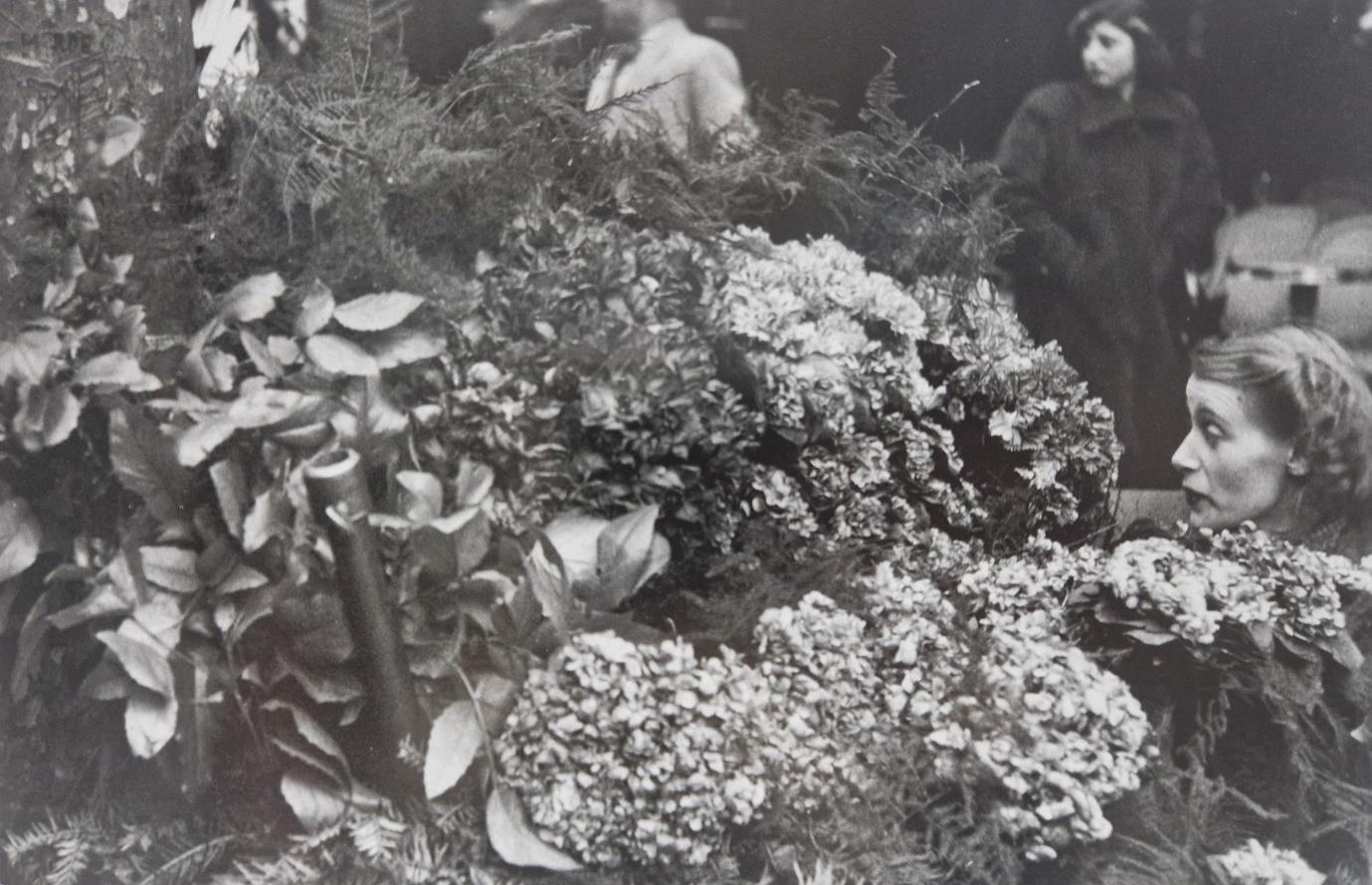
“who sees what I see”
Robert Frank and Kazuhiko Motomura.
A story in six books.

Three presentation copies from Robert Frank to his publisher Kazuhiko Motomura.
Two books by Frank published by Motomura.
And one of the rarest of Frank’s works.
Well, one evening early late or middle last November, two Japanese gentlemen rang my bell on the Bowery. Mr Kazuhiko Motomura and Mr Toshio Hataya did not speak any English or where (sic) too shy to try. They brought a girl who translated… I remember the evening very well.
They said that they had always liked my photographs. They came to New York to ask my permission to have a book published of my work. Something like that had never happened to me. I was impressed and happy…When the two gentlemen left I said to June I’m really going to work on that and try to make it good.
Robert Frank’s recollection of his first meeting with Kazuhiko Motomura opens The Lines of My Hand, the 1972 autobiographical photobook published by Motomura. Frank’s visitors from Japan did not quite walk in off the street as Frank suggests: the meeting had been arranged by Eugene Smith whom Motomura had met in Japan through Moringa Jun whose River, its shadow of shadows he would later publish. But it was an encounter born of Motomura’s desire to rekindle Frank’s enthusiasm for photography and to bring his work to Japan When the two men met, in 1970, Frank was as much a film-maker as a
photographer. Indeed, in 1960, Frank had, in his own words, come to “a decision: I put my Leica in a cupboard. Enough of lying in wait, pursuing, sometimes catching the essence of the black and white, the knowledge of where God is. I make films. Now I speak to the people who appear in my viewfinder. MOVING PICTURES”.
Behind Frank’s decision to abandon photography, was the criticism that had greeted The Americans. Although this extraordinary work is now regarded as one of the most important of all photobooks, the initial response to Frank’s grainy, distant, sideways look at his adopted country was one of perplexed anger First published in Paris in 1958 (no American publisher wanted to handle it), Frank recalled how reviewers described it as “sinister”, “perverse” and “anti-American”. It was published in America the following year, and critics again attacked what they saw as Frank’s undue and unnecessary concentration on themes of dislocation, division, and loneliness. Dismayed, Frank described how “after the publication of the Americans in 1959, a slow fade begins. Filmmaking replaces the single frame photograph”. While Frank was stepping back from photography, an official in the Japanese National Tax Agency called Kazuhiko Motomura, was immersing himself in the worlds of film and photography. His main interests were in the work of Japanese artists but, when he first saw The Americans, he, unlike the critics, recognised that it marked a new way of recording the world in photographs. During the 1960s, as well as working on other photographic projects (hence the meeting with Eugene Smith) Motomura became ever more determined to bring Robert Frank out of his self-imposed exile from the world of photography and introduce his work to a Japanese audience.
Motomura’s approach to Frank was brave and, on the face of it, perhaps a little naïve. He can have had no idea how Frank would react. But the gracious and modest Frank was charmed and so began a friendship and professional relationship that lasted until Motomura’s death in 2014 Evidence that the two men hit it off from the start can be found in the copies of Les Americains and The Americans presented here. One was given to Motomura on October 30th 1970 (so Frank slightly misremembered the date of their first meeting) and the other in November the same year.
In 1971, Motomura founded his own firm “Yugensha” in order to publish the work which he and Frank had discussed the previous year. That work would become The Lines of My Hand, an autobiographical photobook which was also a Frank retrospective and served as an introduction to his work for a Japanese audience.
Motomura published two other works by Frank - Flowers is, a mint copy of which is offered here, and The Americans: 81 Contact Sheets which appeared in 2009. Among the books we have here, is a copy of London/Wales published in 2003 to accompany an exhibition of Frank’s photographs taken when in Britain in the early 1950s. This is inscribed to Motomura “Why NOT – we can make another book. Only – we must Start NOW?” It is especially touching to see here the germ of the idea that would, six years later, become the third of their collaborations.
The six books collected here are two books published by Motomura (The Lines of My Hand and Flower is), three books inscribed Frank to Motomura (Les Americains, The Americans and London/Wales) and one, New York is which is perhaps the most scarce of all Frank titles. It is a collection that tells the story of an important artistic collaboration and a deep friendship founded on the art of photography.
We are offering the books together as a collection for £35,000.

Paris: Robert Delpire. 1958
First edition, first printing. Inscribed on half title:
“To Kazuhiko Motomura who sees what I see and speaks Japanese with my respects Robert Frank. NYC Oct. 30. 70.” Oblong. 182x206mm. pp. 172 [2]. 83 black and white photographs with text, in French, on the page opposite. Among the writers represented are Faulkner, John dos Passos, Steinbeck, de Toqueville, Walt Whitman and Simone de Beauvoir together with several political figures including, Lincoln, George Washington, Franklin D. Roosevelt and Harry S. Truman. Original white cloth illustrated by Saul Steinberg. Protected by a plastic wrapper and housed in a cardboard slipcase made by Kazuhiko Motomura with the book’s details inscribed by him. Some rubbing and light wear to joints and some toning to spine. Internally near fine. Overall an excellent copy of the first printing of one of the great photo books and a book of which it can, without exaggeration, be said that it altered the course of its genre. Frank knew that he was breaking new ground: “I wanted to follow my own intuition and do it my way, and not to make any concession – not to make a Life story... those goddamn stories with a beginning and an end.” It is also the book that, in its later American, English language printing brought together Frank and Kazuhiko Motomura and took Frank in new directions and inspired the moving inscription in this copy. Frank and Motomura first met towards the end of 1970. Frank thought it was in November but this inscription puts a meeting a little earlier. Frank’s specific mention of Motomura’s speaking of Japanese recalls their first meeting and Frank’s mention of the language barrier and it could be that this book was given and the inscription made at that meeting.
 FRANK, Robert. Les Americains.
FRANK, Robert. New York is
New York: New York Times. 1959.

Signed “Robert Frank. NYC. March 27. 96”. First and only edition. 287x207mm. Unpaginated. [56pp]. Introduction by Gilbert Millstein. Original white cloth with the title stamped in black gothic letters on the upper cover and spine. Protected by a mylar wrapper and housed in a cardboard slipcase made by Kazuhiko Motomura with the book’s details inscribed by him. Top right corner of upper cover is a little bumped and creased and there is some soiling to edges of covers and spine and some rubbing to head and foot of spine. But overall in very good condition. Twenty-five black and white photographs. Each photograph shows people engaged in an aspect of life in New York – business, shopping, opera going, visiting galleries and museums,

watching baseball, relaxing in Central Park, going to school. Accompanying each picture is a short paragraph all of which (save two) begins with the words “New York is” and then the event in question, such as “New York is a home run at Yankee Stadium”. Each paragraph continues with “New York is 5 million families growing, needing, wanting buying. New York is The New York Times. New Yorkers live by it. It serves them with the most news. It sells them with the most advertising”. Essentially, the book is a publicity platform for the New York Times advertising department, designed to encourage business to advertise in the paper. But Frank’s photographs lift the whole project to a far more elevated plane. The previous year, he had published Les Americains and the spirit which informed that great work – the combined spirit of the artist and the journalist – is evident in New York is. Frank’s grainy, realistic style captures the speed and grit of urban life even when dealing with New York’s ritzy glamour. But what really strikes us is his ability to pick out one person, make them the focus of the image and tell the story through their movement or facial expression. New York is is one of Frank’s scarcest works and it uncommon to find it signed and in such good condition. Like New York itself, Frank’s book is a compelling blend of art, humanity and commerce.
“To Kazuhiko Motomura. I hope to see you again and that we will become friends. Robert Frank. Nov. 1970. New York”
FRANK, Robert. (introduction by Jack Kerouac). The Americans. New York: Grossman/ An Aperture Book. 1969

Second American edition. Revised and enlarged from the first, Grove Press edition of 1958. Oblong. 182x206mm. pp. [4], vi; 83 black and white photographs with the titles printed on the page opposite. 12 pages entitled “Continuation” with an introduction by Frank and filmstrips from four of his films, Pull my Daisy, The Sin of Jesus, O.K. End Here, Me and my Brother. Original black cloth, original illustrated dust jacket protected by a plastic wrapper and housed in a cardboard slipcase made by Kazuhiko Motomura with the book’s details inscribed by him. Two small creases to the back of the dust jacket and some very minor toning and soiling elsewhere on the jacket. One plate has a small smudge but otherwise an excellent copy of the expanded edition which retained Jack Kerouac’s introduction but added the short appendix highlighting Frank’s growing interest in film-making. Inscribed by Frank: “To Kazuhiko Motomura. I hope to see you again and that we will become friends. Robert Frank. Nov. 1970. New York”. This copy of The Americans was given to Motomura very shortly after Frank had given him Les Americains in October 1970. These early meetings clearly went well and, as these inscriptions attest, Frank was keen to work with Motomura on the project that would become The Lines of My Hand. And they did become friends. This was the book that sparked the friendship and led to the three-book collaboration between them.

Inscribed by Robert Frank. The first of the collaborations between Frank and Motomura.
FRANK, Robert. The Lines of My Hand.
Tokyo: Yugensha/Kazuhiko Motomura. 1972
First edition, limited to 1000. 342x258mm. pp. [5], 1-119, including two folding. Inscribed “For Tadashi and Satoshi in NYC 2015. Robert Frank”. Original black cloth, spine and upper cover lettered in white. Original black cloth covered slipcase, with a photograph on front (Platte River, Tennessee from p76 of the book) and lettered in white to the spine. Illustrated throughout with black and white photographs, contact sheets and film strips. With the thirty-page booklet containing the text in Japanese and small reproductions of the photographs for reference, printed on black paper. Original brown card shipping box. Apart from some rubbing and wear to this box, the book, slipcase and booklet are in excellent condition.

The Lines of My Hand is the first of Robert Frank’s three collaborations with Kazuhiko Motomura and is a mixture of retrospective and autobiography. It begins with photographs from Switzerland (where Frank was born) taken in 1945-46, continues with his very earliest American photographs taken after he arrived on the S.S.James B.Moore in March 1947 (“that was ‘The New World’ I thought I was lucky”) before moving on to selections from his books and films produced in the 1950s and ‘60s. At the end of the book is a photograph of a short letter from Frank to Motomura. It concludes with an explanation of Frank’s aim in ordering the photographs as he does: “Within the next week I’ll send you all the material for the book. I hope that you will like the way I put it together. It’s that way because I want you to know and see how it was – to become like I am. All my best wishes”.

The second of the collaborations between Robert Frank and Kazuhiko Motomura FRANK, Robert. Flower is.
Tokyo: Yugensha/ Kazuhiko Motomura. November 1987.
Limited edition of 500 copies. 343x250mm. Unpaginated. 56 leaves, 81 black and white photographs. A short introduction Frank in English translated into Japanese and a biography of Frank in Japanese and English. In original grey silk covered boards, stamped in white with the title, author and flower design to upper cover and spine. Beige cloth covered slipcase with photograph on front cover and lettered to spine and housed in the publisher’s original shipping box. Mint. The second of the three collaborations between Frank and Kazuhiko Motomura, the inspiration for Flowers is was the tragic death, in an aeroplane crash in 1974, of Frank’s daughter Andrea. Although a single book, Flowers is, is formed of three distinct parts.
The first, Flowers is Paris, is an essay on the use of flowers in Parisian life concentrating on the street flower stalls across the city although, as ever with Frank, the focus is on the vast array of characters whose lives are changed by their encounter with flowers.
The second part, Factory in Detroit, is set in the River Rouge car plant where, as Frank explains in the introduction, he spent two days before being asked to leave. These images are the antithesis of the previous Paris photographs. As an aside, Frank’s departure from River Rouge led to his road trip across America during which he collected the photographs that would become Les Americains.
The final part, Mabou is waiting, is a collection photographs from his home in Mabou, Nova Scotia. These are a mix of studies of the haunting landscape and domestic polaroids.
Unlike anything else Frank had produced, Flowers is demonstrates the range of this extraordinary artist.
Inscribed by Frank to Motomura
FRANK, Robert. London/Wales.
Zurich: Scalo. n.d. [2003].
First edition. 240x190mm. pp128. 65 black and white photographs and six pages of contact sheets. Published to accompany an exhibition at the Corcoran Gallery of Art, Washington, DC, May 10-July 14 2003. Loosely inserted is a photocopy of the separately printed “Catalog of the Exhibition” with descriptions of the photographs, their titles and dates. Original black cloth, original illustrated dust jacket protected by a plastic wrapper and housed in a cardboard slipcase made by Kazuhiko Motomura with the book’s details inscribed by him. In immaculate condition throughout. Inscribed “May 7. 2003. Dear Kazuhiko Motomura. Why NOT – we can make another book. Only –we must Start NOW? This is your friend Robert – in Washington looking at all these old photos always with so much respect for you. Your friend again…….”

This touching inscription to his old friend was written just as the exhibition was about to open in Washington and the “old photos” mentioned by Frank are the ones in the gallery and this book. They date from the 1950s and show two wildly contrasting sides of postwar Britain. By the time of the exhibition, half a century had passed and these photographs were records of a lost world, another age. London was richer, but coarser and less elegant while South Wales was poorer, the mines largely gone and social cohesion fragmented This book is a
fascinating insight into Frank’s work before Les Americains/The Americans. The photographs are beautiful and moving, as they are in his later work, but the moral message is more apparent. Frank, writing later, realised that these images from Britain were doing something different: "War is over; the heroic French population reaffirms superiority. Love, Paris, and Flowers...but London was black, white, and gray, the elegance, the style, all present in front of always changing fog. Then I met a man from Wales talking about the Miners and I had read How Green Was My Valley. This became my only try to make a 'Story'." And, yes, they did make another book - The Americans: 81 Contact Sheets in 2009.

A rare and important study in non-Euclidean geometry one hundred years before Lobachevsky
1. SACCHERI, Girolamo. [Ioannes Hieronymus Saccherius] Euclides ab omni nævo vindicatus sive, Conatus geometricus quo stabiliuntur prima ipsa universae geometriae principia
Mediolani: Ex Typographia Pauli Antonii Montani 1733
First edition. 4to. 227x175mm. pp. [XVI], 142 [2bl], 6 folding plates with 55 diagrams. Contemporary vellum, spine with four raised bands, compartments decorated with gilt flower motif. Covers a little marked and soiled. Some foxing and browning but otherwise very good internally. An excellent copy of a scarce book of which Worldcat locates only sixteen copies worldwide. We have traced no copies at auction.

Girolamo Saccheri (1667-1733) was a Jesuit priest and one of the most influential mathematicians of his time although the significance of his revolutionary ideas was not fully appreciated until 150 years after his death. As a young man, he taught at a Jesuit college in Milan where he encountered the mathematical work of the Ceva brothers. He spent most of his life teaching philosophy, theology and mathematics at the University of Pavia. Euclides ab omni nævo vindicatus is Saccheri’s third work on mathematics and the work for which he is best known. As he died in 1733, it is possible that he never saw it published. Although Saccheri is regarded as the father of non-Euclidean geometry, he did not set out to disprove Euclid’s parallel postulate but, rather, prove it. Indeed, as the title of the book makes clear, it is an attempt to vindicate Euclid. It was in rejecting a contradiction of Euclid’s second postulate (that a terminated line can be produced indefinitely) that Saccheri raised the possibility that straight lines are finite. Although he did not realise it at the time, this idea is now regarded as the basis of elliptic and hyperbolic geometry which refutes Euclid’s second and fifth postulates.
Almost exactly 100 years later Nikolai Lobachevsky and Janos Bolyai, independently of each other, published the foundational texts of non-Euclidean geometry, a term first used by their contemporary Carl Friedrich Gauss. But none of these men knew of Saccheri: as we said, this is a rare book. It was not until another Italian mathematician, Eugenio Beltrami, published a paper in 1889 comparing Saccheri’s work on Euclid’s parallel postulate to that of Lobachevsky and Bolyai, that he was brought to the attention of the mathematical world. The history of non-Euclidean geometry would have to be rewritten with Saccheri taking his place as its prime mover.
[4056]
£45,000
An extraordinary seventeenth century scientific manuscript and a sighting of Newton’s comet
2. [STICKERS, Franciscus] Physica
Leuven: n.p. 1670

A manuscript book containing detailed and extensive notes on a wide range of scientific subjects. 200x155mm. 494 leaves. 34 engraved plates. Text in Latin. The chapter headings are beautifully calligraphed and there are some attractive little drawings in the margins. Bound in contemporary full calf, upper and lower covers with a single fillet border in blind framing a blind triple fillet which then frames a lavishly tooled border with interwoven semicircles and floral motifs in blind. At the centre of each cover is a gilt supralibros with two men, one holding an armillary sphere and the other a pair of compasses. Above them are stars and between them a cartouche inside which is a triple-towered castle surmounted by a crown (this motif is repeated in the compartments of the spine save for the second which has a black morocco label lettered in gilt “Physica”). Beneath this is a shield with a hand holding a book and reaching down through the clouds. This is the coat of arms of the Old University of Leuven. The figures with the armillary sphere and compass are clearly a reference to Mercator, the maker of globes, spheres and other scientific instruments as well as being the finest map maker of his time. On the upper cover is stamped in gilt “Franciscus Stickers” and on the lower, “Bredanus Anno 1670”. One of the preliminary blank leaves has the ownership inscription “Franciscus Stickers”. Stickers was from a family in Breda in the Netherlands. Born in 1649, he would have been a student in 1670 (at Leuven, hence the university’s coat of arms). In 1674, Stickers is recorded as being a lawyer in Breda and marrying Josina Maria van Beeck. He died in 1700, clearly a figure of some substance as the frontispiece engraving of this book has the inscription (dated 1813) “Ex Libris Nob. Dni Franciscii Stickers adeptus est J.A.Cornelissen”. Some rubbing to extremities, joints a little cracked. Recent minor repairs to spine. Leather ties. A little damp-staining and some toning to edges but overall in very good condition throughout.

This significant manuscript book running to almost 1000 pages, provides a valuable and fascinating insight into the teaching of science in the oldest university in the Netherlands in the latter part of the seventeenth century. Stickers’ notes begin with the title “De Physica et Obiecto eius” and proceed to a detailed investigation into the nature and types of causality. “Libri de Anima” (Books concerning the soul) contains notes on “Life and Death” and “the circulation of the blood”. There are various sections dealing with the senses (smell is accompanied by a hand-drawn bunch of flowers), expanded to included notes on related matters such as sleep, tiredness and freedom. Later on in the book, a discussion of the senses takes a more explicitly scientific path with a section on the eye (with a diagram and the initial “O” of “Oculo” framing a hand-drawn eye) and notes on colour and light. Some subjects are dealt with more than once suggesting a developing programme of study appropriate to university education. Significantly, there are two sections headed “Tractatus de Sphera”, the second illustrated with an armillary sphere, engraved by Michael Haye. The notes in these chapters develop into detailed study of planetary motion, astronomy, the stars, lunar science, eclipses of the sun and moon and the zodiac. The astronomical systems of Ptolemy, Copernicus and Tycho Brahe are covered and there is a section on comets with a later note (also in Stickers’ hand) recording how “vidi” (I saw) the Great Comet of 1680 (Kirch’s or Newton’s Comet) and accompanied by a drawing of the phenomenon. There are notes on forms of mutation and change dealing with corruption, putrefaction and mixture. Taken all together, these notes, legibly although minutely written, offer a rare chance to study early modern scientific education through the eyes of a clearly talented student at a university with a link to the one of the great scientists of the previous century. An additional attraction are the decorative calligraphy, the handful of marginal drawings, and the illustrations including engravings of the senses by David Teniers the Younger, scientific diagrams (particularly relating to the sections on astronomy). Some of these engravings may have been produced for insertion into books of lecture notes such as this and a number are rather amusing: opposite the notes titled “De Fortuna” is an image of a hand reaching out the sky and casting dice on a table, and with the notes “De Nutritione” is a print of a flock of sheep nibbling on leaves. It is nice to find the occasional light touch in a work of such serious and extensive learning.
£25,000
[4088]
van Gogh, Gauguin and the Danish avant-garde
3. Den Frie Udstilling Fortegnelse Over Kunstvaerkerne Paa Den Frie Udstilling 1893. Kjobenhav [Copenhagen]: J.Jorgensen & Co. 1893
A catalogue of the first exhibition of paintings by Van Gogh in Denmark. 170x135mm. Text block 155x125mm. Unpaginated. 36pp. In original grey paper wrappers, with title, date and floral decoration on the front cover. Bound into blue half cloth and decorated paper covered boards. Some slight rubbing to the boards but the catalogue itself and its delicate wrappers are in excellent condition. Rare, Worldcat locating only two copies, one in Denmark and the other in the Metropolitan Museum in New York.
This modest little booklet listing the works of art displayed at Den Frie Udstilling in 1893, captures an important moment in European art: it records the public bringing together of the work of Gauguin and Van Gogh and it also marks a crucial step in the establishment of the reputation of Van Gogh. Den Frie Udstilling (The Free Exhibition) was founded in 1891 as a protest against the narrow and conservative admission policy of the Kunsthal Charlottenborg gallery of the Royal Danish Academy of Art. Taking as its inspiration the Impressionists’ Salon des Refusés, Den Frie Udstilling was founded by the painter, printer and designer Johan Rohde, an early champion of Van Gogh whose work he collected. The first exhibition was dominated by Danish artists including Vilhlem Hammershoi, Harald and Agnes Slott-Moller and Rodhe himself. In 1893, Den Frie Udstilling moved to a specially designed wooden pavilion in the centre of Copenhagen and exhibited forty-nine paintings by Paul Gauguin and twenty-eight works by Van Gogh including two of his Sunflowers, a Self-Portrait, a study of a crab, a drawing of the garden of the hospital at Arles and the beautiful White Orchard. Of Gauguin’s works, fewer than half date from, or from before, his short, disastrous stay in Copenhagen in 1884-85 when he moved there to join his Danish wife. Clearly the regard in which Gauguin was held by Danish artists survived his difficult Copenhagen period.

Van Gogh and Gauguin were, of course, close friends, living together in Arles for a few months at the end of 1888 before the relationship soured. Immediately after Van Gogh’s death in 1890, his brother Theo ensured that exhibitions of Vincent’s work were staged as widely as possible. With Theo’s death in 1891, it seemed that Van Gogh’s reputation might fade. Certainly Gauguin did little to assist, so one wonders what he might have felt at co-staring in this 1893 Copenhagen show. It was only through a handful of exhibitions in the 1890s such as this one at Den Frie Udstilling that Van Gogh’s position in the canon became secure.
£2,000
[4085]
Obscenities. The first erotic novel written by a woman
4. de C***, Madame [Félicité de Choiseul-Meuse] Julie, ou J'ai sauvé ma rose.
Hambourg: n.p. 1807
New edition revised and corrected, published the same year as the first edition. Two volumes. 12mo. 168x100mm. pp. [4], 252; [4], 287 [1bl]. Bound by R.Raparlier (signed at head of one of the blank preliminaries) in quarter green morocco with marbled paper covered boards. Spine with five raised bands, compartments decorated and lettered in gilt. A little shelfwear and corners slightly bumped. Internally very good with some slight foxing and soiling and some tears to edges of three leaves in volume one caused by opening. Overall an excellent copy of what is generally regarded as the first erotic novel written by a woman.

Julie is now firmly attributed to Félicité de Choiseul-Meuse (1767-1838) who may have been the wife or daughter (hopefully not both) of the Marquis JeanBaptiste-Armand de Choisel-Meuse, a field marshal who, in 1784 published a translation of Tasso’s Aminta. Félicité wrote twenty-seven books of which Julie is the most celebrated due, in large part, to its being banned “for offending modesty...flouting social conventions and public decency”. Julie is the first hand account of a young woman’s life governed solely by the rule that she should, at all costs, preserve her virginity. Although she takes many lovers (both male and female), her “rose” is, as the book’s title makes clear, always kept safe. By the end of the novel, Julie has joined a secret society of lesbians where she can devote herself to the pursuit of sexual pleasure without the moral and physical messiness of relinquishing her parthenic state. This does of course raise a number of complex philosophicosexual questions about what constitutes virginity. Julie considers her restraint to be a mark of feminine power and, in that, she may be correct. In 1827, the book was banned and copies destroyed “because of the obscenities it contains”. Those obscenities were probably the scenes of sapphic frotting but could, possibly, have been the novel’s sly attack on the nineteenth-century patriarchy.
[4090]
£950
“The boy kills Bradbury Robinson so he can grow up. Or Bradbury Robinson kills the boy so he will never have to grow up.” A corrected draft of one of the strangest novels of the late twentieth century with an introduction by William Burroughs.
5. BRADBURY ROBINSON, [C.J.] Williams Mix
New York and London: The Coltsfoot Press Inc 1977

A draft copy of (the apparently unpublished) Coltsfoot Press edition of Williams Mix by Bradbury Robinson with extensive corrections in red biro made by Bradbury Robinson. A note at the end of the proof reads
“Corrected by the author
Christopher Bradbury Robinson
Somerset April 1977”. Eightyeight loose leaves (356x215mm), seemingly photocopied from a copy removed from a spiral binder, sixty-five of which have corrections and amendments. Verso to the proof title page has the Ex libris of Nicholas Wilde, the writer and artist whose sensitive and evocative drawings of young boys (including the image on his bookplate) can be found on the attractive Old Stile Press reprint of Edward John’s 1913 collection of Uranian verse, The Flute of Sardonyx.
Sold with:
More Please No More. Williams Mix and other writings by C.J.Bradbury Robinson. London and Den Haag: Out Now Press. 2011. Pp. xi [i. bl], 539 [1bl]. Mint in mint illustrated dust jacket. This anthology includes excerpts from Minor Incidents and Young Thomas
And sold with:
A Crocodile of Choirboys. San Diego: Phenix Publishers. 1970. First edition. pp. 189, [3]. Original paperback with illustrated cover. Inscribed “for Nicholas Wilde with best wishes Christopher Bradbury Robinson. 28 June 90”. Front pastedown has bookplate of Nicholas Wilde. Bradbury Robinson’s first novel.
Bare Knees, Boy Knees. San Diego: Greenleaf Classics. 1971. pp. 156, [4]. First edition. Original paperback with illustrated cover. Front pastedown has bookplate of Nicholas Wilde. Bradbury Robinson’s second novel.
Young Thomas. San Diego: Greenleaf Classics. 1971. First edition. pp. 188, [2].
Original paperback with illustrated cover. Inscribed “Christopher Bradbury Robinson. 28 June 90” and below the dedication, Bradbury Robinson has inscribed “dona nobis pacem”. Front pastedown has bookplate of Nicholas Wilde.
Arabian Boys. San Diego: Greenleaf Classics. 1972. First edition. pp. 204, [4]. Original paperback with illustrated cover.
All works by Bradbury Robinson are rare, a testament to their controversial subject matter and their complex, experimental, highly literary style.
Williams Mix has a strong claim to being the strangest and most controversial novel of the late twentieth century. Taking its title from John Cage’s short piece of experimental electronic music for eight simultaneously played magnetic tapes, Williams Mix is, as Bradbury Robinson, explains in his preface, “very largely a book of voices…In Williams Mix there is only one person: the different voices are different parts of his mind”. Bradbury Robinson compares the writer to a composer, “a sound artist” and the way the voices of his novel jump around, suddenly appear and then fade away mirrors the fragmentary unsettled quality of Cage’s work. Aside from aleatory music, Bradbury Robinson’s other major influence is psycho-analysis (he is a Kleinian analyst). Of the Freudian “instinctual conflicts” and the Kleinian “moral conflict” he offers the “realisation that these structures, these conflicts are verbal. They are voiced”. But Bradbury Robinson’s voices are, as he says, “crying in the wilderness”.

This wilderness is perhaps best described in William Burroughs’s extraordinary introduction to Williams Mix - namely, “sexual attraction for boys under the age of puberty”. This is the ostensible subject matter of the novel and it is, without doubt, difficult to see past it. But we should try. As Burroughs makes clear, the book is really about the pathetic desire, doomed to failure, to return to one’s childhood, one’s prepubescence. This “impasse”, as Burrough’s calls it, is the struggle between our past, present and future distilled into an acute psycho-sexual drama. “The boy kills
Bradbury Robinson so he can grow up. Or Bradbury Robinson kills the boy so he will never have to grow up.”
Williams Mix is also about the art of writing and “the music of language”. These were subjects that preoccupied Bradbury Robinson and Burroughs during their long conversations at Burroughs’s London flat in the early 1970s. Bradbury Robinson greatly admired the older man’s work, regarding Soft Machine as “more or less, a continuous stream of poetry”. On the face of it, theirs was a strange friendship. At the time, Bradbury Robinson was a young, just-out-of-Cambridge, prep school master with no interest in the druggy, Beaty, pop culture which was beginning to see Burroughs as one of its godfathers. True, both men shared a similar but not entirely overlapping interest in boys but what drew them together and kept them talking was experimental literature. “Burroughs would pull from his typewriter the page he was currently working on (Dutch Schultz or Port of Saints), hand it to me and say, Musical enough for you, Brad? And we would examine the writing as a musical score.”
During an early meeting, Bradbury Robinson gave Burroughs a copy of his first novel (A Crocodile of Choirboys), extracts of which Burroughs had read in draft (when it was called Minor Incidents). Burroughs was impressed – “You’re a writer…those are the exact words Beckett said to me – You’re a writer!”. Bradbury Robinson then asked Burroughs to write an introduction to his new novel – Williams Mix. A long and tortuous gestation followed. Burroughs recommended it to The Olympia Press. Olympia, short of money and nervous of the reaction to the “problematic” subject matter, turned it down although six proof copies are known to exist. Bradbury Robinson then went to live in North Africa and the project lay dormant for a couple of years. An attempt to have the novel published by Virginia Woolf’s nephew Cecil failed when the printer sneaked a brief look and died of a heart attack. Bradbury Robinson, in his preface to More Please No More, says that the novel hibernated in a tin trunk for years before being released on a CD-Rom in 2004 forgetting that there was this Coltsfoot Press edition of 1977. Although this edition seems to have been published – it appears in the American Book Publishing Record of 1977 - we have traced no copies at auction and it is unrecorded on Worldcat. In 2011, Out Now Press published Williams Mix in the collection More Please No More. This contains some revisions from the 1977 Coltsfoot proof, which is itself a revised version of the proposed Olympia edition. This proof may be the only copy of this version of Williams Mix and so is an important and possibly unique document in the history of this extraordinary and beautiful work of avant-garde, musical, prose-poetry.
The quotes from Burroughs and Bradbury Robinson are taken from https://www.beatdom.com/william-s-burroughs-c-j-bradbury-robinson-and-williamsmix/
which provides valuable insight into the relationship between the two men. [4102]
£2,750
“Like black-beetles”.
D.H.Lawrence, the Bloomsbury Group and homosexuality. A letter and an original Lawrence drawing.

6. LAWRENCE, D.H. Autograph letter to David Garnett April 1915 Sold with an autograph letter signed by Frieda Lawrence to David Garnett (sent at the same time as her husband’s letter);
and with an autograph letter signed by David Garnett to the Lawrences dated 20th October 1912;
and sold with an original drawing by D.H.Lawrence of David Garnett dated 1913. Greatham, Pulborough n.p. 1915
Autograph letter signed by D.H.Lawrence to David Garnett. Undated but the postmark on the envelope (marked, “Absolutely Private”) is dated 20th April 1915. Three sheets (175x125mm), five pages. 595 words. An extraordinary and important letter in which Lawrence writes to his close friend David Garnett on the subject of “men loving men” and, especially Garnett’s men-loving friends in the Bloomsbury Group, Duncan Grant, John Maynard Keynes and Francis Birrell - “these beetles” as Lawrence calls them.
Lawrence and Frieda had got to know the twenty-year-old David Garnett in 1912 when they all spent time together in Germany and Austria. During that time, Lawrence wrote letters describing Garnett’s youthful vigour when swimming in the River Isar: “He simply smashes his way through the water, while F. sits on the bank bursting with admiration, and I am green with envy”. The envy seems to be not due to Frieda’s admiration but for the Garnett’s physical strength, something that the constantly ill Lawrence lacked. Other letters from this holiday find Lawrence praising the wild physicality of Garnett’s dancing: “Such a prancing whirl of legs and arms and raving colours”.

1913 saw the publication of Sons and Lovers (as edited by Garnett’s father Edward). Lawrence found himself feted by Ottoline Morrell and he soon met all the leading members of Bloomsbury. Garnett too was moving in Bloomsbury circles, becoming especially close to Birrell and Grant. Lawrence seemed, publicly at least, at ease in this new world and remained very friendly with Garnett, making a fine sketch of him, smooth cheeked and tousle-haired (see below). But then, during a visit to Cambridge at the invitation of Bertrand Russell, it all changed.
In this letter to Garnett, Lawrence recalls how he and Russell went to visit Keynes in his rooms: “He was not there, so Russell was writing a note. Then suddenly a door opened and K. was there, blinking from sleep, standing in his pyjamas. And as he stood there gradually a knowledge passed into me, which has been like a little madness to me ever since”. Lawrence tells Garnett to break off his friendship with this Bloomsbury men.
“Never bring B[irrell]. to see me any more. There is something nasty about him, like black-beetles. He is horrible and unclean. I feel as if I should go mad, if I think of your set, D[uncan]. G[rant]. and K[eynes]. and B. It makes me dream of beetles. In Cambridge I had a similar dream. Somehow I can't bear it. It is wrong beyond all bounds of wrongness. I had felt it slightly before, in the Stracheys. But it came full upon me in K., and in D. G. And yesterday I knew it again in B.”
“It” in all this is, of course, homosexuality. “It is so wrong, it is unbearable. It makes a form of inward corruption....as if it came from deep inward dirt - a sort of sewer - deep in men like K. and B. and D.G.”.
Lawrence continues his plea: “You must wrench away and start a new life....you, my dear, you can be all right. You can come away, and grow whole, and love a woman, and marry her, and make life good, and be happy. Now David, in the name of everything that is called love, leave this set and stop this blasphemy against love. It isn't that I speak from a moral code. Truly I didn't know it was wrong, till I saw K. that morning in Cambridge. It was one of the crises in my life.” Lawrence ends: “I could sit and howl in a corner like a child, I feel so bad about it all.”
Accompanying Lawrence’s letter is one from Frieda to David Garnett in which she adopts a more conciliatory tone (Two sheets (175x125mm), four pages, 298 words). “Are you getting sick of being bombarded with letters?...I felt a great strength and livingness and a genuine you, if only you could believe in yourself more, in the individual bottomself of you and collect your strength and direct it - you always admire other people much too much, you are really more than Birrell or the others.”
Frieda tells Garnett that he loses himself in other men “and you have got it in you to stand for yourself and by yourself - Also I rather think the young me you know exploit you and feed on your warmth, because you are generous”. Frieda signs off: “Anyhow you are my dear friend”.
Below Frieda’s letter is a forty-five word p.s. from Lawrence telling the poor Garnett: “Don’t marry anybody. Go right away and be along and work and come to your real self”.
Sold with these letters is an earlier letter dated 20th October 1912 from Garnett to “Dear dear Lorenzo. Dear dear Frieda”. It begins with fulsome praise for Lawrence’s recently published “The Trespasser” and then goes on to talk of love, failed love affairs with women. He says to Lawrence: “You with your phallus worship (excuse my expression but it’s true) yet must recognise that love can be a ghastly business”. The letter recalls the summer in Germany: “I’d give a lot to be with you again -swimming in the rivers, climbing mountains”. One senses the closeness between Garnett and the Lawrences but Garnett’s tone is fresher, younger, more carefree - the intensity was all on Lawrence’s side.
The following year (1913), Frieda and Lawrence went to stay with Garnett and his parents at The Cearne, their house in Kent. While there, he sketched Garnett, producing a study of his friend’s head in profile. He captures the quick, youthful vigour he so admired, the thick hair and fresh face. It is signed “D.H.Lawrence” and also inscribed (in Garnett’s hand) “David Garnett by D.H.Lawrence. The Cearne. 1913”. On the verso is a further rough sketch. Single sheet of lined paper, 189x203. Some slight foxing and marking to the edges where it was once framed.
Lawrence attitudes and relationship to homosexuality are complex and continue to interest to scholars and biographers. And his friendship with David Garnett was perhaps even more complex. His “envy” of Garnett’s physical prowess and perhaps of his beauty seems to underpin much of their early time together. The sketch Lawrence made while staying with Garnett concentrates on his youth making him seem much younger than the twenty-one which he was. And the extraordinary outburst in the famous letter of April 1915 is shot through with jealousy, commanding the young man to leave his friends. Keynes certainly thought that Lawrence was jealous. Garnett must have been shocked. If, in 1912, the two men were discussing “phallus worship” why would Lawrence suddenly adopt a tone of high moral outrage in the face of what he called “Bloomsbuggery”? Did Lawrence really disapprove of homosexuality? His novels suggest not. Was he in love and sexually attracted to Garnett? Did he want him for himself and himself alone? Any answer to these questions must necessarily call in evidence these letters and the drawing as they go the heart of the fraught matter of D.H.Lawrence’s sexuality.
[4150]
Dr Johnson’s scarce satire on Robert Walpole
£17,500
7. PROBUS BRITANICUS [Samuel Johnson] Marmor Norfolciense or an Essay on an Ancient Prophetical Inscription, In Monkish Rhyme, Lately Discover’d near Lynn in Norfolk. London: Printed for J. Brett. 1739
First edition. 8vo in 4s. 200x125mm. Pp. [5], 6-55, [1bl].
Bound with:
SMITH. W. The Freemason’s Pocket Companion. London: Printed for John Torbuck. 1736. Pp. [6], 116. With engraved frontispiece.
And:
[CLARKE, Alured]. An Essay Towards the Character of Her late Majesty Caroline, Queen Consort of Great Britain. Second edition. London: Printed for J. and P. Knapton. 1738. Pp. [4], 46.
Three works in one volume. Original bluegrey paper covered boards, backed in tan calf, spine lettered in gilt “Tract Var”. Spine a little rubbed and a tear and two small worm holes to foot of spine. Internally very good although with some staining to halftitle of Marmor Norfolciense and some foxing and marking elsewhere. Front pastedown has the armorial book plate of John Ward whose initials are on the preliminary leaves of each work. Housed in a modern cloth covered box. An excellent copy of this “exceedingly scarce” satirical attack on the Walpolean-Hannoverian hegemony. Written pseudonymously, this is one of Samuel Johnson’s earliest published works. It tells of the finding of a large, antique stone (the Norfolk Marble of the title) inscribed with a cryptic prophecy which is then decoded to reveal contemporary political truths. Marmor Norfolciense established Johnson as a political writer with Jacobite sympathies and a Swiftian bite. Boswell, in his Life (see item 76) describes the work thus:

“In this performance, he, in a feigned inscription, supposed to have been found in Norfolk, the county of Sir Robert Walpole, then the obnoxious prime minister of this country, inveighs against the Brunswick [i.e. Hannoverian] succession, and the measures of government consequent upon it. To this supposed prophecy he added a Commentary, making each expression apply to the times, with warm Anti-Hanoverian zeal.”
“This anonymous pamphlet, I believe, did not make so much noise as was expected, and, therefore, had not a very extensive circulation. Sir John Hawkins relates that, 'warrants were issued, and messengers employed to apprehend the authour; who, though he had forborne to subscribe his name to the pamphlet, the vigilance of those in pursuit of him had discovered;' and we are informed, that he lay concealed in Lambeth-marsh till the scent after him grew cold. This, however, is altogether without foundation; for Mr. Steele, one of the Secretaries of the Treasury, who amidst a variety of important business, politely obliged me with his attention to my inquiry, informed me, that 'he directed every possible search to be made in the records of the Treasury and Secretary of State's Office, but could find no trace whatever of any warrant having been issued to apprehend the authour of this pamphlet.' Marmor Norfolciense became exceedingly scarce, so that I, for many years, endeavoured in vain to procure a copy of it”.
Marmor Norfolciense was often bound with the pamphlet on Queen Caroline, the late consort of George II and one of the preliminary blank leaves is inscribed, in a contemporary hand, “Ye Contents Page” listing these two pamphlets. The other work in this volume is a rare work on free masonry. Although this has no obvious link to the two pamphlets on Hannoverian subjects, it was clearly important for the owner of this book, John Ward, 1st Viscount Dudley and Ward (1704-74) who was the Grand Master of the Premier Grand Lodge of England between 1742 and 1744
£4,750
[4103]
Terror-ist literature. Horace Walpole’s manuscript title page for The Castle of Otranto.
8. WALPOLE. Horace Autograph title page for The Castle of Otranto. A Gothic Story n.p. n.d. [c1790]
Single leaf, 228x175mm. Inscribed on one side only in Horace Walpole’s hand. The full text is:
“The Castle of Otranto. a Gothic Story. translated by William Marshal Gent. from the original Italian of Onuphrio Muralto, Canon of St Nicholas at Otranto. velut egri somnia vane./ Fingentur species; tamen ut pes, &caput uni/ Reddatur forme Hor.”
Some staining and a little creased to the edges but overall in excellent condition.

Walpole has combined the title pages of the first and second editions (both appeared in 1765). The first edition title page contains the reference to the fictitious William Marshal and Onuphrio Muralto while these are omitted from the second edition. However, it is in the second edition that Walpole first describes his story as “Gothic” and includes the (slightly misquoted) epigraph from Horace’s Ars Poetica, in a shortened form from that written here. These lines from Horace translate as “whose idle fancies shall be shaped like a sick man’s dreams, so that neither head nor foot can be assigned to a single shape” and are taken from the passage in which the poet criticises the artistic fashion for combining the body parts of different creatures in a single imaginary animal - not unlike this manuscript title page in fact. These wild imaginings would become known as grotesques and the world of the hideous chimera lies behind the entire genre of gothic fiction of which Walpole’s Castle of Otranto is, famously, the progenitor. Later editions would include all the details as we have them on this manuscript. As the manuscript is undated, we cannot say for certain whether it was intended as a draft for use by a publisher or if it was written out for presentation. If the latter, then the recipient would almost certainly have been Walpole’s close friend Mary Berry to whom he gave and then bequeathed his large collection of his manuscripts. In her diary, Mary describes visiting the Bodoni press in Parma with Walpole to check on the (slow) progress of the sixth edition being printed for Edwards the London bookseller. The Bodoni printing does not include the Horace epigraph so maybe this manuscript was not intended for that edition although it conforms to that title page in every other respect. Whatever the circumstances, it is a
curious and compelling piece of Walpoleana and a unique relic from a novel that holds an important place in the history of English literature.
The conceit of The Castle of Otranto is that it is based on a sixteenth century manuscript from Naples which had been discovered in the library of an ancient Catholic family in the north of England. Walpole hid behind the persona of William Marshal for fear of ridicule should his authorship be known. Encouraged by the favourable reception of the novel, Walpole dropped the mask for the second edition only to be met, after all, with a barrage of abuse, critics describing the story as absurd and dismissing it as romantic fiction. He should have kept quiet.
[4146]
A rare account of missionary life in Madagascar
£12,500
9. JEFFREYS, Keturah The Widowed Missionary’s Journal; containing some account of Madagascar; and also a narrative of the missionary career of the Rev. J.Jeffreys ; who died on a passage from Madagascar to the Isle of France, July 4, 1825, aged 31 years.
Southampton: printed for the author. 1827
First edition. 12mo in 6s. 190x110mm. pp. x, [2bl], 203 [1bl], [24, list of subscribers]. Frontispiece silhouette portrait of Rev. J. Jeffreys. Bound in modern cloth covered boards, spine with morocco label lettered in gilt. Internally very good but offsetting from the silhouette onto the title page.
Loosely inserted is a card (155x104mm) with a charming portrait in pencil of the author with, on the verso, a brief handwritten biographical note about Keturah. Rare in commerce, only two copies of this issue appearing in the auction records.

Keturah Jeffreys (nee Yarnold - 1791-1858) was born in Worcester. She married the missionary John Jeffreys and on 4th August 1821 (which seems to have been shortly after their marriage, they sailed to Madagascar under the auspices of the London Missionary Society. There they worked as missionaries between May 1822 to June 1825 (Keturah giving birth to three children during this time). On a voyage back to England at the end of their posting, John died of malaria. Short of money, Keturah wrote “A History of Madagascar” and asked the London Missionary Society to sponsor its publication. Her manuscript was rejected on the grounds that it contained too much “colouring” although the reviewer was a rival author and so scarcely impartial. Keturah revised the work, gave it a new and more emotionally engaging title, and arranged for it to be published by subscription. The long list of subscribers and the dedication to the Duchess of Beaufort suggests a skilful marketing campaign and the book was sufficiently successful to have been reissued the same year. The Widowed Missionary’s Journal seems to have marked a change in Keturah’s fortunes as, in 1828, she married
Captain John Metcalfe, an officer in the Indian Army. Keturah moved to genteel Bath and then, after Metcalfe’s death in India in 1833, to London. Madagascar was far behind her but it made a strong impression as this vivid, compelling account demonstrates. She was clearly devoted to her husband’s work, quoting freely from his journals but her own observations and descriptions are well drawn and clear sighted. Keturah emerges, both from the book and the lovely portrait, as a kind, strong-minded, independent woman. We bought this book in South Africa and it was said that it came from a family source. Similarly, it seems likely, although we cannot confirm it, that the portrait was done by a member of Keturah’s family.
[4117]
An original illustration by Dorothy Smyth for a Chivers of Bath binding
£950
10. SMYTH, Dorothy Carleton Jane Eyre. A tall steed, & on its back a rider A signed original painting designed as an illustration for Jane Eyre. n.p. Undated [c1900] Watercolour and gouache on paper. 127x75mm (sheet, 211x139mm). Below the painting the title is inscribed in pencil, with the artist’s signature at the bottom right margin. A note at the foot of the sheet reads “for vellucent binding by Cedric Chivers of Bath”.
Dorothy Carleton Smyth worked very closely with Chivers, providing many designs for his vellucent bindings. However, we have been unable to trace a copy of Jane Eyre with this illustration on the cover so it seems that it was never done. A shame as it would have been stunning.
Dorothy Carleton Smyth (18801933) was born in Scotland but educated in Manchester when her father moved there for business. At the Manchester School of Art, she was taught by Walter Crane from whom she absorbed the principles of the Arts and Crafts Movement. It was also under Crane’s influence that Smyth learnt that book design and illustration was, and should be considered, a serious art form. Towards the end of the 1890s, Smyth began working for Cedric Chivers producing illustrations for The Jungle Book and designing the superb covers for Chivers’s edition of Tennyson with their late Victorian mix of medievalism and sinuous Beardsleyesque proto-art nouveau. Around this time, she returned to Scotland to complete her studies at the Glasgow School of Art. Her practice expanded greatly as she began working on stage and costume design and for ten years she toured with theatre companies producing designs for plays, operas, pageants and festivals. She also set up an educational project with her sister Olive (also an artist) with the splendid (and rather modern sounding) name of “Sister

Studios”. In 1914, she took up a teaching post at the Glasgow School of Art. In 1917, the Director of the School said this of her: “Miss Smyth is a living force contained in a human body…Her instincts are unerring, her taste pure and refined and her feelings shrink from every form of ill considered art”. She managed to combine teaching with her art practice, in particular book illustration and it seems probable that this “Jane Eyre” with its bold outlines and rich, deep colour, dates from this period. On 9th February 1933, she was offered the Directorship of the Glasgow School of Art but tragically, she suffered a brain haemorrhage a week later, died and never took up the post.
[4119]
Pococke’s Arabic History of the Dynasties with the Latin translation
£650
11. ABUL-PHARAJIO, Gregorio [i.e. Gregory Bar Hebraeus or Abu’l-Faraj]. [tr.Edward Pococke] Historia Compendiosa Dynastiarum authore Gregorio AbulPharajio, Malatiensi Medico, Historiam complectens universalem, à mundo condito, usque ad Tempora Authoris, res Orientalium accuratissime describens. Arabice edita & Latine versa ab Edvardo Pocockio. Oxford: H.Hall. Impensis Ric: Davis 1663
First edition thus in the Arabic edition and Latin translation by Edward Pococke. 4to. 203x155mm. pp. [12], 368, [90], 66, [5bl], 565, [2]. The final part (565, [2]) in Arabic paginates from the rear of the book. The two blanks are present. Three parts in one volume (i.e. the Latin translation, the Supplementum and the Arabic edition), each with its own title page. Bound in twentieth century brown full calf by Sangorski and Sutcliffe, lettered in gilt to spine. Contemporary manuscript title to fore-edge. Some light fading to the spine, slight toning to edges of first and last leaves and a small hole to foot of the final leaf (not affecting the text) but overall in very good condition throughout. Front pastedown has the bookplate of the Middle East scholar R.M.Burrell. His important library of books on the Middle East was sold by Sotheby’s in 1999 (this was lot 319).

On 17th October 1630, Edward Pococke (1604-1691) arrived in Aleppo as Chaplain of the Levant Company. While there, he deepened his study of the languages and culture of the region and began to collect Arabic manuscripts. In 1636, Pococke returned to England at the request of Archbishop Laud who had recently established a Chair of Arabic at Oxford and wanted Pococke to be the first holder of it. One of the manuscripts brought back by Pococke was the al-Mukhtasar fî’l-Duwal ('History of the Dynasties') of Abu'l-Faraj (Bar Hebraeus, 1226-1286). The lack of material in England on Islamic history and geography meant that Pococke felt unable to prepare his edition and translation and so he secured a sabbatical from Oxford and sailed for Constantinople where he spent the next three years collecting manuscripts. He returned to England shortly before the outbreak of the Civil War and it was only in 1650 that he published extracts from the “History” in his Specimen historiae Arabum which included other material culled from his now extensive collection of manuscripts. Pococke was a Royalist and the years of the Protectorate were hard: he almost lost his professorship and his priestly living. At the Restoration he returned to Oxford and began work on the complete Historia Compendiosa Dynastiarum. Finally, in 1663, almost thirty years after Pococke had returned from Aleppo with the manuscript of alMukhtasar fî’l-Duwal his far-reaching Historia which opened up Arab history to Western was published and “remained the standard edition until the twentieth century” (ODNB).
[4120]
£4,750
While my guitar gently weeps

12. ANONYMOUS Elegant Extracts for the Guittar consisting of The most celebrated Songs sung at the Public Gardens, and from the latest Operas and Entertainments, Canzonetts, Rondos, Airs with Variations, Allemands, Dances, &c. Composed and properly Adapted for that Instrument By the most Eminent Masters London: Printed and sold by J. Preston c1785
Oblong. 140x260mm. pp. [4bl], [2], 48 (lacking one leaf, pp7/8)
Bound with:
A New and Elegant Collection of Ballads, adapted for one and two guitars. By Relfe, Moulds, Billington, Reeves &c.
London: Printed for G.Goulding. n.d. c1800. pp. [2], 32.
Bound with:
A Collection of Songs, Rondeaus, Waltzes, Marches and Dances for the Guitar, Piano Forte Guitar or New Invented Spanish Guitar; Composed and Selected by T.Bolton. Book 1.
London: Printed by Goulding, Phipps & D’Almaine. n.d. c1800. [2], 44 (lacking two leaves, pp37/38 and 39/40).
Bound with:
Complete Instruction for the Guitar Containing the most usefull directions & Examples for Learners to obtain a speedy proficiency to which is added A Choice Collection of Favorite Airs, Minuets, Marches, Songs &c…
London: Printed & Sold by J. Preston. n.d. c1780. pp. [4], 34

Four works in one volume. Bound in contemporary half calf, marbled paper covered boards, red morocco label to the centre of upper cover, lettered in gilt, Mrs Dunn Gardner 1807. Some rubbing and wear to extremities and to lower cover, corners a little bumped. Some browning and foxing and trimming to the top edge has affected a few page numbers but no text or music. Overall in very good condition throughout. Two of these works are unrecorded and the other two are rare. Elegant Extracts is located at the BL only. There is no record of the second and third works in either Worldcat or Library Hub and Complete Instruction for the Guitar is found at the BL and Royal Academy of Music, with a copy each at Yale and LOC.
An interesting sammelband of rare guitar music from the late eighteenth century, a time when the guitar was becoming a fashionable instrument, which was “mostly used”, an observer noted in 1772, “by young Ladies to play in Concert, or sing with”. Indeed, so popular did the guitar become that wealthy women who had previously been wedded to their harpsichords were seen disposing of them cheaply or even exchanging them for a guitar. Not everyone approved of this new fashion: some saw the guitar as a somewhat scandalous, vaguely erotic instrument while one commentator described the instrument as “a plaything for a child”. But by the 1770s female members of the Royal Family were playing the guitar and grand ladies whose portraits were painted by the likes of Gainsborough and Reynolds were often shown holding one. The guitar had arrived and books of music such as these served the new market of well-connected young women.
It is not quite certain which of these audiences for guitar music – the erotically charged scandal-monger or the respectable lady of fashion – our Mrs Dunn Gardner falls into. She may be either Jane Gardner (d.1839), married to William Dunn Gardner or their flighty daughter Sarah Dunn Gardner. Although Sarah would not have been Mrs Dunn Gardner, she was no stranger to fantasy name changes and so this might be her. Either way, this book is touched by drama. Born in 1786 to William
and Jane, Sarah married Marquess Townshend of Raynham in 1807. She tried to have that marriage annulled on the grounds of non-consummation but got bored waiting and eloped to Gretna Green to marry a brewer called John Margetts with whom she then had seven children. The first marriage was never in fact dissolved, making poor Sarah a bigamist. Not that it bothered her much. In 1823, she had all her Margetts children rechristened to give them the rather grander surname of “Townshend” although the real Townshends objected and sponsored a private Act of Parliament to have the children declared illegitimate. At which point, they took the Dunn Gardner surname. On the death of both her husbands, Sarah married for a third time and died two years later, in 1858, presumably of exhaustion. This wonderful story would make a fitting set of songs for one of these collections of guitar pieces. In the main, these are popular love ditties and ballads but there are some more serious, technically challenging instrumental pieces as well as marches and naval tunes. The final book in the collection, Complete Instruction for the Guitar, is particularly interesting. Aimed at beginners, it starts by explaining how to hold the guitar before embarking on a crash course in musical notation, tuning the guitar and describing the differences in pitch between the guitar and the voice. The music begins with “God Save the King”, continues through more complex works and the book ends with scales of natural, sharp and flat notes. Had Mrs Dunn Gardner, in between all her adventures, persevered through these books, she would have ended her days an accomplished guitarist.
[4124]
£2,250
The first printer’s manual written by an American printer for American printers
13. VAN WINKLE, C.S. The Printers’ Guide; or, an introduction to the art of printing: including An Essay on Punctuation, and Remarks on Orthography.
New-York: Printed and Published by C.S. van Winkle. 1818
First edition. 12mo in 6s. 163x100mm. pp. xii, 13-229, [55]. Folding “Scale for Calculating Work”. The last, unpaginated fifty-five pages are “A Specimen of Printing Types from the Foundry of E.White, No 11 Thames-Street, New-York” and “A Specimen of Printing Types cast at D.& G. Bruce’s Foundry, Chamber Street, NewYork”. Recently bound in mottled tan calf, single fillet gilt border, spine with dark brown morocco label, lettered in gilt, modern endpapers. Some browning and foxing, a small marginal tear to p77 (not affecting the text) and a tiny hole to the title page but overall a very good copy of an important and rare book, the last copy appearing at auction in 1925.

The significance of van Winkle’s book lies in its being the first printer’s manual written by an American printer, for American printers and published in the United States. Whilst he admits his debt to Caleb Stower’s Printer’s Grammar, van Winkle explains that he
was motivated to write his book by the high cost of Stower’s book. He wanted to produce a useful, affordable guide for the working printer. He certainly managed to produce a detailed guide. There are sections on the importance of punctuation, the printing of Greek and Hebrew, mathematical, algebraical and geometrical signs, rubbing out ink, and printing colours with black. There is a useful section of technical terms and several pages listing the prices of printing “agreed upon by the master printers of the city of New York at a meeting held the 18th of September 1815” with prices given for master printers and journeymen. Van Winkle also describes American presses and provides specimens from New York typefounders. Indeed, “American printing may be said to have come of age with the publication of Van Winkle”. Rollo Silver, The American Printer, 1797-1825.
[4162]
£12,500
one of the most distinguished miniature books of the early nineteenth century
14. ROCHEFOUCAULD, Duc de la Maximes et Reflexions Morales
Paris: de l’imprimerie de Didot le jeune 1827

64mo. 65x40mm. pp. xxviii, 96. Nineteenth century red morocco, gilt border and spine decorated in gilt and with black morocco label lettered in gilt. Marbled endpapers. Verso of front free endpaper has book label of Emmanuel Martin. In beautiful condition throughout, this is regarded as “one of the most distinguished miniature books of the early nineteenth century”.
[4175]
£900
With striking hand-coloured engravings
15. Church of England The Book of Common Prayer And Administration of the Sacraments, And other Rites and Ceremonies Of the Church, According to the use of the Church of England: Together with the Psalter of Psalms of David, Pointed as they are to be Sung or Said in Churches;

Bound with The Whole Book of Psalms collected into English Metre by Thomas Sternhold, John Hopkins and Others. London: William Pearson, 1708.
London: Charles Bill and the Executrix of Thomas Newcomb 1707
8vo. 193x120mm. Unpaginated. A8-Z8, Aa8, Bb8, Cc4. Psalms. A8-H8, I4. Extra-illustrated with forty three engraved plates all hand-coloured and with tissue guards. Text in double columns, ruled in red. Contemporary red morocco, gilt panels to boards, with decorated edge and corner pieces. Spine with raised bands, lavishly decorated in gilt. Marbled endpapers. Recent repairs to joints at head and foot of spine, corners repaired and some of the gilt retouched. Ownership inscription of “Jane Lloyd. The gift of her mother Annabella Williams 1791”. Title page has ownership inscription of Jane Lloyd Swan Hill and Bridgett Lytton.Internally in very good condition throughout and the hand-coloured engravings are beautifully preserved. The images show scenes from the Bible relating to the readings for the particular Sundays and Holy Days. There are images of various saints whose feasts are kept in the Church of England and, in acknowledgement of the established nature of the English Church, there are engravings of Queen Anne and of the discovery of the Gunpowder Plot, the Martyrdom of Charles I and the Restoration of Charles II. We have been unable to trace the artist but the work is of good quality and the hand colouring is gorgeously rich and vibrant.
[4192]
The first modern artist’s book in the rare glassine wrapper
16. RUSCHA, Edward Twentysix Gasoline Stations
Alhambra, California National Excelsior Press April 1963
£2,250
First edition, number 209 of 400. Unpaginated, pp [48]. Original printed wrappers and with the original (and rare) glassine wrapper. Some slight spotting to edges of covers and a short blue biro mark to glassine on lower cover and a small spot on upper cover but overall in very good condition and Toning to edges and spine, crease to lower cover, head and foot of spine very slight chipped but overall in very good condition. Internally near fine.
Twentysix Gasoline Stations is Ruscha’s first book and widely regarded as the first modern artist’s books. It consists simply of black and white photographs and brief captions stating the name of the petrol company and location of the station. The
book’s origins lie in Ruscha’s long drives from California to his parents’ home in Oklahoma. It sounds dull and it is meant to be, combining as Johanna Drucker says, “the literalness of early California pop art with a flat-footed photographic aesthetic informed by minimalist notions of repetitive sequence and seriality”. Ruscha himself explained how he wanted “absolutely neutral material. My pictures are not that interesting...my book is more like a collection of readymades”. He wanted, he said, “to be the Henry Ford of book making”. This car imagery, combined with the gasoline stations have led some to see the book as a photographic version of a road movieand Ruscha certainly draws on the gas station’s central place in American popular culture. But Ruscha, brought up a Catholic, has lent his support to a more serious reading which sees his journey home through these stations as a form of religious journey, a modern, secular Stations of the Cross: “there is a connection between my work and my experience with religious icons”. This sense of a pilgrimage with a defined endpoint is reinforced by Ruscha’s decision to use as his last image a gasoline station owned by Fina.
£6,750

[4216]