CURRICULUM WORK
Graduate School
The Winery
The mission after gas, the winery on Market St
ARCH203 - Integrated Architectural Design Studio, Fall 2022
Oyster TECTURE
Living, Self-Iterated Shoreline of Oyster-Shipwreck Defending Sea Level Rise
ARCH204 - Thesis Seminar & Studio, Spring 2023
The Greenway II
A Food Cycling Landscape Hwaling Urban Fabrics
ARCH201 - Urban Design Studio, Fall 2021
Cold Mountain
Undergraduate School
Adaptive Reuse of Historical Collective Housing Heritage
The Greenway
Vertical Pedestrian Greenway Interweaved Into Campus High Rise
The Milestone
Victoria & Albert Museum Wuhan Branch of Industrial Exhibition
Viva La Vida
Self-Productive Metabolism Vertical Metropolican Filtering Water of East Lake
Faded In Downtown
Boutique Hotel Providing Getaway In the Middle of Downtown Metropolitan
P
HAYWARD HIGH SCHOOL MODERNIZATION
Comprehensive Modernization of Hayward High School
Client: Hayward Unified School District
Gen.Contractor:OVERRA Construction
Project Cost: $55,000,000
Project Site: Hayward High School
Project Phase: INC #01 - Building G Gymnasium
INC #02 - 15 Buildings Relocation
INC #03 - 7 Buildings Modernization
DSA Reviewer: Mario Serrano - Fire Life Safety Plan Review
Antonio Wu - Fire Life Safety Plan Review
John Chavez - Accessibility Plan Review
Romella Edgmon - Accessibility Plan Review
Hareesh Daryani - Structural Safety Plan Review
Eric Ng - Structural Safety Plan Review
Delivery Type: DBB
Cons. Manager: TRIGroup, Inc.
DSA Approval: Sep 2023
DSA File #: 1-H6
DSA Appl. #: 01-120282
DSA Appl. #: 01-120762
DSA Appl. #: 01-120429
DSA Office: Oakland
Consultants: U&R Civil Engineers and Surveyours . Universal Structural Engineers, LLC . Belden Consulting Engineers . H&M Mechanical Group . Gates and Associates
Description:
Contribution: The Hayward High School Modernization project consists of three phases.
Phase 1 is the Builing G Gymnasium, Phase 2 includs 15 classroom buildings relocation, interim housing, gym bleachers, and seismic strengthening.Phase 3 is the modernization of 7 campus buildings of classroom and HVAC.
CD Set & DSA Review Reproduced the Construction Document (CD) set to meet DSA standards, addressing reviewer comments and facilitating the permit process through close coordination with DSA reviewers.
Construction Administration Managed RFIs, drafted ASKs, issued Addendums and CCDs, and reviewed submittals and shop drawings to ensure project specifications were met, contributing to the successful execution of the construction phase.
Color Material Board Created and presented the color material board to the Construction Manager (CM) and District, ensuring the selection aligned with the project's goals and budget, maintaining design integrity and stakeholder satisfaction.
Sample
Photo - INC #01 Building G Gymnasium
Site Plan - HUSD Hayward High School - INC #02
Rendering - INC #02 Building F
Rendering - INC #03 Amphitheatre
SCHOOL SITE SECURITY GATES & FENCING
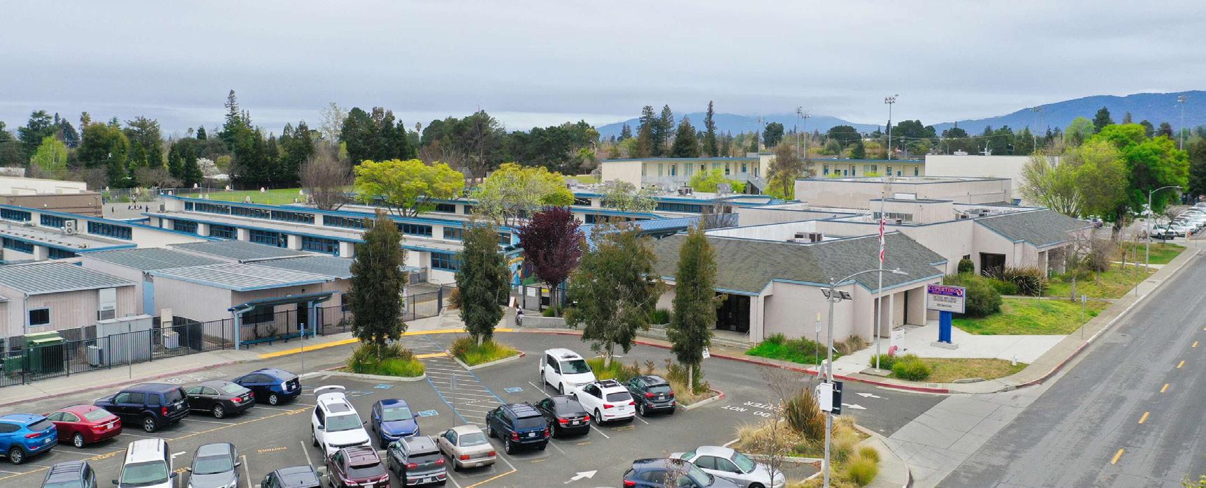
Security & Accessibility Upgrade at 14 Elementary Schools
Client: Cupertino Union School District
Project Cost: $3,000,000 Tier 1 + Tier 2
T.B.D. Tier 3
Project Site: Eisenhower Elementary School
Blue Hills Elementary School
CUSD Bid #: 24-B04-01
Delivery Type: DBB
Gen.Contractor:DRYCO
DSA File #: 43-13
DSA Appl. #: 01-121511
Nelson S. Dilworth Elementary School 01-121512
Christa
Garden Gate Elementary School 01-121474 Stevens Creek Elementary School 01-121473 West Valley Elementary School 01-121475
Chester W. Nimitz Elementary School 01-121456
Montclair Elementary School 01-121515
Louis E. Stocklmeir Elementary School 01-121596
Abraham Lincoln Elementary School 01-121595
DSA Reviewer: Yawen Lin - Fire Life Safety Plan Review
Michael Park - Accessibility Plan Review
Edward Mei - Structural Safety Plan Review
DSA Office: Oakland
DSA Approval: Feb 2024
Consultants: U&R Civil Engineers and Surveyours, Universal Structural Engineers, LLC
Contribution: CD & DSA Review Produced entire CD set, formatted and submitted per DSA PR14-06 procedure, and addressed comments and facilitated the permit process per DSA reviewers request in a tight schedule.
Consultant Coordination Coordinated, reviewed and marked up consultant drawings to ensure compliance with project design intent.
Construction Administration Represented the firm during bid-walk, introduced project details to contractors, answered RFIs, issued Addendums, reviewed submittals and shop drawings, attended weekly OAC meeting.
As-Built Document Researched and collected from District the DSA Application # and history approved drawings for 14 sites.
Client Communication Designed the fence while constantly communicating clients' needs and concerns throughout the project.
Sample Drawing
Fire Life Safety - Illustrative Site Plan - Collins
Rendering - East Entrance - Nelson Dilworth
Photo - Field Entrance - Collins
Rendering - Main Entrance - Christa McAuliffe
Photo - West Entrance - Montclaire
LONGWOOD ELEMENTARY SCHOOL MODERNIZATION
Comprehensive
Modernization of Longwood Elementary School
Client: Hayward Unified School District
Gen.Contractor:OVERRA Construction
Project Cost: $10,000,000
Project Site: Longwood Elementary School
Project Phase: PHASE 1 - 7 Buildings
PHASE 2 - 4 Buildings Relocation
PHASE 3 - New Playground Structure
DSA Reviewer: Mario Serrano - Fire Life Safety Plan Review
John Chavez - Accessibility Plan Review
Romella Edgmon - Accessibility Plan Review
Hareesh Daryani - Structural Safety Plan Review
Delivery Type: DBB
Cons. Manager: TRIGroup, Inc.
DSA Approval: Nov 2023
DSA File #: 1-13
DSA Appl. #: 01-120728
DSA Appl. #: 01-121103
DSA Appl. #: 01-120336
DSA Office: Oakland
Consultants: Universal Structural Engineers, LLC . Belden Consulting Engineers . H&M Mechanical Group . Brio Engineering Associates
Description:
Contribution: New construction and major modernization of four new modular portable classroom buildings, new play structures, major modernization to the 7 existing 2-story buildings, renovate elementary school classrooms, renovate administrative areas and multi-purpose cafeteria/kitchen areas.
CD Set & DSA Review Reproduced the Construction Document (CD) set to meet DSA standards, addressing reviewer comments and facilitating the permit process through close coordination with DSA reviewers.
Construction Administration Managed RFIs, drafted ASKs, and reviewed submittals and shop drawings to ensure project specifications were met, contributing to the successful execution of the construction phase.
Color Material Board Created and presented the color material board to the Construction Manager (CM) and District, ensuring the selection aligned with the project's goals and budget, maintaining design integrity and budget.
Rendering - Building G Lobby
IEEEP PRESCHOOL MODERNIZATION
Refreshment of 5 TK Preschool Sites at Hayward Unified School District
Client: Hayward Unified School District
Gen.Contractor:OVERRA Construction
Project Cost: $5,000,000
Project Site: Eden Garden Elementary School
Delivery Type: DBB
Cons. Manager: TRIGroup, Inc.
DSA File #: 1-13
DSA Appl. #: 01-121239
Palma Ceia Elementary School 01-121241
Ruus Elementary School 01-121593
Helen Turner Children's Center 01-121542
Park Elementary School 01-121540
DSA Reviewer: Duong Nguyen - Fire Life Safety Plan Review
Karlene Gullone - Accessibility Plan Review
Miroslav Sekel - Structural Safety Plan Review
DSA Office: Oakland
DSA Approval: Apr 2024
Consultants: U&R Civil Engineers and Surveyours . Universal Structural Engineers, LLC .
Belden Consulting Engineers . H&M Mechanical Group . Gates and Associates
Contribution: CD Set & DSA Review Re-produced rigorously the entire CD set due to lack of drawing quality and design development, improved to DSA standard, submitted DSA-1 & REG form for project application, formatted and uploaded submittals per DSA PR14-06 requirements.
DSA OTC Meeting Represented the firm to attend DSA OTC Meeting at Oakland Office, addressed comments on-site and stamped out the same day.
DSA Pre-APP Meeting Submitted DSA-93 Form and scheduled pre-application meeting with DSA reviewers, coordinated with consultants in the meeting to determine the review requirement.
Construction Administration Represented the office to answer RFIs, issue Addendums and CCDs, reviewed submittals and shop drawings.
Site Surveys Conducted rigorous site measurements to verify in field for accessibility compliance due to code changes since 1950s, and determine the need for bringing up to current code requirement.
Coordination Compensation Fetched up inadequate early phase communication with CM, District and consultants proactively to ensure alignment with design goals and scope budget.
Rendering - Helen Turner Children Center - Playground
Photo - Ruus Elementary School - Entrance
Photo - Palma Ceia Elementary School - Entrance
Drawing Sample - Site Plan - Palma Ceia Elementary School
KITCHEN UPGRADE AT CUPERTINO USD
Refreshment of 4 Middle School Sites at Cupertino Union School District
Client: Cupertino Union School District
Project Cost: $1,000,000
Project Site: Cupertino Middle School
Delivery Type: DBB
DSA File #: 43-13
DSA Appl. #: 01-121660
Hyde Middle School 01-121661
Miller Middle School 01-121662
John F. Kennedy Middle School 01-121663
DSA Reviewer: Fire Life Safety Plan Review
Accessibility Plan Review
Structural Safety Plan Review
DSA Office: Oakland
DSA Approval: Aug 2024
DEH Permit: Department of Environmental Health, County of Santa Clara
Consultants: U&R Civil Engineers and Surveyours . Universal Structural Engineers, LLC . Belden Consulting Engineers . H&M Mechanical Group . True Manufacturing Co.
Contribution: CD Set & DSA Review Produced rigorously the entire CD set, improved to DSA standard, submitted DSA1, DSA3 & DSA1 REG form for project application, DSA 95 for project re-schedule, formatted and uploaded submittals per DSA PR18-04 requirements.
DEH Pre-App Meeting Scheduled pre-application meeting with DEH reviewers, coordinated with consultants in the meeting to determine the review requirement.
DSA OTC Meeting Represented the firm to attend DSA OTC Meeting at Oakland Office, addressed comments on-site and stamped out the same day.
DSA Pre-APP Meeting Submitted DSA-93 Form and scheduled pre-application meeting with DSA reviewers, coordinated with consultants in the meeting to determine the review requirement.
Construction Administration Represented the office to answer RFIs, issue Addendums and CCDs, reviewed submittals and shop drawings.
Site Surveys Conducted rigorous site measurements to verify in field for accessibility compliance due to code changes since 1950s, and determine the need for bringing up to current code requirement.
Coordination Compensation Fetched up inadequate early phase communication with CM, District and consultants proactively to ensure alignment with design goals and scope budget.
Photo - Cupertino Middle School - Entrance
Photo - Kennedy Middle School - Entrance
Drawing Sample - Site Plan - Kennedy Middle School
OUR LADY OF LA VANG PARISH CAPITAL PROJECT
Phase II - Chapel Addition at City of San Jose
Client: Diocese of San Jose
Project Cost: $50,000,000
Project Site: 389 E Santa Clara St, San Jose, CA
Building Permit #: HP19-009
Planning Permit #: SP19-028
Consultants: U&R Civil Engineers and Surveyours . Universal Structural Engineers, LLC . Belden Consulting Engineers . H&M Mechanical Group . CARDUCCI Associates
Description:
The Our Lady of La Vang (OLLV) Parish Capital Project in downtown San Jose, California is a $50 million joint project between the Diocese of San Jose and the parish. The project aims to replace the parish's church after it was damaged in a fire in 2012. The new church is 17,660 square feet and have a seating capacity of around 1,240 people. Phase 2 will be a 1,250 square foot Chapel enclosed from the South-east corner of the Church. There will be a multi-purpose hall with a gymnasium and four classrooms that shared by the school and parish as the Phase 3 part of the project.
Contribution: Design Lead As the Design Lead for the Project, I played a pivotal role in guiding the project through its various phases, demonstrating strong leadership and exceptional project management skills.
Code Analysis & SD Led the code analysis and schematic design phases, ensuring the project is a highly-articulated space.
Civil & Landscape Coordinated with civil and landscape consultants to address bio-retention and stormwater treatment, and utility trenching in the plaza area.
Structure & Mechanical Worked with structural and mechanical consultants to solve the structural and HVAC challenges of the sloped roof system.
Electrical & Lighting Collaborated with lighting and electrical consultants to design the lighting equipment and skylights.
Product Specifications Contacted product manufacturers for ceiling, flooring, wall panels, doors, skylights, etc. for detailed product cutsheets and specs and collaborated with the Spec writer to create precise spec for the permit set.
CD Set & Details Drafted all construction documentation, including intricate details for wall partitions, ceiling system, roof, door and window, to ensure compliance with building permit requirements.
REVIT Office Standard Established the office Revit standard, using this project as a template to streamline future projects.
Sample Drawing - Construction Plan
Rendering - Section Perspective
Rendering - Interior Perspective
Rendering - Section Perspective
Rendering - Exterior Perspective
014-061-70 & 014-072-050 1
RAILROAD AVE RESIDENCES
75-Unit Luxurious Townhouse Complex at South San Francisco
Client: HISENSE Group
Project Site: 500 Railroad Ave, South San Francisco, CA
Consultants: U&R Civil Engineers and Surveyours . Universal Structural Engineers, LLC . Gates and Associates
Description:
Contribution:
The Railroad Ave Residences project is a residential development featuring five clusters of buildings, totaling 75 units. The project is located on a sloped, narrow site, presenting unique design and construction challenges. The development aims to offer modern, comfortable living spaces while maximizing the use of the challenging terrain.
Cluster 1 Design Given its prominent location on the main traffic avenue, designed Cluster 1 to serve as a visual landmark or "billboard" for the entire develop-ment, ensuring it stood out and attracted attention. Created visually appealing architectural elements that aligned with the over-all aesthetic of the project.
Cluster 3 & Cluster 4 Was responsible for the complete design and detailed documentation of Clusters 3 and Cluster 4, addressing the challenges posed by the sloped, narrow site to create functional and aesthetically pleasing living spaces.
Site Challenge Navigation The sloped, narrow nature of the site required innovative design solutions to optimize space and functionality. Employed advanced modeling and rendering techniques to visualize and resolve these challenges effectively.
Comprehensive Involvement From initial schematic design planning to the final package of planning development, ensured that each cluster met the project's high standards for quality and coherence within the overall PD Package.
WARD VILLAGE
40-Storey Residential High-Rises - Block B, Block N-West & Block H
Client: Howard Hughes Corporation
Gen.Contractor:Albert C. Kobayashi Inc.
Project Cost: $ 1,300,000,000
Project Site: 1108 Auahi St, Honolulu, HI
Consultants: Sub-Contractor - 1st Look Exteriors,
Green Wall Manufacturer - Grenn Living Technologies
Landscape Architects - Green Living Technologies
Description:
Situated between Downtown Honolulu and Waikīkī, Ward Village is a 60-acre community offering a blend of urban and island living. It features exceptional residences, unique shopping, dining, entertainment, and outdoor spaces. Ward Village boasts a diverse array of residences, shops, a globally inspired food scene, and various indoor and outdoor activities. This vibrant community invites you to discover favorite spots, hidden gems, and new experiences, combining urban conveniences with island luxuries. Parks within and around Ward Village offer a balance to city life, providing outdoor sanctuaries for residents and visitors to connect with nature and each other. Enjoy movie nights on Honolulu’s biggest screen, sports, arcade games, and contemporary public art, including murals and sculptures. The neighborhood hosts numerous community events, offering something for everyone to enjoy and experience the aloha spirit.
Contribution: Construction Documentation Details Design & Drafting Schematic Design
Facade Design Client Communication Presentation Package
Drawing Sample - Building Plan - Block B Penthouse Unit Plan
Photo - Block B Penthouse Living Room
Photo - Block B Penthouse Bathroom
Photo - Block B Penthouse Living Room
Photo - Block B Penthouse Kitchenette
THE CREAMERY
38-Storey Residential, Retail Mixed-Use High-Rises
Client: Tishman Speyer
Project Cost: $ 500,000,000
Project Site: 655 Fourth St, San Francisco, CA
Description:
The project involves constructing two 39-story apartment towers, marking a significant shift from the previously approved plans for the SoMa location. In collaboration with Tishman Speyer, our design for these twin high-rises features 1,148 apartments, replacing three low-lying commercial buildings. This 1.1-million-square-foot project includes 9,450 square feet of ground-floor retail space and provides ample parking for 283 cars and 427 bicycles. The 400-foot towers will rise from an 11-story, square-shaped podium topped by an inset balcony surrounding a central courtyard. Our design also incorporates a landscaped plaza surrounded by shops and restaurants, creating 7,740 square feet of privately owned public open space at the corner, with new trees lining 4th and Townsend streets. The two high-rises, built on 1.6 acres, will include a mix of 287 studios, 415 one-bedroom, 409 two-bedroom, and 46 three-bedroom apartments, with 138 private balconies, offering a variety of living spaces to meet diverse residential needs. This project showcases our commitment to integrating modern design with community-oriented public spaces, enhancing the urban living experience in San Francisco.
Contribution: Details Drafting Schematic Design Facade Design Presentation Package
Drawing Sample - Podium Unit Layout
Drawing Sample - Ground Floor Layout
ROCK DRILL RINO
Adaptive Reuse of Historical Industrial Campus Into Mix-used Complex
Client: Oliver Buchanan Group / Weisse Family
Project Cost: $ 300,000,000
Project Site: 1648-1798 E 40th Ave, Denver, CO
Description:
Rock Drill RiNo is a $300 million mixed-use development project located in the heart of Denver's vibrant River North (RiNo) district. This transformative project blends historical preservation with modern urban design, aiming to create a dynamic space for work, living, and leisure. The development includes 422,000 square feet of office space, 65,000 square feet of retail space, and 175 hotel rooms. The design seamlessly integrates new structures with the restoration of existing historical buildings, maintaining the unique industrial character of the area while introducing state-of-the-art facilities. Key features of the Rock Drill RiNo project include a diverse mix of commercial spaces, retail outlets, and hospitality venues. The project will offer a range of amenities designed to foster community engagement and enhance the overall urban experience. Outdoor spaces, green areas, and public gathering spots are thoughtfully incorporated to promote social interaction and a sense of community.
Contribution: Denver Design Charette RFP Package Grasshopper Matrix Calculation
Hand Sketch - Design Concept Diagram
Site Analysis Diagram
POMONA COLLEGE
Pitzer Center for Athletics, Recreation and Wellness
Client: Pomona College
Gen.Contractor:C.W. Driver Companies
Project Cost: $57,000,000
Project Site: Alexander, 550 N. College Ave., Claremont CA
Project Award: LEED Platinum
Contribution:
Contribution:
Pacific Coast Builders Conference Gold Nugget Awards
The Pomona College Center for Athletics, Recreation and Wellness (the Center) is a comprehensive programmatic renewal, renovation, and addition to a facility that has served the campus since 1950. Formerly known as the Memorial Gymnasium, the building occupies an important site adjacent to the campus’s historic Marston Quadrangle, its mature oak trees and architectural context of transitional arcades, loggias, and portals directly inspiring the design of the Center.
Construction Document Signage Design and Presentation
LILIA WAIKIKI
28-story of A Modern Living Experience Blending Elegance and Comfort
Client: Oliver McMillan Group
Gen.Contractor:Nordic PCL Construction, Inc.
Project Cost: $150,000,000
Project Site: 2380 Kūhiō Ave., Honolulu, HI 96815
Contribution:
Contribution:
Līlia Waikīkī is a 615,000-square-foot, 28-story residential tower located in the heart of Waikiki. Developed in conjunction with the Queen Emma Land Trust, the project offers 402 apartments, 20 percent of which are affordable units, ranging from studios to three bedrooms. The tower respects the mauka-makai axis and is wrapped with a façade of punched windows to relate with the existing urban fabric. A glass volume breaks through the center of the tower, opening the interiors to views towards the mountains and the ocean.
Construction Document Design and Presentation Package
Diagram - Second Floor Axonometric
Diagram - First Floor Axonometric
C
THE WINERY
THE MISSION AFTER GAS
Integrated Design Studio: Mass Timber Effect
Instructor: David Jaening
UC Berkeley, San Francisco, Fall 2022
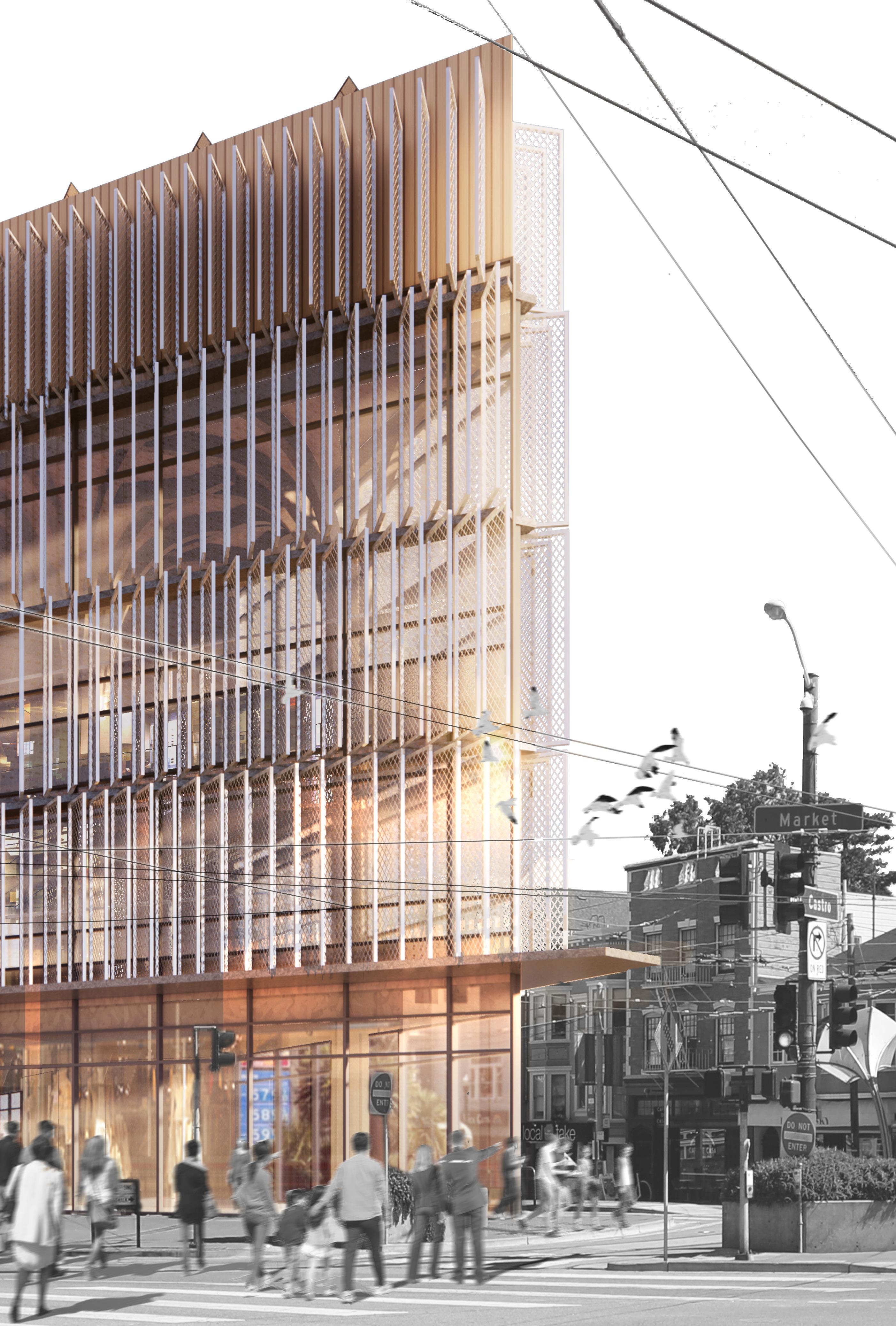
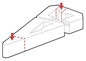
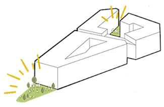
There’s a lot going on at the Chevron on 2399 Market Street, even by the agitated, animated standards of a gas station. The roughly triangular site at the pivot point between The Mission, Duboce Triangle, Hayes Valley, Civic Center, Mid-Market, and SOMA, reflects nearly every attempted method (curves, angles, cul-de-sacs, intersections) of commingling San Francisco’s two oblique grids. One of the things laid bare by the awkward resolution of this incredibly loaded urban condition is that nobody could think of anything better to do with it than put a gas station. The persuasion of car culture and the urban infrastructures built around it have made the gas station at sites like these the best, highest use. But that’s about to change.
An overwhelming consensus of experts identify ‘beneficial electrification’ as the future path of urban sustainability. Charging is the baseline, but what are the other opportunities that it requires, or affords? Most gas stations occupy critical locations (usually corners) on urban blocks, meaning we need a coherent urban planning strategy about what goes where in order to fulfill and augment the non-fueling services of gas stations. It’s also important that these locations not just become fenced off remediation sites. Planning for obsolescence requires planning for the subsequent reemergence.
In this studio, we will approach a gas station site on Market Street in San Francisco, facilitating their metamorphosis into something more resilient, more sustainable, more integrated. We will be proposing new Centers of Community Resilience, addressing the needs of vehicular infrastructure, and advancing social infrastructure from where the stations left off.
Third Floor Wine Tasting Area & Wine Market
Event hall has higher clearance, with one and half times of normal floor height. The higher space allows flexibility for customized client event needs, such as building a temporary stage. Usually, the space serves as another wine tasting area.
39. Wine Tasting Area 40. Wine Market 41. Kitchenette 42. Tasting Room
VIP Room
Dining Terrace
Elevator Mechanics
Machine Room
Water Tank
Guest Elevator Hall
Wine Production
Wine Laboratory
Kitchenette
Second Floor Event Hall
Structure Axonometric
Typical Fog Capture Panel Elevation
01. 3sqm Fog Net
02. Water Gutter
03. Aluminum Tube
04. Hose Nozzle
05. Hose 1,3m
06. Hose Clamp
07. Fog Water
08. Collected Water
09. Wind Direction
10. Net Pattern
Facade Design Illustration
Interior Environmental Design
The courtyard is both the core of ventilation and daylight. In passive and active ventilation, air flows from the surrounding facade to the courtyard. Both ways reinforce each other, giving better result in ventilating air. The courtyard also introduces natural daylight into the center of the building. And the lower southern part of the building gives way for more sunlight. Fog capturing nets on south facade provide shading for interior, preventing the space from overheat. The B1 level garage has no active ventilation for a ramp opening to ground level can be the fresh air importer.
Analysis
Daylight Illuminance(UDI) Analysis
Interior Environmental Analysis
is the
Daylight Factor(DF)
Daylight Factor(DF) Analysis
Annual Glare(DG) Analysis
Useful
Analysis
The entire MEP system is arranged around the courtyard and three building shafts. The building adopts under-floor air distribution system, where air is transported to various locations by fans under-floor. Air Handler Unit is located in the central core. So as the water system. All the pipes and ducts come from and go back to the shafts.
1/2" = 1'-0" Trunk Model of Altrium and North Building
Facade Panel Detail
Frame Detail
2% Rigid Insulation
Flat Rigid Insulation
3mm Membrane
Roof Drainage Pipe
Parapit Cover
Parapit Rigid Insulation
Timber Wall
3mm Waterproof Membrane
Roof Gutter for Stormwater
Clip for Fog Capture
16. Angle Iron Connector for Beams
Glulam Column
Glulam Column
Timber Grid Drop Ceiling 11. Angle Iron Connector for Rim Beam
Exterior Thermal Insulation 13. Gutter for Fog Capture Collected Water
Sloped Pipe for Fog Captured Water
Fog Capture Fiber Net 20. Timber Flooring
120mm Flooring Panel Paddle
Aluminum Window Frame
Timber Window Sill Plate
1/2" = 1'-0" Trunk Model of Slab and Column Assembly
OYSTER TECTURE
Living, Productive, Self-Iterated Shoreline of Reefs, Wetlands, Marshed and Shipwrecks Defending Sea Level Rise
Thesis Seminar and Studio ARCH204b Thesis Studio Instructor: Rene Davids, Gail Brager University of California, Berkeley, Spring 2023
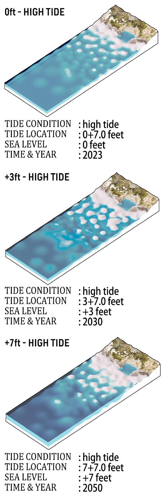
Rather than embracing the San Francisco government's proposal to construct a seawall to safeguard the city, this thesis explores a more nuanced, gentle approach to coastal protection. This method could serve as a replicable model for other shoreline cities. Simultaneously, this approach could generate revenue, create job opportunities, and spawn new public spaces for residents. This turns the concept of a "seawall" on its head: instead of being a costly imposition on the city, it becomes a catalyst for community growth and revitalization.
"San Francisco Archipelago"
Seawall
San Francisco Seawall Program
Subtler?
Options
"Architecture" (Infrastructure) Kills
Pier 90s
Here we have the mapping of "San Francisco Archipelago", showing what San Francisco will look like with 50 feet of sea level rise. With this amount of sea water there will no longer be "Bald Area", instead, San Francisco will become a series of archipelagoes, floating on Pacific Ocean, with over half of existing land drowning in sea water Spector 2012) Again, this drawing is another exageration, tryng to arise public awareness of urgency of preventing sea level rise.
This drawing fantasizes an image of exagerated future -- if we let infrastructure grows without limitation, will there be one dalJ, where a piece of infrastructure is of the size of a planet? Same as the first drawing, the blue rectangle means anlJ form of possible infrastructure. (Love, Death & Robots Volum I Episode 14 'Zima Blue', 2019) By Producing this drawing, I'm truing to rise public awareness on nowadays unlimited infrastructures. What I'm thinking of, to substitute existing giants, are subtler ways while achieving the same effect.
Here "Architecture", more specifically, infrastructure. Infrastructure "kills" people by poor housing condition, unsatisfactory public sanitation, polluted breathing air and drinking water, rising crime rates, and so on. So harmful infrastructure can actually kill the people forced to stald in the neighbourhood. In the drawing, the blue rectangle metaphors any piece of mega infrastructure (2001: A Space Odyssey, 1968), the man is shaded in blue, meaning he has already been "poisoned" by the infrastructure.
I choose pier 80 96 for there are concentrated vacant spaces and existing greeneries for further development. The right part of the drawing is a zoomed in mapping of Pier 80 96, showing what's existing on site now, and giving information on the site context.
Oyster Shells As Construction Material
`Growing My Own Oysters
Massing Formation - Cluster
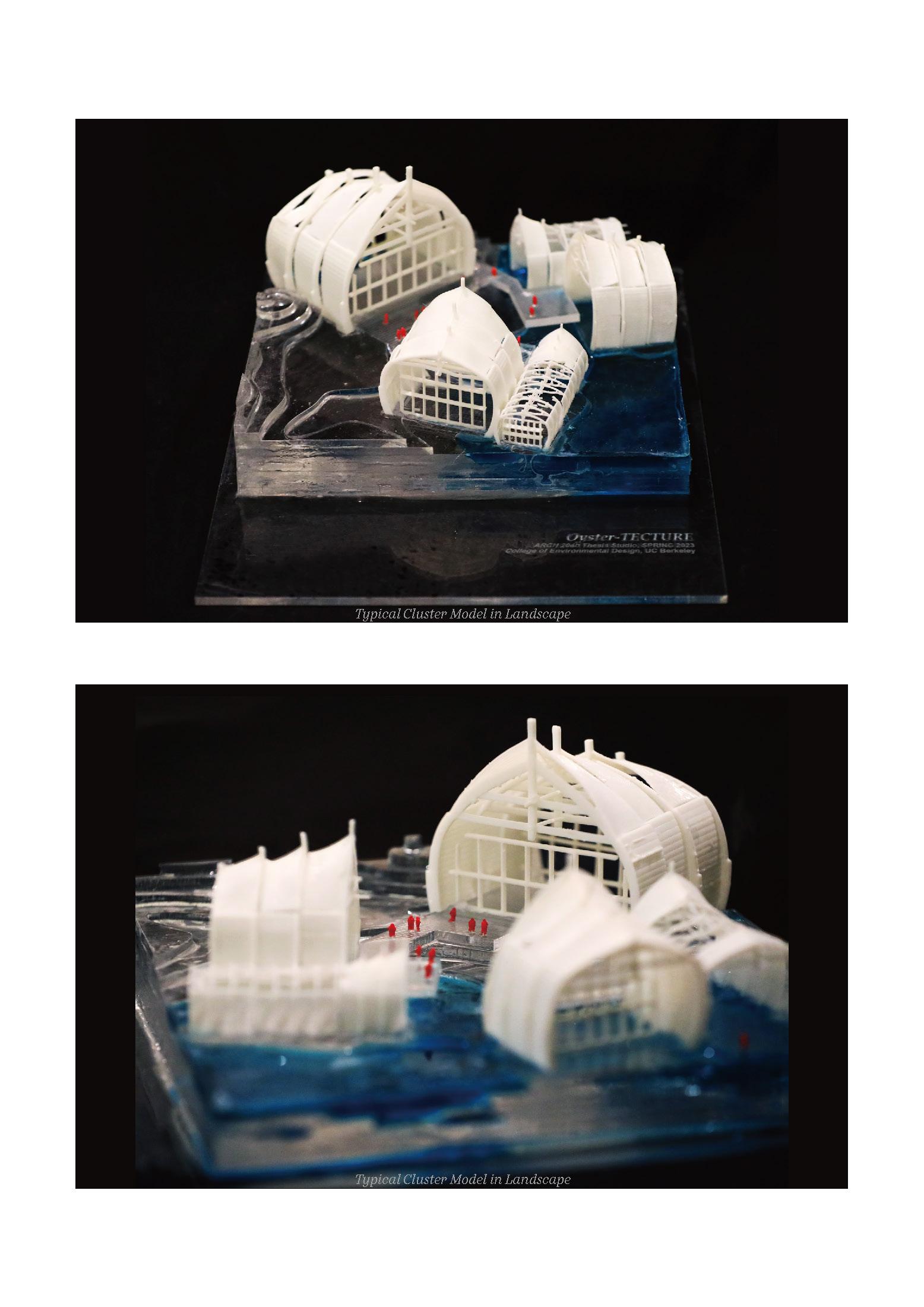
The logic of forming the massing of entire project is modularised duplication. Basially, three pieces of boat sections form a cluster, each will be 120 degree from each other. And the architecture is continously duplicated and grown in the unit of clusters.
The sections is connected with platforms with different elevations, as the public gathering spaces for visitors. And platforms is connected by pedstrians across the entire landscape allowing visitors to wander around and take a glimpse of the beauty of natural coastal shorelines.
Interior Renderings - High/Low Tide
When tides are higher, some of the buildings will be partially merged into seawater, giving customers an unique experience of habitating under sea level and an opportunity of having a glimpse of marine world.
With constant changing of tide levels, the water outside window is constantly changing, as a reminder of the existence of sea level rise to raise public consciousness of protecting the world we are living in.
Different levels of floors and backing floor edges allow spaces of double floor heights to be the program of the entrances, welcoming counters, etc..
The both ends of sections are glazing curtain walls, as an entire reveal of views of the marine and landscape sceneries.
THE GREENWAY II
A FOOD CYCLING LANDSCAPE HEALING URBAN FABRIC
Architecture & Urbanism Studio: JUST Architecture Instructor: Rene Davids UC Berkeley, Oakland, Fall 2020
Our project site links infrastructurally and systemically to the I-880 Freeway system as it runs through the City of Oakland, California. Drawing upon this existing physical artifact intertwined with immediately adjacent structures, networks, systems and social histories within the city, we will propose a new building insertion intended to help more justly integrate existing and newly proposed infrastructure into the immediate local life of the adjacent neighborhoods.
This once elegant street reveals many of the social, political, economic and physical/ infrastructural dynamics that have shaped Oakland and many other cities over the past century. I-880 slashes across Broadway just as it approaches what was once the bustling commercial waterfront of the city. As architects, we will engage these questions in the medium of our own discipline’s work--through drawing and building design, in the belief that we can address large questions, not before or outside of architecture, but within--not architecture plus, just architecture.
Axonometric Section of Restaurant Altrium
Shipping Container Assembly Construction Proposal
Rendering of Pedestrian
COLD MOUNTAIN
ADAPTIVE REUSE OF A HISTORICAL COLLECTIVE HOUSING HERITAGE
Architectural Design Studio: Arthouse Cinema Instructor: Penny Lewis Wuhan University, Fall 2018
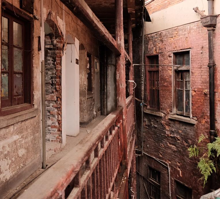
“What more important than the design of architectures is the design of their decay”. As big cities grow, aged buildings are being abandoned – their out of dated attached infrastructural equipment no longer satisfies updated needs – rapidly, too rapid for a thorough purge, thus lots of tiny emptiness merged downtown in the past century. Like a set of void in metropolis crowded context, emptiness in metropolis is not empty though, that each void can be used for every program as an effort for insertion of diversity that stands out in both urban activity and texture.
Cold Mountain, the project that adaptively reuse of Banaux House into an Arthouse Cinema, was previously a void in metropolitan solid, however, a valuable one. Banaux House was built by Russian noble Banaux Brothers during colonization in the early 1900s: the old brick and wood amalgam ended up in ruin simply because they are no longer needed, physically, while emotionally they are carrying memories of generations of residents, and has been regarded as nostalgia symbol of the city’s prosperous ages long before rotten.
Birds Eye View Exterioe Rendering
THE GREENWAY
AN VERTICAL PEDESTRAIN INTERWAVED INTO A HIGH RISE
Architectural Design Studio: High Rise On Campus Instructor: Penny Lewis University of Dundee, Spring 2020
“Globalization gives virtuality to real buildings, keeps them indigestible, forever fresh.” Globalization, one of the inevitable results as ultra-long distance optical fiber brings communication into millisecond age, mega multinational firms come into being, accompanied by reinforced concrete high rises taking up public void in metropolitan centers. The Greenway, a high rise office building for a mega high-tech Inc., is the result when architecture, given globalization, stretched, pushed beyond its impossibility to the point of transformation. Wrapped by a vertical spiral park-like public greenway, the formal core of the office building is actually going through generic engineering to produce a completely new architectural system: the infrastructural project aims a montage of maximum possibility collected from any points, lifted from any context, cited from any ideology. The site is located near the main entrance of WHU, thus compared to centralcampus sites, more citizens visit here. Actually, it is been used as a public park for years where people take a walk with their dogs, have a sit, jog, etc. Thus, the high-rise should not deprive people of a public space, instead should give something more back to them.

Timber Flooring Decks
Aluminum Supports (Duct)
Moisture Insulation (2% Slope)
Thermal Insulation
Concrete Waffle Slab with Vaper Barrier
Marble/Carpet Flooring
Thermal Insulation
Moisture Insulation
Concrete Waffle Slab with Vaper Barrier
Ceiling Panals
Exterior Low-E Glazing Panels
In-between Space
Interior Operable Windows
Ventilation Lourve
Floor and Facade Assembly Rendering
Typical
Greenway Floor Slab
Typical Floor Slab
Typical Building Envelope
THE MILESTONE
NEWLY EMBEDDED INDUSTRIAL EXHIBITION BRANCH OF VICTORIA&ALBERT MUSEUM AT WUHAN
Architectural Design Studio: V&A Museum
Instructor: Mike Findlater
University of Dundee, Spring 2019
120 years ago, a generation of conceptual breakthroughs and supporting technologies unleashed an architectural Big Bang. By randomizing circulation, short-circuiting distance, artificializing interiors, reducing mass, stretching dimensions, and accelerating construction, the elevator, electricity, air conditioning, steel, and finally the new infrastructures formed a cluster of mutations
that induced another species of architecture. The combined effects of these inventions are structures taller and deeper – Bigger – than ever before conceived, with a parallel potential for the richer organization of the social world. “Bigness is no longer part of any urban context.”, indicating something revolutionary occurs in bigness.
Milestone, Victoria&Albert Museum Wuhan Branch, acquires the properties of Bigness. In "Delirious New York“ "Theory of Bigness” is brought up: Big Buildings acquire autonomy for distance between core and envelop increases to the point where façade can no longer reveal what happens inside, causing doom of expected “honesty”. That’s why I dismantle Milestone layer by layer, skin, flesh, bones, veins. Apart from a sense of nostalgia flashback to prosperous Industrial Revolution Age, reobtaining “honesty” in a Big Building is what I want to achieve. When people walking through the sculpture-like milestone on rusted copper grids, will there be faintest hint of “another” Big architecture?
A METABOLISM SELF-PRODUCTIVE CITY FILTERING WATER OF THE EAST LAKE
Architectural and Urbanism Design Studio: City on the Lake
Instructor: Takayuki Suzuki
University of Dundee, Fall 2019
VIVA LA VIDA
Modernism’s promise of transforming building quantity into living quality has been a failure. High density reinforced concrete “forest” insulated from mere meaning of a “forest”, only brings catastrophic experience for its dwellers. What ever happened to 20th century urbanism? Is there a new form of urban expansion that we could refer to? What if we simply define our relationship
with city not as its makers, but just as its mere subject?
Viva La Vida is a city constructed on the lake, self-feeding organic complex, compared to a lifeless concrete, steel, pollution cluster, it’s more like a mega Metabolism life form, a new typological tryout of ecological urbanism city of nature, where plants, animals, human beings live together in this utopian enterprise.
FADED IN DOWNTOWN
A BOUTIQUE HOTEL PROVIDING GETAWAY DESTINATIONS IN THE MIDDLE OF DOWNTOWN
Architectural Design Studio: Boutique Hotel + ?
Instructor: Rowan Patrawen Wuhan University, Fall 2020
To create a wonderland with mountain, water and plants for those who wants to get away for busy urban life is the concept of the Boutique Hotel. At the same time, adding a brand new architecture vocabulary to the traditional building style of old Hankou District.
The facade facing street is pure in geometry, in comparison with the complicated decoration of traditional Western architecture. The other side, however, is rich with a Japanese Garden and waterland on different latitude. In contrary, street facade has appealing color red, while the garden side is more quiet.
With above, the whole building is in great contrast but harmonious, providing an opportunity for city dwellers to take a break and enjoy quiet life in most prosperous street of Wuhan.


