

OVER
Marilyn Lightstone, luminary veteran of stage and screen, continues her series of expressive readings of classic English literature with Frances Hodgson Burnett’s The Secret Garden. You may have read The Secret Garden as a child, but take it from Marilyn, it’s not just for kids! Rediscover the heartwarming story of young orphan Mary Lennox and celebrate the power of nature, friendship, and the human spirit.


ENHANCED SECURITY
MULTIPLE OPERATING STYLES
NUMEROUS CUSTOMIZATION OPTIONS
DURABLE AND LOW-MAINTENANCE STEEL CONSTRUCTION
DUAL-PANE AND TRI-PANE LOW-E GLASS OPTIONS
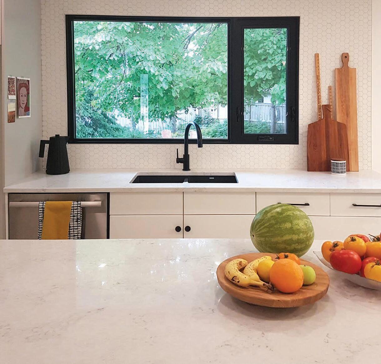
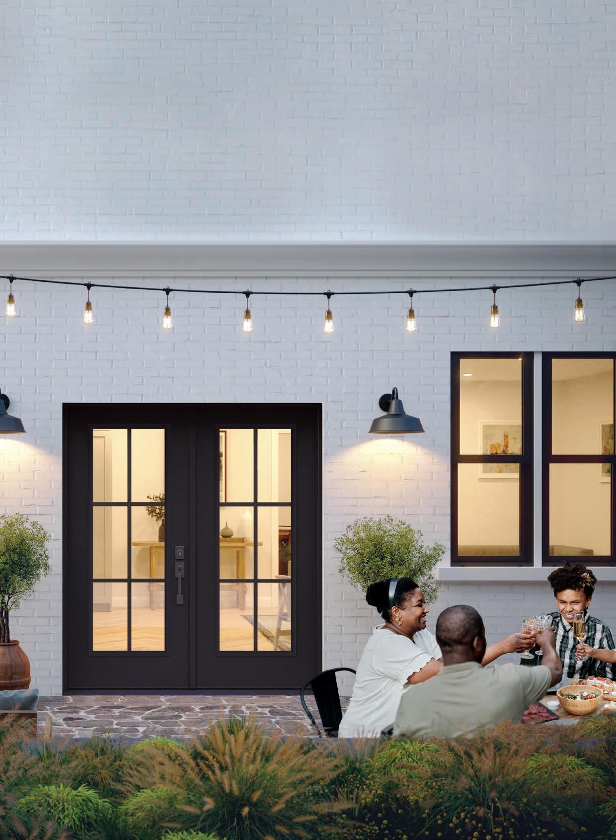
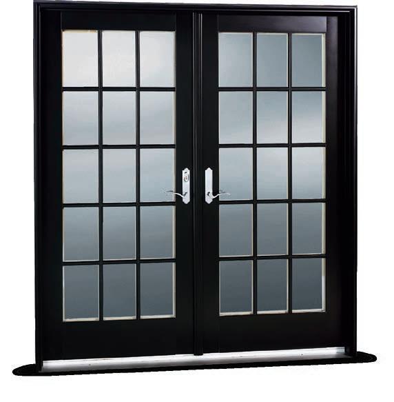
Canadians know the importance of soaking up as much sun and fresh air as possible during the warmer months, and now is the perfect time for you to do just that. JELD-WEN ® custom glass panel exterior doors offer exceptional benefits in terms of both style and performance allowing you to customize a remarkable French door look!
The increased glass surface means you can easily and effectively welcome in more natural light than other entryways. Since these exterior doors open nice and wide, they’re also able to seamlessly connect indoor and outdoor spaces, letting fresh air flow freely.
Complementing these wonderful features is their energy efficiency. You can count on JELD-WEN’s custom door options to deliver the same exceptional performance that you’ve come to expect from a consecutive ENERGY STAR ® Canada award winner.
19 HOME FINDS
Summer decor trends and inspiration
23 TOP 10
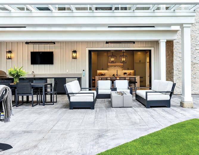
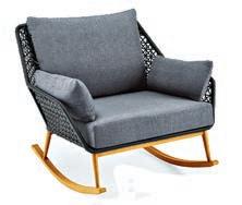
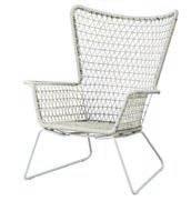
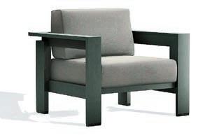
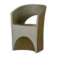
Outdoor seating for hot days and cool nights
26 AT HOME
Modern twist: Vintage allure meets contemporary elegance
34 HOME INSPIRATION
Mid-century modern design: How it continues to influence contemporary aesthetics
38 GET THE LOOK
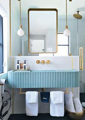
We share the luxe decor of the Dover George Hotel
58 DESIGNER’S EYE
Tips for creating a designated drinks area
30 DESIGN FILE
Red revolution: The unexpected allure of red theory in design
43 STYLE FILE
A Muskoka cottage gets a long-overdue rejuvenation
48 INTERIOR DESIGN
A designer re-works the interior of her pre-construction home
16 BIG STYLE
Deck and terrace decor tips
36 SPLURGE OR SAVE
Make every meal under the open sky a memorable occasion
40 SECLUDED SANCTUARY
A newly constructed family retreat blends classic architecture with modern elements
56 SUMMER TRENDS
Set your intentions for stylish outdoor spaces
64 BACKYARD BLISS
A water feature adds extra dimension to this backyard makeover
32 GARDEN LIFE
Budding ambition: Tips for the novice or hesitant gardener
60 IN THE GARDEN
Turn your garden into a drought-resistant oasis
52 BEFORE AND AFTER Dangers lurking within: Managing indoor airborne toxins
62 BASEMENT RENOVATION
A forgotten space that offers limitless potential

10 A NOTE FROM THE EDITORS Inside, outside / Summer lovin’
24 COVER STORY
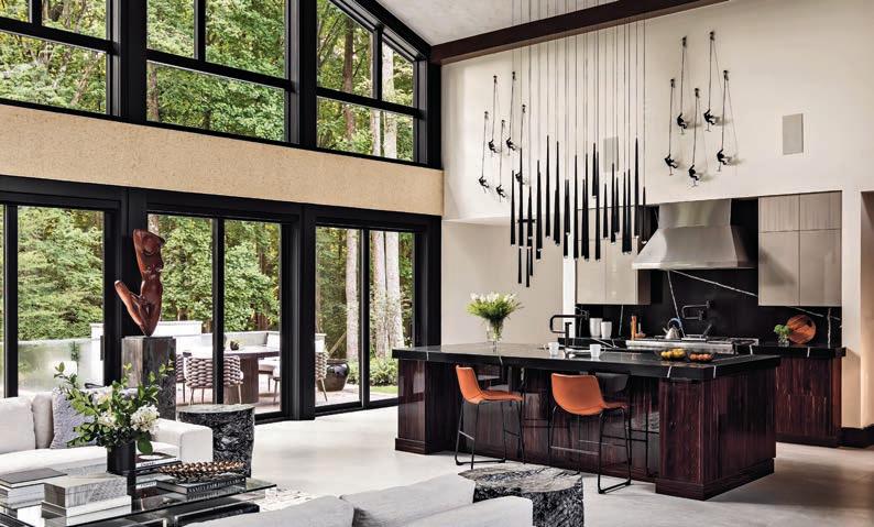
JELD-WEN JWC8500 series windows, a new era of energy efficiency, without sacrificing style
We wait all year for the warmth to come. Our long, and sometimes harsh winters have us dreaming of being outside under the clear blue sky, a canopy of green leaves and the hot caress of the sun. Sadly, that sun has become more foe than friend during times when its relentless heat drives us indoors to the cooling relief of air conditioning. In this issue, however, we still love to celebrate the joys of summer, with articles to enhance your outdoor space to make it a welcoming and
comfortable spot for entertaining, gardening or simply lounging the hours away. From a gorgeous, landscaped water feature and advice on how to style your backyard, to tips for novice green thumbs and trending al fresco furniture and accessories, you’ll find something to help you have fun in the sun, all summer long.
And if you’re not looking to update your outside, we have you covered on the inside as well. Check out a recent basement renovation that turned an empty, unused area into a stylish and functional living space; a couple of inspiring cottage
 MARLENE EISNER EDITOR, NATIONAL
renos that will get you thinking about finally upgrading your cosy lakeside retreat; and thoughts from designers on how mid-century modern design continues to influence contemporary home decor and aesthetics.
Grab a chair and a cold drink, flip through these pages, and prepare to be inspired, inside and out!
 PEPPER RODRIGUEZ CONTRIBUTING EDITOR, ALBERTA
Summer lovin’ happened at last (and no-prize if you get the reference, it just means you’re as old as I am), but the summer blockbusters are out, and I don’t mean just in the movies. Everything we love about the summer months for renovating our home is on full display in this issue, especially if you love your backyard as much as we do.
“Backyarding” is the buzz word of the season, and we give you all the reasons to enjoy your lawns and gardens in style and in the most environmentally sustainable way possible. In these pages, you’ll find a yard-full of expert advice and stories
on how to improve the look of your private outdoor areas.
My contribution this time around is looking at how to design a droughtresistant garden. I’m based in Calgary, Alberta, and it’s going to be a long hot summer here, with deepening concerns of a prolonged drought that will put lawn care in the backseat. But all is not lost, as there are simple ways to design your garden to be waterefficient and pretty enough to enjoy.
The key – as always – is to work with nature, rather than against it. Wouldn’t you love to get a buzz from drinking a cold beer in your yard instead of the buzzing from your lawnmower? Stay cool, DIYers, and enjoy your backyard.
Words you wouldn’t typically use to describe a contractor.
Until now.
At RenoMark, we want to change your outlook on renovation contractors.
That’s why we developed a code of conduct that all our professional contractors follow, including a detailed written contract for every job, backed by a one-year warranty, and a guarantee that you’ll hear back within two business days.
To find a reliable, committed, responsive contractor, visit RenoMark.ca
ARIDO ARIDO regulates interior designers in Ontario for the betterment of the profession and in the best interests of the public, sets education and experience standards for members, and advocates for the profession.
BILD With more than 1,300 members, BILD GTA is the voice of the home building, land development and professional renovation industry and is affiliated with the Ontario and Canadian Home Builders’ Associations. The Calgary region (BILDCR) works closely with various levels of government and stakeholder groups to ensure vibrant, established neighbourhoods and new communities in the region.


DDA The Decorators & Designers Association of Canada (DDA Canada) is a professional association that elevates the industry for design professionals, students and suppliers through education, events, training, advocacy and community building.
HAVAN The Homebuilders Association Vancouver is recognized as the leader in the homebuilding industry since 1974. Its knowledgeable, trusted and resourceful members build more than 65 per cent of Metro Vancouver’s homes.
IDC Interior Designers of Canada (IDC) is the national advocacy association for the interior design profession. representing more than 5,000 members, including fully qualified interior designers and related professionals.
NKBA The National Kitchen & Bath Association (NKBA) Ontario chapter was established in 1977 and is where industry members meet to learn what’s out there and what other members offer. The British Columbia chapter, formed in Jan. 1990, has a large provincial membership to facilitate member engagement, professional development and act as a consumer advocate for members, while being financially viable.
CANADIAN HOME BUILDERS’ ASSOCIATION Since 1943, the Canadian Home Builders’ Association (CHBA) has been “the voice of Canada’s residential construction industry,” with about 9,000 member-companies. The Edmonton-region branch engages and serves its core membership of builders, renovators, and general members by advocating on behalf of the residential construction industry in pursuit of members’ success.
RENOMARK RenoMark identifies professional contractors, custom homebuilders and trades who agree to abide by a professional code of conduct. RenoMark members are reliable, ethical and responsive.
SENIOR VICE-PRESIDENT, SALES, NEXTHOME
Hope McLarnon
416.708.7987, hope.mclarnon@nexthome.ca
DIRECTOR OF SALES, ONTARIO, NEXTHOME
Natalie Chin
416.881.4288, natalie.chin@nexthome.ca
SENIOR MEDIA CONSULTANTS
Amanda Bell
416.830.2911, amanda.bell@nexthome.ca
Merlyn Minty
204.782.8692, merlyn.minty@nexthome.ca
EDITOR – NATIONAL
Marlene Eisner
CONTRIBUTING EDITOR – ALBERTA
Pepper Rodriguez
EDITORIAL DIRECTOR
Amanda Pereira
CONTRIBUTING EDITOR – NATIONAL
Sara Duck
GARDEN EDITORS
Mark Cullen & Ben Cullen
CONTRIBUTORS
Brendan Charters, Jessica Cinnamon, Sara Duck, Paige Johnston, Trish Knight, Pepper Rodriguez, Anika Schachter, Eugenia Triandos, Nicole Varga, Alaa Yassin
EXECUTIVE MEDIA CONSULTANT
Michael Rosset
VICE-PRESIDENT MARKETING – GTA
Leanne Speers
MANAGER CUSTOMER SALES/SERVICE
Marilyn Watling
SALES & MARKETING CO-ORDINATOR
Gary Chilvers
VICE-PRESIDENT, PRODUCTION – GTA
Lisa Kelly
BUSINESS DEVELOPMENT MANAGER
Josh Rosset
DISTRIBUTION distributionteam@nexthome.ca
ACCOUNTING INQUIRIES
accountingteam@nexthome.ca
DIRECTOR OF PRINT MEDIA
Lauren Reid–Sachs
PRODUCTION MANAGER – GTA
Yvonne Poon
GRAPHIC DESIGNER & PRE-PRESS COORDINATOR
Hannah Yarkony
GRAPHIC DESIGNER
Mike Terentiev
Published by nexthome.ca
Advertising Call 1.866.532.2588 ext. 1 for rates and info. Email: info@nexthome.ca
Circulation Direct to households in select prime areas via Globe and Mail and Toronto Star newspapers. At thousands of high-profile pick-up boxes and racks in the GTA, select retailers and designer showrooms. Plus, top consumer and trade shows.
Canadian subscriptions 1 year = 6 issues – $45 (inc. HST)
Single copy price $6.95 (plus HST). Canada Post – Canadian Publications Mail Sales Product Agreement 43643067.
Copyright 2024 All rights reserved. All copyright and other intellectual property rights in the contents hereof are the property of NextHome, and not that of the individual client. The customer has purchased the right of reproduction in NextHome and does not have the right to reproduce the ad or photo in any other place or publication without the previous written consent of NextHome.
Editorial Submissions from interested parties will be considered. Please submit to the editor at editorial@nexthome.ca.

æ Sign up to receive digital editions and newsletters to your inbox!
Terms and Indemnification Advertisers and contributors: NextHome is not responsible for typographical errors, mistakes, or misprints. By approving your content and/ or submitting content for circulation, advertisers and contributors agree to indemnify and hold harmless NextHome and its parent company from any claims, liabilities, losses, and expenses (including legal fees) arising out of or in connection with the content provided, including but not limited to any claims of copyright infringement, unauthorized reproduction, or inaccuracies in the content. Advertisers acknowledge that they have the necessary rights, permissions, and licenses to provide the content for circulation, and they bear full responsibility for the content’s accuracy, legality, and compliance with applicable laws upon approval. Contributors acknowledge NextHome reserves the right to omit and modify their submissions at the publisher’s discretion.


With a vision for the future, a passion for design and numerous accolades, Jodabi Global Inc. continues to redefine living spaces, one project at a time

Jodabi, a leading authority in home design, building, renovations, custom homes, interior design, additions, real estate consultation and other services, caters to an exclusive clientele nationwide.
Its speciality lies in residential projects, where it offers exceptional value at a prescribed budget. Its hallmark is cutting-edge design, superior quality, and skilled craftsmanship, setting the standard for excellence in the industry. Established by visionary entrepreneurs with more than a decade of experience in construction and real estate, Jodabi began by revitalizing distressed homes in Toronto. Today, the company continues to serve a select clientele, offering innovative and customized
projects in residential and commercial real estate.
At the heart of Jodabi’s ethos lies the transformative journey of turning distress into interest. Renowned for exceptional project delivery, the team goes beyond the mere structure, crafting homes that epitomize sanctuaries of tranquillity and comfort. As a family-led endeavour, they prioritize exemplary customer service, translating dreams into tangible reality. They do this by meticulously understanding clients’ desires, ensuring each project is delivered with unparalleled quality, on time, and within budget. Regardless of the
property’s scale, location, or desired features, Jodabi is committed to making its clients’ dreams come true. Jodabi’s success is not solitary, but a result of invaluable partnerships forged with industry luminaries. Collaborations with architects, engineers and skilled artisans, along with trusted suppliers, ensure every project attains its quality and craftsmanship.
Jodabi recently celebrated a sweeping triumph at the prestigious RenoMark Awards in the Greater Toronto Area (GTA), clinching accolades across multiple categories. Its commitment to excellence was highlighted as the company secured the title of “Best Overall Space,”
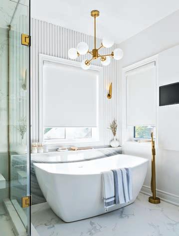
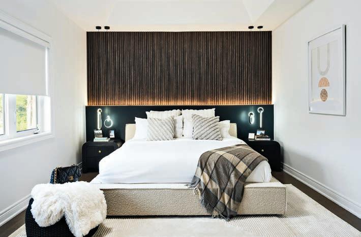
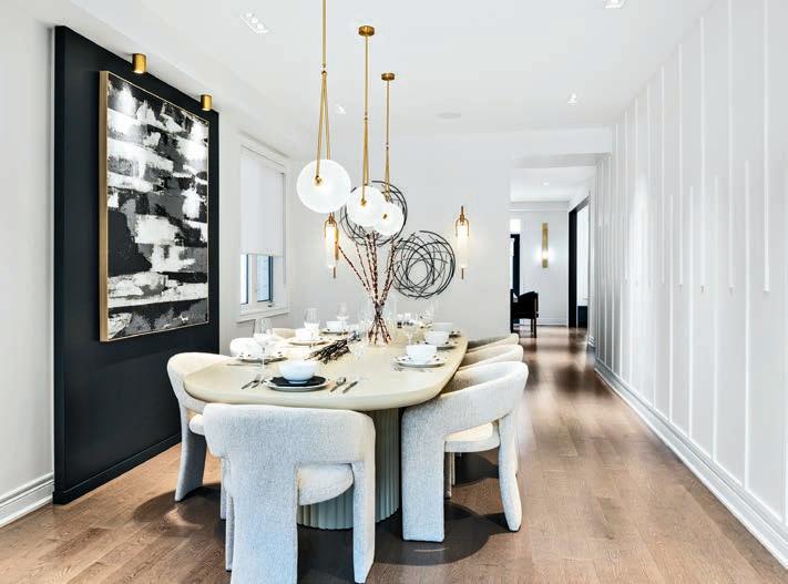
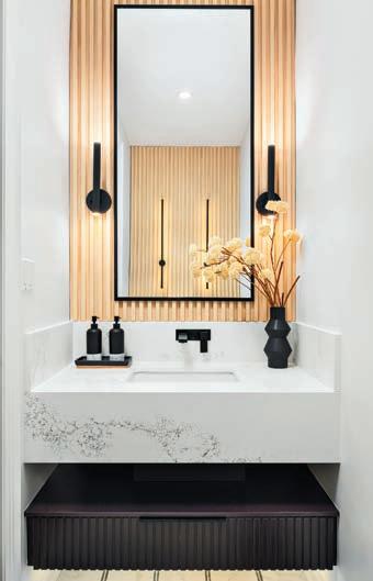
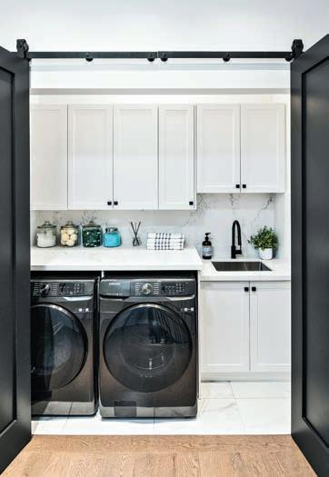
a testament to its unwavering dedication to crafting homes beyond ordinary living. Additionally, its prowess in redefining the heart of the house was recognized with wins for “Best Kitchen Reno” and “Best Washroom Reno,” showcasing the ability to seamlessly blend style with functionality. Notably, Jodabi’s adeptness in delivering exceptional value was highlighted as it clinched the award for “Best Reno Under $300,000,” further solidifying its position as a trailblazer in residential renovation and design.
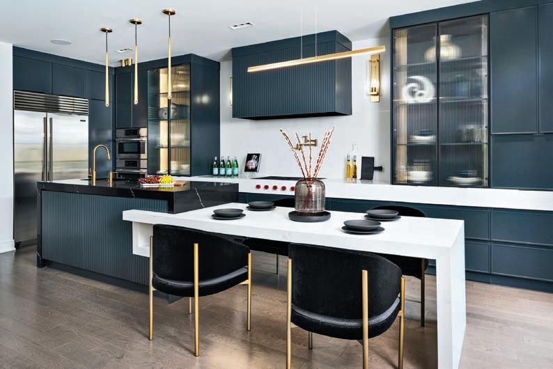
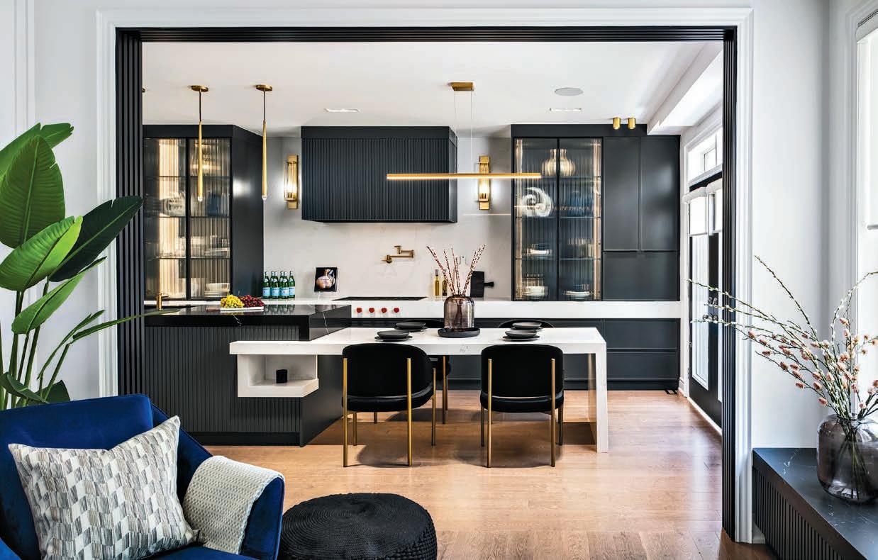
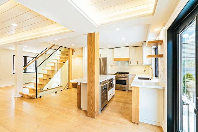
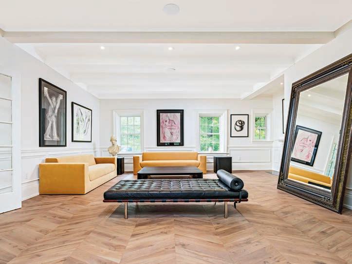
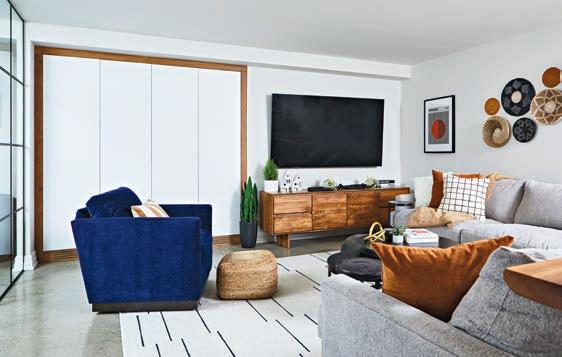
Jodabi took on this builder-grade basic home and transformed it with award-winning renovations in six weeks! The home harmonizes luxury materials, a moody palette, gold accents, and custom millwork to create a home with a cohesive, dramatic and modern vibe. Jodabi’s attention to detail is evident throughout each space. The choice of lighting, furniture, finishes and decor highlight the ability to blend style with form and function.
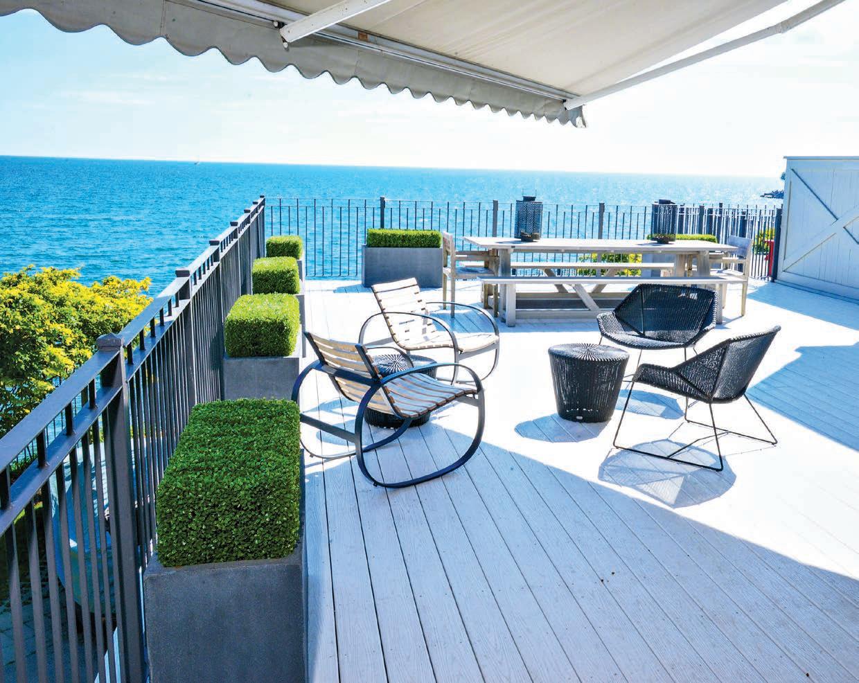
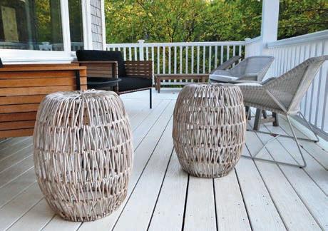
Most people love their personal outdoor space –decks, terraces, balconies and backyards. And no wonder. With long cold winters, we’re always eager to spend more time outside to watch the flowers and trees come alive. And we want to stay out there, listening to the birds, the gurgle of a water feature,
 by LISA ROGERS
watching the sun set and connecting with friends and family.
As the pace of life quickens and our house sizes shrink, the outdoors is literally the last frontier, and the reason why we’re spending so much more on making our backyard, deck or balcony a destination oasis.
So, I say, out with the white plastic chairs and plexiglass tables, and in with the fire pits and heaters, deepseated sectional sofas, teak dining
tables and chairs, carpets and strings of lights to give us a more enjoyable time outside. Outdoor furniture manufacturers have been happy to provide a wider range of options to meet our need to linger outside, with furniture that has longer-lasting frames, fabrics that retain their shape and are water-resistant, and cushion foam that stays comfortable.
Who needs a cottage when you have a space like this?

Plan out your space according to how you intend to use the deck. If you are a big reader or sun tanner, but don’t like eating al fresco so much, then give more space to living room-type furnishings, and tuck a small dining table, maybe with leaves, off to the side and out of the way.
Carefully check out materials. There’s teak or treated pine, as well as metal mixed with wood, solid aluminum and wrought iron. Of these, teak and aluminum last the longest, and are probably the most expensive. Teak you need to baby a bit, while aluminum just wipes clean.
Consider modular furniture, pieces that fit together as a sectional or stand alone as chairs. You can change the seating arrangement to suit the occasion or your mood.
For privacy, especially on a condo balcony, create a privacy “wall” by positioning a row of evergreens in matching containers along the edges of your deck. You can also erect lattice or bamboo screening, then add wall-mounted planters and a water feature.
Music really adds to the ambience, as background — not too loud so your guests can’t hear each other or that the neighbours will complain.
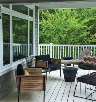
Don’t forget the floor – wood flooring tiles are easy to install, and create an immediate room setting. Add an outdoor rug to pull it all together.
1 2 3 4 5 6 7 8 9 10 12 11 13 14
Decks aren’t just for daytime. Small white lights are magical when strung from house to tree. Add candles around the edges of your deck or terrace; flameless ones are safer. An ethanol fire pit not only creates mood, but keeps your feet warm. And the best thing? It can be moved around.

There’s nothing like dining al fresco, and if you’re the type who likes tons of people over, an expandable table might be the best choice. Classic wrought-iron tables look great and last forever but are pricey. There’s always teak, but it’s pricey, too, so check out the budget-friendly teak alternatives, which work equally well. If your deck is small, go for stackable dining chairs.
Stow outdoor dining essentials, such as table mats and napkins, covered lanterns or candle holders, near the back door or in a waterproof storage bench. Make sure to keep throws handy to ward off the evening chill.
An umbrella will shade the table from the sun and rain; one on a tilt arm can be adjusted to follow the sun all day. The new pergolas do the same and more, especially when fitted with a retractable canopy system, or are screened against bugs.
As for styles, the sky’s the limit. Fancy a week in the Hamptons? Check out sectionals in whitewashed and weathered greys made from resin wicker with East Coast fabrics such as navy and white stripes (in water-repellant fabrics). Prefer a Park Avenue brownstone? Then wrought iron with deep charcoal cushions set amidst a row of boxwoods might be better for you.
Depending on the space you have, hammocks are worthwhile for the down time they afford –snoozing or watching the stars.
Containers are the way to go for gardening. Depending on the direction they face, condo balconies are ideal for herbs and tomatoes but they need a lot of water, so make sure you have proper drainage. Tropical plants love sun and add a festive air to your deck. If you have less direct sunlight, fill tall tapered containers with ornamental grasses for a clean, modern, minimalist look.
Just like inside, the deck is made livelier with the addition of some artwork, such as wrought iron grills, architectural salvage, or window frames (with or without mirrored glass).

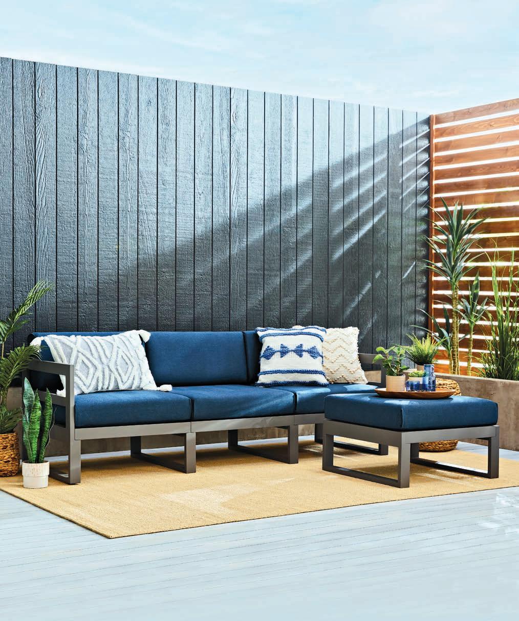
Crafted in Montreal, Cozey epitomizes Canadian design brilliance. The furniture — from outdoor seating and accent chairs to sofas and tables — merges functionality with chic aesthetics, ensuring easy assembly and swift doorstep delivery. But the company’s dedication goes beyond style. Sustainability is woven into the fabric of their ethos. Items returned within the 30-day trial period are either meticulously refurbished and discounted or generously donated to charity, minimizing waste and maximizing value for you and the planet.
is trending this summer; turn the page for more!
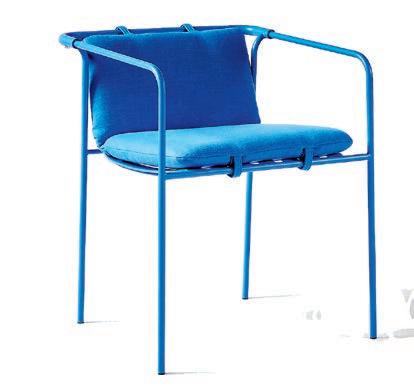
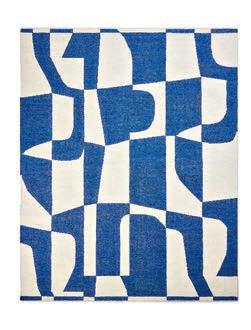
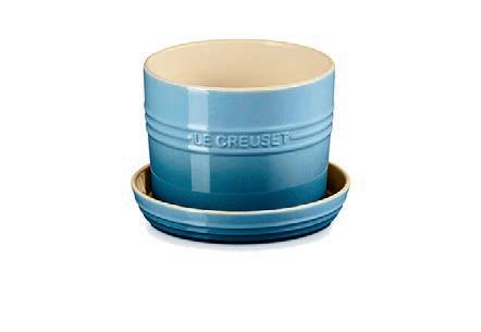
You may have noticed that blue is seriously trending right now. From serene sky tones to deep navy accents, this versatile hue adds a timeless touch of sophistication and tranquility to any indoor or outdoor space.
1. Marta ombre blue double old-fashioned GLASS by Azeeza. $9. cb2.ca
2. Blue swirl acrylic PITCHER $12.99. homesense.ca
3. Poolside geo indoor/outdoor RUG in cobalt. $599. westelm.ca
4. Herb PLANTER in chambray. $50. lecreuset.ca
5. Sicily ceramic dinner PLATE in blue. $29. williams-sonoma.ca
6. Navene blue outdoor dining ARMCHAIR. $549. cb2.ca
2 3 4 5 6 1


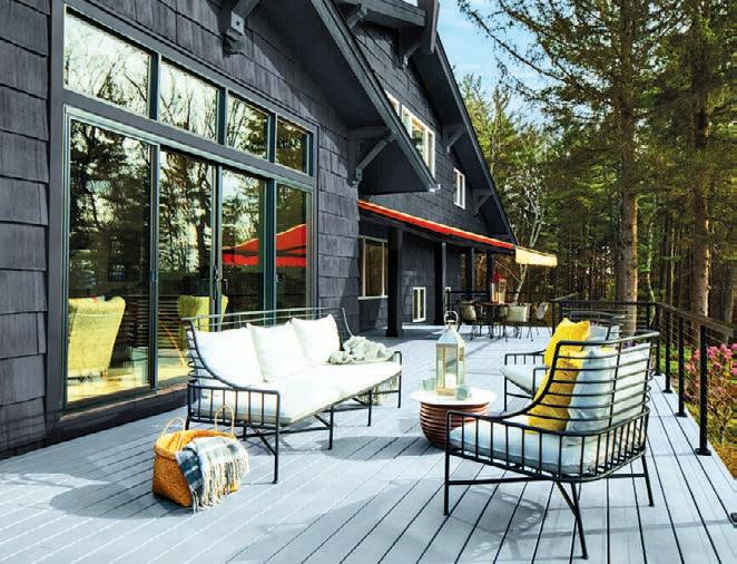
Just in time for the outdoor season, Benjamin Moore has launched the Premium Woodluxe Exterior Stain collection with four opacities: Translucent, semi-transparent, semi-solid, and solid. “Staining is a great way to refresh and protect your outdoor wooden surfaces such as decks, furniture and fences for the coming season and beyond,” says Sharon Grech, Benjamin Moore colour and design expert. Woodluxe is easy to apply, and can be used in the heat, sun, and humidity for in a consistent finish that provides a UV and mildewresistant coating. benjaminmoore.ca
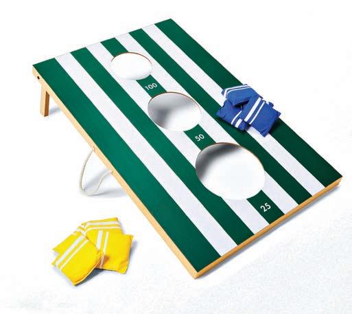
Keep busy all summer long with fun games that can be played in your backyard (or local green space).


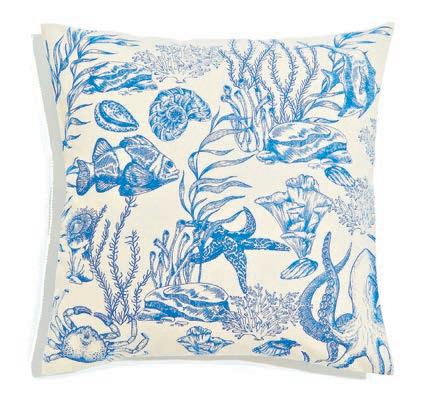
Embrace your inner Ariel (or Sebastian) with these sea-themed accessories for your home.



2 3 1 2 3 4 5


As we move into the summer wildfire season, an air purifier at home provides numerous benefits, such as improving indoor air quality and removing airborne pollutants such as dust, pet dander and allergens. Additionally, it helps reduce the risk of respiratory issues, promotes better sleep and creates a healthier environment for you and your family. Breathe easier with the Clorox large room air purifier. Its three-stage 360-degree filtre system, including a true HEPA filtre, captures 99.9 per cent of allergens and particulates and 99.9 per cent of viruses and bacteria. $230. cloroxhomeappliances.ca

Planted is a Canadian candle company focused on minimizing its impact on the planet. Its active botanical line of candles is handmade in small batches using sustainable, toxin-free ingredients. And if that’s not enough, each purchase plants a tree with the Eden Reforestation Project, supporting environmental revival and community upliftment. shopplanted.com

MUST-see
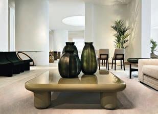
MUST, delivering cutting-edge design inspo and contemporary furnishings, has opened two new stores in the GTA with locations in Toronto and Mississauga. “Our new stores have been designed with diverse urban living in mind, offering a curated furniture selection ideal for various settings like townhouses and compact condos. Our functional and stylish furniture and accessories are inspired by the essence of city living and our customers’ evolving tastes,” explains Émilie Corbeil, product director at MUST. mustsociete.com
Outdoor seating so cool, you will want to style them inside

2 3 4

5

8 9 10 Have a

1
6

7

JELD-WEN®’s JWC8500 series windows usher in a new era of energy efficiency without sacrificing style
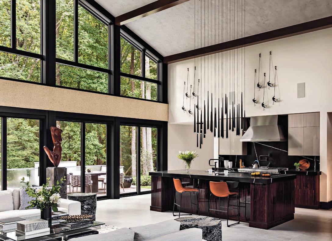
It’s no secret that our world is changing. With each passing season, we’re seeing more and more changes to our already unique and demanding Canadian climate. This increasingly extreme weather means that we’re all facing new challenges in terms of keeping our homes comfortable, protected and affordable.
This ground-breaking new offering is designed specifically for life in Canada, both present and future. It’s been meticulously engineered to exceed all existing and upcoming standards, which are changing rapidly to match our climate. More than that, the JWC8500 series window, which is available in vinyl, or in an aluminum-clad hybrid, is unique in its ability to blend this powerful performance with steadfast durability and eye-catching style.
JELD-WEN has done this intentionally to bring you as many benefits as possible.
Unmatched performance,
All JELD-WEN JWC8500 series windows are 2030-rated. They meet Canada’s U-Factor 0.14 (U.S./I-P) / 0.82 (Metric/SI) or ER 44 building code targets to exceed performance in all regions of Canada. This makes compliance easy, and it also means lower energy bills and more comfortable spaces, regardless of how extreme the temperature may be.
Premium materials that are built to stand the test of time—that’s what goes into every JWC8500 series window. Only the very best vinyl is used, and the hybrid option features a rugged aluminum cladding for increased durability. The windows require minimal maintenance and are constructed specifically to withstand anything our temperamental Canadian climate can hurl its way.
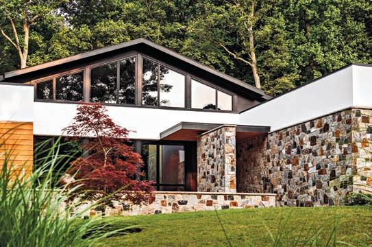
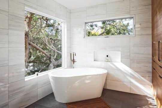
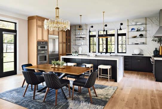
Each JWC8500 series window is made with a sleek, lowprofile design. This means more glass area, for increased natural light and broader views. Plus, it’s all done without compromising any structural integrity or strength.
The benefits of JELD-WEN’s True Tri-Pane Technology™ are well documented, but we’re always happy to offer up a reminder. It consists of three panes of glass, two ½-inch (13 mm) Argon-filled air spaces, and a 1-3/8-inch (35 mm) thick insulated glass unit, and it outperforms standard 1-inch (25 mm) Tri-Pane windows by 30 per cent in terms of insulation.
The result? Reduced energy costs, year-round comfort, minimal interior condensation during winter, and added security.
Choose from a range of Low-E glass options that provide additional insulation to your windows and can absorb or reflect UV rays to help keep your furniture, floors and walls from fading, plus will help keep your home at a comfortable temperature year-round.
Available on JWC8500 series hybrid windows, this truly impressive finish delivers enduring colour uniformity. It resists fading as well as scratches, dents, dings and peeling. Select from an exquisite selection of colours that suit your style. They’ll look good today, tomorrow and into the future.
Whatever your personal taste, there’s a JWC8500 series window for you! Choose between casement, awning, fixed, radius/geometric, bow and bay styles.
Operational JWC8500 series windows feature subtle, simple hardware. This includes a sleek nesting handle and multipoint lock for vinyl and hybrid windows, while interior glazed windows feature a hardware cover for easier serviceability.
It’s safe to say that JELD-WEN’s JWC8500 series window is a game-changer. It’s at the very forefront of innovation, ushering in a new era of efficiency, as well as plenty of lasting value for Canadians just like you.
Interior designer Tracy Clipsham of Liv 4 Design, says her clients were intrigued by the Niagara region and yearned to escape the bustle of Toronto. Their dreams became a reality when they came across an 85-year-old home nestled just steps from Henley Pond and Lake Ontario.
“Our clients craved a sanctuary that harmonized with the region’s natural splendour – serene yet stylish,” says Clipsham. With a shared vision for simplicity, Clipsham was able to integrate the furniture and vibrant artwork, infusing every nook with renewed vitality, while paying homage to the home’s storied past.
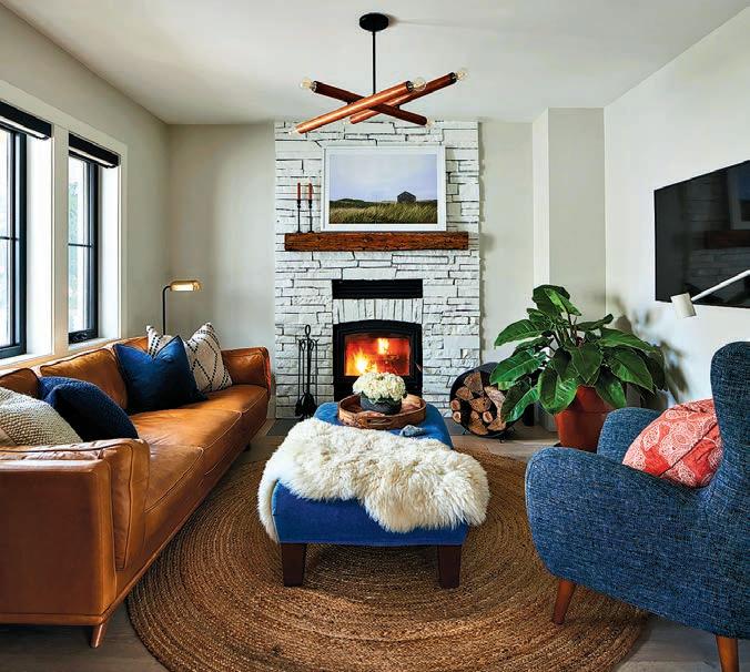
Clipsham’s clients loved the wood-burning fireplace when they found the home, so keeping it was a must. By adding coats of paint and staining the existing mantel, she elevated the look and tied it into the renovation.
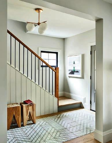
“We wanted to embrace the entrance’s original charm but needed to update the windows and bring the staircase railing to code,” explains Clipsham. She found a fun patterned tile and had it inlaid into the newly engineered hardwood. With a new light fixture and a local artist’s popping photograph, the entrance sets the tone for the entire home.
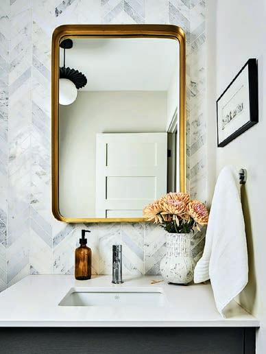
“One of the client’s favourite finishes shown at our design presentation was the marble chevron tile,” says Clipsham. “I made sure to install it in an impactful way.” The tile was used to cover an entire wall in the powder room, making it a showstopper, while the contrast of black in the light fixture and vanity creates the perfect depth of colour to complement the marble.
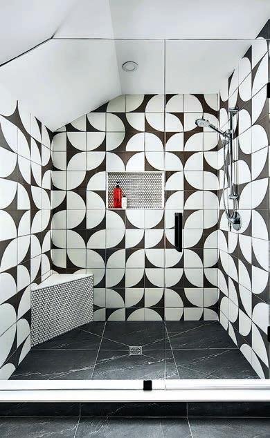
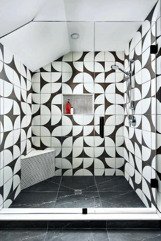
Clipsham and her clients love mid-century modern design, which is reflected in the furniture and lighting selections throughout the house. “When I found the harvest moon tile, I knew it would be the perfect fit for one of the bathrooms,” says Clipsham. The grey and white geometric curves add a touch of mid-century flair, while penny tiles play with scale, creating a playful and fun atmosphere.
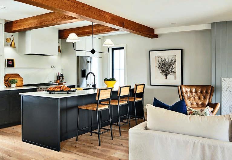
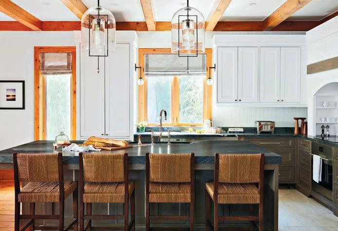
“Black base cabinets create a moody backdrop, which lets the quartz countertops, light fixtures and wood stools steal the scene,” says Clipsham. The white upper cabinets and custom hood keep the kitchen feeling spacious, and the wood ceiling beams add warmth, while concealing a structural beam.
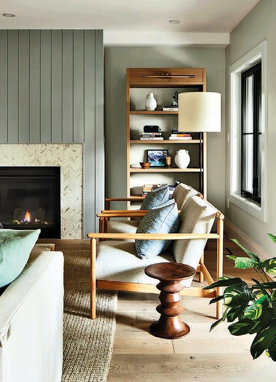
“Having windows across the back was important for my clients to bring light into the space and incorporate the backyard views into everyday life,” explains Clipsham. Adding a gas fireplace creates the focal point for the living room. She surrounded it with herringbone tiles and vertical grey shiplap. Repeating the shiplap from the entrance and a smaller scale of the herringbone from the powder room onto the fireplace creates cohesion and familiarity. “And the custom-made bookcase adds all the personal details to make the room a home,” says Clipsham.
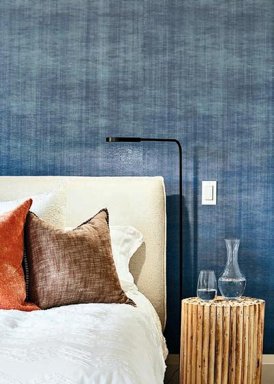
“With views of Henley Pond, I wanted the water incorporated into the principal bedroom to create a peaceful retreat,” says Clipsham. The textured ombre paper in blue tones installed as an accent behind the fabric headboard achieves the look.
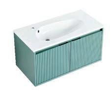
“In the primary ensuite, we opted for a modern layout, taking the freestanding tub under the window and integrating it into the shower area,” explains Clipsham. This design choice results in an airy, bright bathroom, giving the illusion of a larger space. She also introduced a custom blue floating vanity, which mimics the accent wallpaper in the primary bedroom. Pairing the vanity with white vertical candlestick wall tiles against the almost black floors maintains a timeless aesthetic.
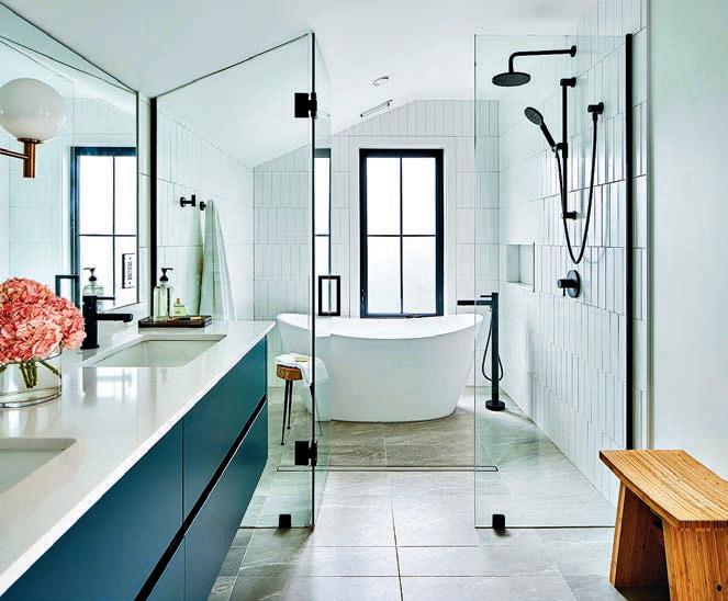
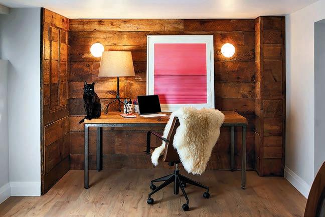
During a demolition site inspection, Clipsham and her clients took a moment to reflect on the home’s original features. “The removal of the original siding at the back of the home revealed wood sheathing,” she recalls. “The clients and I fell in love with its rich character and requested it to be preserved for reuse in the basement.” It now serves as a warm and inviting backdrop for their workspace.
liv4design.com
SOURCES: | GENERAL: Custom MILLWORK fabricated by J. Sinke Wood Interiors | COUNTERTOPS by Silestone, installed by Quartz Co Surfaces | Custom SHOWER GLASS by Grimsby Glass & Mirror Inc. | MIRROR by Low’s Glass & Mirror Co. | EXTERIOR DOORS from Niagara Pre-Hung Doors | BLINDS from Window Treatments by Kaur | PLUMBING by Bathworks | FOYER: LIGHT by West Elm | FRAMED PHOTOGRAPH of lighthouse by Martine Côté | TILE from Dimensions Carpet One | GUEST BATHROOM: WALL TILE from Tiles Inspired | HOME OFFICE: SHEATHING installed by J. Scott Contracting

With more than 15 years’ experience as a magazine editor, writer and content creator, Sara brings her passion for design and decor to our pages each issue. Instagram: @bysaraduck
The Association of Registered Interior Designers of Ontario (ARIDO) is your connection to qualified, experienced, and innovative Registered Interior Designers.
ARIDO protects Ontarians to ensure every person using the title ‘Interior Designer’ is qualified. In accordance with the Ontario Titles Act, an individual cannot use the title ‘Interior Designer’ unless they are a Registered member with ARIDO.
Why should I hire a Registered Interior Designer?
Registered Interior Designers have completed the necessary technical education and passed the required exams to meet ARIDO’s rigorous standards for membership.
Once qualified, Registered Interior Designers must keep their knowledge updated through professional development on topics including the Ontario Building Code, accessibility, sustainability, building and mechanical systems, inclusivity, etc.
How do Registered Interior Designers become qualified?
They must graduate from an accredited 4-year Bachelor of Interior Design program and complete an extensive supervised work experience program under a qualified practitioner. Finally, they pass a rigorous 3-part practical exam which includes building code knowledge.
arido.ca Toll-free 800.334.1180

1 2 3 4 ARIDO’s
Meet with client, establish project goals, client’s wants, needs, and budget. Complete a site survey.


Prepare a variety of project documents, which may include construction drawings and/or product selections. Apply for building permits, as required.
Provide project oversight, including coordination of sub-contractors, consultants, suppliers, and vendors. Document progress to ensure compliance with design intent and project budget. Address issues as they arise.



Develop detailed design with images, sketches, and 3D views. Propose materials, lighting, furniture, and fixtures. Present concept ideas, preliminary drawings, and images to client. IT MATTERS. ASK YOUR INTERIOR DESIGNER IF THEY ARE A REGISTERED MEMBER OF ARIDO. LEARN MORE AT BLOGARIDO.CA
Download your copy now. Don’t know where to start with your project? Our Consumer Guide can help.
Not sure what you don’t know? Let a Registered Interior Designer help you ask and answer the important questions.
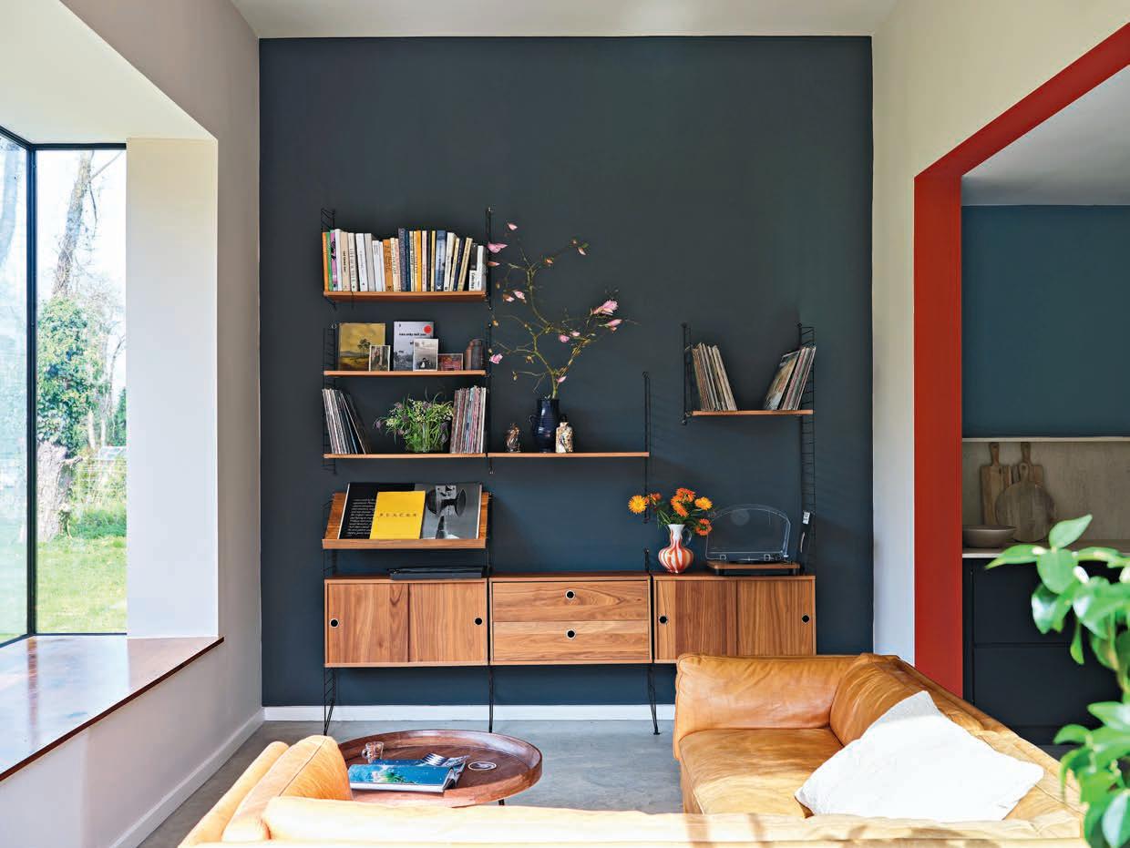
“A great way to introduce more colour is to paint a door frame in an exuberant red for an extra decorative twist.” – Joa Studholme, colour curator for Farrow & Ball
What comes to mind when you envision the colour red? Taylor Swift’s signature cherry red lipstick? Pushing the bright red stop button after a hard Peloton ride? Mark Rothko’s No.301 painting? Whatever red means to you, the bold hue is having a viral design moment. Enter
the “unexpected red theory.” If you haven’t seen this design theory swirling around social media or read about it in The New York Times, let me break it down. The trend was introduced earlier this year by Brooklyn-based designer Taylor Migliazzo Simon (with mega views on TikTok). She explained that if you add a hit of red to any space that doesn’t match, the room will
automatically look better. Consider it the ultimate colour-clashing coolness (say that five times fast!).
So, what makes the red theory so compelling? For starters, it’s all about making a statement. “Red has a welcoming energy that injects some passion into any room – however little you use,” explains Joa Studholme, colour curator for Farrow & Ball.
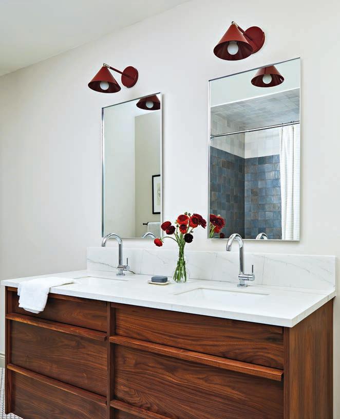

“The deep red sconces offer a subtle hit of colour and if the client wants a change, it’s not difficult to swap out later.”
– Tamara Robbins Griffith, Kerr + Field Interiors 1 2 3
DESIGN and custom VANITY, kerrandfield.ca | Neolith Mont Blanc silk COUNTER, ciot.com | Riobel Riu PLUMBING FIXTURES, tapsbath.com | Nomad LIGHTS, luminaireauthentik.com | custom MIRRORS, adanacglass.com | Skimming Stone custom tinted wall PAINT, farrow-ball.com.
But the appeal of red goes beyond its visual impact. Studies have shown that exposure to the colour red can stimulate the senses and spark creativity. Could this be the start of a red rebellion against the neutral palettes that have gripped the design world for years? I’m not saying to ghost your neutrals, but this design trend could signal that we crave a little more colour in our daily lives.
The versatility of red also allows it to transcend design styles and aesthetics. Red can be seamlessly integrated into any design scheme, from traditional to contemporary, minimalistic to eclectic. It adds warmth to industrial spaces, sophistication to modern interiors, and character to vintage-inspired decor.


However, it’s important to wield the power of red with care. Too much can overwhelm the senses and create a chaotic atmosphere. “The key is to balance out bright colours with more conventional tones,” says Studholme.
Don’t forget the age-old saying, ‘less is more.’ With bold colours such as red, a little goes a long way. That’s the brilliance of this concept – it adds a vibrant touch to your space, but it’s also non-committal and budgetfriendly.
The unexpected red theory has taken the design world by storm, igniting creativity and sparking design conversations. Will you experiment with the theory in one of your rooms? You may be unexpectedly surprised.
With more than 15 years’ experience as a magazine editor, writer and content creator, Sara brings her passion for design and decor to our pages each issue. Instagram: @bysaraduck

4 5 6
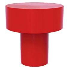
1. I beam red marble SIDE TABLE. $600. cb2.ca
2. French ceramic red heart DISH by Emile Henry. $87. williams-sonoma.ca
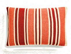
3. Contrast striped throw PILLOW COVER $100. zarahome.ca
4. Cabinet KNOB in fire engine red. $47. bedbathandbeyond.ca
5. Retro-style auto-drip filtre COFFEE MACHINE in red by SMEG. $350. thebay.com
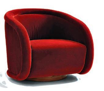
6. Medoc swivel CHAIR in bordeaux. $1,899. crateandbarrel.ca

When I was growing up, my Sicilian grandparents had the most amazing garden and chicken coop in the backyard of their Toronto home. It was the kind of garden that made neighbours blush with envy and local newspapers clammer for a photograph of my Nonno’s six-ft. zucchini.
I spent most of my life eating fresh, organic produce from a garden cultivated by hand with love. It was my grandparents’ happy place after
they left their farm in Sicily and immigrated to a big city with just pennies in their pockets. They worked incredibly hard their entire lives, giving so much to each of us, and they spoiled us with the literal fruits of their labour, treating us to a taste of Sicily right in Canada.
I’d love to say that the horticulture gene was passed down to me, but I’d be fibbing. While my mother’s gardening skills are exceptional, I struggle to keep succulents alive. Can you relate? With the cost of fruits and vegetables skyrocketing this year,
Don’t be afraid to make mistakes or encounter setbacks along the way.
my goal is to create a piccolo giardino (small garden) with herbs, simple vegetables, and berries – a small gesture to my beloved grandparents. I can picture it now, me garnishing my Caprese salad with the perfect sprig of homegrown basil (hey, a girl can dream!). Are you looking to embrace your inner gardener? Here are five tips to help you and me confidently navigate the wonderful world of gardening.
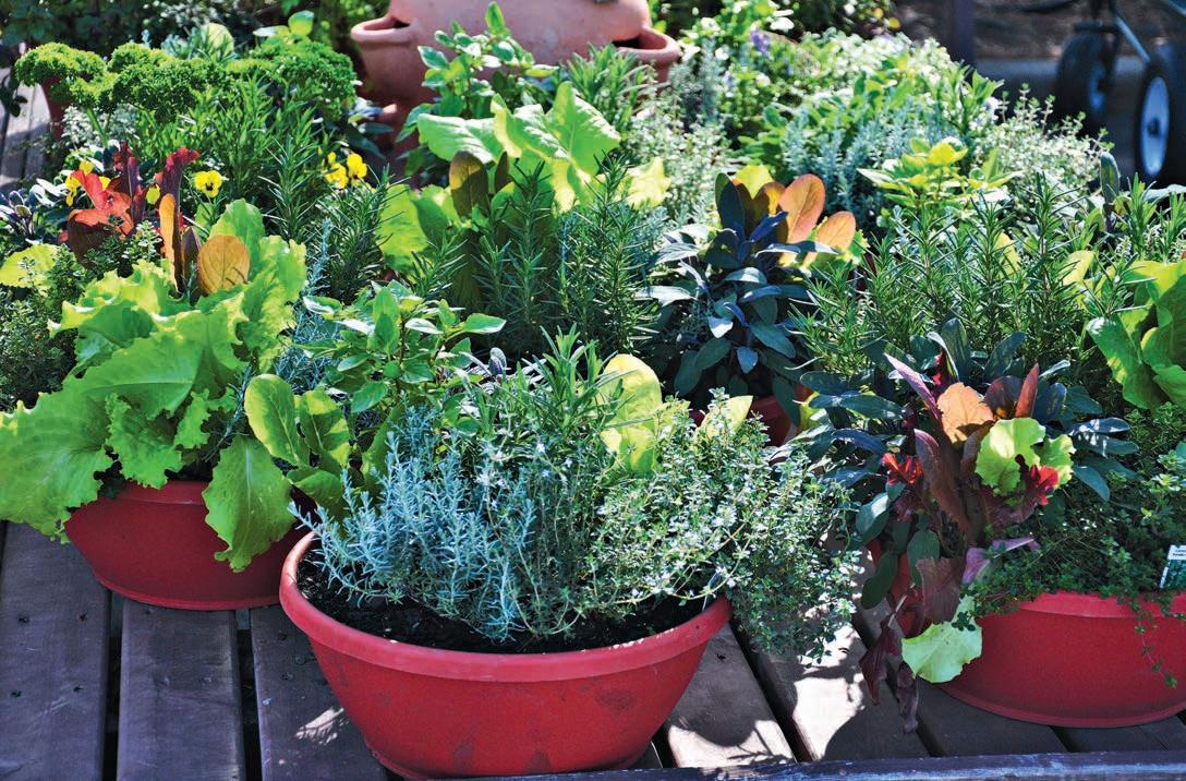
Rome wasn’t built in a day, and neither does a thriving garden. Begin with a manageable plot or a few pots of your favourite plants. Choose easy-to-grow varieties such as herbs, tomatoes, or salad greens to build your gardening skills and confidence. As you gain experience and success, you can gradually expand your garden oasis to encompass your wildest botanical dreams!
Before you start digging, take some time to assess your gardening space. Consider factors such as sunlight exposure, soil quality, and drainage. Is your garden bathed in sunlight all day, or does it receive only a few hours of dappled shade? Does your soil resemble clay, sand, or loam? Understanding these nuances will

help you select the right plants and design a garden that thrives in its environment.
Healthy soil is the lifeblood of a successful garden. Invest in quality soil enhancers such as compost, aged manure, or organic fertilizers to nourish your plants from the ground up. Incorporate these amendments into your soil to improve its structure, fertility and water retention capabilities. Remember, wellfed soil translates to happy, thriving plants.
Like all living things, plants need water to grow and thrive. However, too much or too little water can spell trouble for your garden. Learn to water your plants judiciously, aiming for deep, infrequent waterings rather than shallow, frequent ones. Consider factors such as plant type, weather conditions, and soil moisture levels when determining your watering schedule.

The Side Gardener chronicles Rosie Daykin’s journey from bestselling cookbook author to avid gardener, and how she transformed a neglected plot beside her home into a flourishing oasis. Through love and dedication, she cultivated a diverse array of fresh produce, vibrant flowers, and even added chickens laying organic eggs! Daykin generously shares her gardening tips and mouth-watering recipes, showcasing the beauty of homegrown ingredients. With stunning photography by Andrew Montgomery, the book offers a delightful blend of culinary inspiration and gardening wisdom, encouraging readers to savour the pure flavours of fruits and vegetables, whether sourced from their own backyard or the local market. $45. indigo.ca
Gardening is a journey of discovery, experimentation, and lifelong learning (as I am discovering). Don’t be afraid to make mistakes or encounter setbacks along the way; they’re all part of the gardening experience.
Take note of what works well in your garden and what doesn’t and use each season as an opportunity to refine your skills and knowledge. Join gardening communities, attend workshops, and seek advice from seasoned gardeners to accelerate your learning curve and unlock the full potential of your green thumb. Happy gardening!
With more than 15 years’ experience as a magazine editor, writer and content creator, Sara brings her passion for design and decor to our pages each issue. Instagram: @bysaraduck
Designers show how mid-century modern design continues to influence contemporary aesthetics with its clean lines, organic forms and timeless appeal
Mid-century modern (MCM) design was popular in the United States and Europe from roughly 1945 to 1970. The aesthetic is modern in style and construction and was aligned with the Modernist movement of the period. The look is characterized by clean, simple lines, geometric shapes, bold colours and innovative materials, and generally does not include decorative embellishments.
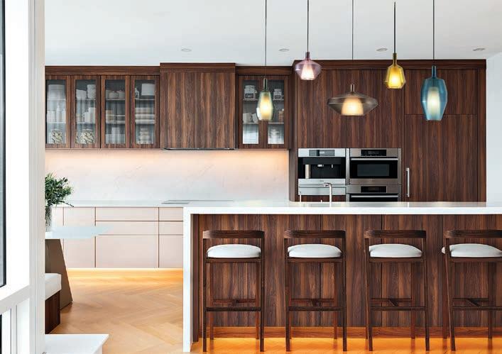
“MCM is all about clean lines and a seamless blend of form and function. As a designer, I focus on incorporating open spaces with large windows and a connection with nature to bring that bright and airy feel characteristic of the style. For furnishings, I opt for sleek and practical pieces, often featuring smooth wood and organic shapes. The colour palette usually revolves around warm neutrals, but I choose deeper shades like teal or mustard if I want to incorporate colour. It’s all about creating inviting spaces that feel timeless and fresh without leaning too heavily into trends.”
– Designer Jude Kamal, Sansa Interiors
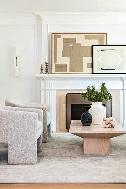
“A mid-century modern design was the perfect balance for this living room, as it brings in clean lines, simplicity, deep earthy tones and honours natural materials like walnut wood and stone.”
– Designer Shaunn Lipsey, Shaunn Lipsey + Co
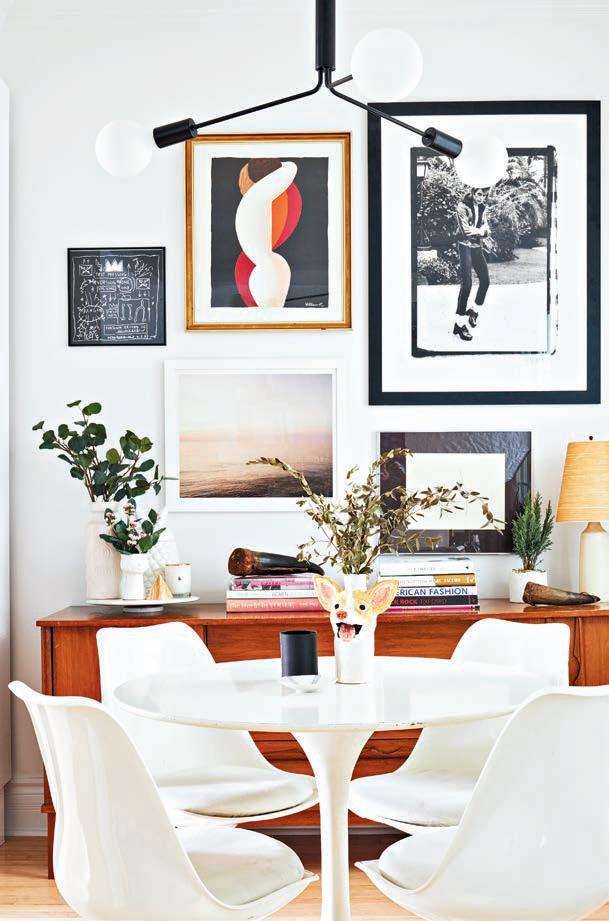
“Mid-mod’s clean, crisp design elements are perfect for a small space, as it will blend in with its surroundings and also adds a level of artistic appeal all at the same time.”
– Designer Jo Alcorn, Alcorn Home
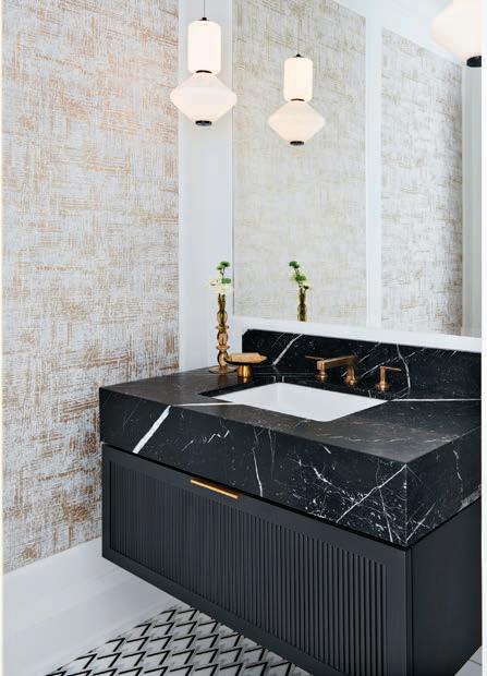
“This bathroom embraces mid-century modern design with its finishes, emphasizing simplicity and functionality. The compact vanity includes hidden storage, while geometric pendant lights and burnished brass fixtures add character. Black and white mosaic flooring complements the floating vanity for a sleek look.”
– Designer Diana Bastone, Diana Bastone Designs
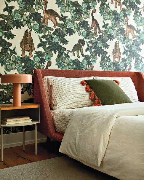
“For this girl’s bedroom, we wanted to incorporate mid-century elements without being too literal. We selected streamlined and modern pieces with a muted yet playful colour palette to create something fresh but timeless. A focal wall featuring stylized dinosaur print wallpaper adds visual interest and reflects the child’s interests. The result is a room she can grow with and enjoy for years.”
–Designers Kevin Kaminski and Alexis Pew, Kaminski+Pew
Photo: Jason Varney Photo: Jason Hartog Photo: Stephani Buchman





 by SARA DUCK
From backyard barbecues to garden gatherings, make every meal under the open sky a memorable occasion 1.



1 9 2 3 4 5 6 7 8 9 2 3 4 5 6 7 8
1. The sun UMBRELLA in beige by Outsunny. $107. rona.ca
2. Modern melamine outdoor DINNER PLATE set. $63 (set of four). westelm.ca
3. Soare PLACEMAT. $8. ikea.ca
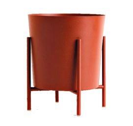
4. Curryblad PLANT POT. $20. ikea.ca
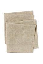
5. Linen NAPKINS in beige. $20 (set of two). hm.ca
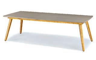
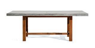
6. Atra concrete dining TABLE for eight. $1,299. article.com
7. Stemmed multi-coloured wine GLASSES by Comfit. $93 (set of six). amazona.ca
8. Geo abstract patterned multi-coloured outdoor CUSHION. $20. rona.ca
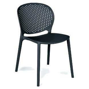
9. Dot stackable DINING CHAIR in graphite. $119 ea. article.com


outdoor stemless wine GLASSES by DuraClear. $102 (set of six). williams-sonoma.ca
5. Abaco concrete outdoor dining TABLE in grey. $2,708. crateandbarrel.ca
6. European flax-certified Marin NAPKIN in natural-hued linen. $19. crateandbarrel.ca
7. Caliente round jute PLACEMAT. $27. crateandbarrel.ca
8. Large PLANT POT in rust brown. $55. hm.com
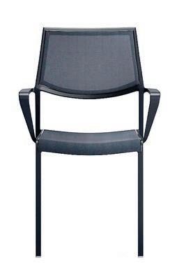
9. Lanai mesh square stackable charcoal grey outdoor dining CHAIR with arms. $249 ea. crateandbarrel.ca
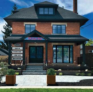
The Dover George is Norfolk County’s new premier luxury boutique hotel, nestled just a block from Port Dover’s Main Street. Boasting a prime location (near Canada’s palm-tree-adorned beach) and a mere two-hour drive from the Greater Toronto Area, this exclusive adultsonly property offers four uniquely designed suites, accommodating up to two guests each for an intimate experience. Purchased in 2018 and meticulously renovated over four years, The Dover George is a labour of love by co-owners Hélène Larochelle and Michael Nimchuk, reflecting their personal dedication to crafting a truly exceptional retreat.
The building traces its roots back to the mid-1800s, when it started as a humble single-storey wood cabin. Today, the original structure still resides within the walls of The Dover George’s modern exterior, a testament to its enduring legacy.
 by SARA DUCK
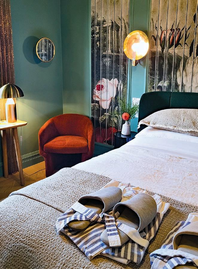
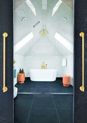
There are four suites meticulously designed for luxury and ultimate comfort. Each suite exudes simplicity, warmth and sophistication, boasting unique layouts and upscale amenities. From Italian wallpapers (swoon!) to original artwork, fireplaces, and freestanding soaker tubs, every detail has been carefully curated to elevate your stay.
In one of the three equally lavish suites on the second floor or the extravagant penthouse spanning nearly 1,000 sq. ft. on the third, guests can expect nothing less than a sanctuary of indulgence. With premium features such as luxe mattresses, European linens, custom furnishings, and spa-like bathrooms equipped with Dyson hairdryers, every moment at The Dover George is designed for pure bliss.
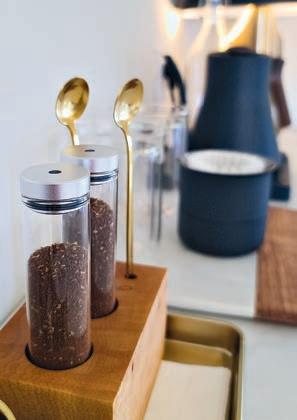
Each suite has a top-notch in-room pour-over coffee program, customblended organic bath amenities,



and luxurious bath linens and robes. Guests wake up to a gourmet continental breakfast each morning, setting the tone for a day of relaxation or exploring the area. With stylish common areas, The Dover George also provides a perfect backdrop for intimate private gatherings or corporate events.




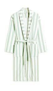
CHECK IT OUT! The seaside community of Port Dover has quite a few hidden gems along its Main St. and the surrounding area.
1 2 3 4 5 6
Since The Dover George is a screen-free hotel, check out the Beach Reads Bookshop to choose from new and pre-loved books. beachreads.ca
At The Dover George, you will adore the custom-made bath products. The owners worked with North Shore Soapworks to develop the Herbed Citrus blend. Don’t miss their shop filled with hand-made luxe soaps and bath and body care. cottagenorthsoapworks.ca
Norfolk Juice Co. is the perfect place to enjoy a healthy coldpress juice, power smoothie or acai bowl. norfolkjuiceco.com
The Dover Cheese Shop offers more than 100 artisan cheeses from Canada and imported cheeses and meats from around the world. dovercheese.com
Need a break from the beach? Indulge in a wine tasting at Smoke & Gamble. smokeandgamble.com
A short jaunt from Port Dover is Creekside Growers, a beautiful flower farm known for its stunning array of Dahlia, a perfect souvenir for home. creeksidegrowers.ca

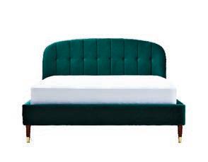
Kyoto velvet tufted queen BED in green. $799. structube.com
 Stagg EKG pro studio electric KETTLE by Fellow in matte black. $325. williams-sonoma.ca Cotton terry
R+D catches up with designers Trish Knight and Nicole Varga of Knight Varga Interiors to learn about their latest project in a remote part of British Columbia
 by SARA DUCK
RENO+DECOR | Describe the setting of the lake house project.
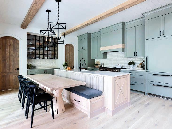
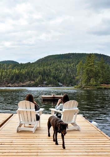
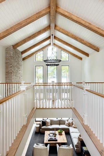
KNIGHT/VARGA | Nestled in coastal British Columbia, The Lakehouse is a newly constructed retreat surrounded by pristine landscapes. Accessed by a scenic two-hour drive and a short ferry ride from Vancouver, its remote location adds to its allure, offering a secluded sanctuary amidst warm lake waters and towering mountains.
R+D | What were the design goals for the project?
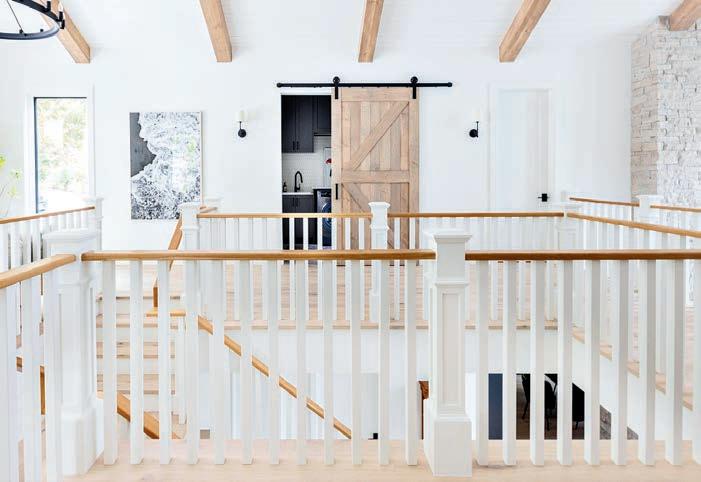
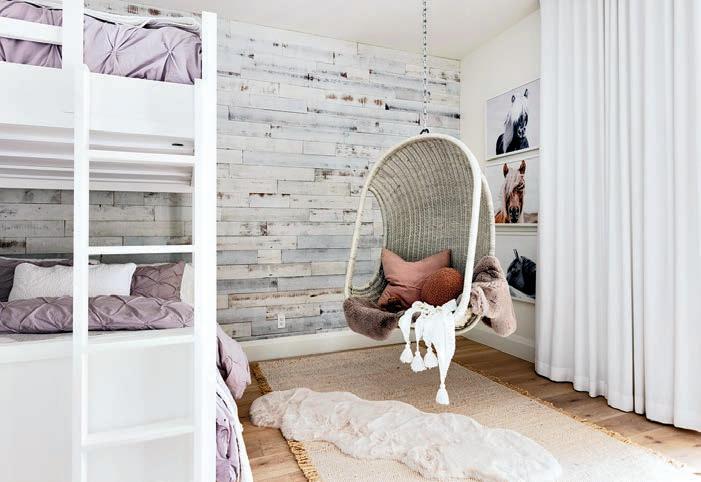
K/V | The design ethos aimed to create a timeless haven to merge modern sophistication with traditional charm. Rooted in natural elements and a neutral palette, the vision was to craft a space that resonates with the family for generations, blending classic architectural features with
contemporary furnishings and lighting.
R+D | What inspired the colour palette?
K/V | The interior design of The Lakehouse draws inspiration from the surrounding coastal landscape, with large windows framing stunning lake and forest views. Shades of greyedout blues and greens reflect the natural hues, while walls painted in SW 7005 Pure White provide a serene backdrop, allowing the beauty of the millwork and white oak elements to shine through.
R+D | How did you ensure a smooth transition between indoor and outdoor spaces in the design?
K/V | Integrating indoor and outdoor living was a priority in the design
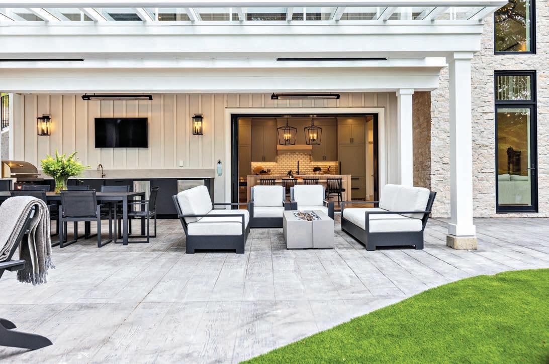
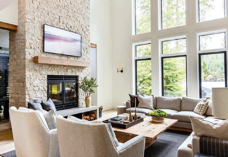
process. Double-height windows in the great room frame panoramic lake views, while a triple sliding glass door connects the kitchen to a covered patio. Outdoor areas were designed to accommodate various activities, from intimate gatherings to entertaining large groups, with provisions for yearround comfort.
R+D | What considerations did you take when designing the outdoor areas?
K/V | Outdoor spaces were meticulously crafted to cater to the needs of the family and their guests, providing ample space for relaxation, dining and entertainment. Every aspect of outdoor living, from swimming in the lake to enjoying meals alfresco, was carefully considered to ensure maximum enjoyment, even on cooler rainy days.
R+D | Were there challenges integrating modern and traditional design elements?
K/V | Integrating modern and traditional design elements posed challenges, but clear communication and compromise were vital to achieving harmony. Classic architectural features were balanced with contemporary furnishings and lighting, creating a space that exudes timeless elegance while offering modern comfort.
R+D | How does natural light contribute to the home’s ambience, especially with its open space design?
K/V | Natural light floods the interior spaces of The Lakehouse, creating a warm and inviting atmosphere. Vaulted ceilings and expansive windows frame breathtaking views of the lake and forest, blurring the boundaries between inside and out, while blackout blinds provide privacy when needed.
R+D | Are there any architectural features that influenced your design decisions?
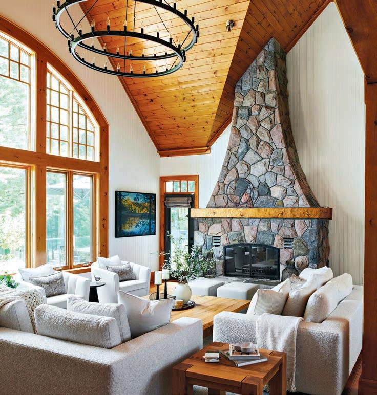
K/V | The vaulted ceilings and a stoneclad wood-burning fireplace were some of the features that served as the foundation for The Lakehouse’s design aesthetic. These elements inspired the overall layout and guided the home’s selection of materials and finishes.

were designed to provide comfort and enjoyment year-round.
R+D | How did you prioritize functionality while maintaining the aesthetic appeal of the interior and outdoor spaces?
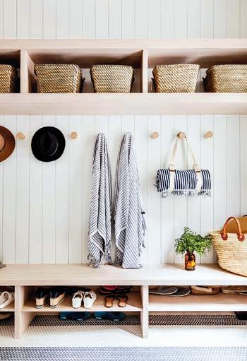
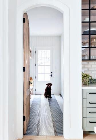
K/V | Balancing functionality with aesthetic appeal was paramount in creating a beautiful and livable home. Quality materials and craftsmanship were integrated into every design aspect, ensuring durability and longevity, while outdoor amenities
R+D | Can you share any unique design elements or features that set this house apart?
K/V | The Lakehouse stands out for its remote location, luxurious yet comfortable living spaces, and capacity to host up to 20 guests. From a dock large enough to accommodate a float plane to a primary suite complete with a hidden office and private patio, every aspect of the home is designed for maximum enjoyment and relaxation.
With more than 15 years’ experience as a magazine editor, writer and content creator, Sara brings her passion for design and decor to our pages each issue. Instagram: @bysaraduck
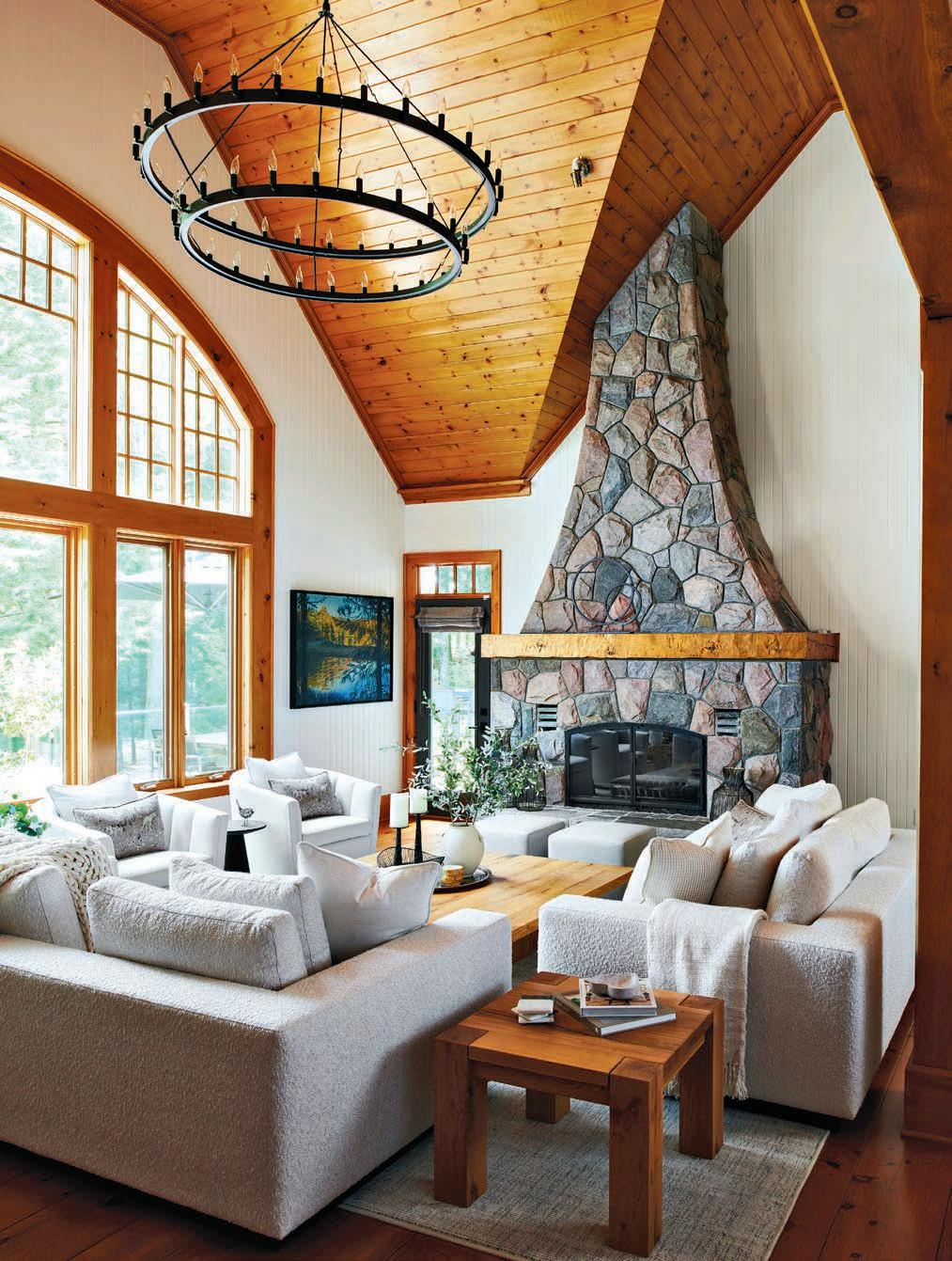
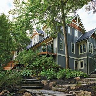
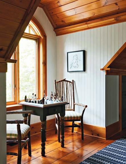
Located along the shores of the iconic Lake Joseph in Muskoka is a picturesque four-bedroom cottage ready for a modern update. Adorned with quintessential cottage features such as large dormers, peaked roofs, and hemlock floors, it exuded timeless charm. However, despite its inherent beauty, the cottage was due for a rejuvenation to align with contemporary design sensibilities. That’s when interior designer, Jane Lockhart, was called in.
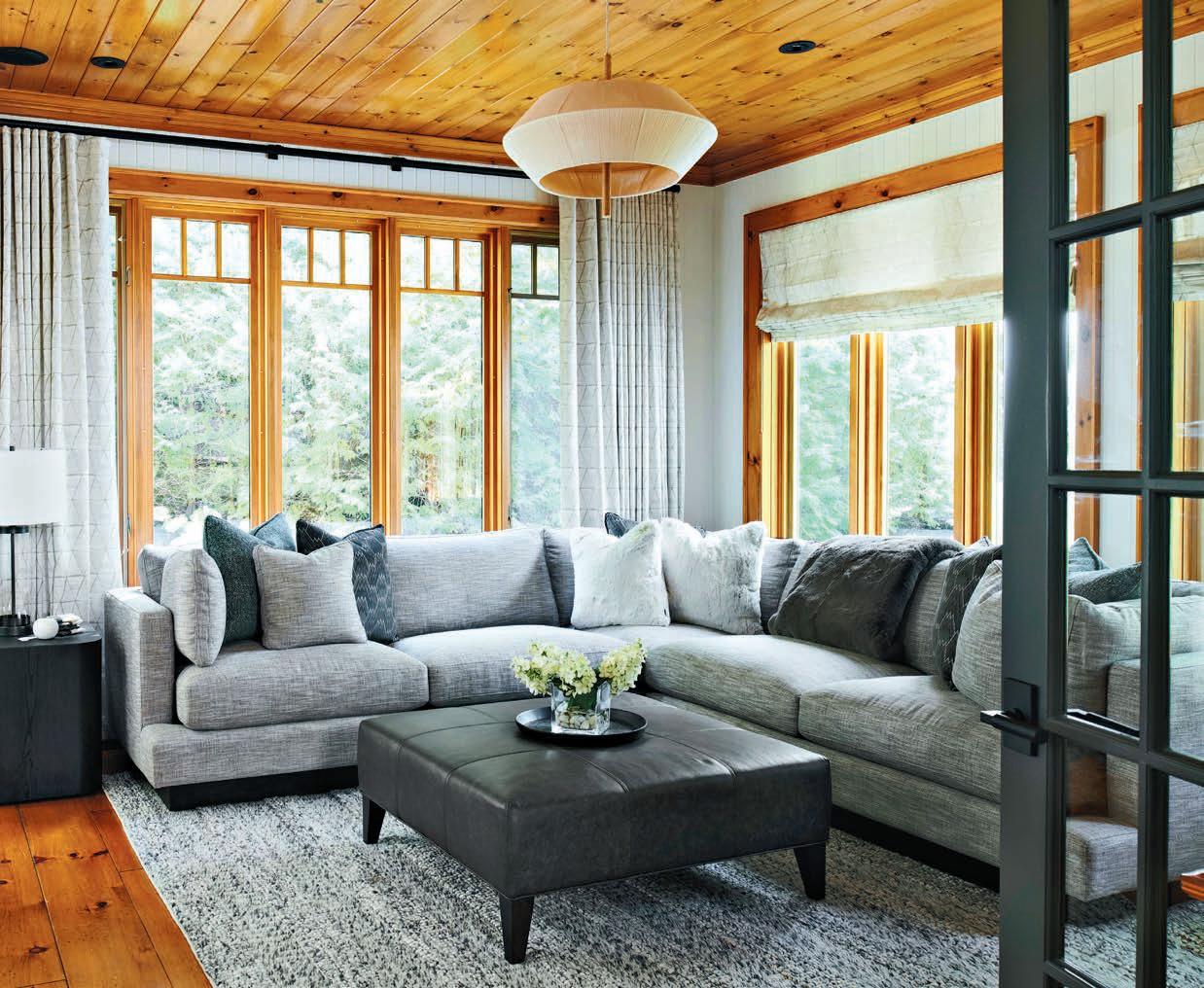
Lockhart’s mission was simple: To blend modern design elements with the cottage’s rustic character. With a keen eye on preserving its original features, every aspect of the
transformation was carefully curated to enhance functionality, efficiency and aesthetic appeal.
Central to Lockhart’s design philosophy was a deep-rooted
connection to nature. Furniture and accessories were thoughtfully chosen to harmonize with the surrounding environment, foregoing flashy elements in favour of understated elegance. The colour palette was kept neutral, with hints of colour reflecting the area’s beauty. Window coverings were reimagined to offer flexibility and allow the homeowners to bask in natural light while maintaining privacy when desired. Wood and stone integrate organically into the entire look of the cottage, while curated photographs on the walls exhibit the area’s outdoor splendour and serve as poignant reminders of the cottage’s idyllic setting throughout the seasons.
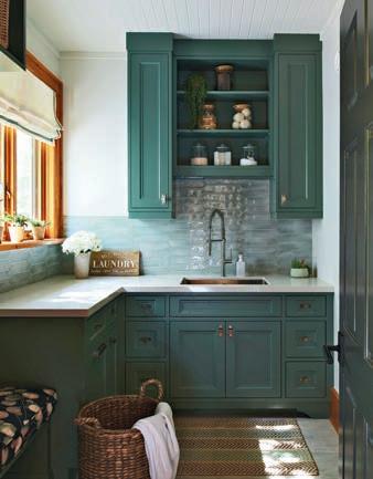
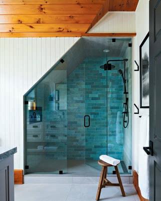
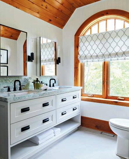
Bathrooms and showers were completely redone from studs to fixtures. Plumbing fixtures and vanities

were carefully selected to elevate visual appeal, with tiles and lighting choices bringing a sense of brightness and airiness into the spaces.
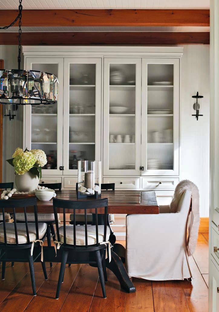
The heart of the home, the kitchen, underwent a striking change. A newly painted tongue-and-groove ceiling was strategically dropped between existing hemlock beams and facilitated the installation of modern LED pot lights, which accentuate the soaring architecture. Gone are the dark hues of yesteryear, replaced with light, refreshing tones to highlight a sense of space and serenity.
Despite its inherent beauty, the cottage was due for a rejuvenation to align with contemporary design sensibilities
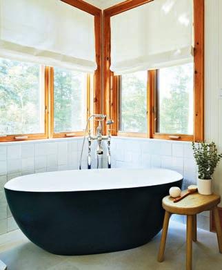
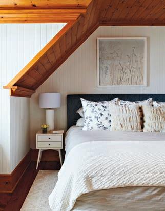
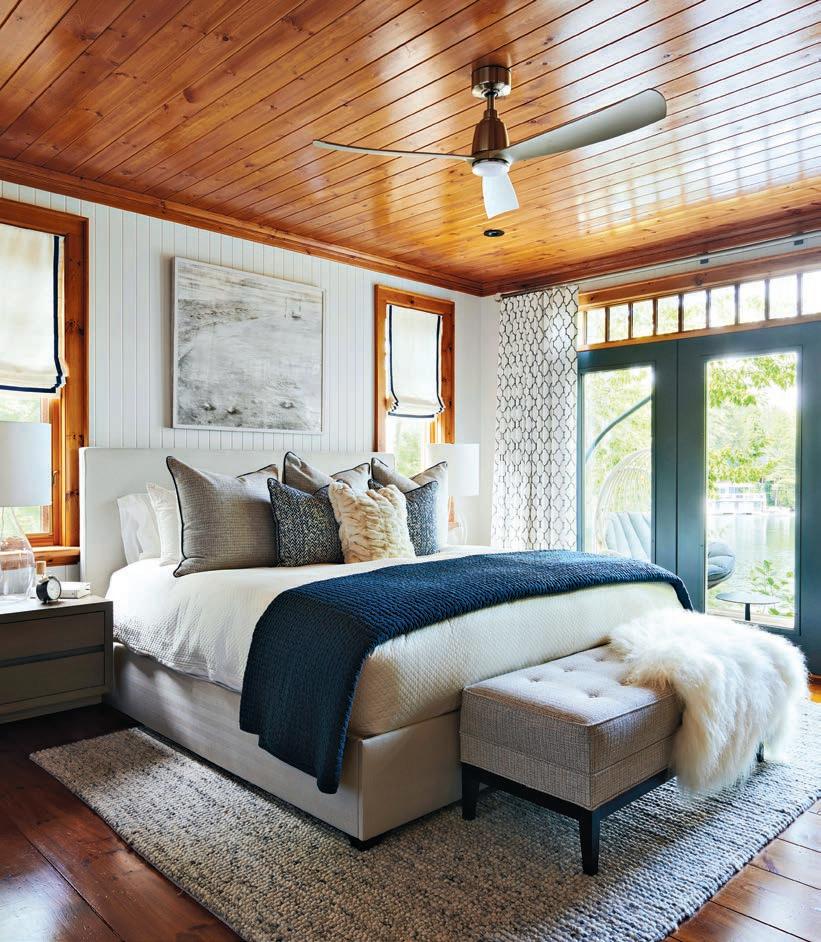
The kitchen renovation was not without its design challenges, however, particularly with the installation of a new hood fan amidst exposed beam structures. Innovative design solutions ensured that functionality was able to coexist with aesthetics to preserve the integrity of the original design concept. Serious attention was paid to sourcing materials locally, minimizing emissions and reducing

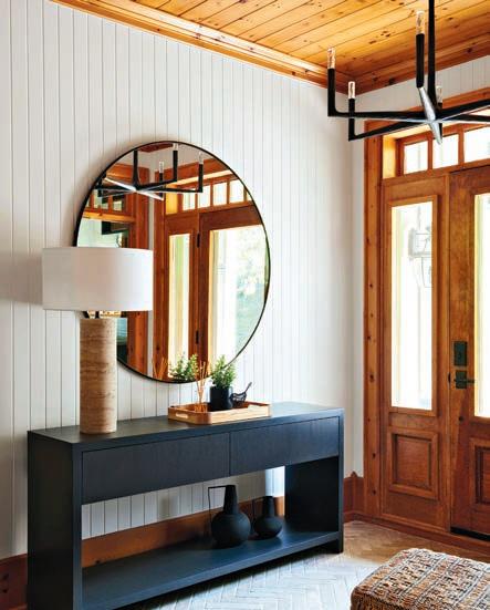
the environmental impact. This commitment to sustainability underscored every aspect of the renovation, further enhancing the cottage’s intrinsic connection to its surroundings.
The result? A harmonious fusion of modernity and tradition, where contemporary comforts intertwine with rustic charm to pay homage to Muskoka’s rich heritage.
janelockhart.com
With more than 15 years’ experience as a magazine editor, writer and content creator, Sara brings her passion for design and decor to our pages each issue. Instagram: @bysaraduck
RENO+DECOR reaches more qualified readers than any other home improvement publication. Our readers are looking for project ideas and connections to professionals that specialize in home improvement, design and construction. Within our colourful, informative format, we can highlight your business, product or service in the best possible way: with creative advertising and/or informative articles and profiles. It’s the best way to get your business the
it needs!


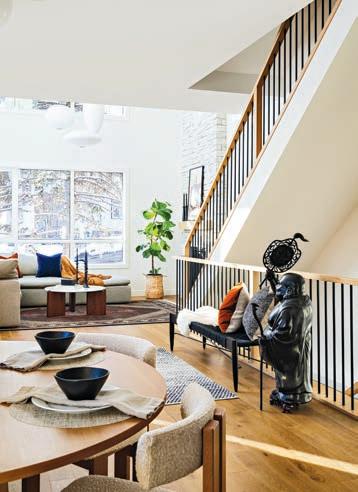
At the start of 2023, my partner and I were looking to purchase a home in Calgary. We had visited a few open houses but hadn’t fallen in love with anything. We even reached out to custom homebuilders but quickly realized that was out of our budget for the neighbourhood we wanted. Then we saw a rendering for a future spec home on a corner property in the area. Modern yet inviting, the three-storey house was to be 3,300 sq. ft., with construction starting soon. Intrigued, we met with the builder. Naturally, as a professional interior designer, the first thing I asked was if I
could redesign everything. I wanted to change the proposed floorplans and reselect all the builder-grade finishes and fixtures. To our surprise, the builder agreed, with the caveat that I stay within their budget and schedule and utilize their preferred trades and vendors. Up for the challenge, we purchased the un-built home and began its redesign.
Wanting to add future value to the home, we negotiated upgrades upfront that were included in the final cost of the house. We added air conditioning, tankless hot water and
by PAIGE JOHNSTON photos KLASSEN PHOTOGRAPHYsmart thermostats. We added a wine fridge to the kitchen. The builder had budgeted engineered hardwood for the main and second floors only, but we had them run the hardwood up to the third level as well.
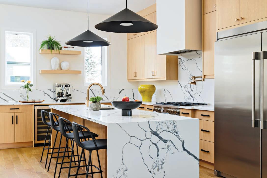
One of the first things I noticed on the builder’s original plans was the kitchen design — it just wasn’t functional. With any kitchen layout, you want to consider the proximity of your main work centres to each other. These are typically the fridge, sink and cooktop (or range). You should be able to
move around your kitchen with ease between these three areas without having to travel too far, but at the same time, you don’t want them too close. As a general rule of thumb, we space each of these appliances four to nine ft. apart from one another. This is known as the kitchen work triangle or “golden triangle”. In the builder’s plans, the fridge and range were more than 15-ft. apart and located on opposite ends of the kitchen, so I moved them around to be closer together.
Next, I enlarged the pantry to include more storage and decided to change the length of the kitchen island, which was originally set to be 12-ft. long. Typically, quartz slabs are only 10-ft. long and I didn’t want a seam in the middle of the counter, so I shortened the island and added a waterfall edge.

In addition to the new plans, I provided the builder with a millwork package that included a reconfigured, more functional laundry room. We reimagined the primary bedroom walk-in closet to include shelves for shoes and some drawers and we looked at the kitchen and bathroom cabinetry to make sure we maximized storage.
Once the functionality of the various spaces was sorted, I moved on to the finishes. Like I do for every design project, I created a look-and-feel mood board to capture the design aesthetic we wanted for the space. I also built a 3-D model to work through the design.
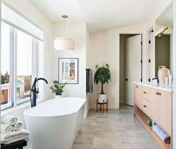
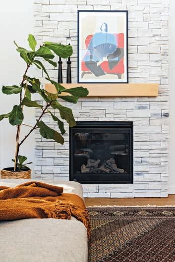
We met with the builder’s preferred vendors and chose the best finishes from their in-stock inventory. For the flooring, we went with a brushed European white oak, engineered hardwood in a warm medium tone. I chose a thinner five-inch-wide plank instead of the much wider plank you often see in spec homes.
I opted for white oak wood cabinetry with a warm glaze finish throughout the house and contrasting black and
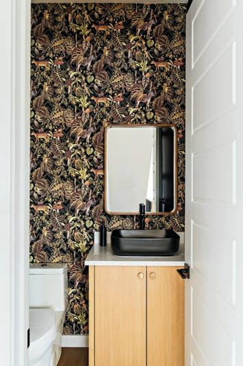
white quartz for the kitchen. For the hardware, I mixed the metal finishes to add visual interest to the space.
One of the biggest constraints we faced was the decorative lighting; we were only given a $5,000 allowance from a lighting vendor we didn’t love. After countless hours of looking through their inventory, we finalized our selection. We did choose to pay out of pocket for a few additional light fixtures from other suppliers to elevate the design, but this was the only thing we did that went beyond the builder’s budget.
The final step was selecting new furniture and accessories to integrate with the pieces we already owned.
While this corner property was intended to be a basic builder’sgrade spec house, we reconsidered the entire space and transformed it into a custom-designed home in just a matter of months. We started the process in Feb. 2023 and moved in at the end of December. The final result? A space we love that we can truly call our own.
Paige Johnston is the founder and principal designer of The Good Design Group, a Calgary-based design studio specializing in hospitality & residential interiors. With more than 12 years of design experience, she boasts a distinctive portfolio of residential and commercial projects. Thegooddesigngroup.com IG: @thegooddesigngroup
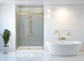




Fleurco is a Canadian company that specializes in the design, manufacture and distribution of a full range of glass shower doors, bathtubs and bathroom accessories. Our company relies on the latest technology and designs to offer you top quality products.
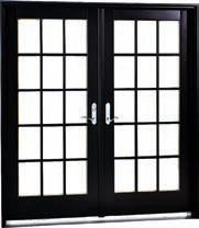
JELD-WEN® steel French patio doors are an excellent investment for homeowners planning a new home build or renovation. They offer energy efficiency, strength, security and are available in various customizations, such as eye-catching colours, finishes, panel designs and glass inserts. Experience the view of a lifetime with top-performing doors at jeld-wen.ca.


Muraluxe is a studio of passionate creators dedicated to crafting distinctive visual experiences. Specializing in personalized architectural panels in custom sizes and finishes. Durable and versatile, providing exceptional solutions for showers, bathrooms, kitchen backsplashes, fireplace mantels, and accent walls. Explore our diverse collections to discover endless possibilities that perfectly complement your distinctive style.
IG: @fleurco.inc
FB: FleurcoShowerdoors




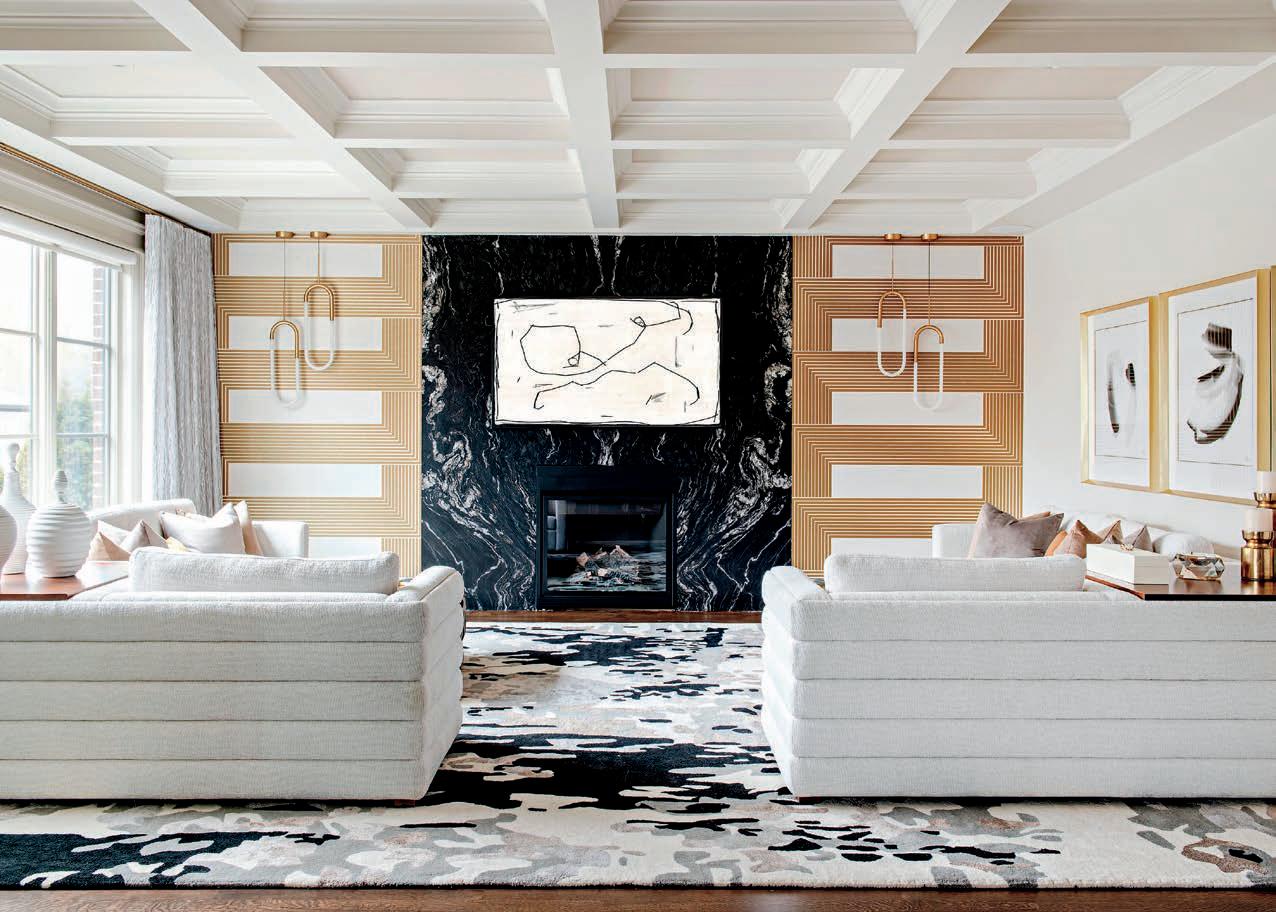


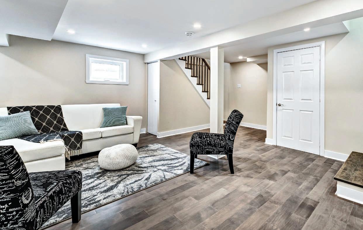
We rely on our five senses to alert us to danger. Sight, hearing, touch, taste and smell – these built-in warning systems allow us to remove ourselves from potential risks. However, when it comes to certain odourless and invisible airborne contaminants in our homes, we need the help of tools and technology to sense their presence. Since we are now building and renovating homes that are more airtight than we did previously (which is the goal for energy-efficiency), trapping – and keeping – dangerous particles inside our home has increased. The good news is, we have products that can help track these contaminants, and remove them from our space.
Volatile Organic Compounds (VOCs) are present in many products that we use to build and decorate our homes. Various paints and coatings, adhesives and sealants, composite wood products, carpeting and vinyl flooring
can contain high levels of VOCs. Cleaning products, air fresheners, personal care products, pesticides/insecticides, and even arts and craft supplies can also contain high VOCs. The solution is to build without them, or purchase lowor no-VOC products, so they never enter the home. The next best thing is to ventilate the space (either naturally or mechanically) to exchange the indoor with outdoor fresh and/or cleaned air, or as a less preferred option, filtered air. VOCs are known to cause health problems in humans, including respiration irritation, organ damage, neurological issues and an increased risk of cancer with long-term exposure.
Nature also produces indoor air-quality concerns. Pollen, pet dander, mould, mildew, dust mites, and radon are all examples of naturally occurring indoor air-quality risks. These also need to be removed to ensure our short-term comfort and long-term health. In the case of radon, a naturally occurring gas that comes into our homes via the basement (from the surrounding soils), it is created when trace amounts of uranium in the soil break down

radioactively. It is not constant and is always moving through soil, so testing for it can be a long-term challenge. Radon can’t be filtered, detected, or interacted with like other gasses in the atmosphere. It’s tasteless and odourless, so we may never know it’s at a dangerous level. Radon is also impossible to eliminate. Fortunately, sub-slab mitigation systems can effectively reduce radon levels to meager amounts, often reducing them by 80 to 90 per cent.
We asked Sonny Pirrotta, national sales manager at Panasonic, for some suggestions. “What homeowners need to look for is an efficient and smart HVAC system to measure, clean and exchange the air, technology that removes odours, allergens, pollens, hazardous PM 2.5 particles and also moisturizes skin and hair. Preferably, this grouping of products are scientifically proven to provide for a fresher and cleaner indoor environment,” says Pirrotta.
In addition, he suggests a product to exchange stale indoor air with fresh outdoor air (such as an HRV or ERV), as well as a system that can measure indoor air quality and automatically control HVAC systems to improve it as needed. Panasonic’s swidget monitoring devices and Nanoe-x systems are examples of technology that advises you of the status of your IAQ, and can automatically and effectively do something about it. The technology deodorizes, inhibits allergens, pollens and hazardous substances, plus eliminates dust. It never needs cleaning or changing. In the case of swidgets, the smart devices replace the typical switch or receptacle, and are able to control any internet-enabled mechanical system, and report to you how clean (or dirty) the air is at any given time.
However, while these systems help with indoor air quality and a list of airborne pollutants, they cannot deal with carbon monoxide or radon.
For these, we need more robust sensors, and some lower tech, but equally impactful solutions. While the building code historically requires smoke and carbon monoxide detectors installed in every home and now it every bedroom, it’s changing to provide solutions to radon risk as well. Bob Wood, from Mr. Radon, says the best way to eliminate the risk from radon isn’t to measure it, but rather, to install an active radon mitigation system, which involves a pipe and fan, vented through to the roof. This can be installed in new or existing buildings, but most don’t do it.
“Radon has been in the Ontario Building Code (OBC) since the late 1980’s,” says Wood. “Unfortunately, the OBC has been deliberately ignored by builders and code enforcement officials. The OBC mandates that builders and code enforcement officials provide a building that does not create illness, providing three choices for builders, including installing an active venting system; installing a stub roughin and test for radon after occupancy; or installing a vapour barrier under the slab and test for radon after occupancy. (Which has been the builder default, leaving the long-term testing to the homeowners after move-in).
“Now that Ontario is adopting the National Building Code (NBC) 2020, a builder must install a capped radon rough-
in and a vapour barrier. The 2025 NBC has a proposed clause that passed the Standing Committee and will require a four-inch passive stack from below the basement floor through the attic to ensure all new buildings can passively depressurize and ventilate at a minimum, but an active system is always best.”
Indoor air quality has always been important, but when our homes leaked air naturally and we frequently opened our windows, it mattered less. We also used to build with more natural products. Now, we are often creating dangerous indoor living environments. With airtight building envelopes, these particles are sticking around for longer, and we end up ingesting them, often unknowingly. The time to take this seriously is now, for the sake of your family’s long-term health.

Brendan Charters is a founding partner at the Toronto design-build firm Eurodale Developments Inc., the 2020 BILD Renovator of the Year. eurodale.ca, IG: @eurodalehomes




JODABI GLOBAL INC. BEST OVERALL SPACE RENOVATION
It was an honour to gather with the Greater Toronto Area’s best renovators and custom-home builders on April 18 to celebrate the 2024 RenoMark Awards. Since 1999, the awards have recognized professional renovators and custom-home builders who are members of the RenoMark program for their quality of work, innovation, customer service and industry leadership.
This year, we received 96 highquality submissions in 18 categories,
including the prestigious Renovator of the Year and Custom-Home Builder of the Year categories. These were then evaluated by 15 industry professionals from across Canada who served as volunteer judges, which was no easy task as the competition was fierce.
The top honours in the 2024 RenoMark Awards went to BRIKS Design Build Group, named Renovator of the Year. Marvel Homes Development won Best Overall Custom Home, Jodabi Global Inc. won Best Overall Space Renovation,
and Norseman Construction won Best Overall Home Renovation. The recipients of these coveted awards set the standard for the industry in customer service, professionalism and workmanship.
The space renovation categories saw Eurodale Design + Build (Best Basement), Jodabi Global Inc. (Best Washroom & Kitchen Renovation under $100,000) and MENATWORK (Kitchen Renovation over $100,000).
For home renovations, winners included Jodabi Global Inc. (Best
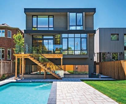
Renovation – No Addition, under $300,000), Norseman Construction (Best Renovation – No Addition, over $300,000), A. Mather Fine Homes Inc. (Best Renovation – Addition, over $300,000), and Woodsmith Construction Inc. (Best Innovative Renovation). Inspire Homes was the acclaimed winner of Best Universal Design/Renovation.
In the condominium categories, Sunnylea Homes Ltd. won Best Condominium Renovation under $200,000 while Eurodale Design + Build won Best Condominium Renovation over $200,000.
The award for Best Commercial Renovation went to JY Construction.

For custom homes, Pine Glen Homes was awarded with Best Custom Home over $2 million and Marvel Homes Development for Best Custom Home under $2 million.
The finalists and winners of this year’s awards truly embodied the excellence and professionalism of our RenoMark members. Founded by BILD in 2001, the RenoMark program connects homeowners with professional renovators and contractors who have agreed to abide by a stringent code of conduct, which promises a superior level of service and customer protection that is higher than the common industry practice. Homeowners can find a

participating renovator or custom homebuilder in their area by searching the RenoMark website at renomark.ca.
To learn more about the winners, visit renomarkawardsgta.ca.
Dave Wilkes is president and CEO of the Building Industry and Land Development Association (BILD), the voice of the home building, land development and professional renovation industry in the GTA. For the latest industry news and new home data, visit bildgta.ca. BRIKS Design Build Group RENOVATOR OF THE YEAR Eurodale Design + Build BEST BASEMENT RENOVATION Norseman Construction BEST OVERALL HOME RENOVATION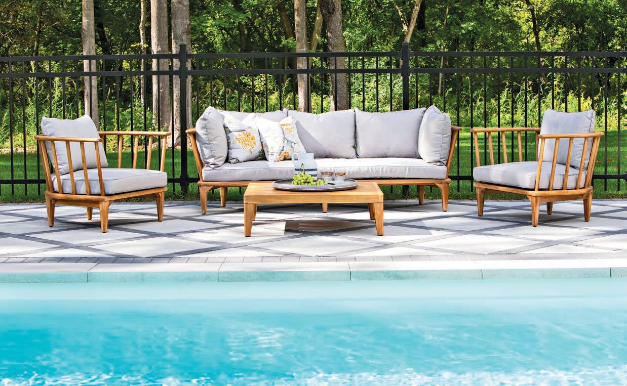
Outdoor living doesn’t necessarily mean “roughing it.”
Quite the contrary. Modern trends and innovations are making our outdoor environments every bit as stylish, comfortable and functional as our interiors. Indeed, decks, balconies and backyards everywhere have undergone a transformation, both in the design process and the finished result. With the 2024 outdoor season now upon us, here are some trends that have already begun to bud and bloom.
Every great space —indoors or out – starts with a vision, and that vision
by EUGENIA TRIANDOSis based on a balance of function and aesthetics. Delineating specific purposes for your outdoor area, such as cooking, dining, relaxing or socializing, with considerations for preferred style and ambience, is the first step in a new, reimagined outdoor environment. Every al fresco area should maintain a coherent and practical link with the interior of the home, such as situating the outdoor dining space adjacent to the kitchen.
Embrace a broader perspective by considering how your property harmonizes with its surrounding landscape beyond its borders. Take note of its orientation and exposure. Then, maximize your space by
strategically organizing seating areas. For example, set up a cosy spot to enjoy your morning coffee with the sunrise, or arrange a table and chairs for hosting hors d’oeuvres and cocktails during sunset hours. On the flip side, hide undesirable views with hedges or screens.
Looking for inspiration? Look inward – in the nearest window, that is. Some might choose to lean into the nature trend, but remember, the backyard is a living space and it should be treated as an extension of the inside. Take cues from your interior colour palette, material selections and textures, and adapt them for the elements. Each functional zone of your outdoor living
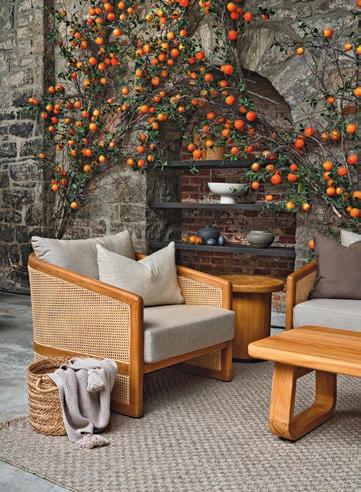
area requires suitable flooring, lighting, and embellishments to complete the look. When furnishing, consider integrating textiles as a means of blurring the boundaries between the indoors and outdoors. Soft cushions, throws and area rugs add comfort and cosiness and infuse the space with personality.

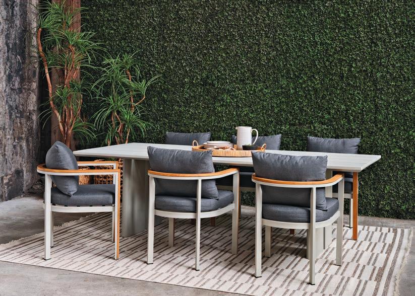
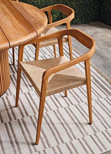
Choose pieces that are weatherresistant, while gracefully adapting to evolving design trends. Embrace natural materials such as wood, stone, rattan, wicker, teak and aluminum for timeless allure, seamless integration with nature, and the ability to withstand the elements. While factors such as UV exposure, wind, rain and fluctuating temperatures were once obstacles, today they are common considerations for designers who specialize in outdoor furniture collections.
In recent years, there’s also been a notable inclination toward versatile and interchangeable outdoor furniture pieces. New outdoor collections such as Somos exemplify this trend, offering modular designs that accommodate diverse layouts, and functional and aesthetic preferences. The appeal lies in adaptability, encouraging creative exploration in outdoor decor. Unlike conventional furniture sets, these foster individuality and allow for the creation of bespoke outdoor living areas that resonate with personal style.
Transform your backyard by integrating lighting to enhance your outdoor cooking areas to facilitate meal preparation. Elevate the ambience and perception of space by incorporating up-lighting techniques on trees or fencing throughout the yard. Prioritize safety with decorative yet functional lighting near steps and along pathways.
One might think that our indoor and outdoor environments are opposites, but from a design perspective, the two have a lot in common, especially when viewed through the lens of comfort and style. When planning your outdoor retreat, reflect on your lifestyle and your aesthetic preferences, then put them through the wringer of the spring’s rain, the summer sun and autumn’s wind. There’s an art to creating a great outdoor living area. With the right planning and products, a basic backyard can be transformed into arguably the best room in the house.
Eugenia Triandos, is the principal designer for Montreal-based Hibou Design & Co. This multi-disciplinary design firm is known for creating interiors that are uniquely reflective and functional to their clients. Providing bespoke residential design services throughout Montreal, Ottawa, Ontario, and North America. hiboudesignco.com Photo: Hibou Design & Co. Photo: Phil BernardAgrowing trend in recent years has been to incorporate specialized drink stations (including wine displays) into home design. Whether you’re a coffee lover, a wine enthusiast, or someone who enjoys entertaining guests, a personalized beverage station can add a touch of luxury and convenience to your living space.
The first step in creating this type of dedicated area is to choose the correct location. The ideal spot will
 by JESSICA CINNAMON
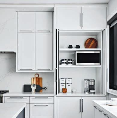
depend on your preferences, available space, and the type of beverages you plan to serve or display. A small corner of your kitchen is perfect for transforming into a cosy coffee bar (make sure there is enough countertop depth) or wine display. This location is convenient for daily use and integrates your drinks station into your overall kitchen design. It’s good to keep in mind that wine should be stored away from potential sources of vibration, such as appliances. This expediates the chemical reactions and advances maturity, undermining the benefits of long-term aging.
If you love to entertain, a dining room drinks station can become a stylish focal point during dinner
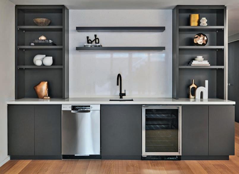
parties and gatherings. Consider incorporating a wine rack, bar cart, or coffee nook to enhance the space’s overall functionality. A drinks station in the living room can be an excellent option for a more casual and relaxed vibe.
Once you’ve chosen the location, it’s time to focus on the design and functionality. Investing in quality storage is important to keep your beverages and accessories organized. When it comes to a wine display, there are two main types. One that is temperature-controlled (cooling units such as a wine fridge will be required) and the other purely for display. To keep the design cohesive, choose wine racks that complement the overall aesthetic of the room. Popular materials include wood, glass, and stainless steel. Ensure that bottles are placed horizontally. This is better for the wine, keeps the corks moist, and ensures minimal air seeps into the bottle. To keep your drinks station looking tidy, incorporate shelves or drawers.
Depending on your beverage preferences, you may need specific equipment such as an espresso machine, coffee maker, blender, or wine cooler (many different sizes available). Choose high-quality items that look stylish and perform well to ensure a perfect drink every
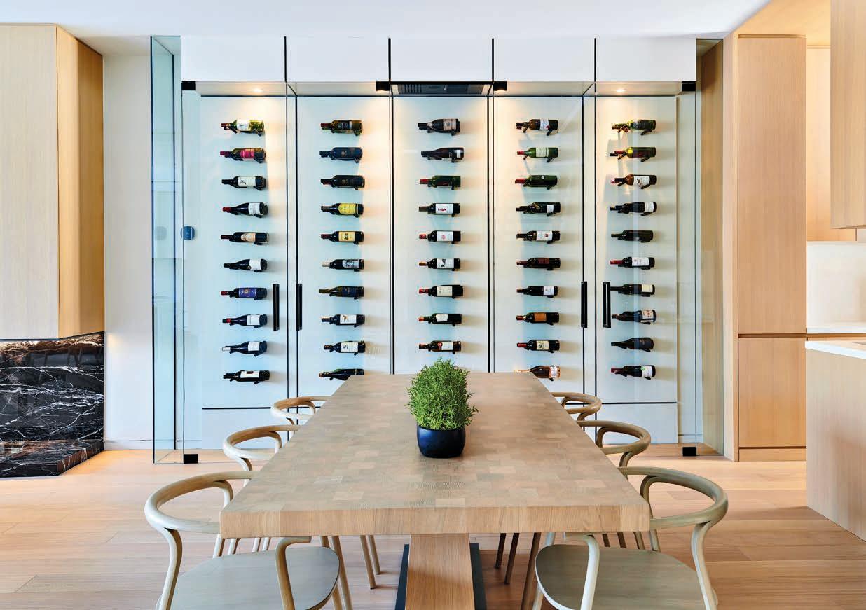
time. Next, add decorative elements to enhance the aesthetics of your drinks station. Consider incorporating artwork, plants, or decorative accessories that reflect your style and complement your home’s decor. Of course, good lighting is essential for creating the right look and highlighting your drink station’s features.
Consider adding task and ambient lighting for preparation areas to create a warm and welcoming ambience. Wine and lighting don’t pair well, so using LED lights and adding dimmer

controls reduces the risk of UV exposure and can set the mood for intimate and evening entertaining.
Maintaining your beverage station is essential for it to remain functional and inviting. Regularly clean and organize the area. By carefully choosing the location, designing the perfect set-up, personalizing the space, and maintaining it regularly, you can create an entertaining hub you’ll love using and sharing with others.
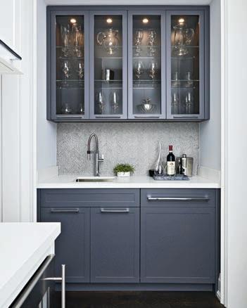 Jessica Cinnamon is the principal designer and founder of Toronto-based Jessica Cinnamon Design Inc., a multi-disciplinary design company that creates stylish and well-curated interiors, and provides complete bespoke residential design services in Toronto, the GTA, cottage country, Chicago, and Los Angeles.
Photo: Naimh Barry Photography
Photo: Stephani Buchman
Turn your yard into a drought-resistant

The white picket fence, the red rose bush, the green, green lawn – it’s the picture-perfect yard of the ideal home that many North Americans dream about. But in these days of climate change and widespread drought, that ideal is becoming increasingly unrealistic.
The water needed to keep gardens and yard turf healthy and green is not
only a strain on the budget, but also strains the water supply of an entire municipality. In the Prairies especially, with deepening drought conditions, water restrictions will likely be imposed this summer, meaning water for lawns and gardens will be curtailed.
There are still people who hesitate to have a drought-resistant garden,
thinking it may end up looking as if it belongs in the middle of the Mojave Desert. Although there is beauty in that landscape, it can be difficult to change a deep-seated desire for a green suburban lawn.
That being said, according to the experts, there are many creative and inexpensive ways to turn your yard into a suburban oasis that is easy on the eyes and not difficult to maintain.
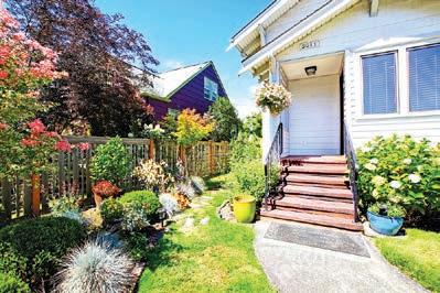
1 2 3 4 5
Water at the right times: The best time to water the lawn is in the early morning or late evening, when it’s cooler.
Know the type of soil: The frequency and amount of water you apply to grass varies depending on the soil, type of grass and weather conditions.
Cut long: Don’t cut more than one-third of the grass height when mowing. By keeping it longer, the grass can develop stronger roots and a greater tolerance to heat and drought stress.
Don’t over-water: Make your grass work hard for its water. With less water, grass will send its roots deeper, seeking moisture. By working harder, the grass does a better job of sequestering carbon and releasing oxygen.
Keep foot traffic minimal: For already stressed grass, foot traffic can cause damage. Keep people off the lawn while the heat persists.
The city of Calgary is expecting drought conditions to worsen this summer, and so it’s promoting its “YardSmart” initiative that offers advice on maintaining a water-wise yard and garden.

The first tip is to sketch your yard and map out where throughout the day there is sun and shade, as well as dry and wet areas. Then you can plan for specific zones for things such as play areas, dining and entertainment, composting, gardening and rain barrels.
Make a note of where water runs or pools and group plants with similar water needs together. Slope flowerbeds, if possible, and place plants that need the most water at the lowest part. Shape the beds so sprinklers and soaker hoses can easily accommodate them and choose native plants that support pollinators or plants that have proven to be lowwater users.
One can also take inspiration from a Japanese rock garden and incorporate decorative rocks and gravel with driftwood and lawn ornaments to take the place of flowerbeds and sod.
There is also the method of “xeriscaping.” According to Chinook Landscaping in Calgary, xeriscaping means you don’t have to water your yard very often, or at all. To do this, you would have to choose plants that are native to the area.
The TurfMutt Foundation, an organization that advocates for the care and use of yards, parks and other green spaces, encourages lawn design that works with nature. “A successful
eco-friendly backyard is one with plants that support your lifestyle and ones that will thrive in your climate zone, with minimal input from you,” says Kris Kiser, the foundation’s president and CEO.
He says homeowners should refer to Canada’s Plant Hardiness Zone Map to find the plants, shrubs and trees that are best suited for their region and home, as they will do better during times when water is scarce.
Choosing the right plants will create a space that is not only attractive, but it will also more likely thrive in your microclimate, be easier to maintain, and will support pollinators and wildlife. Consider your lifestyle needs, too. A hardy grass variety is more likely to hold up to pets and kids. Save delicate flowering plants for patio containers and be sure to do your research on plants that are toxic if ingested by small children and pets.
“No matter the region, during a heat wave or where they may have to impose water restrictions, it’s important to take care of your living landscapes, so that it’s there for you when water scarcity ends,” Kiser says.
“When properly planted and cared for, our yards and community parks can affect climate change on a microlevel and provide support for backyard wildlife and pollinators. Remember, nature starts at your back door, and when done right, your yard is a good place for people, pets and the planet.”
Photo: courtesy Turfmutt Foundation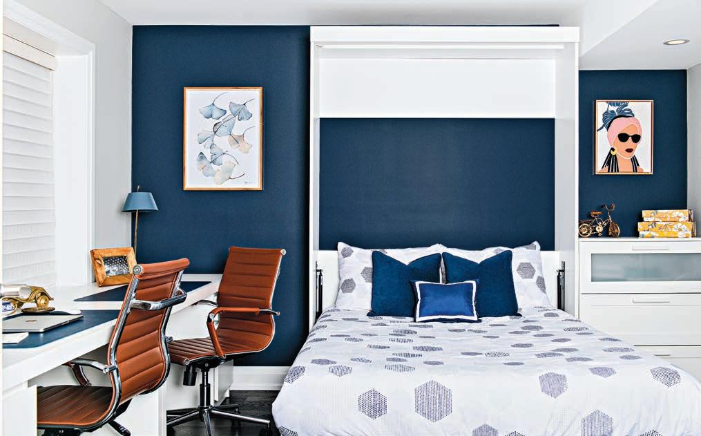
Basements offer limitless potential
Most homeowners these days are looking to maximize the use of their home’s square footage, and that’s when designing multi-functional spaces becomes an importance piece in the home-renovation puzzle. In our recent project, we converted an unfinished basement into a versatile living space that transitions easily between work and family life. Getting to the finished product to meet multiple needs and styles required some careful planning.
Before delving into any design decisions, take time to consider your family’s specific needs and lifestyle.
Are you looking for a quiet workspace, a recreational area, or a blend of both? Will you be hosting guests? How much storage space will you need? These are just some of the many questions to consider during the concept-building stage. Understanding how you’ll use the space will influence every aspect of the design.
Typically, basements come with unique challenges, such as low ceilings or limited natural light. Fortunately, this project was a walkout basement with oversized windows that provided views of the lush outdoors, and so had ample natural light. It was crucial to include these windows into the most frequently
used rooms, in this case, the office and recreational area. To optimize ceiling height, we relocated air ducts during the design phase. We also tackled the challenge of three existing support posts in the recreational area by integrating them into two custom rectangular pillars connected with a custom floating desk and drawer. Additionally, we extended the depth of the wall for the television and fireplace to allow for floating built-in storage units on both sides.
To meet the needs of the family, we needed to create zones to allow for the transition between work and family
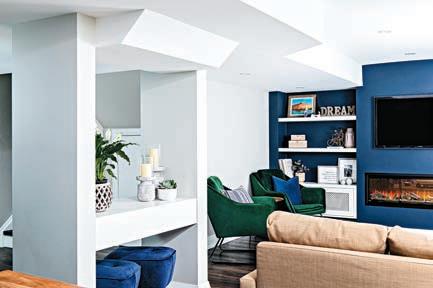

activities. We used a large area rug with the sectional sofa to define the recreational space. The dining table was positioned between that area and the office, and served as a work surface during the day and a spot for the family to gather after hours.
It’s important to balance colour, patterns and textures when considering the flow of a space. When selecting furniture and decor, opt for items that not only look good, but also serve their purpose effectively. Choose durable materials and fabrics that can withstand the wear and tear of daily life. And don’t forget to add some personality. In this project, bold botanical wallpaper served as a backsplash for the kitchenette, setting the colour palette and vibe throughout the entire space. It was a fantastic way to add a touch of style while remaining budget conscious.
Multi-functional spaces should be adapted to suit various needs. Look for furniture that can be easily moved around or adjusted to fit different purposes. In this basement, we installed a Murphy bed in the office to maximize workspace, while still accommodating occasional guests outside of office hours.

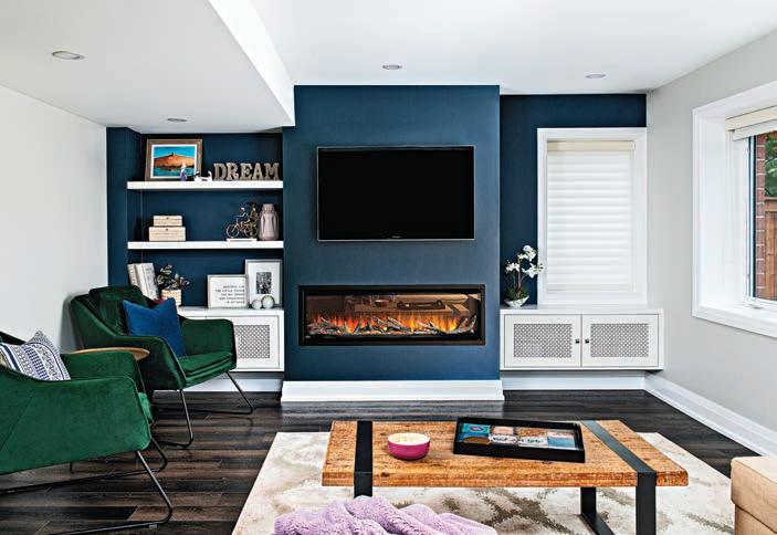
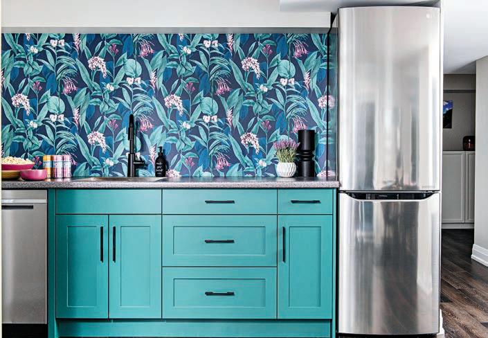
Incorporate plush seating, soft textiles and warm, dimmable lighting, perhaps even using smart technology integration, to create an inviting atmosphere where both work and relaxation thrive.
Here, we balanced productivity with comfort by strategically placing the television for work presentations during the day and movie nights with the family in the evening.
Our homes are more than just places to live; they help us lead our most purposeful lives. No matter the room, we can design any space to meet our needs and support our daily routines. With the right inspiration, you can transform your spaces to meet the diverse needs of your family’s lifestyle. With thoughtful planning and a touch of creativity, forgotten spaces can be turned into areas where work, play and relaxation seamlessly coincide.
Alaa ‘Luli’ Yassin is the principal and creative director for Interiors by LULI, an award-winning design studio creating timeless and inviting spaces for purposeful living. interiorsbyluli.com IG: @interiorsbyluli
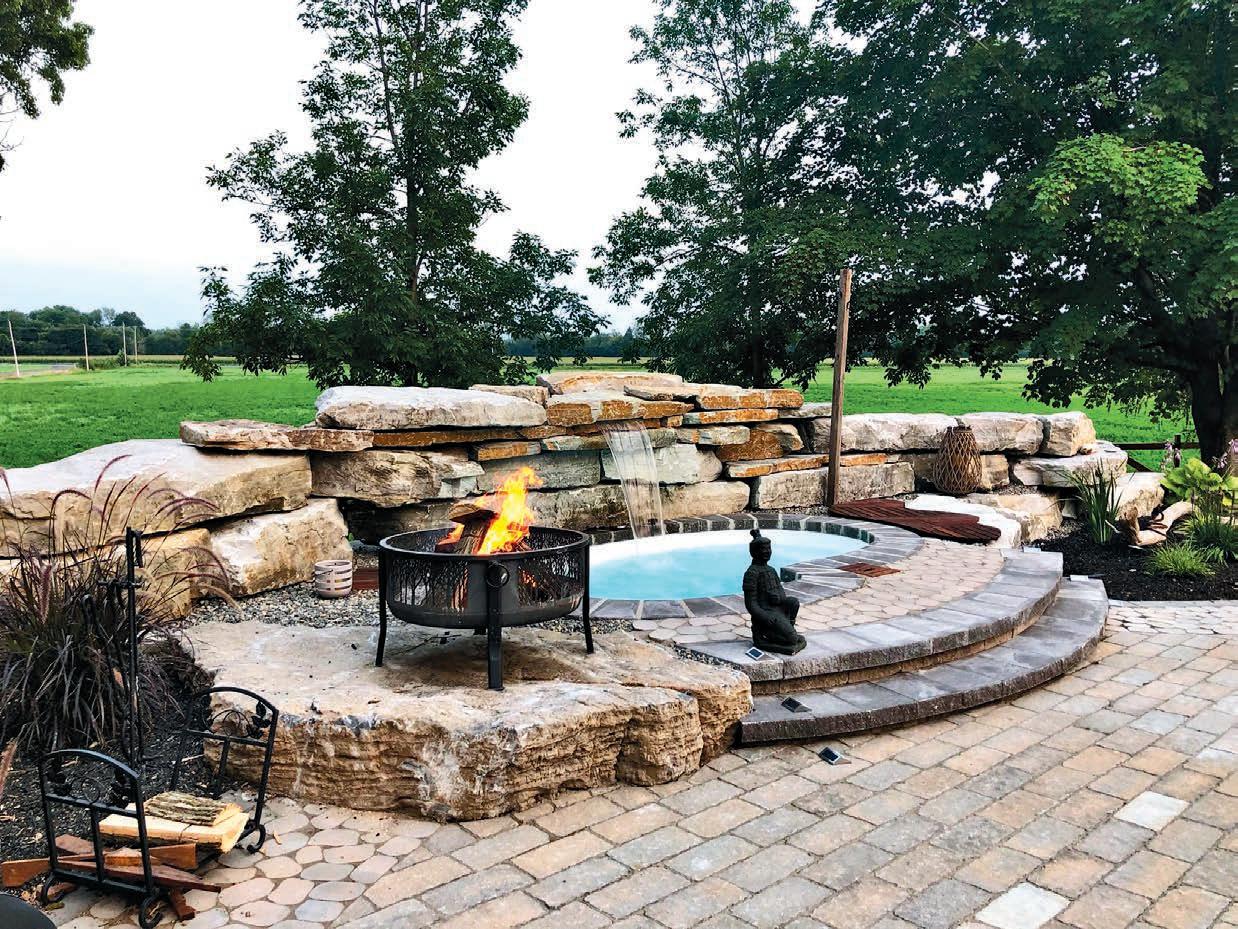
Water feature adds extra dimension to this backyard makeover
In today’s busy world, finding peace and quiet can be a challenge. But for one couple with demanding schedules who longed for a retreat from their busy lives, their backyard became a destination for relaxation.
Situated in the serene outskirts of town, their century-old farmhouse is surrounded by acres of open fields and expansive sunset views. However, despite the picturesque setting, the backyard presented a stark contrast. It
was a bare space that lacked form or function.
After devoting attention to the home’s interior, the homeowners wanted to concentrate on the exterior. The goal was to transform the naked landscape into a personalized sanctuary and more importantly, to provide a sense of calm and privacy the couple desired.
To breathe life into it, we focused on three key design elements: Creating zones for relaxing; installing a refreshing water feature; and incorporating items reflected in the yard’s natural countryside surroundings.
The clients wanted a private backyard retreat for evenings and weekends. However, a key challenge was defining the space to provide a sense of seclusion, while still blending with the surroundings. This was overcome by selecting large natural stones sourced from a nearby quarry to carve out an intimate nook. These stones, with their rugged appearance, were dry-stacked and installed to blend with the landscape. The resulting natural wall contours the pool area and brings the desired level of privacy
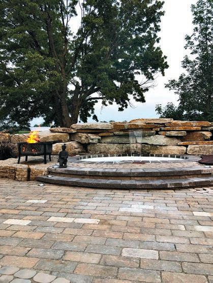
The goal was to transform the naked landscape into a personalized sanctuary
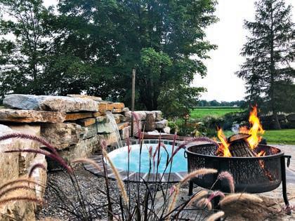

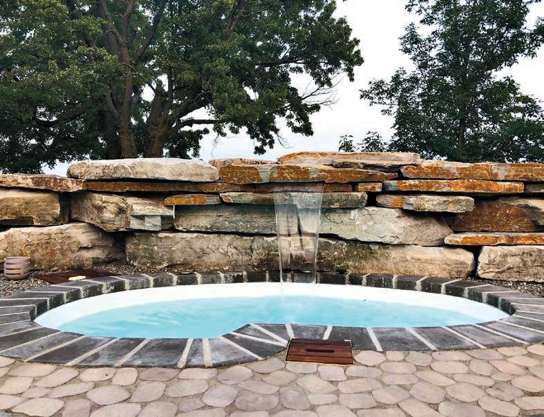
and intimacy to the otherwise open backyard.
Central to the backyard transformation was the installation of a fibreglass plunge pool, which would become a focal point to anchor the design. We chose a small, free-form model, so upkeep is easy for the homeowners, plus it adds a playful touch to the overall aesthetic. The pool’s calm waters offer cool relief on hot days and a peaceful spot for unwinding. Enhancing the natural vibe is a cascading waterfall that was carefully integrated into the pool’s water circulation system and plumbing infrastructure.
Surrounding the front of the pool is a spacious patio area that was laid with natural-toned pavers, chosen for their timeless appeal and easy maintenance, and providing a durable and visually pleasing surface for outdoor activities. The seamless connection between the patio and
pool area maximizes functionality and flow, for easy enjoyment of the outdoor space.
As the sun starts to set, the magic of the retreat begins to unfold. Purposeful decorative lighting was integrated into the design, casting a soft glow to enhance every curve and contour of the space, adding warmth and intimacy. Crafting a well-lit outdoor living area creates a multi-dimensional home that can be enjoyed both day and night. Thoughtfully designed landscape lighting enhances the yard’s aesthetic appeal and lends a sophisticated, well-maintained look to this home.
The four-week project resulted in designing a meaningful space tailored to the lifestyle of this busy working couple. From quiet evenings to lively gatherings with friends, every aspect of the backyard reflected their unique preferences and desires, allowing them to fully utilize and enjoy their private retreat.
LARGE KITCHEN & PINNACLE
Designer: Martin De Sousa
Michaela Burns
Designström Inc.
PEOPLE’S CHOICE
Designers: Christine Da Costa, Maria Perketa
Aspire Design Group
BEST “BEFORE AND AFTER” BATH
Designer: Erica Sibley
Binns Kitchen + Bath Design
BEST “BEFORE AND AFTER” KITCHEN
Designers: Ewa Fisher, Karen Bigiel Fishee Designs
BEST TRADITIONAL KITCHEN
Designer: Angel Yalda Two Tone Interiors
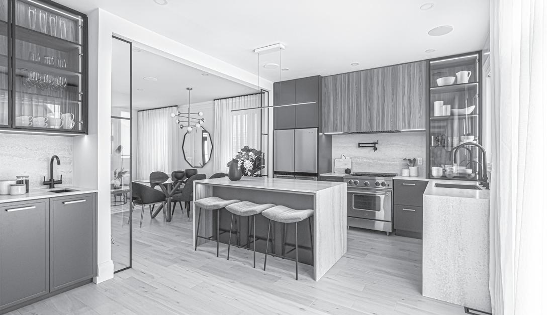
BUDGET FRIENDLY KITCHEN
Designer: Alannah Bent
Alannah Bent Inclusive Design
BUDGET FRIENDLY KITCHEN
Designer: Deborah Mesher
Natalia Bienkowska
Drôle House Inc.
SPECIALTY KITCHEN
Designers: Martin De Sousa, Michaela Burns
Designström Inc.
MEDIUM KITCHEN
Designer: Jessica Cinnamon
Jessica Cinnamon Design Inc.
SMALL KITCHEN
Designer: Martin De Sousa
Holly Cowieson
Designström Inc.
COMPACT KITCHEN
Designer: Christina Fox
Binns Kitchen + Bath Design
The NKBA is the premiere association educating and certifying Kitchen and Bath Professionals. For more information visit nkba.org
LARGE BATHROOM
Designer: Diana Bastone
Diana Bastone Designs
MEDIUM BATHROOM
Designers: Christine Da Costa, Maria Perketa
Aspire Design Group
SMALL BATHROOM
Designer: Rotem Lamsee
Ace Of Space Interiors
POWDER ROOM
Designer: Amanda Shields
Amanda Shields Interiors
OTHER ROOM
Designer: Jenny Kys, Otley Design Company
Tish Firman, Lovegrove Construction
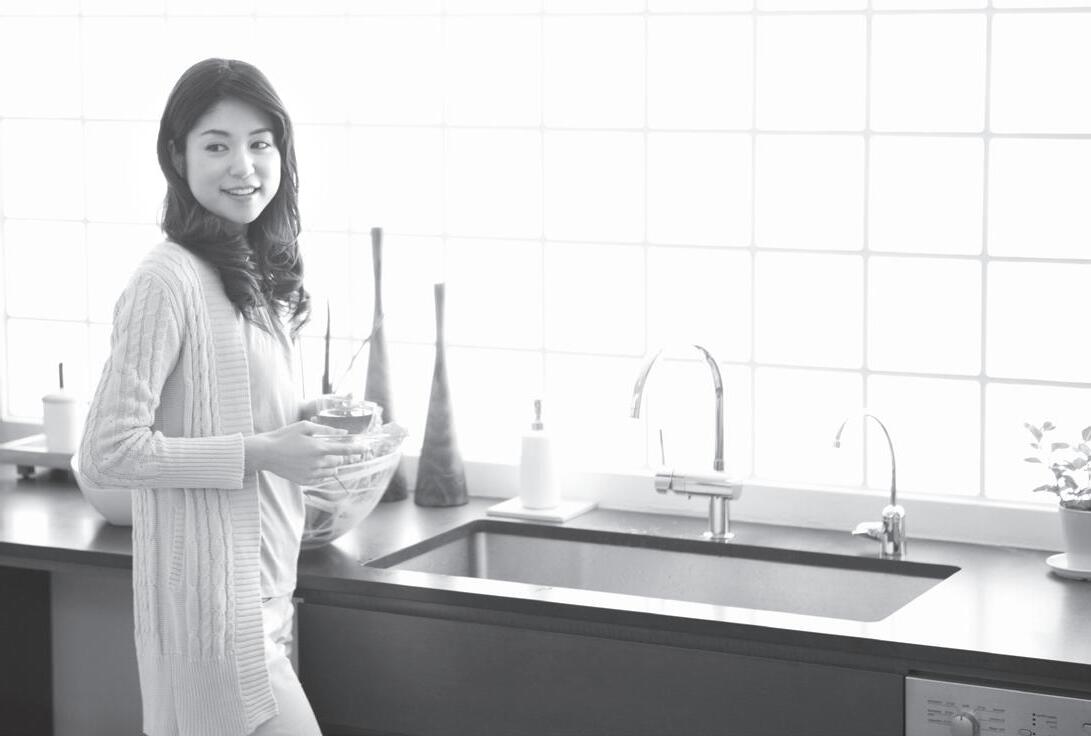
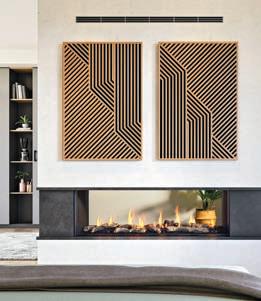
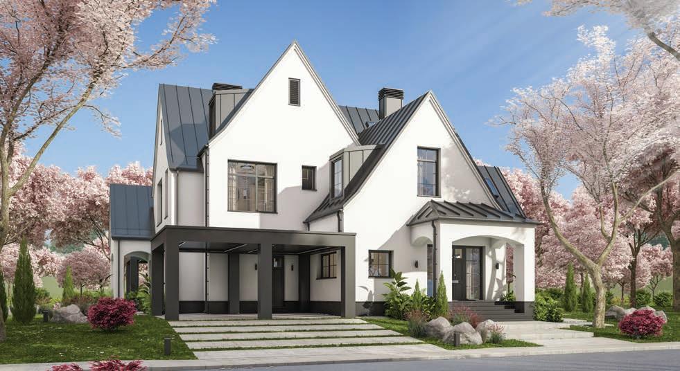
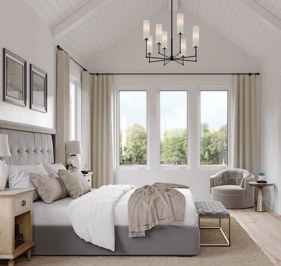
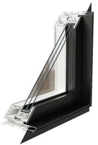
DURABLE AND LOW-MAINTENANCE
VINYL AND ALUMINUM CONSTRUCTION
ALUMINUM-C L AD EXT E RIO R , OFF ER E D I N AN A TT R AC T IV E SELEC TION O F COL O UR S
SL EEK, LOW -P ROFILE HARD W ARE DE S IG N
ENE RGY-EF FI C IENT DUA L-P AN E AN D TRI- P ANE LO W -E G LASS O P TION S
26% LO WER P RO FI LE F RAM E INCR EASES GLA SS AR EA
UP TO 22% BE TTER ENERGY EF FICIEN CY
With the unique changes of our Canadian climate, the demand for energy-efficient products that can stand up to the elements is higher than ever. JELD-WEN® of Canada proudly introduces the groundbreaking JWC8500 series window —a perfect blend of style, performance, and energy savings, meticulously engineered to exceed expectations. Our newest JWC8500 hybrid option exceeds performance, in all regions of Canada, offering an aluminum-clad exterior finish with an exquisite selection of colours to choose from.
Discover the advantages of JELD-WEN of Canada’s most energy-efficient window. Our 8500 series windows are 2030-rated to meet Canada’s U-Factor 0.14 (U.S./I-P) / 0.82 (Metric/SI) or ER 44 building codes, and are designed to significantly reduce energy costs while ensuring year-round comfort in your home.
Tailored to meet the regional needs of homeowners, our windows are the perfect fit when planning a renovation or new home build, seamlessly blending functionality and style to suit any project.
Discover the JWC8500 series window from JELD-WEN of Canada—and experience the future of home comfort and efficiency.

