

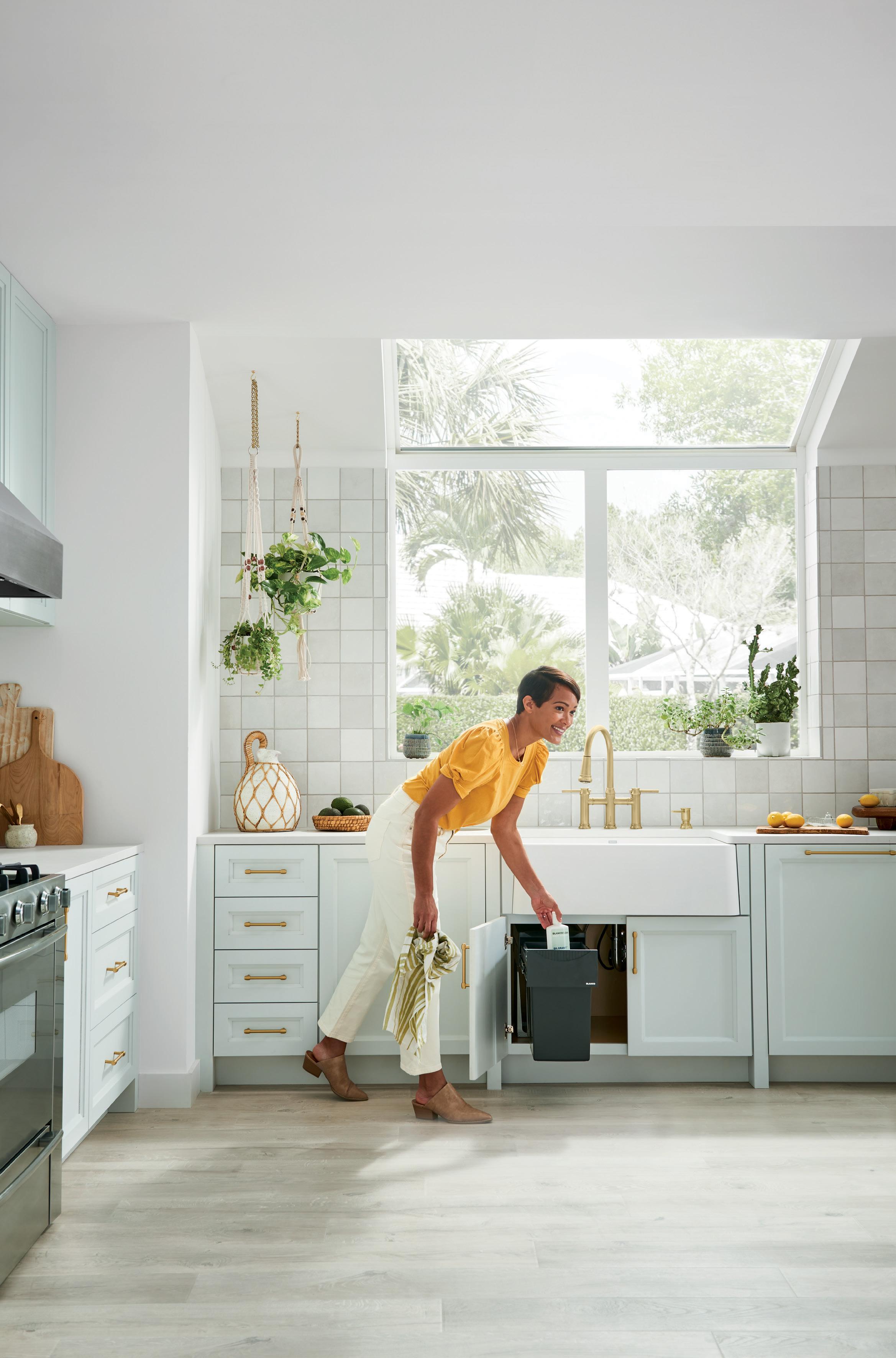
Our deep apron-front sinks serve as a gathering place and our timesaving accessories act as helping hands. When it comes to family dinners and Sunday baking, a complete farmhouse BLANCO UNIT fit for a busy family can make a world of difference. Turn everyday meal prep into cherished memories with a farmhouse BLANCO UNIT.
Scan to explore this BLANCO UNIT

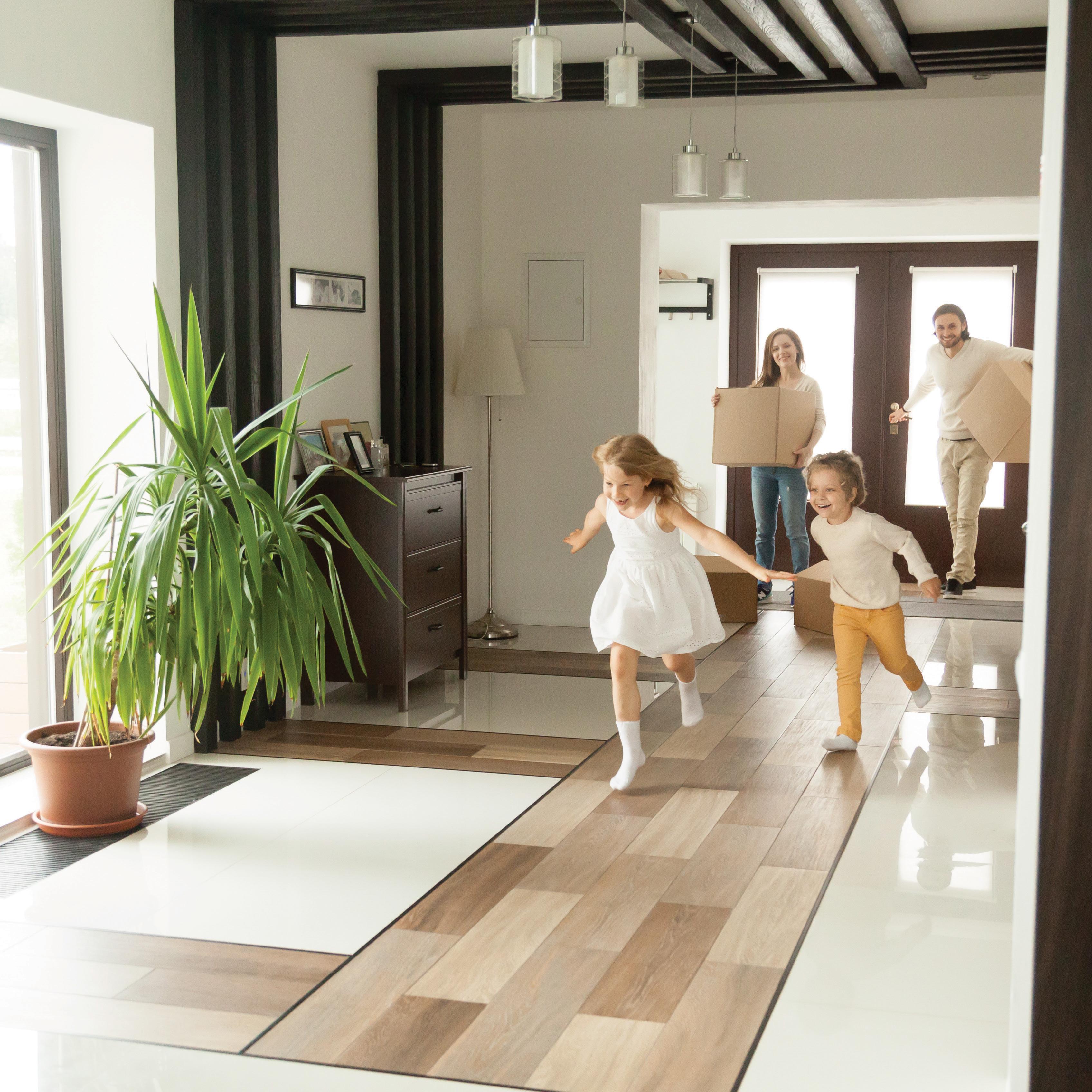
Every Northern Tri-Pane Collection™ window is made in Canada and specifically designed for life in Canadian climates. The exterior pane and increased air spaces insulate the interior panes to reduce radiant heat, regulate the temperature inside the home and block unwanted outside noise.
These windows also meet the highest ENERGY STAR® certification criteria to ensure energy conservation and reduction of seasonal heating and cooling costs.

JELD-WEN windows can be finished in a complement of colours from our premium paint options or with FiniShield™, our latest colour technology for windows with black exteriors and/or interiors.


JELD-WEN windows are available everywhere quality windows and doors are sold.
To learn how you can save up to $5,000 and locate your nearest JELD-WEN dealer, visit: STOPWinter.ca

Visit the new RenoMark website to find professional renovators in your area, find design inspiration and renovation tips and news at www.renomark.ca

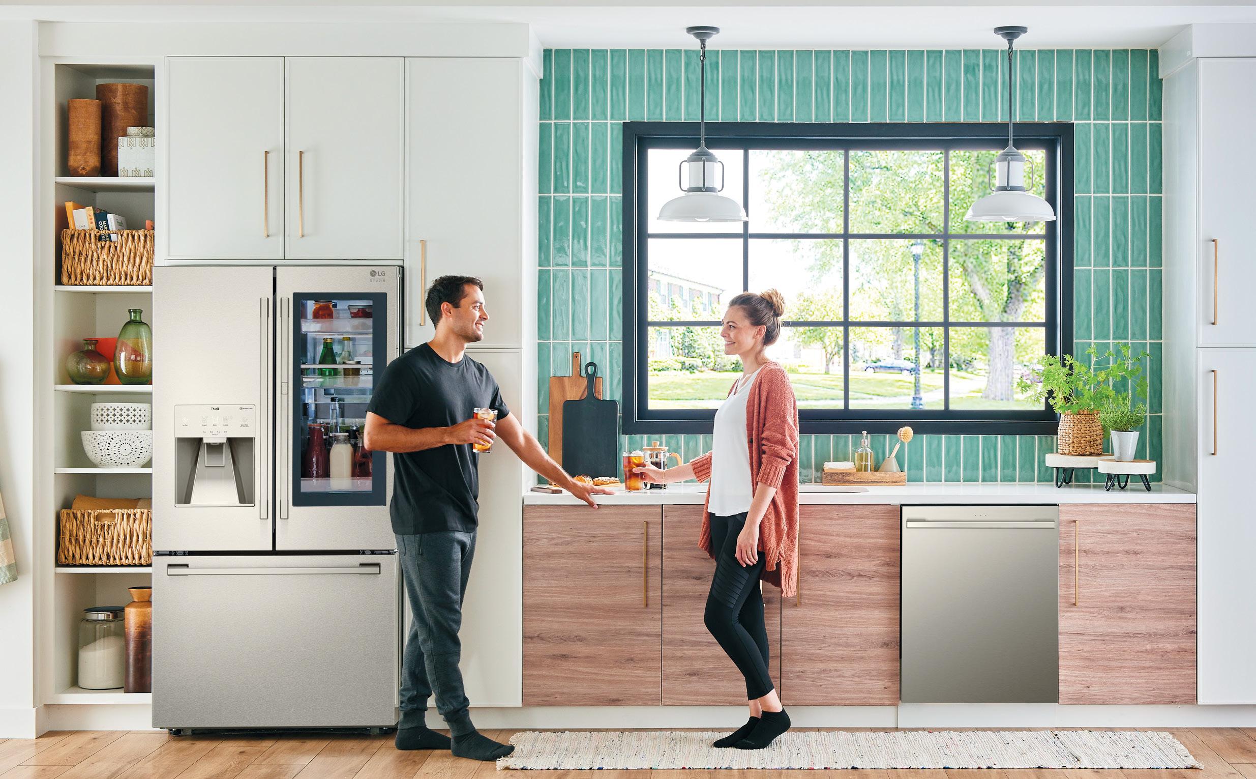
The LG brand has long been synonymous with innovation. With the launch of its refreshed LG STUDIO appliance collection in Canada, consumers will get the same panache for product innovation but with elevated elements and a touch of luxury. The new collection boasts clean lines and a contemporary esthetic to cater to the more discerning home design enthusiast. In addition, modern styling and advanced technology demonstrate that the appliances look as good as they perform.
Find a range of products for the kitchen, such as a counter-depth refrigerator and side-by-side builtin refrigerator; gas, electric and induction free-standing ranges, builtin cooktops, wall ovens, wall-mount chimney hoods; and top-control dishwashers, all featuring a distinctive style palette aimed to complement contemporary kitchen designs. These smart appliances are also built with the innovative LG features consumers know and love, such as LG ProBake
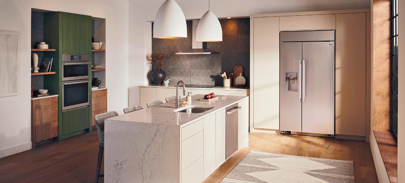
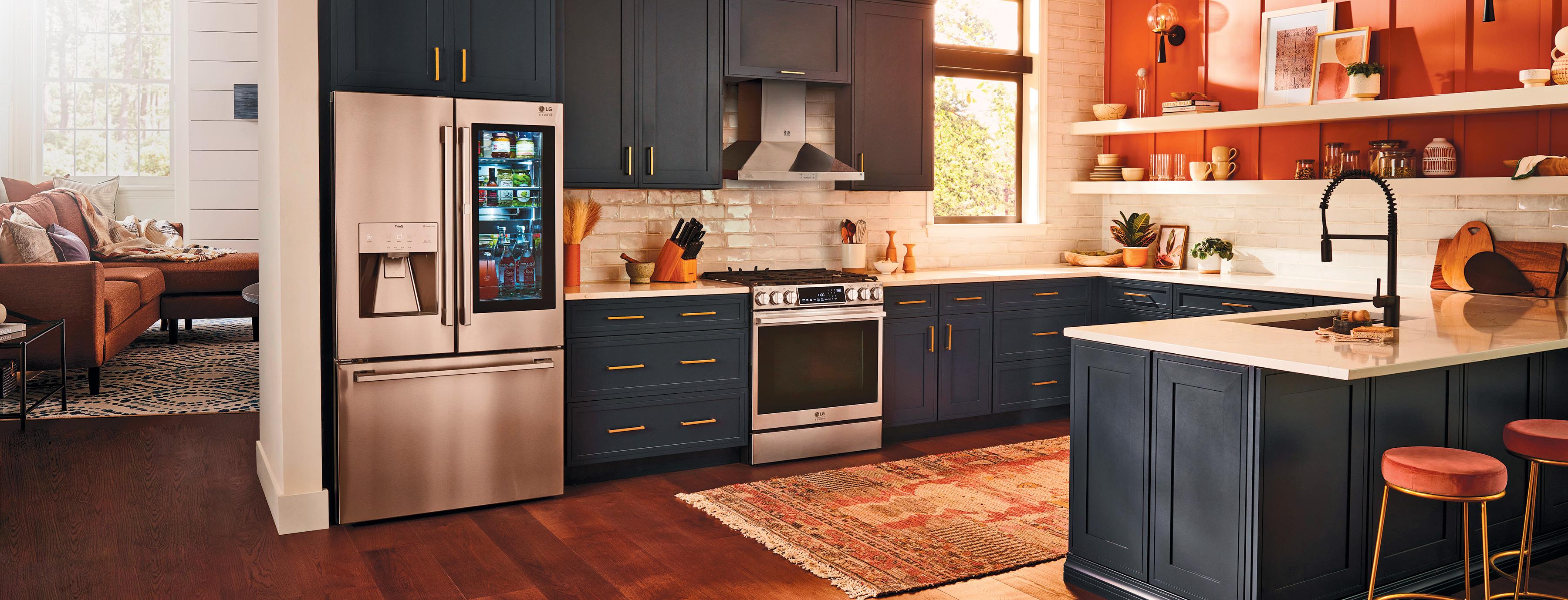
Convection technology, Air Fry, Air Sous Vide, LG’s exclusive Craft Ice and LG TrueSteam technology.
The LG STUDIO appliance collection also extends to the laundry room. The new LG STUDIO WashTower is a clever single-unit, vertical laundry solution with an exclusive Centre Control Panel that takes up half the floor space of traditional side-by-side washing machines and puts built-in intelligence and advanced cleaning within reach.
To round out the laundry suite, the LG STUDIO Styler Steam Closet refreshes, deodorizes and sanitizes clothing with the gentle power of steam, and is the ideal at-home solution to preserve the lifespan of clothes. The mirrored
front panel on the LG STUDIO Styler is an unexpected stylish touch marrying esthetic with utility in your space.
Functionality plays a key role in the LG STUDIO appliance collection. That’s why all the LG STUDIO appliances connect to the LG ThinQ app that enables users to connect and communicate with the appliances to adjust settings, keep an eye on performance and run diagnostics. Plus, all LG STUDIO appliances come with a two-year warranty on parts and labour (please refer to the product manual or lg.ca for specific details). Want to find out more? The new line of LG STUDIO appliances is now available at major appliance retailers across Canada.
Is it faux real? Re-imagining spaces with the art of decorative painting




There’s something wonderful about the winter. I know, most people don’t look forward to shorter days and longer nights. But the flip side of that coin is the beauty of a quieted landscape and the desire to cosy up with friends and family.
During the last two years when gathering meant staying six feet apart or just apart, I have missed “getting close” with my friends and family. I am very much looking forward to seeing my nearest and dearest as we celebrate the various traditions and holidays that are meaningful to us, and then welcome in the New Year.

If you are feeling the same way and intend to gather with your loved ones to create new memories, then you’ve come to the right place. Throughout the pages of this issue, you’ll find your pathway




to holiday bliss, with many helpful tips and inspirational ideas to help turn your home into the welcoming space you dream about.


We’ve asked our interior design and decor experts to share their best ideas on how to decorate your holiday table, set up your first holiday dining room, decorate a welcoming guest bedroom and create the perfect space for gathering, lounging and reminiscing. As well, you will find colourful gift ideas and a host of exciting home finds you’ll want to have. For longer-term home decor and reno solutions, you can read about how to build your own journalling nook, and our seven design expert’s top storage ideas for the busiest rooms in your home.
Thank you for picking up this issue of RENO+DECOR. From our home to yours, we wish you a peaceful holiday season and all the best in the New Year.


HAVAN, the Homebuilders Association Vancouver, is recognized as the leader in the homebuilding industry since 1974. Its knowledgeable, trusted and resourceful members build more than 65 per cent of Metro Vancouver’s homes.


DDA The Decorators & Designers Association of Canada (DDA Canada) is a professional association that elevates the decorating and design industry for design professionals, students, and suppliers through education, events, training, advocacy, and community building.


IDC Interior Designers of Canada (IDC) is the national advocacy association for the interior design profession. As the national advocacy body, IDC represents more than 5,000 members, including fully qualified interior designers and related professionals.


viable.
CANADIAN HOME BUILDERS’ ASSOCIATION Since 1943, the Canadian Home Builders’ Association (CHBA) has been “the voice of Canada’s residential construction industry.” One of the largest industry sectors in Canada, CHBA’s membership is made up of about 9,000 companies.
RENOMARK RenoMark identifies professional contractors, custom homebuilders and trades who agree to abide by a professional Code of Conduct. RenoMark members are reliable, ethical and responsive. At RenoMark we’re changing the way people think about contractors.
Published by nexthome.ca
Advertising Call 1.866.532.2588 ext. 1 for rates and info. Email: info@nexthome.ca
Circulation Direct mail to households in select prime areas via Canada Post. At thousands of high-profile pick-up boxes and racks across. Selected retailers and designer showrooms. Plus, top consumer and trade shows. Also available for purchase at all Chapters/Indigo locations across Canada.
Canadian subscriptions 1 year = 6 issues – $35 (inc. PST & GST) Single copy price $4.95 (plus PST & GST) Canada Post – Canadian Publications Mail Sales Product Agreement 43643067.
Copyright 2022 All rights reserved. All copyright and other intellectual property rights in the contents hereof are the property of NextHome, and not that of the individual client. The customer has purchased the right of reproduction in NextHome and does not have the right to reproduce the ad or photo in any other place or publication without the previous written consent of NextHome.
Terms Advertisers, Editorial content are not responsible for typographical errors, mistakes or misprints. All prices are correct as of press time.
Editorial Submissions from interested parties will be considered. Please submit to the editor at editorial@nexthome.ca.

I’m often asked to create dining areas that are intimate but open, cosy yet cool –oxymorons by all accounts. Believe it or not, it is possible to achieve this balance. So, if your dining room is making its debut this year, pull up a seat and take notes as I serve up some of my top dining room decorating tips!
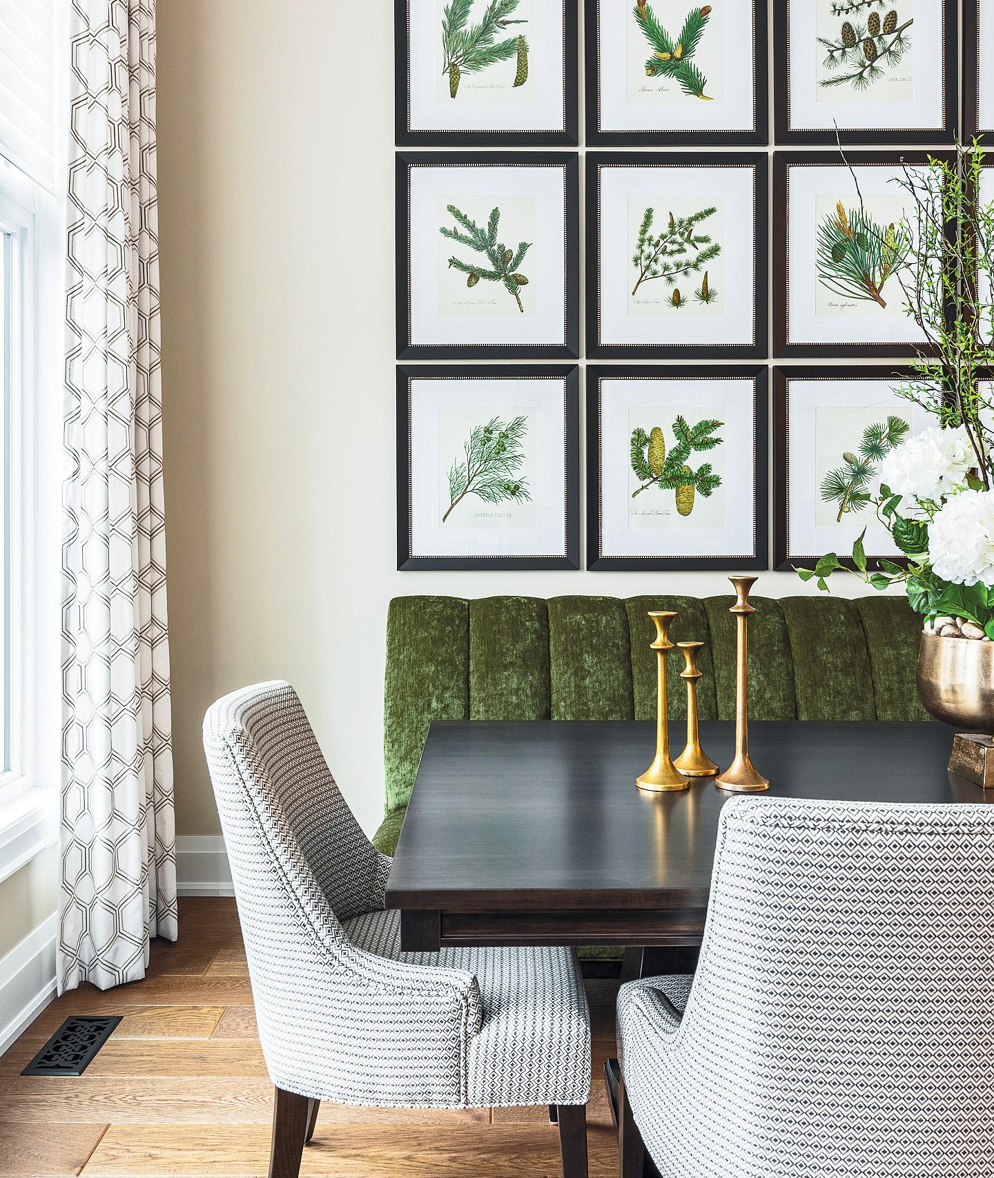
As the setting for gatherings and celebrations, your dining table will be a mainstay behind countless dinners, toasts, future dreams and reflections of the past.



Generally speaking, your table should echo the room’s overall shape and proportions. Rectangular and oval
tables are best-suited to elongated rooms and open-concept areas, square tables work well in square rooms and nooks, and round tables are a good choice in small spaces.
Relative to the room, plan to leave a three- to four-ft.-gap between the table and walls or large furnishings to accommodate the flow of traffic and serving. For seating at the table,
reserve a two-ft.-spot for each guest to account for the place setting with a little wiggle room on either side.
Dining tables come in a broad range of materials. Wood is traditional and durable, and is available in styles from rustic and classic to contemporary. Glass tabletops are easy to clean and are great in small spaces, as they don’t carry any visual weight. Metal, marble, concrete and stone – each has its own unique characteristics.
When choosing, do so wisely, as your table will set the tone in the room and at your dinner party.
With the perfect dining table in place, you can now move onto the chairs. Your chairs are an opportunity to express your style and infuse some unique personality into the room. The chairs don’t all have to match the table, or each other for that matter, but they should align in terms of style and the overall esthetic.
The proportions of your dining chairs matter. Most dining tabletops measure about 30 inches high. Thus, the seat of a standard dining chair is typically about 18 to 20 inches up from the floor. If your dining table is of an unconventional height, plan for a gap of about 10 to 12 inches between the seat and the tabletop.
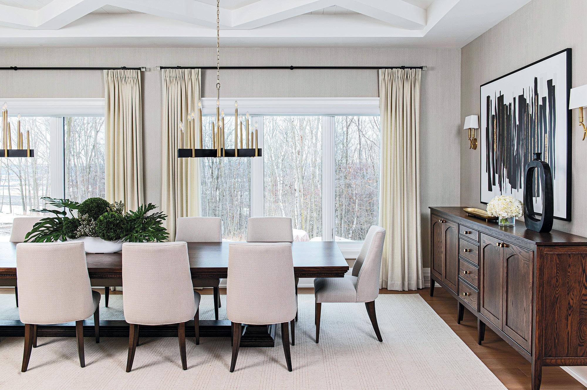

Lighting is a critical component in the dining area. A chandelier is the classic choice of fixture as an elegant focal point to ‘wow’ your guests and showcase the dining table. Your chandelier should be big enough to make a visual impact in the space. The rule of thumb is the diametre of your chandelier or pendant should measure between one-half to threequarters of the diametre or the width of the table, and be suspended three feet above the tabletop. This leaves it low enough to create a sense of intimacy and warmth with enough
room for guests to stand and lean across the table or a centrepiece.

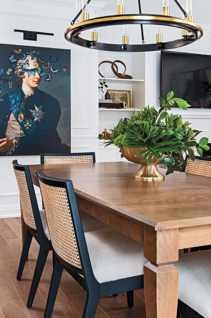
Your dining room is begging to host a great party. With these tips, the space will be dressed to impress – and impress it will.
Patti Wilson, principal of award-winning Patti Wilson Design, is known for creating stylish, thoughtfully curated, livable interiors. The firm provides residential design services for discerning clientele focused on creating elevated interiors that are approachable and a reflection of the client’s unique story. pattiwilsondesign.com. IG: @patti_wilson_design
Photo: Mike Chajecki Photo: Mike Chajecki


Housing in 2022 is expensive! Quite simply, our living areas are trending smaller to retain a semblance of affordability. As such, it is imperative that we maximize every square inch of space. A recent project for a family of five in Toronto serves as a prime example of how the reallocation of space provided better comfort, privacy and flexibility.
The decision: To sell their 1,500-sq.ft., three-storey row house to move to something bigger, or redesign what they already had, and improve upon existing layouts, space allocations and update finishes for a more functional and stylish esthetic, all within a budget they could afford. They decided moving is expensive — double land transfer taxes, commissions and closing costs can add up even before considering the cost to move up to something bigger. Instead, those funds were used to make the existing home function better for their longterm needs.
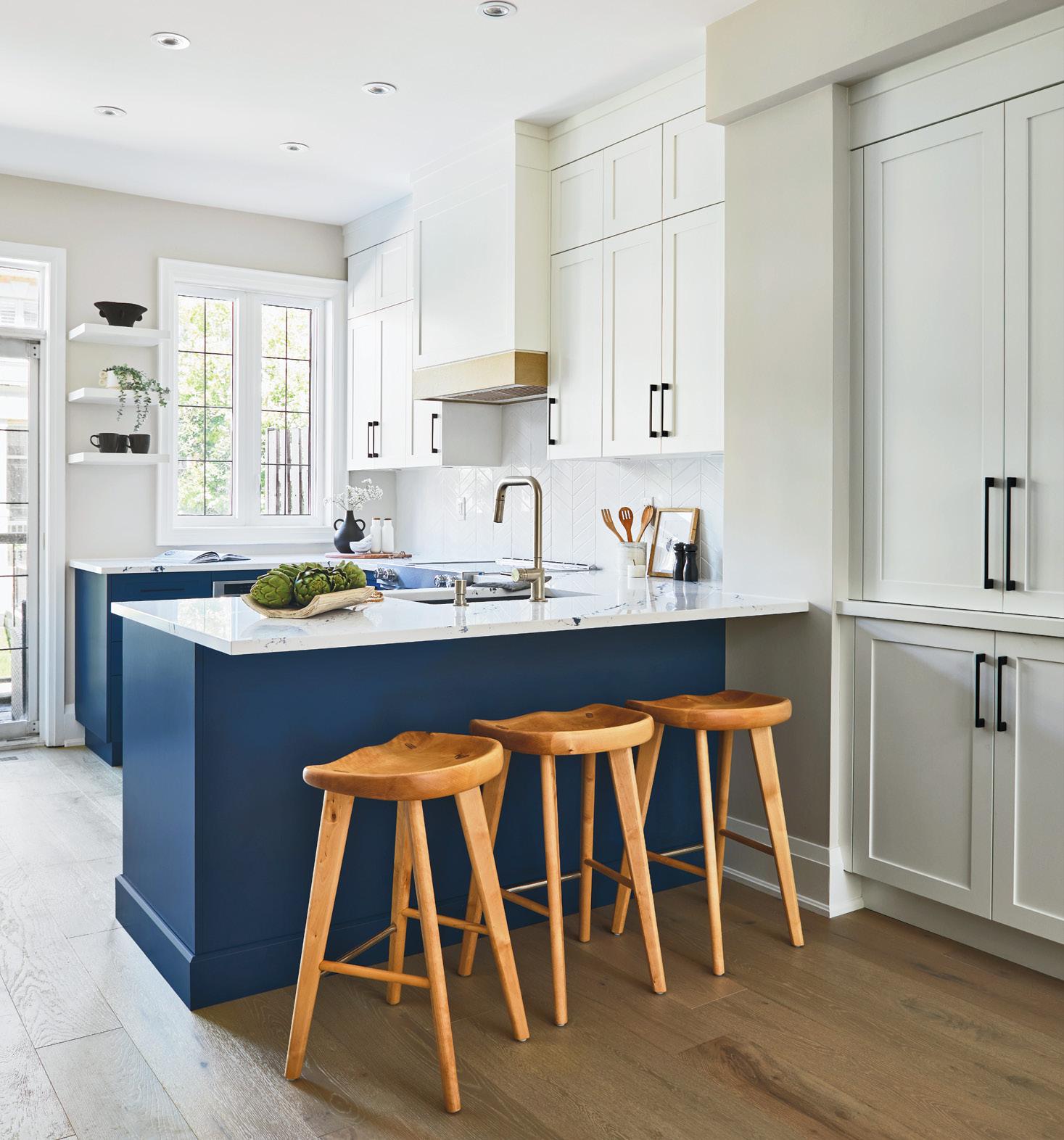
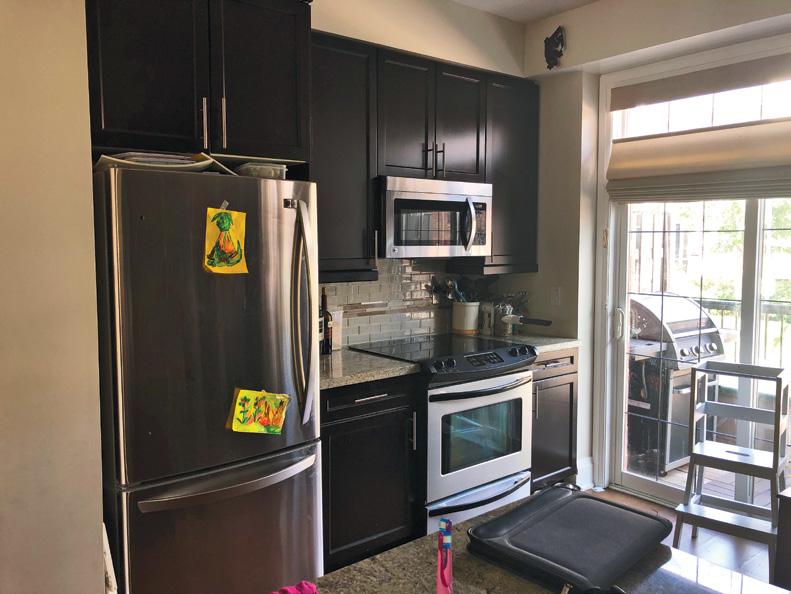
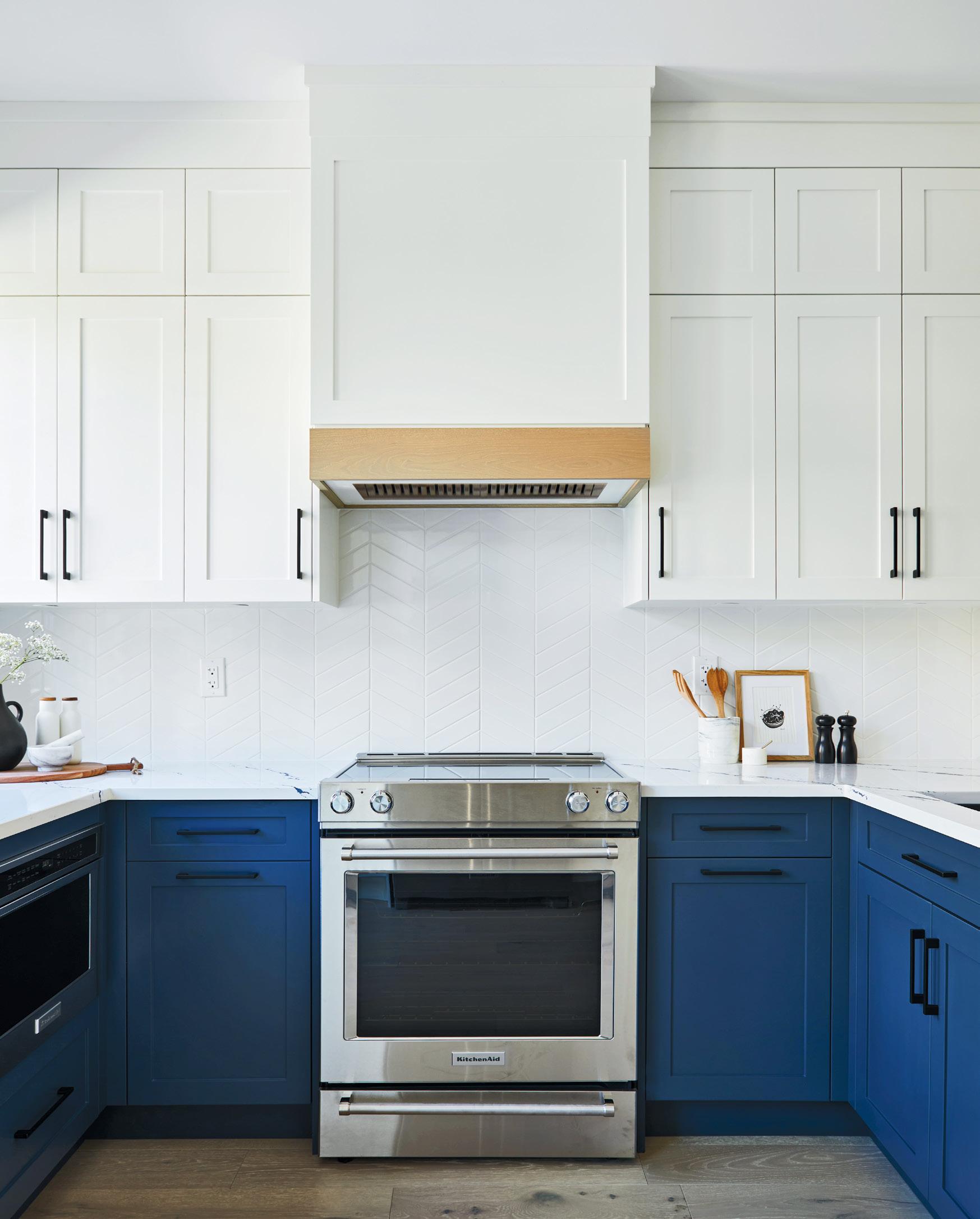
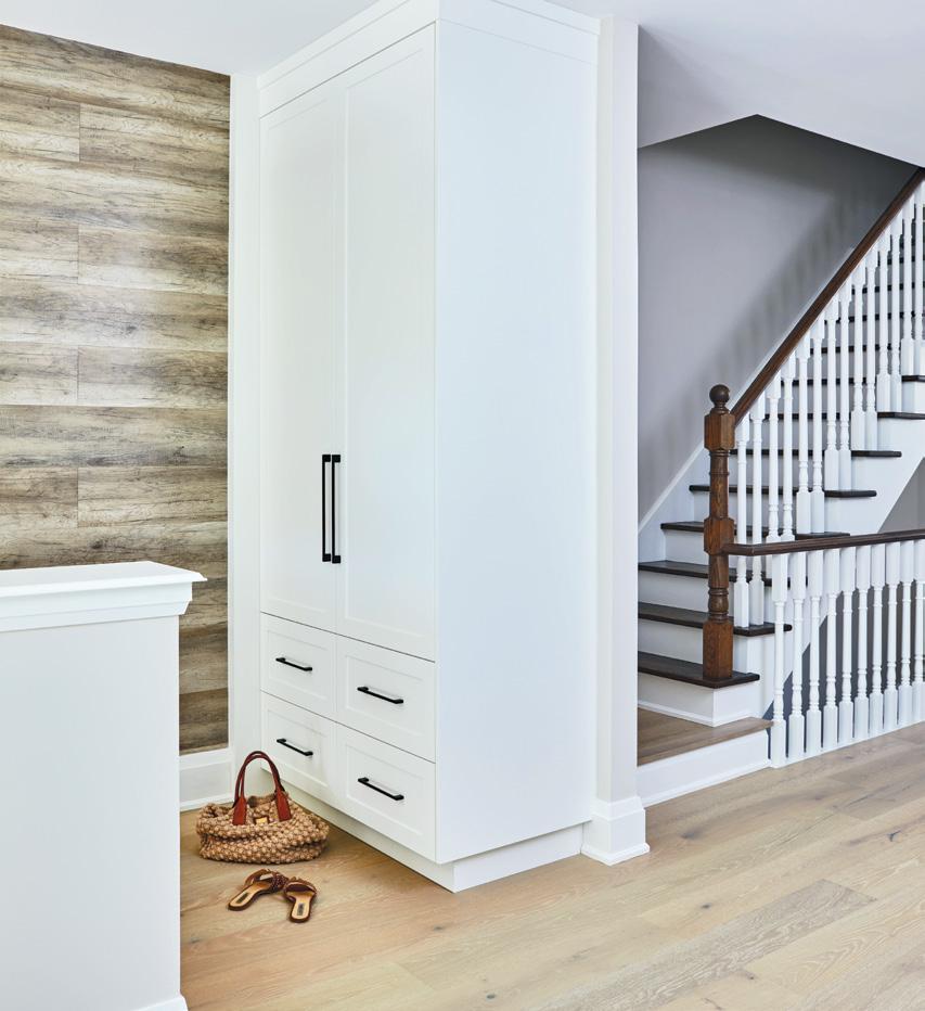
The main floor was the initial design focus, with an update to the storage and the finishes. Five people need a lot of food, room to sit and space to store things such as table settings, counter appliances, coats, hats and bags. Organization was a top priority. Replacing an existing entry closet and some store-bought items with a floor-to-ceiling built-in addressed the space issue and provided everyone with their own place for their stuff. In the kitchen, reorganizing appliances
by BRENDAN CHARTERSBlue and white cabinets brighten up the space.
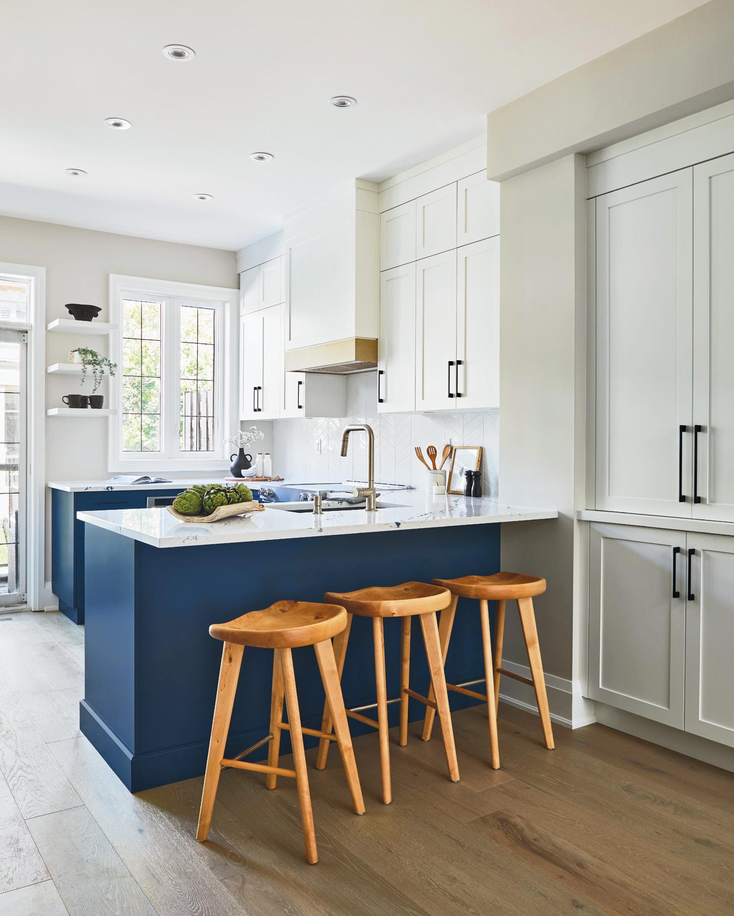
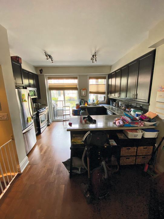
allowed for an improved workspace and traffic flow. Reducing bulkheads and shifting cabinetry allowed for increased storage and a connection with the dining room. Blue and
white cabinets and Cambria Quartz counters added a bright, durable and contrasting style. New flooring and painting unified the space, making it feel larger.


With a row-house condo format, an addition was not possible. Previously, the third floor was comprised solely of a suite for the parents that comprised a bedroom, walk-in closet and five-piece ensuite bathroom. The three children shared two bedrooms on the second level. It was decided to divide the one large bedroom on the third level into two smaller bedrooms, a walk-in closet and a shared washroom.




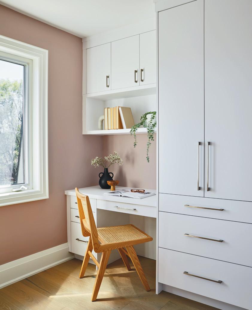
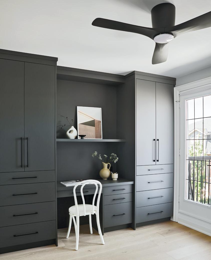
Built-in custom millwork added proper clothing storage in addition to a desk area in both the

remodelled primary and the new child’s bedroom. With functional built-in custom storage, it is possible to achieve what you need in 110 to 140 sq. ft. of space.
The architectural design and construction was undertaken by the Eurodale Design + Build group. The interior design, a key collaboration in the space planning, organization and visual esthetics, was handled by Kenneth King Interiors. Plans were then brought to the team at Distinctive by Design Fine Cabinetry, who created the millwork installed throughout.
A new built-in closet in the entryway.BeforeThe main floor was the initial design focus, with an update to the storage and finishes.
The result is a stylish place for everything. Closets, workspaces, vanities and alcoves were planned to provide storage, organization and style – the goal of every homeowner. The best part? The homeowners loved the results!


When planning your design and build project, make sure you work with a professional contractor who follows a strict code of ethics and conduct, including licensing, insurance and written contracts to protect you and your investment.
Brendan Charters is a founding partner at Toronto design-build firm Eurodale Developments Inc., the 2020 BILD Renovator of the Year. eurodale.ca, @eurodalehomes by SARA DUCK
The latest decor and lifestyle products you’re going to love now and into the New Year
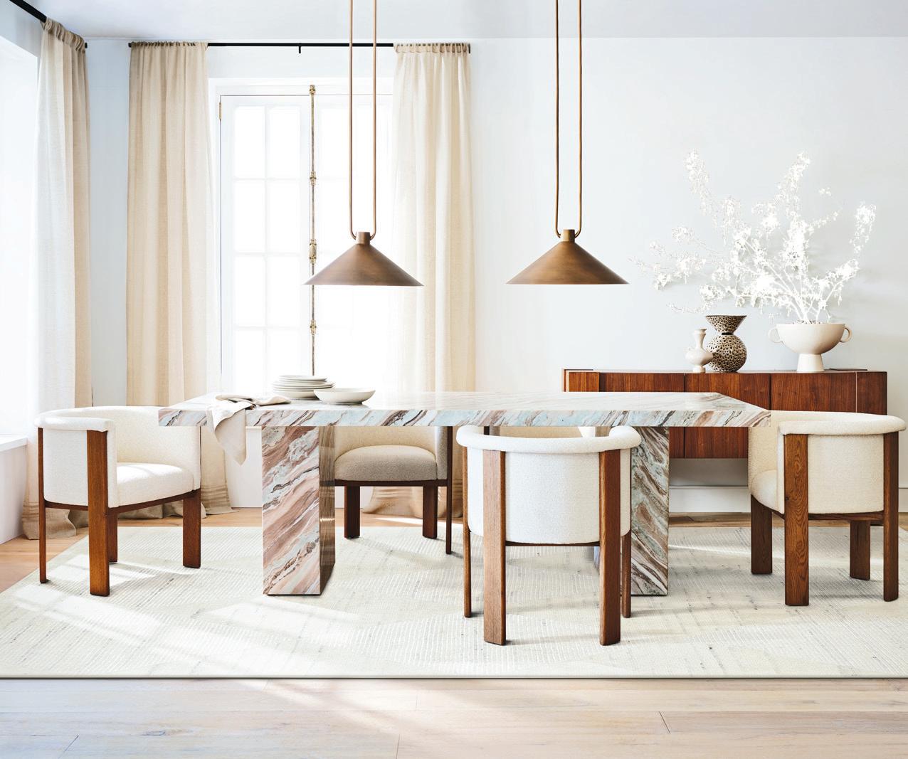
Crafted in a monolithic silhouette, this table showcases a blush and ivory veining of matte-honed Blue Coast marble.
Gustav marble dining TABLE $6,000. crateandbarrel.ca


Luxurious and eye-catching, marble decor pieces can make a statement in any room of your house.
1. Elenora marble TABLE LAMP. $1,500. cb2.ca





2. Marble MORTAR AND PESTLE. $30. hm.com



3. Agotu walnut coffee TABLE. $929. article.com

4. Noa black floral marble wall COAT RACK. $90. cb2.ca

5. Marble KNOB in dark green. $10. hm.com
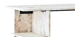
6. Hera marble DESK with shelves. $2,400. cb2.ca

In the mood for something sweet? Nostalgic Chocolate Bars are hand-crafted using delicious childhood combinations such as peanut butter and jelly and pancakes and syrup. The result is a confection that will bring you back in time while satisfying your sweet tooth. Nostalgic Chocolate Bars. $25 (for a pack of five). sugar-plum.com
Is ‘The Great British Bake Off’ inspiring you this season? With the right tools, your baking dreams can become a reality.

AspenClean’s laundry detergent is 100 per cent natural, free from toxins and artificial fragrances. It contains organic essential oils and other eco-friendly ingredients in a concentrated solution to clean your laundry and make it look its brightest. Choose from laundry liquids, detergent pods, or powders that are all hypoallergenic and babysafe. The bonus? It’s safe to use in any machine with all types of laundry and temperatures.


aspenclean.com





1. Non-stick ROLLING PIN in black by Simply Essential. $16. bedbathandbeyond.ca |
2. Six-speed STAND MIXER in black by Hamilton Beach. walmart.ca | 3. 10-piece soft-touch PASTRY TOOLS SET. $213. crateandbarrel.ca | 4. SPOON in walnut. $19. indigo.ca | 5. Gold WHISK by Bloomingville. $19. indigo.ca | 6. Gingerbread wood SERVING BOARD. $40. indigo.ca | 7. Dose MEASURING CUPS in champagne gold. $45. cb2.ca
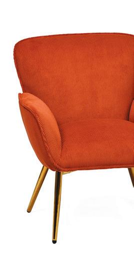
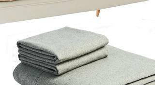
Comfy materials such as faux fur, flannel, shearling and corduroy will help winterize your home and give you that cosy feel all season long.
















While blue hues with hints of green will dominate the paint trends for 2023, you may be surprised to see another striking shade primed to take centre stage in the new year. R+D checks in with four major paint brands to give you the low-down on their top picks
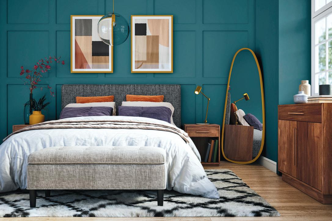

Confident colours are back. After years of neutral palettes, the 2023 paint trends are signalling a change. It’s a paradigm shift from calming shades to more confident colours. As people look for ways to spark joy in their lives, incorporating bright, bold paint colours at home can give them that inspiration.
“I love using bold colours to make a statement because it has visual impact, and you can really feel the colour,” says Diana Rose, principal and creative director for Diana Rose Design. “It can stand on its own, and if combined with another colour or a pattern, it can create a striking effect.”



Melt Water is a robust and refined bluish-greenish tone that intertwines bold blue and calming green to create a captivating colour symbolic of deep water.
“On the other side of the pandemic, people are looking for a mental reset and want to infuse their homes with invigourating colours that help give them a boost, as well as a refuge in today’s unpredictable world,” says Martin Fuchs, PPG senior marketing manager with the Sico paint brand. “Melt Water accomplishes just that, with its energizing yet grounding vibe. It’s symbolic of a new-found outlook and works exceptionally well in any space – both interior and exterior.”
For next year, some of the major paint brands such as BeautiTone, Sico and Dulux, predict that a bright bluish hue with green undertones will be the colour of choice. At the same time, Benjamin Moore has predicted a raspberry-inspired shade to be popular. Whether you sway towards the blues or are feeling the reds, keep in mind that decorating with bold colours doesn’t need to be difficult. Rose suggests it’s as easy as incorporating a piece of artwork with strong colour or even an area rug. “Choosing a select accent piece in a bold colour is a low commitment but can offer a confident look in any space,” she says.

Raspberry Blush is a saturated red-orange that enlivens your surroundings while awakening your senses with charismatic colour. This vivacious hue is unapologetic in its boldness as it encourages a confident colour statement.
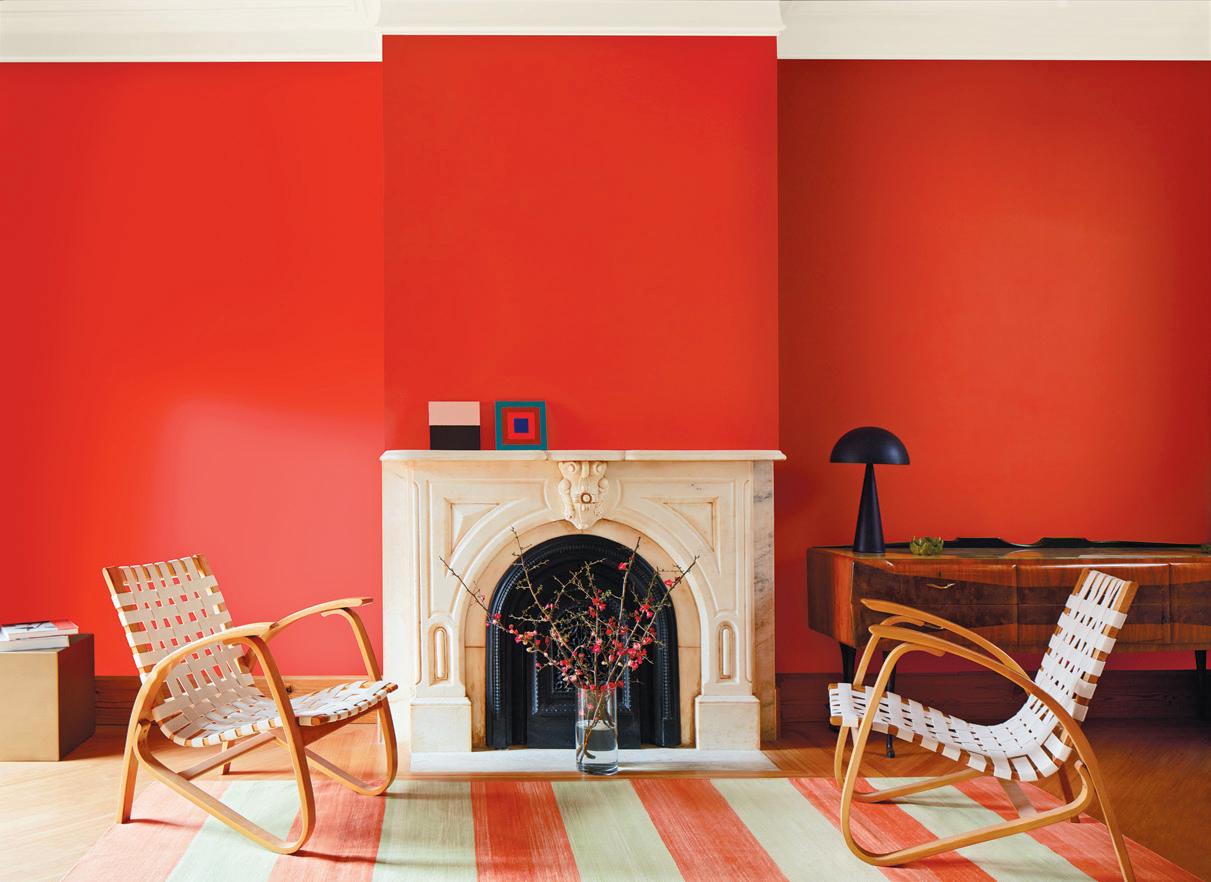
“For 2023, we really felt the need to dial things up with a colour that brings upbeat energy to our surroundings. There seems to be a willingness to be more creative and expressive within our spaces, drawing us toward bold, fun and playful hues,” says Sharon Grech, Benjamin Moore colour and design expert. “Raspberry Blush is dynamic, cheerful and confident, either as a small gesture of colour paired with a beloved neutral, or as a full floor-to-ceiling statement.”
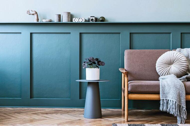
Moments is a calming, shaded blue with an influence of green that brings a fresh perspective to modern interiors and acts as a canvas for the moments ahead. It is reflective and hopeful.
“Blue hues are known to be calming, serene, and reliable – they make us feel comforted, which ultimately invites us to create lasting, positive memories,” says Darryl Allen, BeautiTone creative manager. “Moments is motivated by our desire for healing, wellbeing and exploration.”






A striking green-blue jewel-toned hue that is symbolic of deep water, Vining Ivy is both calming and invigourating, infusing home decor with a much-needed breath of fresh air after a few challenging years.
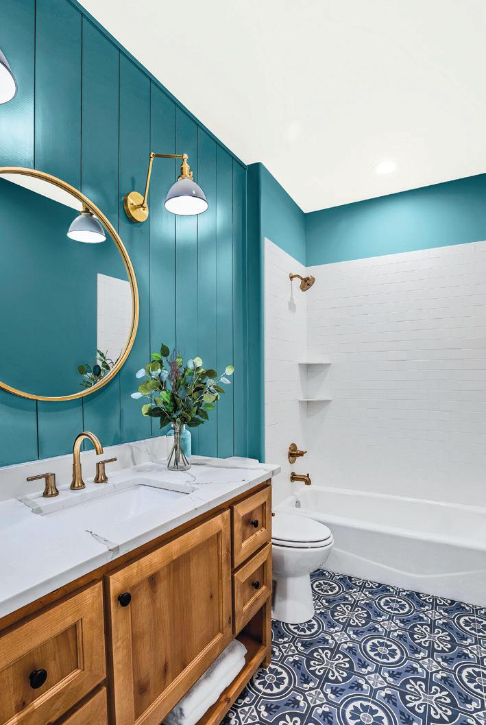

“Canadians took pause during the pandemic to reflect on what matters most, appreciating the beauty of the natural world like never before, and this is translating into uber-earthy and rich, sanctuary-like colour choices for the home,” says Mitsu Dhawan, brand manager for Dulux. “As opposed to softer neutrals that have been popular in recent years, the new natureinspired tones are bolder and more expressive, reflecting an optimistic mood as we emerge ready for the next normal.”
With more than 15 years’ experience as a magazine editor, writer and content creator, Sara brings her passion for design and decor to our pages each issue. Instagram @bysaraduck
RASPBERRY BLUSHCanadian Appliance Source offers the latest in smart kitchen appliances to make modern life easier


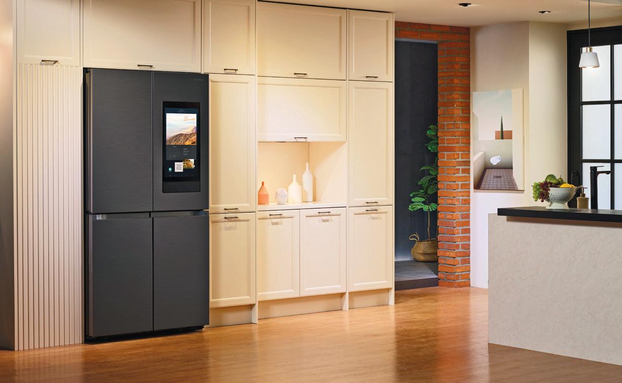
The current advancements in modern tech have many homeowners feeling like The Jetson’s TV series has come to life. We have robotic vacuums, thermostats you control with your phone, doorbells with camera/ video and Alexa to answer any question you can think of. As life gains momentum post-pandemic, we want efficiency when we get home so we can streamline our lives in order to accomplish all the things we love to do, right?
In tune with the times, it’s no surprise to learn that most kitchen appliances now
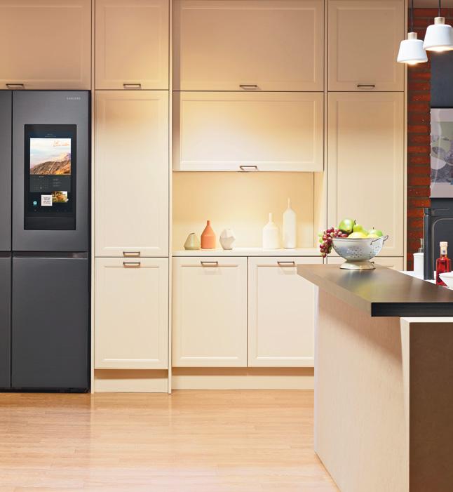
have an app or touchscreen. These and other innovations make it easier for you to do the things you need to do in the kitchen while saving you time. And who wouldn’t love to save time in the kitchen? One of the stand-out smart appliances that dropped this year is the Samsung Family Hub refrigerator from Canadian Appliance Source.


This smart fridge with Alexa builtin lets you control your compatible smart devices, stream music, mirror content and much more all from one central place — the touchscreen on your fridge. Enjoy streaming your favourite music apps, watching your favourite shows from your compatible Samsung smart TV or Galaxy phone, and accessing all your favourite sites like Facebook and YouTube, all from your Family Hub. But wait, there’s more.
Stay connected with your family by sharing pictures, videos or

drawings, leave handwritten notes, and sync calendars. At the office or the gym and can’t remember what’s in the fridge? No worries. You can see inside your fridge from anywhere, search recipes based on the food you have left, and plan weekly meals. All that and more is possible with Samsung’s Family Hub refrigerator. Now that’s innovative design. George and Janet Jetson would be so proud.
Looking to upgrade your kitchen appliances? Visit CAS today and learn more about its smart appliance line. There are 36 showrooms coast-tocoast, open seven days a week. You

Who wouldn’t love to save time in the kitchen?by BILHA KANGETHE
It’s been two years too long of social distancing restrictions, limited dinner parties and the human connections that we oh so crave. This entertainment season’s mood is to make merry, make up for lost time, and transform your home into a cosy retreat with an exciting return to your favourite timehonoured traditions.
While neutral tones, traditional colours and subdued themes have reigned supreme in past years, the 2022 entertaining season is filled with a bold expression of individuality, deep rich tones, and a modern twist on all our family faves.

Whether you are looking to throw an elegant affair or keeping it close with your loved ones, we’ve got you covered, leaving you refreshed, renewed and rejuvenated for an exciting 2023 ahead.
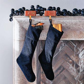
Decking the halls is taking on new meaning as we’re seeing everything from a return to vintage collections and a dashing sparkle of the roaring 20’s glitz and glamour to a refined expression of bold atypical colours and textures. Whether you skew towards bold deep rich tones, vibrant colours, pastels or natural neutrals, look to pair your decor with layers of chunky knits, bold patterns and electric finishes such as Capiz shell, mohair and velvet to express your one-of-a-kind taste.
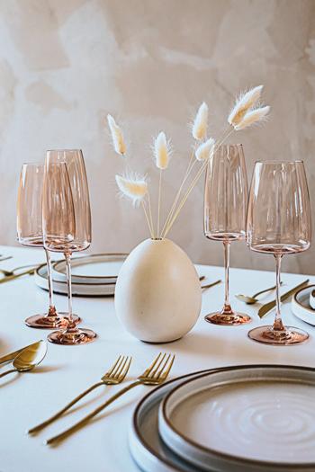
While you spend time and create special moments with your loved ones, incorporate your festive glee onto your table and serving ware.
Anchor your tables with linens and layer with seasonal dishware, napkin rings, silverware holders and table scapes. For the traditionalist at heart looking to infuse a modern esthetic into a design palette or someone looking for a touch of nature with fresh evergreens and deep caramel tones, this season’s

This holiday season’s merrymaking barometer is set at festive fun, featuring bold individual expression and tantalizing table scapes
entertaining goodies have something for everyone. Delight in marble coasters, organic cotton tablecloths and napkins, dainty metallics of gold and silver accents — these trimmings are sure to set a tone, add a dash of dazzle and glitter and create the perfect backdrop to an exciting gathering around your table.



We have decorated our living areas and hallways; this year we are not forsaking the place we retire to at the end of the day. Extend the festive feeling to your bedroom and/or guest bedroom and switch out your yearround bedding and layer with chunky knits, festive plaids and embroidered quilts. Accessorize with Sherpa throws, authentic greenery and festive faux botanicals to extend that holiday cheer beyond the communal living spaces of your home.
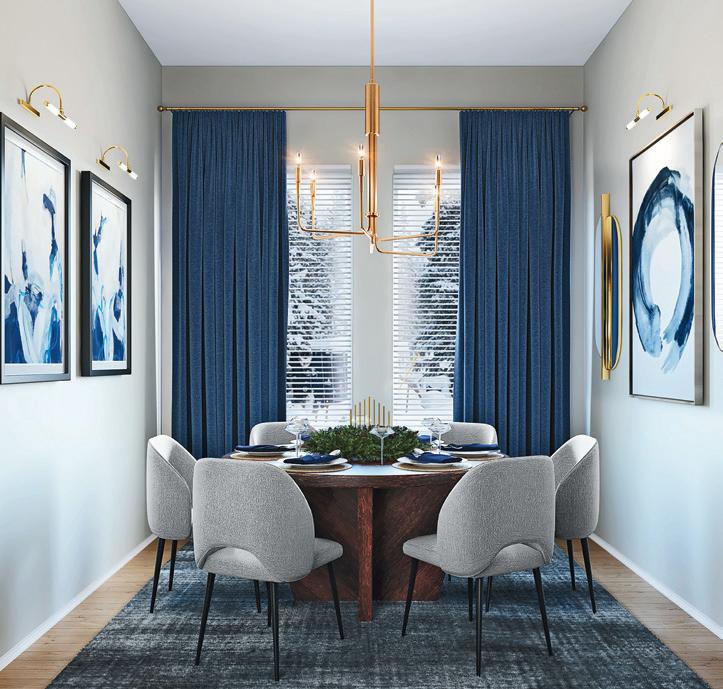
Yes, there is a lot to choose from and a lot of re-inspired and re-imagined traditions. The key to successfully create a space that you are going to enjoy is to ensure that the colour schemes you pick will be reflected in each space you walk into. Let this year be a reflection of who you are and how you want you and your loved ones to feel when they are in your home.
Bilha Kangethe is the founder and creative director of The Lifestyle Loft. As a certified designer and interior decorator, she has created a company that focses on the needs of each client and customer and helps them curate a lifestyle that is comfortable and economical. thelifestyleloft.com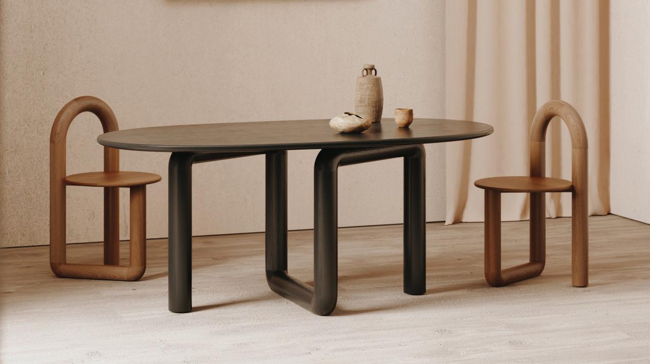

CENTRE
CENTRE
CENTRE
CENTRE
CENTRE
CENTRE


CITY




"With this built-in, I was trying to create not just storage but also a small reading nook and open shelves for the little girls to display their favourite crafts, books and decor – to make it truly personal. The bottom doors were designed to allow the hiding of storage items and to maintain a neat and tidy look."
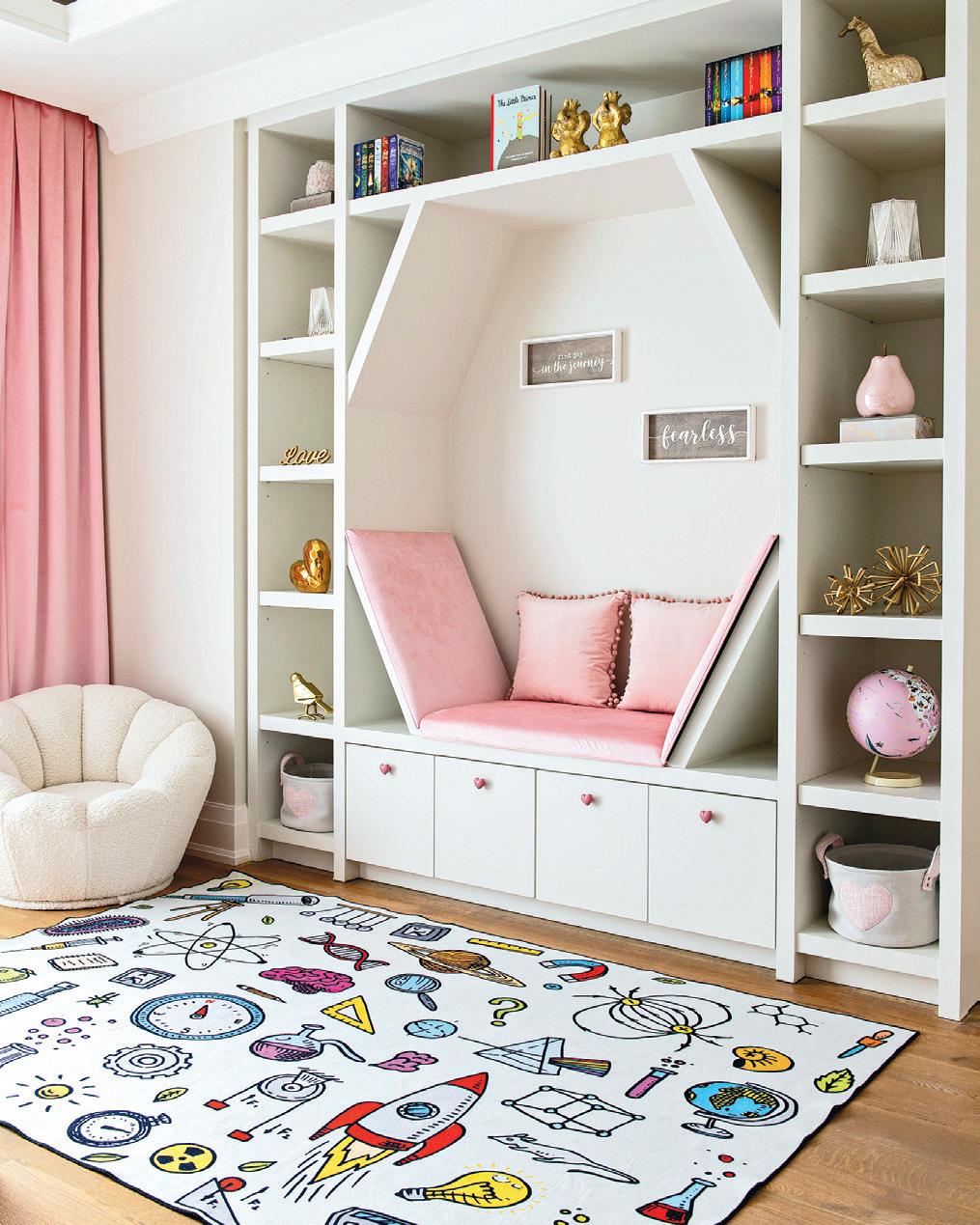


– Designer Diana Rose, Diana Rose Design.
“Extend your typical closet area and add a nook to incorporate visual interest and functional storage. Here, I created a space for keys, extra out-ofsight seasonal items and larger drawers for hats, scarves and mittens. Think vertical for more storage with hooks for hats and jackets and decorative baskets for extra storage for items used daily.”
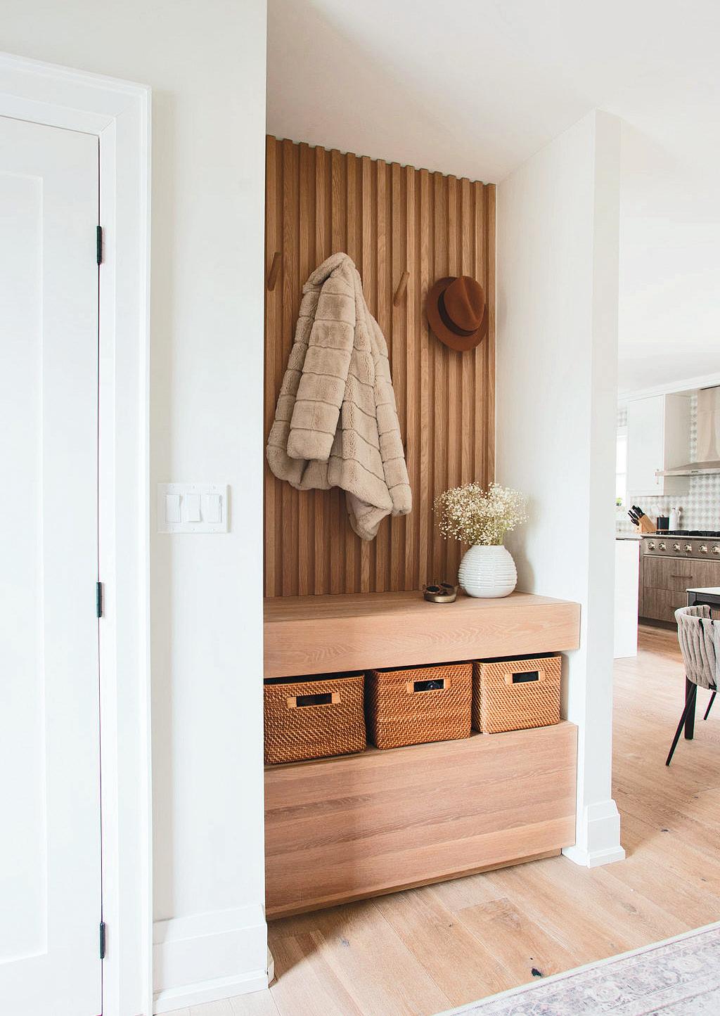


– Designer Lisa Kooistra, Lisa Kooistra Designs
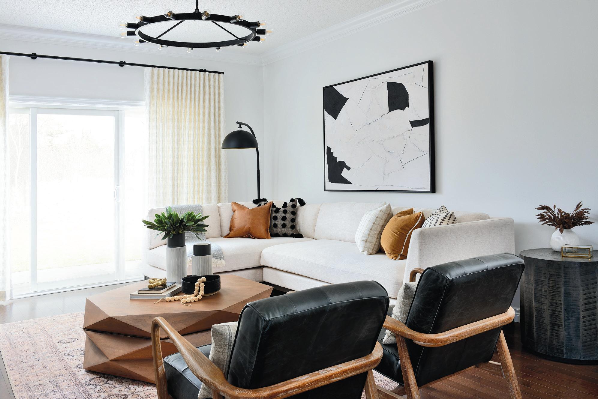
“When faced with a room that has limited built-in storage space, I always try to find opportunities with clever furniture that will double as storage. In this living room, I strategically selected this stylish geometric coffee table that lifts up to store extra throws, games, books and kids’ toys, without cluttering up this living space.”


– Designer Amanda Shields, Amanda Shields Design

“Storage is always something we need more of, so finding clever ways to include it without affecting the design is always a challenge. I love adding drawers underneath a bed, as a bed takes up so much real estate in the bedroom, it’s a practical idea to take advantage of the wasted space below it.”
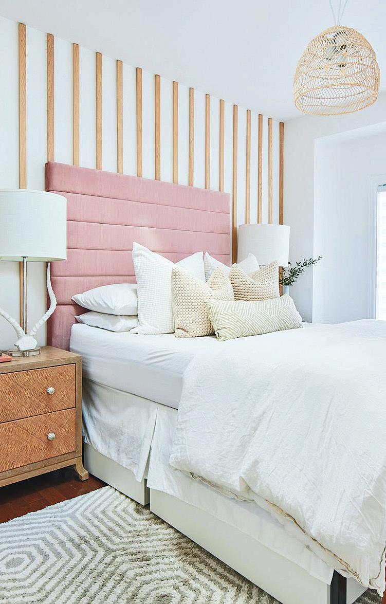 – Designer Jo Alcorn, Jo Alcorn Home
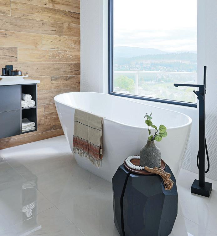


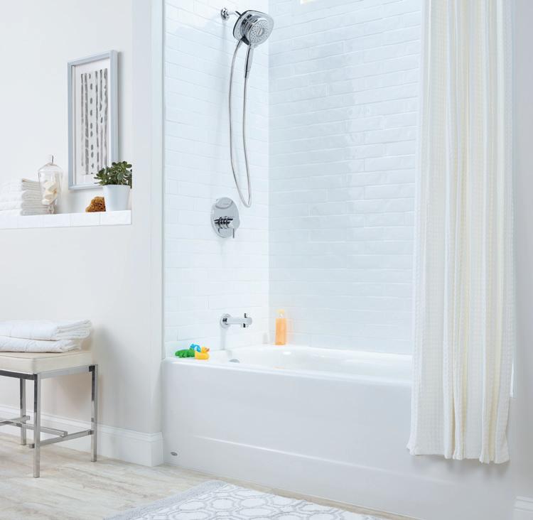
“When it came to the design of this modern bathroom, I wanted to keep the look minimalistic but with storage options. The flat panel cabinetry with no handles helps to keep the space looking uncluttered while the open, functional shelving was designed for everyday folded or rolled towels.”
– Designer Trisha Isabey, Isabey Interiors Ph o t o : Jason Harto g“I was able to incorporate a stylish storage option into this home office by flanking the large front window with built-in bookshelves. The side niche with a small higher window also presented a great opportunity for a built-in desk, with cabinets below the window to house office supplies and a printer.”
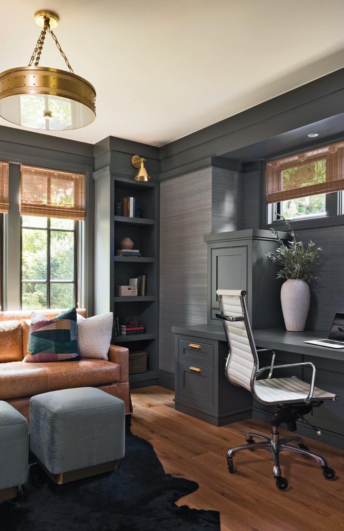

– Stephanie Brown, Stephanie Brown Inc
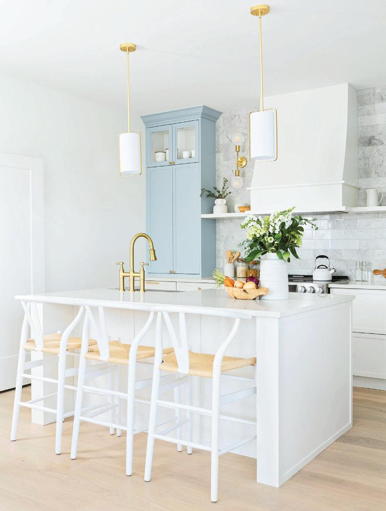
“Tall cabinets in a kitchen create the illusion of higher ceilings, so we implemented them to accentuate the existing nine-ft. ceilings in the home, making them appear much larger. Additionally, tall cabinets act as bulk storage for household items used occasionally, such as seasonal cookware and fine china pieces. Finally, we added glass inserts in the tall cabinets to double as a display for the decorative pieces – making it a practical design feature.”

– Designers Jamelya Francis and Michelle Bellissimo, Francis + Bell Design Studio


 by TIFFANY PRATT
Our mood and outlook are significantly affected by what we surround ourselves with, and colour plays a critical role. Living in colour is a healing, highly vibrational and happy-making experience. For me, colourful, interesting patterns, textures and shiny, glittering one-of-a-kind things make my heart beat faster! So, when it comes to gift giving, I like to gift how I live. By injecting colour, I am bestowing the powers of joy, healing and transformation onto the gift. Be it a fun beauty product or a book, I know I can somehow infuse it with colour and inspiration. Seriously, who can’t help but smile when pulling on a multi-patterned pair of colourful socks?
A gift isn’t complete without wrapping. Don’t feel you must rush to the store to buy wrapping paper – we can do something more creative than that. Try wrapping your gift Furoshiki-style with a colourful piece of fabric you have. Paint up a box from that recent online shopping delivery. Make a bow out of some bubble wrap or wool from that yarn stash that never seems to deplete. Think of the wrapping as an extension of your gift. I hope you enjoy exploring my colour-infused giving ideas. Go forth and gift!
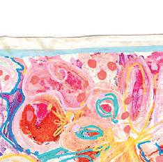
Limited edition silk SCARF by Tiffany Pratt. $60. tiffanypratt.com







EQUILIBRIUM by Aura Soma. From $75. amazon.ca


Voluminous original MASCARA by L’Oreal Paris. $12. shoppersdrugmart.com
Dahlia crew SOCKS by Solmate Socks. $22. solmatesocks.com
Ultra mini classic sheepskin BOOTS by Ugg. $175. nordstrom.ca
“These are my favourite socks.”
500-piece jewellery jumble PUZZLE by Blanc Puzzles. $12. amazon.ca


Clear narrow oversized square SUNGLASSES with medium yellow lenses by Yes Glasses. $79. yesglasses.com


Standard REUSABLE BAG in multi-check by Baggu. $19. indigo.ca

APPLE WATCH series 8. Starting at $529. apple.com

I am gifting this to my sweet dachshund Poppy Pratt!”
Naranco COAT by Celia B. $588. celiab.com
Faux fur SNUGGLE SAC by Floof Couture. From $147. etsy.com
Tiffany Pratt is a Toronto-based multi-disciplinary designer. She supports corporate clients and the public on projects ranging from creative direction, product design, interiors, colour consultation and personal styling. Often referred to as the Queen of Colour, Pratt has an unmistakable, standout style. Learn more about Pratt and her colour consulting services at tiffanypratt.com/reno-decor
With the days now noticeably shorter, we turn to our interior greenscapes to lift our spirits through the dark days of winter.
While houseplant companions cheer up our homes, they too are feeling the effects of shorter days. Nobody understands this better than Darryl Cheng, author of The New Plant Parent. An engineer who has studied the relationship between houseplants and light, Cheng writes: “The impact of light cannot be overstated: No special fertilizer, distilled water or humidifiers will improve a houseplant in a poorly lit environment.”
Here are our top tips for ensuring the well-being of your cherished plants through the winter:


Light is the big one during this limited-daylight time of year. Placing your tropical plants in south-facing, unobstructed windows is ideal, but there is also nothing wrong with adding artificial light. However, take note: Cheng advises that many agricultural-grade grow lights are likely overkill. “Most of the tropicals people are growing as houseplants have a lower light demand than the high-yielding vegetable crops those
lights are built for,” he writes. “If you have a regular white LED bulb, your plants will get enough spectrum at enough intensity to survive.” Bear in mind this supplemental LED lighting is lower intensity than the sun, which can be compensated for with longer exposure — up to 12 hours a day won’t hurt — and with the efficiency of LED lights, there shouldn’t be too much cause for concern on your hydro bill.
The biggest cause for houseplant failure is too much love in the form of watering. Waterlogged potting soil will lead to root rot. If your plants are looking yellow or black and wilted, check to see if the soil is too wet by pushing your finger into the soil about three centimetres deep. Remove the dead foliage and repot into fresh, dry soil if necessary.
Many of the tropical plants we enjoy in our home are native to humid, rainforest-like environments – basically the opposite of our dry Canadian homes during the winter. Orchids, majesty palm, begonias, and Boston fern are some that will benefit from a daily misting with room temperature water in a fine spray bottle, generally when the soil starts to appear dry. Keep an eye out for brown or dry leaf
tips. Important note: Succulents, fiddle leaf fig, and spider plants are among those that do not benefit from misting and can end up with the symptoms of overwatering when misted. The easiest way to decide whether to mist your houseplants or not is to consider where they came from. Those native to the Mediterranean and Africa typically enjoy drier conditions than the lush tropical plants hailing from the rainforests of Southeast Asia and South America.
Like many of us, the new year is a good time for indoor plants to cut back their food intake. Pay close attention — if there is new growth, continue fertilizing at a reduced rate. Most common houseplants slow down in the winter, so you can hold off fertilizing completely until early spring when you notice growth picking up again. In extreme cases, fertilizing in winter can turn soil salty and burn roots however, most often it is just a waste – the expensive fertilizer will end up flowing right through the soil.

Canadian winters are hard on us all, but when we take the right steps to take care of our houseplants, they will in turn look after us.
Mark Cullen is a member of the Order of Canada. He reaches more than two million Canadians with his gardening/environment messages every week. Ben Cullen is a professional gardener with a keen interest in food gardening and the environment.
You can follow both Mark and Ben on Twitter (@MarkCullen4), Facebook (facebook.com/MarkCullenGardening) and Instagram (instagram.com/markcullengardening). Receive their free monthly newsletter at markcullen.com.

From reducing stress to self-discovery, journalling is a mental-health well-being powerhouse.


 by SARA DUCK
As we recover from the pandemic, many of us are still processing the life-altering implications the new virus had on our lives. Fear of the unknown. Loss of loved ones. Isolation. Children learning remotely. Panic-buying toilet paper.
These past couple of years have taken its toll on our minds and hearts, and the need to look after our mental well-being has never been more necessary. While forest bathing and sourdough bread-making became synonymous with providing self-care during COVID, another movement has been on the rise — journalling, writing down your thoughts and feelings to understand them better. Studies have shown that done daily, writing in a journal can help reduce stress, improve your mood, help process negative thoughts and harness selfdiscovery and goals.

You may be thinking back to your teenage diaries written strictly under lock and key. These small, lined books always soothed the soul after some high school drama, right? That’s because writing down what we think and feel lets us express ourselves freely without judgement; it’s a way to process our concerns, issues, problems and fears.
Are you looking to reconnect with pen and paper? Why not create a journalling nook? Much like a reading nook, this space is about creating a cosy, inviting atmosphere so you can let your thoughts flow. Here are 11 products to keep in mind when creating your special space.
We show you how to carve out a small space in your home for this special activity
1. L’Union arc FLOOR LAMP with rattan shade in black metal by Athena Calderone. $599. crateandbarrel.ca



2. Martini SIDE TABLE with white marble base. $699. cb2.ca






3 The wildflower CANDLE. $52. purebalanxed.com

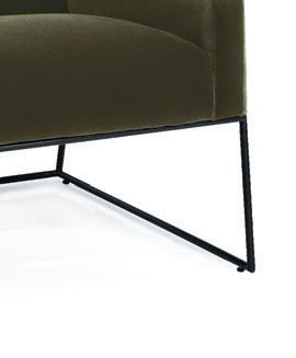
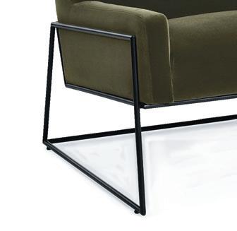
4. Regis lounge CHAIR in juniper green. $929. article.com
5 Vestervig multicolour flat woven RUG. $299. ikea.ca 6. Flow MUG in black by Ferm Living. $24. finnishdesignshop.com 7. Five-year keepsake JOURNAL set by Rifle Paper Co. $80. indigo.ca 8. Original BALLET SLIPPERS in cognac. $90. hidesinhand.com 9. Chaga coconut CHAI. $17. shoplakeandoak.com 10. Esbella THROW. $109. mobilia.ca 11. Bullet PEN in gold by Hay. $13. finnishdesignshop.com
With more than 15 years’ experience as a magazine editor, writer and content creator, Sara brings her passion for design and decor to our pages each issue. Instagram: @bysaraduck
Maybe it was the arrival of Zoom calls and we all needed a cool-looking background, or we finally just got wise to the fact that bookcases and shelves can be great styling tools, but these standard items have really come into focus the last couple of years. Outside of a video view, a well-styled open shelf can elevate and enhance the rest of a room, adding character and interest, and yes, function, too.
I often use open shelving in my own designs, and it’s as requested and loved by my clients as it is by me. In one project, we aligned the theme of the accessories in relation to the room’s broader esthetic, which featured wood and organic elements, with a neutral palette. Our shelf display had muted tones, with a mix of objects and materials that resonated with the rest of the space.
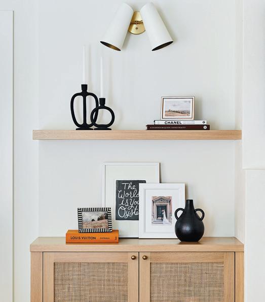
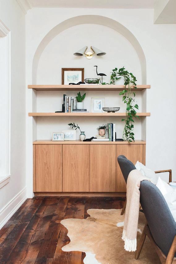
Here are some of my personal tips to style a bookshelf.
This is my best advice when decorating, whether it’s a bookshelf or a whole room. Clearing out everything may sound overwhelming at first, but it makes lighter work of the styling itself. It’s also the best way to take stock of the shelf and the space around it, which will impact what goes on it.
When choosing your accessories, do so wisely, as there is a fine line between a “collection” and “clutter.” The space on your shelf is precious, so don’t waste it on pieces you don’t love, and certainly don’t waste it by cluttering it up again. Whatever you choose, make sure your selections have the desired impact in the room.
Try incorporating an assortment of items in alternate groupings, such as books mingled with photos, art, baskets and pottery. Vary your material selections as well, with a mix of pieces in wood, metal, glass and stone, in a range of textures. Plants are a great addition, too.


If you don’t choose books based on their covers (really, you shouldn’t), consider wrapping them in coloured paper to bring a little life to your displays. Add further visual interest to your display by painting or wallpapering the back panel of the bookshelf, or the wall behind it if it has an open back.

While this advice does the whole “don’t judge a book by its cover” thing, go ahead and treat your books like true accessories, with an eye to colour and pattern. Believe it or not, books come wrapped in some truly beautiful covers that, in my opinion, can easily be placed on a shelf alongside framed or canvas art.
When arranging your accessories, consider the weight and size of each object in relation to the others, and the bookcase itself. Smaller items organically “float” to the top, while the larger ones gravitate toward the bottom. Be sure to balance your display with some empty space. When you think you’re done, take a step back and adjust the display until you’re happy with the result.
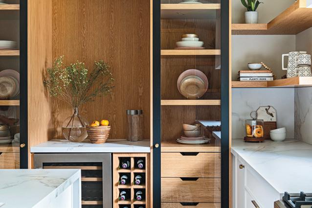
When grouping your collections, work in odd numbers, which creates symmetry and is generally pleasing to the eye. Place the tallest or largest item in the centre of each mini arrangement, with the smaller items on either side.
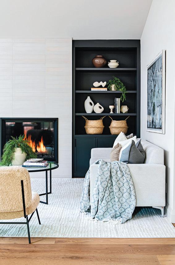
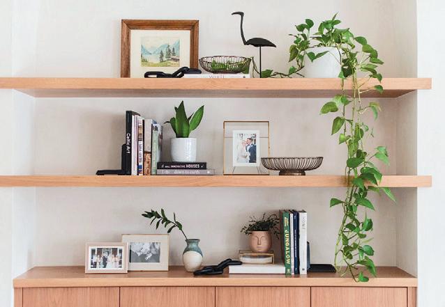
A bookshelf isn’t just a place to put your stuff; it’s an opportunity to showcase your style, personality and personal interests. It’s a way to infuse your home with colour, texture and vibrancy. It helps tell the story of you. Put some thought into your accessories and arrangements, and what it is you want to say. Alternate your display with the changing seasons, your evolving interests and new experiences, or just on a whim. Consider it your blank canvas.
Lisa Kooistra is the creative director and principal designer for Lisa Kooistra Design. This multi-disciplinary design firm has become known for creating exceptional well curated interiors and custom builds. lkdesigns.ca IG: @lisakooistradesigns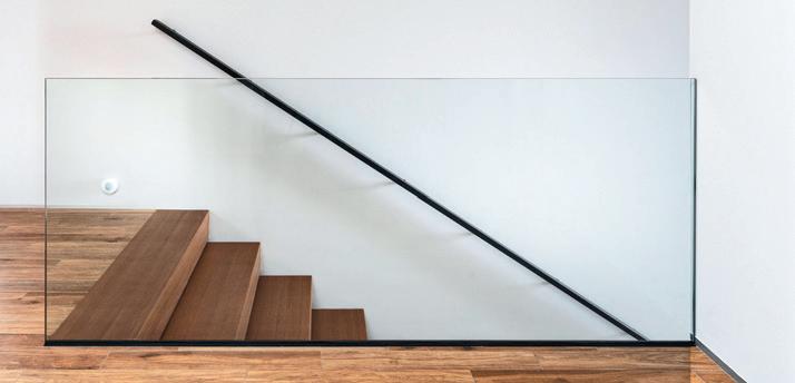
The team at Glass Wise Inc. specializes in custom glass solutions for both residential and commercial customers. They understand their customer’s unique needs and have a team dedicated to bringing endless ideas to life. From engineered and safe custom glass railings to manufacturing and installing custom glass solutions perfectly suited to your needs, Glass Wise, a leading architectural glass installation company, is an owner-operated business with more than 20 years experience in the GTA area and southern Ontario. GLASS WISE INC. | glasswiseinc.ca
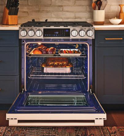
LG STUDIO’s sleek slide-in range delivers on every level. Air Fry to feed a crowd, Air Sous Vide to cook tender meats in the oven and an elevated, slide-in design, and InstaView window to bring style to your kitchen. The EasyClean cooktop and oven keep your range looking like new. Shown here, the LG STUDIO 6.3 cu. ft. InstaView Gas Slide-in Range with ProBake Convection and Air Fry. LG STUDIO | lg.ca
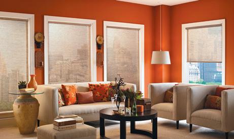
The Roller Collection from Trisol Window Fashions is an innovative whole-home comfort system designed to precisely manage ambient light, protect your privacy, and preserve beautiful views. Mix and match designer fabrics and light-filtering opacities to create custom luxury lighting not possible with other window coverings. Roller shade screen fabrics also help to optimize energy efficiency and block the bleaching damage of UV rays on flooring, furniture, and art. TRISOL WINDOW FASHIONS | trisolwindowfashions.com
Invite lasting beauty and style into your home with high-quality interior doors from JELD-WEN of Canada. Get inspired at greatindoors.ca to browse through the large selection of Canadianmade interior doors (with or without glass) and bifold options.

JELD-WEN WINDOWS & DOORS | jeld-wen.ca


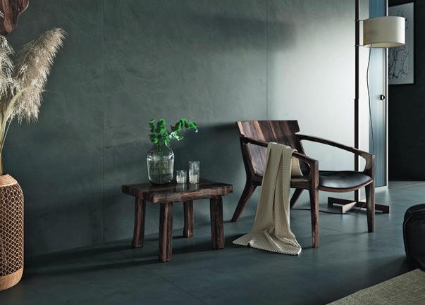
Creating the Dekton Kraftizen Collection was an impressive challenge to reinterpret craftsmanship perfected over the centuries using digital craft technology. Each trowel stroke from long ago transfers onto canvases made of millions of pixels, becoming part of an image and a reinterpretation with no expiration date. It’s a timeless surface ideal for flooring, cladding, countertops, exterior façades and more.


COSENTINO | cosentino.com


Colour, meet kitchen. Introducing Bespoke, Samsung’s first customizable refrigerator. Express your personality with flexibility and performance in mind. Build your own fridge/freezer combination. Choose from eight colours and three finishes for a fridge that matches your personal style. Bespoke – designed for you – by you.

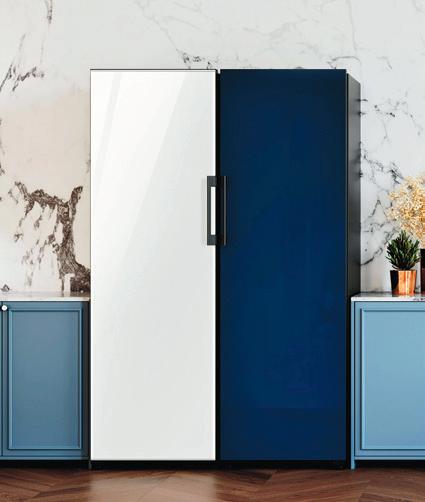
CANADIAN APPLIANCE SOURCE | canadianappliancesource.ca

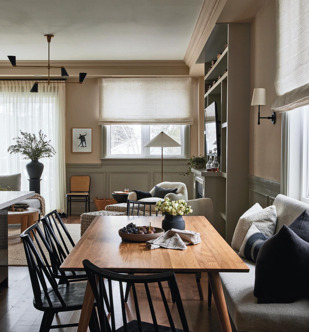
It’s an interior design tale as old as time — how to make an open-concept main floor flow, while remaining functional and fabulous.
For designer Melanie Hay of Melanie Hay Design, the solution is to rely on her problem-solving skills. “I needed to solve several key functions in the space first,” says Hay. “I needed to carve out “zones” in the open-concept space that ensured there was enough room for family living and lounging, entertaining, working from home and dining.” Hay was mindful that her clients were a young family with a new baby and anticipated they would need the entire area to be comfy and cosy for daily family life, but also streamlined and stylish for entertaining.
“I knew with a young child in the house, I needed to be practical with
finishes, and I wanted the room to feel cohesive but still interesting,” she explains.
When creating the dining area, Hay had to come up with a clever small-space solution.”My clients really wanted a place to congregate with family and eat, but space was tight, and I didn’t want to take away from the spacious living/family area,” says Hay. She chose a previously unused area to set the stage for a dining nook and placed a pretty, upholstered dining bench under the window to soften the look and save space.


Next, she added two shaded wall sconces on either side of the window to help define the dining room area and some soft diffused lighting in the evening.
“The chairs are a bold visual element and are also practical, while the mid-century modern style walnut table is a bit unexpected,” she says.
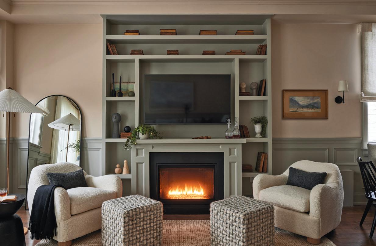
Hay started by painting the walls in Muslin colour, by Benjamin Moore. She appreciated the soft blush undertones and knew it would pair perfectly with the paint brand’s Cosmopolitan hue.
The warm grey with green undertones was used as a contrasting colour on the wainscotting throughout the area and on the large fireplace/TV unit. “The two colours give the space polish and dimension,” says Hay.
When it came to the overall colour palette, Hay used a variety of coordinating warm, earthy tones, using her client’s laid-back personalities and their desire for the space to feel “comfortable and relaxed” as her main inspiration.
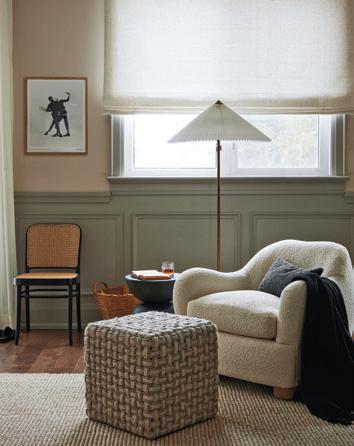
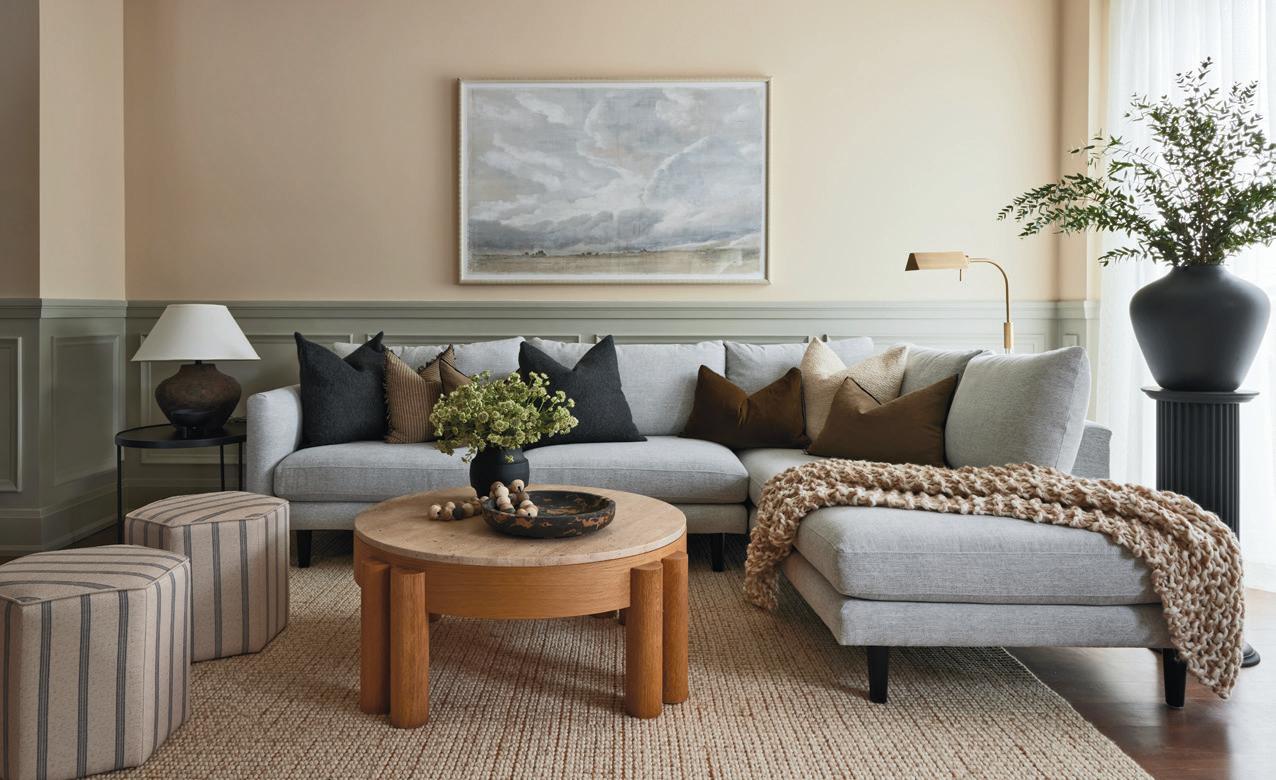
“I love neutral palettes in general, as I find them very livable and timeless however, there is always the chance that a space will fall flat if it doesn’t have enough dimension in tones and textures,” she says. To add depth, Hay incorporated various textiles and materials — a wool and jute rug, linen on the sofa, silk, wool, velvet and linen on the toss cushions, and
brass accents. “This layering of natural textiles and materials makes the space feel warm, enveloping and cosy and keeps it casual yet elegant,” explains Hay.
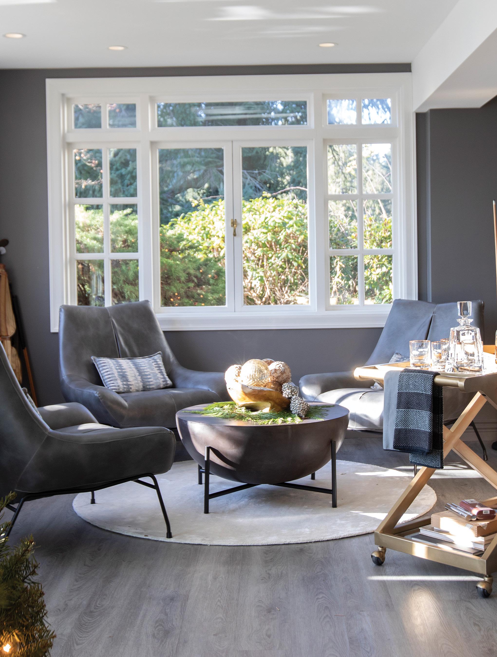
To mainain a cohesive look between the living and dining areas, Hay incorporated the same palette and material selections to ensure there was flow throughout the rooms. In addition, she paid particular attention to the space’s light and dark elements to ensure everything felt balanced. Even the window treatments were consistent between the two rooms to maintain a natural flow.

Using her keen design skills, Hay was able to turn an open-concept dilemma into a stylishly defined space fit for the entire family’s needs.
With more than 15 years’ experience as a magazine editor, writer and content creator, Sara brings her passion for design and decor to our pages each issue. Instagram @bysaraduck
To add depth, Hay incorporated various textiles and materials

 by JAMIE BANFIELD
When it’s cold outside, you want a welcoming environment for you and your guests. Design is more than just about esthetics: It’s also about creating an atmosphere. To create a welcoming ambience when the weather outside isn’t so accommodating, focus on dedicating certain areas to enhance all the right feels.
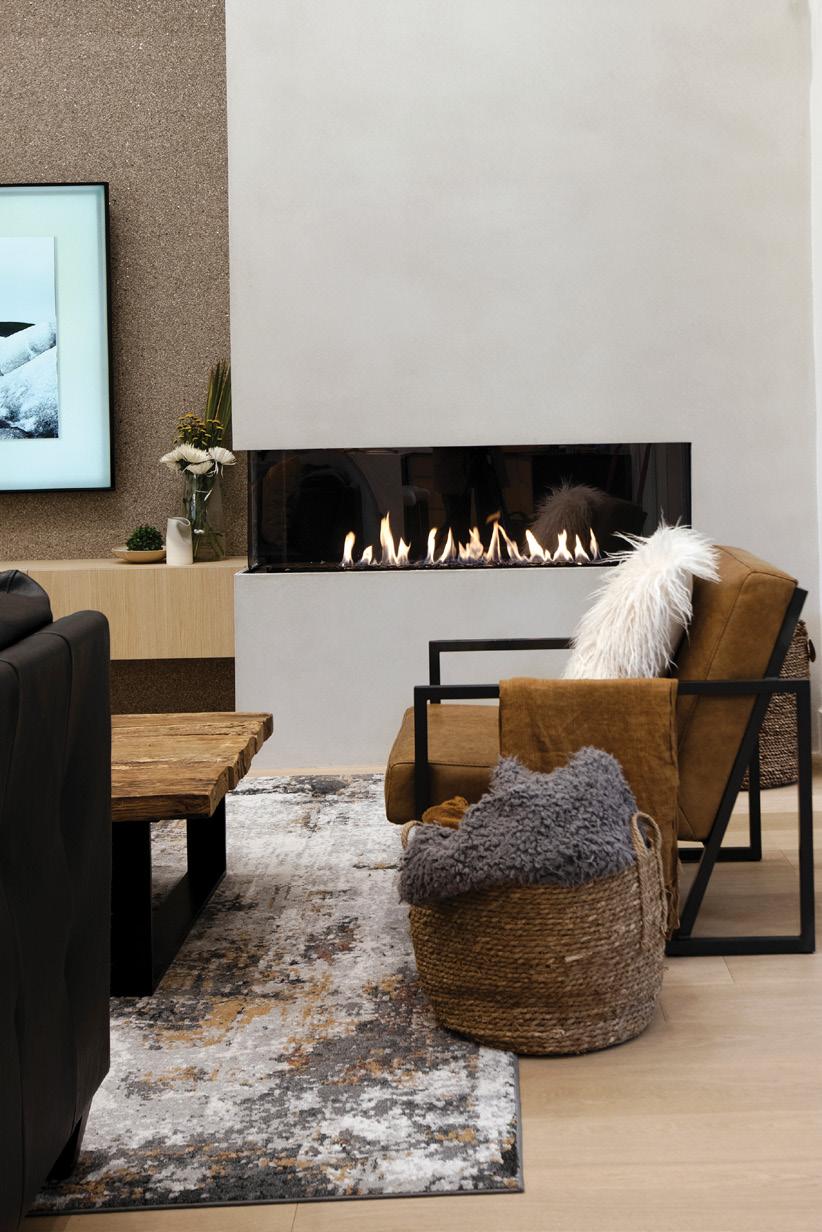
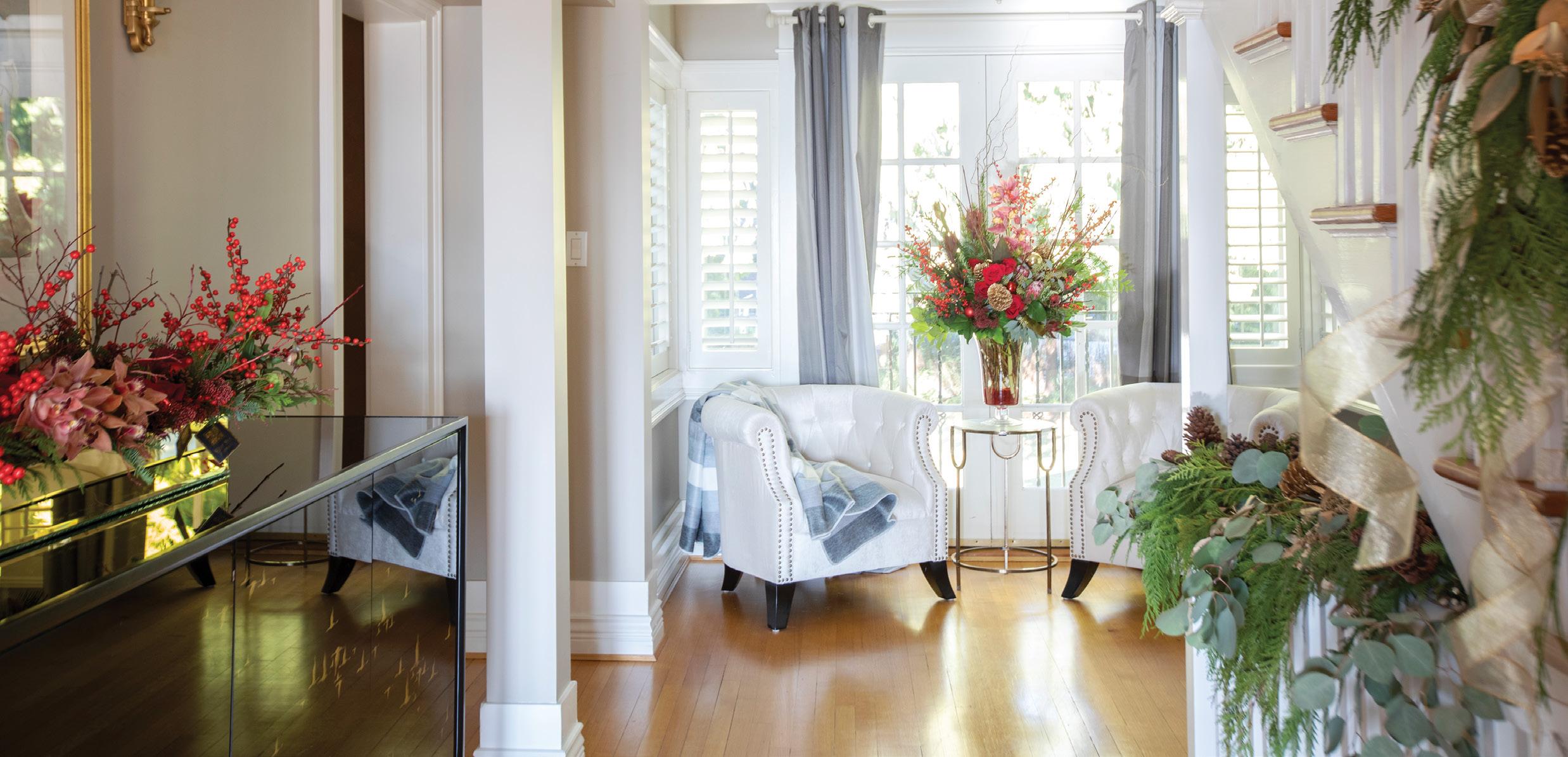
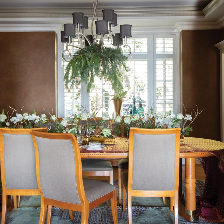
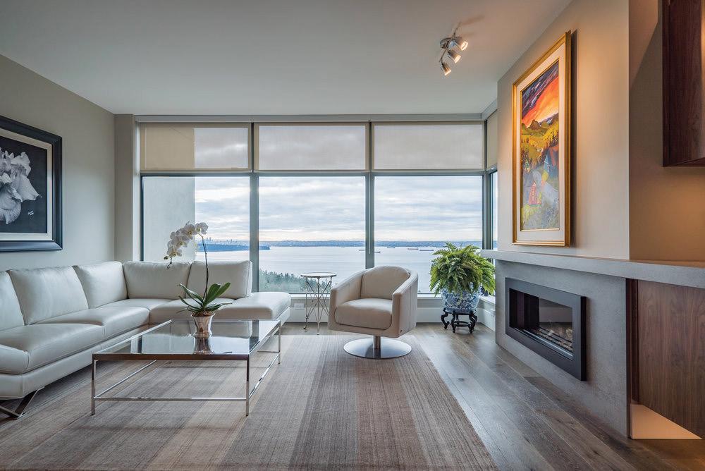
Present the space as somewhere anyone would covet to relax or dine in. Keep clutter in a sort of organized chaos, make sure to have seats available, and use a few design tricks to lure the eye.
Lines: Give the eye a purposeful direction. Utilize the angle of flooring or walls, and where corners meet. This acts as a physical cue for your gaze to follow. Contrast: With a pop of colour or an interesting pattern, you can bring attention to a location with ease. Contrast is a great way to establish a focal point.
Symmetry: Creating a frame is another way to encompass a space and draw the right kind of attention to it. For example, a couch perfectly framed under a window or art piece, or with accents on either side can bring it to the front of one’s attention.
Relaxing is one of life’s luxuries — a place to put your feet up, to unwind after a hard day, or to cosy up with your favourite activity.
Blankets: There’s nothing cosier than a few blankets. To amp it up, layer them up! Heavy knits, wool, fleece, faux fur, there’s no such thing as too many. Store the overflow in a wicker or fabric basket. This makes them accessible to guests; they can just reach out and grab one.
Plant therapy: Plants aren’t just good for adding texture or colour to a room, they also improve the air quality and bring a sense of life into a space. Colder weather means closing doors and windows to maximize the heat and adding indoor plants brings about a more figurative sense of warmth and closeness with nature.
Whether you’re yearning for those halcyon days of summer, or want to relive simple pleasures, decking your space out in memorabilia can help combat those winter woes. Live in the moment with guests but don’t neglect the things that make you sentimental. Dedicate a space to creating and celebrating memories. This extends beyond the holiday season. Find and keep the love by personalizing the space.
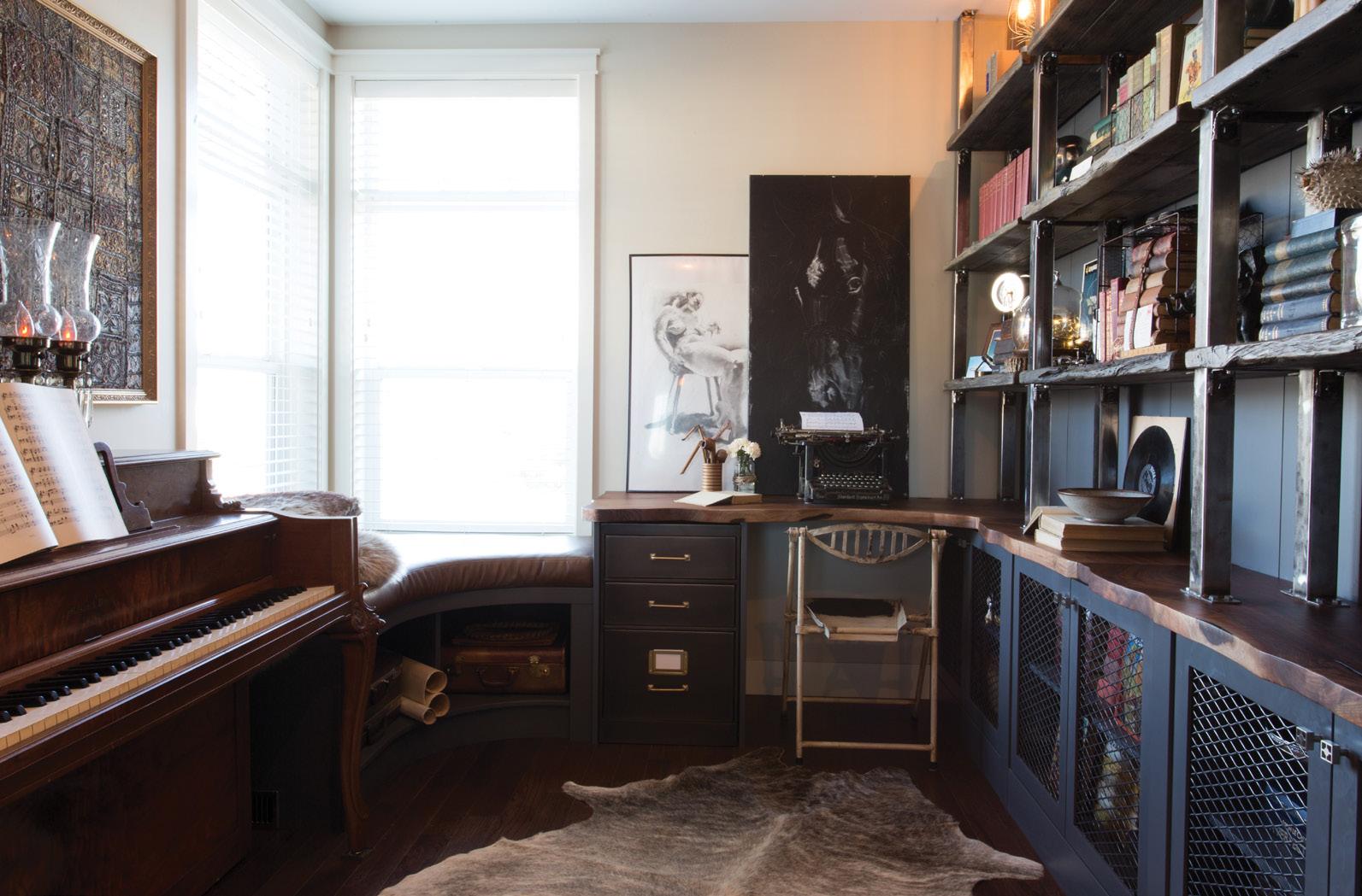
Repurpose old keepsakes: Consider the treasures you’ve accumulated in your lifetime. Tasteful clutter doesn’t have to be bare bones or even storebought. Old letters and encyclopedias can find new purpose. Along with personalizing your home, old treasures can bring more dimension with colour and texture. A few conversation pieces here and there can spark discussion and bring about more memories for the future.
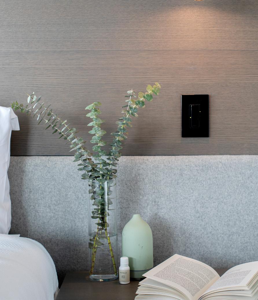
Aromatherapy: Our sense of smell is an often-overlooked part of crafting an atmosphere. But it’s easy to set one

up. Choose a scent (holiday inspired or otherwise) that fits the mood you want to convey and let aromatics (such as essential oils) do the rest. A subtle scent adds another layer to the space: Your olfactory system is closely connected to memory.
There’s more to staying snug in the winter than cuddling up with a cup of tea and nesting in blankets (though that does help). Giving your spaces a purpose can help renew your desire to entertain. It’s good for the soul and a great excuse to have guests over.
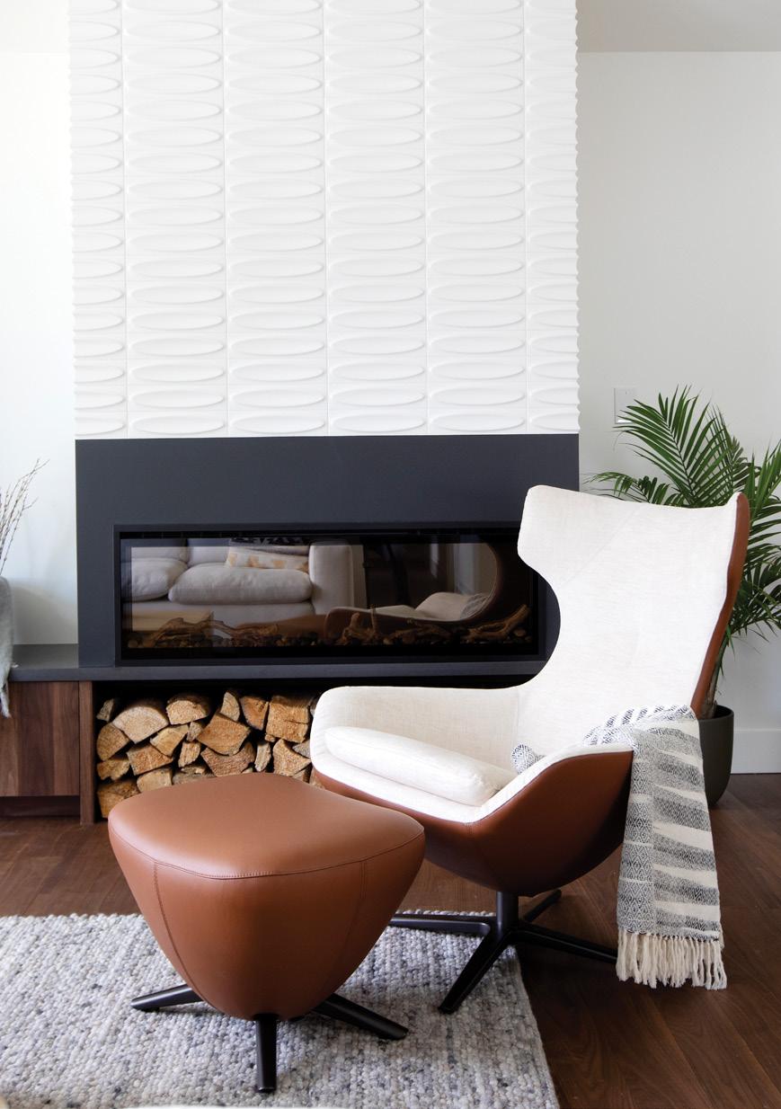
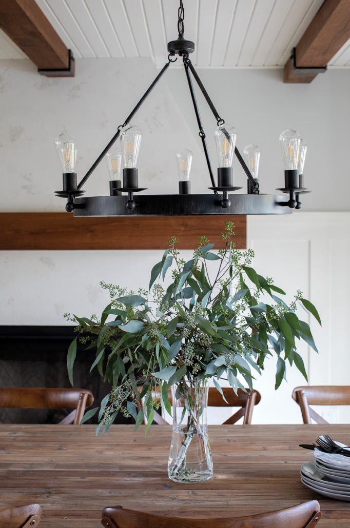
 Vancouver-based residential designer Jamie Banfield, of Jamie Banfield Design Inc., is a creative force in the industry and recognized for his design skills in both residential renovation and custom home design projects throughout Canada. jamiebanfield.ca
Regardless of a home’s actual square footage, the quest to make it look and feel bigger and brighter is eternal. What many people don’t realize is that you don’t always have to undergo a costly and all-consuming renovation to enhance your home’s sense of space and light.
Here are some simple design tips to consider instead.
Decluttering costs you nothing, but it makes a world of difference. A clean, clutter-free space lets light flow freely throughout, making a room appear bigger and brighter. It’s remarkable how “stuff” has a way of eating up
physical and visual space in our homes, blocking out light and that desired sense of openness. Donate, recycle or trash anything you no longer want, need or love.
Painting the walls instantly refreshes a room, and when you choose a light, neutral colour palette, it can also
You don’t need a big reno to enhance the light and space in your home
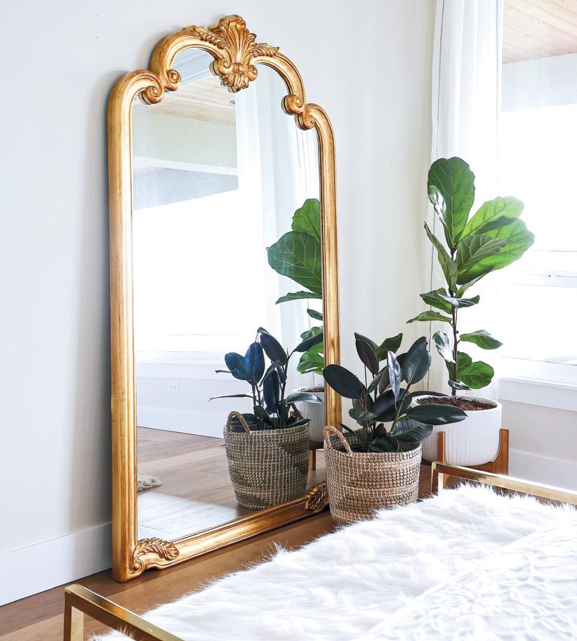
tipMirrors are a great way to amp up the light and airiness in a room, by virtue of their reflection. A large mirror essentially doubles the light in a room, and when strategically positioned across from a window or doorway, it doubles the view as well.

make your home feel more spacious. Pale colours naturally reflect light, which can make the walls appear farther away, thus visually expanding the room. Look to colours such as offwhite, cream, beige or light grey as bright and airy choices that are still on the warm side of the spectrum.
Windows offer outside views, but they are also the main source of natural light entering your home. Let the sun shine in with sheer curtains or translucent blinds that offer privacy without blocking out the light. Also consider removing unnecessary doors, leaving entranceways free and clear.
Your furniture layout also plays a key role in the flow of light through the space. Avoid blocking windows and doorways. Stand back in the room and reposition any pieces that obstruct your views. Low-profile furniture, slim silhouettes, reflective metals and materials such as clear glass or Lucite allow light and views to pass through, making them “disappear” from sight.
Have you ever noticed that dark rooms can make the space appear small and cramped? Poor lighting also makes a room less welcoming and less functional. Given this, it never
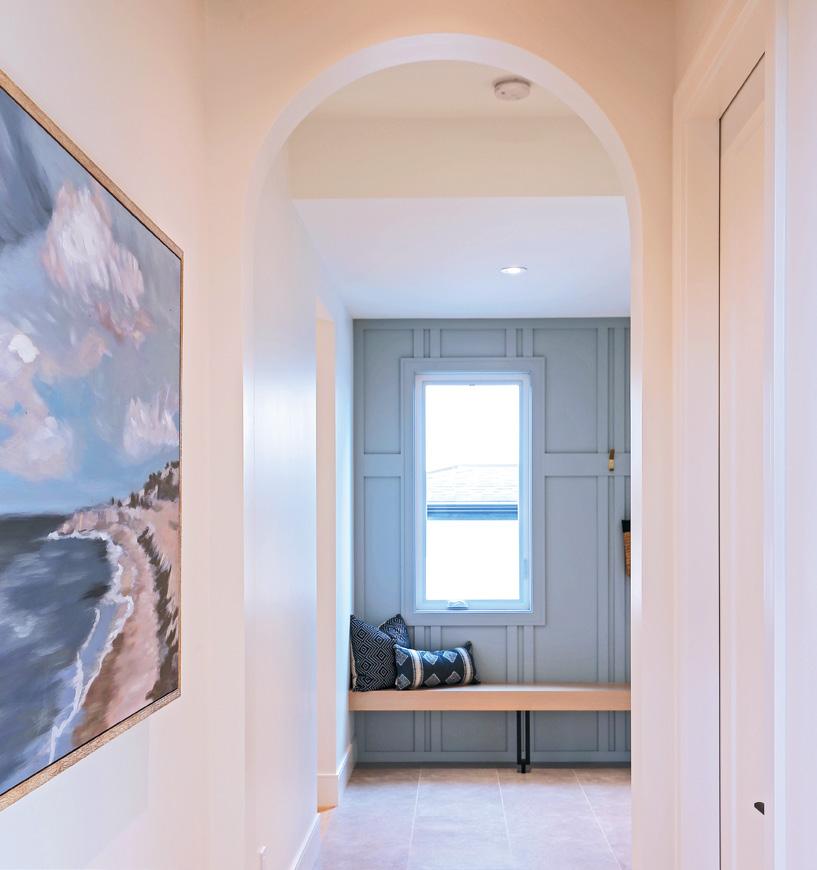
tipPaint the walls in adjoining or adjacent rooms and hallways the same colour to blur the separation between rooms and make them appear larger.
ceases to amaze me that lighting often becomes an afterthought in the decorating process. Always prioritize your lighting in your decorating plans.
A well-lit room should include layers of different types of light sources, such as ceiling fixtures, sconces, table and floor lamps. This will brighten dark corners while highlighting the functional and esthetic features of a room. We always tell our clients to ensure they have various light sources along with dimmers that also allows them to customize the level of lighting, depending on the time of day, the activity and the desired ambience.
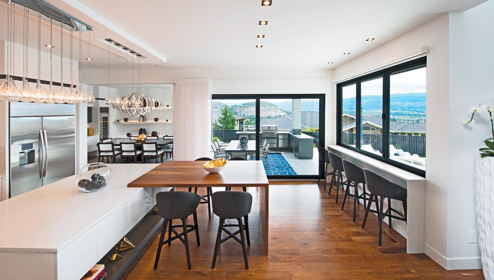
Believe it or not, the amount of light in your home affects not just the home’s esthetic, but your mood and even your physical health. So, lighten up more in 2023 and let the sun shine in.
A brighter, bigger home can be yours – even if it’s just the illusion of light and space.
Trisha Isabey is the creative director and principal designer for award-winning Isabey Interiors. The Kelowna-based design firm has excelled for over a decade creating thoughtfully curated designs. The design team offers a diverse range of design services throughout Western Canada and nationally. Isabeyinteriors.com IG: @isabeyinteriors IG: @furnishbyisabey, we all know
TV renovation shows are highly edited and don’t reflect the reality of most home renos
Home renovation shows are one of our favourite shows to watch. Not only are they entertaining, they make renovating a home look so easy and exciting. Programs like “Love it or
List it Vancouver” can be especially appealing since we can recognize certain landmarks or streets.
Although fun to watch, we all know the shows are highly edited and don’t reflect the reality of the renovation process. Nonetheless, we do learn
about design and the latest interior finishes and stylish open interiors. To help you bring your home renovation aspirations to fruition, we’ve listed some of important “reality” factors to consider when thinking of a home renovation.


Most home renovation shows do not talk about the money or financing aspect of a renovation. Before you commit to any home renovation project, meet with a mortgage expert to help you assess your financial situation. Every person’s financial needs and options are unique. When asked, most people say they are financing their renovation with a line of credit. With this form of financing, you are only required to make payments on the interest and some people believe they can manage paying the interest and go ahead with the renovations. The “reality” of using a line of credit is that eventually, the principal has to be addressed and you end up paying huge interest costs.
A home equity line of credit (HELOC) will give you a lower interest rate… if you currently have one. If you don’t, you will need to have at least 35 percent equity in your home to qualify for one (based on the current mortgage rules by the Bank Act). As of now, you can refinance up to 80 percent of the value of your home for a mortgage based on the appraised value.
Another thing to consider if you are unable to pay off the debt quickly is that you might be better off refinancing your mortgage. It might be more beneficial to get a one- to five-year locked mortgage below three percent by saving interest up front and using your lender’s prepayment privileges. If you currently have a fixed-rate mortgage, find out what the penalty would be for paying it out early. It might still be worth it to refinance.

Sometimes on TV, the designer has $80,000 to renovate an entire main floor, including the kitchen and finishing the basement. Are those numbers realistic? The “reality” is that viewers are not made aware of what has been factored into those numbers, such as design fees, permits, labour, finishes and material costs.
In order to have a budget you can work with for your renovation, do research before you commit. Some people get a specific number in their head without knowing what is involved in the total scope of the renovation. It is critical to work with a professional renovator to reduce any surprises. Don’t know where to find one? A great source for qualified and proven renovators and builders is to inquire at an association such as Homebuilder Association Vancouver (havan.ca).
A professional renovator will work with you to create a detailed budget and timeline for your project so you know what to expect. Once you start selecting materials, take the budget with you so you stay on track. What you don’t want to happen is to run out of money midway through your project because you made too many changes along the way or selected more expensive materials.
On TV, renovations seem to be completed within a few short weeks. The “reality” is that sometimes it can take up to eight weeks just for the kitchen cabinets to be built. Before you start your renovations, prepare a timeline with a renovator so you know what to expect. This will give you an


exact idea of how long it will take to do the tasks so you can plan accordingly.
Also, it’s important to remember that quality, professional renovators aren’t necessarily available right away. Some are booked months in advance, depending on the project. In order to stay on track, materials have to be bought ahead of time and certain items could be out of stock. It might take additional time to get them or in some cases, replace them. It’s important to remember that even a quick project will take a few months, while bigger projects can take up to a year to complete.
On many renovation shows, the interior designer comes into the home with their assistants and an iPad and start moving walls and designing the new space within minutes, seemingly without consulting the clients. You’re not going to want to allow an interior designer to do anything without your input.

When it comes to the actual planning, it’s best to plan for the unexpected. In “reality”, structural changes like moving walls, doors, windows or adding additions may require the services of a structural engineer in order to obtain permits. A good renovator needs to plan for these types of engineering costs and potential time delays in order to complete the project.
Your own home renovations might not have all the glamour of a TV show, but if you take into consideration the factors above, you will end up happy and proud of the results.
One of my fondest childhood memories is of sitting around the fireplace on Christmas Eve, eating mom’s famous French-Canadian tourtière, while listening to the crackling sounds of the wood.
Since then, I have always had a fireplace in any home I’ve lived
by MICHELLE HOPKINSin. When I purchased my new farmhouse-inspired townhome in 2021, a fireplace wasn’t just on my wish list, it was a must.
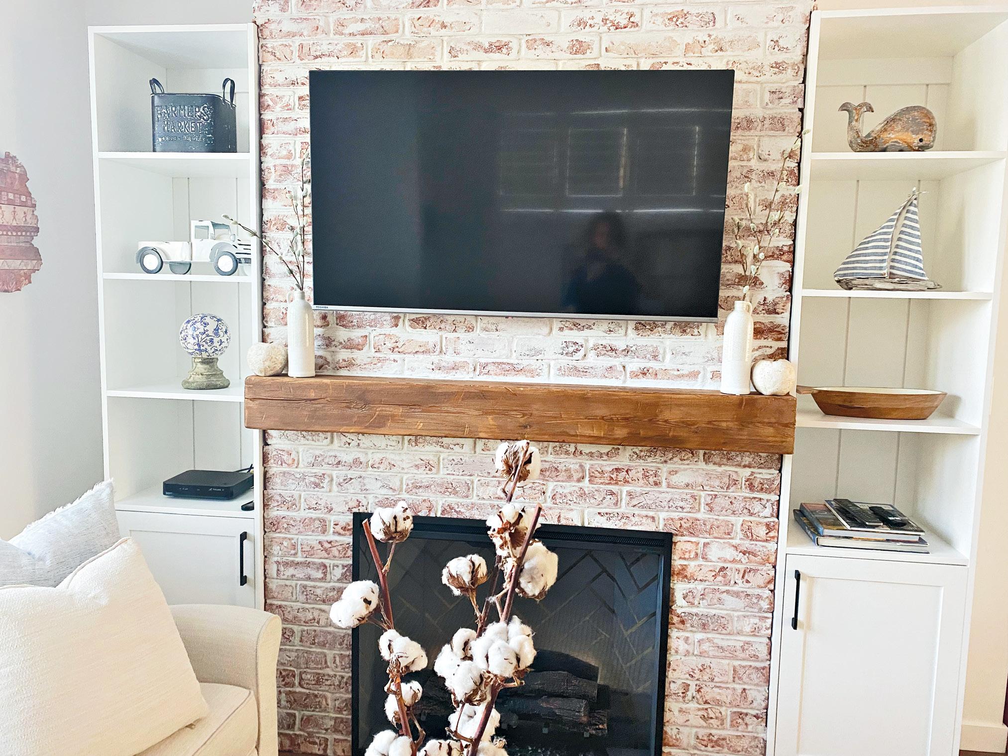


A fireplace becomes a focal point, a gathering place, the heart of the home and an entertainment piece all in one. Before I even moved in, I
called my interior designer for advice and spent hours on Pinterest looking for inspiration — natural components such as wood and brick for an inviting modern country look.
With the living room dimensions in my hand, we worked on furniture arrangements. She told me the space could accommodate a floor-to-ceiling fireplace without sacrificing too much square footage.
A modern country-look fireplace was a must-have in this farmhouse-inspired townhome
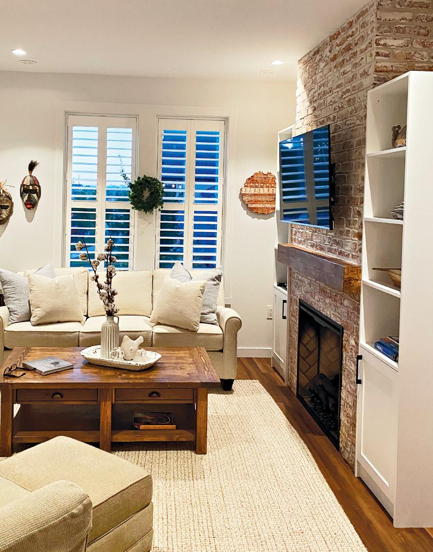
Within days, I was sent a photo showcasing a whitewashed brick fireplace with custom cabinetry on each side. It was exactly what I wanted.
We then went looking for fireplace inserts. While I do love the smell and look of a real wood-burning fireplace, most B.C. cities ban the installation of them.
I was left with two choices, gas or electric. While the designer tried to sell me on a gas insert, which is more expensive than electric to purchase and to install, I opted for the electric insert.
There were a couple of other reasons for choosing electric. Because my gas line vented above my front porch, I would have had to get approval from my strata. With an electric fireplace, there are no venting requirements as there is nothing burning inside the unit. It was one less thing for me to consider.
Best of all, at the flick of a switch, my home can be heated. In addition, today’s electric inserts are much more lifelike than in the past. Another bonus is it features logs and flames that are realistic. I ended up buying one with a herringbone brick background.
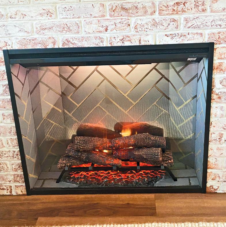
I then went in search of a mantel. I wanted to use reclaimed timber, so I opted for one made from an 1880s Abbotsford barn. My mantel tells a story - one that celebrates the legacy of our pioneering spirit.
Finally, it was time to build the box for my fireplace. Once my contractor measured the wall, it was simply a matter of framing-in the fireplace, which consisted of
2X4 and drywall. It took two days to complete the work, including installing the brick.
Because red brick against white walls was too severe-looking, I opted for a thin brick that I would then have whitewashed. After my tradesperson taped and covered all of the surfaces surrounding the brick, the perfect shade of off-white grout was applied.
He allowed for some of the red to bleed out for contrast by sponging off the excess grout. It now fit seamlessly with my decor.
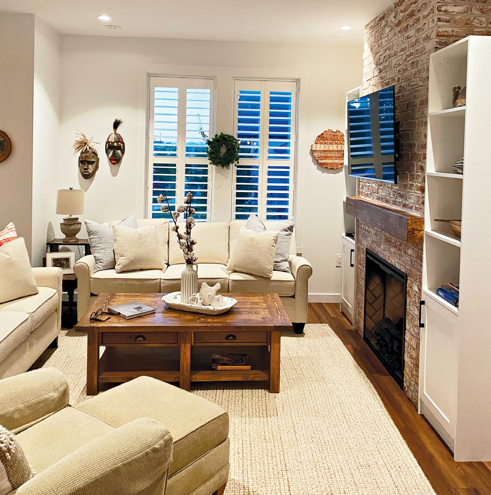
To finish the look, I wrapped both sides of my fireplace with custombuilt cabinets showcasing shiplap detailing for a more sophisticated look to my living room. Not only do the built-ins add visual balance to each side of my fireplace, but they also double as an opportunity for me to display my curios on the open shelving and as extra storage in the larger bottom cabinets.

Now that the days are getting cooler and the darkness is arriving earlier, my fireplace has become the place where family and friends gather to cosy up under the warm glow of the flames.
Michelle Hopkins is a freelance writer based in Vancouver. Since 2004, she has been contributing to several notable magazines, as well as three Oregon based magazines. Besides writing about travel, food, business, and inspiring people, Michelle loves writing about everything to do with real estate and interior design.
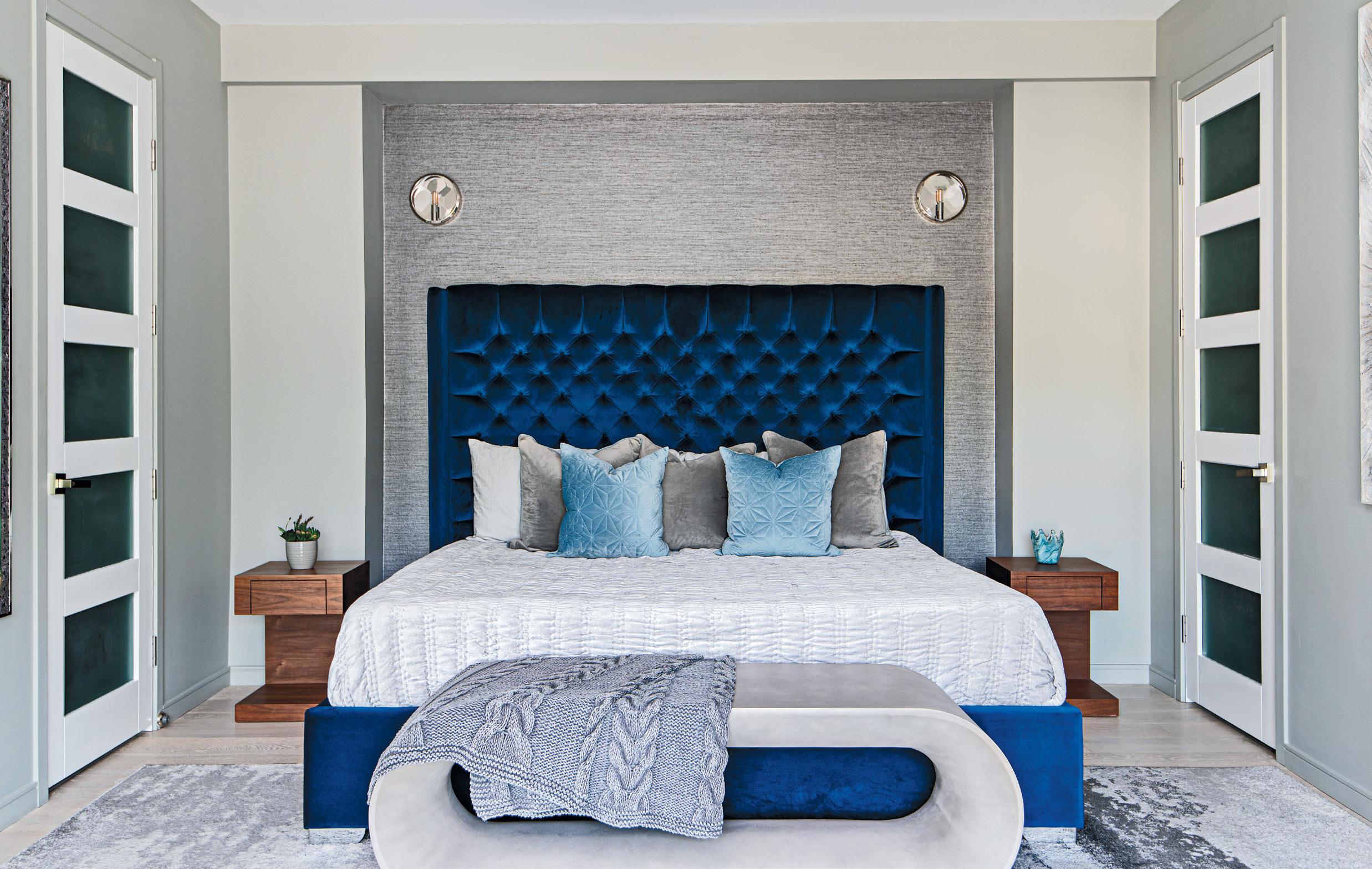 by DIANA ROSE • photos MIKE CHAJECKI
Gracious hosting is all about making your guests feel comfortable.
It’s also about making your home, their home, even if only for a short period of time. This is when some of those oftenoverlooked rooms come into focus –namely, the guest bedroom and bath. Follow these design tips to style these spaces as a cosy retreat your visitors will never want to leave!


If your goal is to make them comfortable, using a neutral colour palette of creams, whites and gentle greys will go a long way. Generally speaking, this family of hues is broadly appealing, which makes it a great choice for a guest bedroom, where one guest’s esthetic preferences and comfort level may differ dramatically from another’s.
Another reason neutral colours work well in a guest bedroom – or in any bedroom – is the atmosphere and ambience they lend to the space. Cool, calm and collected is the ultimate in guest room goals.
Finally, as we see colour trends fade in and out of style every year, a neutral colour scheme has remained consistent. Going this route means you won’t have to redecorate any time soon.


Be sure to have the right type of lighting, with dimmers in the right places. A bedroom will typically need ambient overhead lighting, table lamps or sconces on either side of the bed
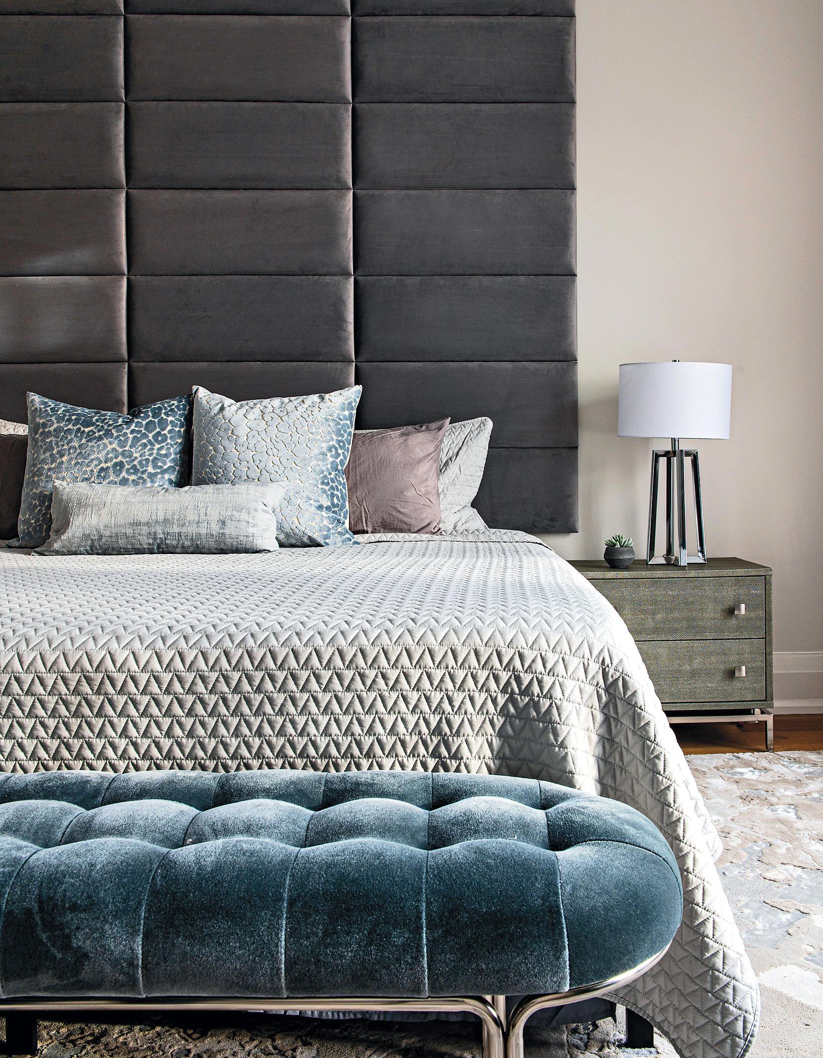
Treat your guests to a little luxury for the duration of their stay. When it comes to extravagances, the best place to take your cues is from the hotel industry. Think back to your favourite vacation accommodation, and remember what made your stay so memorable. Then, incorporate some of these elements into your bedrooms at home. Fresh soft bedding, piles of pillows and extra blankets are sleep essentials, especially during the winter months. In the guest bath, ensure there are plenty of plush towels and toiletries at your guests’ disposal.

From a decor perspective, you can incorporate little luxuries into the room in the form of a textured feature wall, elegant window coverings, modern lighting, and furnishings that are both practical and stylish.
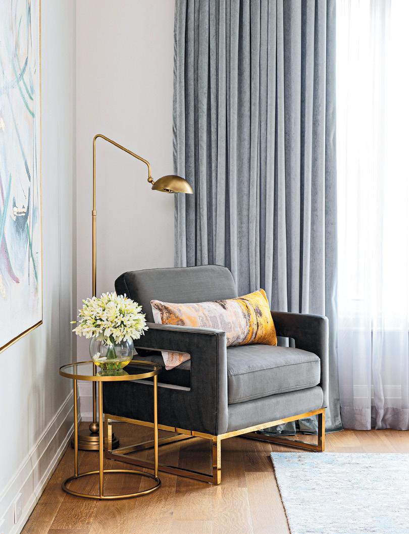

Some thoughtful accessories and pieces of furniture, beyond the bed and night tables, can really give your guests added independence and flexibility in their room. Assume that
visitors will be using the room to relax and do their own thing at times, so aim for comfort and function. Incorporate a small sitting area tucked into the corner of a room to add visual interest, while providing a place for people to sit, take a phone call, or just relax
With that said, don’t overburden the room, or your guests, with too much “stuff.” Keep the space clean and clutter-free to maintain its sense of rest and relaxation.
Creating a “home away from home” is easy when you have the right inspiration. But while your goal is to indulge your guests, remember that the room is in your home, so it should align with your own esthetic preferences and practical needs. With the right pieces in place, you just might find yourself spending a lot more time in the guest room.
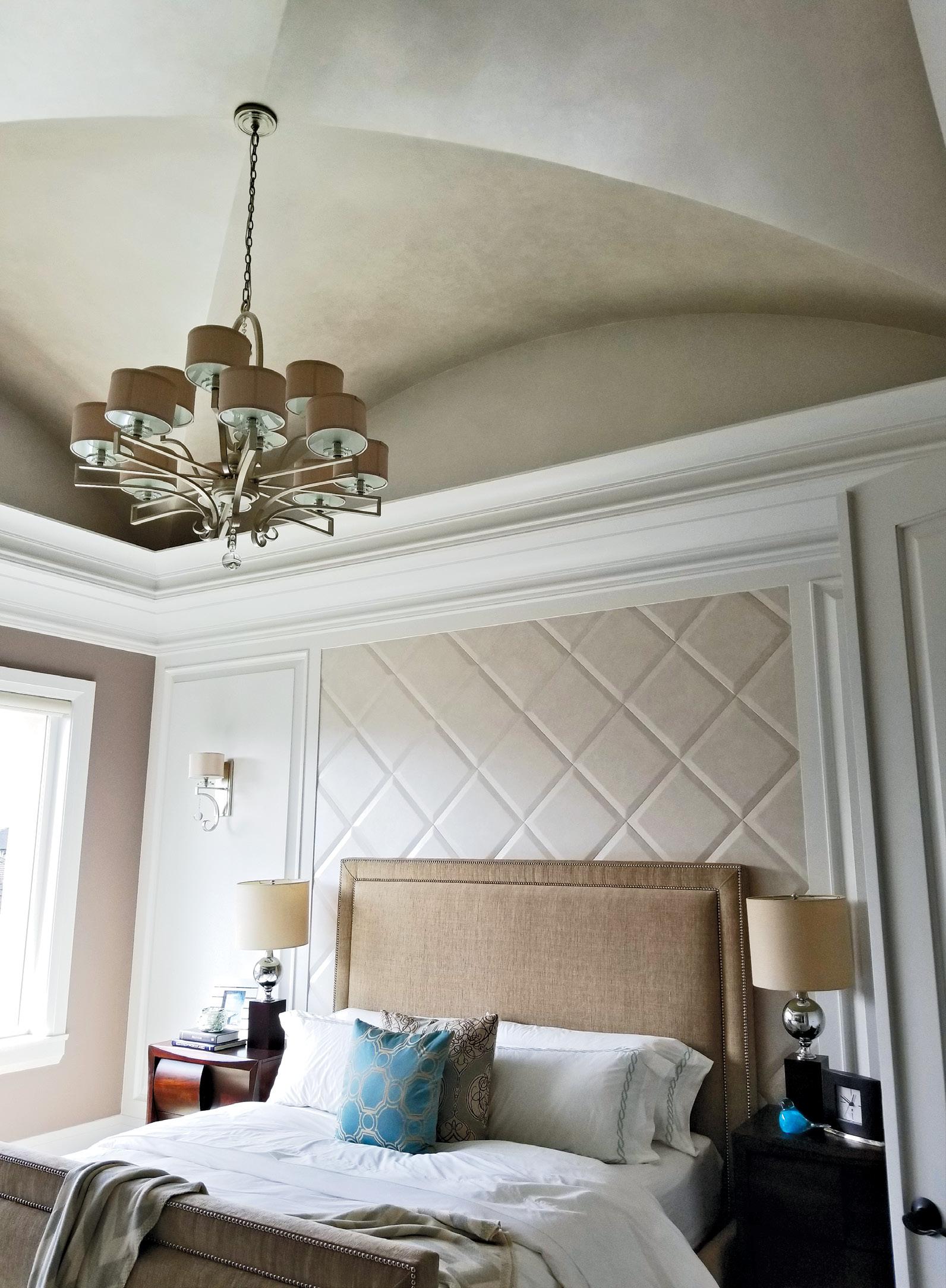
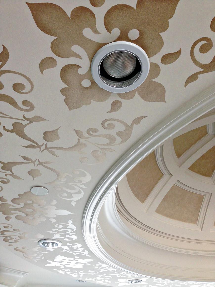
Diana Rose is the principal and creative director for Diana Rose Design. Nationally published, she is known for creating tailored interiors that enhance and complement your lifestyle. Servicing Toronto, the GTA, and Muskoka dianarose.design IG: @dianarosedesignThe grandeur of this entryway, located in Shaughnessy, Vancouver, was taken to another level with the addition of faux marble pillars, champagne gold ‘tipping’ on details, faux-finished ceilings and a custom ceiling design. The process of the work was a natural progression of seeing what a space needed next.

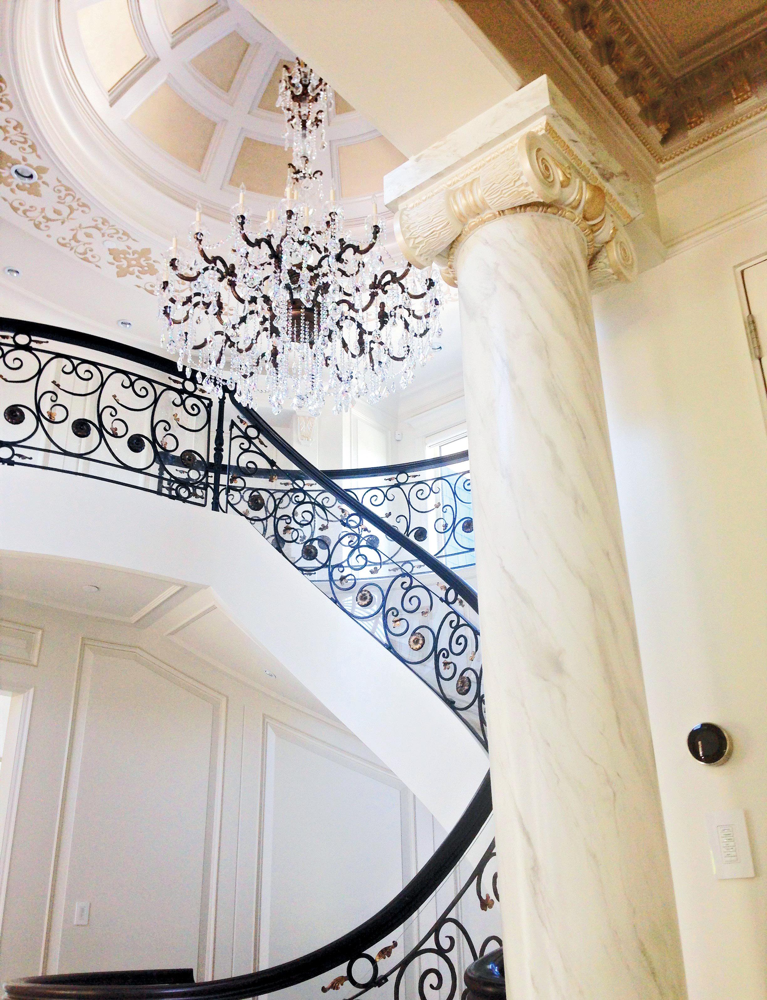
The pattern for the custom ceiling in the entryway was first designed then transferred to thick plastic to create a stencil. Once cut out, the stencil was carefully applied to the ceiling using spray adhesive. With a delicate hand, Modern Masters champagne metallic paint was applied to create an elegant glow.

The era of teased perms and parachute pants also introduced the masses to sponge painting and marbleizing kits. Suddenly, the 14th century art technique was being applied to literally everything, from household interiors to entire shopping
Applied with Modern Masters metallic paints, the reflective nature of the faux finish on the ceiling is very peaceful and harmonious. Depending on the time of day or where you stand in the room, the unique feature on the ceiling will reflect the changes in light and perspective.
malls. The result? A diabolical crash in the art of faux finishing.
Fast forward 30 years and the art form has been completely revitalized. There are many artists around the globe who are continuing the trade and introducing modern looks and designs that suit any style. In Metro Vancouver, Deanna Solveig, owner of Abalone
Custom Painting & Design, is among those artists and specializes in a wide range of finishes that offer a unique and original finish to a home. She uses specialty tools, including feathers, to make the effects come alive. With this form of decorative painting, it’s almost impossible to tell the difference between a “faux” wall or ceiling and the real thing.
spaces with the art of decorative painting
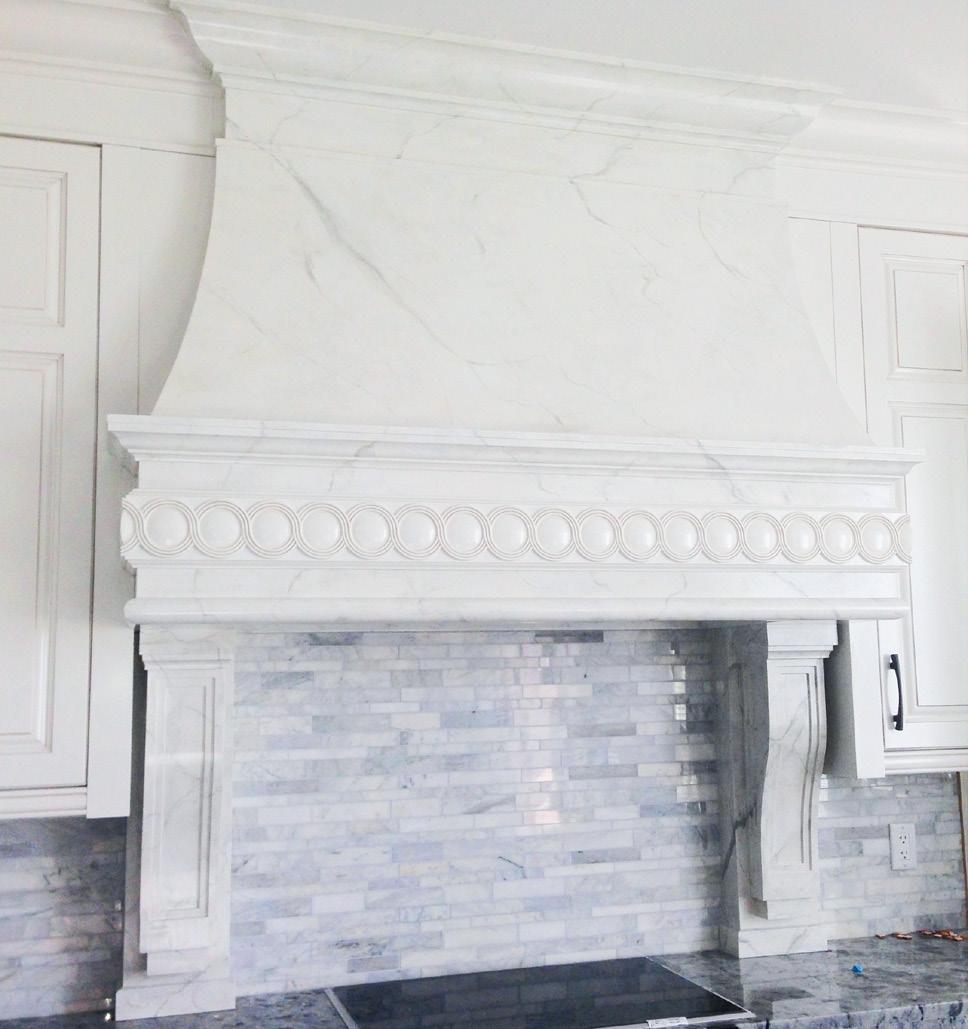
This closeup of a faux marbleized rangehood was prepared with custom-matched paint and glaze, and the veins were created using delicate feathers for a realistic touch. The marbleizing technique is a great alternative in areas where the cost or weight of genuine marble would be prohibitive.

Sometimes it’s impossible to source out the right wood for the job. Here, the decorative wood-grain moulding was matched with the rest of the room. With the help of a wood grain rocker and a keen eye to mimic the colours of the grain, it’s nearly impossible to tell it’s not the real thing.
“We take the surroundings of a room — furniture, lighting, flooring — and tie it all together so that an area feels well rounded and complete,” explains Solveig, as to how the process works. “There’s a void in so many spaces in a home, and many homeowners, designers and builders don’t even realize that decorative painting is an option.”
So, whether you’re seeking to enhance the glam factor of your dining room or make your bedroom unique to you, high-end decorative faux finishes are an intriguing option if you want to move away from traditional wallpaper or paint and enter into the realm of “faux-tastic.”
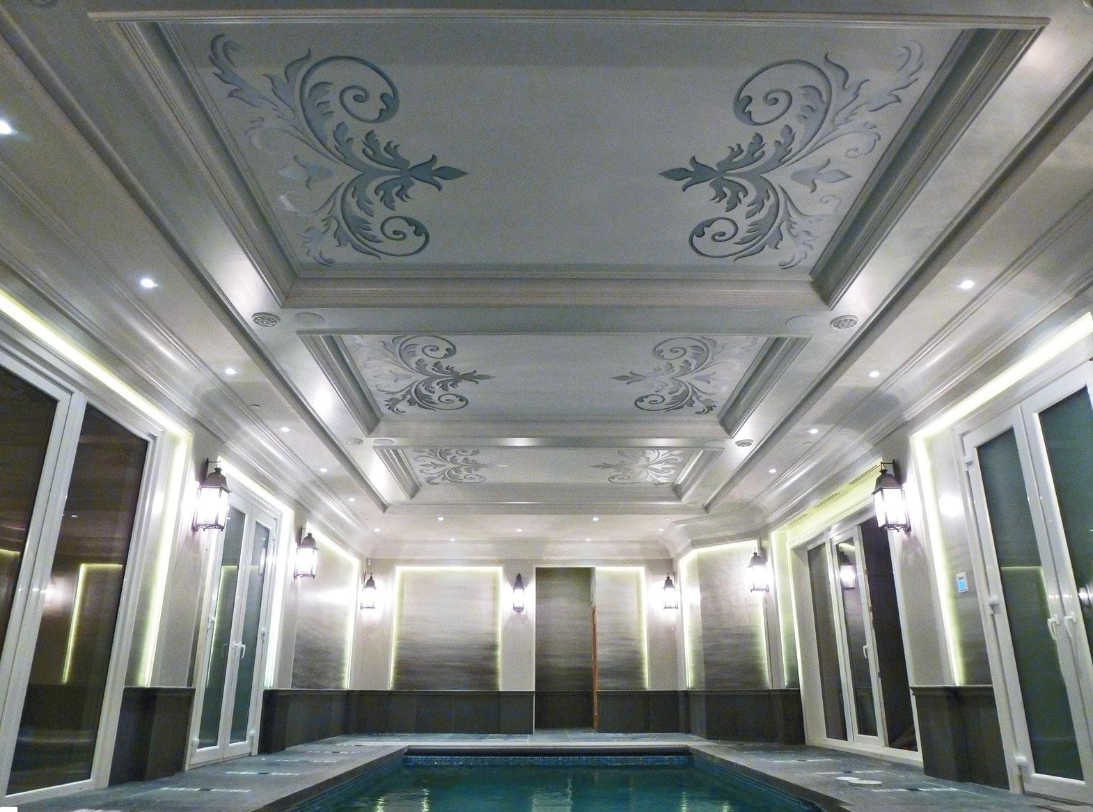
Using a custom-designed stencil, the ceiling was hand-painted using Modern Masters metallic paints. Platinum pearl with dark silver shading incorporated the colours of the house, reflecting the water harmoniously. As a finishing touch, the inset walls were painted warm grey tones to imitate the water.
Find
From pearl plaster walls to faux coffered ceilings, the possibilities are endless
Agua • aguacanada.com
American Standard
• americanstandard.ca
Black & Decker
• blackanddecker.com



Blanco • blanco.com

Buildex Vancouver
• buildexvancouver.com
Canadian Appliance Source
• canadianappliance.ca
Cosentino
• cosentino.com/en-ca

Craftsman • craftsman.com
Fleurco • fleurco.com
Hisense
• hisense-canada.com
Interior Design Show
• interiordesignshow.com
JELD-WEN
• stopwinter.ca
LG Electronics
• lg.com/ca_en/lgstudio
During the cold winter months, plan a


 by MICHELLE HOPKINS
During the cold winter months, nothing feels better than curling up on your favourite chair with a drink or snack to read a good book or watch a movie.
Why not re-create that same cosy and informal atmosphere when planning your next soirée?
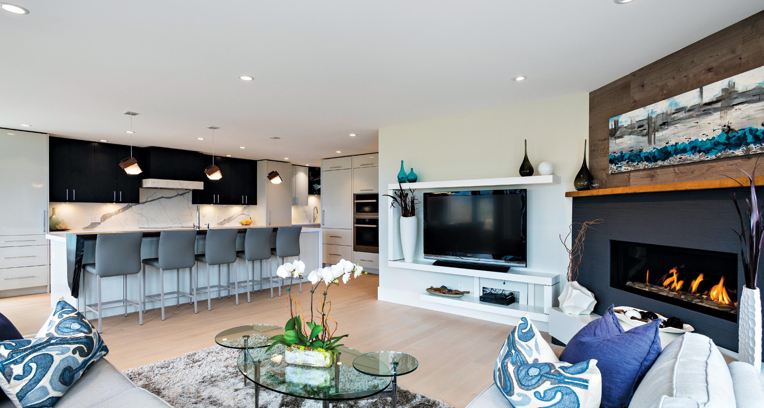
Everyone knows parties somehow end up around the kitchen island, which is a great space for informal, relaxed get-togethers.
“The food can be set up beautifully on the island, and guests can pop over and fill their plates as they wish,” says Sarah Gallop, principal at Sarah Gallop Design Inc. “Decor is a key element here as well, incorporating dishes of varying heights and colours and materials depending on the theme of the gathering. To avoid awkward back tracking, leave space between dishes and have a logical order to the placement of dishes, napkins, food and condiments.”
Couch parties are also pleasurable. However, the food offering is pretty important with this type of entertaining – nothing messy, just simple bite-sized foods that are not going to end up on someone’s lap.
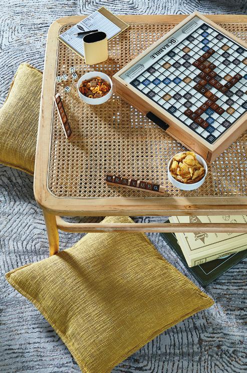
Sometimes, says Gallop, “a coffee table can be very intimate yet comfortable, as the seating is usually much more lounge-like.”

When planning for your coffee table entertaining, Gallop again suggests using serving dishes of varying heights to add visual interest, plus it is a good use of space — a
vertical set-up takes up less real estate. This could be tiered dishes, or dishes placed on something to elevate them and vary the heights.
By mixing up your collection of dishware, you will bring instant charm and a playful look to the table that’s totally you. It’s also a great way to incorporate a pop of colour.
“Reflective surfaces, such as glazed dishes, glassware, crystal and metals can reflect the light as well and greatly enhance the mood,” says Gallop, adding a plate that offers a wine glass holder saves extra space. “In addition, the use of lights helps, too. Think small strings of battery-operated LED lights in glassware, or around dishes, or candles of variable heights — these always boost the ambience,” says Gallop.
For continuity with whatever the central theme is, consider all pieces – serving dishes, eating dishes, glassware, decor, and napkins – and don’t forget to be a little whimsical.

