International Journal of Emerging Trends in Engineering Research
Available Online at http://www.warse.org/IJETER/static/pdf/file/ijeter0110122022.pdf https://doi.org/10.30534/ijeter/2022/0110122022


Available Online at http://www.warse.org/IJETER/static/pdf/file/ijeter0110122022.pdf https://doi.org/10.30534/ijeter/2022/0110122022
Vinay Kumar Singh 1 , Dr. Vandan Tewari 2
1M.E Research Student, S.G.S.I.T.S. Indore India, Vinaysinghiger@gmail.com
2Associate Professor, S.G.S.I.T.S. Indore India, Vandantewari@gmail.com
Received Date: November 5, 2022 Accepted Date: October 25, 2022 Published Date : December 07, 2022
The rapid growth of Technology is leading to the exploration of data at a very deep level. This has caused data to increase exponentially at very high rates increasing the complexity of the relation between them. Multidimensional data thus come into existence and multidimensional data visualization tools help to understand the complexity of the relationship between data efficiently. Radar charts being very simple, easy, and more understandable due to their ability to reduce the complexity of the relationship between data plays a very important role in visualization. But radar charts still contain a fewlimitationsthatarebeinganalyzed duringthis work. Radar charts are significant in many applications thus the work proposes a design for an improved 3D version of the Radar chart that can solve the problem in existing radar charts and achieve benchmarking.
Key words: Multidimensional data visualization, radar chart, 3Dradarchart,cylindricalcoordinatesystem,polar coordinate system.
Visualization is the act of making something visible. It is an essential part of data analytics that gives a perspective of data and increases its understandability. Exploration of data by enhanced technology is leading to explore more and more dimensions/attributes related to data. These attributes affect the resulting decision-making to a greater extent. Thus needed to be understudied and explored briefly. Multidimensional data visualization plays a very important role in increasing the understandability and complexity of relationships in data by representing data in some kind of graphs.
There are a wide variety of multidimensional data visualization tools and graphs like hierarchical display, dimensionality reduction, geometric methods, and iconographic methods. Methods like dimensionality reduction reduce the number of parameters by selecting the most affecting parameters and representing them in the graphical methods. So this kind of method is very ineffective while we are dealing with data with all attributes equally affecting the resultingdecision.Geometricmethodsconsistofvarious kinds of graphs having their disadvantages.
Radial visualization tools are the most effective visualization methods because of their simplicity, ease of visualization, ability to represent a greater number of attributes/dimensions, and their ability to reduce the complexity of relationships between data. Among radial visualization tools, the Radar chart is the most prominent one and the most used because of its easy representation structure. Radar charts play a significant role in visualization for various domains and applications. But radar charts consist of various problems that can decrease their effectiveness in various applications. Some ofthe problems occurringinradar charts are as follows: even if the variables/attributes/dimensions are independent radar charts require normalizing all attributes within a single range because of their circular structure. All the radial visualization tools have the disadvantage that it is difficult to distinguish the radial distances by the human eye in them, as radar chart is among radial visualization tools it also so have this disadvantage. Radar chart due to its converging nature all axis-es converge at a center, thus if extended towards the negative side to represent negative values they will collide with other axis-es. Apart from this, the area under curve was being used for evaluation and ranking in various applications. But if we change the position of axis-es, this will lead to a change in the area and thus affect the resulting decision very much.
The paper proposes a solution to mitigate all problems above-mentioned by proposing a new kind of graphical structure for radar charts. The proposed graph is an enhanced improved 3D version of a radar chart, which is designed using the combination of a radar chart and parallel coordinates plot. Such that now axis-es are vertically rotated and aligned parallel to each other on a circular platform as of radar charts. This kind of chart will mitigate all the above problems and reduces some other problems too. The new 3D radar charts have a wide range of applications in various domains, it can apply to any field where multidimensional numerical data required visualization.
The work performed is organized in different sections respectively. Starting with the introduction in section 1. In the second section, a literature survey has been performed to analyze some pre-existingresearch done onradar charts and in the field of multidimensional data visualization. Next, an overview of Radar charts and other multidimensional data
visualization tools has been discussed in section 3 background study. In Section 4, the design and formation of the new 3D radar charts are being explored. After that in section 5, the expected outcomes are been discussed in brief. In the last section, a summary and conclusion are done.
The radar chart was first used by Georg Von Mayr in 1877. Theycanbeappliedtoawidevarietyofapplications and many kinds of research have been performed to improve their structure some of them are mentioned below.
In June 1973, Kenneth and Philip [1] gave the concept of circular graphs known as kiviat graphs for evaluating and reviewingtheperformanceofsoftwareunitprofiles.The kiviat graph charts are the improved version of radar charts where eachaxisismarked with0%to100%fromCentre to end. Thus the software profile evaluation and review becomes very simple, and easyand reduces the need for normalization. They have tried to get the proper positioning of each axis to avoid collision and get the proper shape generated. As the figure is used for evaluating and reviewing, the shape in the figure must be able to visualize all the parameters/attributes. To some extent, they can visualize all the parameters without any collisionofthe axis, but there we canobserve that independent parameters are also needed to be normalized to have the same value range and if the profile evaluation value goes down toward negative or loss side, then also this type of graph was very difficult to visualize.
In 2004 Mina and Yoshihiro [2] proposed a new data analysis tool known as a Time Tunnel. Authors have tried to use time tunnelsnotonlyas a data analysis tool but also as a multimedia presentation tool. In this tool, the individual observations/records are arranged one above the other as time series numerical data mapped into 3D space. For making this possible, they have used a 3D improved version of the intelligent pad known as intelligent box. As we know, the increase in dimensionality creates problems in visualization and makes graphs very cluttered and hard to understand. But this problem can be solved by interactiveness. The author has used many programmatic elements to make it more interactive Rotation Boxes, Time planes, Data wings, and Time bars. Each element has different functions. Data wings containing the data that has to be presented, rotation boxes help them to rotate throughout the axis to increase interactiveness. Time planes are used for analysis since shifting it from top to below gives the information of the point where the time plane is placed. The time bar is the centralized axis where all the the the data Wings are attached and all the rotation boxes exist. The final graph structure proposed by the authors is still having limitations in representing negative values because negative axis-es collision occurs when axis-es are extended towards the negative side.
In 2005 the extension of the same paper was given by Notsu, Y.Okada, M. Akaishi, and K. Niijima [3]. They have used the same time tunnel. They have tried to use the same graphical structure and programmatic elements as in the time tunnel
before but with a close linkage to parallel coordinates plot. They have tried to plot multi-featured data or multiclass data on the same data wing and connect that multi-featured data Wings into a time bar.
A similar work web-based time tunnel has been introduced by Akase and okada in 2015 [4] where they also have used the same mechanism of time tunnel but they implemented a genetic algorithm on top of it which can reduce complexity in the understanding of data that are overlapped. Authors had designed a system that will optimize classification using a genetic algorithm and thus increase its understandability. The Authors have used the same graph structure as above so have the same limitation but here the need for normalization also occurs, all the axis-es are needed to use values of normalized scales but axis-es are independent so this is the limitation of this paper.
In 2008, a group of authors [5] designed an improved radar chart for the evaluation method of maintenance quality. The kind of improved radar chart they have designed is capable of dealing with one of the major disadvantages of not being able to comprehend value for or records/attributes belonging to a similar group. They have done this by grouping all the similar attributesintoasinglevariable/attributeandvaryingall similar attributes will affect that single variable. Thus this method is capable of removing a large number of attributes with similar properties and reduces efforts to analyze them. They formed a Petal-like structure that represents a group of attributes as a single variable. This structure is nowadays very popular amongst the extensions of the radar chart. But these types of radar charts are having all the problems we are trying to solve such as the need for normalization, negative axis collision, radial distances are difficult to observe, and difficulty in finding the appropriate scale to normalize the values in a specific range.
In 2018 Gabriel zhou [6] surveyed radial visualization techniques of multivariant data analysis. He had gone through many radial-based techniques such as radviz, circle view, radial pheno, circle segment, and time wheel. Circle View is a radial visualization tool designed in 2004 byDaniel and Mike, University of Konstanz Germany [7], Authors have designed the circular structure inspired by Pixel bar chart and histograms. In CircleView radius represents the time axis and the sector of the circle represents an attribute, while each track in a particular sector represents a value of an attribute at a particular time. This value can be represented in form of any color from color series.
Further in 2004 two other graph patterns had been designed by a group of authors [8] which are time wheel and multi-comb. Both of these are very effective for visualizing time series data and have been designed by arranging axis-es into 3D space. Both graph patterns have been designed using a specialized 3D tool known as VisAxes. The authors have also highlighted the problem of difficulty in distinguishing the radial distances in all types of radial visualization tools.
Radar charts being increasingly popular to present spatial data
in visually interesting formats have some great disadvantages too. In 2012 Roger Feldman [9] wrote an interesting paper on why filled radar charts should not be used for comparison of social indicators. Data analyst tends to use filled radar chart area to determine the rank of variables and records /observation, but there rises a problem that changing the position of the attribute axis in the radar chart can lead to changes in the area. He created his data set for comparison of the United States and France on four parameters then he tried to plot them on a radar chart while plotting he tried to alter the axis positions. He observed that change in axis leads to change in the area in the filled radar chart. And thus he recommends not to use a filled radar chart for or evaluation of social indicators.
In this section, the background study related to all the topics required is being analyzed. Starting with a coordinate system then multidimensional data visualization tools followed by radar charts which are discussed in very brief.
In geometry, the coordinate system is termed as the arrangement of lines or curves to determine the location of a point in the space or manifold. These lines are called axes and the distance of that point from the axes is its coordinates. There is various kind of coordinate systems available like number line (the most basic one), Cartesian coordinates system (XY plot or 2D plot), polar coordinates system, cylindrical coordinate system, spherical coordinate system, and homogeneous coordinates system. In this section, we will be discussing - The cartesian coordinate system, polar coordinates system, and cylindrical coordinate system.
The Cartesian coordinate system is among the initial coordinates systems. It has two versions first is the 2D form where data is plotted on a plane where two perpendicular lines are chosen as axis-es (X and Y) and the coordinates of all points are the same as in the (x,y) pair. In three dimensions three lines mutually perpendicular to each other are chosen as axis-es and the distance from these axis-es are coordinates which are in pair of three represented as (x,y,z) as shown in figure 1.

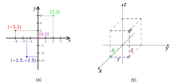
The polar coordinate system is one of the popular coordinate systems. It is plotted in the two-dimensional plane as shown in figure2.Apoint is chosen as the origin/pole and a rayis drawn from the origin is to point that is needed to be measured. The distance between origin and point is the radius (r) and the angle it is inclined to the main axis is represented as theta. Thus the coordinates are represented as (r,θ).
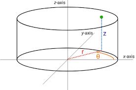
Thecylindricalcoordinatesystemisoneofthe 3D forms ofthe Polar coordinate system where the only difference is that we have z-axis that will provide height to the polar chart. A point is chosen as the origin/pole, and a ray is drawn from the origin to point that is needed to be measured and then lifted towards the value of the Z-axis. The distance between origin and point is the radius (r) and the angle it is inclined to the main axis is represented as theta. Thus the coordinates are represented as(r,θ,z) ,which is shown in figure 3.
Extractingthis informationis a verycomplex and difficult task whenitisinregulartraditionalform. There comes an effective role of graphical representation which can ease this task to a much greater extent because of human visual perception capabilities. Since this data is very complex hence to be represented visually in a graphical structure, complex visualizationtoolsandstrategiesarerequired. This leads to the concept of multi-dimensional data and the methods for its visualization which are known as multi-dimensional
visualization techniques. These visualization methods consist of various strategies, some of them Glyph, textures, tables and stacked plots, scatter-plots, Andrews curve, permutation matrix, parallel coordinates, Radial co-ordinate visualization, data sonification, and virtual reality. All of these have their advantages and disadvantages combining which can result in a moreproficientgraph/plotstructure. Here inthis section, radar charts have been analyzed in detail.
(a). (b)
Figure 4 : Some Popular Multidimensional
(c). (d)
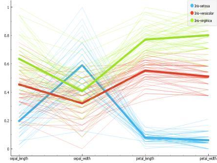
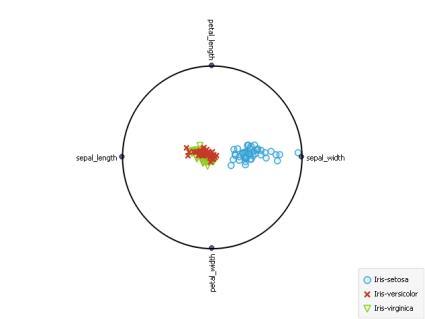
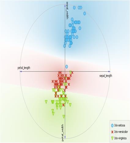
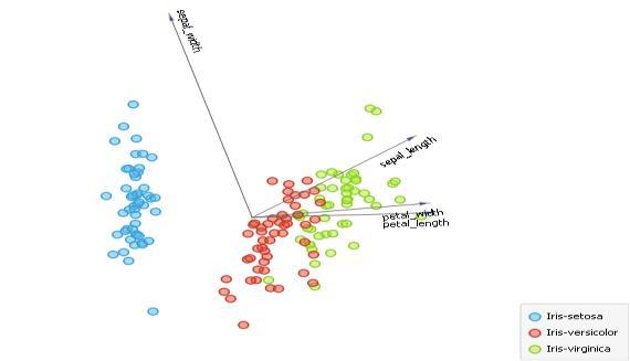
(a)RadViz Plot On IRIS Dataset, (b)FreeViz Plot On IRIS Dataset, (c) Linear Projection Plot On IRIS Dataset With PCA, (d)Parallel Coordinate Plot On IRIS Dataset
A linear projection visualization tool(Shown in figure 4(c)) is a 2D projection of data where the X and Y axis of a record is decided by the combination of all attribute values which are delineated with attribute vectors. RadViz (Shown in figure 4(a)) is a visualizationtool inwhich each axis is represented as an anchor which is placed equidistant to each other. These anchors represent attributes of the record and according to the value of the attribute, each anchor tries to pull the points towards itself. FreeViz (Shown in figure 4(b)) is a visualization tool that is designed by combining linear projection and RadViz, each axis is represented as anchors which are not placed equidistant like RadViz but anchors can be placed anywhere in a circular unit depending on attribute vectors. Similar to RadViz anchors represent attributes of the record and according to the value of the attribute, each anchor tries to pull the points towards itself. Parallel coordinates plot (Shown in figure 4(d)) is the most used multidimensional data visualization tool. It is formed by placing parallel lines vertically in the 2D plot, each line represents an attribute and can have a different scale. A record is represented by connecting a horizontal line and intercepting all parallel lines according to the attribute value that the axis is representing.
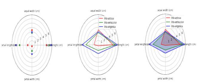
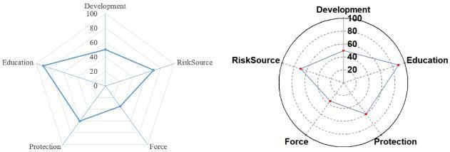
A Radar chart is a graphical way of visualizing multidimensional data into a two-dimensional form. It is formed by multiple axis-es inclined at equal angles and each axis represents one dimension or one variable. One record/observation is taken at a time and its value for each dimension is marked on this axis-es forming a glyph-like structure. There are 3 kinds of radar plots that are used depending on the applications which are defined below and shown in figure 5
Simple Radar Chart- This is the most basic type of radar chart of the three types. It displays values concerning the origin of the spider graph. Simple Radar Chart displays the value of each variable in the dataset by joining the data points on the graph together.
Radar Chart With Markers-This is similar to the simple radar chart. The only difference is the fact that the Radar Chart has markersthistime.Thistype ofdata chart is constructed byfirst visiblymarking the data points on the spider web, then joining these data points together.
Filled Radar Chart- The Filled Radar Chart is an extension of the simple radar chart. This chart type adds filling or colors to the space between the lines and the center of the spider web. The filled Radar Chart is the most colorful chart among the three, and it is also very visually appealing. Also, unlike the radar chart with markers, the markers or data points are not visible on the chart.
(a) (b) (c)
The construction of the Radar chart is very simple. it can be implemented in 2 general forms commonly used by many programming languages, systems, and libraries first is a circular layout and the other is a Polygonic layout. Systems and languages like Mathematica and python use circular layouts while tools like Excel and origin languages such as R use Polygonic layouts. Both are shown below in figure 6.
Polygonic layout- In this layout grid lines are in concentric polygon shape depending on the number of variables to represent where each gridline represents a value for all the variables lying on that grid.
Circular layout- In this type, the gridlines are arranged in a concentric circular form where each grid line represents a value for all variable lines on that grid.
Values of all the attributes are normalized so that they can be represented within a single range.
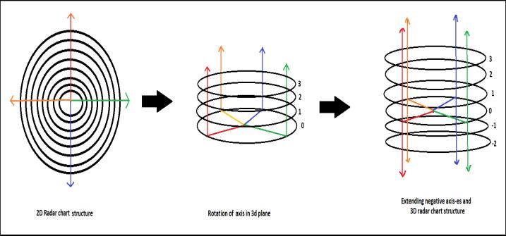
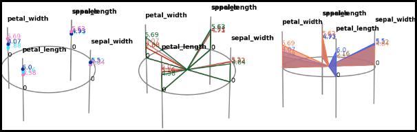
The proposed design structure consists of overlapping circles one above the other instead of concentric circles so that they can represent a vertical hello range of values. Then they are extended towards the negative side so that axis-es can also represent negative values. The new 3D version of the radar chart is formed in this way shown in figure 7.
(a) (b)
Radar charts were very popular because of their circular structure which makes them very easy to understand and provides the abilityto represent a large number of attributes in a single graph. The radar chart consists of concentric circles and all attributes are represented as axis-es intersecting the circles, each circle represents a certain value for each axis.
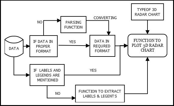
The proposed design will be implemented in the python language, and the graph structure is built on top of the matplotlib library. Before visualizing each data from the data set it is needed to be preprocessed to get it into a proper format with all the metadata available in it. So there is a need for a proper implementation flow structure for designing the 3D radarchartsasshowninfigure 8 Some ofthe functions such as weonlyneednumericaldata soweneeda parsingfunctionthat will pass the data set to filter numerical data only and this function also so have included a mechanism to deal with missing data, not a number values, and other exceptions. After that, we need a function to extract the label's names and legend's names for or naming the axis-es respectively. Finally, we design a function in which both our functions return their output with the type of radar chart as required, this function will finally produce the required 3D chart for all the inputs provided.
The design proposed is expected to mitigate all the problems mentioned above in existing radar charts. The rotation of axis-es vertically generates a circular platform in a 3D space such that, now the values can lie up or down of the platform representing negative and positive values both. In the design structure, axis-es are parallel instead of converging at the center, the axis-es act independently and can have different scales. Values for each attribute are plotted vertically which is easy to compare than radial distances. Apart from all this, the area under the curve for each attribute will not change even if we change the position of axis-es. Thus the proposed design for 3D radar charts is expected to mitigate the common problems like negative Axis collision, need for normalization, change of area undercurve on changing the position of axis-es, and difficulty in distinguishing radial distances. The final 3d radar chart produced will look like chart shown in figure 9.
Indore, for enhancing my ability to think critically and analytically. I would like to give a warm expression of thanks to Dr. Rakesh Saxena, Director, S.G.S.I.T.S. Indore, for providing all the facilities and academic environment during the course ofstudy. I sincerelywishto express, mygratitude to all the members of the staff of the Computer Engineering Department who have extended their cooperation at all times and have contributed in their way to developing the project.
1. K. W. Kolence and P. J. Kiviat, Software unit profiles & Kiviat figures, SIGMETRICS Perform. Eval. Rev., vol. 2, no. 3, pp. 2–12, Sep. 1973.
2. M. Akaishi and Y. Okada, Time-tunnel : visual analysis tool for time-series numerical data and its aspects as multimedia presentation tool, in Proceedings. Eighth International Conference on Information Visualisation, 2004. IV 2004., London, England, 2004, pp. 456–461.
3. H. Notsu, Y. Okada, M. Akaishi, and K. Niijima, Time-tunnel: visual analysis tool for time-series numerical data and its extension toward parallel coordinates, in International Conference on Computer Graphics, Imaging and Visualization (CGIV’05), Beijing, China, 2005, pp. 167–172.
4. R. Akase and Y. Okada, Web Based Time-Tunnel: An Interactive Multidimensional Data Visualization Tool Using Genetic Algorithm, in 2015 19th International Conference on Information Visualisation, Barcelona, Spain, 2015, pp. 95–100.
Radial visualization tools plays important role in multidimensional data visualization. Radar charts are the most effective among radial visualization tools. Mitigating the existing problems in radar charts can help in achieving benchmarking among multidimensional data visualization techniques. The proposed design structure will be able to deal with some of the problems mentioned above in radar charts and provide effective visualization. Apart from this improved 3D radar chart has a wide variety of applications in almost all domains where multidimensional numerical data exist. For example, if doctor bonds a specific instance of data they cannot rely on the patient monitoring system, similarly in all applications where an instance of data is required our 3d radar chart can play this role effectively. As for future work, this design structure will be deployed as a library built on top of matplotlib using the python language.
I am grateful to Dr. Urjita Thakar, Head, Department of Computer Engineering, S.G.S.I.T.S. Indore, for the facilities provided in the completion of this project. I am grateful to Professor D. A. Mehta, Mr. Surendra Gupta, and Mr.Rajesh Dhakad, Department of Computer Engineering, S.G.S.I.T.S.
5. L. Hongliang, L. Anxin, Z. Bin, Z. Tiefu and Xin, Z., A fuzzy comprehensive evaluation method of maintenance quality based on improved radar chart, in 2008 ISECS International Colloquium on Computing, Communication, Control, and Management, vol. 1, 2018, pp. 638–642.
6. G.Zhou, “Radial visualization of multidimensional/ multivariate data: A survey” unpublished.
7. D. A. Keim, J. Schneidewind, and M. Sips, CircleView: a new approach for visualizing time-related multidimensional data sets, in Proceedings of the working conference on Advanced visual interfaces - AVI ’04, Gallipoli, Italy, 2004, p. 179.
8. C. Tominski, J. Abello, and H. Schumann, Axes-based visualizations with radial layouts, in Proceedings of the 2004 ACM symposium on Applied computing - SAC ’04, Nicosia, Cyprus, 2004, p. 1242
9. R. Feldman, Filled Radar Charts Should not be Used to Compare Social Indicators, Soc Indic Res, vol. 111, no. 3, pp. 709–712, May 2013.