6 minute read
WHISTLER HOMES: Simplicity Meets Elegance
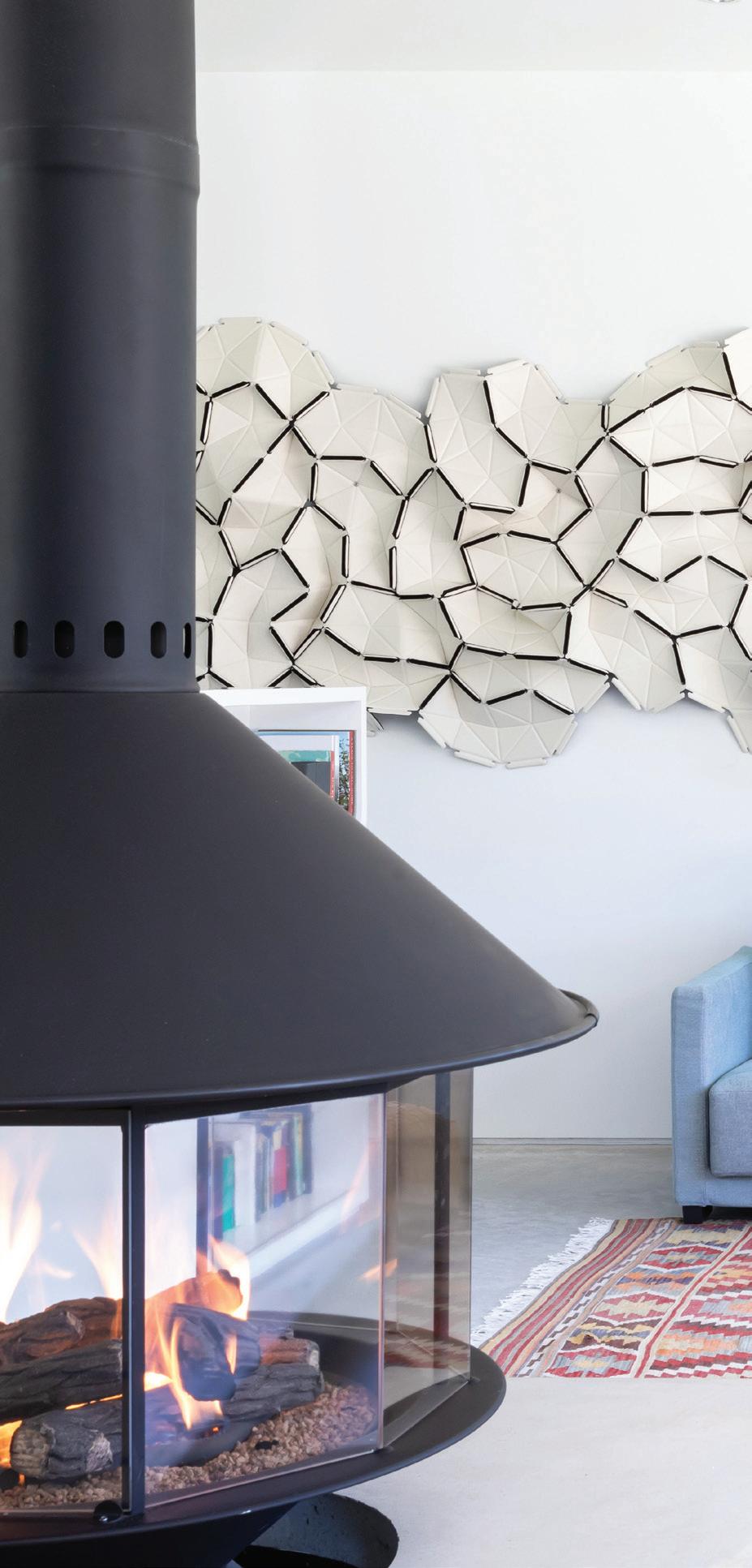
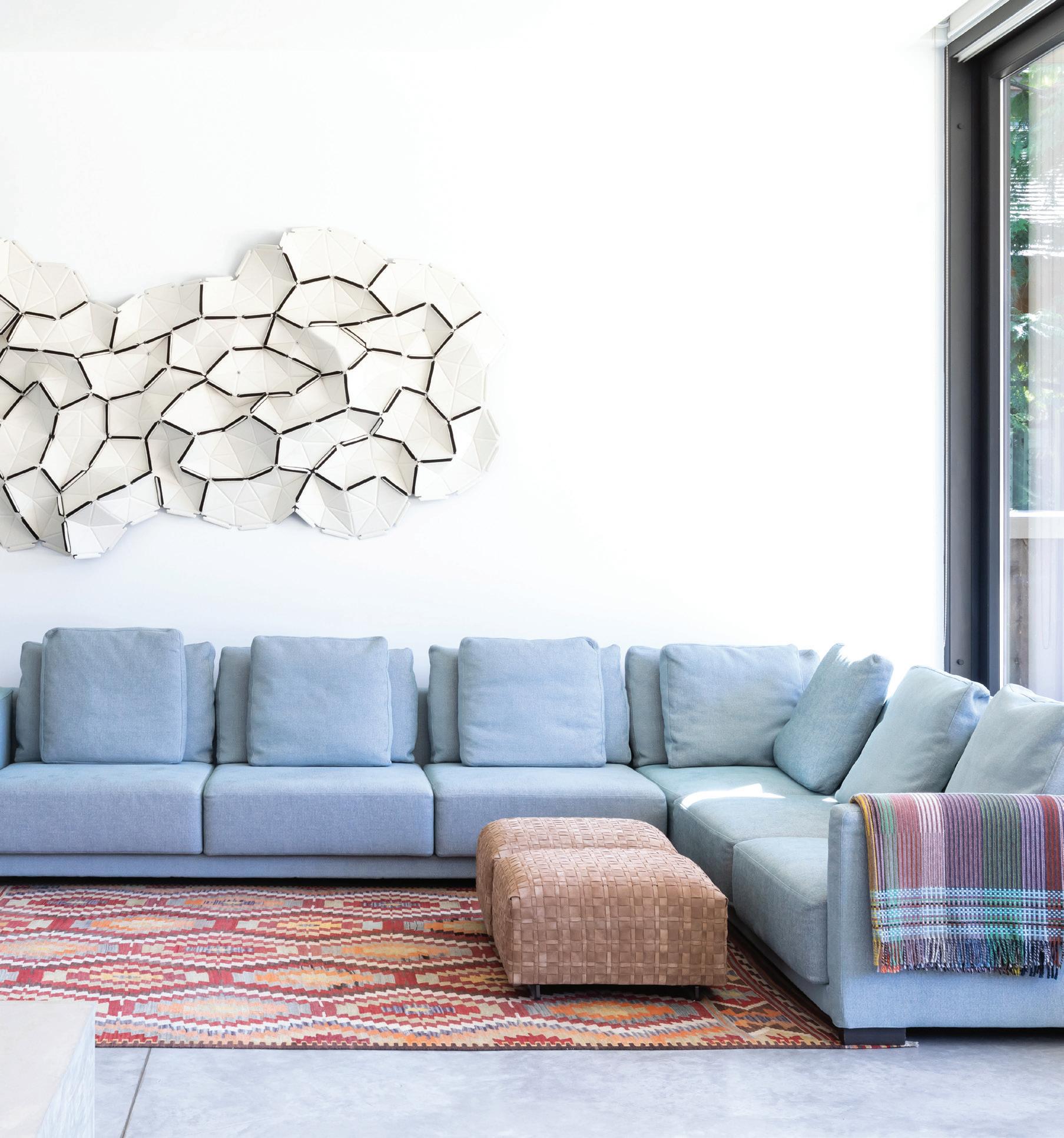
SADIE PLAYS AT HER VINTAGE DESK IN THE PLAYROOM WHICH WILL BE REABSORBED INTO THE MAIN LIVING SPACE DOWN THE ROAD. THE SPACE IS CURRENTLY SEPARATED BY A MOVABLE BOOKSHELF. THE WALL ART IS A MODULAR ACOUSTIC SYSTEM MADE OF WOOL THAT ABSORBS SOUND IN THE MAIN LIVING SPACE. ROSS ARMISTEAD CHOSE THE PIECE, BY RONAN AND ERWAN BOUROULLEC, BECAUSE IT REMINDED HER OF AN AERIAL VIEW OF SNOW-CAPPED MOUNTAIN PEAKS.
SIMPLICITY MEETS ELEGANCE
Advertisement
A LOCAL FAMILY BUILDS A MODERN DREAM HOME ON EASY STREET
STORY BY ALISON TAYLOR PHOTOS BY EMA PETER
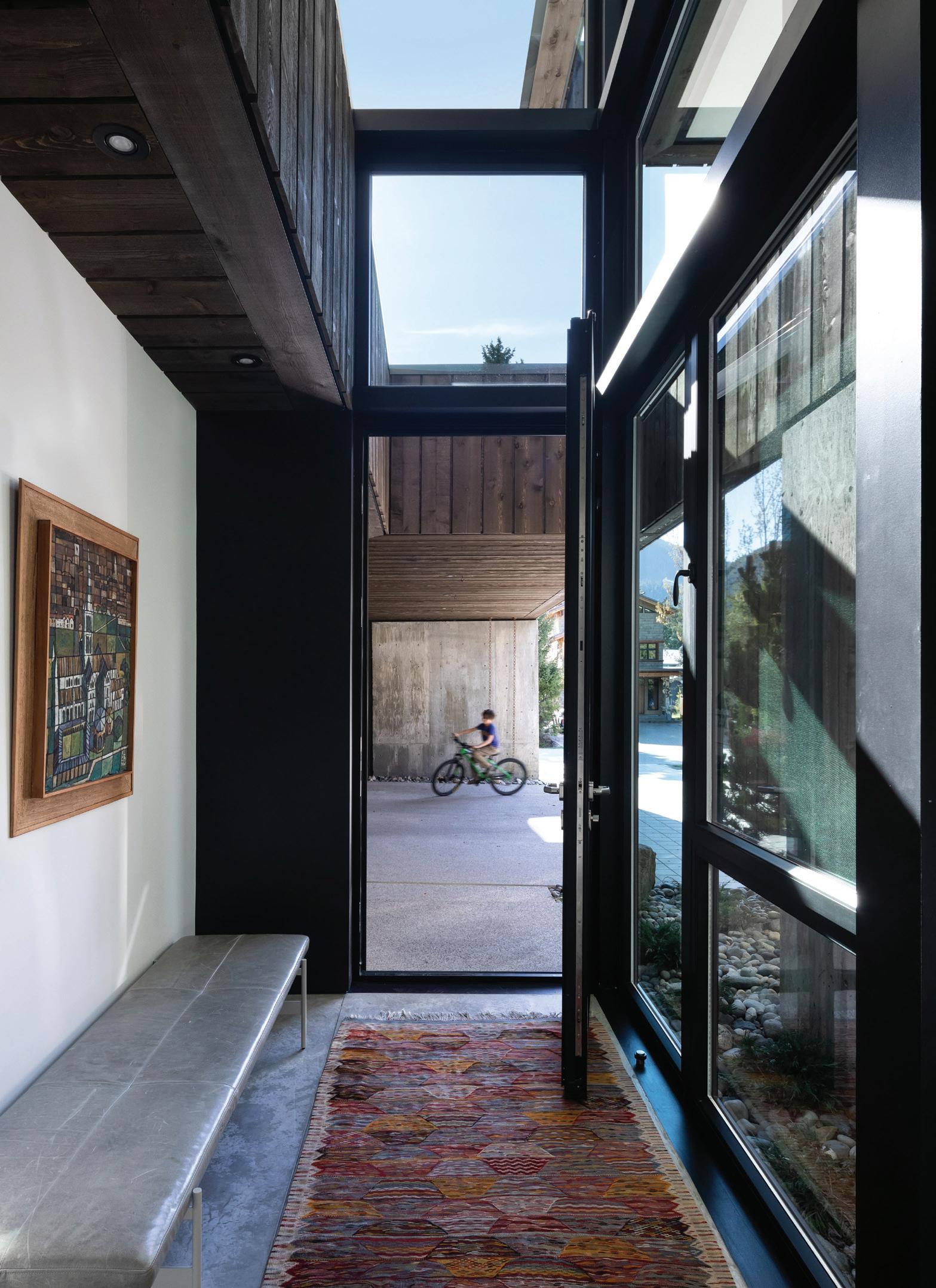
THE ENTRYWAY ART IS A PIECE THAT HAS ALWAYS BEEN IN ROSS ARMISTEAD’S HOMES, BOUGHT BY HER PARENTS IN LONDON IN THE 1970’S. THE RUG COMES FROM A PRE-KID ADVENTURE TO MARRAKESH.
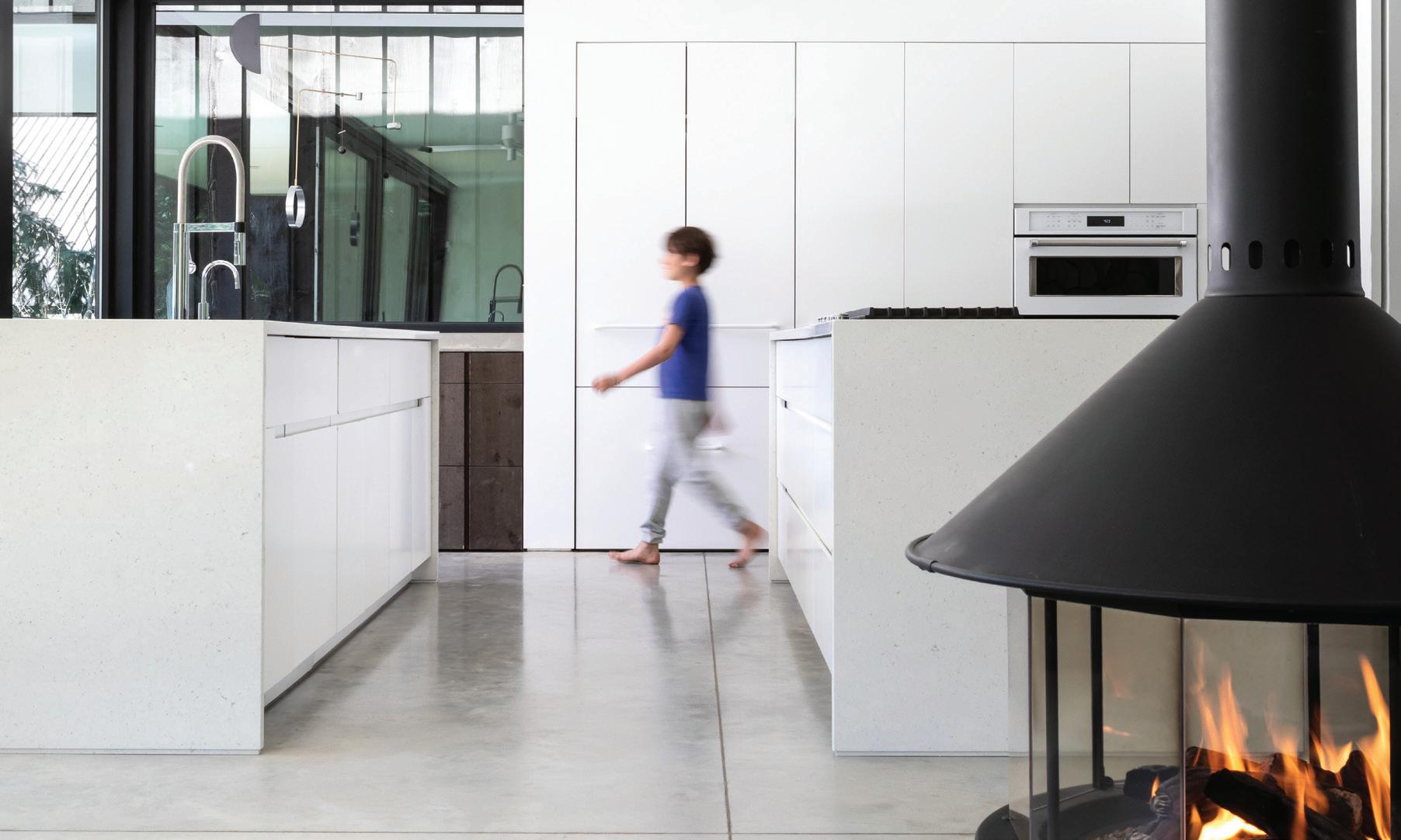
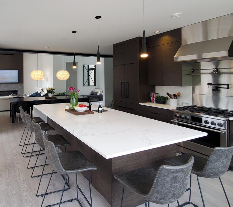
GABE HEADS OUT TO THE DECK, PASSING THE DOUBLE ISLANDS IN THE KITCHEN THAT MAKE ENTERTAINING WHILE COOKING EASY.
As an award-winning interior designer, Deborah Ross Armistead had specific ideas when it came to building and designing her own home.
She knew, for example, that her home wouldn’t be a typical Whistler chalet— wood beams, exposed logs, pitched roofs and classic mountain chalet vibes. She was looking for something different, with a modern feel—a simple aesthetic to match her design style. To find inspiration, Ross Armistead and husband Peter Armistead, a property developer, drove around local neighbourhoods until they found what they were looking for on a quiet street in Alpine. They knocked on the front door and found a homeowner who was happy to share his story, and, more importantly, the name of his architect—Vancouver-based D’Arcy Jones.
D’Arcy Jones Architects is a critically acclaimed firm whose accolades include 2018’s Lieutenant Governor Award of Excellence Medal from the Architectural Institute of British Columbia. Jones explains his style: “We like to create architecture that takes how people want to live, or takes a site-specific problem (and) turn(s) it all into a very personal and fine-tuned building. We like the fact that all of our designs would not work well on another site, because we think they should seem to grow out (of a specific site). >>

TURKISH ANTIQUE SILK PILLOWS, MADE BY PATINA IN FUNCTION JUNCTION, ADD SPLASHES OF COLOUR TO ROSS ARMISTEAD’S OFFICE.
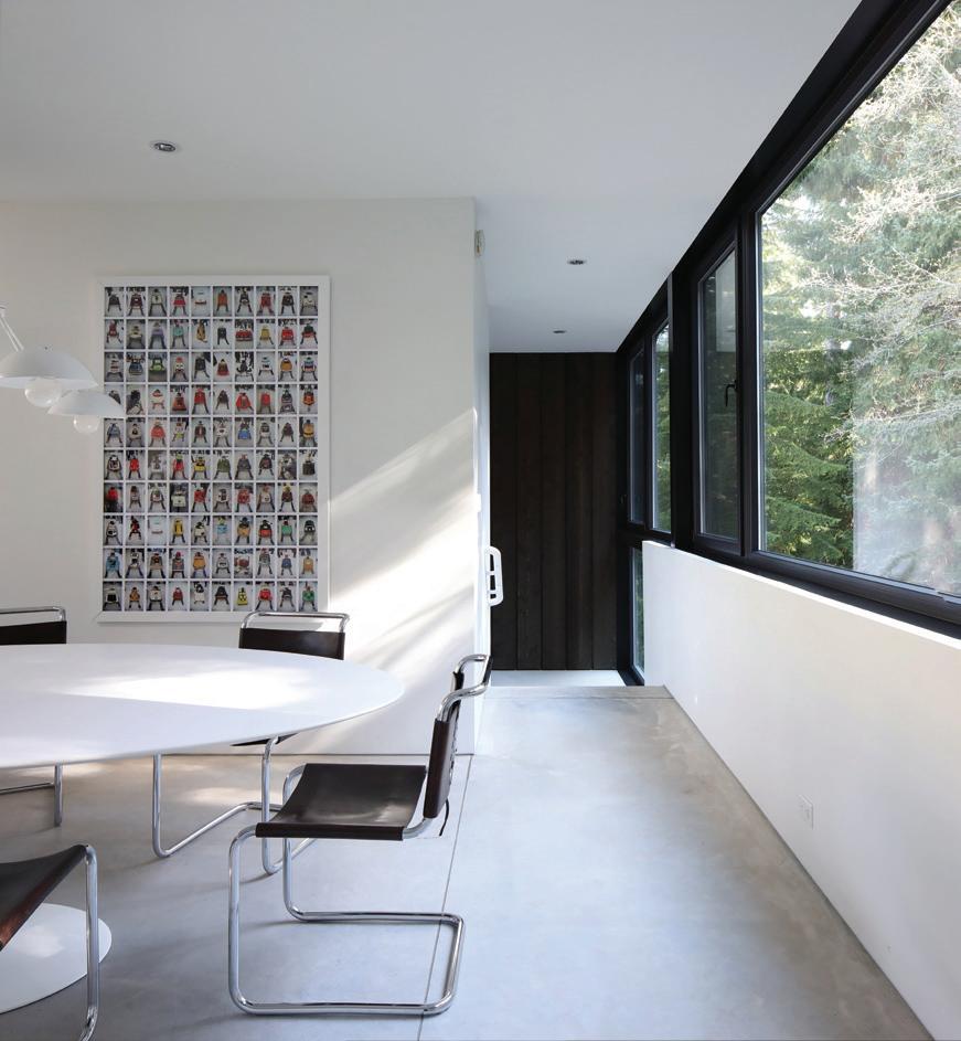
TOP LEFT: THE FOREST IS THE BACKDROP FOR THE FAMILY DINING AREA.
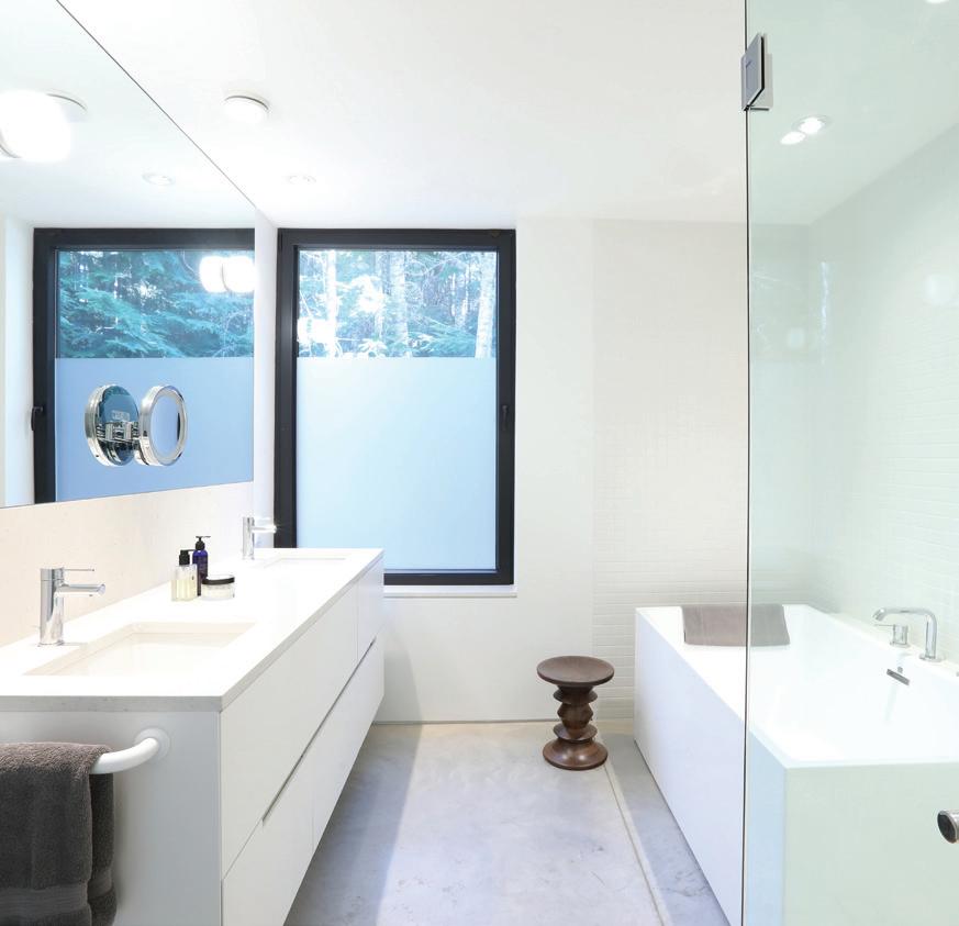
TOP RIGHT: WHITE FINISHINGS CONTINUE IN THE MASTER BATHROOM, THE SAME MATERIALS USED THROUGHOUT THE HOME—A DESIGN ELEMENT THAT REDUCED WASTE AND COSTS. THIS IS ROSS ARMISTEAD’S FAVOURITE ROOM IN THE HOUSE.
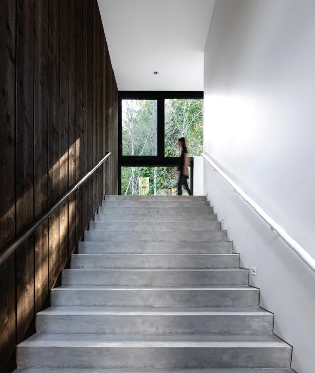
ABOVE: EXPANSIVE STAIRS ARE A DESIGN ELEMENT THAT ROSS ARMISTEAD CHAMPIONED DURING THE DESIGN PROCESS. “ We use natural materials and simple shapes to create houses that feel good.”
Local builder Sheldon Gaudet, of Manor Building Projects, came on board and the team set to work on the family-friendly Easy Street property in Tapley’s Farm. The goal was to build to the maximum square because it was the best financial strategy for the project. Ross Armistead had her feet grounded in reality, however, when it came to building their dream home.
“We had a budget and that was the budget,” she says, joking that Whistler projects often see runaway budgets. “(Our budget) wasn’t arbitrary.”
That meant the builder had to send some of the original ideas back to the drawing board. “They had to really simplify the overall design,” Gaudet explains, removing things like additional exterior walls.
There were, however, certain features that were crucial for the look Ross Armistead was setting out to achieve. Coming from a smaller townhouse where the front door opened straight into the boot room/front entrance, she wanted something different upon entering this house.
“I wanted a clear, beautiful entryway,” she says.
She achieved that with a dramatic seven-foot wide statement stairway. One side of the stairway is covered in dark wood, an extension of the exterior cladding. The wood adds texture and warmth but also effectively divides the house in two—the two-story area behind the wooden wall is home to Deborah and Peter’s offices as well as the media room and a spare bedroom; the other side is the main family living space designed in a reversed floor plan with the bedrooms on the ground floor.
“The reversed floor plan is this house’s main asset. The living areas are on the top floor where the views are better. A large dramatic stair draws you up from the main entry, like a narrow mountain canyon,” says Jones.
That dramatic stairway leads to floor-to-ceiling windows, bathing the area in natural light as well as framing the forested backyard. Large windows continue to dominate the back side of the house with the effect of almost being right in the heart of the forest.
FINE BUILDER OF CUSTOM ARCHITECTURAL HOMES IN WHISTLER
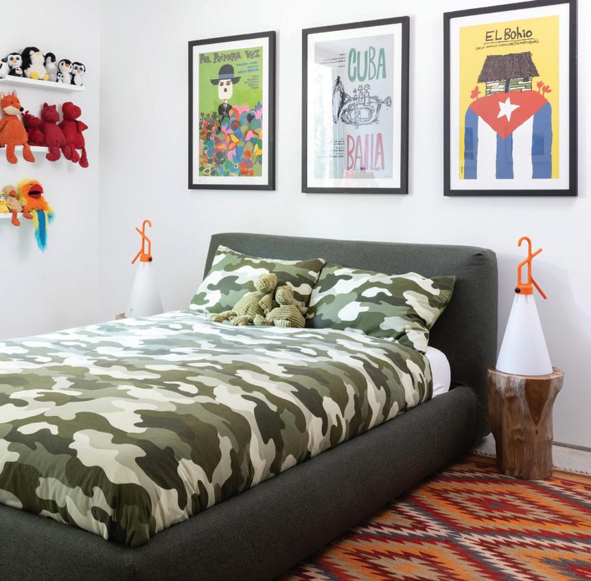
WARMTH, TEXTURE AND COLOUR ARE LAYERED INTO GABE’S ROOM TO OFFSET THE MODERN HOME, MAKING THIS SPACE A KID-FRIENDLY HAVEN.
“One of the biggest surprises of the house is the windows,” says Ross Armistead, who admits that the main focus was always on the front side of the house, not the back. It turns out the forested backyard, framed in the large windows, is “like living in a big painting.”
So too the view from the front of the house where the kitchen and living room look out over the elevated outdoor living space. The backdrop is incredible views of Mount Sproatt and Rainbow Mountain, where the sun sets and where Peter, an ultra-runner, spends much of his free time training.
With clean lines, white walls, and polished concrete floors throughout, Ross Armistead knew she needed to create warmth with texture, lively patterns and bright colour.
“In a modern house, it could be really cold,” says Ross Armistead of the 3,500 square foot home. Instead, the house transforms into a family home with colourful vintage rugs, bright, unconventional art, and splashes of humour like the bunny ears as drawer pulls on her daughter’s desk.
The minimal design is made much easier with good storage—the huge garage, the functional boot room, the his and her closets in the main bedroom.
But the design was not without its construction challenges. “The modern design can bring challenges of precision,” explains Gaudet, adding that as many aspects of the build are kept on one line as much as possible.
The walls, for example, run straight into the windows with no trim to cover any slight imperfections. “The walls and ceilings have to be perfect,” he says. Precision and thoughtfulness are at the heart of this modern build.
Ross Armistead won an IDIBC (Interior Designers Institute of British Columbia) Award of Merit for her work. W
Proud to be the builder of the featured project in this article Professional – Educated – Experienced
CONTACT: sheldon@manorbuildingprojects.com 604-938-4356


