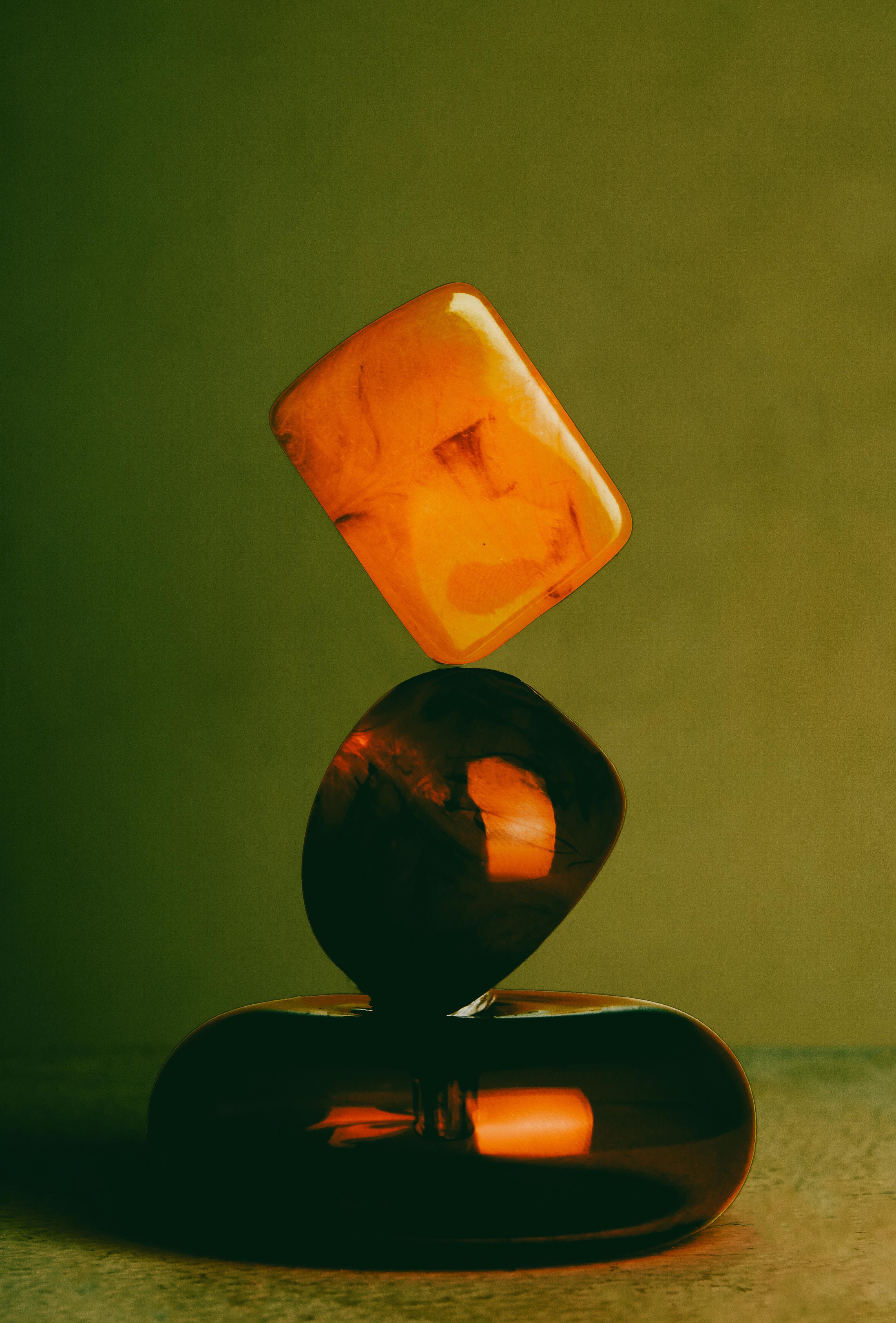
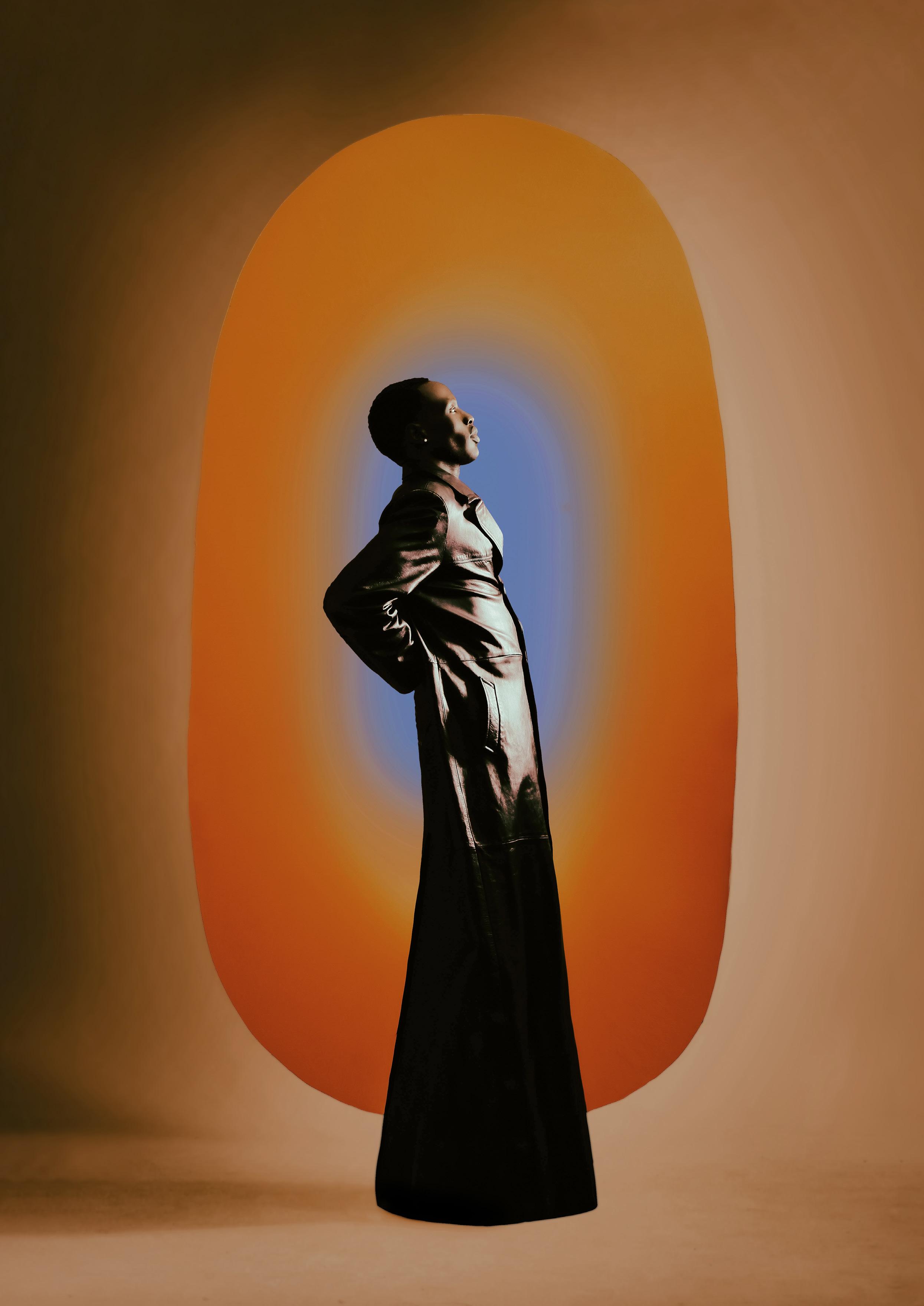
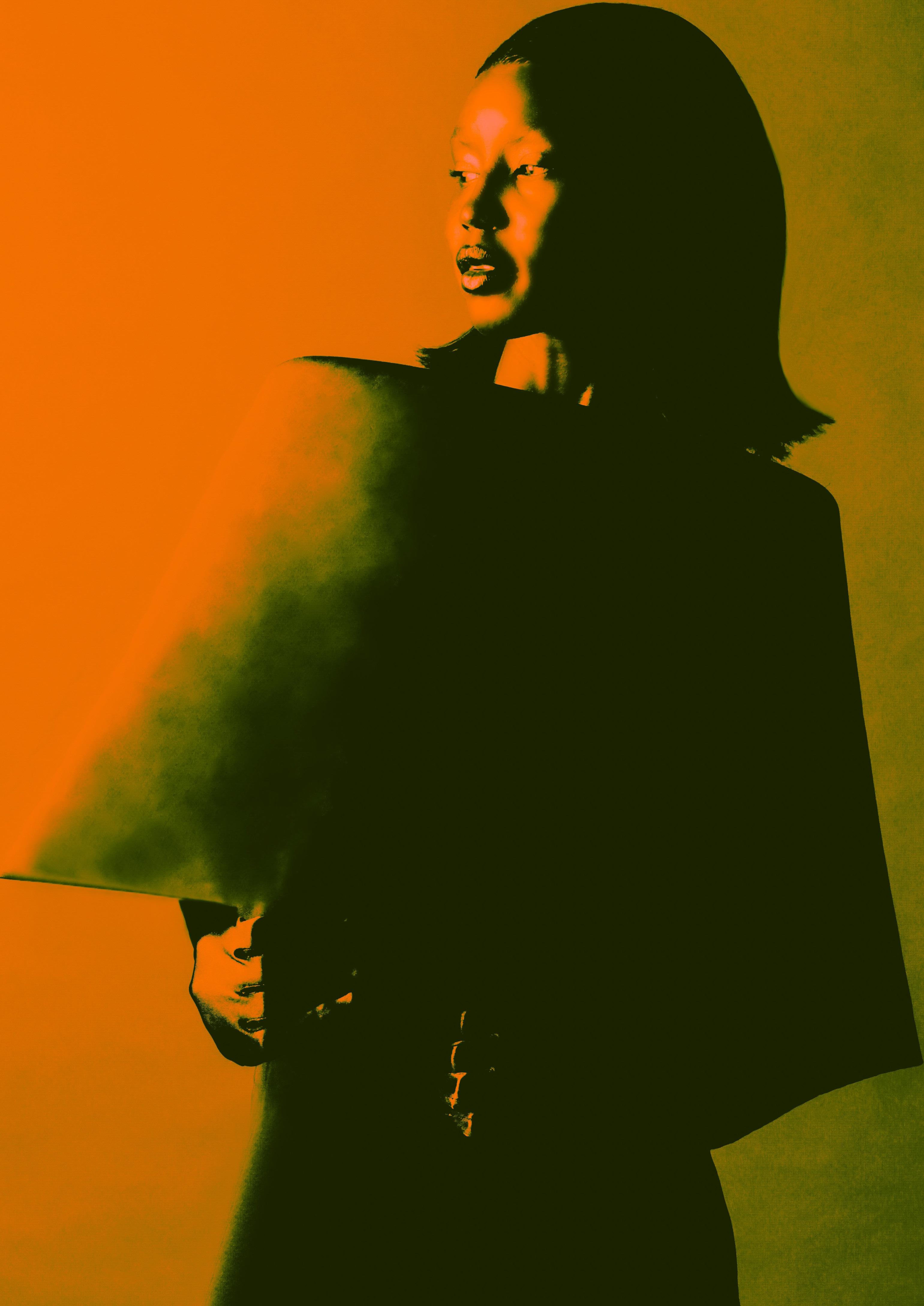
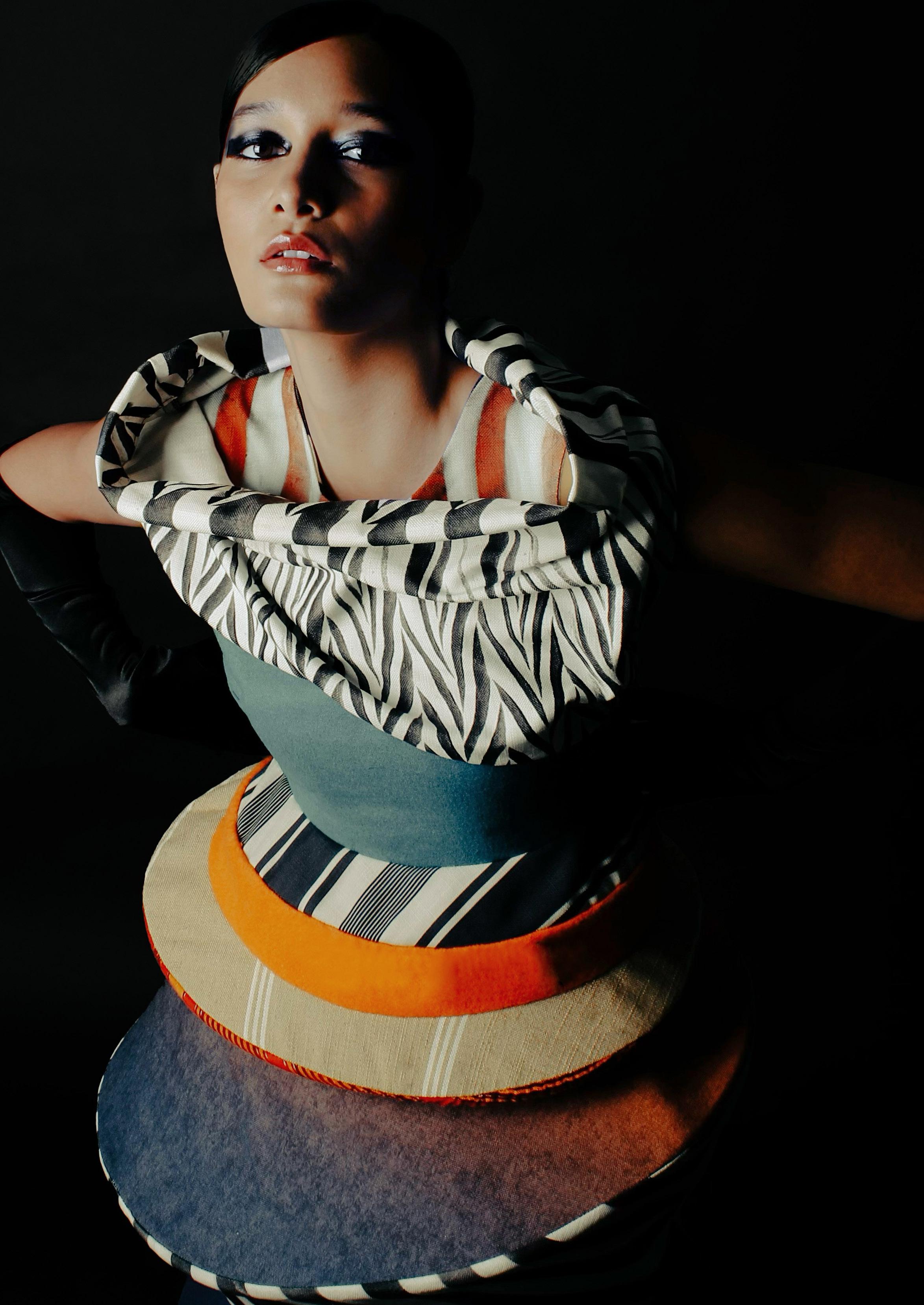
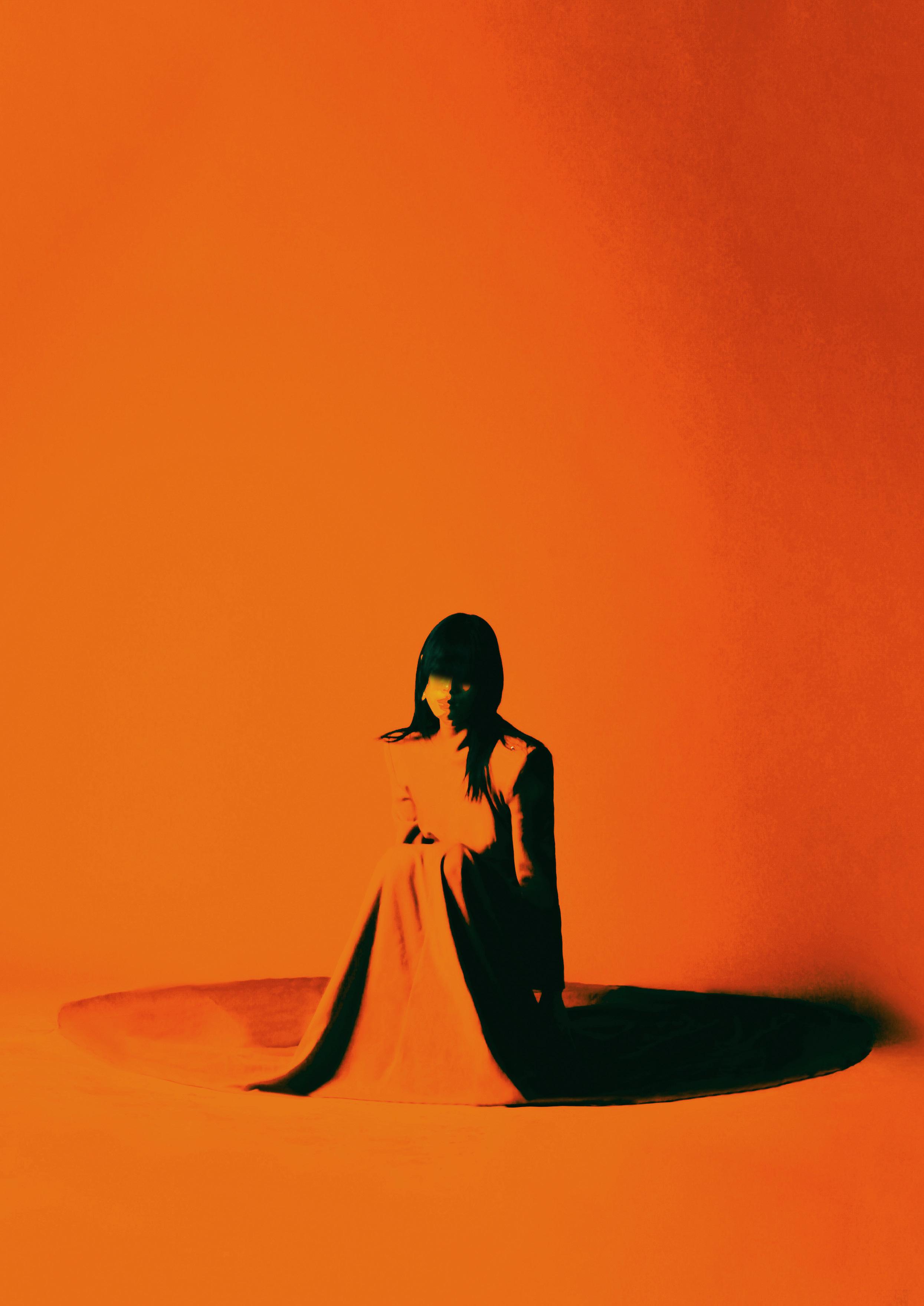
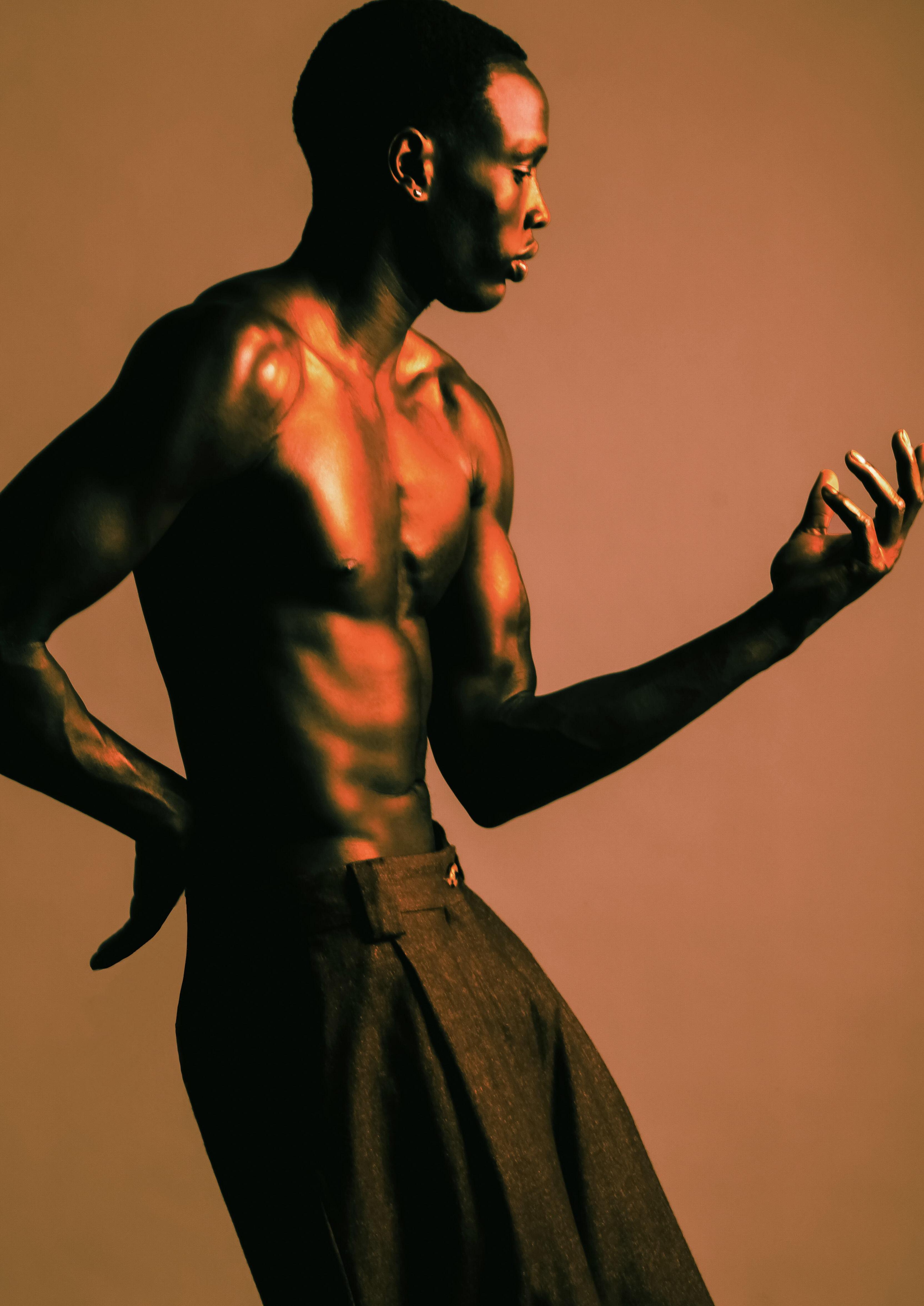
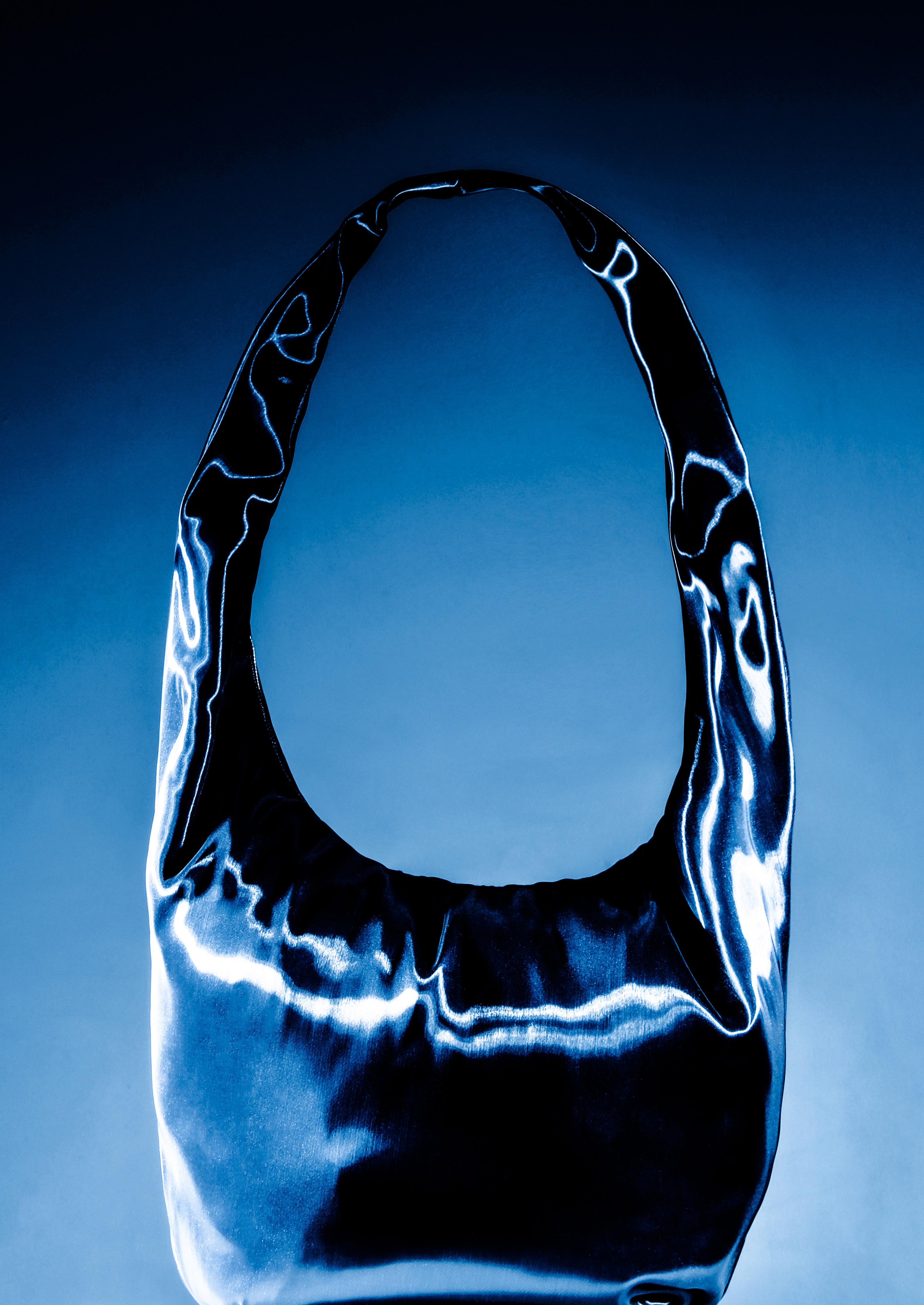
Chroma represents the purity or saturation level of a colour, reflecting its vibrancy or muted quality. High chroma indicates intense, vivid hues, whereas low chroma suggests subdued or desaturated tones, nearing grayscale.
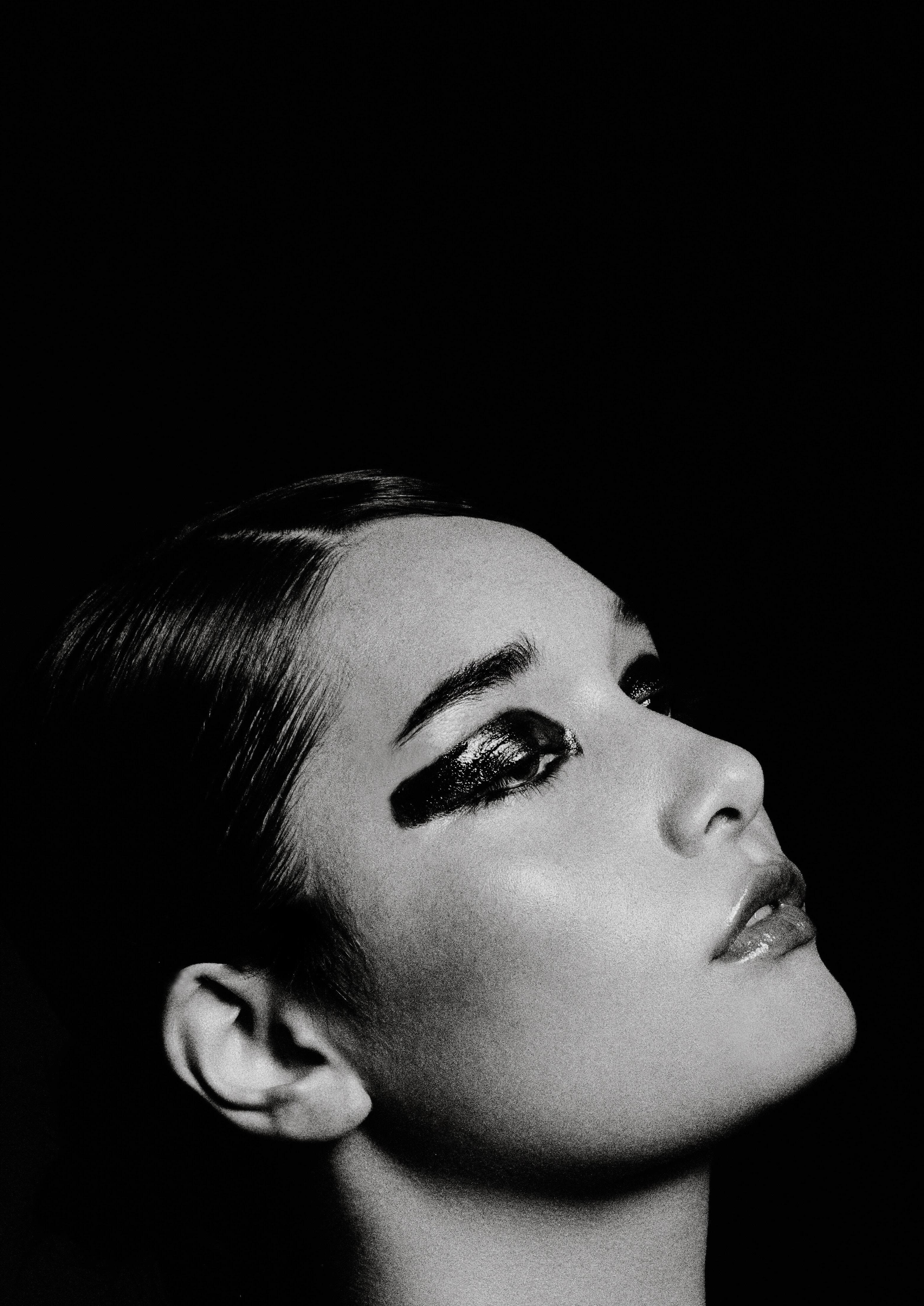
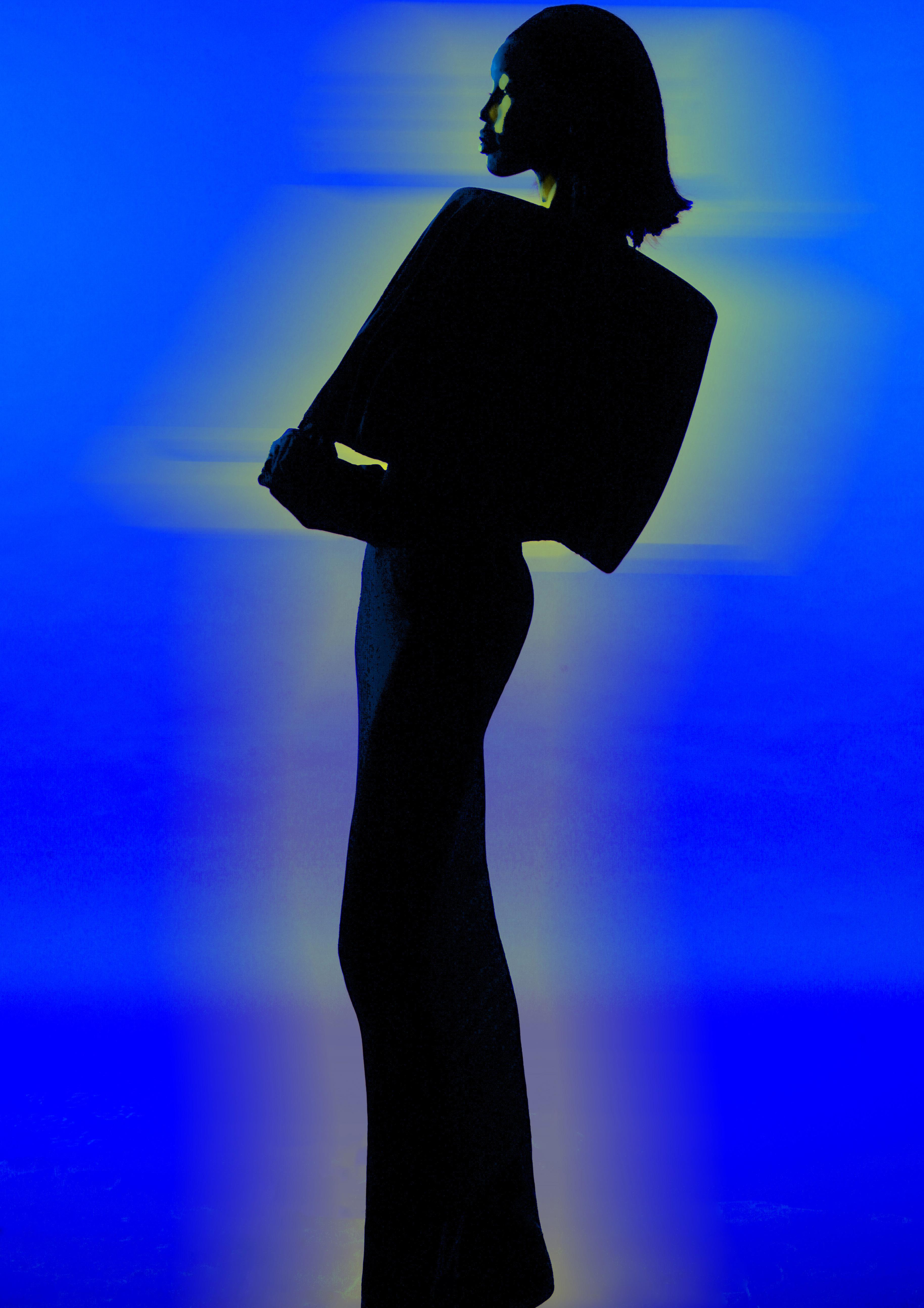
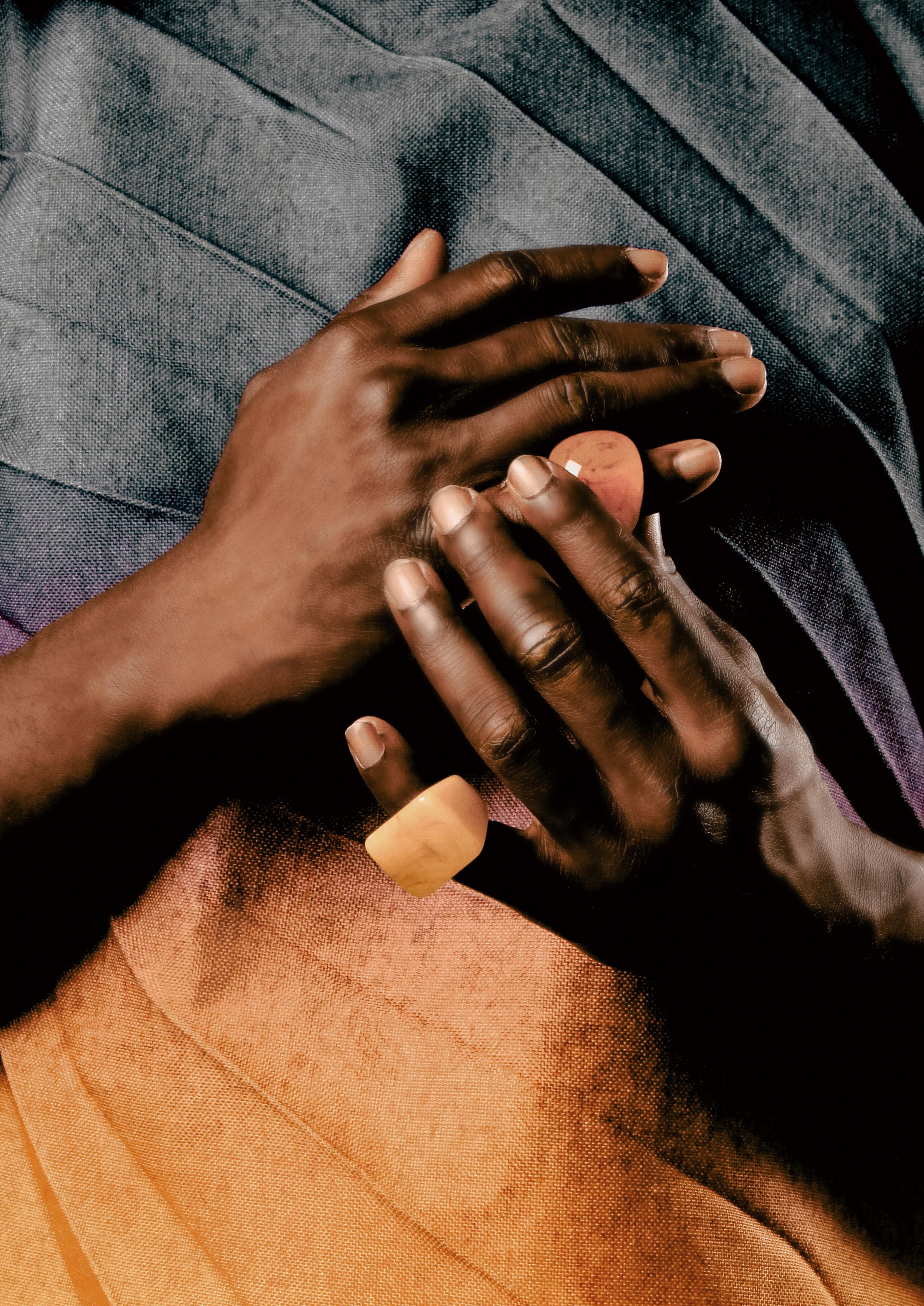
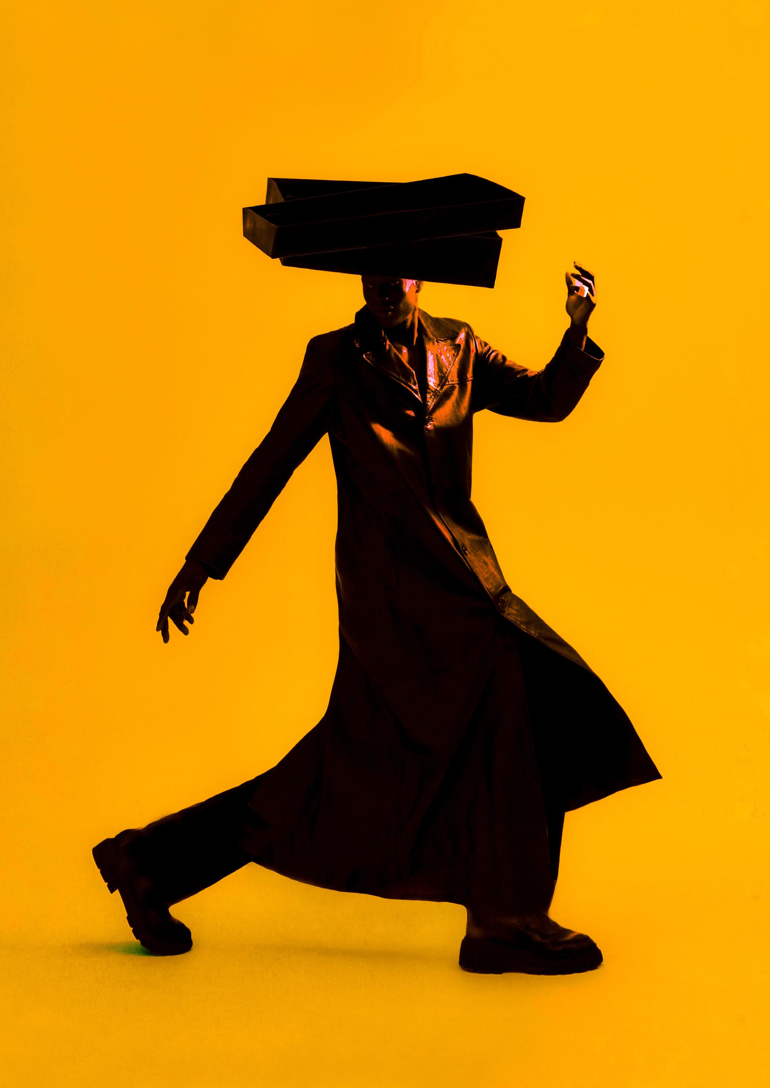
The editorial is an exploration of the nuanced interplay between colour, emotion, and self expression. A celebration of hues and forms, unearthing the story between natural and built environments to evoke visual and emotional harmony. Drawing from architectural geometries, organic forms, and intricate patterns, the concept uses fashion and still-life photography to capture the harmounius dialogue between these realms, shaping our everyday perception of beauty.
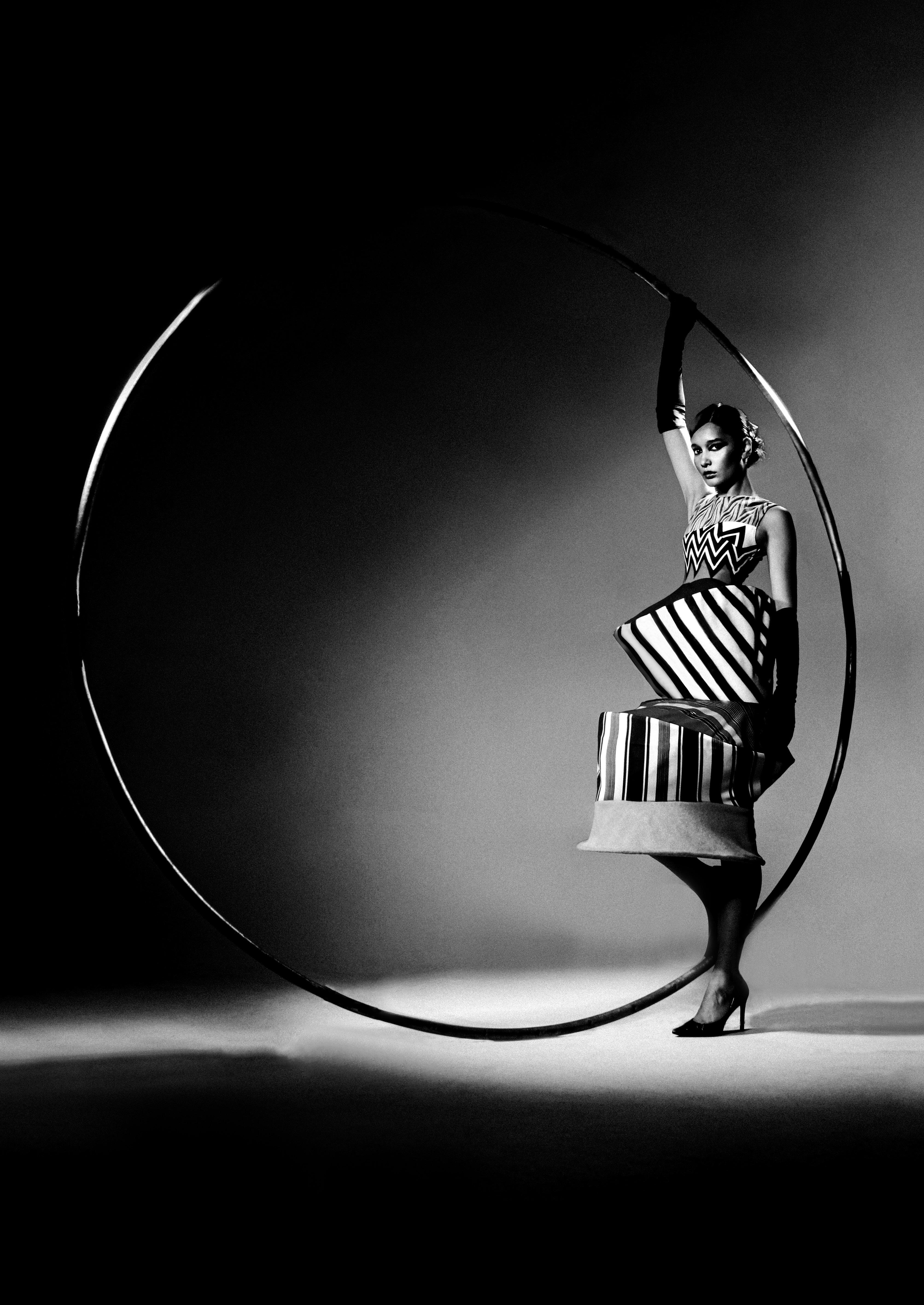
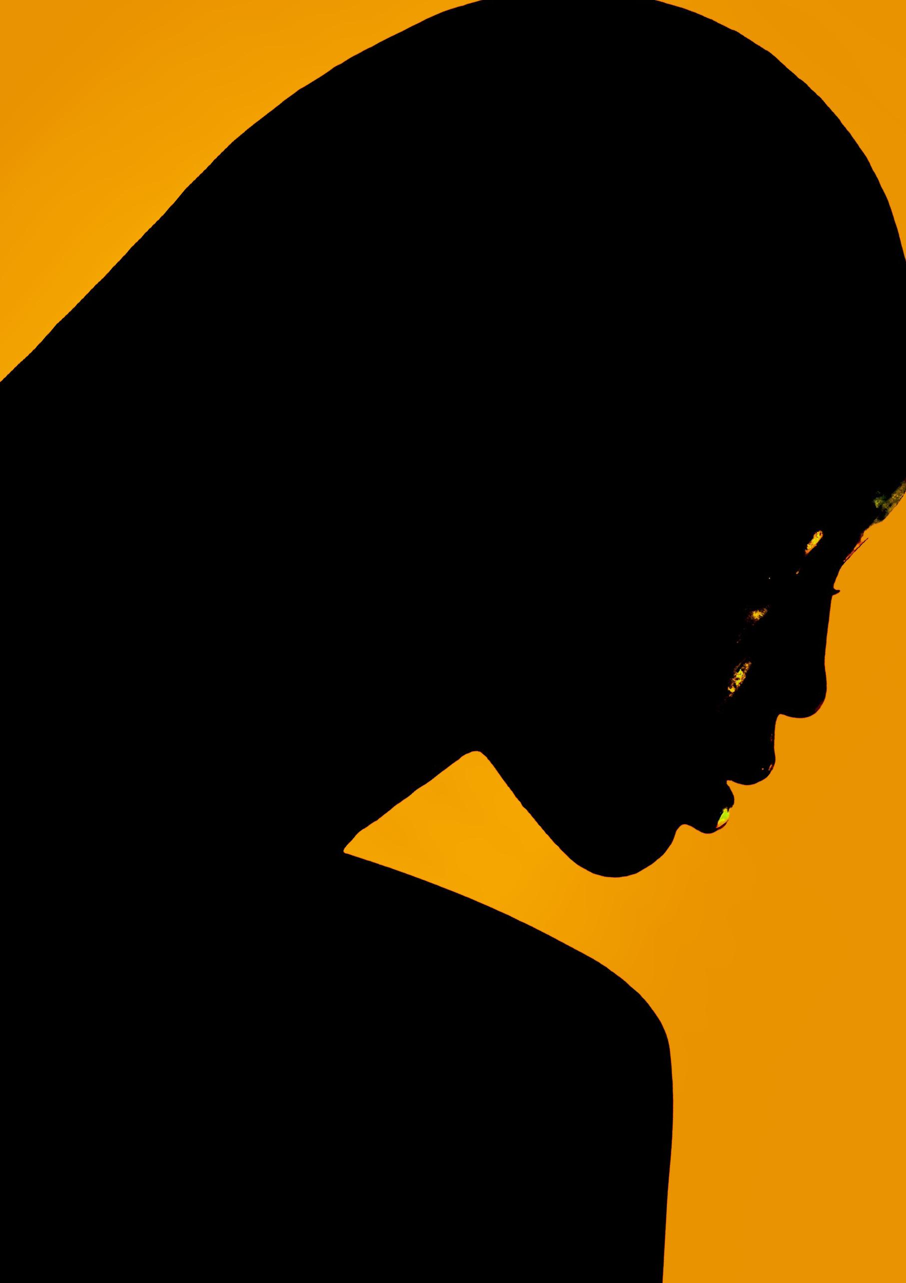
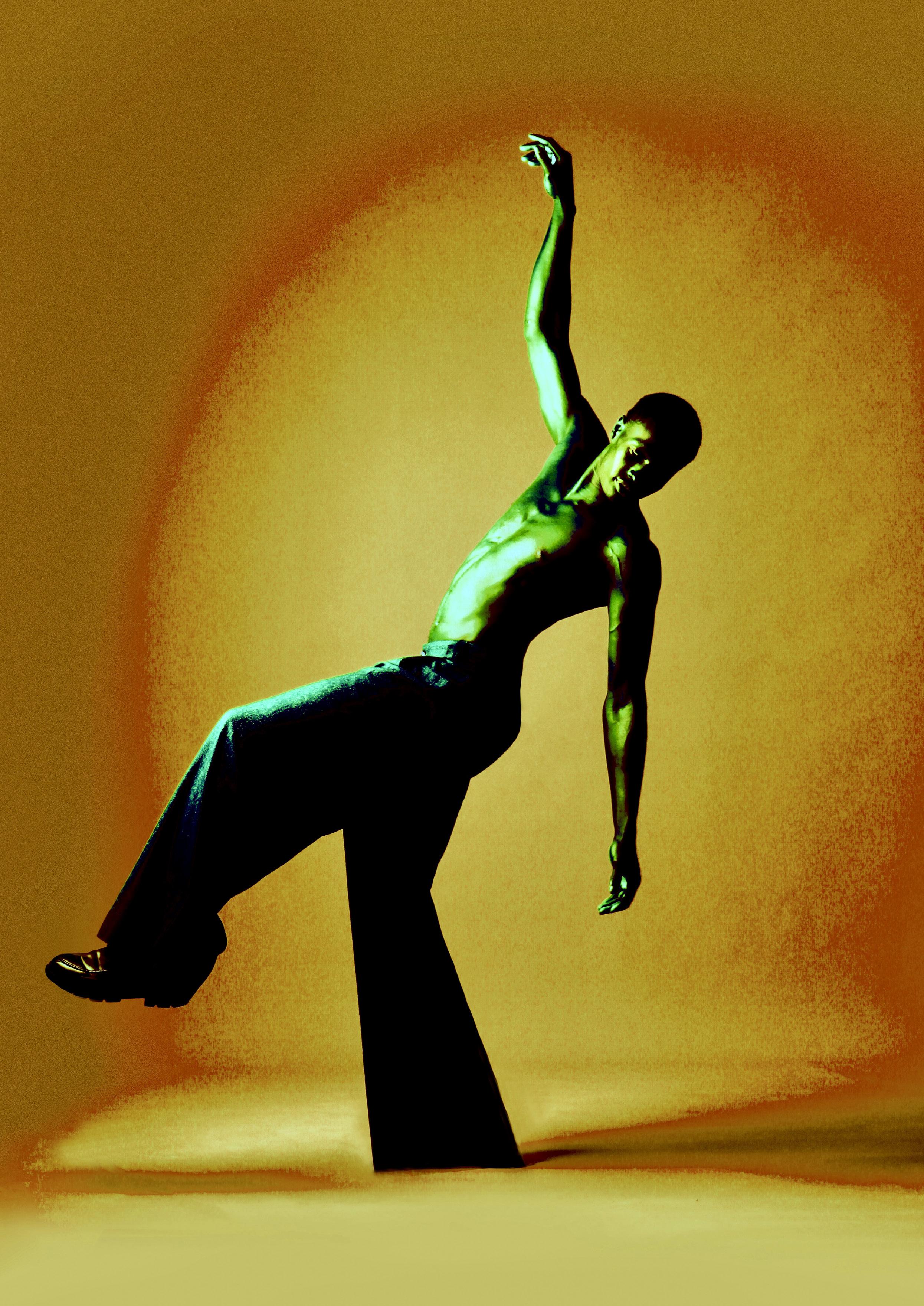
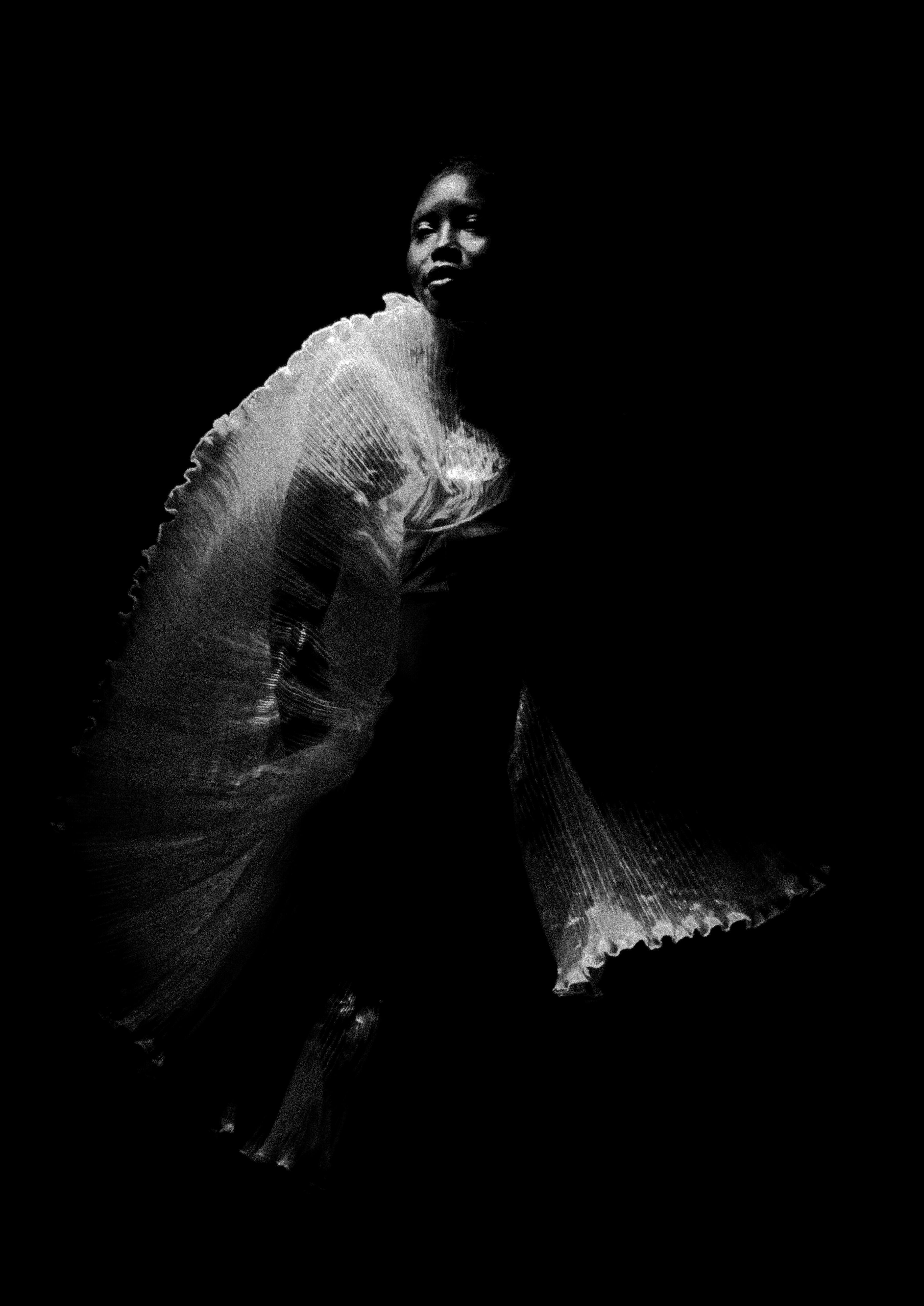
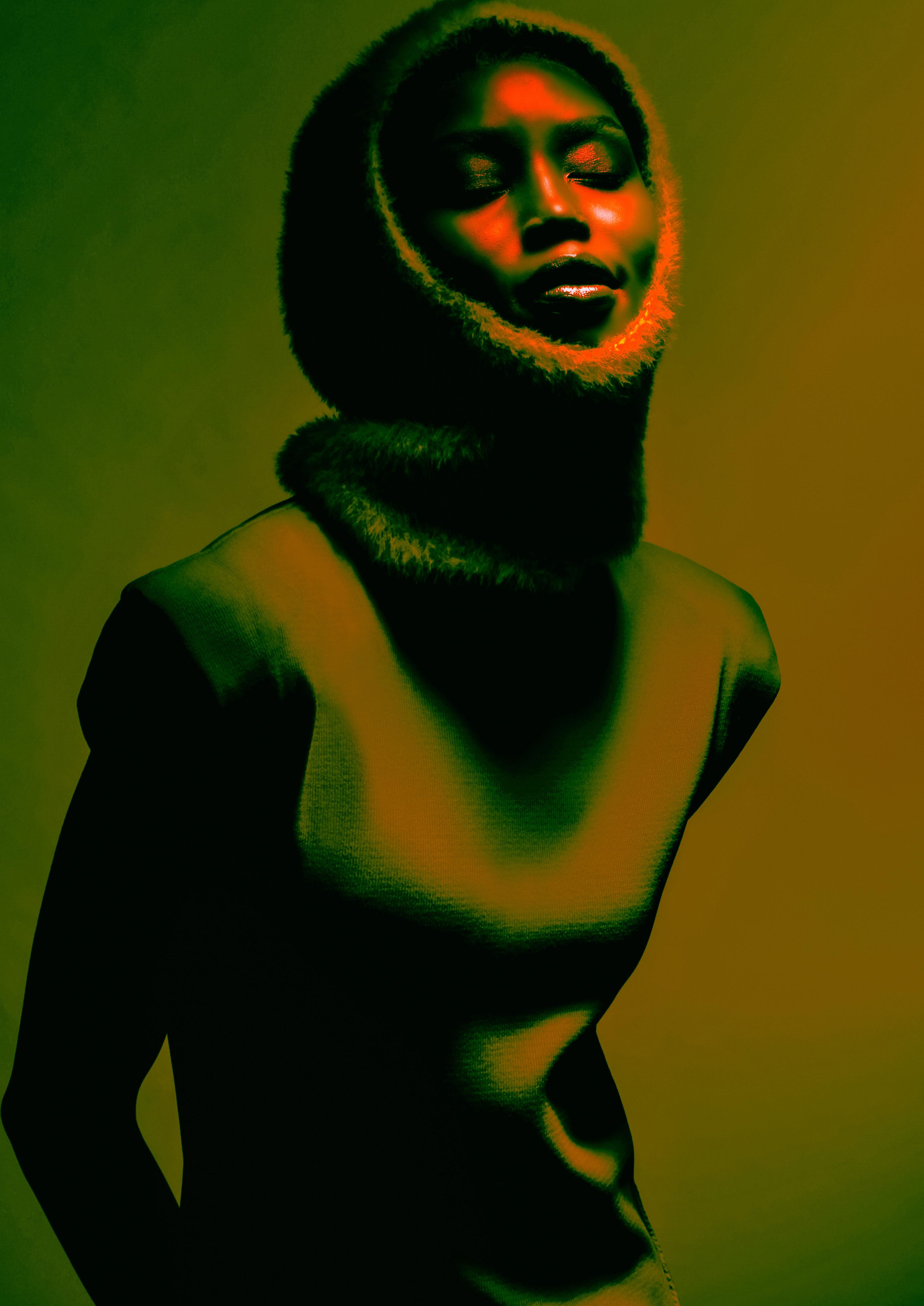
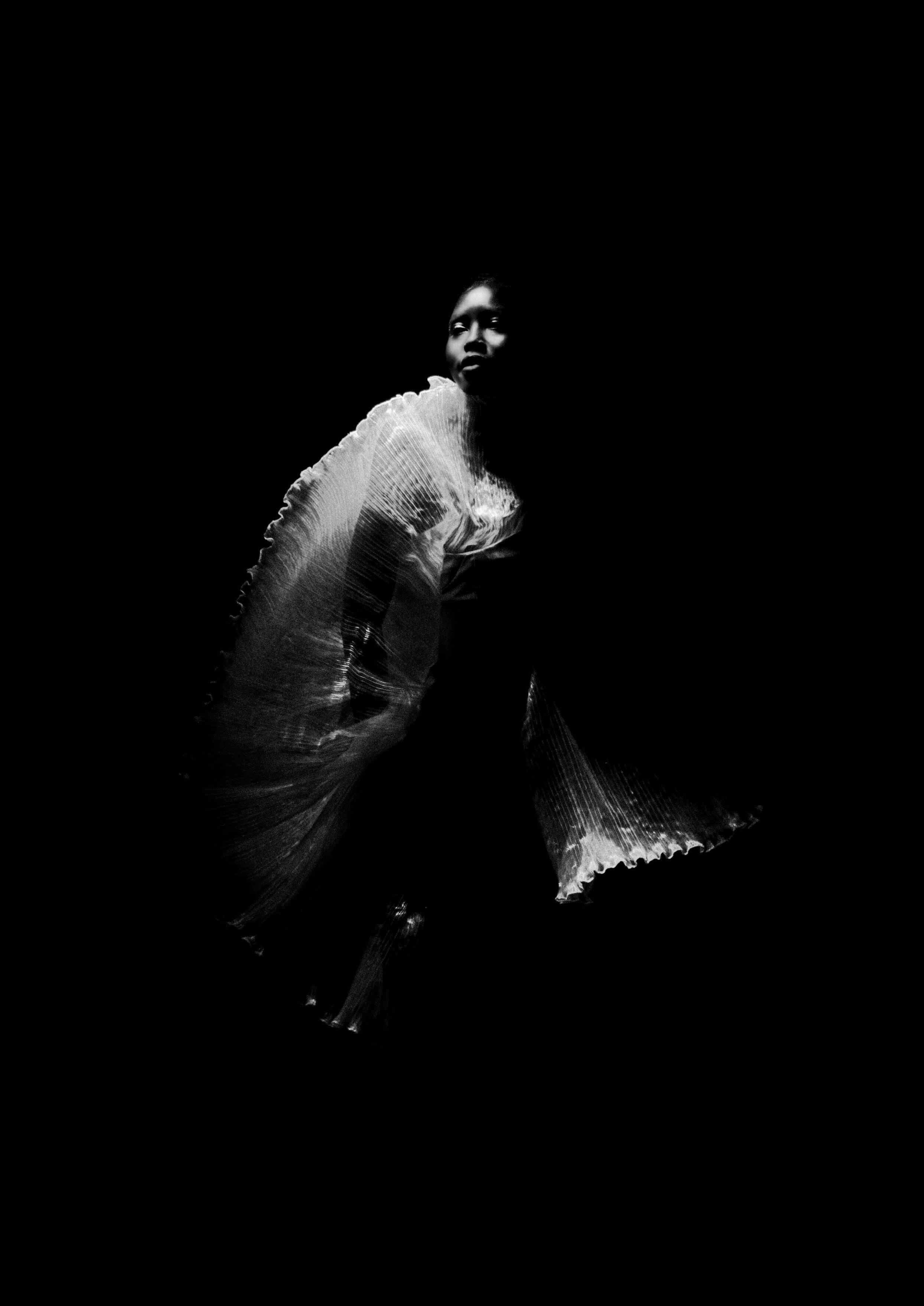
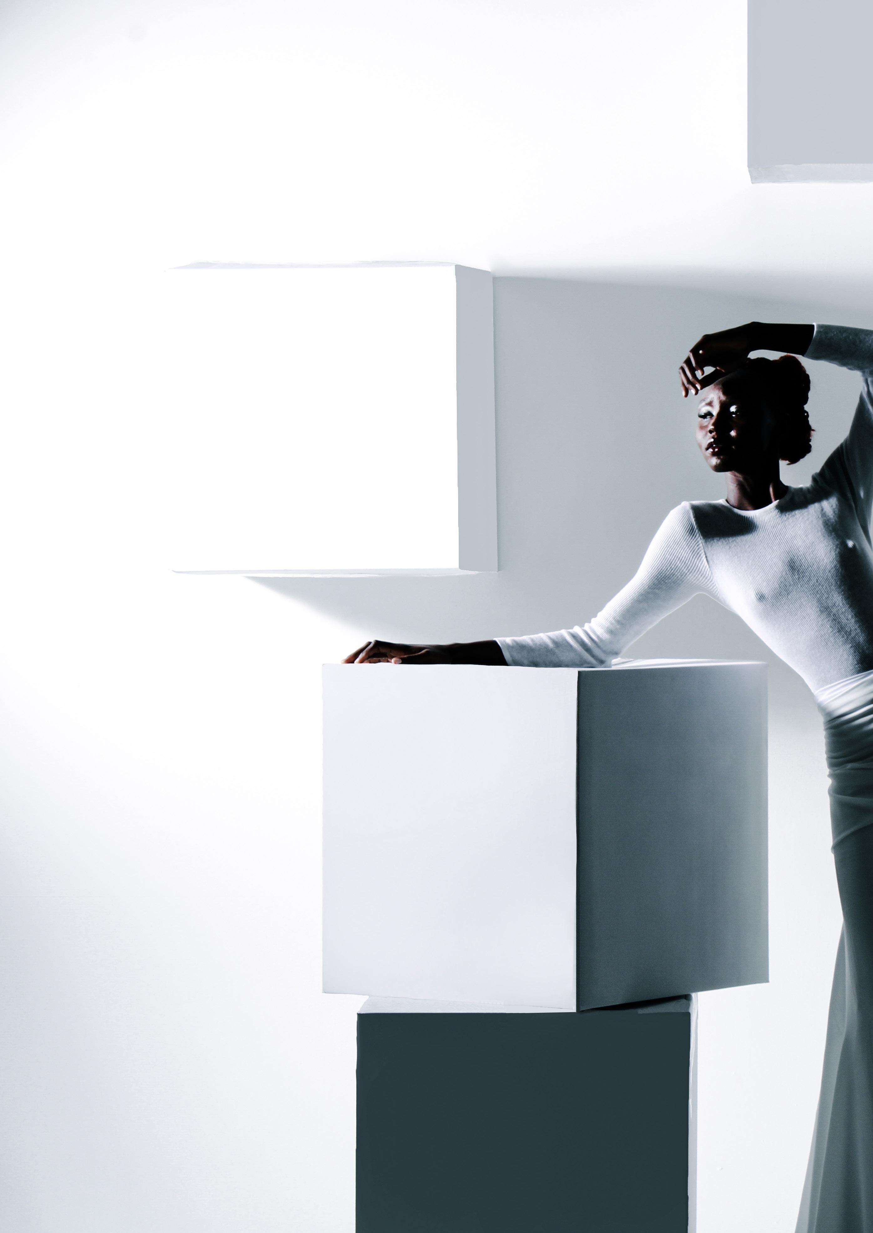
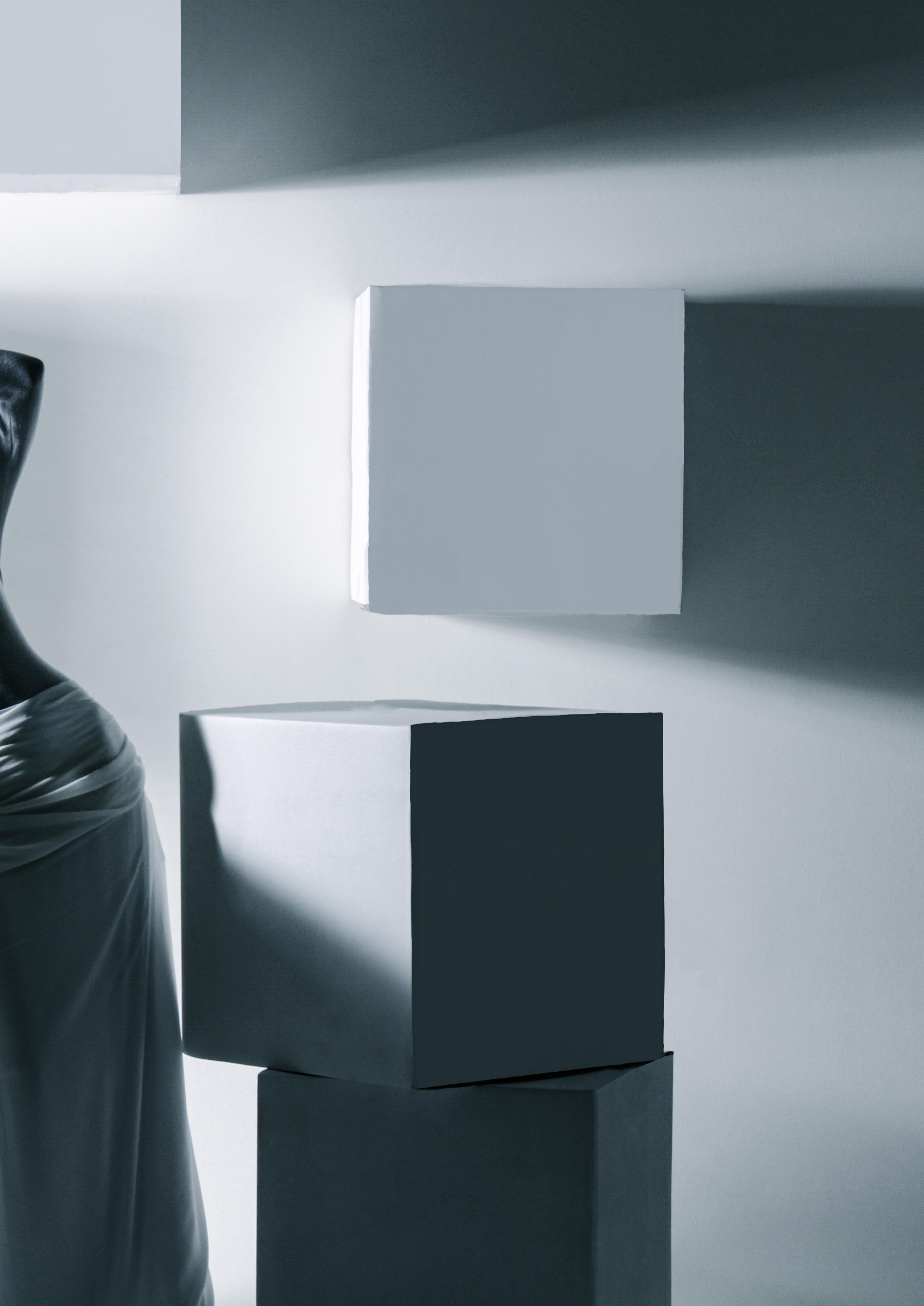
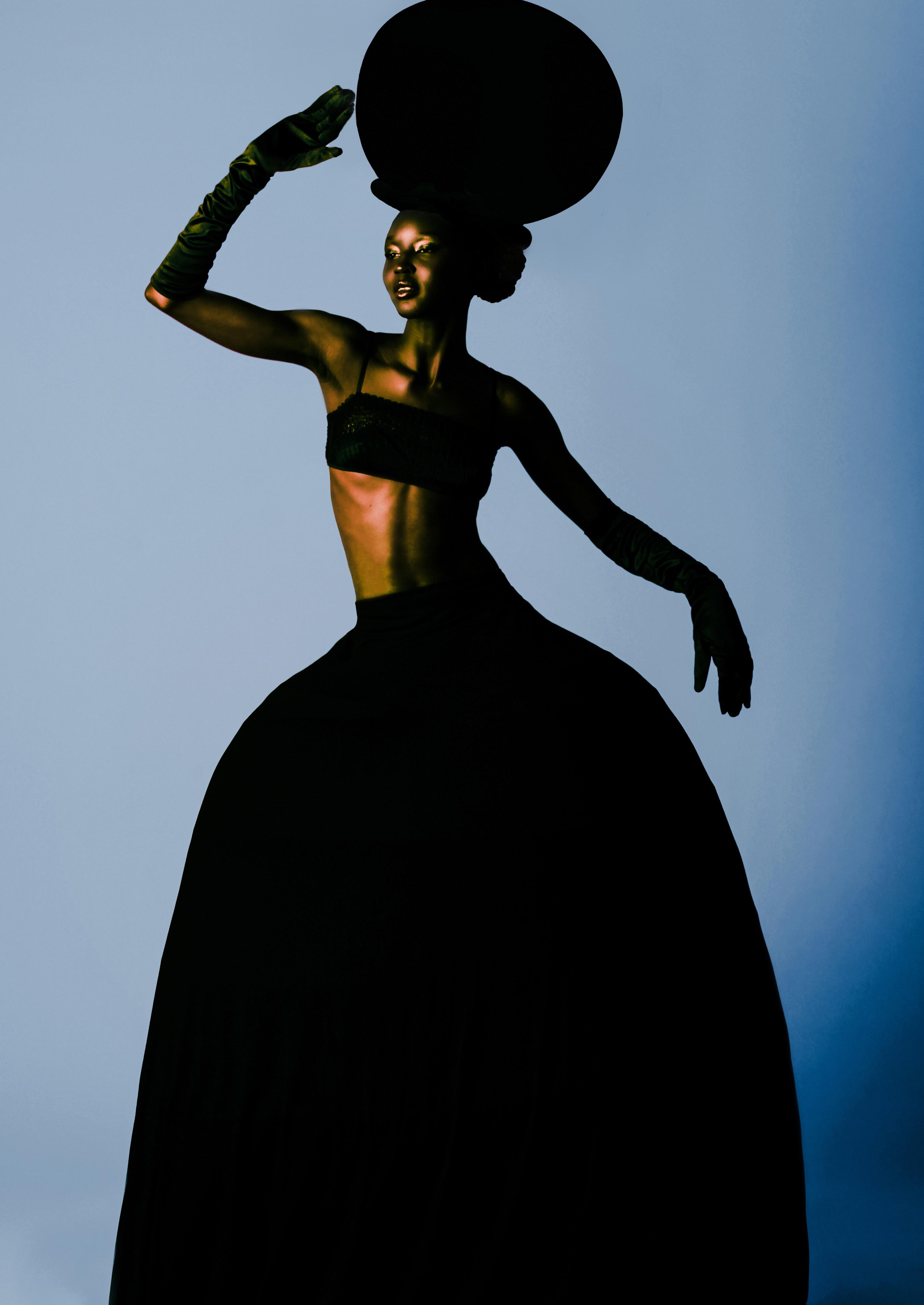
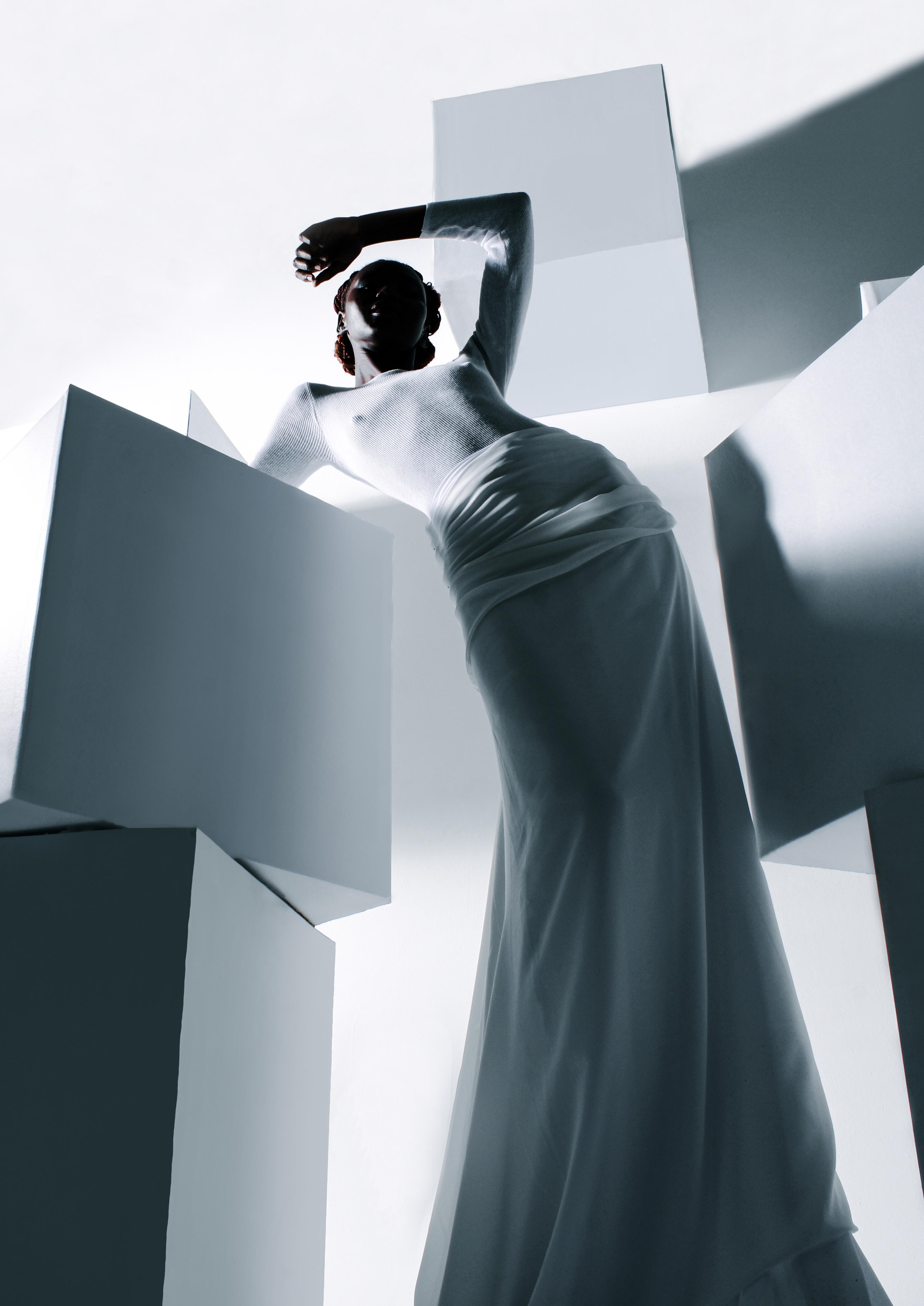
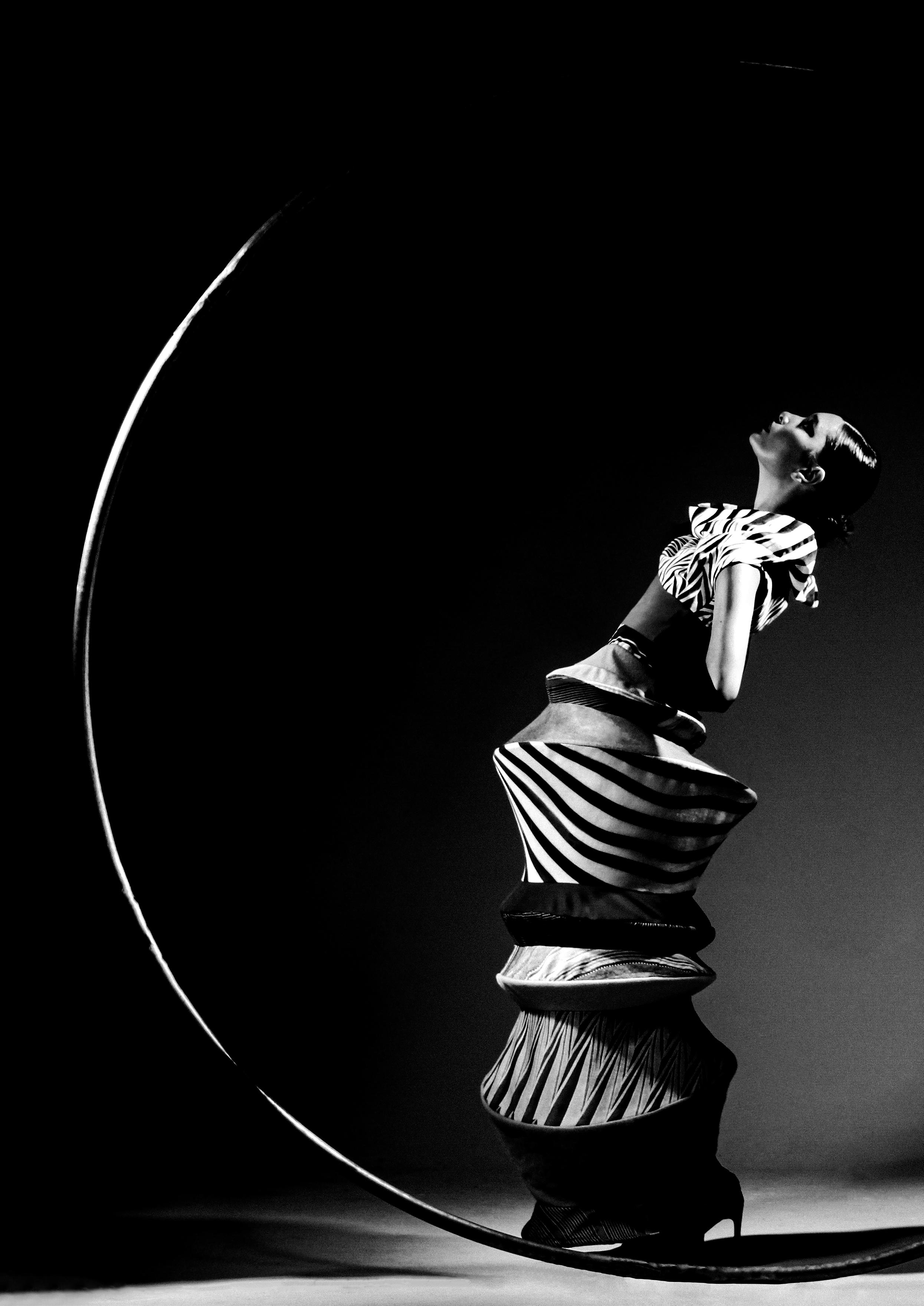
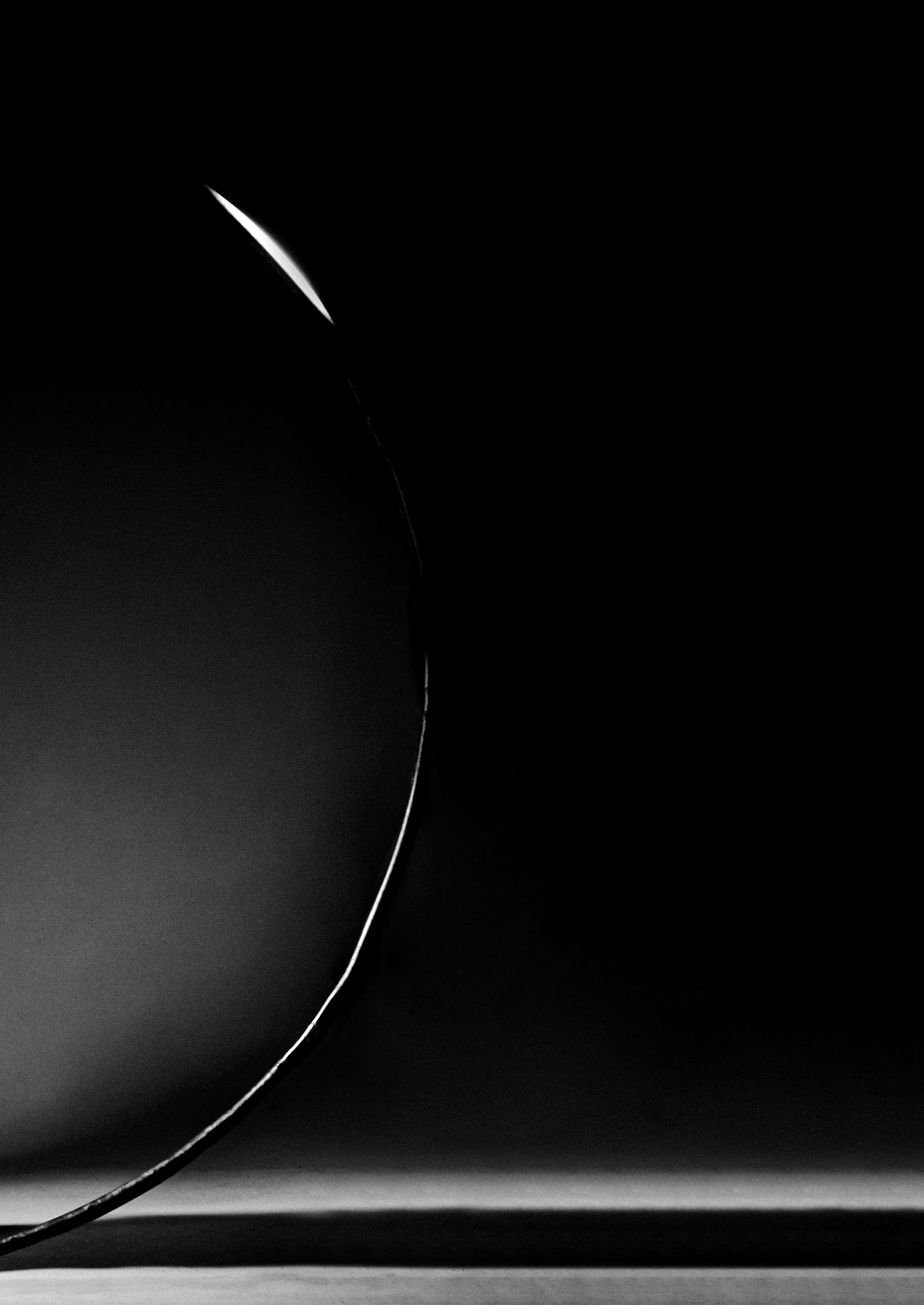
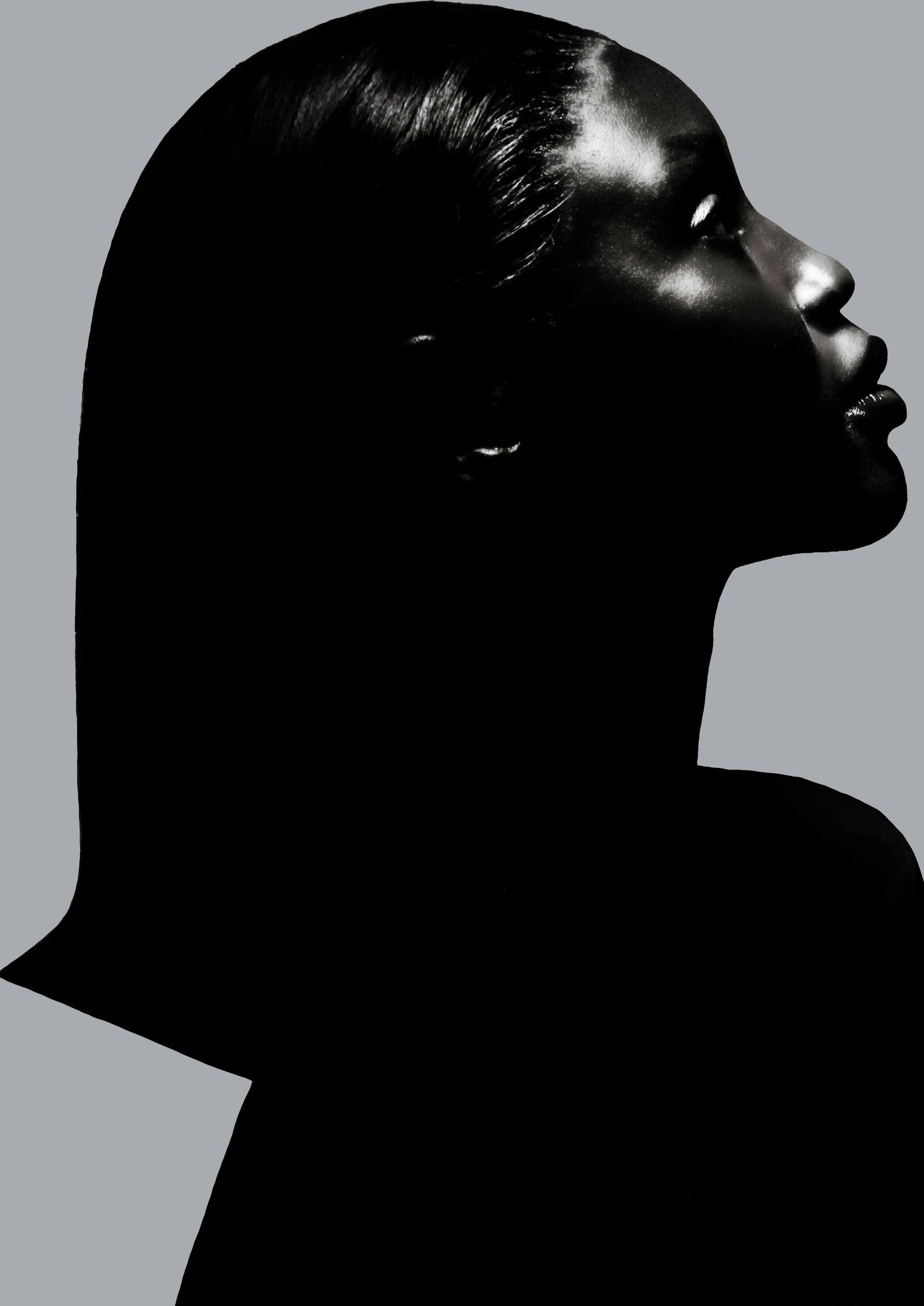
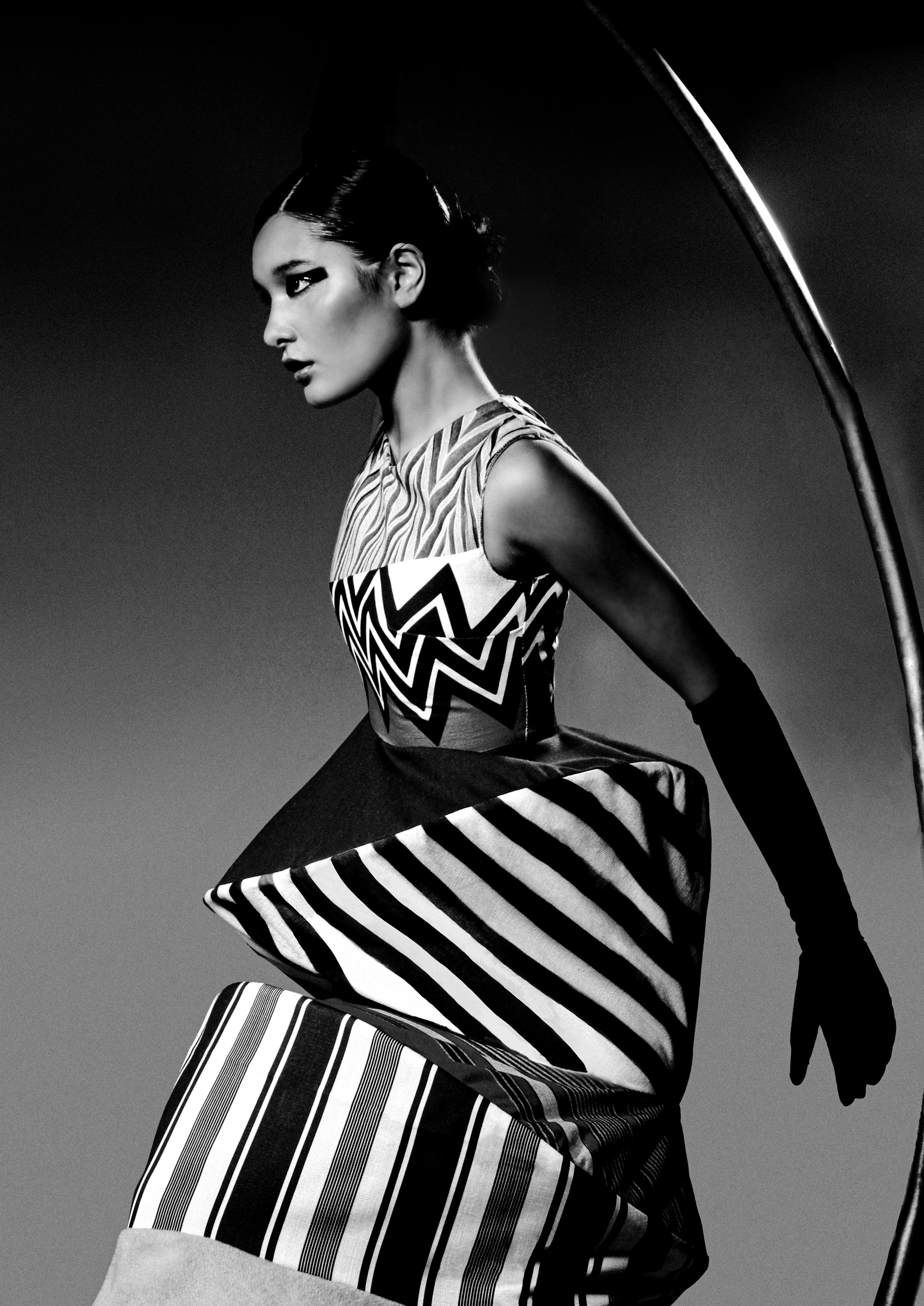
Form dictates the interplay of light and shadow, shaping how colours appear and evolve in photography. Drawing from architectural geometries and organic bodily forms, I explore how structured lines and curves amplify hues, creating visual harmony. This duality emphasises the dynamic relationship between bold shapes and vibrant, emotive colour palettes.