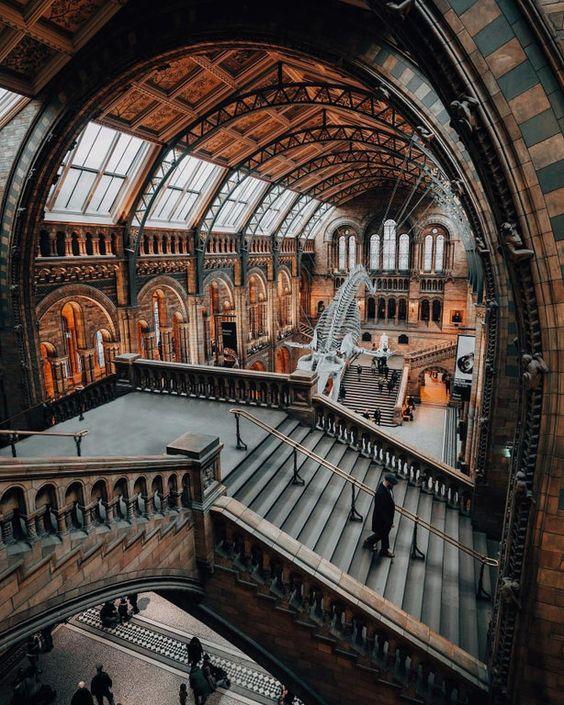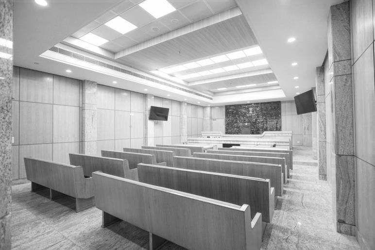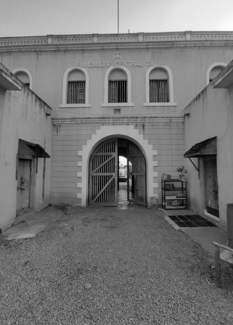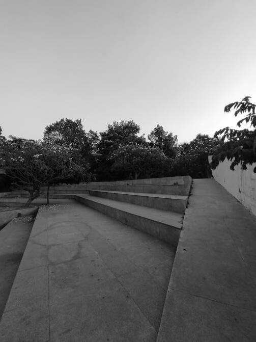

The issue is no longer about new versus old, but about the nature of the vital relationship between the two.
Kenneth
Additions have always been a common type of intervention to old buildings when they no longer meet the current space needs. Additions and reconstructions were traditionally designed based on the historical and physical context of the structure. According to Osmund Overby in Old and New Architecture: A History, before the preservation movement this type of work was based on an understanding of the architectural evidence of the building and on the old architectural context, but usually done in a new style.

ADAPTIVE REUSE
"Adaptive reuse" has been defined and reinterpreted many times in many different ways Some interpretations advocate for contemporary architectural language to be implemented upon, within, or surrounding the old, whereas others focus more on maintaining the historical significance of the existing site via minimal architectural intervention Regardless of approach, the underlying idea behind the concept is the reuse of an existing building to house a program different than the one the structure was originally built for.
Although the phrase, "adaptive reuse" is fairly new in origin, the concept is as old as architecture itself. In his book, Re/Architecture, Sherban Cantacuzino explains it very simply, "Because structure tends to outlive function, buildings through history have been adapted to all sorts of new uses." Because of this, the spatial and programmatic needs of humanity are altered and new spaces are required. These requirements were easily met by the transformation of old, existing spaces.
It wasn't until the industrial revolution that anybody questioned reuse. 3 With the introduction of mechanized and mass production came an abundance of building materials at cheaper costs: This meant that new construction was suddenly simpler and more affordable than renovation. However, not long after the war, America, nostalgic for the past, began implementing federal acts to preserve architecture. Although a number of architects and preservationists in the sixties and seventies argued for the "conservation of the ordinary it was the ecological/ environmental-conscious mentality of 21 century architecture that pushed adaptive reuse as a form of practical space use.
This mentality and approach continues in contemporary architectural practice, and today, more than seventy percent of architectural work is centered around existing structure.


ARGUMENTS FOR ADAPTIVE REUSE
There has always been much debate surround the advantages and disadvantages of adaptive reuse over new construction in regards to practicality, functionality, and cost, as well as its role in preserving the historical culture of a community. However, the shrinking availability of buildable land due to laterally expanding cities and abandoned urban centers is a problem universally acknowledged, and adaptive reuse can be considered an economic response to the issue and others.

LITERATURE STUDY AND CASE STUDY Retrofitting Old Magistrate Courthouse 2 MODERN
HISTORIC BUILDINGS
INTERVENTIONS TO
introduction
We should not live in a bright shining new future, any more than we should hide in a comfortable pastiche of the past We must inhabit an everevolving present, motivated by the possibilities of change, restricted by the baggage of memory and experience.
-David Chipperfield

In order to address the issues of functionality, keeping in mind both the progress and nostalgia of a community, the process and ultimate goal of adaptive reuse must be altered. Kenneth Powell argues this point:
"Out of necessity comes invention, and conservation and rehabilitation schemes now generate some of the most innovative and intelligent work... 'Saving' old buildings is no longer enough. The aim is not preservation but transformation, an architectural... approach to creating new form out of old fabric. “
This requires architects to investigate how the new program, architectural language, technology and structural systems can be inserted into, through, atop, or around the existing, and how the two systems work together to create a functioning (and hopefully, aesthetically-pleasing) structure.
In response to the lack of housing in the Copenhagen area, MVRDV repurposed a pair of silos into multi-family housing units. The Gemini Residence not only served to alleviate housing shortages, but also brought new life to the somewhat derelict area. This rejuvenation via architectural reuse is key to my thesis, but I also very much admire MVRDV's strategy of weaving the new program and materials throughout the existing structure rather than just filling it.

Diagram: New residential program is inserted into and through to the exterior of the existing silo volumes.

Diagram: Deformations in the cylindrical form are derived from interior and somewhat more extreme exterior forms of vertical circulation.
Gemini Residence
Architect: MVRDV


Location: Copenhagen, Denmark
Project Year: 2005
LITERATURE STUDY AND CASE STUDY Retrofitting Old Magistrate Courthouse 3 TRANSFORMATION BEYOND RESTORATION
MODERN INTERVENTIONS TO HISTORIC BUILDINGS case example
Difference between magistrate and judge
A magistrate is a minor judicial officer or a civil officer of a state who handles minor cases in a specific area like a town, district etc. A Judge is a judicial officer who administers court proceedings and gives the judgment on the legal cases after analyzing the facts and evidence related to the case.
Functions of the Labor Court
The Indian Judicial system is a federal judicial system, This is a mixed law-based system, i,.e. based on parliamentary legislature, court laws, customary & religious laws as well, i.e., based on parliamentary legislature, court laws, customary & religious laws as well. The Judicial structure in India is a unified structure
• Courtrooms and Ancillary Facilities
• Judges' Chambers
• Jury Facilities
• Administrative and Staff Offices
• Prisoner Holding Facilities
Supreme court High court
District court
Subordinate judges
Court of small cases for metropolitan cities
Munif’s court
Functions of the Family court
Special court designed to deal with legal problems arising out of family relations. The family court is usually a consolidation of several types of courts dealing with narrower family problems, such as children’s courts and orphans’courts.
Family courts were first established in the United States in 1910, when they were called domestic relations courts. The idea itself is much older
The Supreme Court, High Courts, District Courts and Lower Courts form a single judiciary
Broadly there is a three tier division: Every district or metropolitan area has a District Court, and every state or union territory has a High Court. The Supreme Court is the apex court. Decisions by the Supreme Court are final.
Architectural Implications

The functioning of a court requires 4 major zones of spaces. These are:

• Courtrooms Block
• Judges Block
• BarAssociation Block
• Administration & Records Block.
These blocks essentially belong to the four major functions of the institution. The working of the judicial system is based on the interactions between the judges and the parties in dispute; represented by their lawyers and records keeping of the same.

The Court’s functions can be divided between those relating to industrial relations matters and those relating to the determination of appeals in matters of employment rights. The role of the Court in dispute resolution is to act as a Court of last resort. In other words local dispute resolution arrangements in the organization / company and other dispute resolution machinery of the State should have been fully utilized before a case comes to the Court. 4
• Other Court-Related Facilities
The inter-relationship of these spaces is primarily driven by functionality of the court The access of public is highly restricted to only a certain zones, largely because of security reasons. Also, the general public is not really required to be present at certain zones within the court complex. However, since the functioning of the court needs to be transparent (both ethically and legally), forcibly limiting public access to certain areas, which includes only the Courtroom and Lawyers' Blocks COURT BLOCK
LITERATURE STUDY AND CASE STUDY
4
Retrofitting Old Magistrate Courthouse
COURTHOUSE
STRUCTURE
introduction COURTHOUSE COMPLEX
The Courtroom / Hearing room Design standards


• It represents an interface zone where all the parties related to the judicial process come together in one space; it accommodates the judge, hearing officer (judicial officer), court clerk, reporter, bailiff, attorneys and defendants-in-custody, witnesses, jury, and spectators.
Functionally, the courtroom is divided into two zones: the spectator area and the litigation area.
• The spectator area provides seating for families, witnesses, and the public. The usual number of seating in this area varies to an extent from 20 to 25 seats in a non-jury courtroom to around 100 to 150 seats in large courtrooms
• The litigation area provides seating for the primary participants in the judicial activity: judge’s bench, courtroom clerk station, court reporter’s area, bailiff’s station, witness stand, jury box, counsel area, and exhibition display area and equipment
• Courtrooms in a courthouse building vary in their size and number depending on the type of proceedings that take place within them
• Hearing rooms (for hearing juvenile cases) range from 600 to 800 sq. ft. Small size non-jury courtrooms range between 800 and 1,000 sq. ft. Medium Size courtrooms for general trials With juries may require 1,200 to 1,500 sq. ft. Calendaring and motions courtrooms in large metropolitan courts may have a seating capacity of more than 200 persons, requiring more than 21500 sq. ft.
• The trend is toward smaller courtrooms (800 to 1,200 sq. ft.) with a smaller number of large courtrooms (1,500 to 2,500 sq. ft.) for calendaring and motions functions.
• Floor-to-ceiling heights of small-to-medium-size courtrooms should be 10 to 15 ft.
• Witness Stand to have 6” raised dais above the Hearing Room floor. The public seating area and Hearing Room well to be the raised floor

LAYOUT

The courtrooms should have separate entrances for public (spectators, press, litigants, witnesses), private (judge, jury, attorneys, court personnel, witnesses), and secured spaces (prisoners, court officers) .

• Hearing Room ; Well area to have 8” raised floor above structural slab with concrete filled pan on pedestals
• Judge’s Bench to have 12” raised dais above the Hearing Room floor
• Hearing Room Clerks to have 6” raised dais above the Hearing Room floor
court room
LITERATURE
5
STUDY AND CASE STUDY Retrofitting Old Magistrate Courthouse
COURTHOUSE COMPLEX
Press Facilities
• The press has the right to report news of court cases Spaces for the press can be located in the front row of the public observation area or to the side of the courtroom, often determined by local policy.
• If the press is to be located in the front of the public area. news reporters should be no closer than 9 ft. to attorneys, and litigants who may want to engage in private conversation.
• A press room should be made available in close proximity to the entrance of the building.
Public Facilities
• The public: - has the right to attend all trials and hearings in the role of spectator

• need not be restricted to the rear of the courtroom where only backs of attorneys and litigants and sides of jurors can be seen
• should be able to see and hear all participants as clearly as possible
• should remain inconspicuous and unobtrusive as possible to trial participants
JUDGES' CHAMBERS
Chambers: - are spaces where judges conduct private research, hold conferences, receive visitors, handle correspondence, work on pending cases and relax
- may consist of the judge's private chamber, secretary's office, law assistant's office, and judge's toilet, closet and kitchenette (if desirable)
- in the lower courts may not include secretarial or law assistant's spaces, in which case chambers would be a judge's private office with separate toilet - should be accessible by private judges' corridor or staff corridor;

- the public should not have direct access to the judge's chamber
Approximately 400 to 500 net square feet (NSF), including a private toilet, is considered adequate for the appellate judge's private office.
The chambers should have windows for natural lighting and visual relief. The office should also be soundproof and relatively quiet as conversations with attorneys and litigants regarding pending cases need to be confidential.
court room
Courtroom shape should not be long or narrow and walls should not be parallel or finished in sound-reflective materials. Every courtroom should have a sound lock or share one with an adjoining courtroom.


Retrofitting Old Magistrate Courthouse
LITERATURE
STUDY AND CASE STUDY
6
COURTHOUSE COMPLEX
• Cluster courtrooms on one floor in groups of two, four, six, or eight.

• Place court-related functions near courtrooms.
• Position functions that require after-hours access on the first floor.

When renovating older buildings, it may be necessary to make some minor compromises in the recommended circulation patterns although it is never acceptable to have in-custody detainees escorted through public spaces

Public Circulation
Public circulation provides access from main building entrances to the various functional areas of the building. This includes all areas used by the general public, attorneys, clients, witnesses, and jurors (before sequestration), such as the main lobby, corridors, public elevators and escalators, public restrooms, law library, waiting areas, snack bars, clerk of court counters, and reception areas. The building should have a single main entrance for both public and staff. It is acceptable for the entrance area to include more than one entry point into the queuing zone in front of the security screening;
Private Circulation

Private circulation provides controlled access to courthouse users and is not easily or routinely used by the general public. It permits the movement of judges and other trial-related court personnel between chambers and courtrooms, and the movement of sequestered jurors between courtrooms and jury deliberation rooms, without uncontrolled interaction with other courthouse users.

Secure Circulation
Secure circulation provides for the movement of defendants in custody. Access to the building should be through a secure vehicular or pedestrian sally port Defendants in custody are most commonly taken to a secure central holding and staging area before being escorted to individual courtrooms as needed
Interface : These are spaces where public, private, and secure zones interact.
LITERATURE
AND CASE STUDY
7
STUDY
Retrofitting Old Magistrate Courthouse
circulation COURTHOUSE COMPLEX Adjacency and Circulation
Magistrate Courtroom Facilities PER SET SF EACH SMALL COURTHOUSE MED COURTHOUSE LARGE COURTHOUSE

Witness/ Attorney Conference Room 2 150 300 1,200 2,400
Public Waiting Area 1 400 400 1,600 3,200 Equipment Storage 1 100 100 400 800

Ancillary Facilities
Judicial Staff Toilets 1 50 50 200 400
Court Reporter/Recorder Office 1 150 150 600 1,200
Court Reporter/ Recorder Storage 1 50 50 200 400
Shared Work Room 1 50 50 200 400
Transcriber/Typist Workstation 1 50 50 200 400

Jury Facilities
Jury Room Sound lock Entry 1 50 50 200 400

Juror's Toilets 1 100 100 400 800
Coat Closet 1 20 20 80 100
Trial Jury Room 1 250 250 1,000 2,000 Service Unit 1 20 20 80 160
Audio/Video Equipment 1 10 10 40 80
Sworn Jury Custodian 1 50 50 200 400
LITERATURE STUDY AND CASE STUDY Retrofitting Old Magistrate Courthouse 8
adjacency COURTHOUSE COMPLEX Adjacency and Circulation
Delhi High Court, New Delhi
• Site Area - 60,000 sqm
• Ground Coverage - 17,600 sqm (30%)
• Total Built-up - 64,000 sqm (Approx.)
• FAR Used - 105%
• No. of Floors - 4-6

• No. of Courtrooms - 34
• Area of Courtrooms - 60 sqm (180 sqm for Chief Justice Court)
• Occupancy of Courtrooms : 30 people
• Parking - 421 within the site (Approx.)
As the nation’s judiciary system strives to evolve and expedite legal procedures, architectural interventions become crucial to support these endeavors. The New Courts Complex at the eminent Delhi High Court brings with it a quiet, refined architectural vocabulary, augmenting the existing block.

ZONING AND SITE PLAN


Zoning of the HC campus is efficient and simple. It is based on basic functional relationships of components and their accessibility for the public.
The public and private entry/exit points correspond to the physical placement of these functions on the site (or visa-versa).The Site can hence be divided into three distinct parts based on the publicness of the functions.

The placement of the public and judges' cores correspond to the zoning of the functions efficiently. However, the public core is highly overloaded with only two passenger lifts.
SERVICES & SAFETY
• Non air conditioned waiting areas since well-ventilated limit the use of air conditioning only to the courtrooms and judges' chambers,
• Fire safety can be an issue since the building has very high occupancy and lacks designated fire staircases However, the fact that the building is only 3 floors and has a central ramp solve the issue
Security check-posts at Site entrance level
Security check-posts at building entrance level
case study
LITERATURE
AND
STUDY
CASE STUDY
9
Retrofitting Old Magistrate Courthouse
Administration Judges
block Lawyer Block Security Security LOW HIGH Minimal Public Access Restricted Public Access Unrestricted Public Access
chambers Courtroom's
COURTHOUSE COMPLEX
INTERNAL PLANNING AND RELATIONSHIP
Relationship Between Public areas-Court rooms-Judges' areas
• The internal planning is simple and is dedicated to segregation of the two types of circulation : Public & judges’. The central atrium provides light and spaciousness to the main public waiting area. This triple high space also has the information about the scheduled cases displayed.

• The courtrooms are aligned with the judges’ corridor on one side and the public waiting on the other. This relationship continues through all floors.


• There are 34 courtrooms in total, in which 24 are civil courts and 10 are criminal courts.
• The waiting areas are insufficient, especially at the upper two floors where 14 courtrooms open in the same space. This coupled with overloaded basic amenities (Drinking water & toilets) can result in a highly taxing experience.
• The central waiting space is well lit and ventilated because of the atrium.

• Administrative functions like offices, records rooms, notary, etc., are placed in separate administration blocks and also in the extension block
• The segregation between the judges’ and public circulation has been managed very efficiently There are absolutely no points of intersections between the two

SYMBOLISM & ARCHITECTURALEXPRESSION
•The Delhi HC doesn't have a really strong symbolism attached to the building concept.

•Apart from the two murals on either side of the entrance to the main block and the central fountain in the porch, which abstractly depict justice and law, no other reference of any symbolic element could be found.
•In the bigger Picture, as a complex, the Delhi HC has a sense of dominant presence It gives a sense Of stability amongst chaos.
•The first experience with site was underwhelming, because one of the main accesses to the complex, which is the lawyers' entry, has been ignored and is overcrowded.
•The main courtroom block does have an impressive sense of entry, partly because it sits on podium and partly because of the central triple height space The atrium does provide natural light but it needs to be substantially supported by artificial light.
KEY LEARNINGS & CONCLUSIONS
• The site planning of the Delhi HC gives cues about zoning of functions with respect to the accessibility and publicness of the functions.
• The interrelationships of functions, along with the adjacency of functions could be understood
• The project lacked any particular concept or symbolic markers which could be studied or analyzed
• The program is smaller than the one at hand in this thesis. However, space allocation and sizes of these spaces could be inferred from the study.
• The architectural expression is bold and is appropriate for the function being served.
• The courtrooms were also very small and cramped, without any natural light It produced a congested and intimidating environment inside the courtroom
case study
LITERATURE STUDY AND CASE STUDY Retrofitting Old Magistrate Courthouse 10
COURTHOUSE COMPLEX
CAEN LAW COURT, FRANCE
The law courts of Caen redefines a new domain of urban planning in the centre of the City. The shape of the building agrees not only with the tradition but of course with the more complex duties of law courts in the 21st century.

However, it can inform about the interpretation and architectural manifestation of Justice and a courthouse in contemporary times. The accessibility to the court is clean and simple. It has two main roads abutting the site on the north and south side. The surrounding context is predominantly socio cultural. This rings the courthouse right amongst the public realm and helps with the reconnection of the public with the judiciary. A public library is also a part of the same project.
ZONING
• The front edge of the site (South side) is dedicated to public entry, both pedestrian and vehicular.

• The rear end (North Side) is reserved for the secured entry and exit of the judges.
• The internal functions too are zoned accordingly.
• According to the holding capacity of the court, the public parking is sufficient (110 cars)
• Judges' parking is provided inside the building lock.

• One end of the site also has a public library which is also the part of the same project. These blocks share the public green.
• The public and judges' circulation both are very short and direct which makes them more efficient. The internal planning corresponds to this.

• Site Area - 9,000 sqm
• Ground Coverage - 2,100 sqm (23%)
• Total Built-up – 9,500 sqm
• FAR Used - 105%
• No. of Floors - 5

• No. of Courtrooms - 6
• Area of Courtrooms : Varies
• Occupancy of Courtrooms : Varies
• Parking – 250 cars
SITE PLANNING
case study
Retrofitting Old Magistrate Courthouse
LITERATURE STUDY AND CASE STUDY
11
COURTHOUSE COMPLEX
• An orthogonal pattern constitutes the base for the internal organisation of the law courts.
• The main rooms are adjacent to the facades and the corridors throughout the building always end up at the facades, resulting in good lighting and comfortable working areas
• From the main entrance, there is an axis leading directly to the middle of the building. The circular centre spans all 5 floors and it is the heart of the law courts: a landmark and a parameter for the interior area.

• The combination of an opaque facade and a transparent glass protrusion gives a sense of disconnection between the two parts of the courthouse : the public part which includes the courtrooms and the administrative parts.
• The courtrooms are flooded with light from the sides. This tends to lighten up the entire courtroom.
• This move is good for promoting transparency and infusing a sense of ease, but it is also distracting in certain ways. Strategic use of light, especially daylight, could evoke other emotions like responsibility, focus and commitment.
• The building tries to depict the concept of a "Building in a Garden"

• The simple form corresponds to the fundamental need of jurisdiction The cube underlines by its form the importance of jurisdiction by the means of architecture,

• A horizontal band highlights the first floor where the court rooms are located. In so doing, this new law courts communicate a message both to its users and to onlookers: transparency and balance.

• The stringent shape also signifies stability and order.
• The central atrium which lies at the heart of the building flushes the entire central space with light. The tree at its centre provides a calming influence in the space.
• The building appears light and floating because of the extruded floor and the facade treatment.

KEY LEARNINGS
• Major learnings from this case examples revolve around the aspects of architectural expression and symbolism
• The lack of coherence of the program limits any inferences which can e drawn in the subject
• Site planning hints towards how public space can be interwoven with more restrictive and secured functions of a courthouse.

• The simplicity in the form and its relationship with the idea of jurisdiction is one of the major derivatives from the study.
• The presence of a public library within the precinct of the courthouse hints towards a more inclusive program. It is a function which is dedicated to the public within a more closed function of a court.
• This could go a long way in integrating the public realm with the otherwise opaque and cut-off functioning of a court.
LITERATURE STUDY AND CASE STUDY
12 INTERNAL PLANNING &
Retrofitting Old Magistrate Courthouse
RELATIONSHIPS
SYMBOLISM & ARCHITECTURAL EXPRESSION
case study COURTHOUSE COMPLEX
SPECIFICATIONS
DELHI HIGH COURT, INDIA CAEN LAW COURT, FRANCE
• SiteArea - 60,000 sqm
• Ground Coverage - 17,600 sqm (30%)
• Total Built-up - 64,000 sqm (Approx.)
• FAR Used - 105%
• No. of Floors - 4-6

• No. of Courtrooms - 34
CONCEPTUAL UNDERPINNING
Solving the functional needs of an overloaded judicial System, along with establishing an individual image of the HC
• SiteArea - 9,000 sqm
• Ground Coverage - 2,100 sqm (23%)


• Total Built-up – 9,500 sqm
• FAR Used - 105%
• No. of Floors - 5
• No. of Courtrooms - 6
Redefining the domain of urban planning with a novel approach to court house planning. The form of the building corresponds to the local beliefs along with handling the new age duties of a law court.
BUILDING TYPOLOGY


SITE IMPACT
Site allows segregated entry/exit points as per user groups.
Limits the possibility of open public spaces, Building orientation is governed by the site.
SITE PLANNING
SYMBOLISM & EXPRESSION
KEY LEARNINGS
Coarse grain-Even Texture
Architectural expression corresponds to the context of Lutyen’s Delhi

• The form is dominant which suits the function of a HC.
• Clean rectilinear form symbolizes the order and stability of the judicial system.

• Lacks direct symbolic imagery. The architectural expression gives an impression of permanence and rigidity.
Site allows segregated entry/exit points as per user groups. Large public open areas are provided Building orientation & form are independent of the site.
Fine grain - uneven Architectural expression tries to break away from the existing ways. Responds to the idea of jurisdiction
• The pure geometric form of the structure establishes a relation with the fundamental order of the judicial system.
• The symbolism in the form corresponds to the European ideals of justice and judiciary.
• The architectural expression shows low regard to the existing built environment.
13
LITERATURE STUDY AND CASE STUDY
Courthouse 13
Retrofitting Old Magistrate
case
COURTHOUSE COMPLEX
study
THE FREEDOM PARK, BENGALURU

• Site Area : 22 acres urban park
• Location: center of Bangalore
• Architect : Built by Matthew and Ghosh architects, Bangalore
• Client: Bruhat Mahanagara Palike
• Built Area: 3500 Sq Mts Approximately
• Designed - 2004
• Completed - 2011
The site of the central jail, located in the heart of Bengaluru city today, lay virtually on a line that once divided the ‘old city’ and ‘cantonment’ during colonial rule.

The proposed design was based on the below mentioned key concepts;
• Making the jail periphery more transparent and inviting to the public.
• Adaptive re-use of the existing buildings - the barracks, the quarantine dormitory, the gallows etc. – by transforming them into ‘multi-functional pavilions’in the landscape.
• Maximum use of available resources such as solar energy, rain water harvesting, recharging ground water and follow the site gradients.
The Freedom Park in Bengaluru is one such stupefying projects, where an old Central Jail is adaptively re-used into a public space. The space was out of bounds for the inhabitants, which has now been converted into a space to be used by the people of Bengaluru, so that they enjoy ‘the freedom of 20 acres’ in the heart of the city!
BACKGROUND

The Central Jail complex was built in 1866-67, and today, the activities of this jail have been shifted to a location on the outskirts, thus leaving behind 20 acres of unused space in the busy city, walled off from public presence.
The Government of Karnataka then decided to hand over this historical site to the Bangalore Mahanagar Palika (BMP) - with an intention to redevelop this 20 acres into an urban space accommodating various public activities.
Mathew and Ghosh Architects won the competition and successfully executed the project The project was opened to public in November 2008

14
LITERATURE STUDY AND CASE STUDY Retrofitting Old Magistrate Courthouse
case
COURTHOUSE COMPLEX
study
The Transformation of the Old Central Jail into a an urban Park of Possibilities


ADAPTIVE RE-USE : The existing buildings - the barracks, the quarantine dormitory, the gallows etc. are seen as resources for adaptive re-use. The primary elements of each of these are seen as the walls with fenestrations, the plinth, the roof truss and the roof.

TRANSFORMATION : The process of transformation of the hospital walls comprises making inserts and placing them in a new context of use (exhibition, ice cream / snack outlet, coffee bar, a theater, book browsing etc.) and spatial experience by enabling a quality of lightness of the roof (by the seemingly floating roof).
A strong skyline that takes and reflects light differently due to the indents of the surface. It faces the people’s court that makes it a prominent destination and in close proximity from the Ramachandra Road access. The parallel walls that become the exhibition gallery follow a similar pattern of architectural transformation. The Tower however we wish to remove the outermost layer that has been added to it a few years ago and retain the original inner core in its original state.

case study
15
LITERATURE STUDY AND CASE STUDY Retrofitting Old Magistrate Courthouse
COURTHOUSE COMPLEX
FREEDOM

The park also houses a joggers track (3’000 sq.m.), children’s play area (5’200 sq.m.), jail museum, information corridor gallery, book museum, children’s interactive museum in the old cells yard, tree museum, 150 seater amphitheatre, 50 seater enclosed theatre space and an outdoor exhibition park. 5 acres of the park have been set aside for arranging rallies and protests.

The info corridor coupled with the sculptural wall built on a barrack greets you on the east of the entrance. A subsurface theatre adjacent to it proves a good area for small performances. The sculptural court manages to keep the temperature cool throughout, even at 12 pm when the sun is overhead. The second phase of the construction would incorporate multimedia and storage devices capacitated with LED screens in this corridor. A concept wrap wall near the sculptural court WIII have patterns showing the architectural and design ideas of the park in sequence for the future generations.
Parallel wall & watch tower

PLANNING
The previous entrance to the jail museum has been done away with.

Today, a blue imposing façade welcomes you into this urban park, extenuating the periphery of the central jail. This blue freedom art wall will be clad with permanent large scale art works by renowned artists from India in the near future.
As one enters through this majestic entrance, the administrative block and the central jail greet you on the left. The central jail which has been restored as the jail museum takes you down a trip to this colonial jail.


Housed between high walls and gates and still on its way to receive its finishing touches, the jail museum gives a vantage view of the parallel walls and the watch tower ahead.

case study
Alandscaped amphitheater
With a seating capacity of 250 adds ta the features list.

LITERATURE
AND CASE STUDY
16
STUDY
Retrofitting Old Magistrate Courthouse
PERVADING THROUGH
COURTHOUSE COMPLEX
Phase II: Sadly, a project of such impregnated importance still has a long way to go. It has taken a lot of years and has been an exhausting wait for the architects as well as for the Bangaloreans to finally see the opening of this recreational park.

Apeople's court on eastern light and western reflection surrounding it has been consciously created to swing everyone's attention to it. Alot of work still needs to get done on the court. From the court one notices the book museum with a cats on its mezzanine which has replaced the prison hospital.
TheRetrofitted“HospitalBlock”
The barracks which were located radically with reference to the watch tower have assumed different functions While a couple of them have been retained, some have been converted into landscape elements, a children’s play area and info corridor. All along this 16-acres park, the prison impressions appear in fragmented pieces ubiquitously their presence might not be seemingly obvious everywhere but a good and conscious effort has been made by the architects to not let go off the prison feeling— a right approach to adaptive reuse.
The Re-used “Barracks”

ADAPTIVE RE-USE OF THE JAIL COMPLEX
CONCLUSION

Converting a jail which was at its time the symbol of colonial rule in British India has been a daunting task.

The brief might have read an ‘urban park' but what needed to be projected was a sculptural landmark. For these, a lot of concepts were created.Aliterature court for sitting, a tree museum to teach children about flowering trees, light and sound shows have all been accomplished use of locally sustainable materials like concrete, brick, glass andACP have further on appended to the natural look.
The architect's focus an discovering the old while entering the new has given this 1867 jail a revamp it surely can revel in.

17
LITERATURE STUDY AND CASE STUDY Retrofitting Old Magistrate Courthouse
COURTHOUSE COMPLEX
case study
MUSEUM PLANNING introduction
The museum planning involves planning the actual mission Of the rnuseum along with planning the space that the collection of the museum will be housed in. The way that museums are planned and designed vary according to what collections they house, but overall, they adhere to planning a Space that is easily accessed by the public and easily displays the chosen artifacts.
•The design of museums, art galleries and the temporary exhibition spaces associated with similar organizations involves the housing of a wide range of functions broadly indicated in the common definitions of a museum.
•Museums, however, vary considerably in size, organization and purpose

•It is important therefore to consider the particular context and features that characterize a museum in the process of developing concepts .
•Some museums may have only a small proportion of Collections on public exhibition at any one time, the bulk remaining in storage and accessible for research and conservation purposes only
•Well-serviced temporary exhibition space may be a priority in such cases
•Other museums may have smaller collections attractive enough to the visiting public to warrant the development of sophisticated exhibitions with a designed life of several years.
•In such cases storage space may be needed primarily for the expansion of the collections, and considerable effort may be made to develop educational programs.
Museum Planning involves :
01 Analysis of feel of space in an environment.

02 Provision of effective circulation path and services.
03 Development of new concepts for interior spaces as well studying sustainable building materials through case studies.
04 Investigation of museum architecture and to define the role of a contemporary museum in terms of function and architectural implementation. general design guidelines
Non- Public areas Zone which is meant for the staff alone with environment controls and security.
Non- Public collections Zone in which the finish and durability and environment are created for the staff alone. Highly secure and controlled environment. conservation of documents takes place

Public/ non-collection Zone in which the finish and durability and environment are created for . Contains robust and no artifacts
Public collections area Zone with environmental controls a security designed for the preservation of collections. Public access allowed
Catering Kitchen Electrical room General Storage Mechanical Storage Museum Storage Offices Conference Rooms Security offices Security Equipment Rooms Computer Network Rooms
Workshop Crating/Unerating
Freight Elevator Collections Loading Dock Receiving Goods Lifts Conservation Laboratories Collections Storage Spaces
Checkrooms
Theatre Ticket counter Food services Information deck Cloak room Public toilets Auditoriums Libraries Lobby Stores
Classrooms Exhibition Galleries Orientation
Retrofitting Old Magistrate Courthouse
LITERATURE STUDY AND CASE STUDY
18
MUSUEM
Zoning analysis is a useful tool or the following reasons:
01 It clearly indicates the amount of space that must be contained within the museums environment.
02 It provides benchmarks which assist project beam in monitoring the brief:
03 It forms the basis for preliminary of building running costs

Galleries
Exhibition design must concern itself with judgments about appropriate techniques of presentation, related to both the nature of the material and its position within the concept of display as a whole.
THE ENTRANCE HALL
The entrance hall is the key to the whole building. There should be only one public entrance for a museum and this entrance should be separate from the service areas.
It is important for the entrance hall to be well designed and aesthetically appealing space for it is this space that one is going to be first and last to be in the entrance hall should provide an easy introduction to the building so that the visitors are able to easily orient themselves.
Thus an entrance hall should be essentially a –Transition zone For visitors to adapt themselves in the museum and also a space for refreshing themselves from the gallery displays.
Social gathering place The place should be an open space to serve as a gathering area for the visitors.
Orientation space In large museums where there are large numbers of galleries the entrance hall also serves space for people to orient themselves.
EXHIBITION SPACES

The design Of exhibition spaces should reinforce and promote the audience's engagement with the collections. Exhibition spaces within a museum should have different architectural typologies. Light quality, room proportions, finishes and materials can be tailored for each space to suit the nature and scale of work presented.
SHAPE AND SIZE OF GALLERIES

The practice of rounding off the corners of rectangular rooms is also going out of fashion, as it has been found that the advantage of unbroken walls and the impression of better use of light in a more compact space are offset by the resultant monotony, and that the general effect is not pleasing to the eye

A display case is a cabinet with one or Often more transparent glass (or plastic, normally acrylic for strength) sides and/or top, used to display objects for viewing A display case may be freestanding on the floor, or built-in displays may be mounted on the wall, may act as room partitions, or may be hanging form the ceiling Overall, the most common way to arrange exhibition is to display exhibits along the wall or in the central area at the room in showcases. Specifically, in a general exhibition roam, plane exhibits or small three-dimensional exhibits are arranged against the wall; and special stands are set up so that some large precious three-dimensional exhibits or plane exhibits can be displayed.
• Often the arrangements can be staggered which produces a certain mystery and a desire On the part of the visitor to peek around corners to see what is next. Cases that area arranged to narrow the entrance a bit, so that the hall inside then opens out, provide a certain amount of interest

19
LITERATURE STUDY AND CASE STUDY Retrofitting Old Magistrate Courthouse
spaces MUSUEM
EXHIBITION SPACE
• Viewers should be able to move through the exhibit without being forced to walk past the objects they have already seen.
• There must be adequate space for visitors to move at different speeds.
• A viewer tends to turn to the right upon entering a gallery.
• The normal vision starts 27° up from eye level.
• For a standing viewer, well lit pictures or wall hangs should be hung 10m away with the top not more than 4.9m above eye level and the bottom about 70cm below.
• It is necessary to allow 3-5m² hanging surface per picture.
• 6-10m² ground surface per sculpture,
• A favorable viewing space should have a sill height of 2 13m for pictures and 3-3 65 m for sculptures

Exhibition and collection storage spaces
• The layout of public areas in a museum, may be based on a simple concept of free circulation around a single open-plan exhibition space.
• A linear arrangement of spaces with beginning, middle and end.
• A loop where the essentially linear storyline leads naturally back to the beginning.

• An arrangement of core and satellites where each theme or detailed treatment of a subject leads back to a central introductory or orientation area.
• A more complex scheme combining linear, loop and core–satellite arrangement of spaces which is specifically structured to account for more or less stable relationships between collections and interpretive themes.

Ceiling and roofs Rooms with lateral lighting may have ordinary ceiling (flats , vaulted , smooth or with molding) all that is required being a suitable refraction of diffused colorless light. Light falling directly from above through skylights/ windows which form a permanent feature of the room.
Covered Exhibition Space Design Parameters
Covered Exhibition Spaces are buildings or enclosed structures containing exhibition areas or other spaces, including all overhanging upper floors or balconies. Participants may decide to build more than one level within the Covered part of the Exhibition Space, based on their individual needs.

Height of Buildings
• The height of the Covered part of Exhibition Space (or Building Height) must be less than 12 meters.

• The height limit for any additional architectural elements (such as skylights, roof elements, vertical connections to the roof, sunscreens, signals, etc.) is 17 meters.

LITERATURE STUDY AND CASE STUDY Retrofitting Old Magistrate Courthouse 20
Lighting Into Museum
lighting MUSUEM
There is certain tendencies inhuman behavior which show is taken into account while designing a gallery. People enjoy surprises and excitements. People usually find long walks tiring and hence rest areas be provided. The rest areas are not necessarily sitting space could also include changes in the scale light and texture space. The circulation system can be broadly classified into two.
AUDITORIUM
LAYOUT OF AN AUDITORIUM


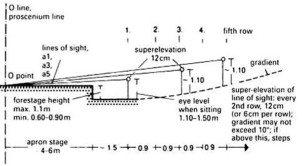
An angle of 130 deg is generally considered to be the limit beyond which it is not possible for an actor to convey facial expressions in two directions at the same time.
Space Requirements:
The basic factors to be kept in mind while designing an auditorium are Area of the auditorium – 0.6 Sq.m /person
Furthest seat from the stage – 20-m Acting area – 9×9 m or 9m diameter
Projection Rooms : Used to be divided into separate compartments for rewinding and projection of the film with dimmer room, switch room, spotlight room, workshop and staff room each being 6 – 10 sq.m
Sight Lines : One of the aids to good sight lines is an effective slope seats may be set on a rising parabolic curve or on two different incline.
Windows And Doors
• Windows and doors should be of suitable size for lighting the rooms.
• Strong and able to be securely closed.
• Non conductive of heat and dust from outside
• There should be no doors inside the exhibition except where a part of the building requires to permanently cut-off for functional reasons. Floor plans for the location of doors in relation to the use of space . MIN 1.6M


Circulation space identifies area of a budding that is used for pedestrian travel, Such as hallway, Stair way, and areas in a room that leads to another room. It is generally not good to have a home a high percentage of Circulation space. When you a budding, your main focus should De the rooms and not the hallway
A fairly mild slope for the lower half of the auditorium – 12” or 1 in 7 A steeper slope for the upper half of the auditorium – 24” or 1 in 3.5 All stepped sections are illuminated by hooded aisle lights.

Aisles :To decide the volumes of the auditorium, one must know the arrangements of aisles.
The maximum number of seats between aisles is 14 and maximum between aisles and walls is 7.

LITERATURE STUDY AND CASE STUDY
Magistrate Courthouse 21
Retrofitting Old
MIN
2M
CIRCULATION circulation MUSUEM
In the operation of collection service not every operation necessarily require a separate space, some service may be provided by outside agencies. As far as possible, collection movement and public circulation should be kept separate.
In Museum Planning, Building services engineering comprises mechanical engineering ,electrical engineering and plumbing (MEP) engineering, all of which ae further sub - divided into the following:
- Communication lines, telephones and IT networks
- Escalators and lifts
- Fire detection and protection
- Heating, ventilation and air conditioning (HVAC)
- Lightning protection
- Natural Lighting and artificial lighting, and building facades
- Security and alarm system
Building Services influence the architecture of building and play a significant role on the sustainability and energy demand of a building. The latest trending MEP or building services is the utilization of building information modelling or BIM which may include 3D and 4D modelling 3D BIM services enable building visualization . preview or prototype of architectural structures before actual construction.
SPACE ALLOCATION AND PLANNING

The design addresses the core of the building once the formalities are cleared. The space allocation plan, which is inherent in every tender procedure, serves as the basis for the planning work, The bulk of the demands placed on museums provides a less sophisticated reading than those of other architectural tasks The exhibition space, in particular, serves as a firm point Of reference Room for manoeuvre is almost always created in every other aspect Since the portion of remaining spaces has increased nearly twenty in the past 150 years, stinginess here is uncalled for!
In order to translate the space allocation plan into the structure of the building, the long lists must be roughly divided up. With regard to the construction of museums, the distinction between public and internal, or between non-public has become established. In a classic scenario, the two categories stand for themselves and can be accessed separately.


However, in the meantime, the boundaries are in flux: workshops, libraries and repositories which previously outsiders had nothing whatsoever to do with arc increasingly opening up to visitors, Occasionally, in some places they are even a component of the exhibition. Therefore, the first task of the architect is to evaluate the interior components with museologists according to public relevance. diagrams above illustrate possible alternative combinations. In addition to the clear division within the building, the option of the mixed-use space allocation plan also presents itself. As a matter of fact, interior components are the initial candidates for complete outsourcing. This is especially recommended if the museum is already very large and its demand for space is designed for growth, the construction site proves to be too narrow or preservation concerns restrict the adaptation of the existing building.

LITERATURE STUDY AND CASE STUDY
22 services MUSUEM
Retrofitting Old Magistrate Courthouse
Safeguarding the collection is the oldest challenge of all for museums. Architects must also address this. Their construction scheme can greatly simplify matters through minimized entrances and exits as well as clearly outlined safety zones. The external membrane of the building, which ideally should be closed, represents the Outermost rampart. The next step protects the collection area as a whole: surveillance must be concentrated here. Located in the innermost circle is the individual object of protection which is visible but stored in an inviolable manner.
Exhibition Supervision
Security technology has undoubtedly made progress. However, no One can intervene on site more rapidly than the supervisor He however comes with a price which is beyond most museums Architects can assist in the exhibition sector by dispensing with the need for walls or at least positioning them in such a way that there are no blind spots. It is thus possible to keep an eye on several exhibition rooms from a passage my. What is required is planning which tailors staffing levels and key positions to each other.
Protection of items


The days when objects are cordoned off are over. In order to maintain distance between the individual showpieces, (hidden) alarm systems are the prime choice nowadays. Valuable goods in particular also require safety glass casing. Certainly, the common cabinet is by no means the only option available. Rather, there are spatial arrangements which are a safety and a presentation feature: one effective device is to place the general public and exhibition objects on different levels
Outer Ramparts
Outer Ramparts is not an argument for windowless However, no rampart is more secure than its weakest part. This context calls for architects. As the coordinators Of all planning and construction services, they see the gaps in the system and ensure that these are bridged. Particular attention should be paid here to aspects which may at first appear exceedingly absurd. : skylights, chimneys, Of the staff, the visitors and in the construction Of the museum is windowsills, fire ladders, emergency access routes, manholes, air considered indirectly at best. The preservation of exhibits is always conditioning ducts; the sewerage system and suchlike. Under no air the first priority circumstances is this list complete without a little criminal imagination.

LITERATURE STUDY AND CASE STUDY
23
MUSUEM
Retrofitting Old Magistrate Courthouse
security
Safety Zones
The world’s oldest horse stables were discovered in the ancient city of Pi-Ramesses in Qantir, in Ancient Egypt, and were established by Ramesses II (c.1304-1237 BC).
Free-standing stables were built from the 16th century. They were well built and placed near the house due to the status horses had as draught animals. High-status examples could have plastered ceilings to prevent dust falling through into the horses’ eyes.

British stables
Traditionally, stables in Great Britain had a hayloft on their first (i.e. upper) floor and a pitching door at the front. Doors and windows were symmetrically arranged. Their interiors were divided into stalls and usually included a large stall for a foaling mare or sick horse. The floors were cobbled (or, later, bricked) and featured drainage channels. Outside steps to the first floor were common for farm hands to live in the building.
▪ Initially, a horse in a wild nature does not require specific shelter. Within suitable climate conditions horses are sufficiently comfortable spending major amount of their life in open areas like pastures, hiding if necessary from direct sun light in the shadows of trees and mountains.
▪ However, with the advent of humans in horse life the situation has changed. Furthermore, population and interaction of horses can be carefully controlled if horses are observed and housed separately. On the other hand, horses, being herd animals, are ought to be kept in social groups and not isolated from each other. All above mentioned factor resulted in an invention of a simple yet efficient housing for horses: the stalls.
Turnout pens
Arenas Barns Paddock Stall Partitions

STALLS
Stall - is a cubicle located in the barn or open area, which is designed to hold an animal without a leash. Inside the stall modern horse spends major part of its time, sleeps, rests and consumes food and water. Stalls are generally located in the stables along a passage or on both sides of it; in case of outdoors stalls, exit from each one of them leads to the open area, passage or riding field
The typical United States stall size is 12‘ X 12’ . This is a good size for many horses, but will be too small for some larger horses, such as drafts and warmbloods. Larger horses benefit from 12’ X 14’ stalls (minimum) or 14’ X 14’ stalls.
Horse barns are commonly built with a ceiling height of 10 to 12 feet with 8 feet being the minimum.

However, the application specifics and collapsible structure of the portable stalls creates a number of extra compulsory necessities for its design.
first of all, stall's design should ensure safety and comfort for all groups of users and for horses especially, due to their unique, active and unpredictable behavior
From the human point of view convenience and usability of the construction plays vital role: high assembling and demolishing speed along with low weight of the elements is a strong benefit for the stall design. Moreover, the structure should be understandable and should allow simple installation in the absence of unique knowledge, skills, tools and construction machinery.
LITERATURE STUDY AND CASE STUDY Retrofitting Old Magistrate Courthouse 24 Horse Accommodation
EQUESTRIAN SPACE
introduction
Stall Side Walls
▪ Walls between stalls can be solid or a partial grille. A social group of well-behaved horses can have solid walls to 4’ above the ground with grille above can make for the most airy and friendly feel in the barn.

▪ Even if your horses are well-behaved and socialized, outfitting your barn with at least one full-height solid stall can give you flexibility when you need it.


Stall Doors
Windows and Openings

▪
Stall doors can be sliding or swinging. Swinging doors can be used for outside doors going out to runouts if they can be latched open or closed for safety.
▪ Stall doors can be open-grille or partial solid, as it affords greater visibility out of the stall. Stall doors can also be provided with an opening for the horse to stick his head out.


▪ Natural light is a great idea in a barn. However, if you use a window or an opening on the back of your stall, it is designed with safety in mind. Glass windows must be placed high in the wall (5 feet or above), constructed of tempered glass, and protected on the horse side with bars.
▪ A Sliding shutter can be opened in nice weather and closed in bad weather.
Stall Floors
▪
A well-draining, mixedaggregate base such as a road base (without any sharp stones)—under a stall mat.
▪
On top of the base, rubber mats are placed. Bedding can then be placed on top of the rubber mat to soak up urine.
Runout or No Runout?
▪
Some stalls are designed to be separated from outdoor space, and others allow for access to an exterior runout.
...the door requires special attention, due to its importance in stall's usability and various methods of execution.
LITERATURE STUDY AND CASE STUDY Retrofitting Old Magistrate Courthouse 25
STALLS
Permanent stalls Permanent stalls Portable stalls Portable stalls Transformable stalls EQUESTRIAN SPACE introduction USER GROUP


LITERATURE STUDY AND CASE STUDY Retrofitting Old Magistrate Courthouse 26 RIDING ARENAS 20 x 40m and 20 x 60m riding arenas are generally the most common sizes as they are the two standard dimensions for dressage tests. ▪ However, for jumping 30 x 50m would be more suitable. ▪ Outdoor riding arenas (usually at competition venues) 40 – 50m x 60 – 70m, which allow loads of room for jumping, but also space for dressage boards to be fitted inside when needed for flatwork ▪ 4 – 4.5 feet / 1.2 – 1.35m, is the usual height of arena fencing. ▪ the absolute minimum height for an indoor riding arena ceiling should really be 14 feet / 4.2m.
– 4.8m Riding Arena Design x EQUESTRIAN SPACE riding arenas 1 Surface Options for Riding Arenas ▪ Sand Surfaces ▪ Waxed Riding Arena Surfaces ▪ Synthetic Riding Arena Surfaces ▪ Wood Chippings ▪ Rubber Surfaces 2 Lighting Options for Riding Arenas ▪ Floodlights ▪ Skylights in indoor 4 Outdoor Arena ▪ Outdoor riding arenas are generally more common as they are usually cheaper to install 5 Indoor Arena ▪ Indoor riding arenas provide great protection from the weather and are the dream facility for a lot of riders. 3 Equine Arena Equipment ▪ DressageLetters & DressageBoards ▪ Poles & Jumps ▪ Working Hunter ▪ Arena Eventing Fences ▪ Riding Arena Mirrors ▪ Sprinklers ▪ Safety ▪ Location ▪ Fencing & Kick Boards ▪ Viewing Gallery ▪ Jump & Equipment Storage ▪ Judge’s Box
(common
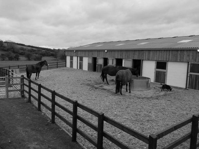
Paddocks (corrals) refer to small, non irrigated, non grazable holding pens or exercise lots, often adjacent to horse stalls. They are used as a place to hold horses rather than as a source of pasture feed. Paddocks may appear as bare, dry lots because of heavy usage.


5 Key Elements to Paddock Design

Location – Locate the paddock where there is proper drainage, with less than a 5% slope. Any drainage should go into a buffer area or vegetated filter strip and never directly into a creek or waterbody.
• Avoid low, frequently wet and muddy areas.
• Do not locate a paddock over any part of a septic system, including the leach field.
• Locating a paddock to the south, west and east of structures will help it to dry out, especially compared to paddocks placed to the north, which are more often in the shade
• Rout any irrigation water or rainwater runoff away from the paddock to keep it dry.
Size – Minimize the size of the paddock or corrals. There should be at least 600 square feet per horse but paddocks should be less than one acre. Shape – Adjust the shape of the paddock to account for the topography, drainage patterns, availability of land and horse’s requirements, e.g. consider a paddock 20’ x 100’ versus 40’ x 50’ .
Fencing – Fencing around a paddock should be strong and free from sharp or jagged protrusions. Wood rails are attractive, but require a lot of maintenance.
▪ Surface – The weather, slope, soil conditions and local regulations may dictate the type of surface required. The surface can be as simple as adding 2 inches of sand to the existing surface or more complex such as building a drain field under the entire surface.
A single horse can be housed in a paddock 12’ wide by 24’ long A 2% slope from a three-sided shelter to an absorption pit improves drainage. The absorption area can vary according to need. The pit can be from 1’ to 5’ deep. It can be filled with rock and gravel. The surface can be covered with sand or turf. If the paddock is built on level ground or if the slope must be other wise adjusted, an area equal to the area of the paddock can be excavated to a depth of 1’ .


LITERATURE STUDY AND CASE STUDY Retrofitting Old Magistrate Courthouse 27
EQUESTRIAN SPACE paddocks ▪ HOW MANY PADDOCKS DO I NEED? ▪ PADDOCK NO: REST PERIOD GRAZING PERIOD + 1 20 DAYS REST 3 DAYS GRAZING + 1 = 8
According to the information that has been conducted, horses, unlike other domestic animals have rather strong visual acuity, stronger than cats and dogs, yet still weaker than human.
According to Jenny Chandler and Mary Foster, it is not yet entirely clear how horses see hues Some of the experimental exercises have shown that horses see clear difference between blue and grey, yellow and grey, and green and grey.
Alternatively, surfaces of stall partitions can be used as canvases displaying landscapes and surroundings the way horses see them. In other words, partition can be a storytelling art piece, allowing to perceive objects through eyes of our riding companions.
Following the research and test results we can estimate how horses see the world around us Therefore, colors applied in stalls design can be arranged in order that would be less noticeable and disturbing to the horse
A design that would look to a human eye as bright and intense combination of orange, red, blue and grey elements, to a horse would look like an object of a relatively singular solid color if the brightness of the tones is held at one level.
"The average horse has a visual acuity of about 20/30 to 20/40, which is much better than the average dog (20/75) or cat (20/100), but slightly worse than the average human (20/20). In humans, 20/20 means that a person can identify the details of an object from 20 feet away. That standard is applied in animals too, so in horses 20/30 vision means that the horse needs to be 20 feet away from the object to see the same details that the normal person can discern from 30 feet."
HORSE VISION


HUMAN VISION

Materials Requirements
According to the specifics of horse behavior safe and strong materials are the priority in the design. Those are important, yet not singular criteria that has to be fulfilled in the construction of the horses' housing.

The choice of material for the stall depends on several criteria like: the budget of the construction, taste of the owner or climatic zone. In the stationary stables wood, naturally, is the most commonly used material Application of timber in stable construction brings various benefits and is relatively affordable On the other hand, unfortunately, wood cannot be considered as a strongly sustainable material Especially if the timber was not disinfected properly
The most durable type of wood is oak, yet it is generally highly expensive. On the contrary fir or spruce, which are more accessible in price, quickly become damaged under continues stress that a stall has to withstand.
A convenient and therefore common solution is to use timber, covered with galvanized metal. This will enhance the strength of the surfaces and will prevent animals from nibbling the timber. Galvanized steel is protected from rust if the galvanizing process was made after cutting.
Selecting the flooring material for the stall should be also a thorough process. Obviously stall floor has to fulfill several important requirements. It is important for the floor to be dry and do not absorb smells and odors. It needs to be safe, durable, strong, and yet obtain acceptable density; since as experience has shown, extremely hard flooring can damage horse's tendons.
As Wheeler (2006) underlines the health of a horse's legs and feet can be greatly affected by the type of stall flooring chosen Furthermore it has to be easily cleaned, safe and not slippery
LITERATURE STUDY AND CASE STUDY Retrofitting Old Magistrate Courthouse 28 Horse Vision and Color Perception
EQUESTRIAN SPACE
special study
Equine dreams, Coimbatore


Equine Dreams offers unique service for breeders, trainers and owners throughout India. With over 12 years of practical experience in the business of horses, Equine Dreams provides horse legal expertise in a wide variety of areas.


The building is arranged in a rectangular plan that provides enclosed stables for 8 horses, wash, tack and laundry, workshop and feed as well as a small office and grooms’ accommodation


it was a new unusual experience of thinking within the framework of a different ergonomic system. There is a differentiation in the treatment of materials in each area, as a means of achieving consistencywiththeir use
case study


LITERATURE STUDY AND CASE STUDY Retrofitting Old Magistrate Courthouse 29
10 x
Sq.m Barn 16
Arena 60 x 50 Sq.m
50
stall
Office
13
x 13 Sq.m
Paddock
x 40 SteelStalls With Wooden Panel 4m x 4m
Arena gallery 4x4m Barn(color coated metal sheet)
A barn wing provides straw and hay storage and parking for the stables vehicles. Externally there is a small pool for the horses,dayyards(hard and grass) aswellas the menage foreventpractice andjumping. EQUESTRIAN SPACE
STABLE HUELQUÉN, CHILE
•Architects: Peñafiel & Valdivieso Arquitectos


•Area: 1130 m²


•Year: 2016
The project sought to gather all the farm equipment and service area into a covered building in order to create an operational center for this agricultural business


The project pays special attention to details so tosolveissuesregardinghorsecare:thetrough, the ties, the horse stall shutters which are closed every night, the saddle room, the saddle supports,andthehorsefeedersamongothers.

Situatednexttotheaccesspath, -rightonthewaytotheupperfields,further upthemountain-,theprojectappearswithallitspowerinfrontofthevisitor, underasinglenarrowandextendedroof.
Itgathersthreefundamental units:thefirstincludesofficespacesandadining roomforworkers;theseconddesignedformachinery,toolsandproducts;and athirdoneforhorses.
case study
Retrofitting Old Magistrate Courthouse
LITERATURE STUDY AND CASE STUDY
30
EQUESTRIAN SPACE
The prefabricated wooden structure required an extremely precise assembly work to correctly fit over the exposed concrete bases previously built. The concrete casting for the bases was made with wooden boards in order to provide the right texture. After the prefab wooden structure was in place, carpenters finalized the job by executing manual work using standard selected pine. The construction was, therefore, the result of a coordinated workflow between technology and craftsmanship.


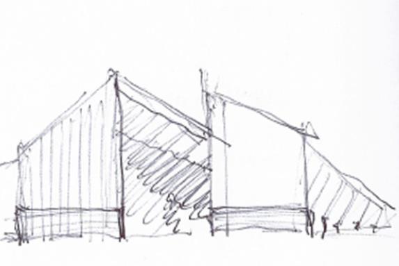
The large gable roof opens at the ends, leaving both sides separated. This gesture is accentuated when reaching the stables, where the west slope of the roof turns in 15 degrees allowing the sunlight to penetrate into the horse stable during the day. Meanwhile the other slope remains unchanged, parallel to the path, shading the horses during the stable daily cleaning duties.


The project pays special attention to details so to solve issues regarding horse care: the trough, the ties, the horse stall shutters which are closed every night, the saddle room, the saddle supports, and the horse feeders among others.


LITERATURE STUDY AND CASE STUDY Retrofitting
Courthouse 31
Old Magistrate
STABLE HUELQUÉN, CHILE EQUESTRIAN SPACE
case study
RESTAURANT, RECREATION & TRAINING, BANGKOK, THAILAND
Architects: Architectkidd


Area: 2000 m²
Year: 2019
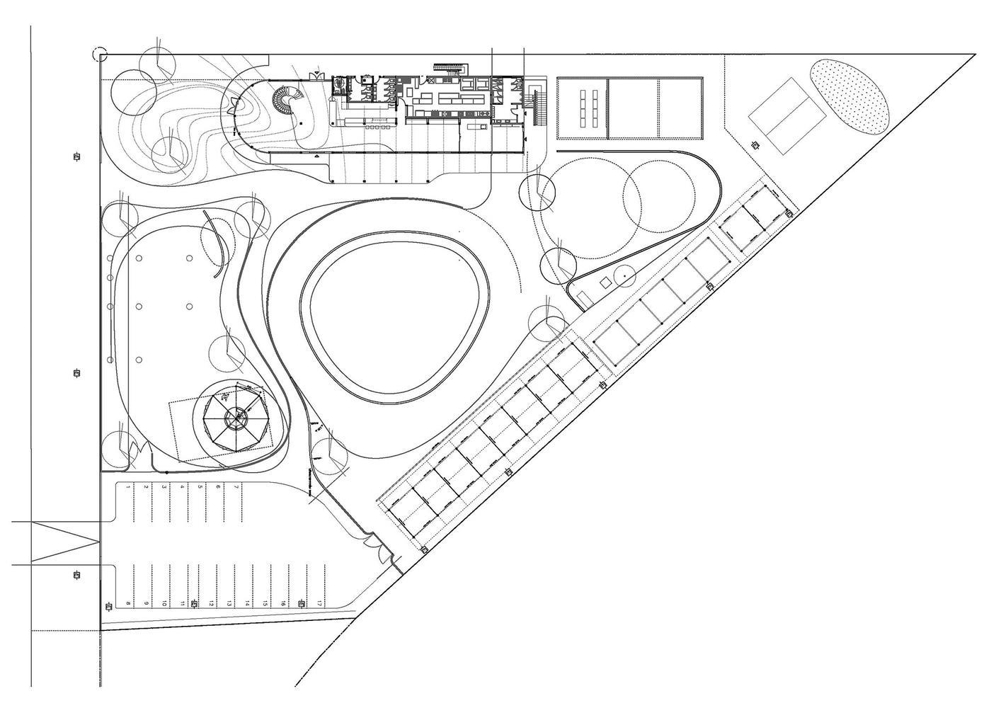
The main intention is to design a place that is friendly for both horses and people. Emphasis is made to create an architectural design that could foster therapy programs, where horses participate in restoring the health of children and patients.
The Padauk wood (Pterocarpus genus), with its natural variations in color ranging from orangebrown to red (and in time oxidizes to a darker purple-brown), resemble the color of the horses in the equestrian center.
The spaces were laid out according to the ways the horses move through the site, from stables to the public areas. In addition, the architecture of the main building of the equestrian center references these curved forms through the use of wooden materials.

Although the essential elements of this equestrian center are the horses themselves, the design aims to create a comfortable environment for children and families. The interior spaces allow for natural light and plants to grow. From the restaurant, people are able to look outside and constantly interact with the horse riders and riding track. The entire area is conducive to not only horses and people, but also other animals such as ponies, ducks and chickens.

LITERATURE STUDY AND CASE STUDY Retrofitting Old Magistrate Courthouse 32
32
Hay Equestrian Center and
EQUESTRIAN SPACE
The
Eatery
case study
Working with a pre-existing structural grid and column layout that had already been built, wood panels that were fabricated in ways that could merge the wall and ceiling surfaces. The resulting curved forms were then layered over the conventional structure and concrete construction.


LITERATURE STUDY AND CASE STUDY Retrofitting Old Magistrate Courthouse 33
Hay Equestrian Center and Eatery EQUESTRIAN SPACE case study
The
National Space standards and guidelines courthouse reorganization & renovation program https://www.ojp.gov/pdffiles1/Digitization/1845NCJRS.pdf
U.S. Courts Design Guide; includes Revisions through June 2008 https://www.wbdg.org/FFC/GSA/courts.pdf
"The Cirtual Courthouse : A guide to Planning & Design "Available at: http:// courthouseplanning.ncsc.wikispaces.net/ Trial+Courts [Accessed 14 March 2017]
https://www.equilifeworld.com/equestrian-lifestyle/stable-interior/sensational-stables/
https://theultimateequestrian.com/the-ultimate-guide-to-horse-riding-arenas-equestrian-facilities/#arena https://www.dayarch.com/educational-building/museum/ www.horsechannel.com/horse-health/how-horses-see-the-world.aspx
About the Morgan: Architectural History. The Morgan Library & Museum: New York, 2006. http://www.themorgan.org/about/historyArchitecture.asp. (accessed April, 7 2009)
Grimmer, Anne. Interpreting the Secretary of the Interio’s Standards for Rehabilitation. U.S. Department of the Interior: Washington, D.C., 1999. http://www2.cr.nps.gov/tps/tax/rehabstandards.htm https://www.buildingsguide.com/floor-plans/horse-barn-plans/
LITERATURE STUDY AND CASE STUDY

34
Retrofitting Old Magistrate Courthouse

