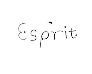
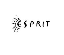
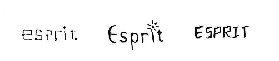
Visual Development Guide


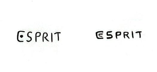
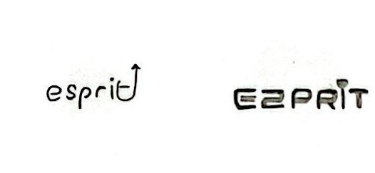
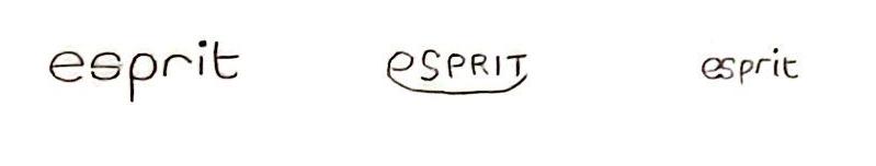
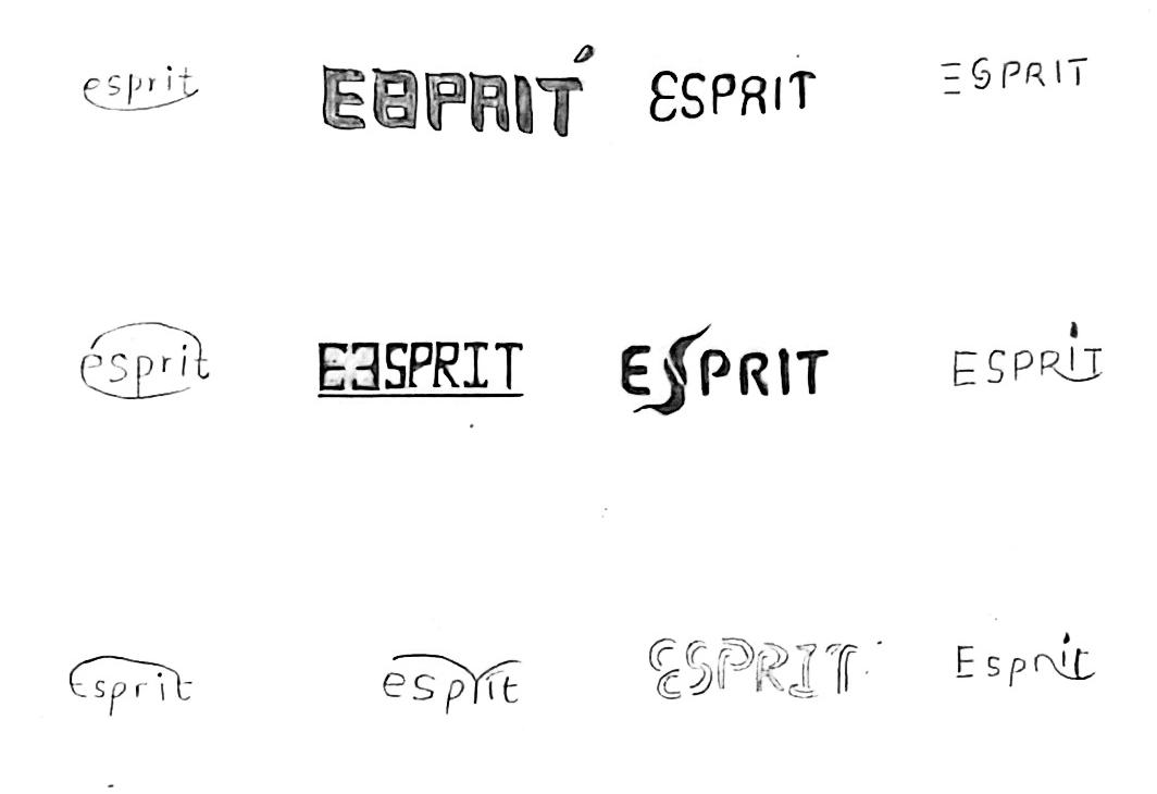
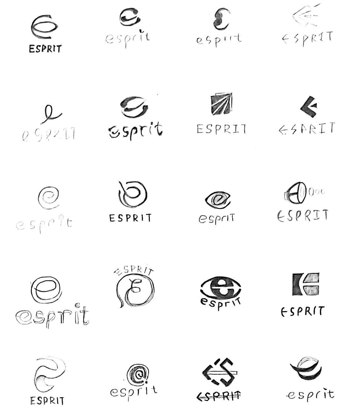
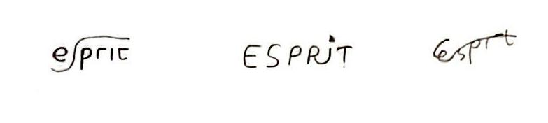
Based on the strategic direction, now is the time to start giving Esprit visual form. The first round of sketches will explore Esprit's new look through three key phrases. The first is to expand the initial keywords into more robust key phrases that can be used to guide the visual development of Esprit. The second is to create different camps based on key phrases, in each camp will be sketched according to different categories. At this stage, all sketches are generated by hand.
responsible | to be a force for good Esprit uses business as a force for good. It integrates social responsibility into its practices, and it is legally and morally committed to prioritising its responsibility to the environment and to society to build a inclusive and diverse community.
sustainable | balance giving and taking Esprit prides itself on sustainability. It is committed to balancing give and take through ethical manufacturing, and continue to innovate with the complex and evolving needs of today's world to provide healthier, more sustainable choices easy and accessible to all.
expressive | inspire conscious creativity
Esprit encourages people to express themselves creatively and guides them to make a difference. It believes that everyone can take a stand in a unique way and bring people of the same background together to make a lasting impact.
If it is not inspiring it is not Esprit.
This is radical positivity, this is a brand that takes a stand.”
— Doug Tomkins (Co-founder of Esprit)
Our mission is to encourage people to express themselves creatively, actively fulfill their social responsibilities, and drive them to get involved and make a difference.
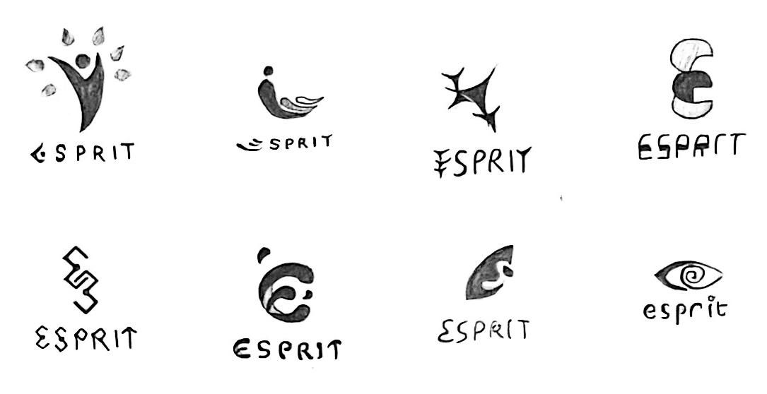
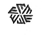
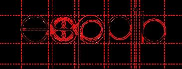
key phrase 01
Responsible | To be a force for good
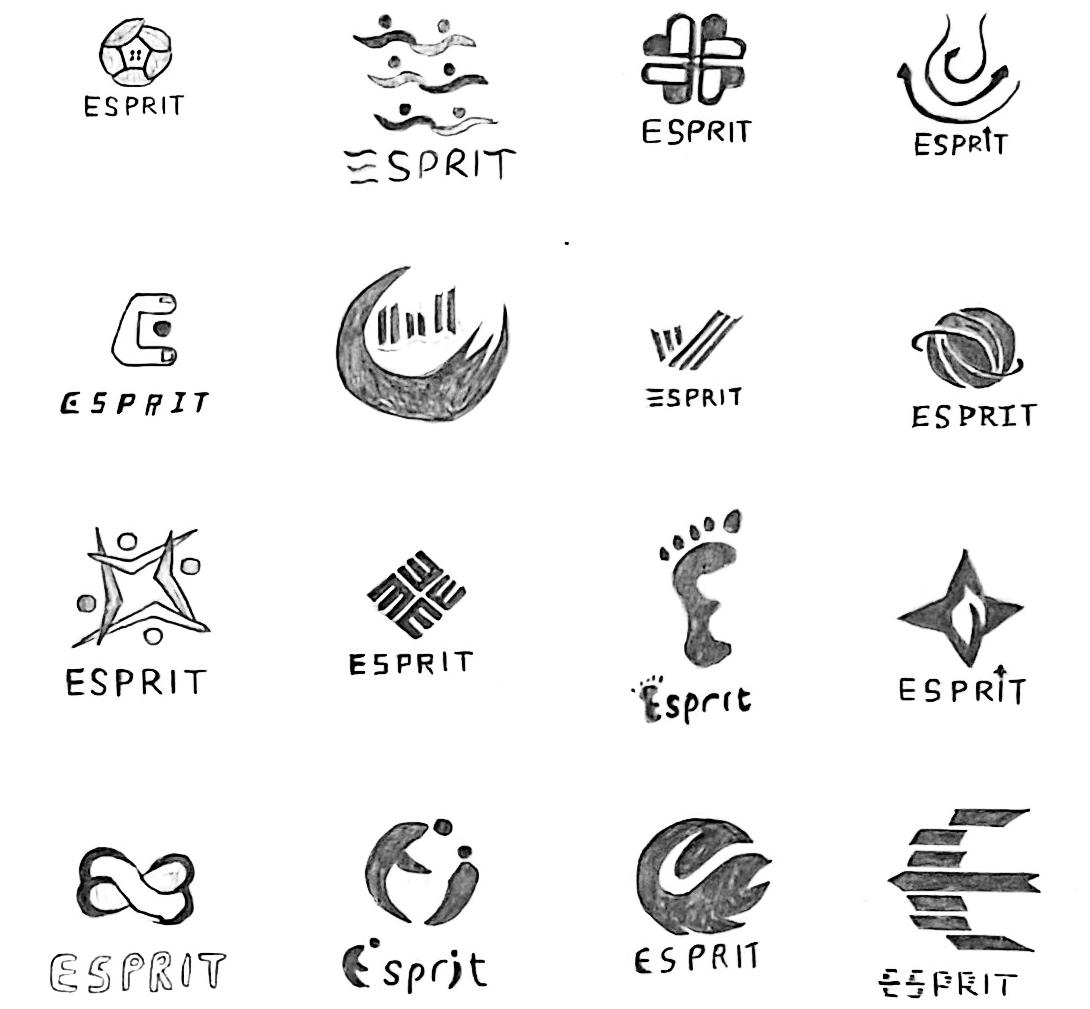
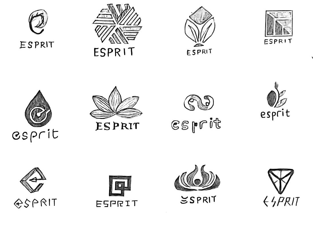
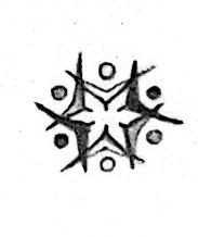
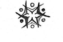
The following explores some of the symbolic and graphic elements related to responsibility that can release a force for good and encourage people to actively fulfill their social responsibilities. 1
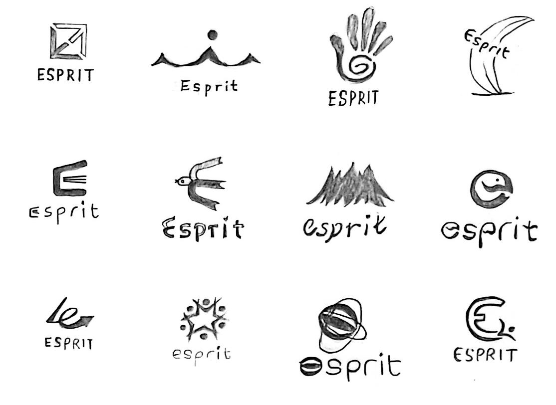
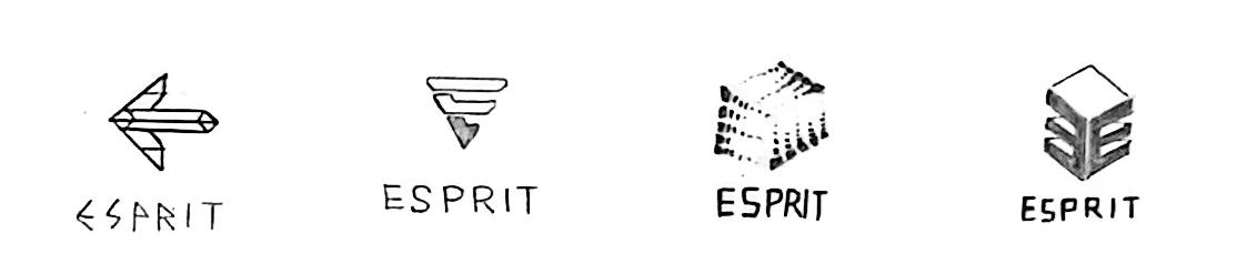
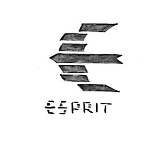
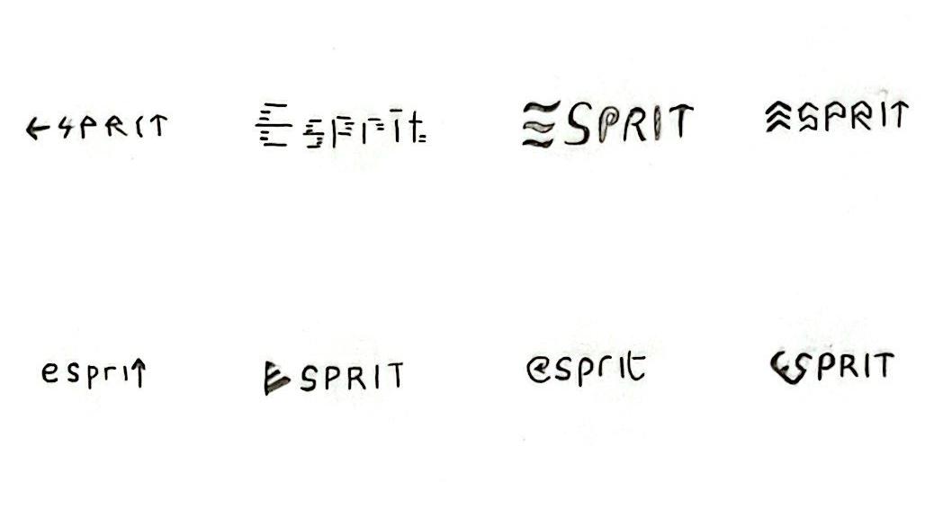
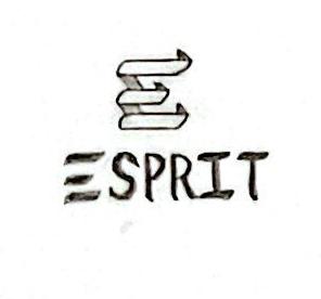
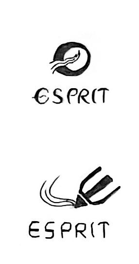
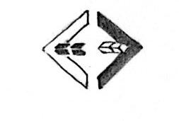
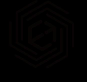
1. Use arrows to allude to the brand initials "E".
2. The letter "E" displayed on each side.
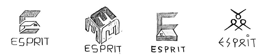
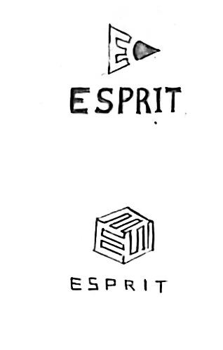
3. Waving flag showing letter "E" using negative space.
4. Brings people together, the brand name in the middle.
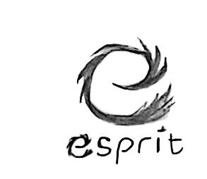
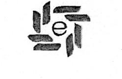
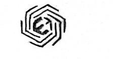
5. Interlock to form the letter "E". 3
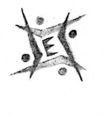
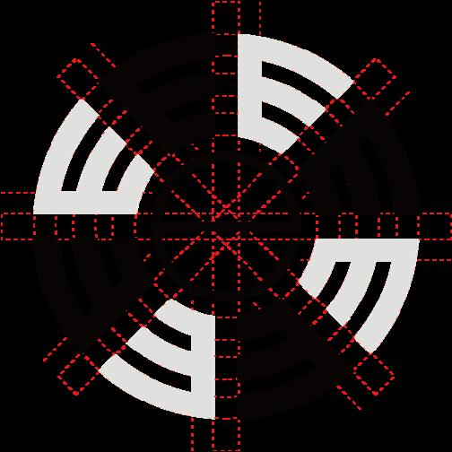
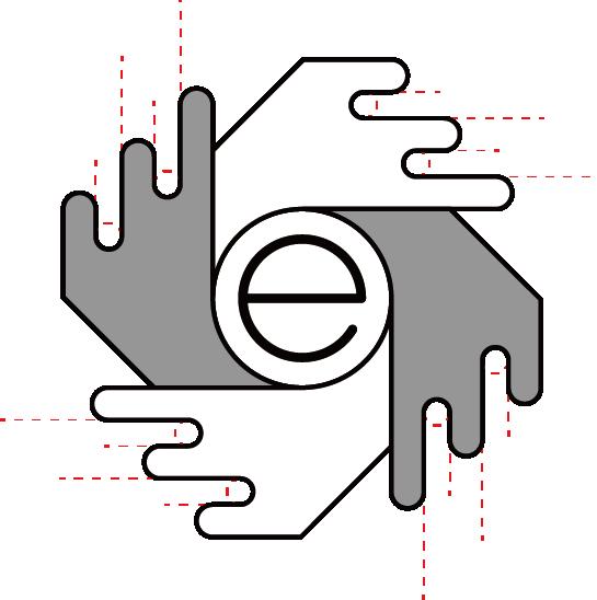
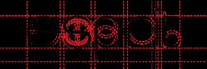
key phrase 01
Responsible | To be a force for good
The following explores some of the symbolic and graphic elements related to responsibility that can release a force for good and encourage people to actively fulfill their social responsibilities.
6. Holding hands to form the letter "E".
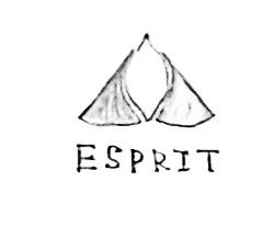
7. Use natural elements to form an upward facing letter "E".
8. Take advantage of turbo and fire effects.
9. Use multiple graphics to form arrows and form the letter "E".
10. The letters "E" and "S" form a heart.
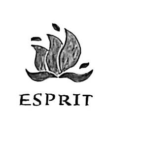
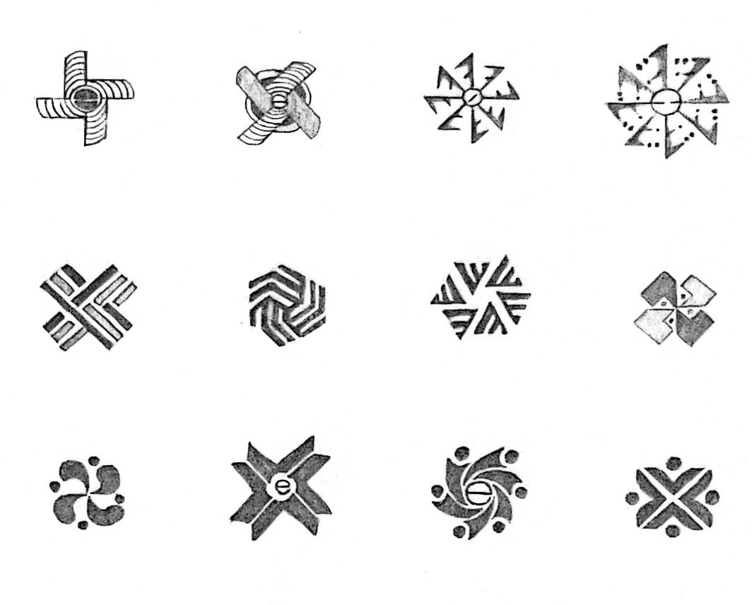
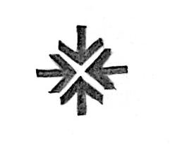
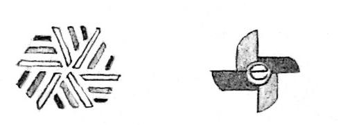
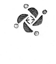
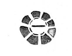
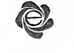
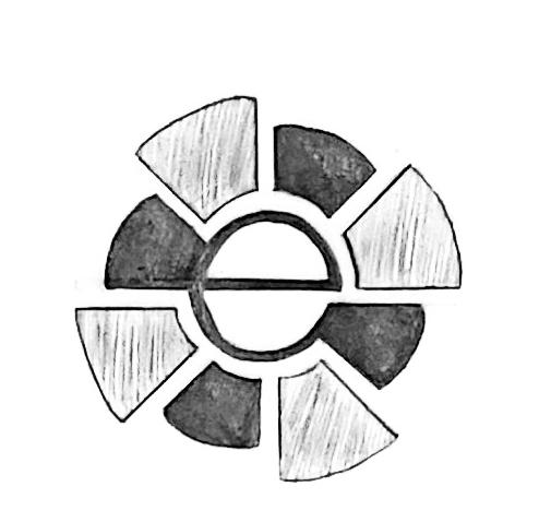
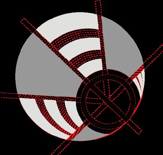
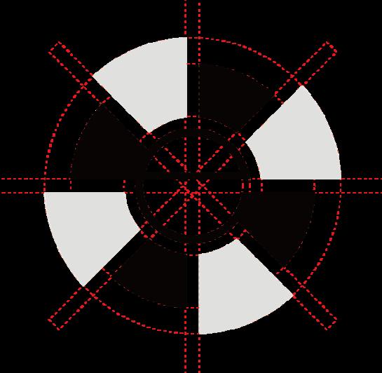
The following explores some of the symbolic and graphic elements associated with sustainability that give a sense of visual balance to show that the brand is focused on promoting a sustainable future.
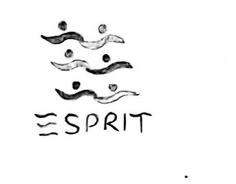
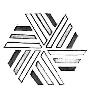
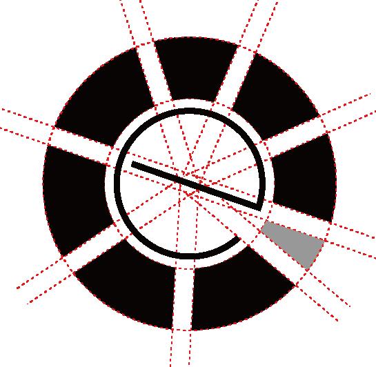
1. Use the shape of the wind wheel to form a visual balance.
2. The shape of the leave alludes to sustainable.
3. Two slanted letters "e" joined together.
4. Dashed lines represent sustainable.
5. The recyclable logo evolved into the 3D letter "E".
6-7. Use the centerline of the letter "e".
8. The ring element alludes to a recyclable and sustainable future.
The following explores some of the symbolic and graphic elements associated with sustainability that give a sense of visual balance to show that the brand is focused on promoting a sustainable future.
9. Use the letter "S" for visual balance.

10. Balance with parallel lines.
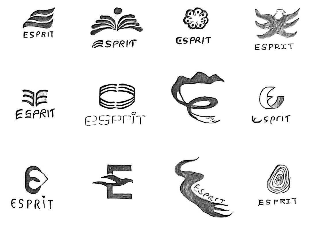
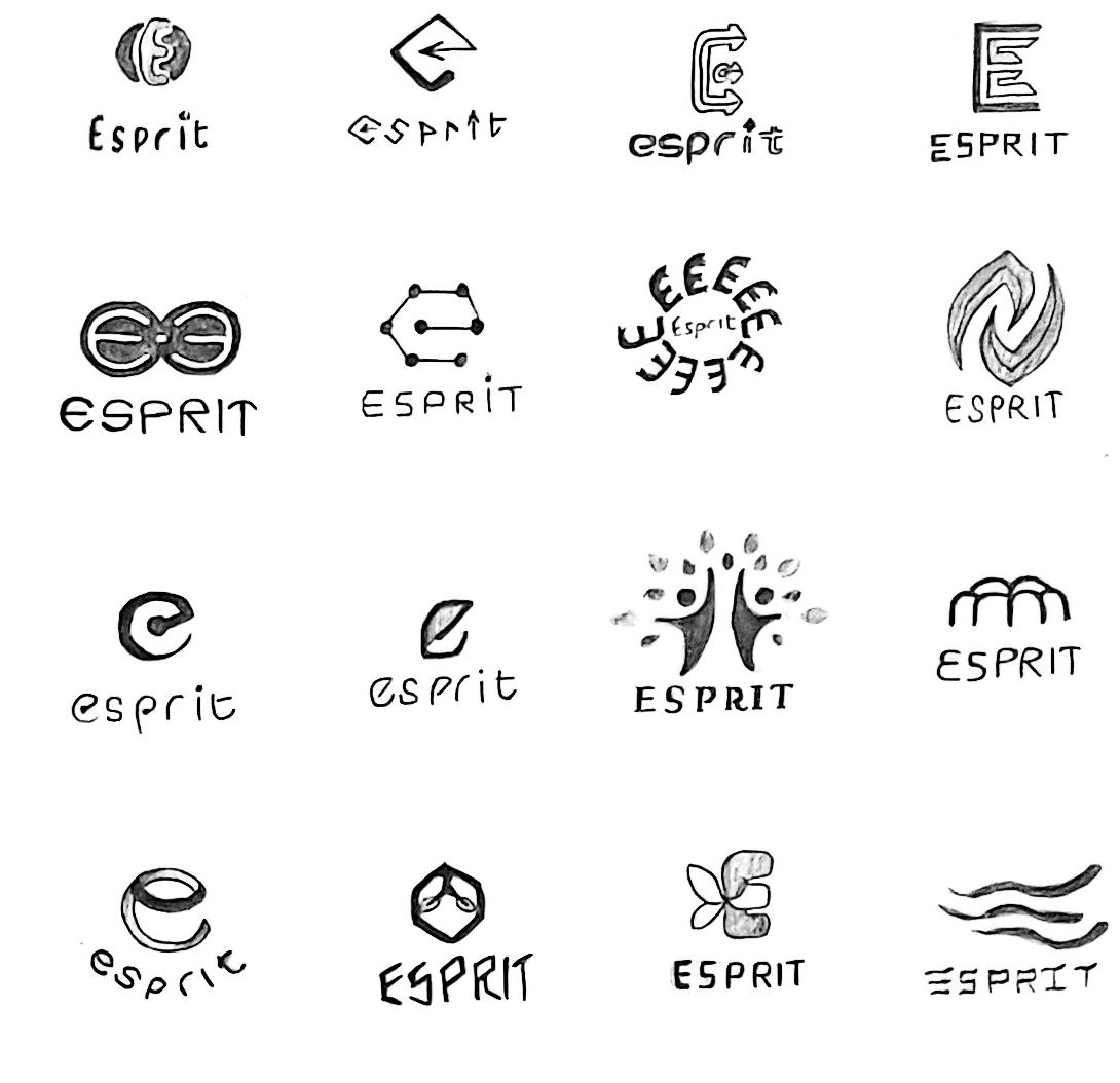
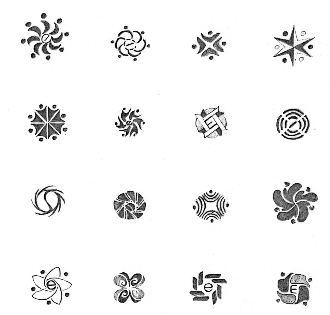
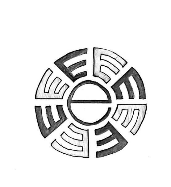
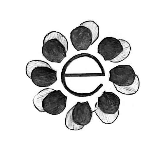
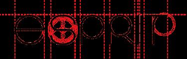
key phrase 03
Expressive | Inspire conscious creativity
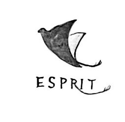
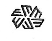
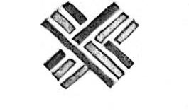
The following explores some of the symbolic and graphic elements related to self-expression that bring out a strong energy with some vivid shapes and silhouettes to encourage people to express themselves creatively.
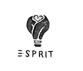
1. The light bulb element lights up the idea.
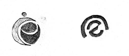
2. Incorporate the letter "e" into an eye shape.
3. Create the letter "e" with dynamic elements.
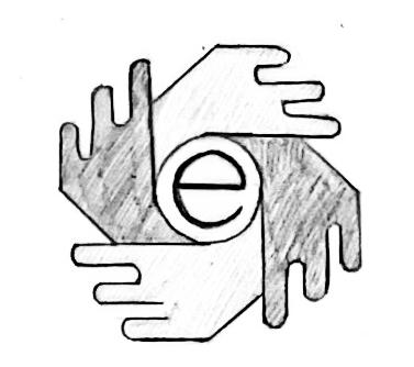
4. Use the elements of hands to create sparks.
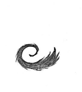
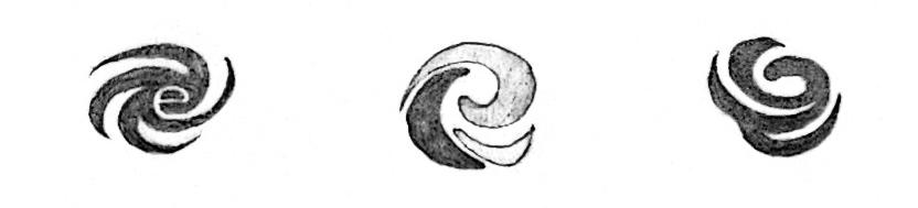
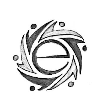
5. Use the concept of fire and burning. 2
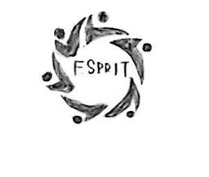
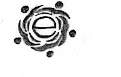
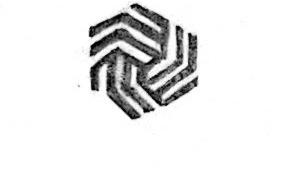
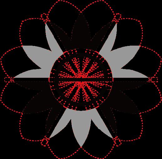
Expressive | Inspire conscious creativity
The following explores some of the symbolic and graphic elements related to self-expression that bring out a strong energy with some vivid shapes and silhouettes to encourage people to express themselves creatively.
6. Create the letter "E" with dynamic elements.
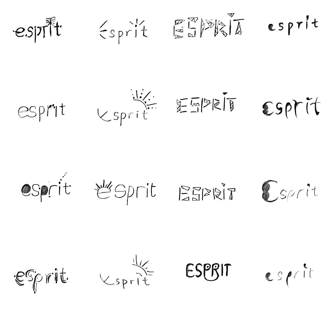
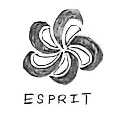
7-8. Use the shapes of flowers, pinwheels, flames and fiery shapes.
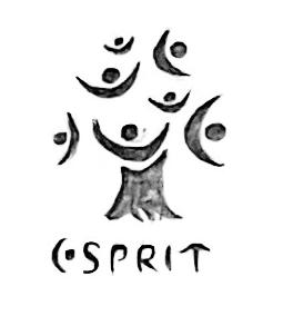
9. The interaction between people and brands.
10. Two hands hug the letter "E". 9 10
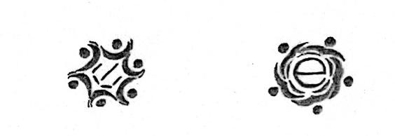
key phrase 01
Responsible | To be a force for good
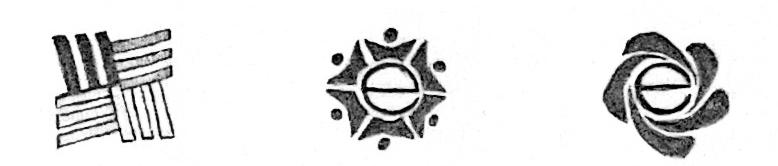
Some symbols or graphics related to arrows, community spaces, flags, tree rings, flames and hearts have potential, indicating that more solutions for incorporating the letter "e" into logos can be explored in the future.
There are elements of windmills, flowers and leaves that create a sense of visual balance related to recyclability and sustainability. Next, move on to explore some visual elements of sustainability and avoid technical styles in graphics.
key phrase 03
Expressive | Inspire conscious creativity
This camp has the most potential in terms of ideas, there are many graphic elements that can be applied, but most tend to be natural. Combine the good aspects of the first two camps and continue to explore visual elements related to expressive and creativity.

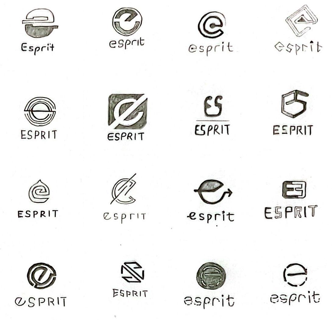
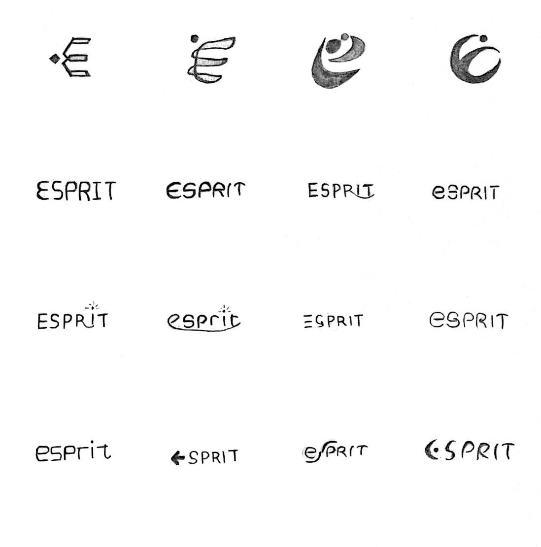
After the first round of sketches, there were many interesting solutions in both the responsible and sustainable camps, but the expressive camp seemed to have the most potential in terms of ideas. So for the second round of sketches,it was better to merge the three camps into one stronger camp and focus on expressive ideas. Next, the plan is to explore more possibilities in this area, and then show 10 of the most effective solutions in the form of digital sketches.

Expressive | Make changes with conscious creativity
By integrating the responsible "to be a force for good" and sustainable "balance giving and taking" into the expressive camp, a new phrase "make changes with conscious creativity" was generated, which stands for driving a sustainable future in a more positive and inspiring way.
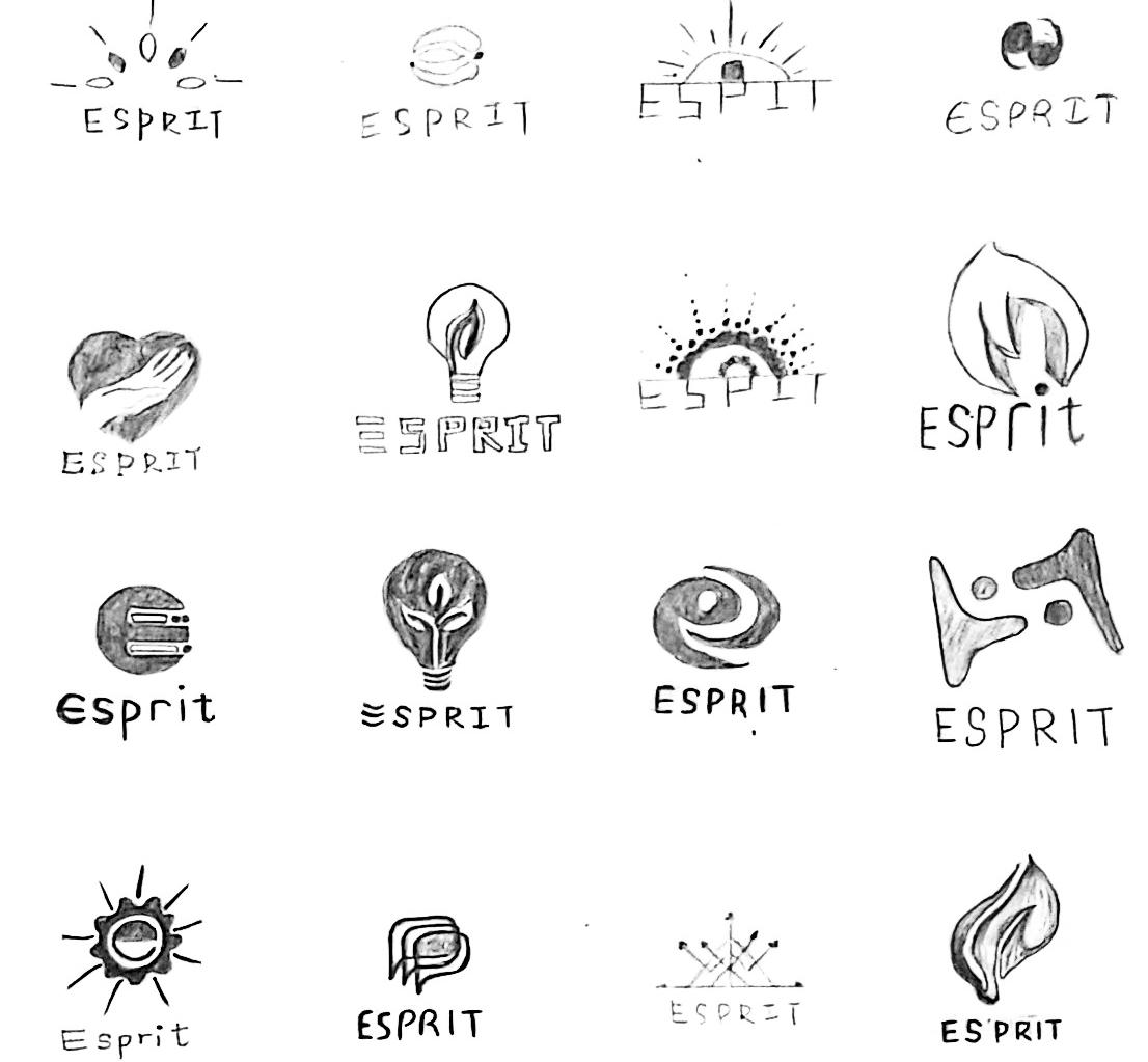
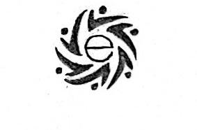
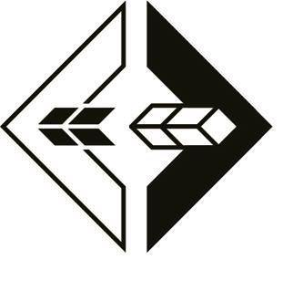
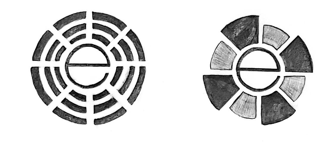
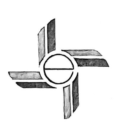
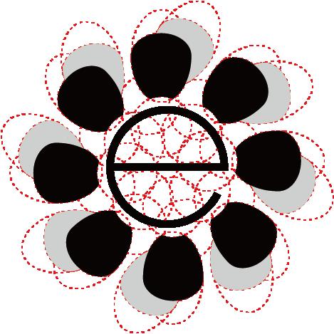
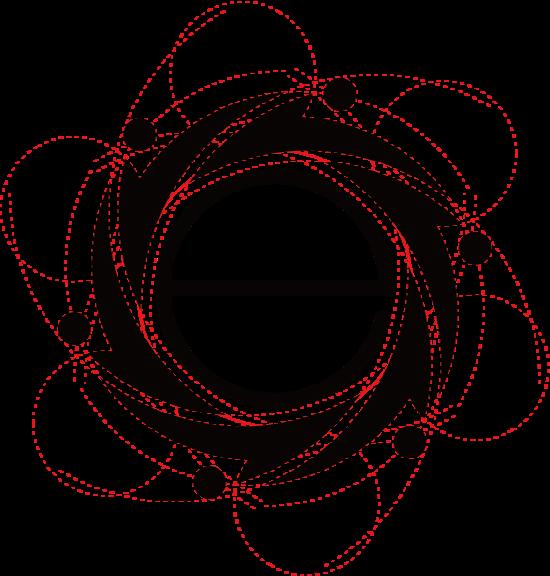
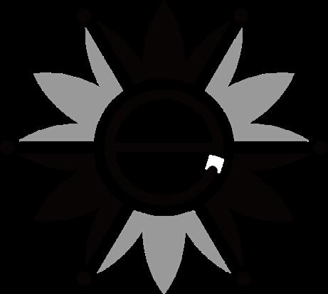
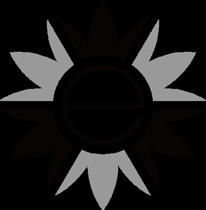
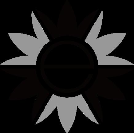
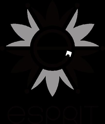
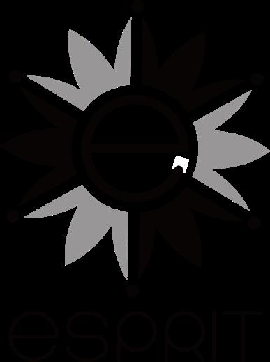
1. Utilizing elements of the sun and flowers, the right part signifies making a difference.
2. The windmill alludes to a change.
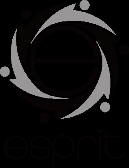
3-5. Bring people together with the letter "e" in the center.
6-7. Use linear elements to represent bringing people together.
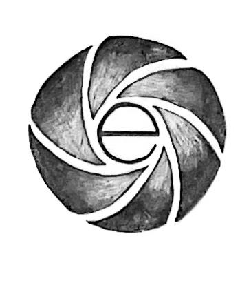
8. Using circular elements like flowers, the letter "e" in the center. 3 4
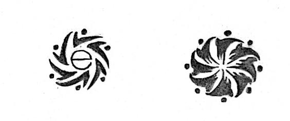
By integrating the responsible "to be a force for good" and sustainable "balance giving and taking" into the expressive camp, a new phrase "make changes with conscious creativity" was generated, which stands for driving a sustainable future in a more positive and inspiring way.
9. A combination of the letter "E" and an arrow to bring people together and make a difference.
10. Use arrow elements to guide people to make changes.
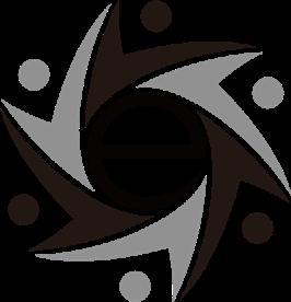
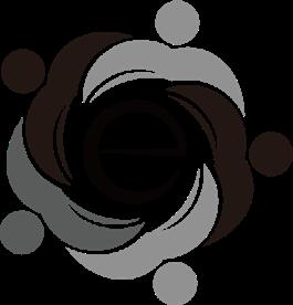
Expressive | Make changes with conscious creativity
According to the second round of sketches, there are symbols or graphics about the letter "e" that can be cleverly aimed at the new key phrase, and these 10 logos are the most potential in this round.
key phrase
Expressive | Make changes with conscious creativity
The second round focused on adding the brand's initial "e" to most of the sketches to make the logos more recognizable by combining the upper and lower case" e" with relevant graphic elements.
+
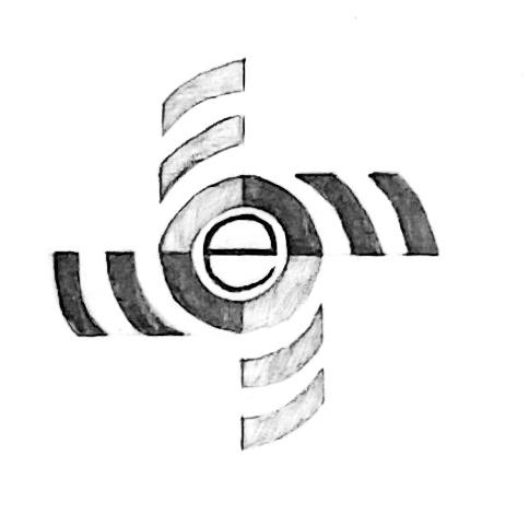
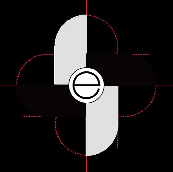
The dotted letter "e" stands for sustainable development, the graphic elements represent diversity and inclusion, and the gray block stands for making a difference.
+
+
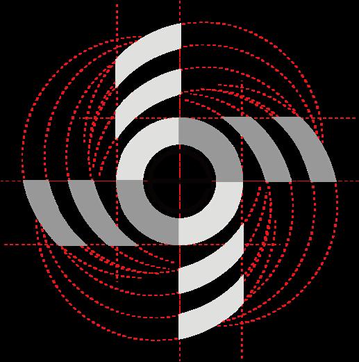
The combination of simple graphic elements into shapes resembling a flower and windmill, this creatively hints at an inclusive and diverse community, and the visual center is the brand's initial letter "e".
These graphic elements are meant to bring people together and encourage them to express themselves creatively, and different colors represent diversity and inclusion.
+ + + +
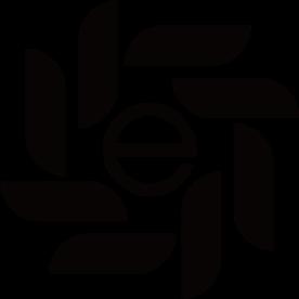
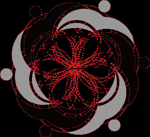
These graphic elements show how to bring people from different backgrounds together and allow the space around the letter "e" to form the shape of a flower, which creates a harmonious community.
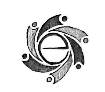
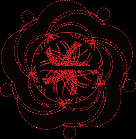
The outer layer of graphic elements shows people expressing themselves bravely, while the inner layer is like bringing together the letter "E" from different directions to form the shape of a flower.
+ +
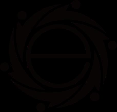
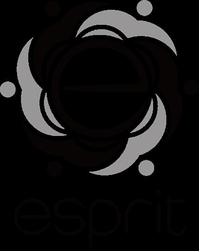
The 4 capital letters "E" are grouped together to form a three-dimensional space, all the "E"s are intertwined with each other, which represents bringing people together.
Combining some simple linear elements intertwined like paper clips, creatively shows the capital letter "E", which also represents bringing people together.
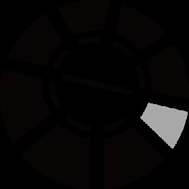
The visual center is a combination of the letter "E" and an arrow, and use a certain weight to highlight them, the outer circle is also the letter "E".

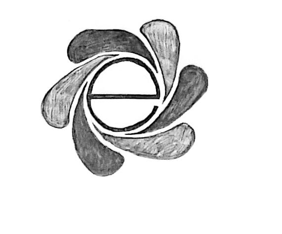
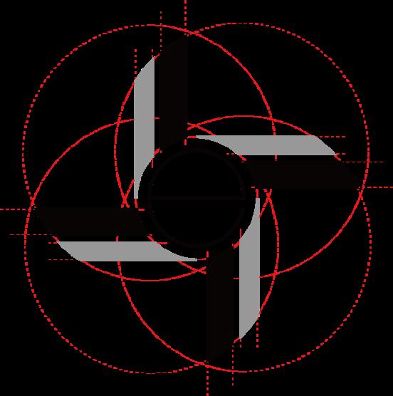
The whole is the shape of a flower, and each petal interwoven together may also be seen as a recyclable and sustainable figure or a harmonious community.
Use two arrows (left and right) similar to the letter "E" to form a balanced figure, and use colors to create a contrast, the visual center is two horizontal 3D "E".


Visual research is crucial to building and developing a brand's visual system. Researching the visual standards guides of other brands can helps Esprit create clear and specific standards to define its visual system. This section will research and analyze some of the best-inclass visual standards guides and find logos in any area that have similarities to the one we are developing, lay the foundation for Esprit's visual standards and avoid being too similar to existing designs.
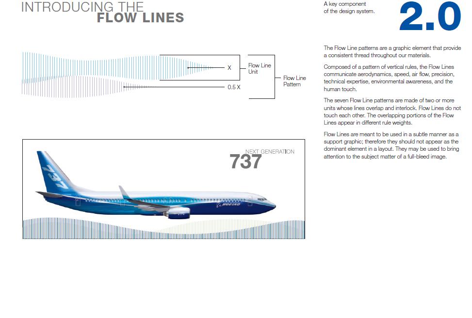
Boeing highlights the flow line patterns in its introduction and explains in detail how the graphic element reflects its brand soul and evokes its brand personality. The introduction guides the audience to associate the graphic element with the relevant technology, experience, and
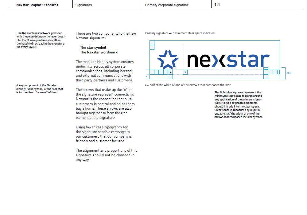
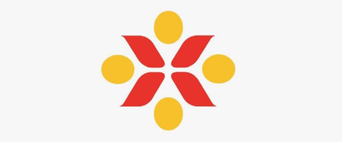
The anatomy of the Nexstar logo is very detailed. First, the new Nexstar consists of the star symbol and the wordmark, where the star symbol is formed from “arrows” of the x, which represents the connectivity in the soul. Second, Nexstar visualizes the scale between the symbol and the wordmark in the form of a diagram, and the minimum clear space required around the entire logo.
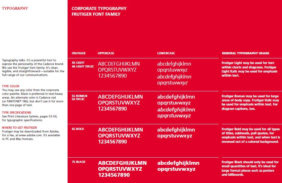
Cadence uses organized tables to present its type specs. It shows the alphabet for different typographical purposes and provides text annotations to explain the specific sizes and weights, and how the characteristics of the type match the brand.
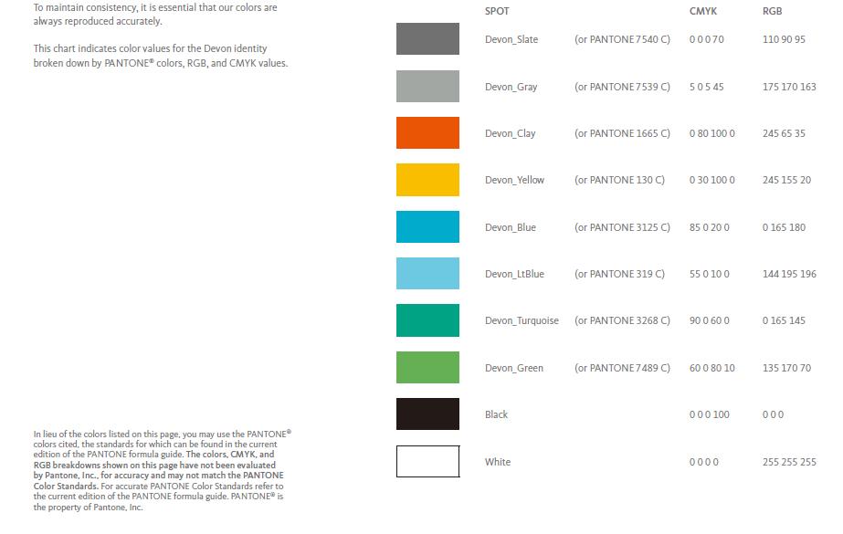
All the colors in the Devon color palette have precise color references. This chart indicates the color values of Devon identity broken down by PANTONE® colors, RGB, and CMYK values to maintain consistency and accuracy across the visual system.
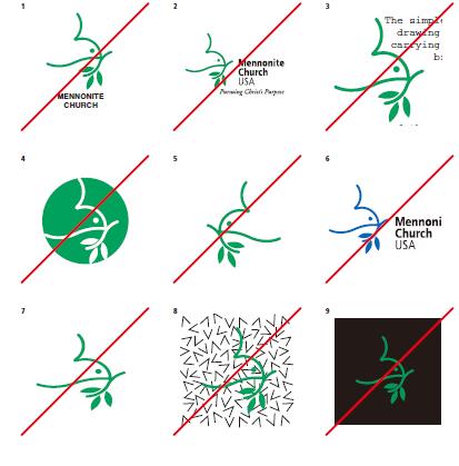
Mennonite Church provides a series of examples of incorrect or unacceptable logos and corresponding text annotations. These can help us better understand how to use the brand logo accurately and realize the importance of creating and maintaining the visual identity.
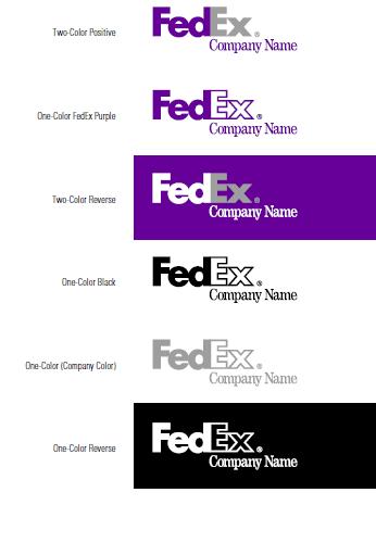
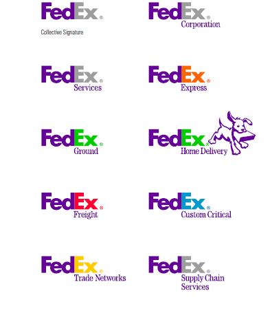
FedEx’s alternative versions are displayed with one-color, full-color, and reverse signatures. It uses different colors to fill in the "Ex" section to help us better identify and differentiate the different services offered by the brand.
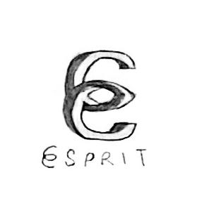
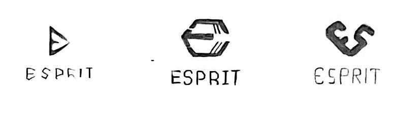
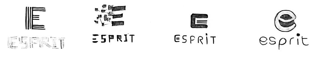
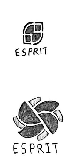
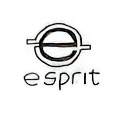
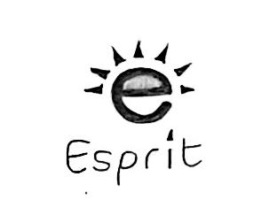
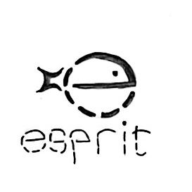
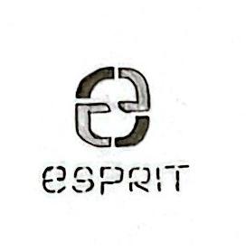
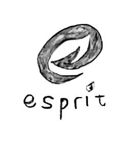
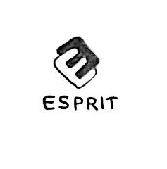
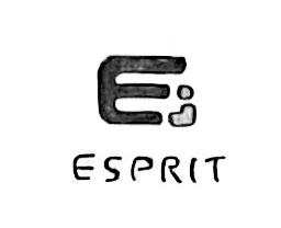
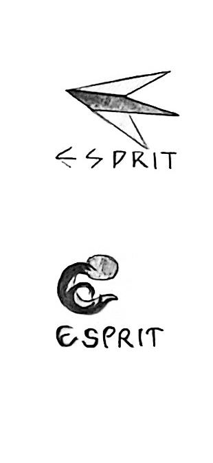
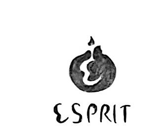
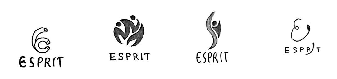
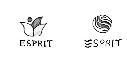
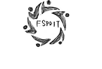
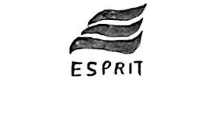
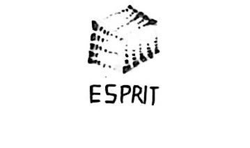
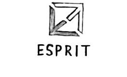
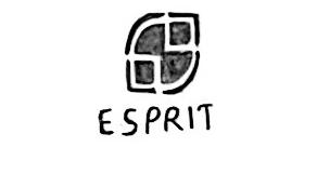
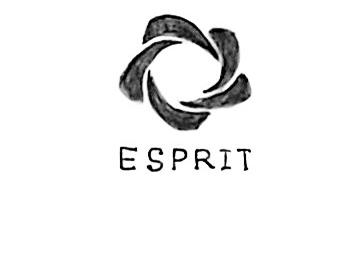
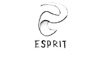
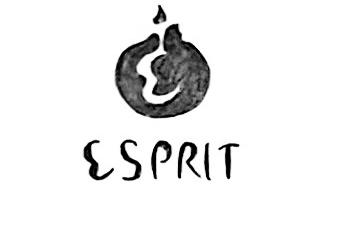
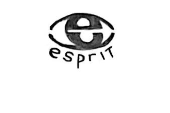
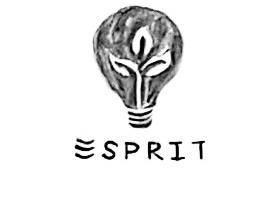
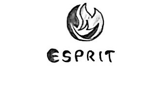
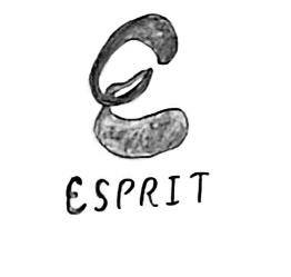
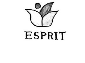
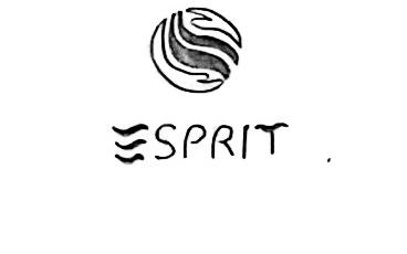
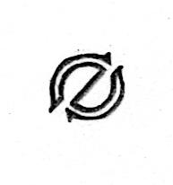
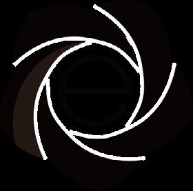
The logos all contain a lowercase "e", they all somehow change the shape of the letter "e" or incorporate the letter "e" into the design, which bears some resemblance to the new logo Esprit is developing.
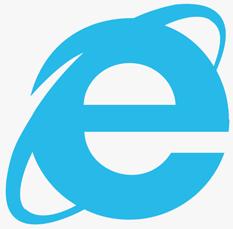
Internet Explorer is by far the longest lasting browser it does. The logo consists of a bold, bright lowercase blue letter "e" and a slightly slanted circle, this circle represents the "Internet".
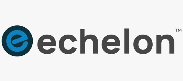
Echelon is a fitness company. The logo contains a lowercase letter "e" and the overall color scheme matches the wide range of innovative smart fitness equipment and classes it offers.
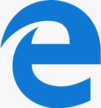
Microsoft Edge is the best browser for Windows. The logo contains a lowercase letter "e" and the broken part at the top left looks like a wave, similar to the Internet Explorer logo.
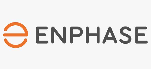
Enphase is a global energy technology company. The lowercase letter "e" is composed of 2 symmetrical linear elements, the left side of the entire logo is not completely closed, which represents a sustainable future.
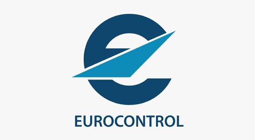
Eurocontrol is an air navigation organization. The logo consists of a lowercase letter "e" and graphic similar to an aircraft wing, which symbolizes its technical expertise in aviation.
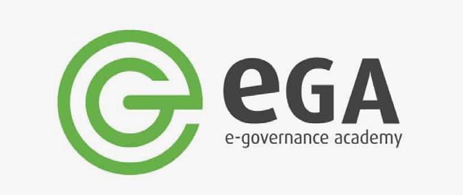
e-governance academy E-Governance Academy is the non-profit foundation dedicated to digital transformation. The lowercase letter "e" is made up of two linear elements and looks more like a combination of the letters" e" and "G".
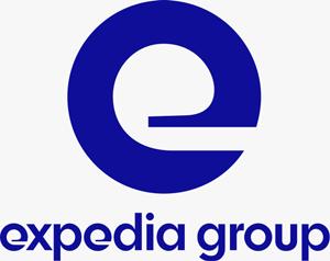
Expedia Group is a global travel company. The inside of the “e” is thinner, and the outside is thicker, the fluidity matched with the sharp lines, which remind people of travel and flying.
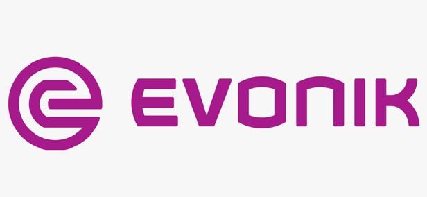
Evonik is one of the largest specialty chemicals companies in the world. The logo is an abstract circular image with the letter "e" that looks contemporary and balanced, symbolizing creativity and mystery.
Ergotron is a global manufacturer of mobility products and digital display mounting. The lower case "e" in the logo is not completely closed, which means it is removing constraints on how people work with technology.
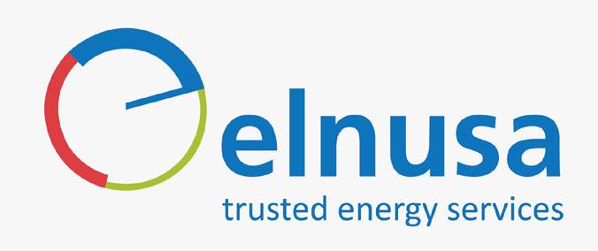
PT Elnusa is an energy service company. The lowercase letter "e" is composed of several linear elements, which is in line with its basic idea of circular energy.
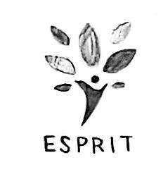
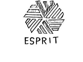
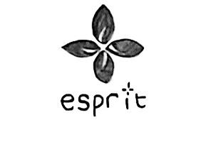
These logos are in the shape of sunshine/flower/windmill, they somehow adjust these specific shapes to fit the brand, which bears some resemblance to the new logo Esprit is developing.
walmart
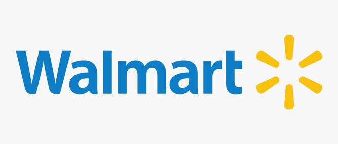
Walmart is an American multinational retail company. There is a sunlight-like design element in the logo, which symbolizes an expressive connection to Sam Walton's original spark of inspiration and innovation.
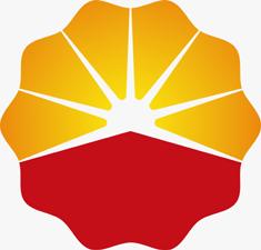
PetroChina is a Chinese oil and gas company. The logo shows a rising sun and the overall color scheme uses the colors of the national flag of the Republic of China, evoking a sense of energy and strength.
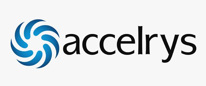
Accelrys is an American software design company, the entire logo is a flower shape, it is composed of multiple curved graphics, which reflects its capability to provide clients in a collaborative manner.
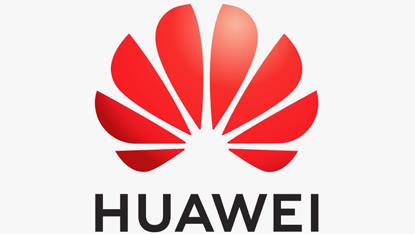
Huawei is a company that provides communication and information technology. The logo hints at the meaning of one of the hieroglyphs forming the word “Huawei” in Chinese – it means “flower.”
Carlson Rezidor is one of the largest hotel groups in the world. The entire logo is in the shape of a flower with a warm color scheme, which reflects the main values of hospitality.
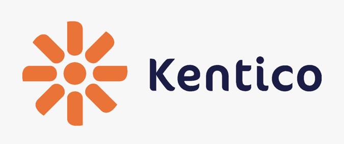
Kentico is a web content management system. The logo is a graphical representation of the flower with eight petals, which creates a sense of movement similar to a windmill, evoking a friendly and warm feeling.
core electric cooperative
CORE Electric Cooperative is a member-owned, nonprofit electric utility. The upper part of the logo looks like a rising sun, which embodies its goal of connecting lives through innovation.

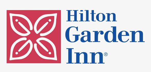
Hilton Garden Inn is an American multinational hospitality company . The logo is composed of four stylized petals placed symmetrically, and the overall shape is a flower, giving a comfortable feeling.
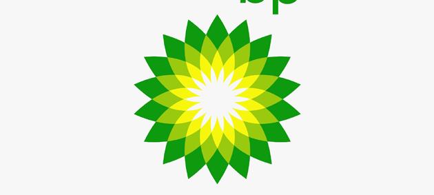
bp
BP is one of the world's largest integrated oil and gas companies. The logo consists of a "Helios" symbol, and its overall color scheme symbolizes various forms of energy, which creates a more socially responsible image.
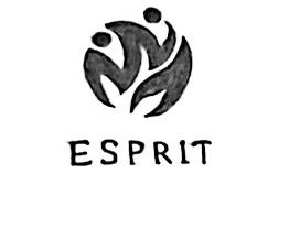
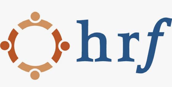
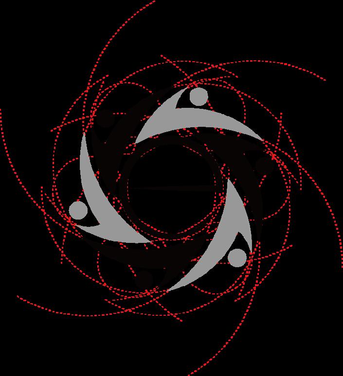
Human Rights First is the nonprofit international human rights organization. The entirelogo looks like four people hugging each other, which shows a just, secure and humane world.

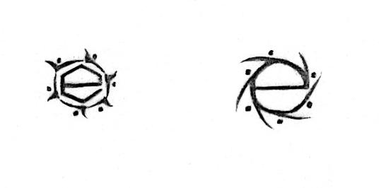
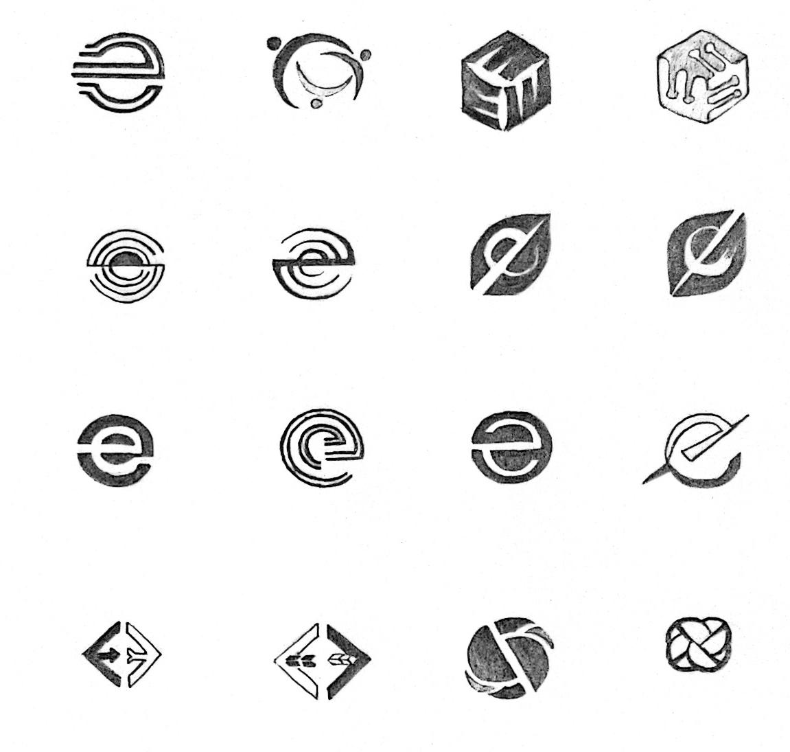
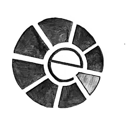
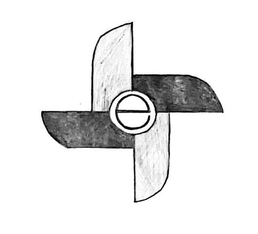
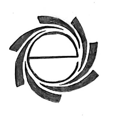
After the second round of sketches, the most promising solutions were those related to the graphic and symbolic type of the letter "e". So for the third round of sketches, the most effective solutions from the previous round for further refinement and development, and the font used by the brand name will be considered as the secondary element in the logo, and through dozens of hand sketches, digital sketches and refined comps to determine the final logo.
Expressive | Make changes with conscious creativity
By combining some of the good sides from the previous 2 rounds, this round narrowed down to the design direction centered around the letter "e" , and further refined and explored solutions on how to make the gaps between letters and graphics look more harmonious.
key phrase
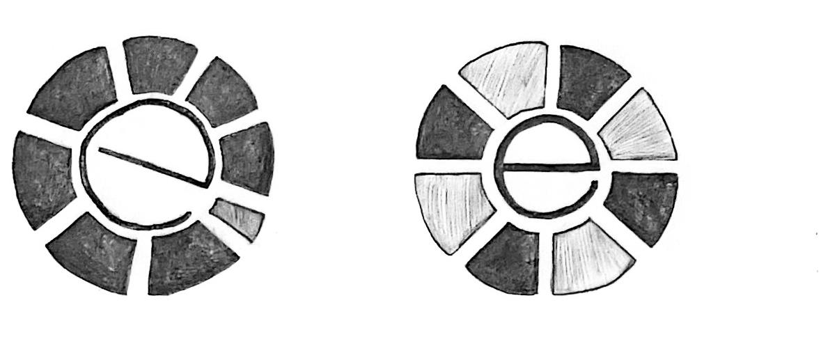
Expressive | Make changes with conscious creativity
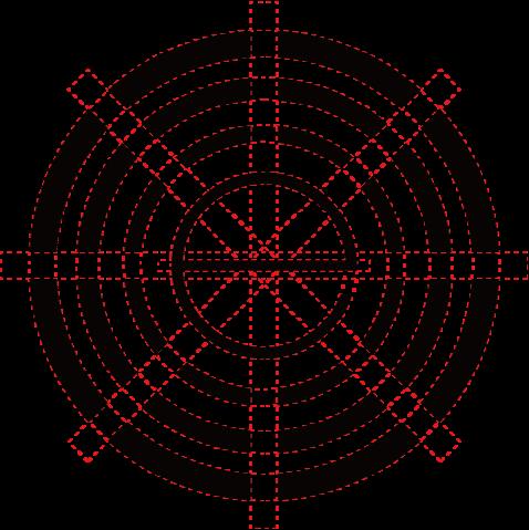
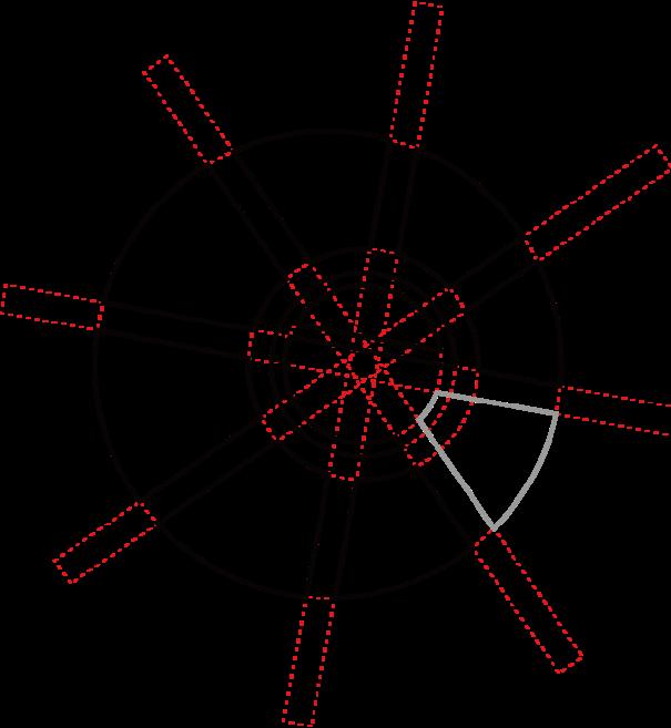
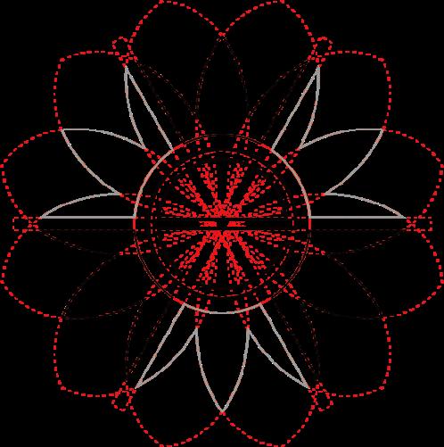
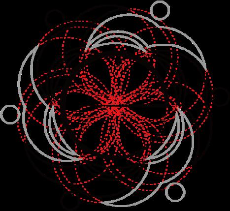
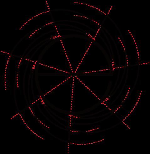
This round of digital sketches is more detailed than the previous two rounds, and auxiliary lines were added to each logo to ensure the correct scale between the letter "e" and the graphic elements.
Expressive | Make changes with conscious creativity
This round of digital sketches is more detailed than the previous two rounds, and auxiliary lines were added to each logo to ensure the correct scale between the letter "e" and the graphic elements.
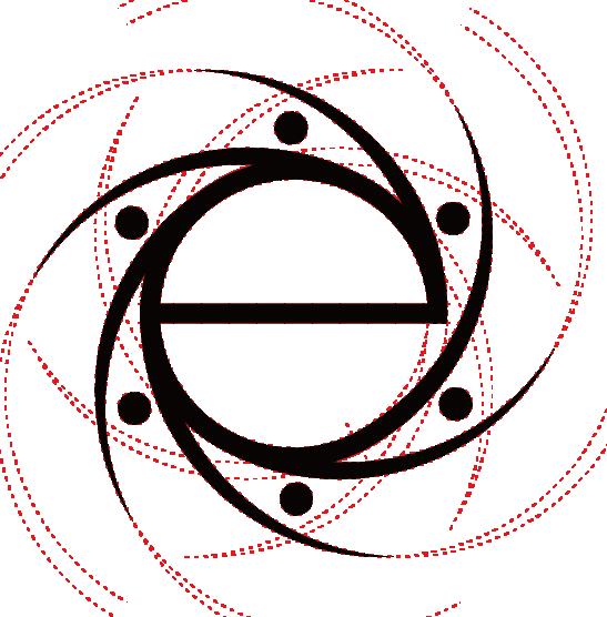
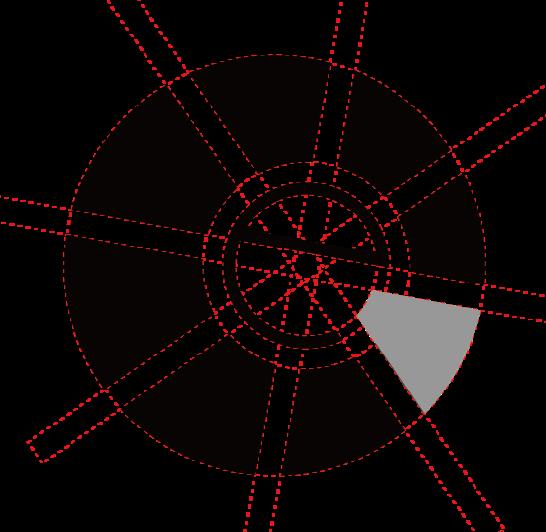
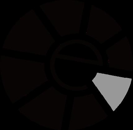
For comps 01, this step continues to refine and explore the position of the graphic element in the lower right corner of the lowercase letter "e" and try to keep the whole visually balanced.
+
The lower right opening of the lowercase "e" corresponds to the graphic element in a different color, which represents Esprit's encouragement to make a difference.
For comps 02, this step works in the opposite direction of comps 01, moving the lowercase letter "e" to the left to make the lower right graphic element larger, thus creating an unbalanced symmetry on the whole.
+
Enlarge the lower right opening of the lower case "e" to correspond to different colored graphic elements, highlighting ideas about self-expression.
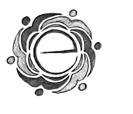
For comps 03, this step continues to refine and explore the shape of the lowercase letter "e" and the shape of the surrounding graphic elements, and try to make the whole look more rounded.
+ +
The graphic elements on the periphery form the shape of a flower, each petal resembling an energetic person, it brings people together and encourages them to express themselves creatively.
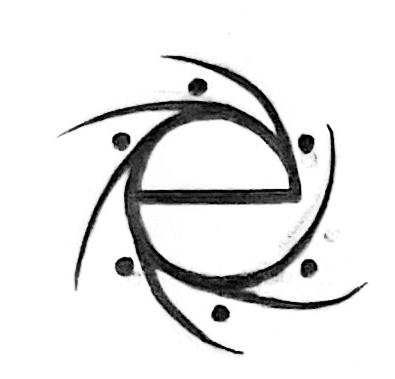
For comps 04, this step continues to refine and explore the gaps between design elements in the outer circle and compare the weights of the lowercase letter "e" to find the one that is most visually balanced.
+ +
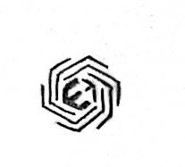
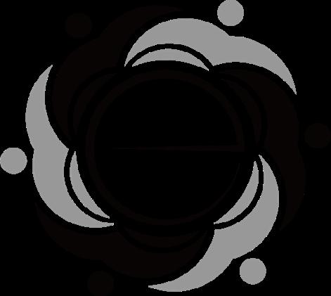
The outer circle of graphic elements can form a very rounded central space for the small letter "e", which creatively represents bringing people together.
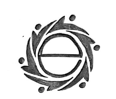
For comps 05, this step is mainly to refine and explore the shape of the lowercase "e" and the shape of the graphic elements in the outer circle, and try to make the overall look more balanced.
+ +
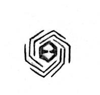
There are two layers of graphic elements on the outside of the lowercase letter "e". The middle layer of graphic elements forms the shape of a flower, which also makes the space around the" e" appear more rounded.

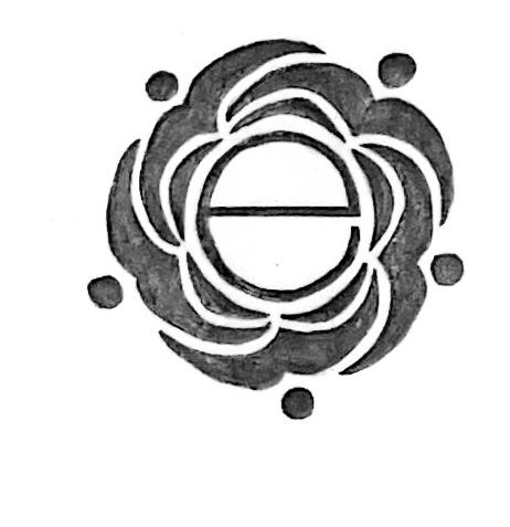
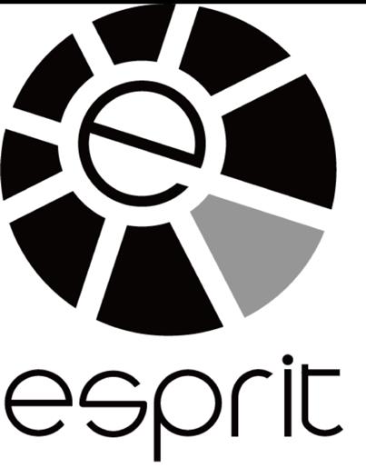
For comps 06, this step continues to refine and explore the shapes of the graphic elements surrounding the lowercase letter "e", trying to bring them closer to the "e" and form a more rounded space.
+ +
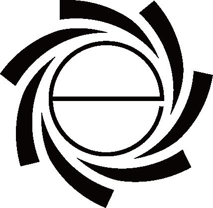
All graphic elements are next to the letter "e" and form a relatively rounded space for it, which represents Esprit's commitment to bringing people together and encouraging them to make a difference.
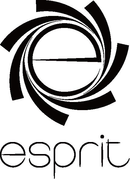
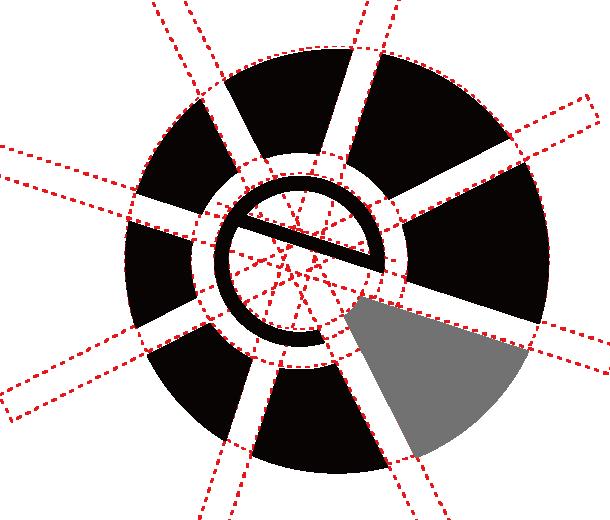
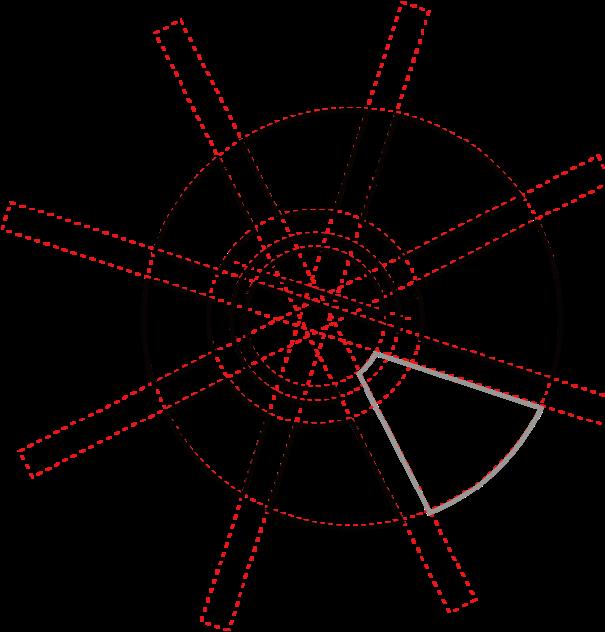
The focus of this step is to further refine comps 01 to 06, review the proportions between graphic elements and the letter "e", the gaps between elements, and adjust them according to the overall effect.


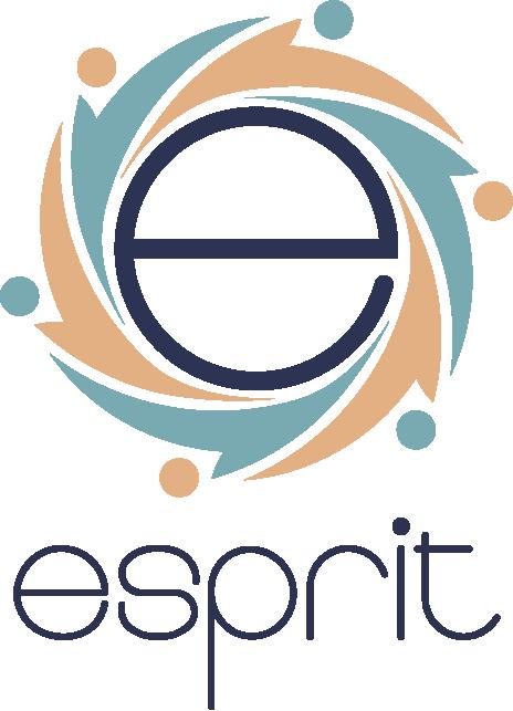
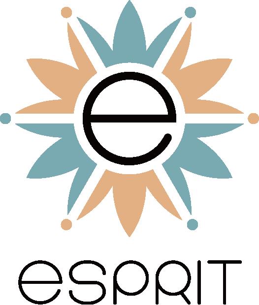
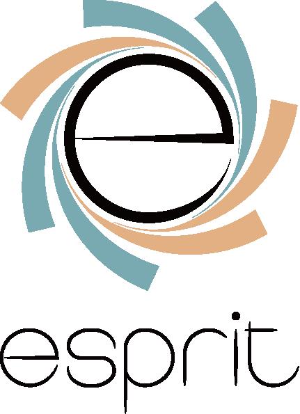
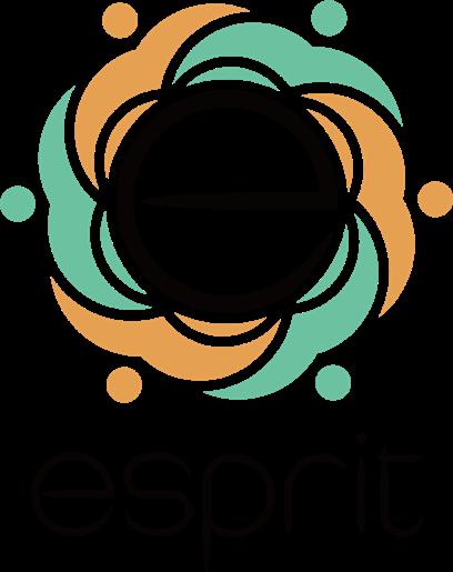
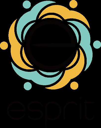
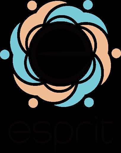
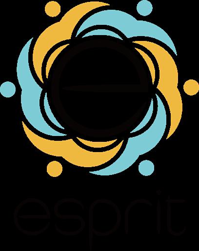
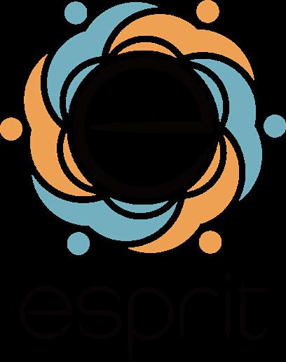
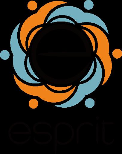
The focus of this step is to further explore the color scheme based on the final shape chosen to find one that highlights the black lowercase "e" while still being consistent with the brand image.
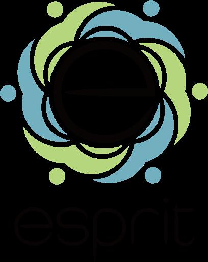

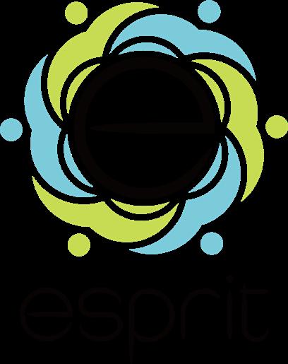
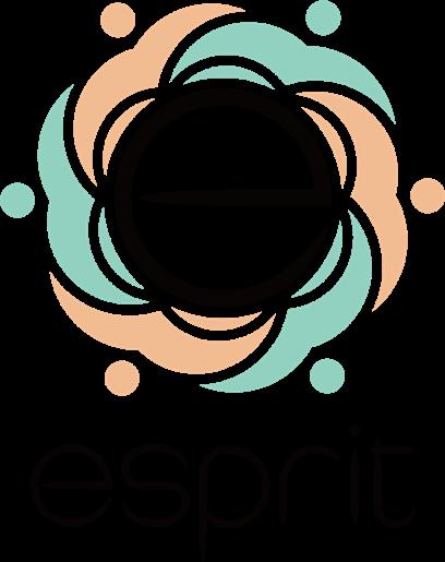
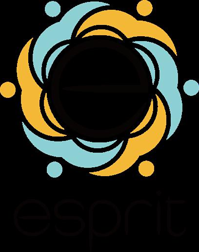
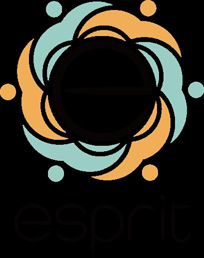
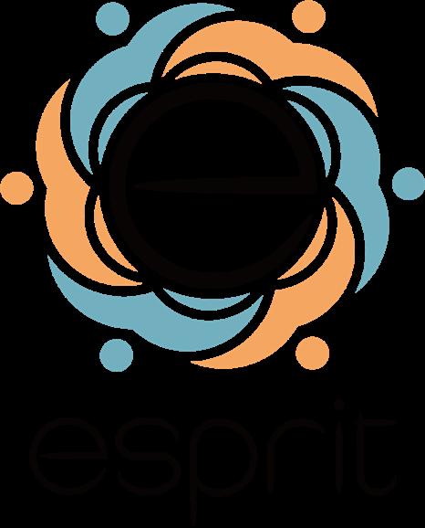
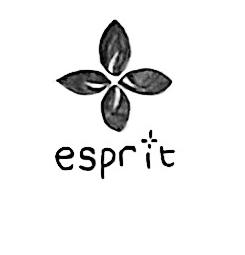
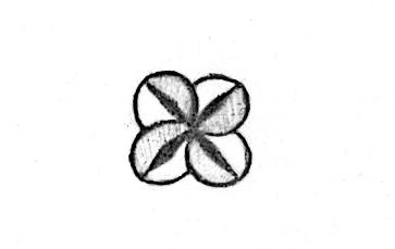
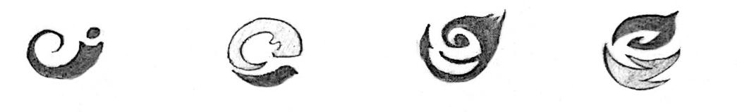
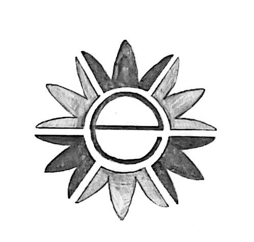
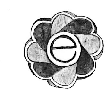
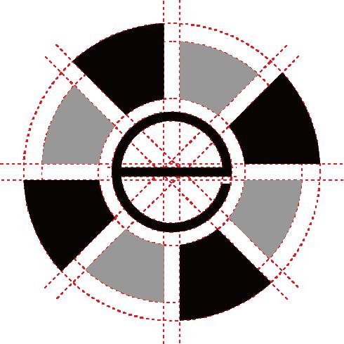
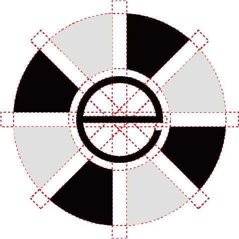
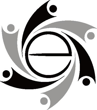
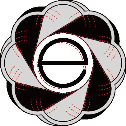
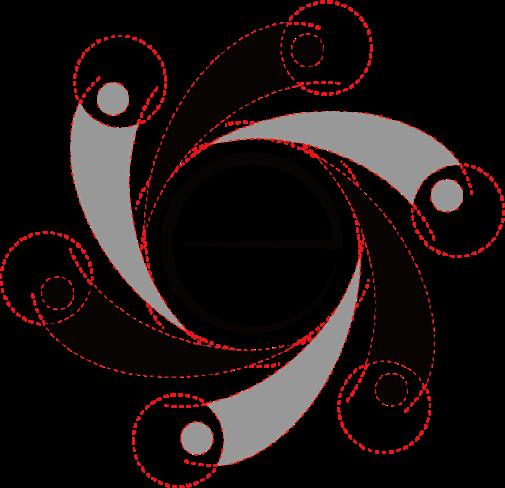
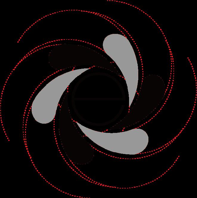
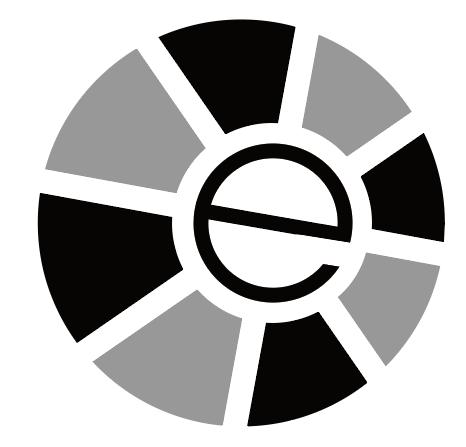
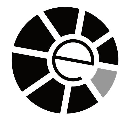
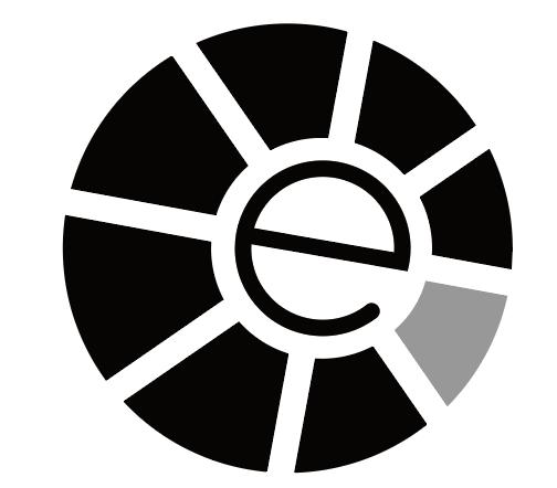
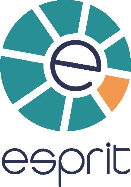
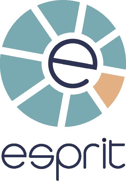
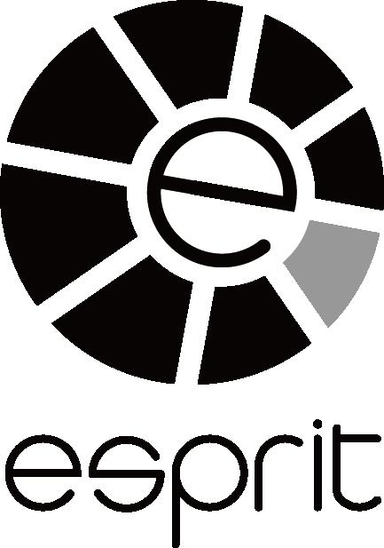
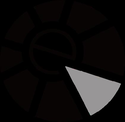
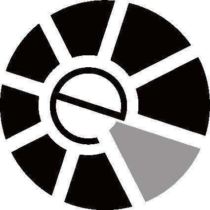
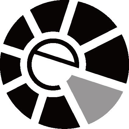
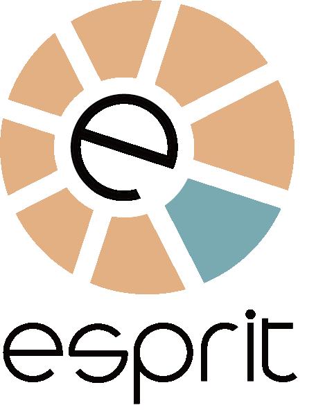
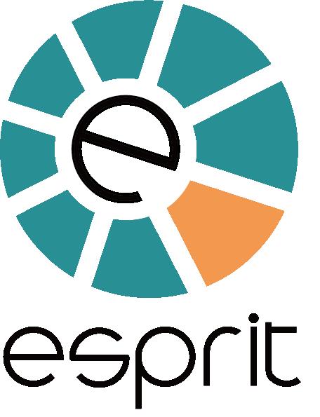
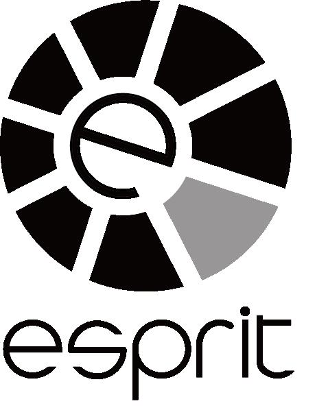
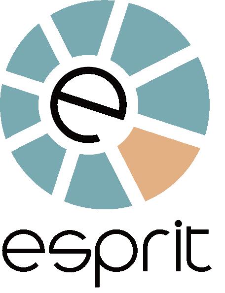
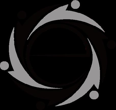
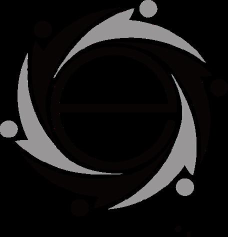
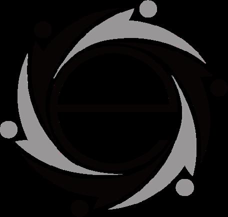
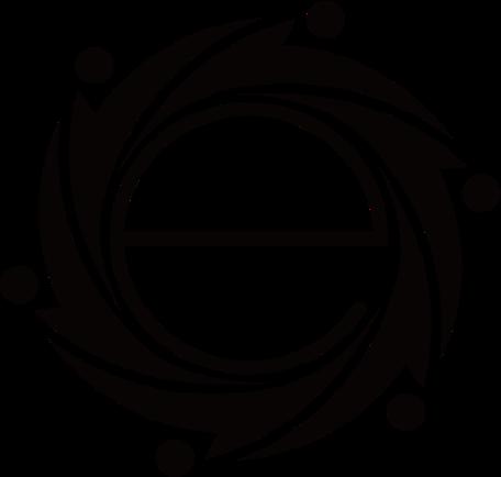
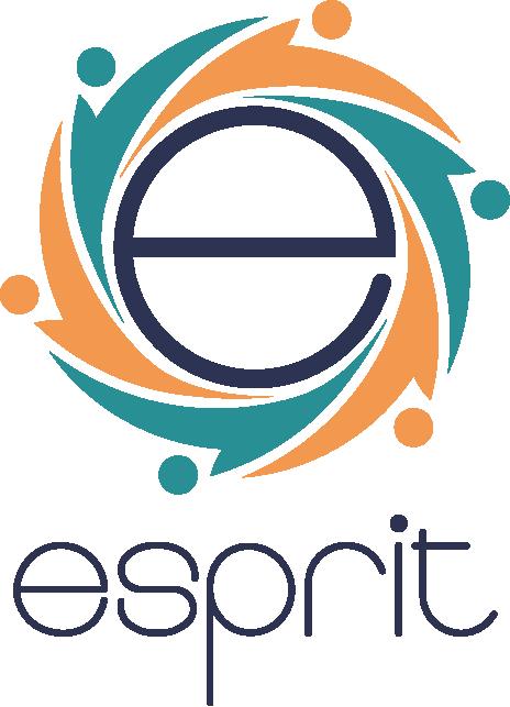
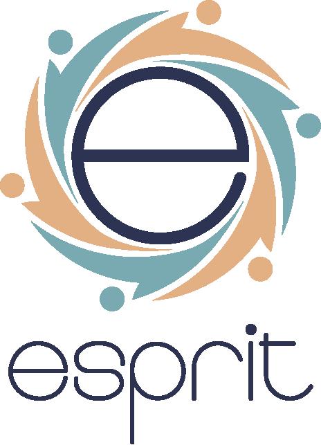
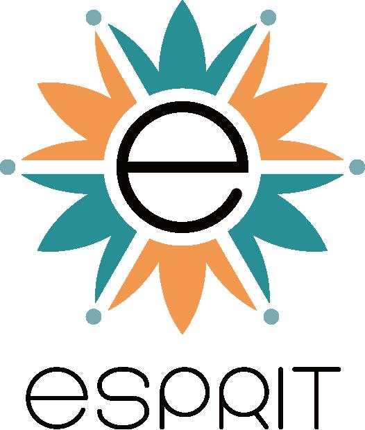
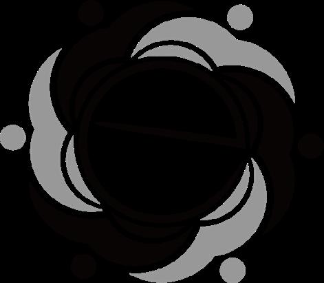
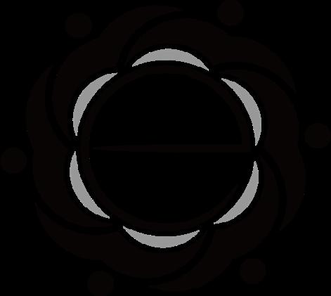
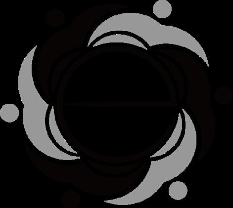
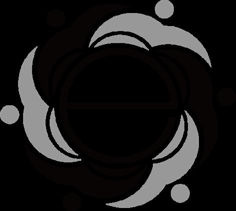
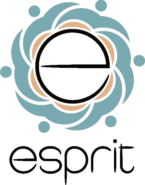
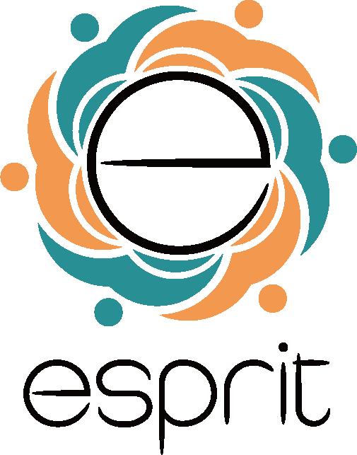
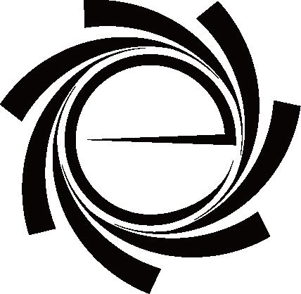
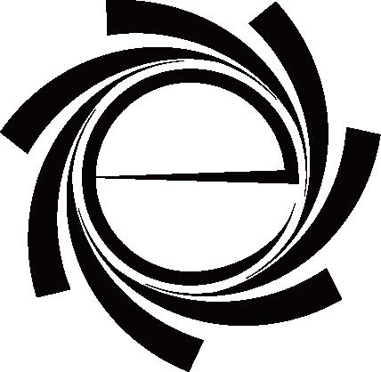
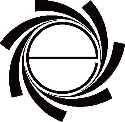
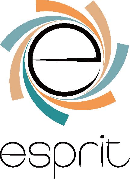
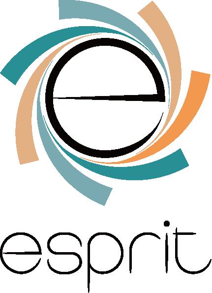
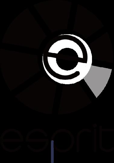
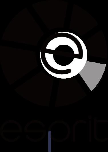
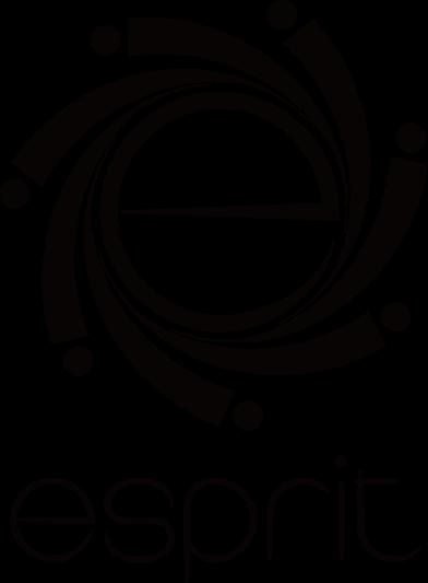
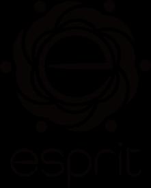
This is the final version of Esprit's new logo, which consists of a rounded lowercase "e" surrounded by 6 petals. The logo is based on the brand's key phrase: Expressive | Make changes with conscious creativity.
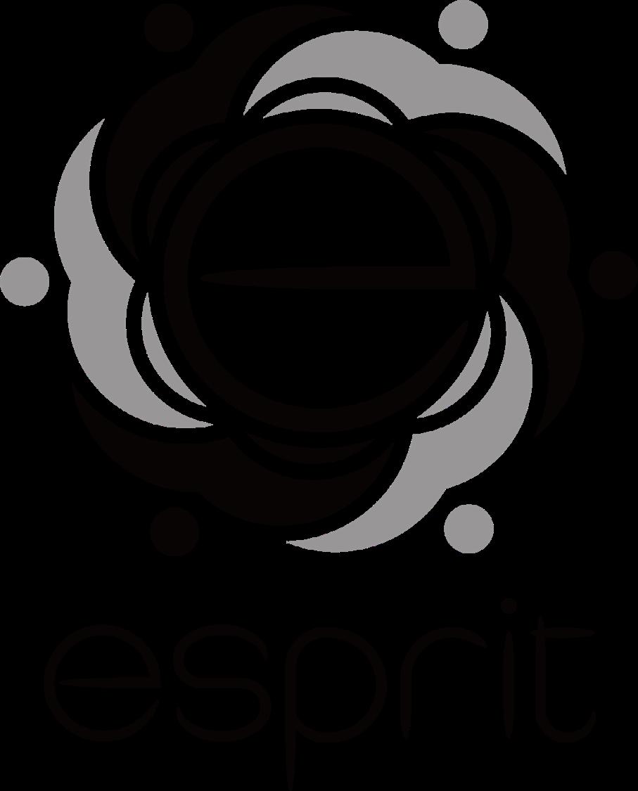
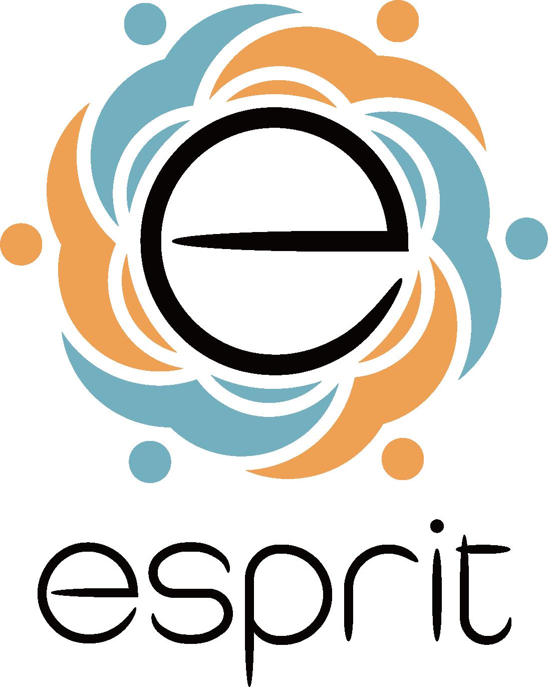
photo credit
Alamy.com Pexels.com Stock.adobe.com Esprit.us typeface info
Adobe Fonts Monotype Fonts new website
For more information, visit the new website: getinvolvedandmakeadifference.us
disclaimer
This is a non-commercial project for educational purpose and is not intended to represent or replace the original brand.