10 minute read
The Creative Corridor
The Creative Corridor
Seungbin Choi and Brian Lee
Advertisement

35 Courtyard at TBWA\Chiat\Day in Playa Del Rey, CA Benny Chan, 1998.
In creative office environments, nurturing a culture that allows for the production of new ideas plays a substantial role in a company’s success. Furthermore, a constant flow of new, good ideas is critical to a company’s successful development. This is why today’s leading tech companies have begun to pay more attention to the places in which their employees work. By facilitating interactions between employees, the office space acts as the medium through which ideas come about. This applies not only to program spaces such as meeting rooms or lounges, but also to the interstitial spaces that connect them, such as corridors. While the term “corridor” suggests certain uses or spatial qualities tied to a standard office setting, some creative offices have started to challenge these standards to augment the creative potentials that corridors can provide. Such modified types of corridors can be categorized as Creative Corridors.
The corridor is the circulation space that connects all the rooms and desks in the office. Unlike the designated program spaces, the corridor is the space through which people move for different purposes; more importantly, it gathers all different kinds of people. In this regard, the corridor can facilitate the formation of casual and informal relationships amongst people who might not otherwise have had the opportunity.
While the traditional corridor’s main function is a path that connects one end to the other, it is also a place where individuals are susceptible to distraction, where serendipitous encounters with others happen and random ideas spark.
Taking advantage of these characteristics, Creative Corridors activate circulation space by maximizing visual and physical connections with adjacent workspaces, increasing the chance for cross-disciplinary interactions between people and integrating various programs which encourage creativity and innovation. As a result, the Creative Corridor bears some characteristics such as functional inefficiency, transparency and multi-functionality. With these physical features, the (Creative) corridor is no longer there just because it needs to be: in fact it is quite the opposite. The Creative Corridor can be a driver of office design by providing a space where people run into one another, where conversations begin, and where different ideas collide. It is the heart of the informal interactions that foster and enhance opportunities to generate new ideas.
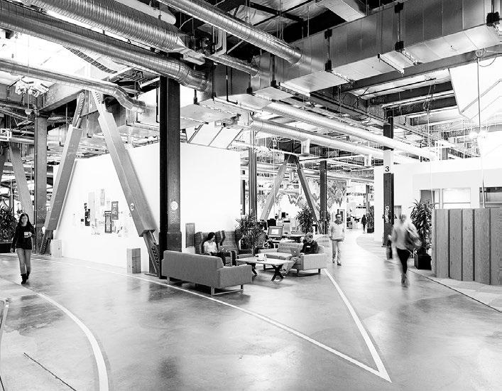
Facebook uses their corridors to engender ideas by encouraging such interactions between employees. While the development of high-rise buildings engendered the vertically-organized office layouts, Facebook expanded their office horizontally to fully utilize the advantages of the Creative Corridor. Vertical circulation via elevators gives employees a more efficient way to move through the office; however, it reduces the horizontal movement through corridors. This vertically-oriented office type was characterized by high panel cubicles, displacing employees based upon their rank within the company’s hierarchy. As a result, there was less chance of encounter between employees unless they planned the meetings. When the groups of employees are divided on a horizontal plane, they share corridors. Their circulation paths intersect and their meanderings collide. Ultimately, this slows people down, forcing them to take longer to get from one place to another. However, time spent in the in-betweens, like walking across Facebook’s campus for a meeting, means more potential for serendipitous interaction. To achieve this, Facebook employs strategies like redundant pathways, where

employees interact in both directions. The result may be inefficient, but it is a functional inefficiency that Creative Corridors deliberately create.
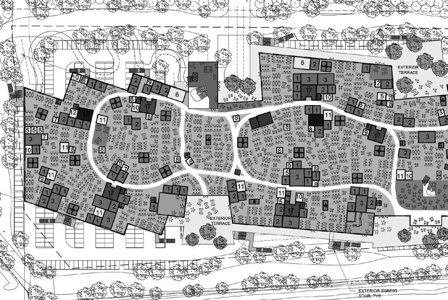
In Frank Gehry’s design for the new Facebook campus, which opened in 2015, the application of the Creative Corridor is evident throughout the office. At 430,000 sq ft, the office has the largest open floor plan in the world, large enough to hold 2,800 employees. With underground parking below and a roof garden above, the interior is one giant space – one designed to foster the free exchange of ideas. This warehouse-type space is 24 feet high, leaving room for a number of small structures within the larger space holding conference rooms, restaurants and cafes that scatter like cottages in a village. All these spaces are connected with winding corridors, creating a small urbanism inside. The social network is not just the foundational idea that runs the company but also instilled in their workplace. Gehry designed horizontal, neighborhood-like, campuses that promote movement and interaction, as opposed to isolation and hierarchy.
Plan of Facebook HQ in Menlo Park, CA Business Insider, 2013. What is conspicuous in Facebook is their proactive implementation of informal gathering spaces, supplying chalkboards and meeting pods around the corridor to facilitate collaboration. Since innovation and collaboration are critical to the company’s success, all the design components are geared toward making it easy for people to talk. If two people run into each other in a corridor and begin a conversation that requires technical discussion, idea generation, or any topic that might benefit from being written down, it is best if they can write it down in these areas. With Creative Corridors that encourage people to communicate and write down ideas, Facebook’s office is replete with informal gathering space, from large open spaces to tiny corners with whimsical furniture. The strategy of using the Creative Corridor as an informal meeting place is apparent in the company’s philosophy; the Creative Corridor in Facebook can thus be seen as an extension of the company’s demand for constant innovation, creating an ideal spatial condition to facilitate informal interactions between employees.

Traditional corridors in offices often are walled off by adjacent program spaces and offices, resulting in an introverted, doorway-lined tunnel that leads to a certain destination. This physical and visual barrier between the office space and the corridor cuts off any communication opportunities between the two spaces. Ultimately, the work produced in an individual office space will remain contained within, and neighbouring office spaces will be unaware of the chances to collaborate – even when they are working on something that is highly relevant to that work. Not all office types are suitable for this model, but in a creative office like TBWA/Chiat/Day, where collaboration within the company is critical, this introverted notion of the traditional corridor is simply against the company’s ideals. One of many offices which sought to challenge accepted notions about the traditional workplace, TBWA/Chiat/Day accordingly takes advantage of the Creative Corridor. Interior view of Facebook HQ in Menlo Park, CA PAE Engineers, 2016.

Designed by Clive Wilkinson Architects in 1997, the current headquarters of TBWA/Chiat/Day in Playa Del Rey is one of the creative offices that best showcases how the Creative Corridor exhibits and exchanges ideas.
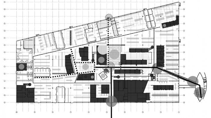
TBWA/Chiat/Day’s 120,000 sq ft building houses over 800 employees. The company is a creative advertising agency with a reputation for quirky, “disruptive” work. The project is a renovation of a large existing warehouse space with 27-foot high ceilings which consolidates the company in one space as one community. The project became known as an “Advertising City” housed within the warehouse envelope. The office is organized as a grid of free-standing structures along broad pedestrian alleyways, with different departments clustered together to form work neighborhoods. The entire complex is bound together by a network of “outdoor streets,” stairs, and elevated walkways – a network of Creative Corridor. What qualifies this network of circulation spaces as Creative Corridors is its transparency: by removing the visual barrier between the work spaces and corridors, transparency allows for the natural flow of information between the two spaces. Although the office is compartmentalized into individual

41 Plan Diagram of TBWA\Chiat\Day in Playa Del Rey, CA Spatial Affairs Bureau, 1998.

spaces, cubicles, and desks, these office spaces are still very open and transparent to promote constant and maximized sharing of creative work within the “city.” By removing the walls facing the corridors and utilizing low cubicle partitions, one can see directly into each workspace when walking along any of the “streets,” or elevated walkways.
Such openness is not only applied horizontally, but vertically. The space’s central axis is “Main Street,” which is flanked by yellow, three-story-tall, shed-like buildings. These structures house the two-person pairs that make up the company’s top advertising teams. Walking down the Main Street, one can view employees in all three levels working in their own spaces, exhibiting the ideas which they are currently working on. This transparency in the office displays employee activity, thereby additionally creating a certain level of surveillance and improving productivity.
In the traditional sense, the corridor is a space divider. Along a narrow corridor in the middle, rooms are parallel on both sides, and departments are grouped according to the corridor configuration. Because companies were formerly more focused on production, it was necessary to divide groups and departments to ensure that workers would focus on their job. Corridors were therefore considered as a default space that only divided groups of people. Departmentalizing the space makes people stay in their office, reducing the freedom to explore outside of their designated area. However, as today’s companies are increasingly concerned with creativity, the corridor needs to change its mono-functional characteristics. In the creative office environment, corridors are where people relax, exchange ideas, work in teams, or even meet with clients. Instead of dividing spaces, Creative Corridors merge departments and house multiple programs to generate more human interactions. Interior view of TBWA\Chiat\Day in Playa Del Rey, CA Benny Chan, 1998.

With architect Bohlin Cywinski Jackson, Steve Jobs, then the CEO of Pixar, designed his company’s headquarters in 1999. This two-story building provides 218,000 sq ft of space for about 700 employees. Jobs envisioned the headquarters to be a place that promoted encounters and unplanned collaborations. Given that collaboration has recently been one of the major topics in office design, and that the late 90’s office setting was filled with cubicles, his ideas were ahead of his time.
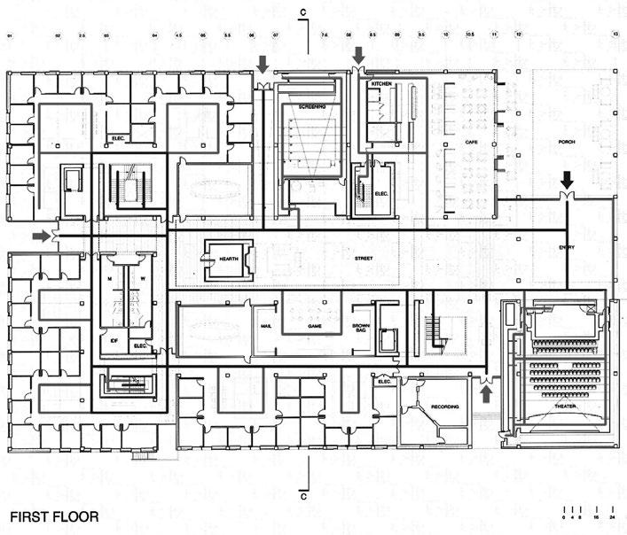
Pixar’s campus design originally separated different employee disciplines into different buildings: one for computer scientists, another for animators, and a third building for maintenance. Jobs recognized that separating these groups, each with their own cultures and approaches to problem-solving, discouraged them from sharing ideas and solutions. Because Jobs was interested in unplanned collaborations in the office, he envisioned a campus where these encounters could take place; the design therefore included a great atrium space that acts as a central hub for the campus. Jobs believed that if a building doesn’t encourage collaboration, the workers will lose a lot of the innovation and creativity that is sparked by serendipity. Accordingly, the focus of the building’s design was to make people get out of their offices and mingle in the central atrium with people they might not otherwise see. This atrium can be seen as a Creative Corridor where people freely circulate and have encounters. There is a reception area, employee mailboxes, cafe, foosball, fitness center, viewing rooms, and a large theater in this large corridor. All these components are mixed in such a way that the boundaries between them are not clear. Although this setting does not seems like an efficient use of space, it makes people run into each other, and adjacent programs are more welcoming for the employees. With the application of the Creative Corridor model, Jobs ultimately succeeded in creating a single building that housed the entire Pixar team.
Circulation diagram of Pixar HQ in Emeryville, CA Jessica Castillo blog, 2012


45 Atrium corridor at Pixar HQ in Emeryville, CA eGarage, 2011.
As contemporary companies continue to require more human interaction and communication to generate new ideas, they are extending the idea of creative office design into the interstitial spaces. From Facebook’s horizontal, meandering corridors that promote different people crossing paths; TBWA/Chiat/Day’s “open streets” that offer the view of employees working in their own spaces and exhibiting ideas; to Pixar’s central atrium corridor that facilitates various programs for gathering people, these are all successful examples that exhibit the essential characteristics of the Creative Corridor. As explored in these examples, the design of the creative office goes beyond the designated workplace to promote work-related values in non-work-related spaces like corridors. Corridors that promote certain values through the physical characteristics such as functional inefficiency, transparency and multi-functionality can be categorized as Creative Corridors. Aside from planned meetings in offices and meeting rooms, the Creative Corridor is where people interact, where relationships begin and develop. It is the one of the main facilitators of the creative office environment and the platform for all things both communal and informal.


