TABLE OF CONTENTS
00
ABOUT ME
PAGE 4 - 5 02
RODIA GARDEN
SECTOR: HOSPITALITY DESIGN
YEAR: SPRING 2022
PAGE 6 - 11
PRECIOUS CARGO
SECTOR: RESIDENTIAL DESIGN
YEAR: FALL 2020
PAGE 12 - 17
CONIFER HEALTH SOLUTIONS
SECTOR: COMMERCIAL DESIGN
YEAR: FALL 2022
PAGE 18 - 23
04
MILK + HONEY
SECTOR: HOSPITALITY DESIGN
YEAR: SPRING 2023
PAGE 24 - 29 05
OTHER CREATIVE OUTLETS
PAGE 30 - 31
YULETA ROEUN
As a first-generation American and the first person in my family to finish college, I earned my degree from the University of North Texas’s interior design program while maintaining leadership roles. Serving as President of the Interior Design Student Alliance and previously serving as IDSA historian while maintaining my spot on the presidents’ list and being chosen as one the top 25 undergraduate interior design students in the U.S. and Canada by the Metropolis Magazine, making me the only one of two from Texas.
My time in the UNT design program has been some of the most cherished in my life. I plan to continue this trend of service and creativity in a field that prioritizes quality of life and problem-solving.
Often I like to connect a building to a human being. The first impression of the exterior or interior of the building is what draws you in and makes you want to come back for more based on the experience, just like meeting someone. Humans spend most of their time inside a building, and our space can affect our physiological behavior. What better way than to start in an area they spend more time in?


RODIA GARDEN
PROGRAM
PROJECT DESCRIPTION
Revit + Lumion + Photoshop
The concept of the Rodia Garden is to create various experiences from the story of Persephone, all while transporting diners to a modernized version of Ancient Greece but still celebrating Mediterranean cuisine and mythology.
In this group project of 3, we created a layout that encourages higher spending per table through seating and table configurations. We incorporated four-top floating tables with seats at right angles to achieve the project requirements. At the same time, six-tops and over will have seats across each other to encourage conversation and socialization (Kimes, 2004).
To immerse the diners in the story of Persephone, the area will utilize prospect and refuge theory to delineate different dining experiences by creating partitions and doorways to convey a transition in the storyline and privacy levels. This is done through the intelligent and evocative use of Greek vernacular materials throughout the space for seamless wayfinding and solidifying the Greek Dining Experience.

MATERIAL SELECTION
Natural materials are the heart of Mediterranean design. It values the concept of using Greek vernacular materials. Rodia Garden utilizes long-lasting and sustainable materials inspired by Greek mythology to integrate as wayfinding throughout the restaurant.

1. FLOORING
• Woodwright White Oak 77000
• Low Emitting
2. FLOORING
• Coverings ETC Eco-Terr Slabs Mestre Cream
• Contains no VOCs
3. COUNTERTOP
• Material Bespoke Stone + Tile Breccia Azul Marble
• Inherently low emitting
4. UPHOLSTERY
• Luna Textiles Notion
• Recycled content and free of flame retardants
5. UPHOLSTERY
• Standard Textile Thompson Velvet
PROSPECT & REFUGE THEORY
A tendency to prefer environments with unobstructed views (prospects) and areas of concealment and retreat (refuges), creating spaces where people can see without being seen. This restaurant highlights many practical applications of prospect and refuge such as shrubbery, partitions to divide different sections of the restaurant. The ceiling rises as the interior is accessed, and the room opens with multiple clear lines of sight.

FLOOR PLAN : NTS
To tell the Greek mythological story of Persephone and Hades, the floor plan is divided into three sections; The Garden, The Abduction, and The Underworld. Since prospect and refuge is the theory of the space, each section will have a different privacy level, and the intimacy increases when you go towards the back of the restaurant.

1. INSPIRATION
Ancient Olympics were as much a religious festival as an athletic event. The games were held in honor of the Greek God Zeus.


2. SIMPLIFICATION
To make this continuous we combined all circles together. The majority of curved lines create familiarity and comfort, they also suggest relaxation.

THE ABDUCTION
The inspiration for the space represents the abduction portion of her story. To incorporate wayfinding as a group, we decided to focus on using color throughout the area—blue representing the seasons where Demeter neglected her responsibilities to agriculture and the earth’s fertility.
A mural of Persephone’s story plays the focus point of the room, while colors that mimic the natural elements are dispersed throughout the space. The jewel of Rodia Garden is the Olympic-track-shaped bar clad in blue marble where patrons can relax after a long day at work or start the weekend off on a high note. As in a garden, the bar mimics a pond which cools the surroundings and draws the visitors to its center.


PRECIOUS CARGO
SECTOR PROGRAM PROJECT DESCRIPTION
Residential Project
Sketchup + Photoshop

Precious Cargo is an attempt by a daughter of refugees to ship her art and her passion for redefining a space back into a country torn apart by a heinous genocide that had targeted artists and anyone who undertook the endeavor of higher education.
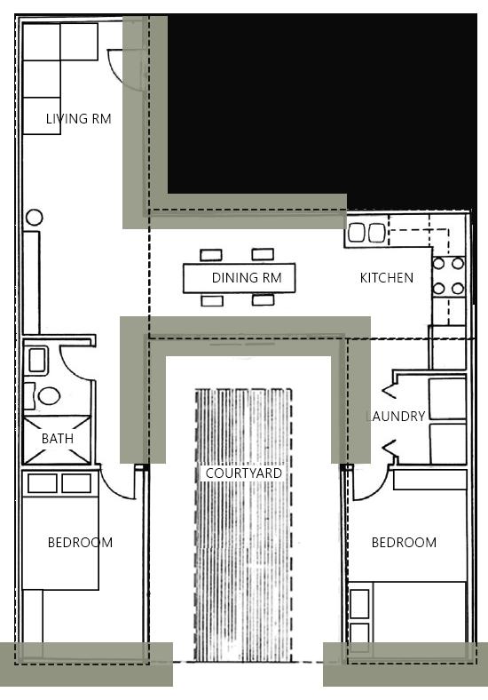
The shipping container home intertwines the rugged beauty of the landscape and the modern industrial setting of a shipping container home. Incorporating a variety of plants, neutral wooden textures, and natural lighting from the floor-to-ceiling windows will create the illusion of being within an environment, including modern materials such as shipping containers and concrete to produce a sense of structure and shelter
SITE LOCATION

The location of this site will take place in the rainforest of Southwest Cambodia and Eastern Thailand, Cardamon Mountains. It is the home of many endangered wildlife and about 25,000 people, many of whom are ethnic minorities.
The rugged landscape is filled with marshes, plains, and gushing rivers, making it the perfect stomping ground for rare species and adventure seekers. Activities in the area include a variety of treks through the jungle, kayaking, mountain biking, and swimming in waterfalls.
This design takes the style of western modernity, combines it with locally sourced materials, and is placed in a landscape with a history as dense and rich as the forests the region is known for.
BIOPHILIC THEORY
Promoting and encouraging interaction between people and nature to improve mental and physical health. To execute this design, I incorporated natural materials and a neutral color palette that would be local in Cambodia to create a refreshing, healthy, and sustainable space.
Utilizing wood inside the interiors and exteriors disguises the shipping container in the environment. Although the location is humid, including wood also improves air quality through humidity moderation. It also improves a person’s emotional state and level of self-expression, which is ideal if this space is used as a vacation home.

NATURE IN THE SPACE:
Visual connection to nature with floor-to-ceiling windows in the dining area and bedrooms.
NATURE OF THE SPACE:
The configurations of the shipping containers creates a courtyard that the tenant can have if they want to be exposed to the environment without being vulnerable to the elements.
1. ACACIA WOODEN PANELS
• Also known as Asian walnut will also be used to bring the woode n element into the space. Wood will also help with the humidity of the mountains. P laced within the bedrooms to create the illusion of taller room s since the shipping container height is 9 foot.
• Concrete flooring is solid and resilient; therefore, it will wit hstand high traffic areas. It is cost-effective, low maintenance, and has slip resistance.
3. PAINT
• Sherwin Williams White Sail is used throughout the entire space to create openness to the small area.
4. TILE
• Magnolia Distressed Subway Tile Olive
• Porcelain tile with a glossy finish has a lot of benefits for the bathroom. It is low maintenance, resistant to wear, and excellent for high traffic use. The color olive will be selected to represent the green color in nature.

5. TILE
• Magnolia Distressed Subway Tile Bianco
6. COUNTERTOP
• S late countertops to represent the rugged landscape of the Carad amon Mountains. This will also create contrast between the paint and light concrete flooring.

THE DINING AREA
The goal for the dining area is to give the tenant a visual connection to nature without being exposed to the outdoor elements but still being able to enjoy what it offers. Research shows reduced stress, positive emotional functioning, and improved concentration and recovery rates.

NATURE IN THE SPACE APPLICATION:
The floor-to-ceiling windows on both sides of the dining room allow tenants to view who is arriving at their home, the courtyard, and the mountains. If the tenants want more privacy in their dining area, they can utilize curtains. This conveys a sense of time, weather, and other living things.

CONIFER HEALTH SOLUTIONS
SECTOR PROGRAM
DESCRIPTION
Commercial Project
Revit + Lumion + Photoshop
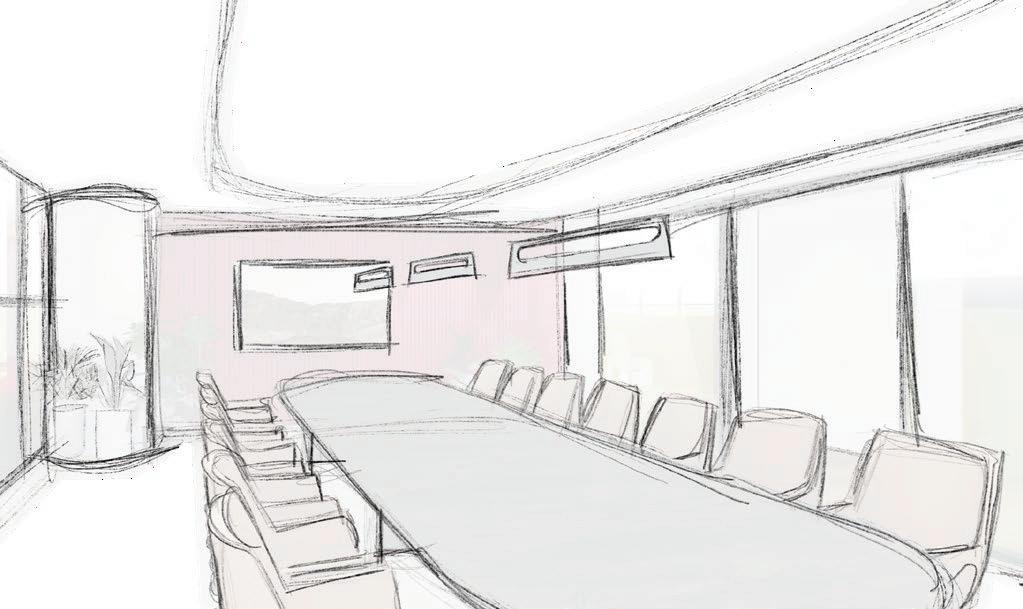
The core concept of this office building development is to create a collaborative and efficient space by strategically using their brand color and adding huddle rooms to encourage productivity and wayfinding throughout the area.
To achieve this, incorporate focus rooms to facilitate collaboration and communication amongst team members while making the environment more intimate. Smaller meeting rooms will help prioritize larger spaces more efficiently and allow employees to have a private area for a smaller groups. Utilizing technology and writing walls will help employees connect with clients or coworkers working from home via video calls (Avstructural, 2019).
MATERIAL SELECTION
Combining wood, stone, and red branding creates a warm environment that boosts productivity to ensure that tenants are collaborative and efficient. Utilizing a countertop with a variation of color adds depth to the space. Strategically placing the color red in areas with more traffic is a form of wayfinding, just like the light going around the corridor.

1. UPHOLSTERY
• Bernhardt Textiles - Emerge Clay
• 100,000 Double Rubs Wyzenbeek
2. FLOORING
• Relative Space - Flyt Wide Coto
• VOC-free finish, 100 % Sustainably Harvest Wood
3. TILE
• Architessa Glossy Ceramic Subway
• 14% Pre-consumer recycled content
4. COUNTERTOP
• Neolith - Sofia Cuprum
• 100% natural materials (clays, felspar, silica and natueral mineral oxide)
5. ACOUSTICAL PANEL
• Turf Reed - Red 23
• Polyester (PET) felt 60% pre-consumer recycled
6. PAINT
• Curator - Cotton Canvas
COLOR THEORY
The science behind the colors we see daily and how we respond to specific color combinations and proportions. Conifer Health Dark red is associated with leadership and courage. Being exposed to or wearing the color red can cause some physical effects. every other color, red can evoke both positive and negative feelings, but what it is known for is passion. Since red is known for more productive.
Health Solution company’s color is dark red. According to studies, red emotes feelings of energy, power, and determination. effects. Red can help elevate blood pressure and increase metabolism, heart rate, and respiration rate. (Al-Ayash, 2015) Just like for being a passionate and emotional color, it increases your heart rate and gets the blood pumping, making an employee

1. INSPIRATION
Utilzing the curvinlinear structure of a mitochondria.


2. SIMPLIFICATION
Creating emphasis on the curvilinear structure of the inner membrane in the design of the arch entrance.

THE FOCUS ROOMS
Lined with acoustic panels and tucked away, these rooms are inspired by a cell’s mitochondria. Like the mitochondria, these focus rooms are designed to be the powerhouse of the office . With noise cancelation and relative isolation, these rooms will increase productivity and quality of work
The Mitochondria are essential in creating energy to drive cellular function and biological processes and emphasizing the curvilinear structure of the inner membrane in the design of the arch entrance.


MILK + HONEY
SECTOR PROGRAM
PROJECT DESCRIPTION
Hospitality Project
Revit + Lumion + Photoshop

The concept for this space is to create a space that focuses on sustainable and holistic design with topics such as lighting, prospect & refuge, and biophilic design to enhance people’s comfort and well-being. Inspiration from natural elements and crystals that milk and honey use as part of their branding.
In addition to their branding, custom hexagon seating will be located in the courtyard lounge, where guests will gather before they depart to their appointments, such as bees leaving to collect pollen. The yoga studio will have a skylight to access natural light with plants to create a calming environment. The sauna room will mimic the curvilinear lines of the wood grain.

LIGHTING DESIGN
An art and science involving the manipulation of light creatively and functionally. It includes the study of how different light sources, the quantity of light, and the quality of light affect a space’s aesthetic and functional aspects. Ultimately, lighting design helps to enhance a space or setting, creating the desired ambiance or atmosphere.
PROSPECT AND REFUGE
Refer to the sense of security or freedom people feel when they view an area of open land or horizon from a sheltered space. The feeling of “prospect” is a sensation of a broad, uninterrupted vista that helps give a sense of discovery and anticipation. Refuge, on the other hand, is a sense of safety or protection provided by being sheltered.
BIOPHILIC DESIGN
Style of architecture that seeks to blend naturally into the built environment harmoniously. The purpose is to foster a connection with the natural environment and reduce stress. This design style has proven to provide a range of physical, mental, and social benefits to its occupants, including increased productivity and creativity, improved air quality, and better access to mental health and wellness.

1. INSPIRATION
The function of a beehive is to provide a space for a colony of bees before they depart.
2. SIMPLIFICATION
Hexagonal seating can promote social interaction and a sense of community, which can be beneficial for creating a positive and welcoming atmosphere.


LOUNGE + COURTYARD

The goal for the lounge area of the spa is to create a space with a genuinely serene ambiance. With a skylight overhead, the bright light from outside filtered in, enveloping the room with pleasant and peaceful energy. An abundance of greenery, including leafy plants, smooth river rocks, and invitingly comfy cushions, gave it a natural and cozy atmosphere. You felt both connected and sheltered at the same time.
To incorporate the hexagon shape from their branding, custom seating was created to imitate the beehives, which the bees gather before they depart to collect pollen, just like before clients depart to their appointments within the spa.
ALYCIA RENEE INTERIORS
BRAND

Alycia Renee Interiors


PROJECT
Brand Identity Design
INDUSTRY
Interior Design
PERSONALITY
minimal elegant organic
SKETCHES
COLOR PALETTE


