Visual Development Guide


Our Mission is: Quiksilver uses their vision to help adventure-seekers explore and enhance their time in nature, so that they can embrace amazing outdoor experiences.
“When we started designing the first quiksilver boardshorts, we just wanted to make them better than the others.”
Quiksilver helps customers to reach the top, ignore distractions, and focus on adventure.
Quiksilver gives customers a better sports experience and help them to see a world they have never seen before.
Quiksilver encourages customers to explore more adventures and bring their spirits to life.
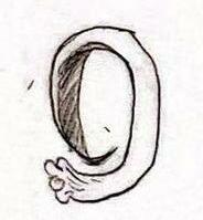
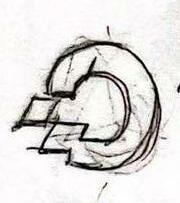
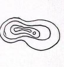
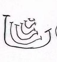
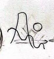
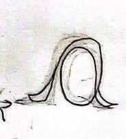
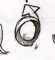
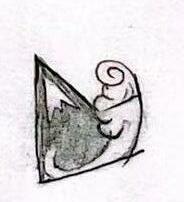
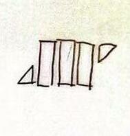
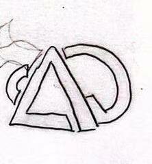
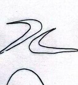
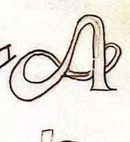
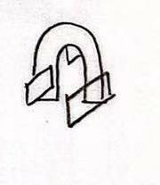
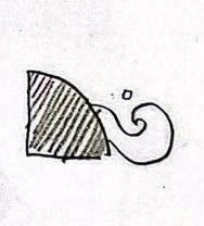
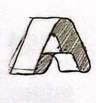
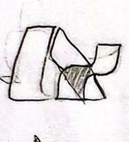
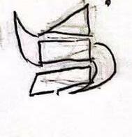
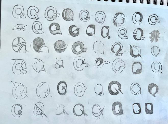
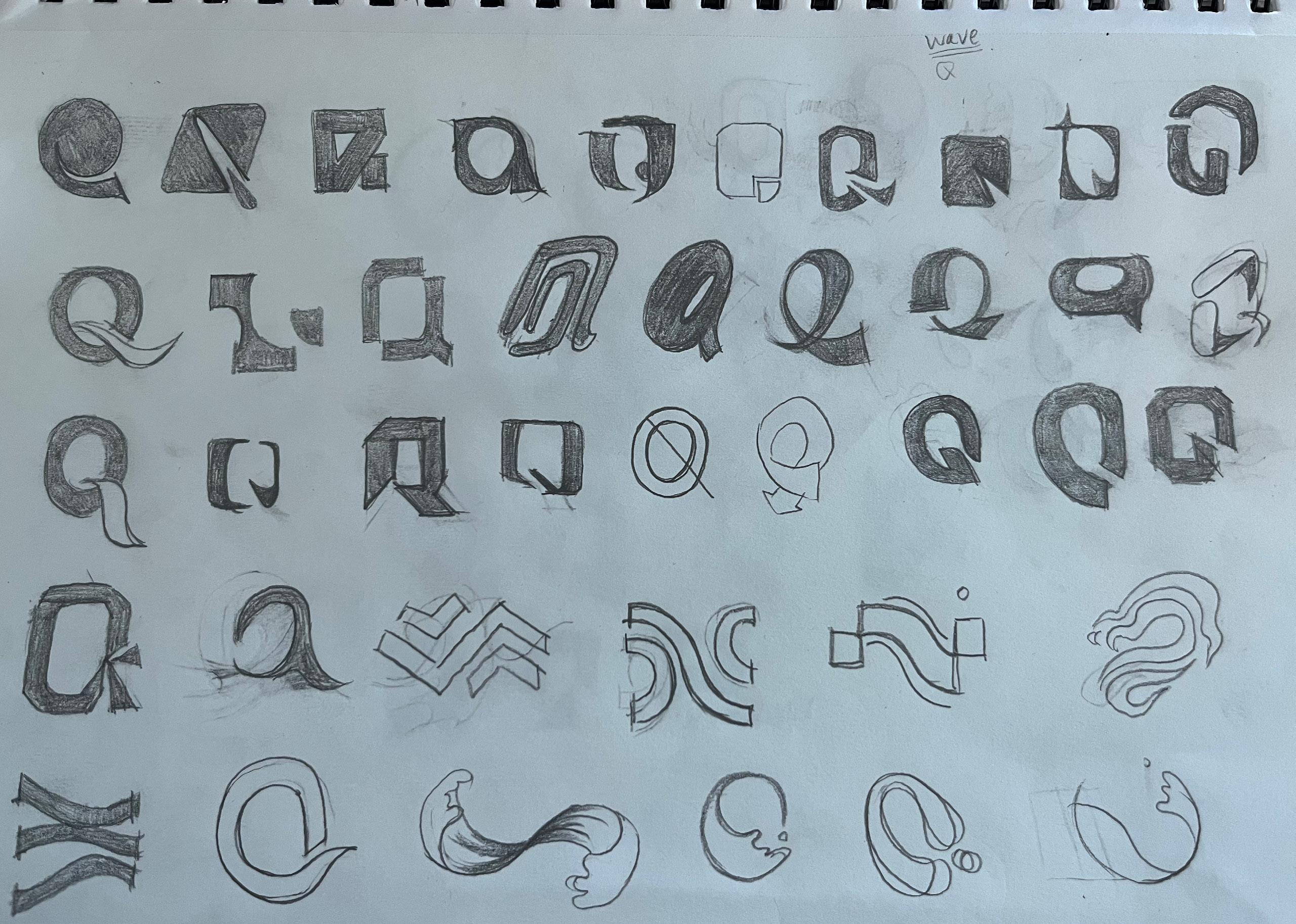
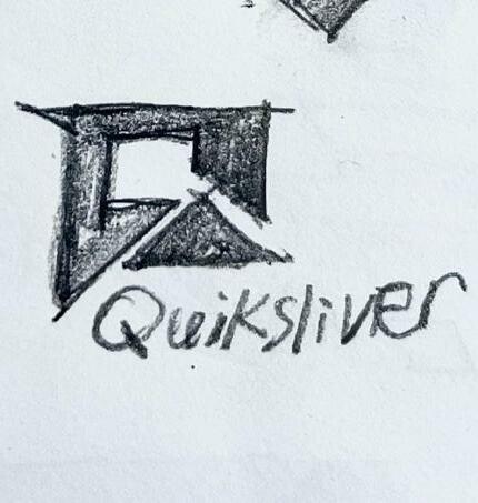
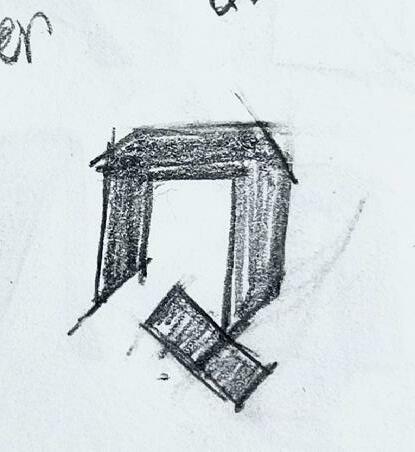
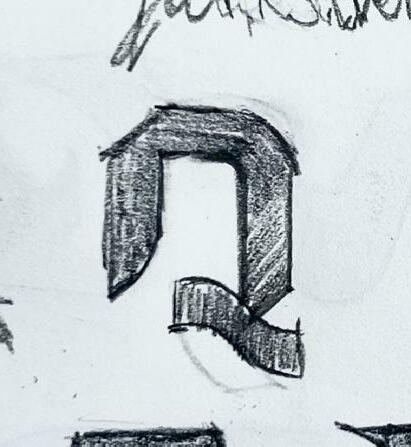
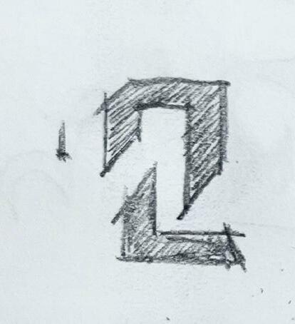
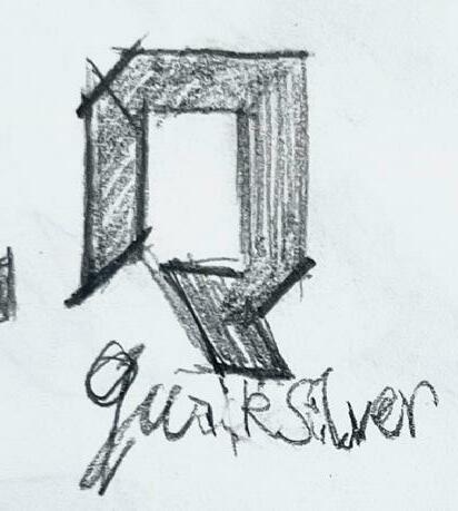
We need to do 300 logo sketches follow three keywords, refine 10 of each keyword. Find the 7 logo don’t examples from the famous brand visual guide collection.

6. 2.
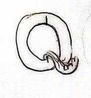
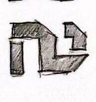
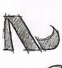
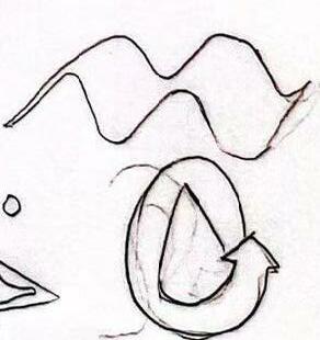
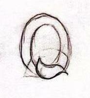
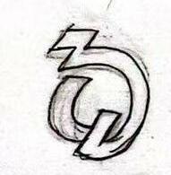
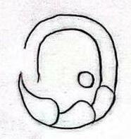
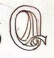
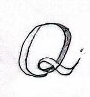
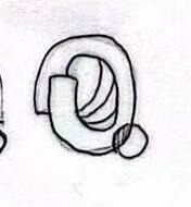
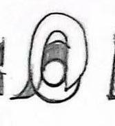
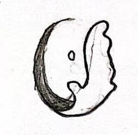
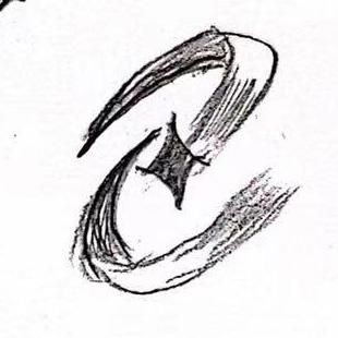
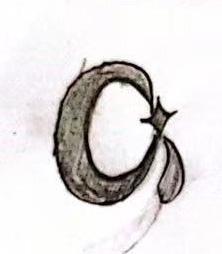
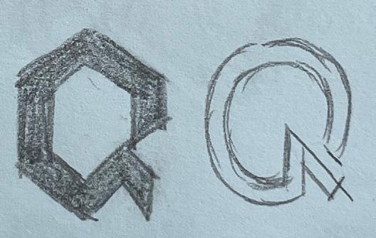
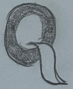
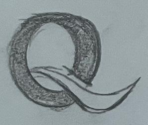
Splitting of the graph of Q Realistically combine Q’s tail with the waves to show vitality
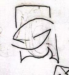
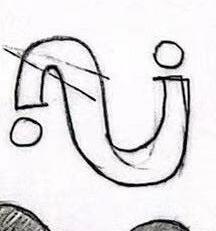
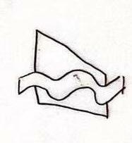
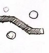
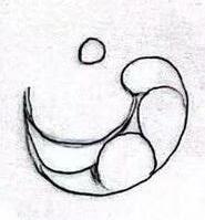
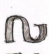
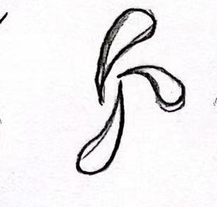
Disassemble the letters to show the ups and downs of the waves
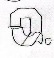
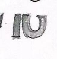
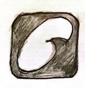
Outlines the styling of Q. But the performance of the ocean and the ocean is not
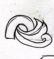
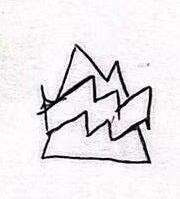
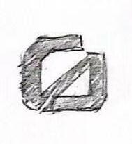
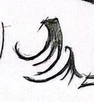
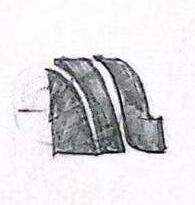
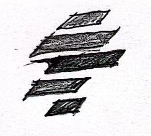
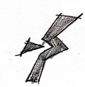
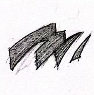
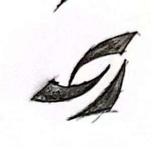
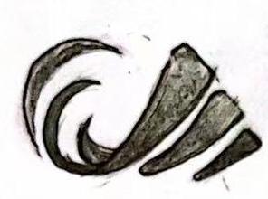
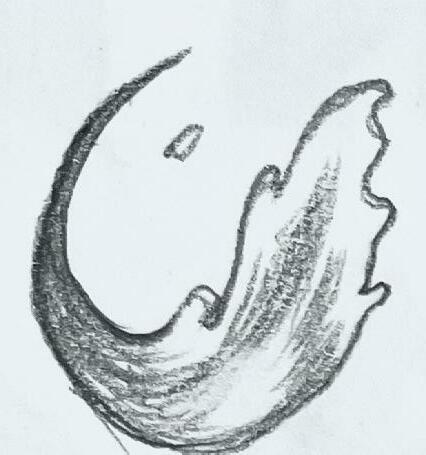
Fragmented shape of the split Q shows the power of the movement。
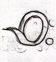
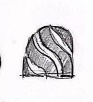
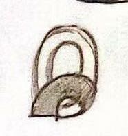
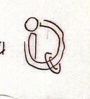
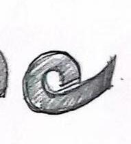
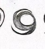
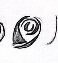
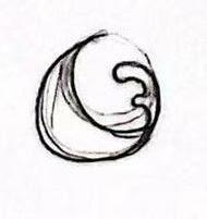
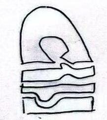
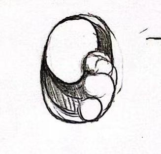
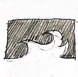
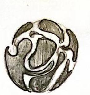
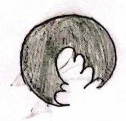
Place the waves inside the circle of the Q to form a complete picture
1. 7. 3. 8. 4. 9. 5. 10.
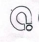
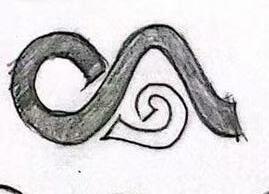
Combine the Q and the curve, abstractly expressing the waves。
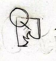
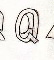
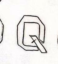
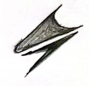
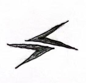
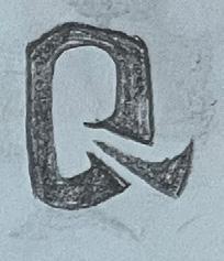
Combine the letter Q with an arrow for a strong purpose.
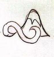
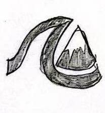
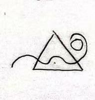
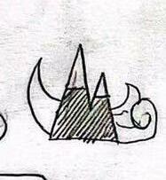
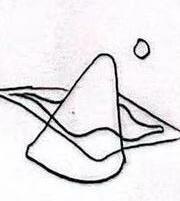
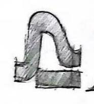
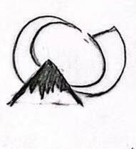
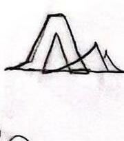
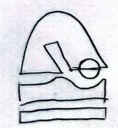
Take the mountain and the waves as two parts of Q respectively.
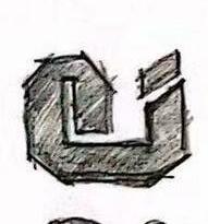
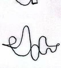
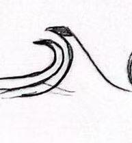
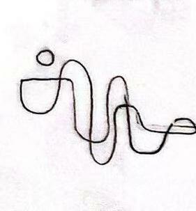
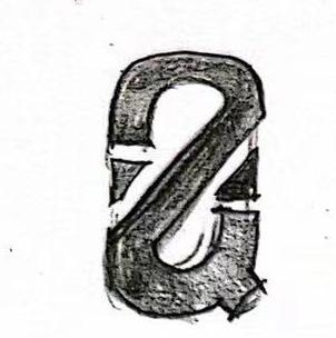
The shape of a wave is summarized as the letter Q
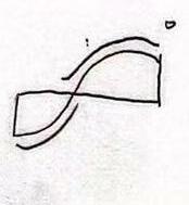
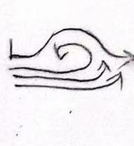
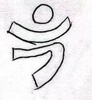
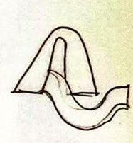
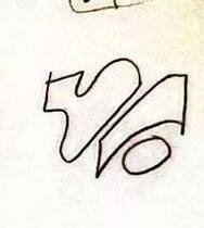
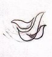
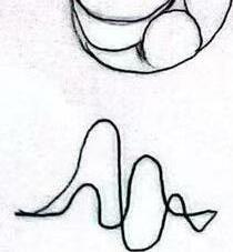
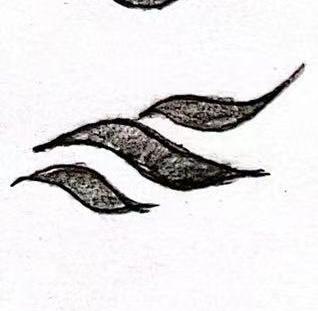
Represent a wave as a line. maintain a sense of strength
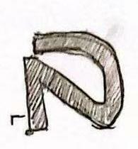
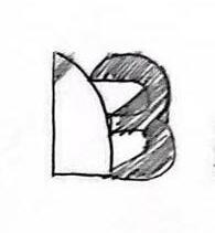
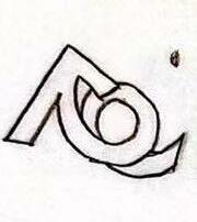
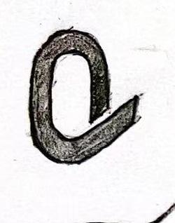
Rugged styling Q
Figurative waves form the shape of Q Rugged styling Q
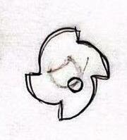
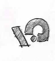
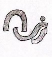
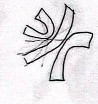
More aggressive combinations of Q and arrows
More combinations of Q and arrows
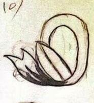
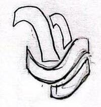
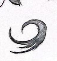
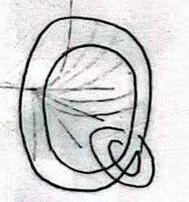
Liquidity of the spray
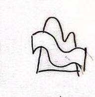
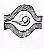
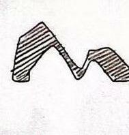
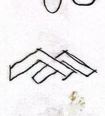
The shape of waves meeting each other on the sea surface
Picture of undulating waves on the sea surface
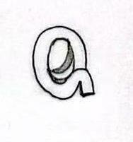
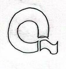
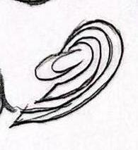
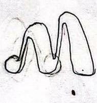
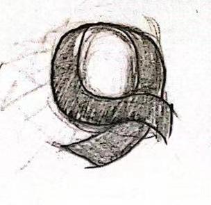
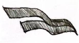
The shape of Q is as soft as a ribbon but powerful
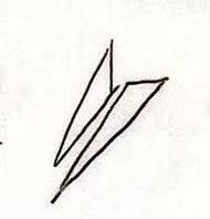
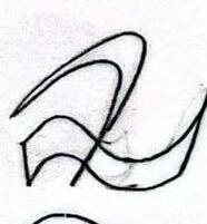

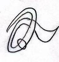
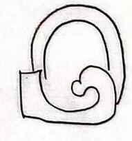
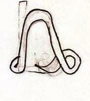
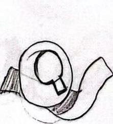
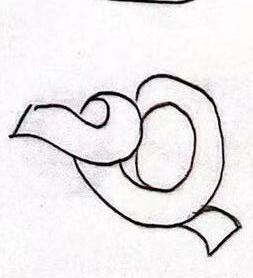
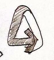
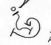
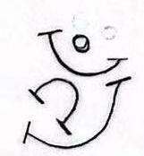
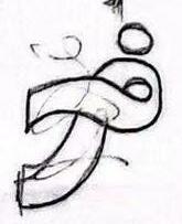
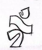
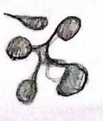
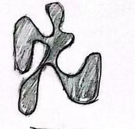
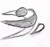
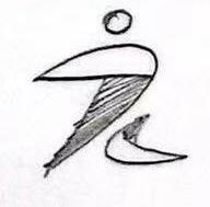
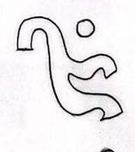
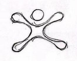
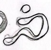
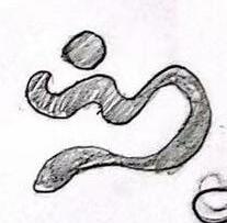
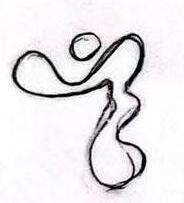
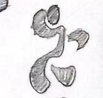
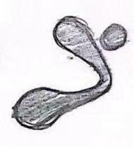
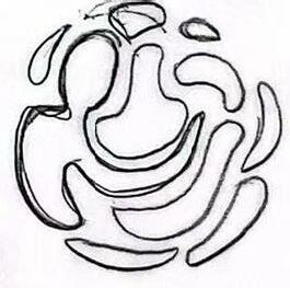
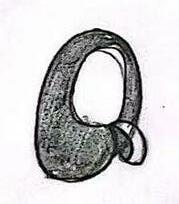
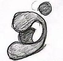

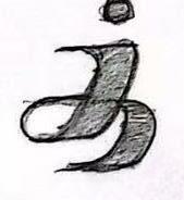
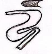
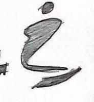
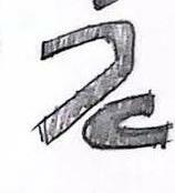
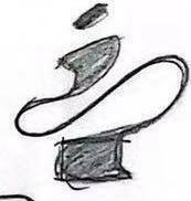
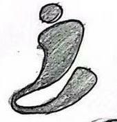
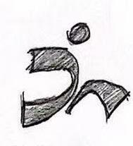
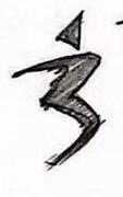
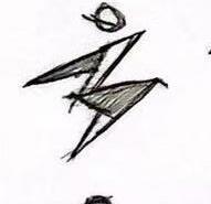
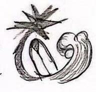
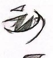
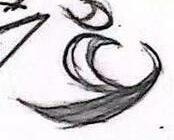
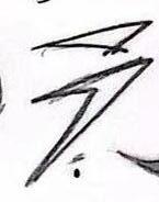
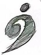
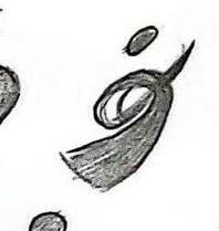
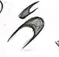
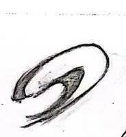
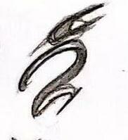
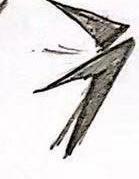
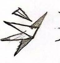
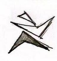
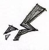
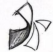
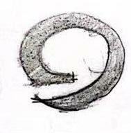
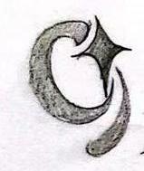
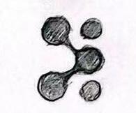
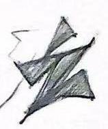
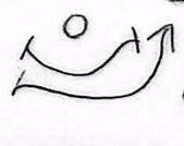
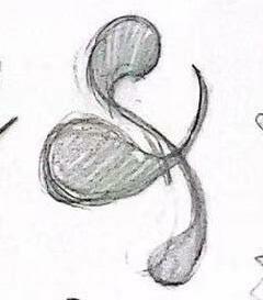
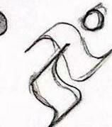
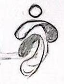
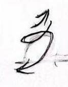
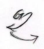
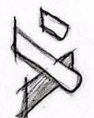
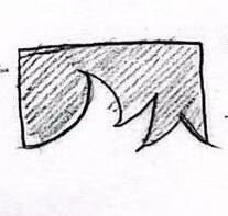
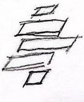
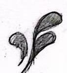
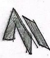
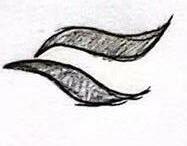
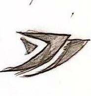
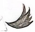
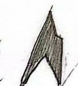
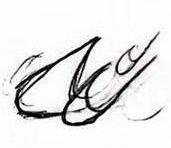
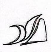
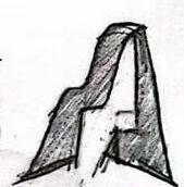
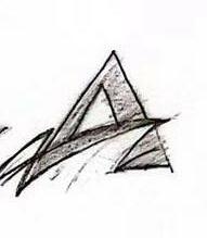
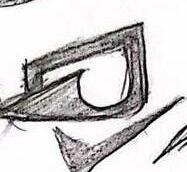
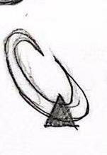
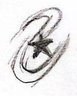
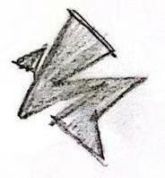
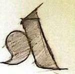
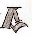
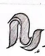
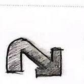
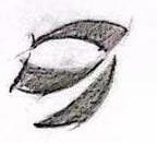
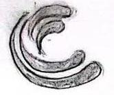
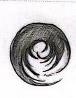
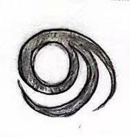
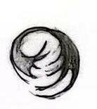
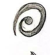
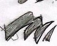
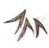
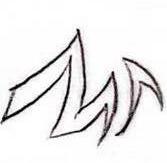
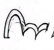
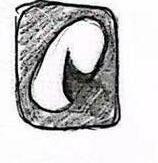
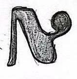
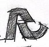
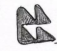
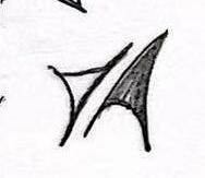
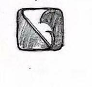
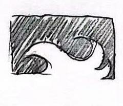
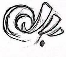
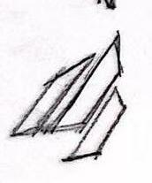
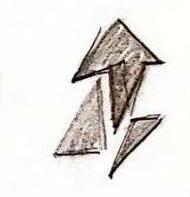
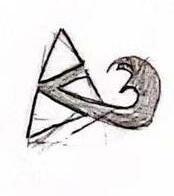
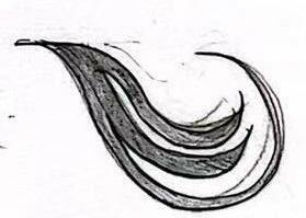
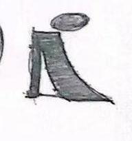
image of a powerful athlete Ripples of the waves Different Expressions of athlete Image
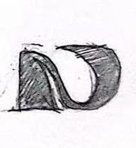
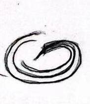
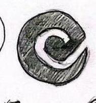
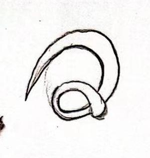
The shape of Q outlined in one stroke
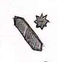
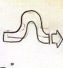
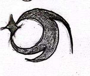
The star pattern is combined with the spray to form the letter Q.
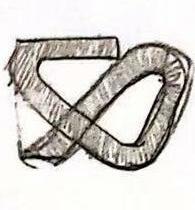
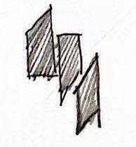
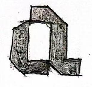
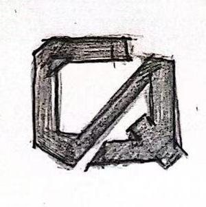
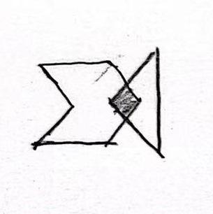
Geometric shapes full of tension
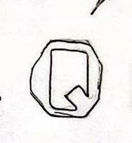
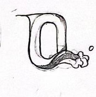
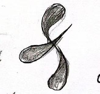
Q’s tail becomes a figurative spray
A combination of vibrant geometric shapes.langh
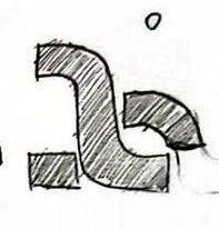
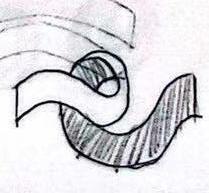
The combination of tumbling waves and Q
Use positive and negative shapes to express the picture of waves rolling on the water surface
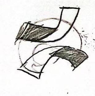
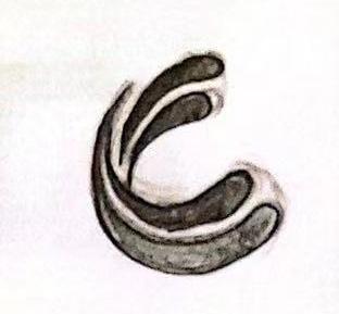


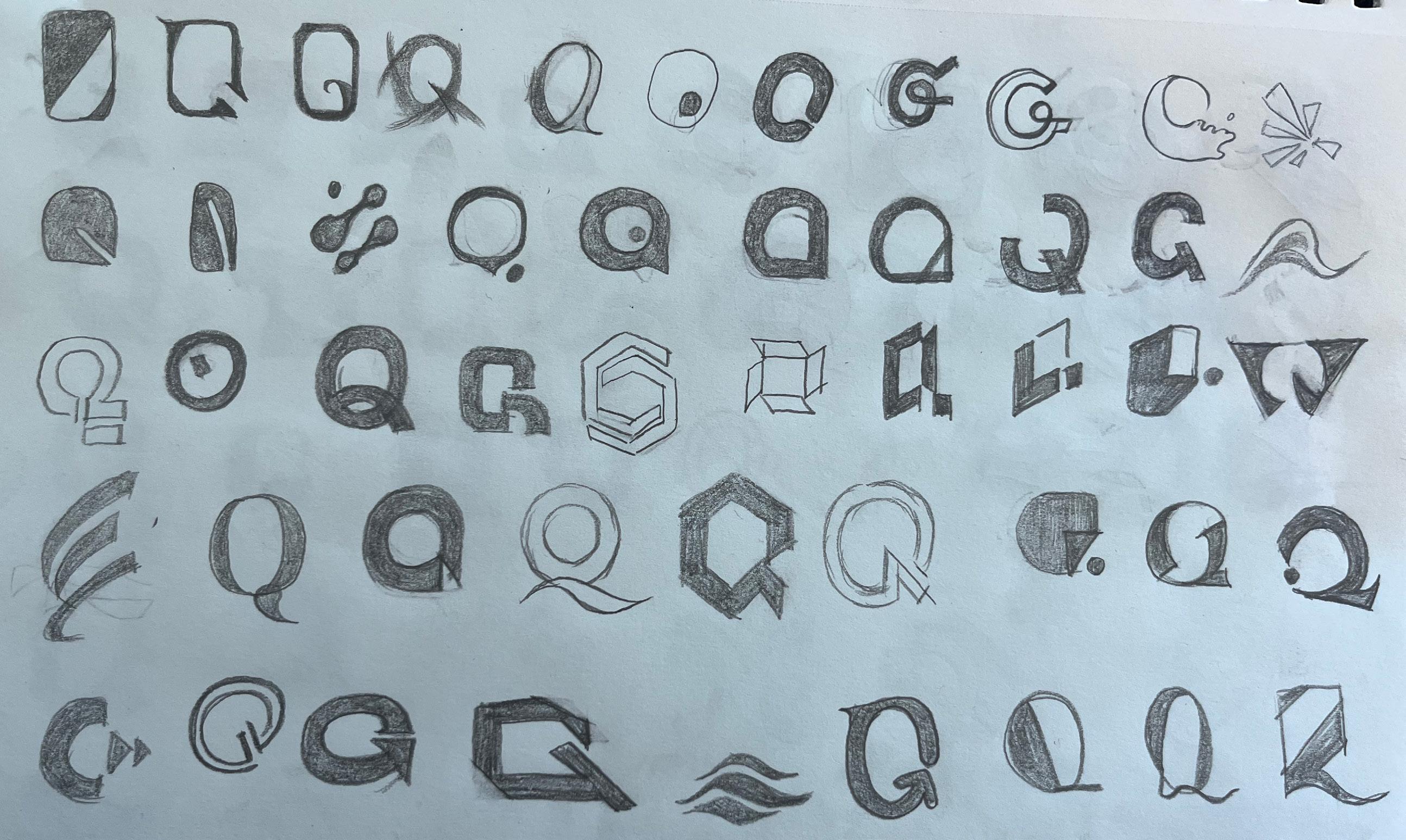
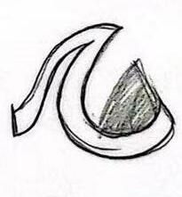
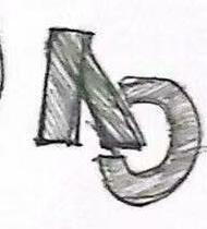
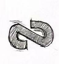
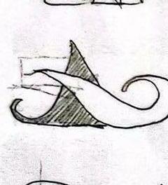
Q's tail is detached from the body structure to create movement
Combination of Q and Arrow
Combination of Q and Arrow
The combination of Q and star graphics
Geometric shapes full of tension
Split graph formation dynamics
Q’s tail becomes a figurative spray
A combination of vibrant geometric shapes.langh
strong structure
Use positive and negative shapes to express the picture of waves rolling on the water surface
Quiksilver helps customers to reach the top, ignore distractions, and focus on adventure.
Quiksilver gives customers a better sports experience and help them to see a world they have never seen before.
Quiksilver encourages customers to explore more adventures and bring their spirits to life.
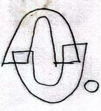
logo development refined designs
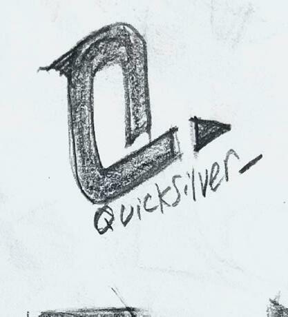
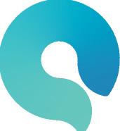


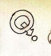
Our new logo uses a combination of circles. Different circles add up to form the wavy shape of an ocean wave. The outcome combine of the sea and the letter Q to convey the spirit of adventure.
The new Wordmark is based on the Serifa Condensed Medium font, adding elements of surfingusing a 45-degree bevel to represent wind and waves.
Symbol


An introduction to this new visual system that grabs attention with a playful handwriting.
The layout with text introduction makes it easier for more people to understand the usage specifications of the logo.
The layout with text introduction makes it easier for more people to understand the usage specifications of the logo.
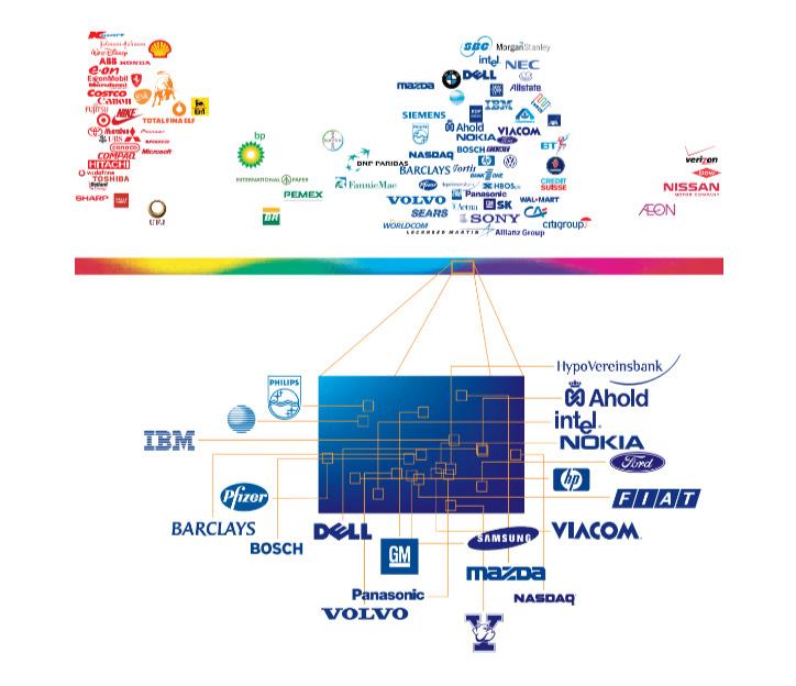
Using a large number of searches as a basis to show the visual orientation of different colors in the market can help people better understand the logic of using colors.
4: Main ID colors (logo colors)
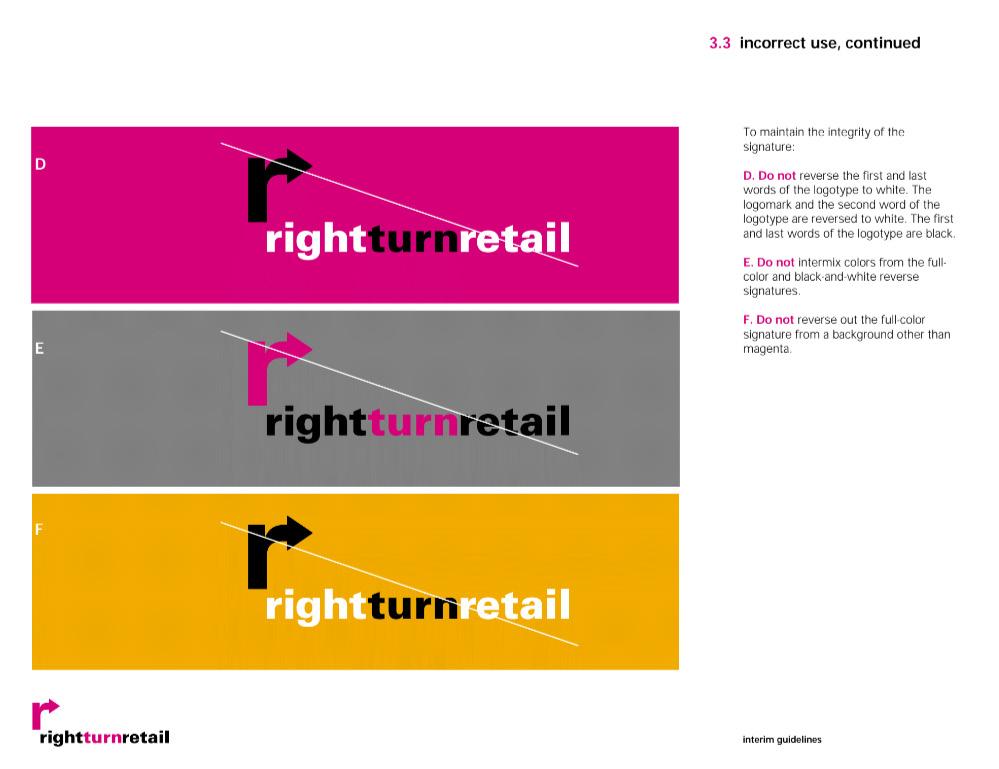
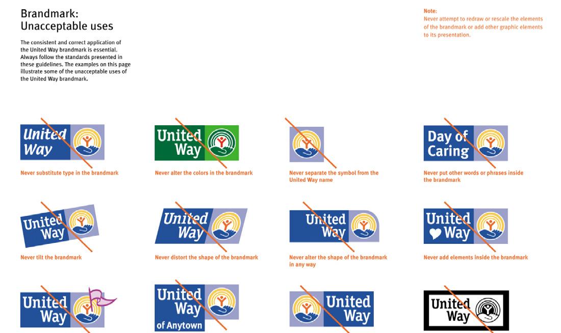
United Way provides various types of wrong usage of logo to help customers understand how to use it and avoid damage to logo design.
Due to the particularity of its use, Red needs to be often used together with other brand logos. Red therefore offers a large number of versions.
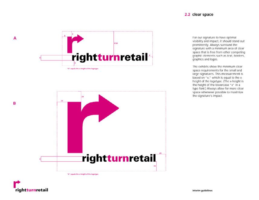
The color background often leads to mistakes in usage, rightturnretail therefore produced a color example that would cause errors with the original visual system to help people avoid mistakes.