PORTFOLIO
by Yanling Zheng8 Slected Works from 2019-2022 I Architecture in Hunan University I Architecture and Urban Design in Politecnico di Milano
“It sounds difficult,” I said.
“Of course it is,” the old man said, sounding as if he were spitting out something hard. “There’s nothing worth getting in this world that you can get easily.” ... ... “But, when you put in that much time and effort, if you do achieve that difficult thing it becomes the cream of your life.” 'The cream of the cream. It means the best of the best. The most important essence of life— that’s the crème de la crème. '
(Cream, by haruki murakami)
To me, architecture is like the cream from the site, the job of architect is to refine the essence of the site and add flavour to make a tasty and healthy cream.
ACADEMIC WORKS
AND THE MOUNTAIN ECHOED
The Campus Gymnasium in the Yuelu Mountain 03/2018 - 06/2018
Location: Changsha, Hunan, China
B.S. 4th year 2nd semester
Course title: Architectural DesignVI

Collaborator: Li shiqi, Li jingyu
Contribution: Concept, Design, Rhino+gh, concept schemes, rendering
Instructor: Yuan zhaohui
Email: kevinyuan@hnu.edu.cn
The east and west sides of the site are the main travel routes for students, tourists and residents.


The site is wide open, with excellent mountain view.
Hunan University, Normal University, residents, tourists and mountains interweave wonderfully here. This is also the unique place of the site: students carry schoolbags and slowly walk on the path day by day under the gaze of the mountains. Tourists roam on the busy and noisy snack street at the foot of the mountain. Residents' houses are built on the hill. The mountain has shaped the unique soul of this place.
Tourists roam on the busy and noisy snack street at the foot of the mountain. Residents' houses are built on the hill. The mountain has shaped the unique soul of this place.
There are a cluster of teaching buildings on the north and south of the side.On the west side, there are many small houses built on the hill.
It is a sport ground, including basketball court, badminton court and runway at present.

The venue reminds me of the remote Theater of Delph, where the rough material of the theatre is in perfect harmony with the mountains that have stood for millions of years. Besides, the nearby teaching buildings use a lot of granitic plaster with Xiang River grit, creating a rough atmosphere. Therefore, the design focus on continuing the heaviness and the sense of eternity of the place.

Interestingly, there is a gradual change of scale around the site from west to east, from small-scale residential buildings in the west to medium-scale teaching buildings in the middle, and then to Yanjiashan in the east. So try to weaken the size of the campus instead of simly placing a large-scale building

Cut into three blocks, the second hall, the rest hall and the main hall.
Simply inserting a large-span building will become a barrier on the site. Turn around the main hall and the second hall to shape small squares in the four corners of the site
Using unit to further diminish the size of the building and the gaps between units become entrances

Since the high requirement of the clear height for sport space and the lower requirement for the serve space, the arch form is used as a structural unit to fit the function

The cross section is catenary, which makes the force transfer path more reasonable. Shrink one side of the unit to enrich planar combinations

Sinusoidal curve is used to control the longitudinal section, strengthen the stiffness of the structure and solve the drainage problem.
Combine different height units, providing natural lighting and naturally form entrances and long windows


A BATH WITH THE ANTIQUARIUM
Adaptive reuse of the antiquarium in Villa Adriana
08/2020
Location: Tivoli, Italy
M.Sc. 1st year 2nd semester
Course title: Piranesi Prix de Rome Workshop
Collaborator: Shantao Jiang
Contribution: Concept, Design, Plan, Section, Diagram, Rendering, all drawings in This Portfolio.
Instructor: Valerio Tolve Email: valerio.tolve@polimi.it

East Facade of the Antiquarium
In the South is the second block of the Antiquarium. We can see a clearly different characters between the first block and the second one, the first one is on the groundfloor and open to the public, while the second one is 2 meter higher and hidden behind the trees. Currently the rooms are unused and unaccessible


In the North is the first blck of the Antiquarium, which houses a wide range of sculptures found in the Canopus in the Aurigemma excavations of the 1950s. Currently it is open on the occasion of temporary exhibition events between spring and autumn, the interior still covered with original vaults and made in opus reticulatum.

The Compositional Structure of
The compositional structure of Villa Adriana is based on a complex centrality system that organizes its ordering layout and defines the positional syntax of the architectural elements. This layout draws a polar composition of a radialhypotactic character, ie based on a series of sensitive points connected to each other by fans of generating axes. This system is based on a certain number of centralities, ie architectures or single elements whose substance is due to a circular shape, or a dome that generally qualify a central plant from which several radial axes develop, which in turn connect other centralities hierarchically dependent.
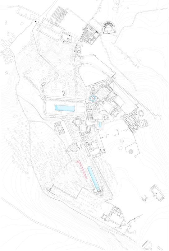
In villa adriana's masterplan, water is an important theme throughout. According to the research by Tracy L. Ehrlich, 'there are 25 major architectural complexes at the villa. Of these 25 complexes, 19 incorporate some kind of water feature... Of the 19 remaining complexes, all include at least one water feature. Water is an important node in most clusters. especially for the pecile and canopus, where the water is positioned on the axis, one is a piscina, introducing the whole landscape in Tiovli, one is a 120m canal, with a colonnade in around, which was curved on the north side, single on the western side, and double on the eastern side.
Three baths, Thermae with Heliocaminus, Small baths and great baths, are arranged between the pecile and canopus, and each room is different, including the pool, apodyterium (entrance room), tepidaria (warm room), frigidarium (cold room) and the hot rooms, which provide opportunities of lush water experience.
Unfortunately, these first-century baths, have been abandoned for a long time and we can only imagine the images of these baths of 2,000 years ago with the help of the remained vaults. Now we would like to take the opportunity to bring the bath back

Standing on one of the most important axes of the site, you can see a part of the new addition standing on the ground floor, while another part is hidden behind the trees. As one of the buildings on the axis, the repetitive units is used to strengthen the presence of the axis and maintain the important position of the grant dome on the main axis. Besides, have a simple design language can also make the new part stand out in the environment, achieving a balance between the new addition and the context.
Since the northern block is in a better condition and still functioning as a museum, we decide to maintain the museum and only make renovation in this part. The bathing area is arranged to the south, hid behind the existing plants to guarantee the privacy for bathers in this busy axis. In the end, a different characters between the museum and the bath can be created, one is open to the crowds, another one is peace and quiet.
Getting inspired by the transformation of 530 dewllings, in which Lacaton & Vassal choose a smart strategy - attaching new volumn in facade, so that the added volumn can have a minimun affect of the original structure, at the same time, giveing extra space and have a better light environment in interior.


In the case of Antiquarium, we similarly choose the method of adding new volumn that surrounds the original structure, with the attempt to avoid the touch of the original structure, and create a new face in Antiquarium to achieve a better relationship with the axis in Canopus.

On the ground floor, the newly added semicircle on the museum façade is positioned in between the windows and ope to the public, searing as seat for visitors to rest, bringing visitors closer to the museum while preventing the noise. The semicircular structures at the bath are opening towards the interior, blocking the entrance of each room, serving as tiny locker room and providing privacy.

In the first floor, the semi-circular traffic core is opening to the bath volume, which becomes a barrier between the restaurant and the bath, preventing the noise and views interference from the noisy side, and at the same time naturally directing people keep going to the grand bath.


Different strategies were adoptedfor the small bath and the grand bath. For the smaller one, is to create a private atmosphere, so the entrance is hidden behind trees. After a long ramp, visitors can get away from the noisy axis and enter the small bathrooms that are covered by semicircular structures. For the open bath, idea is to make the best use of the olive grove, let the bathers enjoy the four seasons of Villa Adriana through the fog.


CROSSING MACELLO
Urban Design of the disused area in Milan
03/2020 - 07/2020
Location: Tivoli, Italy
M.Sc. 2nd year 1st semester
Course title: Thematic Studio
Team in site analysis phase Amandine Pontin, Marketa Havlinova, Nicola Smit
Project was developed individually

Instructor: Emilio Faroldi, Stefano Capolongo, Francesca Belloni
Email: emilio.faroldi@polimi.it, stefano.capolongo@polimi.it, francesca.belloni@polimi.it
External Historical Nuclei
Pedestrian Oriented Spaces


Ancient Nuclei
Urban Renewal Area
Squares
Railway Stations
Public Spaces in Milan

Reference: Territory Governance Plan (PGT)

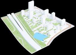
The Ex Macello site is a disused area spanning around 15 hectares, the site of the communal slaughter house and of the poultry and rabbit market in the real estate compendium of the Milan wholesale market. From this map of the urban tissue of Milan, it is visible that the Ex Macello area is now abandoned by the city and becoming a dark area in the city. The aim of this proposal is to rebuild the identity for Ex Macello area and connect it with the urban context.
Context Function

The construction of Ex Macello dates back to the begining of 20th century, function as slaughter house and became important food supplier for the city, followed by the construction of the supermarket cluster in the east. Now the Ex Macello is abandoned and clearly we can see a function difference in the context, in the west is resident area while the east side is a cluster of large supermarket.
City of Milan
Consisting of city blocks with courtyards
City of Milan Movement happens naturally between city blocks
Ex Macello perceived as an impermeable area - a huge block
All activities happen inside the border - no connection
Characters of Ground Floor
Our site and its surroundings act as a set of impermeable 'blocks', bounded by roads, that have no possibility of entering or creating a shortcut. Environment of these roads dose not have many quality features it calls for more open and generous environment that would make it possible to walk through, and intersting to stay.

Morphology Extension
The housing blocks are extended from the context to macello area, to have a coherent urban tissue with context.


From this map of green space in Milan, we can see green spaces are scatter around the city, except the Ex-Macello area. Hence public green space will be an important topic in the design phase to improve the living quality in this area.

In the context two kinds of urban tissues can beobserved, In the west is the city of milan, with a completed urban tissue, in the east is the periphery area Forlanini, with typical 1960s apartment blocks.
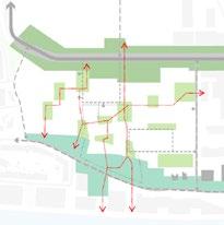
Transportation + Axis Connection Different transportation and axis are introduced to have a better connection with the transportation nodes and existing buildings in context.
Ex-Macello area, currently act as a wall, blocking the connection between the city and the periphery area.
This proposal is to transform the wall to an urban node in between two urban area, becoming an area no only for people to pass by, but also can stay to enjoy the green and public spaces.
Crossing Axis
Two principal axis are crossing the site, one is one is the historic corridor, connected with series of reused buildings to remain the hitoric identity of this area; Open space is being inserted as another axis to served as the gathering space for the whole area.

Hierachy of Public Spaces
Buildings are organized by the scattered public spaces, wchich the center has the highest hierachy that become the heart of this area.
Net of Connection
In groundfloor a net of connection is proposed to weave the public nodes together. Then a flow of public space, including square, green space, interioir space, roads, could be established.


Comman space as gathering space in center


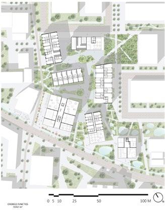
Function requirement from the tender brief are arranged as three principal function schemes, in the west is the cluster of startup and culture buildings, where more public function could be integrated to help the area open to the city. In the center, the square and the gallery is transformed to the common space, where could become the gathering and relaxing space for the whole area.


In the crossing axis, series of public function are integrated to guide the people from the city to cross, also it is connected with the function schemes in surrounding.

When people arrived the center, the market, food street, green and sport space become spaces for people to stay and meet each other.

Commercial spaces are located in the south, becoming part of the public space in center. on the top is a green roof, where people can have a view connection with the public square.


A PEEK FROM THE FOREST
Mix-used buildings beside the historical buildings
09/2019 - 01/2020
Location: Fagnano Olona, Italy
M.Sc 1st year 1st semester
Course title: Construction and Sustainability Design Studio
Collaborator: Han Xu, Jiang Shantao

Contribution: Concept, Design & Modeling, Plan, Section, Construction, All Drawings in This Portfolio (Except Master Plan and Render)
Instructor: BRUNETTI GIAN LUCA, BELLI LORENZO
Email: gianluca.brunetti@polimi.it, lorenzo.belli@polimi.it
The topic is the regeneration of the Campo sportivo and we had freedom to choose builiding site. We choose a mild strategy —— adding functions related with the orginal building, so that the new and the old would have chance to work together; Toward another side the building is cantileverd out to have a better view and more chance to be exposed to the villages in down.


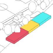


INTERNATIONAL COMPETITION FOR CONCEPTUAL DESIGN OF SHENZHEN TANGLANG COUNTRY PARK CITY VIEWING PLATFORM


Tanglang Mountain is rich in ecological resources and serves as a country park in the center of the Shenzhen with mountains. The rapid develpment of Shenzhen in the past 30 years is impressive, but in the future we believe that the perspective can be shifted more to the relationship between the city and the environment. Hence the main concept is 'returning', give the top back to the nature, welcoming the visitors to enjoy both the view of the nature and the city.


