ZHIFEI XU
Massachusetts Institute of Technology M.Arch Work Sample 2022
This pavilion is named in Chinese "Qing Xing Ting“, which is taken from a famous local poet Yang Jiong's poetry: "Several bamboos, densely forest-like. Half-room in the shadow, and a nice afternoon looking out of window." The project is located at the north entrance of Yingchuan Village, facing the pond, backed by orange trees field, above the existing sewage treatment equipment. We hope to design a place that can provide shading for villagers in the hot weather, and be used for citrus sales during the winter season. In order to frame the view towards the pond across the site and to avoid putting extra structural load on sewage treatment equipment underneath, we used bamboo and fiberglass as the main building material to design a long span structure of up to 20 meters. Based on the dimensions of bamboo, and the material characteristics of being subjected to bending and tension, we use it as cables with a certain stiffness, and give different adjacent structures with different structural depths. In between the upper cord and lower cord, bamboo rods are randomly placed to add rigidity to the roof system. The high tensile strength of fiberglass allow us to pre-stress the roof structure, further increasing structural stability. Meanwhile, the excellent weatherability of fiberglass protects the perishable bamboo structure. The twisted bamboo surface on both sides of the building is the main support structure, with the restroom and storage room hidden behind.


QINGXIN PAVILION
A Contemporary Reciprocal Structure In Rural China

Status: Under Construction MIT Summer 2019 - 4 weeks
Collaboration with Du Boliang (MIT), Wang Zhaohan (SEU), Sun Kang(SEU), Liu Huanyu (CAA)
Instructor: Wang Shu, Lu Wenyu, Zhang Yao (MIT), Tang Bin (SEU), Zhu Lei(SEU), Huang Li (CAA), Jiang Weihua(CAA)

Ceiling Plan

The design takes advantage of the layout of existing facilities to define space. The electric box protruding from the ground is incorporated into the new sink design, dividing the space, organizing the circulation and echoing the lowest point of the roof. Flip cover bamboo chairs are designed above the sewage wells that protrude from the ground, and a seating area facing the pond is formed by the treatment of ground height.
Roof Plan

Irregular bamboo struts are placed randomly in between the upper cord and lower cord with all directions, adding rigidity to the roof structure. The irregularity of bamboo as a natural material is not avoided as typical modern construction but celebrated in the arrangement of the bamboo struts. Thus, the design gains its contemporary meaning.


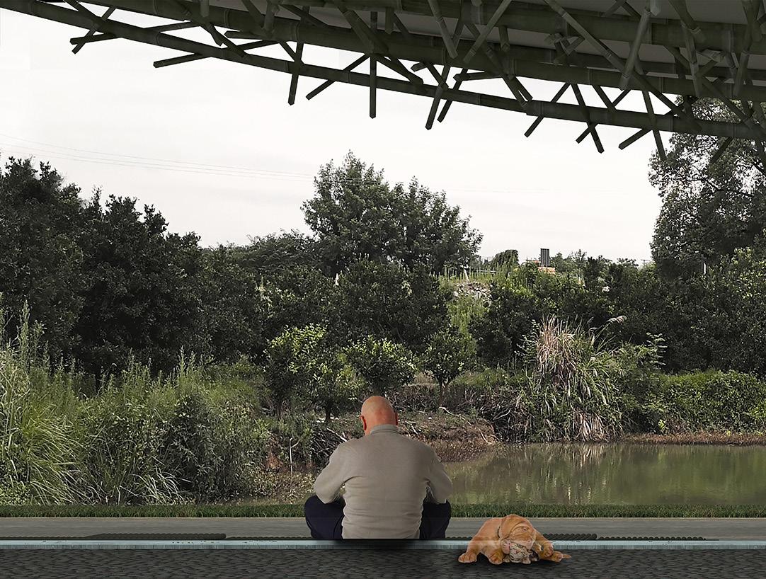 The 22-meter pavilion frames the view, just like a traditional
Elevation Long
traditional Chinese landscape painting unrolled in front of you.

At night, the lights hidden in the foundation and on the upper side of the tension cables

 Elevation Short
cables lighten up the structure. The pavilio n becomes an icon of Yingchuan Village.


Studies of bamboo details and joints. The final 1:1 mockup includes a simplified version of the tilted bamboo wall and joins which enables the tension member (here the plastic membrane) smoothly turn its corner and bring down the tension.
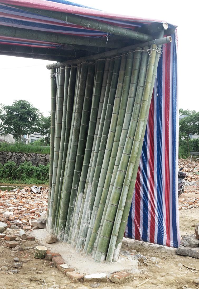


 Final Mock-Up. Actual Building

Building Under-construction...
This is a campus entrance renovation project located in Kunming, China. The school is a 12-year boarding school with approximately 5,000 students and faculty. The campus is located in a typical Chinese urban environment. There are several other schools within a 3km radius of the school, and the school is surrounded by neighborhoods mostly built in the early 2000s. The existing wall separates the school from the surrounding community, creating a small, inwardly oriented, self-sufficient community. Due to changes in the nature of the urban site and roadway re-zoning, the main entrance to the campus, which was previously located to the west, is no longer available. The project called for a new main entrance to the school at the back of the campus, without taking up as much of the existing facilities as possible. The back entrance is adjacent to the Pan Long River and now faces the Long River Park with a beautiful green environment.

Kunming BeiQing Campus Border Renovation Reinterpretation of Chinese Traditional Typology
Collaboration with Vicky Chen
Status: Under Construction
LDI: Yunnan FanYa Institude

2021-2022


 Photo - Entrance Gate Under Construction


 Plan- Parent Waiting Area
Photo - Parent Waiting Area Under Construction
Short Section 1


Short Section 2
 View of parent waiting area, under construction.
When thinking about the kind of place I would love to live in, chinese traditional landscape garden come to my mind. The Chinese garden is a kind of constructed nature: They were meant to evoke a feeling of being in the larger natural world so that the occupant could capture the sensations of wandering through the landscape. Compositions of garden rocks were viewed as mountains and miniature trees and bushes suggested ancient trees and forest. In other words, the garden presented the larger world of nature in microcosm. Although in present-day it is unrealistic to build and live in a garden anymore, the same principle can still be implied and condensed in limited footprint. This project attempts to rethink the Chinese architecture from the very origin: What will Chinese architecture be like, with the current techniques, but without western influence?


A HOME OF CONSTRUCTED NATURE Imagine a Contemporary Chinese Landscape Garden
Garcia Abril

MIT Fall 2020 Instructor: Anton
As the Chinese old saying says “The highest form of retreat is finding serenity amidst chaos.” The site choice of this project is located underneath one of the busiest highway interchanges in Shanghai, occupying the vacant green space of this urban void.


Every element in this project can find their way back to the origin from the traditional chinese garden.

Matter to data to matter. The hand made model is scanned into digital models as the first step, and the rebars are bent and weaved into the cage as the rough form. Then the construction workers would spray the concrete on to the reinforcement cage layer by layer. After the major concrete structure is settled, workers spray the insulation and surface treatment from the inside.


Detail 1: Cable to Highway Detail 2: PVC Clamp Detail 4: Facade to Ground Detail 3: Cable to Artificial Mountain Detail 2 Detail 4 Detail 1 Detail 3 12 1 Existing highway 2 Expansion anchor 3 Metal anchor 4 Steel cable 5 1 mm. stretched translucent PVC composite membrane 6 8mm steel plates. galvanized 7 Lifting anchor with flat plate 8 Concrete artificial mountain 9 Rebar net #10 10 Inclined steep prop for facade anchorage. Ø80mm 11 Facade support structure. Steel tubes Ø114mm 12 Micropile foundation 9 11 10 5 7 4 4 6 5 1 2 3 4 8
Wandering up the project, one would see the zigzag stairs in between the artificial mountains, just like the ones in the traditional painting.


The always
The interior of the larger artificial mountain makes the personal study and collection room. A treasure house is always part of the Chinese scholar's dream.

The mechanic of the project follows the overall concept, as the priority is given to natural heating and cooling. On the winter day, the envelope act as a greenhouse through the greenhouse effect, and the huge artificial mountains act as thermal mass to store the heat, and during the night it slowly radiant out again. During the summer day, the windows on the envelope can be opened, and through the chimney effect the hot air can run away, and during the night the nature wind can cool down the structure.

Looking up from the living room, you see the artificial mountain at your back. The rhythm of the artificial mountain echoes with the rhythm of the highway, just like the composition of mountains and rivers in a traditional painting.

This project for a winery in Baja, Mexico investigates two forms of excavation as a method of construction that is designed to balance cut and fill of the land. This project researches and uses the work flows of available mechanical digger equiptment and explores how a banal construction technique, such as excavation, might become architecture and infrastructure. The project uses the digger, site cast concrete and primary on-site rocks and earth mass to create a winery and fog harvesting system that engages the experiences of the earth and air.

EARTH with FOG A Geological Construction
2019 Core 3 Collaboration with April Gao
Instructor: Sheila Kenndy, Caitlin Muller(Structure)
MasterPrize Student 2020

MIT
Architecture


The bowl site is a remote and hidden site that is accessed through a winding back road. Native plants and animals thrive in the natural landform benefited from rain run-off and fog passing through the southwest lip of the bowl, creating the sense of a peaceful, untouched landscape high in the hills. IF the bowl site represents the next layer of landscape development THEN radical means need to be taken to engage and protect this territory as a productive landscape. While current winery practices exploit water resources in the valley, we imagine a winery that prioritizes water harvesting and conservation to support its wine production. The winery is positioned to both embrace the site as a secluded native landscape and to harvest ground water run-off. Fog that blows in from the west wind is collected water for winemaking and the COLEF center.


We researched and have developed a new and replicable method of cast and excavation earth construction that utilizes a typical small road excavator, a common piece of equipment in Ensenada. Our excavation construction system is designed as a balanced system of cut of fill. Earth that is excavated and dug out to create the winery, is relocated on site to form a set of sloped berms that support the fog catching mesh.


 Material experiment and formal exploration
Programs are organized along the road of compacted dirt for digger. Each program has one side open to the outside and another side contacting with earth. The roof of the lower programs become the outside terraces. for upper programs.

Canopy Plan derived from the excavation path and tangent circle geometry. Vertical Fog Catcher wrap along the path, while horizontal canopies are hung by cables ties on the berms. Concept structure model shows how the tangent circle layout work structurally for fog catcher.


1-100 Structure Concept Model
Skylight Detail
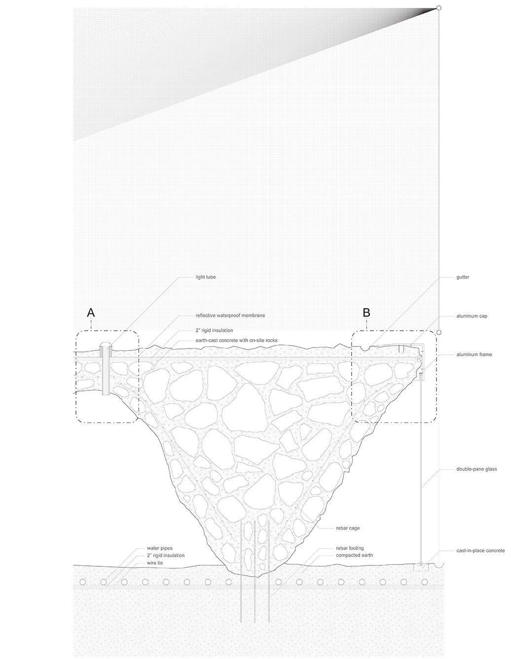
Glass tubes are designed to cast in place as the skylights. The placement follows the structure need, the smaller the internal force, the more the skylights. These skylights would reduce the need for electric lightings and create an atmosphereic effect.

 rebar cage compacted earthreservoir
rock cast structuretension tie of fog catcher
The enclosure is designed to fit the irregular geometry and rough surfaces resulted from the brutal construction method. A metal edge is folded around the edge and used as the buffer between the rock cast and the glass curtain. Together they form the climate control line.


earth
structure Gravel for path
Compacted earth
Compacted
earthMetal capping of window
Rock cast structure core
Stabilization geotextile
Earth mold for rock cast core
Enclosure Detail
This project constructs relationships between two contrasting materialities, earth and fog. The site leaves traces of these on the building itself, concentrating the essential experience of the terroir. Excavation and fog catcher are elevated beyond conventional applications to influence building form, materiality, and performance. Borrowed earth becomes the formwork for rugged earth masonry structures. Berms created from displaced earth structurally support the suspended fog catcher system. Each system requires only a simple, transportable set of tools.

EARTH OBSERVATORY & PLANETARIUM

UC Berkeley 2017 Arch 100C
Instructor: Rene Davids
The site is located in an abandoned quarry in Rockridge, Oakland, and I intend to explore a poetic alternative to the current careless abandonment of quarries in Oakland. The project incorporates a Planetarium and a Geological Exploratorium and captures Genius loci, celebrating the timeless quality of the stone, sky and water, while relinks surrounding urban fabric that are currently disconnected.
A model was created to reinterpret the stone. The project focuses on the splitting movement of stones and represents the driving force behind the movement. Since stones are individual objects but when grouping together they form different landscapes. My model was designed to share the same quality and a modular system was adopted. The basic module can split and retract. These small modules were put together to form a bigger model which can form different space. The cubes were pushed up and down to form different configuration, just like how the crustal movement shape the landform we see today since a long time ago

1
Plaza
Cycle


These Collage with the photographs of the Bilger quarry and the artificial stone exercise provided conceptual foundation for the project.


The series diagrams show the relationship between the project and the site, the way programs are organized, the conceptual thinking behind the project and how the exhibits are perceived by visitors.


 Waving landscape
created by tubes in different length
resembles Oakland Topography
Offline Exhibiton in an Online World The three layers of the project resemble and celebrate the timeless quality of sky, water and stone.
The fisrt layer of the museum complex form a plaza with the existing fabrics A diagram shows how the house of stones works. The stones are hosts and people are guests. In Between From Public to Private / From Noisy to Quiet From Light to Dark / From Urban to Nature
The walking corridor of the musuem is de signed in the cycle of geological period
Sky, Water and Stone
House of Stone
Waving
Stepping Landscape
Site Model


Attitude
This project is not trying to flaunt its form, propagandize its content or nest over the site. It accepts the constructed nature , transform the force of nature into architecture language, and it humbly submerges its monumentality underneath the water, only giving a few hints by the popping out skylights. It quietly waits underneath the surface like a silent stone, for the visitors to come through the cycle and explore the deep sensation in the heart intrigued by the light and space and the timelessness of the content.
Conceptual Site Model
Process Model
Site Analysis
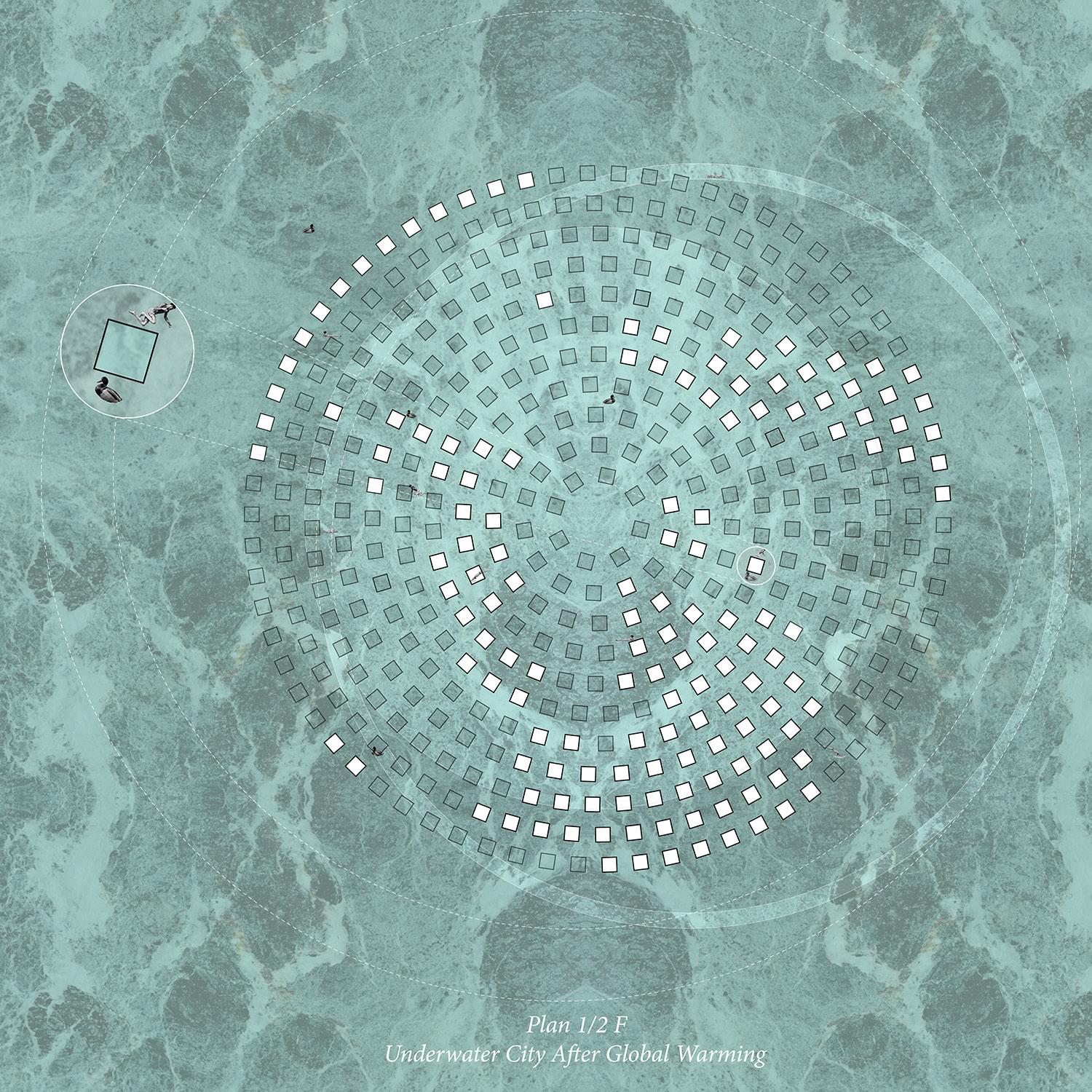
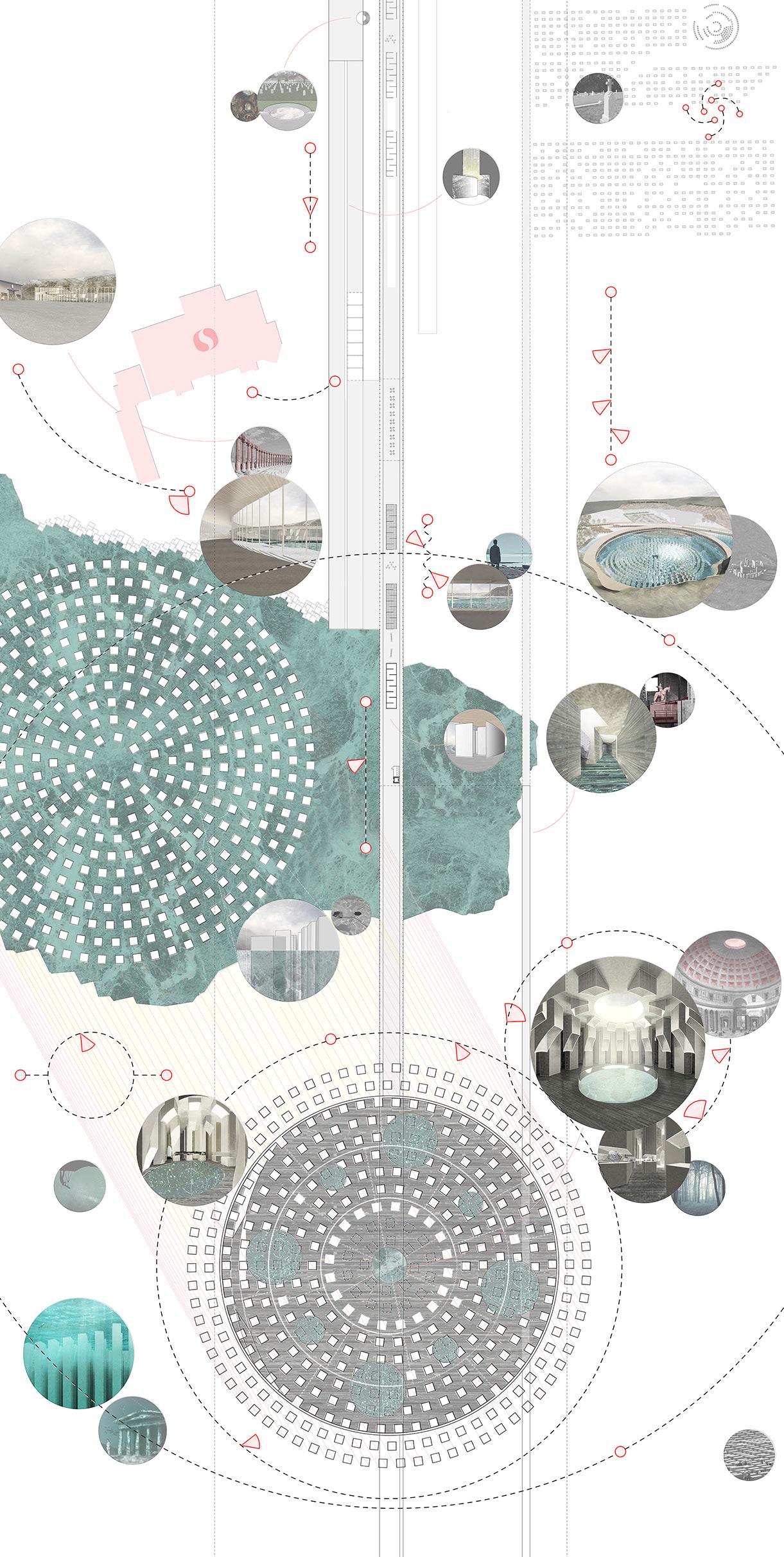
The series of 4 maps of the assigned site in relation to larger Oakland study conditions including existing connections (bridges and tunnels),crustal movement, regional hydrology and star orbiting. These studies transform directly or indirectly into the museum project: The outside walkway connects surrounding city fabrics as a bridge, featured in Bay area; The skylights shoot through the roof into the light and become a waving landscape coming in and out of the water, resembling Oakland’s topographical condition; People can experience the water from different layers, from top looking down, from the gallery on the same level, inside lagoon and touch the water and underneath the water in the stone musem; The project’s three layers of rings in plan resembles the orbiting of the planets, echoing the theme of timelessness.


Site Plan
The project site is at the intersection between the Oakland hills and the flats, College and Piedmont shopping areas, and below the Oakland and Saint Mary’s Catholic Cemetery, the Country club and CCA but there is a little if any connection between these areas. The walkway outside the museum establishes a connection between these isolated fabrics, forms a plaza with the existing shopping center while also acts as a buffer zone, offering a smooth transition between the hustle-bustle of Safeway and the Earth Observatory and Planetarium, between the artificial and nature. The circular shape of the inside circular gallery helps directing attention to the lagoon.

3


Illuminated, or illumates. Walking through the different layers of the museum, people can visit the Stone Exploratorium while enjoying the rich scenic environment the lagoon provides, sense the change of both space and time.

One is brought to awareness regarding the reality of water - it is an active part of the architecture. Rising and Falling between seasons, showing or hiding the museum, the water intrigue poeple's sense of time.


Explode Axon
6
Unroll Narrative
Diagram

VERNACULAR SPECTACULAR
UC Berkeley 2017
Collaboration with Anthony Lam
Instructor: Mete Sonmez
Third Prize - VEX ASA International Design Competition 2018
Roof typology, here is the dome, is used and manipulated in our design. Historically speaking, the dome was an intensely hierarchical and centrally form. Unlike other traditional roof typologies, such as pitched roofs or flat roofs, which usually have uniformed space underneath, or barrel vaults, which create linear space, domes typically create centralized and static space, forcing people to look up and create a sense of monumentality through both people’s reaction and the scale of the structure. It usually symbolizes serenity and power, seen on churches or palaces. Architecturally speaking, it was used as a shape making tool in the sense that the form of the structure is exactly how people sense the interior space. Due to its unique formal quality and standing in architecture history, the dome has become a symbol of classical order and rarely appears in modern or contemporary architecture.
What if we reconsider archetypes, here specifically roof, be treated as purely form cleansed of its associative surplus (function, context, iconographic definition), which offers the opportunity for its transformation. Here we ask, What are the qualities of architecture in perpetuity? Can we associate architectural flexibility as a typological problem of elongated permanence rather than ephemerality? Can the typology be redefined here with the counterintuitive proposition, that “type” is indeed dynamic, fluid, and evolving entities?
Our design proposal can be considered a response to these questions in its specific context. A grid was generated from the surrounding urban fabric while being rotated to challenge the grid and strength the boundary condition.
Artists’ oddness were expressed through the rotating grid, which challenges the banal normative grid around. The concept of living is deconstructed and represented diagrammatically in our project. The social space is extracted from each living unit and becomes a common living room on the third floor while leaving the private bedrooms and bathrooms in each separate unit (which are accessed by separate stairs for each one of them). Here, the dome is the main instigator of the project, but it is freed from its original function, context, and iconographic definition. Different from the monumental scale, centrally, serenity classical model of the dome, here the dome act as human scale, vernacular, scattered individual living units. The mixed play between the traditional and contemporary use of dome gives the dome all the possibilities to be associated with architecture history and context, while also setting it free as a typology from any of these. Its how we use architecture history to create something new, conceive flexibility as a typological enigma, or to say, achieve spectacular through vernacular.
Elevation
The design reaches complexity and contradiction through playing with classical architecture language and typology. For example, all the units are similar, while cropped by the site boundary, different profiles were shown. The sectional quality is also expressed through the elevation, which blurs the boundary between these two. All the archetypes used in this building are symmetry, while due to the rotation and the asymmetry of the site, it gives a sense of unbalanced while appear ordered at first. The design incorporates a relentless grid as a background, while none of the design moves are either modernists or classicists.

Stacking
Each individual unit is composed of a dome as a shape making tool on the top, a dome as a space-making tool inserted as a void, and arches supporting beneath as structure tool. Some units were connected to form a larger space while other in-between spaces become skylights penetrating through the building. Because of the changing of poche figure with each unit, four different spatial types were stacked within a single building. Thus, the idea of flexibility was investigated based on the overlay of the relentless rotated grid and the variation of certain plan typologies through different manipulation of the dome as archetypes.

 Concept Model showing the stacking typology condition
Plan changes from a open plan, to a multiple corridor plan, to a multiple room plan, to individual room plan.


PROFESSIONAL WORKS
 Rendering Collaborated with JIGEN
Shenzhen Opera House
Project Manager: Anna Von Roeder
Project Team: Sami Yakhlef, Zihao Wang, Zhifei Xu
Role: 3D Modeling, Drawing, Diagram, Material Sample Year: 2022
This almost square-shaped precinct, the Opera House neighbourhood, will be part and parcel of the music and the sea on three of its sides. It will be protected by a huge glass hall to substantiate the fact that the Opera House itself and its auditorium belong to the China Sea. The Opera House’s auditorium will be visible through the spacious foyer leading to it. On the northern side it will open completely on to the music precinct. This will involve a large loggia opening on to terraces teeming with life, seaside terraces that will evoke the sea, thanks to lying beneath the lights coming from the sea of glass that will house them. The sea will be both around you and over you. This explains more clearly why the main foyer has to be made of a noble, precious and luminous material that spells the meeting of sea and music and light. Mother-of-pearl is a bright and lustrous light-element that looks wet when dry. As such, mother-of-pearl will feature in the Opera House auditorium in an irregular, rhythmic way, highlighting the curve of the balconies or the acoustic geometries of the walls. Using the lustrous white reflections of a nacreous material will be a concrete poeticisation of the meeting of the sea and the auditorium and concert halls of the Opera House. It will be an indication of the diverse uses of the halls and foyers in its rhythmic marking of the different interiors. At Shenzhen, then, inside as well as out, the twin image of mother-of-pearl shell and wave will open on to the everchanging light of the sea.


80m 70m 53m BIG ROOF MFH SOFFIT 大屋顶多功能厅檐口 DESIGN 设计 TERTIARY ALUMINUM MEMBERS 三级梁 ALUMINUM FRAMES + GLASS PANELS (TWO SIDED) 铝框+玻璃面板(双面) PRIMARY STEEL BEAMS 主梁 - Truss depth: 2m to 11m SECONDARY STEEL BEAMS 次梁 - Truss depth: 2.25m to 4m OVERALL SYSTEM 整体系统 深圳歌剧院 - Shenzhen Opera House Schematic Design 方案设计 - MID TERM REPORT -中期汇报 - October 2022
Ateliers JeanNouvel




sample Substract description GLASS TYPE Transparent A02 no Pilkington K glass N (float) face 4 GLASS TYPE Transparent Solar B01 Low iron solar saflex solar SH 0.76 mm 1pvb B02 Low iron solar saflex solar SG 0.76 mm 1pvb GLASS TYPE Transparent Teinted B03 Low iron earth tone ocean grey (RB17 8761, VCV 000H) 0.38 |saflex solar SG 0.38| saflex clear 0.38, low iron B04 Low iron earth tone shale grey RB17 6544) 0.38 |saflex solar SG 0.38| saflex clear 0.38, low iron B05 Low iron earth tone graphite grey RB17 0828) 0.38 |saflex solar SG 0.38| saflex clear 0.38, low iron B06 Low iron earth tone smoke grey RB17 8378) 0.38 |saflex solar SG 0.38| saflex clear 0.38, low iron GLASS TYPE Printed C01 Low iron 25% density C02 Low iron 50% density C03 Low iron 75% density GLASS TYPE Patterned D01 no Kathedral D02 Low iron Chinchilla D03 no Kura D04 no Imprimée 54 D05 no Imprimé 151 D06 no Atlantic GLASS TYPE PV E01 Monocrystalline silicon E02 Cadmium Telluride Photovoltaic Transparent - Hard pirolytique coating PVB solar grey + PVB solar graphic patternPVBSOLARCOATING PVBSOLARCOATING PVBSOLARCOATING PVBSOLARCOATING BIG ROOF PANELS 大屋顶玻璃面板 TYPES AND MATERIALS 类型和材料 TRANSPARENT GLASS 透明玻璃 PRINTED GLASS 彩釉玻璃 PATTERNED GLASS 压花玻璃 PRINTED+PATTERNED GLASS 彩釉+压花玻璃 PANEL TYPES 玻璃面板种类 Transparent PrintedPatternedPrinted and PatternedPhotovoltaic no glassTOTAL PIECES 952671465761 7017 58138030411 31%23%19% 23% 2% 1%100% m² 301782915423735 2911324772258116915 深圳歌剧院 - Shenzhen Opera House Schematic Design 方案设计 - MID TERM REPORT -中期汇报 - October 2022Ateliers JeanNouvel BIG ROOF PANELS 大屋顶玻璃面板 GEOMETRY AND SIZE 几何和尺寸 TERTIARY ALUMINUM MEMBERS 三级梁 ALUMINUM FRAMES 铝框 GLASS PANELS 玻璃面板 SECONDARY STEEL BEAMS 次梁 PANEL SIZES 玻璃面板尺寸 3,75m x 1,5m3,00m x 1,5m2,25m x 1,5m1,50m x 1,5m 40%20%20%20% 深圳歌剧院 - Shenzhen Opera House Schematic Design 方案设计 - MID TERM REPORT -中期汇报 - October 2022Ateliers JeanNouvel
 Rendering Collaborated with BRICK
Bjarke Ingels Group Smithsonian Campus
Project Manager: Aran Coakley
Project Leader: Alvaro Velosa

Project Team: Zhifei Xu

Role: Drawing, Diagram, Render, Model Year: 2018
Located between 7th and 12th Streets along Independence Avenue SW on the National Mall, the site includes the Smithsonian Institution Building (known as the Castle), the Arts and Industries Building, the Freer Gallery, the Hirshhorn Museum and Sculpture Garden, and the largely underground Quadrangle Building, which is home to the National Museum of African Art, the Sackler Gallery of Art and the S. Dillon Ripley Center.
BIG’s Master Plan will expand the Visitor Center and add a new Education Space beneath the garden, with access provided by peeling the edges of the landscape up. These design moves will also create clear connections between spaces and allow natural light to reach subterranean spaces. The plan will also reconfigure the entrance pavilions of the African Art Museum and the Sackler Gallery to increase their visibility. Other changes include updating mechanical systems and adding structural reinforcements to the Castle to protect against seismic activity.
Alternative


RESTORE CASTLE PERIOD OF HISTORICAL SIGNIFICANCE, 1910 VISITOR CENTER VISITOR CENTER CONNECTS TO QUAD LEVEL B1 EXISTING QUAD FOUNDATION WALL EXTENT OF EXCAVATION RELOCATE PAVILIONS VISIBILITY FROM MALL AND CONSOLIDATE LOADING RAMPS CENTRALIZE MEP SERVE THE ENTIRE CAMPUS ACCESS TO MUSEUM VISITOR CENTER MAINTAIN A PARTERRE EAST WEST CIRCULATION EAST WEST PATHS CONSOLIDATED LOADING DOCK CONSOLIDATED LOADING CONSOLIDATE VISITOR CENTER & MUSEUM ACCESS ELEVATOR ACCESS ELEVATOR ACCESS INCORPORATE INTIMATE GARDENS INTIMATE GARDENS SW ECO DISTRICT CONNECTION EXPAND SKYLIGHTS EXPANDED SKYLIGHTS BRING ESTABLISH CIRCULATION TERRACED GARDENS MALL CONNECTION ENTRY TO MUSEUMS
Masterplan Elements and Transformation
INTRODUCTION
BUILDINGS
South Mall Campus:
INTRODUCTION SITE CONSTRAINTS


South Mall Campus:
The South Mall Campus is located in the Southwest Quadrant of Washington, D.C. and occupies approximately twelve acres of land along the southern half of the national mall. The site’s major boundaries are predominately defined by Twelfth and Seventh Streets, S.W., to the west and east; Independence Avenue, S.W., to the south; and Jefferson Drive, S.W. to the north. A portion of the campus (the Hirshhorn Museum Sculpture Garden and its flanking tree panels) extends beyond Jefferson Drive to the north.
The South Mall Campus is located in the Southwest Quadrant of Washington, D.C. and occupies approximately twelve acres of land along the southern half of the national mall. The site’s major boundaries are predominately defined by Twelfth and Seventh Streets, S.W., to the west and east; Independence Avenue, S.W., to the south; and Jefferson Drive, S.W. to the north. A portion of the campus (the Hirshhorn Museum Sculpture Garden and its flanking tree panels) extends beyond Jefferson Drive to the north.
McMillan Line:


New projects are constrained by the McMillan setback line determined by the planning commission in the early 1900s. The line is a 445 foot offset from the east-west axis of the Mall. Although a few anomalies exist, seeking an exception would involve a long and complicated process.
Cons
-Extents of excavation under Castle
-Garden too park-like
-Removal of 3 Quad entry pavilions
-Poor access to expanded Castle Visitor Center
-Poor daylight at Castle Visitor Center
Historically Designated Places:
INTRODUCTION VIEWS OF HISTORICAL BUILDINGS
Historically Designated Places:
The entirety of the campus is located within the National Mall Historic District which is listed in the D.C. Inventory of Historic Sites and National Register of Historic Places. All of the buildings, except the Quadrangle, are currently individually listed in the National Register of Historic Places or have been designated National Historic Landmarks.
The entirety of the campus is located within the National Mall Historic District which is listed in the D.C. Inventory of Historic Sites and National Register of Historic Places. All of the buildings, except the Quadrangle, are currently individually listed in the National Register of Historic Places or have been designated National Historic Landmarks.
STREET
STREET
9th Street Tunnel:
Castle View Preservation:
The 9th street expressway tunnel runs north-south between the Arts and Industries Building and the Hirshhorn Museum. This creates a barrier to a potential underground connection between the Hirshhorn Museum and the rest of the campus.
As the oldest and most iconic building on the National Mall, the Castle should remain prominent and clearly visible to visitors arriving from all directions. Its presence on Independence Avenue will also become important as the SW Eco-district continues to develop in the future.
Pros
+Restoration of Castle
+Seismic Castle protection
+Consolidated loading facilities
+Repair Quad roof
+Central mechanical plant and modern efficient systems


+Improved campus circulation and wayfinding
Paln Design Elements


+Accessible Freer Entrance
+Hirshhorn Museum tunnel and garden walls restored +AIB parking replaced with expanded garden
ALTERNATIVE C PRESENTED 12.2014
SOUTH MALL CAMPUS
JEFFERSON
DR. INDEPENDENCE AVE. 7TH STREET 12TH STREET 10TH STREET 9TH STREET THE CASTLE AIB NMAFASACKLER RIPLEY FREER HIRSHHORN
JEFFERSON
DR. INDEPENDENCE AVE. 7TH STREET 12TH STREET 10TH STREET 9TH STREET THE CASTLE AIB FREER HIRSHHORN NATIONAL MALL HIRSHHORN SCULPTURE GARDEN
SMITHSONIAN
SOUTH MALL CAMPUS 20
INTRODUCTION CAMPUS BUILDINGS
JEFFERSON
DR. INDEPENDENCE AVE. 7TH STREET 12TH STREET 10TH STREET 9TH STREET MALL CENTER LINE 445 FT [135M]
JEFFERSON
DR.
INDEPENDENCE
AVE. 7TH STREET 12TH STREET 10TH STREET 9TH STREET 9TH ST. EXPRESSWAY
SMITHSONIAN
SOUTH MALL CAMPUS 21
JEFFERSON DR. 7TH STREET 12TH STREET 10TH
9TH
THE CASTLE 12TH
STREET
SMITHSONIAN SOUTH MALL CAMPUS
Campus Views: Views to historical visible by visitors
JEFFERSON DR.
INDEPENDENCE AVE.
7TH STREET 12TH STREET 10TH STREET 9TH STREET
THE CASTLE
AIB NMAFA
SACKLER
RIPLEY
FREER
HIRSHHORN
JEFFERSON DR.
INDEPENDENCE
AVE.
7TH
STREET
12TH
STREET
10TH
STREET
9TH
STREET
THE
CASTLE
AIB
FREER
HIRSHHORN NATIONAL
MALL
HIRSHHORN SCULPTURE GARDEN
SMITHSONIAN SOUTH MALL CAMPUS 20
CAMPUS
CASTLE BASEMENT AND QUAD NORTH SOUTH SECTION FACING EAST
CASTLE BASEMENT AND QUAD NORTH SOUTH SECTION FACING EAST
SMITHSONIAN SOUTH MALL CAMPUS
accommodate


WC Sackler Entry Loading Service Service Service
WC Sackler Entry Loading Service Service Service New Visitor Center galleries can
the program currently
Egress
the castle: gift shop,
visitor
ion,


Sackler Entry Galleries 262 Offices and Collections Events and Exhibition Sackler Entry
Galleries currently occupying
restrooms,
informat
cafe.

Zheshui Nature Conservation Center
Project Manager: Yao Zhang Project Team: Zhifei Xu, Ryan Wu

Role: 3D Modeling, Drawing, Diagram, Rendering Year: 2021
Regardless of the appearance, the traditional nature conservation station design is relatively single-function, mainly responsible for the exhibition and reception role of visitors, and the space is relatively simple, mostly a basic room plan or an open plan. This simple design can no longer cope with the changing needs of today.
Our proposal further designs office space and accommodation space in addition to the basic function of receiving visitors (exhibition hall, souvenirs) for the traditional nature conservation station, which enhances the economic benefits of the nature conservation station, and also the design of the viewing platform helps to promote tourism. The indeterminate space design facilitates flexible switching of use scenarios and the future transformation of the building operation.
The sheer volume of the building stands like a temple on the site, overlooking the entire watershed and gaining monumentality. The facade without openings gives the building a sculptural feel. The vertical prismatic masses seem to be separated but continuous like a canyon, echoing the geological features of the site and completing the spirit of the site.
OfficeOffCourse
900 18001800900180018002700900800 1000 1000 1375 9003580 900 1330 28501160 1170 2000 1000 900 2000 1900 10003610 1000 1000 1900 1000 1350 900 1800 500 1200 1260 1375 2000 2621 690690 410 672762 850 1270 725 566 725 720 600 900 410 900 2100 900 1600 1540 900 900 900 826 1600 1600 1640 900 1900 2700 900 1400 4050 410 600 500 1390 1000 900 1000 566 672 762 925 925 2900 2000 1000 2700 2160 1000 319 2100 900 1200 900 2700 900 900 900 1820 1600 1700 900 900 900 1000 1000 800 689 1700 1580 3640 1014 2850 997 1200 1713 900 900 620 900900 1100 900 9001340 1000 900 740900 900 450 1480214 900 826 900900 9009009009001050 9001050 900900900 2000 900 1340 1200 4340 42204540 3000 3600 300 4840 1000 320 6740 38 3824 4060 9640 66806040 3770 900 5080 4280 900 3900 3900 8040 6640 2980 4540 3560 1200 7240 200 6600 3440 4540 1200 2700 3480 3280 5870 7340 1200 120 8180 100045402300200010001000 120 4260 4280 7240 6920 42201800 620 1800 900 2700 36001200 300 3003600 5220 5220 3303 6017 1600 5290 3900 1800 3500 360010003600 3760 5000 1500 18980 2420 6300 1500 3760 4640 4400 3320 1400 5220 4220 1000 36003700 120300 200 1200 3600 6300 3840 2000 3400 700 700 6000 3650 4260 1200 4340 6920 3600 2040 3900 620 1000 1800 480 5220 1000 4340 5400 3840 23402780 8800 360011606880900 5100 4240 1000454010880 6300 5120 35005340 7560 5380 5120 5660 1840 6300 1200 1800 320 4790 2940 6440 65301500 6660 6040 200 1400 7430 2003004490 3120 4290 120 4250 5800 3700 3900 4500 7520 65302720 46409005610 3900 3700 1000 5400 900 4000 4890 1620 4540 2040 5660 4460 28900 5120 6040 5720 2420 1000 7210 1000 10520 100018001000 3600 1480 3340 3600 7640 3980 6300 5000 4360 1500 2320 4720 2704 5100 1880 1880 2000 3880 3920 1200 4060 4000 1750 3650 9640 4600 7220 3600 38004440 6760 4500 4620 1750 250 1000 6300 报告厅 办公区 办公区 休息区 厕所 前台 视频展览室 演讲室 设备摆放区 展览室A 展览室B 展览室C 会议室 清洁室 衣帽间 序厅 展览区前台 展览区入口 售票机 共享办公区 共用客厅 共用客厅 会议室 一层平面1400mm +0.175 -1.575 +1.4 -0.525 +0.525 -1.75 0.00 +0.7 +0.7 -0.7 -2.5 -3 -3.5 -3 -2.0-2.5 -0.5 -3 -2.0 -2.5 -1.5
2000600 90028006752085 900 1800 900 900 900 800 1000 1000 800 900 900 900 900 800 1100 800 600 2000 600 1200 1400 600 1800 1086 734 2000 1800 900 900 900 900 900 900 1800 800 600 600 1500 200300 900 1329 1542 729 900 1700 120 200 300 800 3600 100 8002000 300 200 120 90090067511252700 900900 900 4500 580 2134 900 120 标间1 标高2800mm 标间2 标高5250mm 标间3 标高7525mm 标间4 标高10500mm 标间塔楼A型和B型从室内进入,1楼为办公室。 标间塔楼C型和D型从室外进入,1楼为共用室客 标间塔楼A型有3栋,B型C型D型各一栋。总共6 ABCD型室内尺寸无区别,仅在开窗数量和房间朝 标间1 标高2800mm 标间1 标高2800mm 共用客厅 标高175mm 标间2 标高5250mm 标间2 标高5250mm 标间3 标高7525mm 标间3 标高7525mm 标间4 标高10500mm 标间4 标高10500mm 标间1 标高2800mm 标间2 标高5250mm 标间3 标高7525mm 标间4 标高10500mm 标间塔楼A型 标间塔楼B型 标间塔楼C型 标间塔楼D型 展览厅 天井 办公室大厅 办公室 标间1 标间2 标间3 标间4 天台 中庭屋面 中庭 套间A客厅 套间A卧室1 套间B卧室 公共厕所 套间A卧室2 12775 10300 5750 8225 7525 5250 13325 4200 4375 200 12600 12600 -1500 2975 4200 6650 9450 1250012500

NEMESTUDIO

Flatbed Junk
Supervisor: Neyran Turan
Project Team: Zhifei Xu, Isabella Warren
Role: Design, Drawing and Animation Summer 2017
Interior space has swallowed the Earth. Some call it the endless interior. Others question the contemporaneity of this condition and claim that it has always been about the interior, and that we simply did not know it. After all, they say, what we call territory is nothing more than a kind of planetary interior. Thinking of the giant airconditioned interiors of assembly plants, warehouses, self-storage buildings, flower markets, convention centers, distribution centers, and office buildings, there is more to these interiors beyond their immense scale and ubiquity, however. First, consider their specific architectural manifestation of accumulation. As containers of an exponentially growing multiplication of cabinet of curiosities, they are contemporary monuments of constant collecting, accumulating and trashing of “stuff,” simply all that is junk of the junk-space. Second, despite the piles of material that they contain—from architectural elements, to material specification, to the various scales of objects—their exterior is almost always blank.
Flatbed Junk is a very large building that treats the satellite image view of the roof as a territorial relief canvas. Its flat reading is fake as it mischievously hides its architectural content. All that junk reads mute when it is flat.


 The 22-meter pavilion frames the view, just like a traditional
Elevation Long


 Elevation Short


 Final Mock-Up. Actual Building


 Photo - Entrance Gate Under Construction


 Plan- Parent Waiting Area
Photo - Parent Waiting Area Under Construction


 View of parent waiting area, under construction.


 Material experiment and formal exploration


 rebar cage compacted earthreservoir
rock cast structuretension tie of fog catcher


 Waving landscape


 Concept Model showing the stacking typology condition


 Rendering Collaborated with JIGEN


 Rendering Collaborated with BRICK


