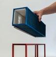
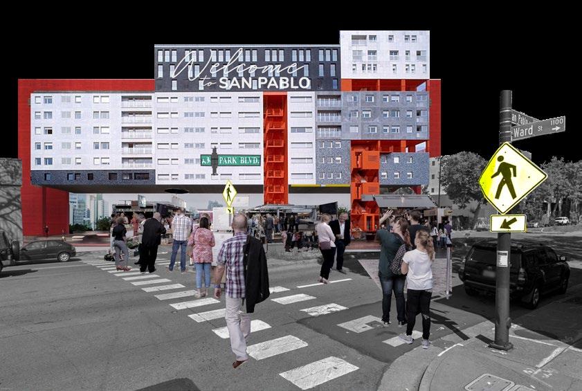
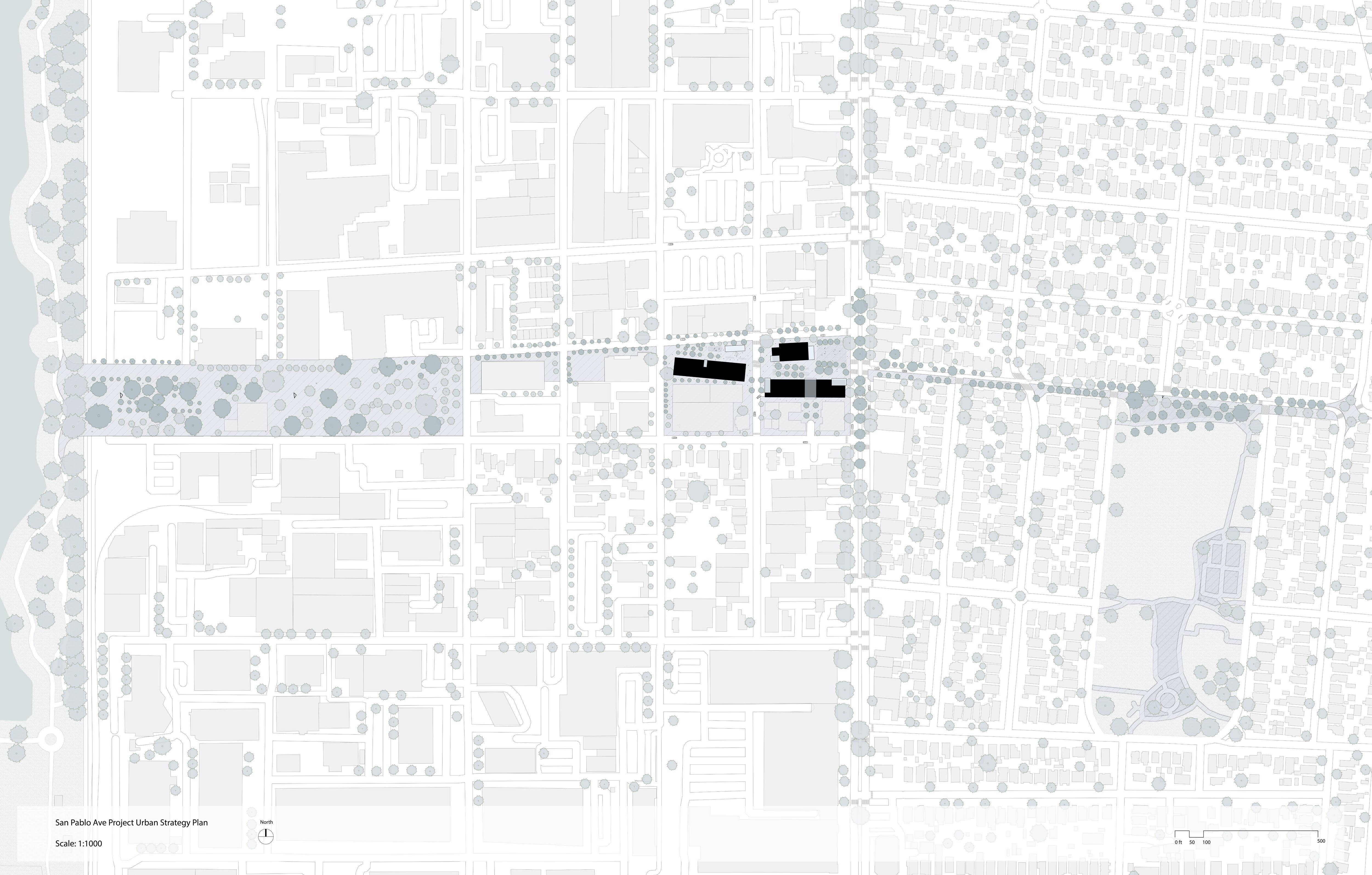
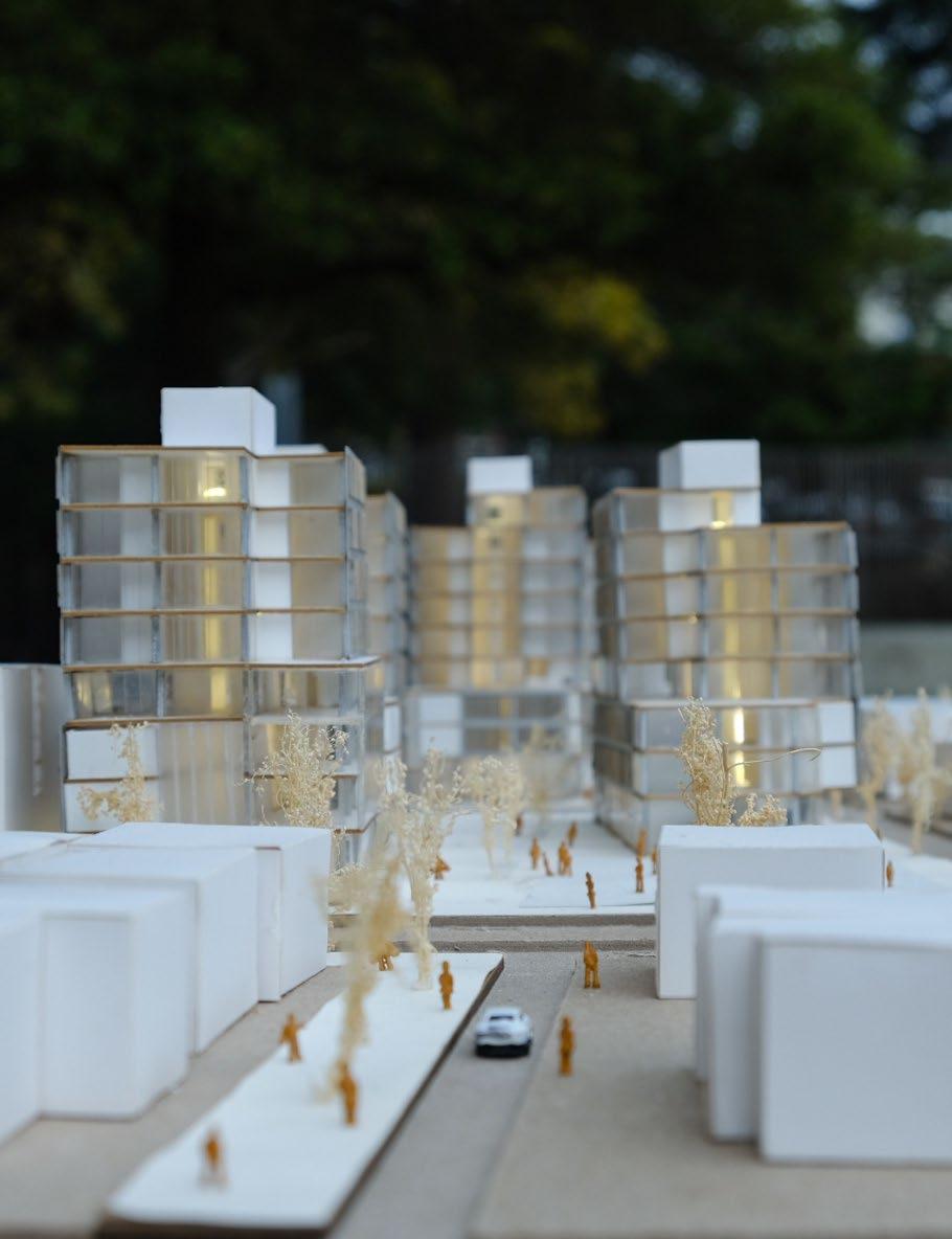
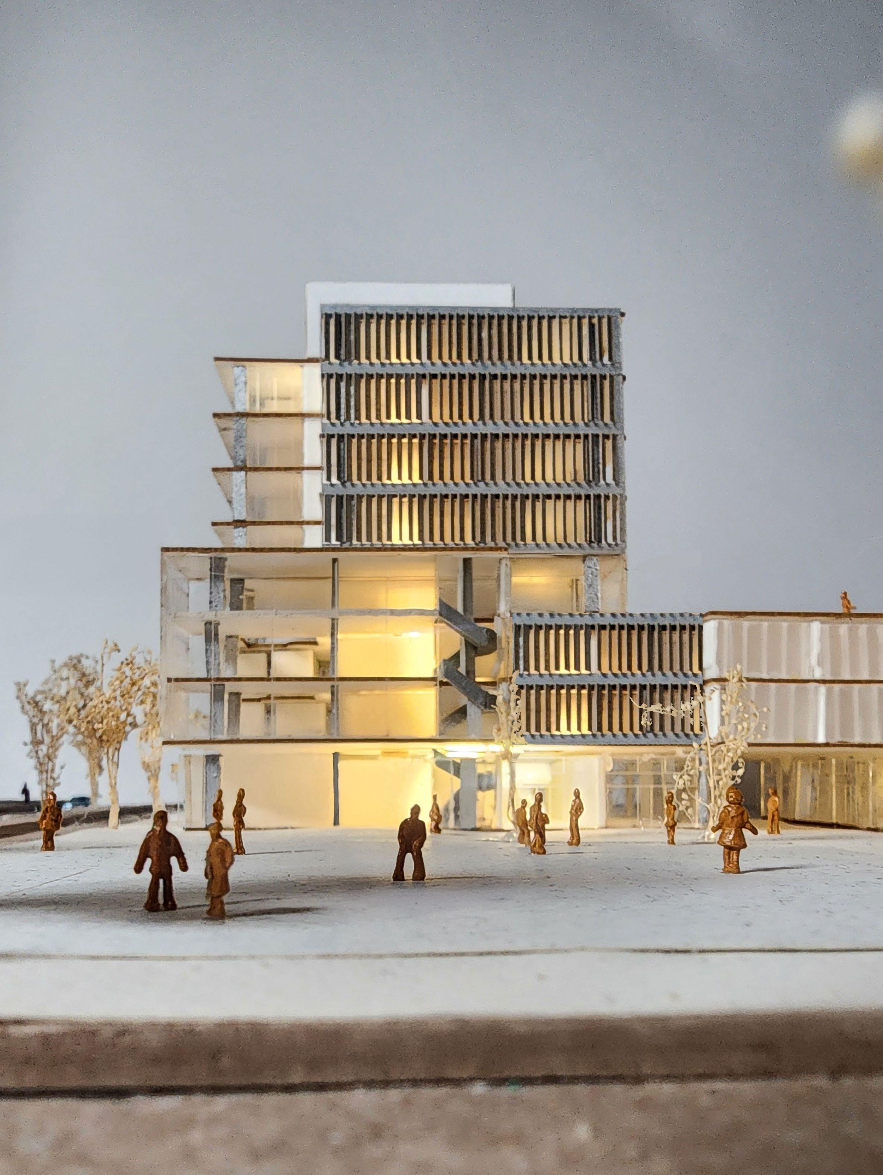
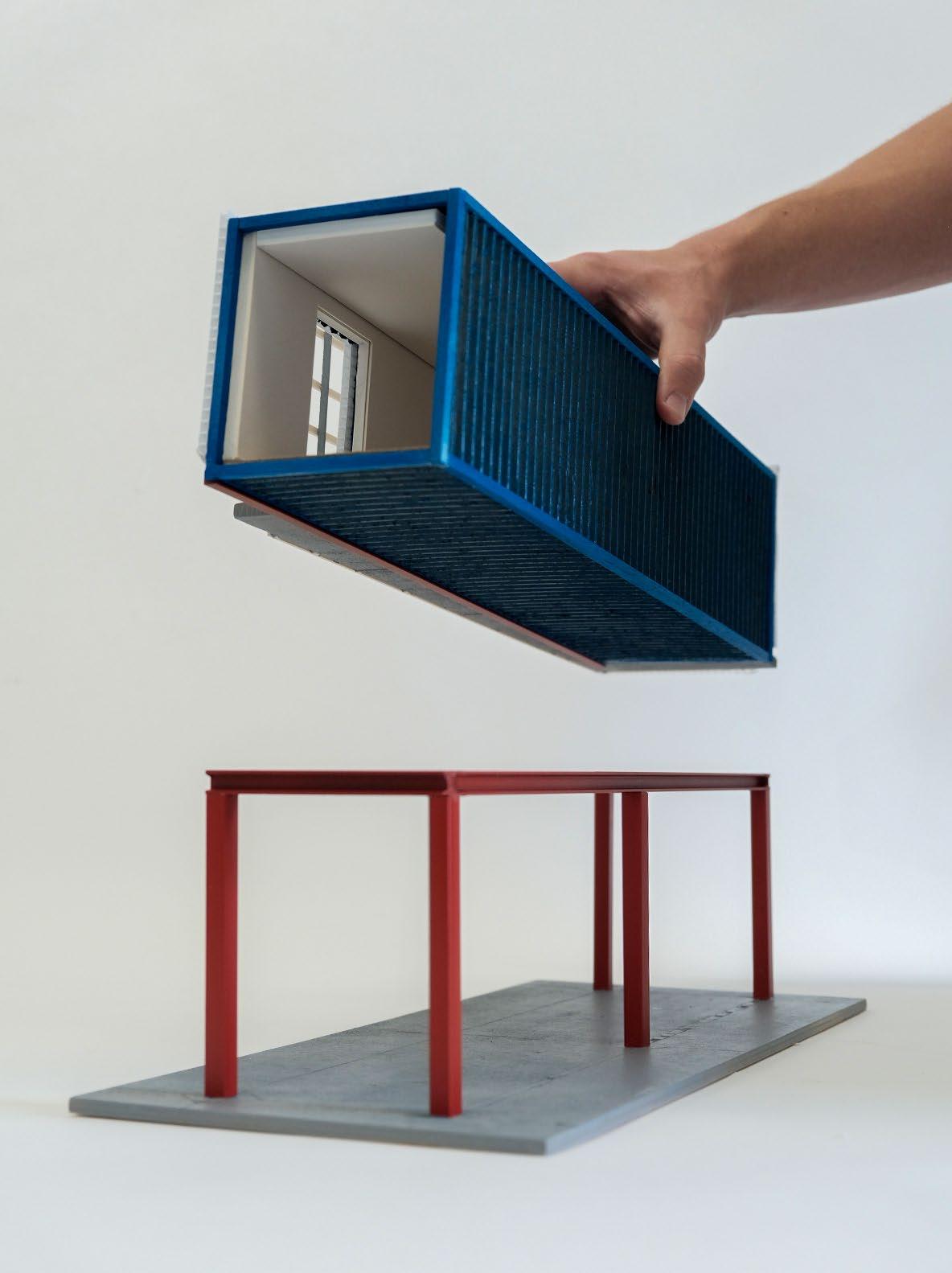
Park Boulvard
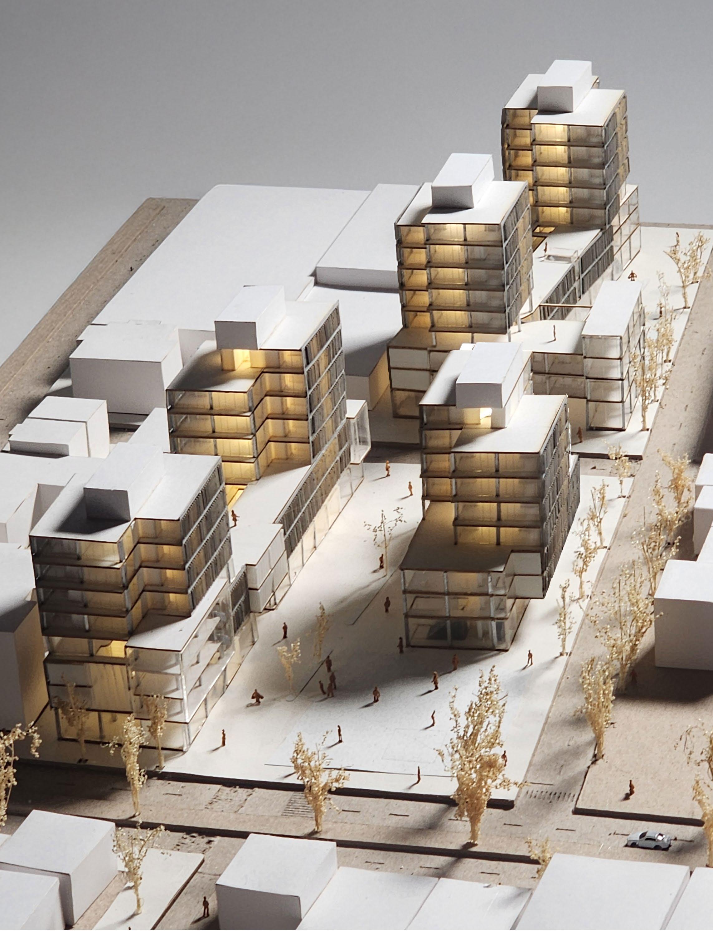
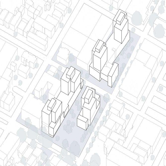
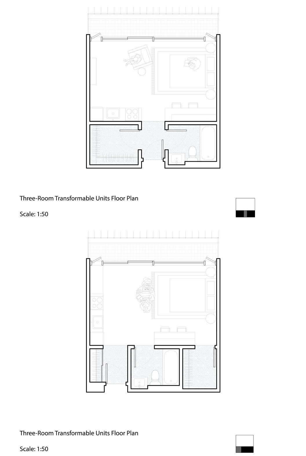
High Density Mixed-Use Residential Architecture
An urban intervention project.
The University of California, Berkeley, CED
Studio:Arch 201 Core Urbanism Studio
Instructors: Juana Canet and Gines Garrido (Visiting from ETSAM-UPM, Spain)
Software: Rhino, Grasshopper, Adobe Creativity Suite Location: Berkeley, California
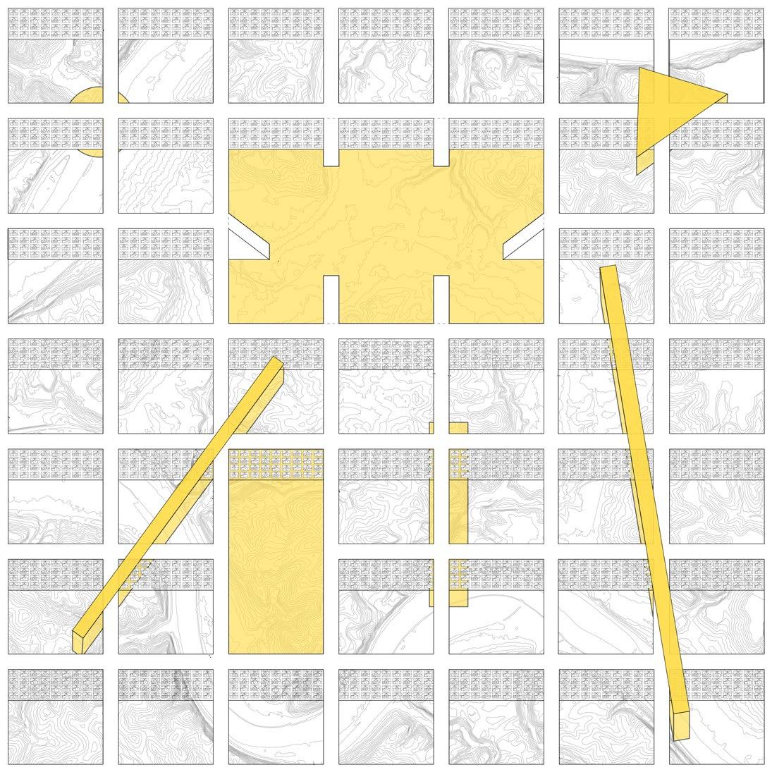
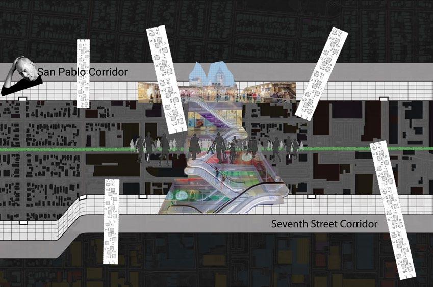
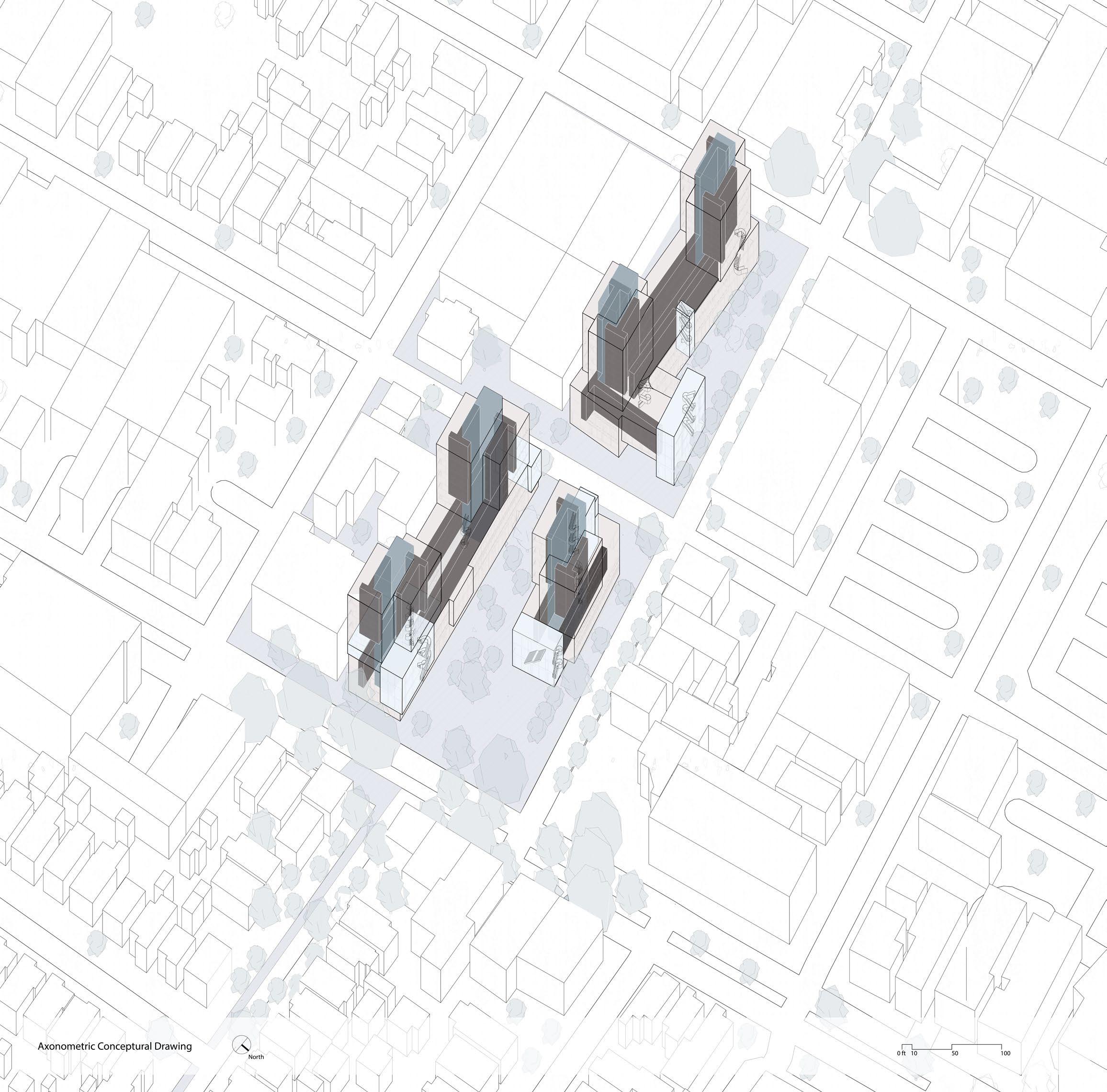
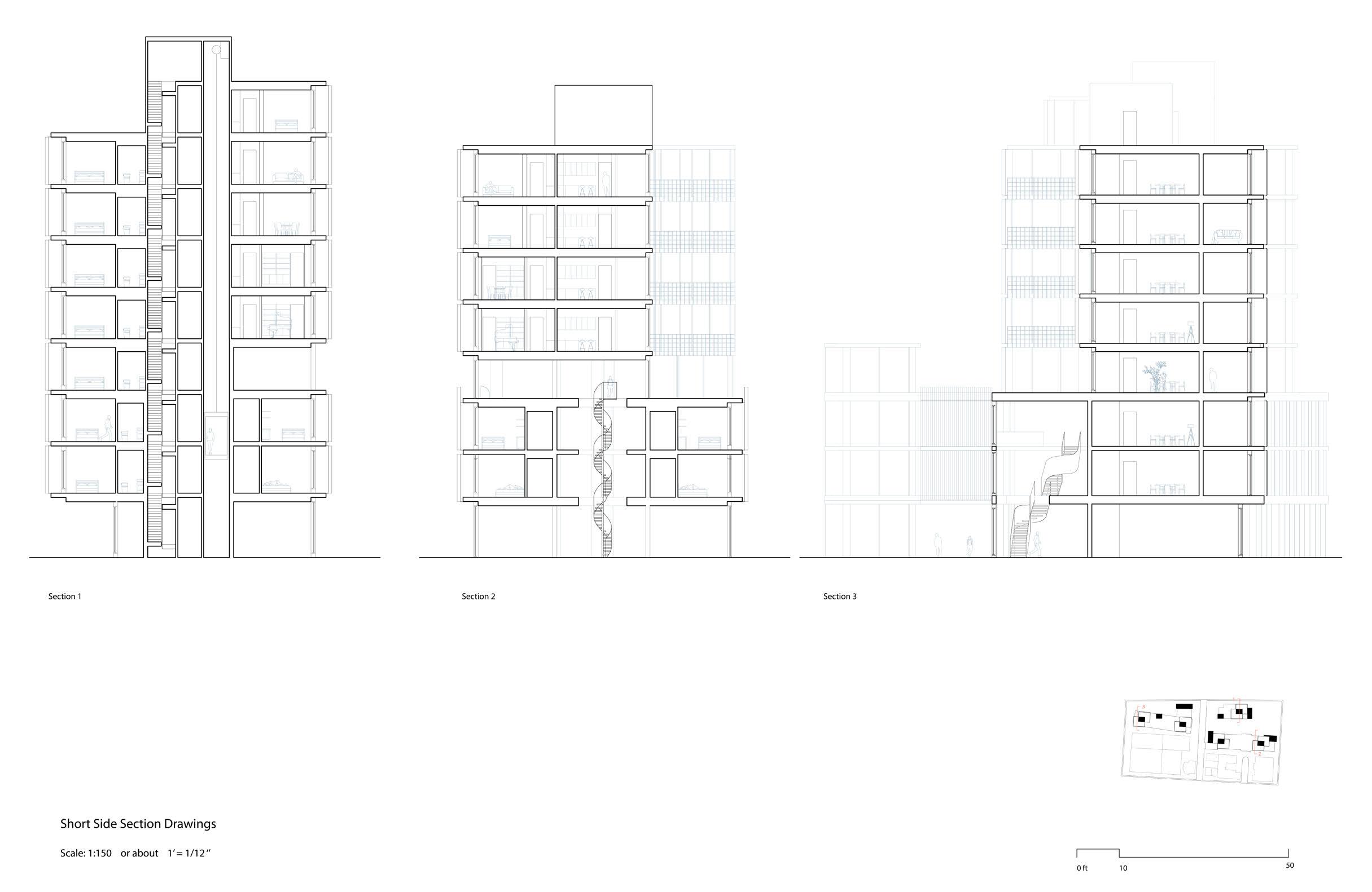
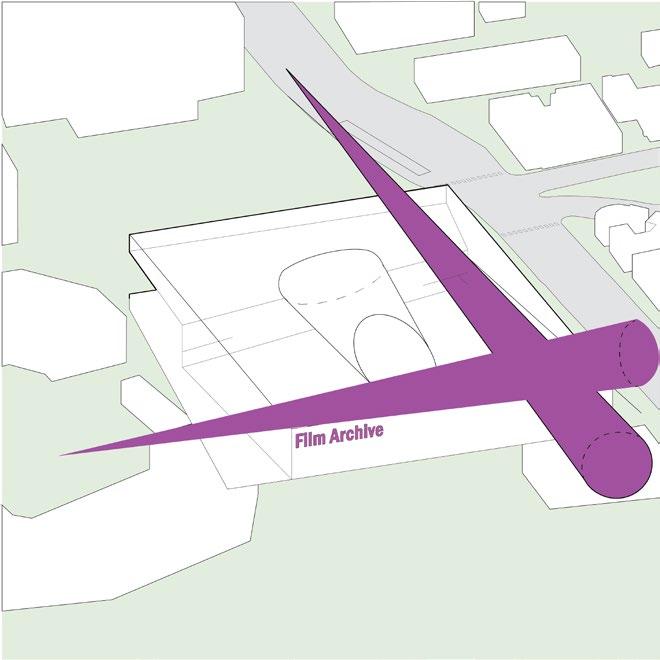
A Possibility of Breaking the Linear Limitation (Right)
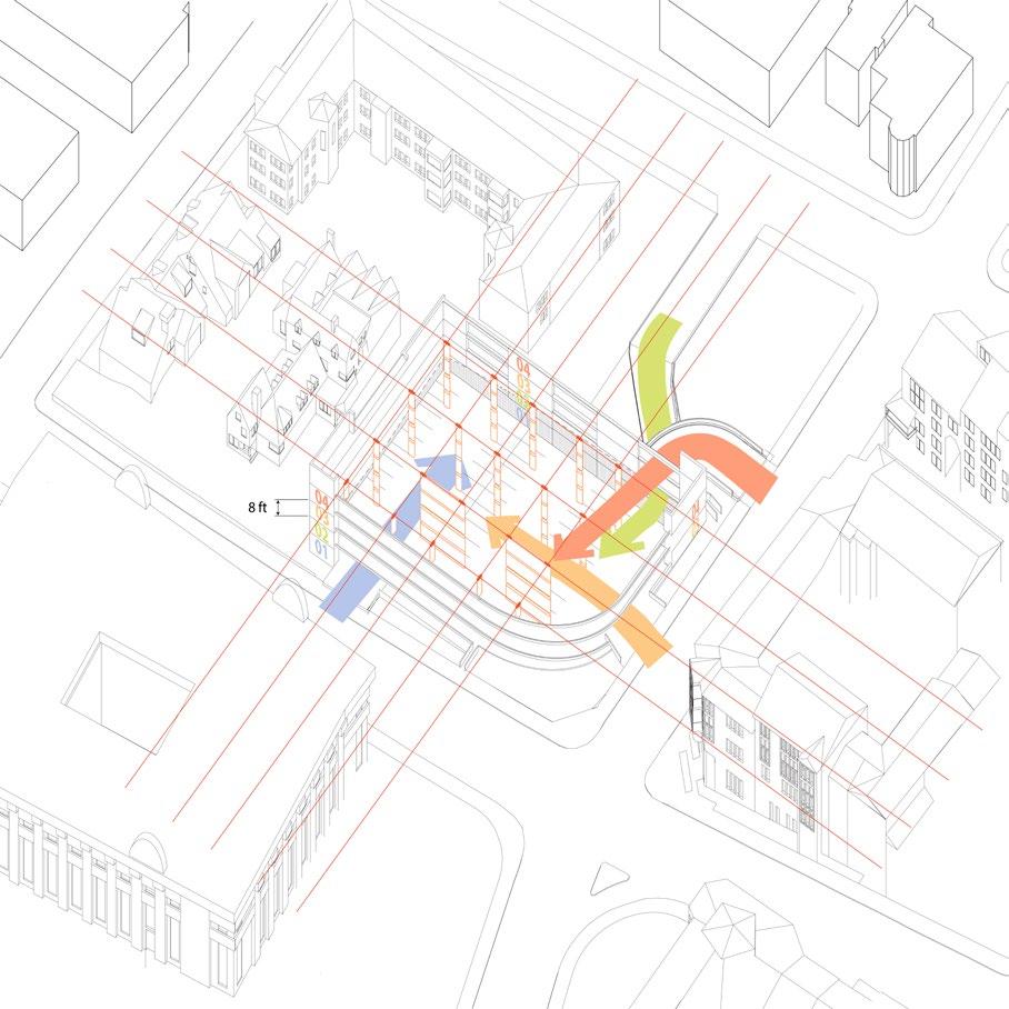
Traffic
In
This
Note:
The full analysis and proposal article is published on the UC Berkeley TRACE magine, fall 2024 issue.
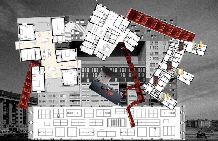
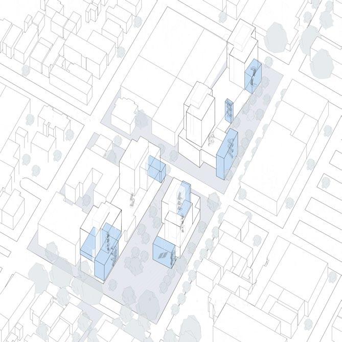
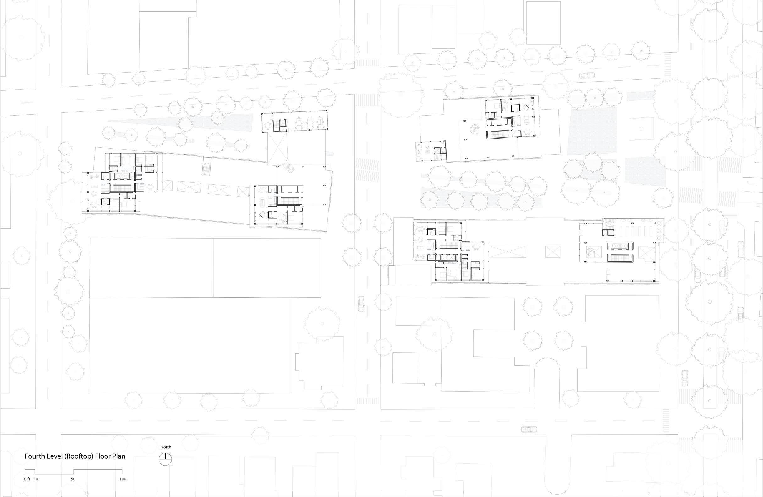
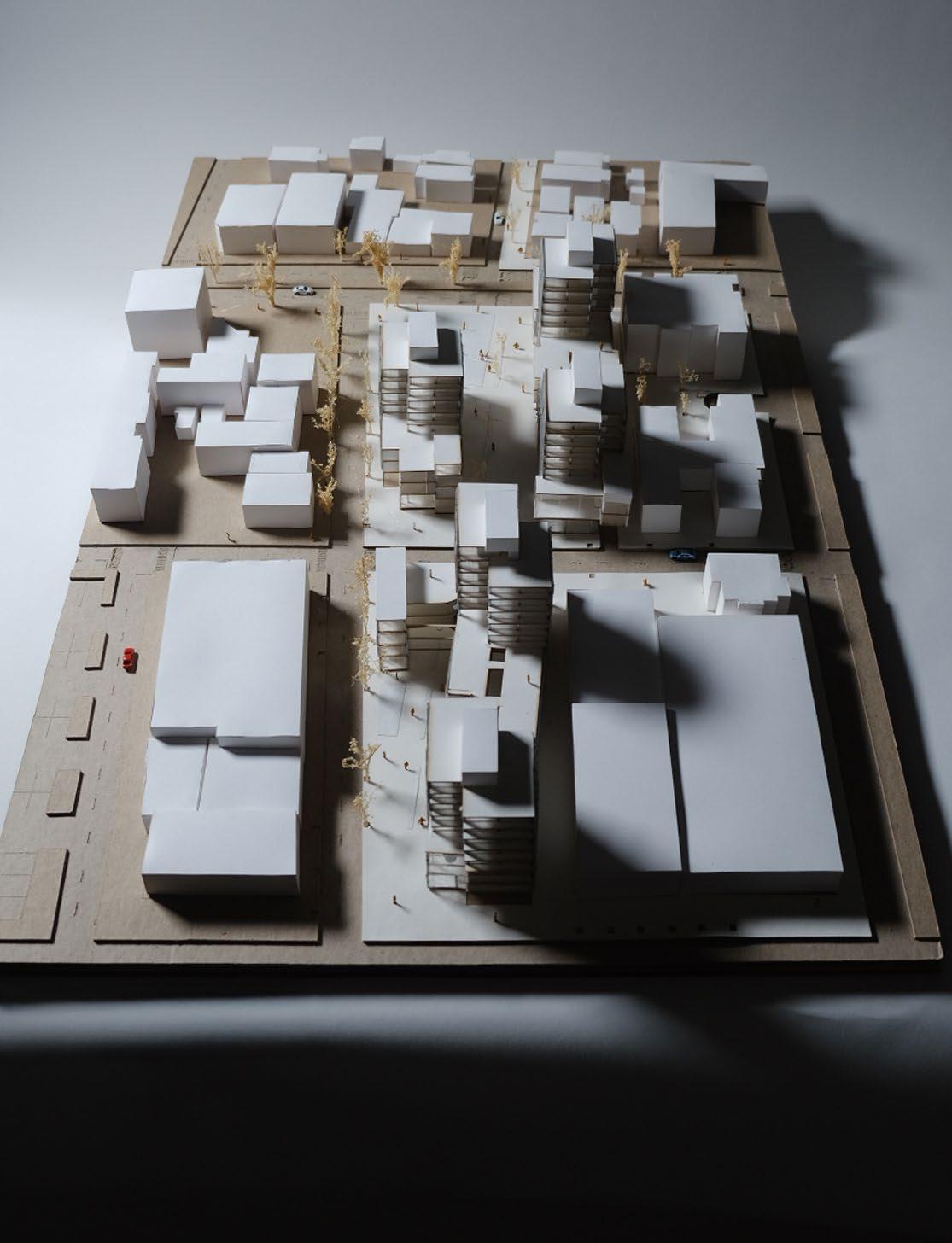
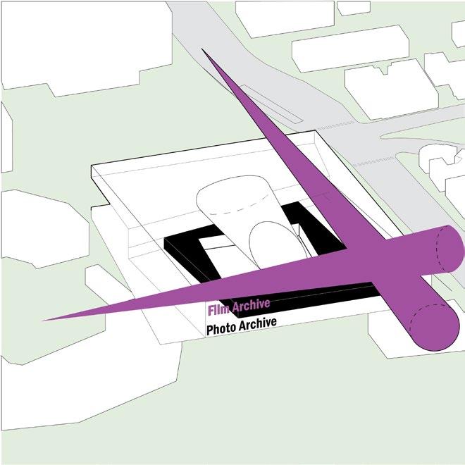
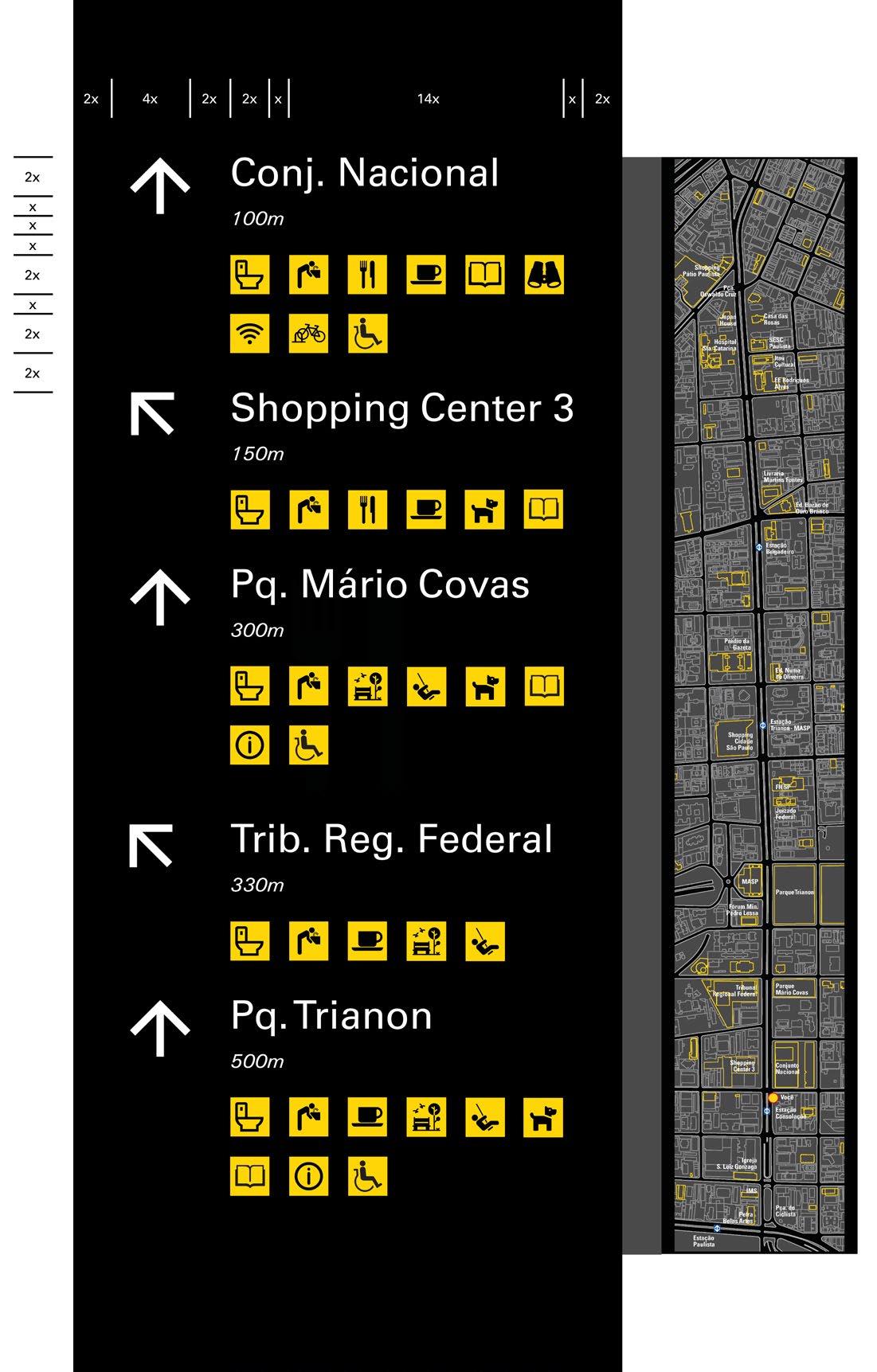
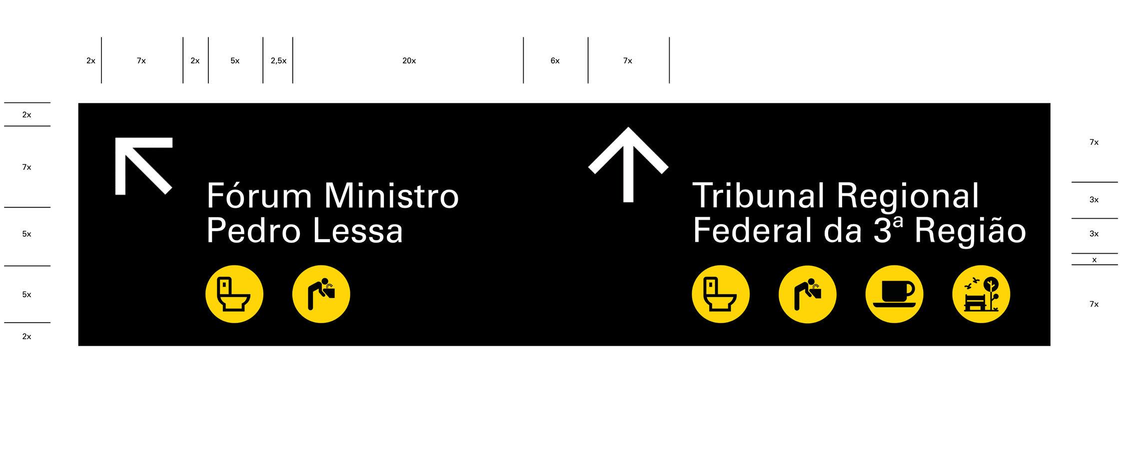
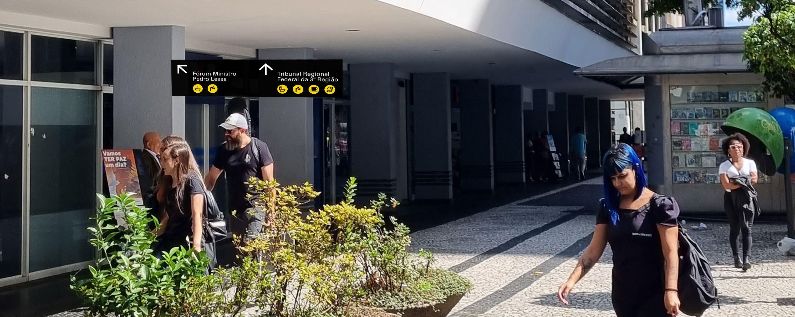
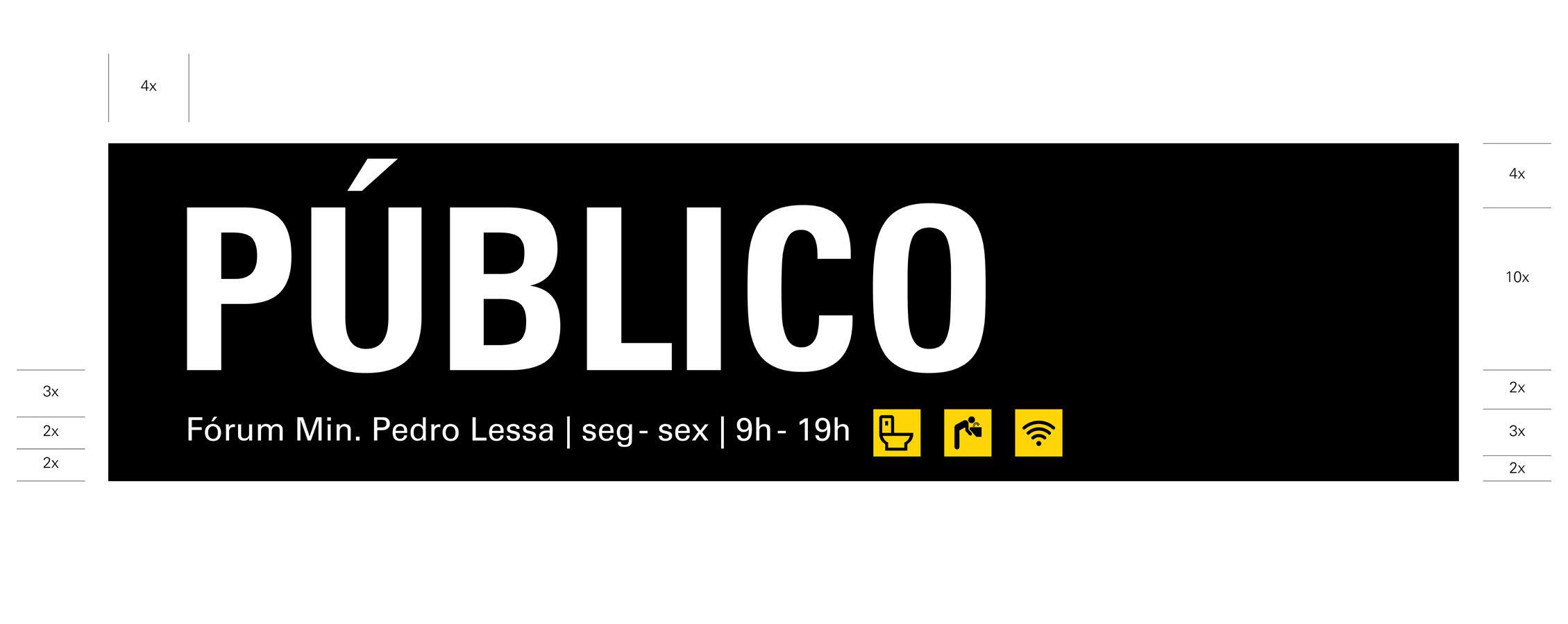
Interconnecting Urban Architecture Plan Collage (Right)
the red and orange elements represent architectural parts that connect each composition group to the ground level, as the in-between grey spaces where interactions are encouraged to happen.
the hyperstructure is represented similarly, but the concept is the opposite. Here, it does represent the urban separator, but the linear boulevards stand for the complete urban structure that collects all the activities along them. What exists other than the two continuous strips is not visible or experienceable from the strip.
Human
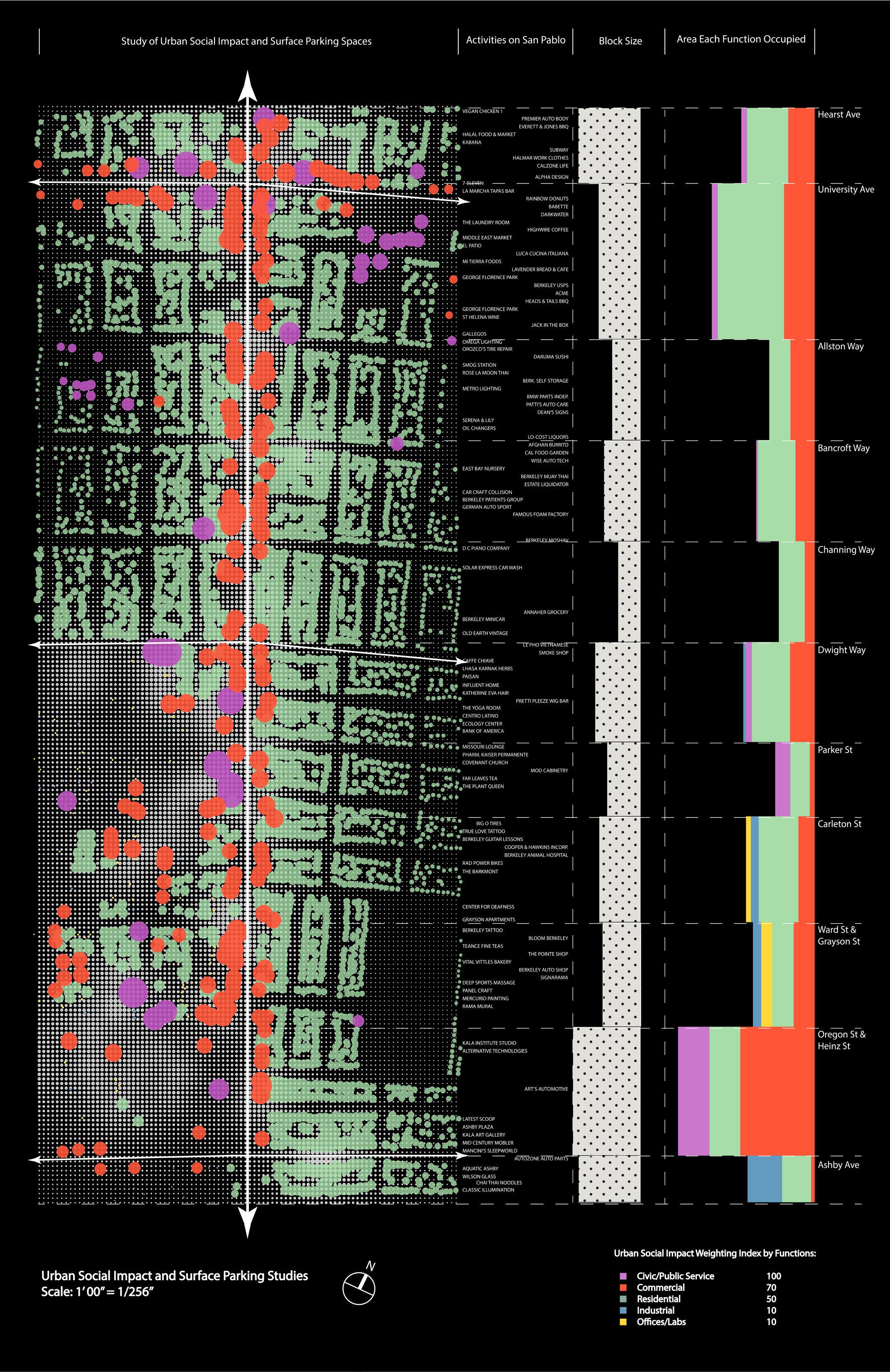
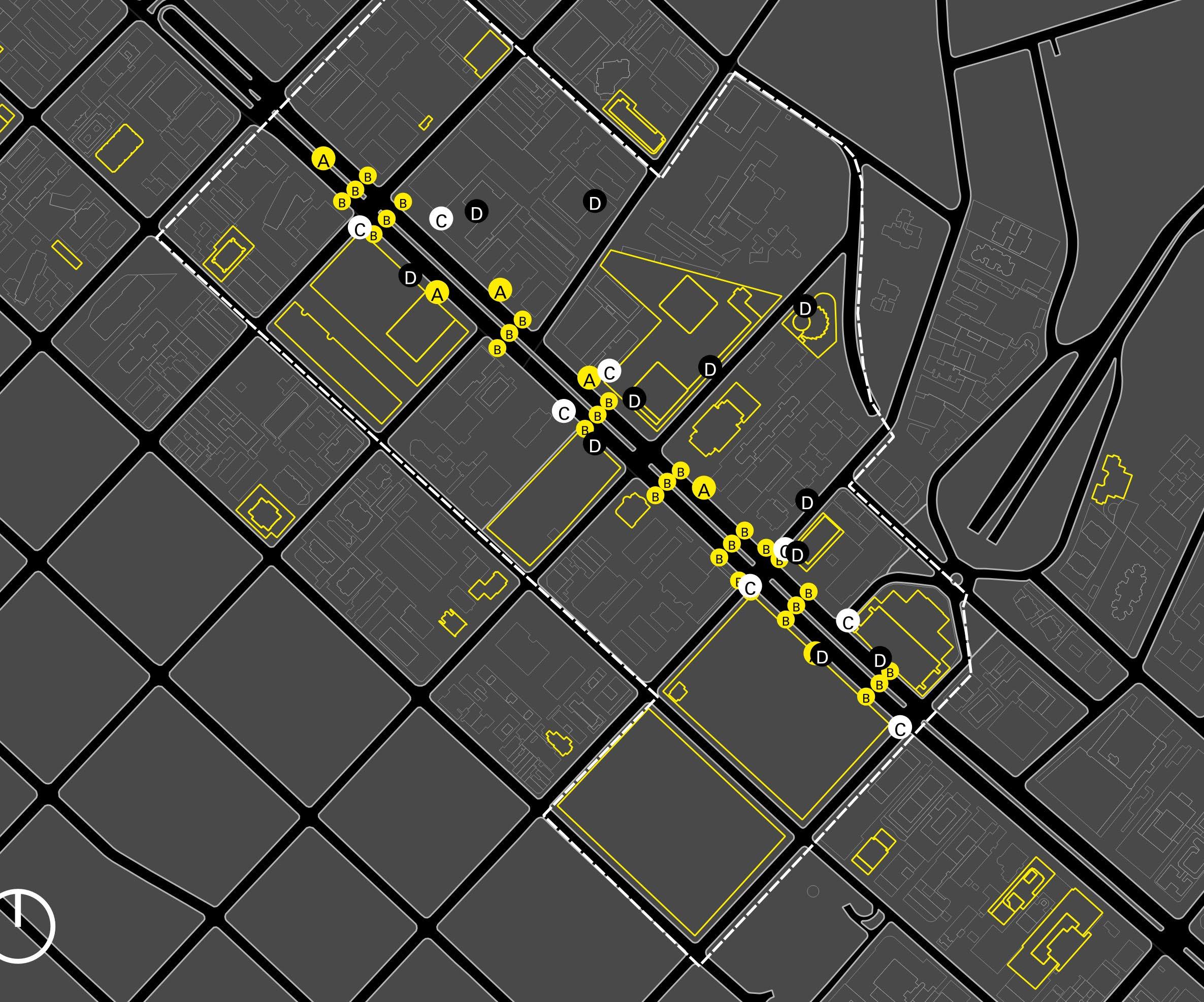
Social impact and surface parking studies (Left Page)
The study of regional building functionality, percenage, social impact, and the quantity and distribution of surface parking lots.
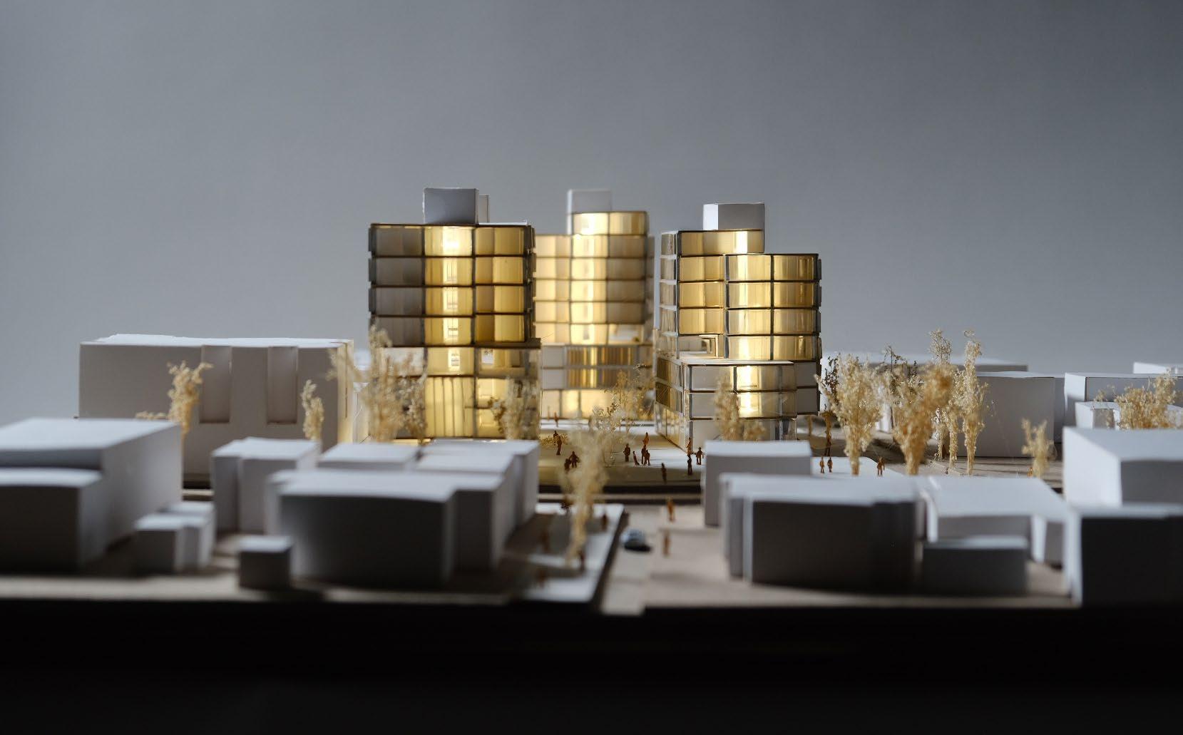
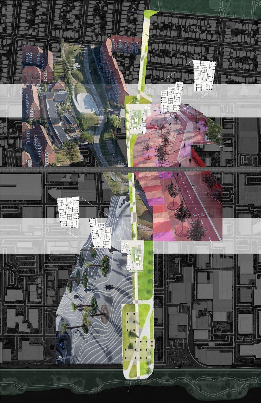
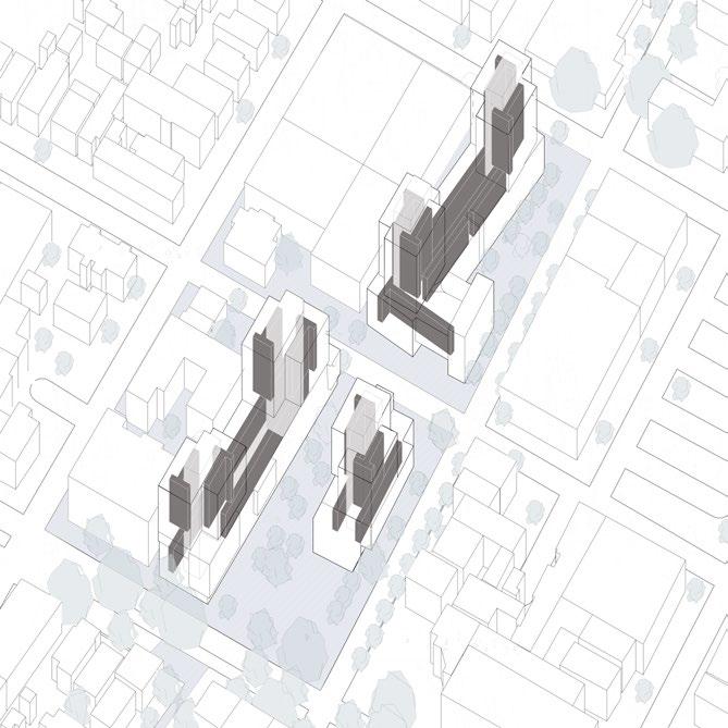
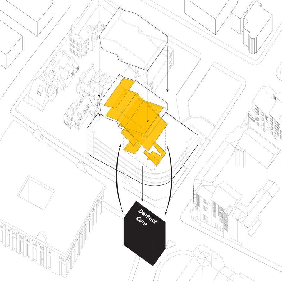
Centered Interconnecting City (Left)
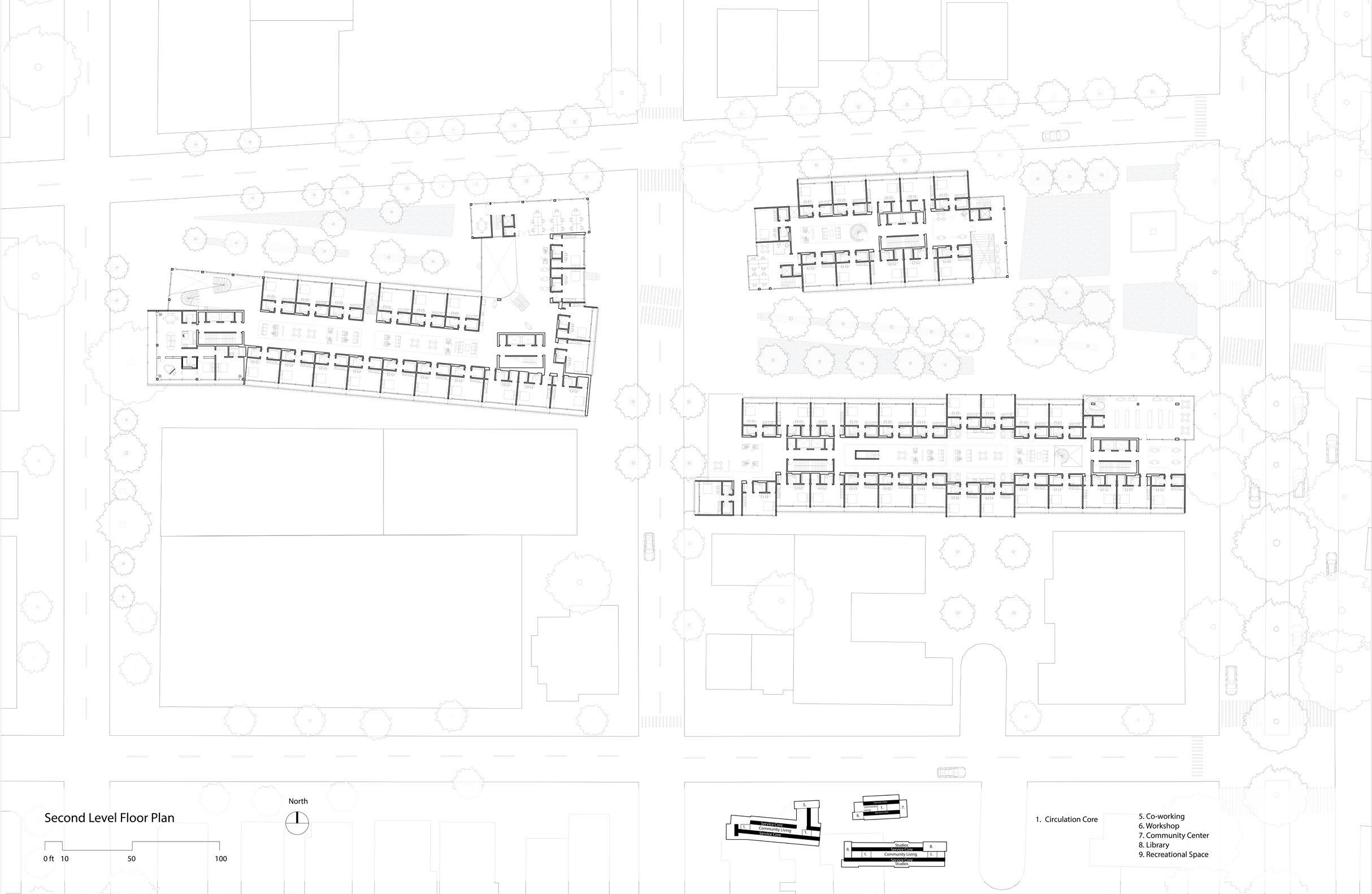
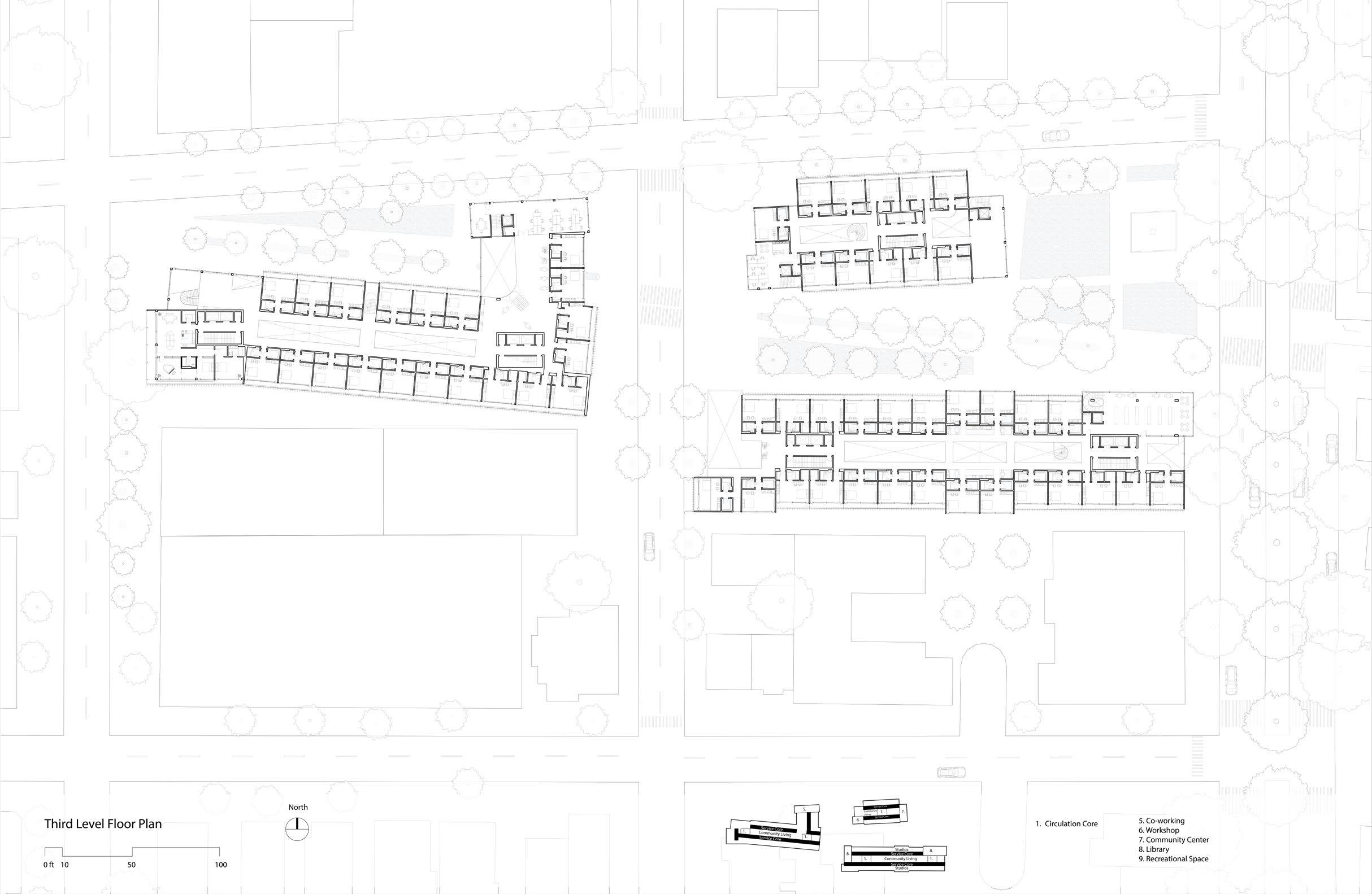
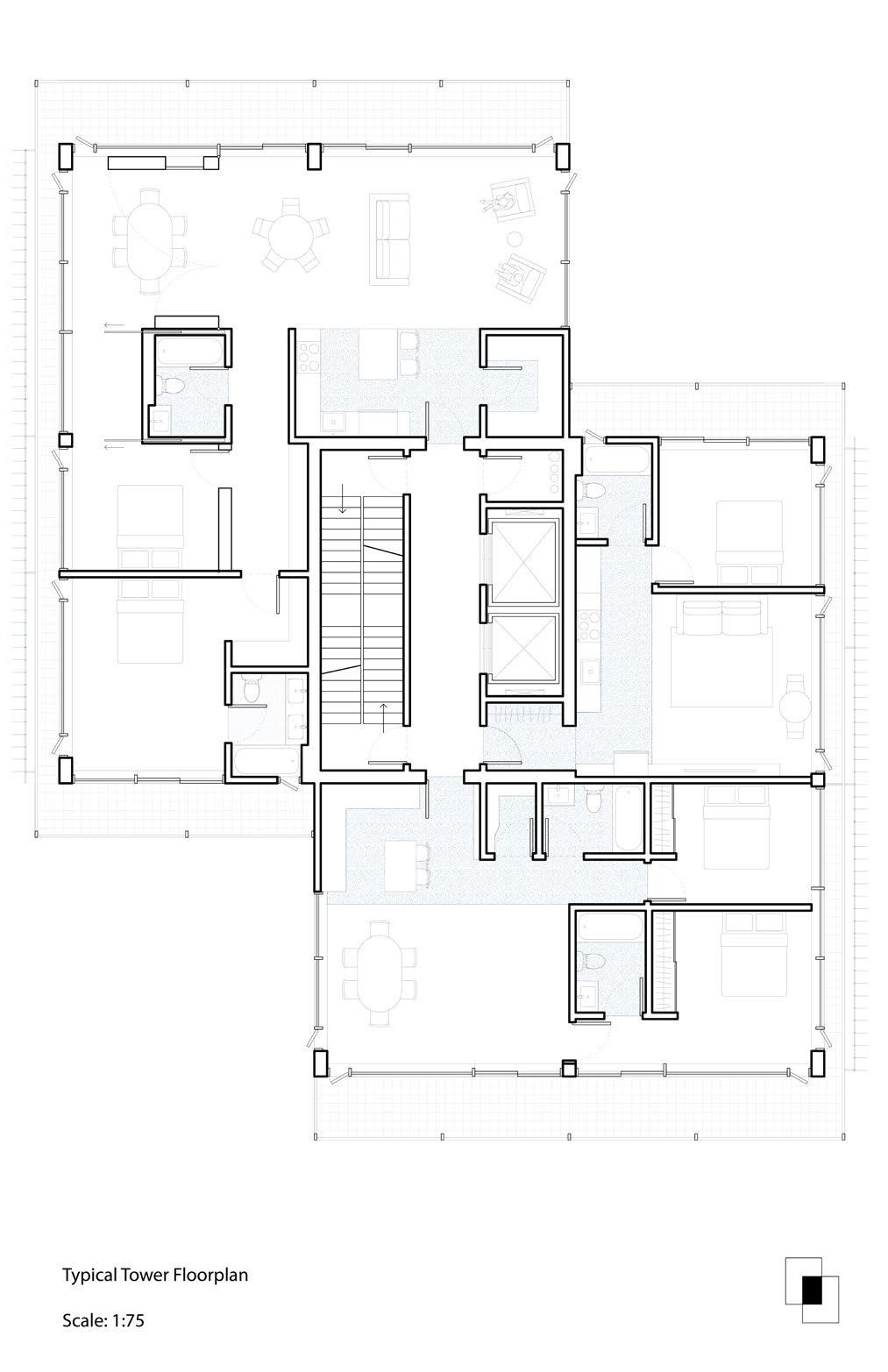
Ground Floor and Urban Scape Connection
The ground level, where the architecture meets the city, is mostly preserved as gardens and plazas to be open to the public with zero resistance. The upper volumes exist as groups of different houing types and functions.
In the proposal collages, the red and orange elements represent architectural parts that connect each composition group to the ground level, as the in-between grey spaces where interactions are encouraged to happen. The elements should be necessary for circulation, and may also be the potential spaces to design public spaces that break the boundaries of the absolute inside and outside. The red structure, borrowed from the MASP Museum in Sao Paulo, marks a loop that both starts and ends on the ground level, to bond the architecture and the overall environment. On the ground level, where everything meets together, will be a market-like multi-function space, a sequence of urban plazas, that will have the maximum publicity. The architecture will become a vertical extension of the city that still maintains or enhances the urbanity.
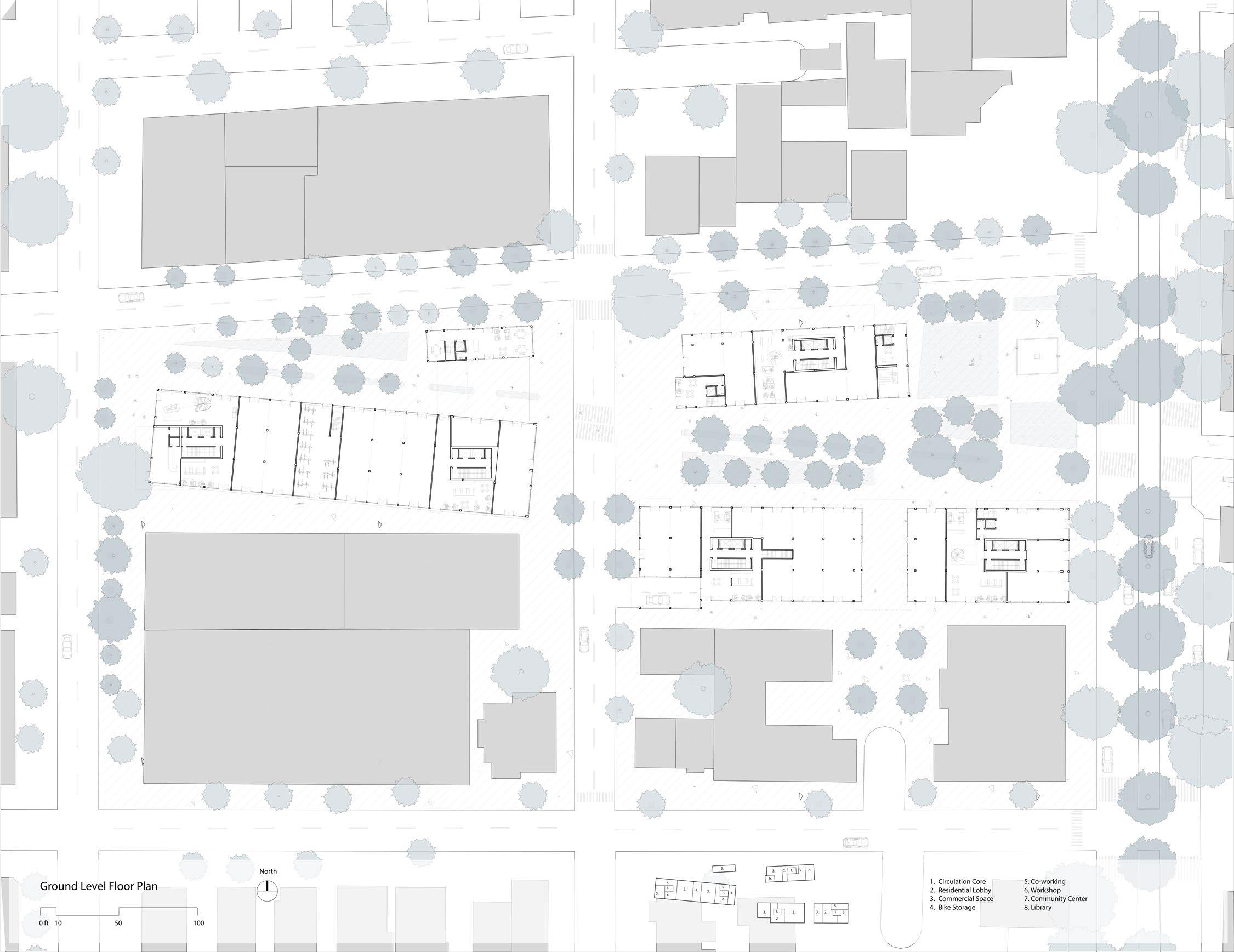
In the actural design, the public volumes, including a library, a community center, a co-working space, a workshop, a bike storage, and a leasing office serves as the breakers of the absulote interior which bring together both the residents and visitors. Those spaces all have their own sets of vertical circulations, controling the open public spaces on the ground, and shows the publicity of the space. All the public spaces inserted through the ground floor and the two studio floors, anchoring the entire lower volumes with the urbanscape. Some of the public spaces even go further to connect the roof top terraces. In the daily using senario, the public spaces become the most commonly used circulation pathes because of their accessibility and transparency.
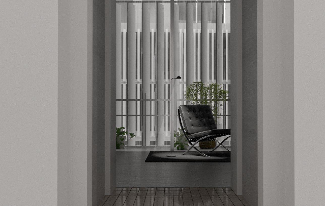
Rendering of the studio unit
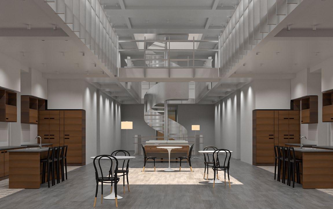
Rendering of the common space
Rendering of tower unit
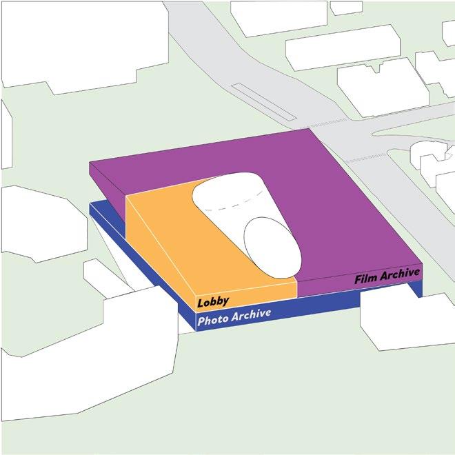
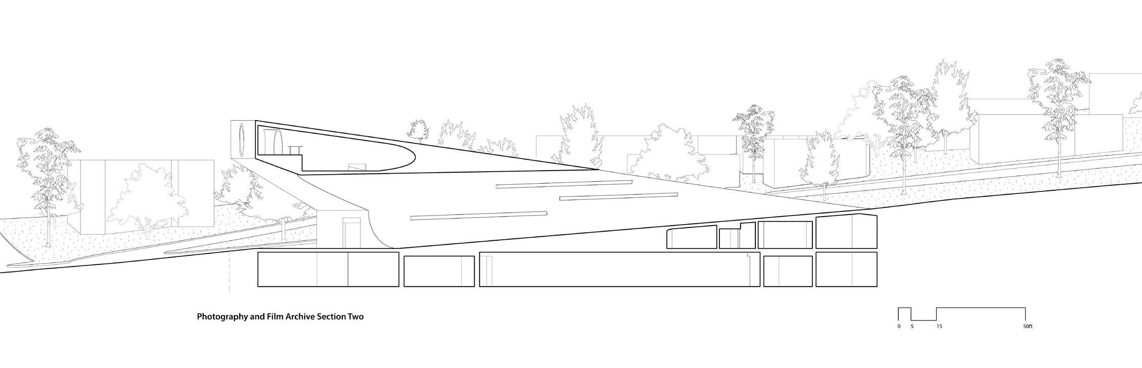
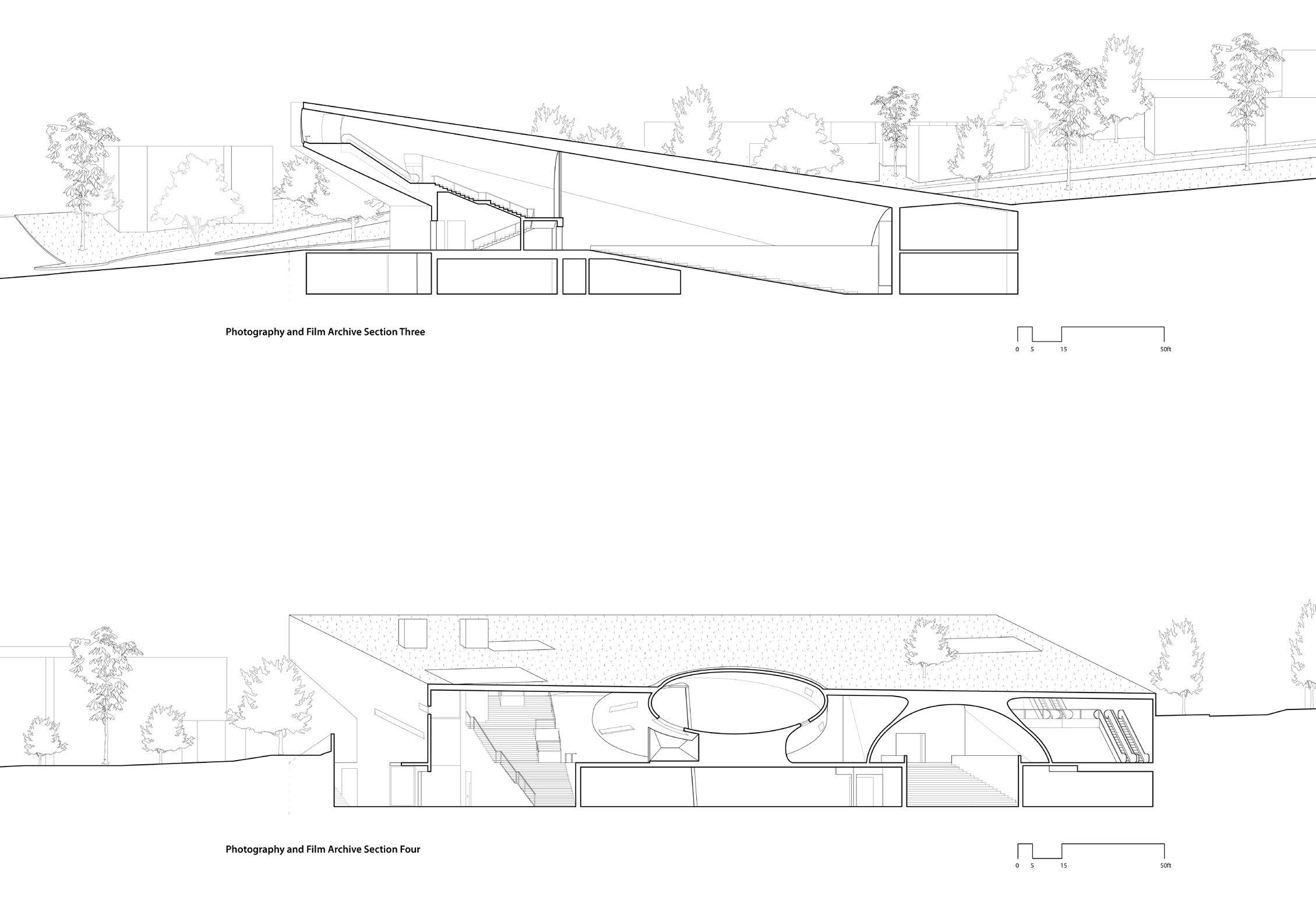
Berkeley Film and Photography Archive
A combined architecture that houses two seperated archives.
The University of California, Berkeley, CED
Studio:Arch 200A
Time: Fall 2023
Location: Berkeley, California
How to combine two seperate archives in the same architecture? How to design an architecture in the boarder of urban, nature, and a world-class university campus?
Inspired by constructivist artist Malevich’s White on White, I started to explore the tension created by geometry form and its boundaries. Combined with my teammate’s case study Tres Grande Bibliotheque by OMA, we also brought the thinking of solid and volid into the design discussion.
The design ended up with a combination of these two concepts together to create this final design: an architecture using geometries to define the space into defferent uses and shape the spatial quality. Meanwhile, from inside out, the architecture exists in its specific site, interact, shaping and shaped with the environment.
Both archives are designed with solid components that set and define the space within the limitation of the pre-defined architectural volume, and the mass itself engaging with the surrounding environment. The two Parti are integrated to interact with each other in terms of circulation, spatial organization, and structure. Both Archives initial the public visiting circulation from the grand lobby along with distinct circulation paths for professional visits and special events.
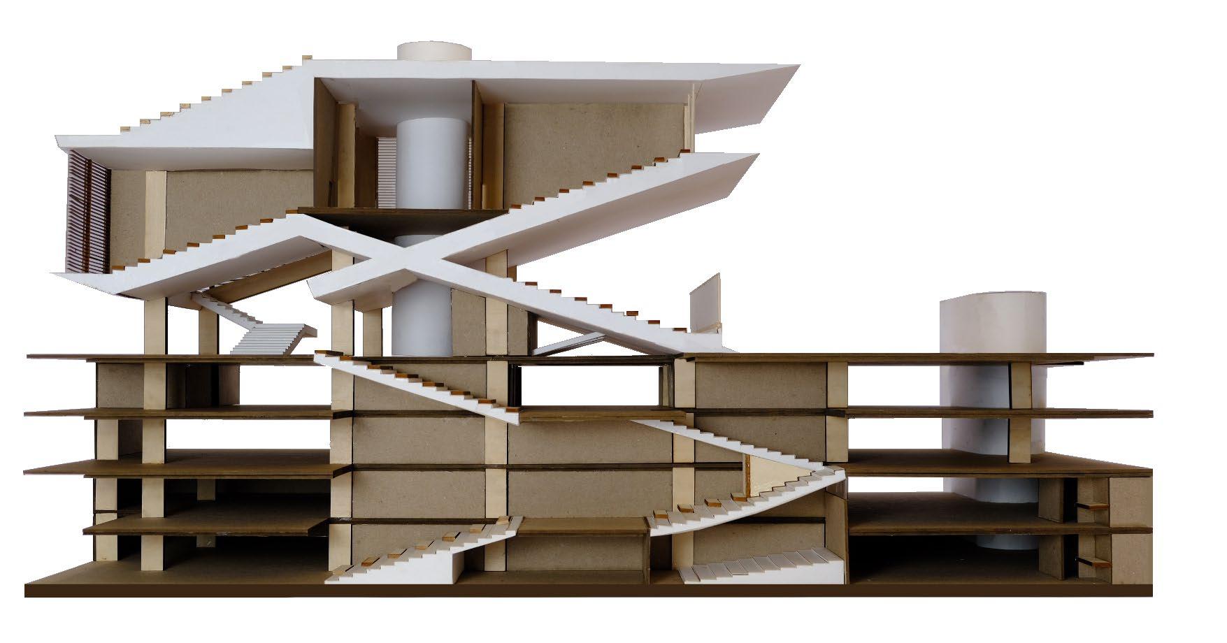
The Cone Project
Interior Rendering
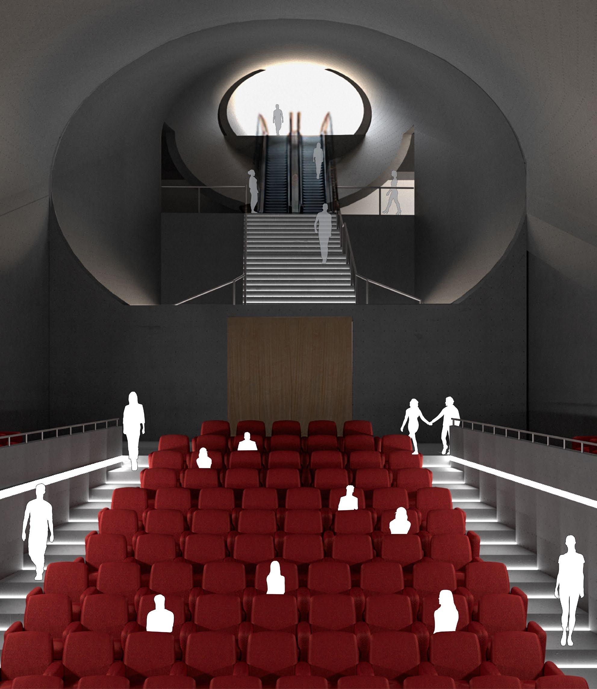
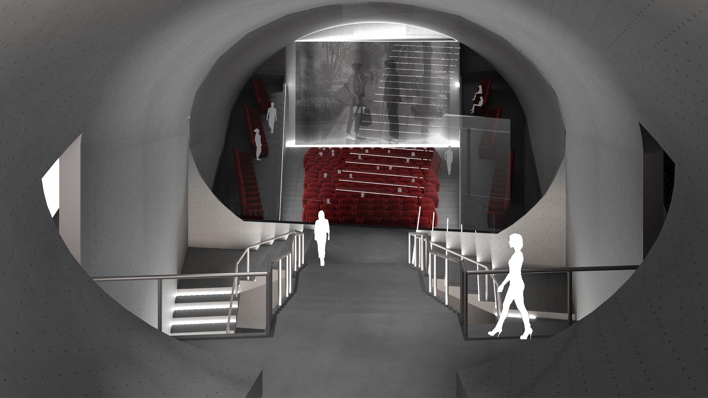
Inside the film archive cone. At the back, the cone served as circulation space. In the front, it becomes the main movie theater
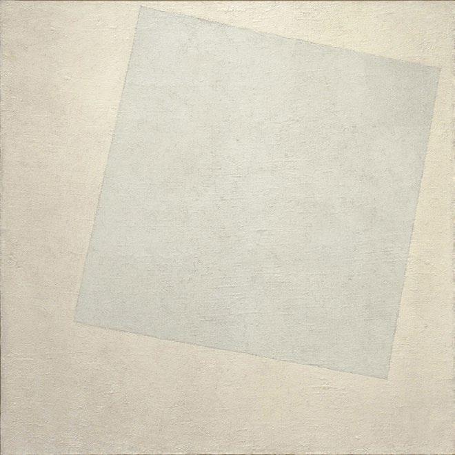
White on White
Case study one.
The Floating blue square created four spaces between the boundaries of itself and the larger square. The blue square gives dynamic of flow to the four surrending spaces, and they are sligtly different because of the variation of orientation and areas. This interplay of form and movement creates an engaging experience that invites exploration and contemplation.
Tres Grande Bibliotheque
Case study Two.
The Très Grande Bibliothèque by OMA showcases a diagrammatic design comprising four transparent towers linked by a central atrium. This layout emphasizes spatial clarity and connectivity, facilitating ease of navigation and interaction. The diagrammatic arrangement symbolizes the library’s role as a hub for knowledge dissemination and intellectual exchange.
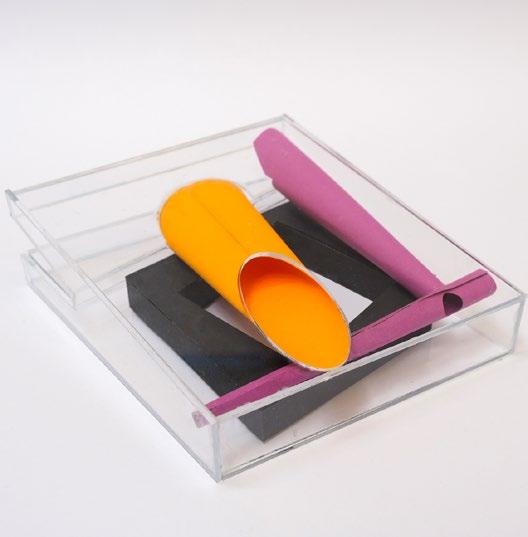
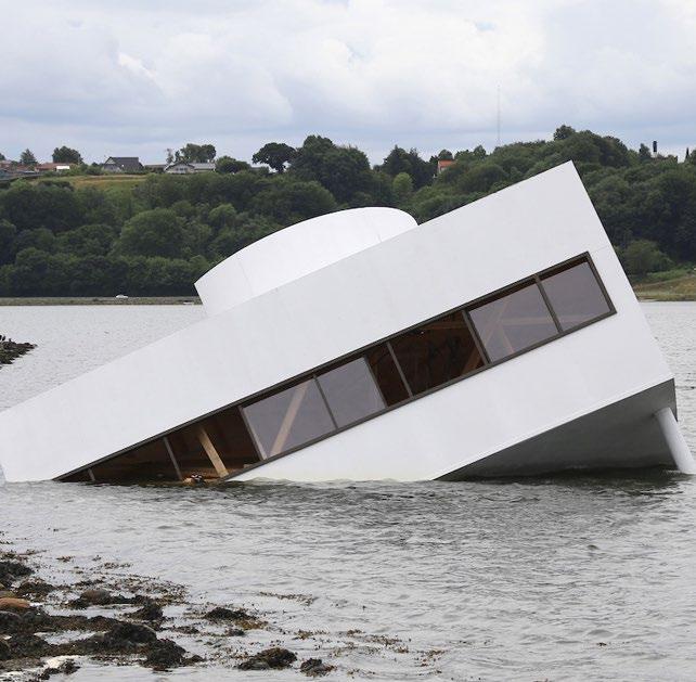
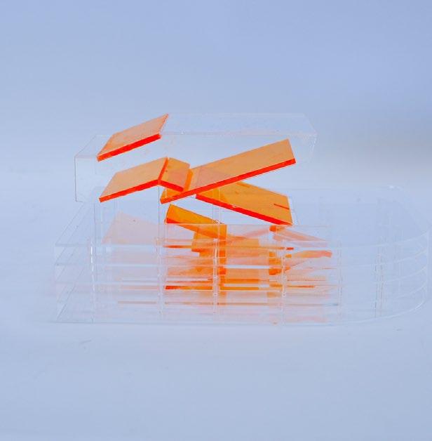
The Sinking Villa Savoye
This image of the art installation serves as a critique of the present-day Berkeley built environment.
Currently, almost every building in downtown Berkeley and the university campus is in cubic shapes and rarely responds to the surrounding environment, like an agglomeration of medieval fortresses. In this specific context, architecture need to respond to the environment to introduce a more conversational urban condition.
2.
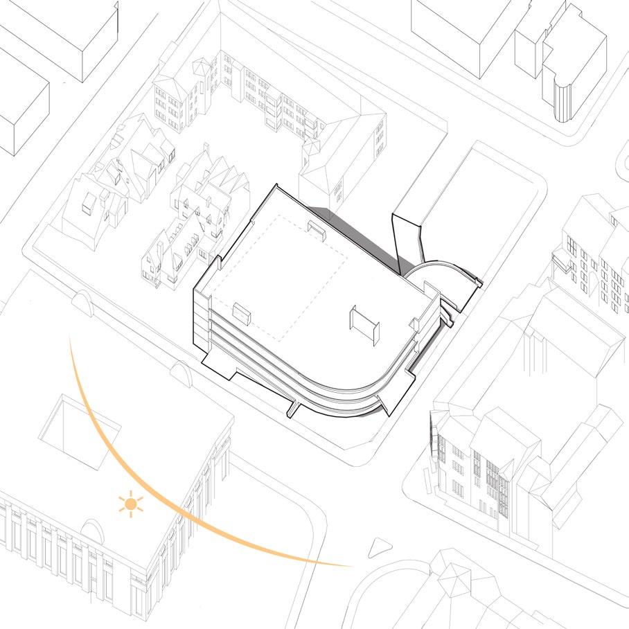
New Campus Gateway
In the lowerhill side, the spatial experience differs from the uphill side by clearly defined and prominent boundary forms delineating the plaza’s layout.
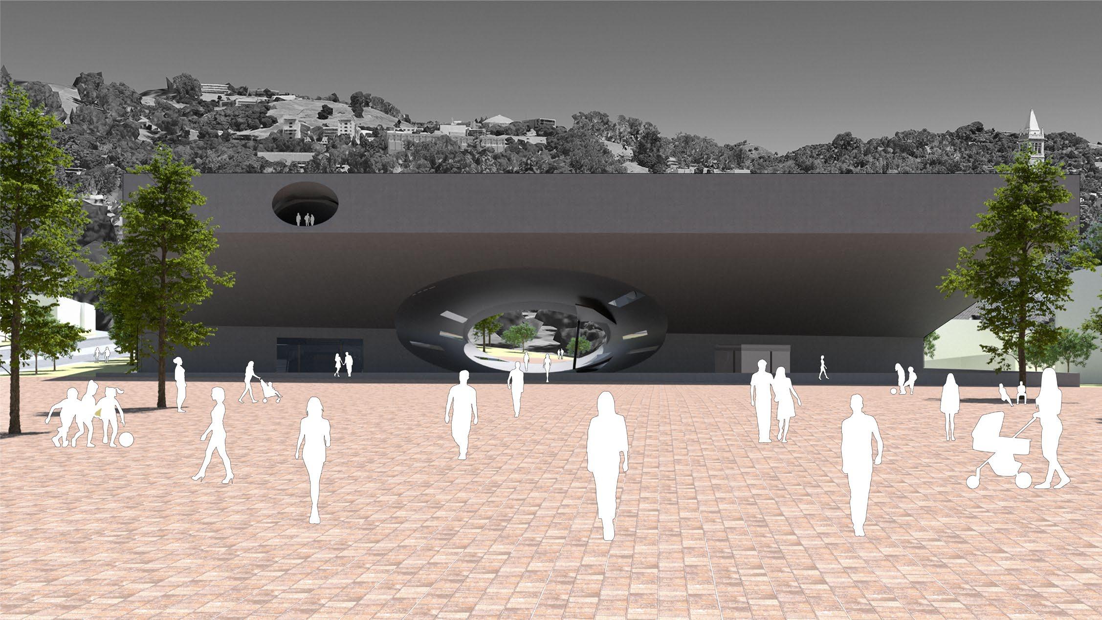
Inspired by OMA’s Grand Library, a cone is strategically placed in the architectural volume to connect the front and back, providing opportunities for internal circulation and interaction between interior and exterior spaces.
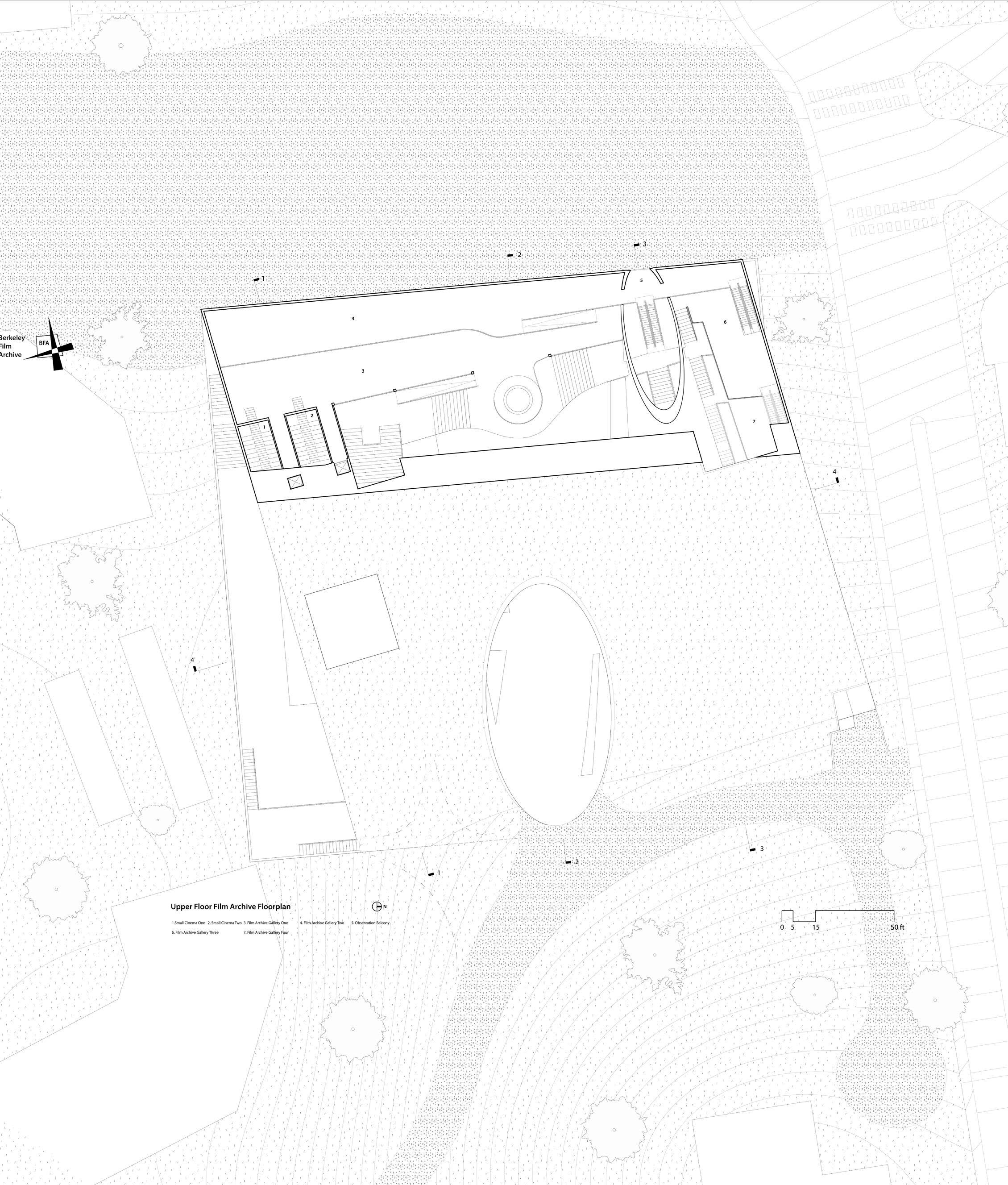
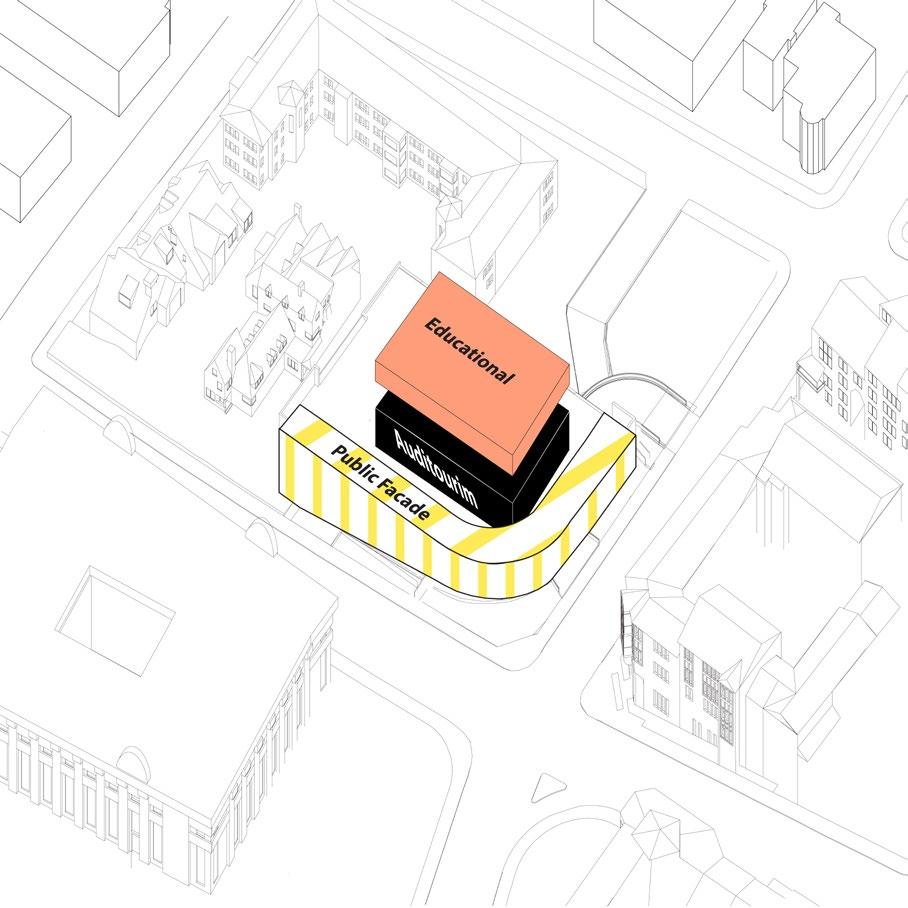
3. Programming
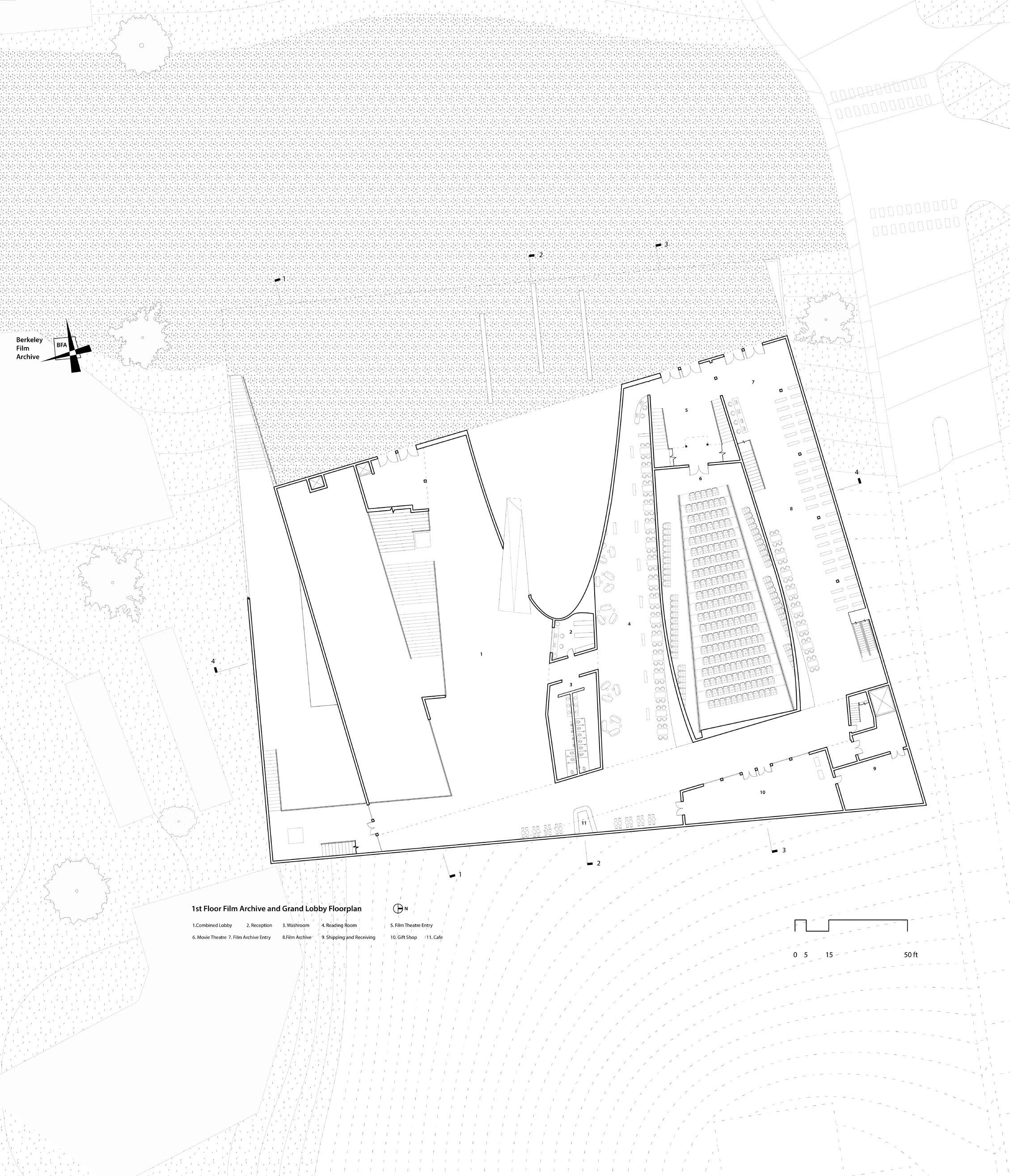
The shared lobby is on one side of the central cone. Above it and on the other side of the ground floor is the Film Archive, underneath it is the Photo Archive.
This project used to be a two persons project, am in charge of the lobby and the photo archive design, my teammate was in charge of the film archive. the current version is completely revised by myself.
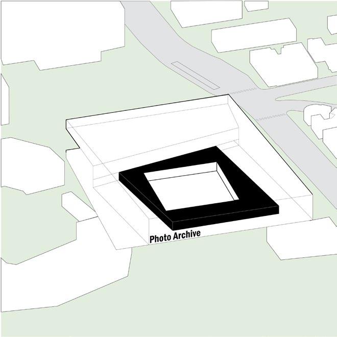
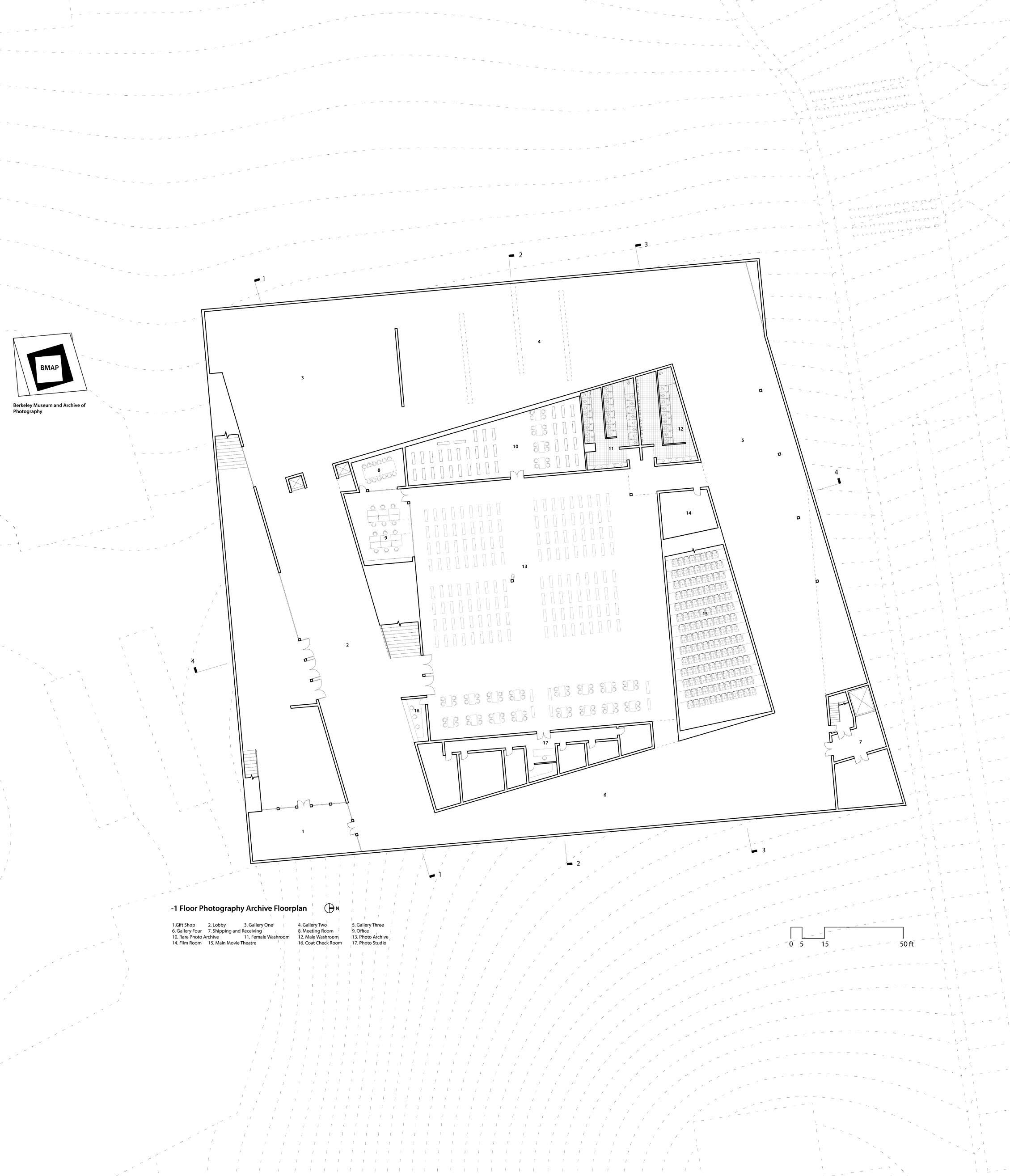
4. Photo Archive Design Parti
Inspired by “White on White,” the design features three nested squares, creating three layers of spaces from inside to outside: the outermost layer comprises the lobby and museum galleries, the enclosed ring in between houses access-restricted and service areas, with the archive space at the center.
The poched enclosed ring also has lower ceiling heights, with the space above dedicated to climate control systems and structure.
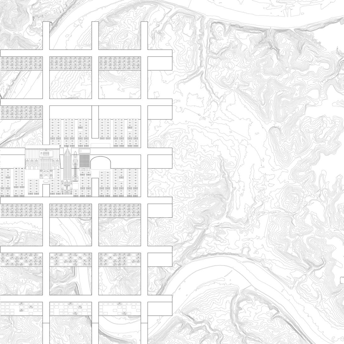
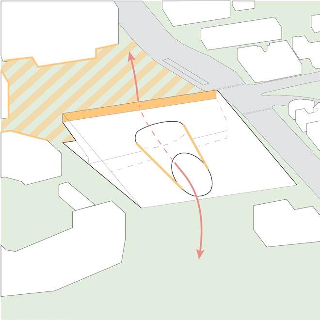
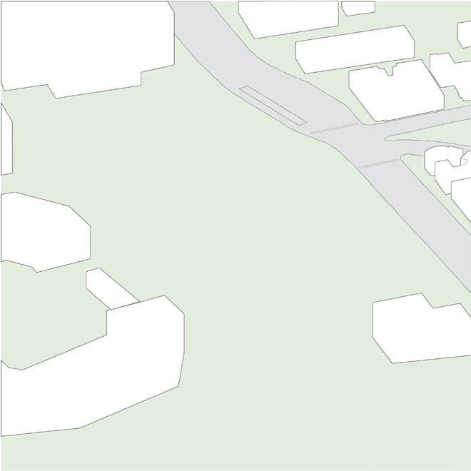
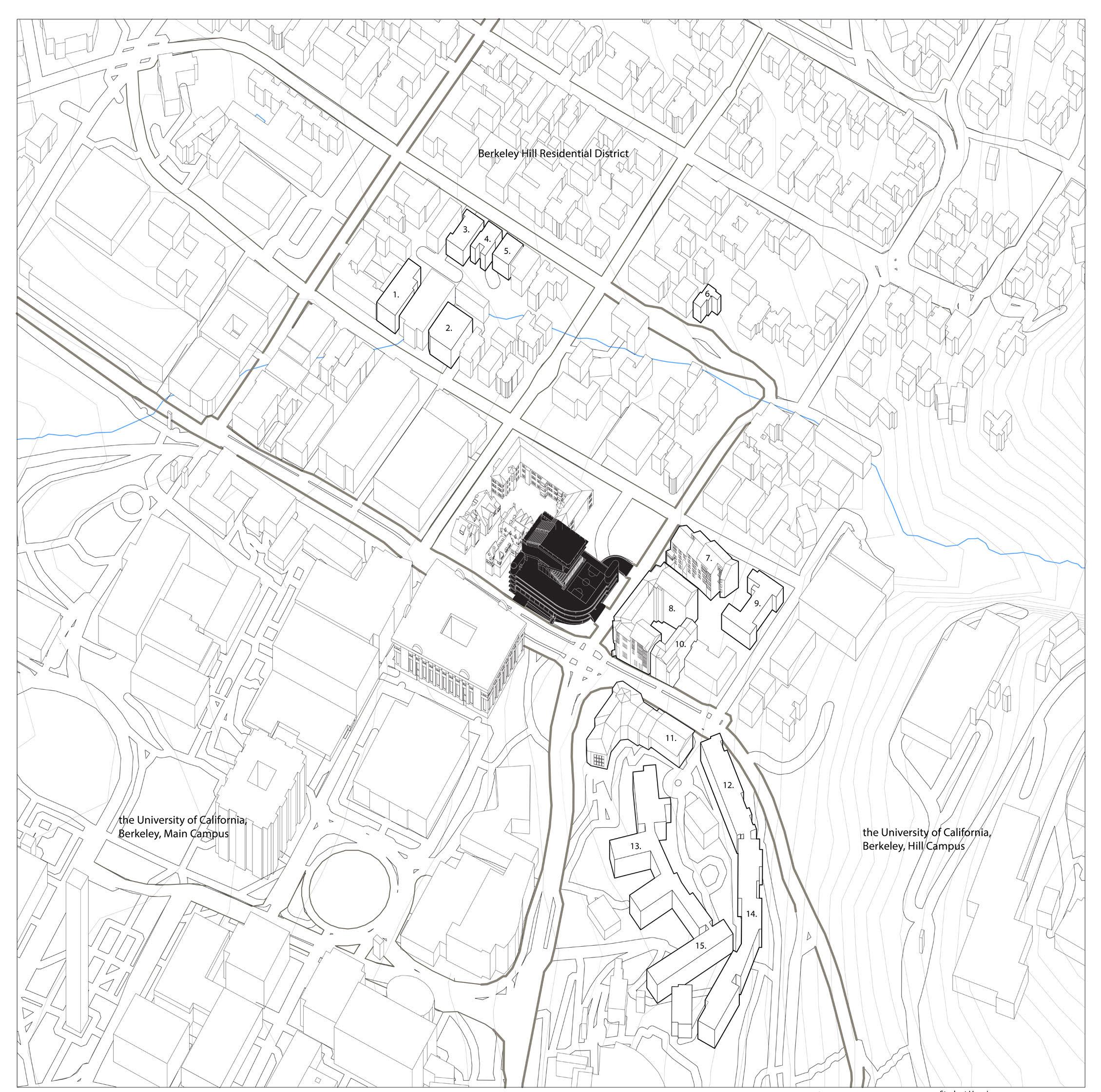
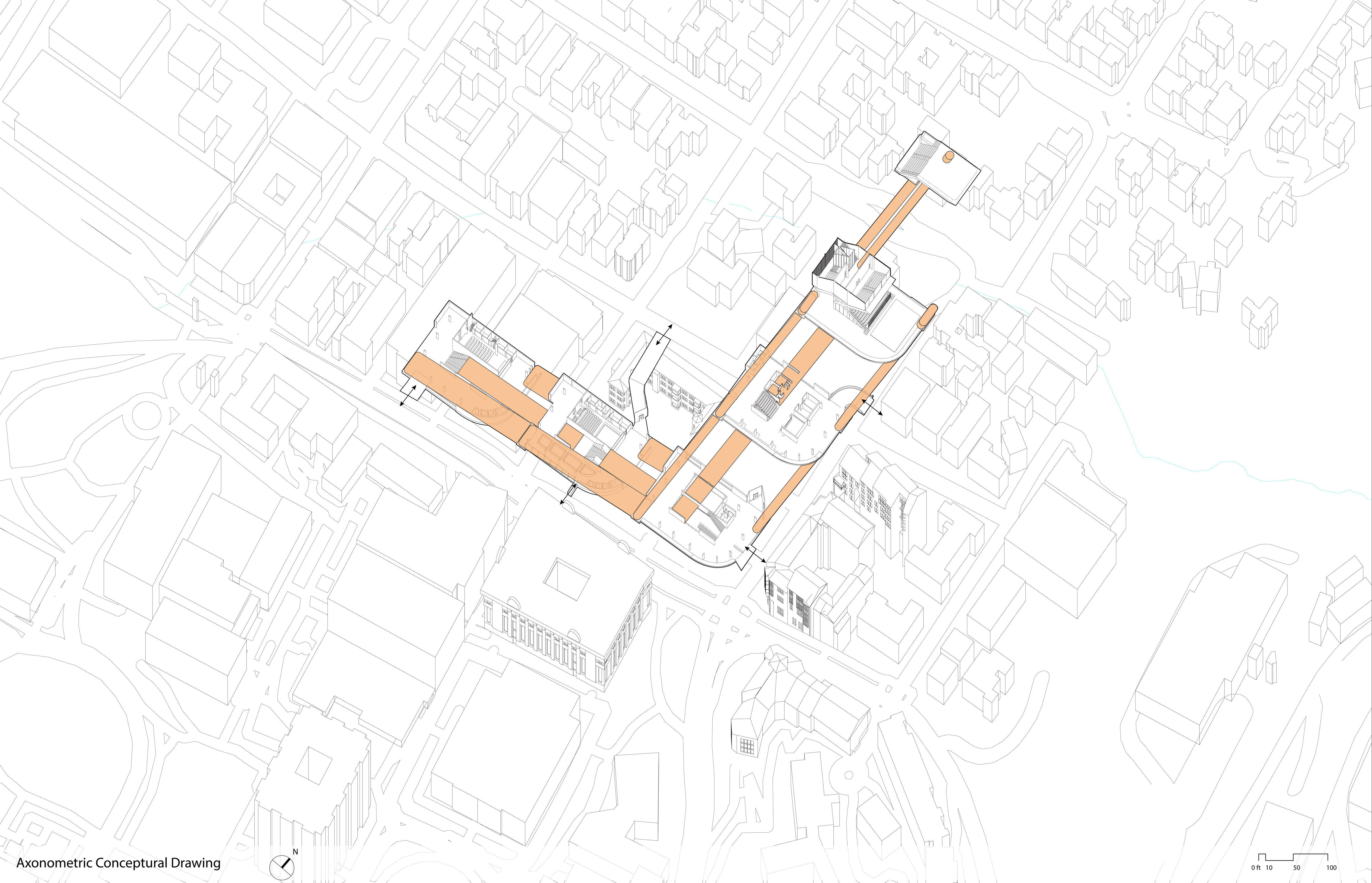
Site
The Site is located on the North of Berkeley University campus. The location is one of the only two entries in this direction and the end of two major roads from Berkeley Hills.
The site is also the ending moment of a natural landscape system fromw uphill within the university campus. Beyond the site will be the urban area until it reaches the bay.
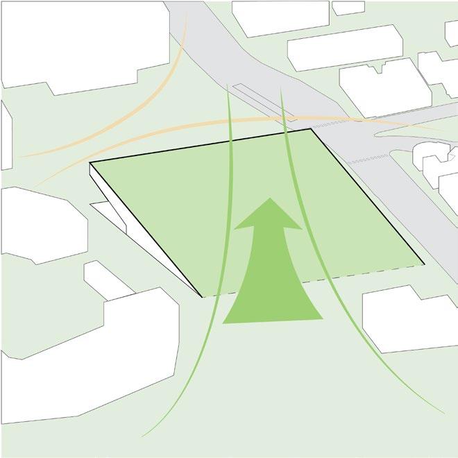
1. Breathing and Extending
Breathing: Leave the front part of the site open to encourage connections between the inside and outside of the university campus.
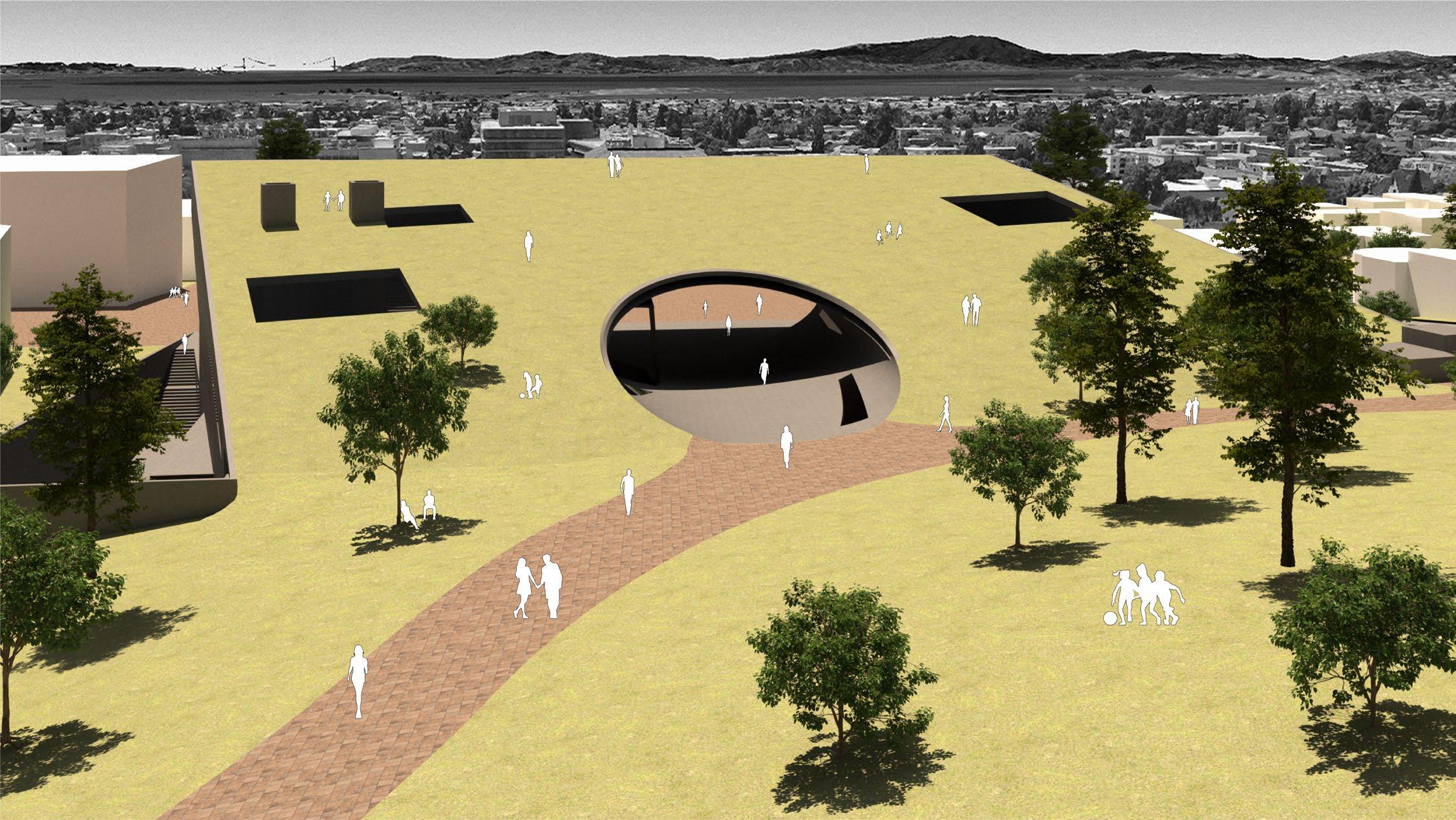
Extending: Elevating the ground from its meeting point on the uphill side provides an uninterrupted natural experience of the Bay Area. By leaping over the urban area, it extends sights to the other side of the Bay, enhancing the scenic journey and preserving the continuous connection with nature.
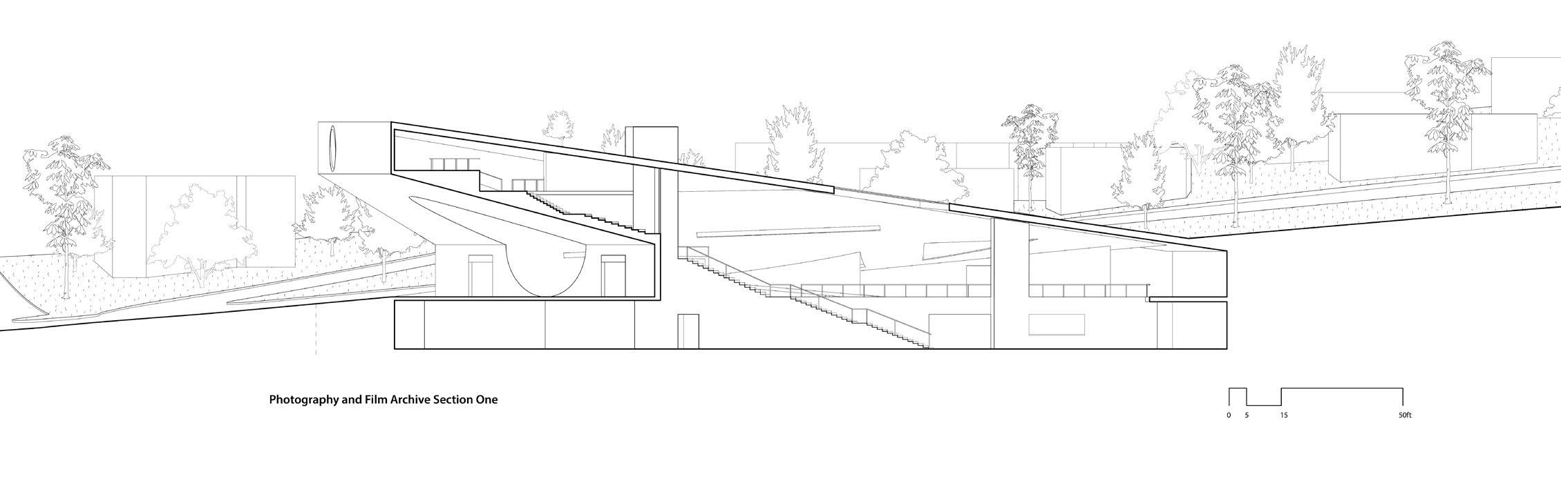
5. Film Archive Design Parti
The film archive cone separated the space into three parts. In the over-reaching part, the cone functions as a “void” circulation pathway, flanked by film archive museum galleries on two sides.
Conversely, the order is reversed in the main building part: the cone serves as the “solid,” and the main movie theatre and the archive and reading space are on the two sides. At the rear, another cone links the film archive to the rest of the building. The back cone collects servant spaces and additional fragment spaces.
6. Combined Design Parti
The overall operation is about Poche and its boundary limitations. Both archives are designed with solid components that set and define the space within the limitation of the pre-defined architectural volume, mas the mass itself engaging with the surrounding environment.
The two Parti are integrated to interact with each other in terms of circulation, spatial organization, and structure. Both Archives initial the public visiting circulation from the grand lobby along with distinct circulation paths for professional visits and special events.
The design of the photography archive is inspired by Malevich’s White on White (1918). The design features three nested squares that creates three layers of spaces from inside to outside: the outermost layer comprises the lobby and museum galleries, the enclosed ring in between houses access-restricted and service areas, with the archive space at the center.
Visitors can enter the space from the two public entries, one from the semi-underground museum courtyard, and one from the shared Reception Hall that connects to the central passage cone. Additionally, the cargo transport space and egress stairs are located on the lower left corner. There, the virtical circulaion will lead to upper floors and backs to the ground at the garden level.
Here on the first floor is where the two archives meets. On the left side is the shared grand entry hall of the two archives. Going up from here is the Film Archive Gallery Spaces, and going down is the photography archive. On the right side is the main movie theater and the actural archive and library space.
On thisfloor, it is clear to see the overall spatial operation is about Poche and its boundary limitations. Both archives are designed with solid components that set and define the space within the limitation of the pre-defined architectural volume, and the mass itself engaging with the surrounding environment.
The two Parti are integrated to interact with each other in terms of circulation, spatial organization, and structure. Both Archives initial the public visiting circulation from the grand lobby along with distinct circulation paths for professional visits and special events.
The film archive cone separated the space into three parts. In the over-reaching part of the archtecture, the cone functions as a “void” circulation pathway, flanked by film archive and museum galleries on its two sides.
Conversely, the order is reversed in the main building part: the film archive cone serves as the “solid” component, provide the spatial structure for the main movie theatre and defined the space on its two sides as archive and reading space. At the rear, another cone links the film archive to the shared Lobby and the photo archive. The back cone also collects servant spaces, a gift store, and a cafe.
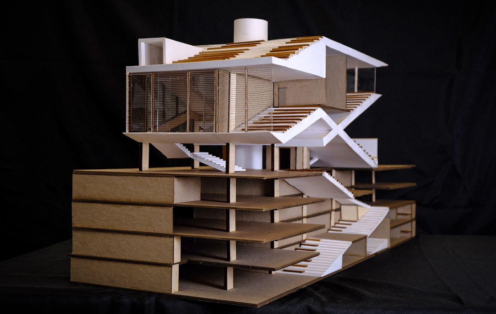
The architecture created a public plaza as the campus gateway at the downhill side Rendering and model photography
From the backside, the architecture emerged into the landscape, slightly flipping up to extend the nature experience to the region Rendering and model photography
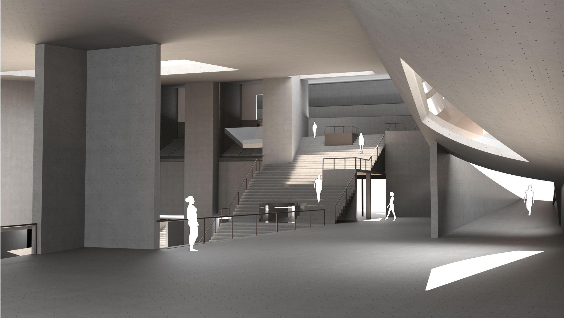
The shared grand entry hall on the first floor Interior Rendering
Inside the film archive cone. In the front, the cone served as circulation space. At the back, it becomes the main movie theater. Interior Rendering
Adaptive Reuse
is a growing trend due to land shortages in major metropolitan areas and sustainability concerns. Meanwhile, the knowledge-based economy has been the primary economic engine since the 1960s; related institutes and industries require spatial expansion and urban space transformation to meet constantly changing needs.
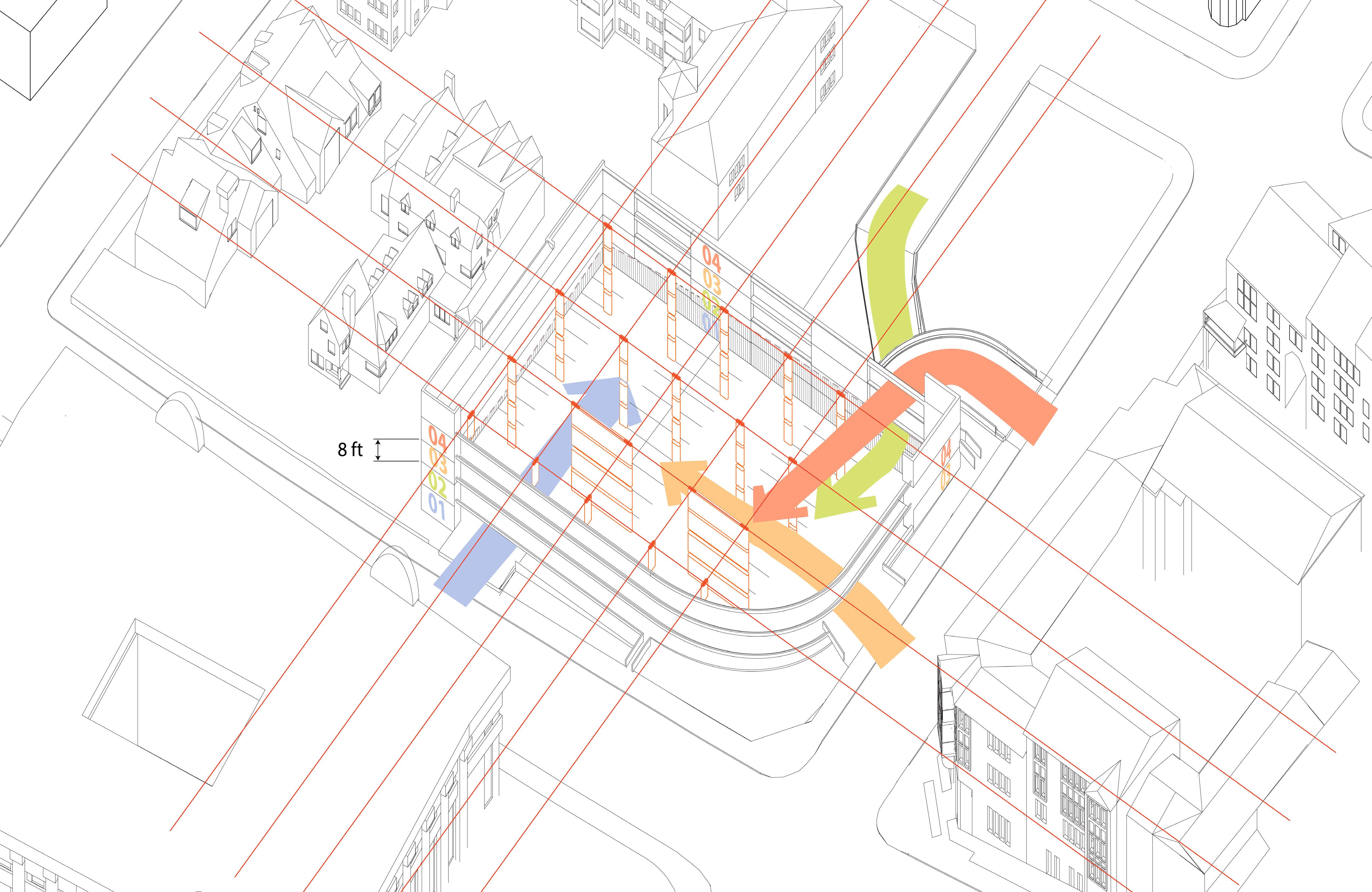
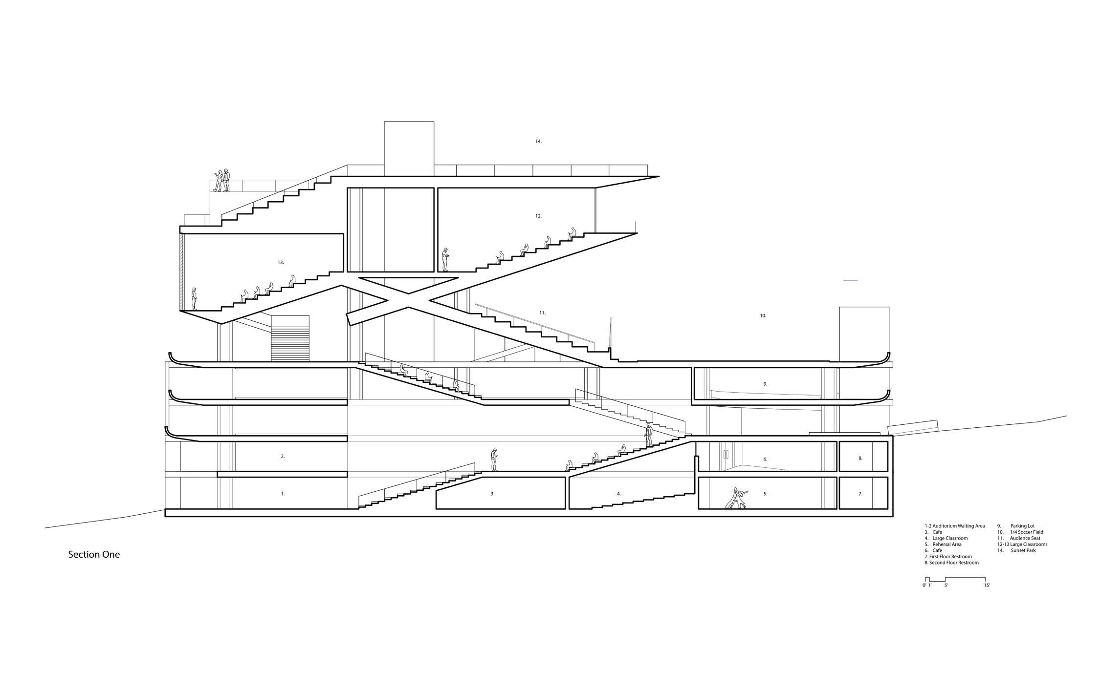
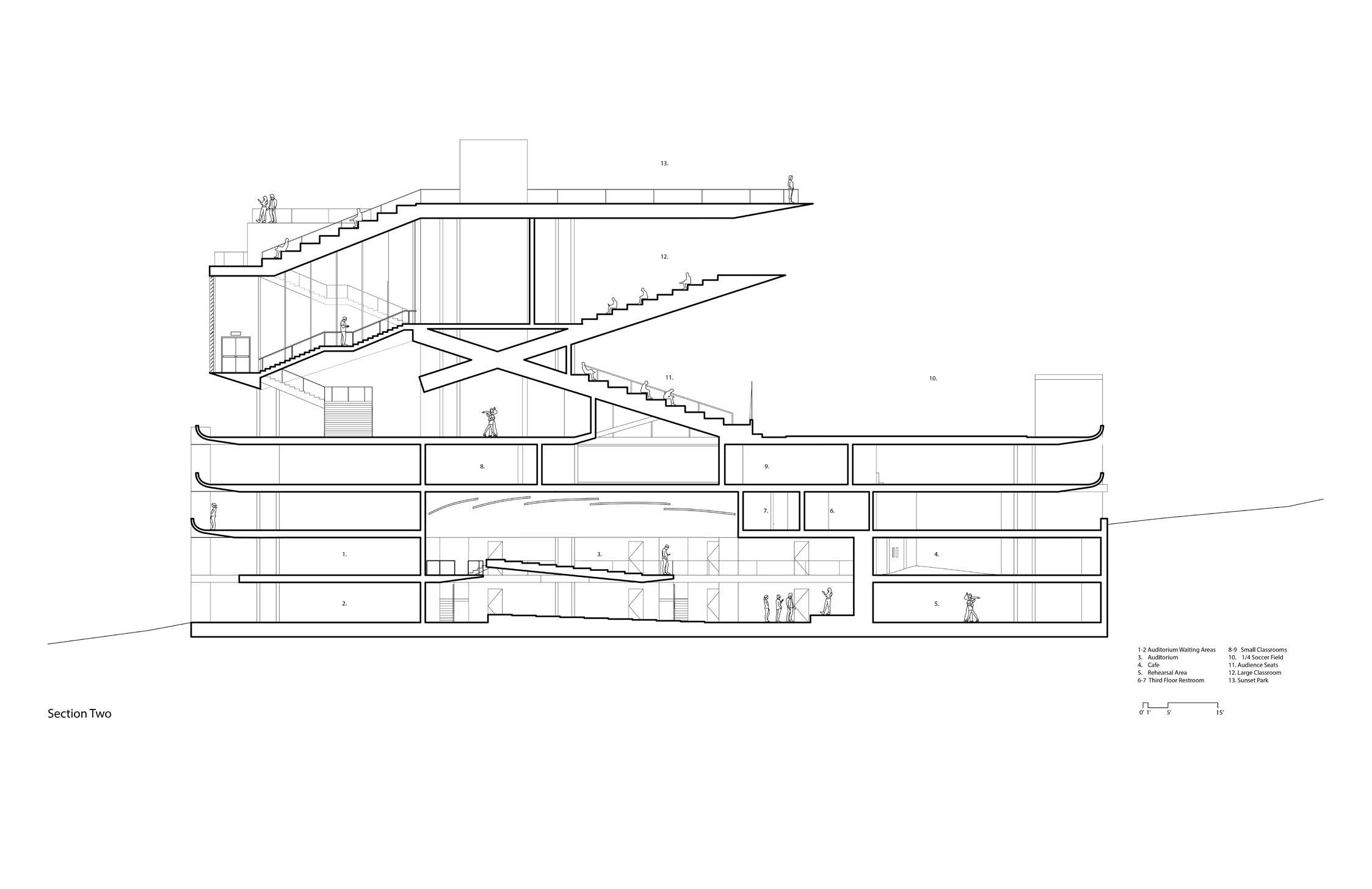
This adaptive reuse project is a practice and exploration under this scenario. The original parking garage has a ceiling height of only 8 feet and is situated on a slope with a relatively small floor area. By utilizing the slope height changes, each parking floor has their own ground connections without internal vertical circulations.
The design task is to transform this structure to an academic building. However, the low ceiling height poses a challenge for accommodating large classrooms, and I aim to minimize alterations to the original structure.
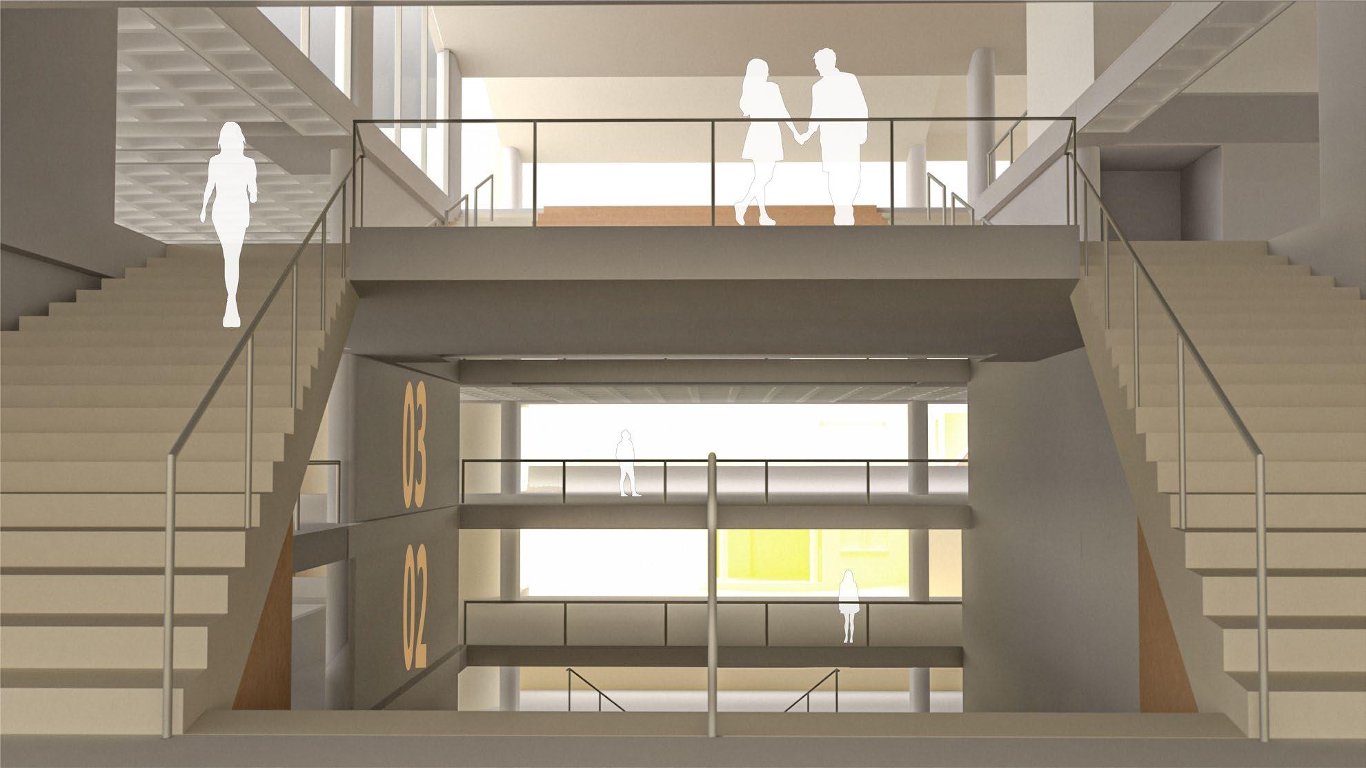
Therefore, my design intervention focuses on breaking the vertical limitations to create new internal spatial relationships and extending the original structure framework upwards. Additionally, part of the existing space is transformed into public-use areas.
Overall, all the original vertical structure is preserved and extended, and the total floorplate demolition is within 20%.
After renovation, the garage became a vertical urban plaza serving the community and supporting varies activities, with minimal interruptions between different functions.
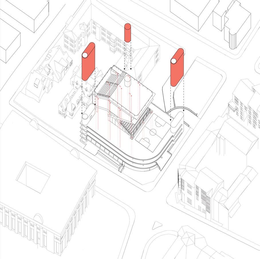
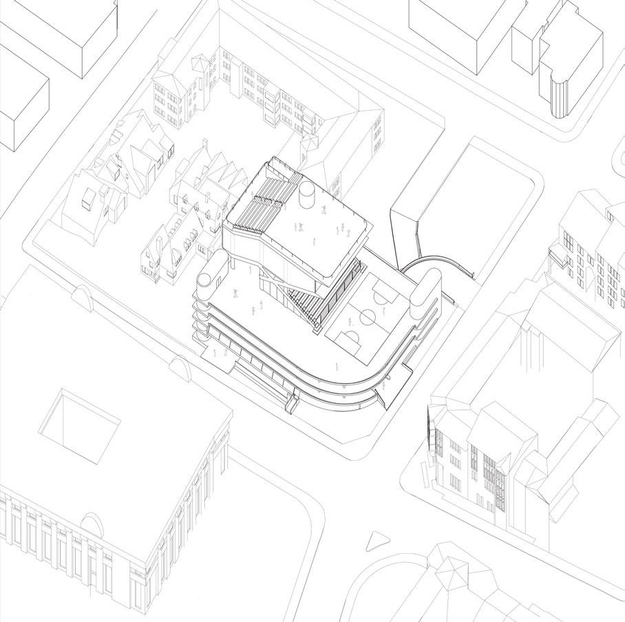
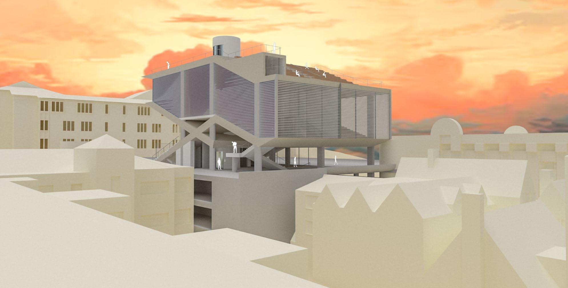
Adaptive Reuse Project
Converted an existing parking garage to an academical and civic architecture. Using minimum structural interpertation to achieve a complete spatial reform.
The University of California, Berkeley, CED
Studio:Arch 200B
Time: Spring 2024
Location: Berkeley Hill, California
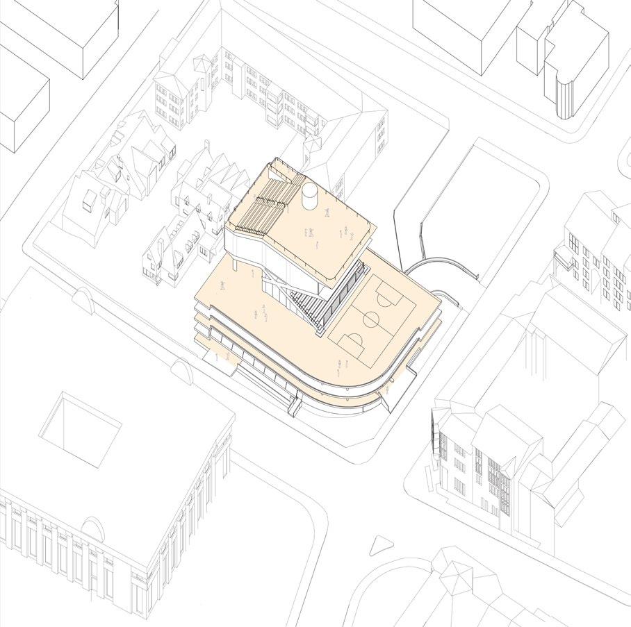
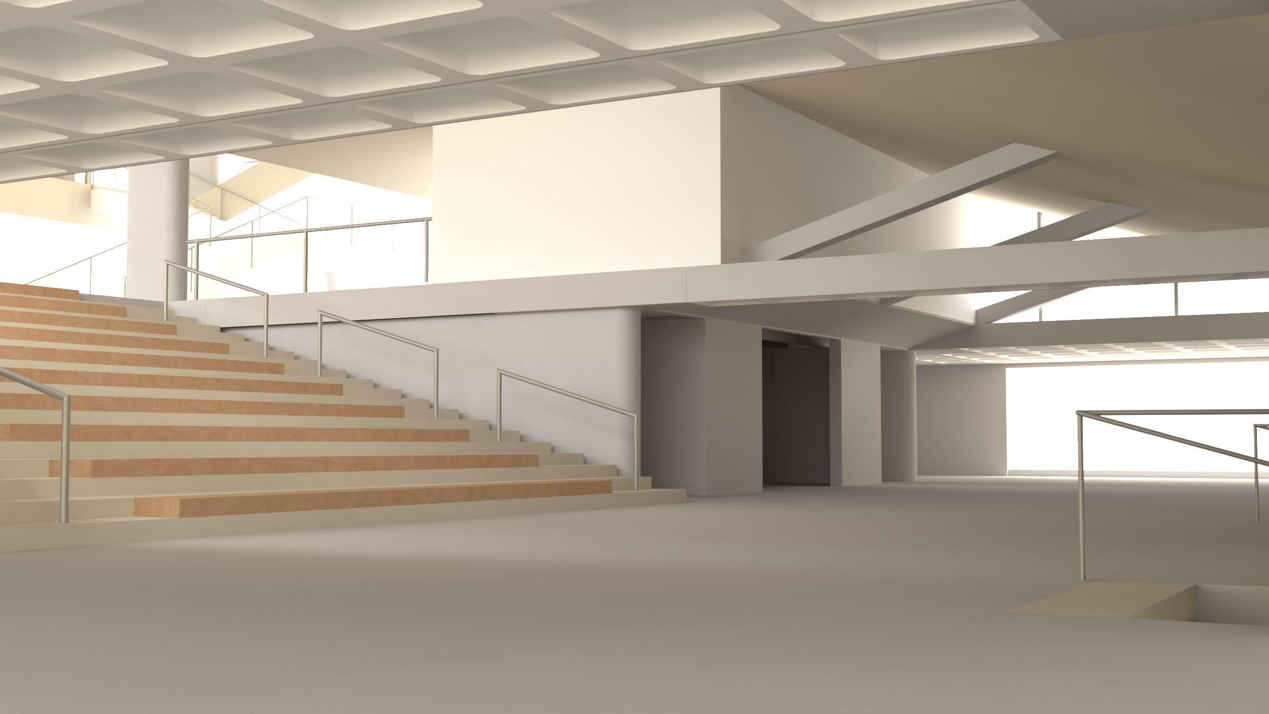
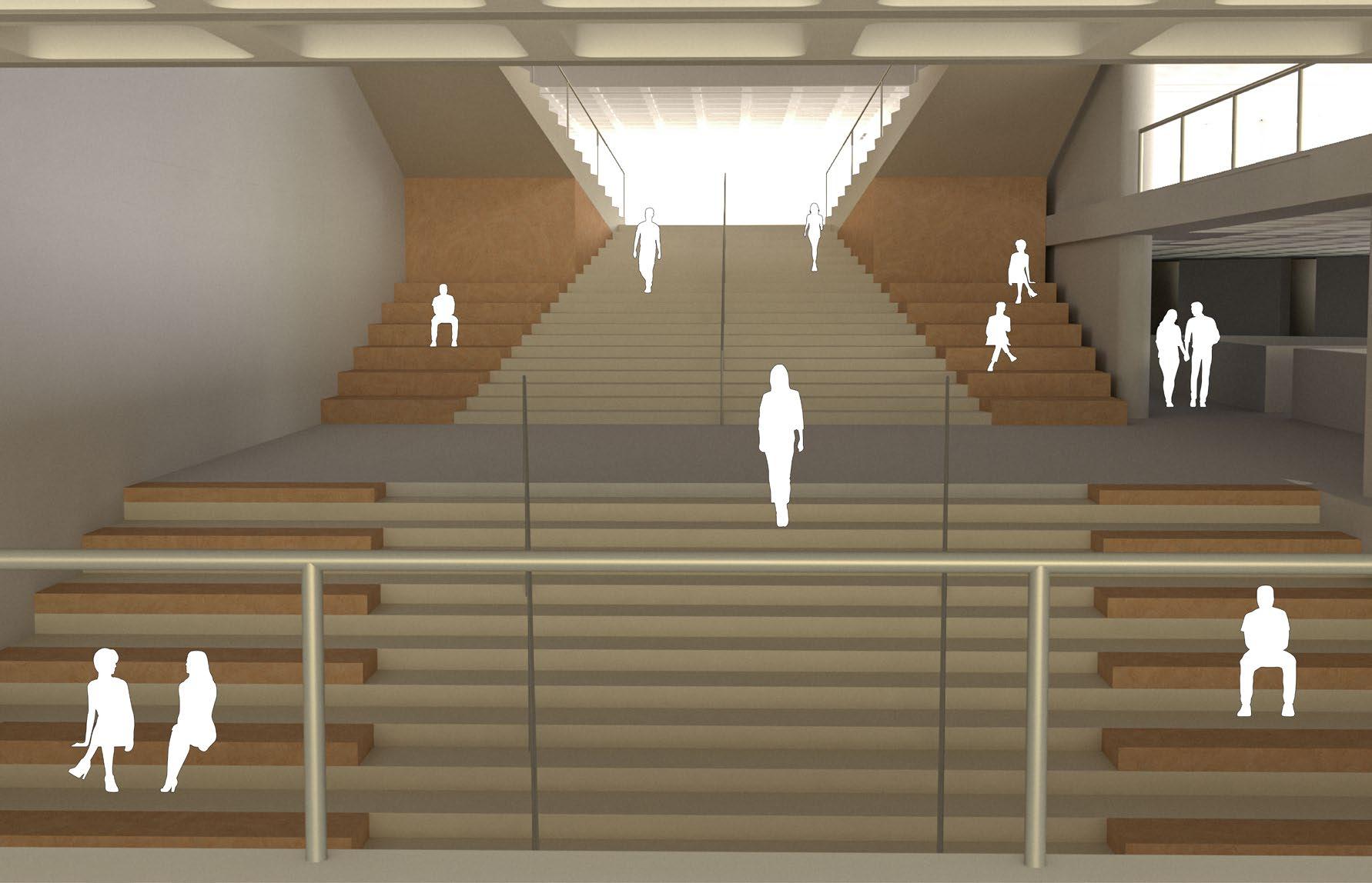
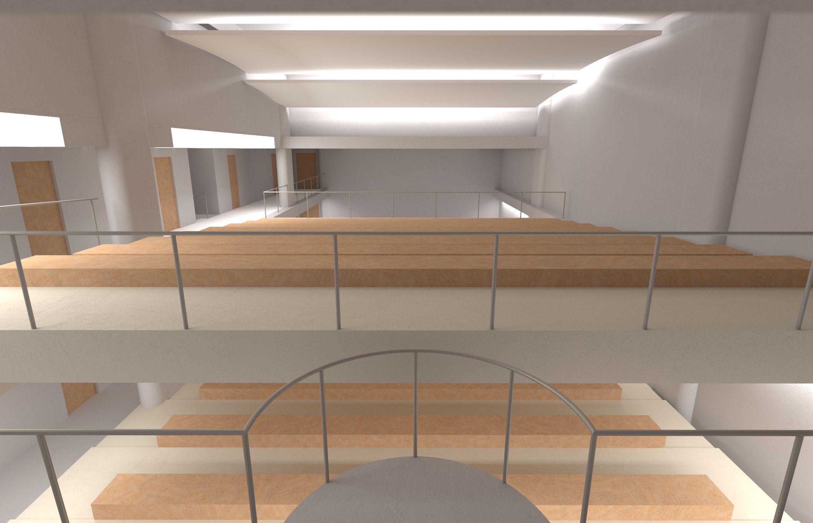
Vertical Urban Plaza
Current Condition
The
Opened-up the Core The
Current Interior The
Donut Structure
Programming
Public Space
Circulation and Structure
Final Design
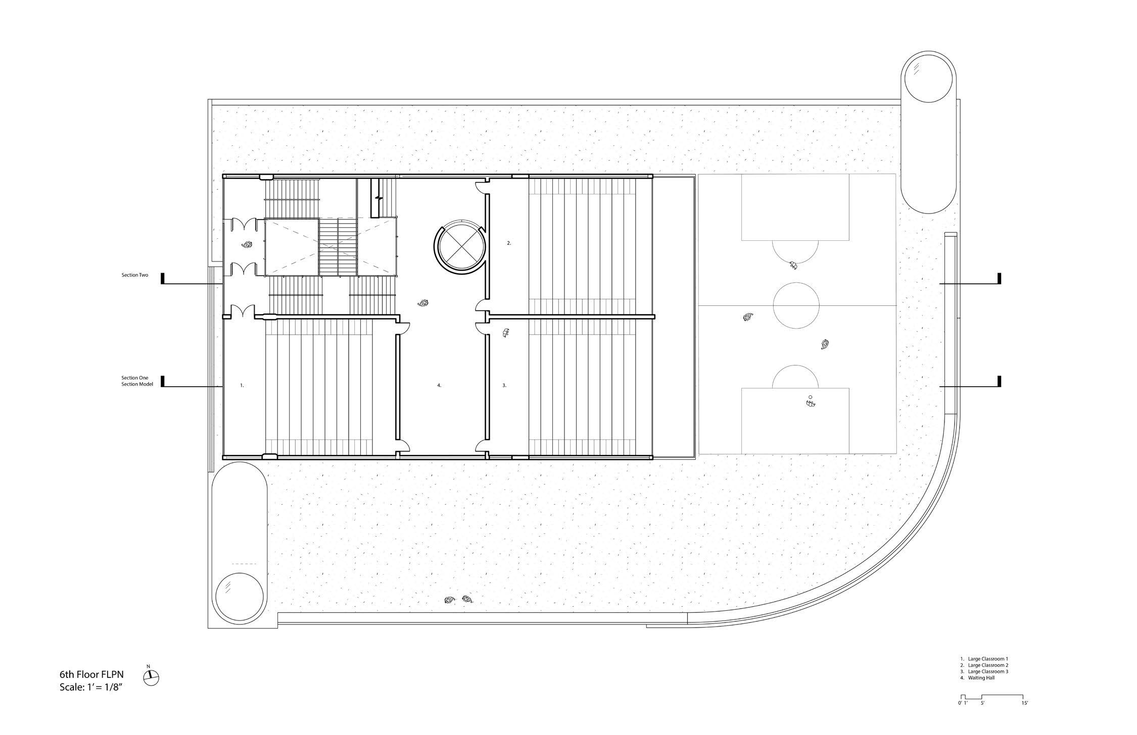
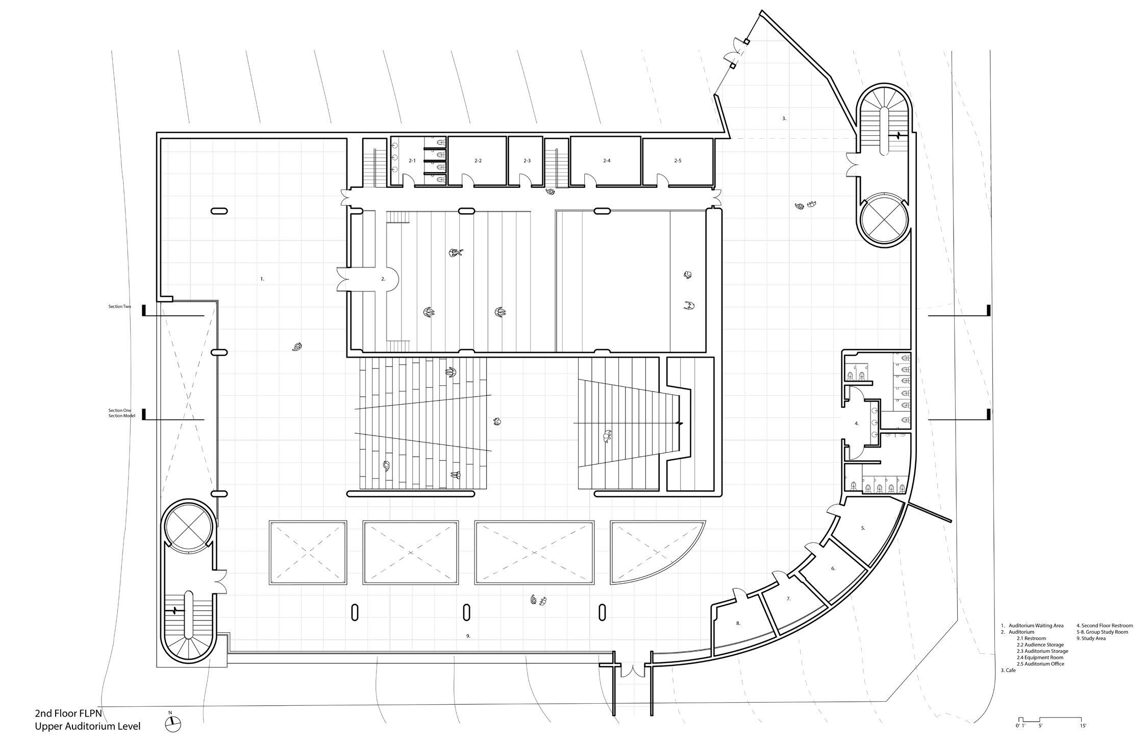
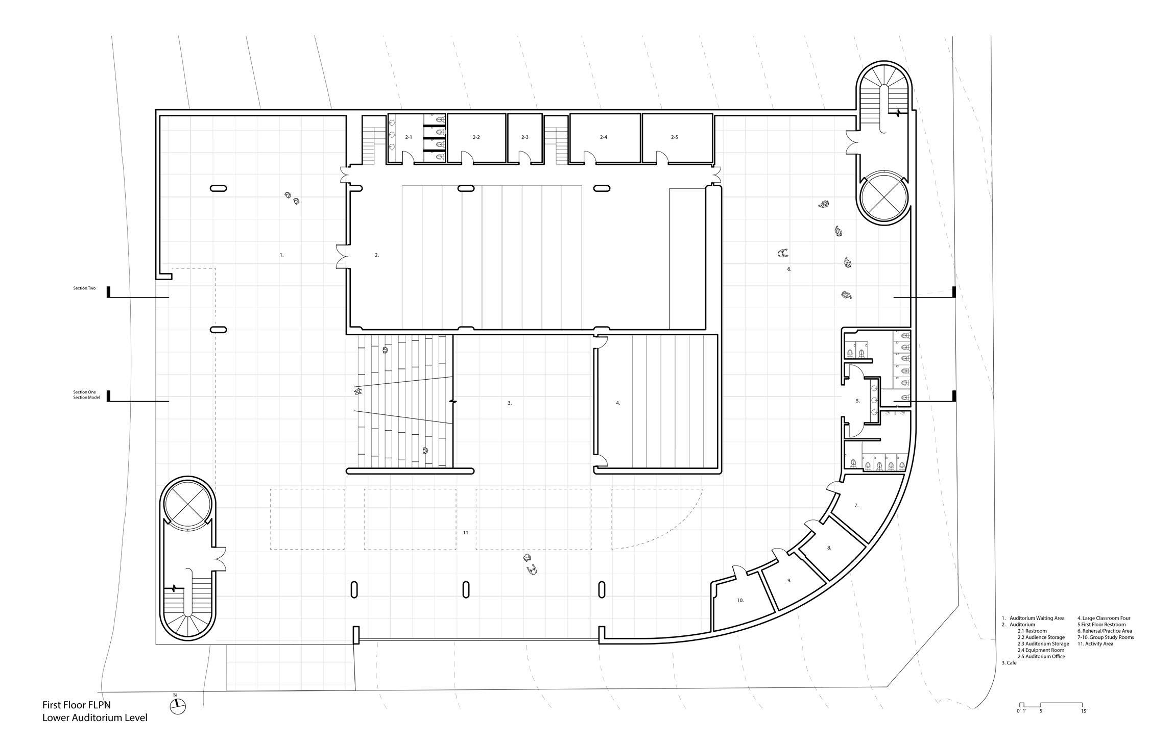
Sixth Floor
The Upper Volume
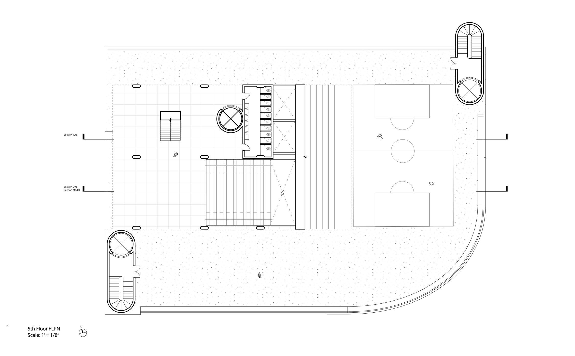
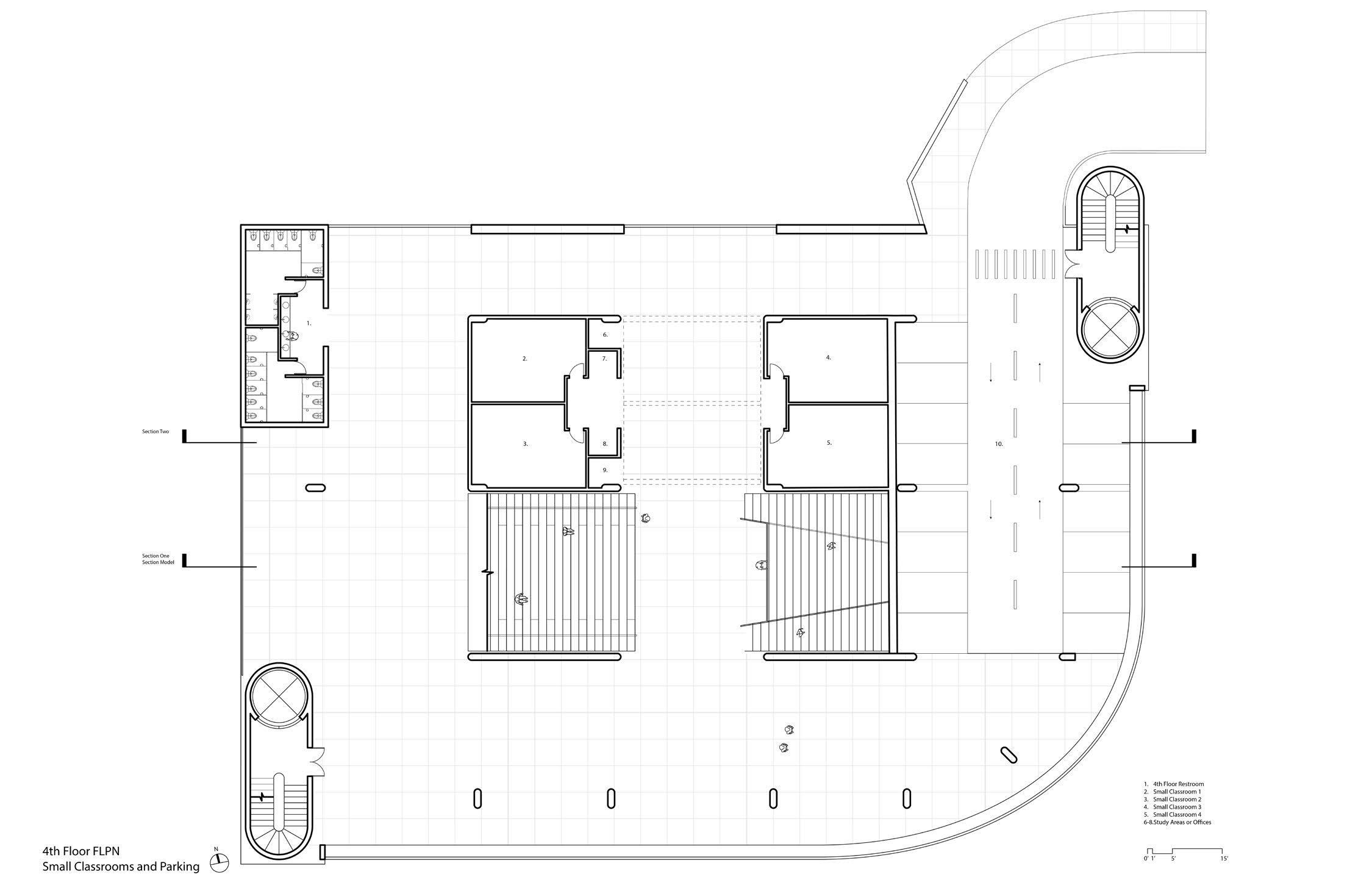
Fourth Floor (Small Classrooms and remaining parking lots)
The fourth floor houses all the small classrooms and some semi-private discussion spaces. This floor is mainly for academic use but also includes the 14 remaining parking spaces for university faculty. Locating parking spaces on floors other than the first floor is a design requirement, but situating them on the fourth floor is a strategy to showcase the building’s publicity and its proximity to the academic spaces within the architecture.
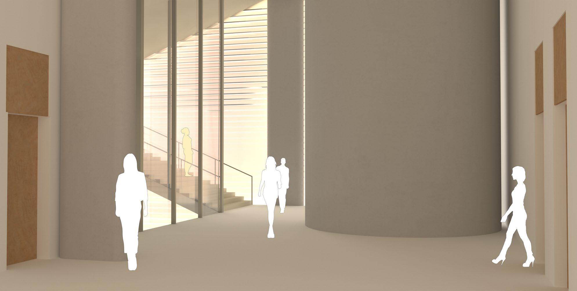
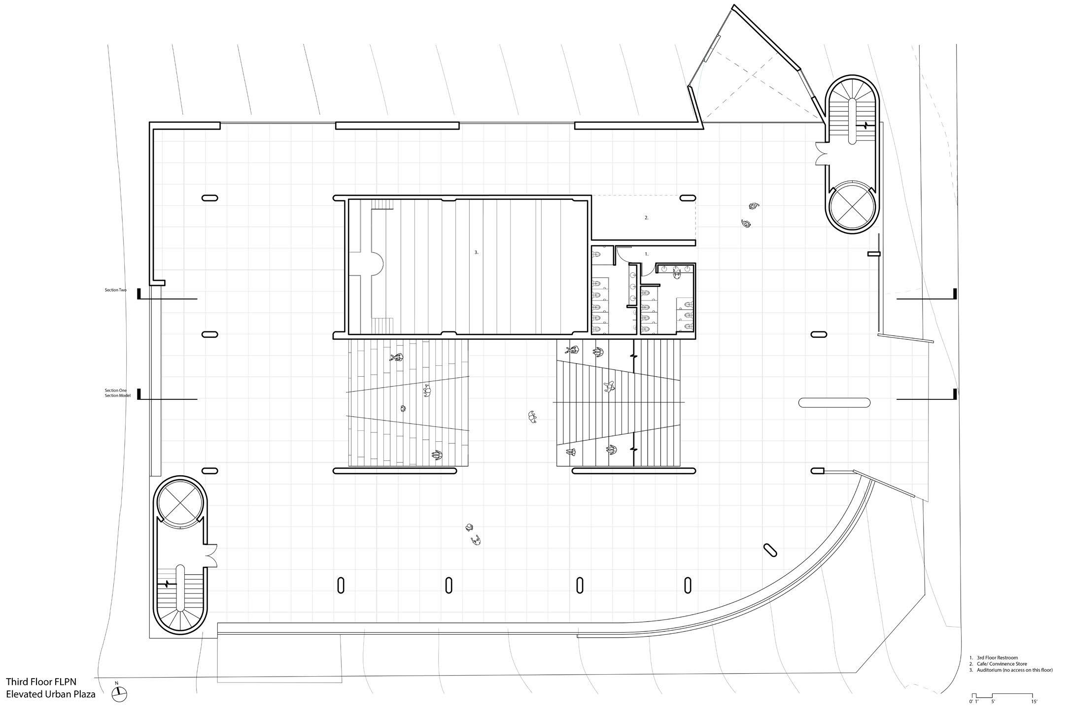
Main Entry on the Third Floor
central Staircase
Not just the main circulation space, the central staircase also feathers theater-like study and social space.
At the underground part of the original parking garage, the main auditorium is designed here to achieve the best ultilization of artifical light and sound control.
Auditorium
section Model Photography
Section Model Perspective View
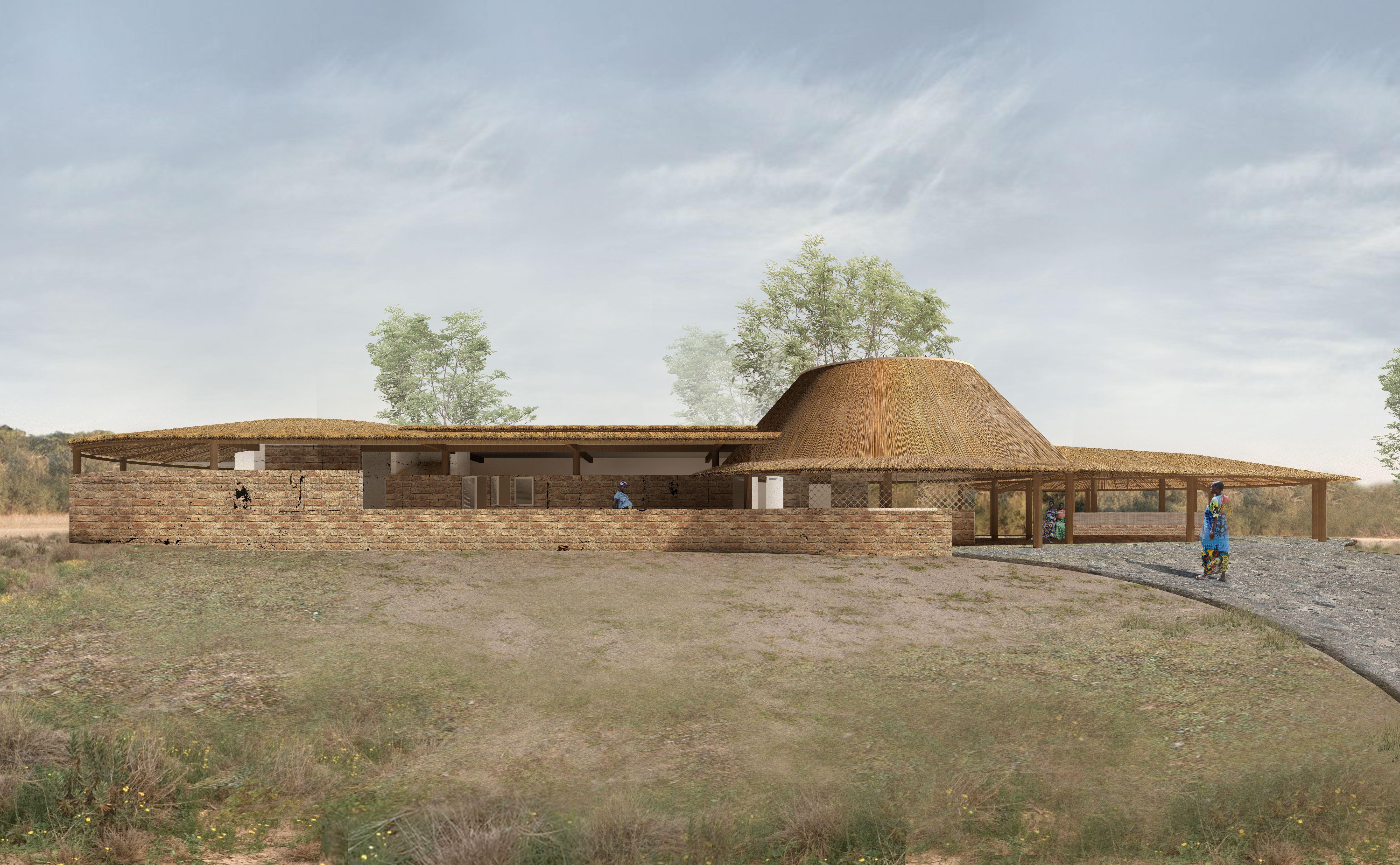
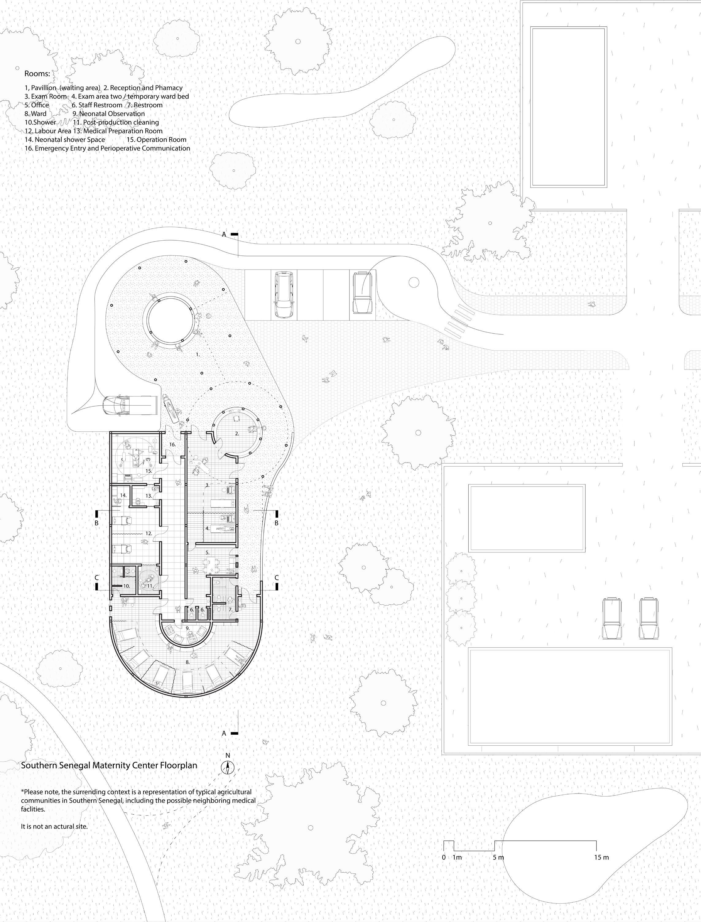
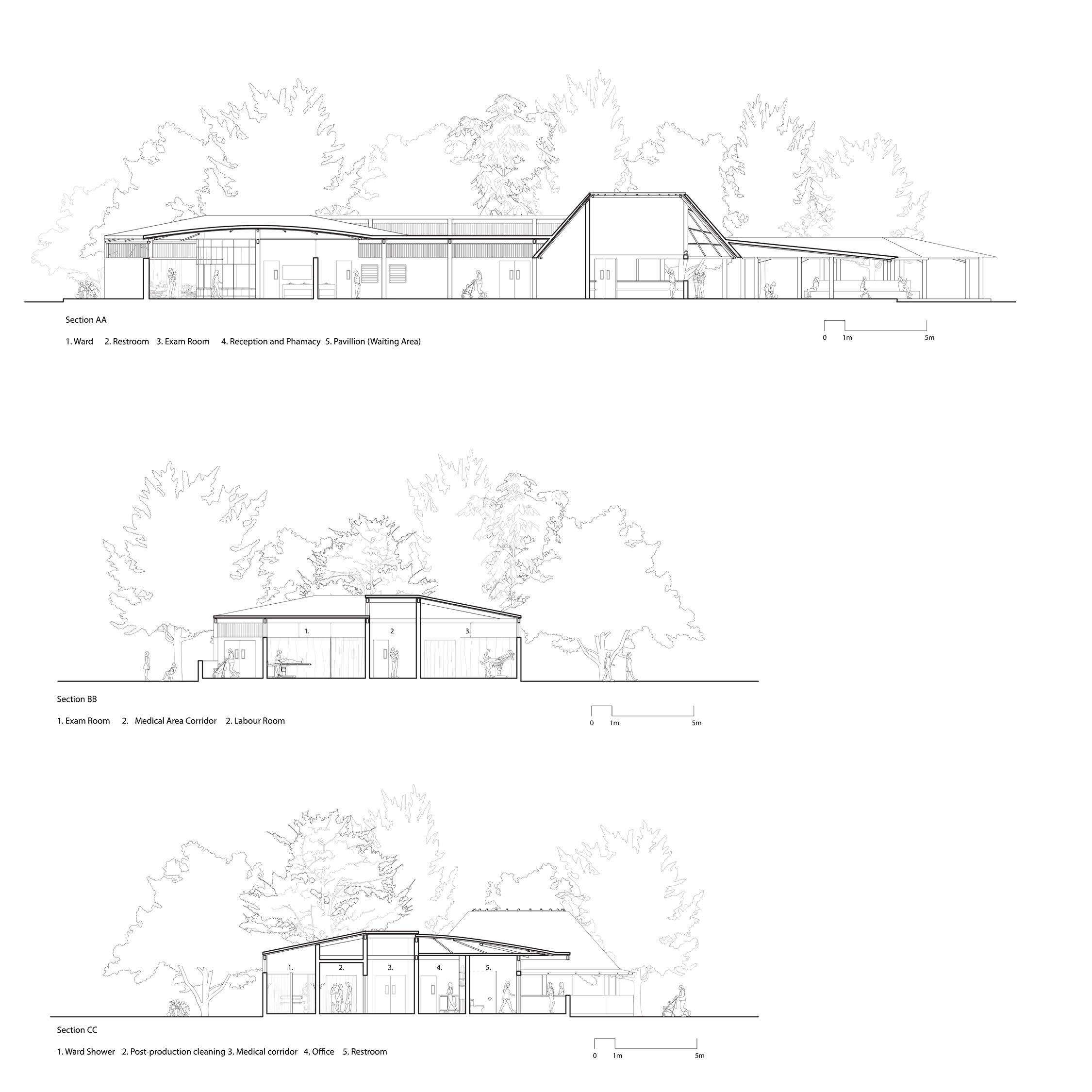
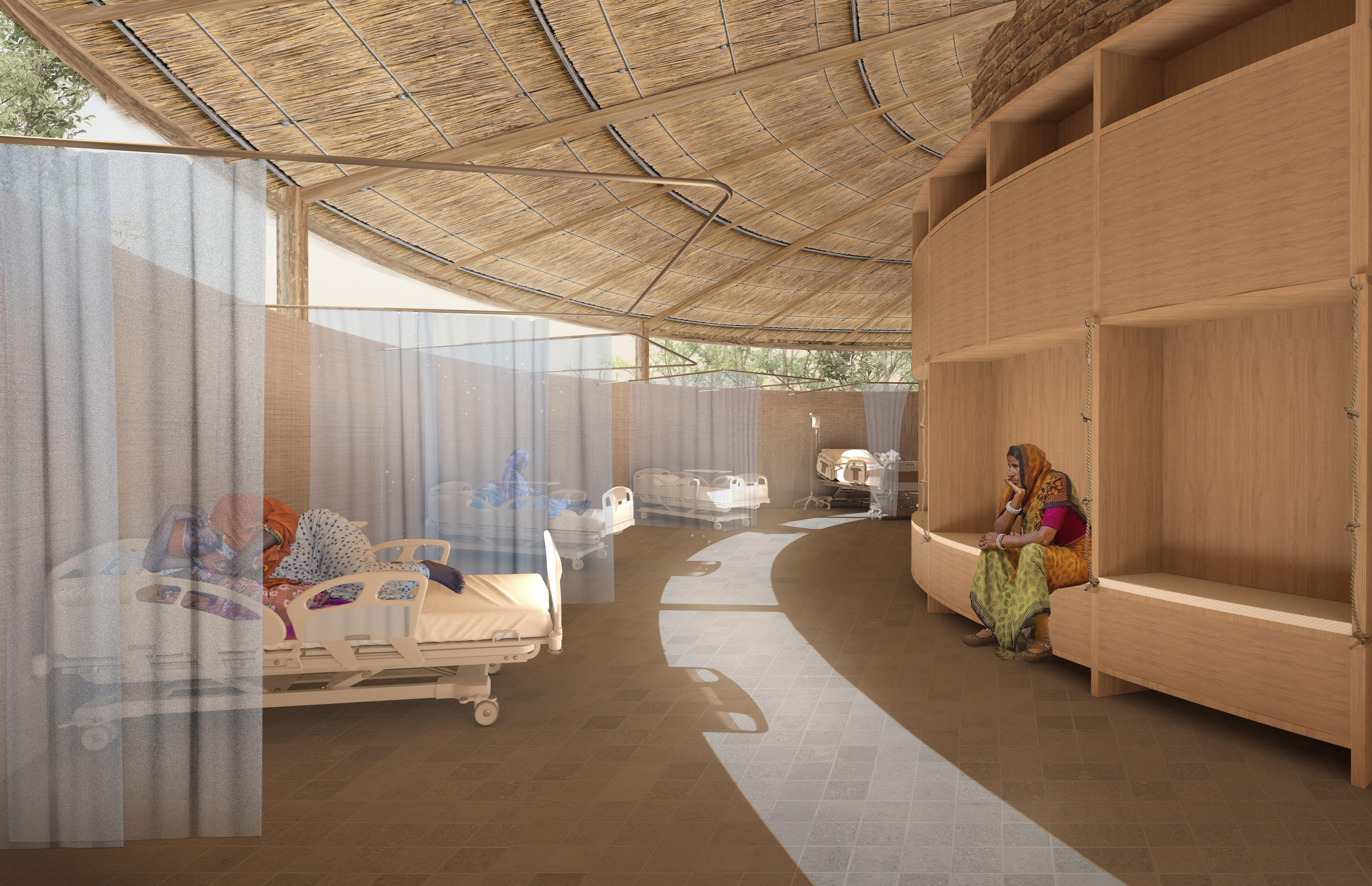
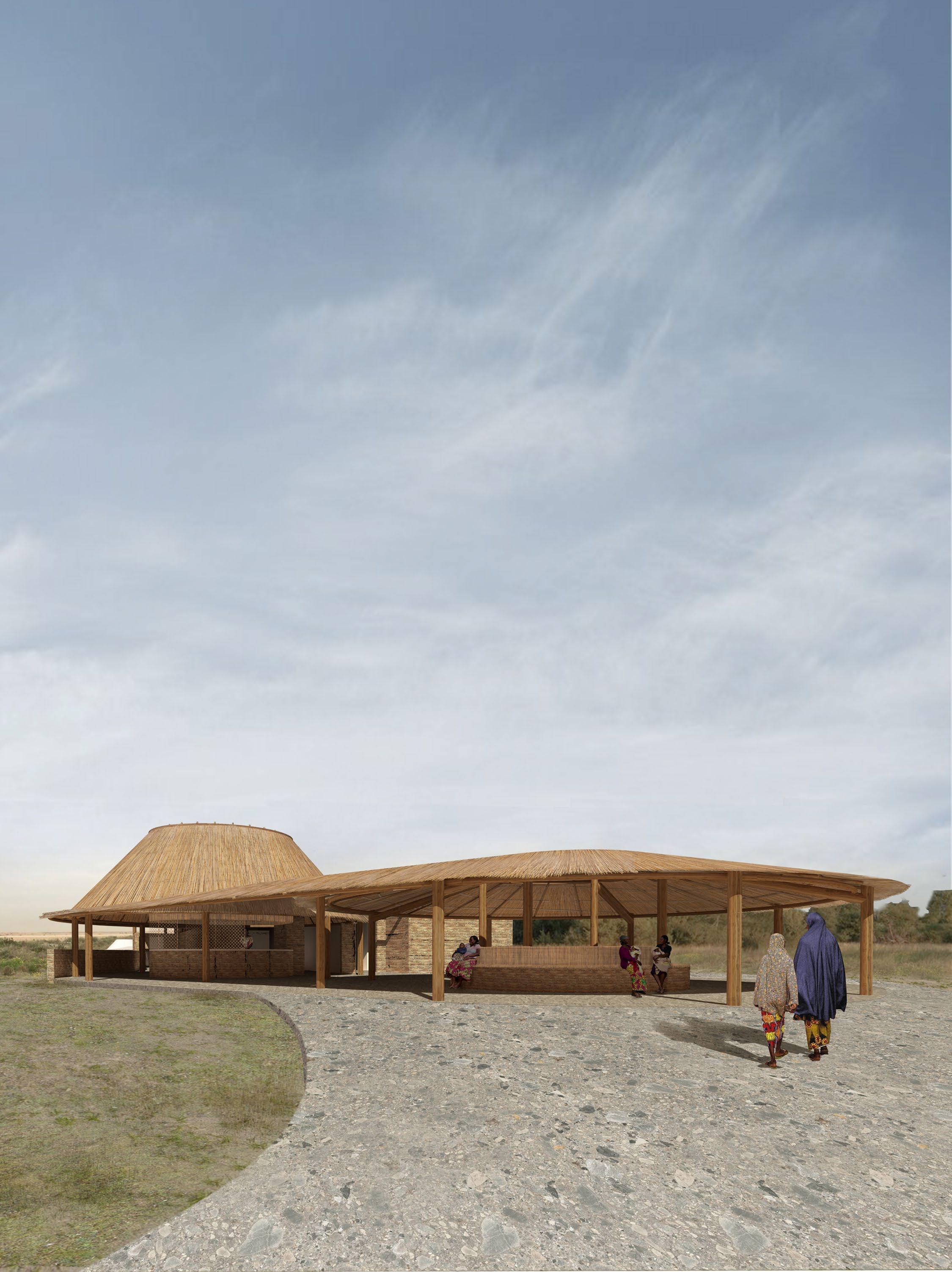
Maternity center in rural context, a professional medical environment, and also a community social condenser
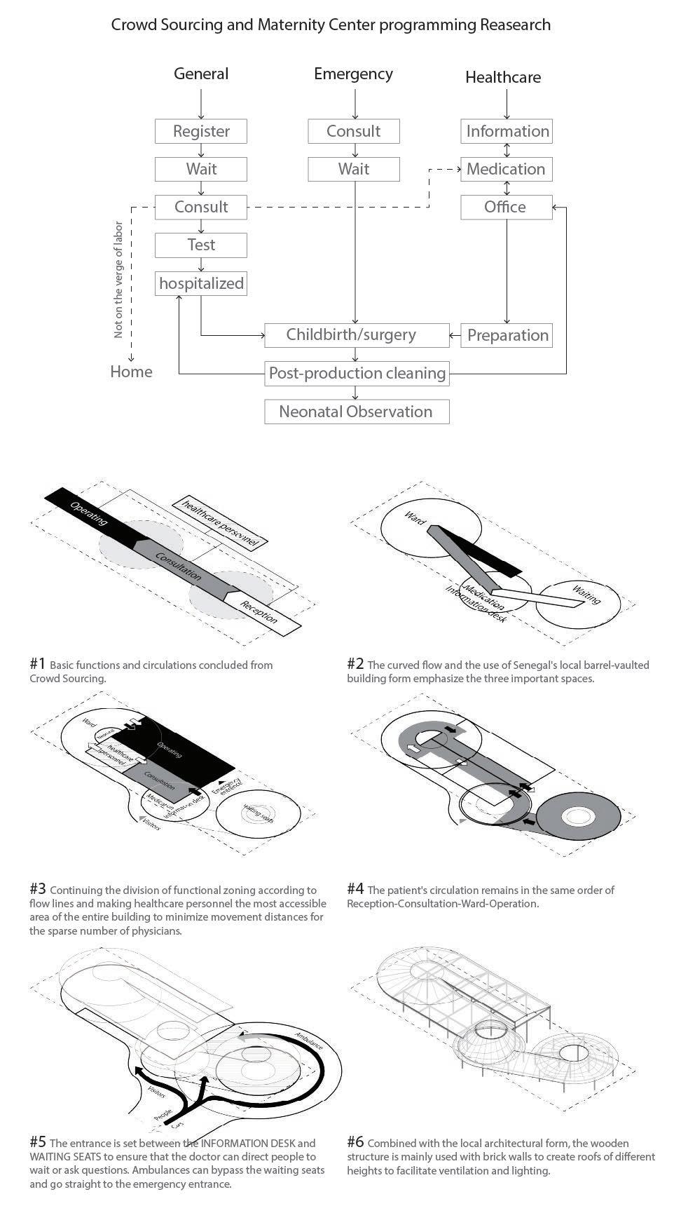
Addressing the lack of maternity services and awareness in rural Southern Senegal, we designed the new Maternity Center to be a welcoming and professional facility to ensure the safe arrival of new lives and to introduce necessary knowledge to the community.
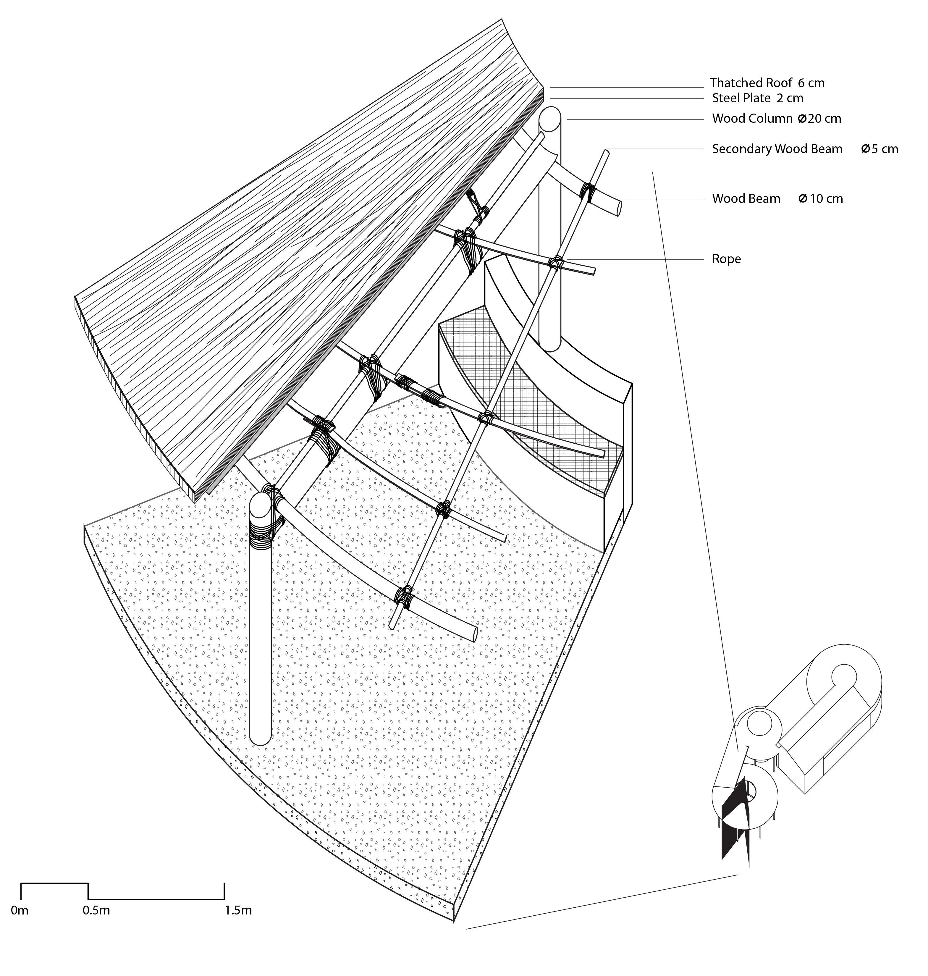
The architecture form is generated by spatial management considerations and inspired by local building structures. The patient workflow follows a sequence from examination to the ward, delivery, returning to the ward, and finally going home. Spatially, This workflow is wrapped around the staff area, allowing staff to efficiently monitor and access different zones. Emergency entry and the perioperative communication place is at the other end of the architecture to provide a secured shortcut to the labour and operating area. The neonatal observation area is surrounded by the ward, so the new moms can stay around with their babies, although the two spaces are separated.
To ensure patient health and community engagement, the reception area is designed as a semi-isolated pavilion, serving as a recreational space for both patients and community members. The reception area and pharmacy are adjacent to the pavilion, allowing staff to monitor patients and interact with the community. Additionally, all patient areas are equipped with disability facilities, including railings, handles, and ramps in the shower spaces. Water-using areas in different functional zones are strategically placed to minimize material use and reduce health risks.
Interior Rendering
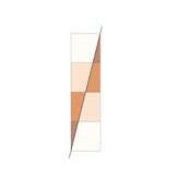
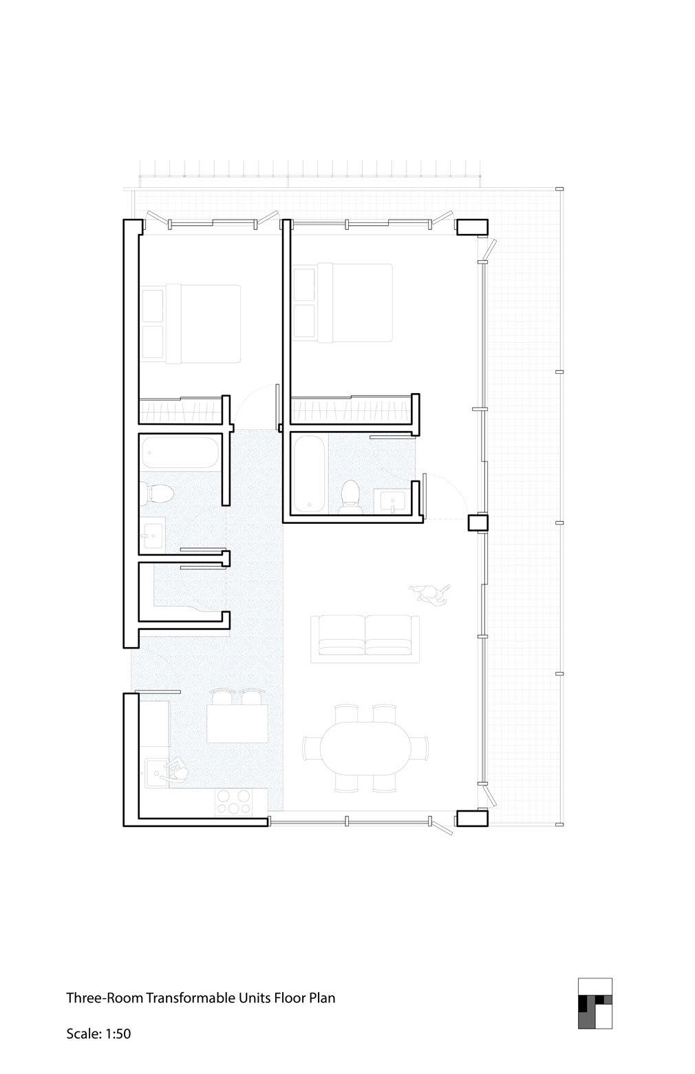
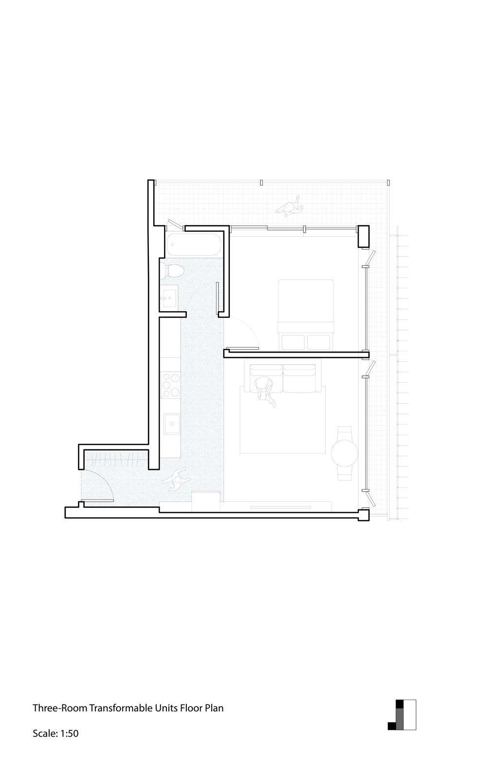
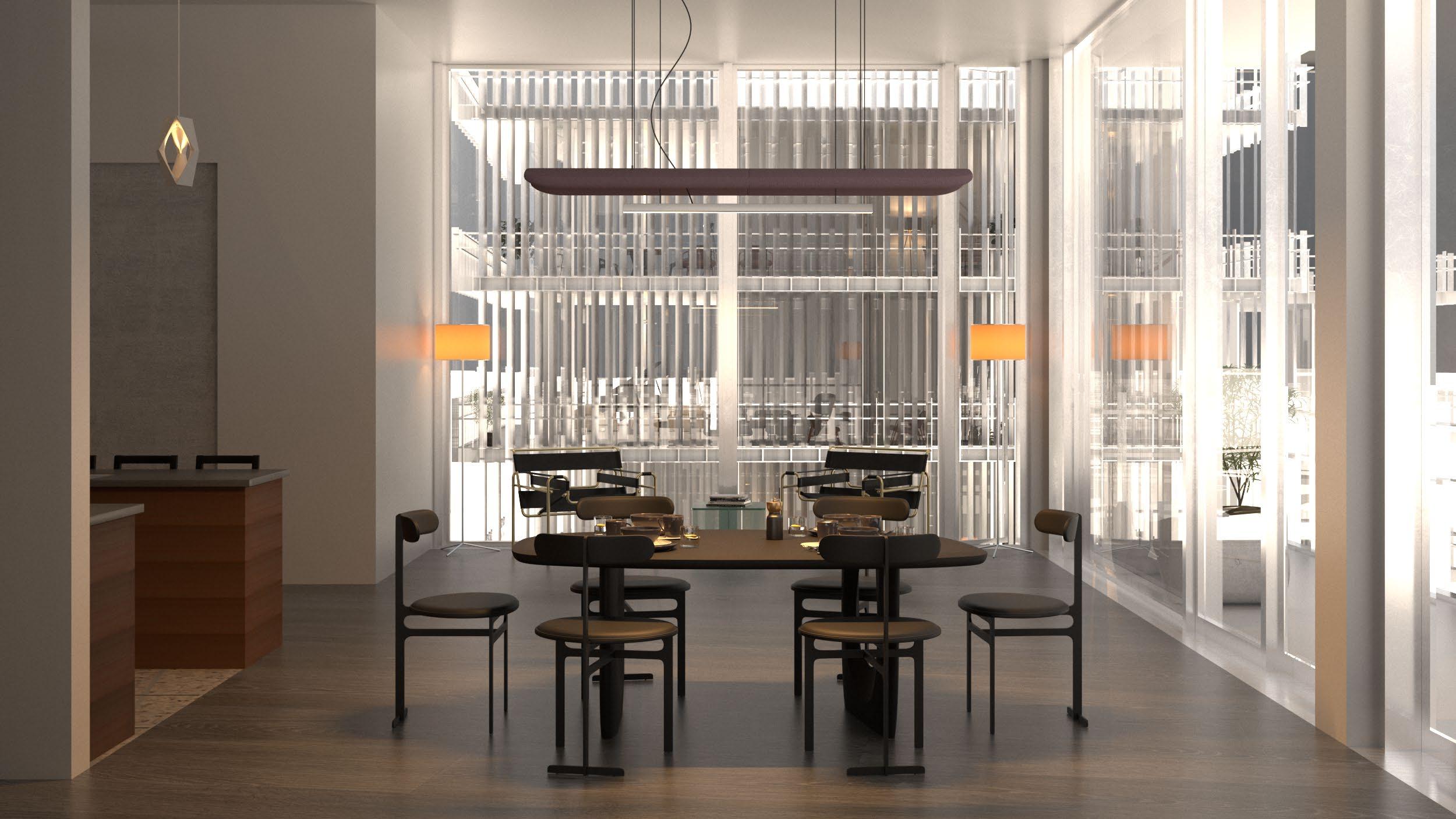
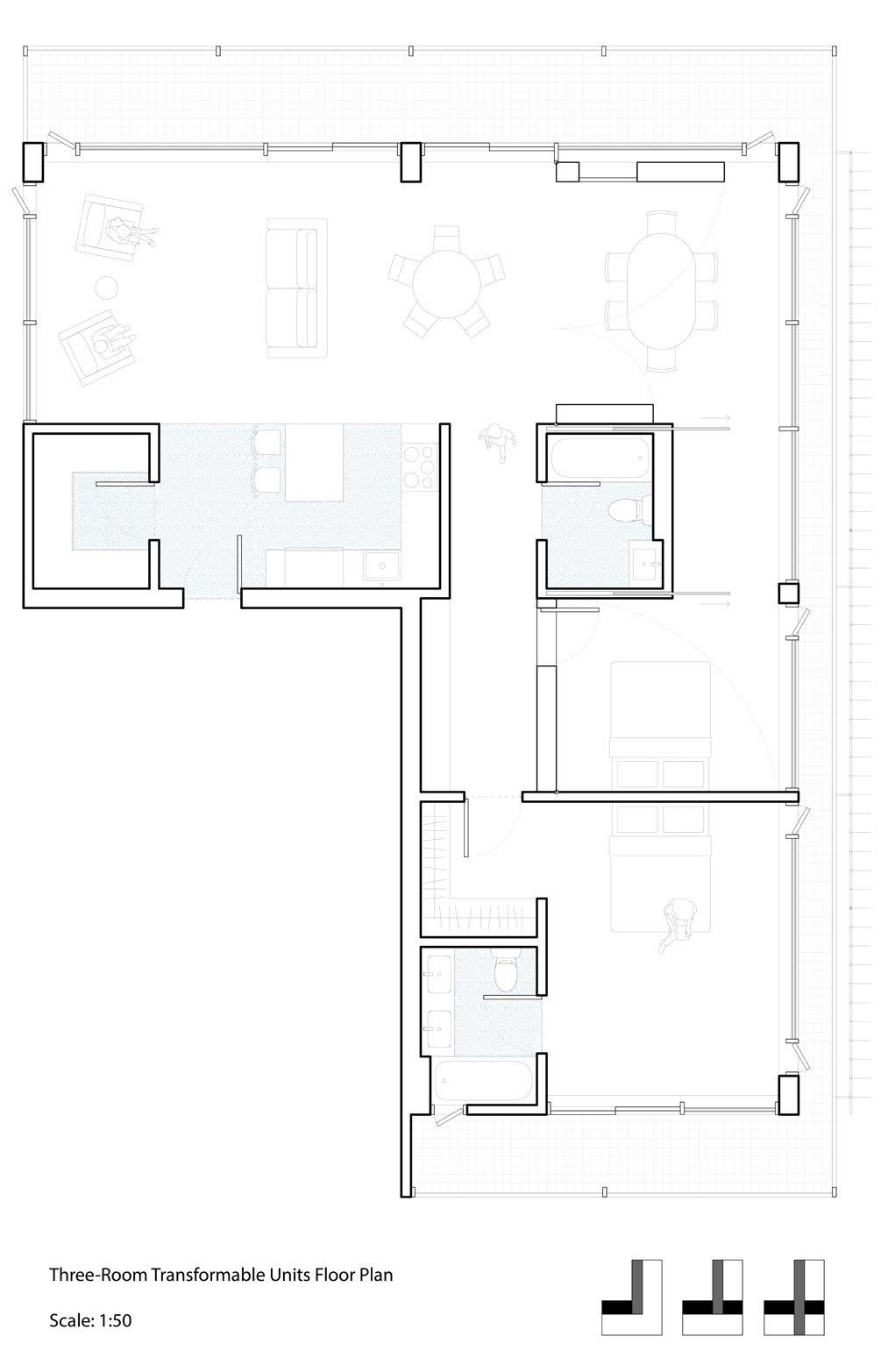
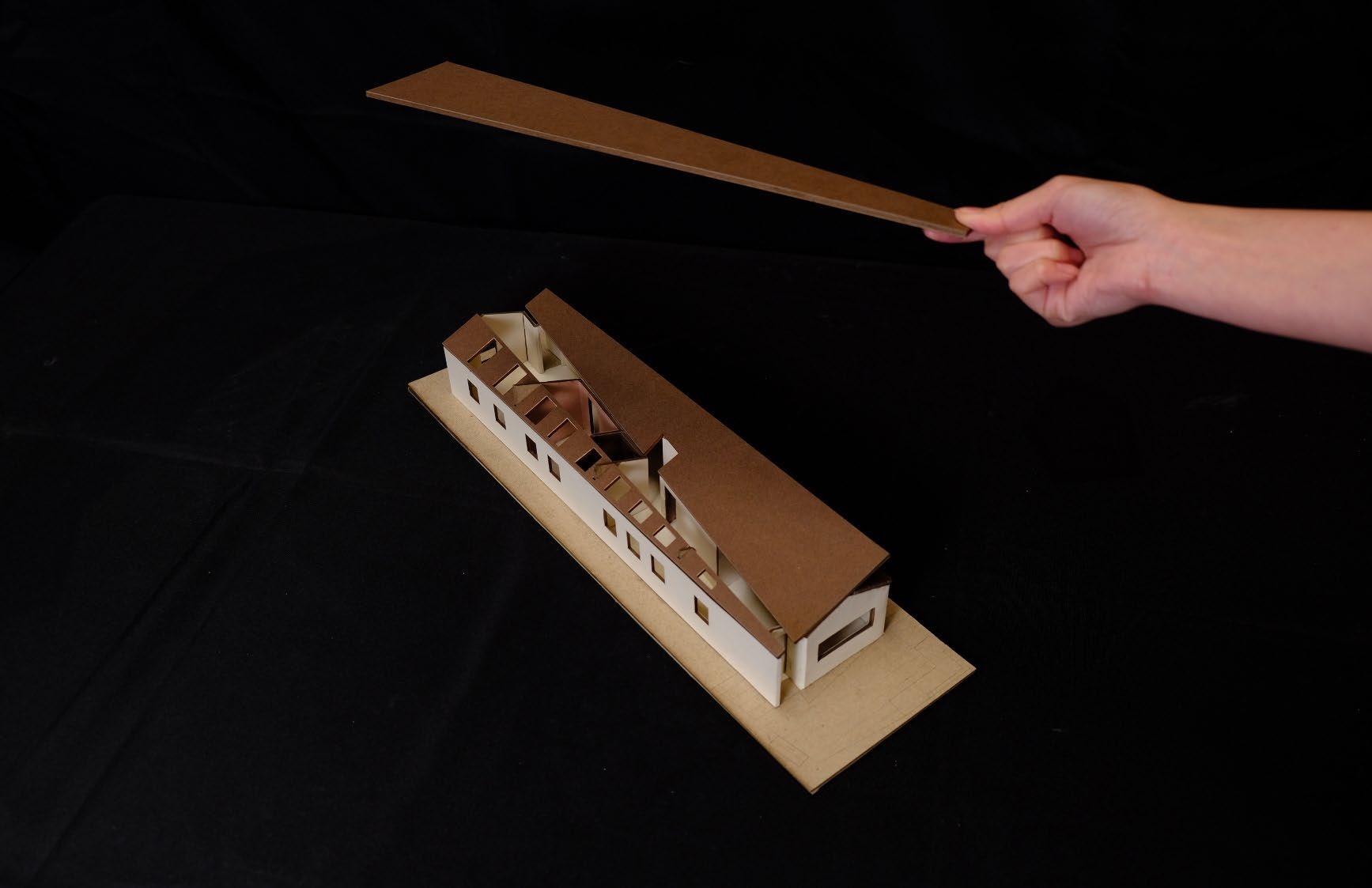
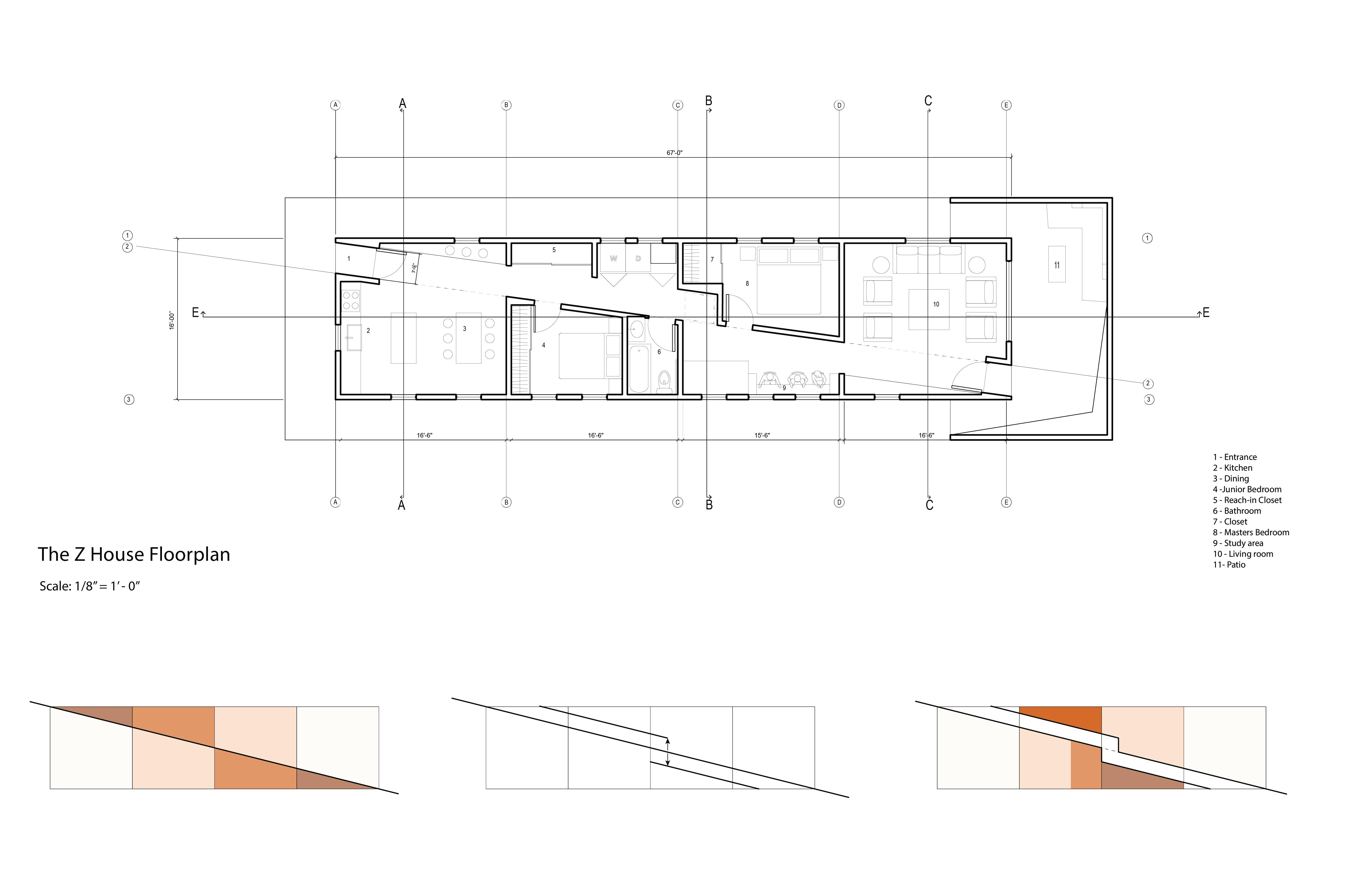
Compact single-family house in the Bay Area
The University of California, Berkeley, CED
Group project, team of 2
Studio: Arch 200B
Time: Spring 2024
Location unspecified
The Bay Area faces significant housing pressure. This project explored the possibility of maximizing the living experience within a predetermined structural frame of a micro-house.
By introducing a diagonal line, the required rectangular space is divided into two equal triangular spaces, and the publicity of both triangles reduces as the width goes from wide to narrow until reaching the center, where the spatial hierarchy is revered into the other triangle.
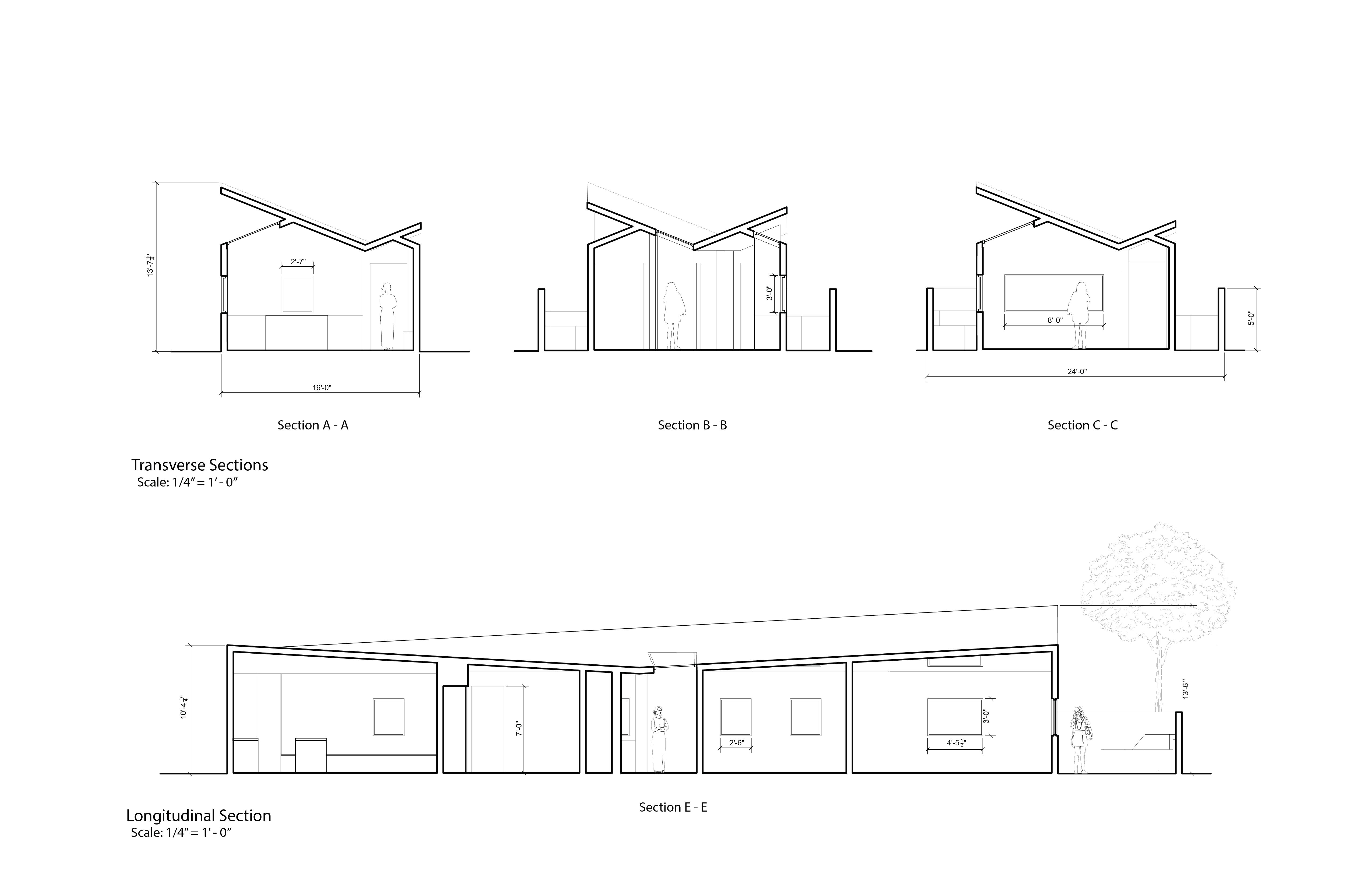
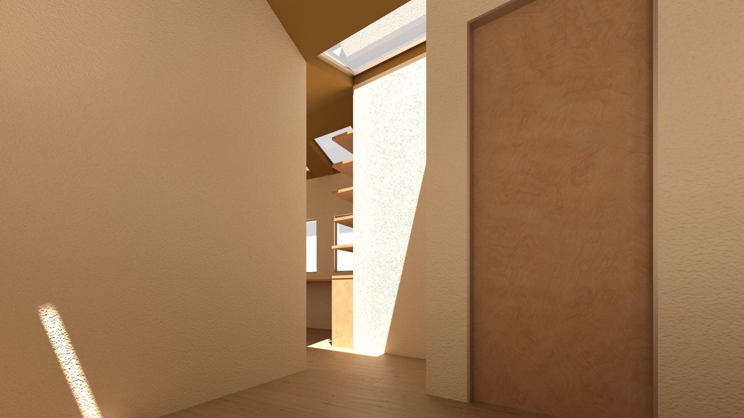
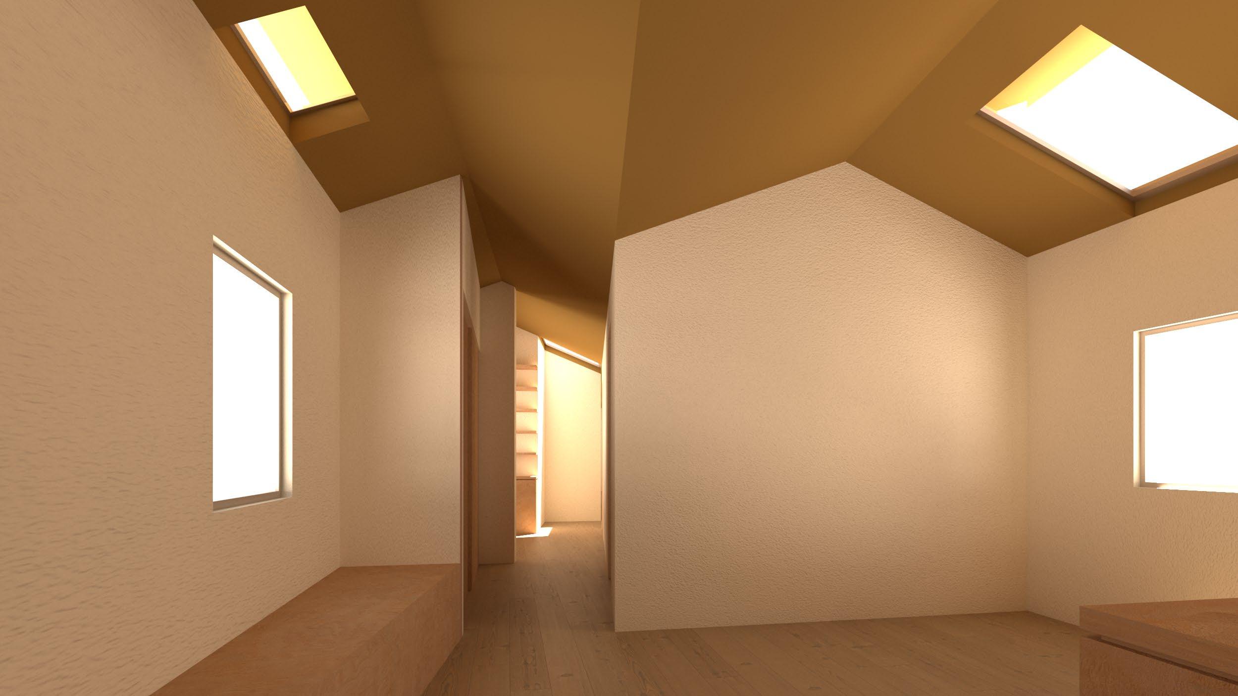
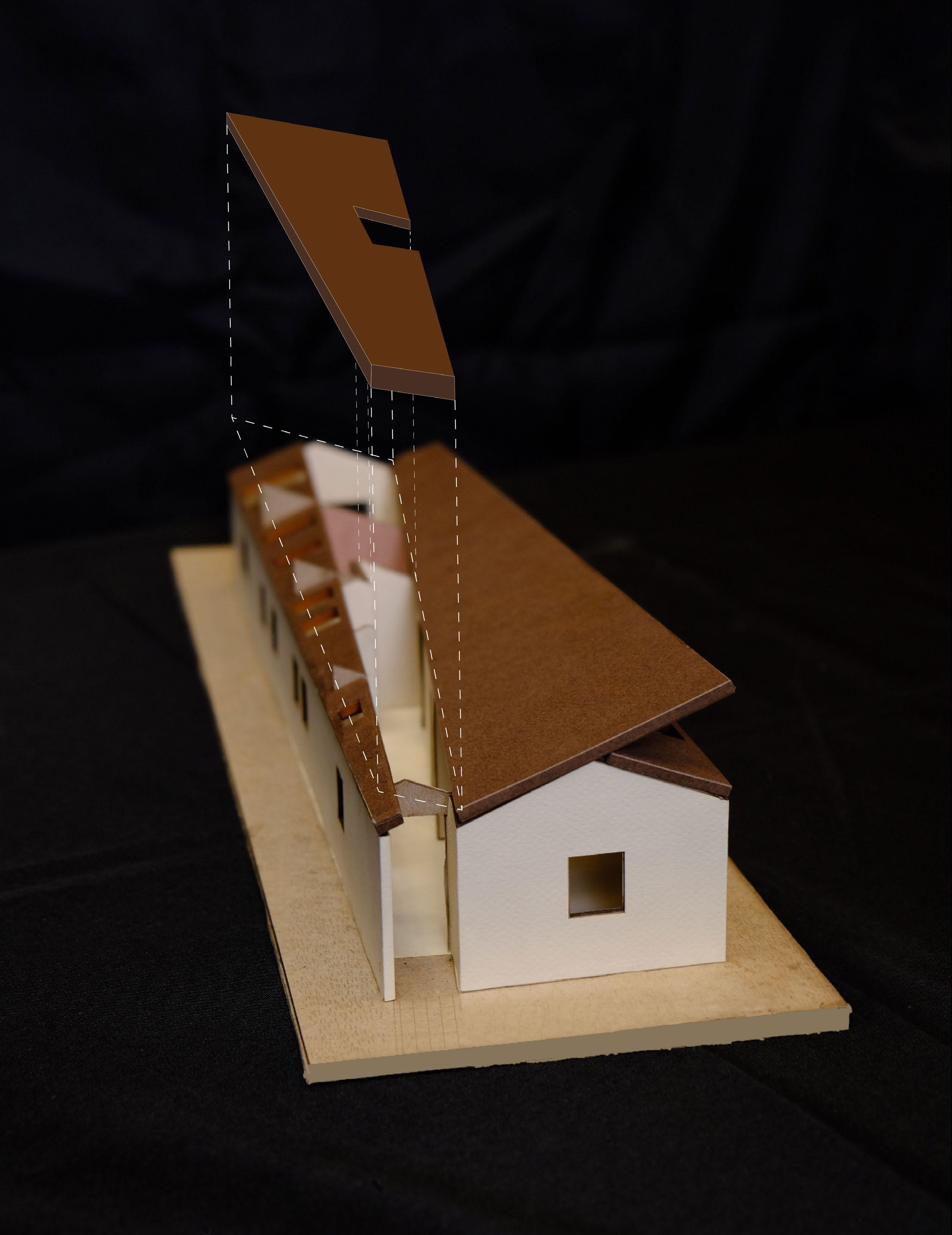
From outside to inside, on the two sides are the more public spaces, including the living room, kitchen and dining, and foyer. Further in are the two bedrooms, laundry, and studies, until the washroom is in the heart of the house, representing the ultimate privacy. The diagonal cut per se allows edge triangular spaces to become useable, and disappeared, resolved into the wall naturally. Additionally, the offset operation of the diagonal corridor optimizes the usable areas to suit their functions better. The “ Z ” House
The roof design has two considerations. First, there will be more natural light come into the house during morning and late afternoon, and less in the noon. Second, the dual-butterfly roof shape creates two dormed areas: the wider parts are the occupable spaces, feels like house within the house, and the narrower part is the corridor.
OTHER DESIGN WORKS
Sport pavallion design, group project 2024
Structural design and Karamba Analysis Barcelona Temporary Apartment
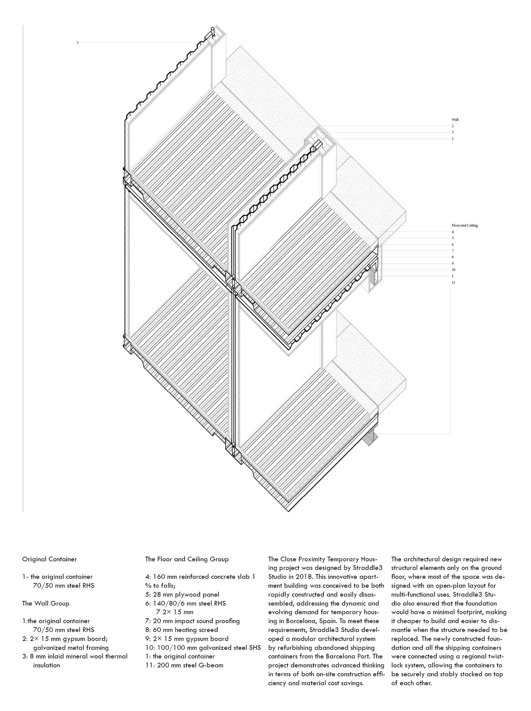
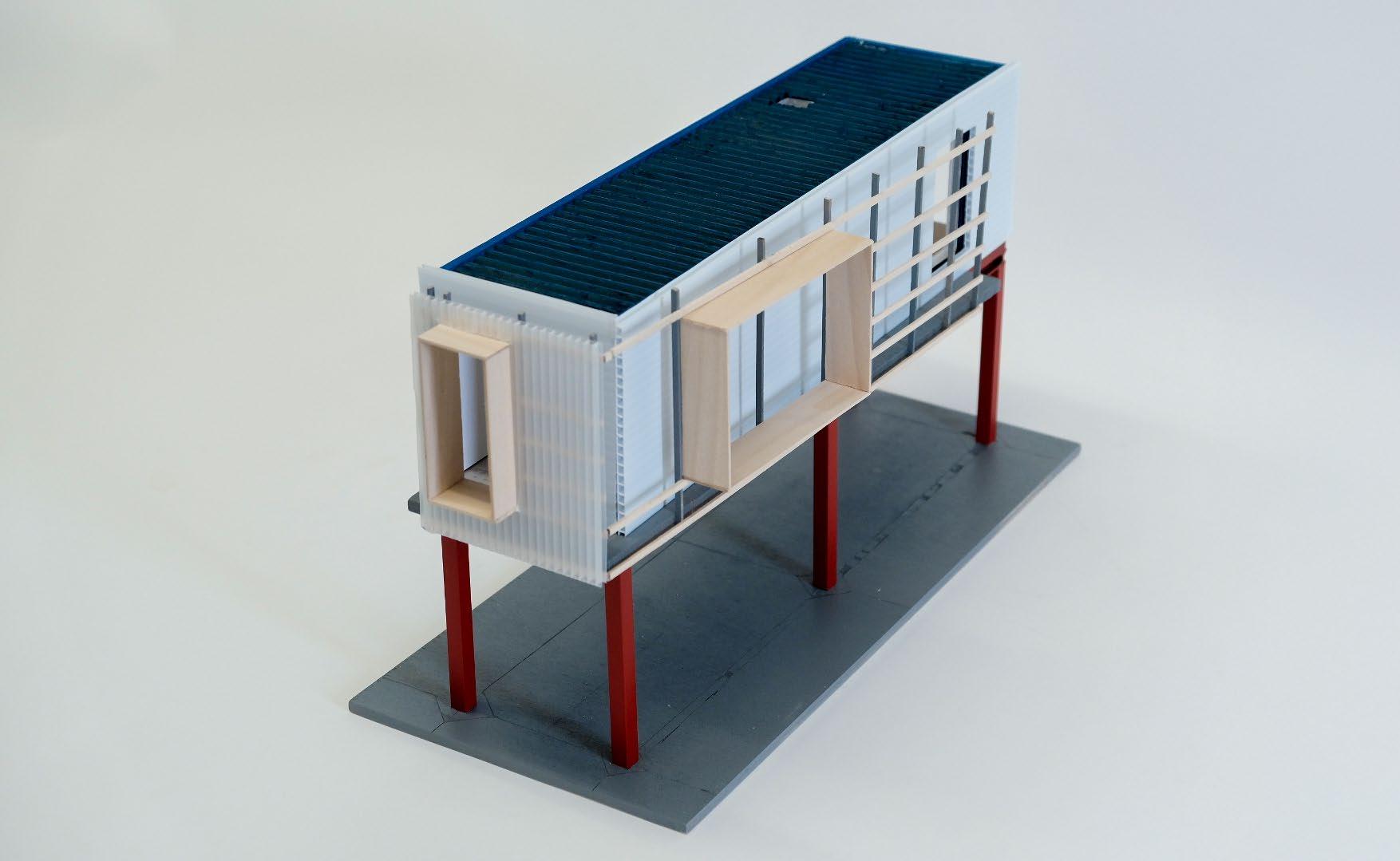
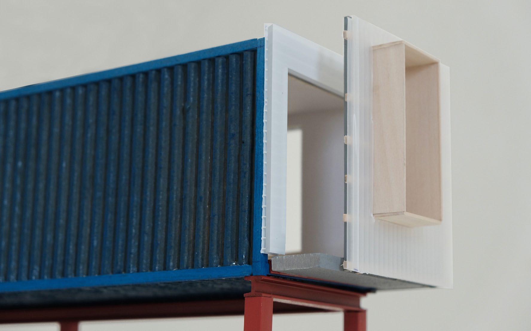
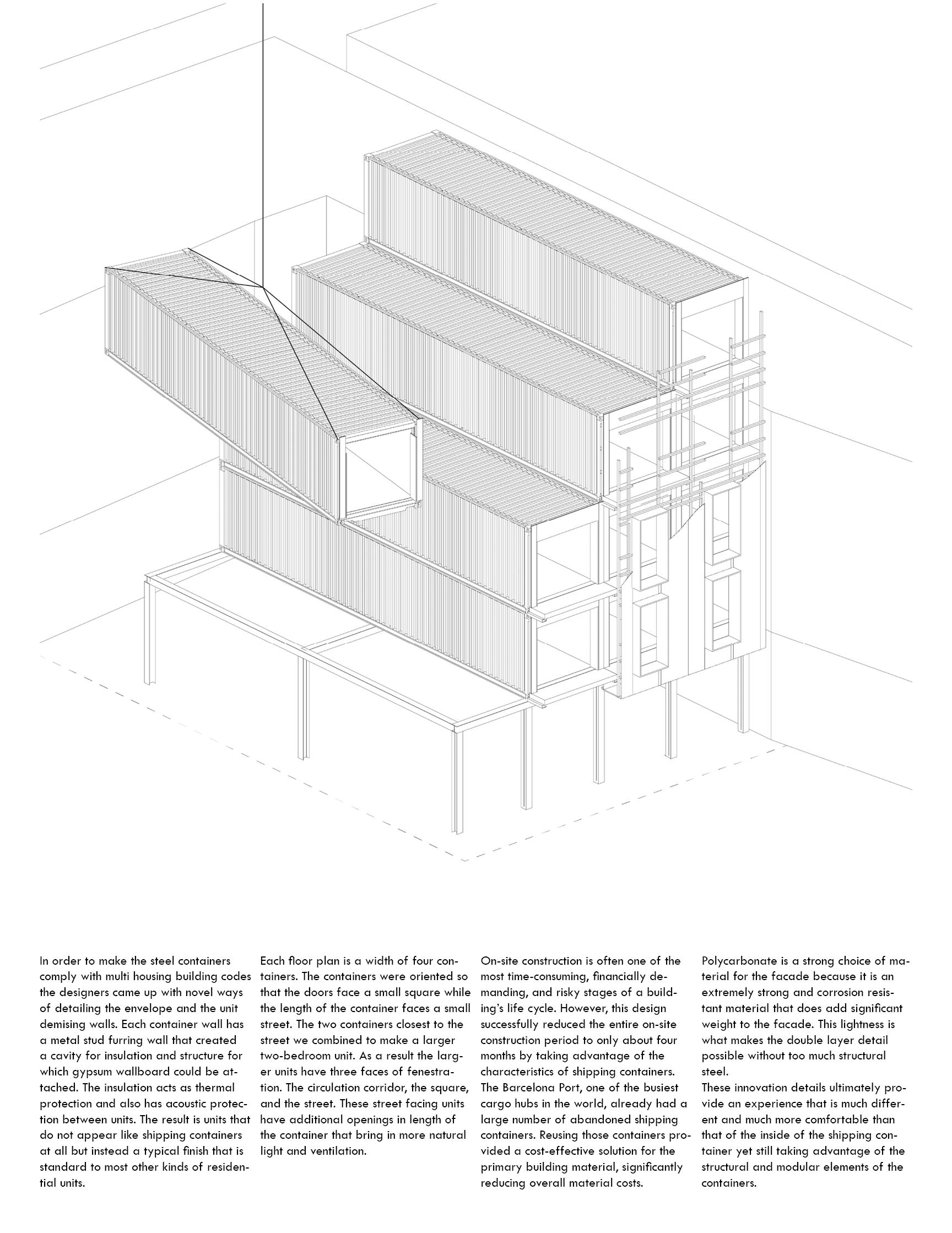
Architecture construction case study, group project 2024
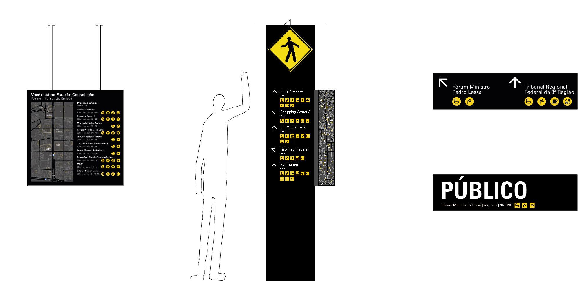
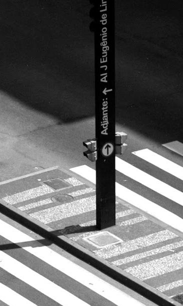
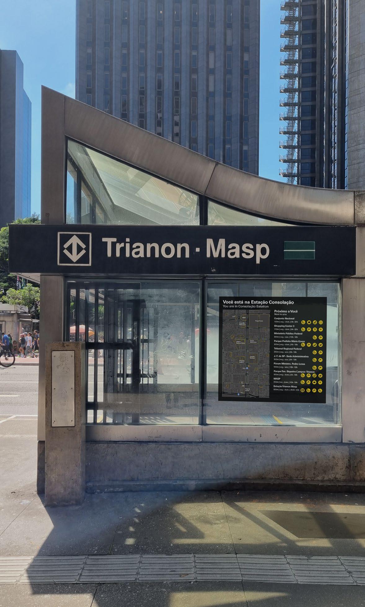
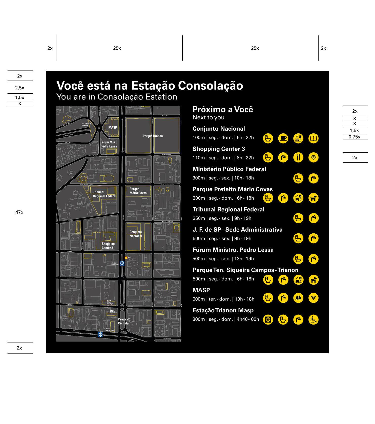
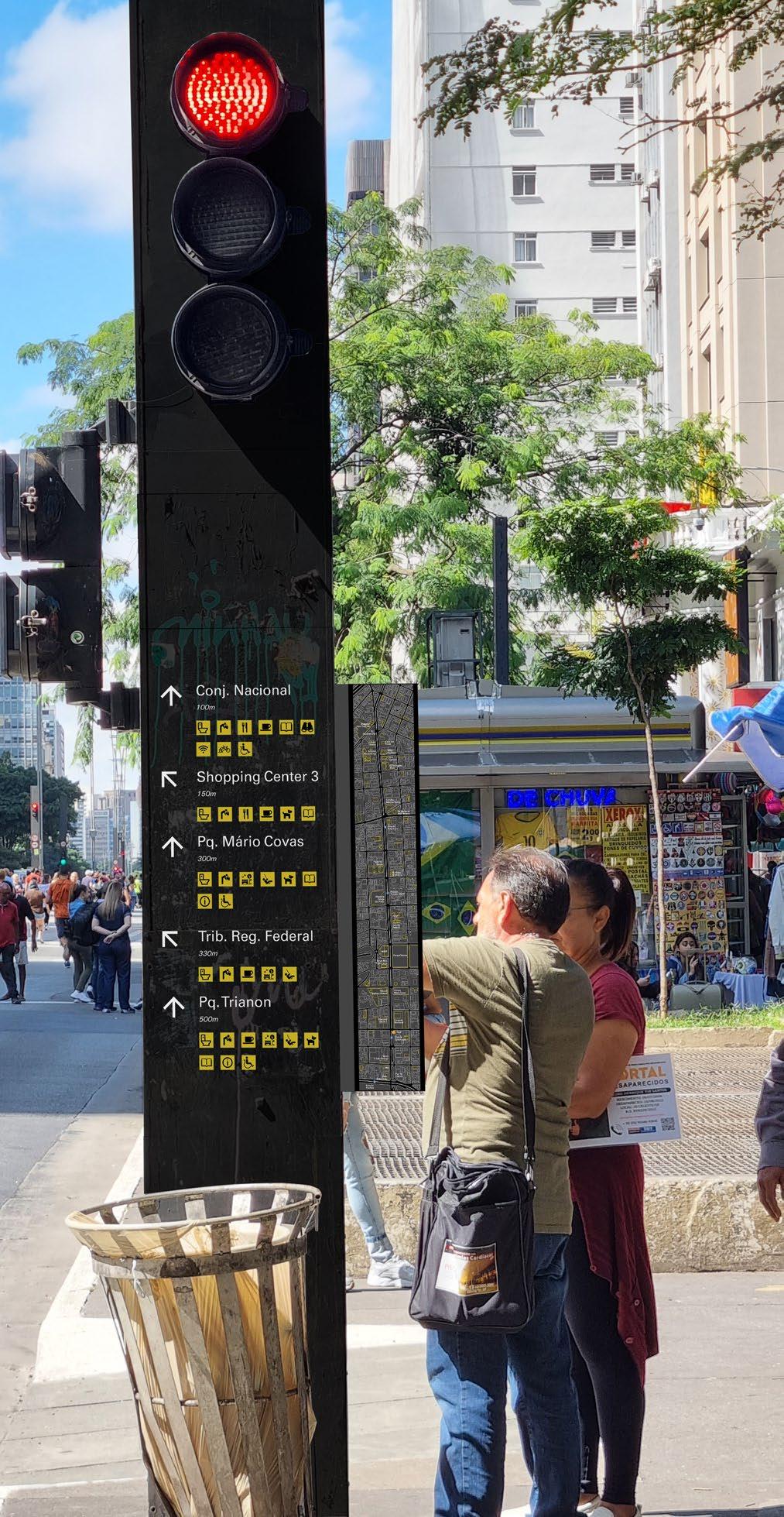
The Parallel Aftermath of Total Design
Urban visual system revisement, group project
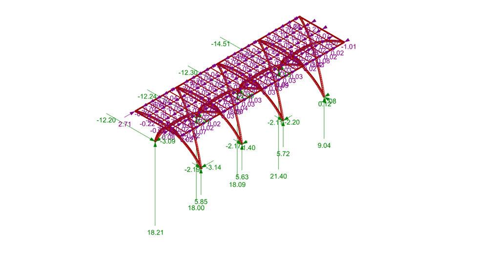
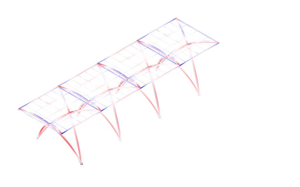
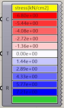
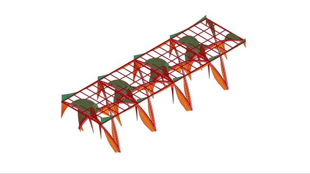
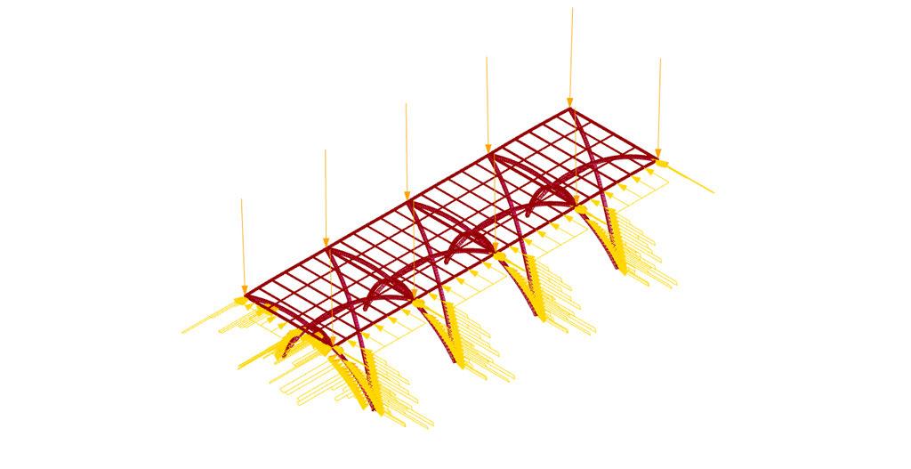
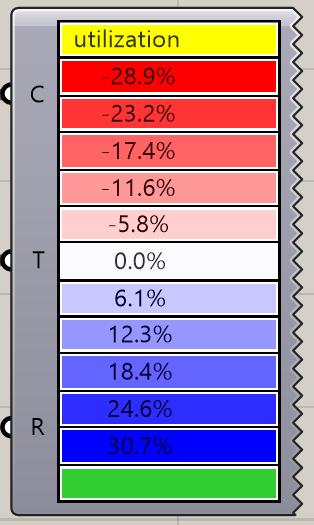
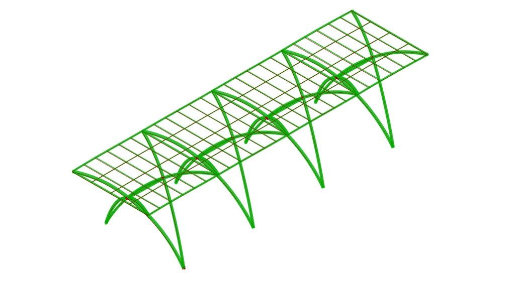
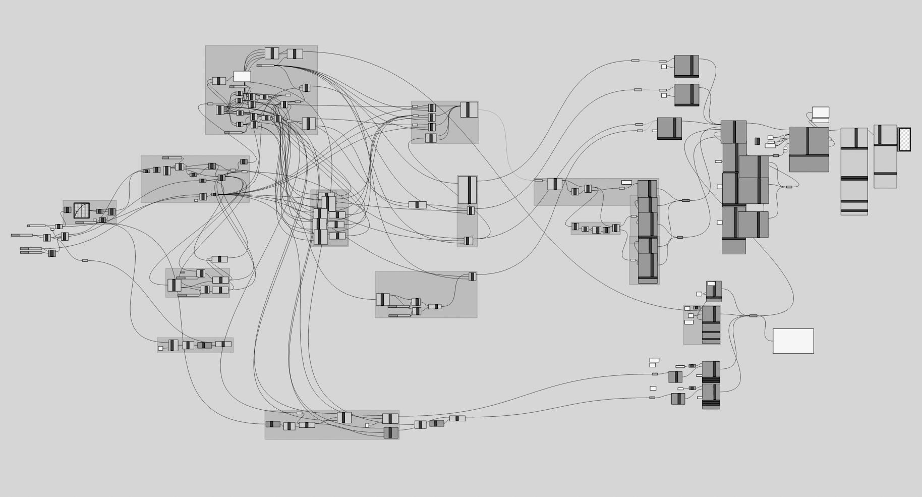
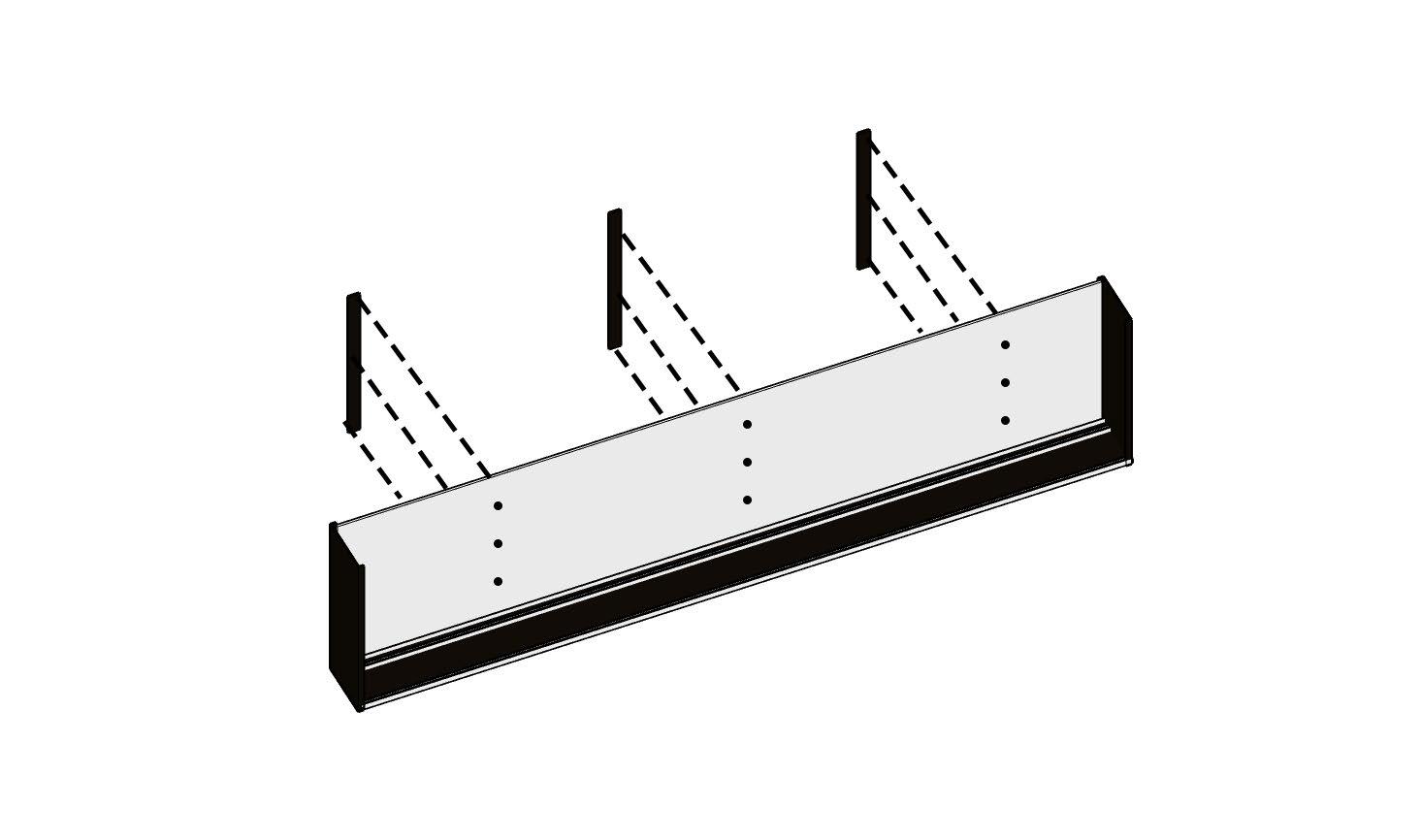
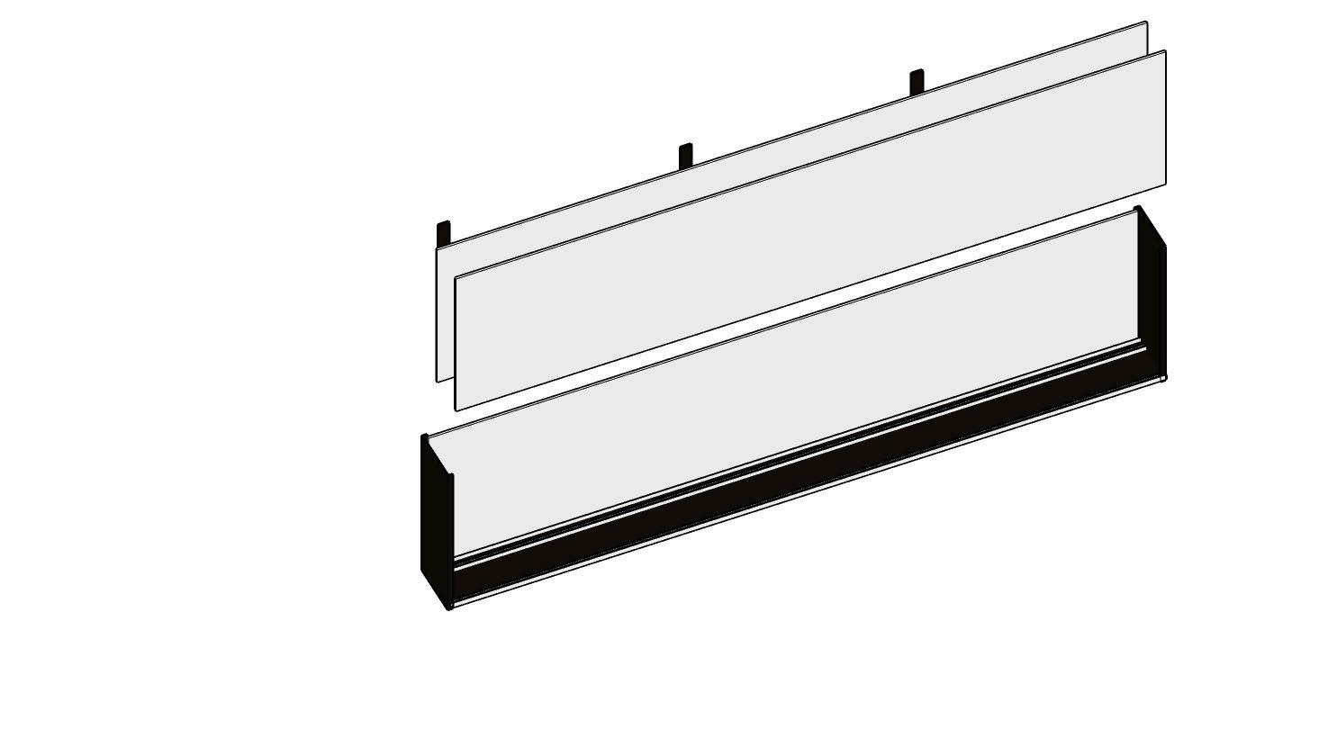
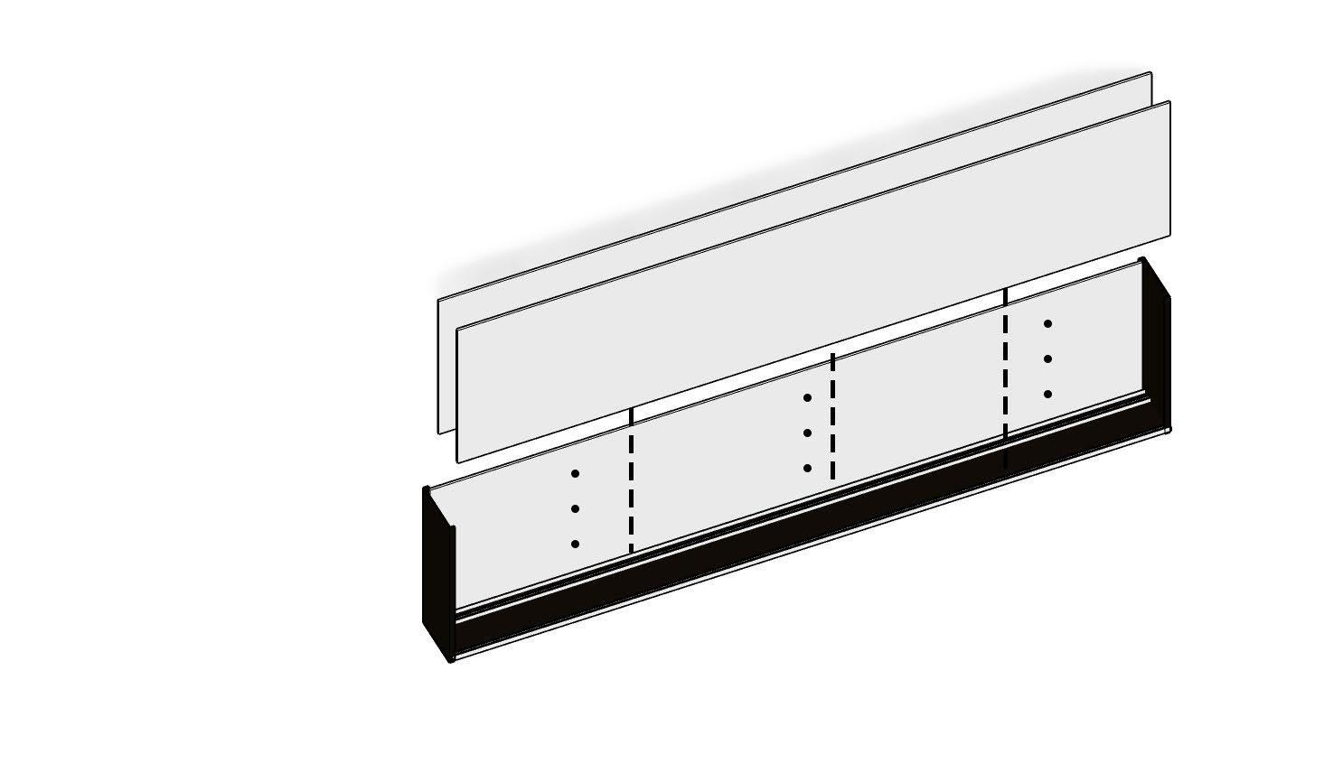
Structural Design and Karamba Analysis
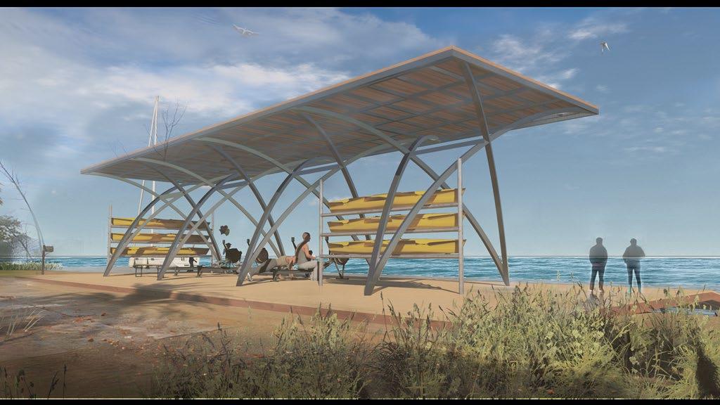
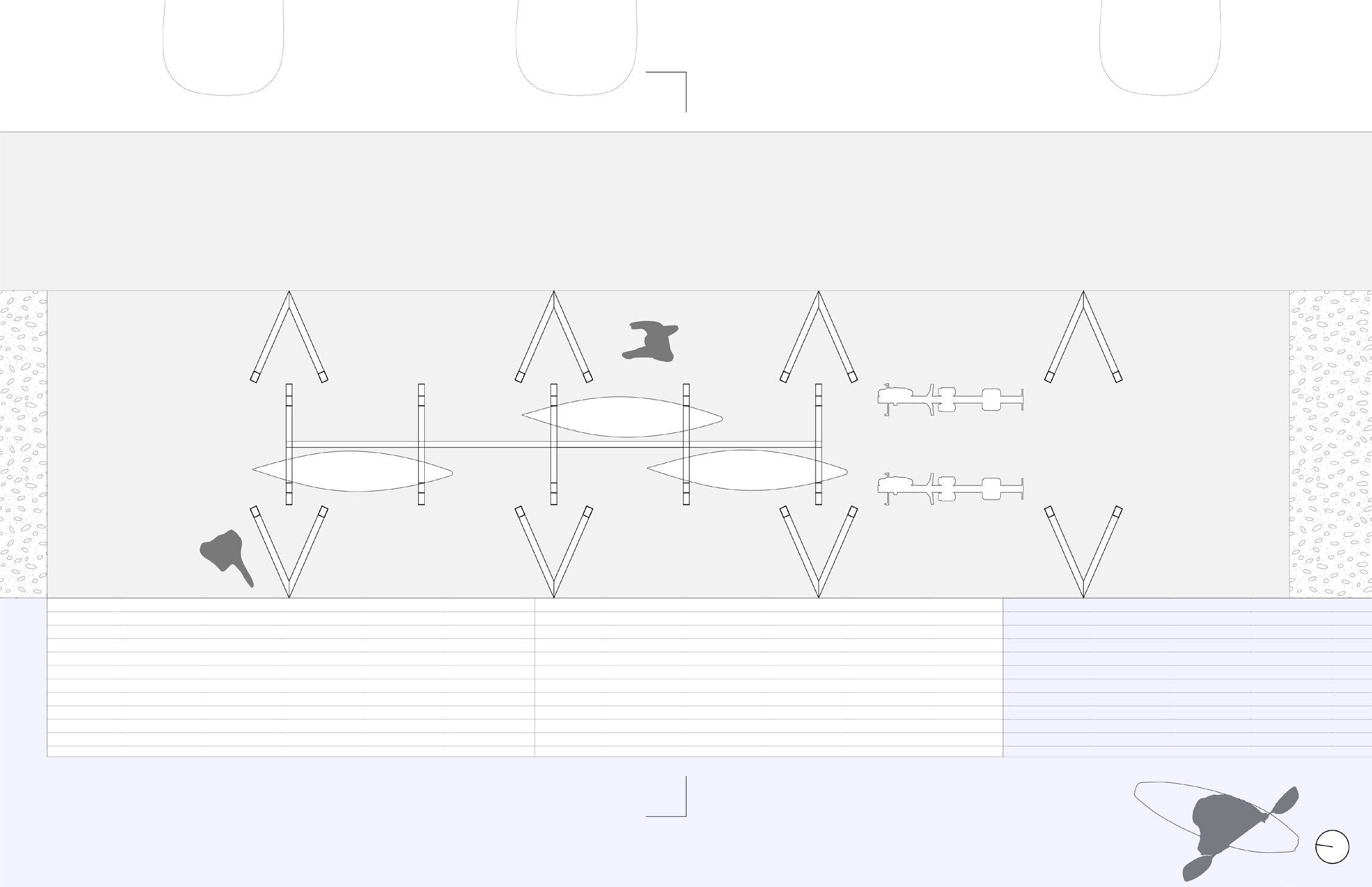
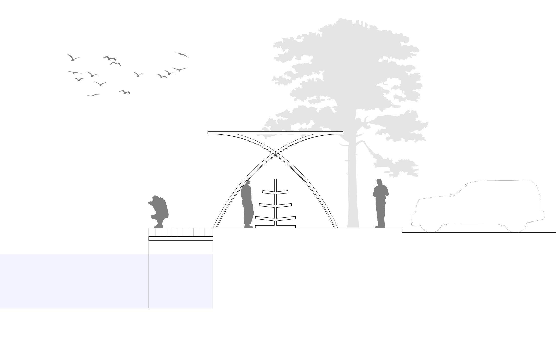
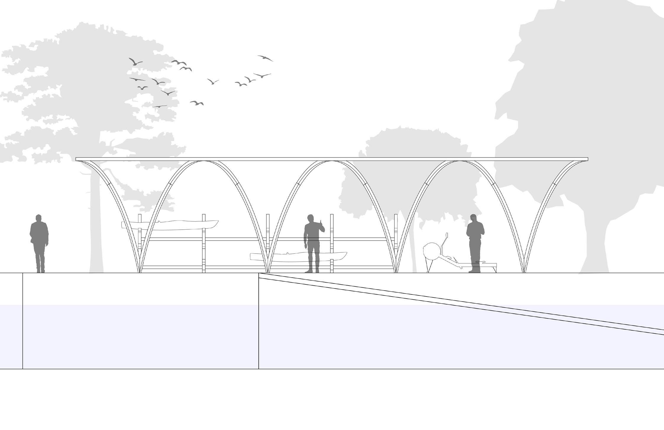
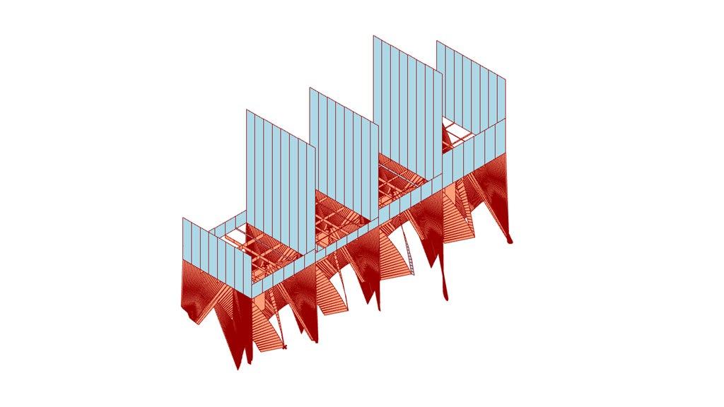
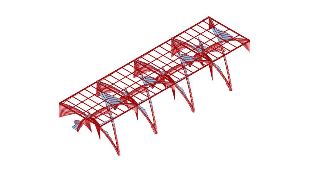
Kayak/Canoe Pavilion
The University of California, Berkeley, CED
Group Project. Team of 4.
Class: Arch 250 Structure Design
Time: Spring 2024
Location: Berkeley Marina, California
Concept:
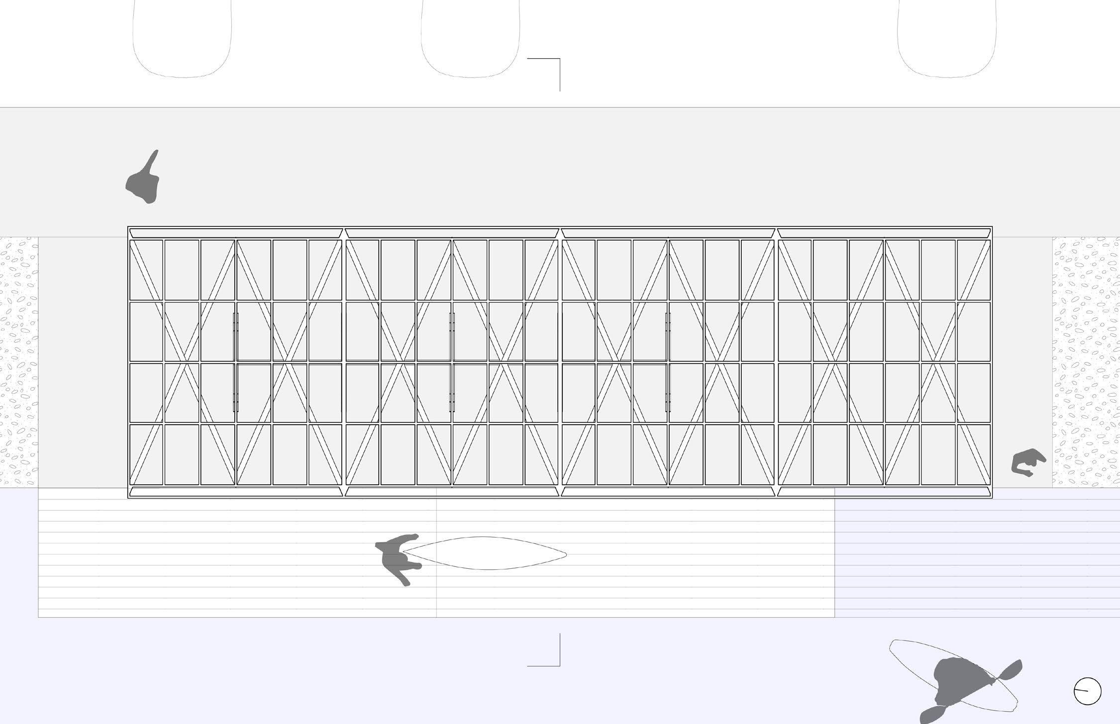
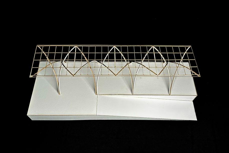
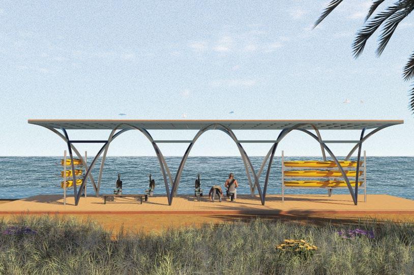
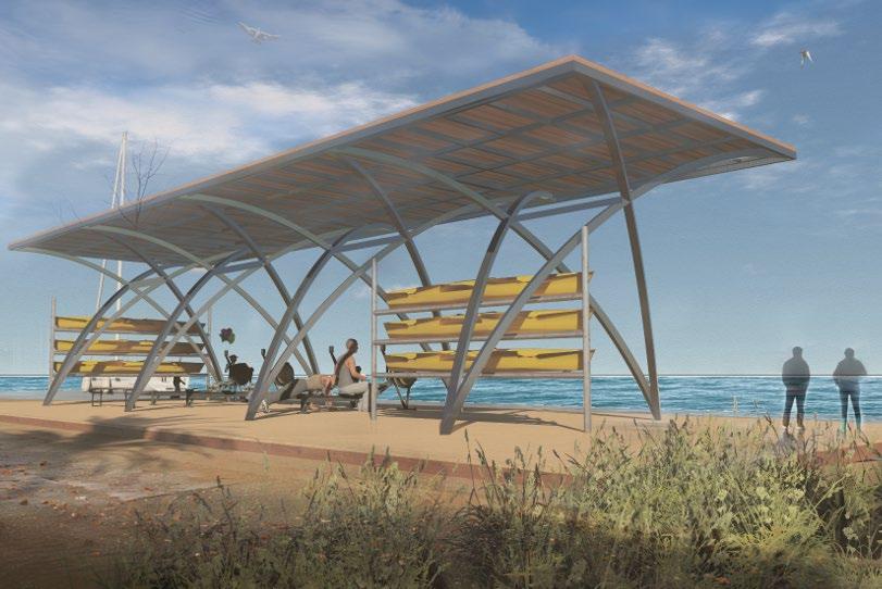
Being in the Bay Area, we naturally felt attracted to the waters of the bay. In that sense, we designed a pavilion under which people could store kayaks and canoes, exercise their rowing technique, and also allow them to easily guide their boat of choice to a nearby ramp into the water below. To fit this aquatic ideal, our location of choice is a strip of land west of Shorebird Park in the Berkeley Marina.
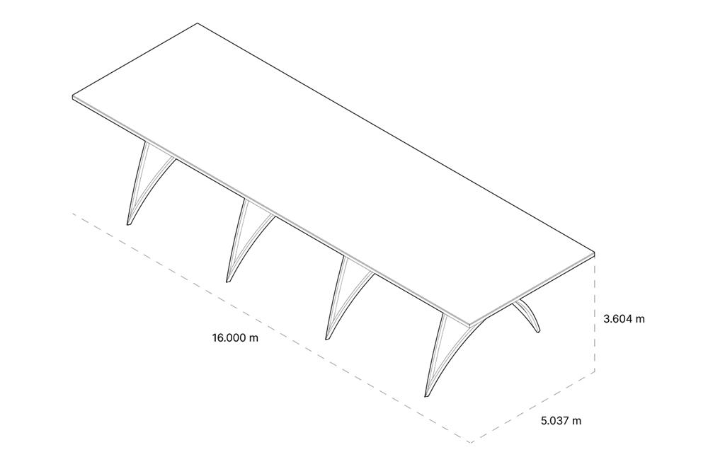
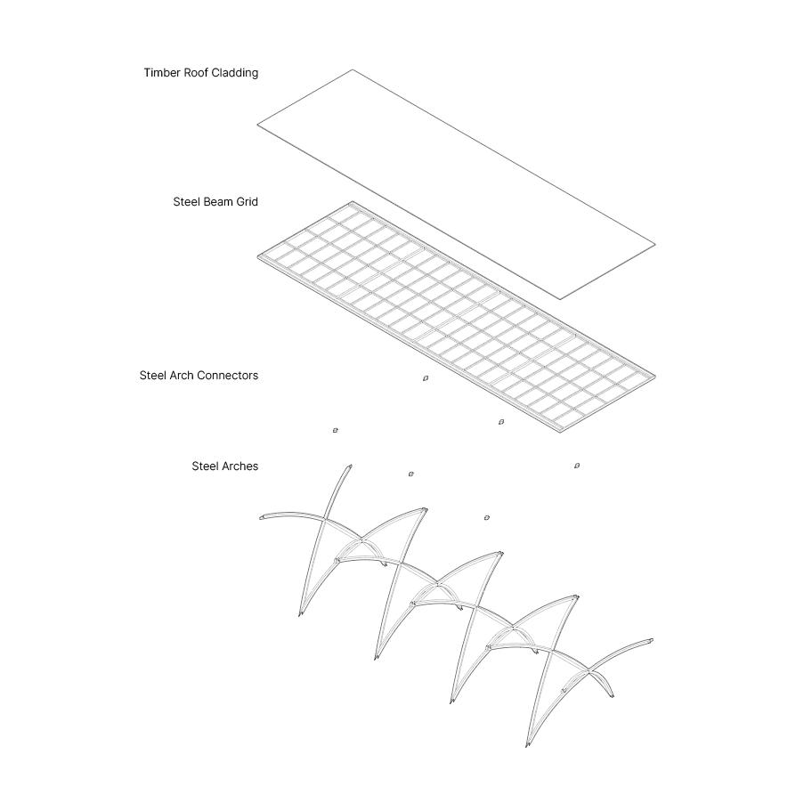
Geometry:
We approached a simple pavilion design inspired by cranes used to hoist small boats but we streamlined it to produce catenary cantilevers to better support our roof. Our positioning of the pavilion parallel to the Bay was inspired by several boathouse designs (ex. WMS Boathouse at Clark Park). This led to our design involving a combination of Steel Arches for the primary structure and a Steel Beam Grid for the roof with Timber Cladding on top to provide shelter.
Structure Axonometrics