
VVD AMAG
INTERNATIONAL ARCHITECTURE
MAGAZINE

THOUGHTS FROM THE EDITOR
by Ana Leal
A PEACEFUL ARCHITECTURE by
José Manuel Pedreirinho
THE BEAUTY IN VVD’S WORK by Manuel
Aires Mateus
THE WAY TO A MODEST ARCHITECTURE by
Marc Dubois
NATAN SHOP
VH RESIDENCE
SPORTMAX SHOP
H-H PENTHOUSE
CONCORDIA OFFICES
DC RESIDENCE
COPYRIGHT BOOKSHOP
VDD RESIDENCE
VVD RESIDENCE II
POTTERY FOR WOW
DESK AND CHAIR FOR BULO
B RESIDENCE
VB-VH APARTMENT KNOKKE
P RESIDENCE
BAIT AL SHARQ RESIDENCE
D-M APARTMENT KNOKKE
VDV-G RESIDENCE
RESIDENTIAL TOWER
ARTHUR & FOX SHOP
DC II RESIDENCE
B-S RESIDENCE
YOUTH HOSTEL ANTWERP
V-M RESIDENCE
TONICKX OFFICES KORTRIJK
STEP FOR VICCARBE
BELGO-SEEDS OFFICE
BRABO FOR GEIGER
CARRIERES DU HAINAUT
TR RESIDENCE
BA RESIDENCE
M1 OFFICES
HH PENTHOUSE
RH3 EXPEDITION YACHT
DRD APARTMENT
INFRA-STRUCTURE FOR FLOS
PAUL FOR MOLTENI&C
C PENTHOUSE
LA RINASCENTE
VO RESIDENCE
DLC RESIDENCE
FRANCK FOR SUTHERLAND
HBH RESIDENCE
RATIO FOR DADA
MOLTENI&C | DADA SHOWROOMS
CASA M
AUGUST HOTEL
AUGUST FOR SERAX
SCHELDE 21
PABLO FOR B&B ITALIA
WINERY VV BY VINETIQ
HECTOR FOR MOLTENI&C
OBLIQUE FOR FLOS
CENTRAL: THE ORIGINAL STORE
CREDITS


NATAN SHOP
Brussels, Belgium
One of the projects Van Duysen has undertaken for Natan, a Belgian fashion house.
The design for this shop, in Brussels, takes its cue from the pure, essential lines of the space and furnishings. Natural light, together with the use of voids, becomes a fundamental factor in the perception of the geometry of the building.
Laid out of two levels, the design plays with the vertical dilatation of the architectural volume, and creates visual openings that allow one’s gaze to run freely over the contours of the interior. Natural light from the large windows on the upper floor invades and saturates the stark, white walls and partitions of the floor below. The staircase is enhanced and transformed from a mere functional element into a forceful architectonic presence, in contrast to the rarefied emptiness of the spaces.
The furnishings are also reduced to an essential minimum, and are perfectly integrated with the neutrality of the spaces and of the garments themselves, which are hung from minimal hooks like artworks in a gallery.
Este é um dos projectos que Van Duysen realizou para Natan, uma casa de moda Belga.
O desenho desta loja em Bruxelas parte das puras linhas essenciais do espaço e mobiliário. A luz natural combinada com a utilização de vazios torna-se um factor fundamental na percepção da geometria do edifício.
Distribuído em dois níveis, o desenho joga com a dilatação vertical do volume arquitectónico e cria aberturas visuais que permitem que o nosso olhar corra livremente pelos contornos do interior. A luz natural proveniente das grandes janelas no piso superior invade e satura as rígidas paredes brancas e compartimentações do piso inferior. A caixa de escadas realçada e transformada desde um mero elemento funcional numa forte presença arquitectónica, em contraste com o vazio rarefeito dos espaços.
O mobiliário é igualmente reduzido ao mínimo essencial e é perfeitamente integrado com uma neutralidade dos espaços e das próprias roupas, que são penduradas em ganchos minimais como pegas de arte numa galeria.


VH RESIDENCE
Lokeren, Belgium
Behind the unchanged 1930’s façade, this house, which had been built as one of a series of five dwellings all designed by the same architect, has been dismantled and completely restyled. The goal of such a radical transformation was to introduce light and space into a very narrow structure.
There were two major considerations with regard to the project. The first of these was the construction of spaces along a horizontal axis, stretching all the way from the entrance of the house to the bottom of the garden. The opening along this axis makes it possible to fully experience the depth of the building, while the position of the staircase against the partition wall makes maximum use of the available space. The second was ensuring that the three-storey-high central atrium, topped by a cupola and adjacent to the living area on the first floor, acts as a luminous hinge for the surrounding rooms. By opening up the back frontage completely, the living area has been remarkably extended. This transparency creates a more effective relationship between the different spaces and their functions.
Por detrás da fachada inalterada de 1930, esta casa, que havia sido construída como parte de um conjunto de cinco habitações desenhadas pelo mesmo arquitecto, foi desmantelada e completamente remodelada. O objetivo de uma transformação tao radical foi introduzir luz e espaço numa estrutura muito estreita.
Existiam duas grandes considerações relativamente a este projecto. A primeira
era a construção de espaços ao longo de um eixo horizontal, estendendo-se desde a entrada da casa ate ao fundo do jardim. A abertura ao longo deste eixo possibilita a experiência da total profundidade do edifício, enquanto que a posição da escada junto a parede de meação, proporciona a máxima otimização do espaço disponível. A segunda era assegurar que o átrio de pé-direito triplo, rematado com uma copula e adjacente à área de estar do primeiro piso, actua como uma articulação luminosa dos compartimentos envolventes. Com a abertura total da fachada tardoz, a área de estar foi consideravelmente ampliada. Esta transparência cria uma relação mais eficaz entre os diversos espaços e as suas funções.


CONCORDIA OFFICES
Waregem, Belgium
The modular design for this new office complex, created for a Belgian textile firm, incorporated three oversized light boxes to reflect the company’s industrial connections. The main entrance is located beneath the first of these light boxes; once inside, the axis of the long catwalk leading from the parking area is repeated in the central circulation.
The light boxes both anchor the site into the landscape and create a strong spatial effect in the interior, enhanced by plenty of natural light. A sober façade of concrete and glass panels encloses the old, existing building; this use of a limited selection of specific materials defines the new structure as a neutral, monolithic form.
O desenho modular deste novo complexo de escritórios, criado para uma empresa têxtil belga, incorpora três grandes caixas de luz que reflectem o caracter industrial da empresa. A entrada principal localiza-se sob a primeira caixa de luz. Por sua vez no interior, e no eixo do longo corredor de distribuição central, estas caixas repetem-se.
As caixas de luz amarram o terreno e a paisagem e criam um forte efeito espacial no interior, reforçado pela abundância de luz natural. Uma fachada sóbria de betão e painéis de vidro encerram o antigo edifício existente. O uso de uma selecção limitada de materiais específicos, define a nova estrutura, formalmente neutra e monolítica.


COPYRIGHT BOOKSHOP
Antwerp . Belgium
Having moved from a small space in a narrow alley to the new ModeNatie building, home of Antwerp’s fashion museum, this art and architecture bookstore was conceived as a reinterpretation of a traditional library, in conformity with the historic character of the building.
The space has been divided into a high central section, flanked on both sides by balconies that are detached from the façade on the street side. At the back of the space, the two balconies end in massive walls, behind which are two identical staircases.
This spatial set up, in combination with the blank-finished central columns and beam structure, is a striking arrangement of horizontal and vertical lines. Because of this, customers continually experience new views at each point in the shop.
In contrast with this clarity, the spaces above and below the balconies were conceived as large-scale niches, into which bookcases would be set. Both the partitions with their book tablets and the ceilings have been carried out in dark wood paneling, and look like boxes slid within the tight, white structure.
The wood paneling evokes a warm and cozy atmosphere, while the simple and sober detailing of furniture and lighting suggests a more contemporary feel. The same can be said of the floor, in dramatically flamed, dark-brown marble, which is consciously reminiscent of the classic Modernist architecture of Mies van der Rohe and Adolf Loos.
The monumental console, desk and central staircase, all in marble, ensure a harmonious balance between old and new. Without the addition of any ornaments, the subtle interplay of structure and furniture, including display cases and reading lamps, imbue this modern bookstore with the air of an oldfashioned library.
Tendo mudado de um pequeno espaço num estreito, para o novo edifício ModeNatie, casa do museu da moda de Antuérpia, esta livraria de arte e arquitectura foi concebida corno uma reinterpretação de uma livraria tradicional, em conformidade com o carácter histórico do edifício.
O espaço foi dividido numa secção central alta, flanqueada de ambos os lados por varandas que se destacam da fachada no lado da rua. Na parte de trás do espaço, as duas varandas terminam em paredes maciças, por detrás das quais existem duas caixas de escadas idênticas.
O arranjo espacial, em combinação com as colunas centrais e estrutura do vigamento, é uma impressionante organização de linhas horizontais e verticais. Por isto, os clientes podem experimentar continuamente novas vistas em cada ponto da loja.
Em contraste com esta clareza, os espaços acima e abaixo das varandas foram concebidos como nichos de grande escala, nos quais se instalariam estantes de livros. Ambas as compartimentações com
as suas prateleiras de livros e os tectos foram executados em painéis de madeira escura e assemelham-se a caixas introduzidas no interior da estrutura branca.
Os apainelados de madeira evocam uma atmosfera quente e confortável, enquanto que a pormenorização simples e sóbria do mobiliário e iluminação sugere um sentimento mais contemporâneo. O mesmo pode ser dito em relação ao pavimento, em mármore castanho escuro, dramaticamente flamejado, que é uma reminiscência consciente da arquitectura classicamente Modernista de Mies van der Rohe e de Adolf Loos.
A consola monumental, a mesa e escada central, todas em mármore, garantem um equilíbrio harmonioso entre antigo e novo. Sem a adição de quaisquer ornamentos, a articulação subtil da estrutura e mobiliário, incluindo expositores e candeeiros de leitura, conferem a esta moderna livraria um ar de livraria antiga.


VDD RESIDENCE II
Antwerp . Belgium
The classic façade of this 1870’s townhouse, a former notaries’ office, was restored to its original form and finished with a high gloss surface. The original floor plan was changed to meet the demands of the new owner, but it’s typology was retained. On the ground floor, the narrow patio lightens the entry hall, kitchen and dining room; the entry hall opens up onto the large, square living room trough an equally large sliding door. The living room itself opens onto the garden with a square pool edges in Belgian bluestone. On the first floor, the spaces are grouped around the TV room, which is painted in charcoal grey and serves as an internal circulation area.
Each of the rooms is noticeable for the lack of ornaments and possessions cluttering up the surfaces. The walls have been finished with an off-white textured plaster that emphasizes the mass, and the doors are treated in the same manner. In the kitchen the attention is drawn towards the huge La Cornue cooker in front of a wall of Delft tiles. Ali other functional areas can be hidden behind doors.
The original staircase with skylight was kept but simplified to its pure form. The large bedroom with ‘library wall’ opens up into the bathroom where, as with the cooker in the kitchen, the reclaimed marble bath is the focal point, with the washbasins and shower hidden behind white doors. All fixed lighting is by simple light bulbs, replicas of Thomas Edison’s carbon-filament bulbs.
A fachada clássica desta habitação citadina de 1870, um antigo escritório de notariado, foi restaurada até a forma
original e finalizada com um acabamento de elevado brilho. A planta do piso térreo original foi alterada para responder às exigências do novo proprietário, mas a sua tipologia foi mantida. No piso térreo, o pátio estreito ilumina o hall de entrada, cozinha e sala de jantar; o hall de entrada abre-se sobre a ampla e quadrada sala de estar, através de uma igualmente ampla porta de correr. Por sua vez a sala de estar abre-se para o jardim, com uma piscina quadrada em pedra calcária Belga azul. No primeiro piso, os espaços agrupam-se em torno da sala de TV, pintada de cinza-carvão, definindo urna área de circulação interna.
Em cada um dos quartos é notável a falta de ornamentos e objectos acumulados sobre as superfícies. As paredes foram acabadas com um reboco texturado de cor branca que acentua a massa, e as portas são tratadas da mesma forma. Na cozinha a atenção é atraída para o fogão La Cornue em frente de uma parede de azulejos de Delft. Todas as outras áreas funcionais podem ser ocultas sob as portas.
A caixa de escadas original e a clarabóia superior, foi mantida, mas simplificada até à sua forma pura. O grande quarto com “parede de livraria” abre-se para a casa de banho onde a banheira de mármore, assume o destaque, tal como como o fogão na cozinha, com os chuveiros e os lavatórios escondidos por portas brancas. Toda a iluminação fixa é conseguida através de simples lâmpadas, réplicas das lâmpadas de filamento de carbono de Thomas Edison.


POTTERY FOR WOW
This collection of ceramics for When Objects Work is an exercise in restrained theme and variation. Although each piece can be experienced in isolation, the collection is conceived as an entity, with the differences of scale and colour creating the powerful rhythms and modulations expressed in the subtle yet intense palette of a European landscape.
Each piece is composed of two elements: an earthenware container and a wooden plate. While the angle of the curve and the smooth profile of each pot are fixed, the diameter and height of the vessels vary; these shifts in scale determine whether the container framed is a bowl or a platter. The thickness of the wooden plate, which serves as both cover and plinth, is also variable.
Serene and sober, these pots have the abstract quality of the archetypal, but they have been pulled from abstraction into the world of physical forms, things you want to touch and to hold. A certain material roughness - the slight irregularities in the surface of the clay, and the soft, weathered grain of the wood - is critical to their character.
Esta colecção de cerâmica para When Objects Work é um exercício de temática e variação contida. Embora cada peça possa ser experienciada de forma isolada, a colecção é concebida como uma entidade, com as diferenças de escala e cor que criam poderosos ritmos e modulações expressas na subtil e, no entanto, intensa paleta de uma paisagem europeia.
Cada peça é composta por dois elementos: um recipiente cerâmico e uma base de madeira. Enquanto que o ângulo da curva e o suave perfil de cada cerâmico são fixos, o diâmetro e altura dos vasos variam; estas mudanças de escala determinam se o recipiente é uma taça ou uma bandeja. A espessura da base de madeira, que serve tanto de cobertura como de suporte, é também variável.
Serenos e sóbrios, estes potes cerâmicos têm a qualidade abstracta do arquétipo, mas foram trazidos da abstracção para o mundo de formas físicas, coisas que queremos tocar e segurar. Uma certa rudeza do material - as ligeiras irregularidades da superfície do barro e o suave grão da madeira - é crítico para o seu carácter.


BAIT AL SHARQ RESIDENCE
Khawaneej . Dubai . UAE
Bait Al Sharq”, which means “House of the East”, is a project rooted to its region. The brief was to create a project that represents the Client’s family to the public but also providing a private escape and get-together environment in a unique contemporary home atmosphere. This brief was to be combined with the mission to investigate all aspects of regional architecture. A project that authentically addresses its context and incorporates both means from the traditional and the technological.
This project, elaborated in Glose collaboration with Vladimir Djurovic Landscape Architecture, benchmarked at an ambitious level: Landscape and Architecture working together to create a sustainable regional project that protects the inhabitants from the harsh environment but reflects at the same time all the sensual subtleties of the “Garden of Paradise”.
The design process illustrates the investigation of the design team and the client about the elements that define the habitat of the people living in the middle east. In an abstract contemporary way, the evident sculptural values of the traditional regional architecture are combined with the history and sensuality expressed in the Islamic garden. These elements are further reflected upon, in an investigation about the essence, a layer deeper down in the regional way of life. Landscape and architecture melt in one intention, one expression, one materialization. Landscape defines sensorial experiences and particular spaces, while architecture generates scale, atmosphere and protection.
A fusion of elements with the ambition of creating one exclusive and distinctive feeling of “home” that offers a range of experiences, a contemporary gesture where tradition, local culture and identity are visible and reinterpreted.
Long and vertical architectural elements of stone are placed at east/west direction in order to protect and benefit from both harsh sun and beneficial winds and to allow the landscape to flow in between the different levels. Different landscape elements or types of garden provide the different experiences but also organize the adequate hierarchy between the spaces, uses and program needs. The display of the stone masses creates flows, spatiality and visual connections in one open plan conception where the border line between architecture, space and landscape can no longer be strictly identified.
In contrast with the protective and solidity expression of the wall elements that are materialized in warm and soft Syrian stone, a triple layered roof structure in both opaque and perforated thin bronze panels completes the global expression of the project.
This thin and delicate extended canopy not only provides the adequate sun protection, through a dramatic dimming of natural light, but also generates a visual framing of the surrounding vegetation. Emphasizing the regional dimension of the project, the main landscaped areas around the project express a desert scenery of indigenous trees, acacias Arabica and crushed gravel paths. This harsh sustainable approach evolves
gradually into one central lush green oasis at lower ground floor. Full of fruit trees, palms trees, water features and shadowed spaces this central area establishes the main outdoor living experience for the family. The functional program’s main elements to be identified in the architectural project are the Majlis, the main villa and tree family villas. The Majlis represents the family, a formal place to meet and welcome special guests at the main property’s formal access. The living quarters of the 4 villas, separated from the public life in the Majlis, are placed around the central oasis, the heart of the composition, a common central area and private garden at lower ground floor level with special leisure facilities that provide a unique indoor and outdoor living experience, the central place of the project where the family can meet away from all formal aspects of public life.
‘Bait AI Sharq’, que significa ‘Casa do Este’, é um projecto enraizado na sua região. O objectivo era criar um projecto que representasse a família do Cliente perante o público, mas também providenciar um refúgio privado e ambiente de convívio numa atmosfera doméstica única e contemporânea, Este objectivo foi combinado com a missão de investigar todos os aspectos da arquitectura regional. Um projecto que aborda autenticamente o seu contexto e incorpora tanto os meios do tradicional e do tecnológico.
Este projecto, elaborado em estreita colaboração com Vladimir Djurovic Landscape Architecture, enquadrado
num nível ambicioso: Paisagismo e Arquitectura trabalhando em conjunto para criar um projecto regional sustentável que proteja os habitantes de um ambiente hostil, mas que reflecte simultaneamente todas as subtilezas sensoriais do ‘Jardim do Paraíso’. O processo de desenho ilustra a
investigação da equipa de projecto e o cliente sobre os elementos que definem o habitat das pessoas que vivem no médio oriente. Numa forma abstracta e contemporânea, os evidentes valores esculturais da arquitectura tradicional regional são articulados com a história e sensualidade expressas no jardim
Islâmico. Estes elementos são ainda reflectidos, numa investigação sobre a essência, numa camada ainda mais profunda do modo de vida regional. Paisagem e arquitectura fundem-se numa intenção, numa expressão, numa materialização. A paisagem define experiências sensoriais e espaços

particulares, enquanto que a arquitectura gera escala, atmosfera e protecção. Uma fusão de elementos com a ambição de criar uma noção de ‘casa’ exclusiva e distinta que oferece um leque de experiências, um gesto contemporâneo onde tradição, cultura local e identidade são visíveis e reinterpretadas.
Longos e verticais elementos arquitectónicos materializados em pedra são colocados na direcção Este/Oeste para proteger e beneficiar tanto do sol forte e ventos benéficos e permitir que a paisagem flua por entre os diferentes níveis. Diferentes elementos da paisagem ou tipos de jardim possibilitam as
diferentes experiências, organizando também a hierarquia apropriada entre os espaços, usos e necessidades programáticas. A exposição das massas rochosas cria fluxos, ligações espaciais e visuais numa concepção de planta aberta onde a fronteira entre arquitectura, espaço e paisagem não podem mais ser

estritamente identificados. Em contraste com a expressão protectora e sólida dos elementos de parede que são materializados em quente e suave pedra Síria, uma estrutura de cobertura de três níveis em painéis de chapa de bronze opaca e perfurada completa a expressão global do projecto.
Esta fina e delicada extensão da cobertura não só providencia a protecção solar adequada, através de uma diminuição dramática da luz natural, mas também gera um enquadramento visual da vegetação envolvente. Realçar a dimensão regional do projecto, as principais áreas de paisagem em volta do
projecto expressam um cenário deserto de árvores indígenas, acácias arábicas e percursos de gravilha esmagada. Esta abordagem áspera e sustentável evolui gradualmente para um exuberante oásis verde central no nível inferior do piso térreo. Cheia de árvores de fruto, palmeiras, elementos de água e áreas de


sombra, esta área central estabelece a principal experiência de vivência exterior para a família.
Os principais elementos do programa funcional a serem identificados no projecto arquitectónico são os Majilis, a villa principal e as três villas da família.
Os Majilis representam a família, um lugar formal para reunião e receber convidados especiais no acesso formal da propriedade principal. As áreas de estar das 4 villas, separadas da vida pública nos Majilis, são dispostas em torno do oásis central, o coração da composição, uma área central comum
e jardim privado no nível mais baixo do piso térreo com instalações especiais de lazer que oferecem uma experiência de vivência interior e exterior única, o lugar central do projecto onde a família pode reunir-se longe de todos os aspectos formais da vida pública.

RESIDENTIAL TOWER
Jeddah, Saudi Arabia
Material, structural, volumetrically, this project refers to regional elements in a very contemporary way. The perimeter wall defining a (semi- ) public area surrounded with a colonnade where pedestrians can meet in the shade ; the tower (indicating the importance of the place) , arising in a comer related to the boundary wall while marking the interior courtyard garden at the same time, is clad in a same material/structure as the colonnade.
The aesthetical atmosphere is defined by the overall volumetrical mass of the building, the strict rhythm and proportions of the three-dimensional grid, the use of the goldish material, the double height gardens behind the façade and the transparency due to the use of glass.
In a contemporary language, this concept deals with history in a way that it is not evidently recognizable or fake, it results in a strong project where references to history are used to root the project in the region and , through the correct interpretation, creating a sustainable, comfortable and functional residential tower.
Material, estrutural, e volumetricamente, este projecto remete para elementos regionais numa forma muito contemporânea: A parede perimetral que define uma área (semi- ) pública rodeada por uma colunata onde os pedestres podem reunir na sombra; A torre (indicando a importância do lugar), que surge num canto relacionado com a parede perimetral marcando simultaneamente o pátio-jardim interior,
é realizada no mesmo material/estrutura da colunata.
A atmosfera estética é definida pela global massa volumétrica do edifício, o ritmo e proporções rigorosas da grelha tri¬dimensional, a utilização de materiais dourados, os jardins de pé-direito duplo por detrás da fachada e a transparência devido à utilização de vidro.
Numa linguagem contemporânea, este conceito lida com a história numa forma que não é evidentemente reconhecível ou falsa, resultando num forte projecto onde as referências históricas são utilizadas para enraizar o projecto na região e, através de uma interpretação correcta, criar uma torre residencial sustentável, confortável e funcional.


DC II RESIDENCE
Tielrode . Belgium
The project for a house in Tielrode is the second project for the client of the DC residence in Waasmunster, which Van Duysen designed in 1998. The client is moving from a purely residential neighborhood to a rural environment. The brief was to build a house adapted to these rural and informal surroundings. Apart from the main house, the project also concerned the renovation of the old farm barns.
The position of the new built house was restricted by the footprint of the existing house. The concept of Van Duysen to go back to the simple rural building typology (a long volume parallel to the street, with a 45° gable roof) refers to the tradition of simple farm houses in the region. By its position, it strengthens the courtyard in between the house and the barns, opened up to the street. The house is situated between the courtyard and the fields, in this way enjoying both the smaller scale of the enclosed courtyard (with the midday sun), as well as the far and wide views on the fields.
The reference to tradition in the basic volume is combined with a contemporary execution. The detailed approach to the design and the material palette add to the contemporary character of the house. By the use of a consistent material for the façade, any ornamentation is removed from the design: the typical gutters and ridges are nearly abstract, invisible. The traditional roof overhang was not executed, the door thresholds were not carried out in Belgian bluestone, and the wooden façade - making reference to the old wooden barns- is continued on the roof.
After consultation with the client and the contractor, the two old barns were not renovated but rebuilt, in the same design language as the main house, adding to the character of the total project. At first glance, because of their abstract character the three volumes don’t seem rooted in the rural context. However, when you enter the courtyard, you feel that the project is indeed grown rooted in the tradition and the scale of the immediate environment.
The principles of a passive house were followed and achieved in the design, with the collaboration with Denc!-studio, and architectural studio specializing in sustainable construction. The landscape design by landscape architect Paul De Roose, was limited on purpose to the careful planning of solitary trees, the restoration of the beautiful holly hedge around the terrain and the use of a brushed concrete floor, typical for a function farm courtyard. These concrete floors are continued in the house in a polished finish, where they set the tone for a sober interior, fitting the atmosphere of the architectural project.
O projecto da casa em Tielrode é o segundo projecto para o cliente da habitação DC, em Waasmunster, que Van Duysen desenhou em 1998. O cliente está a mudar-se de um bairro puramente residencial para um ambiente rural. O pedido consistia na construção de uma casa adaptada a esta envolvente rural e informal. Separados da casa principal, o projecto também abarcou a renovação dos antigos celeiros.
A posição da nova casa estava restringida pelo perímetro da casa existente. O conceito de Van Duysen de voltar a uma simples tipologia de edifício rural (um longo volume paralelo à rua, com um telhado inclinado a 45°), remete para a tradição de simples habitações rurais na região. Com esta posição fortalece o pátio entre a casa e os celeiros, que é aberto para a rua. A casa está situada entre o pátio e os campos, disfrutando assim da escala menor do pátio fechado (com o sol do meio-dia), bem como das vistas amplas e longínquas dos campos.
A referência à tradição no volume básico é articulada com uma execução contemporânea. A abordagem pormenorizada ao desenho e a paleta de materiais acentuam o carácter contemporâneo da habitação. Através da utilização de um material consistente na fachada, toda a ornamentação é removida do desenho: as típicas caleiras e juntas são quase abstractas, invisíveis. O tradicional telhado projectado não foi executado, as soleiras não foram feitas em pedra azul Belga, e a fachada de madeira - fazendo referência aos antigos celeiros de madeira - é continuada na cobertura.
Após consultar o cliente e o construtor, os dois celeiros não foram renovados, mas sim reconstruídos, seguindo a mesma linguagem de desenho da casa principal, acentuando o carácter global do projecto. À primeira vista, devido ao seu carácter abstracto, os três volumes não parecem enraizados no contexto rural. No entanto, quando se entra no pátio, sente-se que o projecto está de facto enraizado na
tradição e escala da envolvente próxima. Os princípios de uma casa passiva foram seguidos e concretizados no desenho, com a colaboração do Denc!- Studio, um atelier de arquitectura especializado em construção sustentável.
O arranjo paisagístico, da autoria do arquitecto paisagista Paul de Roose, foi propositadamente limitado de forma a planear cuidadosamente árvores isoladas, o restauro da bela vedação em torno do terreno e a utilização de um pavimento de betão escovado,
típico para a função de pátio rural. Este pavimento de betão é prolongado na casa com um acabamento polido, marcando o tom para um interior sóbrio, enquadrado na atmosfera do projecto arquitectónico.


B-S RESIDENCE
Zwevegem, Belgium
A project to convert a farm (consisting of a farm house, 2 large barns and 3 small outbuildings) into a house, for a family with two children, was developed respecting the tradition of Flemish rural architecture with a very contemporary approach to the plan. A plan that hardly suggested the classic farmhouse with irregularly overhanging gable roof, classic roof tiles and “kalei” brick (brick plastered with a thick clay finish) façades.
The 2 large barns, to be refurbished in the future, are positioned parallel around a court. Flanked by several outbuildings, the newly renovated farm house encloses of the third side of the court.
The gently sloping, wide and rough landscape with a windmill on the horizon, requires a very sheltered but open contemporary approach: strong base volumes in “kalei” brick support the large gable roof and define the living spaces on the ground floor of the house.
The contemporary living spaces in between the volumes, are only separated from the outside by large windows framing vistas of the landscape or the southern court. The brick volumes evoke a feeling of rural “Raumplan” architecture because of their massive character, yet create direct open relationships between the spaces and accentuate beautiful sightlines through wide openings between the volumes.
The materials and details are recovered from the old tradition: wooden flooring and furniture with wide oak planks, aged bluestone in different formats, classical pivot hinges and door handles, exposed
light bulbs, “kalei” brick on the outside which continue inside and even to internal ceilings. Although these materials create a rough atmosphere, the tactility and the careful approach into the details form a comfortable house that tries to encapsulate the essence of the rural living, sheltered by a large red tiled roof. Ox blood red doors accentuate the main entrance and respect the color that has been painted on ports and shutters of old barns for centuries.
Um projecto para converter uma quinta (que consiste numa casa rural, 2 grandes celeiros e 3 pequenos anexos) numa habitação para uma família com duas crianças, foi desenvolvido de forma a respeitar a tradição da arquitectura rural Flamenga com uma abordagem muito contemporânea na planta. Uma planta que dificilmente sugere a clássica casa rural com um telhado irregular avançado, telhas clássicas e recoco tipo ‘kalei’ (tijolo burro revestido com uma camada espessa de argamassa em barro).
Os 2 grandes celeiros, a serem remodelados no futuro, são posicionados em paralelo em torno de um pátio. Ladeada por vários anexos, a nova habitação rural encerra o terceiro lado do pátio.
A paisagem suavemente inclinada, ampla e irregular, com um moinho no horizonte, requer uma abordagem muito protectora, mas aberta e contemporânea: fortes volumes de base em tijolo ‘kalei’ suportam o grande telhado inclinado e definem os espaços de estar no piso térreo da habitação. Os espaços de estar
entre os volumes são apenas separados do exterior por grandes janelas que emolduram vistas da paisagem ou do pátio Sul. Os volumes de tijolo evocam um sentimento de arquitectura ‘Raumplan’ rural, devido ao seu carácter maciço, embora criando relações directas e abertas entre os espaços e acentuando as belas linhas de visão através de grandes aberturas entre os volumes.
Os materiais e pormenores são recuperados das tradições antigas: pavimentos de madeira e mobiliário com grandes tábuas de carvalho, pedra calcaria azul envelhecida em diferentes formatos, clássicas dobradiças de pivot e puxadores de porta, lâmpadas de iluminação expostas, reboco tipo ‘kalei’ no exterior que continuam no interior e até mesmo nos tectos interiores. Estes materiais criam uma atmosfera rústica, apesar do toque dos materiais e através de uma pormenorização cuidada, eles formam uma casa confortável, tentando incorporar a essência da vivência rural, protegida por um grande telhado vermelho. Portas vermelhas, tipo sangue de boi, acentuam a entrada principal e respeitam a cor pintada em portas e estores de antigos celeiros durante séculos.


V-M RESIDENCE
St-Martens-Latem, Belgium
The spatial and design concept of this house, built in the green surroundings of Sint-Martens-Latem, was strongly influenced by the particularities of the site, the functional program and the local urban regulations.
The terrain was a combination of two lots with defined building areas. Set in a low-density urban settlement of villas, the terrain has a very strong natural character, surrounded by dense gardens, forest and narrow streets sided by old and beautiful Ash, Oak and Maple trees. The terrain is protected by a curtain of high trees in its northern-eastern sides and by dense green hedges at southern-western views, creating a strong sense of protection and natural enclosure.
The main volume is located at the comer of the terrain, opening the internal spaces to the southern light and views and, at the same time, protecting the private garden from the adjacent streets and pedestrians. The architectural expression is defined by long brick walls and stacked volumes, following the main two borders of the lot, emphasizing the sense of protection and embracing the landscape, making it part of the architectural concept. This long wall, materialized by a long, elegant and narrow grey brickwork, accentuate the relation of the house with the garden, defining the outdoor spaces and garden areas as if they were the physical extension of the internal spaces. The scale and span of this elements in the terrain outline the idea that the main living area and the garden create an extended livable space, were architecture and landscape blend together.
The main entrance is located at the
northern-eastern terrain’s comer, where a patio garden leads to the main entrance under the cantilevered first floor volume. Internally the house is organized in two main directions, at both levels. In the ground floor, public areas flow around the main hall, with double height and a glazed roof, creating the sense of one continuous and dynamic space with multiple points of view towards the garden. The main living zones have a strong relation with the outside through wide glass surfaces, sliding windows and continuous brick walls. The living room, relatively sunken in the general floor level, offers a singular perspective of the natural and built landscape, with the garden, swimming pool and covered outdoor terrace as background. On the first floor, in a more private atmosphere, the residents continue the Glose dialogue with the outside panoramas trough large openings that flood the main circulation areas and the private rooms with southern light. The dialogue between masses and void defines the main character and atmosphere of the project, not only in plan but also in the façade and tridimensional composition.
The extended and textured brick volumes are interchanged with large openings according to the different internal spaces performing a balanced arrangement of architectural elements. In the interior, the presence of the soft grayish brick texture accentuates the pureness and sobriety of the spaces. The interior design is directly related with the architectural expression of the house not only by the composition of the spaces around the masses, voids and long walls but also trough a fine selection of sober and natural materials.
The floor, executed in wide planks of solid Pine wood define a very soft atmosphere in combination with minimal glass panels, white lacquered doors and counter tops in grey Quartzite stone. The result is a very tactile and architectural experience that accentuates the contemporary soul of the house.
O conceito espacial e de desenho desta casa, construída na envolvente verde de Sint-Martens-Latem, foi fortemente influenciado pelas particularidades do lugar, o programa funcional e os regulamentos urbanos locais.
O terreno é resultado de urna combinação de dois lotes com áreas de construção definidas. Situado num aglomerado urbano de baixa densidade de villas, tem um carácter natural muito forte, rodeado por densos jardins, florestas e ruas estreitas ladeadas por antigas e belas árvores de Freixo, Carvalho e Acer. O terreno é protegido por uma cortina de árvores altas nos seus limites Norte/Este e por densas sebes nas vistas a Sul/Oeste, criando um forte sentimento de protecção e encerramento natural.
O volume principal está situado numa das extremidades do terreno, abrindo os espaços interiores à luz e vistas a Sul e, simultaneamente, protegendo o jardim privado das ruas adjacentes e pedestres. A expressão arquitectónica é definida pelas longas paredes de tijolo e volumes sobrepostos, seguindo os dois principais limites do lote, acentuando o sentimento de protecção e abraçando a paisagem, tornando-a parte do conceito
arquitectónico. Estas longas paredes, materializadas por uma longa, elegante e estreita alvenaria de tijolo cinzenta, acentuam a relação da casa com o jardim, definindo os espaços exteriores e áreas de jardim como se fossem a extensão física dos espaços interiores. A escala e envergadura destes elementos no terreno definem a ideia de que a principal área de estar e o jardim criam uma extensão do espaço de estar, onde
arquitectura e paisagem se fundem. A entrada principal situa-se no canto Norte/Este do terreno, onde um pátio jardim nos leva à entrada principal sob o volume do primeiro piso em consola. Internamente, a casa é organizada em duas direcções principais, em ambos os níveis. No piso térreo, as áreas públicas desenvolvem-se em torno do átrio principal, com pé-direito duplo e cobertura de vidro, criando a noção de
um espaço contínuo e dinâmico com múltiplos pontos de vista para o jardim. As principais áreas de estar têm uma forte relação com o exterior através de grandes superfícies de vidro, janelas de correr e paredes contínuas de tijolo. A sala de estar, relativamente rebaixada em relação ao nível de pavimento, oferece uma perspectiva singular da paisagem natural e construída, com o jardim, piscina e o terraço exterior

coberto como pano de fundo. No primeiro piso, numa atmosfera mais privada, os residentes continuam o diálogo próximo com os panoramas exteriores através de grandes aberturas que invadem as principais áreas de circulação e os quartos privados com luz a Sul.
Os volumes prolongados e texturados com grandes aberturas de acordo com os diferentes espaços interiores,
num arranjo equilibrado de elementos arquitectónicos. No interior, a presença da suave e acinzentada textura do tijolo realça a pureza e sobriedade dos espaços. O desenho interior está directamente relacionado com a expressão arquitectónica da casa, não só pela composição dos espaços em torno das massas, vazios e longas paredes, mas também através de uma fina seleção de materiais sóbrios e naturais.
Os pavimentos executados em largas tábuas de madeira sólida de pinho definem uma atmosfera muito suave em articulação com painéis minimais de vidro, portas lacadas a branco e tampos de pedra Quartizo cinzenta. O resultado é uma experiência muito táctil e arquitectónica que realça o espírito contemporâneo da casa.

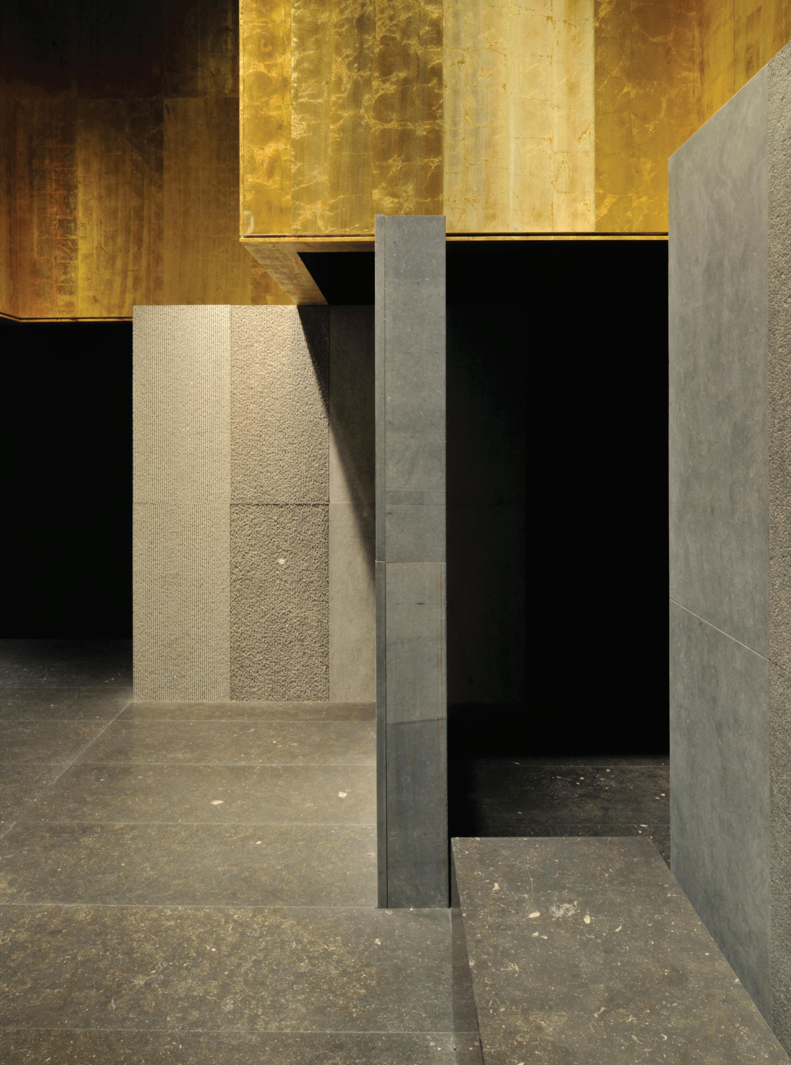
CARRIÈRES DU HAINAUT STAND, INTERIEUR 2012
Kortrijk . Belgium
Vincent Van Duysen Architects was asked for the 3rd time by Carrières Du Hainaut, a leading provider of the original Belgian Blue Stone, to design their fair stand on the Interieur 2012 Biennale in Kortrijk. The purpose of the stand is let visitors get to know the materials, numerous finishes and realizations.
The concept of Vincent Van Duysen goes beyond the typical trade show booth, and approaches the project in an architectural way. A three-dimensional composition was designed, with seemingly massive blue stone walls, positioned orthogonally on a grid. The visitors are able to enter the created spaces, and once inside they’re completely enclosed by blue stone walls, with different finishes that they can experience up Glose.
The composition of surfaces and walls takes place on two different levels: the walls on the bottom layer, create a routing, demarcating the various spaces visitors can enter and where they can immerse themselves in the experience. On a second, higher-located level, we have again a composition of surfaces, which together define a second, cross-shaped space. This area is not accessible, but clearly delineated, and creates different atmospheres in the underlying areas. This overhead space is completely lined in gold leaf on the inside, which combined with the lighting creates a golden glow descending into the spaces. The gives the stand a very warm and intimate atmosphere, despite the inherent cold nature of the blue stone material. The result is a spatial experience with an almost sacred atmosphere, generating wonder and emotion about the blue stone material.
Vincent Van Duysen Architects foram convidados pela 3a vez pela Carrières Du Hainaut, um dos líderes no fornecimento da original pedra calcária azul Belga, para desenhar o seu stand de exposição na feira Interieur 2012 Biennale em Kortrijk. O objectivo do stand é permitir aos visitantes conhecer os materiais, inúmeros acabamentos e concretizações.
O conceito de Vincent Van Duysen vai além do típico stand de feira e aborda o projecto num modo arquitectónico. Uma composição tridimensional foi desenhada, com paredes aparentemente maciças de pedra azul, posicionadas numa grelha ortogonal. Os visitantes podem entrar nos espaços criados e, uma vez no interior, estão completamente envolvidos por paredes de pedra azul com diferentes acabamentos que podem experienciar de perto.
A composição de superfícies e paredes faz-se em dois níveis diferentes: as paredes no nível térreo criam um percurso, demarcando os vários espaços em que os visitantes podem entrar e onde se podem envolver na experiência. No segundo nível, mais elevado, temos novamente uma composição de superfícies, que em conjunto definem um segundo espaço em forma de cruz. Esta área não é acessível, mas claramente delineada, criando diferentes atmosferas nas áreas a que se sobrepõe. Este espaço suspenso é completamente revestido com folha de ouro no interior, que combinada com a iluminação cria um brilho dourado que desce sobre os espaços. Isso confere ao stand uma atmosfera quente e íntima, apesar da natureza fria inerente da pedra azul. O resultado é uma experiência
espacial com uma atmosfera quase sagrada, gerando curiosidade e emoção em relação ao material de pedra azul.


TR RESIDENCE
Knokke, Belgium
On reclaimed land close to the sea, with views delineated by an urban coastline, a limited number of trees, shrubs and centrally sited farm buildings define the spatial organization. The brief was to replace existing structures with a contemporary farming business, stables and surrounding orchard. By implementing three elongated blackslatted wooden volumes in the existing open landscape, with a dramatic courtyard in between, the archetypal farmyard was created. The house, stables and barn create a clear border around the courtyard – the heart of the farm – but the open side permits a connectedness to the surrounding meadows. The courtyard is also enlivened by a water feature – centred between the house and the stables – and at the other end its flat character is interrupted by a 60-metre retaining wall that catches the small undulation in topography and terminates in an integrated cesspit. The basic volumes are of a utilitarian barn typology where openings – to be closed by large sliding gates – are kept to a functional minimum.
A thorough approach with regard to detailing and materials strengthens the contemporary character of this project. The design omits any ornament on the façade – gutters, drains and ridgelines are abstracted to the point that they are almost invisible. Making reference to old wooden barns, the repetitive timber motif merges sills and eaves and extends on to the roof, whereas the farmhouse is granted larger openings for views out to the landscape and courtyard, and is distinguished from the other volumes by its large chimney flues.
From a distance the abstraction of the three wooden volumes is complete – but coming closer to the project, more and more details become visible. One might say the architecture is designed ‘at the scale of furniture’. The abstract formal language of the façade is poetic in its refined detailing and, in the sunlight, the diaphanous rhythm of the slatwork is further emphasized.
The initial concept proposed a discreet volumetric analysis of elongated and staggered structures to mark a clearly enclosed yard and inner area. The long, low typology of farm buildings and barns is found nearby in the ‘polder farms’ (farms located on floodplains) of Flanders in Belgium, as well as in the Netherlands. Because of the utilitarian nature of the brief – ‘this is a farm’ – no visual distinction was made between home, stables and barn. For the functional aspects of the brief, the classic roof eaved form of the farm building has been elongated to create large, utilitarian sheds.
The use of materials also follows the barn typology, but has been distilled. The storage rooms and stables of a farm are often clad in wooden planks, both in Belgium and abroad. Wood is a natural and sustainable farmyard material that immediately references the rural character and forms the basis of the project. Here all façade work, exterior cabinetry and other visible parts of the buildings are resolutely clad in black-stained wood, supported by a polished concrete base. This second material again emphasizes the utilitarian nature of the farm and is used as a continuous floor surface both
inside and out. As well as lending the building a contemporary character, the black-stained wood contributes strongly to the sustainability and longevity of the built form.
The palette of soft grey and anthracite is tempered by the surroundings – the green of the trees, shrubs and meadows. The green of the landscape also mingles with the exterior hard surfaces and defined planting that permeates the concrete strips in strategic places.
Em terrenos recuperados junto do mar com vistas delineadas pela linha costeira urbana, um número limitado de árvores, arbustos e edifícios agrícolas localizados centralmente, definem a organização espacial. O objectivo, aproveitar as estruturas pré-existentes e acolher uma quinta contemporânea, com estábulos e um pomar circundante. Por entre a paisagem aberta existente, a implantação de três volumes longos, em ripado de madeira negra, desenham um pátio de carácter dramático entre eles.
A casa, os estábulos e o celeiro criam uma fronteira clara em torno do pátio - o coração da quinta – e as aberturas entre eles permitem estabelecer uma relação com os prados envolventes. No pátio, é integrado um espelho de águacentrado entre a casa e os estábulos - e numa das extremidades o seu carácter plano é interrompido por um muro de contenção de 60 metros que absorve a pequena oscilação natural da topografia. Os volumes, de forma simples, com base na tipologia funcional um de celeiro, mantêm as aberturas - fechadas
por grandes portas de correr – num funcionamento minimal.
Uma abordagem cuidada no que diz respeito ao detalhe e aos materiais, reforça o carácter contemporâneo deste projecto, que omite qualquer ruido na fachada. “Calhas, ralos e sulcos” são abstraídos a ponto de serem quase invisíveis, recordando os antigos celeiros de madeira, em que a repetição e mescla de soleiras e beirais de madeira se estendem até o telhado.
Por contraposição, o espaço de habitar distingue-se dos outros volumes pelas grandes aberturas direccionadas para a paisagem e para o pátio, e pela presença de grandes chaminés. À distância, a abstracção dos três volumes de madeira é total - mas à medida que se estabelece a aproximação ao projecto, os detalhes tornam-se visíveis. Pode-se até dizer-se que a arquitectura é desenhada “à escala do mobiliário”. A linguagem formal abstracta da fachada torna-se poética pelo depuramento do seu desenho, e
com a luz solar, o ritmo diáfano do ripado é ainda mais enfatizado.
O conceito inicial tem por base o desenho de três volumes longos, com diferentes escalas, que definem um pátio claramente fechado, que remete à tipologia longa e baixa dos edifícios agrícolas e celeiros encontrados nas proximidades das “quintas de Pólder” (quintas localizadas em várzeas) quer em Flandres, na Bélgica, quer na Holanda.
Com base na intenção conceptual inicial

- “isto é uma quinta” - nenhuma distinção formal foi estabelecida entre a casa, os estábulos ou o celeiro, e os aspectos funcionais foram resolvidos através da forma clássica do telhado, cujo beiral dos volumes alongados proporciona grandes e versáteis espaços.
Também os materiais escolhidos, reforçam o caracter de celeiro. Os armazéns e estábulos de uma quinta são habitualmente revestidos a madeira, quer na Bélgica quer em qualquer outro
sítio. A madeira, material de revestimento natural e sustentável e de carácter rural, é a base do projecto. Toda a fachada, é revestida em madeira pintada “de preto”, e assenta numa base de betão polido. Este segundo material, reforça a natureza utilitária da quinta e é simultaneamente usado enquanto piso contínuo, tanto no interior como no exterior. Para além de conferir ao edifício um carácter contemporâneo, a pintura da madeira contribui ainda para a sua conservação e longevidade.
A paleta de cores cinza claro e antracite é temperada pela circunstância natural envolvente - o verde das árvores, os arbustos e as planícies. O verde da paisagem funde-se com a construção e com o plantio que emerge entre os vazios criados em pontos estratégicos.


An old expedition yacht underwent an extensive rebuilding process to create a floating ‘home away from home’. Working in close collaboration with the yacht’s owner, Vincent Van Duysen Architects were responsible for the general concept and mood, spanning from the complete interior renovation to partnership with Vripack engineers and designers on the exterior modifications.
The concept was to create a new expedition yacht with an ultimate level of comfort and luxury while also using a careful selection of natural and tactile materials to create a serene and timeless atmosphere, as one can also find in the owner’s residence on land.
The interior creates a special environment in which occupants are encouraged to explore all their senses and interact with the vessel’s unique character. The use of fine but understated natural materials such as brushed oak, honed Carrara marble, Italian leather, cashmere, cotton rope and handmade vegetal rugs invites guests to feel, touch and fully inhabit all interior spaces and lounges. An example of this are the walls made out of rounded carved wooden panels, referring to the typical naval rope stacks. At the same time, the yacht’s interiors suggest a sharp and sportive mood, inviting guests not only to relax but to engage in multiple activities, from the highly customized fitness lounge to the outdoor observation gym or the upper deck with its bespoke tenders, kayaks and paddleboards.
The design integrates many rounded and gentle surfaces, in a contemporary way, from the unique sky lounge oak
panelling to the stone details of the bathroom. All the interior hardware and lighting fixtures followed this aesthetic, to perfectly blend old and new.
The lighting design, created by PSLab, incorporated custom lighting fixtures, blending in with the overall interior design. The loose furniture features customdesigned items and exterior furniture was customized by Paola Lenti in Italy for RH3, featuring the new Portofino collection designed by Vincent Van Duysen.
The key feature of this special project was the complete and immersive design approach, from the larger-scale interventions to the smallest details, creating a new direction for yacht interiors and at the same time defining the ideal feeling of a floating ‘home’: the perfect shelter equipped for all expeditions and adventures at sea.
Um antigo iate de expedição passou por um extenso processo de reconstrução para permitir criar uma “casa longe de casa” flutuante. O trabalho foi desenvolvido em estreita colaboração com o proprietário do iate, e Vincent Van Duysen Architects foi responsável pelo conceito geral, desde a renovação completa do interior até à parceria com os engenheiros e designers da Vripack nas alterações externas.
O conceito teve por base o desenvolvimento de um novo iate de expedição com um caracter máximo de conforto e luxo, conferido por uma selecção cuidadosa de materiais naturais e sensoriais, capazes de proporcionar
uma atmosfera serena e intemporal, à imagem da presente na residência habitual e permanente do proprietário.
O interior cria um ambiente especial no qual os ocupantes são incentivados a explorar todos os seus sentidos e a interagir com o carácter único da embarcação. O uso de materiais naturais e discretos, tais como a madeira de carvalho escovada, a mármore de Carrara, o couro italiano, a la de cachemira, a corda de algodão ou os tapetes vegetais feitos à mão, convidam os ocupantes e hóspedes a sentir, tocar e viver plenamente todos os espaços interiores. Exemplo disso são as paredes em painéis de madeira entalhada arredondada, remetendo às típicas pilhas de cordas navais. Simultaneamente, os interiores do barco sugerem um caracter desportivo, convidando os seus utilizadores não apenas a relaxar, mas à pratica de diferentes actividades desportivas, desde o ginásio, altamente personalizado, até ao espaço de treino ao ar livre, ou no deck superior, com a presença de caiaques, paddle e pranchas de remo.
O desenho dos interiores integra muitas superfícies arredondadas mas de uma forma contemporânea, desde os painéis de carvalho que revestem o deck aos detalhes de pedra que reveste o quarto de banho. Quer o equipamento interno e quer a iluminação seguem estas directrizes, para garantir uma combinação perfeita entre o antigo e o novo.
A iluminação criada pelo PSLab, incorporou luminárias personalizadas de
acordo com o desenho geral do interior. Os móveis soltos apresentam detalhes personalizados e os móveis exteriores foram desenvolvidos por Paola Lenti em Itália para a RH3, apresentando a nova colecção Portofino desenhada por Vincent Van Duysen. A principal característica deste projecto tao especial foi a abordagem de design completa e imersiva, desde as intervenções em grande escala até aos detalhes mais pequenos, abrindo uma nova
oportunidade aos interiores dos barcos através da construção de um caracter de ‘casa’ flutuante: o abrigo perfeito equipado para todas as expedições e aventuras no mar.


C PENTHOUSE
Antwerp, Belgium
Inspired by the beautiful panoramic view of the River Scheldt and the bluestone along the grey quayside, the project is arranged around the axes of its volumes and breathtaking views, allowing each zone to take advantage of this spectacular location.
The concept of the project was to create an ‘urban loft’ that retains the rawness of construction yet encompasses a complete finish and feeling of comfort. The concrete ceiling and rough timber refer to the historical warehouses, which have an architectural presence in the surrounding quay and the city.
The concept was a large-scale interpretation of the abstract and sculptural approach of Belgian Cubist Georges Vantongerloo (1886–1965), a founding member of Dutch artistic group De Stijl, the movement that advocated pure abstraction and universality by reducing the essentials of form and colour.
The project has strong architectural qualities within a residential apartment context. The sculptural architectonic approach corresponds to the Abstract Expressionist art collection of the owner. Works by international artists – such as Gavin Turk, Carl Andre, Gerhard Richter, Jef Verheyen and Wade Guyton – are dotted around the penthouse.
The walls and floors are finished in the same material to a rigorous standard of detail for a sober and textural appearance. The material selection is a manifestation of the grey tones of the River Scheldt and its quayside, as well as referring to the Arte Povera movement, in which driftwood, metal, earth and concrete were used.
From the beginning of the design process the width of the timber planks and the character of the concrete ceiling were integral to the entire project. This meant that all dimensions – of the walls, cupboards, and so on – were designed as multiples of the width of the timber planks used for the creation of the concrete ceiling. The central monolithic volume enclosing the fireplace is positioned in such a way that all surrounding spaces have a direct connection; however, they are also separable through use of full-height sliding doors, which makes the experience of the penthouse that of a single open space, divided by functional blocks (including for example kitchen storage, bathrooms, dressing room, toilets, fireplace and so on).
The floor level of the entrance is slightly raised to match the height of the facing terrace. This intensifies the spaciousness and contributes to the separation between the public zone to the front and the private area at the back. The private rooms provide a more intimate experience through the use of reclaimed timber planks to the ceiling and walls.
The Cubist approach also shows through the semi-fixed elements in the penthouse: the kitchen island, central coffee table in the living room, or the wooden blocks behind the beds with the slide-in television screen, for example.
The elongated bronzed brass table is a specially altered piece by Vincenzo De Cotiis that creates a pronounced presence in the dining area, which enjoys the panoramic view of the Antwerp skyline with the cathedral behind.
Inspirado na vista panorâmica extraordinária sobre o rio Scheldt e da pedra azul presente ao longo do cais cinza, o projecto é organizado em torno dos eixos dos seus volumes e vistas deslumbrantes, permitindo que cada espaço tire partido desta localização tao particular.
O projecto consistia no desenvolvimento de um ‘loft urbano’ que mantivesse a rudez da construção, e simultaneamente uma sensação de conforto. O tecto de betão e madeira em bruto recorda os armazéns históricos, que marcam presença no cais e na cidade.
O conceito base foi uma interpretação em grande escala da abordagem abstracta e escultural do cubista belga Georges Vantongerloo (1886-1965), membro fundador do grupo artístico holandês De Stijl, o movimento que defendia a abstracção pura e a universalidade, reduzindo os fundamentos da forma e cor.
O projecto tem fortes características arquitectónicas num contexto de um apartamento residencial. A abordagem escultural reflecte a colecção de arte expressionista abstracta do proprietário. Obras de artistas internacionais - como Gavin Turk, Carl Andre, Gerhard Richter, Jef Verheyen e Wade Guyton - fazem parte dos diferentes espaços.
As paredes e chão são revestidas no mesmo material com um rigoroso padrão de detalhes que lhe confere uma aparência neutra ainda que texturada. A selecção do material é como que um prolongamento dos tons de cinza do rio Scheldt e do cais, além de remeter
também para o movimento Arte Povera, no qual foram utilizados troncos, metal, terra e betão.
Desde o início do processo de desenho, a largura das pranchas de madeira e o carácter do tecto em betão foram essenciais para todo o projecto,
implicando que todas as dimensões - das paredes aos armários e afins - fossem pensadas como múltiplos da largura das pranchas de madeira usadas na cofragem do tecto.
O volume monolítico central que envolve a lareira está posicionado de forma a que
todos os espaços envolventes tenham uma ligação directa; no entanto, esta simultaneamente assegurada a sua separação através do uso de portas de correr, que permitem a experiência da cobertura como um único espaço aberto, dividido apenas por blocos funcionais (incluindo a despensa da cozinha, quarto

de banho e de vestir, e a lareira). O nível do piso da entrada é ligeiramente elevado para coincidir com a altura do terraço em frente. Este detalhe reforça amplitude do espaço e contribui para a separação entre a zona pública frontal e a zona privada tardoz. Os quartos, mais reservados, permitem uma experiência
mais íntima, reforçada através do uso de pranchas de madeira recuperada no tecto e nas paredes.
A abordagem cubista presente, reflecte-se nos elementos semifixos da cobertura: na ilha da cozinha, na mesa de apoio central da sala ou mesmo
nos blocos de madeira posicionados atrás das camas que acolhem a tela da televisão de correr. A longa mesa de latão bronzeado é uma peça especialmente alterada por Vincenzo De Cotiis que tem uma presença de destaque na sala de jantar, e oferece uma vista panorâmica sobre a cidade de Antuérpia e a


VO RESIDENCE
Knokke, Belgium
Knokke, a Belgian seaside village, is known for its refined white holiday homes with gabled roofs. Situated alongside the Royal Golf Course, this permanent home for the owner and his family allows beautiful wide views across the golf course and onto its protected private gardens, designed by Martin Wirtz.
Large, whitewashed brick volumes –positioned simply within the natural green landscape – support a large thatched roof. These primary architectural elements define the strong and modern character and expression of the house, which is an interpretation of the archetypal traditional villa in Knokke.
The massive monolithic brick volumes arrange the house spatially and functionally. It is sometimes open to its environment with vistas to the green all around, or protected when positioned between, behind or within the massive brickwork volumes. The cementwashed bone-coloured finish links the exterior with the interior.
The minimal windows strengthen the continuity between indoors and out. The large thatched roof gives a protected and introverted feel, and provides privacy for the inhabitants. Without any gutters or roof ridges, and with its low-hanging roof edges, the large abstract roof adds to the contemporary character of the house. The two large chimneys – reminiscent of the open fires and chimneys of old mansions – create a play of verticality against the horizontal lines of the roof and the pool house extension.
The architecture is completed with the terraces, an outdoor swimming pool and
adjacent poolhouse, to enable the owner to enjoy different views of the surroundings while taking advantage of optimal sun orientation. The terraces create open or semi-enclosed seating areas to both the north and south sides of the house to bring the outdoor landscape closer to, or almost into, the house.
The interior materials are finely detailed and elegant, sophisticated and in contrast to the raw expression of the thatched roof and the cement-washed brickwork textures applied all over the exterior and some of the interior walls.
Depending on the desired mood, the different interior finishes bring variation within the bounds of a similar design approach and atmosphere. The dark wooden double-height ceiling in the grand living room contrasts with the natural-wood clad kitchen with its lower ceiling. Meanwhile the leather and ‘vegetal’ wallpaper finish of the home office and master bedroom relate to the softer and more intimate feel of these private areas. The green mosaic for the home spa adds to the essential and quiet experience of relaxing in this space.
The custom-made furniture and interior decor further add to the sophisticated atmosphere, reminiscent of the grand holiday homes of the past.
Knokke é uma vila belga balnear de ocupação sazonal e temporária, onde predominam tradicionalmente casas brancas com telhados de duas águas. Por contraposição, este projecto prevê uma ocupação permanente pelo proprietário, e situa-se junto do Royal
Golf Course, o que lhe permite usufruir de uma vista panorâmica sobre o campo de golfe e o jardim privado protegido, de Martin Wirtz.
Grandes volumes de tijolo caiado –posicionados e inseridos de forma simples na paisagem natural – sustentam um grande telhado de palha. Estes elementos primários definem a contemporaneidade, e o forte carácter e expressão da casa, que surge como uma interpretação da villa tradicional arquetípica de Knokke.
Os volumes de tijolo monolíticos organizam a casa espacial alternando planos fechados com planos abertos para o jardim. O acabamento cor de osso estabelece a ligação entre o exterior e o interior, e as janelas de características minimalistas, reforçam a continuidade entre o interior e o exterior.
O telhado de colmo confere uma sensação de protecção, introspecção e privacidade aos usuários da casa. Sem qualquer goteira ou cumeeira perfeitamente definida, o grande telhado reforça o carácter abstracto e contemporâneo da casa. As duas grandes chaminés - que remetem às lareiras e chaminés presentes nas antigas construções - estabelecem um jogo de verticalidade contra as linhas horizontais do telhado e a extensão da casa da piscina.
A arquitectura completa-se com os terraços, uma piscina exterior e uma casa de apoio adjacente, de forma a permitir aos usuários desfrutar de diferentes vistas sobre a envolvente, e ao mesmo

tempo tirar partido de uma óptima orientação solar.
Os terraços definem áreas de estar abertas ou semifechadas para os lados norte e sul da casa de forma a “trazer o jardim para dentro de casa”.
Os materiais presentes no interior dos espaços, são finamente são neutros e sofisticados, em contraste com a expressão crua do telhado de colmo e a textura da alvenaria caiada no exterior,
também presente em algumas das paredes interiores.
Os diferentes acabamentos presentes no interior, proporcionam dentro dos seus limites uma abordagem e atmosfera distintas. O tecto de madeira escura e o pé direito duplo no grande espaço da sala de estar contrastam com o revestimento de madeira natural e o tecto mais baixo da cozinha. Simultaneamente, o acabamento em pele e o papel de parede “vegetal” do escritório e do quarto
principal proporcionam uma sensação mais calma e íntima. O mosaico verde usado no spa, contribui essencialmente para uma experiência tranquila e relaxante nesse espaço.
O mobiliário, desenhado de acordo com o espaço e as necessidades da casa e da decoração interior, acrescentam à atmosfera sofisticada, uma referência das grandes casas de férias do passado.


HBH RESIDENCE
Southampton, USA
This residential project, under construction at the time of writing, is located in Southampton, south-eastern Suffolk County in New York, with a landscape and coastline that is part of the famed stretch of shoreline known as the Hamptons, the exclusive summer destination of New York City that extends from Amangansett, Sag Harbor to the remote and popular Montauk area. Historically, this area has been devoted to agriculture and fishing, which nowadays still influences the special atmosphere of the landscape and traditional housing.
Along with the seemingly infinite coastline of sandy beaches, this area soon turned into a perfect retreat for busy Manhattanites. The Hamptons became the ultimate showcase for the ‘art of living’, where iconic architectural structures include works by Horace Gifford, Philip Johnson, Gwathmey Siegel and Norman Jaffe, among many others.
The programme for this private residence was defined with the client to create the perfect family retreat, not only as a summer vacation house but also as the main family home all year round. From the early stages, the client’s ambition was to create the perfect combination of creative minds for the conception of the project. Vincent Van Duysen was responsible for the architecture and took on a leading role in the design team. Interior and furniture design were realized by the renowned Atelier Christian Liaigre, while the landscape is designed by Dutch landscape architect Piet Oudolf.
The project site has a particular atmosphere. Close to the sea and adjoining a large pond, the west side of the property is entirely defined by protected wetlands, with its
specific palette of colours and vegetation. Large oak trees dominate the access road to the property, creating a peaceful and natural environment. At the same time, this region is bathed in a distinctive light throughout the year, creating strong shadows and contrasts in the landscape. The combination of all these natural aspects along with the strong architectural tradition of the region created the perfect canvas for the project.
The architecture is defined by a cluster of structures housing different functions of the programme, composed of the main house and subsidiary buildings. This design approach reflects the archetypal composition of a traditional farmhouse and residential structures, which forms an integral part of the region’s cultural heritage.
From the lush and colourful driveway, the access is through one of the buildings to arrive at a central courtyard, the starting point of all summer activities. The interaction of the different volumes around the central courtyard is unified by a wooden pergola and an extended wooden deck at a higher elevation that connects and embraces all outdoor and public areas around the house. These terraces were designed as a pure extension of all the interior spaces.
In summer, exterior and interior blend to create a whole experience and ensure interactivity between the different parts of the programme. Public areas dominate the ground floor in a careful sequence of rooms and atmospheres, always emphasizing an important axis or an interesting point of view towards the landscape or an outdoor patio. Accessory buildings house secondary functions such as a fitness room, playroom, pool house and so on, while higher volumes
contain the more private and exclusive areas, with the master bedroom and master suite, along with the children’s bedrooms. All these special rooms in the house have higher ceilings, capturing and framing the nature around through generously sized pocket windows, sliding into the walls.
An important aspect of this project is the tectonic expression of the architectural volumes. It was vital to achieve a timeless but contemporary palette of materials, but it was also important to find a material that would enhance the careful composition of volumes and the hierarchy between angled and vertical planes while accentuating the tactility of the surfaces and the way they cast shadows under the unique light. Having in mind the traditional materials of the region, like the typical wooden barn sidings or the cedar wood shingles, bespoke fired clay tiles were carefully selected to cover the entire façade and roofs to recreate the local architectural heritage in a contemporary way.
This highly textured and tactile material, in combination with naturally aged ipe wood and dark metal complete a very powerful yet sober palette of materials that blends in with the surrounding environment. The interiors from Christian Liaigre and the different gardens areas by Piet Oudolf are the result of an intense and rewarding collaboration and were part of the architectural concept from the early stages, defining the project as a whole experience and vision. Interiors and loose furniture by Liaigre showcase the intrinsic summer mood of the Hamptons, while complementing the architectural expression and answering the singular demands of a family home. The atmosphere is relaxed and comfortable, yet refined and timeless.


RATIO FOR DADA
Ratio is based on the presence of building-like compositional forms and on the skillful use of the materials of which Vincent Van Duysen is an undisputed interpreter.
The modular kitchen hinges on a structure composed of metal grids that define the basic components: Wall units, columns, hoods and accessories. Full volumes, empty volumes and tops of different thicknesses are hooked to the slender and minimal techno/structural elements, creating an elegant interplay of balances.
The kitchen is developed over two layers: the structural layer, consisting of the uprights, and the surface layer. The interplay of vertical and horizontal lines gives the product a strikingly graphic and architectural expression, characterised by the scansion of the vertical uprights and by the doors and rear surfaces.
Ratio tem por base a presença de formas semelhantes a edifícios e o recurso a materiais particulares, mestria na qual Vincent Van Duysen tem um destaque incontestável.
A cozinha modular é articulada sobre uma estrutura metálica que define os componentes básicos: paredes modulares, colunas, exaustores e acessórios. Volumes cheios, volumes vazios e topos de diferentes espessuras são encaixados nos elementos técnico/estruturais de espessura reduzida, conferindo uma interacção elegante de equilíbrios.
A cozinha desenvolve-se em duas camadas: a camada estrutural, constituída
pelos montantes, e a camada da superfície. O jogo de linhas verticais e horizontais confere ao produto uma expressão gráfica e arquitectónica diferenciadora, caracterizada pela confrontação dos montantes verticais, portas e a superfície tardoz.
MOLTENI&C | DADA SHOWROOMS
London, United Kingdom | New York and Los Angeles, USA
The main idea behind each showroom is to put across Molteni&C | Dada’s style, excellence and heritage. Within every space, the art of living hinges on sophisticated interiors characterized by different materials and layers resulting in an organic mixture of contrasts, tactility and colour. The interiors strive to instill a sense of home as if one entered a domestic hearth.
Inspiration derives from a careful look into the graphic world of Gio Ponti and Carlo Scarpa, with the addition of many new elements. The result is a meticulous subdivision of each section and a plethora of textures able to act as the perfect backdrop to display Molteni&C|Dada’s new products.
In detail, New York with its Madison Avenue, midtown location, brings a contemporary interpretation of an Italian palazzo with a reference to the company’s Italian heritage. London’s store in Chelsea juxtaposes the company’s collections to the original building dating back to the late 1800s blending with the local culture. The monobrand in Los Angeles represents a tribute to the modernity and sophistication of the 20th century Californian home complemented with a subtle Italian touch: Travertino marble accents.
A ideia principal de cada showroom é ilustrar o carácter, excelência e herança da Molteni&C | Dada. Em cada espaço, a arte de viver articula interiores sofisticados caracterizados por diferentes materiais e layers, que resultam numa mistura orgânica de contrastes, texturas
e cores, cujo interior pretende transmitir uma sensação de lar e conforto, semelhante ao de uma casa.
A inspiração provém do estudo do mundo gráfico de Gio Ponti e Carlo Scarpa, e da adição de novos elementos. O resultado é uma subdivisão meticulosa de cada espaço e uma infinidade de texturas capazes de conferir o cenário perfeito para mostrar os novos produtos Molteni&C | Dada.
Em particular, o showroom no centro da cidade de Nova Iorque na Madison Avenue, representa uma interpretação contemporânea de um palácio italiano e da herança italiana da empresa. Por sua vez, a loja de Londres em Chelsea, acolhe as colecções num edifício original do final de 1800, que se combinam com a cultura local. Em Los Angeles, o showroom representa um tributo à modernidade e sofisticação das casas californianas do século XX, acrescida de um toque italiano subtil nos detalhes em mármore Travertino.


CASA M
Melides, Portugal
Casa M was a labor of love that took over three years to build in Melides, Portugal. The team behind its design together with Van Duysen, the actual client, sought to create an enduring monument to design – a sculptural oeuvre camouflaged by the rolling hills, dunes and cork trees of Alentejo, south of Lisbon, where flocks of storks hover high above it. With an exterior of exposed aggregate (a type of concrete left unsealed to reveal its craggy components) tinted a bone hue to vanish into its sandy surroundings, the compound achieves the opposite effect of its Brutalist forebears, which tended to overpower the landscape. The house is meant to take in the elements – sand, light, wind, sun, air, fog and the Ocean in the distance – with a non-ornamental attitude letting the sculptural, umbrella-like canopies of marine pines be the centre of attention. Sunrise and sunset here dictate the palette of colours and moods, while the structure casts shadows on the walls and on the bare soil as light shifts.
Drawing inspiration from iconic concrete residential structures by modernist masters such as Can Lis in Mallorca by Jørn Utzon, Casa Luis Barragán and Georgia O’Keeffe’s Ghost Ranch, even Casa Malaparte in Capri, the ethereal, unobtrusive structure disappears into the surrounding forest dunes. Embodying Van Duysen’s stylistic aesthetics, the pouredon-site concrete volumes represent the purest expression of the textureobsessed, materials-driven strain of warm brutalism that has defined the studio work for more than three decades.
Van Duysen’s search for stripped-down essentialism translates into a bare-bone
structural language and space. As Van Duysen sees it, it’s a shrine, a sanctuary, a domus in which he feels protected yet inspired, lulled by an unspoiled vegetation, so typical of the area. It’s an argument for eliminating noise and clutter from one’s life, to receding (quite literally, in this case) into the natural environment.
The concept of domestic hearth was key in envisioning the plan, whose fulcrum –a central living space featuring a cubist fireplace, opens up onto a courtyard characterized by a sort of Hellenic rhythm and balance set by concrete pillars. Casa M’s wings close onto an open space overlooking the mesmerizing natural landscape composed of green pines and vast expanses of rice patties. It’s an open, shaded pavilion in the summer; a shelter in the winter. A swimming pool, embedded in the terracotta tiled rooftop, adds magic to the residence as its emerald green water mirror materializes out of nowhere, mirage-like.
Casa M’s architectural core is in a continuous dialogue with the outside where sand is allowed to be part of the house itself, blurring the distinctions between indoor and outdoor. The interiors, rendered in Brazilian ipe wood, brown terracotta tiles in a nod to the Portuguese tradition, and sparse furniture, reinforce how the warm Brutalist monolith is hard at its core but soft and welcoming in character.
The colours of concrete and cork trees are actually reprised inside with each detail, from the wooden ceilings to fixtures and panels, all the way to custom-made furnishings. In the living
quarters, a 11.8-meter glass sliding door, disappearing into the walls, opens onto the central columned space, riad-like, horizon and Ocean in the distance, only a little farther to grab.
A Casa M foi um projecto de amor, que demorou mais de três anos a construir em Melides, Portugal. A equipa responsável pelo seu desenho, juntamente com Van Duysen, o cliente do projecto, procurou criar uma obra eterna - escultural e integrada de forma subtil entre as planícies, dunas e sobreiros Alentejanos, a sul de Lisboa, sobrevoados por comuns bandos de cegonhas. O material de revestimento exterior (betão não selado) em tons de osso, permite um desaparecimento visual na circunstância envolvente arenosa, por contraposição a um movimento brutalista antepassado, que tendia a querer dominar a paisagem. A casa foi projectada para absorver os elementos naturais presentes do local - areia, luz, vento, sol, ar, neblina e o mar - com uma atitude não ornamental, permitindo que as copas escultóricas e parecidas com guarda-sóis dos pinheiros sejam o centro da atenção. O nascer e o pôr-do-sol ditam o conjunto de cores predominantes, enquanto a estrutura projecta as sombras nas paredes e no chão, à medida que a luz muda com o passar do dia.
Tendo como referência projectos de casas modernistas tais como Can Lis em Mallorca de Jørn Utzon, Casa Luis Barragán e Georgia O’Keefe’s Ghost Ranch, até mesmo a Casa Malaparte em Capri, a estrutura etérea e discreta desaparece por entre as dunas locais. Representando o
conceito formal habitual de Van Duysen, os volumes de betão cofrado no local representam a expressão mais pura da procura exaustiva de texturas quentes e materiais brutalistas que definem o trabalho do escritório à mais de três décadas.
A busca de Van Duysen de um depuralismo despojado de excessos traduz-se numa linguagem estrutural e
espacial. Aos olhos de Van Duyen, esta casa é como um santuário, uma domus que lhe confere protecção e inspiração, que o aconchega por entre uma paisagem intocada, típica da região. Razão para eliminar o ruído e a desordem natural da vida diária, e retroceder (literalmente, neste caso) para um ambiente natural. A presença do coração foi fundamental no desenho da planta da casa, cujo
centro – o espaço de estar - inclui uma grande lareira cubista que se abre para um pátio definido por uma espécie de ritmo “helénico” conferido pela presença de um conjunto de pilares de betão. A Casa M fecha-se num espaço aberto com vista para uma paisagem hipnotizante natural de pinheiros verdes e uma vasta extensão de plantações de arroz. Um espaço aberto e sombreado no verão; um abrigo no

inverno. Uma piscina, inserida no telhado em terracota, confere uma magia adicional à casa no espelho d’água verde-esmeralda que se vislumbra do nada, como uma miragem.
O coração da Casa M estabelece um diálogo contínuo com o exterior, no qual a areia faz parte da própria casa, eliminando a distinção entre o interior e exterior.
Os interiores em madeira de ipê brasileira, os ladrilhos de terracota castanhos, como que numa homenagem à tradição portuguesa e o mobiliário interior, reforçam como o volume monolítico brutalista duro na sua essência, mas suave e acolhedor no seu carácter. As cores do betão e dos sobreiros são, na verdade, reproduzidas no interior da casa em cada pormenor, desde os tectos de madeira, à iluminação
dos espaços, passando pelos móveis desenhados à medida e necessidades dos diferentes espaços. Na sala de estar, uma porta de correr de vidro de 11,8 metros desaparece nas paredes, permitindo que o espaço se abra para colunata do pátio central a partir do qual se vislumbra o horizonte e o oceano, aquase à distância “do agarrar”.


AUGUST HOTEL
Antwerp, Belgium
During most of the previous century, soldiers were looked after in the military hospital, a neoclassical monument situated amid Antwerp’s 19th-century sprawl. This beautiful complex has now been restored and redeveloped into a serene urban haven.
Contained within the original complex was a convent, whose diverse typology of buildings served as home to the nuns who looked after the soldiers, a place in which they could withdraw from the demanding task of assisting the ill and wounded. The front building housed a reception area for visitors and guests, while a more elaborate, centrally located chapel facilitated worship. The main residential building and its gardens are slightly separated from the others – in fact, most passers-by hadn’t even noticed that this part of the hospital existed; yet, by way of its function, it forms an inseparable part of the magnificent monument.
Vincent Van Duysen Architects’ strategy in turning the hidden gem and its gardens into August was first and foremost to respect the historical DNA of the site and its surroundings and to align with the general principles governing the redevelopment of listed buildings. This was achieved through the careful restoration of its neoclassical splendour (in collaboration with Wouter Callebaut Architecten), and through the addition of contemporary architectural elements, suitably upgrading the premises to its new function as a modern hotel.
The project consists of three gardens and five public buildings, all in the neoclassical spirit. One can still sense
the sober, understated life of the convent nuns. The chapel and public entrance are much more elaborate than the rest, in keeping with their important purpose. Utilising new technology – well known in the shipyards of Antwerp’s harbour – the military performed tests on the contemporary steel structure that complements the master plan of brick buildings. All design decisions have been guided by a respect for the existing architecture, with the wilful intent not to let the necessary structural works create any visual impediments.
Black awnings hover above August’s main entrance and, along with a newly planted tree, serve to ‘identify’ the project – this is what guests will first encounter. These refer to the glass awnings covering the former terraces of the hospital pavilions, while also functioning to beckon visitors. Like the Art Deco canopies in neighbouring Cogels-Osylei, the entrance signifies a new urban entity in Antwerp: August.
The interior scheme nourishes the existing features, highlighting the grey-green timber panelling, the white mouldings, and so forth, reintegrating original elements and reproducing others that have been damaged or diminished, while selectively introducing black components to distinguish the contemporary from the classic. This design approach has been consciously applied throughout the project, reviving the classical feel for a new public.
Nestled in the winter garden is the restaurant, whose glass roof emphasises its central function within the complex.
Carefully restored decorative profiles and doors, along with hand-painted tiles and white marble, as seen in the chapel, are the undisputed protagonists in these internal spaces, where again, black elements represent the new, providing contrast and gently bringing contemporary life to the project. Respecting 19th-century traditions, the fixtures and fittings are tailor made, with lighting by Flos and furniture by Vincent Van Duysen for Molteni&C, each and all of which have been specially developed.
August, which now cares for another kind of guest, invites visitors to gather at the bar inside the former chapel and to partake in its various offerings, such as savouring a fine meal in the sunlit restaurant, experiencing the maze of gardens, and spending the night in one of its 44 guest rooms. While these activities are not dissimilar to those of convent life, the difference lies in the shift from private seclusion to public access, and in the possibility of overnight stays. The aim is for hotel guests to feel completely welcome and at ease in a pleasant, hospitable environment; to derive the same kind of joy the former residents felt in worshipping God.
Interwoven amongst the architecture are the gardens, expertly designed by Martin Wirtz. These are lush in atmosphere, providing a veritable oasis of greenery in which visitors can immerse themselves. A diversity of trees ensures continuity throughout, while detailed differences denote the individuality of each. The main walled-garden is organically structured, with irregular volumes of clipped hedges, shrubs, trees, and perennials. Flowers are
in bloom most of the year, and zones have been created to lend a sense of place and enhance cosiness. The unusual plant beds extend into the garden surrounding the grotto, where they transform into traditional flowerbed arrangements, instilling a more intimate character. A secluded jardin secret defines the third garden. It contains a natural swimming pond around which a row of crisply clipped evergreen oaks is clustered, allowing August Spa users total privacy. These green characteristics add the aspect of outdoor life to the comfortable and warm world within, imparting balance and completing the composition.
Durante grande parte do século passado, os soldados eram assistidos no hospital militar de Antuérpia, num monumento neoclássico do século XIX. Complexo este, restaurado e convertido actualmente num sereno paraíso urbano.
Do conjunto original fazia parte um convento, cuja diversificada tipologia de edifícios servia de residência às freiras que cuidavam dos soldados, local o qual proporcionava também um retiro à exigente tarefa de socorrer enfermos e feridos. O edifício frontal acolhia uma área de recepção para visitantes, e uma capela no centro, acolhia as cerimónias de culto. O edifício residencial principal - ligeiramente separado dos jardins e dos restantes edifícios – passava na verdade despercebido à maior parte dos utilizadores, que pela sua função, representa no entanto parte inseparável do magnífico monumento.
A estratégia de Vincent Van Duysen em transformar este edifício e o seu jardim no hotel August, teve por base o respeito pela referência histórica do mesmo no local, o restauro cuidadoso do seu esplendor neoclássico (em colaboração com Wouter Callebaut Architecten), e a adição de elementos contemporâneos, por forma a actualizar adequadamente as instalações para sua nova função como hotel.
O projecto é composto por três jardins e cinco edifícios públicos, todos no espírito neoclássico, nos quais quase se pode ainda sentir a vida sóbria e discreta das freiras do convento. A capela e a entrada pública são muito mais elaboradas do que as restantes, de acordo com a sua finalidade. Todas as decisões de projecto foram pautadas pelo respeito à arquitectura existente, com intenção deliberada de não permitir que as obras estruturais necessárias criassem quaisquer impedimentos visuais.
Os toldos de cor preta e uma árvore recém-plantada, identificam a entrada do hotel August, estabelecem o primeiro contacto com os hóspedes e identificam as coberturas de vidro dos antigos terraços dos pavilhões dos hospitais. Como as copas Art Déco na vizinha Cogels-Osylei, a entrada representa uma nova entidade urbana em Antuérpia: August.
O esquema interior responde às características existentes, destacando os painéis de madeira verde-cinza e as molduras brancas, reintegrando elementos originais e reproduzindo outros que foram danificados ou diminuídos, enquanto se introduzem cuidadosamente elementos pretos para distinguir o contemporâneo, do clássico. Esta abordagem de desenho foi aplicada de forma consciente ao longo do projecto, destacando uma atmosfera clássica, para um novo público.
Acolhido no jardim de inverno, está o restaurante, cujo telhado de vidro enfatiza a função central que ocupa dentro do complexo. As portas de madeira, cuidadosamente restauradas, os azulejos pintados à mão e a pedra mármore branco, presente na capela, são os elementos protagonistas dos espaços internos, onde de novo elementos pretos representam o novo, proporcionando contraste e evidenciando delicadamente a contemporaneidade do projecto. Respeitando as tradições do século XIX, a iluminação foi desenvolvida pela
Flos e os móveis pela Molteni&C, ambos desenhados por Vincent Van Duysen.
August, que agora acolhe outro tipo de hóspedes, convida os seus usuários a desfrutar do bar presente na antiga capela, bem como a usufruir de uma refeição no restaurante, experienciar o labirinto de jardins ou passar a noite num dos 44 quartos disponíveis. Embora estas actividades não sejam diferentes das da vida no convento, a grande diferença reside na alteração da reclusão privada para o acesso público e possibilidade de dormir no espaço. O objectivo é que os hóspedes do hotel se sintam completamente acolhidos e à vontade num ambiente agradável e descontraído; com a mesma alegria que as ex-residentes sentiriam ao adorar Deus.
Absolutamente relacionados com a arquitectura estão os jardins, habilmente projectados por Martin Wirtz. Com uma atmosfera exuberante, proporcionam um verdadeiro oásis de vegetação. Uma diversidade de árvores garante uma continuidade, enquanto pequenos detalhes conferem a individualidade de cada uma. O jardim principal murado é organicamente estruturado, com volumes irregulares de sebes aparadas, arbustos, árvores e perenes. As flores desabrocham na maior parte do ano, e zonas de lazer diferenciadas foram criadas para proporcionar uma sensação de conforto. Os canteiros invulgares estendem-se até ao jardim, no qual se transformam em arranjos tradicionais de canteiros de flores, proporcionando um carácter mais intimista. Um jardim secreto e isolado define o terceiro jardim. Com uma lagoa natural em torno da qual esta presente uma linha de carvalhos perenes bem desenhados permitindo aos usuários do August Spa uma privacidade total. Estas características exteriores melhoram a qualidade da vida ao ar livre, que se aproxima do confortável e acolhedor do mundo vivido no interior dos espaços.

AUGUST FOR SERAX
With a vision that results from an unbridled curiosity, Vincent Van Duysen always creates an all-inclusive atmosphere in which he seamlessly interweaves architecture, interior design, and design objects. A vision to which he also stayed true when he was commissioned to convert the monastery of the former military hospital in Antwerp into a August hotel.
For the terrace he designed the Outdoor collection, a series of minimalist chairs that effortlessly link the history of the environment to a modern interpretation.
Vincent Van Duysen: “Furniture should never clamour for attention, it should become one with its surroundings, unnoticed. It is the users who add colour.”
The Outdoor collection by Vincent Van Duysen for Serax is made of aluminium and it is available with a black or greygreen powder coating. This makes it suitable for both indoor and outdoor use. The chairs, lounge chair, and table articulate the sheer simplicity of the monastic life they were inspired by. The wider, slightly lower proportions are of this day and age and contribute modernday comfort.
Com uma visão que resulta de uma curiosidade insaciável, Vincent Van Duysen cria atmosferas abrangentes na qual relaciona de forma perfeita a arquitectura e o design de interiores e de produto. Visão esta que esteve naturalmente na base da conversão do mosteiro do antigo hospital militar de Antuérpia no hotel August.
Para o terraço desenhou a colecção outdoor, uma série de cadeiras minimalistas, que estabelecem de forma natural a relação entre a história das pré-existências com a sua interpretação contemporânea.
Para Vincent Van Duysen: “O mobiliário nunca deve chamar a atenção, deve sim fundir-se com o que o rodeia, passando despercebido. Serão os usuários a adicionar-lhe cor.”
A colecção Outdoor de Vincent Van Duysen para a Serax é produzida em alumínio e está disponível na cor preto ou cinza-esverdeado, o que o torna adequado quer para uso interno quer para uso externo. As cadeiras, cadeiras de braços e mesa, articulam a pura simplicidade da vida monástica na qual foi inspirada. As proporções mais largas e ligeiramente mais baixas são comuns aos dias de hoje e contribuem para um conforto actual.

SCHELDE 21
Antwerp, Belgium
Schelde 21 is part of the “Nieuw Zuid,” a master plan for the redevelopment of the former brownfields south of the city centre of Antwerp, Belgium. This previously neglected river front area has, since 1994, been a work in progress to relink the city to its river. The brand-new neighbourhood is the final milestone of a 30-year process that has totally redesigned the quays. Nieuw Zuid is a mixed-use district with an emphasis on living that also features shops, public facilities and offices, with optimal integration of public space.
Schelde 21 offers an answer to the contemporary reality in which living and working in the city irrevocably demand a wider range of functional and energetically efficient housing facilities. The master plan and zoning laws therefore imposed various requirements. Each residential unit within each building had to be provided with private outdoor space and a partially enclosed glazed terrace zone, based on the principle of the double glass façade, plus optimal use of solar energy and heat insulation. Within the historical context of the site (and the city), Schelde 21 represents a contemporary architectural interpretation of the quays’ traditional and pragmatic warehouses, supplemented on the one hand by the rationality in the natural stone grid of the façade, typical of the Casa del Fascio by Giuseppe Terragni, on the other hand, by the playfulness and warmth of the woodwork as in House Fisher by Louis I. Kahn.
Responding to the current (aging) social context, the building contains 105 serviced apartments, spread over eight above-ground storeys. A double structural
exoskeleton in the façade creates layering and rhythm: A sleek grid of columns and beams in natural stone is juxtaposed to the underlying façade cladding, exterior joinery and wooden top floor with a terrace.
The entrance area has been designed to grant views of the river Scheldt and of the in-progress green park between building and water. The public ground floor, encompassing reception functions and restaurant, is connected via an open loft to a partially excavated floor, consisting of a gym, swimming pool, hairdresser, public living space and terrace.
The L-shaped building embraces a sunken semi-public court-anglaise which escapes from the ground floor passage via a green embankment. Here, VVDA opted for a south-west-oriented shelter on the lower level – the end of a natural green area sloping inwards to shield residents from wind blowing over the river. This topographic variation in the project, an architectural journey from the river through void to the lower ground floor in the back, is a unique spatial experience – parcours architectural – for the elderly in the serviced apartments. The overall design aims to be timeless, pure, contemporary, tactile, refined, detailed and warm. A place where people feel safe, secure and at home. A place to relax.
O Schelde 21 faz parte do “Nieuw Zuid”, o novo plano urbano para a reconstrução dos antigos brownfields ao sul do centro da cidade de Antuérpia, na Bélgica. Esta área da frente de rio, anteriormente
negligenciada, tem sofrido desde 1994 um trabalho de consolidação e religação da cidade ao rio, representando o novo bairro, o passo final de um processo de 30 anos que redesenhou totalmente o cais. Nieuw Zuid é um bairro de uso misto com destaque para a vivência urbana, que prevê lojas, instalações públicas e escritórios, com uma integração perfeita no espaço público.
O Schelde 21 pretende oferecer uma resposta as necessidades da actual realidade contemporânea, em que viver e trabalhar na cidade exigem de forma inquestionável uma grande diversidade de espaços de habitar, funcionais e energeticamente eficientes. O plano director municipal e as leis de loteamento impõem inúmeros requisitos. Cada unidade residencial dentro de cada edifício, deve prever um espaço exterior de uso privado e uma zona de terraço parcialmente fechada, com base no princípio das fachadas de vidro duplo, para além do uso de energia solar e isolamento térmico.No contexto histórico do local (e da cidade), Schelde 21 representa uma interpretação arquitectónica contemporânea dos armazéns tradicionais e pragmáticos dos cais, por um lado pela racionalidade imposta conferida pela pedra natural em uso na fachada, típica da Casa del Fascio de Giuseppe Terragni, e por outro lado, através da luz e do carácter quente das carpintarias de madeira, tal como na Casa Fisher de Louis I. Kahn.
Respondendo ao contexto social actual (de envelhecimento), o edifício acolherá 105 apartamentos com serviços, distribuídos por 8 pisos acima do solo.
Um exosqueleto estrutural duplo na fachada proporciona diferentes camadas e ritmos: um cruzamento de colunas e vigas em pedra natural é justaposto ao revestimento da fachada subjacente em carpintarias de madeira e os terraços do último piso.
A área de entrada foi desenhada para permitir uma vista sobre o rio Escalda e o parque verde entre o edifício e a água. O rés-do-chão, de carácter público, acolhe
funções de recepção e restauração, um ginásio, piscina, cabeleireiro e esplanada, no piso inferior.
Um desnível topográfico natural, permite um percurso extraordinário desde o rio até ao piso térreo inferior tardoz, e uma experiência espacial única - aos habitantes seniores que ocupam os apartamentos com serviços. A VVDA optou por desenhar e considerar um abrigo orientado a sudoeste no
piso mais baixo – que corresponde simultaneamente a uma área verde natural inclinada, para proteger os residentes do vento que sopra desde o rio. O desenho geral do projecto pretende ser intemporal, puro, contemporâneo, refinado, cuidado e acolhedor. Um lugar onde as pessoas se sintam seguras, protegidas e acima de tudo confortáveis. Um lugar para viver e relaxar.


WINERY VV BY VINETIQ
Puurs, Belgium
Liezele, a small hamlet 30 minutes south of Antwerp, is a fertile area where small agricultural farmsteads are traditionally growing asparagus, where green fields, small streams, aligned with rows of willow- or poplar trees are defining the structure and mood of this beautiful rural Flemish landscape.
“Valke Vleug”, the small stream/brook dividing and giving name to the VV winery, is “the flight of the Falcons” in old days typical birds in the area, an illustration of the rich natural beauty, an illustration of the character of the place. It’s this character on this specific location, close to the owners house, that starts the building of ‘a once in a lifetime project’ : an hedonistic estate that allows to grow 4,2 hectares of cool climate wines , to enjoy horse-riding in nature and enjoy life and culture in all its aspects with family and friends.
The architecture by Vincent Van Duysen is embedded in the same tradition of Flemish Farmsteads, archetypical in its form and sturdy functional in its setting, the same building elements were part of the demolished asparagus farm on the site, but also have been an integral part of the rural heritage for centuries before. The horizontal grand barn, typical for the traditional farm buildings is now combined with a small but vertical modern farmhouse and together they create a new hierarchy which dialogues with the strong horizontal lines in the open landscape.
The barn and the tower are the protagonists of the place and are defining, together with 4 massive concrete volumes, the central court, the
heart of the winery, where all activity of Valke Vleug Estate finds place. An open air empty square that gives hierarchy and organizes the farm, a place to gather the grapes during harvest or linking the wine tasting functions with the natural surroundings, the core of the project that allows for events or for quiet moments when the farmer, after a hard day at work, enjoys sunset when resting on the long wooden bench.
The benches, designed by Daniel De Belder, are part of embedding the grand architectural volumes to the human scale, even if the benches are sometimes 8 meters long, they feel in proportion and are creating ‘moments’ in the overall architectural project where the hedonistic, yet sober experience is taking over.
It seems that the massive wooden elements of De Belder work together with the architectural volumes of Van Duysen to maximize the experience of the visitor towards the landscape, to link the buildings position to the Valke Vleug stream and to relate the old magnificent oak close to the house, to organize the orientation towards the best sunset views etc. … but as a matter of fact, it is the other way around, the project embeds to the natural beauty and by adding more than 50 newly planted poplar, willow, cherry and hazel trees it gives proof of the intention of the long-term integration of the new farm in its natural setting. The colour of the terroir, the soil of Valke Vleug has inspired the selection of the lava stone soft scaping of the access roads and central court.
This is an important aspect, the boarder between winery soil and functional soft scaping of the farm is invisible and the colour tone continues into the concrete foundation, floors and walls.
It seems that the architectural volume is part of its natural character of the soil (so important for the ‘terroir’ winemakers are referring to), it allows a continuation between the soil and the architectural, between the indoor and outdoor spaces, with only the metal clad black wooden roof structure above.
The same black coloured wood of sustainable European Larch is used for the shutters of the barn and the cladding of the farmhouse. The black colour refers to the “Flemish Barns” traditionally painted in coal tar to protect wooden structures for long time. A tradition of colour that adds contrast to the green lush surroundings and giving the projects its sharp, edgy contemporary character. The farmhouse and its private life is protected behind the concrete walls at the central court. The rooftop terrace gives a view on the far surroundings, overviews the farmstead activity and the winery beyond.
This experience is in all rooms part of the private life, window bays give light and view, also at living room level where the ground floor is softly raised, just above 1 meter, to emphasize the experience of the owner, a long distance perspective on the strong horizontal landscape created by the 17.000 vines.
This is an experience that relates the manmade farmland geometry with the beauty of the architectural form
of volumes and into the sharp lines of its interiors. The interior spaces are a continuity of the architectural language, the rough concrete floors are functional and yet warm sober at the same time, the open structural black wooden roof structures seem to merge into black wooden wall cladding, furniture and grand open fires, all elements creating spaces where wine tasting feels protected in an open shelter or where the wooden or stainless-steel wine barrels are waiting for the next generation of Valke Vleug wines to come.
Liezele, uma pequena povoação, 30 minutos a sul da cidade de Antuérpia Sul, é uma zona comum de produção de espargos e pequenas quintas, caracterizada por campos verdes e pequenos riachos ladeados por salgueiros ou choupos.
“Valke Vleug”, pequeno riacho que divide e dá nome à adega VV, significa “Voo dos Falcões”, antigos pássaros típicos da zona, que ilustram o carácter e a beleza do lugar. Carácter o qual, pela sua peculiaridade nesta localização específica e tão próxima da casa dos proprietários, será a base de construção de “um projecto de vida único”: uma quinta hedonística para cultivo de 4,2 hectares de vinho e que permita também o desfrutar diário do contexto de inserção natural, no qual se incluem passeios a cavalo e uma vivência na natureza e cultura local com a família e amigos.
A arquitectura de Vincent Van Duysen respeita e reflecte a tradição presente nas quintas Flamengas, quer no aspecto robusto formal, quer em questões funcionais. As pré-existências do local, parte integrante da herança rural, serão mantidas. O grande volume horizontal, típico celeiro das construções agrícolas tradicionais, e o volume da casa, pequena mas vertical, representarão em conjunto uma nova hierarquia, em diálogo com as fortes linhas horizontais características da paisagem.
O celeiro e a torre serão os protagonistas do lugar, em simultâneo com 4 novos volumes de betão e o pátio central, o coração da quinta, onde se desenvolverá toda a actividade da quinta Valke Vleug. O grande pátio central será responsável pela hierarquização e organização da quinta: espaço para a colheita das uvas durante a vindima ou articulação das novas funções de prova de vinhos, eventos ou momentos de pausa, no final de um árduo dia de trabalho para desfrutar do pôr-do-sol ou descansar nos longos bancos de madeira.
Os bancos, desenhados por Daniel De Belder, fazem parte da integração dos grandes volumes de arquitectura à escala humana. Mesmo que por vezes com 8 metros de comprimento, mantêm-se proporcionais e representam ‘momentos de pausa’ no projecto de arquitectura geral onde o hedonismo, embora como uma experiência discreta, se destaca.
Os elementos maciços de madeira de De Belder estabelecem um diálogo com os volumes da arquitectura de Van Duysen para maximizar a experiência do visitante em relação à paisagem, permitindo estabelecer uma relação com o rio Valke Vleug, o antigo e extraordinário carvalho próximo da casa, e o usufruto das melhores vistas sobre o pôr-do-sol. Na verdade, o projecto contribui ainda para o reforço da beleza natural do local, através da plantação acrescida de mais de 50 choupos, salgueiros, cerejeiras e avelãs. A cor do solo de Valke Vleug inspirou o uso da pedra lávica e do reboco macio no revestimento dos acessos e do pátio central. Aspectos importantes, na fronteira entre o solo da vinícola e na quinta.
Os volumes da arquitectura fazem parte do carácter natural do lugar. Tão importantes como o ‘terroir’ para os enólogos, permitem uma continuidade com o solo, entre os espaços interiores e exteriores, nos quais se destaca apenas a estrutura do telhado de madeira, pintada de preto.
A mesma madeira preta, é usada nas venezianas do celeiro e no revestimento da casa. A cor preta tem como referência os “Celeiros Flamengos” tradicionalmente pintados com alcatrão de carvão para proteger e prolongar a longevidade das estruturas de madeira. Uma tradição de cores que proporciona contraste com o verde luxuriante envolvente e confere aos projectos um carácter contemporâneo claro e arrojado.
A casa, e o seu uso privado, é protegida por paredes de betão desde o pátio central. O terraço da cobertura oferece uma vista extraordinária sobre a propriedade e uma visão geral das actividades na quinta e na adega.
Esta experiência faz parte da vida quotidiana em todas as divisões da casa. Os vãos das janelas permitem a entrada de luz e uma vista abrangente para o exterior, também ao nível da sala, no qual o piso é suavemente elevado pouco mais que 1 metro, de forma a garantir uma perspectiva de longa distância sobre as 17.000 vinhas.
Esta experiência relaciona a beleza da paisagem natural com os volumes construídos. Os espaços interiores reflectem uma continuidade da linguagem projectual exterior: os pisos de betão são funcionais e ao mesmo tempo discretos e acolhedores, as estruturas do telhado em madeira preta parecem fundir-se no revestimento das paredes, móveis e grandes lareiras, e todos os elementos, proporcionam uma sensação de aconchego, protecção e abrigo aos barris de vinho, quer de madeira ou em aço inoxidável, que acolhem a próxima geração de vinhos Valke Vleug.


HECTOR FOR MOLTENI&C
The Hector bookcase takes its inspiration from the typical modernist libraries and offices which we translated in an elegant, smooth almost gracious but especially domestic language.
Through the precise, up to the mm, adjustment of the shelves you can create very personalized compositions, from structured and symmetric to a more dynamic and casual setting, against the wall or as a space divider.
The richness of its materials (the poles in wood, the bronze metal) and the crafted, elegantly rounded details makes it a true masterpiece for the domestic space. Functional additions such as the bar closet and an office table complete the collection.
A estante Hector inspira-se nas bibliotecas e escritórios tipicamente contemporâneos que traduzimos numa linguagem elegante, suave, leve, mas de carácter especialmente doméstico.
Através de um preciso ajuste, até ao milímetro, as prateleiras permitem a criação de composições muito personalizadas, desde estruturadas e simétricas a uma configuração mais dinâmica e casual contra a parede ou como divisória de espaço.
A riqueza dos materiais utilizados (madeira e bronze), os pormenores trabalhados e elegantemente arredondados, conferem a estante Hector numa verdadeira obra-prima para oespaço doméstico. Complementos funcionais como armários, e uma mesa de escritório completam a colecção.

CENTRAL: THE ORIGINAL STORE
Bangkok, Thailand
Nestled in the heart of Bangkok, Central: The Original Store draws from a family heritage honouring the history of Central Group. The design, as reimagined by Vincent Van Duysen, pays homage to the building’s origin and history, thrusting it forward into a cultural centre that embraces the contexts of Bangkok’s neighbourhoods, and the changing world around them.
The main monolith, whose façade is covered in traditional, hand-crafted terracotta tiles from Lampang province, is reminiscent of Central Chidlom’s original frontage. The body is dotted with expansive floor-to-ceiling glass openings flooding the space with natural light and granting visitors views of the surrounding districts. A peculiar architectural element is the rooftop, treated as a detached volume, almost an insert, characterised by black metal sheet cladding.
Each level within Central: The Original Store has a unique function. The vast street-front glass panels recall Bangkok’s very first window display. The first floor sets the mood with the intimate vibe of an elegant entryway, encompassing terrazzo floors and high concrete ceilings punctuated by wooden beams. This is not a remake, but rather a tribute to the era’s unspoken language of aesthetic unity.
The bespoke iron vitrines echo traditional lanterns used by Tiang and Samrit to walk into the late hours, as the father-and-son pair worked to build Central’s businesses from this location. The vitrines magically embellish the space at night; a symbol of hard-work and dedication.
The first floor sees Siwilai Café serve coffee and à la mode refreshments to their guests. The courtyard, lush and sunlit with plants and rich vegetation, is an architectural feature that connects old-and-new, manifested as a music bar at night designed by the Japanese studio Tripsters, with timeless notes from the custom-made OJAS sound system. A place to enjoy coffee by the day and music as dusk falls.
The sculpted staircase, bathed by daylight, leads guests to the Retail Library, where the book collection underlines the building’s story and purpose. The third and fourth floors are hybrids between exhibition and event spaces, where a large movable display case acts as a divider reiterating Central’s innovative character and versatility.
For 360° views of the city, visitors can peruse the top floor and enjoy a meal at Aksorn; the Tripsters-designed restaurant by David Thompson, an eminent and dedicated chef who continues to be at the forefront of innovative Thai cuisine. Hungry or not, customers can always take in the Bangkok city skyline from a vantage point that is the panoramic roof terrace, gazing down onto the bustling Charoen Krung Road.
Situada no coração de Bangkok Central: The Original Store provem de uma herança familiar que honra a história do Grupo Central. O projecto, tal como reimaginado por Vincent Van Duysen, homenagia a origem e história do edifício, direcionando-o para um centro cultural que abraça os contextos dos bairros
de Bangkok e o mundo em mudança à sua volta.
O volume principal, cuja fachada é revestida por tradicionais ladrilhos de terracota feitos à mão na província de Lampang, é uma reminiscência da fachada original de Central Chidlom, e acolhe amplas aberturas de vidro, do chão ao tecto, que inundam o espaço com luz natural e proporcionam aos visitantes uma vista integral sobre os bairros envolventes. O telhado, revestido a chapa preta representa um elemento de particular destaque.
Cada piso dentro da loja: The Original Store tem uma função distinta. Os painéis de vidro a partir da rua recordam uma vitrine de Bangkok. O primeiro piso proporciona uma sensação mais intima e uma entrada elegante, com tectos altos em betão e vigas de madeira, como uma homenagem à linguagem tácita da unidade estética da época.
Os moveis vitrine em ferro desenhados para o espaço, recordam os tradicionalmente usados por Tiang e Samrit no passado, proporcionando um carácter mágico ao espaço, à noite; símbolo de muito trabalho e dedicação.
No primeiro piso, o Siwilai Café serve café e bebidas à carta e costumizadas de acordo com o pedido dos diferentes clientes. O pátio, exuberante, iluminado e com vegetação natural, estabelece a relação entre o antigo e o novo, e acolhe um bar com música à noite, projectado pelo estúdio japonês Tripster, com notas atemporais do sistema de som personalizado OJAS. Um espaço para

desfrutar de um café durante o dia e de música ao anoitecer.
A grande escada de ligação, banhada pela luz do dia, encaminha os clientes à biblioteca, na qual a colecção de livros destaca a história e o propósito do edifício. O terceiro e o quarto pisos são espaços polivalentes, que acolhem
exposições e eventos, nos quais uma grande vitrine móvel estabelece uma divisória, reiterando o caráter inovador e a versatilidade da Central.
Para usufruir de uma vista panorâmica de 360° sobre a cidade, os visitantes podem percorrer o último piso e disfrutar de uma refeição no Aksorn; restaurante Tripster
de David Thompson, chef reconhecido e de referência na vanguarda da cozinha tailandesa contemporânea. A usufruir de uma refeição, ou não, os clientes podem sempre tirar partido da vista sobre a cidade de Bangkok a partir do terraço panorâmico na cobertura e da movimentada Charoen Krung Road.

NATAN P
project: 1995 - 1996 location: Brussels, Belgium images © Alberto Piovano
VH RESIDENCE project: 1995 - 1996 location: Lokeren . Belgium images © Alberto Piovano
CONCORDIA OFFICES
project: 1998 - 2000 location: Waregem . Belgium images © Juan Rodriguez
DC RESIDENCE
project: 1998-2001 location: Waasmunster . Belgium images © Alberto Piovano
VDD RESIDENCE
project: 1998 - 2003 location: Dendermonde . Belgium images © Alberto Piovano
SPORTMAX SHOP project: 1999 location: Milan, Italy images © Alberto Piovano
H-H PENTHOUSE project: 1999 location: New York . USA images © Alberto Piovano
VDV-G RESIDENCE project: 1999 - 2008 location: Zonhoven . Belgium images © Alberto Piovano
COPYRIGHT BOOKSHOP project: 2000 - 2001 location: Antwerp, Belgium images © Juan Rodriguez
VVD RESIDENCE II
project: 2001 - 2003
location: Antwerp, Belgium images © Juan Rodriguez
B RESIDENCE project: 2001 - 2006
location: Paris . France images © Juan Rodriguez
P RESIDENCE
project: 2003 - 2007
location: Antwerp . Belgium
images © Juan Rodriguez and © Alberto Piovano
POTTERY FOR WOW pproject: 2004 images © Alberto Piovano
DESK AND CHAIR FOR BULO project: 2004 images © Alberto Piovano
YOUTH HOSTEL ANTWERP project: 2004 - 2011
location: Antwerp . Belgium images © Juan Rodriguez
D-M APARTMENT KNOKKE
project: 2005 - 2007 location: Knokke . Belgium images © WDA
VB-VH APARTMENT KNOKKE
project: 2005 - 2006
location: Knokke . Belgium images © Koen Van Damme
DC II RESIDENCE
project: 2005 - 2010 location: Tielrode . Belgium images © Juan Rodriguez
B-S RESIDENCE
project: 2006 - 2010
location: Zwevegem . Belgium images © Juan Rodriguez
BAIT AL SHARQ RESIDENCE project: 2007
location: Khawaneej . Dubai . UAE images © WDA
V-M RESIDENCE
project: 2007 - 2011
location: St-Martens-Latem . Belgium
images © Koen Van Damme
ARTHUR & FOX SHOP
project: 2007 - 2009
location: Paris . France
images © WDA
RESIDENTIAL TOWER
project: 2008
location: Jeddah . Saudi Arabia images © WDA
TONICKX OFFICES KORTRIJK project: 2009 - 2011 location: Waregem . Belgium images © Juan Rodriguez
STEP FOR VICCARBE project: 2012 images © Viccarbe
BELGO-SEEDS OFFICE project: 2012 location: Kortrijk . Belgium images © Thomas De Bruyne
BRABO FOR GEIGER project: 2012 images © Geiger
CARRIERES DU HAINAUT project: 2012 location: Kortrijk . Belgium images © Koen Van Damme
TR RESIDENCE project: 2014 location: Knokke, Belgium images © Koen Van Damme, © Hélène Binet and © Dirk Caremans
BA RESIDENCE project: 2014 location: Wilrijk, Belgium images © Hélène Binet
M1 OFFICES project: 2015 location: Beirut, Lebanon images © Leva Saudargaité
HH PENTHOUSE project: 2015 location: New York, USA images © François Halard
RH3 EXPEDITION YACHT project: 2015 images © Bart Heynen
DRD APARTMENT project: 2015 location: Knokke, Belgium images © Koen Van Damme
INFRA-STRUCTURE FOR FLOS product design: 2016 images © Courtesy of Flos
PAUL FOR MOLTENI&C product design: 2016 images © Courtesy of Molteni&C
C PENTHOUSE project: 2016 location: Antwerp, Belgium images © Koen Van Damme and © Mark Seelen
LA RINASCENTE project: 2017
location: Rome, Italy images © Marco Beck Peccoz
VO RESIDENCE project: 2017
location: Knokke, Belgium images © François Halard and © Hélène Binet
DLC RESIDENCE project: 2017
location: Kruishoutem, Belgium images © Hélène Binet and © Koen Van Damme
FRANCK FOR SUTHERLAND product design: 2018 images © Courtesy of Sutherland
HBH RESIDENCE project: 2018 location: Southampton, USA images © Joseph D’Arco
RATIO FOR DADA product design: 2018 images © Courtesy of Molteni&C
MOLTENI&C | DADA SHOWROOMS project: 2018 to 2019
location: London, United Kingdom New York and Los Angeles, USA images © Courtesy of Molteni&C
CASA M project: 2019
location: Melides, Portugal images © Ricardo Labougle and © Vincent Van Duysen
AUGUST HOTEL project: 2019
location: Antwerp, Belgium images © Mark Seelen, © Robert Rieger and © Frederick Vercruysse
AUGUST FOR SERAX product design: 2019 images © Frederick Vercruysse
SCHELDE 21 project: 2020 location: Antwerp, Belgium images © Koen Van Damme
PABLO FOR B&B ITALIA product design: 2019 images © Courtesy of B&B ITALIA
WINERY VV BY VINETIQ project: 2020 location: Puurs, Belgium images © Koen Van Damme and © Piet Albert Goethals
HECTOR FOR MOLTENI&C product design: 2020 images © Courtesy of Molteni&C
OBLIQUE FOR FLOS product design: 2020 images © Courtesy of Flos
CENTRAL: THE ORIGINAL STORE project: 2020 location: Bangkok, Thailand images © Dof Skyground

VICENT VAN DUYSEN TEAM
Vincent Van Duysen
Carine Goossens
Joëlle Van Campen
Manu Buelens
Eugenio Cirmi
Kristof Geldmeyer
Pascal Bilquin
Kristoff Biscop
Silke Bos
Massimo Colagrande
Lies De Baere
Sander Delchambre
Arne De Crom
Simon De Pauw
Vincent De Veirman
Caterina Galavotti
Luis Goncalves
Anna Greco
Bertrand Lejoly
Silvia Lucchetta
Humberto Nobrega
Jaime Pages Sanchez
Miguel Pereira Vinagre
Jill Rooijakkers
Flavien Servaes
Alessia Taris
Klaas Van Hissenhoven
Mario Vanwynsberghe