
7 Baroque Influencers Changes our View of the Future
Bea Cantillon and Herman Van Goethem
“The Laurel of this Forest, the Sun of this Heaven”
Pierre Delsaerdt and Esther Van Thielen
The Jesuits – Galvanisers of the Catholic Reformation in 17th-century Antwerp
Guido Marnef
Pierre Delsaerdt
Joris Van Grieken
Hildegard
92 Rubens and the Jesuits
Nils Büttner and Bert Watteeuw
104 Rubens’ Ceiling Paintings
Nils Büttner and Bert Watteeuw
136 D’Aguilón, Huyssens and Rubens as Baroque Influencers: The Ignatius Church
Ria Fabri and Piet Lombaerde
168 THE PEOPLE OF ANTWERP
Guido Marnef
178 OTHER FAITHS
Pierre Delsaerdt and Guido Marnef
186 PLAYFUL DIVINE LOVE
Marc Van Vaeck and Johan Verberckmoes
199 About the Authors
200 Baroque Influencers in the Snijders&Rockox House in Antwerp
202 Select Bibliography
204 Index of Names
206 Colophon
207 Photography Credits

Sermon books, controversy publications and catechism books are examples of the wide range of genres that the Jesuits used to proclaim or deepen the “true” faith. Devotional literature and ascetic works were also part of that purpose. In more academically oriented writings, such as history books, the defence of the faith was included too. The fact that the Jesuits in Antwerp made such an important contribution to all of these genres was undoubtedly related to the position of the professed house. After all, the Fathers associated with that house were given the freedom to dedicate themselves wholly to apostolate and academic work. A number of them were engaged in the critical study and publication of hagiographies. The Bollandists, named after Joannes Bollandus, furnished the publication of the well-known Acta Sanctorum, the first two volumes of which appeared in Antwerp in 1643. This collective undertaking also featured the aforementioned aspect of the defence of the faith, because the Jesuits wanted to use critical text publications to repudiate the Protestants’ negative criticism and ridicule of the veneration of the saints. The fact that the Antwerp professed house was selected to realise the prestigious project of the Acta Sanctorum shows that this Jesuit establishment had become one of the most important in Europe.
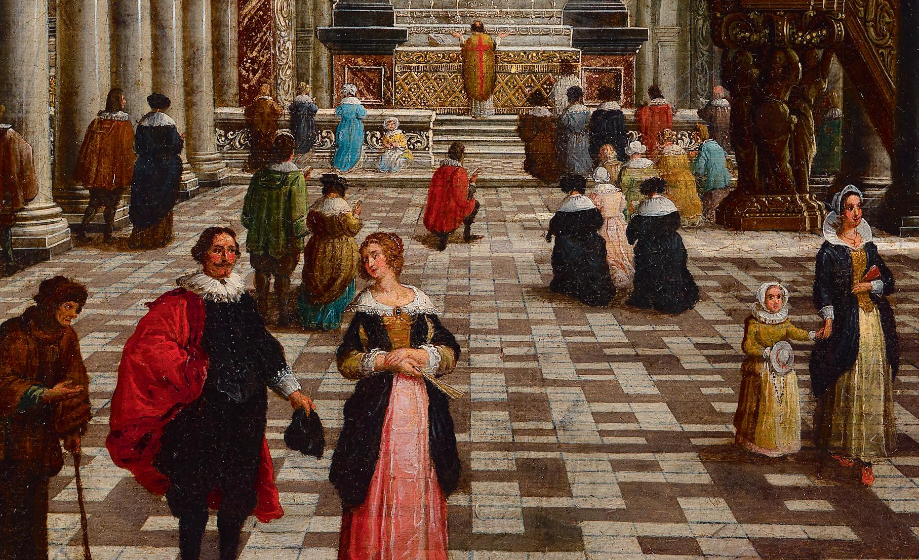
With the Acta Sanctorum, the Bollandists in Antwerp were able to address – through the printing press – an international audience of literate people who were conversant with Latin. At the other end of the complex communication spectrum, they made effective use of public rituals to reach the local urban population. Such public rituals could develop into proper mass spectacles and tapped into oral and visual communication methods. We have already mentioned the festive installation of the statue of the Virgin Mary in the façade of the city hall in 1587, and the festivities at the inauguration of the Saint Ignatius Church in 1621. The jubilee celebration of 1685 offers another textbook example. Here the Jesuits commemorated and celebrated the capitulation of rebellious Antwerp and the founding of the first Marian sodality one hundred years earlier. On Sunday, 26 August 1685, a solemn procession passed through the city with representatives of the guilds, the shooting companies, the clergy and the city council all joining in. The next day there was an ommegang or civic parade. In addition to the traditional decorated cars, there were five more cars specially decorated for this occasion. The tableaus enacted on those cars were performed by pupils of the Jesuit college. In this way visual images were presented illustrating how the city had suffered from heresy and rebellion and how – with the help of the Virgin Mary – it had been liberated and made prosperous again by Alexander Farnese. Both processions passed under the triumphal arches erected in the city. The triumphal arch on the Meir
crossing Huidevettersstraat was designed by the Jesuits of the professed house. It was about 23 metres high and 15 metres wide and consisted of a central arch flanked by two lateral wings. Large paintings and inscriptions, referencing the central theme of the jubilee, were placed on the arches or galleries.12
For the organisation of the jubilee celebrations, the city and church authorities worked together closely. In old historiography, these public rituals – and, by extension, the broader process of the Catholic reformation – have often been presented as top-down processes imposed by Church and State. From that point of view, the common believers were thought to be primarily passive participants. The accounts of the jubilee of 1685 seem, at the very least, to call for more nuance. Several neighbourhood committees were actively involved in the decoration of the triumphal arches that were erected in their district. A traveller from the Dutch Republic who stayed in Antwerp during the festivities was struck by the great enthusiasm he witnessed in the streets of Antwerp, and by the beautiful decorations in private homes. Regarding the 1622 celebrations of the canonisation, historian Louis Châtellier commented that such exuberantly festive manifestations were only possible when they enjoyed the support and daily effort of ordinary citizens and craftsmen.13
The Jesuits played a pivotal role in the organisation of the jubilee celebrations of 1685. At that time they still had an enormous influence on urban society. Nevertheless, there are quantitative parameters that indicate that the Jesuit order had already past its prime at that time. The trend in the numbers of Jesuits, college pupils and sodality members points in that direction. In the 18th century the decline became even stronger. The waning influence of the Jesuits undoubtedly had several sources, and merits further investigation. Their involvement in the quarrels with the Jansenists, their loyalty to the Roman Church and the shifting dynamics within the varied monastic landscape all played a role. Until the order was suppressed in 1773, the Antwerp Jesuits in the professed house and in the college nevertheless continued to dedicate themselves ad maiorem Dei gloriam (to the greater glory of God).

1 Letter from Luis de Requesens y Zúñiga of 19 April 1574, in: Louis Prosper Gachard (ed.) Correspondance de Philippe II sur les affaires des Pays-Bas, 5 vol., Brussels 1848-1879, vol. 3, pp. 7-8.
2 About placement of this statue, see: Theodoor Van Lerius, Kronyk van de sodaliteit der getrouwden te Antwerpen (1585-1773), Antwerp 1862, pp. 8-15.
3 Figures taken from: Marie Juliette Marinus, De contrareformatie te Antwerpen (1585-1676). Kerkelijk leven in een grootstad, Brussels 1995, pp. 155-156.
4 Figures from: Marianne Moehlig, Het jezuïetencollege te Antwerpen in de 17de en 18de eeuw, onuitgegeven unpublished licentiate thesis, KU Leuven 1988, pp. 94-97.
5 A good description of the meetings is provided in the manuscript by Charles Droeshout, Histoire de la Compagnie de Jésus à Anvers. B. La Maison Professe, Leuven, KADOC, inv. 3290, vol. I, p. 251 onwards.
6 Figures from: Marinus, De contrareformatie te Antwerpen, p. 264.
7 Quoted in: Louis Châtellier, L’Europe des dévots, Paris 1987, pp. 73-74.
8 Based on Erik Duverger (ed.), Antwerpse kunstinventarissen uit de zeventiende eeuw, 13 vol., Brussels 1985-2004.
9 Photograph of this engraving in: Droeshout, Histoire de la Compagnie de Jésus à Anvers. B. La Maison Professe, vol. I.
10 See overview in: Marinus, De contrareformatie te Antwerpen, p. 163, table VIII.
11 See in particular: Birgitte Martens, “Nederlandstalige religieuze controversepublicaties en de kunst van het argumenteren in de Zuidelijke Nederlanden (1591-c. 1688)”, in: Trajecta. Religie, cultuur en samenleving in de Nederlanden, 19-20 (Louvain 2010-2011), pp. 241-272.
12 A description of the festivities and triumphal arches in: Petrus Franciscus de Smidt, Hondert-jaerigh jubile-vreught Bewesen in dese Stadt Antwerpen, Antwerp 1685.
13 Châtellier, L’Europe des dévots, pp. 70-72.
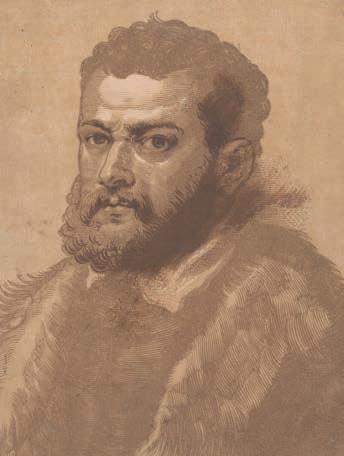
FIG. 3 Christoffel Jegher and Peter Paul Rubens after Tintoretto, Portrait of a bearded Venetian man, the so-called “Doge Giovanni Cornari”, c. 1633-1636,
up with pen and brown ink, 278 × 214 mm, Brussels, KBR, Prentenkabinet, inv. S.V 43718
worked out in a rather linear fashion. Reproducing fine details and subtle tonal transitions in the form of very fine (cross) hatching and dots is virtually impossible. The woodcut was therefore frequently used for the production of relatively cheap prints with a fleeting character. Using templates, the white areas between the lines can easily be coloured serially. This type of print was produced in Antwerp in the 16th century by Jost de Negker, Hans I Liefrinck, Sylvester van Parijs and Anton van Leest, among others. Still, a lot of high-quality woodcut graphic art was also produced. Albrecht Dürer’s woodcuts were already highly regarded at the beginning of the 16th century and, like his engravings, have long continued to be seen as the benchmark. This also applies to the woodcuts produced after Titian in Venice, which were even copied in the Netherlands.
A technically complicated variant is the so-called chiaroscuro woodcut. The technique makes it possible to create compositions by printing different tone blocks and line blocks on top of each other in a limited set of similar or contrasting colours. It originated in Germany at the beginning of the 16th century. In Italy, the chiaroscuri were given their name and their most typical form: an imitation of relief drawings on a washed colour underground, which was very fashionable among artists and collectors. In Antwerp, the technique was used more moderately.8 It remained a niche product for an audience of art lovers. Joos Gietleughen, alias Jodocus de Curia, a craftsman from Kortrijk, produced about twenty around 1555 after the designs of Frans Floris.9 For the Bruges humanist and printer Hubert Goltzius, he made images of coins and medals with portraits of emperors that served as illustrations for his Vive Omnium Fere Imperatorum Imaginas (Bruges, 1557). The publication was later published in an expanded form by Plantin. Adriaen Thomasz. Key and Crispijn van den Broeck were also experimenting with this method, the latter in a rarely seen combination with the etching technique. In the 17th century, Christoffel Jegher was almost the only one making virtuoso woodcuts in collaboration with Peter Paul Rubens with his designs as the basis, and he also applied the chiaroscuro technique on a limited scale (fig. 3).10
Unlike the woodcut, the copper engraving does offer the possibility of displaying intricate pictorial effects in black and white. Because the lines − of various depths − can be closer together, it is possible to achieve a much higher level of detail on a smaller surface than with the woodcut. The textures of materials and fabrics can be suggested through the refined and complex tracery of lines and dots. With the help of a sharp v-shaped engraving gouge needle, or burin, well-ordered lines, hatchings and stipples are engraved in the metal. In this case it is the deeper grooves that are inked and that make an imprint on the paper. That is why one speaks of intaglio (incised).11
The metal burrs that occur during engraving can simply be removed. The result is smoothly defined, regularly shaped lines. By choosing to exert more or less pressure with the burin, the engraver can vary the grooves in depth and width. By playing with expanding and narrowing lines, tonal variations can even be suggested without resorting to crosshatching.
The burin is challenging to handle and engraving requires a long and specialised course of training. Initially, it was mainly goldsmiths who used this engraving technique to decorate their products. The engraver would work from a detailed design drawing that was usually made by an artist especially for that purpose.12 Transferring the main lines of the design to the copperplate is done through a rather complicated
technique. When designing, the artist must keep in mind that the drawing will be printed in reverse (fig. 5).
It is not only the carving of a burin engraving that was technically demanding and time consuming. The inking and printing was also more complex than for a woodcut. To be able to distribute the greasy ink paste evenly over the plate, it was heated over glowing coals. To obtain a nice high-contrast print, the plate had to be wiped clean: the ink is removed from the plate surface first with a cloth, then with the ball of the hand, leaving ink only in the grooves. A sheet of moistened paper is then placed on the inked side of the printing plate. Placed on a board between two blankets of felt it is passed through the two rollers of an intaglio printing press. These rollers apply the right amount of pressure to squeeze the ink out of the grooves onto the damp paper. The dampness prevents the ink from running because grease and moisture repel each other. The engraving is hung on a line to dry, the ink hardens, the paper dries and the carrier and image are permanently united. The publishers did not always print copperplates in-house. For example, we know that Hieronymus Cock hired Sander Janssens, a specialised printer, to do this. Plantin also outsourced the intaglio printing of book illustrations (fig. 4).
An etching is printed in exactly the same way as a burin engraving. But the method of making the grooves in the plate is profoundly different. With the etching, the grooves are bitten into the metal with an acid. The plate is first coated with an impermeable layer of wax or varnish, the so-called etching ground. It can be drawn in with a metal stylus, an etching needle. The plate is then exposed to an acid or immersed in an acid bath so that the drawing scratched into the etching ground is deepened. Iron etching was a skill that armourers had employed for a long time, but with copper it was possible to achieve a more refined result. In the first decades of the 16th century, artists in Germany, Italy and the Low Countries experimented with etching techniques and fine-tuned the procedures to perfection. Albrecht Dürer still etched on steel, but Lucas van Leyden made successful etchings on copper around 1520 and his methods were soon copied. Jan Gossaert and Dirk Vellert in Antwerp, Jan Crabbe and Nicolaas Hogenberg in Mechelen and Jan Rombouts in Louvain made copper etchings in the years 1520-1530.13 It took a while longer for the technique to be applied on a large scale.
In principle, a trained draftsman could easily make a successful etching without the intervention of an engraver. The technique was therefore often used by painters and draughtsmen who had not been trained as an engraver. Pieter Bruegel the Elder was commissioned by Cock to design numerous prints that were then cut in copper by engravers. He himself
experimented once with the etching technique. The result – The Rabbit Hunt – looks much more fluid than his designs that had been interpreted by engravers, and is strongly reminiscent of his pen drawings. Hieronymus Cock’s etched views on Roman ruins from 1549-1550 are an early example of successful etchings printed in large editions. They represented a breakthrough for the large-scale application of the etching technique.14 Because the etched grooves tend to be much shallower and more irregular than those of burin engravings, etched plates are more difficult to print and will wear down more quickly – from repeated inking, wiping, and printing. Cock was one of the first in Europe to finesse an etching technique – the precise composition of the etching ground and the acid – that achieved a reliable, consistent and durable result. In that period, the brothers Joannes and Lucas van Doetecum developed a technique in which they would correct etching with the burin.15 They initially worked on assignments for Antwerp publishers such as Gerard de Jode and Hieronymus Cock and introduced their technique there; it also turned out to be very suitable for engraving maps and atlases. The reliable combination of etching and burin became an extensively used technique with Antwerp printmakers and publishers and was also widely imitated internationally. The etching is masked as a copper engraving and the irregular and expressive character of the etching is obscured. The engraving with its orderly and more “slick” appearance continued to be preferred for a long time. The pure etching, sometimes combined with drypoint, will mainly be used by artists who want to be creative in the printing medium themselves. The drypoint technique consists of scratching directly into the copper with an etching needle. It offers numerous expressive possibilities but is unsuitable for printing large print runs due to the fact that burrs are left and because of the very shallow grooves. In Antwerp, after one-off attempts by, among others, Pieter Bruegel and Frans Floris in the 16th century, it is mainly Anthony van Dyck and Cornelis Schut who will successfully make use of pure etching (fig. 9 and fig. 10).16
Show names – spread fame
In the second half of the 16th century it became customary to put the names of the makers on the prints. This practice had been common in Antwerp for some time, but it was only systematically applied since Hieronymus Cock’s time. This had a lot to do with the emancipation of the arts, in particular the role of the painter as the intellectual inventor of a work of art, something Cock was much in favour of celebrating. He was inspired by Raphael and by Roman print publishers such as Antonio Salamanca. The use of monograms was slowly becoming


although it did see the benefits of a healthy partnership with religiously inspired women who helped them reach a broader target group. Their religious way of life was very popular in the 17th century, but in the 18th century its popularity seemed to slowly dwindle.
Spiritual daughters came from diverse backgrounds. Some had to work to earn a living, others were wealthy enough to be free of such concerns. The latter category included the wealthy sisters Maria (1575-1649), Anna (1581-1674), Christina (1585-1657) and Lucretia-Suzanna (1590-1622) Houtappel, and their cousin Anna ‘s Grevens (1579/15801638). The sisters were, among other things, patrons of the Sint-Rosalia chapel at the Hessenhuis, where girls’ education was given. They were under the spiritual guidance of the Jesuit Carolus Scribani (1561-1629) and supported the building campaigns of his order. For example, they spent large sums on the construction and decoration of the Chapel of Our Lady that was added to the Saint Ignatius Church in the 1620s. That gave them the right to be part of the decisions concerning its decoration. It refers to the life of Mary, for example with a large painting of The Assumption. In addition, life-size marble statues of the patron saints of these spiritual daughters (Maria, Anna, and the martyrs Christina and Suzanna) and the coat of arms of the Houtappel family were incorporated into the beautiful Baroque interior (fig. 9).
They were involved in more than this one project. During their lifetime, the Houtappel sisters invested approximately 231,000 guilders in initiatives of the Society and also paid for the renovation of the Rivierenhof, the estate of the Antwerp professed house in Deurne. After the death of Anna, the longest surviving of the sisters, in 1674, the order also acquired what was left of their fortune. Their bequest gave the sisters the right to be buried in the Saint Ignatius Church. Entirely contrary to the custom of the Society, their confessor Scribani was also buried in their burial chapel. The social commitment and investment of spiritual daughters, such as the Houtappel sisters, helped the Jesuits to reach a diverse audience. It is to these passionate sisters and their cousin that the Jesuit Heribert Rosweyde wrote his book Het Leven der HH. Maeghden, die van Christus tyden, tot dese eeuwe in den salighen staet der suyverheyt inde wereldt gheleeft hebben (The life of the Holy virgins who from Christ’s time until this century have lived in sublime state of purity in the world) in 1626.
1 [Adriaen Poirters], Het leven van de H. Rosalia. Antwerp, Cnobbaert, 1658, fol. ã5 recto-verso.
2 Ibidem, fol. ã7 recto.
3 Opkomste der Sodalityt, manuscript, 1622-1734 (Erfgoedbibliotheek Hendrik Conscience, B 61341), pp. 92-93.
4 Ibidem.
5 [Adriaen Poirters], Het leven van de H. Rosalia. Antwerp, Cnobbaert, 1658, fol. ã3 recto.
6 Ibidem.
Since the order, whose mission it was to convert as many people as possible, had been created, the Society of Jesus had recognised books as an important medium in their evangelical work. By the end of the 18th century, the Jesuits had published more than 6,000 books.25 Many of these publications were intended for education. The Jesuits’ comprehensive education system aimed to create a standardised education that went far beyond basic schooling. Each college had its own library and the acquisition of books was considered as important as the purchase of food.26
The Jesuits strove to introduce Catholic doctrine as widely and lastingly as possible, and imagery played an important role, whether or not in combination with texts. When the Fathers made statements about visual culture, they were inspired by rhetoric. Good images had to have the same impact as an inspired speech and had to “feed” the audience in the same way.27 Only then could one persuade citizens and contribute to a better moral or religious experience. The art and drama theory of the time proclaimed the similarity of literature, visual art and music: all arts were based on rhetoric and on the imitation of nature. This parallel between rhetoric and visual culture provided the parameters within which images could be discussed. A wonderful example of this subtle interplay between word and image are the emblem books. They give an impression of the way in which images were used at that time and of the underlying way of thinking. Emblemata helped religious readers to better understand the connections between text and images. They were permitted to discover the links between text and image themselves, and to draw their own conclusions. According to early modern views, the intellectual effort on the part of the audience was a vital part of visual communication. The creation of images tested the intellectual and communicative skills of the artists, just as the perception of images tested the public.
Rubens’ religious paintings refer to the sacrificial death of Christ, or the miracles and martyrdom of saints.28 Especially in the churches, the paintings were an integral part of the liturgy, inviting the parish to contemplation and quiet devotion. They were designed to have an immediate emotional appeal for their audience. As a result, the works were also easily accessible for an ordinary layman – and they can still speak to us today in our secular world with its tsunami of images. This is not only the result of Rubens’ dazzling skill as a painter, but also thanks to his ability to insightfully conceive of ways to visualise substantively complex phenomena.29 The strongest proof is the pictorial plan he developed for the Jesuit church in Antwerp. Rubens not only made the paintings for the main altar for this church, he also painted other altarpieces and, most remarkably,
the 39 ceiling paintings, which, in form and content, are considered the highpoints of the visual culture of the Jesuits. Art historians are still discovering new things about these paintings to this day.
Some of Rubens’ works are and will remain enigmatic. This is the case with an oil sketch he painted between 1617 and 1620, which shows two Jesuits on a beach. Naked nymphs in the water are positioned in their line of sight (fig. 5).30 This composition was never carried out in a large format. However, elements of it can be found in a number of portraits that the artist did complete in full, which show figures in similar garb. On one of these drawings, Rubens writes in Latin: “Note that the dark colour does not refer to Chinese scholars, but to the Fathers of the Society of Jesus” (fig. 4).31 The drawing shows Father Nicolas Trigault (1577-1628), who was already famous in that time for his missionary work in Asia. He travelled across Europe to raise money to finance the Jesuit missions in Asia from 1615 to 1617. Rubens met him and painted his portrait. He did the same for other members of the order, although painting portraits was not one of his favourite pastimes.32 After all, his ambition was to achieve eternal glory by creating prestigious history paintings. This was also the wish of his brother Philip, who in a letter invoked the gods to protect Peter Paul from the dangers of travelling: “No letters, my brother, no strong vein of your sharp mind will avail you then, nor your hand that has acquired the skill to design artistic pictures and to paint like a second Apelles.”33
The high aesthetic and intellectual standards of the painter and his patrons are also apparent in the copious number of allegorical title pages that Rubens designed for books. He produced these for no less than 19 works by Jesuit authors.34 One outstanding example is the title page and illustrations he made for a treatise on optics by François d’Aguilón (15671617), which appeared in 1613. As rector of the Jesuit college in Antwerp, he had written his Opticorum libri sex (Six books on optics) for the teachers who were teaching the new subject of mathematics at the college.35 It was Carolus Scribani who, in 1606, had asked the Antwerp city council for permission to open a school for mathematics. It was intended to be open to merchants and seafarers also, so that the interests of the city would be safeguarded. The founding of this school was a weighty argument for moving the college to another, larger building; until then it had been located in the old House of Aachen. In 1608 the college moved to the Hof van Liere, and in 1615 d’Aguilón, now rector of the institution, was able to open the mathematics school. Rubens surely will have been already exchanging ideas with him about the construction of the new Jesuit church in those times.


FIG. 1 Pieter Huyssens, Design Drawing for the Façade of the Antwerp Jesuit Church, c. 1620, washed ink drawing on paper, 620 × 440 mm. Antwerp State Archives, Charles Borromeo Church archive, drawing inventory, no. 15