A white canvas packed with playfulness - Pelham (US)
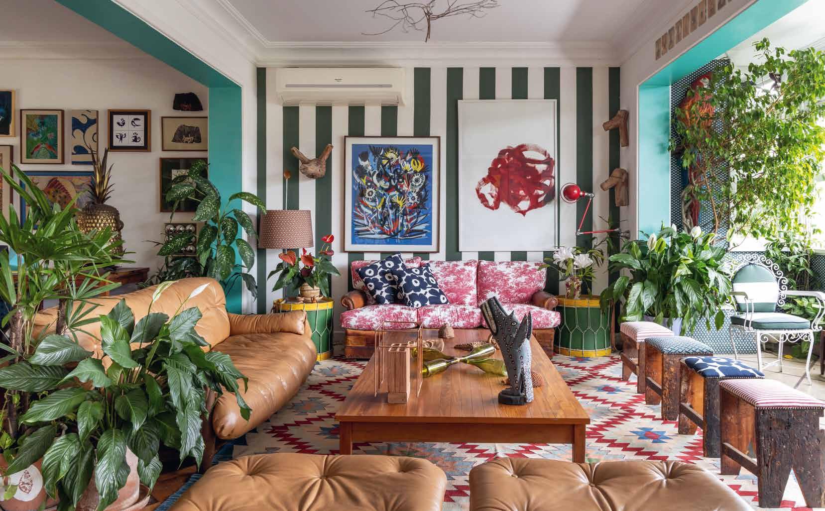
Unconventional room with a view - Rio de Janeiro (BR)
Curious and curiouser - Henley (UK)
A marriage between vibrancy and subtlety - Aix-en-Provence (FR)
Primary colours under the eaves - Neuilly-Plaisance (FR)
Quirky curiosities, muted colours - Cape Town (SA)
Delivering the unexpected - London (UK)
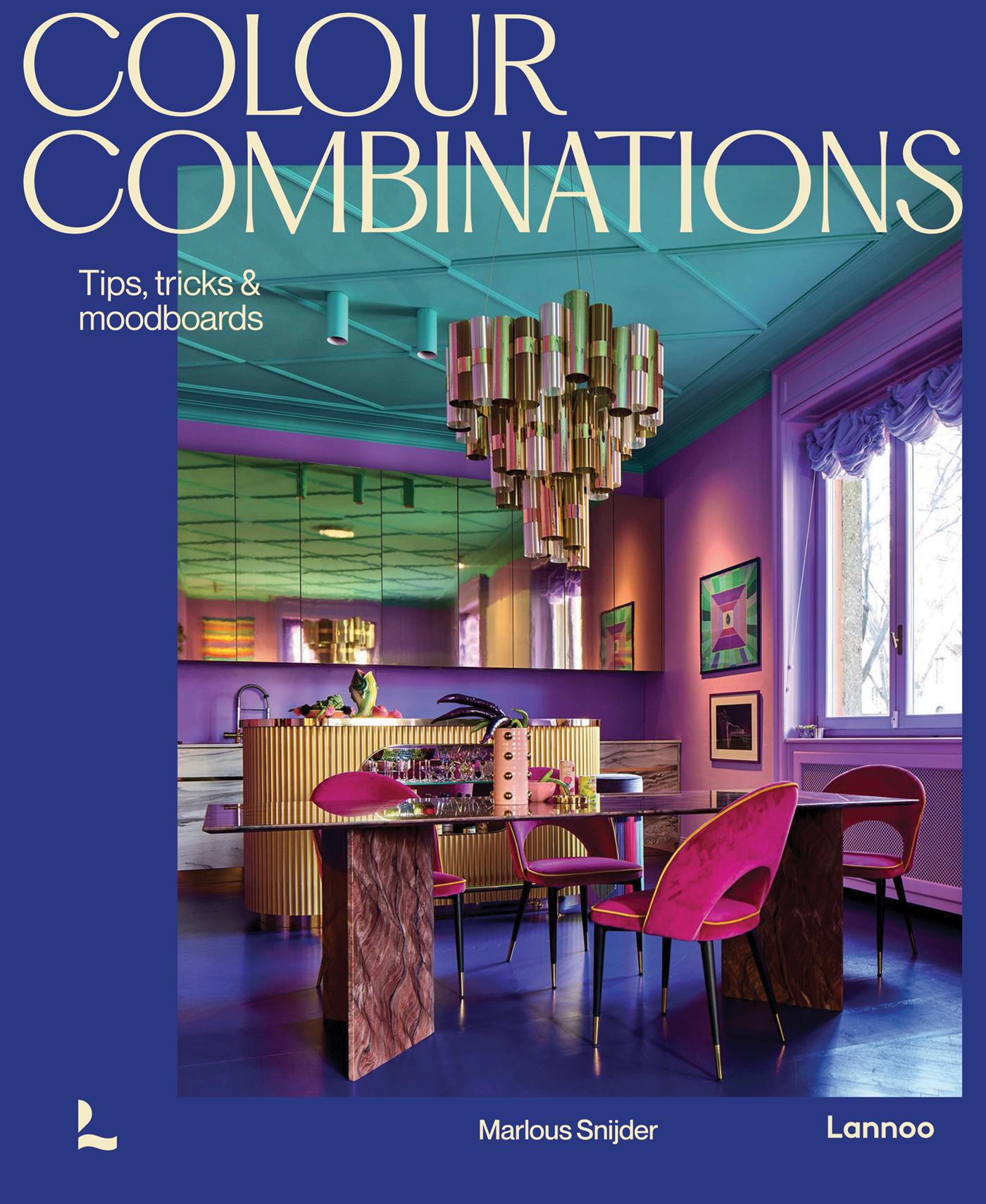
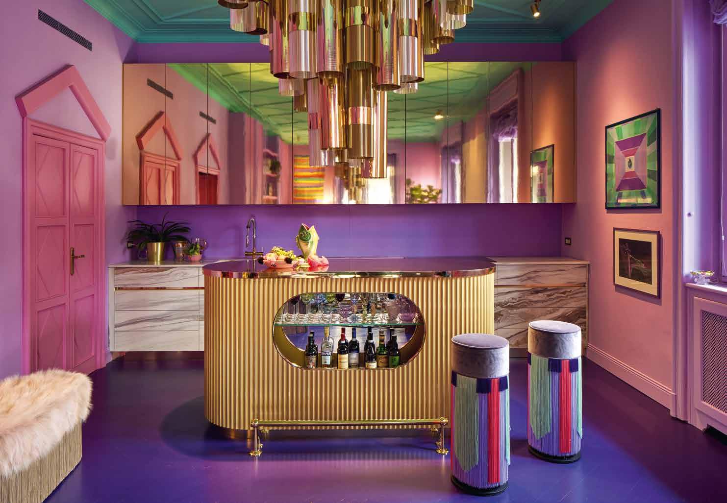
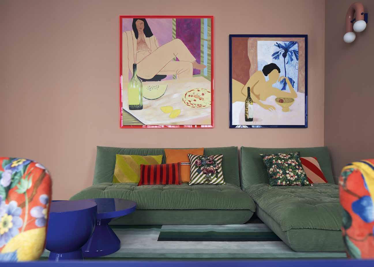
Madness to the method - Milan (IT)
Orange is the new black - Turin (IT)
SUNNY SIDE UP
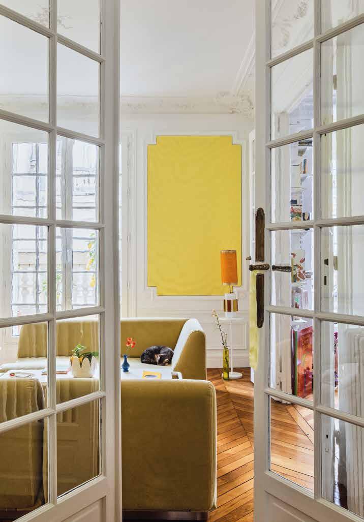
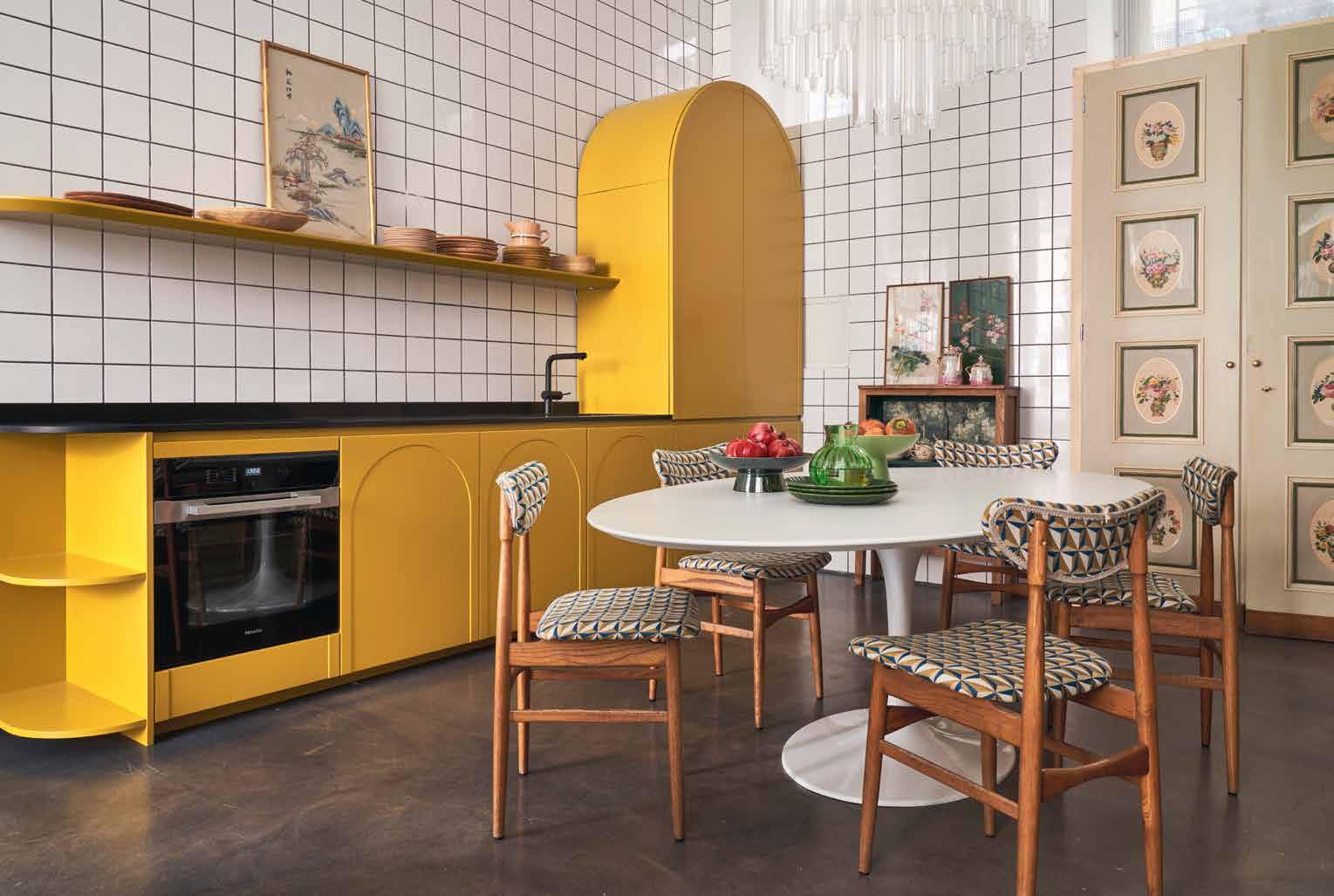
Nestled on a charming street in Paris’s XVIIe Arrondissement, amidst early 20th-century architecture, lies the vibrant 70-square-metre apartment of creative partners Alice Gras and Anaïs Seguin. This colourful, joyful space radiates creativity and good humour while preserving a tranquil ambience.
Yellow, chosen for its uplifting qualities of joy, good humour, cheerfulness, and warmth, takes centre stage, perfectly complementing their light-filled open space. The kitchen and bathroom underwent substantial renovations, resonating with memories of travels and family traditions. Inspired by the graphic allure of Southern France, Alice designed the boldly geometric and contemporary tiles of the kitchen floor herself.
Alice and Anaïs cleverly chose a lighter shade of yellow for the kitchen, combined with an overall monochrome palette for a more earthy aesthetic. This creates a subdued, cosy feel – always important for spaces where you spend a lot of time. That said, make sure you use natural light to select the right shade of yellow.
In north-facing rooms, you want to bounce light around, so stick to bright yellows and stay away from green or blue undertones. Light in south-facing rooms becomes
warmer, meaning deep yellows will be intensified. In that case, maybe try a warm sand or rich ochre for a more subtle effect. If you don’t want to paint all your walls yellow, pair it with a muted colour, like white or grey. Or introduce a bold colour with a dash of blue.
In their purest, primary-colour forms, yellow and blue are often used to stand out, especially in creating memorable logos (the big blue Swedish brand comes to mind). However, these bold characteristics don’t always translate into a harmonious home. Blue and yellow are opposites on the colour wheel, each bringing distinct qualities to a space. While blue exudes tranquillity and seriousness, yellow radiates joy and energy. Yet, the residents skilfully balance these contrasting hues, allowing blue to dominate in the separate dining room, where it’s paired with calming white. The white walls are accented by colourful artwork, making the blue dining room a serene focal point that perfectly balances the vibrant yellow. The warm wooden tones of the floor blend seamlessly with both yellow and blue, tying the space together. For the bedroom, Alice and Anaïs drew inspiration from a hotel photo and wanted a distinctive, adaptable headboard. Some old sheets, once belonging to a great-grandmother, were perfect for the look they envisioned, so they carefully and painstakingly marked the pleats and created a beautiful headboard. The soothing sea blue, pale yellow, soft greens, and greys echo the palette of the rest of the apartment, creating an inviting, calm haven where the residents can unwind and relax.
COLOUR THEORY
Interestingly, the pink-for-girls and blue-for-boys rule in Western societies is a mere century old. Before that, the colours were reversed: pink, a faded red, was associated with cardinals and uniforms, while blue was linked to the Virgin Mary. Because of its long-running cultural association with young girls and the feminine in general, pink can nowadays still be a tad divisive. And it is high time to reclaim it for spaces shared by all sexes.
h COLOUR SCHEME ANALOGOUS
COLOUR THEORY
hCOLOUR SCHEME SPLIT-COMPLEMENTARY
The Unexpected Red Theory – coined by Taylor Simon on TikTok – suggests that a room never truly looks complete until it includes a touch of red. Much like how a classic red lipstick can perfect an outfit, this design principle argues that adding even a small amount of red to a space where it wouldn’t typically belong instantly makes the room feel more cohesive. In essence, a little (or a lot) of red can go a long way in making a space feel vibrant, unique, and full of life.
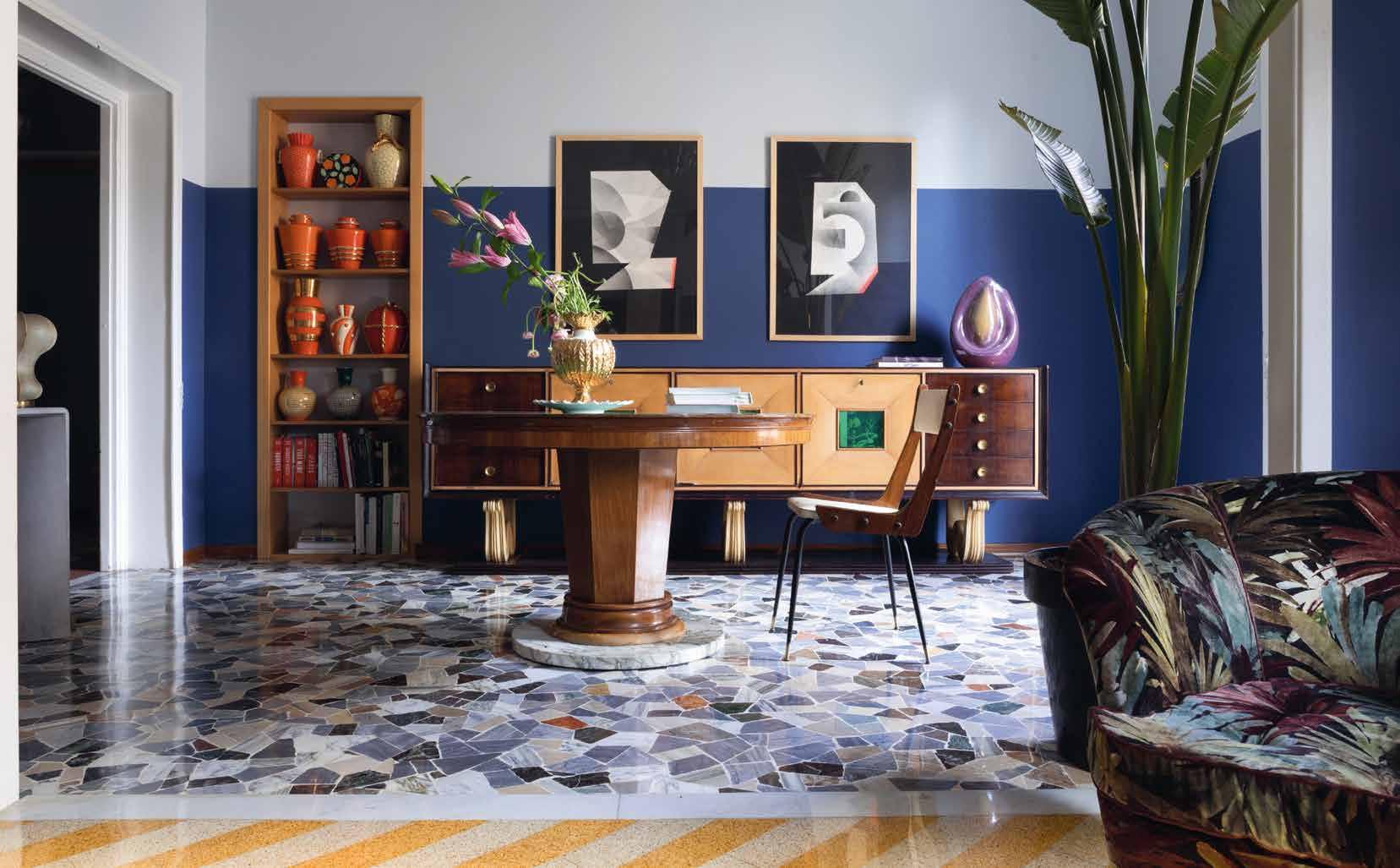
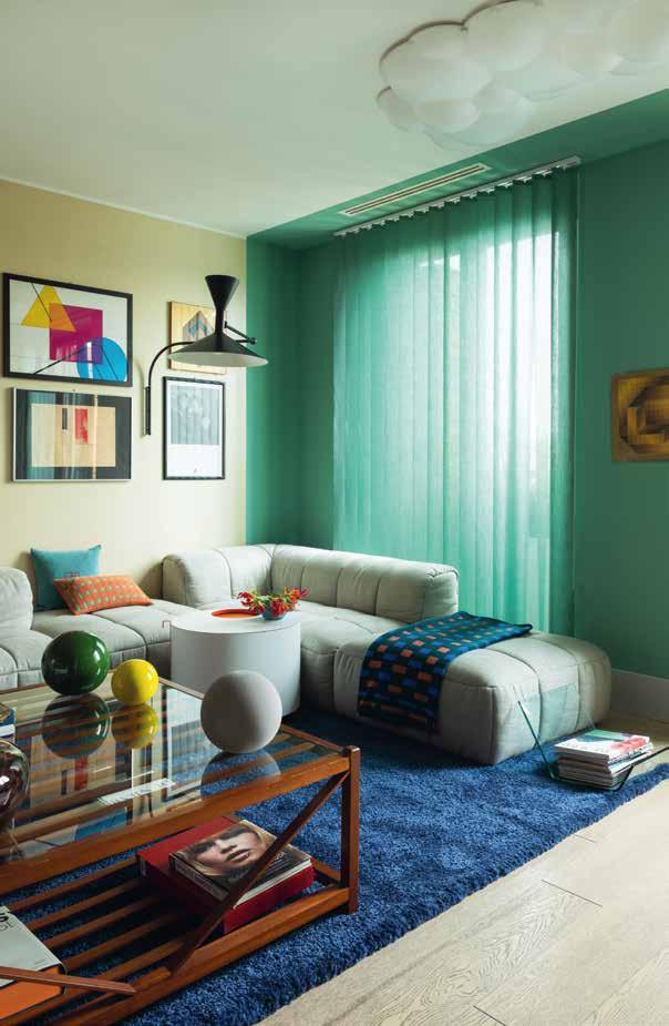
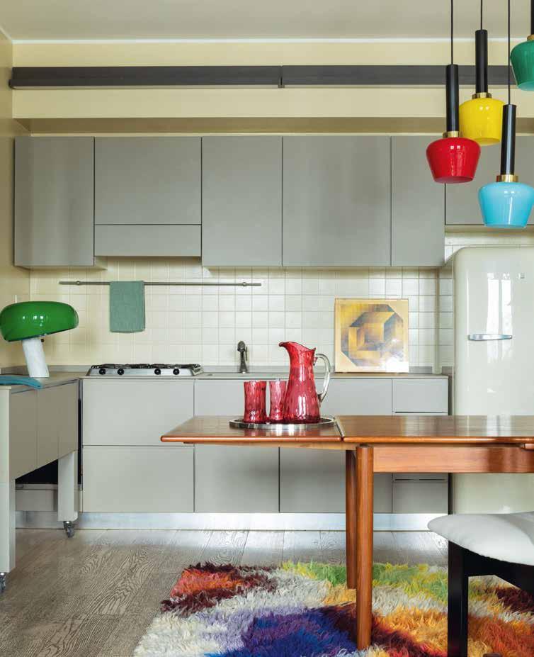
The entrance floor features 10x10 centimetre yellow tiles with blue grout, which extend up the steps and into a bathroom entirely in yellow. In the living room, the muted tones on the wooden cabinetry and walls help to ground the design, avoiding total chaos. Stefania has skilfully used colour to delineate the different areas of the shared space. The green carpet and sofa subtly define the living area, while the blackand-white striped rug in the dining area not only defines that space but also tempers what Stefania herself described as the ‘madness’.
Cobalt blue is electrifying, which makes it the perfect colour to play with, even if neutrals are your thing. It instantly modernises a space and can be the ideal gateway to other colour combinations. By working in some strong contrasting colours, like yellow, orange, or pink, you get a pop art kind of feel. Geometric patterns, on the other hand, pair particularly well with it as they match the colours’ energy, giving it that deliciously mad Memphis Milano feel. You could also incorporate a piece of furniture in solid blue –whether it’s an armchair, coffee table, or even a sofa. Keep the rest of the décor neutral to create a beautiful, sleek contrast. You can even experiment with accessories, from simple throw pillows to candle holders or even candles. The beauty of this approach is its flexibility – you can easily switch things up whenever you want, ensuring you don’t tire of this daring hue too quickly.
Texts
Marlous Snijder
Copy-editing
Lisa Holden
Image Selection
Marlous Snijder
Irene Schampaert
Book Design
Irene Schampaert
If you have any questions or comments about the material in this book, please do not hesitate to contact our editorial team: art@lannoo.com
All rights reserved. No part of this publication may be reproduced or transmitted in any form or by any means, electronic or mechanical, including photocopy, recording or any other information storage and retrieval system, without prior permission in writing from the publisher. All rights are reserved, including those for text and data mining, AI training and similar technologies.