
34
Millionen stehen hinter mir! (Millions Stand Behind Me!)
Cover of AIZ, 16 October 1932
 John Heartfield


34
Millionen stehen hinter mir! (Millions Stand Behind Me!)
Cover of AIZ, 16 October 1932
 John Heartfield
Introduction to Photomontage, Dawn Ades (ed), Thames & Hudson, London, 1976
Introduction
Manipulation of the photograph is as old as photography itself. Fox Talbot’s ‘photogenic drawing’, one of the earliest photographic processes, developed during the 1830s, involved the direct contact printing of leaves, ferns, flowers, drawings, and was rediscovered and put to use with an almost infinite repertoire of objects by Man Ray, Christian Schad and László Moholy-Nagy in their ‘photograms’ of the 1920s. Double exposures, ‘spirit photographs’ (sometimes the outcome of an unexpected result when an old collodion plate was imperfectly cleaned and the previous image dimly appeared on the picture), double printing and composite photographs are all enthusiastically discussed in popular nineteenthcentury books on ‘photographic amusements’ and trick photography. Cutting out and reassembling photographic images belonged on the whole to the realm of popular diversions – comic postcards, photograph albums, screens and military mementoes.
The term ‘photomontage’, however, was not invented until just after the First World War, when the Berlin Dadaists needed a name to describe their new technique of introducing photographs into their works. (The Futurist painter Carlo Carrà and the Suprematist Kasimir Malevich had already used photographs, but as isolated examples, not, as with the Dadaists, more than one photograph or parts of photographs combined.)
The word gained currency, therefore, in the context of an art (or anti-art) movement. The name was chosen with rare unanimity by the Berlin Dadaists, although they were later to dispute its exact historical origins
within their own group. ‘Seized with an innovatory zeal’, Raoul Hausmann wrote, ‘I also needed a name for this technique, and in agreement with George Grosz, John Heartfield, Johannes Baader, and Hannah Höch, we decided to call these works photomontages. This term translates our aversion at playing the artist, and, thinking of ourselves as engineers (hence our preference for workmen’s overalls) we meant to construct, to assemble [montieren] our works.’1 Montage in German means ‘fitting’ or ‘assembly line’, and monteur ‘mechanic’, ‘engineer’ or fitter. John Heartfield, perhaps the best-known practitioner of photomontage, was known as the Monteur Heartfield by the Dadaists, not simply because of his photomontages, but in recognition of an attitude, which they all shared, towards their work and its relation to existing artistic hierarchies.
The Berlin Dadaists used the photograph as a readymade image, pasting it together with cuttings from newspapers and magazines, lettering and drawing to form a chaotic, explosive image, a provocative dismembering of reality. From being one element among several, the photograph became dominant in Dada pictures, for which it was peculiarly effective and appropriate material. Its use was part of the Dadaists’ reaction against oil painting, which is essentially unrepeatable, private and exclusive. Photomontage belonged to the technological world, the world of mass communication and photomechanical reproduction. When Hannah Höch said of photomontage: ‘Our whole purpose was to integrate objects from the world of machines and industry in the world of art’,2 I think she meant it in the sense that the materials of photomontage, particularly newspaper photographs and newsprint, were made by mechanical processes, as well as in the iconographical sense. The Russian Constructivists were to value photomontage for very similar reasons. There was also a close connection between Dada photomontage and the Dada poetry of, for instance, Jean (Hans) Arp, Tristan Tzara and Kurt Schwitters, which involved the random use of sentences from newspapers, scraps of conversation and clichés out of context, words wrenched from their normal associations.
When Dada photomontage was invented it was within the context of, although in opposition to, collage. The name was chosen, clearly, to
distance the two activities, and Dada recognised a very different potential in the new technique. Louis Aragon, in his essay of 1923 on Max Ernst’s collages and photomontages, sees a fundamental difference between Ernst’s works and Cubist collage: ‘For the Cubists, the postage stamp, the newspaper, the box of matches that the painter sticks on to his pictures, have the value of a test, an instrument of control of the reality itself of the picture… With Max Ernst it is quite different… collage with him becomes a poetic procedure, completely opposite in its ends to Cubist collage, whose intention is purely realist.’3 In a later essay, ‘La peinture au défi’ (1930), Aragon distinguishes between the two quite distinct categories of collage: the first is that in which the stuck element is of value for its representational qualities, the second for its material qualities. In the second, he suggests, collage operates only as an enrichment of the palette, while the first is prophetic of the direction it is to take, ‘where the thing expressed is more important than the manner of expressing it, where the object represented plays the role of a word’4 – the direction taken by Ernst. While Ernst, who explicitly distanced himself from Berlin Dada, moved in one direction, away from Cubist collage, Richard Huelsenbeck, who returned to Berlin from Zurich in 1917, had found that Dada in Zurich pushed collage further in the Cubist direction:
With the new medium, the picture, which as such remains always the symbol of an unattainable reality, has literally taken a decisive step forward, that is, it has taken an enormous step from the horizon across the foreground; it participates in life itself. The sand, pieces of wood, hair that have been pasted on, give it the same kind of reality as a statue of the idol Moloch, in whose glowing arms child sacrifices are laid. The new medium is the road from yearning to the reality of little things, and this road is abstract.5
Huelsenbeck here criticises the Zurich Dadaists for not taking the logical step – which, in fact, Marcel Duchamp had already taken in his
3 Louis Aragon, ‘Max Ernst, peintre des illusions’, in Les Collages, Hermann, Paris, 1965, author’s translation, p.29.
4 Aragon, ‘La peinture au défi’, op. cit., p.44, author’s translation.
5 Richard Huelsenbeck, ‘En avant Dada’, in Robert Motherwell (ed), The Dada Painters and Poets, Wittenborn, Schultz, New York, ny, 1951.
Page from Dadaco, Munich, January 1920 with George Grosz and John Heartfield, Der Weltdada Richard Huelsenbeck (Worlddada Richard Huelsenbeck) or Dadabild (Dada Picture), c.1919
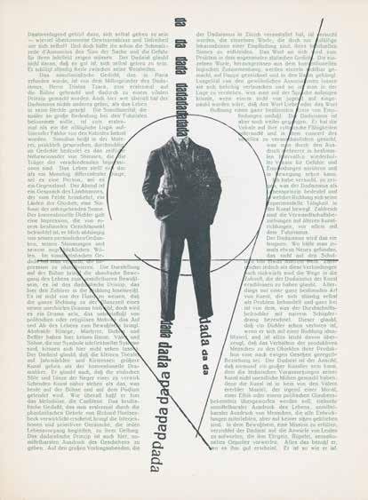
dada–constructivism ; The Janus Face of the Twenties, Annely Juda Fine Art, London, 1984
This is a preliminary and tentative investigation of a subject that needs closer attention than it has so far received: the relations between Dada and Constructivism. It is not difficult to see why this topic has engaged neither the attention of historians of Dada nor of Constructivism, except in special cases where there is an obvious overlap – that of Theo van Doesburg and his rogue review Mécano, for instance, or of Kurt Schwitters. Dada and Constructivism have at best been seen as the opposing poles of the international avant garde in the period immediately following the First World War. This view has been reinforced by the insistence on the Dada-Surrealism inheritance, with Surrealism’s well-known antipathy to most forms of abstraction, an antipathy which has, with a certain justice, been mapped back onto Dada. But Dada has not always been granted the status of an ‘opposing pole’ to Constructivism, and has quite frequently been presented, often by Constructivists, as performing something of the role of an enema, a destructive but cleansing convulsion preceding the great task of reconstruction. In 1922 El Lissitzky and Ilya Ehrenburg wrote in an editorial in the first issue of their review Veshch/Gegenstand/Objet: ‘The negative tactics of the “Dadaists”, who are as like the first futurists of the pre-war period as two peas in a pod, appear anachronistic to us. Now is the time to build on ground that has been cleared.’1 Naum Gabo even denied Dada a separate identity, presenting it rather as the death throes of the Cubist revolution:
There were moments in the history of Cubism when the artists were pushed to these bursting points; sufficient to recall the sermons of Picabia 1914–16 (sic), predicting the wreck of art, and the manifestos of the Dadaists who already celebrated the funeral of Art with chorus and demonstrations. Realising how near to complete annihilation the Cubist experiments had brought art, many Cubists themselves have tried to find a way out… Our generation did not follow them since it has found a new concept of the world represented by the Constructive idea.2
More recently critics have recognised the positive and radical nature of the Dada challenge: ‘During the First World War the Dadaists had initiated an international movement that subverted the traditional categories and supposed “laws” of art. With the conclusion of the War, it seemed imperative to many artists that the dada critique be accepted and the laws of art reformulated from firm and objective bases.’3
It is possible to take this point further, and see the Dada critique not only as a crucial precedent to the objectives of International Constructivism but to see Dada as a continuing and active force in its own right during the early 1920s.
Richard Sheppard ends his thorough chronology of the Dada movement with two events, both of which took place towards the end of 1924: the publication of the First Surrealist Manifesto by André Breton, and the closure of the Bauhaus in Weimar (it was to move to Dessau in October 1925).4 Both of these events then, standing apparently at opposite ends of the artistic spectrum, were of significance in relation to the cessation of Dada activity. By then, most Dada artists had already or were soon to enter into other allegiances. Dada’s permanent state of ironic revolt was impossible to sustain, and yet most Dadaists remained nostalgically loyal to it. Jean (Hans) Arp wrote in 1927: ‘dada is the basis of all art. dada is for the senseless which doesn’t mean nonsense… i exhibited along with the surrealists because their rebellious attitude toward “art” and their direct attitude toward life were as wise as dada.’5
2 Naum Gabo, ‘The Constructive Idea in Art’, in J.L. Martin, Ben Nicholson, Naum Gabo (eds), Circle: International Survey of Constructive Art, Faber and Faber, London, 1937.
3 Bann, op. cit., p.51.
4 Richard Sheppard (ed), ‘Dada: A Chronology’, New Studies in Dada: Essays and Documents, Hutton Press, Driffield, 1981.
70 dada–constructivism
In spite of the fact that Arp exhibited at the first Surrealist exhibition in 1925, La Peinture Surréaliste, his continued relations with Constructivists confirm the strength of the links Constructivism once had with Dada. In 1924 he collaborated with El Lissitzky to write the first ‘dictionary’ of modernism, The Isms of Art, and towards the end of the decade worked with Van Doesburg and Sophie Täuber on the Aubette café in Strasbourg. None of them compromised their style and the now destroyed café, its severe geometrical designs side by side with Arp’s free organic forms, stood as a memorial to the creative oppositions and collaborations between the two movements. While Arp joined the Surrealists (although this barely affected his work), Hans Richter, a fellow Zurich Dadaist, took the opposite path of Constructivism. He still saw Dada as an essential element though, in the constitution of the review he founded in 1923, G.
G as it finally appeared had the traits of Dadaism as well as of Constructivism, two seemingly unrelated movements. It offered articles by Mies van der Rohe as well as Tristan Tzara, by Gabo, Pevsner, Malevich, Lissitzky, Doesburg as well as by Arp, Schwitters, Hausmann, George Grosz, Man Ray. The fact is that the tendencies of Constructivism, or more generally speaking of structure, appeared in Dada itself; though they were not, as in Russian Constructivism, a programme or the single aim of Dada. Dada as a movement had no programme. But the tendencies for an order, a structure, appeared nonetheless as a counterpart to the law of chance which Dada had discovered. In this way the Constructivist involvement in Dada and vice versa may be understood. That is how Doesburg from De Stijl was at the same time a Dadaist. Eggeling made his Generalbass in Dada times, Richter’s black and white counterpoint and even Duchamp’s discs and ‘roto-reliefs’ (all with structural tendencies) were connected with and appeared in Dada. The aims of the new and unrestricted (Dada) and the aims of the enduring (Constructivism) go together, and condition each other. To embrace and integrate these two tendencies was the purpose of the magazine G. 6
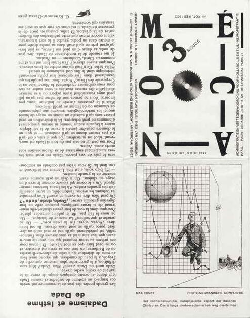
Mécano No.3 Red, Leiden, October 1922
Unfolded sheet: 32 × 50 cm | 12⅝ × 19¾ in

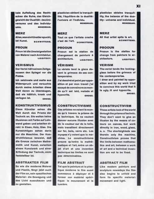
 82 Pages x–xi from Arp and El Lissitzky, Die Kunstismen 1914–1924, 1925
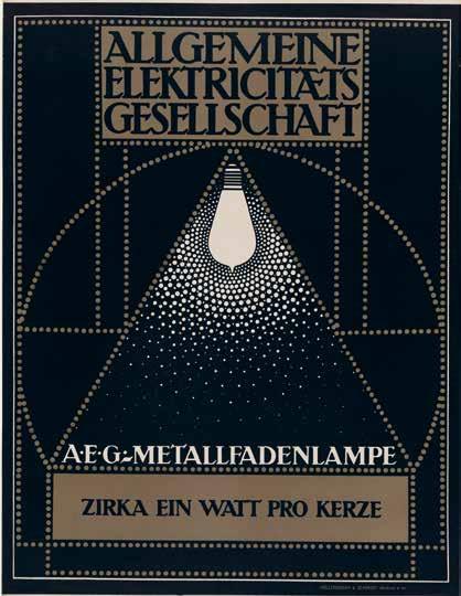 112 Peter Behrens aeg – Metallfadenlampe (aeg – Metal Filament lamps), 1907 Lithograph
In 1936 Alfred Barr opened his book Cubism and Abstract Art with a comparison of two posters. Both were produced to advertise the 1928 international exhibition of printing held in Cologne. Barr’s purpose was to draw attention to the contrast between the ‘fairly realistic poster style common to mediocre travel posters the world over’, of the one, and the ‘simplicity and abstraction’ of the other.1 Here, the ‘natural objects are reduced to flat, almost geometric forms arranged on a strongly diagonal axis under the influence of Russian Suprematism’. The reason that two different posters were produced was that they were intended for different markets: one for the Anglo-American, ‘accustomed to an overcrowded and banally realistic style’, the other for the German public, which, ‘through the activity of its museums and progressive commercial artists was quite used to an abstract style’. For Barr, the superiority of the formal, abstract poster was self-evident. He ends his comment by saying: ‘Today, times have changed. The style of the abstract poster, which is just beginning to interest our American advertiser, is now discouraged in Germany.’ Later in the book he comments on the political cause of this discouragement, the rise of National Socialism.2
Certain assumptions in Barr’s pictorial preface are worth spelling out. Firstly, the status of the poster: it is treated not as a secondary art but as an art form in its own right, like painting, photography, theatre, film. In his catalogue of the exhibition that the book accompanied he lists the
category as ‘typography and posters’. Secondly, there is the implication that, while the simplicity of the abstract poster was good in itself, it was particularly good in a poster where the need for simplicity had long been recognised as intrinsic. The question might arise as to whether an abstract poster is necessarily simpler than a figurative one – look at the radical simplifications of the Beggarstaffs (the pseudonym used by British artists William Nicholson and James Pryde), for example. The difference here is that the simplicity of Barr’s poster is based upon abstract geometrical principles independent of the subject depicted, and the complex of ideas underlying Barr’s prejudice will be examined in detail later. He implies that the more abstract design is more functionally effective than the other. Because the result of the abstraction in this case is to focus attention on the typography, it is of course especially apt, given that the poster is advertising an exhibition of modern printing. But Barr would clearly favour an abstract design, whatever was being advertised. When he uses the term ‘abstraction’, in this case, he does not in fact mean total nonfiguration. Although it is doubtful whether an Anglo-American audience would recognise in the triangular shapes a ‘reduction’ or ‘abstraction’ of Cologne cathedral’s twin towers, the fact remains that these geometrical shapes retain an element of figuration, however reduced, which has the function of keeping them distinct from the typography. But many posters in the 1920s and 1930s did use totally non-figurative designs. Does this mean that the poster image as distinct from its typography ceased to function? In other words, that in so far as it was abstract it became simply an adjunct to the typographical message?
I would like to look at the question of function and abstraction in poster design in the first three decades of the twentieth century, and to consider the ways in which the main movements within modernism influenced and absorbed the poster, and reciprocally to what extent they fed off it. To focus on these questions and narrow my argument to those
2 Barr discusses the contradictory ways in which abstract art became involved in politics, with, for example, the Nazis suppressing abstract art and international style architecture while fascist Italy welcomed them. A footnote was added, as the book was going to press, on the refusal of us customs to allow in, as art, 19 pieces of sculpture that were to be in the exhibition, because they did not represent a human or animal: ‘This essay and exhibition might well be dedicated to those painters of squares and circles… who have suffered at the hands of philistines with political power.’
114 function and abstraction in poster design
posters directly or indirectly connected with modernism and its roots is, obviously, to look at only a tiny fraction of the total poster production of this period. Whole areas have to be excluded, including historical and political events that spawned innumerable poster campaigns such as the two world wars. However, the inquiry will necessarily involve sociopolitical and historical issues given the interdependence of the poster and society. Why, for example, was the Anglo-American market, as Barr describes it, resistant to or ignorant of abstract design? What contributed to its success in Europe? Barr’s optimism about the arrival of an abstract style in American advertising was to be short-lived. The Second World War brought to an abrupt end experimental graphic design and before the war, in Germany, the Nazis had condemned modern typography and returned to black letter gothic. On both sides, Axis and Allies alike, a conservative realism (which had of course always coexisted) swept across the entire field of poster production and more or less eliminated the abstract-constructivist style. It is, incidentally, a significant comment on the divided nature of poster studies that the literature on Second World War posters often entirely ignores this remarkable fact, leaving out the way a poster looks altogether. Although the poster has its own history and conditions, it tends to be treated in different ways according to the discipline involved: as an illustration of social or political history, as an aspect of the history of marketing and advertising, as a branch of art and design.
The poster had, during the period I want to discuss, a spectacular energy, and this energy has never really been recovered since the Second World War. Its conditions had changed for good. The poster belongs to a specific phase in the age of mechanical reproduction: for 70 or 80 years it was the most conspicuous, accessible and familiar form of pictorial production. After the First World War it was joined by the film and the illustrated weekly paper, which had, in El Lissitzky’s opinion, triumphed over the easel picture. ‘The invention of easel pictures produced great works of art, but their effectiveness has been lost. The cinema and the illustrated weekly magazine have triumphed.’3 For a while the poster was the ally and support of the cinema. But it was eventually displaced by
3 ‘Our book’ (1926), in Sophie Lissitzky-Küppers, El Lissitzky, Thames & Hudson, London, 1968, p.361.
336 top: Max Ernst

Lesson in Automatic Drawing (The Magnet is Close No Doubt), c.1923

Pen and ink on paper
17.3 × 169 cm | 6¾ × 66½ in
bottom:
Max Ernst
Lesson in Automatic Drawing, c.1923

Pen and ink on paper

17.3 × 169 cm | 6¾ × 66½ in
337
different methods, equivalent on the one hand to automatic writing – ‘the Surrealist method’, on the other to the ‘récit de rêve’, the dream narrative. In the untitled drawing, there is a freedom in the line, which wanders or jerks across the paper, sometimes resolving into the image of a person or thing but often remaining just a mark, while in L’aimant est proche a succession of images unrolls, leading from one to another in an unexpected and irrational way which is more like the progress of a dream. If this is the case – and it is only a supposition – the difference would be that these images pre-exist, and the drawing is intended to make them visible. The first, untitled, drawing is closer to André Masson’s automatic drawings, one of which was reproduced in the first issue of La Révolution surréaliste. Both Masson and Ernst allude to time through the process of drawing, making the progression of line and its metamorphosis very visible. The difference between these and L’aimant est proche is illuminating for the problem of Surrealism and the visual arts as Morise saw it. Masson’s drawing begins without a consciously preconceived subject, and allows any external references to emerge as the lines suggest them (if they do). In other words while Masson’s drawing follows the free play of thought, Ernst’s L’aimant est proche (if it is following a dream) is trying to capture images from memory. Given the nature of his argument it is striking that the automatic drawing Morise chooses to illustrate his article is one of the most abstract Masson ever made.
Breton took control of La Révolution surréaliste in July 1925 and started to publish his essays on Surrealism and painting, which were a response to Morise and to the even more negative position of Pierre Naville who denied there could be any such thing as ‘surrealist painting’. 24 Breton mentions and then glides over the controversy about the incompatibility of painting dreams, in which the image pre-exists, and the ‘Surrealist method’ of automatism, simply fastening on the ancient need to ‘fix’ images. ‘The need to fix visual images, whether or not these images preexist, has manifested itself throughout time and has led to the formation of a real language which seems to me no more artificial than the other one…’25 Painting was thus re-established as an echt (real) Surrealist activity, though no rules were laid down.
24 Pierre Naville, ‘Beaux-Arts’, La révolution surréaliste, no.3, April 1925, p.27; ‘Everyone knows now that there is no such thing as surrealist painting.’
338 dreams in surrealist discourse
The debates culminating in Breton’s ‘Surrealism and Painting’ were the background to Photo. Though there is no doubt that Miró took his own route, he was aware of the rich Surrealist discourse around the problem of translating into visual terms dreams, daydreams, and unconscious thought. Morise had begun to question the problem of the ‘dream image’, which was essentially still considered in terms of rather than opposed to automatism. Much later, in ‘Artistic Genesis and Perspective of Surrealism’ (1941), Breton contrasted the (still essential) automatism with the ‘other road available to surrealism… the stabilizing of dream images in the kind of still-life deception known as trompe l’oeil (and the very word “deception” betrays the weakness of the process), has been proved by experience to be far less reliable and even presents very real risks of the traveller losing his way altogether.’26 The ‘dream painting’, in 1925, was not yet the popular metaphor for visual Surrealism.
In 1925 Miró began the series of paintings on a blue ground, so blue as ‘the colour of my dreams’ is also the colour of his paintings. He did not otherwise add words to his ‘blue’ paintings. Blue seems to have a natural affinity with dreams: the ‘blue sun of dreams’ as Aragon said.
The writing on the canvas in Photo: ceci est la couleur de mes rêves is more carefully lettered than in any of the other ‘poem-pictures’, which has the paradoxical effect of on the one hand underlining their graphic nature and on the other the divorce between line/word and colour. It is as though Miró is meditating on the Surrealist tendency to give the word primacy over the image. In ‘Une Vague de rêves’ Aragon describes the ‘nature of the troubled mental states brought on by Surrealism, by mental fatigue, by narcotics, and the way these resembled dreams and mystical visions together with the semiology of mental illness’ which ‘led us to evolve this proposition which, alone, can explain and link all these factors: the existence of a mental substance.’ Eventually, he says, ‘it gradually dawned on us that the mental substance described above was, in fact, vocabulary itself. There is no thought outside words: the whole surrealist experience evidences this proposition…’27
25 Breton, ‘Le surréalisme et la peinture’, La révolution surréaliste, no.4, Paris, 16 July 1925, p.26; Breton’s articles on Surrealism and painting were published as a book Le Surréalisme et la peinture, nrf, Paris, 1928.
26 Breton, Le Surréalisme et la peinture, Gallimard, Paris, 1965, p.70.
27 Aragon, op. cit., p.7.
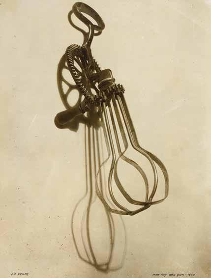 554 Man Ray Man and Woman, 1918/1920
Gelatin silver prints
Left: 38.8 × 29.1 cm | 15¼ × 11½ in Right: 43.7 × 33.5 cm | 17¼ × 13¼ in
