Architects receive a lot of professional press periodicals (or we used to before they started only sending out digital simulacra of their magazines), which feature building projects that suit the editors’ sense of what’s considered excellent at the moment. But the trends of the moment are not our mission here, instead we’re interested in the 95% or so of buildings that, by and large, never make the cut of being considered notable. This is everyday architecture in the USA, the unsung and ubiquitous masses of buildings that line our streets and parking lots.
Is it fair to call this a vast wasteland? That memorable phrase was originally coined as an assessment of the television fare in 1961 by Newton Minow, then chair of the Federal Communications Commission. (And despite a choice of thousands of channels and services instead of four—vast indeed—on balance one might well say the same today.) In any case, a lot of what we see or, more to the point, usually fail to see on the way past, is pretty bad. Certainly not all of it; there are workmanlike buildings that do a good job of filling in the background, and there are occasional gems that get to be center stage for a while. While these deserve our admiration, the rest deserve a fair measure of dismay.
We do tend to look past all the rest; it becomes a blur, failing to garner our attention and often deservedly so. If we’re in the suburbs, we’re likely to be driving past at a brisk pace so there’s hardly an opportunity to observe in any case. And in the last analysis, such observing of the built environment is simply not in the nature of most citizens’ way of life anyway; like the frog in the pot with the water getting gradually hotter, we’ve gotten used to things and simply don’t notice how bad the built environment has become.
ORO Editions
introduction: a wasteland
So, let’s have a look, principally in the darker reaches of ordinary, everyday American suburbia, at several types of everyday architecture. Except for the mega-scale of shopping centers, malls, and hospitals, these tend to be stand-alone buildings. Some of them, to be sure, are pretty big, but most sit in the streetscape or the landscape with space all around them, which is often asphalt paved. Some of these building types will also be found in the centers of cities, where property values will have reduced, if not eliminated those peripheries. Out in suburbia, though, most of them assert a very American quality of independence, each, as Harold Hill the Music Man said of each bassoon, having its big fat say. But, as Don Alhambra in Gilbert and Sullivan’s “The Gondoliers” would have it, “when everyone is somebody, then no one’s anybody!” Or in more urbanistic terms, buildings in the ’burbs line up with little sense of ensemble or context, each an ill-formed, isolated statement, ending up a sort of vague built chaos. With some trepidation, let’s check them out: we may even uncover some everyday work done well, diamonds in the rough out there in the wasteland.
?
ORO Editions
2.1
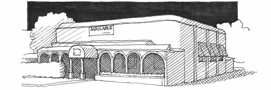
“Available:” Since demolished.
2a. Restaurants, Bars, and Breweries
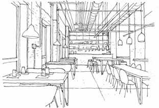
Good restaurant architecture turns out to be oddly hard to define as such. Not long ago, a local favorite closed because the owners decided they had become too old to keep it going. On the outside one could discern, barely, the bones of a shabbily stylish roadside eatery from long ago (Fig. 2.1), and an appraising eye could find much to criticize on the inside as well. One might offer that a fine menu was its saving grace, or that the loyal and friendly staff was exceptional, but there was yet more to it. The rather too small wooden booths enforced a congenial intimacy, as did the two little curtained mini-rooms in the corners, along with warm colors and finishes, a big mirror, and subdued but not too subdued lighting. All were elements of interior happenstance that helped contribute to a pleasurable dining experience. Hard to define, indeed, and to be sure, architecture is but a part of the equation, but it does have a crucial part to play in such one-off dining establishments, for better or worse. One-of-a-kind restaurants often share one characteristic that chains often do not: inadequate acoustic mitigation. Whether this is due to a pressed tin ceiling or to the fashionable lack of a ceiling, the outcome is the same. One is forced to conclude that the resulting din is misperceived as a signature of popularity; that we are in the right place with the right people, so we are all having a good time talking louder and louder to be heard because everyone else is doing the same. (That’s even a thing technically, something called the “Lombard Effect.”) It’s true, though, that the management at such places sometimes have second thoughts as a result, evidenced by added-on panels of foam or of something or other to be seen or found on the deck or the walls or the undersides of the tables and chairs. Generally, these are not going to help very much, for better acoustically absorptive products are what’s needed, and in larger areas. But acoustic ceiling panels are evidently seen as outmoded, since it appears that we prefer to see the ducts and wires and bar joists and corrugated deck and concrete, paying homage to the fact that we’re tough and we don’t need any mollycoddling, we’re urban and urbane and love the ugly, unfinished nature that much of urban redevelopment now seems to entail (Fig. 2.2).
ORO Editions
Or something like that; the ultimate motivation seems hard to pin down. There’s “let’s play house in this old garage”; indeed, maybe it harks all the way back to childhood, hunkering in packing crates or under a card table with a sheet over it. And it may play into a parallel motivation on the part of the developer to spend as little as possible on a new venture, for it can sometimes seem that little more than a coat of paint and a building permit were involved. Well, there is the grease trap, potentially a deal killer for any such business expecting to deal with grease in the menu, which most will. The general trend to faddishly dingy may, in interior design terms, date back to the decline of heavy industry, with big old mills and warehouses newly empty and available for relatively inexpensive adaptive reuse. It was what developers eventually did, and the designers and the public followed suit with buy-in. (That is not to gainsay the fact that some such empty mill buildings took a very long time to get repurposed, or the fact that some such renovations were indeed very well done and far from inexpensive.)
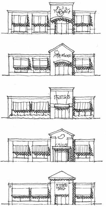
And then there are the chains: Hard Rock Café, TGI Fridays, Texas Roadhouse, Red Lobster, Chili’s, Applebee’s, Cracker Barrel, Olive Garden, Outback Steakhouse, Cheesecake Factory, and the rest, those said to be among the 25 most popular chain restaurants (Fig. 2.3). One feels a little queasy after such a list, perhaps needing an Alka-Seltzer. Architecturally their recent fates are similar to those of other stand-alone outfits, regarding the general adoption of an efficient rectangular solid with an armory of embellishments brought to bear to distract some attention from this fact. Also likewise, a polite and slightly overstuffed modernism prevails, somewhat emulating the customers in those regards. Specialized chains do have their variants—a shingled Red Lobster, a rubbly Olive Garden, a tin-roofed Roadhouse—some being more successful than others in their thematic scenography, a significant aspect of architecture being, after all, about mise en scène
Beyond such furbelows, though, the architecture of the chains arises from standardized designs produced with no knowledge of an ultimate site, the results thus being relentlessly generic and object-centered, contributing to a nationwide suburban site planning default of boxes in rows that demean exterior space instead of defining it. Among the chains, Cracker Barrel gets some sort of venture planning prize for its cheap frame boxes that actually look pretty good, its store full of things no one needs that one must struggle through on entry or exit, and its unchallenging menu of comfort food. Working fireplaces! Generously scaled restrooms! They’re so popular
ORO Editions
Hints of similarity among the chains.
3a. Branch Banks
Branch banks seem more than a bit vestigial nowadays, what with so many transactions taking place in the digital world of the not exactly real. But brick-and-mortar branch banks are still around, and oddly enough still being built, sometimes by Johnny-come-lately outfits such as the 10th 11th bank or the northeastern southwest bank. Collectively branch banks aren’t quite as objectionable in architectural terms as some other everyday architecture types, and there are definitely some things of interest, both pro and con, to be pondered.
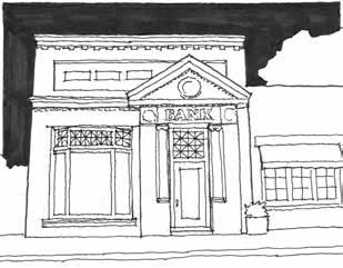
Long ago, banks were designed to project solidity and security (Fig. 3.1). But at some point, things changed and a sense of friendly accessibility became the norm, or at least the norm to be attempted, and a bank’s branches were the main conduit for this effort at make-believe. That trend has continued to the present day, one result being attempts to demolish the perceived standoffishness of the teller line. Originally featuring “teller’s cage” grilles, then a glass barrier, and then just a counter, the line is gone altogether in some newer branches, with banking associates (no longer mere tellers) now standing at freestanding stations which the customer sidles up to as if ambling in from the marts of trade to share a tall tavern two-top.
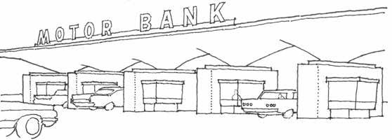
A unique element of branch banking that’s had a strong architectural impact has been the drive-through. Branch banks per se having originated in the ’20s, the first drive-throughs were pioneered in the USA in the ’30s, becoming widely popular by mid-century (Fig. 3.2). In larger such installations of several lanes, each lane had a sleek little kiosk with a sleek little teller inside, right there in the drive-through. And in some cases, reportedly, each had a steep little stair to a secure little tunnel leading under the driveways to and from the bank. We still see money changer personnel in glass boxes at parking garages and turnpikes, but at branch banks, not so much: while they persisted into the ’60s, they were rendered obsolete by the pneumatic tube systems we see today. Well, we didn’t so much see those at first because they went back to the inside teller underground where all self-respecting outdoor utilities should reside. But, just as with phone lines and power lines and cable lines, they’ve ended up overhead, snaking around in a nakedly exposed fashion, back to the person behind the bullet-resistant window at the first drive-through lane. And now even that window’s gone since, in many cases, that person is too busy manning a two top inside, so it’s all about cameras, which we’re all not so happy to have still embedded in our lives since we got so sick of them in 2020. And even the drive-throughs, which did ultimately make the branch bank interiors a bit desert-like, have themselves been used less and less due to the ATM, first the walk-up variety and then, naturally, the drive-past variety. And even those are being a bit sidelined by the mobile app-iness of online banking.
ORO
3.2 A branch bank drive-through from 1959.
3.1 Small town bank as anchor of neoclassical stability.
3.3
Some branch banks embodying midcentury and late-century modernism.
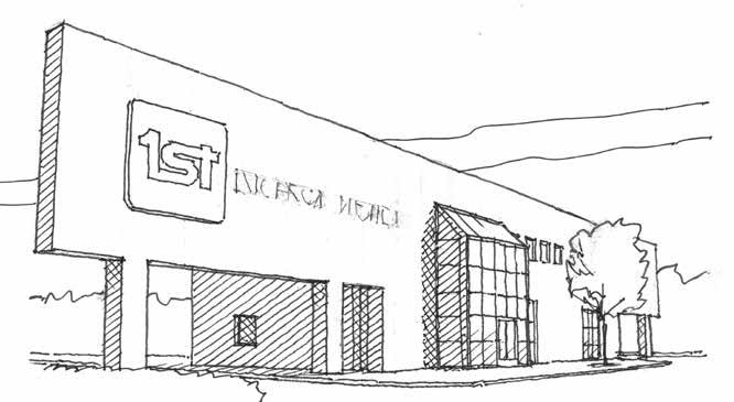
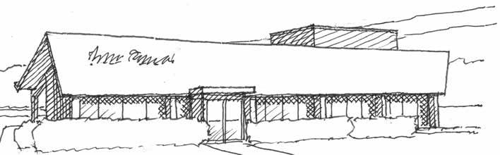
Regarding their architectural qualities, some pretty snazzy modernist branch banks made their appearance in the ’50s, a setting of trends which some enlightened designers have managed to emulate to this day (Fig. 3.3). But this is not to imply that the average branch bank nowadays is all that snazzy; indeed, it is rather likely to have been suited up in pseudo-Georgian duds. Comments herein under the heading of the “McMansion” regarding columns, pediments, and windows apply here as well; even more pertinently, in fact, as there never were neoclassical precedents for a branch bank. The drive-through is particularly difficult to pull off from an historicist perspective, giving the game away as they tend to do when the roof invariably cantilevers beyond the last pair of columns, themselves generally being too skinny, too far apart, or both (Fig. 3.4). Another sticking point on the branch bank exterior that occasionally appears is a particularly
inventive treatment of the keystone: it shows up as usual at the top of a round arched window (archtopped windows subtly alluding, perhaps, to the virtually sacred place of money in society), but sometimes, apparently of the view that the more is the merrier, also at the base of the arch (Fig. 3.5).
This odd and deeply wrong use of the keystone shape was probably resorted to when the voussoir brick rimming the arch came to a stopping point and the designer was at a loss as to what should go next, and what a handy economy it must have seemed to use the same precast shape three times per window. All of which is to say that “traditional” branch bank exteriors of current times, trying to project solidity and security in a sort of weak-willed return to first principles, don’t do a very good job of it architecturally. Reasons for this would include the difficulty of translating the historicism of a downtown bank to the suburban reality, but also the apparent
ORO Editions
4.1
Some period styles of the ‘20s. Above: Colonial Revival, Spanish Revival, Craftsman. Below: Italian (or Mediterranean), Dutch Colonial, Tudor.
4a. McMansions: The Settings
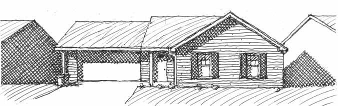
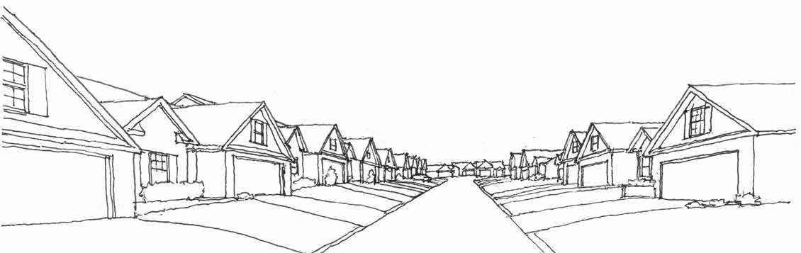
Most would agree that the centerpiece of this taxonomy of everyday architecture would be the suburban house. It feels a little shameful to be writing critically about these because it’s a bit like shooting fish in a barrel, really: there are so many things wrong, and so many of them that are painfully obvious. But apparently these aren’t that obvious to builders or buyers. Well, that’s an elitist statement, to be sure, but one is led more or less unavoidably to that conclusion. True, maybe buyers have little choice and make the best of a bad deal when it comes to the suburbs-- one has to give them that. Suburban residential development—sprawl—arose from a complex combo of land value, population growth, desire for more space, desire for better amenities, the car’s ascendance—a bunch of issues. The deed is done, the burbs are here, and our mission now is simply to call out the bad to worse aspects that are ubiquitous in every city and town, in every state in the union, of millions of unaccountably bad houses.
The Type
A Field Guide to American Houses, by Virginia Savage McAlester, has been a remarkably useful and comprehensive classic since its first edition in 1984, with Lee McAlester. Its 2015 edition features significantly expanded coverage of metastatic variants on the American single-family house from the ’90s to the present, and one defers to that edition for its efforts to taxonomize American house types and subtypes of that period. The emphasis here, with some digressions, will be on the particular “style” known therein as “Millennium Mansion,” or elsewhere by the more widespread sobriquet “McMansion.” An internet resource defines the latter as “a large modern house that is considered ostentatious and lacking in architectural integrity,” a sentence elegant in the simplicity with which it sums up the two overarching negative attributes of millions of American homes.1
The above reference to a taxonomy suggests that the conundrum of the recent American house is a more complex animal than this one type. But the McMansion is its most visible and, indeed, its most readily critiqued manifestation. One surely hopes the view that its reign is in decline is correct, but despite such a development, the damage done remains extant and its impact widespread and long lasting.
Origins
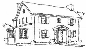
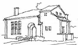
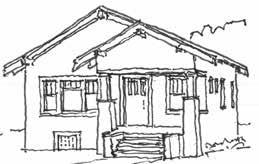
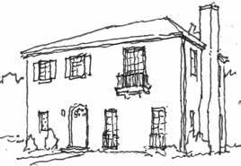
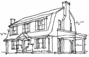
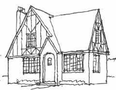
To set the stage, one recalls the heritage of styles from Europe, including Tudor, Mediterranean, French, and neoclassical variants, that joined Colonial Revival and craftsman styles from new world precedents in the form of the period revivals that populated the suburbs of the ’20s (Fig. 4.1). While these styles weren’t perfect, they were pretty good, achieving attractive, varied, well-proportioned, and
ORO Editions
1 A website titled “McMansion Hell,” if still online, is worth checking out for some sharp commentary as well as some appalling images of the type.
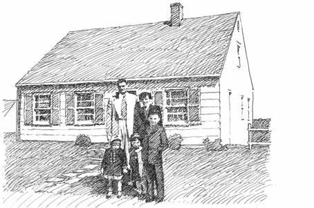
comfortable approaches to modest single family residential design, equipped with dependable sets of well-honed design specifics. But by the ’30s, Europe had also spawned the advent of modernism in architecture, and this, along with the Great Depression and the impact of World War II, changed everything. The depression brought an end to the heyday of the period styles, and the war led in turn to mass housing estates of small, simple houses, often in the austere Cape Cod mold (Fig. 4.2). At the same time, the architectural profession was newly in thrall to the so-called International Style, arising most famously from the work and influence of Le Corbusier, Walter Gropius, Ludwig Mies van der Rohe, and their acolytes. So, demand for the period revivals— embodying convincing and deft designs drawn from informed knowledge of historical precedent— died out to no fault of their own, new house construction was simplified for economy and minimally embellished, and the profession left it all behind in any case for this new mistress. By the ’50s, residential architecture in America had sort of lost its way.
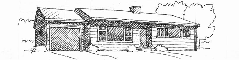
Since the ’30s the streetcar suburb had been replaced with the automobile suburb, and it was no longer necessary to walk to work or to the streetcar because we now had the privilege of getting out the car and driving to every single thing we needed or wanted to do. And as the ’40s became the ’50s and ’60s, consumers wanted a step up from wartime austerity, and in large part the effect on the little Levittown Cape Cod was to stretch it laterally, with the “rancher” and its variants eventually cropping up throughout much of the nation (Fig. 4.3). It’s true that some architects did some fine work in their preferred hothouse version of modernism (witness California’s “Case Study Houses” as one set of examples),but architects were increasingly regarded as a luxury, hired by the privileged rather than the masses. Developers did make some inroads into mass market versions of what became known eventually as mid-century modern, Eichler Homes being one example, but their innovations were in the minority.
4.3
4.2
A Cape Cod house in Levittown, NY.
4d. Smaller Houses in the Burbs
Much sound and fury having been expended herein on the McMansion and its ilk, it’s only fair to turn one’s attention to smaller houses of current and recent times; after all, it’s a rather limited demographic that can afford the questionable judgment to McMansionise. There are lots of smaller homes for the smaller budget, though they often also aspire, rather futilely, to the McModel and its image of “gracious country living.” But in the case of a starter home—the young couple having bravely moved up from the apartment to something barely detached—it seems that little in the way of graciousness can be afforded among what is on offer (Fig. 4.15). A not uncommon version of the not so big house gets the deserved sobriquet of a “snout house,” wherein the requisite two car garage not only takes up more than half the façade but thrusts proudly forward, resulting in neighborhood enfilades consisting of little more than garage doors (Fig. 4.16). This happens because the garage remains firmly embedded in the front of the house rather than being detached and facing an alley instead, as was once the rule rather than the exception in such developments.9
9 Is the entry experience from the garage into the laundry room really preferable to a brief trip back outdoors via the back yard? Evidently, yes, and one can’t really gainsay the advantages of avoiding such a trip in rain or snow, even though the attached frontal garage is perhaps the biggest stain of all on the recent domestic streetscape. Some recent developments would have a two-car garage facing an alley while featuring an accessory dwelling unit (ADU: for mother-in-law, rental, etc.) on the floor above: this idea, codes permitting, sweetens the pot of that approach.
ORO
4.15 Starter homes.
4.16 Snout homes.
4.17
Craftsman redux, Farmhouse, Contemporary.
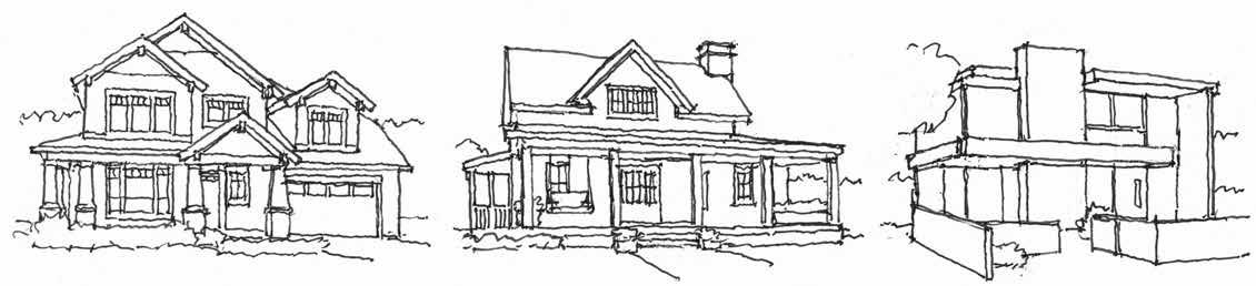
Of course, style remains a subject of interest, with “craftsman” and “farmhouse” designs having grown in popularity, and it’s fair to say this is a good thing, at least sometimes. But stylistic excesses remain, as in some over-decorated “Victorian” or Spanish Revival models, their reliably good features having often been misapplied. And then there is the style of modernism, for it is a style as well, and not the manifest destiny of all buildings henceforth as some schools of thought would have it (Fig. 4.17). Modernism has its roots in singular structures, sculptural objects on display in the garden, and just doesn’t adapt all that well to ensembles, which is what houses in the burbs are, being lined up in rows. We speak not of mid-centuryism with its sheltering low-rise gables, but of the requisite modernist signatures of flat or shed roofs, appliqued siding in very light and/or very dark and neutral tones, and large areas of glass: difficult, really, to get right per se, not to mention in a context of more of the same.10
Again, often enough the floor plans for these smaller places cling to McMansion aspects, such as a fat footprint that leaves half the interior largely in the dark. Pointless 45-degree angles may also plague the layout. Sometimes there will be “vaulted” or “tray” ceilings, which will require custom framing both for the ceiling vault and the roof above, added costs among the many which account for the sticker shock level of recent, presumably modest single-family housing. Two stories are not uncommon among such smaller houses (“smaller” being a relative term), and given the typically reduced width of the site, proportions in front can get a bit teeter-y. Taken to extremes, as things always will be somewhere, they can get downright bizarre (Fig. 4.18).
10 Realtors call recent such designs “contemporary,” relegating the term “modern” to those of mid-last-century.
ORO Editions
4.18
Some extreme narrow housing (in Chesapeake, VA).
5.1
Once the Forward Look, now the Angry Look.
5a. Cars and Their Domains
Why in the world would cars be included in a discussion of everyday architecture? Well, the latter phrase does mean something like “man-made constructions we get inside of daily,” so in that regard you could say that cars qualify. Americans spend an average of an hour a day behind the wheel: they’re a place of habitation. And the average car thus spends 23 hours a day sitting still and being available for admiration (or ridicule).
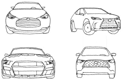
Most everyone has an opinion of one kind or another about cars. Just as with non-mobile architecture, these may well include thoughts on quality, cost, and style. And while architecture buffs are likely, often as not, to be architects, car enthusiasts are everywhere. But there’s a foundational thing about cars nowadays, and it’s this: as a group, they’re just not very cool anymore. Many are chunky, lumpy, and downright angry looking (Fig. 5.1). Maybe the wide-open mouth-grille with all the teeth and the squinty little headlight eyes are attempts to look cool, but they succeed mainly in looking terribly out of sorts.
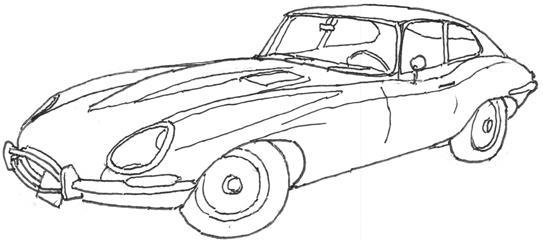
Cars, at least some of them, once seemed effortlessly stylish. One fondly recalls the debonair Studebakers and Kaisers, Chrysler’s sleek (if flawed) “forward look” models, and the not-yet-eroded grace of the earlier ‘Vettes and Porsches. Indeed, the best-looking cars ever made, though they were admittedly oh, so impractical, were roadsters. Everyone will have their favorites, such as the earlier Boxsters, Miatas (when they still had the flip-up headlights), the MGs, and the Jaguars (the XK-E allegedly deemed “the most beautiful car even made” by Enzo Ferrari) (Fig. 5.2).
5.2
The XK-E.
ORO Editions
5.3
The tipped-down aesthetic
Flashes in the pan like the Avantis and Pacers, fine and not so fine cars respectively, were good-looking while they lasted. Readers, style experts all, will have their own choices for such a list. There’s no denying that older production-line cars that were superficially stylish usually weren’t very good in quality terms. That helped Japanese imports to help eviscerate the big old carmakers, the crash of 2008 providing the coup de grâce, and the industry in the US never really fully recovered. Style never really recovered either.
What happened to style, anyway? Did the advent of compacts and subcompacts inoculate the public against their cramped little interiors, driving everyone to minivans and SUVs?1 SUVs have worse fuel efficiency than smaller cars, their higher center of gravity increases the risk of rollovers, their higher front-end profile makes them twice as likely to kill the pedestrians they hit, they give a sense of security that makes for less cautious driving, and their larger mass increases their braking radius,
reduces visibility, and increases damage to others in collisions. But people feel safer in them (though they usually aren’t), they have more room (which is often unnecessary), and you can see over the tops of the other cars (although many of the other cars seem to also be SUVs).
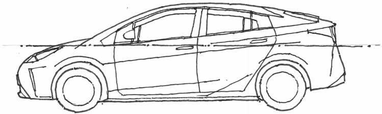
It may or may not be true, but it almost looks like the big, clumsy SUV infected the other car body types with its big, clumsy DNA: most everything has a sort of stubbiness now. Indeed, these stubby cars are remarkably similar in profile: at a glance, they all look just about the same, an optimized result of mass marketing, aerodynamics, government safety regulations, and internal space requirements for large people and their cargo. Perhaps in a failed attempt to compensate, we sometimes see the trick of tipping the side windowsill line and a crease in the side sheet metal downward going forward; maybe this is meant to make the car look kinetic and aggressive, but more generally it just plain looks out of plumb (Fig. 5.3). Perhaps the perceived stubbiness
1 And what’s the real difference between the dimensionally similar minivans and SUVs, anyway? SUVs are more equipped for irresponsible off-road driving and consumption of fossil fuels: they’re considered more “fun,” or used to be. The SUV is marketed as more macho (it is simply bolted to a truck chassis, and don’t we all want to identify with hard working real men who drive trucks and make $10 an hour) while the minivan (“mini”: little, petite, feminine) as something the little woman could drive the little league team around in. The minivan is said to have more versatile doors and storage capabilities, the SUV more power train options for storming around fragile ecosystems. Body styles have evolved and variegated to the point that some SUVs now look a lot like sedans; there’s even something called a compact SUV.
ORO Editions
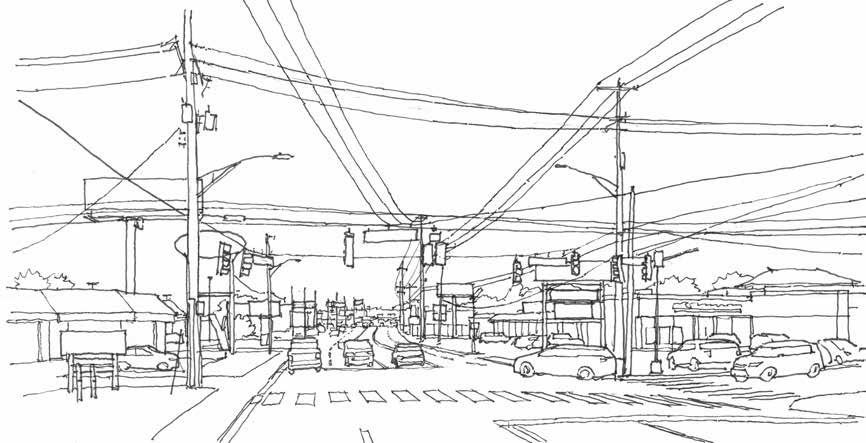
that may seem to be stating the obvious—surely we all know all about all that—but it can still be revealing to take a snapshot of the suburban commercial environment, exposing the uglification that we have become blind to (Fig. 5.6).
While in the thick of a commercial connector road, one often turns out to be negotiating a largely contiguous 300-foot-wide pavement of moving and parked traffic, interrupted only by the minimal islands and buffers required by law. Shrubs may or may not be surviving in those conditions, and trees have a way of being few and far between. To be sure, every so often the main drag is greenery-buffered, and in those cases the 300-foot-wide pavements are off to the sides where they are surrounded by big boxes and little boxes (see “Shopping Centers”). It’s even possible to drive, parallel to the main drag, from one parking lot to the next, on sort-of-default frontage roads.
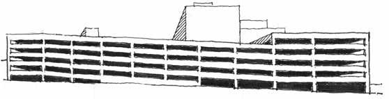
Parking Garages
Once there are more cars than can be accommodated in parking lots, we get parking garages. Generally, these are no more attractive-- in a way they are even less so, rearing up to dominate the visual field with their bulk, relieved by no hint of human inhabitation. The most efficient parking garage designs turn out to involve park-on ramped floors, and unless these can be concealed in the middle—requiring a
site that is over 180 feet wide—one side of a garage will slope, offering the exhilarating impression of partial collapse (Fig. 5.7). Parking garages present a challenge to innovative designers, and brave attempts have been made to turn them into “art objects,” hard though that may be to visualize. Once they’re built, they’re hard to repurpose into anything else, something optimistic visionaries hope will be possible once car usage actually declines, given the assorted ramped floors and floor-to-floor heights suitable for garages and little else. In some high dollar parcels, on-site parking has been put fully underground, but this is very expensive, as is the constant forced ventilation required to keep them from filling up with carbon monoxide. More typically they rise up, with open sides permitting natural ventilation and views of many shiny grilles. Occasionally they’ve been tricked out to pose as office buildings with mullions in the “windows,” but since these can’t have any glass in them, the result tends to suggest the aftermath of a fire or a looting event. To give the due to some good practices regarding parking structures, if we must have them they can be buried in the middle of a block and surrounded by retail or residential. Or at the very least, the ground floors on street exposures can be lined with retail. And even if the site doesn’t permit or call for functions other than warehousing cars, it’s possible, given a sufficient budget and some ingenuity, to make a parking garage presentable, though this remains a bit of a long shot. (Fig. 5.8).
ORO
5.6
A car’s eye view of commercial suburbia.
5.7
Other Car Places
Cars have a way of generating a whole variety of further sketchy environments, which are pertinent to the topic of everyday architecture in their own particular negative ways. Car dealerships tend to be flashy and graphics-intensive, and used car lots take that to the next level with their carnivalesque pennants and blazing illumination. There are chain emporiums that exist to take your car off your hands for fully as much as half of what it’s worth; if you’re there, you may well be badly in need of funds to deal with some other exercise in bad judgement, or simply for being stuck at the wrong end of the American dream, as so many are. The ultimate sad fate of car togetherness outside the parking lot or the parking garage is the junkyard (they may call themselves wrecker services or salvage auctions) which every urban area features somewhere. And there are car part emporiums, that turn out to be junkyards for cars that have been deconstructed, and there are fair sized graveyards devoted solely to tires. At least someone is collecting them, though tires still have a way of showing up in the ditch or the creek or put to decorative use in planting beds.
ORO
The appearance problem of park-on ramps. 5.6
Having glanced at these sad automotive end games, one feels obliged to make note of the perfectly legitimate and perfectly architecturally boring family of car care centers, auto parts stores, muffler places, oil changers, tire stores, car washes, and the like, but little more need be said other than that such places are thick on the ground, attesting to the utter prominence and dominance of the car in society. And these places need not be boring! They present widespread opportunities, so seldom exploited, for innovative design, evocative of speed (well, responsible speed) and style. Clearly it turns out to be pretty easy to complain about cars and their domains, but ultimately they deserve a sort-of nod for their undeniable appeal in terms of freedom, style, and convenience. Once the frankly absurd internal combustion engine is finally replaced, cars will be hard to beat as the nation’s conveyance of choice. And, the roads are already there, as opposed to the railroad system, which largely doesn’t exist as such, through no fault of its own. Not to mention the propensity of cars to assist in cleaning up the national gene pool, though having pointed that out may be a bit too dark even for this commentary.
6a.
Parks and Places Like Them
On the face of it, “open spaces” would seem to be well outside the purview of a book about architecture. But there are several categories of open space that are part and parcel of what makes up the fabric of urban and suburban development, and they have direct relationships with one or another of our everyday building types. And it does bears noting that they tend to come off a bit better than all those “built-space” types. The following concerns three quite different sorts of defined open space—that aren’t parking lots—found in most cities and towns.
Squares and Streets
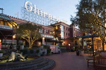
6.1 Ghirardelli Square, San Francisco: the old chocolate factory that anchors things dates from 1852, while the commercial development opened in 1964. Its spatial sequence remains hard to beat as an exemplar of urban open space design. Photo courtesy of Jamestown Urban Management.
A “town square” is something one might vaguely associate with smaller towns in less urbanized areas of the country, conjuring images of a leafy rectangular park with a Victorian era county courthouse in the middle. Many such places do exist, and towns that aren’t county seats may still feature town greens, possibly centering on a gazebo or a war memorial. But beyond this pleasant model, there’s no well-established American tradition for a central urban plaza corresponding to European precedents. Some so-called squares in American cities, such as Philadelphia’s Rittenhouse Square or Savannah’s Wright Square, are also actually parks, and while welcome respites in dense urban areas, they don’t come off as (nor are they usually meant to be) urban plazas. Indeed, numerous cities and towns have no central square at all: a lively stretch of downtown street ends up being what many Americans think of as the center of town, though streets are, after all, primarily about cars. That said, we’re glad to have such “main streets” and wish there was something like them in the
ORO Editions
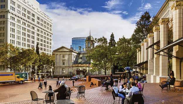
6.2 Pioneer Courthouse Square, Portland, OR. Opened in 1984, the full-block plaza accommodates a wide variety of urban amenities and events, though the large central space can seem vacant when large scale events aren’t underway.
commercial suburbs, where central spaces are likely to be nothing more than parking lots. Some streets can afford a desirable sense of place if provided with trees, attractive pavements, and amenities to serve pedestrians. Some have even been fully converted to pedestrian use and become “linear squares” of a sort.
Unfortunately, that nostalgic main street image doesn’t jibe with the modern-day reality in some downtowns where a fair share of storefronts are empty, a fate largely due to those commercial burbs. To enhance their attractiveness as places to be (and thus their commercial viability), many of those main streets could use some sort of town square-like place to focus the middle of town further. But again, the town square tradition in America is really one of downtown parks as opposed to something more like the paved plazas, market squares, and pedestrian streets of Europe. One supposes it’s partly our bad weather that accounts for this, though trees and shade structures can and do render paved plazas more livable. Paved plazas are more versatile for public gatherings such as markets and musical events, and some do exist, whether private, like San Francisco’s Ghirardelli Square, or public, like Portland’s Pioneer Courthouse Square (Figs.6.1 & 6.2).1
1 Of possible interest regarding a comparison of urban squares in the old and new worlds: the author’s book, Urban Lessons of the Venetian Squares, ORO Editions, 2022.
ORO Editions
Photo by Alamy.
6b.
Campuses and Places Like Them
The following odd cohort shares a commonality, being groupings of multiple buildings, normally found in or adjoining cities or towns, that involve a sort of symbiotic relationship with multiple associated outdoor open spaces.
Universities
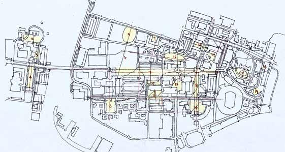
Colleges and universities across the country adhere, fairly consistently, to a “quadrangle” approach for the disposition of their buildings and open spaces. One can see precedents at places like Oxford and Cambridge where the buildings of the older colleges fully surround and define rectangular courtyards, thus resembling the cloisters of medieval abbeys. In more modern times such green squares are less fully enclosed by the buildings that define them, but the desirable sense of the outdoors as a “series of rooms” prevails, at least to some extent, some of the time. Greens or commons—larger open spaces with more irregular boundaries—are also to be found on the luckier campuses, as are elongated, axial “malls,” not to be confused with the suburban shopping
6.5
A preliminary study for a university master planning effort, showing a mixture of existing and proposed buildings. This dense urban campus still manages to be organized around quads, malls, and greens. (As is the way with master plans, this version is already well out of date.)
variety (Fig. 6.5). All this is to note the distinctive and leafy pedestrian-oriented role such campus open spaces play, in contrast to the typical urban spatial experience (the street) or the suburban one (the parking lot).
Military Bases
The US Department of Defense owns 30 million acres, found in every state in sometimes enormous installations. It’s the world’s biggest employer with the world’s biggest military spending more than twice over. While military bases involve a measure of defined open space, sort of like college campuses do, the buildings themselves fail to measure up very much. As with prison design, attractive architecture often seems felt to be inappropriate, a bit namby pamby, for the no-nonsense attitude that appears to prevail regarding life on the base. Drab buildings at these places do little to enhance the experience, and some small measure of blame for the dysfunction one sometimes hears about regarding military life might possibly be assigned to these dispiriting environments.
ORO Editions
Fairgrounds
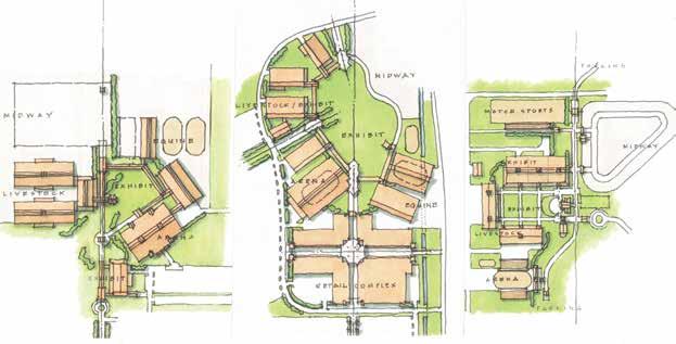
Fairgrounds are about as ubiquitous as campuses: two thirds of the more than 3,000 counties in the USA feature a fairground. While some are modest acreages, others are a pretty big deal, and state fairs are the biggest deals. Once lying rather fallow, except for a few weeks in the fall, more and more these places are becoming year-round events centers. As with campuses, a fairground features an assortment of buildings, but rather than libraries, classroom buildings, and dormitories, they feature arenas, exhibit buildings, and livestock barns. And instead of quadrangles, commons, and malls, they feature exhibit and midway lawns, amphitheaters, and livestock rings. So they amount to a lot more than the carnival, though that’s the main attraction for a good many visitors. Planning a fairground can be a significant exercise, just a bit like planning a college campus except with livestock involved and with lower budgets (Fig. 6.6). Fairground architecture has to deal with the challenge of its image—that these modest structures need no particular design attention—when in reality they need more than usual in order to overcome the often prevailing limitations of pre-engineered building systems, modest budgets, and modest expectations.
ORO Editions
6.6
Some examples of concept-level fairground master plans for sites in Texas, California, and Illinois. All feature well-defined central open spaces.