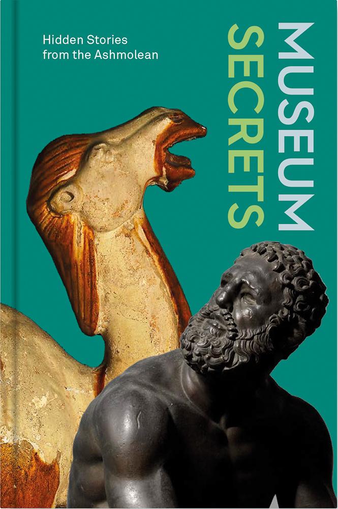
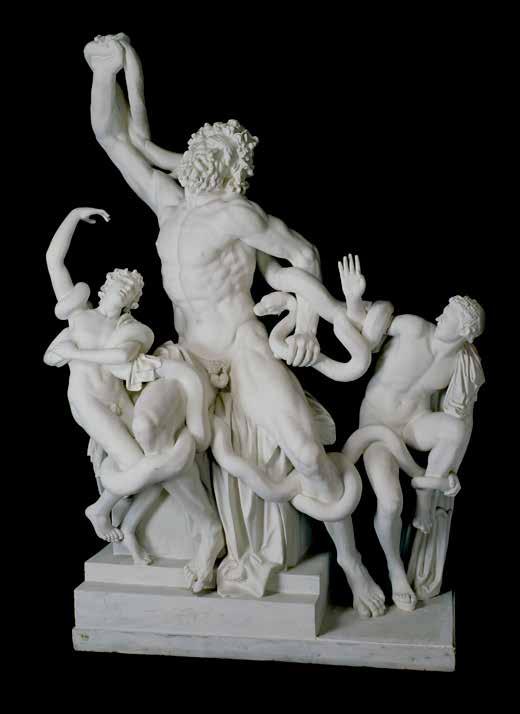
This is a story about casts: that is, plaster replicas of ancient sculptures. It is a story about three cast collections. And it is a story that involves a certain amount of straight talking about a gentleman’s unmentionables. You have been warned.
Now, the Cast Gallery at the Ashmolean is one of the most interesting places in the Museum to watch visitors. The thing about casts is that people don’t know quite what to make of them, so it’s a place of puzzled faces and whispered conversations. Are they just copies of sculpture? Or are they sculpture in their own right?
To make a cast of a complex piece of sculpture is an exacting process. Moulds taken from the original, comprising many separate sections, are painstakingly assembled to be filled with plaster and then carefully deconstructed to reveal a near perfect reproduction. Sometimes, the surface is smoothed to remove the lines marking the joints between the mould-sections, and tinted or coloured, for example to transform the plaster into the appearance of bronze.
Sometimes, though, the cast is more cunningly complicated even than that, as I discovered one day a couple of years ago when I received a text message from a colleague.
The message read: ‘Weird favour. The Ashmolean’s plaster cast of the Laocoön… Could you take a picture of its crotch for me? V curious about whether it has a detachable penis’.
Now, this is not the place to reveal the identity of the colleague concerned, but let me just say that they occupy a position
of substantial eminence in the world of academic art history, far beyond the horizons of little old Oxford. Let us call them the Eminent Art Historian. The stakes, then, were clearly high. I got to work.
Now, the Laocoön is one of the greatest and most celebrated works of sculpture produced by the ancient cultures of the Mediterranean. Discovered in a vineyard in Rome in 1506, it is an astonishing, virtuoso piece of carving, a visceral, moving portrayal in marble of human suffering and fear, as the Trojan priest Laocoön and his two sons are attacked and killed by giant sea serpents sent by the vengeful god Poseidon.
After its excavation, artists clamoured to see it and it immediately entered their visual vocabulary in paint, print, bronze and more marble. And of course, once it started to be copied in other media, people wanted to see the thing itself — or at least something close to it — and so it came to pass that, in time, replicas began to be cast in plaster and found their way into collections all over Europe.
Which would have been fine, were it not for the fact that the tortured, twisted body of Laocoön himself had on display at the very centre of the composition, a fully realised, undisguised and unmistakable set of male genitalia.
Moulds taken from the original, comprising many separate sections, are painstakingly assembled to be filled with plaster and then carefully deconstructed to reveal a near perfect reproduction.
in the body working together as a system. With a tiny change in posture, the sculpture suddenly looks more alive. One of the earliest examples of this change is a kouros from Athens called the Kritios Boy. There’s also a copy of him standing in the Cast Gallery.
Whereas the old-style kouroi had dead level hips, the new ones had one tilted higher than the other. The earliest sculptures in this period of change have the smallest of tilts in their hips, and as time went on, this became more and more pronounced. It is particularly obvious if you look behind the kouros. One buttock is relaxed, while the other is tense. So again, if you want to work out a date for a Greek kouros, it is wise to look at its pelvis and bum.
Many Greek sculptures only survive as fragments of the torso. As long as you can see the crotch, you’ve got what you need to make an educated guess about roughly when it was made.
Many Greek sculptures only survive as fragments of the torso. As long as you can see the crotch, you’ve got what you need to make an educated guess about roughly when it was made. So, if you ever find yourself in the Cast Gallery at the Ashmolean, don’t be shy. There’s a lot to find out if you are brave enough to look.
6 Forms and Music
Lena Fritsch
The Museum isn’t just the sum of all the objects it holds, it is all the people who come to experience them. It is a place where we practise empathy.
write over 40 books in fields including travel, philosophy, psychology, art history, feminism, politics, gardening, and music theory. She also wrote gripping ghost stories. Vernon is now acknowledged as one of the great polymaths of the twentieth century.
There is one particular gift that I am grateful to Vernon for: she introduced the word empathy into the English language. It is a word to describe our ability to understand someone else’s feelings, to put ourselves into someone else’s shoes.
Vernon first came up with this word in her work on psychology and art. With her partner Kit Anstruther-Thomson, she developed a theory about what defines beauty in works of art. They argued that when we see shapes, colours and forms in artwork, our muscles and breath respond subconsciously. For example, looking at bright colours might cause us to inhale, or the curves of a sculpture might make us shift our own weight in response. They
developed this new word ‘empathy’, or ‘projecting feeling’, to describe the idea that our bodies naturally respond to art. Kit and Vernon suggested that beauty is not something an artwork has by itself. Beauty is an act which happens in our bodies when we encounter art. Therefore, we, our bodies, our responses, are part of the art. Beauty is an active process, and we are the crucial ingredient. We make beauty happen by being there.
Beauty happened in the empathetic moment when we opened the archive box with this drawing in it, and held our breath when we locked eyes with Vernon.
I think back to the many months during the pandemic in which the Museum was closed, and the million objects in it sat in the dark with no-one to look at them. If you think of the world in Vernon’s terms, then they were only waiting for us to bring their beauty to life with our presence. The Museum isn’t just the sum of all the objects it holds, it is all the people who come to experience them. It is a place where we practise empathy.
So, as we imagine sliding this sketch back into its dark, safe drawer in the Print Room, I can’t help thinking of the next person who is going to participate in an act of beauty when they open up this archive box and look into Vernon’s intelligent eyes.
Which of the fourteen artists could have been using their turquoise brush so carelessly. Was it a bad day? Were they frustrated, or in a rush? or was it someone else’s hand?
background. I noticed at once that its painting quality is quite different from the carefully painted figures. The width and thickness of the strokes are uneven, even rough on the borders. It seems to me as if the background was filled up in a great hurry by someone not very skilful in using the brush. It was a somewhat surprising observation since the background of a painting is usually very carefully executed, as it serves as a ground for the rest of the composition depicted on top. I wondered which of the fourteen artists could have been using their turquoise brush so carelessly. Was it a bad day? Were they frustrated, or in a rush? Or was it someone else’s hand?
And there is more: while I was analysing with a portable microscope the panel with the Greek myth of Pygmalion and Galatea, I saw that on the right border, where the blue background meets the arched frame’s golden capital, a reddish colour seemed to peep from below. Something seemed to be off.
I set about my detective work. I used an X-ray fluorescence spectrometer, to detect the chemical elements of the turquoise background and compare it with the dark blue colour used for many details and objects on different panels. I found out that this dark blue colour contained cobalt. Therefore, I was expecting the turquoise
shade of the background to be cobaltbased as well, although mixed with white paint to obtain a lighter shade. Instead, I found it to be of a completely different nature: it doesn’t contain cobalt at all. It is a very different paint to the other blues in the bookcase.
Hints were slowly adding up: the different painting quality of the turquoise background compared to the rest of the bookcase, the diverse nature of the pigment used for the turquoise and dark blue shades and the reddish colour peeping from below the background in the panel of Pygmalion. All of this seemed to suggest that the turquoise background was not originally part of the bookcase. I had to dig deeper.
I headed off to the galleries with an infrared camera. Most pigments are transparent to the infrared light. Because of this, an infrared picture reveals the underdrawing below the painting layer. It’s a bit like photographic archaeology. I set up the camera on a tripod, focused it on the Pygmalion’s panel, and started the infrared scanning. For the next ten minutes I stood there, in anxious expectation, staring at the picture while it slowly appeared on the computer screen, one tile after the other.
By the time the scan reached half the panel, I was amazed. The scene depicted on the screen looked very different from that on the bookcase. Where before stood a pomegranate tree in a plain turquoise background, I could now observe the legs of a human figure on the right of the tree and what seemed to be an arm of another figure on its left. Furthermore, there was a drapery running behind the whole scene, much like the curtain on a theatre stage.

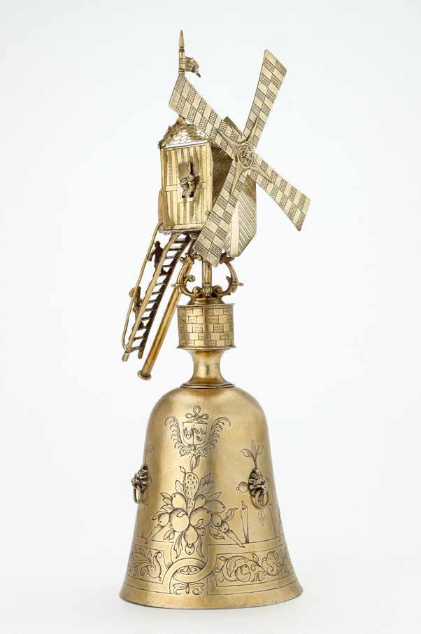

Communal drinking, with cups of alcohol passed around, was often used to welcome and honour guests. It was descended from medieval feasts and banquets held in communal halls. In northern Europe ‘welcome cups’ often in the form of wild animals or fabulous monsters were used to honour guests or celebrate weddings. Guests were expected to take a drink from the cup, men from the large hollow body of the beast, women from the smaller head that also doubled as a cup. You can see several of these elaborate cups-withincups in Gallery 53, including a pompous looking owl, a dancing bear, and a proudlystriding stag.
With the introduction of non-alcoholic hot beverages later in the seventeenth century, such communal drinking and games fell out of fashion among the wealthy.
A wander through Gallery 53 is a lovely reminder of our endless capacity for fun when it comes to the simple act of sharing a drink, alcoholic or otherwise, with friends. So next time you find yourself raising a cup with loved ones, perhaps you will remember the Ashmolean’s windmill, and the many hands that have done just the same for centuries. Do come and visit it. Those tiny silver Dutchmen are ready and waiting to greet you with a wave.
Cups in the form of an owl, a Stag, a Bear, c.1570–80, silver-gilt, glass; cast base, 15.5 cm.
ASHM o LEAN MUSEUM (WA2013.1.72).
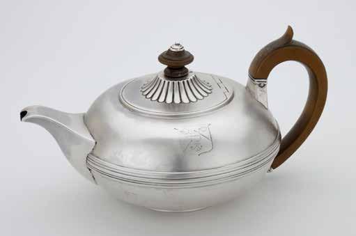
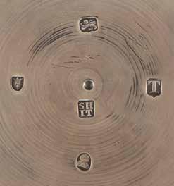
Hennell and Terry were obliged to register a new sponsor’s mark, and it is worth pausing for a moment to consider, in practical terms, what that means.
A sponsor’s mark will commonly comprise the initials of the maker or makers concerned, set in some sort of surrounding cartouche. The design must be registered with the Assay Office at Goldsmiths’ Hall in London, and be cut into a die that can then be used to punch everything that the firm makes.
The sponsor’s mark, then, represents a series of design decisions that are intensely personal, wholly public and entirely deliberate. Hennell and Terry’s mark tells us a great deal about them. It is the one mark among all these five that bears a subtext, a poem almost, in only four letters.
It seemed appropriate that as senior partner in the firm, Samuel’s initials should come first. Equally appropriate was the decision to romanise the J of John to an I, in keeping with the style of the time and the classicising form of the teapot.
For the sake of clarity the two pairs of initials were then placed neatly one on top of the other in a simple square, giving the clear, unmistakable, four-letter impression: S-H-I-T. There is, I fear, no possible way of construing this mark other than the most obvious. Hennel and Terry’s maker’s mark is ‘shit’.
Now this is surprising. Who, after all, would wish to stamp the product of their hand, this beautiful, elegant object, with such a word? Jeweller to the Masses, Gerald Ratner, once famously described his own company’s products as shit and in so doing
destroyed his business. That cannot have been Samuel and John’s aim.
It is not as if the word itself can possibly be misunderstood. Shit is everyday. It may not be a word used by the polite classes but it is certainly a word known to the polite classes. English poets, from Chaucer through Shakespeare to Dryden and Pope have always had a scatological turn. Jonathan Swift’s line in ‘The Lady’s Dressing Room’, “Oh! Celia, Celia, Celia shits!” is merely the most celebrated in a long literary tradition honouring that universally shared bodily function.
This is not a mysterious word. It is not a code or a cipher. It is not some abstruse piece of street slang, an arcane lexicon known only to a handful of initiates. Everyone knows it. Shit is shit: rooted in our daily lives and discourse and, if too vulgar to be spoken, never very far from being heard.
So why has it been punched onto the bottom of this elegant Regency teapot, to infiltrate and inhabit the politest social rituals of that politest of social classes, the English clergyman’s wife’s tea table?
Of course, we cannot know and unless there is correspondence lurking in the archives of still-surviving firms descendant from Hennell’s, we may never have any concrete clue; but it is worth asking the question of this nice lady’s teapot — who saw the hallmark?
Certainly it wasn’t the clergyman’s wife as she poured the tea for her guests. And it wasn’t the guests as they admired their hostess’s taste for fashionable tableware. But when the tea was cold, and the guests had gone, and the tray was carried down to the servants hall for everything to be
washed and polished, the teapot was turned upside down and emptied, and the hallmarks winked up at whichever maid or footman found themselves rinsing out the leaves, spelling out ‘shit’ to whoever was there to look.
And it seems to me then, that Hennell and Terry were making a joke, speaking out into the lives of the servants of their clients, sending a nod from workshop to below stairs, from trade to service.
Jokes on objects are very rare and, like jokes in Shakespeare, even more rarely funny. It may be that I am simply more puerile than the average museum person, but here, surely, is a funny joke and a joke that contains that vital characteristic of any good gag: a touch of solidarity, of mutual understanding, and perhaps even in this case the slightest hint of compassion in the shared acknowledgement that silver may be silver, but shit is shit – and life, sometimes, can be both.
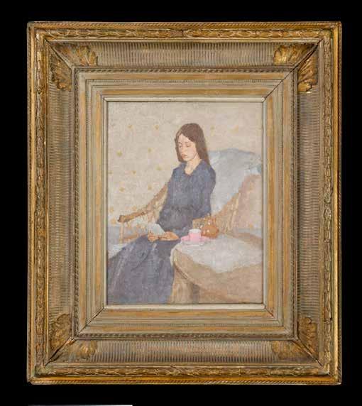
fervour. She loved both women and men with a fierce desire which often bordered on obsession. This included the artist Auguste Rodin. When he rejected her, Gwen wrote to him every day for ten years. In middle age, she converted to Catholicism, throwing herself into religion with the same single-minded focus as she did with all her passions. Her sketchbooks started to fill with reflections about God, connecting her creative process to almost transcendental religious experience.
Her solitude was in itself an act of defiant independence, living alone at a time when this was almost unheard of for single women. In her youth, she and a friend set off to walk across Europe, sleeping outside and earning enough to eat by singing and drawing portraits. For a pair of young Victorian women, this was daring behaviour. Gwen refused to be shaped by the expectations of her time, and she lived as she pleased. As she wrote in a letter to a friend, ‘I am a young woman, with a longing and a hope to be good, not caring for the opinion of anyone, not afraid of obscurity or contempt’. Her frugality and hermit-like seclusion were self-elected. Gwen wasn’t lonely, she just loved being alone, and dared to be so.
Gwen’s paintings celebrate a powerful female perspective. The vast majority of her paintings show individual women and girls, alone in often private spaces, just like in the Ashmolean’s painting. She showed women as they are by themselves, removed from any social pressures and expectations.
Her next most common subject was simply the interior of her own bare room. This too was radical in its own way. One
of her favourite pieces of writing was Virginia Woolf’s A Room Of One’s Own, a feminist essay which argues that women need a space of their own, both real and metaphorical, in order to have equality in a male-dominated world. It seems that alone, in her lodgings, Gwen found a universe of inspiration.
In short, Gwen refused to live life according to any other rules but her own. And in fact, she did, literally, write her own rules. Her notebooks are full of memos to herself, which she called her ‘rules for life’. Here are a few of them.
• You make your life. Let it be consciously, with fearlessness.
• Live largely and deeply. Do not be afraid. You can do some good because you will it.
• Rectify position and mentality several times a day. Meditation every day, be that inspiration.
• Enter into Art as one enters into Religion.
• Don’t think about what others think of you.
• Don’t expect anything more from love, but know that you can get everything. Love the difficulties.
Over the pandemic, we all had to come to terms with loneliness and with the interiors of our own rooms. And when it was a struggle, I tried to remember this painting, and Gwen John’s rules for life. They are a reminder that there are some joys to be found in solitude, and we can always find ways to live largely and deeply. As Gwen wrote on 17th October 1912:
‘Every moment is holy. Do not soil the moments’.
Her solitude was in itself an act of defiant independence, living alone at a time when this was almost unheard of for single women.
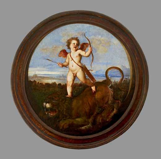
Yet mystery and secrecy surround this Cupid, in that the picture had an active role in hiding something precious from view. It was exciting to discover that this painting was made as a cover for a portrait of a Venetian noblewoman, also by Titian. In grand Renaissance homes, painted covers hiding other pictures were fairly common, though they fell completely out of fashion by about 1600. It is incredibly rare to be able to identify one today, and it has been
possible to do this by studying historical documents and inventories relating to the Vendramin collection.
So, if you visited Gabriele Vendramin’s home in Venice, you were not permitted to look at Titian’s noblewoman, who was a secret presence on the wall. First you had to admire the Triumph of Love, with its message about true love conquering all — indeed, conquering all in Venice.
Only then, when you were in the right frame of mind, would the hidden woman be unveiled. So this was tantalising, with the suspense of anticipation and the delayed pleasure of recognition. You can imagine the sociable gathering of friends, the chat about the mystery, the moment of revelation, the reactions in seeing the hidden portrait.
It is fun to think how this might have happened. Could the Triumph of Love have been hinged to the frame of the portrait to slide across, or to open up like a door, or was it lifted off by a servant at a wave of Vendramin’s hand? We don’t know, because it’s been cut from a rectangle down to a roundel, so we are unsure as to what the original fittings would have been.
But who was hiding beneath the image of Cupid and the lion? Titian’s concealed portrait doesn’t survive, but from descriptions of it in the archival record we can conclude that the woman in the portrait was Elisabetta Querini Massola. Elisabetta was a friend of leading writers and intellectuals in Venice. Her beauty, grace and virtue were celebrated in poetry. Titian had painted three portraits of her by 1544 for different people, and sonnets were written in praise of these images. One poem compared the power of Elisabetta’s eyes with Cupid’s arrows (if she gazed on you, you could not avoid falling in love) and compared her with Venus rising from the waters of the lagoon. Titian’s witty image chimes with this and might even have inspired this sonnet.
But Elisabetta was not a shrinking violet or a pretty young maiden. She was quite a character, ambitious and forceful, knowledgeable about art and antiquities.
Aged 17 and newly-wed in 1537, Pietro had violently stabbed his young wife before fleeing to Mantua to take refuge in a monastery.
We do not know her date of birth but she was already married in 1512 so would have been about 15–16 years old by then, and she died in 1559. By the time Vendramin acquired her portrait, Elisabetta was in her mid to late forties, and she was conducting a campaign to protect her son, Pietro. Aged 17 and newly-wed in 1537, Pietro had violently stabbed his young wife before fleeing to Mantua to take refuge in a monastery. Pietro was sentenced to death for her murder. Several years later, Elisabetta and her husband Lorenzo Massola were still desperately trying to secure him a pardon through their influential connections.
I find it fascinating that this playful painting can act as a portal into a multilayered story. One strand tells how Gabriele Vendramin had the portrait with its bespoke painted cover installed in a room that showcased Titian’s art, and that the cover spoke to his collection of sculpture, medals and antiquities. Another strand tells of concealment and revelation as part of an enjoyable social experience, a sociable fiction about poetry and paintings, about Elisabetta as an artistic muse, forever beautiful with a gaze that would inspire love. Yet, Vendramin and his friends who could look at the hidden portrait also knew about the real life of this Venetian matriarch and her family, including murder and the ferocity of maternal love.