Sommaire
9 Introduction
La naissance de l’aquarelle
De la technique au genre
Moyen Âge-xviiie siècle
13 « Cette manière est la première de toutes » : la peinture primitive
15 Le dessin colorié dans les manuscrits enluminés médiévaux
Drawing with Watercolor in Renaissance
29 Le dessin aquarellé à la Renaissance en Italie : dessins préparatoires et études de la nature
The Northern Renaissance: Albrecht Dürer, the First Watercolorist
40 La Renaissance nordique : Albrecht Dürer, premier « aquarelliste »
Northern Color Wash and Drawing in the Seventeenth Century
54 Lavis de couleur et dessin colorié dans la tradition nordique au xviie siècle
The Miniature: Bodycolor and Watercolor
75 L’école de la miniature. Gouache et aquarelle
Differentiation of Genres:
86 La différenciation des genres : miniature et gouache
101 Nommer un genre : aquarelle, ce mot « nouveau dans notre langue »
120 Deux innovations techniques : papier vélin et couleurs prêtes à l’emploi
Le modèle anglais et l’expansion du genre en Europe et aux États-Unis
L’aquarelle au xixe siècle
129 La prééminence de l’école anglaise
137 Les paysagistes aquarellistes : de la tradition topographique au paysage moderne
161 La technique réinventée
162 Exposer et promouvoir : les sociétés d’aquarellistes
166 Le triomphe des illustrateurs
179 L’aquarelle comme peinture
186 L’expansion de la pratique de l’aquarelle en Europe
206 L’école américaine
Traditions et modernité
L’aquarelle en France au xixe siècle
219 Un art d’agrément
Traditions and Modernity
226 Une époque de transition
236 L’influence anglaise et le renouveau à l’époque romantique
248 Eugène Delacroix, la conquête du lavis libre
264 Autres tendances à l’époque romantique : Paul Huet, Eugène Isabey et Alexandre Gabriel Decamps
273 Les voies de la modernité dans les années 1860
296 Le néoromantisme et la tradition des illustrateurs et des miniaturistes : la Société d’aquarellistes français
Huet, Eugène Isabey, and Alexandre-Gabriel Decamps
The Société d’Aquarellistes Français: Neo-Romanticism and the Traditions of Illustration and Miniature
Cézanne, Signac et les débuts de l’abstraction Aquarelle et avant-garde à la fin du xixe et au début du xxe siècle
Cézanne, Signac, and Early Abstract Art
326 Paul Cézanne, la quintessence de l’aquarelle
watercolor and the avant-garde
342 Paul Signac : filiation, affirmation du trait et libération de la couleur
354 Aquarelle et abstraction
Paul Cézanne: The Quintessence of Watercolor
Paul Signac: Kinship, Assertion of the Line, and the Liberation of Color
378 Les couleurs de l’aquarelle
provide an imperfect or even coarse result, depending upon their granulometric properties; this result is concealed by an opaque paste but revealed by a wash. Natural dyes (soluble dye materials), which are derived from the saps and juices of fruits, grasses, and other plants—blue derived from the elderberry or the juice of the Mercurialis plant; yellow from saffron or turmeric, for example—are better adapted to a translucent wash. Illuminators also made use of pieces of colored fabric (called drapeaux, i.e., colored rags), which were dried and protected from the light. They were placed in a shell, a small glazed pot, or a glass with water to release their color when it was time to apply the pigment. This process is notably described in an Italian manuscript of the first quarter of the fifteenth century from the collection of the Biblioteca Casanatense in Rome (Ms. 1793), which was published by the Dutch art historian Arie Wallert in 1995. The author details the method for dyeing fabrics with plant dyes and a mordant such as alum or urine, as well as the way to utilize them in the workshop or studio.11
l’invention du broyage mécanique. Délayés, les pigments minéraux (« pigments lourds ») donnent, selon leur granulométrie, un résultat imparfait, voire grossier, dissimulé dans une pâte opaque, mais révélé par un lavis. Les colorants naturels (matières colorantes solubles) issus des sucs et jus d’herbe, de plantes ou de fruits sont plus adaptés à un lavis translucide (bleu tiré des baies de sureau ou du jus de mercuriale, jaune de safran ou de curcuma par exemple).
Les enlumineurs se servaient aussi de morceaux d’étoffes teintées (« drapeaux », c’est-à-dire chiffons colorés), séchés et conservés à l’abri de la lumière, et mis à dégorger dans une coquille, un petit pot vernissé ou un verre au moment d’appliquer la couleur. Ce procédé est notamment décrit dans un manuscrit italien du premier quart du xve siècle conservé à la Biblioteca Casanatense de Rome, publié par Arie Wallert. L’auteur détaille le procédé pour teindre ces étoffes avec des colorants de plantes et un mordant comme l’alun ou l’urine, et la façon de les utiliser dans l’atelier 11
Des recettes pour fabriquer des couleurs « sans corps » artificielles circulaient aussi au Moyen Âge. On lit ainsi celle du vert de cuivre, obtenu à partir du vert de gris mêlé d’un peu de lie de vin séchée en fine poudre (gravelle), dans le Liber colorum, traité des couleurs compilé au début du xve siècle par l’humaniste Jean Lebègue, greffier de la Monnaie de Paris. Lebègue avait étudié diverses sources : Théophile, Héraclius (De coloribus et artibus Romanorum), ainsi que des recettes d’atelier attribuées à Antoine de Compiègne, copiées d’un recueil du Milanais Giovanni Alcherio. Le manuscrit latin, conservé à la Bibliothèque nationale de France, a été étudié par Inès Villela-Petit, dont nous reprenons ici la traduction d’un passage sur le vert. L’auteur du traité compare sa parfaite translucidité à celle du jaune de safran, couleur diaphane dont on lavait les pages de parchemin, dans l’Antiquité tardive, pour en éteindre le blanc trop lumineux :
Recipes for manufacturing artificial colors “without body” also circulated during the Middle Ages. Thus, we read about a copper green obtained from verdigris mixed with a little sediment of wine dried into a fine powder (tartar); this is mentioned in the Liber colorum (Colors book), a treatise on colors compiled at the beginning of the fifteenth century by the humanist Jean Lebègue, a clerk at the Paris Mint. Lebègue had studied various sources: De diversis artibus of Theophilus; De coloribus et artibus Romanorum (seventh–twelfth century), attributed to Heraclius (or Eraclius); and the workshop recipes attributed to the fourteenth- century illuminator Antoine de Compiègne, which were copied from a collection by Giovanni Alcherio of Milan. The Latin manuscript, now housed in the Bibliothèque Nationale de France, has been studied by Inès Villela-Petit, whose translation of a passage about the color green we have adopted here. The author compares its perfect translucency with that of saffron yellow, the diaphanous color with which the pages of parchments were washed in late antiquity in order to tone down a too-luminous shade of white:
[This is done] to produce a green that is transparent and without body in its nature, that is to say, lacking substance, like saffron yellow, which is transparent and without substance, which has no covering power because of its thinness, its transparency, and its lack of material, through which the other colors can be seen. This is the reason it, like the green, remains per se muted or overpowered and shows little or not at all. Laid upon other colors, it cannot be perceived very much at all.
Pour faire un vert transparent et sans corps par nature, c’est-àdire dépourvu de substance, comme, pour prendre un exemple, le jaune de safran, transparent et sans substance, qui n’a aucun pouvoir couvrant du fait de sa ténuité, de sa transparence et de son peu de matière au travers de laquelle les autres couleurs se voient ; c’est pourquoi, en lui-même, comme le vert il reste éteint du fait de son peu de matière et ne se voit pas ou peu, et posé sur d’autres couleurs il ne peut pas se voir beaucoup non plus. Mais ce vert n’est pas inoffensif comme le safran, au contraire il est par nature acide et corrosif, de sorte qu’il détruit et ronge
And yet, this green is not mild like saffron; on the contrary, it is acrid and corrosive by nature, such that it destroys and corrodes
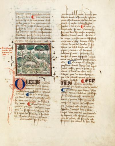
Page de droite
Maître du Policratique de Charles V « Nabuchodonosor métamorphosé en bête », Chronique anonyme, en langue française, depuis la création du monde jusqu’en 1384, etc.
Opposite 5. M A ster of t H e Policraticus of C HA rles V (active 1366–1403)
Fin du xive s.
Plume et encre brune, aquarelle sur parchemin, 33,5 × 24,5 cm
Besançon, bibliothèque municipale, Ms 677, fol. 13 ro
“Nebuchadnezzar Metamorphosed into an Animal,” from Chronique anonyme, en langue française, depuis la création du monde jusqu’en 1384 . . . , late fourteenth century
other colors if it is laid upon them, on account of the verdigris that it contains. Such is its nature. It is used upon parchment and paper. Take a little verdigris and a small amount of the sediment of wine dried into a fine powder, something that is called tartarus in Latin and gravelle in French. Grind them together, reduce them to powder upon a hard, flat stone using some vinegar.
les autres couleurs s’il est posé dessus ou dessous, et ce à cause du vert de gris qu’il contient : telle est sa nature et on l’utilise sur parchemin et sur papier.
Prenez un peu de vert de gris et un peu de lie de vin séchée en fine poudre qui se dit tartre en latin et gravelle en français, broyez-les ensemble et réduisez-les en poudre sur une meule en pierre dure et plane avec du vinaigre.
Afterward, draw everything you wish on parchment and paper and leave the space untouched between the lines traced in black; then take the color green that you have prepared and fill in what you have drawn, according to your liking. Note well that this green cannot be covered by any other color, as we have detailed above. Nor should it be laid upon other colors except the white of parchment or paper; but even here it should not be applied upon any manufactured or painted white pigment, because the green that was created is acrid and corrosive; and indeed, its acidity destroys the other colors, as we have indicated above.12
Puis dessinez tout ce que vous voulez sur le parchemin et le papier et laissez blanc l’espace entre les traits tracés au noir, puis de la couleur verte ainsi préparée, remplissez à votre guise ce que vous aurez dessiné. Notez bien qu’on ne doit recouvrir ce vert d’aucune autre couleur, comme on l’a dit, ni le poser lui-même par-dessus d’autres, si ce n’est seulement sur le blanc du parchemin ou du papier, mais non sur quelqu’autre couleur blanche fabriquée ou peinte, parce que le vert ainsi fait est corrosif ou acide, et du fait de son acidité il détruit les autres couleurs, comme indiqué précédemment 12 .
Inès Villela-Petit propose d’identifier Antoine de Compiègne au Maître du Policratique de Charles V, auteur de dessins à l’encre rehaussés de lavis translucides dont un vert, caractéristique du manuscrit de chroniques conservé à la bibliothèque municipale de Besançon.
Villela-Petit proposed identifying Antoine de Compiègne as the artist known as the Master of the Policraticus of Charles V, named for his work in the dedication copy of the translation of John of Salisbury’s Policraticus. This illuminator is known for ink drawings heightened by translucent washes, including a green tint characteristic of a manuscript of chronicles housed in the municipal library of Besançon (plate 5).
Le dessin colorié
The Tinted Drawing
Le dessin colorié, ainsi que l’a méthodiquement décrit Antoine de Compiègne, est un dessin tracé à l’encre, dont les blancs sont laissés en réserve et les formes « emplies » de lavis de couleur, apposé au pinceau à l’intérieur des contours. Une précision technique est ici nécessaire : suivant leur composition, certaines encres – c’est le cas de l’encre métallo-gallique qui est l’une des plus communes –ont la propriété chimique de devenir insolubles, indélébiles, après séchage. Le dessin peut être repris au lavis sans être altéré ou, inversement, un lavis déborder sur un trait sans que celui-ci ne devienne flou ou ne soit emporté. Il s’agit le plus souvent d’un lavis rudimentaire de teintes uniformes, et très pâles, qui a cependant donné dès l’époque carolingienne un résultat très raffiné. Les artistes les plus habiles peuvent créer des volumes en clair-obscur, pour creuser les plis des drapés, ou des effets de matière comme la robe givrée de la croupe d’un cheval dans les illustrations de La Estoire de Seint Aedward le Rei (milieu du xiiie siècle). Le manuscrit comporte soixante-quatre tinted drawings
The tinted drawing, as it is systematically described by Antoine de Compiègne, is a drawing traced in ink, in which the whites are left in reserve (i.e., the white of the supporting material is left untouched) and a color wash laid on with a brush fills in the forms inside the contours. Technical precision is necessary here: certain inks, depending upon their composition, possess the chemical property of becoming insoluble and indelible after they have dried. This is the case with metallo-gallic ink, which is one of the most common. The drawing may be rewashed without being altered or, conversely, a wash can run over a line without causing it to blur or disappear. In most cases, this is a simple wash, very pale, with uniform colors, which was nevertheless capable of producing a very exquisite result in the Carolingian era (plate 6). The most skilled artists were able to create volumes in chiaroscuro in order to emphasize the folds in drapery or such material effects as the frosty coat on the rump of a horse in the illustrations for the mid-thirteenth-century La Estoire de Seint Aedward le Rei (plate 7). The manuscript, a life of Saint Edward the Confessor, contains sixty-four tinted drawings on parchment, executed around 1250–60, by artists established in London or Westminster. In Britain, the practice of tinted drawing, attested in Anglo-Saxon manuscripts of
Double page suivante
« Les quatre évangélistes », Evangelia quattuor [Évangiles] 1er quart du ixe s. (avant 830 ?)
Pages 18–19
6. Unknown A rtist
Encre et aquarelle sur parchemin, 28 × 20 cm (chaque page) Paris, Bibliothèque nationale de France, Ms Latin 11959, fol. 19 vo et 20 ro
Pen and brown ink, watercolor on parchment, 13⅛ × 9⅝ in. (33.5 × 24.5 cm)
Bibliothèque Municipale, Besançon, France; Ms. 677, fol. 13r
de l’aquarelle
“Four Evangelists,” from Evangelia quattuor, first quarter of the ninth century (before 830?)
Ink and watercolor on parchment; each page: 11 × 7⅞ in. (28 × 20 cm)
Bibliothèque Nationale de France, Paris; Ms Latin 11959, fol. 19v and 20r
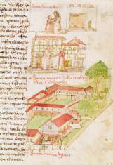
Marco di Bartolomeo Rustici
Above
Siège de la Misericordia, piazza del Duomo, et Santa Maria de’ Servi (Basilica della SS. Annunziata) à Florence, Codex Rustici, détail Milieu du xve siècle Plume et encre, aquarelle sur papier, 48 × 32 cm Florence, Biblioteca del Seminario Arcivescovile Maggiore Fiorentino, folio 11 ro
13. M A rco di B A rtolomeo Rustici (1392/93–1457)
“Seat of the Misericordia, Piazza del Duomo, and Santa Maria de’ Servi (Basilica della Santissima Annunziata), in Florence,” from the Codex Rustici, middle of the fifteenth century Pen and ink, watercolor on paper, 18⅞ × 12⅝ in. (48 × 32 cm)
Biblioteca del Seminario Arcivescovile Maggiore, Florence; fol. 11r
Page de droite
Opposite
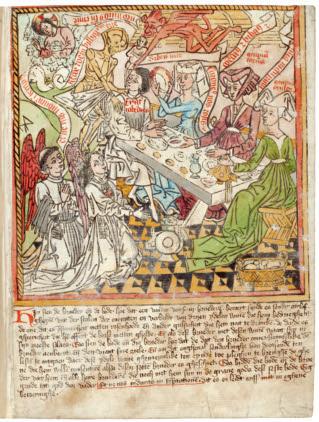
Pays-Bas du Sud, monastère augustinien (Louvain ?)
14. Augustini A n Mon A stery (Leuven), Southern Netherlands
Exercitium super Pater Noster (en flamand)
Page from Exercitium super Pater Noster (in Flemish), c. 1447–50
Vers 1447-1450
Hand-colored print and gray ink on paper, in folio
Gravure sur bois coloriée à l’aquarelle, encre grise sur papier, in-folio
Bibliothèque Nationale de France, Paris; Rés. XYLO-31, fol. 7r
Paris, Bibliothèque nationale de France, Rés. XYLO-31, fol. 7 ro
of Foix), probably created around 1440–60 for Charles IV of Anjou, Count of Le Maine and Guise. The scene depicting Gaston Phoebus handing his book to his huntsmen is a very elaborate composition that is executed remarkably well (plate 11). François Avril believes that the illuminator could only have been an artist of the highest level who was aware of the latest developments in Flemish painting.17 The artist commands washes just as well as the miniaturist, with tiny, fine strokes. The other drawings depict wild or tame animals, hunting scenes (plate 12), and a few buildings in the countryside. These are scattered small vignettes in a square format, in frames that are rectangular or arched, whose placement on the page varies.
est une composition très élaborée et d’une exécution remarquable ; François Avril considère que l’auteur ne peut être qu’un artiste de premier plan, au fait des nouveautés de la peinture flamande 17. L’artiste maîtrise aussi bien le lavis que la touche en petits traits fins des miniaturistes. Les autres dessins représentent des animaux sauvages ou domestiques, des scènes de vénerie et quelques bâtiments dans des paysages, dispersés dans de petites vignettes de format carré, dans des cadres rectangulaires ou à la partie supérieure cintrée, dont la disposition dans la page varie.
En Italie, la pratique médiévale du dessin colorié se prolonge au Quattrocento, alors qu’a déjà débuté la première Renaissance. L’aquarelle est utilisée pour l’illustration des manuscrits qui sont de véritables livres illustrés, comme le traité militaire de Roberto Valturio, De re militari (1472, Biblioteca Vaticana), dans lequel les machines de guerre et des scènes de poliorcétique sont coloriées de façon un peu archaïque, ou l’extraordinaire récit de l’orfèvre florentin Marco di Bartolomeo Rustici, le Codex Rustici. Rustici relate un voyage imaginaire en Terre sainte et décrit la ville de Florence et ses monuments. Ce codex, source iconographique majeure pour l’histoire de l’architecture religieuse et civile florentine au milieu du Quattrocento, s’achève par un répertoire d’animaux et de plantes. Les dessins de la première partie ne sont pas cantonnés dans des cadres ornementaux mais suivent le texte et se déploient dans la page. Il s’agit encore d’un dessin colorié. L’artiste utilise un nombre réduit de teintes posées au pinceau et la couleur est très codifiée, avant tout destinée à donner des informations qui rendent le dessin immédiatement lisible – rouge pour les toits, vert pour les parties en jardin, ocre pour les murs. Mais la beauté des dessins, la liberté de la mise en page et l’aisance avec laquelle le lavis est appliqué donnent le sentiment d’une invention certaine.
In Italy, the medieval practice of tinted drawing extended into the fifteenth century, even though the early Renaissance had already begun. Watercolor was employed to illustrate manuscripts that are veritable illustrated books, such as the military treatise De re militari, by Roberto Valturio (1472; Biblioteca Apostolica Vaticana, Vatican City, Rome), in which the machines of battle and scenes of siege warfare are tinted in a manner that is a little archaic; another such work is the the Codice Rustici, the extraordinary narrative of the Florentine goldsmith Marco di Bartolomeo Rustici, which relates a voyage to the Holy Land. This codex is a major iconographic source for the history of Florentine religious and civil architecture in the mid-fifteenth century (plate 13); it closes with a catalogue of animals and plants. The drawings of the first part are not confined within ornamental frames but follow the text and spread out on the page. They are still tinted drawings, and the artist uses a reduced number of colors applied by brush. Each color is quite codified and above all meant to convey information that renders the drawing immediately legible: red for roofs, green for garden scenes, and ocher for walls. Yet, the beauty of the drawings, the freedom of the layout, and the ease with which the wash is applied convey the feeling of a certain creative gift.
Hand-Colored Prints
L’estampe coloriée
The tinted drawings that illustrate manuscripts display a great deal of affinity with the practice of hand-coloring prints, in which the line is printed and the color applied by hand—either freehand or stenciled—with a wash on every proof. In the fifteenth century, the illustrations in the first chiro-xylographic (block-printed) books, among them the Biblia pauperum (Paupers’ Bible), which was published in the vernacular by Albrecht Pfister in Bamberg, were printed using a wood matrix, with the color added in a somewhat sketchy manner; the text, however, which was generally reduced, was still hand-scribed. The images in printed books could be colored in the same way as single sheet prints (plate 14). The invention and dissemination of color prints (the printing of blocks with color in addition to the block with lines) in the fifteenth century did not bring about the end of hand- colored prints, which remained very widespread until the nineteenth century, notably in the popular arts. Then, it
Le dessin colorié des manuscrits présente de grandes affinités avec la pratique de l’estampe coloriée à l’aquarelle, dans laquelle le trait est imprimé et la couleur apposée à la main – à main levée ou au pochoir – au lavis sur chaque épreuve. Au xve siècle, les illustrations des premiers livres chiro-xylographiques, parmi lesquels la Biblia pauperum (Bible des pauvres), éditée en langue vulgaire à Bamberg par Albrecht Pfister, sont imprimées avec une matrice en bois, la couleur ajoutée de façon un peu sommaire, mais le texte – en général réduit – est encore manuscrit. Les images des livres imprimés peuvent être, comme les estampes en feuille, coloriées à l’aquarelle. L’invention et la diffusion de l’estampe en couleurs (impression des planches de teinte en plus de la planche de trait) au xve siècle n’engendre pas la fin de l’estampe coloriée, qui demeure très répandue,
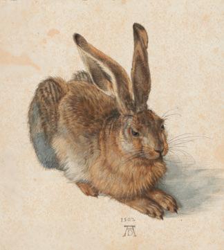
Albrecht Dürer
33. Albrec H t Dürer (1471–1528)
Le Jeune Lièvre
Young Hare, 1502
1502
Plume et encre, aquarelle et gouache sur papier, 25 × 22,5 cm
Pen and ink, watercolor, and gouache on paper, 9¾ × 8⅞ in. (25 × 22.5 cm) Albertina, Vienna; no. 3073
Vienne, Albertina, inv. 3073
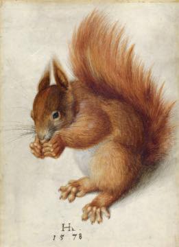
Hans Hoffmann Écureuil roux 1578
34. H A ns Hoffm A nn (1545/50–1591/92)
Red Squirrel, 1578
Watercolor and gouache, preparatory drawing in graphite, on vellum, 9¾ × 7 in. (25 × 17.8 cm)
Aquarelle et gouache, dessin préparatoire au graphite, sur vélin, 25 × 17,8 cm
Washington, The National Gallery of Art, Woodner Collection, inv. 1991.182.5
National Gallery of Art, Washington, DC; Woodner Collection; no. 1991.182.5
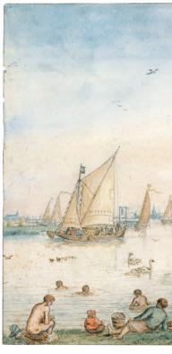
a repertoire of subjects and motifs. Avercamp’s watercolors are tinted drawings; the composition is carefully delineated with pen and ink—at times upon a preliminary outline in black chalk—then the wash is carefully laid on inside the line in order to tint clothing, trees, architectural details, objects, or utensils with variations or alternations of color that are skillfully calculated. Only the sky is washed rather broadly. Color accompanies the naturalistic inclination in the seventeenth century, but it also aims at a decorative and seductive effect that was destined to please art lovers.
l’encre – parfois sur un tracé préalable à la pierre noire – puis le lavis posé avec soin à l’intérieur du trait pour colorer les costumes, les arbres, les détails d’architecture, les objets ou les ustensiles avec des variations et des alternances de teintes savamment calculées. Seul le ciel est lavé assez largement. La couleur accompagne l’inflexion naturaliste du xviie siècle mais elle vise aussi à un effet décoratif et séduisant, destiné à plaire aux amateurs.
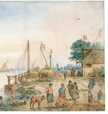
Les dessins aquarellés d’Adriaen van Ostade, né en 1610, sont parmi les scènes de genre les plus enlevées du xviie siècle hollandais. Probablement tous exécutés au cours des dix dernières années de sa vie, ils forment un ensemble distinct et très homogène dans son œuvre graphique. On considère en effet depuis le xviiie siècle, à la suite d’Arnold Houbraken – lui-même peintre et auteur d’un recueil de biographies, Grand Théâtre des artistes et peintres néerlandais (1718-1721) –, que Van Ostade aurait subitement commencé à produire ces dessins en 1672, dans la maison du négociant et amateur d’art Constantijn Sennepart à Amsterdam mais les historiens n’ont pu vérifier précisément cette assertion. Houbraken rattache cette nouvelle manière aux désordres et aux angoisses des temps de guerre, après l’invasion des troupes françaises et de leurs alliés cette année-là. Très élaborés, mis en couleur avec éclat et un sens décoratif certain, signés et parfois datés, ces dessins forment un corpus d’une cinquantaine d’œuvres, vraisemblablement exécutées sur commande et très recherchées par les collectionneurs :
« Les curieux Hollandois » aurait dit le grand collectionneur français du xviiie siècle, Pierre Jean Mariette, « achètent ces dessins coloriés au poids de l’or 35 ». Un peu répétitifs mais toujours savoureux, ils mettent en scène le théâtre d’une vie rurale animée, anecdotique et pittoresque, dans des décors rustiques aux détails réalistes. Philippe de Chennevières a bien résumé, dans un article sur les dessins anciens pour la Gazette des beaux-arts en 1879, l’iconographie du maître – non sans une pointe de dédain pour ce qui n’était pas exactement de son goût :
The watercolor drawings of Adriaen van Ostade, born in 1610, were among the most brilliant genre scenes of the Dutch seventeenth century. They were probably all executed during the last ten years of his life and form a distinct and very homogeneous ensemble in his graphic work. Indeed, it has been thought since the eighteenth century, based on the ideas of Arnold Houbraken (a painter and author of a collection of biographies of Dutch painters, De groote Schouburgh der Nederlantsche Konstschilders en Schilderessen [Great theater of Netherlandish painters and paintresses], 1718–21), that Van Ostade suddenly began to produce these drawings in 1672 in the house of Constantijn Sennepart of Amsterdam, a merchant and art lover; however, art historians have been unable to verify this assertion accurately. Houbraken connected this new approach with wartime fears and disorders that followed the invasion by French troops and their allies in that year. Signed and sometimes dated, these drawings, very sophisticated and brilliantly colored, with a certain decorative sense, form a body of about fifty works; they were probably executed on commission and were very sought after by collectors. The great French collector of the eighteenth century Pierre Jean Mariette is said to have remarked: “The strange Netherlanders buy these tinted drawings for their weight in gold.”34 The Van Ostade watercolor drawings are a little repetitious but always delectable; they anecdotally and picturesquely stage the spectacle of animated rural life with rustic scenery and realistic details. In an article on the drawings of the old masters written for the Gazette des beaux-arts in 1879, Philippe de Chennevières summarized the iconography of the painter very well, yet not without a touch of disdain for something that was not exactly to his taste:
Avec Adrian [sic] van Ostade nous entrons dans le vif de la vie rustique hollandaise ; le joyeux artiste nous montre les plaisirs parfois dévergondés, les rires exubérants, les danses triviales et animées, les chants bruyants, les jeux et les orgies du paysan, tantôt dans une auberge enfumée, ou à la porte de quelque cabaret, tantôt sous une hutte branlante, tantôt encore sous une
With Adrian [sic] van Ostade we get to the heart of Dutch rural life; the joyous artist shows us pleasures that are at times wanton, exuberant laughter, vulgar and animated dances, loud songs, and the games and feasts of the peasants; sometimes in a smoky inn or at the door of some tavern; sometimes in a ramshackle hut; and again sometimes beneath an unpretentious arbor; we see the fife,
Hendrick Avercamp
46. Hendrick Averc A m P (1585–1634)
L’Été : activités près d’un canal
Vers 1620
Summer: Activities near a Canal, c. 1620 Black chalk, pen and brown ink, watercolor, and gouache on paper, 10¾ × 15⅛ in.
Pierre noire, plume et encre brune, aquarelle et gouache sur papier, 27,5 × 38,5 cm Berlin, Staatliche Museen zu Berlin, Kupferstichkabinett, inv. KdZ 118
(27.5 × 38.5 cm)
Staatliche Museen zu Berlin, Kupferstichkabinett; no. KdZ 118
l’aquarelle
L’aquarelle comme peinture
The Pre-Raphaelites
Les préraphaélites
The relationship between oil painting and watercolor was at the heart of numerous debates throughout the nineteenth century. The hierarchy of media and genres remained a very rigid constraint that affected the appreciation of watercolor as well as its commercial value. The evolution of materials that had made ready-to-use pigments available for everyone, and the large number of women who practiced watercolor in a world dominated by masculine values, nurtured the myth of the ease of working in watercolor and contributed to its stigmatization. By claiming the title “painters” in the name of the Society of Painters in Water Colours, watercolorists asserted and defended the idea that watercolor was a noble art and a branch of painting. The development of societies of watercolorists encouraged and supported the production of very spectacular watercolor works based upon the same model as oil painting, which were intended to be exhibited and to compete with oil paintings. During the second half of the nineteenth century, the British artists known as the Pre-Raphaelites practiced watercolor as an opaque and dense water-based paint, the touch of which was similar to that of oil painting and a far cry from the fluid wash whose transparency and freedom had played a major role in the anti-academic evolution of the genre at the beginning of the century. Established in 1848, the Pre-Raphaelite Brotherhood united poets, critics, and painters, among them the three founders: William Holman Hunt, John Everett Millais (plate 128), and Dante Gabriel Rossetti (plate 129). Each artist had his own aesthetic, but the three were united in a shared desire to reject the principles of academic art derived from the Renaissance.
Le rapport entre peinture et aquarelle est au cœur de nombreux débats et polémiques tout au long du xixe siècle. La hiérarchie des techniques et des genres reste un carcan très rigide, qui affecte leur appréciation mais aussi leur valeur commerciale. L’évolution du matériel, qui a rendu accessibles à tous les couleurs prêtes à l’emploi, et le grand nombre de femmes qui pratiquent l’aquarelle dans une société aux valeurs masculines entretiennent le mythe de la facilité de l’aquarelle et sa déconsidération. En prenant le titre de peintres – « Painters in Water Colours » – pour la première société qui les représentait, en 1804, les artistes revendiquaient et défendaient l’idée que l’aquarelle était bien un art noble, une branche de la peinture. Le développement des sociétés d’aquarellistes a encouragé et soutenu la production d’aquarelles très spectaculaires, destinées à être exposées et à rivaliser avec la peinture, sur le même modèle que la peinture.
Dans la seconde moitié du xixe siècle, les préraphaélites anglais pratiquent l’aquarelle comme une détrempe opaque et dense dont la touche est similaire à celle de la peinture et très éloignée du lavis fluide, dont la transparence et la liberté avaient joué un grand rôle dans l’évolution anti-académique du genre au début du siècle. Créée en 1848, la confrérie des préraphaélites (Pre-Raphaelite Brotherhood) rassemble poètes, critiques et peintres parmi lesquels les trois fondateurs, William Holman Hunt, John Everett Millais et Dante Gabriel Rossetti. Chaque artiste a sa propre esthétique mais tous se sont rassemblés dans une volonté commune de rejeter les principes de l’art académique issus
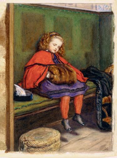
128. Jo H n Everett Mill A is (1829–1896)
John Everett Millais
My Second Sermon (the painter’s daughter Effie), 1864
Mon second sermon (Effie, fille du peintre)
1864
Watercolor and gouache on paper, 15¾ × 9¾ in. (40 × 25 cm) (framed)
Aquarelle et gouache sur papier, 40 × 25 cm (encadré)
Replica of the 1864 oil version on canvas, 38¼ × 27½ in. (97 × 72 cm)
Londres, Victoria & Albert Museum, inv. 399-1901
Guildhall Art Gallery, London Victoria and Albert Museum, London; no. 399-1901
Bound by their admiration for the Italian Quattrocento (the 1400s, before Raphael), they rediscovered the beauty of illumination, which inspired them to reconnect with medieval practice. The painter Ford Madox Brown, whose work is often associated with that of the brotherhood, though he was not a member, also regarded watercolor as a way to reproduce his oil paintings; in doing so he participated in a practice that was widespread during the Victorian age.
Edward Burne-Jones pushed the quest for a kinship between watercolor and oil painting to the limit. Apprenticed to and trained by Rossetti, Burne-Jones advanced his practice of watercolor from the early 1860s. He then entered a period of great creativity and innovation. Fiona Mann, a specialist in Pre-Raphaelite artistic techniques, has studied Burne-Jones’s evolution by examining, in particular, the abundant archive of the artist’s supplier, the colorman Charles Roberson, in the manuscripts collection of the Hamilton Kerr Institute, a department of the Fitzwilliam Museum at Cambridge University.24 At the end of the 1850s, Burne-Jones was still using traditional materials, including powder pigments that he had to prepare himself. Beginning in the 1860s, however, he increasingly ordered moist colors, mixed with glycerine, first in pans (Winsor & Newton had marketed them since 1832), then in tubes (from 1842). Burne-Jones was sensitive to the texture of watercolor; thus, when he began to deal with works that were increasingly large, ambitious, and pictorial, he turned to additives that allowed him to work the color densely and to try out the opaque effects of his mixtures. Listed among Burne-Jones’s orders in Roberson’s archives were those for “watercolour megilp,” a thickening agent made of gum tragacanth, a large amount of ox gall, and a French fixing machine by Rouget.
de la Renaissance. Liés par l’admiration du Quattrocento italien, ils redécouvrent la beauté de l’enluminure, dont ils s’inspirent, renouant ainsi avec la pratique médiévale. Ford Madox Brown considère aussi l’aquarelle comme un moyen de reproduire ses tableaux à l’huile – ce en quoi il rejoint une pratique répandue à l’époque victorienne. Edward Burne-Jones porte à son paroxysme la recherche d’une parenté entre aquarelle et peinture à l’huile. Formé par Rossetti, dont il a été l’apprenti, Burne-Jones progresse dans la pratique de l’aquarelle au début des années 1860. Il entre ensuite dans une période de grande créativité et d’innovation. Spécialiste des techniques des préraphaélites, Fiona Mann a étudié les procédés de Burne-Jones et leur évolution en exploitant notamment les riches archives du fournisseur de l’artiste, le marchand de couleurs Charles Roberson, conservées au département des manuscrits du Fitzwilliam Museum de Cambridge (Hamilton Kerr Institute) 24. À la fin des années 1850, Burne-Jones utilise encore du matériel traditionnel, des pigments en poudre qu’il doit donc préparer lui-même, mais à partir des années 1860, il commande de plus en plus de couleurs moites, préparées avec de la glycérine, d’abord en pains (Winsor & Newton les commercialisent depuis 1832), puis en tubes à partir de 1842. Il est sensible à la texture de l’aquarelle et, alors qu’il se confronte à des œuvres de plus en plus grandes, ambitieuses, picturales, il a recours à des adjuvants qui lui permettent de travailler la couleur en épaisseur et d’expérimenter les effets de ses mixtures. On répertorie dans les registres de Roberson, parmi ses commandes : du watercolour megilp, un agent épaississant à base de gomme adragante (tragacanthe), du fiel de bœuf en grande
Réplique de la version à l’huile sur toile (1864, Guildhall Art Gallery, 97 × 72 cm)
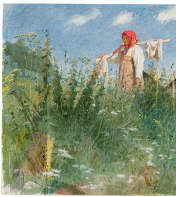
138. Iv A n Nikol A yevic H
Ivan Nikolaïevitch Kramskoï Jeune fille portant du linge 1874
Kr A mskoy (1837–1887)
Girl with Washed Linen on a Yoke, 1874
Aquarelle et gouache sur papier vélin, 20,5 × 29 cm
Watercolor and gouache on linen paper, 8 × 11⅜ in. (20.5 × 29 cm)
Moscou, galerie Tretiakov, inv. 7129
Tretyakov Gallery, Moscow; no. 7129
l ’expansion de la pratique de l’aquarelle en e urope
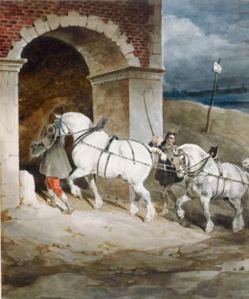
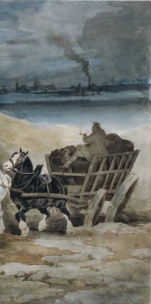
Théodore Géricault
Le Chariot à charbon, route de Londres
177. T H éodore Géric A ult (1791–1824)
Vers 1820-1821
The Coal Wagon, London Road, 1820–21
Lavis d’encre et aquarelle sur papier vélin, 21,7 × 27,7 cm
Ink wash and watercolor on wove paper, 8½ × 10⅞ in. (21.7 × 27.7 cm)
Londres, The British Museum, legs César Mange de Hauke, inv. 1968,0210.28
The British Museum, London; César Mange de Hauke Bequest; no. 1968,0210.28
Sortir de « l’ostracisme » : la création de la Société d’aquarellistes français (1878-1879)
Emerging from “Ostracism”: The Birth of the Société d’Aquarellistes Français (1878–79)
Lami supported the enterprise to form an association of watercolor artists in France. In fact, he wrote to Baroness Betty de Rothschild:
Lami appuya l’entreprise. Il écrivait en effet à la baronne Betty de Rothschild : J’ai eu l’honneur de vous parler d’une association que nous faisions à l’instar du “Water-Colour Society” de Londres. Hier soir nous avons nommé Madame votre fille [Charlotte, épouse de Nathaniel de Rothschild] une des nôtres. Elle sera entourée de gens de talent qui seront tous honorés de la voir figurer dans nos expositions. Le nombre des associés est limité à vingt, et la baronne Nathaniel a été nommée à une grande majorité. Toujours à l’imitation de la société de Londres, on offrait à dix amateurs des arts d’être membres honoraires ; on a songé à mettre M. Edmond sur la liste. Il serait en bonne compagnie : le prince de Joinville, Maurice Cottier, Ed. André, vicomte Greffulhe, Welles de la Valette, Emmanuel Bocher, A. Hartmann, A. Dreyfus, docteur Court 71
I had the honor of speaking to you about an association that we have created on the model of the “Water-Colour Society” of London. Yesterday evening we named your daughter [Charlotte, wife of Nathaniel de Rothschild] as one of our own. She will be surrounded by persons of talent, who will all be honored to see her present in our exhibitions. The number of associates is limited to twenty, and Baroness Nathaniel was named with a large majority. Still in keeping with imitating the society of London, we have offered the possibility of honorary membership to ten art lovers; we have thought of adding Monsieur Edmond [Betty de Rothschild’s son] to the list. He will be in good company: Prince de Joinville, Maurice Cottier, Ed. André, Viscount Greffuhle, Welles de la Valette, Emmanuel Bocher, A. Hartmann, A. Dreyfus, and Dr. Court.70
Alexandre Dumas fils and, in the following year, 1880, Antonin Roux joined them. The committee, which enjoyed high social patronage, combined collectors, wealthy businessmen, art lovers, and influential personalities from the worlds of politics and the arts. The first sixteen titular members (subscribers) were: Henri Baron, Charles Édouard de Beaumont, Jean-Baptiste Édouard Detaille, François Louis Français, Ferdinand Heilbuth, Eugène Isabey, Jules Ferdinand Jacquemart (plate 221), Roger Jourdain, Louis Eugène Lambert, Eugène Lami, Louis Leloir, Maurice Leloir, Madeleine Lemaire, Baroness Nathaniel de Rothschild, Georges Vibert, and Jules Worms. The seventeenth member, Gustave Doré, joined them very quickly before the opening of the first exhibition, in which he intended to present no fewer than sixteen works, among which was The Charity of the Fishmongers (Musée d’Orsay, Paris, RF 12234), engraved as an illustration to the catalogue. It is immediately evident that several generations were represented in the exhibition, from Eugène Lami, born in 1800, to Louis Leloir, born in 1843. Illustrators and genre-scene specialists predominated, while the avant-garde was absolutely excluded.
Alexandre Dumas fils et l’année suivante, en 1880, Antony Roux les rejoignirent. Le comité mêlait donc, sous un haut patronage mondain, des collectionneurs, des hommes d’affaires fortunés et amateurs d’art, des personnalités influentes du monde politique et artistique.
Les seize premiers membres titulaires (souscripteurs) furent Henri Baron, Charles-Édouard de Beaumont, Édouard Detaille, François-Louis Français, Ferdinand Heilbuth, Eugène Isabey, Jules Ferdinand Jacquemart, Roger Jourdain, Louis Eugène Lambert, Eugène Lami, Alexandre Louis Leloir, Maurice Leloir, Madeleine Lemaire, la baronne Nathaniel de Rothschild, Jehan Georges Vibert, Jules Worms. Le dix-septième, Gustave Doré, les rejoignit très vite, avant l’ouverture de la première exposition à laquelle il était résolu à présenter pas moins de seize œuvres, dont La Charité des poissonniers (musée d’Orsay, RF 12234), gravée en illustration au catalogue. On voit d’emblée que si plusieurs générations sont représentées, d’Eugène Lami, né en 1800, à Alexandre Louis Leloir, né en 1843, les illustrateurs et spécialistes des scènes de genre dominent, et que l’avantgarde est absolument exclue.
Jules Ferdinand Jacquemart
La Chambre du peintre Henri Regnault après sa mort, le lendemain de Buzenval 1871
221. Jules Ferdin A nd J A cquem A rt (1837–1880)
The Painter Henri Regnault’s Room after His Death, the Day after Buzenval, 1871
Aquarelle sur papier vélin, 32,8 × 48,2 cm Paris, musée d’Orsay, conservé au musée du Louvre, don Otto Gutekunst, 1920, RF 5187 r o
Watercolor on wove paper, 12⅞ × 19 in. (32.8 × 48.2 cm)
Musée d’Orsay, kept at the Musée du Louvre, Paris; Gift of Otto Gutekunst, 1920; RF 5187 recto
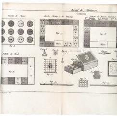
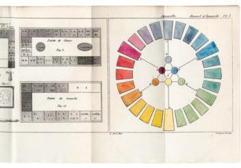
Palettes, range and order of colors for gouache and watercolor, equipment
II-k. Palettes, choix et ordre des couleurs de la gouache et de l’aquarelle, outillage Les palettes pour miniaturistes, modèles de celles des aquarellistes, peuvent être d’ivoire, de verre (l’envers est alors peint d’une couche de blanc de plomb à l’huile et protégé d’une semelle de carton ou de bois), de faïence, de terre de pipe, de biscuit de porcelaine… Formes et dimensions varient (ordinairement, de 6 à 9 pouces – environ 15 à 23 cm au plus long). Les palettes en biscuit de porcelaine sont planes ou aménagées avec des creux ronds en surface pour loger les couleurs ; l’amas de blanc est alors placé au centre29.
The palettes for miniaturists, which established the models for those of watercolorists, could be made of ivory, glass (the reverse side was painted with a layer of lead-white oil paint and protected with cardboard or wooden backing), earthenware, pipe clay, or bisque porcelain. The forms and dimensions varied (generally 6 × 9 in./15 × 23 cm long at most). Palettes in bisque porcelain are flat or set up with round hollows in the surface to hold the colors; thus, the pile of white is placed in the center.29
Constant-Viguier a pleinement entériné l’abandon de la gouache pour les carnations. Il préconise donc une palette spécifique pour les chairs, et donne pour exemples celles de deux artistes : palette de « l’école du miniaturiste Augustin » (fig. 3) et de Mansion (fig. 4). Quelques miniaturistes, à l’exemple d’Isabey père, écrit Constant-Viguier, « font charger de couleur de petites plaques carrées d’ivoire. Ces plaques remplacent alors les palettes, et nous serions fortement tenté de les conseiller, à cause de la commodité à les charger isolément de nouveau, lorsqu’une d’elles n’a plus de couleur30 ».
Constant-Viguier fully confirmed the abandonment of gouache for skin tones. He prescribed a specific palette for flesh tones and provided those of two artists as examples: the palette of “the school of the miniaturist Augustin” (fig. 3) and that of André Léon Larue, known as Mansion (fig. 4). Constant-Viguier wrote that some miniaturists, following the example of Jean-Baptiste Isabey, “fill small, square ivory slabs with color, thus replacing palettes. We are strongly tempted to recommend them on account of the ease in filling them separately when one of them no longer has any color.”30
Les légendes de la planche 1 sont ici reconstituées à partir d’abréviations et de commentaires recueillis dans les deux parties du manuel.
Here we have reconstructed the legends for Constant Viguier’s plate 1, assembling the comments and the abbreviations dispersed throughout the two parts of the work.31
De haut en bas et de gauche à droite
Fig. 4 : Palette de chairs (du miniaturiste Mansion)
Fig. 17 : Palette (Matte) de paysage
Fig. 18 : Palette de fonds (gommée)
From top to B ottom and F rom le F t to right
Fig. 3 : Palette de chairs (de « l’école du miniaturiste Augustin »)
Fig. 4. Palette for skin tones [of the miniaturist Mansion]
Fig. 17. Palette [matte] for landscape
Fig. 16 : Palette de fonds (ou de gouache de Mansion)
Figures 1 à 14 : voir ci-après
Fig. 18. Palette for backgrounds [gummed]
Fig. 15 : palette de gouache « la plus usitée »31
Fig. 3. Palette for skin tones [of “the school of the miniaturist Augustin”]
Abréviations utilisées pour les couleurs
B. A. Blanc d’argent.
Fig. 16. Palette for backgrounds [or of the gouache of Mansion]
Bistr. bistre.
Various figures
Bl. C. Bleu de cobalt.
B. M. B. Brun mars bistre.
Fig. 15. Palette for “the most used” gouache32
Bl. Pr. Bleu de Prusse.
aBB re V iations used F or the colors
Br. 4. Brun, no 4.
B. A. Blanc d’argent [silver white]
Bistr. Bistre [bister]
C. de G. Carmin de garance.
Ind. Indigo.
Bl. C Bleu de cobalt [cobalt blue]
J. de N. Jaune de Naples.
J. dé. Jaune doré.
B. M. B. Brun mars bistre [Mars bister brown]
J. I. Jaune indien.
Bl. Pr. Bleu de Prusse [Prussian blue]
L. A. 2. Laque animale, no 2.
Br. 4 Brun [brown] no. 4
L. G. i. Laque de garance, no i.
L. G. B. F. Laque de garance, brun foncé.
C. de G. Carmin de garance [madder carmine]
L. G. C. Laque de garance cerise.
Ind. Indigo
J. de N. Jaune de Naples [Naples yellow]
J. dé. Jaune doré [Gilt yellow]
Sté V . F. Constant-Viguier and F. P. Langlois de Longue V ille
Plate 1, Manuel de miniature et de gouache par Stév. F. Constant-Viguier, suivi du manuel du lavis à la sépia et de l’aquarelle, par F. P. Langlois de Longueville . . . , 2nd ed. (Paris: Roret, 1830), octodecimo
Bibliothèque Nationale de France, Paris; V-24997
Planche 1 du Manuel de miniature et de gouache, par Stév. F. Constant Viguier, de Paris. Suivi du manuel du lavis à la sépia et de l’aquarelle, par F.-P. Langlois de Longueville... 2e éd., Paris, Roret, 1830, in-18o Paris, Bibliothèque nationale de France, V-24997
N. B. Noir de bougie.
J. I. Jaune indien [Indian yellow]
N. I. Noir d’ivoire.
O. J. Ocre jaune.
L. A. 2. Laque animale [animal lake] no. 2
O. R. Ocre rouge.
Orp. J. Orpin jaune.
L. G. 1. Laque de garance [madder lake] no. 1
Orp. R. Orpin rouge.
O. W. Ocre de Wolfenbuttel.
L. G. B. F. Laque de garance, brun foncé [deep brown madder lake]
Outr. Outremer.
L. G. C. Laque de garance cerise [cherry madder lake]
Pté. R. Précipité rouge.
N. B. Noir de bougie [lampblack]
Pté. Vet. Précipité violet.
N. I. Noir d’ivoire [ivory black]
R. M. i. Rouge mars, no i
O. J. Ocre jaune [yellow ocher]
R. M. 2. Rouge mars, no 2.
O. R. Ocre rouge [red ocher]
R. M. C. Rouge mars capucine.
S. C. Sienne calcinée.
O. W. Ocre de Wolfenbuttel [ Wolfenbüttel ocher]
S. N. Sienne naturelle.
Orp. J. Orpin jaune [yellow orpiment]
T. C. Terre de Cassel.
Orp. R. Orpine rouge [red orpiment]
Outr. Outremer [ultramarine]
Pté. R. Précipité rouge [red from precipitated gold]
29. Ibid., p. 36. 30. Ibid., p. 40. 31. Ibid., p. 99. 32. Ibid., p. 38 et 99.
T. de Col. Terre de Cologne
T. I. Terre d’Italie.
Pté. Vet. Précipité violet [purple of Cassius]
V. Calt. Vert de cobalt.
R. M. 1. Rouge mars [Mars red] no. 1
V. Mal. Vert minéral.
R. M. 2. Rouge mars [Mars red] no. 2
V. M. 3. Violet mars, no 3.
Von. H. Vermillon de Hollande.
R. M. C. Rouge mars capucine [Mars nasturtium red]
S. C. Sienne calcinée [burnt sienna]
Von. Ch. Idem, de Chine32
S. N. Sienne naturelle [raw sienna]
T. C. Terre de Cassel [Cassel earth]
Commentaire des figures 1 à 14, 17 et 18
T. de Col. Terre de Cologne [Cologne earth]
Fig. 1 : carré de glace [verre] dépolie pour le broiement.
T. I. Terre d’Italie [Italian earth]
V. Calt. Vert de cobalt [cobalt green]
V. Mal. Vert mineral [mineral green]
V. M. 3. Violet mars [Mars violet] no. 3
Fig. 2 : molette de verre pour rebroyer les couleurs en poudre dont la finesse est jugée insuffisante ou qui manquent de gomme. Il faut éviter le marbre blanc afin de ne pas
Von. H. Vermillon de Hollande [Dutch vermilion]
Von. Ch. Vermillon de Chine [Chinese vermilion]
déposer de fines particules blanches qui altèrent la couleur33
commentarY o n the other F igures in plate 1
Fig. 1. Frosted square [glass] for grinding Fig. 2. Glass pestle for regrinding the color powders whose fineness has been judged insufficient or that lack gum. White marble must be avoided so as not to deposit fine white particles that alter the color.33
Fig. 5 et 6 : godet et broyon (molette arrondie en forme de dé à coudre). Les godets permettent de préparer les mélanges de gouache ou de broyer les couleurs conditionnées en trochisques ou en pains, qui doivent être délayées au fur et à mesure des besoins (carmin, outremer, certains jaunes). Ils peuvent être en porcelaine, en faïence, en cristal ; l’auteur conseille ceux qui ont un creuset arrondi dans une masse carrée, propre à recevoir la pression du broyon34
Fig. 7 : plaque de porcelaine équivalant à un « assemblage de godets35 ».
Fig. 8 : si un poil dépasse du pinceau, ce qui peut gâcher le travail, on peut le raccourcir en faisant rapidement traverser au pinceau mouillé la flamme d’une bougie en
Figs. 5 Godet [small mortar] and broyon and 6. (rounded pestle in the form of a thimble). Such mortars enable the preparation of gouache mixtures or the grinding of colors packaged in conic form or as cakes, which must be diluted according to need (carmine, ultramarine, certain yellows). These mortars must be made of porcelain, earthenware, or crystal. The author suggests those that have a rounded crucible within a square mass, suitable
un simple va-et-vient (le couper le rendrait inutilisable)36
for withstanding the pressure of grinding.34
Fig. 7. Porcelain slab equivalent to an “assemblage of godets.”35
Fig. 9 : moyen d’arrêter une fente sur le tuyau de plume, fixé sur la hampe ou ante (manche) d’un pinceau, par une double entaille en X à l’extrémité de la fente, avec un canif bien coupant37
Fig. 8. If a hair protrudes from the brush, which can ruin the work, one can shorten it by rapidly passing the moistened assembled brush over (A) the flame of a candle (B) along the bottom part of the shaft (C), while going from (D) to (E).36
Fig. 10 : grattoir avec une pointe très mince et très coupante, moins arrondie que les modèles « en cœur » des grattoirs de bureau38. Il permet d’enlever la couleur sèche ; il faut que le coupant soit parfaitement aiguisé, faute de quoi cet outil « materait » (c’est-à-dire polirait) la matière au lieu de la soustraire39. Ce procédé remplace avantageusement la technique difficile et dont « la routine seule prolonge la durée » d’enlevage au pinceau humide.
Fig. 9. A way to stop a split in the quill, fixed upon the shaft or ante (handle) of a brush, by a double X cut at the end of the split with a very sharp penknife.37
Fig. 10. Scraper with a very narrow, very sharp point, less rounded than the “heart-shaped” models of bureau scrapers.38 It removes dry color; the cutting edge must be perfectly honed, or this tool will “polish” the material instead of removing it.39
Fig. 11 : modèle de grattoir de M. Binant, marchand de couleurs (rue de Cléry, no 7) semblable au racloir des ébénistes40.
Fig. 12 : nouveau racloir triangulaire de M. Binant, qui offre trois « coupans ».
This process very advantageously replaces the difficult technique of lifting out using a moist brush, of which the “routine alone prolongs the duration.”
Fig. 13 : pupitre de miniature (boîte). Le couvercle s’incline à l’aide d’une crémaillère horizontale. Il est ordinairement couvert d’une serge ou drap vert41.
Fig. 11. Model of the scraper carried by M. Binant, color dealer (rue de Cléry, 7); it is similar to the scrapers used by cabinetmakers.40
Fig. 12. M. Binant’s new triangular scraper, which offers three cutting edges.
Fig. 14 : treillis ou cadre de carreaux mobiles (pour calquer, réduire, ou augmenter d’après un modèle). Les épingles permettent de fixer les fils pour établir le quadrillage mobile42
Fig. 13. Miniature desk (box). The cover tilts with the help of a horizontal peg. It is ordinarily covered with green serge or sheeting.41
Fig. 17 : Palette de paysage ou de gouache mate
Fig. 14. Lattice or framework of moving square lines (for copying, reducing or enlarging after a model). The pins allow the wires to be fixed in order to establish the mobile grid pattern.42
« La palette de paysage ou de gouache mate, représentée par la fig. 17, se couvrira de couleurs moins gommées que celles de la palette de fond
33 Ibid., p. 35. 34 Ibid., p. 38-40 35 Ibid., p. 39. 36 Ibid., p. 41-42 37 Ibid., p. 42-43. 38 Ibid., p. 44. 39 Ibid., p. 44-45. 40 Ibid., p. 45-46. 41 Ibid., p. 52, 55 42 Ibid., p. 59-62
l es couleurs de l’aquarelle
Homer, Winslow (1836–1910), 161, 206, 207, 208–9, 209, 210–11, 213
Houbraken, Arnold (1660–1719), 66
Hoüel, Jean-Pierre-Louis-Laurent (1735–1813), 97, 98–99
Huet, Jean-Baptiste (1745–1811), 97
Huet, Paul (1803–1869), 242, 264–65, 266, 267, 302, 326
Hugo, Victor (1802–1885), 360 Hunt, William Henry (1790–1864), 176–77
Hunt, William Holman (1827–1910), 179 Huysum, Jan van (1682–1749), 65, 73
Isabey, Eugène (1803–1886), 248, 264, 267, 268, 269, 278, 280, 287, 300, 303, 306, 318, 321, 390
Isabey, Jean-Baptiste (1767–1855), 229–32, 230, 231, 235, 236, 237, 264, 388, 395, 400 Israëls, Isaac (1865–1934), 197, 204
Jacquemart, Jules Ferdinand (1837–1880), 300–301, 302, 306, 321, 322–23
Jacquet, Jules (1841–1913), 310 Johannot, Alfred (1800–1837), 122, 226 Johannot, Tony (1803–1852), 122, 226, 303 Jones, Thomas (1742–1803), 142 Jongkind, Johan Barthold (1819–1891), 9, 118, 131, 197, 236, 260, 267, 273, 278, 280–86, 280, 281, 282, 283, 284–85, 286, 287, 288, 289, 303, 321, 326, 336, 342, 345, 346, 350
Jordaens, Jacob (1593–1678), 54, 55 Joris, Pio (1843–1921), 199 Jorn, Asger (1914–1973), 368, 372–73
Jourdain, Roger (1845–1918), 300, 302, 321
Kandinsky, Wassily (1866–1944), 9, 14, 186, 326, 354, 364–65, 366, 367, 368
Khnopff, Fernand (1858–1921), 197, 198 Klee, Paul (1879–1940), 340, 366, 368, 371 Kokoschka, Oskar (1886–1980), 368 Kramskoy, Ivan Nikolayevitch (1837–1887), 186, 192–93 Kupka, František (1871–1957), 354, 368, 369, 370
Lalauze, Adolphe (1838–1906), 297 Lambert, Louis Eugène (1825–1900), 300, 306
Lami, Eugène Louis (1800–1890), 237, 267, 290, 296, 297, 298, 299, 300, 302, 303, 306, 316, 321 Lance, George (1802–1864), 176 Landseer, Edwin Henry (1802–1873), 173, 243 Larsson, Carl Olof (1853–1919), 186, 190 Larue, André-Léon, see Mansion
La Tour, Maurice-Quentin de (1704–1788), 307 Lawrence, Thomas (1769–1830), 248–49 Le Blon, Jacob Christoph (1667–1741), 119 Le Brun, Charles (1619–1690), 116 Leloir, Alexandre Louis (1843–1884), 300, 302 Leloir, Jean-Baptiste Auguste (1809–1892), 318 Leloir, Maurice (1853–1940), 300, 303, 306, 312, 316, 317, 318, 319, 321 Lely, Peter (Pieter van der Faes; 1618–1680), 56 Lemaire, Madeleine Jeanne (1845–1928), 300, 312 Leonardi, Vincenzo (1589/90–1646), 35, 38 Leonardo da Vinci (1452–1519), 32, 38, 360 Lepic, Ludovic-Napoléon (1839–1889), 327 Le Prince, Jean-Baptiste (1734–1781), 119 Lespinasse, Louis Nicolas de (1734–1808), 97, 125 Levesque, Pierre Charles (1736–1812), 13, 76, 84, 103, 116 Lewis, John Frederick (1805–1876), 315 Lhermitte, Léon Augustin (1844–1925), 306 Linnell, John, the Elder (1792–1882), 147, 164, 166, 168 Lorrain, Claude (Claude Gellée; 1604–1682), 106–7, 108, 150, 342, 345 Loustaunau, Louis Auguste Georges (1846–1898), 306 Lupton, Thomas Goff (1791–1873), 150, 153
Maccari, Cesare (1840–1919), 199 Macke, August (1887–1914), 340, 354, 356–57, 368 MacKnight, Dodge (1860–1950), 206 Madou, Jean-Baptiste (1796–1877), 194–95, 196 Mallet, Jean-Baptiste (1759–1835), 97 Mander, Karel van (1548–1606), 54, 64 Manessier, Alfred (1911–1993), 368 Manet, Édouard (1832–1883), 327, 328 Manet, Julie (1878–1966), 326 Manguin, Henri-Charles (1874–1949), 293 Mansion (André-Léon Larue; 1785–after 1837), 85, 229–32 Mantegna, Andrea (c. 1431–1506), 42 Marie, Adrien Emmanuel (1848–1891), 306
Marin, John (1870–1953), 206, 213, 215 Master of Le Champion des dames (active c. 1465/75), 21, 23, 25 Master of the Policraticus of Charles V (active 1366–1403), 16, 17 Master of Wavrin (active c. 1451–c. 1475), 21, 22 Matisse, Henri (1869–1954), 215, 293, 344, 345, 348, 354, 356 Mauve, Anton (1838–1888), 186, 197 Maxence, Edgard (1871–1954), 306 Mayeux, Pierre Henri (1845–1929), 118 Meissonier, Jean Charles (1848–1917), 306 Meissonier, Jean Louis Ernest (1815–1891), 303, 306, 307, 310, 311 Menzel, Adolph von (1815–1905), 184–85, 202, 203 Merson, Luc-Olivier (1846–1920), 306 Mesdag, Hendrik Willem (1831–1915), 197 Meulen, Adam Frans van der (1631/32–1690), 116 Michaux, Henri (1899–1984), 358, 361 Michelangelo (Michelangelo Buonarroti; 1475–1564), 9, 166, 220
Millais, John Everett (1829–1896), 178, 179 Millet, Jean-François (1814–1875), 65, 278 Monet, Claude (1840–1926), 248, 282, 287, 288 Monnier, Henry (1799–1877), 223 Moreau, Gustave (1826–1898), 9, 250, 267, 273, 290–93, 291, 292, 293, 294, 295, 303, 321, 362, 363, 382, 386, 401 Moreau, Louis-Gabriel, the Elder (1740–1806), 97 Moreau-Néret, Adrien (1860–1944), 306 Morisot, Berthe (1841–1895), 327, 329 Morse, Samuel Finley Breese (1791–1872), 207 Moser, Mary (1744–1819), 176 Mottez, Victor Louis (1809–1897), 106 Nash, Joseph, the Elder (1808–1878), 136, 141 Natoire, Charles-Joseph (1700–1777), 103, 104–5 Nattes, John Claude (c. 1765–1822), 163 Nolde, Emil (1867–1956), 368 Normand, Alfred Nicolas (1822–1909), 118 O’Keeffe, Georgia (1887–1986), 4–5, 213 Ostade, Adriaen van (1610–1685), 63, 65, 66, 68, 70, 72, 116 Ozanne, Nicolas-Marie (1728–1811), 346 Palmer, Samuel (1805–1881), 133, 134, 166 Pars, William (1742–1782), 142 Partridge, Bernard (1861–1945), 175 Payne, William (c. 1760–after 1830), 143 Pérignon, Alexis-Nicolas, the Elder (1726–1782), 97 Perréal, Jean (c. 1455–c. 1530), 15 Perrot, Catherine (b. 1620), 79 Pettie, John (1839–1893), 134 Picot, François Édouard (1786–1868), 280, 312 Pierre, Jean-Baptiste-Marie (1714–1789), 97 Piette, Ludovic (1826–1878), 327 Piles, Roger de (1635–1709), 86 Pisanello (c. 1395–c. 1455), 32, 33, 34 Pissarro, Camille (1830–1903), 327, 342, 344 Pissarro, Lucien (1863–1944), 344 Pocock, Nicholas (1741–1821), 163 Poussin, Nicolas (1594–1665), 38, 150, 267 Powell, Joseph (1780–1834), 165 Primaticcio, Francesco (1504–1570), 39 Prout, Samuel (1783–1852), 141, 142, 164, 242, 246 Pugin, Augustus Charles (c. 1762–1832), 130, 173 Pyne, William Henry (1769–1843), 133, 163
Raffaelli, Jean-François (1850–1924), 327 Raffet, Denis-Auguste-Marie (1804–1860), 229, 273 Raphael (Raffaello Sanzio; 1483–1520), 9, 34, 220 Redouté, Pierre-Joseph (1753–1840), 101, 120, 121, 220, 267, 303 Rembrandt van Rijn (1606–1669), 72 Reynolds, Joshua (1723–1792), 56, 166 Ricci, Marco (1676–1730), 93, 97 Richardson, Jonathan, the Elder (1665–1745), 56 Richter, Gerhard (b. 1932), 374–75 Rigaud, Stephen Francis Dutilh (1777–1862), 163 Robert, Hubert (1733–1808), 100–101, 103, 234 Robert, Nicolas (1614–1685), 79, 80, 82, 83, 84 Robertson, Archibald (1765–1835), 206 Roelofs, Willem (1822–1897), 195, 196 Roesler Franz, Ettore (1845–1907), 198, 199 Roget, John Lewis (1828–1908), 133, 162, 163 Rossetti, Dante Gabriel (1828–1882), 133, 179, 180 Rothschild, Charlotte de (1825–1899), 296, 321
Rouault, Georges (1871–1958), 293 Roulliet, Amaranthe (1810–1888), 267 Rousseau, Théodore (1812–1867), 65, 278 Rowlandson, Thomas (1756/57–1827), 130–31 Rubens, Peter Paul (1577–1640), 54, 56–57, 116 Ruskin, John (1819–1900), 150, 154, 161, 165 Rustici, Marco di Bartolomeo (1392/93–1457), 26 Saint-Aubin, Gabriel Jacques de (1724–1780), 102, 103, 220, 234
Sand, George (1804–1876), 255, 360 Sandby, Paul (1731–1809), 8, 94–95, 97, 120, 122–23, 129, 132–33, 133, 137, 139, 140–41, 164 Sargent, John Singer (1856–1925), 161, 206, 208, 209, 212–13, 213, 404
Savery, Jacob, the Elder (c. 1565–1602), 62–63, 64 Savery, Roelandt (1576–1639), 65 Scharf, George (1788–1860), 165 Schelfhout, Andreas (1787–1870), 280 Schiele, Egon (1890–1918), 186, 205, 368 Schongauer, Martin (c. 1445/50–1491), 40, 42 Servandoni, Giovanni Niccolò (1695–1766), 97 Sesshū, Tōyō (1420–1506), 14 Shelley, Samuel (c. 1750–c. 1808), 163 Signac, Paul (1863–1935), 9, 118, 131, 260, 282–86, 289, 303, 334–35, 342–50, 342, 343, 344–45, 351, 352–53, 354 Signorelli, Luca (1445/50–1523), 30, 31 Silvestre, Israël (1621–1691), 116 Simonetti, Attilio (1843–1925), 199 Simoni, Gustavo (1846–1926), 199 Smith, John Warwick (1749–1831), 142 Spaendonck, Gerard van (1746–1822), 101, 303 Spilliaert, Léon (1881–1946), 198 Stevens, Pieter (c. 1567–after 1624), 64
Stieglitz, Alfred (1864–1946), 213, 215, 340 Storelli, Félix Marie Ferdinand (1778–1854), 220, 234 Stothard, Thomas (1755–1834), 166 Stuck, Franz von (1863–1928), 366
Taunay, Nicolas Antoine (1755–1830), 86–87 Tomba, Casimiro (1857–1929), 197
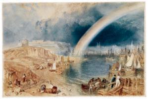
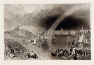
Toovey, Edwin (1826–1906), 195 Towne, Francis (1739/40–1816), 142 Troost, Cornelis (1696–1750), 92, 97 Turner, Joseph Mallord William (1775–1851), 120, 126–27, 129, 131, 133, 146, 150–60, 151, 152, 153, 154, 155, 156–57, 158, 159, 160, 161, 184, 243, 249, 283, 286, 342, 345 Tusquets y Maignon, Ramón (1837–1904), 199 Valenciennes, Pierre Henri de (1750–1819), 228, 234 Vandergucht, Gerard (1696–1776), 164 Varley, Cornelius (1781–1873), 143, 150, 163, 164 Varley, John (1778–1842), 143, 150, 163, 164, 166, 176, 242, 243 Vasari, Giorgio (1511–1574), 34 Vendramini, Giovanni (1769–1839), 172 Vernet, Antoine Charles Horace (Carle Vernet; 1758–1836), 223, 224, 226, 237, 296 Vernet, Claude-Joseph (1714–1789), 282, 346 Vianen, Paulus Willemsz. van (c. 1570–1613), 64 Vibert, Jehan Georges (1840–1902), 13, 300, 302, 303, 304, 306, 312–18, 312, 313, 321 Villot, Frédéric (1809–1875), 103 Vinckboons, David (1576–c. 1632), 64 Violet, Pierre Noël (1749–1819), 84 Viollet-le-Duc, Eugène Emmanuel (1814–1879), 118 Vischer, Peter, the Elder (c. 1460–1529), 40 Vischer, Peter, the Younger (1487–1528), 40, 41
Walker, Frederick (1840–1875), 133, 135 Wallis, William (1796–c. 1829), 140 Ward, Edward Matthew (1816–1879), 174 Watelet, Claude Henri (1718–1786), 13, 14, 76, 84, 103, 116, 391, 393, 395 Wells, William Frederick (1762–1836), 155, 163 Werner, Fritz (1827–1908), 314 Wheatley, Francis (1747–1801), 172 Whistler, James Abbott McNeill (1834–1903), 206, 208, 209 Wilkie, David (1785–1841), 243, 248 Wille, Johann Georg (1715–1808), 224 Wolgemut, Michael (1434/37–1519), 41–42 Worms, Jules (1832–1924), 300, 302 Wouters, Frans (1612/14–1659), 56
Zabala, Eduardo Zamacois y (c. 1841–1871), 302 Ziem, Félix (1821–1911), 296, 306 Zorn, Anders (1860–1920), 186, 191