Brand Identity Guide
. . . . . . . . . . . . . . . . . . . . . . . . . . . . . . . . . . . .
. . . . . . . . . . . . . . . . . . . . . . . . . . . . . . . . . . . . . . . . .
Pan-tique Bakery Brand Identity Guide 3
WHO WE ARE
4 USING THIS MANUAL
5 VISUAL IDENTITY
6 PROTECTED COLORS
7 LOGO
.8 Logo Overview
8 Logo Structure
9 Logo Rules
10 Logo Colors . . .
. . .
11 Logo Placement . . . . . . . . . . . . . . . . .
. . 12 TYPOGRAPHY . . . . . . . . . . . . . . . . . . . . . . . . . . . . . . . . . . . 13 Typography Overview . . . . . . . . . . . . . . . . . . . . . . . . . . . . . . . . . . 13 Typography Rules . . . . . . . . . . . . . . . . . . . . . . . . . . . . . . . . . . . . . . 14 SECONDARY GRAPHICS . . . . . . . . . . . . . . . . . . . . . . . . . 15 BRAND PRESENTATION . . . . . . . . . . . . . . . . . . . . . . . . . 16
CONTENTS
. . . . . . . . . . . . . . . . . . . . . . . . . . . .
. . . . . . . . . . . . . . . . . . . . . . . . . . . . . . . .
. . . . . . . . . . . . . . . . . . . . . . . . . . . . .
. . . . . . . . . . . . . . . . . . . . . . . . . . . . . . . . . . . . . . . . . . .
. . . . . . . . . . . . . . . . . . . . . . . . . . . . . . . . . . . . . . . . .
.
. . . . . . . . . . . . . . . . . . . . . . . . . . . . . . . . . . . . . . . . . . . .
. . . . . . . . .
. . . . . . . . . . . . . . . . . . . . . . . . . . . . .
. . . . . . . . . . . . . . . . . . . . .
WHO WE ARE
Pan-tique is an international bakery that wants to bring back the taste and refinement of bakery products from the past centuries, starting with the bread enjoyed by the inhabitants of Pompeii and the the ones of Egypt and ancient Greece and reaching up to the 19th century in the elegant French bakeries.
Pan-tique Bakery Brand Identity Guide 4
This manual of graphic standards is developed to improve and standardize the visual identity of the Pan-tique bakery. It is intended for use by professional graphic designers for the purpose of presenting visual identity and on other content and media. The content of this manual is specific and technical. It contains:

USING THIS MANUAL
• examples of the use of visual identity elements and styles in different media;
• protected colors;
• sign and logotype construction;
• selected fonts and other standards that are used as a starting point for modeling new materials;
• using the recognizable standardized identity. The standards presented in this book were developed on January 2023. All future changes that will be added to this manual in an updated version that can be found at: www.pan-tique/rs/rs/brandidentityguide.com
Pan-tique Bakery Brand Identity Guide 5
Pan-tique is a bakery dedicated to bringing back the forgotten falvours of the ancient world’s bakery products while also reminscing the traditional French breads.

We are using traditional and simple ingredients for the most authentic taste and experience.
VISUAL IDENTITY
Our breads are kneaded with care by our passionate and experienced bakers and baked in wood fired oven, each bread adopting the subtle wood flavour.


Pan-tique is a brand that puts the accent on the elegance and simplicity of its products.
Even if its purpose is to bring back old recipes, Pan-tique is continously involved in incorporating a modern feel and look that both the youg adults and the older generations will find inspiring.
Pan-tique Bakery Brand Identity Guide 6
CG Blue
Pantone 7705 C
CMYK 99, 27, 0, 41 RGB 1, 110, 151 HEX #016E97
PROTECTED COLORS
Logo Colors
Steel Teal
Pantone 5415 C
CMYK 35, 7, 0, 41 RGB 97, 140, 150 HEX #618C96
Xanadu
Pantone 5565 C CMYK 16, 0, 12, 43 RGB 122, 145, 127 HEX #7a917f
The colors of Pan-tique bakery are earthy colors, inspired by nature and by ancient Roman mural paintings and mosaics. They are expressing the classical and elegant nature of Pan-tique and the origins of the fresh bakery products which are inspired by the simple yet authentic cuisine of ancient civilisations.
Cafe Au Lait
Pantone 7591 C
CMYK 0, 30, 51, 27 RGB 185, 130, 91 HEX #b9825b
Tan Crayola
Pantone 721 C
CMYK 0, 24, 46, 16 RGB 213, 161, 114 HEX #d5a172
Timberwolf
Pantone Warm Gray 1 C
CMYK 0, 3, 6, 9 RGB 232, 225, 217 HEX #e8e1d9
The blue and green colors represent the water while the browns symbolize the grains, the two essential ingredients for any dough.
Pan-tique Bakery Brand Identity Guide 7
LOGO
The logo for the Pan-tique bakery was inspired from the Art Nouveau movement by incorporating its organic shapes and nature inspired themes and colors. It represents an acronym between the French word
for bread ‘pan’ and the word ‘antique’. The stem of the letter p is formed by a stylized wheat stem which also ties the p with the letter a by a stylized turned leaf.
The main font of the logo is Calsavier which was slightly modified for the letters P, a and i. The sans-serif font brings a modern element to the logo while still maintaining the
vintage and elegant visuals.
Two colors were used for the construction of this logo. The main one is Steel Teal and the secondary one is Tan Crayola.
Pan-tique Bakery Brand Identity Guide 8
Overview
Logo
Logo Structure
font: Calsavier
x
3x 4.5x
5x
Pan-tique Bakery Brand Identity Guide 9
Logo Rules
The space around the logo should always be equal to the height of the small letters (x height in the figure below).
The size of the free zone should modify proportionally with the dimension of the logo.
free space around the logo
Pan-tique Bakery Brand Identity Guide 10
x x x
Pan-tique Bakery Brand Identity Guide 11
85px
15mm
On-screen:
Print:
Main version Secondary version Dark version (only when it is necessary) Logo Colors
Logo Placement
The logo should never be tilted at any angle. Only straight versions are allowed.
Pan-tique Bakery Brand Identity Guide 12
Typography Overview
The authorised fonts to be used in all forms of communications are Calstavier, Cormorant Upright and Lora.
Calstavier should be only used for:
• Logo
• Creative Headlines
Cormorant Upright should be used for:
• Headlines (in capitals)
• Subtitles (sentence case)
Cormorant Upright is available in various different weights but only the Medium version should be used. Lora should be used for:
• Body Copy
• Captions
Calstavier
TYPOGRAPHY abcdefghijklmnopqrstuvwxyz ABCDEFGHIJKLMNOPQRSTUVWXYZ 0123456789?!$ . ,;:”
Cormorant Upright
Lora
abcdefghijklmnopqrstuvwxyz ABCDEFGHIJKLMNOPQRSTUVWXYZ 0123456789?!$.,;:” abcdefghijklmnopqrstuvwxyz ABCDEFGHIJKLMNOPQRSTUVWXYZ 0123456789?!$.,;:”
Pan-tique Bakery Brand Identity Guide 13
Typography Rules
Headlines should follow a clear hierarchy. Too many weights and font sizes to emphasise certain parts of a text should be avoided. In every layout a few general typographic rules should be considered:
• All text should be set flush left. Justified text should be avoided
• The number of characters per line should be no more than 80 characters (a space counts as character)
Example
Headline:
Cormorant Upright
Font size: 25pt
Space After: 20px
Body text: Lora Regular
Font Size: 16pt Leading: 23pt Space after: 15px
ED MAIO . UT INT QUAERO BLATUR?
Ipit quatemque ex et et quis evellup tiaturibus.
Tatur as est, ommodi repudit etur aci vellaborro quatus veribuscia plam culpa doluptaqui od minum rem ipsum ra sum quiae nonecuptatur maionse nime num rae veruptati reperio ilit, suntur, suntiam ressi sum im qui cusam quam utatistis commolut dolore sequi nos velias dolendae volupta eseque mincimo luptas consequis inciis dus volendia sequia descit aut ressus a nis dolorum est quia consedit autatures maximodic tempos eatia ducidem im ide plam doluptios pressit ibusam, qui blabor a dolum quate re nullabo. El mossimos andi il molupta tiant, volores equam, cuscid quo ea sitias vellumet omni ullit et faccus.
To explit lanihit atiur, ut am aut dunt esequid eleculpa plitin consed ut il molupta ipsam eosaperum qui sam, tecesed quunt.
Pan-tique Bakery Brand Identity Guide 14
This decorative design is constructed only from basic shapes (triangles and rectangles) and is inspired by the ancient Rome’s mosaics.
It simbolyzes both the rich history of the products and the traditional and simple nature of baked products. It can be used both as a separate decorative element but also as a pattern for different packaging elements, papers, envelopes, margins etc.
SECONDARY GRAPHICS
pattern for the wrapping paper
This line element is taken from the logo and it represents a stylized wheat leave, symbolizing elegance.
It can be used as a decoration or for accentuating a ford, title or other elements. It can be tilted at any angle.
Pan-tique Bakery Brand Identity Guide 15
BRAND PRESENTATION
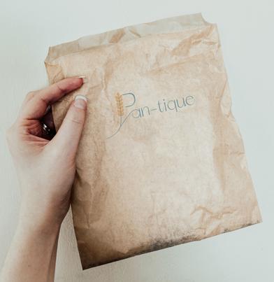
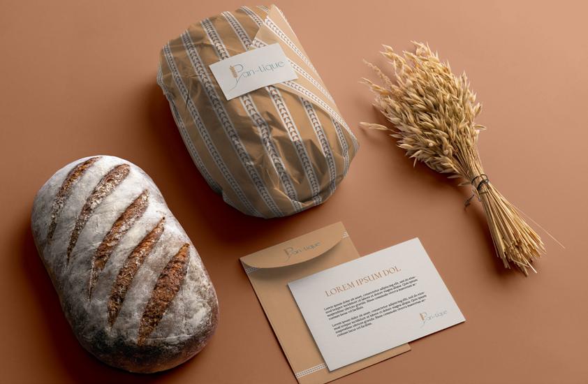
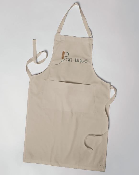
Pan-tique Bakery Brand Identity Guide 16
2023, Pan-tique
Design and Concept by Adelina Iancu
For support and queries please contact the designer
Adelina Iancu Romania, Buzau Tel. 1234 567 899 adelina.iancu@mail.com www.adelinaiancu.com
January 2023

