GRAPHIC DESIGN PORTFOLIO
Selected Works
2022-23

Selected Works
2022-23
I am highly passionate about visual communications with a keen eye towards trends, aesthetics & attention to detail.

My core expertise lies in conceptualisation, typography, colour theory & layouts. You will see works ranging from logo design, Identity & branding, collaterals, UI/UX, Packaging, Web & Publication.
I have a personal drive to always be at my best, comfortable working with a team & experienced working in fast paced environments.
Currently looking for a position as a graphic designer, open to remote & on-site roles.
Self-Employed, Nashik, Maharashtra
Freelance Graphic Designer
June 2022-Current
Product Designer / Assistant Project Manager
Design Eight India Pvt. Ltd
June 2021- June 2022
Adobe Illustrator
Adobe Indesign
Adobe Photoshop
Sketching
Painting
Psychology
Adobe Premier Pro Figma
3ds Max
Philosophy
Fitness
Football
aditya.gunjawate.1d@gmail.com
+91 8263923596
English(Fluent)
Hindi(Fluent) Marathi(Mother-tongue)
Italian(Basic)
Florence Design Academy, Florence, Italy
Florence Design Academy, Florence, Italy
Masters’s Diploma in Industrial Design (2019-2020)
Florence Design Academy, Florence, Italy
Bachelor’s Diploma in Industrial Design (2017-2019)
St.Lawrence High School & Junior College
Secondary and Higher Secondary Education (2009-2017)
Publication Design
Time Frame
4 Weeks Company
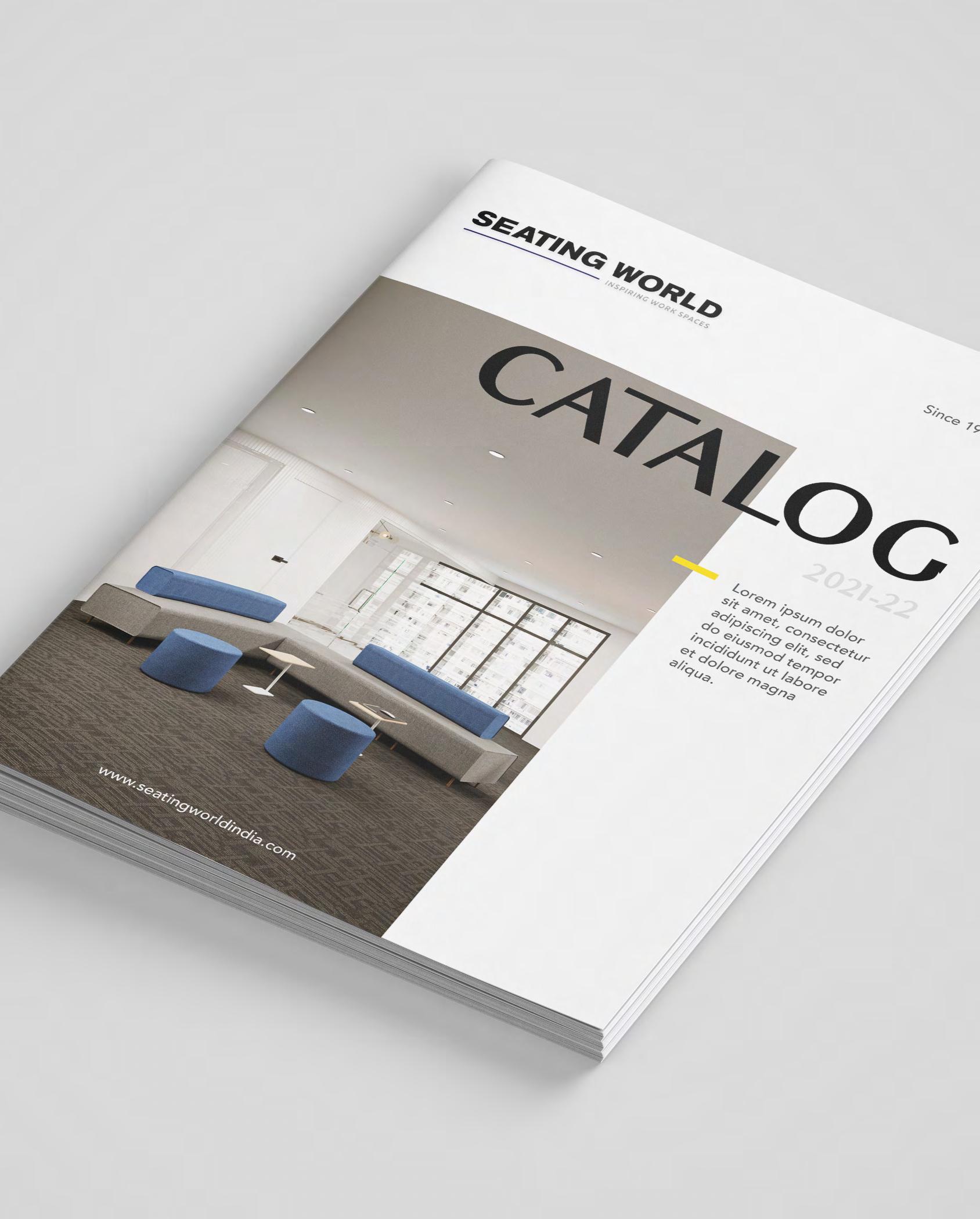
Seating World India Pvt.Ltd, Hyderabad, Telangana
Role
Closely understanding the products and the design philosophy of a furniture brand and transferring it into a simplified visual language.Collecting and producing high quality data such as product renders, technical drawings and written content.
Background
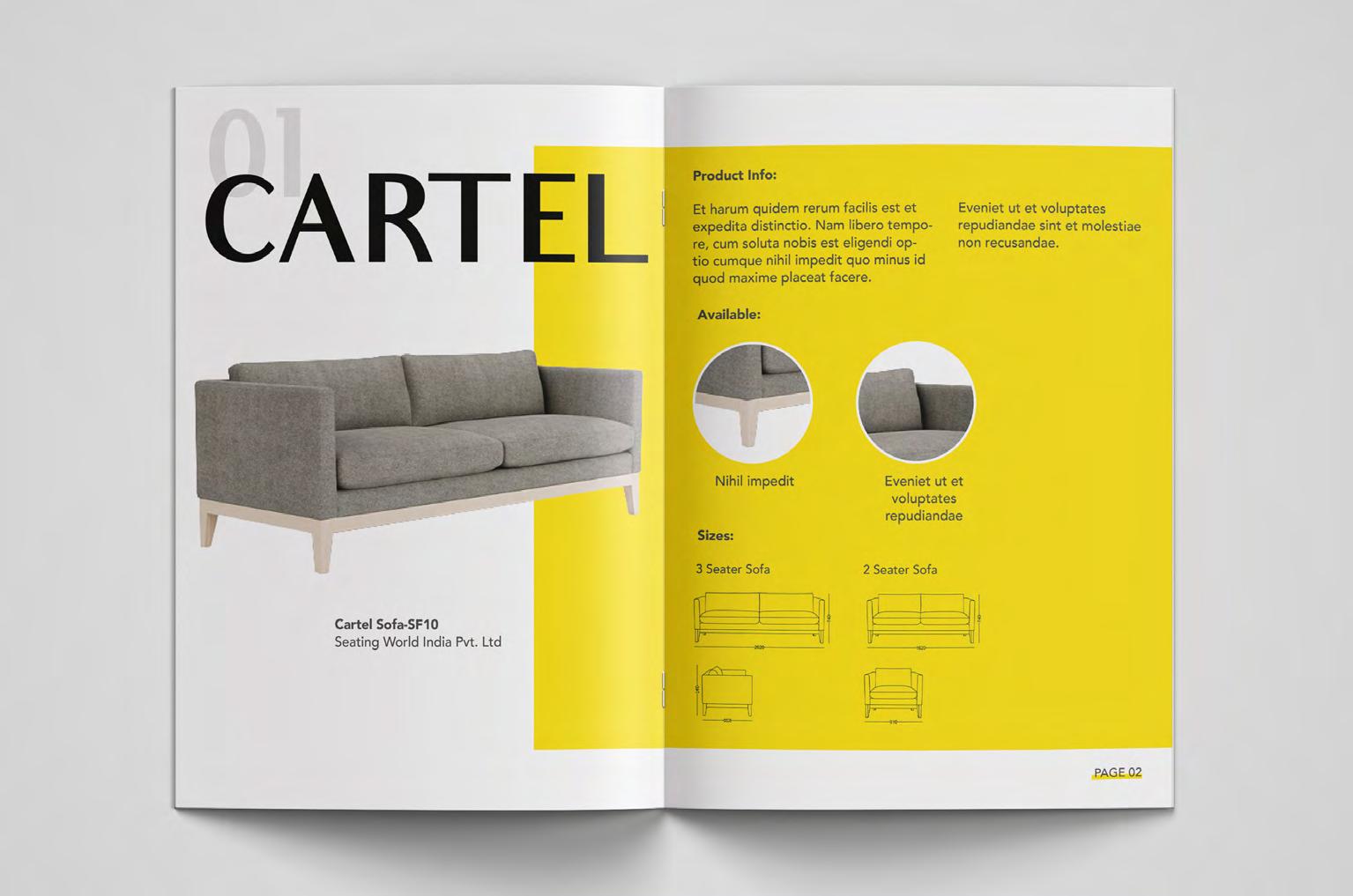
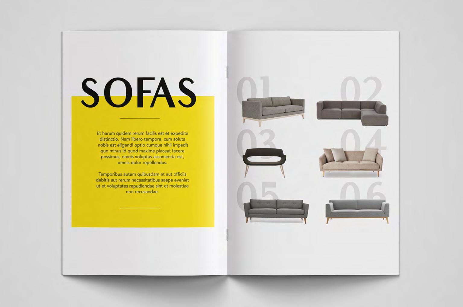
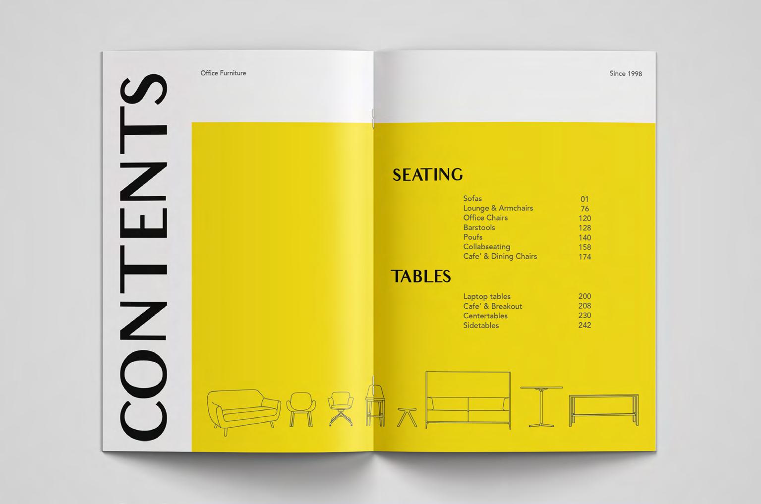
Seating World India is a well-recognised office furniture brand in Southern India. It has been offering complete furnishing solutions for companies and homes since 1998.
Based in Hyderabad its showroom space expands to 60,000 sq. ft with a manufacturing unit of 30,000 sq. ft, where different products are customised. Since its inception it has collaborated with world-class furniture brands such as Steelcase, Andrew World, B&T, Viccarbe, District Eight, etc and worked on projects with multinational companies such as Google, Microsoft, ADP, J.P Morgan, etc.
Within a publication, a book resides a complex journey and framework of publication design. From understanding the target audience, collecting data to choose the right colour, type and layout.
As an infographic publication, it has to be very clear and precise, for its viewers to understand easily. Explaining the products with only limited and necessary information. While also keeping in mind the brand philosophy, values & heritage.
Topic : Catalogue Design, Documentation
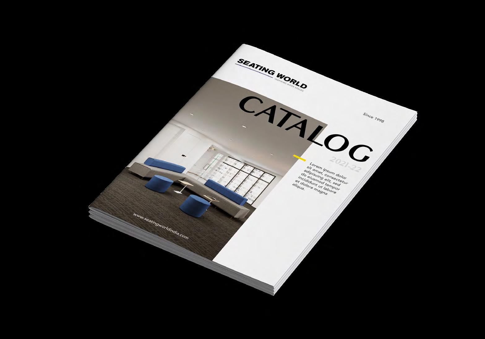
Dimensions : A4
Paper : 150 gsm
Cover: 250 gsm
Stage 1
Research
Data collection
Content
Ideations
Layout explorations
Stage 2
Type explorations
Layout Finalisation
Cover explorations
Approvals
Improvements
Stage 3 Mockup Presentation Final Print
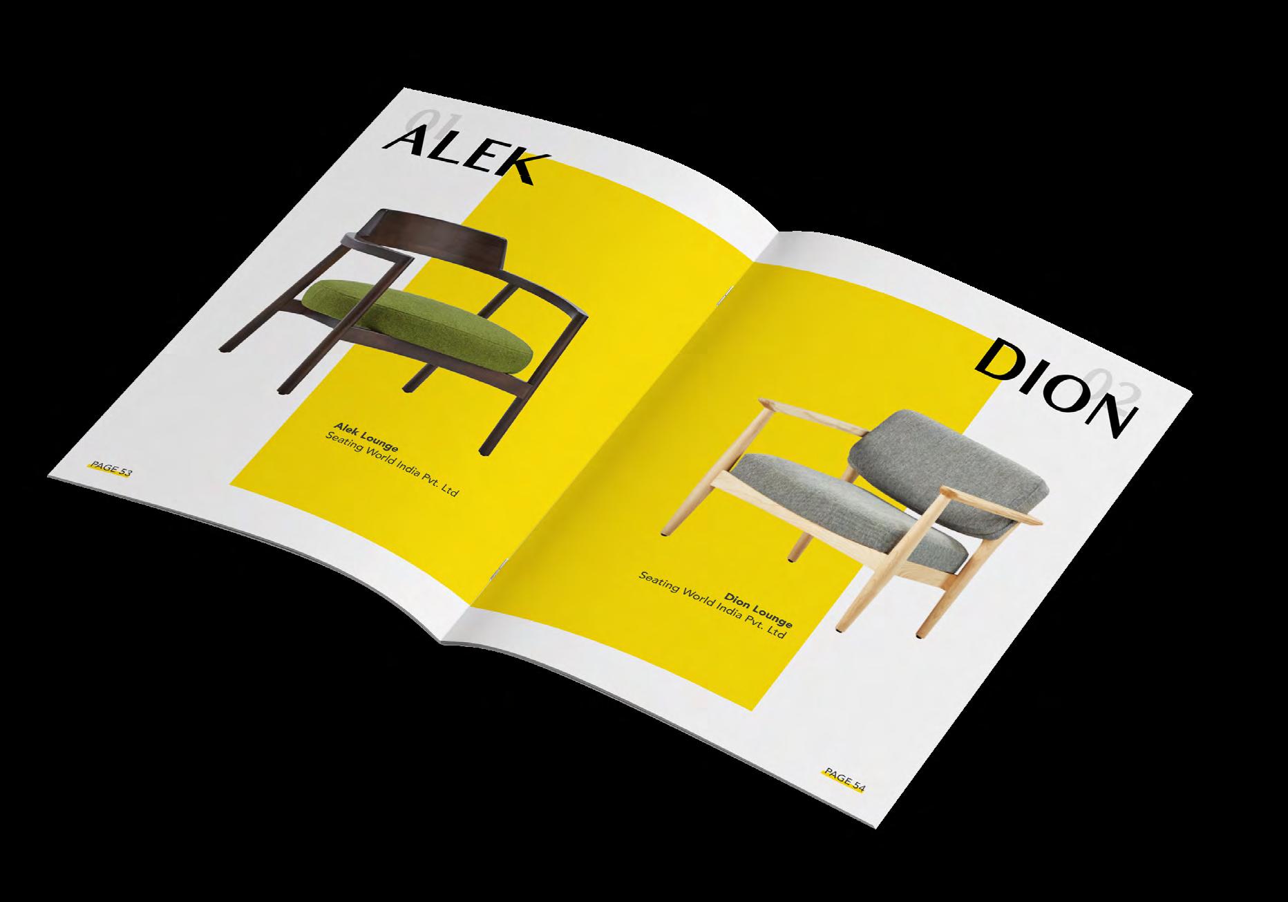
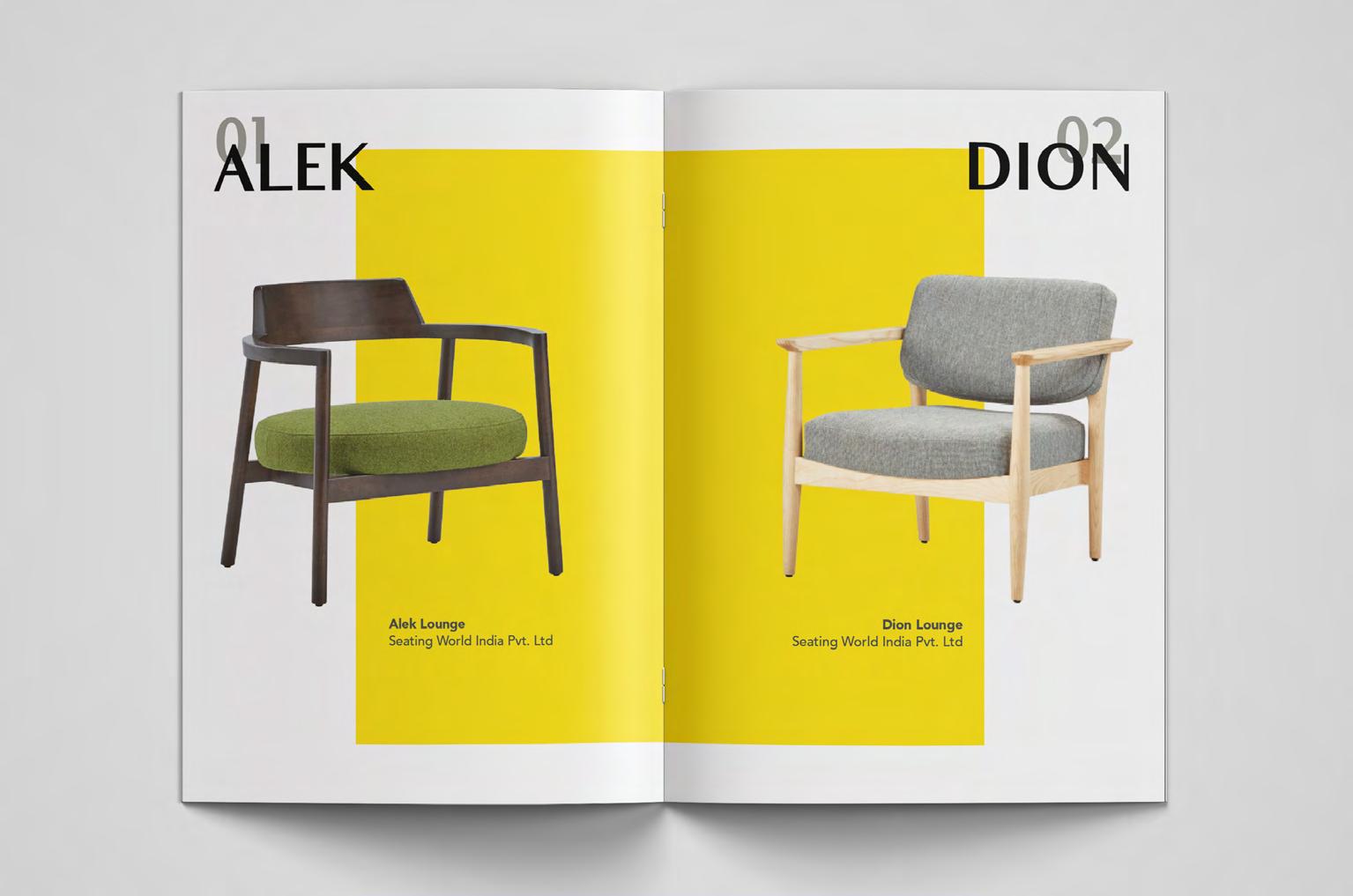
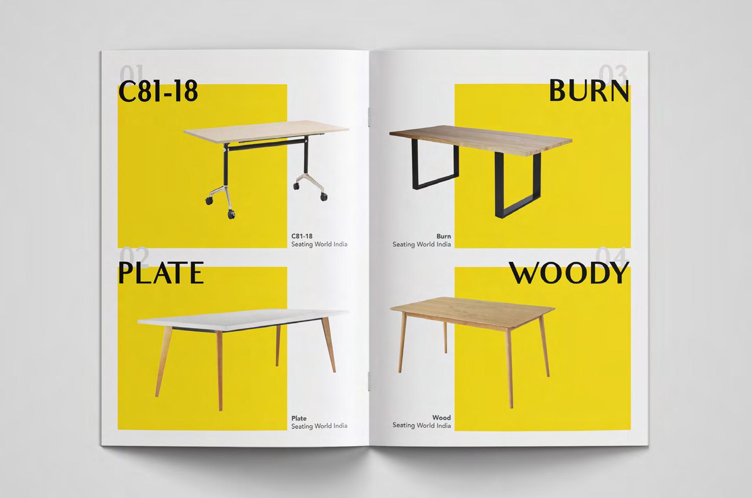
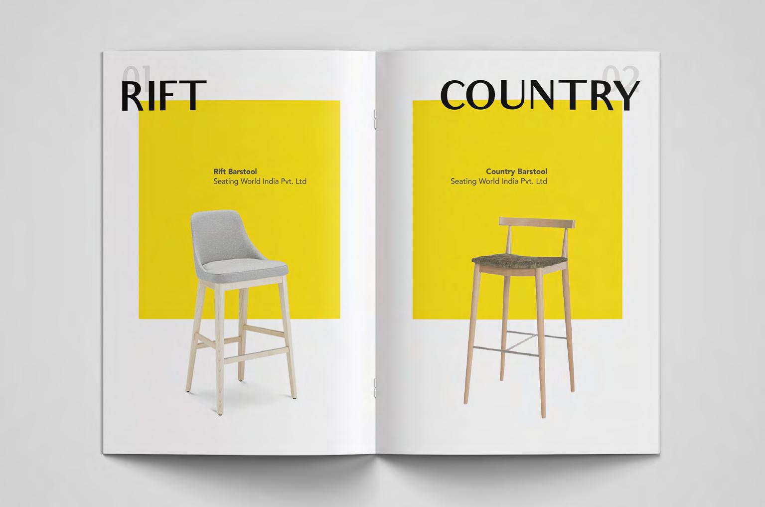
Some spreads of the catalogue
Time Frame
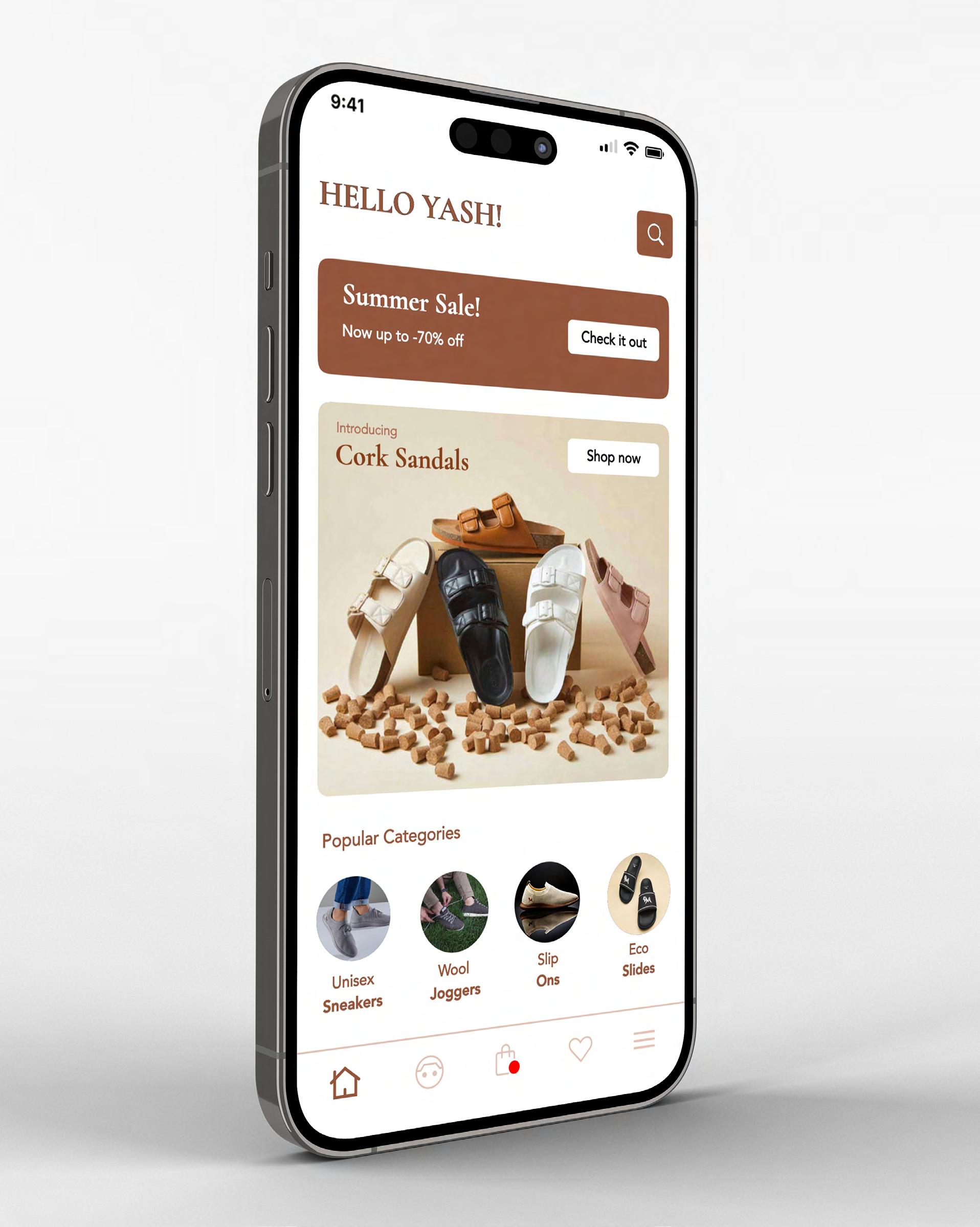
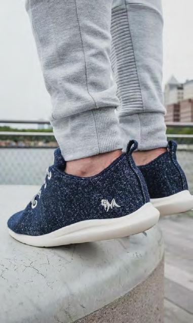
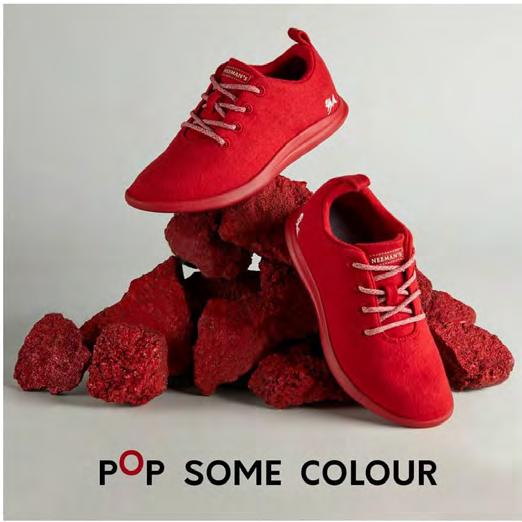
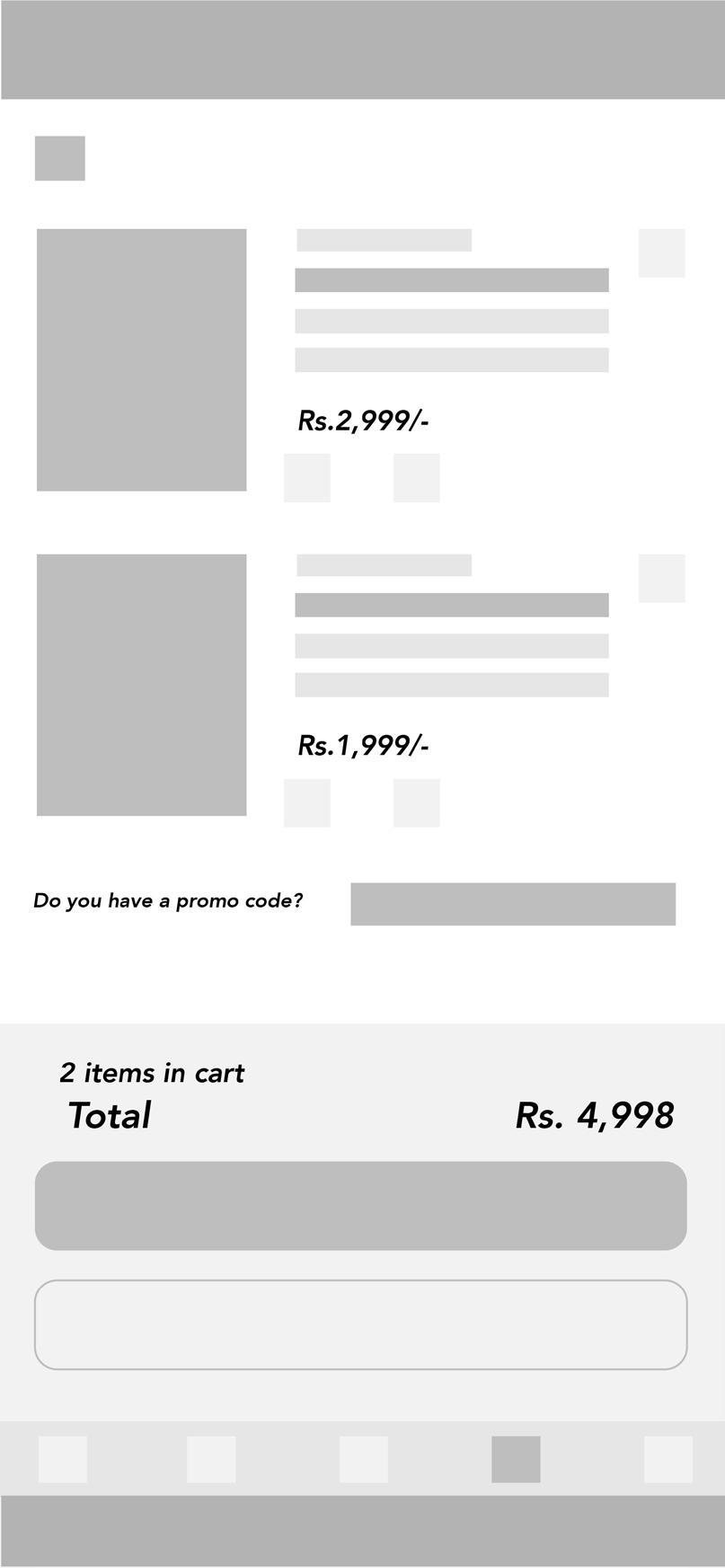
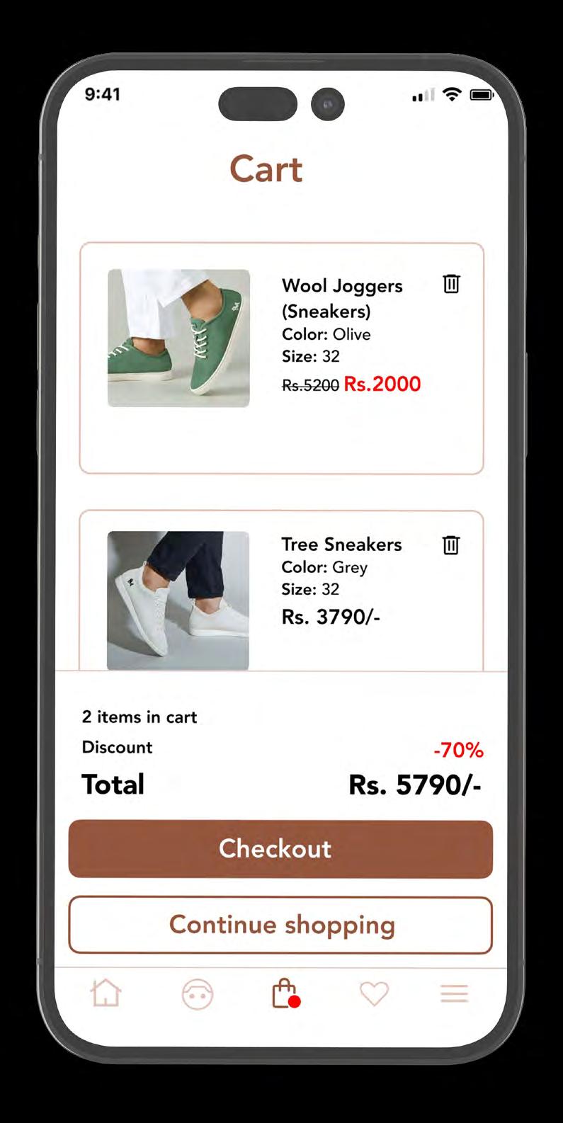
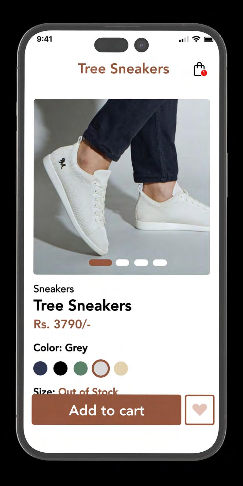
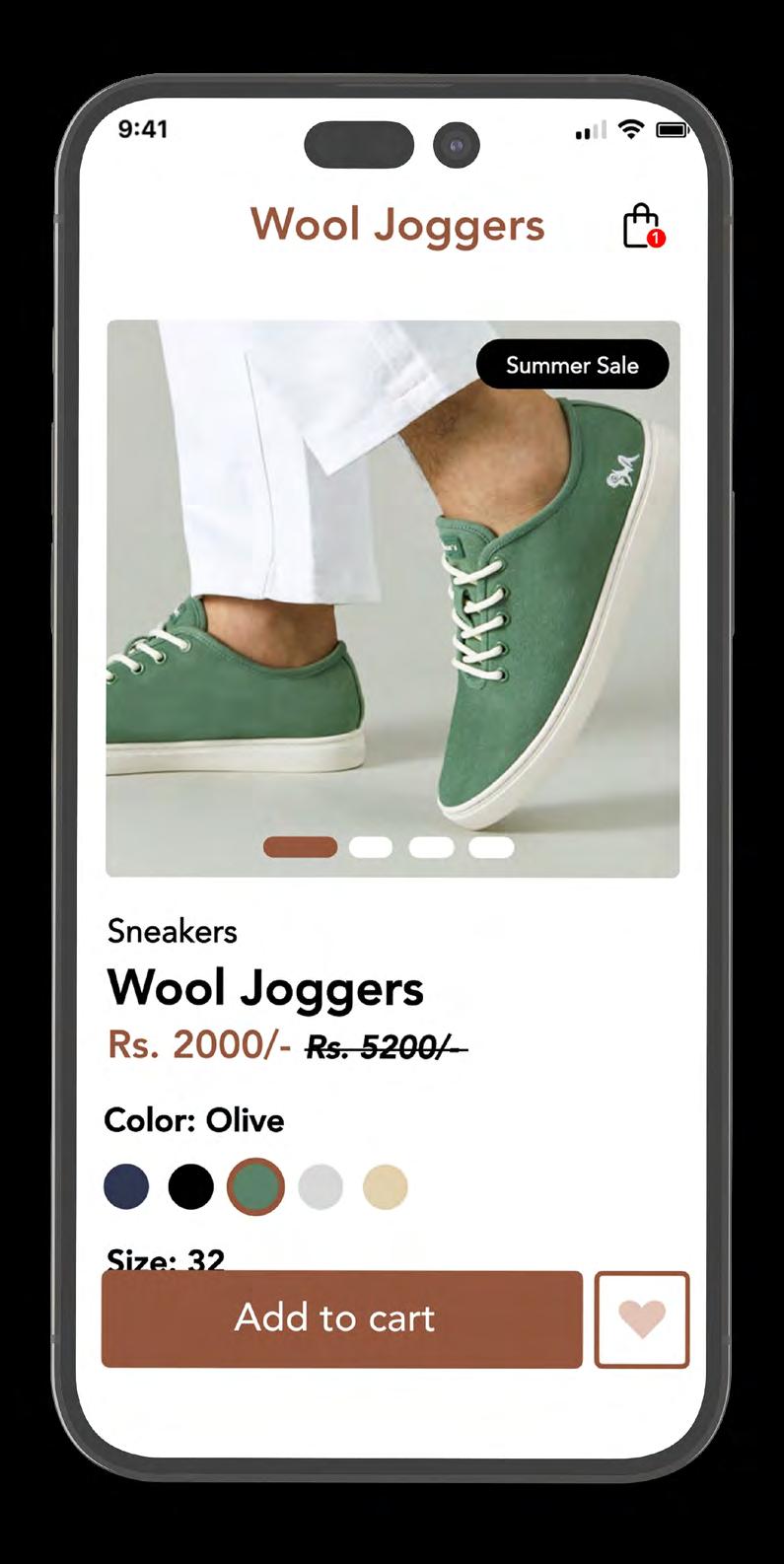
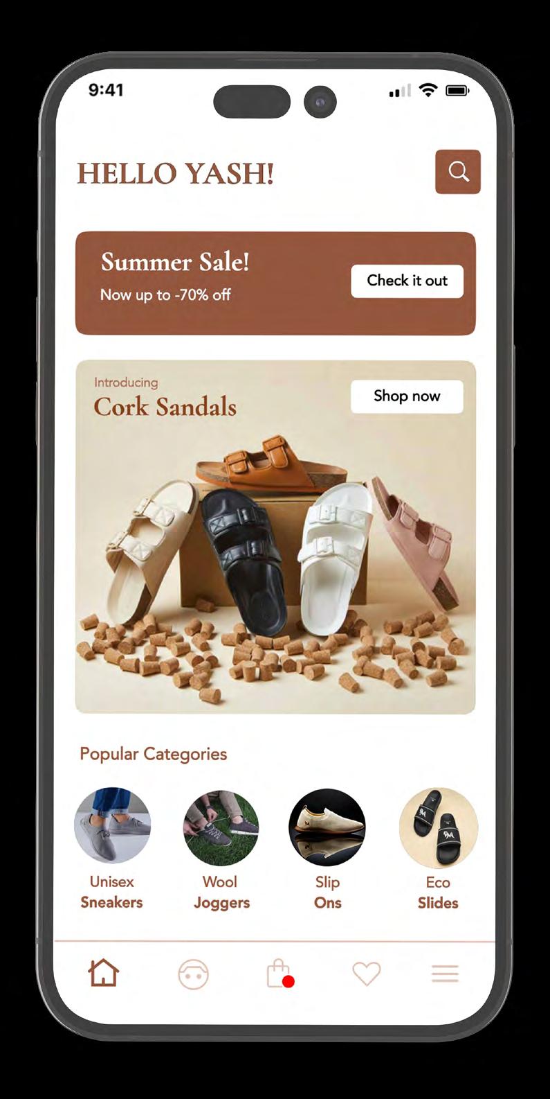
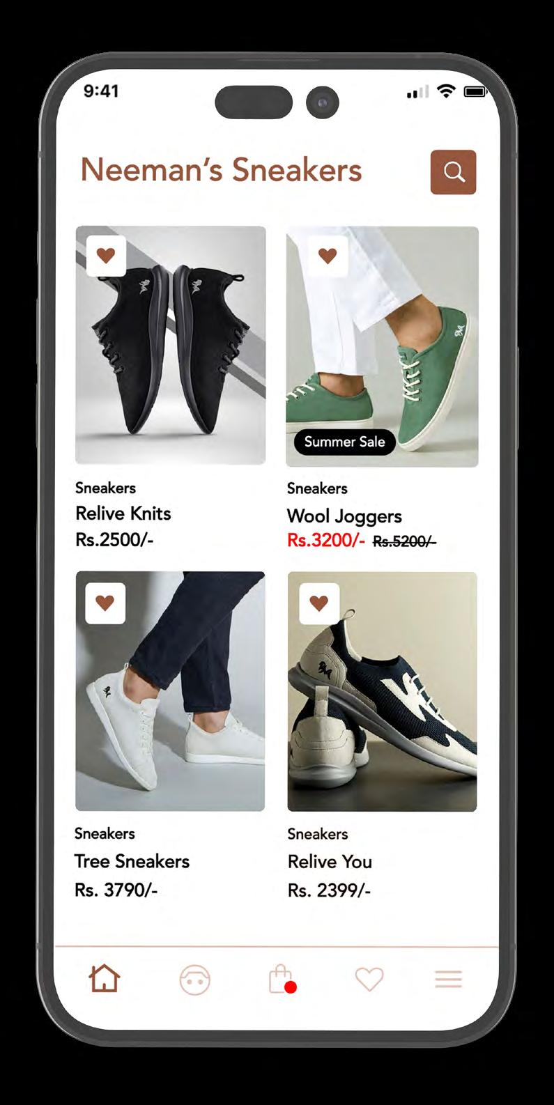
4 Weeks Company Neeman’s India, Hyderabad (Personal Project)
Role
Realising the gap between the current position of the brand with respect to it’s giant competitors.Understanding the target audience and creating a user interface that is easy to use, almost instinctive.
Background
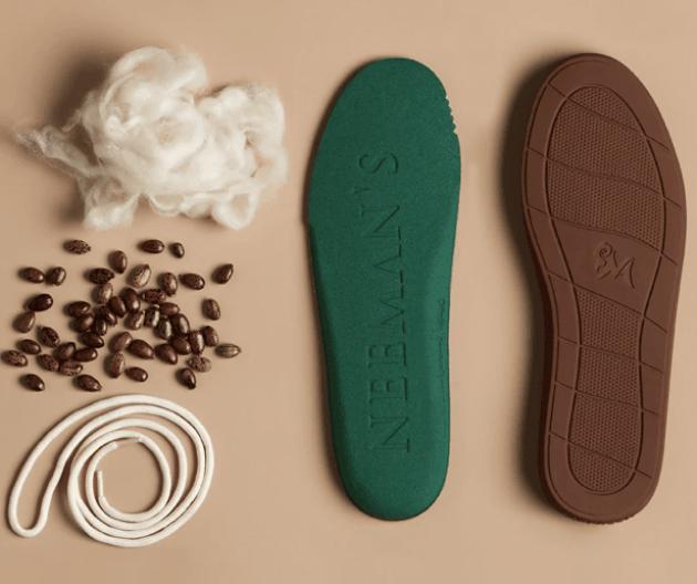
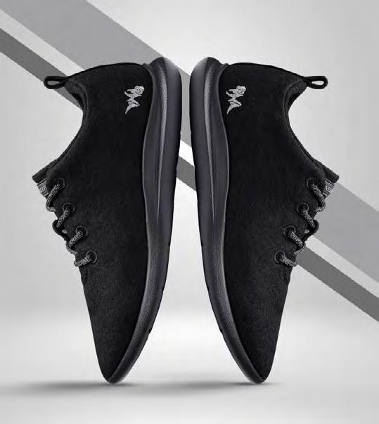
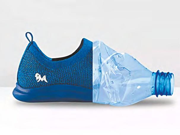
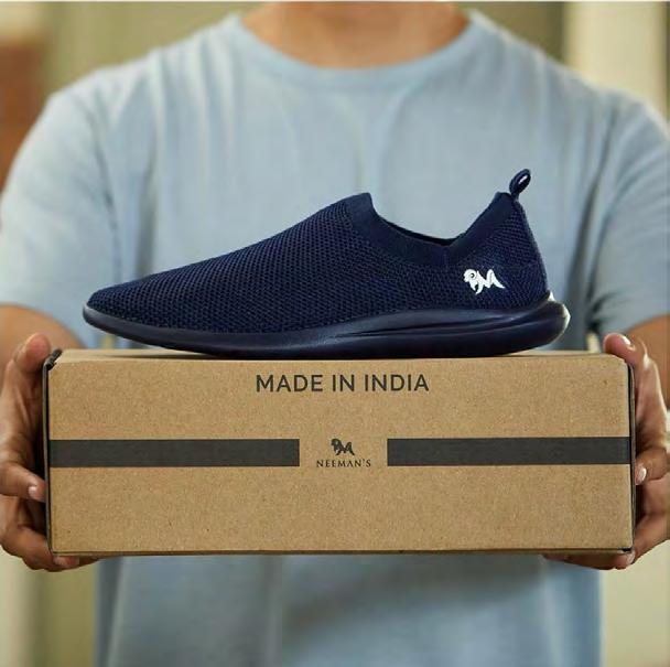
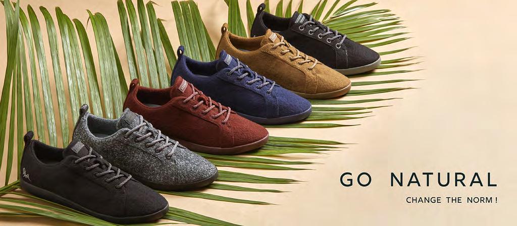
Neeman’s is India’s first shoe brand to use natural, renewable and sustainable fibres, including merino wool.
Founded in 2017, in Hyderabad, Neeman’s envisages manufacturing shoes that are stylish, comfortable, and eco-friendly. Neeman’s is the first company in India to use Australian merino wool for its shoes. Neeman’s shoes are leading a culture of sustainability and comfort in the footwear space in India. Neeman’s manufactures comfortable shoes that are crafted with merino wool, organic cotton, recycled PET bottles, wood, fruit pulp, tyres, bamboo, and more.
Yash Bhansal, 26 yrs, is an Interior designer based in Kolkata. A sneaker head who buys from brands like Nike, Puma, etc. Who is looking for a made in India brands offering quality such as the international brands, he finds Neemans.
Visha Gunjal, 48 yrs, is a housewife based in Banglore. Likes to browse footwear and finds neemans shoes to be good looking & affordable, yet is looking for an inclusive and safe buying experience over an app.
Stage 1
Research
Defining objective
Moodboards
Data Collection
Stage 2
User personas Information arch Ideation
Layout explorations
Wireframes
Stage 3
Style guide High fidelity wireframes
Interactions


Identity & Branding
Time Frame
4 Weeks
Company
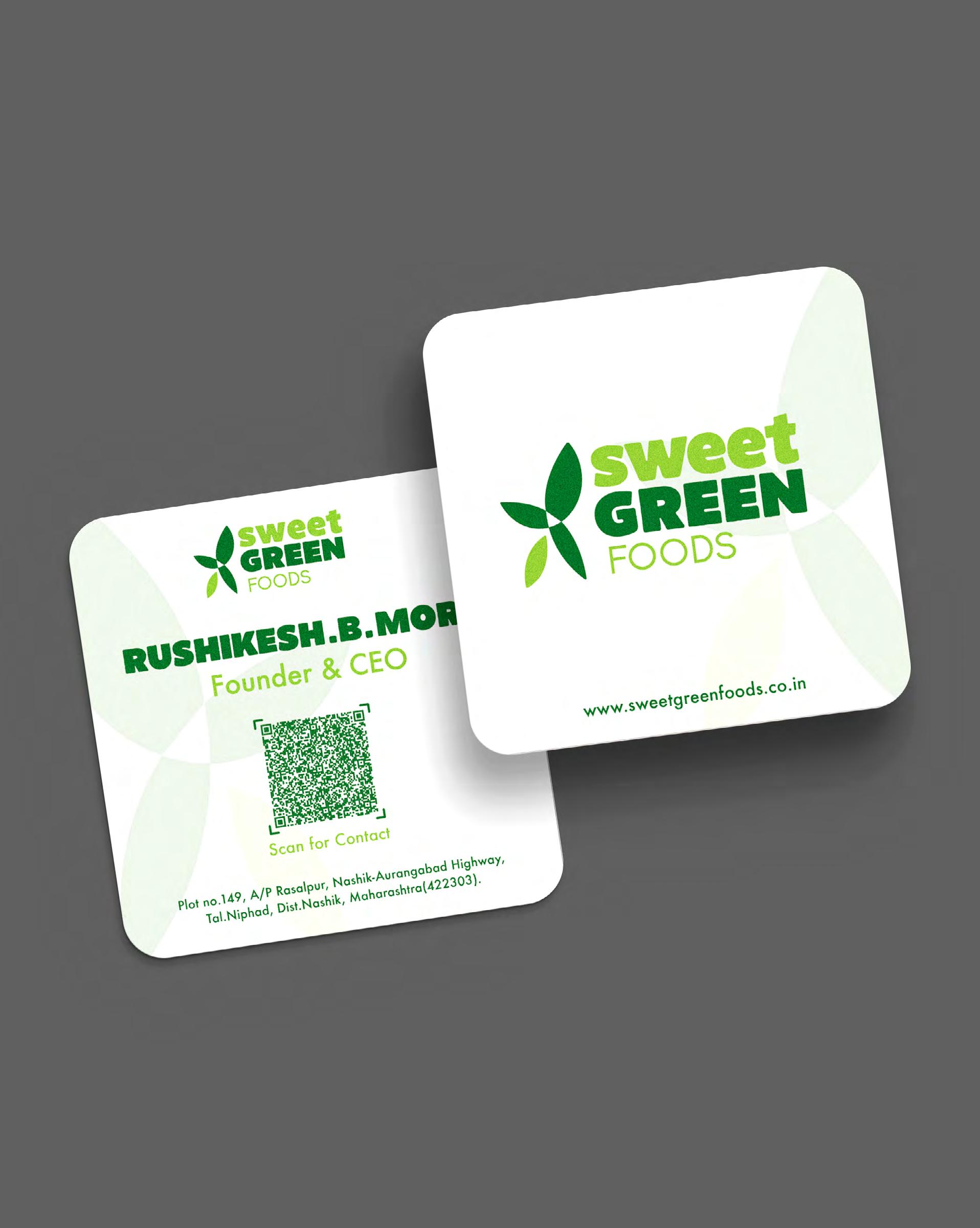
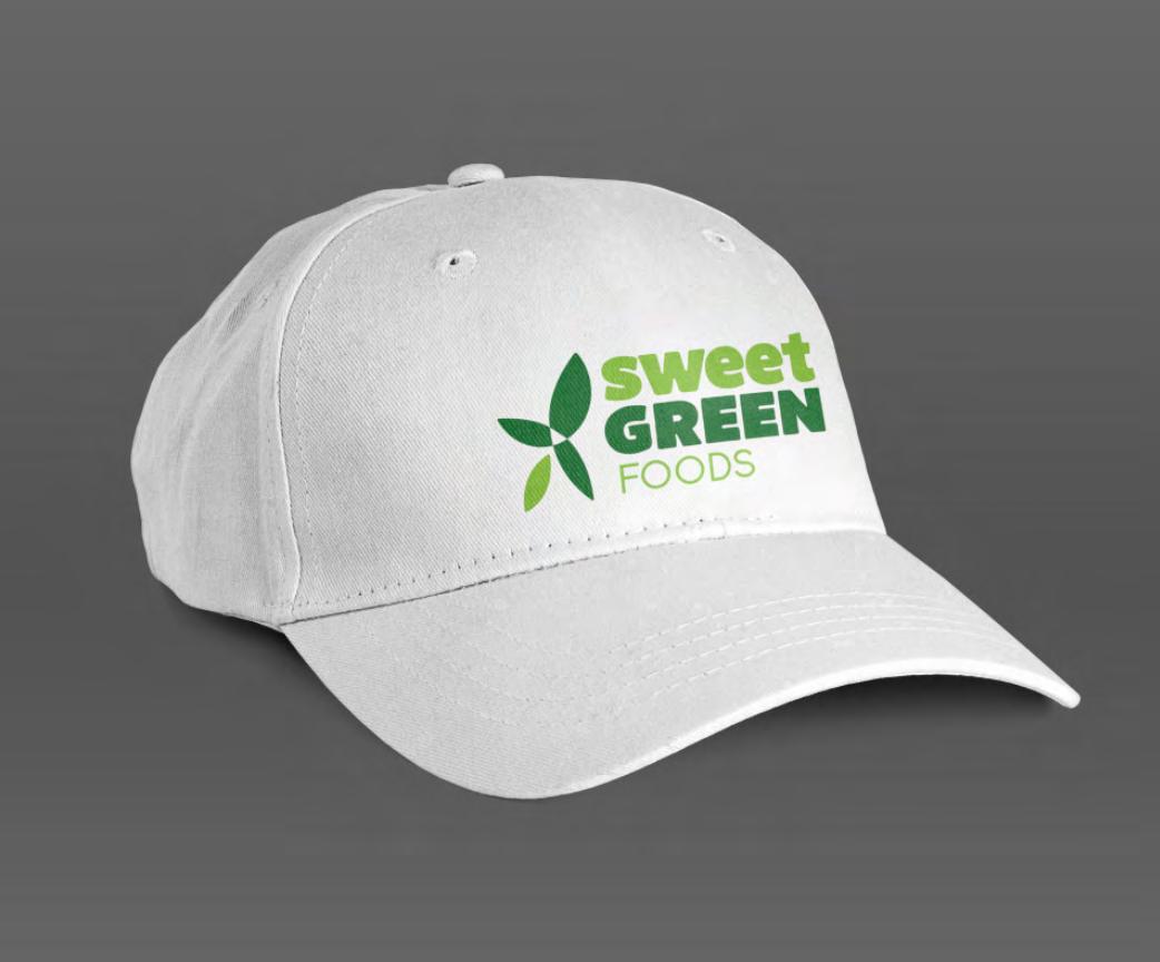
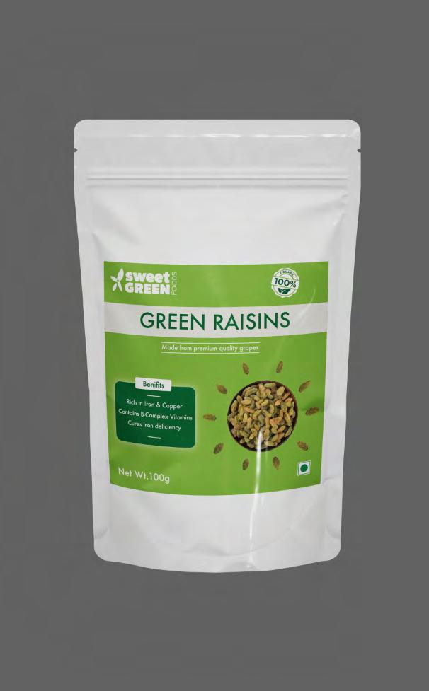
Sweet green Foods
Role Understanding the vision of the client of rebranding this original brand named sweet green farms as an organic foods company. Understanding the target audience.
Background
Sweet green foods is a startup that emerged with a vision of building healthier communities by connecting people to natural food.
The products include Nutraceutical products, probiotics, Multivitamin Syrups, Gym Supplements and Amino Acids, Instant drinks, and many more in the further expansion plans.
Making food that is slow, expensive and healthy as opposed to fast, cheap and unhealthy.
Stage 1
Client Meeting
Data Collection
Research
Ideation
Conceptualization
Exploration
Stage 2
Finalizing Improvements
Font explorations
Color selection
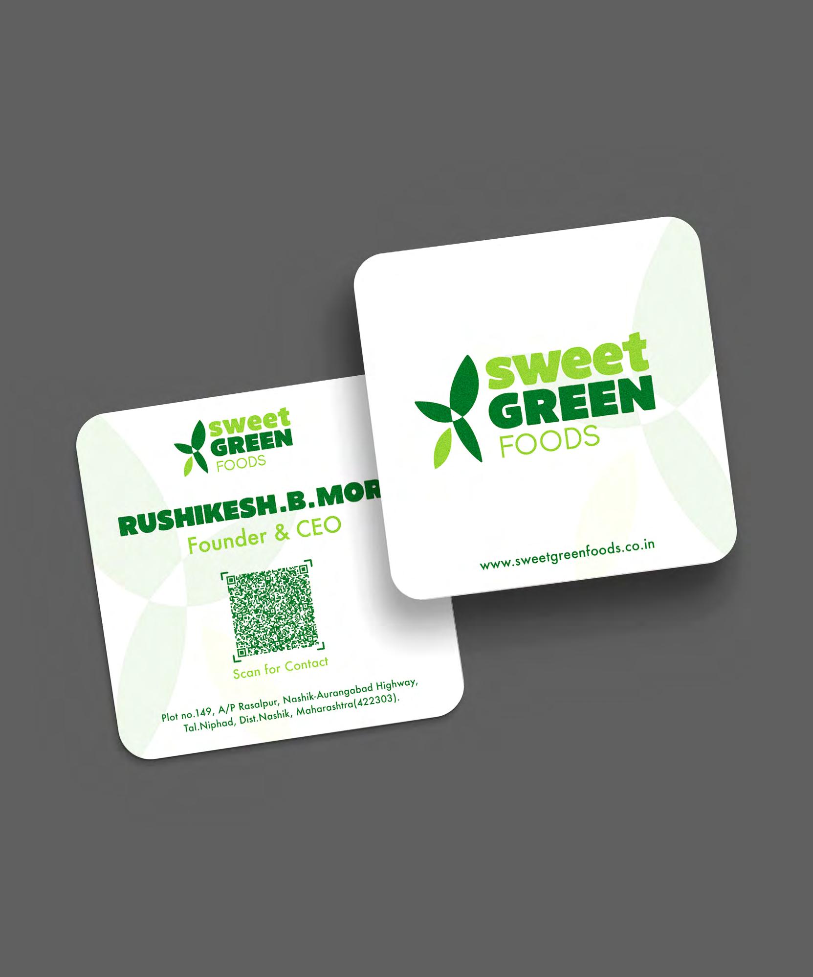
Collaterals
Brand Ideation
Stage 3
Branding
Brand Campaign
The logo started taking its idea as being a combination mark. Seed to crop shows the organic and healthy motive of the brand & at the same time the letter ‘X’ that is auspicious & is a musthave to the client.
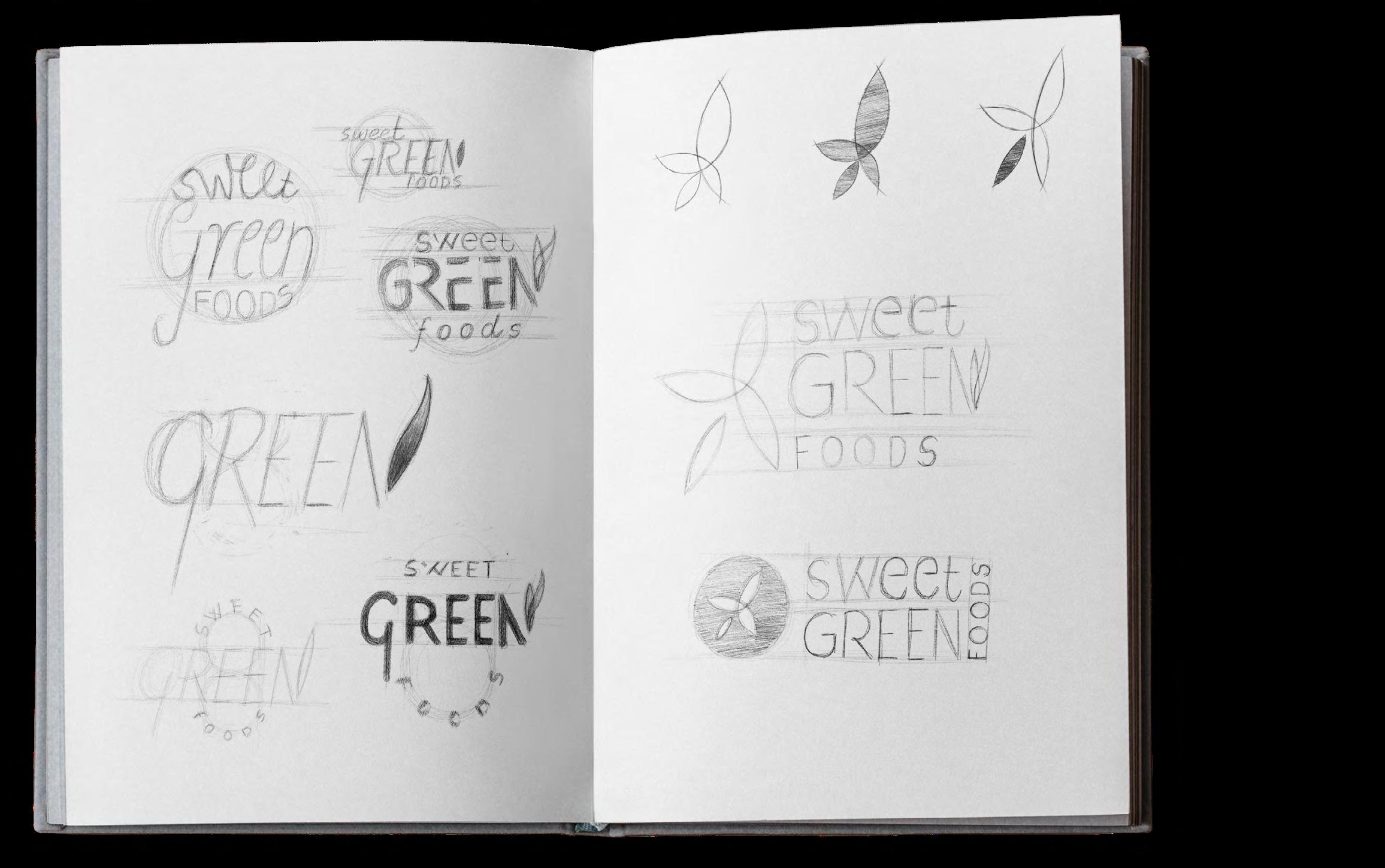
A brand that started in the interiors of a town in Maharashtra. Hence the logo initially was aimed to portray the real illustration of the site farm alongside the manufacturing/factory area.
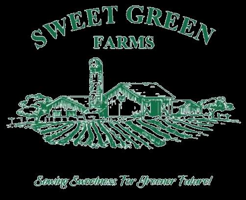
This original identity was aimed to create a vintage look. Eyes are led from the farmland to the factory and then to the Brand, difficult to create a recall value. The mono-colour looks very dull & boring.
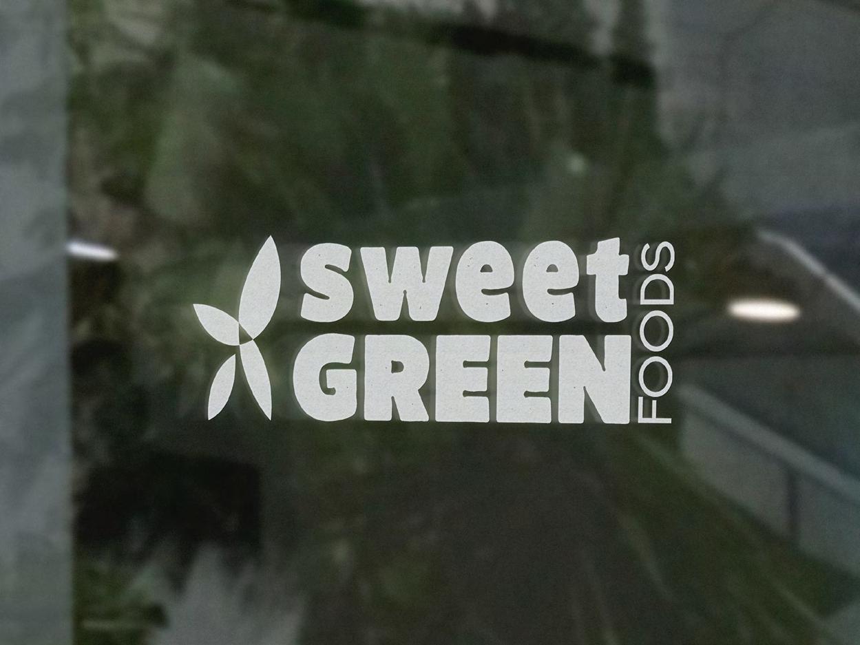
The new logo is aimed to create a brand identity that is recognisable, versatile & timeless.
We choose to construct the logo alongside the name for easy readability, with a vision that the logo could also be used on its own as time passes by.
The colours give a sense of freshness and tend to stand out creating a very strong and balanced recall value.
#136f2d R:19 G:111 B:45
Larrikin Black Solid
Futura Medium
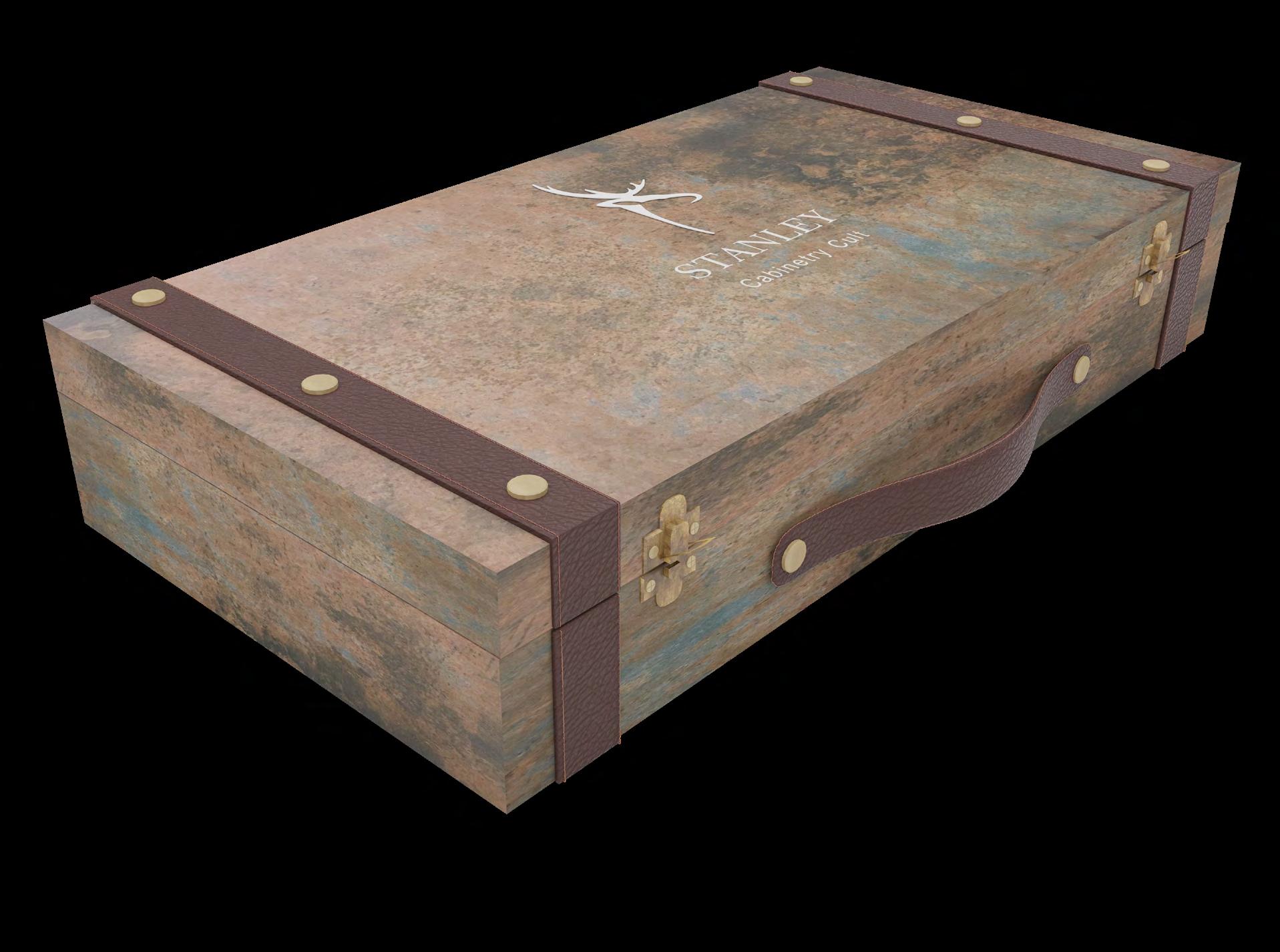
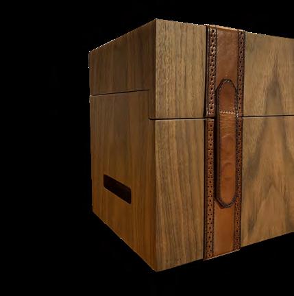
Product Design
Time Frame
3 Weeks
Company
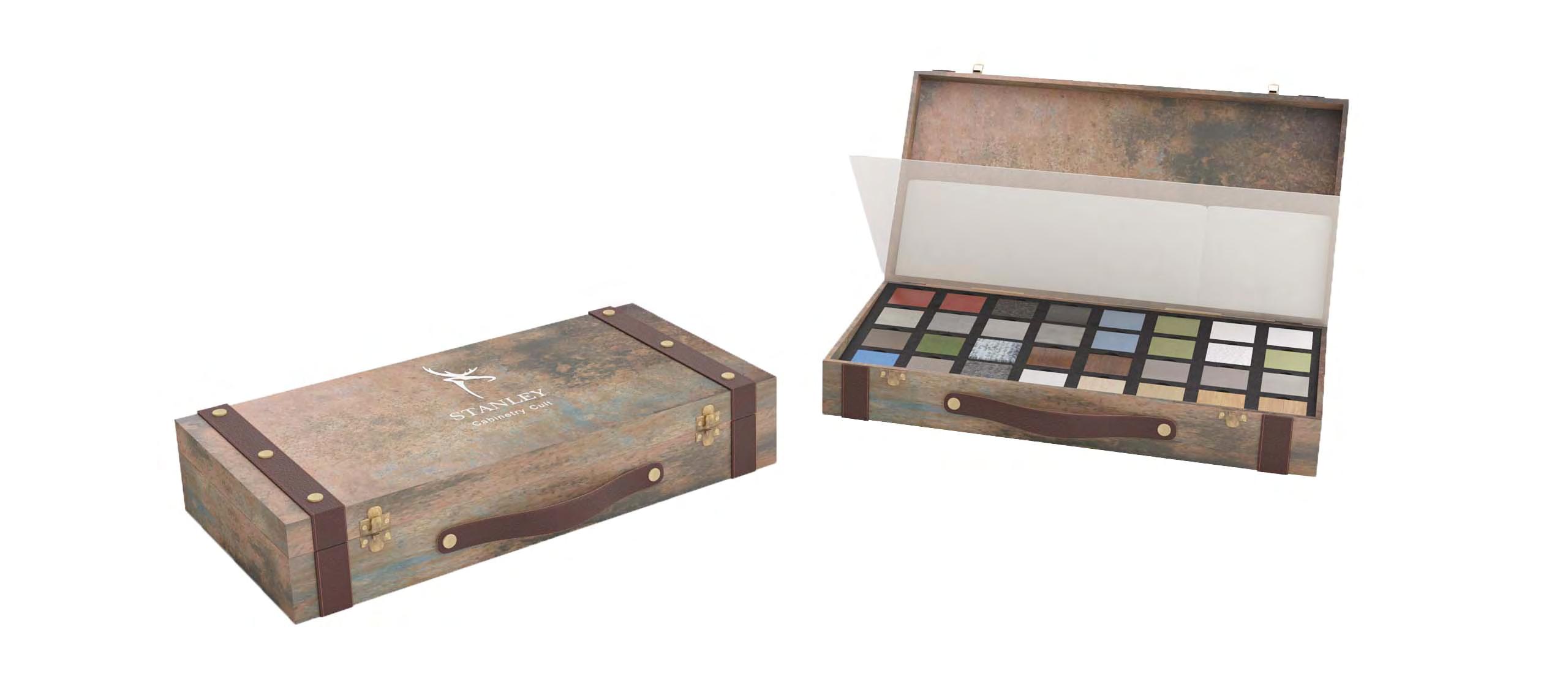
Stanley Living
Role
Analysing the existing products, drawbacks & problems. Understanding the brand values & design language to create a product that looks good & is purposeful.
Background
Stanley is India’s leading luxury furniture and home decor brand.
Started 26 years ago, started off as car seat upholstery from a car shed, having vendors lining up from all around the world for their exclusive upholstery leathers.
Moving towards the leather sofas section they slowly started expanding into a complete lifestyle brand with stores all over India as well in the US.
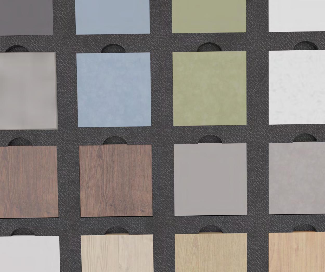
Understanding the existing product and identifying that it is very heavy in weight, hence difficult to carry from place to place. As well it has some non-functional details such as the handle with less depth makes it even more difficult to hold. Also, the product fails to depict the story or design language of Stanley as a brand.
• Heavy
• Visually looks like a shoe box.
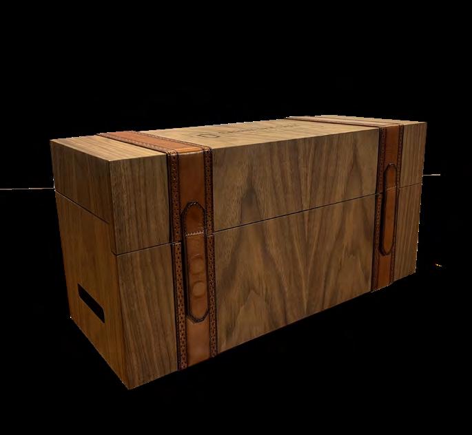
• Nonfunctional Details.
Stage 1
Research
Defining Problems
Moodboards
Ideation
Conceptualization
Exploration
Stage 2
Improvements
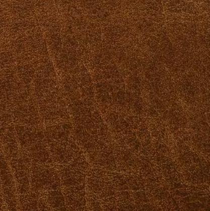
Color, Material & finishes
Technical aspects
Stage 3
Renders
Final Graphics
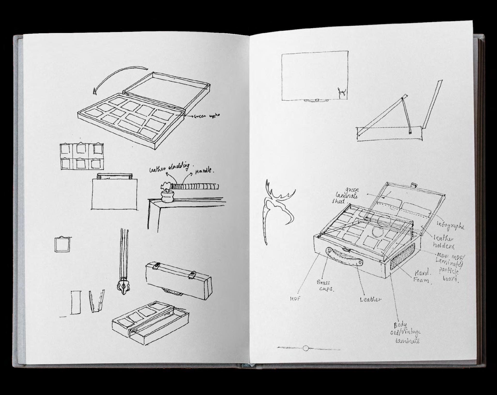
• We drew inspiration from old vintage suitcases and also adopted the shape as it distributes weight evenly and is easy to move around.
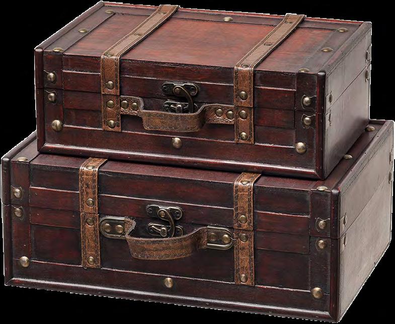
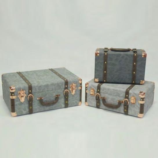
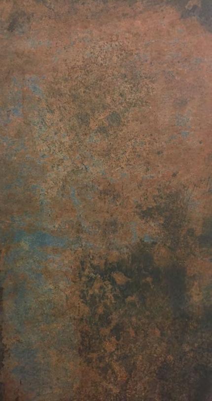
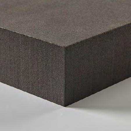
• Focusing on details and using materials that represent the design language & narrate the story of the brand.
• While inside of the bag has details that make it easy to use and will keep the material samples safe.

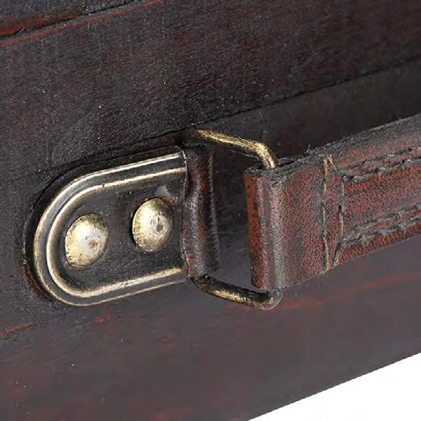
Cabinetry Cult
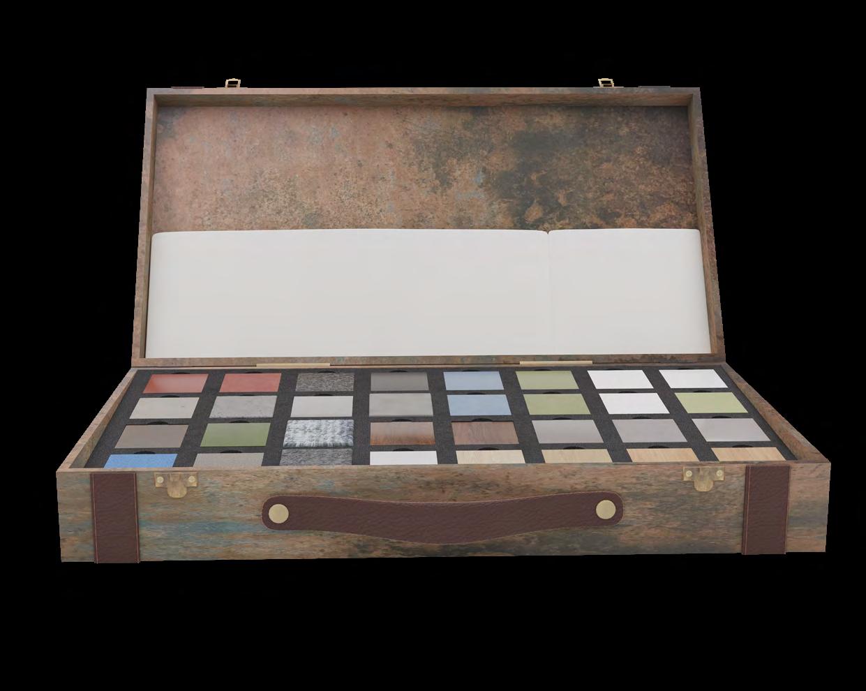
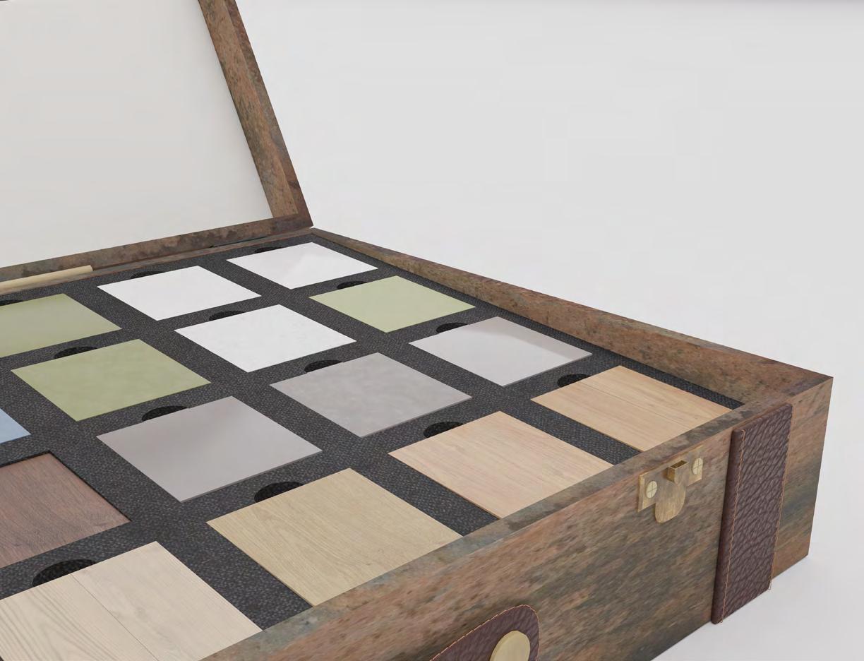
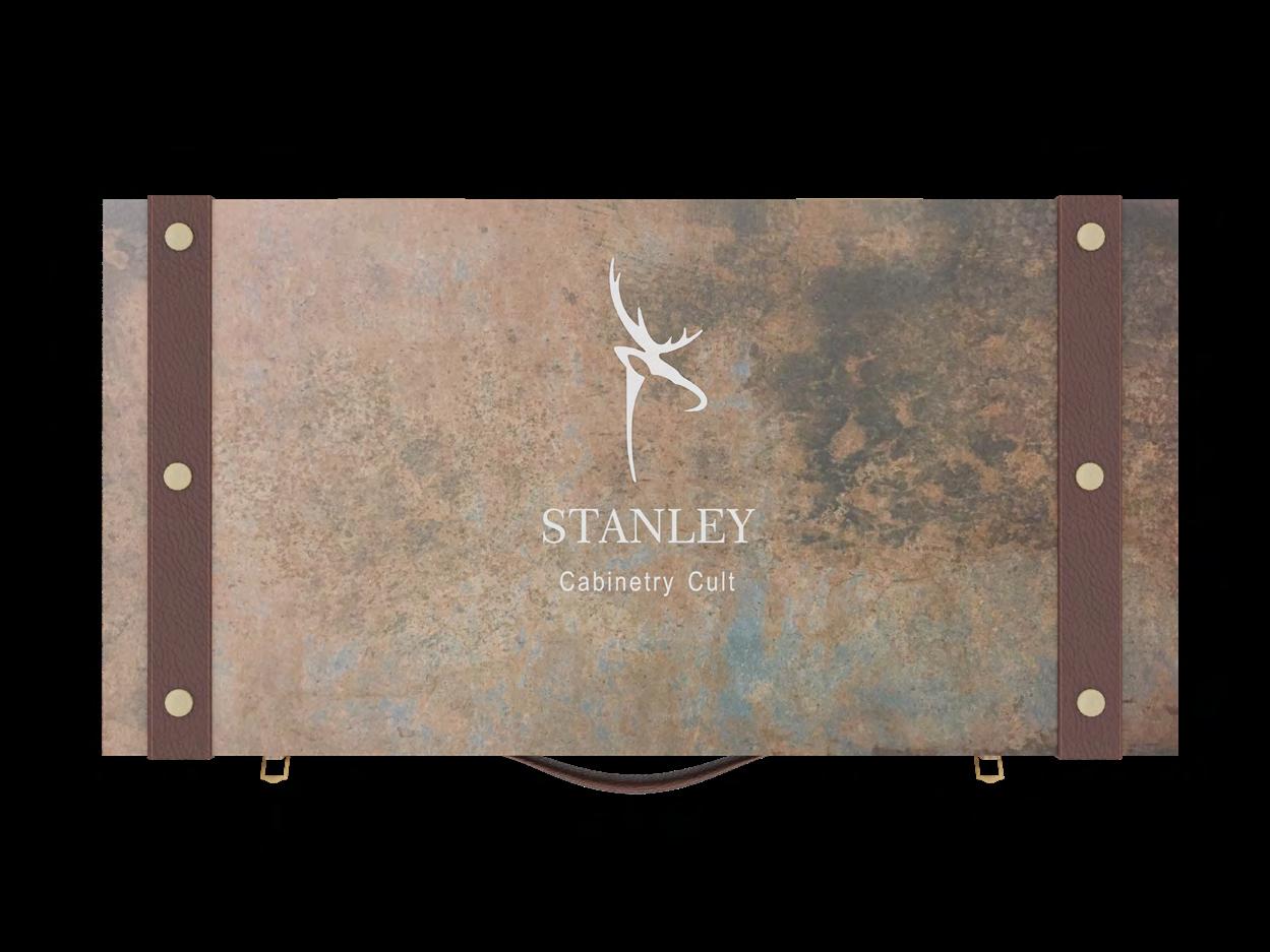
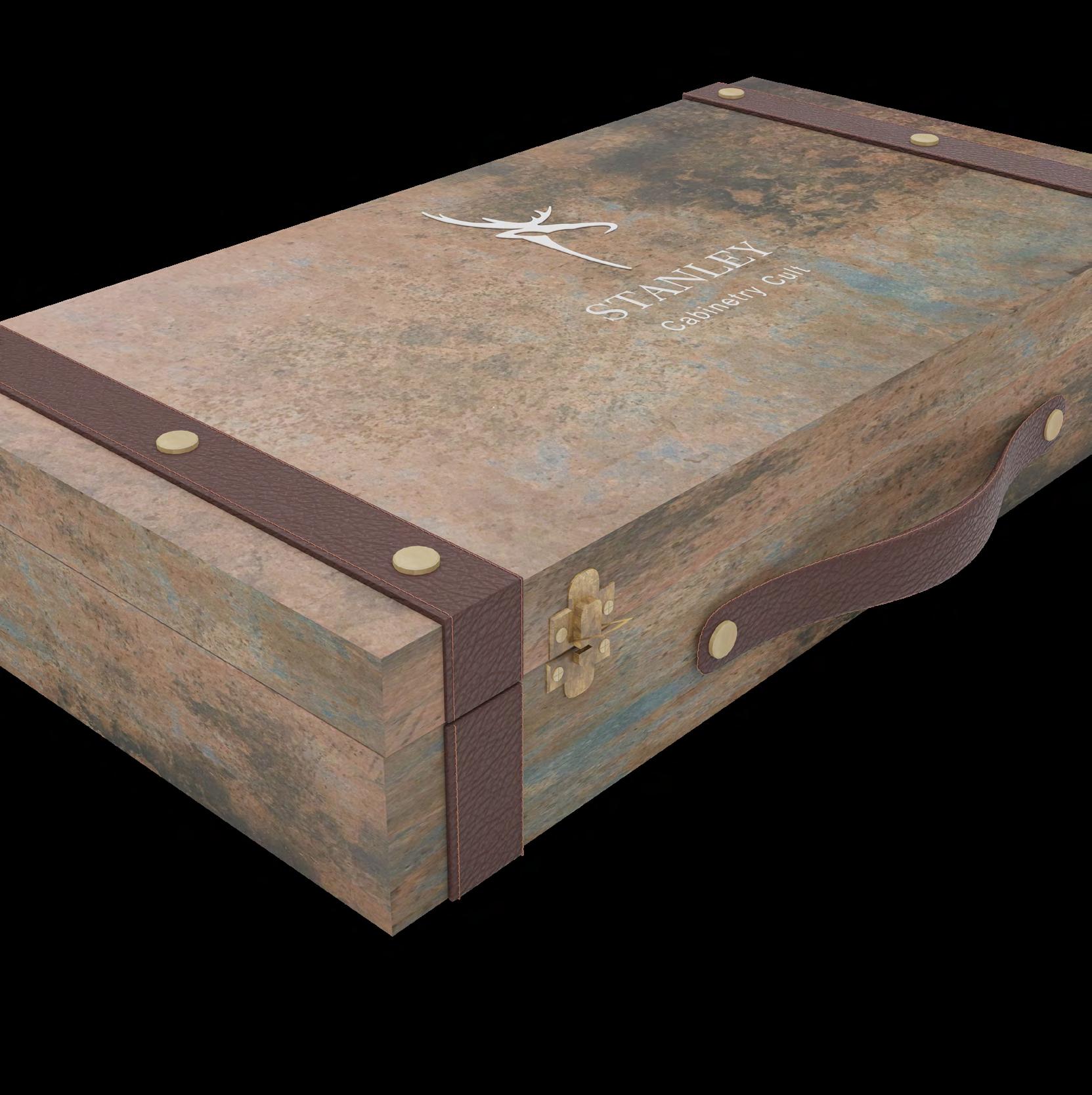
Leather storage
 Butter paper
Leather cutout logo
MDF & Veneer
Foam
Butter paper
Leather cutout logo
MDF & Veneer
Foam