
CONTENTS
Modular Living in Spokane
Mixed-Use on Lake Union
Detailing a Redesign
[ Grassroots ]


Fall 2020 / Architectural Design V

Micro-community
With the construction of I-90 through East-Central Spokane, a historically neglected community was further divided. Nearly 30% of East-Central Spokane falls below the poverty line and 43% of this community is home to African American residents due to this area’s history of redlining.
Considering the issues at hand and the everencroaching development of this area, we were tasked to provide an architectural solution that addresses community needs while aiming to combat gentrification and the potential displacement of the residents in this neighborhood.
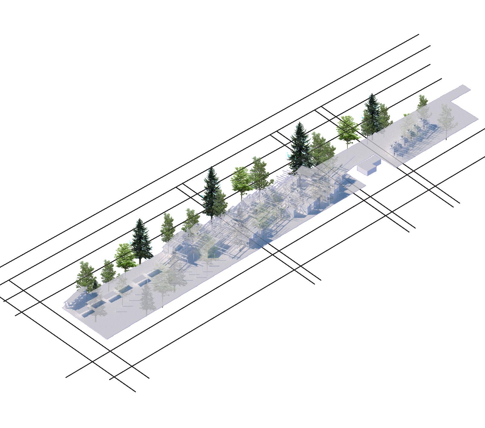
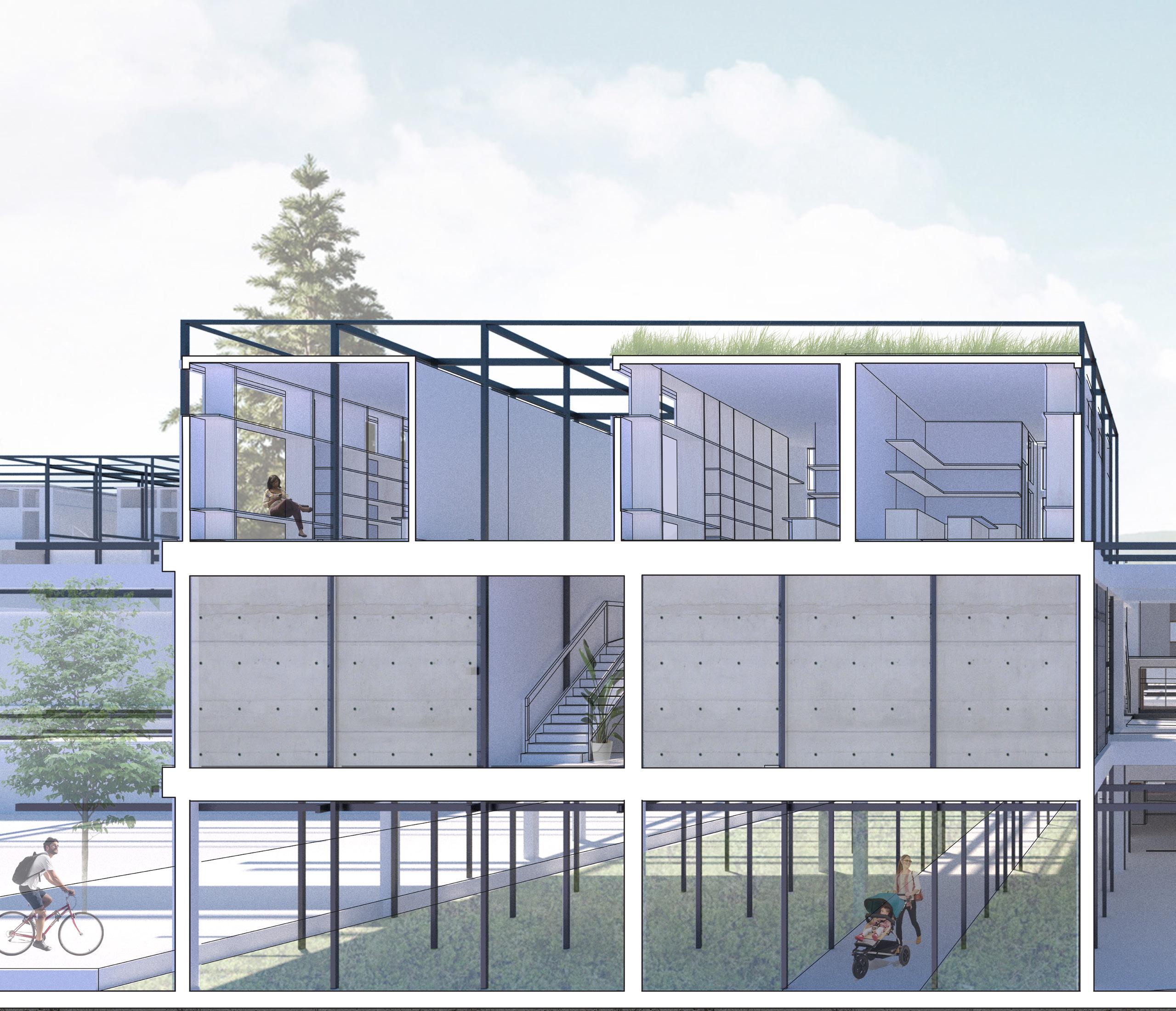
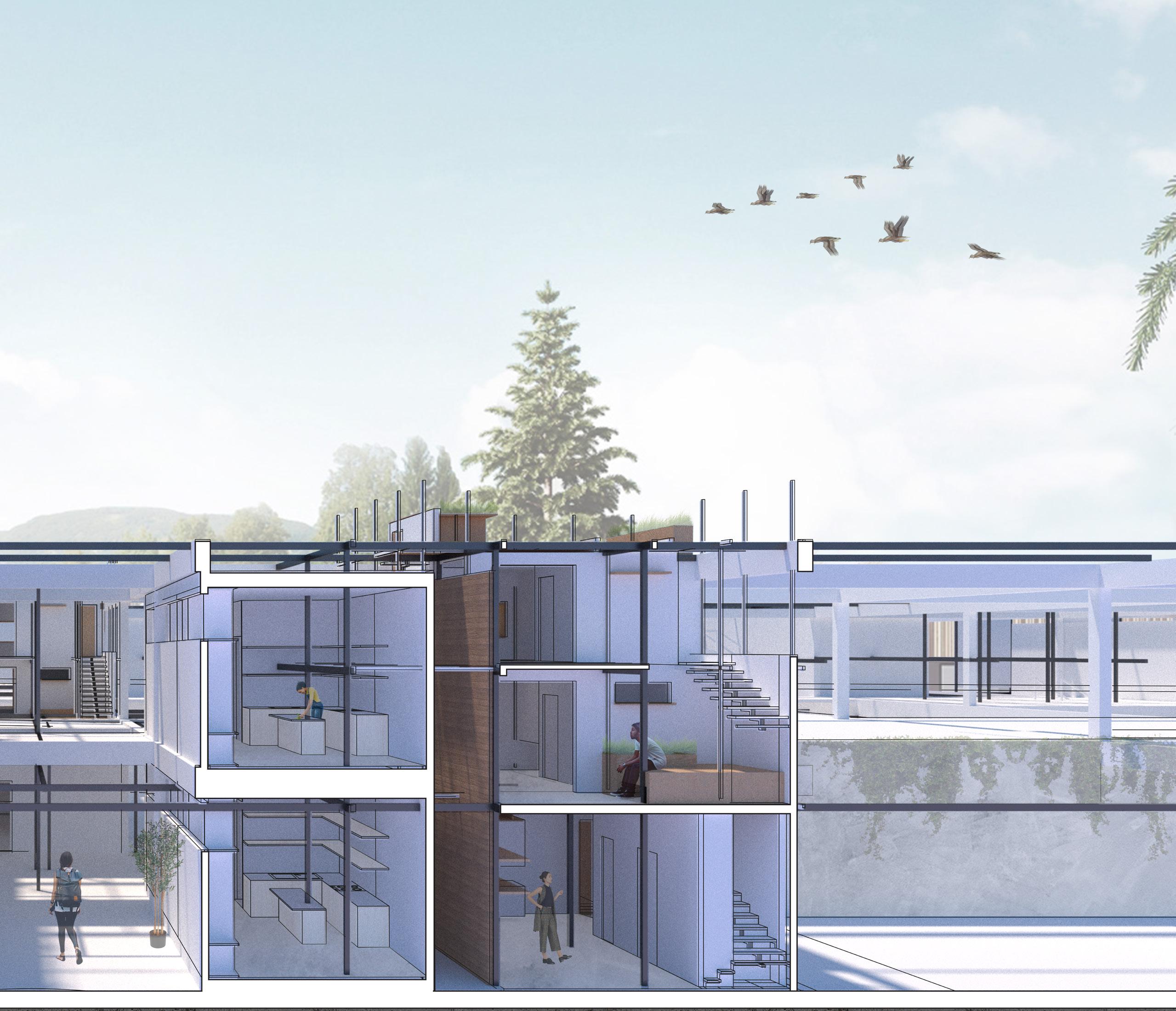
Grassroots is a community-oriented solution that seeks to empower residents through the creation of their own ideal community. A series of highly adaptable, easy-to-erect column, beam, and panel systems allow room for growth while equipping east-central residents with the tools to build their own future.
This approach pays attention to the socioeconomic conditions of this community and the existing natural order and urban fabric while encouraging gradual development over



Using a steel superstructure, additional structural elements can be added


Adaptable wall panels and plates clip onto the structure
Different building typologies can be facilitated using this method


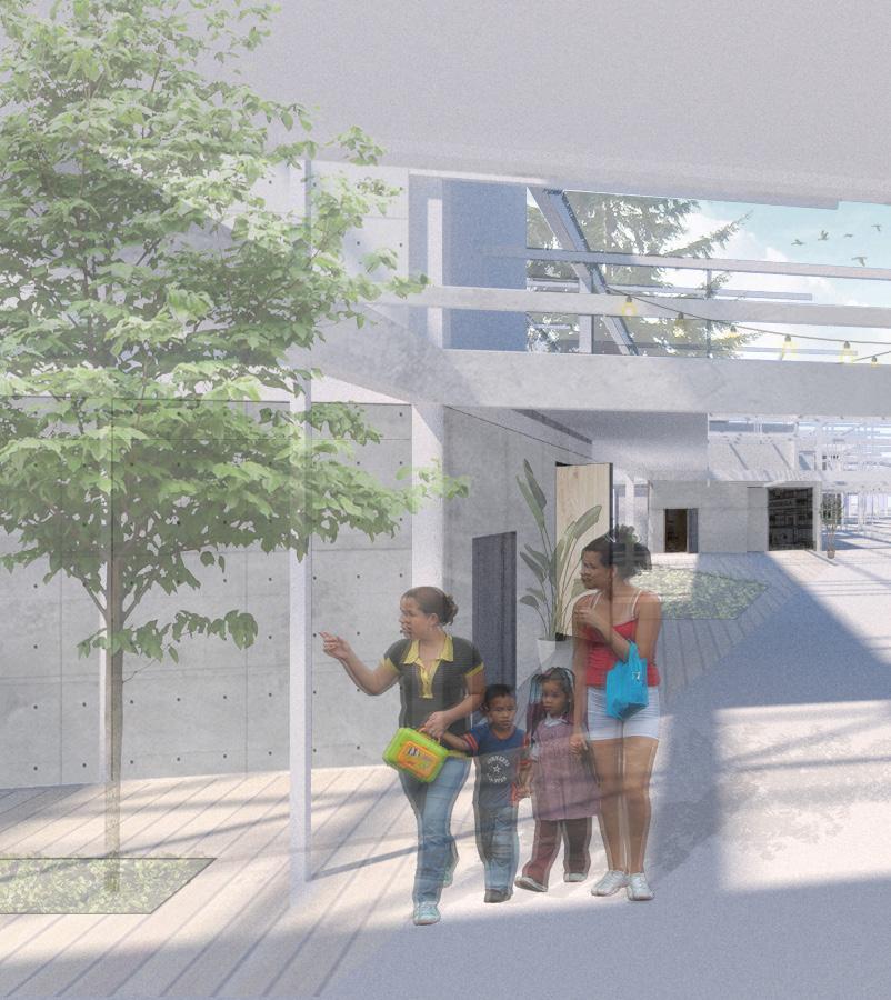
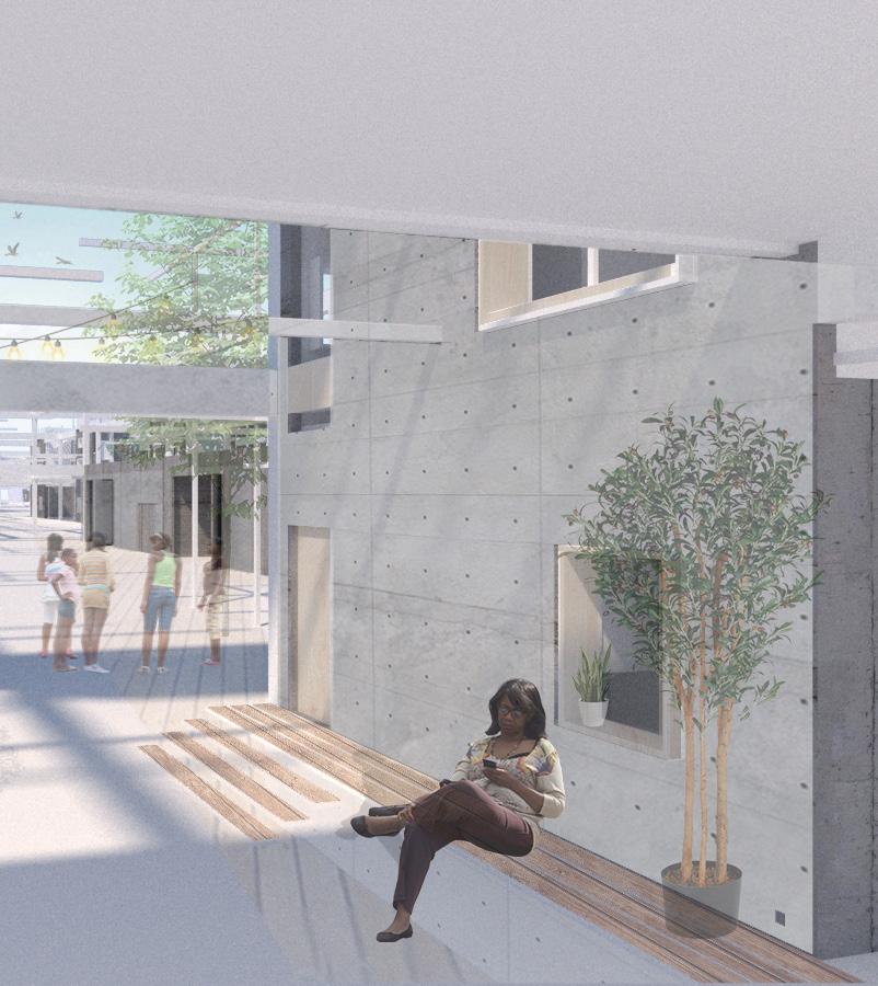
Micro-communities, clusters in which there is a variety of programs allows for occupants to access vital services within their area
Over time, these microcommunities will then grow and connect thus creating an ideal community built and planned entirely by EastCentral Spokane residents.
There is a variance of scale along the site as well as a series of clusters and voids. Different programs are placed in relation to scale and the existing urban fabric.




Spring 2021 / Comprehensive Design Studio I
Collaborators: Emma White, Dakota Adelhelm
2021 AIA Northwest + Pacific Student Design Award
Conceptual Sketches


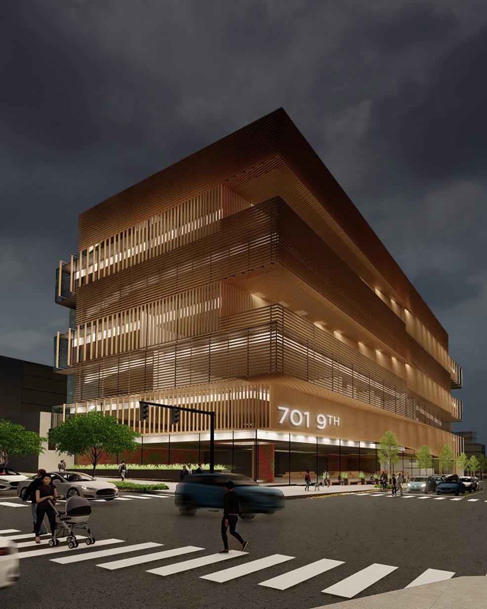
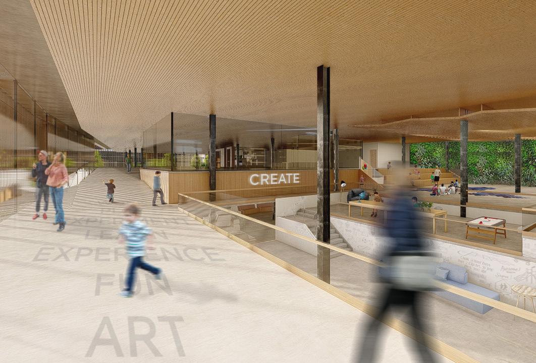
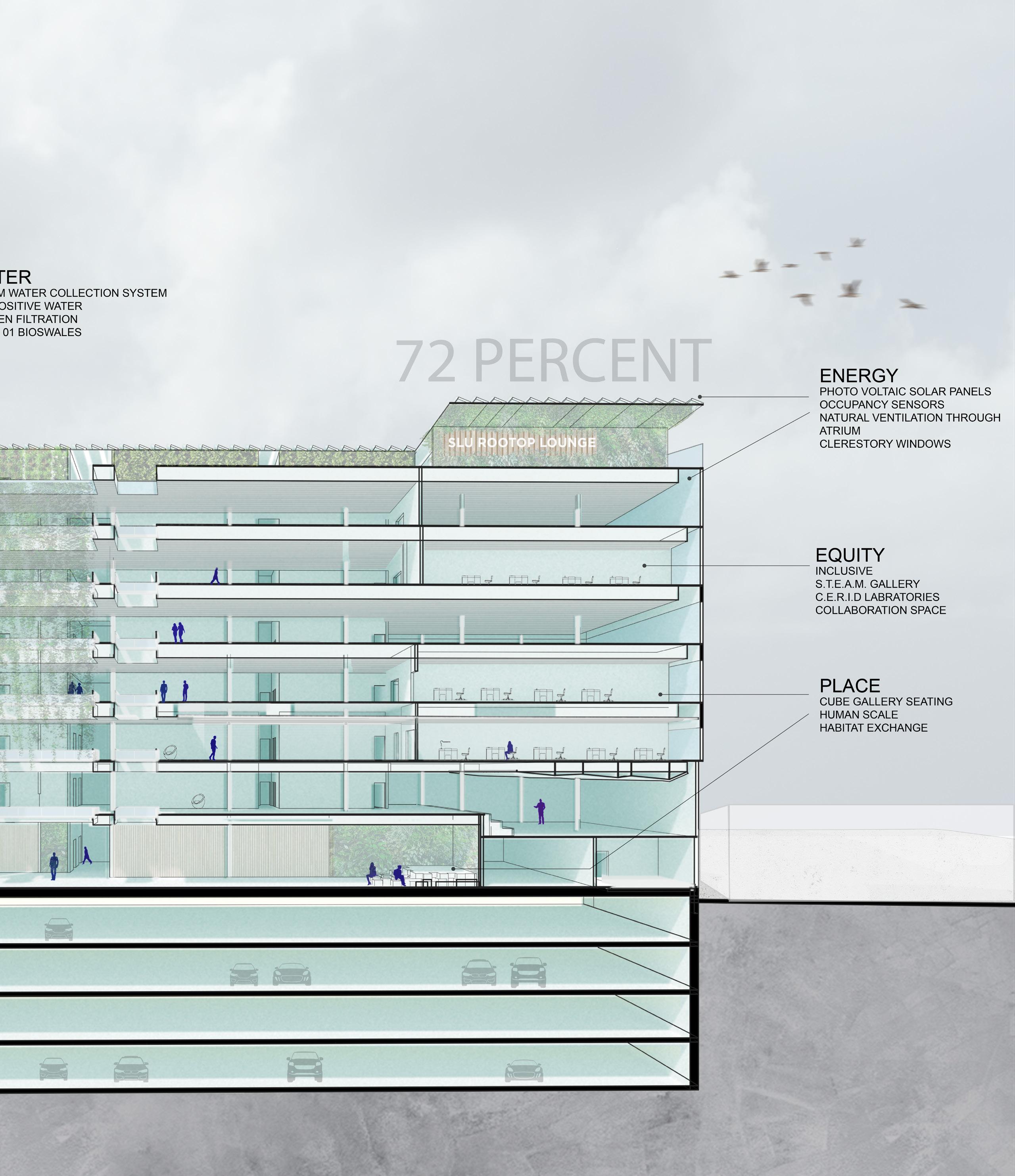
Located on the southern end of Lake Union, our senior capstone project consists of interactive galleries, learning spaces, and laboratories for the CERID. The client came to us with a list of specialized problems they needed to solved for the building. These design challenges included a method for the building to engage the sidewalk below, a modest restaurant on the roof, and finally, a unique and site-specific façade.
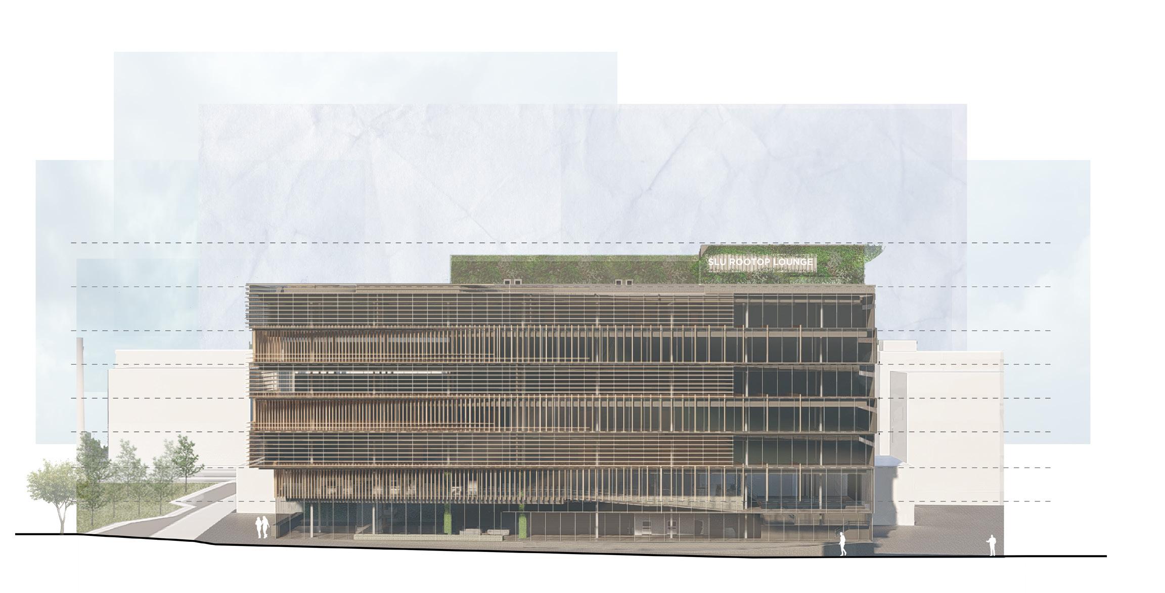
The facade consists of individual engineered wood louvers which clip into a track system tied and suspended from the structural mullions. The design addesses issues of shading, daylighting, visual interest, and interior experience while being a beautiful addition to the area.

Introducing yet another building to SLU seems like a straightforward task. However, the introduction and design of our programmatically varied development took many factors into consideration. Issues such as equity, comfort, sustainability, and community were the cornerstones of our design process.
With this development, we hope to bring a sense of community equity in a heavily commercialized district by creating welcoming spaces while honoring area’s history through various design motifs and features.
PROGRAM

PEDESTRIAN TRAFFIC
Our site presents numerous opportunities to take advantage of including views, recreational and transit infrastructure in close proximity to downtown.

The orientation of the façade louvers fall in line with the sun path of the area. The dematerialization of this façade occurs at points where less shading is needed and where views are of importance. While clustering occurs in places where optimal shading is necessary. The system keeps in line with Seattle’s 40% Glazing ratio.


VIEWS

SLAB THERMAL BREAK
SLAB THERMAL BREAK
BALCONY POUR STOP
BALCONY POUR STOP
CONNECTOR
ACCESS WALKWAY
CONNECTOR
SUSPENSION ROD
ACCESS WALKWAY
SUSPENDED CEILING
SUSPENDED CEILING
PARKLEX LOUVERED FACADE

SUSPENSION ROD TRACK SYSTEM


 Level 1 STEAM Gallery
Rooftop Lounge
Level 2 STEAM Gallery
Levels 3-7 CERID Laboratories


The Living Building Challenge is a rigorous performance standard for buildings. We used this regenerative design framework to create spaces that give more than they take.
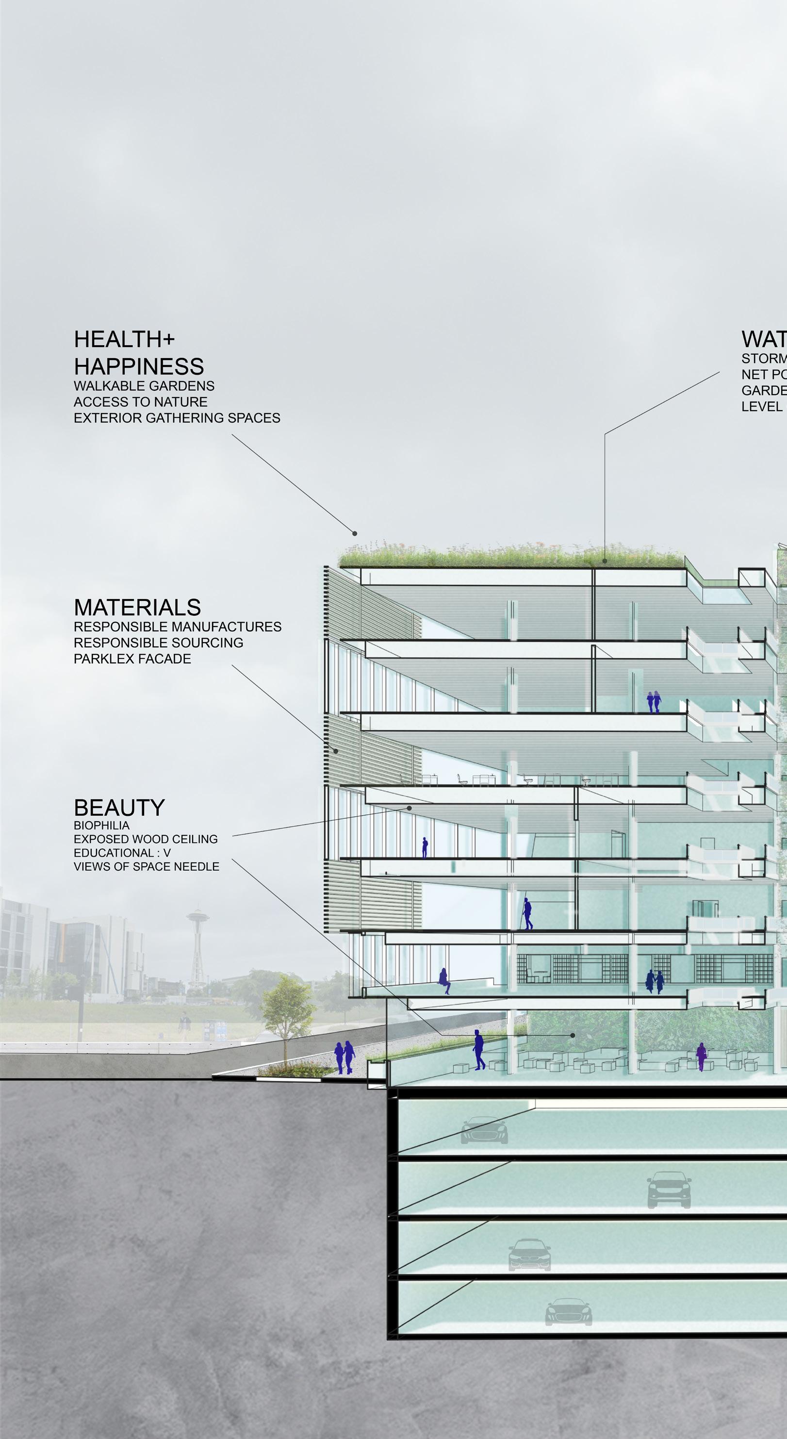
The LBC is organized into seven performance areas. With our building, we managed to satisfy most of the criteria necessary in obtaining a LBC Certified building given our site, code, and budgetary constraints.
72% LIVING
BUILDING CHALLENGE

[ Design + Detail ]
Fall 2020 / Seminar in Architectural Communication
Designed by Integrus Architects, the Spokane Falls Community College music building was used as a case study for this design detail re-design project.
There were four phases in this re-design including design and implementation of a terra cotta rainscreen facade, new window systems, a new curtain wall and entry, and a re-design of a stair. Each of these phases were designed with aesthetics and practicality in mind with an emphasis on experience and program.

Throughout the design process, we were tasked with accentuating the functionality of the building through the various design interventions.
The process was a thoughtful one with research on materiality, manufacturers and installation procedures, as well as issues directed at sustainability all while understanding the building and its intended uses.
Drawing inspiration from piano keys, the rainscreen design is made of grooved terra cotta panels with a profile similar to piano keys through an alternating color pattern. This rainscreen assembly is easy to install through the use of a clip system along a horizontal substructure. The parapet also utilizes a terra cotta coping giving this facade a clean, nicely detailed appearance.


PUNCHED OPENING
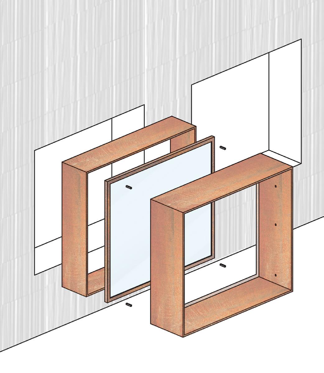
The arrangement is made of a punched opening with metal protrusions on either side of the window with the interior protrusion allowing for use as a desk space while the exterior acts as a shading mechanism while adding variation.
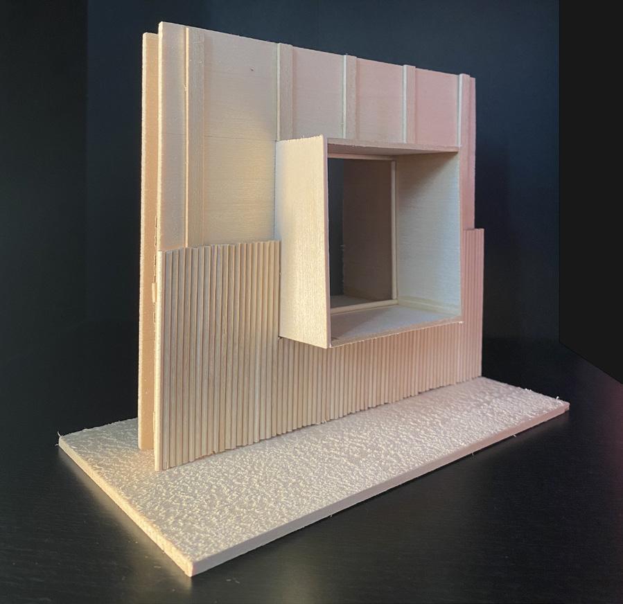
The EBE 65 steel frame window by Secco Sistemi is durable and responsive to temperature. The finishing is corten steel while the protrusions also are made of a powder coat steel with a cohesive match.
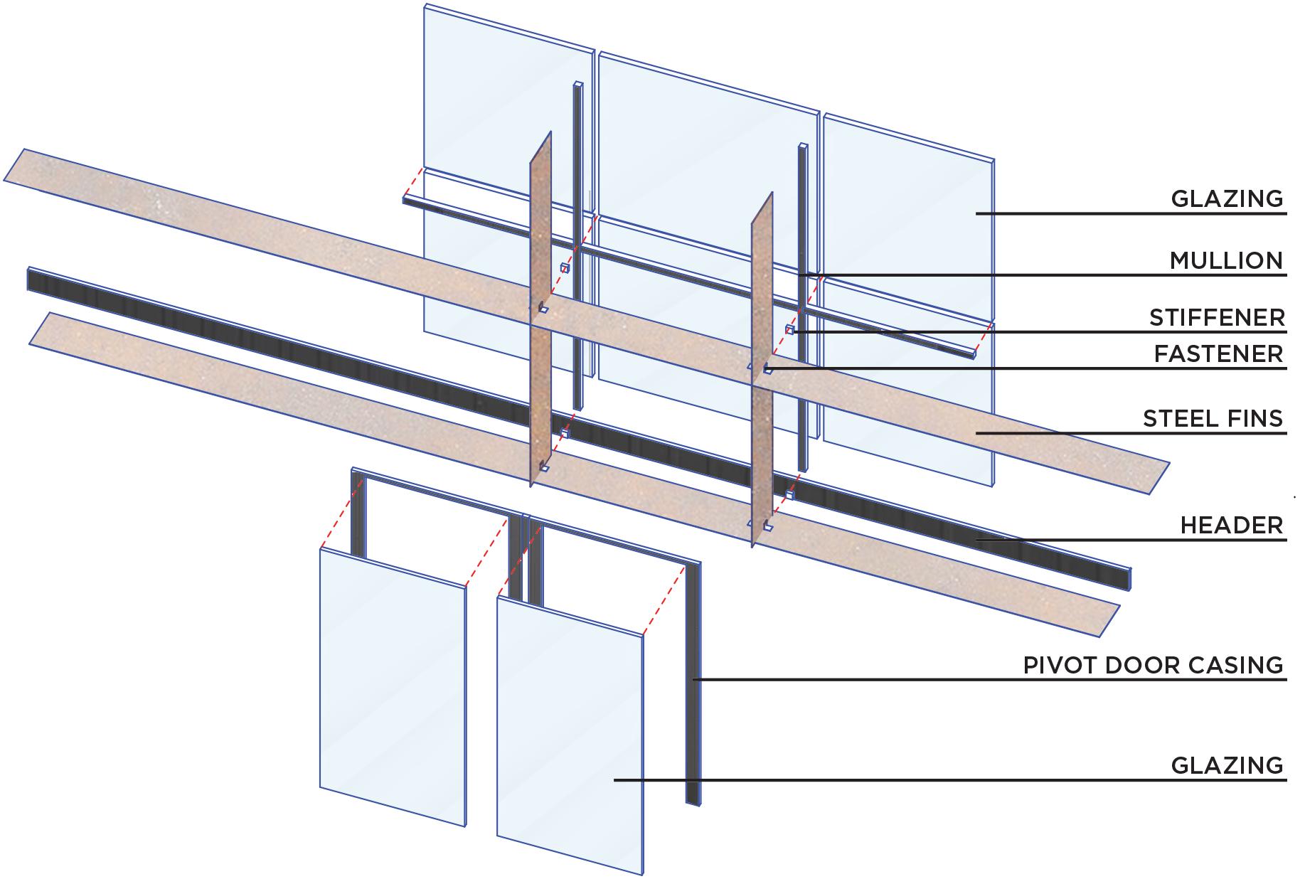
CURTAIN WALL + ENTRY
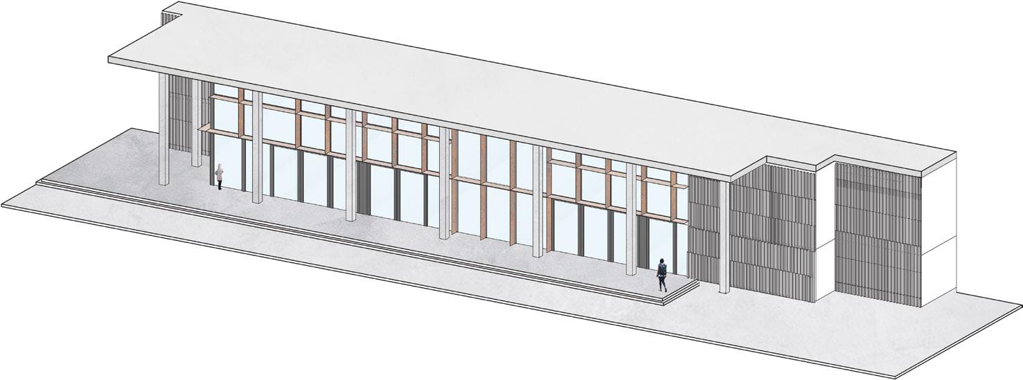
The improvements made to the entry condition establishes an indooroutdoor with the addition of pivot doors lining the lower level of the curtain wall allowing the space to be transformed with a variety of programs. The vertical and horizontal fins compliment the building stylistically, offer shade and light diffusion, and accentuate circulation through their strategic placement.
4. STAIR
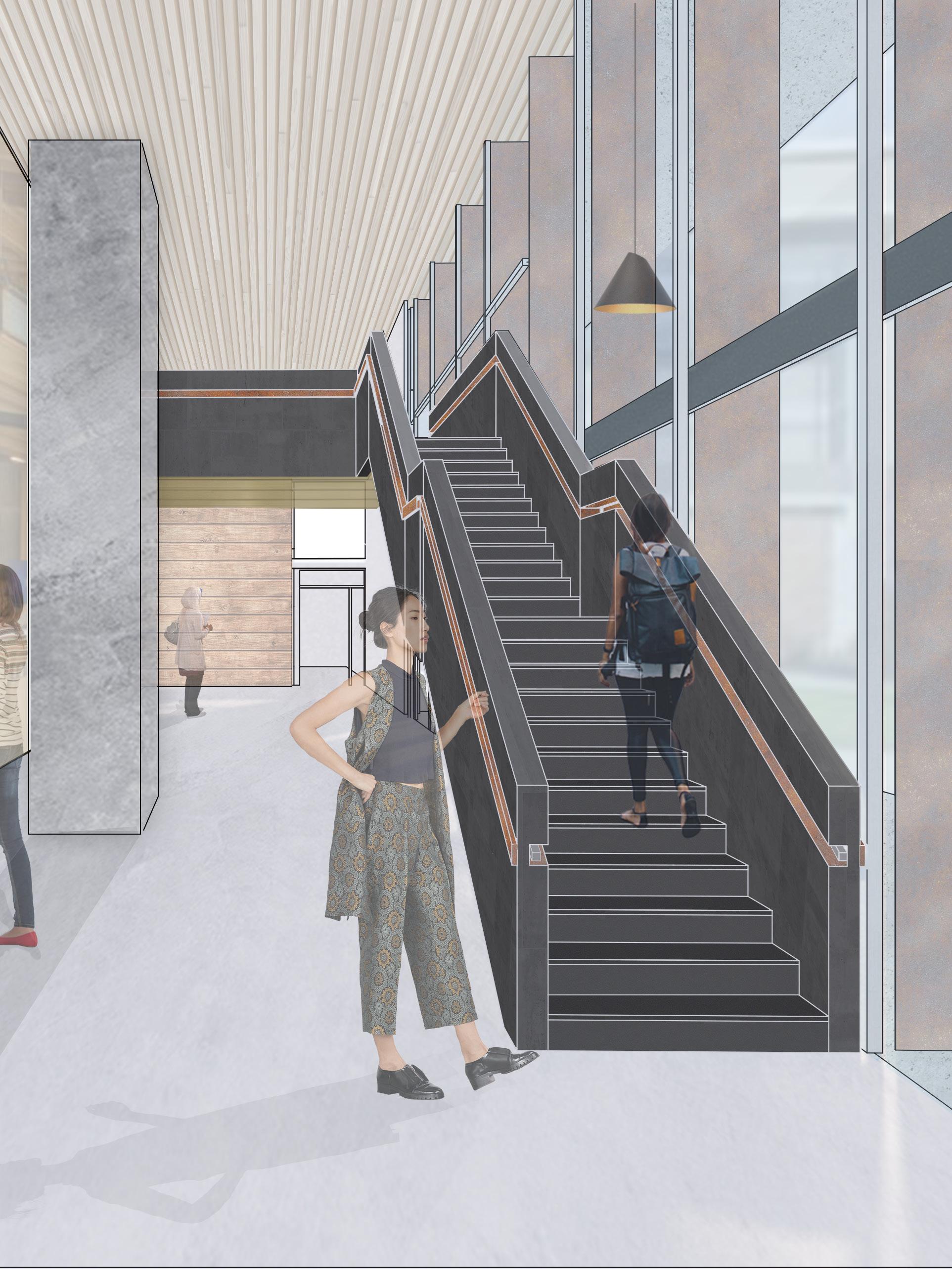
This stair design is one that keeps aesthics and code requirements in mind. The stair is cladded with a sleek fiber cement and highlighted with steel channels to accentuate circulation while concealing the handrail in an inner channel.


The materiality falls in line with other aspects of the building thus bringing a sense of cohesion while the variance in texture gives users a unique sensory experience. The tread and risers made of a welded anti-slip steel plates with an enclosed underside to ensure the clean, nicely detailed appearance.
HANDRAIL DETAIL
POWDER COAT STEEL INNER CHANNEL
WOOD RAILING
POWDER COAT STEEL OUTER CHANNEL
WELDED STEEL RISER + TREAD
[ Professional Work ]
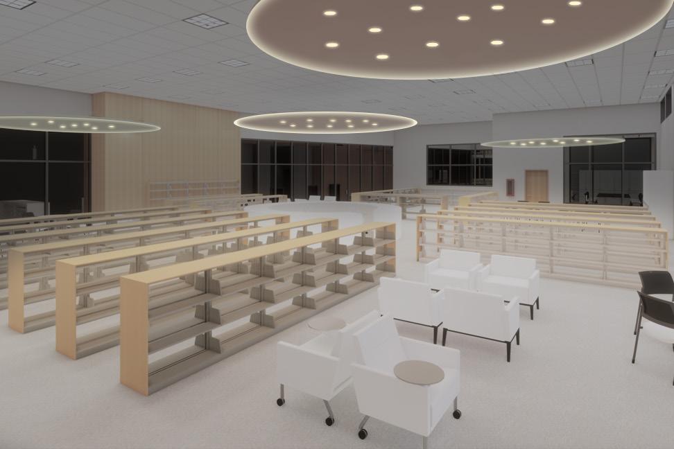
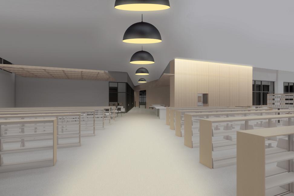
Project: Mount Vernon Library
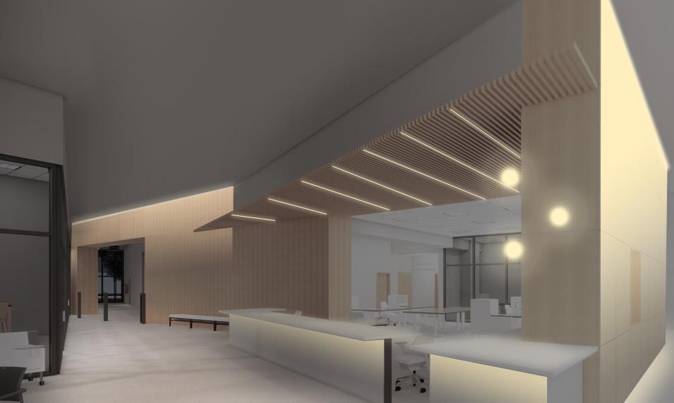
Location: Mount Vernon, WA
Client: HKP Architects
Project: OSOS Washington State Library
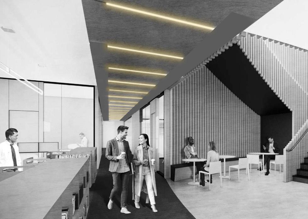
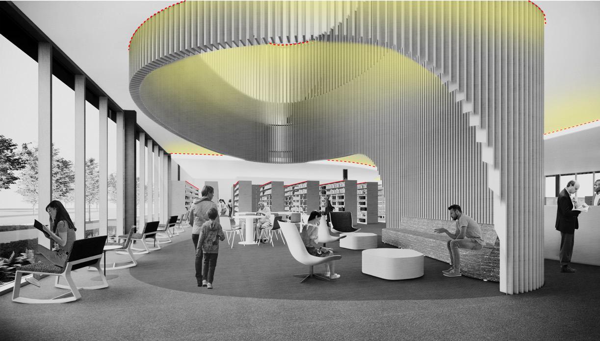
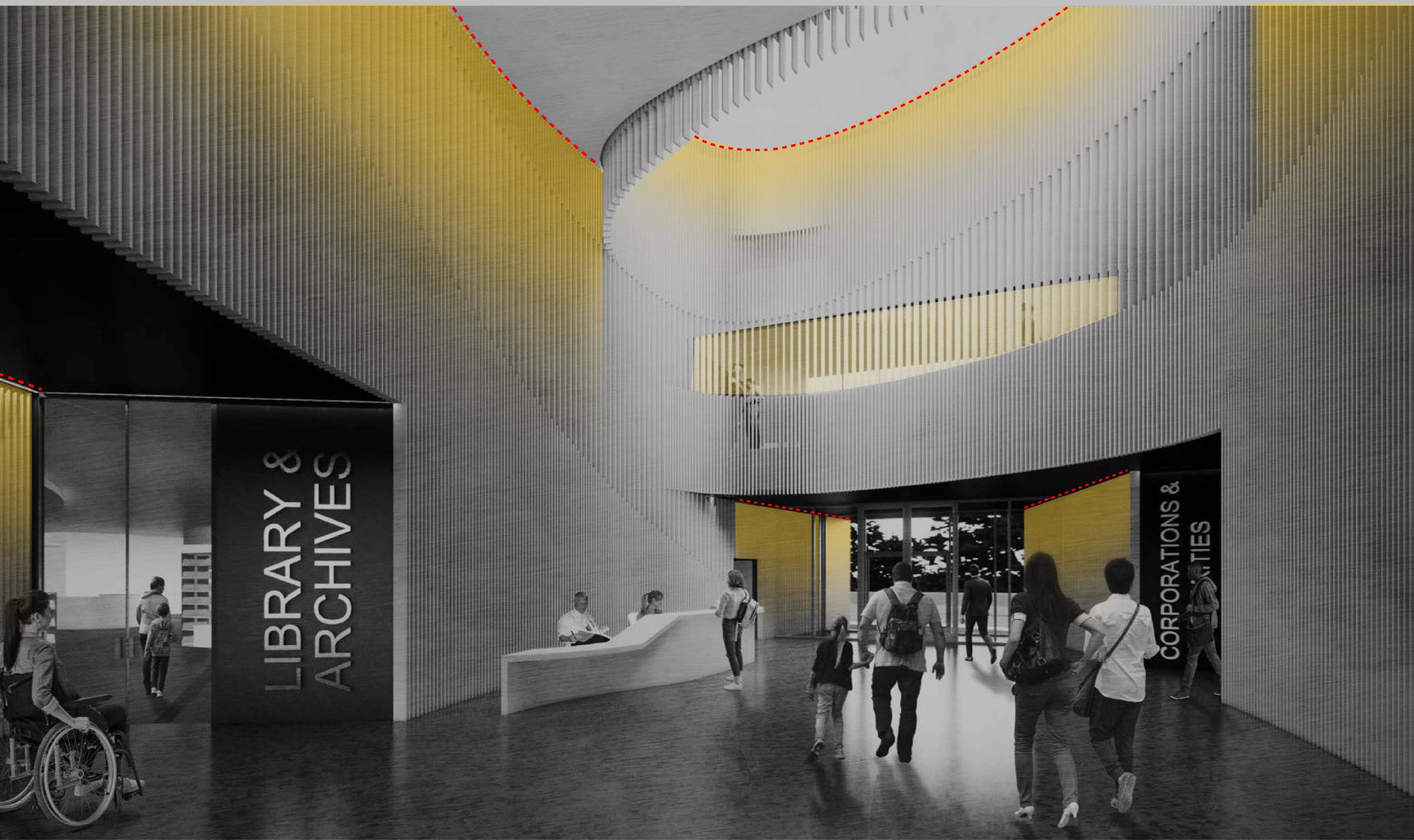
Location: Olympia, WA
Client: Miller Hull Partnership
(206) 960-5951
