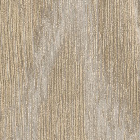
Altro Whiterock Satins™


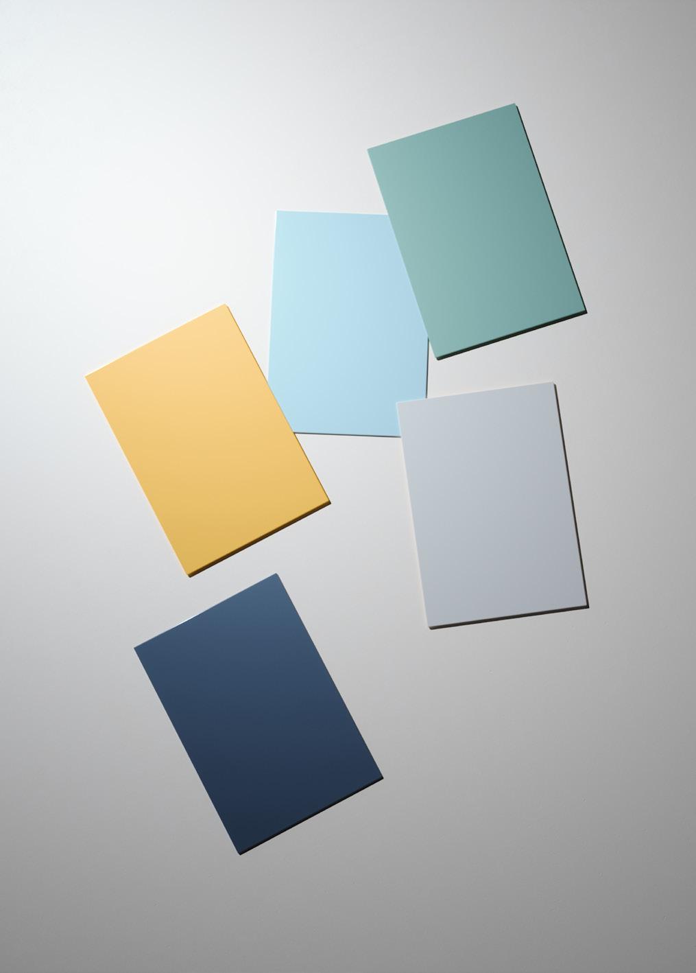
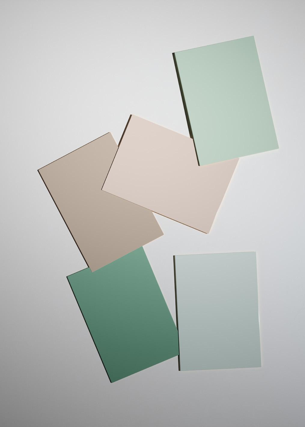
We have introduced 10 new colours to our Altro Whiterock Satins collection. These new colours have been carefully developed to complement each other, and other floor and wall products in our portfolio.
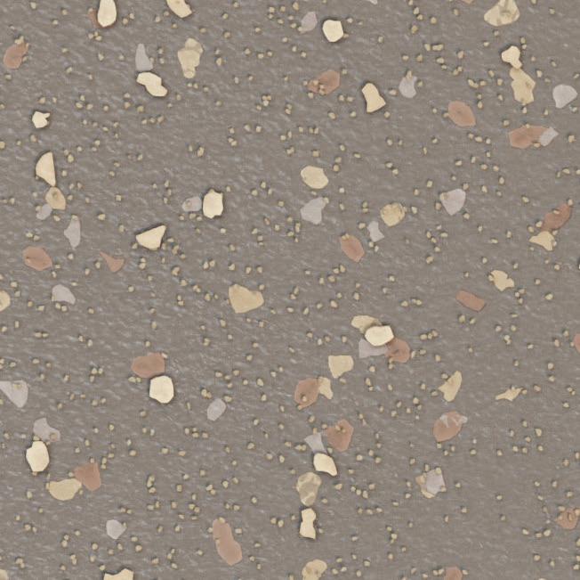
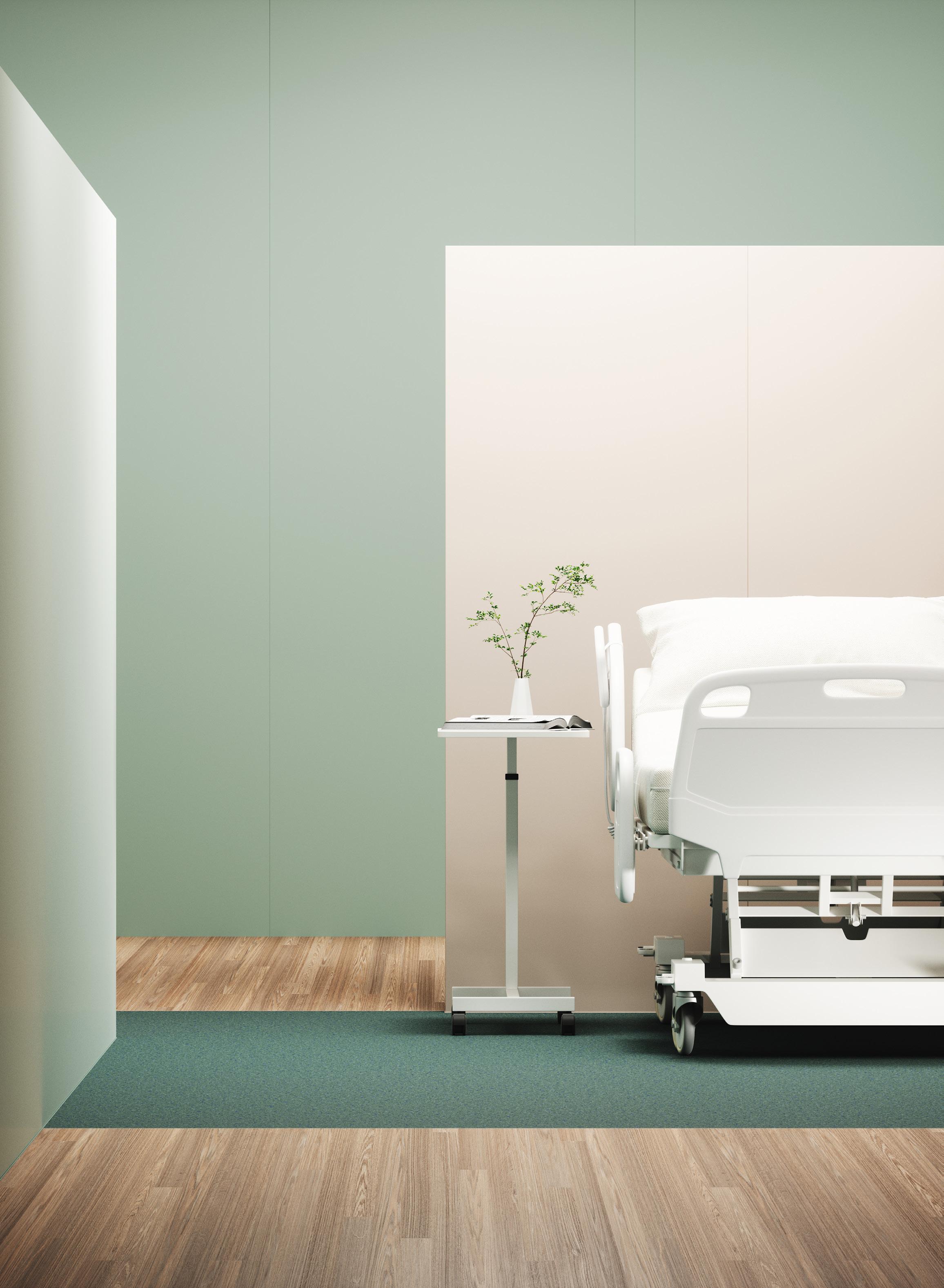
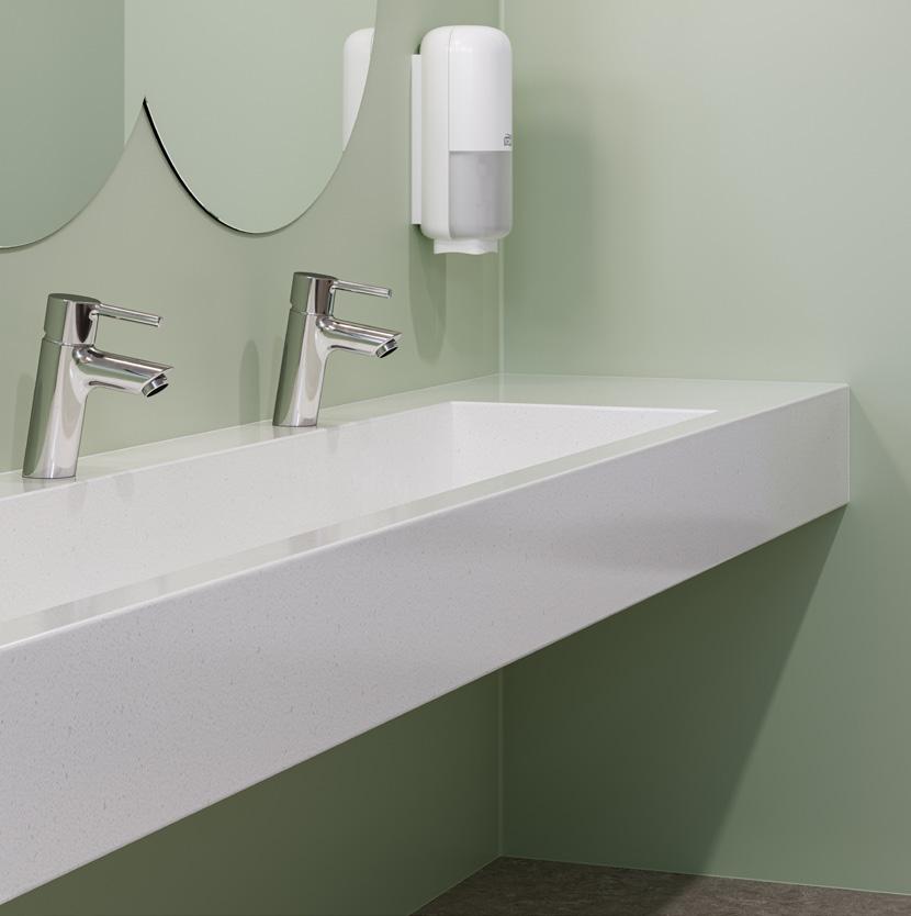
From subtle shades of off-white to unique, bold colours, the new refined collection will enhance any design scheme. Wellbeing and inclusivity are at the heart of the decision-making process behind our product development. We aim to create interiors that prioritise the comfort of visitors, residents, patients, and staff from the outset. Human-centred design is not just a buzz word to us, and we understand our products can play a big part in achieving it. Working closely with prominent figures and leading thinkers in inclusive design, has ensured a wide array of Light Reflectance Values (LRVs) and Chroma values are available in our Altro Whiterock Satins collection, providing you with an extensive selection to enhance your interior design with inclusivity in mind.
Explore our inspirational brochure to help add more colour to your interiors.
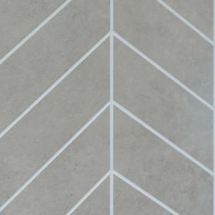
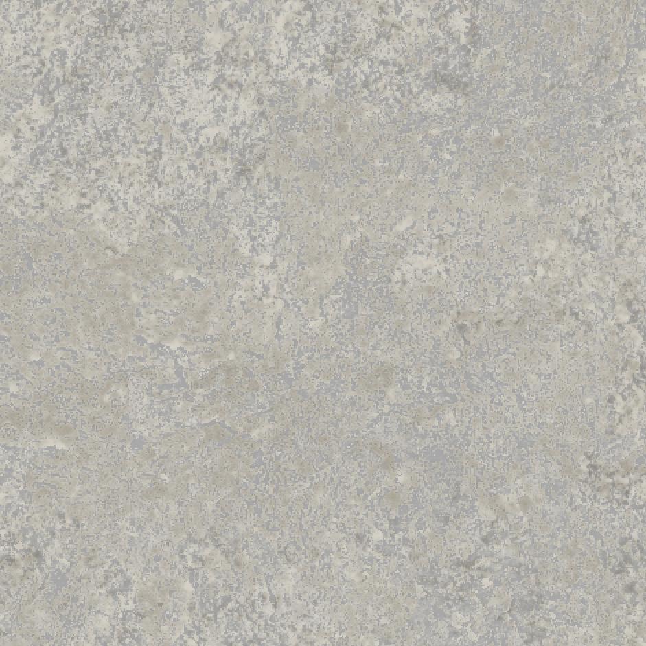
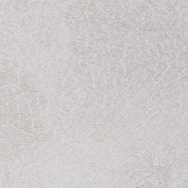
A quiet grey that will help connect all the other materials and colours in the space. Silk will work in any scheme, cool or warm, making it one of our favourite neutrals.
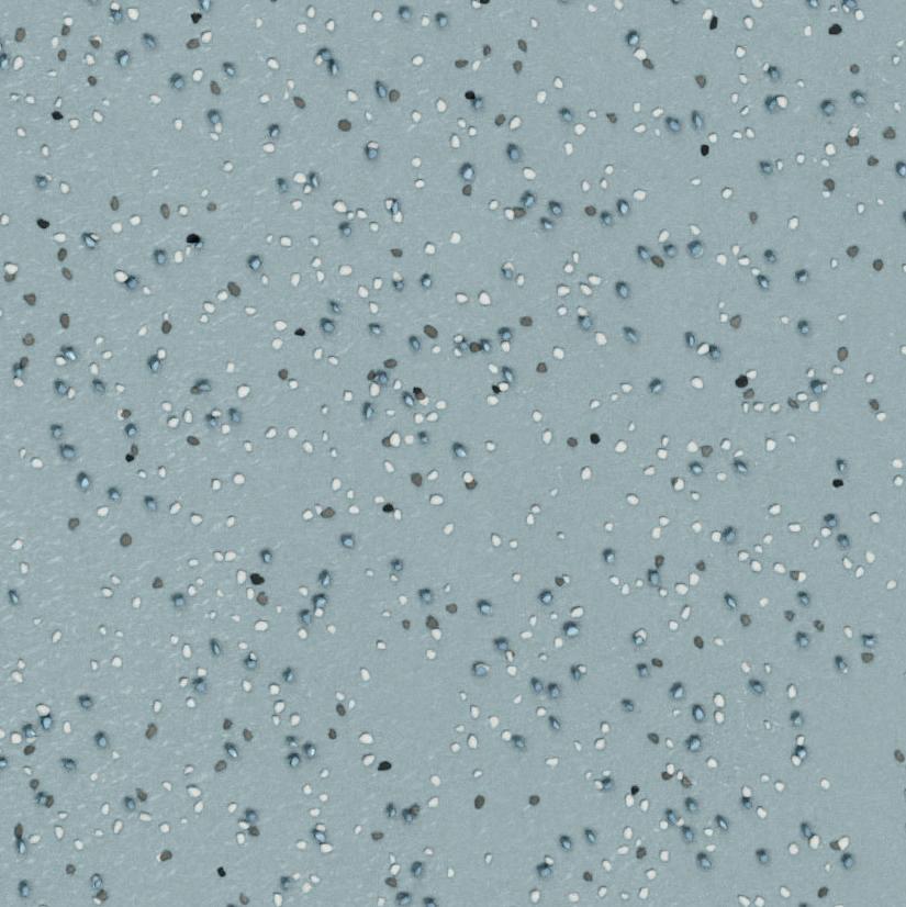
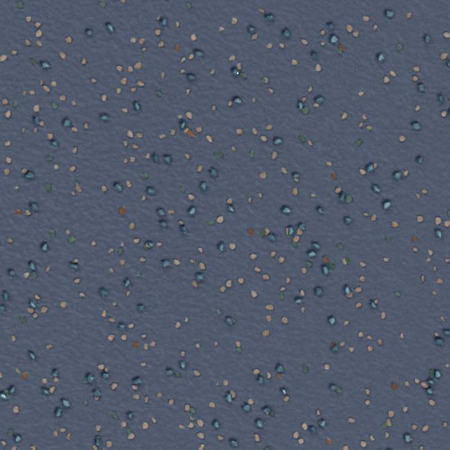
From cloudless skies to clean water, blue is the colour that evokes trust and comfort. Add a sense of calm and peace with this perfect shade of light blue.
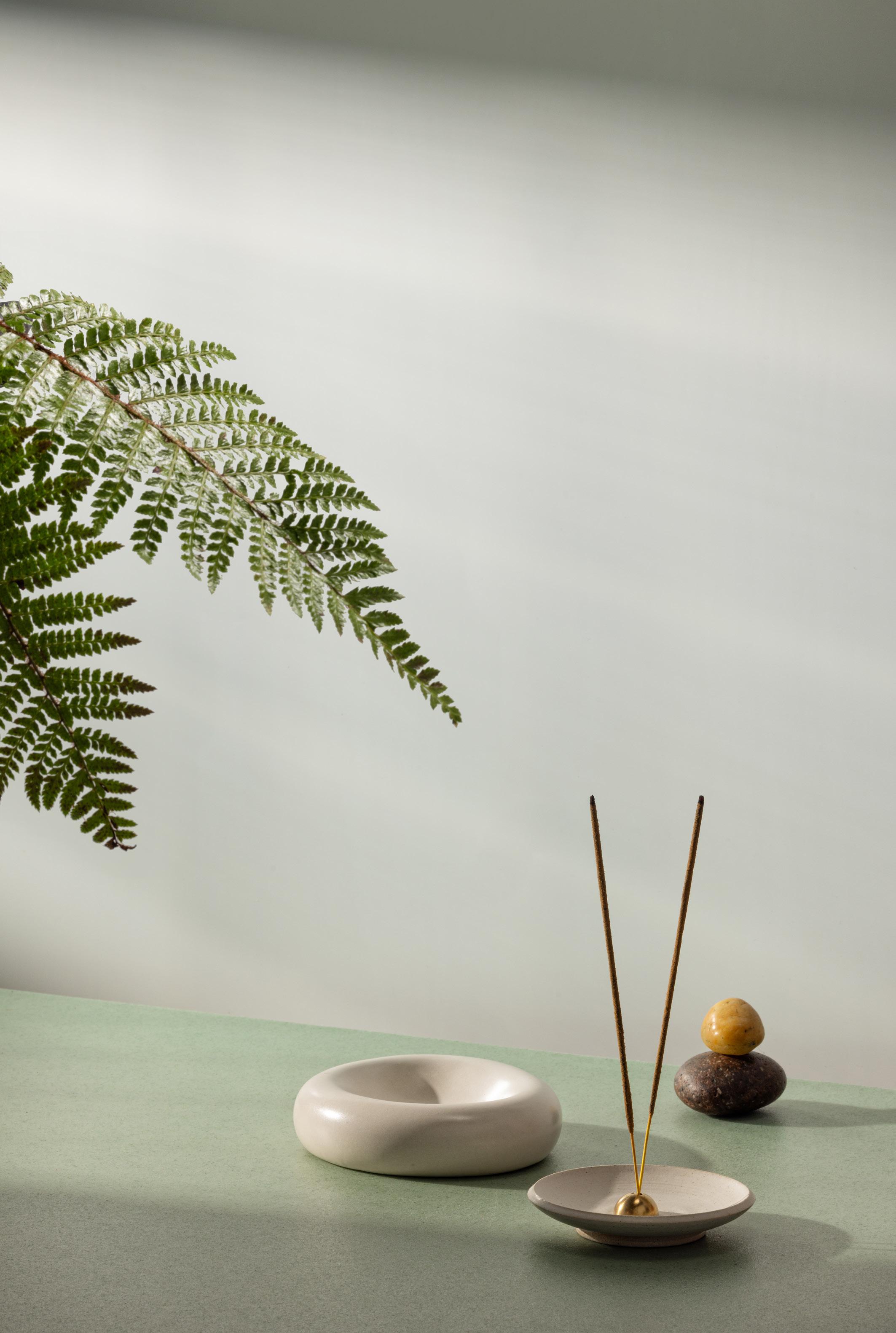
Busy lives, busy spaces, there is no time to stop, no time to reflect. We aspire to help create spaces that allow us to do just that. Take a moment to slow down and breathe, even in the most unexpected of circumstances.

Neither too warm, nor too cool, this soft pink is a joy to work with. Add to an earthy palette next to Hessian, Linen and Clay or accent with Blush, Clarity and Twilight.
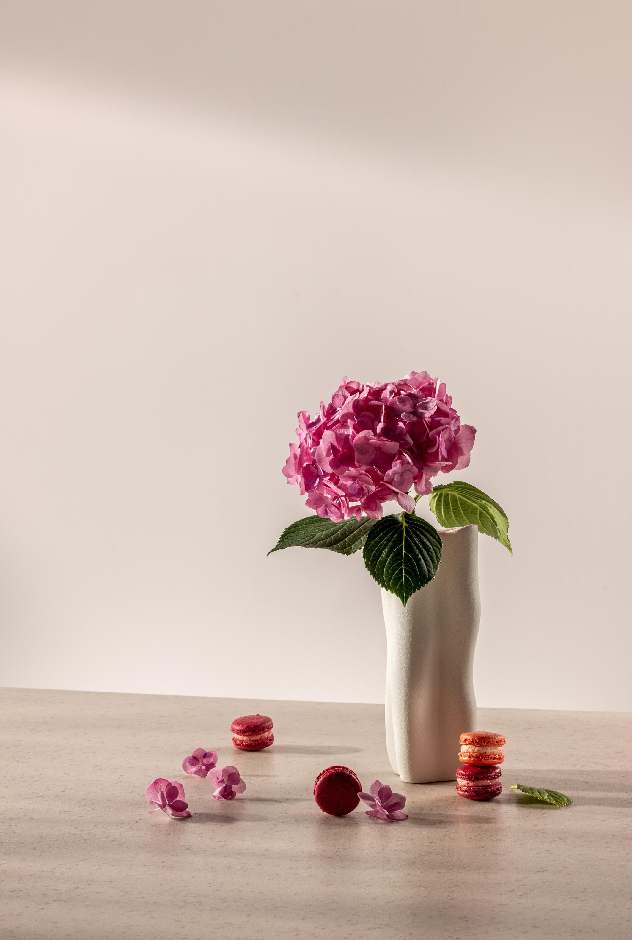
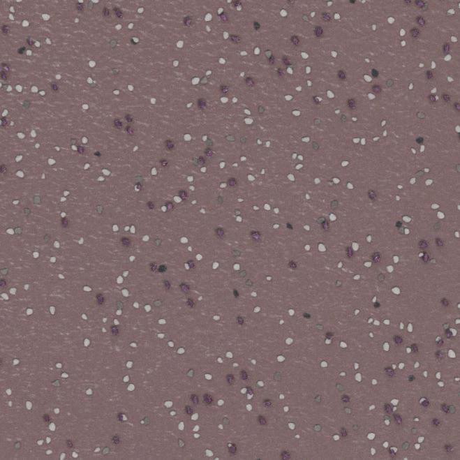
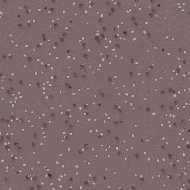
Soft dusky pink that has a deep earthy undertone and a vintage flair. Blush is elegant and unique making it a perfect choice for an accent wall colour you want everyone to notice.
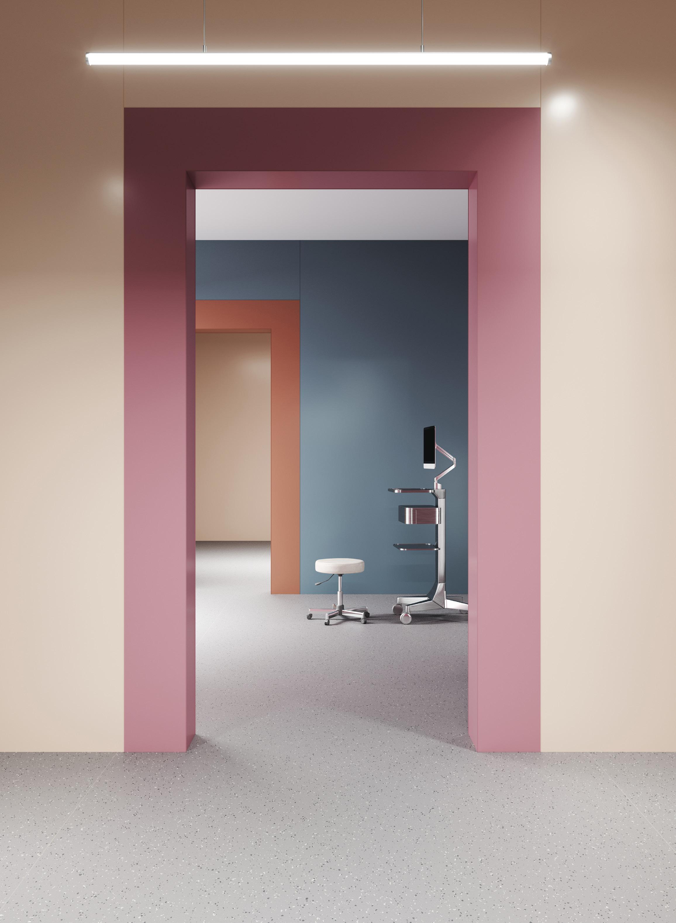
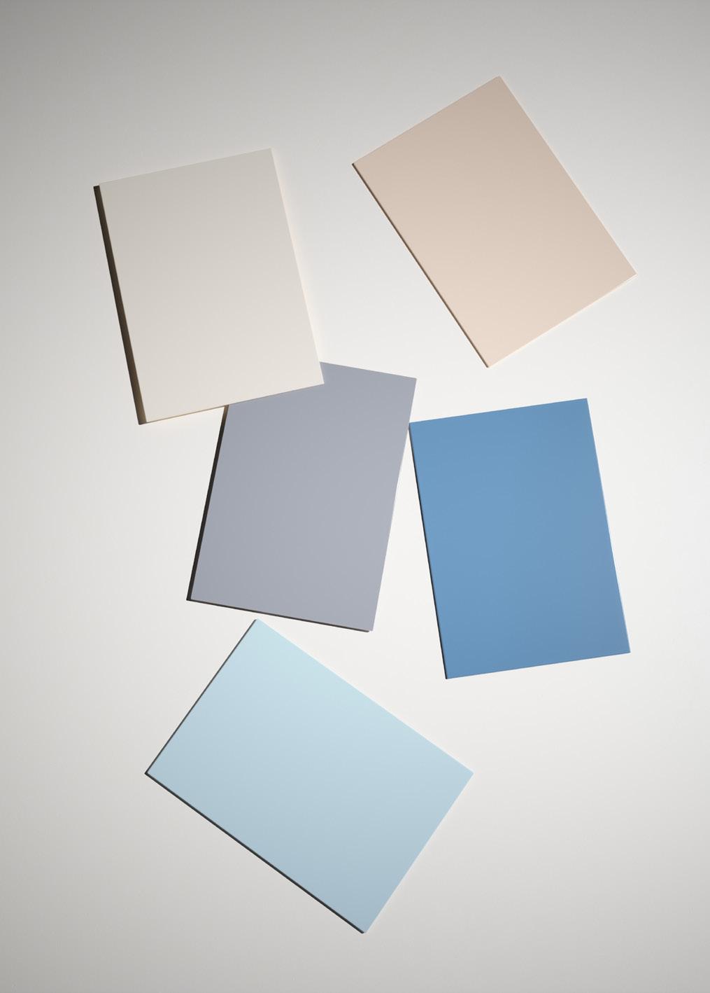
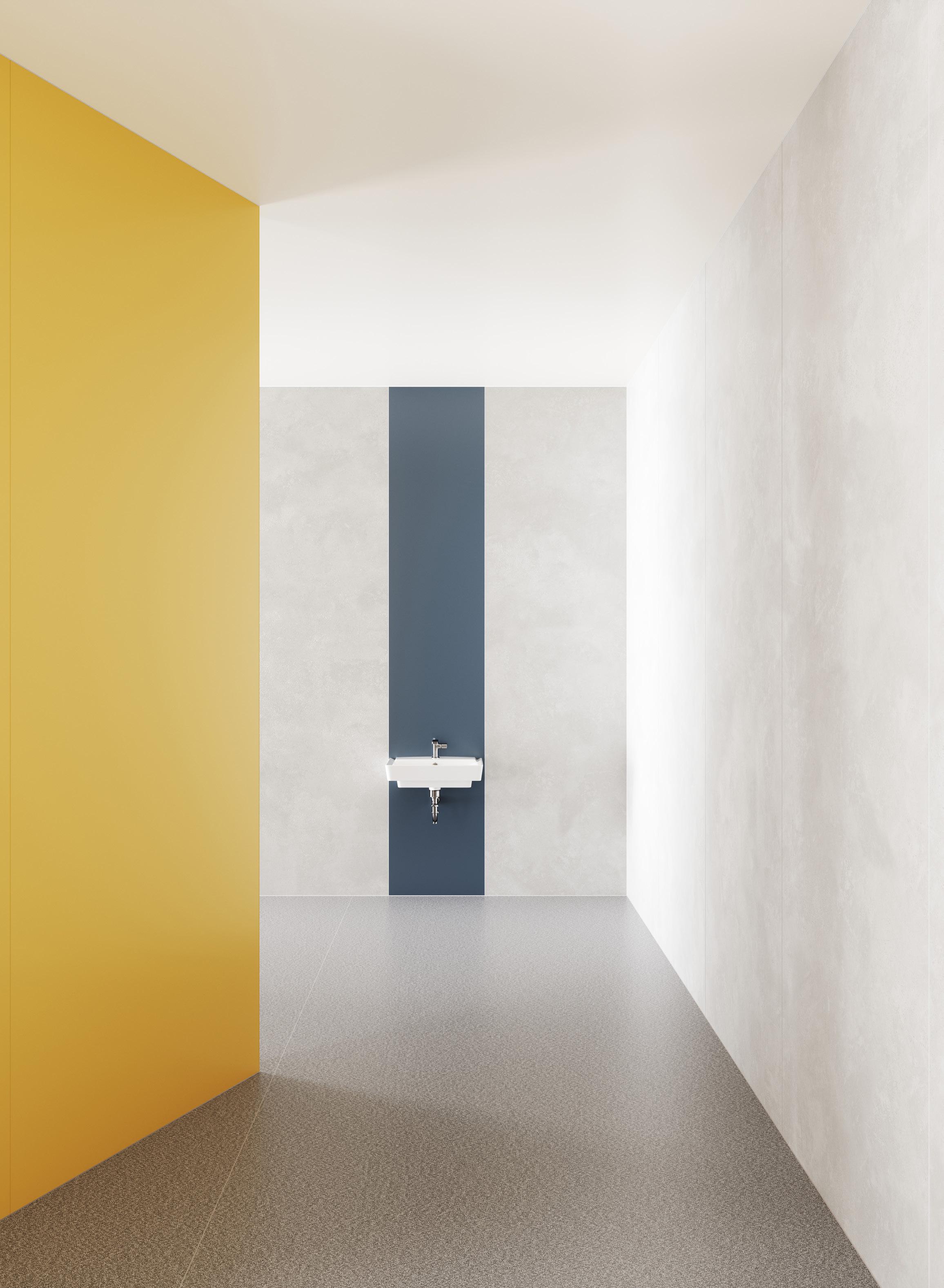
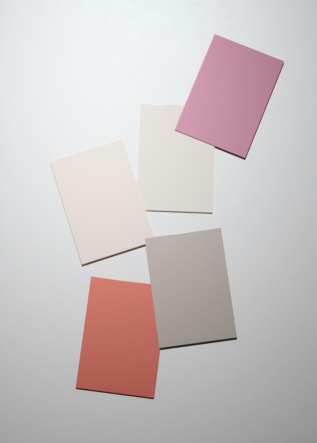
To create a visually impactful and balanced space, pair shades with the same undertone and complement them with contrasting colours that have similar Chroma values.

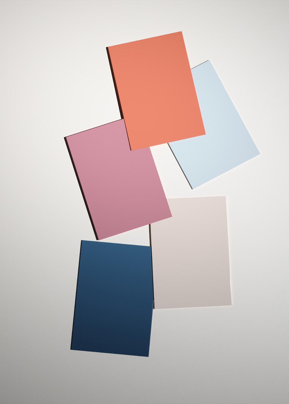
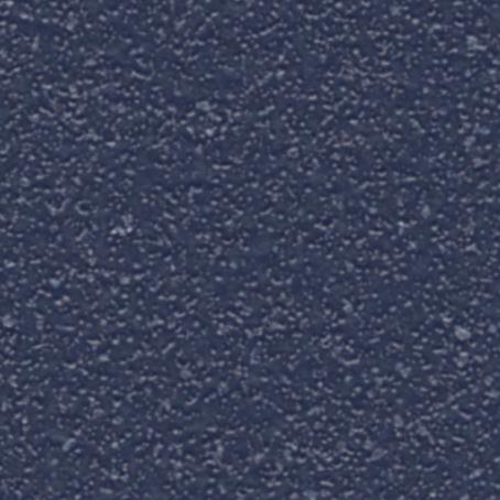
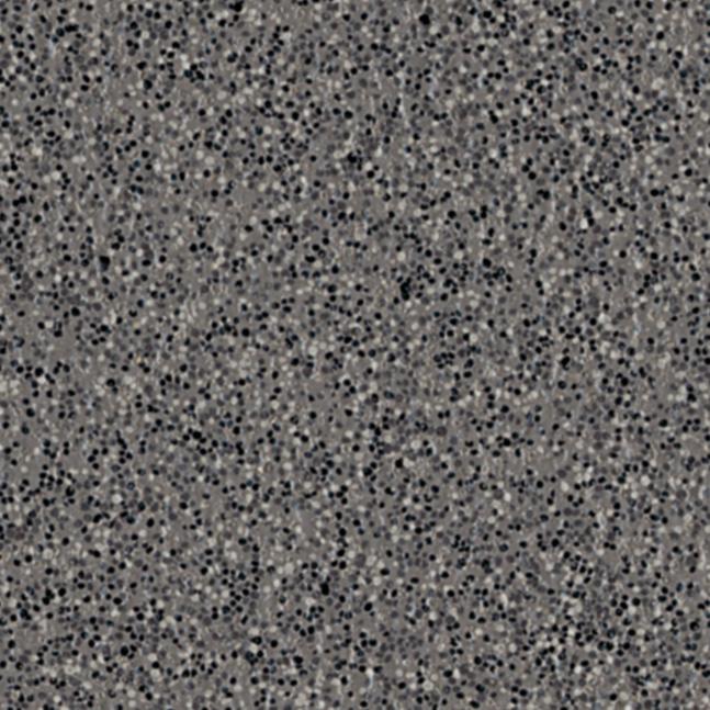
Inspired by the evening sky, Twilight is the deepest blue in our collection. It is sophisticated and timeless and will add depth and richness to your design.
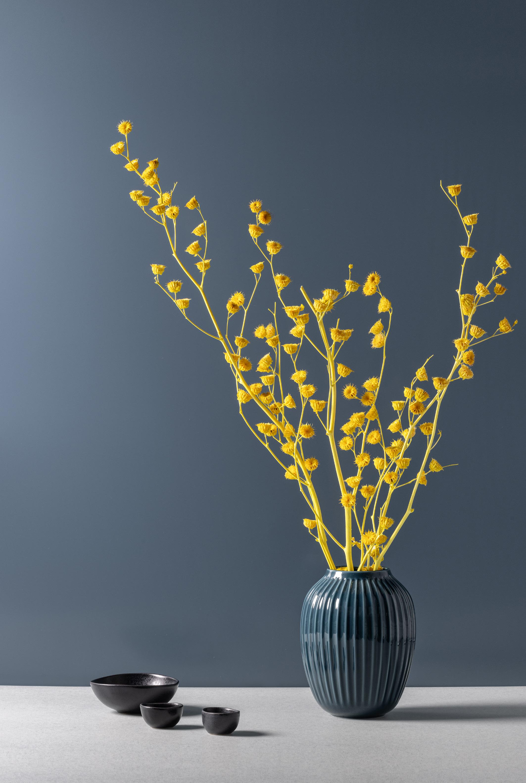
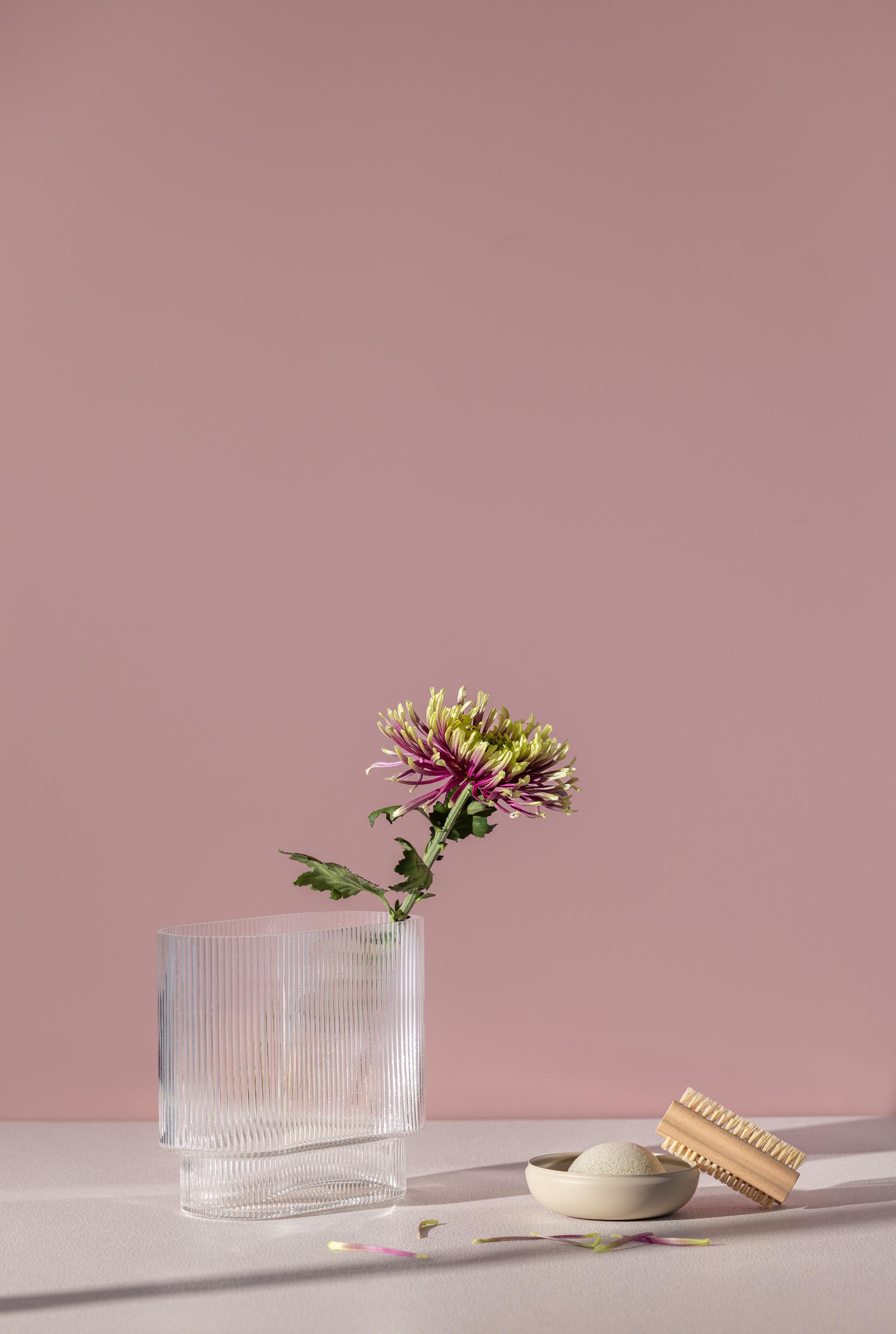
Although a muted yellow, Honeydew brings joy and positivity into any space. Pairs beautifully with Twilight, Breeze, and Serenity. Honeydew is the yellow you will never grow tired of.

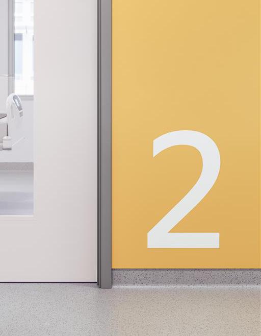
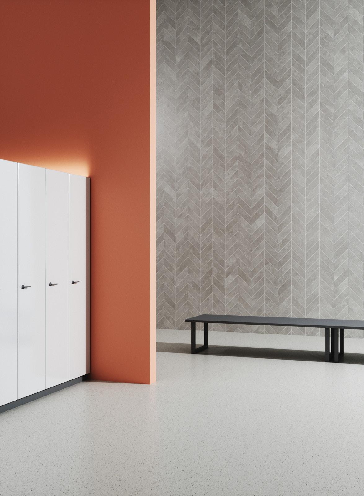
When designing public spaces, opting for the safest choice might seem like the best option. However, this often results in interiors that lack personality. A bold yet thoughtful colour combination can be transformative and create a positive impact.
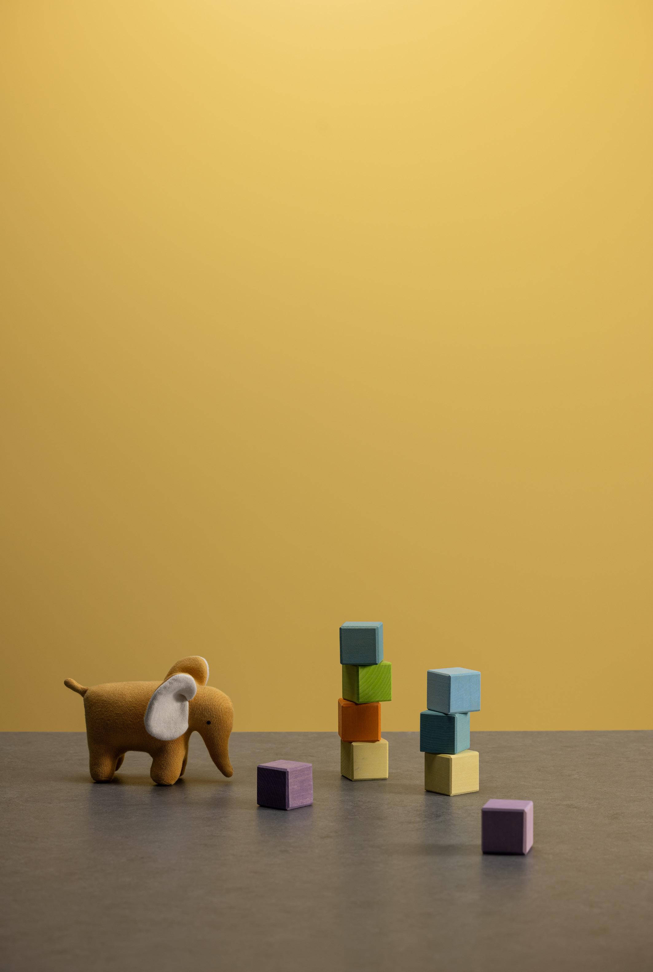
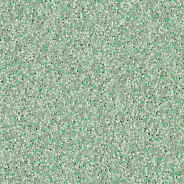
This light green will bring tranquillity and freshness into the space. Use in a monochromatic scheme with Serenity and Promenade or with Fawn and Hessian for a gentle contrast.
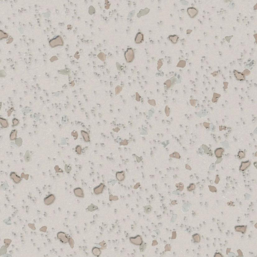
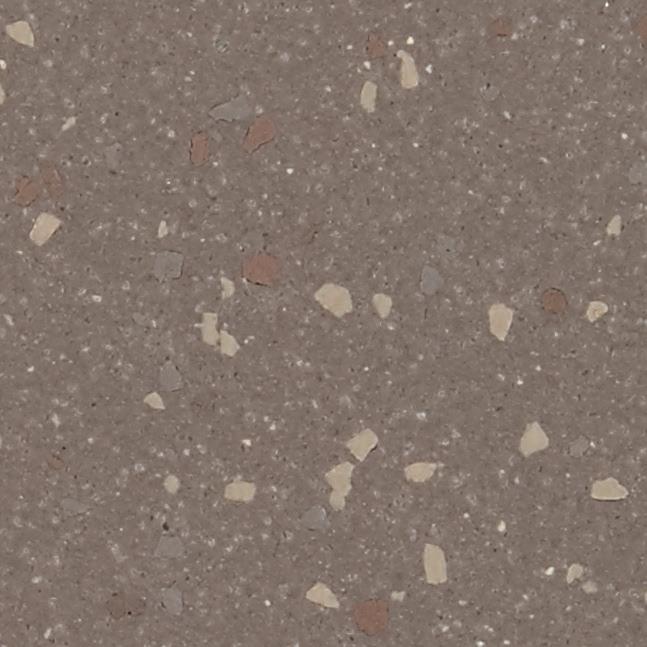
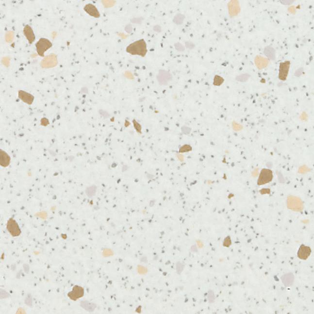
This subtle yet deep off-white will add comfort and warmth to any interior. A perfect colour to use in both small and large spaces. Hessian will pair beautifully with so many products in our collection. Don’t limit your imagination.
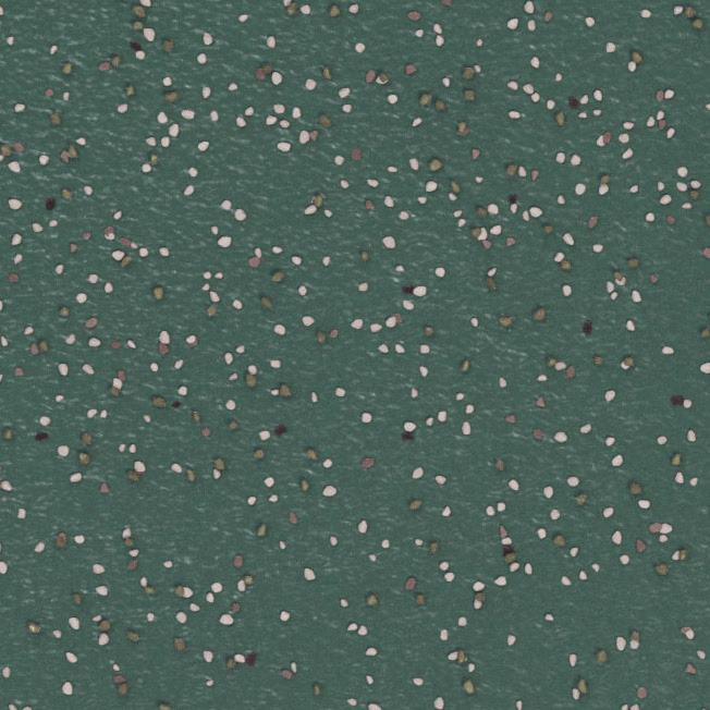
A welcoming, mid-tone green, Serenity will make the space feel holistic and considered. Green is known to have healing properties which makes Serenity the perfect colour to infuse wellbeing into your space.

Nature-inspired colour combinations enhance our lives and evoke a sense of balance. By using subtle contrasts between complementary colours, you can achieve a holistic design.
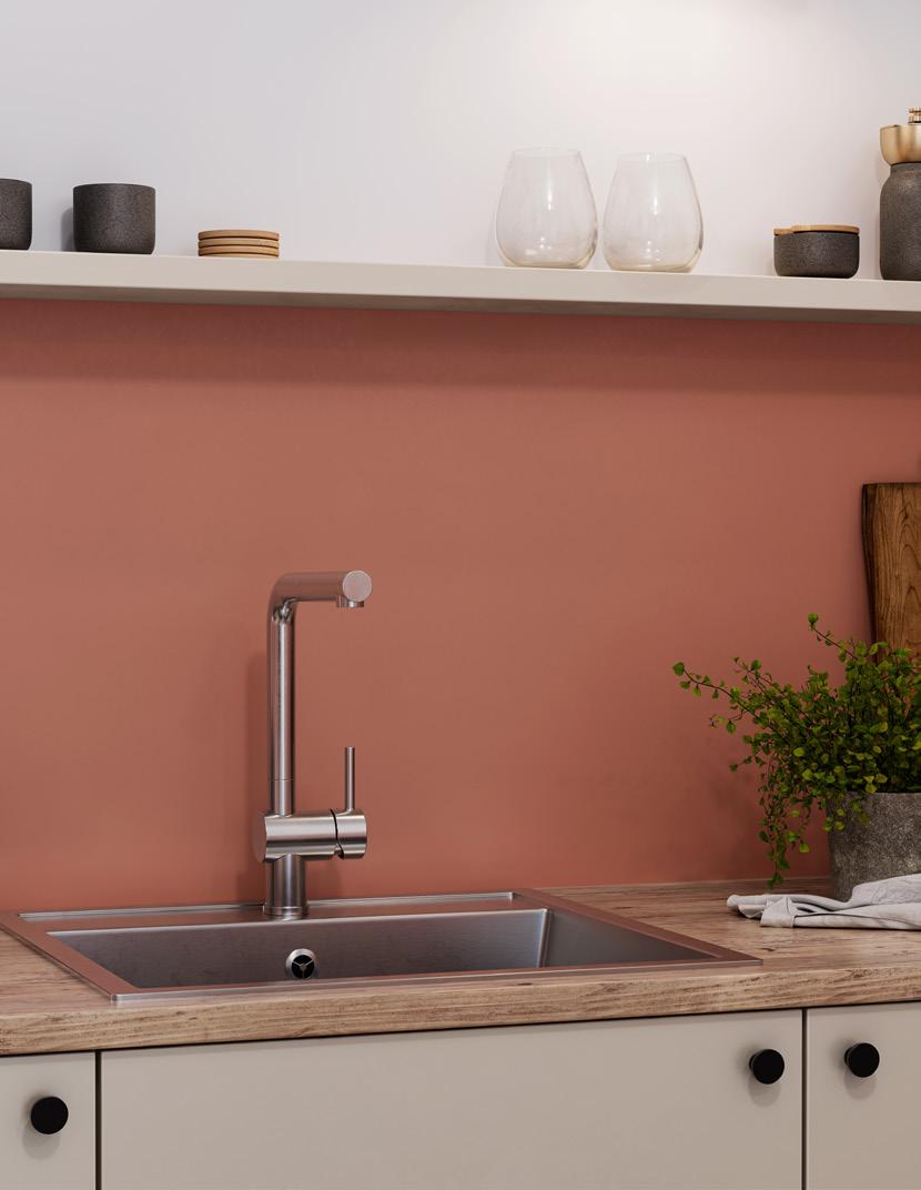
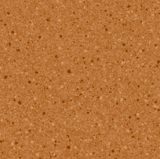
Inspired by earthenware, this colour will fill the space with energy and warmth. The subtle pink undertone makes it contemporary and versatile. Pair this shade with warm neutrals like Hessian, Linen, and Fawn or with Twilight for a striking contrast.
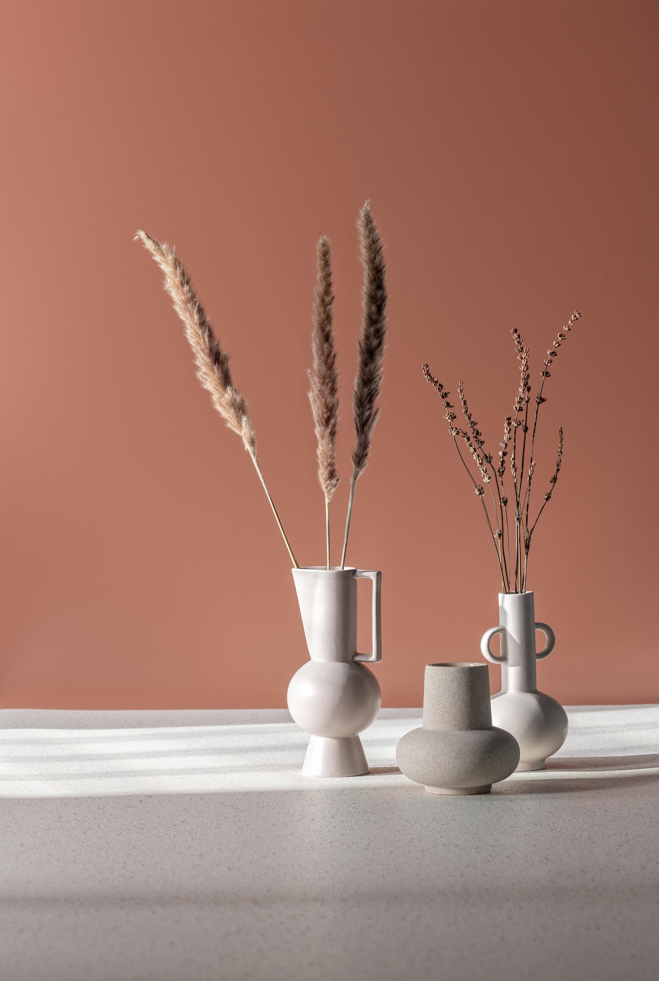
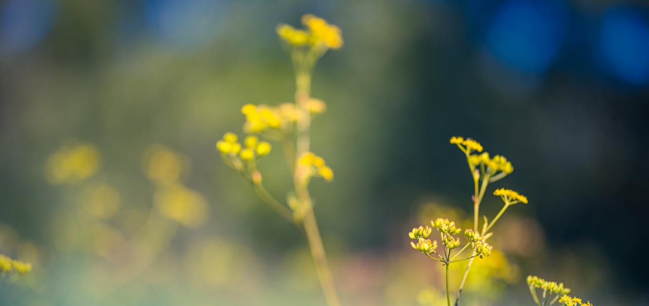
Trends often highlight what has always existed. Vernacular materials are ingrained in our DNA, evoking a sense of comfort and belonging. By incorporating colours inspired by natural materials, we can help people connect with spaces.
Here are some useful colour combinations to help you create beautiful, inclusive interiors. An LRV contrast of at least 30 points between floors and walls is recommended, with additional accent colours for zoning, splashbacks, or doors. We understand that every project is unique, which is why your Altro Consultant is always available to provide tailored assistance.
Here are some useful colour combinations to help you create beautiful, inclusive interiors. An LRV contrast of at least 30 points between floors and walls is recommended, with additional accent colours for zoning, splashbacks, or doors. We understand that every project is unique, which is why your Altro Consultant is always available to provide tailored assistance.
Energising
Group social
Group neutral
Discover effective and contrasting colour combinations for designing welcoming and healing neurodiverse-inclusive interiors. These palettes, curated by Stephanie Kyle, Senior Architect and Inclusive Design Consultant at Floyd Slaski Architects Ltd, along with independent experts, cater to diverse sensory needs. They enhance aesthetic appeal and support the wellbeing of neurodivergent individuals or those with neurodegenerative conditions, promoting calming, comfortable, and safe atmospheres.
Semi-private light
Semi-private dark