

The following short Portfolio contains a small selection of works ranging from professional, academic, self-initiated projects, and events.These works highlight my skill-set in numerous areas such as 2D & 3D Design, Drawing, 3D Modelling, Rendering, Installation-making, Film-making, Graphical Design, and experimental Model Making and Material Testing as well as on-site building, management and supervision. Some projects are still underway and unfortunately drawing or image cannot be shared until they have been completed. A complete Design Portfolio is available and can be provided upon request.
CONTENTS
SAMPLE PORTFOLIO
(structured as below)
Exhibition Design
The Horror Show! A Twisted Tale of Modern Britain Architecture Critical Care Showcase Beatrix Potter: Drawn to Nature Jameel Prize: Poetry to Politics
Filthy Lucre: Whistler’s Peacock Room Reimagined Laughing Matters: The State of a Nation
Installation Design Landscape for Play Social House
Academic Work Marina-Ville
Interior Design ‘Fiit” Ofce HQ
Graphic Design and Writing
Visions of the Future in Blade Runner
Design and Television Work
Bauhaus Rules
THE HORROR SHOW! A TWISTED TALE OF MODERN BRITAIN


Exhibition Design at Sam Jacob Studio (w/ BARNBROOK) [Exhibition Location: Somerset House[


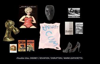


‘THE HORROR SHOW! A Twisted Tale of Modern Britain’ celebrates the nations greatest cultural visionaries, artists and designers, examining how ideas rooted in ‘Horror” have informed the last 50 yers of creative rebellion in modern Britain. The exhibition presents an alternative perspective on the last 5 decades of
––
CONSTELLATION ONE TEENAGE RAMPAGE
––––
CONSTELLATION ONETEENAGE RAMPAGE
–
––
CONSTELLATION ONETEENAGE RAMPAGE
–
––
–––––
-
––
–––
-
–CONSTELLATION ONE TEENAGE RAMPAGE


––
––
–––
–––––


CONSTELLATION THREE –DARK SHADOW –internal lighting–


––
CONSTELLATION THREE –DARK SHADOW –


potential of modern day witchcraft with an emphasis on anarchic alchemy of horror - through its subversive, transgressive and supernatural themes. The exhibition was conceived and o-curated by BAFTA nominated flmmakers Iain Forsyth & Jane Pollard and Somerset Houses’ Senior Curator, Claire Catterall. 3D designed ––

– Top Left: Exhibition Entrance Top Right: David Shrigley’s “I’m Dead (Kitten #1)”, 2007 & Jenkin van Zyl’s “Six Scintillating Sinners (In Vitro)”, 2021 Middle Left: Exhibition Section 1: Monster - Constellation Middle Right: Exhibition Section 3: Witch - Entrance Above: Exhibition Section 2: Ghost - Constellation Bottom Right: Exhibition Section 1: Monster - Catwalk
by Sam Jacob Studio, with a collaborative partnership with with Grpahic Design Studio, BARNBROOK , The Horror Show! received critical acclaim and garnered a 5-star review from The Guardian labelling the show, “funny and serious at the same time, and leaves us unsure whether we should laugh or scream or cry”. t o st t o o t to oo ––––
–
––
Top Left: Exhibition Section 1: Monster - Concept Visual Top Right Exhibition Section 3: Witch - Concept Visual Middle Left: Section 2 Constellation Cabinet Framework Design Middle Right: Exhibition Section 2: Ghost - Concept Visual Lower Left Exhibition Section 2: Ghost - Schematic Plan Bottom Left: Section 1 Constellations Display Arrangements Bottom Right: Exhibition Section 1: Monster Catwalk - Concept Visual

ARCHITECTURE CRITICAL CARE: CSM GRADUATE SHOWCASE ‘22/‘23
Exhibition Design at UAL: Central Saint Martins [Self-Directed Project]

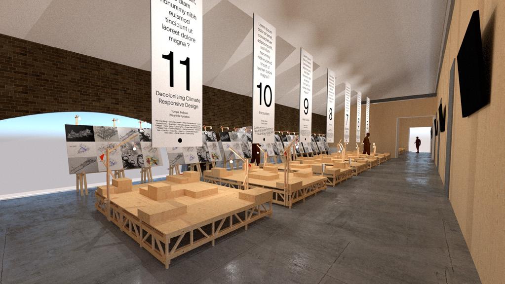


The ‘ARCHITECTURE CRITICAL CARE SHOWCASE’ for graduating BA student cohorts since 2022 was planned and desiged to ensure inclusivity and participatory decision-making throughout its curation process. The goal was to actively encourage student engagement and foster a shared sense of


ownership & responsibility in its development. Each Design Studio was provided with a set of modular furniture and key parameters to work within. In the lead up to the Graduate Show, the design studios dedicate their eforts to curating their projects, aiming to celebrate a year of hard work that embody the core principles of
their design agendas. The outcome is a vibrant display of diverse approaches that celebrate the course’s expansive community. To ensure accessibility for all, the graphic design of the show incorporates large and legible typography. The exhibited work is organised via posing clear questions and succint project

descriptions - this aims to make the showcase an approachable experience for all. The project was led, designed and produced by myself and Louis Lupien, alumni from the course and now parttime associate lecturers for the course. It is a refection of the values of BAArch, which they are now delighted and proud to promote. D
Canvases
BA Architecture Showcase Space Install Plan


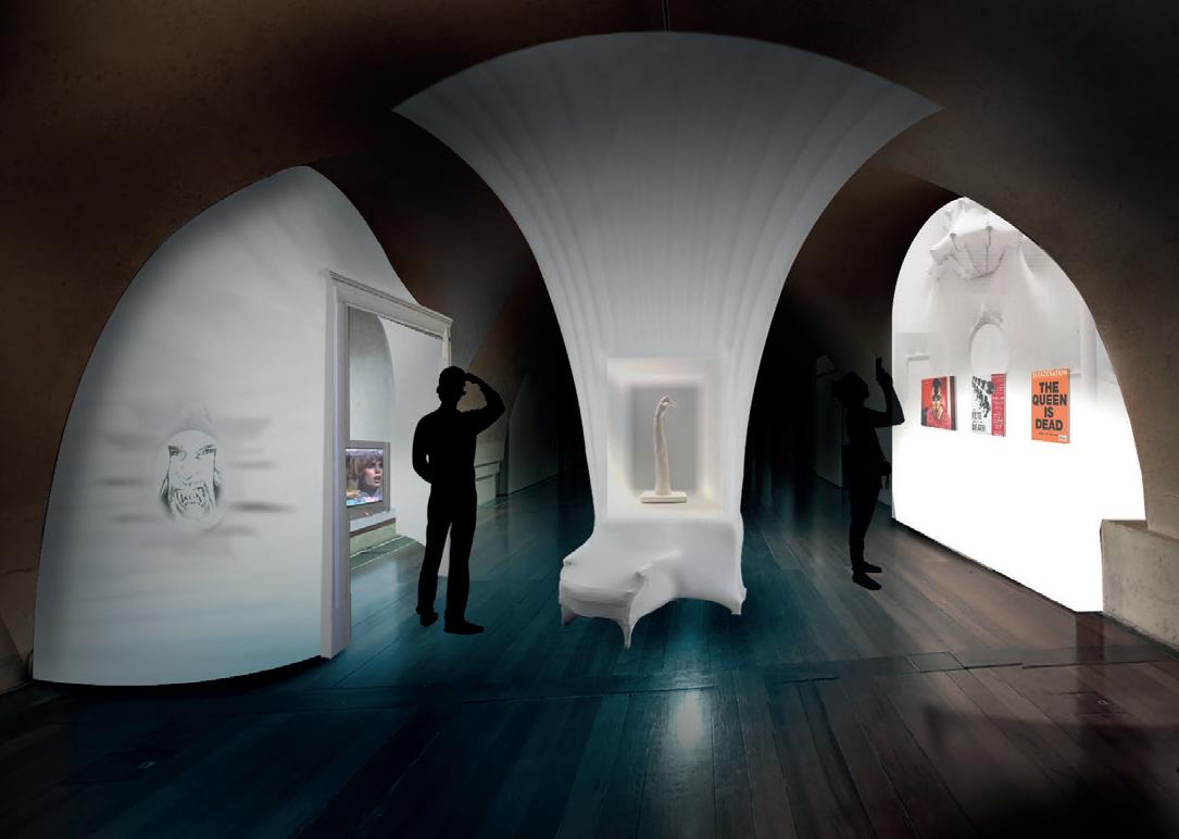
BEATRIX POTTER: DRAWN TO NATURE


Exhibition Design at Victoria & Albert Museum


‘BEATRIX POTTER” DRAWN TO NATURE’ is the frst exhibition to tell the complete life story of Beatrix Potter, one of the best loved authors of children’s fction in the 20th century. Realised through a major partnership with the National Trust, this playful and interactive exhibition invites visitors of all ages to rediscover this
household name and explore the full breadth of her achievements and multifaceted life, from storyteller to natural scientist and conservationist. The exhibition showcases over 200 personal objects including artworks, rarely seen letters, manuscripts, sketches, coded diaries, family photographs, commercial
London to the Lake District, where she eventually settled, from Town and Country to Under the Microscope through to A Natural Storyteller and Living Nature. The design acumen was in accordance in responding to a hybrid of historical architectural detailing that complimented the natural landcsape of Potter’s background. Section 2 Under the Microscope Section 3 A natural story teller


Exhibition overview Section 4 Living Nature Top Left: Exhibition Section 1: Town & Country Top Right: Entrance Entrance & Cabinet Layout Middle Left: Exhibition Section 2: Under the Microscope Middle Right: Freestanding Timber Display Structure Lower Left Row Interactive Play Areas Bottom Left Typical Exhibition Display Arrangement Bottom Right: Interactive Panelling set within moulding
Top Left: Exhibition Section 2: Under the Microscope - Concept Visual Top Right: Exhibition Section 4: Living Nature - Concept Visual Middle Left: Isometric 3D Exhibition Model Middle Right: Section 2: Timber Lattice Frame and Interactive Microscope Table Bottom Right: Exhibition Schematic Plan


Beatrix Potter Interim Developed Design 14

Exhibition overview Section 2 legacy Section is intended to be constructed as a self supporting CLT structure for both ease of touring to other venues but to also create legacy after the exhibition. Inspired by Beatrix’s donation of land to the National Trust the structure could become an educational tool exhibition space for years after the exhibition’s run. Exhibition overview Schematic plan Intro
Ventilation
Animated back panel Mouse SP SSP .2 SSP
AV Cupboard Animated Section panel Mouse
AV.2 Animated panels Inects Secton Living Nature AV Sheep Hearding
Introduction Homelife
Animated Title Rabbit
Travels Entrance portal Albertopolis
.2 SSP SP1
Secton Homes Haunts
Bertram and Secton Under the Microscope Microscope
.2 Speed drawing Mycology
AV Animal Animations AV .2 Animal Animations Hilltop
.2 Scientific Drawing

AV Interactive Embroidery
SSP.3
Farm SSP SP 4 SSP .1 SSP Secton natural storyteller and Literature People and Animals budding Jeremy
Sawrey SSP .3 Places .3 Mouse
AV Tiggy Winkle dressing up interactive McGreggor's
AV Shop animals animation
Shop high Proposed Beatrix Potter Schematic plan 2 M

JAMEEL PRIZE: POETRY TO POLITICS, Victoria & Albert Museum


Exhibition Design at Victoria & Albert Museum


‘JAMEEL PRIZE’: Poetry to Politics’ is a contemporary Art & Design competition hosted by the V&A that is devoted to Islamic tradition. This year was its sixth edition at the museum and the frst time its focus was set to ‘design’ alone. The exhibition presents work from 8 fnalists based around the globe from India,
Iran, Pakistan, Lebanon, Saudi Arabia, UAE and the UK. The fnalists work span from graphic design to fashion to textiles to architecture and the design of the exhibition was aimed to refect the multi-disciplinary content. The work presented addresses the personal and the political, interpreting the past in critical and
creative ways. The design of the exhibition was drawn up to be a more holistic and encompassing experience that treated all entries equally. Throughout the design process we constantly aimed for a sustainable approach that would allow a low carbon footprint for the build and touring of the exhibition. The build itself was constructed
from aluminium scafold which allowed for ease of re-purposing and recycling post use with MDF boards that could tour with the display to future venues. In particular, a central aim for the design was to ensure that it refects the ways in which Islamic art and culture remain rich sources of inspiration for contemporary design.
Top: Rendered Isometric Views from Detailed 3D Exhibition Design model.


Middle Row: Rendered Exhibition Views from 3D design model.


Above
Exhibition Plan
Top Left: Exhibition Space: Jan Traboulsi Top Right: Entrance Banners & Exhibition Entrance Middle Row: Exhibition Space: Sofa Karim & Concept Render Bottom Left: Exhibition Space: Kallol Datta Bottom Right: Exhibition Set Build Detailed Bottom (Clockwise): Jana Traboulsi Bespoke Showcase detail, Ajlan Gharem Chandelier and Dome detail, Bushra Waqas Khan bespoke showcase detailFILTHY LUCRE, Victoria & Albert Museum

Exhibition Design at Victoria & Albert Museum


On-top of multiple design collaborations from across the globe, I was fortunate to be in the lead designer position on this project to help demonstrate master craftsmanship and luxury as part of this installation. Utilising luxurious wood panelling, and an ornate interior, I worked on complimenting the narrative by developing THIS PAGE | Top: Exhibition Installation and AV Projection Above: Installation Interior Top Right: 3D Entrance signage & Detail Middle Right: Cladding Detail | Bottom Right: Exhibition Scenic Painting and Graphics & Paint Detail OPPOSITE PAGE Top Left: 3D Exhibition Mode Top Right: Exhibition Plan and Installation Drawings | Centre: Proposed Exhibition Visual | Bottom: Installation Photos - Build/Painting/Cladding/Interior/Signage Workshop Visit
the space as a journey through time and ego so as to draw viewers into the gallery and lead them into the room. Using light, projection, scenic painting and striking set build, Filthy Lucre became one of the museums most visited free exhibitions that had a generous extension before it eventually left on tour.


Porter Gallery. The installation is an unsettling re-interpretation inspired by tension between art, ego and patronage. Filthy Lucre itself is a 1:1 scale replica of the Peacock Room that has been turned on its head to create an uneasy experience of destruction and twisted excess involved in the originals creation. 3003
5569 Signage
Filthy Scale: 1:100
Elevation
by Contractor confirm dimensions
Acknowledgement graphics [C-1]

Ceiling Mounted HD Projector for AV01 dimensions TBC V&A install
3087 9251
Crate Storage Group Exterior of object clad 18mm Wisa Spruce ply hung splt battens fixed directly studs Ply Ebony https://osmouk.com/sitechaptern .cfm?bookid=Products&chapter=82&page=373#WoodWaxFinish Olivares Bench vinyl existing carbon graphics [SG-1]
Gallery Wall be Painted Colour RAL Panel (x2) by graphics [IP-1] Vinyl graphics signage

Graphic signage to be rigged by build/graphic Refer Graphic Spec [T-1] Floor protected during Updated layout Object cladding Gallery walls repainted entirely [Wall Height 7m] specification
9287 UNCLAD 2305
wall with fire doors (self closing hinges push plates) secured structure and gallery walls Painted Escape sign wired gallery socket https://www.emergency-lighting-direct
.10.19 Updated layout Electrical Services structural stability Drawing conjunction specifications scope drawing SHOP DRAWINGS SUPPLIED AND APPROVED PRIOR FABRICATIO
3507 Filthy 1005 1644 Filthy Filthy Proposed 1:100 A3
of object clad Wisa Spruce ply hung splt battens directly Ply stained OSMO Wood Wax Finish Ebony coats] https://osmouk.com/sitechaptern .cfm?b ookid=Products&chapter=82&page=37 wall with fire doors (self closing hinges push plates) gallery Painted colour RAL 7012 (Dulux) Contractor Escape sign gallery power socket https://www.emergency-lighting-direct gn-arrow-down

Exterior object be clad 18mm Spruce ply hung splt directly Ply stained OSMO Wood Wax Finish Ebony [2x coats] https://osmouk.com/sitechaptern .cfm?b ookid=Products&chapter=82&page=37 3#WoodWaxFinish
Updated layout and specification
745 1220 1220 6100 1047 1047 1402 4830 977 2274
object be clad Wisa Spruce hung splt battens directly stained OSMO Wood Wax Finish Ebony [2x coats] https://osmouk.com/sitechaptern .cfm?b ookid=Products&chapter=82&page=37 wall with fire doors (self closing hinges push plates) gallery Painted colour RAL 7012 (Dulux) Contractor Escape sign gallery power socket https://www.emergency-lighting-direct gn-arrow-down
Exterior object clad 18mm Spruce ply hung splt directly Ply stained OSMO Wood Wax Finish Ebony [2x coats] https://osmouk.com/sitechaptern .cfm?b ookid=Products&chapter=82&page=37 3#WoodWaxFinish
+2000 AFFL +2000 AFFL
+2000 AFFL +2000 AFFL Elevation Elevation
escape doors (self closing hinges push plates) gallery Contractor install illuminated Fire Escape sign gallery power https://www.emergency-lighting-direct .uk/led-maintained-emergency-exit-si gn-arrow-down
Studs be cladding Object back remain unclad Group by Updated layout annotation and NOTES/KEY Design Description

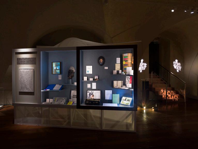
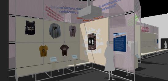
LAUGHING MATTERS, Victoria & Albert Museum


Exhibition Design at Aberrant Architecture & V&A Museum


British comedy is justly famed, not only as a source of entertainment and collective experience, but also for its power and precision as an acute tool of cultural and political critique. “Laughing Matters” was designed to help instil those core values that British Comedy has bought to countless homes over the past 100 years and
celebrate it’s ever evolving content. The exhibition houses curated items and footage that are categorized into specifc themes regarding British Culture and attitudes refected through comedy over time. Split across two foors, the installation provides an exhibition spaces on the ground foor and a co-working/learning
space in the space above where the theme of comedy is constantly present. Custom designed display case refect iconic British artistic styles that help refect and resonate within the Gallery Space whilst using, block, matte colours to distinctly increase recognisable elements within the collection. Interactive elements
also play a part including interactive media screen with audio telephone handsets alongside graphically designed captions and showcases that allow for user input as well as user participation. “Laughing Matters” brings the past 100 years of British Comedy to life and returns its iconography into our Museum Living Room.
Top Left: Finished Exhibition Space.
Top Right: Interactive (Head)Phone


Middle Left & Above: Panelling Colour Detail

Middle Right: Photos of seating in use
Bottom Right: Designed Workspace
Top: Early 3D Modelled Concept for object displays, numerous forms and shapes and colours explored.

Middle: Elevation Drawings showing learning and work space.
Above: Detailed Display Case Breakdown - Elevation and Plan View


Right: Isometric Views highlighting colours, shapes, forms and themed cabinets alongside seating and interactive elements.


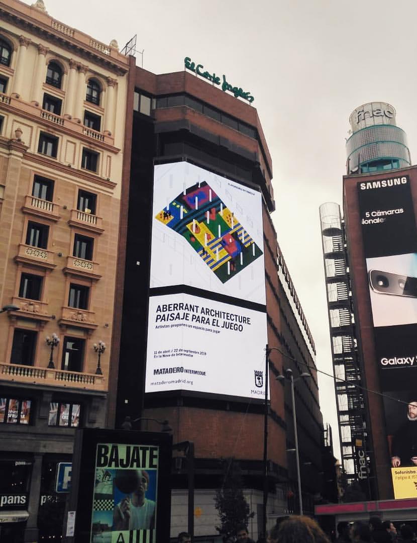
LANDSCAPE FOR PLAY, Madrid - Paisaje Para El Juego


Installation Design at Aberrant Architecture
“Landscape for Play” is an installation devoted to the idea of free play. Inspired by the Dutch Playground Designer, Aldo Van Eyck, “Paisaje Para El Juego” or “Landscape for Play” is a leisure-based proposal that shifts the shapes of the surrounding city in to an interior space. The installation itself uses a translation of the urban
space through play, utilising shapes and colours that invite children of all ages to use the space in a newly engaging and imaginative way. The interior play-scape is composed of follies, sunken spaces and diferent height elements that don’t impose strict and rigid restrictions in terms of how people must behave and play. This


fexibility means that the playground can be used as a setting for a range of activities that go beyond the traditional notion of a “playground”. The playground was installed in Madrid from April 2019 through to September 2019. Working on this project forced us to think spatially, graphically and logistically in order to


develop the structures remotely from London. The programme required us to form an advertisement campaign that comprised of graphical posters as well as a short animation that would be broadcast on public screens across Madrid and across the whole of Spain. “Paisaje Para El Juego” is for children of all ages.


Top: Children interacting with fnished playground.
Middle Left: Playground public opening.
Middle Right: The Play Mountain.

Above: Completed Playground.
Right: Nationwide advertising campaign, design and graphics placed on posters and giant screens.
Top Left: Concept Collage.
Top Middle: Collage Plan Drawing

Middle: Main Axonometric Drawing & Coloured Graphic
Right: Animation Stills
Above: Finalised Plan

Bottom Middle: Construction Breakdown & 3D Design for nook.


SOCIAL HOUSE, Shanghai


Installation Design at Aberrant Architecture


to the public sphere. Social House consists of fve Hearth structures, refecting that of chimneys, that break through the lattice structured roof, retaining that aesthetic. The structures themselves containing several uses in the forms of perching, leaning, sitting and leaning. All of these being forms of informal - -
Top Left: Finished Structure.

Top Right: Detailed and Close up imagery.
Middle Left: Seating placed in Public Square Middle Photos of installation in use. Above: Graphical Advertised Poster Left: Seating in Use
socialising. The SOCIAL HOUSE uses its structures to house books, and magazines to allow for provocation of conversation, allowing a free fow of socialising and meeting within and around it. Centred in the heart of Xintiandi in Shanghai, the installation itself lasted through the Summer of 2018, allowing users and


passers by to flter though the exhibition and allow the life of the SOCIAL HOUSE to thrive. The idea of the hearth is a timeless feature of the home alongside the dwelling and the narrative of a collective gathering, SOCIAL HOUSE is here to capture it.

- -
Far Left: Installation at night time. Right: Concept Views, illustrated from a 3D model.
300
- -
100 X13
1100
1101
600
600 600 600 600 600 -
+3000 -
Dotted Lines Indicate Floor Board Join Lines SEAT SECTION Edges


100
+3000 H2
H1 H1
1000 4000
100 596 600 904 600 1100 100
320mm 300mm
- -
360 320
Shadow signage Signage Shadow Gap around
Materials Key 620 380

Colour to TBC.
Logo Vinyl. Colour to M3.
Gap around signage Text Vinyl. match
M1 Floor Panels (Pink) x10 Recessed Floor Lights Textured Render (Pink) M4 Colour match floor. (i) All timber shelves are removable detachable. (ii)Timber shelves in unit H3 are re-positionable. Colour match floor Translucent Waterproof Sheet

Materials Key Floor Panels (Pink) 1000mm 1000mm M2 x10 Recessed Floor Lights M3 Textured Render (Pink) Colour match floor. (ii)Timber shelves in unit H3 are re-positionable. Painted Softwood Timber Colour match floor M6 Translucent Waterproof Sheet Material Finishes confirmed approve material samples (GA)_13 -

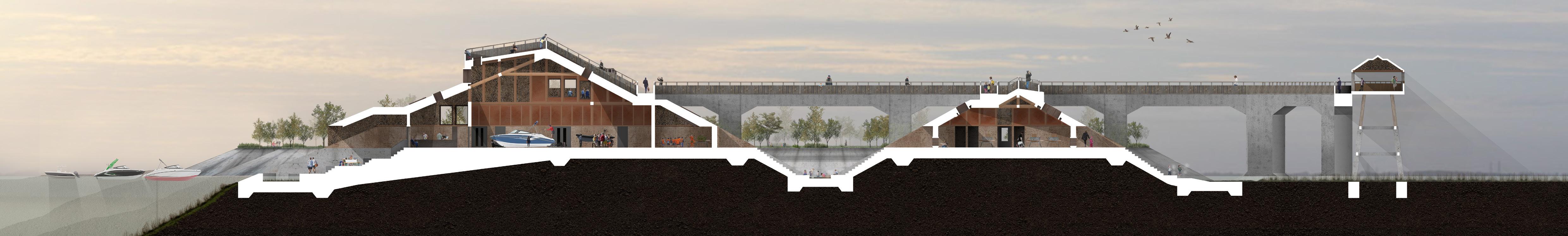
MARINA-VILLE Graduate Final Design Project | Tutors - David Chambers and Kevin Haley
The concept of maritime is etched into the fabric of Canvey Island. Sailing and Yacht clubs, Marina workshops and the iconic Chapman Lighthouse still carry signifcance towards the identity of Canvey today. Marina-Ville, aims to target the distancing generations and create a masterplan to regenerate the Marina
environment by reviving a forgotten community. Island seniors can help share knowledge of craft and history, through construction and archiving, teaching new skills to engaged youths. In turn, youths will help maintain the area, through the management and development of new skills, helping run the area. This agenda aims
to set up several spaces enforcing a generational bridge featuring Tidal Pool Classrooms (extracting educational potential of the natural environment), Boat and Mechanical Workshops (providing jobs and opportunities such as apprenticeships), surrounded by Tidal Social Spaces, using submersible structures to help link


both the land and the sea. The proposal will ofer a contemporary and feasible solution to renovating the existing run-down area of Oyster Creek and breathe a new life back into the Marina. Focusing on The Point of Canvey Island, the proposal will address making and learning within a natural and artifcial landscape.
Top: Isometric Rendered Slice of Proposal
Above: Proposal Topography
Top Right: 3 Rendered Proposal Views
Right: Ground Floor Plan
Far Right: Masterplan
Bottom: Long Rendered Section (1.7m Roll)
Material Tests (Left) focusing on creating concrete alternatives using site materials for a greener sustainable set of materials for both structural and programmatic uses.


In response to my material test series developed a Material Totem. This model, representing a programmatic element, such as a tidal pool, and using intended materials in its composure. This model is also to be used as an experiment to decide the most suitable material upon exposure to water. The model is to be placed in a sealed container and exposed to periods of water interaction over 1-2 weeks. A way to determine the integrity and suitability of the most successful test materials.
Top Left: Tidal Pool Sectional Detail
Top: Material Totem
Above: Totem Detail
Middle: Casting Process
Far Left: Concrete Test Bricks

Left: Totem Exploded Views
 (Above) Materials Left to Right: Brick Crete, Jesmonite, Jesmonite & Concrete, Timber, Clay & Cement, Concrete
Prepared mould for Casting Sectional Piece
Mould Cast and left to solidify
Cast extracted from mould to be sanded
(Above) Materials Left to Right: Brick Crete, Jesmonite, Jesmonite & Concrete, Timber, Clay & Cement, Concrete
Prepared mould for Casting Sectional Piece
Mould Cast and left to solidify
Cast extracted from mould to be sanded
“Fiit” HQ, London
Interior Design at Aberrant Architecture


Fiit’s interactive, online platform is bringing boutique studio ftness into everyone’s living rooms. Designing their brand new ofce space and studio headquarters provided us with a challenge that felt natural in maintaining their mission to make ftness addictive. Retaining the ftness and active theme, we decided to design a

working space that could be turned quickly and fexibly into a working out, active space. Using gym fooring, bespoke furnitures our creative input allowed Fiit to believe in our vision and execution of what will become their most important and exclusive space. Ofce spaces and meeting rooms received bespoke panelling and
desks to aid the movement of hot desking and a kinetic working environment. Drawing up detail designs and creating colourful visuals helped us drive our notion of an active workspace that also including a flming, set space to provide broadcasting capabilities to the outside world. We wanted to make sure that we were
breaking down the barriers to ftness and create a truly motivating and connected ftness and working experience that keeps people coming back for more to use a series of spaces that is hardly ever thought of as a combined treatment. With this project we are applying what we’ve learnt over practice, to help revolutionise an industry.
Visions of the Future in Blade Runner Dissertation and Publication [Graphic Design and Written Work]


Investigating the Sets and Theories Constructing a City on the Edge of the Future. A study of Ridley Scott’s 1982 production of, Blade Runner, in relation to the application of Architectural Theory in Film. discuss the conception, production and execution of the project in relation to it’s infuences and sources, amongst real

architectural sets used in the flm. From Corbusier to Archigram, Sant’Elia to Peter Cook, the writing demonstrates an extremely important link between two felds of study that I deeply connect with. It is a critical piece of work that questions whether set design can become a form of experimental and predictive science.
BAUHAUS RULES - BBC Four Design TV Documentary | Presented by Jim Moir (aka Vic Reeves)


Presented by Jim Moir (aka Vic Reeves), Bauhaus Rules documented, over the course of a week, six Central Saint Martins graduates across fne art, fashion, graphic design and architecture. I was very excited to be asked to participate in this event in which the rule, was to stick to the Bauhaus Rules. Each day we were challenged to create a new work of


art, design or performance whilst working solely to Bauhaus practices and document how are contemporary design methods clash or complimented that of design over 100 years ago. The show was a 1x 60 minute broadcast and was commissioned for BBC Arts and BBC Four as a BBC Studios production. [Documentary stills below]


 Above: Cover of Publication (Left - Back Cover, CentreSpine, Right - Front Cover, with own illustration)
Right: Title Page and Contents Page.
Far Right Column: Physical Outcome Chapter 5 Highlights: “The Architecture of Domestic Narrative”
Appendix - Breaking down key scenes, via still images and script, for further analysis.
Above: Cover of Publication (Left - Back Cover, CentreSpine, Right - Front Cover, with own illustration)
Right: Title Page and Contents Page.
Far Right Column: Physical Outcome Chapter 5 Highlights: “The Architecture of Domestic Narrative”
Appendix - Breaking down key scenes, via still images and script, for further analysis.
