The Architect's Newspaper
FORTH by Morris
Adjmi Architects ups the appeal of Atlanta’s hospitality scene page 12
AN visits with TEN × TEN Landscape Architecture and Urbanism in Minneapolis page 22


FORTH by Morris
Adjmi Architects ups the appeal of Atlanta’s hospitality scene page 12
AN visits with TEN × TEN Landscape Architecture and Urbanism in Minneapolis page 22

From L.A.’s Expo Park, which will host its third Olympic Games in 2028, to the expanded Joslyn Art Museum in Omaha and the improved Superdome in New Orleans, American cities attempt to reshape public life. Read on page 27.
Fogarty Finger and Andrew Berman Architect deliver housing plus a library. Read on page 16.


Virginia Hanusik’s Into the Quiet and the Light and Iwan Baan’s Rome – Las Vegas pages 62 & 64
An excerpt of Adam Rolston’s Joyspace, a riposte to Rem’s “Junkspace” essay page 66

A team led by Snow Kreilich Architects completes a welcome center for a historic cemetery.

Lakewood Cemetery is a 150-year-old Minneapolis landmark in an area once inhabited by Dakota tribes, a landscape of cathedral-like oak savannas and lake shores lined with wild rice. As evidence of the westward spread of the East Coast rural cemetery movement, the cemetery’s picturesque 19th-century campus is the product of settler colonialism, but today the grounds are home to a transformational 21st-century vision of how to rethink death as part of a continuum of life and memory.
At the heart of this transformation is Lakewood’s new 25,000-square-foot Welcome Center, a multidisciplinary collaboration between Snow Kreilich Architects, Miller Dunwiddie, and TEN × TEN Landscape Architecture and Urbanism.
Lakewood’s motto—“Celebrating Life”—demonstrates the radical rethinking behind the Welcome Center. Chris Makowske, Lakewood’s president, has been a driving force behind its shift from a private, inward-looking institution to a public landscape that plays many roles: as a recognized urban arboretum; place of solace and retreat; and destination for classes, music, and seasonal events. continued on page 14
At the Bernheim Forest and Arboretum, DOMM debuts a new installation. Read on page 20.

Parks, plants, products, and more. Read on page 39.


You might be thinking: “What’s up with the flamingos?” They are part of VOTE!, a new permanent public artwork by artist Matthew Mazzotta installed at the newly constructed Palm Beach County Supervisor of Elections building in Florida. The flamboyance consists of three 27-foot-tall birds and is matched with four oversize voting booths. The scene occupies a shallow yard in front of a tilt-up concrete wall painted light teal. Here, each flamingo assumes a different stance, meant to showcase the different ways each of us engages with our government. The point is to get people excited about the act of voting and trusting of the authority that collects and counts votes—all while educating residents along the way.
Mazzotta’s piece builds on the success of a prior Floridian commission. His piece titled HOME debuted in 2021 within the Main Terminal of the Tampa International Airport. This consists of an even-larger flamingo poking its head around below a mirrored ceiling, suggest that travelers are underwater. (The airport closed for three days following Hurricane Milton but soon reopened, though there was minor damage.) Mazzotta’s proposal for the sculpture was selected from a pool of 734 submissions. Upon completion, it went viral. Soon, the airport held a competition to name the flamingo. The winning moniker? Phoebe.
VOTE! is sited in a particularly significant location for current events: Palm Beach County is home to Mar-a-Lago, the Spanish Revival–style mansion commissioned by Marjorie Merriweather Post that is now owned by former President Donald Trump and operated as his high-end social club. And the elections building is a quick drive from the Trump International Golf Club in nearby West Palm Beach, where in mid-September an alleged gunman was discovered hiding in the bushes with a semiautomatic rifle waiting for Trump to play through to the sixth hole. An appreciation for guns is at times even built into our cities: Part of Trump’s golf course is bounded by Gun Club Road, which leads to Gun Club Estates, where the streets are named after gun manufacturers.
Of course, firearms have bipartisan appeal. During the second presidential debate, vice president Kamala Harris mentioned her own gun ownership. She discussed the subject with Oprah the following week. “If somebody breaks into my house, they’re getting shot,” Harris said. In a season where the presidential election feels like an existential crisis, it gets frustrating to intone a basic truth about the duty of voting while so much is on fire, flooded, drying up, bombed out, or falling apart. With all that’s happening, who cares about some cartoonish flamingos?
VOTE! offers a much-needed bit of levity, and its humor has a point. “VOTE! urges us to consider the weight of voting on behalf of the people and beings who cannot vote but are affected by what we decide,” according to the piece’s project text. “What would be on Nature’s mind if it had a chance to vote?”
As it incorporates both sculptural form and textual information, Mazzotta’s piece can be read as both duck and shed. Speaking of which, see page 8 for a heartfelt account of the premiere of Stardust , a new documentary about Robert Venturi and Denise Scott Brown, which was screened during the New York edition of the Architecture & Design Film Festival.
Beginning on page 27, our features tackle big, culturally significant operations in Los Angeles, Omaha, and New Orleans. Each stands to reshape how residents engage with major destinations. The cover sports a striking photograph by Monica Nouwens of the construction of an expanded California Science Center, designed by ZGF to hold the space shuttle Endeavor standing upright, seen from the Exposition Park Rose Garden. It, and Nouwens’s other shots, accompany reporting by Alissa Walker about the city’s race to make improvements ahead of the 2028 Summer Olympics (page 32).
Our landscape section (page 39) extends across all parts of the issue, from a studio visit with TEN × TEN Landscape Architecture (page 22) to a pictorial that offers a glimpse at an architectural installation by DOMM at Bernheim Forest and Arboretum as part of its L+A+N+D (Landscape + Art + Nature + Design) effort, curated by Jenny Zeller (page 20).
Bookish items finish out this fall issue, including Alexander Luckmann’s review of Into the Quiet and the Light by Virginia Hanusik, whose photographs of Louisiana we ran in 2023, and Mimi Zeiger’s take on Iwan Baan’s Rome – Las Vegas, which contains an essay by Ryan Scavnicky that was previewed in this issue last year.
On the back page, read an excerpt of a fresh manifesto by Adam Rolston, who became an architect after growing up as a “middle-class assimilated Jewish gay kid…in L.A.” He navigates our contemporary crises with taut, Jenny Holzer–like dictions like this one: “In our age of compulsive confession, nothing is real unless it is made personal.”
Back to the birds: VOTE!’s arrangement has an open voting booth that is missing a pensive feathered occupant. While the absence suggests interaction for the purposes of an easy social media post, to me the deeper message is an invitation to participate in our democracy now, while we still have the chance. Jack Murphy
CEO/Creative Director
Diana Darling
Executive Editor
Jack Murphy
Art Director
Ian Searcy
Managing Editor
Emily Conklin
Web Editor
Kristine Klein
Design Editor
Kelly Pau
News Editor
Daniel Jonas Roche
Associate Editor
Paige Davidson
Copy Editor
Don Armstrong
Proofreader
Joanne Camas
Editorial Interns
Soleil Protos
Claudia Yoon
Vice President of Brand Partnerships (Southwest, West, Europe)
Dionne Darling
Director of Brand Partnerships (East, Mid-Atlantic, Southeast, Asia)
Tara Newton
Sales Manager
Heather Peters
Audience Development Manager
Samuel Granato
Vice President of Events Marketing and Programming
Marty Wood
Senior Program Associate
Trevor Schillaci
Program Assistant
Izzy Rosado
Events Marketing Manager
Andrea Parsons
Charlotte Barnard
Business Office Manager
Katherine Ross
Design Manager
Dennis Rose
Graphic Designer
Carissa Tsien
Associate Marketing Manager
Sultan Mashriqi
Marketing Associate
Anna Hogan
Media Marketing Assistant
Mika Rivera
General Information: info@archpaper.com
Editorial: editors@archpaper.com
Advertising: ddarling@archpaper.com
Subscription: subscribe@archpaper.com
Vol. 22, Issue 7 | October/November 2024
The Architect’s Newspaper (ISSN 1552-8081) is published 7 times per year by The Architect’s Newspaper, LLC, 25 Park Place, 2nd Floor, New York, NY 10007.
Presort-standard postage paid in New York, NY. Postmaster, send address changes to: 25 Park Place, 2nd Floor, New York, NY 10007.
For subscriber service, email subscribe@archpaper.com.
$6.95/copy, $50/year; institutional $189/year.
Entire contents copyright 2024 by The Architect’s Newspaper, LLC. All rights reserved.
Please notify us if you are receiving duplicate copies.
The views of our writers do not necessarily reflect those of the staff or advisers of The Architect’s Newspaper
The Gray Building at the University of Kentucky by Studio Gang contains the Landscape Architecture program, which is not a part of the UK College of Design. Landscape Architecture and Biomedical Engineering share studio and support spaces in the building.
The opening image of the Sustainability focus section in the September 2024 issue was created by the Office for Political Innovation.


Whether it’s swinging or sliding, small or monumental, Halliday + Baillie offers iconic flush solutions for any door in your project. Delivered in a dozen New Zealand-tested architectural finishes to ensure a lifetime of elegance and performance.


Founders and CEOs of landscape architecture firms confirm their support for ASLA’s ambitious Climate Action Plan
Founders and CEOs from several of the “largest and most influential” landscape firms in the United States—among these SWA, Field Operations, and OJB—signed a letter announcing their support and commitment to meet, or exceed, the goals laid out in the American Society of Landscape Architects (ASLA) Climate Action Plan. The Climate Action Plan, first rolled out by the professional organization in 2022, strives for “a zero-emission profession by 2040.” Kristine Klein
Studio Museum in Harlem announces its first exhibition ahead of fall 2025 opening, a Tom Lloyd retrospective
Construction is well underway on a new purpose-built home for the Studio Museum in Harlem designed by Adjaye Associates and Cooper Robertson with landscape features by Studio Zewde. Curators also announced that the Studio Museum’s first exhibition (when it opens in fall 2025) will showcase the work of Tom Lloyd, a Queens-based sculptor who died in 1999. For many, the retrospective marks a full circle: Lloyd was the subject of Studio Museum’s first exhibition 56 years ago, titled Electronic Refractions II Daniel Jonas Roche
HGA restores San Diego Symphony’s Jacobs Music Center
For three years, the Jacobs Music Center in Downtown San Diego has undergone renovation work. The theater, previously known as the Fox Theatre movie palace, brims with Spanish baroque detailing. Restoration work on the historic theater kicked off in early 2022, when the San Diego Symphony partnered with architectural firm HGA to restore and renovate the building with acoustician Paul Scarbrough and theater planner Schuler Shook. The renovations include preserving ornamental details such as the central chandelier, gilded baroque details on the ceiling and surrounding walls, lighting, sound, and recording equipment. Soleil Protos
Morphosis completes concrete-clad building for Crow Museum of Asian Art at UT Dallas
On the campus of the University of Texas at Dallas, the first phase of the Edith and Peter O’Donnell Jr. Athenaeum, a planned culture and arts district, has opened. Designed by Los Angeles–based architecture firm Morphosis, the building will serve as a satellite location of the Crow Museum of Asian Art, an institution based in Downtown Dallas. Clad in textured, precast-concrete panels, the Crow Museum has a materiality that echoes that of the Perot Museum of Nature and Science, Morphosis’s debut in Dallas, which opened in 2012. Trevor Schillaci
Diller Scofidio + Renfro shares renderings of the University of New Mexico’s new building for the College of Fine Arts
A new building by Diller Scofidio + Renfro for the University of New Mexico (UNM) responds to the Albuquerque landscape in both form and materiality. The new state-of-the-art Center for Collaborative Arts and Technology (CCAT) yields a 60,000-square-foot arts education facility that will serve as a central hub for the UNM College of Fine Arts. It gathers workspaces, space for mounting exhibitions, and a 600-seat multipurpose performance hall all under one roof. The project is slated for completion in 2026. Claudia Yoon

Exhibit Columbus announces Miller Prize recipients and university design research fellows
With less than a year to go before Exhibit Columbus’s fifth cycle kicks off, Adaptive Operations, Studio Barnes, Studio Cooke John, and AD—WO have been named the official 2024–25 J. Irwin and Xenia S. Miller Prize recipients. Chandler Ahrens, Constance Vale, and Kelley Van Dyck Murphy; Sarah Aziz; Akima Brackeen; César A. Lopez, Jess Myers, Amelyn Ng, and Germán Pallares-Avitia; Suzanne Lettieri and Michael Jefferson; and Andrew Fu, Aaron Goldstein, and Aleksandr Mergold are the research fellows. DJR


Hanif Kara named 2024 Sir John Soane Medal recipient
An engineer, not an architect, is this year’s Sir John Soane Medal recipient. Hanif Kara— the go-to structural engineer for Zaha Hadid Architects, David Chipperfield, Herzog & de Meuron, Norman Foster, BIG, Grafton Architects, and Francis Kéré—is the prize’s 2024 winner. Kara was born in Uganda in 1958. He founded his structural engineering firm, AKT II, in 1996. The Sir John Soane Medal will be officially presented to Kara on November 26 at London’s Royal Academy of Arts. Last year’s winners were Anne Lacaton and JeanPhilippe Vassal. DJR
Is Centre Pompidou × Jersey City back on the table? A recent city council vote resuscitates the project
Jersey City politicians haven’t given up on bagging a Centre Pompidou satellite branch, despite a big setback this summer. In August, Jersey City Mayor Steven Fulop, who is now running for governor, proposed an abatement deal to revive the plan. That abatement deal was approved recently, and Centre Pompidou x Jersey City is back on the table. The new tentative site for museum project is at the base of two 50-story towers designed by Handel Architects on Pavonia Avenue in Journal Square. DJR
Kengo Kuma to design Global War on Terrorism Memorial, replacing Marlon Blackwell Architects
Last year, Marlon Blackwell Architects beat out 176 firms in an international competition to design the new Global War on Terrorism Memorial in Washington, D.C. This October, the Global War on Terrorism Memorial Foundation (GWOTMF) announced that Kengo Kuma & Associates will design the National Mall’s newest memorial instead. AN reached out to both the GWOTMF and Marlon Blackwell for comment in regard to what prompted the switch, but a specific reason for the change wasn’t given. “We have no comment but do wish [GWOTMF] all the best in their mission,” a spokesperson for Marlon Blackwell Architects told AN DJR
Robert A. M. Stern Architects to refurbish historic UT Austin tower
A 307-foot-tall Beaux Arts tower designed by Paul Philippe Cret has perched over UT Austin since it was completed in 1937. Now, for the first time in its 85-year history, the Texas tower will undergo a major refurbishment. Robert A. M. Stern Architects has been selected for the job. The renovation, slated for completion in summer 2027, will entail a comprehensive restoration of the tower’s exterior; the stone, windows, lighting, clockface, and historic gilding will all be improved. Metal and wood surfaces will be repainted to match the original design, and the tower’s east and west entrances will be reconstructed. DJR
Field Operations and Brook McIlroy partner for new project on Toronto’s Bentway
Three traffic islands situated between Dan Leckie Way and Spadina Avenue in Toronto will soon complement The Bentway. Part of a larger vision to revitalize underutilized spaces around the Canadian city’s Gardiner Expressway, The Bentway Conservancy, in partnership with the City of Toronto, announced the design team behind the forthcoming Bentway Islands project. The new public space will be transformed by Field Operations and local practice Brook McIlroy. CY
FXCollaborative designs new home for Children’s Museum of Manhattan inside historic church
The Children’s Museum of Manhattan (CMOM) has provided world-class cultural programming for kids since 1973. Currently, CMOM is based on 83rd Street on the Upper West Side, but museum officials have their sights set on a historic 7-story church on 96th Street overlooking Central Park for its new center of operations. FXCollaborative was tapped to repurpose 361 Central Park West—a church completed in 1903 by Carrère & Hastings—into a new home for CMOM. After a final phase of fundraising, CMOM should open its doors on Central Park West in 2028. DJR
SCAPE and BIG to transform Connecticut brownfield into public park
Norwalk, Connecticut, is a city of almost 100,000 people on the Long Island Sound. Soon, a relic of Norwalk’s industrial past will be converted into a public park. Plans are underway to convert Manresa Island, a 125-acre brownfield site, into a dynamic green space and community hub. SCAPE has been selected to create the master plan and do community outreach, and Bjarke Ingels Group will convert the island’s former coal-fired power plant into a multiuse public building. The plant’s epically proportioned turbine hall will be reprogrammed for community events. DJR
Ralph Knowles, a passive design pioneer, dies at 95
The inventor of the “the solar envelope” concept, Ralph Lewis Knowles, died in Cleveland on August 23. Though Knowles became a leading figure during his time at USC, his career lasted for decades following. He produced several works that cemented his place in the field, wrote seven books, and authored numerous articles and manuals that spread his enthusiasm for passive solar architecture—a key component in contemporary sustainable design initiatives. His work was acknowledged with the AIA Medal for Research and through his fellowship award and honor as a “Passive Solar Pioneer” by the American Solar Energy Society. SP
The Shelburne Museum reveals renderings of the new Perry Center for Native American Art after disengaging Adjaye Associates
After severing ties with Adjaye Associates because of sexual misconduct allegations against David Adjaye, the Shelburne Museum in Shelburne, Vermont, released renderings of the new Perry Center for Native American Art. The design is by Indigenous-owned Two Row Architect, as well as Reed Hildebrand and Annum Architects. The design includes a red circular structure with a central oculus in the ceiling that allows natural light in. CY
Philosopher Fredric Jameson, author of Postmodernism, or, the Cultural Logic of Late Capitalism, dies at 90
Philosopher Fredric Jameson died on September 22 at his home in Killingworth, Connecticut. He was 90 years old. Since 1985, Jameson had been professor of comparative and romantic literature at Duke University. Postmodernism, or, the Cultural Logic of Late Capitalism was arguably Jameson’s best-known book. Other important texts for architects penned by Jameson include The Brick and the Balloon: Architecture, Idealism and Land Speculation; Architecture and the Critique of Ideology; Future City ; and Space Wars DJR

Paul Rudolph’s Sanderling Beach Club destroyed by Hurricane Helene
Hurricane Helene has killed more than 200 people and decimated houses, infrastructure, and roads across the Southeast. Sanderling Beach Club, a 1952 building designed by Paul Rudolph in Sarasota, Florida, has also been destroyed. Florida-based architect Max Strang told AN the architecture is totaled, and there is nothing left to repair. Strang relayed to the Paul Rudolph Institute for Modern Architecture that he will present a reconstruction plan. DJR

The 2024 Bethel Woods Art and Architecture Festival invites students to Build Community, Build Creatively, Build Fest
Now in its third iteration, Bethel Woods Art and Architecture Festival wrapped up this September. In Bethel, New York, architecture students, professors, and organizers put together a sprawling group show spread throughout the historic site of the 1969 Woodstock festival. Students and faculty from Princeton University, Kean University, Auburn University, Syracuse University, Cornell University, Arizona State University, Georgia Tech, Rensselaer Polytechnic Institute, and Rochester Institute of Technology all took part. DJR
University Children’s Hospital of Zurich by Herzog & de Meuron opens in Switzerland
In Zurich, Herzog & de Meuron recently completed two buildings: an acute-care hospital and a research and teaching facility. The acute-care hospital is a 3-story building made of wood and concrete, and the research and teaching facility is a 5-story cylindrical one finished with white lacquer, not unlike Frank Lloyd Wright’s Guggenheim Museum. In its materiality, facade rhythm, and interior finishes, the new acute-care hospital echoes Alvar Aalto’s Paimio Sanatorium, completed in 1932. At University Children’s Hospital of Zurich, architects at Herzog & de Meuron undertook a similar pursuit as Aalto did almost a century ago: Can architecture abet the healing process? DJR
Neri Oxman launches eponymous New York–based design studio
Former MIT professor Neri Oxman recently launched her eponymous multidisciplinary design studio. OXMAN works at the intersection of computational design, robotics, material science, green chemistry, biology, and ecological engineering. The New York office space where OXMAN is headquartered was designed in collaboration with Foster + Partners. So far, OXMAN’s output has been expansive; it designs buildings, digital architecture, and also 100-percent-biodegradable footwear made of bacteria. DJR
Louvre selects WHY Architecture for “most significant museographic overhaul” in a decade
WHY Architecture has been selected by Musée du Louvre for two major commissions at its historic Paris complex. The New York office will create scenography for the new Department of Byzantine and Eastern Christian Art and refurbish the Louvre’s Roman antiquities trail. BGC Studio, a Paris office, will work with WHY Architecture on the project. Kulapat Yantrasast, founder and creative director of WHY Architecture, will be the project leader. DJR
NJPAC campus redevelopment by SOM, Weiss/Manfredi, Future Green, and OCA breaks ground in Newark
Shovels have broken ground in Newark on a major campus redevelopment for the New Jersey Performing Arts Center (NJPAC)—a $336 million project with designs by SOM, Weiss/Manfredi, OCA Architects, and Future Green Studio. Upon completion, NJPAC will bring housing, shops, restaurants, outdoor gathering spaces, and a unique education and community center (with professional rehearsal spaces) to Newark’s downtown, spread throughout NJPACs 12-acre campus. DJR
AIA Board of Directors alleges a “coordinated campaign” to publicly discredit leadership
On September 25, a press statement from AIA board of directors was sent to AIA members alleging “a coordinated campaign being driven by various AIA stakeholders to publicly discredit the EVP/CEO and the wider Board.” Details about the plot, including who might be leading it, were not provided. “The AIA Board is concerned about the coordinated effort that we have become aware of to discredit our leadership team this year,” AIA president Kimberly Dowdell told AN DJR
Jean Nouvel to renovate historic Paris building for Fondation Cartier’s next gallery location
Founded in 1984 by Alain Dominique Perrin, the Fondation Cartier was France’s first corporate foundation for contemporary art. To mark its 40th anniversary, the Fondation Cartier pour l’Art Contemporain is preparing to decamp from its glassy outpost along Boulevard Raspail and into a historic building on Place du Palais-Royal, in the heart of Paris. The renovation will be headed by Jean Nouvel. CY

Nelson Byrd Woltz redesigns Rice University’s academic quadrangle with an eye toward history and an appetite for optimism.
Unveiled early in the fall 2024 semester, the central quadrangle of Rice University now has a new look. Thanks to a landscape design by Nelson Byrd Woltz Landscape Architects (NBW), the space has been updated for contemporary academic life. The commission builds on NBW’s track record in Houston, as the firm has redesigned the city’s Memorial Park, the grounds of the Rothko Chapel, and the landscape for the upcoming Ismaili Center.
The axial vistas of the previous version of this important space were first conceived as part of the school’s General Plan, issued in 1910 ahead of Rice’s opening in 1912 and designed by Cram, Goodhue, and Ferguson Architects. Over time the campus grew while the treeless expanse of the Academic Quadrangle remained fixed in time. For years it was stamped with a diagonal desire path that allowed students to cut across the lawn and get to class on time.
NBW began schematic design with a deep dive into the history of the campus and the Texas climate. More than 24,000 new plants were installed around the quad, each carefully selected to feel at home in Houston: species like Echinacea purpurea, Salvia farinacea “Henry Duelberg,” and Penstemon tenuis abound, echoing the school’s blue brand color. There are also 90 new trees on the quad, primed to provide shade as they mature. The vision is that students will one day see a contiguous canopy as they walk the curving pathways beneath the intertwined branches. These will join the campus’s existing live oaks, planted in the school’s early years, that have come to define the experience of moving across the eastern parts of the campus.
NBW’s scheme elaborated the diagonal into an ellipse and added additional curves that swoop across the grounds. In the center of the new space, a paved outdoor common room offers space to meet and gather, as does a mirrored pair of shade structures and benches set in front of Fondren Library.
Beyond serving as a place to study and reflect, NBW’s new quad represents a larger story about Rice University itself. The prior quad boasted a statue of the school’s founder, William Marsh Rice, installed in 1930 on a
Twenty years in the making, a documentary film tells the untold story of Robert Venturi and Denise Scott Brown.
stone pedestal at the center of the space.
In 2019, the school began a process of self-reflection that included the creation of the Rice University Task Force on Slavery, Segregation, and Racial Injustice. The history and presence of the Rice statue was considered, as Rice himself was a slaveowner.
A 2021 report offered that the Academic Quadrangle needed “bold change.”
In this update, the school has “recontextualized” the statue of Rice: It now sits at ground level in the southeast corner of the quad.
Other campus elements also inform the new stone and brickwork, like the colonnade of the nearby Lovett Hall, whose influence can be read by astute observers within the new exterior pavement designs.
The removal of linear hedges further opened the quadrangle for events. The new version is capable of hosting gatherings of up to 3,000 people and is the historic location of the school’s graduation ceremonies.
Beyond formal events, the quad was designed for everyday student engagement. The central patio space repurposes the plinth where Rice’s statue once stood: In a move inspired by Speakers’ Corner in London’s Hyde Park, the world’s oldest purpose-built platform for free speech, the granite pedestal now represents the school’s commitment to open discourse on campus and “student-led initiatives,” according to a statement. (The old plinth also contained Rice’s remains, which have now been transferred to a cemetery.) The stone is engraved with a phrase from JFK’s “We choose to go to the moon” speech, given at Rice Stadium in 1962.
The arcs of NBW’s new quadrangle challenge the linearity of the Rice campus’s early buildings and its typical allées. They stand to offer a new suite of habitable outdoor spaces, but only time will tell if their layered symbolic gesture will result in enhanced freedoms for students and the causes they choose to support, today and tomorrow. For now, this significant revision is a physical manifestation of Rice’s ambitious work to create a more equitable future. Emily Conklin
It was a brisk Wednesday afternoon, and the sun was somewhere between coming and going. My mom had just driven to New York from Boston. She picked me up from work like how she used to pick me up from school, and we headed to the old Yiddish Theater in the East Village, which is now Village East by Angelika. We were on our way to see Stardust: The Story of Robert Venturi and Denise Scott Brown by Jim Venturi and Anita Naughton, presented by the Architecture & Design Film Festival (ADFF) Stardust was more than 20 years in the making. Jim started interviewing people and compiling footage for the documentary in 2002, and Anita joined the project team ten years ago. I worked for Jim at ReThinkNYC for almost five years before joining AN . My mom, a retired Boston Public School social worker, had always wanted to meet Jim, who’s been a mentor to me and a friend. That’s why she schlepped all the way down to New York that day. “Will there be famous people?” my mom asked in the car. “Probably,” I replied. We arrived at the Yiddish Theater around 6:00 p.m. Jim was on the sidewalk greeting people and taking pictures with friends. I tapped him on the shoulder, and we hugged. We hadn’t seen each other in a while. “This is my mom,” I said. Jim and Mom spoke for a few minutes. Next thing I knew Alexandra Lange was there; she also met my mom. And then came Paul Goldberger, James Wines, Kriz Kizak, Henry Smith-Miller Laurie Hawkinson Mira Friedlander, Patterson Sims, and Martin Filler. And then Peter Eisenman and Cynthia Davidson, and Beatriz Colomina and Mark Wigley
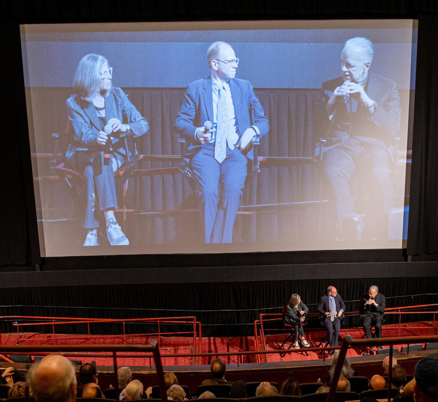
ADFF founder Kyle Bergman gave opening words, and Jim Venturi, Martin Filler, and Gabrielle Espardy had a brief discussion about Stardust after the screening, pictured below. Anita was brought onstage to everyone’s delight. We all clapped for her. Filler lambasted the Sainsbury Wing’s ongoing renovation by Selldorf Architects. Jim shared intimate memories of the last few days of his dad’s life in Philadelphia. “That part in the movie when Denise said it was better to be a woman in the 1920s than the
1950s—it’s true,” Mom said later that evening on our way home. “Really? Why?” I asked. Mom proceeded to tell me what her childhood was like during the postwar baby boom, a period of her life she rarely talks about. “Women couldn’t have their own bank accounts until the 1970s, for god’s sake!” she said rather animatedly. “I never knew that,” I said, a bit ashamed for not having known that.
“Everyone always knew about Bob, but not Denise,” my mom said on the phone in the days after the screening. “How could anyone possibly hate that woman? She’s absolutely wonderful! Any working woman can relate to her. What was the Nazi’s name?” Mom asked. “Philip Johnson,” I replied. “I would consider it a badge of honor to be hated by that guy,” she said with chutzpah.
Indeed, Stardust did something one wouldn’t expect from a documentary film about famous architects. It was a love story first, where architecture came second. It provoked essential conversations about gender, labor, and the “star system” between generations, like the stories it inspired my mother to tell me about her own lived experiences.
“I thought about [ Stardust ] for the rest of the night,” James Wines told me afterward. “It’s a real film! I’ve seen so many architecture documentaries in my life. I’m 92 years old now, mind you! And most of them put me to sleep. They also tend to be pretentious and inflate the architect’s importance. This wasn’t like that at all,” Wines said. “Capturing architecture in film is not at all an easy thing to do. [ Stardust ] was a genuine work of art.”
“Bob, Denise, and I share a similar sense of humor. We have a lot of the same sardonic views about the profession, especially its pomposity,” Wines said. “I often tell students, ‘If you really want to be creative, don’t go to the GSD and read boring papers.’ I tell them, ‘Just look at the dumbest thing you’ve ever seen. That’s where the ideas are!’ It’s like what Duchamp did. The dumbest thing you’ve ever thought of is probably where nobody else is looking. I think Bob and Denise also had that sensibility.” DJR

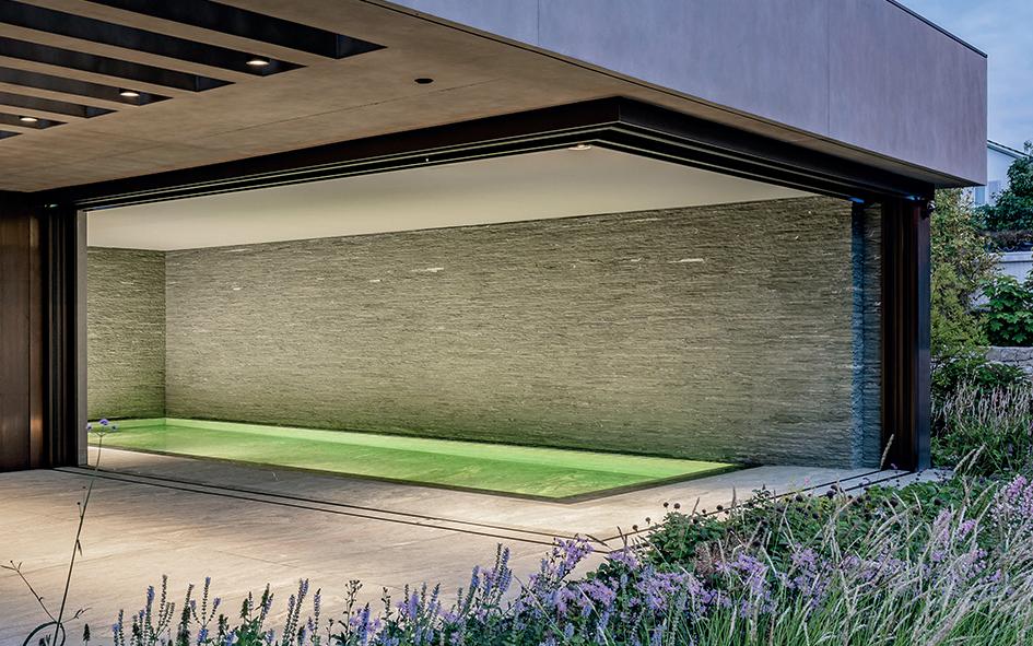

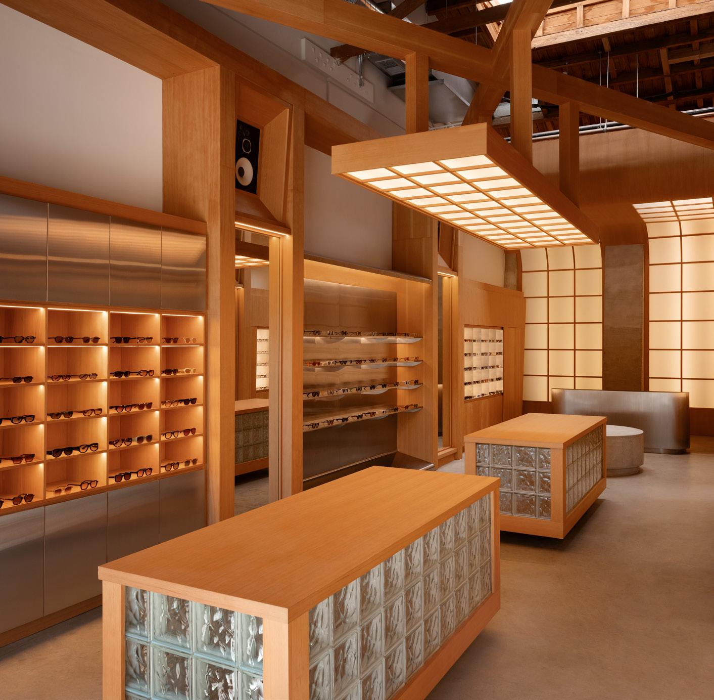
AKILA LA
3300 Sunset Boulevard, Los Angeles, CA 90014
22RE
AKILA Eyewear emphasizes Japanese craftsmanship, natural materials, and modern precision. 22RE translated the company’s ethos into an interior design for the retailer’s Los Angeles flagship by looking to ryokan , a traditional Japanese inn. To do so, the architects incorporated translucent materials, grids, and shoji sliding doors. This grid also helps organize all the glasses on neat shelving, made from Douglas fir and paired with a metallic finish for a sense of the brand’s contemporary leanings. The interior is punctuated by counters of more wood and glass block that fall under the building’s original vaulted ceiling, which the architects exposed by adding a large cross truss to lower the lighting. At the rear of the space, the ceiling’s shoji screens curve down to the wall, a satisfying backdrop for the stainless-steel counter in front.
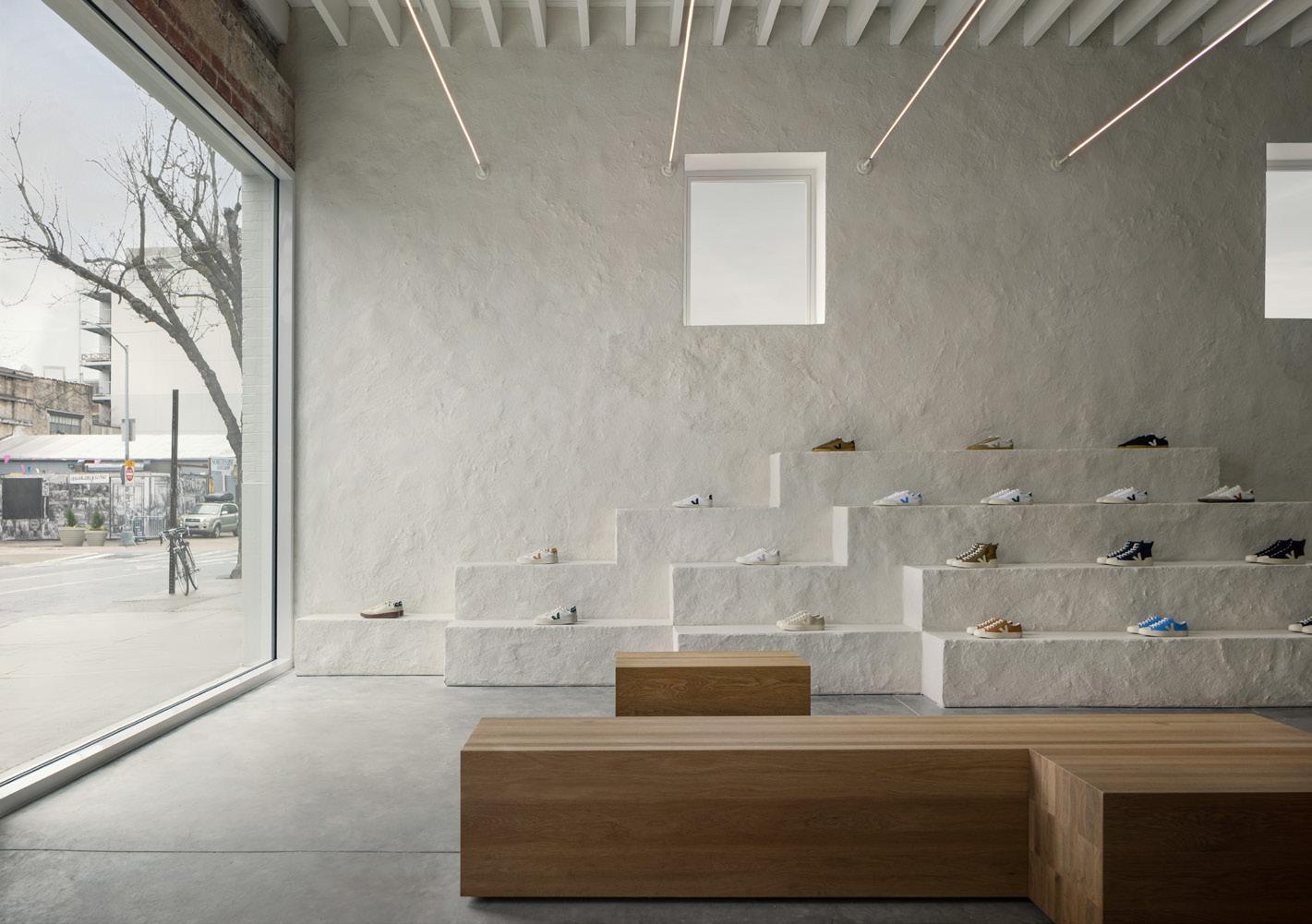
Veja Brooklyn
111 North 5th Street, Brooklyn, NY 11249 Office JDY
A hodgepodge of masonry, wood, concrete, and stucco materials can often be found in old New York City buildings that have swapped owners (and thus designs) over time, and the Brooklyn locale for French sneaker brand Veja is no different. Rather than concealing this idiosyncrasy, Office JDY repaired and remediated the amalgamation while revealing it. The mixed materials are paired with white surfaces—the only new finishes in the store—made with a custom lime plaster mix developed with local craftspeople. This forms a textured wall and display of boxes to highlight products. Opposite it, a floating 37-foot shelf was built into the exposed brick. White oak benches and a sales counter add warmth, while thin tubes of light stretch across the ceiling.
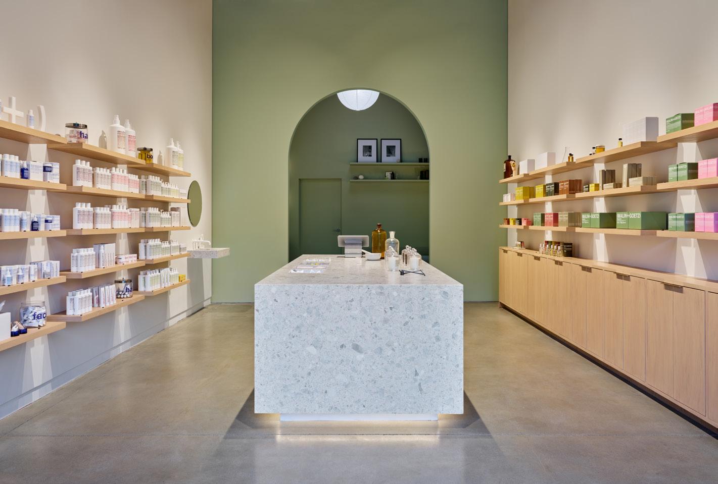
MALIN+GOETZ Silver Lake
3300 Sunset Boulevard, Los Angeles, CA 90026
Bernheimer Architecture
An art deco facade on Los Angeles’s Sunset Boulevard used to front an auto body repair shop. Bernheimer Architecture maintained the exterior while renovating the space for skincare and fragrance line MALIN+GOETZ’s new outpost in Silver Lake. In addition to the recently completed Abbot Kinney location, the architects designed the brand’s Silver Lake site by merging the client’s clean branding with film history. A long interior organizes the company’s various offerings on natural white oak shelves along the wall. They face inward toward a counter made of white terrazzo slabs. The orderly, neutral tone allows the teal archway in the back to pop. Inspired by the way mystery entices characters in Pulp Fiction , the architects created a contrastingly colorful backroom, featuring a lounge space, to beckon customers within. The monochrome room is set beneath a wooden truss, carried over from the auto body shop, and updated with a skylight.

Wall Street
67 Wall Street, New York, NY 10005 Jakob Sprenger and AZA
For Aesop’s new location in downtown New York, Jakob Sprenger in collaboration with Alexander Zilberman Architecture (AZA) drew from the art deco style of the site as well as the 37-story Munson Building, where the retail space is located. The former lobby space was defined by tall ceilings and walls clad in Fior di Pesco marble. The renovation continues the grandeur of the building with pilasters that display Aesop’s skin care and fragrances, while crown moldings and a coffered ceiling add to the elegance. Seven bays of maplewood, patinated brass, and fabric inlay opulently organize offerings, a shelving system that nods to the building’s maritime heritage. It’s all lit by a vintage chandelier to help make the interior look as if it has always been there. Kelly Pau





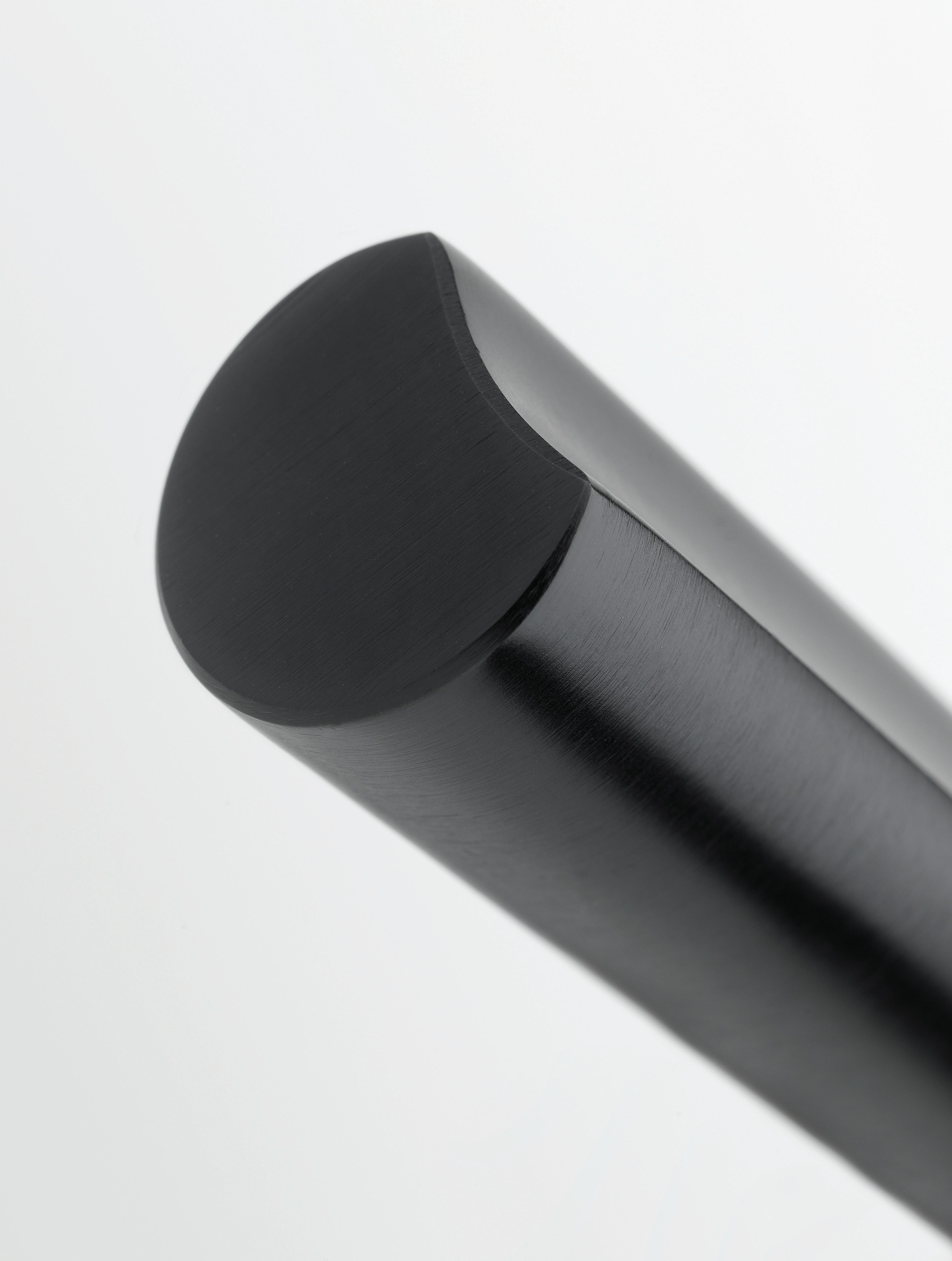
by David Rockwell
The ECLIPSE collection of architectural hardware is known for its iconic silhouette. The cylindrical form, with a curved, carved channel, creates soft lines that ensure a perfect ergonomic grip. The moon-like detailing continues seamlessly along the entire length of the lever’s arm and over the curve of the neck.
formani.com
A hotel by Morris Adjmi Architects is the latest addition to a growing district in Atlanta’s Old Fourth Ward.
It all started with Jamestown L.P., the real estate investment firm established in Cologne in 1983 to give middle-class Germans a chance to profit from the growth of U.S. cities. Over the years, Jamestown, which located its North American headquarters in Atlanta, has owned Manhattan’s Chelsea Market (which it sold to Google for $2.4 billion) and One Times Square, which it is currently revamping; Brooklyn’s Industry City; San Francisco’s Ghirardelli Square; and other high-profile properties. In 2011 it bought a 2.1-millionsquare-foot 1920s building, once a Sears Roebuck distribution center, in Atlanta’s Old Fourth Ward, a historically Black neighborhood about a mile northeast of the city center. Following a design and master plan by S9 Architecture, Jamestown embarked on a $140 million renovation to convert the red-brick building into Ponce City Market, a mixed-use complex that includes a “destination” food court.
Ponce City Market opened in 2014. Two years later, Jim Irwin, the Jamestown executive in charge of the project and an Atlanta native, left to start his own real estate investment company, New City. The firm first redeveloped the site of a Kroger across the street from the Ponce City Market; the success of that project gave it the inside track to purchase a nearby 12-acre parcel that was being deaccessioned by Georgia Power. That site adjoins the charming 17-acre Historic Fourth Ward Park and isn’t far from the Atlanta BeltLine, the linear park that encircles much of the city. New City was just a three-person company at the time of the acquisition, Irwin said. Still, it was able to raise the $31 million purchase price, primarily from family offices. New City made plans to put seven new buildings on the site.
Irwin calls Atlanta a “fast-moving, business-friendly, scrappy city known for doing things very fast but not always very well.” He set out to change that, he said, by “bringing in architects who had not worked in Atlanta before who would see things with new eyes.” He started off by hiring the estimable Seattle firm Olson Kundig to design a 1.1-millionsquare-foot commercial building covered in black glass and horizontal louvers. Then he turned to Morris Adjmi, known for a variety of bespoke buildings in New York and Washington, D.C., to design a 359-unit apartment building called Overline Residences. Modulated plans and sections artfully disguise the size of the brick building, which opened last year.
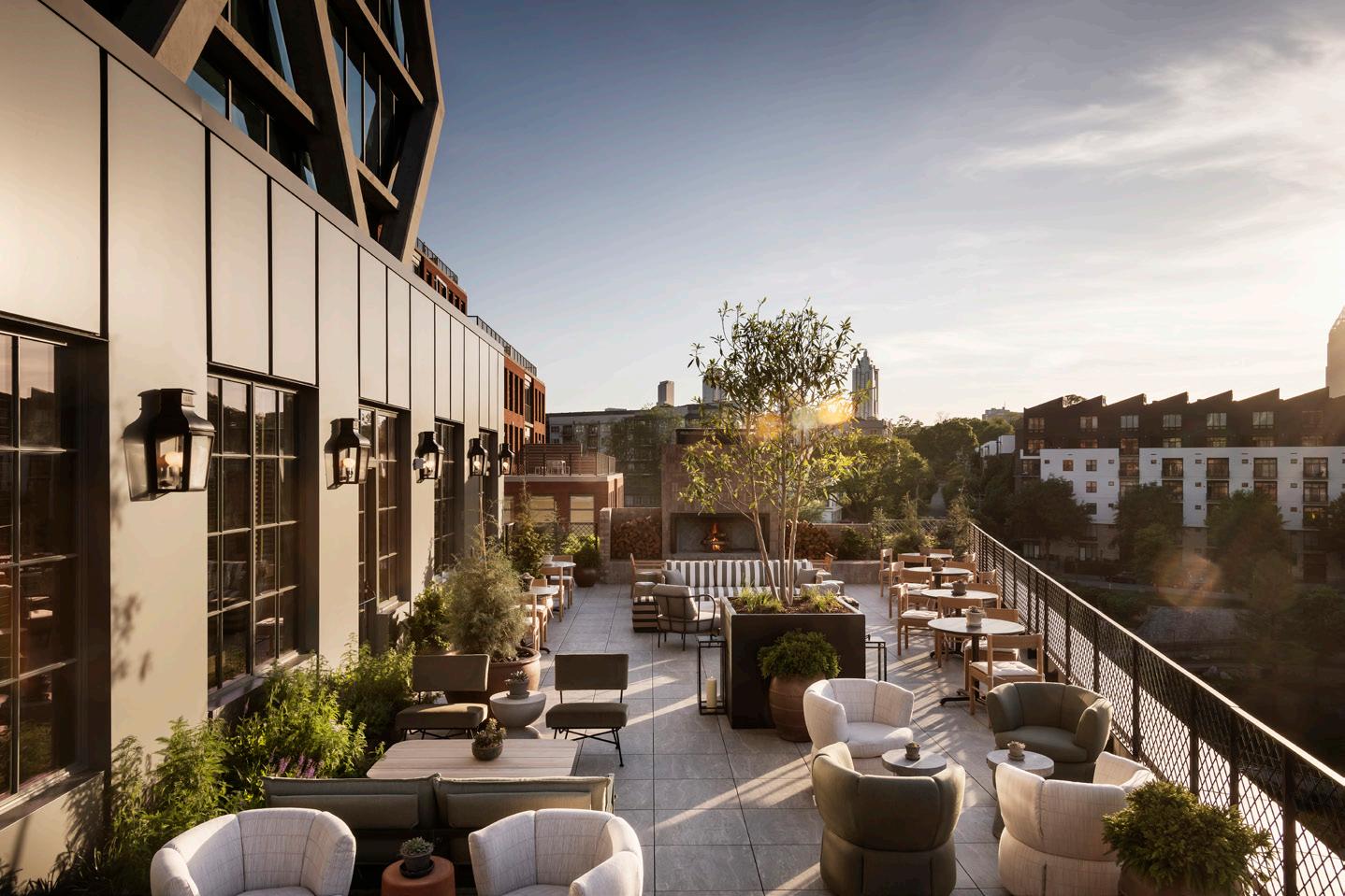
Adjmi’s second assignment was to create a 196-room hotel, christened FORTH. His firm, Morris Adjmi Architects, delivered a 16-story glass tower with exposed-slab edges wrapped in a diagrid exoskeleton. Irwin said the goal was to use structure to create a striking exterior that would also be “fun” from inside the building. So each room—including mine, which faced Ponce City Market from the 14th floor—has a view that is slightly obscured but at the same time greatly enlivened by the concrete crisscrosses outside.
The hotel, which opened in June, includes a resort-style swimming pool and fitness center meant to appeal not only to overnight guests but to locals via a member’s club and four restaurants that are already popular among Atlantans. The interior design is compelling—a stylish mix of midcentury

modern with a few unexpected tableaux. Design choices include a museum-style diorama behind the concierge desk featuring a group of taxidermic foxes. Irwin called it “a whimsical mash-up of Wes Anderson and a natural history museum” and noted that the foxes were “ethically sourced.”
“We wanted to step into the Southern gothic a little bit,” Adjmi offered. His firm and Method Co. collaborated on the hotel’s interiors, while Method Studios and Stokes Architecture + Design handled the restaurants. The furniture selection throughout is beautiful but not clichéd—no small achievement in our Design Within Reach era.
Irwin plans to add three more buildings to the New City enclave, including another office tower by Olson Kundig and a residential building by the Berlin- and New York–based firm Barkow Leibinger. Both will feature ground-floor retail and landscaping by Brooklyn’s Future Green Studio designed to further the ascent of an already-booming neighborhood.
Fred Bernstein is the winner of a 2023 award from the American Academy of Arts and Letters for exploring ideas in architecture and the 2009 Oculus award from the New York chapter of AIA for excellence in architecture writing.

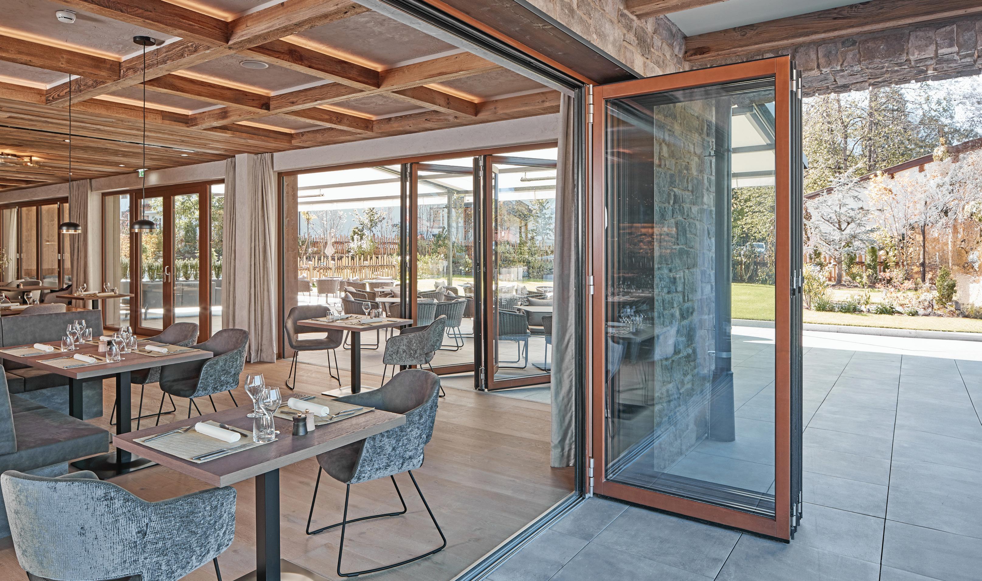
Easy Operation: Smoothest and easiest operation of any folding glass wall as panels glide to their open or closed position.
NanaWall creates the most innovative glass walls that shape residential and commercial spaces.

Superior Performance: Exceptional resistance against wind-driven rain. Energy-efficient panels keep extreme weather out. Air, water, structural, forced entry, swing door and cycle tested.
Design Options: Slimmest panel profiles available, can stack either to the left or right—inswing or outswing. ADA-compliant sill option with high heel resistant feature. Unlimited widths, customizable configurations, glazing, and 50 standard color choices.


In Minneapolis, Lakewood Cemetery’s Welcome Center is built for memory and connection.
continued from cover There are historic precedents. In the early 19th century, rural pastoral cemeteries in Boston, Philadelphia, Brooklyn, and Cincinnati became the first great public parks. They were close to dense cities but not confined within them, as were thousands of earlier enclosed churchyards. Young people and neighbors came for picnics, bicycle touring, and daily walks.
Yet with growing urbanization, regular visits to cemeteries became rare in 20th-century American cities. Death was rarely discussed with children, and cemeteries were not a part of life but instead became reserved spaces zoned for single uses. Memorial Day remains the one time when cemeteries bustle with activity as people visit and leave flowers.
After 150 years, “we are asking today, what is an authentic Lakewood?” Makowske said of the cemetery’s programming and visitor experiences. He argues that permanence and monumentality are not a priority for younger generations, who place a greater value on moving experiences, active engagement, and nature.
The paradigm shift happening now at Lakewood doesn’t rely on stylistic design precedents or the creation of contemporary monuments. Instead, Snow Kreilich Architects’ design for the Welcome Center is
subtle, elegant, and beautifully crafted. The building is not an iconic form but a vessel for the experience of learning, welcoming, gathering, creativity, and being alive in a place to remember those who have passed.
Design principal Matthew J. Kreilich describes the Welcome Center as “transformational yet respectful of the legacy of the site,” noting that the facility’s program is also transformational for the cemetery industry as a whole.
The ground-level public spaces are accented with thermally modified ash wood, installed vertically, creating a quiet domestic context where families come to plan memorials ranging from burials to cremations and ash scatterings. Glazing is placed at the end of circulation routes and public spaces so that the new gardens are always visible.
The Community Meeting Room and adjoining gallery are designed to handle a variety of uses and group sizes. A telescoping glass wall can seamlessly open the two spaces, allowing them to accommodate parties, lectures, concerts, or other large gatherings. When separated, these spaces can facilitate art therapy classes, performances, legacy writing workshops, and meditation groups—all with a nondenominational and multicultural reach.
For flexibility, the second-level office spaces feature raised-access floors, enabling
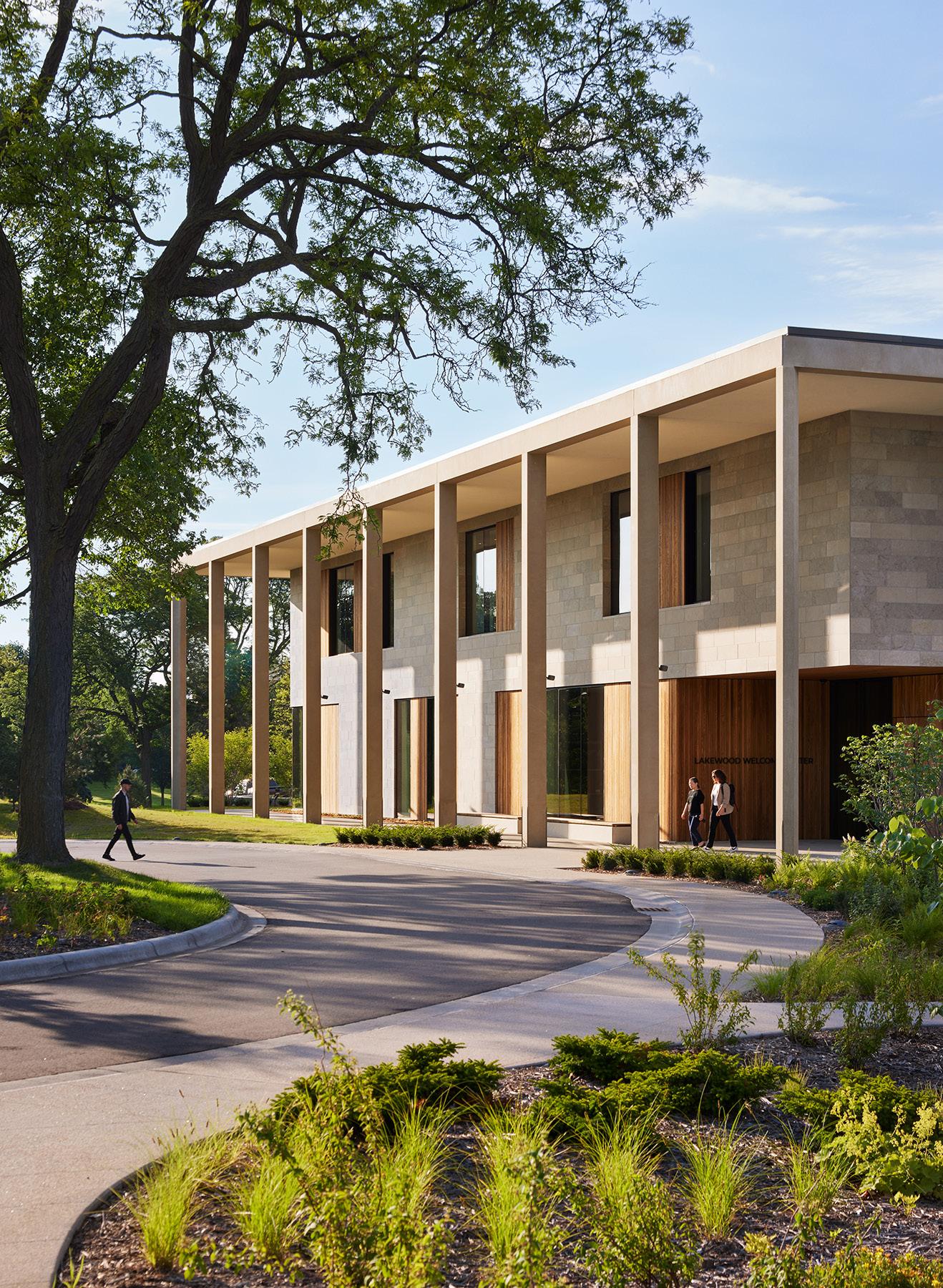
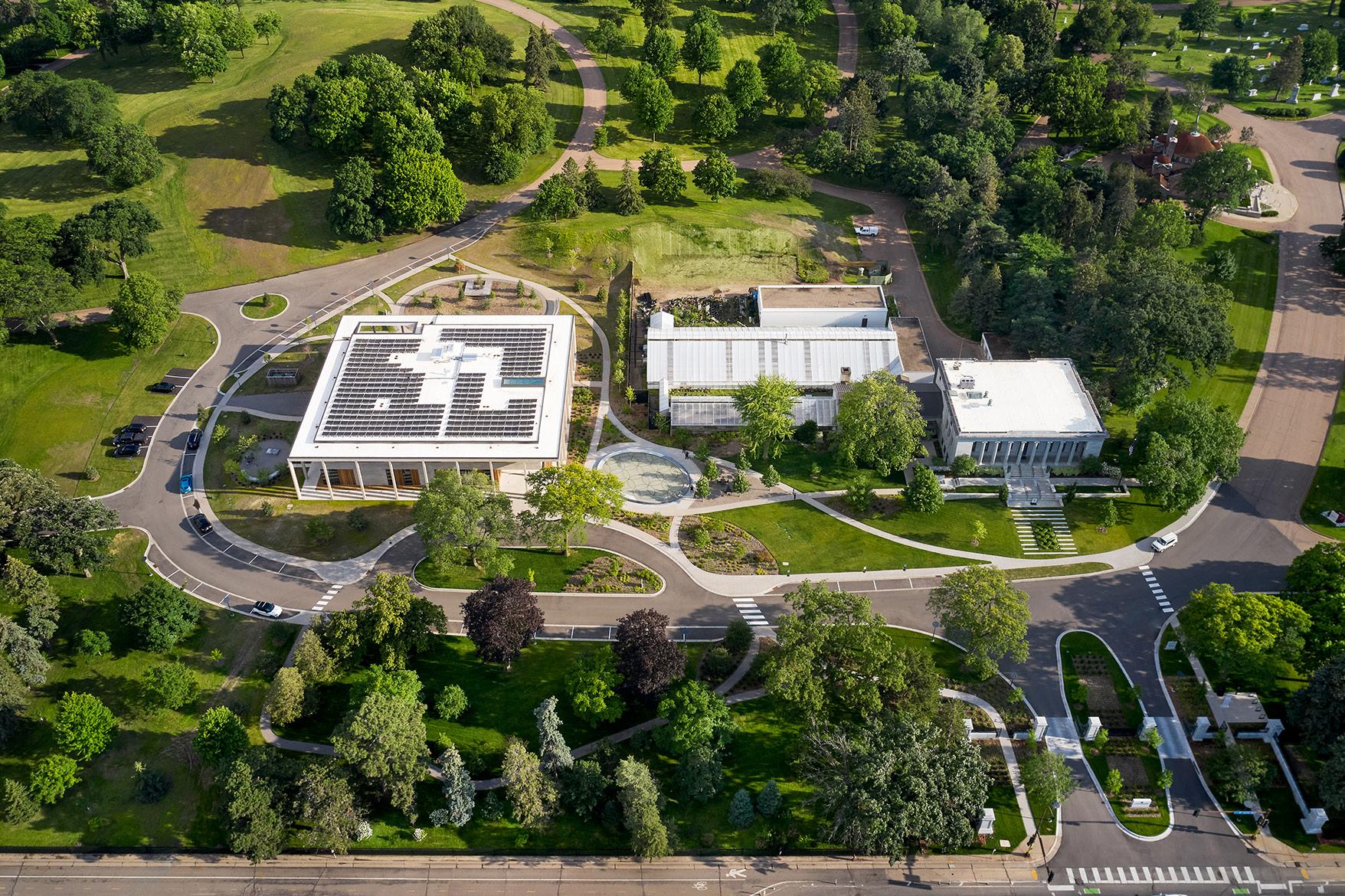
future modifications to create open office layouts. Meeting rooms can be converted into offices and vice versa. Like the public level, the second-floor corridors terminate in floorto-ceiling windows. Light and the borrowed scenery of landscape become architectural, creating an illusion of prospect and refuge that is both intimate and expansive. The building’s two-story colonnade and Flint Hills limestone and stone cladding echo the classical facade of Lakewood’s 1929 Administration Building. This sheltered perimeter acts as a front porch, facilitating movement between indoor and outdoor spaces while reducing summer heat gain.
The pleasantly austere design also aided in the delivery of a net-zero, all-electric building with a well-insulated envelope. Windows are strategically located to make the most of a restrained 30 percent windowto-wall ratio. Below grade, a geothermal system exchanges energy with the aquifer, cutting energy use intensity by 40 percent and only requiring two deep wells. On the roof, a 120-kW solar array covers the center’s remaining energy needs.
The new site plan by TEN × TEN brilliantly connects the orthogonal Beaux Arts entry experience with the 19th-century cemetery first planned by Adolph Strauch, a landscape architect known for designing Spring Grove Cemetery in Cincinnati. The Welcome Center’s plan located the new building on axis with the city’s street grid and the older Administration Building while reintroducing the older cemetery’s sinuous lines in new entry paths linking the formal front gates with the Welcome Center. Though a small
distance in a 250-acre cemetery, the journey of arrival through this transitional space feels expansive and rich thanks to encompassing drifts of native prairie grasses and flowers.
“We see this as not just a welcome center but as an infusion of humanity in a place that had long been monumental,” Ross Altheimer, principal and cofounder of TEN × TEN, said. This human connection may prove essential for the future relevance of cemeteries now that families have so many more options for internment.
Denita Lemmon, a principal with Miller Dunwiddie, asked: “Why would you want to stay at Lakewood forever if you never visited while alive?” Makowske’s philosophy is that when we lose connection with the past, we can become metaphorically “dismembered.” Experiential cemeteries can help to make us whole. He added: “If there’s no sense of continuity and active memory for those alive, then a cemetery just becomes a place to keep the dead.”
Frank Edgerton Martin is a landscape historian, design journalist, and preservation planner.
Below: An aerial view of
Bottom: The building is surrounded by new landscaping and wildflowers.


2010s, the 3-story structure had seen better days. Everything needed major work, so it “wasn’t unthinkable to think about building something new on this site,” Dana Sunshine, director of capital and real estate initiatives at NYPL, told me during a recent visit.
The branch library is an architectural commission with a variable program: Not beholden to the grandeur expected of a central location, it can more readily conform to the needs of its local community. What do residents want? Meeting spaces? Workspaces? Access to services or the internet? An area for kids? Perhaps just a quiet place to read a book? Beyond its two flagship Midtown hubs, the New York Public Library (NYPL) operates 90 branches across Manhattan, the Bronx, and Staten Island (Brooklyn and Queens have their own systems.) The latest for NYPL is a new $10 million, 20,000-square-foot facility for Inwood,
a hilly neighborhood at the northern end of Manhattan’s panhandle where the A train ends. Designed by Andrew Berman Architect, the handsome interior is like an Apple Store mixed with a Roman basilica. It occupies the ground floor of a $59-million, 14-story tower, designed by Fogarty Finger, that contains 174 affordable apartments.
They call it The Eliza after Eliza Hamilton, widow of founding father Alexander Hamilton, who opened the first school in nearby Washington Heights in 1818. The new mixed-use building, constructed on cityowned land, replaced Inwood’s first NYPL building, which opened in 1952 . By the
The idea to colocate a new branch library with housing above dovetailed into wider neighborhood activity. Inwood was rezoned in 2018 under Mayor Bill de Blasio with the goal of adding affordable housing, encouraging economic development, creating open space along the Harlem River, and preserving community character. But the rezoning allows for additional height along major streets and on parcels adjacent to the Harlem River, which sets the stage for commercial development.
The plan was immediately challenged by residents who were worried about displacement and community impacts. Their case went to the New York State Supreme Court, which ruled in the coalition’s favor, but an appeal overturned the ruling, and a follow-up was denied in 2020. The Eliza was announced in 2021 and reached substantial completion this summer. While the library is open, residents have yet to move in, and the finishing touches are still being applied to the project’s community spaces.
Berman and Chris Fogarty, cofounding principal of Fogarty Finger, teamed up with
Housing Workshop NY, Community League of the Heights, Alembic Development Company, The Children’s Village, and Ranger Properties to win the commission. In addition to the library, their plan proposed spaces for community use. On the second floor, prekindergarten classrooms are painted in orange and yellow tones, and the education area includes an outdoor terrace at the rear of the building, overlooking the grounds of a middle school. In the basement, a suite of rooms will support adult education and a STEM lab for robotics. A commercial kitchen will soon be home to the fourth location of Emma’s Torch, which trains refugees, asylees, and survivors of human trafficking for careers in the culinary world. Each of these interiors was designed by Fogarty Finger.
The Eliza is reserved for residents who make up to 60 percent of the Area Mean Income (AMI), or about $74,500 for a two-person household this year. Ten percent of the units are for New Yorkers who earn up to 30 percent AMI, and 15 percent for formerly unhoused people. Rents are tied to income, so a one-bedroom will go for $500 to $1,300 a month. This is a steep break from typical pricing: Next door to The Eliza is Tryon North, a market-rate apartment complex where a 1-bedroom unit rents for over $3,000.
The four separate entries for different programs—plus a fifth passage, an egress hallway for the adjacent school—created competition for frontage access along Broadway in the ground-floor plan. (The hallway also doubles as a book-delivery corridor for the library.) Above, the T-shaped plan arranges tidy units along two short, double-loaded corridors. Resident amenities include a rooftop lounge and outdoor terrace, coworking space, laundry facility, gym, and bike room.
The Eliza is more impressive in section and elevation, as Fogarty and Berman collaborated from the start to find a structural grid that would work for both the library and the units above. Rather than the typical arrangement of contorting library uses to fit a leftover space, the design team “had this great opportunity to think of the way we were doing the housing above the library so that we could make the library work as well as it could,” Fogarty remarked.
On the nicely proportioned facade, the brick-clad columns run continuously upward, only interrupted by a channel reveal that separates the podium from the tower. Above, two floors of apartment windows are ganged together and padded out by terra-cotta panels. (Maximum and minimum window sizing for affordable units is regulated by the city.) Below, large pieces of low-iron glass are set flush to

the brick. The idea was to make the library feel like part of the city, which it easily does.
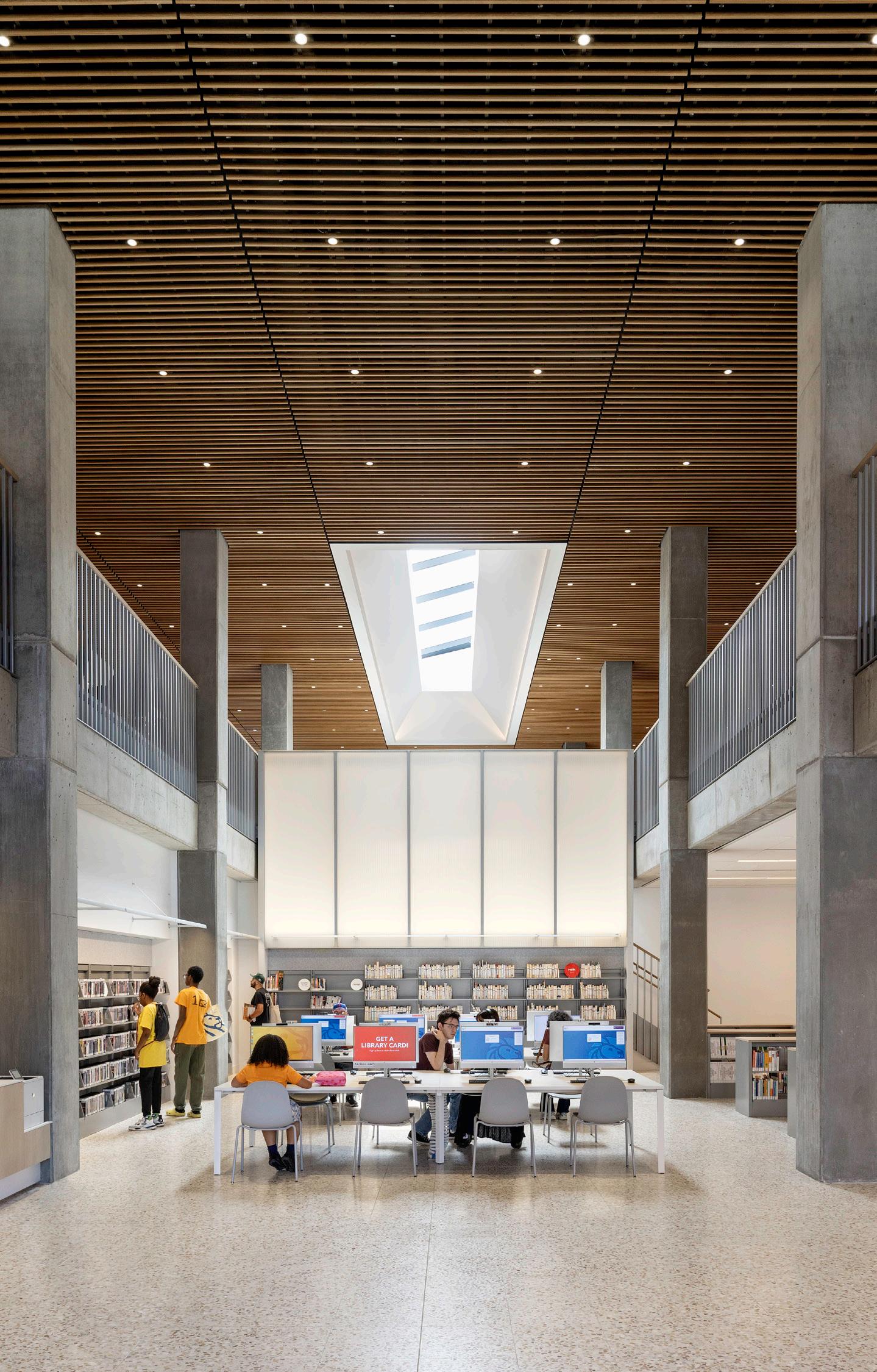
The interior reads like a temple for the people. A double-height central space is capped by a skylight, and an illuminated panel creates a billboard of light that draws people in and up. The materials are durable but honorable: exposed concrete columns (carefully protected during construction by Mega Contracting, the project’s general contractor), a slatted-wood acoustic ceiling, terrazzo floors, thin steel guardrails, and color via orange carpet, warm red lounge chairs, and a rainbow of poufs.
Berman, who has completed numerous branch libraries and library interiors, including the Van Cortlandt Branch Library in the Bronx, said the design “speaks to the important idea of the library as a generous facility.” The new library acts like a courtyard or a piazza; it’s a public destination, and “the architecture underscores that through big, open, easy-to-comprehend spaces.” He wanted the building to be quickly understood. “You walk in the door, you know where you are and you feel the confidence to self-discover, because it’s all unfolding in front of you.” Beyond the great room there are separated spaces for children and teens, meeting rooms, two reservable community rooms, and of course Wi-Fi and plentiful outlets.
Already, the library hums with activity. It is the type of public space where it feels comfortable to stay for a while and disappear into a book, magazine, or computer screen.
Inside and out, the building is thoughtfully designed to serve New Yorkers. Sunshine said NYPL will use the same approach for its branch location along the Bronx’s Grand Concourse (Brooklyn Public Library finished similar projects in Brooklyn Heights and Sunset Park in recent years.) This tracks with the “City of Yes for Housing Opportunity,” advanced by Mayor Eric Adams, which would spur the creation of up to 108,850 new homes over the next 15 years, and an earlier order that required city agencies to review their sites to see if they are suitable for building affordable housing.
Still, the relationship between NYPL and city hall has been tumultuous lately. Over the summer, NYPL waged a successful public campaign complete with fire memes and 174,000 letters of support to undo $58.3 million in city budget cuts that had forced closure of library locations on Sundays. With his recent indictment on charges of bribery, campaign finance, and conspiracy , Adams now faces bigger problems beyond punching down on beloved public institutions.
The Eliza demonstrates how architects can deliver thoughtful, dignified spaces to be used by everyone. More of this, please! JM
page,
Opposite page, right: The rigorous fenestration is enlivened by an architectural reveal between base and tower.
Above, left: Inside, a central axis and generous skylight read like “a temple for the people.”
Above: Workspaces are easily accessible on the public library’s ground floor, lined with floor-toceiling windows.
COOKFOX cofounder Rick Cook designs a machine for living—and skiing—in upstate New York.
“If Le Corbusier saw houses as machines for living, then I see this house as my machine for skiing,” said Rick Cook, cofounder of COOKFOX, of his newly designed project in upstate New York.
That “skiing machine”—measuring a little over 3,000 square feet across three stories—was designed by the architect himself. Sited deep in the North Country, the alpine-inflected contemporary home rests on a wooded acre within Bear Valley, a ravine next to the rolling hills of Titus Mountain and directly in the path of a ski trail. When the opportunity to purchase a parcel of land in the valley came up, Cook jumped on the chance to create his interpretation of a family-oriented, purpose-built machine for Adirondack living.
“Ours is the first modern structure in the valley, so we had to balance our aesthetic inclinations with a sensitivity to the context and history of the site,” Cook explained. To do that, he looked at the historic Adirondack
homes neighboring the property, copying their basic shapes and forms, echoing their deep dormers and front porticos. These architectural elements also reminded Cook of other styles of homes found in snowy climes, specifically Swiss chalets and Nordic lodges. Cook used cedar inside and outside the house to maintain the traditional wood material of those typologies. He wrapped the exterior in blackened cedar paneling and outfitted the soffits, railings, and outdoor staircase in clear-coated cedar boards. However, a subtle decorative touch was introduced, though still in keeping with his modernist inclinations: Cook cut ski marker shapes (diamonds, squares, and circles demarcating trail difficulty levels) into the building’s balustrades.
The geometric motif cleverly broadcasts the home’s raison d’être more than typical stencil-cut hearts and evergreen trees.
That explicit connection to skiing wasn’t relegated to mere decoration, though. The lowest level of the house was designed to be

ski in, ski out. Cook embedded the home into an incline, meaning a pit stop while descending the mountain via the trail would be easy. A covered terrace with storage for skis opens to a “boot-on” hallway (furnished with commercial-grade carpet) that leads to a tiled powder room. “Having a bathroom you can run into with your boots still on is a huge luxury. Every ski family would smile knowing this exists,” said Cook.
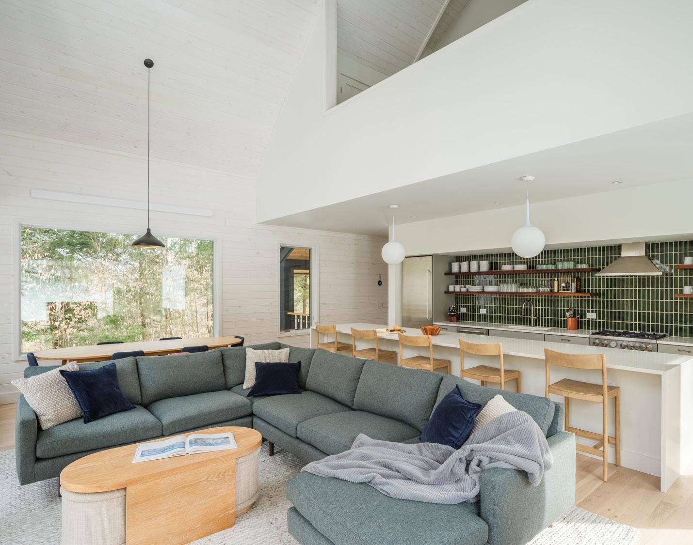
Walk up the stairs, and you’re in the heart of the home: a double-height, open-concept floorplan with room for cooking, eating, and lounging. Cook used cedar again for the interiors, shellacking and staining them all white—he is a modernist, after all. To combat that monochrome abundance, he made several openings along the east, north, and west sides for picture windows and sliding glass doors connected to a covered balcony, which looks out over the forest’s canopy.
“When it snows, being in there is like what I imagine being inside a snow globe would feel like,” Cook said. Two ancillary bedrooms and a full bath complete the first floor. The primary bedroom and bathroom, shared by Cook and his wife, Ellen, occupy the top floor.
In keeping with Cook’s professional reputation as a leader in sustainable design, he ensured his ski home reached the highest
possible metrics of efficiency and thermal comfort—without breaking the bank. An energy recovery ventilator and R60 insulation in the ceiling keep the air in the house clean and comfortable year-round. Highperformance window panes filled with argon gas keep drafts from seeping through the large aluminum-clad wooden frames. The front door reached an impressive 1.48 ACH50 when a blower door test was performed— twice as efficient as what code dictates for a home in this northern climate zone (6a). “Budget is always a concern when trying to DIY sustainability,” explained Cook, “but we got the house pretty close to Passive House standards at less than $400 per square foot.” Unlike Cook’s primary residence downstate, which took 20 years to complete, the Bear Valley house was move-in-ready in just 16 months—COVID-19 supply troubles notwithstanding. Cook and his family have enjoyed two winters in it now. “Every house—whether for yourself or a client—is about fulfilling hopes and aspirations beyond mere shelter,” said Cook. “For our family, this house perfectly articulates its purpose: a place for having a great time together.”


We offer metal solutions for outdoor environments, including fencing systems, pavilions, and trellises.
Our products are engineered for long-lasting performance, withstanding harsh weather conditions while contributing to cutting-edge, sustainable design.
From decorative screens to complete structural systems, BŌK Modern’s outdoor offerings are visually striking, functional elements.
BOKMODERN.COM | 415.749.6500


A unique, patented fencing system where structural support is folded directly into the panel during fabrication for an easier installation and results in a very seamless, clean design. It is available in aluminum and Cor-Ten steel.


Provides a clean, nearly seamless look. It uses a thin blade for lateral support rather than a heavy dimensional post. The result is a very contemporary appearance constructed in solid metal or with a virtually infinite array of patterns.

The simple truths of the color wheel are dramatically upscaled in a new installation within the Bernheim Forest and Arboretum in Clermont, Kentucky. Realized by Los Angeles–based office DOMM, it is part of L+A+N+D, a new dedicated area of the Bernheim site that supports large-scale, immersive land art. ¶ Within the Forest: Without the Forest, crafted by DOMM cofounders Raffy Mardirossian and Paul Matevosyan, is an electric-orange artwork that wraps a trio of trees in stacked bands of netting. “When developing this project, we realized that there’s a moment here where you’re leaving the nature you’re in—not physically, but because you’re seeing it through a different lens,” Mardirossian said in a video about the installation. The orange layers act as a monumental filter, or photographer’s gel, that transforms the forest into a room. ¶ The scrim is PVC-coated debris netting, a familiar material for architects. Suspended on aircraft cable and accessible by ducking under the fabric, the curtain-like partition borrows influence from artists like Christo and Jeanne-Claude and Robert Irwin. “It’s an architectural tool that allows an enhanced and saturated experience to occur,” Matevosyan explained. ¶ Of course, orange is also the opposite of green on the color wheel, ensuring that this wrapping is visible to Bernheim visitors from a distance, which no doubt draws them closer to appreciate its peaceful courtyard. Emily Conklin See more on archpaper.com.


Pulp Studio was just an idea hatched in a basement 28 years ago. As pioneers in the category of specialty and decorative glass we no longer represent the image of a small art glass company, and for many of you that is the perception.
Pulp Studio has transformed itself into one of the largest most technical specialty glass companies in North America producing both interior and facade related glass products.
What is your perception of Pulp Studio? If you thought nothing has changed, well then you sure haven’t been paying attention. Bent Glass Capabilities
• Annealed
• Fabricated
• Insulated
• Graphics
Find out about all of the changes and our capabilities at www.pulpstudio.com/bent-glass
sales@pulpstudio.com
TEN × TEN brings the built environment and community together.
TEN × TEN Landscape Architecture and Urbanism is based in Minneapolis, but it has projects all over that demonstrate a keen sensitivity to materiality, context, ecosystems, storytelling, and ethics. Whether negotiating dilapidated brownfields in Pittsburgh or contributing to the upcoming 2025 Venice Architecture Biennale, TEN × TEN practices what it preaches. The office, founded in 2015 by Maura Rockcastle and Ross Altheimer, lists what it believes in on its website: “We acknowledge that land is an expression of power and believe that it can be redistributed.” This one of their several guiding values. This commitment to the pluriversal nature of landscape architecture saturates each of the firm’s works.
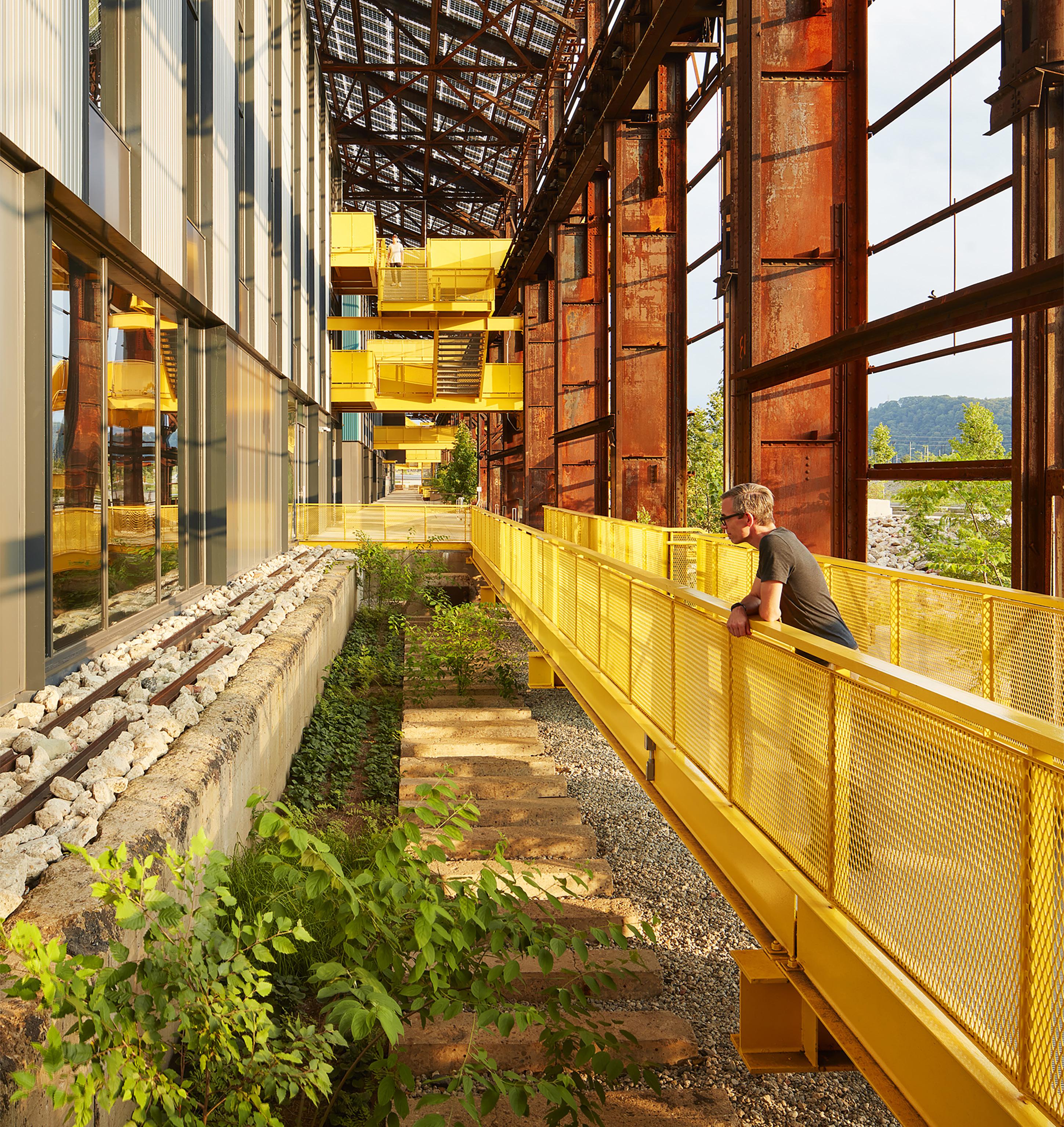

A 1,300-foot-long historic factory on Pittsburgh’s Monongahela River was the last standing steel mill in the city of Pittsburgh until 1997, when Mill 19 closed. After, the 5-acre property wasted away, a somber reminder of Pittsburgh’s once thriving industrial base. TEN × TEN, MSR Design, D.I.R.T. Studio, Atelier 10, and other offices gradually transformed the brownfield into a sustainable, high-tech innovation district. “So much of the site had been erased,” Rockcastle said. “We were really interested in capturing its memory, so
we did a survey of all the materials we wanted to repurpose from the site. There was so much steel, clay, and crushed rubble.” Altheimer added: “We had to transfer a lot of this material from Minneapolis to Pittsburgh. One day, airport security stopped us and asked why we had so much clay and wire, essentially bomb making materials.” [Light chuckling.] “For us it was really important to keep the site’s spirit, and memory, alive. Mill 19, I think, demonstrates our interest in tactility.”

Gallaudet University is considered the world’s premier higher education institution for students who are deaf or hard of hearing; its verdant campus was completed in 1866 by Frederick Law Olmsted and Calvert Vaux. Despite its altruistic beginnings, Gallaudet had a disturbing history: It didn’t admit a single Black student until 1950. And even after Brown v. Board of Education, Black students were barred from studying and living with white students, so Black students were sequestered in a building called the Kendall School, a far less attractive abode compared
to the milieu ideated by Olmsted and Vaux. In 2016, TEN × TEN was a finalist in a competition with MASS Design Group to tell this story, and create a “Black Deaf centric space” named after Louise B. Miller, the mother of a Black deaf student who filed a class action lawsuit against the Washington, D.C., Board of Education so her son could receive an education. “Miller’s case was a big civil rights story that’s not very well told,” Rockcastle said. “So this is a memorial in her honor, and to honor those first 24 Black deaf students at the Kendall School.”

Together with Snow Kreilich Architects, TEN × TEN recently completed a 1.25-mile elevated walking path that meanders through Minnesota Zoological Gardens. The serpentine trail gives visitors vantage points of the zoo and its creatures that the ground plane just can’t afford. This new way of looking at things, TEN × TEN noted, is meant to accelerate one’s own dedication to activism. “It was a retrofit of existing infrastructure,” Altheimer said. “We were tasked with repurposing a defunct monorail from the
zoo’s original design in the 1970s. Rockcastle, who grew up in Minneapolis, likely visited the monorail when she was a kid. It was decommissioned in the 2010s.” Altheimer continued: “John Frawley, the zoo’s director, had this vision for repurposing the monorail. He was really inspired by the High Line in New York City. There’s been a lot of excitement surrounding the project since it opened last year and the perspectives it offers.”

Flandreau, South Dakota, is a city of 2,000 people about 100 miles southwest of Minneapolis. There, the studio is partnering with Gensler and the Flandreau Santee Sioux Tribe to deliver a new wellness center, landscape design, and more. “The Flandreau Santee Sioux Tribal Wellness Center is a critical community hub for recreation, health, and social connection,” TEN × TEN shared. An iterative engagement process resulted in the design team recognizing and uplifting three foundational goals: Connect, Gather, and Heal are
the guiding principles for the new campus. “The design team was challenged by tribal members while developing the center,” said TEN × TEN. Throughout the process they asked: Does it bring life?
“The response is the co-creation of a site design and larger landscape framework,” the team said. “It acts as a connective thread throughout the 20-acre tribal grounds interconnecting the water, land, and community.”
DJR

Artistic Tile's Flute Nero accents WorkLife’s new state-of-the-art conference room, making a bold and sophisticated statement. This exquisite tile draws inspiration from the fluting of classical stone columns but reimagines it with a contemporary twist. Unlike traditional fluting, the waves of Flute Nero undulate outward from the center of each tile, creating a smooth, dimensional effect that seamlessly flows from one tile to the next.
Meticulously crafted from high-honed China Black marble, Flute Nero tiles are elegantly inlaid with lines of brass, forming a stunning combination that enhances the architectural sophistication of the space.
artistictile.com


LEA, Hotel Particulier, is a 6-story complex located in the heart of Old Montreal offering clientele the opportunity to live in four unique design universes. What gives this build its distinctive character is that it was envisioned by four brothers, each of which poured a part of themselves into their respective spaces. It was named Lea, in honor of their mother.
For its master bathroom, they wanted to recreate an environment like no other for its clientele; a sensory cocoon of calmness, in which one can retreat to a private at-home spa designed for utmost relaxation and reaching a state of zenitude. The minimalism in Fantini’s Franco Sargiani Milano series was an undeniable choice for this project, as it blends in with perfect continuation. Rather than to be constrained by indivisible hardware, Fantini does with great ease and with versatility what no other has managed to achieve.
fantini.it/en-us
Fantini’s Franco
Northway Cir features a sleek, modern design with a focus on open-concept living from Hans Krug. The 2-story living area is flooded with natural light, creating a bright and airy atmosphere. The home seamlessly blends modern aesthetics with practicality.
The kitchen stands out with a stunning marble backsplash and large marble island. High-end appliances are incorporated into the kitchen’s design, keeping the overall aesthetic cohesive and tasteful. Hans Krug has mastered the art of combining functionality with the latest trends in interior design.
hanskrug.com
The modern home is a multifunctional place for relaxation, entertaining, and self-expression. Hans Krug’s renovation brings all these desires together seamlessly.


The Architects & Designers Building
For over 35 years, Tania Bulhões has crafted luxury tableware and fine fragrances, transforming homes into spaces of beauty. In April 2024, Tania Bulhões opened a new flagship store in São Paulo blending shopping, dining, and art: Leila, the in-store restaurant, offers a fusion of French and Brazilian cuisines, paying homage to the founder’s heritage.
As Tania Bulhões expands into the U.S. with a New York showroom, the brand remains committed to creating timeless designs that celebrate life and reflect a deep connection to nature and heritage.
taniab.com
Leila, the restaurant nestled within Tania Bulhões showroom, is a perfect immersive expression of the brand’s legendary design.
At the Architects & Designers Building you can shop 40 showrooms to create the perfect environment for residential and commercial projects—from a single kitchen, a complete home, or a signature hi-rise to a boutique hotel or a new restaurant—all under one roof. Discover the world’s leading brands where luxury design defies expectations.

N
G T A Y K -
How do the complex projects that inspire civic pride succeed—or fall apart? There are many actors, stakeholders, professionals, and histories involved. In these three stories, writers survey three meaningful sites for American cities to see how they are meeting local expectations. Alissa Walker explores the troubled status of Exposition Park in Los Angeles as the city prepares for its third Olympic Games, to be held in 2028. Walker’s reporting is enhanced by commissioned photographs by Monica Nouwens that show the current state of the park. Page Comeaux assesses improvements by Trahan Architects to the Superdome in New Orleans, which in the years since Hurricane Katrina has come to serve as a symbol of the city itself. And in Omaha, Charlie Weak returns to his hometown to appreciate an expansion of the Joslyn Art Museum by Snøhetta that contributes to a “renewed faith in the Midwest cultural scene.”

The Joslyn Art Museum in Omaha opens a new addition by Snøhetta.
THUNDERSTORMS HAVE ALWAYS BEEN A FACT OF life in Nebraska—beautiful and awe-inspiring but intimidating if you’re not used to them. Certainly, changes to a host of Nebraska institutions in years past (Gene Leahy Mall, Omaha Central Public Library, Holland Performing Arts Center, Eppley Airfield) evoke similar feelings of excitement and anxiety. But Snøhetta’s completion of the new Rhonda and Howard Hawks Pavilion at the Joslyn Museum of Art, one of the city’s—and the region’s—most important arts institutions, has signaled a renewed faith in the Midwest cultural scene.
It’s been decades since Conagra ushered in the 1990s building boom, restructuring Omaha’s riverfront and downtown with a new 30-acre corporate campus. This moment in Omaha’s history was complicated. Starting in 1990, the city added 5 million square feet of new office space, saw Gallup open an office in town, and was anticipating the opening of
a new mall at 144th and Center streets. But the most controversial addition was Conagra’s new campus: This led to the largest demolition of a district listed on the National Register of Historic Places, Omaha’s Jobbers Canyon district. Yet just 25 years later, in 2015, Conagra cut 1,500 jobs and moved its headquarters to Chicago.
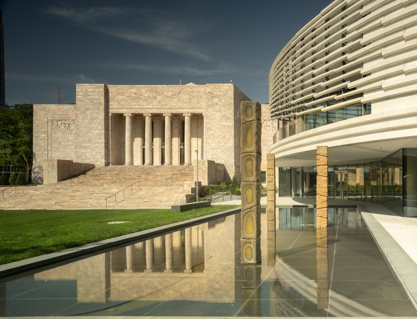
Young Nebraskans like myself may be skeptical of today’s level of new development; however, we all know that turbulent thunderstorms bring rain, petrichor, and cool weather. I like to say about the new Rhonda and Howard Hawks Pavilion at the Joslyn Art Museum what Nebraskans often say about thunder and the rain: We needed this. The new 42,000-square-foot addition by Snøhetta opened in September, connecting the Joslyn’s two existing pink marble boxes: the original 1931 art deco building, designed by John and Alan McDonald, and the 1994 Suzanne and Walter Scott Pavilion, designed by Foster + Partners. Snøhetta’s
scheme adds 16,700 square feet of gallery exhibition space, 15,400 square feet of public gathering space, new and restored public gardens, and a prominent new entrance whose precast volume cantilevers out past the glass doors.
The Joslyn sits just outside of downtown Omaha, a few blocks west of the Gene Leahy Mall. If you’re driving westbound on Dodge, you’ll see the Joslyn’s rosy marble ascend from your passenger-side window as you drive past Omaha Central High School. Upon arrival, visitors can see Snøhetta’s new concrete mass peeking out just beyond the entrance’s stone walls.
“A lot of people told us, ‘Don’t eff it up,’” Jack Becker, the Joslyn Art Museum’s executive director and CEO, said at a recent press conference. “It’s interesting talking to people who have been coming here for generations. This is often their first museum experience or their predominant one.”
A Meditation on Transition
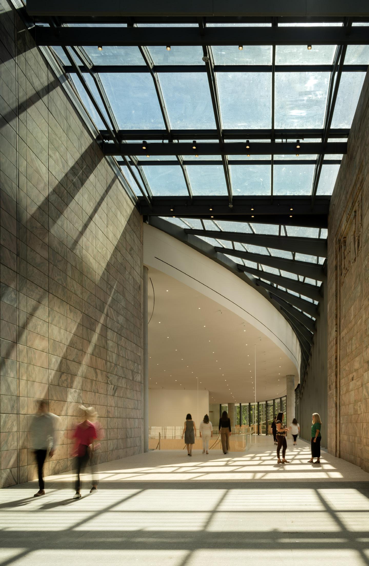

Like many Omahans, I first visited the Joslyn as a child. The astonishment I felt at age eight upon entering the 45-foottall glass atrium has stayed with me and is perhaps to blame for my interest in architecture.
Returning to Omaha in recent years has meant reconciling with the city where I grew up, in all its renewed versions. Even as Omaha changes, however, and new libraries, parks, and art museums come online, the things that make Omaha feel like home (Husker football, temperamental weather) remain constant. As the form of the new Hawks Pavilion emerges from between the two existing buildings, it borrows formal inspiration from the Nebraska landscape and weather patterns. Snøhetta’s design is a meditation on what it means to transition: The resolute rectilinear forms of the existing pavilions soften into a new curvilinear shape; a grand atrium guides visitors to intimate gallery spaces; and interiors bleed into the adjacent landscape of native prairie grasses. These grounds have been revamped for outdoor museum events. I look forward to witnessing how both the building and the grounds will change with the seasons and the weather.
Michelle Delk, partner and landscape architecture director at Snøhetta, shared that “Jack [Becker] organized a group of us to go see sandhill crane migration. That placed us in the larger Nebraska landscape, which led us to call attention to seasonality and moments that pass by, light and shadow, like being in the blind.” Delk is referring to a research trip the team took, which gave the design team clarity on “moments where you can frame experiences differently and how the result can be quite moving.”
Compress and Release
Early in the 20th century, Sarah Joslyn, the museum’s original donor, had a vision for an arts center to serve the people of Omaha. But that vision has expanded as the museum’s
regional influence has grown. Art enthusiasts from Denver, Kansas City, Des Moines, and Chicago find inspiration here, starting when they enter the Phillip G. Schrager Atrium. Snøhetta designed this new entry to create connections to newly renovated outdoor public spaces and gardens populated by native plants and sculptures. A roiling upper volume, whose staggered precast baguettes appear to spin, spills out past the transparent ground floor, sitting low and creating a series of covered outdoor spaces before transitioning to glass and nestling itself neatly between the existing marble buildings.
Museumgoers now enter the Joslyn beneath the rosehued precast volume. The tones of the baguettes and the volume’s solidity on its northern face nod to the two existing buildings. “The first question everyone asked us was ‘Will the new building be pink?’ Our immediate answer was always no,” said Snøhetta architecture director Aaron Dorf. “We experimented with different sizes and tones of aggregate, and the result was a kind of light blush to the building; it’s not white, it’s not pink, and it changes during the day and depending on the weather.”
Once a visitor is inside, the weight of the low entry releases as the cantilever gives way to the atrium, whose sweeping curvilinear elements tie the Hawks Pavilion’s atrium in with the existing glass atrium. “You feel a sense of compression, and then it opens up. It’s a bit like walking into a church,” said Snøhetta founding partner Craig Dykers. “There’s a sense of drama.”
Change and Constancy
The drama Dykers described feels like a nod to the compression and release of the old building but with a twist. The atrium carries visitors up the grand stair and onto the second floor, which is lofted on thin white rods. At the top of the stair, this second-floor space is awash with natural
light from the adjacent curtain walls. Scultpures from the collection then line the path toward the first two open gallery spaces of the new pavilion and the Phillip G. Schrager Collection, a donation of 52 works of postwar and contemporary art constituting one of the most significant gifts in Joslyn history. In addition to the traditional gallery spaces, the Hawks Pavilion hosts a new gallery of works on paper; the inaugural exhibition is by Omaha-born artist Ed Ruscha, who donated 18 works as part of the addition.
When retreating from the atrium, the scale of the building shifts dramatically to more intimate gallery spaces. At the same time, skylights in the vaulted ceiling give off a warm daylit glow, and below, fragmented ash flooring recalls the parquet floors of the Joslyn’s original galleries.
“We don’t have that experience where you’re pressed against crowds of people as you’re going to look at works of art. We wanted things to feel more intimate compared to the Scott Pavilion,” Becker said.
In his final novel, You Can’t Go Home Again , Thomas Wolfe wrote: “Perhaps this is our strange and haunting paradox here in America—that we are fixed and certain only when we are in movement.” To me, Wolfe is saying that only through the natural and constant changing of our world are the immutable pieces of our lives revealed to us, be they everyday things like college football and Casey’s breakfast pizza or grand things like wispy giants floating over seas of swaying prairie grass.
THE LYRICS OF KENDRICK LAMAR’S 2012 SINGLE “Poetic Justice” express a duality between belief and skepticism—“If I told you that a flower bloomed in a dark room would you trust it?” When the artist takes the Super Bowl LIX halftime stage in New Orleans this coming February, he will be enveloped by the Superdome’s half-billion-dollar renovation, led by Trahan Architects. Significantly, 2025 will mark both the 50th anniversary of the building’s opening and the 20th anniversary of Hurricane Katrina’s landfall. With updates to materiality, accessibility, and user experiences, the landmarked stadium is finally flourishing, albeit within a hard-bitten city still germinating after decades of convalescence. The Superdome is closely associated with New Orleans itself, but when the two are referred to interchangeably, praise for this state-owned building (it’s leased to the NFL) can misrepresent challenges that still lie ahead for the city. The Superdome’s longtime operator exemplified this merger when speaking of the post-Katrina restoration effort: “The minute we turn that roof white again, people are going to believe in this recovery.”
Trahan was chosen to repair the Superdome in 2005 during its temporary closure. However, the most recent improvements required the local project team to safely navigate a busy event schedule that remained active during construction. The undertaking was tackled incrementally, leaving behind freshly finished amenities for spectators, operators, and athletes. Roundly recognized for curated material applications in award-winning theater and museum projects, Trahan Architects made no exceptions for the arena. Extruded aluminum tubes hug the complex forms of three new atria that guide the majority of fans to their upper-level seating. A subtle shift from polished concrete to terrazzo in exclusive club areas maintains a minimal palette while providing a noticeable value-add for VIP ticket holders. Sleek-edged profiles, elegant textures, and dark metal accents take cues from the hospitality world, providing a subdued luxury for premium game experiences.
Finish upgrades also coincided with updated branding. Caesars Entertainment doubled down on its investment in the Poydras Street corridor, anchored by the stadium on the “lake side” and by a freshly pedimented Caesars Hotel & Casino on the “river side.” Now emblazoned with the silhouette of its imperial namesake, the Caesars Superdome has come full circle, in a manner of speaking. Curtis and Davis Architects and Engineers, the stadium’s original designers, paid homage to the Superdome’s ancient forebears, proclaiming that “the Superdome seeks to do for New Orleans what the great amphitheaters and stadia of antiquity did for their communities.” Their implication was that the arena would serve as a civic center rather than a dedicated sports venue—an innovative concept at the time. The building can fit 1.5 Colosseums beneath its impressive 9.7-acre roof, providing space for monster truck rallies, Mardi Gras balls, and three consecutive nights of Taylor Swift’s Eras Tour.
While the 1970s design debuted new ideas like adaptable seating, its circulation eventually became antiquated by contemporary standards. Trahan’s removal of a space-hogging ramp system allowed the architects to reclaim 100,000 square feet of usable space without expanding the building’s footprint—a remarkable example of creative preservation in practice. The operation allowed for concessions to breathe new life into widened sideline concourses, freeing up space in the corners for modernized vertical circulation. Some ramps still remain at each end zone, but new elevators and express escalators now take fans to their destinations in a fraction of the time—all critical infrastructure for ushering in the full-capacity crowd expected for the championship game in February.
Super Bowl LIX and its venue are primed to enter the canon of New Orleans’s most storied events, but the Superdome still characterizes many Americans’ remembrances of the paradigm-shifting storm that flooded 80 percent of the city and claimed 1,392 lives (including six inside the stadium itself). Today’s visitors would be hard-pressed to find any acknowledgment of the disaster, partly because of the removal of a small documentary display that chronicled the event during a recent phase of improvements. Decades of work have significantly updated the half-century-old stadium, decidedly encasing troubling histories beneath layers of applied finishes. Is this the same stadium where disempowered and dispossessed New Orleanians were left to languish, or like the Ship of Theseus, did replacing its constituent parts succeed in creating the structure (and, as some suggest, the city) anew?
To forge ahead or to dwell on the past is a persistent question just behind the tableau of The Big Easy , in which the Superdome gets placed front and center. Which way one leans largely depends upon whether past injustices continue to impact their communities. On opening day 2006—13 months after 30,000 refugees were abandoned within—ESPN’s Mark Schwartz reported that “perhaps the most daunting task is to scrub away memories of the Superdome as a cesspool of human misery.” This view denied its human-made causes
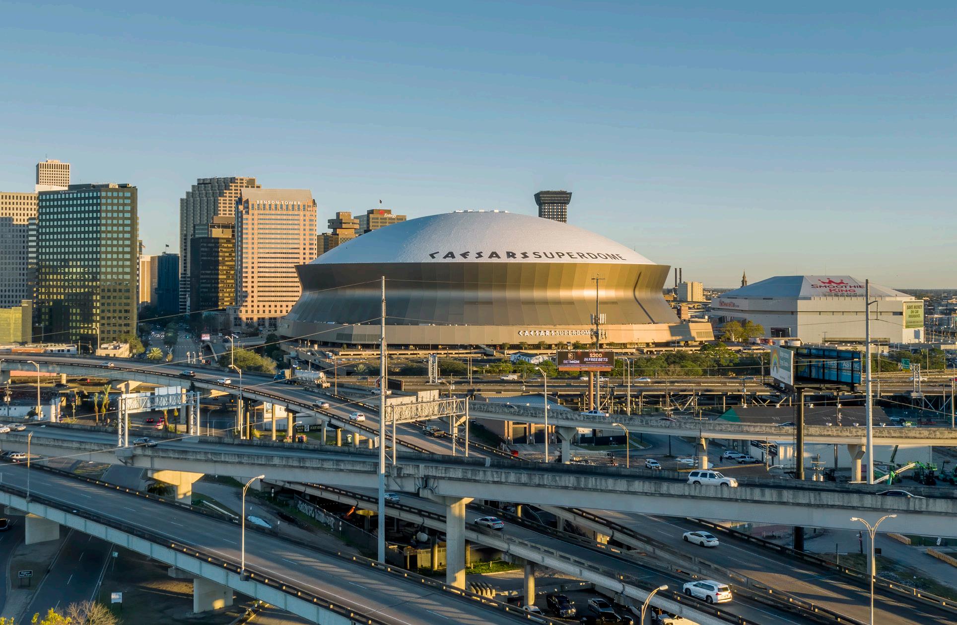
while sanitizing its inconvenient juxtaposition with sporting fanfare. At the Saints’s 2024 home opener, a Fox NFL commentator again marveled at the efforts being made to prepare the city for the upcoming occasion: “They are rebuilding this city for the Super Bowl.” Road and drainage projects have certainly accelerated across New Orleans, yet intermittent power outages have spiked in recent months, including one that interrupted the writing of this very article. In August, the entire city was subjected to a multiday boil-water advisory (a frequent hassle for some areas) when a Mylar balloon drifted into power lines near a treatment plant, disrupting the city’s potable water system.
The state legislature recently denied New Orleans $29 million for a more resilient power station. The state eventually negotiated down to $17 million in matching city funds, amounting to a $55 million state investment in the project to date. Meanwhile, at least $90 million in renovation costs and debt forgiveness have been dispensed to the Superdome, a small example of the stadium’s primacy as an economic investment over critical municipal services. For its part, the city government occasionally fumbles its obligations to bolster New Orleans’s wider resiliency. This year, a federal watchdog cited the failure of Mayor LaToya Cantrell’s administration to start on eight green infrastructure projects that were funded back in 2017. Its report, After More Than Six Years, the City of New Orleans’ National Disaster Resilience Project Activities Had Made Little Impact on Resilience, expressed skepticism that the city could complete any of the designated projects.
If recovery is defined as returning something to its former state, then New Orleans may never recover from Hurricane Katrina on those terms. The city’s population remains below prestorm levels, and more than 100,000 Black residents found themselves putting down roots elsewhere after the conditions for their return were not equitably facilitated. New Orleans closed 85 percent of its public housing from 1996 to 2007 in favor of mixed-income projects and vouchers, displacing many low-income residents. Housing costs are still trending upward today, but the catastrophic storm and equally catastrophic response did not eradicate the culture of those who were able to return once the water drained.
The vibrancy of celebrations like Black and Indigenous walking parades on Super Sundays should not be taken for granted but should be protected with requisite investment in the longevity of the communities that perform them. The Superdome’s renovation might best be used as a goal rather than a gauge of the city’s prosperity. City officials seem to share this sentiment, marking their intention to maintaining improvements beyond the Super Bowl and build on their momentum. Trahan Architects was thoughtful enough to future-proof the building, anticipating the replacement of its elevated entry plinth with street access that’s more public—representing the belief that the city’s street life will eventually grow outward to meet it. If New Orleanians are provided with equivalent resources, then it just might.
Page Comeaux is an organizer, architect, author, and educator.


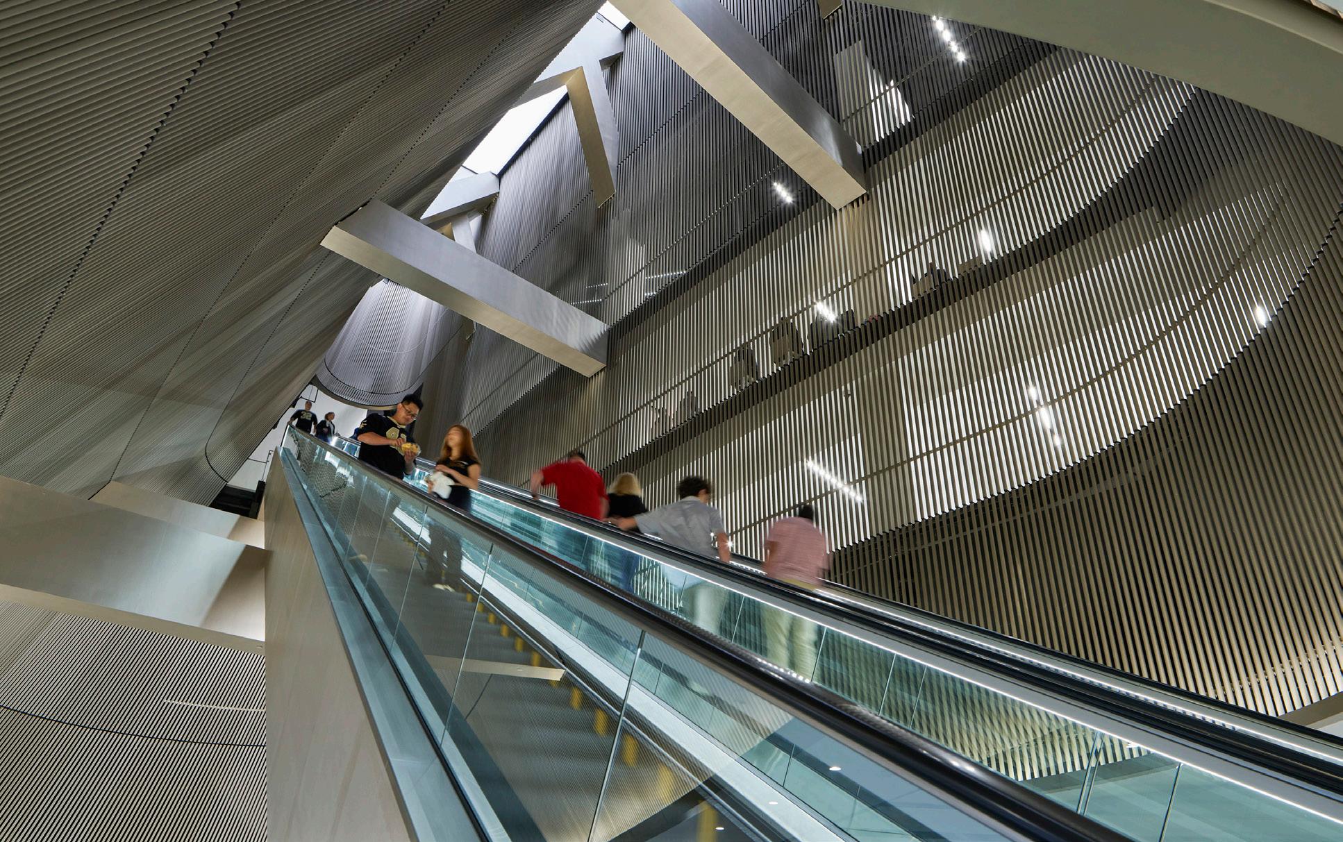
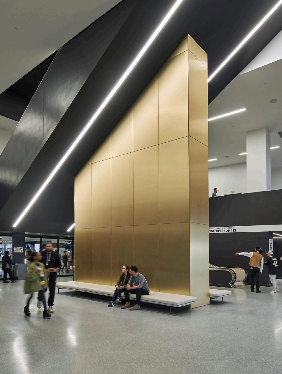
Opposite page: Exterior view of the Superdome’s newly renovated domed white roof—a city landmark.
Above, left: The architects leveraged unused vertical spaces to install escalators and elevators in place of the old ramps.
Above, right: Modern luxe finishes like brass and silver tones offer optical upgrades.
Left: A section drawing shows how the stadium reaches to meet the street and incorporates modern vertical circulation.
Below, left: The clever use of vertical elements in details like these screens draws the eye upward, like in a religious space.
Below, right: Views of the field are the most important: Even from the nosebleeds, viewers get a full view of the action.

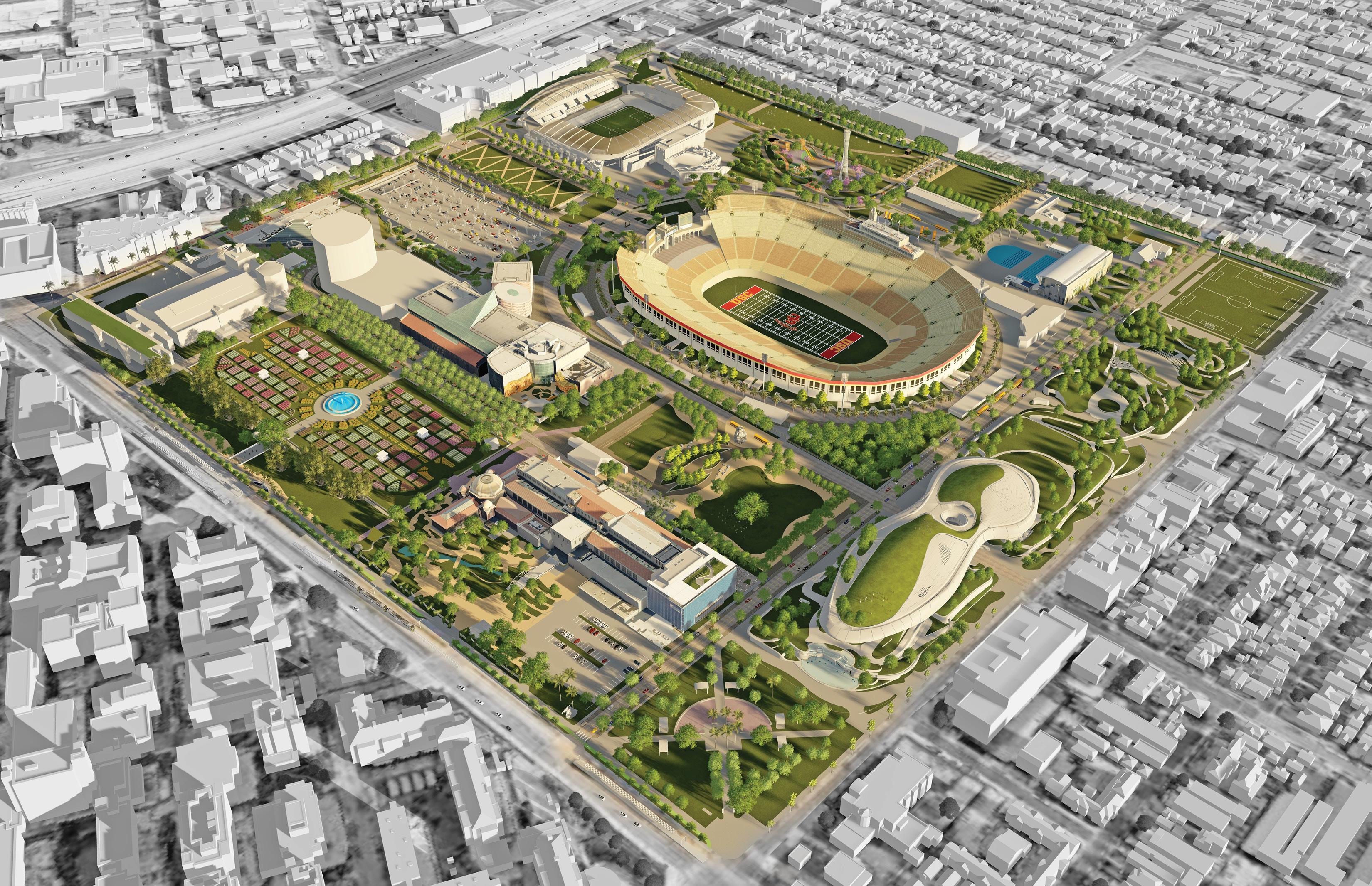
Alissa Walker and Monica Nouwens visit a storied Olympic site in Los Angeles to see how preparations are going for 2028.
IN LESS THAN FOUR YEARS, LOS ANGELES’S Exposition Park will become the only site in the world to host events during three different Summer Olympics. A perpetual flame burns as a reminder atop the park’s Los Angeles Memorial Coliseum, where Olympic rings are tacked, forever intertwined with L.A.’s fate. This is the park where a tiny L.A. introduced itself to the world during the depths of the Depression in 1932. This is the park where a man wearing a jet pack blasted over a stunned crowd during the exuberantly designed 1984 opening ceremonies. But today, the 160acre South L.A. park that should evoke the city’s enduring Olympic spirit is instead filled with unrealized plans and deferred maintenance—crumbling walls, dead vegetation, and acres of cracked pavement for parking cars instead of actual park space.
In August, $352 million in state funding was announced to turn a surface parking lot on the south side of Expo Park into 6 acres of green space, a move that park boosters hope will be the first of many major public investments to be completed by 2028. “We are in the early stages of a historic transformation at Exposition Park that will shape us into a premier world destination,” said the park’s general manager, Andrea Ambriz. “This transformation began with the community asking for green space.” While the world’s attention might be focused on the park for four weeks four years from now, Ambriz is looking for lasting changes for one of the most park-deprived neighborhoods in L.A. “This park project represents the single largest green infrastructure investment the state has made in the community of South Los Angeles,” she said.
Originally conceived as an agricultural fairground in the late 1800s, Expo Park’s evolution from orange grove to global mega-event destination mirrors the story of Los Angeles. The park was filled with Beaux Arts cultural monuments during the City Beautiful movement, then civic leaders rallied to build the Los Angeles Memorial Coliseum in 1923. Each Olympic wave brought with it some form of park investment. The swim stadium built to host aquatic events in 1932 received a renovation paid for by the surplus from the 1984 games; what’s now named the LA84 Foundation/ John C. Argue Swim Stadium will be hosting diving events in 2028. Even recent “no-build” Games have yielded privately funded venues in the park, like BMO Stadium, completed in 2018, which will host to-be-determined events in 2028. But with severe budget limitations at the state and local levels, the park may need creative ways to fund its improvements. Although Exposition Park is state-operated, overlapping jurisdictions are managed by the city and county of


Opposite page: A master plan of Exposition Park as envisioned for the 2028 Games by Torti Gallas + Partners
Left: Currently the entrance to the Coliseum hides behind concrete blockades, a 10-foot fence, and a sea of parking.
Center: The facade of the Lucas Museum of the Narrative Art, designed by MAD with Stantec and funded by George Lucas, is nearing completion.
Below: Another institution on Expo Park grounds, the Natural History Museum, is preparing to open NHM Commons, a cafe and public space that will welcome visitors even without a ticket.
L.A., sometimes revealing competing interests between various institutional developments and the preservation of open space. In 2020, a new master plan for the park was approved by state, county, and city officials aiming to strike that balance. Part of the challenge was navigating each entity’s unique lease agreement. According to Neal Payton, senior principal at Torti Gallas + Partners, which led the master plan project, “We had to play between the lines and make the connections between them—to the extent that each building would let us.” The solution was a plan consisting of nine separate elements that could hypothetically be implemented in phases as money and resources became available. The newly funded park space is one of those elements, and it’s a key one because it solves a spatial equity issue, Payton explained: Multiple iconic gateways like the Rose Garden serve the well-resourced USC border to the north, while the neighborhoods to the south are greeted by shimmering lots of cars. “People come to Expo Park to go to a stadium or a museum or maybe to go swimming,” said Payton, “but we also want people to come to Expo Park because it’s a park.”
For the moment, most of Expo Park’s major improvements are happening institutionally within its four museums, each getting shined up for 2028. The California Science Center recently hoisted the Space Shuttle Endeavour upright alongside two rocket boosters. The California African American Museum has reopened after a $5 million upgrade. And MAD Architects’ Lucas Museum of Narrative Art hovers patiently above a new 11-acre green space designed by Mia Lehrer—another parking lot that became a park over a parking garage—scheduled to open in 2025. In November, the Natural History Museum will open an audacious expansion named NHM Commons, which removes the wall of the museum’s monolithic south entryway. “We’re not abandoning the south entrance; we’re essentially stretching it to the west to make a more inclusive, transparent, multifunctional point of entry,” said architect Fred Fisher, of Frederick Fisher and Partners. And most importantly, he noted, this whole new section is before the paywall, meaning that the entire commons, including a theater, gallery, and new cafe, does not require paid admission and can operate independently of the museum’s hours. “The two new big windows in the facade are a gesture to connect to the community and break down any perceived barriers,” Fisher said. “This is all about making the museum spill into the park.” That mindset should be embraced by more of the Natural History Museum’s neighbors. Just across the lawn, the Coliseum, which should be a jewel at the center, is easily
Center: Concrete park benches
Below: Integral to mitigating the effects of heat in the city, swimming facilities are open to the public in Expo Park. But these facilities were first built in the 1930s, ahead of the very first L.A. Olympics.
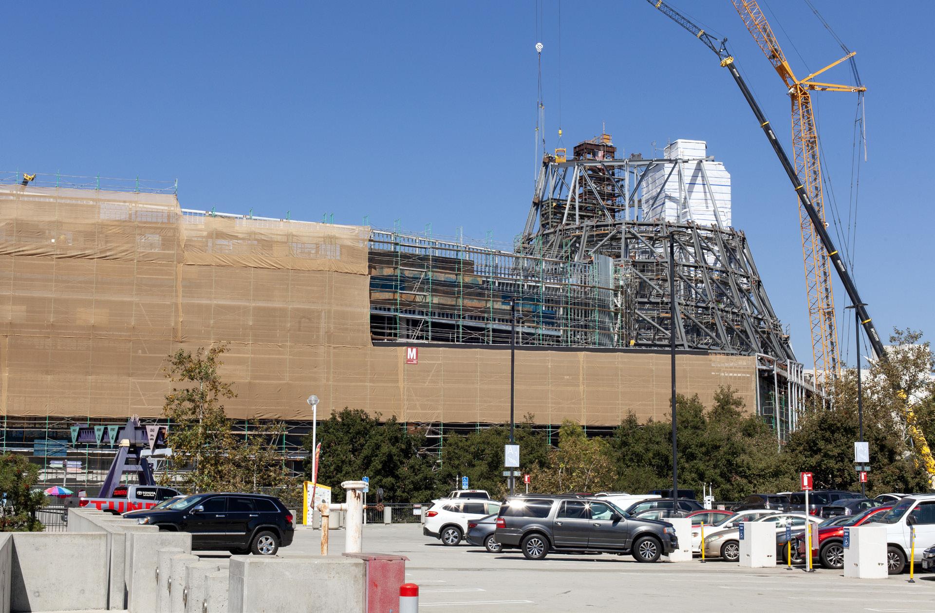
the least-friendly building in the park. In 2018, USC paid for a $270 million glow-up right after L.A. won the 2028 bid; from within its arches, the century-old building has never looked better. But the perimeter is now a hostile warren of fences shrouding this beloved structure with the architectural equivalent of a clear plastic game-day backpack. One master plan element that could soften its edges is the Olympic Ring Walk, a proposed walking path dotted with sports history exhibits that would encircle the stadium. During the Olympics the Coliseum will be fitted with a pricey temporary floor to host track and field events. But why make such an improvement ephemeral and only for athletes to enjoy? Here’s an opportunity to fix the current conditions and leave it for the community, better than before. Let’s get Nike to sponsor it.
A walking track would also imply that pedestrians are welcome in the park, especially when there are two E line light-rail stations right there. The strategy of tucking parking beneath has locked in a disappointing reality for Bill Robertson Drive, the north–south street that slices through the park, because it’s now become the only way to access various parking garage entrances. The master plan calls for a “shared street” concept that would delineate a majority of the space for people. But that part is up to the City of L.A., which also has a languishing streetscape improvement proposal named Reimagining Expo Square that’s meant to create better pedestrian connections on the streets bounding the park. While components of the proposal have found their way into an active transportation corridor project on four surrounding streets, the city hasn’t yet presented a timeline for fixing the park’s dangerous and disjointed perimeter, which certainly doesn’t bode well for what organizers have dubbed the “car-free” games. “We’re happy to see enhanced pedestrian and bike facilities coming to these four street corridors,” said Abby Stone, senior project director of RIOS, which consulted on the project. “And we also hope that the city is able to proceed with some of the more robust streetscape enhancements that we originally proposed, including additional street trees and plantings, curb extensions, and new environmental graphics.”
These same interventions need to happen throughout the park as well. An esplanade that runs east to west through the park is currently lined with a hundred or so concrete benches left over from the 1984 Games, each stamped with the LA84 logo and in varying states of deterioration. The master plan recommends a heroic promenade with a festival-like rendering showing wider pathways, better benches, brightly colored banners, and groves of shade trees. But if the park is meant to look like this by 2028, it’s nearly too late to start planting them.
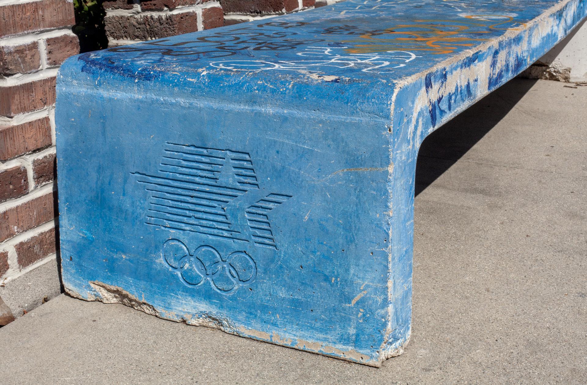


In the world of architecture, sustainability is top of mind. When it comes to the exterior facade, coil and extrusion coatings play a critical role to the form, function and sustainability attributes of a building ’ s design.
Sustainability isn’t new to Sherwin-Williams—it’s embedded in our values, culture and way of doing business. We’ve embraced a science-based, holistic approach to sustainability and are continuously seeking ways to integrate it into every part of our business. Our Coil and Extrusion Coatings Division is driven by three key sustainability pillars—Corporate Commitment, Product Innovation and Customer Partnership—we are leading the industry in sustainability.
Examining our corporate commitment further, our commitment is guided by the enterprise-wide pillars of Environmental Footprint, Product Blueprint and Social Imprint and we believe a strong foundation helps us hold ourselves to the highest standards of ethics, business integrity, and corporate governance. Our approach to sustainability and environmental, social and governance (ESG) enables broad engagement across the organization, while providing appropriate oversight and accountability throughout the company.
Through the Environmental Footprint pillar, our continuous improvement approach aims to reduce our carbon emissions, energy use, and waste generation in addition to expanding our renewable energy use and recycling methods. Enterprise-wide, Sherwin-Williams is working toward our goal of reducing absolute scope 1 and 2 greenhouse gas emissions by 30 percent.
Social imprint is key when examining sustainability from a holistic approach. We are committed to providing a safe and inclusive environment both in and out of the workplace where individuals of all backgrounds are welcomed, celebrated, and appreciated.
Our Product Blueprint initiative is how we drive sustainability through innovation. We lead the industry by offering cutting-edge solutions and implementing sustainability into the stages of our product innovation and development processes. Specifying metal coil and extrusion coatings on the building envelope offers many other benefits such as durability, performance and unique color and effect options. Moreover, metal building products have a long lifespan, lower maintenance requirements and can be recycled. Applications includes curtain wall, façade, roof and wall panels and other metal building accessories.
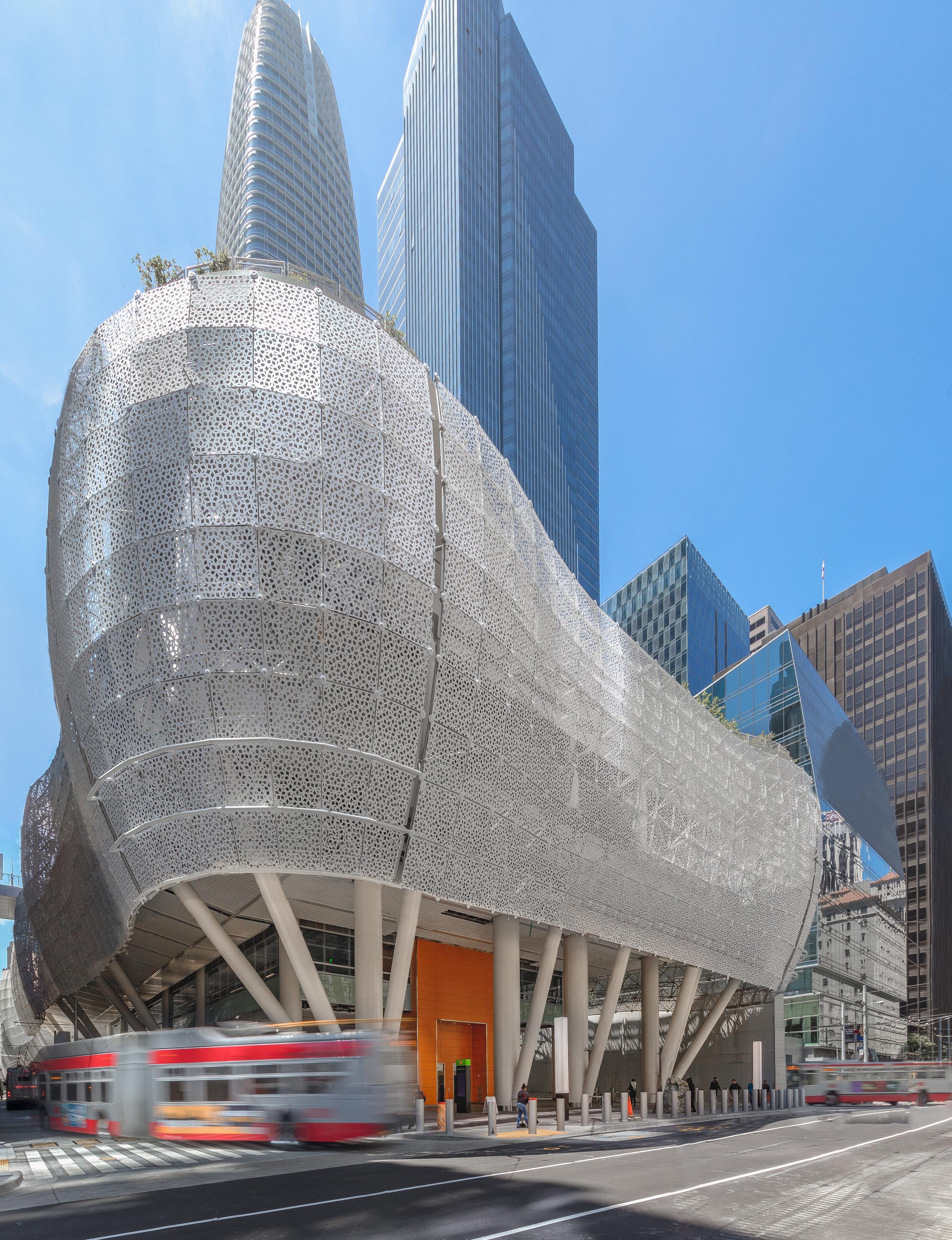
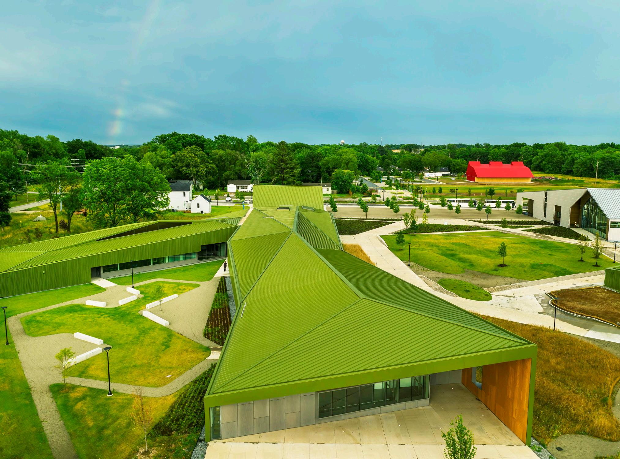


Solar reflective coatings for metal roofing and wall panel systems have become increasingly popular. Available in Fluropon® and Illumipon™, these coatings contain solar reflective and thermal emittance (TE) pigments that reflect infrared radiation while still absorbing visible light, resulting in a coating that can stay cooler. This is coupled with the coating’s exceptional resistance to natural elements such as sun, rain, and UV rays, as well as marring and fading.
A leading benefit of solar reflective coatings is their ability to help mitigate the heat island effect and improve roof emissivity. Urban heat islands are caused by roof and pavement surfaces retaining the suns’ heat, causing elevated temperatures, increased energy usage, and local climate disruptions. Solar reflective coatings reflect heat to contribute to lower surface and ambient air temperatures. When used in new construction, solar reflective coatings can earn Leadership in Energy and Environmental Design (LEED) credits for roofing and wall panels. LEED credits, or status, are awarded to buildings that prioritize sustainability and are built with longevity and efficiency at the forefront.
Radiation cure technologies are rapidly advancing. A developing technology in the coil coatings industry, radiation curing changes the way a coating is cured. Traditionally, the coating is cured with a thermal oven while radiation curing uses energy instead of heat to solidify the liquid coating. Used primarily in printing applications, this technology utilizes either Ultraviolet (UV) energy or Electron Beam (EB) to form a coating. UV radiation curing works by utilizing high-intensity ultraviolet energy to instantaneously cure the coating. A chemical photo-initiator is used to absorb the UV energy and cross-link the polymers. EB curing utilizes accelerated electrons to directly cause the cross-linking of inks and coatings. This allows for a high degree of conversion from oligomer to polymer to take place. When it comes to sustainability attributes, this innovative curing process produces low to no VOCs, is formulated with 100 percent solids, and can have a lower energy expenditure compared to traditional thermal curing. Radiation cure coil coating systems can be tailored to unique applications, including gutters, fascia and more.
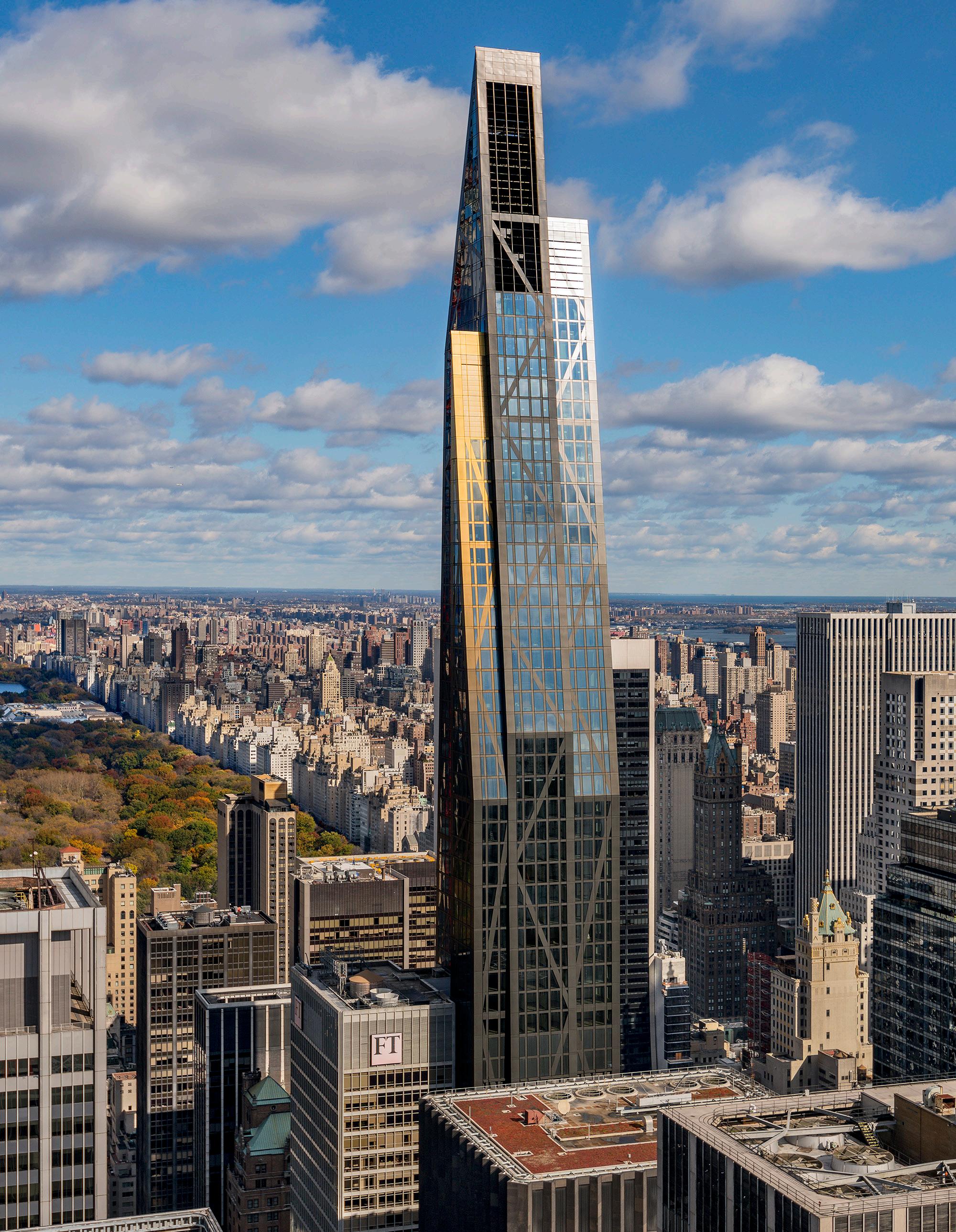
Incorporating bio-renewable ingredients in coatings systems has become more common, especially in Europe. Polyester topcoat systems can use bio-renewable raw materials that are naturally replenishable such as vegetable oils and animal fats. These systems are mostly used for interior coil applications like ceiling profiles and wall panels as well as exterior coil applications like metal roofing systems, facades and other sheet steel elements.
Another industry trend is using pre-consumer recycled plastic (rPET). Resin systems can contain up to 55 percent recycled content such as plastic bottles, containers and packaging. Formulated with a higher percentage of solids, these materials help mitigate the need for fossil fuels—non-replenishable items that take millions of years to form.
When designing with sustainability in mind, it is crucial to use products and suppliers that offer you the resources and solutions to help you meet your goals. At Sherwin-Williams, we work directly with architects to help their projects meet sustainability requirements of national and global initiatives. From LEED accreditation to energy savings initiatives to unique sustainability goals, we’re your partner in sustainability.


Design Without Limits
Plains & Pods : Outdoor experiences open to interpretation.
by Industrial Facility
Forms | A Modern Craft Manufacturer

The recent American Society of Landscape Architects (ASLA) conference, held in Washington, D.C., was a real celebration, as it marked 125 years of ASLA operations. Compared with AIA’s convention, which was held in early June in the same D.C. convention center, it offered a different approach to creating the built environment, perhaps best expressed through the vibes of the expo halls: While one exhibitor at AIA imported a Tesla Cybertruck for attendees to pose with, the ASLA hosted many play structures and an area with friendly canines (actually a display for pet-exercise company Gyms for Dogs). The sound of kids experimenting with outdoor sonic play equipment carried through one section. There was even late-afternoon breakdancing (!), hosted at mmcité’s basketball court.
Upstairs, days of sessions delivered a density of interesting content, from technical know-how to advice for activists. In an engaging panel, Jonah Susskind of SWA; Christine Ten Eyck, a landscape architect who leads her own practice from Austin; and Dalia Munenzon from the University of Houston shared research, strategies, and projects for fire-prone regions,
especially in the Wilderness-Urban Interface, or WUI. (See Timothy Schuler’s Q&A with SWA design principal John Wong on page 56.) In another, Charles Birnbaum of The Cultural Landscape Foundation spoke with Peggy King-Jorde of KING JORDE Cultural Projects Consulting and Angela Kyle of Jennie’s Legacy about the urgency of cultural preservation. Their conversation was grounded in an acknowledgment that the public process is broken and asserted that people who reflect the communities they serve should lead landscape projects. Plus: Why do we commission environmental impact statements and not cultural ones?
Centering Indigenous knowledge was a regular topic across the convention, including during the event’s keynotes. Lyla June Johnston, a Diné artist, scholar, and community organizer, gave an inspirational talk about edible Indigenous landscapes and the importance of the land back movement. Her examples included the Shawnee chestnut groves, the clam gardens created by the Kwakwaka’wakw and other Indigenous groups in the Pacific Northwest, and the grasslands pyromanagement practiced for centuries by tribes across

The vitality of landscape architecture was on display at ASLA’s 2024 conference—and remains so in this dedicated section.
what is now the American Midwest. Johnston encouraged landscape practitioners to consider healthy soil as an heirloom to be passed down to future generations and to think about their work as writing “love notes to creation.” Her talk earned her a standing ovation. On page 48, read about Diana Budds’s visit to Forge Project in upstate New York, which is restoring the principles of Indigenous land stewardship to its 60-acre site.
Part of the conversation about Indigenous voices in landscape also included revisiting the profession’s history. In a panel titled “Rematriate the Land: Our Obligations to Truth and Healing,” José de Jesus Leal advised educators to “stop starting your classes with Olmsted,” referring to the figure who is often cited as the founder of American landscape architecture. Even the term “landscape architecture” could be seen as problematic, given its history of being bound up with displacement across the American continent. The same critique could be made against architecture, as the profession has been associated with development and gentrification in this country.
History provides both hard truths and ongoing shared references. The idea of the primitive

hut was widely distributed in a now-infamous etching by Charles Eisen as the frontispiece to the second edition of Marc-Antoine Laugier’s Essay on Architecture , published in 1755. The image is interpreted to showcase “architecture” (personified by a woman here) looking to nature for inspiration, not the lineage of other past styles. Behind her stands a gable-roofed structure fashioned out of tree limbs and trunks; it merges with the surrounding forest. Seen today, the image also suggests the blending of—or at least alignment between—architecture and landscape architecture, an ideal that has powered decades of work on landscape urbanism, landform building, and our current goals of carbon reduction and energy performance.
To begin this landscape-focused section, a “pavilion party” of sorts invites four smaller projects that showcase the contemporary value of closely coordinated efforts between these disciplines, whether it is within a single larger company or across collaborating entities. These projects offer essential needs—shade, sustenance, bathrooms—while also succeeding as attractive additions to their surrounding environments. What could be better than that? JM
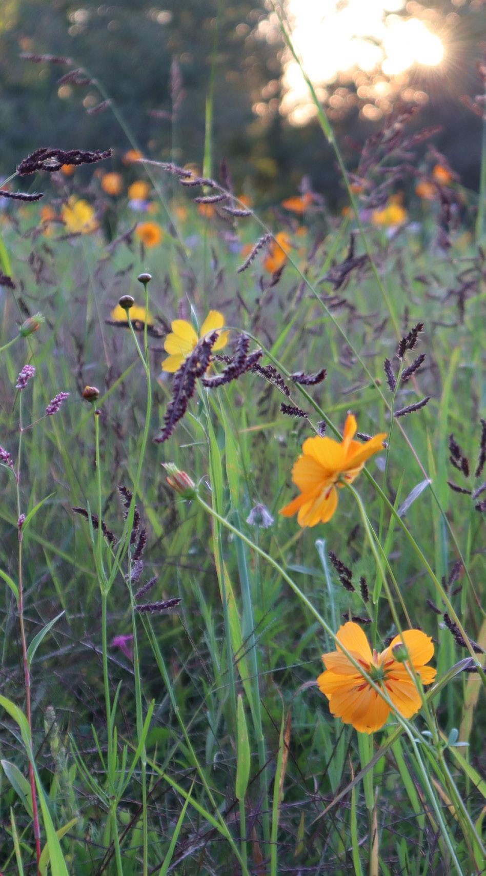


Snøhetta and landscape
architect Catherine O’Connor deliver a climate-responsive renovation for Austin’s Blanton Museum of Art.
Design architect: Snøhetta
Landscape architect: Catherine O’Connor
Structural engineer: Martin and Martin
Fabricator: Trans FX, Carlson Baker Arts
Lighting: L’Observatoire
Installation: Patriots Erectors
Glazing contractor: Sentech
Pavers and walls: Wausau, Clean Scapes
Wood: Thermory
Bronze: Isec
Light poles: Lyte Poles
Signage: Clean Scapes
Seating: Durbanis
Glass: Cristacurva
In Austin, the Blanton Museum of Art’s renovation has been on the minds of art and architecture enthusiasts since it was first announced that Snøhetta would spearhead the multiyear, $35 million grounds renovation—and for good reason. The 200,000-square-foot overhaul centers around 12 otherworldly petal-shaped sculptures, which rise 40 feet in the air and offer a clever landing place for visitors. Even beneath a blistering September sun, the towering canopy’s wandering shadows and dappled light make a 90-degree day bearable for all visitors.
The design, which is both functional and artful, happens to be just as thought-provoking as the works inside the Blanton’s walls. However, there’s a larger conversation to be had, one that speaks to the city’s cultural and natural elements, as well as to its future as an ever-evolving hub for growth and exploration.
The renovation reflects the Blanton’s importance and connection to the city. It occupies a pivotal position between the Texas State Capitol and the Bullock Texas State History Museum and opens onto Ellsworth Kelly’s Austin , a chapel-like building and colorful culmination of the late artist’s impressive career. The flowing outdoor landscape features curving pathways, which take their cue from the museum’s arched loggia and stately live oaks. The petals funnel rainwater to replenish an underground collection system that feeds 25,000 new plants, including native dwarf palmetto, Texas gold columbine, and Cherokee sedge.
On weekdays, the courtyard becomes a place of escape and imagination for students, families, or those who walk past on their lunch break. Weekends bring larger crowds, live music, and more as visitors lie under the petals, reflect on the art, or enjoy a picnic on the lawn. The renovation has not only redefined the visitors’ experience at the Blanton but it’s a permanent exhibit itself—one that fuses art, architecture, and nature for an immersive experience beyond the gallery’s physical limitations.
Lauren Jones is a Texas-based architecture and interiors journalist and is a frequent visitor to the Blanton, as well as the city’s other art museums.


In San Francisco, Min Design crafts a subtle restroom pavilion within China Basin Park by SCAPE.
Design architect: Min Design
Landscape architect: SCAPE, CMG
Collaborators: Miller Company, Pine & Swallow, Pannu Larsen McCartney, BKF Engineers, Urban Design Consulting Engineers, Langan, Brookwater, Peterson Associated Engineers, Webcor, PritchardPeck Lighting
Fixtures: Evero, Toto
Interior finishes: Bradley, Bobrick, Daltile, Fireclay, ASI
In San Francisco, the bay is something most people look at but don’t really use. SCAPE’s design for China Basin Park, wrapping the northeast edge of Mission Rock, is seeking to change that.
On the September afternoon I visited, the Bay Trail was a-rush with people on postwork runs and the grove of native strawberries was in flower. A landscaped path leads uphill from there to a section of native and adaptive plants, fed by the project’s blackwater system. From the top of the park, a grass glade slopes down toward the water, which now has a beach of sand and crushed oyster shells.
The restroom, by Min Design, appears like a pavilion in the park. Tucked beneath the raised lawn, the doorless, curved opening is lined with green tile. “We just couldn’t see making it one of those dark, little structures in the landscape,” said E. B. Min, founder of Min Design The facility is all-gender: “We are changing the way we think about and engage with the edges,” she explained.
The challenges faced in designing China Basin Park were familiar to SCAPE’s founder, Kate Orff: “Filled and artificial land floods because water wants to go where it wants to go. The memory of the water and marine species is still there.”
Designing for climate adaptation, as SCAPE does, reorients a project toward the landscape as ground for the relationships that bring a place alive. China Basin Park’s partners seem uncommonly aware of this and made ecological—and with it, social—resilience a core principle. Partnering landscape design firm CMG explained how much is happening beneath the ground: To counter sinking, a grid of stone-filled piles about 10 feet deep was designed to interact with the bay mud, and stormwater systems are aggregated into plantings and habitats across the park.
A lot of new design in the Bay Area disappoints, but this doesn’t. The work at this corner of Mission Rock looks like a future that’s aware of what has always made the city a destination. The beautiful bones, Orff said, might help San Francisco “take the lead with a more integrated and nature-based approach.”
Elizabeth Snowden is a writer based in the San Francisco Bay Area, where she also runs the Pallas Gallery.

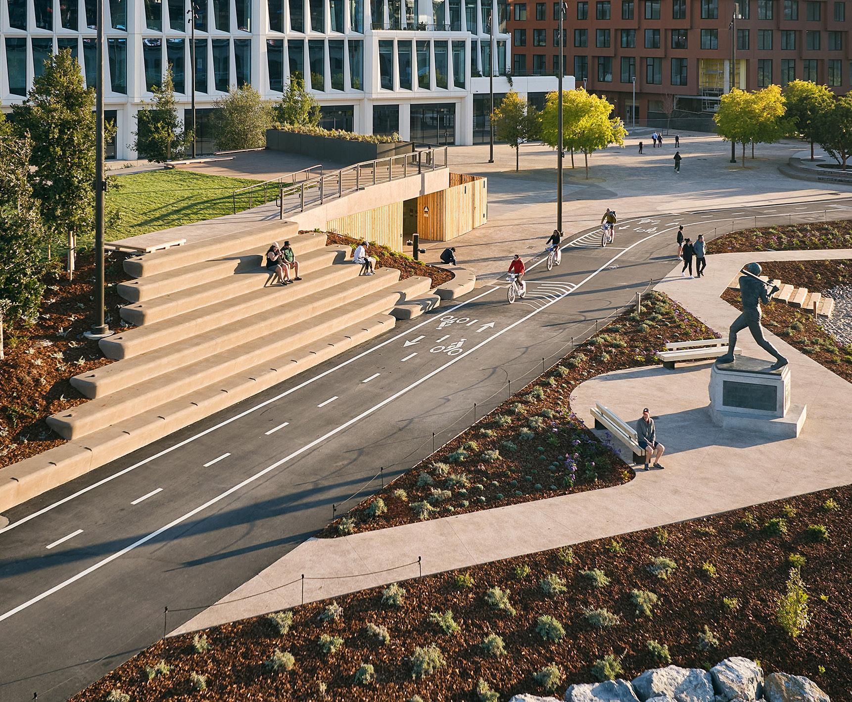
Common Works Architects and LAUD Studio collaborate on a central park and plaza for a small Oklahoma city.
Design architect: Common Works Architects
Architect of record: LAUD Studio
Landscape architect: LAUD Studio
Structural engineering: 360 Engineering
Electrical engineering: CEC
Civil engineering: Johnson & Associates
Lighting design: Hess
Play equipment: Greenfields Outdoor Fitness, Lappset, Poligon
Water fountains: Most Dependable Fountains, Delta Fountains
Outdoor furniture: Fermob, Kim, 3Form, Forever Lawn, Landscape Forms, Santa & Cole, Belson Outdoors, Vestre, mmcité
As part of its master parks plan for The Village, Oklahoma—a city of less than 10,000 people— landscape architecture firm LAUD Studio rehabilitated six residential parks. But demolishing a dilapidated apartment complex between the library and city hall created an opportunity to build a connector between them as well as a new plaza in collaboration with local design firm Common Works. It’s called Village Park.
“The city just never had the classic town square,” said LAUD Studio founder Brent Wall. “The park is an attempt to create a hub in the heart of the city.”
Common Works Architects designed two rectangular cedar-clad, pale green pavilions around a concrete stage for programming on the plaza. “We wanted consistency along the whole park and to maintain that traditional park feel,” designer Chandler Brown said. “The choice of cedar versus concrete or steel and softer colors lends warmth and references a more traditional park setting that is also more approachable.”
While only a few hundred feet apart, each pavilion is tailored to its specific location. One, at 60 feet long and 20 feet wide, is narrower and airier, with open seating under four shedshaped structures with 14-foot roofs. The other pavilion measures 100 by 20 feet, offering more space for picnic tables and a public bathroom under pitched steel roofs complete with hanging lights and ceiling fans.
The city’s goal to promote physical and mental health also shaped the design for a final white pavilion. Set farther back from the main plaza, a U -shaped structure envelopes an outdoor gym and play area serving children, young adults, and family outdoor recreation.
For Brown, “a big concern was creating visual privacy during the day while still connecting to the landscape.” As a solution, metal fins serve as a buffer between the visitor and the street, allowing kids to play and adults to exercise without prying eyes.
James Russell is a freelance writer in Fort Worth, Texas, who writes about art, the built environment, and politics for multiple outlets, including Arts and Culture Texas, Texas Architect, and Landscape Architecture Magazine
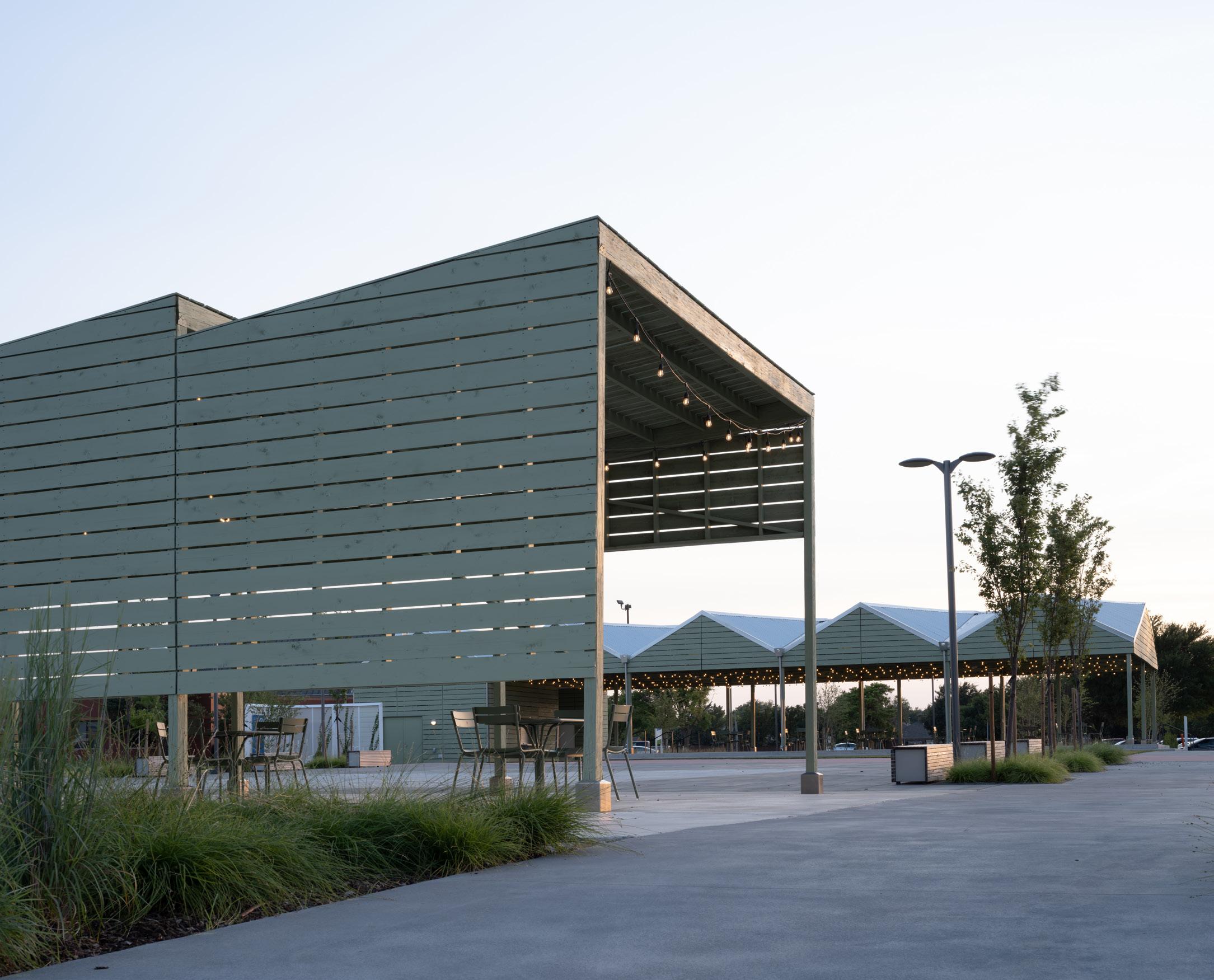

A new pavilion by Schaum Architects touches down in Nelson Byrd Woltz’s Memorial Park in Houston.
Architect: Schaum Architects
Landscape architect: Nelson Byrd Woltz
Interior design: Kelly Barnhart, Schaum
Architects
Structural engineering: H2B Engineering
Electrical engineering: GK Engineers
Civil engineering: Gunda
Lighting design: G2LD
General contractor: Tellepsen
Cladding: Resawn Timber, Acme, Ornamenta
Glass: Vitro
Windows: Kawneer
Doors: NanaWall
Interior finishes: La Nova Tile
Lighting: Noguchi, Axis, Lithonia, Luminii, Artemide
Furniture: Herman Miller Eames, Vaarnii
As Houston inches into the more comfortable space between summer and fall, I find myself at the Memorial Park running track to get a couple miles in. Breathless and sweaty, I walk over to Vibrant, the park’s new health-conscious food option. There’s no better reward after a solid run than only having to walk 50 feet to fuel my coffee addiction. Designed by Schaum Architects as a second location for the original cafe in Montrose, this building is intentionally made to integrate seamlessly with the surrounding landscape.
The most notable element of the cafe is the generous patio facing the park. This features a gabled steel roof that boasts a 30-foot cantilever. The structure resolves in a vaulted ceiling that ensures no columns interrupt the space below. As I walk along the building, I also notice that small squares push out of the brick to create a textured facade.
Inside, floor-to-ceiling glazing frames views of the park, and a color palette of white and light-toned wood complements the steel structure and window mullions. An operable glass wall connects the interior to the exterior, strengthening the seamless line to the park. This combination of color and glazing also allows the late summer’s pale-yellow sunlight to subtly transform the otherwise cold color scheme into a warm and inviting one. The interior is split into three bays by exposed beams: kitchen, serving counter, and seating area, with the kitchen housed within the larger brick mass at the front of the building. The second is thinner and hollows out inside to create an invisible separation between the serving and seating areas. As a testament to the intentional design, the patio even features benches instead of chairs with backs at the perimeter of the space to bring the nature in unobstructed.


October/November 2024
Durable performance textiles shouldn’t sacrifice good design. The following patterns explore color and abstract designs, many of which are inspired by landscapes, while finding inventive ways to obscure repeats and endure the elements. KP

Island Collection | Sunbrella sunbrella.com
United Fabrics and Sunbrella collaborated on a series of textiles inspired by American road trip destinations, and the debut collection takes after Coney Island. Sunset-inspired colorways and urban-inflected nautical designs make up the four patterns in the collection, all of which are durable yet graphic enough for both indoors and out.

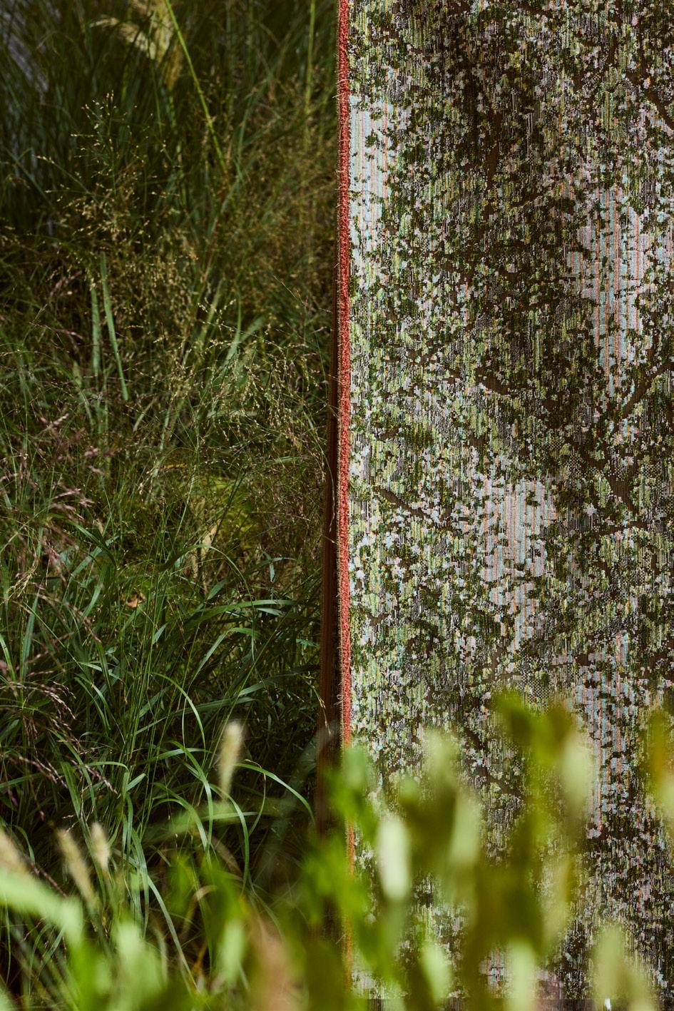
Moments of Wander | HBF Textiles hbftextiles.com
Designed by Christiane Müller, Moments of Wander is a collection of three abstract patterns, devised after reflecting on moments in nature. Either textured offerings like Fields of Velvet or more classic plaids such as Trails of Tweed evoke different patterns up close or at a distance, aptly prompting moments of wonder.

Made with solution-dyed acrylic, this collection features a hazy striped pattern available in a range of vibrant or neutral
The unique take on a classic pattern means it easily pairs with other bold or solid patterns and environments.

Outdoor Calita | de Sede desede.ch/en
de Sede developed a special, water-permeable padding that provides protection against weather and makes this textile suitable for cruises and other nautical environments. Outdoor Calita features five colorways in a contemporary geometric pattern.

LANDSCAPE | Kravet kravet.com
Barbara Barry designed LANDSCAPE for Kravet, a collection informed by nature in Ojai, California. The patterns—Windchime, Sand Dune, Wildbrush, and Agave—evoke the greenery and tranquility of the mountains visible from the town.

has never felt so inspired.
Introducing our new family of Stone Textures that capture the beauty of natural stone. Inspired by nature, designed for felt, and stunningly unique.
John Wong, the landscape architect behind some of the world’s most recognizable landscapes, opens up about nearly five decades of practice at SWA.
You know John Wong’s work even if you don’t. You’ve seen it if you’ve ever visited the Stanford University campus, where over a span of 30 years Wong has evolved and modernized Frederick Law Olmsted’s historic landscape. Or if you’ve stumbled upon Tulsa’s Guthrie Green, an urban park and outdoor amphitheater that supplies district heating and cooling to the surrounding buildings. Or if you’ve ever seen Mission Impossible: Ghost Protocol , in which Tom Cruise is framed by the elliptical landforms of Wong’s groundscape as the actor scales the Burj Khalifa.
Wong is a design principal in SWA’s Sausalito office, where he has worked since 1978. His legacy in the field of landscape architecture is freshly evident thanks to a new book, Selected Works of Landscape Architect John L. Wong: From Private to Public Ground, from Small to Tall, a monograph that, at 588 pages, shares something with Wong’s oeuvre. Spanning cultures, climates, and scales, the Hong Kong–born landscape architect’s work has been an influential part of a growing movement to bring the natural landscape back into urban centers and to dissolve the artificial barrier between cities and nature. Timothy A. Schuler spoke with Wong to learn more about the making of the book and its resonance.
Timothy Schuler: Did the book project reveal any new insights about your own body of work?
John Wong: Absolutely. Most of the projects are large-scale, mixed-use and have a major impact on urban living. Many were completed during a period when the world was growing. As you know, landscape architecture began in the United States back in Olmsted’s day, and many of the skills have only been passed on internationally over the last 30 years. Oscar [Riera Ojeda, the book’s publisher] was trying to capture how I developed a body of work that spans not just the local or regional but the
international scene. He hadn’t seen someone like that, until recently. In the last ten years or so, a lot of landscape architects have gone overseas. But I started in the 1980s. I was very fortunate to be part of that opportunity, riding the waves and working with many different clients, engineers, and architects. It taught me a lot about how to design in a different culture, in a different setting.
What have you learned over the years about designing in not just climatically responsive but culturally grounded ways?
I approach projects with one general design methodology, and that doesn’t change from one place to another—although the application will be different. I try to teach our young people, as well as students, that you want to have a full understanding of the place. You need to go there. You need to walk it, learn it. What is the vegetation? What is the topography? Is there something that is part of the overall ecological system? When I was at graduate school, I had lunch with Dan Kiley many times, and he always said, ‘John, whenever I go to a place, I just walk around the block and look at what trees do the best. And that’s how I develop my plant palette.’ I do that too. But I go beyond just learning about a palette of trees and shrubs. I learn about materials, about weathering. You know, this handrail, how come it’s falling apart? For me, there’s no boundary between culture and environment. It’s about the importance of the place. You have to respect it. You have to learn from it.
The book’s title is The Selected Works of Landscape Architect John L Wong. Many people might know that these are SWA projects but not associate any one name with them. Has the anonymity that came with working at SWA ever been a struggle?

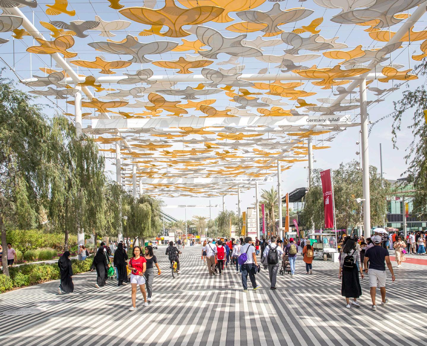
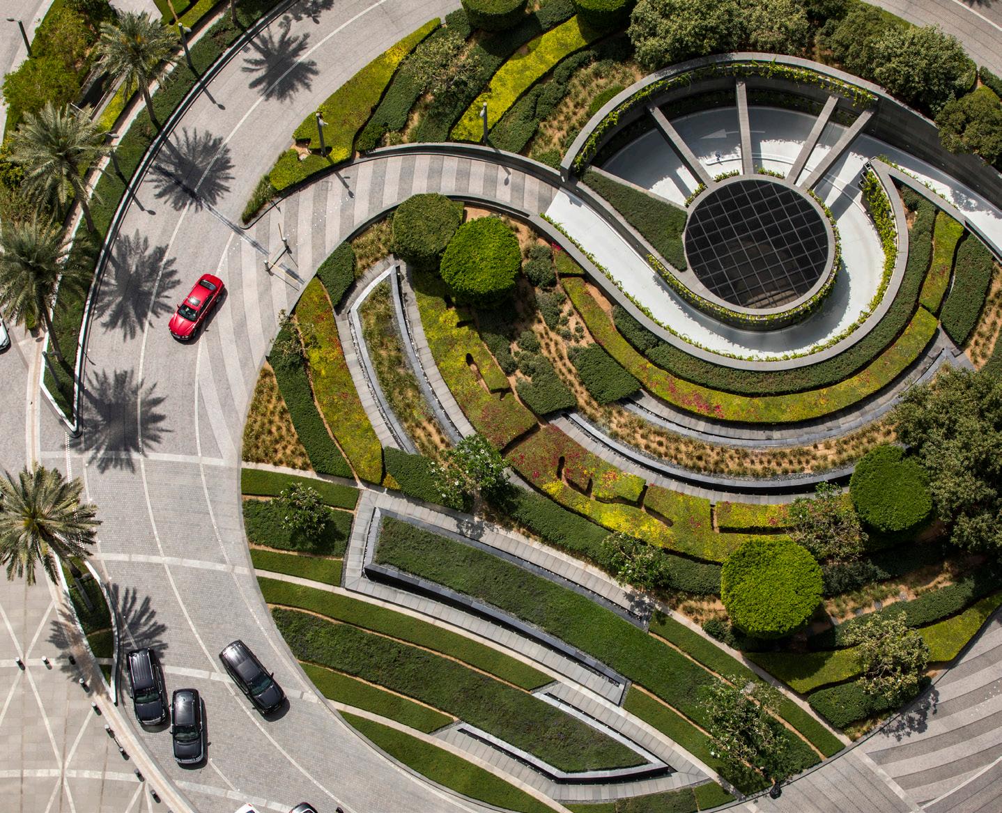
I decided to do the book to highlight that, yeah, I was part of SWA, but for all the projects that are showcased, I was the principal in charge, meaning these are projects I brought in myself, through my own work and through my own [relationships]. It’s a little bit of ego on my part, right? But I also wanted to show that you might be working for a company, but that doesn’t mean that all the work is designed in a certain way or under a single direction. You have a lot of say. You can be your own person, and you can provide your point of view.
When I look back, the most important thing I hope the book does is inspire students and young professionals. We need more young practitioners. The field is overwhelmed with opportunities, and we’re just not able to meet the challenges with the talent that we have.
How many of the comments from colleagues and friends have been about the weight of the book? It’s very big.
[Laughs] Everybody weighed it. It varies between 9.5 and 9 pounds, 7.5 ounces. The good news is I made it to all their coffee tables. I consider that a success.
Top: SWA’s public realm design for Expo 2020.
Above: Wong’s work on the landscapes surrounding the Burj
Left: Cover design of Selected Works, published by Oscar Riera Ojeda Publishers.
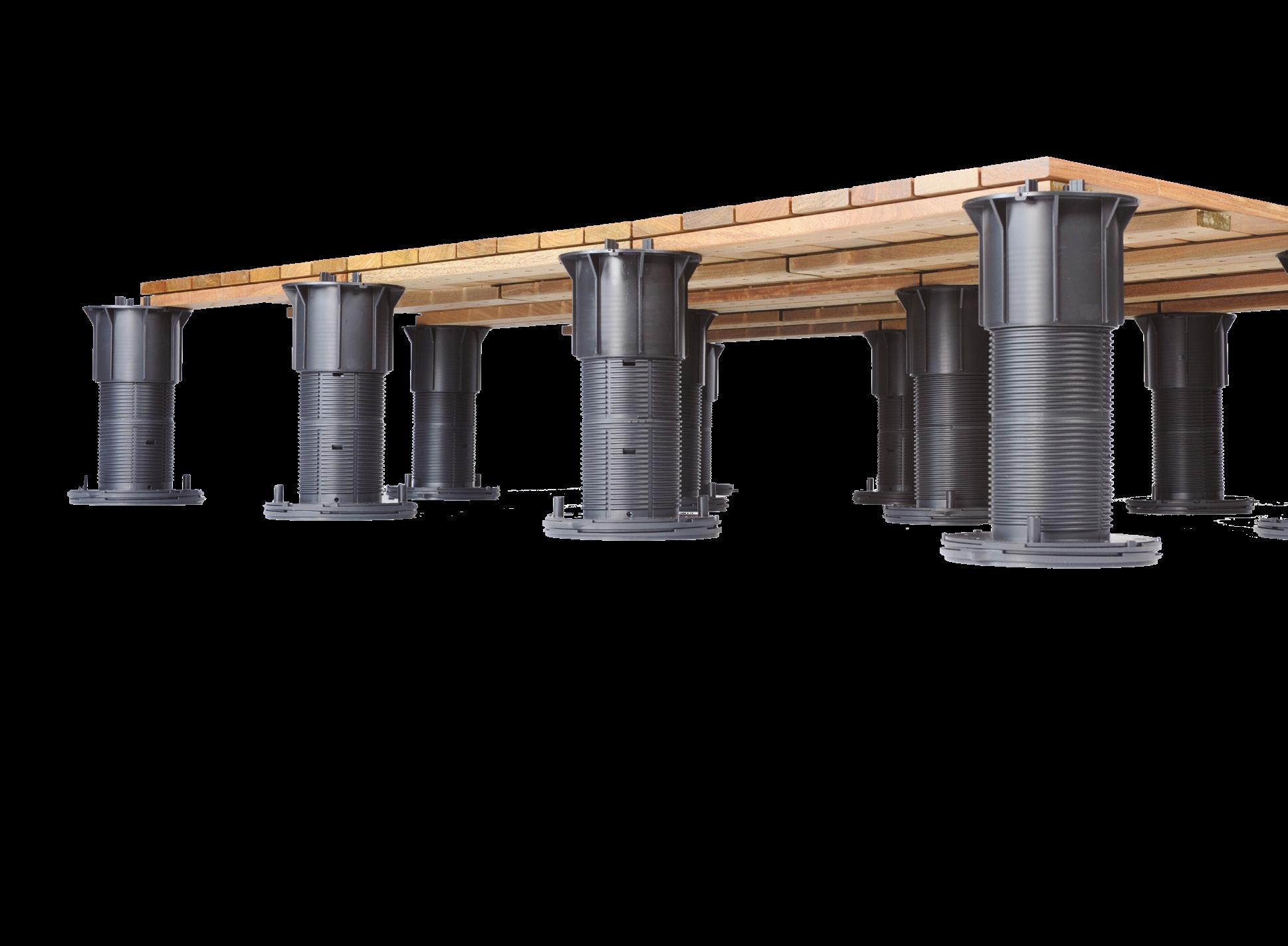




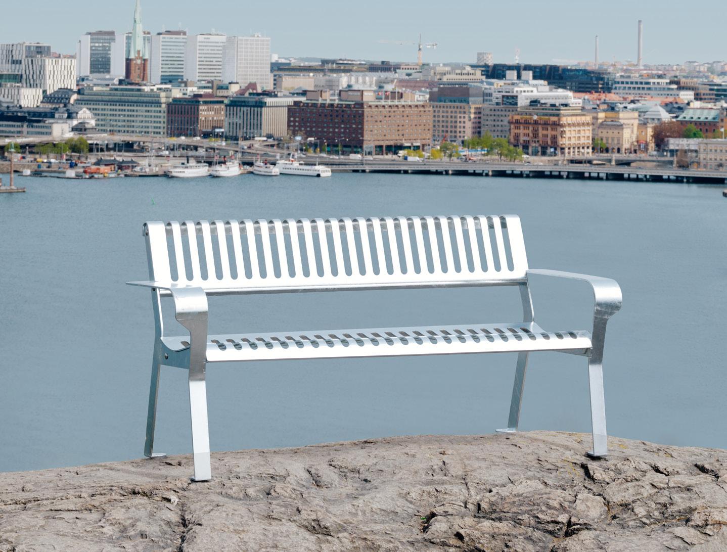
The first furniture to be made with “fossil-free” steel, Tellus was designed by Emma Olbers. It takes on a familiar park bench form but in a sleeker, more sustainable fashion.

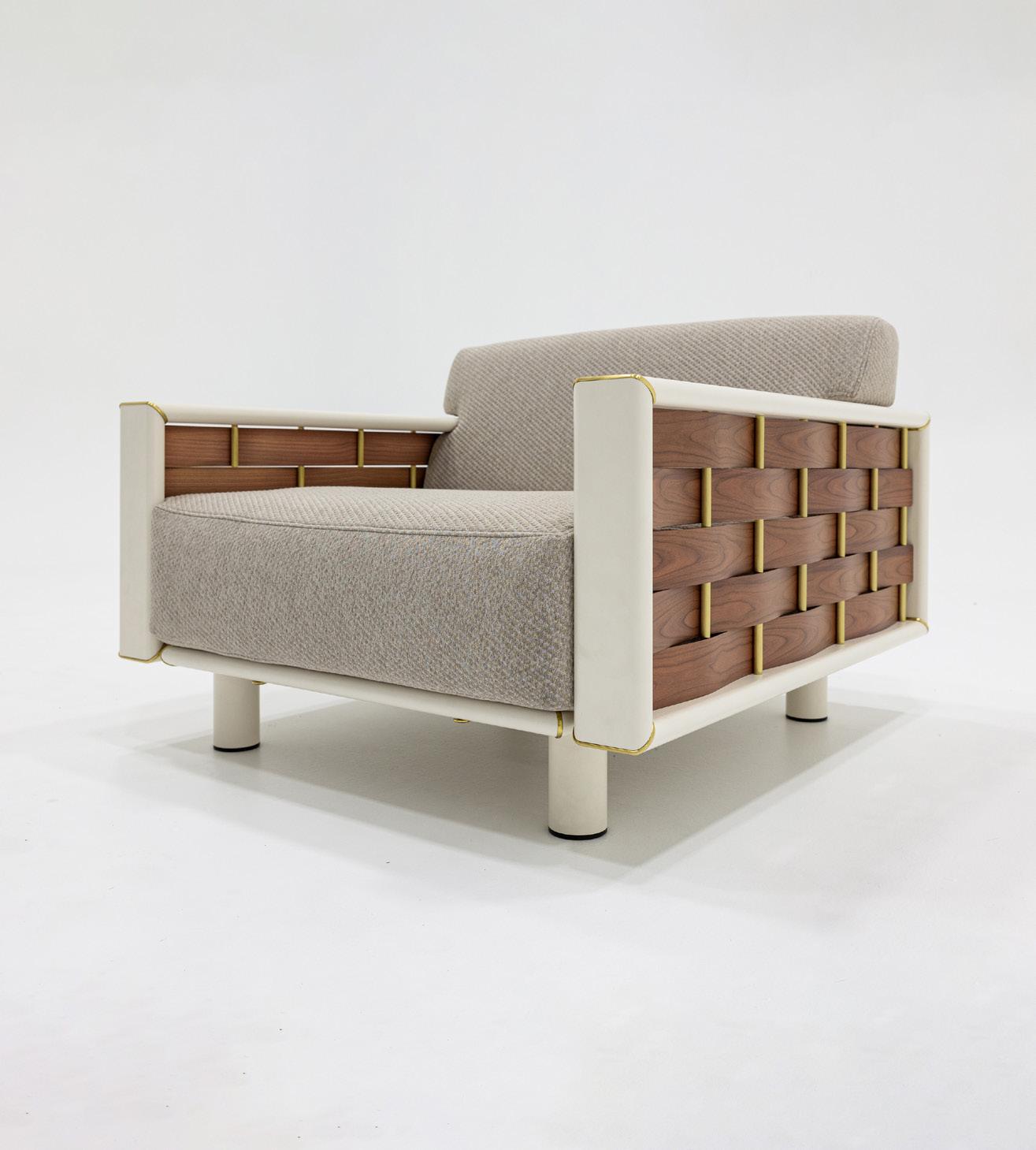
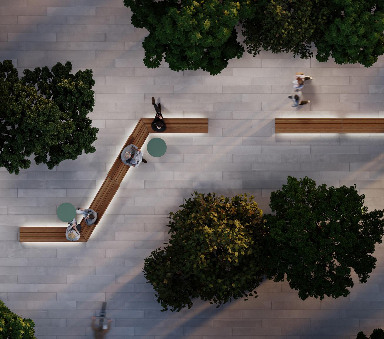
Outdoor furnishings create places for community and offer a sense of welcome. These selections focus on designs for more friendly and inclusive outdoor spaces. KP

Morse Dot | mmcité mmcite.com
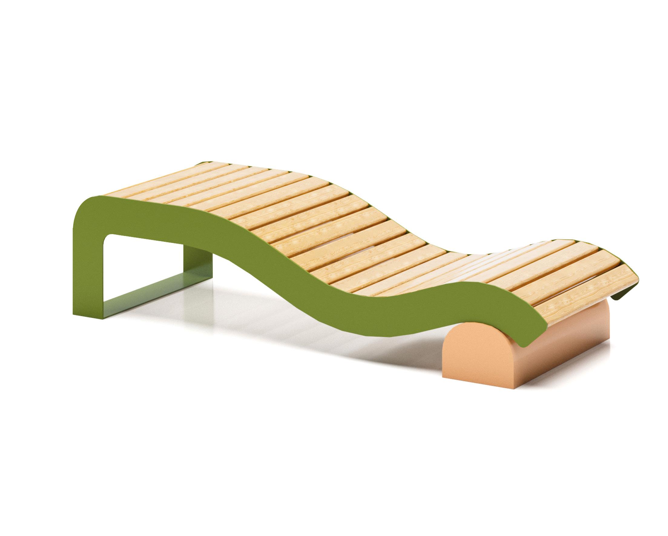
The Morse Collection expands with its newest member, Morse Dot, a single steel leg with a wood seat that acts as a backrest and table all in one. The Morse Dot adapts to the versatility of outdoor spaces, serving as an impromptu work meeting spot or a place to rest and people-watch.
Svall Bench | Nola nola.se
Designed from a child’s perspective by Matilda Lindstam, Svall is a whimsically contoured bench that offers different seating heights, a form inspired by the swirls and pastries.
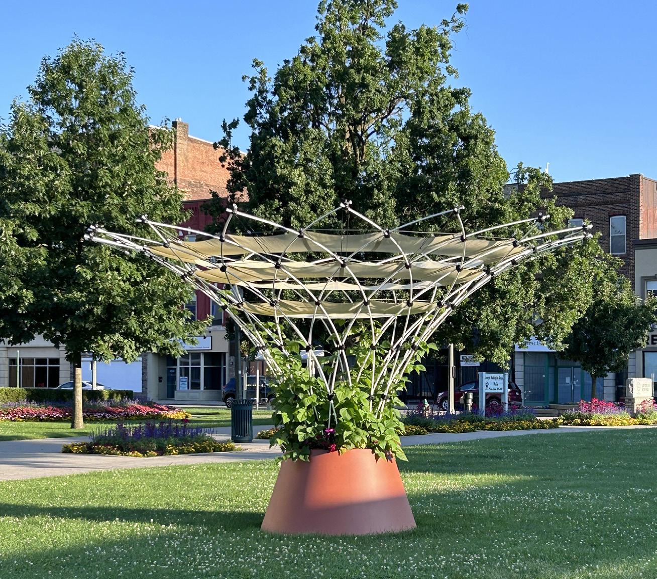

Weiss/Manfredi and Reed Hilderbrand find new solutions for old problems at Longwood Gardens’ West Conservatory.
Architect: Weiss/Manfredi Architects
Landscape architect: Reed Hilderbrand
Interior design: Weiss/Manfredi Architects
Structural engineering: MKA
MEPFP engineering: JB&B
Civil engineering: Pennoni
Lighting design: Tillotson Design Associates
Facade consultant: Front
Historic structures: John Milner Architects Glazing contractor: Roschmann
Glass: Glassbel
Doors: Dawson
Interior finishes: API Precast, Sun Precast, A&H Metals
Conservatories come in Crystal Palace and space frame forms, but they’ve never arrived quite like Weiss/Manfredi’s West Conservatory at Longwood Gardens. Located in Pennsylvania’s Brandywine Creek Valley, the 1,100-acre garden, once the estate of Pierre S. du Pont (heir and executive within that industrial empire), opened to the public in 1921 and has operated as a nonprofit since 1946. In the decades since, Longwood has enlisted a variety of top horticultural talents, from Thomas Church to Peter Shepheard and Roberto Burle Marx. Longwood boasts an edenic range of features, from an orangery to an Italian water garden to a 55-ton Aeolian organ, and it has now added possibly its most unique architectural feature.
The Gardens’ president and CEO, Paul B. Redman, had been acutely conscious that a prime spot next to the main conservatory was occupied by a “warren of old greenhouses,” largely fulfilling service functions, and led Longwood to find a better use for this space. An ensemble emerged through the joint efforts of Weiss/Manfredi and Reed Hilderbrand, centering on the new 32,000-foot Mediterraneanthemed conservatory. In an interview with the two founders of Weiss/Manfredi, Marion Weiss and Michael Manfredi, the designers displayed one of their earliest sketches, drawing upon “the crisp lines of the existing conservatories and the wandering geography of the hills.” Their aim was to “take those two geometries and weave them together.” And that’s what they did at the West Conservatory.
The conservatory follows the existing axis, but Manfredi explained that they “looked to nature to find the most fantastic structural opportunities.” Post-and-beam lintels have been supplanted by trunk-and-branch here, for example: The conservatory is supported by arboreal steel columns that twist in irregular
October/November 2024

patterns beneath a roof composed of four varieties of undulating surfaces. “The columns never curve where you expect them to,” Manfredi said. “Some of these columns overreach and take on more of the span and others take less of it.”
That’s not all that’s striking. Conservatories often aren’t remotely sustainable—artificial climates usually haven’t been climate friendly. Some of the easiest “green” design strategies also won’t work with greenhouse structures: Glazing and laminate glass solutions choke plants off from the sun. A turning point for the West Conservatory design was the realization that Longwood didn’t require a year-round hotbox. To meet both sustainability and programmatic goals, Weiss/ Manfredi set out to make a structure that functioned more like “the gills of a fish.”
Mediterranean plants can live relatively happily in most mid-Atlantic temperatures
(with some year-round adjustments for humidity, wind, and other factors). The only thing they flatly can’t survive is the northern winter. Weiss/ Manfredi took advantage of this climatic overlap to design a structure of remarkable permeability, with 424 louvered windows on the walls and roof. This allows the ambient outdoor temperature in for the spring, summer, and fall, but louvers can be closed to seal the conservatory upon the arrival of winter. Added roof shades serve as parasols or thermal blankets, depending on the season.
Another innovation implemented by the Weiss/Manfredi team was the form of the conservatory’s louvers. These fins are generally horizontal and can open at best halfway. Weiss explained, “Vertical shutters had never been done on anything like this scale.” These can open over 90 percent of their 10-foot length, enabling maximal airflow and providing a clear
view in all directions “instead of one broken down by a thousand mullions.”
Countless conservatories have a pool at the center, but Longwood’s has three islands at its heart, crisscrossed by canals. Kristin Frederickson, principal at Reed Hilderbrand, described this design as a “topographical move” designed to reflect the “inseparable relationship among stone, water, and plants” in the Mediterranean. (The conservatory includes plants from Mediterranean Köppen zones around the world, with several recent arrivals from Australia.)
The circulation system consists of stone pavers that “float above the planted plane.” The bodies of water then terrace down beneath the water’s surface, a step—or steps—inspired by legendary Mughal Gardens at Lutyens’s Rashtrapati Bhavan in New Delhi. These canals will feature water lilies and seasonal aquatic plants.
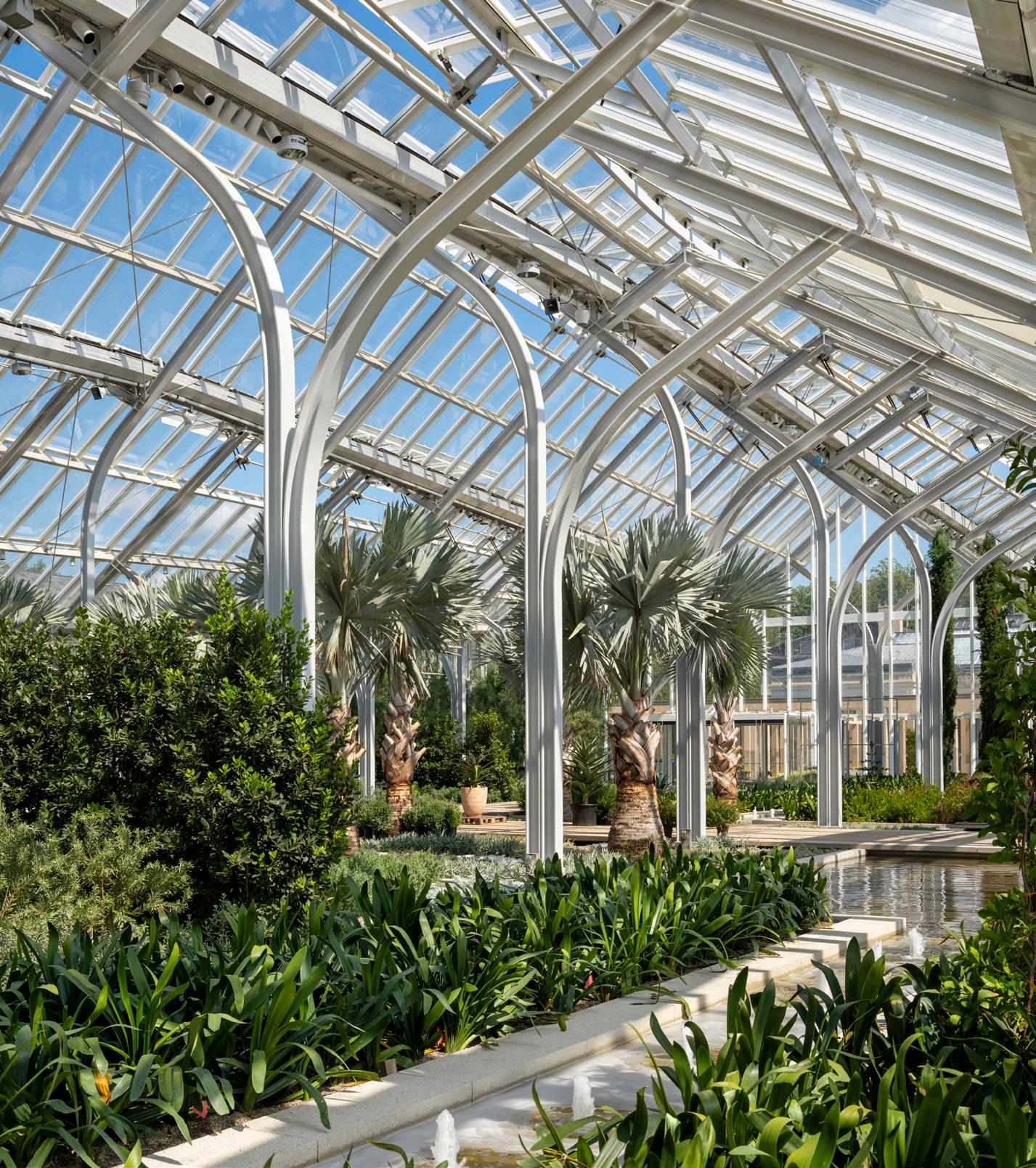

While conservatories often host revolving plants that rotate out when they aren’t at their most picturesque—runway models on occasional display—the West Conservatory’s planting scheme is a more permanent composition, with 85 percent of the items planted intended to remain there year-round. Redman explained that it was a work of “deliberate design and craftsmanship” for the long term. There will be greater improvisation in hanging and trellised items, but the arrangement is intended to last. Frederickson explained how Reed Hilderbrand achieved a balance between formality and informality, drawing upon both “orthogonal typologies” found in historic Italian and greater Mediterranean villa gardens. For this reason, the subsurface was all sorts of work. Weiss/Manfredi described it as the most complicated waterproofing the firm has ever done. This is all threaded around soil that is at

Opposite page: The interior of the West Conservatory feels like an archipelago, with islands of plantings floating on a series of canals.
Above, left: The plants in the conservatory are meant for long-term viewing and resist traditional approaches to rapid transition.
Above: Instead of a singular pool in the conservatory, Weiss/Manfredi designed the entire space to feel like a series of canals.
Left: A site plan describing the new West Conservatory’s location within the larger Longwood Gardens estate.
least 3 feet deep and conceals ventilation of an extremely responsible sort: 300-foot-long earth ducts absorb soil temperatures to cool the interior in summer months, and geothermal sources and the steam from an onsite plant provide heat in winter. All the water used in the conservatory is harvested on-site.
The new West Conservatory represents the jewel in Longwood’s crown of recent renovations and architectural additions. A new arcade, also by Weiss/Manfredi, rings Peter Shepheard’s 1989 Waterlily Court to the east and a new administrative building (also by the firm) and the Bonsai Courtyard border to the north. The composition terminates in a new vista to the west of uncoiffed meadows that were previously obstructed by working greenhouses.
Burle Marx’s 1993 Cascade Garden, his only extant project in the U.S., was also relocated as part of this greater investment at Longwood.
Sharon Loving, Longwood’s chief horticulture and facilities officer, recalled Burle Marx showing up to plan the spot and immediately forsaking his own planting plan to improvise from a buffet of plants the Gardens had provided from Brazil, California, and Florida. Loving described his process as akin to “painting with plants.”
The Cascade Garden was originally located in a constrained structure—Burle Marx’s Brazilian ebullience was cramped by a Victorian bustle. Plants too close to the walls suffered from both excess heat and frost, and a kapok tree grew gnarled and sideways against the ceiling. Manfredi explained that changing the structure much would be “presumptuous,” but the firm built a slightly taller and wider replacement to provide a more comfortable home for these plants. One hitch, Weiss explained, was keeping the Cascade Garden’s orientation to the sunlight and its configuration of topography
identical to Burle Marx’s original vision. Save for an existing pathway that was marginally regraded to achieve ADA compliance, all other elements and plants were dutifully catalogued for precise reassembly.
Weiss spent extensive time traveling and researching in preparation for the West Conservatory commission. She was “seeing beautiful conservatories and beautiful gardens, but one had the sense that these were collections of passionately fabricated things, one thing after another.” Weiss/Manfredi’s aim was harmony among these built elements to, as Weiss explained, make these “one thing because of the other.”
Whether beamers, bollards, or lamp-posts, the following light solutions prioritize lumen strength and distribution as well as charming, modern aesthetics. KP
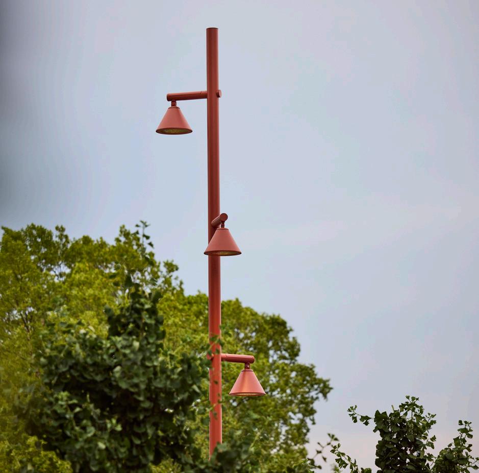
Moment Lighting | Landscape Forms landscapeforms.com
Characterized by straight lines, perfect circles, and conical shapes, this collection offers sleek, adaptable profiles. It’s available in different pole heights and mounting configurations, or hung and wall-mounted and with an optional hexcell louver to ensure precise illumination with minimal glare.
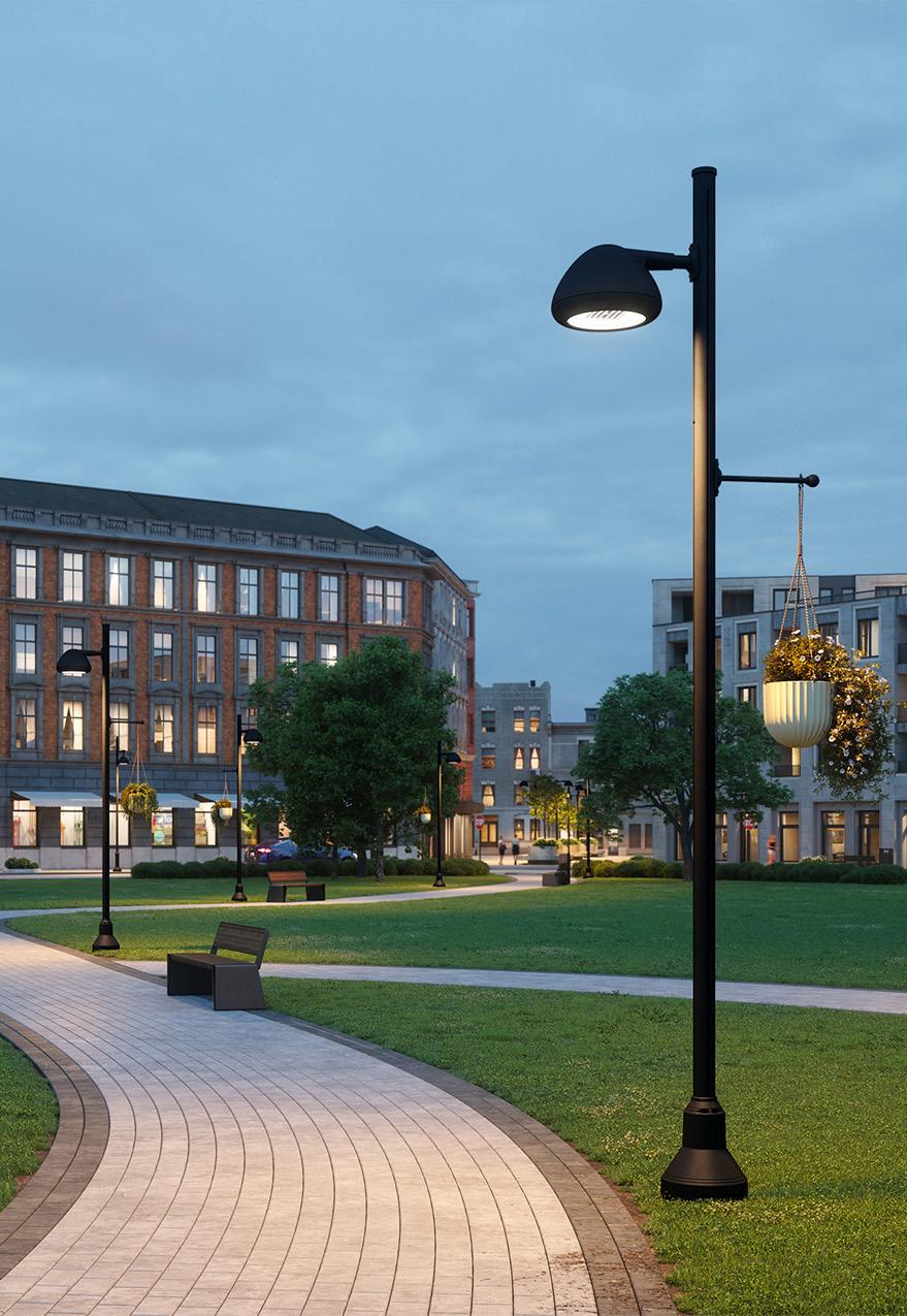

October/November 2024

Drawing from the silhouette of a glass diffuser, BIG designed Gople Outdoor as a cotton candy–colored family of lighting. Bollards, spots, and lanterns make up some of the line, each interpreting diffusers in different ways.

Beamer Contour Projector | ERCO erco.com
Available in a new large size, ERCO’s beamers provide precise and powerful lighting suitable for museum applications. The narrow, inconspicuous framing houses straight-edge projections to create exact framing, cutting down on light pollution.


The Indigenous arts organization’s land remediation project is about restoring the relationship between its site and history.

Driving up the steep gravel driveway at Forge Project—a nonprofit Indigenous arts initiative in Ancram, New York—first you see, then you hear, the landscape. In the late-summer sun, black-eyed Susans, shoulder-high goldenrods, and wispy native grasses appear to shimmer as they catch the light when the breeze ripples through. Open your car door and you hear the chirping of birds and buzzing of crickets, katydids, and bees.
Just a few years ago, the scenery at Forge was different: It was a neatly shorn lawn like you’d find in the suburbs. The ongoing transformation of that lawn into a biodiverse meadow is the result of Forge Project restoring the principles of Indigenous land stewardship to its 60-acre site. As beautiful as the meadow is today, aesthetics are secondary to the mission of the organization: Forge is committed to developing a mutually beneficial relationship between the land and the people who use it.
“This work is really meant to interrupt the ways that Western understandings
of conservation often still reproduce an extractive relationship with the land rather than Indigenous worldviews that understand our interdependence with it,” said Sarah Biscarra Dilley, director of Indigenous programs and relationality at Forge and a member of the Northern Chumash tribe.
Forge is located on the ancestral lands of the Stockbridge-Munsee Band of Mohican Indians, a tribe that lived there until the United States government forced them to relocate multiple times in the 17th and 18th centuries. Today, most people know the area as the Hudson Valley, one of the most influential regions in the United States with respect to instilling Eurocentric ideologies about land and landscape in the West. Here, artists like Thomas Cole, Frederic Church, and other Hudson River School painters portrayed sublime landscapes that romanticized myths about untouched wilderness and national expansion. Meanwhile, European settlers clearcut the region’s forests to supply timber and fuel and to make space for farming.
This history is expressly visible at Forge Project from the position of its headquarters—a residence that Ai Weiwei designed for an art collector in 2006. Most of the landscape around the house was either European lawn grass or hay (evidence of agriculture) with a few ornamental trees. Just beyond the home’s roughly 30-acre clearing is forest.
Earlier this year, Forge Project, which was founded in 2021, transitioned its leadership model to be Native-led, which included forming an Indigenous steering council and developing a memorandum of understanding with the Stockbridge-Munsee Tribal Council. The organization took a similar approach to its landscape. It developed a vision and goals document for the land remediation work in consultation with the Stockbridge-Munsee Tribal Council; Misty Cook, a member of the Stockbridge-Munsee tribe and herbalist; landscape architect Jamie Purinton; botanist Claudia Knab-Vispo; and meadow specialist Beth Romaker.
Biscarra Dilley explained that developing a process for managing the site was a structural response to the structural problem of colonization. While land acknowledgments reference the violence of colonialism, the reparative work Forge is doing is an example of what might come after.
“We’re building on a relational way of doing things, which is central to how we work,” Dilley said. “It’s understanding the land not as it has been conceptualized through settlement— something inanimate or somehow objectified— but understanding place as an interlocking and interdependent set of relations. We’re not just talking about the plants; we’re talking about all of the life that the land supports.”
It’s a metaphorical way of exploring what “land back” might look like. While the Stockbridge-Munsee have sought the return of their land, like at Monument Mountain, they have not requested the same of Forge Project’s site. But if they do, “we will have been stewarding the land in alignment as best we can with
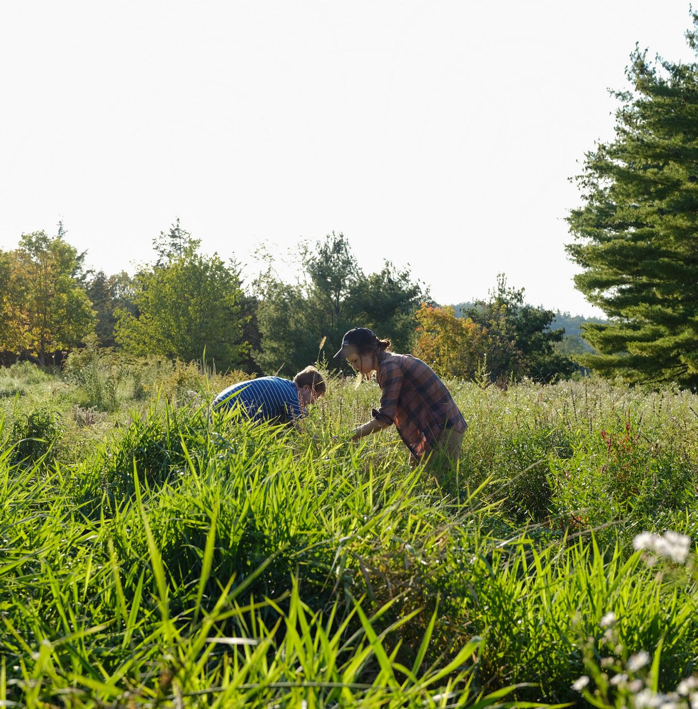

their protocols,” said Paloma Wake, strategy and operations manager at Forge. “So if it does come back to them, it’ll be in a better place.” Forge and the landscape designers mapped the landscape and took account of the plant communities in various zones. Then they thought about how native plants could be “invited” into the landscape—a term that comes up often when discussing Forge’s remediation work and speaks to the relational method of caring for the land. Cook’s 2013 book Medicine Generations influenced the plant mix. “We drew up this long list of plants that theoretically would be acceptable,” Knab-Vispo explained. “And then it was really a matter of looking at the site conditions and who would actually be happy there.”
Some areas, like the lawn, had no native plants, so the team decided to take a high-intervention approach to that area. This entailed the complete removal of all the grass (mostly Kentucky bluegrass, which is of European origin), tilling the soil, applying a horticultural vinegar, and reseeding it with a custom meadow
Opposite page: Land remediation work at Forge Project might look untouched, but it’s far from untended.
Clockwise from left: Volunteers work during the institution’s Meadow Work Days, a volunteer learns about a native plant species, Forge Project is notably home to Chinese artist Ai Weiwei’s sole work of architecture in the U.S., dramatic sunrises and sunsets make for spectacular performances over the hills.


mix. “The plants of European origin were a profound reminder of the hard and painful history of colonialism, so their removal felt like a significant act of reclamation as much as remediation,” Purinton said. For this reason, the landscape design team also decided to part with the ornamental weeping cherry trees and yellow magnolias that lined the driveway.
Other wetter, rockier parts of the site had more biodiversity. Here, the team opted to remove plants they didn’t want to see—like purple loosestrife and multiflora roses, species that grow aggressively and crowd out native ones— and nurture or add the varieties they wanted to see. There’s an understanding that even though some of the plants might not be native to the area, they are playing a role in the landscape. Small yellow trefoils, for example, act as nitrogen fixers. “Plants will grow where they’re needed, even if we’re not ready for them,” Wake explained.
Today, much of the removal process takes place slowly, by hand. It mostly happens during
Meadow Work Days, which Forge Project, KnabVispo, and Purinton lead. During these afternoons, volunteers come to help selectively remove discouraged plants. In exchange, they learn about the landscape. This type of relationship building is at the heart of the remediation work. “We’re learning alongside the land and inviting people into that process,” Wake said. Instead of putting culturally significant plants on display, like in a clearly labeled medicine garden, the Forge Project landscape encourages people to take the time to learn about them and add dimension to the richness they are experiencing.
While parts of the meadow might appear to be uncultivated by Western standards, it is still tended. If left alone, the surrounding forest would grow back into the cleared meadow. Part of the ground maintenance includes cutting back saplings that might crop up. But what exists now are more plants that help pollinators and reflect the culture at Forge Project. “I always like to point out that the term ‘restoration’ gets
used with different reference points,” KnabVispo shared. “At Forge Project, we don’t try to ‘restore’ an ecosystem that has never existed there before. We’re inviting more native plants back into the current landscape, which reflects centuries of European-style land use and—in some places—is dominated by European plants.” Forge is still experimenting with its model. It’s been a little over 18 months since it embarked on this remediation work, and as time goes on, the model will evolve as the organization learns and listens to what the land wants to do. As Biscarra Dilley reminds us, “The land has agency.”
Outdoor flooring is often at odds with nature, but manufacturers and landscape architects are devising new ways to adapt to water and other natural elements. KP

ORCA Brick Pavers | ORCA orcaliving.com
Landscape design and product studio ORCA created pavers made of local California clay and recycled concrete. They are permeable, encouraging regenerative water use and embracing the movement of the earth and its natural biorhythms.
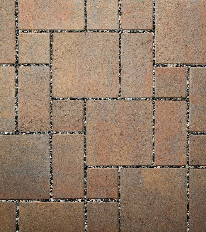
Aqualine Ashlar Permeable Pavers | Belgard belgard.com
ADA-compliant, durable, and low-maintenance, these pavers use a three-piece system with interlocking spacer bars for increased structural performance while keeping stormwater runoff and water quality in check. A smooth surface and a micro-chamfer minimize vibrations and increase wheelchair comfort.
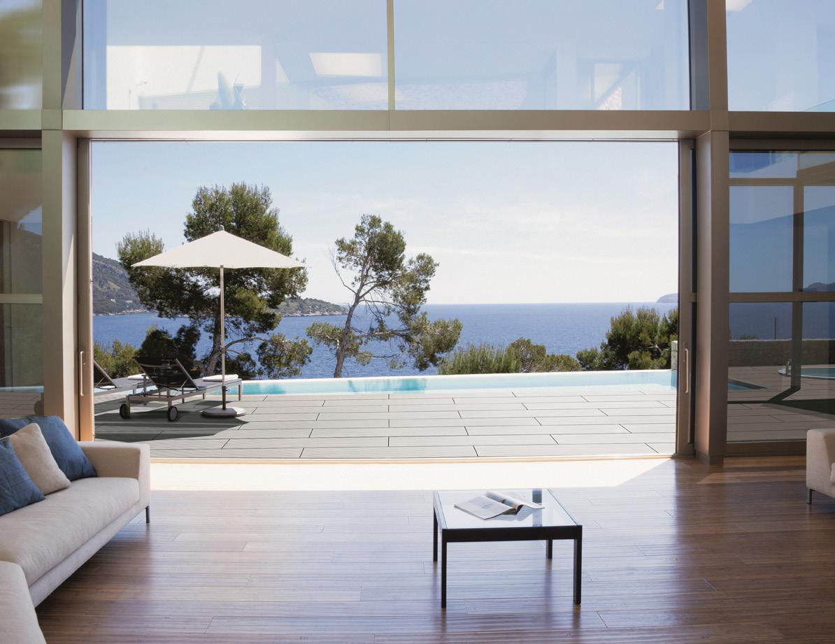


Tennessee Flagstone SlateFace | Hanover Architectural Products hanoverpavers.com
Tennessee Flagstone’s shifting tones and textured surface are fine-tuned to replicate stone. Its undulating top surface is made from sections of actual stone with a mix of solid and blended pieces to create visually engaging pavers.

Urbanscape Series | Glen-Gery glengery.com
These clay brick pavers offer a traditional look with resilience and easy maintenance in mind. The new line takes after urban landscapes, and as such, it is available in a range of earthy and neutral tones.
October/November 2024
CERPIANO+ | Shildan shildan.com
CERPIANO+ is a terra-cotta raised deck system available in four colors and a grooved or smooth finish. Made with all natural materials, the decking is UV- and frost-resistant, easy to install, and features customizable sizes to adapt to any project.
Level.Up Adjustable Deck Pedestal Joist Support System | Bison Innovative Products bisonip.com
Eliminating the need to dig, level the ground, or demolish existing flooring, this system from Bison is an efficient deck builder, compatible with pressure-treated lumber or composite deck boards. The system includes telescoping adjustable pedestals that compensate up to 8 percent ground slope and can hold up to 750 pounds per pedestal.

EcoTerra | Unilock commercial.unilock.com
Offsetting 27 trees for every 1,000 square feet of pavement, EcoTerra is a 100 percent facemix without the use of cement or efflorescence. Not only is it less carbon intensive, it also features high compressive strength and low water absorption.
This listing combines companies specified in case studies, product highlights from our Design Editor Kelly Pau, and additional recommendations, all in one place.
3form 3-form.com
Amop grupoamop.com
Andreu World andreuworld.com
Bludot bludot.com
Bosquet bosquet.us
Carl Hansen carlhansen.com
Cassina cassina.com
Dedon dedon.de
Desalto desalto.it
Durbanis durbanis.com
Emeco emeco.net
Extremis extremis.com
Fermob fermob.com
FORMS + SURFACES forms-surfaces.com
Fritz Hansen fritzhansen.com
Heller hellerfurniture.com
Landscape Forms landscapeforms.com
Loll Designs lolldesigns.com
Maglin Site Furniture maglin.com
Metalco metalco.it
MDT-Tex mdt-tex.com
miramondo miramondo.com
mmcité mmcite.com/us
Pavilion Furniture pavilion-furniture.com
Poliform poliform.it
Renson renson.net
Rimadesio rimadesio.it
Santa & Cole santacole.com
Serge Ferrari sergeferrari.com
Streetlife streetlife.nl
Tucci tucci.com
Vaarnii vaarnii.com
Vestre vestre.com/us
Vondom vondom.com
Acuity Brands acuitybrands.com
Amerlux amerlux.com
Artemide artemide.com
BK Lighting bklighting.com
Cyclone cyclonelighting.com
Diabla diablaoutdoor.com
ERCO erco.com
Flos flos.com
Lebello lebello.com
L’Observatoire lobsintl.com
Luminii luminii.com
Luminis Lighting luminis.com
PritchardPeck Lighting pritchardpeck.com
RBW Lighting rbw.com
Selux selux.us
Stickbulb stickbulb.com
Tala tala.co
Vibia vibia.com
de Sede desede.ch
Designtex designtex.com
Fabricut fabricut.com
HBF hbf.com
Kravet kravet.com
Kvadrat kvadrat.dk
Link Outdoor linkoutdoor.com
Maharam maharam.com
Momentum Textiles momentumtextilesandwalls .com
Sunbrella sunbrella.com
Vanderhurd vanderhurd.com
ABC Stone abcworldwidestone.com
Alaplana Ceramica nuevaalaplana.es
Artistic Tile artistictile.com
Belgard belgard.com
Bison IP bisonip.com
Caesarstone caesarstoneus.com
Clean Scapes cleanscapes.net
Florim florim.com
Glen-Gary glengery.com
Greenmood greenmood.us Greenscreen greenscreen.com
Hanover Architectural Products hanoverpavers.com
Invisible Structures invisiblestructures.com
Keystone Hardscapes keystonehardscapes.com
La Nova Tile lanovatile.com
LiLi Tile lilitile.com
Marble Systems marblesystems.com
Matter Surfaces mattersurfaces.com
Millboard millboard.com
Nicolock nicolock.com
ORCA orcaliving.com
Parasoleil parasoleil.com
Pioneer Landscape pioneerco.com
Shildan shildan.com
Tournesol Siteworks tournesol.com
Trueform Concrete trueformconcrete.com
Unilock unilock.com
Wausau wausautile.com


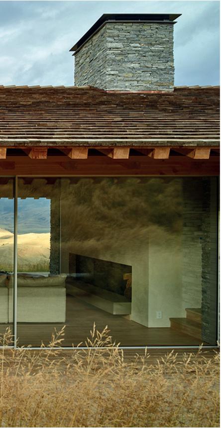


For 20+ years, The Architect’s Newspaper has delivered the news, features, case studies, and reviews that have powered architecture culture in North America. Consider a paid subscription to help support independent journalism about the built environment, or claim your free subscription today if you’re a registered architect, engineer, or landscape architect.
Subscribe today and join the conversation.
Virginia Hanusik
Columbia Books on Architecture and the City
$28
I had lived in New Orleans for five weeks when Hurricane Ida hit. I was lucky enough to evacuate to a friend’s house in Houston, where my wife and I stayed until the power in our neighborhood came back on. At that time, much of south Louisiana was still without electricity. Traffic was heavy on the drive back from Houston, and by the time we approached New Orleans on I-10, it was pitch black, the darkness unbroken by house or street lights. Until, that is, the sky was lit bright orange by flares from the refineries that line the Mississippi River between Baton Rouge and New Orleans. We now know that the electrical outage meant that the refineries were flaring improperly, spewing even more toxins than they are legally allowed to into the night sky. The apocalyptic light of those post-Ida refineries made for a spectacular image of environmental injustice.
Virginia Hanusik’s new photo book, Into the Quiet and the Light: Water, Life, and Land Loss in South Louisiana, aims to divert our attention from such spectacle to the everyday impacts of climate crisis. Over the last decade, Hanusik’s photographs of South Louisiana have been featured in magazines like The New Yorker , exhibited across the country, and gained her a following on X. In her book, signs crop up over and over. They read, “Warning/Do Not Anchor or Dredge/Crude Oil Pipeline”; “Welcome/You Have Reached the Southernmost Point in Louisiana/Gateway to the Gulf”; “Century 21/Action Realty, Inc.”; “Leave Sand on Lot”; and “Growing Louisiana Together/#MakeTheFuture,” with a Shell Oil logo. These everyday signs mark places, boundaries, and transactions, but they also tell stories of persistence, evacuation, destruction, exploration, extraction, and exploitation.
Hanusik’s book aims to show what literary scholar Rob Nixon calls the “slow violence” of climate change, the “chasm that divides those who can act with impunity and those who have no choice but to inhabit intimately, over the long term, the physical and environmental fallout.” Unlike interpersonal or military violence, slow violence is often invisible, and Nixon poses how depicting it can save the world. No pressure. In the introductory essay to Into the Quiet and the Light, Hanusik positions her own work similarly: “advocating for the value of a place that is often seen by the rest of the country as a sacrificial climate buffer zone.” Making South Louisiana visible, she posits, will push us to take this place, and the havoc climate change is wreaking on it, seriously.
Much of Hanusik’s oeuvre is spectacular. There are pink and orange sunsets over Lake Pontchartrain, palmetto palms in early-morning fog, narrow strips of swamp against the silvery blue vastness of the Gulf. But the photographs chosen for Into the Quiet and the Light admirably support her foregrounding of the everyday. They show landscapes that interweave the human and the nonhuman: Lake Maurepas with a crumbling pier; a tarp-covered A-frame roof; the moon rising over the Lake Borgne Surge Barrier. Most notably, they are printed in black and white. This desaturation stops viewers


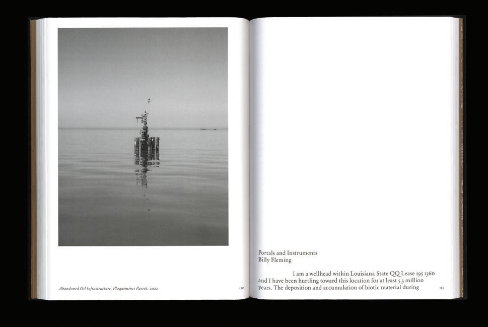


from either basking in the glow of expected beauty or crying out in horror at the sublime destruction of, say, Edward Burtynsky’s immense oil fields and Blade Runner –orange mine tailings. Instead, it invites us to look more closely and ask ourselves what stories these places tell, whose lives are intertwined with them, and what their future will be.
Hanusik’s essay directly addresses one of my discomforts with her photographs: If she aims to refocus from grand images to everyday life, why are there no people in her photographs? She argues that “the built form holds collective memory, that it often has more power to describe how we view the land and each other than portraiture can.” In support of this argument, a footnote cites Colorado photographer Robert Adams to the effect that, while he was photographing, his questions about landscape survival often “fell away into the quiet and the light.” The quote gives Hanusik’s book its title. I’m not convinced, though. What Adams describes is a flow state of artistic work, and he implies that his immediate experience supersedes his intellectual questioning. But this immediacy is precisely what Hanusik aims to avoid or, at least, move beyond. Built form can hold collective memory, yes, but it is always at one remove from individuals. Hanusik’s elegant portrait photographs from other publications clearly show that she can avoid her subjects becoming mere extras in a disaster story, and I think such photographs would have fit this book well. That said, her wonderful photography of South Louisiana’s architecture, much of it raised high above ground (and hopefully water) level, deserves a book of its own.
Into the Quiet and the Light deviates from the standard monograph that presents one artist, with at most a few laudatory essays from critics. Instead, it is like an episode of Greek tragedy, one in which the character (Hanusik) interacts with a chorus of other voices. Photographs alternate with brief essays by activists Imani Jacqueline Brown, Jessica Dandridge, and Michael Esealuka; writers and educators Billy Fleming and Andy Horowitz; and designers such as Kate Orff and Jonathan Tate. This move is central to the book’s success. Only a few essays engage with Hanusik’s photographs, and each of them could stand alone with its discussion of South Louisiana, climate change, and/or landscape representation. Word and image complement each other, and the book’s small format makes it easy to hold and read. Although it is beautifully made—don’t miss the endpapers, which are based on Louis Fink’s famous meander map of the Mississippi—this is as far as a photo book can get from belonging on the coffee table. Into the Quiet and the Light argues that art can only depict slow violence and serve political change if it can be in dialogue with other fields. It makes two valuable contributions: first, giving us Hanusik’s photographs at their least spectacular and most laconic and, second, modeling a collaborative and place-specific approach to depicting climate change.
The annual Top 50 list recognizes the best interior architects practicing today.
AN Interior Magazine Fall/Winter 2024
aninteriormag.com @aninteriormag
A region-specific product library that organizes all the products and services you need to know—and spec. Facades | Interiors | Tech | Building Products library.archpaper.com
Regional Providers Innovative Products Green Building
Bringing experts together to discuss the challenges and opportunities facing the AEC Industry.
Webinars Roundtables Case Studies
tradingnotes.archpaper.com
The industry-leading high performance facades conference with national coverage.
Austin Oct 31, 24
Los Angeles Nov 7+8, 24
Seattle Dec 5, 24
San Francisco Jan 23, 25
Ft. Lauderdale Feb 4, 25
facadesplus.com @facadesplus.com
Celebrating firms across the AEC industry with outstanding studio culture.
Launches January 2025
archpaperawards.com
Continuing education platform presented by AEC industry leaders. Learn anytime, anywhere.
Webinars Virtual Events White Papers
cestrong.com
Gathering stories for the best in outdoor and landscape design.
Virtual Events Weekly Newsletter Print Features C|E Strong Webinars outdoorspaces.archpaper.com
Showcasing the best design showrooms in NYC and LA.
NYC - May 2025
LA - June 2025
NYC - October 2025
Pushing the theory and practice of adaptive reuse and sustainable design.
Virtual Event
December 18, 2024
Rethink the Built Environment events.archpaper.com/renew24
Photographs by Iwan Baan with contributions by Lindsay Harris, Izzy Kornblatt, and Ryan Scavnicky Lars Müller Publishers
$53
I have yet to make a pilgrimage to The Sphere, but I think about it more than I’d like to admit, searching for tickets to see Dead & Company under its dome of high-resolution screens or doling out Instagram likes to friends who road-tripped east on Interstate 15 in search of immersive communion. As Las Vegas’s newest attraction, The Sphere opened in 2023, but the values it embodies were there all along. These are captured in the latest photo book from Iwan Baan, Rome – Las Vegas: Bread and Circuses: desire, spectacle, the “horror” of global tourism, as contributing essayist Ryan Scavnicky puts it after Nikola Tesla. For all the earthly talk of showgirls and slot machines, fear and loathing, ducks and decorated sheds, Sin City is a place of passion and transcendence: a truth closer to godliness than devilish temptation.
People yearn for transformation, to be connected to something greater than themselves. Which is why Baan’s photographs of the people and architecture of Vegas pair so seamlessly with his images of Rome, taken during a sunbaked heatwave in 2022.
Baan articulates urbanism at two scales. In claustrophobic compositions, his street photography captures the alienation of the Grand Tour. E. M. Forster once described the ever-itinerant plight of the early-20th-century tourist, a description that still applies more than 100 years later. “[They are] handed about like a parcel of goods from Venice to Florence, from Florence to Rome, living herded together in pensions or hotels, quite unconscious of anything that is outside Baedeker, their one anxiety to get ‘done’ or ‘through’ and go on somewhere else.”
Within this murmuration, Baan freezes moments of exhaustion or disorientation in the search for togetherness. One image, taken at the Trevi Fountain, is devoid of middle ground. A trio of young women with punkish buzz cuts stand in the center frame amid a press of bodies. Only one looks toward the swirling stone of the baroque fountain. In number and placement, these figures mirror the statues: Oceanus presiding, flanked by Abundance and Salubritas.
By contrast, Baan’s aerial views—more imperial than omniscient—display the urban fabric writ large and sprawling, with grids extending past the edges of the full-bleed page. Over nearly two decades of practice, this particular helicopter angle has become this Dutch photographer’s de facto signature. There are sections in Rome – Las Vegas that rely too heavily on this godlike point of view and could use a tighter edit. Do we really need so many spreads of the incursion of Vegas suburbia on the landscape? Then again, maybe that’s the point: It keeps growing.
Instigated by an invitation by the American Academy in Rome to mount the exhibition From Las Vegas to Rome, this book attempts a dialogue not only between two cities but between itself and Learning from Las Vegas (LFLV), which celebrated its 50-year anniversary in 2022. Lindsay Harris, the academy’s interim Andrew Heiskell Arts Director, reproduces Robert Venturi, Denise Scott Brown, and Steven Izenour’s famous simile in her introductory essay: “Las Vegas is to the Strip what Rome is to the Piazza.”
Opening spreads echo the parallel construction of this phrase: the ruins of the Roman Forum on the left-hand page, the Colosseum Theater at Caesars Palace on the opposite. Seen from the air, Piazza Navona’s oblong splendor is darkened by late-afternoon shade, and Vegas’s once-seedy old town is covered by the canopy of Jon Jerde’s Fremont Street Experience. There’s a wit and delicacy in these early diptychs, and the dedication to a binary dialogic is reflected even in the paper choice,
which is glossy on one side and matte on the other. Las Vegas, of course, gets the slicker surface, while rough aligns with the Eternal City’s innate tactility.
While bridging the geographic divide between the Nevada desert and the Italian capital via the labors of a nomadic photographer (who was in residence at the academy at the time) feels natural, spanning the temporal and intellectual distance to LFLV is, ultimately, more difficult. Harris suggests Scott Brown’s photographic oeuvre as a precedent, a keen-eyed body of work often focused on the collapsing of signage and urban space. Baan’s images of The Sphere set within Vegas’s everyday banality lovingly echo her groundbreaking work. (He also made a pilgrimage of his own to visit Scott Brown at home, which is recounted by Izzy Kornblatt in the volume.) Where LFLV so iconically celebrates the roadside TANYA billboard, Rome – Las Vegas catches a Sphere-sized emoji giving side-eye.
Baan has Vegas covered, but Rome evokes a different book, Complexity and Contradiction, which is packed with analysis of Roman structures, many illustrated by Venturi’s black-andwhite photographs—perhaps taken during his own time as a fellow at the academy. In a note for the 1977 second edition, Venturi expressed a wish that his title be amended to include “in Architectural Form.” Like the head and tail of a silver dollar
deposited in a slot machine, form complements LFLV’s focus on symbolism.
Baan, whose images definitively catalog contemporary architecture, is an expert in photographing form (even when decorated in kitsch). His Pantheon series depicts the bulbous dome sticking out from the urban fabric, white and round. Baan zooms in on the proto-Sphere, moving from Nolli map aerial to wilted tourists perched on its steps with Powers of Ten skill. But once he’s inside the church, his camera angle changes and turns upward toward the coffered dome.
Photographers could be thought of as liminal beings—creatures behind the lens, not in front of it; observers of the city, not participants, and certainly not tourists seeking snapshots. Yet, in gazing up at the Parthenon’s great oculus, Baan falls under the building’s ancient sway and takes the same picture as the rest of us sightseers. And in this act, there’s communion.
Mimi Zeiger is a Los Angeles–based critic and curator.
Below: Las Vegas’s Sphere overwhelms the landscape.
Bottom: A Baan signature aerial view of Rome.




With Joyspace, Adam Rolston delivers an aesthetic manifesto for today’s hyper-referential world.

Joyspace is a new book by Adam Rolston. His ambitious text, in part a response to Rem Koolhaas’s 2002 essay “Junkspace,” surveys modernism’s discontents, contemporary media addictions, and the dissolution of the binary fields of architecture and interior design. The two sections below bookend the publication: After quite literally asking “How did we get here?” Rolston provides expert answers before filing a final chapter that illuminates how Joyspace is resistance.
I Like Therefore I Am (Disrupting Forces)
I have been up all night with my smartphone gleaming on my face, casting inverted, gravity-defying shadows on the walls. I am as bright as the dopamine rushing through my synapses. I have been wrapped in the limits of logic, posting feverishly to the ends of the Earth, connecting across space with time-bending speed, love, and endless hope for a blindingly bright and beautiful future.
Social media is the end of authorship again. Authorship is dead—long live authorship. On the superhighway of digital image exchange, there is no speed limit. Every pixel is curated, edited, and thrust forth in an endless visual thirst trap. Online, there is an unceasing tsunami of taste. An arms race of the aesthetic is on. A global feedback loop has created subculturally defined communities. We all look at and like images in a self-affirming orgy of autonomic admiration. It is a searchable firehose of beauty. Here, the spectator and the maker alike circulate art, architecture, and design in an infinite stream. Everybody is an author, and nobody is an author in a flood of influence. A tidal wave of ideas is up for grabs. Ideas that exist before we have them. Virtual spaces. Buildings of the mind. Unimagined art and artifice. All these ideas belong to all of us and no one.
In the future, everyone will be famous for a fraction of a second. Taste is in the eye of each community of beholders. The consensus of aesthetic opinion is roadkill on the virtual asphalt of the internet. We have never been more connected and self-sorted into cul-de-sacs of aesthetic affinity that we define and are defined by. In the future, innovation will only be situational. We will have a global view but create locally. We will ride the wave of ideas and images across the planet but surf it home. I like; therefore, I am.
A wormhole in your pocket collapses and warps all time, place, and history. There is no now or later, nor here or there.
Past and present have been bent upon themselves. We live in a world where binary code has made the collapse of ridged binaries possible.
We live in a fourth dimension with almost all of human history, culture, and fantasy available in the palm of our hands. Our smartphones are a prosthetic memory palace that contains and spreads our histories and dreams infectiously across a planet of cultures to be consumed, sampled, absorbed, reconfigured, and reincorporated into a global creative production that reaches ever more deeply into our collective unconscious. It is a glorious, unstoppable wave of imagination.
Like a fever dream, the twenty-four/seven digital image distribution of imagined and in- real-life architecture and design has distorted the field of play. Buildings have begun to look like renders. Renders are indistinguishable from real-life objects. The design of an interior in Bahrain shared on social media can influence one in Baltimore in real- time. Intellectual property in the designed and built environment has become risible in the context of digital all-access. Social media and digital collaborative tools are transforming how we work and create with yesterday’s top-down strategy of aesthetic leadership, giving way to new forms of collective creativity. A new networked model of the twenty-first century has replaced the hierarchical, linear, siloed, industrial production model of the nineteenth. AI has changed the game. Our creative cultures are shifting. Disruption is the zeitgeist. Do we need to rethink our definitions of value in the built environment? How is the role of the architect and designer changing in this new, radically different context, and how did we get here?
Joyspace (Possible Futures)
Aesthetics are the new non-planimetric nationalism. We love to murder to dissect. In a blink, we unconsciously divide our world into tribes within tribes. Today, form follows habitus. Taste is the new world order. Our habitus is the passport to territories of enfranchisement. We wear our boarding passes on our backs. We fashion fashion to communicate access and belonging. We journey to Joyspace. We congregate in places that reflect our inner selves. Joyspace brings us together. Creative selfhood is the vaccine for the ubiquity of the techno-capital pandemic of sameness. Joyspace is the immune system of subcultural coherence. A radical disruption in the fabric of dominance has emerged. Joyspace is resistance. Joyspace is time travel. Joyspace is polymorphous.
Positive space is the new negative space. We dream ourselves into the spatial languages of the unconscious. Hyper-referential, self-constituting physical and virtual environments manifest ideas about ourselves materially. Joyspace is a field of thought and action. I occupy Joyspace; therefore, I am.
Joyspace is the libidinal weaponization of habitus against the corporate war on humanness. It is the erotic iron dome that defends against the monetization of desire. It is impossible to bomb Joyspace out of existence. It is noncontiguous, transferable, and peripatetic. We move between our social territories, inhabiting culturally defined spatial configurations born of our collective unconscious. Search engines connect us globally in a strategic network of spaces, places, signs, and symbols. We find each other through form. We see ourselves through symbols. Our bodies are a battleground. Our spaces are our ramparts. Joyspaces are the SPF that protects us from the monetization of our corporal habitus, our bodies, and ourselves.
The exponential explosion of taxonomies of beauty is rendering the corporate anatomical averages of Kim Kardashian, Taylor Swift, and Beyoncé Knowles meaningless. In the future, plastic surgery, Ozempic, collagen injections, wrinkle cream, and liposuction will be the stuff of art, not artifice. The corporate conversion loop that transforms economic capital into symbolic capital via the invasive processing of physical appearance will be rendered impotent. We will craft our corporal image out of joy, not transactional necessity. When all bodies have secular worth, the religious financialization of singular physical value definitions will lose meaning. When all bodies are a Joyspace, no bodies are an ideal. In Joyspace, our bodies are a playground.
Junkspace is what happens when Modernism loses its mission, when negative space becomes a negation. Modernism without joy is a skinned rabbit walking—a Lagomorpha emperor without clothes. Joyspace is the proprioceptive skin animated by the internal organs and the muscular, skeletal, and nervous systems of HVAC, concrete, steel, conduit, fiber-optic cable, and insulation of the endless global built environment—the invasive species of Modernism withers and retreats
when Joyspace provides life, coherence, and form. The corporate, scientific, and data-driven guts of techno-capital’s planetary construction infrastructure, immunized by Joyspace, become the lifeblood of cultural coherence. Wherever there is air-conditioning, Joyspace can grow. There is a contest for the survival of the fittest among a spectrum of agents, from the ad hoc habitus of vernacular Joyspace to the monetized anti-Joyspace of the techno-capital network. Anti Joyspace cannot metastasize where Joyspace flourishes. Joyspace gives. Junkspace taketh away.
Joyspace is in the liminal architectures of everyday life, like a colorful blanket spread out for a picnic, a child’s pillow fort, a hot dog cart, a street fair tent festooned with catenary lights, a chuppah swathed with flowers, a stage set on Broadway, a decorated food truck, the lost graffiti-covered 5 Pointz building of Queens, a Burning Man structure, Fusterlandia in Havana, Ferdinand Cheval’s Le Palais Idéal, Freetown Christiania, or any other place where human joy and self-expression collide with public space.
Empathy is the scalpel that sculpts the architecture of the body politic. Today, designers are Bordieusians. Joyspace is the surgical manifestation of physical habitus, “a subjective but not individual system of internalized structures, schemes of perception, conception, and action common to all members of” a tribe. There are over six thousand languages spoken on this planet. At least as many nonverbal, visual, symbolic frameworks expressive of specific cultural subject positions exist and are evolving worldwide right now. Designers of Joyspace are aesthetic polyglots. They are conjurers of symbols, close-readers of desire, and translators of positive space. Joyspace is always negotiated with its creators, patrons, and audience regarding the past, present, and future. It is a battleground that wins an audience only through representation. There is a new ambition to connect and negotiate across cultures. An aesthetic xenophilia that is open, global, and polyvalent has emerged. Emotion is now a bona fide source of aesthetic inspiration and a functional requirement. Form now follows feeling. Joyspaces emphasize awe and wonder, especially concerning new aesthetic categories of the natural and human-made sublime. The aestheticism of Joyspace differs from its romantic predecessors because it does not relegate formalism (or form) to a secondary status but mobilizes it as the foundation of more robust, muscular, visually symbolic languages that would be impoverished without it. Here, architecture and design are approached as neither pure sculpture nor pure scenography but rather in a liminal space that can synthesize the two. Designers are now empaths and forensicists, close-reading audiences as the stuff of aesthetic drivers, both form-giving and symbol-generating.
The aesthetic pendulum swing that now travels globally at the speed of light has fostered partisan globophobia and its kinder sibling globaphilia. Petulant, fragile aesthetic xenophobia mirrors its opposite, exuberant libidinal xenophilia. This race to the extremes of isolationism and multiculturalism reflects the disruptive rush of global connectedness. But, a new nonbinary approach has emerged that fosters nuanced respect for ever-evolving cultural specificity and the hybridity born of all access. In these new ecosystems, some aesthetic species or languages flourish, some are lost, and new species are created daily in a libidinal mating of ideas flowing across the planet at previously unfathomable speeds; creating Joyspace everywhere, these ecosystems infectiously spread. Joy will out. Us is more.
I’ve seen things I couldn’t believe: metal turned to stone spinning in the Bahraini sun, a flying dome evaporating into a grass field off the coast of Alqueva Lake. I’ve seen phantoms from marginalized pasts made material in Covent Garden. All those moments across the multiverse will be captured forever in code-like tears of joy in an endless ocean of data. We are riding a swell on the outside break mid-journey toward a post-xenophobic drop where no universalisms will be needed. The craving for humanity, significance, and coherence will drive deep situational action to create architectures that are the stuff of power, poetry, symbol, and transformation. We are balancing on the crest of a bright, beautiful binary wave. We cut a line once again into a brave new nonbinary future.
Joyspace is published by Pacific Books and was released on October 1. The title is the inaugural publication in the Pacific Design Series and is available on pacificpacific.pub.
Adam Rolston, senior founding partner of INC Architecture & Design, has been shaping the built environment for over three decades. Raised in Los Angeles and educated in Connecticut, New York, and Florence, Rolston has lived and worked in Asia, Europe, and the United States.
Size & Color: 4” x 4”, 4” x 8”, 8” x 8”, GCB91004

Developed as an alternative to granite, the NEW Hanover® Cobble Prest® Brick features an undulated surface with irregular edges to imitate split-top granite cobbles. When installed in the proper patterns to achieve interlock, vehicular traffic can be accommodated. They’re available in Hanover’s full range of over 3,800 granite-like colors.


