INTRODUCING THE VIRACON IDENTIFICATION NUMBER (VIN):


INTRODUCING THE VIRACON IDENTIFICATION NUMBER (VIN):
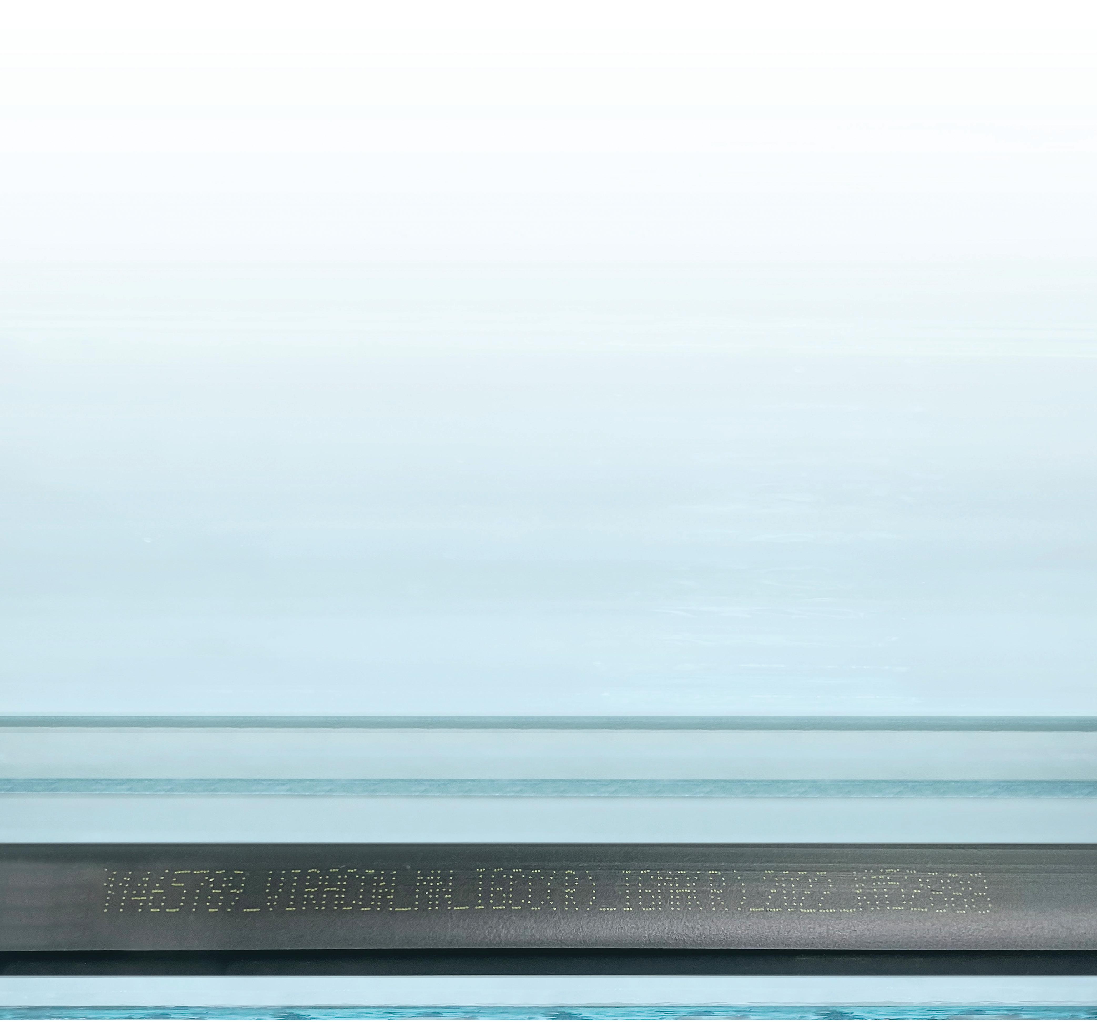
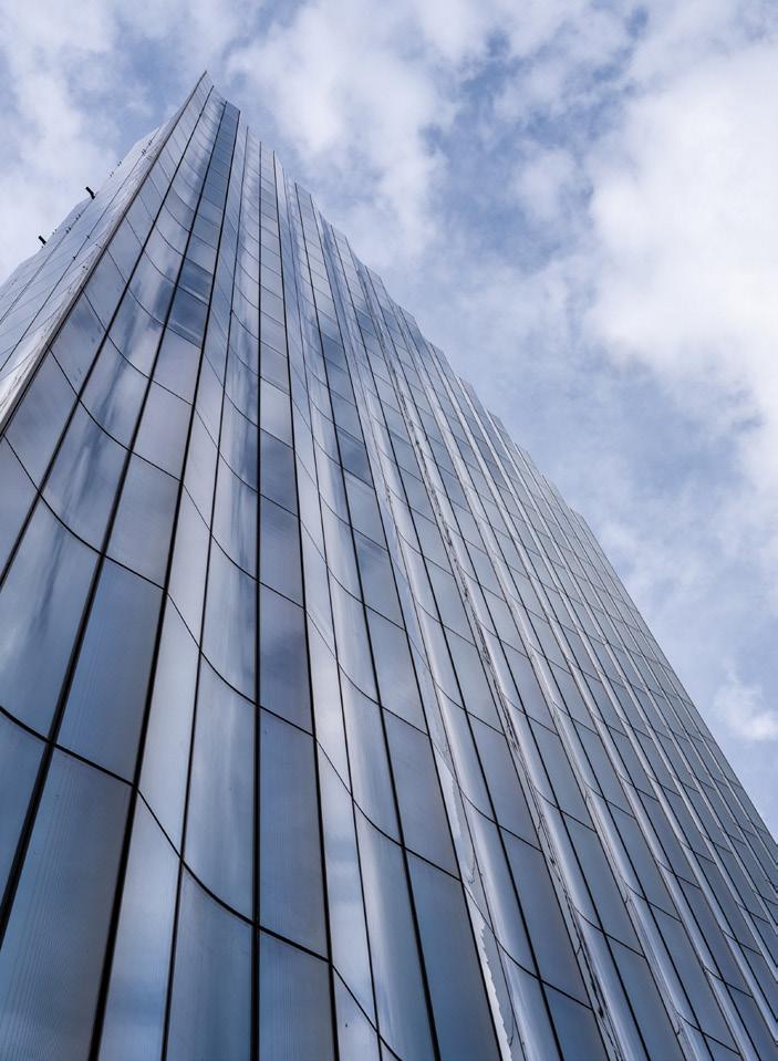
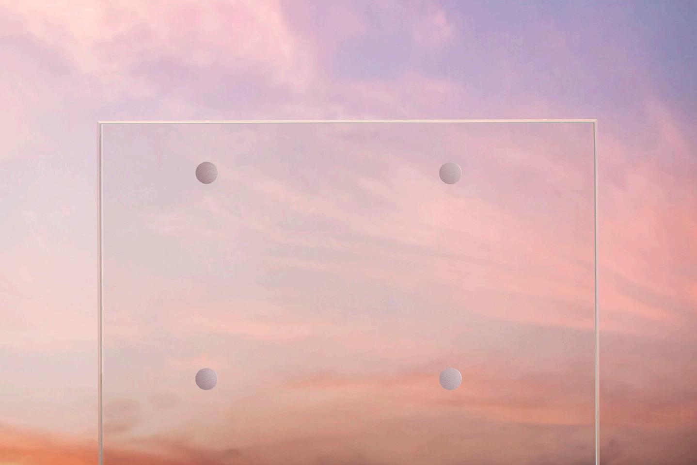
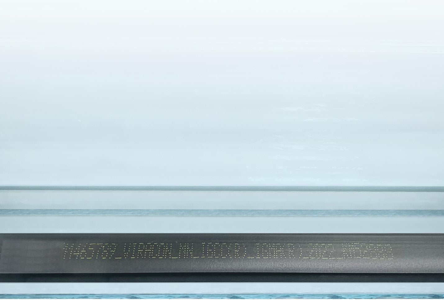
A New Asset Management Tool for Your Glass. At Viracon, we never stop improving our glass or the customer experience. The Viracon Identification Number (VIN) is further proof of this commitment. Discreetly printed on the thermal spacer, the VIN is a unique number that contains all the information you need about an insulating unit installed on a building, including glass type, composition, and finished size. With the Viracon Identification Number, the number of reasons to choose Viracon keeps growing. Learn more at Viracon.com/VIN.
July/August 2023
Design architect: OMA/Shohei Shigematsu
Architect of record: Cooper Robertson
Landscape architect: Michael Van Valkenburgh Associates
Structural engineering: Arup
Electrical engineering/MEPFP/
Telecommunications: Buro Happold
Civil engineering: Wendel
Lighting design: Arup
Gallery lighting: Litelab
AV/Acoustics: Jaffe Holden
Graphic Design (Signage/wayfinding): Wkshps with Once-Future Office
Facade consultant: Thornton Tomasetti
General contractor: Gilbane
Geotech: McMahon & Mann Consulting
Engineers
Historic Preservation: Preservation Studios
Vertical transportation: VDA Elevator & Escalator
Consulting Town Square Roof, Common Sky: Studio
Other Spaces - Olafur Eliasson and Sebastian
Behmann
Metal/glass curtain wall: The Roschmann Group
Moisture barrier: Grace
Exterior marble: Vermont Quarries
Glass: Glasbel
Entrances: Blasi, Schuco
Metal doors: Steelcraft
Roofing: SBS, Soprema
Waterproofing: Grace, Suprema
Insulation: Rockwool
Acoustical ceilings: Armstrong
Paints and stains: Sherwin Williams
Plastic laminate: Formica
Solid surfacing: Corian
Special surfacing: 3 Form
Floor and wall tile: Daltile, Porcelanosa
GFRG: Formglas
Metal ceiling: Lindner
Furniture: Hay
Upholstery: Kvadrat
Lighting controls: Lutron
Water closets: Duravit
Urinals: Toto
Lavatories and faucets: Lacava
Buffalo, New York, is at last experiencing some happier days. The city has done a decent job of preserving its historical building stock—with works by Louis Sullivan, Daniel Burnham, Eliel and Eero Saarinen, and Frank Lloyd Wright still intact—but the renovation and revitalization of a myriad of other urban sites has picked up as well. From Silo City’s grain elevators to the Trico facilities, which once produced windshield wipers, Buffalo’s industrial relics are transforming into new centers of art and culture. The city is growing, again: It experienced population gain, as registered in the 2020 census, for the first time in 70 years, while adding some 10,000 new apartments in the last decade.
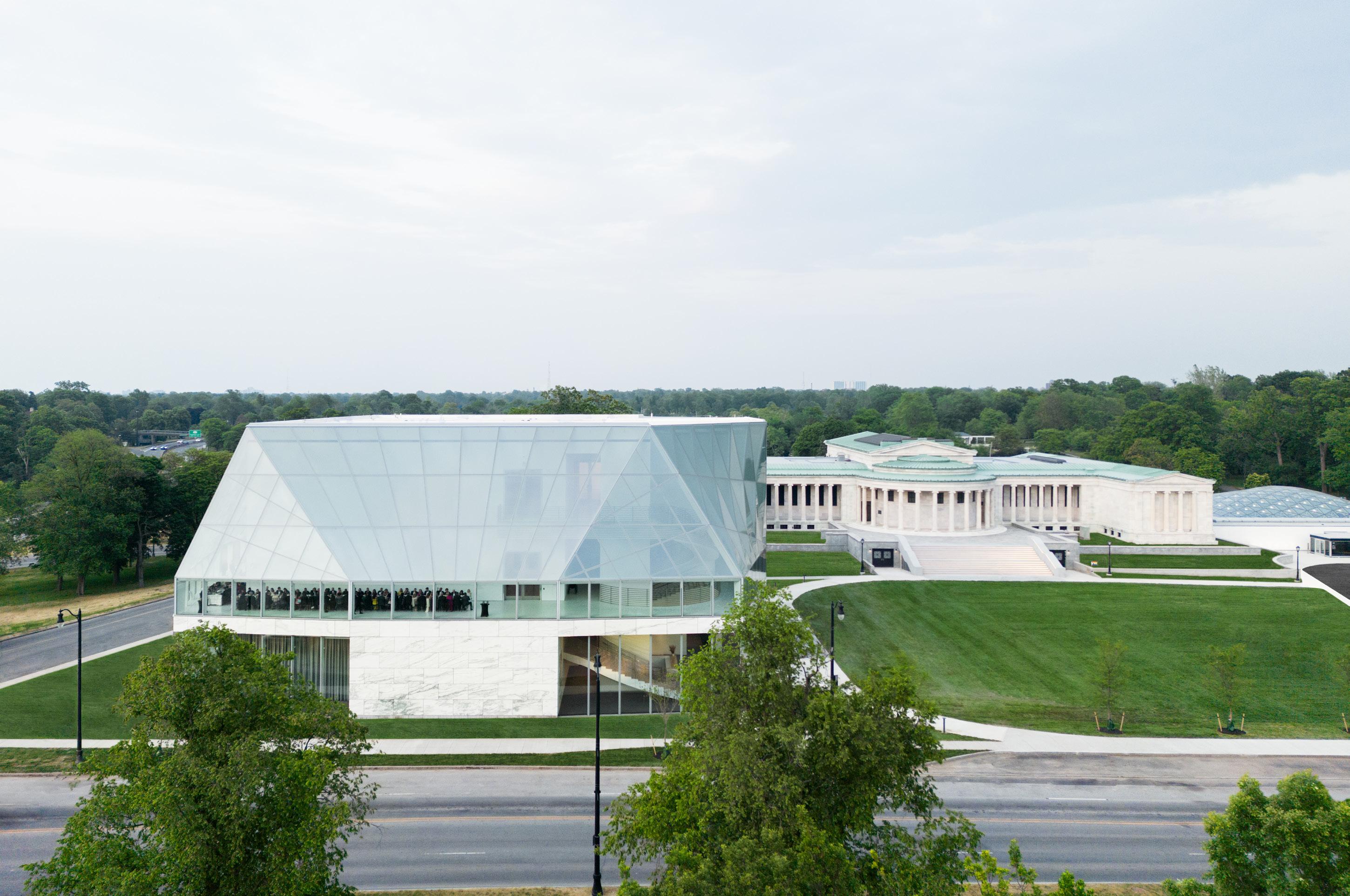
The most recent manifestation of this trend can be found in the cultural anchor of the Albright-Knox Gallery, rechristened as the Buffalo AKG Art Museum with the addition of the new Jeffrey E. Gundlach Building by OMA New York in collaboration with Cooper Robertson. For decades, AKG was composed
of two iconic pieces. The original Neoclassical 1905 Robert and Elisabeth Wilmers Building, designed by Edward B. Green, is based on the Erechtheion in Athens. There are a total of 102 Ionic columns, a grand central portico, and side porches supported by caryatids. The second piece, by contrast, is the 1962 Seymour H. Knox Building by Buffalo native and SOM archduke Gordon Bunshaft, a man with some ideas about how to exhibit Giacometti and Léger, given that he had them in his house. This first addition used the same Vermont Danby marble as its 1905 counterpart but updated the museum’s programming with an open air courtyard and a crowning gray smoked glass auditorium.
The Albright-Knox was well-loved, though the Bunshaft addition suffered from the common high-modernist paradox of providing excellent views of nature while literally obstructing access to it: The courtyard was built astride a former Frederick Law Olmsted–designed path into the adjacent Delaware
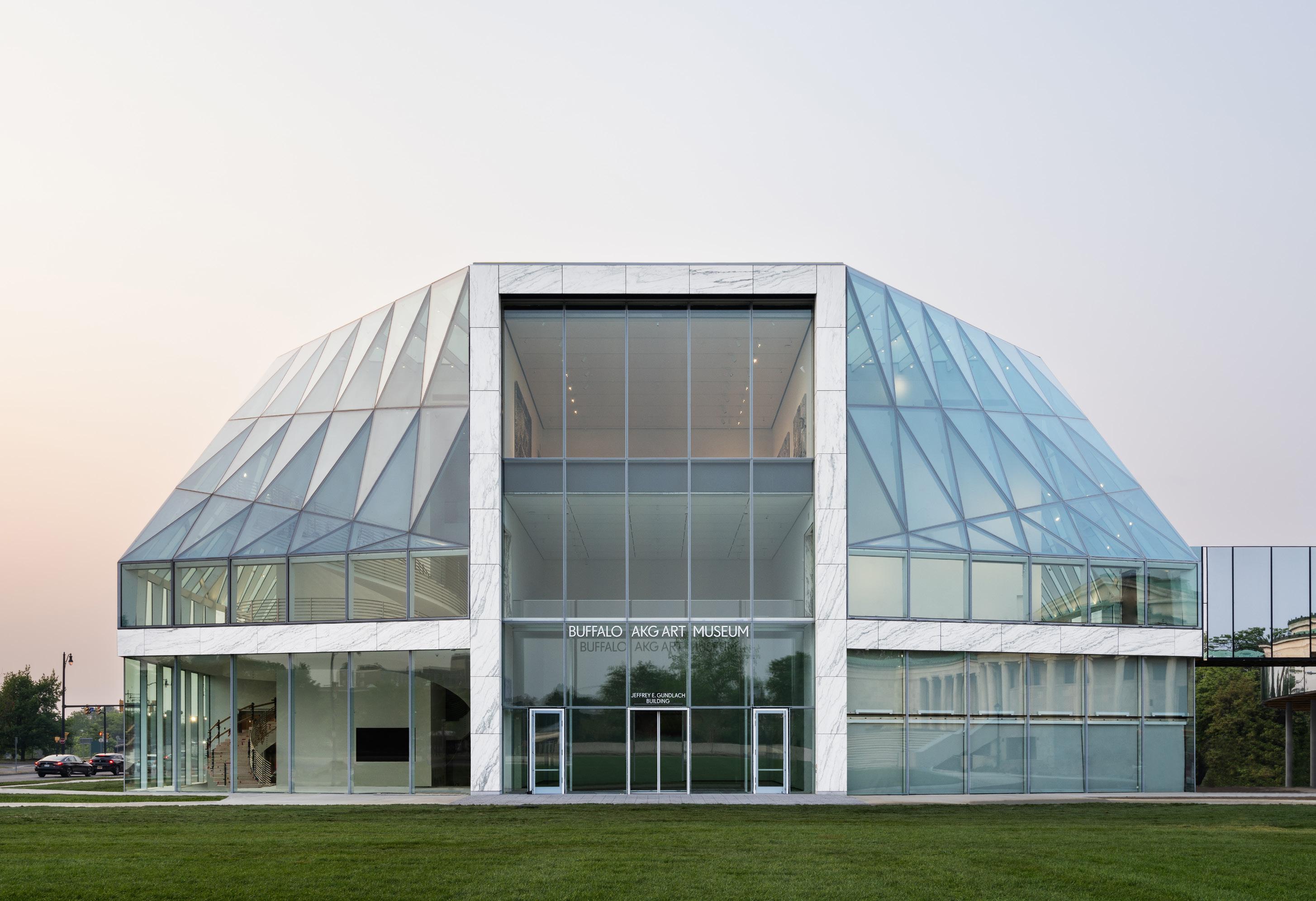
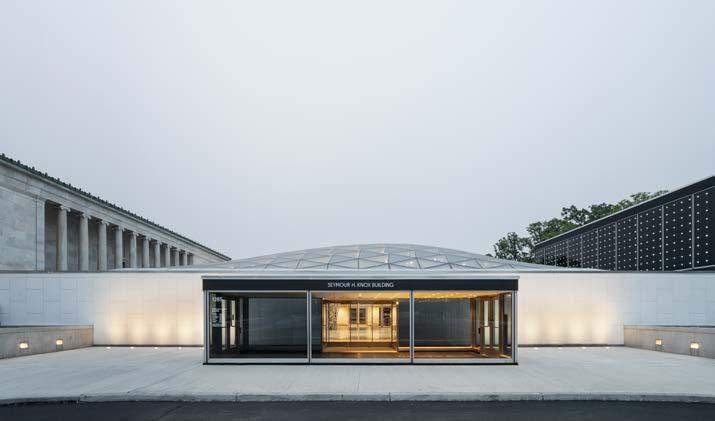
MARCO CAPPELLETTIFacing page: Facade of the new Jeffrey E. Gundlach Building and its uniquely contradictory gently sloping form made from angled glass.
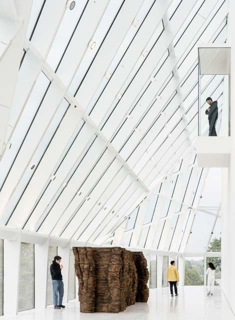
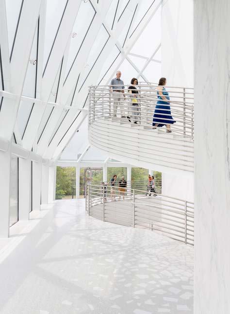
Left: A sculptural stair is visible, from outside the Gundlach Building, traversing all gallery levels and becoming an art object itself.
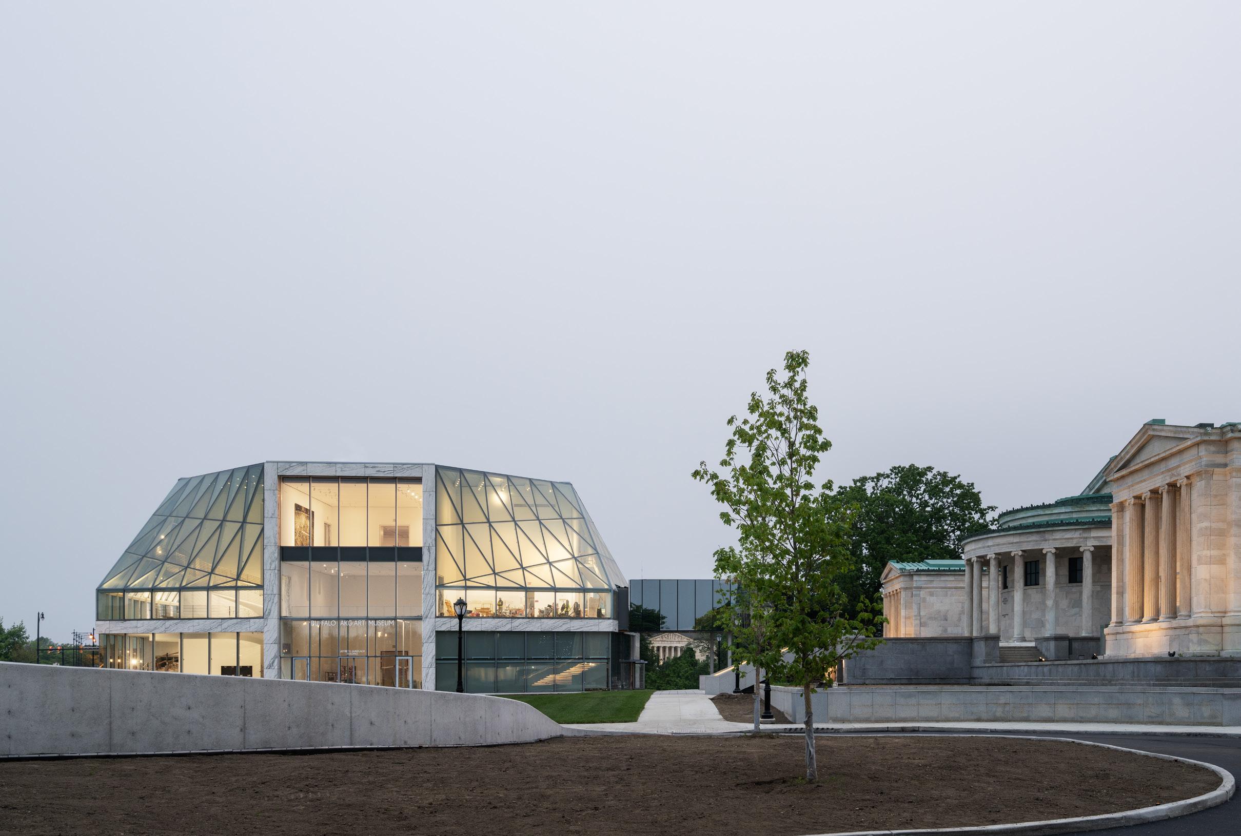
Above: Playful glass installation techniques create a funhouse viewing effect when looking at other buildings on the campus.
July/August 2023
Park, with an entrance on one side but a blank wall on the other. The museum’s tarring over the front lawn for a parking lot and removal of the original grand stairs was no help. Still, both buildings have aged well and were accepted as cultural institution canon, even if neither was quite willing to extend you a handshake.
After being selected from a shortlist of five firms, narrowed down from 50, OMA New York’s initial plan for the museum’s expansion didn’t land well: Its proposal literally sat atop the Bunschaft-era courtyard. But preservationist outcry thankfully prompted a change of course. The next challenge for OMA, then, was determining just where to place the expansion instead: To the north of the museum there are highway ramps; to the east is the sacrosanct Olmsted parkland; and to the west there is a high probability of disturbing an archaeological site with Indigenous artifacts. Eventually, a portion of the parking lot to the southwest emerged as the winning spot, although the logistical challenge here was how to connect it
to the Wilmers Building at a diagonal. This was solved by the expediency of a Niemeyer-like winding bridge on pilotis, designed to slope at an ADA- and art handler–suitable angle that winds around existing oaks on the site.
One substantial benefit of this location is the creation of a semibounded grand lawn on the space that was once a parking lot. (Cars are now entombed in a garage beneath the grass.) The Gundlach Building now animates a new east-west axis for museum circulation as well, both inside and out. The expansion provides a loading dock, a utility that even the wisest minds of 1905 and 1962 didn’t anticipate. AKG Director Dr. Janne Sirén quipped, “Craning Picassos and Pollocks through snowstorms is not something we really want to be doing.”
OMA’s taste for eccentric geometries and glass shrouds is well-established, and it’s up to more of the same here. Principal Shohei Shigematsu explained in conversation that the firm initially devised a simpler geometric
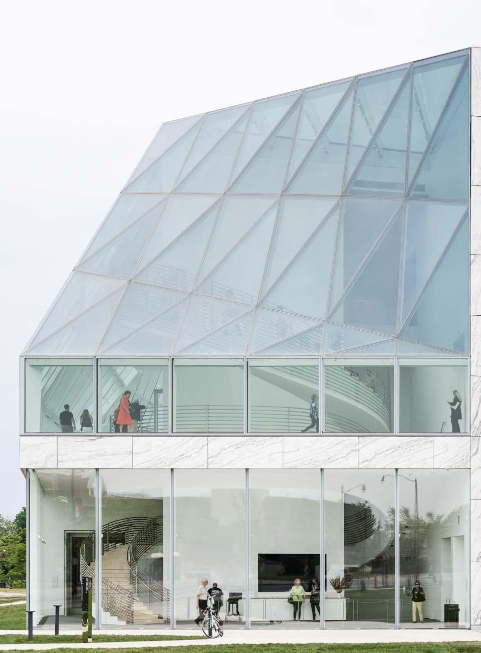
slant of glass for the structure but eventually veered in a stranger direction to avoid anything resembling the curtain wall of an office building. The resulting Gundlach Building, made possible by billionaire Buffalo native Jeffrey Gundlach’s donation of $65 million, is now sheathed in angled glass. Overall, the capital campaign raised $230 million for the campus’s revision and expansion.
The addition is fronted by a large, two-story marble entrance portal rising from a plinth, both designed to echo canonical elements on the two existing buildings. It’s a formalist gesture that sits a little oddly with the remainder of the facade, characterized by its sinuous, triangulated glass: a waistcoat on a futurist. There’s something remaining of OMA’s torpedoed Chicago Lucas Cultural Arts Museum proposal here, if brought somewhat into line with local probity.
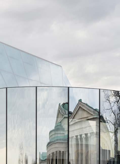
The glass is entirely a good idea. It's basically a cloak not of invisibility but of visibility draped around a central rectilinear
Facing page, top left: Interior views of the stair on the second level, where the design becomes more of a "void" in the space.
Facing page, top right: Circulation wraps visitors around the periphery of the museum, where generous glazing allows for views across the campus and lets in natural light.
Facing page, right: Third-floor gallery works by Tiffany Chung, Martha Jungwirth, Simone Leigh, and Matt Connors.
Facing page, far right: View of the Sculpture Terrace with Ursula von Rydingsvard’s Blackened Word, 2008.
gallery volume inside. You can see all sorts of things from the exterior, a lively contrast to the remainder of the campus. Shigematsu explained his effort to balance the “introversion” of the broader campus and larger spirit of “closed and calm and pristine and authoritarian museums.” The addition also has a contextual inspiration, he noted, in the Crystal Palace and the architecture of botanical gardens.
The glass veil is interesting in itself. A “softness” was the aim, and it was achieved thanks to a complicated structural arrangement, which suggests curves despite largely being composed of triangular panes. Shigematsu wanted “torsion,” and he achieved it.
The Gundlach’s interiors are well-thoughtout and originate from a set of cruciform galleries at the center of the first floor and exhibition spaces. Shigematsu observed that “often a contemporary gallery becomes the victim of all of the infrastructure and all of the operational needs. I thought that art should
always be at the core—like a building core, like an elevator core.” Where to put the core functions then? Well, at the corners: The elevator, offices, a black box theater, and loading dock are all peripherally located, leaving the galleries as the heart of the museum. Shigematsu expressed frustration over the typical dynamic of gallery walls being exterior walls, almost entirely entailing that they will be blank. This is emblematic of the age-old battle between art and the destructive effects of natural light. These center galleries set up the use of additional galleries along the glassy perimeter, so the second-floor promenade is suited to the display of art objects less sensitive to light than paintings.
A winding central staircase unifies these two conditions. Shigematsu expressed a certain tedium with “the sculptural stair becoming one of the moves that every architect does in every museum.” His aim? “To make it a little less obvious.” The stair spirals on its own to the first level, then connects to the
floor slab on the second floor and spirals on its own again on the third. “The stair is not a freestanding solid stair on the second level.” Shigematsu noted. “It looks like a void instead of a stair, so it has an ambiguity of an object versus a nonobject.” OMA’s was also an effort to unite means of ascent. The elevator lobby is right next to the stair, not down a hallway to the left, as is often the case. Both are deliberately part of the same spatial experience, not a principal tier for the young and mobile in one place and a back up for everyone else, somewhere else. Notably, the elevator shaft is also envisioned as a display for art.
The galleries that constitute the center of the building are spacious and technically sophisticated. Partition walls don’t quite touch the floor; instead, they hover ever so slightly. There’s a double-height space on the ground floor, an easy access to the promenade on the second, and an unobstructed view to the city’s downtown on the third. Red-oak flooring patterns are variable and patterned in concentric
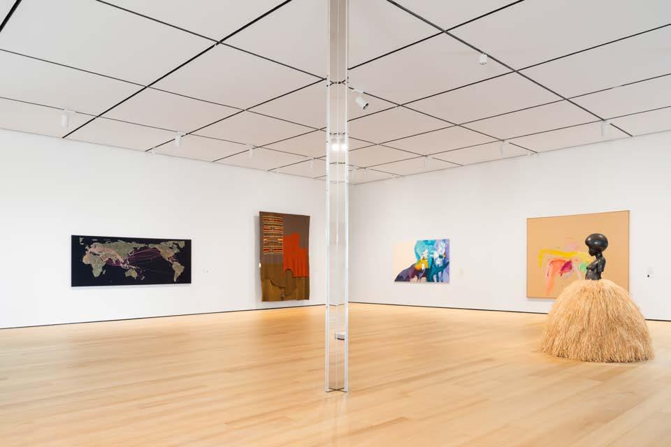
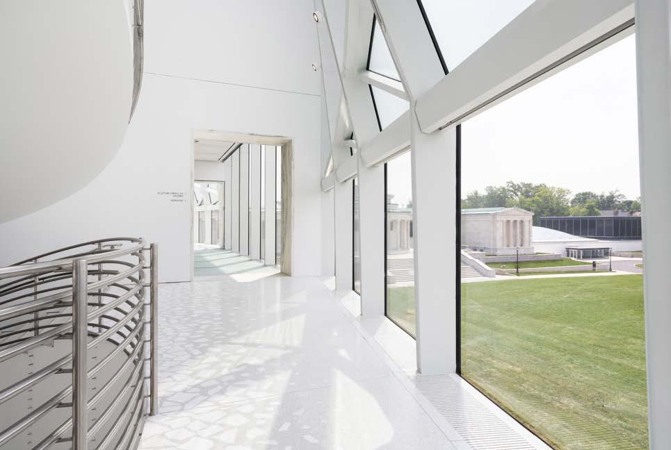
circles on the lower floors; the boards gradually widen as you ascend, and large single planks mark each doorway. Flooring treatment also extends beyond just the new galleries: Cracked marble flooring in much of the Wilmers Building was also replaced with red oak to provide a seamless experience.
In addition to introducing new, world-class design to the Buffalo institution, a major goal of OMA’s expansion was to revamp the AKG’s programming, both physically within the museum spaces and metaphorically in terms of the institution’s relationship with the community. These goals were addressed most directly in the reimagination of the Knox Building’s courtyard and auditorium, as well as the education spaces. The courtyard was formerly surrounded by administrative and donor spaces; now, the perimeter spaces have shifted to public use with these areas turned into a cafe, gift shop, and Creative Commons.
The last of these is sponsored by Lego in its first collaboration with a museum, one of a
range of Scandinavian elements that Sirén, a Helsinki native, has brought along.
The second-floor Bunshaft auditorium was refurbished along precisely Bunshaftian lines and looks excellent. OMA chose to convert its lower floor into an education and community wing, with movable partitions respecting the Bunshaft original. This represents a real improvement on prior educational facilities. Sirén explained, “We had two classrooms that looked like a dungeon. In Finland, we would not put anyone in such a classroom.”
Sirén also spoke of a desire to engage more closely with the community. “We built two things at the same time: One of them is a physical building and the other is our house of ideas. Our idea was a museum that was open for everyone and not just a small number of privileged individuals.” His desire was to create “a welcoming place” that is more easily accessible. (To that end, the Knox Building will not charge an admission fee.) The museum also sought to improve links with the city by
creating a leadership-level director of community engagement position. To provide art for those who might not be inclined to visit, an “art truck” has been commissioned, transporting art beyond the gallery walls to support the museum’s Public Art Initiative.
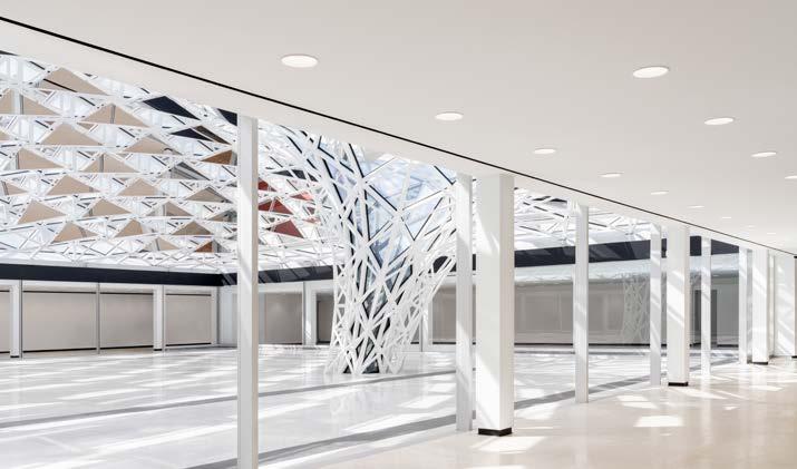
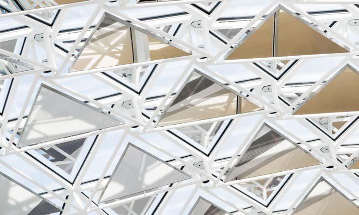
The abiding problem with the Bunshaft courtyard was simply being located in one of the snowiest cities in the United States. It was splendid in theory—and in the summer months—but given the museum’s decades of difficulty in actually using it as a space for hanging art and gathering, OMA’s solution to cap it is pragmatic and agreeable. The peristyle courtyard has a new ceiling that’s decidedly non-Bunshaftian in fashion, but results in an intriguing dialogue. Previously, the courtyard had a single tree, another trapping of a modernist repurposing of nature as sculpture at its essence. Now, it has been replaced by Common Sky , an arboreal installation by Olafur Eliasson and Sebastian Behmann of Studio Other Spaces, which features a
far-from-natural but very fun canopy of acoustic panels covered in reflective skin extending over the space beneath an undulating dome. They also added a second entrance facing Delaware Park, restoring the original Olmsted link between museum and park.
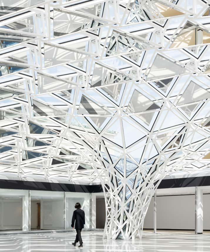
Sirén spoke of a prime interest in restoring this connection: “How do you take down barriers from entering a museum? First of all you make it so easy to come in that it’s almost like you are slipping in; you don't even notice that you’ve entered. It’s free, there’s no one at a desk. If you want to just take a shortcut from east to west, you can do that.”
Let’s not forget the art. The AKG’s collection is strong in many regards, but particularly in abstract expressionism. Ellsworth Kelly, Gene Davis, Richard Hunt, and Tony Ausler have come out of the vaults, and 33 Clyfford Still pieces are on display in the inaugural exhibition, Clyfford Still: A Legacy for Buffalo.
An exhibition of recent acquisitions also showcases pieces by Nick Cave, Ragna Bley,
Tiffany Chung, and more. One Gundlach gallery is named after Marisol, the Venezuelan American Pop art polymath. The AKG was the first museum to acquire her work, and she repaid this favor by donating her estate to the museum; an exhibition is coming next year. Other new notables include installation pieces that activate new and unexpected display spaces, like Cornelia Firelei Báez’s Chorus of the Deep : The aqueous glass tile mosaic in the new courtyard literally shines. And a Miriam Bäckström tapestry is even being installed at the museum’s garage entrance, an admirable use of a space most would ignore.
Museum expansions are intrinsically tricky. The job is always to respect your elders without parroting, and plenty of expansions fail on one or both counts. OMA’s work is ultra-2023 in character, and yet the project does reflect a nuanced attention to what was there and what wasn’t. “I think that modernism was all about flexibility” Shigematsu
ed, “but the 1905 building is all about spatial
character. Both are important, and we need to embrace both. We’re not into compromising flexibility, but we don’t want to make a gallery that’s the same everywhere either. In a subtle way we’re trying to inject a spatial specificity to the place.” By this count, OMA’s new Buffalo AKG genuinely succeeds.
stat-Explore our new 25T/35T/50T thermally broken entrance systems.
Twenty-six states have already adopted ASHRAE 90.1-2019 or the IECC 2021. Both require a 0.63 u-value or lower in climate zones 4-8, with more states forecasted to adopt the codes in the future.
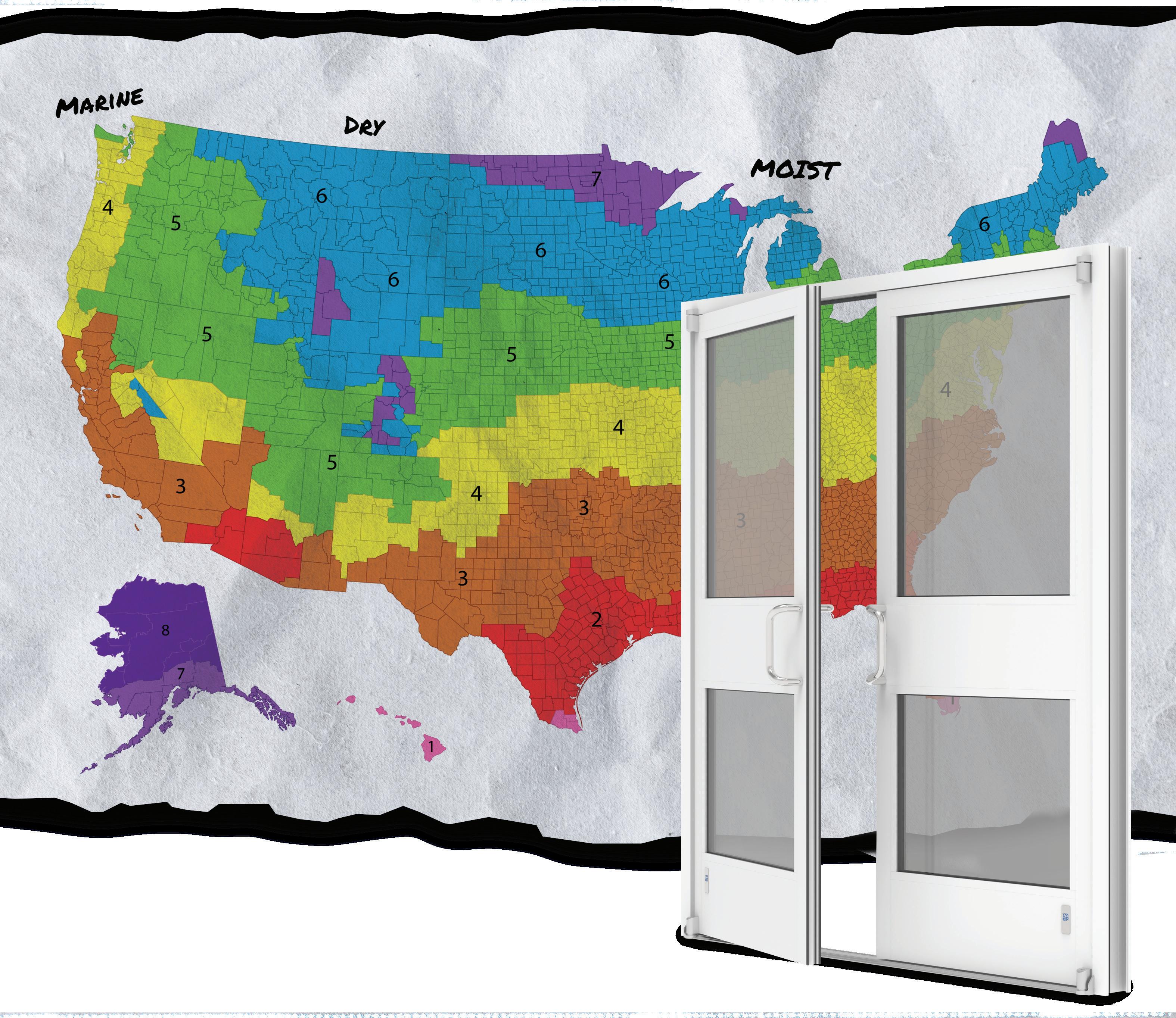


Learn more about our new entrance systems at www.ykkap.com.

Glass transparency and circularity should reshape how the industry operates.
We hit a world record this month: On July 3, the world saw the hottest global temperature ever recorded. But this record was quickly shattered, surpassed only one day later, on July 4. Carbon emissions are directly linked to rising temperatures, weather pattern disruption, and wildfires such as those that kept a third of the U.S. population under air quality restrictions last month. Can the emergence of responsible designs and solutions improve this situation? Recently, innovations in glass and glazing technologies have been used to strike a balance between the development of new technologies and more holistic, circular practices.
At the Glass Performance Days (GPD) conference, held in Tampere, Finland, in June 2023, a collaborative of practitioners participated in a workshop called “Clarity Revisited, (Re)shaping the Future of Glass.”
Part of a one-day event called Opportunities in a Circular Economy for the Glazing Industry, this workshop brought competitors from the industry together to brainstorm new paths forward, honestly addressing the climate crisis and designers’ roles within it. While most of the environmental impact of facades is related to energy preservation, this group focused on embodied carbon emissions related to the fabrication of glazing products. Here are some of the most important takeaways from this working group.
The amount of energy and its source (renewable or nonrenewable) in the manufacturing process of glass significantly influences the extent of environmental impact. This is highly relevant for the most intensive stages of production, like the float process, which occurs before cutting and processing of glass. These issues are deeply entrenched and therefore difficult to change, but by directly engaging questions of emissions related to primary energy use, we can unlock the highest potential for carbon reduction.
Some successful strategies we discussed as models for future innovation included ongoing work to decentralize energy supply systems. By partially diversifying kiln combustion strategies, implementing recover heat from industry processes, installing photovoltaic panels wherever relevant, and educating all stakeholders about the carbon intensity and design/procurement implications of each relevant step, contractors and designers alike will have more power to designate more responsible standards.
The use of secondary resources, such as glass cullet—recycled glass sorted based on color—is a great avenue to reduce the melting temperature of glass and thus reduce emissions. In fact, the incorporation of post- and preconsumer glass cullet decreases the emissions related to the production of float glass. (One ton of cullet saves approximately 0.3 tons of CO2.)
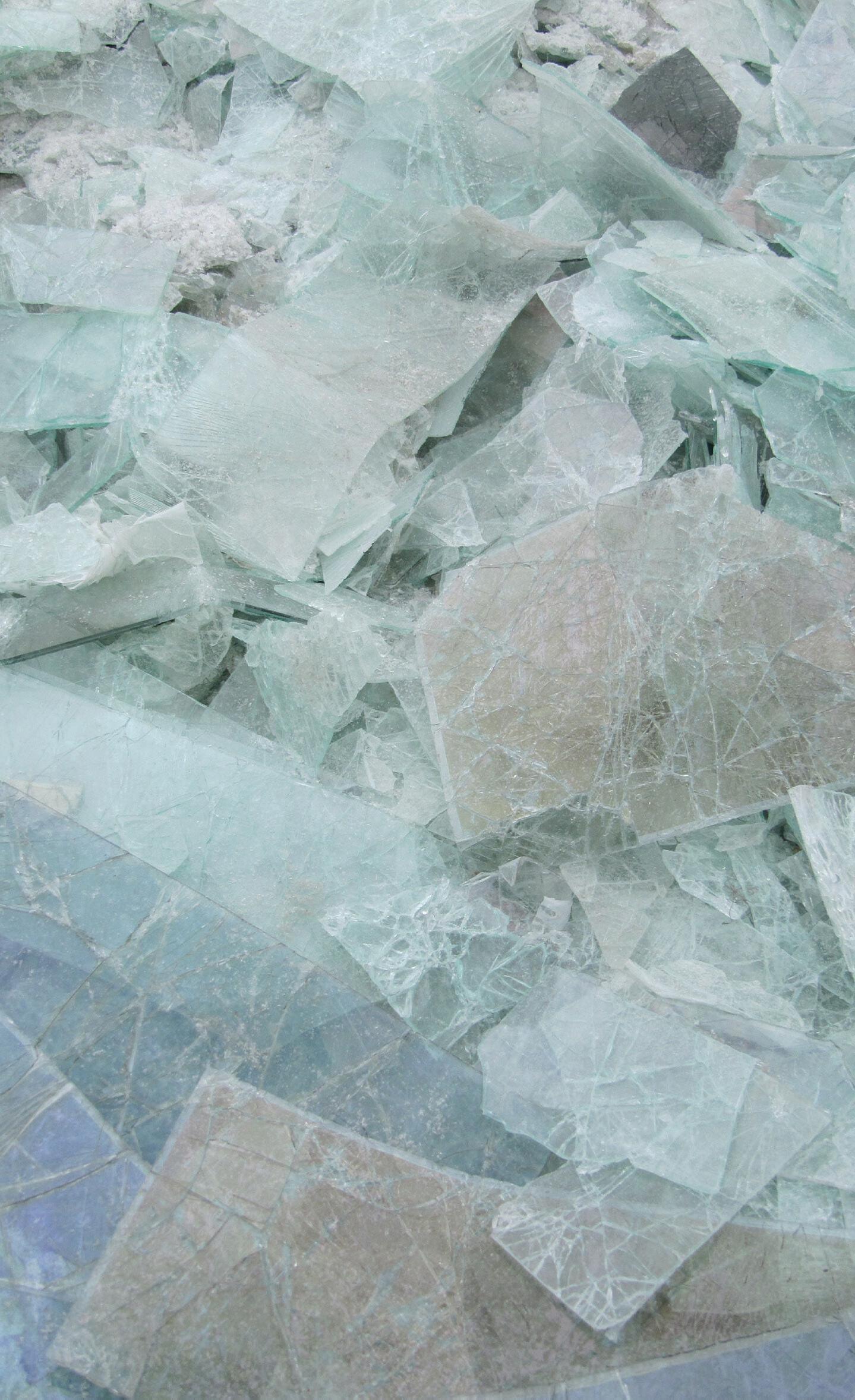
However, finding efficient ways to harvest postconsumer flat glass is the leading priority for the industry right now, especially in the flat-glass sector, where these circular practices are not currently common. This would mean that recycling companies
would both collect and sort cullet. But it’s become clear that more specialist dismantlers are necessary to upscale glass reuse and recycling. They also need to be brought into all stages of design development to determine whether today’s designs can be dismantled in the future.
A robust network for glass reuse and recycling could have a massive impact on material life cycles and carbon sequestration, as we know from sophisticated standards in metal reprocessing, for example. But the reusability of glass generally can also be aided by secondary products that can be considered at the time of manufacturing and fabrication. Certain surface sealants and treatments make reuse more feasible for our existing systems: For example, Cutri and Willareth shared recently published research into the reuse of glass in spandrels at GPD that can be aided by the use of fullface sealant, which creates a “safety glass” for at least one more design cycle. Even partially circular considerations and solutions are helping reduce carbon emissions now, which is key to meet Paris Agreement goals.
Fortunately, the environmental data for flatglass products is growing and increasingly accessible. New products typically have tags or can be equipped with "chips"—sensors that collect data on glazing performance and also store information about where a product was manufactured, by whom, and other specifics that would be important to the next user to know when recycling the material. However, there is untapped potential for even more dynamic technology: For example, using AI to map existing buildings and tag data is currently being researched. Also, communication between clients and designers about environmental qualities and impacts is improving along with awareness, a trend we hope to continue to see.
It’s widely recognized that flat-glass products are attractive targets for disassembly efficiency research. It’s merely a matter of time and tool selection. Equipment solutions are available to deglaze facade products and prepare glass for recycling. By developing dismantling processes and design strategies amiable to recycling or reuse, architectural glass will have more potential to stay within the same market and therefore contribute to its decarbonization.
It is very promising to see that several insulating glass unit (IGU) manufacturers and glazers have developed processes and equipment solutions to take apart existing units, clean the glass, and reform a new IGU. This process, has precedents around the world, including examples in Belgium, the Netherlands, Quebec, and New York City.
But how can practitioners and fabricators enter into discourse about these necessary changes? To support much-needed new collaborations, new platforms for data sharing and material repurposing are needed, though a few already exist in the U.S. and Europe. But beyond building these new platforms, it’s important to also support new generations of planners and engineers from diverse backgrounds. By diversifying the field, we redefine the role of design-
ers as leaders in new bidding and supply chain management efforts. Today, universities are developing circularity courses and programs as part of architectural education: Gone are the days where architecture was seen as a formal exercise devoid of real-world responsibility.
To be not only relevant, but a leader in addressing the climate emergency, the glass industry (including all stakeholders in the entire design and construction process) must nevertheless aim to perform outside of merely using more glass. Project-specific questions must be asked that tailor innovation to the appropriateness of a site. Sustainability must be embedded in a project from the very beginning, from concept all the way to the detailing and fabrication phase. Designers today must ask: What is the whole life carbon of my glass facade design and operation? Is an ultrahigh thermal performance, floor-to-ceiling, transparent glass box a responsible design? Is low-iron glass necessary? How can I design with reused/recycled glass in facades while still delivering high thermal performance? These considerations will yield new design dynamics and aesthetics and certainly whole new architectures.
Sophie Pennetier, associate director of special projects, steers Enclos’s growing sustainability and circularity efforts. She is an adjunct professor at SCI-Arc and involved in several industry focus groups aimed at decarbonizing facades, such as the Facade Tectonics Institute, where she serves on the board of directors.
Lisa Rammig leads the teams in Eckersley O’Callaghan’s California offices. She has played a significant role in its expansion, leading many of the group’s most challenging projects, while also remaining involved in academia and building strong links between research and industry. She is part of the Facade Research Group at TU Delft and is an elected member of the Special Advisory Council of the Facade Tectonics Institute at the University of Southern California.
Linda Hildebrand is a professor of reuse in architecture at RWTH Aachen University. She is an architect specialized on circularity in the built environment and a cofounder of Concular, a platform for digital services to facilitate circularity in the built environment.
LINDA HILDEBRAND




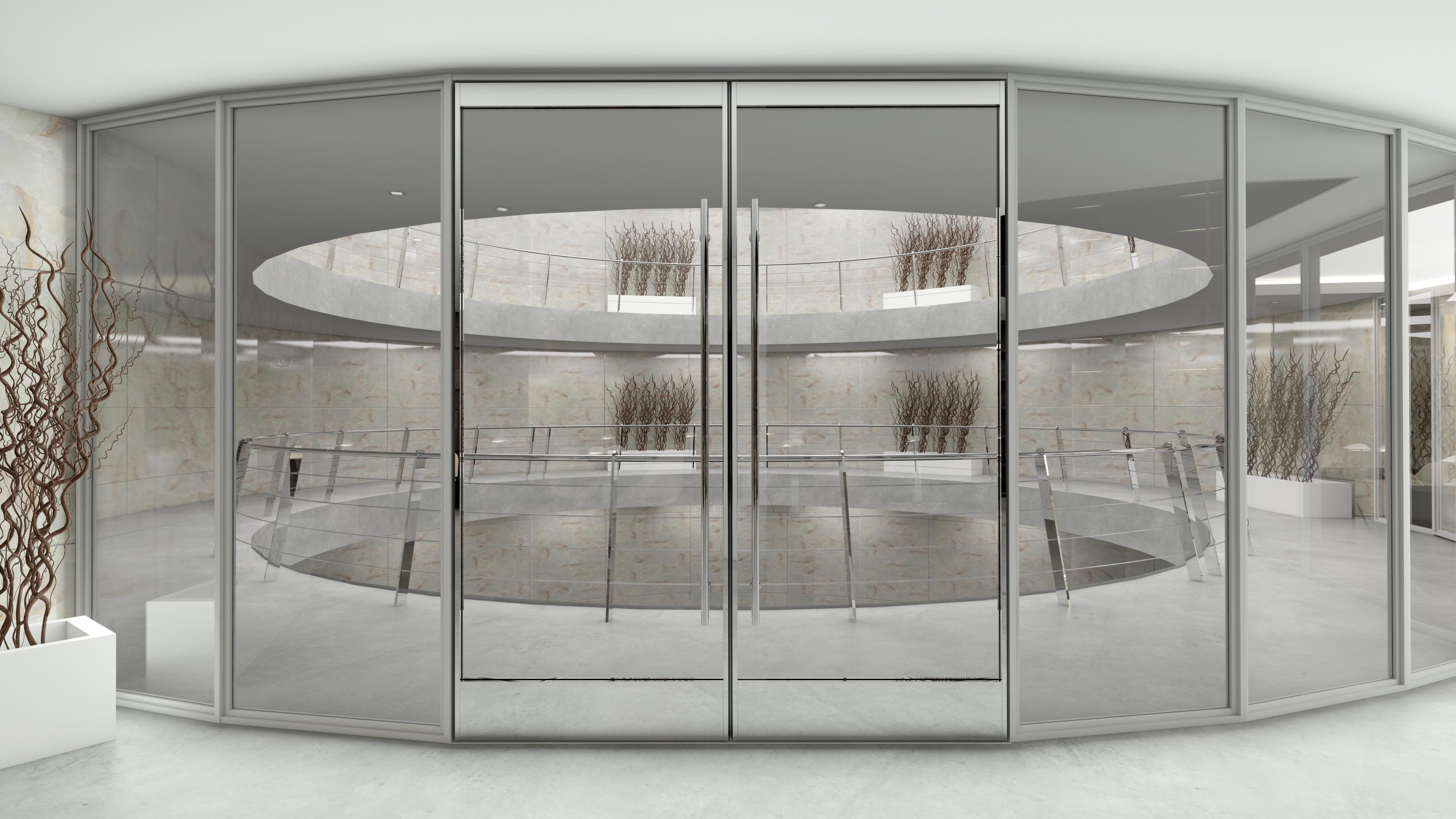

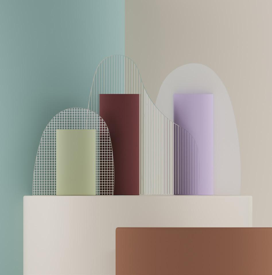
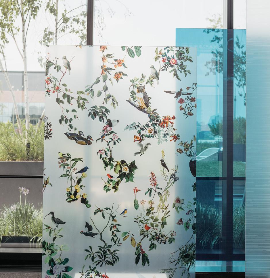
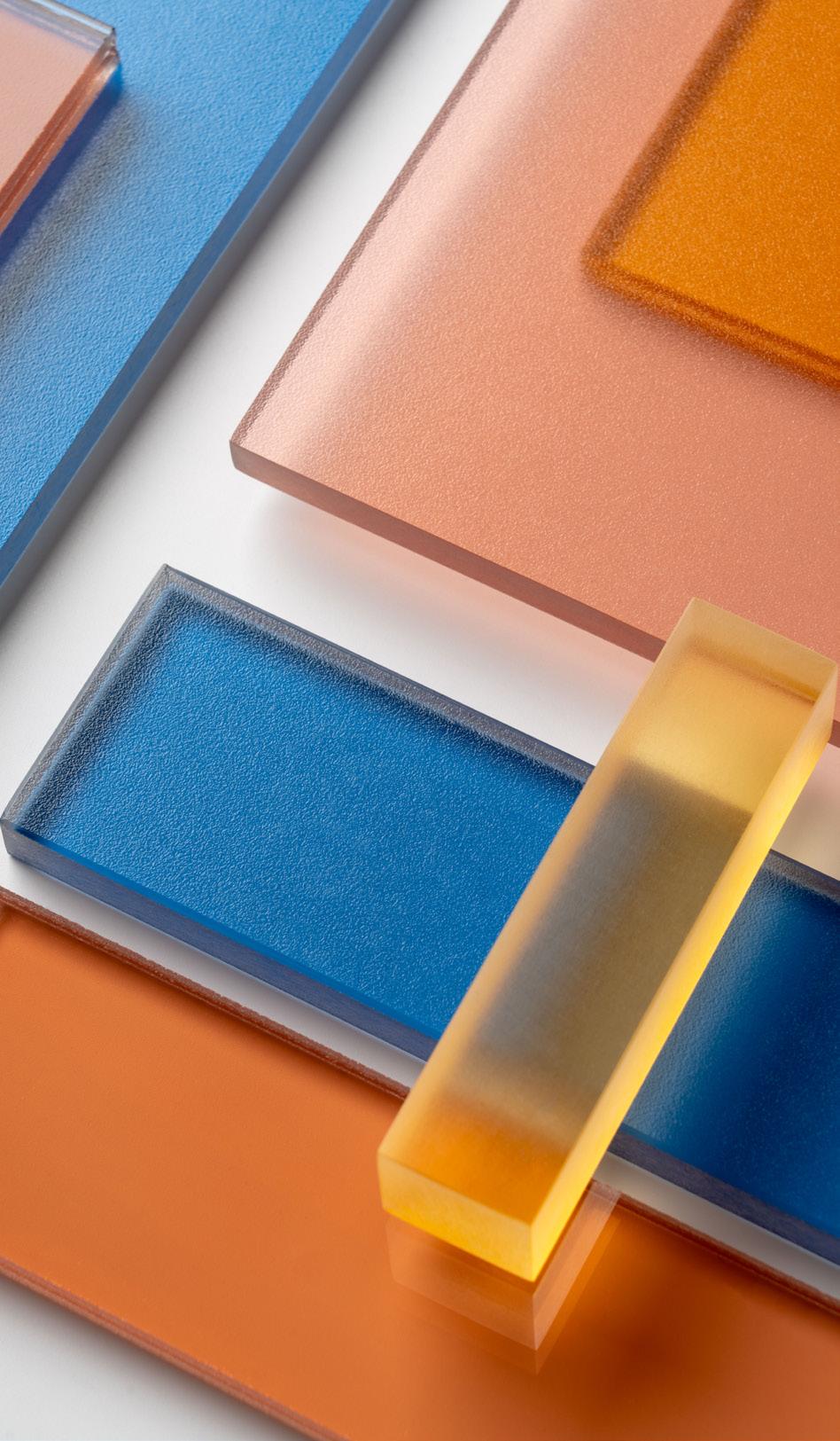
Designers and manufacturers of decorative glass have a range of techniques at their disposal— from glass tempering and acid etching to back-painting and digital printing—to produce the right colors, patterns, and textures for a project. But decorative glass is not just for show. It can also be specified to meet performance or sustainability goals for applications ranging from elevator cab walls to exterior cladding.
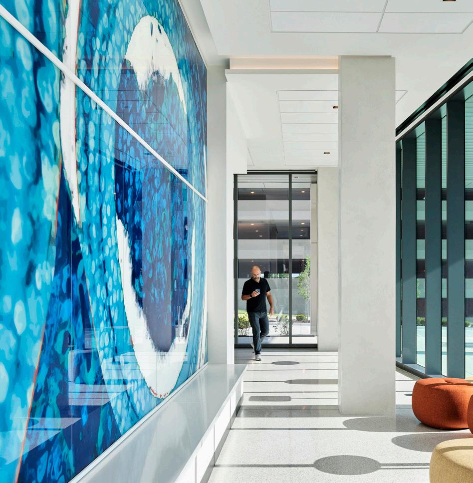
 Rita Catinella Orrell
Quadratti OmniDecor Glass Design omnidecor.it/en
2023 Color Collection 3form 3-form.com
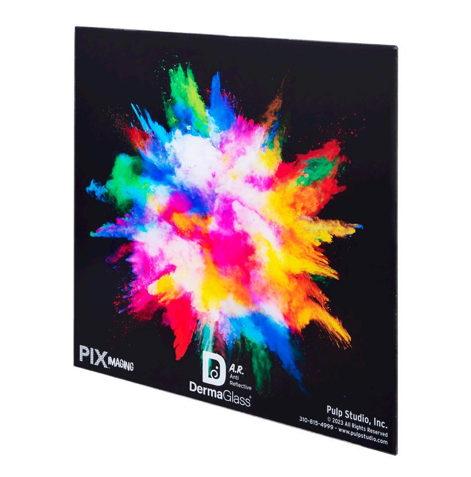
DermaAR Finish Pulp Studio pulpstudio.com
TurnKey Fusion Light Wall Bendheim bendheim.com
Introducing Derma AR, an anti-reflective option to our ultra-thin, highly durable DermaGlass. Derma AR is a 1.3mm, low-iron glass that comes in sizes up to 58" × 118". It is exceptionally strong, flexible, lightweight, durable, and scratch-resistant. And it can be used with our Pintura back-painted coating or laminated with graphic interlayers. Making it not only highly resilient, but also
extremely versatile in both architectural and elevator cab installations. It can also be laminated to itself or to honeycomb core for safety. Now that it’s been brought to your a ention, we’ll let you envision all the possibilities.
To learn more, please contact a Pulp Studio sales representative.
More sight, less weight. Our thin, high-strength glass now comes with an anti-reflective option.


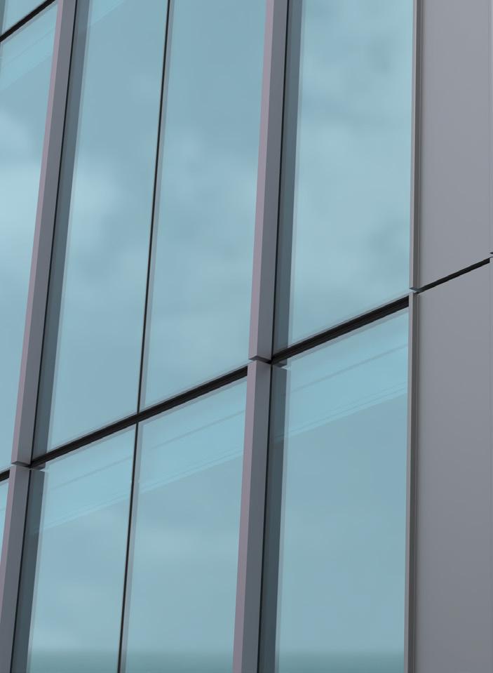
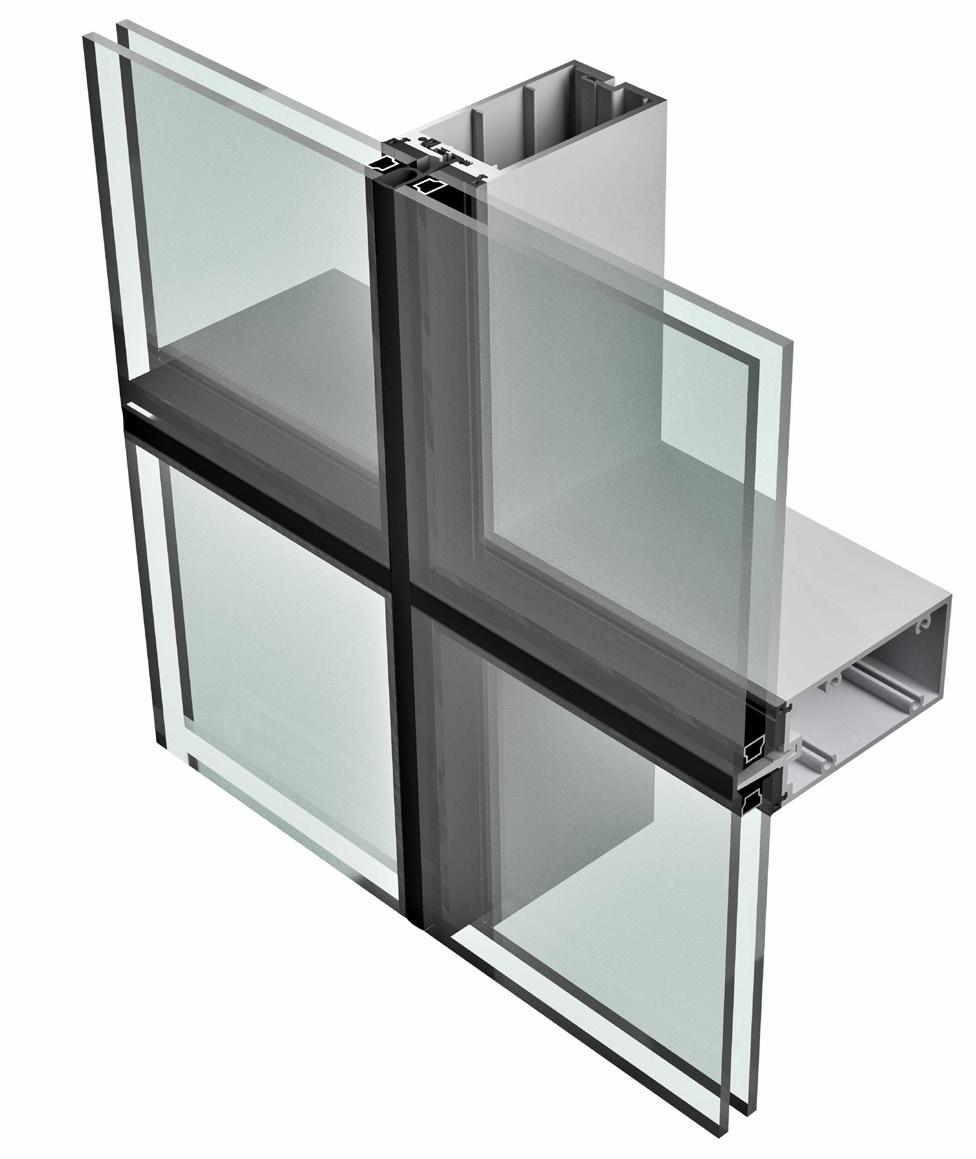
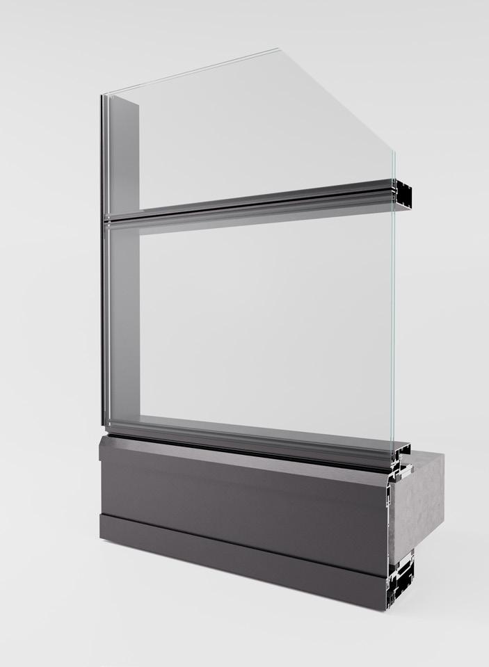
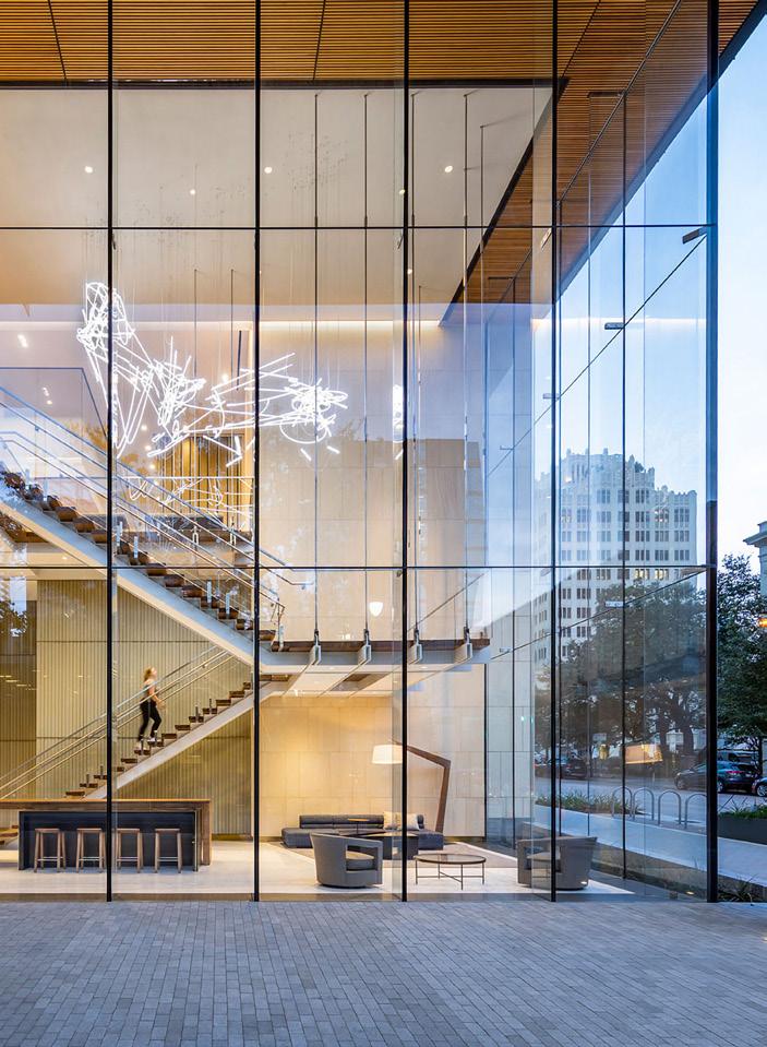
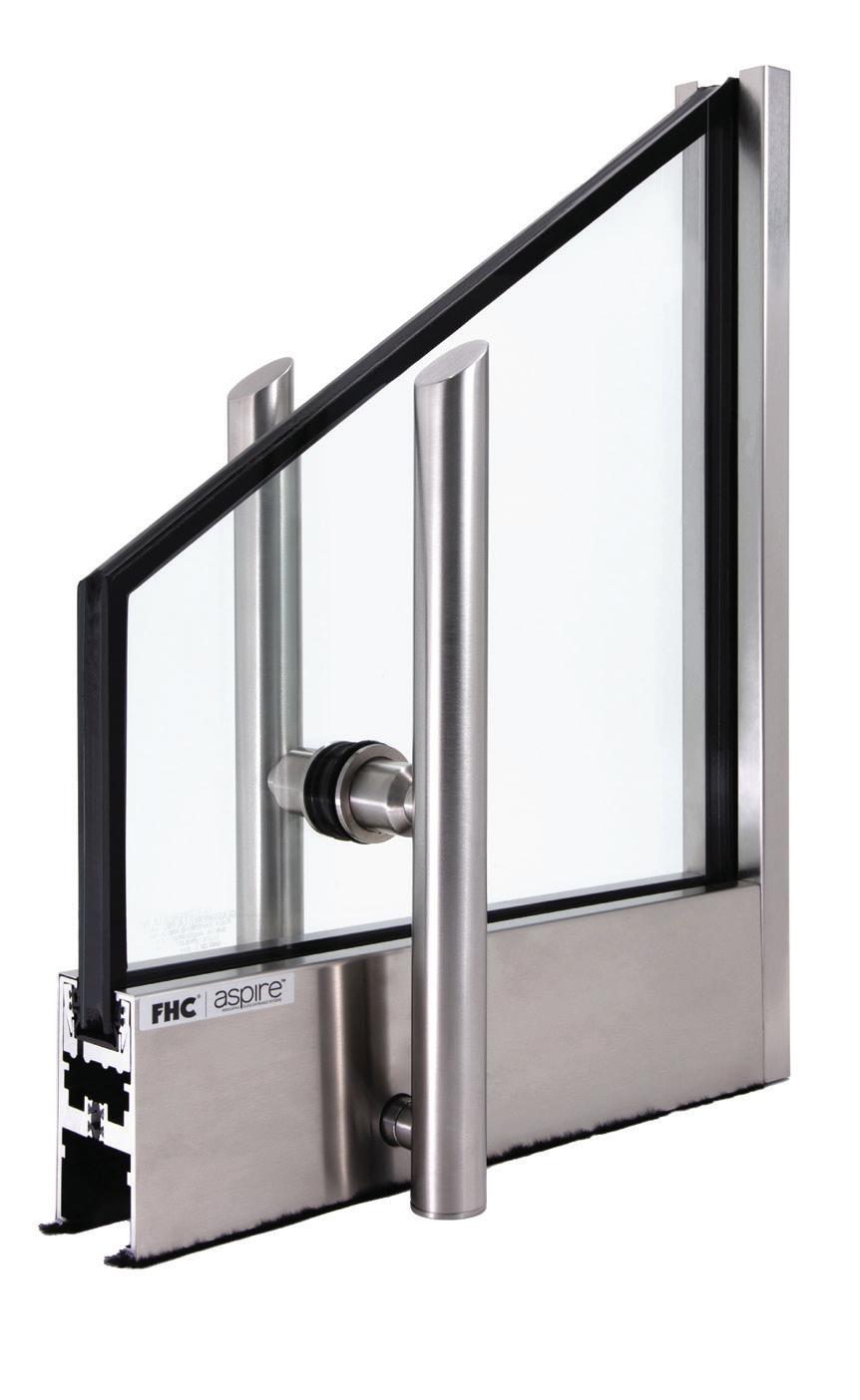
Structural glass and glazing need to be tougher than tough, and these frameless glass assemblies take on an portion of the structural load. Typically used for entrances, curtain walls, storefronts, stairs, railings, and flooring, structural glass is not restricted by the size limitations of standard framing systems, allowing for more expansive—and often more innovative—installations. Here are some of the latest structural glass options for projects both big and small. RCO
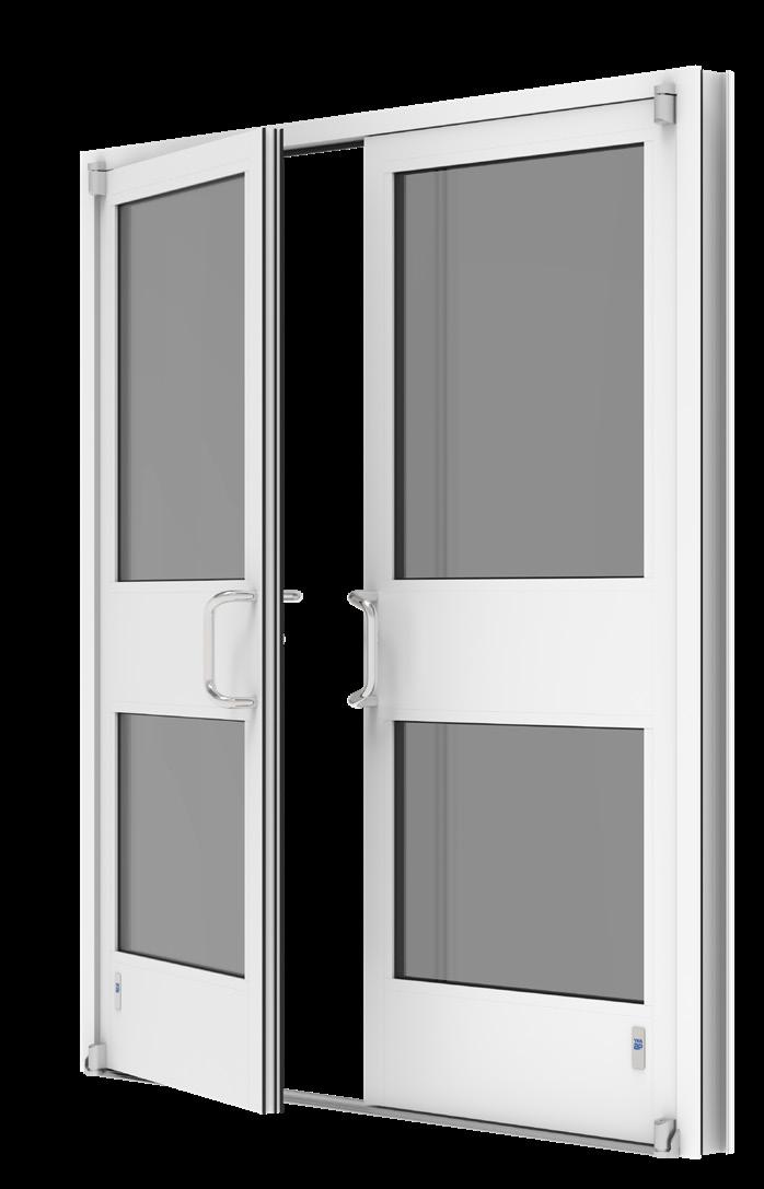 CRL DRX Modular Door Rail System CRL crlaurence.com
VetraFin-G Series System Sentech Architectural Systems sentechas.com
Kova Window Wall Kova kovaproducts.com
950SG Therml=Block Window Wall Tubelite tubeliteinc.com
RWW Curtainwall Reflection Window + Wall reflectionwindow.com
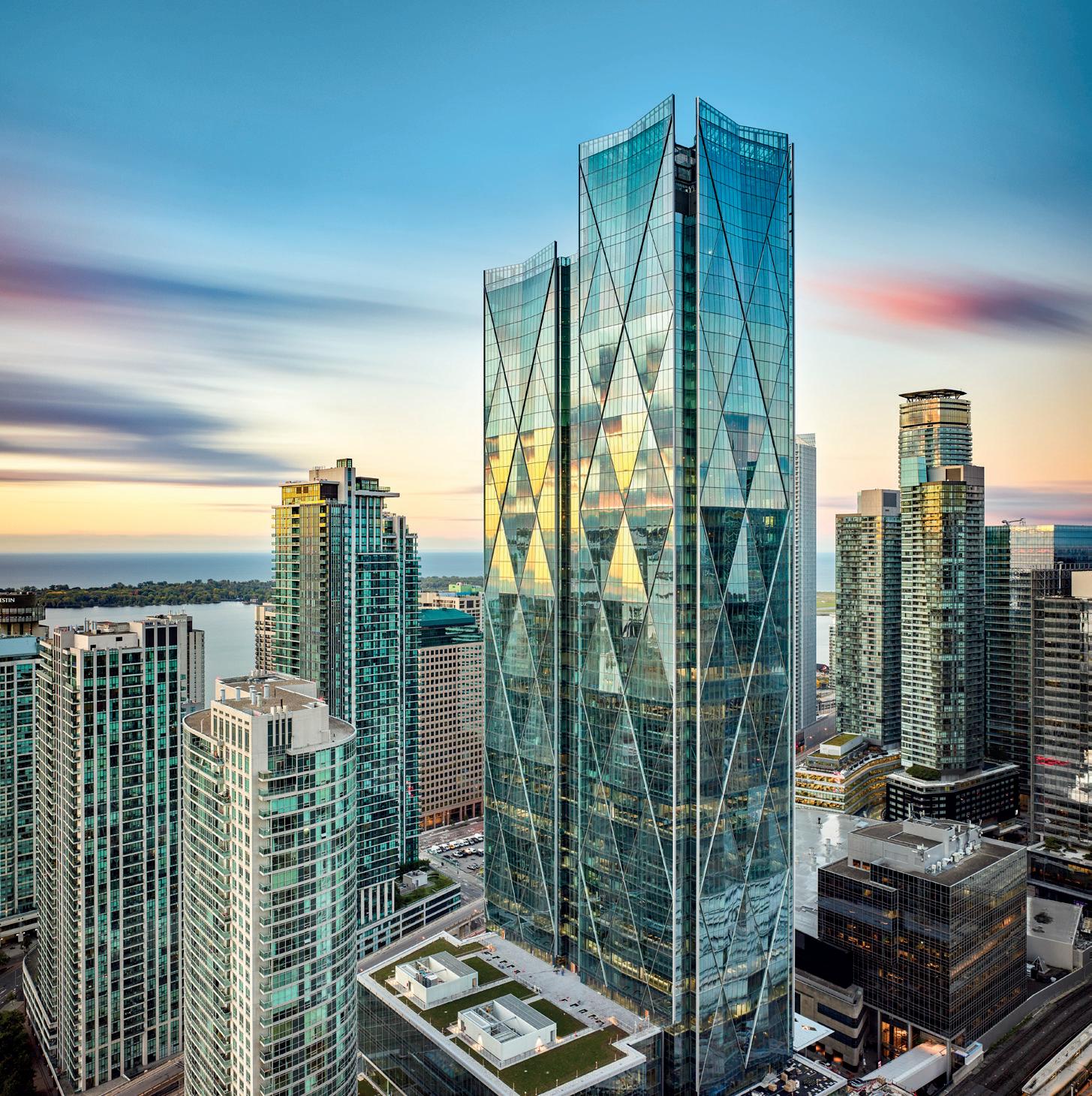
Ködispace 4SG is a reactive thermoplastic warm edge spacer with built-in desiccant that replaces the traditional edge system made of spacer, desiccant and primary sealant. Due to its ability to form a chemical bond with the glass and silicone secondary seal, Ködispace 4SG increases the durability of the Insulating Glass and maintains energy performance reducing both embodied and operational carbon. Contact
Montreal's new insectarium breaks down the white box.
Architect: Kuehn Malvezzi / Pelletier De Fontenay / Jodoin Lamarre Pratte architectes
Location: Montreal, Quebec, Canada
Museology: Kuehn Malvezzi
Landscape architects: atelier le balto
Electromechanical engineers: Dupras
Ledoux
Structural engineers: NCK
Civil engineers: Génie+, Lévis
Sustainable Development Advisor: CIMA+
Indoor and outdoor signage: Kuehn Malvezzi with Double Standards
Scenographic and multimedia coordination: Go Multimédia
Execution and site supervision for museology: La Bande à Paul
Special consultant for greenhouses: Capital
Greenhouse
Tree preservation: Nadeau Foresterie
Urbaine
Curtain wall installation: Unicel Architectural
Glass: Multiver
Aluminium: Alumico Architectural Inc.
Structure Hot-dip galvanized steel: Groupe
AESP
Cast-in-place concrete: Coffrage Alliance
Reinforcing steel: Acier AGF
Building services electricity: TBC
Constructions
Plumbing: Le groupe Charbonneau
Building controls: Regulvar
Greenhouse systems, shading system:
Harnois Industries
Shotcrete custom mix: Sika Canada
Reinforcing steel: Acier AGF
Interior systems: Grondin Acoustique
Epoxy floor coating: Les Peintres
Multicouleurs
Fabricated metals steel finishing: Groupe
C&G Beaulieu
In 1976, architect Roger Taillibert’s Montreal Olympic Stadium opened with a tower tilted on a 45-degree angle—the tallest inclined tower in the world. Many of the 1976 Olympics’ facilities near the main stadium were converted into components of Espace pour la vie, or Space for Life, a science museum complex that includes the Montreal Biodome and the Rio Tinto Alcan Planetarium, with other institutions spreading into an adjacent park. In April 2022, an insectarium designed by Berlin-based Kuehn Malvezzi with local firms
Pelletier de Fontenay and Jodoin Lamarre
Pratte architectes joined the city’s natural science ranks.
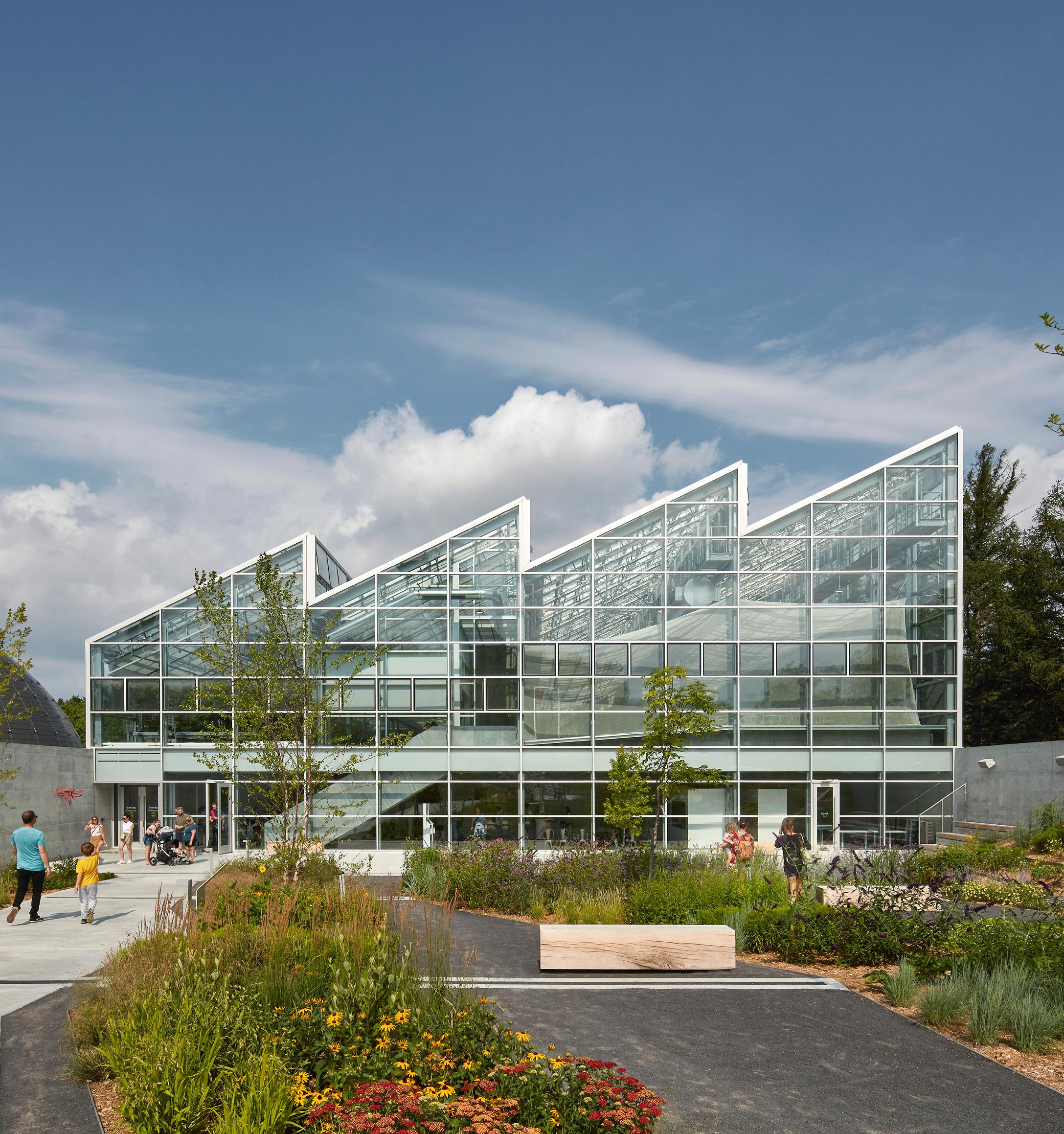
The Montreal Insectarium’s final form was the result of a seven-year process through design and construction, which began with a 2014 competition. The insectarium’s program is split into two primary spaces: a sawtooth, glass-wrapped greenhouse above ground and a labyrinthine subterranean structure. The insectarium hosts over 3,000 insect species in its specimen collection and over 175 living insect species. The greenhouse is home to an additional 150 living plant species and 3,000 plant specimens.
Kuehn Malvezzi, Pelletier de Fontenay and Jodoin Lamarre Pratte architectes told AN that the design team initially considered a “much more horizontal and fragmented” building, though keeping the landscape and built structure connected guided all design iterations. The surrounding landscaped gardens (designed by atelier le balto) feature winding paths that ultimately bring the visitor
back into the structure without feeling rigid: A path through an exterior butterfly garden, for example, ends at the insectarium’s underground entrance, connecting the all levels of the building to its landscape.
Visitors enter the insectarium through the Pollinator Garden before then proceeding through the Labyrinth, a shotcrete-formed interior that sensorially disconnects visitors from the outside world while leading them through the exhibitions. The architects worked closely with workers in creating a 1:1 mock-up of a cave section, with workers honing a finish that would be applied across shotcrete sections. It took several weeks to install, the architects said, as curing and finishing processes had to be carefully planned and joints between sections that finished at different times had to be smoothed to ensure material uniformity.
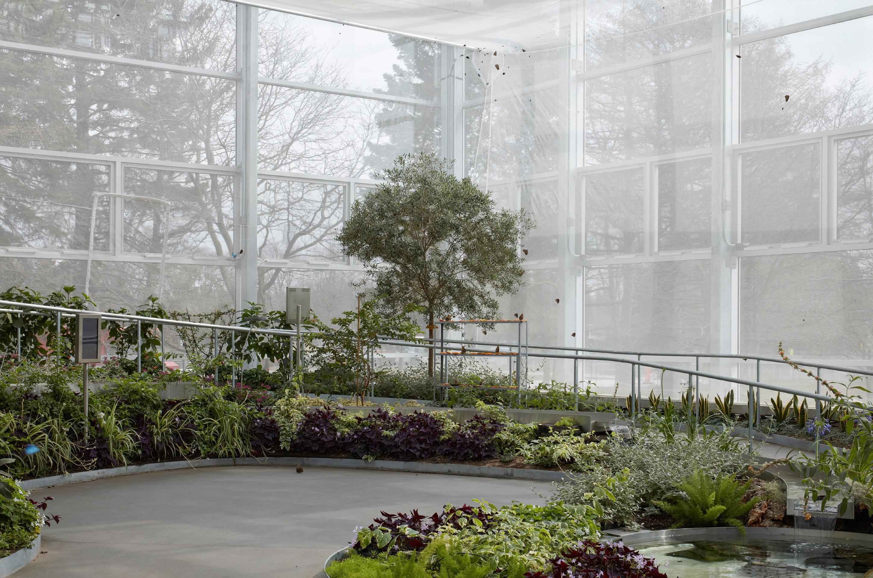
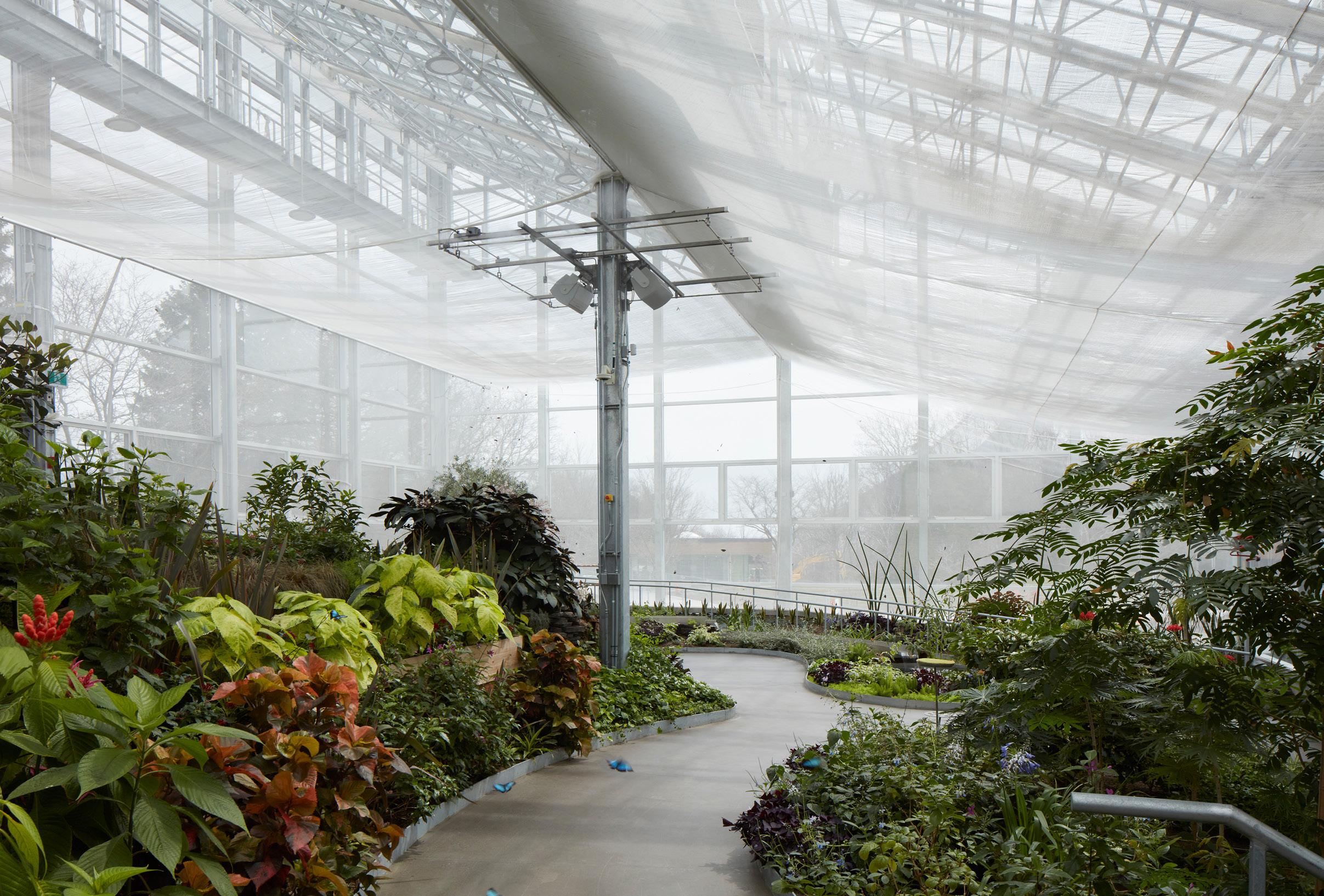
Emerging from the depths of insect education, visitors then arrive in the Grand Vivarium— the above-grade greenhouse that defines the building’s glass facade. Gently sloping paths
lead them through a series of microclimates, containing some insects that can move freely, while others are contained in glass. A glass-walled space in the middle of the Grand Vivarium hosts workshops, while also supplying spaces for employees to conduct research.
The architectural team told AN that their approach to designing the glass system— which they knew would define both the structure’s exterior character and shape visitor experiences on the interior—necessitated a shedding of assumptions about standard curtain walls and mechanical systems. In addition to otherwise common considerations like airtightness and R-value, ultraviolet penetration and natural ventilation schemes were crucial for plant growth. These points led to a “performant curtain wall envelope … with clear glass for maximum transparency, combined with automatic operable windows, roof and wall retractable insulated curtains, large overhead fans, and a cooling mist system.” This approach was paired with
July/August 2023
a double-glazed wall assembly and a roof system that combines both laminated and bonded double-glazing with interlayer film, allowing snow to melt.
The integration of mechanical needs within a glass and metal frame leaves these systems largely exposed to visitors. Apart from technical needs, it serves as a reminder of the level of artificial climatic control necessary to show a wide range of biomes in a single structure in Montreal’s cold northern climate. While the typology of the greenhouse and sloping circulation is reminiscent of the nearby Biodome (which was recently renovated by KANVA), the fully transparent walls and roof on the greenhouse break down the traditional opacity of a museum in favor of the lightness of a crystal palace. CW
 JAMES BRITTAIN
July/August 2023
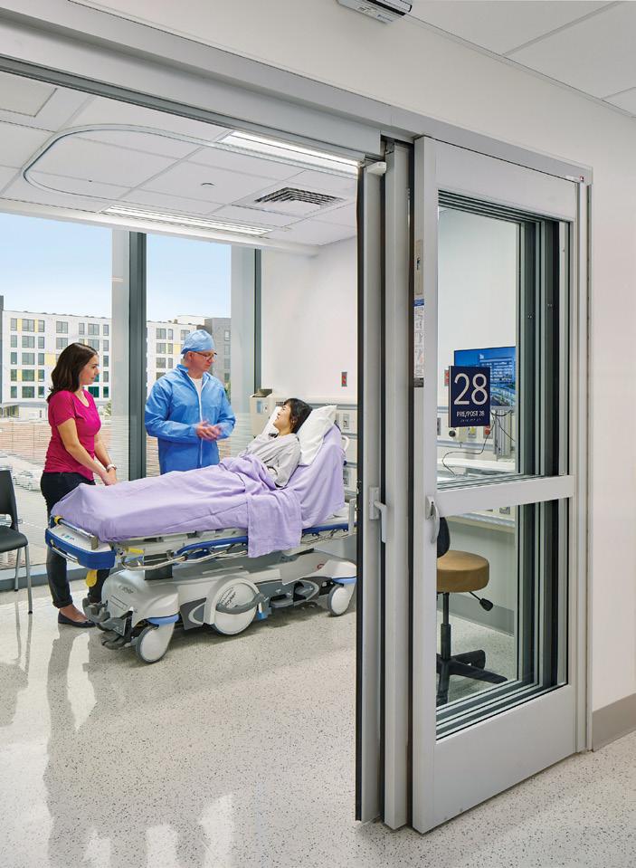
Certain projects require specialty solutions such as switchable glass, photovoltaic glass, or wind protection for roofs, skylights, facades, doors, and windows. While some specialty glass is very industry-specific, such as radiation shields for X-rays in medical facilities, others work across many different project types, like bird-friendly glass for a wide variety of facade contexts. RCO
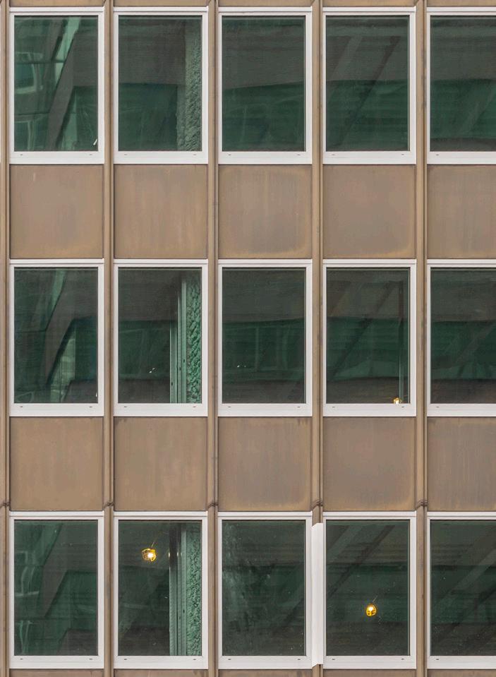
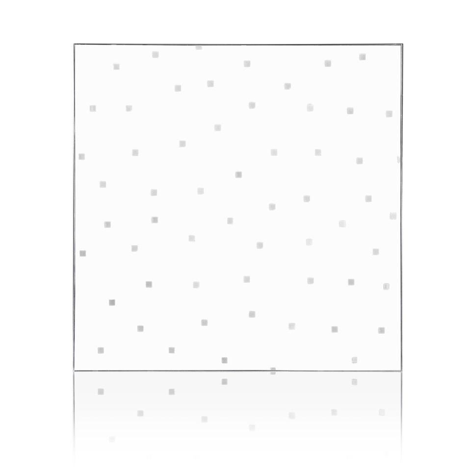
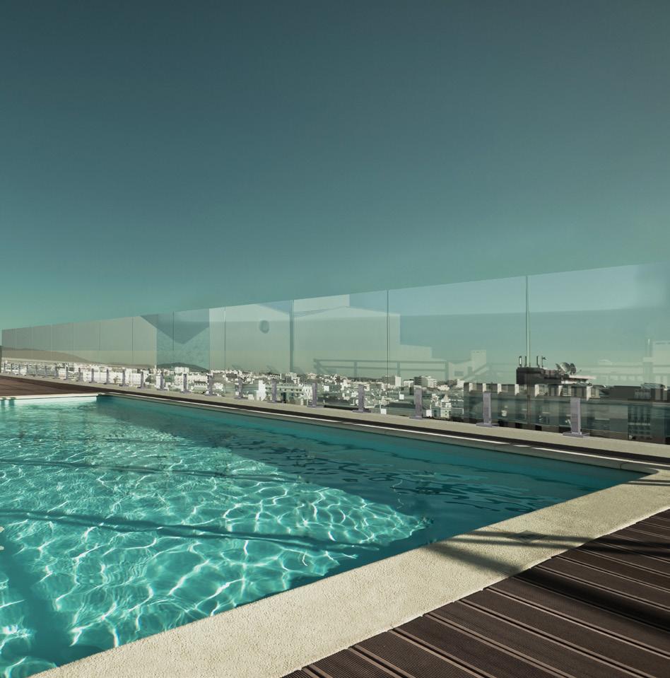
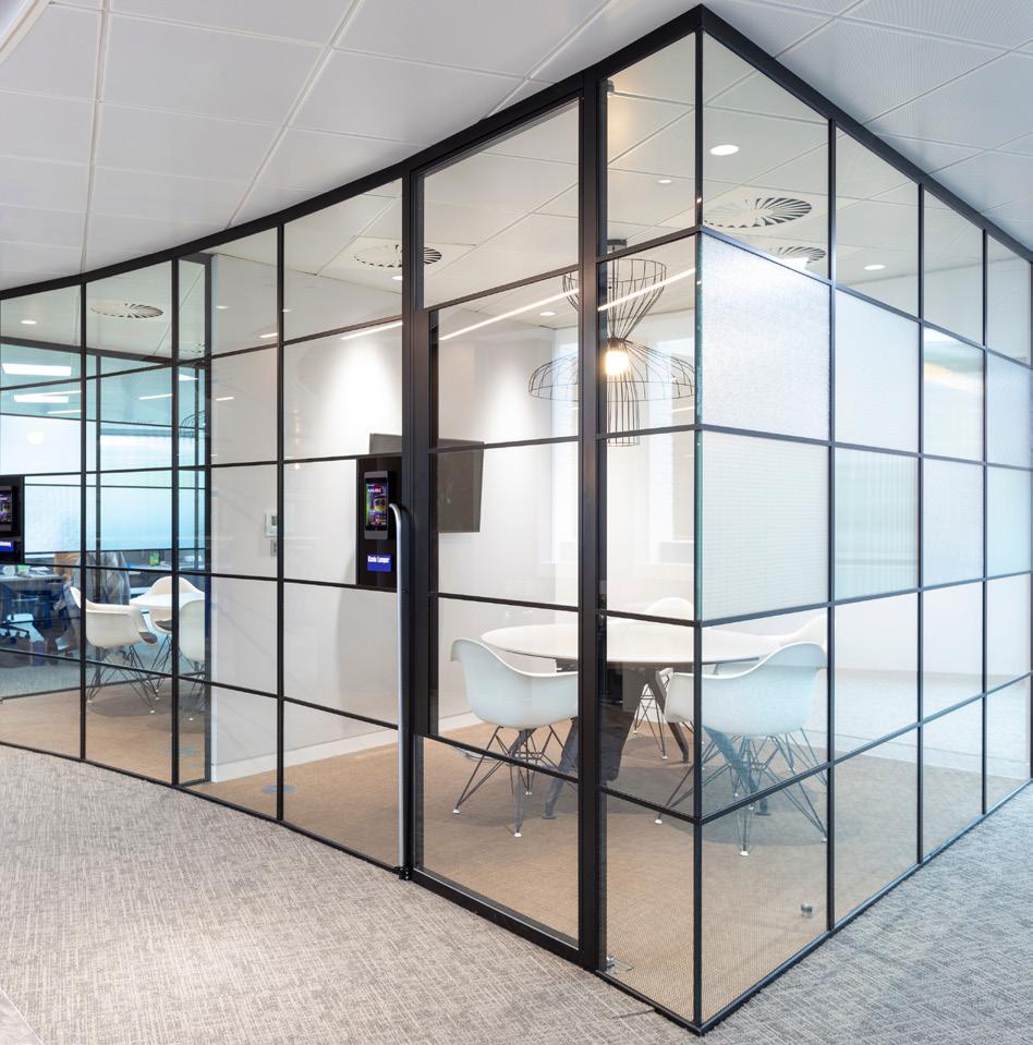 PurOptima Revolution 54 Plus with Tech Panel Optima Systems puroptima.com
Ocula Frameless Glass Windscreen Sightline Commercial Solutions sightlinecommercial.com
AviProtek Bird-Friendly Glass Walker Glass walkerglass.com
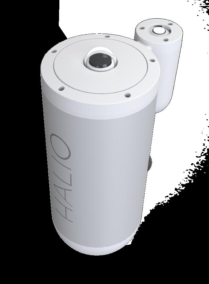
SolarCam Halio halioinc.com
Bird1st UV Glass Guardian Industries guardian.com


July/August 2023
Projects can incorporate high-performance architectural glass to improve fire protection, storm resiliency, energy efficiency, acoustics, and even safety and security. There are options that meet the needs of even the most stringent building codes and regulations, while also giving occupants access to views and natural light. RCO
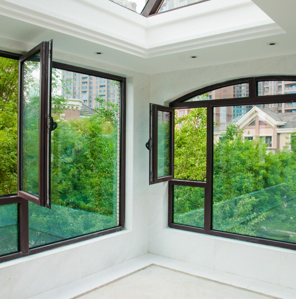
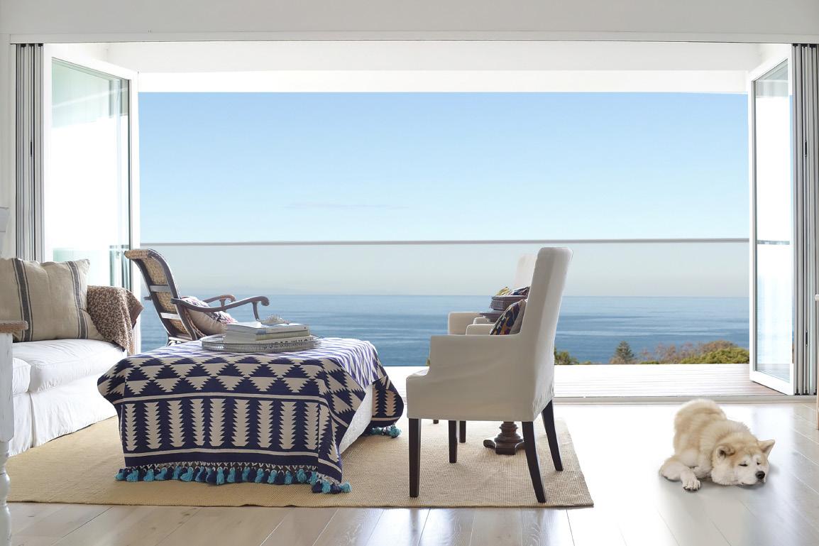
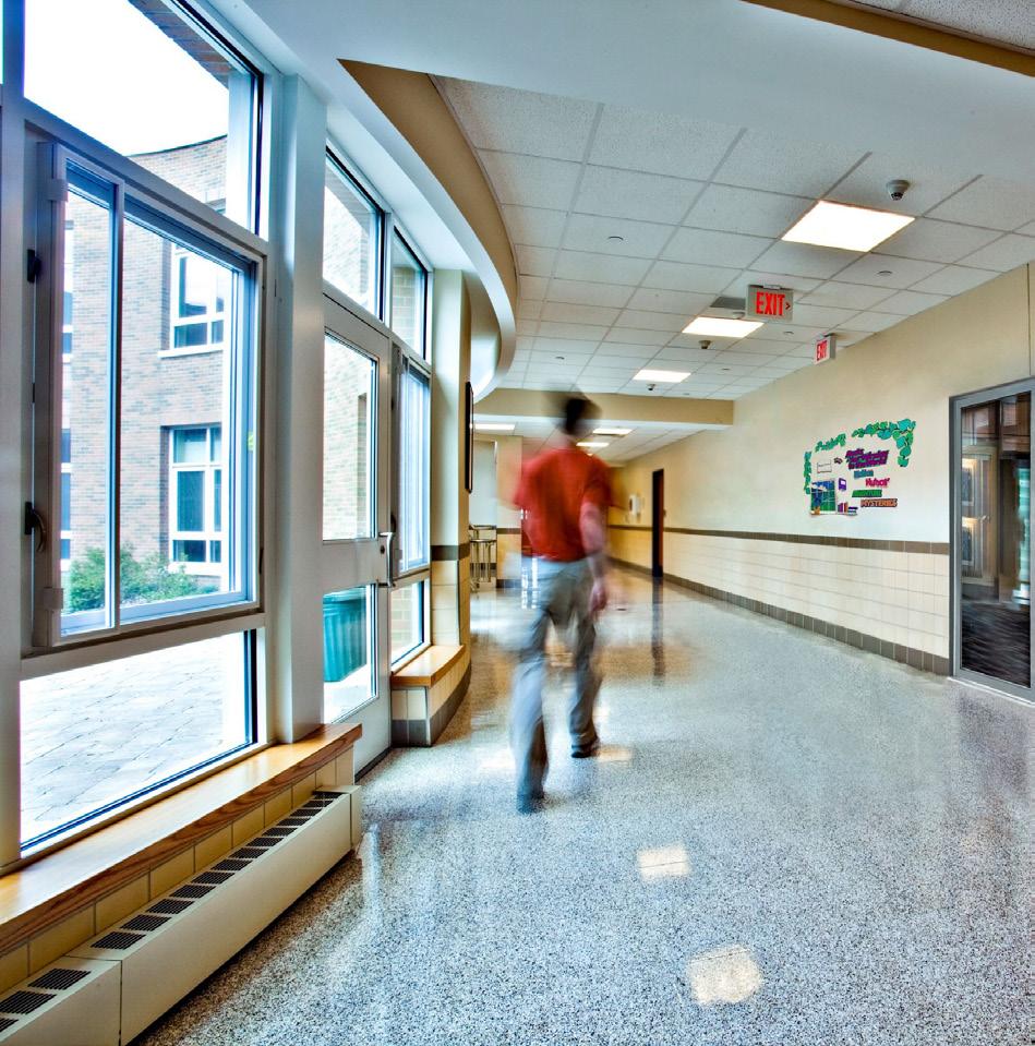
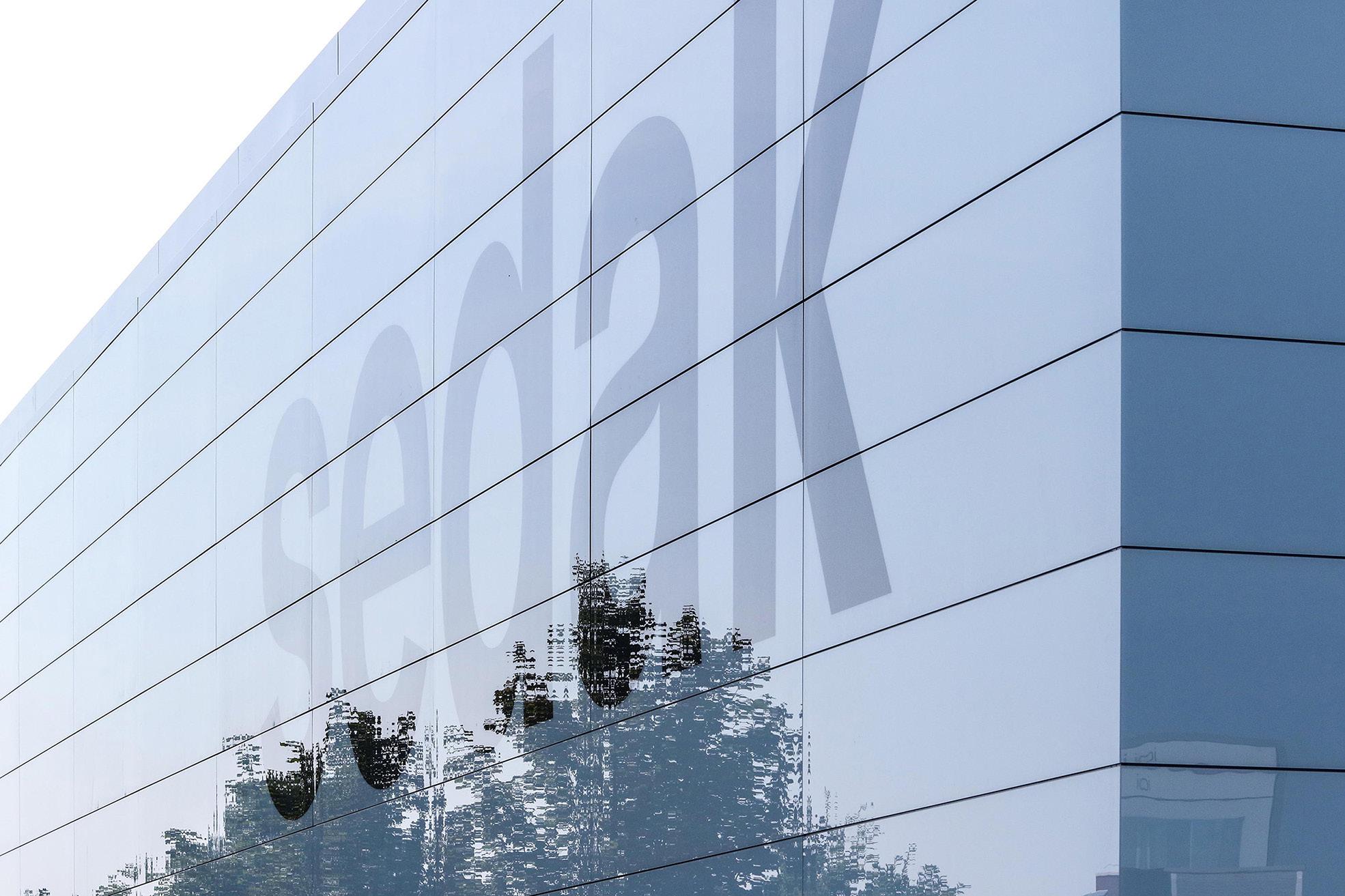
 New Patents for SuperClear 45-HS & SuperClear 45-HS-LI Safti First safti.com
Sedak GSP Sedak sedak.com
Designer Guard System Technical Glass Products tgpamerica.com
Coastal Storm Door System Panoramic Doors panoramicdoors.com
VacuMax Vacuum Insulating Glass Vitro Glass vitroglazings.com

These crisp, reflective neutral coatings manage solar heat gain with exceptional performance. All with a classic aesthetic you know and love.

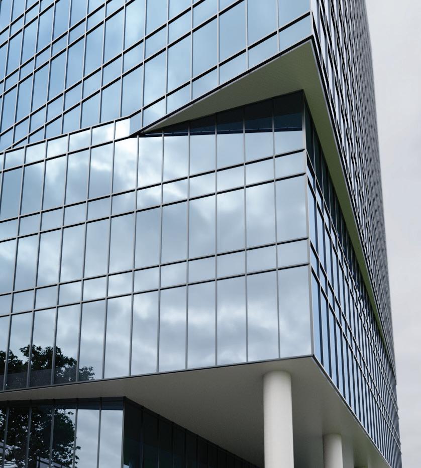
SNR 35 delivers advanced performance with an ultra-low 0.17 solar heat gain coefficient for captivating exteriors and more sustainable, comfortable interiors.
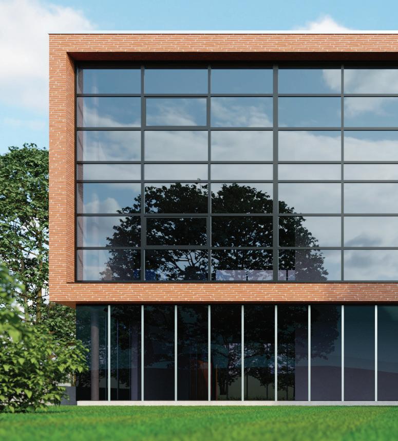
SNR 50 offers a pleasant balance with a cool 0.25 SHGC, medium reflectance and desirable 48% visible light transmittance creating bright and inviting spaces.
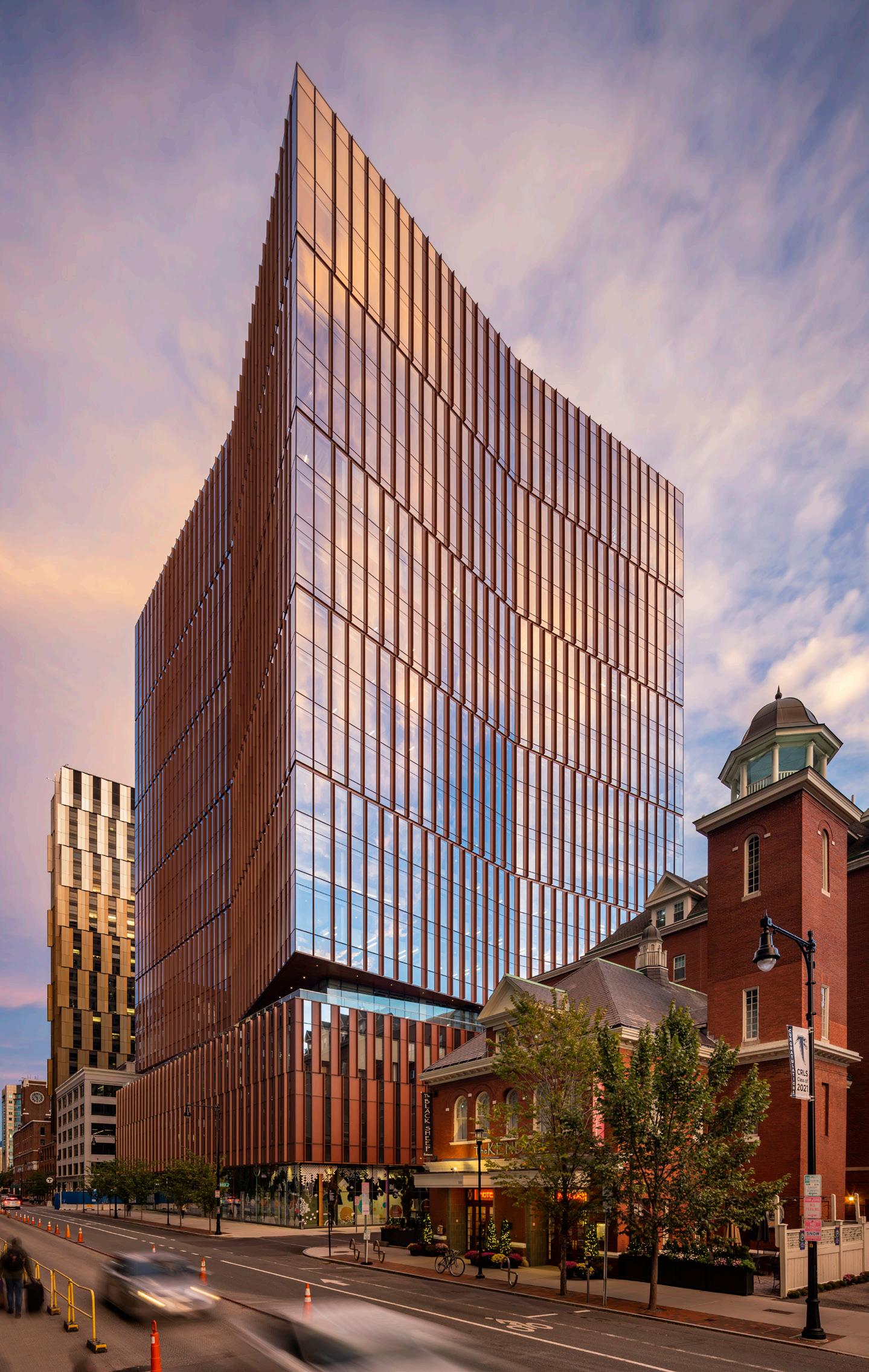
Weiss/Manfredi uses frits and fins to clad a tower for MIT.
Design Architect: Weiss/Manfredi
Location: Cambridge, Massachusetts
Structural Engineers: McNamara Salvia
Glazing: Heintges & Associates
Elevator: VDA Elevator and Escalator Consulting
Lighting: HLB Lighting
Acoustics: Acentech
Code: Jensen Hughes
Sustainability: The Green Engineer
General contractor: Turner Construction Company
Superstructure: G&C Concrete Construction
Superstructure: Canatal Industries
Exterior glazing/curtain wall: Fabbrica/Massey
Millwork: Walter Furman
Interior lobby glazing: Modern Glass and Aluminum
Interior lobby flooring: DePaoli Mosaic Company
Across the Charles River from Boston, a spate of recent projects has altered the skyline of Cambridge’s Kendall Square neighborhood.
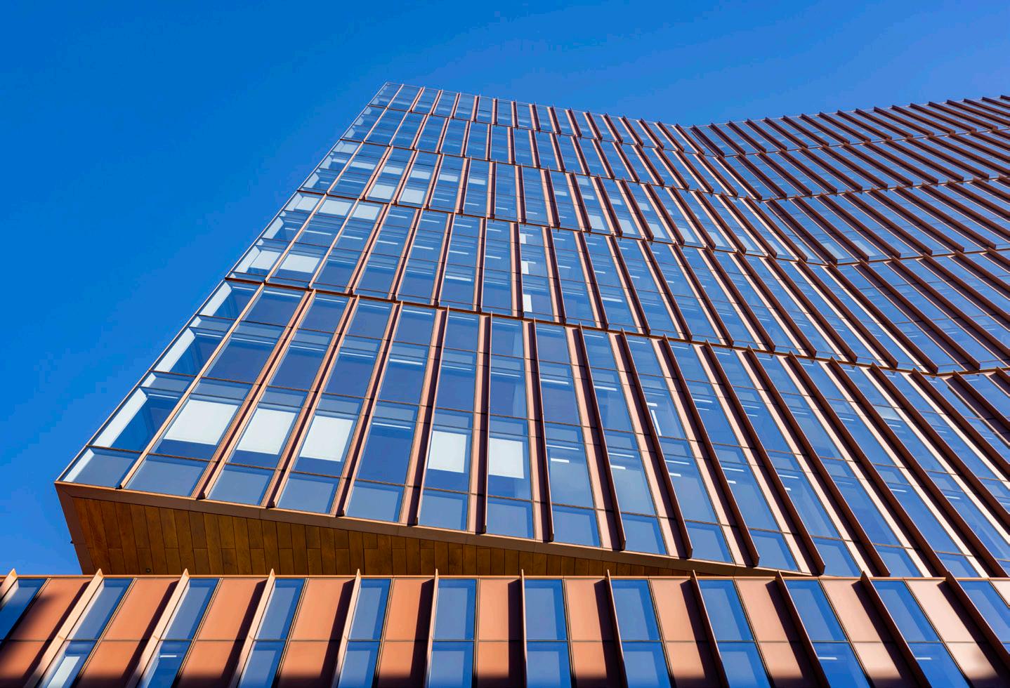
MIT Kendall Square Site 5, designed by New York–based firm Weiss/Manfredi, is one such project, and it makes its presence known with eye-catching massing and a glass curtain wall shaded with a ceramic frit and terra-cotta colored aluminum fins.
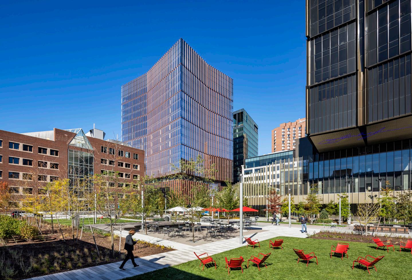
Weiss/Manfredi has been on something of a tear when it comes to institutional, and glassy, projects, recently ranging from the curved structural glass of Yale’s Tsai Center to the staggered brick-and-glass form of Kent State’s Center for Architecture and Environmental Design.
In Cambridge, the office’s 17-story tower was completed last year and houses a number of programs, such as the MIT Museum, MIT Press bookstore, and Boeing’s Aurora Flight Sciences research unit. In its massing, the project seeks to blend in with its neighbors. “The building creates a transition from the brick buildings of Main Street to a newly created campus green that will become an important part of MIT’s open spaces,” Weiss/Manfredi cofounders Michael Manfredi and Marion Weiss told AN. “The building responds to these contexts and programs through the sectional articulation of its massing and facade, which are keyed to the datum lines and rhythm of adjacent buildings.”
The 4-story podium consists of a fully glazed ground floor curtain wall to establish a lively presence at street level, and the rhythm of opaque and transparent elements above
July/August 2023
reflects the scale of nearby historic buildings. Above the podium, the 13-story tower is arranged in a bow-tie-like floorplan that magnifies the pleated detailing of the facade system.
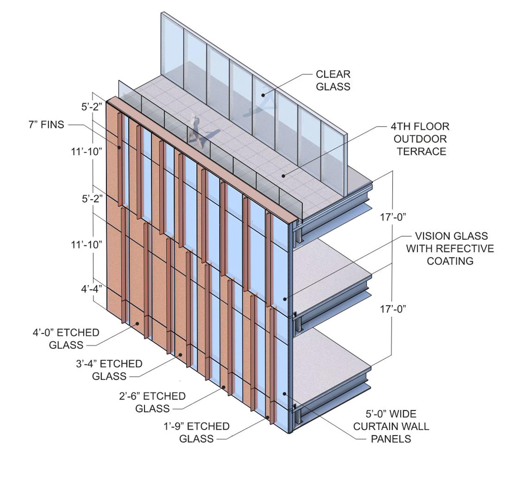
For the design team, the layout of the facade is intended to be something of a chameleon, with a motley crew of acid-etched glass, fritted glass, and coated aluminum presenting variegated textures and reflections based on perspective and lighting conditions. “The tower’s acid-etched, color-integral glass, and shadow box panels densify in opacity towards the center of the building’s folds to maximize corner views while providing a high performance and energy efficient curtain wall,” noted Manfredi and Weiss. “The fin depth corresponds to maximize the chromatic effect of the building from different angles and allow changes of light and shadow to occur throughout the day.”
Though the pattern of the facade appears complex, the system behind it is not. A unitized curtain wall proved the most expeditious option to fast-track the project and maintain a tight schedule—the curtain wall and steel were bid out months ahead, which allowed for early shop drawings of superstructure and enclosure. The curtain wall is divided into seven standard panel types, and that simplicity eased construction and fabrication costs. The majority of the panels are approximately 5 feet wide, a standard dimension that proved ideal for both fabrication and installation. They are held to the cast-inplace structural system with industry-standard, adjustable, embed-type anchors located at the top of the floor slab. All in all, the curtain wall was installed in about six months, with multiple crews simultaneously at work across the building.
While the aluminum fins and clever massing act as passive shading divides for the facade, there are several design measures within the unitized panels themselves that helped the project reach LEED Gold certification: thermally broken mullions, low-e coating, ceramic frit, argon-filled insulated glazing, and upper insulated opaque shadow box panels.
The result is an enclosure that maximizes views while retaining high-performance standards and, importantly, in its unique character and massing, acts as a gateway for MIT’s fast-growing presence in this corner of Cambridge.
Matthew Marani, studying city and regional planning at Pratt Institute, writes about architecture and urban design. ALBERT VEČERKA/ESTO ALBERT VEČERKA/ESTO ALBERT VEČERKA/ESTOskydesign.com

Saflex FlySafe™ 3D PVB interlayer

Where aesthetics and bird safety collide
Saflex FlySafe 3D PVB interlayer protects birds and views worldwide as a highly effective, low-coverage solution for laminated glass.
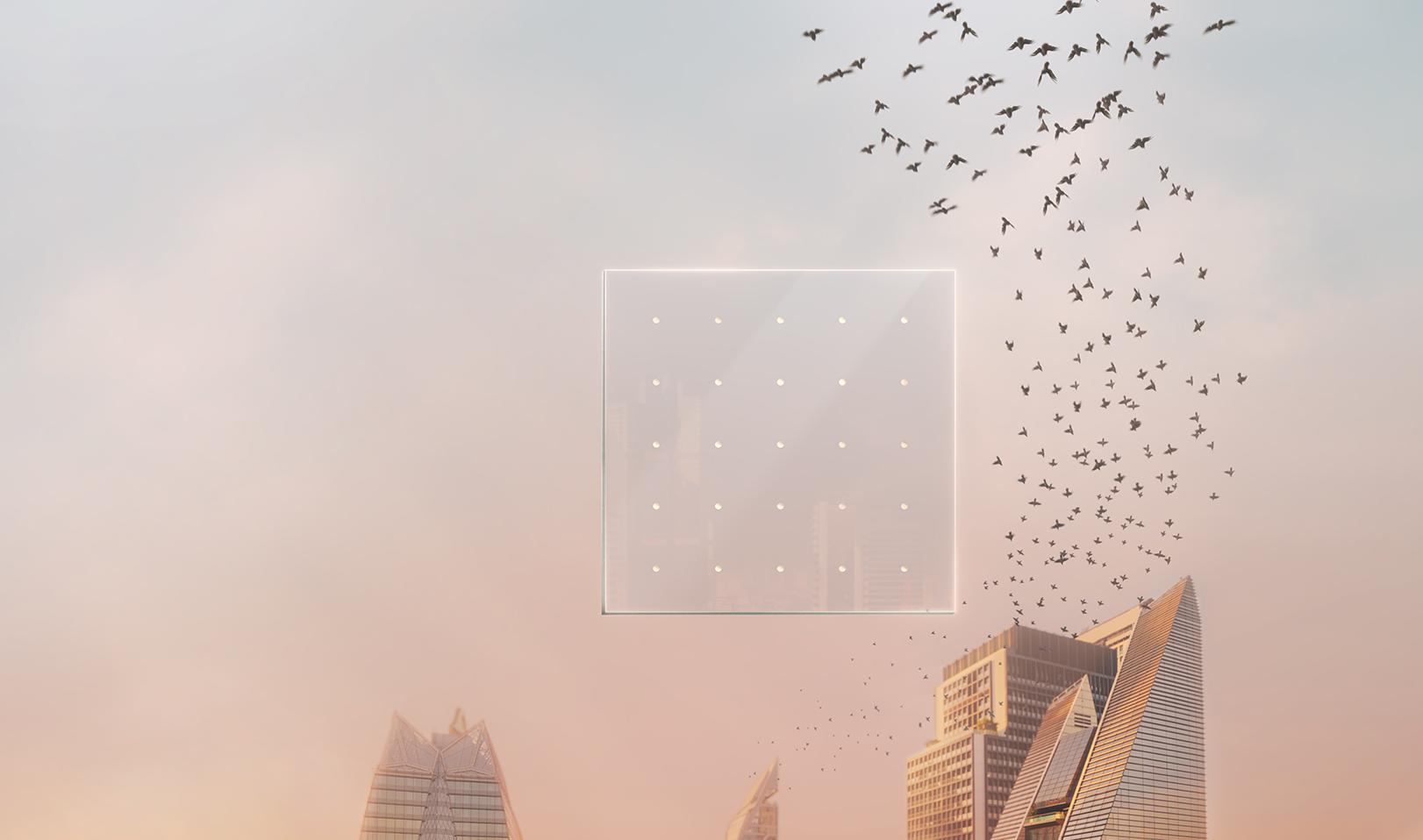
FlySafe 3D checks off all the boxes:
• Bird friendly
• Aesthetic
• Effective
• Innovative
• Durable
Available in a variety of sequin sizes and colors
Ideal for: Atriums | Balustrades | Cladding | Curtain walls | Exterior doors | Facades | Glass fins | Link bridges | Podium glass | Storefronts | Skylights | Windows


OLI creates a floating campus in Suzhou with an intricate set of facades realized in glass and GFRC.
Design Architect: OLI Architecture
Location: Suzhou, China
Local design institute: AEPA Architects
Engineers
Project management: QNP
General contractor: Nantong Wujian
Construction Engineering
Curtainwall consultant: Talweg Engineering
Studio
Curtainwall consultant for local design institute: Shenzhen OEC Facade Technology
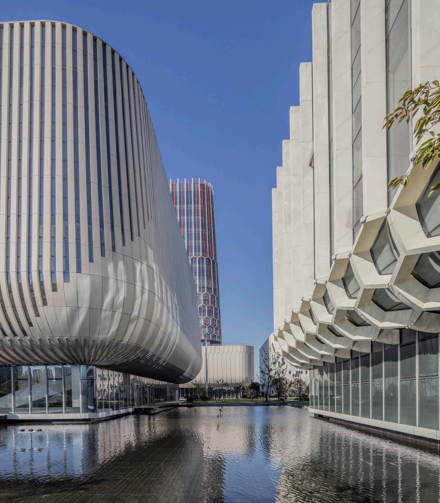
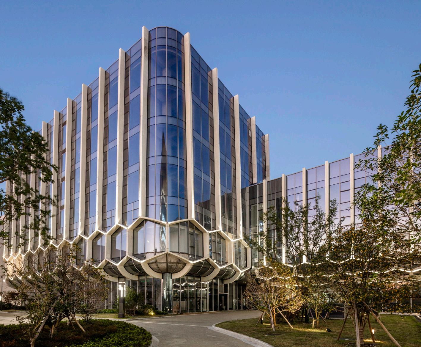
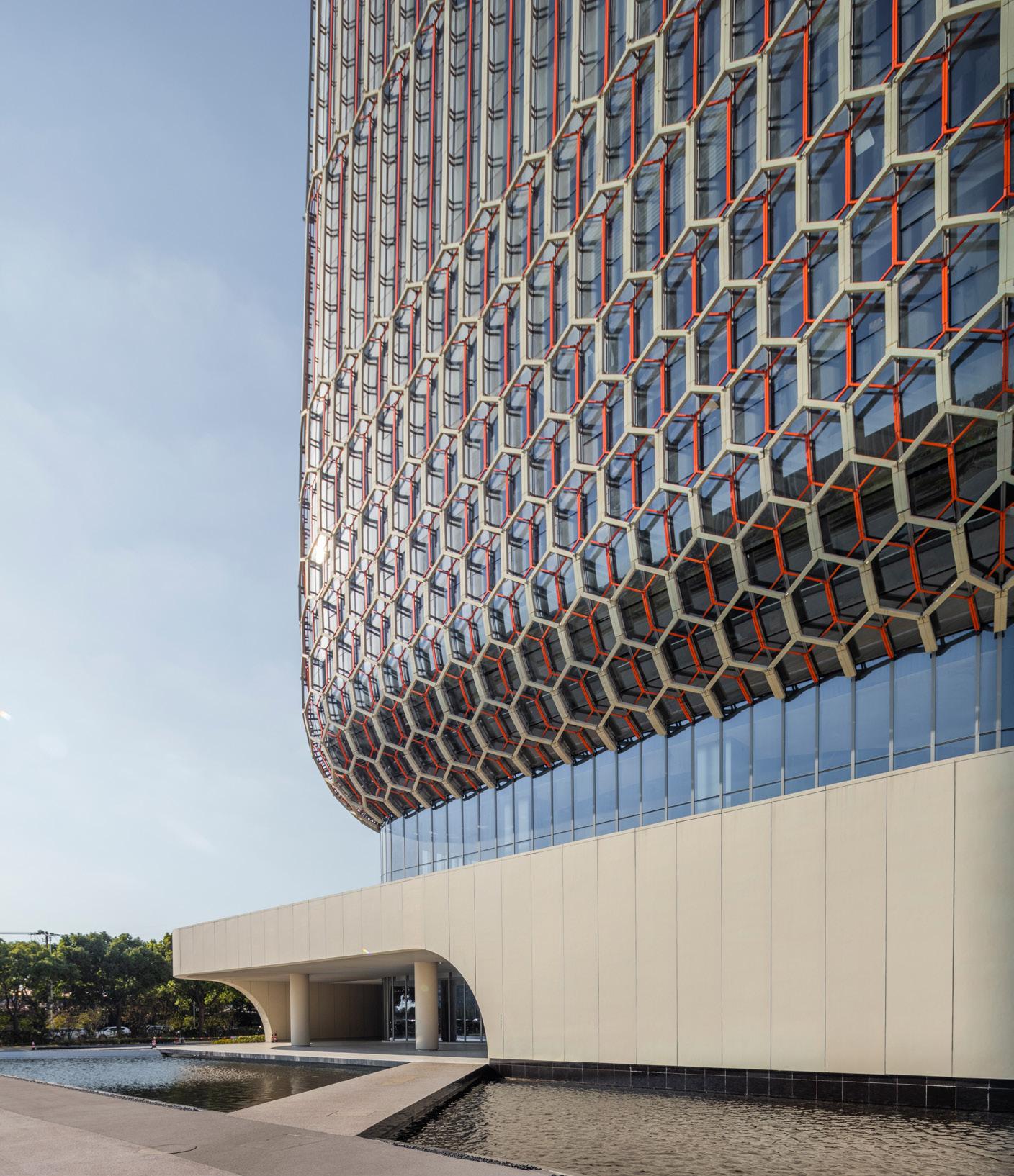
Floating over a reflecting pool in Suzhou, China, the Ascentage Pharmaceutical Headquarters, designed by New York–based OLI Architecture, stretches upward beneath a unique, parametric exterior facade. Created for a young Hong Kong pharmaceutical company, the glass facade references the hexagonal structure of a benzene ring to create a visually interesting and modern way to skin the interrelated buildings on the new 147,000-square-meter research and manufacturing complex.
The design is influenced by an interesting intersection of modern genetic science and traditional Suzhou scholar’s garden. As in these gardens, the focus of the design brings attention to the water, specifically the black Shanxi granite reflecting pool, which makes the gently curved, transparent buildings of the complex feel like they’re floating. This is juxtaposed with a geometric honeycomb-like pattern on the facade, which through its shape highlights the genetic research performed by the company. The pattern is based on the ring that annotates the bonds between disparate carbon and hydrogen molecules. It was designed using adaptive BIM families and stretches upward throughout the building skin.
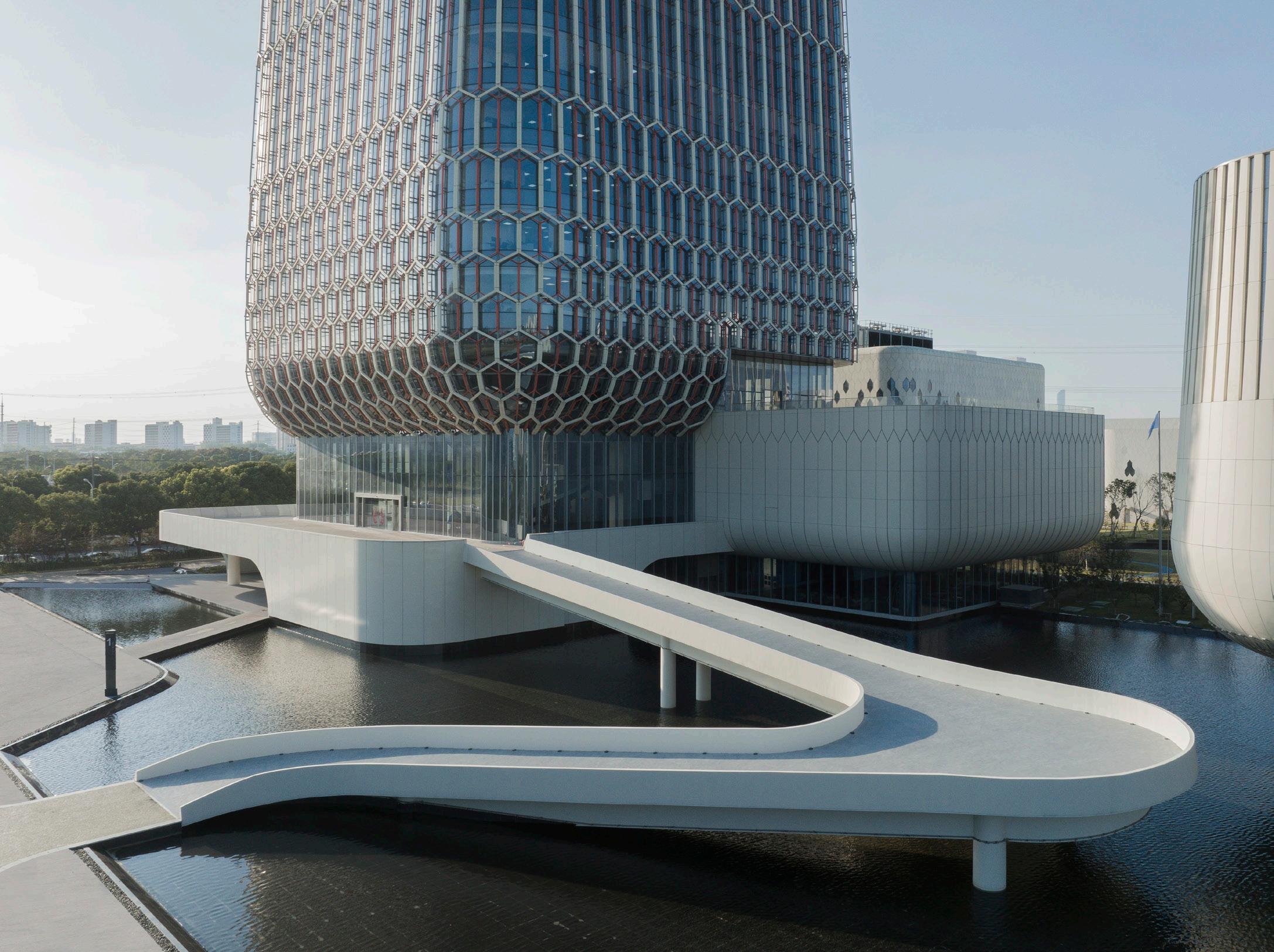
OLI Architects principal Hiroshi Okamoto told AN that “the clinical and high-tech feel … is purposefully softened by the careful composition of building scale, height, and facade pattern diversity.” Beyond the pattern, the distinctive use of glass on the facade was envisioned to strike an optimal balance of transparency and privacy. Integrated sun shading and careful interior programming of building floor levels and orientations make maximum use of these high-performance insulated glass units (IGUs): The majority of the buildings employ a double-layer curtain wall system, which uses double silver low emissivity (low-e) insulated glass units on the inner side and varying densities of ultra-high strength concrete panels and aluminum extrusions on the outside—these create the hexagonal overlay.
Due to their various material tolerances and strengths, the installation process of the concrete panels was meticulously planned to protect the installed glass. Glass-fiber reinforced concrete (GFRC) support keels and vertical stack joints also offer support. Additionally, several iterations of the design were developed in order to avoid excessive heat stress differentials, yet acute IGU angles still allow for large, prefabricated components with double curvatures to be assembled safely and efficiently.
Okamoto explained that “as energy performance for buildings enclosures have become very demanding in each successive iteration of the Chinese building codes, we needed to use a remarkably high-performing glass with low a solar heat gain coefficient
[SHGC], blocking a good amount of infrared and UV light, while also preserving high VLT,” or percentage of natural daylight.
This contradictory goal is nevertheless challenging a new generation of architects to innovate and adapt to new building codes that stress more sustainable and energy efficient buildings.
In order to customize IGUs to meet both efficiency levels and overarching design goals, OLI worked with Xinyi Glass, a Hong Kong–based glass manufacturer at the cutting edge of low-e glass products. Xinyi provided glass for the entire project utilizing a special low-e coating that achieved the conflicting goals of letting in as much natural light as possible, with as little solar heat gain as feasible. Together, the manufacturer and designers went through several iterations to perfect the coating for both the curved and double-curved glass, so that everything would appear consistent.
The new headquarters is situated within a growing high-tech science and technology center outside of historic Suzhou. The new facilities will allow the company to continue its cutting-edge research in biotechnology and oncology. Charles Gebbia
Above:
Satisfy safety regulations with Aluflam, the key system featuring true extruded aluminum vision doors, windows and glazed walls, fired-rated for up to 120 minutes. Access a wide portfolio of most architectural finishes and indistinguishable products from non-fire-rated doors and windows.
Design architect: OMA/Shohei Shigematsu
Partner: Shohei Shigematsu
Associate: Jake Forster
Project architect: Caroline Corbett, Ninoslav Krgovic
Interior architect (GF–F10): Peter Marino
Executive architect: CallisonRTKL
Structure: WSP
MEP: WSP
Lighting: Tillotson
AV: Theater Projects
Acoustics: Cerami Associates / Henderson
Engineers
Graphics, Signage, Wayfinding: 2x4
Vertical transportation: Edgett Williams
Consulting Group
IT/Data/Security: Tiffany & Co. (In-house)
Sustainability: Paladino
Client Rep/Project Managers/Cost: MACE
Group
General contractor: Structure Tone
Facade: Heintges
Glass: Seele (manufactured by Sunglass)
“Meet me at Tiffany’s” is a phrase New Yorkers may only use when directing hopelessly lost tourists to a rendezvous on 5th Avenue. But the iconic status of Tiffany & Co.'s flagship store far surpasses its starring role as Audrey Hepburn’s go-to breakfast spot. It’s been a landmark for tourists and locals alike since its opening in 1940, though the luxury jeweler has roots going back to 1837, which means that OMA had nearly two centuries of legacy to revamp when it took on the flagship’s renovation, the store’s very first.
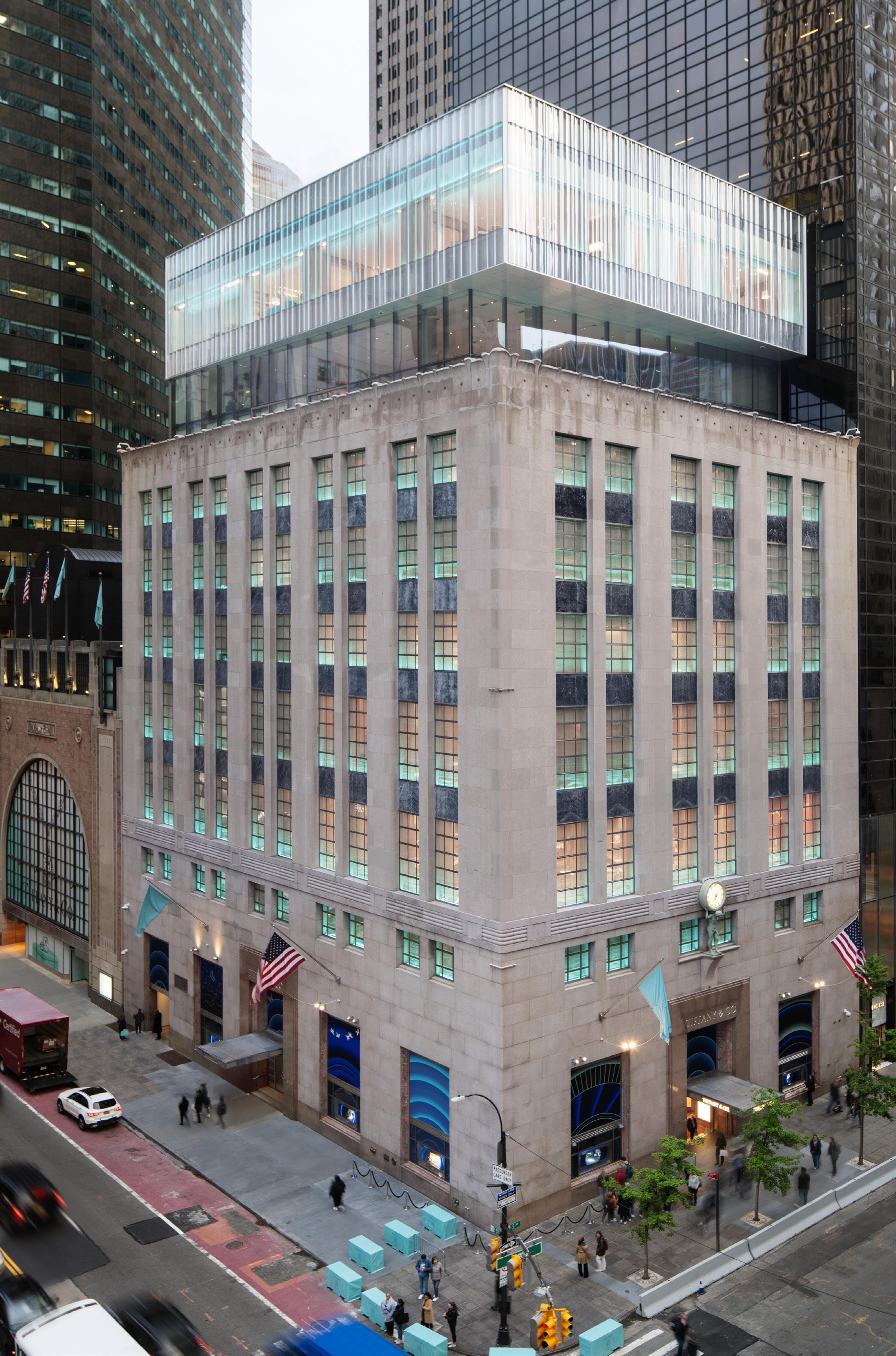
The 10-story limestone building at 727 5th Avenue has just been renovated and expanded, finally opening this spring to reveal a “jewelry box” glass topper that seems to hover over the masonry mass. OMA was tasked with the exterior restoration and addition, as well as mechanical system updates, while Peter Marino took charge of the interiors.
On a hot July morning at the jeweler's headquarters, Jake Forster, associate at OMA, explained that the sculptural details found in the new glazed addition crowning the flagship were inspired by Tiffany’s iconic designs—like the cut-crystal drinking glass I held in my hand. Visible on the building’s historic doors and hardware, and especially in its famous Atlas Vase, these art deco bas-relief forms inspired the designer to experiment with slumped glass for the expansion.
The process of making slumped glass was custom to this project and resulted from a close collaboration between OMA and glass manufacturers Seele and Sunglass. Molten glass was draped over a mold, taking on its wavy shape as it cooled, a process that demands the highest level of craftsmanship and customization. It hearkens back to historic glassmaking techniques for making curved glass—special details which were status symbols in 19th-century society. This level of craft is, of course, appropriate for a luxury artisan with iconic glassworks scattered throughout its oeuvre, in equal measure to diamonds.
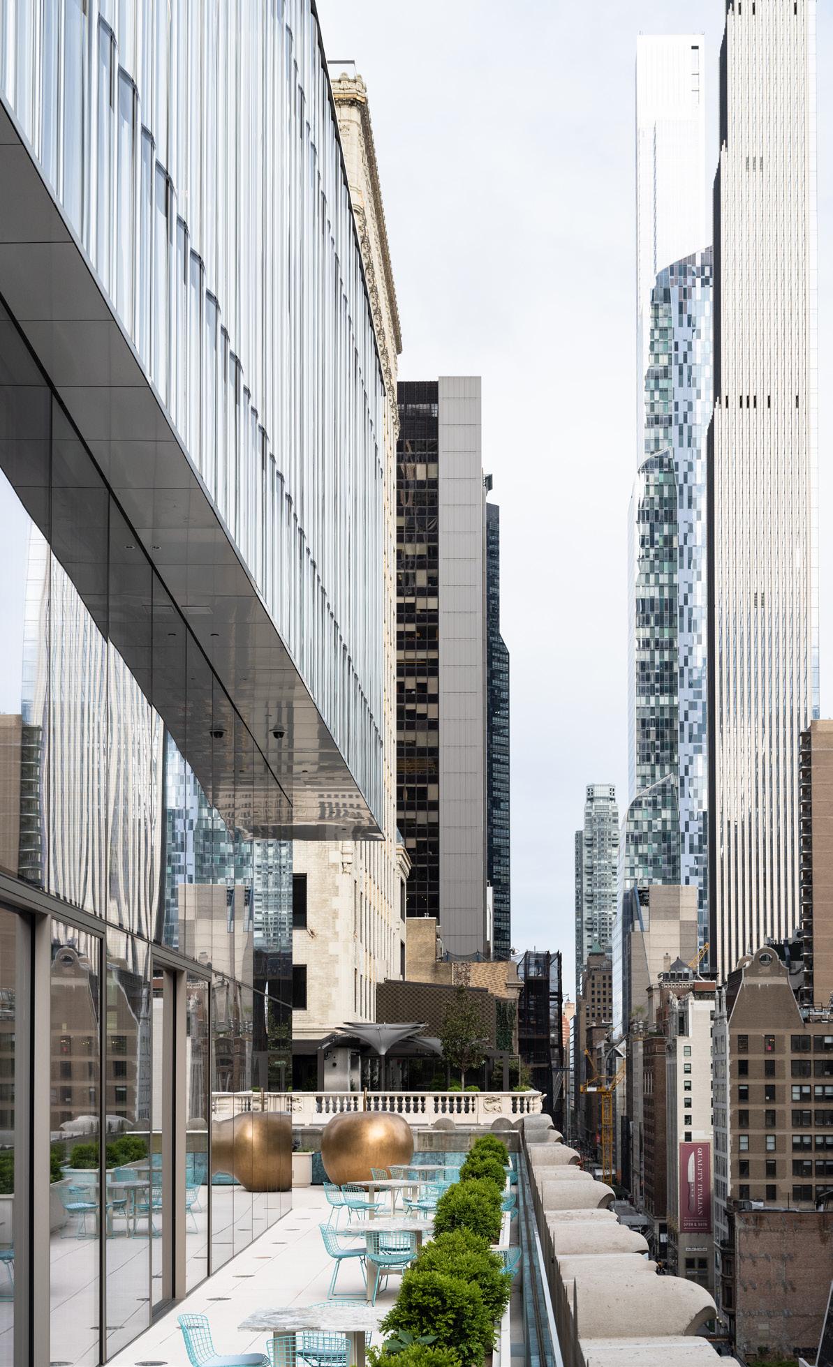
The 2-story addition’s hovering effect is achieved through the translucent character of two distinct glass types as well as a subtle setback. OMA replaced a previous—and odious—1980s rooftop addition with two new glassy floors that host events, clients, and exhibitions as well as showcase the brand’s history. The bottom is recessed to make way for a terrace with sweeping views of Manhattan and Central Park, and the top
July/August 2023
cantilevers above it, slightly wider at the back of the lot and narrowing as it approaches 5th Avenue to allow for more terrace space. “The new design flaunts translucency rather than transparency,” Forster stated. “It plays with the simultaneous needs for privacy yet a desire for weightlessness.” OMA opted to experiment with a slumped glass technique that offers not only privacy but texture, too, in contrast to the mirrored, glassy fronts of the surrounding skyscrapers.
The slumped glass was also chosen for its structural efficiency: It requires less vertical support than more standard applications. The curves are created from one mold
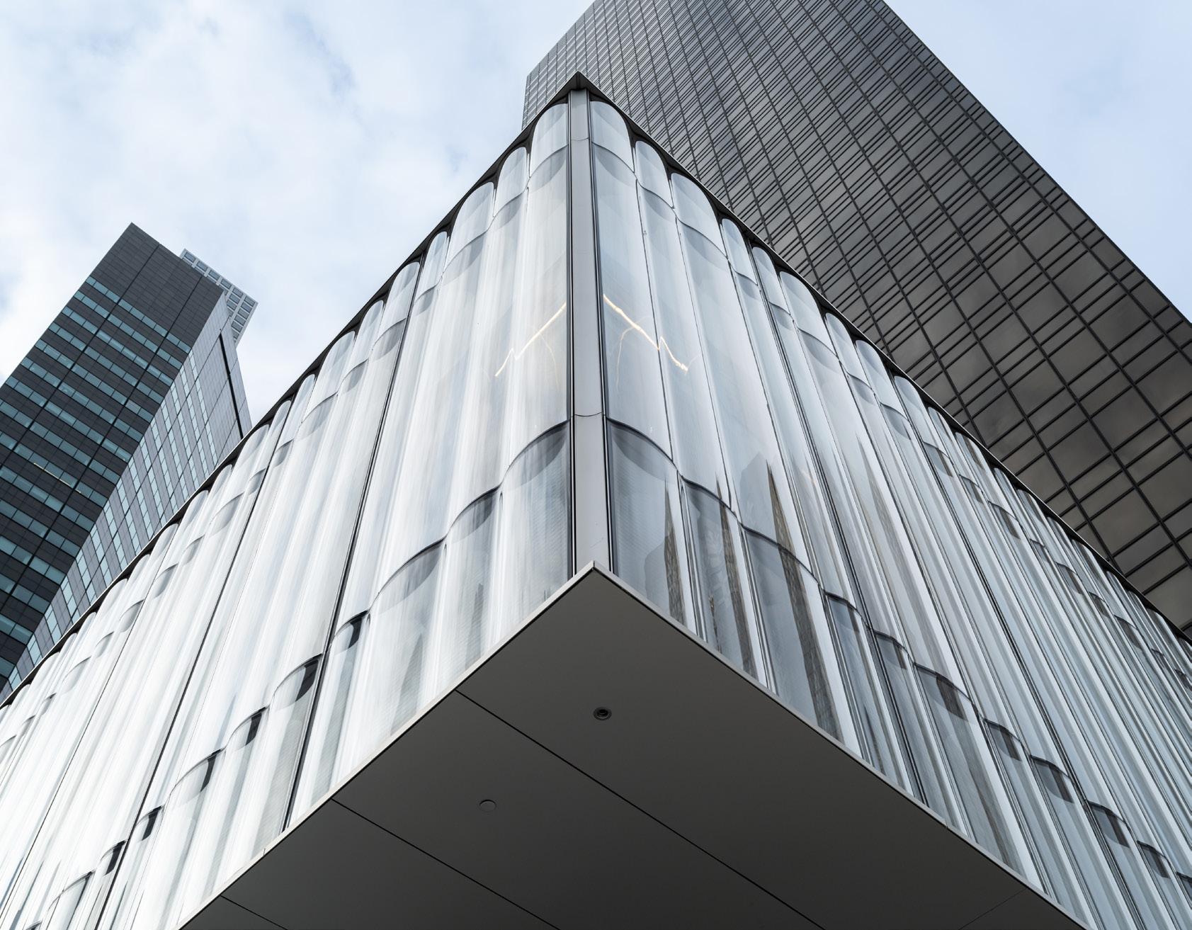
and lifted into place in alternating ABAB patterns to offer more variability, softening the otherwise boxy form. Looking out from within the space, there is also a funhouse effect as it subtly warps the Plaza Hotel beyond at certain angles. It seems like the top floor is draped with a curtain or thick velvet cloth, not unlike the small blue boxes customers bring their Tiffany’s wares home in. The effect is strengthened by OMA’s decision to light the entire glass mass up at night with Tiffany Blue bulbs, making the entire addition an extension of the iconic wrapping.
“The result is a translucent vitrine to signal new flagship activities—a contemporary
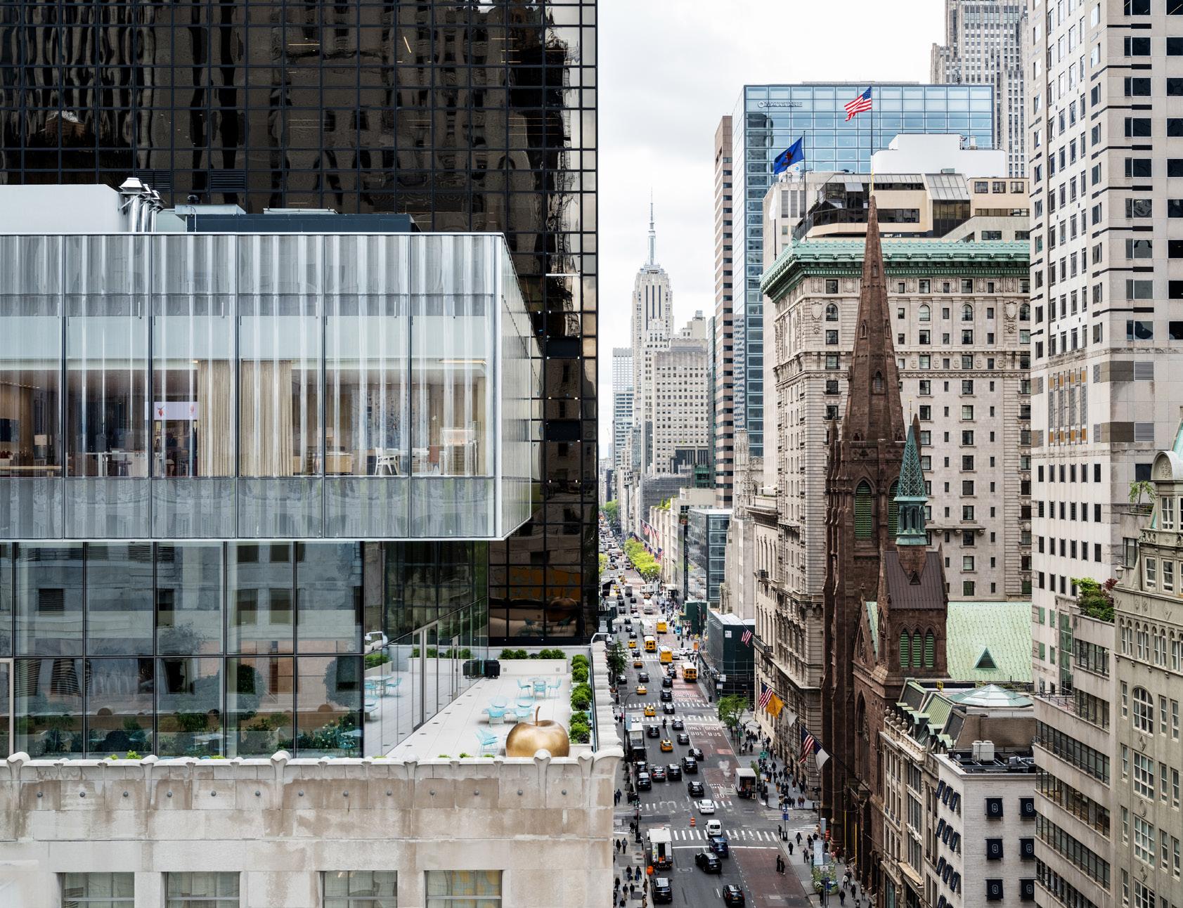
bookend to the historic building and symbolic launch of a renewed brand,” Shohei Shigematsu, partner at OMA, offered. During my visit in July, workers were still putting the finishing touches on the interiors, while plants and Tiffany Blue outdoor furniture were scattered about the terrace. But as Forster and I looked over the limestone parapet toward the panoramic view of Central Park, the feeling of being enveloped by the city and its myth of glamour took hold. When prompted, Forster said his favorite details from the project were the thinness of the joints at the northwest corner and the concave piece of aluminum at the building’s
bow that holds the artful glass together. “It’s the things that look the most effortless, or become the most overlooked, that actually take the most work and invention,” he said. This attention to detail is an ethos shared both by OMA and its iconic client. Emily Conklin

Advancements in material technology help coatings and films serve critical roles in architecture. They can prevent injury during storms, fire, or forced entry. They can increase a building’s energy efficiency or offer improved views or added privacy, depending on which is needed. These glazing options can support every facet of a project, whether you’re constructing a storefront, interior display cases, railings, or glass partitions. Additionally, a new spacer offers asset management information for easy glass replacement. RCO
 Modular Poly Clear 2 Mil Stackable Window Film Avery Dennison graphics.averydennison.com
BirdSecure Pro interlayer Kuraray trosifol.com
Aluflam aluflam-usa.com
Avery Dennison averydennison.com
DuPont dupont.com
Kuraray trosifol.com
Owens Corning owenscorning.com
Poly Wall poly-wall.com
Saint-Gobain saint-gobain.com
STI Firestop stifirestop.com
Tremco Tremcosealants.com
Safeflex saflex.com
Safti-first safti.com
Unicel unicelarchitectural.com
3form 3-form.com
Bendheim bendheim.com
CARVART carvart.com
Galaxy Glass & Stone galaxyglass.com
Glas Italia glasitalia.com
Goldray Glass goldrayglass.com
Lasvit lasvit.com
Lunada Bay Tile lunadabaytile.com
Marazzi marazziusa.com
Nathan Allan nathanallen.com
OmniDecor Glass Design omnidecor.it/en
Pulp Studio pulpstudio.com
SCHOTT North American us.schott.com
Skyline Design skydesign.com
Benson/MiTek bensonglobal.com
Consolidated Glass Corporation cgcglass.com
Dynamic Glass dynamicglass.com
Enclos enclos.com
GGI generalglass.com
Giroux Glass girouxglass.com
Glasswerks glasswerks.com
Harmon harmoninc.com
Massey masseysglass.com/
Momentum Glass momentum-glass.com
New Hudson Facades newhudsonfacades.com
Permasteelisa permasteelisagroup.com
The Roschmann Group roschmann.group/en
Seele seele.com
W&W Glass wwglass.com
U.S. Glass and Aluminum us-glass.com
Cardinal Glass Industries cardinalcorp.com Eastman eastman.com
Erie AP erieap.com
Faour Glass Technologies faourglass.com
Fenex fenex.com
GAMCO gamcocorp.com
Innovative Glass innovativeglasscorp.com
Kinestral Technologies kinestral.com
Kuraray kuraray.com
Panoramic Doors panoramicdoors.com
REHAU rehau.com
Safti First safti.com
Sedak Sedak.com
Sto Corp. stocorp.com
Technical Glass Products tgpamerica.com
Technoform technoform.com
Tecnoglass tecnoglass.com
Thermalsun Glass Products thermalsun.com
Vitro Glass vitroglazings.com
Viracon viracon.com
Vitro Architectural Glass vitroglazings.com
Xinyi Glass xinyiglass.com/en/
Alumil alumil.com
Cristacurva cristacurva.com/en
Dlubak Speciality Glass dlubakglass.com
Formglas formglas.com
Guardian Industries guardian.com
Glasbel glasbel.com
GlasPro glas-pro.com
Halio Halioinc.com
Horton Automatics hortondoors.com
Multiver multiver.ca
Old Castle obe.com
Optima Systems puroptima.com
Pilkington Glass pilkington.com
Saflex saflex.com
SageGlass sageglass.com
Seele seele.com
Sightline Commercial Solutions sightlinecommercial.com
Standard Bent Glass Standardbent.com
TGP Fireglass fireglass.com
Walker Glass walkerglass.com
C. R. Laurence crlaurence.com
Fabbrica www.fabbricausa.com/
FHC fhc-usa.com
Kawneer kawneer.com
Pielle pielle.tv
Reflection Window + Wall reflectionwindow.com
Schüco Schueco.com
Sentech Architectural Systems sentechas.com
YKK ykkap.com
