Snøhetta’s craftforward Vesterheim Commons opens in Decorah, Iowa page 12 The Sphere, designed by Populous, hosts inaugural concerts in Las Vegas page 12


REX,
13 AN checks out interior
Novus page 18 14 PAU in Williamsburg 15 SHoP’s Brooklyn Tower 16 Pictorial: a83 74 Marketplace 82 A comic by Amelyn Ng The Architect's Newspaper The Architect’s Newspaper 25 Park Place, 2nd Floor New York, NY 10007 PRSRT STD US POSTAGE PAID PERMIT No. 336 MIDLAND, MI October/November 2023 archpaper.com @archpaper $3.95 Parks, products, and more. Read on page 51. Landscape TY COLE BEN DENZER AN at 20 Read on
20.
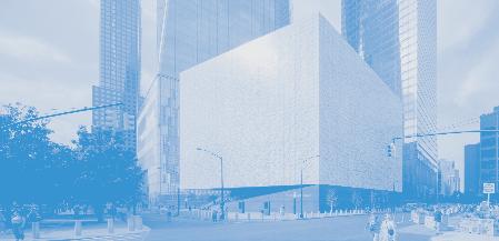
Davis Brody Bond, and Rockwell Group complete the Perelman PAC page
architectures by New York–based Modellus
page


Custom and unique claddings with aluminum chains
Kley Student Residence, Montpellier, France, by Archikubik. Photo by Marcela Grassi.
OUTDOOR
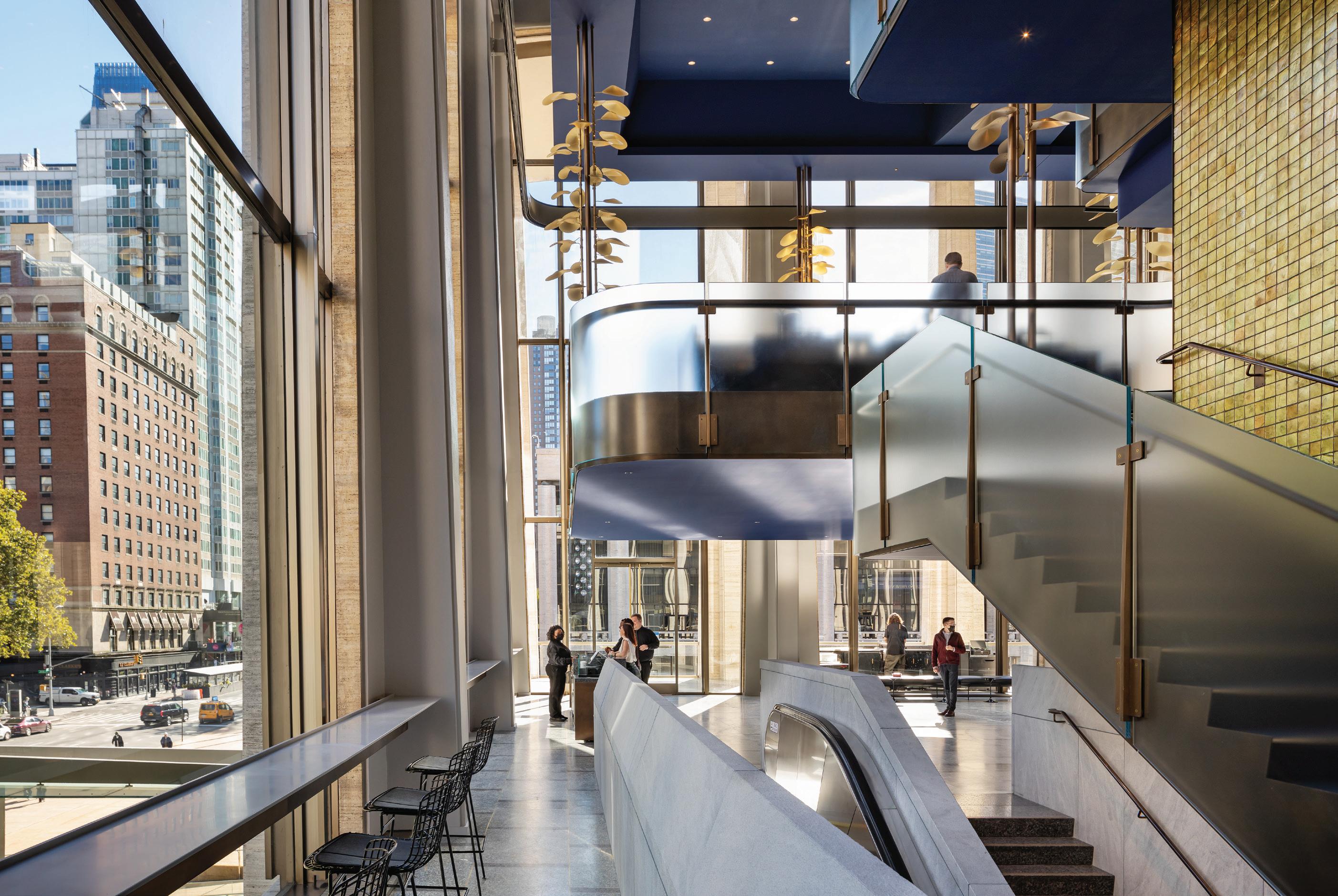
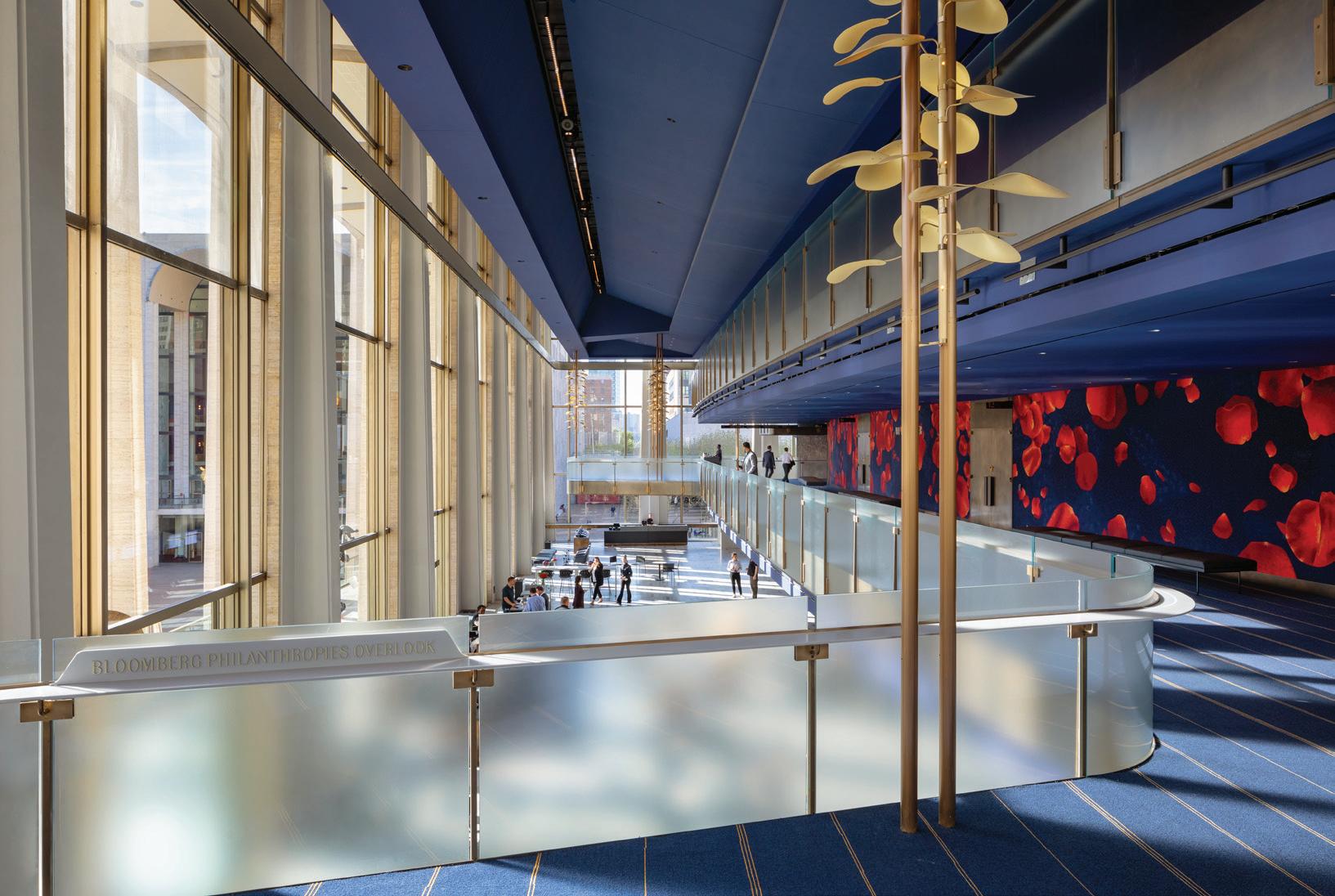
The new Lincoln Center David Ge en Hall, designed by Diamond Schmitt and Tod Williams/Billie Tsien Architects, was decades in the works but completed ahead of schedule and under budget since the pandemic forced the closure of the Avery Fisher Hall.
The first priority was to improve and revitalize the acoustics inside the main theater, to make sure it was the best-in-class acoustic experience for the New York Philharmonic. What resulted is a completely new theater inside the building, not just a renovation, creating an intimate and inclusive experience for the audience.
Everything in the building, from door handles to floorboards to railings, feels reassuringly solid. Pulp Studio fabricated over 8,700 square feet of flat and curved, laminated glass railings, using an acid etch glass to meet the design aesthetic and provide an enhanced level of privacy. The bent glass was chemically strengthened for increased surface protection and Pulp Studio’s proprietary Precision Edge® technology was used on all the flat glass for a refined and professional look.
Social/Public Spaces: Tod Williams Billie Tsien Architects / Concert Hall: Diamond Schmitt Photos: Michael Moran Glass: Lafayette Metal & Glass Company – Hauppauge, NY
2100 W. 139th St. Gardena, California 90249 Tel: 310-815-4999 Fax: 310-815-4990 Email: sales@pulpstudio.com www.pulpstudio.com
PROJECT SHOWCASE David Geffen Hall New York, NY
Owner Rep: CMDC Consulting, LLC / Acoustics: a-‘ku-stiks/ Theatre: Fisher Dachs Associates Mechanical/Electrical: Kohler Ronan, LLC
Lincoln Center’s
©Michael Moran/OTTO
Tools of the Trade
The Architect’s Newspaper brings you “news, big and small, with a catholic sensibility about what architects and designers might consider newsworthy (real estate, landscape, preservation, art, film, ecology, law?).” I could’ve written this sentence yesterday and thought it accurate, but it is actually lifted from the Editor’s Note by William Menking and Cathy Lang Ho from AN’s first issue, published on November 10, 2003. Then it was a promise; now it’s a fact.
That initial offering, intended as a soft launch, and the early years of AN were largely focused on New York. These were assembled blocks from Ground Zero in a Tribeca loft, when a major concern was development at the World Trade Center site. The November 2003 issue also covered the extension of the 2nd Avenue subway; the first phase opened in 2017 at a cost of $4.5 billion, and the second, up to 125th Street, is underway, with an estimated cost of $7.7 billion. AN’s first Eavesdrop, penned by Aric Chen, teased the reveal of SANAA’s design for the New Museum; today, an extension designed by OMA New York is under construction.
Now, 20 years on, this anniversary issue is also rooted in New York. Justin Beal reviews the opening of the final piece of the World Trade Center campus’s high-profile puzzle: the Perelman Performing Arts Center, designed by REX with Davis Brody Bond and Rockwell Group (page 13); Kelly Pau writes about Atelier Cho Thompson’s workshop for MOCA in Chinatown (page 6); Marianela D’Aprile reviews PAU’s transformation of the Domino Sugar refinery (page 14); SHoP’s supertall in downtown Brooklyn is inspected (page 15); a glimpse at recent shows at a83, an architecture gallery in Soho, is on view (page 16); Lauren Gallow visits with Modellus Novus, which works down the block in the Woolworth Building (page 18); and Lane Rick appreciates Drawing as Practice, now installed at the National Academy of Design’s new location in Chelsea (page 81).
Since that first issue, AN—led by editors like Julie Iovine, Sam Lubell, Matt Shaw, Samuel Medina, and Aaron Seward, among other talents—has expanded in scope to cover architecture and design across the country, continent, and planet. For example, this issue features SCAPE and Studio Gang’s new riverfront park in Memphis (page 54), a comment from Puerto Rico (page 79), a review from London (page 80), and news from Chicago, Atlanta, Las Vegas, and Decorah, Iowa, where Frank Edgerton Martin attended the opening of a new Snøhetta project (page 12). There’s even a trip to low Earth orbit as part of a
comic by Amelyn Ng (page 82). Beyond New York, we also maintain a strong Texas connection, as we have an office in the state: See this issue’s Focus section about landscape for two case studies from Austin and Houston, on pages 60 and 64, respectively.
Over the years, AN has handled changes in schedule, design, and personnel while consistently taking on a range of stories, from serious to sarcastic, and running them with punny titles. The media landscape has changed profoundly since 2003, the year when the U.S. invaded Iraq and The Postal Service released Give Up. It’s worth remembering that Facebook launched in 2004, Twitter (now X) in 2006, Instagram in 2010, and TikTok in 2016; these platforms have reshaped how we acquire and share information and have only accelerated the speed of its transmission. This reality makes it harder to realize a quality print publication. In response, AN Media Group sports a diverse ecosystem of offerings. In the last five years, our busy team has hosted about 60 Facades+ conferences in 20 cities, 9 TECH+ events, hundreds of virtual programs, and continuing education for over 45,000 architects, all while publishing well over 7,000 online articles. As a company, we are thankful for our current and former staff, in addition to our community—architects, landscape architects, planners, designers, writers, photographers, manufacturers, advertisers, communications professionals, and many others—who help create and sustain architecture culture in North America.
Rather than take on the full expanse of AN’s output, this issue’s anniversary section, which begins on page 20, focuses on its last five years. It offers an interview with our CEO/creative director, Diana Darling; a tour through the top headlines; remembrances of those who have died, including Menking; a celebration of other aligned anniversaries; and a big thank-you to the hundreds of writers who have filed for us. It also looks ahead, into the future: One section gathers a wide set of voices to imagine what architecture and architectural media might be like 20 years from now, in 2043. Reading them, one can see that there are societal, planetary crises that should remake architecture practice and that architectural media ought to encourage this progress as fast as we can.
Architecture, like life, is meaningless without optimism. The belief in a better tomorrow is an essential item in the architect’s tool kit. As always, a potent mix of innovation and timelessness is low-key GOATed when success is the vibe. Jack Murphy

The September issue included an incorrect image of CertainTeed’s
The Architect’s Newspaper
BEN DENZER
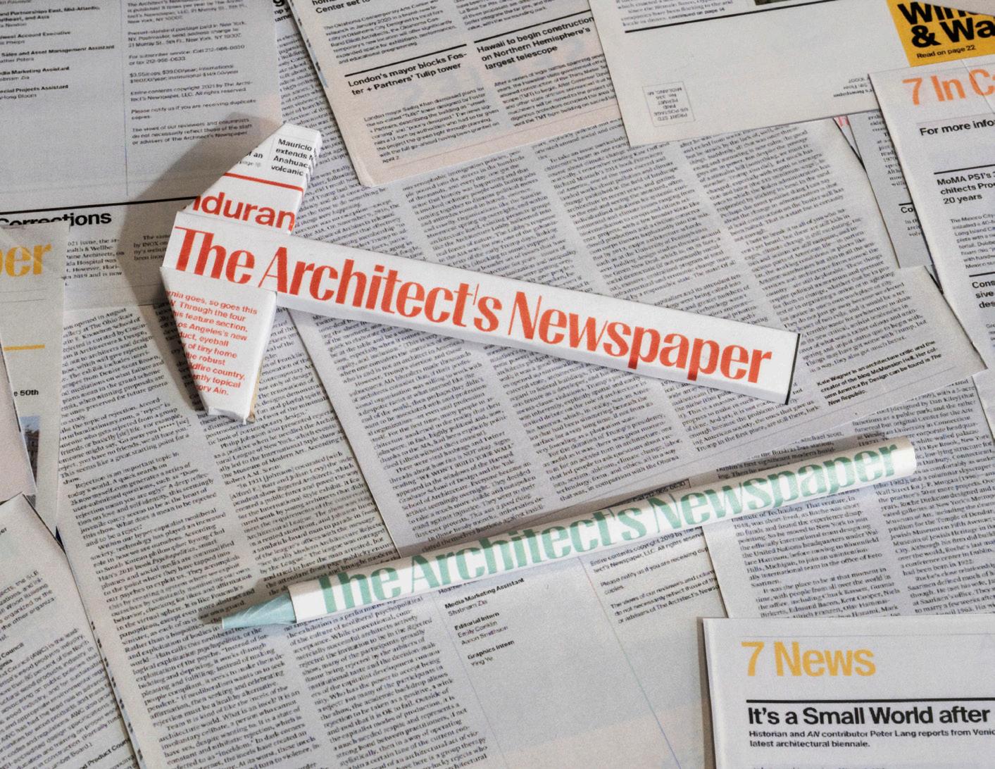
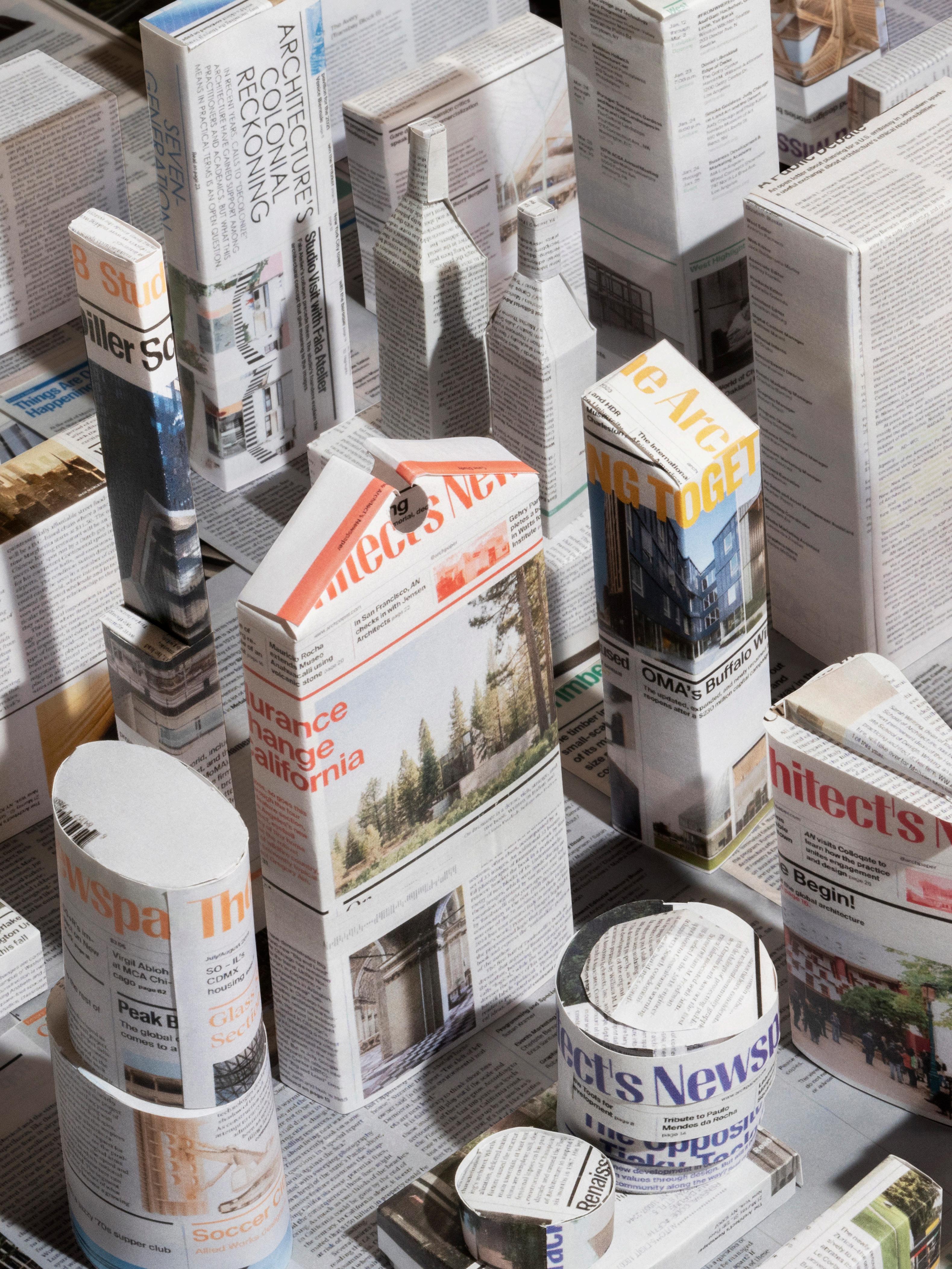
Solstice Shingle as part of its products coverage. The correct image is shown above. The cover image, the one on this page, and the full spread on pages 20 and 21 are the work of Ben Denzer, an artist, designer, and publisher. He earned an MFA in graphic design from RISD and a BA concentrating in architecture from Princeton. Denzer has designed book covers for Penguin Art Group and regularly works with The New York Times and The New Yorker . For this commission, Denzer made a paper-model version of New York assembled from scanned AN pages. (For scale, 1 WTC is about 7 inches tall in the pictures.) The result, which confuses buildings and media as architectural outputs, stages recognizable structures together with more anonymous ones for a portrait of the city AN has covered for 20 years. 4 Editor’s Note Masthead Info
Correction About the Illustrations General Information: info@archpaper.com Editorial: editors@archpaper.com Advertising: ddarling@archpaper.com Subscription: subscribe@archpaper.com Vol. 21, Issue 9 | October/November 2023 The Architect’s Newspaper (ISSN 1552-8081) is published 7 times per year by The Architect’s Newspaper, LLC, 25 Park Place, 2nd Floor, New York, NY 10007. Presort-standard postage paid in New York, NY. Postmaster, send address changes to: 25 Park Place, 2nd Floor, New York, NY 10007. Call 212-966-0630 for subscriber service. $3.95/copy, $49/year; institutional $189/year. Entire contents copyright 2023 by The Architect’s Newspaper, LLC. All rights reserved. Please notify us if you are receiving duplicate copies. The views of our writers do not necessarily reflect those of the staff or advisers of The Architect’s Newspaper. CEO/Creative Director Diana Darling Executive Editor Jack Murphy Art Director Ian Searcy Managing Editor Emily Conklin Web Editor Kristine Klein Design Editor Kelly Pau Associate Editor Daniel Jonas Roche Associate Newsletter Editor Paige Davidson Contributing Products Editor Rita Catinella Orrell Copy Editor Don Armstrong Proofreader Joanne Camas Editorial Intern María José Gutiérrez Chávez Vice President of Brand Partnerships (Southwest, West, Europe) Dionne Darling Director of Brand Partnerships (East, MidAtlantic, Southeast, Asia) Tara Newton Sales Manager Heather Peters Assistant Sales Coordinator Izzy Rosado Vice President of Events Marketing and Programming Marty Wood Senior Program Associate Ethan Domingue Program Assistant Trevor Schillaci Audience Development Manager Samuel Granato Events Marketing Manager Charlotte Barnard Events Marketing Manager Savannah Bojokles Business Office Manager Katherine Ross Design Manager Dennis Rose Graphic Designer Carissa Tsien Associate Marketing Manager Sultan Mashriqi Marketing Associate Anna Hogan Media Marketing Assistant Wayne Chen
6 Open Eavesdrop
Climate Change Is Mighty Real
The show must go on at the Architectural League’s Beaux Arts Ball.
“You can’t just cancel something like this” was the vibe in the hours leading up to the Architectural League’s annual Beaux Arts Ball, held on Friday, September 29. Overnight into the early morning, an intense storm swept through New York City, flooding basements and halting nearly every subway line; schools were evacuated, and streets turned into rivers. Still, deposits were made, booze was purchased, and runway outfits were rented, so the party had to continue. Come nightfall—and, thankfully, the end of the rains—a fleet of Ubers deposited the city’s architectural tastemakers at Agger Fish Corporation in Brooklyn’s Navy Yard complex. The theme for this year’s bash was crazy on the nose: Sea Change.
Mario Gooden, welcomed diners before turning the microphone over to its new executive director, Jacob Moore, decked out in a fringed blazer.
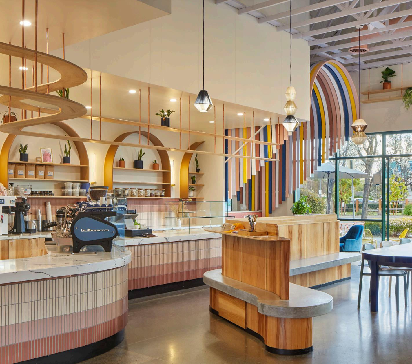
Coffee as a gateway for travel is the ethos that underlies California-based coffee brand Voyager. For its fourth location, San Francisco–based firm Studio BANAA brought this concept to life through organic materials, a bright palette, and whimsy. The new space in Cupertino, California, opens with a series of colorful archways that visually manifest the brand’s eclectic coffee offerings. It opens into the cafe, made spacious by converting an extra bathroom into a window
seating nook and removing the preexisting drop ceiling: What’s revealed above are historic wood trusses. To delineate space, a waving wooden divider and concrete bench separate those ordering from those seated. Soft and inviting curvature then becomes a theme, defining arched shelving, tables, and counter displays in hues of pink, blue, and yellow. Voyager is a welcome alternative to clean, minimalist cafe design, a fresh and joyful look. Kelly Pau
MOCA Workshop
3 Howard Street
New York, NY 10013
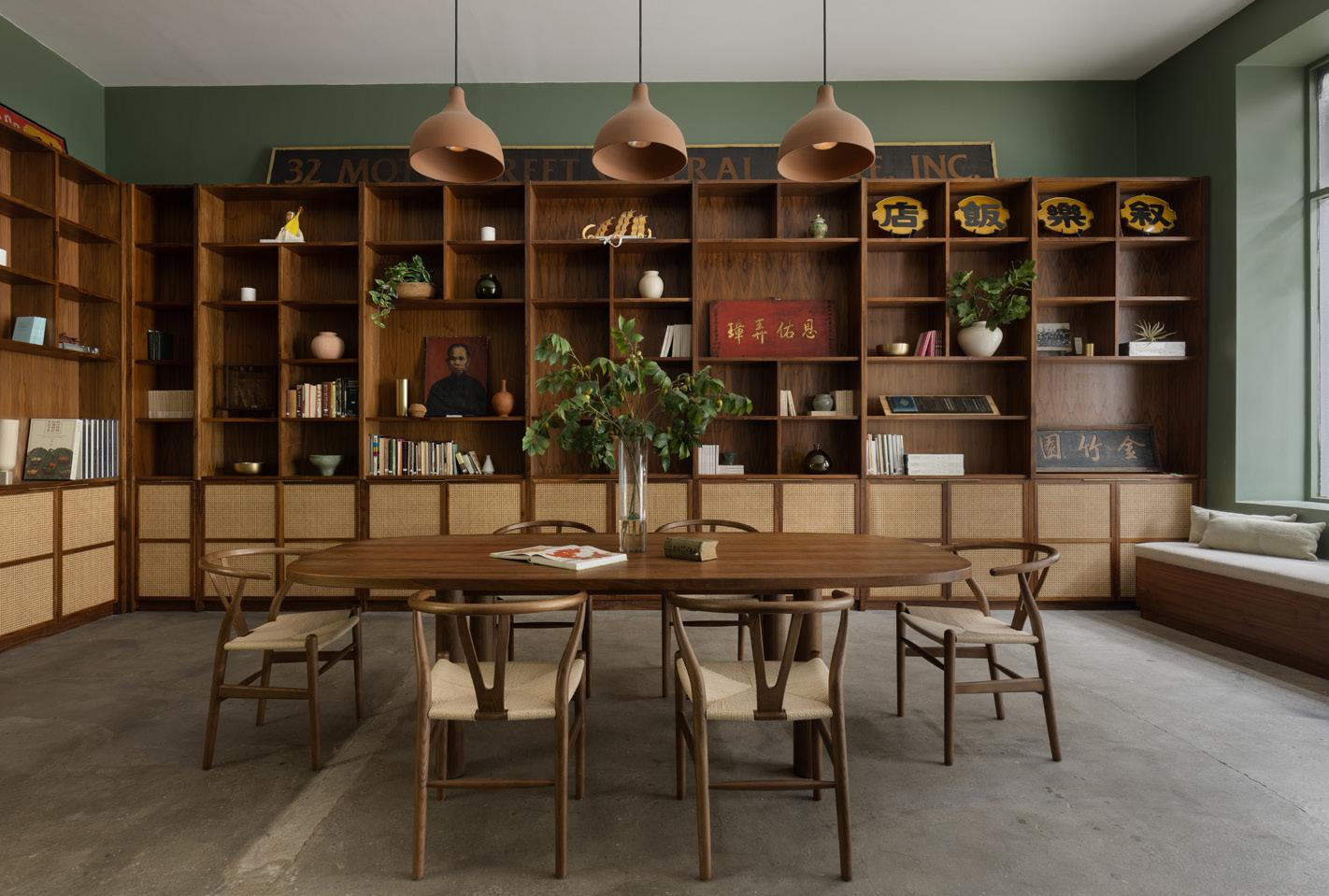
In 2020, the Museum of Chinese in America (MOCA)’s Collections and Research Center was destroyed by fire. In its place came the two-story, 5,000-square-foot facility that operates as a storefront library, event space, workspace for staff, and oral history studio. The New York institution tapped Atelier Cho Thompson to design the workshop and integrate it into the Chinatown neighborhood. For the public library, the designers set a serene tone with sage green walls,
rattan accents, and lighting fixtures by Rejuvenation. The environment nods to the neighborhood’s Chinese ancestry while remaining modern. If the front of the workshop invites its neighbors to add their own memorabilia to the community archive, the exterior room memorializes it, neatly organizing 85,000 artifacts on a Montel shelving system. Catering to both private and public functions, the workshop’s design is a reflection and function of its community. KP
Eavesdrop arrived to witness the community’s festive attire (still mostly black-clad, save for a few brave souls) and partake of the event’s open bar. (Disclosure: AN was an advocate media sponsor of the evening.) Upon entering the expansive warehouse, I was washed in green light. After checking my coat, I was promptly given the option of a pre-mixed Mojito or a glass of white wine from waiting attendants with silver platters. The idea of a ball—at first a bal, when the idea emerged for a fete at the École des Beaux-Arts in the 1890s—conjures images of grand halls and live bands and white male architects dressed up as New York skyscrapers. But since 1990, when the Architectural League revived its version of the event, it has been more of an excuse to catch up with colleagues in a fancy way and less of a sexist cringefest. Armed with one-word themes— chill, alchemy, tender—an up-and-coming New York office realizes an installation that sets the scene for a rager.
Rather than diminishing the feeling of being in a fisherman’s wharf, Brooklynbased studio CO Adaptive Architecture ’s immersive canopy repurposed the proprietor’s fish nets: Those no longer of use were strung up from hooks and pullies and dotted with what looked like verdant foliage from the sea—think seaweed and plants that prefer dampness, right on trend with this season’s best moss memes. To open the festivities, the organization’s president,
Does the Architectural League control the weather? The day’s monsoon was nothing if not a reminder of our attempts at surviving climate change doom. Looking up, the nautical tenting literally situated guests as being under the sea, Little Mermaid style. The bluewave animations, designed by Michael Bierut of Pentagram and projected and frozen on the night’s programs, made use of the realization that “sea change” has nine characters, setting them in a 3 × 3 grid. (Hejduk would be proud.) Attendees were encouraged to “jump into the fray” and embrace the possibilities inherent in “turbulence” and “flux,” all while “celebrating circularity, reinvention, and the interdependence of planetary ecosystems and the built environment.”
And celebrate we did. The early crowd tucked into family-style platters of earthy food: kelp pesto, melon, and spaghetti squash, though one can ask why a climate-focused event had the guts to serve red meat. Later, the night’s entertainment took over: Lina Bradford—DJ, talk-show host, actress, princess of light, according to her Instagram bio—provided the soundtrack. The soundsystem was loud enough that within a certain distance of the booth networking chatter ceased being useful and dancing was the only possible form of communication.
As people wandered back to the open bar after the meal, the tables were snatched up, clearing space as more attendees poured in for the afterparty. Board members, firm leaders, designers, professors, engineers, publicists, editors, and writers all collided, mingled, moved together. Clumps of talkers formed and reformed, trafficking in the latest gossip. Wide doors opened to a loading area in the back where people could inspect the rented mobile bathroom modules or escape for a cig in the wet air. Given the morning’s storm, these evening festivities felt a bit like partying on the deck of the Titanic, except with oontz-oontz beats subbed in for string quartets. Still, people need to get together.
All in all, Eavesdrop had fun.

The Architect’s Newspaper
Voyager Craft Coffee 20807 Stevens Creek Boulevard, #200 Cupertino, CA 95014
MIKIKO KIKUYAMA
COURTESY EAVESDROP
SAMARA VISE

What began as a medium for creating sustainable public art, today helps architects and designers transform commercial spaces with the use of color and light.
LIGHTBLOCKS architectural resin products can be produced in any color, pattern and translucency to create unique and beautiful spaces, and their non-porous, fingerprint- and scratch-resistant surface makes LIGHTBLOCKS especially well-suited for high-traffic environments.
Let our experienced team take your project from “How?” to “WOW!” Dream.


1.603.889.1115
lightblocks.com
Create. Transform.
Pierce Boston lobby, CBT Architects | LIGHTBLOCKS fire-rated Classic Dry Ice
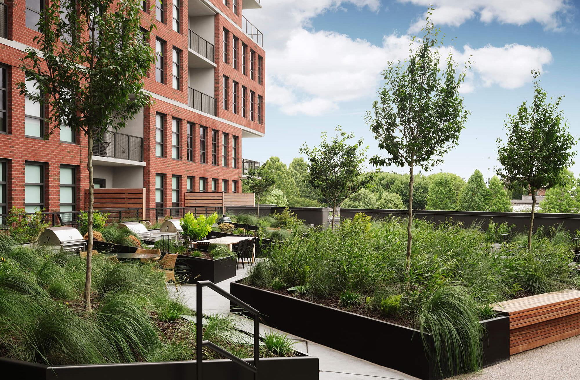
Adjmi Architects in Atlanta
Morris Adjmi Architects delivers a new statement in Atlanta’s Fourth Ward.
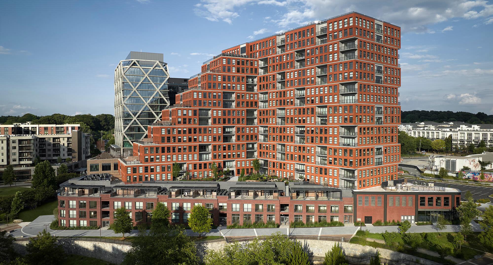
Amid a housing crisis in the booming city of Atlanta, Morris Adjmi Architects has completed its contribution to the city’s ambitious megaproject Fourth Ward. The mixed-use district is being developed by New City, an Atlanta development company that recently completed the nearby Ponce City Market.
Fourth Ward’s 11-acre site was previously owned by Georgia Power but is being redesigned to provide a connection to Atlanta’s BeltLine. Morris Adjmi contributed Overline Residences: a 630,000-gross-square-foot
residential complex ranging from 16 to 18 stories. Clad in red brick, a nod to the site’s industrial past, the complex offers everything from apartments to multilevel units and maisonettes within clever setbacks designed to humanize the building’s scale. Future public transit lines will connect to Fourth Ward in coming years to offer tenants a car-free lifestyle. The BeltLine extension to the site will activate a bustling plaza encircled by midrise office towers connected via sky bridges.
Daniel Jonas Roche
Bring in the Suits
wHY Architects face legal action from Asian Art Museum in San Francisco.
wHY Architects is being sued over an addition designed for San Francisco’s Asian Art Museum (AAM) in 2020. The museum’s foundation announced in a press release that it has started the process to file a cross-complaint. Legal action was first initiated by the project’s building contractors, Swinerton Builders, in December 2021 following several failed attempts to resolve the matter amicably after a slew of building deficiencies—multiple leaks, an “interior environment of inadequate quality,” and an unusable terrace—presented themselves shortly after completion of the building’s pavilion.
wHY Architects told AN it is “proud of its design, and we are confident that all issues at AAM were caused by construction failures and were not the fault of the design professionals.”
After a costly refurbishment to remedy the building’s deficiencies, both the builder and the architect claim that the other is responsible for the issues. The foundation, which raised the money, is caught in the middle in its obligation to donors. “The fundamental question to be resolved in the action is who must pay for those costly repairs and interventions,” the museum stated. DJR
Leading by Example
Governor Kathy Hochul’s Buy Clean Concrete program seeks to reduce embodied carbon in New York.
Earlier this month, the Hochul administration announced the adoption of Buy Clean Concrete, a series of rules that place limits on the amount of concrete used in state-funded public building and transportation projects.
The guidelines were informed by several recommendations from New York’s Climate Action Council Scoping Plan from 2022.
When the law goes into effect on January 1, 2025, architects and builders will be able
to compare the carbon costs of different concrete mixes. Builders will also have to submit reports to the state to demonstrate that the project has an environmental impact below the limits set by New York State.
New York is the first state to pass this sort of legislation. Buy Clean Concrete aligns with the state’s goal of 70 percent renewable energy generation by 2030 and statewide carbon neutrality by 2050. DJR
Bethel Woods 2023
The art and architecture festival encourages students to take “the groovy way.”
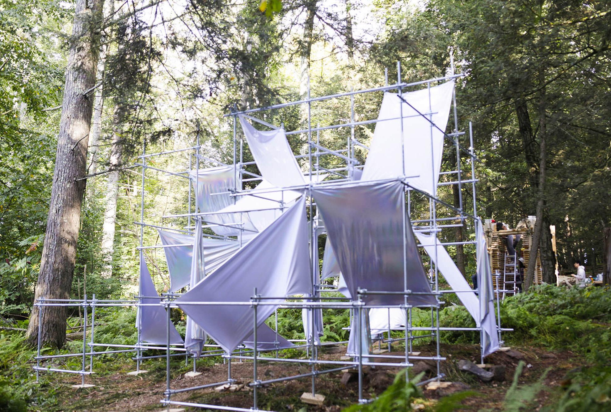
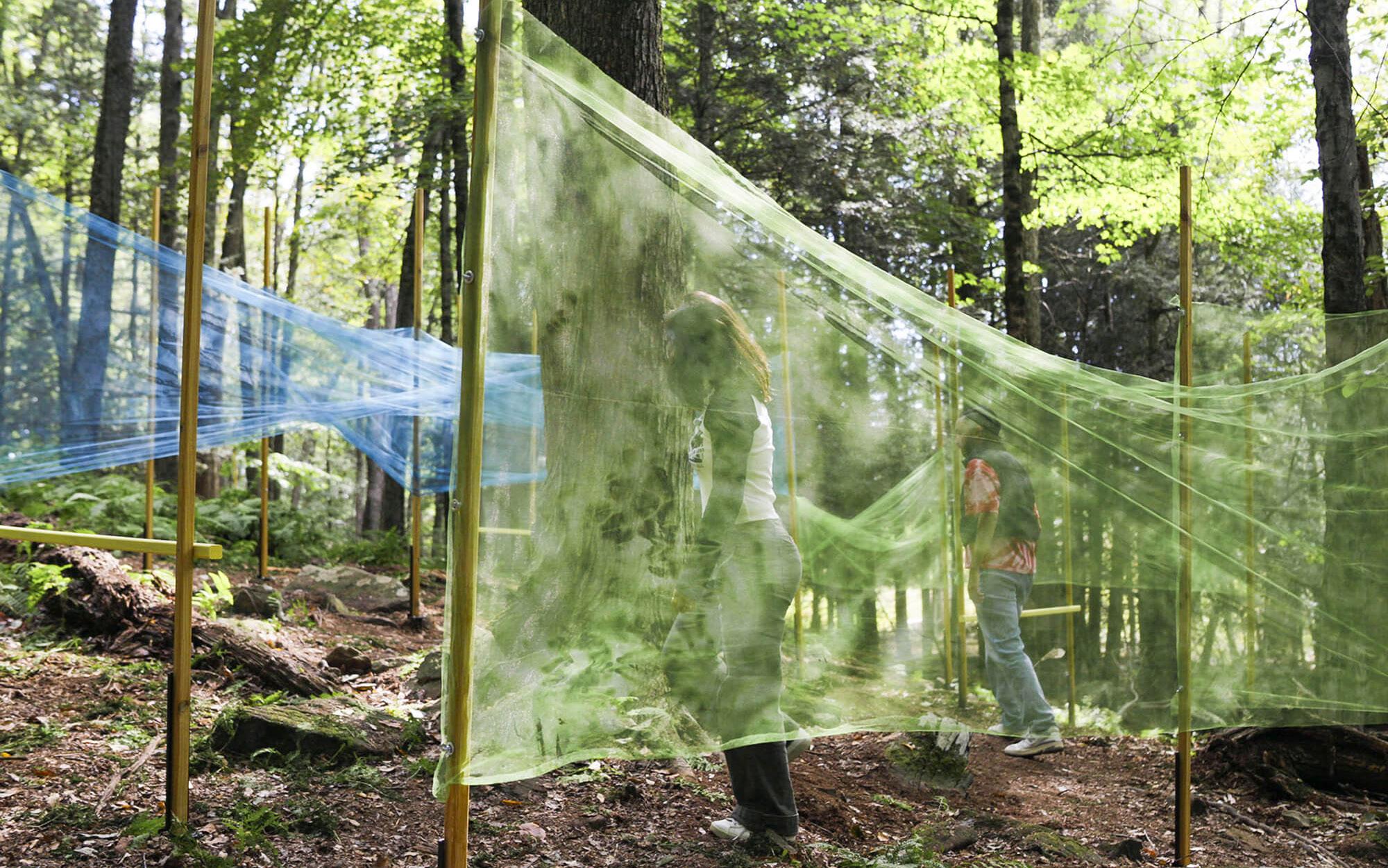
Since 2022, the historic site of the original Woodstock festival in Bethel, New York, has invited architecture students to build fantastical follies near the vast meadow where icons like Hendrix, Joplin, and Baez famously shredded in 1969. But today, the Bethel Woods Art and Architecture Festival, now in its second iteration, provides emerging architects a platform to execute designbuild projects that introduce them to the joys and challenges of operating at a 1:1 scale. The theme of this year’s Art & Architecture Festival at Bethel Woods Center for the
Arts was “Take the Groovy Way.” More than 75 participants came from Kean University, the University of Kentucky, the Fashion Institute of Technology, Rochester Institute of Technology, Syracuse University, Cornell University, Illinois Institute of Technology, and Texas Tech University for installations, lectures, and live musical performances.
Dr. Neal Hitch, senior curator of the Museum at Bethel Woods, said, “Each piece will align with concepts of entry, journey, and procession, calling on visitors to forge their own path.” DJR
The Architect’s Newspaper 8 News
COURTESY MORRIS ADJMI ARCHITECTS
COURTESY MORRIS ADJMI ARCHITECTS
BREYDEN ANDERSON BREYDEN ANDERSON
There’s Always Another Level

For 20 years, The Architect’s Newspaper has been a trusted voice in architectural news and cultural reporting. At Vitro, we know a thing or two about legacies. Our Solarban ® family of solar control, low-e coatings has been the leading choice for architects for more than five decades and offers a wide range of performance and aesthetic options suitable for any building.
There’s a Solarban® glass for every project. Learn more at vitroglazings.com/solarban
New UNESCO Sites Announced
UNESCO offers protections for 42 new sites and “sites of memory.”
Last last month, the total number of UNESCO World Heritage sites rose to 1,199 with the recognition of 42 new sites—33 cultural and 9 natural—offering “the highest level of heritage protection in the world.”
Of note this year is the addition of three new Sites of Memory, places where an event occurred that people would like to see memorialized. These include a former naval
academy in Argentina turned detention center during a military dictatorship, the genocide sites in Rwanda, and burial sites across France and Belgium for tens of thousands of World War I soldiers. The committee also added sites in Ukraine to its List of World Heritage in Danger following Russia’s fullscale invasion. KK
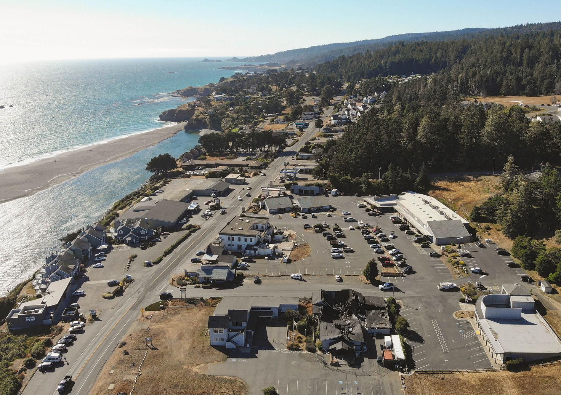
Figure and Terremoto Rebuild
Figure, a San Francisco studio led by James Leng and Jennifer Ly, will replace an existing community center in Gualala, California, built in 1954 that was lost to arson in February 2023.
For decades, the Gualala Community Center was a focal point in the town and hosted a variety of organizations. So, the new building is all about “rebuilding the heart of our community,” said Nancy Gastonguay, president of the community
center’s board. The choice to go with Figure was unanimous. “Their passion and energy for the project resonated with everyone,” Gastonguay said.
Figure will join the San Francisco– and Los Angeles–based landscape architecture firm Terremoto to design a new master plan for the community center campus, a site that extends from the edge of Highway 1 to the redwood foothills in the east. DJR
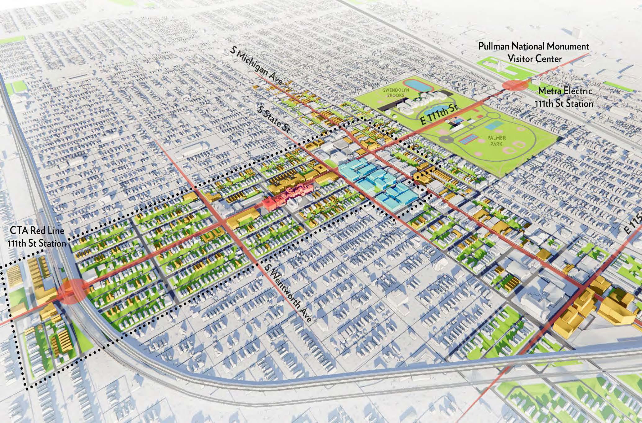
Red Line extension
CTA’s largest-ever expansion reaches out to fulfill a transit gap.
With a focus on economic development in a part of the city that’s been starved for transit access and investment for much of its history, the Chicago Transit Authority (CTA) announced in September nearly $2 billion of federal funding for its Red Line Extension . The plan will add four new stops across 5.6 miles to the Red Line El on the far South Side of the city, the only part of Chicago where CTA rail does not approach city limits. Located in some of the least densely populated areas of Chicago, it’s a plan to spur development by building toward greater transit demand. The Federal Transit Administration
New Starts grant of $1.97 billion will be delivered by 2024, providing more than half of the project’s $3.6 billion budget. Local funding comes from a $950 million transit tax-increment financing fund. This is the largest single transit project in CTA history and its largest ever capital grant, deployed to address calcified transit and economic investment inequalities in predominantly Black and poor neighborhoods.
It’s been a long-awaited win for South Side residents: Mayor Richard J. Daley first proposed extending the Red Line to the southerly city limits in 1969. The city’s goals are to use transit to increase housing
access, aid local businesses, promote local cultural assets, and promote wellness. “The Red Line Extension will be one of the single biggest investments on the Far South Side in decades,” said CTA spokesperson Tammy Chase.
The new track will be mostly elevated, transitioning to at-grade before the final station at 130th Street; there will be no intersections with existing roadways. The city is purchasing 86 parcels along the route emanating southward from the 95th Street station. Chase said fewer than half of these parcels are single-family homes and many are currently vacant. In addition to new stations at 103rd Street, 111th Street, Michigan Avenue near 116th Street, and 130th Street (which will include bike infrastructure and parking), the plan includes a new rail yard at 120th Street and Cottage Grove Avenue. Construction is likely to begin in 2025 and be completed by 2029.
The CTA recently issued an RFP to several design-build conglomerates— FH Paschen, Ragnar Benson, Milhouse and BOWA Joint Venture; Kiewit Infrastructure; and Walsh VINCI Transit Community Partners—which will compete for the contract, set to be assigned in late 2024.
Long term, it’s estimated that the extension will create 25,000 new jobs and spur $1.7 billion in real estate development. It’s part of a “transit-supportive development plan” coauthored by Chicago’s Department of Planning and Development (DPD). “This project has always been more than just a transit project, and one of the goals as we developed it was to stimulate transit-oriented development around stations in disinvested areas,” said Chase.
With public input, the CTA and DPD have identified desired development patterns around the four stations. Most notably, the station at 111th Street is planned as an anchor for the Roseland Medical District , a multipurpose health campus surrounding the 100-year-old Roseland Community Hospital, a few blocks away. Roseland has been the focus of preservationists looking out for its glazed terra-cotta brick and Indiana limestone-clad buildings along Michigan Avenue. But the neighborhood has also been identified as one of the areas targeted for investment with Invest South/West, Chicago’s plan to fund historic preservation and new development in underserved South and West Side neighborhoods. Farther south, the station at 130th Street will connect the city’s most geographically isolated neighborhood, which is of course also home to its largest surviving public housing project,
Altgeld Gardens. Twenty miles from the Loop and hemmed in by landfills, a water reclamation plant, refineries, and more, Altgeld Gardens still suffers from rampant pollution that inspired the birth of the environmental justice movement.
Abraham Lacy is the president of the Far South Side Community Development Corporation , which focuses on small business and community and housing services, as well as development and planning. He’s also the interim executive director of the Roseland Medical District. As such, he has been involved with the effort to extend the Red Line to the far South Side for more than a decade. “Our primary push is to build up density,” he said. “Transit is really one of the greatest catalysts.”
For Lacy, the extension is vital because of the way it will complement the existing transit infrastructure in the far south, primarily Metra commuter rail and the bus system, which typically travels east to west along arterial roads. “We have transit access down here, but connectivity with other [networks] is not readily available,” he said.
The population of the far South Side dropped by 20 percent from 2000 to 2018, according to the DPD, and Lacy said that transit access is one reason. A journey to the Loop can take 90 minutes one way, as multiple buses may be required before a rider steps onto a rail platform at 95th Street. The CTA estimates that the extension will save commuters 30 minutes per trip. If simply accessing healthcare, like at the Roseland Medical District, is a transit ordeal, it’s hard to call a neighborhood livable. “That’s one of the reasons that folks are leaving the area,” said Lacy. “[They’re] not going to live in an area that’s not going to service [their] health needs.”
“When you marginalize a subset of people for 60-plus years, it’s not just about how this is going to improve the economy of the city, which it will,” he said. “It breathes hope into your neighborhood, because now you’re saying, ‘The city cares about me enough that I can get public transit into the rest of the city.’”
The Architect’s Newspaper 10 News
Zach Mortice is a Chicago-based design journalist and critic who focuses on the intersection of architecture and public policy.
ADRIAN SMITH + GORDON GILL ARCHITECTURE
The collaboration reenvisions a lost community center in Gualala, California.
COURTESY FIGURE
info.usa@equitone.com
www.equitone.com
high performance facade materials
A New Western Home
Snøhetta designs a commons for Norwegian life in America.
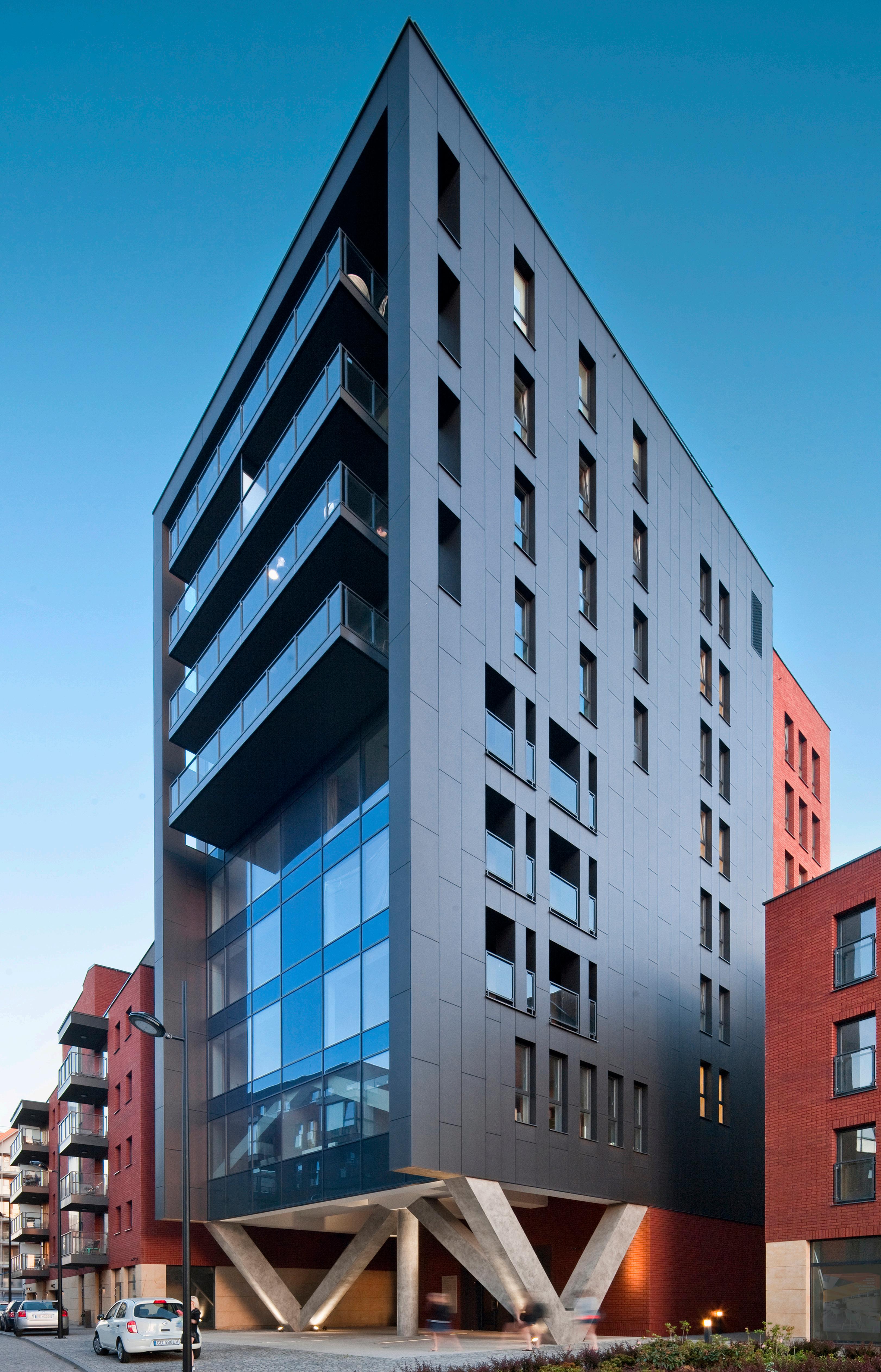
When Norwegians immigrated to the United States in the early 19th century, the lure of vast open lands drew many to Midwestern regions—generally taken from Native Americans and newly available for homesteading. Set in the hilly northeast corner of Iowa, the town of Decorah was one of these immigrant settlements. They saw this new land as their “Western Home”—Vesterheim.
Today, Vesterheim is the name of the National Norwegian-American Museum and Folk Art School—a hybrid of craft and art collections, education, and architecture. In 2018, Snøhetta began an ambitious master plan with the goal of uniting the disparate folk and vernacular buildings, 19th-century commercial structures, and multiple entrances around the complex.
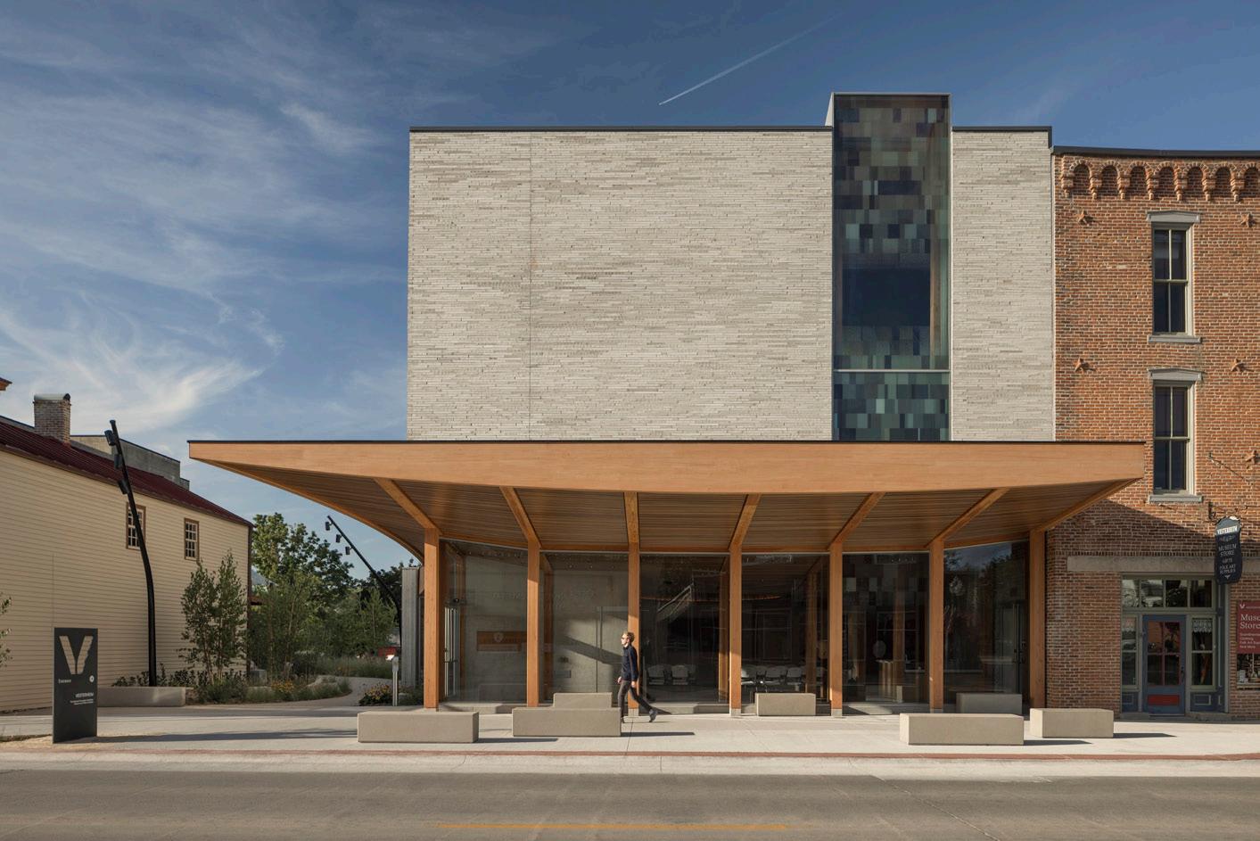
Completed in September, the 7,600square-foot Vesterheim Commons has both unified and clarified the institution. Inspired by traditional boat construction, Snøhetta designed the entrance canopy as a horizontal sail sweeping upward over the street. The canopy’s curved edge and Douglas fir construction contrasts with the flat, light-toned brick and glass of the new facade.
The Vesterheim celebrates traditional connections between people, architecture, and landscape through ecological restoration of the landscape surrounding the folk buildings
Pondering
The Sphere opens in Las Vegas. What does it mean for architecture?
An early episode of SpongeBob SquarePants contained a particularly moving scene. Upon seeing Patrick Star approached by the dangerous Man Ray, a villain who had kidnapped Mermaid Man and Barnacle Boy, our hero calls out, “Not so fast, archvillain. We still have the Orb of Confusion!” The Orb of Confusion was a simple blue glass sphere small enough to fit in SpongeBob’s hand, with a single on-and-off switch When the switch is flicked, a ripple effect visually centered on the object emanates outward. Anyone caught in the wave can do nothing but stand there dumbfounded, slobbering, and babbling nonsense. The device enabled our hero to save the day, but at what cost?
The Orb of Confusion is a touchstone reference for SpongeBob fans. I test the prowess of friends and students by pretending something is the Orb, and if they get the joke, we then babble, slobber, and laugh together. If not, well, they need to work on their cultural literacy. Many objects have played the part of
imaged and shared as even more fuel for the hype machine.
The sphere was designed by Populous. Its facade is typically dark, but it can display nearly anything; and the pixels are for sale. The result, a dynamic visual feast of art and advertisements, is a captivating spectacle that completely consumed my attention. It is a dazzling collapse of image and form. The exterior of this thing goes hard.
It’s been more than 50 years since Denise Scott Brown and Robert Venturi imagined the billboard as the essential condition of a contemporary monument. At that time, it was assumed that billboards needed to be flat, economical means of presenting a single image to the passing car. Billboards, just like digital screens, no longer need to be flat; they can now take on multiple shapes, materials, and directions. The billboard can finally be the entire building, a dream initially proposed by Scott Brown and Venturi, collapsing the duck and the decorated shed into a single structure.
collected on the site. This folk architecture was built with local materials—tree logs and local light-colored limestone—with solar orientation in mind. The new Vesterheim Commons is designed with many of the same regional materials. Its mass timber frame was fabricated by Bell Structural Solutions in Albert Lea, Minnesota, and the exterior walls built of dramatic 2-by-20-inch bricks from Glen-Gery in Adel, Iowa. The bricks’ tactile quality and color evoke the limestone seen in both Vesterheim’s restored buildings and Norway’s dramatic landscapes carved by glacial melt.
Visitors enter the new Commons via a grand new ground-floor lobby with direct connections to Vesterheim’s diverse programs. As the largest public space, the lobby can host 100 people for lectures or performances, host special events, and even transform into a classroom.
On opening day in September, the lobby offered cool respite from the hot sun outside. Snøhetta’s project lead, Matt McMahon, describes the design’s solar strategies for daylighting throughout the year: The lobby’s wood-slat ceiling rises up inside, bringing in more daylight from the street. In summer, when the sun is high, the canopy shades the sidewalk and entry beneath. In the winter, the lower sun casts light deep into the lobby.
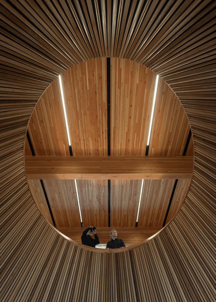
At the center of this public space, a dramatic oculus draws views upward to the second-floor gallery. Constructed with blackened cedar, the form evokes a ship’s prow rising through the floor. The architects worked with Arup to line the oculus’s interior with cedar planks of varying sizes to diffuse sound from below. Climbing farther, a third floor houses artifact exhibits, a research area, and a digital center. With the innovative work of Snøhetta leading the museum and research center into a new era, Vesterheim’s collections and programming will continue to grow and serve a global audience.
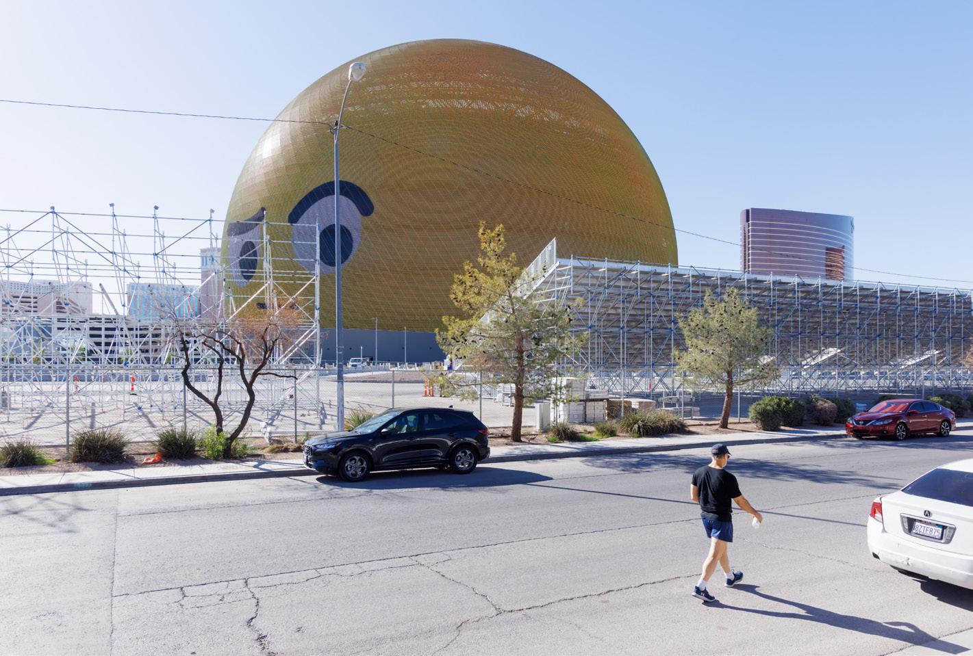
the Orb of Confusion over the years, including a compressed ball of Chipotle burrito foil and a wireless computer mouse. Now, my latest Orb is The Sphere at the Venetian Resort in Las Vegas.
The 18,600-seat auditorium opened on September 29, with an inaugural performance by U2, kicking off its 25-show residency. But to call The Sphere an auditorium is selling it short. The Sphere boasts seats with haptic feedback, pinpoint sound, and, currently, the world’s largest LCD screen. It promises to reach new heights (or depths?) in the immersive theater experience but needs $2.3 billion to do so.
They say The Sphere is one of those things you have to see to believe, and belief will cost you. A casual glance at tickets at the time of this writing suggests average prices are $800 to $1,400 per seat. With over 100 million posts on TikTok within a few days, it is clear that everyone wants to show us just how incredible their experience was. Turns out the interior is essentially an OmniMax theater with a stage at the front.
During U2’s show, the backdrop actively upstaged the band itself, morphing from mountains to outer space, oceans, and everything in between. This, like everything in Las Vegas—and perhaps our whole world at less noticeable scales—is designed to be
The study of Las Vegas as a way to understand architecture’s role within society appears to be in fashion again. Recently, the American Academy in Rome exhibited photographs of the city made by Dutch photographer Iwan Baan paired with contemporary images of Rome, in part to celebrate the 50th anniversary of Learning from Las Vegas. (The show was featured in AN’s October/November issue last year.) Baan’s work captures changes in each city that reveal how public space and architecture are forced to serve a new civic role: as a backdrop to be experienced and shared.
I visited Las Vegas with Baan during The Sphere’s opening days to study how it presents a new piece of the puzzle for understanding the relationship between these two cities. Together, we are working on a forthcoming book to be released next year by Lars Müller Publishers about these photographs. I hope that this study contributes to an understanding of how architecture is evidence of our changing world.
Ryan Scavnicky is an assistant professor of practice at Marywood University School of Architecture. He is the founder of Extra Office.
Iwan Baan is a Dutch photographer known primarily for images that narrate the life and interactions that occur within architecture.
The Architect’s Newspaper 12 News Dispatch
Frank Edgerton Martin is a landscape historian, architectural writer, and design journalist.
Above: A welcoming awning invites passersby inside and blends in with neighbors.
Left: The view of the second-floor gallery from beneath the oculus.
MICHAEL GRIMM
MICHAEL GRIMM IWAN BAAN
Stacked ’n’ PAC-ed
The Perelman Performing Arts Center opens in Lower Manhattan.

Take a look at any review of the new Perelman Performing Arts Center (PAC) in New York and there is a good chance the words “$500 million” appear long before the name of any architect, actor, or dancer. The price tag is the headline, and it is impossible to hold a number like that in your my mind without thinking about the recent news of major staffing cuts at the Public Theater and the Brooklyn Academy of Music, or the fact that one of New York’s greatest buildings, Marcel Breuer’s Whitney Museum, will transition from the hands of a nonprofit museum to those of a multinational auction house when Sotheby’s moves in next September (a transaction that, incidentally, sets the market value of Breuer’s masterpiece at about one fifth of the Perelman’s). It is hard not to think about what even a fraction of that half billion might mean to spaces like the Kitchen, the New York Theater Workshop, or Performance Space New York.
It is hard to know what to make of it all, but there is also little to be gained by begrudging it. This is how money moves in New York and no amount of nostalgia or righteous indignation can stop it. Money flows toward naming rights and ribbon cuttings and development opportunities and speculative investments, and, in this case, toward an awkward little corner of the World
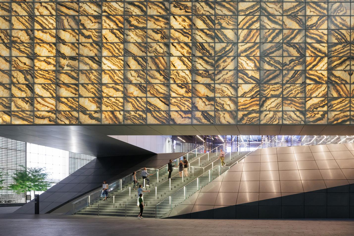
That solution is a cube clad in 4,896 pieces of translucent, intricately veined Portuguese marble suspended above a somber granite plinth. It was developed in partnership with Davis Brody Bond and showcases interiors by Rockwell Group. During the day, the marble washes the interior in warm amber light; at night, it all glows like a creamy incandescent boulder. Nestled inside, and supported by 6,300 tons of structural steel, is a second smaller box containing three theaters arranged in an L shape around a large scene elevator. This trio of theaters can be bisected and bundled in dozens of permutations. To fit it all in, Ramus weaved utilities behind bespoke acoustical panels and turned theatrical convention on its side by stacking the traditional front of house on top of the back (a move he also deployed in his Wyly Theatre in Dallas).
The building invites comparisons with another stone monolith: Gordon Bunshaft’s Beinecke Library at Yale. In both buildings visitors approach at ground level and ascend a staircase to find themselves inside a translucent marble box. The effect, in both cases, is breathtaking, but while the Beinecke reveals itself upon entry—the massive glass column of books articulates what the building does and why it cannot be exposed to direct sunlight—the first floor of the PAC reveals nothing about what is happening in its core. It is a black box in both the theatrical and philosophical senses of the term. You can walk the entire perimeter of the public first floor in the interstitial space behind the marble cladding without a clue as to what is happening upstairs. (Yet some of the building’s nicest moments happen along that perimeter, when you find yourself standing alone between a mundane unmarked door and an exquisite expanse of stone.)
The most exciting space in the PAC is one most people may never see. The day I visited, the lights in the mechanical room beneath the theater were powered down, so Ramus guided me under girders and across catwalks with the flashlight on his phone. Even in the dark I could see the thrill in his eyes as he described how it all worked. Together with several massive “guillotine” walls upstairs, this expanse of collapsible pistons and scissor jacks can push and pull the theaters above into 62 different configurations
of thrusts and traps, risers and rakes, pits, and prosceniums (each permutation preapproved by Port Authority building inspectors). It is here in the building’s mechanized core where it possesses the greatest energy— the same spirit of audacious engineering that pushed the original Twin Towers so high. Fittingly, the PAC was overseen by Magnusson Klemencic Associates, the successor firm of the Seattle-based engineering office that partnered with Minoru Yamasaki on the original World Trade Center.
Beautiful as it is, it is difficult to behold the precision tuning and the ultrafine tolerances of this mechanical room and not feel a shiver of anxiety about what might happen 2 or 6 or 12 years hence when a piston seizes up or a riser gets jammed. Having the capacity to be flexible is not the same as being flexible—and that can be as true creatively as it is mechanically.
Arts nonprofits are delicate organisms and only as strong as the community that surrounds them—a community that needs steadfast supporters and an invested audience just as much as it needs the artists who bring work to life. The PAC has a visionary creative director in Bill Rauch, but he will be working on a site defined by an uncanny dissonance with the city around it. In many meaningful ways, the 16 acres of the World Trade Center site have not been part of New York City since they were seized via eminent domain by the Port Authority of New York and New Jersey in 1962. To this day, the superblock remains an island within an island. It has its own police, its own building inspectors, its own rules. It occurred to me as I parted ways with Ramus that a single-minded tourist could take the A train from JFK to Fulton, ascend through the Oculus and walk to the PAC without ever really setting foot on a Manhattan street.
The PAC is the best new building at the World Trade Center, by a long measure, but whether design alone is enough to make the site feel like part of the city remains an open question.
Justin
Trade Center superblock where a small group of private and semiprivate donors entrusted architect Joshua Ramus to make good on a 20-year-old promise to bring arts to the site of tragedy.
Like most projects on the site, the building advanced in fits and starts. Frank Gehry was hired. Frank Gehry was fired. When Ramus won the commission in 2015, what he was given was not so much a program as a problem: The site sits above a nasty snarl of ventilation ducts, a dozen converging subway lines, and an enormous spiral ramp that delivers trucks to a garage below and, because that ramp needs to rise to street level, most of the PAC begins 21 feet aboveground. To complicate matters, the building can only rest on seven irregularly placed structural knuckles— vestiges of the Gehry design—and it needs to withstand a variety of harrowing blast criteria unique to the site. Furthermore, it was decided somewhere along the line that the theater should not appear conspicuously commercial and the memorial should not be visible from its interior. In short, the design had to be respectful of its context and heart-stirring in its grandeur—simultaneously spectacular and inconspicuous—all while balancing three theaters over a tangle of vibrating infrastructure on a handful of structural points. Given the circumstances, REX’s design is ingenious.

October/November 2023
13 Crit
Beal is an artist and author based in New York. His first book, Sandfuture, was published by MIT Press in 2021. He teaches at Hunter College.
Left, top: The floating cube contrasts with neighboring high-rise, glassy architecture.
Left, above: Visitors enter beneath the glowing marble facade.
Above: The engineering located beneath the stage allows for program changes.
IWAN BAAN
IWAN BAAN
IWAN BAAN
14 Crit
Sweetness and PAU-er
In Williamsburg, a new office building rises from within the Domino Sugar refinery.
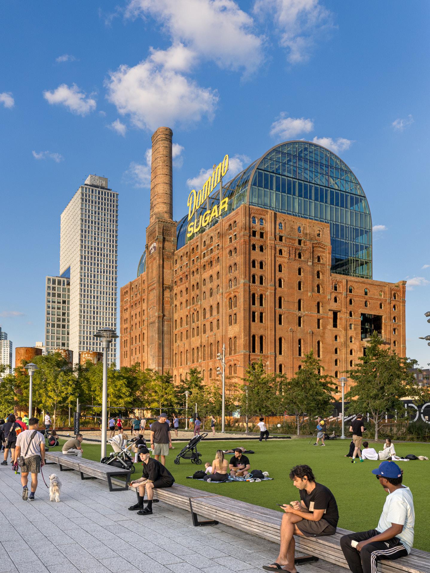
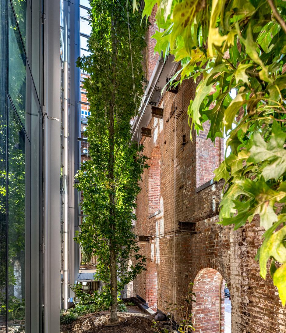
“This is the jewel in the crown,” said Vishaan Chakrabarti of Practice for Architecture and Urbanism (PAU). He was talking about the office’s reimagination of the Refinery at Domino, which just finished construction as part of a wider redevelopment scheme that has transformed this run of the Brooklyn waterfront into a warren of glazed high-rises. Here, on the top floor of the PAU-designed building, some traces of history remain: This glass box with a barrel-vaulted ceiling rises three stories out of the brick shell left behind by a structure that originally housed the panning, filtering, and finishing operations for Domino Sugar. Putting a new building inside an old one is a clever approach to adaptive reuse for such a drastic change of program: from sugar processing to office work.
Ruchika Modi, the project architect, told me that the refinery building was, in fact, not a building at all. “In a building you would expect some relationship between the exterior and the interior. It was a bunch of cavernous spaces,” she remarked. “It was really just a giant piece of machinery cloaked in masonry.” This rationale led PAU to treat the brick facade like a sleeve, inserting a brand-new office building between the four masonry walls. A continuous vertical gap that ranges from 10 to 15 feet in depth separates the glass exterior of the offices from the refinery’s old brick, allowing
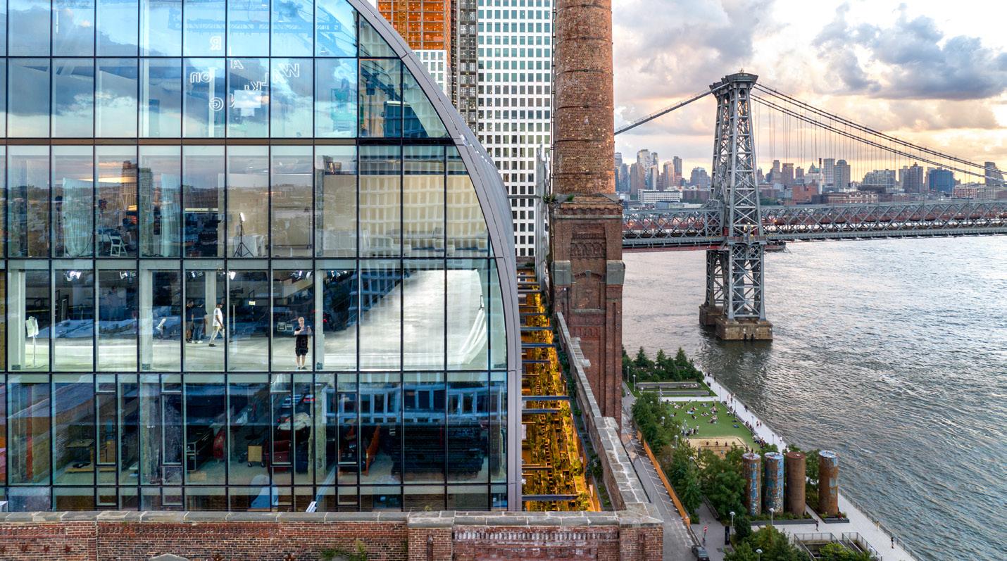
light to reach the office spaces to be fitted out by future tenants. Open to the elements, the void is also filled with plantings, including 17 trees. When I visited, most of the nonarboreal greenery was in fact fabric and plastic replicas of plants, a stopgap measure taken, I assume, to encourage potential tenants to sign a lease. This gap is uninhabitable except on the ground floor, where PAU dropped the sills of the windows to grade level. The move was not without precedent: “We wanted the building to look like a historic building,” Modi said. “But this used to be a factory building; they didn’t care about how it looked. If they needed to poke a hole, they’d poke a hole. It wasn’t precious. We wanted to maintain that ethos.” Standing between the new building and the old shell is akin to being in a hall of mirrors, the expanse of glass reflecting both the inside of the brick shell and the buildings on the other side of it.
PAU hopes that the building’s ground-level porosity will encourage passersby to look in and, once food and beverage establishments open inside, entice them to buy. On the upper floors, where the gap becomes an uninhabitable void, the narrow distance between the glass and the brick has a vertiginous effect, providing only a slim wedge of views up and down. Arched openings in the brick—these were the inspiration for the glass box’s form—provide pleasant enough views onto
the waterfront, its attendant park (designed by Field Operations and the first piece of the development to finish), and nearby residential towers, completed and under construction. Construction is moving apace, likely spurred by the controversial and now expired 421a tax abatement program, which exempts owners from paying property tax if their property value changed because they did construction on a multifamily residential building.
The pressure might be on to finish, and according to the master plan, the design of a monster tower next to the Domino is yet to be unveiled, but the development has been in the works for more than a decade. The refinery shut down in 2004, laying off 220 workers after being bought by the Community Preservation Corporation (CPC). In 2007, the Williamsburg waterfront was rezoned for mixed-use development, and the CPC proposed a plan for the site that turned out to be highly unpopular; it made few concessions to local residents, who feared they would be displaced by the development. (It’s hard not to feel that way after a factory that employed hundreds of people in your neighborhood shuts down.) And the corporation didn’t make good on a promise of 30 percent affordable units, either. Two Trees acquired the site from CPC in 2012, and the master plan by SHoP was unveiled the following year.
Domino has its own troubled history. Sugar was one of a few crops that fueled the slave trade in the 18th and 19th centuries. It was also catalyst for U.S. expansion into Puerto Rico, a process that saw 45 percent of that island’s arable land become reserved exclusively for sugar planting, leaving the territory dependent on imports for much of its food. The man who oversaw that process, Charles Herbert Allen,
did so by creating the world’s largest sugar syndicate, the American Sugar Refining Company, now known as Domino Sugar. Meanwhile, in Brooklyn, the Domino refinery processed anywhere between two-thirds and three-quarters of all the sugar consumed in the United States, relying on labor from workers—many of whom were Black, many of whom were Puerto Rican—to turn its profits.
It should not be lost on anyone that The Refinery at Domino is indeed a new building camouflaged inside an old wrapper. It’s just another office tower by a for-profit developer, the 21st-century evolution of the rapacious expansion that has fueled the American economy for the last 300 years. The refinery might have nice amenities, and the park (another act of camouflage, by the way—it is, though it might not appear to be, private) might be pleasant to run through, but those benefits all pale in comparison to the $3 billion real estate portfolio this building is helping Two Trees consolidate. Across the development, 700 units of means-tested, income-dependent “affordable” housing, out of 2,800 total, are hardly a consolation price. The unfettered growth of enterprise, paid for in part by the displacement of working people, churns on, though here PAU’s architecture maybe makes it easier to accept. The trees craned in from above, the LED replica of the Domino Sugar sign, the barrel vault pushing out through the brick like a modern-day Crystal Palace—it’s all perfectly palatable cover for the fact that this crown jewel might be a blood diamond.
Marianela D’Aprile is a writer and the deputy editor of the New York Review of Architecture. She lives and works in New York City.
The Architect’s Newspaper
Clockwise from far left: View of the new Domino Sugar Refinery building from the eponymous riverside park.
The transparent barrel-vault crown offers sweeping views of the river, park, and Williamsburg Bridge span.
The “void” between old and new is filled with trees and greenery.
MAX TOUHEY
MAX TOUHEY
MAX TOUHEY
15 Crit Tower of Brooklyn
SHoP’s latest supertall delivers Gilded Age spectacle.
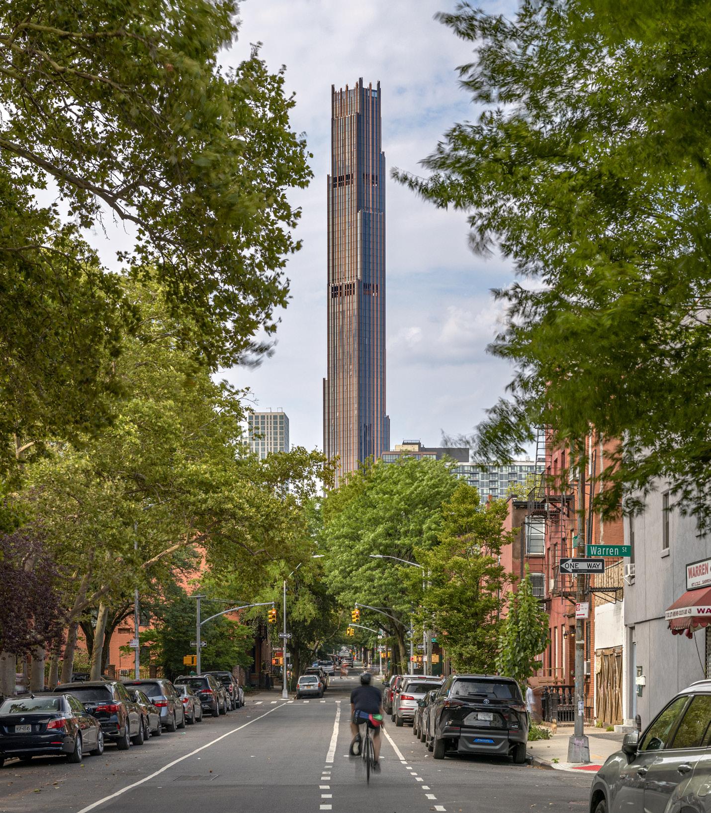
Like a painting with eyes that follow, I can’t escape The Brooklyn Tower. I typically see it twice on my daily commute. It looms over picnics in Fort Green Park, pokes up during site visits, doubles in the iridescent waters of the Gowanus Canal, and hovers in the back of photos taken from my roof. I see it from near and far; it is part of my life whether I like it or not. Unlike art, architecture in the city is unavoidable.
For better or worse, the tower is the tallest building in Brooklyn, and its coloration sets it in contrast against the sky and surrounding towers, which are lighter, more reflective. It is a constant reminder of the realities of wealth accumulation: A “crescendo” of the downtown skyline, it also parallels a bar graph of income inequality. Its golden, Trump Tower–like darkness makes its grandeur that much more in-your-face. Rather than polite attempts made by skyscrapers to disappear via all manner of glassy manipulations, this one’s shape, lavishly articulated, is on full display.
With its 93 floors rising over 1,000 feet in height, the Brooklyn Tower is problematic not because of the considered resolutions of its design decisions but because of the initial, awful calculus of real-estate speculation. One of the suggested storylines for the project is that Gotham has decamped to Brooklyn: Finally, the borough has some Architecture to compete with Manhattan! Beneath the novelty of its height and color palette, SHoP has completed something spooky that rivals Manhattan marvels like the Woolworth Building, where it offices.
While density is of course preferable to
art deco sensibility. Perhaps one precedent is Midtown’s American Radiator Building, completed in 1924 and designed by Raymond Hood and André Fouilhoux, which sports dark brick and gold accents. The Brooklyn Tower’s geometric flourishes are largely a response to its neighbor, the Dime Savings Bank, a neoclassical structure designed by Mowbray & Uffinger that opened in 1908. The hexagons inscribed in the floor and ceiling of its landmarked interior, in addition to the dome’s six-sided drum, provided geometric references that are symphonically deployed at multiple scales: Both the floor plates and the apartment plans are hexagonal. The new building rises from the north corner of the bank’s triangular block, whose east point is occupied by Junior’s, a diner that has been here since 1950 Like SHoP’s prior supertall for JDS, 111 West 57th, which sprouted like a yucca bloom from the historic Steinway factory, this tower mines the historic structure from which it springs for ornamental uses.
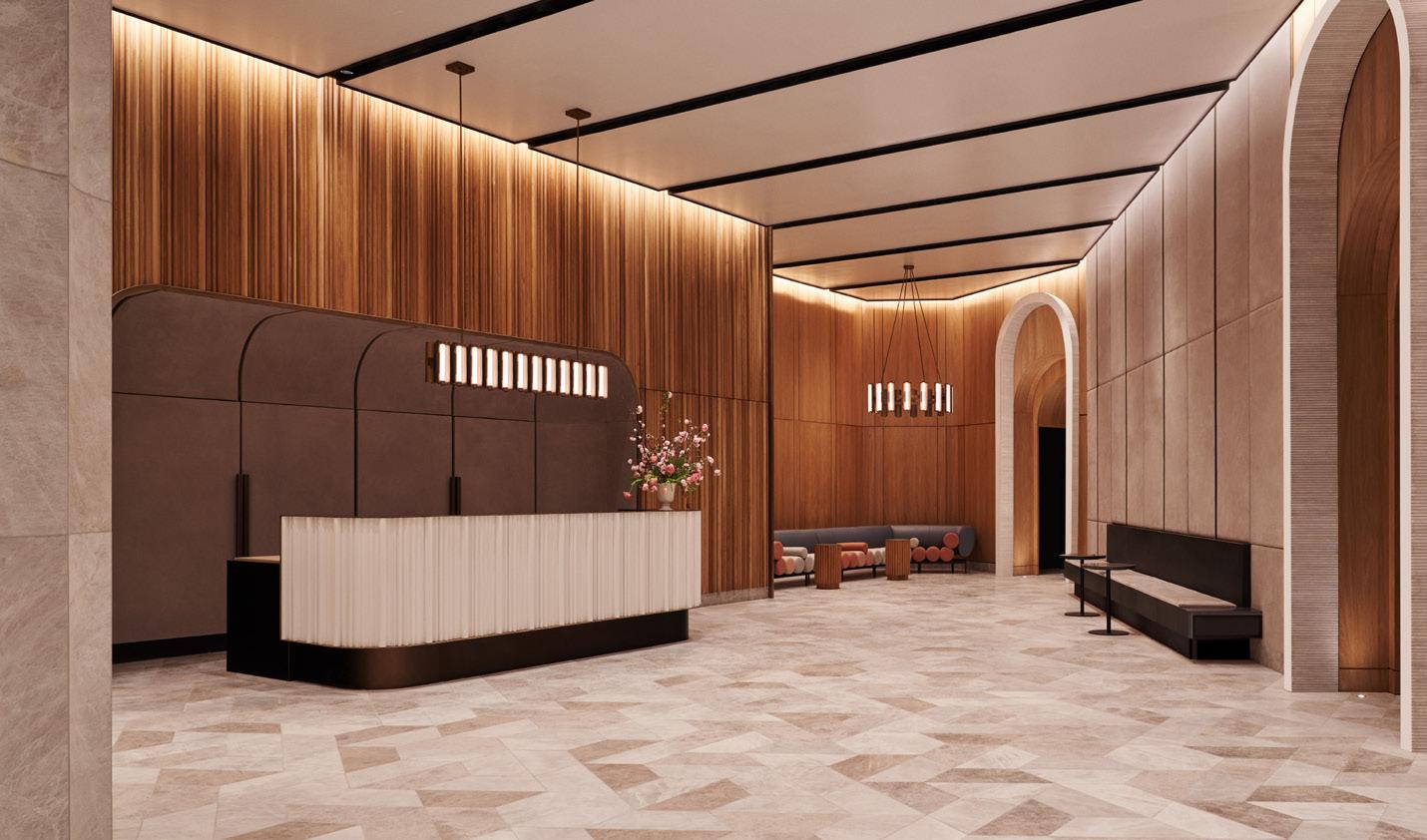
Woods Bagot, led by Krista Ninivaggi, completed the interior design of the shared spaces. Everything is benignly thoughtful and considered, down to the “kiss and go” pods, where residents can wait for their Ubers, and the ceiling of the elevator lobby, which is finished in custom oversized dime tiles whose diameter had to be altered to avoid the appearance of counterfeiting during production. Gachot Studios handled the design of the units, which are sleekly outfitted in dark metals (recalling the building’s exterior) and scan as stylishly staged.
limited less by what is structurally possible and more by how much sway occupants can tolerate. The stepped faces host 5-foot-deep balconies from which residents can gaze out over the city.
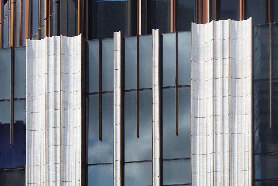
The tower’s podium is partially faced in marble “convexacave” columns and includes amenities like a hexagonal outdoor pool that rings the historic Dime Savings Bank’s dome. The bank’s name meant that one could open an account with just a dime in 1859 ($3.70 in today’s money). Upon full completion of the tower’s interiors, Brooklynites will once again be able to use the bank’s lobby, which may become a culinary destination, though it is doubtful that anything hearty will be on the menu for less than four dollars.
The tower’s design revives a romantic era of early-20th-century New York appropriate for today’s new Gilded Age. The tower would comfortably fit into Batman’s Gotham, but not Superman’s Metropolis. But who would live here, the hero or the villain? (Like Palpatine, perhaps some conversion would take place.) As presented in The Black Skyscraper by Adrienne Brown, New York’s early towers reshaped not only the skyline but the racial and societal relations of those who built, occupied, walked by, and witnessed these technical feats. The skyscraper precipitated a new type of urban spectator; more recently, the supertall has had a similar effect.
sprawl, the Brooklyn Tower’s 550 units are largely unaffordable. Even its 120 affordable units, offered via lottery, weren’t that cheap, with prices starting at $2,630 per month for a studio. Its market-rate leased units, as shown on the website, start at $3,529 for a studio, and sale prices begin at $950,000 for a 574-squarefoot studio, a rate of $1,655 per square foot. (For reference, in August 2023, the median sale price per square foot for listings in the overall borough was $697.)
In construction for years, the building has already endured meme-like roasts about its evil demeanor. If Brooklyn is Mordor from The Lord of the Rings, then this is Barad-dûr, atop which the fiery Eye of Sauron might appear. Jacob Reidel, writing in New York Review of Architecture , compared it to Coruscant, the Galactic Capital from Star Wars , notably where Palpatine transforms from senator to emperor.
The tower’s evilness comes from its height and dark glass, but also from its solid pilasters, which terminate in turrets as its balconies spiral upward around the perimeter. These appendages give it a spiky profile, as if it were a castle. The sense of being fortified is amplified by the slotted apertures on double-height open floors, which reduce wind loads but can also be read as embrasures from which soldiers might fire arrows or dump boiling liquids on intruders below. In reality, these spaces will be basketball courts or dog parks in the sky for residents.
Designed by SHoP and led by founding principal Gregg Pasquarelli for JDS Development Group, the Brooklyn Tower stylistically combines Gothic Revival with an
Up close, the facade breaks down into a variety of metallic extrusions—fluted, cylindrical, triangular—of varying colors, even white. The shapes pile up in the corners, making for a heavier outline that conveys solidity; they become shallower toward the middle of the elevation, giving overall faces a sense of concavity. These textures create turbulence as wind moves around the tower, which reduces strain on the core. (Smooth, all-glass towers are bad at this; at times they behave like airplane wings, creating lift across opposite sides of the structure.) At this point, the design of supertalls is
In its time, the American Radiator Building was divisive but atmospheric; its darkness can be read as a commentary on the airborne pollution (created in part by boilers and radiators) that would inevitably coat its facade. Critics compared it to a coal pile and its lighter accents to the flames of an unbanked fire. A century later, a familiar flavor of head-scratching continues about SHoP’s achievement: Some characterize it as a feat of architectural expertise, while others see it as an imposing fortress of capitalism. (It is, of course, both.) The Brooklyn Tower’s black-and-gold bulk embodies the grime of real-estate speculation; rather than cloaking environmental pollution it instead makes visible how increasingly hard it is to survive in New York today. JM
October/November 2023
Left, above: The tower, over 1,000 feet tall, is visible from central Brooklyn’s low-rise streetscape.
Above: The project’s stylish lobbies were designed by Woods Bagot.
Right: A detail of the “convexacave” cladding
MAX TOUHEY
ADRIAN GAUT
MICHAEL YOUNG
16 Pictorial
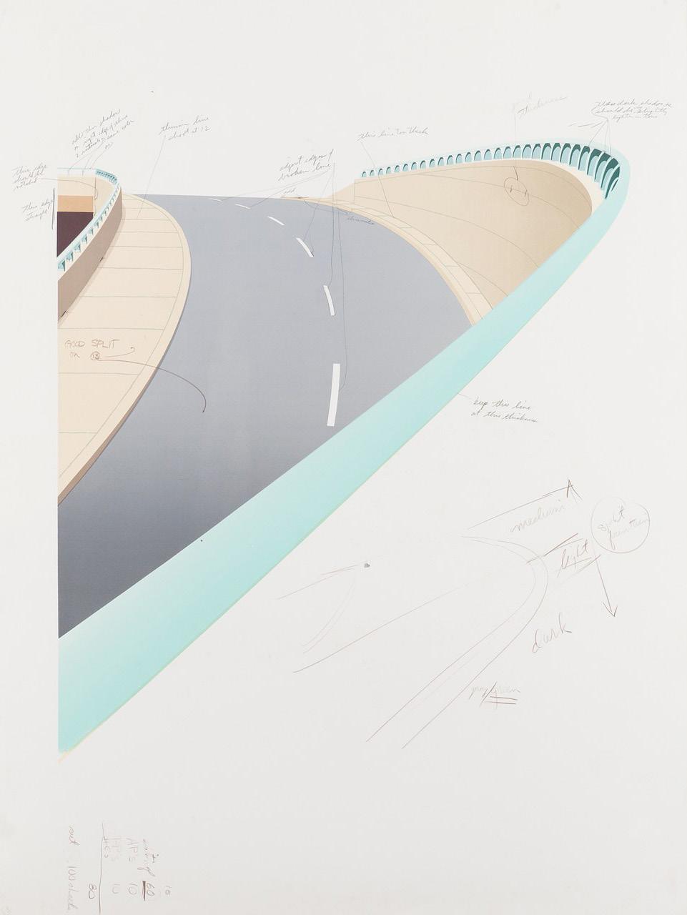

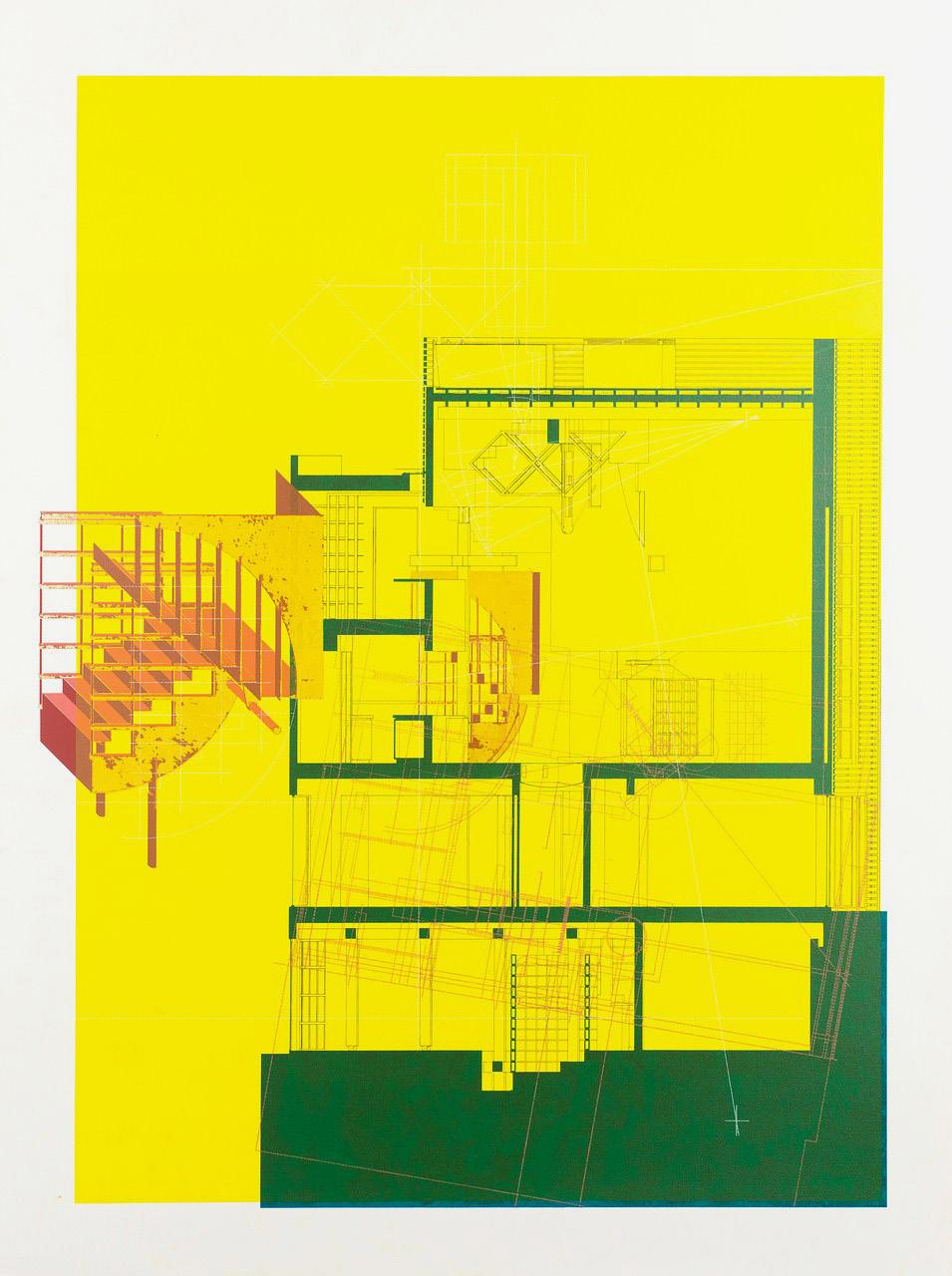
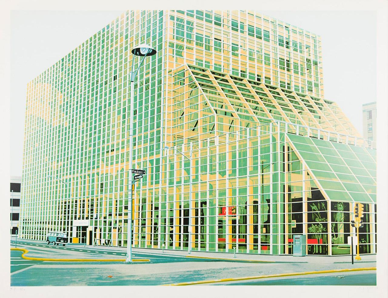
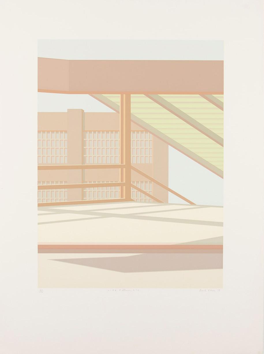
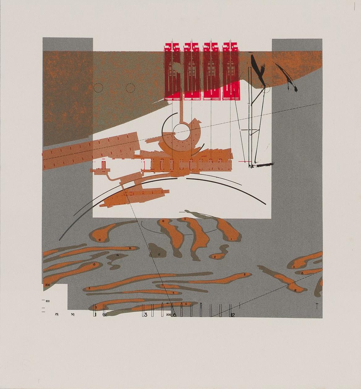
Proofs, Editions, Happenings
a83 examines its legacy by revisiting an analog age of architectural printmaking and creative culture in New York City. Proofs
1 Highway, Working Proof with Notes , 1981.
2 Stair Axonometric with Section (color proof), 1987.
3 Notes After Proof, Tony King, 1986. Editions
4 Greenwich Savings Bank , 1981. (AP: 15/30)
Serigraph on paper
5 L.I.R.R. Entrance L.I.C ., 1980. (38/175) Serigraph on paper
6 First Wisconsin Plaza, 1979. (PP: 5/10) Serigraph on paper
Happenings
7 Creativity = Capital , 1983. (120) lithograph and screenprint on paper
8 Chiba JPGA , 1991. (14/50)
Serigraph and aluminum leaf
9 Charles Luce, 83-84 Print Projects, Exhibition Invite, 1984. Ink on paper
In 2020, a83, a gallery plus print shop, created a hub of sorts for design types nestled right in the beating heart of Manhattan’s Soho neighborhood. Joining the ranks of such downtown archi-institutions like the Storefront for Art and Architecture and Citigroup, a83’s exhibition schedule brings the architecture community together in a beautiful, cast-iron loft space. Led by Owen Nichols and Clara Syme, the shop takes over the space and equipment from John Nichols Printmakers & Publishers, which was operated by Owen’s father from the same space from 1978 until 1994. Nichols and Syme also codirect Chibbernoonie, a self-described “global design empire based in Princeton, New Jersey.”
The gallery’s programming is heavy on craft and experimental forms of representation. Often, works on paper are highlighted—a83’s specialty is in-house risograph printmaking, and editions are produced in
its basement workshop. Other shows have focused on painting and alternative forms of architectural image making. To date, the gallery has staged shows on Anthony Ames, Claude Parent, and Reiser + Umemoto, among others.
This year, a83 is mounting an ongoing series titled Architectural Image-Making in 1980s New York. Curated as a three-part series, it began in January with Proofs, which surfaced offprints and tests, and continued this past summer with Editions, the more “complete” drawings that stemmed from those mark-making tests. This fall, it will finish with Happenings, which will continue the journey of an architectural print by sharing announcements and posters. Stay tuned for the show’s opening on November 11, which is sure to draw a crowd. Emily Conklin
The Architect’s Newspaper
COURTESY A83
ALL IMAGES
1 2 3



October/November 2023 17 4 5 6 7 9 8
18 Studio Visit Change Makers
New York–based Modellus Novus is transforming the practice of architecture from within.
It’s a tale as old as time: After working for years at large architecture firms, three up-and-coming architects set out to launch their own practice. Whether for the thrill of entrepreneurship, the itch for creative freedom, or just being sick and tired of working for someone else, it’s not unusual for designers to take the leap into business ownership. For New York–based Modellus Novus, however, the impetus to launch its own studio came from somewhere else: a desire to change the way architecture itself is practiced.
For cofounders Preeti Sriratana, Jonathan Garnett, and Steven Harper, addressing this issue of limited access in the profession was integral to their launch of Modellus Novus, Latin for “new model,” in 2015. Since then, the trio, along with the firm’s practice director, Anya Gribanova, have worked to show the world the new model they envisioned. “Yes, we wanted to do progressive, pioneering, beautiful design,” said Sriratana, “but equally important to us was to build a form that would change how architecture is practiced.”
With a mission of designing spaces for the many, Modellus Novus itself is a model of such a space. The 26-person firm is global in its makeup, with women composing over half of the staff
hailing from 11 countries and four continents. This diversity is no accident. “In order to design spaces where people from different backgrounds feel welcome, it’s not just about the design itself,” explained Sriratana. “The built environment is defined by the people behind it. It’s important to align yourself with people who share your values.”
Ultimately, the firm has found this mission actually helps it create better work. Across an interiors-focused portfolio for industries as far-ranging as residential, institutional, and commercial, and with a strong emphasis on hospitality—including the recently opened, much-lauded Tatiana by chef Kwame Onwuachi at New York’s Lincoln Center—Modellus Novus has gained a reputation for creating places that find authenticity through surprising details and material explorations. “If you have value alignment, it speeds up the process of decision-making because we’re in agreement about what we want to achieve,” said Garnett. “We’re all trying to unlock some potential in the project that can bring people together.”

The Architect’s Newspaper
3
COURTESY MODELLUS NOVUS
Lauren Gallow is a Seattle-based writer and editor covering art, architecture, and design.
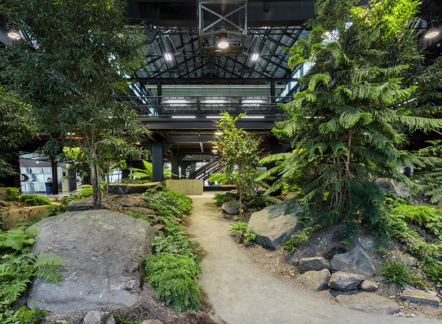

1 Crye Precision 2016
Tucked into the Brooklyn Navy Yard behind an unassuming brick facade is a living forest of mature trees, massive boulders, and a bale of live turtles. In the design of this 87,000-squarefoot adaptive reuse project for Crye Precision, an industry leader in protective armor, Modellus Novus sought to create an unexpected, restorative moment for workers and visitors alike. “We pulled the perimeter into the interior of the building to create a place where people can gather, which is
a through line in all of our work,” said Sriratana. Working with landscape design-build studio Verdant to execute the living forest promenade, Modellus Novus upended the typical manufacturing facility model, instead creating a place for people to thrive and collaborate.
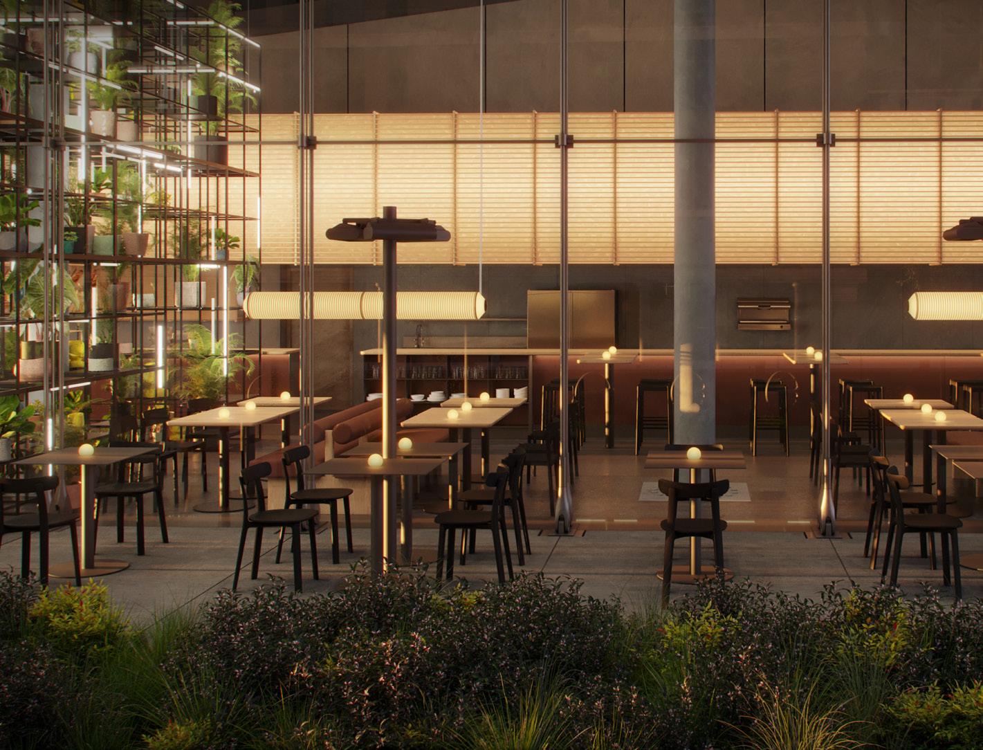
3 Frenchette Bakery at the Whitney Museum of American Art 2022–
For its redesign of the ground-floor cafe at the Whitney Museum of American Art, currently nearing completion, Modellus Novus looked to Renzo Piano’s original emphasis on transparency. “The building was always meant to have a very public ground floor,” said Garnett. “It’s a generous concept, and we wanted to build on that.” The updated cafe design brings warmth and beckons people inside via two major design elements: a
massive black steel installation by artist Rashid Johnson, with shelves holding plants, books, and sculptures, and a new 70-foot-long lantern light fixture above the bar made of wood and rice paper, which Garnett affectionately refers to as a “gentle giant.” “The lantern becomes a beacon, and along with Rashid’s piece they become distinct elements that frame the space.”
2 Discolo 2022
Surprise and delight are common elements in Modellus Novus’s designs, and Discolo is no exception. Hidden in plain sight beneath New York Italian restaurant Al Coro (also designed by the firm), the moody, high-fashion cocktail bar is replete with plush built-in furnishings, reflective surfaces, and dramatic lighting. The space reveals itself sequentially, transitioning from bar to lounge to private room with custom hi-fi equipment. “Discolo leaves spaces to be
discovered,” said Sriratana. “Whereas Al Coro above is the apex of fine dining, Discolo becomes its rebellious underground foil that loosens the buttons to be purely revelatory.” Ultimately, Discolo reflects one of Modellus Novus’s core principles: creating places that celebrate freedom of expression, writing new stories of culture defined by the people who use them.
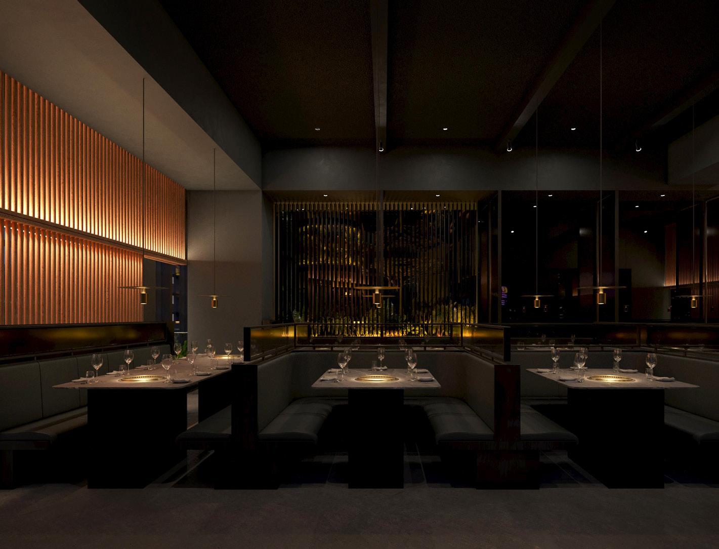
4 COTE Singapore 2023–
In its third design for chef and restaurateur Simon Kim, Modellus Novus continued the thread of theatrical drama that defined its designs for Kim’s Miami and New York locations. Conceiving each room as a different scene unfurling in space and time, the team envisioned COTE Singapore as the brand’s third act. “We wanted to unfold this expanding story of the COTE brand and the things that inspire Simon,” said Garnett. Drawing
on Singapore’s tropical environs and Kim’s love of plants, the bar is densely populated with greenery and artfully illuminated, imbuing the space with jungle drama. Hidden drawers and casework elements in the private dining space engage visitors in a tactile way. “In the end it’s about engagement and the human experience,” said Garnett.
October/November 2023 19 1 3 2 4 COURTESY MODELLUS NOVUS AARON THOMPSON/COURTESY MODELLUS NOVUS COURTESY MODELLUS NOVUS ADRIAN GAUT/COURTESY MODELLUS NOVUS AND DISCOLO
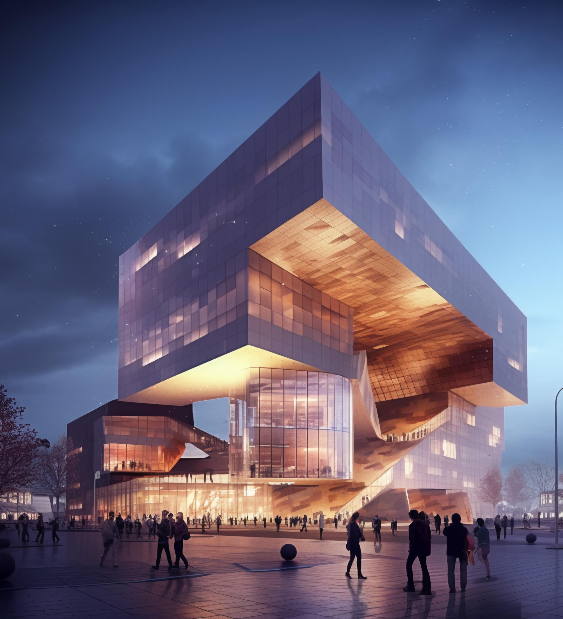
by:
Presented
facadesplus.com Visit our website for the 2023–2024 Facades+ schedule
Image by Midjourney
PIONEERING SUSTAINABLE ARCHITECTURAL DESIGN
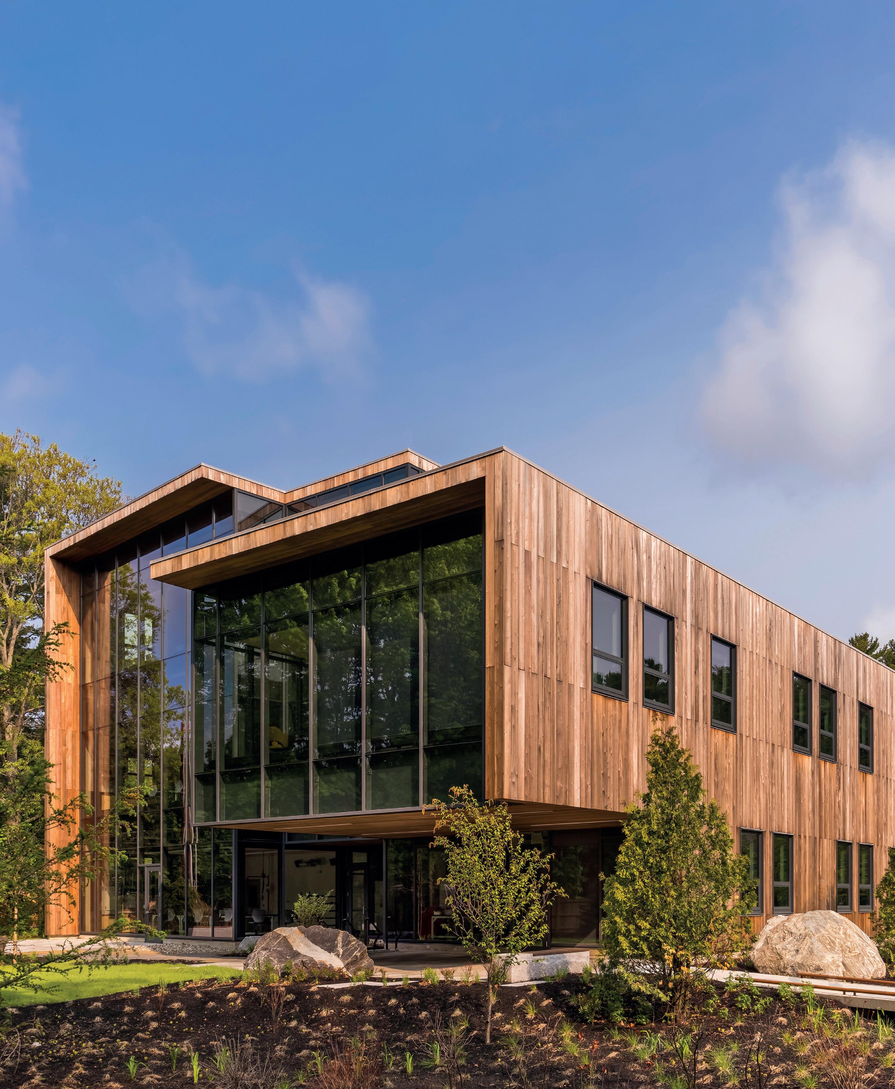
Kawneer is driving positive change by providing environmental transparency in the form of EPDs and Declare labels. Our thoughtful product design and responsible manufacturing help to inspire distinctive buildings and make a sustainable difference around the world.
FIND
OUT MORE AT
KAWNEER.COM

BEN DENZER
YKK AP America is a national manufacturer of commercial façade systems for specifiers and glazing contractors seeking smart design, quality engineering and exceptional customer support. With the support of our dedicated employees, we combine controlled manufacturing and thoughtful design to provide quality building solutions that will meet your performance, aesthetic and sustainability needs.

HAPPY ANNIVERSARY TO ARCHITECT’S NEWSPAPER!

Field Technical Service
Phone and on-site consultation for product installation challenges.
Project Support
Estimating, design and management for large scale projects.
Engineering Consultation
Assistance with codes, system info, calculations and modifications.
Continuing Education
Fenestration and engineering courses that reward AIA CEU credit.
www.ykkap.com
Write It UpYearsTwenty of theBreaking News
With this issue, AN celebrates two decades of print production. From humble origins, AN has grown into a trusted source for architecture news and commentary and, through AN Media Group, a wide array of events, newsletters, and resources. We’re thankful for 20 years spent covering the best (and worst) in architecture.
To mark the occasion, we’re picking up where our 15-year anniversary issue left off. This special section takes a close look at the last five years of the newspaper. Here, we feature an interview with our CEO/creative director, Diana Darling; survey the era’s top stories; remember those who are no longer here; celebrate other architectural anniversaries; and say thank you to our writers. We also hold a space for collective speculation, where a range of thinkers share their thoughts about what architecture—and architectural media—will be like 20 years from now, in 2043. Read on.
23 Feature October/November 2023

From your friends at Microsol Resources
to The Architects Newspaper Your resources partner for Software. Training. Services. Autodesk | Bluebeam | Chaos V-Ray & Enscape | McNeel Rhino | Ideate Software | Panzura | Eagle Point Software
Congratulations
Anniversary
The Architect’s Newspaper published its first issue on November 10, 2003. Founded by Bill Menking and Diana Darling, the operation has grown into AN Media Group. Throughout its 20year history, Darling has been a leader, ideating and delivering new publications, products, newsletters, and events. Gina Pollara, who briefly worked at the company with her, sat down to talk about this milestone.
Gina Pollara (GP): Tell me about your leadership of The Architect’s Newspaper. You were always handling the financial side of things, but tell me about your creative contributions.
Diana Darling (DD): My years in the fashion industry taught me a lot about branding and reproduction quality. Over the past 20 years, I’ve created or co-created everything we’ve done: the newspaper, its regional editions, our newsletters, and the conferences were my idea. I am most comfortable leading sales and marketing. I feel motivated when I’m solving problems and innovating. I’ve grown the newspaper into a media company beyond what we originally imagined when we published our first issue.
New ideas have a life of their own; sometimes they work like our Facades+ brand, and sometimes they come to an end. I love the idea of making things, so years ago I started a newsletter called Fabrikator that ran its course. Later, in 2012, we started our Facades+ conferences with a big event in New York. We’re wrapping up our 11th year now, and that has been a big part of our business, both in terms of focus and revenue. Without Facades+, we might not be in business. You can’t just have a print publication by itself anymore. During the pandemic, we rolled out a lot of virtual events and since then we do a lot of webinars and continuing education through virtual events. It’s been amazing to reach our community using these new platforms.
I still contribute my ideas for editorial input, especially for AN Interior. That brand is about creativity and has a cultural and lifestyle component. Something we often talk about internally is how division of The Architects Newspaper is more about words, while AN Interior is about pictures. I’m involved in many aspects of AN Interior, which feels comfortable to me as I previously worked in fashion publishing.
How did you get your start working in media?
Prior to starting AN, I worked in retail marketing. I produced print catalogues in the heyday of direct mail. My first job out of college was with Neiman Marcus Catalog in Dallas. For more than 20 years I was involved in buying paper, creating production schedules, handling circulation, and controlling creative budgets. From that experience I understood how to produce a print publication. I always wanted my own business, so the idea of starting a publication with Bill mixed both of our knowledge and strengths. Bill brought architectural history, writing experience, and industry connections, and I brought the business acumen of developing media products, reaching the audience, and getting money in the door.
When did you get the idea to start The Architect’s Newspaper?
When I met Bill in 1990, he was writing for a London-based magazine called Building Design, and we were friendly with the editor, Paul Finch. At one point, Paul suggested that we should start a publication like Building Design in the United States. We moved back to New York in 2002 when I had a bit of severance money, and realized if AN was going to happen, we needed to dedicate real time to it. We must have worked on it for about a year before bringing on Cathy Lang Ho to jumpstart the editorial department along with Bill, and she invited Martin Perrin to be the first art director. We thought we could publish a paper
A Life in Media
Diana Darling shares her experience leading and building AN Media Group.

20 times a year in each region of the U.S., and we thought we were going to sell advertising with one person! We were ambitious, we didn’t have a clue.
You started the paper from your loft in Tribeca. What was that like?
We were all located over the place. Bill and Cathy were in the front office, and I was in a little office in the middle of the space. And the others were in this little side apartment that we called our “back office.” We didn’t have a decent internet connection, and we didn’t even have a phone system that connected the front and back offices. One of the perks of the job was doing your laundry at work. I don’t think our daughter liked having this circus around all the time.
What’s the biggest thing in the architectural world that has changed since you started the newspaper?
There has been a shift in who is here and relevant, which is always going to be the case. People have retired, and there are new publications. The scene is not the same.
We’ve explored different routes like podcasts and video, and of course social media is so important today. I’ve always believed in bootstrapping. When we were first starting, I heard someone say that when you have a media company, you have to stack dimes.
And that’s what I have always believed and tried to adhere to: Developing a lot of revenue streams with high margins.
It sounds as though you have been responsive to these major changes in how media companies can survive.
You have to stay relevant. Being independent keeps us nimble. If we want to try something, we go for it; we don’t have to go to corporate to get decisions made. I see solutions quickly and then decide what to do next. It has not been easy, and I sweated every payroll until 2013.
How did you balance your career and being a parent? Nowadays more men are confronted with that challenge whereas before it was just on women, right?
Bill would take our daughter, Halle, to school every day by bicycle. I didn’t leave every day at 3:00 p.m. when school was over; I was focused on making the newspaper successful. This is the struggle of modern life: We want to work and raise a family at the same time. It was important to Bill and me that we gathered every evening for dinner. The business talk would come up, and it was fun to talk about. But then Halle would inevitably ask, “Can you just talk about something else?” In hindsight, I wish I had paid more attention to Halle during those years. I am
making up for lost time now and being present with her is a priority for me.
It must have been challenging for you to have lost Bill and still keep the newspaper running.
Bill and I built this paper. A lot of people don’t know that. People automatically assumed it was all him. That was a struggle for me for many years. When I started Facades+, it was great to be out on my own and build a reputation for myself in the AEC community.
Bill brought in so much knowledge because he was out there, networking all over the place. He was the personality in front of the newspaper. It was who he was, but that isn’t me. It’s not my personality.
He had a huge network of people that fed him information, in New York and all over the world; when he died, I didn’t know how to replace that. That part has always been challenging to me, while managing the business and the family. This is what I miss about Bill: his enthusiasm and charisma. There was always something new and exciting he was attending, traveling to, or working on. He was a unicorn, and he will never be replaced in my life in the same way.
But I have always been here behind the scenes, so I had to work to stay relevant after Bill died. Running the day-to-day operations, managing all departments, sales, finance, HR, IT, marketing, and keeping my eye on editorial… It’s a lot! I strive to keep AN relevant as I’m very competitive.
How do you feel as a woman running an independent media company?
I often feel as though I don’t get the acknowledgement that other men do in this publishing profession. From this side of the coin, things appear to be easier for men to achieve financial success. I have to maintain a holistic view and stay on top of everything to be sure we are presenting ourselves in an appropriate and competitive way. Bill was great at what he did, but he never looked at the spreadsheets. If I started talking numbers, his eyes would glaze over.
Is there anything else we should mention?
We have had a passionate and devoted team at AN from the beginning. It is ever changing, but Bill and I did not do this on our own. It was amazing to have Cathy Lang Ho to help jumpstart the paper and bring on Martin Perrin, who set a design style that carries on today. I am still in touch with prior editors like Julie Iovine and Matt Shaw and Sam Lubell, as they’re always ears I can depend on. And I could not have done this without Dionne Darling, my sister-in-law, who has managed sales and marketing for ten years and has been a huge support and asset for the business. I would like recognize Tara Newton, Heather Peters and Marty Wood, who have been with AN for over 5 years. And now Jack Murphy is leading the editorial team with lots of great ideas and passion. And a special call out to the 20 years of advertising support that continues to grow, as well the committed readers that continue to follow AN and all that we do.
It has been a wild and exciting ride and nothing like I thought my life would be after moving from Grand Prairie, Texas, to New York in 1987.
What’s next for AN Media Group?
I am excited to continue growing different parts of the business. I’d like to see us strengthen our existing platforms and stay true to our print legacy. There is always an idea to pursue, another phone call to make, and another story to tell.
Gina Pollara is a memorialist who studied architecture at the Cooper Union. She has worked on Louis Kahn’s FDR Memorial and the Triangle Fire Memorial.
25 Feature October/November 2023
ANKIT RAUNIYAR


THANK YOU FOR TWENTY GREAT YEARS
For the past two decades, The Architect's Newspaper has provided our industry important stories and news, along with sought-after awards on how architecture grows and advances America. At Marlon Blackwell Architects, we support AN—as well as feel the loss of Bill Menking—for communicating how good design strengthens our lives and communities. Thank you for being a valuable resource for our profession.
PROJECT BEFORE PRIDE
EXCELLENT BEFORE EASY
CURIOSITY BEFORE JUDGMENT
CLARITY BEFORE HASTE
PEOPLE BEFORE PRODUCT
2 0 0 3 2 0 2 3
LookingForward
A Glimpse Into Our Collective Crystal Ball
As The Architect’s Newspaper turns 20, we’re reflecting on two decades of operations. But because architecture is about the future, we’re also thinking about what’s next. What will the scene be like in another 20 years? AN started in 2003, so what about 2043? To help with this vision, we invited a range of architects, writers, and scholars from around the world to speculate with us. They responded to two questions: What do you hope architecture will be like in 2043? And: What do you hope architectural media will be like in 2043? Their responses, filed with hope in mind, are cause for cautious optimism.
clause laws that the Future Liberation Party government put in place, the entire field of architecture has shifted from a projective mode to an investigative one. Architects now scour dusty building permit and certificate of occupancy archives in search of empty and unused space. As a result of this new “land” grab, the interior has become a domain of radical imagination. The horizontal realm of use, play, and love has overcome the vertical abstraction of property ownership. Nick Axel
WHAT DO YOU HOPE ARCHITECTURE WILL BE LIKE IN 2043?
I hope architecture will be symbiotic with the forces and beauty of what’s left of nature, rather than hubristic. For example: less A/C, more passive cooling, and saying no to new buildings that don’t need to exist.
Frances Anderton
By 2043, building new buildings has become politically untenable, and destroying existing ones equivalent to social excommunication. Thanks to nationwide lapse occupancy
I hope that by 2043 architects will design only buildings that produce more energy than they use. More, because buildings in 2043 will not only meet their own operational energy needs but will offset their embodied energy in a reasonable number of years (20 or fewer). There can be no “accounting tricks,” like calling buildings net-zero because their owners promise to plant trees somewhere, someday. Net-zero is not zero, and by 2043 everyone should understand that. Fred Bernstein
My sincere hope is that architecture will by then have given up its focus on the production of new, stand-alone buildings, as well as the focus on their production by supposedly genius designers. Instead, it will understand the act of architecture as the gathering, upcycling, recycling, and assembly of what already exists in such a way that the spaces and places we already have are more sustainable—in a deep and fundamental manner—more open to all and just in their configuration, and more beautiful. Aaron Betsky
My hope for architecture in 2043 (and hopefully before) would be that the discipline sheds the myth of a social or ecolog-
ical project not also being a formal project and vice versa. Integrating social and ecological issues alongside form, organization, and aesthetics would reinvigorate our disciplinary agency. For this, by 2043, I hope we will have better tools to see, understand, and intervene within the abstract systems that implicate architecture—allowing designers to take a more holistic and informed approach on how we build and maintain form. Neeraj Bhatia
Attuned to the real needs of society; understanding of the fact that what it can provide the public is determined as much by legal and political frameworks as by site and project constraints; and always pushing the boundaries of practice.
Giovanna Borasi
More global and less global. More global in that groundbreaking projects will be more evenly distributed throughout the world, and less global in that they will be more culturally, urbanistically, and ecologically attuned to their sites.
Daniel Brook
By 2043 I hope architecture is directly relevant to the largest challenges society confronts, including climate change, social inequity, and technological dislocation. Much of our political and technological discourse is about division and disillusion, but architecture can instead be about connectedness… It can be about an architecture of urbanity.
Vishaan Chakrabarti
I don’t have personal hopes or desires, but I can provide you with some trends and possibilities that people in the field of architecture have been discussing for the future of architec-
27 Feature October/November 2023
ture in 2043: sustainability, smart cities, modular and prefabricated construction, adaptive and resilient design, mixed-use spaces, cultural sensitivity, health and well-being, advanced materials, accessibility and inclusivity, and collaboration and interdisciplinarity. These are some of the potential directions that architecture could take by 2043, but the future of architecture will depend on various factors, including technological advancements, societal values, environmental concerns, and economic considerations. ChatGPT
The pandemic panic that began in 2020 may be over, but among its dubious lessons is that long-distance travel and face-to-face human interactions are largely avoidable. If these are permanent sociological shifts—conversations mediated by masks, social gatherings represented by grids of faces on computer monitors, city marketplaces replaced by home-delivery networks, virtual workplaces and classrooms infesting our homes—then which architect has given us the most prescient urban image of our collective future? Probably not the intensity and incessant movement of Le Corbusier’s Ville Radieuse, but perhaps the relative dispersion and stasis of Frank Lloyd Wright’s Broadacre City. Wright predicted a world covered with low-density sprawl—to him, a vision of rugged rural independence, but in all likelihood only an exacerbation of suburban isolation and anomie. Let’s hope he was wrong. Thomas Daniell
Twenty years from now, I hope that we will have moved on from the dominant culture’s conception of diversity and inclusion as manifested by Western architectural institutions and media by embracing a more authentic and nuanced understanding of anti-oppression. This would necessitate the architectural discourse to engage in a serious interrogation of its relationship to race, gender, and class, enabling it to diminish its own hierarchical systems, thereby allowing the scope of who can participate to widen. Only then can we fully realize a socially progressive industry that can support those who presently go unseen. Erandi de Silva
I. I hope that in the U.S. it will be governed by a body that:
A, takes an ethical stand on:
1. bad labor practices
2. unsustainable construction practices
3. energy-consuming buildings
B, espouses degrowth and promotes rehabilitation/ renovation whenever possible
II. I hope that it will be a profession that is accessible/affordable to all who want to enter it.
III. I hope that architecture will no longer be seen as a series of singular, isolated, nationalist institutions but, rather, a union of all architects.
IV. I hope that architecture is no longer forced to distinguish itself from planners, landscape architects, or interior designers. Peggy Deamer
Beyond practical changes such as availability of new tools and technologies, I suspect we will see diminished material resource availability, alongside less access to fresh air, natural light, and water. Habitat will also be dwindling. The positive outcome here is that we may see a trend in reuse of materials and buildings. We will also see greater interaction with the natural world around us to provide more connections between humans and the flora and fauna. Because of this, landscape architecture will assume a stronger role in the development of the built environment. Finally, on a positive note, I believe we will see a trend toward diversity in cultural and ethnic approaches take root around the world. We may see less Eurocentric methods of design. This will be refreshing and help with all peoples discovering positive perspectives for change around the world. Craig Dykers
In the late 1990s, botanist and psychedelic thinker Terence McKenna commented that those in privilege await and prepare for the coming of the apocalypse, while for the majority of the planet the apocalypse has been here, depending on where one is looking. In the past 20 years, apocalyptic, manmade, and natural disasters have devastated the region of the planet known to outsiders as the Middle East, and architecture, ancient and modern, has been affected, mutilated, demolished, wiped out physically and even from memory. Twenty years ago, today’s unfolding premeditated, intentional, and catastrophic destruction of some of the world’s oldest and most culturally layered cities was not on the horizon, even as unjust imperial war machines ripped through Iraq and Afghanistan. Looking into the future, while optimism is needed, realism is more urgent. One hopes architecture in 2043 will follow new models and preserve old ones that have accumulated meaning
for communities, not just tourists and voyeurs; that it will learn from the devastating experiences of the recent past; and that it will be equitable, fair, affordable, and reflecting of diverse communities living a wide range of lifestyles that are not determined by cultural or economic hegemony. However, that possibility seems unlikely if it is to be built on a foundation made of today’s heaps of rubble. Mohamed Elshahed
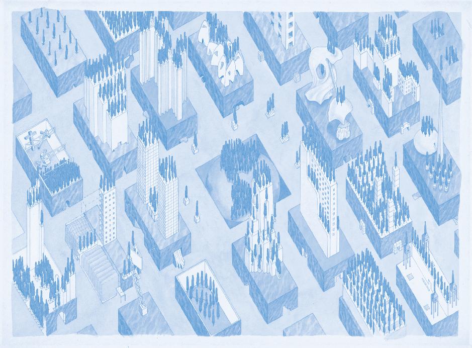
I would like to answer by summarizing what I think rather than what I hope. With the risk of being cynical, I believe that the kind of economic and political frames that characterize contemporary architectural production are not going to substantially change in only 20 years. After all, 20 years is just a bit more than what it takes to conceive and bring to life one big civic building, such as Herzog & de Meuron’s Hamburg Elbphilharmonie, which was completed 15 years after its initiation. Architectural form, in this sense, is always a late manifestation of its recent past. More presumably, in 20 years from now, current dynamics are going to manifest themselves more evidently, which is why I imagine that in 2043, cities around the world will be filled with buildings covered with trees. So called “vertical forests” are in fact the perfect rhetorical answer to the state of ecological stress that we are experiencing today, as they summon the collective image of sustainability (nature) in order to legitimize in the eyes of public opinion and clients real estate operations that would otherwise be strongly criticized. The vertical forest is the architectural version of what Slavoj Žižek calls “the hypocrisy of beneficence:” Covering buildings with plants does in fact little more than reproduce the unsustainable urban model that these architectures claim to combat. From the moment in which ecological commitment becomes a structural element of the building industry, in other words, the remedy becomes part of the disease. I believe that the city of the near future will be the very same as today’s city, with the same (if not more) problems, but with a lot more potted plants. Davide Tommaso Ferrando
If data is the new oil, architects, urban planners, and city officials have a responsibility to engage with a more robust engagement with digital property and data infrastructures. Architecture will need to explore new modes and impacts of data collection that affect the future of urban living and architecture. Hidden infrastructures—digital and fossil fuel—and their deleterious effects on the environment are easy to hide when they are at the bottom of the ocean, but much harder when the infrastructure is part of our cities, part of our urban experience. Both oil and tech industries have long sought to do this, frequently via architectural means. I hope architecture will engage more robust forms of urban reuse and renewal of infrastructural buildings serving the data (tech) and fossil fuel (oil) industries. Wendy W. Fok
In 2043, I hope architecture will be more seamlessly integrated with and more like the natural world around us—regenerative, performative, bio-based, colorful, joyful, and healthy for all living beings. I hope that our architecture and place-making is a source of pride for not only the design community but for all of those who love their homes, neighborhoods, cities, and our planet. Julia Gamolina
I hope that the field will be demystified and that architects will be seen as professionals who did a lot of school and training and also provide a valuable and necessary service—like doctors, lawyers, accountants. I hope there’s less mystique around this figure of the lone genius architect, less forgiveness of terrible behavior, and more understanding of the actual skills that architects bring to the world, which I understand as: organizing space so that we have nicer lives. I hope the actual architecture itself will be climate-conscious, interesting, as-yet unbuilt but not yet unimagined. Eva Hagberg
By 2043, architects will be grappling with two main choices: to restore or reinforce the environments of the non-human species anticipated to survive climate collapse since we will
not, or to design disaster typologies that will mitigate but not avert our demise, which range from heat centers and climate refugee camps. It is a profession-implicating tragedy that climate collapse has become the ultimate starchitect, expediently and irrevocably melting 750 billion tons of polar ice caps each year while the entire global profession of architects 3 to 4 million architects hasn’t mustered more than 2,500 zero-carbon buildings worldwide, accounting for a miniscule portion of the world’s total. To hope for an alternative reality would require a radical overhaul of our accreditation system and curriculum to be deployed as a State Of Emergency mandate, with immediate effect. Harriet Harriss
Will we still be practicing today’s revival-style modernism in two decades? Or will the sum of the new technologies arising from the desire for environmental sustainability finally engender a revolutionary new architecture, as the rise of some technologies—arch, concrete, flying buttress, steel frame, air conditioning—has in the past? I pray for the latter. But it’s pure faith, as the calculus of success is daunting. So many buildings have to perform, all over the world, soon. Which, short of an unlikely political awakening, means architecture will have to embrace, co-opt, then rewrite the market-desire-based populism it has long scorned. David Heymann
I hope architecture in 2043 will be free of fossil fuels, full of natural light and natural ventilation, in urban forms or protecting natural landscapes, unprecedented, and full of inspiration for future generations. Steven Holl
The architecture of 2043 will be similar to architecture of 2023, albeit digital fabrication, creative and generative AI, robotics and smart sensing will be highly integrated into the process. The hope is that this is a time where technology rapidly advances to continue, as it has over the last 100 years, to find workflow, material, and operational efficiency. Furthermore, social and ecological factors will continue to play an important transformative role. Whether architecture is solving for components of climate change and future proofing, or building our communities and neighborhoods to serve a more equitable and just future. Design, and more specifically architecture, will be more democratized within the built environment, thus leading to greater desire for design excellence. The role of the architect is as critical as it was over history, and we will need to be thought leaders at all scales within the built environment. Jeffrey Huber
Playful, smart, provocative, and refreshing. Wonne Ickx 9/11, an urban catastrophe provoked by hubris, changed the perception of architecture in New York City. Despite the initial notion that the city was dead, New York flourished, and with the help of AN, the architectural conversation became more mainstream. Most likely, the theater of environmental events will become increasingly dramatic. Architecture and urbanism will affect all. It is unfortunate that it takes crises to bring architecture to the fore, but we’ll take it if it increases its relevance. In two decades, our work should be inclusive acts of resilience, restoration, and regeneration. Florian Idenburg
I hope—against perhaps all the available evidence—that architecture might be organized around collaboration and cooperation rather than competition. Perhaps projects might begin by working together rather than pitching one against another. Collaboration as a default, with projects as a nucleus around which architects, clients, users, and people might orbit, and that draw skills, knowledge, and imagination into their gravitational field, that materials might even circulate between. It might mean not just a richer and more pleasant way of producing the world around us, but it might also forge new and unlikely alliances: AI and weaving, robotics and handcraft, clay and carbon fiber, history and speculation. In other words, a kind of architectural commonwealth connecting how things are produced, what they are made from, and how they are used, reused, imagined, and reimagined. Sam Jacob
Through buildings; through the organization of how activities unfold; through the regulation of water, energy, material flows—architecture articulates societies and ecosystems. For 2043, I could imagine trees, air, earth, humans, mountains, pipes, walls, windows, ants, butterflies, mice, virus, bacteria, clouds, and more coexisting in a state of mutual support, and architecture as the form of articulation that makes that coexistence possible and durable. I celebrate architecture’s capacity to operate transscalarly, facilitating alliances across species, materialities, and human and nonhuman intelligences. Andrés Jaque
Three principles of design that define the context of architecture in the city (a riff on Hilberseimer): Everybody in the city must hear the birds sing; everybody must be able to smell
28 Feature The Architect’s Newspaper
DAVIDE TOMMASO FERRANDO
the odor of the earth, trees, and flowers; architecture in its broadest sense must be understood to be a public concern. Phyllis Lambert
Above water. Mark Lamster
My hope for architecture in 2043 is that urbanism, urban planning, urban design, housing, and landscape architecture will have gained in importance and dominate the discourse. In a world in which an absolute majority of the explosively growing population will live in cities, and a majority of that will still live in shanty towns if they’re not completely homeless, the improvement of both should be the most important task. This would involve the improvement of affordable housing in unprecedented quantities, public transport, connections to public facilities, as well as a greater importance on ecological issues through governance. As the growth processes accelerate, I hope AI can help in the simulation and steering of these processes. Bart Lootsma
I hope that valued examples of our architectural history and city fabrics are taken care of and valued for their contributions to our communities rather than sacrificed for the economic potential they often represent. I hope to see the icons of today and yesterday still thriving in 2043. Elaine Molinar
Recognizing the hard work that bringing about a healthy and equitable future will entail, and not taking for granted the entrenched interests that must be overcome, I hope 2043’s architecture—and the built environment more broadly—is designed and built to be accessible to and in service of the working classes. Jacob R. Moore
It has been very interesting to see the early seeds of union organizing within the architecture profession. I hope in the next 20 years we will see that movement come to maturity. I’m curious what practitioners will do with strong union power and how that organizing will impact the working life of architects. I hope it will become so much more expansive and understood as socially interconnected with the concerns of daily life in the built environment. Jess Myers
I would hope to see the architectural landscape marked by a heightened consciousness in the field of architecture in 2043. It is essential that we engage in work that yields meaningful consequences, by viewing architecture as a social act, and to strive to create work that is accessible to all socioeconomic levels. It will be of utmost importance to acknowledge that this commitment should permeate all typologies in our daily practice. Lorcan O’Herlihy
I hope landscape architecture will be much more integrated into public life and policy. During the pandemic, the science of mRNA vaccines was front and center; likewise landscape architecture should be visible, effective, and in the service of the public good in the climate emergency. I’d like to see landscape architects heading the Department of the Interior, on the President’s National Climate Task Force, serving as mayors and city managers in cities and towns across the United States, and leading the newly launched American Climate Corps. The profession emerged from private gardens, from industrialization, as a form of leisure, and from a culture of consumption, but we have to pivot towards a radically more public and civil service approach. Maybe something closer to inspired permaculture or farming. Honestly, I think this will be more fun and more rewarding. Kate Orff
Not in ashes, at the bottom of the ocean, or owned by Blackrock. Anjulie Rao
We have to chill out. We have to find a balance. We have to get rid of our myopic obsession with craft and zoom out to see what unfettered growth and endless construction is doing to our planet. As architects we have to understand that the biggest obstacles to human flourishing aren’t architectural problems. No matter the good intentions or spatial innovations, architecture has to engage politically to make a dent in the compounding crises of ecological destruction, housing scarcity, and neocolonial land enclosure. Architects need to push for housing decommodification. We need to advocate for the re-commoning of land at home and resource sovereignty abroad. We need to fight for #LANDBACK and undo centuries of theft and genocide on Indigenous peoples globally. The way I see it, whatever architecture looks like is an emergent property from the conditions of its development, not an individual imposing their creative genius on a sandbox world. If you can’t walk to get groceries within 15 minutes, what is the difference if your postmodern dwelling contains witty references or lacks 90-degree angles?
In 2043, I hope to walk down the street to the local commons where my neighbors are tending to the crops they planted in the spring, grab an apple off one of the trees we
all share, and touch grass on the decommodified open space between our mid-rise garden city apartment buildings. I won’t be thinking about indexical deconstructivism, sketchup contemporary, or recursive post-digital skeuomorphism. I’ll be with my loved ones, surrounded by a community that supports each other, and I’ll be happy. @societyiftextwall
First off, I hope that architecture in 2043 has, by this point, solved the question about the division of labor in firms in favor of laborers. I hope to see a unionized architecture across the board, because I believe that this is the starting point for everything from greater diversity of formal ideas to diverting energy and money away from wasteful, harmful, or just plain bad projects and towards projects that uplift communities and genuinely make the world a better place. Furthermore, I hope architecture does revolt a little bit against the BIM-ification of everything—the reliance on similar forms and claddings because they are prespecified and less vulnerable to liability. While these technologies can save a great deal of time, that time isn’t being redirected back to doing the real thinking and form-making and exploring of architecture but rather towards simply taking on more and more projects.
Architects leave school with a set of skills that make them feel empowered and energetic about using architecture to improve the world we live in—or at least the built environment, which is a huge part of the world, one that is entwined with political questions such as climate change, housing, and migration, often interacting with those issues on the intimate level of the everyday. By the time they get to firms, they feel less like people with agency and more like drones, their work less about shaping space and contributing to real change and more like simply managing different parts of capital. This is a great shame, a great squashing of creative and human potential. So in my opinion, rather than gamble on a future of flying cars or floating cities, the practices of architecture are what need to change. With greater democracy across those practices, as will hopefully be achieved by 2043, we will see a flourishing of creativity and a bolder, more inclusive, and more forward-thinking architecture. Kate Wagner
One group (of Indigenous, antiracist, anti-imperialist, anticolonial activists) will instrumentalize their skills to design both spaces of resistance and anticapitalist propaganda. In their fight against colonial time and capitalism, they’ll work to protect, de-privatize, and dismantle an encroaching ecocidal fascist regime that threatens slight challenges to their domain with annihilation. WAI Think Tank
We would love to see architecture evolve to play a broader, more valuable, and supportive role in society. For too long architecture has served the wealthy and the ego, embellishing both clients and a star-architect syndrome. This has spawned the society of the spectacle, serving the goals of the elite. In an increasingly more equitable and diversified world, one hopes that this transitions to more profoundly communityfocused work: architecture as truly social work for our globalized world. Clive Wilkinson
If the last two decades have taught us anything, it’s that architecture progresses more slowly than the culture it inhabits. Let’s hope that by 2043 the field has found a way to embrace equitable labor practices and ditched the “sole genius creator” mythology. Ground-up construction of buildings will be more rare, but architectural expertise is expressed in retrofits of outmoded typologies (like high-rise office towers) and adaptation of existing structures for climate’s new normal. Mimi Zeiger
If architectural media exists in 2043, I hope it pushes for architecture that is symbiotic with nature’s forces and beauty, rather than hubristic. Frances Anderton
By 2043, the audience of architectural media is no longer strictly architects. People (i.e., not architects) look to architectural media to understand what is happening around them. This means not reporting on “best” (or, as became trend in the age of social media, “worst”) practice, but on whatever practice does. To aid architects in their efforts to discover new space, architectural media has become more comprehensive and systematic in reporting on every activity of the building industry. It has finally become a wire, one that inevitably publishes too much for any one person, but one that publishes something for everyone. Nick Axel
I hope that by 2043 architecture writers and the publications that employ them will stop repeating claims made by architects and their clients about how “green” their buildings are without first doing some investigation, or at least a few backof-the-envelope calculations. (Will there still be envelopes in 2043?) Terms like net-zero, carbon-neutral, and climate-positive, which in 2023 mean anything people want them to mean, will have specific, agreed-upon definitions. And all those definitions will take embodied energy into account. Calling a building net-zero without considering embodied energy will seem ridiculous in 2043. Fred Bernstein
I hope and trust that architecture criticism will be a constituent part of the development by which the discipline will have given up its focus on the production of new, stand-alone buildings, as well as the focus on their production by supposedly genius designers. Instead, criticism and the discipline both will understand that the act of architecture as the gathering, upcycling, recycling, and assembly of what already exists in such a way that the spaces and places we already have are more sustainable. And, in a deep and fundamental manner, more open to all and just in their configuration, and more beautiful. Aaron Betsky
Human. I mean this in two ways. Firstly, rather than always reacting to what is trendy, I hope it looks at architecture as a way to understand the phenomenon of human life. Secondly, not written by AI. Giovanna Borasi
More reporting-based. Too often today, in a time of tight editorial budgets and byzantine grant-funding infrastructures, critics write about buildings they have never seen in cities they have never visited. The result is architecture writing that privileges form over function. A building that is beautiful but not functional is just a sculpture. By 2043, I hope that architecture media will have the stable funding infrastructure and the editorial integrity to only feature buildings their writers have visited. Daniel Brook
By 2043, I hope the architectural media helps to determine success and failure in architecture by fully evaluating its cultural, social, and environmental impacts in the world, as well as upon the profession and all those who labor in it.
Vishaan Chakrabarti
I don’t have personal hopes or desires, but I can provide some insights into the possibilities and trends that people in the field of architectural media may anticipate for 2043: virtual reality and augmented reality, digital collaboration platforms, AI-generated content, interactive and personalized content, sustainability and green-design focus, global collaboration and cross-cultural exchange, accessible and inclusive content, data visualization, virtual architectural exhibitions and events, and ethical considerations. The evolution of architectural media in 2043 will likely be driven by technological advancements, societal needs, and the changing landscape of architecture itself. It’s important for the architectural media industry to adapt and innovate to meet the demands and expectations of architects, designers, and the public in an ever-changing world. ChatGPT
Twenty years from now, I hope that we will be looking at an architectural media landscape that is less focused on serving the needs of society’s most privileged, be they architects or clients. Because architecture media is largely controlled by the dominant culture, we urgently need editorial perspectives that can provide relevant critical outlooks that don’t have a strong platform in the current environment. To deepen our collective understanding, funders and advertisers must provide financial support to enable this work. However, this support should not require the approval of the dominant culture, as they aren’t well-positioned to determine what is relevant to the communities they marginalize. If architecture wants to genuinely diversify its media space, we need more conversation and education around this particular issue. Erandi de Silva
WHAT DO YOU HOPE ARCHITECTURAL MEDIA WILL BE LIKE IN 2043?
29 Feature October/November 2023
I hope that it will more completely recognize that there are more ways to practice than producing objects and more places to be tracking than the developed/Western world. Peggy Deamer
Today there remains an interest in perfection by architectural media. This often neglects the influence of clients, commercial interests, insurance, education, and legislation in the development of a project. Furthermore, perfection is a stand-in for a utopian dream, unattainable, like slinky fashion. Let’s hope the representations of design in 2043 are less empty of people and other forms of life; let’s hope the writing will more often explore lesser represented directions even if messy; let’s hope history will not be forgotten. Finally, as with the built world, I hope we will see a less Eurocentric understanding of what design should or could be so that tone and style will be more diverse. There will be more critical assessment of critical theory and academic frameworks. This is already happening in other forms of media.
Craig Dykers
Architectural media will need to engage deeper in mixed-media (XR) approaches and curation. As users transition closer to digital media and their digital devices for learning and leisure, the accessibility of information will require an active engagement of providing a feedback loop between architectural and design journalism <> printed matter <> physical activations, and vice versa. It is my belief that architectural media should be an interchange between physical and digital media, merging the phygital space.
Wendy W. Fok
In 2043, I hope that architectural media will engage with general media outlets to bring provocative stories about the places that shape our world to a larger audience. I also hope that architectural media will embrace new platforms and technologies for deeper storytelling and place depictions—new kinds of video content, imagery, etc. Finally, I hope that architectural media continues to expose those harming our people and planet, and celebrates those working towards climate and social justice.
Julia Gamolina
Vibrant, competitive, ubiquitous. I hope somehow newspapers fund full-time architecture critics again; that the magazines don’t need to sell themselves 50 times over; that writers can make a living; that architecture coverage is seen as a necessary part of cultural, political, social understanding. I hope The Architect’s Newspaper will still be thriving, along with 50 other broad and niche publications, all of whom pay their writers and photographers and editors.
Eva Hagberg
Photographs carry more content than words in most mainstream architectural reporting today, a trend prompted, well before its internet apotheosis, by the rise of inexpensive color lithography. But architectural photographs are notoriously weak at explaining anything about a building beyond form. What can “head shots”—Mary N. Woods’s pinpoint characterization of conventional architectural photography’s upper limit—effectively communicate about a building’s environmental performance, say, or its social equity? I doubt we’ll ever return to more words to broadly communicate and consume architecture. So I hope for a new architectural photography that utilizes the pliability of digital technique —and our evolving intelligence in understanding images—to expand the stories a picture can tell.
David Heymann
I hope architecture media in 2043 will be more reflective and philosophical, less commercially driven, and more concerned with social potential and artistic intensity.
Steven Holl
Architectural media will need to find a way to better link with the public. It will be critical to promote architectural awareness and the role of architects and how they shape the built environment. The hope would be that media will be more than print and digital formats and move to immersive experiences that allow general and professional audiences the ability to touch, smell, hear, and see projects through technology that can bring the architecture to them. As an architect I am much more interested in the ability to understand the techniques and technologies of architecture. An emphasis on AR/ VR technologies and highlighting bespoke details as well as precedent typologies, or even immersive digital sets that can allow architecture to further build upon its past epistemology, yet be forward thinking and innovative in regards to how that information is delivered.
Jeffrey Huber
Playful, smart, provocative, and refreshing. Wonne Ickx
I hope there will actually be well-moderated and informed conversations by real people. Florian Idenburg
Anything that corrodes the current PR-ification of architecture would be progress. Maybe it’s a universe of zine-like things that make private obsessions public, that collectively stake out multiple positions and possibilities, that reveal amazing new potentials in the everyday. Is it print, a blog, a tweet, a post? Maybe the medium is also multiple—from photocopied sheets to screens to banners and tote bags and newsprint, to shows, musicals even. Maybe it’s time to understand media—after print, after Twitter, after whatever else is next to fail, whatever it is as the conduit of message. Maybe the era of “the medium is the message” is over. Maybe the message is now the medium. Maybe even architecture itself might be the architecture media of the future.
Sam Jacob
Architectural media is architecture made visible. For 2043, I would like an architectural media that enables humans to feel, sense, and discuss how our entanglement with other humans and more-than-human forms of life is designed.
Andrés Jaque
Honest. Phyllis Lambert
I am quite sure it will be in crisis, because architectural criticism is always in crisis. I do hope and expect the printed word (written by actual humans) will remain an essential form, although I’m not sure exactly how it will be delivered. And it would be nice to still be paid. Mark Lamster
I hope that in 2043 there will be a viable place for several carefully edited—that is, moderated—web platforms, with clear cultural identities, that fill in the hole that is left after the larger classic architectural magazines will probably have disappeared. This is crucial to generate discourses that people can share. These new platforms should be Zeitschriften again, as magazines are called in German, instead of the depots —the other meaning of magazine in German—they have become, developing their identity over time through assembling different, clearly moderated, publicly accessible, positions. I hope that new technologies, such as VR and AR, will not only be used to highlight architectural highlights but will also be used in interactive maps and process simulations on an urban, regional, and maybe even global scale. Bart Lootsma
I would like to see a focus on the impact that architectural work generates, on the human body and behaviors, animal life, as well as on economic and environmental conditions. In other words, equal time given to performance as well as aesthetics. Elaine Molinar
Recognizing the hard work that bringing about a healthy and equitable future will entail, and not taking for granted the entrenched interests that must be overcome, I hope 2043’s architectural media—and media that cover the built environment more broadly—speak both critically and clearly about the concerns of working people. Jacob R. Moore
I would like to witness a transformative shift away from the conventional portrayal of buildings as mere static and autonomous structures. Instead, I hope to see architectural media evolve into a dynamic medium that portrays buildings as integral components of the human experience and weaves them into the fabric of their surroundings. This evolved architectural media would offer a more authentic representation of the symbiotic relationship between architecture and its environment. It would foster a deeper understanding of how architecture shapes and is shaped by the world around it, providing viewers with a more profound and holistic perspective on the built environment. Lorcan O’Herlihy
I’m not sure what the anti-Instagram is, but it would be that. My super-savvy teenage daughter deleted Instagram last year! No photos, please, no pithy captions. Just as in my book Petrochemical America, where I unpacked Richard Misrach’s photographs to tell stories of extraction and portrayed landscapes of energy, technology, and environmental justice, landscape media in 20 years needs to be locked into sharing stories of the people and communities that made them, about carbon embedded and captured, about sand mined from Cambodia, about ipe dragged from the Brazilian rainforest. Can media do that? What will landscape architecture look like if we actually fully halted oil and gas production, and exploitation of the earth’s resources? Again: for me, more fun and more rewarding. Kate Orff
I first typed the word existent. But truly, I hope that architectural media, in 2043, will be cooperatively owned and operated by authors and critics themselves. Traditional media is in constant crisis—god help me if I have to hear “the crisis of X criticism” one more time—and perhaps we need to be building alternative models for how media is produced and
funded. We need fewer Anna Wintours and more Defectors; a model that builds careers for writers and changes the stakes for publishing could keep us afloat. If not, at least it will keep things exciting. Anjulie Rao
Architecture critics historically have had the most impact in posts at publications outside of architecture, primarily newspapers and magazines. The media landscape is so fraught now that those positions are disappearing as soon as their posts are vacated, as we can see with the Chicago Tribune Notably, there are some bright spots, such as the founding of the New York Review of Architecture, which, through a combination of subscriptions, sponsorships, and grants, has been able to find a way forward (and pay writers well thanks to their work with the Freelance Solidarity Project!) despite the relative paucity of the post-internet media landscape. However, in my opinion, I think the best model for starting an independent architectural press lies in predecessors in sports journalism, a field I also work in. So far the Defector model, successfully replicated in cycling’s Escape Collective, of self-sustaining subscriber funding without corporate sponsorship has borne fruit.
My dream is an architectural media that is not undergirded by the AEC industry, whether that industry sponsorship takes the form of HGTV or ArchDaily. Furthermore, my dream is that, by 2043, we will have an architectural media that is public-facing above all, because the public deserves local, accessible, high-quality journalism and criticism about the built environment on a scale we are not presently reaching, especially if criticism positions continue to vanish. We all live in the world. We all deserve to participate in it. We all also deserve to see our own lives reflected in architectural media, not just the spaces of the rich and famous. That requires reshaping everything, even vernacular or popular design media culture. I think it’s possible, and we are moving increasingly in that direction. Kate Wagner
In their walled and surveilled enclaves, award-winning groups of trained designers will continue expanding their operations, designing beacons of luxury funded with planetary-scale destruction. Produced by AI, all media outlets that didn’t join the revolution will continue re-producing pompous slogans that hide behind smokescreens of ecological and sustainable newspeak, the ultraviolent modernization unleashed by more than 500 years of uninterrupted spoliation. WAI Think Tank
Architectural media in 2043 will dissolve distinctions between print and digital and merge to become an immersive combination of the two. Presently people choose one of the two or opt for both. Digital has the advantage of speed and can include links and images/video. It is more wholesome. Print has the solidity and ageless physicality with which many of us have an emotional bond as creatures of habit. It imparts a sense of permanence.
Given rapid digital advances, the news media of 2043 will create devices that will combine the best of the two. There would be small, compact high-tech printers that would be linked to the online publications with the paper of choice already stacked at the subscriber’s end. As soon as the new edition of a “print” journal is out, the reader would automatically receive the copy at their desk. The other innovation will be that the digital copy will provide immersive experiences of the project covered, not just text and images. Rajnish Wattas
In 2043, architectural and design media will be central to the political fortunes of progressive urbanists and environmentalists who have become elected to lead across the globe for their creative vision for the cities, buildings, and infrastructure that in 2023 their baby boomer predecessors were wasting. Now demolishing buildings, widening highways, parking on streets, using fossil fuels and plastics for building construction is seen as the dark ages. Claire Weisz
Independent architectural media will have an increasing role to play in guiding the new urban renovation and revitalization priority. The climate crisis must be more front of mind, with asset recycling and building to minimize carbon impacts. Housing and transportation for the masses must again be prioritized in this new milieu to create a far more sustainable and equitable world. Clive Wilkinson
Architectural media is indebted to the critics and reporters who are dedicated to a sector that is ambivalent in valuing their service. In an age of increased automation, sustaining a writing practice will only be more difficult. It would be great if architectural media takes clues from the new contract negotiated by the Writers Guild of America, which according to Dani Anguiano and Lois Beckett of The Guardian, “does not outlaw the use of AI tools in the writing process, but it sets up guardrails to make sure the new technology stays in the control of workers, rather than being used by their bosses to replace them.” Mimi Zeiger
30 Feature The Architect’s Newspaper
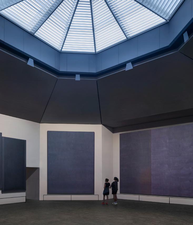

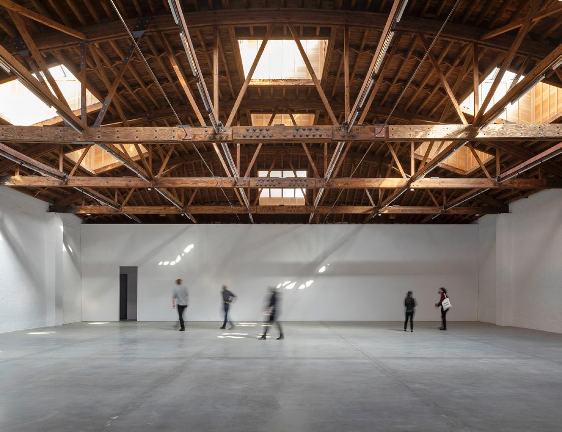


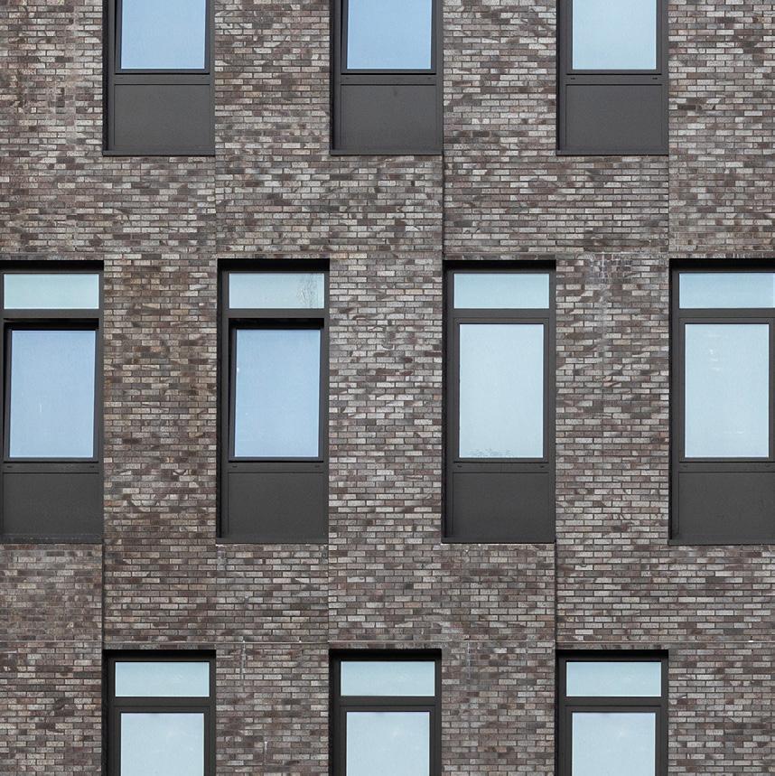
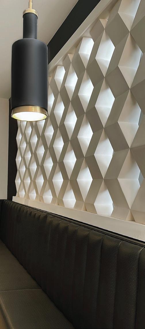




31 Feature October/November 2023 As we celebrate our own 30th anniversary, ARO congratulates The Architect’s Newspaper on 20 years of insight, dialogue, and excellence in design journalism. Ventanas Wall Panels Shayle Wall Panels Kahn Wall Panels Ziggy™ Screen Wall Blocks, Patent 8,375,665 Zephyr™ Screen Wall Blocks, Patent 8,375,665 modulararts.com 206.788.4210 made in the USA the is wall greater... ...than the sum of its parts. Congratulations! 20 years of The Architect’s Newspaper!
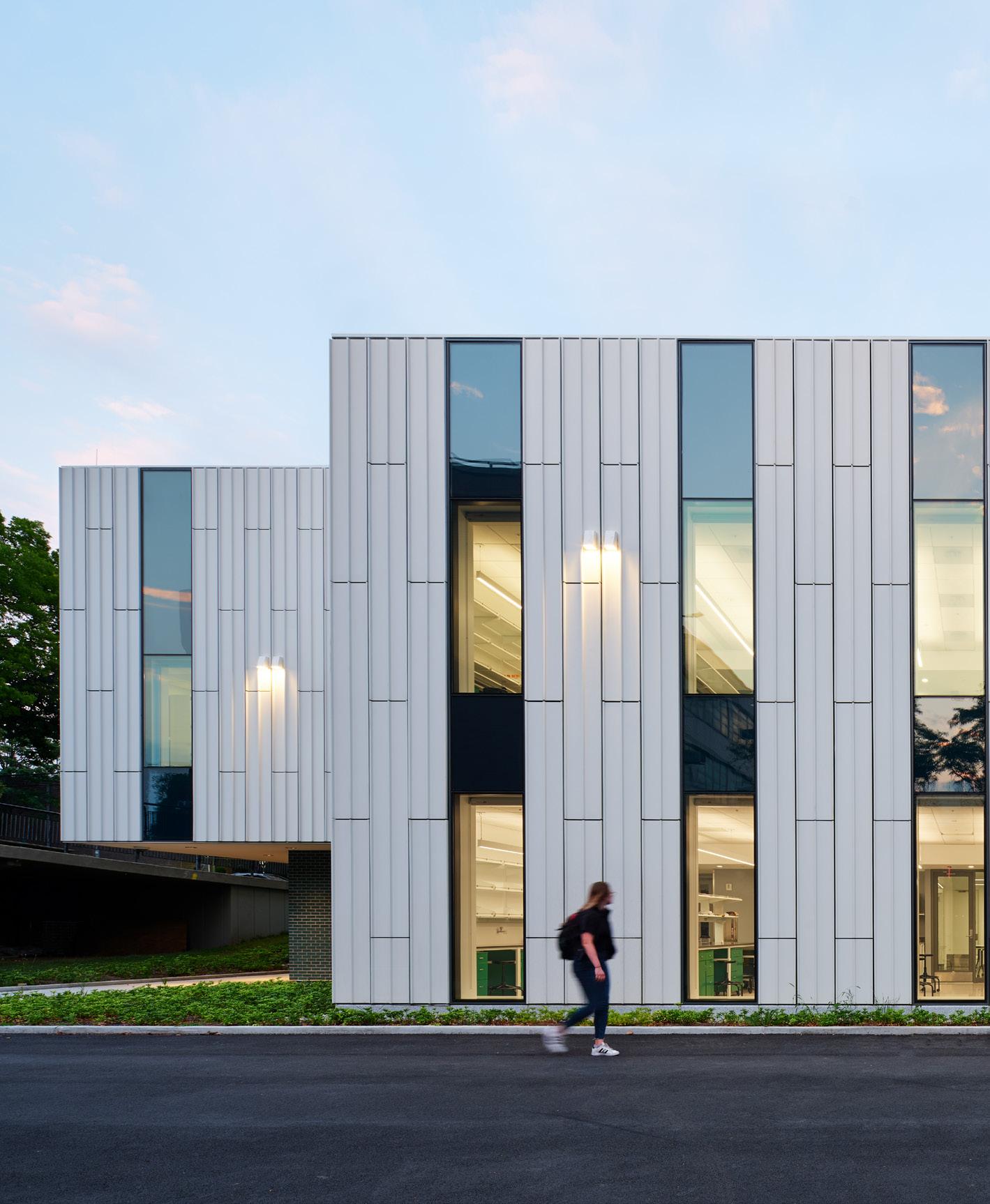


32 Feature The Architect’s Newspaper HAPPY 20 TH TO OUR FRIENDS AT THE
Content Studio PR + Advertising Marketing Strategy ccsullivan.com +1 646.838.1033 alex@ccsullivan.com
ARCHITECT’S NEWSPAPER!
Here’s to the next 20 years of A/N. Keep keeping it fresh. From your fans and friends at C.C. Sullivan.


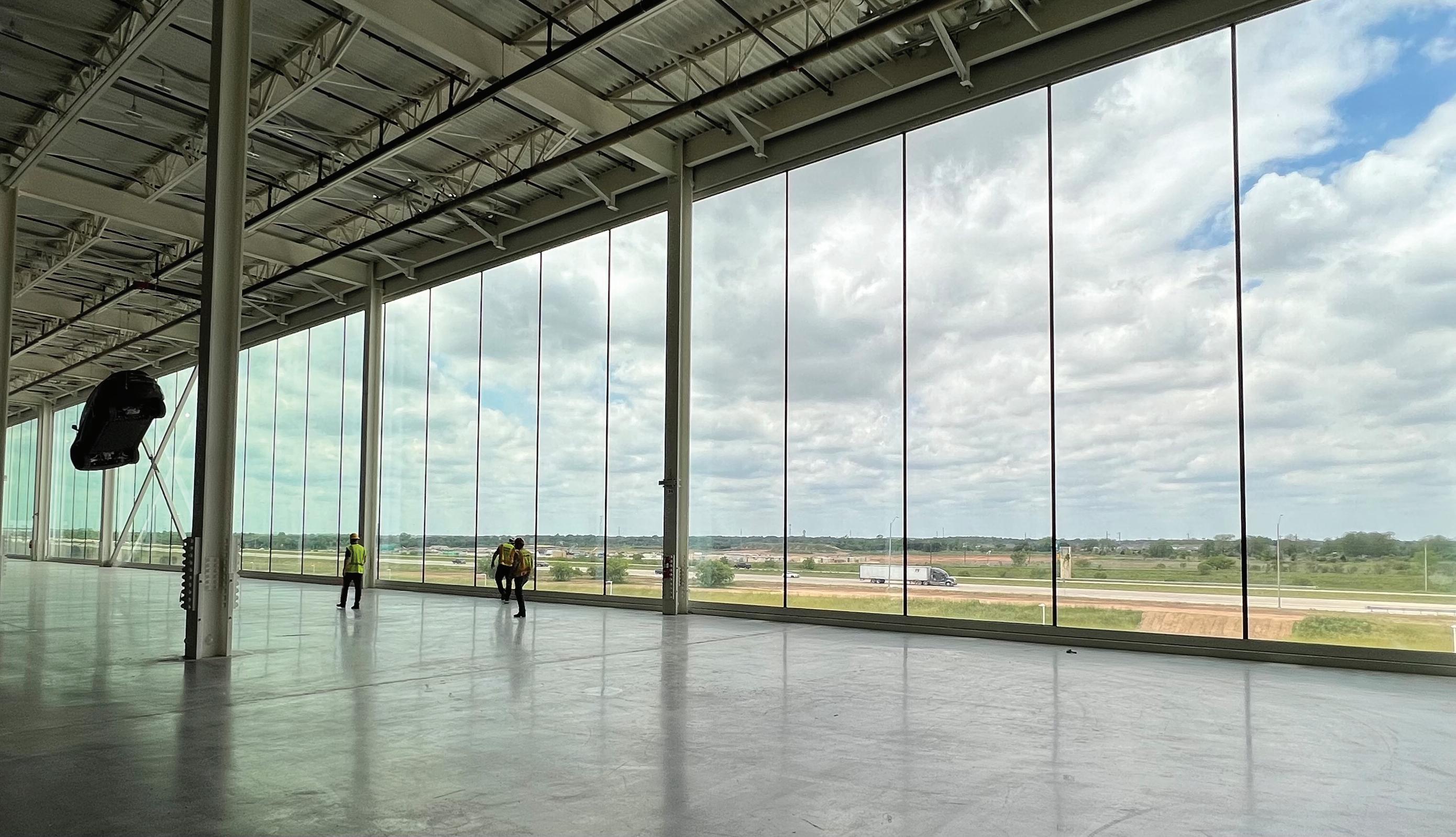


www.spacesmith.com
Happy 20th Anniversary to The Architect’s Newspaper!

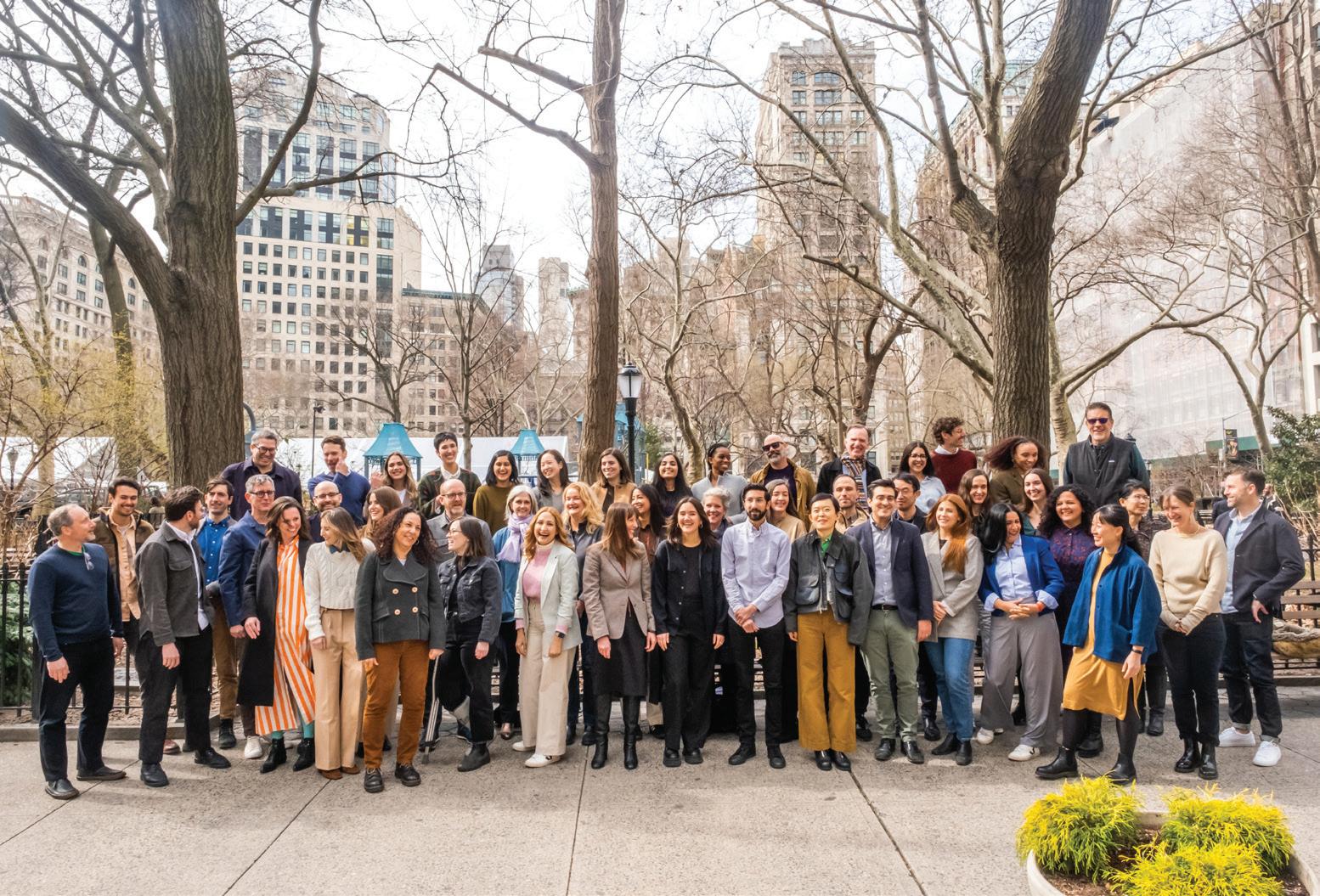
34 Feature The Architect’s Newspaper
Celebrating 20 years of Architect’s Newspaper
to The Architect’s Newspaper on their 20th Anniversary!
TenBerke Architects D.P.C. 41 Madison Avenue, 17th Floor New York, NY 10010
Congratulations to the team for its past, present and future of honoring excellence in design. With love to Diana, and we will remember you always, Bill.
Congratulations
From all of us at TenBerke
CELEBRATING 20 YEARS WITH AN, WE ARE LOOKING INTO THE FUTURE AND REFLECT ON WHERE WE GROW OLDER.
WHERE WE GROW OLDER
How to design for the elderly and their caregivers? Our latest documentary, Where We Grow Older (30min, 2023), looks at how the growing ageing population is reshaping architectural, political and social constructs through two case studies, in Barcelona and Baltimore. Featuring Marisa Morán Jahn, Rafi Segal, and Pau Vidal.
This is the final film in our three-part documentary series, conceived by Giovanna Borasi and directed by Daniel Schwartz, that examines the ways in which changing societies, new economic pressures, and increasing population density are affecting the homes of various communities. Watch the first two films When We Live Alone and What It Takes to Make a Home on cca.qc.ca/films
cca.qc.ca/ wherewegrowolder
Just Keep Scrolling Five Years of Headlines
A lot has happened since 2018. We collectively weathered a pandemic, introduced the verb “to Zoom” into our vocabulary, and took to the streets for climate action and racial justice. Along the way there were buildings torn down and topped out; designs finalized in bedrooms, backyards, and half-empty offices; awards announced and scandals broken.
At AN, these events were captured in the heds and deks of our stories. To remember the recent past, we’ve created a textual collage of words that fills the next five pages, one for each year, playing with the publication’s sense of humor. It’s a literal wall of text that shows a bit of what we’ve been up to.
36 Feature The Architect’s Newspaper
From Rice to Riches Mine, All Mine SAVE THE EGG Pratt to the Future Teeter-Totter Wall Post-Patriot Rumors Bye Bye Brutalism Old Landscapes in New Places Cool (Irony) Arkansas Rising Place To Bee Scorpio Rising Back Off Drowning in Empty Vessel Slate-d for Greatness Sorry, Glass Enthusiasts Vernacular No Thanks Call To Climate Action New Museum, New Digs Yikers Rikers Design Frank Lloyd Wrong Off With His Head Saving Grace Freudian Slip? A Basket Case Love It or List It Moving Parts The Browsing Circuit Dig the New Call To Action Turk Rework Look Dewey Dontecimal The New Front Yahd Eames for the Sky Taking the Title 46th Pritzker Prize Winner 2018 2019 Historic Oklahoma City "Egg Church" is in danger of being demolished Zaha Hadid’s completed One Thousand Museum joins the Miami skyline Harriet Harriss named new Dean of Architecture at Pratt Rael San Fratello turns the U.S.–Mexico border into a joyous seesaw playground Does Tom Brady want to be an architect when he retires from football? Massachusetts puts the Paul Rudolph–designed Hurley Building on the market 2020 AIA Gold Medal awarded to Marlon Blackwell McDonald’s debuts mini restaurants— for bees Decoding the colonial history behind Blue Origin’s space settlements Thomas Kelley reviews Virgil Abloh’s mid-career retrospective Sarah Whiting chosen as next dean of Harvard Graduate School of Design Patrik Schumacher sues to become sole executor of Zaha Hadid’s estate Foster + Partners reveals The Tulip, a sky-high observation tower in London Japanese architect Arata Isozaki named the 2019 Pritzker laureate Ohio’s iconic big basket building is back on the market Chicago’s Thompson Center is up for sale The Getty Conservation Institute charts a 100-year plan for the Eames House Iris van Herpen collaborates with architects for hypnotizing couture presentation Steven Holl’s ambleworthy Hunters Point Library is finally open We need to rethink the Rikers Island replacement jails Sasaki to remake Boston City Hall Plaza into a place people might actually want to be The Architecture Lobby issues official statement on the Green New Deal OMA reveals first renderings of New Museum expansion WEISS/MANFREDI win competition to master plan the La Brea Tar Pits The Turk’s Inn graces Brooklyn with a jazzy ‘70s supper club straight from Wisconsin Hunters Point Library called out over accessibility issues French Senate declares Notre Dame must be rebuilt as it was before, quashing competition Junya Ishigami reveals completed Serpentine Pavilion Kanye West is designing Star Wars–themed affordable housing Eavesdrop: Here are all the architects and designers in Jeffrey Epstein’s black book AIA urges Trump to reverse decision to withdraw from the Paris Agreement Mjøstårnet by Voll Arkitekter is the now the world’s tallest timber tower November 10 Thieves steal Frank Lloyd Wright and Schindler furniture pieces around Los Angeles DS+R and Rockwell Group’s The Shed opens its massive guillotine doors New Jersey megamall opens after more than 20 years in development Kanye West’s dome-shaped housing prototypes were demolished Here’s what saved the Notre Dame Cathedral from total destruction Frank Gehry wins restraining order against death threat-sending job seeker Hudson Yards and its Vessel open to the public World’s first underwater hotel opens in the Maldives There’s No Place The New American Dream Like Dome 37 Feature October/November 2023
2020
BIG trouble Sorry For That Earlier Article A Call to Arms Eva’s Out The Climes They Are A Changin’ Black Thumb Chugging Along Win To Protect and Preserve in Brazil RIP Making Federal Buildings Beautiful Again Truly for the Birds Econo Lodging Patients A Man’s Home Is His Castle. But Out of the Woodwork A Round of Virtual Applause, Please There’s A Cold Wind A Blowin’ Not Literally In Response Keeping It Fresh A Dublin Hard Corps Bon Voyage For The Opportunity Drop the Bomb Confusing Industry Updates Facts As Es-Stated A Surprise Self-Demolition Let Them Lob Serves Your Back to School Grafton Marcel Marsold End of An Era Postponed Pavilion Allford for the Win Stay Inside Breaking News Spate of Hate Maybe Another Time, L.A. Bjarke Ingels spotted in Brazil with Jair Bolsonaro The House of Representatives passes bipartisan Bird-Safe Buildings Act George R. R. Martin wanted to build a castle in his backyard; Santa Fe shot him down Letter to the Editor: Minnesota AIA leaders on the murder of George Floyd and destruction in the Twin Cities Potential executive order might force neoclassical style on federal buildings Washington State converts motel into coronavirus quarantine Yvonne Farrell and Shelley McNamara named 2020 Pritzker laureates Rumblings at London’s Architectural Association about Eva Franch i Gilabert’s leadership Simon Allford is RIBA’s next president As COVID cases surge to new highs, museums across America close again The White House’s classically inspired tennis pavilion is complete, draws criticism for timing Yvonne Farrell and Shelley McNamara named 2020 Pritzker laureates Serpentine Pavilion won’t open this year The AIA Conference on Architecture 2020 has been canceled Marcel Breuer’s iconic Pirelli Building will be readapted into hotel Helmut Jahn pitches proposal to save Chicago’s Thompson Center The salacious, fouryear battle over Zaha Hadid’s estate has finally been settled Architecture Billings Index bottoms out to historic lows Construction costs fall as material prices
rise
continue to
Seattle’s Waterfront Park at Pier 58 collapses into the Puget Sound
to light after British firms express frustration with Autodesk
top
for 2021, including
Preservation groups launch initiative for campus architecture at HBCUs Previous grievances come
AIA announces its
honors
Edward Mazria as Gold Medal recipient New York’s Javits Center completes transformation into 1,200-bed emergency hospital
Vessel
August AN has a new look
Grafton Architects will design Anthony Timberlands Center for the University of Arkansas Teen dies after jumping from the
2020 Venice Architecture Biennale postponed until
Richard Rogers will retire after 43 years of heading his eponymous firm
Penn Station
January 1
the Winter Design Challenge to help outdoor dining beat the freeze
lines
Foster + Partners’ towering London Tulip rejected for good SOM’s Moynihan Train Hall expansion for
opens
Chicago launches
Operation PPE creates 3D-printed equipment for the COVID-19 front
Eva Franch i Gilabert fired as director of London’s Architectural Association
Governors Island could get a massive climate solutions center following rezoning
Frank Lloyd Wright’s School of Architecture at Taliesin will close
38 Feature The Architect’s Newspaper
An Additional Layer Icy Relations Another Tragedy I Walk THE LINE Britain Beyond Salvage Job Europe Gearin’ Up for a Vernissage Safdie in the Sky With Diamonds Welcome Climate Concerns Building Up, Not Tearing Down Ongoing Situation Blowing Bubbles Keep Austin But It’s Sticking Around More Than Words Chic-osystem Printed Not Great Tip Of The Drill Playing It Safe A Round of Virtual Applause, Please “A Bold, Brave Choice” People Power In Walking Distance Bettin’ It’s Happening A Miesticulous Undertaking What’s In A Name? Bring A Friend or Three Paris On The Meanwhile, Back at the Ranch Hudson Got 2,034 Ether? On Biden New York City will nix existing contracts with the Trump Organization Vessel at Hudson Yards shuttered indefinitely following third suicide Saudi Arabia unveiled a 100-mile-long linear city in a desert Brexit creates challenges for U.K. architects in Europe, but opportunities for U.S. architects The Venice Architecture Biennale will go ahead with a physical opening in May 2021 Safdie Architects envisions a mega district over a Toronto rail corridor Lakisha Woods named as 15th executive vice president and CEO of the AIA Architecture academia’s latest controversy has all the makings of a shit show, but we need to look past the spectacle The Academy Museum is open, but its standout gesture rings hollow Donald Judd’s Architecture Office in Marfa severely damaged by fire Anne Lacaton and Jean-Philippe Vassal win the 2021 Pritzker Prize ICON and Lennar reveal the world’s largest 3D-printed community, designed by BIG Illinois will sell the Thompson Center for $70 million Form outshines function at MoMA’s Broken Nature Grace Farms and Herman Miller launch face masks to support eradicating slavery in the built environment AIA names its top honorees for 2022, Angela Brooks and Lawrence Scarpa as Gold Medal recipients Antepavilion designers arrested as police raid East London site Paris’s ChampsÉlysées will get a pedestrian-friendly green overhaul Lesley Lokko will curate the 2023 Venice Architecture Biennale In Architecture and Labor, Peggy Deamer recognizes architects are workers Biden administration passes sweeping climate orders, and AIA praises rejoining the Paris Accords NBBJ’s spiraling glass Helix will anchor Amazon’s HQ2 in Arlington Salone Del Mobile may postpone again as COVID resurges in Italy OMA will build out the first American Pompidou Center in Jersey City Burbank’s historic Warner Bros. Ranch will be redeveloped in $500 million overhaul Yesterday’s storming of the Capitol revealed a crisis of leadership. Architects look ahead to a Biden presidency Chipperfield Architects completes careful renovation of Mies’s Neue Nationalgalerie in Berlin The Farnsworth House is renamed to honor Edith Farnsworth Vessel will reopen this week with a ban on solo visitors This Paul Rudolph–designed house in New York is being sold as an NFT What Chicago loses when it loses an architecture critic A residential tower outside of Miami partially collapses Obama Presidential Center passes review, will break ground later this year on Chicago’s South Side 2021 Project Future All Along the Watchtower Grenade Grid The Big Shakeup Mind the Shade Gap MoMA curator Martino Stierli wants to “destabilize” the Western canon The bulbous bay windows of the Lantern House illuminate NYC’s High Line Richard Meier retires as his eponymous firm changes its name and restructures Study finds that 500 million new trees are needed to address U.S. shade disparity 39 Feature October/November 2023
2022
Gyo Obata’s restaurant pavilion on the National Mall to be demolished to make way for $130 million Bezos Learning Center
Supreme Court ruling jeopardizes the future of carbon emission regulations
New York City removes its last surviving public payphone
Metabolic memories: Remembering the Nakagin Capsule Tower
Fort Worth’s National Juneteenth Museum announces planned groundbreaking and reveals BIG-helmed design
Sanders Cafe, birthplace of KFC, is liberally seasoned with midcentury nostalgia
as its first Black woman president
A Mies van der Rohedesigned hall opens at Indiana University 70 years after the project was shelved
As war rages, Ukraine’s collective memory is at risk
Viral image generator DALL·E mini produces amusing, sometimes nightmarish architecture content
Metaverses and NFTs use digital architecture, but what do they have to do with real life?
The Art Institute of Chicago’s bronze lions return from a spa vacation refreshed and with a renewed sense of humor
The AIA heralds the Inflation Reduction Act, with its $369 billion in climate spending, as a “step in the right direction”
In Los Angeles, recent interest in ADUs prompts an honest look at the housing type
Moshe Safdie donates his professional archive and Habitat 67 apartment to McGill University
change
Rosalie Genevro to leave her position as executive director of the Architectural League of New York in 2023
An American architect attended the FIFA World Cup Qatar 2022. This is what she saw.
What is going on at SCI-Arc?
Ingrid Schroder selected to lead London’s Architectural Association School of Architecture
Google will occupy Chicago’s Thompson Center beginning in 2026
Santiago Calatrava’s St. Nicholas Greek Orthodox Church is finally open
Twitter’s newest office amenity is a bedroom
New York City FC to finally decamp from Yankee Stadium for new soccer-dedicated home in Willets Point, Queens
The office was once a vital technology, but its time may be over
A Door Closes The Grift Lives On Plastic Planet Austin-tatious Bot Life Jaque Of All Trades Midjourney Madness The Once and Future Bridge A Fur-ever Home Looking Back End Of The Road “Now Is All” Liturgy Lit Up Out Of Work Thick, Rich, and Saving Safdie History Made “Respectfully, I Dissent.” Weiners Circle Last Call Miesian Breaking Revival Brick on Brick Eye On The Prize A New Lease on Life Winging It Top That Getting 100th President Pave The Way Incoming Meta Hotel Elon Pitch Perfect? Three Women Deans The American Dream, Updated? The Colonel Beckons The Mane Attraction A New Era Star Attraction Metabolized No End In Sight Meme Machine Building A Foundation Why write about architecture? ChatGPT has ideas. Moscow’s Strelka Institute pauses operations, possibly permanently This supertall by HKS is the future of Austin’s skyline SPACES surveys our deep entanglement with plastic as commissioner of the U.S. Pavilion at the 2023 Venice Architecture Biennale Andrés Jaque announced as new dean of Columbia GSAPP Artificial intelligence can now make convincing images of buildings. Is that a good thing? Can the Sixth Street Viaduct predict the future of Los Angeles? Tail o’ the Pup, L.A.’s iconic hot dog–shaped hot dog stand, reopens this month after years in storage Doghouse design by Frank Lloyd Wright finds forever home at Marin County Civic Center One year after the Capitol insurrection, the complex is repaired and hardened Tokyo’s Nakagin Capsule Tower set to be demolished in April The Irish Arts Center builds on history after decades of planning AIA awards 2023 Gold Medal to Carol Ross Barney Architect of the Capitol accused of rampant ethical abuses in bombshell report Massachusetts announces Paul Rudolph’s Hurley Building will be “transformed” as part of mixed-use redevelopment Selldorf Architects’ controversial National Gallery renovation approved by local officials CTBUH declares Milwaukee tower Ascent the world’s tallest timber building AIA elects Kimberly Dowdell
Recent academic departures offer lessons about how architectural education should
Revamp of historic
Francis Kéré is the 2022 Pritzker Prize laureate
40 Feature The Architect’s Newspaper
Cooper Union postpones exhibition on Soviet design school Vkhutemas, citing Russia’s ongoing aggression in Ukraine
AN speaks with SO – IL about its controversial job posting and wider structural issues in the profession
Cooper Union to proceed with Vkhutemas exhibition, including “additional framing materials and public programming”
Anish Kapoor’s long-awaited bean sculpture wedged beneath Herzog & de Meuron’s 56 Leonard is now complete
“Wee-hee!”
Mario Kart–inspired apartments are coming to Phoenix
White Castle wants to find a good home for this lookalike Kansas burger stand
President Biden fires Architect of the Capitol J. Brett Blanton amid scandalous allegations
Subway to offer electric vehicle charging “oasis” with playgrounds and Wi-Fi
LIRR’s Grand Central Madison opens after years of delays and billions in cost overruns
HOK will design New York City’s first purpose-built soccer stadium in Willets Point Workers in Snøhetta’s U.S. studios petition to unionize
SOM-led design team announced for Governors Island climate hub
New York’s historic Flatiron Building sells at auction for $190 million
45 stories
Centre Pompidou will close for five years of renovations starting in 2025
Eric Owen Moss Architects completes a new office tower in South Central Los Angeles
Studio Gang’s Gilder Center for Science, Education, and Innovation opens in New York
Workers at Snøhetta vote against unionization
It’s (Not) Always Sunny Logged In and Stressed Out Nice Box All for One and One for All The Anti-Starchitect Chobani Urbanism Anti-gentrification Philadelphia activists rented an airplane for an Eagles’ game to send 76 Place’s developers a message Magazzino unveils the Robert Olnick Pavilion, designed by Alberto Campo Baeza and Miguel Quismondo New York firm Sage and Coombe Architects announces new office union Shows like Severance and Succession offer workplace imaginaries amid the ongoing crisis of office space Hans Noë, a long overlooked artist, Mies protégé, and “hiding master,” is on display at Manhattan’s National Museum of Mathematics Silicon Valley investors reveal $800 million proposal for a new city in eastern Solano County 2023 Déjà Vu Full Disclosure Let’s-a-go! Craving Preservation The Show Must Go On Constipated Track Changes “It’s Finally F*cking Finished” Capitol Offense Fress and Recharge Shotcrete Symphony Las Vegas Ponders Its Orb 19 Inches There All Along A Nail Biter (W)rapper’s Delight Under Fire Next Chapter It Ain’t Over Brake Room Not Back in the U.S.S.R. Kickoff In the Works Solidarity Triumph of the Sold! Just a Skyscraper Moneyball Californication In Memoriam? Death to Dormzilla? Money Talks, Money Walked Quiet Style Mickey Mouse French On the Move Again Dressing Matters Protestors storm and deface Oscar Niemeyer–designed buildings in Brazil’s capital during political riot LPC says fashion designer Tom Ford can’t change the doorway to his Paul Rudolph–designed home on the Upper East Side University of California abandons plans to build “windowless dorm” Munger Hall Red Hot Chili Peppers’ Flea patroned a playground designed by NBBJ and ESI Design for L.A.’s Nickerson Gardens Built-environment companies affected by the recent SVB and Signature bank collapses Oakland A’s reveal renderings for proposed Las Vegas stadium Designs released for the Zaha Hadid Architects–designed condo building planned for the site of the Surfside collapse David Adjaye is accused of sexual misconduct by former employees The Architectural League of New York names Jacob R. Moore as its next executive director MSG Sphere lights up the Strip with graphics of an eye, moon, Earth, and more Frank Lloyd Wright’s TSOA will leave Arcosanti for a new chapter in Scottsdale, Arizona Pratt names Quilian Riano dean of the School of Architecture Austin’s proposed HKS-designed supertall shrinks to
Chick-fil-A opens a fancy rest stop for NYC delivery drivers
Florida Governor Ron DeSantis rids Disney World of its special tax privileges
Amazon halts construction on its HQ2 development in Arlington, Virginia
41 Feature October/November 2023
David Chipperfield is the 2023 Pritzker Prize laureate

42 Feature The Architect’s Newspaper HAUSMAN LLC, BUILDING INFLUENCE · WWW.HAUSMANLLC.COM · 646.742.1700 Hausman LLC toasts your 20 years of editorial spunk and entrepreneurial smarts Happy Birthday to The Architect’s Newspaper!
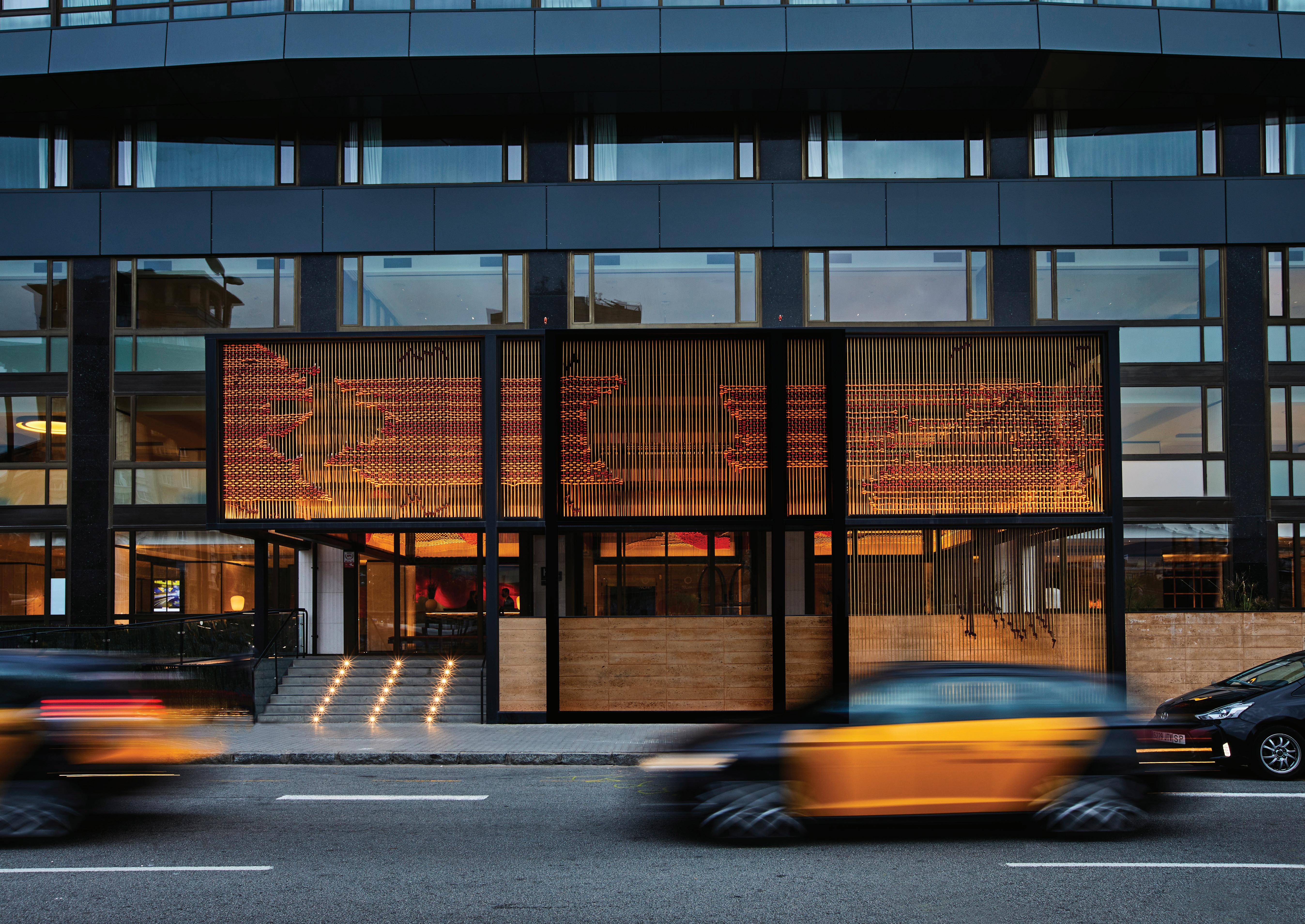
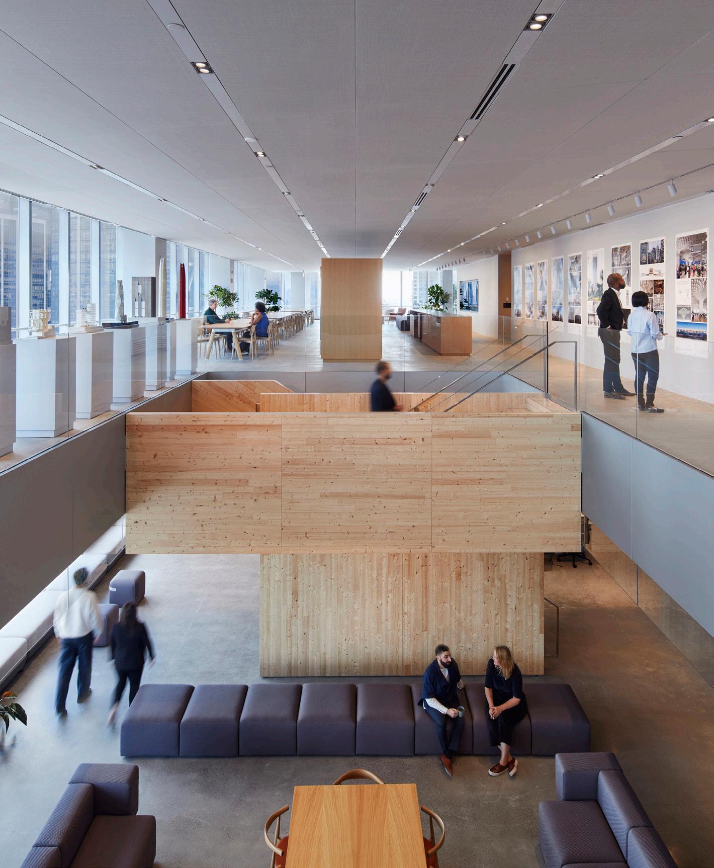
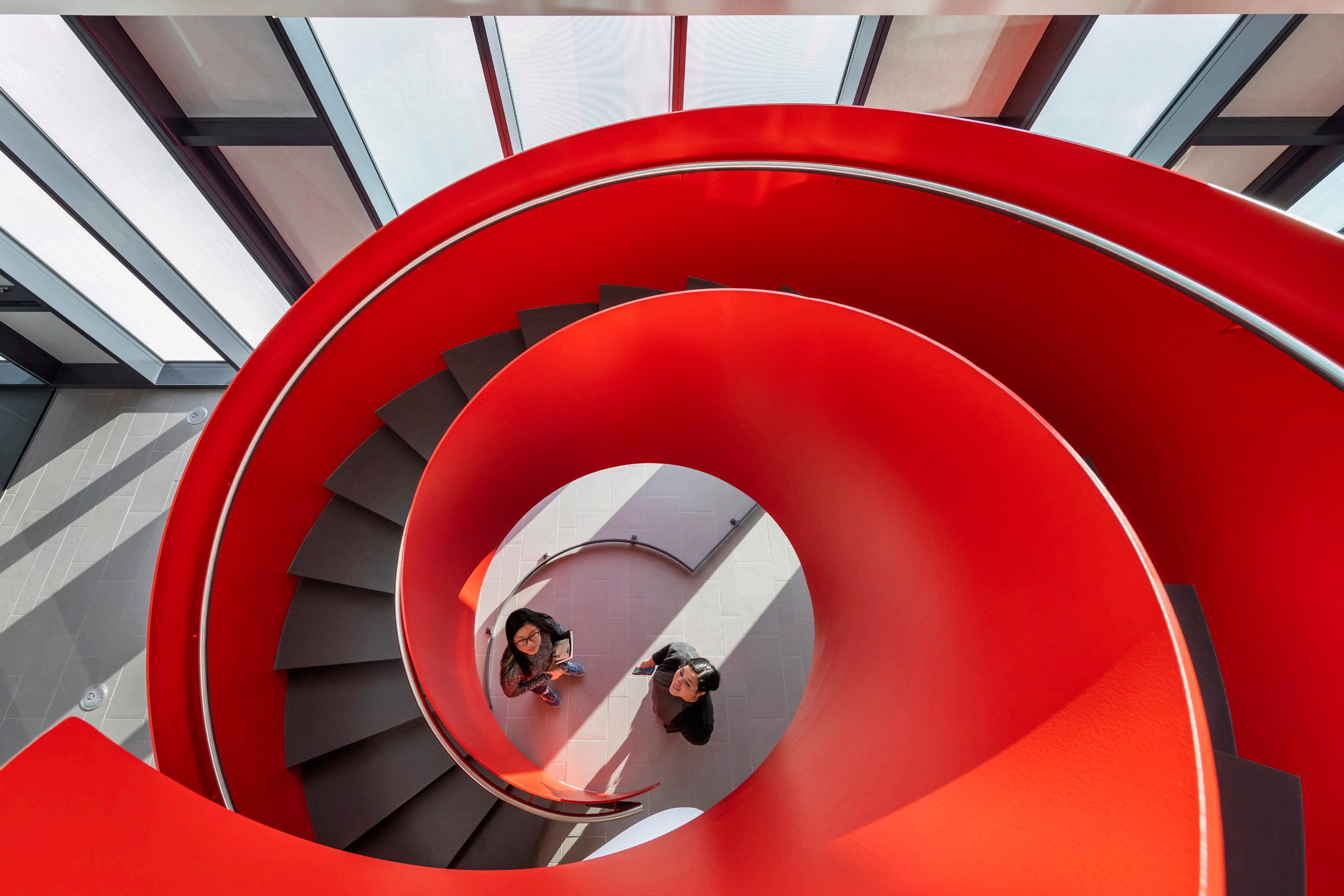 LEERS WEINZAPFEL ASSOCIATES
William “Bill” Menking, architectural historian and educator who was cofounder and editor-in-chief of The Architect’s Newspaper, passed away on April 11, 2020, at his Tribeca, Manhattan, loft after a long battle with cancer. He was 72 and is survived by his wife, Diana Darling, and their daughter Halle.
Menking was an invaluable part of the architecture community in New York as well as nationally and internationally. Best known for founding The Architect’s Newspaper with Diana Darling in 2003, he was also a prolific curator and writer. Menking was on the board of directors at the Storefront for Art and Architecture and The Architecture Lobby, as well as a tenured professor and trustee at Pratt Institute. He was the curator of the 2008 U.S. Pavilion at the Venice Biennale of Architecture and organized many exhibitions, including The Vienna Model: Housing for the Twenty-First-Century City and Superstudio: Life Without Objects, the latter of which became an important book on the Italian collective. He was also the author of Four Conversations on the Architecture of Discourse (2012) and Architecture on Display: On The History of the Venice Biennale of Architecture (2010); both were co-edited with Aaron Levy and published by the Architectural Association in London.
For Menking, the discourse and production of architecture were as much about people as they were ideas. In fact, the two were interchangeable in many ways. Likewise, art was his life and he made life into an art. It is sad that someone who enjoyed life as much as Bill would ever have theirs cut short, but we can take solace in the fact that Bill did more living in his 72 years than most of us would do in three times that long.
His friends were his colleagues, who he loved to connect and gather, whether for a gallery talk or for a round of beers. “I am sorry for those who didn’t experience his amazing [1998] Archigram show at the Thread Waxing Space [in New York], just one of many mega projects in his determination to share his boundless enthusiasms with us,” said Barry Bergdoll, Meyer Schapiro Professor of Art History at Columbia University. “The same generosity spread into the weekends when he staged Texasstyle BBQs in his garage in Greenport, on his beloved North Fork.”
This zest for life and love for travel took him around the world, most of all to Italy; he literally attended every Venice Architecture Biennale since it started in 1980. He was something of a one-man tourism bureau for the places he visited, always excited to give the best recommendations for architecture, museums, sightseeing, or restaurants. He would rarely lead you astray; usually one wound up far off the beaten path. “Bill was such a luminous and restless intellect, drunk with the delight of connecting the loose ends of architecture, urbanism, and art,” said architect Marion Weiss. “His enthusiasm for radical architecture, urban exceptions, and great food was infectious.”
Bill had a knack for being in the center of the action. Perhaps because it was in his DNA—he descended from some of the earliest British settlers in America, as well as the Okies who continued this trailblazing tradition. Bill was born at the Ramey Air Force Base in Aguadilla, Puerto Rico, in 1947 and raised in Stockton, a small town in California’s Central Valley, where he worked as an air-traffic controller for crop dusters and once played football against O.J. Simpson. He attended UC Berkeley to study architecture and urban studies from 1967–1972, and I can only imagine the things he saw there (something about Governor Reagan bombing him and his friends or something). Clearly, this immersion in American counterculture helped shape his excellent taste and avant-garde predilections, from radical architecture to social activism, to local clothing shops and DIY oyster shacks.
Master Mind

navigating the urban environment, Bill began working in the early ’80s as a location scout for film and TV in New York. This led him to sunny and decrepit Miami, where he took up an art director post on Miami Vice His contributions to the show helped rehabilitate many of Miami’s now-celebrated modern and Art Deco buildings. In the ’90s, Menking moved to London to attend the Bartlett School of Architecture. During his time there, he became close with Peter Cook and other members of Archigram, and he wrote for architectural publications including The Architects’ Journal and Building Design, both then thriving in England. The experience inspired Bill to import this model to the United States, and The Architect’s Newspaper was born in 2003 in his loft. “We had no idea what we were doing, and it made it better!” he often told me.
“In an age where information is fundamental to our lives, The Architect’s Newspaper filled a gaping void, with straightforward reporting on what’s happening in the profession day to day that we weren’t getting from the two remaining monthly professional journals, and certainly not from newspapers,” recalled Robert A.M. Stern, architect and regular reader of AN . “It also brought to our shores an American version of the lively discourse we’d been reading from the U.K.”
“AN is just what it says it is—a newspaper. Strange that no one used this concept before Menking,” said Phyllis Lambert, founder of the Canadian Centre for Architecture and avid AN reader. “Like The New York Times and the Guardian, it is my source for deeply informed, judicious information about what is happening in the field.”
We will continue to celebrate the life of Bill Menking, who will be remembered as someone who was always in the right place at the right time, agitating and connecting, breathing life into whatever was around him. Bill’s memory will live on not only through the continued influence of The Architect’s Newspaper, Pratt , and Storefront but also through all the lives he touched with his mentorship and guidance.
Everyone who came through the paper took some part of Bill’s thinking with them. For me, his influence is palpable: How to avoid the status quo or the cliché. How to work in and around institutions. How to do more with less, and not be too precious. How to keep the social mission radical. Many of my fellow travelers came through Bill, including my Rockaways fishing buddy Walter Meyer and my Sunday pasta buddy James Wines, both, like Menking, equally lovers of life and intellectual discussion.
I can’t count the number of people whose work I studied in architecture school that I ended up meeting through Bill in social situations, nor, I suspect, can others. “Bill was someone who gave you everything without asking anything in return. He was a connector of people, ideas, and souls,” said Eva Franch I Gilabert, former director of Storefront for Art and Architecture and now director of the Architectural Association. “If I just made a map of all the people he connected me to, I would be able to make a portrait of a generation of idealist, honest, generous, radical, and eternally young.”
In 1974 and 1975 he worked as an organizer for the United Farm Workers, helping establish labor unions in rural towns in central and southern California, before landing in downtown New York City at a time of
During school, he headed to Florence, Italy, where he met key players of the radical architecture movement such as Archizoom Associati, Superstudio, and Grupo UFO. His interactions with this community of radical thinkers, designers, and architects would form the foundation of some of his most important research and curatorial practice, including multiple shows on Superstudio as well as a seminal book (written with Peter Lang) published in 2003. It laid the groundwork for his future work on Archigram, the British cousins of the radical Italian architecture movement.
heightened cultural production. Hanging among this vibrant art scene, he met Dan Graham, with whom Bill drove around New Jersey documenting suburbia. In typical Bill fashion, he got a job as a server at Studio 54, where he witnessed iconic moments like when Bianca Jagger rode a white horse through the club. He moved into his famous Tribeca loft space on Lispenard Street, which he built out into a classic downtown dream loft that he was always excited to offer up as a venue for fundraisers, or for meetings and holiday dinners with AN staff. He had one of the better-stocked liquor collections, almost entirely gifts from foreign visitors who would stay with him when visiting New York. With an acumen for learning and
One time, Bill and I were hanging out with his buddy Alastair Gordon outside the tent at Design Miami, when Hans-Ulrich Obrist came up to us. Taking a moment to pause, Hans said it best in his signature accent, with a big, shining smile: “Bill Menking is a legend.” Matt
Shaw is a New York–based columnist and author of the forthcoming book American Modern: Architecture Community Columbus Indiana This obituary was previously published online on April 11, 2020, and in the May 2020 issue of The Architect’s Newspaper
AN cofounder William “Bill” Menking passed away at age 72 on April 11, 2020.
Bill Menking photographed on a balcony in Venice, Italy.
44 Feature The Architect’s Newspaper
COURTESY JONATHAN MASSEY
2019
Stanley Tigerman 1930–2019
The Chicago architect and educator built 450 buildings around the world, but as an “establishment antagonist” he rebelled against high modernism alongside his fellow Chicago Seven architects.
Kevin Roche 1922–2019
The Irish-born American architect influenced American architecture during his time at the Eero Saarinen firm and later on formed his own architectural firm, Roche-Dinkeloo.
César Pelli 1926–2019
The award-winning Argentine architect was responsible for designing some of the most famous skyscrapers around the world. He served a 12-year tenure as dean at the Yale School of Architecture and consolidated his creative legacy by opening his eponymous firm.
Charles Jencks 1939–2019
The Baltimore-born architectural historian Charles Jencks was best known as the hero of postmodernism, but he also founded the Charles Jencks Award and Maggie’s, a cancer research institute dedicated to his late wife.
I. M. Pei 1917–2019
The legendary Chinese American architect founded Pei Cobb Freed & Partners (originally I. M. Pei & Associates) and won the 1983 Pritzker Prize.
Sally Byrne 1930–2019
Florence Knoll Bassett 1917–2019
The founder of furniture designer Knoll began her career training with modernist legends like Mies and Eliel Saarinen. Her ethos of sleek lines and minimal forms translated into iconic furniture that remains coveted today.
Phil Freelon 1953–2019
Shoji Sadao 1927–2019
Shoji Sadao was a technical architect who helped transform visionary works into reality. He was half of Fuller & Sadao as well as executive director of the Noguchi Foundation and Garden Museum.
Grace A. Tan 1960–2019
The Filipino American architect was the principal and president of John Portman & Associates and was integral in the opening of the firm’s Shanghai office.
2020
Michael Sorkin 1948–2020
Michael Sorkin was an architect, urbanist, theorist, critic, author, and director all at once. His death was the first pandemic blow to the American architecture community.
Adolfo Natalini 1941–2020
Yona Friedman 1923–2020
Robert Coles
Kuldip Singh
Deborah Dietsch
Those We’ve Lost Along the Way
Tomás Nagy
Honoring some of architecture’s late greats.
1951–2020
Hungarian architect and educator Tomás Nagy was head of the department of architecture at the Moholy-Nagy University of Art and Design.
Jaquelin T. Robertson
1933–2020
Elizabeth Sverbeyeff Byron
Anne Bass
1923–2020
1941–2020
A lifelong patron of the arts, Anne Bass famously commissioned the Bass House, one of the most ambitious residential designs by the modernist architect Paul Rudolph.
Henry N. Cobb
Cini Boeri
1926–2020
1924–2020
Italian architect and designer and founder of Cini Boeri Architetti, Cini Boeri was best known for her iconic and now timeless modular seating designs.
2021
Richard Rogers
1933–2021
The AIA Gold Medal recipient, Pritzker Prize, and multiple Stirling Prize winner is best known for grand projects like the Centre Pompidou, 3 World Trade Center and the Lloyd’s building.
Cornelia Hahn Oberlander
1921–2021
German-born Canadian landscape architect Cornelia Hahn Oberlander revolutionized mid-20th-century urban play spaces and cleared the path for women in the profession. She received Vancouver’s prestigious Freedom of the City Award.
Gottfried Böhm
Virgil Abloh
1929–2020
1934–2020
1952–2020
Deborah Dietsch was a pioneering architecture writer and critic who served as editor-inchief of Architecture Magazine in the 1990s, defining its pre-internet primacy.
1920–2021
1980–2021
The Illinois-born multifaceted designer rose to fame through his wide array of artistic talents.
Virgil Abloh was a DJ, an artist, and a designer of both clothing and objects. After early collaborations with the likes of Kanye West, he soon launched Off-White and later became the first-ever African American artistic director for menswear at Louis Vuitton.
Kristen Richards
1952–2021
Kristen Richards, a tireless advocate for architecture, founded ArchNewsNow . Her dedication to architecture led to her induction as an honorary member of AIA.
Helmut Jahn
1940–2021
German American architect Helmut Jahn’s career was defined by fashionable flourishes and a celebrity persona that earned him both popular attention and the unwavering trust of his clients. He helped shape Chicago’s iconic skyline.
Paulo Mendes da Rocha1928–2021
The Brazilian architect and Pritzker laureate Paulo Mendes da Rocha found acclaim for his Brutalist projects in his homeland and was also an activist and outspoken critic of the 1964 Brazilian coup d’état.
Art Gensler 1935–2021
Paige Rense 1929–2021
Paige Rense, a powerful and influential voice in the world of architectural journalism, served as editor-in-chief of Architectural Digest from 1975 to 2010.
Eli Broad 1933–2021
2022
Ricardo Bofill 1939–2022
Spanish architect Ricardo Bofill’s work was otherworldly. His monumental factory conversions and starkly colored housing blocks served as inspiration and backdrops for countless films and television shows.
Gyo Obata 1923–2022
American architect Gyo Obata was the cofounder, and the O, of the global architectural, engineering, and design firm HOK.
Christopher Alexander 1936–2022
The British American architect and educator impacted not only architecture but also urban design and computer science through his writings on human-centered design, notably A Pattern Language and its trilogy. He founded the Center for Environmental Structure based on these theories.
James Polshek 1930–2022
A former dean of Columbia GSAPP and founder of Ennead Architects, James Polshek was a remarkably prolific yet unassuming figure. He was a recipient of the AIA’s Gold Medal, the Fulbright Association’s Lifetime Achievement Award, and was admitted to both the American Academy of Arts and Sciences as well as Arts and Letters.
Issey Miyake 1938–2022
One of fashion’s most iconic and innovative designers was born in Hiroshima, Japan, and
survived the tragic bombing. Issey Miyake was quoted saying, “I’d rather think of things that can be created, not destroyed, and that bring beauty and joy.” His timeless pleated garments have been worn by the most important names in the arts, but architects seem to have a special affinity for the “Pleats, Please” line: perhaps it’s the clothing’s minimal yet architectural quality.
Mike Davis 1946–2022
Mike Davis was one of the most prolific writers the architecture world has known in recent memory. His incisive writings, from City of Quartz to Planet of Slums, deftly combine politics, history, and personality, with a laser-sharp focus on the built environment as a broad and ever-moving subject of study.
Bruno Latour 1947–2022
French philosopher Bruno Latour left behind a trail of insights that is so deeply relevant to the field of design that one almost forgets he wasn’t an architect at all. He believed that design’s status relies on designers’ ability to enact real change.
Dan Graham 1942 – 2022
Arata Isozaki 1931–2022
He got his start as an apprentice to legendary metabolist Kengo Tange. He went on to win a Pritzker and became a household name straddling the globe’s East and West.
Doreen Adengo 1976–2022
2023
Paolo Portoghesi 1931–2023
B. V. Doshi 1927–2023
An Indian architect who blended modernism and his vernacular context into stunning spaces, Balkrishna Vithaldas Doshi was a veritable force in the architecture community. He was the first from his home country to win a Pritzker Prize.
Rafael Viñoly 1944–2023
Born in Montevideo, Uruguay, Rafael Viñoly went on to shape the world’s skylines as the architect of 432 Park and the “walkie-talkie” 20 Fenchurch, among others.
Jean-Louis Cohen 1949–2023
The multihyphenate thinker, historian, architect, and educator Jean-Louis Cohen may have been a French citizen, but really he belonged to the world. His loss is the loss of a leading intellectual with unparalleled expertise on some of architecture’s most urgent issues and most prolific figures.
Joan Davidson 1927–2023
Debora Reiser 1927–2023
Beverly Willis 1928–2023
Born in Tulsa, Oklahoma during the Great Depression, Beverly Willis established her own firm in 1966. She went on to found majorly the National Building Museum and Beverly Willis Architecture Foundation, and open doors for female designers across the profession.
Harriet Pattison 1929–2023
Harriet Pattison was an award-winning Philadelphia-based landscape architect known for her work on the Franklin D. Roosevelt Four Freedoms Park in New York City and the Kimbell Art Museum in Fort Worth, Texas.
45 Feature October/November 2023
220th 1803
The Louisiana Purchase
Negotiated by James Madison under Thomas Jefferson’s presidency, this acquisition almost doubled the size of the fledgling republic through colonizing means: France didn’t control much of the territory and actually only ceded the right to dispossess Indigenous groups of their lands. Decades earlier, Jefferson established a square-format system for dividing land into property that was to be unrolled all the way to the Pacific Ocean. Today, much of this part of the country is organized accordingly, for better or worse. It’s Jefferson’s grid, we’re just living in it. JM
140th 1883
Brooklyn Bridge
The Brooklyn Bridge, designed by John A. Roebling and completed by his son and daughter-in-law, was the first to connect Manhattan and Brooklyn. Prior to its construction, thousands of Brooklynites depended on ferries to traverse the East River, a particularly difficult passage in winter. Thirteen years after its construction, the five boroughs of New York City were brought into a common municipal charter drafted by Andrew Haswell Green. Today, the Brooklyn Bridge is a popular tourist destination, and for good reason: It physically embodies our unified metropolis. DJR
130th 1893
Chicago World’s Fair
The book that most significantly made me want to study architecture was Devil in the White City. I’m from Chicago, and the book dramatizes events and characters that defined the city during the time of the Chicago World’s Fair. The shiny neoclassical buildings of the City Beautiful Movement that housed those otherworldly exhibitions still define city culture today. It’s fun to imagine plaster of Paris buildings being erected like theatrical sets, but the dark fascination of the book also warns of disasters that come from cost-cutting and undervaluing labor. EC
110th 1913
Adolf Loos’s Ornament is a Crime
The Viennese architect Adolf Loos wasn’t a good man. In recent years, it has come to light that Loos was both a racist and likely a pedophile. For more than a century, however, his canonical text Ornament is a Crime, published in 1913, changed the way architects think about decoration on buildings. While it might still be required reading on some syllabi, it should be understood with contemporary adjustments. For those who wish to inscribe it on their bodies, for a while, consider a new set of temporary tattoos designed by Sam Jacob Studio. DJR
101st 1922
Schindler House
This duplex designed by Rudolph Schindler, an Austrian architect who landed in Los Angeles, is 101 years old, but it could easily command a stunning magazine cover today. Witness its indoor–outdoor living, flexible partitioning via shoji-like screens, prefabricated assemblies, and climate-responsive sleeping porches. Even spicier was the home’s cultural life, which teemed with creatives and creative arrangements: Schindler and his wife, Pauline, divorced, and later she returned to live in the second unit. It is prime fodder for a television series. HBO: The writers’ strike is over; where are you at? JM
100th 1923
Cross-Laminated Timber
CLT is a buzzword these days. Architects tout it as a green alternative to steel and concrete for making homes, midrises, skyscrapers, et al. Although CLT has become all the rage lately, the technology itself is, surprisingly, a century old, patented in the U.S. by Frank Wars and Robert Watts, two entrepreneurs in Tacoma, Washington. DJR
Frank Lloyd Wright’s Imperial Hotel in Tokyo
It’s no secret that FLW’s iconic “prairie” style had more to do with Japanese sensibility and cultural knowledge than it did with the expansive grasslands characteristic of the American Midwest. The architect’s modern design for the Imperial Hotel is one of his most enduring works; it is also oddly haunting, as it was demolished in 1968. The fragment of it in The Met is one of my favorite ghosts. Its history will be reinvented yet again thanks to a new design from Atelier Tsuyoshi Tane Architects. EC
Le Corbusier’s Towards an Architecture
A century later, this enigmatic but canonical book still seduces architects of all ages with its grandiose language and daring visual assemblies. Le Corbusier was inspired by the literary experiments of the day while trying to market himself to the technocratic elite. Problems plagued the text’s distribution, most egregiously its poor translation into English by Frederick Etchells, in which Toward an Architecture became Towards a New Architecture and, as Frank Lloyd Wright complained, volume became mass. Jean-Louis Cohen’s introduction to a new translation picks apart the author’s fabrications, laying bare the tactics deployed by Le Corbusier to create an ambitious but disjointed collection of declarations, mechanical equipment, (manipulated!) photographs, and early projects. JM
Hollywood Sign

The larger-than-life letters spelling out Hollywood were first placed on the Santa Monica Mountains in 1923 as an advertisement for Hollywoodland, a nearby housing development. When installed, it included flashing lights, because 50-foot-tall letters alone weren’t enough of an attention grab. The sign was supposed to be on view for a year, but it remained in situ as the city below entered the Golden Age of Hollywood, cementing itself as a symbol of the city and its filmic legacy. KK
90th
Nazis close the Bauhaus
1933
Hannes Meyer’s New Bauhaus Pedagogy is a recently published anthology edited by Philipp Oswalt about its namesake’s tenure as director of the Bauhaus between 1928 and 1930. Meyer’s favorite slogan was “The people’s needs over the need for luxury,” which, along with the high concentration of Jews and women at the school, put the institution at odds with the National Socialist German Workers’ Party. The Nazi majority of Dessau closed the Bauhaus in 1933. DJR
Architectural Anniversaries
The Athens Charter
Eighty years after the ink dried, Denise Scott Brown is still at war with the Athens Charter—a document penned by Le Corbusier in 1933 that dictated how buildings and cities should be arranged using “tower in the park” principles. Frida Grahn notes in her new anthology, Denise Scott Brown: In Other Eyes, that in 1978 Scott Brown first challenged the Athens Charter’s hegemony at a CIAM conference in Switzerland. But she hasn’t stopped. At the Center for Architecture in New York last winter, Scott Brown declared her position before a packed audience: “The Athens Charter can go to hell!” DJR
80th
Casa Malaparte
1943
With a name that means “the wrong/evil side,” this striking Italian modern house seems to be nearly throwing itself off a cliff into the sea; or at the very least, its dramatic rooftop staircase seems to be inviting you to. Designed by a leader of the Italian Rationalist movement, Adalberto Libera, it’s been immortalized as the star of the iconic French nouvelle vague film Le Mépris. Even today it’s immediately recognizable in, and aligned with, contemporary design culture. EC
65th
Seagram Building
1958
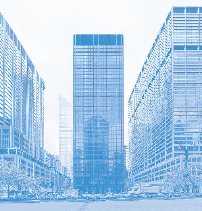
No NYC architecture tour is complete without a stop at the Seagram Building, designed by Mies van der Rohe with assistance from Phyllis Lambert and Philip Johnson. The original POPS (privately owned public space) and a temple to the modern ideal of clean, empty, surveillable space, the monolith of glass and steel endures in the architectural imagination for being the first. But maybe its plaza and bubbling fountain should be best known as the stars of the cult-favorite short film The Social Life of Small Urban Spaces. EC
60th
Federico Fellini’s 8½
1963
Before becoming a starchitect, Rem Koolhaas was a journalist/filmmaker who studied the work of Italian director Federico Fellini. At the impressionable age of 21, Koolhaas interviewed Fellini for the Dutch magazine Haagse Post, an experience he said deeply shaped his 50-plus years of practice. Fellini’s influence on Koolhaas was apparent at the 2014 Venice Biennale in OMA’s project Monditalia, where the architects displayed 8½, released in 1963 with set design by Piero Gherardi, alongside other examples of avant-garde cinema. DJR
Beinecke Library
“A titan of industry, a decisive army general, an architect John Wayne.” This is how a lead SOM designer once described Gordon Bunshaft, whose buildings are about as machismo as they get. At the Beinecke Library, completed in 1963 at Yale, Bunshaft reveals his softer side in the creation of a simple, rectangular volume held up by Vierendeel trusses and clad with translucent, 1¼ inch-thick Vermont marble. When the lights are turned on, the material makes the building looks like it’s glowing. DJR
Met Life Building
Opened as the Pan Am Building in 1963, the 59-story building with a stretched octagonal form has loomed over Grand Central Terminal and Midtown for 60 years. Designed in the International style by Richard Roth, Walter Gropius, and Pietro Belluschi, the landmark was one of the first in the city to use precastconcrete exterior walls. KK
Berlin Philharmonic
Herzog & de Meuron’s philharmonic in Hamburg arguably takes cues from Hans Scharoun’s Berlin Philharmonic, completed in 1963. Scharoun’s signature roof profile sweeps and curves from one oblique view; from another it becomes a smashed cube blown to bits, proto-deconstructivism, perhaps. Scharoun’s design replaced the original Berlin Philharmonic, which was destroyed in World War II. DJR
Demolition of Penn Station begins
McKim, Mead, & White’s neoclassical masterpiece of a railroad station was demolished in 1963 and is understood to be the beginning of the preservation movement (and preservation profession) in the United States. Today, as the debate rages over how to fix Penn Station, neotrads salivate over the thought of rebuilding the complex to its former glory. You don’t know what you’ve got until it’s gone... EC
THOMAS WOLF/WIKIMEDIA COMMONS/CC BY-SA 3.0
46 Feature The Architect’s Newspaper
KEN OHYAMA/WIKIMEDIA COMMONS/CC BY-SA 2.0
and Other Milestones
Salk Institute
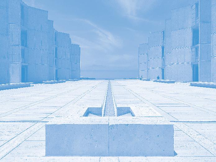
Maybe there isn’t a project quite so universally loved as Salk. Everyone who’s seen that picture of the single stream of water flowing toward the sea…we want to work there. Oh, to be a scientist working in peaceful collaboration behind an unsustainably harvested teak window, contemplating infinity. Louis Kahn and Luis Barragán really did it here. EC
50th 1973
Robert Caro finalizes The Power Broker manuscript
“Are you finished yet?” Robert Caro was asked this painful question more times than he could count in the seven years it took him to write The Power Broker, the canonical counter-biography he finished in 1973 about Robert Moses, which earned him a Pulitzer. Bob Gottlieb, was Caro’s editor on the project. The two worked closely until Gottlieb’s death earlier this year, but oddly, they weren’t friends—rather frenemies. Their endearing relationship was at the center of Turn Every Page, a documentary by Gottlieb’s daughter, Lizzie Gottlieb, that debuted last year. In Caro’s latest memoir, Working, a nod to Studs Terkel, he notes that 350,000 words were cut from the first manuscript. Caro is quoted saying, “I still miss some of those chapters.” DJR
Co-Op City tops out
The first shareholder family moved into Co-Op City in 1968, but construction wasn’t finished there until 1973. Fifty years after Co-Op City’s high-rises topped out in the North Bronx, the complex continues to entice debate. In Freedomland: Co-op City and the Story of New York, Annemarie Sammartino leans upon her childhood in Co-Op City to tell its remarkable story. She pooh-poohs yesteryear’s critics, like Ulrich Franzen and Ada Louis Huxtable, for focusing on the estate’s aesthetics while overlooking its impressive economic and racial egalitarianism, which stands strong to this day. Amid a devastating housing crisis, this generation of urbanists, like Sammartino, seems more sympathetic to the heroic co-op by Hermann Jessor, which reminds us of the utopian optimism that architects employed not so long ago. Today, it beckons designers to do the same. DJR
Ricardo Bofill’s Les Espaces d’Abraxas opens in Paris
Architecture nerds were thrilled to see Ricardo Bofill’s Les Espaces d’Abraxas appear in The Hunger Games 2, a dystopian film starring Jennifer Lawrence, in 2015. The grandiose people’s palace where Greco-Roman columns take on surreal proportions in Paris’s Noisy-le-Grand suburb served as a backdrop for the postapocalyptic Hollywood thriller. DJR
30th
Het Nieuwe Instituut
New York’s World Trade Center
Minoru Yamasaki’s two identical office towers that formed part of New York’s World Trade Center complex would have turned 50 this year. When proposed, the design wasn’t well-received by critics or the public, but it came to be a beloved binary in the city’s skyline. With 110 floors each when completed, the towers held the title for most floors in a building, a number that was swiftly matched with the construction of Chicago’s Sears Tower but not surpassed until the Burj Khalifa was finished in 2010. KK
The Birth of Hip-Hop
Fifty years ago, DJ Kool Herc hosted a party at Sedgwick Houses in the Bronx that is now identified as the origin of hip-hop. Sekou Cooked quoted Craig Wilkins in an essay for AN: “Hip-Hop Architecture should be a model for all architectural practice,” he said. Perhaps this anniversary deserves a pause to reflect further on questions about diversity, equity, and justice that architectural institutions have been asking themselves since summer 2020. EC
Sydney Opera House
Danish architect Jørn Utzon’s submission to a 1956 design competition for an opera house in Sydney was number 218 out of 233. The assessor’s report lauded Utzon’s design for being “simple to the point of being diagrammatic.” The skyline-defining building was one of the first to use computer-aided design to lay out its unique geometries. Last year, ahead of its 50th, the Sydney Opera House completed a decade-long renovation to upgrade acoustics and accessibility. KK
40th
1983
Parc de la Villette competition

Bernard Tschumi, OMA, Zaha Hadid, Jean Nouvel: The 1983 Parc de la Villette competition received submissions from the 20th century’s biggest names at the onset of their celebrity. In total, the competition had 470 entries. Tschumi’s winning proposal and the drawings that accompanied it went on to become a canonical architectural project. DJR
1993
Het Nieuwe Instituut is a model for architecture institutions worldwide, as it curates and maintains some of the most label-defying archives and architectural projects in the world. It has a legacy of rebellion and has more often than once engaged in legal gray areas, as shown in exhibitions and publications like Architecture of Appropriation. EC
LEED
Thirty years ago, the environmental movement was absorbed into neoliberal paradigms as “sustainability.” The USGBC began its LEED certification program in 1993, right around the time that Francis Fukuyama declared the end of history and Burners moved their late-summer gathering from Baker Beach in San Francisco to Black Rock Playa. JM
Francis Fukuyama declares The End of History
Francis Fukuyama’s The End of History and the Last Man was published the year I was born, which theoretically makes me temporally citizenless. In 1993, Fukuyama argued that the thesis-antithesis-synthesis dialectic championed by Hegel and later flipped on its head by Marx in the form of historical materialism had come to a conclusion with the West’s defeat of communism. “The end of contradiction! War! Hunger! Human suffering!” Fukuyama declared. It’s a position he’s been forced to clarify ever since. DJR
25th 1998 Google
“I don’t know; Google it.” The search engine’s name has become a verb synonymous with the need to know just about anything. Since it first launched as the internet’s front door it has morphed into so much more than just a place to look things up, adding a map feature, video streaming, an email service, and now AI-powered capabilities to its repertoire. Why know things when Google knows everything? KK
20th 2003
Bush declares “Mission Accomplished”
OMA/AMO’s 2004 treatise Content, designed by Simon Brown and John Link, is graphic design par excellence. It features U.S. president George W. Bush’s buffoonish mug touting a McDonald’s “Freedom Fry” alongside Saddam Hussein dressed up like Rambo and Kim Jong II as the Terminator. The book was published one year after Bush infamously declared “Mission Accomplished” aboard the U.S.S. Abraham Lincoln—a misstatement, to say the least. In 2021, researchers at Brown University calculated that the war started by Bush’s administration claimed the lives of 432,093 Iraqi and Afghan citizens. DJR
Pumpkin Spice Latte
In early 2003, Starbucks executives and product scientists gathered in the “Liquid Lab,” in the coffee company’s Seattle headquarters, to gobble down bites of pumpkin pie, followed by sips of espresso. The result of the top-secret meeting was one of Starbucks’s top-performing beverages. Twenty years later, hundreds of millions of Pumpkin Spice Lattes, or PSL for short, have been consumed, and for many the annual launch of Starbucks’s fall menu marks the start of autumn. KK
AIANY at LaGuardia Place
The AIA’s oldest and largest chapter has been around since 1857. As appreciated in the first issue of AN, AIA New York’s headquarters and public-facing Center for Architecture operate out of 536 LaGuardia Place. When it opened, then executive director Frederic Bell said in The New York Times, “This is not a clubhouse for architects but a space that could engage the public.” Renovated by architect Andrew Berman, the building is defined by the 16- by 18-foot void cut into its floor plate, placing the offices, event spaces, and exhibition galleries at subterranean levels, while making the activities visible from the street. KK
Log
The first issue of this lauded theory journal, edited by grande dame Cynthia Davidson, debuted 20 years ago at Urban Center Books on Madison Avenue. Produced by just two people out of Peter Eisenman’s studio under the umbrella org of the Anyone Corporation, the name was inspired by a ship’s log, whose job is to record and observe. (I’ve also heard speculation regarding Twin Peak ’s log lady and the log function on a graphing calculator as other sources.) Still, the logo is a literal log, and there’s an inflatable log pool toy in the office. Now on issue 58, Log continues to observe the built environment in a committed, text-forward format. EC
10th 2013
The Architecture Lobby
In 2013, Peggy Deamer attended a program led by Who Builds Your Architecture, and a switch was flipped. With a cadre of early supporters—including AN’s Bill Menking— she founded The Architecture Lobby, a not-quite-union of thousands of architects and designers, as well as those adjacent to the profession, who examine the connections between architecture and labor or lack thereof. The Lobby is the most exciting step toward workers’ rights, representation, and acts of refusal in the architecture industry. These changes can lead to greater equity in the field and much-needed climate action. EC
5th 2018
Dank Lloyd Wright
Before the rascals stormed Instagram, Dank Lloyd Wright was clowning via Facebook. Despite its rapid proliferation of influence during the pandemic, the meme page got its start in 2018, an internet moment when folks like Patrik Schumacher were still writing impenetrable walls of text on their Facebook pages to talk about architecture online. DJR
The Shitty Architecture Men List
Perhaps nothing has gotten those in power to prick their ears up more than the Shitty Architecture Men List, a spreadsheet where people anonymously listed the names of supposedly sexually abusive men. Five years later, it appears that David Adjaye is the only person to have faced serious consequences, via an investigation about alleged acts that took place years after the list was circulated. DJR
CODERA23/WIKIMEDIA COMMONS/CC BY-SA 4.0
47 Feature October/November 2023
DAVID T/FLICKR
congratulates A’N for two decades of insightful reporting on the built urban environment. wxystudio.com


48 Feature The Architect’s Newspaper
25 Park Pl, Floor 5 New York, NY Bronx Charter School of the Arts © Albert Vecerka/Esto
Cheers to 20 years WXY
Theory

Inspiring Moments in Motion
We believe that for design to be truly great, it must stand the test of time, be sustainably crafted, and proudly American made.
Theory : Transit reimagined through the lens of public art.
Designed by Scott Klinker Landscape Forms | A Modern Craft Manufacturer
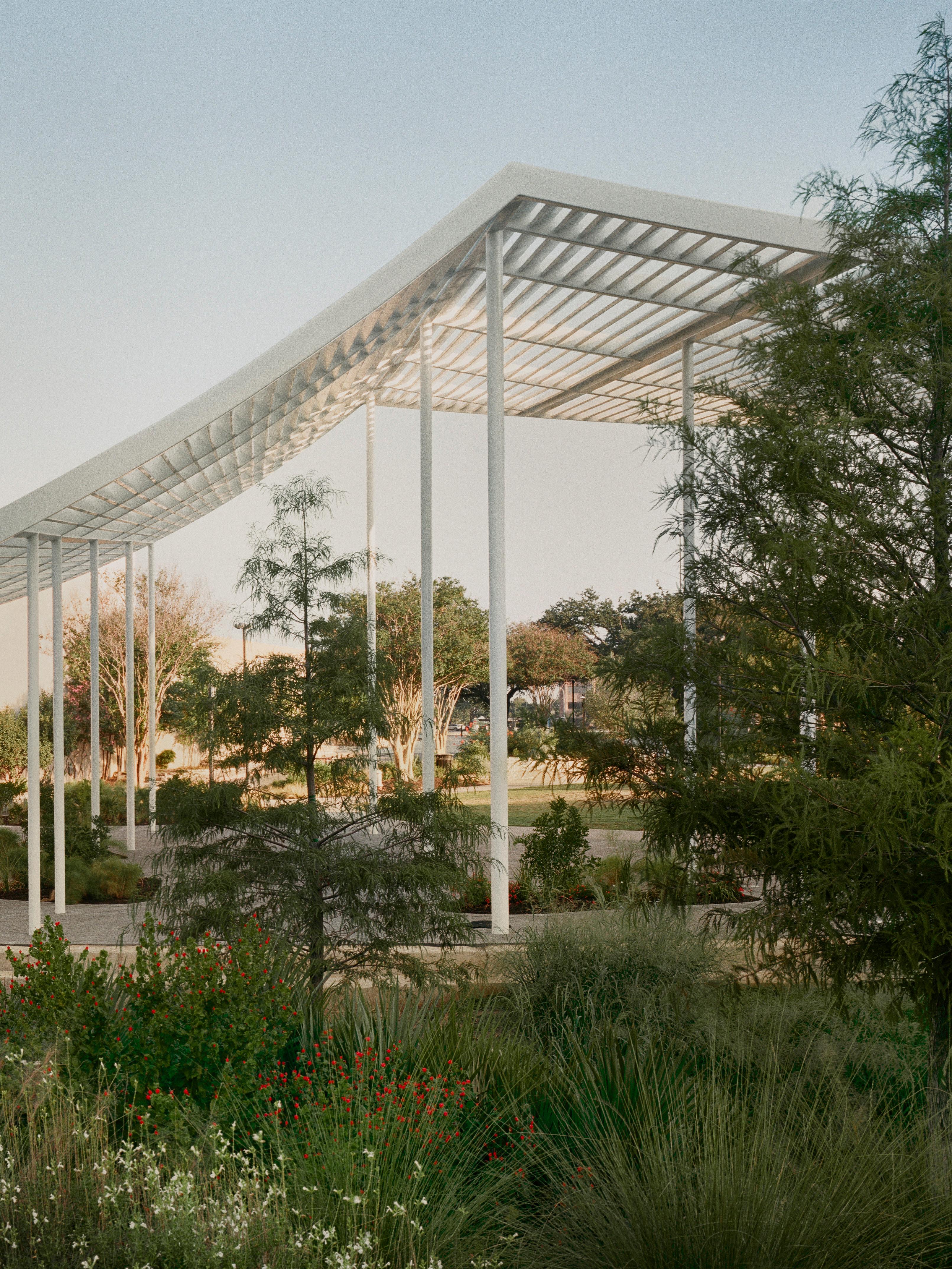
52 What’s Next in Urban Agriculture 54 Case Study: SCAPE and Studio Gang in Memphis, Tennessee 58 Public & Contract Furnishings 60 Case Study: dwg. and Agenda Architecture in Austin 62 Hospitality & Residential Furnishings 64 Case Study: RIOS in Houston 66 Surfaces 68 Lighting 70 Pictorial: Gardeners House 72 Specialties 73 Resources CASEY DUNN Landscape October/November 2023
What’s Next in Urban Agriculture
A new generation of community gardeners have big goals for cultivating the concrete jungle.

Urban agriculture encompasses community gardens cultivated by volunteers as well as vast greenhouse and rooftop farms that sell their products to grocery stores across the country. The concept of food production in urban areas has gained visibility in recent years in tandem with discussions of food insecurity, climate resilience, and equitable access to green space, but the challenge of understanding and representing such a diverse range of stakeholders persists.
In 2021, New York City established the Mayor’s Office of Urban Agriculture (MOUA). The stated goal of the office is to create an unprecedented “strategic and equitable plan for urban agriculture and policy for New York City.” While MOUA’s first plan is slated for publication this fall, those involved in gardening and farming in the city already have ideas for how new policies could better support their work.
Gil Lopez, one of the 11 gardeners behind Smiling Hogshead Ranch, knows that the cost of land is a major barrier to growing affordable food at scale in the city. “There’s no agricultural zoning in New York City,” he said, but went on to propose an idea: “If a building hosting an urban agriculture project could get a portion of their tax reduced because some percentage of their property is zoned agricultural, and those savings were passed directly on to the farmer and not to the developer or building owner, farming could be more affordable.” He also believes that existing sustainability measures could be leveraged to encourage agriculture: “New York City has mandated that new buildings over a certain size have to have a solar or green roof. If we could make these food-producing places, we could really start moving the needle on this.”
On a grassroots scale, Lopez believes that reclaiming the commons is a critical start. “It’s important to encourage designers to design spaces that incorporate food production, but the onus doesn’t end with the designer. The management of the space must be taken into account.” Growing or foraging edible foods in NYC Parks & Recreation–managed public space is currently illegal. The Bronx River Foodway is a pilot program that operates in exception to this rule and has allowed public foraging since 2017 to great success. Lopez and others believe that foraging restrictions are evidence of the racist and classist systems that have produced and perpetuated food deserts and widespread food insecurity. Architects and designers could be change-makers in this realm. Lopez included a call to action in our conversation: “I think it’s important for designers to weigh in on these things legislatively and to be advocates.”
What would positive change look like at the scale of the community garden? Founding
members of El Jardin del Paraiso Bonnie Stein and Annalee “Annie” Sinclair hope for streamlined communication channels between city agencies and community gardens. El Jardin del Paraiso relies on GreenThumb, the community-garden arm of NYC Parks, to provide essential services. Stein and Sinclair hope that the increased awareness of the importance of urban agriculture will increase funding for GreenThumb, a program they say is stretched thin across the more than 550 community gardens in its jurisdiction. “A lot of things only happen because of an emergency,” said Stein. Sinclair cited a nine-year stretch in which El Jardin del Paraiso lost water access after a grant to upgrade an in-ground water source went awry: Communications broke down between the city and the gardeners.
Irrigation and the availability of water are common problems for volunteer-run spaces. Community gardeners across the city have called for support in developing sustainable irrigation systems. “It would be ideal if every space could have some type of in-ground water system that taps into city water lines,” said Corey Blant, deputy director of urban agriculture at New York Restoration Project (NYRP), a nonprofit organization that supports public green space and community gardens across New York City. NYRP launched its Urban Agriculture program in 2020 in response to the desires of urban gardeners hoping to grow more food. He noted that many community gardens rely on city fire hydrants and rain catchment systems for their irrigation, making them vulnerable to droughts.
Anthony Reuter, assistant director for planning and programs at NYC Parks GreenThumb, told me about the precarity that community gardens have faced in the past. For decades, many of these pocket green spaces have depended upon the support of the presiding mayoral administration for protection from development— with mixed results. Reuter assured current members that their gardens were safe as long as they were actively used. However, he acknowledged that the aging leadership of many historic community gardens can be worrying: “We need to identify young people who will keep these spaces going. If you love being in the gardens, join them. These are volunteer-run spaces that only exist if people are involved.”
“People want to be stewards of their own piece of land,” said Sinclair as Stein nodded. “The best part of having this place is seeing people in it.”
Melody Stein is the founder of studio VISIT, a creative practice for land-based research. She is also a visiting assistant professor of landscape architecture at the Pratt Institute and a 2023 Forefront Fellow at Urban Design Forum.
The Riley-Levin Children’s Garden after improvements and support from NYRP.
COURTESY NYRP
52
October/November 2023

We make cities smart and beautiful MORSE FROM GALLERIES TO STREETS mmcite.com Message for the future Design: Studio Segers
54 Case Study
Mississippi Masterpiece
In Memphis, SCAPE and Studio Gang complete Tom Lee Park, a transformative riverfront destination.
October/November 2023

Landscape architect: SCAPE
Master planner and architect: Studio Gang
Location: Memphis, Tennessee
Project lead and client: Memphis River Parks Partnership
Contractor: Montgomery Martin Contractors
Civil engineer: Kimley-Horn
Structural engineer: Thornton Tomasetti
MEP: Innovative Engineering Services
Sustainability analysis: DataBased+
Lighting designer: Randy Burkett Lighting Design
Playground designer: MONSTRUM
Art: Theaster Gates, James Little
Wood: Firmitas, Timberlab
Wood Decking: Thermory
Glass: Guardian Glass
Roofing: Firestone
Entrances: Nanawall, YKK
Chairs and tables: Fermob
Lighting: Luminii, Louis Poulsen, BK Lighting, Lumenpulse, Pure Edge Lighting
“I can’t believe we built this in Memphis,” said Carol Coletta, president and CEO of the Memphis River Parks Partnership (MRPP), on a bright, late-summer morning just before the new Tom Lee Park opened to the public. Coletta’s incredulity is a bit dramatic: With MRPP, she has spent years leading the charge to make riverfront improvements a reality. While the city continues to struggle with poverty and the spatial consequences of racism in the American South, it’s showing signs of rebirth. The new 31-acre park, designed by SCAPE and Studio Gang with a $61 million price tag, is the latest in a string of
projects focused on reactivating the city’s frontage along the mighty Mississippi River.
The project began in 2017 when a City of Memphis taskforce commissioned Studio Gang to develop a master plan for how to improve its 6 miles of riverfront. (Studio Gang shared this work as Stone Stories, part of the U.S. pavilion during the 2018 Venice Architecture Biennale, which included the installation of 800 cobblestones shipped over from Memphis.) Since then, MRPP has also improved and renamed two downtown parks, formerly named for Confederate leaders, and opened the River Line, a 5-mile path that connects the string of parks under its management.
Tom Lee Park was next. It was named for a Black river worker who in 1925 saved the lives of 32 people from a sinking steamship despite not knowing how to swim himself. His heroism was met with local and national praise.
SCAPE’s work began with extensive remediation of the compacted soil, which was previously covered with a clay cap by the U.S. Army Corps of Engineers. SCAPE’s landscape design took inspiration from the river and all its riffles, microdeltas, and tail-outs. In plan, it has winding lines that mimic sedimentary flows. “The scale of the Mississippi River is massive,” Kate Orff, founding principal and partner at SCAPE, told AN. Orff is no stranger to the Mississippi, as her family hails from Clinton, Iowa, and she has long studied its watershed for academic studios and publishing efforts.
SCAPE designed for biodiversity, with a plant list that prioritized native species from Tennessee and across the South. It added more than 1,000 new trees, including almost 300 oaks. Brad Howe, design director at SCAPE, described how this
tall canopy will shelter an understory of fruiting trees, including pawpaws and persimmons, which will help support several butterfly species. All selections were made to aid flood resistance—the park was underwater as recently as 2011—and boulders are placed to stop debris from flowing farther inland during high water.
Pathways guide visitors around and through these plantings, but also across the city. Previously, only staircases led to the upper bluffs; the new park adds the first ADA-accessible ramp at Carlisle Cutbank Bluff and improves pedestrian crossings along Riverside Drive. Four zones delineate park programs: Civic Gateway, Active Core, Community Batture, and Habitat Terraces. To the north, closest to downtown, a Civic Gateway offers a plaza, oak grove, and lawn. To the south, Community Batture stages public art and offers a meditation path that wanders through a birch grove and a scenic overlook. At the end of the park, the Habitat Terraces host a pollinator lab, sound gardens, and an outdoor classroom. The Active Core of Tom Lee Park sports its most intensive improvements. Play sculptures designed by Denmark-based Monstrum in collaboration with SCAPE take the shape of aquatic creatures like a river otter and a sturgeon, and the central plaza also hosts the glulam grid of Studio Gang’s Sunset Pavilion, made with southern yellow pine and supported by six “quad-pod” columns inspired by historic waterfront cranes made from logs. A mural on the pavement by the Memphis-born painter James Little adds angled bands of color to the plaza. Nearby, two pavilions with concessions, restrooms, and a meeting room follow the contours of SCAPE’s deltaic layout. Nodding to the river’s history as
a conveyor of timber, they are structured using solid tree trunks stripped of their bark. This area, with its ample seating for river watching, promises to be a popular spot for Memphians.
“The pandemic showed us that we need public spaces for many different situations, but also that programming, which comes from the community, was important,” said Jeanne Gang, founding principal and partner of Studio Gang. Tom Lee Park is a major infrastructure investment for the city and for Black Memphians in particular. The amenity is blocks away from several historically Black neighborhoods, and park access was restricted based on race in earlier eras. The memory of violence, in many forms, isn’t far away: Gang’s Sunset Canopy was named in honor of Tyre Nichols, a Black man who died in January at the hands of Memphis police officers; he loved taking pictures during twilight.
Like Nichols, Lee’s story mixes with larger histories. To thank him for his heroism, the City gave him a job as a garbage man, then thought of as coveted employment for a Black person. He retired in 1948 and died four years later of cancer. The plight of Memphis sanitation workers worsened, and in 1968, two garbage collectors, both Black men, were crushed to death in the back of a trash truck. The unionized workers, supported by the NAACP, organized a strike. It went on for two months, which drew the attention of Dr. Martin Luther King, who visited the city on April 3 and spoke to a crowd. The following night, he was assassinated while standing on the balcony of the Lorraine Motel. Today the building is part of the National Civil Rights Museum, which stands five blocks from Tom Lee Park.
Close to the embankment’s edge, a statue
TOM HARRIS
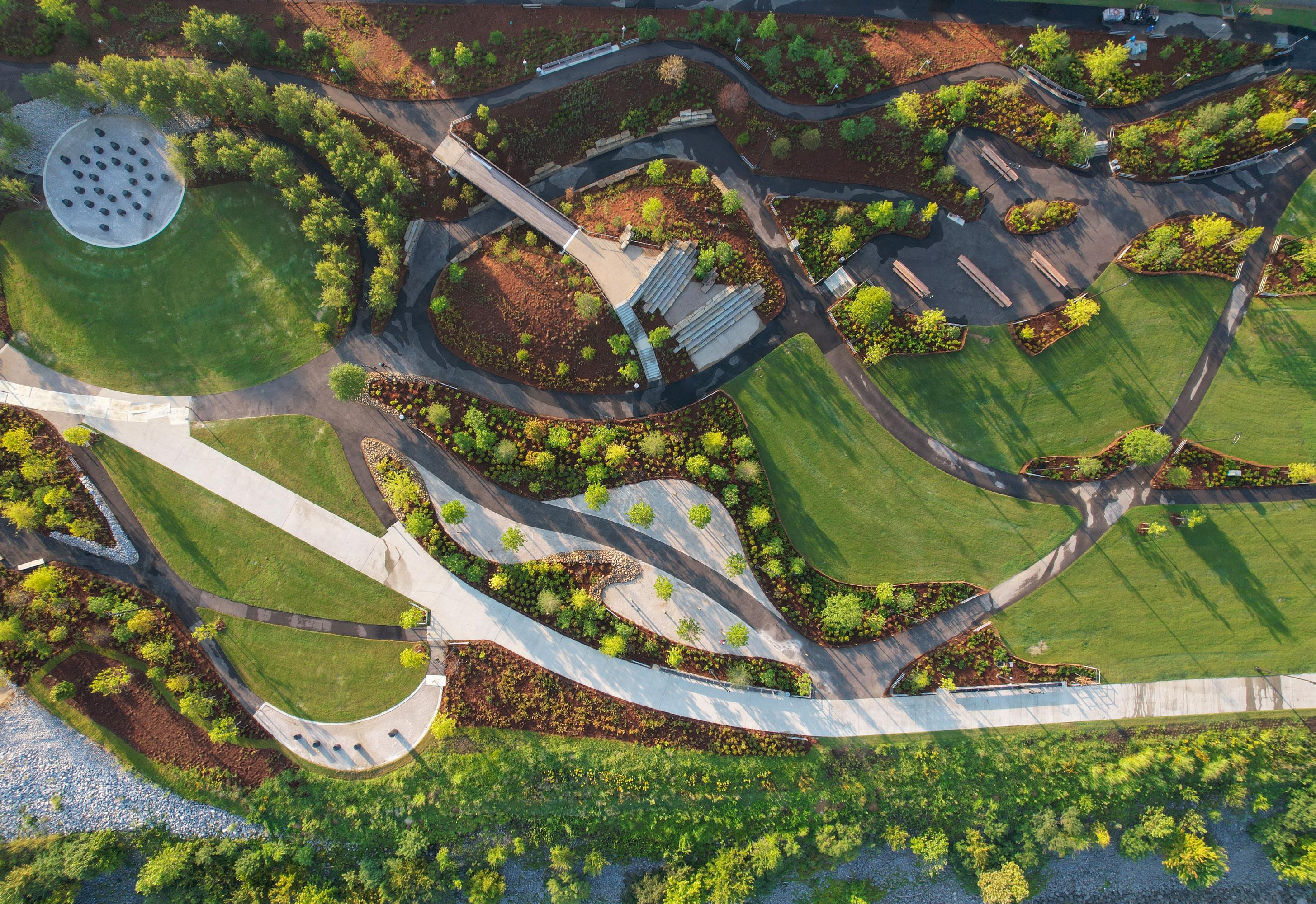
“Use this park as a manifestation of love.” JM
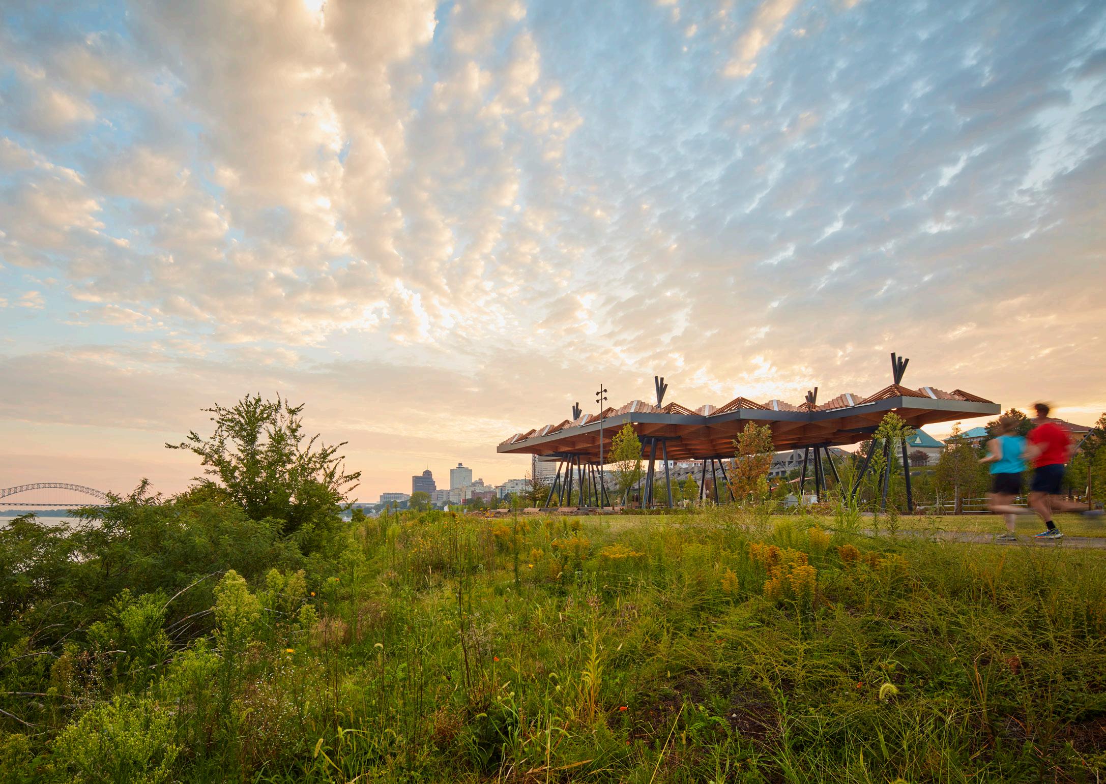
55
Facing page: Enlivening what used to be a “moonscape” along the water, the new park brings native landscaping and design.
Above: Winding pathways lead visitors through and around pockets of gardens and spaces designed for recreation and reflection.
Right: The Sunset Canopy by Studio Gang encourages gathering.
TOM HARRIS
October/November 2023
JOHN DONNELLY
of Tom Lee by sculptor David Allan Clark was installed in 2006. It is now complemented by A Monument to Listening, a permanent installation by the Chicago-based artist Theaster Gates that locates 32 solid stone chairs—and one elevated throne, for Lee—in a small spread close to the statue of Lee and in a larger circle up the slope. The basalt chairs are deliberately chipped in places, revealing rough patches that are flinty tan and unpolished. Late on a hot afternoon, a crowd gathered to witness Gates bless his anti-monument with two singers from his Black Monks ensemble. In a singsong incantation, the trio delivered Lee’s story, narrating both his brave act and his treatment as a Black man in the South. Their voices built into a tempest before seeking resolution. To close, Gates offered a benediction:

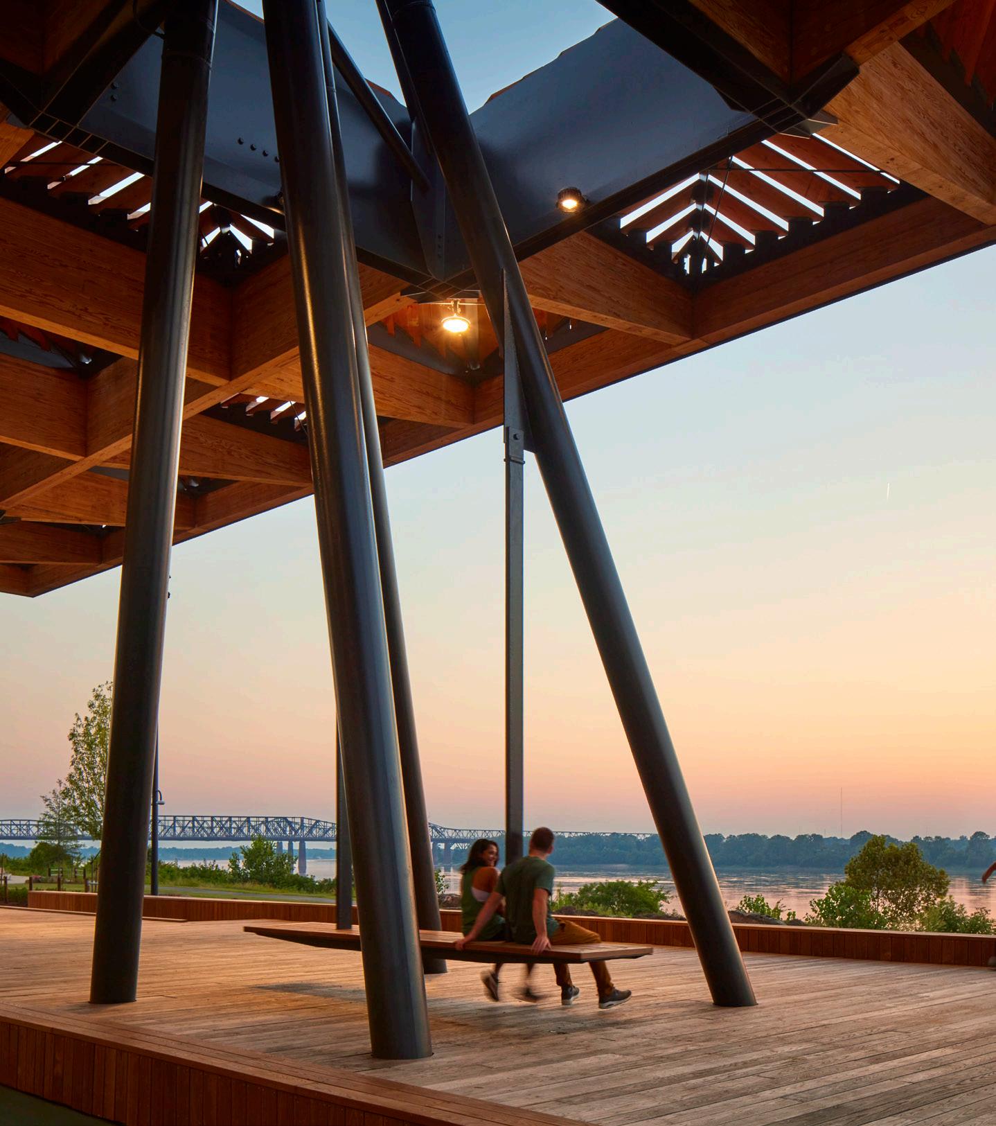
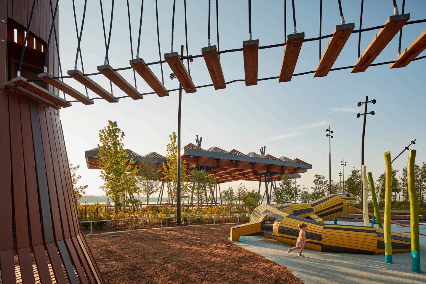
Top: Part of the park’s Active Core includes sculptural playgrounds designed by Monstrum and SCAPE. Left: The shaded space beneath the Sunset Canopy offers sweeping views of the Mississippi River. Above: Play equipment feels animated and is made with natural materials. JOHN DONNELLY TOM HARRIS TOM HARRIS October/November 2023
Mississippi Masterpiece continued
56 Case Study



SETTING A HIGHER STANDARD IN COMMERCIAL ROOFING AND WATERPROOFING.
Developed in the early 1960s, Monolithic Membrane 6125® was the first hot fluid-applied rubberized asphalt membrane. Lasting two to three times longer than a typical built-up roofing system, MM6125® assemblies can contribute to fewer re-roofs, less waste going into landfills, and less demand on our natural resources.
MM6125’s proven performance protects more than the built environment, it also protects clients’ investment, our natural resources, and the well-being of building occupants.
Contact Hydrotech America or visit www.hydrotechusa.com to see how MM6125 can protect your project.
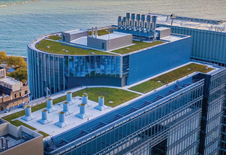


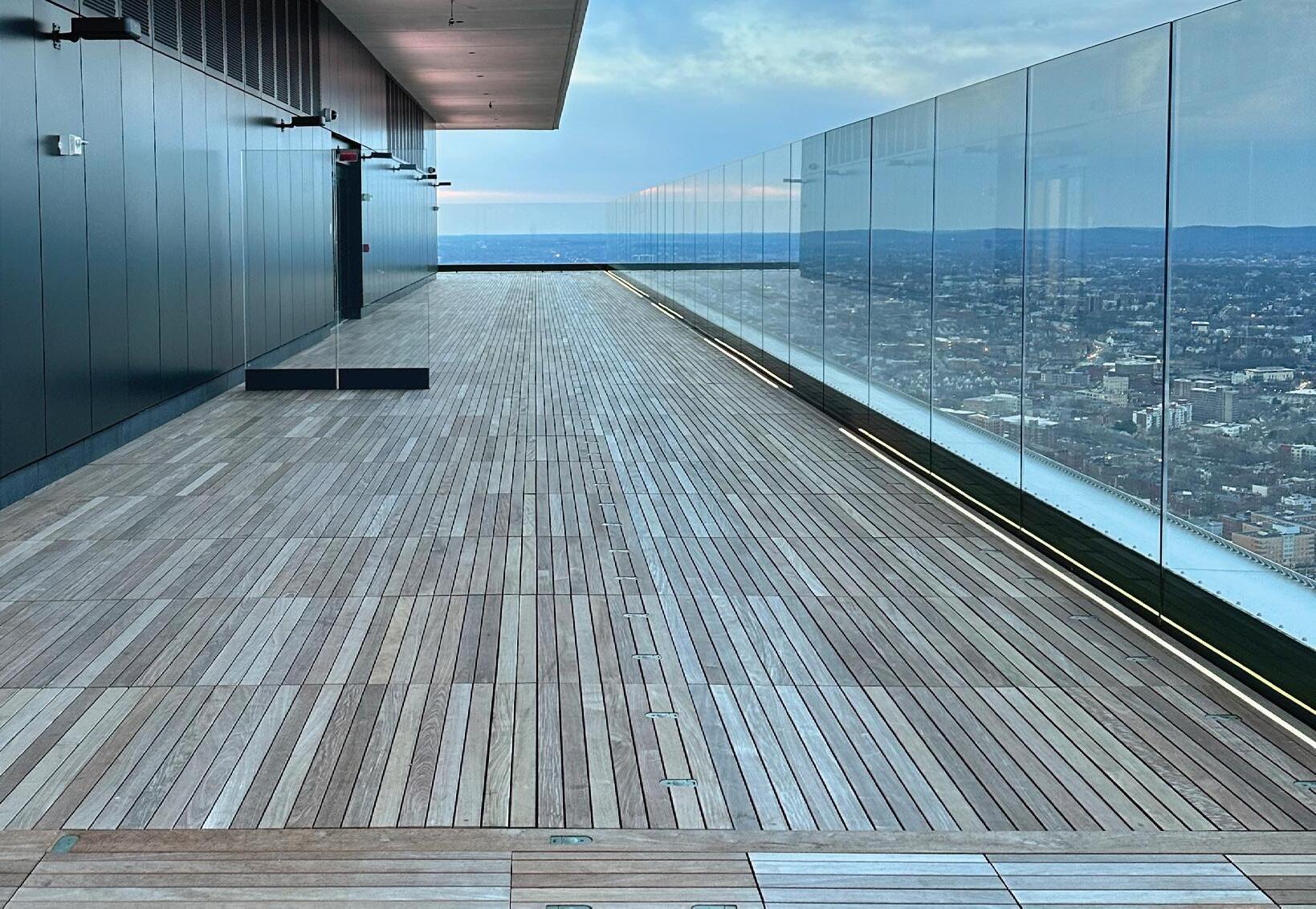
MM6125®
© 2023 American Hydrotech, All Rights Reserved.
First Church of Christ Scientist Headquarters. Boston, Massachusetts.
Guggenheim Museum. New York, New York. 2018 Northwestern University - Simpson Querrey Biomedical Research Center. Chicago, Illinois 2023 Prudential Tower: 51st floor observation deck. Boston, Massachusetts
1971
1990
58 Products
Public & Contract Furnishings
The right landscape furniture can bring life, community, and identity to outdoor settings. To best serve the people who use them, spaces such as parks, city squares, and campuses require durable furnishings to activate them. Rita





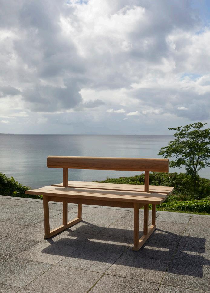


Garden Office Fermob
Catinella Orrell
fermob.com
Backdrop Landscape Forms landscapeforms.com
Twigz Café Collection Division Twelve division12.com
Bluff Chair Heller hellerfurniture.com
ALL IMAGES COURTESY THE RESPECTIVE MANUFACTURERS Broom
New Colors Emeco
Willard
Tournesol tournesol.com
October/November 2023
Morse Collection mmcité mmcite.com/us
Chair in
emeco.net
Collection
Banco Double Bench Fritz Hansen fritzhansen.com



60 Case Study
St. John’s Encampment Commons
dwg. and Agenda Architecture reimagine a significant site.
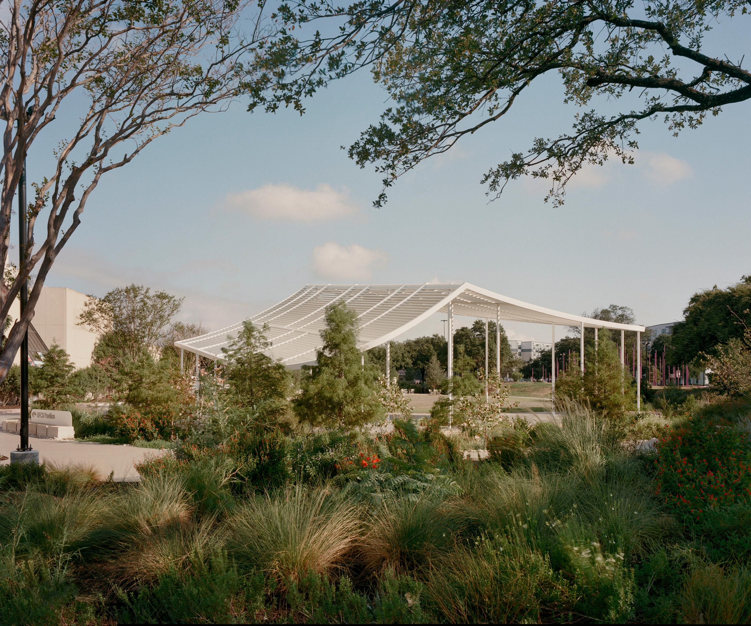

architect: dwg.
Agenda Architecture
Austin Structural engineer: Leap! Structures Electrical engineer: Bay & Associates
engineer: Stantec (park phase) WGI (pavilion phase)
Austin Community College
representative: RedLeaf Properties
contractor: Harvey Cleary
fabrication: Renfro + Co
contractor: Strata Landscape
In 1867, on the heels of the Emancipation Proclamation, four African American Baptist ministers, led by the Reverend Jacob Fontaine, founded what would become known as the St. John Regular Missionary Baptist Association. The organization still exists today with the same mission: spreading the Christian gospel. In 1893, the association purchased 306 acres of land four miles north of Austin to use for its annual encampment meetings. Fourteen years later, it established on the site an orphanage and school that offered practical industrial training as well as coursework in the arts and humanities to African American men and women. But since a fire destroyed the orphanage in 1956, the site has proved amorphous: Land was sold to a developer who, in 1971, built on it the city’s first suburban shopping mall, Highland Mall. Then, that mall was adapted to anchor the Austin Community College’s Highland Campus
General
Steel
Landscape
Outdoor
Landscape
Architect:
Location:
Civil
Client:
Client
furniture: Landscape Forms Light fixtures: Targetti, Luminii Pavers: Keystone Hardscapes Paint: Sherwin-Williams
Top: View of Agenda Architecture’s pavilion set within the new parkland. Above: Historic photograph of a 19th century encampment on the site. CASEY DUNN [PICA-04422], AUSTIN HISTORY CENTER, AUSTIN PUBLIC LIBRARY
2023
October/November
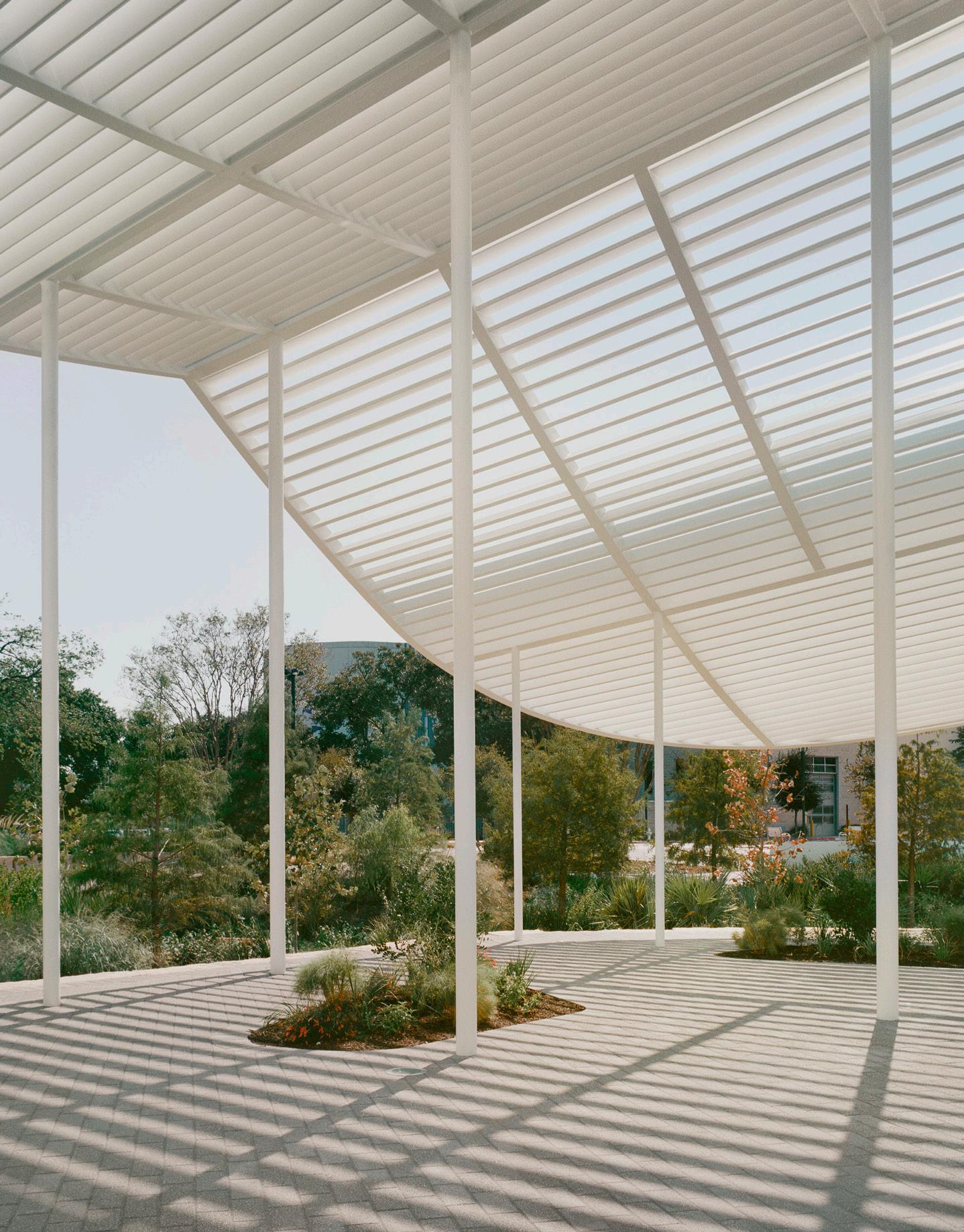
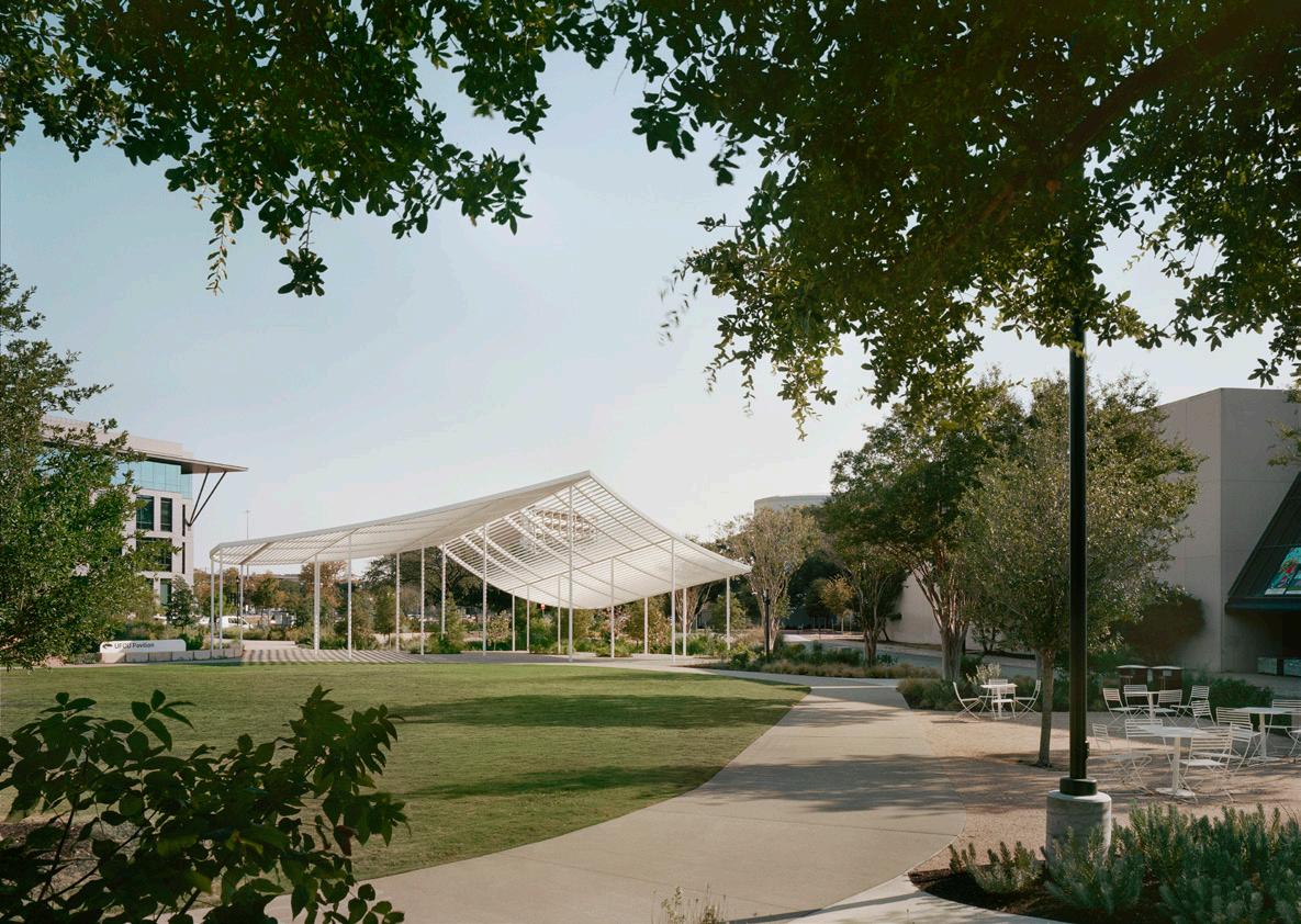
when it opened its doors to students in 2014. But today, a new, open green space known as the St. John’s Encampment Commons has begun to return the site to its roots.
Designed by landscape architecture firm dwg. with Agenda Architecture, the commons serve as the campus’s eastern gateway as the college seeks to restore the site’s historical connections to education and to the African American community, which had been erased over the decades. The project celebrated its official opening on August 28, though it had already been functioning as a de facto dog park for nearly a year, despite attempts to deter visitors with construction fencing.
Driving the landscape design was the preservation of four oak trees that had been transplanted from other areas of campus and unceremoniously plopped in 6-foot-high dirt mounds onto what was then a parking lot. This
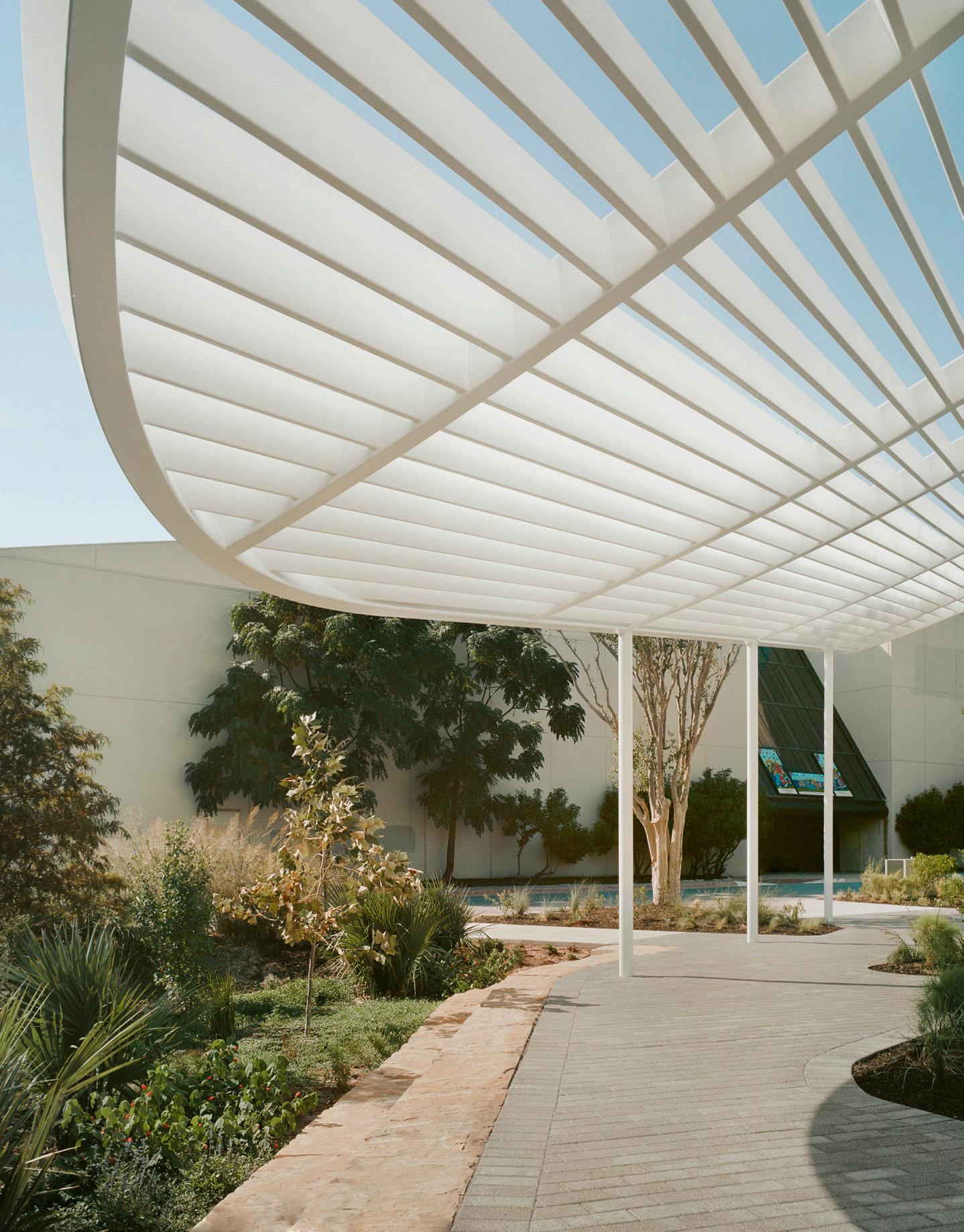

led to the idea of lifting the grade and working with the site’s topology to create a natural amphitheater. The elevation is flanked by winding paths encircling a central lawn, and landscaped beds and seating areas can be found scattered along the perimeter.
Water conservation, too, was a central part of the vision. A nearly 1-million-gallon cistern captures rainwater from the top deck of the adjacent parking garage, as well as AC condensate from the central chilling plant: Like rainwater, the condensate can be collected, and is then used to irrigate the commons, among other purposes. The design team also reduced impervious cover by 90 percent and incorporated a sponge garden, which filters pollutants from stormwater before it flows into a regional detention pond. “This became a profound demonstration of how you can be smart with infrastructure,” said dwg. president and founder Daniel Woodroffe.
Floating at the site’s southern end is a diaphanous event pavilion designed by Agenda Architecture. A structure was initially planned for college functions like graduation, convocation, and outdoor classroom space, but ambitions for the space expanded to the larger campus ecosystem. (The local PBS station, colocated on campus, first pitched the idea of a music venue during planning stages.)
Though the pavilion was first envisioned as a roofed structure, the team pivoted after realizing rain infiltration wasn’t a primary concern. The result is a system of white epoxy-painted steel columns and louvers, the form inspired by the cloth tents that once graced the encampments of the congregation, according to Agenda Architecture partner Michael Hargens. Each louver rotates slightly, creating a striated shading pattern and the illusion of a volume that can magically transform from transparent to solid as lighting conditions change.
Current page: The pavilion structure by Agenda Architecture serves multiple public purposes, from graduation ceremonies to performances. Its form was inspired by the tents pitched for annual encampment meetings. Each louver rotates slightly, allowing for varied shade patterns, and gives an illusion of volume.
The 4,750-square-foot structure’s irregular column grid was devised in consultation with Leap Structures to keep columns as slender as possible. There’s also a rectangular, column-free zone that can host a stage. The shifting roof height and grid divides the canopy space into distinct areas that offer varying degrees of intimacy, appropriate for anything from a dance recital to a conversation over coffee. “The fact that they saw the value of enabling people to come together and do it in a way that will, I hope, stand the test of time and be a talking point for generations is really uplifting for me,” said Woodroffe. “The agenda of social, environmental, and economic change has been great to see exemplified in a project like this.”
Anastasia Calhoun is the editor of Texas Architect magazine.
61
CASEY DUNN
CASEY DUNN
CASEY DUNN
October/November 2023
CASEY DUNN
62 Products
Hospitality & Residential Furnishings
Outdoor spaces make hotels and homes feel calm and inviting, whether the goal is to make a residence feel more like a resort or to make a hotel feel like a home. These designs are robust and fit for a variety of climates, offering users a more relaxed and luxe material experience. RCO


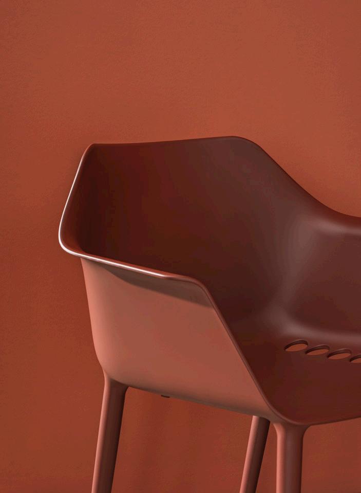
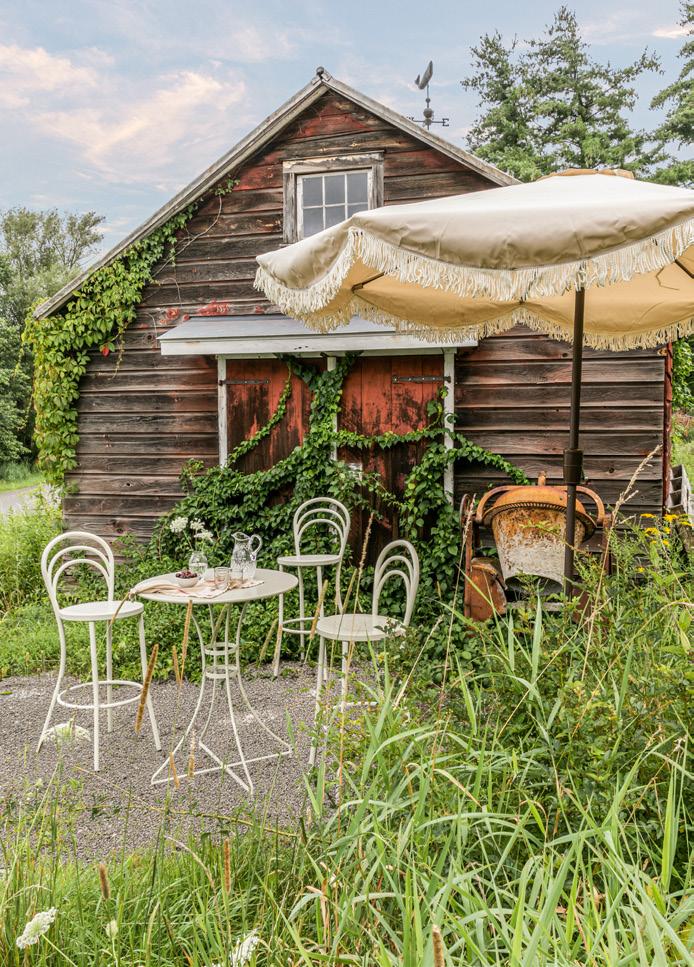


 Tivoli Armchair Zio + Sons and Industry West industrywest.com
Mbrace Lounge Chair Dedon dedon.de
Mexique Outdoor Tables Cassina cassina.com
ALL IMAGES COURTESY THE RESPECTIVE MANUFACTURERS
Gala Pure ECO Andreu World andreuworld.com
Lollygagger High-Rise Chair Loll Designs lolldesigns.com
Sandcastle Collection Pavilion Furniture pavilion-furniture.com
Dondolina Outdoor Folding Chair Fiam Italia fiamitalia.it/en/
October/November 2023
Leplì Outdoor Series Poltrona Frau poltronafrau.com
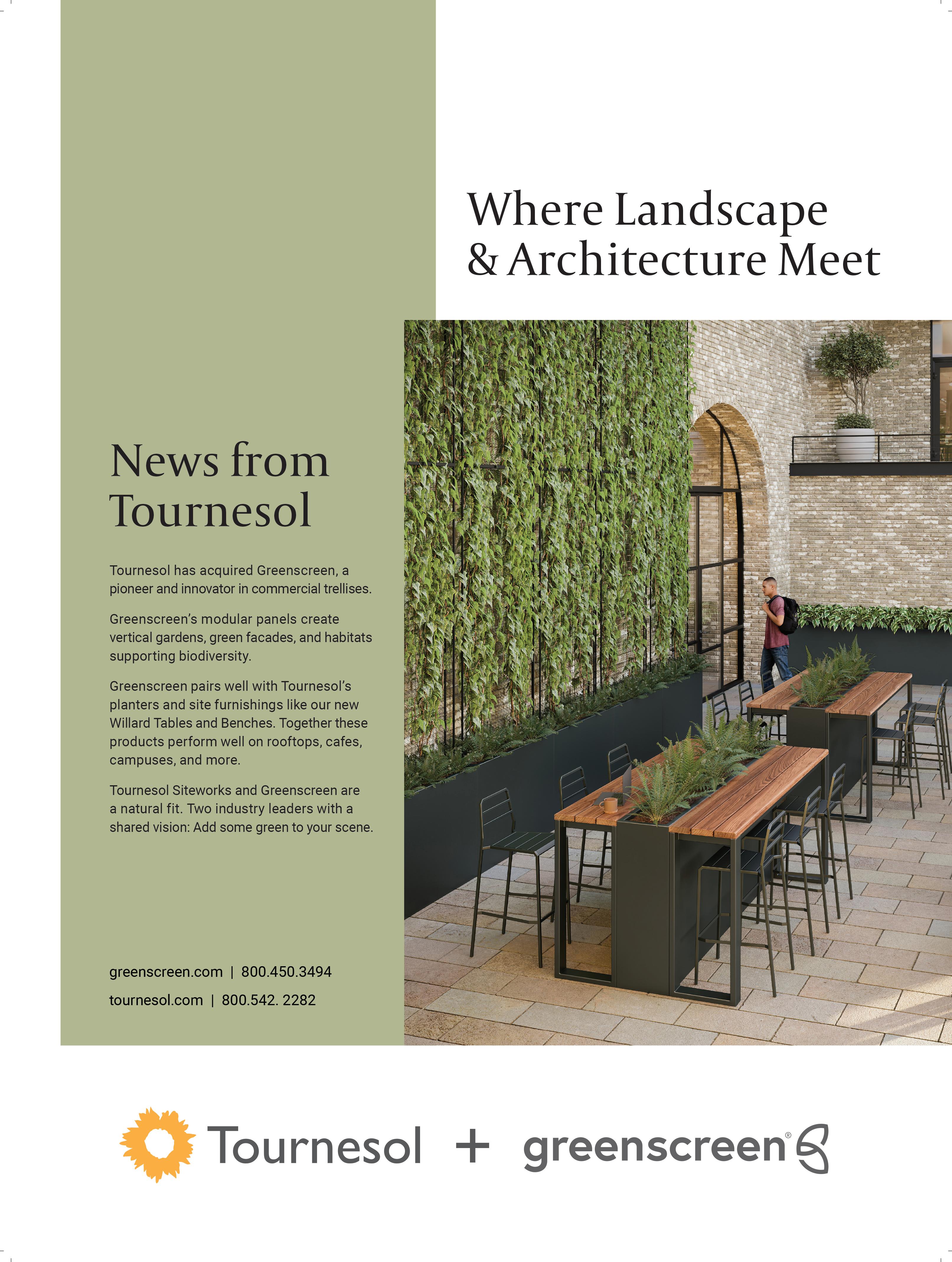
64 Case Study
The People are the Performance
October/November 2023
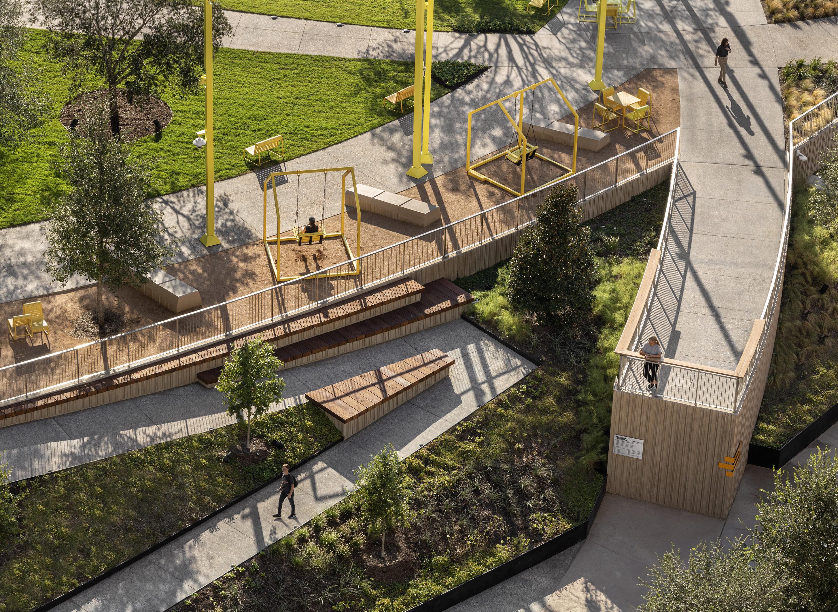
Landscape architect: RIOS
Executive landscape architect: Asakura
Robinson
Architect: RIOS
Executive Architect: HarrisonKornberg
Location: Houston
Client: Houston First Corporation
Contractor: Manhattan Construction Company
Structural Engineer: Henderson Rogers
MEP Engineer: E&C Engineering
Civil Engineer: Gradient Group
Furniture: QCP
Precast stairs: Wausau
Light poles: Technilum, Selux
Waste receptacles: Landscape Forms
Bicycle racks: Landscape Forms
Water Feature: Fluidity
The new Lynn Wyatt Square in downtown Houston has been transformed from a concrete heat island into the new, lush front yard of Houston’s Theater District. Designed by international design collective RIOS, the park is a testament to the ingenuity of interdisciplinary design: By addressing the citywide need for both more green space and outlets for art and creative expression, Lynn Wyatt Square is no
longer a place to get through, but a place to linger.
Much more than a park, Lynn Wyatt incorporates a variety of programming in highly designed ways. Loosely inspired by urban choreography, it has curvaceous walkways, but at its core, the park fosters performance through architectural interventions. Through a collaboration with architects at HarrisonKornberg, there’s now a two-story restaurant, but also an amphitheater in a grassy knoll, and other flexible performance areas.
One familiar with the area may wonder, how is all of this parkland sitting atop a parking garage?
RIOS cites this underlying constraint as an inspiration. The square sits above two 60-year-old parking garages separated by a 2-inch gap. However, this preexisting condition was embraced: “We made that a basis of our design,” said Peter Emerson, a studio director at RIOS. “We didn’t want to go in with a proposal that wasn’t structurally realistic.”
Each corner of the square is accessible, both from street level via ramps and from the parking garage below via a four-stop elevator. Two of the ramps are particularly serpentine: One ascends from Texas Avenue through a zigzag maze of local fauna, and the other, from Smith Street, winds through a multilevel water fountain. These immersive treatments for what could have been
run-of-the-mill circulation paths make them beautiful and accessible. Emerson explained that “we designed this water feature to be high enough that if you’re in a wheelchair, you’re going to be really intimately situated within that water. And in fact, it’s probably a much cooler experience than if you’re standing.”
RIOS wants Lynn Wyatt Square to introduce new audiences to the performing arts and tie together the diverse offerings downtown has to offer. “It’s extremely important that audiences are diversified,” Emerson continued, “and that audiences feel welcome from wherever they live and whatever their background is.” Performance can happen almost anywhere within the square thanks to plug-in stations scattered throughout that provide electricity for amplification. There is even a “sometimes stage” in the fountain: a platform that can be drained so that a performance can take place with cascading water surrounding it.
RIOS designed with the motto “The people are the performance.” People are imperative to placemaking, and therefore the square needs to be inviting and comfortable, unlike its predecessor. Asakura Robinson, a Texan landscape architecture firm, worked with RIOS to incorporate hardy native plants and large, mature shade trees,
which help mitigate the scale of the surrounding buildings. Evapotranspiration will lower the ambient temperature in the square, while the lawn and shaded walkways cut down on glare. The trees’ custom root boxes aren’t boxes in the traditional sense; they allow the roots of the trees to intermingle, supporting the mycorrhizal network, which enables trees to live longer, healthier lives.
Two overlooks, one on Smith and one on Texas, extend the park’s pathways, provide unique viewpoints, and offer visitors “an opportunity to engage with the street in a different way,” Emerson explained, providing “a sort of beacon or welcome sign from the street level.” They signal the square as an important civic place, beckoning people and providing almost tangible lines of connection to nearby anchors, like the Alley Theater. They are a focal point for the circulation design, drawing pedestrians—and hopefully, eventually performers—through the square. The entire project has transformed a former heat island into a shady gathering spot with innovative new programming and technological interventions not often seen in city parks.
Emily J. Hynds is a writer and artist living in Houston.
Lynn Wyatt Square becomes the new front yard of Houston’s Theater District.
PAVEL BENDOV / ARCHEXPLORER
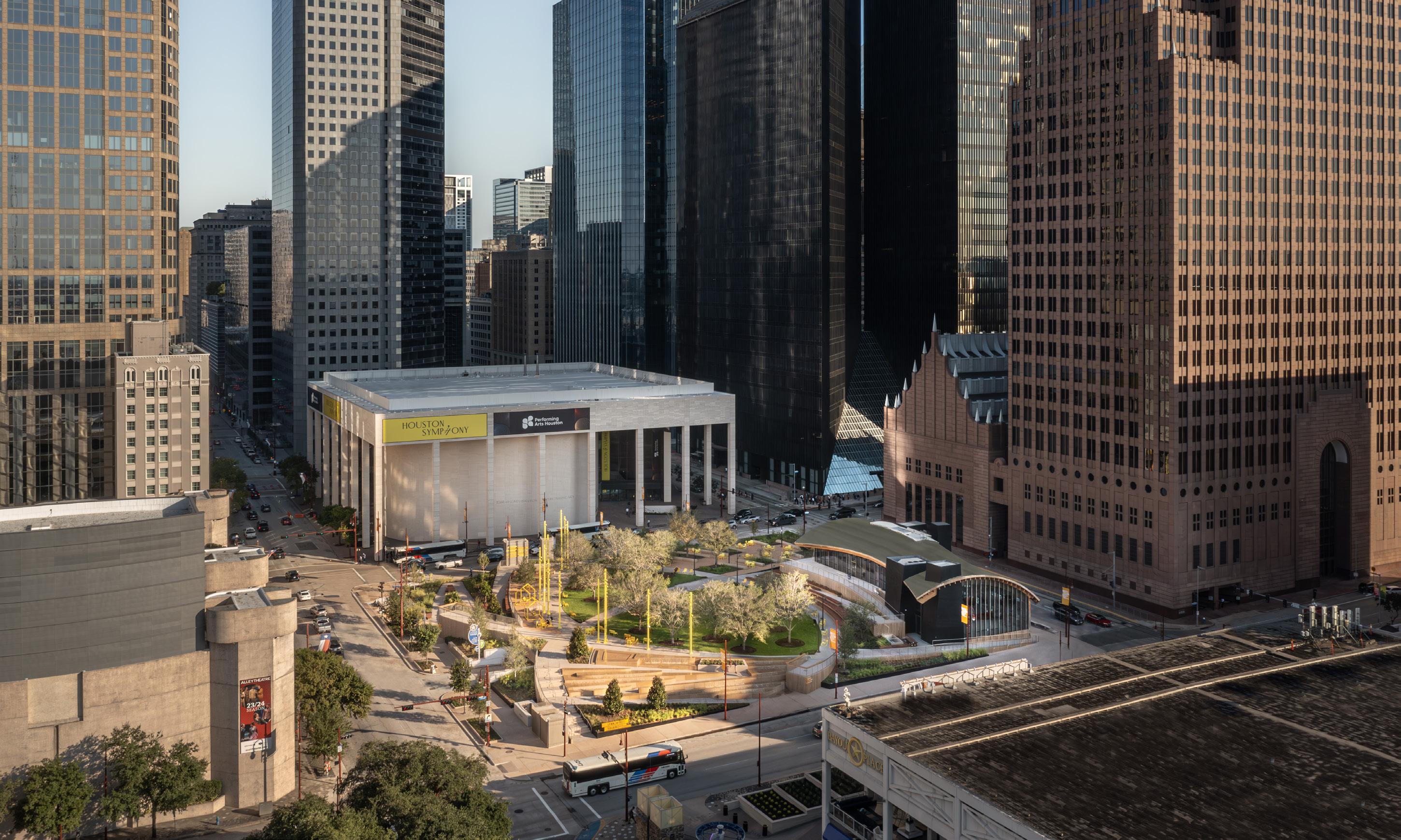




65
Facing page: Switchback paths and overlooks take advantage of the site’s topography.
Above: The park acts as a reprieve amidst the density of the Theater District.
PAVEL BENDOV / ARCHEXPLORER PAVEL BENDOV / ARCHEXPLORER October/November 2023 Reimagine the Outdoor Experience ROOFTOP DECKS PLAZAS GREEN ROOFS POP-UP PARKS WATER FEATURES DECK SUPPORTS WOOD TILES CONCRETE & STONE 2CM PAVERS PAVER SUPPORT TRAYS ARTIFICIAL TURF GRATING SITE FURNISHINGS Interface Inc. Headquarters, Atlanta GA architect: Perkins & Will photographer: ©Nick Merrick bisonip.com | 800.333.4234 Ugly QR code. Beautiful Decks.
Below: Playful illumination enhances both the architecture and the new performance spaces.
66 Products
Surfaces
Whether for poolside, patio, or pathway, these cutting-edge porcelain tile, stone, and composite materials stand up to the elements with style, providing the necessary slip-resistance, frostresistance, and cleanability your project demands. RCO


 Fringe by Mutina Artistic Tile artistictile.com
Composite Decking Millboard millboard.com
ALL IMAGES COURTESY THE RESPECTIVE MANUFACTURERS
La Geoteca Porcelian Slabs Gardenia Orchidea gardenia.it
Surat Porcelian Tile Alaplana Ceramica nuevaalaplana.es
Skyline Leather Marble Collection Marble Systems marblesystems.com
October/November 2023
Azimuth Monocibec monocibec.it
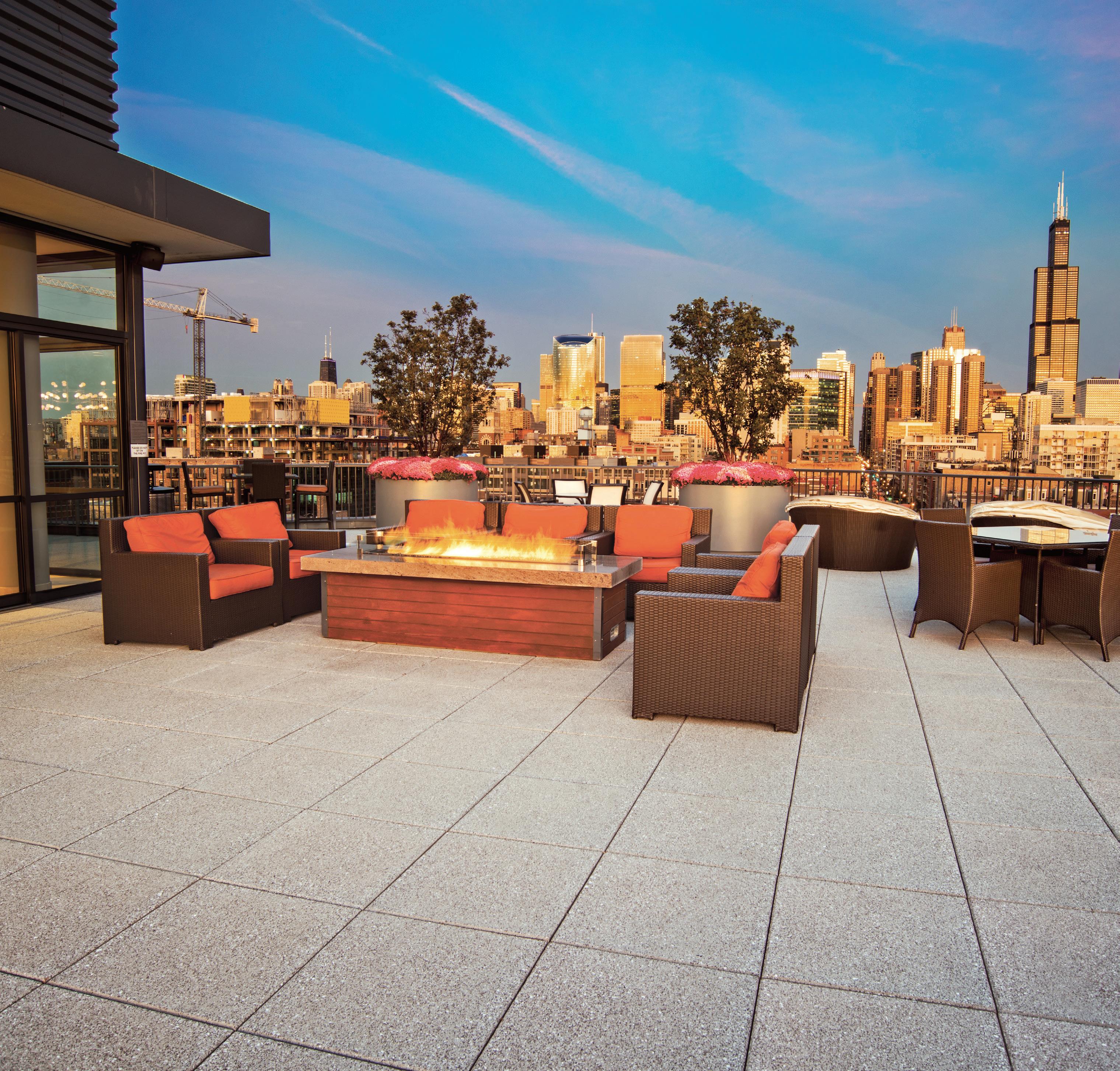
THE SOLUTION FOR ALL YOUR ROOFING NEEDS
HANOVER®
ROOF & PLAZA PAVERS
Hanover® Roof & Plaza Pavers provide environmental benefits while creating aesthetically appealing rooftops and plaza gardens. A wide range of paver styles, pedestal systems and high wind solutions are available. And with a library of over 3,800 granite-like colors to choose from, paving possibilities are endless.

www.hanoverpavers.com
68 Products
Lighting
Landscape lighting can be engineered to either seamlessly blend into its surroundings or stand out as an artistic feature. The latest designs below highlight architectural features while also introducing a touch of creativity. RCO
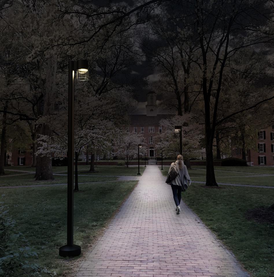


 Melli Selux selux.us
Inline Luminis Lighting luminis.com
ALL IMAGES COURTESY THE RESPECTIVE MANUFACTURERS Topo Collection RBW Lighting rbw.com Meduz
Royal Botania royalbotania.com Sticklight
weltevree.eu
Northport Collection Landscape Forms landscapeforms.com
Collection
Weltevree
October/November 2023
Collebrezza Qu Lighting qu-lighting.com

Complete hardscape, landscape, and artificial grass supply.

34 stores across the Southwest PICK-UP AND DELIVERY AVAILABLE!
866-863-3901
We make it easy to get the job done.

23PILC064-14-149462-1
70 Pictorial
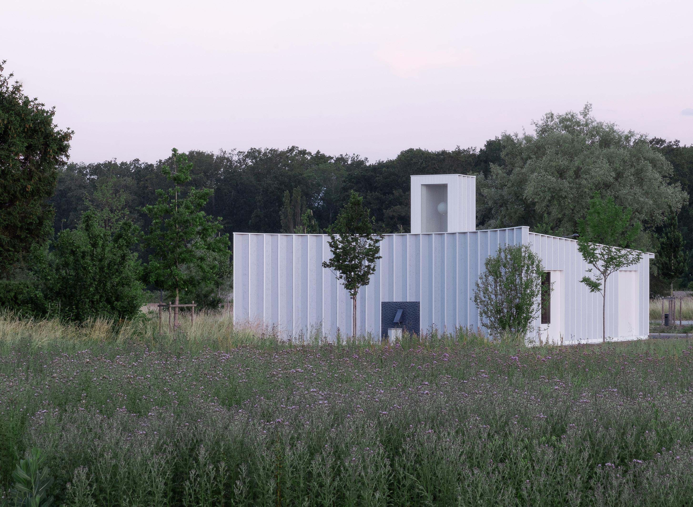
Gardeners House
Cabinet completes an oasis at the edge of the forest.
This isn’t your average project. Cabinet, an architecture practice led by Fanny Noël and Diogo Lopes, has designed a workplace for gardeners at the edge of a forest on the outskirts of Geneva. Adjacent to a newly cleared site for collective housing and agricultural fields, the form resembles a house due to its pitched roof and compact massing. The building includes one arced facade that faces away from the street; the full circle is completed with a ring of trees. The facade of pleated wooden boards is painted a subtle blue that resembles the Swiss sky, metaphorically “bringing it down” to earth: This could be the last house in the neighborhood, a hut at the edge of the woods.
Within, it’s eccentrically materialized and meticulously thought out to aid in the work of gardening. A tall lantern illuminates a central hall, and bands of skylights above the concrete roof beams brighten the utilitarian rooms. Clean sightlines lead the eye to thoughtful details, like custom handrails and tool storage, set within grids of terra-cotta blocks and ceramic tiles. Providing both practical workspace as well as leisure and shaded spaces for residents, Gardeners House is a unique, open-ended question mark nestled in a new development that feels as if it had always been there. What could’ve been just another banal, suburban box is now something strange and dignified thanks to Cabinet’s imagination. EC
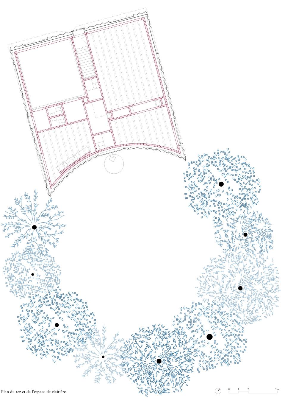
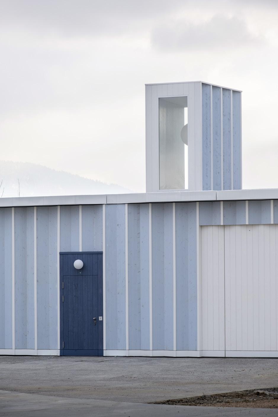
SVEN HÖGGER COURTESY CABINET
SVEN HÖGGER
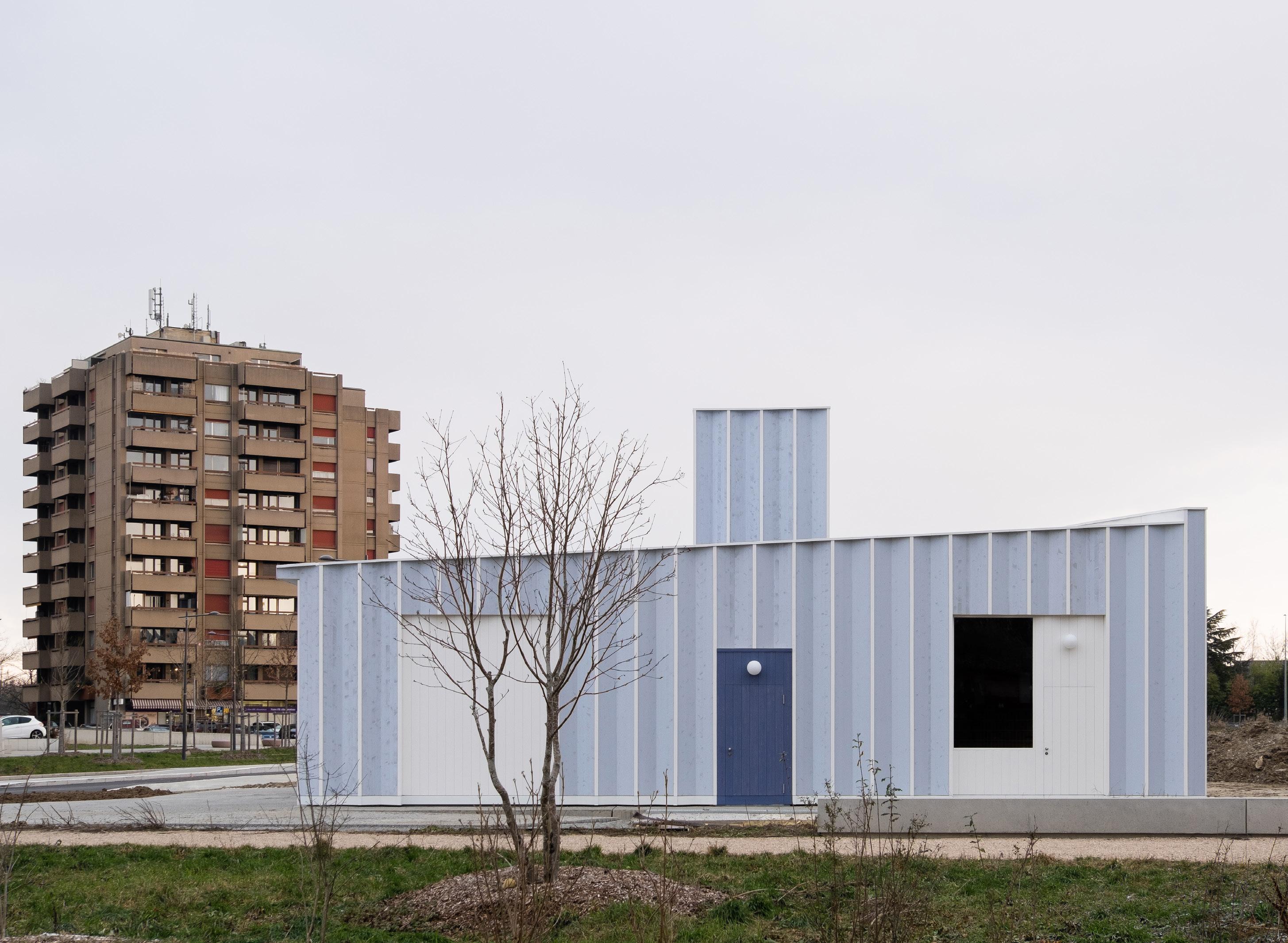
71 SVEN HÖGGER SVEN HÖGGER SVEN HÖGGER SVEN HÖGGER October/November 2023
72 Products
Specialties
This roundup of specialty products includes a diverse assortment of solutions. From elegant transit shelters to a lamp/shower combo, materials are hard-working, but the results are always elegant, including details in brass, molded stone, and marine-grade aluminum. RCO




 Juliette Molded Stone Planter JoinUs. joinus.boutique.com
Theory Transit Shelters Landscape Forms landscapeforms.com
Galanthus H20 Lamp/Shower Olev olevlight.com
Site Sizable Pool Drains Infinity Drain
Waterworks Outdoor
Urban Garden Planter Collection Tuuci tuuci.com
infinitydrain.com
Sink Weltevree weltevree.eu
Umea Receptacles Magnuson Group magnusongroup.com
ALL IMAGES COURTESY THE RESPECTIVE MANUFACTURERS October/November 2023
Cuprum Planters Collection Royal Botania royalbotania.com
73 Resources
Hospitality & Residential Furnishings
Andreu World andreuworld.com
Bloss blosscompany.com
Bludot bludot.com
Bosquet bosquet.us
Carl Hansen carlhansen.com
Cassina cassina.com
Dedon dedon.de
Desalto desalt.it
Fiam Italia fiamitalia.it/en/
Fritz Hansen fritzhansen.com
Loll Designs lolldesigns.com
Pavilion Furniture pavilion-furniture.com
Poliform poliform.it
Poltrona Frau poltronafrau.com
Rimadesio rimadesio.it
Serge Ferrari sergeferrari.com
Vondom vondom.com
Zio + Sons and Industry West industrywest.com
Lighting
Acuity Brands acuitybrands.com
Ambientec ambientec.co.jp
AMEICO ameico.com
Amerlux amerlux.com
Artemide artemide.com
BK Lighting bklighting.com
Cerno cernogroup.com
Diabla diablaoutdoor.com
Flos flos.com
Inter-lux inter-lux.com
Landscape Forms landscapeforms.com
Luminis Lighting luminis.com
Luminii www.luminii.com
Louis Poulsen louispoulsen.com
Modern Forms modernforms.com
Qu Lighting qu-lighting.com
RBW Lighting rbw.com
Royal Botania royalbotania.com
Selux selux.us
Structura Inc. structurainc.com
Tala tala.co
Targetti targettiusa.com
Vibia vibia.com
Weltevree weltevree.eu
Public & Contract Furnishings
BEGA bega-us.com
Division Twelve division12.com
Emeco emeco.net
Extremis extremis.com
FORMS + SURFACES forms-surfaces.com
Fermob fermob.com
GANDIABLASCO gandiablasco.com
Heller hellerfurniture.com
Kornegay kornegaydesign.com
Landscape Forms landscapeforms.com
Maglin Site Furniture maglin.com
mmcité mmcite.com/us
Pavilion pavilion-furniture.com
Renson renson-outdoor.com/en-us
Victor Stanley victorstanley.com
Vestre vestre.com/us
Surfaces
ABC Stone abcworldwidestone.com
Alaplana Ceramica nuevaalaplana.es
Artistic Tile artistictile.com
Belgard belgard.com
Bison IP bisonip.com
Caesarstone caesarstoneus.com
Cerdomus cerdomus.com
Florim florim.com
Gardenia Orchidea gardenia.it
Greenmood greenmood.us
Greenscreen greenscreen.com
Hanover Architectural Products hanoverpavers.com
Invisible Structures invisiblestructures.com
Ironsmith ironsmith.cc
Italgraniti Group italgranitigroup.com
Keystone Hardscapes keystonehardscapes.com
Marble Systems marblesystems.com
Millboard millboard.com
Monocibec monocibec.it
Nicolock nicolock.com
Parasoleil parasoleil.com
Pioneer Landscape pioneerco.com
Tournesol Siteworks tournesol.com
Trueform Concrete trueformconcrete.com
Specialties
Brickworks brickworks.com
Firmitas firmitas-structural.com
Infinity Drain infinitydrain.com
JoinUs. joinus.boutique.com
Landscape Forms landscapeforms.com
Magnuson Group magnusongroup.com
Olev olevlight.com
Royal Botania royalbotania.com
Thermory thermoryusa.com
Timberlab timberlab.com
Tuuci tuuci.com
Weltevree weltevree.eu
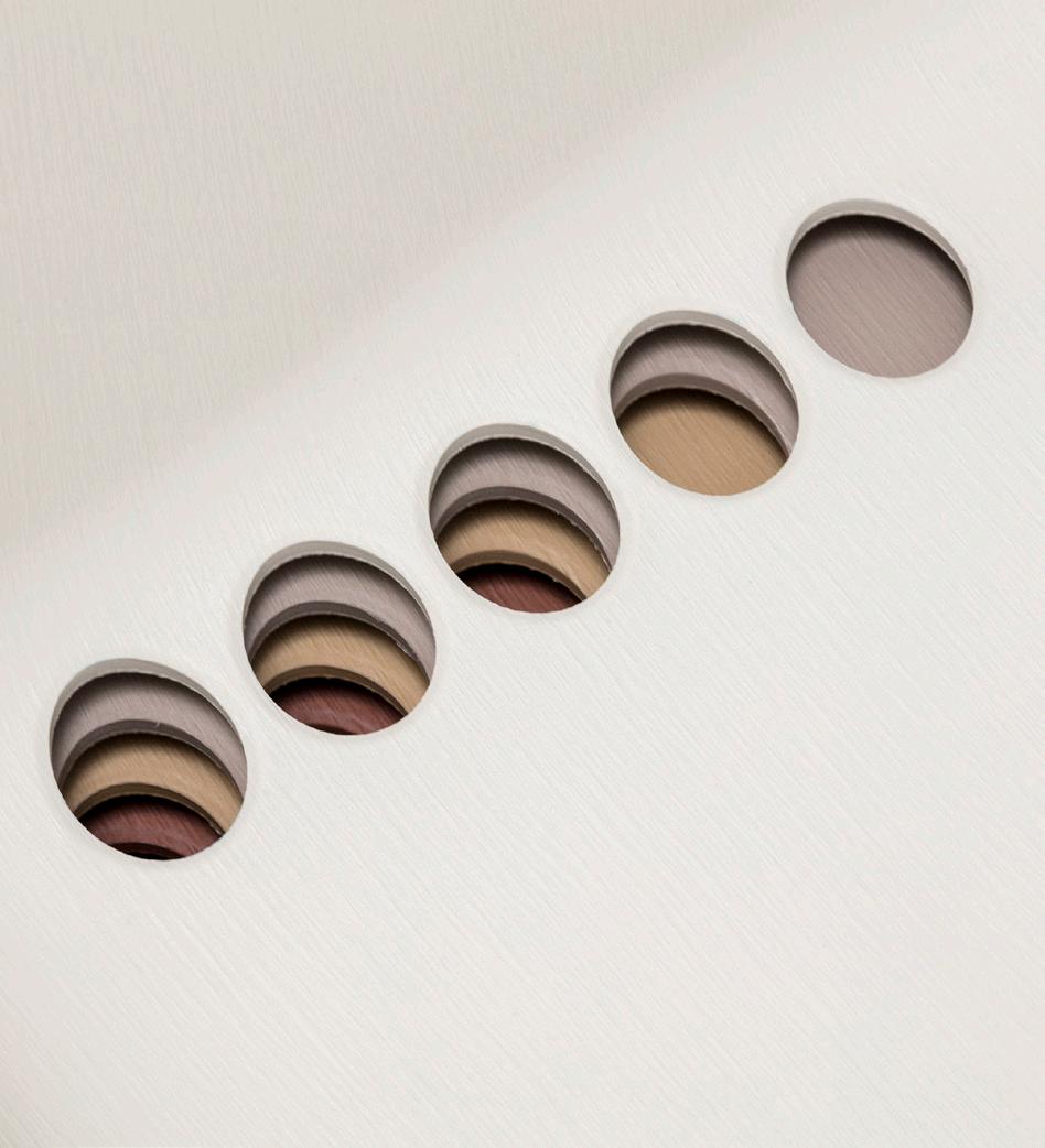

COURTESY ANDREU WORLD COURTESY RBW COURTESY ARTISTIC TILE October/November 2023
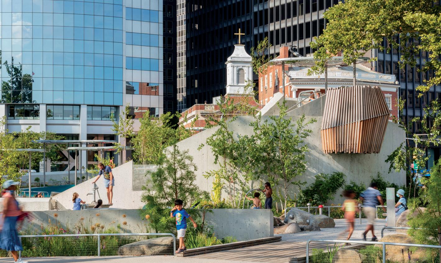

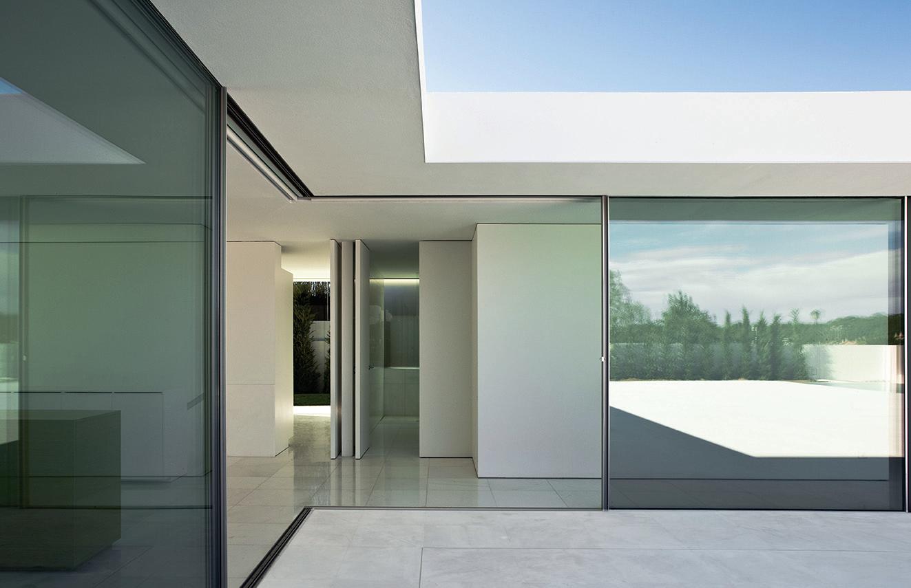

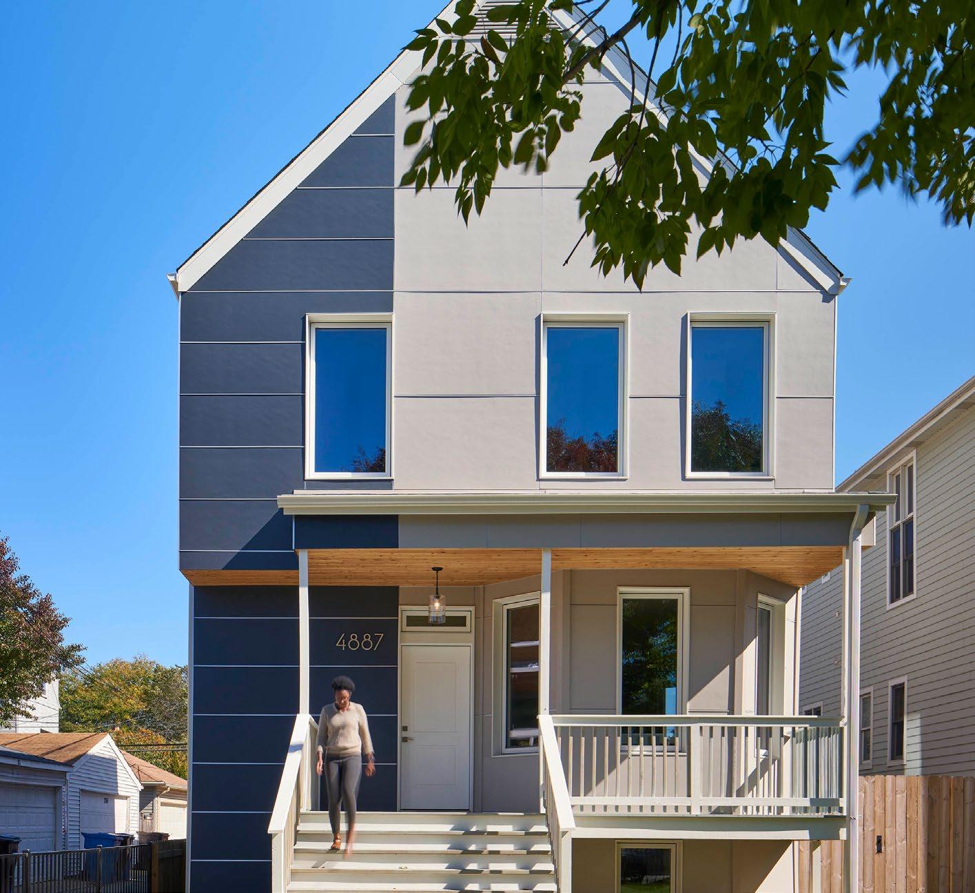
The Architect’s Newspaper 74 Marketplace RE RE RE RE RE FRESH BUILD FASHION GENERATE NEW USE GROW RE RE RE RE RE RE RE RE RE RE RE RE MODEL AIA Chicago celebrates the 2023 Decarbonization Honor Award PROJECT Yannell PHIUS+ Residence ARCHITECT HPZS MEP ENGINEER dbHMS CLIENT Yannell Foundation for Sustainable Development AIA Chicago’s Decarbonization Award recognizes projects at the vanguard of energy reduction which exemplify the architects abilities to pursue the goals of design excellence and the 2030 Commitment. Learn more at AIAChicago.org/awards Sahar Coston-Hardy esto.com Battery Playscape, New York NY BKSK Architects
October/November 2023 75 Subscribe archpaper.com/subscribe OUTDOOR SPACES • FACADES+ • THE ARCHITECT’S NEWSPAPER • TECH+ • LATE EDITION • CE STRONG AN INTERIOR • TRADING NOTES • OUTDOOR SPACES OUTDOOR SPACES • FACADES+ • THE ARCHITECT’S NEWSPAPER • TECH+ • LATE EDITION • CE STRONG COMPANY COMPANY PAGE PAGE AIA NY www.aifny.com 48 American Hydrotech www.hydrotechusa.com 57 Architecture Research Office www.aro.net 31 BIG www.big.dk 42 Bison IP www.bisonip.com 65 Canadian Centre for Architecture 35 CC Sullivan www.ccsullivan.com 32 Cosentino www.cosentino.com Back Cover Dada Goldberg dadagoldberg.com 34 Dattner www.dattner.com 32 DXA studio www.dxastudio.com 32 ETEX/Equitone www.equitone.com 11 Greenscreen www.greenscreen.com 63 Hanover Architectural www.hanoverpavers.com 67 Hausman www.hausmanllc.com 42 Invisible Structures www.invisiblestructures.com 59 Kriskadecor www.interiorsfromspain.com/interiors/es/index.html 2 Landscape Forms www.landscapeforms.com 50 Leers Weinzapfel www.lwa-architects.com 43 Lightblocks www.lightblocks.com 7 Marlon Blackwell www.marlonblackwell.com 26 Microsol Resources www.microsolresources.com 24 mmcité 7 LLC www.mmcite.com 53 Modular Arts www.modulararts.com 51 Novita www.novitapr.com 43 Pioneer Landscape www.pioneerco.com 69 Pulp Studio www.pulpstudio.com 3 Rockwell Group www.rockwellgroup.com 43 SOM www.som.com 43 Spacesmith www.spacesmith.com 34 Taylor & Company www.taylor-pr.com 32 TenBerke Architects www.TenBerke.com 34 Thor Kitchens www.thorkitchen.com 83 Vitro www.vitroglazings.com 9 Vitrocsa goldbrecht.com 5 & 74 WW Glass www.wwglass.com 33 WXY architecture + urban design www.wxystudio.com 48 YKK AP www.ykkap.com 22
76 Exhibition Highlights
SIGHTLINES on Peace, Power & Prestige: Metal Arts in Africa
Through December 31

Curated by Drew Thompson and featuring exhibition design by Emanuel Admassu and Jen Wood of AD—WO, Sightlines on Peace, Power & Prestige: Metal Arts in Africa marries contemporary artists with lineages of their mediums originating in Africa. The show offers a meditation on the African diaspora
Beautiful City—Empty City
and centuries of innovation in metalworking, sculpture, photography, and textile arts. These historic precedents are then brought into conversation with emergent forms and groundbreaking Black artists, like Amanda Williams and Otobong Nkanga, among many others. EC
Jimmy DeSana, Suburban
Through January 19, 2024
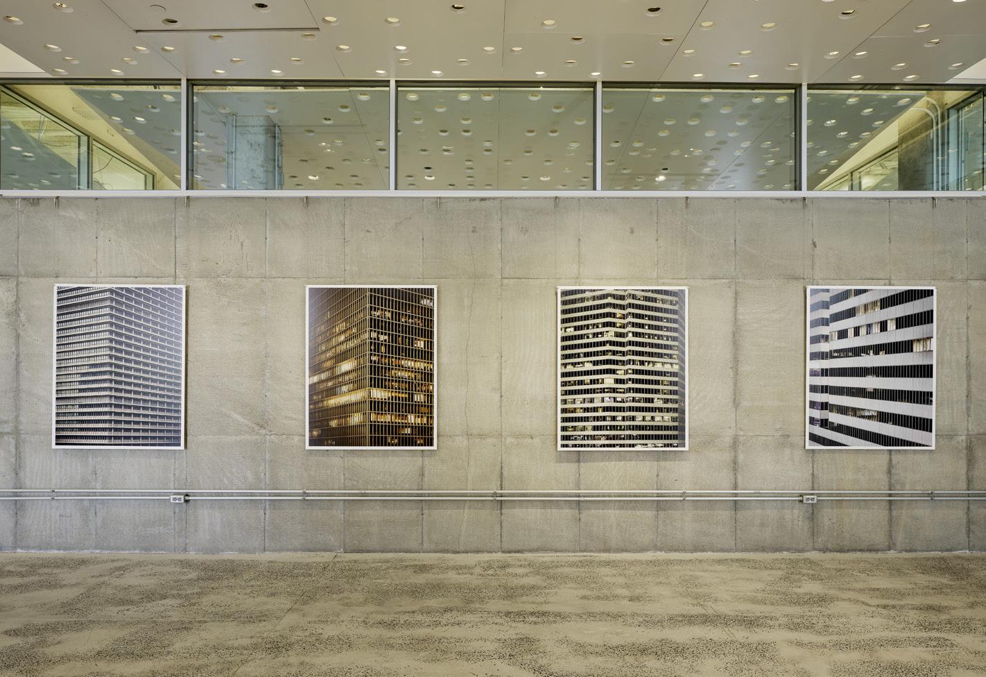
Before the pandemic, the image of a desolate downtown sounded like an impossible contradiction. But in 2020, cities emptied out, leaving behind an eerie feeling of isolation. Photographer Leonid Furmansky documented this moment in Houston with a portfolio of photographs titled Oil Towers . Selections from this work, curated by AN ’s executive editor, Jack Murphy, freeze
this moment: The context of Houston’s oil and gas legacy feels particularly chilling now that we can look back on the era with some distance. A set of programs—including lectures by Jessica Varner, Jesús Vassallo, and Daniel Barber, and a walking tour led by Stephen Fox—will explore and extend the show’s ideas. EC
Through October 28
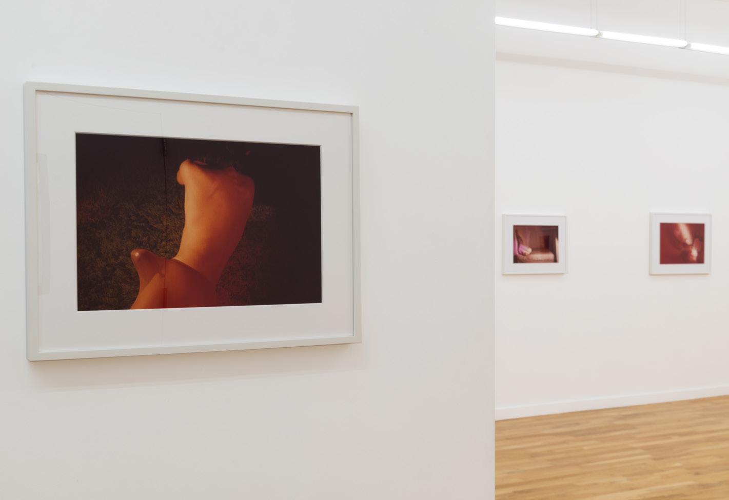
The queasiness of suburban ennui has been the subject of Jimmy DeSana’s photography since the 1970s, and this debut solo exhibition at DOCUMENT Chicago showcases 12 of the artist’s images made from 1979 to 1985. DeSana was a key figure in New York's ’70s downtown scene, exploring gender and queerness in his
Marshall Brown Projects: Dequindre Civic Academy
photography, and had a retrospective at the Brooklyn Museum in 2022. The act of challenging accepted binaries and labels is centered in the images. Some subjects are bathed in neon light from gelled tungsten bulbs, with the rays illuminate the uncanny nature of suburban living and identities shaped by consumerism. EC
Through May 27
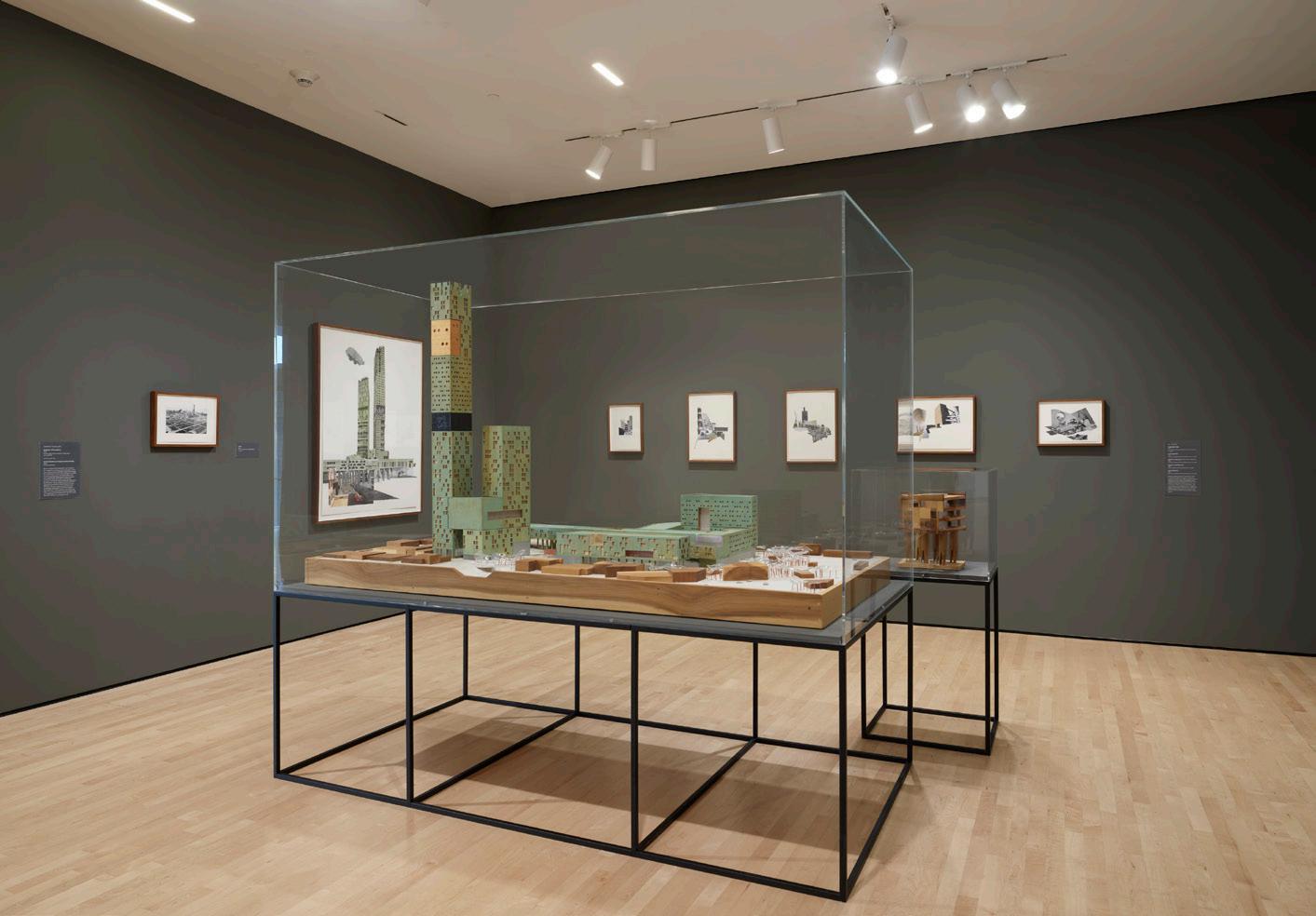
Originally commissioned for the 2016 Venice Biennale, this exhibition posits an alternative future for the city of Detroit. Utilizing imaginative combinations of collage, architectural drawing, and model making, architect Marshall Brown considers the potential for—and even responsibility of—architects and designers to revitalize areas that have historically been
overlooked and marginalized. The gallery centers around a large site model encased in glass. The interplay between the model and details presented as collages, photographs, and drawings on the surrounding walls offers visitors a dynamic, zoomed-in and -out experience. Brown’s vision is a colorful and evocative meditation on a
The Architect’s Newspaper
East Midwest West
Southwest
utopian “what if.” EC
Architecture
902
Document 1709 West Chicago
SFMOMA 151 3rd
San
JIMMY DESANA TRUST/COURTESY THE JIMMY DESANA TRUST, P·P·O·W, NEW YORK AND DOCUMENT, CHICAGO
ROSS/COURTESY SFMOMA DA PING LOU, COURTESY OF BARD GRADUATE CENTER LEONID FURMANSKY
Bard Graduate Center 18 West 86th Street New York, NY 10024
Center Houston
Commerce Street Houston, TX 77002
Avenue Chicago, IL 60622
Street
Francisco, CA 94103 ©
DON
Your trade fair only pass is complimentary with promo code DAPMARNEW

JAVITS CENTER,
BDNY.COM Exclusive Insight. Empowered Design.
NOVEMBER 12 + 13, 2023
NYC
.

Design trade professionals receive complimentary admission with pre-registration by November 10.

PRESENTED IN PARTNERSHIP WITH DUCHATEAU
AT THE
... AND BEYOND
+
REGISTER, VISIT
BARKER HANGAR | SANTA MONICA
-18
ALWAYS
EDGE
EXPERIENCE WHAT’S NEXT ... NOW IN DESIGN
FURNISHINGS TO
www.westedgedesignfair.com THE
NOVEMBER 16
79 Comment Building on Stricken Land
Moral debates have consistently plagued architectural history, particularly in a narrow Eurocentric canonical reading. From the Palladian camouflage of the filthiest aspects of farm life in the Veneto to Loos’s hilarious critique of the habits of his Viennese clientele, morality in architecture has made a case for specific formal maneuvering. But even far away from Europe, the cultures of the Caribbean have also had their love affair with moral compasses in architecture, from the foundational urban grids that claimed to bring order to the otherwise chaotic jungle to the hagiographies of midcentury European architects who immigrated to the tropics with “enlightening” intentions. The modern movement was said to introduce material stability, hygiene, and geometric disciplines to these islands: stricken lands of unannounced hurricanes, tropical diseases, and perpetual debt.
In 2010, the Luis Muñoz Marín Foundation Visitors Center, designed by José Javier Toro, one of the most accomplished architects of his generation in Puerto Rico (and a poster child of the neo-modernist orthodoxy), brought back the sinful grime to the modern box, on a site loaded with dirty secrets. The effort was an early independent project for Toro, who worked for almost 20 years as Toro Ferrer Arquitectos, in partnership with Gonzalo Ferrer. There is room for confusion here, as Toro y Ferrer is also the name of a legendary architectural practice led by José Javier’s father Osvaldo Toro and Gonzalo’s uncle, Miguel Ferrer. Since 2011, Toro Arquitectos has been engaging in an ongoing conversation with the legacy of his father, already present in the work done under the Toro Ferrer Arquitectos name. The firm even remodeled some of his father’s buildings, like the General Studies School at the University of Puerto Rico (2009), which included a brandnew annex, the Jaime Benítez Rexach Building, an architectural highlight of the last decade. His work for public clients is particularly daring. As a solo architect, he has introduced subtle yet visible variations to the late modernist imaginary.
Muñoz, Puerto Rico’s first elected governor, is the father of the midcentury invention of the country as an American commonwealth. The visitors center is built on what used to be his farm, and his old house still stands there as a reminder of the moral dilemmas faced by the former governor. Toro’s contribution to this tropical farm has been designed with its aging process embedded, like a Dorian Gray at peace with the public display of his decrepitude.
There have been plenty of depictions of the aging colonial status of Puerto Rico in art before. Some critics even claim that it has the stature of a motif. For example, painter Francisco Rodón notoriously immortalized Luis Muñoz Marín’s decaying effigy in a lessthan-heroic face that seems to be crying out of guilt, frustration, and hopelessness. These emotions are also present in Stricken Land: The Story of Puerto Rico, Rexford Guy Tugwell’s 1947 account of his five-year role as the last American governor of an island that was “waiting to be decolonized.”
Tugwell and Muñoz are a mythological pair in the country’s political history. After 500 years of Spanish presence, the legacies of traditional cities on the island were pathologized by bureaucrats, like Tugwell, who followed Corbusian thinking. Tugwell was an economist of centralized control dogma, an enemy of the urban “slum,” and a proponent of the countryside as an alternative. His legacy ignited an architectural transformation on the island, including the proliferation of urban sprawl.
Modern architecture, stripped of its curtain walls and environmental negotiations,

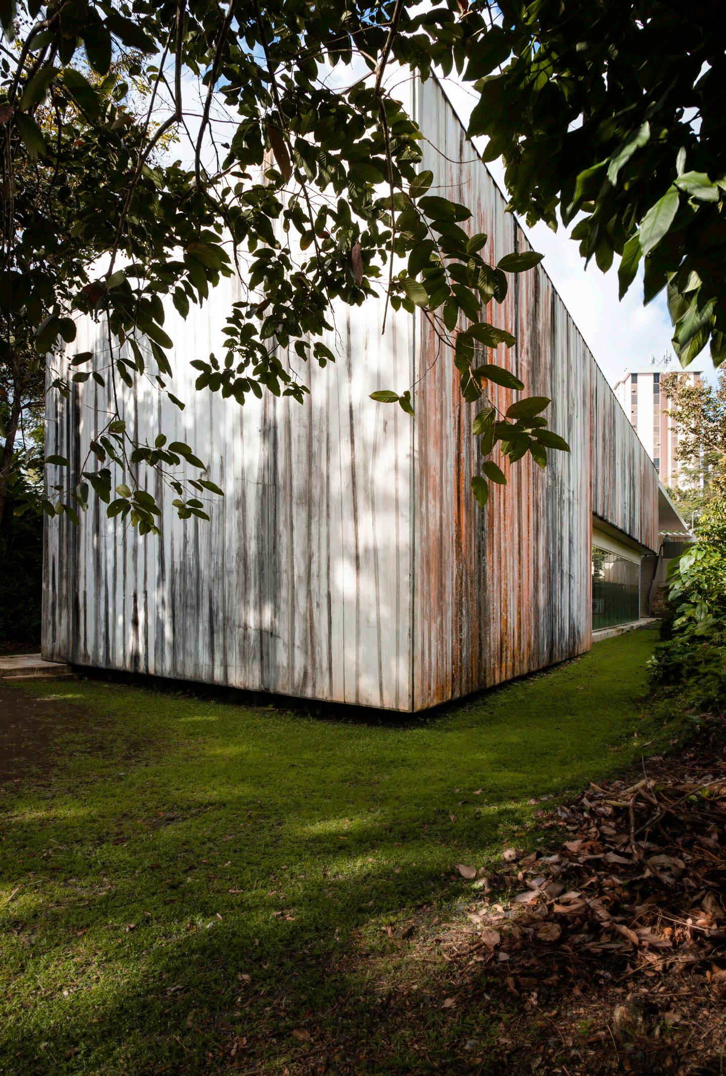
served as a backdrop to the political dramas of a country ill-equipped to role-play the American puppet the U.S. wanted the island to be. So, everything that failed in the American experiment in Puerto Rico needed to be concealed with architecture. Modern architecture provided off-the-rack clichés of economic, social, and political progress.
Toro’s archive, exhibition facility, and events center landed on the property like a rebellious prodigal son. Its walls were designed to become stained and dirty; its water management strategies are fully exposed, almost pornographically, through the monumental glass panes. The building is at its melancholic best when, over the years, its concrete has become stained by a natural patina. When steel elements are invited to the party, as happens at the entrance that serves as propylaea to the entire complex, the clarity of the scheme becomes annoyingly compromised. Scandinavian pieces also make their way into interiors, characteristic of the style’s invasion of midcentury Puerto Rican homes and hotels like trophies of modernity. One of the most memorable moments of Toro’s rehashing of modernistic tics at the fundación is the highly staged view into Luis Muñoz’s former office: It looks like a soundstage straight out of the first season of Mad Men , all matchy-matchy Scandinavian. Its nostalgic datedness constitutes the heart of the building.
Seen years after its opening to the public and decoupled from the tyranny of the new that powers most architectural media, the value of Toro’s discrete box can now be appreciated as a blasphemous betrayal of the modernist ethos and the Greatest Generation’s obsession with order. Killing the father is more than a metaphor here: Toro y Ferrer were considered the go-to architects for the ELA, the Estado Libre Asociado, the local name for the Puerto Rican state, which has been maliciously mistranslated as “Commonwealth” to cover up its colonial vestiges. One could say that the Puerto Rico’s midcentury architectural Camelot is the dual creation of the German émigré Henry Klumb combined with Osvaldo Toro and Miguel Ferrer’s innovative work.
At their best, these architects provided a classic prototype of modern architecture for the tropics, as they highlighted both the possibilities and challenges of building in a developing location with cultural resistance to modernization—or, rather, Americanization. The work of this breed of pioneers of modern architecture has been praised for its adaptations to the local conditions and labeled a “foundational” moment in a land perennially afflicted with identity crisis and an enduring residue of colonial violence.
Toro’s aesthetic contradicts the Puerto Rican palimpsestic logic of its vernacular architecture. But in his defense, one could argue that the baroque exuberance of the tropical forest is better served with restrained geometries and normcore architectural languages, which summarize Toro’s vision and give form to his Oedipal revenge tale.
October/November 2023
Miguel Rodríguez-Casellas is an architect and educator based in Puerto Rico.
Revisiting Luis Muñoz Marín Foundation Visitors Center by Toro Arquitectos, 12 years later.
Above: A canopy corridor leads visitors into the historic structure.
Below: The exterior's stained concrete condition has been preserved. ©PAULA QUEVEDO
©PAULA QUEVEDO
80 Review
Herzog & de Meuron at The Royal Academy
The Royal Academy of Arts
Burlington House, Piccadilly
London W1J 0BD, UK
July 14–October 15
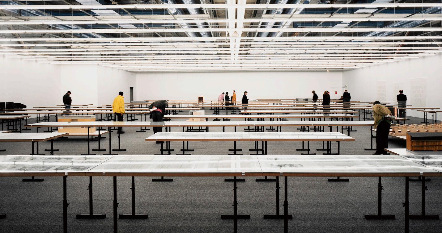
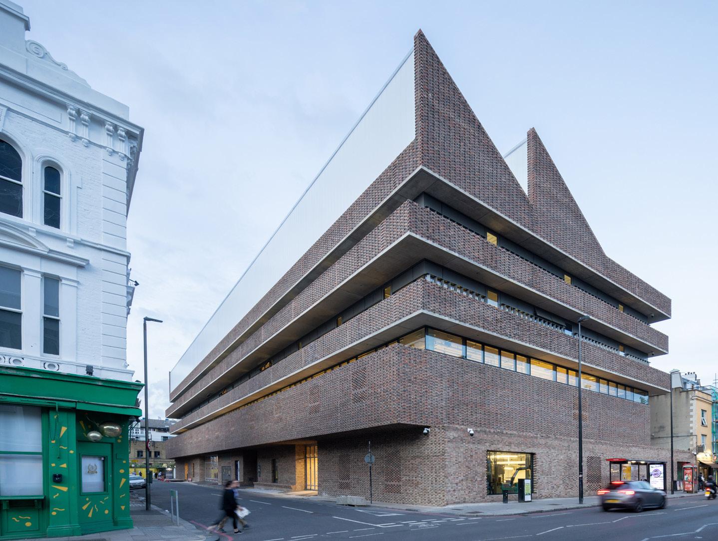
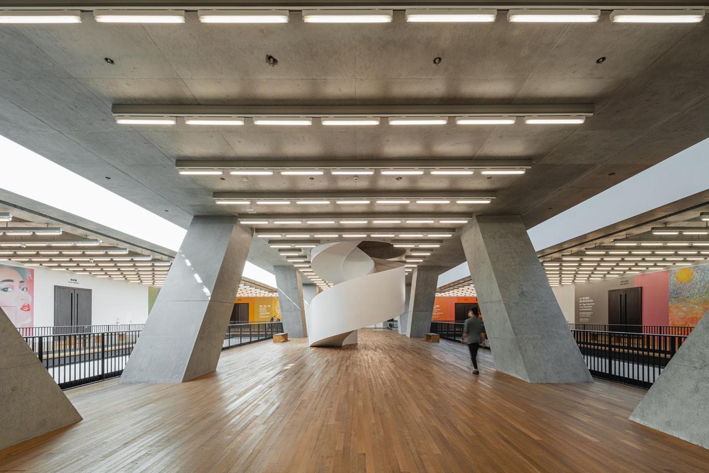
Herzog & de Meuron at London’s Royal Academy transports gallerygoers into a literal Wunderkammer. The curation encourages viewers to engage with Jacques Herzog and Pierre de Meuron’s iterative, exploratory process of testing ideas, but the density of objects and attempts to present the most minute details of the oeuvre make the show a challenge to take in. Jacques Herzog once likened the practice of architecture to ecology: “Whatsoever you do, do it with care.” As in its buildings, Herzog & de Meuron shows that “care” manifests as a desire for total control of the details and an obsession with process.
Under the leadership of Esther Zumsteg, H&dM’s curator-at-large, the meticulous archive tells the story of this attention to care. Physical artifacts on show are anchored within a set of three vitrines identical to those at H&dM’s Kabinett archive in Basel; models, maquettes, and sketches all arranged in a loosely chronological order. In addition to directly looking at the objects on display, visitors can point, scan, and explore large-scale facade mock-ups, sectional models, and even “inhabitable” 3D spaces via a bespoke mobile app that offers an interactive AR experience. Snooping around, viewers will find that the model of REHAB Basel gets an AR treatment, with the visual showing the formal diagram of the therapy pool, one of the key nodes within the building’s plan.
Apparently, AR functionality is intended to push the understanding of the relationship between the body and architecture, but the tech does not match the aspiration. Generally, the models have greater clarity without the AR enhancements. There is no scope for a close-up inspection of the CaixaForum models or the massive yet transparent M+ model. Both could have been given a stand-alone vitrine within the show.
There are also several films within the show that offer glimpses into construction sites and factory testing. We see, for example, the deft labors of construction workers setting copper panels in place. Two additional films at the center of the exhibit are also supposed to exemplify the practice’s care for its work, though they reveal this “care” more in terms of attention, or control over, the way the buildings are used after the architects’ involvement has ended. On one side of a divider, three frames play out the day-to-day existence of a series of H&dM projects. On the other, a 37-minute film provides an emotionally rich account of the lives of a group of people who use REHAB Basel as part of their injury recovery. The reflective film links buildings and scenes thematically, with crowds of pedestrians seeming to amble between the forecourt of Fünf Höfe and M+.
If there is an intent to comment on form in Rehab from Rehab, the longer film by Bêka & Lemoine, then it is subtle. The focus here is exclusively on the recipients of care and those who care for them. Gallery attendees hear from Abdel Rehman, a young man affected by the sudden onset of Guillain-Barré syndrome. Extended frames show him performing his daily regimen of strengthening exercises and ambulation around one of the courtyards—a space filled with light and suffused with the color of adjacent greenery.
Later viewers see another patient undergoing an “animal-assisted” therapy program: We watch how, walking alongside and training a dog, he extends his range of motion and muscular strength with each step. Here again, the building takes a secondary role, but it is an important one. The quiet strain of timber underfoot becomes a reassuring accompaniment to the patient’s movement, reminding viewers of the responsive “naturalness” of the material. The timber cladding, with its pronounced grain, also asserts this building’s
connection to nature, bathed in sunlight and the dappled shadows of swaying plants.
Having reached the climax of the film in the pool of REHAB Basel, the same pool that was animated by diagrammatic pinpricks of light in the vitrine, viewers proceed to a room dedicated to Kinderspital Zurich. Around the room exhibition labels describe the concept: individual recovery rooms, each with a strong domestic feel, collectively arranged as 35 different neighborhoods. The digital presentations here are hit and miss, but at the center of the space is a full-size mock-up of one of the children’s rooms, which again can be enhanced by the app for the “full” AR experience. Panning left and right, the film allows fellow gallerygoers to become part of a rendered scene, complete with timber soffit, a deep window reveal for sitting and watching the world, and visual cues to nature in the form of a sunken planter with verdant foliage.
This latter space suffers precisely because of H&dM’s desire to meticulously present every nuance of this project. As a result, details get lost in the thick of things. One exhibition label reads: “Highly specific joining of concrete and wood elements are an integral part of the identity of the new hospital.” The drawings presented beside this text are printed at a size and resolution that requires a determined effort to decipher.
Though the coherence of the content falters in this final room, the overall message is clear: Here is a practice not only interested in working on towering apartment buildings and high-profile galleries, but one that is also resolutely interested in the architecture of holistic care. Many exhibition viewers choose not to end in this final room but to return for a final viewing of Rehab from Rehab. One of the doctors in the documentary comments: “This is a therapy-free space. … People are just enjoying what they do.” This is what Herzog & de Meuron’s intense consideration and exhaustive testing achieves for recuperative facilities and, in fact, all typologies: Functionality becomes a given, to the point where users can enjoy the finer qualities of the everyday.
Josh
Clockwise from top: Installation view at the Centre Pompidou, 1995; Extension of the Stadtcasino Basel, 2012–20; M+ Museum, 2012–21; Royal College of Art, London, 2016–21
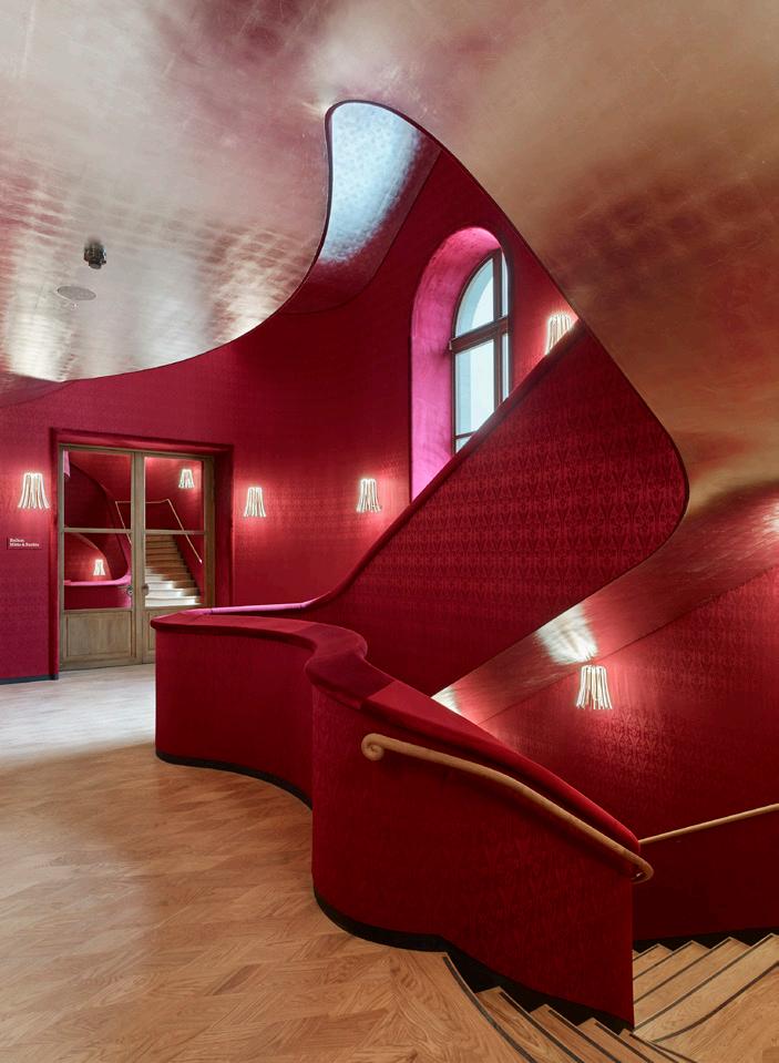
The Architect’s Newspaper
Fenton is an architectural writer and communications consultant based in London.
© ANDREAS GURSKY
© RUEDI WALTI
© KEVIN MAK
© IWAN BAAN
81 Review
Drawing as Practice
Curated by Sara Reisman National Academy of Design
519 West 26th Street, Floor 2 New York, NY
Through December 16

What is a drawing? Ink on paper is probably a drawing. So is a charcoal sketch. But what about embroidery, sculptures, and videos?
According to the National Academy of Design, these things can be drawings too. This provocation is the driving force behind Drawing as Practice , the inaugural exhibition at the National Academy’s new Chelsea location, which aims to redefine not just the drawing but the institution’s own identity.
After selling its Beaux Arts mansion on Fifth Avenue in 2016, the National Academy finally has a new home. It’s no longer alongside the institutions of Museum Mile but among the contemporary galleries of Chelsea. “We traded parquet floors for concrete,” said chief curator Sara Reisman of the Bade Stageberg Cox design. Now located in a second-floor space accessible only by elevator, the white box gallery is divided into three intimate areas. The minimal, planar language of the walls echoes the clean lines of custom plywood vitrines and seating. The architecture respectfully allows attention to focus on the densely packed exhibition of more than 100 works that question the boundaries of the viewer’s assumptions and thrust the historic institution into contemporary art and architecture discourse.
When the National Academy was founded in 1825, drawing fulfilled a practical need for artists and architects to make studies en plein air before returning to their canvases and paints in the studio. Drawing techniques were taught through instructional classes, which the National Academy’s school, among other institutions, offered to academicians and outsiders alike. In the nearly 200 years since, the tools have changed, and so has art. Not only can artists buy paint in tubes (prior to their introduction in 1841, artists mixed their own paints) and snap iPhone photos as references, but drawings as both a medium and subject matter have evolved too.
the historic drawings of the National Academy’s school that were made in an instructional setting, sharing a model for technical practice. There’s a common conceptual thread.
The question of "practice" is complicated by the quotidian use of the term among architects to distinguish between the physical construction of buildings and theoretical explorations of ideas. Within an architectural practice, the drawing is never the final work, just the representation of the thing that will become a built work of architecture. Billie Tsien’s Façade Study Model (2008) for the Barnes Foundation presents compelling ruminations on composition and material, but they are intrinsically tied to the final thing, the building. With no mention of the Barnes Foundation and no image of the facade that was built, the visitor cannot read the drawing in its context of Tsien’s work. Instead, context is offered in nearby drawings, like James Wines’s Nature’s Revenge: NYC 2050, View from the Lower East Side (2022), a work that is a not a proposal for some building or intervention but a visual representation of an idea.
The most explicit relationship on display between a drawing and its corollary works is Katie Schimert’s watercolors (Dione, 2021, and The Sea Resting Against the Earth, 2021) and ceramics (Thalassa, 2021, and Hestia, 2021). The line-like ribbing of the ceramic works is clearly in conversation with the layered lines of the watercolors. The interplay between the
2D and 3D representations becomes apparent and succinctly illustrates the exhibition’s intention.
Otherwise, this reading lies primarily in Reisman’s essay in the exhibition brochure, which meticulously relates each grouping of works back to the field of drawing, often by providing relevant history and context. Helpful as this is, an essay is a demanding way to engage with an exhibition. Most critical to navigating Drawing as Practice is perhaps a visitor’s personal knowledge of the artists’ and architects’ works beyond the gallery walls. The exhibition demands a critical eye and caters to an audience already familiar with the art and architecture, fitting for an organization run by artists and architects.
Drawing as Practice itself is an instructional exhibition of sorts. It takes a common term, drawing, and deconstructs it from a variety of angles. Where it falls short, the exhibition feels scattered and unfocused: There is a lot to deconstruct. But this is also the show’s greatest strength. It raises a lot of questions, offers few answers, and embraces the complexity and multiplicity of the topic. In short, it is very hard to come away from this exhibition without questioning what makes a drawing.
Lane Rick is an architect and founding principal of Office of Things. She supports her work through research, drawing, and writing.
By framing drawing as a part of “practice,” the curatorial team invites visitors to situate the act of drawing within the broader context of an artist’s or architect’s work. The drawing might be a study along the way to a final work, though this linear relationship is complicated by the inclusion of works that are final products in their own right.
With both the subject matter and the method at play, the drawing can become a tool of communication and protest. An ongoing collaboration between Jenny Polak and Dread Scott is represented by two works, Passes: Sugarcane and Dividends (2019) and Passes: Délivré (2023). The former shows a figure encrusted in cowrie shells, a currency that supported the West African slave trade, while the latter juxtaposes delivery workers and burning cane fields, a nod to the Haitian Revolution. That Polak and Scott share gallery space with relatively innocuous drawings like Moseley Isaac Danforth’s Cast of Venus with Student Sketching in Background (c. 1827–1837) is a testament to the lofty ambitions set forth in the exhibition.
The overwhelming variety of works on display is at times difficult to reconcile; it pushes the viewer to grasp for fleeting moments of continuity, often embedded in the wordplay of the exhibition’s name, Drawing as Practice A working title, Drawing as Process hints at the importance of a continuous line of inquiry. (This is in stark contrast to the MoMA’s definition of a drawing, which emphasizes the one-off nature of a work.)
Reisman is more focused on the many ways that the act of drawing fits into a larger creative process instead of its physical characteristics. Take, for example, Sol LeWitt’s The Location of a Blue Square, a Red Parallelogram, and a Yellow Parallelogram (1976). Its inclusion makes more sense if you are familiar with his instructional drawings—written instructions for others to execute drawings—and casts a new light on


October/November 2023 Tk Tk Tk
Clockwise from top: Installation view at the new Chelsea gallery space.
The Location of a Blue Square, a Red Parallelogram, and a Yellow Parallelogram by Sol LeWitt
Red Skin Bounty by Hock E Aye VI Edgar Heap of Birds
© ETIENNE FROSSARD COURTESY NATIONAL ACADEMY OF DESIGN
COURTESY THE NATIONAL
OF DESIGN
© 2023 THE LEWITT ESTATE/COURTESY PAULA COOPER GALLERY
ACADEMY
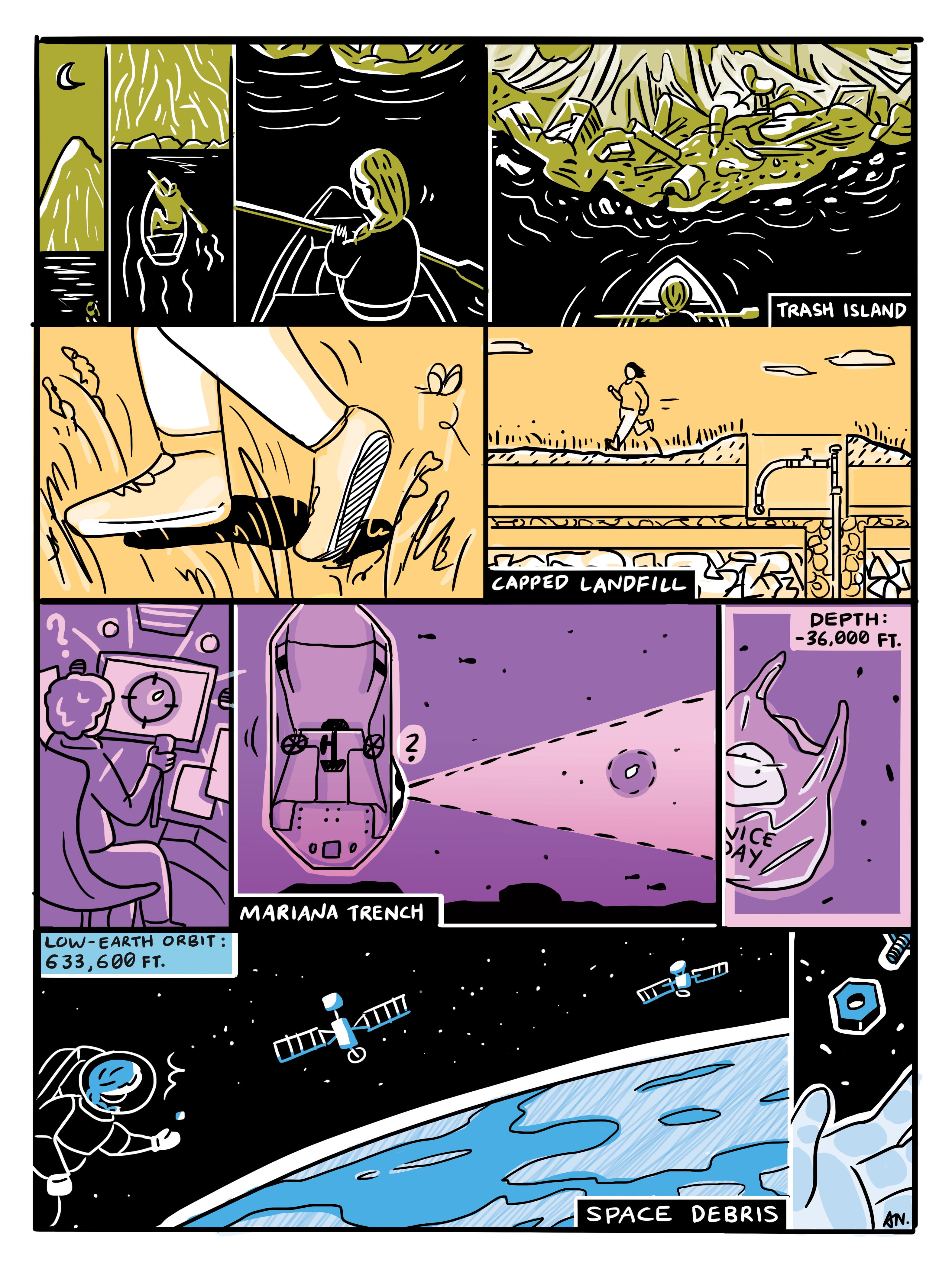 Amelyn Ng is a Singaporean-Australian architect, cartoonist, and assistant professor of architecture at RISD.
DON’T MAKE LUNCH. MAKE THUNDER.


THOR Kitchen: a complete line of full-featured, superbly crafted, stainless steel warriors. Dual fuel, gas and electric options. 4,000–18,000 BTU burners. Infrared broilers. LED panel lights.
Continuous cast iron grates. Heavy-duty tilt panel controls. Massive capacities. LightningBoil™ speed. Brilliant blue porcelain oven interiors. And more. The real value in pro-grade performance.
RANGES | OVENS | COOKTOPS | VENTILATION | MICROWAVES | REFRIGERATORS | WINE COOLERS | ICE MAKERS | DISHWASHERS | BBQ GRILLS | PIZZA OVENS
THORKITCHEN.COM MEMBER #COOKLIKEAGOD © Copyright 2023 THOR Kitchen, Inc. | All Rights Reserved. 23TINT01-24-149296-1
UKIYO

[u-key-yo] · Japanese
(n.) living in the moment, detached from the bothers of life.
“The floating world”
A new collection designed by Claudia Afshar.
Two structured patterns available in five colors that transform the identity of cladding.


 LEERS WEINZAPFEL ASSOCIATES


 Tivoli Armchair Zio + Sons and Industry West industrywest.com
Mbrace Lounge Chair Dedon dedon.de
Mexique Outdoor Tables Cassina cassina.com


 Fringe by Mutina Artistic Tile artistictile.com
Composite Decking Millboard millboard.com


 Melli Selux selux.us
Inline Luminis Lighting luminis.com


 Juliette Molded Stone Planter JoinUs. joinus.boutique.com
Theory Transit Shelters Landscape Forms landscapeforms.com
Galanthus H20 Lamp/Shower Olev olevlight.com


 Amelyn Ng is a Singaporean-Australian architect, cartoonist, and assistant professor of architecture at RISD.


