John Pawson × Dinesen 30
Highlights from Salone del Mobile 35
Neri&Hu creates a calming retreat 80
Pršić & Pršić renovates in Providence 96
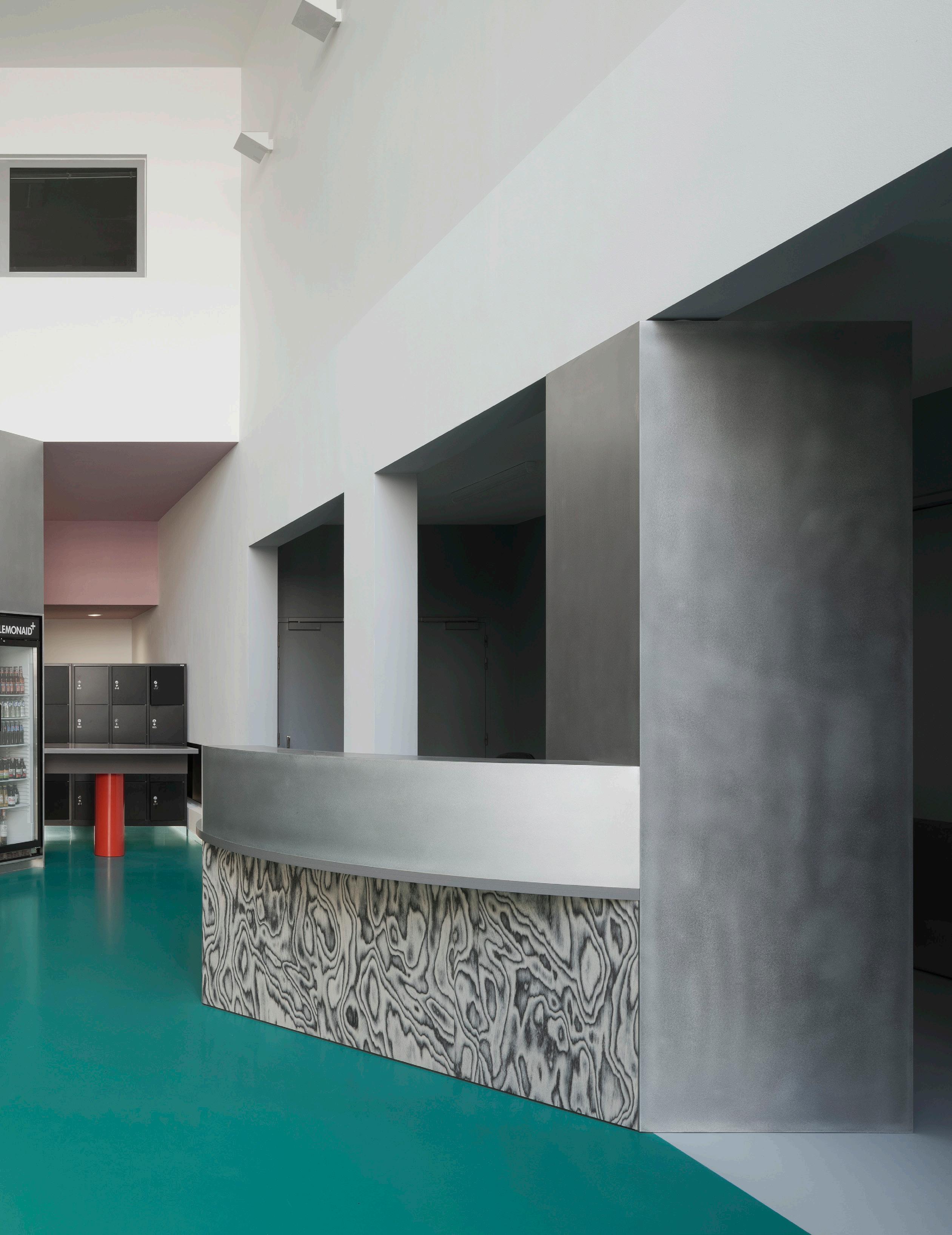
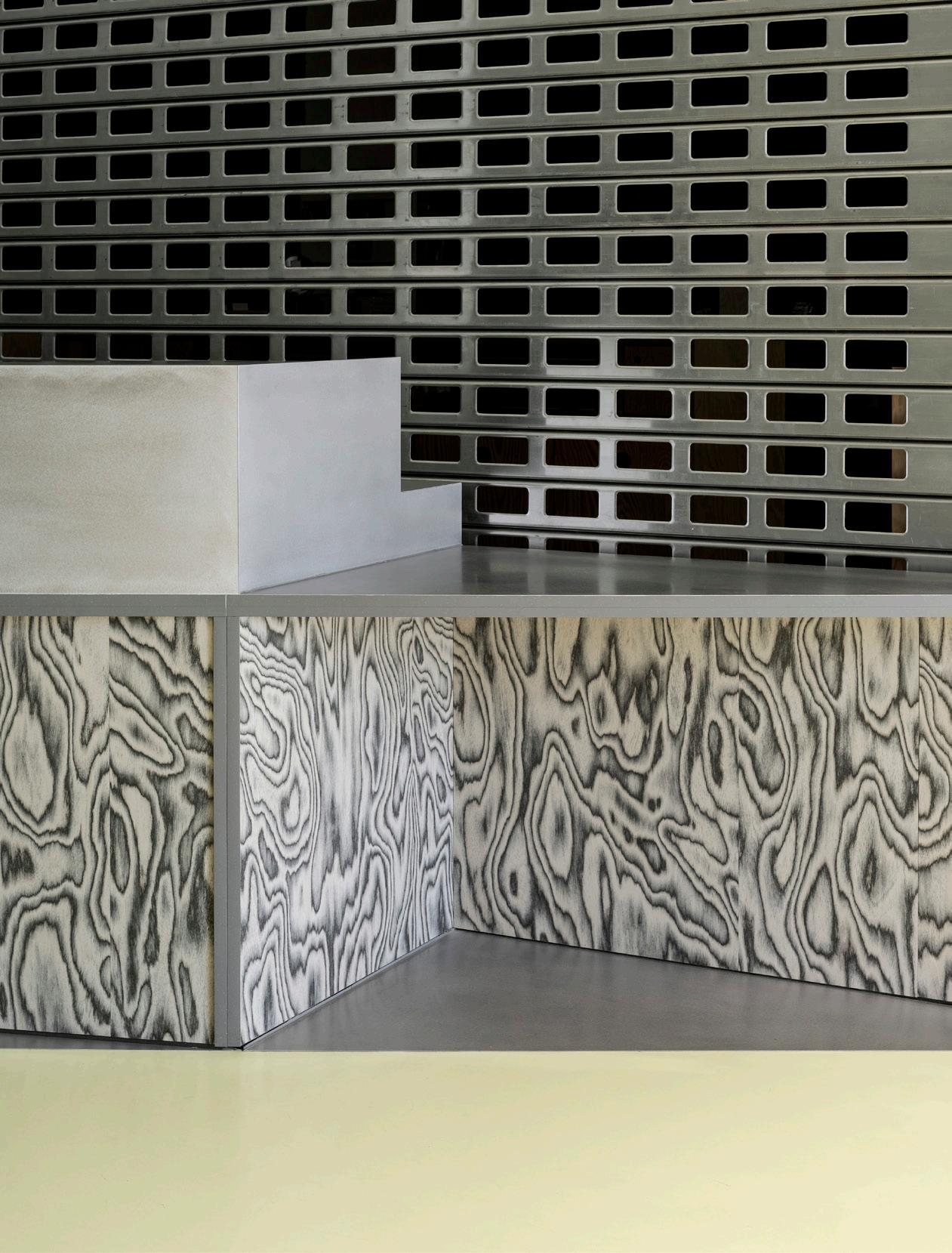
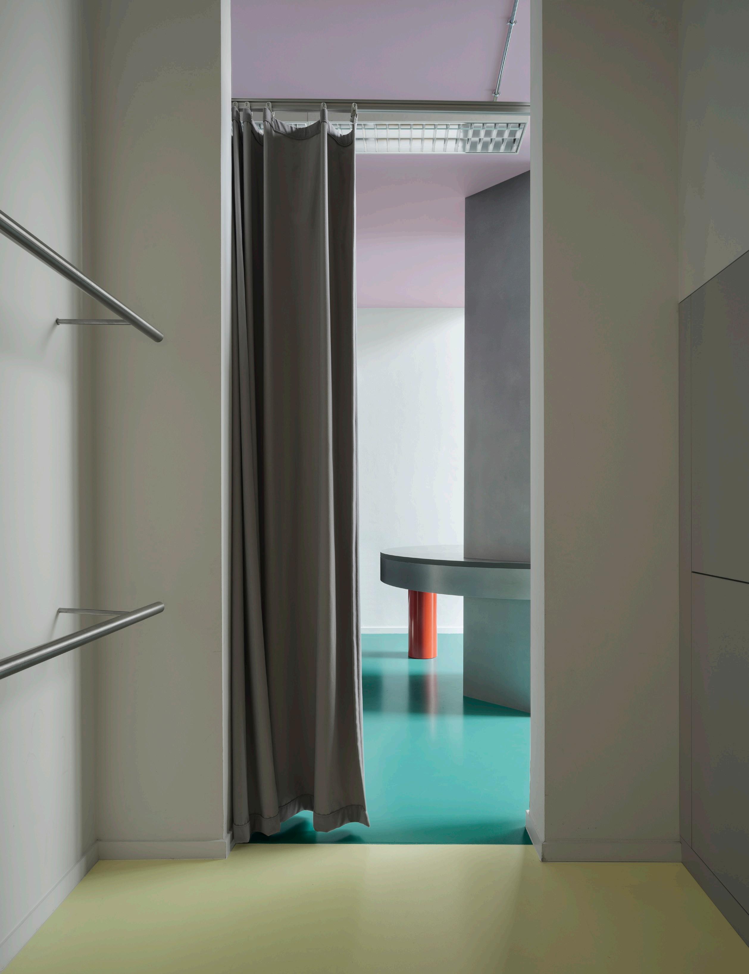
i.s.m.architecten reworks a photo museum 112
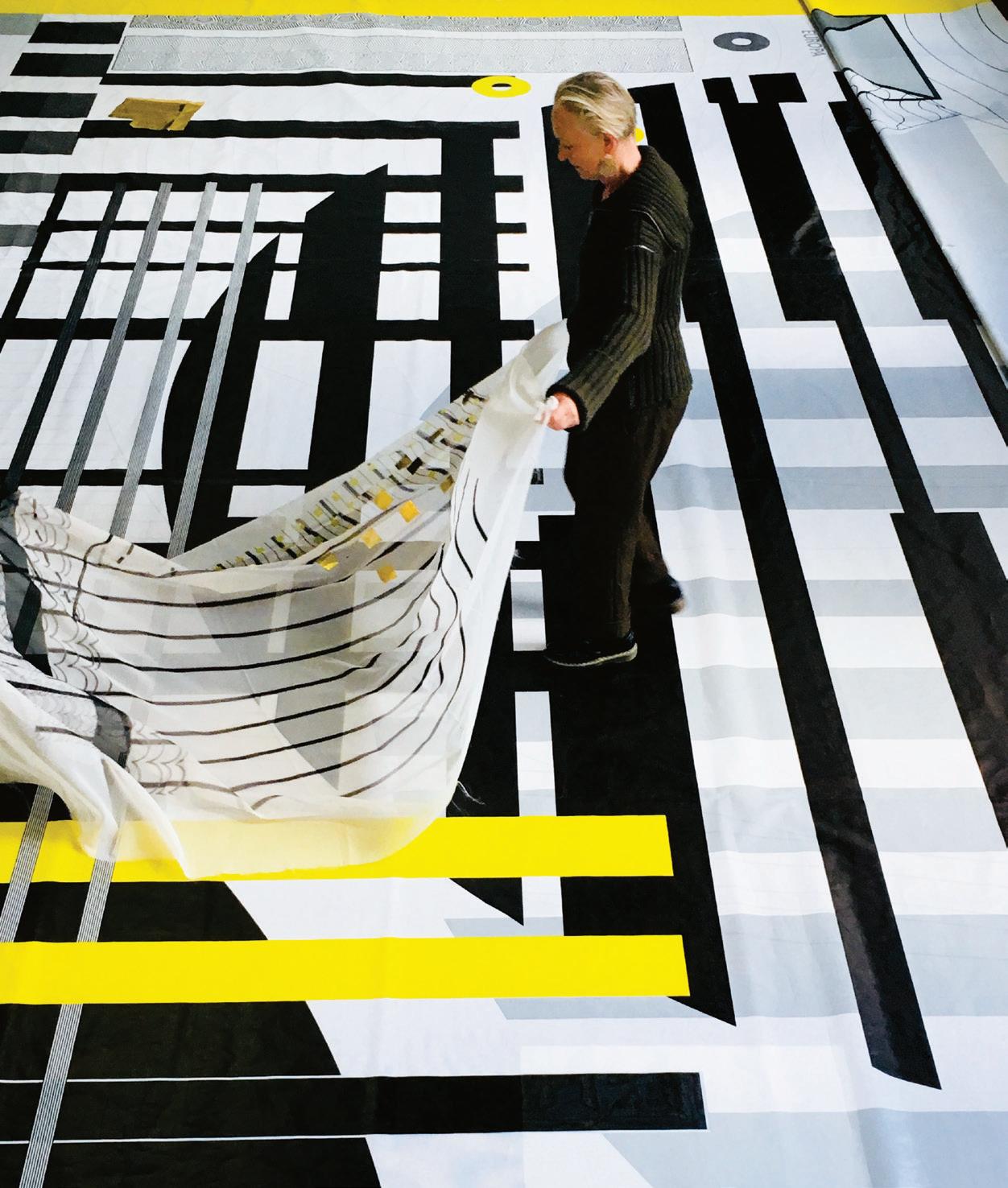
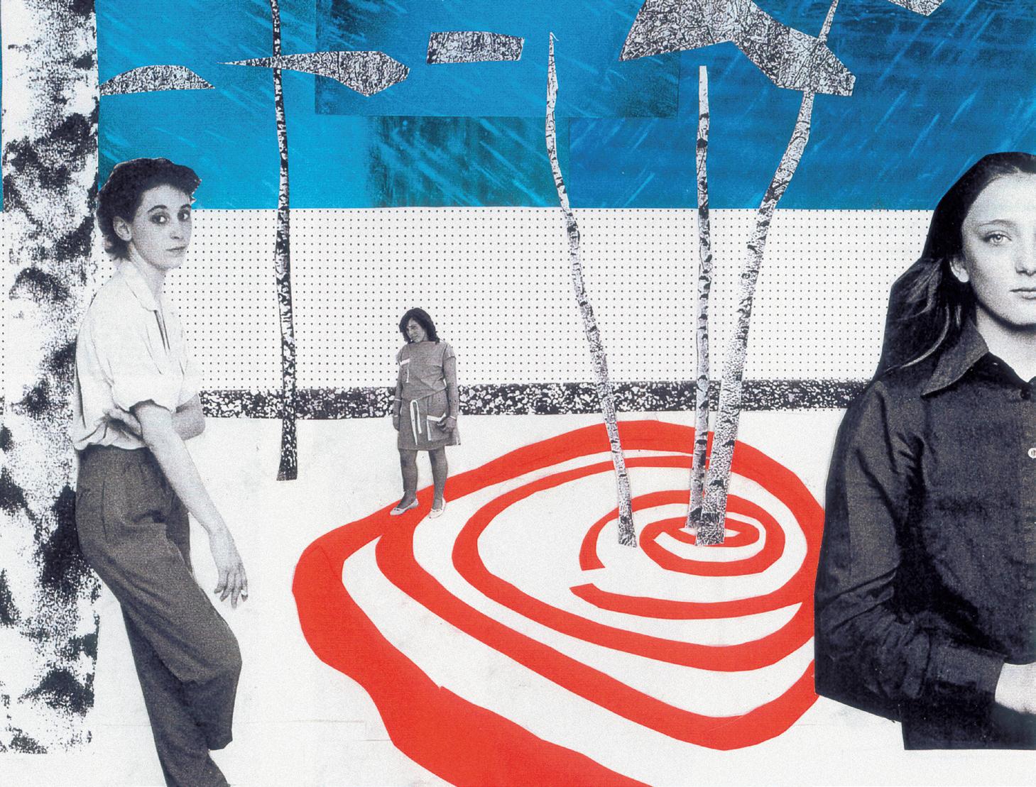
Petra Blaisse’s Art Applied 122
Kitchen & Bath 43
Issue 25 Spring/Summer 2024
$15






























3 250 Park Ave South, New York, NY 10003 | T (212) 375-1036 | lignerosetny @ rosetusa.com 250 Park Ave South, New York, NY 10003 | T (212) 375-1036 | lignerosetny @ rosetusa.com
4 Issue 25 Spring/Summer 2024 New York Flagship Store 102 Madison Ave New York, NY 10016 newyork@rimadesio.us +1 917 388 2650
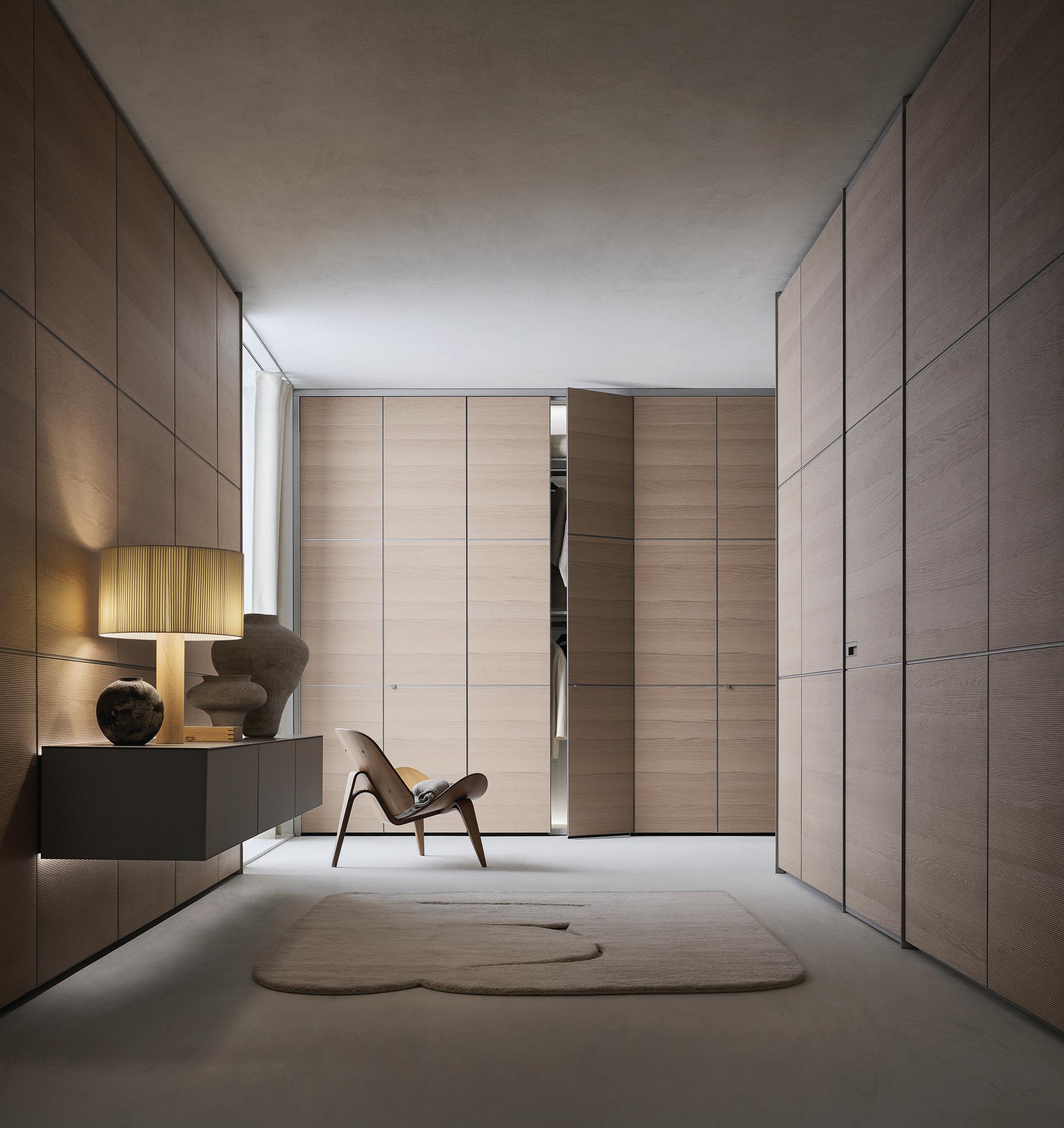
DISCOVER MODULOR WALL PANELLING SYSTEM, COVER WALK–IN CLOSET, RADIUS DOOR. DESIGN GIUSEPPE BAVUSO
5 AN Interior

112
On Blaisse’s new “discovery book,” Art Applied
124
The
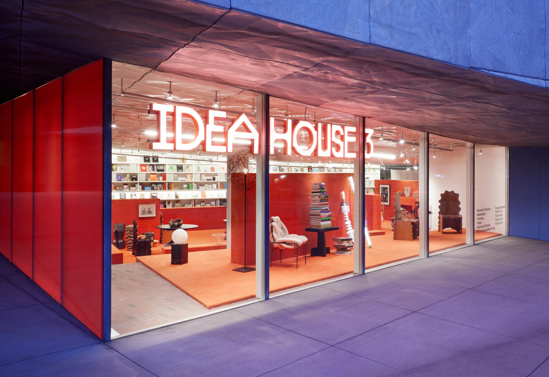
Visiting
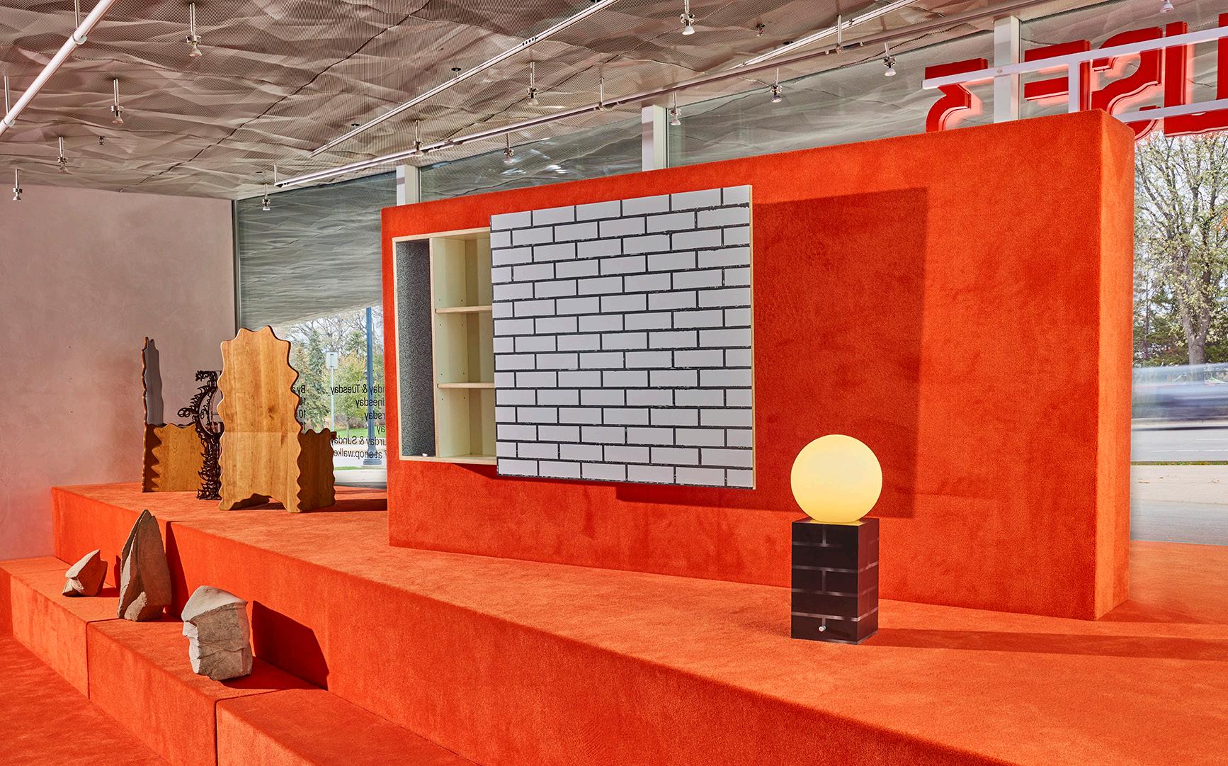
the new Idea House 3 at the Walker Art Center.
130
A
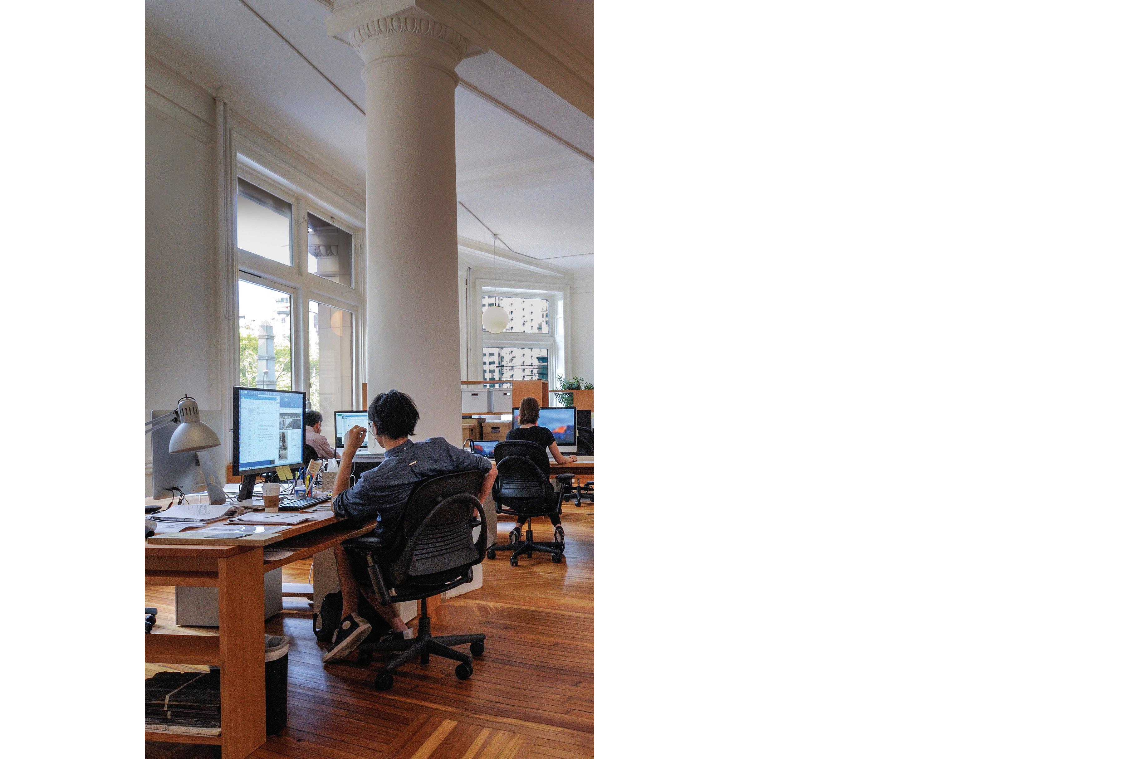
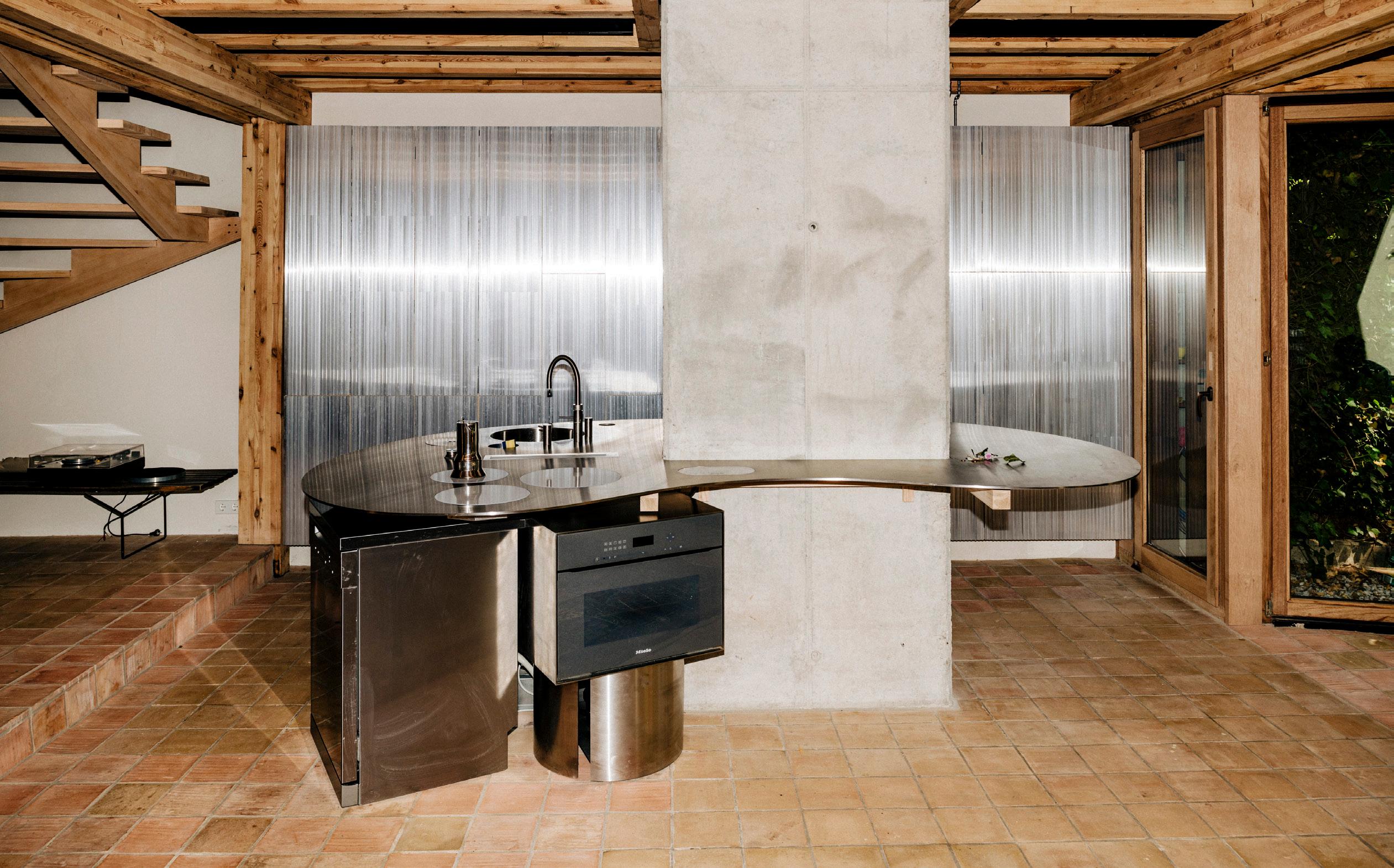
8 Issue 25 Spring/Summer 2024 10 Editor's Note 14 Giles Tettey Nartey, Michael Bennett, Jialun Xiong, 22RE Four emerging designers, profiled by Kelly Pau 21 A Mirrored Image Checking in with the DBA_Lab’s peepSHOW installation. 22 History Anew Kallos Turin transforms a historic London office into a calm oasis. 24 Shelf Life PRODUCTORA lands its first project in NYC’s fashionable Soho neighborhood. 30 John Pawson’s Spaces of Calm An interview on the occasion of his new furniture collaboration with Dinesen 35 Salone del Mobile 2024 43–76 Focus Kitchen & Bath 44 Free the Kitchen Sam Chermayeff Office in Berlin (as seen in the photograph above) 58 Playful and Personal Sarah Jacoby Architect in Manhattan 60 Art Deco Update Ideas of Order in Hudson Heights 61 At Home in Rome 02A in Rome 70 Manhattan Oasis Rockwell Group’s Bathhouse 74 At the Garden Club FOOD New York’s Garden Club 76 Bathing Rituals Schemata’s Komaeyu 79-119 Features Quirky, Textural, Worldwide 80 Seeking Serenity Neri&Hu in Hainan 90 Diplomatic Relations Lütjens Padmanabhan in Bogotá 96 At Home Together Pršić & Pršić in Rhode Island 104 BeAr at RABE BeAr Architects in Bilbao
Soft Boundaries i.s.m.architecten in Antwerp 122
Interview with Petra Blaisse
An
House Inside the Gallery
and
contextualizing
The Thief
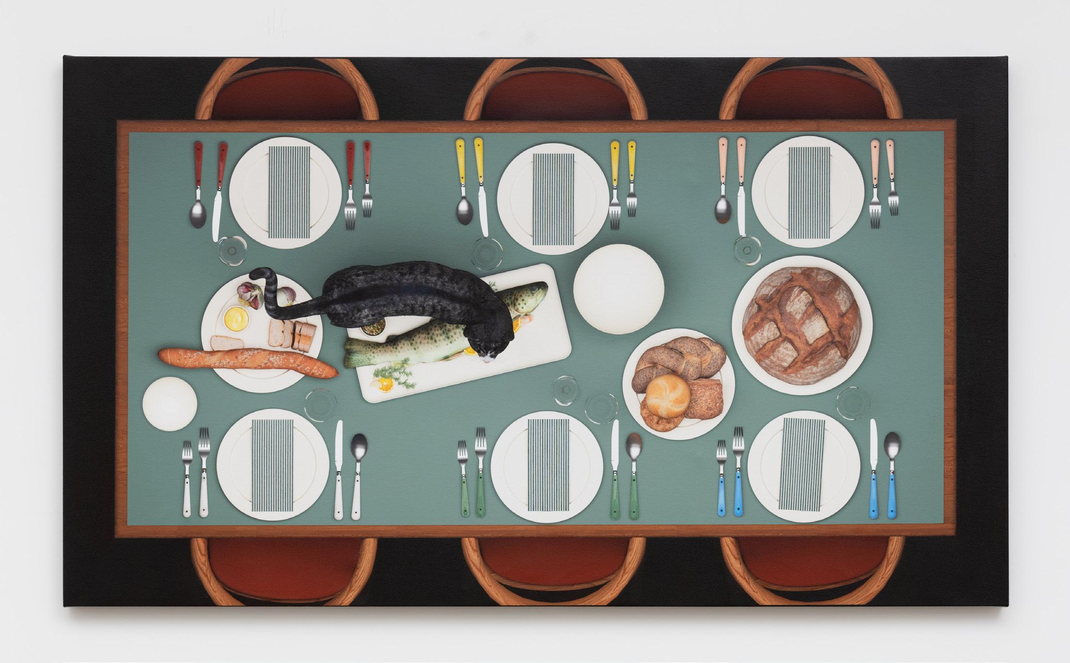
hyper-(sur)real painting by architect, educator,
Wright. Contents
and artist Erin
Oliver Helbig
Our Experience, Your Dreams. We design spaces that become the foundation for a lifetime of cherished memories.
LUMINAIRE.COM Coral Gables. Miami. Chicago. Los Angeles. San Francisco. Menlo Park. DESTINATIONS
THE CURIOUS.
FOR
Make It Funky
Gaetano Pesce died on April 3 at age 84. Pesce’s rebellious career of designing buildings, interiors, furniture, and objects raged against an early-21st-century aesthetic backdrop of increasingly monotonous, boring interiors. Who else could get away with melty resin wardrobes or a chair that resembles a reclined busty lady or a proposal for a building entrance in which one would process under a pair of spread butt cheeks?
If you were at Salone del Mobile this year, you had the chance to witness Pesce’s designs on display at the Pinacoteca Ambrosiana. For a wider roundup of impressive installations by architects and new products released at the fair, check out our coverage starting on page 35. Pesce’s work is not for the faint of heart, and he realized it with an attitude of future-forward optimism. We desperately need more of that these days.
A similar appreciation for eclecticism fills the sails of this issue of AN Interior, which gathers fun features from around the world. To start, witness a relaxing spa by Neri&Hu (page 80), followed by a quartet of adaptive reuse projects that prize material richness. Plus, our annual Kitchen & Bath section takes a new tack, beginning with an exploration of the culinary creatures designed by Sam Chermayeff Office in Berlin (page 44) and proceeding to witness three small, saturated kitchens (pages 58–61) and three venues where people can bathe and relax together (pages 70–76).
Similar to last year’s Spring/Summer release, this issue was loosely theorized as a coursed meal set upon the page’s table: There are amuse-bouches, appetizers, piatti primi and secondi, dessert, and even a back-page lagniappe. It’s rare for readers to consume a magazine in this sequential format—a publication is often absorbed in pieces on the go or in various states of distraction—but this was part of the idea. Sometimes there are distant allusions, like in the cat witnessed in PRODUCTORA’s loft (page 24) and the feline dinner guest who appears in Erin Wright’s The Thief (page 130).
Part of the ongoing inspiration here has been a conversation about what our architectural audience wants to see. What is surprising, challenging, urgent? Hopefully there are some discoveries along the way. As Gaetano Pesce reflected in 2021, “To be incoherent means to be free from what you were doing before, to be free from yourself. Meaning you’re free to experiment.” Each issue of AN Interior is basically a little adventure. I hope you like this one.
Talk soon,
Jack Murphy Executive Editor
10 Issue 25 Spring/Summer 2024
EDITOR’S NOTE
11 AN Interior AUSTIN BOSTON CHICAGO DALLAS LOS ANGELES MELBOURNE MEXICO CITY MIAMI MINNEAPOLIS MONTERREY NYC LEX NYC NOMAD PORTLAND SAN FRANCISCO SEATTLE SYDNEY WASHINGTON, DC BLUDOT.COM BLU DOT LA 8751 Beverly Blvd 323.761.7212
● Lev Bratishenko is a writer and recovering curator.
● Phillip R. Denny is an architectural historian. He is a PhD candidate at Harvard University. ● Jesse Dorris is a writer in New York City and hosts Polyglot , a radio show on WFMU. ● Ellena Ehrl and Tibor Bielicky are Zurichbased architects and editors. They cofounded Ehrl Bielicky Architects, Superposition , and the research platform Recording America . They are editors-at-large at Capsule and teach at ETH in Zurich. ● Elizabeth Fazzare is a New York–based editor and journalist who covers architecture, design, culture, and travel for publications including Architectural Digest , Dwell , and Interior Design . ● Lauren Gallow is a Seattle-based writer and editor covering art, architecture, and design with bylines in Dwell , Metropolis , Interior Design , Cultured , and Cereal , among other publications.
● Craig Kellogg graduated with honors from architecture school at the University of California, Berkeley. He is a creative director in New York. ● Use Lahoz is a novelist, journalist, and a regular contributor to El País , where he writes regularly about architecture and culture. He teaches at Sciences Po Paris University. ● Frank Edgerton Martin is a landscape historian, design journalist, and regular contributor to The Architect’s Newspaper . ● Adrian Madlener is a Brussels-born, New York–based design writer. He has contributed to publications including Dezeen , Hypebeast , and Wallpaper . Previously he was a senior editor at The Architect's Newspaper. ● Anjulie Rao is a journalist and critic covering the built environment.
12 Issue 25 Spring/Summer 2024 Contributors
CEO/Creative Director
Diana Darling
Executive Editor
Jack Murphy
Art Direction
Maiarelli Studio
Managing Editor Emily Conklin
Design Editor
Kelly Pau
Web Editor
Kristine Klein
News Editor
Dan Jonas Roche
Associate Editor
Paige Davidson
Vice President of Events Marketing and Programming
Marty Wood
Senior Program Associate Trevor Schillaci
Program Assistant
Izzy Rosado
Editorial Interns:
Maria José Gutiérrez Chavez Moses Jeanfrancois
Vice President of Brand Partnerships (Southwest, West, Europe)
Dionne Darling
Director of Brand Partnerships (East, Mid-Atlantic, Southeast, and Asia)
Tara Newton
Sales Manager
Heather Peters
Events Marketing Manager
Charlotte Barnard
Events Marketing Manager Savannah Bojokles
Design Manager Dennis Rose
Graphic Designer Carissa Tsien
Audience Development Manager Samuel Granato
Business Office Manager Katherine Ross
Associate Marketing Manager Sultan Mashriqi
Marketing Associate Anna Hogan
Media Marketing Assistant Wayne Chen
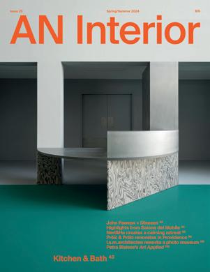
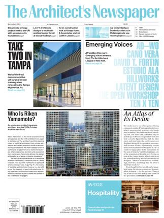
This issue’s cover spotlights the FOMU museum in Antwerp, Belgium, designed by i.s.m.architecten. The cover image is by Luis Díaz Díaz. Read this feature, written by Adrian Madlener, starting on page 112.
Please notify us if you are receiving duplicate copies. The views of our reviewers and columnists do not necessarily reflect those of the staff or advisers of The Architect’s Newspaper. Issue 25 Spring/Summer 2024







AN Interior









13
Issue 25 Spring/Summer2024. AN Interior is published twice a year as part of The Architect’s Newspaper (ISSN 2476-1532), which is published 7 times a year by The Architect’s Newspaper, LLC, 25 Park Place, Floor 2, New York, NY 10007. Presort-standard postage paid in New York, NY. Postmaster, send address change to: 25 Park Place, Floor 2, New York, NY 10007. For subscriber service: Tel. 212-966-0630. Fax
212-966-0633. $15.00 a copy, $45.00 one year. Entire contents copyright 2024 by The Architect’s Newspaper, LLC. All rights reserved.
©2022 modularArts, Inc. ©2023 modularArts, Inc. ©2023 modularArts, Inc. ©2020 modularArts, Inc. ©2019 modularArts, Inc. ©2012 modularArts, Inc. Made in the USA Breeze™ Zephyr™ 206.788.4210 | info@modulararts.com | www.modulararts.com Gypsum panels and screen wall blocks interlock to create continuous surfaces of any size. Durable, fire-safe, and healthy. Stunning feature walls made in the U.S. for over 20 years! Shayle™ Spectra™ Strata™ Ventanas™
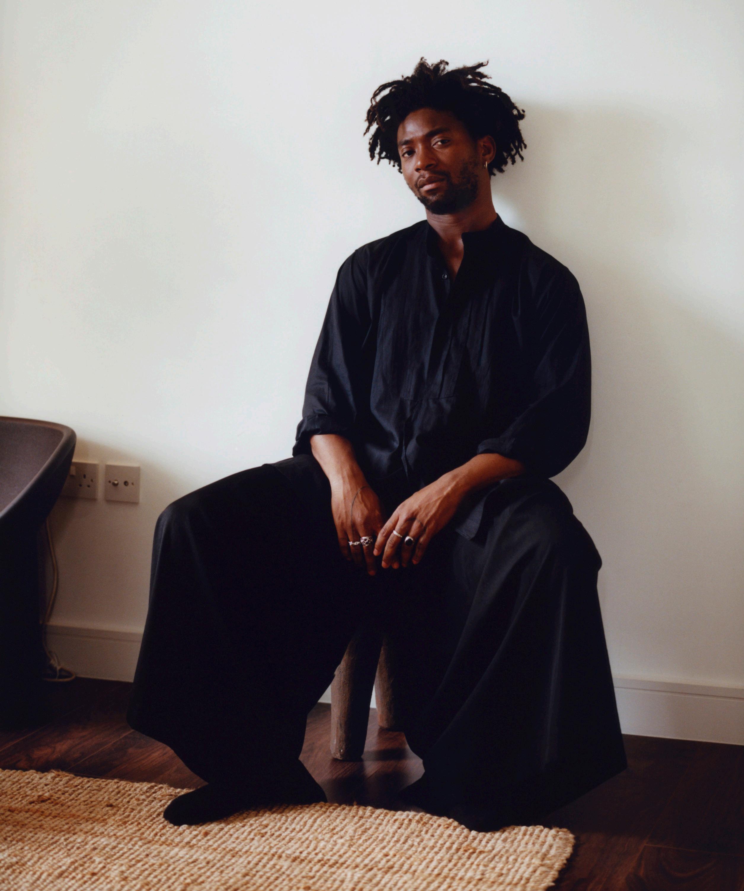
Giles Tettey Nartey is a British Ghanaian designer, researcher, and architect. His research-based design practice encompasses filmmaking, installation, performance, and object design deeply rooted in West African culture, fostering a dialogue between craft and ritual. Nartey made his debut at Milan Design Week this year with the Communal Table, a piece made from maple that is designed for making the West African staple fufu. Much like the architect’s work at large, it appreciates the myriad ways objects enrich the everyday. gilestetteynartey.com
14 Issue 25 Spring/Summer 2024
IN THE KNOW
Giles Tettey Nartey
Christian Cassiel

INFINITE POSSIBILITIES Starphire Ultra-Clear® glass is the purest, most versatile canvas for your glass designs. With unmatched clarity and a signature azure blue edge, the possibilities for brilliant interiors are limitless. starphireglass.com
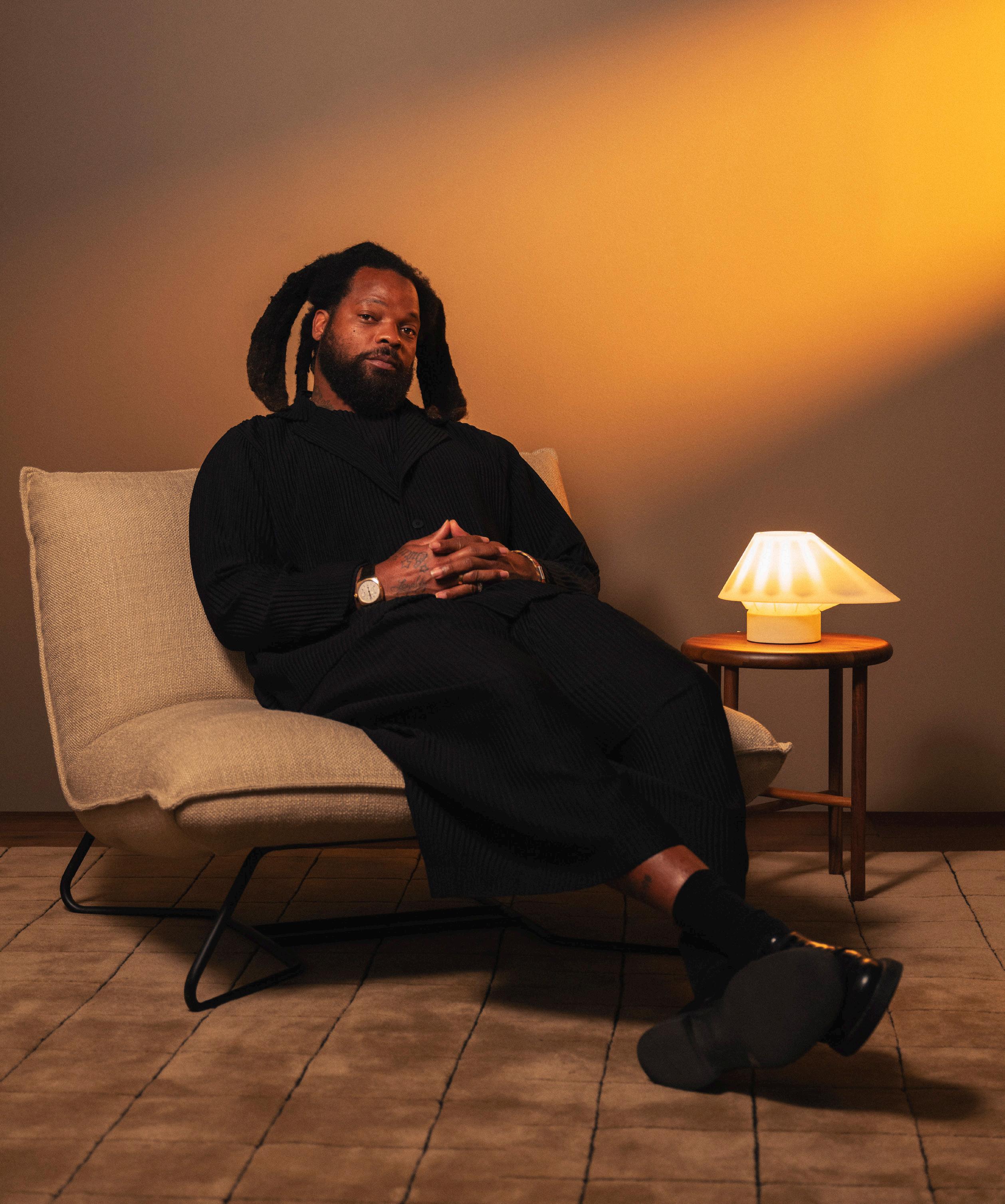
Former NFL star and founder of Studio Ker, Michael Bennett works within an African diasporic language. His 2024 inaugural furniture exhibition, We Gotta Get Back to the Crib, opposes Western design traditions in favor of explicitly African and African American motifs. On the heels of this success, he’s now collaborated with Gantri on a table light: The form references African architecture and history, namely the Little Dipper constellation, which guided many enslaved people escaping the South. Recently, the designer and architect-in-training debuted new work at his Houston exhibit. This included the irregularly curved Pew, a sofa that puts church seating in conversation with couch design and, like much of Bennett’s work, meditates on Black bodies in sacred spaces. studio-ker.com
Michael Bennett IN THE
16 Issue 25 Spring/Summer 2024
KNOW
Studio Kër and Gantri
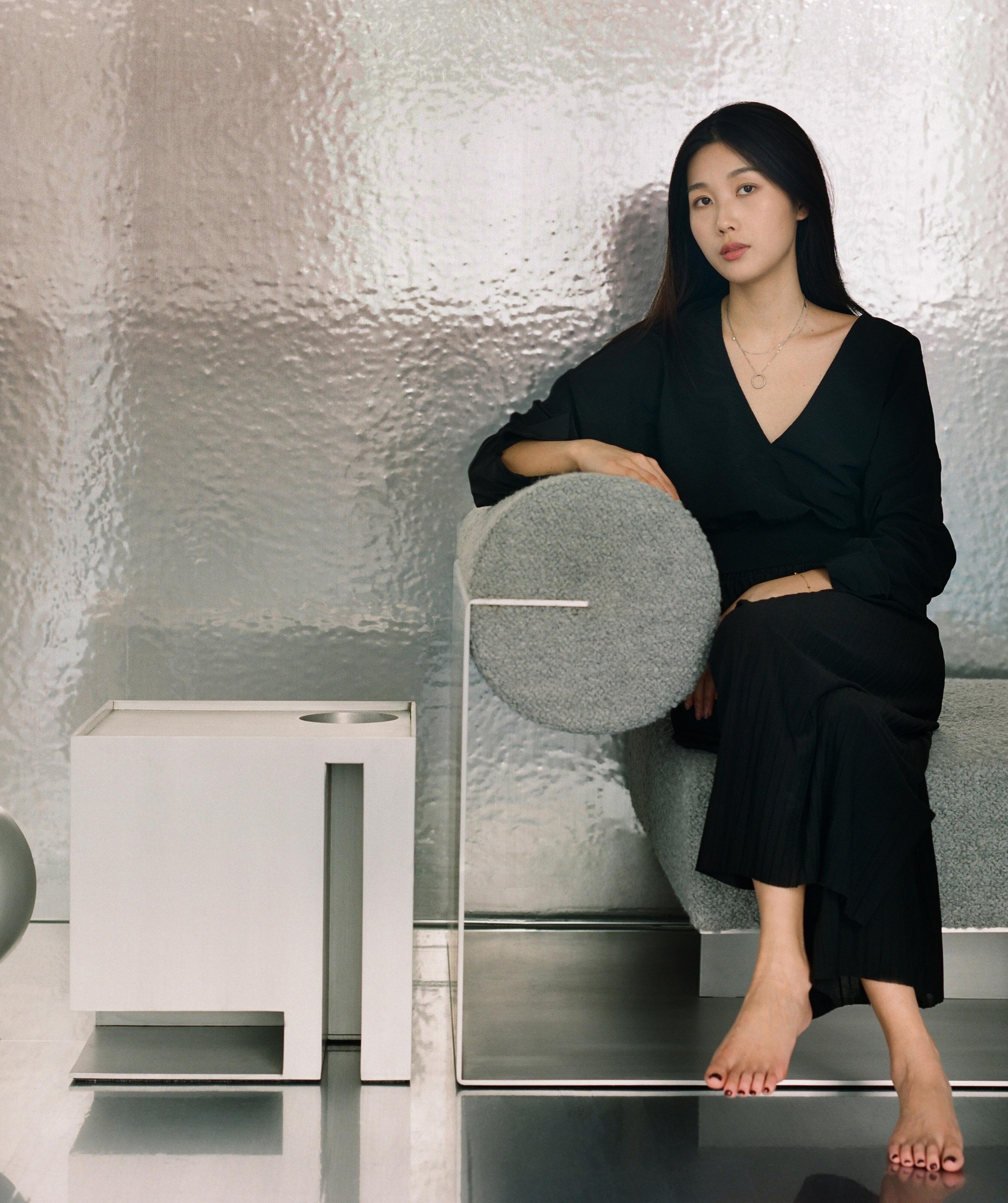
Hailing from Chongqing, China, and now based in Los Angeles, Jialun Xiong is a designer exploring ideas of duality and creative restraint. Having studied interior architecture and furniture design, Xiong’s approach artfully balances positive and negative space, always considering the relationship between objects and spatial volumes. Inspired by the mountainous landscape and high-rise architecture of her hometown of Chongqing, as well as the functional minimalism of the International Style of architecture, Xiong creates spatial environments and furnishings with an abstract geometric bent that precisely frame the human experience happening within. jialunxiong.com
IN THE KNOW
17 AN Interior
Jialun Xiong
Ye Rin Mok
22RE IN THE KNOW
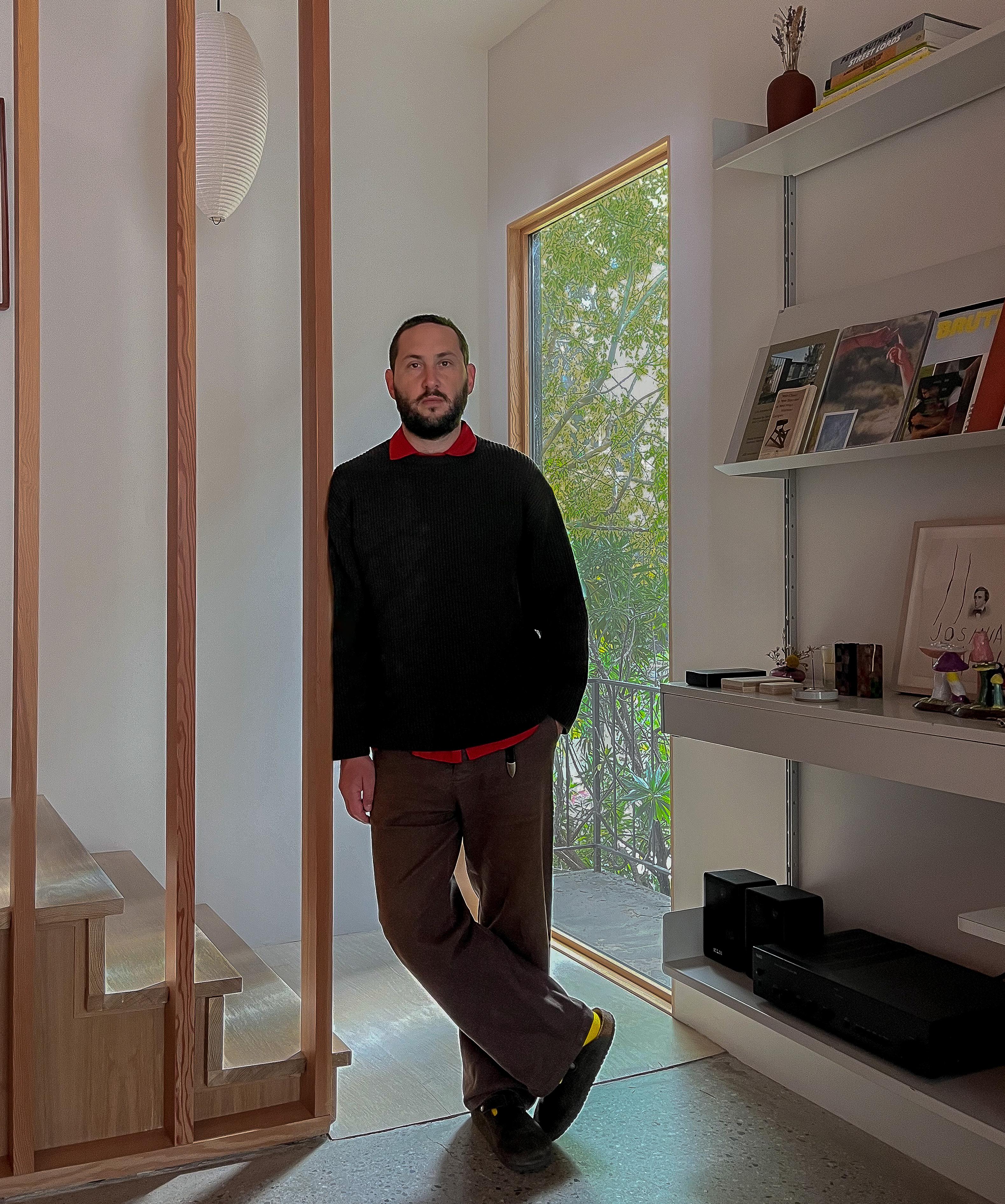
Founded in 2021, 22RE is a Los Angeles–based multidisciplinary design and architecture office established by principal Dean Levin. The practice brings together Levin’s multicultural worldview (he was born in South Africa and raised in California) and his background in art and architecture. With respect for craft and traditionalism, 22RE creates new sensory experiences and modern environments that endure. Driven by an unwavering commitment to creative ideals, 22RE provides a full range of services, including ground-up architecture, interiors, and furniture design. In fact, much of the firm’s work incorporates custom furniture made by its in-house carpentry studio. Many of these pieces, inspired by past projects, will be rolled out as commercial collections later in the year. 22reoffice.com
18 Issue 25 Spring/Summer 2024
Austin Leis


Wood that raises the bar. 151 West 18th Street, New York havwoods.com/nyc HW16604 Pallido Order your spring/summer WoodBook now
Playful
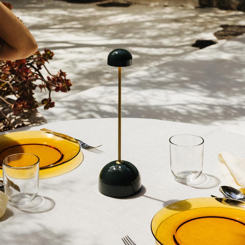
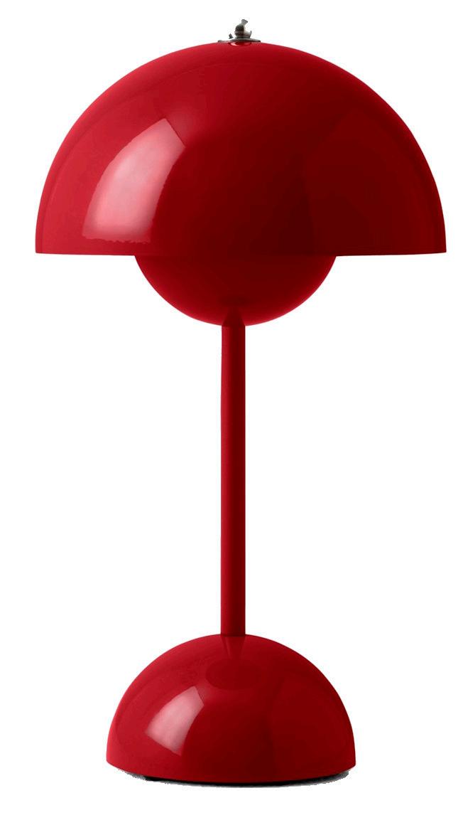
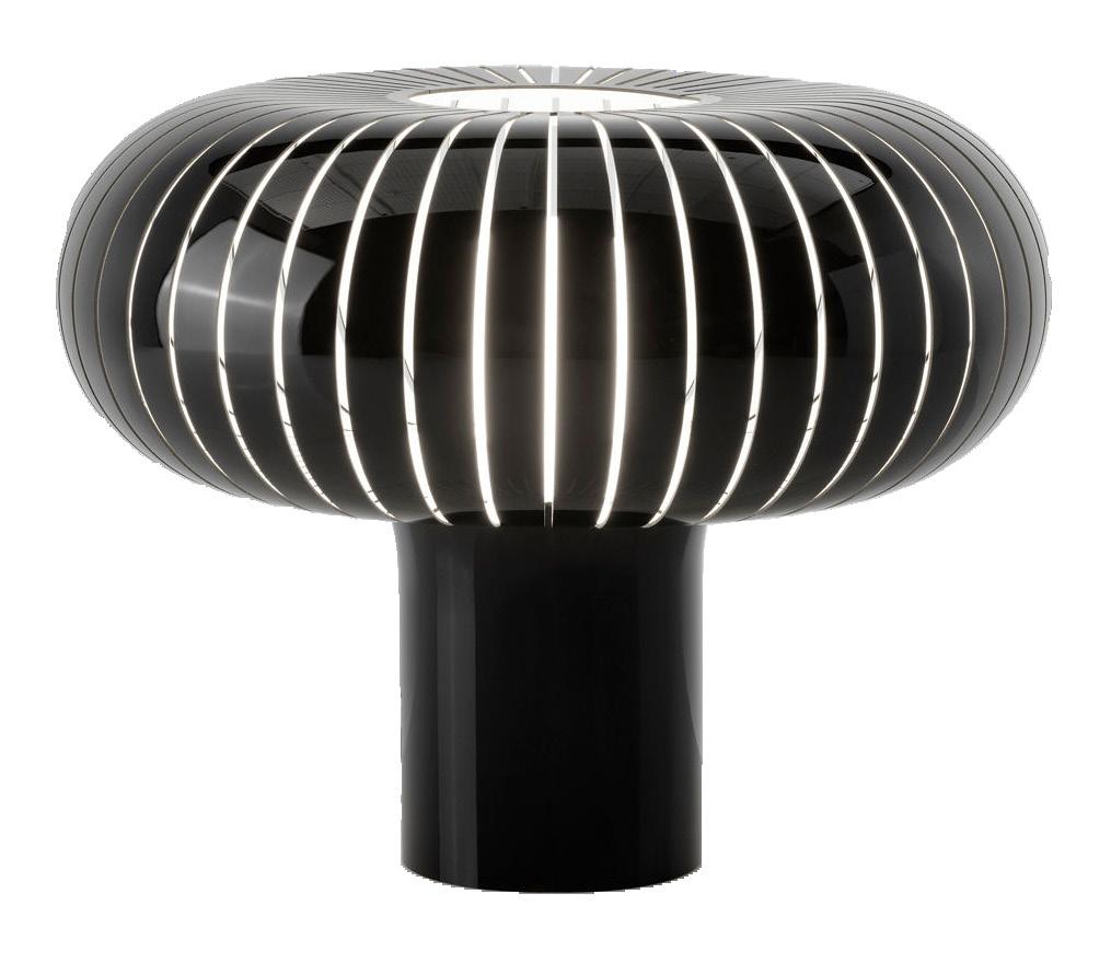



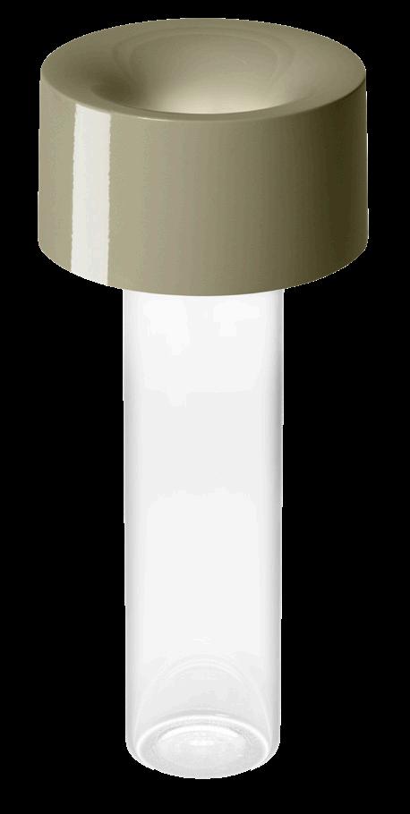
20 Issue 25 Spring/Summer 2024 A new wave of compact lights will make your tabletop pop.
3
4
5 Flowerpot VP9 by &Tradition 6 Uri by MoMA Design Store 7 Africa
Vibia IN THE KNOW Courtesy the product manufacturers 4 7 5 6 3 Portables 2
1 Sips by Marset
2
Teresa by Kartell
Fleur by Foscarini
Mantle by Tala
by
peepSHOW, an installation by David Baker Architects’ DBA_Lab, shimmers and confounds.
Text by Craig Kellogg
A Mirrored Mirage
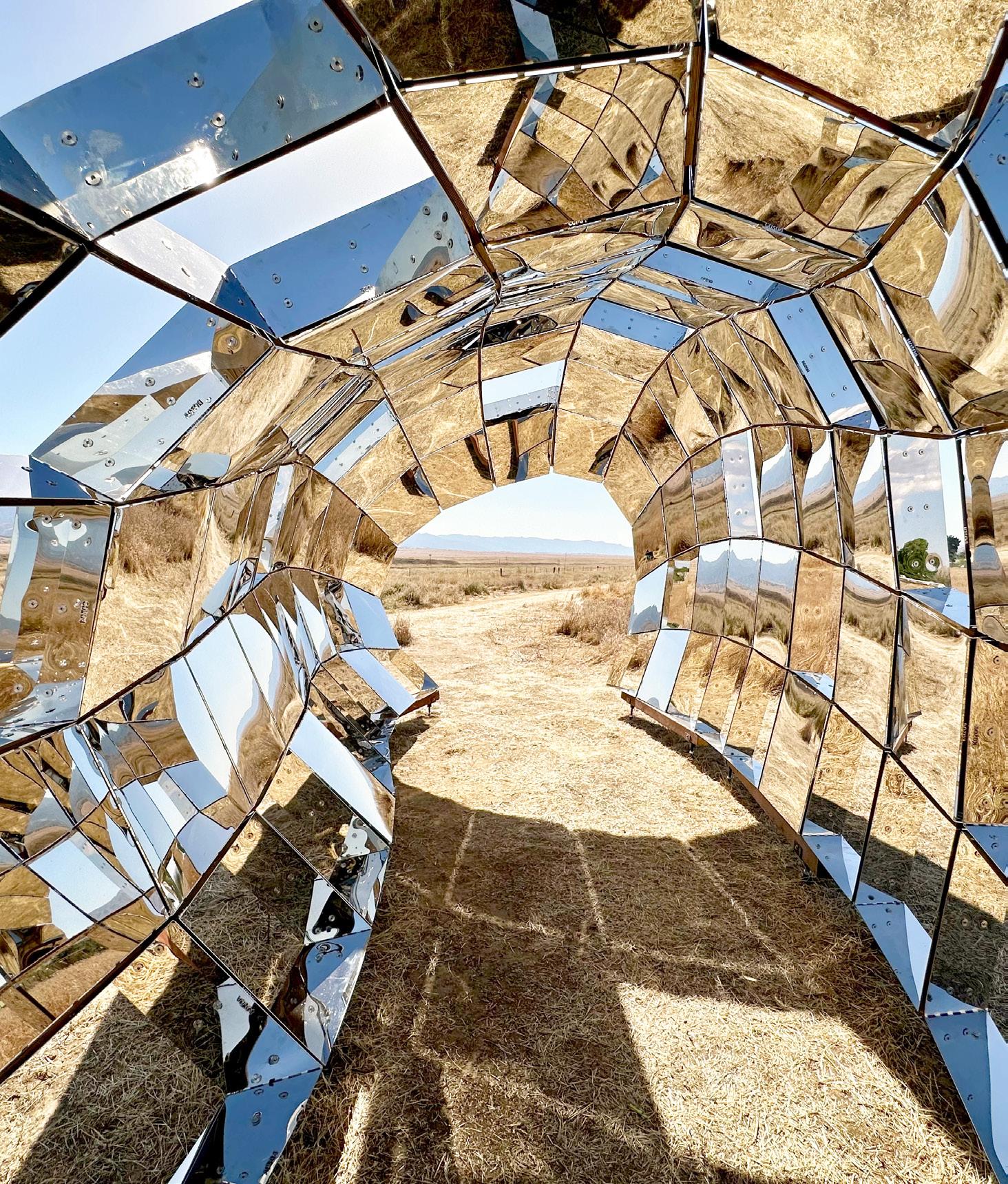

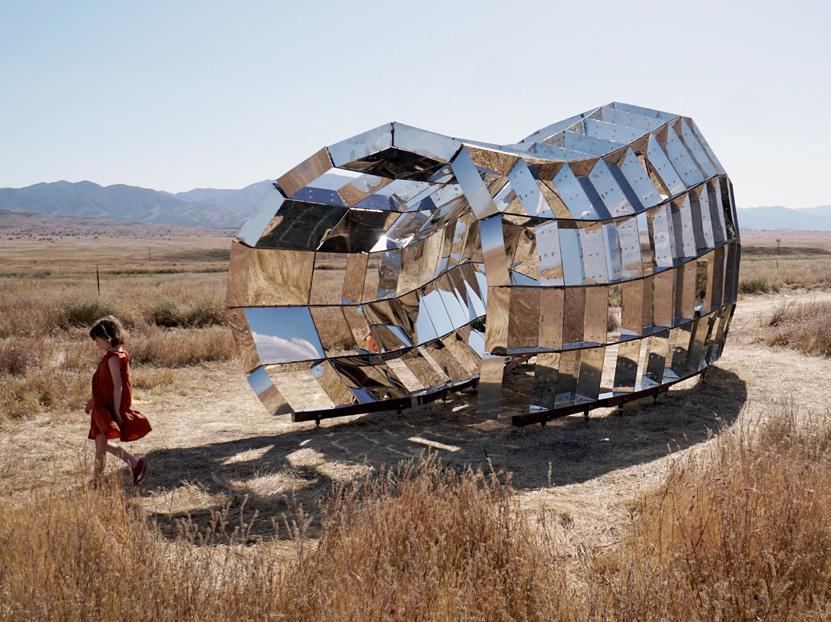
It’s a kaleidoscope grown so huge you can walk inside. Installed most recently at the Blue Sky Center southwest of Bakersfield, California, this is the third iteration of peepSHOW by David Baker Architects’ DBA_Lab. “We created an object of intrigue,” explained Taylor Dearinger, associate at DBA. DBA_Lab is an internal studio that works beyond customary boundaries of hospitality and multifamily housing. Its inaugural peepSHOW was realized for the first Market Street Prototyping
Festival in 2015. Studio members used a CNC router to cut a kit of parts from acrylic mirror and plywood, all slotted together without fasteners. A beefed-up second version consisting of 120 mirror-polished stainless-steel boxes, cushioned with marine-grade plywood, was screwed together. Surprisingly, it only showed for a few days at the same festival a year later so as to avoid an intrusive gate or encircling fence. The security measure just “didn’t feel true to the nature of the piece,” Dear-
inger explained. Fortunately, crowds were not a problem at the rural Blue Sky Center, where the piece was assembled a third time last year with fabrication partner BOK Modern and structural consultant Arup. Unfortunately, summer winds were unexpectedly strong, and some boxes buckled. When the structure started to lean, this peepSHOW was disassembled, and it is now in storage. The memory lingers for Dearinger today like a mirage. Of course, she’d “love to see another version.”●
21 AN Interior
IN THE KNOW
@ Blue Sky 2023
above and left peepSHOW is a sculptural installation that encourages visitors to immerse themselves in the landscape.
IN THE KNOW
Text by Elizabeth Fazzare
History Anew
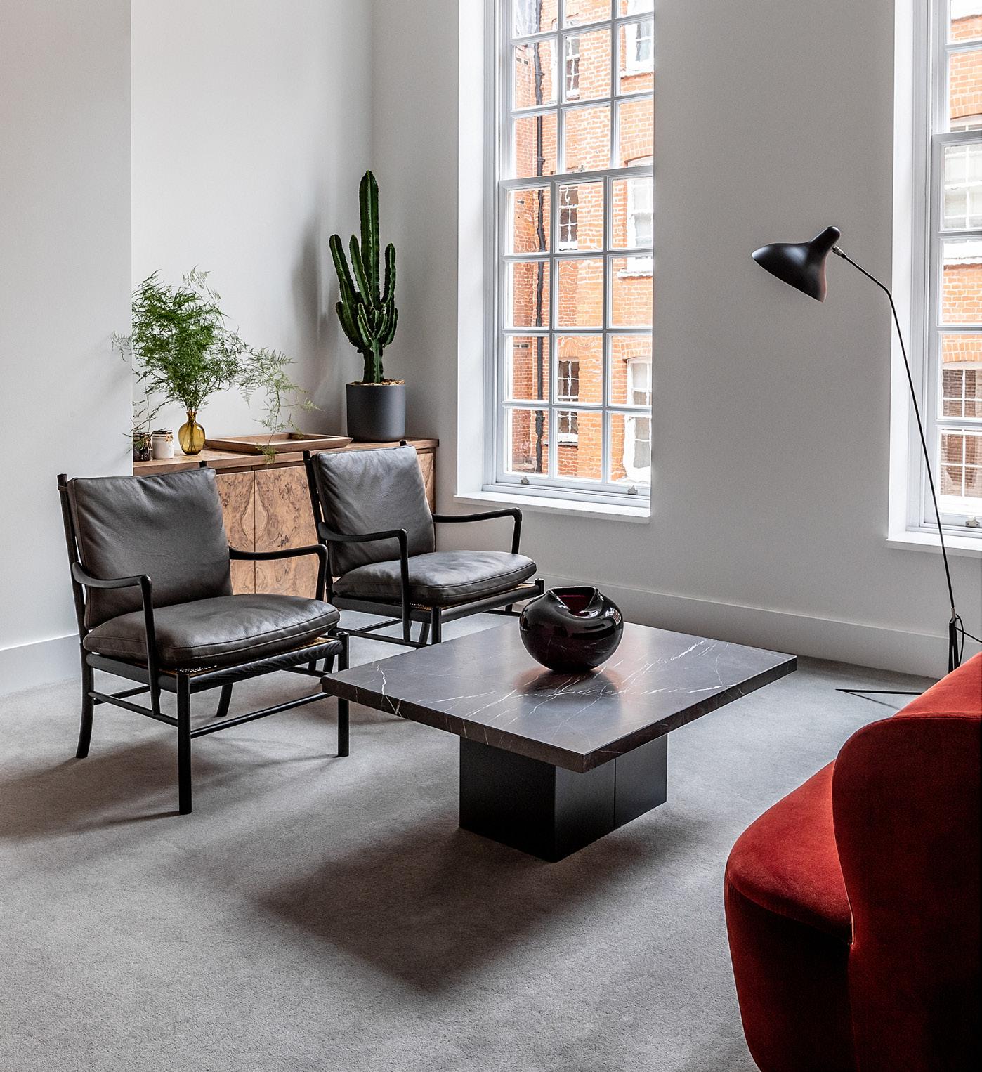
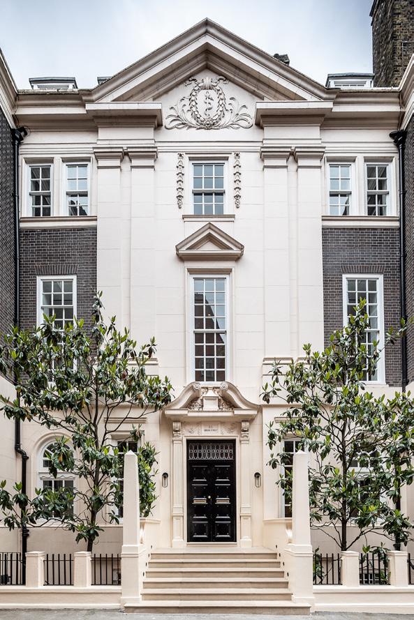
Since it was constructed in 1725, this French-inspired classical building in London’s posh Mayfair neighborhood has lived many lives—it’s been a private home, a clinic, and now an office. Starting in 2020, when the London- and San Francisco–based design firm Kallos Turin was tasked with reinventing it yet again as a modern finance workplace, the only historic elements that remained were the decorative pediment, pilasters, and 20th-century obelisks on its exterior. The interior was a true blank slate, so studio cofounders Stephania Kallos and Abigail Turin let the spirit of this facade guide their design.
“Conversation with history is one of the joys of the profession,” explained Turin. Here, it’s sparked in warm minimalist details made in materials that could have appropriately been original. A fluted travertine reception desk sits in front of a patinated copper accent wall on the ground floor, accessed
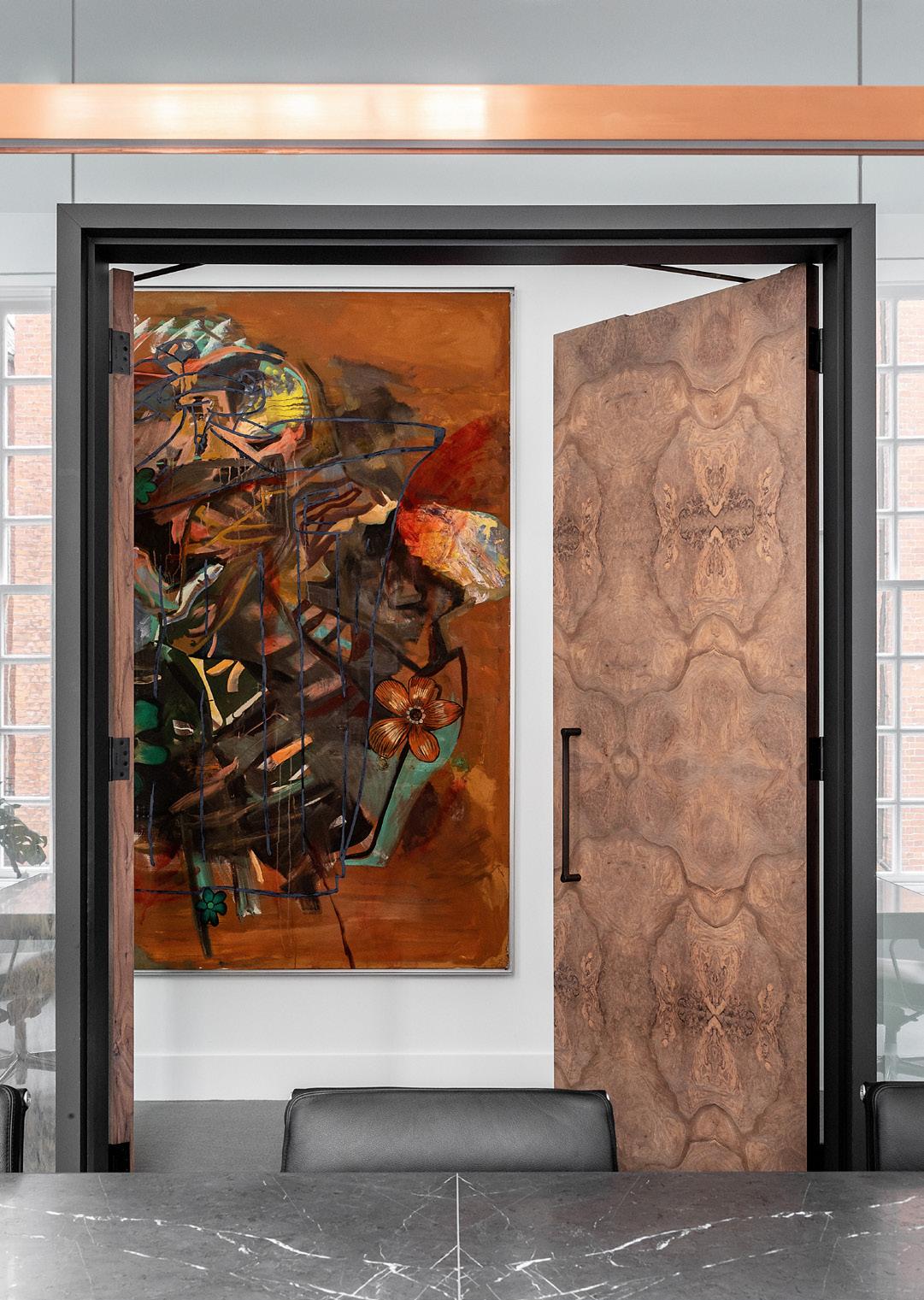
through arched doorways with basket-weave walnut flooring underfoot. Upstairs, burl walnut desks decorate open and private office spaces. The moody wood also panels the doors of a conference room. Just outside hangs a palette-matching painting by Martin Kippenberger (untitled, 1988), sourced from the client’s personal collection.
On the ground floor of the building, less access to daylight led to dimmer spaces. In response, Turin said, “we doubled down” on the low-light vibe, finishing walls with gray stucco. Where sunlight does stream into the offices’ large upper-story windows, she and Kallos called local landscape designer Alexander Hoyle to fill black builtin planters with a whimsical mix of greenery, from cacti to umbrella trees. Turin said the entire design process aimed to answer a driving question: “How do you make a space both relevant and connected to what was there before?” ●
22 Issue 25 Spring/Summer 2024
In London, global design studio Kallos Turin gives an 18th-century office building a new life.
Taran Wilkhu clockwise from above left Burled
becomes a statement piece throughout the office, seen here in a conference room door; gathering spaces take advantage of the natural light; the historic exterior was preserved and restored. facing page , above and right The burled walnut also appears in desks; a soft matte finish unites everything through grey stucco wall and ceiling treatments.
walnut
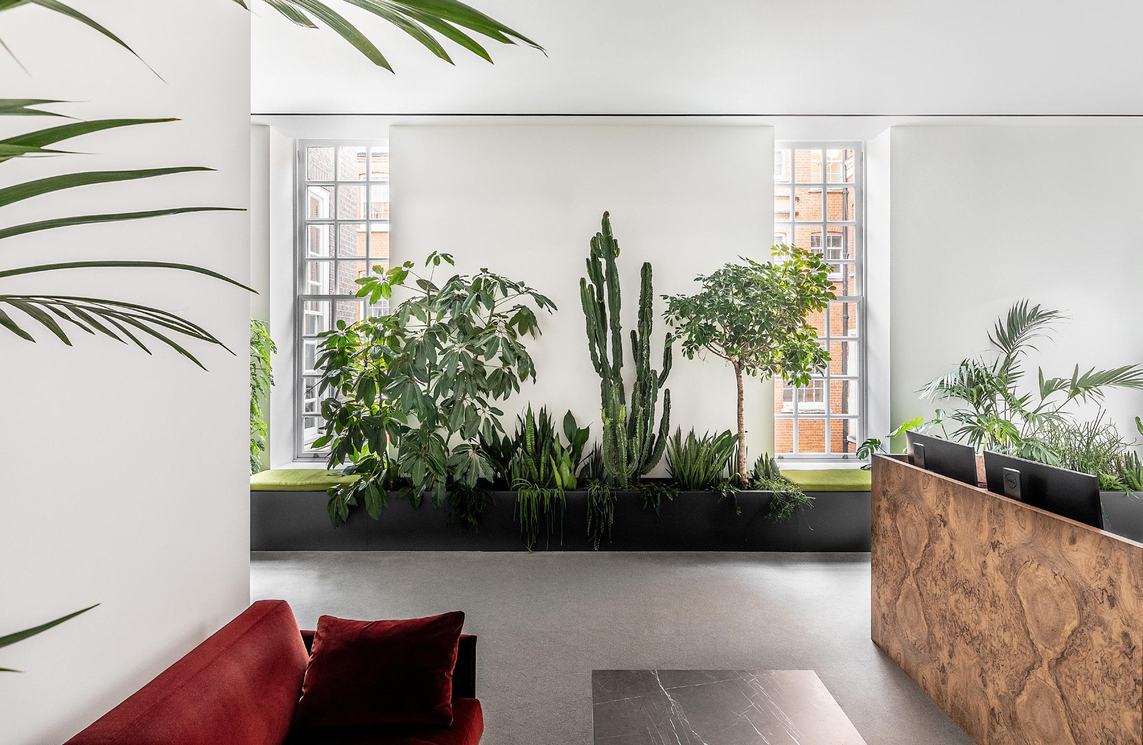
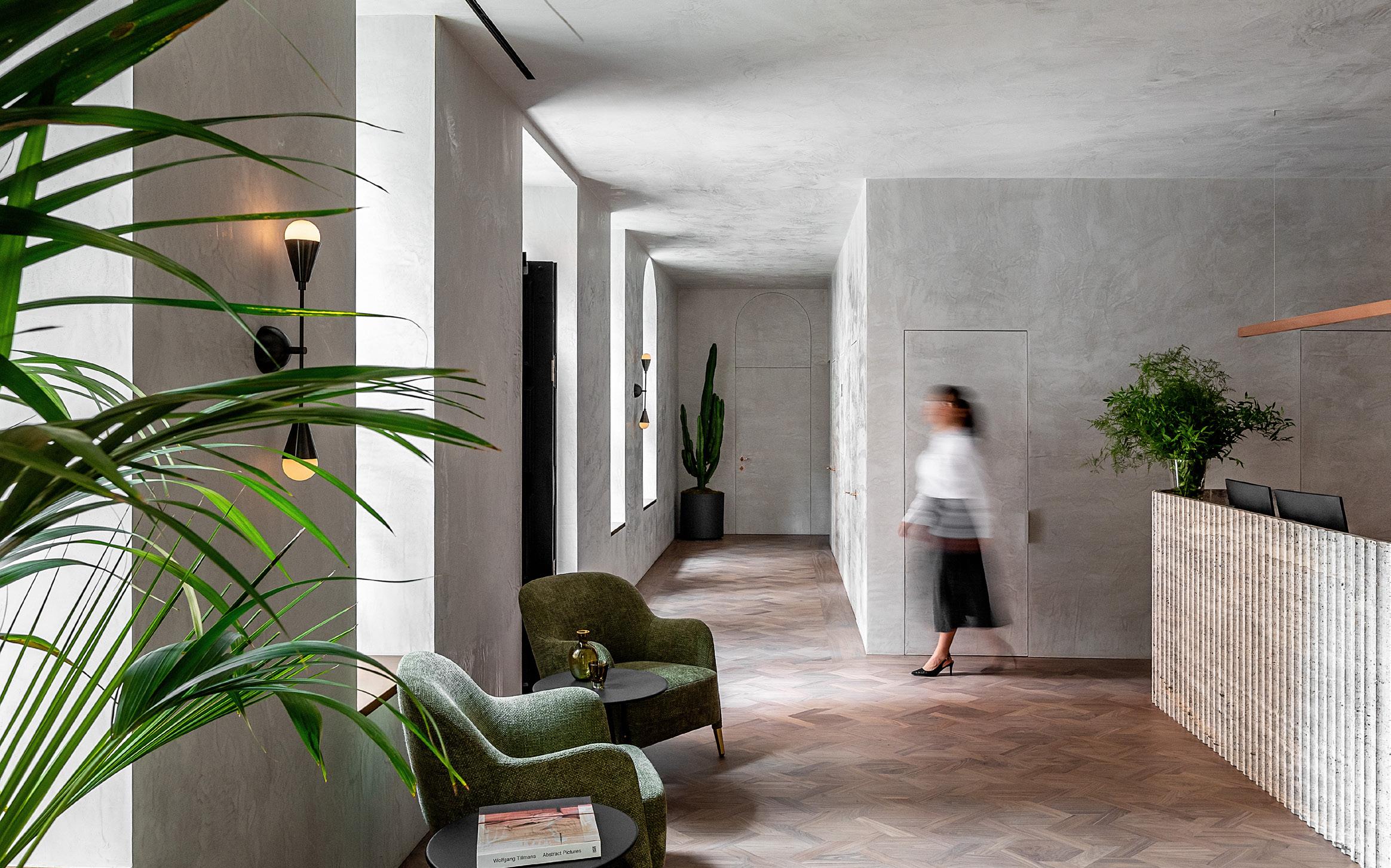
23 AN Interior
Mexico City–based PRODUCTORA designed a loft-like home for a creative couple within the footprint of a garden apartment in Soho. Text by Emily Conklin
Shelf Life
Manhattan’s Soho neighborhood at first conjures images of 4- and 5-story cast-iron buildings with large windows overlooking Belgian-block streets. These “loft” buildings were once home to workshops and factories but today house New York’s crème de
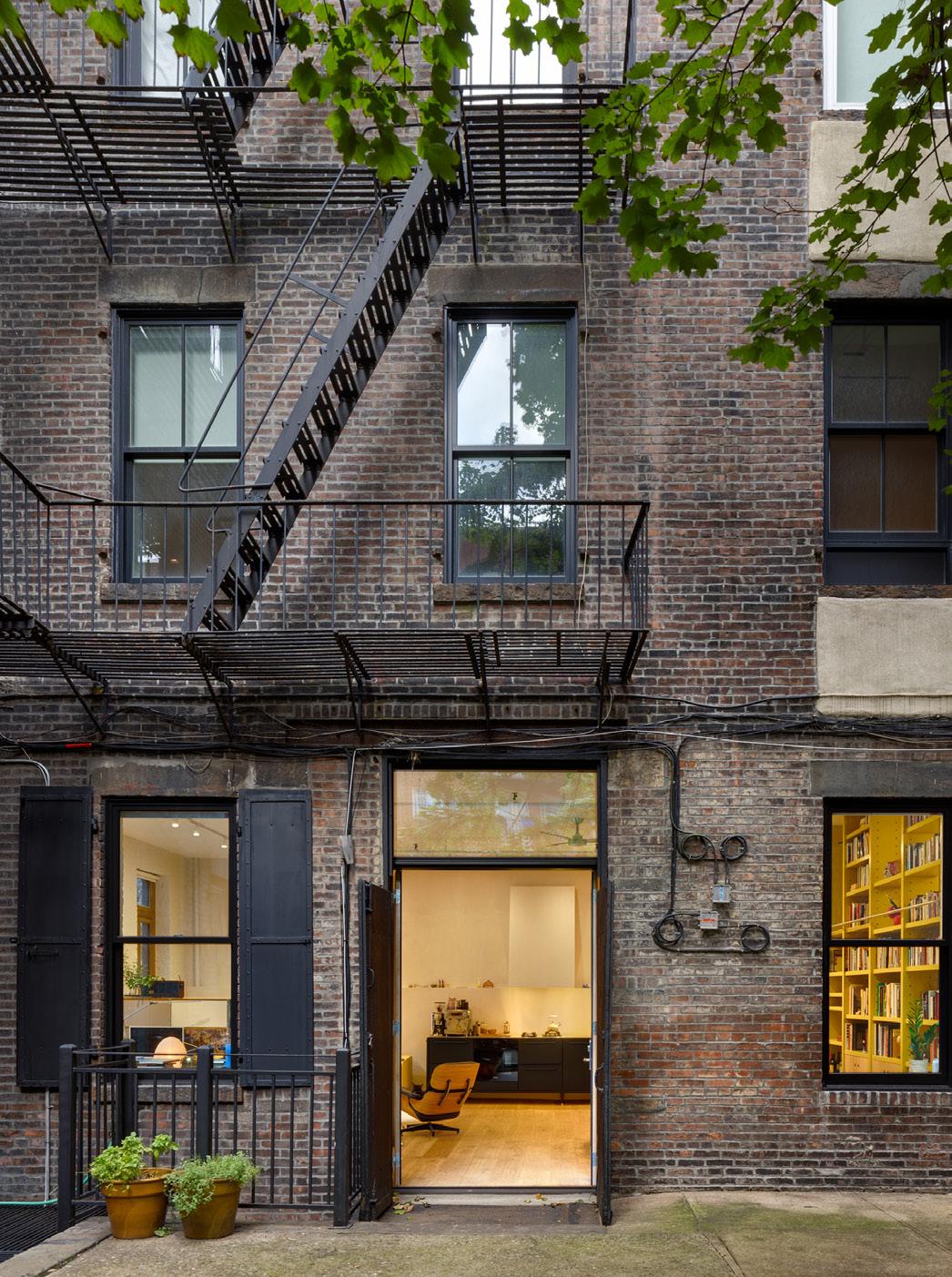
la crème. A more subtle and contemporary loft conversion has taken place on Sullivan Street, but you’d never know: The residence opens to an interior courtyard instead of the street. This is Mexico City–based PRODUCTORA’s take on the garden loft apartment.
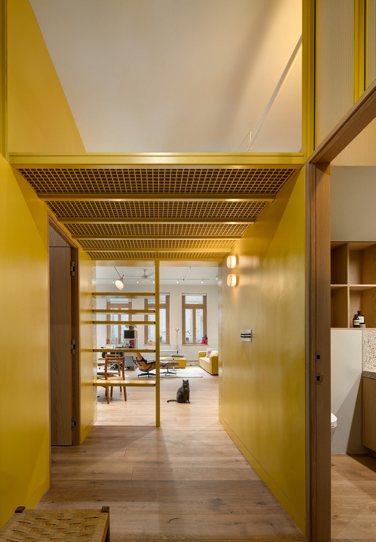
Originally a completely open floorplan, the space now has four distinct rooms: a bedroom, bathroom, and lofted guest suite overlooking a great room, which serves as an open-concept area for cooking, dining, lounging, and working. The interior is home to a couple who split time between their native Mexico City and New York. “This is a space for creatives to return to, recharge, and let loose,” Wonne Ickx, a founding partner of PRODUCTORA who is now based in New York, told AN Interior on a recent tour.
Ickx has known the clients for years: Alberto Kritzler, Harvard’s 2023 Loeb Fellow, and his wife, Ximena Santaolalla, author of Sometimes I Wake Up Shaking, which won the Mauricio Achar Random House National Literary Prize. Their home is filled with vintage Eames pieces, from a multipronged hanging light fixture to the polka-dot cabinet and, of course, the black-leather lounger. The couple’s elevated taste can also be glimpsed in a variety of Nelson and Noguchi table lamps and a custom Vipp kitchen.
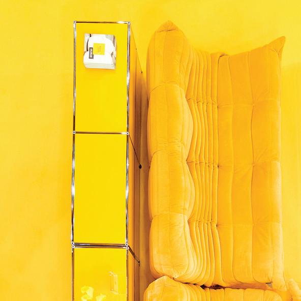
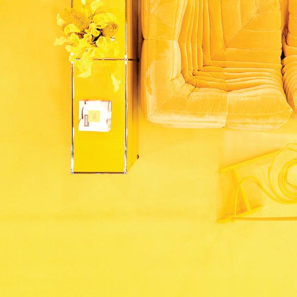
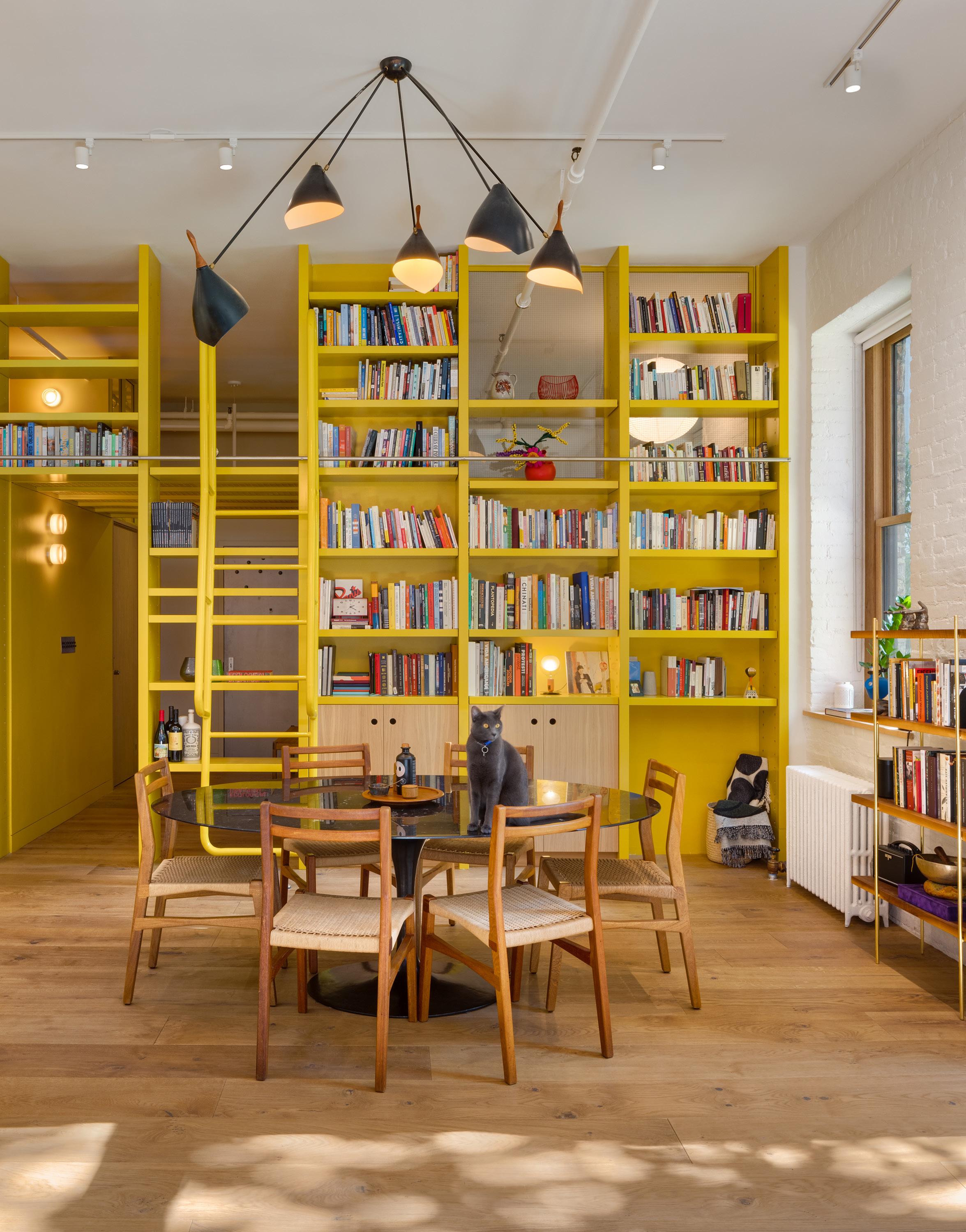
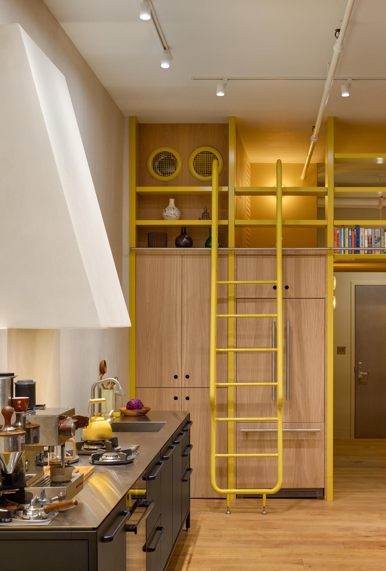
But the piece that brings the entire home together couldn’t be ordered online: The residence is structured by a bookshelf/ sleeping loft/entryway system rendered in a bright, taxicab yellow. Custom-designed by PRODUCTORA, it was built by a New York–based metal fabricator with few frills. The piece is true to the office’s commitment to single-color projects. It packs a punch.
While yellow wasn’t Ickx’s original spec, it emerged from a design constraint: “To create a strong loft area above the entrance, we needed to use a standard fiberglass system. The grating by McNichols only came in green or yellow,” Ickx explained. He then chose to use the loft not only to structurally organize the new living space but unite it with an almost monochromatic gesture: There’s also a yellow couch, warm hues from the chandelier and the glass sconces, and even a yellow tea kettle. Most powerfully, the yellow grid of the sleeping platform
24 Issue 25 Spring/Summer 2024
IN RESIDENCE
above The former studio apartment now has distinct spaces thanks to a custom yellow bookshelf that acts as a framework for living.
Rafael Gamo
Experience
25 AN Interior THEMART.COM | CHICAGO SHOP OUR SIX FLOORS OF DESIGN SHOWROOMS WHERE
WHAT’S NEXT
WHAT-IFS BECOME
the most comprehensive design destination that offers hundreds of showrooms and the best in kitchen, bath and fine furnishings under one roof. POGGENPOHL | SUITE 138
“This is a space for creatives to return to, recharge, and let loose.” —Wonne Ickx
right The entry corridor connects bedroom and bathroom, while a loft creates a sleeping area for guests.
below To the far left is the kitchen, where wooden cabinets conceal a refrigerator and storage behind custom Vipp cabinetry.
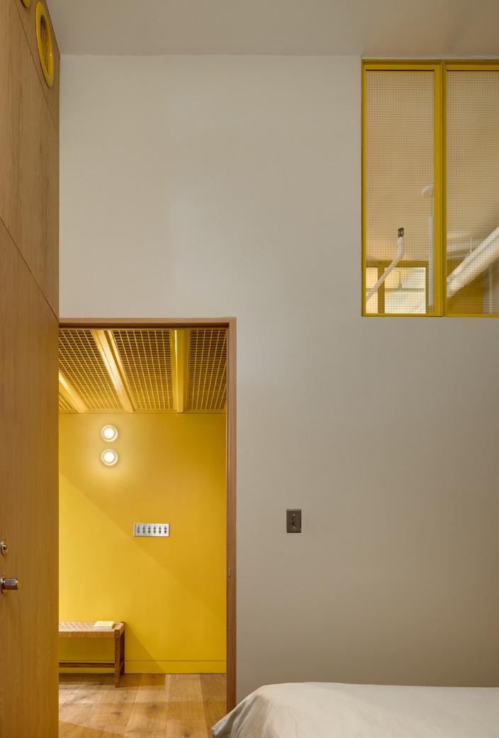
below , right The monochromatic yellow color extends from the bedroom into the bathroom across the corridor. Each space is illuminated by interior clerestory glazing.
 Rafael Gamo
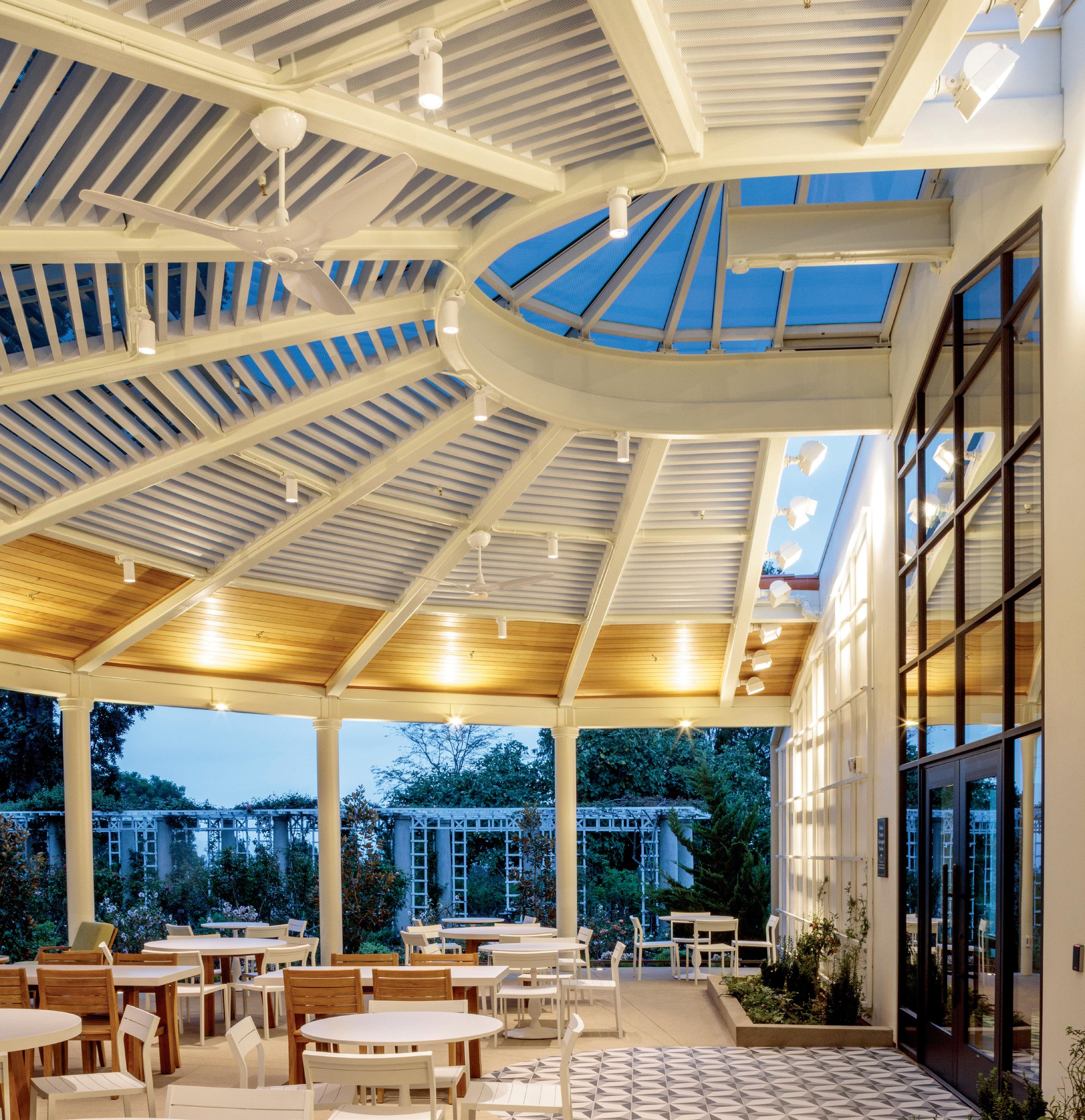
Rose Garden Tea Room | San Marino, CA
Lineair Plank in Custom White
Architect: Architectural Resources Group
Contractor: Martin Bros.
Distributor: L&W Supply
METAL AT PLAY: INSIDE AND OUT
Crafted with precision, our aluminum Lineair Plank beams redefine artfulness in metal ceiling design. Durable, stylish, and easily transitions from indoors to out, Lineair Planks seamlessly blend aesthetics with functionality, adding a touch of sophistication to any space.

| University Park, IL | www.atas.com | 800.468.1441
27 AN Interior
Allentown,
PA | Mesa, AZ
transitions into a full-height bookshelf system that stretches the entire width of the loft. Its “shelves” also cleverly conceal culinary elements on the left, where it intersects with the black-metal Vipp kitchen. A refrigerator, freezer, and pantry are hidden behind flush wood fronts.
The yellow spine also serves as one wall of a newly configured bedroom, where a new window was punched into the masonry. “This was one of our first projects in New York,” Ickx said, smiling, “so I did not imag-
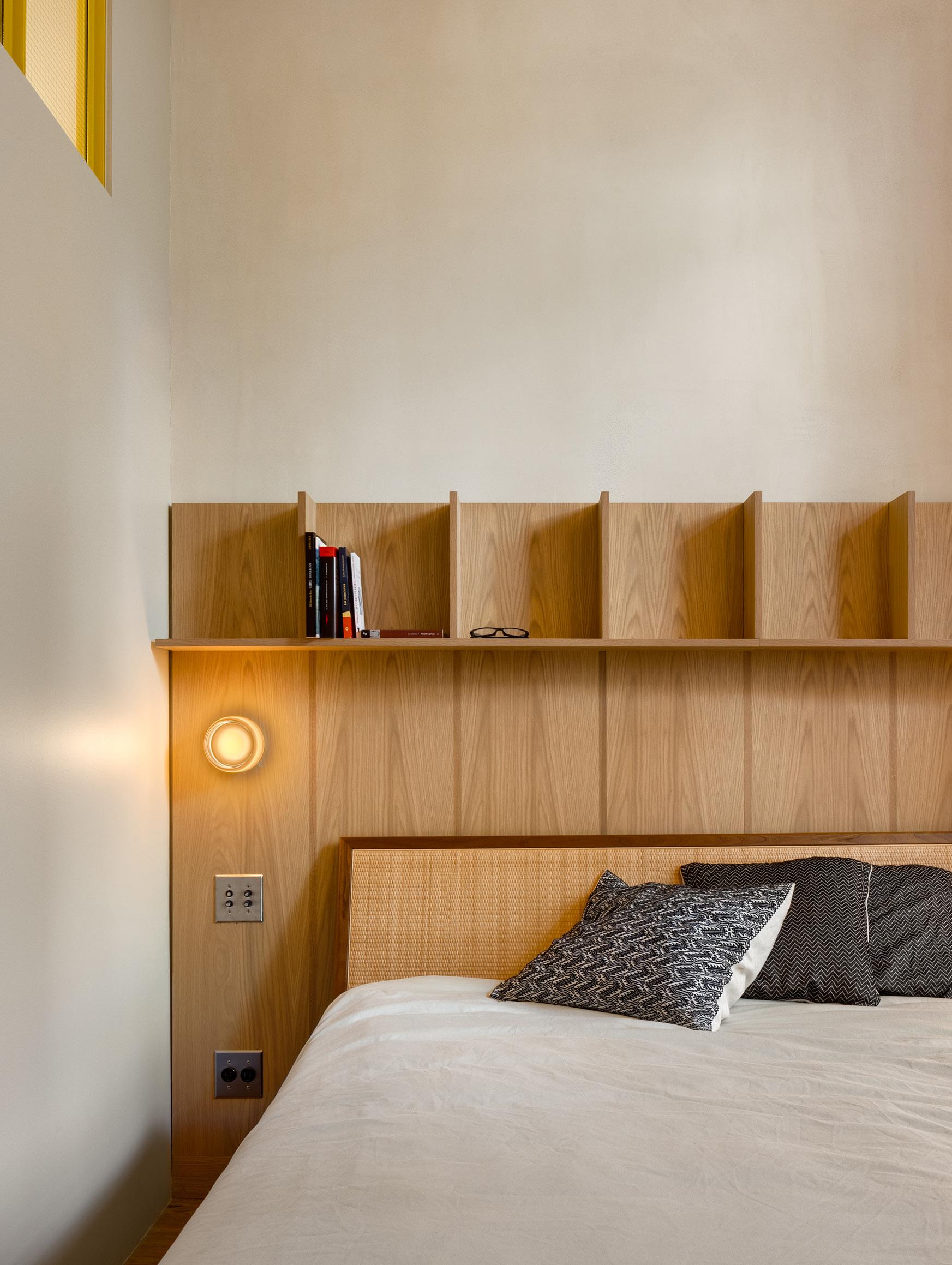
ine how much permitting would be required for one window in a historic building.” The bedroom shares a party wall with a public courtyard, so privacy is accommodated with a frosted glass pane that also adds a translucent ambience to the room. Here, there are other space-saving interventions designed by PRODUCTORA that are so simple they seem inevitable: The headboard of the bed supports another room-wide bookshelf system made of gently scalloped wood, and the door to the room opens seamlessly to lay
flush with a built-in closet system, meaning the door doubles as a front door when closed and a closet door when opened.
With its clever and playful design solutions, the garden loft feels expansive and generous amid the density of downtown Manhattan. The boldness of its sunny yellow spine, now lined with books, ties everything together in an abstract yet livable gesture. PRODUCTORA’s design is the lemon zest needed to enhance a space to support the lives of two dynamic creatives. ●
below , left Custom fabrication extends into the bedroom as well: This built-in headboard with lighting and storage solutions.
below , right The ground-floor loft also boasts generous outdoor courtyard space on two sides where guests can enjoy fresh air and admire the historic exterior.
Issue 25 Spring/Summer 2024
Rafael Gamo
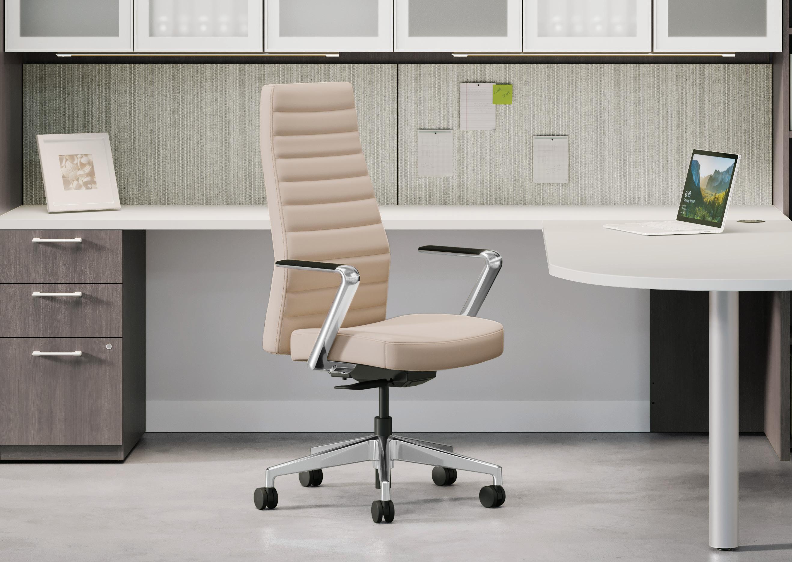

With its slim, tapered profile, sophisticated detailing, and a selection of luxurious fabrics and finishes, Cofi is sure to stand out in any office setting. Cofi™ — Refined design. Sophisticated style. Make your space work® Learn more about Cofi on hon.com >
Thirty years after first designing furniture using Dinesen wood, John Pawson discusses his new Pawson Furniture Collection with
Text by Jack Murphy
John Pawson’s Spaces of Calm
Hans Peter Dinesen and AN Interior.
IN CONVERSATION
John Pawson’s work pleasantly hums with emptiness. It defines a quiet, elevated version of contemporary architecture often referred to as minimalism. While living in Japan, Pawson learned from architect and designer Shiro Kuramata. He later studied at the Architectural Association before founding his own studio in 1981. About 20 people work in Pawson’s London office on commissions around the world.
Dinesen, founded in 1898, is a family-run Danish manufacturer of wood flooring and products. The company sources trees from forests in northern Germany and specializes in wide planks of Douglas fir, which can be up to about 45 feet long and 18 inches wide. Pawson first spied a Dinesen sample under the arm of his friend Richard Rogers in the early 1990s. Pawson sought out the company when realizing his own home and ultimately convinced it to make straightedged floorboards instead of the traditionally conic planks, that result from the tapering in trunk diameter. This change, combined with Pawson’s imprimatur, reshaped the audience for Dinesen’s products.
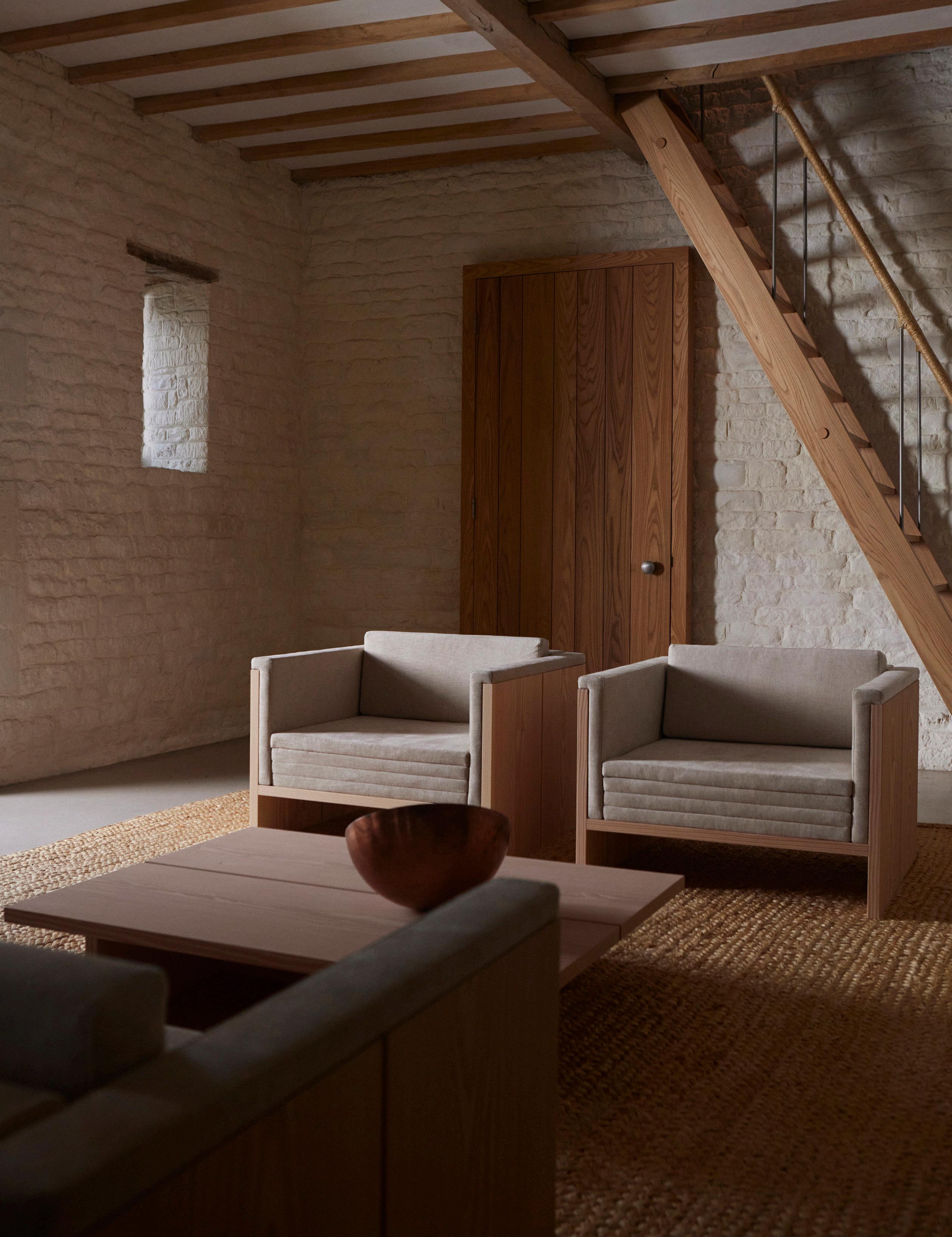
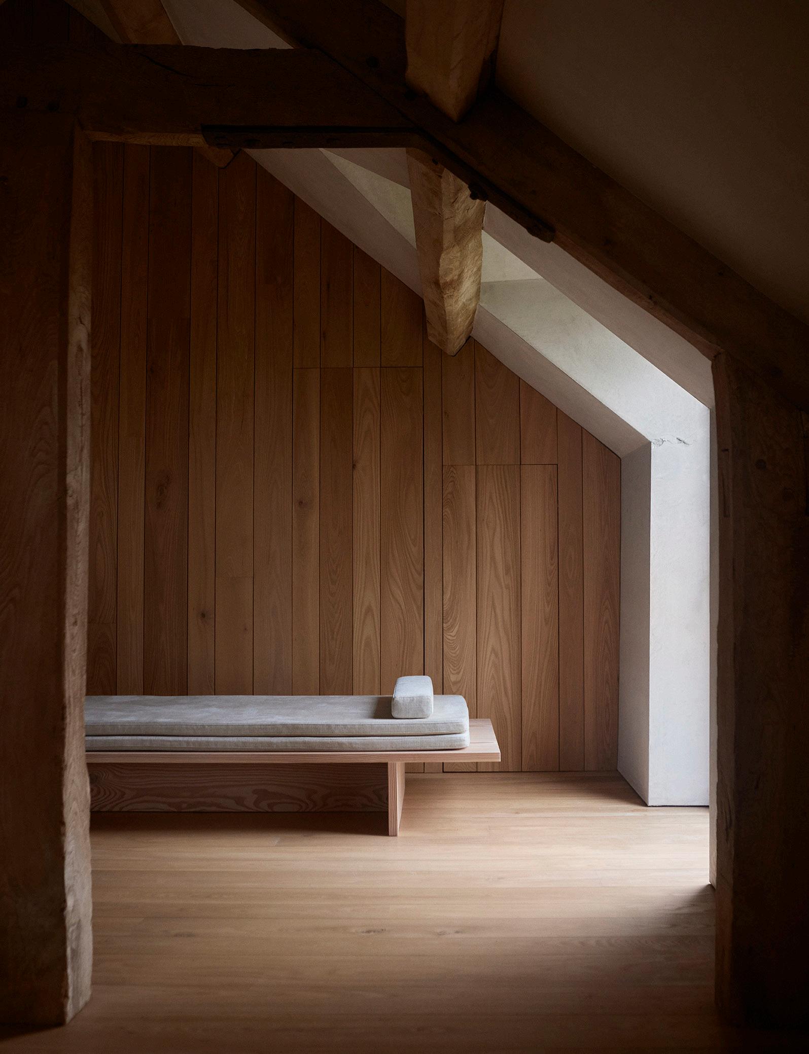
Pawson initially designed a table, benches, and stools for his young family. (The stool, when rotated, becomes an armchair for a child.) Today these dining pieces, reimagined, are joined by new lounge items: a table, chair, sofa, and daybed. “The dimensions of the timber determine the proportions of the forms,” Pawson said.
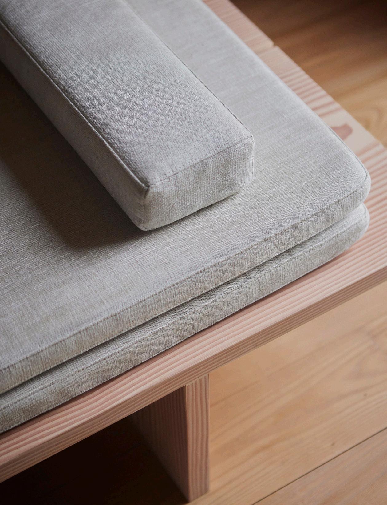
The last three offerings are upholstered in Kvadrat fabric that can be customized when ordering.
While Pawson is funny in conversation, he often lets his sentences drift into reflective silence before his next thought takes shape. On an overcast night in Copenhagen he perched on one of his new chairs to talk with Hans Peter Dinesen, a fifth-generation Dinesen and currently its brand director. The chat took place in Dinesen’s showroom, which will be remodeled by Pawson before 3 Days of Design in June. The next morning, AN Interior’s executive editor, Jack Murphy, spoke with Pawson and Hans Peter Dinesen about their collaboration.
AN At this point in your career, John, I imagine you’re able to choose what you want to work on. Why was it the right time to revisit these pieces of furniture?
John Pawson (JP) I got to architecture relatively late. I never really went to school for it. I tried quite a few other things, including teaching English to Japanese students who weren’t interested. I’ve gone through long periods of extreme boredom. Since finally finding something I really enjoy doing, I haven’t had a minute’s boredom since. I’m lucky that I’m able to do the bits I like.
Hans Peter Dinesen (HPD): For my family—
especially me, my brother, and my sister— we always grew up with this furniture. It has been a part of our life. This latest meeting of Dinesen and John Pawson has been an important reflection for us. Looking back on the furniture, it’s still relevant. Our hope is that people in 30 years will think the same. The idea of starting this new chapter together is to learn from the past and see how we can put it into the future in a new way. So we asked John to continue developing the pieces from the 1990s.
AN What was the working process to design these pieces?
HPD It was not a straight line from A to B; there was a lot of experimentation. We started during the COVID-19 pandemic in 2020, so it has been a long process. There were prototypes and testing with different treatments, joinery, and wood species. The pieces are not exactly the same as the original pieces; they have been developed and refined, so there are new details that make them even more timeless.
AN The oak strip between two planks of Douglas fir on the table is a new addition, for example.
HPD Yes, but it’s not only the visual appearance of oak. It has a higher density, so it’s good for joints between softer pieces of wood.
31 AN Interior
Claus Troelsgaard
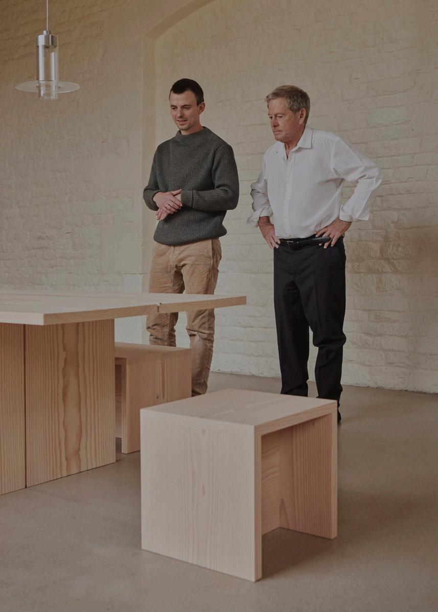
right John Pawson (right) with Hans Peter Dinesen (left) inspecting the furniture collection's new table, benches, and stool.
JP It also stops the bread from falling to the floor.
HPD The gap is interesting, and my father talked about it. When I asked him about what he learned from John Pawson, he said that the gaps between the floorboards are significant. Each individual plank becomes its own character. Instead of the floor being one flat surface, it becomes something solid and three-dimensional.
AN Right. The reveal delineates each piece.
JP Otherwise, it looks like a carpet.
AN It has been 30 years since these, the original pieces, were designed. Do you think there have been any changes in that time about how people live? If so, did those changes affect the furniture?
JP The honest answer is I don’t know. Obviously, there have been big changes in how people live in the world, but I think the elements of houses vary little from before. There is a much stronger awareness of the ecological side and working with natural materials. Floorboards make you aware of what you’re treading on.
AN Has that been true for you in your personal life?
JP Definitely. When I’m at home in the country, I sit and look out the window or through the rooms. Sometimes my wife, Catherine, says, “You’re not doing anything. Could you empty the bins?” And I say, “Well, I am actually working.” I’m contemplating, but I can never persuade her. But I literally sit and look at boards, often just to get pleasure.
AN One thing that has changed, as you mentioned, is our ecological awareness. More architects are thinking seriously about where their materials come from. Some of us think about the forest when looking at wood floors and vice versa. How has that sensibility changed over time?
HPD For us, the most important part is taking care of the tree in the whole value chain, from the planted seed to the final floor and the floor’s afterlife. We take care of it, because when we fell a tree, it’s a responsibility. We must take care of the whole tree trunk and give it as long a life as possible, even longer than it had in the forest. That’s the mission, and we can’t succeed without the architect and the client.
We also know a lot of young architects who are curious about sustainable forestry practices. We are happy to share the knowledge of our German forestry collaborators, who just celebrated their 300-year anniversary. We use selective logging, where we pick one tree at a time for one project instead of clear-cutting. We also don’t replant trees; the forest itself is regenerative. We just pick the trees out.
AN Dinesen has supplied floors for historic churches. This relates to your work, John, because it attempts stillness and is often described as monastic. What is it about that sense of quiet that we experience in religious spaces that you are drawn to?
JP From an early age, I felt different in spaces that were calm. Then I wondered how to actually achieve them in physical terms— to build an atmosphere in space with materials and light.
There is a difference. It’s dangerous to talk about secular work—like houses, mostly—as being spiritual, because when you design a church, you want it to be a place where you can worship and be closer to God. You, as an architect, only have the same materials at hand. You’re never guaranteed that it
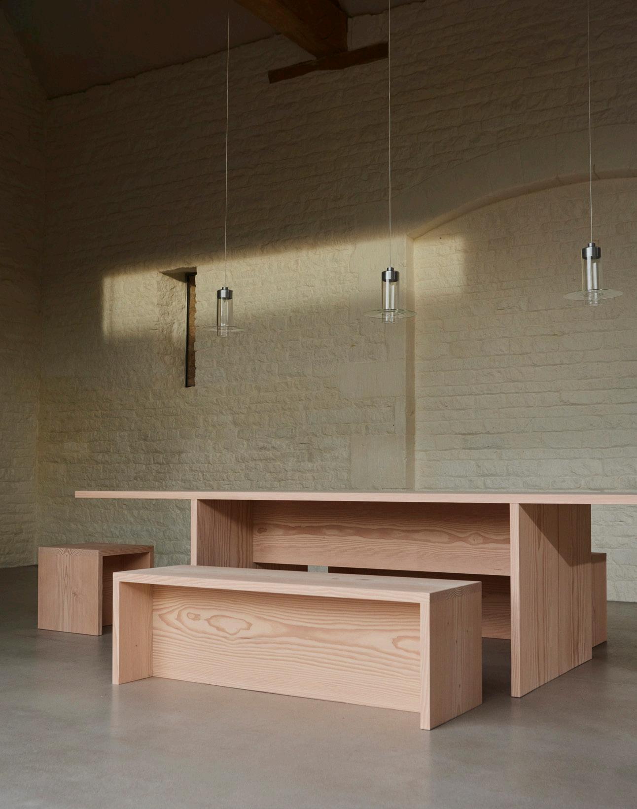
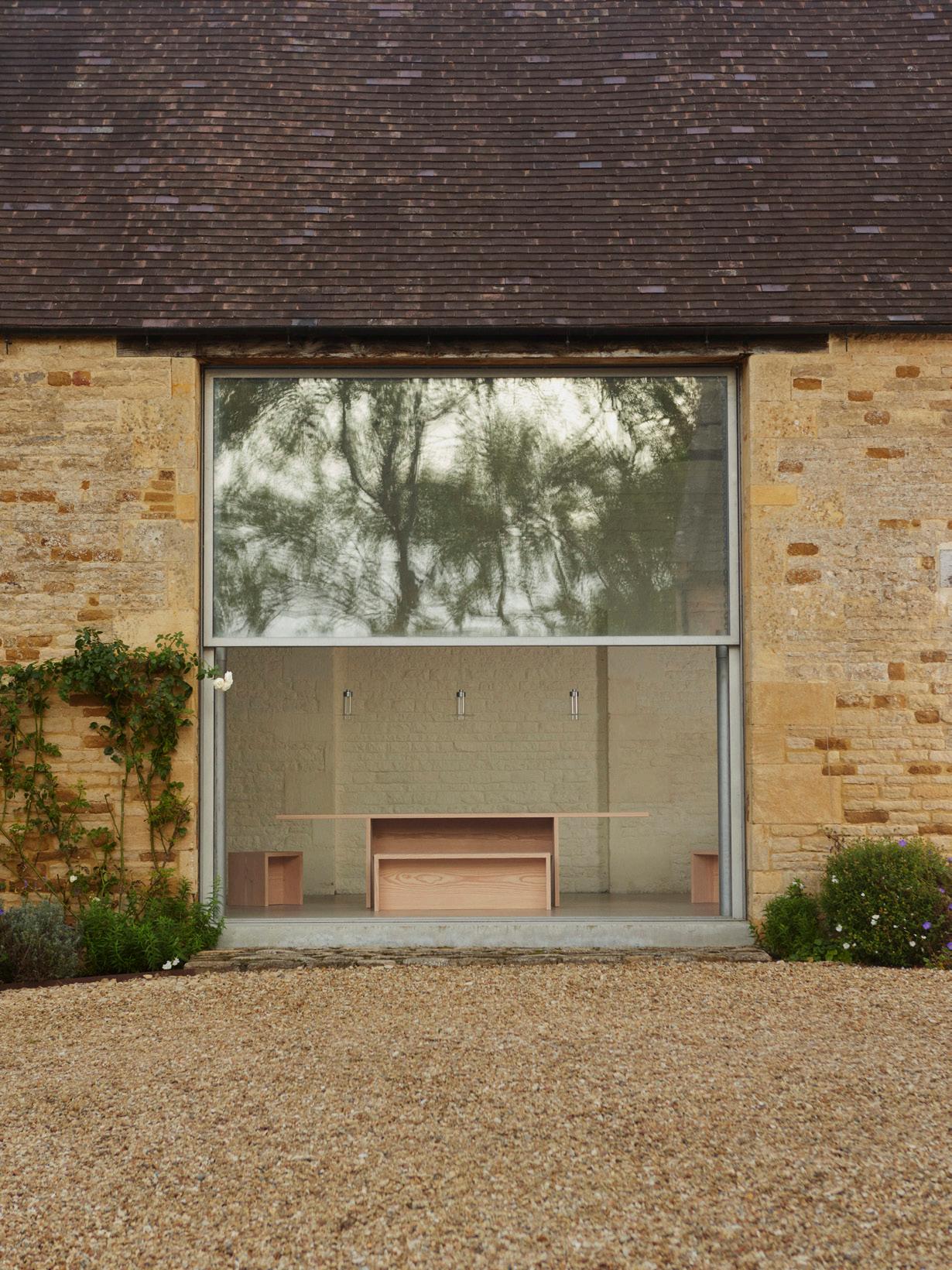
facing page , left A table, bench, and stool from Pawson’s Dining Series are glimpsed through an opening in his historic home in the Cotswolds.
facing page , right Dimensions and proportions of Dinesen’s Douglas fir planks provided the starting point for the design of these pieces.
above , left A detail of the daybed from Pawson’s Lounge Series, shows the cushions upholstered with Kvadrat fabric.
above , right Shown in Pawson’s home, the daybed harmoniously integrates with the spirit of quiet calm that his architecture seeks to establish.
will be spiritual, but you try your best with the proportions, light, and the other things at your disposal.
Some people who walk in have no clue what’s going on, but most people enter a spiritual place, and you almost hear them expelling the air because they start to relax, and it feels good. That’s what you’re after, feeling good.
AN How did you learn about this feeling of space? Was your family religious when you were young?
JP My dad and mum were Nonconformist Methodists in Yorkshire. Their parents were practicing Methodists, so they went to church twice on Sundays, there was no alco -
hol, and services had no music. That’s in my background, but I think it’s also the whole Yorkshire thing with the treeless landscape and industrial buildings in Halifax. And obviously Fountains Abbey and Rievaulx Abbey were nearby.
The monks from the Abbey of Our Lady of Nový Dvůr, Czech Republic, saw my Calvin Klein stores before they commissioned me. I thought they had visited, but as Cistercians, they can’t leave the community, so I guess they encountered them in a book. They saw a space with a couple tables and imagined how it could easily be transferred to a church altar.
I had to start learning quickly when working with them. They wrote a detailed brief for each room, including the tempera-
ture. They wanted to sleep in rooms that were about 57 degrees Fahrenheit, for example. It’s nice that they don’t have any personal possessions. It makes things easy. They each have a watch and their own boxer shorts. So when you go into the laundry, there’s a whole array of Calvin Klein, Ralph Lauren, or Hugo Boss underwear. It’s a tough life. They never leave, so what you do for them is important. It must be practical, functional, and durable.
The young monks don’t quite understand why they need proper architecture, which of course costs money to build well. To build at all costs money, but to build well costs a bit more. I think they would rather have kept the money and had to do less work. But I’m told they got it eventually. ●
33 AN Interior
Claus Troelsgaard
Stone has never felt so inspired.
Introducing our new family of Stone Textures that capture the beauty of natural stone. Inspired by nature, designed for felt, and stunningly unique.
34 Issue 25 Spring/Summer 2024
turf.design
Barcelona Wall Scape
We’re so back. This year, the 62nd annual Salone del Mobile and its Fuorisalone extension across Milan offered a FOMO-inducing whirlwind of installations, exhibitions, events, pop-ups, collaborations, salons, and activations—all in service of showcasing the latest in design. AN Interior was on the scene to witness the meleé, from the basement club that hosted a gathering of American architects and designers to the bustling avenida of Rho Fiera’s convention center to the exclusive rooftops and balconies with Duomo views. Beyond the new offerings at the EuroCucina and International Bathroom Exhibition, what stood out was Milan Design Week’s thrumming intensity, perhaps due to the overlap with the vernissage of the Venice Art Biennale. The week was a superbloom of cultural activity drawing attendees from around the world. Fashion brands had more visibility than in past years, with major houses mounting exhibitions and hosting exclusive parties. Plus, an interest in reissued pieces and engagement with bygone styles—notably the blocky creations and oversize aesthetics of 1970s and ‘80s—mixed with the continued popularity of restrained, minimal objects. But perhaps the biggest takeaway was the widespread concern with material sourcing, as the design world responds to the climate crisis by shifting its manufacturing processes. It’s not sexy work, but it’s essential. On the following spreads, see our favorite installations, colorful finds, and products by architects. Jack Murphy
Dolce Salone
A Multiverse of Design
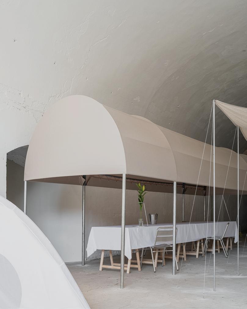
Dropcity
A long-term project by architect Andrea Caputo to activate the barrel-vaulted spaces under an elevated railway, Dropcity’s strong installations this year included work by Sam Chermayeff Office, Christian Kerez, 6:AM—GLASSWORKS, and many others.
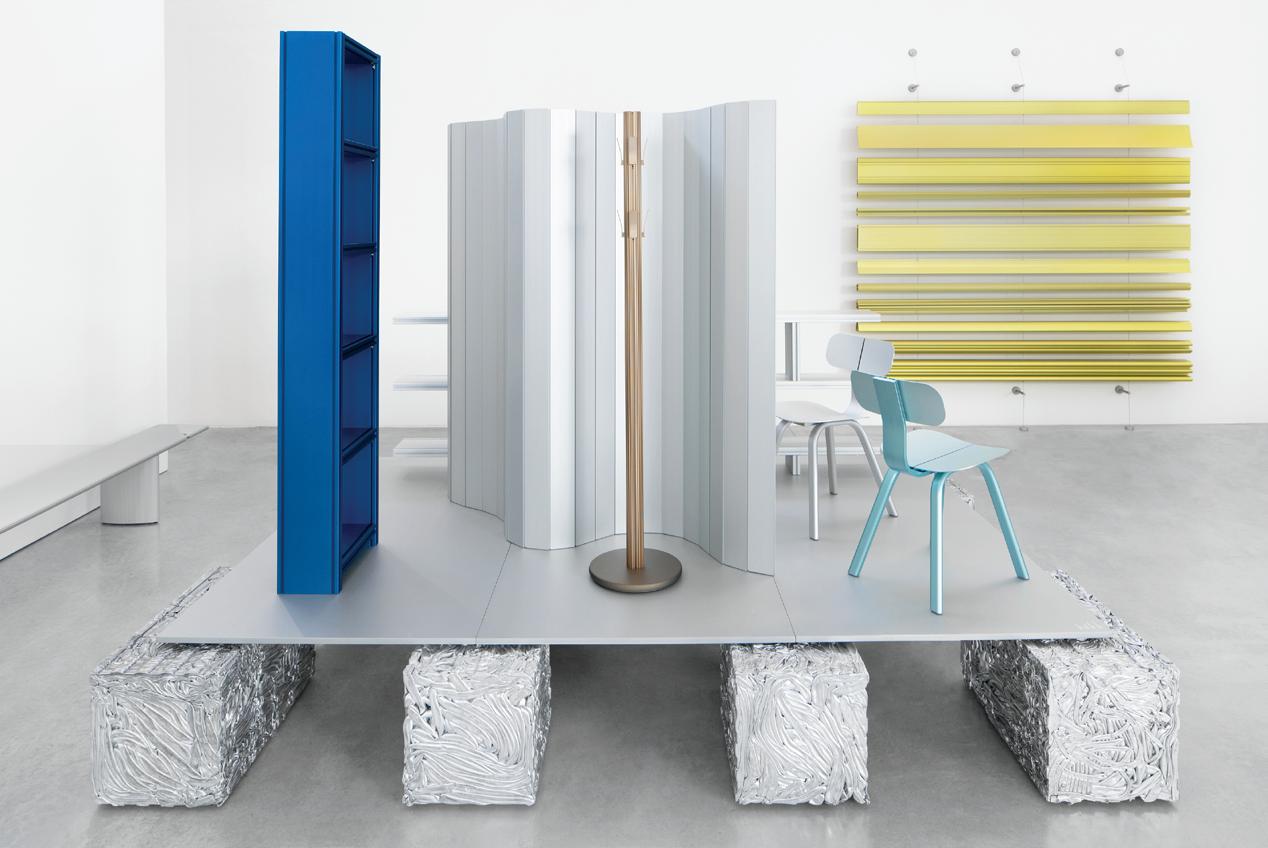
Hydro at Capsule Plaza
Hydro shared objects fabricated using its Hydro CIRCAL 100R recycled aluminum product. Lars Beller Fjetland, a Norwegian designer, led the effort, with designs by Inga Sempé, Max Lamb, Philippe Malouin, John Tree, Shane Schneck, Andreas Engesvik, and Rachel Griffin.

Baranzate Ateliers
Installed in two warehouses near the Linate airport, this spread of collectible design organized by Zaventem Ateliers included a group show of Belgian designers and work from Zaventem makers and guests. Refreshingly chill.
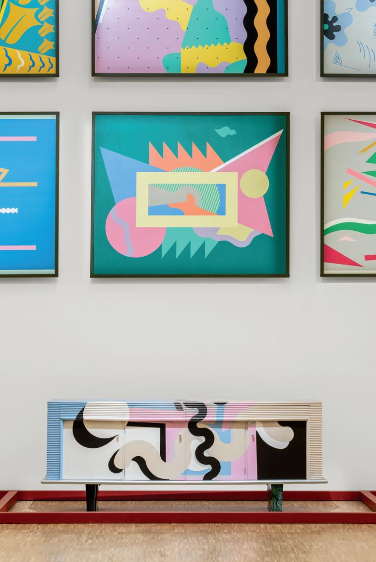
Io sono un drago
Milan’s Triennale hosted a number of great exhibitions, but this retrospective of Alessandro Mendini’s work, produced with the Fondation Cartier pour l’art contemporain and curated by Fulvio Irace, is a show stopper. It remains on view through October 13.
36 Issue 25 Spring/Summer 2024
Clockwise
from top: Piercarlo Quecchia, Amber Vanbossel, t-space studio, Delfino Sisto
Legnani
/ © Triennale
Milano
Amid thousands of offerings, AN Interior’s editors sought out the most captivating installations they saw during Milan Design Week. From collectible design stagings to immersive, experiential environments, there was something for all types of design enthusiasts. Here are some of the shows we loved. Selected by Jack Murphy & Kelly Pau
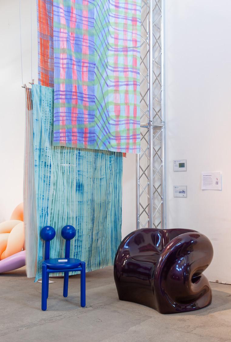
The Future is Currently Unavailable
In a repurposed railway yard Scalo Farini, Isola Design Gallery curated over 150 designers to explore how design and new craftsmanship can shape our future and that of the planet. Experimentation and material research are a common thread, making for an exuberant yet thoughtful showing.
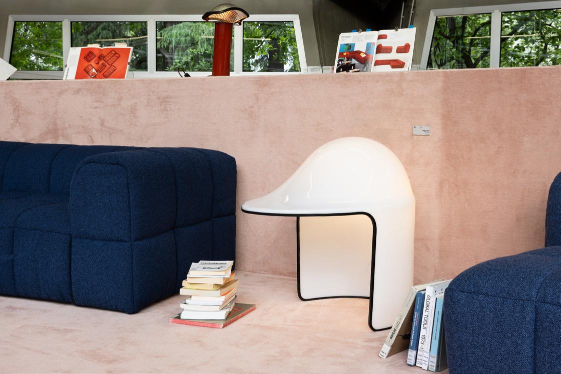
Two pop-ups activated the archive of female architect Cini Boeri to mark her 100th birthday. A range of furniture was on view in Parco Sempio’s library, and within Loro Piana’s showroom in Brera, pieces in new, custom upholstery were available to try out.
SaloneSatellite
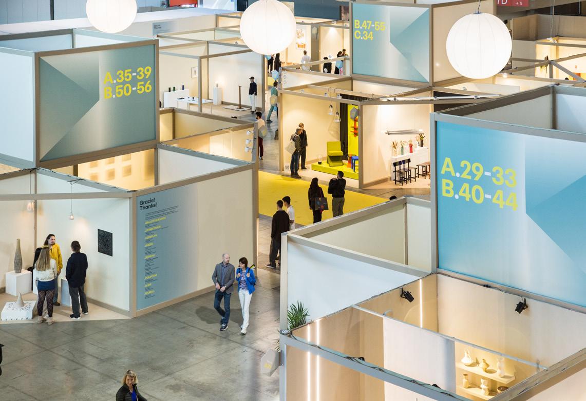
Now in its 25th year, this selection of emerging design was an inspiration. An inflatable PVC and aluminum lamp by Studio Ololoo won first prize in the juried competition. A show about Satellite’s history was also on view at the Triennale.
DesignSpace AlUla
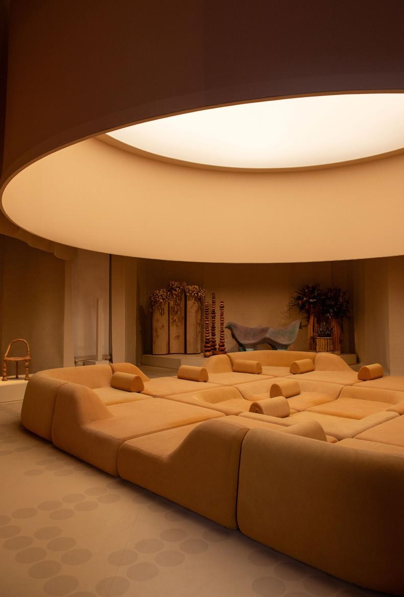
For its first appearance during Milan Design Week, DesignSpace took over the Mediateca Santa Teresa in Brera with an exhibition designed by CLOUD and Studio Sabine Marcelis. The hit was Haus Dari, a giant couch designed by the French collective Hall Haus.
37 AN Interior
Clockwise from top: © Anwyn Howarth, © Ludovica Mangini, Design Space AlUla 2024, Gianluca Di Ioia
Cini Boeri at 100
COLOR PLAY
The week’s unveilings from showrooms, booths, and many palazzos were united by a desire to go bold. Playing with material application, form, and even sci-fi aesthetics lent a decidedly futuristic tone to the buzziest releases. Selected by Jack Murphy & Kelly Pau
Mutina × Ronan Bouroullec Editions
mutina.it ↗
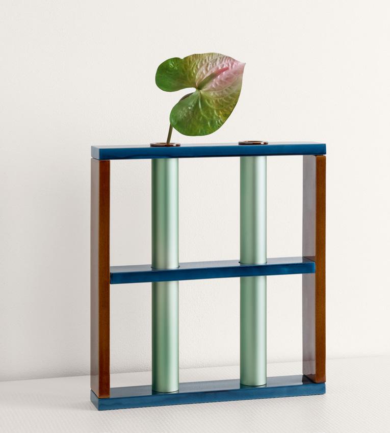
QUASIDESIGN Studio Sweep
qds.studio ↗
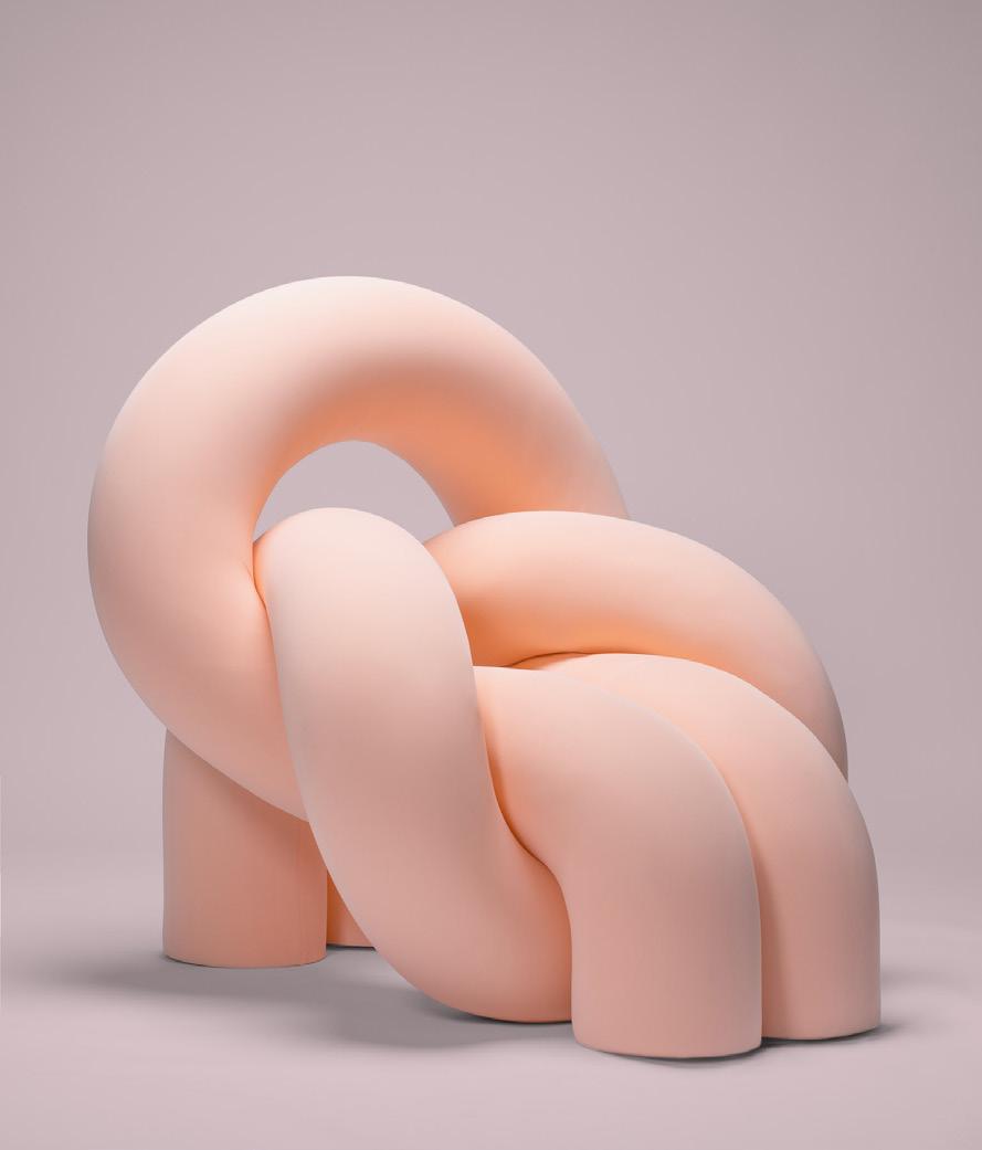
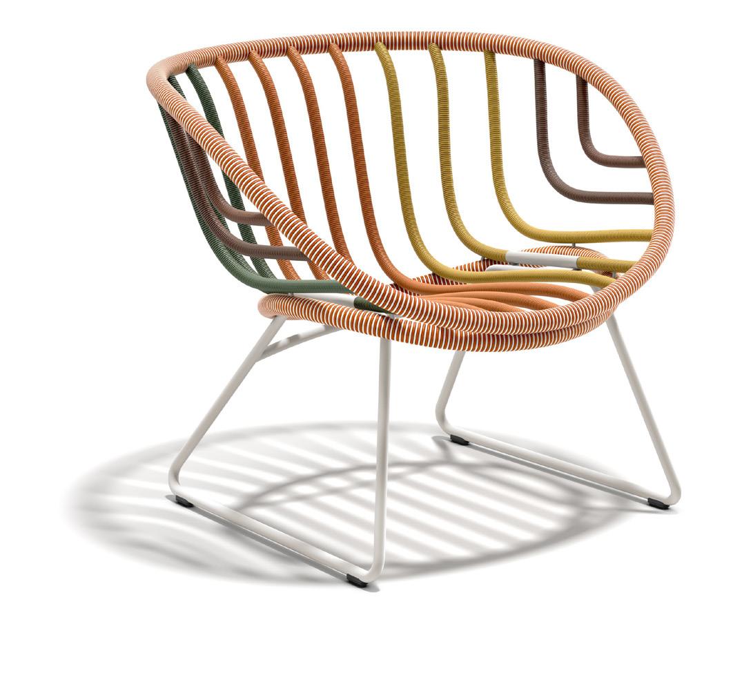
DEDON × Stephen Burks Man Made KIDA Armchair
dedon.de ↗
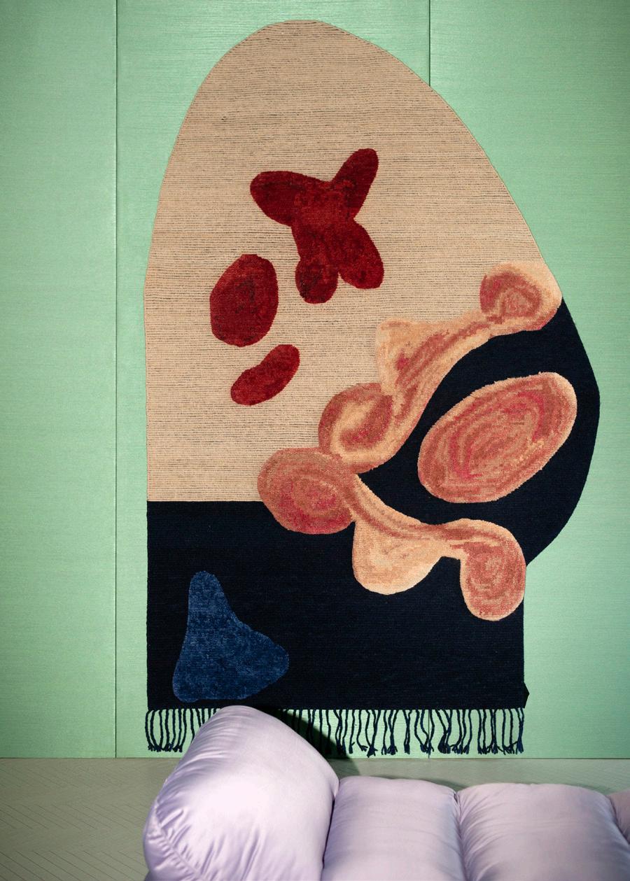
cc-tapis × Faye Toogood Rude Arts Club
cc-tapis.com ↗
38 Issue 25 Spring/Summer 2024
Clockwise from top: Gerhardt Kellermann, Courtesy DEDON, Courtesy QUASIDESIGN Studio, © Andrea Ferrari
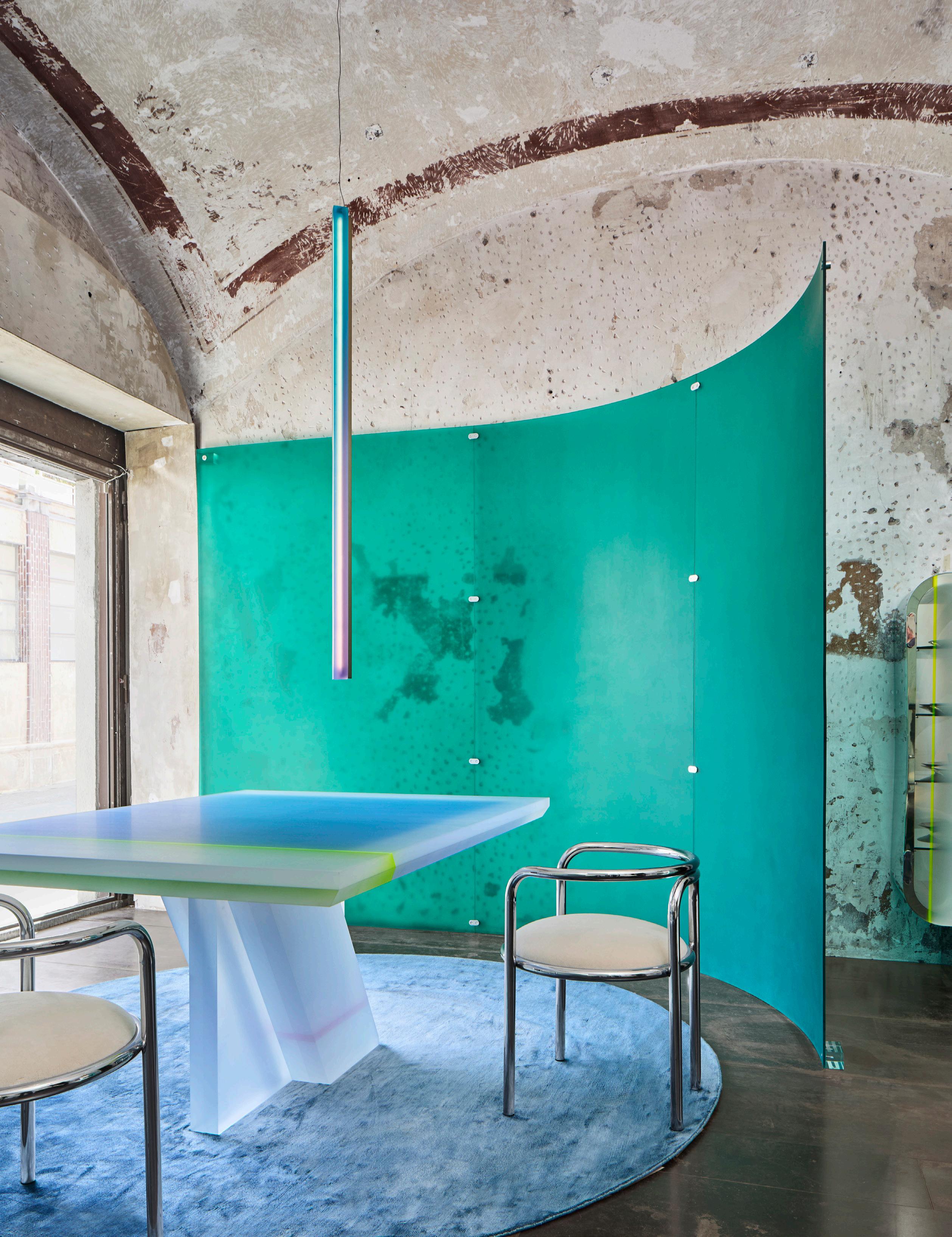
Draga & Aurel × Rossana Orlandi Gallery Apartment of Wonder draga-aurel.com ↗ Riccardo Gasperoni
DESIGNED BY ARCHITECTS
Milan Design Week offers an opportunity for architects to tackle new forms of design, be it outdoor furniture, lighting, or technical building materials. Standouts from the week proved their creativity at multiple scales, uplifting both form and function. Selected by Jack Murphy & Kelly Pau
iSiMAR × Zaha Hadid Architects Topos isimar.es ↗
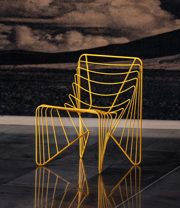
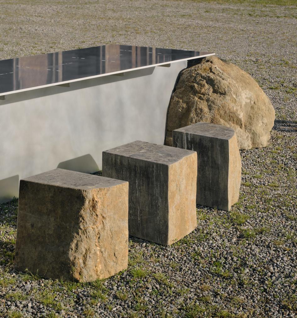
Surfacedesign New Geologies sdisf.com ↗
40 Issue 25 Spring/Summer 2024
Stellar
Lyrical stellarworks.com
Works × Neri&Hu
↗
Clockwise
from top:
Courtesy
iSiMAR, Pier Carthew, © Alex Lesage, Courtesy Stellar Works
Volker Haug Studio × Flack Studio Lucky Stud volkerhaug.com
↗
Fornace Brioni × Snøhetta
Void
fornacebrioni.it ↗
© Mattia Balsamini
While kitchens and baths have long been the stars of luxury residential projects, this issue of AN Interior takes a more holistic look at what makes the design of these spaces so unique. Tracking trends in explosive color palettes that make a big splash out of small kitchens, Lauren Gallow gives us a tour of three compact yet multichromatic kitchens that become both the social and artistic heart of the home. This section then goes one step further for the bath—in these pages we leave the home altogether to explore the ancient and essential concept of the bathhouse. Jesse Dorris offers a closer look at these places for relaxation, socialization, and above all unique connection, and what defines the resurgence of the trend— and architectural type—today. Each product showcased in these pages was curated by our design editor, Kelly Pau.
● In this Section
44 Free the Kitchen
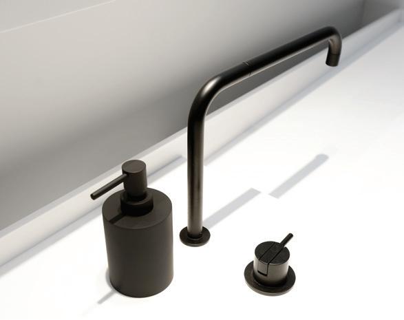
48 Trend: Sculptural Faucets
50 Sinks & Vanities
52 Toilets
54 Millwork
58 Sarah Jacoby Architect in Manhattan
60 Ideas of Order in Washington Heights
61 02A in Rome
62 Hardware
66 Outdoor Kitchens
68 Outdoor Showers
70 Rockwell Group’s Bathhouse
74 FOOD New York’s Garden Club
76 Schemata’s Komaeyu
Kitchen & Bath
43 AN Interior
↘43—76
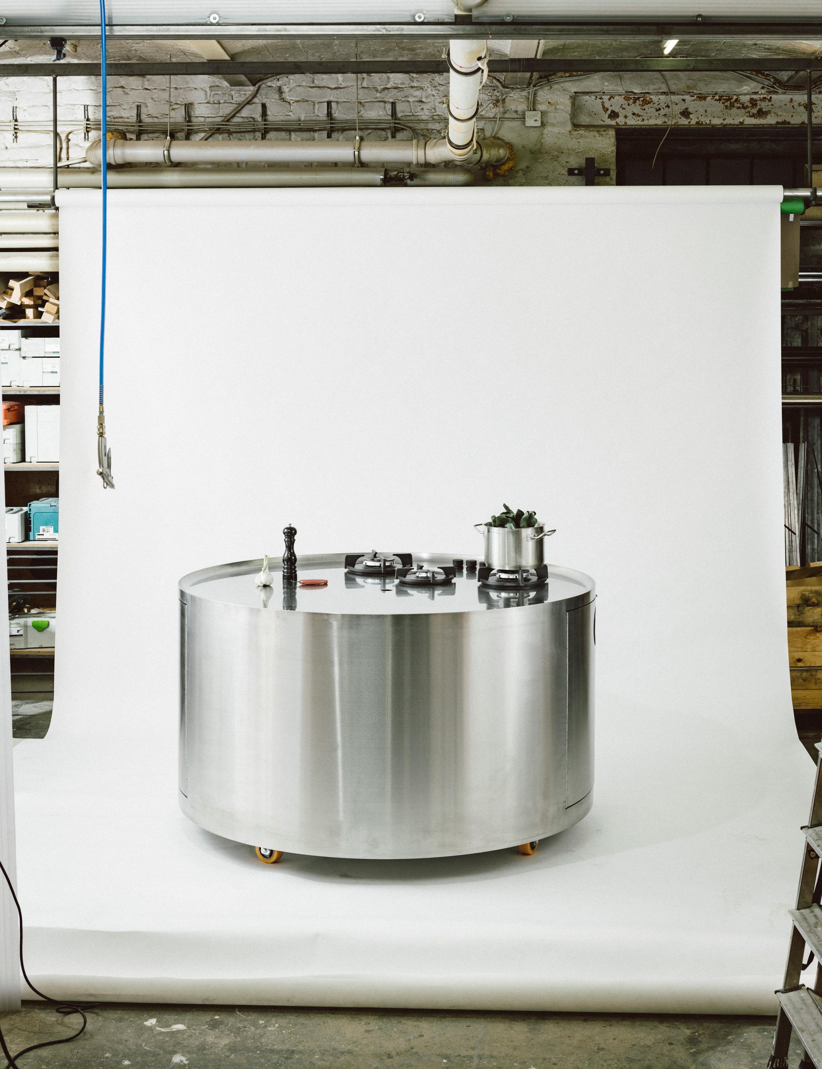
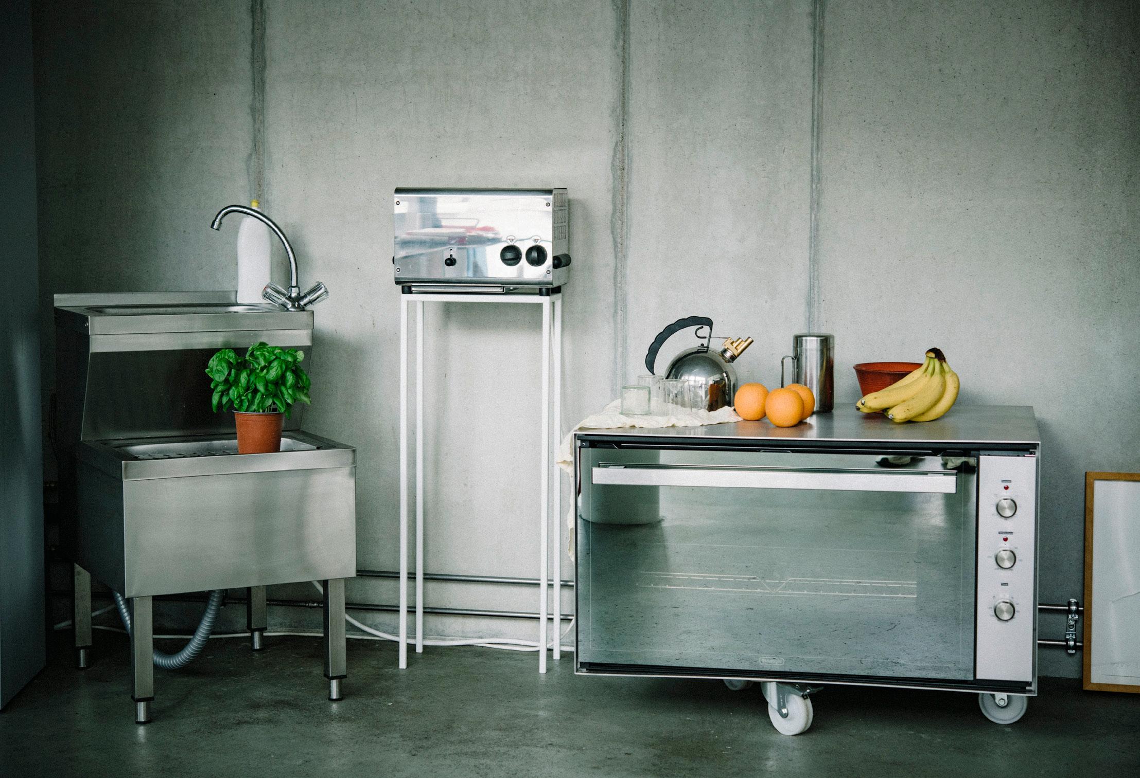
Kitchen designs by Berlin-based architect Sam Chermayeff Office come with oven-size microwaves and wheels, challenging both social norms and design standards.
Text by Lev Bratishenko
Free the Kitchen
facing page Chermayeff’s kitchen islands are some of his best-known works, freeing countertops, ranges, and even sinks from the wall.
below Appliances become exaggerated yet functional kitchen creatures in Chermayeff’s designs.
45 AN Interior
IN FOCUS
Oliver Helbig
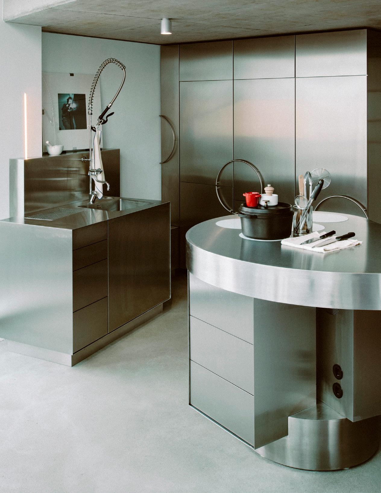

Hoping for radical social change through objects often disappoints, as it always turns out to matter more who uses them. Nevertheless, some designs become strongly associated with desires for more freedom, flexibility, or fun, and while it would be naive to imagine that they change social relations all by themselves—just by being there—they can help.
Architect Sam Chermayeff’s “free kitchens” reflect this optimism well. His designs are free in that everything from sinks to ranges is liberated from walls. Many elements have caster feet and can be moved, though practicality dictates they stay close to one another like a huddle of penguins. “I mean, l didn’t invent the kitchen island,” Chermayeff joked, though even his most fixed designs, which are islands, take unusual forms. They juxtapose kitchen components in ways that
suggest we have been neglecting even this familiar typology, whose original shock in bringing food preparation out of the closed kitchen and onto a kind of domestic stage has been so normalized that it’s largely forgotten (though whose labor is displayed vs. whose is hidden has not changed as much).
Chermayeff’s kitchens break up into archipelagos that reflect their owners’ desires more than standards of industrial production. His designs speak the language of industry and its materials, evoking an image of mass customization that has been a dream of functionalism for a long time. Walk through the lofts in Meyer-Grohbrügge & Chermayeff’s apartment building on Kurfurstenstrasse in Berlin, and you’ll feel the variations as a personality barometer. The rare apartments in the building that do con-
form to the norm of linear kitchens attached to the walls stand out like a kid with crossed arms in the schoolyard. They don’t want to play the game.
Chermayeff’s free kitchens continue to develop, and recent commissions for kitchens in restrained plans may test the strength of the concept’s attachment to the loft. Everything in a loft is supposed to be free. Ideally, things can always be picked up and moved around as life changes. But in the kitchen, the promise of open loft living crashes into the stubbornly inflexible electric, gas, plumbing, and ventilation conduits that sit in our homes.
So, Chermayeff is also thinking about bathrooms, probably the most rigid interface between the home and urban infrastructure. How free can you be on the toilet? ●
46 Issue 25 Spring/Summer 2024
above , left Rendered in crisp stainless-steel, appliances and islands come together to form beautiful yet functional compositions.
above , right While the forms of Chermayeff’s islands and storage units might be custom, he often incorporates industry-leading appliances from brands like Miele and Kohler.
Oliver Helbig
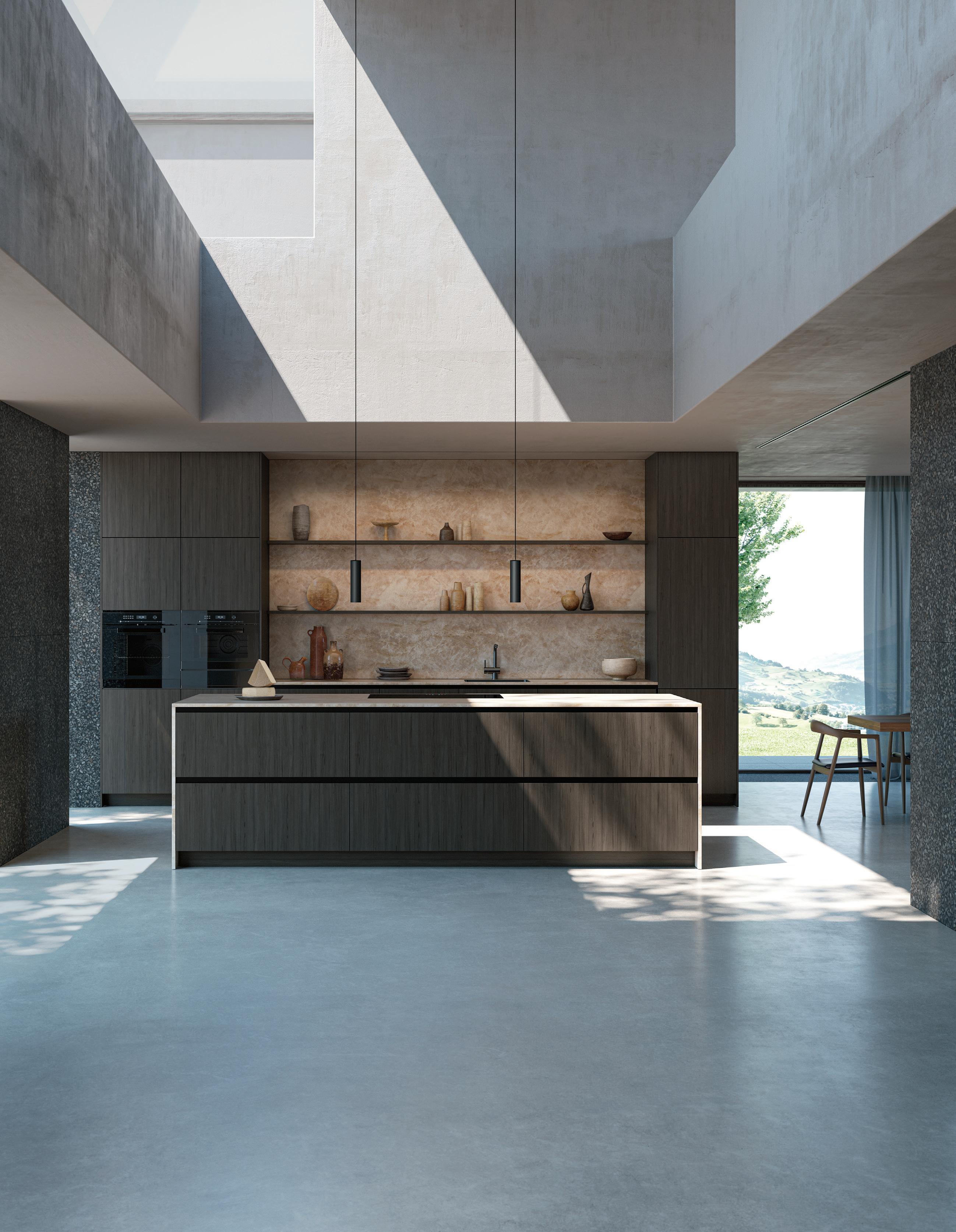
Poggenpohl Los Angeles 8900 Beverly Blvd. Suite 104 90048 Los Angeles +1 310-289-4901 losangeles@poggenpohl.com losangeles.poggenpohl.com
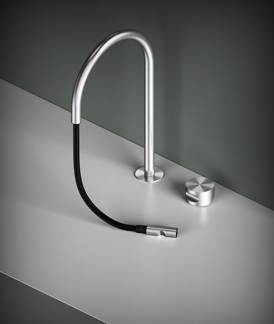
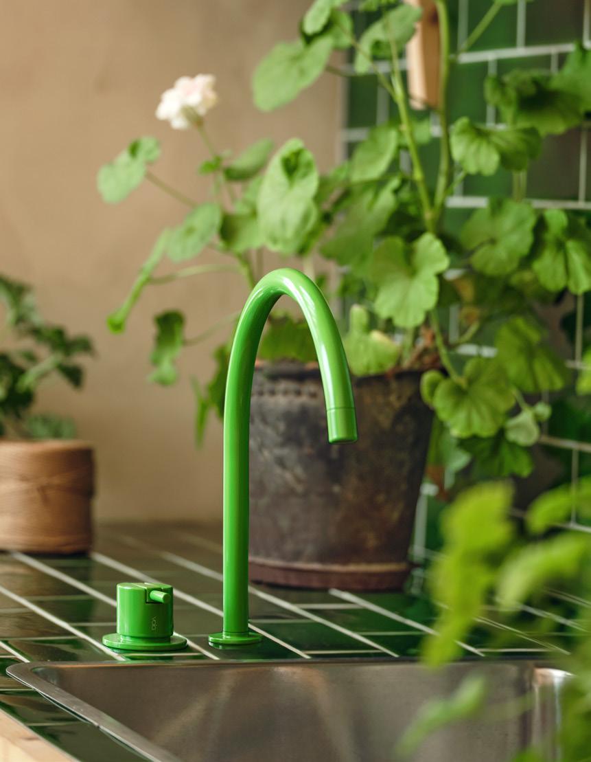
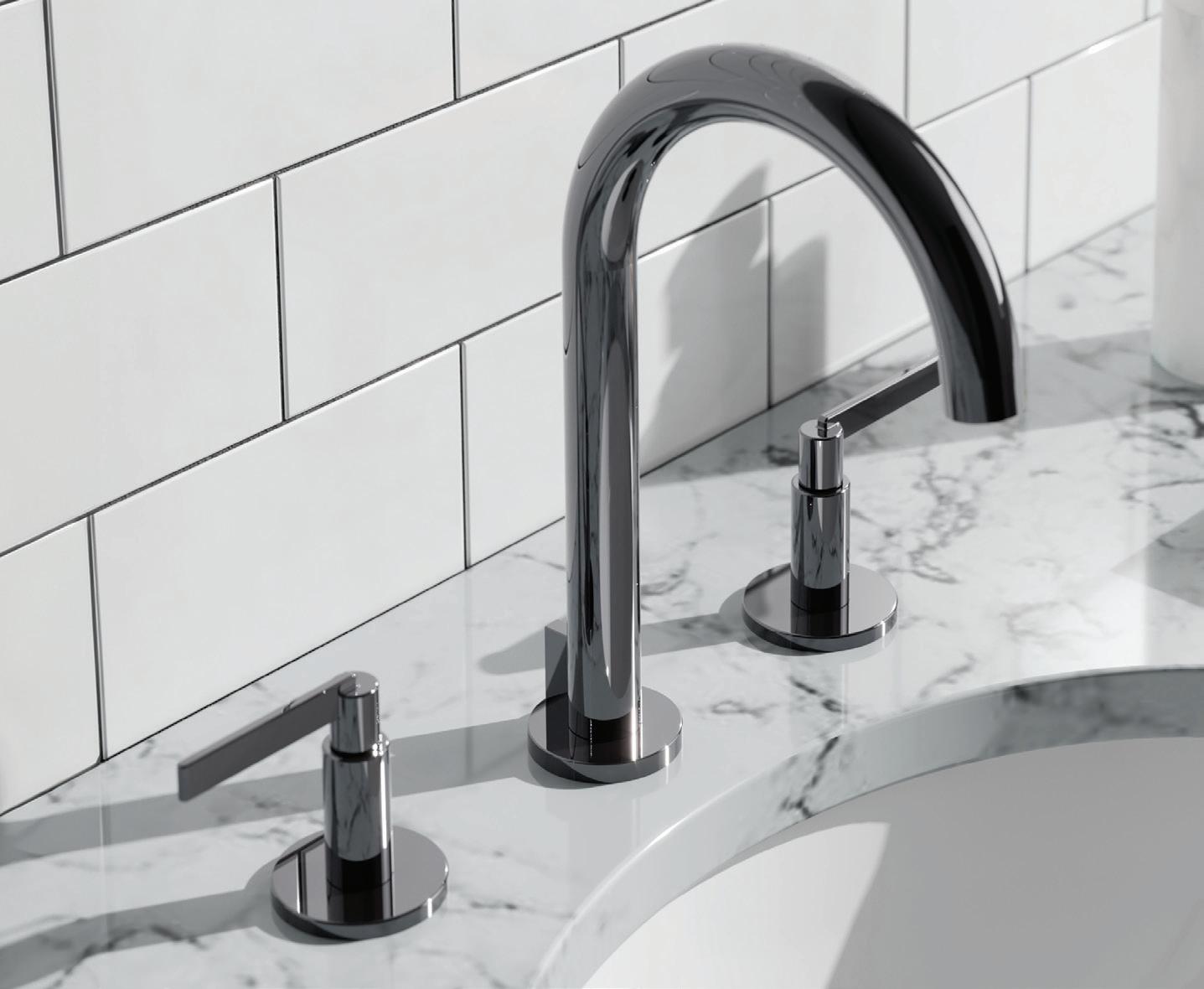
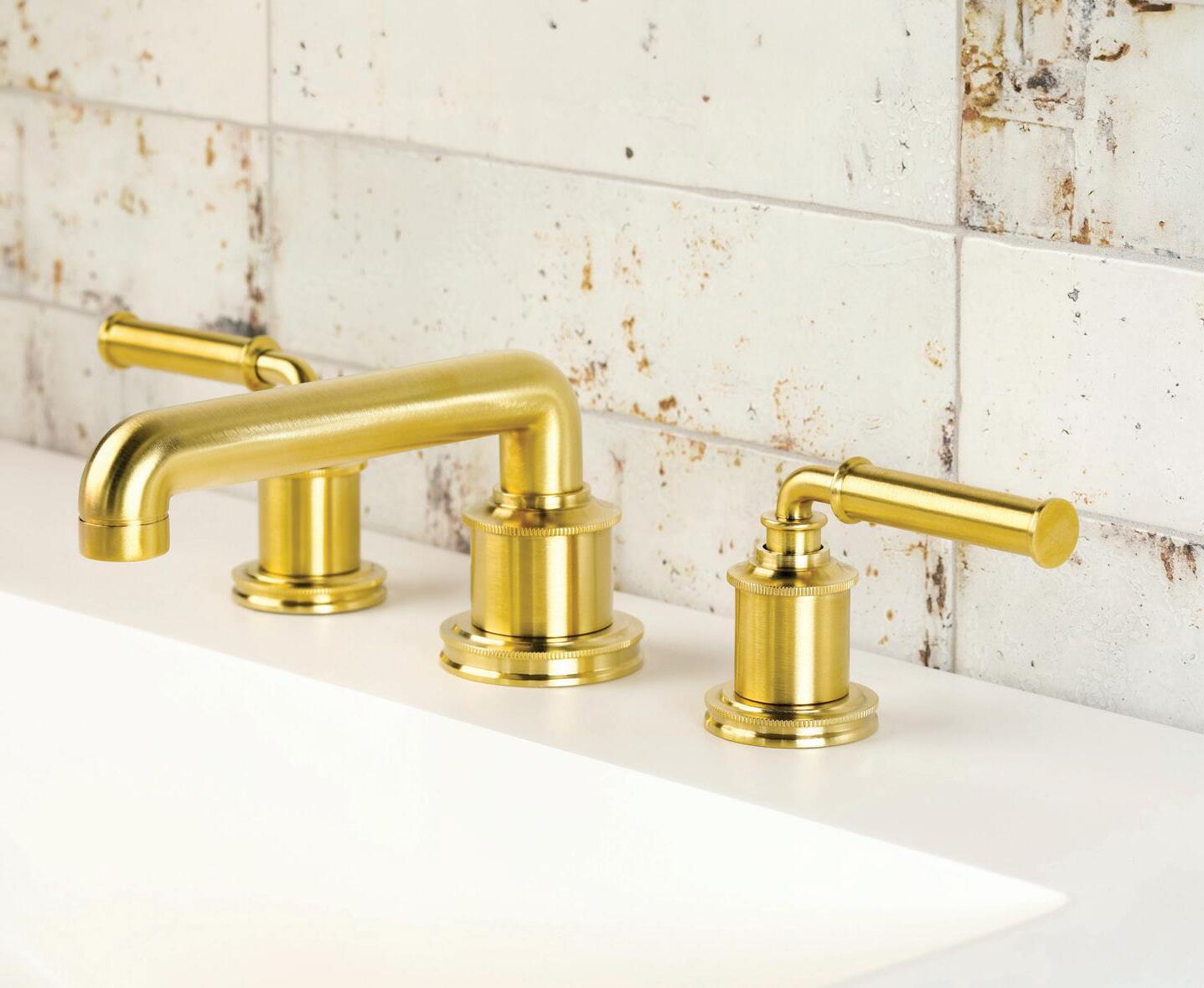
Even functional fixtures can be bold design statements, a point many brands seemed to have agreed on at this year’s KBIS. Weaving together the many new releases at the international trade show, one uniting factor made a splash: sculptural faucets. The forms of spouts and handles offer designers opportunities to get creative with shape, curvature, linearity, and tactility. Some opted for the sleek and angular, composing sharp right angles and minimalist systems. Others went playful, turning handles into fully circular knobs or devising serpentine spouts whose various configurations better suit oversize sinks. As more and more bathrooms and kitchens deliver charismatic, distinct interiors, these products add an eye-catching layer for a more immersive design.

Kohler Components kohler.com

Sculptural Faucets
BARIL Design MARIE barildesign.com
48 Issue 25 Spring/Summer 2024
TREND VOLA 590H en.vola.com
courtesy the product manufacturers
Images
THUMB quadrodesign.it
QuadroDesign

49 AN Interior Newport Brass is widely recognized for its expertise in creating bathroom and kitchen faucets and fixtures known for their exceptional quality. The brand’s collections encompass a broad spectrum of designs, innovations, and finishes, catering to contemporary, transitional, and traditional styles. Inspired Design. Unrivaled Craftsmanship. 2001 CARNEGIE AVENUE SANTA ANA, CA 92705 • 949-417-5207 • WWW.NEWPORTBRASS.COM
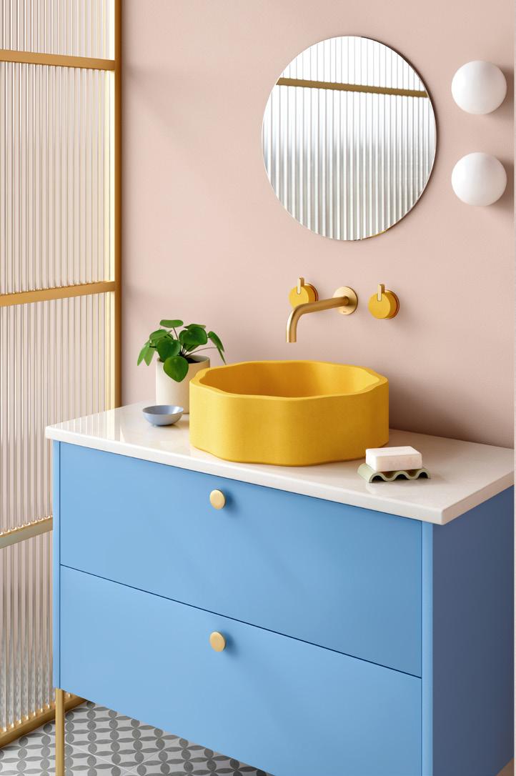
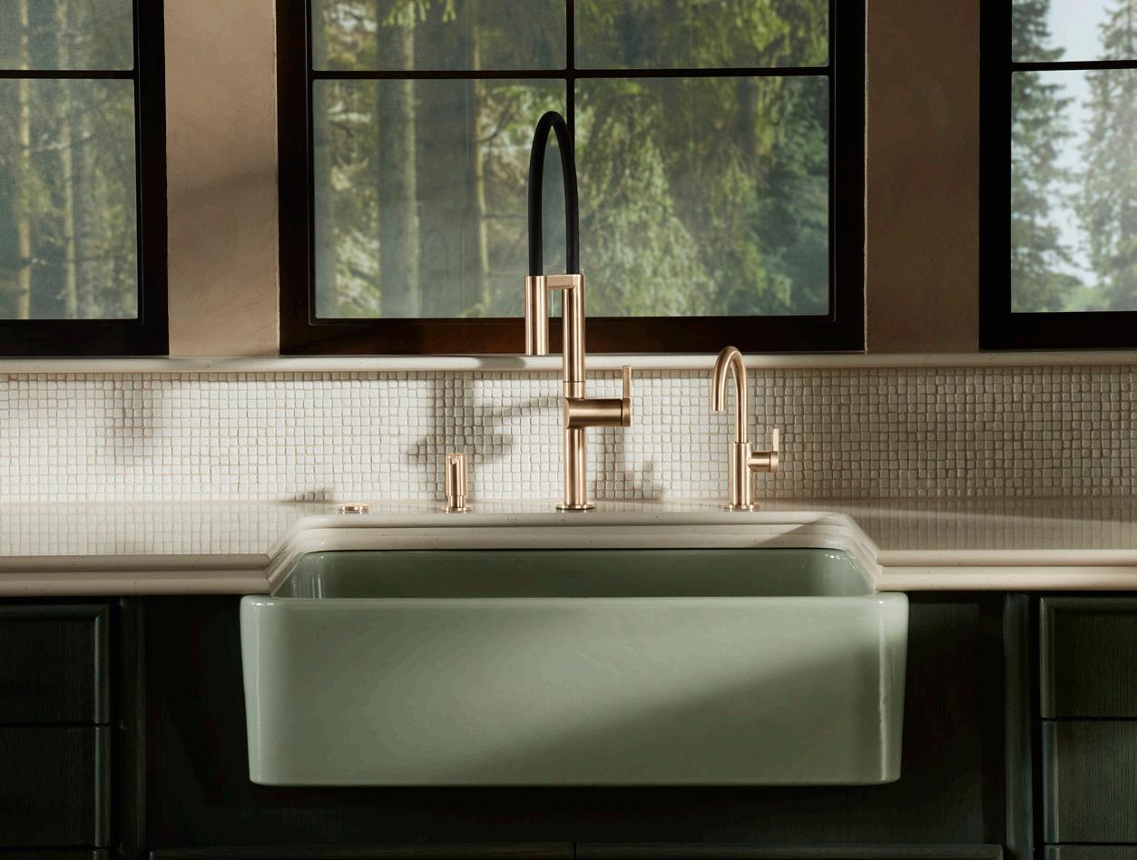
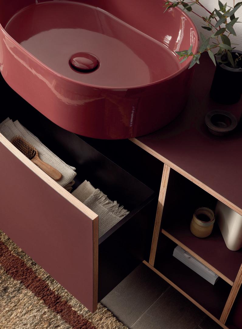
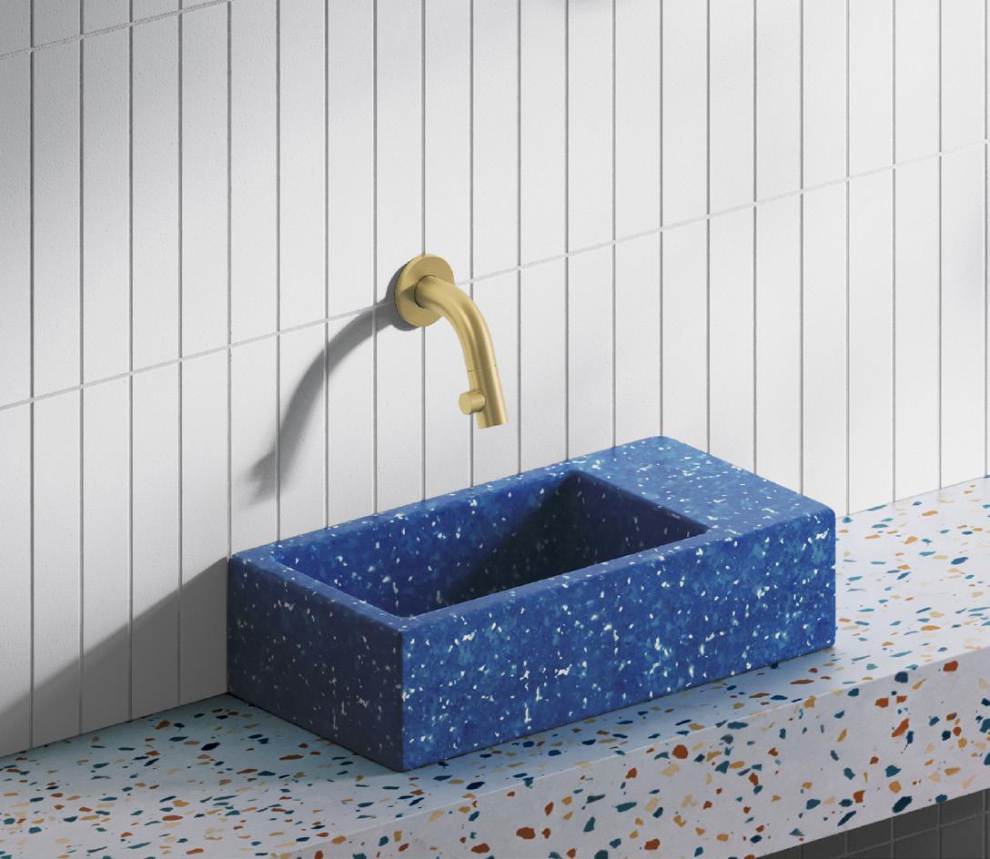
Color stole the show at 2024’s KBIS. Concretti’s Bucket Sinks were a particular trade show favorite, blending a vintage style with vibrant concrete. These saturated sinks come alongside material innovation and whimsy, as in the case of Kast’s curving sinks or Clou’s Ecorazzo, made from 100-percent-recycled plastic waste.
Sink & Vanities
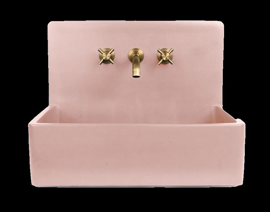
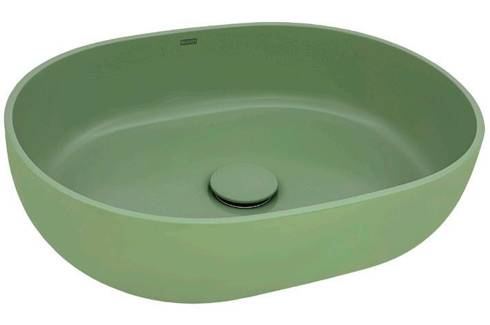
1. Concretti, Bucket Sink concrettidesigns.com
2. Ruvati, Canali ruvati.com
3. Kast, Wave collection kastconcretebasins.com
4. Ceramica Cielo, Theo 175 ceramicacielo.us
5. Kohler, Heritage Colors Collection kohler.com
6. Clou, Ecorazzo clou.nl
50 Issue 25 Spring/Summer 2024
PRODUCTS
1 4 3 2 5 6
courtesy the product manufacturers
Images
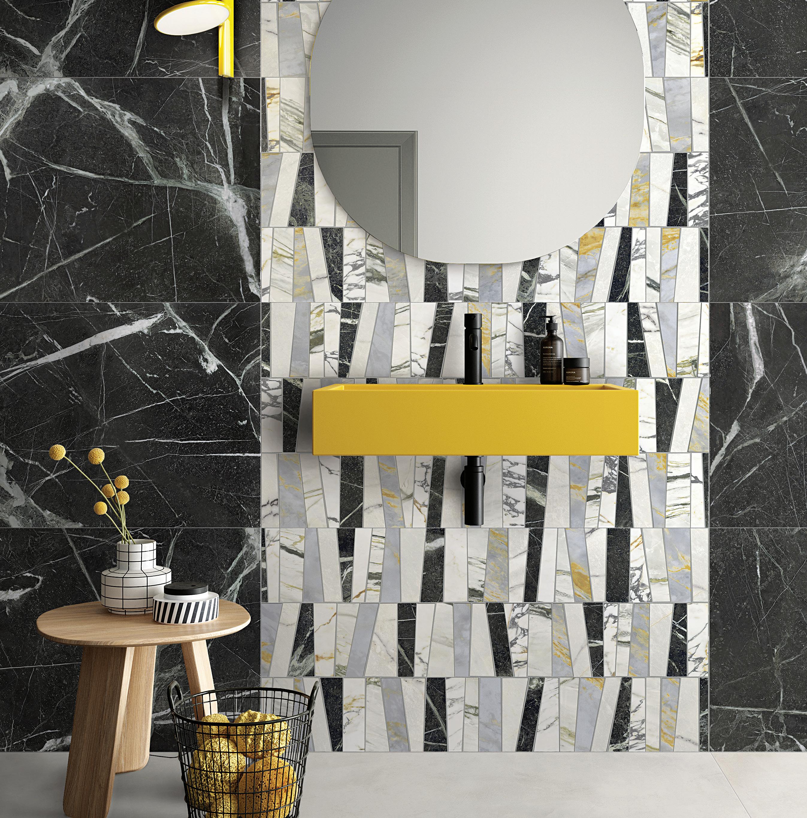

51 AN Interior Manhattan | Southampton | Red Bank | Philadelphia | Hicksville | Boston NemoTile.com | 48 East 21st Street New York, NY 10010 | 212.505.0009
Leon - A Porcelain Marble Collection & HD Awards Finalist
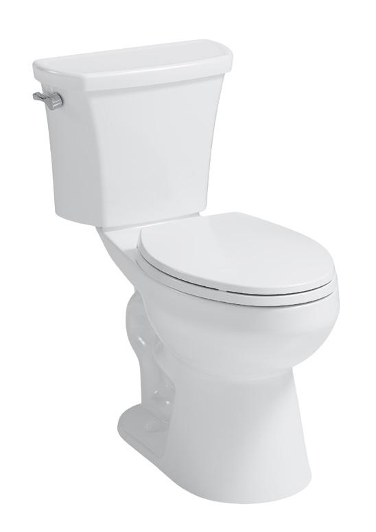
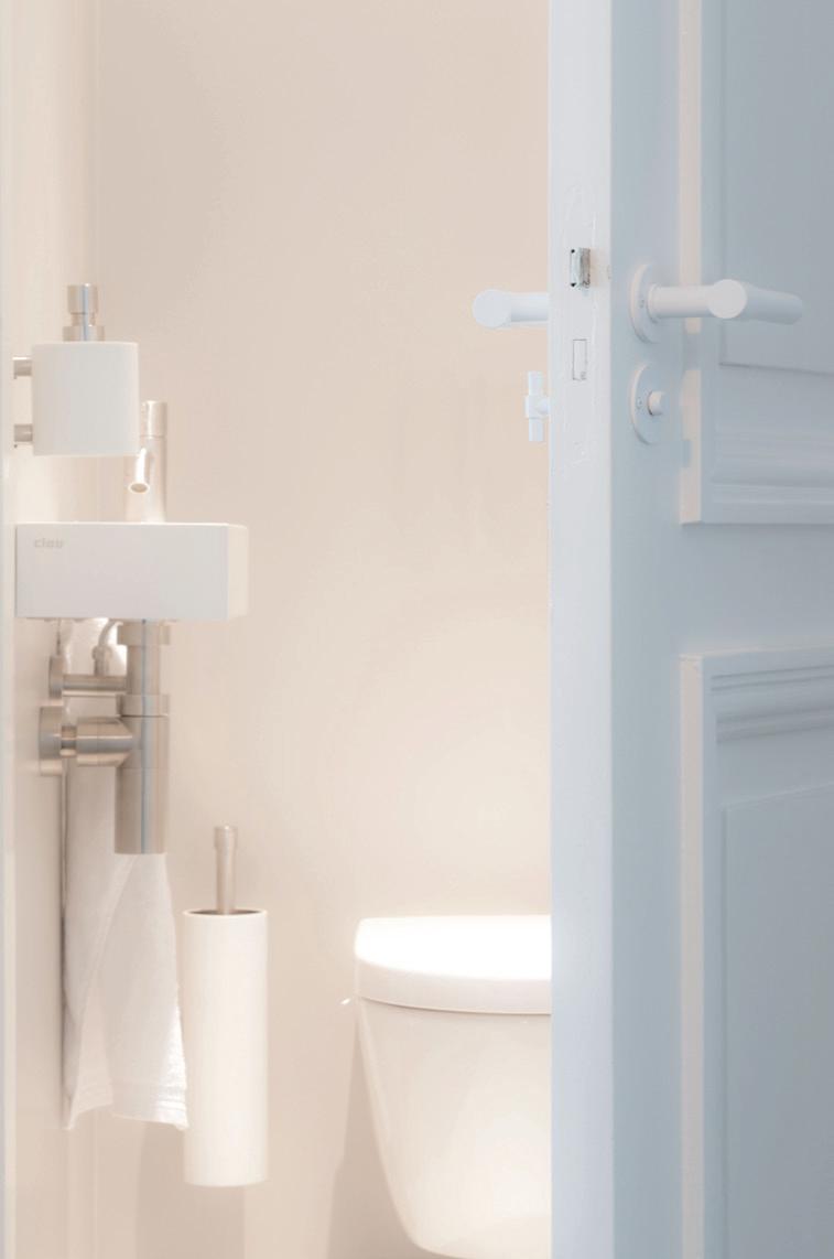
Since the pandemic, a desire for smarter, more hygienic design has continued to propel interiors, especially in the realm of bathrooms. Manufacturers have risen to the call by building lavatories that are never singularly functional. Instead, 2024’s fixtures emphasize energy saving, self-cleaning technology, anticlog safeguards, and odor and dirt reduction.
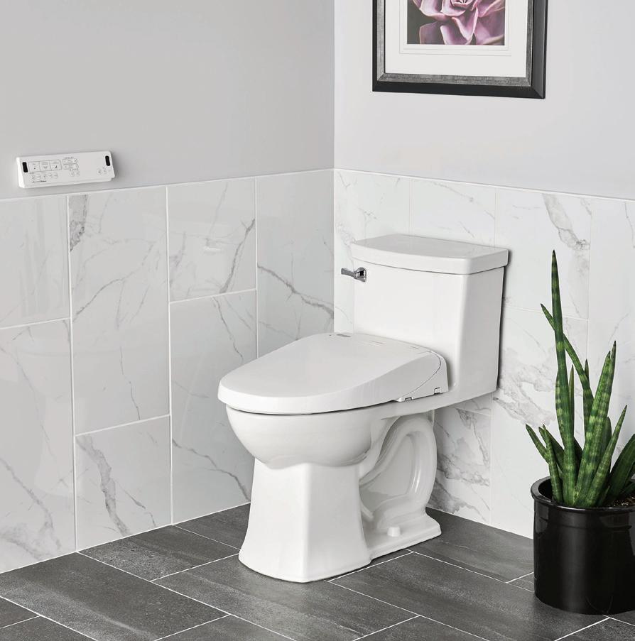
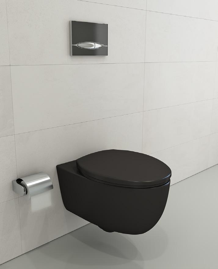
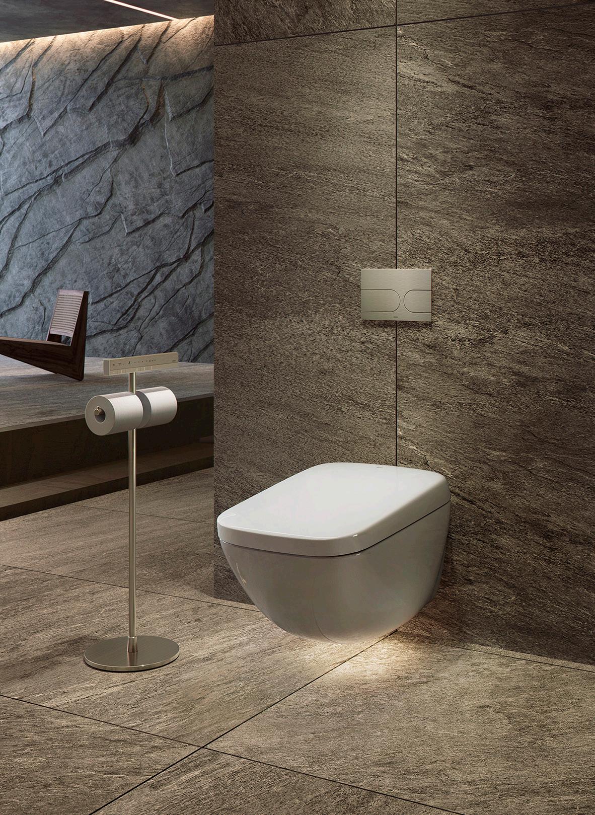
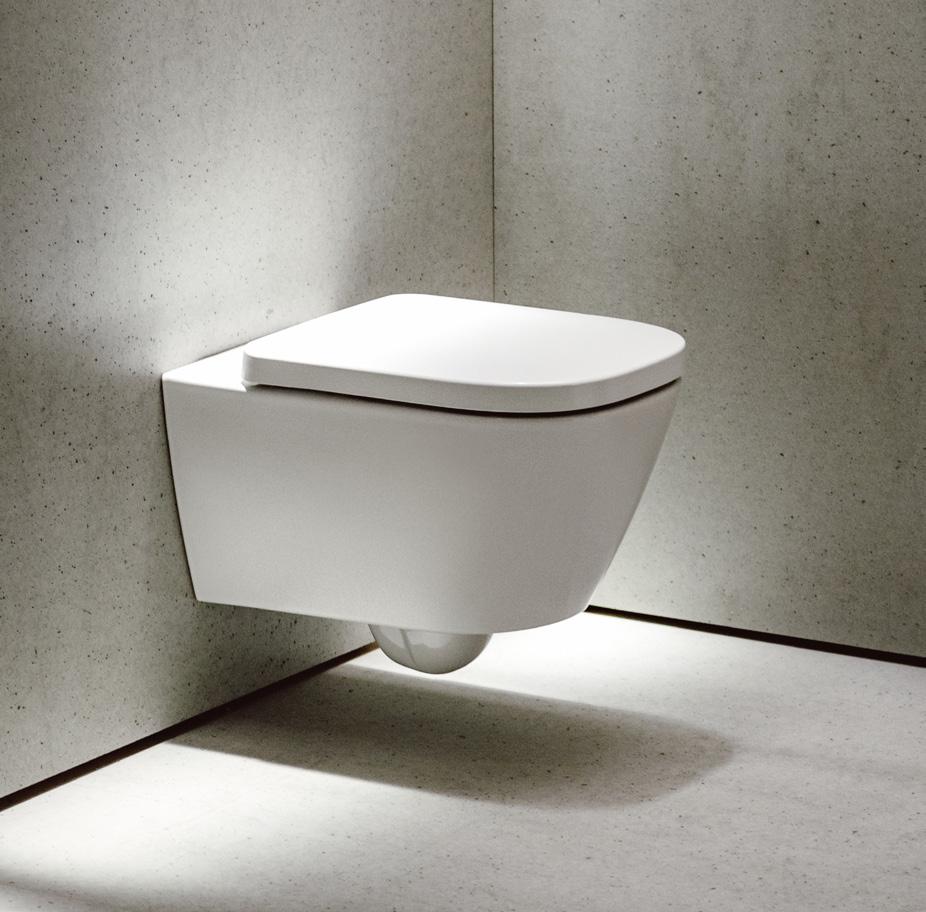
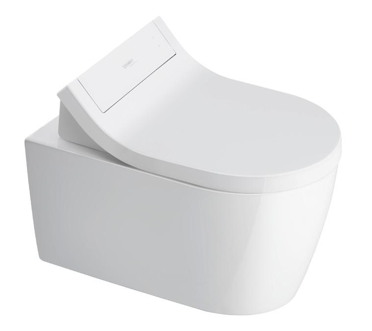
1. FGI, Anti-overflow toilet fgi-industries.com
2. Ferguson, American Standard Advanced Clean® 100 SpaLet® ferguson.com
3. Laufen, The Euro durasein.com
4. Bocchi, 1632 Milano wall-hung toilet bocchiusa.com
5. Toto, Neorest totousa.com
6. Duravit, SensoWashR Classic Shower Toilet Seat duravit.us
52 Issue 25 Spring/Summer 2024
PRODUCTS Toilets
2 3 1 4 5 6 Images courtesy the product manufacturers
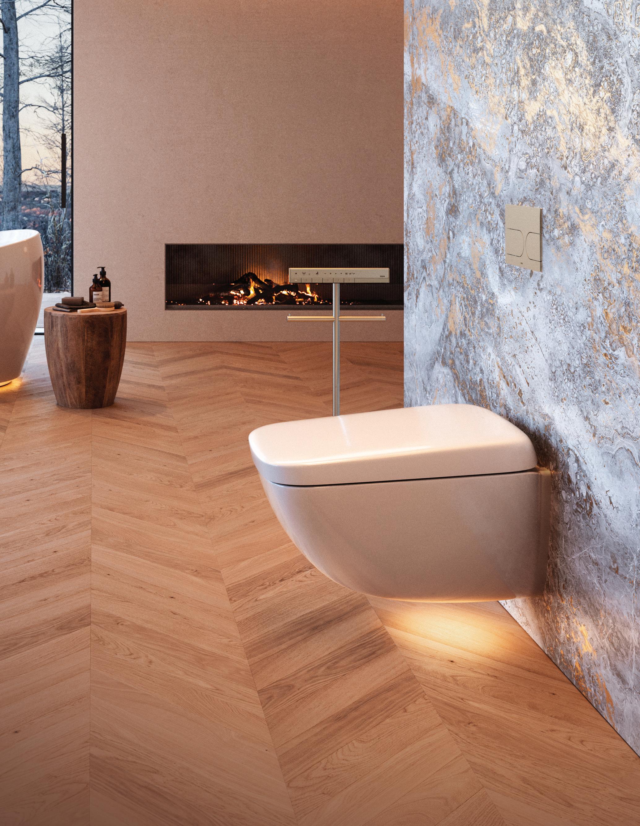
WX1 2023 TOTO’s new NEOREST WX1 Wall-Hung model blends cutting-edge technology with a sleek space-saving design, offering unparalleled comfort, hygiene, and sustainability for a truly sophisticated bathroom experience. TOTO NYC GALLERY 20 W 22nd Street, New York, NY 10010 TOTOUSA.COM | 917-237-0665 EXT. 3 SCAN CODE FOR INFO
PRODUCTS Millwork
From storage systems to islands, millwork often makes (or breaks) one’s first impression of a kitchen. These systems organize all of a room’s necessities. The following products are a testament to how manufacturers have grown increasingly creative with material application, installation efficiency, texture, and volumes—without sacrificing aesthetics.
1. Vipp, V3 Kitchen vipp.com
2. Molteni&C, Prime Kitchen shopmolteni.it
3. Reform, COLUMN reformcph.com
4. SieMatic, Secret Service siematic.com
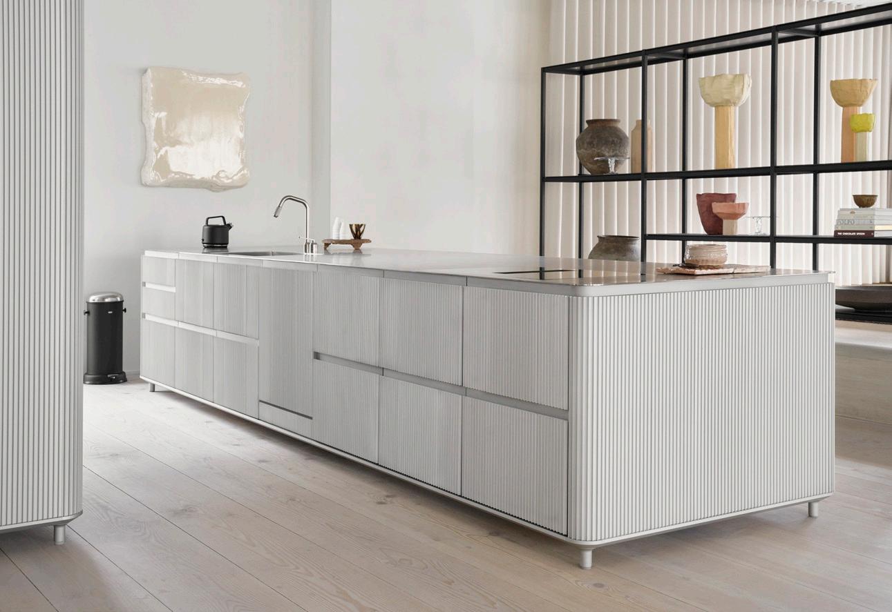
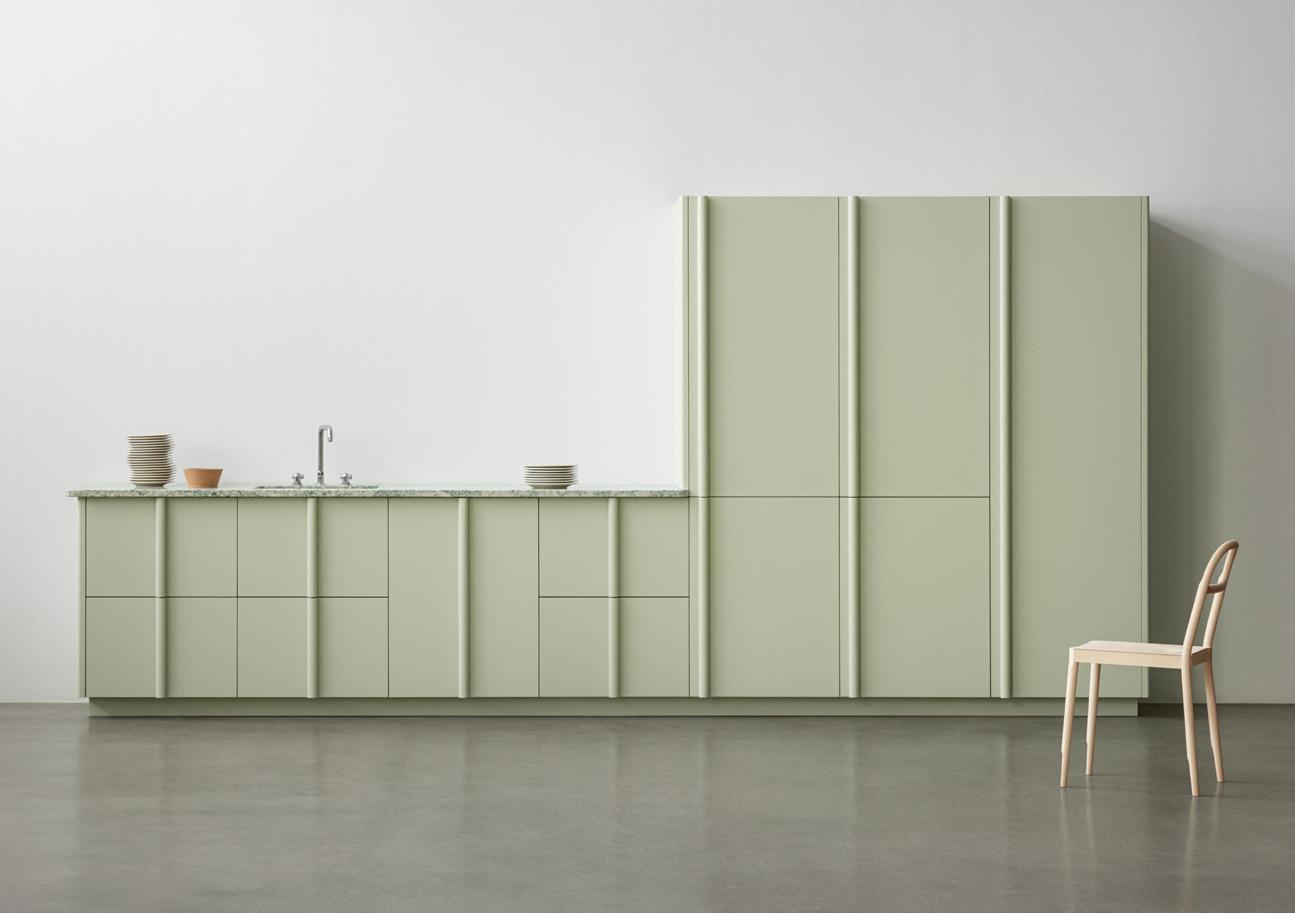
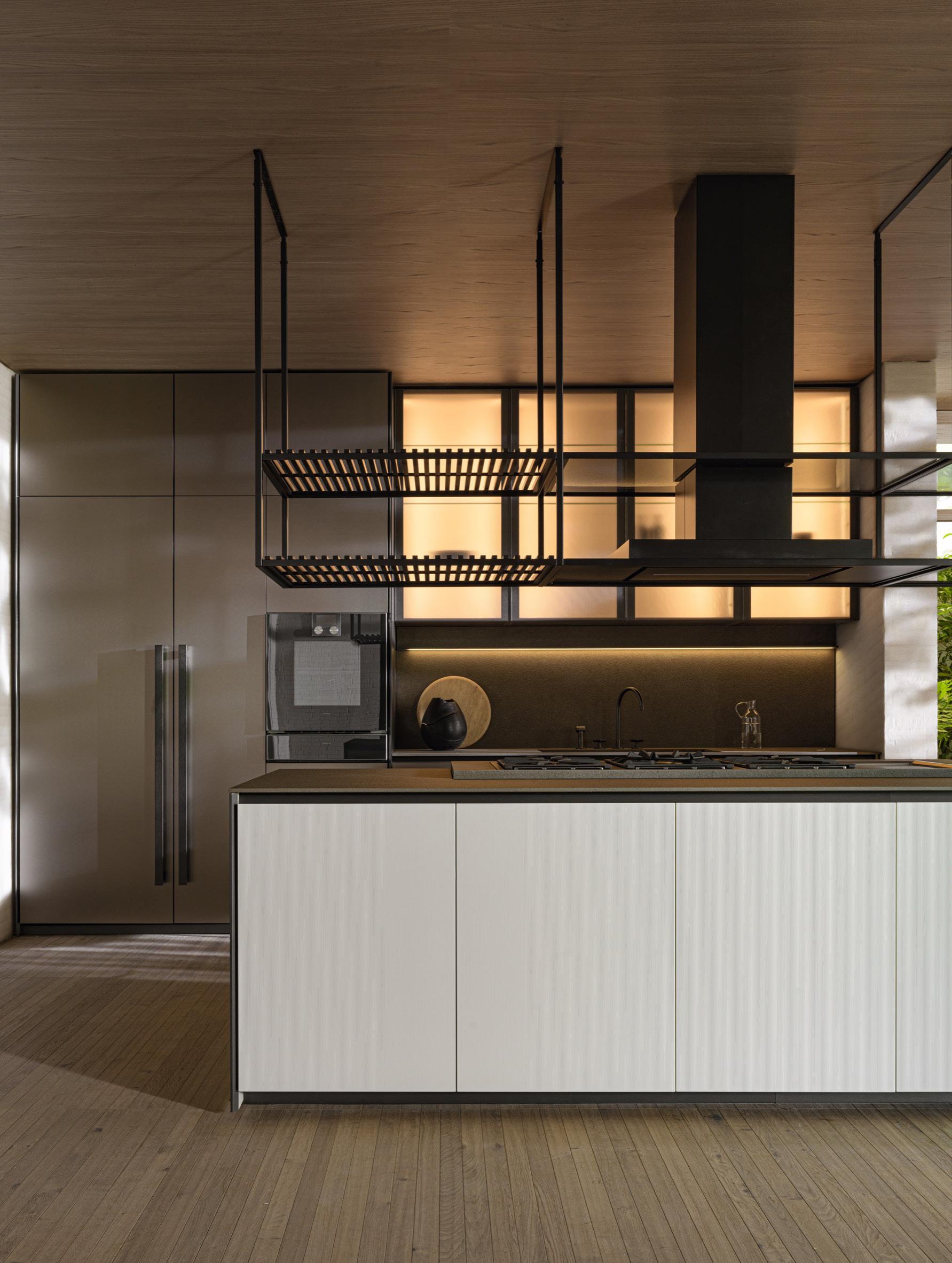
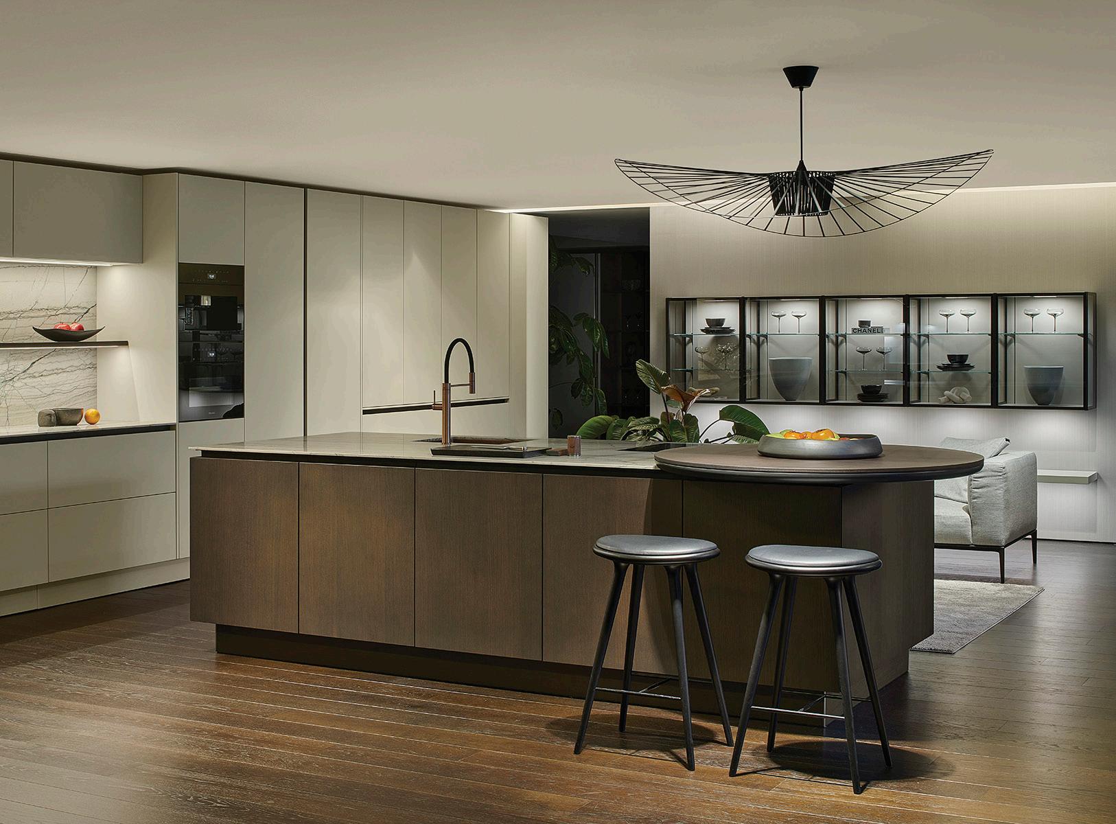
54 Issue 25 Spring/Summer 2024
1 3 2 4
Images courtesy the product manufacturers
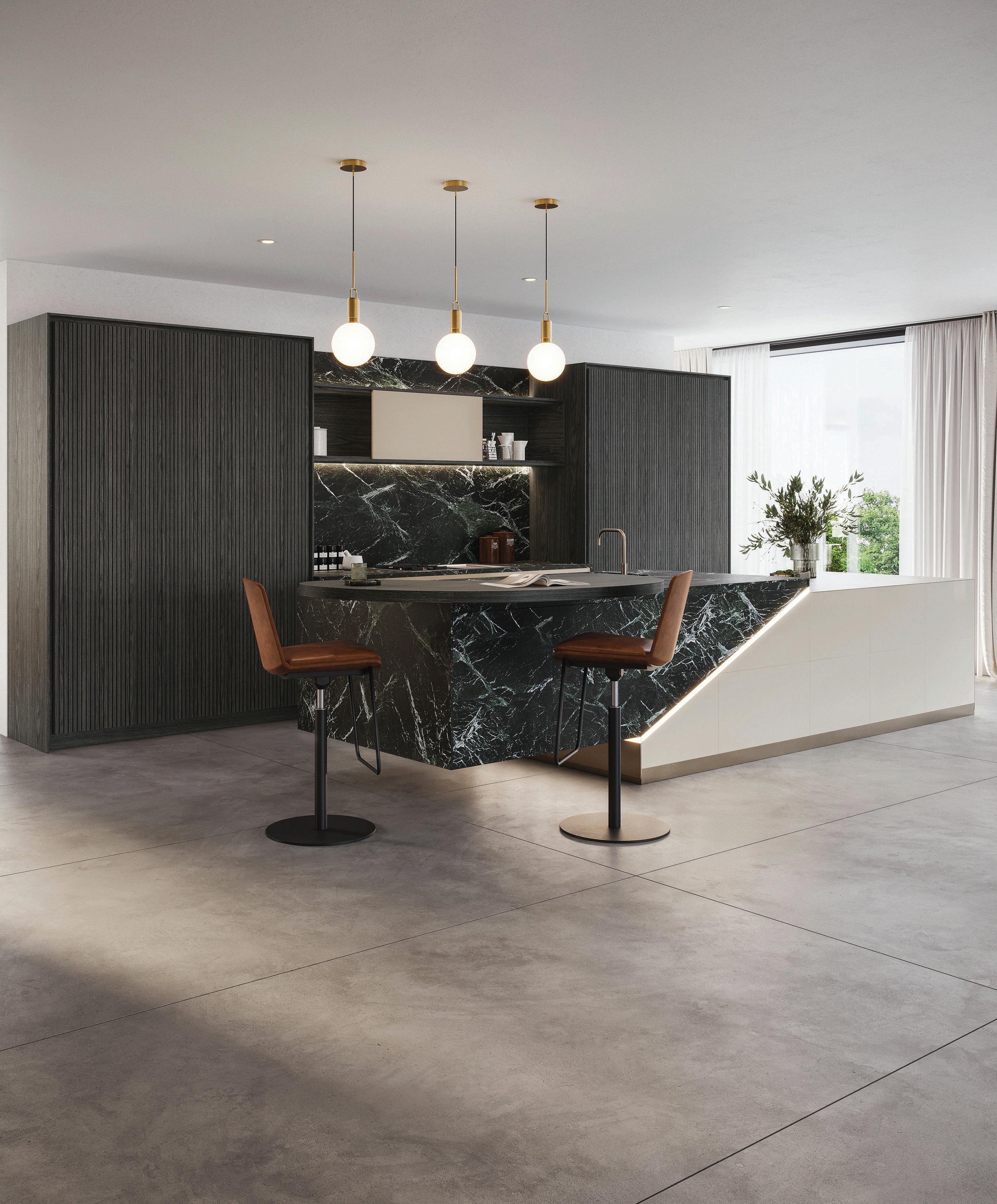

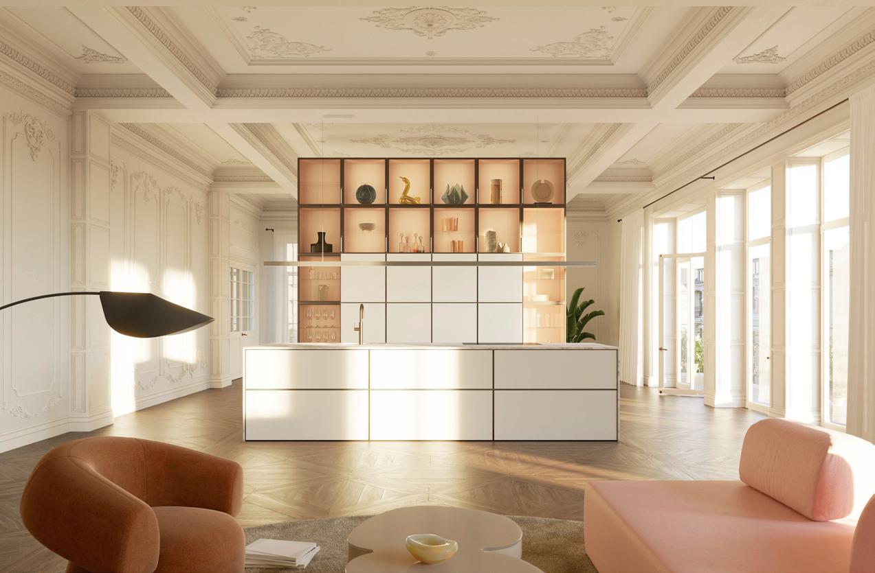
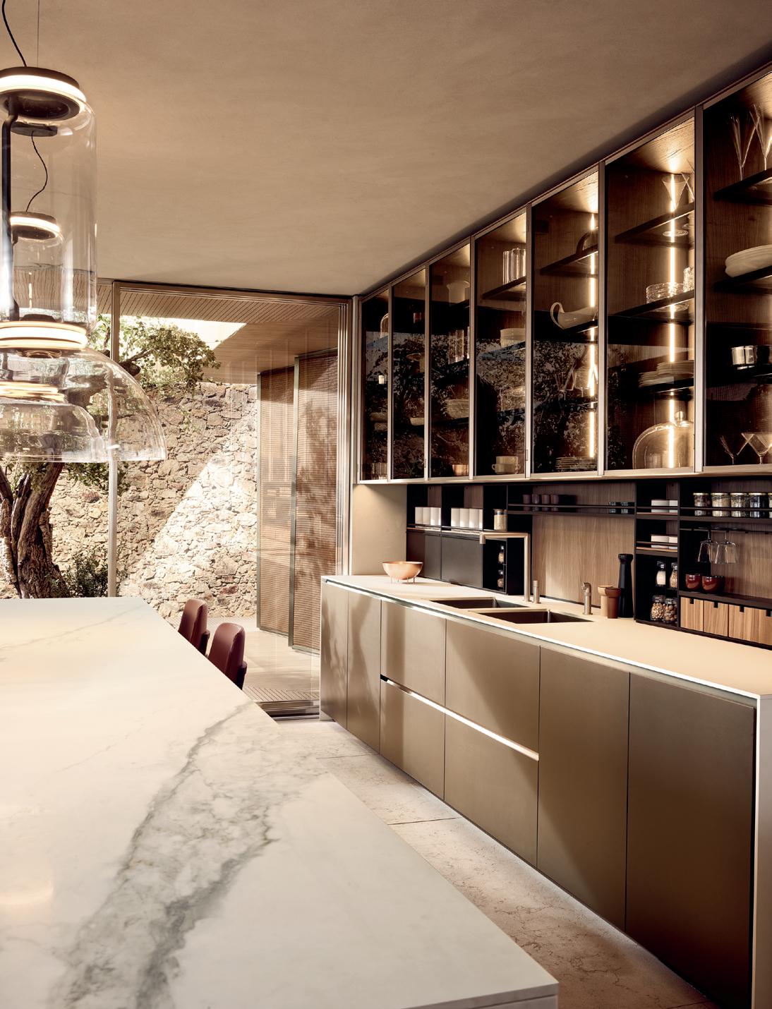
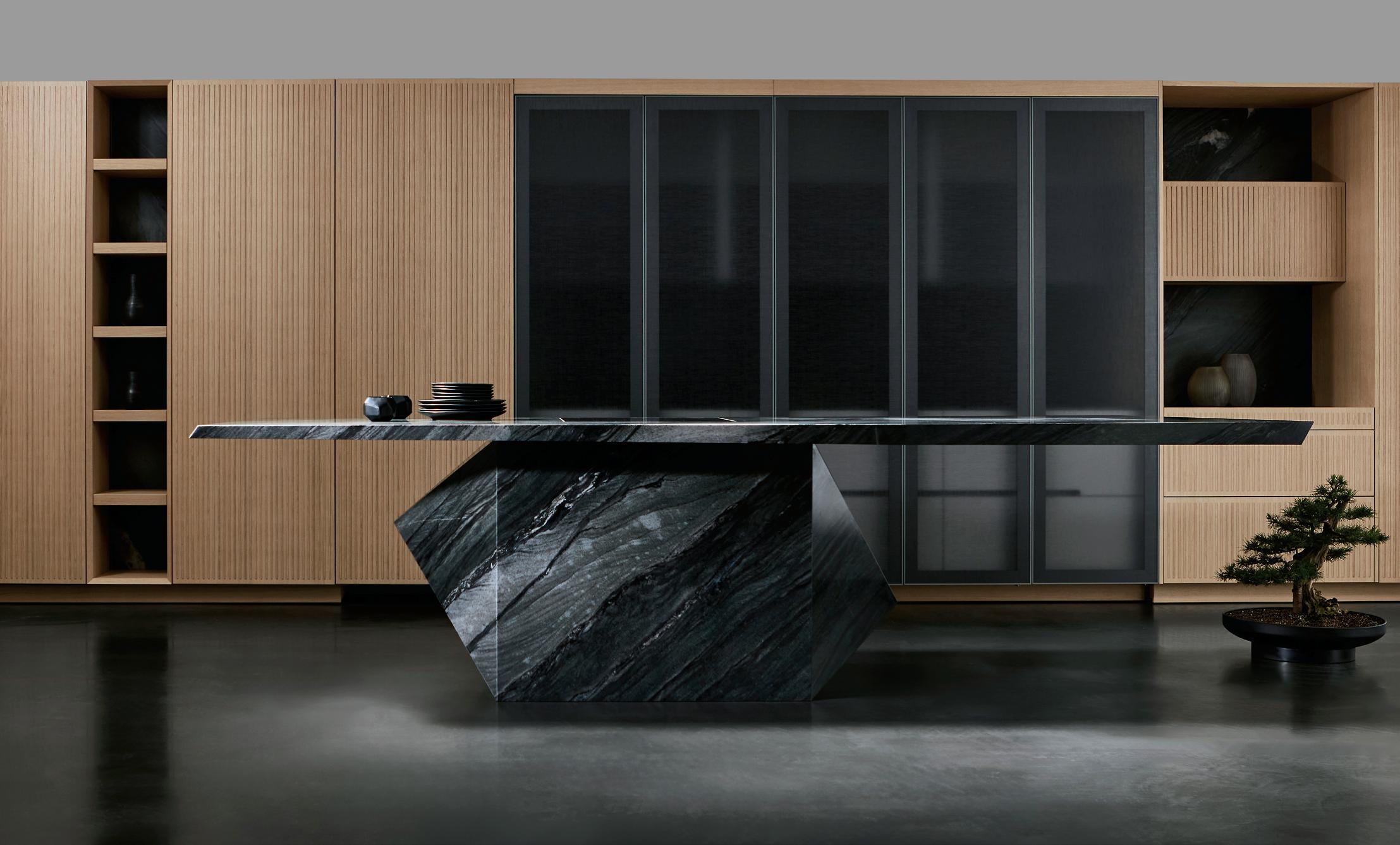
innovative design ideas that defy gravity eggersmann since 1908 eggersmannusa.com new york | dania beach | naples | houston | dallas | chicago | los angeles | laguna niguel | pittsburgh | scottsdale | sand city | maui | honolulu | los cabos eggersmann Kitchens | Home Living 8921 Beverly Blvd | West Hollywood, CA 90048 | 310.288.0073
6. Poliform, Alea Pro poliform.it
7. eggersman, Depot Murphy Doors + Nami Kitchen Island eggersmanusa.com
56 Issue 25 Spring/Summer 2024 Millwork PRODUCTS 5 7 6
5. Poggenpohl, Poggenpohl kitchen with the contour fronts poggenpohl.com
courtesy the product manufacturers
Images

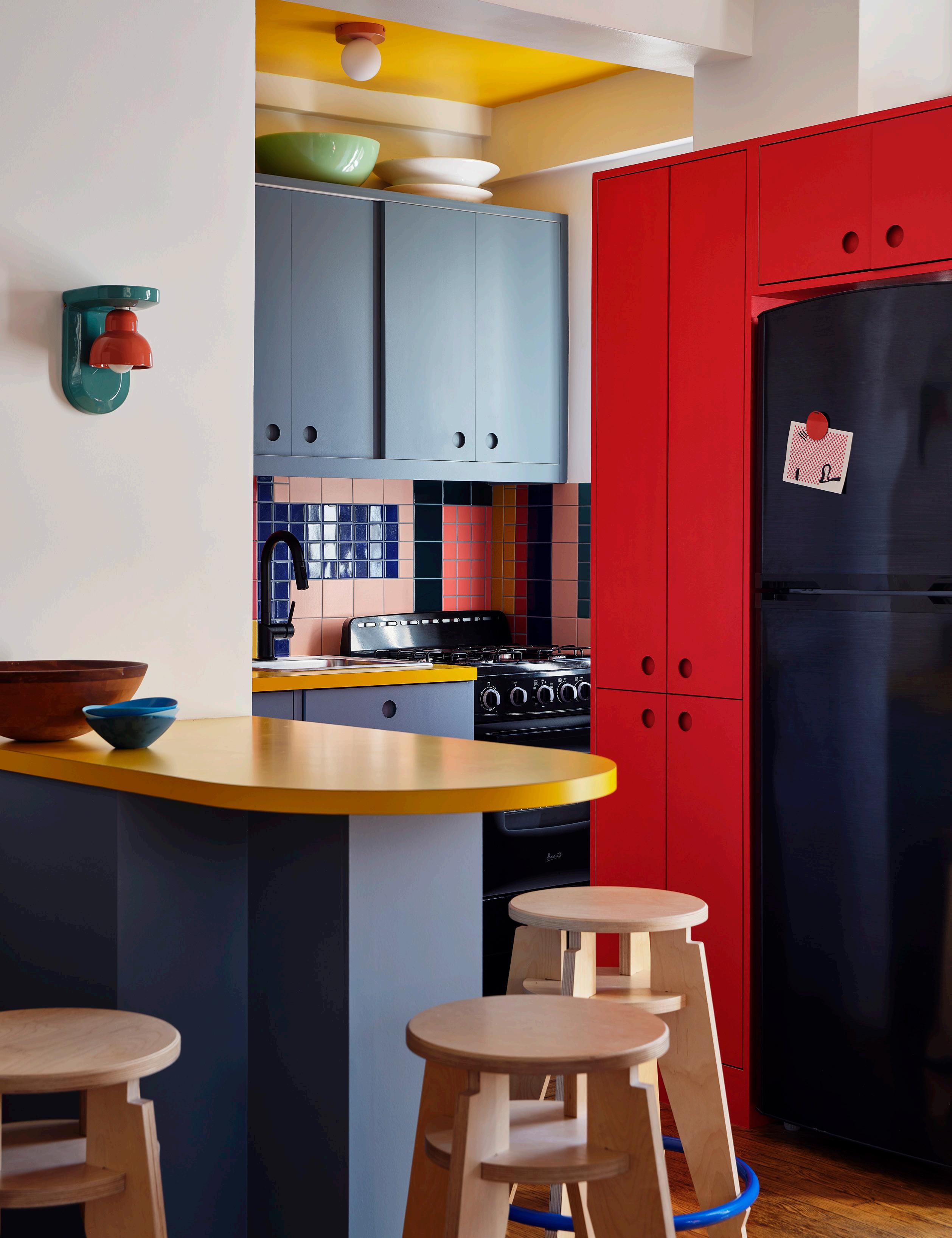
this page The kitchen is centered around a breakfast
served
facing
counter
by custom stools made by the
artist Pam Lins.
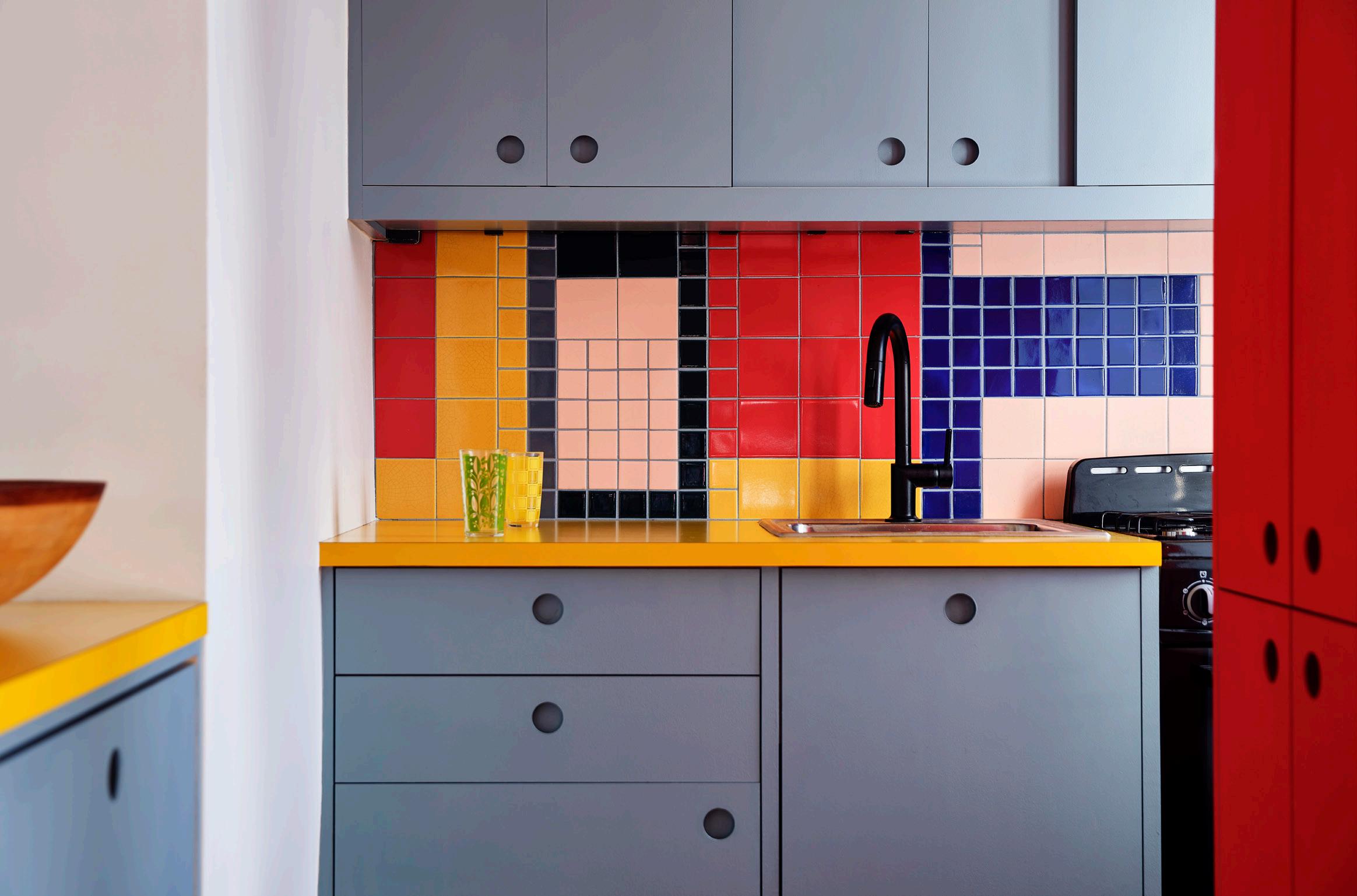
page The primary color palette of the kitchen built-ins continues in a playful mosaic backsplash.
Ty Cole
Sarah Jacoby Architect designs a compact and colorful kitchen for a visual artist with custom, space-saving details and furnishings. Text by Lauren Gallow
Playful and Personal
In Manhattan, Sarah Jacoby Architect combined color with a thoughtful reorganization for an inspired new kitchen composition. The artist’s kitchen pulls from the abstract sensibilities evident in her own paintings and drawings, which incorporate bold swaths of color and brazen geometric shapes. “The kitchen was originally a galley with very little room,”
said Jacoby. “We wanted to keep most of the appliances where they were, while opening it up and bringing in color, light, shape, and playfulness—more of the artist herself.”
Hindered by tight square footage, Jacoby removed a wall to make room for a new peninsula offering additional counter space and a seating area linking the kitchen
and living areas. Primary colors animate the painted custom cabinetry and laminate countertops, and a backsplash of Fireclay tiles in an arrangement codesigned with the artist provide a focal point at the back, making the kitchen feel larger. Stools designed by the artist Pam Lins, a friend of the client, inject a dose of playful personality to cap it off. ●
AN Interior
IN FOCUS
An uptown Manhattan apartment is reimagined by New York–based firm Ideas of Order to become a forever home with contemporary style. Text by Lauren Gallow
Art Deco Update
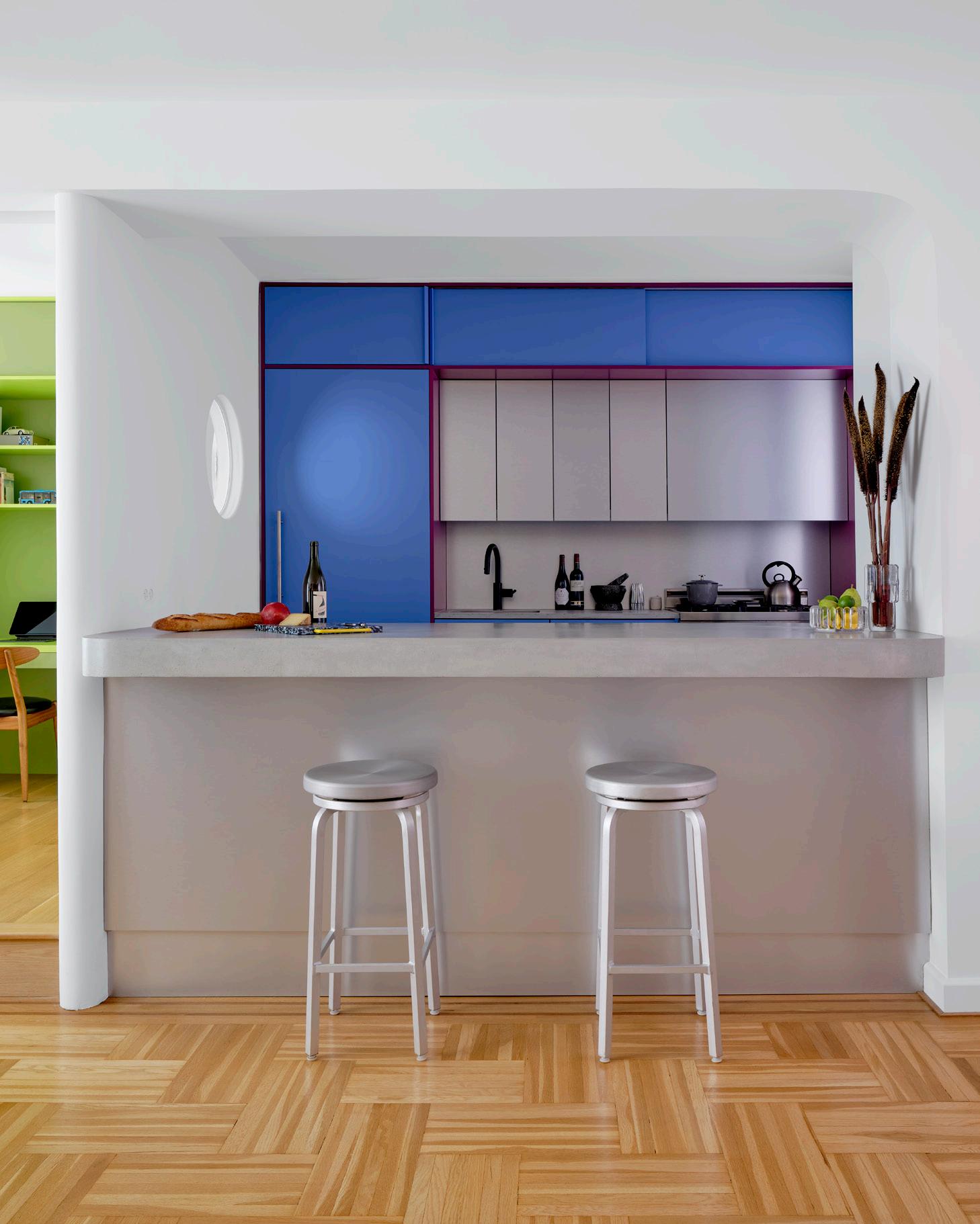
Located within a 1940s art deco building, this upper Manhattan apartment takes inspiration from the era’s proclivity for shiny surfaces and colored light to help a small kitchen feel more spacious. Designed by local firm Ideas of Order, the kitchen’s facelift was part of a larger renovation, including a new flex room and additional entryway storage. “The clients had been living there for years and decided to invest to make it a home they’ll continue to live in for a long time,” said the architect and firm cofounder Henry Ng.
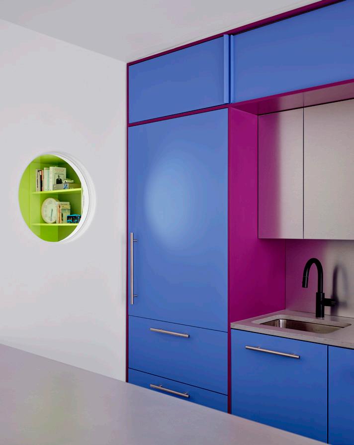
The kitchen’s aluminum cabinets, backsplash, and paneling beneath the eatin counter offer a subtle reflectivity that amplifies each volume. Concrete countertops ground the space, with polychrome painted millwork providing visual interest: Different color palettes demarcate the kitchen from the other zones of the open-plan apartment. A circular window between the kitchen and the flex room becomes a playful porthole while also drawing in natural light. Overhead cabinetry with sliding panel doors maximizes access in a tight space. “We approached the design with as much attention as we would have a larger space,” said architect and cofounder Jacob Esocoff. “It was an understanding that small scale can be an asset and value in design.” ●
60 Issue 25 Spring/Summer 2024
IN FOCUS
above The kitchen stands apart from the rest of the home through its cool and calming color palette. Blues and purples play well with stainless-steel chromatic accents.
Sean Davidson
right A small punched aperture in the kitchen wall allows for a playful peek into the adjacent room.
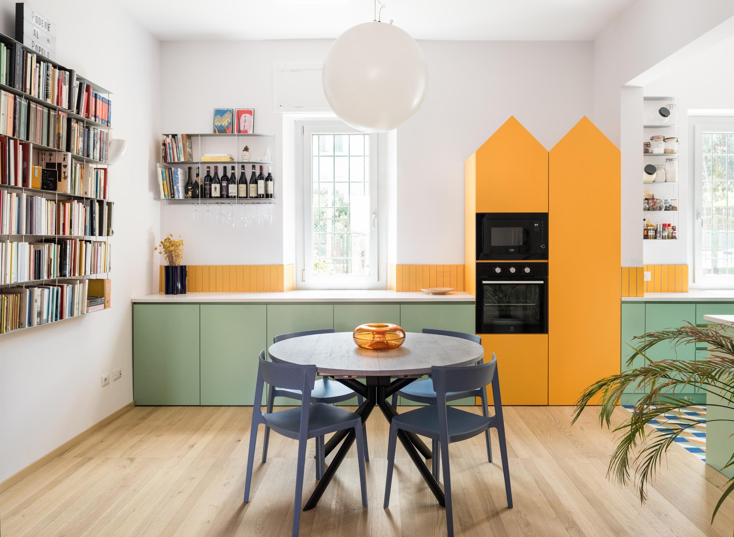
IN FOCUS
In Rome, 02A crafts a sunny and bright kitchen in the Italian capital with a contrasting palette of dandelion yellow and seafoam green. Text by Lauren Gallow
At Home in Rome
For this early 20th century home in the Pigneto district of Rome, local firm 02A conceived a tailor-made kitchen reflective of the owners’ joie de vivre. Occupying a space that was formerly the home’s entrance, the new kitchen manages to be both open and separate at the same time. The sink and cooktop are tucked into a U-shaped niche that opens to a dining area containing the oven, refrigerator, and additional counterspace. “The clients envisioned a kitchen that would facilitate both cooking and socializing simultaneously,” said 02A co-owner Marco Rulli, who worked with manager Ilaria Caprioli on the proj-
ect. “Our approach was to craft a kitchen that physically bridges the two functional zones.”
02A’s functional interventions surprise and delight, including a free-floating, triangular yellow hood, a dish drying rack integrated into over-sink shelving, and gabled casework enclosing the refrigerator and shelving. The result is a space that feels playful and inviting—an homage to self-expression. “Our aim was to encapsulate the stories and aspirations of our clients, creating a repository of memories from past homes and a welcoming space where friends can gather,” said Rulli. ●
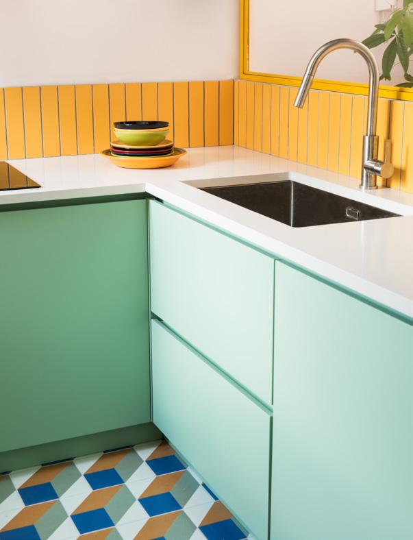
top Custom peaked fridge cladding adds a funky and personalized touch.
above A funky 3D floor pattern enlivens the kitchen by adding depth to the small space.
61 AN Interior
Paolo Fusco
PRODUCTS Hardware
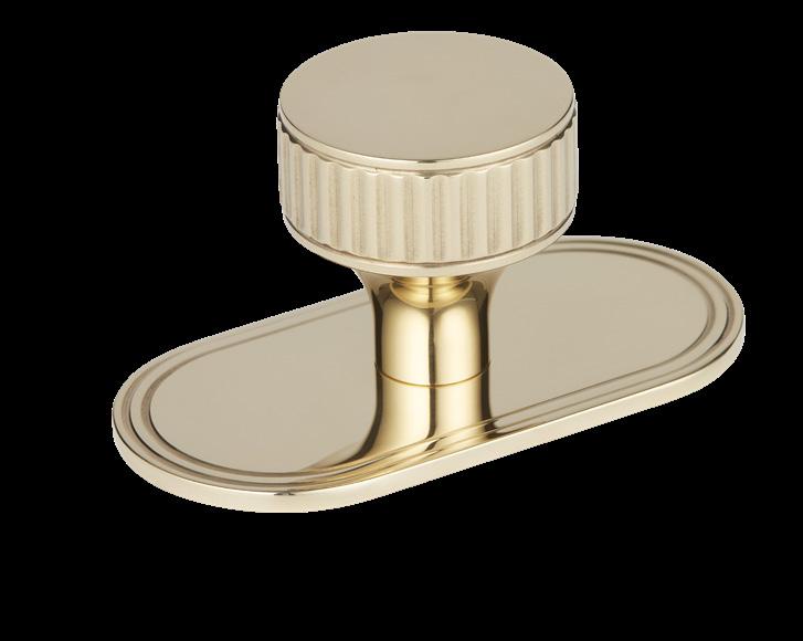
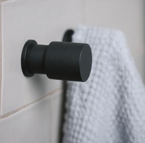
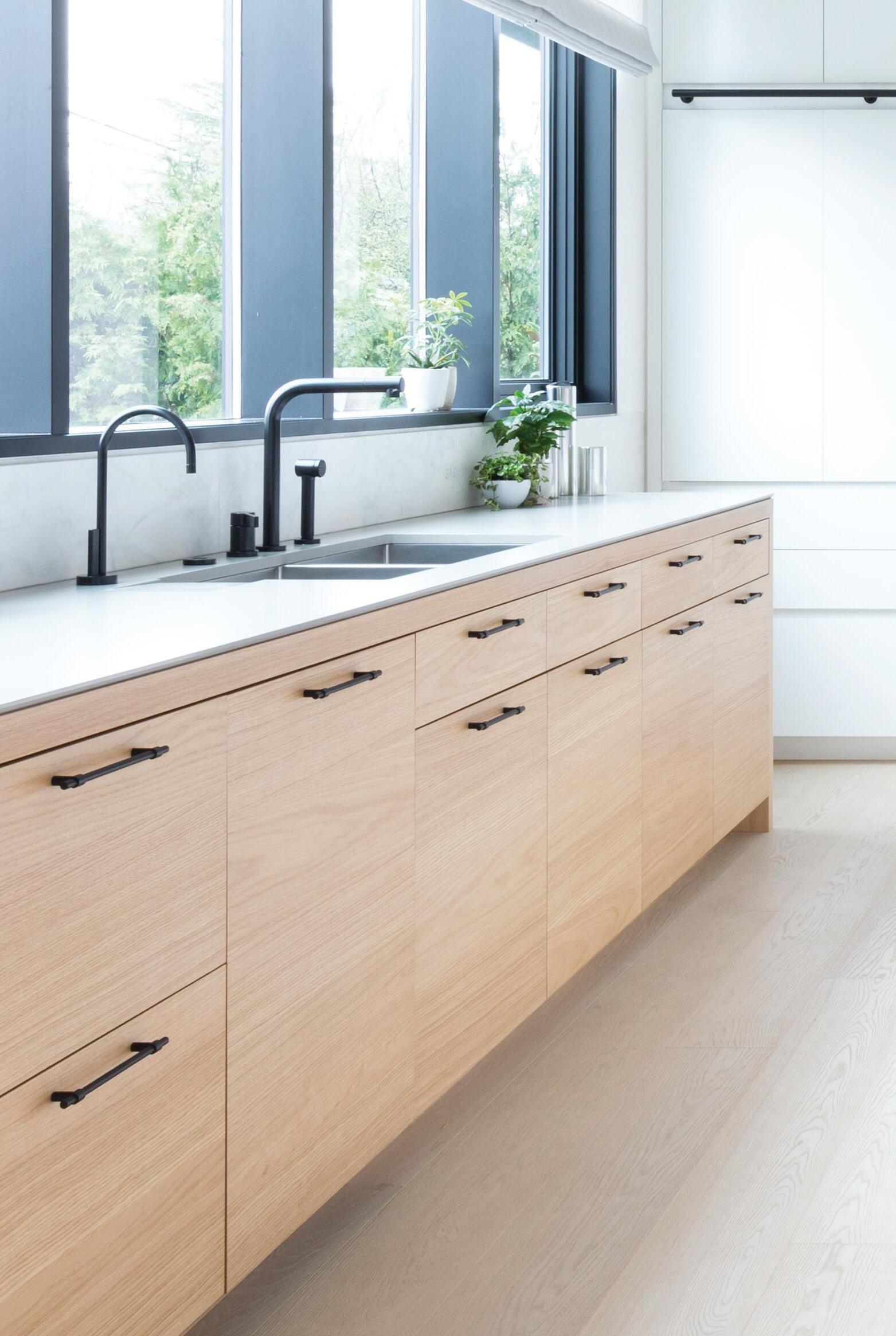
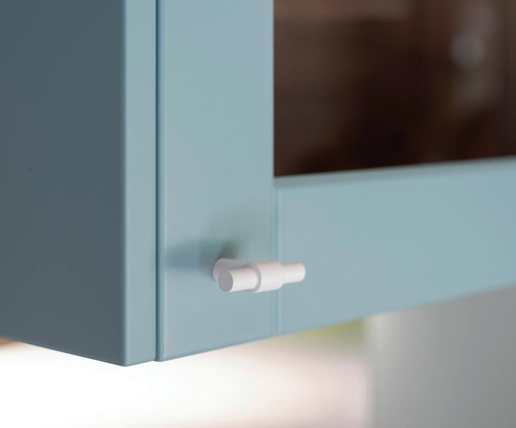
A design’s cohesion can often be felt through details: the knobs, pulls, drains, and handles. Whether a space is in need of a decorative accent or something seamlessly concealed into the larger design, this guide collates the latest releases whose attention to detail, craft, and performance are meticulous enough for a kitchen or bath.

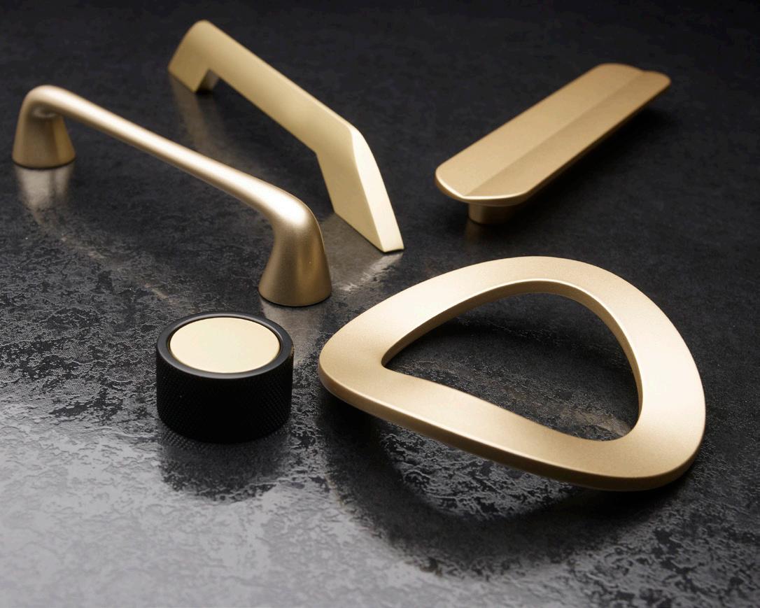
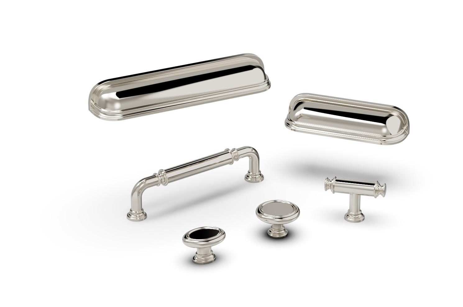
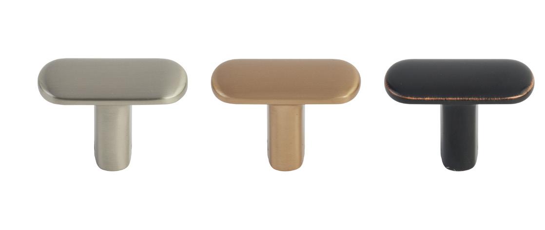
1. Oatey, Quickdrain bench oatey.com
2.Belwith Keeler, Berkshire belwithkeeler.com
3. Richlieu, Autore Collection richlieu.com
4. Infinity Drain, Adhesion Linear infinitydrain.com
5. Emtek, Habitat Collection emtek.com
6. Armac Martin, Cocktail Collection durasein.com
62 Issue 25 Spring/Summer 2024
1 3 2 4 6 5
Images courtesy the product manufacturers

ARCHITECTURAL HARDWARE
Designed and manufactured in New Zealand
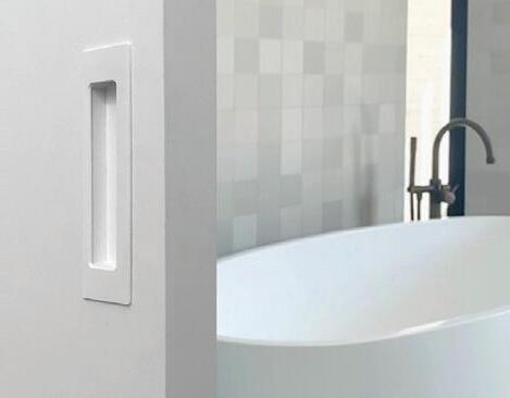
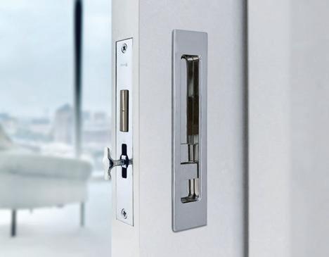
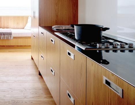
Whether it’s for the kitchen, the bath, or on the rocky coast of New Zealand, Halliday + Baillie has been making architectural hardware that stands up to any harsh environment, and does so beautifully. A commitment to sustainability is matched by the innate Kiwi talent for innovation. The diverse offering of solid brass pull handles, flush pulls, pocket door locksets, door stops, and modern stair rail brackets can enhance any space in your home. Available in a dozen hardy architectural finishes.
63 AN Interior
Available in North America through Bridgeport Worldwide and its dealers : +1-888-846-4319 hallidaybaillie.com
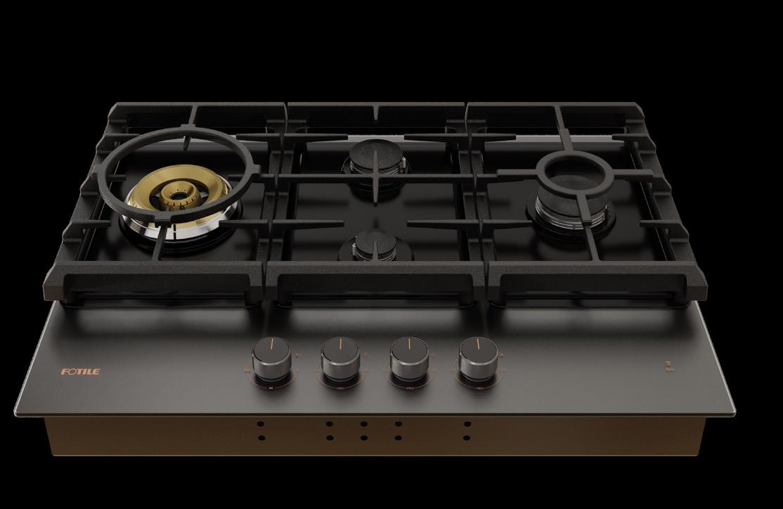
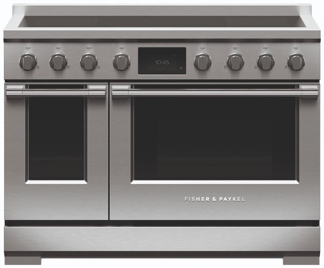
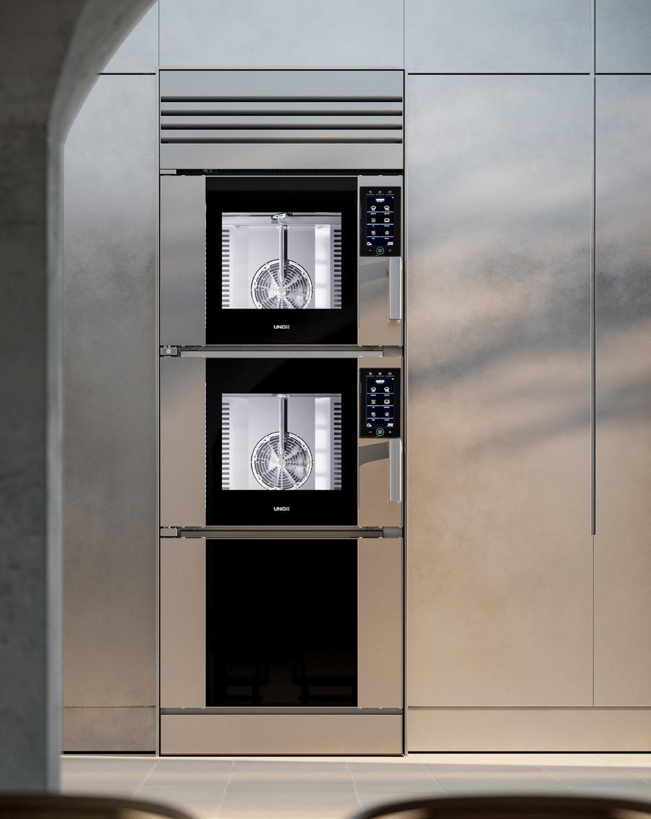
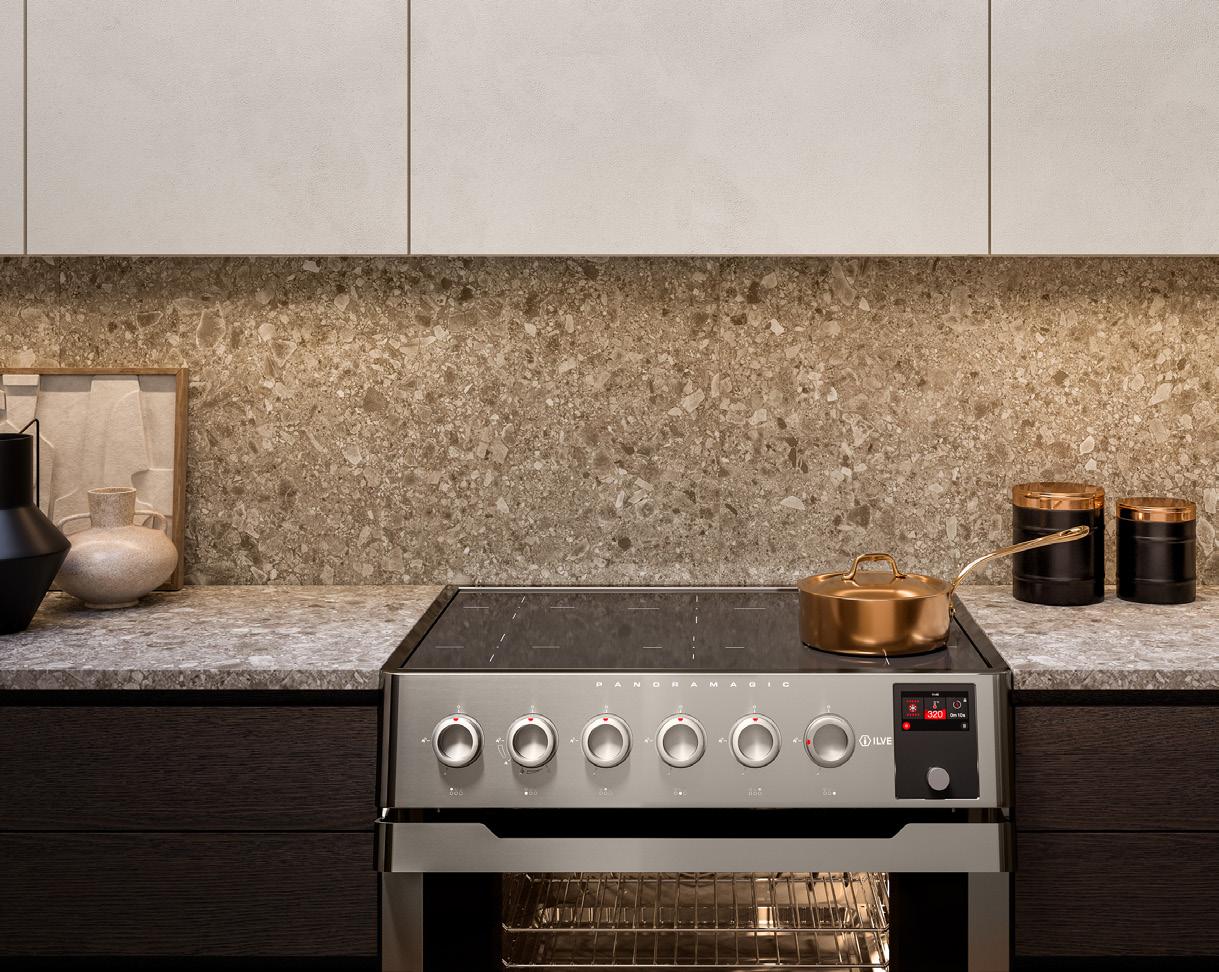
New cooking trends are constantly trying to embrace both tradition and the innovation at the same time: We want both gas stoves and an air fryer. The ovens and ranges collected here adapt to the shifting kitchen landscape by incorporating different methods of cooking, flexibility in their forms, and multi-functionality.

64 Issue 25 Spring/Summer 2024
PRODUCTS Ranges 3 2 1 5 4 1.
2.
3.
and
4.
5.
Images courtesy the product manufacturers
Thor Kitchens, 36 Inch Tilt Panel Professional Gas Range thorkitchen.com
Unox Casa, SuperOven unoxcasa.com
Fotile, 30” Moonshadow Tri-Ring Cooktop
Hood fotileglobal.com
ILVE, Panoramagic 36” Induction Range ilve.com
Fisher & Paykel, Series 11 48" Professional Induction Range fisherpaykel.com
65 AN Interior Available in North America through Bridgeport Worldwide and its dealers : +1-888-846-4319
The ONE Collection, by Piet Boon—offers solutions for every corner of your project. In a wide range of luxury finishes, delivers a total concept. Designed in The Netherlands. Obsessed with details formani.com TOTAL PROJECT ARCHITECTURAL HARDWARE FOR MODERN LIVING SPACES
Falken Reynolds Interiors Photography: Emma Peter
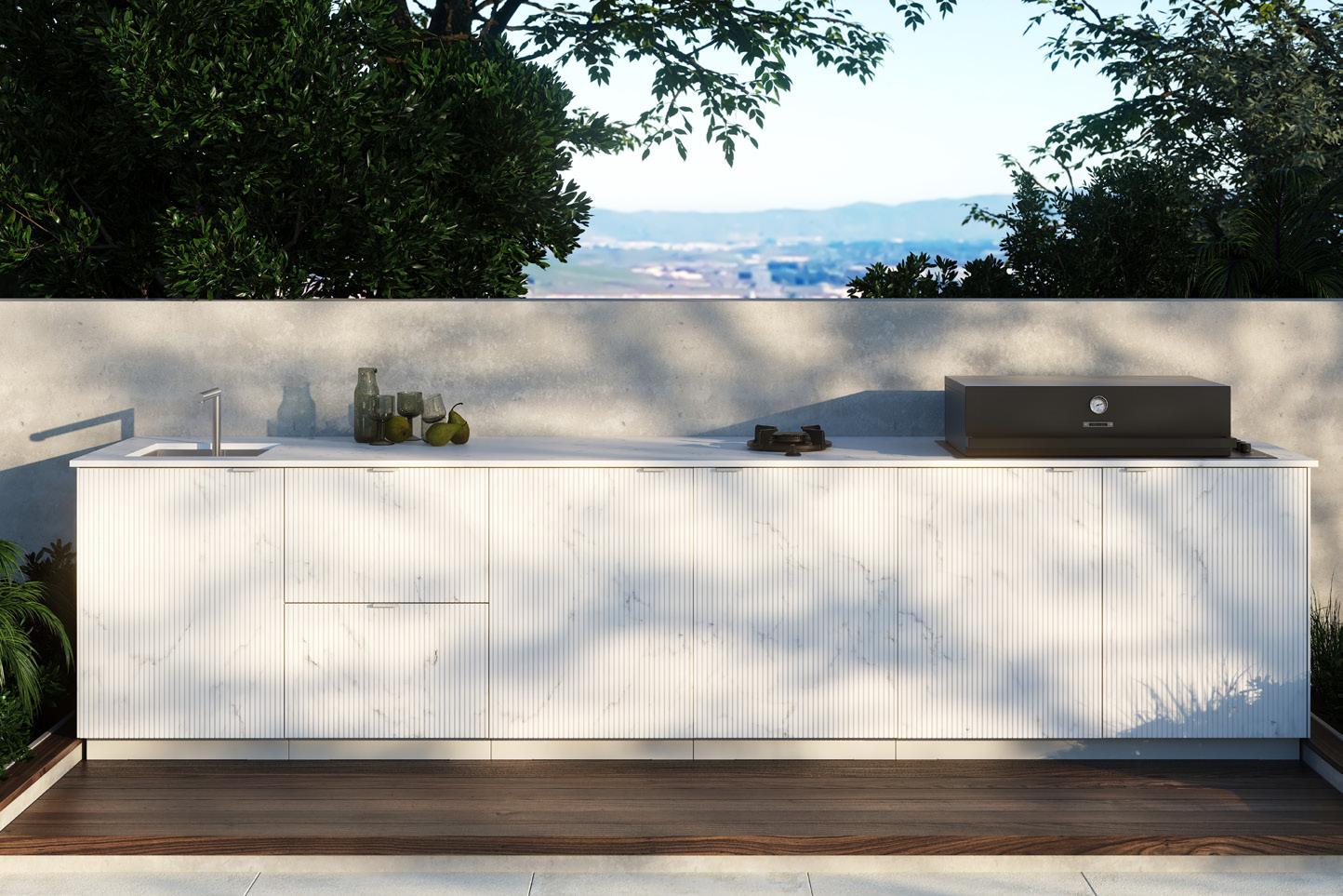
Outdoor Kitchens

66 Issue 25 Spring/Summer 2024
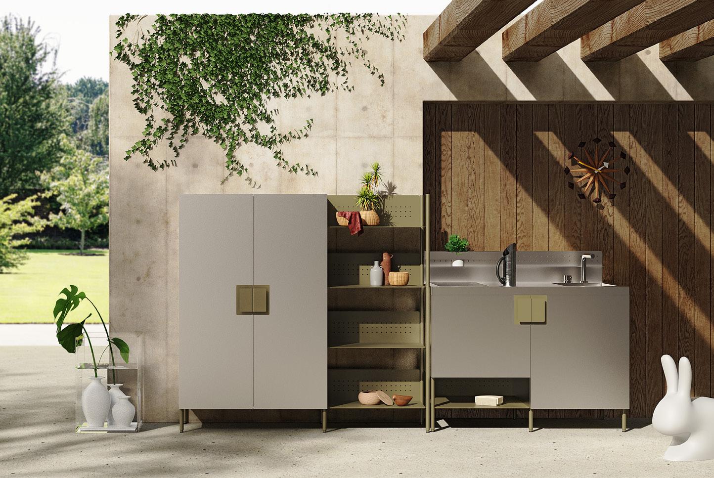
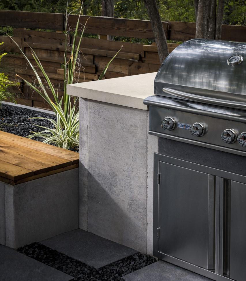
typologies, designers have shown an interest in blurring the boundaries between indoors and outdoors. It makes sense, then, that more architects are extending kitchens beyond the interior realm. Products have answered the call with not only an attention to durability but also an emphasis on striking industrial aesthetics. PRODUCTS
Across
2 1. Dekton x Urban Bonfire, Collab collection urbanbonfire.com 2. Hestan, Outdoor Living Suite hestan.com 3. Oldcastle, Elements Collection durasein.com 4. Abimis, Atria abimis.com 3 1 4 Images courtesy the product manufacturers

Whether your home is near a sandy beach or boasts a secluded backyard pool, an outdoor shower is a fashionable and functional addition that effortlessly adds a luxurious, tropical feeling to your space. These new outdoor bathing products use sleek, minimal silhouettes so they feel like an integral part of your design composition.
Outdoor Showers
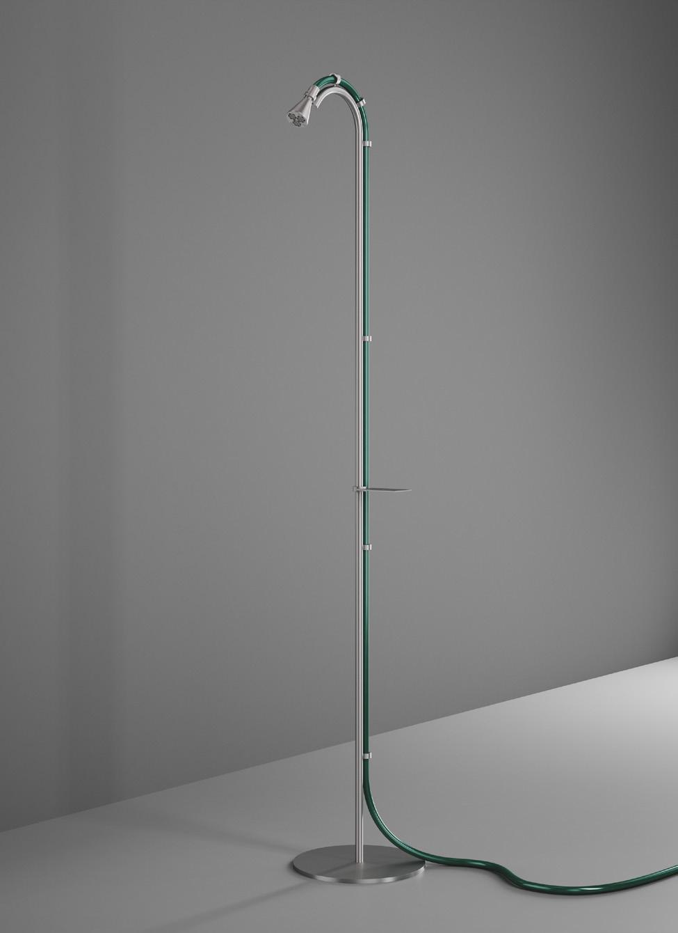
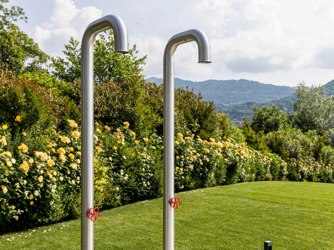
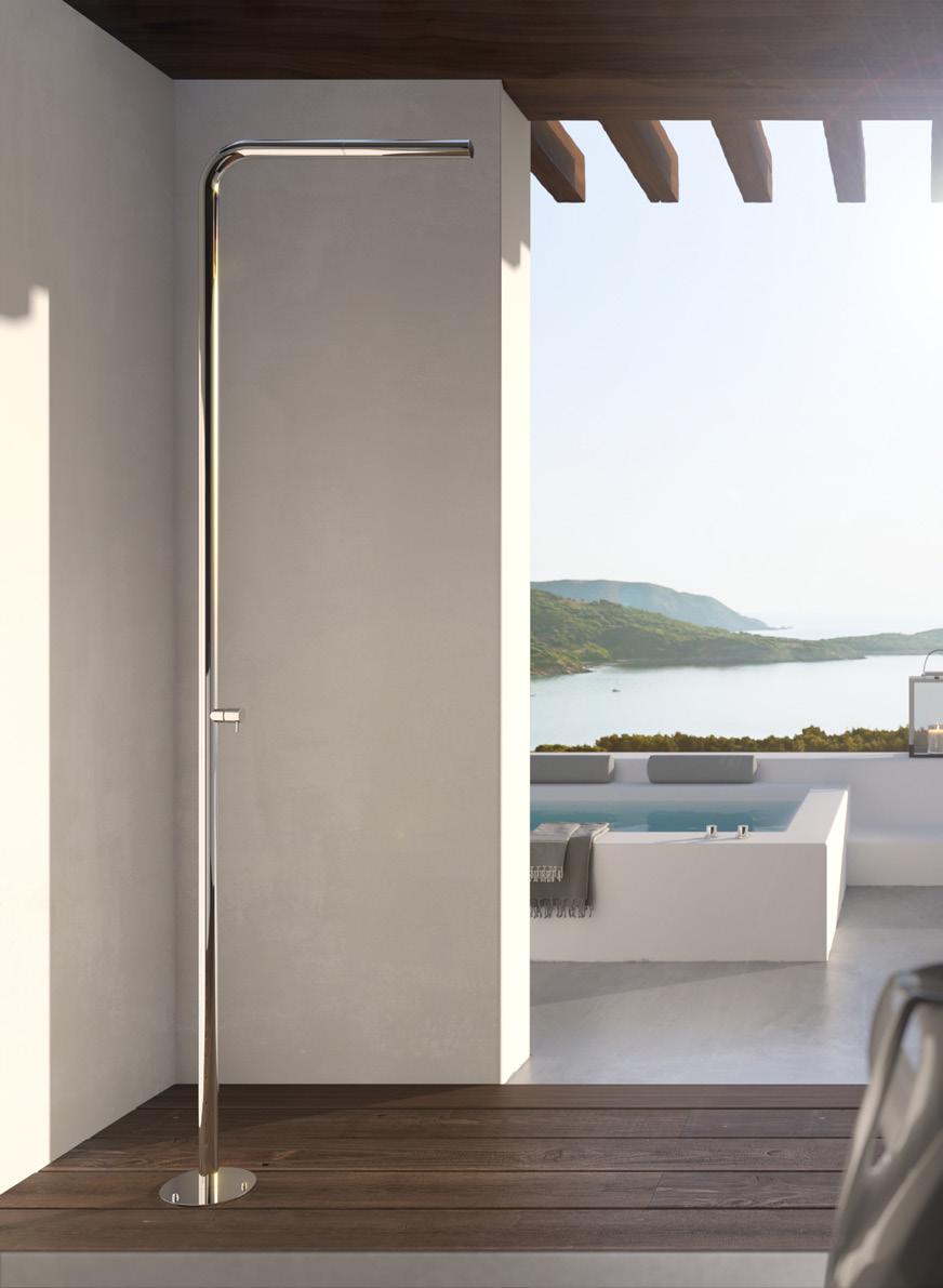
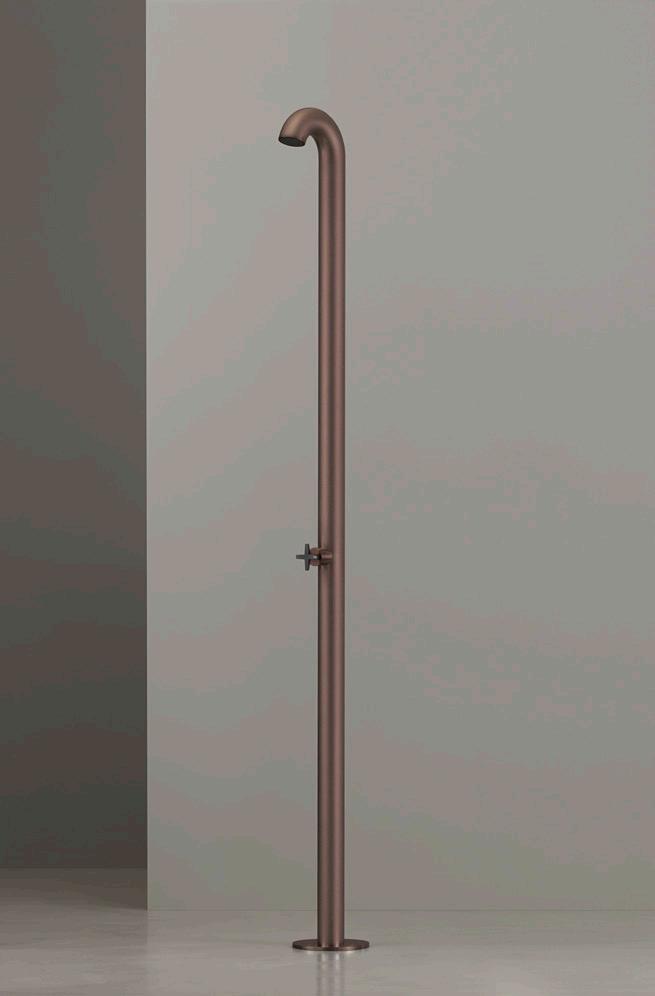
1. QuadroDesign FFQT Outdoor Shower quadrodesign.it
2. Outdoor Shower Company, FTA-S40-HC outdoorshowerco.com
3. Fantini, AW / EX Pipe fantini.it
4. Ceadesign, BOLD ceadesign.it
68 Issue 25 Spring/Summer 2024
PRODUCTS
Images courtesy the product manufacturers 1 4 2 3

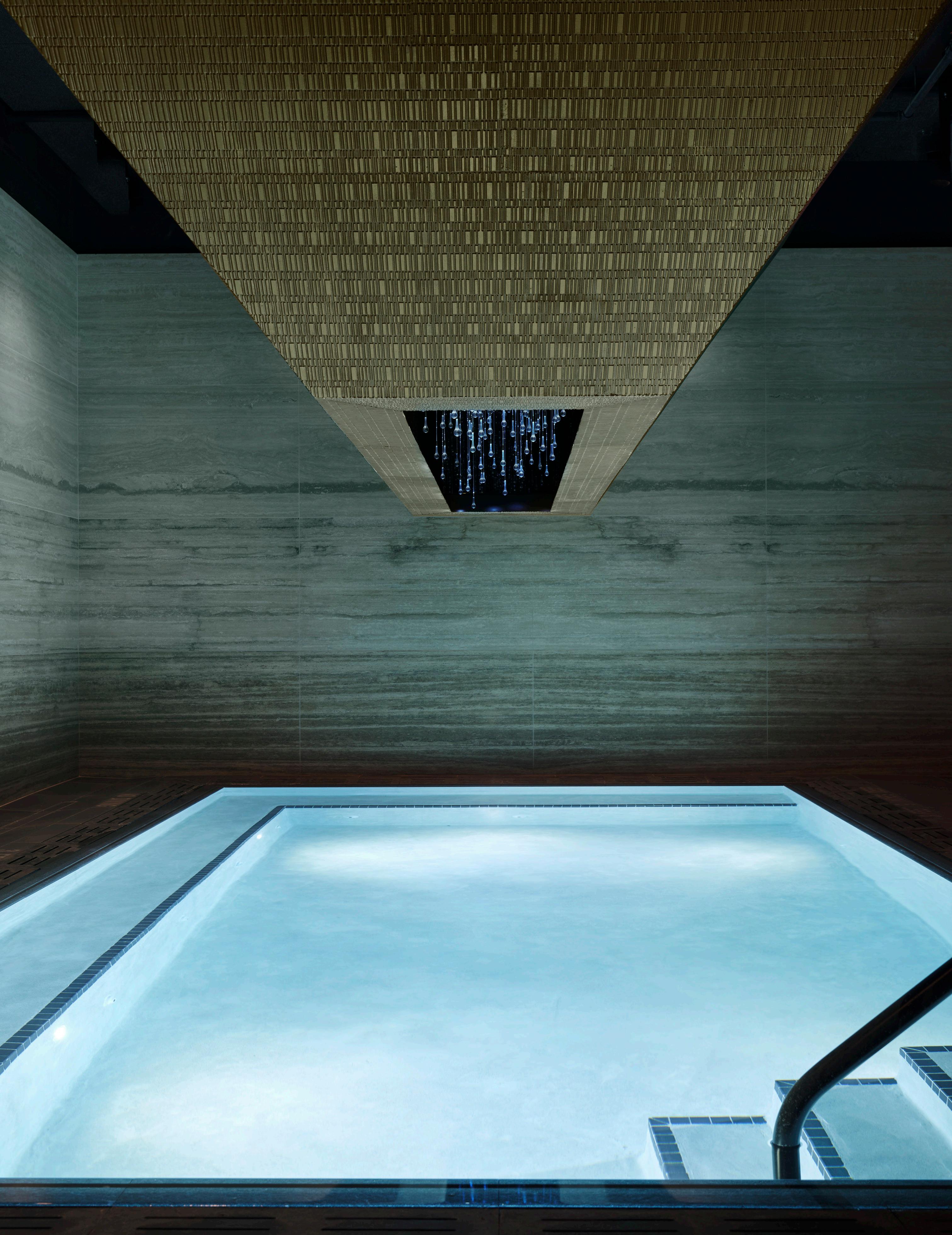
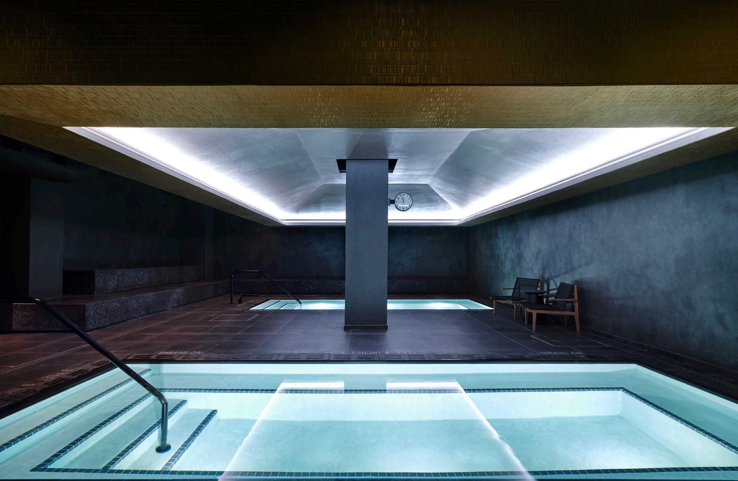
Lit from above by evocative pyramidal fixtures, each bath within Bathhouse offers a unique gradation of both temperature and privacy.
Rockwell Group with Colberg Architecture debut Bathhouse’s new location in the Flatiron District, offering New Yorkers a taste of tranquility. Text by Jesse Dorris
Manhattan Oasis
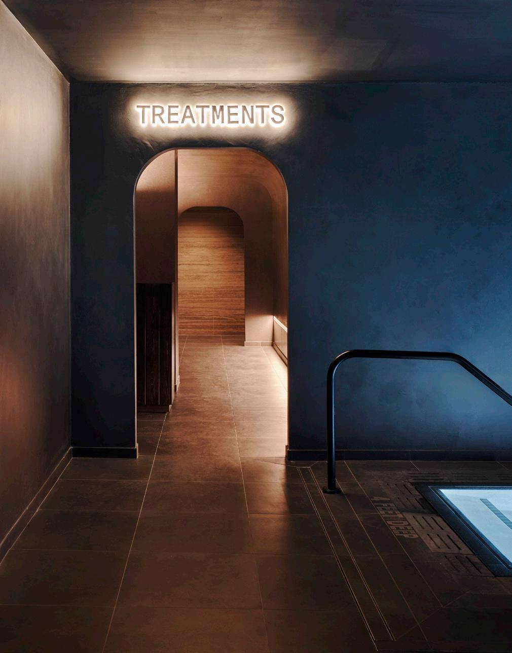
In most of the world, people used to bathe together; it was almost unheard of to be wet, nude, and alone. In 21st-century New York City, it’s rare to be alone unless you’re in your bathroom. While the city does have a long history of bathhouses and spas, from the East Village Russian and Turkish Baths on East 10th Street to Korean jjimjilbangs like the much-missed Spa Castle in Queens, most have moved from the no-frills
men’s club vibe toward buzzy takes on tradition. In the 1970s, gay men began populating traditional bathhouses from Harlem on down, turning them into sites of resistance for people tired of being told their bodies, and what they might do with them, are inherently filthy. But recently these spaces have become much more palatable for corporate tastes and takes on wellness and well-being.
Sexy, if not sexualized, self-care is exemplified by Travis Talmadge and Jason Goodman’s Bathhouse concept. And it’s perhaps perfected at their first Manhattan location, for which the pair enlisted Rockwell Group with Colberg Architecture to elevate the idea—or, given its previous life as a parking garage beneath West 22nd Street, take things deeper.
“In New York, going to the spa re -
71 AN Interior
IN FOCUS
Gaut and
Adrian
Emily Andrews
quires a pivot and transition, because you’re in this very hectic environment,” said David Rockwell. After you check in on the groundfloor, a pair of illuminated arches signals your transition: a stairwell, surprisingly dark, descending to a floor offering labyrinthine men’s and women’s locker rooms. This level is also home to a cafe that accommodates both wellness and party vibes with a menu of toasts, juices, and cocktails. “I think those of us who work in cities find ways to embrace vertical circulation,” Rockwell said. “I’ve always been interested in stairs as delivery devices, but also as emotional things.” Here, the emotion is a kind of hushed wonder at what is to come, a not-inappropriate feeling for the moment before you get (mostly) naked with strangers.
An even deeper stairway leads to the heart of the place. Its quarter turns and changes in light do a lot of the lifting. “Working with a limited palette, just a shift in color temperature from slightly blue to very warm
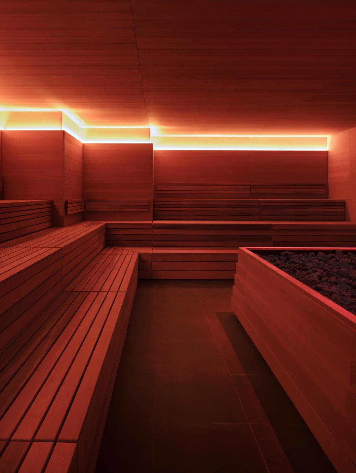
does make you feel like you’ve arrived at a destination,” Rockwell said. At Bathhouse, the destination is a thoughtful progression of six hot and cold pools, some illuminated by inverted pyramids filling the overhead space. On the perimeters, doors lead to ceremonial and infrared saunas, with recessed lighting that emphasizes their long cedar lines. There’s also a banya, whose beautifully simple stove forms a focal point; and an eerie steam room, where strip lights cause the 3D Danish tile to shimmer in the steam plumes, as if you’re sweating it out in a James Turrell installation.
It’s very razzmatazz, in its minimal way—very Rockwell. “The material palette is moody,” he said, “really just travertine, fluted glass, stone, concrete, and patinated metals.” Ancient in spirit yet speaking to the moment, Bathhouse flatters the very New York impulse to look inward and look good doing it, or at least do it in a good-looking space. To be sure, some elements need to
catch up to contemporary NYC. On my Tuesday afternoon visit, the clientele encompassed wide swaths of gender expressions, physiques, ages, and levels of peacockery. Gender-binary bathrooms go back as far as bathhouses themselves and aren’t just an American hang-up, but hopefully before long they’ll seem as backwards as the Reduc-o-matic portable tub.
Soon enough, water may be a luxury in and of itself—not to mention the energy for the heating and cooling of that water. At Bathhouse Flatiron, the heat is provided via Bitcoin mining, which feels both ridiculously contemporary and a bubble as ready to burst as those pumped into the pools themselves. Best not to think about it, perhaps. It makes sense that we’re longing for quiet moments of contemplation, or maybe of avoiding contemplation, to gather strength for the pivots and transitions on the horizon. After a few hours of spectacular rejuvenation, it might feel like no sweat at all. ●
72 Issue 25 Spring/Summer 2024
above , left The dry sauna offers warm lighting and centers on a large bed of heated rock. There is a calming herbaceous scent throughout the room.
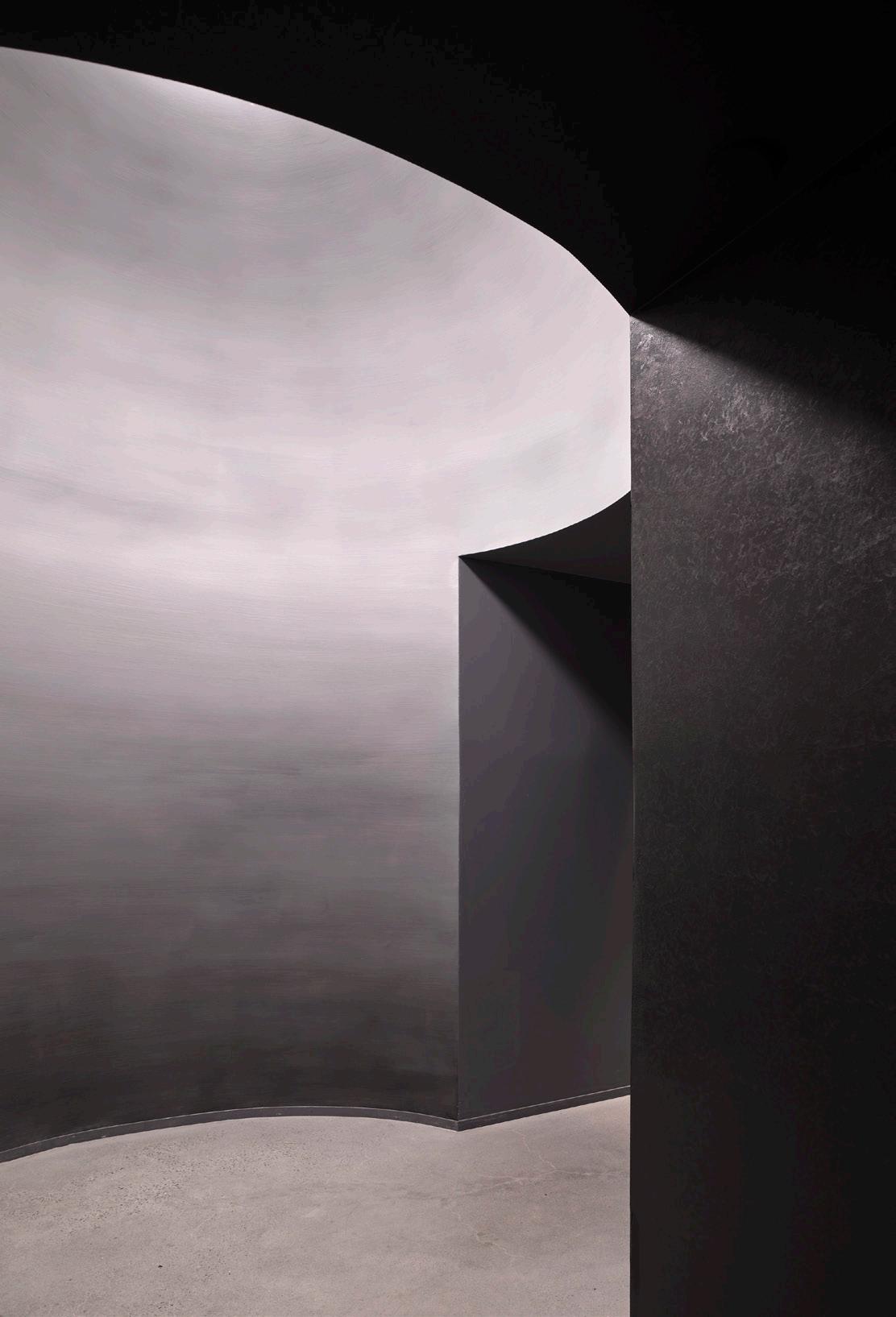
above , right The subterranean entrance to the locker rooms sets the mood for your bathing experience.
Adrian Gaut and Emily Andrews
above Each pool offers a distinct sensory and social experience, ranging from icy-cold solo plunges to larger, pleasantly warm oases.
below Treatment rooms are separate from the pool floor, offering quiet retreat for a variety of facial treatments, massages, and scrubs.
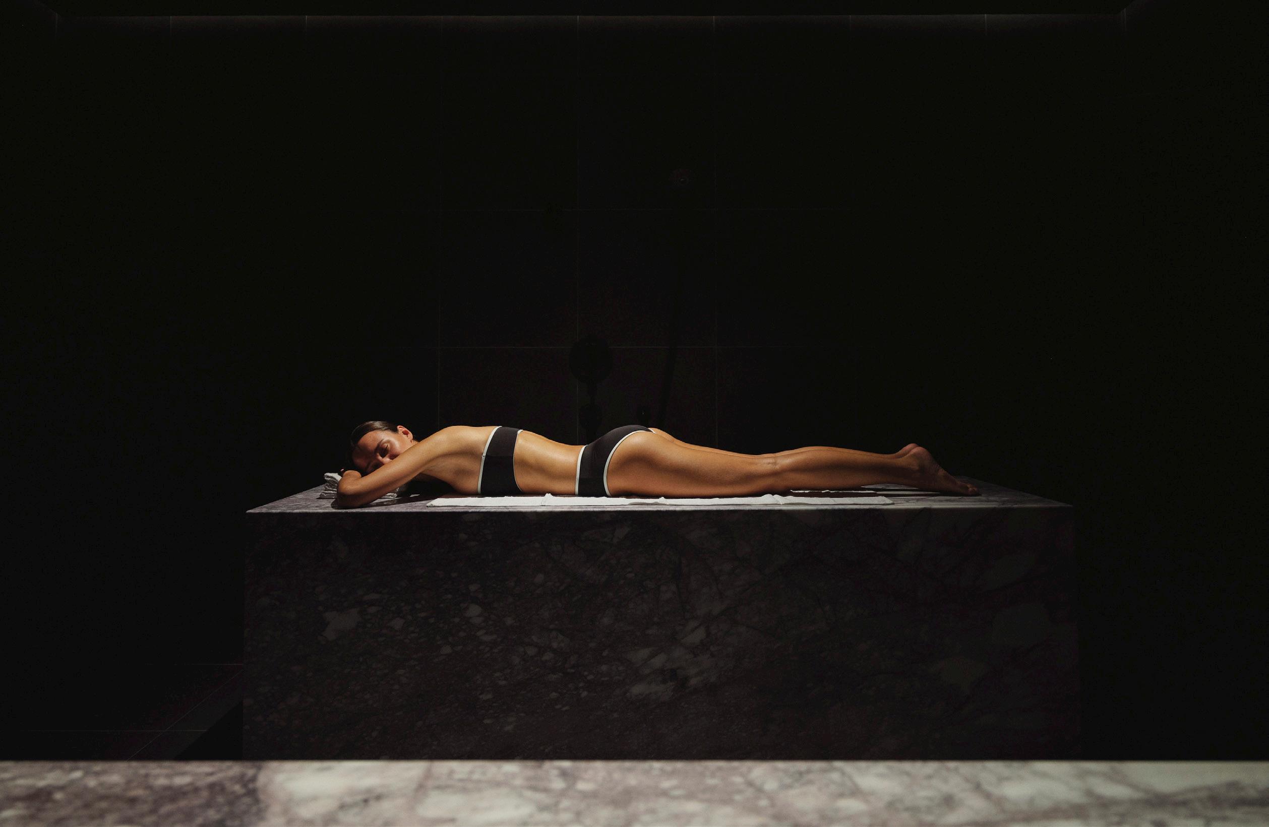
FOOD New York beckons visitors to a lush retreat in the jungle with highly textural materials and a chic sensibility at the buzzy Palm Heights Hotel. Text by Jesse Dorris
At the Garden Club
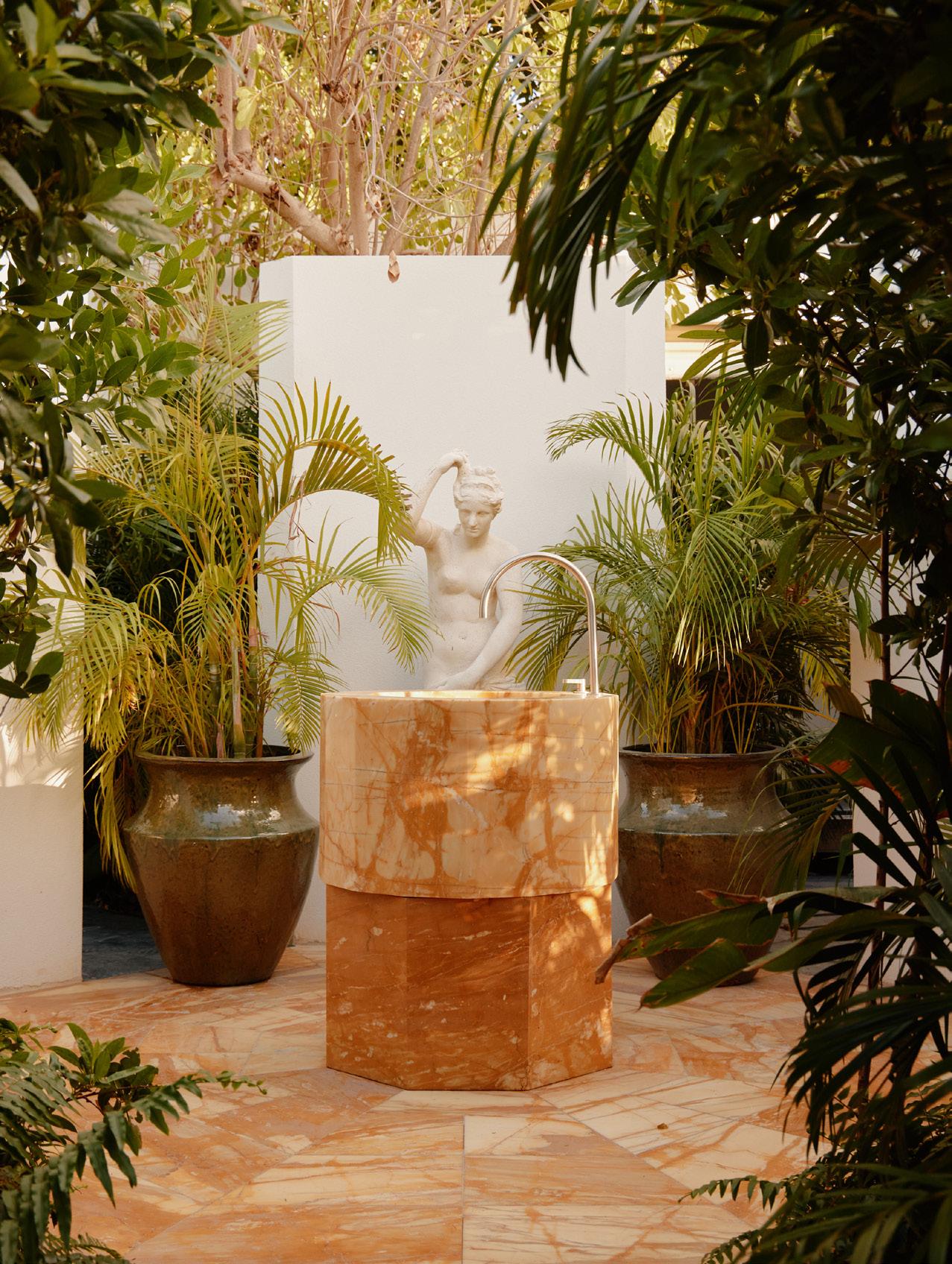
The genius of the traditional bathhouse is its simplicity: just four walls, fire, and water. For the Garden Club of the Palm Heights Hotel on the Cayman Islands, FOOD New York managed to distill things even further, all but eliminating one of those essential elements.
“The brief was very open-ended,” said founding director Dong-Ping Wong, so he took a plane down to check out the site. “You walk out of the plane into this wall of humidity,” he described, “so it was a no-brainer. You’re sweating anyway. Instead
left The spa takes advantage of the tropical climate to create an outdoor bathhouse experience with sculptural fixtures amid lush greenery.
below Outdoor showers and baths allow visitors to feel connected to nature as they unwind after treatments. All facilities are open to the sky.
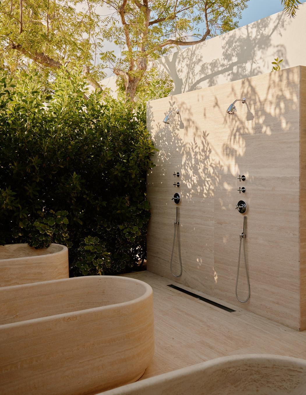
of fabricating the bathhouse, could you just get outside?”
In effect, that wall of humidity is a bathhouse wall. But in reality, lush hedges do the spatial trick, carving out zones across a 35,000-square-foot spa with a sextet of pools, a hammam, treatment and locker rooms, and more. “Planting became an architectural material,” Wong said. “It had to have a certain level of thickness, because we wanted opacity.”
Stone steps in when absolutely nec-
essary: Yellow travertine clads both ice and steam rooms, its hue meant to be discovered like sun filtering through the greenery. Black marble defines a roofless zone with both hot and cold plunging pools. “The idea was for it to become a sensory- deprivation room,” Wong said. But even here, the sunlight gets in. Connection to the senses is key. “I wanted as little artifice between the thing producing the experience—in this case nature and temperature—and your body experiencing it.” Simple as that. ●
74 Issue 25 Spring/Summer 2024
IN FOCUS
William Jess Laird
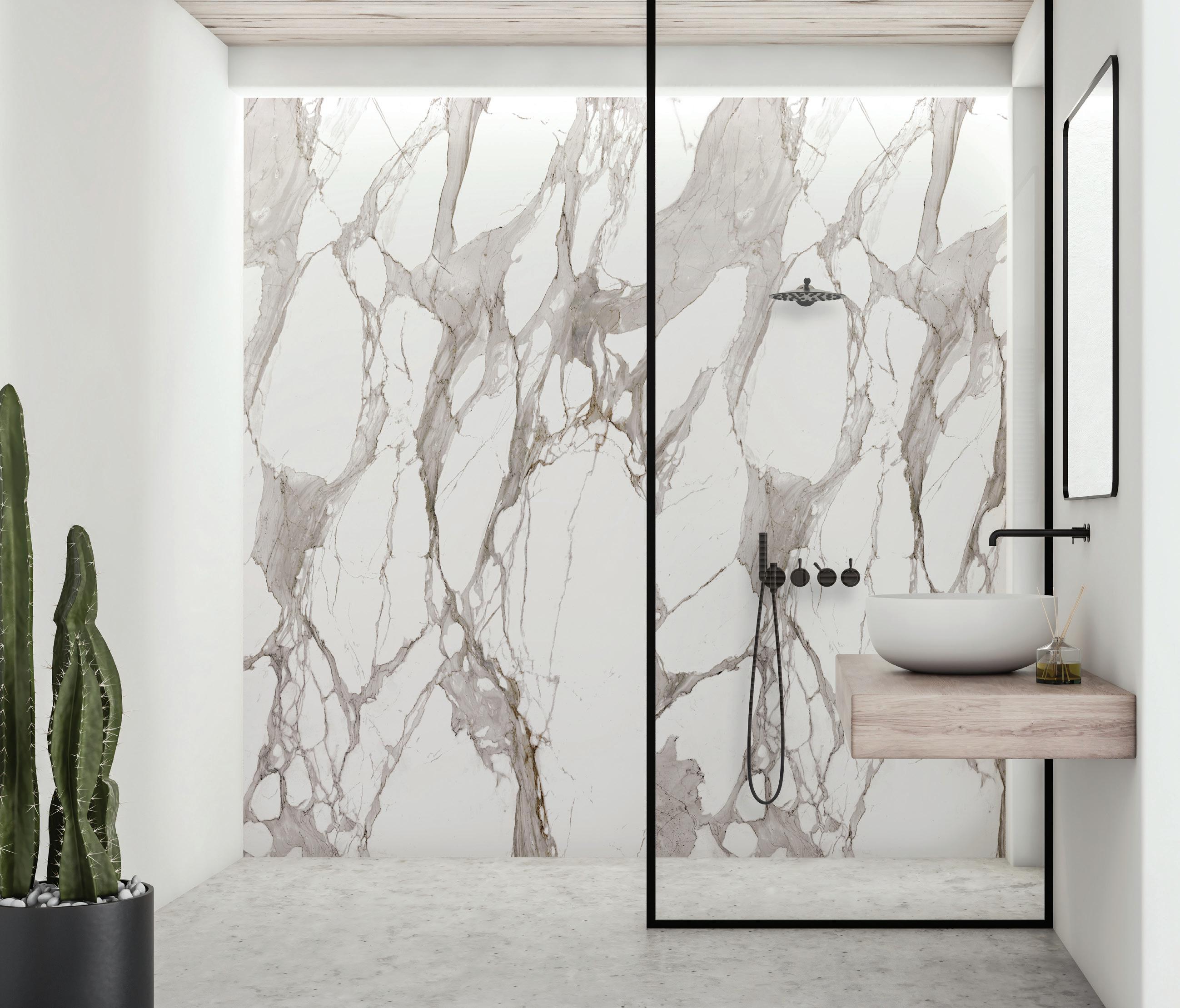
Simple
• Designed for use in shower / bath
• Premium properties of MONARC ensure an extremely flat, lightweight, waterproof panel
• Delivers a striking visual appearance inspired by natural elements
• Inspiration drawn from wood, marble, stone and metal variations


75 AN Interior
Calcutta Marble
Installation. Stunning Results.
enclosures, lobbies,
feature walls, and other interior spaces
FIRE & ELECTRICAL RATED LIGHTWEIGHT COMPOSITE MATERIAL LOW MAINTENANCE EASY INSTALLATION WET WALL APPLICATIONS HIGH QUALITY APPEARANCE From the makers of For more information or to order samples, scan QR code with mobile camera or email us: info.usa@3acomposites.com 800.626.3365 | ALUCOBONDUSA.COM / PRODUCT / MONARC

IN FOCUS
The Komaeyu bathhouse by Schemata Architects is a playful take on a ritual tradition in Japan that crafts and intimate sense of community. Text by Jesse Dorris
Bathing Rituals
In 2020, Schemata Architects reimagined a 1985 Japanese sento, or public bathhouse, into a Towada-clad destination complete with DJ booth and cafe. Last year, founder Jo Nagasaka and his team looked back to the history of the sento—and toward the future of a vacant lot nearby—when refreshing an extant bathhouse on the ground floor of a reinforced-concrete building in the Komae suburbs of Tokyo.
Traditionally, sento partition walls separated zones for men and women. Here, one rises some 7 feet high, not quite to the ceiling of the 1,000-square-foot bathhouse, carving out zones for saunas but also a bandai, or reception counter, where everyone
can relax together over a beer. Postwar sento also boasted murals of Mount Fuji, a custom carried into the present via tile patchworks arranged in honor of the murals Nagasaka remembered from the Kyoto bathhouses he used to frequent.
Those tiles, custom made in Tajimi in three shapes and sizes, clad the surfaces of the bathing areas for installations that incorporate the usual grids but also patterns of negative space that give a sense of time passing. Their hue references the greenery of the lot next door, where plants sprout up to feed off the bathhouse culverts. With this humble yet impactful project, Schemata has updated the old sento into a breezy 21st-century hangout. ●
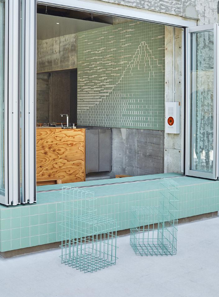
above A playful and modern seafoam green color palette is consistent throughout the bathhouse, creating a fun contrast to neonyellow accessories.
right Schemata used the tile design material to create surprising mosaics like this Mount Fuji rendering at the front bar area.
76 Issue 25 Spring/Summer 2024
Ju Yeon Lee

YOUR LOCAL SHOWROOM: NEW YORK | GREENVALE | SOUTHAMPTON YOUR PROJECT IS OUR PRIORITY Our showrooms are designed to inspire, with bath, kitchen and lighting choices from top brands curated in beautiful, hands-on displays. From product selection to delivery coordination, an industry expert will be there to support your project every step of the way. fergusonshowrooms.com


Quirky, Textural, Worldwide
The hunt for captivating interiors often takes us around the world. In our features section, we visit five projects across four continents to see how architects make the most of existing buildings and, in the case of Neri&Hu’s Sanya Wellness Retreat, deliver entirely new ones. Read on to see these inventive and challenging spaces.
Seeking
Neri&Hu designs a comprehensive spa complex for those looking to heal, relax, and unwind just outside the hustle and bustle of Hong Kong.
Serenity
Text by Kelly Pau
Photography by Chen Hao
China’s southernmost point is the Hainan Island province, whose tropical climate has made it a go-to vacation spot. The burgeoning “Hawaii of China” inspired a large insurance company to build the sprawling Sanya Wellness Retreat on the island’s Haitang Bay. The company enlisted Shanghai-based Neri&Hu Design and Research Office. But when the architects arrived at the site, they found that the supposed beach resort is not … on the beach.
A pesky highway divides the beach from the retreat, requiring visitors to cross beneath via underground tunnels. This puzzled the architects: “How to let the people who come here have a sense of peace and quiet and not be bothered by the highway?” asked the firm’s cofounder Rossana Hu.
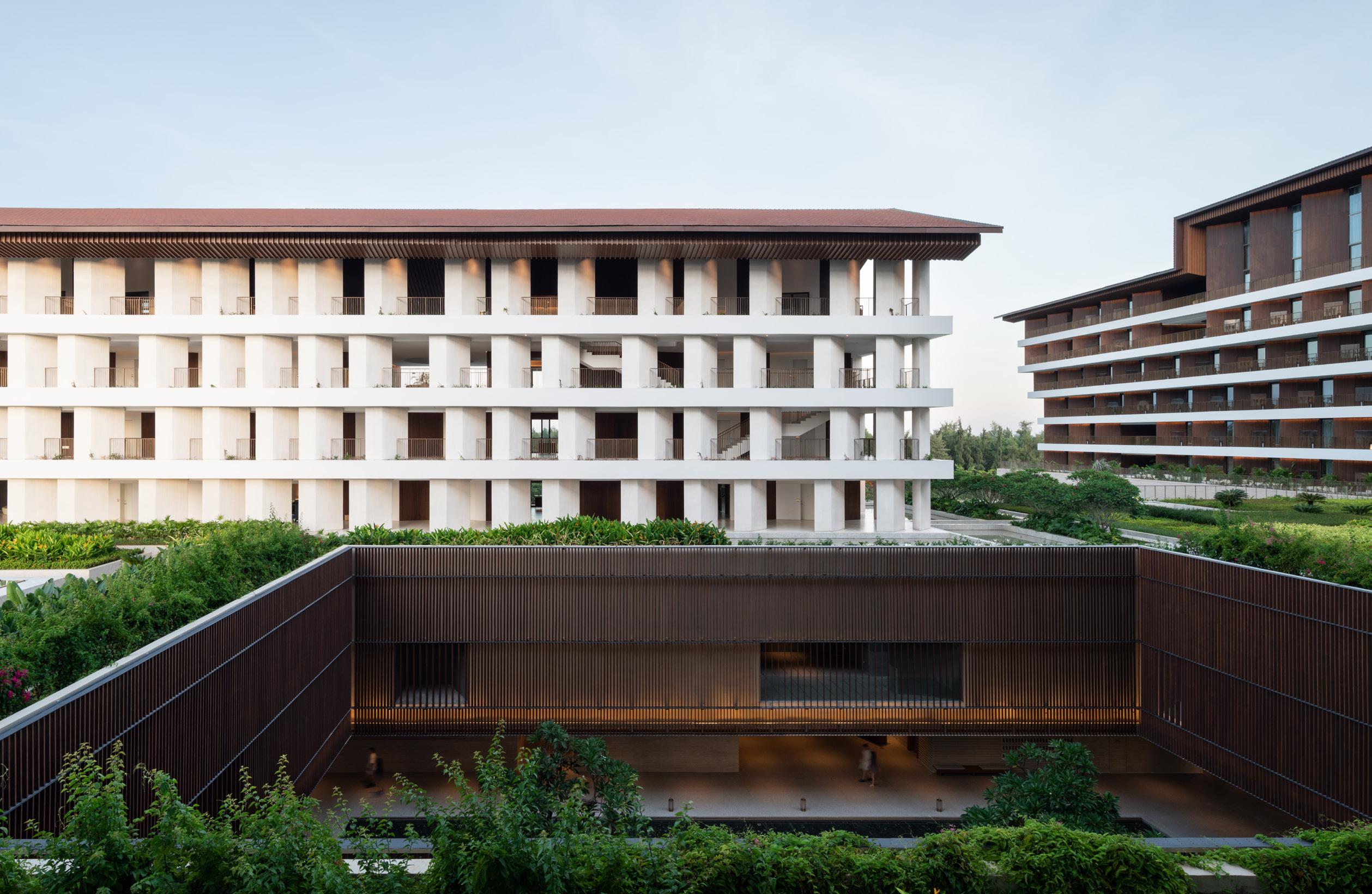
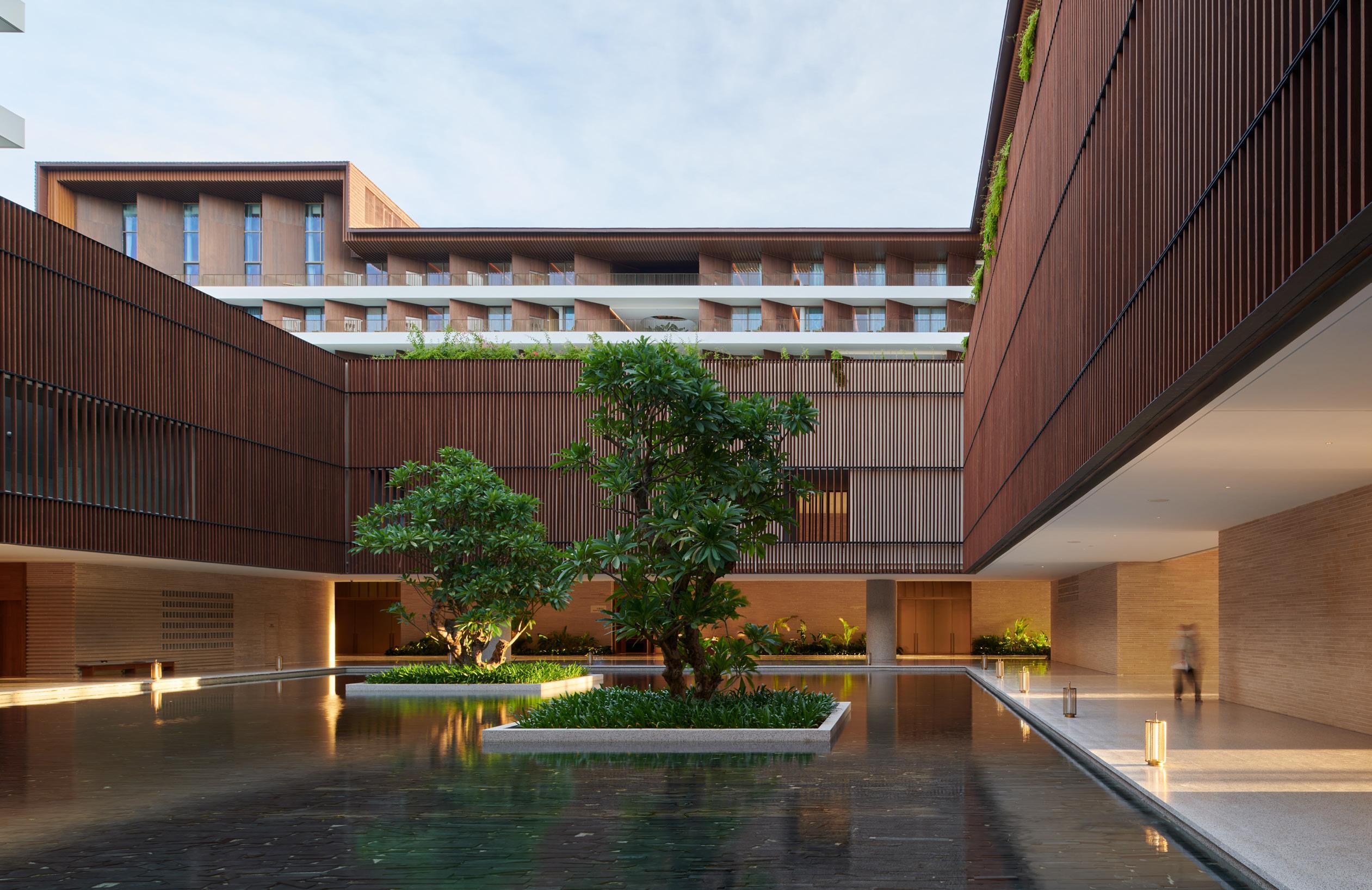
The answer was in the massing. Two L-shaped volumes encircle a courtyard, walling off the road while protecting guests within its arms. The diagram takes cues from the ancient walled city of Nanjing. The timber form is perched atop a masonry base, ensuring that all 343 guest rooms have a view of the ocean.
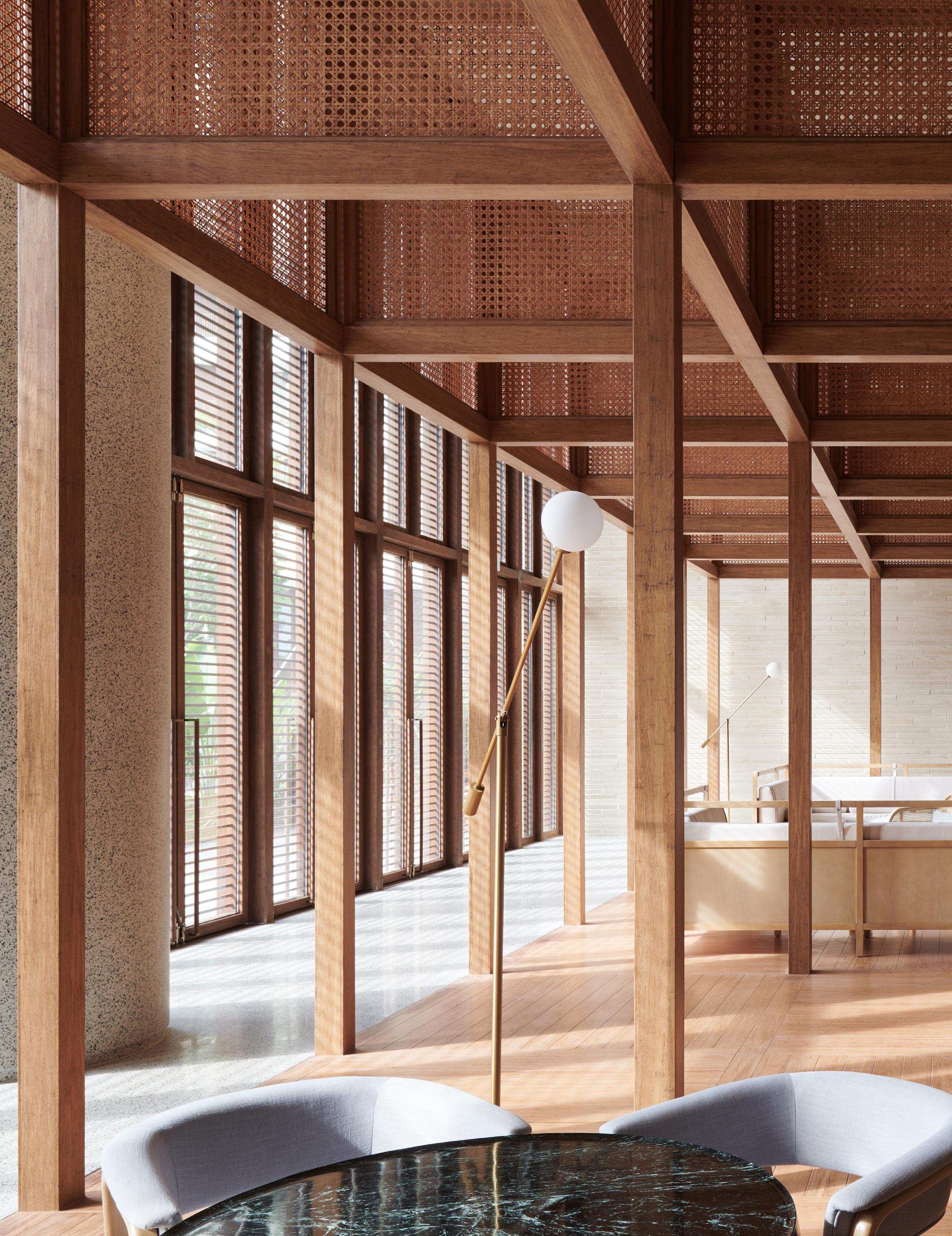
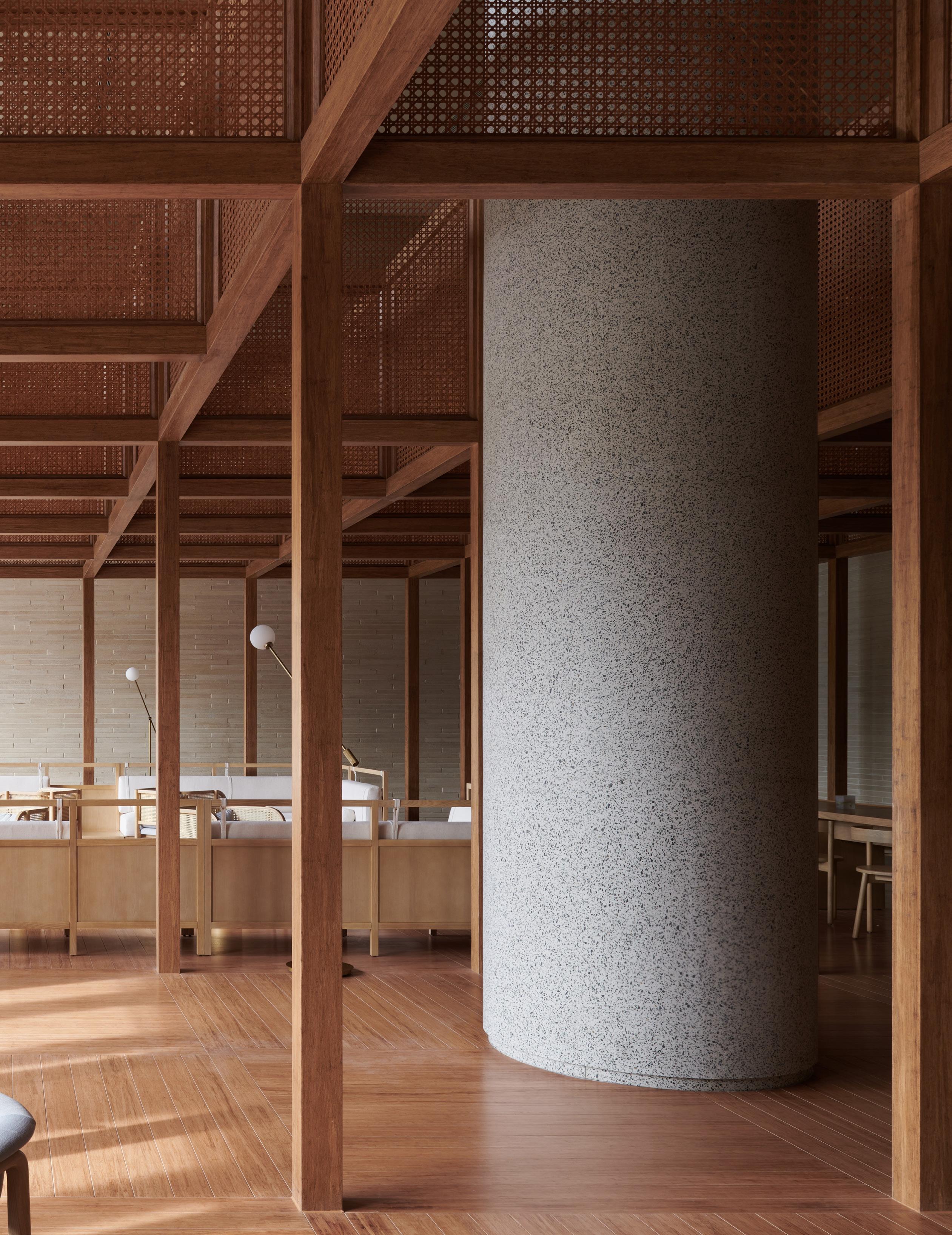
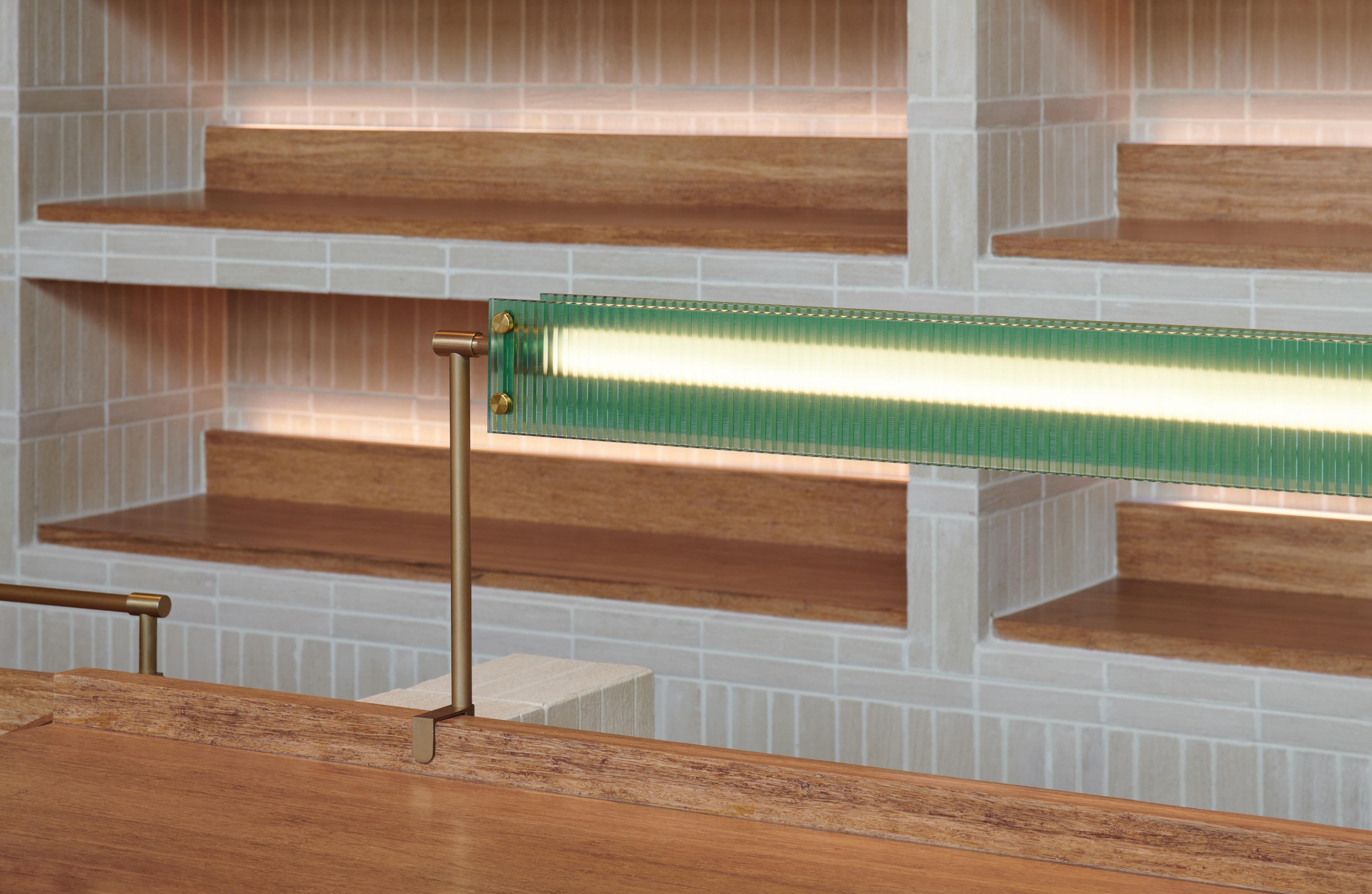
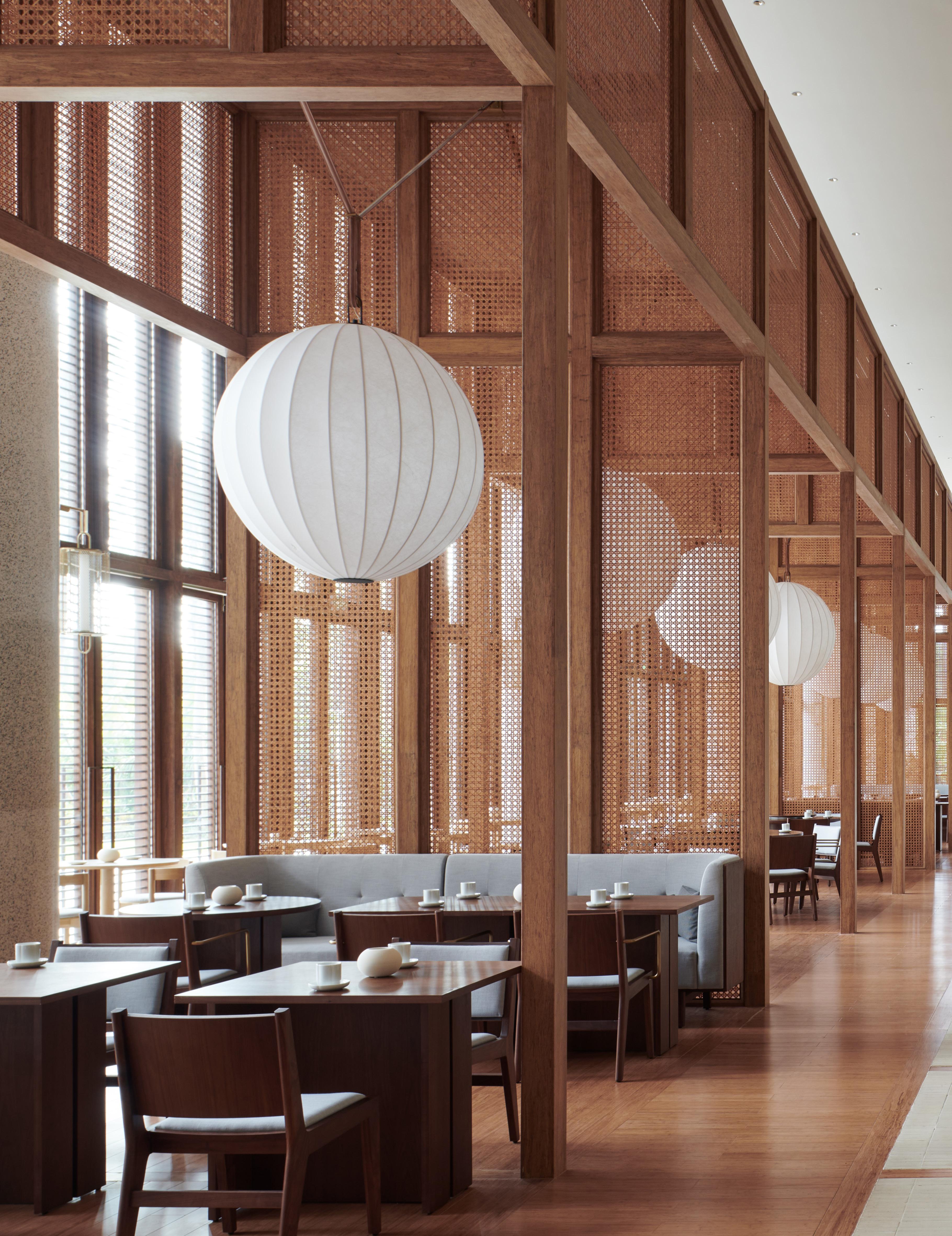
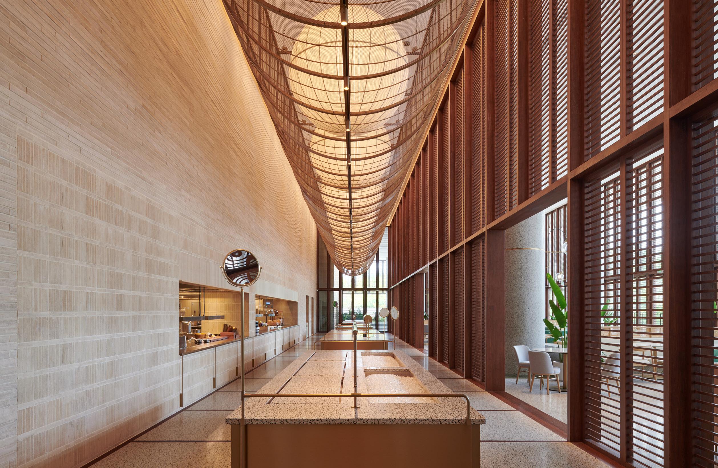
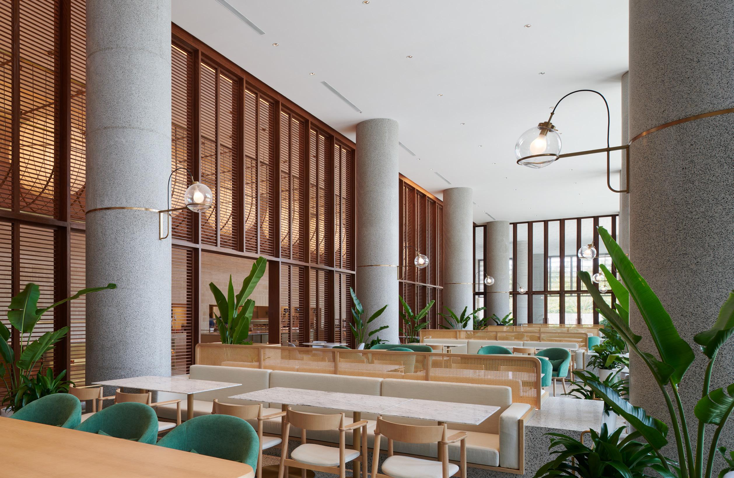
Given the large scale of the project, Neri&Hu choreographed openings and compressions to strategically cultivate a calming environment. On the first level, the lobby feels more like a garden landscape replete with ponds, apertures, and floating lights. Even within the nearly 89,000-square-foot campus, there’s still a connection to nature through the framing of sky and water and gentle cross breezes. “It’s a delicate balance between openness and enclosure,” Hu said. “The ground floor is very open and transparent, so you can see through a lot of different layerings of functions and rooms,” she continued. In the cafe and dining areas, for instance, rattan partitions offer organization, but the translucent material softens the fortresslike feel of the structure. The architects relied on local craftsmanship where possible: handmade clay bricks for the walls, teak wood throughout the interior, and traditional bamboo construction abounds. Fine art made by the Indigenous Li tribe is also showcased. Incorporating local practices was important to Hu: It gestures toward a different sense of luxury. Advocating for this became the biggest challenge in the project
below Warm wood floors and finishes nicely complement the textured masonry and lighter fabrics.
facing page , right Thoughtful details like built-in desktop lighting make the large complex feel complete and human-scaled.
facing page , below The entire complex is wrapped in breezy balconies that invite guests to linger outside.
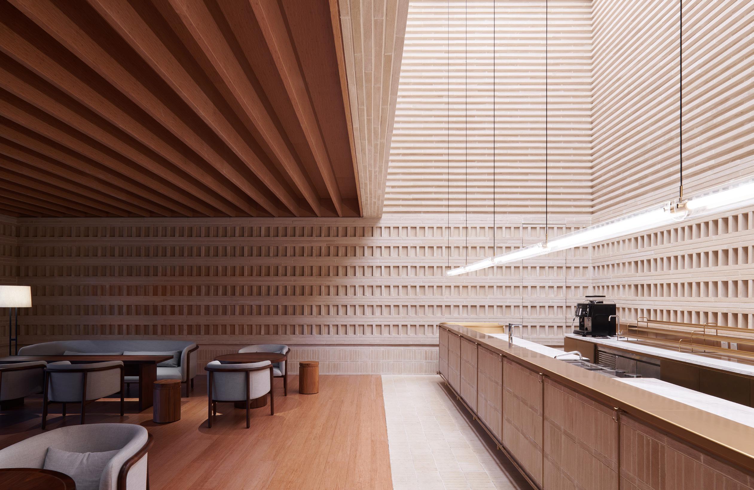

Dining spaces play with scale and height. High lofted ceilings are tempered by wooden structures that resemble a patio or pavilion.
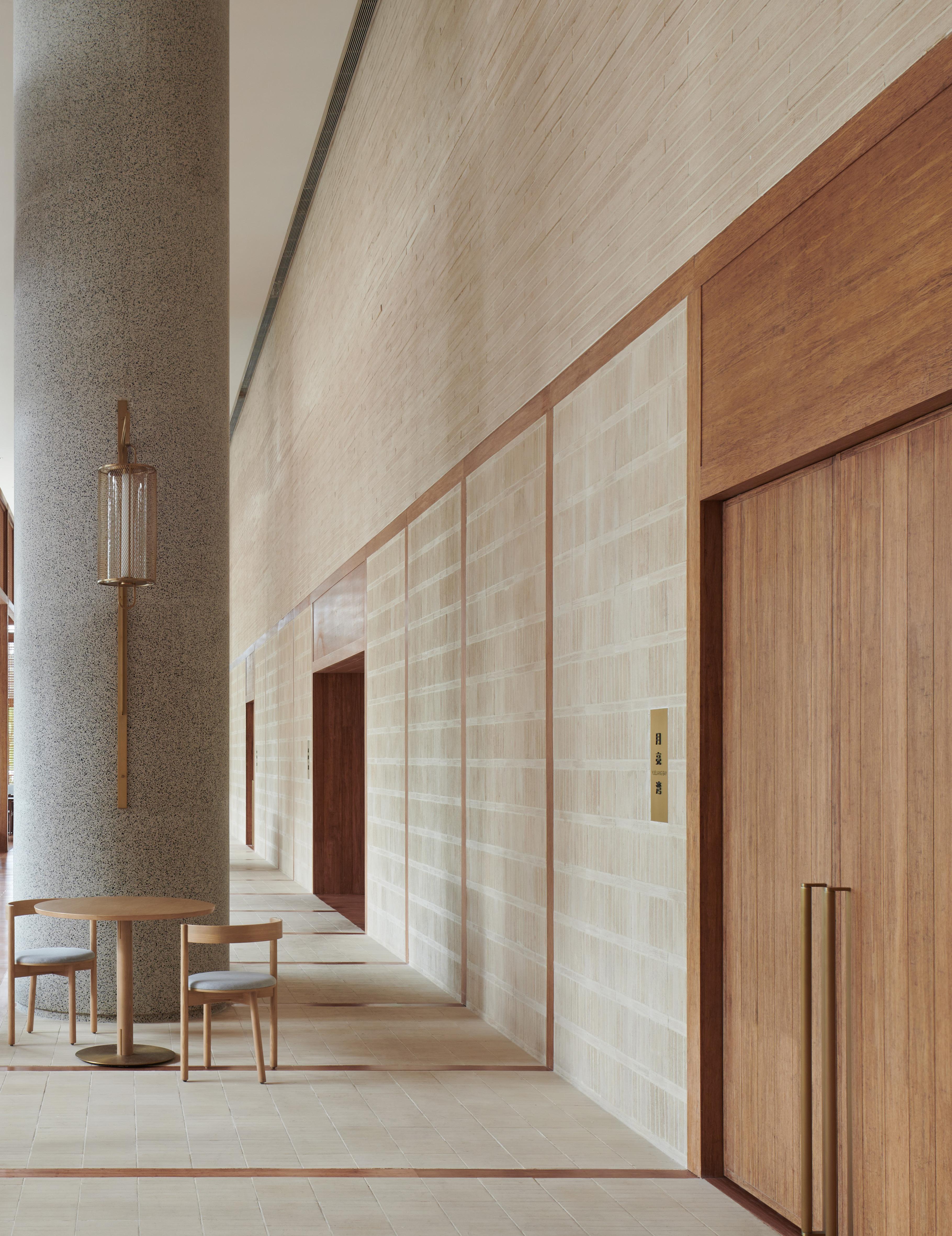
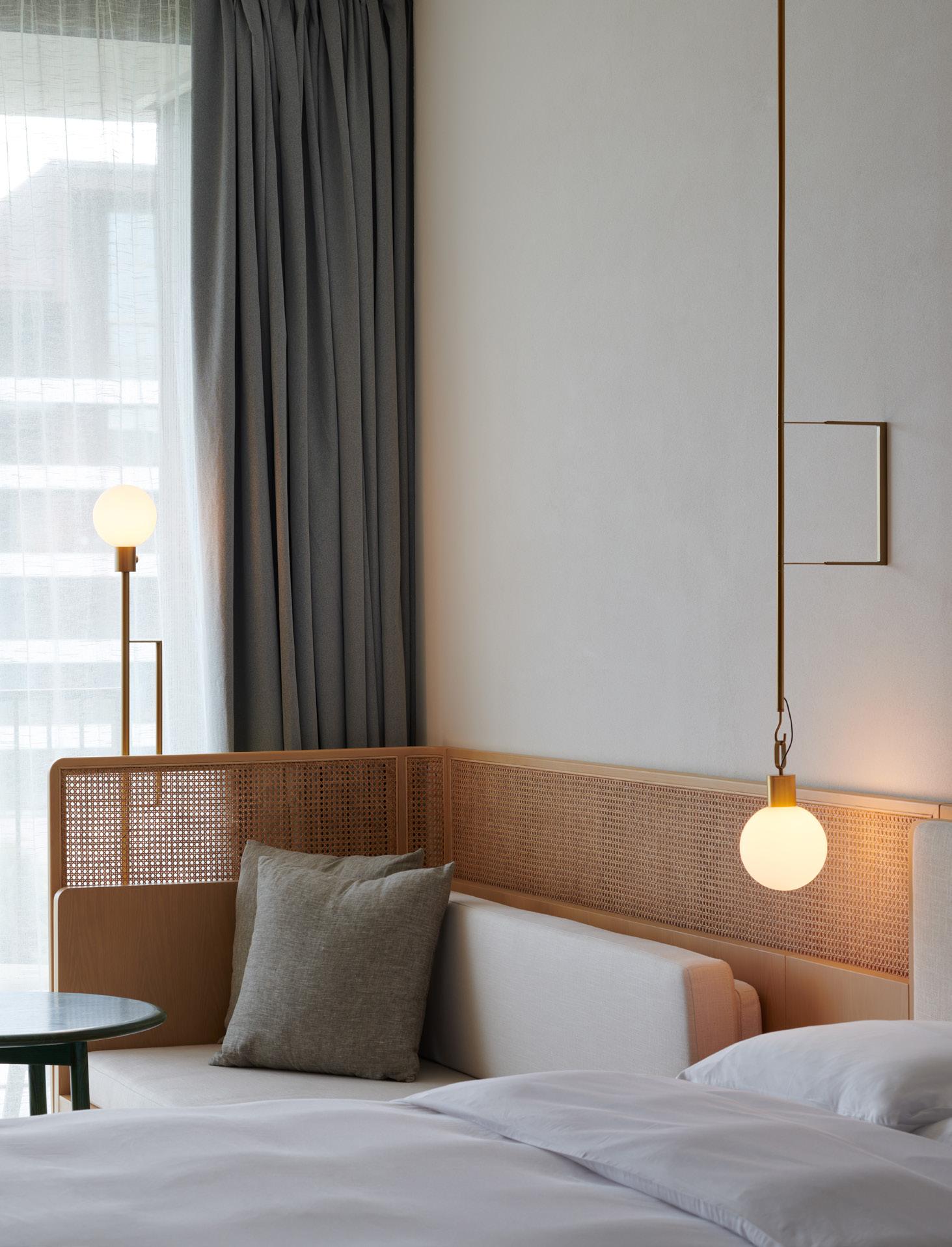
as the client conceived of a different aesthetic. “Their idea of luxury was commercial luxury: chandeliers and Venetian glass,” she explained. Yet Neri&Hu bridged this divide by educating the clients on how luxury and wellness can look different—and even better. This take on quiet luxury persists in the guest rooms, designed as wooden boxes with soft, waxlike bamboo finishes. Custom furniture—designed by the practice—decorates each space. Here, motifs from the first cohere with the second: The wood and white color scheme continues the resort’s subtle color palette, rattan and bulbous lighting recall the first-floor eateries, and fluted walls provide texture, recalling the overall rational, gridded structure of the hotel’s design.
Each room is outfitted with a terrace, an important component to keep guests connected to the outdoors. The series of terraces, set at an angle and divided by wooden partitions, create a rhythmic facade of brown sails in the sky.
Sanya emphasizes Neri&Hu’s dedication to total design. Walking in the footsteps of Walter Gropius, the architects focused on cohering and controlling product, interiors, and architecture. “We were very mindful of experience from different scales, at the city level all the way down to the personal level,” Hu said. In the growing world of specialization, full-scale integration is both a strength of this project and the office that executed it. ●
facing page , above Custom lighting design results in fun and sculptural fixtures like this long series of globes.
facing page , left Pops of green—both in the furniture and plants—interrupt the calming neutral palette.
right Guest rooms continue the design language and ethos of calm. Details like spherical bulbs and woven screens add a whimsical touch.
87 AN Interior
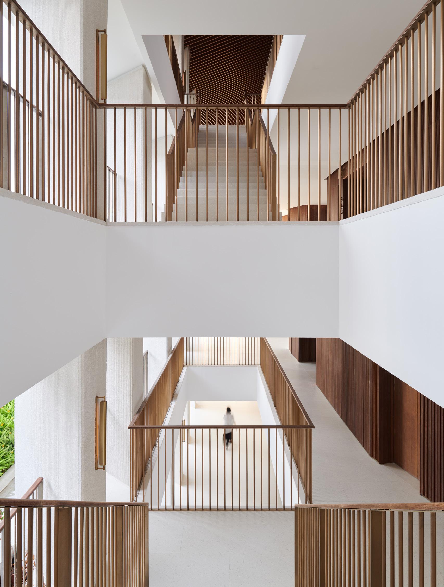
above Outdoor circulation is encouraged not only laterally on the balconies, but between floors with thoughtful vertical integration.
facing page , above and right Guest suites are elevated on a podium around a verdant courtyard with a peaceful water feature at its center.
88 Issue 25 Spring/Summer 2024
Diplomatic Relations
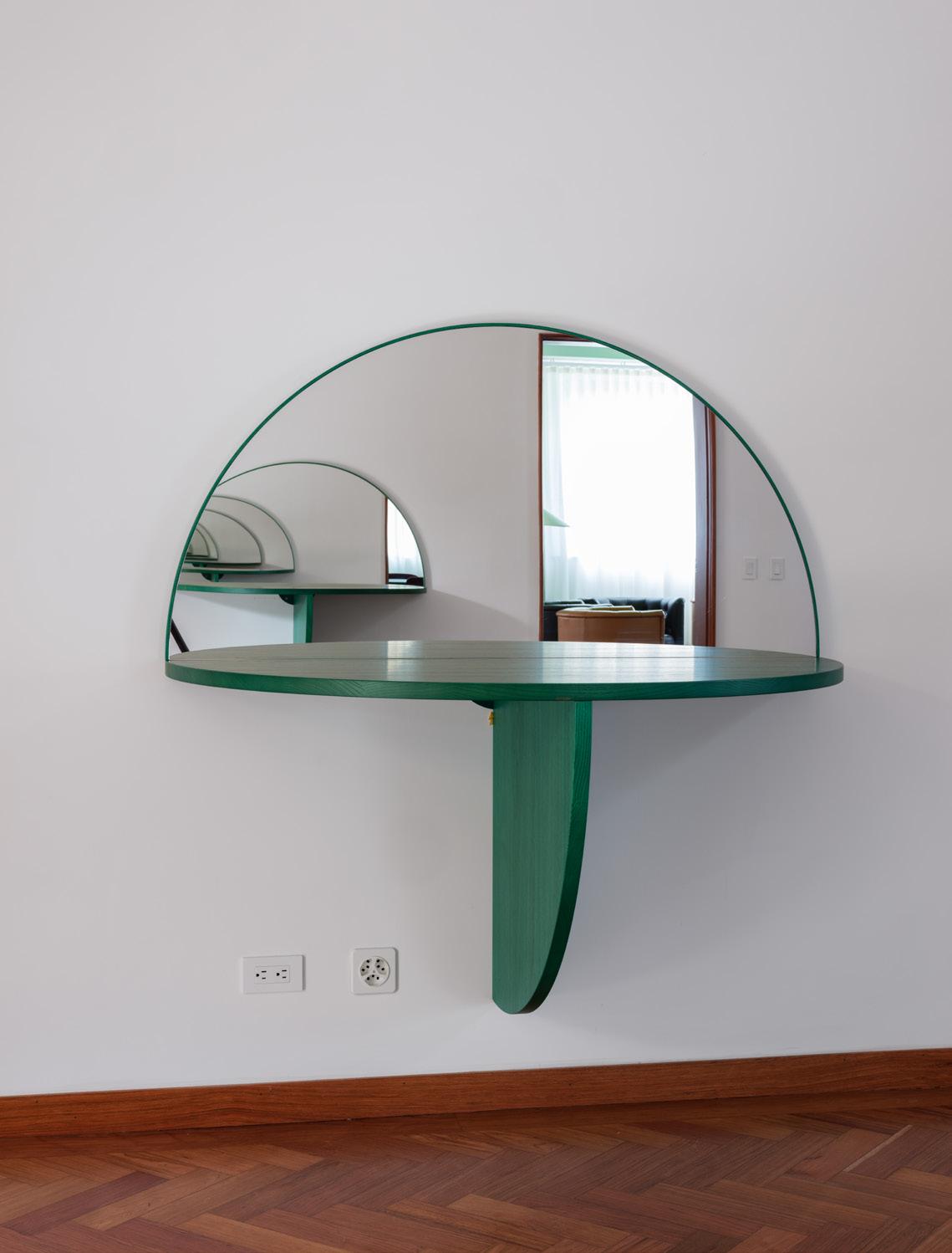 Lütjens Padmanabhan uses curves and color to renovate the Swiss embassy in Bogotá, Colombia.
Text by Tibor Bielicky and Ellena Ehrl Photography by Max Creasy
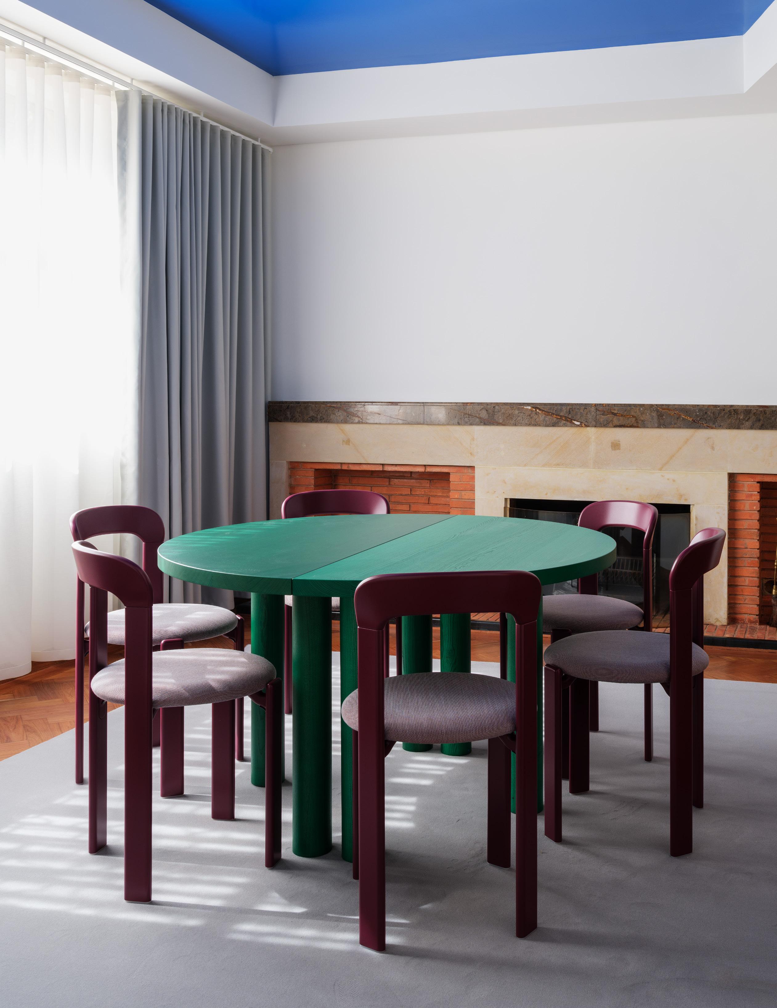
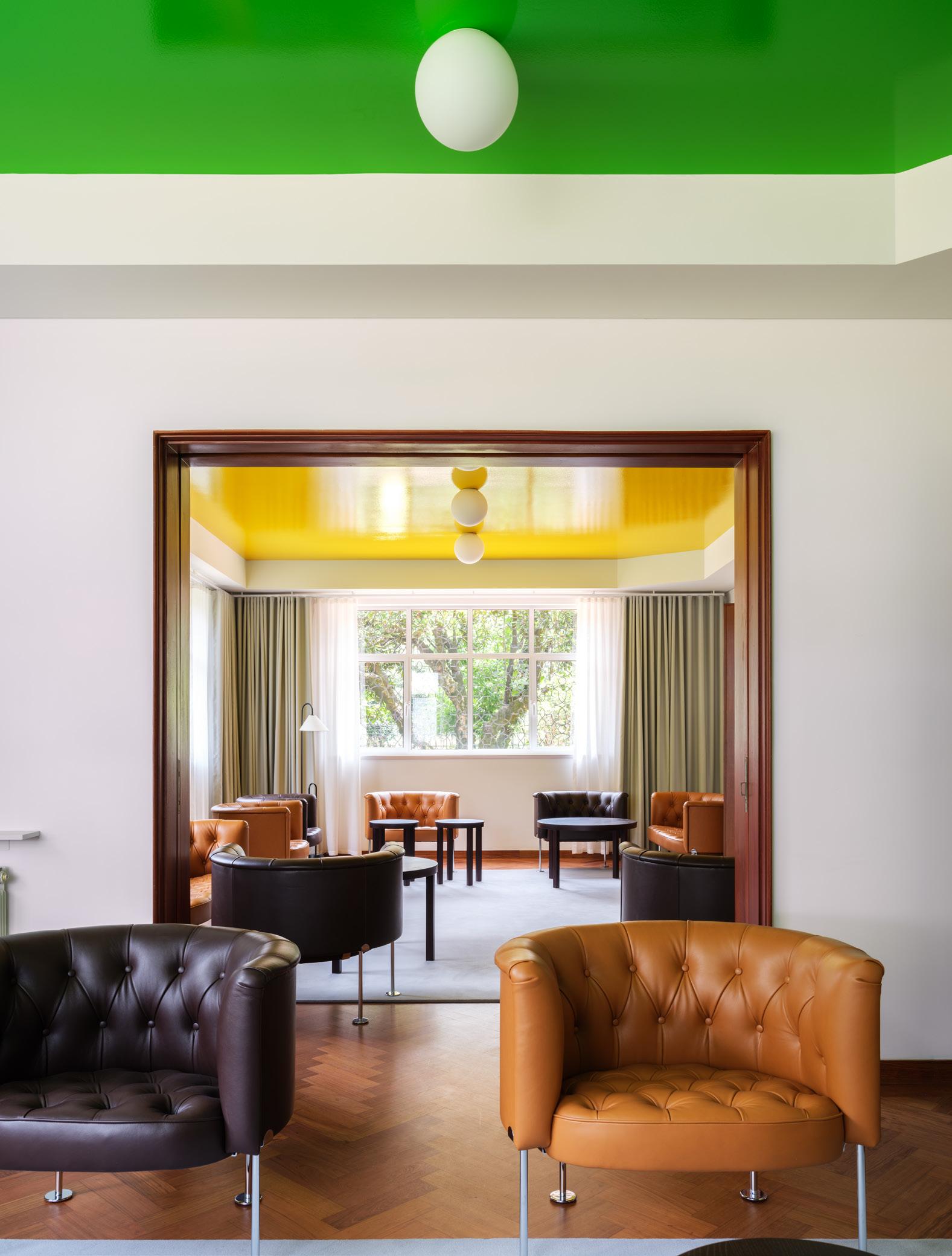
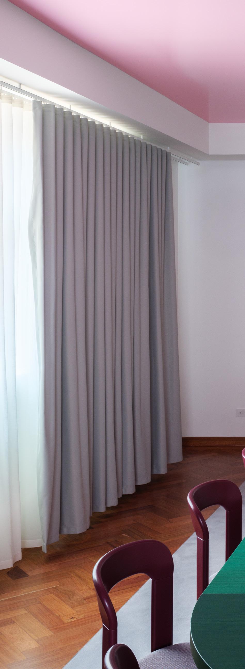
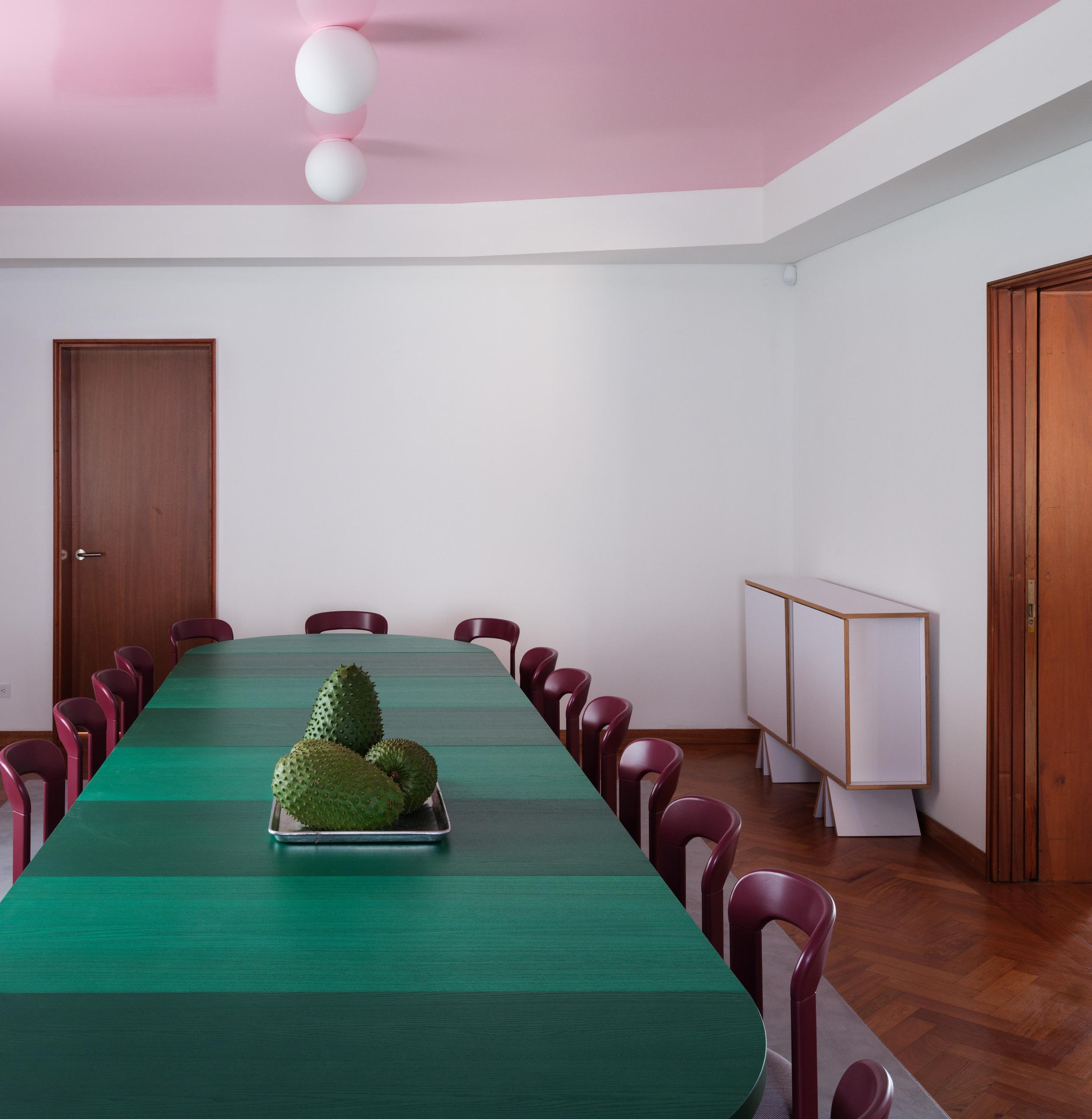
right Complementary color palettes in each room are anything but boring. Furnishings enhance the multicolor vibe of each interior.
below Seen through an enfilade, different rooms are defined by individual playful ceiling colors.
Issue 25 Spring/Summer 2024
93 AN Interior
From 2017 to 2024, Zurich-based architecture practice Lütjens Padmanabhan completed three projects for Swiss representations abroad: a new residence for the Swiss ambassador to Algiers; the Swiss consulate in Stuttgart, Germany; and most recently, a concise and colorful renovation of the Swiss ambassador’s residence in Bogotá, Colombia.
The Bogotá residence, Lütjens Padmanabhan’s first project in the Americas, is a 2,550-square-foot reimagination of an existing villa that started with the need to meet earthquake-resistance standards. To disguise the new reinforcements, the designers got creative: Inset colorful and reflective ceilings were installed in all main rooms. But the villa was also updated in other ways that reflect a contemporary sensibility. For example, the existing service kitchen transitioned into a new family hub, seamlessly connecting to the garden. There, a new glass-roofed space was created for receptions. The first floor’s interventions dissolve the rigid separation between ambassadorial and staff areas and underline an egalitarian way of living and working. Unique, character-filled furniture pieces inhabit the representative rooms, which can be composed easily according to daily needs, embracing the mobility that’s intrinsic to the life of a diplomat.
Each room has its own shape and color. On the groundfloor level, the almost symmetrical floorplan is carefully but consciously broken. The main rooms provide space for every possible scenario, from small intimate conversations to larger gatherings with big delegations. The color scheme on the ground level is bright and energetic, bringing in the colors from the garden—and from around Colombia. In contrast, the colors chosen for the ceilings on the
upper floor are kept quiet, resembling the tones of twilight and nightfall to generate a purposefully calm environment.
Lütjens Padmanabhan’s commission also included the furniture. The architects not only designed the built-ins but also several freestanding tables, consoles, dressers, and lamps. Together with select Trix and Robert Haussmann furniture, they bring with them a very particular flavor of Swiss design culture. The contrast between the classical appearance of the existing villa and the almost flashy additions creates a tension that feels unconventional and at the same time typical for the work of the architects.
The garden follows suit. The architects’ own bright yellow Uhu lamps that inhabit the garden add to the overall beauty of the local vegetation and derive from a bright catalog of other anthropomorphic objects Lütjens Padmanabhan has created over the years. The objects include cat mailboxes and doorbells (“they even purr when the door opens”), several tables with lively small feet, and a series of birdthemed lamps. All bear the architects’ recognizable signature, which indicates their interest in postmodern design. For example, the Uhu lamps reference John Hejduk’s Masks and Ettore Sottsass’s Twenty-Seven table lamp.
In the southeast corner of the garden, the architects added a new glass roof, creating a seating area in the green that protects from the daily rains, which are common to the tropical climate of Colombia. The track of light bulbs beneath evokes the feeling of being in the public realm, which is a rare condition in a place like an embassy with high-security standards. But here in the garden and throughout the entire space, the architects’ joyful interventions manage to recede into the background as life—and work—unfold with ease, uninterrupted. ●
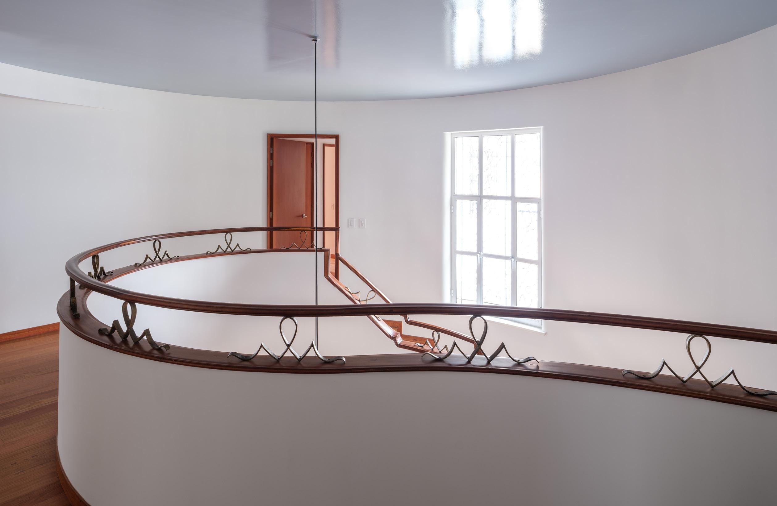
facing page The historic staircase was a centerpoint of the renovation. It has been restored and now brings guests to newly public areas of the
below
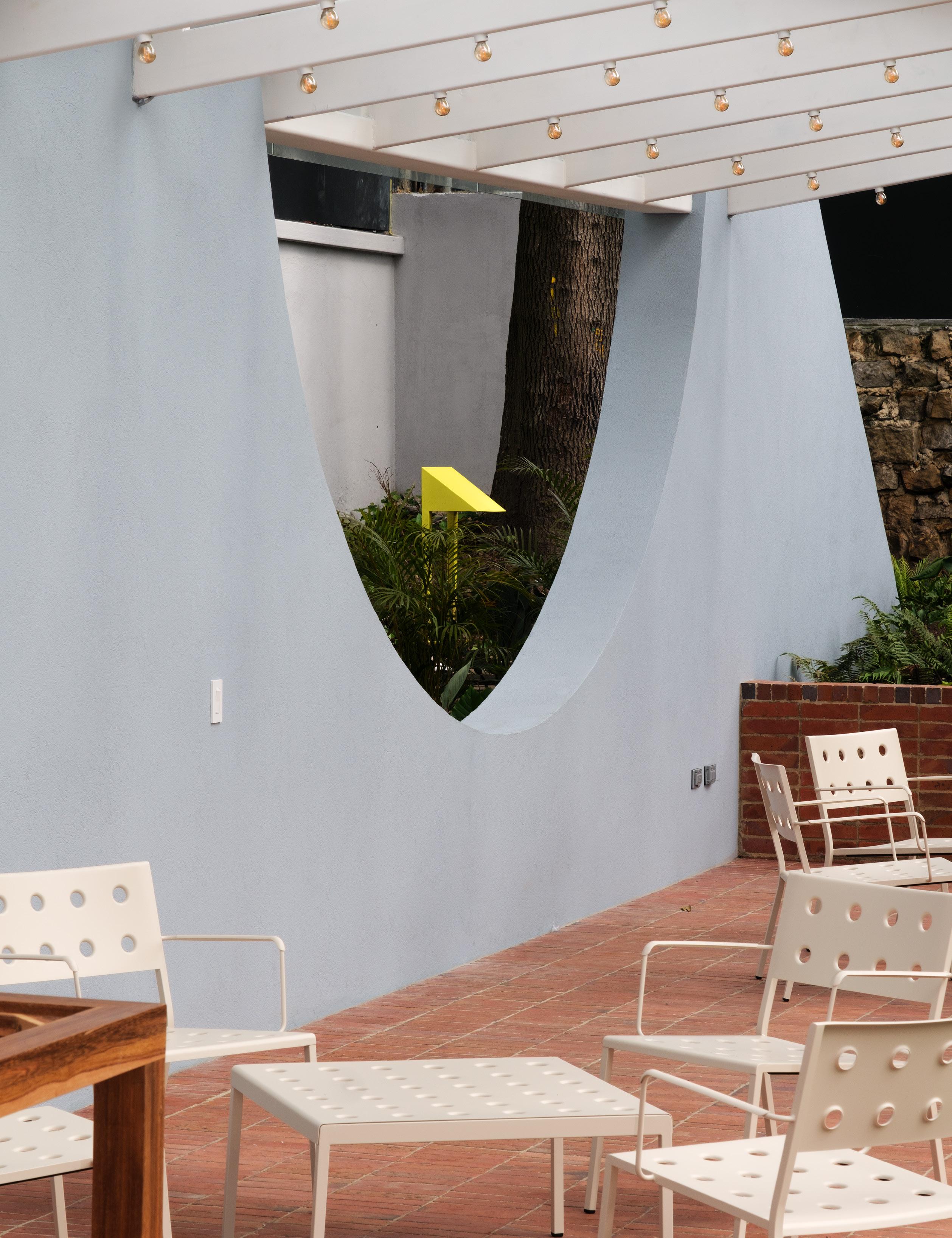 house.
Custom lighting in the garden was designed by the architects in their signature anthropomorphic style.
Pršić & Pršić transform a vernacular New England home into a new kind of coliving community in Rhode Island.
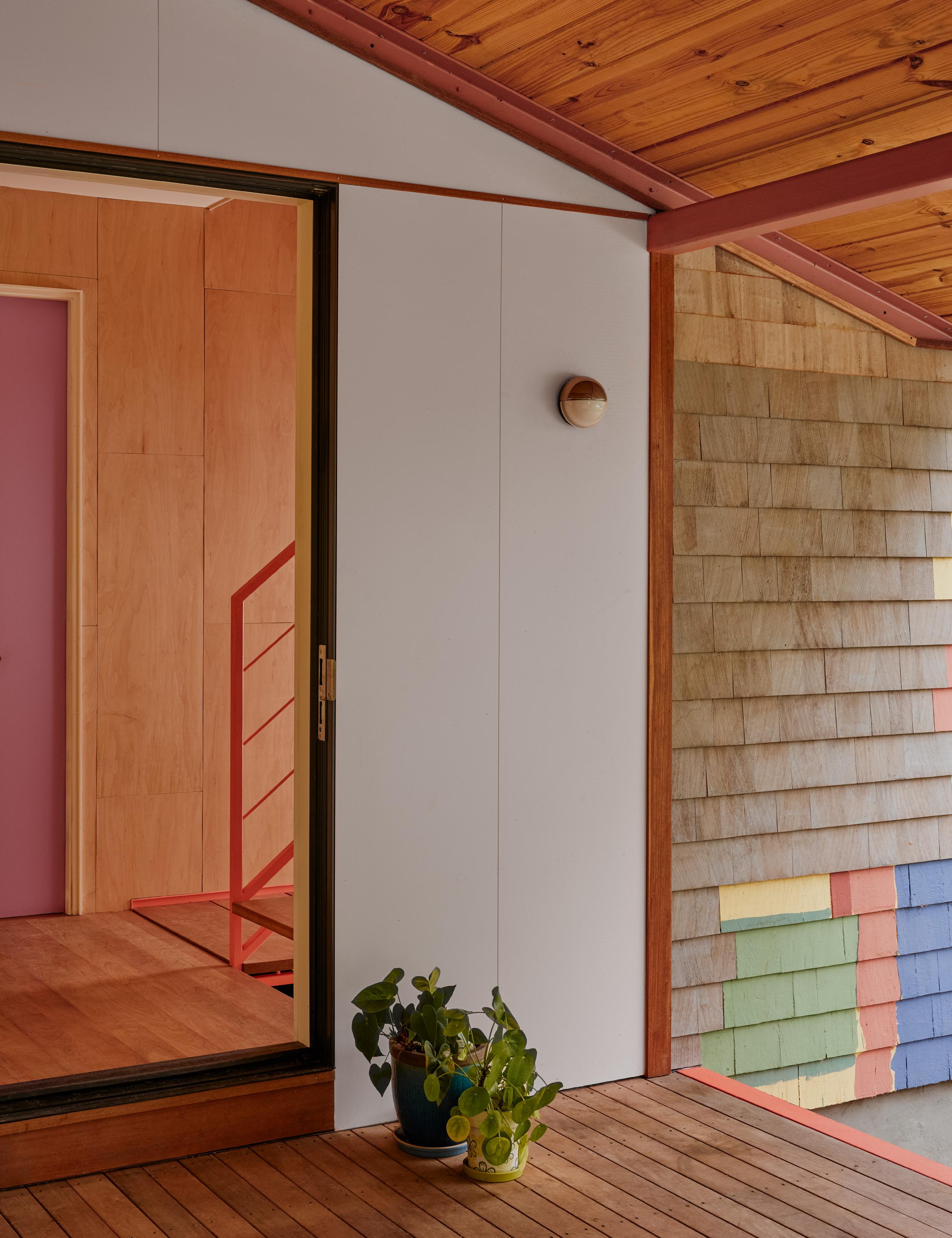
At Home
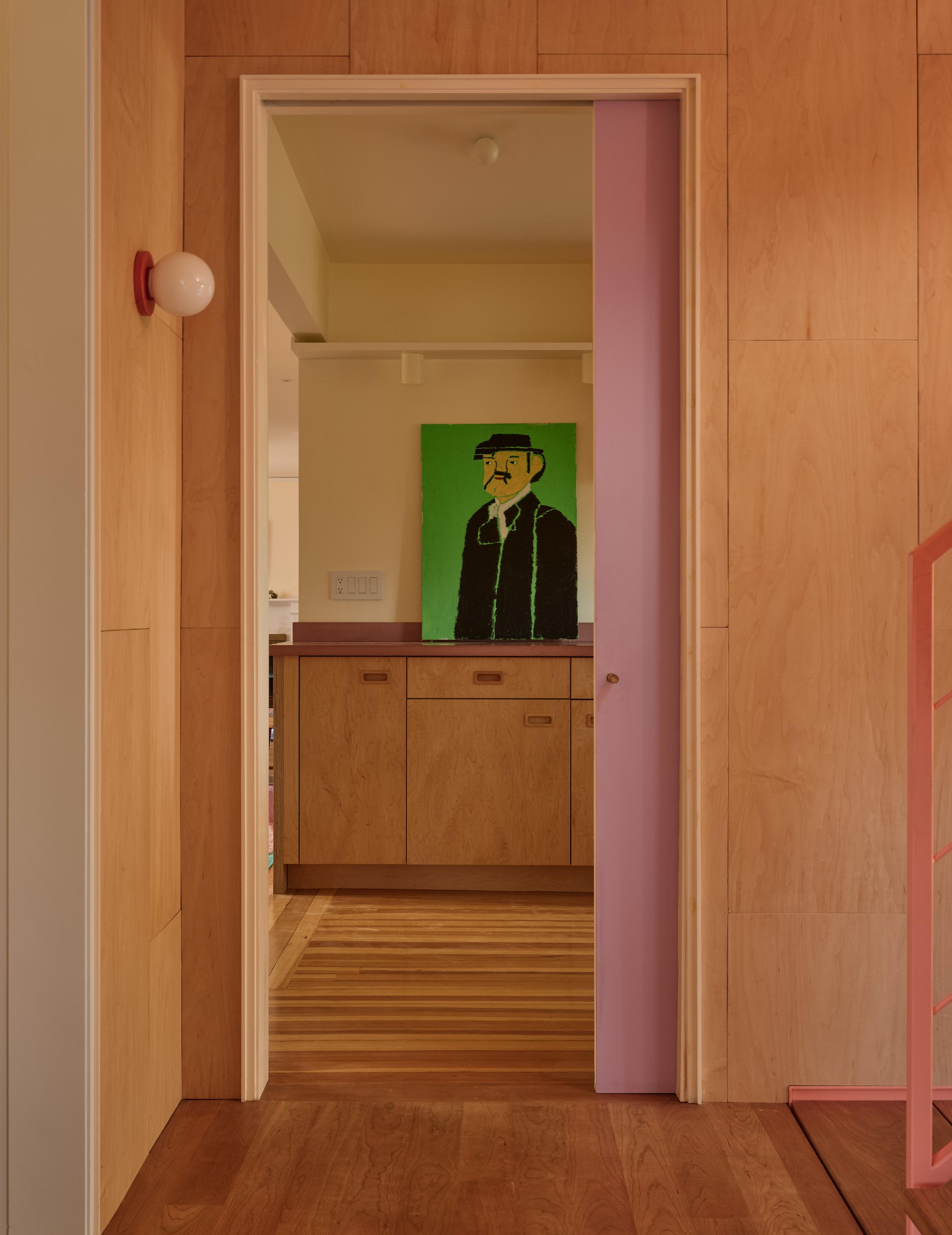
Together
Text by Anjulie Rao
Photography by Kate Foster and John Hesselbarth of Apparition
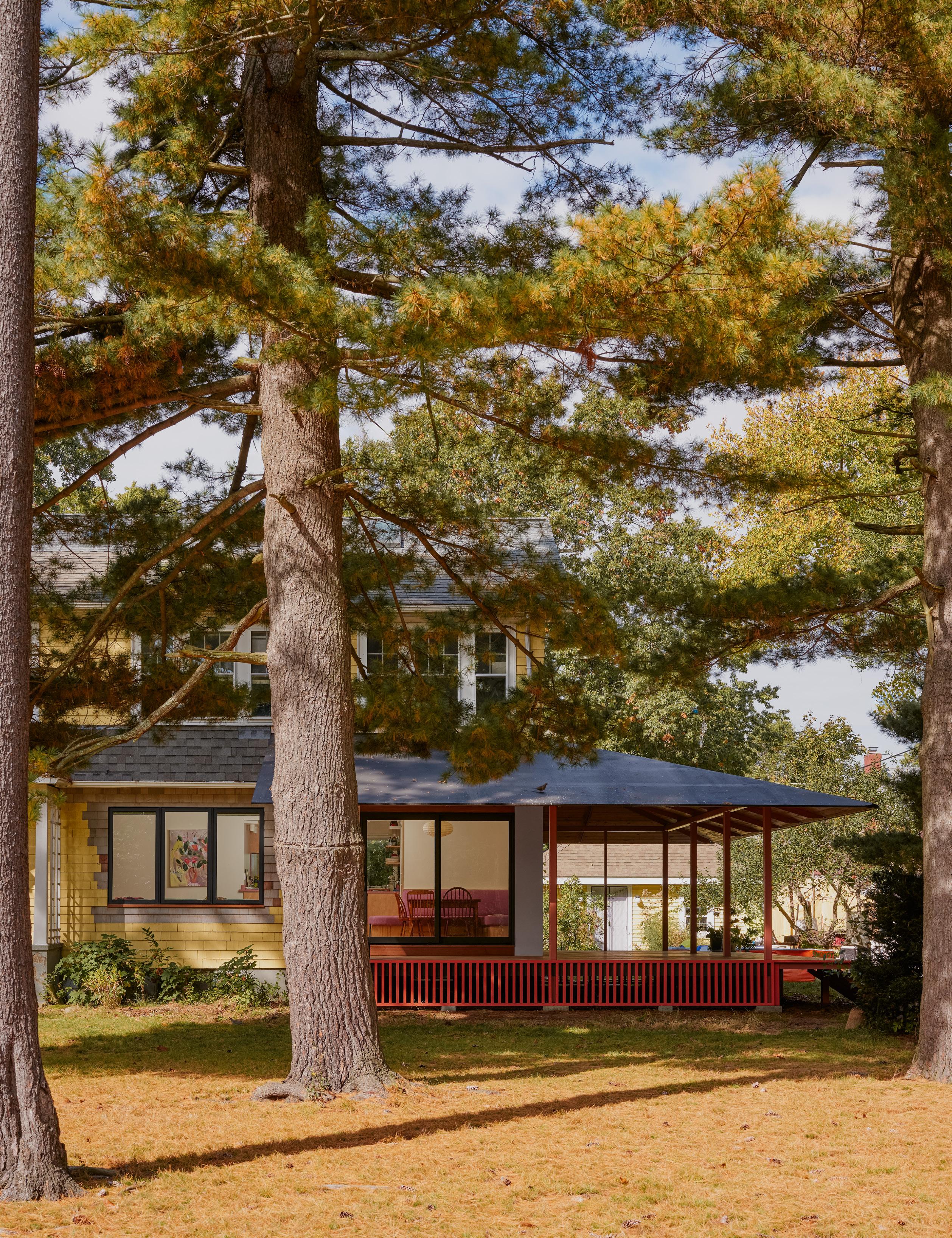
right The designers worked with the tenants to choose a shade of paint, and it was decided that the swatches would be kept rather than painted over as a visual remnant of the home’s story and process of making.
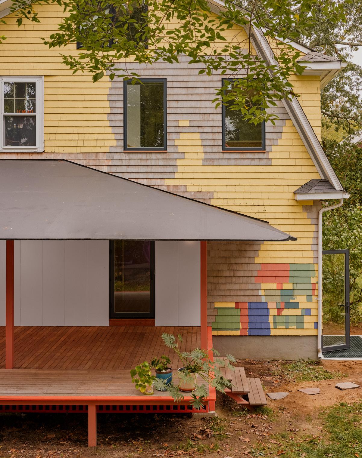
Housing continues to confound the American Dream: Costs are rising, new homes are getting smaller, and families are shrinking. Yet little by little, many communities are realizing the benefits of coliving as a way to share costs and resources. In Providence, Rhode Island, Pršić & Pršić, a multidisciplinary design office led by partners Almin Pršić and Cara Liberatore, recently completed the renovation of an older Victorian-style mansion into a space for two families.
The house had seen many haphazard interventions, including partitions that transformed the single-family structure into three unique apartments, becoming a “nonconforming” three-family building in a single-family district. The client wished to preserve the multifamily arrangement while organizing the ruckus.
Each family participated creatively in their own way. “There was an interesting informality because there were multiple voices in the conversation,” Liberatore said. “It wasn’t a process where we drew something and then they looked at it and said yes or no. It was very organic.” Pršić and Liberatore worked frequently on-site, where they peeled back layers and took notice of the quirks and misalignments of a settled house, like 2-inch level changes between rooms and flooring that zigzagged around the ghosts of partitions past.
The mazelike home required a new plan that would produce two units, a shared playroom and common area, and a guest space. The architects began by rebuilding the porch and demolishing the bulky staircase, replacing it with a half-turn steel stair.
“The stair itself is like a single fin that essentially runs top to bottom. It’s constructed like a truss,” explained Pršić. The offset treads “appear to float in space,” he continued. And minimizing the stair’s footprint also freed up space in the first-floor kitchen, which the designers reclaimed for a built-in refrigerator and a dining space.
“[The client] was really keen on work[ing] with wood,” Pršić
said. So the architects settled on clear-coated plywood millwork, which adorns the first-floor walls, cabinetry, and a breakfast nook bench. “The bench was a big deal to the client because it provided a fairly big communal space,” he continued. The cabinetmaker used plywood slats to create undulating seating that includes built-in storage. Color quickly became a prominent feature: Pink was selected as the first-floor theme, but finding the right shade wasn’t easy (the many samples considered are now pavers in the backyard). But eventually, the subtle red in the original cherry flooring, coupled with an otherwise neutral material palette, made the warm, deep pink an ideal choice.
Upstairs, the landing opens to another kitchen. Unlike the streamlined first-floor unit, the second floor—occupied by a textile artist, a drummer, and their child—is more eclectic. The soapstone sink was acquired by the artist while visiting a slate manufacturing company in Maine; two light fixtures found in an abandoned home on Cape Cod hang from above. In order to draw natural light in, the architects “layered” two windows: one new puncture on the building’s exterior into the stairwell brings light through the interior kitchen window. A two-paneled glass door to the kitchen, with one side frosted, creates an extra, optional layer of privacy. Because the guest room also occupies the second floor, the family has access to an attic studio workspace. The success in Pršić & Pršić’s coliving arrangement lies in small details. But the architects noted that collaboration and open negotiation also played a huge role. Pršić said, “When we’re dealing with people living together, we’re talking about social structures and privacy. It’s an exploration of different things that have existed before, in different contexts, and drawing on that to figure out what actually works for people.” ●
99 AN Interior
facing page The architects added a generous porch extension replete with
skirting to
colorful
extend the home outdoors for socializing and sharing meals.
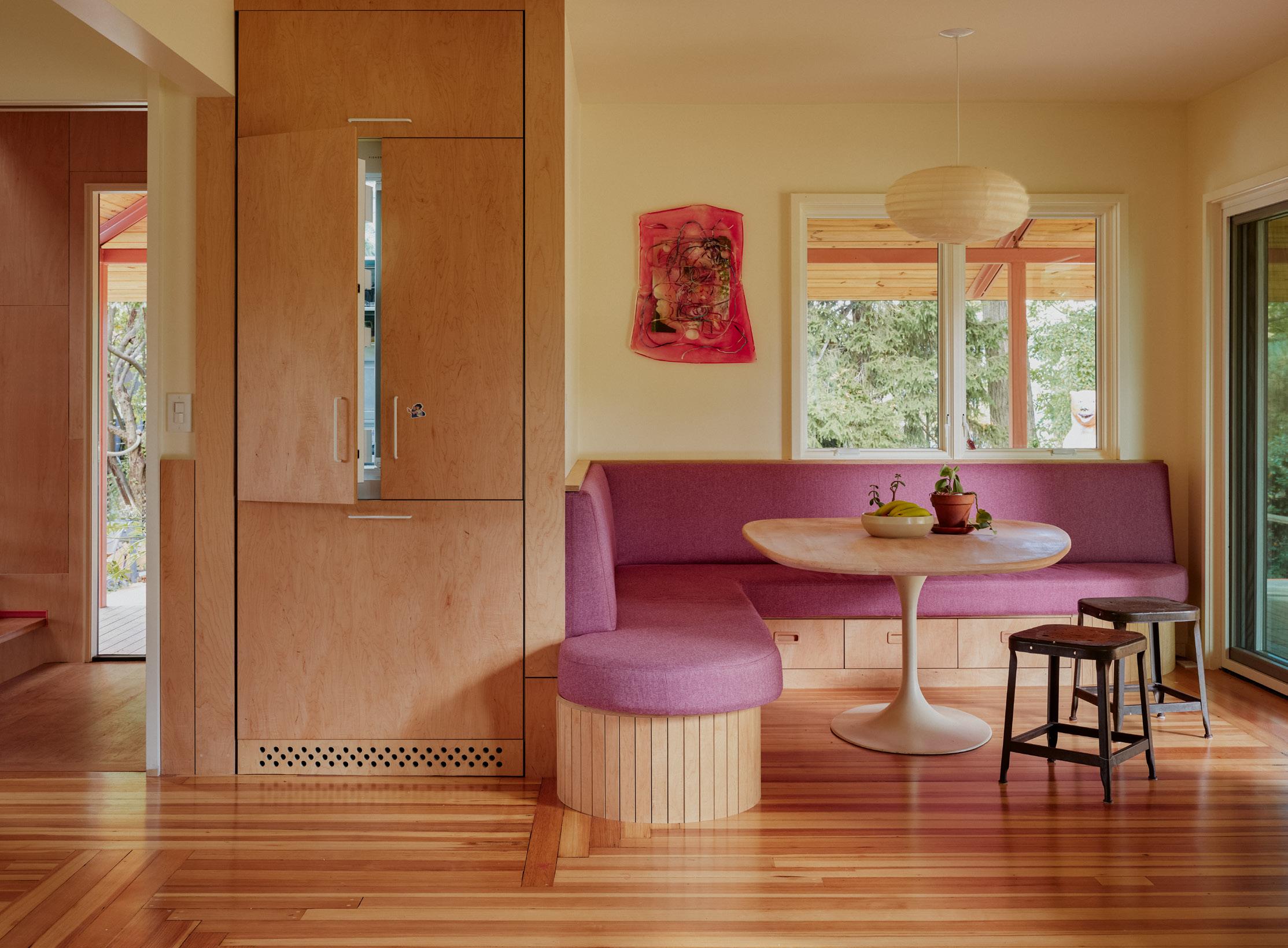
above Warm woods and built-ins define the communal spaces of each residence, with pops of pink deployed as a uniting detail.
right Internal windows and sliding doors make small,
spaces feel expansive.
facing page Color and eclecticism built into the design make even quotidian spaces feel elevated, like this matte black countertop and pale pink faucet.
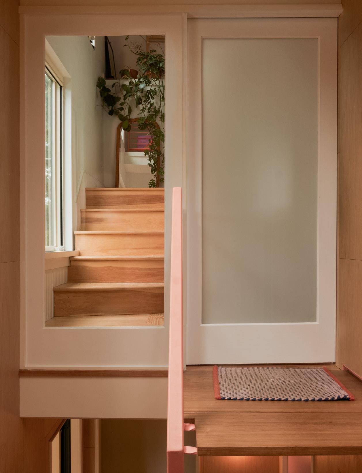
100
tight
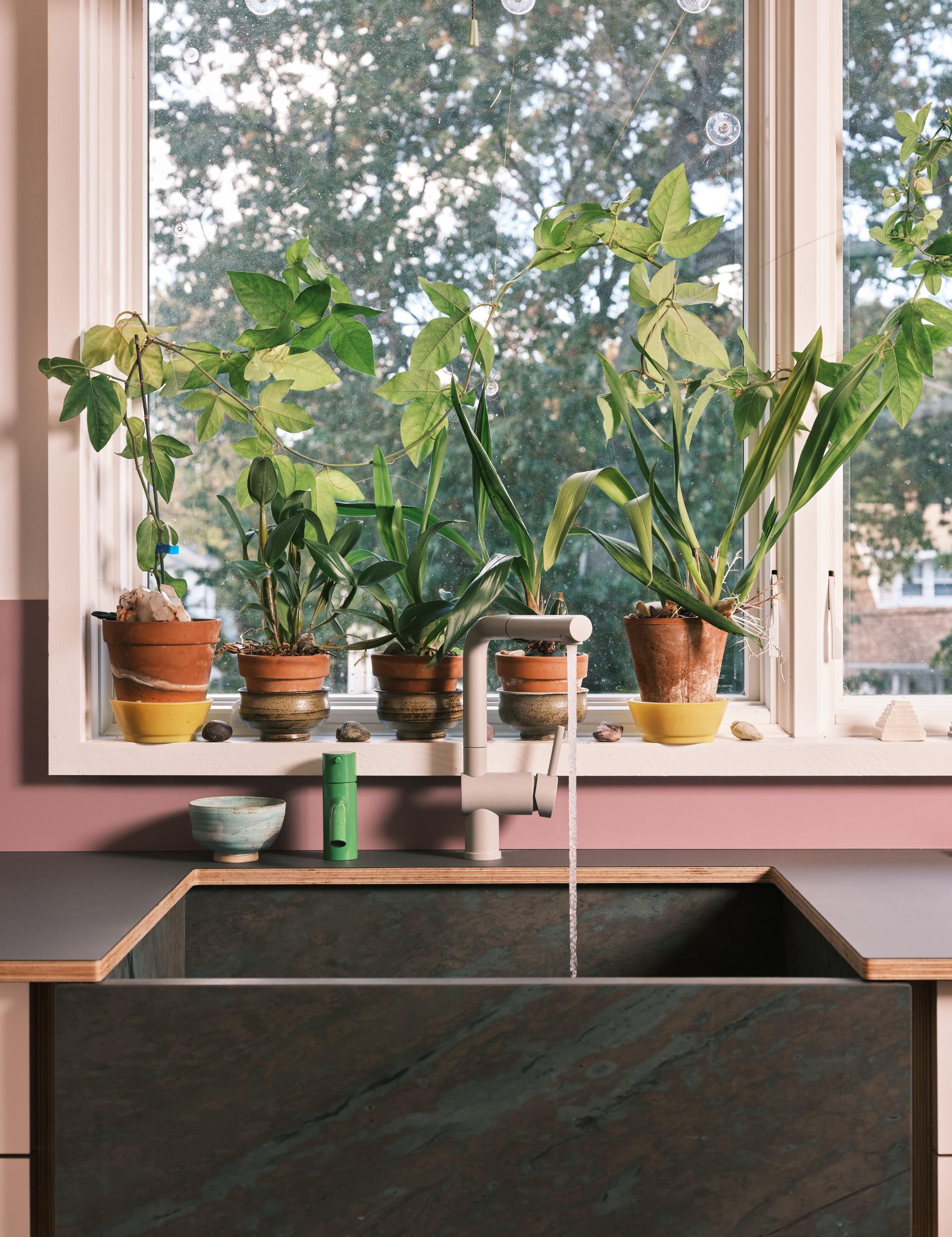
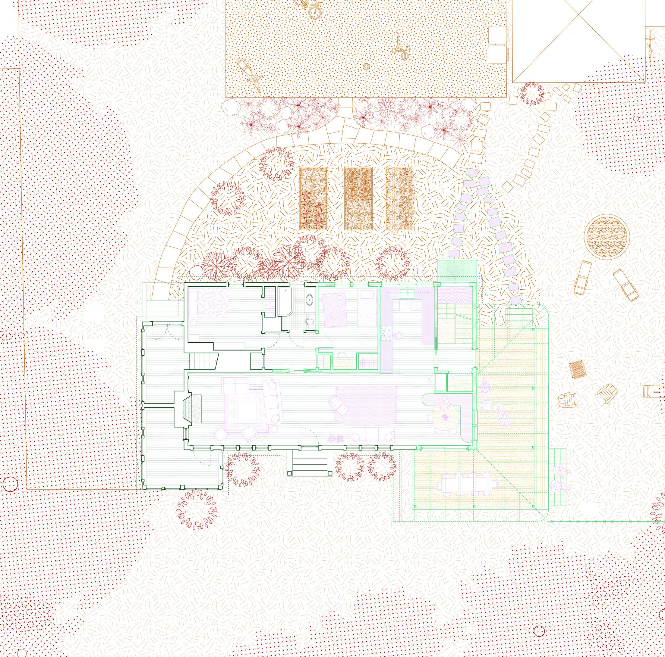
above A site plan by the architects takes on the color palette and aesthetic sensibility of the project.
facing page The new front porch, constructed in steel, frames the landscape.
102 Issue 25 Spring/Summer 2024
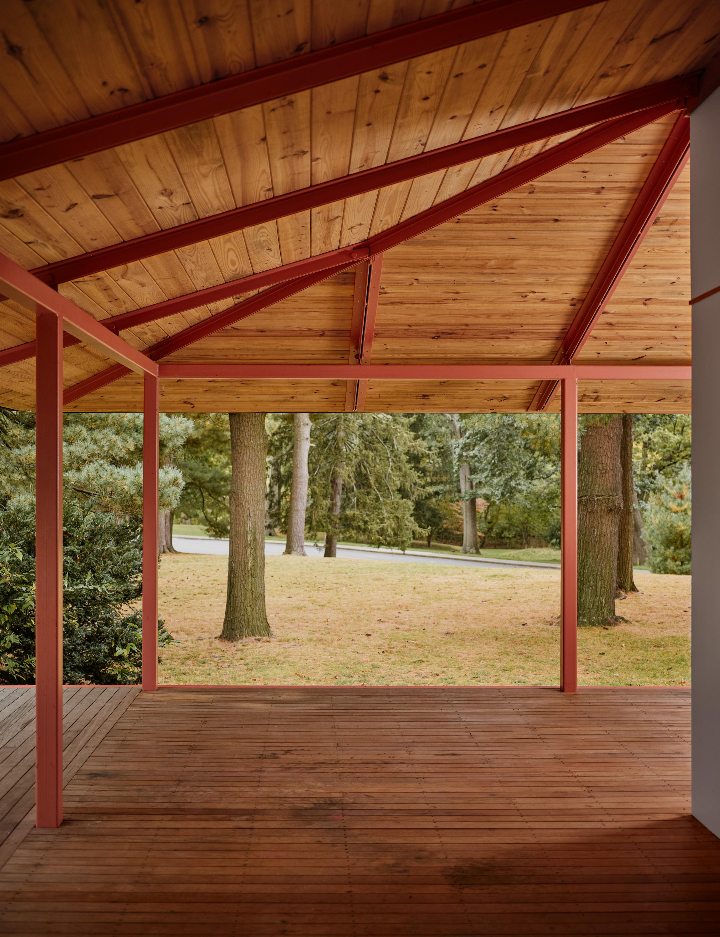
“When we’re dealing with people living together, we’re talking about social structures and privacy. It’s an exploration of different things that have existed before, in different contexts, and drawing on that to figure out what actually works for people.” —Almin Pršić
BeAr
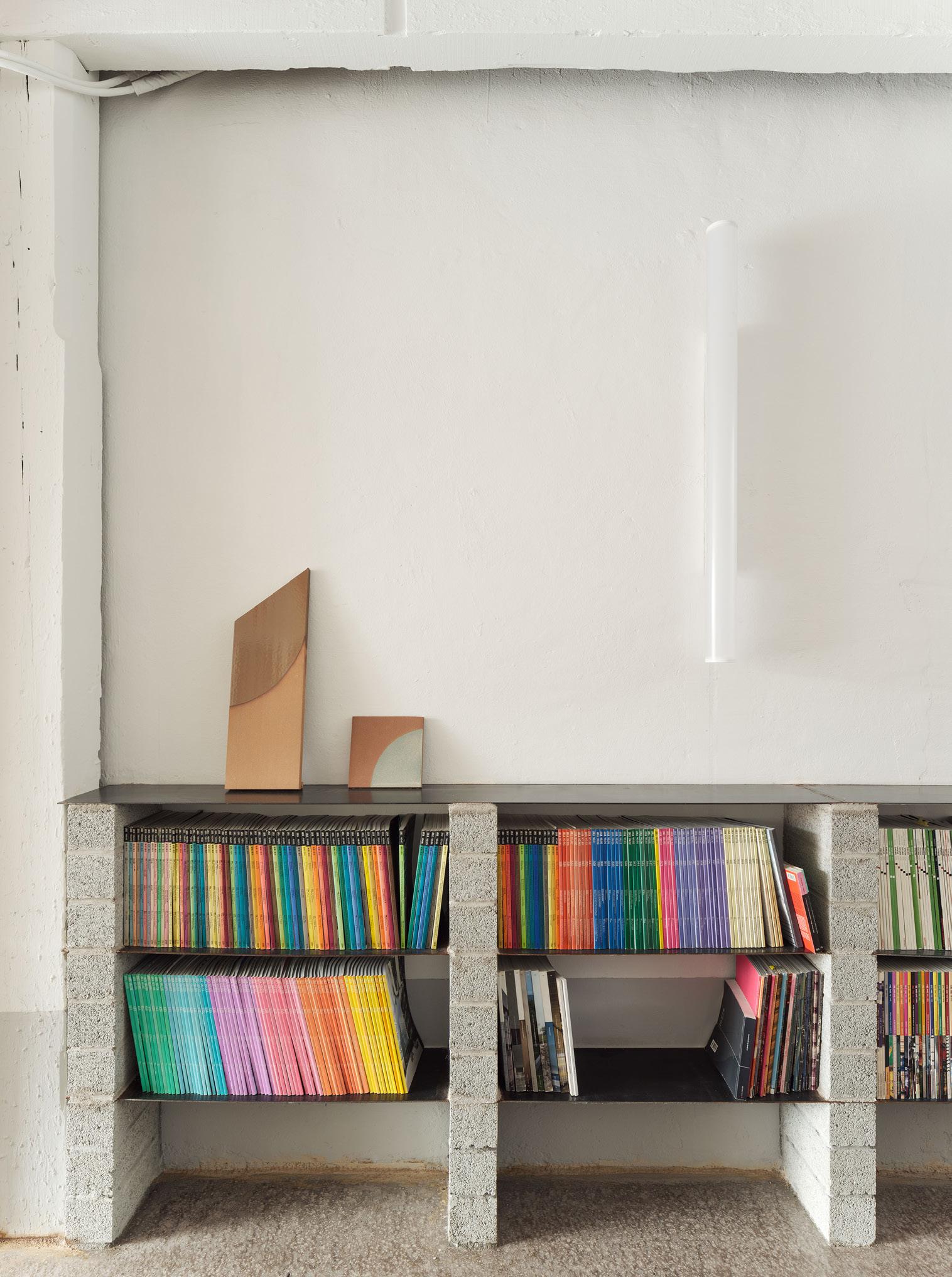
at RABE
BeAr Architects embrace aesthetic tension within the walls of an abandoned Bilbao warehouse.
Text by Use Lahoz
Photography by Luis Díaz Díaz
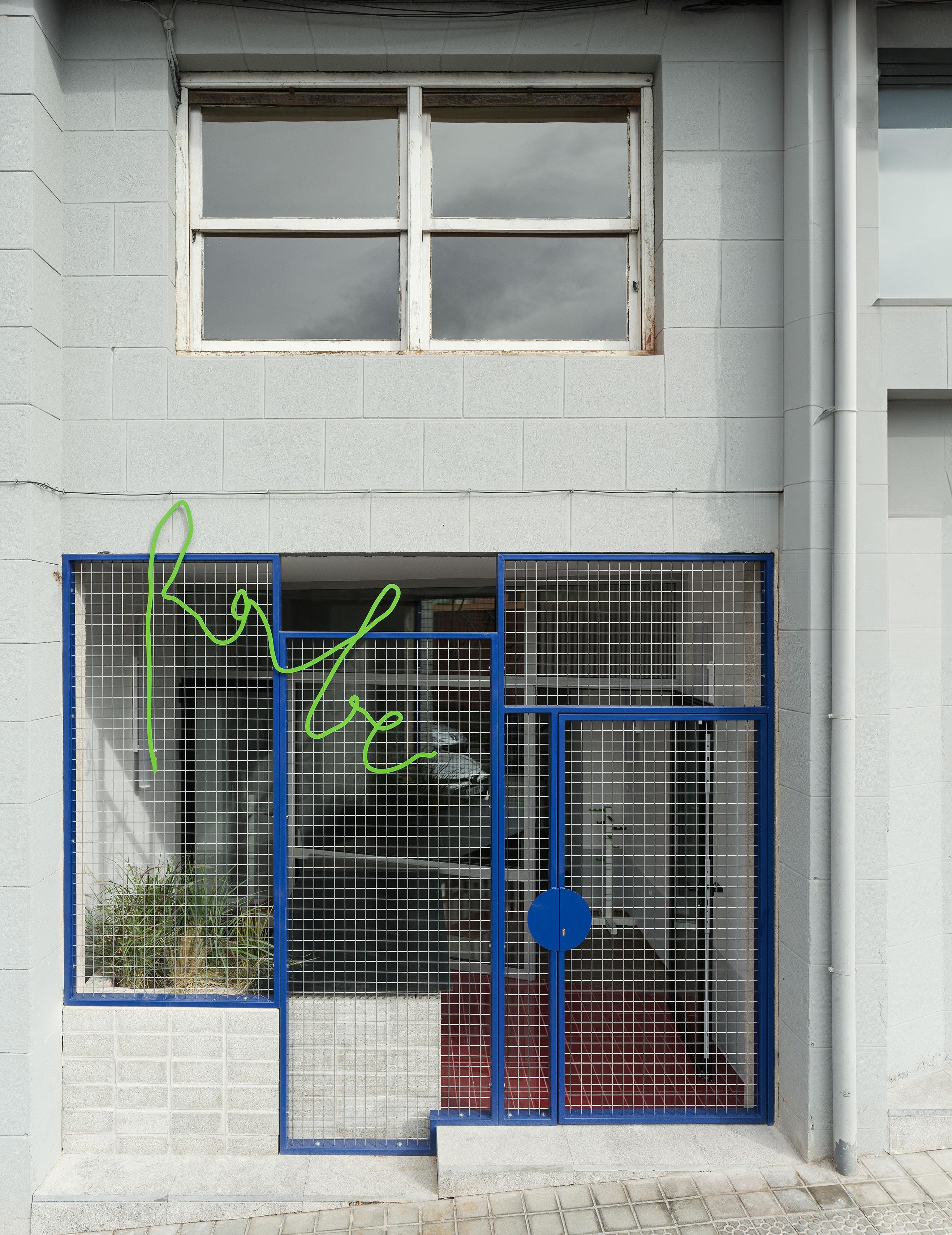
The spine of the studio is an extralong utilitarian table where the designers work, relax, share meals, and gather together throughout the day.
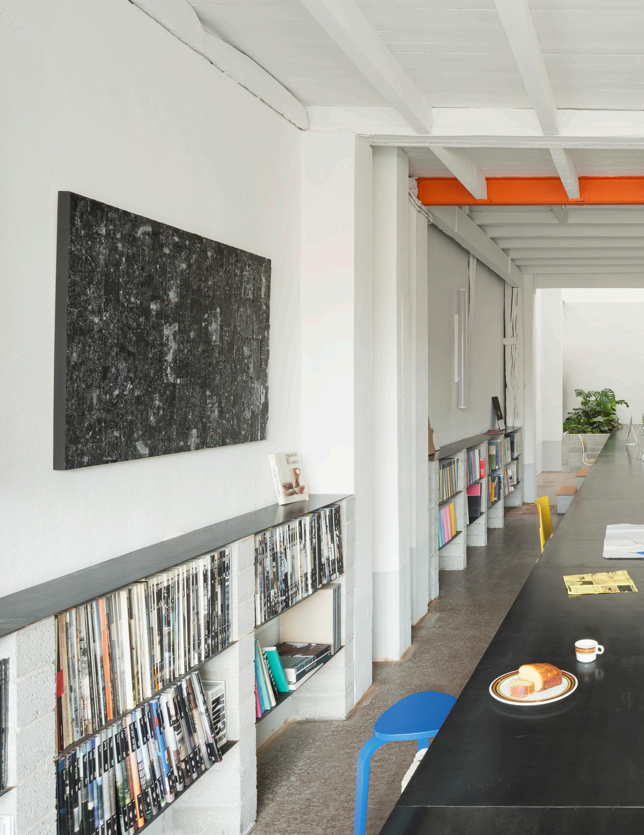
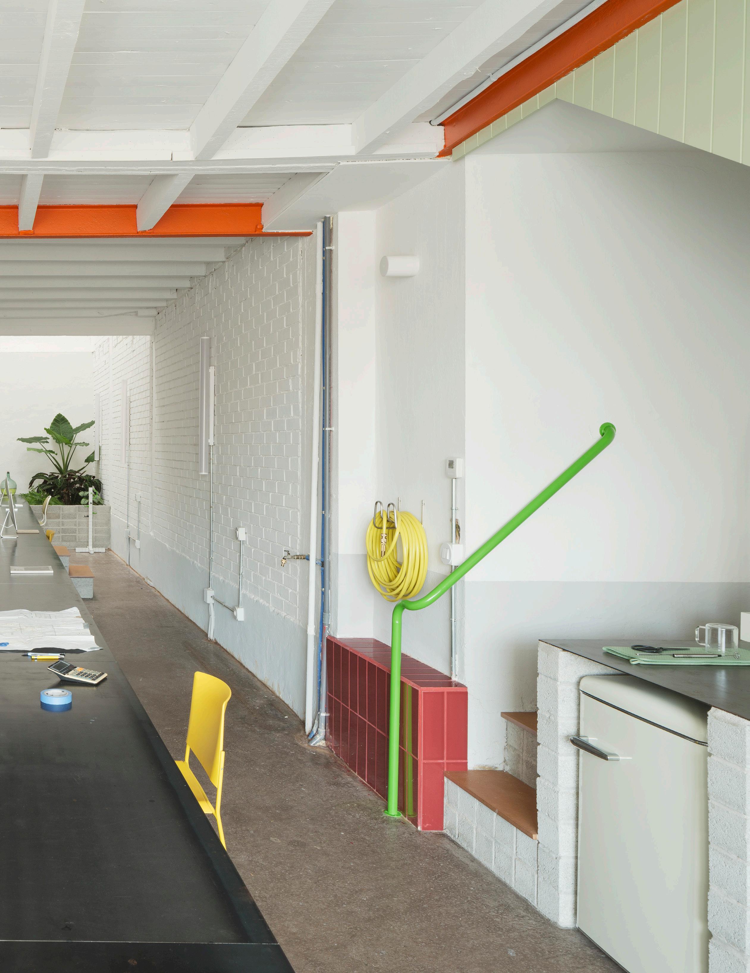
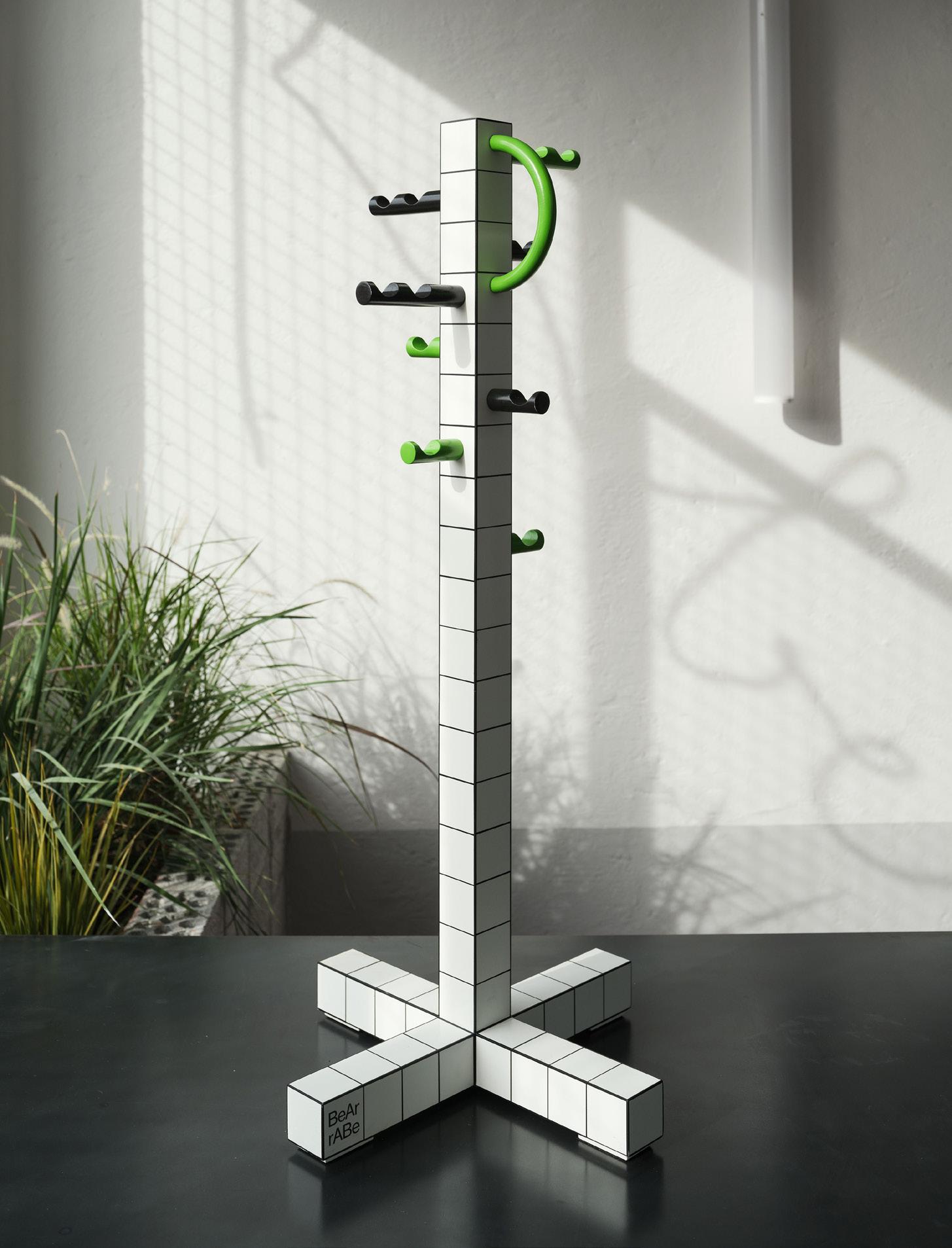
left The studio is filled with fun objects designed by the firm, like this coatrack that’s almost an homage to Superstudio.
Ane Arce and Iñigo Berasategui, founders of the Bilbao, Spain–based architecture firm BeAr, envisioned RABE as a design challenged with recovering the memory of a historic warehouse. The 650-square-foot structure had been abandoned for more than 40 years, but the duo felt a pull toward the space. It has varied yet distinct uses: Two floors allow the studio more space to work, but the building also also lends itself to organizing exhibitions and conferences.
Berasategui said, “We took the facade inside.” After designing a new custom metal door, the designers intervened on the long, loftlike interior with a 55-foot table in saponated iron that cuts the floor in two. Everything revolves around it: “It’s the protagonist,” explained Berasategui. Supported on pedestals, walls, and block stairs, the table invites you to work, eat, or climb on it, go down, and walk around it.
BeAr’s studio culture is built on conviviality and shared meals—and knowing how well people eat in Bilbao, this is not surprising. “We all eat lunch together and sometimes also have dinners where we invite colleagues,” he said. Under the staircase connecting the first-floor gathering space, shelves and a compact kitchen have been built with simple materials: concrete from the nearby town of Guernica and more of that raw saponated iron.
But these materials are anything but drab in application. One look at the studio space, and the electric color palette pops: Touches of orange, blue, and green—the colors of the BeAr studio logo—make even ordinary details like railings and appliances stand out.
The second floor, however, is a surprising counterpoint to the bright, open plan at ground level. Originally the offices of a construction company, the space was lined with abundant built-in cabinetry. But
108 Issue 25 Spring/Summer 2024
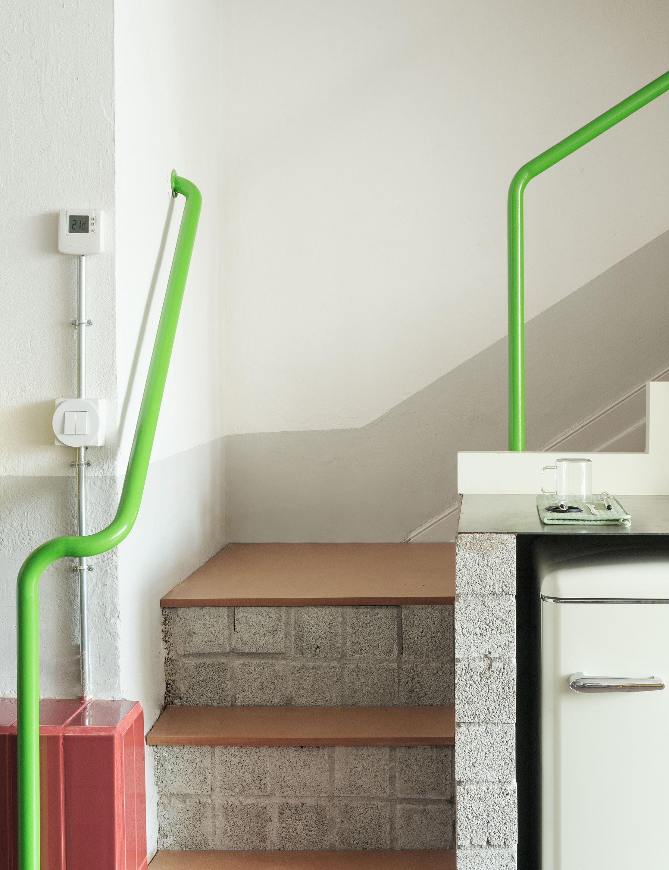
Color is used to call attention to details and wayfinding. These electric-green railings lead you upstairs, but the color also becomes RABE’s signature motif, as seen on its exterior signage.
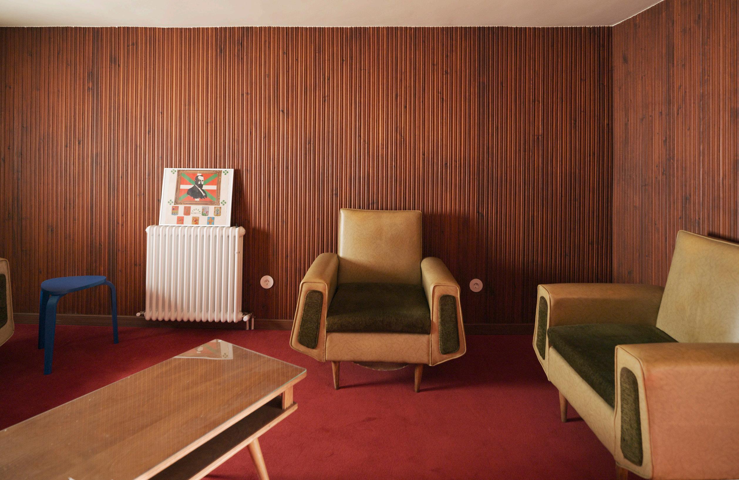
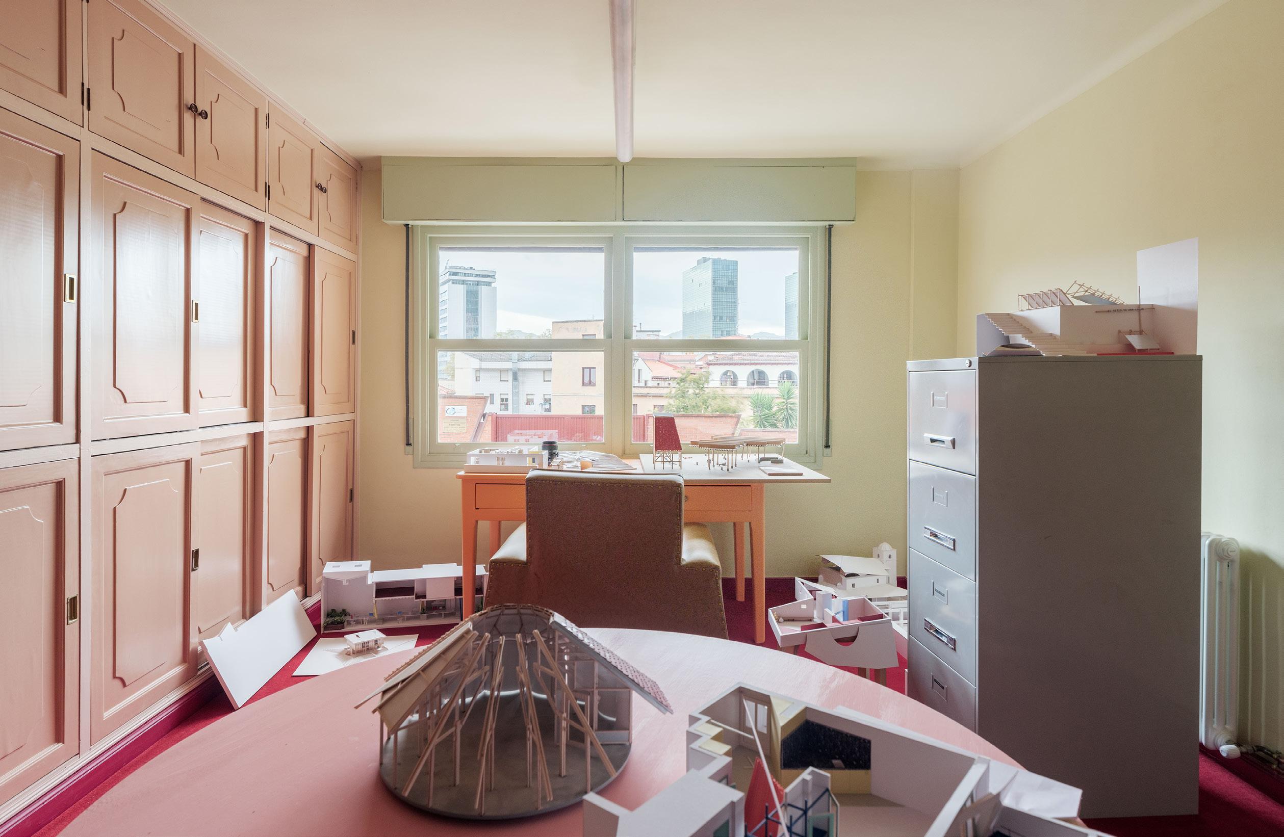
facing page , left The upstairs floor is a surprising juxtaposition, where office and making spaces take on textured wood paneling and are furnished with more comfortable furniture.
facing page , below Built-in cabinetry was meticulously preserved and restored and now it wears a shade of ballet-pink paint.
right BeAr uses the upstairs spaces to work on and display models-in-progress.
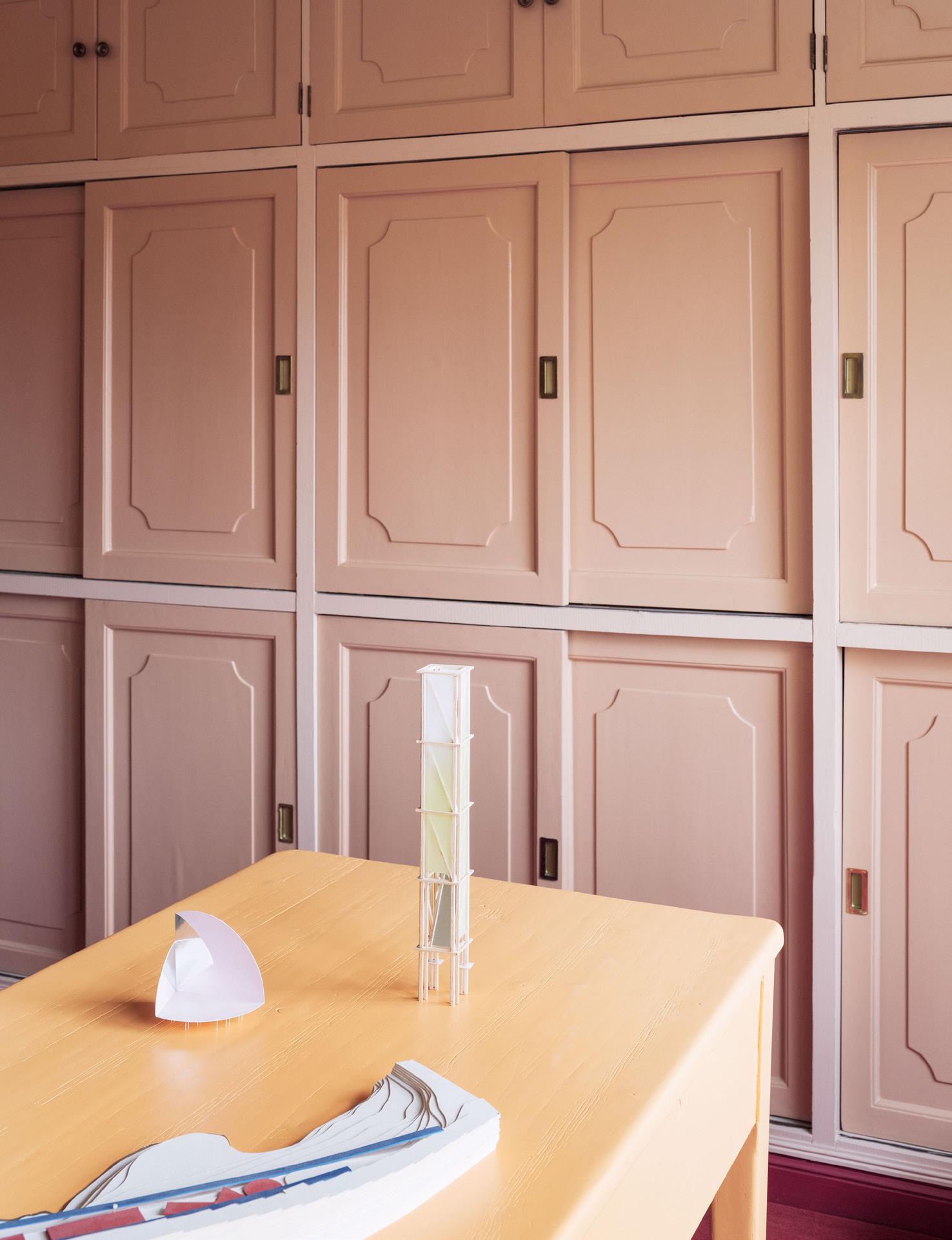
these upper-level spaces are no longer standard offices, but variously sized meeting rooms, the studio’s archive, and model-making workshops.
The cabinetry was preserved—a gesture to remain faithful to the site’s history—but each unit was first dismantled and lacquered in warm, rosy colors. A deep-red carpet connects these with the dark wood paneling enveloping the rooms. The playful feeling of the ground floor remains, but in a subdued and distinctly cozy manner.
RABE is based on this strong visual contrast between the two floors. Emphasizing the raw industrial feel of the warehouse on the first floor and the vintage office feel on the second, the design decisions invoke one of the major inspirations for the studio: the Sonneveld house by Brinkman and Van der Vlugt. “Beyond the fact that it is an example of the so-called International Style, it shows that this era was not white and has a precious and very human use of color and texture,” said Berasategui. BeAr identifies with the house because it
is a house as comfortable as a machine: efficient, hygienic, and designed with its inhabitants in mind. All this has to do with BeAr’s philosophy. RABE is in tune with the “hygienic” demands of the modern lifestyle. “We believe that architecture should have an intellectual weight. It is important to produce architecture as well as thought,” said Berasategui. To produce architecture as well as thought is an obsession even on the smallest scale. There are clear points that are repeated: joy, fearlessness, or the design of objects. Berasategui admitted, “We are frustrated artists.”
The RABE studio setting might not be for everyone, but its bold choices and convivial programming make it a perfect home for BeAr. It’s the starting point for many of the studio’s adventurous—and even controversial—projects. It tries to strike the difficult balance between being opportune and opportunistic. The goal of remembering the humble warehouse through the spatial design roots BeAr in the moment as well as on the site. ●
111 AN Interior
i.s.m.architecten has redesigned the ground floor of the
combining industrial tropes with bold, colorful details.
Boundaries Soft
 Antwerp Photo Museum,
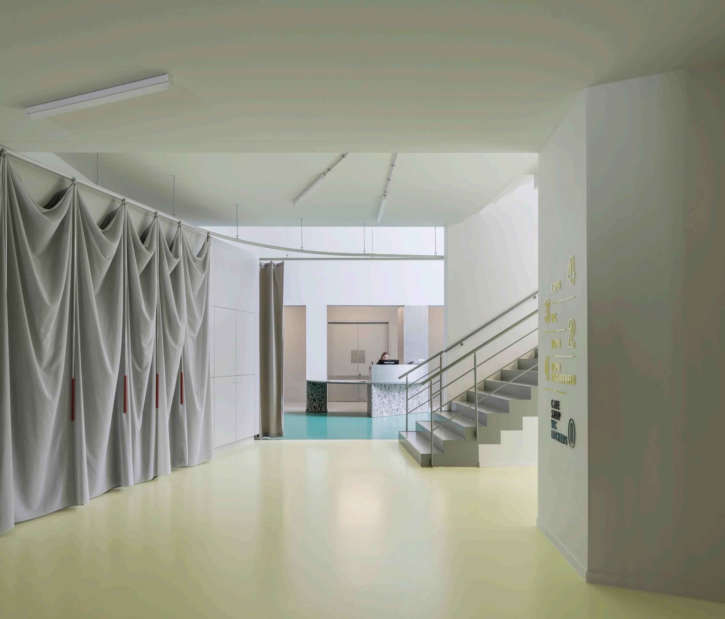
Boundaries
Text by Adrian Madlener
Photography by Luis Díaz Díaz
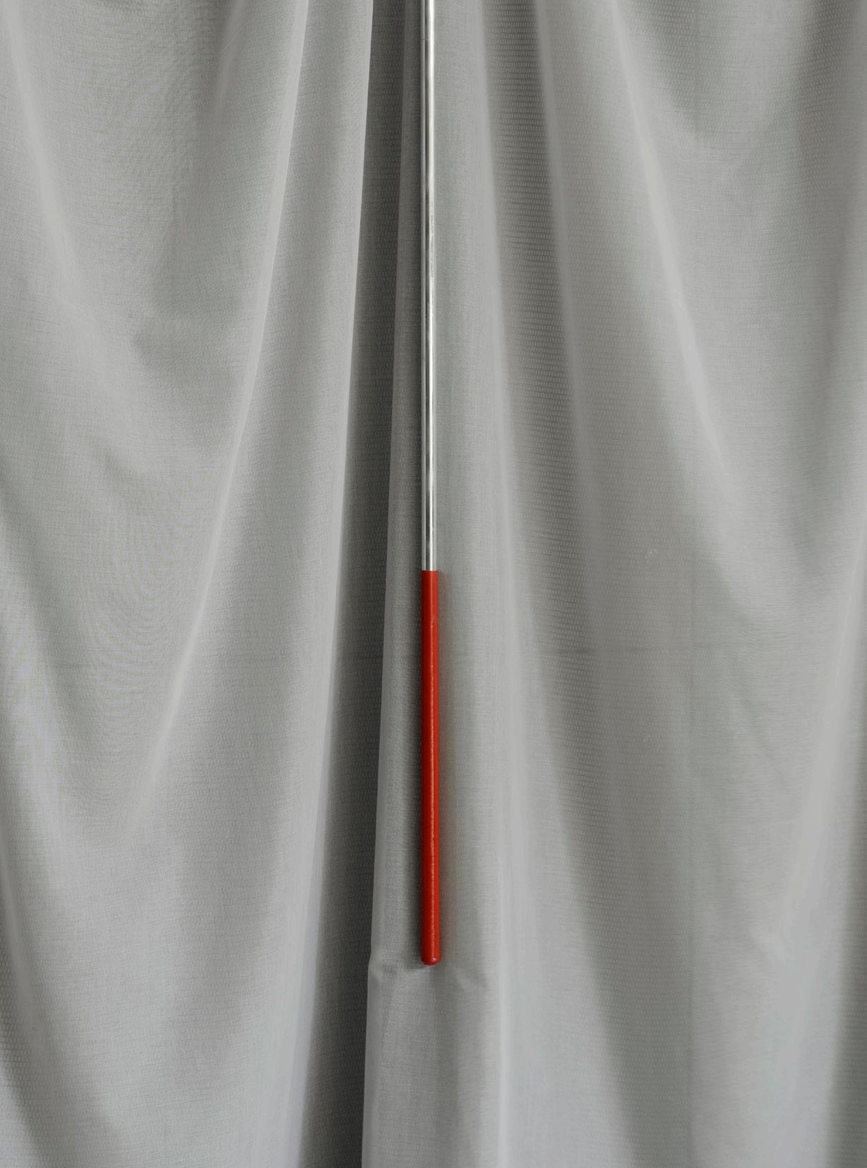
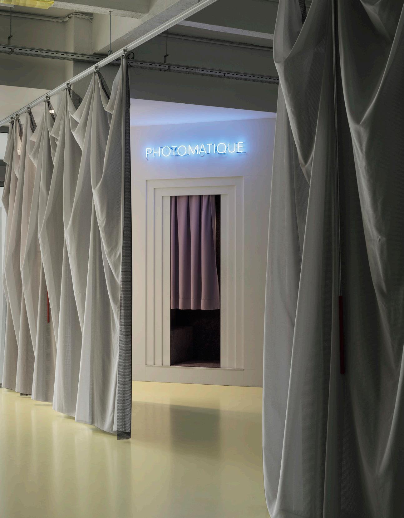
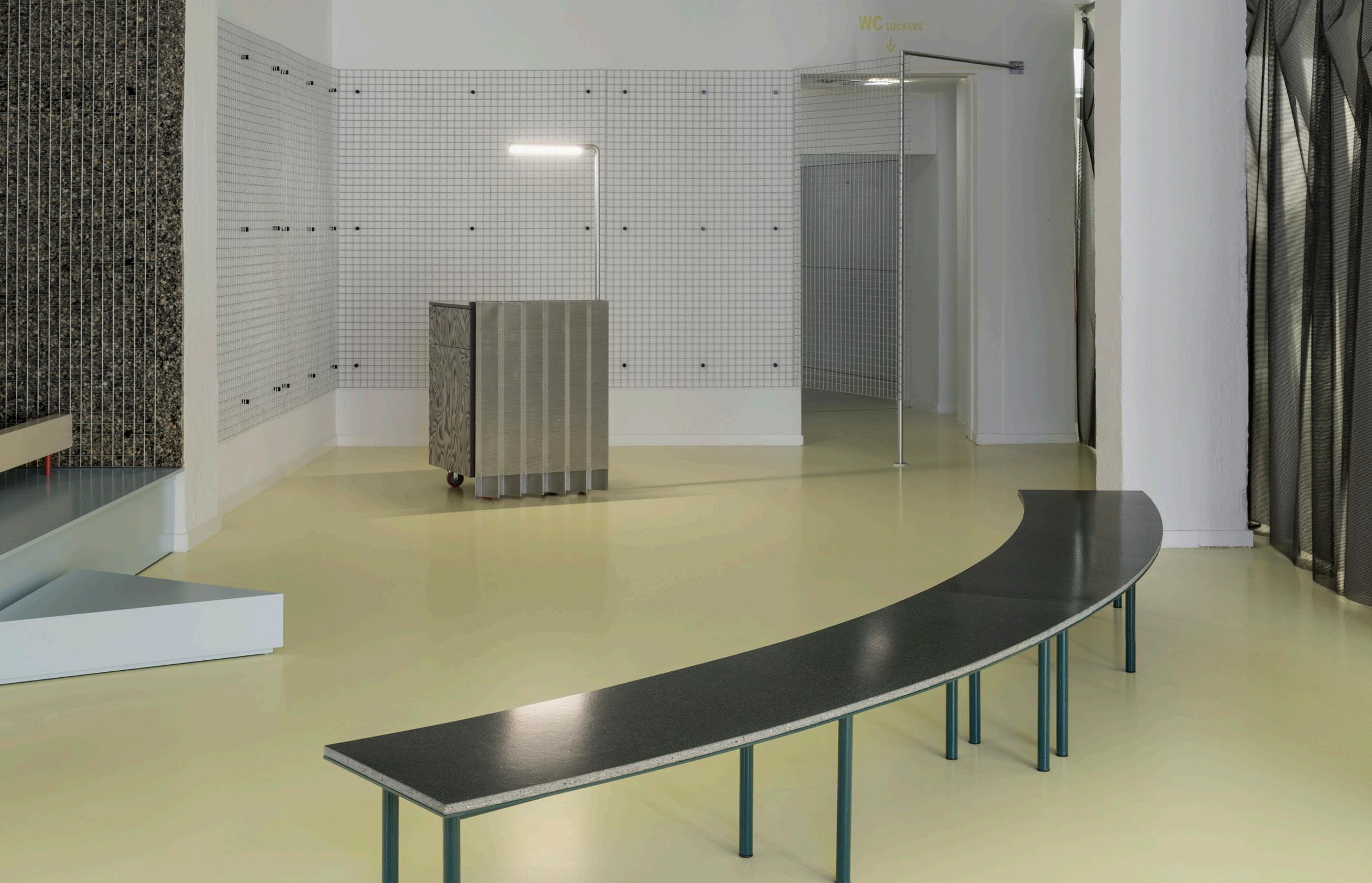
facing page , far left An unexpected red curtain pull adds to the curtain pulls.
facing page , left Soft curtains pull back to reveal different programmatic elements.
facing page , below A small stage and speaking podium were custom designs by i.s.m.architecten.
below A plan detailing the circulation to and through the new lobby in relation to the rest of the museum.
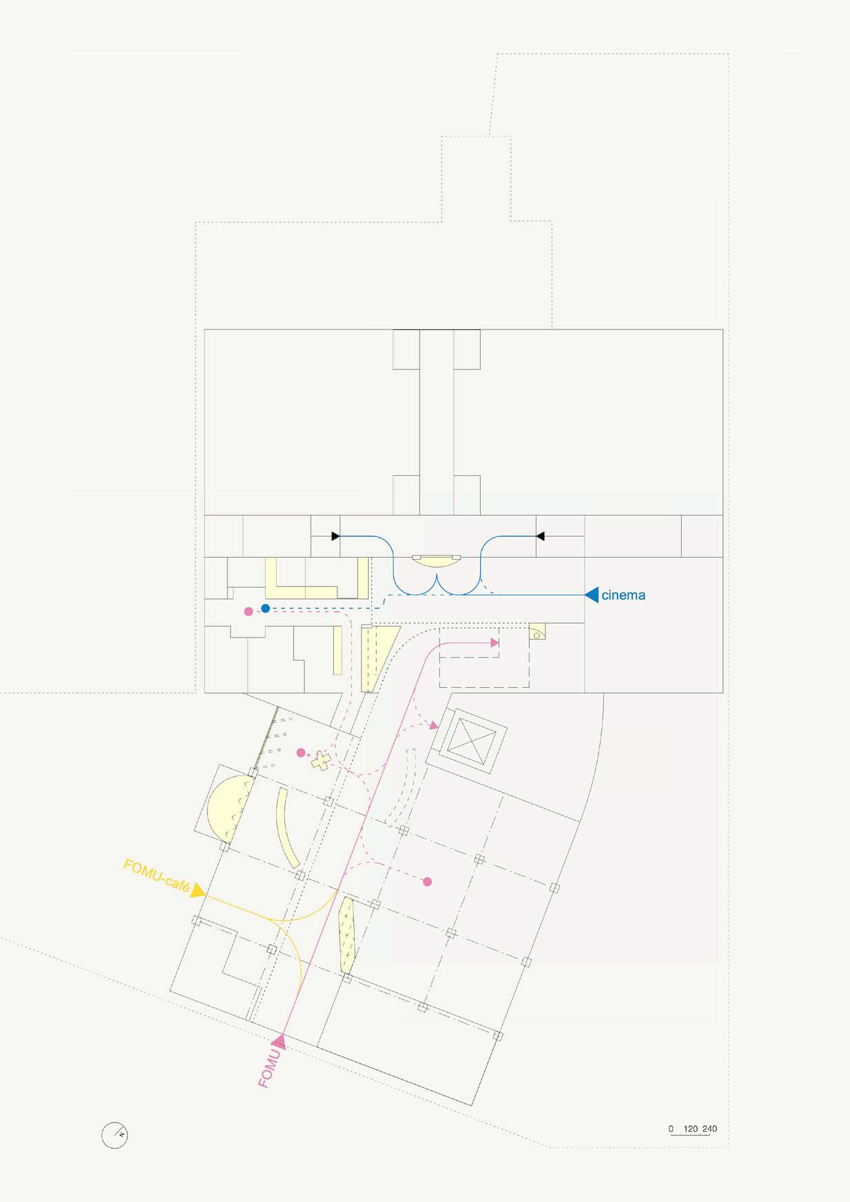
Antwerp is undergoing a cultural revival, though many might argue that this major port town and unassuming capital of fashion has always maintained some level of influence. Part of this small but impactful city’s cache is its raft of museums that touch on creative topics as varied as Flemish Renaissance painting and radical performance art.
Among this bevy of specialized institutions is the world-famous Fotomuseum Antwerp, or FOMU. Housed in a former warehouse, the kunsthalle-style platform has hosted solo exhibitions on Sally Mann, Cindy Sherman, and Zanele Muholi. Though a popular destination for 80,000 local and international visitors annually, its ground-level entrance was in dire need of a refresh.
Answering an open call to reconfigure this essential space, local practice i.s.m.architecten devised a scheme predicated on better wayfinding and flexibility. The interior architecture firm’s winning design incorporates bold scenographic elements, easily decipherable signage, and visually striking material treatments.
“Initially, the museum had to employ signage and staff to direct visitors up the stairs to the exhibition rooms,” said Wim Van der Vurst, practice coprincipal. Visitors were prone to “inadvertently” head toward the cinema instead of the museum: The stairs were situated laterally to this line of sight. Van der Vurst decided that “a spatial intervention was required to distinctly separate the two areas.”
He and his team, including partner Koen Pauwels, worked around nonnegotiable constraints like the museum’s two entrances to introduce both hard and soft interventions. For example, a sculptural podium on wheels was constructed for impromptu lectures and capsule exhibitions alike.
One of the most striking elements of i.s.m.architecten’s design is a continuous teal floor that “further demarcates the [space’s] two functions: light yellow for the museum and a darker green for the cinema.” This chromatic pairing reflects FOMU’s well-established visual identity, but also that of iconic camera brands like Kodak and Fujifilm. This colorway is also expressed in the use of sleek yet visually complex industrial components throughout, such as mesh metal wall panels and monolithic curved benches. Breaking up the monotony of iridescent aluminums and gray-to-black composites are pops of red—even implemented in curtain pulls.
Other custom furnishings include a ticket counter with a triangular profile so as to not obstruct footfall. “These elements stand out due to their unique shape but are unified as a set through the consistent use of certain details and materials,” Van der Vurst added.
The 6,000-square-foot complex, incorporating many of FOMU’s auxiliary amenities and facilities, is also broken up by a large curtain developed by Brussels-based artist Flore Fockedey, who shapes her practice around the exploration of surfaces and the spaces they can make. Two types of drapery were incorporated as modular room dividers that can be opened or closed based on necessity. While a lush, double-sided textile adds a textural quality to the environment, a less ornate yet practical curtain encapsulates the cinema and provides sound insulation.
“This project reflects our firm’s emphasis on adaptive reuse and responsive design,” Van der Vurst concluded. “Similar to previous endeavors, our goal here was to create a space that is flexible, accessible, and engaging for the different stakeholders.” ●
115 AN Interior
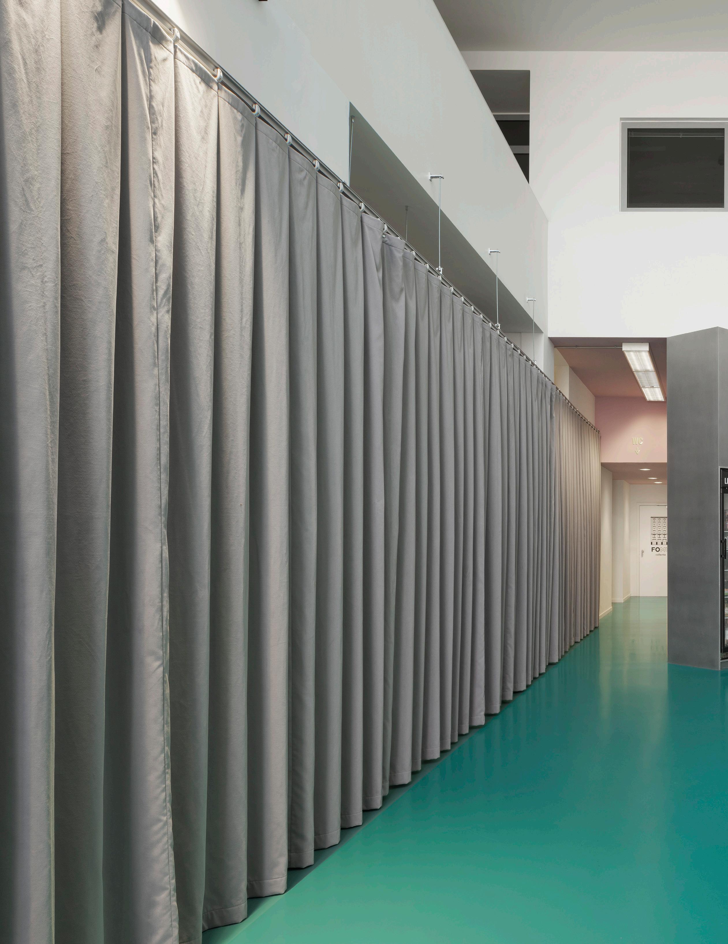 A clean teal floor unites this entire space—even its surprising moments, like this rotated, vending machine column, which extends beyond the wall above.

right Creative staining emphasizes the pattern of the wood grain in stark contrast to the security grate in the background.
below Mesh curtains add shadow and dimension as soft partitions.
facing page Curtains open to reveal utilitarian spaces like coat rooms but also frame views.


Issue 25 Spring/Summer 2024

Resources
● History Anew 22
AH Peck ahpeck.co.uk
Anour anour.dk
Apparatus apparatusstudio.com
Bluebell Architectural & Design Products bluebellarchitecturalproducts.co.uk
Capital Carpets capitalcarpets.com
Cassina cassina.com
Downers Design downersdesign.co.uk
Finn Juhl finnjuhl.com
Flos
flos.com/en/us
G. Miccoli & Sons stonebymiccoli.co.uk
Gryphon Systems gryphonsystems.net
HÅG flokk.com/en/us/hag
Izé ize.info
Maison Vervloet vervloet.com
Molteni&C molteni.it/en
Stone Productions stone-productions.com
● Shelf Life 24
Benjamin Moore benjaminmoore.com/en-us
Buster + Punch busterandpunch.com
Clé Tile cletile.com
DC Cabinetry dccabinetry.com
Dornbracht dornbracht.com/en-us Fantini fantini.it
Flos flos.com/en/us
House of Antique Hardware houseofantiquehardware.com
Hunter Douglas hunterdouglas.com
LV Wood lvwood.com
Marvin marvin.com
McNichols mcnichols.com
RBW rbw.com
Ressource ressourcepaints.us
TOTO totousa.com
Vipp vipp.com/en
● Salone 2024 35 cc-tapis cc-tapis.com
DEDON dedon.de
Draga & Aurel draga-aurel.com
Fornace Brioni fornacebrioni.it
iSiMAR isimar.es
Mutina mutina.it
Stellar Works stellarworks.com
Surfacedesign sdisf.com
QUASIDESIGN Studio qsd.studio
Volker Haug Studio volkerhaug.com
● Playful and Personal 58
Abet Laminati abetlaminati.com/en
Avanti avantiproducts.com
Bosch bosch.us
Brizo brizo.com
Empire Cabinets ecabinet-marble.com
Elkay elkay.com/us/en
Farrow & Ball farrow-ball.com/us
Fireclay fireclaytile.com
In Common With incommonwith.com
Justice Design Group jdg.com
Noguchi shop.noguchi.org
Summit summitarchitecturalproducts.com
● Art Deco Update 60
Bartco bartcolighting.com
Bertazzoni us.bertazzoni.com
Bosch bosch.us
Elkay elkay.com/us/en Emco emcobuildingproducts.com
Liebherr liebherr.com/en/usa
Miele mieleusa.com
Newport Brass newportbrass.com
The Modern Fan Company modernfan.com
● Manhattan Oasis 70
Ann Sacks annsacks.com
Benjamin Moore benjaminmoore.com/en-us
Bobrick bobrick.com
Caesarstone caesarstoneus.com
Claylime claylime.com/en
Concrete LCDA ober-surfaces.com/en/concrete-lcda
C. R. Laurence crlaurence.com
Daltile daltile.com
Dean Barger Studio deanbargerstudios.com
Design Within Reach dwr.com
DTile dtile.nl
Elkay elkay.com/us/en
Goldstein & Charschan gcbpgroup.com
Karen Pearse Global Direct kpgd.com
Kohler kohler.com/en
Paola Lenti paolalenti.it/en
Perennials perennialsfabrics.com
Robern robern.com
Scuffmaster scuffmaster.com
Teakworks4u teakworks4u.com
Vermont Structural Slate vermontstructuralslate.com
Watrline watrline.com
West Elm westelm.com
Wilsonart Americas wilsonart.com
● At the Garden Club 74 Arco arcoconstruction.com
ERCO erco.com/en_us
Travertine travertinestoneproducts.com
● At Home Together 96
Boxco Studio boxco.studio
HB Design & Build hbarchive.com
Old Bristol oldbristol.com
Stem stemcontx.com
● Seeking Serenity 80
Arktree arktree.in
BIAD biad.com.cn
Corlette Design corlettedesign.com
Golden Curtain Wall Group golden-wall.net/en
L&A Design aoya-hk.com
Schmidlin schmidlinusa.com
Shenzhen Cheng Chung ccd.com.hk
Zhejiang Yasha chinayasha.com
● Diplomatic Relations 90
ACS Partner acs-partner.ch
AGR agrfabricators.com
Artemide artemide.com
ClassiCon classicon.com/en/
Greenelec greenelec.com.au
Hidro-obras hidro-obras.com.ar
Jean-Paul Rausis jeanpierrerausis.ch
Métrica Constuctores metricaconstructores.com
Walter Knoll walterknoll.de/en
● BeAr at RABE 104
EGE Carpets egecarpets.com
ETAP etap.com
Technal technal.com
Viveros Fadura viverosfadura.com
120 Issue 25 Spring/Summer 2024


PRESENTED BY and West Hollywood June 27, 2024 Flatiron & Nomad May 15 & Oct 17, 2024 register: 2024springdesigncrawl.eventbrite.com
Petra Blaisse’s new book, Art Applied, reflects on a career of trailblazing and multihyphenate creativity through the work of her studio, Inside Outside. Text by Phillip Denny
Discovery Book

Dutch designer Petra Blaisse founded her practice, Inside Outside, in 1991; in the 33 years since, the “one-woman shop,” as Blaisse described it, has evolved into a multidisciplinary design firm whose commissions range across scales and media to include textiles, interiors, exhibitions, and landscapes. A new book, Art Applied (Mack Books), edited by Fredi Fischli and Niels Olsen, provides a comprehensive overview of Blaisse’s varied work in nearly 900 pages.
Blaisse is not a typical designer, and
Art Applied is hardly a conventional monograph. It shares this uncommon quality with two other books on Inside Outside: Movements 25%: Introduction to a Working Process (2000) and Petra Blaisse: Inside Outside (2007, edited by Kayoko Ota). Both were designed by Irma Boom, and each is a masterpiece of bookmaking that embodies Blaisse’s distinctive sensibility. Movements was created to accompany the 2000 exhibition of the same name at the Storefront for Art and Architecture in New York, mem-
orable almost a quarter century later for the multistory outdoor curtain that Blaisse installed at the corner of Kenmare and Lafayette streets. The pocketbook is a durable artifact of the temporary installation. Each page is perforated with a pattern of die-cut holes that open windows from one project to another; they also lend the pages an airy, wispy lightness akin to a flowing curtain. The dots reappear in Blaisse’s second book with Boom, published seven years later and this time printed in metallic and fluorescent inks that evoke the textures and polychromatic splendor of a lush garden.
Art Applied is another product of close collaboration between author, the editors, and the book designer, Zurich-based Teo Schifferli. And like Movements, the catalyst for this book was an exhibition. Following Blaisse’s installation design for several shows at the Institute of the History and Theory of Architecture (gta) at the ETH, which Fischli and Olsen codirect, the curators explored the idea of staging a retrospective of Inside Outside. It didn’t take long for the team to realize the enormous scope of their plan: “The three of us looked at each other and admitted it would take years because there is so much work,” Blaisse told AN Interior. But then “all of a sudden they had another idea: ‘Why don’t you design it … in three months?’”
Inside Outside / Petra Blaisse: A Retrospective was presented in 2018 in the Semper Building, the seat of the ETH, named in honor of its architect, Gottfried Semper. The impressive neoclassical structure was built atop one of Zurich’s most prominent sites at a time when the university was known as the Polytechnikum. As an exhibition venue, however, it left much to be desired: The building is “totally ugly,” Blaisse said. But her visceral response sparked a strong reaction. “We had to influence the architecture because that’s what we do,” Blaisse reflected. The exhibition presented a selection of 70 projects on a pair of enormous curtains—each 12 meters high and 25
122 Issue 25 Spring/Summer 2024
IN REVIEW
Inside Outside, from Art Applied (MACK, 2024)/Courtesy of Inside Outside and MACK

meters long, or about 40 feet by 82 feet. The soft curtains animated the stubbornly frozen space. “There was this perfect architectural rhythm,” Blaisse explained, as they moved in the drafts from the entrance hall.
Art Applied began to develop in earnest soon thereafter, while the exhibition traveled to Rome’s Zaha Hadid–designed MAXXI Museum in 2022. The first step toward the book was assembling the archive of Inside Outside, a process that entailed organizing “heaps of slides, sketches, and negatives,” Blaisse reported. “We worked with so many people, and each kept their archives differently,” Blaisse said. “It was a complete hell on earth, but it was also totally fascinating—a process of rediscovery.”
Designers tend to be forward-thinking by nature, and that outlook sometimes registers as a suspicion, or even outright rejection, of the retrospective framework: Why bother looking backward when the future lies ahead? By contrast, Blaisse clearly savored the opportunity to reflect on decades of creative work. The designer’s voice accompanies each project in the form of a brief text, signed PB. The texts are akin to diary entries in their distinctive mix of reflection and firsthand reportage. They are often humorous and always engaging, as when Blaisse recalls the rapid disappearance of the salvaged-glass chunks that they installed in a dry streambed within the Rotterdam Museumpark, an early collaboration with OMA/ Rem Koolhaas and the landscape designer Yves Brunier, who died three years before the project was completed: “The glass rocks

caught every ray of light and turned the river of stones into a twinkling stream, like in a fairy tale,” she wrote. “After a few months, all of the glass rocks had miraculously disappeared—later resurfacing in art pieces and on architects’ desks.”
Like the practice it represents, Art Applied resists easy categorization. It bears the hallmarks of a design monograph in its comprehensive scope and significant weight, but it deftly avoids the clichés. It strikes a personal tone where other designers typically opt for distance. The book imparts to its reader the sense of seeing through the designer’s eyes; and in fact, many of the photographs were taken by Blaisse herself. Although architects will find several of the settings familiar, one frequently has a sense of déjà vu as these carefully selected images reveal the subtleties of light, texture, and color that are the focus of her work. Insightful texts—contributed by Charlotte Matter, Jack Self, Penelope Curtis, and Rem Koolhaas, among others— offer outside perspectives that complement Blaisse’s views from the inside. In sum, the book succeeds in capturing the designer’s relentless curiosity and conveying the excitement that comes from discoveries made in collaboration with others—that is, after all, the thread that winds through more than 40 years of work. Is there a name for this subgenre that includes Art Applied alongside the two previous books? With some discussion, Blaisse considered the term “discovery book,” but it would be just as accurate to simply call it a triumph. ●
facing page Petra Blaisse, pictured arranging a textile piece. Her work with this lightweight medium resulted in some of her best-known pieces.
above The front cover of Art Applied, published this year by MACK
left A collaged illustration by Blaisse represents her multimedia style and the messiness inherent in the book, its making, and the presentation of her oeuvre.
123 AN Interior

IN RETROSPECT
The House Inside the Gallery
The Walker Art Center’s Idea House 3 is now open, bringing handmade design and furnishings directly to the public. It is the only gallery/store in an American museum where visitors can touch one-of-a-kind chairs, lamps, tables, and fabrics—and have conversations with staff who share stories about their makers.
Idea House 3 is a bold retail innovation that recalls an early modernist vision for popular access to thoughtful design. The concept grew out of a cross-disciplinary partnership between Asli Altay, head of design, content, and communications at the Walker, and Felice Clark, the museum’s director of business development.
In the wake of COVID-19, they brainstormed new uses for the Walker’s street-facing bookstore, which had been closed for two years. If there was ever a time to rethink museum activities, visitor engagement, and relevant spatial programming, this was it.
The Walker already had a long and prominent history of popularizing modern design and crafts. In 1935, Franklin Roosevelt’s New Deal programs established hundreds of community “art centers” across the country. Working for the Federal Art Project, Daniel S. Defenbacher organized 70 of them—employing artists as teachers and makers of murals, sculptures, and other “useful” arts.
The Walker (the largest of the art cen-
ters) invited Defenbacher to stay on as its first director in 1939. Knowing that many New Deal programs were soon to end, he saw a new role for the institution as a purveyor of modern design in everything from residential architecture to furniture, lighting, painting, and fabrics. So, Defenbacher founded the Everyday Art Gallery inside the museum to display modern, American-made home furnishings and products. Visitors could actually sit in an Eames chair next to a telephone and directly call the local department stores or vendors who sold a product in the gallery.
The Walker also launched the Everyday Art Quarterly to diffuse the idea of
124 Issue 25 Spring/Summer 2024
Walker Art Center’s new Idea House 3 rethinks how design supports daily life.
Text by Frank Edgerton Martin
Neal Reiter/Courtesy Walker Art Center, Minneapolis


shop.archpaper.com The AN Shop is now open!

above Before installation, the vibrant orange of the shop displays and its reflection on the ceiling already created an impressive interior.
below Many of the items sold and displayed at Idea House 3 are recognizable pieces that are designed in surprising ways that evoke artwork, like the Lawless Side Chair designed by Evan Fay.

simple, quality design nationwide. Then the Walker started building. Idea House 3 gets its name from the two full-scale Idea Houses that the Walker constructed on the campus from 1941 to 1947. Everyday design embodied the optimism of the postwar age. It’s no surprise that Case Study Houses, sponsored by Arts & Architecture, also arose at this time.
Reconnecting to Handmade Things
Curator Asli Altay feels that the time is ripe for reconnecting people to handmade, thoughtful environments and furnishings. “There’s a violence about cheap things and their effects on our lives, materials, laborers, and the environment,” she
said, referencing global retail channels such as IKEA and clothing manufacturers whose products are cheap upfront but designed to be quickly discarded.
Altay and Felice Clark looked to the original Idea Houses for inspiration and conceived a new “idea house” for artist-made design. Clark recalled that, about six months into the planning, “we got really excited when we realized that no other arts institution was doing this.” She added that “the creativity in our business model allowed us unusual flexibility in exhibit rotation and margins”—emphasizing that a major goal is to create attention and income for emerging artists.
During her years as a graphic de-
126 Issue 25 Spring/Summer 2024
Neal Reiter/Courtesy Walker Art Center, Minneapolis


Register at icff.com NORTH AMERICA’S SINGULAR PLATFORM FOR INTERNATIONAL DESIGN. MAY 19-21 2024 JAVITS CENTER NYC ARCHITECT’S NEWSPAPER READERS*: YOUR PASS IS COMPLIMENTARY WITH PROMO CODE: DAPMARCHNEWS *NONEX MANUFACTURERS AND INDEPENDENT REPS ARE NOT ELIGIBLE

above Once products are installed, the orange pedestals of the store suggest different rooms, turning the space into a house, with objects hinting at varied domestic uses.
signer in London, Altay encountered Zak Group— known for its masterful books and typography—when she designed a book for Zak Keys, the group’s founder and creative director. Fifteen years later, she reached out to Keys to create an identity and design for the Walker’s Idea House 3—the group’s first foray into retail design.
“We designed a house within the Walker and then blew the roof off,” Keys said. “What’s left is a foundation and a series of movable walls that create rooms. This house is a tool for the Walker curators to challenge ideas about how we live.”
Keys designed an Idea House 3 typeface that expresses the angles and floorplan geometry of the original Idea Houses. Working with Dyvik Kahlen Architects to organize the 1,500-square-foot space, they referenced the room types in the original houses to create a series of rooms reflecting daily life—relaxing, playing, working, hosting, and reading, with a design-focused bookstore lining the back wall.
Framed by orange carpeted “walls” evoking DIY and construction stores in the
U.S. and Europe, these spaces become distinctive zones that feel separate without being confining. You can look up to see Herzog & de Meuron’s folded metal-mesh ceiling, which also wraps the entire exterior along with outward views to daylight and motion on the street.
The Guest Room
The project team created a space called the Guest Room for temporary exhibits that rotate every six months. Focusing on Midwestern artists and makers early in their careers, the opening exhibit—Midwest Design Here & Now—was organized by the writer and curator Wava Carpenter, former director of Design Miami and cofounder of the incubator Anava Projects in Berlin.
On the Walker’s website, Carpenter wrote that modernism’s emphasis on functionality “helped entrench social inequities by erasing disparate personal, regional, and cultural expressions.” But she also noted that “progressive design thinking in the 21st century has revalued small-scale, sustainable production methods that predate the
modernist era.” This commitment to sustainable production stems from the idea that one’s quality of life is not tied to a quantity of space. Instead, investments of time and money can be refocused inward on quality items that last a lifetime. Purchasing such design objects directly benefits the artists— and at Idea House 3, customers have the opportunity to build relationships with them.
Slowing Down
Beyond design, Idea House 3 also offers lessons in how we consider time and value. Today’s global supply chains allow nearly instant access to mass-produced furnishings and objects while severing any sense of connection to their makers or even the sources of materials. Speed of acquisition trumps worry over environmental impacts like the loss of old-growth forests or labor conditions.
Idea House 3 offers one solution by encouraging us to slow down. This is not a story of instant gratification but of reassessing what we mean by value. Take the time to savor things. ●
128 Issue 25 Spring/Summer 2024
Neal Reiter/Courtesy Walker Art Center, Minneapolis
Submit to the 10th Annual
PRODUCTS
Submissions Open Through Friday, July 19, 2024 (midnight ET)
Submit to the 12th Annual
DESIGN
Launching June 20, 2024
Submissions Open Through Friday, September 20, 2024 (midnight ET)
129 AN Interior

Erin Wright’s The Thief
Text by Emily Conklin
Erin Wright joins the time-honored tradition of architects who paint. Wright, a painter and professor of architecture at Woodbury University in Burbank, California, recently displayed new works in a show titled The Host, The Thief, The Wives, and Their Lovers at Sow & Tailor in Los Angeles. The painting above, completed in acrylic and measuring 72 inches wide and 42 inches tall, depicts the “thief,” a curious cat who appears on the table, likely before a meal begins, and introduces a bit of mischief. The intentionally flat, render-like
quality of the overhead view seems inspired by Wright’s training as an architect. The photorealistic canvas encourages us to consider the symmetry of the settings against the main dishes. The scene, and those of other works in Wright’s show, offers a fresh take on the surrealist tradition of modern painting, one that welcomes architecture’s viewpoints and spatial precision. A good dinner party requires drama: If the cat manages to run off with the fish, it will certainly make for interesting conversation. ●
130 Issue 25 Spring/Summer 2024
IN SHOW
Sow & Tailor and Mason Kuehler

131 AN Interior
| CALIFORNIA | COLORADO | CONNECTICUT | DISTRICT OF COLUMBIA | FLORIDA GEORGIA | ILLINOIS | MARYLAND | MASSACHUSETTS | NEW JERSEY | NEW YORK | NORTH CAROLINA PENNSYLVANIA | TEXAS | VIRGINIA | WASHINGTON KITCHEN: E7.90 XTONE ROBLE PURO 1.877.PORSA.US | www.porcelanosa.com/us
ARIZONA

vMikado
Edward Barber & Jay Osgerby
2024


 Rafael Gamo


 Lütjens Padmanabhan uses curves and color to renovate the Swiss embassy in Bogotá, Colombia.
Text by Tibor Bielicky and Ellena Ehrl Photography by Max Creasy


 house.
Custom lighting in the garden was designed by the architects in their signature anthropomorphic style.


 Antwerp Photo Museum,


 A clean teal floor unites this entire space—even its surprising moments, like this rotated, vending machine column, which extends beyond the wall above.
