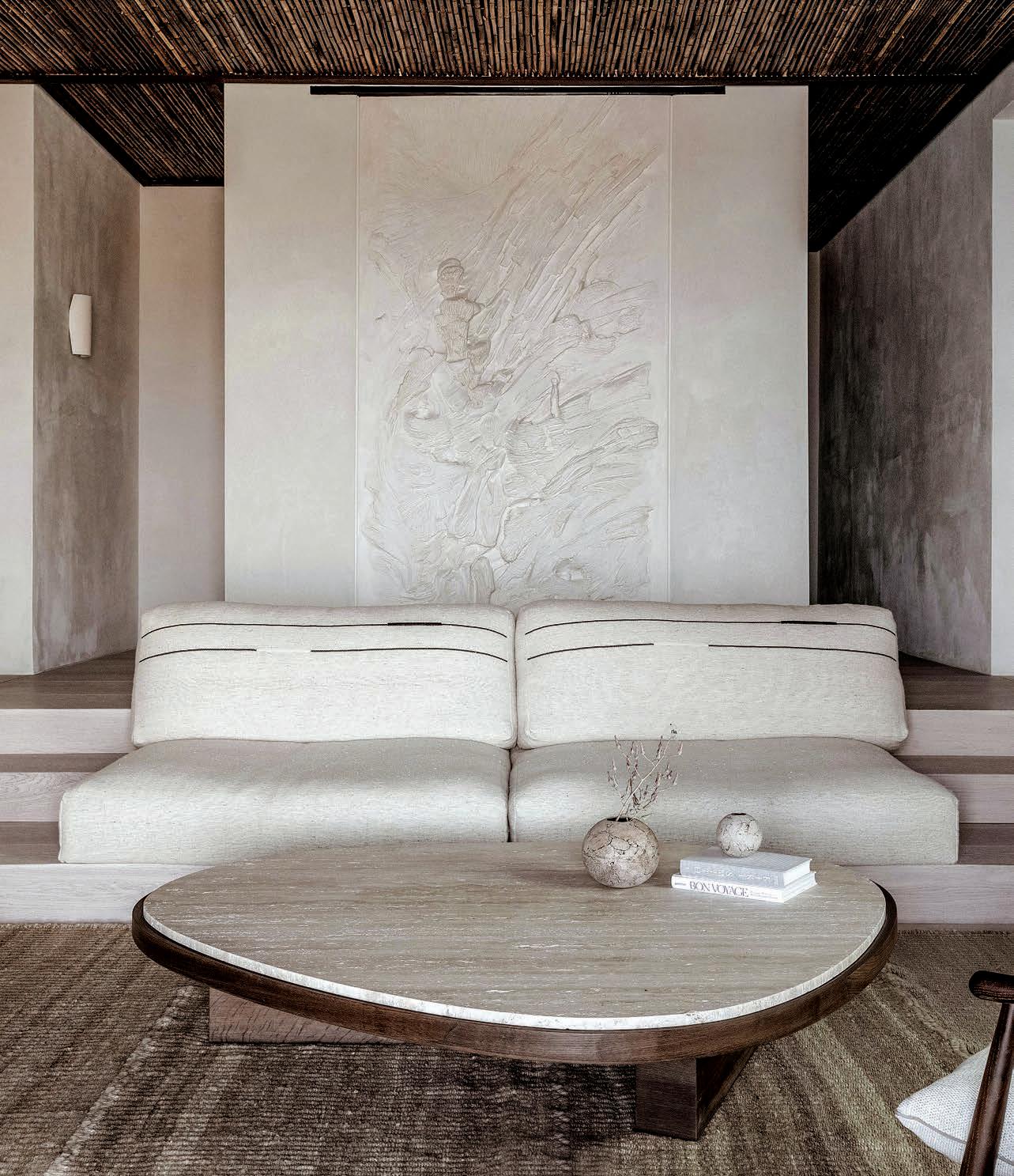
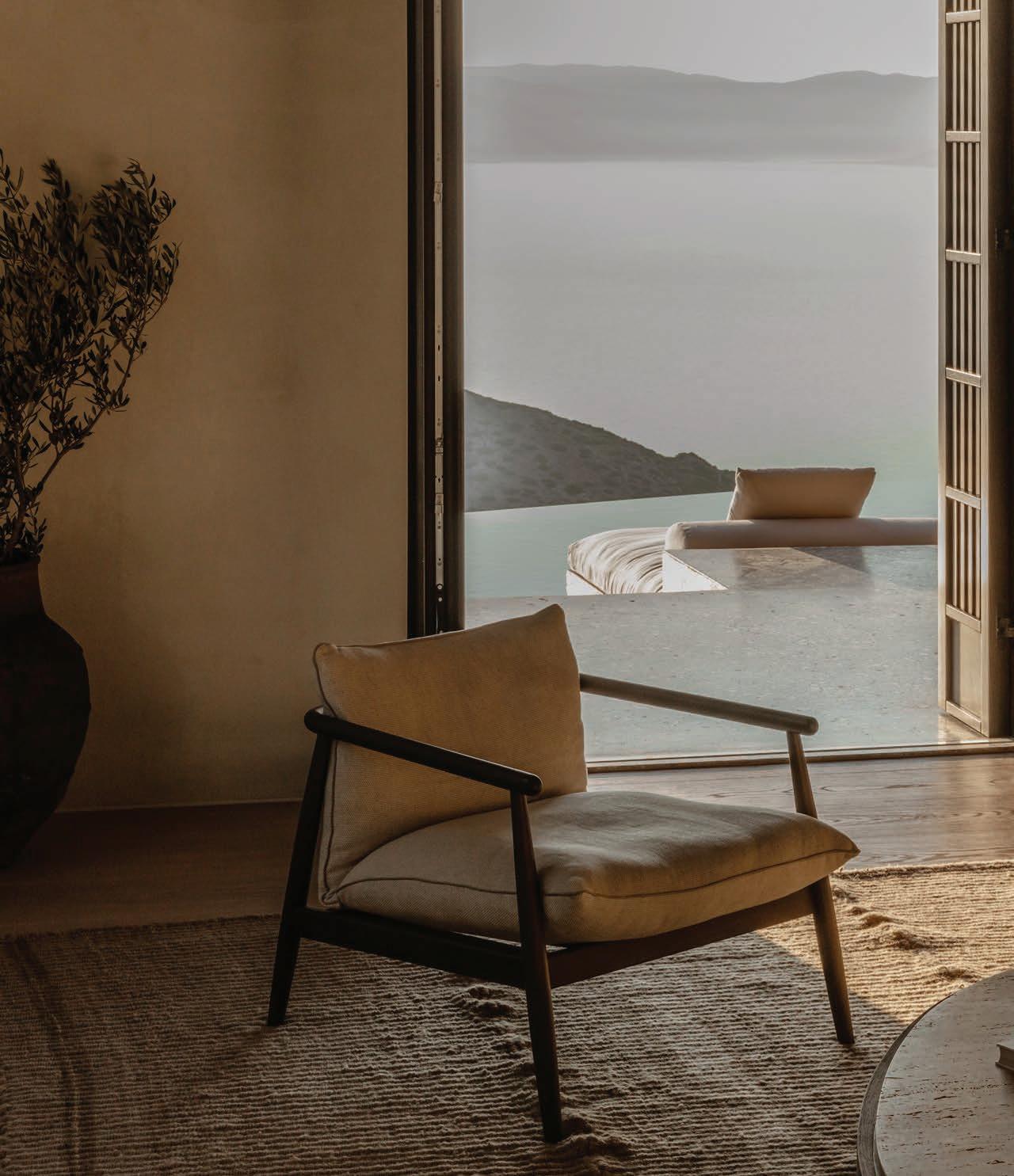
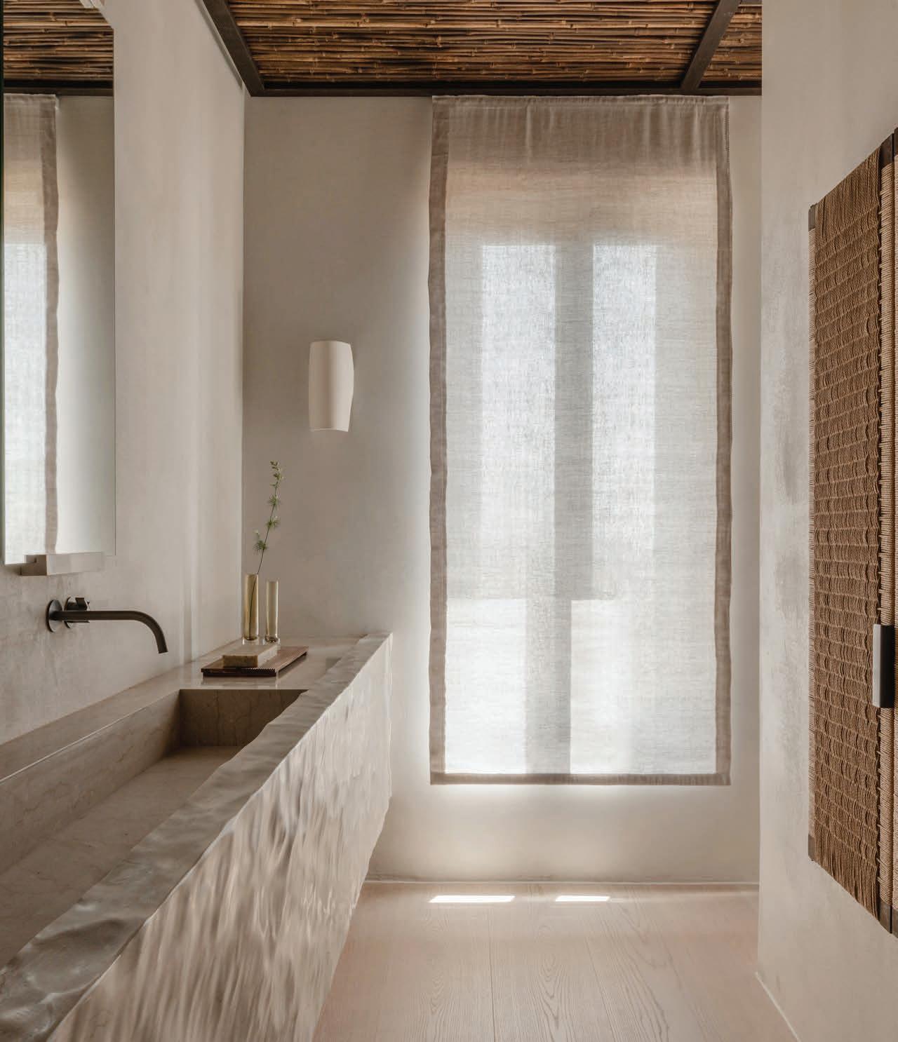
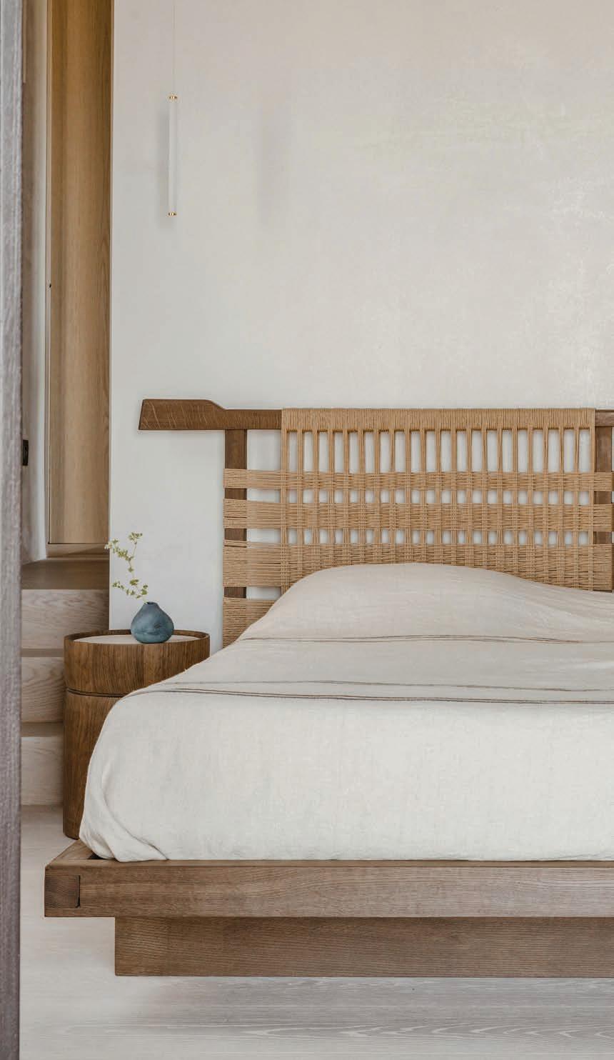
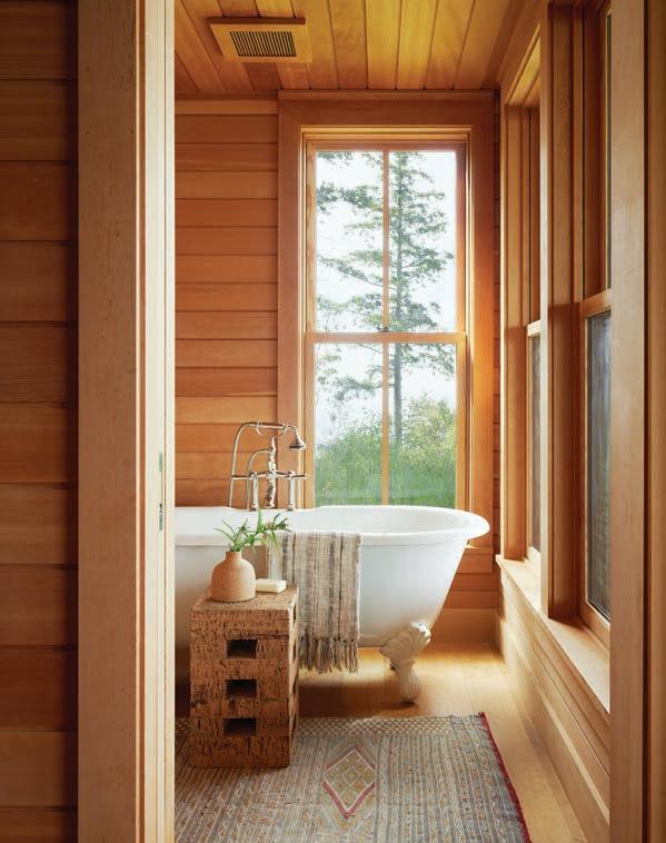
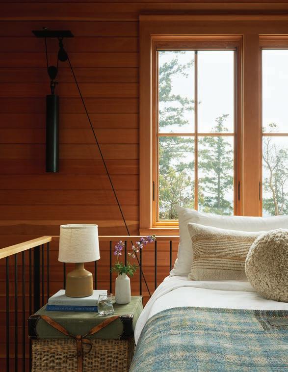
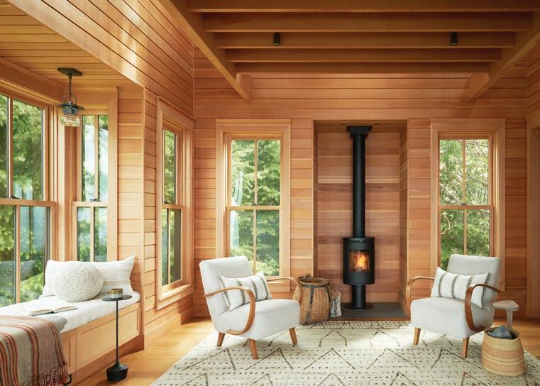
WARM VIBES

seeking the sublime special issue KITCHENS AND BATHS RESTRAINT VERSUS WILD ABANDON
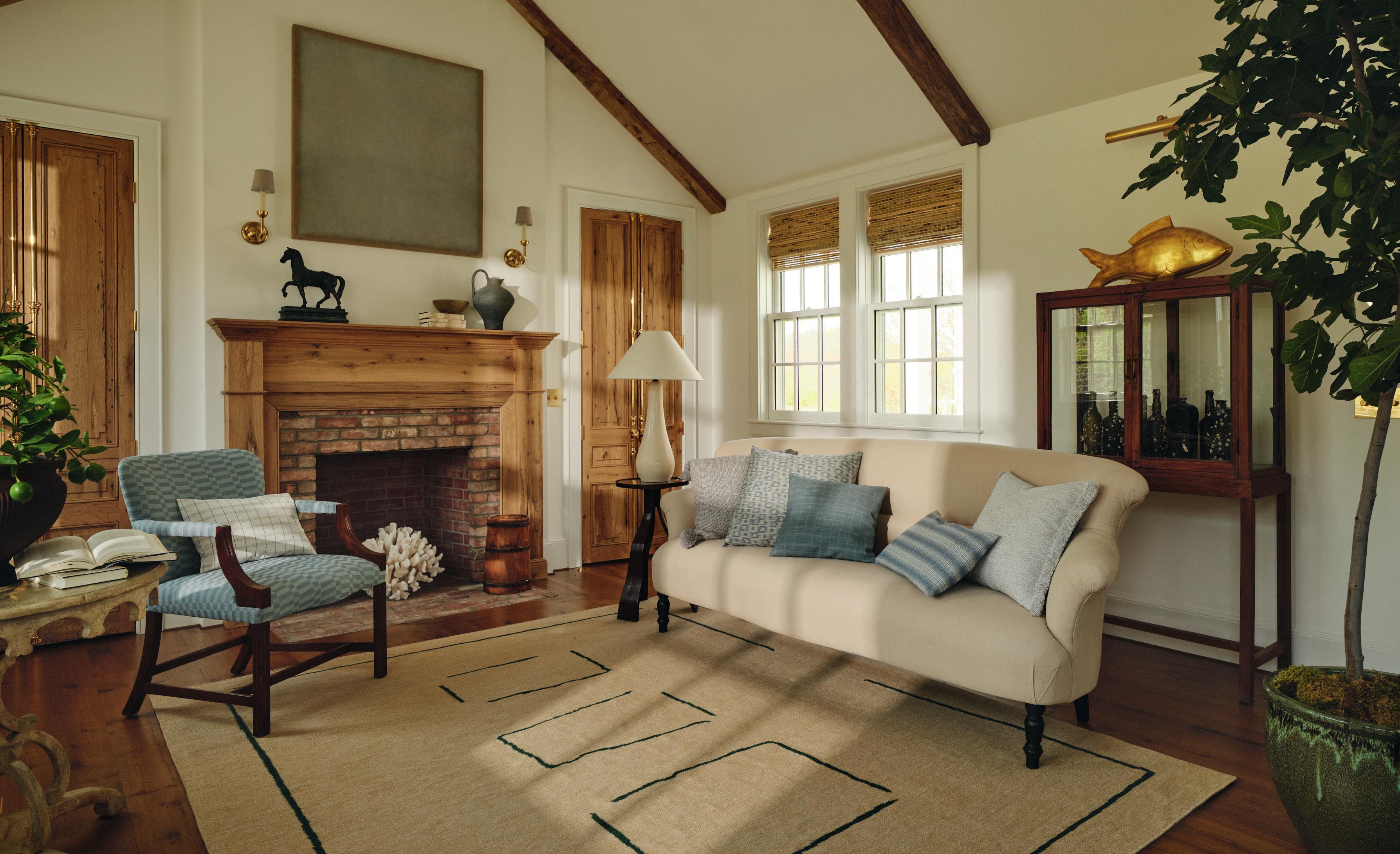


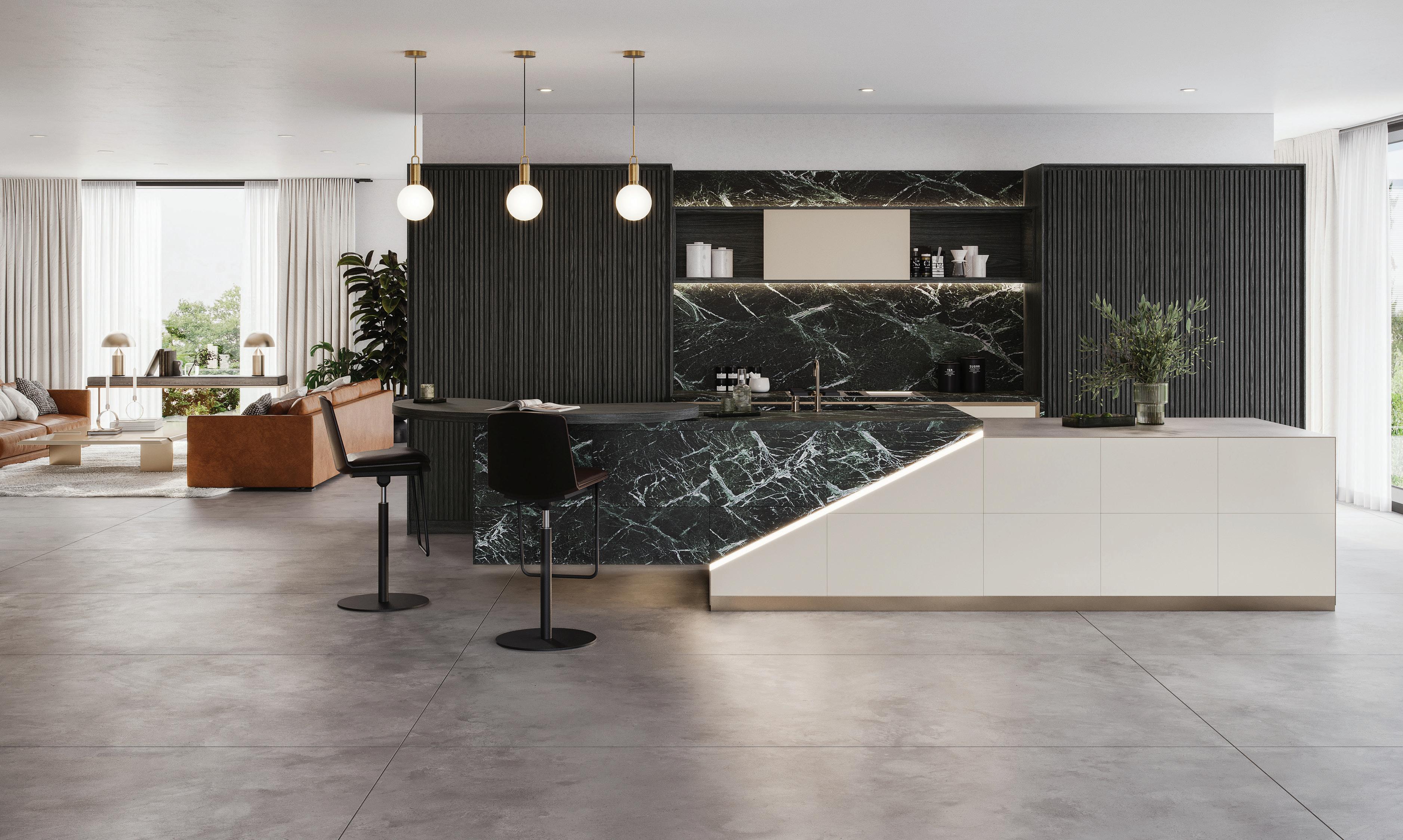
eggersmannusa.com eggersmann Kitchens | Home Living new york | dania beach | naples | houston | dallas | chicago | los angeles | laguna niguel | pittsburgh | scottsdale | sand city | maui | honolulu | los cabos
innovative design ideas that defy gravity eggersmann since 1908



hunterdouglas.com
hunterdouglas.com
©2022 Hunter Douglas Inc.
hunterdouglas.com
©2022 Hunter Douglas Inc.
©2022 Hunter Douglas Inc.
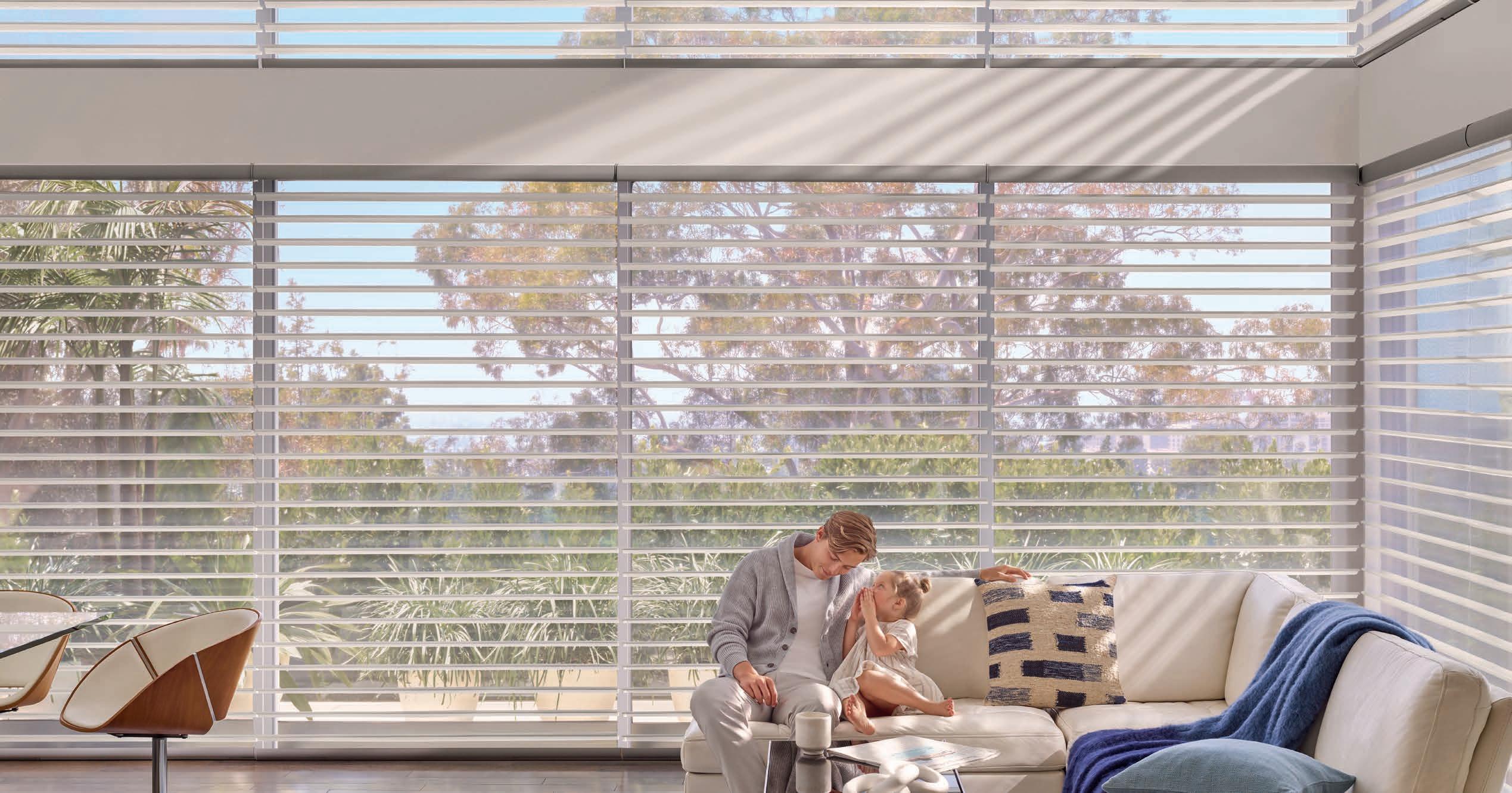
LIVE BEAUTIFULLY
Who doesn’t want to live well? To be perfectly at ease, in comfort and style?
Innovative product designs pair with gorgeous fabrics and control systems so advanced, shades can be scheduled to automatically adjust to their optimal position throughout the day. Creating a new world of beauty, convenience and energy efficiency – morning, noon, and night.
 Silhouet te® Cl earVi ew® Shadings with PowerView® Automation



WALTERS WICKER, INC INFO@WALTERSWICKER.COM | WALTERSWICKER.COM BAIA COLLECTION ETHIMO.COM


US DISTRIBUTOR FOR ETHIMO
NEW YORK Architects & Designers Building 150 East 58th Street, 3rd Floor New York, New York COSTA MESA Costa Mesa Experience Center 695 Town Center Drive, Suite 180 Costa Mesa, California

KITCHEN PERFECTION Create a kitchen without compromise with luxury appliances tailored to your lifestyle. Be inspired at our Experience Centers, or discover more at fisherpaykel.com fisherpaykel.com/us/ec
FROM THE EDITOR

EVOKING THE PAST
I’ve been amassing design magazines since long ago, schlepping them from home to home like the prized possessions and historical annals of time that they are, dog-earing my personal favorites and on the odd occasion reflecting, hmm, why?!
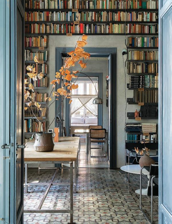
Maybe it was age dictated? Maybe desire? Even envy. But if I’ve deduced anything from this practice, it’s that TRENDS are subjective and bear a genesis in previous generations.
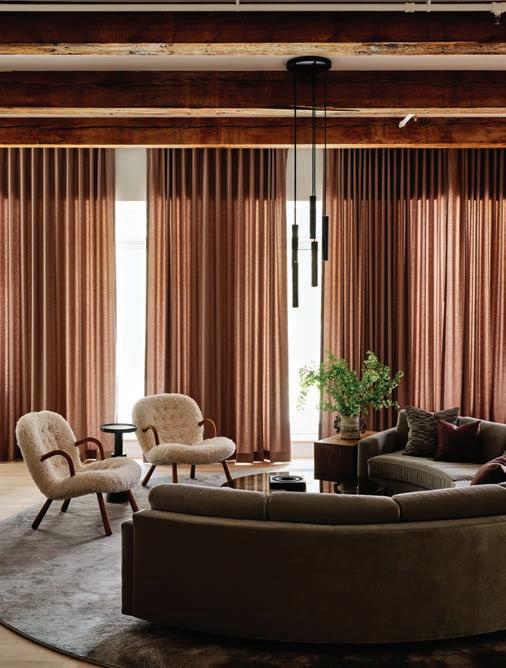
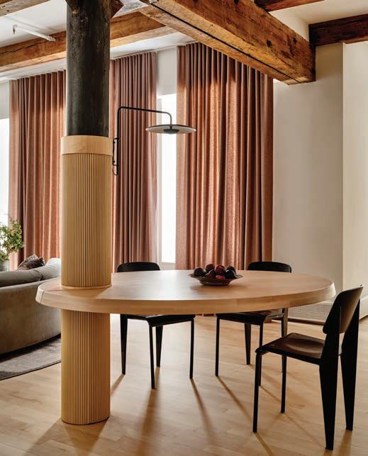
So after the swampy heat of summer, I welcome the varied assumptions of warm vibes as fall arrives. In this issue we celebrate kitchens and design projects that feel delicious and cozy. Neutrals. Woods. Coupled with the crispness of the night air that defines autumn, celebrate it with wild abandon or discernable restraint as only you can.
14 AUTUMN 2023
Ramona Balaban
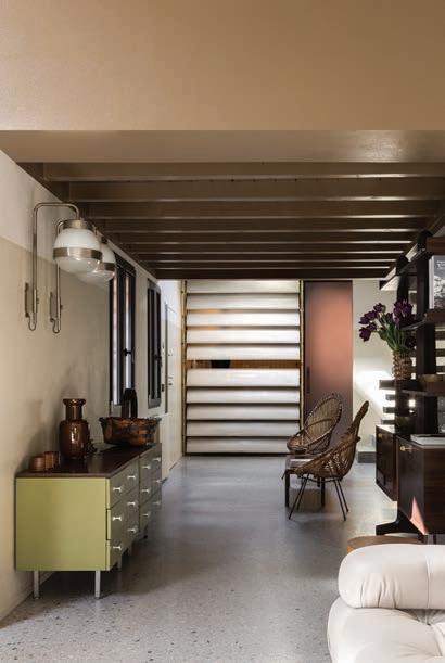
The private home of designer Giuseppe Amato in an early-20th-century Art Nouveau building in Palermo, Italy. His mentor was Sory Yanagi of Japan, and his works have been presented around the world in group exhibitions alongside the biggest names such as Philippe Starck, Toyo Ito, Michele De Lucchi, etc.
p80
Hugo Landa Garcia
Studio Gutow
AUTUMN 2023
VOL. 15 NO. 3
SHOW ME THE METAL
LANDRY DESIGN GROUP
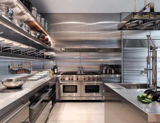
Beverly Hills Residence - Created in collaboration with Philip Nimmo & Company, this immaculate chef's kitchen was designed for a hospitality entrepreneur who loves to cook and often prepares a buffet for friends. Stainless steel shelving and a custom pot rack make the chef's kitchen a machine for cooking, with every implement and ingredient readily at hand. landrydesigngroup.com
WATERWORKS
Henry Chronos waterworks.com
DEPUTY EDITOR
Jennifer Quail
CREATIVE DIRECTOR
Laura Soles
EDITORIAL
MANAGING EDITOR Deborah L. Martin
COPY EDITOR Karen Brown
CONTRIBUTING EDITORS
Thomas Connors | Gwen Donovan
Tate Gunnerson | Jennifer Quail | Myles Mellor
DIGITAL
WEB EDITOR Kelly Walters
DIGITAL IMAGING Glyph Co
WEB SERVICES Honest Creative
DIGITAL CONTRIBUTING EDITORS
Jill Brooke | Gwen Donovan
Nicole Haddad | Paul Hagen
Alice Garbarini Hurley | Kelsey Mulvey
ADVERTISING
GROUP PUBLISHER | CHIEF REVENUE OFFICER
Janice Browne
ASSOCIATE PUBLISHER
Sophia Koutsiaftis
SALES
Law Chambers | Suzanne Cooper
Steven Fisher | Elaine Heyda
Lauren Stonecipher | Susan Welter
MARKETING
MARKETING DIRECTOR Nancy Donovan Ganz
SALES SUPPORT Corey Otis
PRODUCTION
PRODUCTION ASSISTANT Michelle Lowe
PRODUCTION SERVICES Glyph Co
CIRCULATION DIRECTOR Thomas Smith
ACCOUNTING
CONTROLLER Kate Varela
ACCOUNTS RECEIVABLE ADMINISTRATOR Angelica Solórzano
ACCOUNTS PAYABLE ADMINISTRATOR Alyssa Valerio
PUBLISHED BY HUDSON ONE MEDIA, LLC
STEVEN MANDEL PRESIDENT | CEO
JAMES S. COHEN CHAIRMAN
Comments and suggestions: amy.sneider@hudsononemedia.com For product or project consideration: submissions@hudsononemedia.com
Advertising rates, deadlines and information: advertising@hudsononemedia.com
Subscription information: Call toll free 833.260.3379 or email custsvc aspire@fulcoinc.com

Single-issue copies and past issues: magdogs.com/aspire-design-and-home
aspire design and home is published quarterly by: HUDSON ONE MEDIA, LLC
All rights reserved ©2023 Reproduction of the articles or photos contained herein without the express written consent of HUDSON ONE MEDIA, LLC is strictly prohibited. Not responsible for typographical errors.
aspire design and home (USPS 22790), Volume 15 Issue 3, Autumn 2023
Periodical postage paid at Cornwall, NY 12518 and at additional mailing offices.
POSTMASTER: Send address changes to aspire design and home PO Box 3000, Denville, NJ 07834
16 AUTUMN 2023
Manolo Langis
AMY SNEIDER EDITOR IN CHIEF | ART DIRECTOR
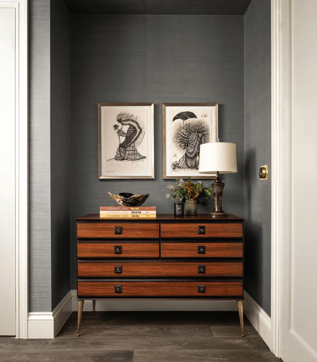
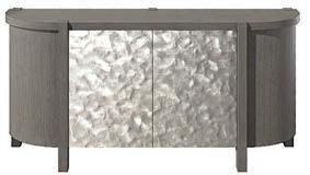
BERNHARDT Prado Sideboard bernhardt.com
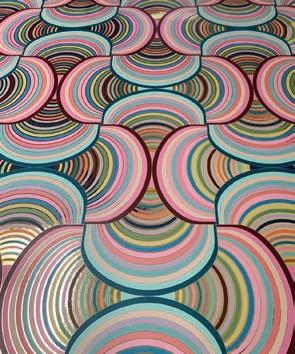
EVER ATELIER Moon Baby Wallcovering Strawberry Solstice (shown) everatelier.com
DASI Photo
RANGECRAFT
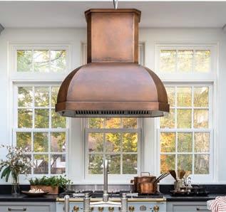
Kotler Style Hood
| Summer 2023 correction: Juliette
is the principal of
design
Antique copper finish makes a statement in this kitchen design by J. Thom Designs. rangecraft.com
Spencer
Brooklyn-based
firm Atelier Ro
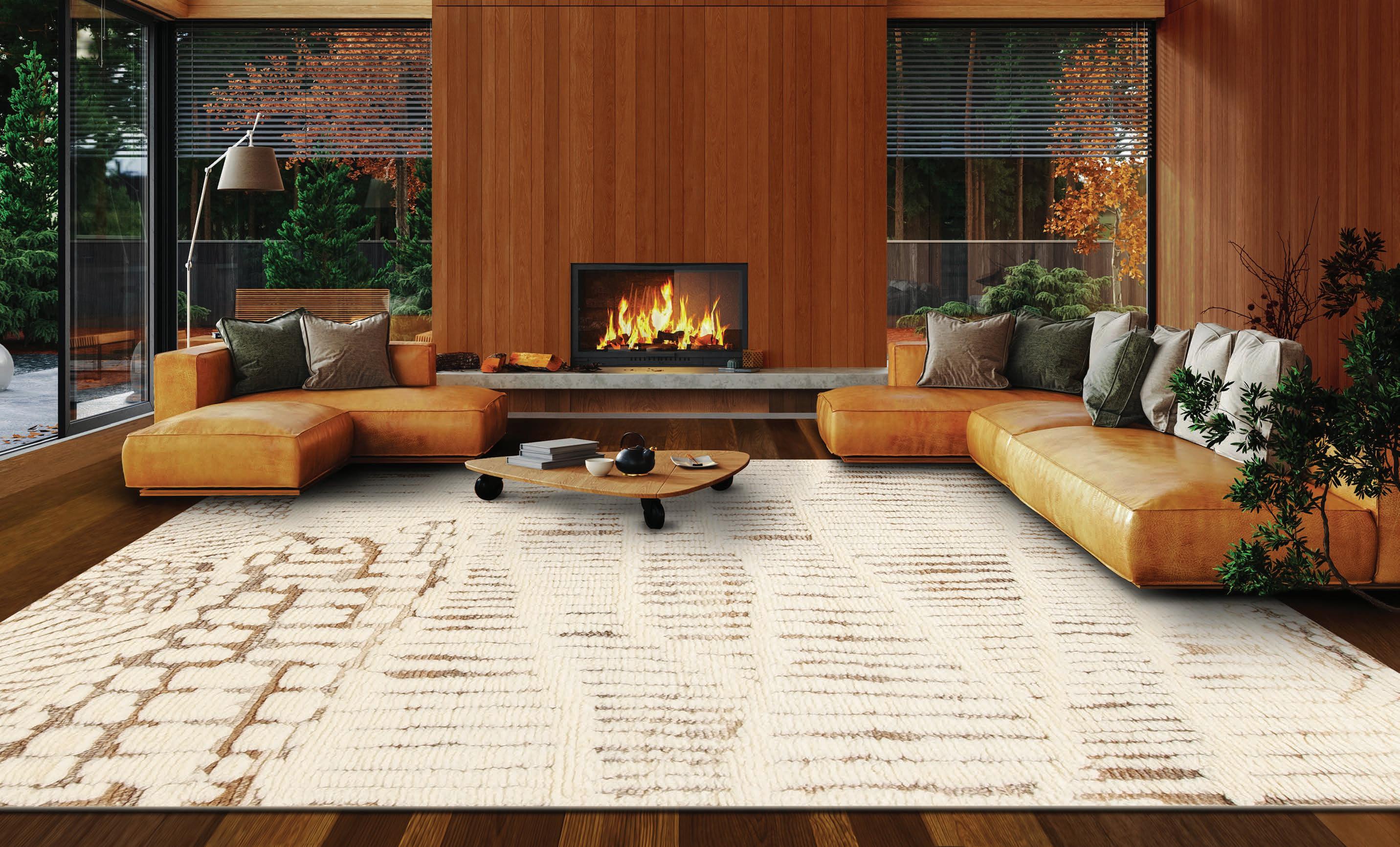



THE WORLD’S FINEST DECORATIVE RUGS 888.726.2393 | www.samad.com Boho Plus Collection - Genesis, Natural Ivory - Fawn
C0NTENTS DESIGN • LIFESTYLE • ARCHITECTURE
Belgium
58 EAVESDROPPING
Landscape architect Kevin Mampay tailors the land of a 150-year-old Flemish farmhouse
Studio City, California
66 LIMESTONEAGE
Rustic meets refined in this modern dwelling on a lush lot in a tony California enclave
Saint-Tropez, France SISTER ACT
74 No sibling rivalry here. The Fossa sisters join forces as well as studio spaces – creating a singular experience
Newport Beach, California
80 DOWN THE COAST
This beach town home manifests an impressive assurance
Crete, Greece
86 MOTHER EARTH
High in the village hills, a contemporary home honors the world around it
Amsterdam, The Netherlands
96 DUTCH TREAT
A compendium of savory proportions
Bow, Washington
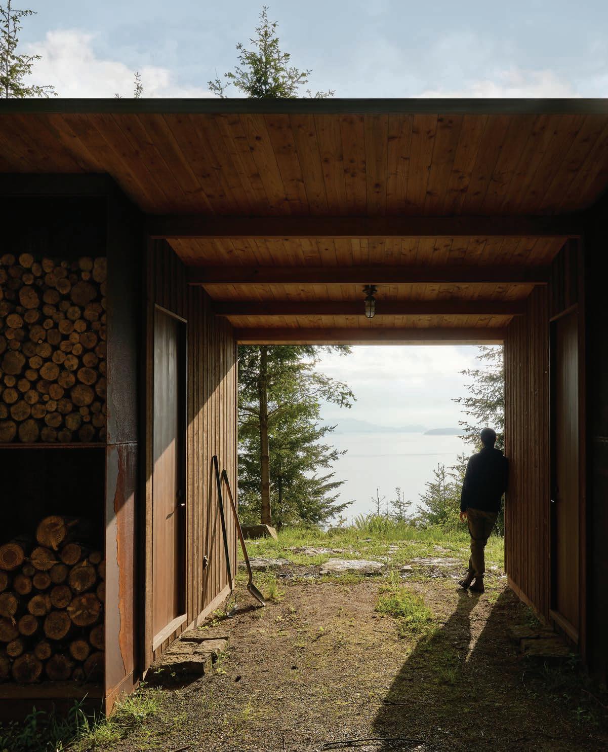
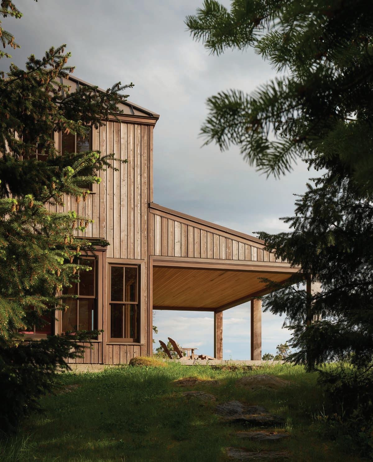
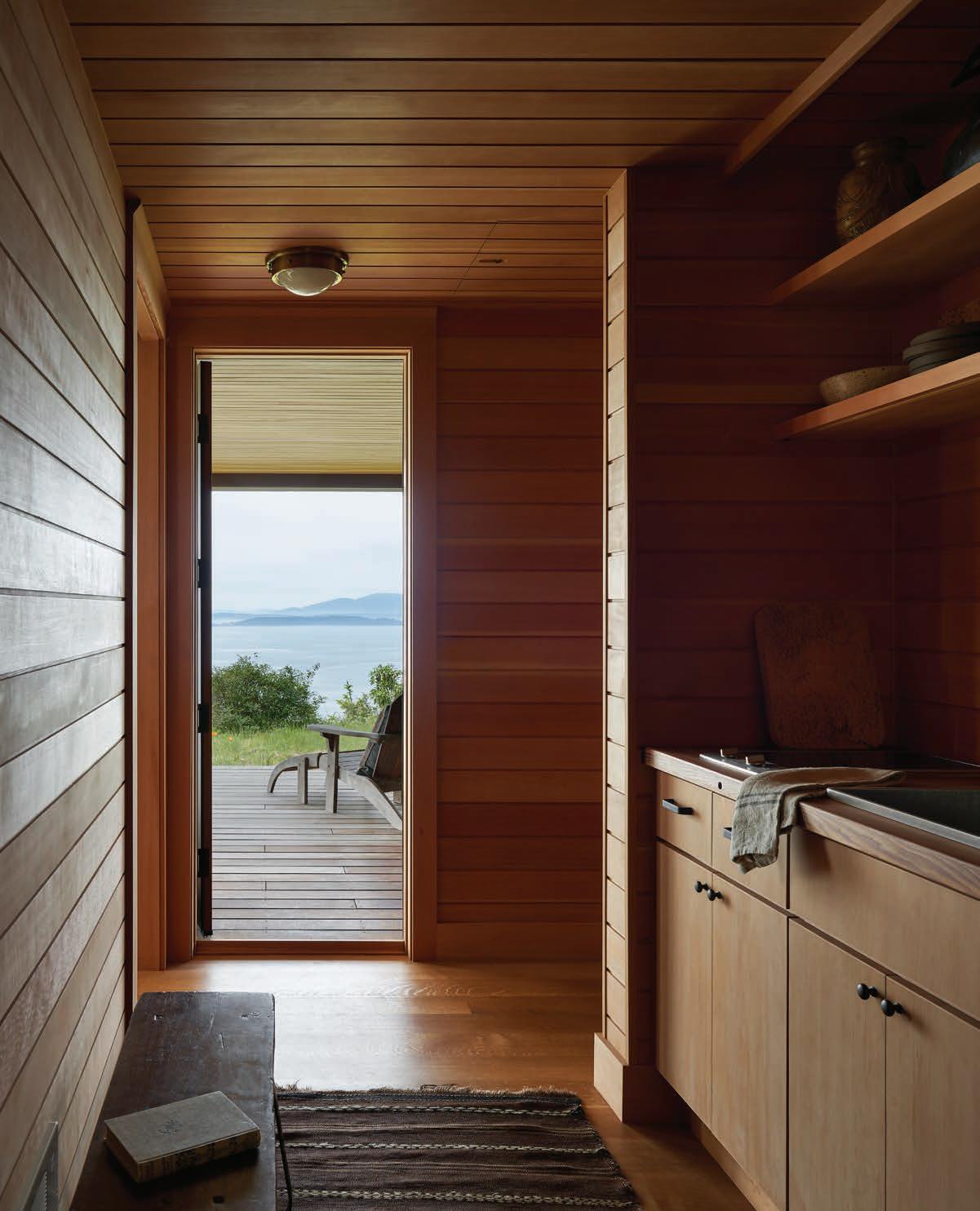
102 CLIFF NOTES
Inspiration abounds as renowned architect
Steve Hoedemaker of Hoedemaker Pfeiffer, works a steep plot of land overlooking the San Juan Islands
Modena, Italy
108 JUST SEW
Italian fashion designer Erika Cavallini’s Modena home is a case study in style
Chelsea, New York
112 PEARLS OF WISDOM
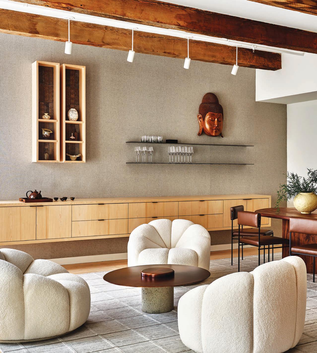
Designer Todd Raymond configures a restrained color palette in what is considered a new movement –Japandi Style – a minimalistic approach to design

Austin, Texas
118 AERIE PORTAL
Designer Erica Volkmer helps an attorney-turned-techie make a home in the sky
Menlo Park, California
124 NO HOLDS BARRED
A couple recruits designer Sindhu Peruri to give their 1980s dwelling a new lease on life
20 AUTUMN 2023
14 FROM THE EDITOR 16 CONTRIBUTORS
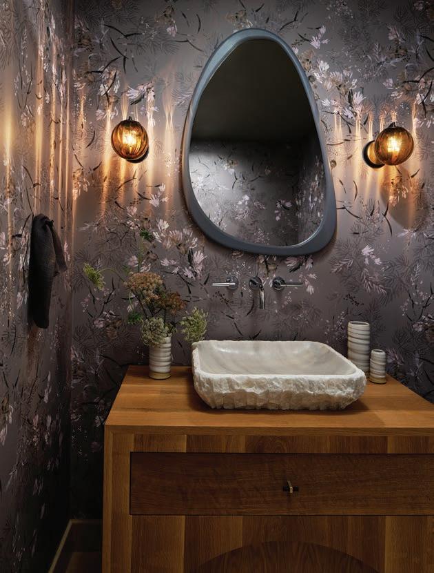
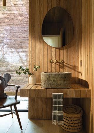
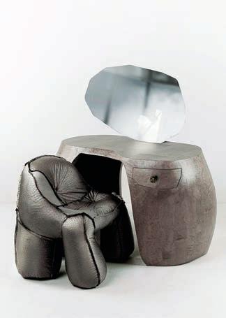
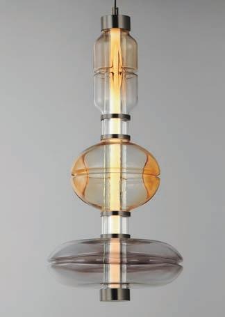
CLOCKWISE TOP LEFT RUG WINGS by Peter Valcarcel. Hand-knotted in Nepal. Rugs and carpets available to the trade. marknelsondesigns.com, petervalcarcel.com DRESSING TABLE AND CHAIR BIRDS EYE by Charlotte Kingsnorth charlottekingsnorth.com BATHROOM Designed by Rob Diaz. White oak wall paneling with a fine pencil-line gap clads the walls and integrated vanity in this Studio City powder room. robdiazdesign.com LIGHTING César Giraldo & STUDIO M LIGHTING. The capsule Gusto Collection designed by César Giraldo features artisanal handblown glass elements colored in cloud-like white infused glass or gradients of smoked gray and warm amber tones. The glasses' hand-crafted dimples refract dedicated LED lighting that highlights an undulating silhouette throughout the fixture. studiomlighting.com
Todd Goodman of LA Light Photo


C0NTENTS
IN EVERY ISSUE
24 BOOKNOOK
A curated collection
32 ARCHETYPES
William Hefner. Daniel Germani. Caren Rideau. This accomplished trio conjures up their ideal kitchens
36 ROUNDUP ZEST FOR LIFE
Kitchen and Baths
56 BOOKING RESERVATIONS
Recipes offering generous helpings of global inspiration
62 MUSE
Creatives Fernando Laposse, Simone Brewster and Stephen Block share their design designations and philosophies
LAST WORDS
Design and words intersect in a crossword puzzle
ON THE COVER
Stockholm, Sweden
Home of Lisen Båge
Designer Sofie Arnholm
Photography Anne Nyblaeus
To view article online go to aspiremetro.com/LisenBage
BÅGE & SÖNER
A jewel on your nightside table. bagesoner.com

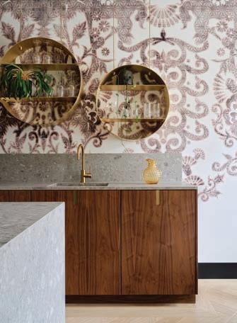
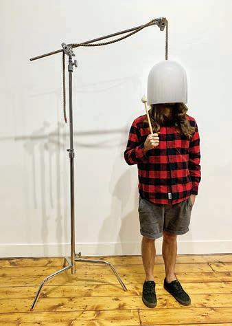
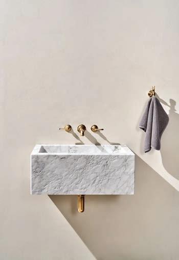
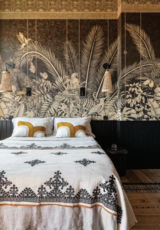
CLOCKWISE TOP LEFT LAVATORY Tellaro rectangular, wall-mounted, marble lavatory sink by Waterworks. waterworks.com KITCHEN Designer Roelfien Vos. Filicudi vinyl wallcovering from Glamora makes a striking statement above the sink in the kitchen. glamora.it CRYSTAL BELL Romina Gonzales and Jason Robert Bauer's AURA is a crystal bell for spiritual journeying. The bell is used by holding it by the string and rhythmically ringing it with the included handmade mallet over another's head. thethirdrooom.com BEDROOM Lyon, France.
Wallpaper: Inkiostro Bianco, cushions: É litis, bedspread: Caravane, lighting: Leroy Merlin.
XAWD ORIGINAL
DESIGN GOD SAVE THE BIEBS
This light-hearted take on a Renaissance-styled baroque wallpaper features an unexpected depiction of heaven and hell inspired by the time Post Malone was spotted choking Justin Bieber in a night club. All in good fun, of course! anthonywdesign.com

22 AUTUMN 2023 J & R Bauer Inc.
Frenchie Cristogatin
Space Content
p96
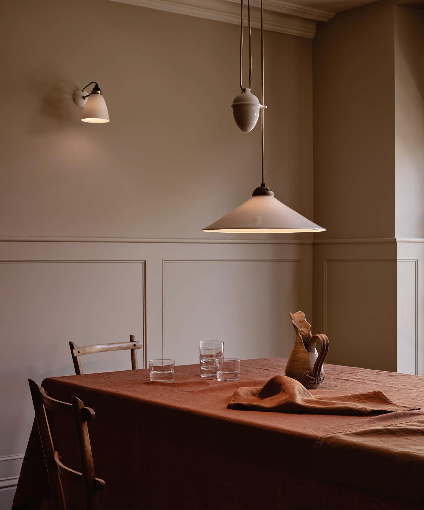

ORIGINAL BTC Unique Timeless Lighting, Handmade in England ANTIQUE BRASS COLLECTION ORIGINALBTC.COM
LIVING UPRIVER: ARTFUL HOMES, IDYLLIC LIVES BY BARBARA DE VRIES AND EMMA AUSTEN TUCCILLO RIZZOLI $55

BIBLIOFILES
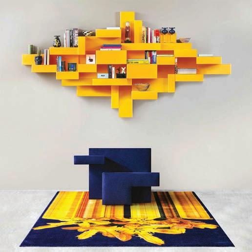
Primitive Bookshelf by Qeeboo is a modern Italian piece of design with a strong personality, and one of the most iconic products designed by Studio Nucleo. Initially made as a limited-edition product, this bookshelf is now industrialized by Qeeboo and re-proposed in a polyethylene version with rotational molding in order to make it accessible to everybody. Primitive evokes the paradox between the movements of the 20th century, from cubism to abstract art, constructivism and suprematism, exposing the double meaning of rationalism and its primordial geometric spontaneity. imaestri.com
Typesitting
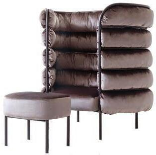
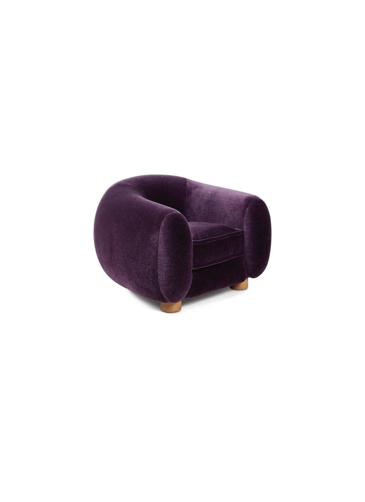
3 AYAKO DESIGN STUDIO Hideaway Chair in upholstered brown velvet Avalon Orbit from Unique Fine Fabrics. ayakodesignstudio.com
BEHIND THE BLUE DOOR: A MAXIMALIST MANTRA BY JOHN DEMSEY WRITTEN BY ALINA CHO PHOTOGRAPHY BY DOUGLAS FRIEDMAN VENDOME $65

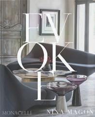
EVOKE: NINA MAGON BY NINA MAGON WITH JILL SIERACKI MONACELLI $60
ITALY BY INGREDIENT: ARTISANAL FOODS / MODERN RECIPES BY VIOLA BUITONI PHOTOGRAPHY BY MOLLY DECOUDREAUX RIZZOLI $40

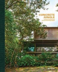
CONCRETE JUNGLE: TROPICAL ARCHITECTURE AND ITS SURPRISING ORIGINS GESTALTEN $90
Modern
and the Pursuit of Beauty
Jay Pridmore
MODERN BEYOND STYLE AND THE PURSUIT OF BEAUTY: BOOTH HANSEN AND THE ARCHITECTURE OF LAURENCE BOOTH BY JAY PRIDMORE CHICAGO SEVEN PRESS AND STEEL BRIDGE EDITIONS $40
THE MEANINGFUL HOME: SOULFUL ARCHITECTURE AND INTERIORS BY CELESTE ROBBINS WITH

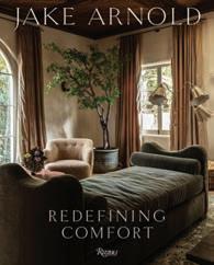
JAKE ARNOLD: REDEFINING COMFORT RIZZOLI $60
24 AUTUMN 2023
Beyond Style
Booth Hansen and the Architecture of Laurence Booth
JACQUELINE TERREBONNE MONACELLI $60
2 3
BOOKNOOK
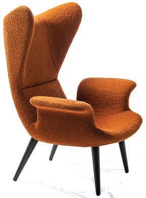
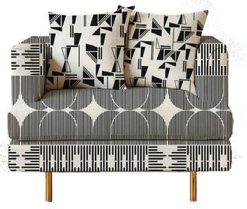
1 DIESEL LIVING with MOROSO Longwave high back lounge chair by Diesel Design, 2013. Ricciolone bouclé fabric in Ochre. moroso.it 2 SOCIETY OF WONDERLAND + S. HARRIS COLLAB Collection designed by Stephanie Eventov. textured.sharris.com
NEW YORK CITY | THE HAMPTONS | LONG ISLAND | PALM BEACH | PLYMOUTH MI | BAY HARBOR MI (888) 206-0015 • hello@bakesandkropp.com BAKESANDKROPP.COM






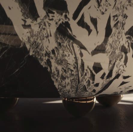
646.707.3065 New York 718.389.8360 Brooklyn 516.997.9412 Hicksville Live Your Life In Stone







 Rock & Roll Bathtub in Grand Antique
Part of the Classic Rock Collection by Cara Woodhouse for ABC Stone
Rock & Roll Bathtub in Grand Antique
Part of the Classic Rock Collection by Cara Woodhouse for ABC Stone
Rock & Roll Bathtub in Grand Antique
Part of the Classic Rock Collection by Cara Woodhouse for ABC Stone
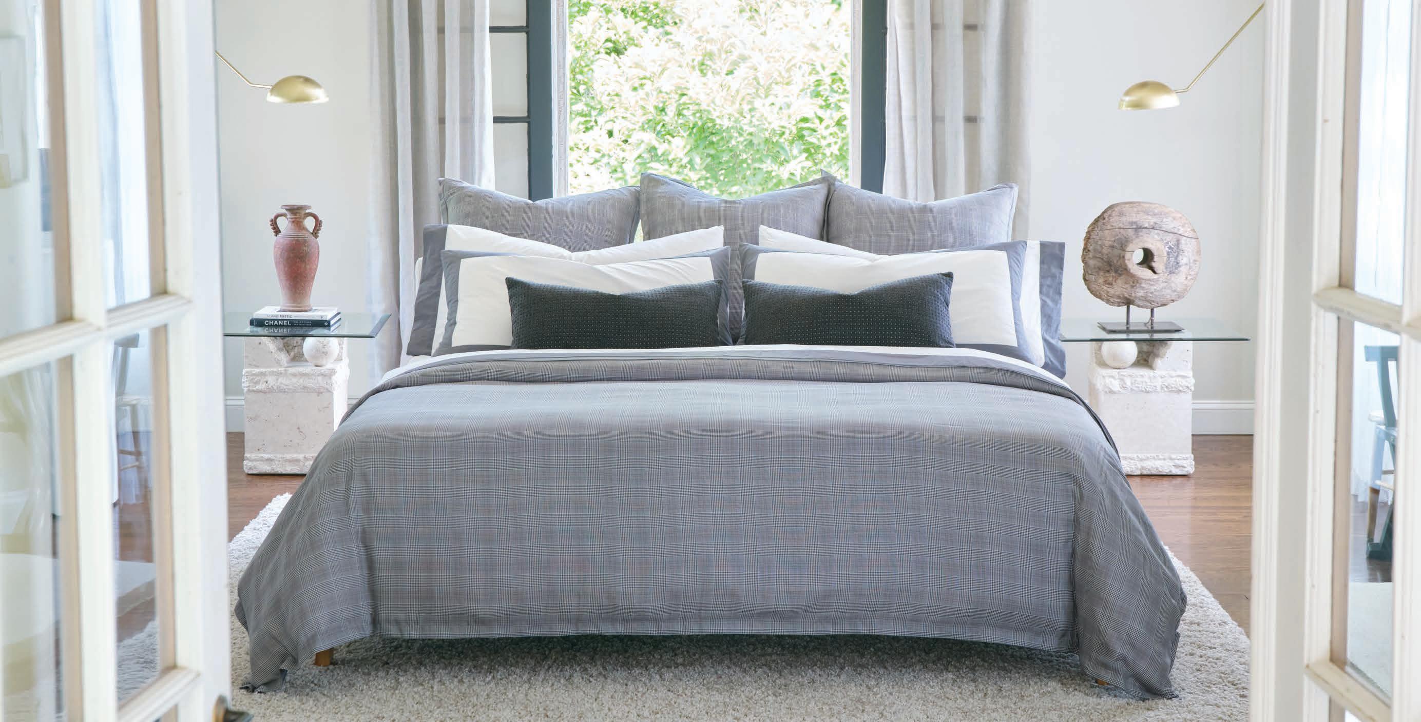

www.easternaccents.com | customerservice@easternaccents.com | 800.397.4556 | customerservice@easternaccents.com | 800.397.4556
The finest in home textiles. Chicago-crafted since 1989.


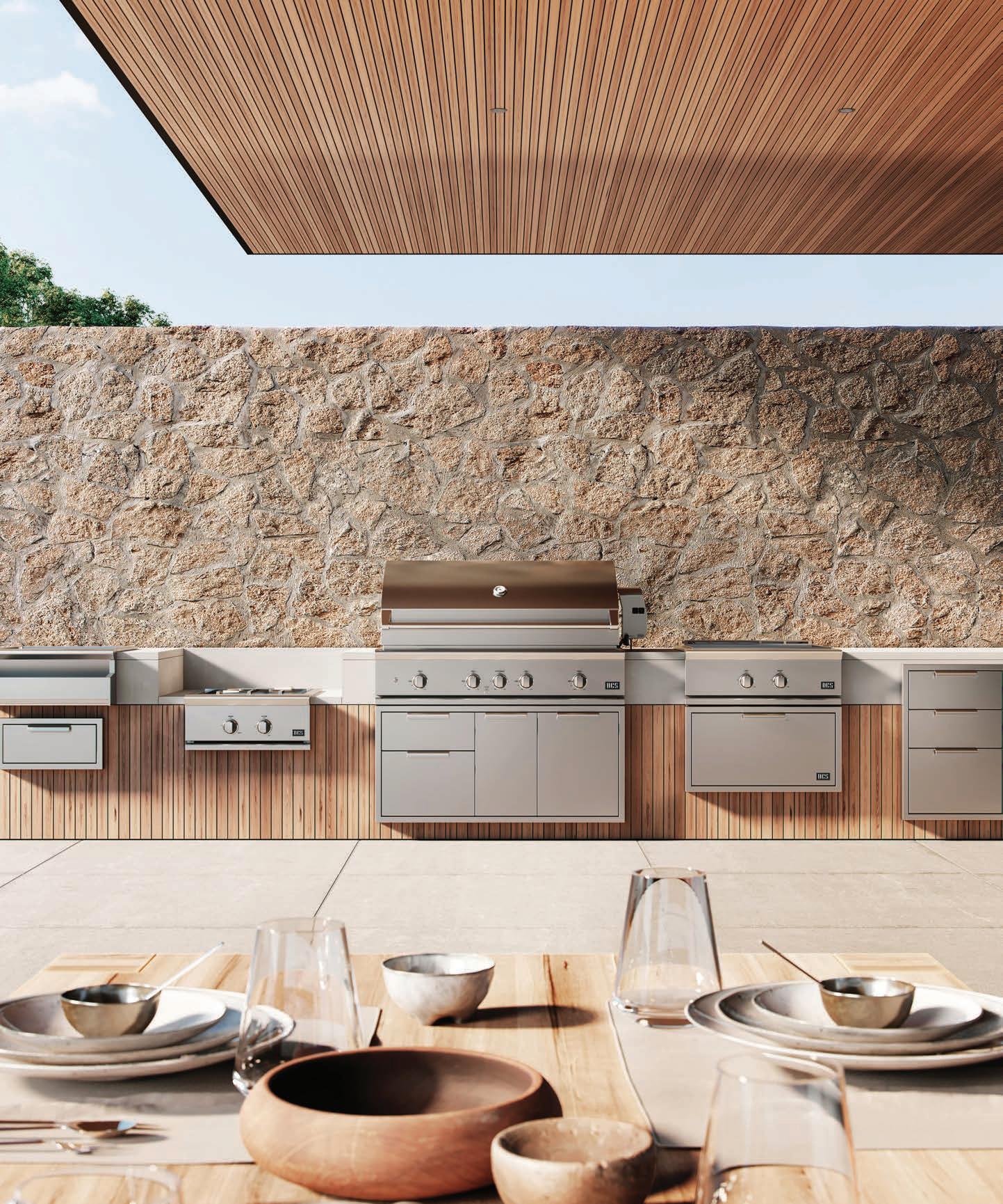

www.dcsappliances.com
RECIPE FOR SUCCESS: A TRIO OF ECLECTIC DESIGNERS CONJURES UP IDEAL KITCHENS
Three notable creatives located in California and Arizona synchronize laid-back Western vibes and highly original design influences. Daniel Germani is an award-winning architect and designer based in Phoenix who is upending the look of outdoor kitchens with a sleek, modern collection from Brown Jordan. William Hefner, architect and founder of Studio William Heffner, skillfully integrates the fine craft of building and a harmonious use of natural forms into his kitchen designs from studios in LA and Montecito.
Caren Rideau, talented founder of The Kitchen Design Group in Los Angeles, is passionate about food, wine, family and friends, all topics she covers in her new cookbook “Caren Rideau: Kitchen Designer, Vintner, Entertaining at Home.” These leading innovators have a lot to say about how kitchens continue to evolve in terms of both efficiency and aesthetics.
– GWEN DONOVAN

WILLIAM HEFNER
Studio William Hefner
Architectural Expertise in the Kitchen
William Hefner’s trademark is designing spaces that are warm and understated, evocative and original, and always richly restful. These design goals are met in the kitchen in several clever ways. “In order to prevent stainless steel from being visually dominant in the landscape of the kitchen, I like to cover as many appliances with cabinet fronts as possible,” he notes. “Things that are super popular right now are ranges with color and metal (brass, bronze, stainless) options that distinguish the kitchen. People are lighting
some of the larger-scale faucet options. More and more, people are going for steam ovens as an appliance.”
Southern California’s sunny climate also influences Hefner’s kitchen aesthetic. “We try to design the homes so that they have hearty butler pantries, which allow the kitchen to be less encumbered with storage. Just the essentials are stored in the kitchen. This allows for more wall surfaces to be doors or windows. I don’t like the feeling of being cut off from the outdoors when I’m in a kitchen.”
32 AUTUMN 2023
ARCHETYPES
Laura Hull
OPPOSITE TOP A kitchen for casual, stylish family living in Brentwood, California. CENTER Partial view of the kitchen at Chateau des Fleurs, a grand estate in Bel Air, California. BOTTOM William Hefner’s own kitchen in his Montecito, California home.
E D I T I O N M O D E R N . C O M Made in Los Angeles since 2006
quintushome.com

Pacific Design Center Suite B527
THE FINEST
COUNTERTOP
MAKERS IN THE WORLD
Be iconic with Cambria quartz surfaces. | CambriaUSA.com

© 2023 CAMBRIA || 1436501_CNP
OAKLEIGH™
™
QUALITY AHEAD OF ITS TIME

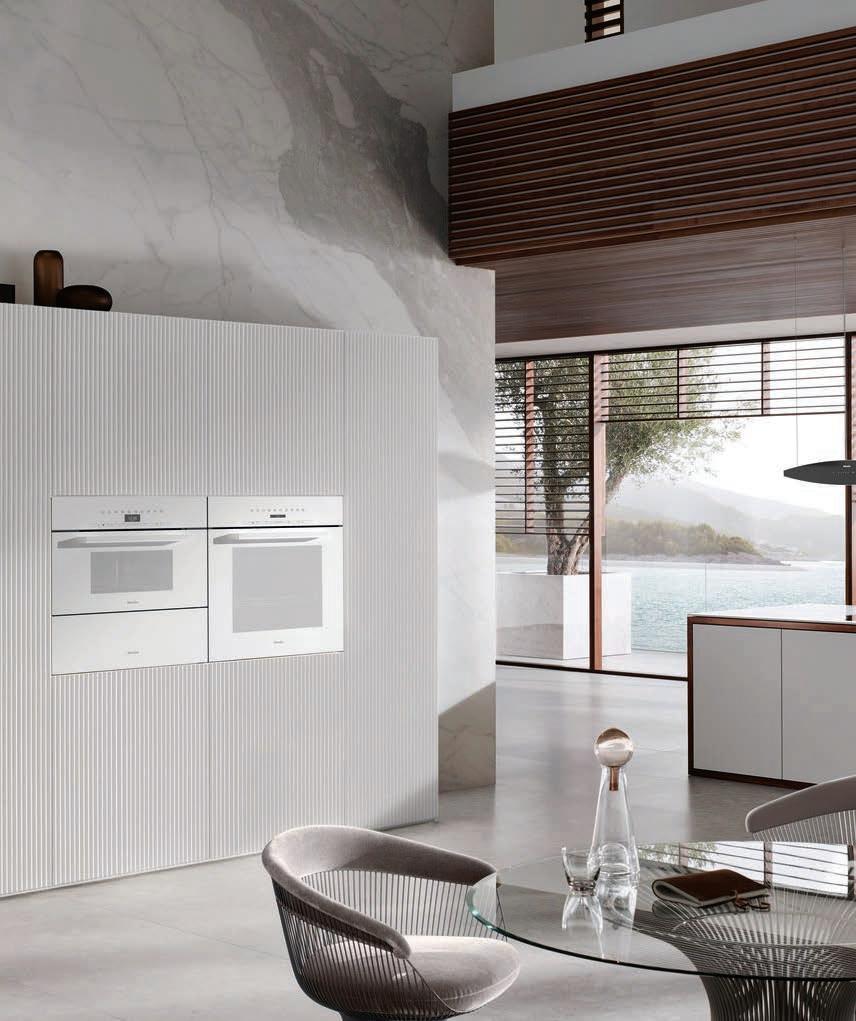
In a kitchen, everything should work around you and reflect your style. The new Miele Generation 7000 high-end kitchen appliances are the perfect match for your every need, thanks to innovative, intuitive technology and smart features.
SNYDERDIAMOND.COM
SANTA MONICA PASADENA VAN NUYS
KI TC HE N I BA TH I HAR DW AR E I OU TD OO R
THOM FILICIA
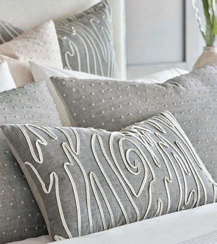
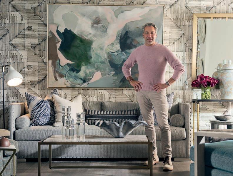


Sedgwick & Brattle is Thom Filicia’s first to the trade showroom, located at the New York Design Center in NYC. Sedgwick & Brattle brings together a selection of products from the Thom Filicia Home Collection, a thoughtfully curated grouping of items from around the country, as well as vintage and one-of-a-kind pieces. From upholstery to casegoods, lighting, artwork, rugs, bedding, pillows, textiles, accessories & more, S&B is your one-stop-shop for all things home.
By a designer for designers, Sedgwick & Brattle was born out of Thom’s love of all-things-design, and serves as a laboratory for designers as well as design-enthused customers & clients to find beautiful, interesting and unique items that help to create inspired backdrops for an authentic and dynamic life.
212.685.0600 | sedgwickandbrattle.com | info@sedgwickandbrattle.com

@SedgwickandBrattle | @sedgwickbrattle

MarketWatch
1 2 3
4 6 7 5
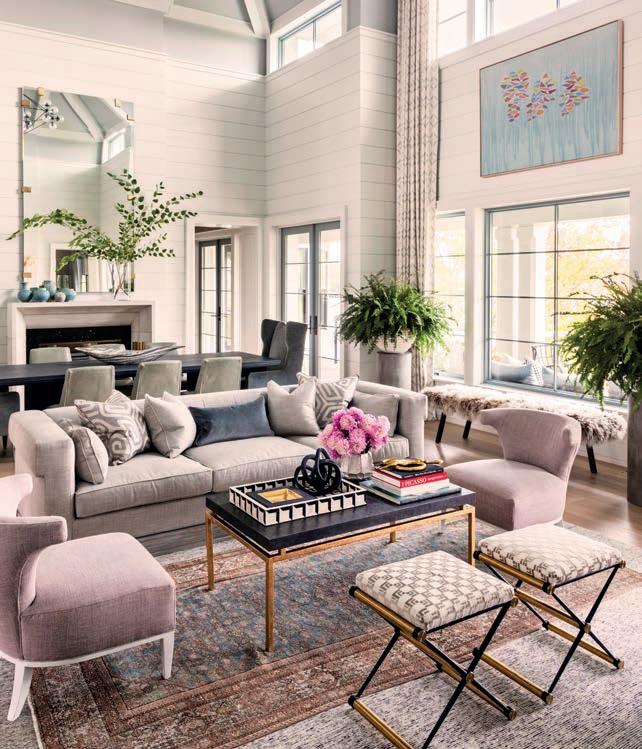
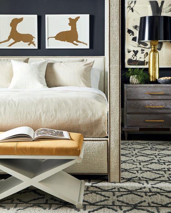
1. Thom Filicia in his NYC showroom, Sedgwick & Brattle, at the New York Design Center ( Photo: Amy Lamb). 2. Clearview Bedding from the Thom Filicia Home Collection for Eastern Accents, available at Sedgwick & Brattle.
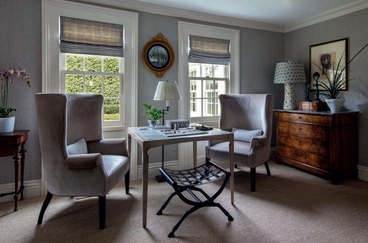
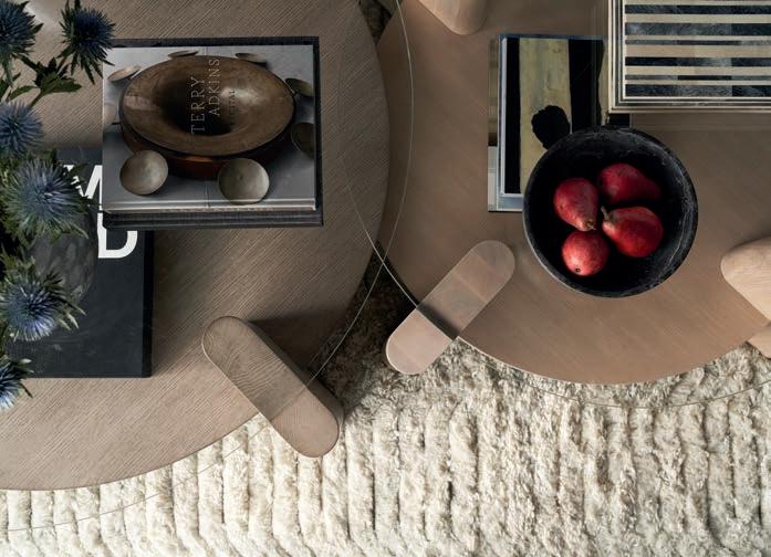
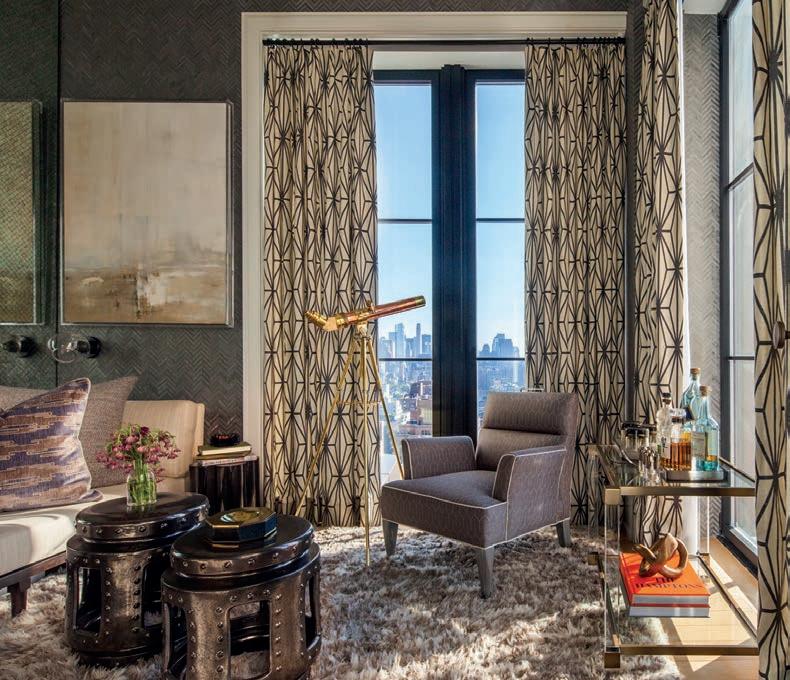
3. Thom Filicia Inc’s CT Classic Project featuring the Danforth Game Table from the Thom Filicia Home Collection ( Photo: Nick Johnson). 4. Artwork, rugs and furniture from the Thom Filicia Home Collection, available at Sedgwick & Brattle. 5. Thom Filicia Inc’s Walker Tower Project featuring product from Sedgwick & Brattle. 6. Thom Filicia Inc’s West Lake Project featuring product from Sedgwick & Brattle ( Photo: Amy Lamb). 7. Wolcott Cocktail Tables & Matson Rug from the Thom Filicia Home Collection, available at Sedgwick & Brattle.
Snyder Diamond
With a legacy dating back to 1949, Snyder Diamond is a local family-owned company serving SoCal’s interior designers, architects, builders, contractors, and homeowners. Providing a one-of-a-kind L.A. experience, a peerless dedication to our customers, and the widest selection of kitchen, bath, hardware, outdoor and plumbing products in the area, we take pride in introducing the latest trends in kitchen and bath to the U.S. market, and strive to live our vision of always being “first with what’s next.”
818.286.9900 | snyderdiamond.com | @snyderdiamond


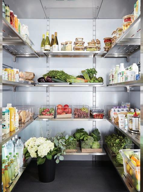
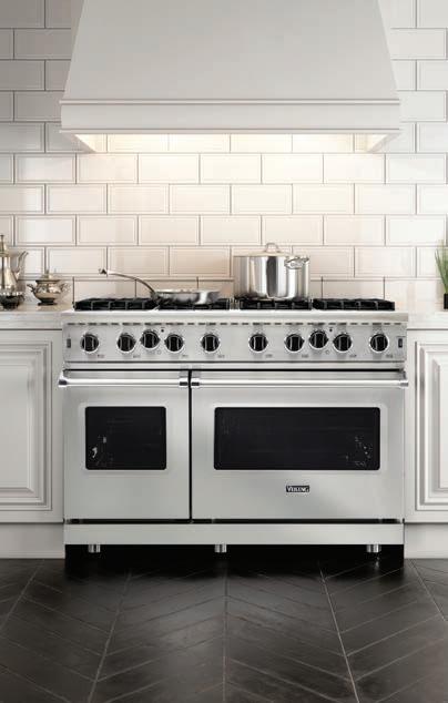
1. VIKING Dreamers. Innovators. Leaders. Viking continues to revolutionize high-end appliances by incorporating proven technology and innovative features once reserved for commercial kitchens, into Viking appliances for your home. 2. QOLDFUSION Qoldfusion is the world’s first luxury residential walk-in cold pantry, found only at SD. Available in a range of interior colors, it’s easy to install and outshines traditional refrigerators in energy efficiency. If you’re tired of cramped refrigerators—it’s time to make room for cool.
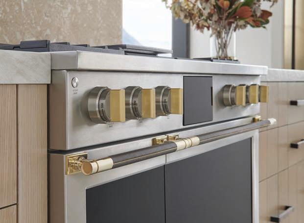
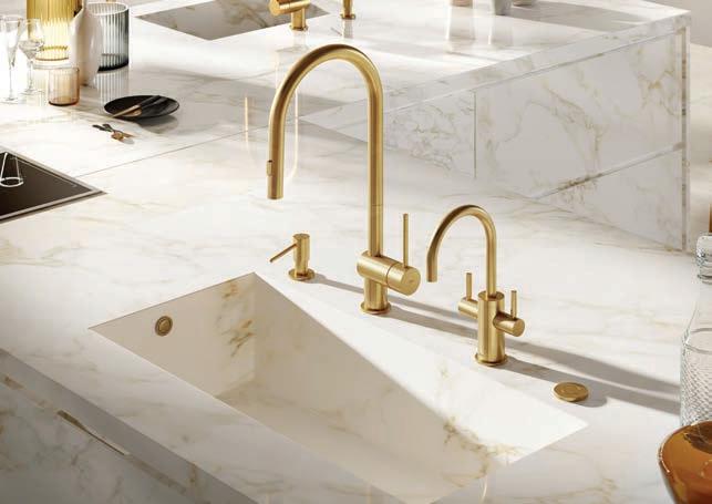
3. MONOGRAM The Monogram Designer Collection by Richard T. Anuszkiewicz is their very first designer series. Offerings include two striking brass and titanium aesthetics inspired by fine jewelry featuring hand-stitched leather hardware and customizable panels, hoods and handles to create personalized, luxurious cooking experiences. 4. MGS Since 1997, Italian luxury brand MGS has been developing high-quality stainless steel materials into functional, sleek kitchen and bath fixture designs that have indubitably raised the industry bar with their structural grace and efficiency.

40 AUTUMN 2023
1 3 4 2
MarketWatch
ARCHETYPES
DANIEL GERMANI

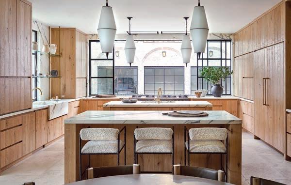
As far as trends, several mainstays are falling out of favor, Hefner says. “Fewer people are requesting microwave ovens. I’ve always had a dislike for traditional upper cabinets. I try to avoid them as much as possible or have them come all the way down to the countertop. I just feel like they often drag a kitchen down and make it feel so normal.” His take on Smart features in the kitchen? “If a client wants to indulge in those, my goal would be to hide them as much as possible. I don’t want the kitchen to look like a spaceship.”
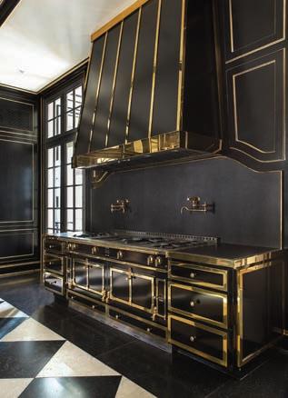
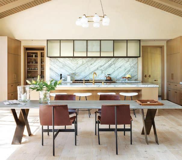
Exemplary kitchen designs of Hefner’s include two stunning examples, “I love the family kitchen at Chateau des Fleurs, which is all black and brass. It’s about as over-the-top as we’ve done. I also love the kitchen at the Romero Canyon house in Montecito. It holds up one end of a large great room with warm woods and a glass and steel hood. AND there are no upper cabinets!”
Singular Designs Inspired by an International Icon
Based in Phoenix, Arizona, Argentinian architect and designer Daniel Germani brings a global viewpoint to his eponymous design studio. His deep understanding of the design culture in America and Europe is recognized internationally, as seen in a slew of high-profile design awards. The multidisciplinary studio specializes in product design, design consultancy, interior design and architectural renovation, while innovative projects range from furniture to architectural products and accessories.
ASPIREDESIGNANDHOME.COM 33
Laura
Laura Hull
Hull Trevor Tondro Courtesy of Daniel Germani
Daniel Germani Studio
Cosmopolitan Kitchen
Brown Jordan
Outdoor Kitchens
Elements Collection
Brown Jordan
Outdoor Kitchens
ARCHETYPES
CAREN RIDEAU
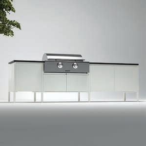
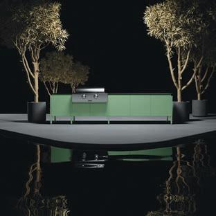
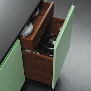
Thinking outside the box comes naturally to Germani, who has been a past and present creative director for notable furniture brands, including Brown Jordan, where he put his indelible stamp on the Elements outdoor kitchen collection of colorful, ultra-modern pieces. He describes it this way, “Embracing a pared-back, European aesthetic, Elements blurs the lines between cabinetry and furniture with accentuated legs and a sleek, frameless design featuring nested drawers and integrated handles for drawers and doors. Its minimalist design and detail-oriented functionality, including soft close doors and drawers and the flexibility to incorporate a range of appliances, make Elements look and feel like an indoor kitchen with the durability to withstand the outdoors.”
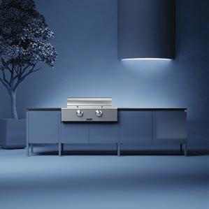
Brightly-infused colorways lend a whole new look to this outdoor kitchen collection, Germani explains. “Color can help bring a space to life, and as a product designer, it’s been a true joy to see growing demand for new finishes and to help design professionals bring their visions to life. For 2023, we’re introducing a stunning sapphire-inspired blue, and we’ll continue to explore new finishes to inspire great outdoor design.”
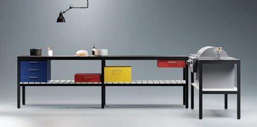
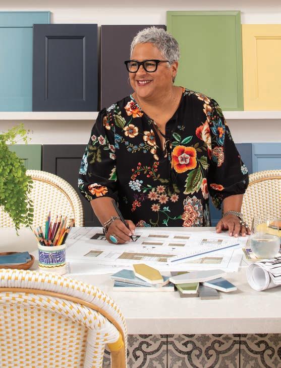
Germani’s leading role in outdoor kitchen designs has made a tremendous impact on backyard chefs around the world, he notes. “It’s been an incredible journey to see the growing momentum for outdoor design. The soaring demand for outdoor kitchen spaces reflects a significant shift in homeowner sentiment, and it’s one with serious staying power.” As for his product inspirations? “My aesthetic is influenced by the Bauhaus, Oscar Niemeyer, Le Corbusier, Mies van de Rohe and Frank Lloyd Wright, and our studio’s philosophy is simple: good design has to be honest and inspiring.”
Caren Rideau On Designing Her Best Life
Who says you can’t do it all? Not Caren Rideau, who happily embraces a multi-hyphenate list of professional pursuits: kitchen designer-cookbook author-vintner-business owner, among other roles. She likes nothing better than having friends over for a meal and greeting them with a glass of wine from Tierra y Vino, the vineyard she runs with her life partner Andrés Ibarra, possibly followed by a favorite meal of carne asada from her new cookbook.
34 AUTUMN 2023
Meghan bob Photography
Brown Jordan Outdoor Kitchens
DANIEL GERMANI STUDIO
In “Caren Rideau: Kitchen Designer, Vintner, Entertaining at Home," she informs readers about her kitchen designs, wine-making and things that give her life meaning. “My work life spreads into my social life, and there are blurred lines about what is work and what is lifestyle or simply living!”
When asked about her fantasy kitchen, the answer was simple: “My favorite is a kitchen filled with love, laughter, joy and, of course, my family and friends. We can improvise with any appliances; cooking comes from the heart! The best kitchen, whether small or large, is a well-thought-out kitchen.”
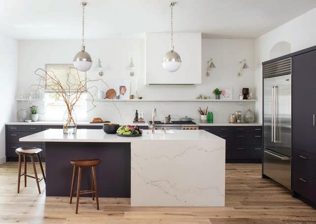
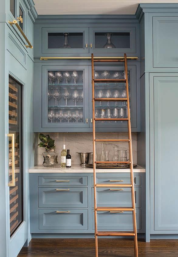
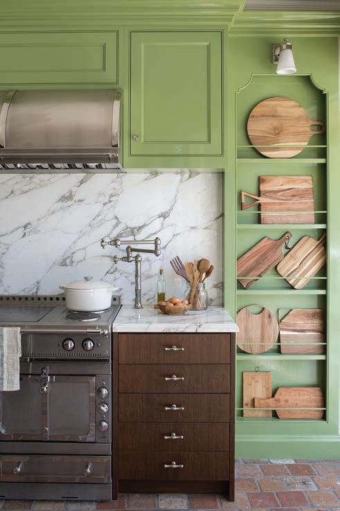
Her latest business ventures are wine- and design-related, Rideau explains. “Although educated in interior architecture and specializing in kitchens and baths for three-plus decades, I have been so excited to merge my wine business and my lifestyle of entertaining into one voice. After all, they are relatable to most, and I find my joy in sharing with others. And I am beyond excited to launch my new dinnerware line in collaboration with Gorky Gonzalez out of Guanajuato; it is a dream project. The patterns are inspired by my growing up in Arizona; the Southwest influence with the cactus design and the sunflower.”
With her passion for entertaining, Rideau has simple advice for prepping and planning. “Make dishes that are easy and don’t take you away from your guests. Plan the dishes you want to serve ahead of time. Set the table with linens and have your plates and flatware out. My grand rule is none of my guests are allowed to clean dishes .” As a final note, she shares her favorite toast, the one she uses around her own dinner table: “Give thanks to our friendships and our family, and know how to love one another. ”
ASPIREDESIGNANDHOME.COM 35
Meghan bob Photography
Meghan bob Photography
Uva (the Spanish word for grape) is one of the newest colors in Rideau’s Frida cabinet collection.
Nopal, a richly verdant color featured in the Frida cabinet collection, was inspired by the earthy yellow-green hue of a cactus.
Meghan bob Photography
Created to streamline storage, this blue-clad wine bar has ample space for glasses, plus a full-sized wine cooler.
Zest for life
a kitchen roundup
Cantù, Italy
DESIGN DETAILS Baroque carvings with hand-applied gold leaf adorn ivory resin cabinetry in this luxurious Italian kitchen by Silik X Michelangelo Designs. A black-and-white wallcovering depicting shelving staged with busts, vases and other classical items continues the mix of tradition and modernity while adding a touch of whimsy. “Mixing modern and traditional elements gives any space that wow factor,” notes Michelangelo Designs president and co-owner, Chris Farra. “It creates a unique, unexpected environment that will make people stop and stare.” BIG IDEA “Fifty years ago, you would never put modern and traditional together, but in today's design world, there's a lot more flexibility,” adds Farra. “Nobody is stuck in a box. If you live in a modern house but have traditional aspirations – or vice versa – you can add those elements, and they become a conversation point.”
COMPILED BY TATE GUNNERSON
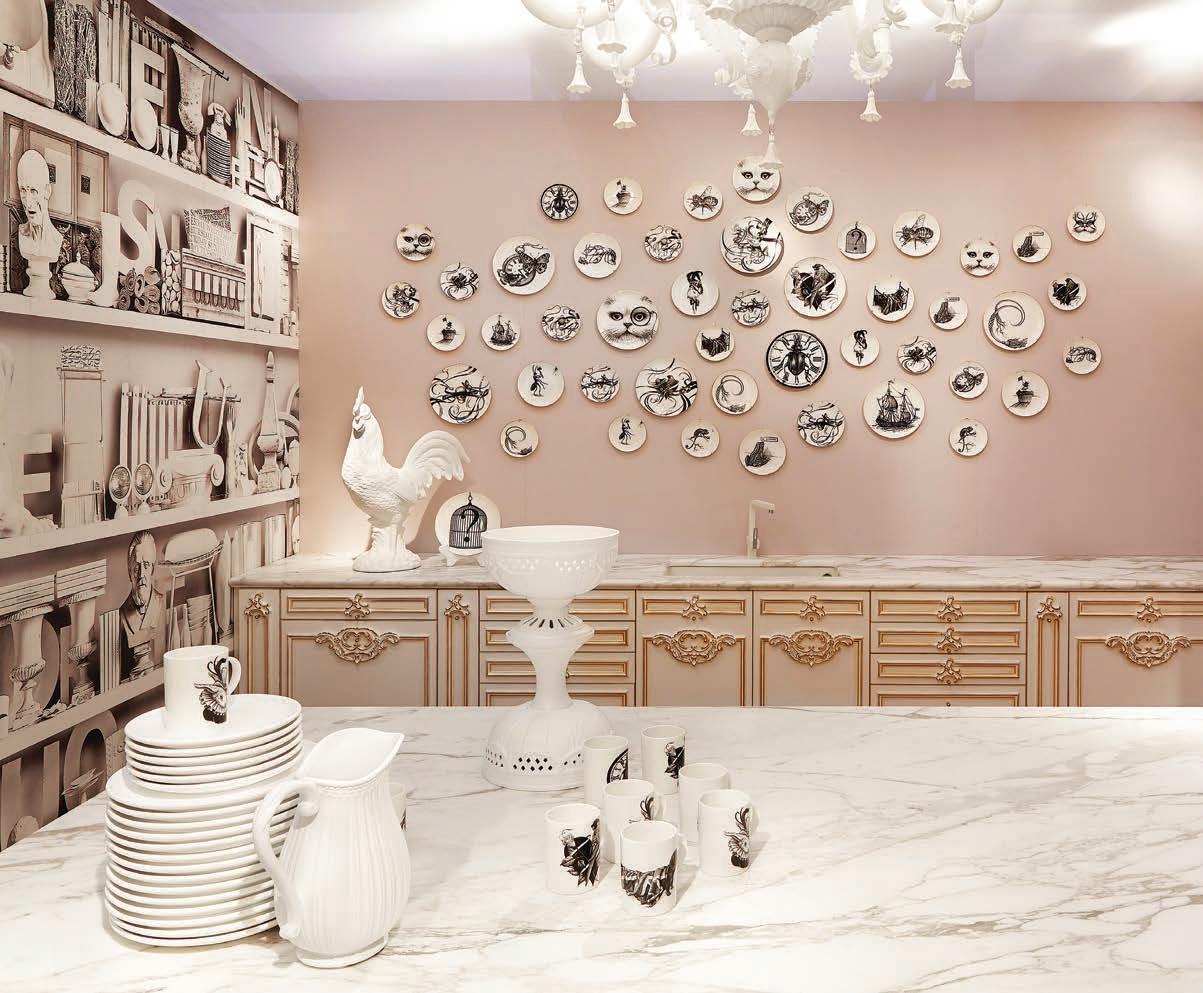
36 AUTUMN 2023
Courtesy of Michelangelo Designs
Rome, Italy
DESIGNER ANNALISA MAURI DESIGN DETAILS A stimulating shade of teal selected from Le Corbusier’s masterful color palette enlivens the kitchen walls in this 1920s-era villa located just steps away from Rome’s bohemian Trastevere neighborhood. To foster the industrial style her client envisioned, designer Annalisa Mauri exposed the concrete flooring and incorporated the sort of stainless steel cabinetry with integrated countertops that are more often found in restaurants. The simple color and material palette juxtaposes the historic architecture, creating, “a force of energy,” Mauri states. BREAKFAST, LUNCH OR BRUNCH? Breakfast, absolutely! I am Italian, and what could be better than waking up in the morning slowly with a big cup of coffee, bread with butter and jam, yogurt with red fruits and freshly squeezed orange juice?
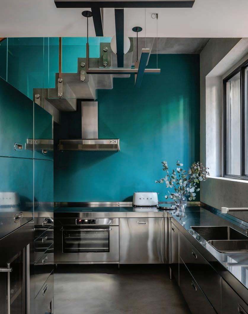
ASPIREDESIGNANDHOME.COM 37
Helenio Barbetta
Chicago, Illinois
DESIGNER JASMIN REESE INTERIORS DESIGN DETAILS After rendering the majority of her client’s West Loop apartment in a sleek black-and-white palette, Jasmin Reese convinced them to paint the kitchen and dining area in a bold teal hue. “I pushed them out of their comfort zone,” she admits. Indeed, a curvaceous purple velvet channel-tufted banquette wraps around a concrete support column in the dining niche, where a small white pendant casts a pool of light onto the burnt oak tabletop. A compact table lamp and a concealed LED strip that illuminates the back wall add to the moody ambiance. CHAIR OR BANQUETTES? I prefer banquettes over chairs whenever possible. Chairs require so much clearance. Banquettes don’t take up as much real estate. BIG IDEA Use multiple light sources. Rather than selecting an oversized chandelier, Reese opted for a smaller-scale one and incorporated both a small table lamp and a concealed LED strip that washes the wall with light. “The effect is dramatic and very painterly,” she says.
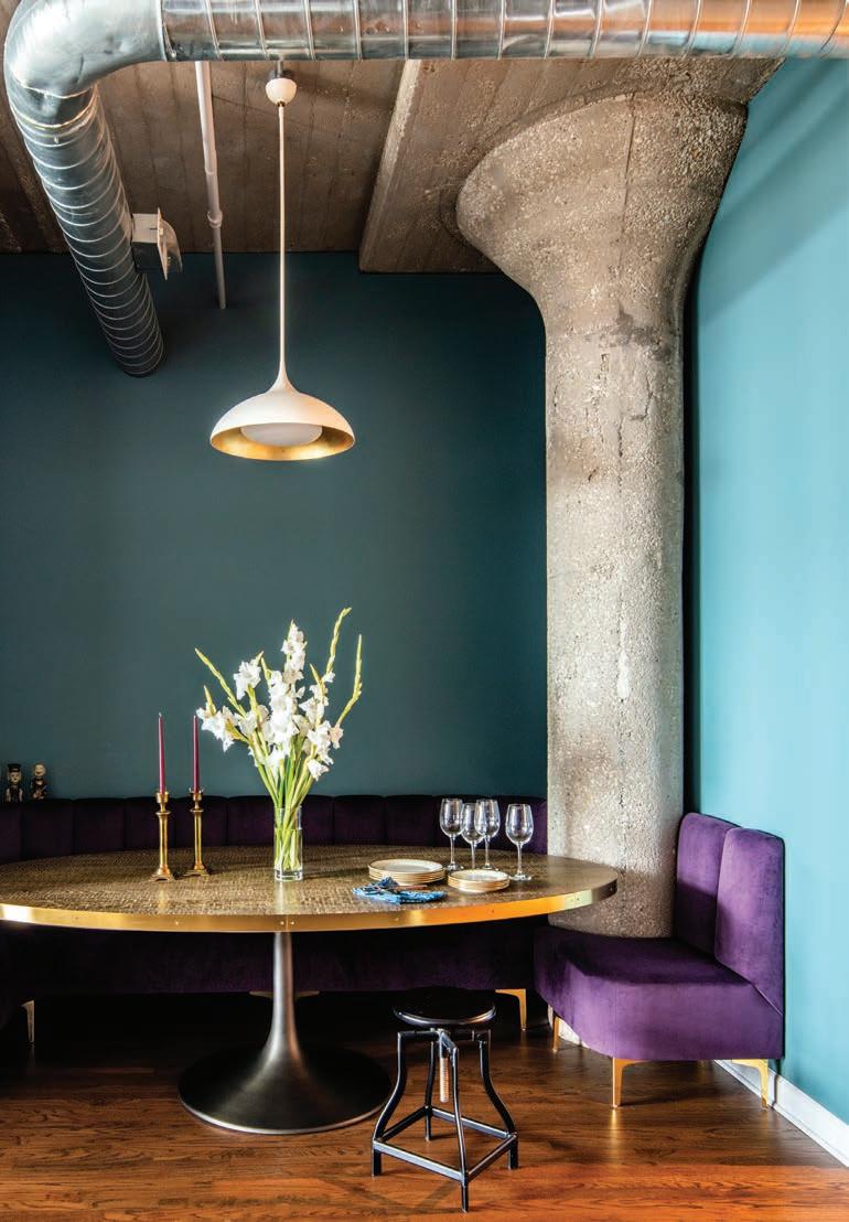
Varese, Italy
DESIGNER ABIMIS DESIGN DETAILS Modern stainless steel cabinetry juxtaposes the substantial wooden ceiling beams and rustic stone details in this upscale Varese kitchen by Abimis. The minimalist result checks all the boxes for the happy owners. BIG IDEA Using stainless steel cabinetry in kitchens. AISI 304 stainless steel is a biologically neutral metal that does not give off any odor or release any substances into food, as well as being resistant to corrosion and temperatures of up to 932°F, extremely easy to clean and 100% recyclable. The hallmark of our Abimis kitchens is that they are “tailor made.”
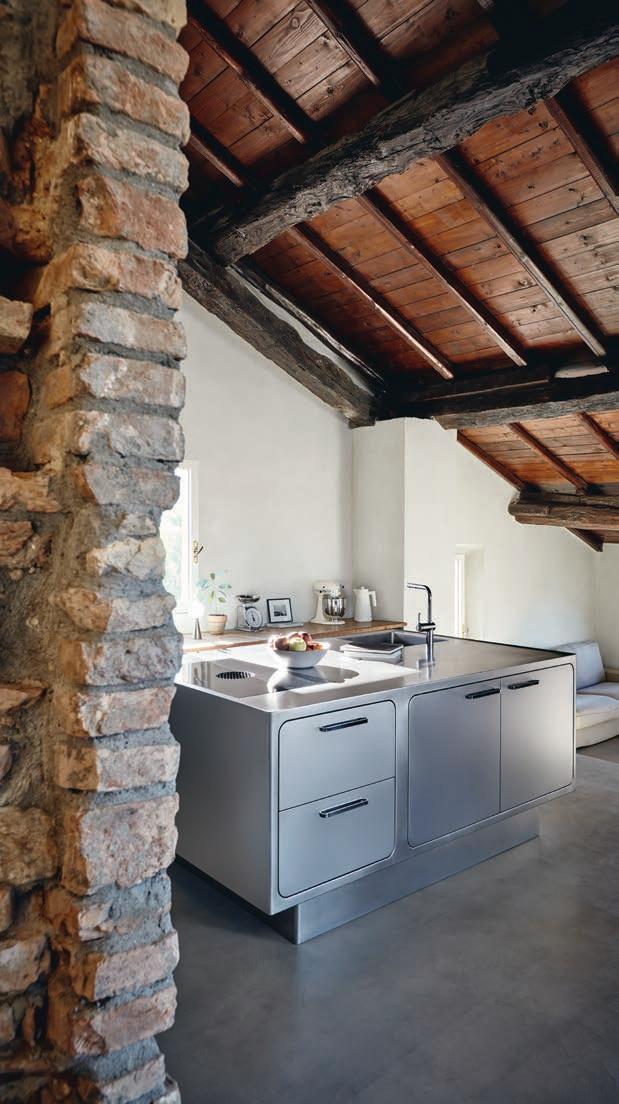
38 AUTUMN 2023
Nick Johnson
Sara Magni
Calgary, Canada

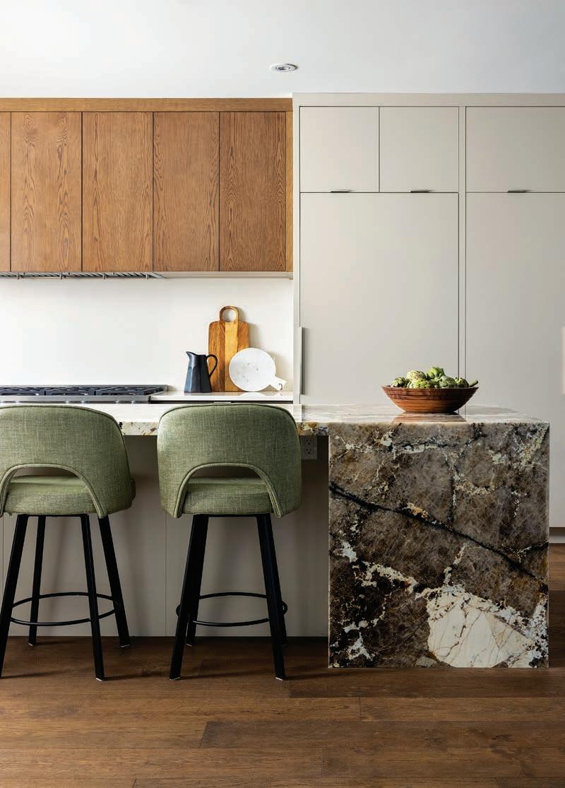
DESIGNER ALYKHAN VELJI DESIGNS DESIGN DETAILS Veiny Patagonia granite countertops and a seamless white quartz backsplash play off the restrained mix of painted and oak cabinetry in this upscale Calgary kitchen by interior designer Alykhan Velji. “Natural stone makes an impact and adds a sense of timelessness,” Velji explains. Indeed, the island countertop waterfalls on both sides, adding a sense of drama. Integrated appliances, meanwhile, maintain the minimalist midcentury-inspired vibe the owner envisioned. STANDALONE OR INTEGRATED APPLIANCES? It depends on the kitchen, but in general, integrated appliances are the way to go. They don’t compete with the other materials and result in a cleaner, more modern aesthetic.
ASPIREDESIGNANDHOME.COM 39
SOCIETY OF WONDERLAND Nu-Disco Shakedown Wallpaper Collection Elevation Blue (shown) Pearlized textural matte finish. societyofwonderland.com
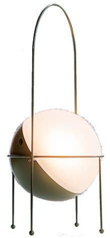
AMBIENTEC Madco Lamp Designed by Elisa Ossino. ambientec.co.jp
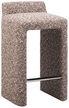
GOOD COLONY Studio Paolo Ferrari Solid Leg Stool Featuring a fully upholstered body with a striking hammeredmetal footrest. goodcolony.com
Joel Klassen Photography
Rome, Italy
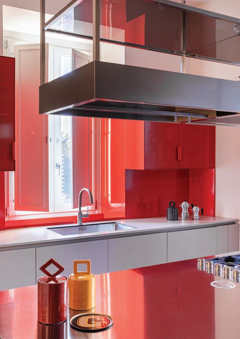
DESIGNER PUNTO ZERO DESIGN DETAILS Sleek, lacquered cabinetry and an iron backsplash in a daring blood-orange hue define this newly remodeled kitchen by Giorgio Marchese and Arianna Nobile in the Eternal City. “Red is a color from Roman tradition,” Nobile says, noting its use in the excavation underneath the nearby Colle Oppio. An iron countertop in the same vibrant color accents the island, while the base cabinets and perimeter counters are rendered in a complementary sand tone. The energetic palette “makes the space feel alive and full of life,” Nobile declares. BIG IDEA Don’t be afraid to mix up materials and colors. Finding a balance might seem harder than working with neutral spaces, but the outcome will be far more exciting for sure!
York
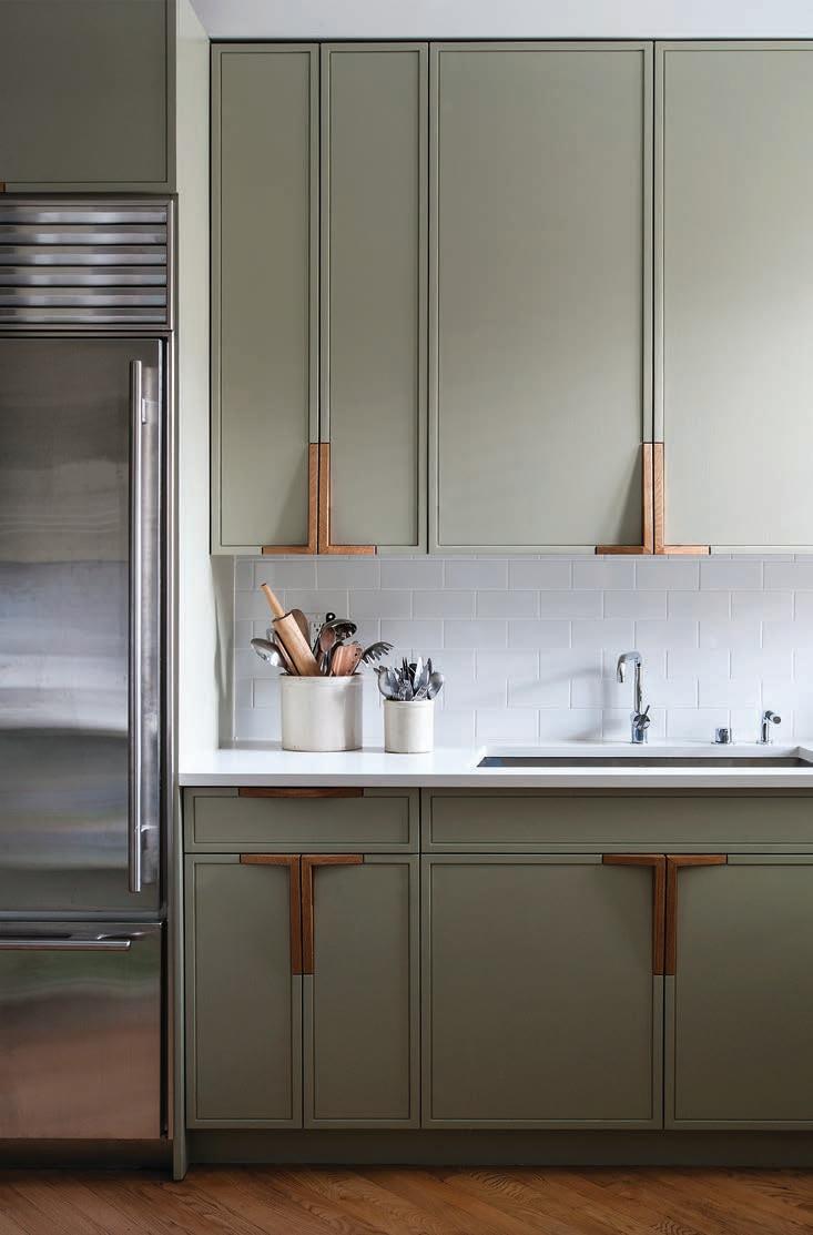
DESIGNER WORKSTEAD DESIGN DETAILS Rather than replace the updated cabinetry in their client’s Park Slope kitchen, interior designer Stefanie Brechbuehler and her team swapped out the doors with new Shaker-style ones painted in the same soft gray color as the walls and millwork throughout the apartment. “We wanted to calm things down,” she explains, pointing to the sleek white quartz countertops and matching subway tile backsplash. Custom wooden hardware with a bespoke profile further buoys the upscale design. HAND VS. SPRAY PAINTING CABINETRY? This cabinetry is hand-painted so you can see a fine grain, and that was important to us.
40 AUTUMN 2023
Serena Eller
Matthew Williams Brooklyn, New
URBAN FEELINGS
Mérida, Mexico
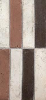
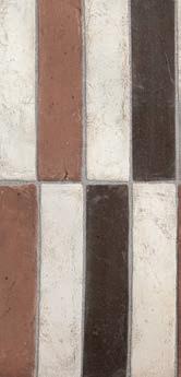
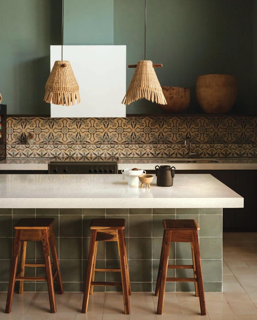
DESIGNER FRANCISCO BERNÉS DESIGN DETAILS Modernity and tradition commingle effortlessly in this Mérida kitchen. Located in a Colonial-era house, its boxy concrete hood and sleek quartz countertops juxtapose the handmade pasta tile cladding the floor, island and ornate, three-dimensional backsplash. In lieu of upper cabinets, a simple wooden shelf runs along the plaster-covered concrete range wall, displaying woven baskets the Dutch owners collected while living in Mozambique. They play well with the island pendants, which are made of a natural fiber harvested from the shores of a lake in Michoacán. “It was important for the design to reflect the home’s history,” explains architect Francisco Bernés. GAS OR CONVECTION? I don’t know how eco-friendly it is, but I prefer gas. If the electricity goes out, you can still cook. And I like to see the fire.

ASPIREDESIGNANDHOME.COM 41
Photography Fabian Martinez, Styled by Tami Christiansen
La Fornace Comfort Collection Handmade terracotta tile in beautiful neutral colors. urbanfeelings.it
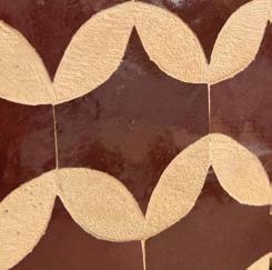
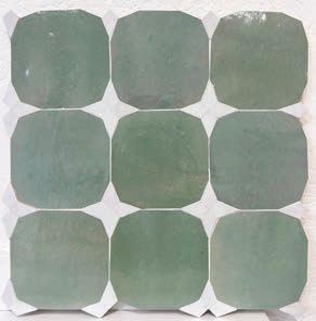
SALIMA FILALI Zellige Collection ZAHRA (above), PLUME (right) Moroccan handmade tile. salimafilali.com
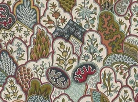
PIERRE FREY Les Rivieres De L'indus
Printed with the block printing technique by the Manufacture Royale d'Oberkampf around 1791, this pattern is better known as the Chinese Nested Pattern. It consists of decorative elements found at the base of Indian trees of life. It is traditionally hand screen printed in France on a superb cotton percale. Also available in wallpaper. pierrefrey.com




creativewallcoverings.com 908.665.7997 Please call for an appointment DESIGN•TEXTILES•HOMEWARE CWI DESIGN
TIMELESS DESIGNS, UNMATCHED ELEGANCE
JWH DESIGNS PHOTOGRAPH BY TIM LENZ


are often referred to as “Jewelry” in the kitchen. For a range hood that makes a statement with a focal point that creates the “Wow” Factor, RangeCraft is the premier choice. Remember... There are Range Hoods and then there is a RangeCraft Range Hood!
RangeCraft range hoods
CELEBRATING OVER 50 YEARS rangecraft.com 877-RCHOODS DESIGNED AND MADE IN THE USA
Range Hoods Made To Order. Any Design. Any Material. Any Finish.
Mejdal, Denmark
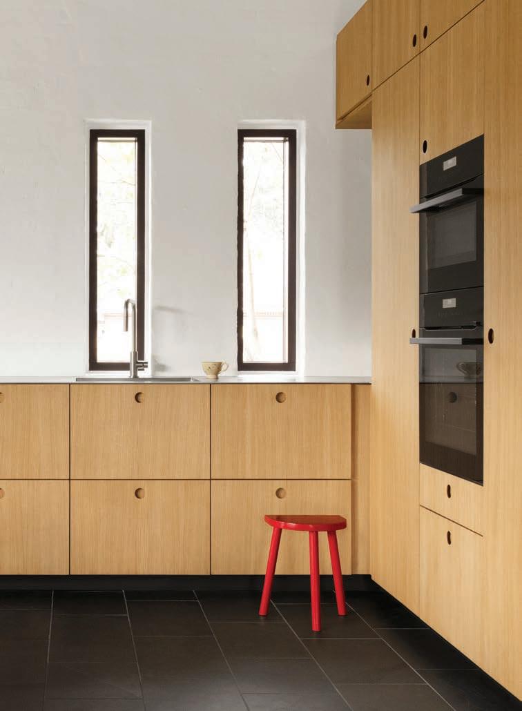
DESIGNER ANN MØLGAARD ANDERSEN DESIGN DETAILS Envisioning a happy space for family meals, kids’ projects and joyful gatherings, Ann Mølgaard Andersen and Chung W. Cheung completely reimagined the kitchen in their late 1970s-era Mejdal, Denmark kitchen, eliminating a powder room and blowing out the high, pitched ceiling, which they clad with black acoustical tiles by Troldtekt. “It creates a cozy, cave-like feeling,” Andersen describes. White walls create a crisp backdrop for contemporary oak base cabinetry by Reform, metal countertops and dark slate flooring. Colorful accessories that can easily be swapped out for an entirely new vibe punctuate the neutral milieu. “It’s a clean, classy look,” Andersen comments. WHAT LESSON CAN READERS TAKE AWAY FROM THIS SPACE? When you’re redoing a room, respect the architecture of the house. Does it actually fit the house? You’ll be much happier with the kitchen if it suits the house.
Milan, Italy
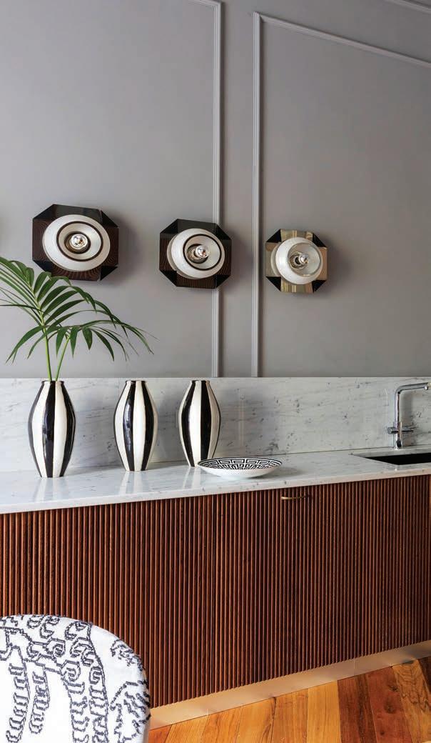
DESIGNER COSIMO BONCIANI DESIGN DETAILS To create the convivial entertaining space his sister envisioned in her late-19th-century, Milan apartment, interior designer, Cosimo Bonciani relocated the kitchen to the brightest and most beautiful room in the house. “We wanted to build a space that could be experienced outside of mealtimes without feeling like a kitchen room,” Bonciani maintains, pointing to the lack of upper cabinets. Indeed, light-gray walls with classic moldings and oak flooring made from 100-year-old recovered planks foster a classic, comfortable backdrop for a bank of fluted wooden base cabinets with Carrara marble countertops. Sourced from a 1970s-era disco, a series of sculptural wall sconces take on the role of art. “We wanted to recall the golden age of Italian design,” he states. “This room became the centerpiece of the house.” WHAT LESSON CAN WE TAKE AWAY FROM YOUR DESIGN? There are few cabinets, but the space is well organized and has everything a young family might need. It is extremely practical and very quick to clean!
48 AUTUMN 2023 Courtesy of Reform
Helenio Barbetta
Dublin, Ohio
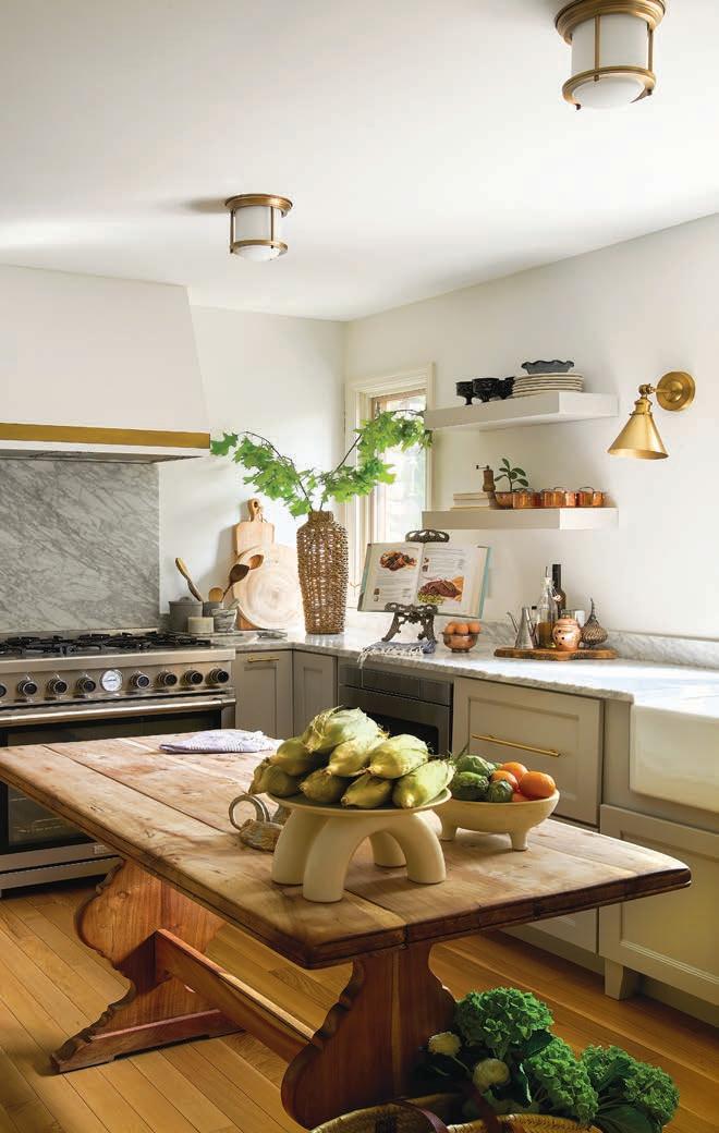
DESIGNER JULIE PAULINO DESIGN DETAILS Drawing inspiration from her home’s stone exterior, interior designer Julie Paulino reimagined her Dublin, Ohio, kitchen with warm hardwood flooring and latte-colored cabinetry accented by Carrara marble countertops. “It’s a European-style kitchen with American functionality and technology,” she remarks. The designer pushed back a wall, eliminated a peninsula and did away with upper cabinets on the window wall, resulting in a larger, light-filled space. In place of an island, Paulino incorporated a wooden dining table that invites long conversations. WHY SPLURGE ON QUALITY MATERIALS? High-quality materials and appliances will not only enhance the overall aesthetic but are also going to offer more durability, longevity and value.
CHECHAL PENDANT
Hand-woven palm

Hand-turned Tzalam wood
The subtle beige tone, the way it hangs, and the interlocking of the palm create a dialogue with the space. Its dynamism and playfulness contrast with the textures and colors that whisper a sophisticated bohemian spirit. Customization available. chechal.studio

ASPIREDESIGNANDHOME.COM 49
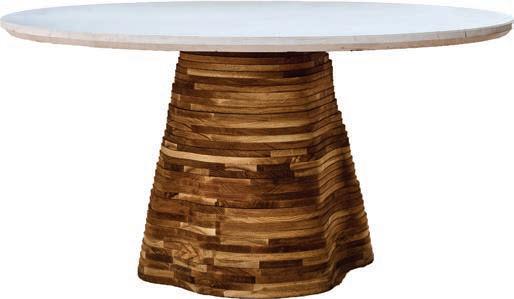
Marshall Evan GOOD COLONY SSS ATELIER Movement Dining Table 37
tiered layers of oak and walnut pay homage to the ripples of sand on the designer’s native Michigan shoreline. goodcolony.com
Bergamo, Italy
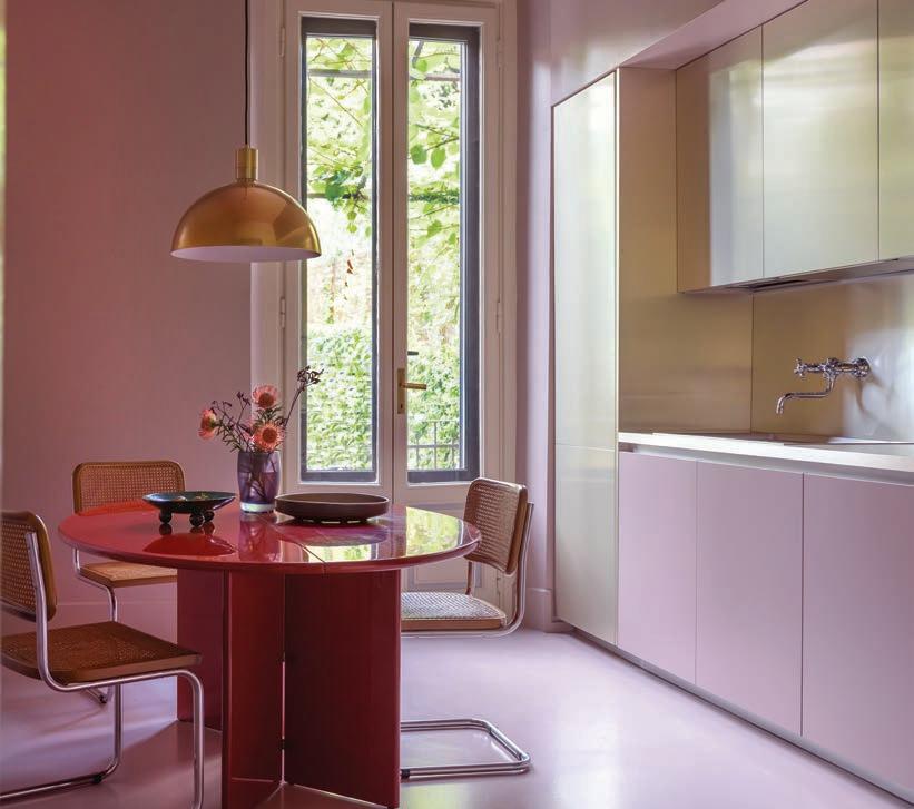
DESIGNER DANIELE DAMINELLI DESIGN DETAILS Soft pink walls and matching cabinetry play off the color of the marble floors in this Bergamo, Italy, kitchen by interior designer Daniele Daminelli. “The décor is a blend of ingredients from different eras and styles, mixed with delicacy in search of sophisticated harmony,” he asserts. Indeed, a contemporary brass dome pendant illuminates a deep red lacquered table surrounded by iconic cane-back chairs by Marcel Breuer. Metal cabinets and countertops in a champagne enhance the serene setting. “It’s a quiet space where the client can cook and chat with friends,” he adds.
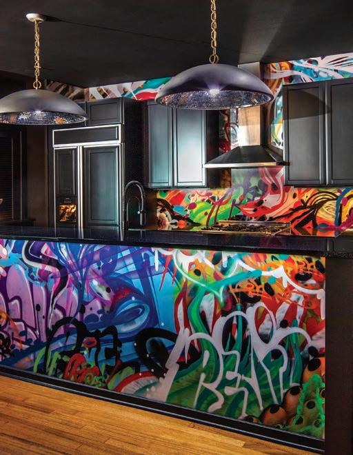
DESIGNER JASMIN REESE INTERIORS DESIGN
DETAILS “This place is like a kaleidoscope,” quips interior designer Jasmin Reese of the West Loop kitchen she designed for an eccentric couple who adore color. The designer recruited a local street artist to graffiti the back wall, backsplash and front of the island, using bold primary colors. Embedded with symbols and sayings that reflect the couple, the urban motif pops against the black walls, ceiling and cabinetry. “This place satisfied their love of color. It was really fun to jive with them.” BIG IDEA Paint is an affordable, impactful way to transform your space. For a unique look, hire an urban graffiti artist. You’re helping the economy by hiring somebody local, and you’ll get a bespoke look.
50 AUTUMN 2023
Dooq Majorelle Collection Lotus by Margarida Pereira dooqdetails.com
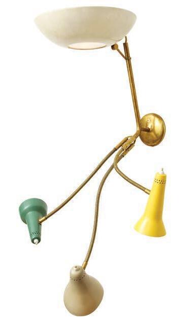
DONZELLA No. 179, Rare Wall Sconce by Gino Sarfatti for Arteluce Italy c. 1950
Playful yet sophisticated this light references sculpture in lacquered aluminum, brass, frosted glass and plastic switches. donzella.com
Nathalie Krag Chicago,
Illinois
Nick Johnson
BRINGING EUROPE TO YOUR HOME.

FRENCH OAK ARTIFICIAL TURF LVP
Mill Valley, California
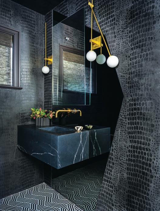
DESIGNER TINEKE TRIGGS INTERIORS DESIGN DETAILS Inspired by her fashionable client’s edgy attire, Tineke Triggs outfitted this Mill Valley powder room with a dazzling brass-inlaid black-and-white marble floor from her own collection and dark plaster walls in a hand-done crocodile pattern by artist Caroline Lizarraga. Mismatched brass globe pendants flank a thick black marble sink anchored atop an angled wall mirror that gives the space an edge. “This space has a rock 'n roll vibe,” Triggs expresses. “It’s a reflection of the client – edgy and unexpected.” WHY IS BLACK A SUITABLE COLOR FOR SMALL SPACES? It’s a common misconception that dark walls make a space feel smaller. Black creates negative space, so dark walls actually make smaller rooms feel more spacious.
SIGNATURE HARDWARE
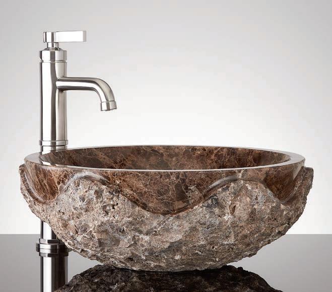
Hull Round Marble Vessel Sink
Bring textural drama to your bathroom. Crafted from Dark Emperador marble, the smooth interior of the sink features a rich black tone that also beautifully highlights the material’s unique veining. ferguson.com
Stockholm, Sweden
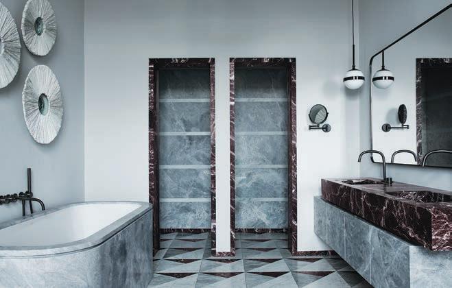
DESIGNER STUDIO LAWAHL DESIGN DETAILS
Designers Joanna Lavén and David Wahlgren reimagined a former office into a spa-like primary bathroom adorned with classic Carrara and winecolored Rosso Levanto marble. Located on the third floor of a late-18th-century apartment overlooking the coast, the space includes a standalone shower and a long, oval Bardiglio marble tub that counterbalances the linear two-tier stone vanity. “We love to play with shapes and texture,” Lavén describes, pointing to the custom, handmade ceramic wall sculptures by Hanna Järlehed Hyving over the tub. “It gives a nice balance to the room.” WHAT CAN READERS TAKE AWAY FROM THIS BATHROOM? Treat the bathroom as a decorative room that can be pretty in and of itself, and use it as you would a living room. It doesn’t have to be just functional.
CARBONSHACK
Lichen Pendant
Unique light fixtures that explore the intricate organic structures of the natural world. Designed and fabricated in the United States using 3D printing technology, LED illumination and wood veneers. carbonshackshowroom.com

52 AUTUMN 2023
HAY
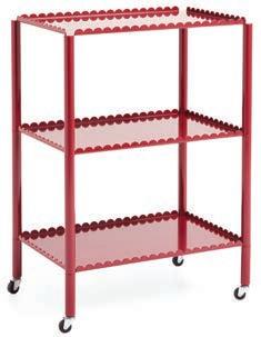
The Arcs Collection by Muller Van Severen
Two functional yet aesthetic pieces: the Arcs Mirror and Arcs Trolley. The Arcs Trolley is HAY’s first serving cart, available in two sizes for a variety of different uses. us.hay.com
Christopher Stark
Kristofer Johnsson
Photo courtesy of Signature Hardware for Ferguson Bath, Kitchen & Lighting Gallery
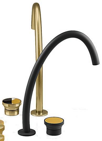
Basin mixers, tall and medium height finished in Brass Brushed PVD and Matte Black from the Accent color palette. gessi.com
THE FUTURE PERFECT
Bari Ziperstein Donut Square Planter
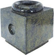
Bari Ziperstein pushes the boundaries of slab construction with innovative engineering methods. Each meticulously crafted piece is a limited edition of 28, exclusively available through The Future Perfect. thefutureperfect.com
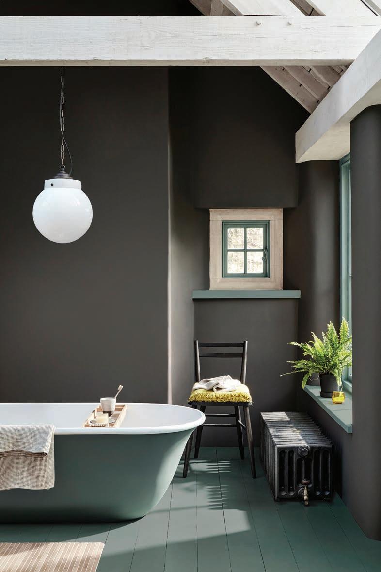
Manchester, United Kingdom
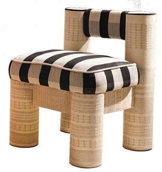
White
Together MINNA & LMO present the CRCL Chair, a classic LMO design now available in handwoven MINNA fabrics. The CRCL Chair is made of recycled paper and regional pine, and utilizes alternative cushion stuffing consisting of recycled fast fashion textile waste, instead of commonly used petroleum-based foams. minna-goods.com
DESIGN Ruth Mottershead, creative director of LITTLE GREENE PAINT & PAPER DESIGN DETAILS Gray-green accents enliven the warm gray walls in this light-filled second-floor bathroom in a 19th-century Manchester farmhouse. “We wanted it to feel organic, so we used earthy, natural colors,”shares Mottershead, noting that the entire space has been slathered in paint, including the tile floor and the soaker tub. “The result feels comfortable, welcoming, enveloping, cozy, and quite serene. It’s the kind of space where you want to relax in a bath.” BIG IDEA Easily transform a space by color drenching the walls, ceiling and moldings in the same color. “It adds a bit of drama.” Or, for a unique look, she suggests painting the millwork in a bold accent color.
ASPIREDESIGNANDHOME.COM 53
Courtesy of Little Greene Paint & Paper
GESSI Origini
MINNA X LIKEMINDEDOBJECTS CRCL Chair Black &
DON’T MAKE LUNCH. MAKE THUNDER.


RANGES | OVENS | COOKTOPS | VENTILATION | MICROWAVE DRAWERS | REFRIGERATORS
THOR Kitchen: a complete line of full-featured, superbly crafted, stainless steel warriors. Dual fuel, gas and electric options. 4,000–18,000 BTU burners. Infrared broilers. LED panel lights. Continuous cast iron grates. Heavy-duty tilt panel controls. Massive capacities. LightningBoil™ speed. Brilliant blue porcelain oven interiors. And more. The real value in pro-grade performance.
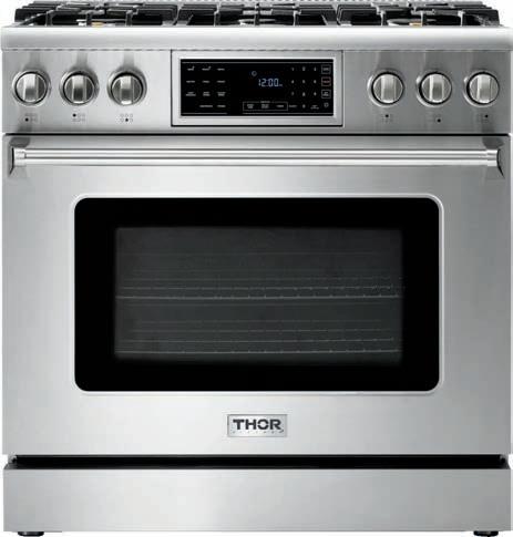

THORKITCHEN.COM MEMBER #COOKLIKEAGOD
© Copyright 2023 THOR Kitchen, Inc. | All Rights Reserved. 23TINT01-04-149457-2 WINE COOLERS | ICE MAKERS | DISHWASHERS | BBQ GRILLS | PIZZA OVENS
BOOKING RESERVATIONS
CEVICHE PAIRED WITH ALBARIÑO
Serves 6
Albariño, with its high acidity and refreshing citrus notes, is a fantastic choice for pairing with this exquisite dish.
TRANSPORT YOUR PALATE WITH RECIPES OFFERING GENEROUS HELPINGS OF GLOBAL INSPIRATION AND UNIVERSAL APPEAL GWEN DONOVAN



Mexico City, Mexico
Jorge Vallejo of Quintonil

Charred avocado tartare with escamoles and Mexican herb chips
Singapore
Julien Royer of Odette Kampot pepper-crusted pigeon

2 pounds tilapia filets, diced into 1” squares (the fish is easier to cut when it’s partially frozen)
1 cup fresh lime juice (about 8 limes)
½ cup seeded chopped tomato
½ cup finely chopped onion
¼ cup chopped fresh cilantro leaves
1 serrano chili chopped fine (I use 2 - I like it spicy) salt and pepper for seasoning
8 - 10 tostadas, can be purchased
1 avocado-pitted and sliced for garnish
Put chopped tilapia and onion in a medium bowl. Pour the lime juice over the fish and onion, mix gently to combine. Cover with plastic wrap and place in refrigerator for about 1 hour or until fish is opaque throughout.
Remove ceviche from refrigerator and drain and discard the excess lime juice. Add the cilantro, tomato and serrano, season with salt and pepper to taste.

Generously spoon the tostadas with ceviche and garnish with sliced avocado. As an option, dollop with bottled hot sauce (Tapatio, Valentina or Huichol).
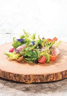
Taipei, Taiwan
Richie Lin of MUME MUME salad

Composed of 20-30 different seasonal vegetables
Modena, Italy
Massimo Bottura of Osteria Francescana

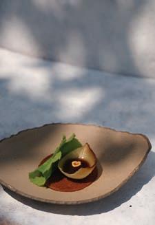
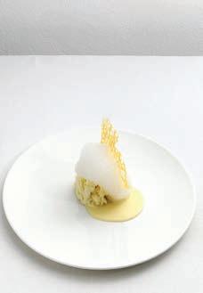
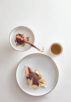
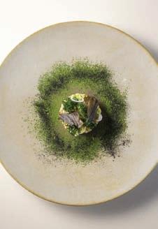
Five ages of Parmigiano Reggiano in different textures and at different temperatures
Kobarid, Slovenia
Ana Roš of Hiša Franko Injera of roasted barley flour and dark malted barley oil, onion, lamb, chicken, pork offcuts stock, celeriac, preserved berries, king oyster mushrooms, toasted hazelnuts
56 AUTUMN 2023
Plating and headshot courtesy of Quintonil
Plating and headshot courtesy of Odette
Paolo Terzi
Suzan Gabrian
Plating and headshot courtesy MUME Hospitality Group
SIGNATURE DISHES: 50 CHEFS
SHARE THEIR SECRET RECIPE
By Amelie Vincent LANNOO $70
CAREN RIDEAU: KITCHEN DESIGNER, VINTNER, ENTERTAINING AT HOME POINTED LEAF PRESS $75
Callo Albanese & Sueo Courtesy of Hiša Franko
NEW ARRIVAL HAVANA BED

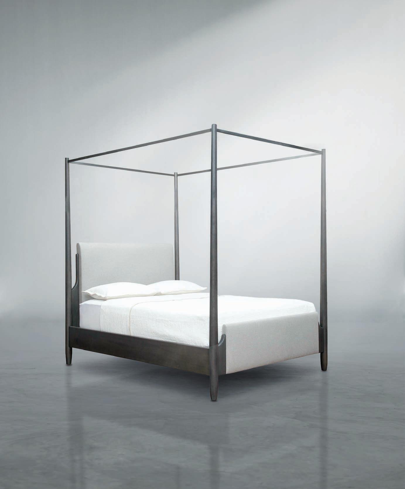
CELEBRATING 25 YEARS IN BUSINESS ANEESFURNITURE.COM
58 AUTUMN 2023
LANDSCAPE ARCHITECTURE
ASPIREDESIGNANDHOME.COM 59
TEXT THOMAS CONNORS PHOTOGRAPHY HENDRIK BIEGS
ENCOUNTERING THE 150-YEAROLD FLEMISH FARMHOUSE OF LANDSCAPE ARCHITECT KEVIN
MAMPAY, ONE APPRECIATES ANEW THE ELEMENTAL, SUSTAINING JOY OF HAVEN
BELGIUM
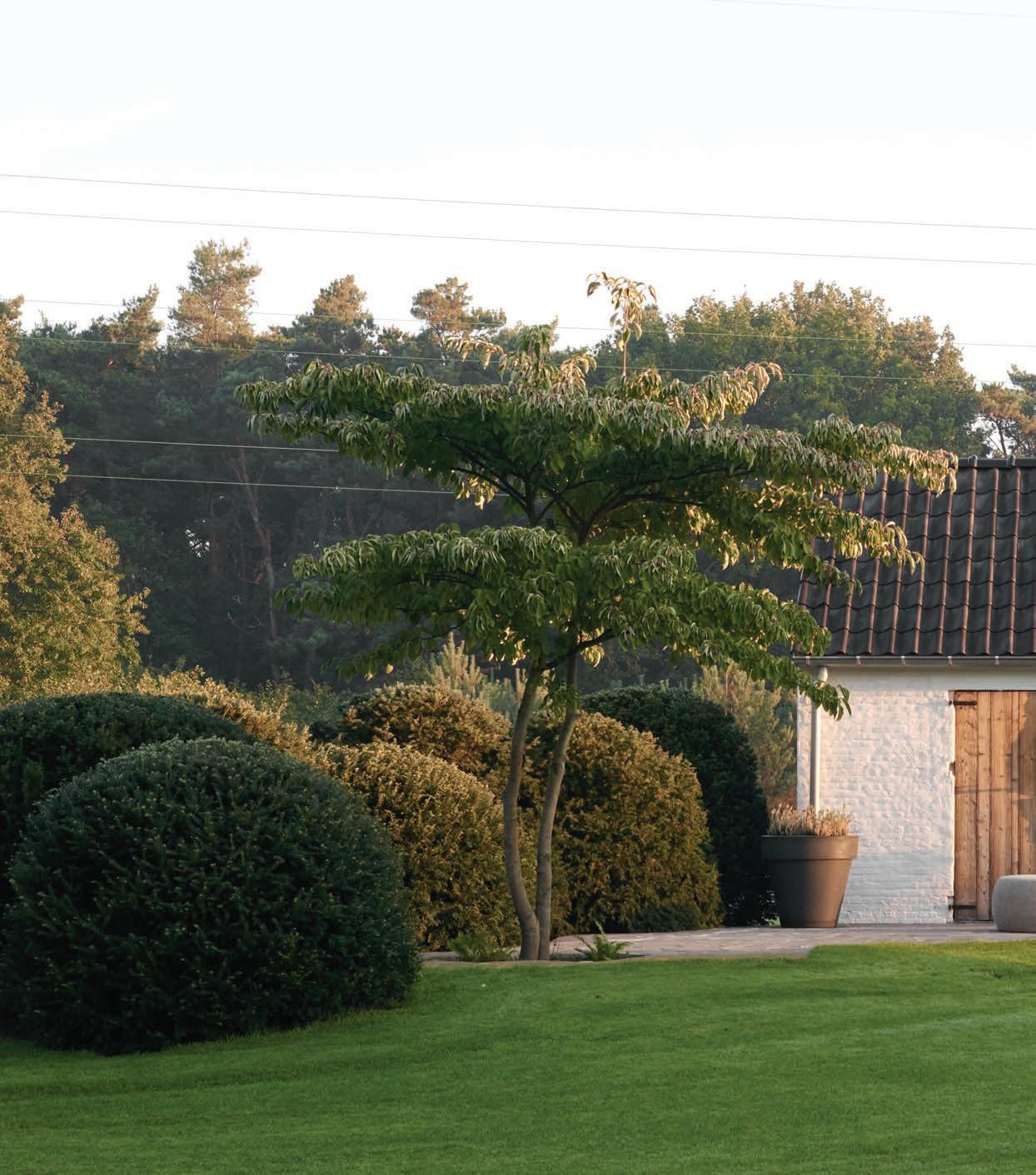
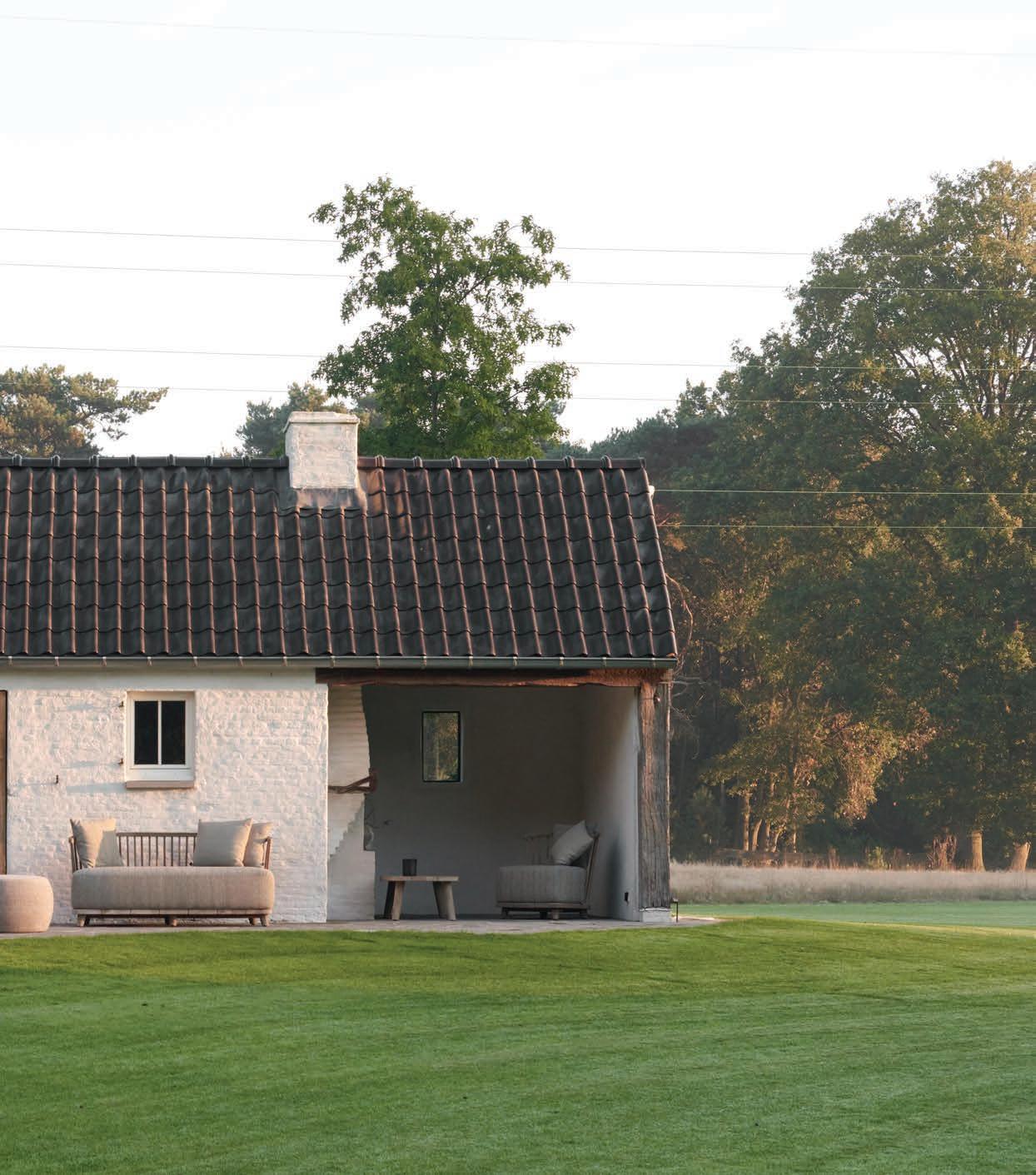
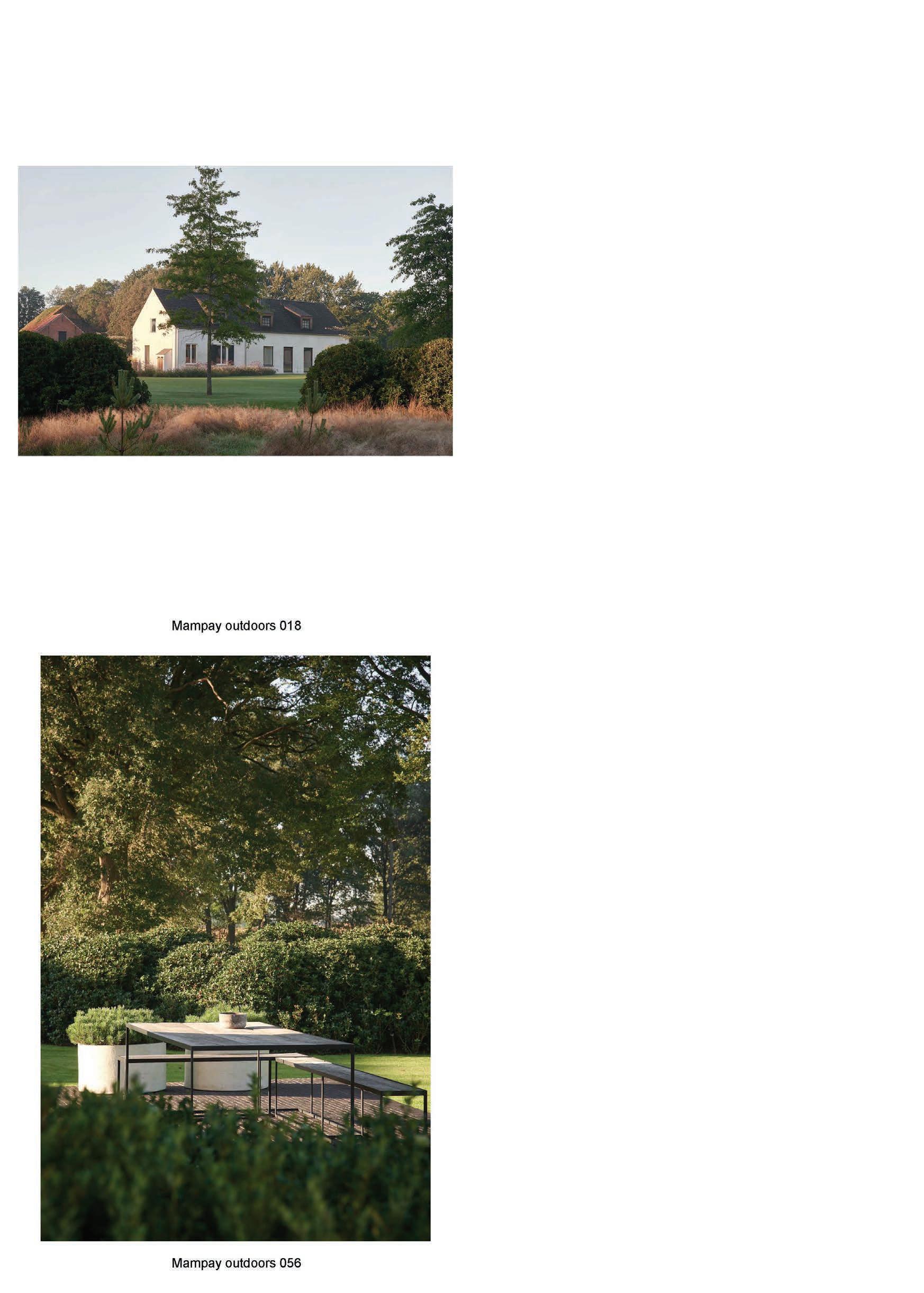
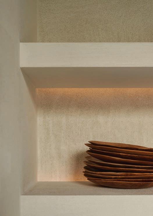
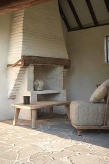
Simple and robust, this humble residence sits amid a subtly tailored landscape. Driven by a passion for simplicity, Mampay cleared out an overgrown and formless wood to fashion an idyllic space comprising a broad lawn embellished with artfully situated trees, bushes and other plantings. A meandering drive leads across the property to the house, which is set 500 feet from the road.
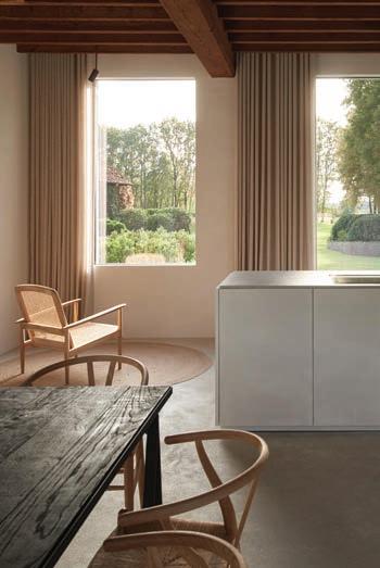
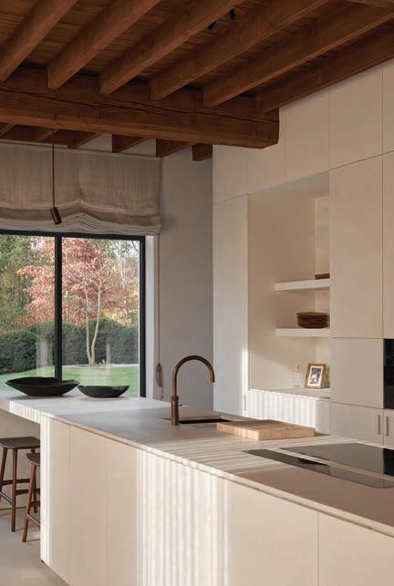
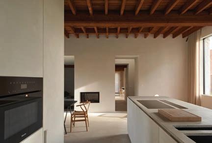
Despite its age, the simple lines of the house give it a contemporary profile. Working with interior designer Steven Gielen, Mampay gutted the structure to create rooms that strike a crisp, very of-themoment character, one warmed by the exposed wood beams of the original ceiling. Orienting rooms to the immediate environment and the vistas beyond was central to the program. While retaining the original window placement, Mampay enlarged some of the openings to better appreciate the landscape. He notes, “Every view through the windows looks like a painting.”
In addition to creating a kind of transparency – a seamless quality between indoors and outdoors – the windows allow natural light to permeate the home, shaping and sculpting the neutrally hued walls and floors. As it bounces through the space, it adds depth and definition to these monochrome rooms. Slashes of light and swaths of shadow engender a shifting sense of volume. Unadorned walls assume a fresh visual interest. Sunshine pours across the floors, like newly laid pathways.
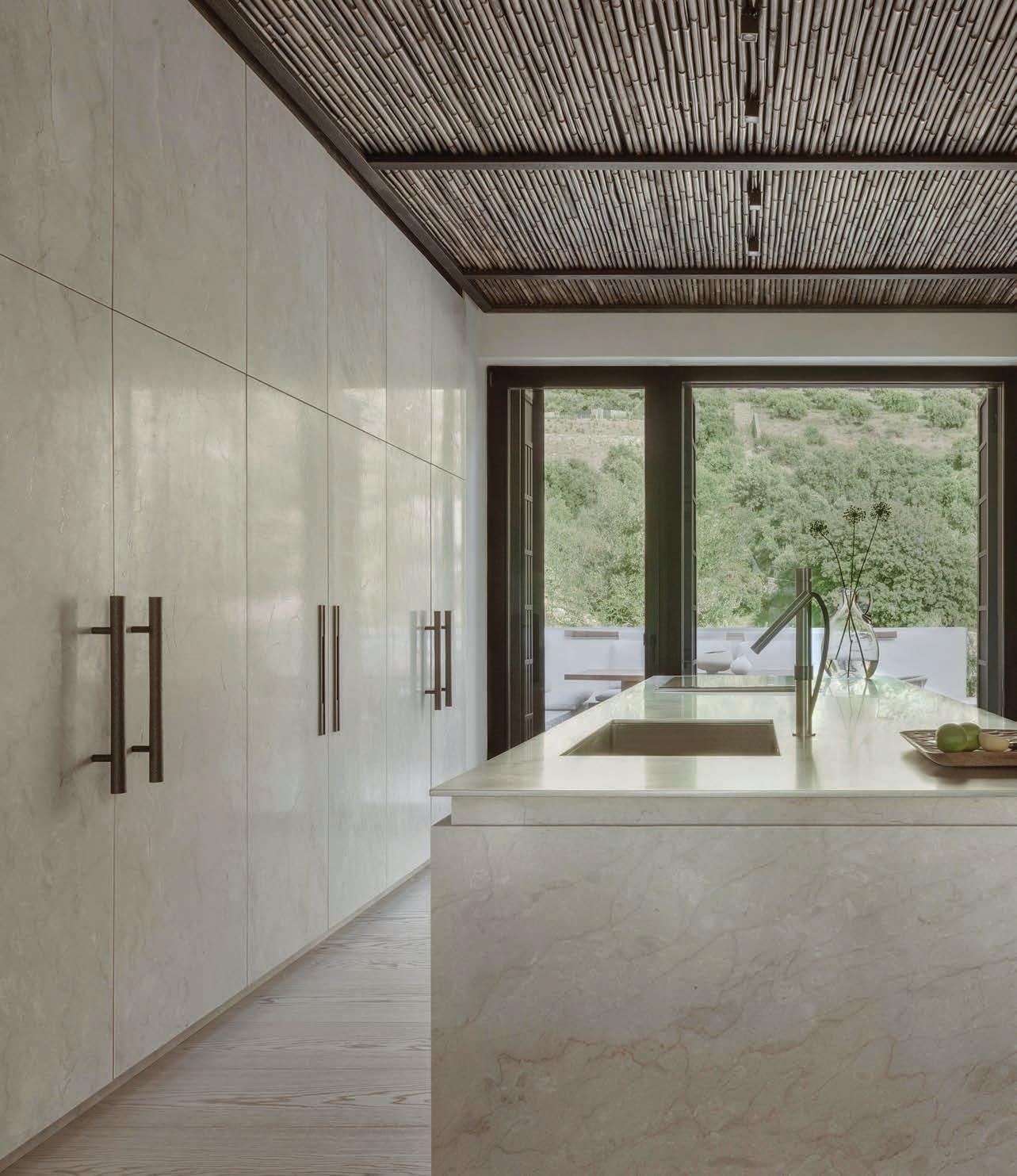
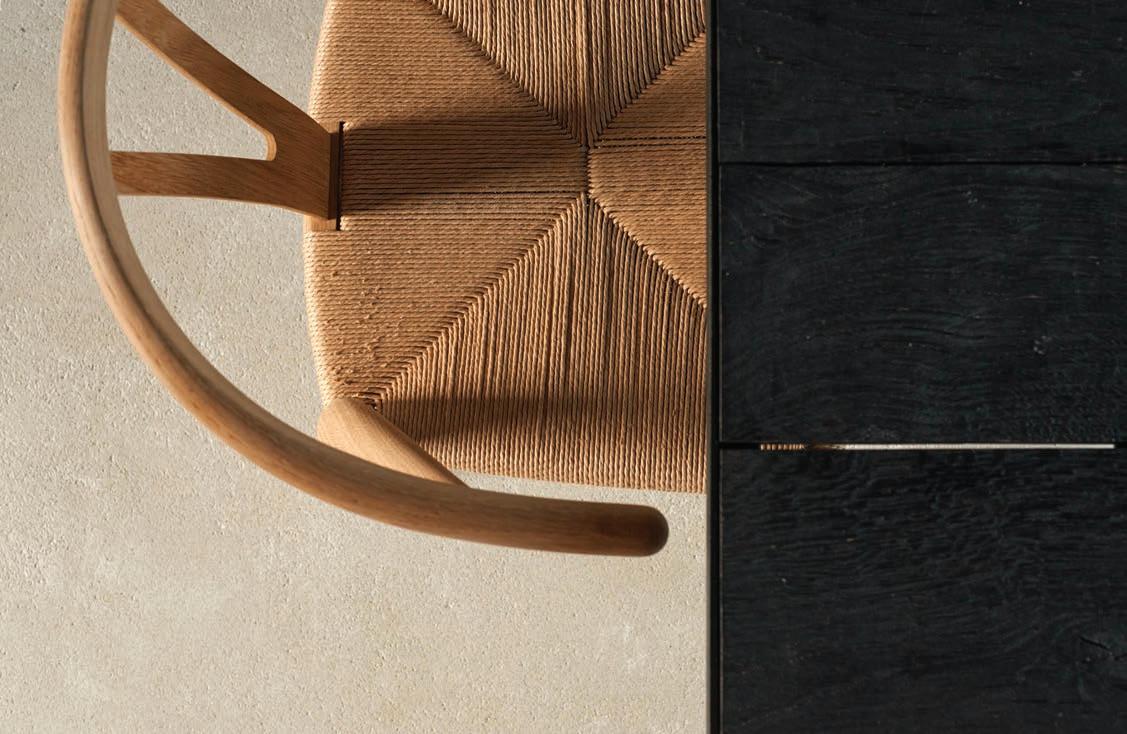
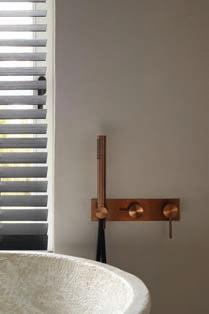
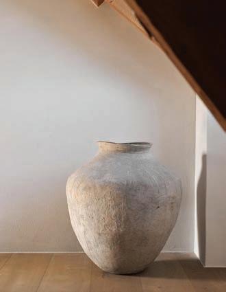
In such clearly minimal interiors, every object – an amphoralike vessel on the floor, a vase of flowers – assumes a spacedefining presence. Even the highly arched spigot in the kitchen sink seems to occupy its spot significantly. There is a certain precision to these spaces, a soberly functional aspect. But above all, an enveloping sense of calm, of refuge and yes, of shelter.
60 AUTUMN 2023
MUSE

Fernando Laposse has made a name for himself by questioning ethics. In particular, the artist has focused his lens on the ethics of agriculture and production and the waste products in which they result. For the “Ghosts of Our Towns” exhibition at Friedman Benda gallery in New York, Laposse’s first exhibit on his own, he dove deep into three particular materials – corn, agave and avocado – to express not just their creative and functional potential, but the need for attention to their complete lifecycle as well.
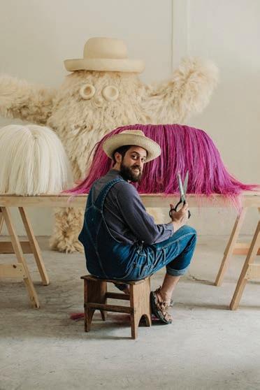
Laposse’s guiding mantra is “to get to the root, one must go to the soil.” And he has quite literally done just that, choosing to be involved in the life and times of the crops that find their way into his creations – from their planting and harvesting through to designing specifically with them in mind and fabricating the actual products. Revered for his design of products that exude personality, one could say these objects also have soul, as Laposse’s focus is not simply on utilizing often unexpected materials but on the livelihood of those who work the land where they are grown and live in proximity as well. According to the artist, “efforts to regenerate the land go hand in hand with efforts to regenerate community.” And he is an artist who walks the walk. In 2015, Laposse built on a lifelong relationship with the town and people of Tonahuixtla, a small village in the Mixtec region of Puebla, and founded a collaborative project and workshop. It was a joining together of both spirit and action that served to counter the erosion of the land and its surrounding community by finding real solutions, including material innovation and new craft techniques, some of which can be experienced in “Ghosts of Our Towns.”
Laposse hopes an understanding of the farmed materials, their wide-reaching potential and their harvesting and production processes will expand awareness of necessary change, and that his creative work will instigate a sensory and conscionable reaction, leading to a societal shift in practices and the promotion of renewal where it is needed.
JENNIFER QUAIL
“Ghosts of Our Towns” is on show at Friedman Benda through October 14. friedmanbenda.com
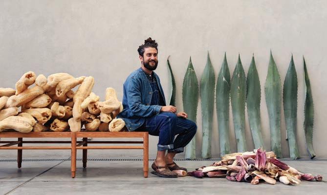
62 AUTUMN 2023
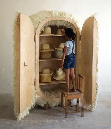
Agave Cabinet
Artist Fernando Laposse explores agriculture and waste in his first solo exhibition.
Pepe Molino
“MY WORK CONCENTRATES ON USING PLANT FIBERS, BECAUSE I LIKE THE CHALLENGE OF ADDING VALUE TO SOMETHING THAT IS EASILY OVERLOOKED OR EVEN CONSIDERED WASTE … THESE ARE RENEWABLE RESOURCES THAT CAN INCREASE BIODIVERSITY WHEN MANAGED CORRECTLY. ”
The Dogs shaggy benches

Discover the exclusive benefits of partnering with us at Arhaus.com/Business. EMBRACE INSPIRATION
MUSE
To take on the responsibility of being an artist, one must possess the desire to inspire, to create a sensation of exploration and to challenge people to see in a way they hadn’t previously. Norms must be shattered, and beliefs, whether acknowledged or buried, must be questioned. For SIMONE BREWSTER, her role was born out of a realization of absence – a lack of diversity and representation of people of color, particularly women, in the design world. It is a calling to force people to think, to explore ideas of gender and race and to fill the void she witnessed with pieces that would challenge viewers to contemplate the roles objects play in telling us who they are, who we are and how we view and acknowledge diversity in our everyday environments.
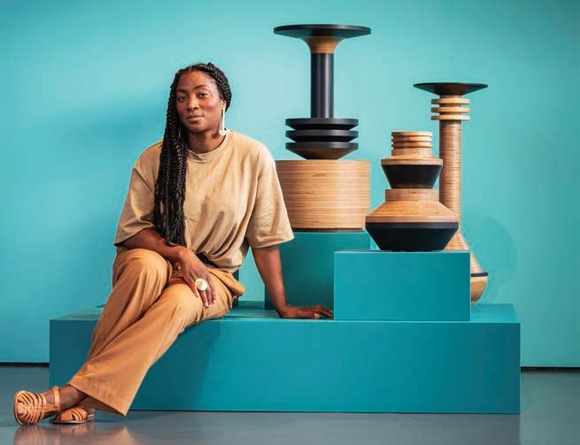
Brewster speaks of “intimate architecture,” the idea of applying core architectural principles to objects, the smaller, more intimate scale amplifying the emotional response that material and texture can provoke. For her show “The Shape of Things” at NOW Gallery in London, the artist endeavored not just to engage with the viewer but also to inspire them to engage with themselves –the part “that wants to create and ask questions and find solutions, to play and to have fun.” The exhibition included her own favorite piece, which is also one of the most challenging and earliest works of her career: The Negress. The object presents itself as a simple black chaise, but with closer examination, the parts of a deconstructed female form – breasts, legs, head – are discovered to be the supporting elements, each trapped beneath the seat in a position of service. The juxtaposition of beauty and confrontation leaves viewers with more questions than immediate answers, which is precisely as Brewster intended. JENNIFER QUAIL nowgallery.co.uk simonebrewster.co.uk

64 AUTUMN 2023
Charles Emerson NOW Gallery
“
THE ROLE OF THE ARTIST IS TO SHAKE PEOPLE . . . WHEREAS THE ROLE OF THE DESIGNER IS TO SOLVE PROBLEMS.”
Mammy table and The Negress chaise longue
Giraffe
“
I OFTEN GET ASKED ABOUT CREATING ACROSS DISCIPLINES AND HOW THAT INFORMS MY WORK . . . WHAT’S MORE IMPORTANT IS THE ACT OF EXPLORATION AND THE QUESTIONING THAT TAKES PLACE. ”
Tropical Noire
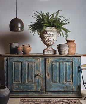
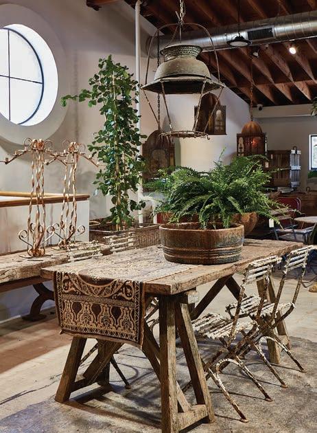
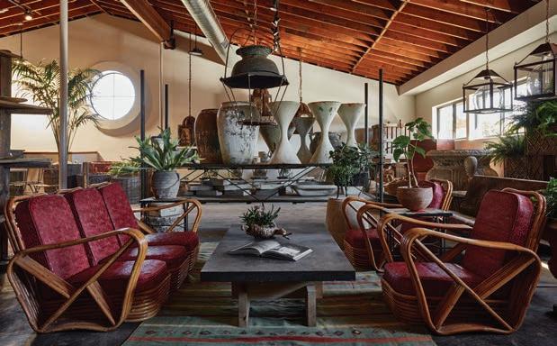
Step inside the lush and very real dreamland that is Inner Gardens, a Culver City, California, showroom that places Mother Nature center stage and surrounds her with treasures from far and wide and long ago. This oasis of abundant flora and patinaed furnishings and objects can easily inspire a trance-like state and conjure gossamer imaginings of Adam and Eve peeking coyly through foliage or lounging on a pair of antique garden chaises.
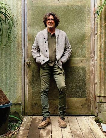
The sumptuous creation of STEPHEN BLOCK, INNER GARDENS speaks to his two great passions – plants and flowers first, followed quickly by antiques – and weaves them together in harmonious artistic expression. “Perfection doesn’t appeal to me,” Block explains. “I need to see and experience the age. My design aesthetic, whether dealing with plants, flowers or antiques, aligns with wabi-sabi: embracing the unconventional, asymmetrical and far from flawless. I find beauty in the imperfections.”
While ancient originals hold a place in his heart, Block also believes in the power and presence of repetition in gardens. That need to incorporate multiple planters of the same design into landscape projects led to his creation of the Inner Gardens Collection, a line of reproductions of some of his favorite antique finds that hold their own alongside the sometimes ancient pieces that inspired them. The thrill of the hunt for timeless treasures often finds Block overseas, with the siren call of France, Italy and Spain luring him back again and again. The garden designer and curator of the beautifully imperfect notes the experience allows him “to connect with history through the objects I cherish, deepening my understanding of the world.” And for those who make their own pilgrimage to his lush and ever-changing garden sanctuary, visitors whose excitement and curiosity bring the showroom to life, Block has one desire: “My hope is they can sense the same."
 JENNIFER
QUAIL innergardens.com
ASPIREDESIGNANDHOME.COM 65
“
MUSE
I CURATE OBJECTS BASED ON LOVE AND INSTINCT. OFTENTIMES, IT’S AS IF THEY CHOOSE ME.”
Stephen Block
66 AUTUMN 2023
LIMESTONEAGE
RUSTIC MEETS REFINED in this
ASPIREDESIGNANDHOME.COM 67
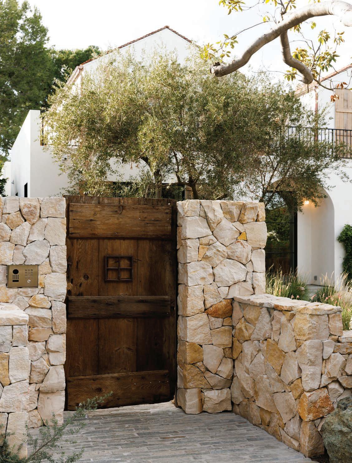
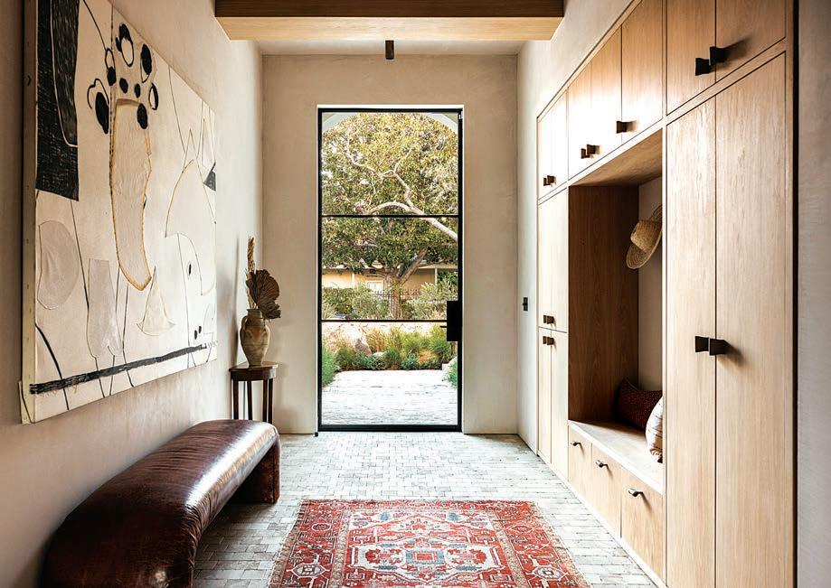
OPPOSITE Bukhara limestone walls and an antique door from 1st Dibs give visitors a glimpse of the sort of old-world materials architect Rob Diaz incorporated into his new A-frame dwelling in Studio City. ABOVE A large artwork by Ali Silverstein hangs over a vintage leather waterfall bench in the front foyer. The demilune console table is by Platform Home.
on a LUSH LOT in a TONY STUDIO CITY ENCLAVE TEXT TATE GUNNERSON PHOTOGRAPHY VIRTUALLY HERE STUDIOS STYLING THE PLATFORM EXPERIMENT
MODERN DWELLING
STUDIO CITY, CALIFORNIA
Architect Rob Diaz has turned heads throughout Southern California with his many upscale residential projects. One of his latest endeavors is a four-bedroom, five-bathroom A-frame home and detached casita in an intimate enclave of Studio City. Separated by an in-ground swimming pool, the stucco-clad structures boast rustic wooden shutters, copper gutters and imported terracotta roof tiles that were reclaimed from an old church in France. He notes, “It has a timeless vibe.”
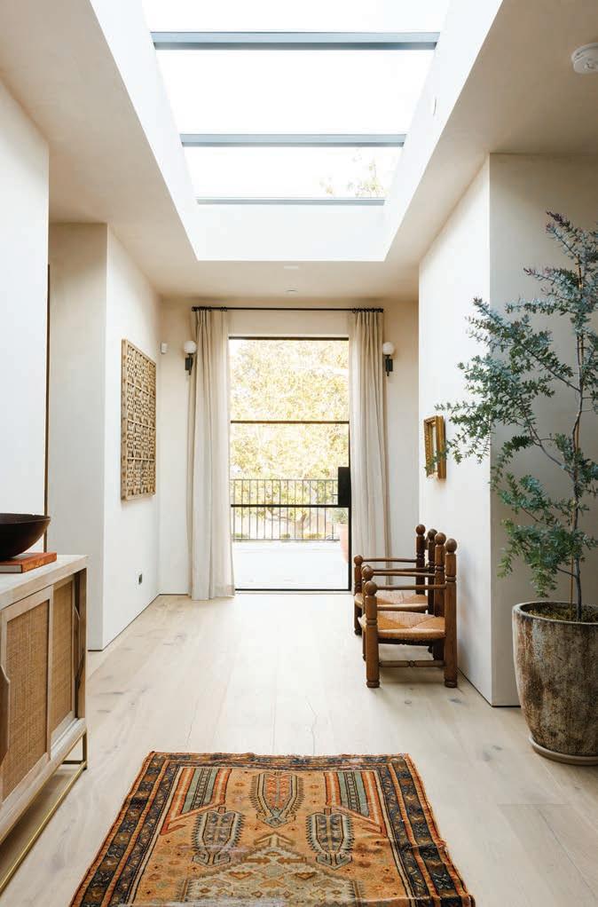
Envisioning a seamless blend of European and California influences, Diaz, in collaboration with Alexander Studio and designer Anastasia Ratia, designed the interior with long, wide oak flooring and hand-troweled clay walls, which are punctuated by black steelframed doors and windows that imbue the space with natural light.
As Diaz explains, "We leaned into the European influence; there were moments we wanted to highlight." Indeed, the central hallway boasts a limestone sanded cobblestone floor and, in the front entry, quartersawn, white oak built-in cabinetry. In a deliberate act of restraint, the walls are tinted with a neutral hue, moldings have been minimized and there is no baseboard. “It didn’t need anything else.”
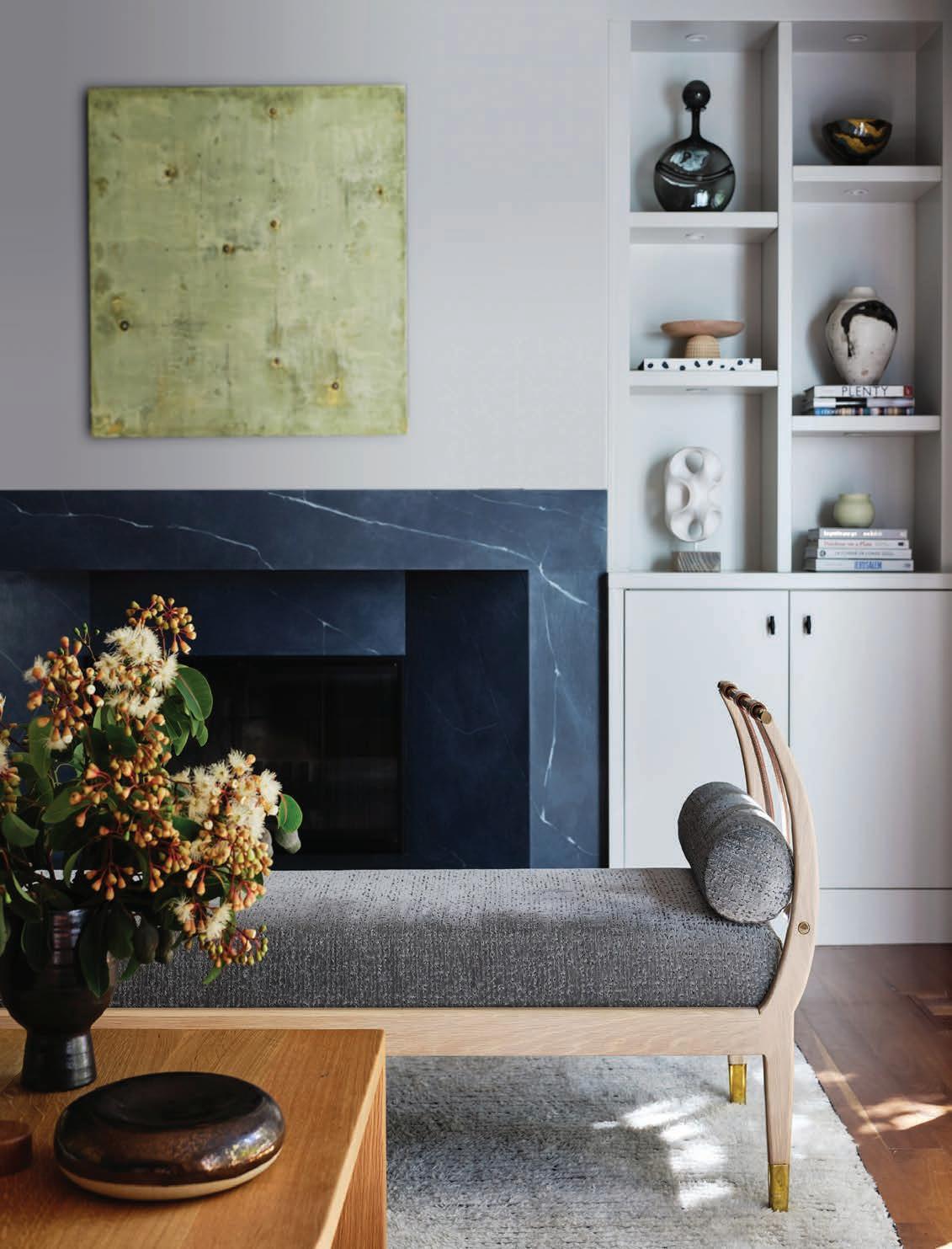
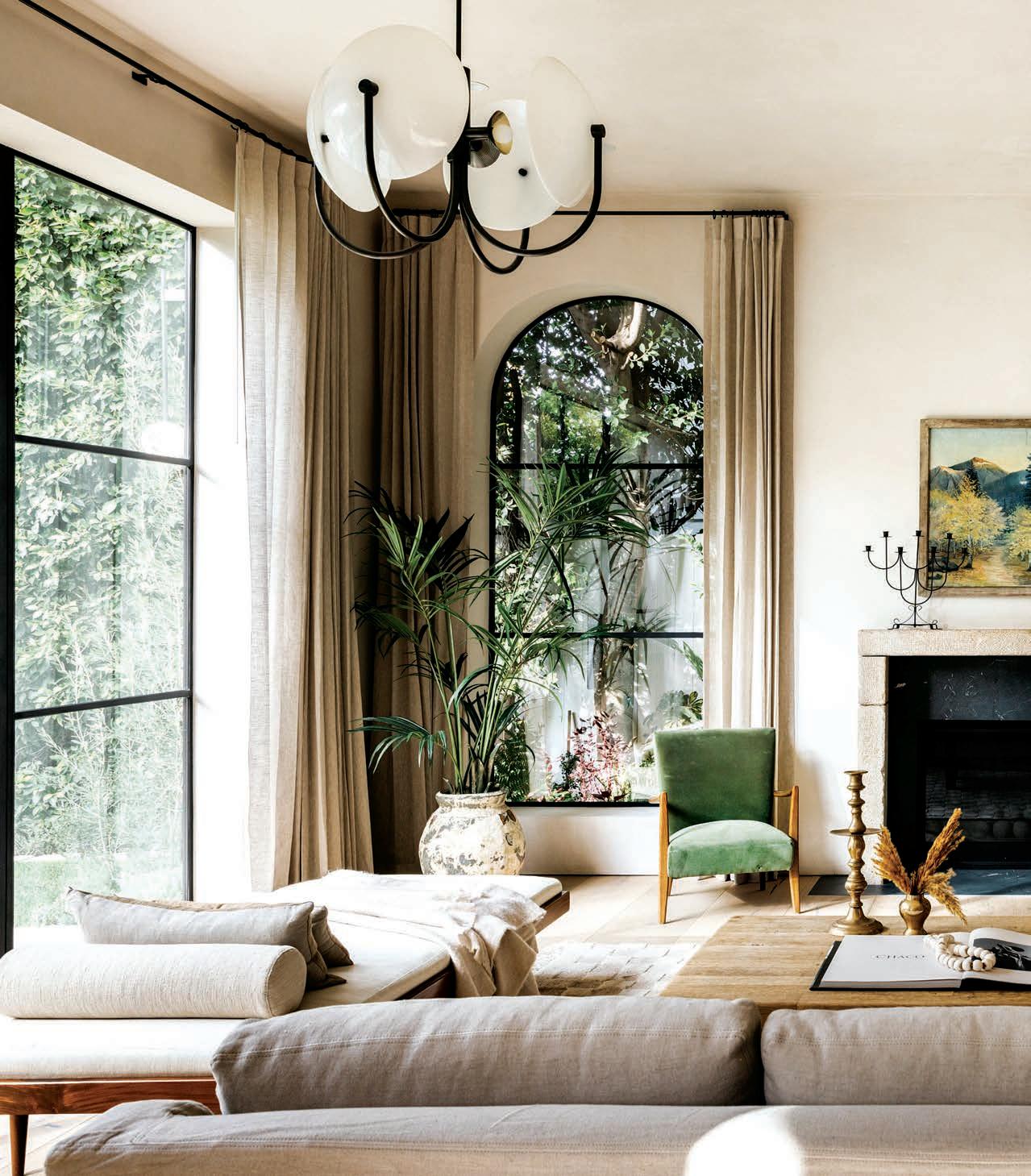
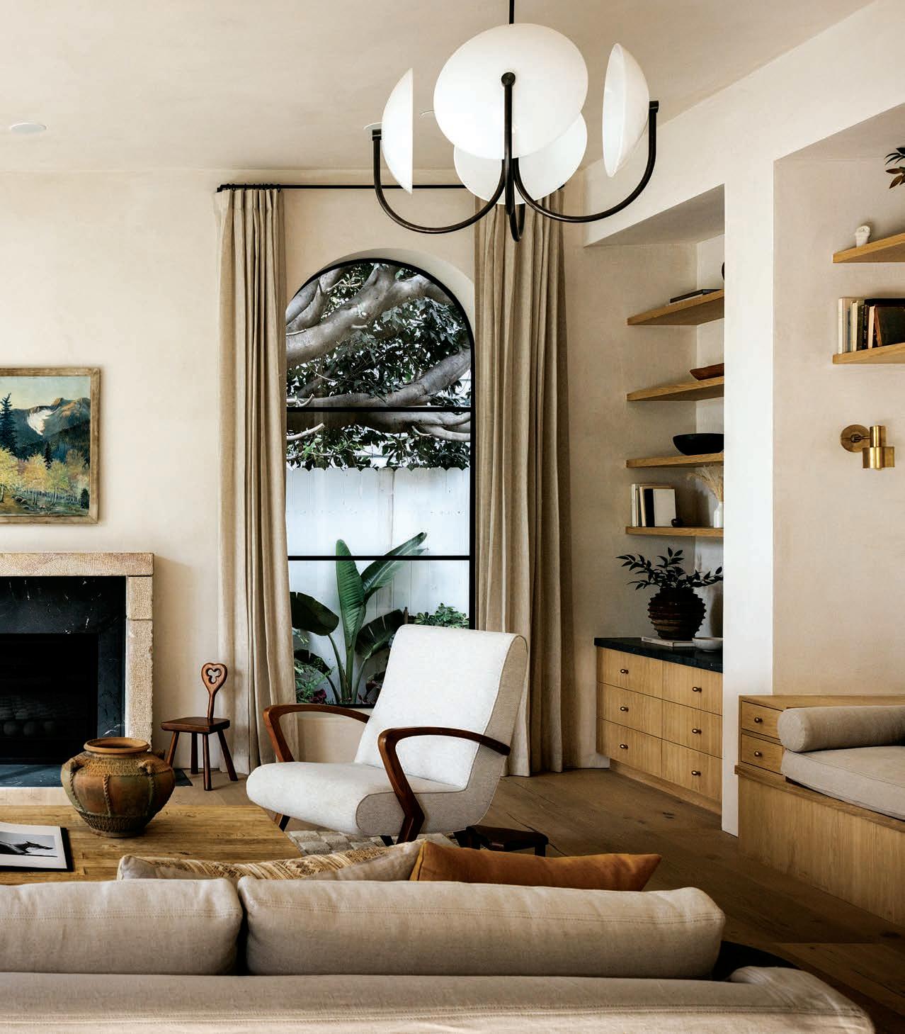
In the living room, a plush sofa defines a sophisticate d conversation area in front of a fireplace with a natural bluestone surround and a solid limestone mantel from France. Along one wall, a pair of architectural niches house built-in oak cabinetry and a daybed illuminated by a pair of small brass wall sconces. “I enjoy spending time in more intimate spaces like this,” Diaz admits. “It’s a great spot to read a magazine.”
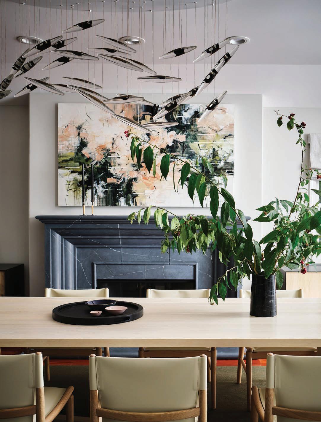
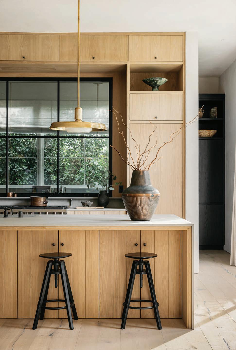
A pair of iron chandeliers with glass shades play off the tall, arched windows on either side of the fireplace. Brass pendants, meanwhile, cast warm pools of light onto the sandstone countertop in the open kitchen, where a steel-paned window behind the range allows the cook in the adjacent service kitchen to be part of the action. And in lieu of a traditional chandelier, a 15-foot, wall-mounted brass-andcrystal fixture illuminates the table and chairs in the open dining area. “I love the unexpected,” he shares. “We put a lot of energy into the lighting schedule.”
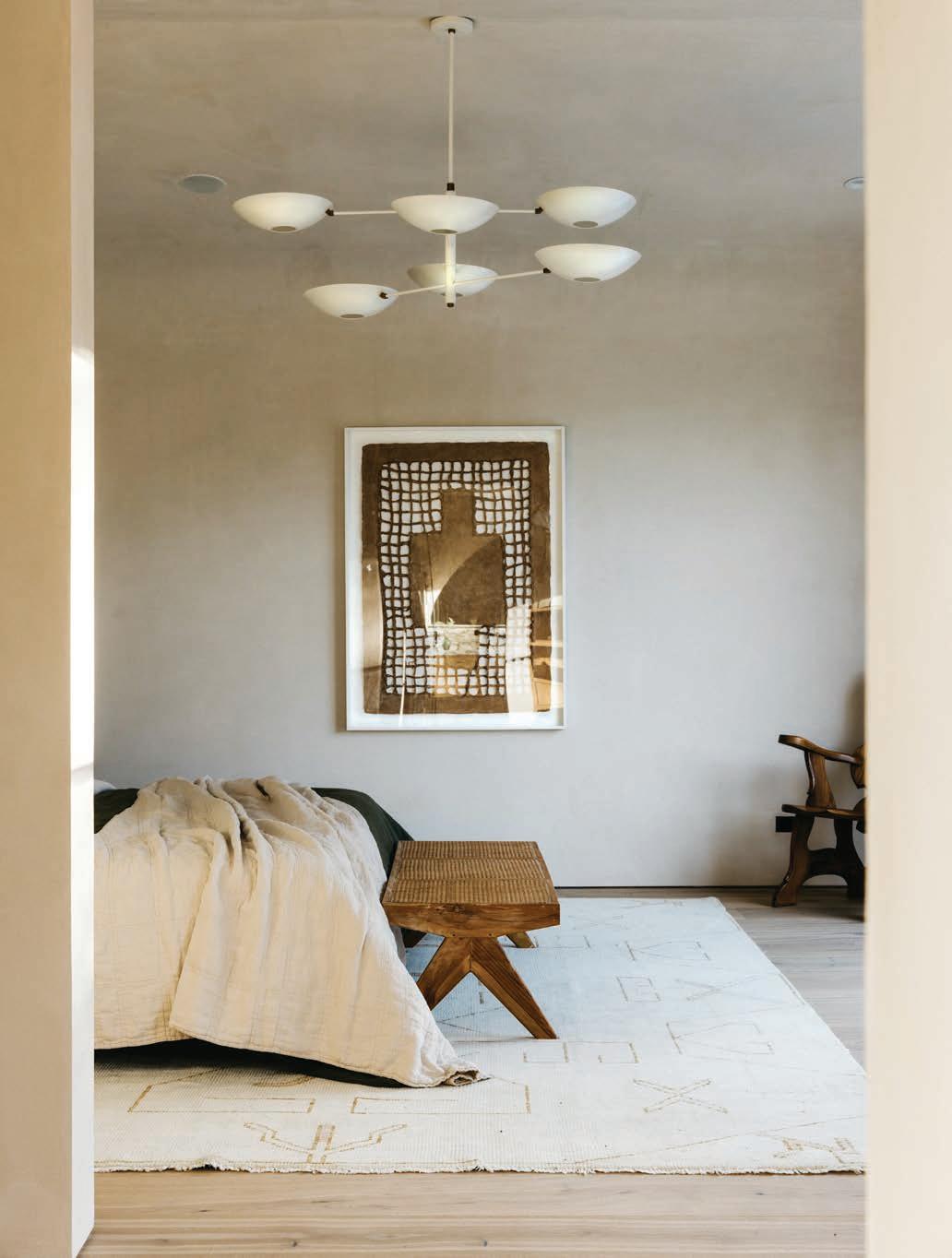
Decidedly, a modern, six-arm pendant in white reflects off the plaster ceiling in the second-floor primary bedroom suite, which opens to a spacious patio overlooking the front yard. The palette flows into the en suite bathroom, where veiny white marble accents the oak floor and hand-crafted wooden vanity. In addition to a luxurious, marble-clad standalone shower with ample space for two, a soaking tub offers a relaxing spot to take in the neighborhood views.
After expending so much time, energy and money on the twoand-a-half-year project, Diaz spent some time alone there, sipping a cup of tea and puffing on a cigar while he enjoyed the fruits of his labor. Eager to share the project, he later hosted a catered open house for approximately 1,500 people, serving lobster tail and champagne as they raved about the home he created. “That’s my payday – a moment to feel gratitude and ask myself what worked and what didn’t work,” he avers. “To have it be so well received felt really good. There’s nothing I would change about this place.”
68 AUTUMN 2023
ASPIREDESIGNANDHOME.COM 69
Brass pendants from Roman and Williams Guild illuminate the sandstone island countertop in the handsomely outfitted kitchen. The black counter stools are from IKEA.
70 AUTUMN 2023
A pair of chandeliers from Allied Maker play off the arched windows in the living room, where a sofa from HD Buttercup anchors a comfortable grouping in front of the limestone fireplace.
ASPIREDESIGNANDHOME.COM 71
72 AUTUMN 2023
A rug with a cream and nude pattern from Lulu and Georgia and bedding from Evenfall Home play off the neutral walls in the primary bedroom. The furnishings are by The Platform Experiment.
ASPIREDESIGNANDHOME.COM 73
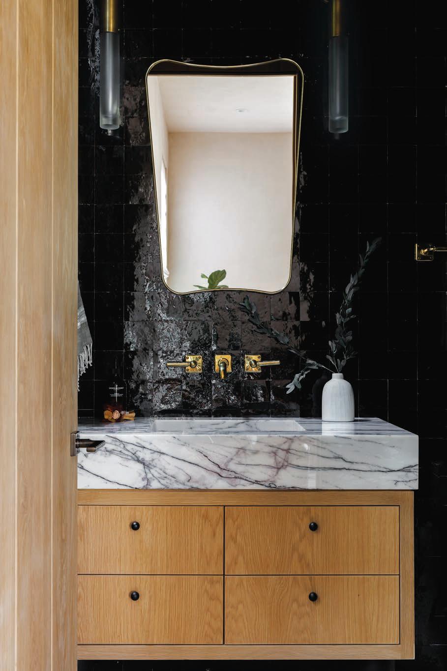
Dark Zellige tile from clé establishes a moody milieu in the first-floor office bathroom. The lights are from Apparatus Studio.
74 AUTUMN 2023
The
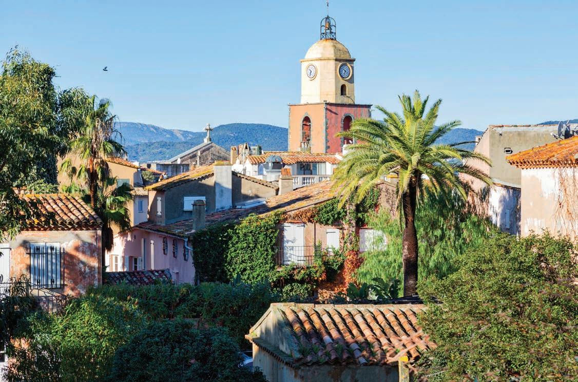
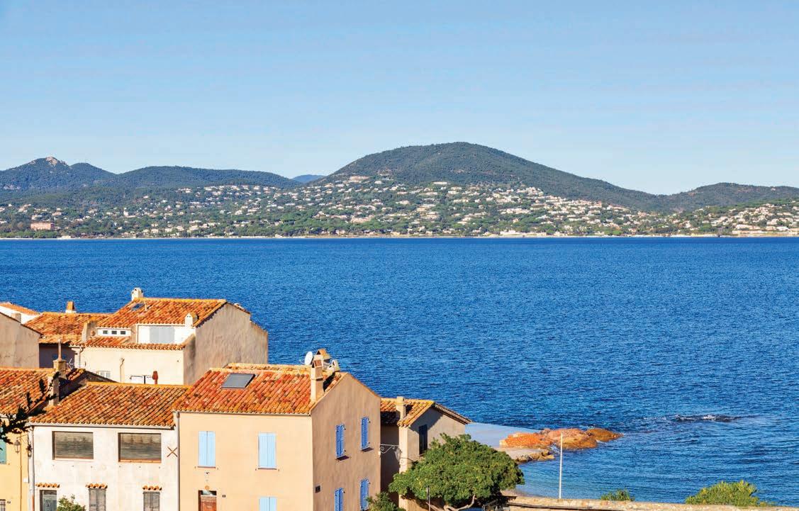
SAINT-TROPEZ, FRANCE
No sibling rivalry here.
TEXT THOMAS CONNORS PHOTOGRAPHY FABIO LOMBRICI INTERIOR DESIGN MARIO PAOLO STURLESE AND LUCA DEMATHEIS ARCHITECTURE FEDERICA FOSSA
Francesca Fossa
SISTERACT
Federica Fossa
When it comes to color, plenty of people talk a good game. But chances are, few kick neutrals to the curb quite like Francesca and Federica Fossa. Several years ago, Federica bought a vacation home and asked her architect sister to help her reenvision it. The two had worked together previously, so collaborating was a piece of cake. And the results of their teamwork are downright delectable.
Not far from the waterfront and the Place des Lices – site of the lively, twice-weekly open-air market – Federica’s home spreads over two floors in an old house typical of this corner of France. When she found the place, it was divided into an apartment above with two separate studio spaces on the ground floor. Today, the lower level comprises an entrance hall and two bedrooms, each with a bath. A newly installed circular staircase links these with the living room, kitchen and a third bedroom upstairs.
In refreshing the property, the sisters were determined to respect its inherent charm, retaining the masonry, plaster, windows and other details that give the place its robust character. “Wanting to maintain the spirit of the house, I called on interior designers Mario Paolo Sturlese and Luca Dematheis, who did all the painted surfaces, as well as the mirrored
furniture in the entrance and the resins in the bathrooms,” explains Francesca. “They have a very particular sensibility for this type of work, and they managed to reveal the soul of the house.”
Shopping together, Francesca and Federica furnished the home with finds from French and Italian flea markets and frequented small galleries and design shops for art and accessories. A sideboard came from a Genoese junkyard. Two colorful, 18th-century panels depicting berries and birds – purchased at a market in Liguria – once adorned a Tuscan country house. The brass coffee table, on which Federica displays Italian ceramics of the 1950s, came from the Ritz in Paris. The art in the home ranges from drawings their mother made when she was 15 to work by the 20th-century artist Albino Galvano and a relief in white stucco by the contemporary French artist Philippe Valentin.
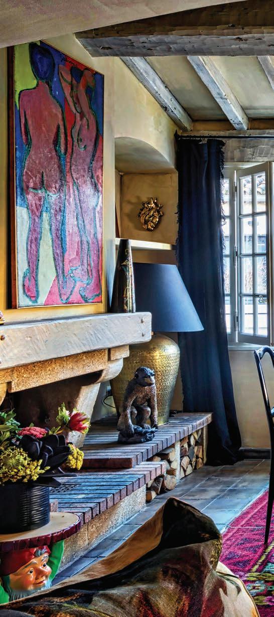
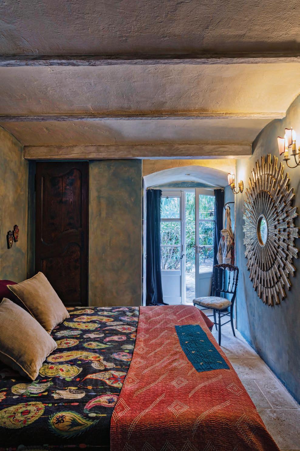
From the rugs to the warmly painted walls, and from the wildly patterned fabric on an easy chair to a paisley bedspread, the home is practically ablaze with color. While far from funky, this residence exudes an all-enveloping bohemian vibe. Insouciant and good-natured, like that amusing friend who lacks a filter but never goes too far, it is a welcoming place infused with an energy that makes one smile.
ASPIREDESIGNANDHOME.COM 75
Fossa sisters join forces as well as studio spaces – creating a singular experience.
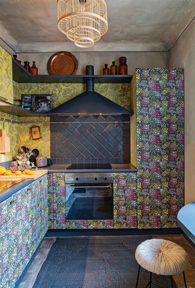
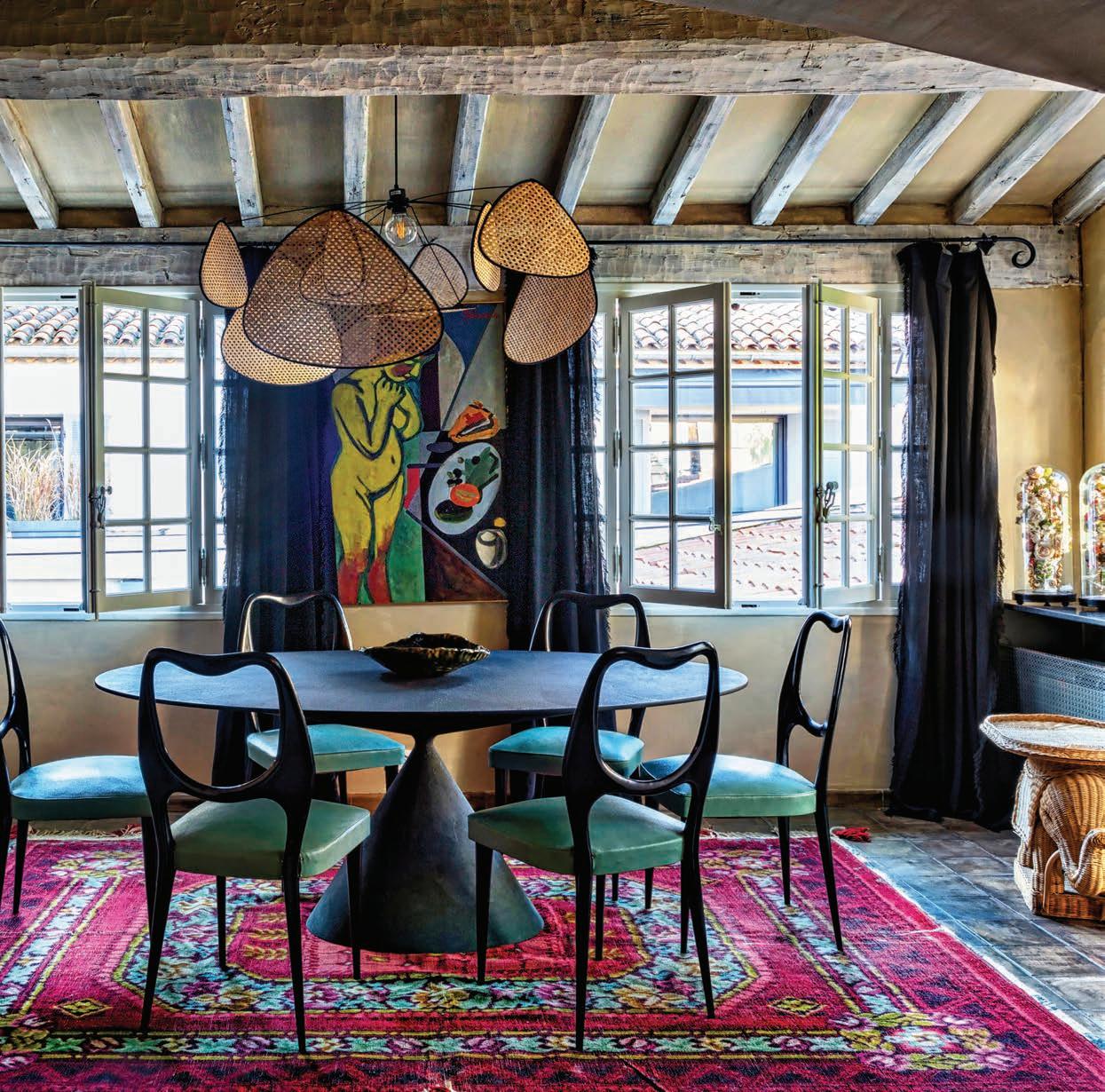
LEFT The kitchen, daringly outfitted in two wallpapers from Designers Guild – Katagami Moss and Casablanca Berry. BELOW LEFT A vibrant tableau in an old cupboard. BELOW In the visually dynamic dining room, the award-winning Desalto Clay table and vintage chairs from the 1950s.
76 AUTUMN 2023
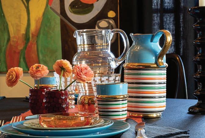
The Bloomsbury-meets-the-Riveria dining room vibrates with its bright Persian carpet, vintage chairs covered in green upholstery and electric-hued Galvano paintings. The kitchen is practically psychedelic, thanks to the extravagantly applied Casablanca wallpaper from Designers Guild. Even Federica’s housewares – dishes, plates, platters and candlesticks – are playfully vivid.
ASPIREDESIGNANDHOME.COM 77

78 AUTUMN 2023
While far from funky, this residence exudes an allenveloping bohemian vibe. Insouciant and good-natured, like that amusing friend who lacks a filter but never goes too far, it is a welcoming place infused with an energy that makes one smile.
ASPIREDESIGNANDHOME.COM 79
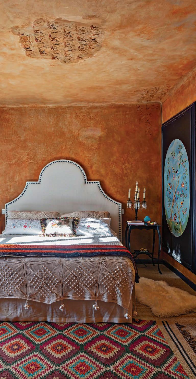
FAR LEFT This guest bedroom is outfitted with Boho Chic, a linen from James Malone Fabrics of Málaga, Spain. LEFT Blue, 18th-century oval panels make for an eye-popping contrast to the ochre walls and ceiling of the primary bedroom.
80 AUTUMN 2023
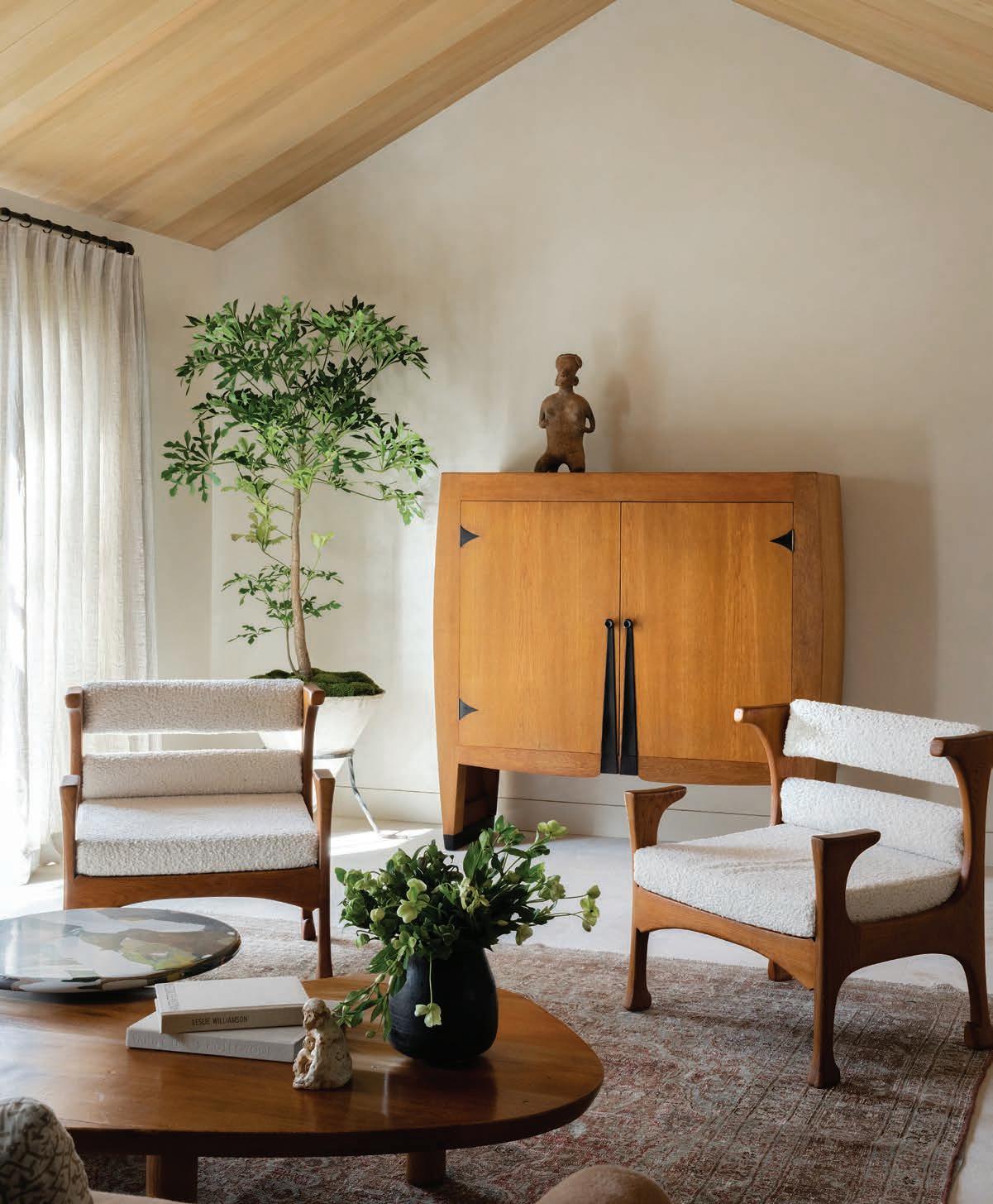
LIVING ROOM A pair of French armchairs c.1960s make way to a Piet Kramer Art Deco cabinet of the 1920s.
“Overall, the goal was to keep the interiors simple but richly layered to create a peaceful environment for our client,” describes Lisa Berman, principal and founder of Studio Gutow.
ASPIREDESIGNANDHOME.COM 81
Down the coast This Newport Beach, California, home manifests an impressive assurance TEXT THOMAS CONNORS PHOTOGRAPHY HUGO LANDA GARCIA
82 AUTUMN 2023
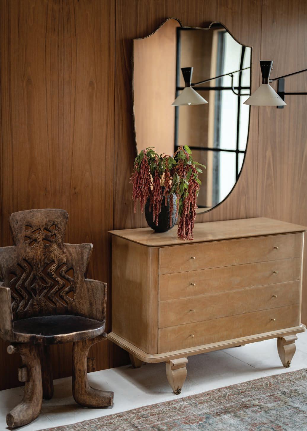
ENTRYWAY In the entry, a 1950s French commode, vintage mirror and Finnish chair sourced from Ponce Berga create a welcoming vignette.
Simplicity isn’t always subtle. And a space meant to be pleasingly plain can turn out to be an exercise in sensory deprivation. Less can be more, but the line between more and less is easy to trip over. Yet in the right hands, a happy medium is a pleasure to behold.
A project of the California-based firm Studio Gutow, this Newport Beach home manifests an impressive assurance, a sureness of design spun of keen eyes, a command of space and a sophisticated sensibility. The work of Lisa Berman, principal and founder, and Melissa Rohani, director and partner, the coastal home could have looked much different. “When we first met,” shares Berman, “the client showed us images of what I would say was ‘trending’ on Instagram. Very laid-back California eclectic. After much conversation, exploration and actually touching materials, it became apparent that she had a more elevated aesthetic.”
A newer home in an established neighborhood, the house required a little cosmetic care to give it an individual character. Studio Gutow tweaked the floor plan, created a small addition, opened up the ceiling in the main living area and installed custom interior oak doors. A focus on materials was key to establishing a sense of substance and groundedness, underscored by a cohesive color palette of brown, camel, cream and green. While there’s nothing at all rustic about the home, there is an embracing earthiness to it, thanks to the Mexican tumbled limestone in the kitchen, a chocolate travertine fireplace mantel and surround, aged limestone floors in the living room and walls finished in Venetian plaster or walnut.
ASPIREDESIGNANDHOME.COM 83
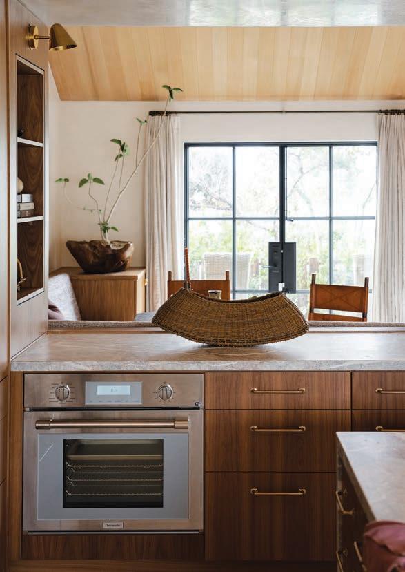
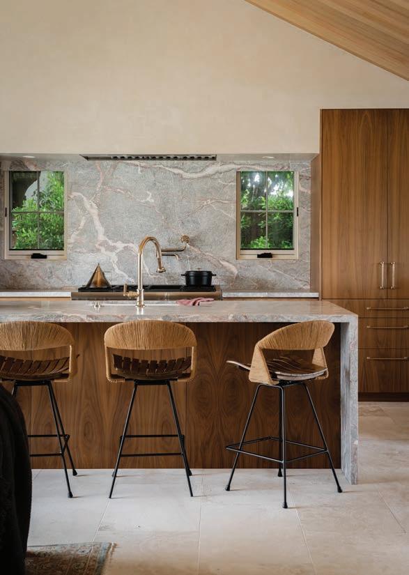
KITCHEN Fior di Pesco marble forms the countertop and backsplash in the kitchen. Vintage Arthur Umanoff barstools belly up to the island.
POWDER ROOM
PRIMARY EN SUITE
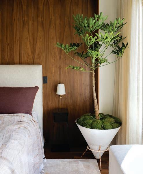
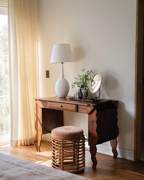
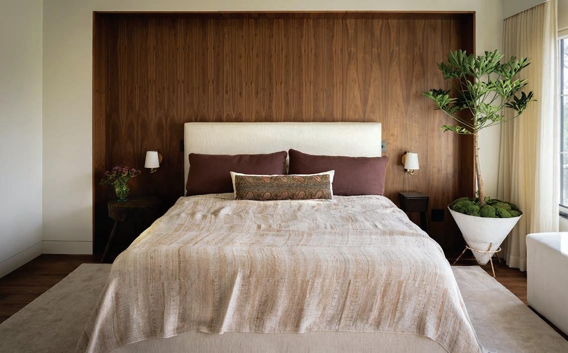
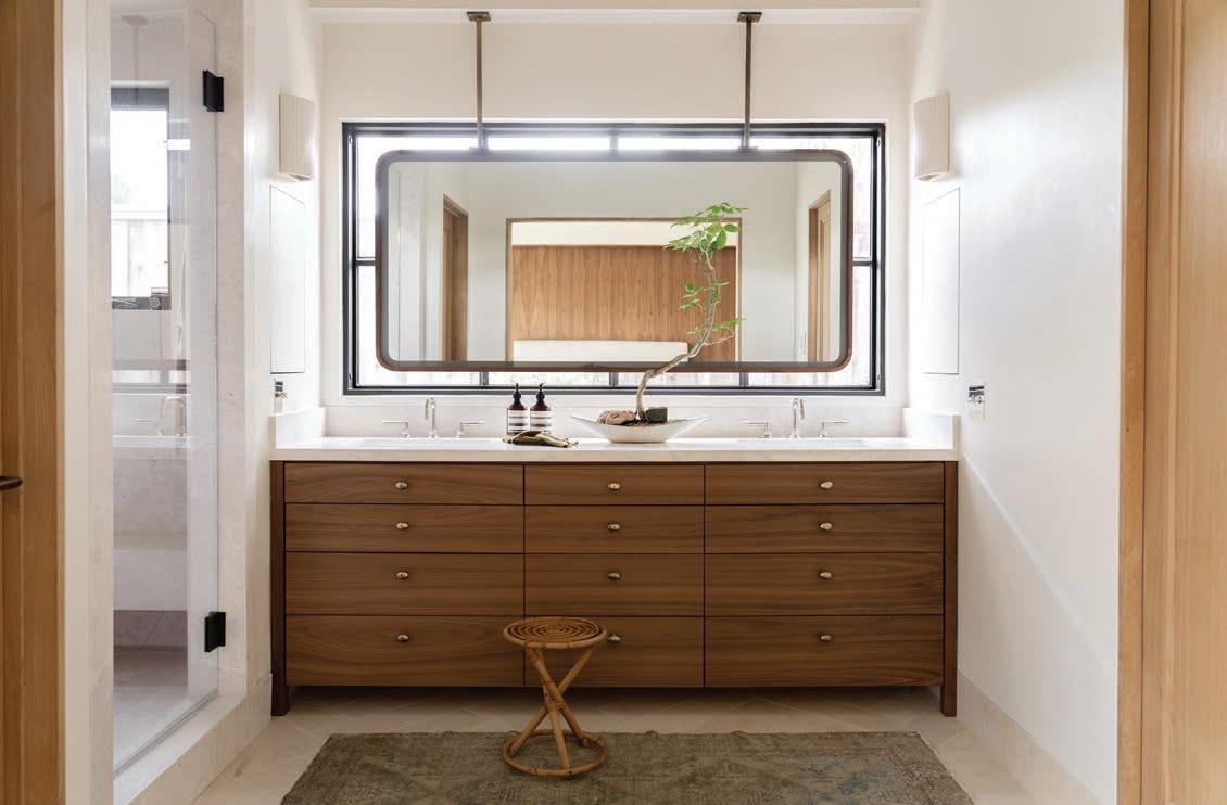
LEFT An old desk from a church now serves as a vanity. OPPOSITE ABOVE A defining walnut-paneled nook orients the bed. The custom headboard is upholstered in a Rose Uniacke fabric. OPPOSITE BELOW In the primary bath, a handsome walnut vanity and an impressive, custom mirror framed in iron.
FAMILY ROOM
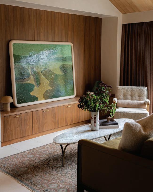
BELOW A casually displayed painting by artist Tyler Hays sets the tone in the family room. Vintage marble cocktail table from Obsolete.
At 3,000 square feet, this is not a tiny house, but the orchestration of color and material and the relaxed disposition of the furnishings generate a marvelous intimacy and a kind of directness that transcends pure functionalism. “We find that people are really over open-plan living and want the security and comfort of smaller spaces,” observes Rohani. “We use vintage pieces mixed with the contemporary to help create this feeling of warmth.”
That sense of warmth stems in large part from wood and its varied hues. Wall paneling and built-ins are crafted in walnut, while furniture pieces range from a vintage Piet Kramer Art Deco cabinet in oak to a four-drawer French commode of the 1950s with sycamore veneer. Although the furniture selections are significant – Arthur Umanoff vintage barstools, Carlo Scarpa dining chairs, a Willy Guhl planter – because they are visually sympathetic and understatedly arrayed, they do not shout out their design bona fides as they might in a home comprised of more gallerylike spaces. The home abounds in custom touches, including a roomy dining banquette and a substantial illuminated mirror in the primary bathroom, framed in iron. Vintage Persian rugs, Fortuny and alpaca pillows on a mohair sofa and cotton velvet and linen headboards in the bedrooms – along with Indian silk woven throw pillows and blankets – add texture. Artwork – a landscape by artist and designer Tyler Hays, Pre-Columbian objects, and black-andwhite photography – bring a worldly depth to these rooms.
84 AUTUMN 2023
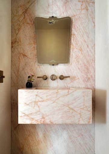
Pink Lady Quartzite integrated slab sink and wall, creamy Venetian plaster walls, walnut floors, vintage French mirror.
ASPIREDESIGNANDHOME.COM 85
86 AUTUMN 2023
MOTHER EARTH
High in the hills of Crete, a contemporary home honors the world around it
 TEXT BY
BY BLOCK722
To imagine a Greek village is to see a collection of bright white buildings huddled against a hillside or cascading to the sea. Up close, these separate into individual dwellings or shops or inns, and walking among them, one truly enters into the spirit of wherever one finds oneself – Naoussa in Paros, perhaps, or Oia in Santorini. And it is natural, while tossing back a metaxa or sipping a glass of Vin Santo in a taverna, to dream of a slow-paced life in the sun. But a town dependent on tourists is only slow-paced for the tourist who has left a major city behind. In Greece, as in most places, serenity often rests, not in the wilderness but somewhat farther afield.
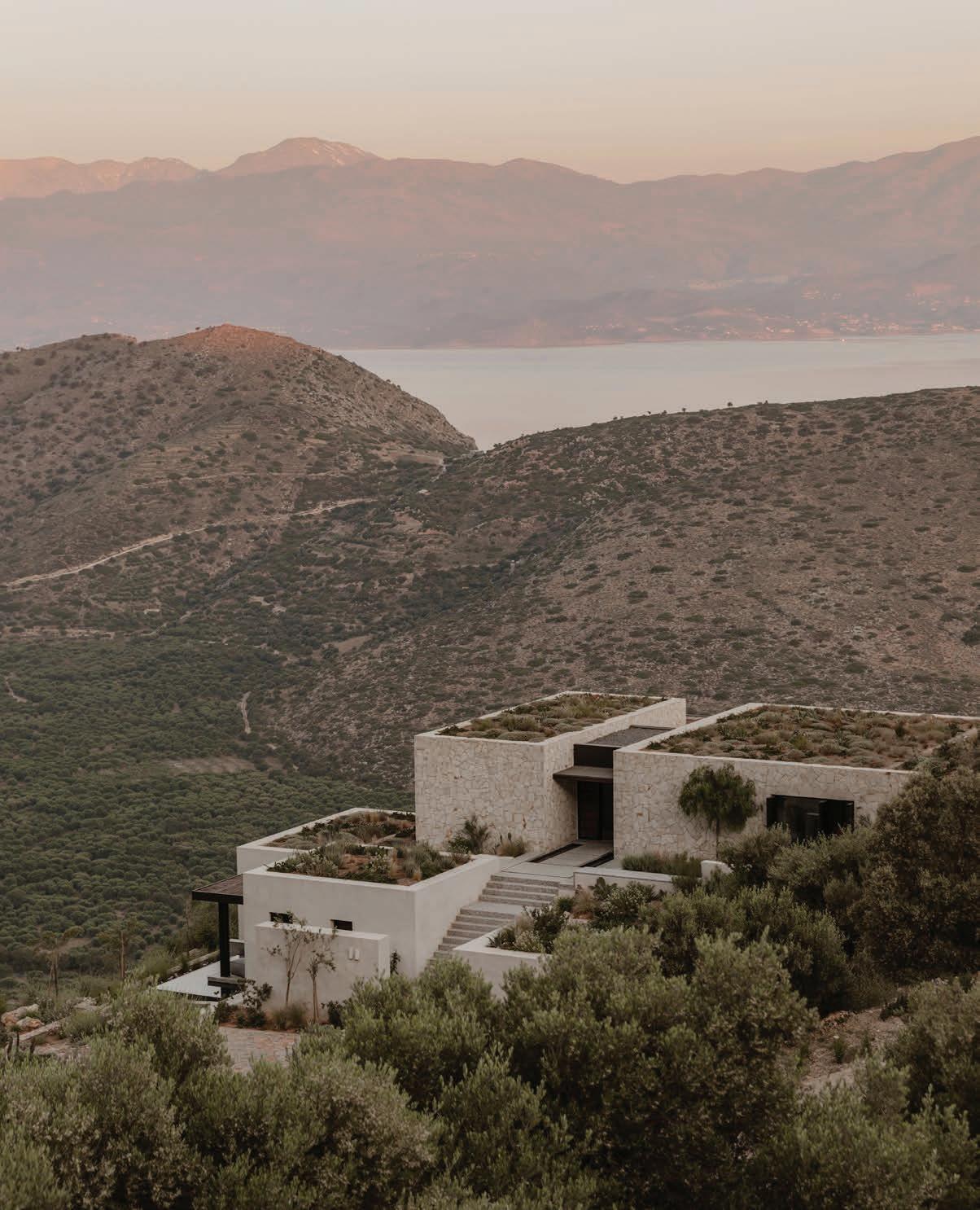
Perched high on a slope with vistas stretching to the sea, this earth-hugging home in the northern foothills of Crete’s Thrypti Mountains seems as elemental as the landscape around it. Designed by the Athens-based architecture firm, Block722, it combines a sophisticated program – home cinema, gym, a billiard room and bar area – with a deep respect for natural materials and craftsmanship. Situated to guarantee that every room offers a view, the property is firmly oriented to the outdoors, outfitted with spacious terraces and a swimming pool.
ASPIREDESIGNANDHOME.COM 87
THOMAS CONNORS PHOTOGRAPHY BY ANA SANTL ARCHITECTURE
O Lofos [The Hill], a unique piece of art combining Scandinavian aesthetics, simplicity, balance and purity with the Mediterranean spirit.

88 AUTUMN 2023
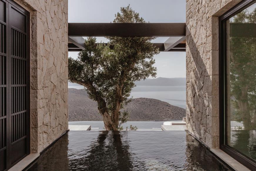
Breaking the structure into a constellation of small volumes, the firm minimized its impact on the landscape while creating a distinct sense of progression through the house. The living and dining area, for example, are arrayed over three levels. The kitchen offers immediate access to an outdoor eating area. The home’s kinship with the environment is evident the minute one steps into the open-air entryway, which is grounded by a water feature and overlooks a mature olive tree. Although it is spun from locally sourced wood and stone, the house doesn’t take its cue from the vernacular, but rather – according to the architects – from a minimalism that draws from Scandinavian and Japanese esthetics.
There is an austerity to the home, but it springs satisfyingly from the texture and hues of the natural materials. “Most of the materials were left in their natural state, in their original discolored colors, giving a relaxed look,” notes Executive Creative Director and co-founder Katja Margaritoglou. “Various woods, either smoked or treated with another natural process, give a darker touch.”
Basic, inasmuch as it defers to the wind and the sun and views that seem to go on forever, this home is wonderfully grounded, not simply because it is so companionably integrated into the landscape, but because of the warm minimalism that pervades its interiors. Although utterly comfortable, these rooms almost urge one to move, to get out, to engage with the world. Amply supportive of all we do when we return inside – dining, conversing, snoozing after a swim – they underscore life as it is lived, and in their singular recessiveness, telegraph the true power of architecture. And for all the sophistication of its design, this home captures, in its way, the sensibility of that great son of Crete, writer Nikos Kazantzakis, who understood, deeply, “how simple and frugal a thing is happiness: a glass of wine, a roast chestnut, a wretched little brazier, the sound of the sea. Nothing else.”

ASPIREDESIGNANDHOME.COM 89

90 AUTUMN 2023

ASPIREDESIGNANDHOME.COM 91

92 AUTUMN 2023

ASPIREDESIGNANDHOME.COM 93

94 AUTUMN 2023


ASPIREDESIGNANDHOME.COM 95
A COMPENDIUM OF SAVORY PROPORTIONS

96 AUTUMN 2023
TEXT THOMAS CONNORS PHOTOGRAPHY SPACE CONTENT INTERIOR ARCHITECT ROELFIEN VOS AMSTERDAM,THE NETHERLANDS
DUTCHTRE AT

ASPIREDESIGNANDHOME.COM 97
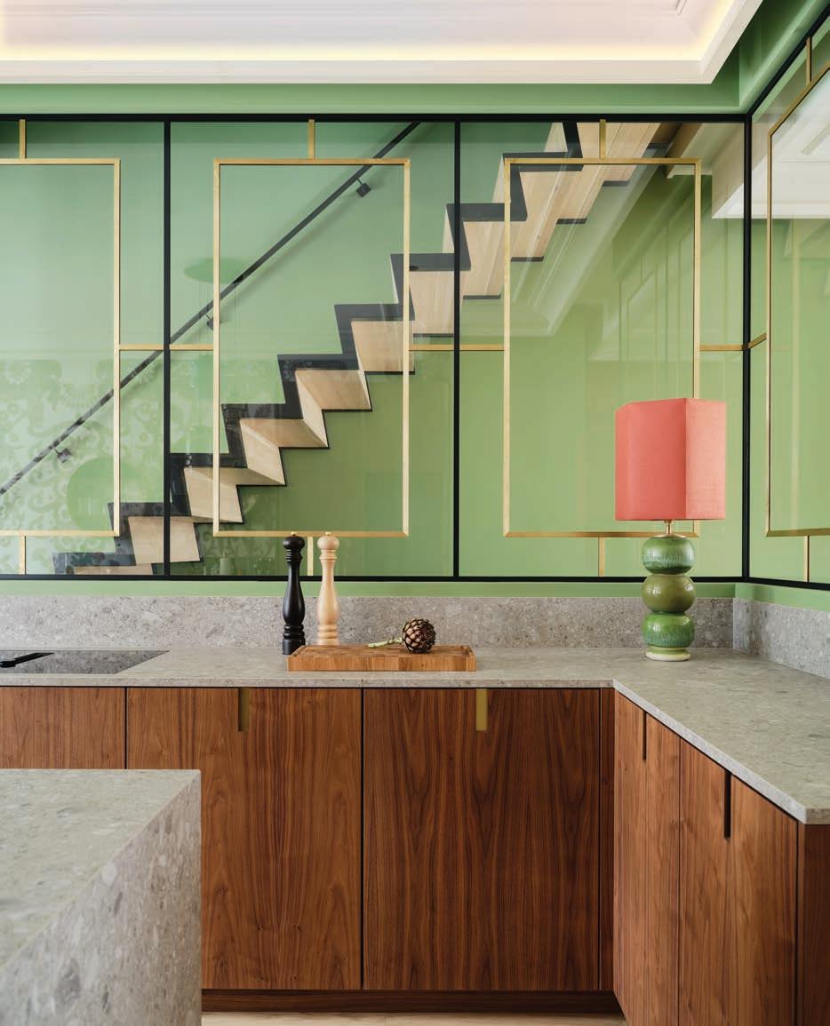
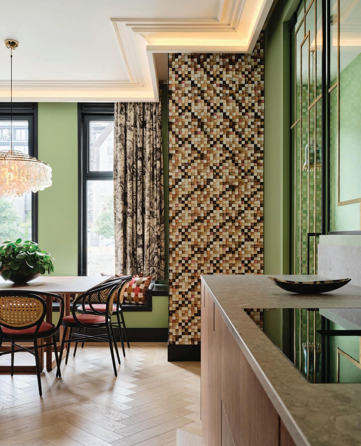
OPPOSITE THE GLASS-AND-BRASS WALL OF THE KITCHEN AFFORDS A VIEW OF THE DYNAMICALLY SCULPTURAL STAIRCASE. THIS PAGE A MODERN CHANDELIER FROM VERPAN HANGS ABOVE THE TABLE IN THE SUNLIT DINING AREA.
To riff on Robert Frost, when it comes to interior design, “Something there is that doesn’t love a wall.” Or at least a wall that reads like a plain plane. True, some folks love an uninflected expanse of white, broken only, perhaps, by a painting positioned just so. But when building out a brandnew unit for a client in Amsterdam, interior architect Roelfien Vos engaged fully with the envelope of the space.
Situated in the city’s desirable Jordaan district, the property is home to a Dutch family of five whose primary residence is in Dubai. Delivered as a shell, it allowed Vos the freedom to orchestrate the space from the ground up.
While committed to creating very specific identities for the various rooms, Vos was also determined to invest the interiors with a sense of openness, a tactic apparent in the floating staircase and the glass-and-brass wall that wraps around the kitchen.
Where another designer might have gone for a loftlike appearance congruent with the building’s construction, Vos fashioned a more layered but no less contemporary look. Impressive moldings cap the rooms with a traditional touch, but the walls take off in a more freewheeling yet still substantial way.
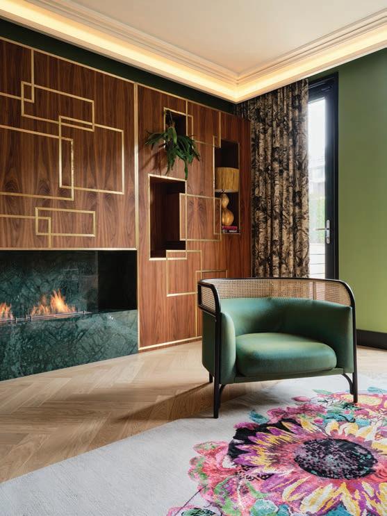
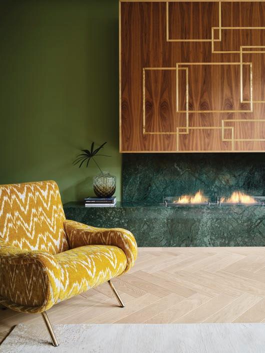
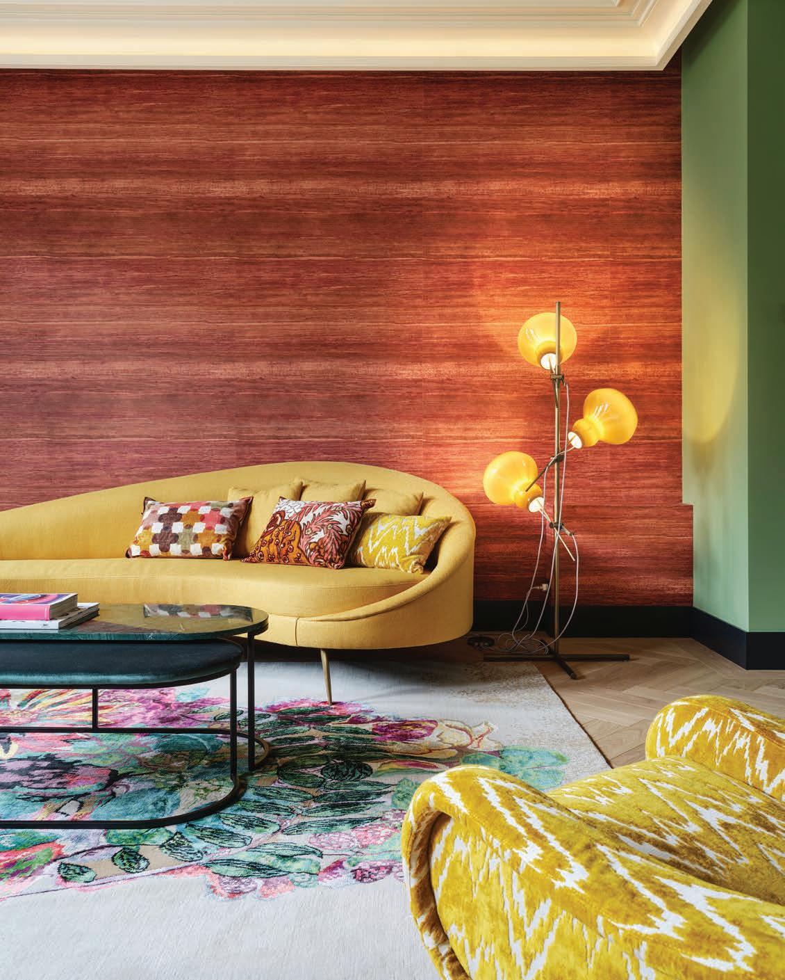
The living room epitomizes Vos’ full-on approach to addressing the perimeter of a space. One long wall is covered in a deep pink silk from Élitis. Another supports a custom walnut-and-brass, built-in component featuring a fireplace and deep niches for display. Here, as elsewhere, she has chosen green paint to round out the wall treatment. “I’ve loved the color green and all its tones all my life,” admits Vos. “When I was 13 years old, I had a green room, and since I started my studio 22 years ago, this color has formed a thread in my projects.”


98 AUTUMN 2023
ABOVE THIS CUSTOM BUILT-IN CABINET MADE OF WALNUT AND INLAID BRASS IS A POWERFUL PRESENCE IN THE LIVING ROOM. TARGA LOUNGE CHAIR DESIGNED BY GAMFRATESI.
“I’VE LOVED THE COLOR GREEN AND ALL ITS TONES ALL MY LIFE,” ADMITS VOS. “WHEN I WAS 13 YEARS OLD, I HAD A GREEN ROOM, AND SINCE I STARTED MY STUDIO 22 YEARS AGO, THIS COLOR HAS FORMED A THREAD IN MY PROJECTS.”

ASPIREDESIGNANDHOME.COM 99
A SINGULAR COLOR COMBO – PINK, YELLOW, AND GREEN – PLAYS OUT IN THE LIVING ROOM. SOFA FROM BAAN MEUBELEN, DEEP PINK SILK WALLPAPER FROM ÉLITIS.
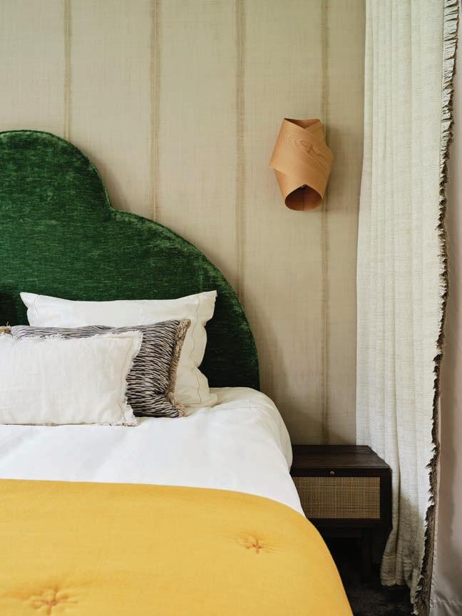
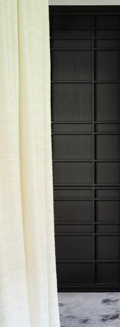
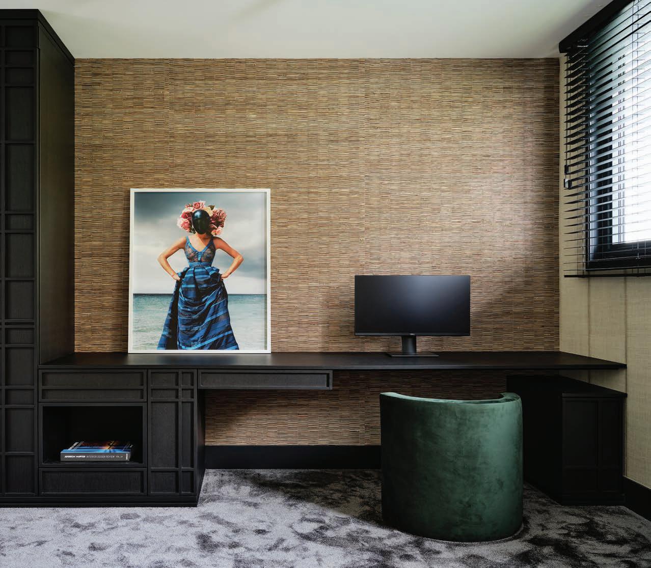
In the dining area that sits directly off the kitchen, Vos applied another Élitis product, a mosaic-like paper with a mother-of-pearl appearance. The wall above a built-in desk in the basement lounge is covered in a weave of abaca (natural leaf fiber) and foil. And in a most striking move, the area above the kitchen sink sports a bold print from Filicudi. Throughout the home, black functions as a framing device, giving a satisfying weight to various components – such as the cupboards in the lounge and the primary bathroom – and injects a sense of luxe into these interiors. Observes Vos, “The use of black and wood – a Wenge finish on oak – gives warmth to the rooms and at the same time, a modern touch. The windows and some details in the glass wall, as well as the rail for the stairs, are also black, which allows these to stand out and form a beautiful combination with the customized millwork.”


100 AUTUMN 2023
When it comes to furnishings, curvilinear forms dominate in the living room with its classic Lady armchair by Marco Zanuso, a Thonet-inspired Targa Lounge Chair designed by GamFratesi in 2015 and the Lucena coffee table from Duran Interiors, all of which sit on an Ebru rug with a center medallion spun of colorful, gargantuan blooms. The kitchen dining area is set with a walnut-topped Opus Table from Potocco and cane chairs from Satelliet. In each room, there’s a solid sympathy between the visual weight and profile of the furniture pieces and the adventurous way in which Vos has treated the walls. “I get into a state of euphoria when I’m puzzling with colors and prints,” she confides. “The trick is to ensure that an interior remains in balance despite bold colors and elements.” Equilibrium achieved.

ASPIREDESIGNANDHOME.COM 101
THE BASEMENT LOUNGE IS EQUIPPED WITH OAK CABINETRY IN A WENGE FINISH. TALIM, A WOVEN BARK AND FOIL PRODUCT FROM ÉLITIS, COVERS THE WALL.

102 AUTUMN 2023
ARCHITECTURE
Inspiration abounds in this maker’s space perched in the foothills of a mountain range overlooking the San Juan Islands in Washington
notes cliff
Architect Steve Hoedemaker will never forget the first time he saw the steep plot of land overlooking Puget Sound where his clients wanted him to design an art studio in the same style as the house they had recently built. The site is so high that some people have resorted to climbing up the final ascent on their hands and knees. “It was definitely a pause-and-catch-your-breath kind of trip, but the sweeping views north toward Canada and west toward the San Juan Islands are exhilarating,” he describes.
Echoing the form of the main house, which he had also designed, the studio is clad with cedar accented by a standing seam metal roof. In addition, both structures include a lofted second level and a front porch. Hoedemaker admits that the designs are "a bit of a tongue-in-cheek image of a farmhouse. They are talking the same language." Designed as a square within a square, the newly built studio’s first floor is split evenly between a covered front porch overlooking the San Juan Islands and a double-height living area with a built-in window banquette. A retractable ladder leads up to a suspended sleeping platform that comprises 50% of the interior floor plan. “It allows natural light to bleed down into the maker space.”
Mirroring the exterior, cedar planks line the interior walls and ceiling. Oak flooring and built-in kitchenette cabinetry made of Douglas fir complement the cozy milieu. “This building was intended to celebrate beautiful materials, and those materials are essentially the only décor needed,” he explains, noting that a wonderful cedar scent permeates the air. “It feels rooted in nature.”
ASPIREDESIGNANDHOME.COM 103 TEXT
TATE GUNNERSON PHOTOGRAPHY KEVIN SCOTT ARCHITECTURE HOEDEMAKER PFEIFFER
On the lower level, a sleek black potbelly fireplace creates a focal point, where a graphic black-and-white-patterned rug anchors a pair of upholstered armchairs covered in complementary fabric. “We were playing with this idea of camp, a simple and intimate relationship with the most basic elements that you need to be comfortable,” he shares. “We wanted to lean into simplicity and allow the outside and all the beautiful materials to be the star of the show.”
A pulley system allows the stairway to be raised or lowered – an acknowledgment by Hoedemaker that it’s located in front of a large wall where the owners may want to someday display artwork. “It’s wired to a heavy counterbalance that allows you to easily unhook it and push it all the way up to the ceiling,” he adds. A simple metal railing with a wooden handhold separates the sleeping loft.
Doubling as a guesthouse, the studio also includes a bathroom with a clawfoot tub that looks out over the Puget Sound with views of Vashon, Blake and Bainbridge islands. “The husband takes at least one bath every day as a ritual,” Hoedemaker explains. “It’s a central element of living that really speaks to him.”
Hoedemaker attributes the success of the project, in part, to the client’s trust. “They appreciate our work and gave us the green light to pursue the kind of design that we like to do. This home is really about celebrating the outdoors and the incredible setting. It invites you to explore in every direction.”
104 AUTUMN 2023

ASPIREDESIGNANDHOME.COM 105

106 AUTUMN 2023
Designed by architect Steve Hoedemaker to complement the other structures on the hilly 40-acre parcel, this detached structure contains firewood storage on both sides of a breezeway that frames the ocean view. The main house, detached art studio and outhouse, all clad in cedar, share a similar architectural language. Hardware from Rejuvenation and RH accent the built-in cabinetry in a kitchenette located in a corridor to the front porch. Cedar planks line the ceiling of the covered front porch of this bespoke art studio perched on a hillside overlooking the San Juan Islands. A patterned carpet from Eliko Rugs and furnishings from Housewright Gallery complement the wood-paneled walls in the living area. A Regal clawfoot soaker tub with Shaughnessy feet from Cheviot enjoys a jaw-dropping view of the Puget Sound. Perched on a short stack of books atop a woven side table, a lamp by Stone and Sawyer from Housewright Gallery softly illuminates the sleeping loft. The bed and bedding are also from Housewright Gallery.


ASPIREDESIGNANDHOME.COM 107
JUST SEW
f ash ion designer Erika Cavallini’s Modena home is a case study in style
Italian

108 AUTUMN 2023
PHOTOGRAPHY
IANNIELLO
TEXT THOMAS CONNORS
ALESSANDRA
Vintage handbags sit atop a Danish coffee table under the daring minimalist stairway.

ASPIREDESIGNANDHOME.COM 109
One of a pair of Bonacina rattan chairs flanks the Edmondo Palutari bookcases in the entryway.

110 AUTUMN 2023
Pink DIN tiles by Konstantin Grcic, a matte black Fantini faucet and a slatecolored Cielo bathtub in the primary bathroom.
As a fashion designer, Erika Cavallini knows a thing or two about tailoring a look, and her home in Modena, Italy, is an ensemble that looks just right. Situated in the historic center of the city, not far from the famous Ghirlandina bell tower, Cavallini’s three-level apartment is an artful yet unassumingly composed affair. At 1,829 square feet, it is spacious but not sprawling, roomy yet comfortably contained. There’s a wonderful clarity to these interiors, a sense of proportion that is neither rigidly mathematical nor strikingly showy. Her possessions abide here.
In recent years, Cavallini has exercised a growing interest in interior design. Collaborating with the Milanese architecture office Studiopepe, she created a collection of marble and brass vases that debuted at the Salone del Mobile in 2019, and she has since taken on interior projects for commercial and residential clients. “I search constantly for furnishings and accessories, from vintage to contemporary, and have become a collector of Italian design icons, particularly of the 1960s,” describes Cavallini.

“My favorite piece in the home is the T92 Table, the ingenious work of Eugenio Gerli and Mario Cristiani, done for Tecno in the 1960s,” shares Cavallini. A simple square piece, the table’s surface opens like the flaps of four envelopes and rotates. “It’s a majestic work of engineering and beauty,” suggests Cavallini, “which I found thanks to the interior design store Capperi di Casa.”
As wonderfully individual as each of these pieces is, Cavallini revels most in the subtle play of color in her home. “I love the powder pink of the Camaleonda sofa, the gray of the floor, the glossy enamel coffee color of the ceiling, the touches of pistachio green in the Gio Ponti Leggera chairs in the kitchen. And the various rosewood pieces warm everything.”
Dressed, but not done, Cavallini’s home exudes a distinct authenticity, a point of view. Her possessions may have a pedigree, but her interiors are all her own. A kind of natural understatement is the order of the day here.

Cavallini’s taste is manifest in her own residence, where the living room is outfitted with a Mario Bellini Camaleonda sofa and a 1960s sideboard by Edmondo Palutari. The reception area of the unit is set with a pistachio green chest of drawers by George Nelson, freestanding rosewood bookcases by Palutari and a pair of rattan chairs of the 60s attributed to Bonacina, the renowned furniture company founded in 1889. The office where she meets with clients is populated with Danish designs. One of the most singular pieces in the home is a 1950s aluminum sunshade designed by Jean Prouvé. Once attached to the façade of a school in Béziers, France, it now serves as a wall in the primary bathroom. Throughout the apartment, semi-industrial elements and finishes – terrazzo flooring, painted brick and a staircase of cantilevered concrete slabs – complement Cavallini’s carefully selected furniture.

ASPIREDESIGNANDHOME.COM 111
The office is anchored by a large storage unit that Cavallini designed, made from acidetched iron.
The pink marble and green onyx vases were designed by Cavallini in collaboration with the Milanese architecture office Studiopepe.
A pair of Delta wall lights by Sergio Mazza for Artemide rise above the George Nelson credenza. In the distance, an architectural sunshade by Jean Prouvé is repurposed as a wall, closing off the bathroom.

112 AUTUMN 2023
ABOVE A fabric wallcovering from Phillip Jeffries softens the walls in the formal dining room, which includes a trio of bouclé-covered chairs around a concrete-and-metal cocktail table from Roche Bobois. A long velvet-covered bench from Design Public Group and sleek chairs by Samuel Lamas surround a black walnut table by STR in the formal dining room. The chandelier is from Moooi.
pearls of wisdom
A restrained color palette, custom oak built-ins and posh furnishings transform this Chelsea loft into the Asian-inspired dwelling that perfectly suits the young family living there

ASPIREDESIGNANDHOME.COM 113
TEXT TATE GUNNERSON PHOTOGRAPHY READ McKENDREE
Todd Raymond

114 AUTUMN 2023
ABOVE New pendant lights and complementary stools from Normann Copenhagen punctuate the existing bamboo cabinetry in the kitchen, which did not require a full renovation. OPPOSITE PAGE (LEFT) A wall of custom wool sateen draperies from The Shade Store creates a wow-worthy moment in the light-filled formal living room. The wool rug is from Sacco Carpet. OPPOSITE PAGE (RIGHT) Iconic Standard chairs by Prouvé surround a cantilevered oak table that’s integrated with the exposed structural column between the living room and kitchen. The sconce is by Marset.
Inspired by their travels in Asia, a professional couple expecting their first baby asked interior designer Todd Raymond to establish a calming, Zen-like milieu in their sprawling second-floor loft, which is conveniently located steps from the High Line in Chelsea’s Gallery District. Last updated in the 1990s, the 4,200-squarefoot space had dark millwork, vibrant paint colors and boisterous floral wallcoverings that did not resonate with the new owners. “We had only four or five months to finish it before the baby arrived,” Raymond describes. “We hit the ground running.”
In pursuit of a clean slate, Raymond and his team first removed much of the old millwork and built-in cabinetry, stripped away the wallcoverings and refinished the orangish-red flooring into a light shade protected by a clear coat sealant. Raymond explains, “We tried to keep the materials simple and the lines very clean and sleek so that there was a certain calmness.” In addition, they redesigned the reflecting ceiling plan, adding more
spotlights to foster the mood and ambiance their clients wanted.
In the spacious formal living room, a round area rug anchors a pair of shearling-covered chairs and a curvaceous sofa upholstered in mohair, which is positioned to face the greenery on the adjacent outdoor terrace overlooking the street. A wall of wool sateen drapery in chocolate brown emphasizes the height of the ceilings while playing off the color of the rustic wooden beams. “It’s not overpowering, but it adds a really nice backdrop in this formal setting,” he notes. “We love bringing in some drama and bling.”
The verticality of the drapery’s ripple-fold pleats echoes the ribbed millwork that clads the lower portion of an exposed structural column. The column also supports a custom oak cantilevered table, which Raymond and senior designer Nicole Barthelme designed to accommodate their client’s 11th-hour request to incorporate a small table for more intimate family dinners. Raymond states, “We thought outside the box.”


ASPIREDESIGNANDHOME.COM 115
“We tried to keep the materials simple and the lines very clean and sleek so that there was a certain calmness.”
Chelsea, New York
spacious formal living room
shearling-covered chairs
curvaceous sofa upholstered in mohair

116 AUTUMN 2023
That’s also the case for the formal dining room. Rather than float the custom black walnut table in the center of the room, the designers placed it against the far wall, pairing it with metal-framed leather chairs and a long banquette upholstered in a rust-colored velvet that nicely complements the wood beams. A trio of bouclé-covered chairs create a spot for guests to enjoy an after-dinner aperitif. “The idea was to really get them to move around the space, to use the whole apartment,” he adds.
A neutral fabric wallcovering lines the far wall, where a 15-foot oak credenza with a sleek profile provides extra storage. Above it, a pair of minimalist metal shelves and a vertical oak shelving unit lined with glazed tile glints when illuminated by the newly added spotlights. A wall-to-wall oak media cabinet likewise defines the cozy family room, which is simply furnished with a sectional sofa and a green velvet womb chair around a pair of wooden cocktail tables.
The minimalist design scheme flows into the primary bedroom, where a textural wallcovering that wraps into the window jambs creates a subtle yet impactful backdrop for an upholstered wall-to-wall headboard and a cozy bouclé-covered chair near the window. “This room is like a cocoon – a sanctuary where they can escape at the end of the day,” Raymond notes.
Completed in time for them to move in with their new baby, the owners are overjoyed with the result. Raymond is just as thrilled with the transformation, crediting the clients for trusting him to implement their vision and sharing, “They are lovely guys who gave us the freedom to push the project forward. This is a little slice of heaven in the middle of Manhattan.”

ASPIREDESIGNANDHOME.COM 117
OPPOSITE PAGE Aluminum discs by artist Anna Sidi-Yacoub adorn a prominent wall in the formal living room, where a sofa from RH and clam chairs in natural shearling create an intimate spot for laughter and conversation. BELOW A chandelier by Mapswonders and sconces from Metropolitan Lighting Fixture Co. softly illuminate the primary bedroom. The chair is from CB2, the side table from Spartan Shop.
AERIE PORTAL
DESIGNER ERICA VOLKMER HELPS AN ATTORNEY-TURNED-TECHIE MAKE A HOME IN THE SKY

118 AUTUMN 2023
VESTIBULE The vestibule to the primary suite is set with a rosewood chest of drawers and artwork by Oaxacan artist Pura Sangre.
Boldness doesn’t always knock you over the head. It isn’t limited to big gestures, wild ideas, to shocking. It does ride on individuality, openness, risk. And it isn’t incompatible with understatement. Designed for the CEO of an AI-driven legal technology company, this Austin penthouse combines a certain soberness with a clear willingness to embrace the unexpected. Neither far out nor hidebound, it’s proof that a little daring goes a long way.
The builder’s spec, two-bedroom residence needed a lot of warming up from its original, blandly cool look when Austin designer Erica Volkmer came onboard. The unit did have its good points –walnut cabinetry and custom brass doors – but it lacked nuance and depth. And the homeowner, who arrived from Houston with what he called “bachelor” furniture, was ready to expand his interior design horizons. “We started with several design books, ranging from Parish Hadley to Jean-Louis Deniot to Steven Gambrel,” shares Volkmer. “Honing in on his personal taste was key, and what we discovered is he appreciated a wide range of styles. He is also an avid reader, so exchanging books for inspiration was a fun part of the process.”
No matter what the project, Volkmer is committed to creating a “hierarchy of design” with “a strong and architecturally minded backdrop.” Here, custom-designed wood paneling and trim details, bold wallpaper and carefully considered curtains establish that essential framework. “We took a deep dive into paint, plaster and brass to play with the natural light,” explains Volkmer. And when it came to furnishing the spaces, she threw herself just as fully into the process. “The lighting was its own thesis, as were the rugs. We approached both collections the way we would curate an art collection.”
A mix of antiques, modern designs and contemporary pieces give the home a kind of fluid identity. Recognizable but not rote, audacious yet not outrageous, its vibe ranges from wonderfully proper to playful. The dark-hued study sports a handsome Chesterfield sofa upholstered in a deep-green Italian hide from Jerry Pair Leather, and the walls are covered in the hand-painted Sun Pavilion pattern from Gracie Studio’s Landscapes wallpaper line.
At the other end of the spectrum, there’s the lively music room. “Our client brought a few surprises to the table, such as brightblue Focal speakers for that space,” notes Volkmer. “But we chose to embrace them rather than design against them, selecting a vibrant cobalt de Gournay wallpaper, a vintage de Sede sofa and an iridescent cerulean blue and red antique rug.”
Highly individual objects, including horsehair sconces from Apparatus Studio, a trio of Miquel Aparici’s walnut-and-brass Bird Tables (a collaboration with Barcelona’s Mermelada Estudio) and Vladimir Kagan’s creature-like Gabriella Chair, add interest throughout. The homeowner’s tight art collection includes work by East Coast painter Sarah Rubin and Mississippi-born Austinite Patrick Puckett. A Turkish rug hung at the head of a bed and an antique English settee are among the pieces that invest the home with an established, accumulative air.
“Although our projects may range in style, our interiors are all consistently curated to foster depth and interest. At the same time, we know not to take the process so seriously. Interior design is meant to bring joy, and we have fun doing it. This allows us to be daring, take risks and encourage our clients to do the same,” stresses Volkmer.
ASPIREDESIGNANDHOME.COM 119 TEXT THOMAS CONNORS PHOTOGRAPHY AARON DOUGHERTY INTERIOR DESIGN ERICA VOLKMER, PRINCIPAL AND FOUNDER OF EVENSEN DESIGN
AUSTIN, TEXAS

120 AUTUMN 2023
STUDY The stunning study, complete with a custom sofa, Gracie Studio wallpaper and Volkmer-designed walnut cabinetry with a raisin stain.


ASPIREDESIGNANDHOME.COM 121
ABOVE CLOCKWISE TOP LEFT KITCHEN Volkmer framed in the kitchen and installed a brass “arch” to create an intimate transition to the living and dining spaces. Walls and ceiling are painted in Foundry Brown from Donald Kaufman. A custom Murano chandelier hangs over the island. FOYER A Tara Lewis painting, 18th-century Italian mirror and a solid bronze bench by Paul Mathieu from Ralph Pucci. PRIMARY BEDROOM A custom walnut-and-brass bed, paired with an antique Herki rug on the wall, make a powerful impact. Utterly refined, the sitting area features an 18th-century screen and antique English and French seating, newly upholstered.
AT THE OTHER END OF THE SPECTRUM, THERE’S THE LIVELY MUSIC ROOM. “OUR CLIENT BROUGHT A FEW SURPRISES TO THE TABLE, SUCH AS BRIGHT-BLUE FOCAL SPEAKERS FOR THAT SPACE,” NOTES VOLKMER. “BUT WE CHOSE TO EMBRACE THEM RATHER THAN

122 AUTUMN 2023
DESIGN AGAINST THEM, SELECTING A VIBRANT COBALT DE GOURNAY WALLPAPER, A VINTAGE DE SEDE SOFA AND AN IRIDESCENT CERULEAN BLUE AND RED ANTIQUE RUG.”
The towering Focal speakers set the tone for the music room, with its vintage de Sede sofa, and eye-popping de Gournay wallpaper.

ASPIREDESIGNANDHOME.COM 123
no holds barred
Still enchanted by the tight-knit community where they raised their teenagers, a Menlo Park, California, couple recruit designer Sindhu Peruri to give their 1980s dwelling a new lease on life

124 AUTUMN 2023

ASPIREDESIGNANDHOME.COM 125
OPPOSITE FAMILY ROOM Faux painted to resemble Nero Marquina black marble by Caroline Lizarraga, the fireplace creates a striking focal point. The Rib Bench is made by Konekt. ABOVE DINING ROOM A chandelier by Coup D’Etat from Ochre floats over an oak table from House of Morrison. Chairs B&B Italia.
after living for more than a decade in their 1980s-era Mediterranean-style home in Menlo Park, California, the owners had grown tired of the beige wall-to-wall carpeting and dark cherry kitchen cabinetry. Attached to their charming tree-lined street and tight-knit community, they decided that moving was not an option. Instead, they turned to interior designer Sindhu Peruri, whom the wife had met at Zumba. “Her style is tasteful and modern but warm,” the wife describes. “I gave her one hundred percent carte blanche.”
Peruri took advantage of the creative freedom they afforded her, repainting the exterior, switching the location of the formal living and dining rooms to create a better flow and touching nearly every surface throughout the interior. The client’s elegant yet understated sense of fashion – and the verdant setting – inspired the restrained palette of neutrals Peruri selected for the interior. “It’s very lush and green outside, and I wanted to sort of pull those colors in,” she sharess.

126 AUTUMN 2023
TEXT TATE GUNNERSON PHOTOGRAPHY BRAD KNIPSTEIN
Brightening up the space was also a key part of Peruri’s design. To freshen up the kitchen, she painted the dark cherry cabinetry white and replaced the former backsplash with a natural stone-and-metal mosaic that perfectly complements the dark stone countertop. “It livens up what was once a dark and dingy space,” she maintains. In the same spirit, she recruited muralist Caroline Lizarraga to faux paint the neutral stone fireplaces to resemble Nero Marquina black marble.
Flanked by floor-to-ceiling built-in cabinetry with open shelving, the family room fireplace creates a striking focal point for a tailored linen sofa and a pair of contemporary green leather armchairs around a two-tiered wooden cocktail table with rounded edges. The palette flows into the new formal dining room, where a glass chandelier, fittingly dubbed “The Wave” for its flowing shape, illuminates a long wooden table and complementary chairs. “Lighting elevates the space and adds that element of sparkle,” Peruri explains
OPPOSITE KITCHEN Newly painted cabinets and a mosaic backsplash from Da Vinci Marble brighten up the formerly dark kitchen. POWDER ROOM Smoked-glass sconces by Hector Finch reflect off the colorful floral wallcovering by Kelly Ventura in the dazzling, completely updated powder room. LOUNGE Reflected in a mirror from Uhuru Design, a glass bubble chandelier by Apparatus Studio adds a touch of metaphorical whimsy to the intimate champagne lounge. The wallpaper is by Area Environments.
Sofa by BassamFellows.

Indeed, a cloud-like glass bubble chandelier adds a touch of whimsy, both visually and metaphorically, to the intimate champagne lounge. There, a black ceiling both complements and juxtaposes a light black-andwhite floral wall covering. The wife enjoys hosting girlfriends here, and it’s also an ideal spot to enjoy a martini with a book at the end of the day.
A more vibrant floral wallcovering likewise distinguishes the powder room, which the designer outfitted with a custom oak vanity with an arch detail that plays off the architecture. An oblong-shaped mirror flanked by smoked glass sconces completes the mélange. “It’s a small moment of luxury, a place where you can really go bold,” Peruri shares. “It’s moody and impactful.”

Fearful of disrupting their busy lives, the owners originally didn’t intend to redo the powder room. When Peruri learned they would be traveling for a month, she convinced them to move forward with the renovation, promising to complete it before they returned. She also pushed them out of their comfort zone on occasion. When they weren’t sure about the bench in the front entry, for example, she urged them to wait until the rug arrived before they made a final judgment. “She was right,” the wife admits. “I tend to play it too safe, so I like to be pushed a bit.”
Indeed, Peruri’s changes gave the home a new life and made the owners realize they had made the right decision to stay put. They recently hosted a birthday party for friends, opening the doors between the new, larger dining room and the adjacent patio as a private chef prepared a delectable meal with Japanese, Hawaiian and California influences. “It was so fun to sit and enjoy the beautiful space,” she declares. “I just love our cozy home and see us spending many more years here.”
ASPIREDESIGNANDHOME.COM 127
last words


Visit: aspiremetro.com/lastwordsautumn23 for answers 1 They might be marble or travertine 4 Soft bathroom accessories 8 Soap unit 9 Wine connoisseur 10 BBQ meat holders 11 Wash 14 Drink holder 15 Type of bandage 17 Grooming item 20 West of Hollywood 22 40 (rock group) 23 Aesthetic 25 Soup scoop 26 Scarlet 27 Blue color 28 Darns socks 31 Beef bourguignon, for one 34 Drop in on 35 Balloon gas symbol 36 Often tiled area above the kitchen countertop 37 Salt Lake City locale, abbr. 1 It might have claw feet 2 Mammoth 3 Nozzles in the bathroom 4 Fork prongs 5 Taste 6 Condos, e.g. 7 Patina 10 Bathroom item usually kept on the floor 11 Foam or froth 12 Abbr. in car ads 13 T.G.I.F. part 14 French vineyard 16 Material used for manicures 18 Renovate 19 Color 21 Get on in years 24 His and Hers bathroom item 27 Stand in 29 "Medium" like perception, abbr. 30 "Deep blue" or -green 31 Quiet! 32 Dripping ___ 33 Approval word ARTE WALLCOVERINGS Osmanthus Collection The substrate of this design is a playful reference to an authentic Japanese tatami floormat technique. Available in 5 colorways Tatami Deep Blue (shown) arte-international.com

arte-international.com
Showrooms London Paris Culemborg Los Angeles
collection KHARGA pattern GOBI

TheodoreAlexander.com theodore_alexander_official


 Silhouet te® Cl earVi ew® Shadings with PowerView® Automation


 Rock & Roll Bathtub in Grand Antique
Part of the Classic Rock Collection by Cara Woodhouse for ABC Stone
Rock & Roll Bathtub in Grand Antique
Part of the Classic Rock Collection by Cara Woodhouse for ABC Stone
Rock & Roll Bathtub in Grand Antique
Part of the Classic Rock Collection by Cara Woodhouse for ABC Stone


 JENNIFER


 TEXT BY
BY BLOCK722
