BENE


Pure Senses orientiert sich an der Suche nach Balance mit einem Blick auf das ganze Leben. Wohl fühlen soll man sich nicht nur im privaten Umfeld, sondern auch in anderen Bereichen, in denen man sich vermehrt aufhält. Allen voran das Büro. Damit ein vertrautes „Sense of Place“-Gefühl entstehen kann, müssen fließende, weiche Formen und angenehme Farben integriert werden, die elegant, dezent und neutral die Ausgewogenheit in den Arbeitsalltag transportieren.

Pure Senses is about the quest for balance and seeing life as a whole. Any place where we spend time should feel like a positive part of our private world. Especially the office. Soft, fluid shapes and appealing colours create a familiar sense of place, bringing ele gance, subtlety and neutrality to our work aday routines.
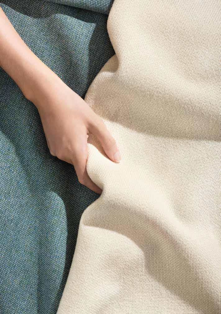
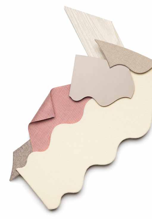
Helle und ruhige Farben bringen eine optische Entschleunigung ins Büro.
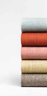
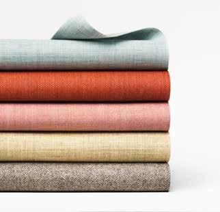
Helle Farben wie Weiß und Beige sind die Basis des Farbkonzepts. Im Optimismus verankert, strahlen sie subtil Ruhe und Eleganz aus.
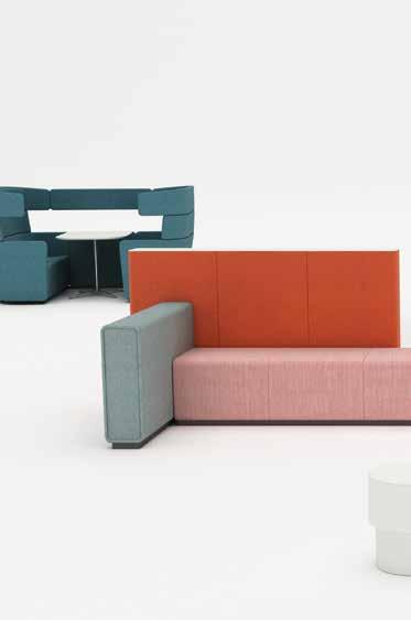
DEZENTE DENKHILFE. Blau in verschiedenen Abstufungen wirkt als sekundäre Akzentfarbe, steht aber auch für innere Ruhe und Klarheit.
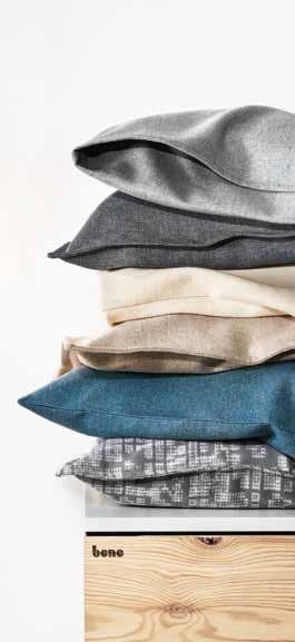
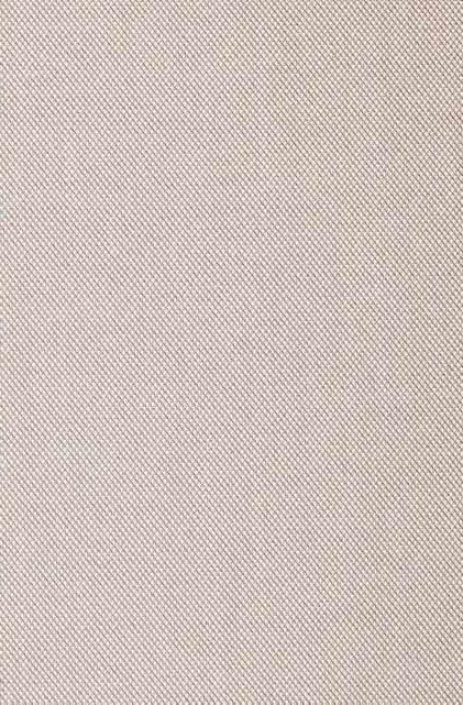
Grau-weiß-melierte Muster lockern das Setting auf und verwandeln geometrische Formen in weiche Strukturen.
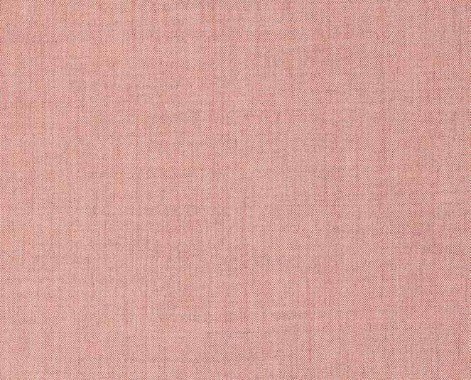
Sanfte Rottöne werden als Akzentfarben eingesetzt. Sie integrieren das Authentische und die Lei denschaft.
Bright, calming colours ease the visual pace.
This colour palette is based on light col ours such as white and beige. Grounded in optimism, they emanate subtle peace and elegance.
An array of blues provide a secondary accent colour and also suggest inner peace and clarity.
Mottled grey and white patterns make for a relaxed air and soften the structure of geo metric shapes.
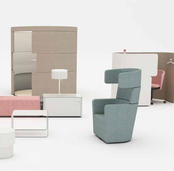
Muted reds are used as an accent colour that blends authenticity with passion.
Im Büroumfeld wird die Symbio se mit dem Privaten immer stärker sicht bar. Dabei geht es um Ent schleunigung und eine Wendung nach innen, um Klarheit zu gewinnen und Kontemplation zu för dern. Wohnlichkeit hält Einzug, Arbeitsweisen ändern sich, gemütli chere Zonen und Bereiche gewinnen an Be deutung. Die Farbwelt Pure Senses unterstützt diese Tendenz und schafft eine Umgebung, in der sich Menschen wohlfühlen und klare Gedanken fassen können.
CALMING COLOURS FREE YOUR CREATIVITY. Our offices and our personal space are becom ing more perceptibly inter linked. It’s a question of slowing down and turning inward to find clarity and evoke contemplation. Cosiness is on the up: new ways of working mean that comfortable areas are more im portant than ever. The Pure Senses colour palette works with this trend, helping you create a space where people feel good and can think clearly.