THE NEXT GENERATION OF DESIGNERS: FRESH IDEAS
UNIQUE STYLE BOLD LOOKS

THE NEXT GENERATION OF DESIGNERS: FRESH IDEAS
UNIQUE STYLE BOLD LOOKS
LUXURIOUS RETREATS + RESOURCES TO CREATE YOUR OWN HAVEN









256.215.7011




RealEstate@RussellLands.com RussellLands.com
THE HERITAGE FROM RUSSELL LANDS.


EXQUISITE WATERFRONT LOTS NOW AVAILABLE.


Firepits and birthdays. Starry nights and laughter. There’s no life more wonderful than The Heritage on Lake Martin. Set among Lake Martin’s nearly 900 miles of shoreline surrounding over 40,000 acres of pristine water, The Heritage is a 1,500-acre waterfront development along 12 miles of sparkling shoreline—all from Russell Lands, one of the South’s most respected land companies. The stunning community features spectacular waterfront and luxury interior homesites, as well as a flagship resident-owned lake club and private Coore & Crenshaw golf course. Don’t miss your chance to start your own cherished traditions.




Opportunities to rewrite your Heritage are now open. Contact us today.



20 Creative Turn
When an artistic opportunity came her way, Allie Nielson jumped in with both feet to launch a career in everlasting floral designs.
24 Stepping Out
Following a lifelong passion, decorator Ragan Wesson took a leap of faith into the world of design.
30 Inspiration Home 2023
Our next home is under construction. Meet the design team and take a peek at the rendering.
Having admired a historic home for many years, a young family finally makes it their own with the help of designer Kelly Butler.

40 From Basic to Beautiful
Designer Ellie Christopher transforms a run-of-the-mill condo into a sophisticated jewel box full of color and pattern—and a bit of quirkiness.
48 An Enchanting Makeover
By uncovering a home’s hidden potential, designer Caylee Stefanek creates an interior plan tailor-made for its owners.
70 Soup for Days
Warm up your winter days with this roundup of robust recipes.
74 Fashion Forward with M.G. Style
Stylist Mary Glenn McElveen brings out the best in her clients and their closets.
57 Beautiful Baths
This special section showcases four inspiring baths filled with classic and contemporary styling. In addition, industry pros offer advice to help you create your own indulgent at-home spa.
I’ve never felt more certain of that statement than now as 2023 approaches. For me, this is going to be a big one. ree of my children are graduating from high school in May. My husband and I are facing an almost-empty nest. How did it get here so fast? What happens next? All of the parents who have experienced this before me say that there is a bit of sorrow—and then, ultimately, there’s a newfound freedom. Is that true? e soundest advice I have been given is to share in my children’s new journey (but don’t move into their dorm with them!) and then continue to move forward as an individual.
I’m taking cues from the featured designers in this issue. Whether starting their own business, embarking on a di erent path, or taking their careers to new levels, they are inspired—and inspiring. When Allie Nielson, a former nurse, found herself in Andalusia, she regrouped and tapped into her creative side. Intrigued by her in-laws’ wholesale business of preserved orals, she launched her own business designing elegant forever arrangements (page 20). Decorator Ragan Wesson, a former ight attendant, traded her wings in for her rst love—design—and she hasn’t looked back (page 24). Ellie Christopher and Caylee Stefanek opened their own design rms and have each quickly amassed an impressive portfolio of projects (pages 40 and 48). What’s the common thread among all these talented individuals? ey all followed their passions with vigor and excitement and were open to opportunities—and to change.
Whatever changes 2023 brings you, I hope you will embrace them, feel energized, and create a few new experiences for yourself. Here’s to a new year and new experiences. e best is yet to come.

PUBLISHER / Walker Sorrell wsorrell@pmtpublishing.com
EDITOR / Cathy Still McGowin csmcgowin@pmtpublishing.com
ART DIRECTOR / Derek Gaylard
ADVERTISING ART DIRECTOR / Vic Wheeler
PHOTOGRAPHER / Jean Allsopp
WEB EDITORS / Mattie Naman, Kathryn Bell
COPY EDITOR / Julie Gillis
RECIPE EDITOR / Leslie Byars Register
CONTRIBUTORS / Alice Welsh Doyle, Mary Fehr, Robert Martin, Mary Margaret Smith, Paige Townley, Shelby Willoughby, Kathleen Varner
ADVERTISING / SALES
Traci Owen 205.802.6363 ext. 110 towen@pmtpublishing.com
Hope Roddam 205.802.6363 ext. 114 hroddam@pmtpublishing.com
DIRECTOR OF INTEGRATED
MEDIA & EVENTS / Sheila Wardy
ADMINISTRATION / OFFICE MANAGER
Lauren Sullivan
ACCOUNTING / Keith Crabtree
CIRCULATION / DISTRIBUTION
Anita Miller
Advertising Sales O ce: 3324 Independence Drive Homewood, Alabama 35209 O ce: 205.802.6363 / Fax: 205.802.6393
TO SUBSCRIBE OR FOR QUESTIONS ABOUT YOUR SUBSCRIPTION, CALL 1-833-454-5060 or visit birminghamhomeandgarden.com
T.J. POTTS / President
THOMAS E. MCMILLAN / Partner & Director PMT Publishing Inc. 3729 Cottage Hill Road, Suite H Mobile, AL 36609
VW Gallerie is Birmingham’s most state of the art interactive plumbing design center. Whether you are building a new home, remodeling your kitchen or bath, or simply refreshing your fixtures, VW Gallerie consultants will guide you to quality products that represent your style. We are dedicated to providing exceptional customer service so your experience with us is an enjoyable one.
VW Gallerie is Birmingham’s most interactive plumbing design center. building a new home, remodeling bath, or simply refreshing your fixtures, consultants will guide you to quality represent your style. We are dedicated exceptional customer service so with us is an enjoyable one. It’s a short drive to one of our three locations. Call and schedule your
It’s a short drive to one of our three convenient locations. Call and schedule your appointment today.
Whether you are searching for uniquely distinctive or purely functional fixtures, VW Gallerie is the choice for those who desire to create an extraordinary kitchen and bath.


MONDAY - FRIDAY 8AM - 5PM • APPOINTMENTS RECOMMENDED
VW Gallerie is Birmingham’s most state of the art interactive plumbing design center. Whether you are building a new home, remodeling your kitchen or bath, or simply refreshing your fixtures, VW Gallerie consultants will guide you to quality products that represent your style. We are dedicated to providing exceptional customer service so your experience with us is an enjoyable one.
Call and schedule your consultation appointment at one of our three convenient design centers, or if you’re in the neighborhood, you are always welcome to come in and explore. We look forward to seeing you!

It’s a short drive to one of our three convenient locations. Call and schedule your appointment today.

ALLIE NIELSON CREATES ONE-OF-AKIND ARRANGEMENTS DESIGNED TO ENHANCE ANY HOME—NO MAINTENANCE REQUIRED!

 Text By CATHY STILL MCGOWIN
Photography by JEAN ALLSOPP
“When clients ask how o en they will need to water their orchid design, I have the great joy of responding ‘never!’
As other flowers and greenery start to droop and fade, a Vine + Branch proudly stands tall and displays its rich color.”
—Allie Nielson, Vine + Branch
ometimes life takes an unexpected detour yet puts you right where you were always meant to be. Allie Nielson originally pursued a career in nursing, but a more creative calling pursued her. “I am the product of generations of oral designers, interior designers, and photo stylists,” says the Fairhope, Alabama, native. “I always felt that I possessed the family’s creative gene, but I wasn’t sure how to express it until life took me to Andalusia, Alabama.”
While Andalusia isn’t top of mind as a creative hub for design, it turned out to be a catalyst that helped surface Allie’s artistic side. When Allie met her husband, Will, she was also introduced to his family’s dried oral business, the Knud Nielson Company, located just one county over from her hometown. “I was instantly fascinated with the company’s rich family history, and I was impressed with the high-quality products,” Allie


Visit vineandbranch.shop for ready-toship wreaths and preserved botanicals. Follow along on IG at vine.and.branch for information about pop-up shops in Birmingham and Fairhope. And look for Vine + Branch as a vendor at the 2023 Nashville Antiques and Gardens Show in February 2023.
says. “I loved walking through the warehouse to see all of the botanicals in their various stages of drying and preservation.” at intrigue and those walks stirred her imagination, and the result was Vine + Branch.
Allie’s rst pieces, moss-covered crosses adorned with dried lavender and silk ribbon, were designed as a fundraiser to help front-line workers during the pandemic. “I thought I would sell a few
dozen to family and friends,” she says. “Remarkably, I sold over 400!”

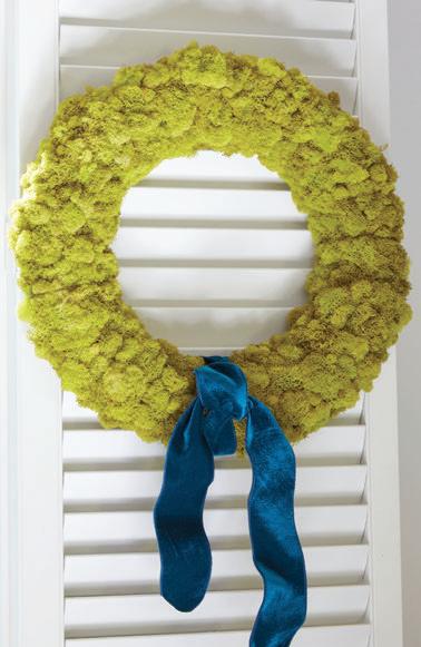
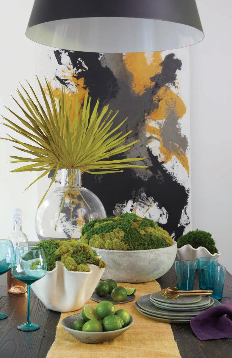
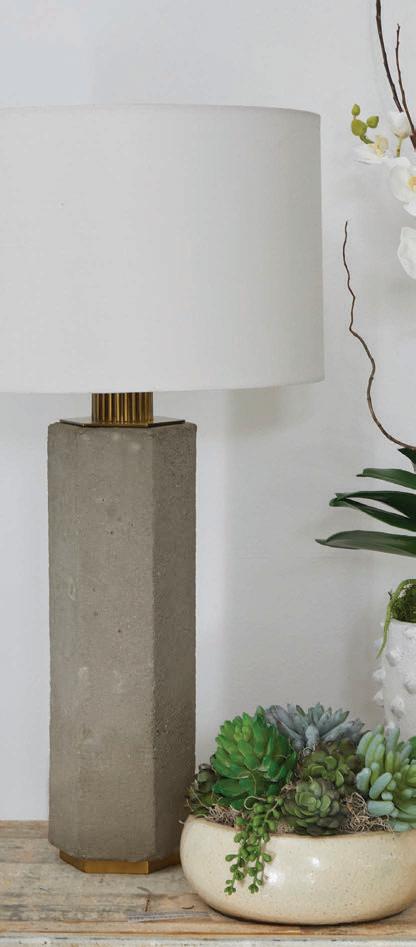
Since then, she has expanded to everlasting orchid arrangements, moss bowls, wreaths, palm fronds, and succulents—all designed to make a statement without any maintenance. “I have a high standard for the quality of my materials,” says Allie. “I use preserved and dyed moss which will hold its color for three years or more. And I make sure

my orchids are top-of-the-line.”

Allie sources her own containers, culling garden shops and antiques stores. “I look for vessels everywhere I go,” she says. “I am most drawn to the natural and organic elements of handmade designs. In the future, I have plans to start experimenting with concrete and plaster to make my own containers.”

Allie also works with clients to ll their own cherished pieces. “Several clients already own a vessel that they love, and we work together to create a unique design for that container,” she says. For Allie, it’s a way to help her clients preserve not only her botanicals but also precious memories.

Ragan
Wesson
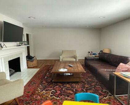
BEFORE: Wall and trim color divided the space. Shutters blocked the light and intruded on the room. The crosses needed a piece of furniture below to ground them.

DECORATOR RAGAN WESSON FELT CALLED TO THE WORLD OF INTERIORS, AND THE WORLD HAPPILY WELCOMED HER. SHE SHARES THE THINGS SHE LOVES MOST ABOUT IT, AS WELL AS A FEW OF HER FAVORITE PROJECTS.


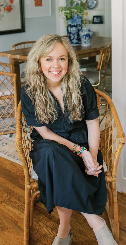
t takes a lot of con dence to step out on your own as an interior decorator— something that didn’t come easily to Ragan Wesson; but when your passion keeps calling, you just have to answer. “I must confess that I was intimidated by the world of interior design,” says Ragan. “I had ‘impostor syndrome’ when I compared myself to other designers who were well established in the eld. So when I graduated from UAB, I took a job with Delta Air Lines.”


Living in Manhattan and ying around the world did nothing to diminish Ragan’s interest in interiors. “Being in New York and getting to travel had a profound impact on my vision and my eye,” she says. Inspired by the city’s shops and architecture, Ragan spent her


Symmetry. It grounds a room and provides visual peace in a way that nothing else can.
Scale. A piece of furniture or art that is the wrong size (too big or too small) for a space can destroy the atmosphere.
Flow. Furniture and accessories should always be placed in a way that allows the room to breathe while also serving the people using it.
Color and texture. An artist once told me that every room should have a touch of red. I also think every room should have a bit of black. And I will never stop telling my clients to add texture. A wooden coffee table looks a thousand times better when it is placed on top of a soft rug that is covered with a fluffy sheepskin. Then layer with a collection of earthy olive jars, and finish with books, antlers, and fresh greenery. Storytelling. Every space should reflect the personality of the people who live there.
days o exploring. “In Europe, I visited every museum and cathedral that was within walking distance of my hotel,” she says. “I took all the inspiration I found in Europe and brought it back home to Manhattan, where I decorated my 500-square-foot apartment from top to bottom. Not a single wall was empty.”
After returning home to Birmingham, Ragan settled into Homewood, got married, and is now the mother of three young children. “My friends started asking me to help them decorate their homes, and before I knew it, I had a fulledged business.”
Often working on a budget, Ragan smartly balances splurge pieces with costsaving items and homeowner’s exisiting pieces to curate custom, elevated designs. “A little strategy can go a long way in making the most of a tighter budget, Ragan says. “I enjoy helping a client incorporate an inexpensive ea market antique piece and then dressing it up with custom linens and art.”

BEFORE: Furniture and seating seemed disjointed. The co ee table was too heavy for the space. The far wall lacked any definition. AFTER: Custom cabinets create a true focal point and provide storage. An acrylic co ee table visually opens the room and allows the rug to stand out. Ragan pulled colors from the rug for pillows and accessories to bring the space together. New furniture creates balance.
Hunting and Gathering.
“I love stumbling upon original art at antique malls and thrift stores,” says Ragan. “I found my favorite piece of art in London at a little ea market on the side of the road. It’s a vintage oil painting of two thatched-roof English cottages.” She adds that she always looks for art that is signed and original and has a great antique patina. “Don’t ever let an atrocious frame or cluttered antique booth scare you away from digging for gold,” the designer says.
Finding Inspiration. “I enjoy reading old design books and learning about the greats: Billy Baldwin, Bunny Williams, Sister Parish, etc. I am currently crushing on Chicago designer Summer ornton,” Ragan says. She adds that one of her favorite books as a child was e Secret Garden. “ ere was something so wild and romantic about the grand old
RAGAN’S NO-FAIL


a house.
Every goal, every effort put forth throughout your day is vital to creating the life you envision for yourself and your family. At Bryant Bank, we’re here to help you get into that home you’ve been dreaming of and exceed every expectation along the way.


Let one of our experienced local mortgage professionals walk you through every step of the mortgage process — and beyond.

house with its locked rooms and corridors. I would get lost in the pages as I imagined what the secret garden must have looked like,” she says.
Personal Style. “I love any style if it is done well,” the designer says. “My personal taste leans more classic and Southern with a lot of character. My dream home would be somewhere between an elegant French chateau and a masculine, classy mountain lodge.”


Best Buy. In addition to her design services, Ragan also sources and sells antique rugs. “I often hear clients with young children say that they love the way oriental rugs look, but they could never justify the cost because their kids would destroy it,” Ragan says. “I always remind them that I have small children too, but I also have those beautiful rugs. e great

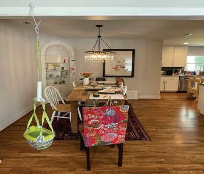
BEFORE: The dining area o ered plenty of space but lacked any distinguishing features except for the corner cabinet.

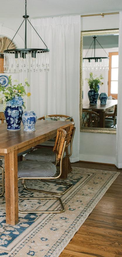
AFTER: Ragan introduced a larger rug to define the space and added a draped wall and a mirror to stand in as a window. Art relocated to the other wall brings balance and focus. Chairs are vintage and complement the table and each other. The bookcase is styled with colorful finds in appropriate scale.
thing about a real, hand-woven rug is that it can be cleaned, rewoven, and redyed if needed.” She adds that sometimes the rugs look even better when they re ect the character of the ages. “One real, oriental rug is worth a thousand machine-made rugs,” Ragan says.

Builders: JOHN MARK RIVES | ERIC WAITE RW Development
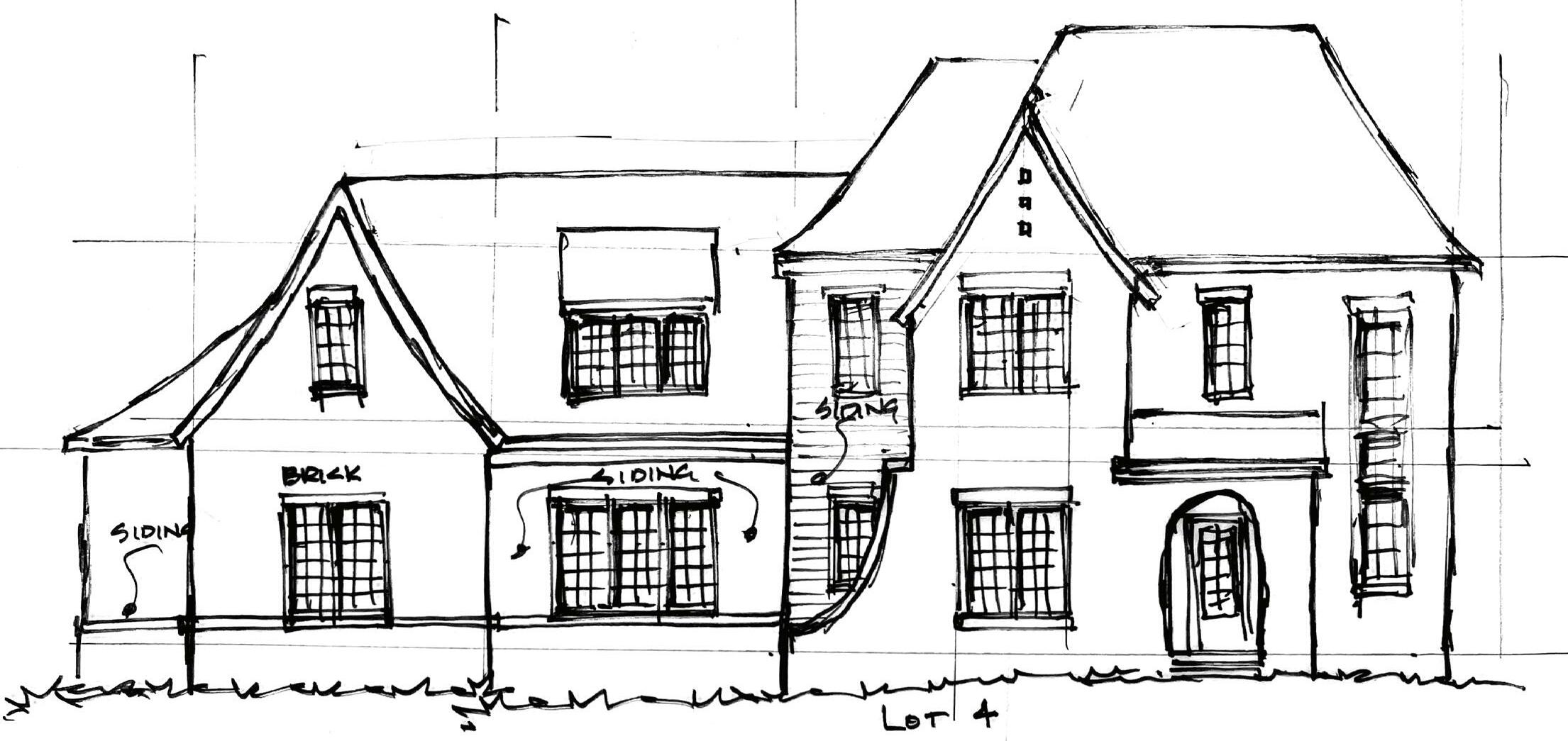
John Mark Rives, a fourthgeneration contractor, brings a wealth of construction and real estate development knowledge to every project. After graduating summa cum laude from Auburn University with a


presented by
major in building science, he spent his first years working as a commercial project manager. In 2011, John Mark expanded into real estate development and has since sold dozens of homes across the Birmingham metro area. John Mark understands what it takes to have a pleased buyer, as well as how to manage a team of architects, designers, and subcontractors to make the process as smooth as possible. He currently resides in Vestavia with his wife, Hillary, and their three boys. When he isn’t spending
time with his family, he enjoys golfing, traveling, and being an active member of The Church at Brookhills.
Eric Waite brings over 10 years of experience in the real estate industry, and has a bachelor’s degree in business from Auburn University. Eric’s involvement in the industry has ranged from mortgage broker to property management, land development, and homebuilding. These experiences have
taught him how to open the lines of communication between clients, customers, and businesses to get projects done. Eric has developed a passion for working personally with clients to provide them with custom homes that fit their family’s needs. He currently resides in Birmingham with his wife Mary Alex and their newborn daughter. He is a member of Redeemer Community Church and enjoys spending time with family and friends, as well as playing basketball and golf and going bow hunting.

Landscape Architect: JENNAFER COLLINS | GREENSPACE LLC
Jennafer Collins is a handson landscape architect with extensive work experience in site planning, planting and detail design, on-site consultation, construction observation, and project management. She graduated from the College of Environment + Design at the University of Georgia and is a registered landscape architect in the state of Alabama with 25 years in the profession. Jennafer is also a member of the American Society of Landscape Architects. Her landscape designs will make the Forest Creek community feel naturally tucked into the hillsides.
Home Architect: DAVID SMELCER | SMELCER DESIGN
Smelcer Design is one of the state’s top home design firms, and the team’s work speaks for itself. The details that David adds to the home are nothing short of immaculate. He displays an incredible ability to think through terrain and how to perfectly design and position each home. David’s plans have brought all elements of the Forest Creek style together.
Interior Design Liaison: BECKY UMPHREY | RDI
Becky Umphrey has an instinctive eye for current design trends yet knows how to maintain a timeless style, taking great care to choose materials and stunning finishes that all come together for a cohesive feel. Her passion for design is a huge asset to the Forest Creek project.

DESIGNER KELLY BUTLER ORCHESTRATED A MUCH-NEEDED REMODEL TO TRANSFORM AN OUTDATED RENTAL PROPERTY INTO A WELCOMING AND WELL-DESIGNED HOME FOR A FAMILY OF FOUR.
Text by PAIGE TOWNLEY / Photography by JEAN ALLSOPP
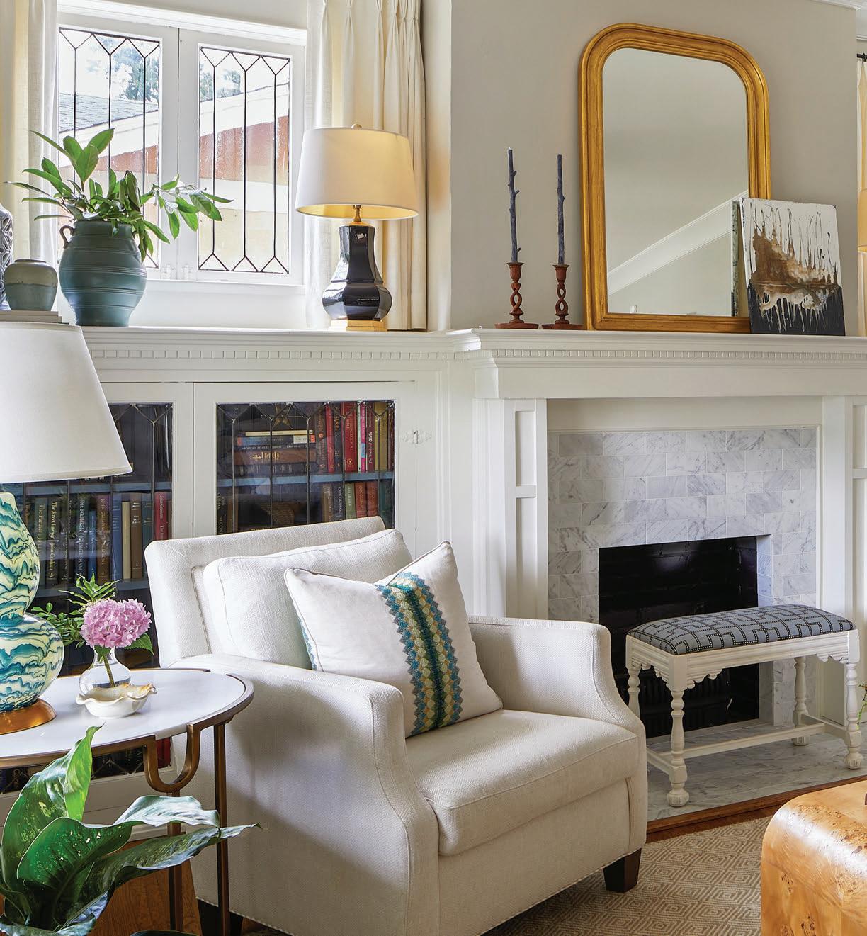
ob and Laurie Heard’s home has been a part of their lives long before they ever o cially owned it. Purchasing it was just a technicality. “I had my eye on this house for years,” says Laurie. “We tried to buy it numerous times but it never worked out.” Persistence nally paid o when the Heards were able to swoop in and snag it, and it’s obvious why they were enamored
with the historic house. Built in 1921 and known o cially as the Dunnavant home (named after the original homeowners), the house features charming characteristics in keeping with its bungalow style. However, at 3,800 square feet, it also o ers plenty of space for the family of four. Rob and Laurie also love that the home is just down the street from their former house and is located in Huntsville’s notable Twickenham district, a preserved
Put it on display.
With a musician in the family, there’s no reason to hide instruments in the corner. Kelly made this guitar a focal point to create a conversation piece and as a great reminder to practice.

historic district. “ is home gives us the size and style we want and keeps us in our very walkable neighborhood,” Laurie says.
e Heards got right to work renovating, and to their surprise, the house had good bones. But because it had served as a rental for 40 years, there was still much that needed to be done.

As a commercial real estate developer, Rob had close connections in the construction industry, and he brought in Guild Builders to assist with tweaking the layout. e original oorplan was rather open with large rooms, so the footprint required no change—it simply needed a little rearranging.
To balance the home’s history with

Back it up.
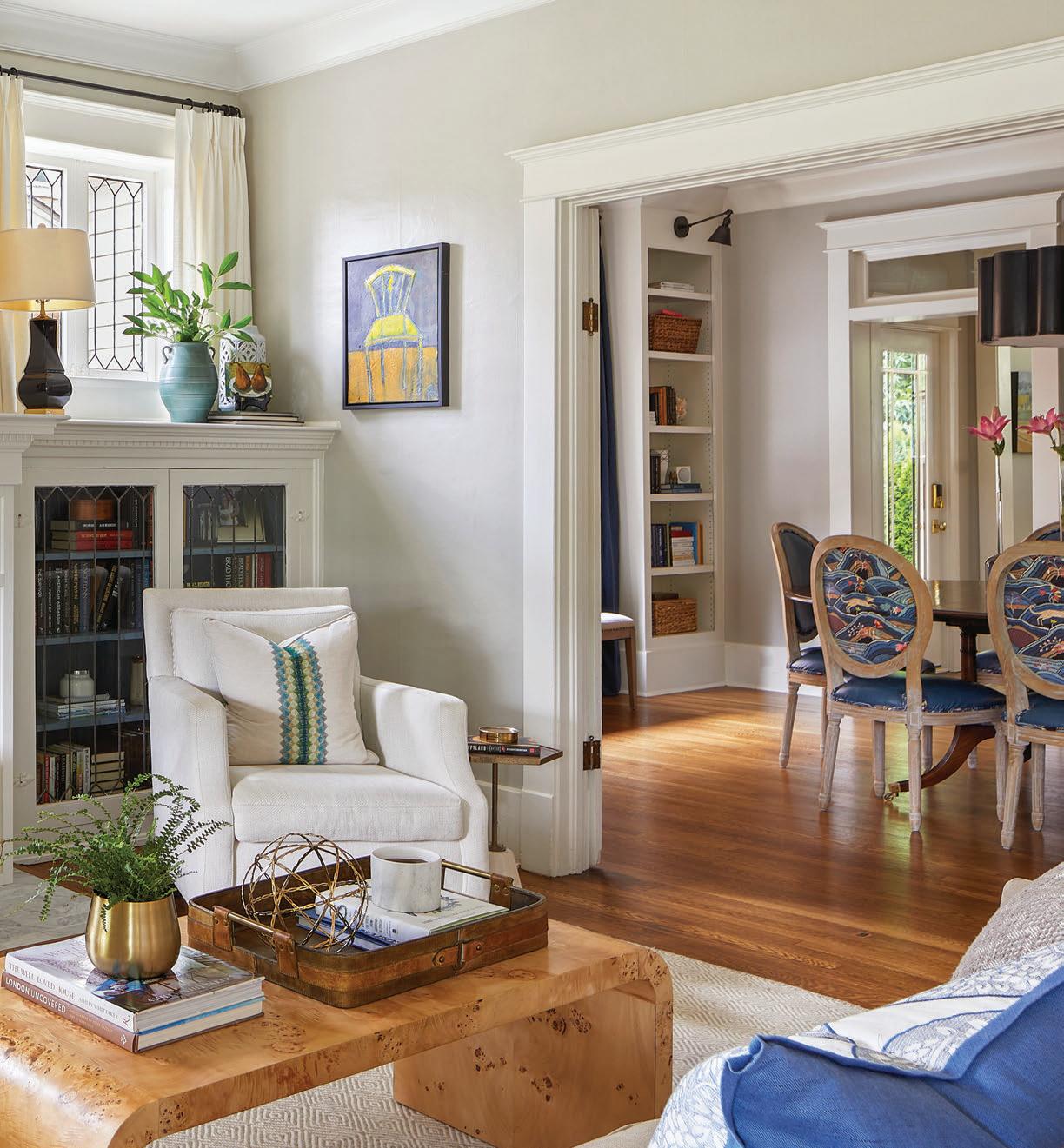
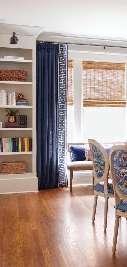
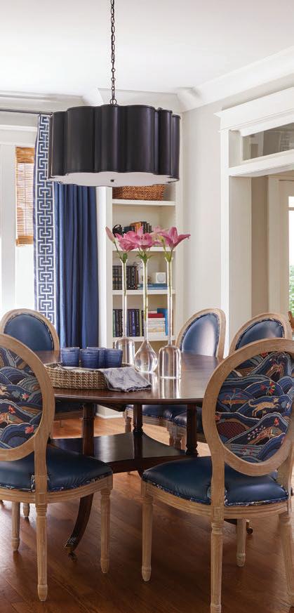
On dining chairs, Kelly mixed a higher end Schumacher print with a simple faux leather. This way, she was able to splurge on a favorite fabric and still o er durable seats.
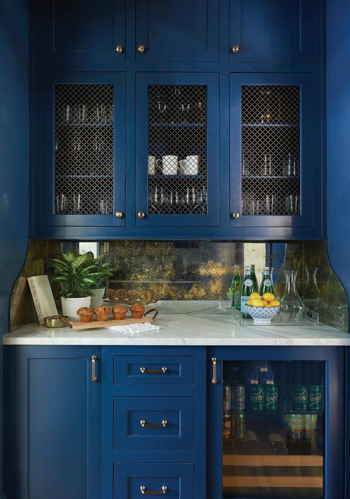
The cabinets, walls, trim, and ceiling in the butler’s pantry are all painted a custom blue. For added drama, Kelly used a high-gloss paint. “A small space like this is a great spot to be bold because you’re in and out of the space so quickly,” says the designer. An antiqued mirror backsplash adds even more shine.

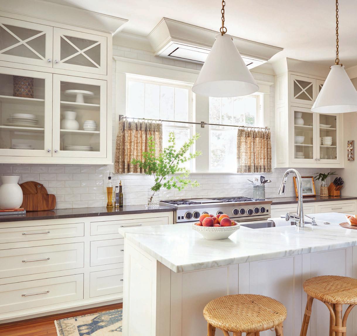
Brush up on your history. Keep a historic home from looking too modern after a renovation by mimicking the original architecture. When selecting new cabinets for the kitchen, Kelly went with an “X” pattern for the upper cabinets, which gives the completely new kitchen a beenthere-for-years feel.
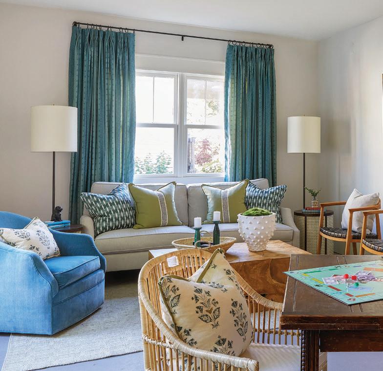
newer, modern touches, the Heards turned to Kelly Butler of K Butler Interiors. e designer put together a plan that plays up the home’s charming details while also creating comfortable spaces that speak to the family’s personality and lifestyle. She began by refreshing the space with a new coat of paint (Seattle Mist by Benjamin Moore), carrying that color through most every room. e soft neutral allows other hues to pop, such as the blue accent inside the living room bookcases, the blue walls
in the TV room, and the blue butler’s pantry/bar.
e kitchen received a serious facelift to allow for a more functional layout that included the addition of an island. To make the new space feel crisp and clean, Kelly used an all-white palette but went with two di erent marbles—Calcutta gold for the island and black marble for the perimeter—for added visual interest. Pattern and texture are introduced with Schumacher linen café curtains and the bamboo barstools from Serena & Lily.
e classic white subway tile lends itself to the historic feel of the home.

An awkward space on the back of the house was reimagined to create a new pantry, laundry room, and master suite. Upstairs, a much-too-large guest room was reduced in size to make space for a second bathroom.
Kelly also juxtaposed modern accents and a proper mix of patterns with well-placed antiques and the home’s original features so it doesn’t feel too formal. In the living room, the leaded-
glass windows, built-in bookshelves, and replace—all original—sit behind a modern wooden co ee table, which o ers clean, sleek lines to complement the mirror sitting atop the mantel. e many patterns in the TV room—all perfectly coordinated in varying shades of blue—create a cozy feel to o set the dramatic vibe of the dark walls. “ e house had so much to o er with its original charm,” Kelly says. “It just needed a good update in order to bring it back to life.”
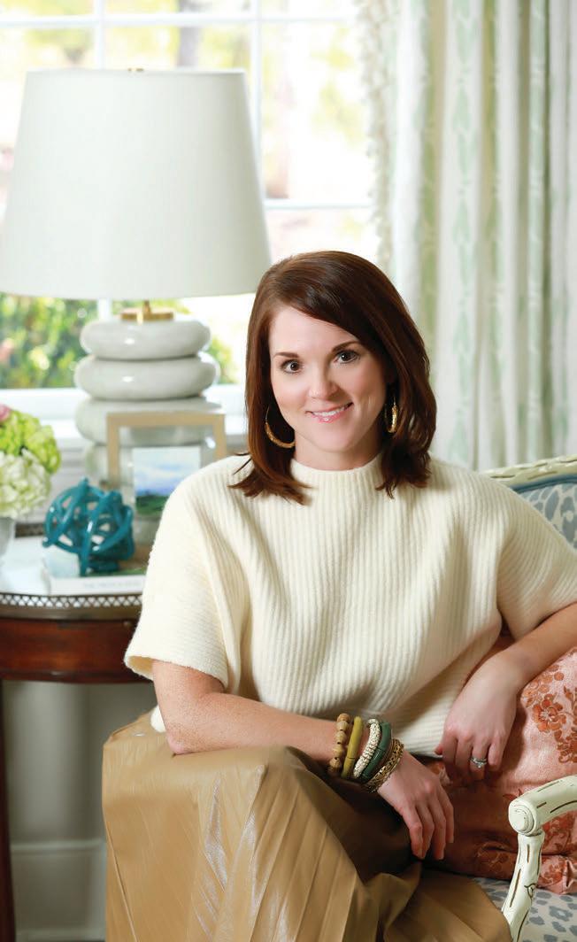
Fresh, timeless design is the motto behind K Butler Interiors, and Kelly carries out that philosophy to the very last detail with every project. The Huntsville-based designer uses her innate sense of style in both historic renovations and modern new builds. Kelly also designs commercail spaces. She provides design services that thoughtfully balance both beauty and function within an aesthetic that perfectly fits into each client’s plan and lifestyle. While all of her projects are custom-designed around each homeowner’s individual taste and needs, Kelly has an affinity for mixing old with new and traditional with modern to create timeless spaces with a twist. kbutlerinteriors.com, IG: @kbutlerinteriors

TIP Step

Kelly Butler shares her top tips for updating any home.
It’s important for a home to meet the everyday needs of a family. To ensure a plan achieves that goal, spend time in the beginning thinking through the function, layout, and aesthetics to define exactly what is needed.
Mix Finishes.
Plumbing, hardware, and light fixtures are great places to mix and match. “Using a polished nickel finish for your bathroom faucet with satin brass fixtures adds warmth and sophisticated shine,” Kelly says.
Color Cues.
“Choose a color or two that speaks to you, and repeat it in different ways throughout the home for visual continuity,” says Kelly. For balance, add color in small, subtle doses in some spaces and go bolder in others. For dimension, use varying, complementary shades of the same hue such as the blues she used on walls, cabinets, and accents throughout the house.
“Hard and soft surfaces are great ways to play with texture,” Kelly says. “A woven chair, linen window treatments, a glossy lamp, a velvet pillow, layered rugs—these different textures add drama, create visual interest, and give your space a lived-in feel.”
Pull from the Past Incorporate pieces that tell your story. Family heirlooms hold sentimental value and serve as great conversation pieces,” Kelly says. “Mixing old with new also helps strike a visual balance.”

Interior design, lighting, custom window treatments, pillows, furnishings: K Butler Interiors Builder: Guild Builders, Huntsville, AL

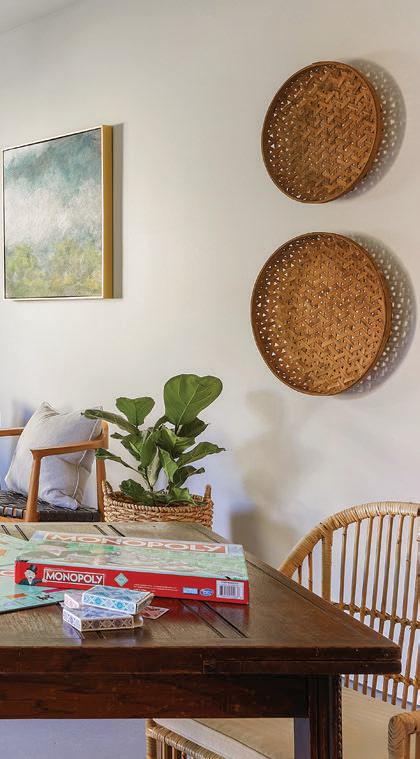
Custom cabinets: Oldwood Custom Cabinets, Huntsville Tile: Tile and Stone Market, Huntsville Countertop slabs: Triton Stone Group Cabinet hardware: Door Decor, Huntsville Wall color, TV room and bookcases: Providence Blue by Benjamin Moore Bedside tables: West Elm Cane bed: CB2 Art on mantel: Lauren Smith Art Bedside tables (blue and white bedroom): Ballard Designs Vintage pub table (game room): Railroad Station Antiques, Huntsville

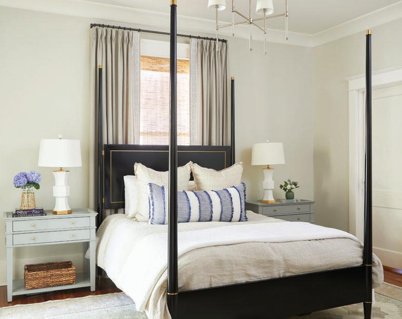
Find common ground. For accent colors in a bedroom, Kelly pulled hues from the rug, mixing prints and scale in patterned soft goods.

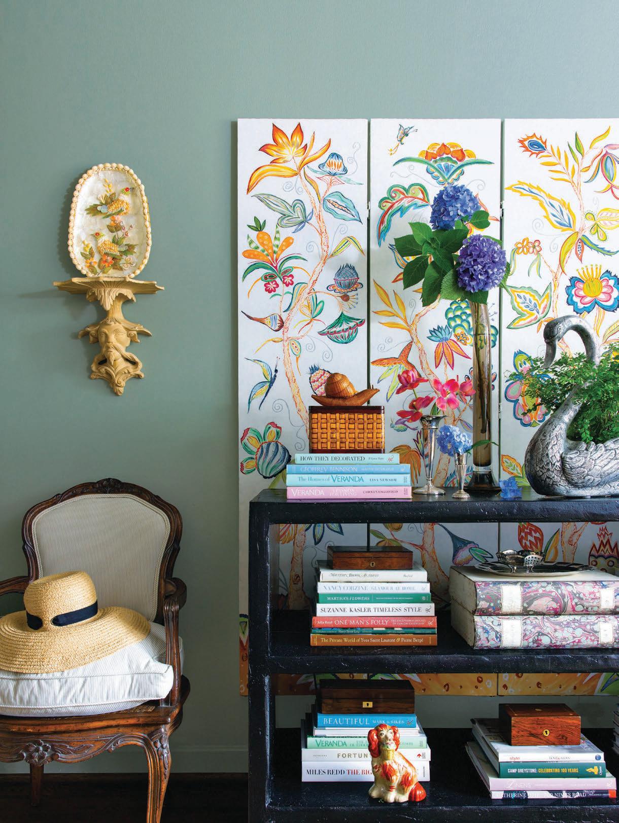
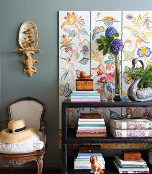
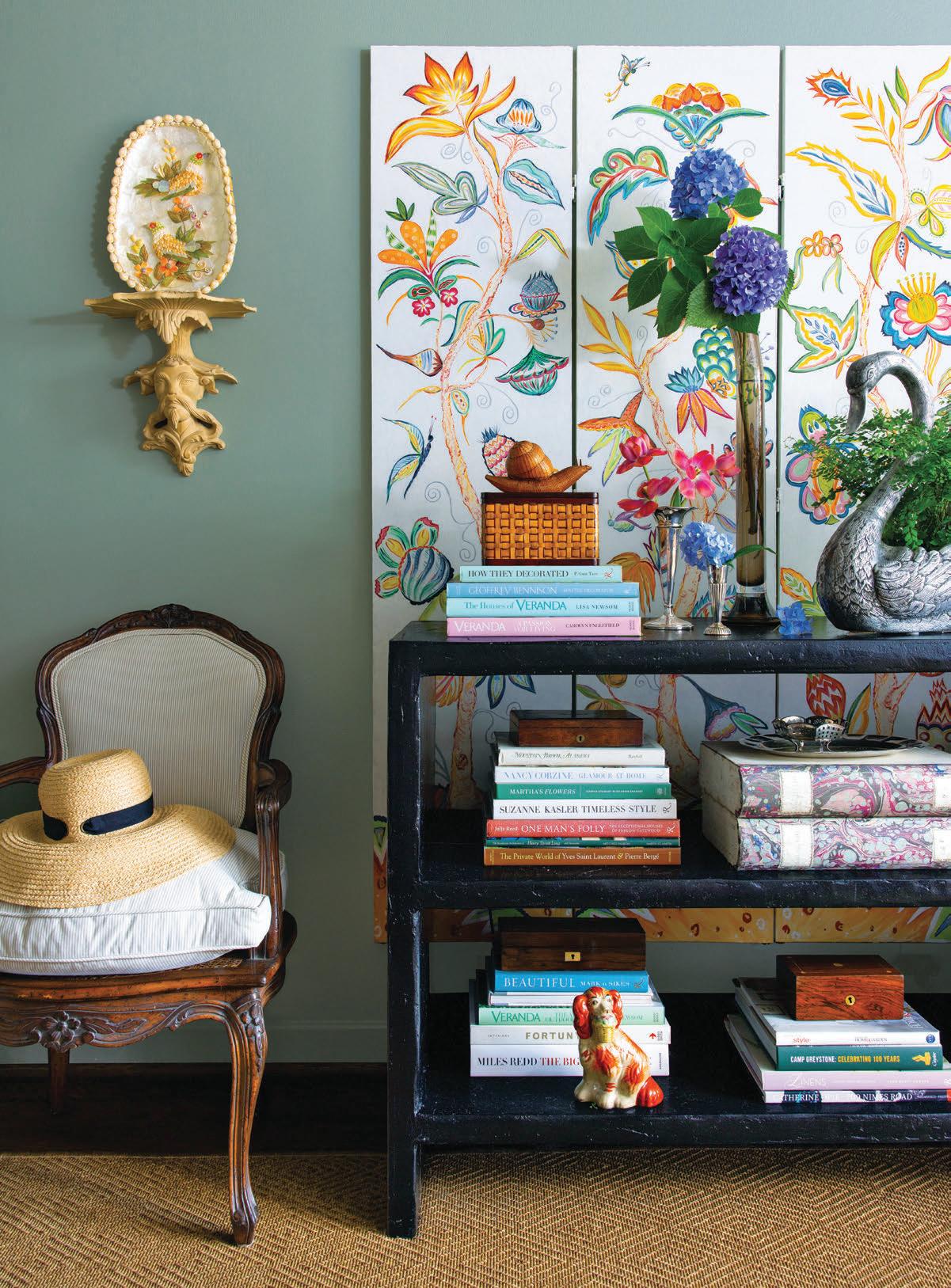 A lively floral screen painted by Ellie Christopher brings pretty attention to a living room wall— especially when paired with more of the designer’s finds and books.
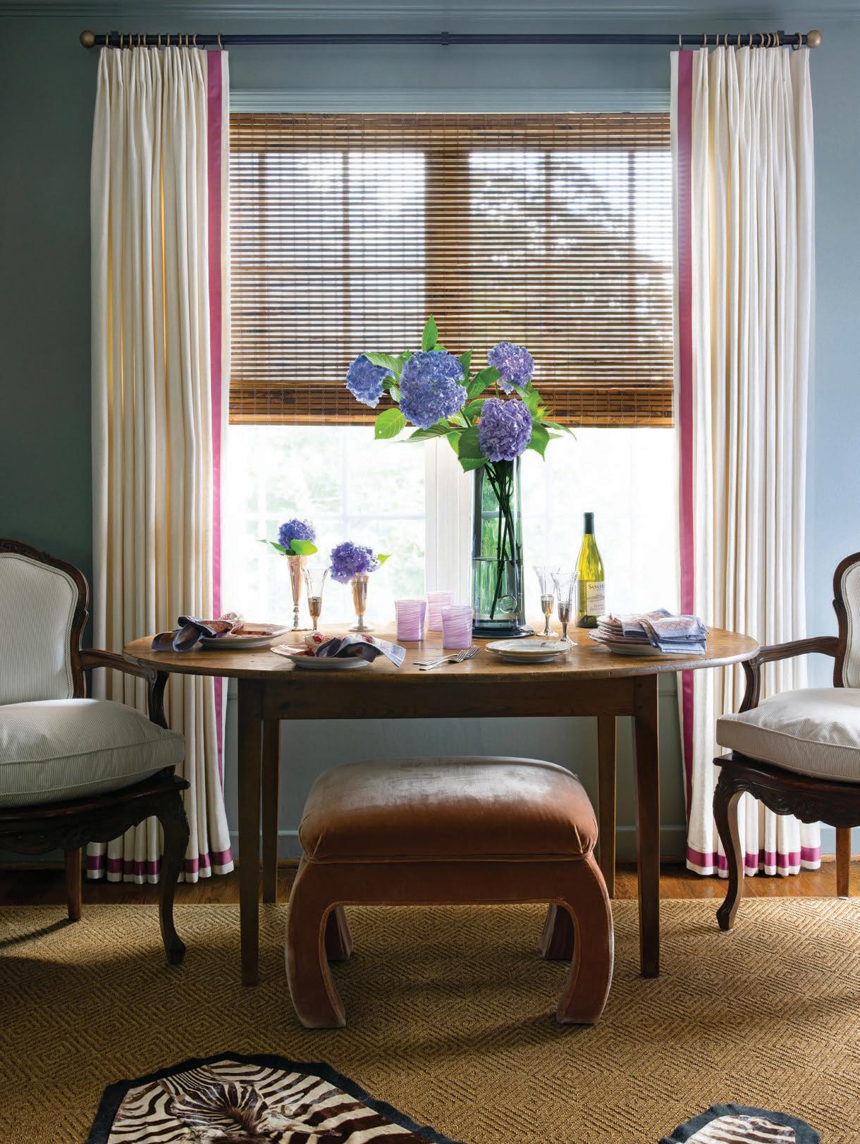
In the linear combination living and dining area, Ellie situated a slim oval table, a pair of bergère chairs, and a bench that can be tucked under the table when not in use or serve as additional seating when needed.


DESIGNER ELLIE CHRISTOPHER TAKES A STANDARD-ISSUE CONDO AND CASTS A COLORFUL SPELL OVER EVERY ROOM WITH CHOICE GEMS AND QUIRKY FINDS.
 Text by ALICE WELSH DOYLE | Photography by MARY MARGARET SMITH Floral Design by KATHLEEN VARNER
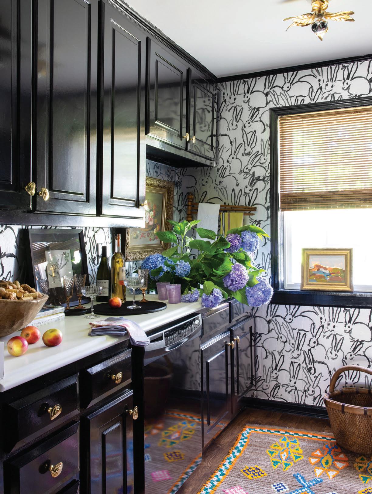
he vibrant interior designer Ellie Christopher calls herself an old soul, which is certainly re ected in her love of antiques and vintage pieces and in her nods to traditional decorating. However, that description doesn’t tell the whole story. Ellie is also drawn to the unusual and unexpected in her craft. Items that others may see as a little too patinaed or too quirky seem to fascinate her, as evidenced in her 1960s condo that she has completely reworked. e interiors can best be described as having a charming “cabinet of curiosities” vibe injected with lively color. But it certainly didn’t start out that way.
“When I purchased my condo in 2017, it had builder beige and gray everywhere,” says Ellie. “It was so depressingly bland. I wanted a home that would invigorate and excite me every time I walked in the door.” However, she did like that the original black-andwhite tile bathroom was still intact. “I’d seen others that had ugly brown home improvement store tiles installed to ‘modernize’ the space,” the designer says.
Before she moved in, Ellie wallpapered the bathroom in a chic snakeskin pattern and painted the living room green. Updates to the kitchen fell rmly in the cosmetic category. “ e kitchen had black appliances, which I wasn’t prepared to replace yet,” she says. “I decided to paint the cabinets black in

OPPOSITE: In order to minimize the kitchen’s appliances, Ellie painted the cabinets glossy black and papered the walls in a whimsical Hunt Slonem for Kravet design that speaks to her love of animal motifs.
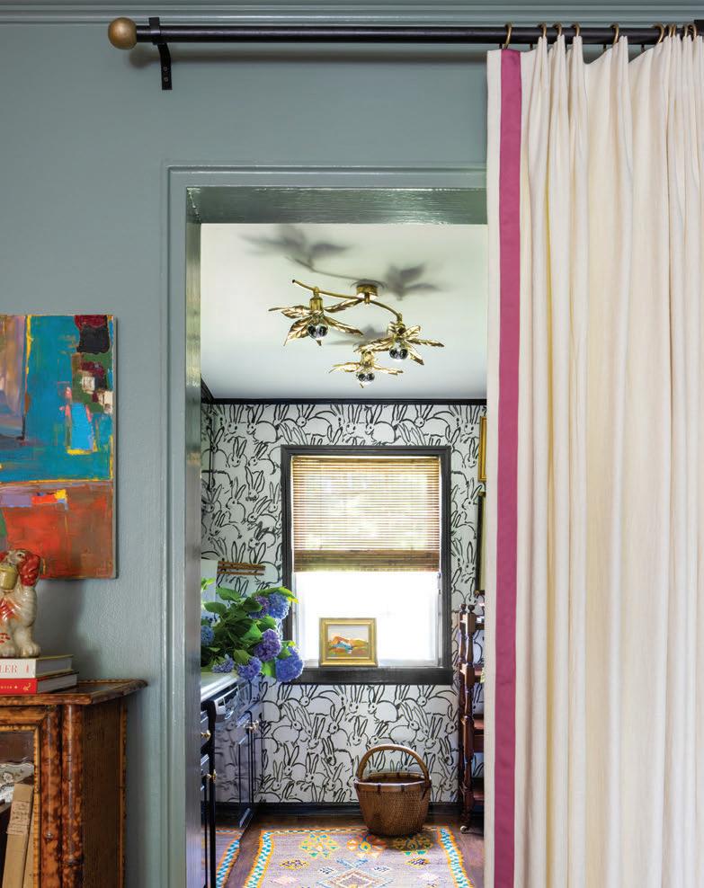
ABOVE: A portiere designed to match the living room draperies sets o the main living area from the galley kitchen and closes easily when desired.
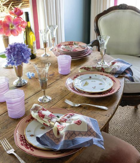
LEFT: The pretty tablescape includes of mix of plates from Table Matters and Bromberg’s, along with napkins from Alkmy. The cool purple glasses bring in a contemporary note to the weathered drop leaf table.
“When friends or clients say antiques are too hard to live with, I invite them over for cocktails just to prove otherwise.”
— Ellie Christopher
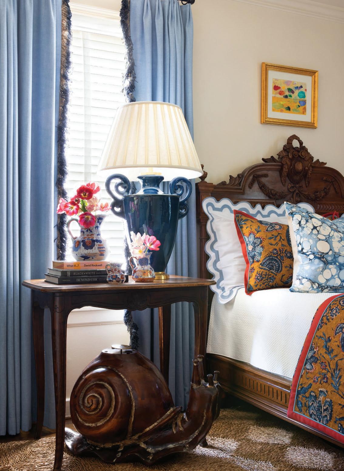
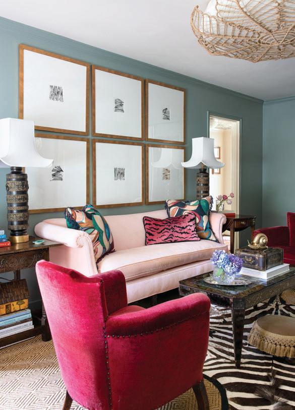
THIS PAGE: Ellie updated an heirloom bed with linens from Matouk. The shams and coverlet are a custom design from Katie Leede. The bedside is from Maison de France. OPPOSITE: A lifelong artist, Ellie created the series of black-and-white abstracts to anchor the wall in the living space. A sofa from Ellie’s family was re-covered in a shell pink velvet and topped with a lively mix of pillows. Side tables are from Henhouse Antiques.
“It’s important to be patient and steadfast while hunting for treasures. It takes time to find art and accessories that make a home feel like it’s lived in and loved. Design shouldn’t feel rushed and disposable. I’ll always be looking for pre y things to layer in.”

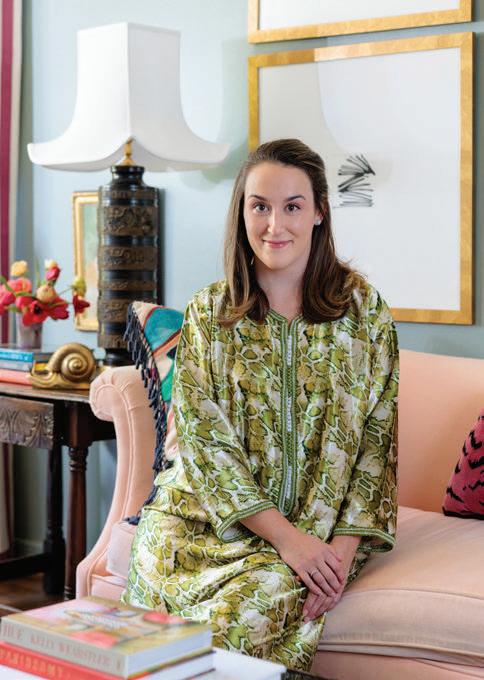
Raised in Columbus, Georgia, Ellie Christopher graduated with an interior design degree from the University of Georgia. After college, she worked in the Jerry Pair showroom at ADAC, which led to a position at Robert Brown Interior Design and then with Beth Webb. Ellie then moved to Birmingham to work with Tammy Connor before opening her own firm. “I have worked for so many designers with different styles so I enjoy doing all types of looks,” she says. “I see my job as trying to elevate each client’s individual style and tailor it to them. But I do try to add an element of surprise here and there to keep it fresh.”
Ellie Christopher Interior Design elliechristopher.com, IG: ellie_christopher
— Ellie Christopher
Buy one great piece each year. Filling a home can be overwhelming, so take your time to invest in on outstanding chest, a piece of art, or a rug per year.

Don’t be afraid to break the rules. Sometimes the old ways need an update. It can be fun!
Buy art that evokes an emotion or memory. It’s important to live with pieces that bring you joy.
Collect, collect, collect! Find something you love like vintage linens, glassware, or books. I adore my collection of sterling napkin rings. They’re all different but look amazing all together.
Don’t let kids or pets stop you from having beautiful things. The design world continues to adapt for our busy and messy lives. Performance textiles are life changing!
order to disguise the appliances.” Ellie then hung the black and silver Hunt Slonem wallpaper.
With an engaging canvas in place, the designer started adding in beautiful things that spoke to her heart. “Each space has evolved over time as a compilation of memories from trips and gatherings with family and friends,” she says.
Ellie used her rst tax return to purchase the cool carved lamps with pagoda-style shades for her living room, channeling a memory from her childhood. “I’ll never forget one day when an antique clock was delivered to my mother’s home with a note saying it was from a secret admirer,” says Ellie. “A few years ago, I learned that my mom sent it to herself. I love that story, and it’s given me permission to buy myself the things I love and want.” e designer also has a penchant for collecting
animal-inspired pieces of all types, and although she doesn’t discriminate, she has a particular fondness for snails.
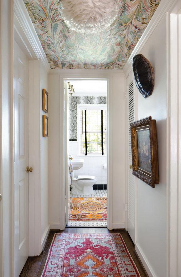
Other favorite nds include a leather lion footstool scored on First Dibs in the living room, along with a zebra hide rug. A large tortoise shell is mounted in the hallway, while a Sta ordshire china dog perches on a console table. And, of course, a stately wooden snail peeks out from under a side table in the guest room.
More recently, Ellie purchased two chairs at auction that she plans to cover in a unique marbleized velvet. “ e fabric combines the best of both traditional and modern—a classic pattern rendered in a more edgy interpretation,” she says.
Even with all of her design changes, Ellie is still looking ahead at what’s next for her condo. “I don’t know if I’ll ever be nished decorating, but it does nally feel like the sanctuary I’ve been wanting!”
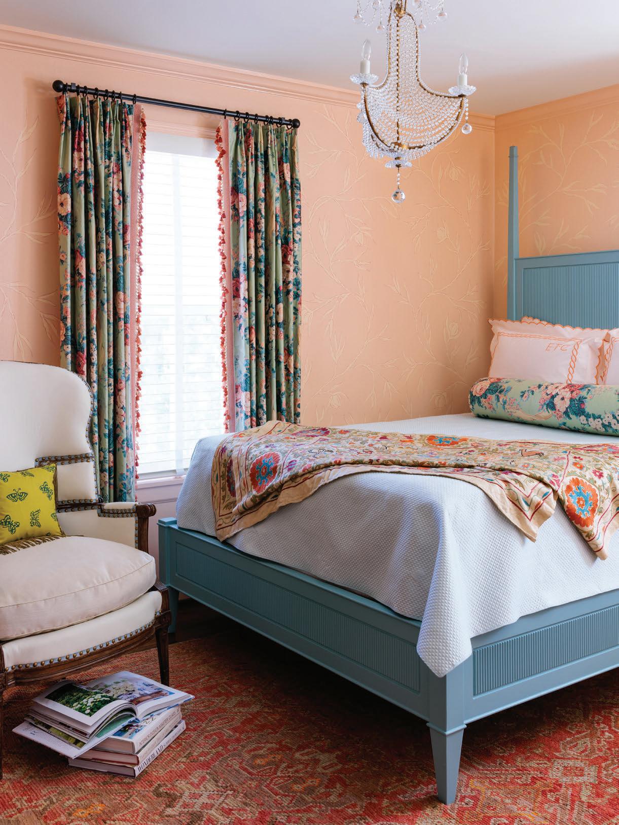 OPPOSITE TOP, LEFT TO RIGHT: A bold contemporary painting from artist Amee Calloway finds company with an antique chest. The small hallway is big on drama thanks to the Kravet wall covering on the ceiling, the light fixture from Design Supply, the hanging tortoise shell, and bold art.
THIS PAGE: In the main bedroom, chintz curtains and a pretty blue bed are set o by peach-hued walls.
WHEN A FAMILY BUYS A HOUSE THAT DOESN’T MEET ALL THEIR EXPECTATIONS, IT FREQUENTLY TAKES A TALENTED PROFESSIONAL TO REDESIGN THINGS TO SUIT THEIR TASTES. AND WHEN THAT PRO IS INTERIOR DESIGNER CAYLEE STEFANEK, THE RESULTS ARE TRULY TRANSFORMING.
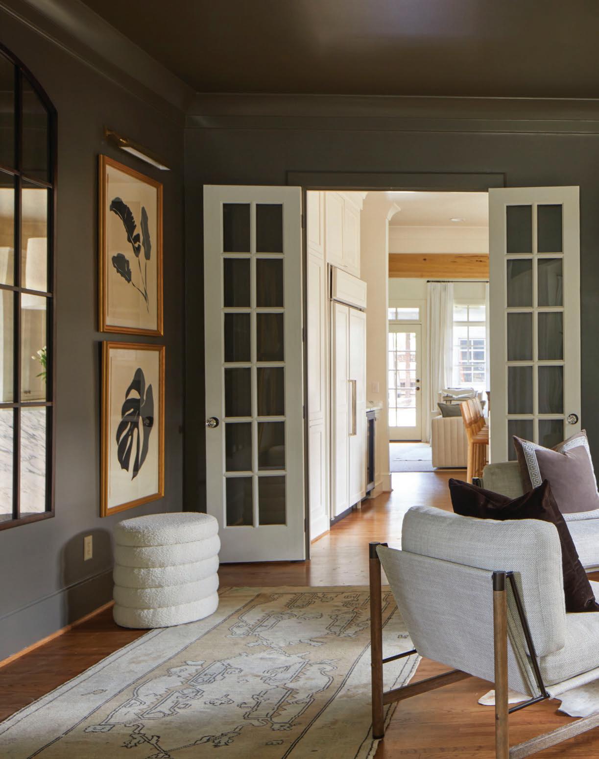
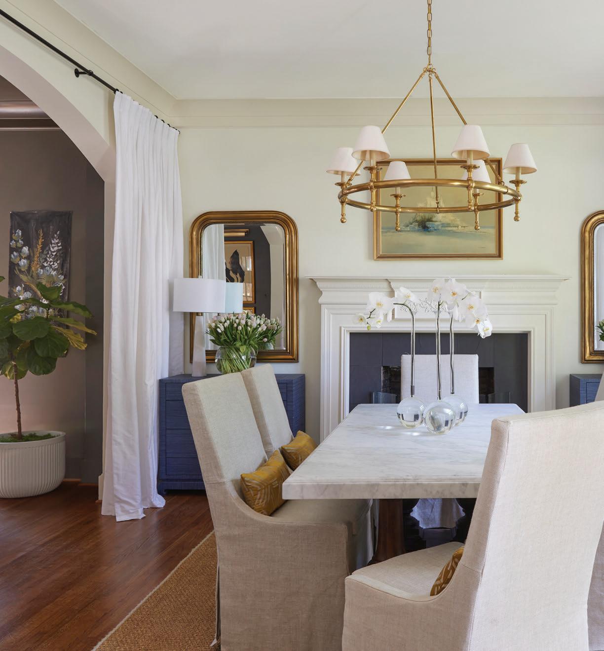
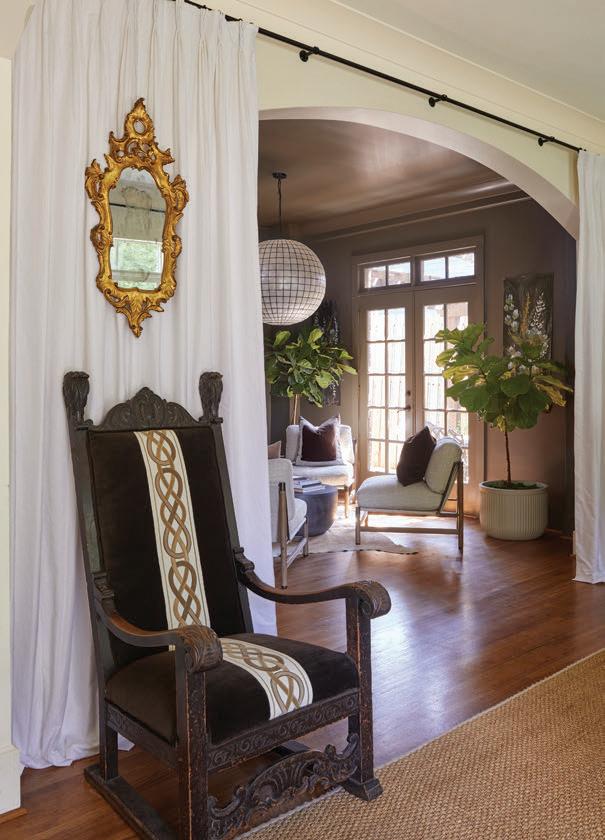
OPPOSITE TOP: Gracing the dining room, this antique throne chair was a thrift-store find that the designer re-covered in a lush brown mohair and velvet trim.
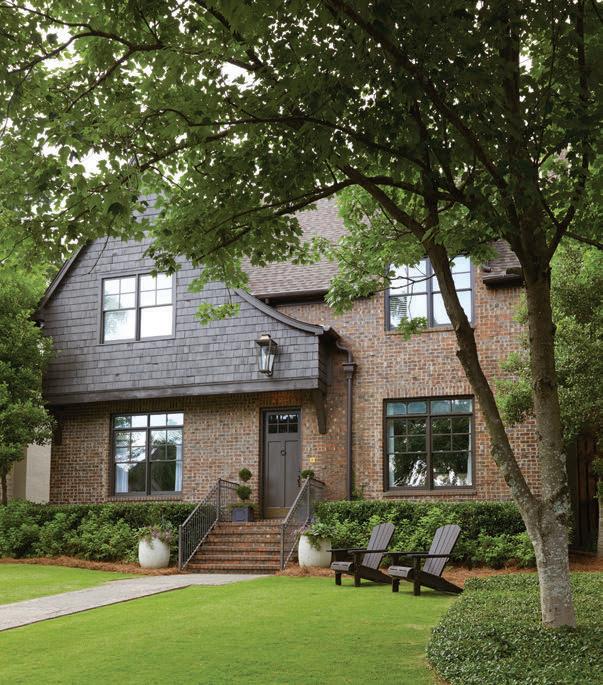
OPPOSITE BOTTOM: The home’s English Cottageinspired exteriors were further enriched by applying a dark stain to the cedar beams, shakes, and window trim, which also complemented the existing brickwork. The addition of a large gas lantern from Brandino Brass strengthens the e ects by illuminating the front entryway.
hile it’s ideal to buy a house that best suits your needs and lifestyle, that is not always the case. However, a home that doesn’t have every desired amenity doesn’t have to be a deal breaker. You simply must decide if you are willing to make those changes to achieve
your vision. Such was the dilemma confronting these young homeowners, who realized that their new address required some extra nessing before it would earn their full stamp of approval.
Although the Edgewood house had undergone previous renovations, its demeanor was a bit too con ning for a growing family. Moreover, with three kids in tow, the new owners
wanted free- owing spaces and easy maintenance that didn’t quite match up with the home’s existing layout. One thing led to another, until nally, they resigned themselves to take on an ambitious home overhaul.
Birmingham interior designer Caylee Stefanek of Logos Interiors put her expertise to work. “ ese clients initially approached me to create a better, more open connection

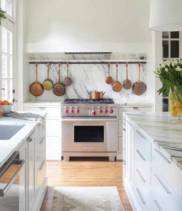
between their kitchen and adjacent family room,” Caylee says. “From a general, overall assessment, the house seemed ne as it was, but I felt that it wasn’t living up to its full potential, especially in the kitchen.” Once she sketched plans and interior elevations that proposed a recon guring of the space, the designer and homeowners began the project—something that extended beyond the kitchen makeover.
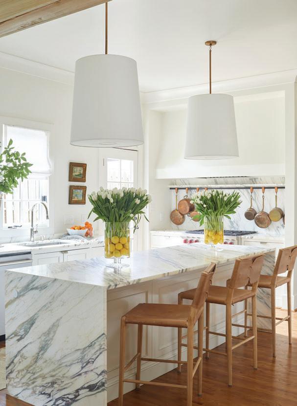

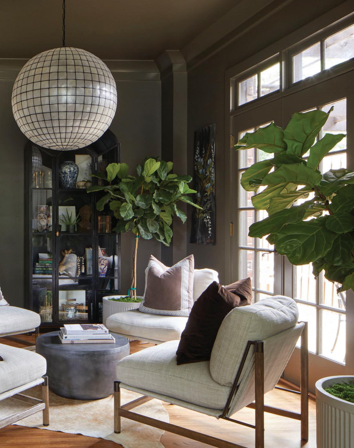
Along with creating the necessary drawings, Caylee oversaw everything from picking furnishings and artwork to arranging accessories and decorating rooms. “In an attempt to reduce both costs and clutter, I edited during each phase to make sure the nal mix of materials, xtures, and embellishments felt balanced enough, edgy enough, and above all, livable,” she says. Anything that didn’t hold a
certain sentimentality for the family was left out. “ e couple already had so many beautiful pieces to incorporate, so we had to get creative with where to place everything,” says Caylee. “We even hung objects like gilt mirrors and small engravings directly on curtains and millwork.”
Along the way, the designer made a conscious e ort to keep things simple. In the master suite, she created a streamlined
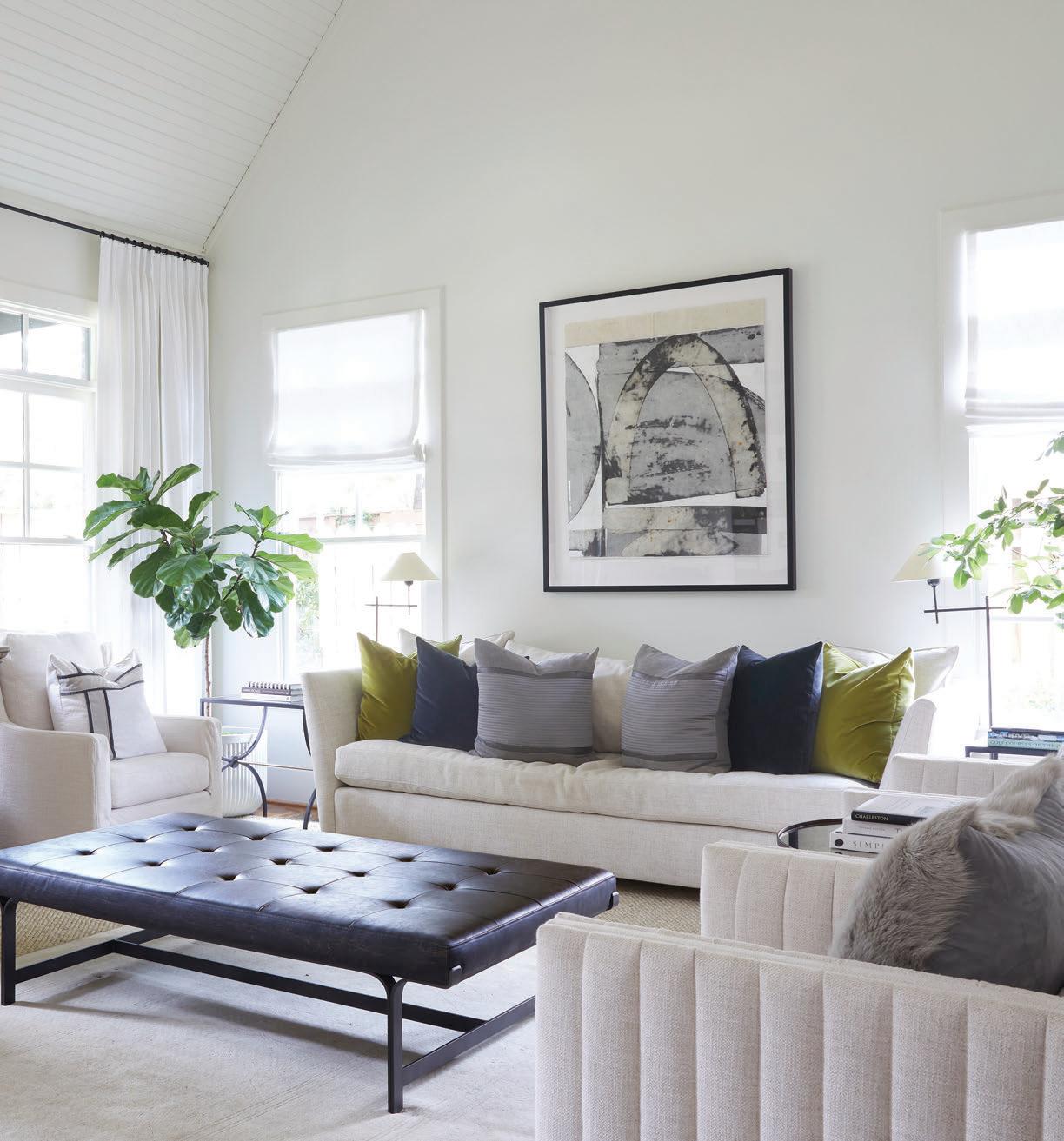
“My goal was to create interiors for this home that reflect the clients — welcoming but also stylish and clever! Each room contains comfortable places to sit and connect with family and friends, as well as a bevy of conversation pieces without any clu er.”
—Caylee Stefanek, Interior Designer
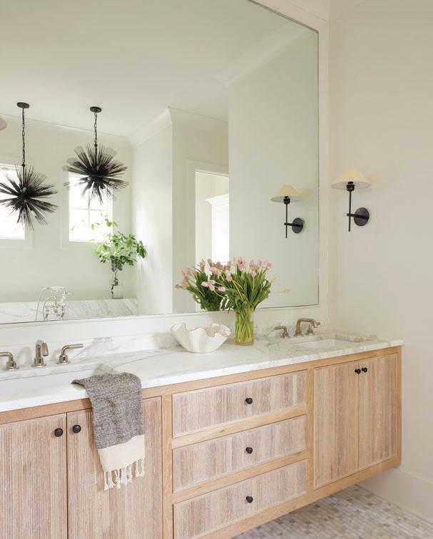
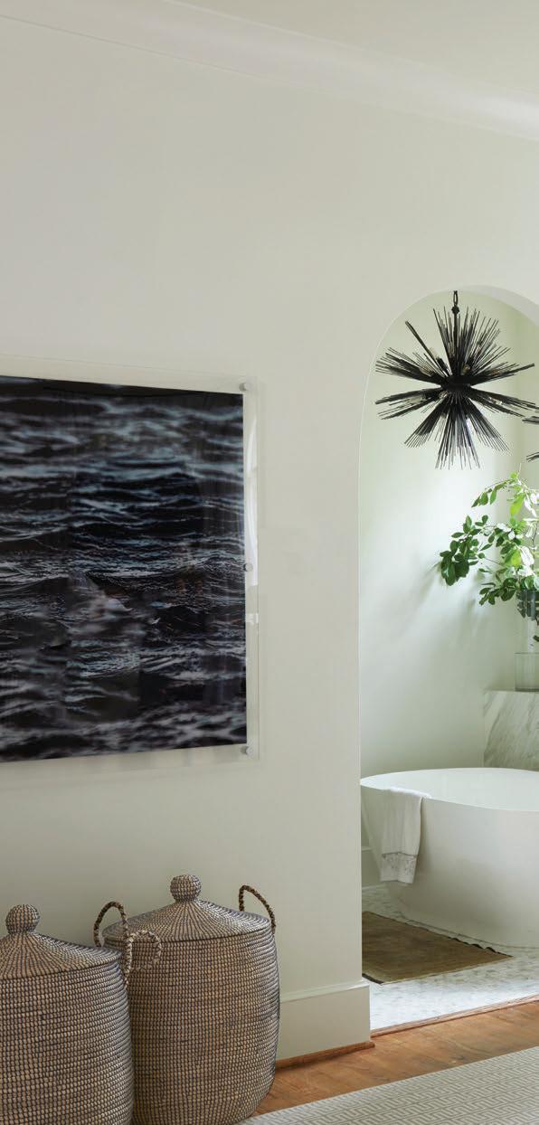
LEFT AND BOTTOM LEFT: Clerestory windows supply the master bath with plenty of natural light, and their high placement o ers privacy. Elegant wall sconces contrast the two sea creature-like pendant lights hanging above the freestanding tub.

THIS PHOTO: The entire headboard wall is layered with custom linen draperies, along with an original painting by Caylee. Lamps fashioned from antique Italian artifacts reside on a pair of bedside tables.
vanity and bath area for the couple, which includes a spa-like soaking tub. Prudent selections of textures and fabrics also played a crucial role in the renovations. “Because my mom is a seamstress, nding beautiful linens and reupholstering certain furniture pieces are always at the forefront of my mind—even though it’s one of the last things I nalize on a project,” says Caylee. e satin S. Harris lumbar pillow fabric, along with
the Colefax & Fowler damask found in the master bedroom, are two of the designer’s favorite textiles in the home.

Because Caylee’s design process involved a comprehensive layering of elements to bring about a polished outcome, the house now feels tailor-made for the homeowners. “Best of all, I got to know these clients so well through treasure-hunting with them,” says Caylee. “Towards the end of this makeover,
RESOURCES:

Designer: Caylee Stefanek, Logos Interiors Contractor: Drew Ogle, Ogle Construction Light fixtures: Mayer Lighting Plumbing fixtures: Fixtures and Finishes Marble countertops: Triton Stone of Birmingham Artwork in family room and botanicals in the sitting room: Design Supply

comfortable places to sit and connect with family and friends, as well as a bevy of
I instinctively knew what ‘holes’ remained that needed to be addressed to make this home perfectly re ect the family.”

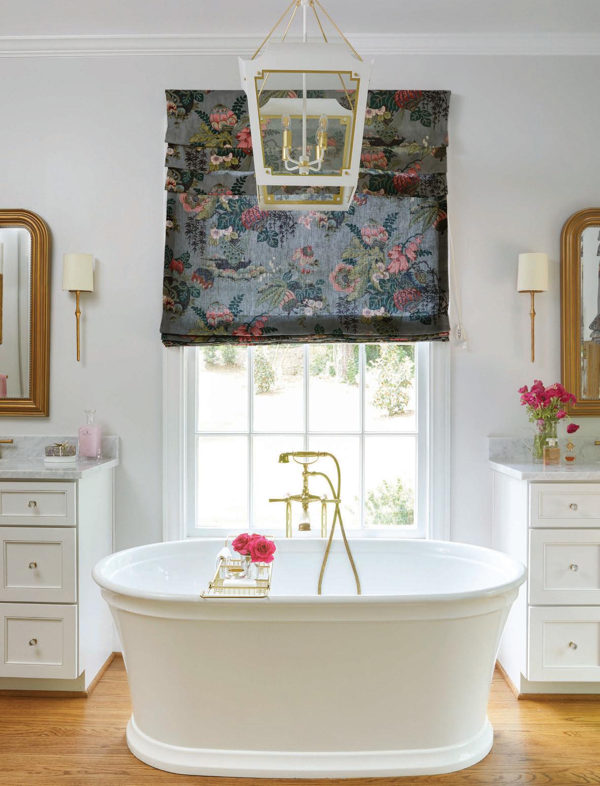
THIS IMAGE:

Design: Catori Design House
Tub, plumbing, hardware: VW Gallerie
Cabinets: DB&J Cabinetry
Countertops: CR Home
Roman shade fabric: Anna French Fairbanks, Thibault
Lighting: Julie Neill Caddo lantern and Studio VC
Dauphine Sconces, Visual Comfort
Luxurious appointments, high-tech innovation, classic looks, and fresh color and pa ern. Check out these dreamy baths that have all this and more to inspire your own indulgent retreat.
here’s nothing good about a water leak— unless of course it’s the catalyst for a gorgeous update. Designer Kelly Butler took the opportunity to transform her client’s ooded bath by turning the former cave-like space into a cocoon of green and white (Sage Wisdom by Benjamin Moore). “Black, textured tiles
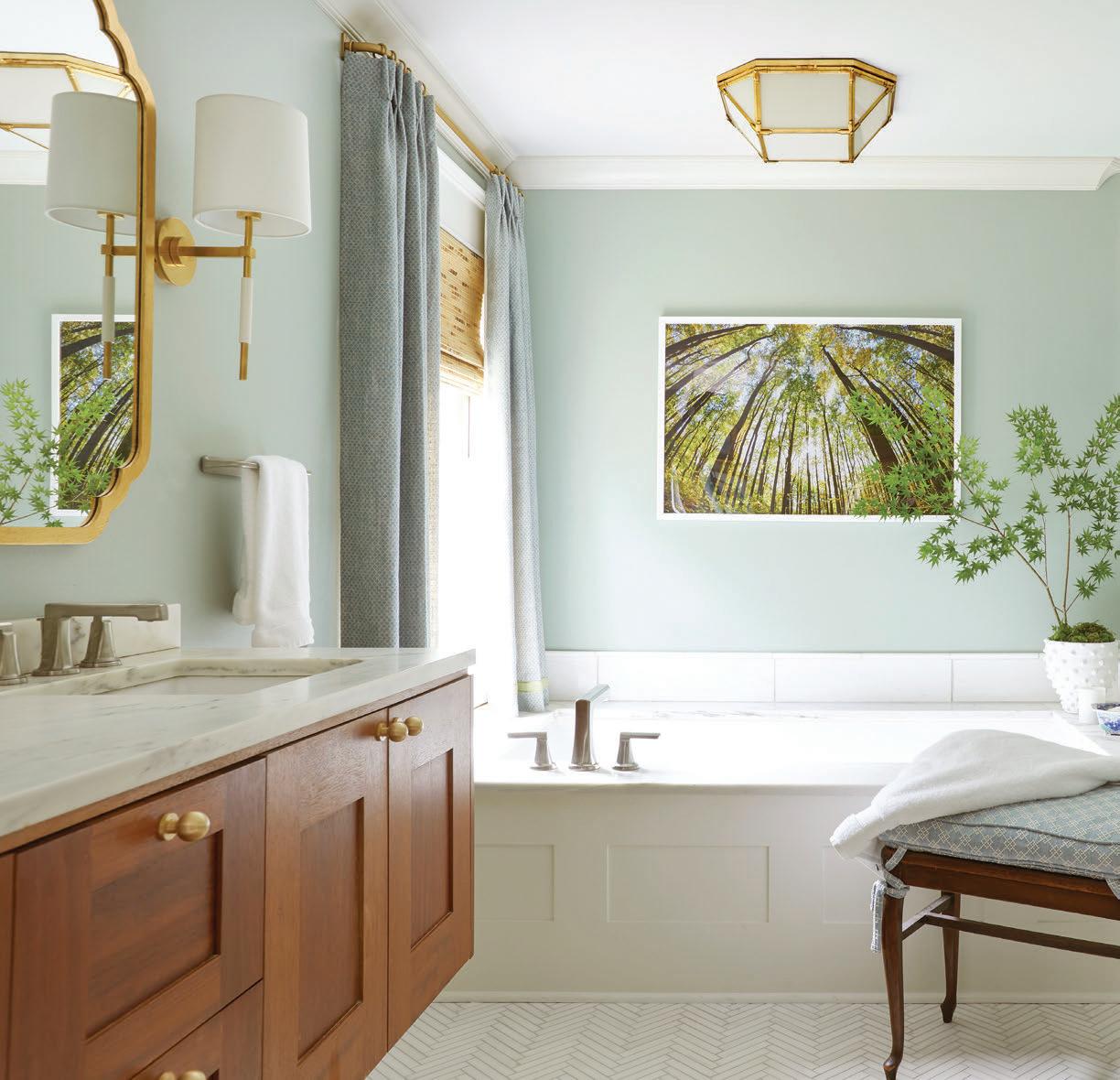
had covered an entire wall. Along with the brown oor and shower tiles, the room felt heavy and dark,” Kelly says. “New tile in lighter tones helped brighten the room.”
Kelly was able to salvage the best part—the oating cabinet. “ e wood is a nice contrast and provides all the storage needed,” she says. To complement the vanity’s marble countertops, she mixed in
new marble and ceramic tile in a variety of sizes and patterns on oors and in the shower to create interest and texture while ensuring a timeless feel.
And before all the new appointments were made, Kelly made sure to reinforce and update all of the old plumbing. is renovation is not only beautiful but also o ers the homeowners peace of mind.
RESOURCES:

Design, mirrors, sconces: K Butler Interiors

Plumbing fixtures:
Heritage Kitchen & Bath

Tile: Tile and Stone Market, Huntsville
Before

FLAKE STRIKES A BOLD, BEAUTIFUL
HER BEDROOM AND BATH WITH NEW FINISHES, A GRAPHIC PUNCH, AND HIGH-TECH LUXURIES.
olbalt blue and black have always been part of Lisa’s personal design scheme. When she decided to renovate her bedroom and bath, it was
just natural that she would carry the favorite hues to her own spaces. “Huge Moroccan cobalt blue vases have been in the front part of our house for years, and I knew this was the color I wanted to continue in the renovation,” Lisa says.
Inspiration also struck when she toured a condo designed by Andrew Brown. “After I saw the painted oors, I wanted to move in. But instead, we replicated the look and brought the oors back to our home.”
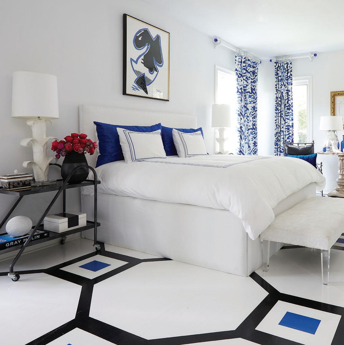
“My bedroom is my sanctuary. I spend more time in this room than any other room in the house. I love being able to do work or even eat a meal in here.”
— Lisa Flake
With the palette rm, Lisa reinstalled most furniture from her original bedroom. “I loved each piece and knew they would take on a di erent feel with the painted oors and custom bed, bedding, and drapes,” she says.

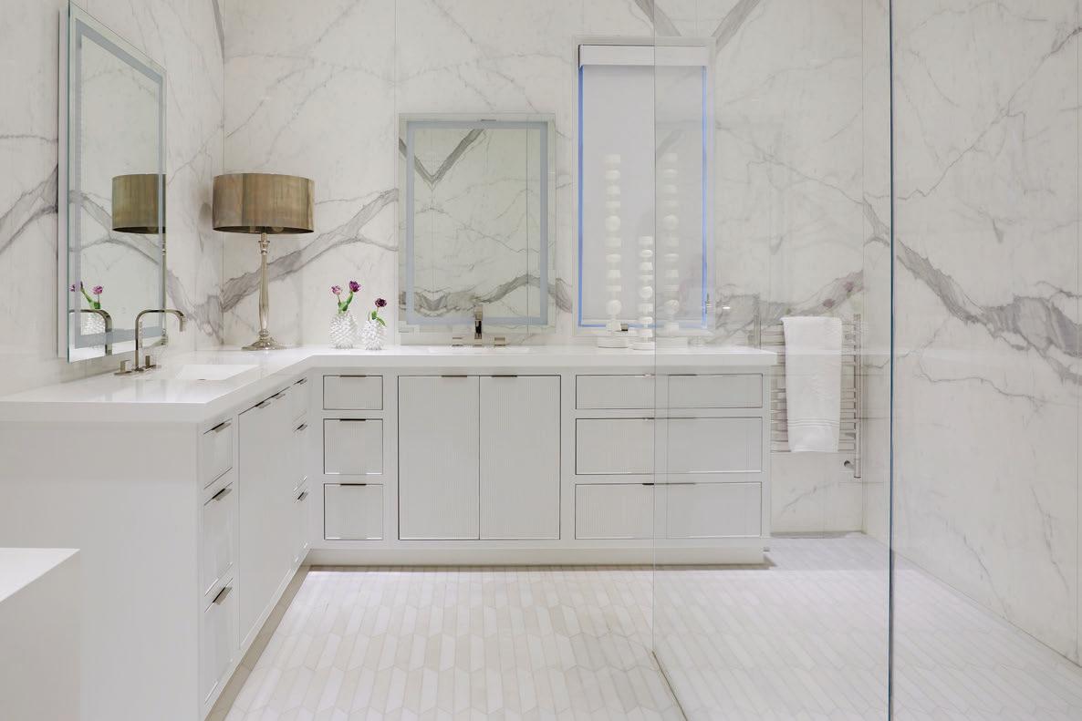
As a soothing foil, the bathroom is calm, cool, and mostly white. Drama comes through in the shower wall that looks like one continuous slab. “ ey are actually 10-foot-tall sheets of porcelain that I have been eyeing for years,” says Lisa. “I had dreamed of the


RESOURCES:
Design: Caldwell Flake Interior Design
Painting above bed, console, desk, lamps: Hiltz-Lauber
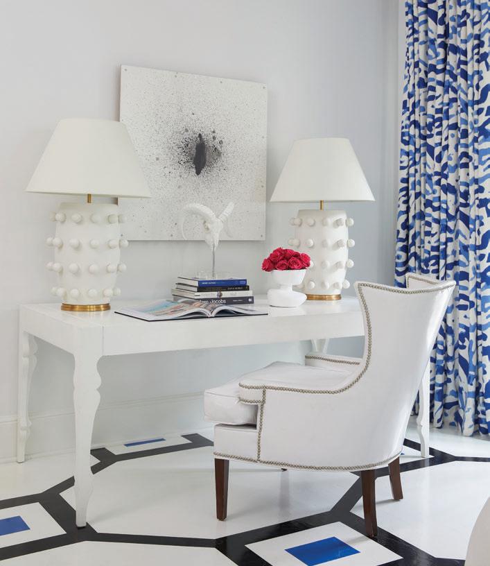
Floor painter: Emily DeBuys
Shower tile: Triton Stone Group

Contractor and tile install: Adrian Bond
Sinks and counters: Alabama Stoneworks
Cabinets: Cantley & Company
Fixtures: Fixtures and Finishes
Hardware: Brandino Brass
day I could use them.”
For added comfort and convenience, Lisa added high-tech appointments. e toilet has a Toto washlet with auto open and heated seat. “It’s easy to add to most toilets,” she says. “All you need is a plug behind the toilet.” Lighted mirrors o er multiple settings. Heated oors extend into the shower, and a towel warmer keeps things cozy.
A BRAND NEW BATH SHINES WITH ARCHITECTURAL INTEREST, GRACIOUS PROPORTIONS, AND PLENTIFUL COMFORTS.
hen building new, it’s easy to cross everything o your wish list. Designer Mandi Smith T marked
her client’s every box when it came to elegant appointments, function, and style while designing this primary bath. Soaking tub? Check. Roomy shower? Yes. Custom double vanities? at too. ere’s also plenty of storage thanks to a
built-in dressing table and closet accessed by double doors. Finished in shades of pale gray, white, and cream, the athome retreat perfectly complements the ajoining bedroom with its neutral hues and soft blue accents.


Interior Design: Mandi Smith T Interiors



Architect: Chad Bryant; C.M.Bryant
Architecture, L.L.C.
Builder and cabinets: Slate Barganier Building
Hardware: Brandino Brass
Fixtures: Mayer Lighting
Tile and stone: Robert F. Henry Tile and Triton Stone Group
Paint Color: Swiss Co ee, Benjamin Moore


Let one of our talented and experienced artists help you find your inner talents! Students in the wheel classes may practice anytime the studio is open (skill-driven class). Hand-building students complete projects each week (project driven class). Also ask about birthday parties, ladies night out, corporate team building, and more.
Cost: For the LOW cost of $250 we provide 6 WEEKS of instruction, FREE studio use during business hours, glazes, firing and 25 lbs of clay to find your inner potter!
Information: Call us at the Studio (205) 702.7055!


ere's just something special about a pot of soup simmering on the stove. It’s comfort food at its nest. January is the ideal month to simplify your meals (post-holiday indulgences) and make these one-pot wonders. ey will keep for several days and provide a hot lunch too.




For those of you with a busy work week, I suggest prepping the ingredients the night before and have them ready to go in a large zip-top plastic bag.




at really speeds things up if you are short on time. Most of these soups are ready in under an hour, except for the Hearty Ribeye Vegetable Soup. I highly recommend letting that one simmer for several hours to yield the most incredible avor.


So what are you waiting for? Pull out that Dutch oven and get chopping. Here’s to soup season!


SERVES 6
½ cup butter
1 onion, diced
3 celery stalks, chopped
2 carrots, peeled and chopped
¹⁄³ cup flour
4 cups chicken broth
2 cups half-and-half
6 cups broccoli florets (about 3 medium-size crowns)
2 bay leaves
½ teaspoon nutmeg
½ teaspoon red chili flakes
1 teaspoon salt
½ teaspoon pepper

SERVES 4 TO 6
6 red bell peppers
4 garlic cloves, peeled and whole
2 tablespoon olive oil, divided Salt and pepper
1 yellow onion, finely chopped
1 (7-ounce) jar sun-dried tomatoes in oil
Juice of 1 lemon
Pinch of red pepper flakes
3 cups vegetable stock, plus extra for thinning if needed
Whipping cream and pesto for garnish
Preheat oven to 400°.
Roughly chop peppers, and place in a large, rimmed baking sheet. Add garlic; drizzle with about 1 tablespoon olive oil, and sprinkle with salt and pepper. Bake for about 45 minutes.
In a large pot, heat remaining 1 tablespoon olive oil to medium-high; add onion, and sauté until tender. Add the roasted peppers, garlic, sun-dried tomatoes in oil, lemon juice, red pepper flakes, and vegetable stock.
Simmer for 20 to 30 minutes. Remove from the heat, and puree in a blender. Return to the pot, and adjust seasonings as needed.
Garnish with cream and pesto.
4 cups extra-sharp Cheddar cheese, grated, plus more for topping
Salt and pepper to taste
Crusty French bread for dipping
Melt butter in a large Dutch oven on medium heat. Add onion, celery, and carrots. Sauté until tender, about 5 minutes.
Sprinkle flour over vegetables, stir to combine, and cook for 1 minute or so. Add broth, and next 7 ingredients. Cover and reduce heat to low. Simmer for 20 to 30 minutes or until broccoli is tender.
Add cheese, and season with salt and pepper. Top with additional cheese, and serve with warm, crusty bread.

SERVES 6 TO 8
2 tablespoons butter


1 onion, finely chopped
2 medium carrots, diced
2 stalks celery, diced
6 cloves garlic, minced
8 ounces baby bella mushrooms, diced
Do not skip the pesto garnish. Store-bought is fine for this. The added flavor combines wonderfully with the roasted peppers and sun-dried tomatoes.
¼ cup all-purpose flour
6 cups chicken broth
4 boneless, skinless chicken breasts, about 1 pound
1 teaspoon salt, plus more to taste
I highly recommend grating your own cheese. It will melt much better than the pre-shredded type.

MAKES 4 QUARTS
2 tablespoons olive oil, divided
1 (16-ounce) bone-in ribeye
2 tablespoons Montreal seasoning
1 large onion, chopped
3 celery ribs, sliced
3 carrots, peeled and sliced
1 (14.5-ounce) can diced tomatoes
2 (32-ounce) cartons low-sodium chicken broth
½ cup butter beans
½ cup green beans, cut into 1-inch pieces
2 ears fresh corn, kernels removed
1 baking potato, peeled and cubed into ½-inch pieces
½ cup Heinz 57 Sauce (do not substitute)
2 tablespoons Worcestershire sauce
½ teaspoon pepper, plus more to taste
1 cup uncooked wild rice blend, rinsed and drained*
1 tablespoon rosemary, finely chopped
2 bay leaves
1 cup whole milk or half-and-half Celery tops or leaves for garnish
Heat butter in a large Dutch oven over medium-high heat. Add onion, and sauté for 4 to 5 minutes, stirring occasionally. Add carrots, celery, garlic, and mushrooms, and sauté for 3 more minutes. Add in the flour, and stir continuously for 1 more minute.
Gradually pour in chicken broth, stirring to incorporate with the flour without any

2 bay leaves
1 teaspoon salt
½ teaspoon pepper
Preheat oven to 400°.
Heat 1 tablespoon olive oil in a cast-iron skillet. Sprinkle both sides of the meat with Montreal seasoning. Sear steak on both sides, and place in oven for 15 to 20 minutes. Remove from oven, and allow to rest for 10 minutes.
In a large Dutch oven, heat remaining 1 tablespoon of oil on medium-high. Add onion, celery, and next 12 ingredients.
On a cutting board, cube the ribeye into 1-inch pieces. Add the ribeye and bone to the soup mixture. Simmer for 1 to 2 hours. Adjust salt and pepper if needed. Remove the bone and bay leaves before serving.
lumps. Add the chicken breasts and next 5 ingredients. Let the soup reach a simmer; reduce heat to medium-low, cover, and cook for 40 to 45 minutes until rice is tender. (Stir occasionally so that what is on the bottom of the pot does not scorch.)
Remove chicken breasts, shred the meat with two forks, and return to the pot. Add milk or half-and-half, stirring to combine. Remove the bay leaves, and season with additional salt and pepper. Garnish with celery tops or leaves before serving.
*Note: If you are unable to find a wild rice blend, substitute a (6.2-ounce) box of Ben’s Original Long Grain & Wild Rice, and reduce the cooking time to 20 to 25 minutes.
SERVES 8
1 pound boneless, skinless chicken breasts
2 tablespoons olive oil, divided
1 teaspoon salt, plus more to taste
¼ teaspoon pepper, plus more to taste
2 tablespoons butter
3 celery stalks, thinly sliced
3 carrots, peeled and finely chopped
1 medium onion, diced
3 cloves garlic, minced
3 tablespoons flour
8 cups chicken broth
Zest of one lemon
¼ cup fresh lemon juice, plus more to taste
2 tablespoons chopped parsley
2 tablespoons fresh dill or 1 tablespoon dried
1 bay leaf
¾ cup uncooked orzo
2 cups fresh baby spinach leaves
Preheat oven to 375°.
Place chicken breasts in an oven-safe dish; drizzle with 1 tablespoon olive oil, and sprinkle with salt and pepper. Cover tightly with foil, and bake 35 minutes.
While chicken is baking, melt butter in a large Dutch oven over medium-high heat. Add remaining 1 tablespoon olive oil, celery, and next 3 ingredients. Cook until vegetables are tender. Sprinkle with flour, stirring continuously for about 1 minute.
Shred chicken with two forks, and add to pot. Add broth, zest of lemon, lemon juice, parsley, dill, bay leaf, and orzo. Simmer for 20 to 30 minutes or until orzo is cooked through.
Add spinach just to wilt, and adjust seasoning with salt and pepper if needed.
Stylist and closet curator Mary Glenn McElveen partners with clients and brands to elevate women’s wardrobes. Here, she shares her best advice and the things that inspire her.

For event and bridal styling, I like to meet with my client so I can understand what she is looking for. I ask a lot of questions! Next, I will pull inspiration pictures to present to the client. Once we are in sync, I will source items both online and locally for the client to try. After we nail down the look, we can choose shoes and accessories.
For a closet edit, I ask my client to give me a mini tour of her closet so I can evaluate her goals and needs. Sometimes, it’s a matter of cleaning out, piecing together outfits with items in her closet, or filling in where necessary.
What are five basics that every woman should own?
A good pair of jeans. Nothing is better than finding the perfect pair of jeans that you can wear all of the time. My personal favorites are Mother jeans, which can be found at Tulipano.
A versatile jacket. This could be a blazer, a wool jacket, or a leather jacket. Owning a good jacket that can be styled multiple ways is a closet essential for winter dressing.
A white button-down.
This is a must for all seasons! It’s tailored and crisp, and it fits in with any style and age. Ann Mashburn makes the best button-downs. Le Weekend in English Village carries them.
A comfortable “everyday” shoe. Find a shoe you can wear multiple days a week that works with most outfits in your closet. It can be a fun sneaker or a pretty loafer.
A great accessory. For some outfits this might be a black belt, and for others it could be gold hoop earrings, a gold layering necklace, or even a neck scarf. Adding an accessory is one of the easiest ways to personalize a very simple outfit.
Ask yourself these questions. Have you worn it in the past two years, and if not, why? Is it worth getting altered or having me help style it for you? Does it look dated or worn out? Lastly, does it bring you joy? If you don’t love it anymore, it doesn’t look good on, or you have overworn it, it’s time for it to go.
What goes around always comes back around! I grew up in the 90s, and it is so fun seeing those trends come back in style! I try to stick with a neutral color palette and add one pop of color or trendy piece each season. I don’t advise spending too much money on seasonal trends.
