Effects
Under the Loupe

THE MAGAZINE FOR LIGHTROOM ® & PHOTOSHOP ® USERS OCTOBER 2022 Understanding and taking advantage of Publish Services in Lightroom Classic from sharing photos to contributing images to Adobe Stock
Photo
Learn how to use Photoshop to fill in all the missing pieces of old photos that have either been poorly composed or severely cropped Cover Images ©Adobe Stock and Unsplash ®

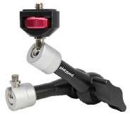
Platypod where INNOVATION never sleeps! Founded in 2014, our mission is to help photographers boost creativity with unique solutions to convert ideas to images. Night and daytime long exposure • Low angle • Tight spaces • Macro • Food • Toys Products • Travel • Remote rigs • Time-lapse • Architectural interiors • Lighting Adapt to rocks, railings, poles, trees, walls, dashboards… GET THE IDEA? JUST ABOUT ANYWHERE. FAST SET UPS, ERGONOMIC DESIGNS, INNOVATIVE CONTROLS… PLATYPOD DOES IT ALL!


Platypod Tools are: • Sturdy • Durable • Versatile • Compact • Sleek Design • Ergonomic • Heavy Duty • Weather Resistant SIGN UP FOR OUR FREE MONTHLY NEWSLETTER AND SPECIAL OFFERS. Introducing the AWARD WINNING


OCTOBER 2022 VOL 25 NO 10 PHOTOSHOP WORLD 2022 GURU AWARD WINNERS Join Us in Celebrating our Finalists and Winners [018] [ 007 ] A NOTE FROM SCOTT [ 009 ] CONTRIBUTORS [ 010 ] BENEFIT SPOTLIGHT [ 012 ] KELBYONE COMMUNITY [ 028 ] NEW ONLINE TRAINING [ 170 ] PRODUCT REVIEWS DEPARTMENTS MAXIMUM WORKFLOW Radiant Photo [048] VISUAL STORYTELLING Raining in Paris: The Process of Rediscovery [062] LIGHTROOM Q&A Terry White Answers All of Your Lightroom Questions [070] DEVELOPING THE SHOT Ross Fountain: Super Resolution Processing [030] UNDER THE LOUPE Using Publish Services in Lightroom Classic [042] LIGHTROOM LABORATORY Capturing a Fine-Art B&W Photo in Bad Weather [038] GOING MOBILE Mobile Magic [074] DOWN & DIRTY TRICKS Raising the Fright Factor of Halloween Images [112] PHOTOSHOP FOR LIGHTROOM USERS Photoshop for Photoshop Users [078]


23RD ANNUAL 100 HOT TIPS Take Your Workflow to New Heights with these 50 Photoshop & 50 Lightroom Tips [085] To read Photoshop User magazine and watch KelbyOne courses on tablets and other mobile devices, download the KelbyOne app: Apple App Store Google Play ONLINE CONTENT Whenever you see this symbol at the end of an article, it means there are either downloadable practice files or additional content for KelbyOne members at http://kelbyone.com/magazine Click this symbol in the navIgation bar at the top of the online reader to access the Contents. Whenever you see this button in an article, click it to go to the KelbyOne site to watch courses that cover similar topics contained in the article. Whenever you see this button , click it to go to the KelbyOne Online Community to ask questions or make comments about this issue. PHOTO EFFECTS Restore the Missing Pieces in a Cropped Photo [144] PHOTOSHP Q&A Answers to Your Photoshop Questions [182] DOWN & DIRTY TRICKS Surreal Mental Hallway Inspired by The Patient [126] PHOTOSHOP PROVING GROUND Cleaning Selection Edges [156] BEGINNERS’ WORKSHOP Copying Makeup from One Photo to Another [138] DESIGNING IN PHOTOSHOP Get Plugged into Photoshop Extensions [162]

SCOTT
ON THE ROAD AGAIN
There’s a lot going on as we head into the last quarter of the year. First, I just got back from Salt Lake City where I did a presentation for the grand opening of the new building at Pictureline, Salt Lake’s pho tography store since the ’80s, and I can’t tell you how much I enjoyed getting to present to an in-person audience. I met lots of KelbyOne members and saw some old friends. Thanks so much to everybody who came out.
My next in-person speaking event is a keynote talk at B&H Photo’s first-ever OPTIC West conference out in Mon terey, California, November 6–7, 2022. It’s my only West Coast gig of the year, and I haven’t been out to California since before COVID, so I’m really looking forward to it (and to finding the nearest In & Out Burger when I’m out there). There’s an amazing team of teachers at the conference, including a special keynote from National Geographic photographer, Frans Lanting, where he’ll present his new book and photo project. You can attend in person or online, both of which are free.
We just announced our next conference (and our last conference of the year), and I think the timing is just perfect. It’s The Travel Photography Conference and we’ve put together an all-star crew of instructors, and we’re welcoming some fantastic new instructors who have such great info to share. It’s going to be an incredible learning experience and we want you to be a part of it. It’s coming up October 25–26, 2022. It’s all online and each day has two tracks. The whole conference will be archived so you can rewatch any classes you want to see again, or catch any sessions you missed. If you want to attend (and you totally should) click this link . Also, you can check out the official trailer where I explain more about the conference by clicking here Adobe MAX (Adobe’s big annual event) is nearly here and, as I mentioned last issue, it’s when Adobe usually releases a bunch of new Lightroom and Photoshop
features. So, if history is any indicator, we’ll soon have lots of new goodies to learn and apply to our workflows, and of course, we’ll have all the coverage and education here in the mag and online, so keep an eye out for the Adobe MAX keynote on October 18.
Next week, I’m super-excited to be off to the Tuscany region of Italy to lead a travel photography workshop with KelbyOne instructor Mimo Meidany. We’ll be doing a lot of location shooting, a bunch of postprocessing in the classroom and, of course, we’ll be sampling some incredible Italian food (could include some wine; hey, ya never know). I’m going early and bringing a KelbyOne video crew with me to record some travel photography online courses for you guys. There will be lots of cool stuff in these courses, so I can’t wait to share them with you.

It’s going to be a fun October, and I’m glad you’re here along with us for the journey. It’s going to be a great one!
Scott Kelby KelbyOne President & CEO Editor
 Publisher
All my best,
&
KelbyO n e A NOTE FROM
KELBYONE.COM 7
EDITORIAL:
Scott Kelby, Editor-in-Chief
Chris Main , Managing Editor
Kim Doty, Associate Editor
Barbara Thompson , Copy Editor
GRAPHICS:
Jessica Maldonado, Art Director
Margie Rosenstein , Senior Graphic Designer
Angela Naymick , Senior Web/Graphic Designer
MARKETING:
Adam Frick
Ashley Fosse
Kleber Stephenson
WEB: Adam Frick
Yojance Rabelo
Aaron Westgate
PUBLISHING:
Scott Kelby, Publisher
Kalebra Kelby, Executive V.P.
Jean A. Kendra , Business Manager
ADVERTISING:
Kleber Stephenson , Vice President of Business Development & Enterprise: kleber@kelbyone.com
HOW TO CONTACT KELBYONE:
U.S. Mail: 138 Douglas Road East Oldsmar, FL 34677-2922
Voice: 813-433-5000
813-433-5015
Customer Service: info@kelbyone.com
Letters to the Editor: letters@photoshopuser.com
COLOPHON:
Photoshop User Magazine is produced using Adobe Photoshop CC 2022 and Adobe InDesign CC 2022. Korolev, Factoria, and Priori Sans are used for headlines and subheads. Acumin Pro and Korolev are used for body copy.
Our 23rd Annual 100 Hot Tips Issue | Cover Design
 By Jessica Maldonado
It’s October, and that means it’s time to stock up on as much candy as possible to keep all those ghosts and ghouls happy so they don’t play any tricks on you, because we have you covered there. Yes, we have plenty of tricks in this issue to keep you busy, but these tricks are the kind that are just as sweet as all that candy. And like last year, we’re giving you 50 Photoshop tricks and 50 Lightroom tricks to spread the love so you can improve your creativity and productivity in both applications. So turn to page 85 for some hot tips.
All contents ©COPYRIGHT 2022 KelbyOne, LLC . All rights reserved. Any use of the contents of this publication without the written permission of the publisher is strictly prohibited. Photoshop User is an independent journal, not affiliated in any way with Adobe Systems, Inc. Adobe, the Adobe logo, Acrobat, Illustrator, InDesign, Lightroom, and Photoshop are registered trademarks or trademarks of Adobe Systems, Inc. in the United States and/or other countries. All other trademarks mentioned belong to their respective owners. Some of the views expressed by contributors may not be the representative views of the publisher.
ISSN 2470-7031 (online)
An official publication of KelbyOne
This seal indicates that all content provided herein is produced by KelbyOne, LLC and follows the most stringent standards for educational resources. KelbyOne is the premier source for instructional books, online classes, and live seminars for creative professionals.
THE MAGAZINE FOR LIGHTROOM & PHOTOSHOP USERS
n Fax:
Cover Design: Jessica Maldonado/Images:
©Adobe Stock & Photo by Janet Ruth on Unsplash
COREY BARKER
is a digital artist and Photoshop instructor. He is the author of Photoshop Down & Dirty Tricks for Design ers Vol 1 and 2, as well as numerous courses here at KelbyOne. He has also been a featured instructor at live events such as Photoshop World and Adobe MAX.
PETER BAUER
is an award-winning photographer and author, and does photo and video verification for a limited clientele. His latest book is Photoshop CC for Dummies. He was inducted into the Photoshop Hall of Fame in 2010 and received the Pioneer of Photoshop Award in 2005.
DAVE CLAYTON
is a UK-based graphic designer with over 30 years experience; author of How Do I Do That In InDesign; host of the successful He Shoots, He Draws pod cast; and a KelbyOne, Photoshop World, and Adobe MAX instructor.

SEÁN DUGGAN
is a fine-art photographer, author of several books on Photoshop and digital imaging, and creates edu cational content for companies such as Adobe and LinkedIn Learning, where he has over 20 courses on photography, Photoshop, and mobile image making.
MARTIN EVENING
is a photographer with a background in commercial studio photography. He’s also an experienced tech nical reviewer, who has over the last two decades authored 25 books on Photoshop and Lightroom. He was inducted into the Photoshop Hall of Fame in 2008.
BRYAN O’NEIL HUGHES
is Director of Product Management & Partner Outreach at Adobe, overseeing a portfolio of Creative Cloud applications and services. He’s one of Adobe’s primary spokespeople, representing them across creative segments and platforms.

SEAN McCORMACK
is a commercial photographer based in Galway, Ireland. His work covers everything from fashion and portraiture to products and interiors. He fell into writing from his love of Lightroom, and appreciates the opportunity to pass on his knowledge. He also loves playing with plug-ins.
KIRK NELSON
is a professional graphic designer and photographer in the D.C. area. With 25 years of experience, he refers to himself as “Your Friendly Neighborhood Graphics Geek.” You can find more of Kirk’s tutorials and Photoshop resources at The Pixel Pro
VICTORIA PAVLOV
was introduced to the magical world of art from her childhood. Her first language was the language of art. Victoria dedicated her professional life to digital and traditional imaging and photography. She has a passion for design and all things creative.
IBARIONEX PERELLO
is an LA-based photographer, writer, and educator with over 30 years of experience. He’s the host of The Candid Frame podcast, and has written many magazine articles and books, including Making Pho tographs: Developing a Personal Visual Workflow
DEB PIETI
has worked with Photoshop and Lightroom since 2009, retouching photos for family. She has always been intrigued with old photos and the history behind them. Ancestry.com has inspired her even more and fits perfectly for restoring and colorizing photos.
SERGE RAMELLI
is a landscape and urban photographer based in the US and Paris. His work has been shown in more than 90 galleries worldwide, and he has 7 fine-art books. Serge teaches photography, Photoshop, and Light room to students all around the world.
LESA SNIDER
is the senior technical author and eLearning developer for TAITTowers She also authored Adobe Lightroom CC and Photoshop CC for Photographers: Classroom in a Book (2016), Photoshop CC: The Missing Manual, TheSkinnyBooks, and more than 40 video courses.
ROB SYLVAN
is a photographer, educator, and aspiring beekeeper. He’s the author of many Lightroom and photography books, eBooks, and videos, including Adobe Photoshop Light room Classic for Dummies. Rob can often be found in the KelbyOne Community helping members with PS and LR.
SCOTT VALENTINE
blends his education in physics with his love for art, bringing a unique voice to teaching through experi mentation. His Hidden Power books (Adobe Press) are used in colleges across the US. He wants you to never let your tools get in the way of your art.
ERIK VLIETINCK
A J.D. by education, Erik has been a freelance tech nology editor for more than 22 years. He has written for Macworld, Computer Arts, Post Magazine, Red Shark News, and many others. Visit his website at Visuals Producer
TERRY WHITE
is a Worldwide Creative Cloud Design Evangelist for Adobe Systems, Inc., an Adobe Certified Expert, author of Secrets of Adobe Bridge, co-author of InDesign CS/CS2 Killer Tips, runs Terry White’s Tech Blog, and presents at conferences around the world.
DAVE WILLIAMS
is a well-seasoned, UK-based travel photographer, edu cator, and blogger with internationally published work and a passion for sharing his knowledge of Adobe soft ware. Dave lives by the mantra, “Lend me your eyes and I’ll show you what I see.”
23RD ANNUAL 100 HOT TIPS

COREY BARKER, SEÁN DUGGAN, MARK HEAPS, SCOTT KELBY, BRET MALLEY, VICTORIA PAVLOV, IBARIONEX PERELLO, ROB SYLVAN, TERRY WHITE, AND DAVE WILLIAMS
Our annual tradition of bringing you 100 of the hottest tips by 10 of the most-talented design and photography gurus in the industry is now in its 23rd year. In years past, it’s always been all Photoshop all the time, but starting last year, we now do a high-flying mix of 50 Photoshop tips and 50 Lightroom tips.
OCTOBER 2022 V OL 25 N O 10
ARE YOU GETTING THE MOST OUT OF YOUR KELBYONE PRO MEMBERSHIP?

As a Pro member, you’re receiving the ultimate experience with KelbyOne. This is our complete plan that includes everything to immerse yourself in learning. We want to make sure you know about all of the added benefits you’re getting as a Pro member so you can take advantage of them all! Pro members have access to our entire course library (800+ courses), including a new course every week, taught by world-class instructors who you know and love. In addition, you have hundreds of quick tips and tutorials, guided learning tracks, and the opportunity to live-learn through private members-only webcasts.
You can also get Photoshop, Lightroom, and photography help from the amazing members in our Community. You get Photoshop User magazine monthly along with access to more than 150 back issues, including all the issues of Lightroom Magazine. Then there’s the Creative Toolkit packed with pre sets, eBooks, and other fun freebies. And last, but certainly not least, there are significant discounts available from our partners, such as Apple, B&H Photo, and Mpix.
Do you know someone who should go Pro?
Share the benefits of a Pro Membership with them to help accelerate their learning today! n

KelbyO n e BENEFIT SPOTLIGHT 10

Get Ready for the Travel Photography Conference

Where can you find the best-kept location secrets, get inspired with recipes for creating breathtaking photographs, and discover endless ways to enhance your creativity? At this year’s Travel Photography Conference, of course! This exciting two-day online event is happening on October 25–26, 2022, and you’re invited.
Engaging and easy-to-follow sessions, world-class instructors, live Q&A, and premium sponsor discounts are just a few of the reasons to attend this conference. And our breakout sessions, show floor, and bonus events will leave nothing to be desired. We’ve said this time and time again, but our attendees rave about the value we bring to them with our online conferences, and this event is no exception. Plus, how often can you connect with other photographers from around the world?
This year’s conference features Scott Kelby, Larry Becker, Jefferson Graham, Padma Inguva, Erik Kuna, Elia Locardi, Serge Ramelli, Rick Sammon, Deborah Sandidge, Neil and Susan Silverman, Terry White, and Dave Williams. What a lineup! And classes cover everything from awesome road trips to photo walks, to capturing unique photos, to photographing the wonders of the world.
As usual, we’ve prepared a few guides on the KelbyOne Insider to help you get the most from the Travel Photography Conference. Our first guide lists the classes that focus on travel photography preparation. You have to plan flights, attraction tickets, meal times, rest stops, and so much more. Add the logistics of a photography outing into the mix, and you’re looking at a lot of work. Luckily, we’ve done a ton of it for you!
The second guide points out the classes focused on postprocessng. Sometimes you just can’t get the right shot in-camera. Maybe the scene is too crowded, the weather isn’t cooperating, and you don’t have time to completely reshoot with a packed travel schedule. Luckily, there are a few Photoshop and Lightroom tricks that can help save the day (and your photos!).
And finally, our third guide focuses on the classes that give you all the information you need during the actual shoot. If you’re looking to gain confidence behind the camera and understand all that it takes to create breathtaking photos, this group of sessions is for you. Let your creativity guide you on your next trip.
So click here to check out all the event guides, and then click here to check out the full schedule so you can start putting together your own list of classes that you want to attend. But don’t forget, you’ll have access for one full
year to all conference sessions, just a few days after the completion of the live conference. So if there’s a class you can’t squeeze into your schedule, you can always view it later, or even rewatch some of the classes you did attend. View the full schedule here.
Early bird tickets are only $149. That’s $150 off the full ticket price. So click here and get registered for the show today!
Sign Up for Our Monthly KelbyOne Newsletter
As a KelbyOne member, there are various ways to keep up to date on everything new going on at KelbyOne. The first way is to check out the top of your Dashboard at KelbyOne.com. There you’ll see the latest course; featured articles from the Insider; what’s going on in the KelbyOne Community; featured discounts, tracks, and Toolkit items; plus a link to the latest issue of Photoshop User magazine.
Speaking of the Insider, that’s the official KelbyOne blog where you can keep up with the latest news. Plus, you’ll find articles, product reviews, and tips and tricks. As for the KelbyOne Community, you can always check out the Announcements category by using the drop-down at the top left of the page. Of course, there’s also all our social media channels, including Facebook, Twitter, Instagram, Pinterest, and YouTube
And finally, there’s our monthly newsletter. Go to your KelbyOne Dashboard and scroll all the way down to the bottom and, on the right, you’ll see “Join Our Newsletter.” Enter your email address and you’ll start getting our monthly newsletter where we announce all of our upcoming events, the latest courses on the site, the latest issue of the magazine, and sometimes you’ll even find special discounts or freebies.
So, as you can see, there are plenty of ways to stay on top of all your latest KelbyOne benefits to get the most out of your creative journey. n
COMMUNIT Y CHRIS MAIN | ASHLEY FOSSE | DAVE CLAYTON PHOTOSHOP USER > OCTOBER 2022 12


KELBYONE COMMUNITY Artist Spotlight Ted Wendel member since 2022 / imagedbyted.com


KELBYONE COMMUNITY Artist Spotlight Hari Singh member since 2020 / harisingh.ca


KELBYONE COMMUNITY Artist Spotlight Lars A. Steine member since 2019 / larssteine.no


KELBYONE COMMUNITY Who’s Who in the KelbyOne Community Lisa Holcomb member since 2020 / instagram.com/ldholcomb
LISA HOLCOMB
Lisa Holcomb is a freelance photographer located in Virginia. She’s the owner of Vision That, a pho tography and graphic design company. Lisa enjoys lifestyle, still, aviation, and event photography, but because of her curious nature and love of travel, her favorite is travel photography and learning about other cultures.
How did you discover KelbyOne and what made you join? Which instructors have inspired you the most?
I first became familiar with KelbyOne five or six years ago when I was trying to learn more about my camera and its settings. I got really serious with it about three years ago after moving back here from another country where I worked as a photographer. I took a job after returning here as a content creator for an interior design company and that’s when I started following Dave Clayton to learn more about design. When the pandemic hit, I was laid off, so I decided during lockdown to immerse myself into learning, and I watched KelbyOne every waking moment. I was amazed with the instructors there, such as Scott Kelby, Erik Kuna, Glyn Dewis, Dave Clayton, Lisa Carney, and so many more.
Travel is always a great motivation to capture different locations, landscapes, and wildlife. Where have been some of your favorite places to photograph?
I was fortunate enough to travel to Mexico, the Dominican Republic, and the Bahamas to do some work for a resort. These were some of the most beautiful places. While there, I was able to photograph beautiful beaches while learning the culture and capturing the lives of people living there. Event photography was also a big part of my work there, which was also exciting. I’ve traveled to other parts of the world as well, and can’t wait to start traveling again. I’ve missed meeting new people and learning about their culture. I also like to look for abandoned cars and homes to photograph: There’s something very nostalgic about that.
Many photographers haven’t dipped their toes into videography as you have. What do you enjoy about videography in comparison to photography?
While I don’t do as much video work as I did in the past, I do miss it, and would like to get back into it. I’d say I like the fact that you’re able to tell a story with both. I think that with photography, you sometimes have to really analyze what you’re looking at and come to your own conclusions; while with video, it’s pretty obvious what the story is. With technology today, it has become much easier to film video. I’ve become very excited about using the iPhone for video and loved watching Scott Kelby’s classes about iPhone photography as well.
When was that first moment you picked up a camera and thought, “This is for me”?
I got interested in photography when I was 14 and used my sister’s camera. I never stopped thinking about it. Through the years, I’d pick up my camera and use it for special occasions but, as I got older, life took over, and work, marriage, and family took all of my time. I knew my time would come to pick up a camera again, though, and live life through that lens. After my kids were grown and living their own adult lives, that’s exactly what I did. I packed my things and boarded a flight: me and my camera.
What has been the evolution of your gear over the years?
Well, I have to admit I get all caught up in gear, or at least I did for a while. I’ve since learned that it’s not about the gear; it’s about you and how you see things, and how you learn to use the gear you have. Recently, I added newer gear, because today’s cameras take a lot of the guesswork out of it. With the help of all the KelbyOne instructors, and their guidance, I’m still learning more technical ways, such as composition and what to look for in a photograph. The part that I’ve come to love is the postproduction aspect of photography. While I love many genres, I really like the artistic aspect of editing a photograph. Looking at Glyn Dewis’s portraits and Lisa Carney’s retouching, I’m so in awe of those skills and work daily to get better at them.
We’re coming out of the back end of a tough couple of years. How did you use the pandemic to work on your photography and creativity? I definitely jumped straight into courses, workshops, and memberships with numerous instructors. KelbyOne and its classes have been a huge part of my learning since March 2020. This time also gave me the opportunity to go out and find things to photograph so I could work on the skills I was learning. I look forward to what the future brings. I’ve really enjoyed the online workshops, such as Photoshop World, Adobe MAX, and many others; but I just can’t wait to attend some of these events in-person to meet so many of the people I’ve learned so much from. n
WHO’S WHO IN THE KELBYONE COMMUNITY
KELBYONE COMMUNITY KELBYONE.COM 17
Best of Show


BEST OF SHOW | WINNER David Schlatter, Texture
NEARLY 1,000 CREATIVES FROM ALL TYPES OF backgrounds took to the Internet and Photoshop World website, August 30–September 1, 2022, for Photoshop World . With an array of classes on photography, Photoshop, and Lightroom, there was no short age of knowledge, talent, creativity, and learning.
Since its humble beginnings in 1999, the Guru Awards have become the most prestigious and coveted awards in the international digital imaging industry. Every year since then, attendees have been encouraged to submit their work in various unique categories in which we choose two finalists and one winner in each category. From all of those entries, a Best of Show is also chosen. Best of Show winners have gone on to do great things—some have even become KelbyOne instructors! And boy we were absolutely overwhelmed with the creativity this year. So please join us in celebrating the talented finalists and winners from Photoshop World 2022!

KELBYONE.COM 19
Photoshop Artistry


PHOTOSHOP USER > OCTOBER 2022 20
Joseph Nuzzo, In the Old CountryRebecca Anderson, M da Vinci Banner
PHOTOSHOP ARTISTRY | WINNER Joan Walker, Dancin’ in the Moonlight
Macro Photography


KELBYONE.COM 21
Diana Teeters, Nestled Dahlia
Robert Norris, Purple Flower & Water Drops
MACRO PHOTOGRAPHY | WINNER Richard Conflitti, Strike a Pose
Landscape Photography


PHOTOSHOP USER > OCTOBER 2022 22
Ron Van Rooden, Paris
Pamela Mallory, Arcadia National Park Fall Foliage
LANDSCAPE PHOTOGRAPHY | WINNER Michael Menachof, Cabo Sunrise
Wildlife Photography


KELBYONE.COM 23
Carolynn Trimble, Confronted
Paul Smith, Willet in the Mist
WILDLIFE PHOTOGRAPHY | WINNER Tim Oliver, Snowy Egret on Display
Portrait Photography


PHOTOSHOP USER > OCTOBER 2022 24
David Schlatter, Light Me Up
Lou Gusmano, Portrait
PORTRAIT PHOTOGRAPHY | WINNER Darrell Brown, Pause for Reflection
Creative Photography


KELBYONE.COM 25
CREATIVE PHOTOGRAPHY | WINNER Karen J. Oshaughnessy, The Positive Outlook
David Schlatter, Enter the LightPaul Smith, Blue Angel Intimidation
Mobile Photography


PHOTOSHOP USER > OCTOBER 2022 26
Suzanne Robinson, Rounding for Home
Josh Hill, Untitled
MOBILE PHOTOGRAPHY | WINNER Lali Singh, Moving Awareness

Here Are Your Latest Online Courses


Retouching in Lightroom: It’s All in the Details
Portrait photographer, Tracy Sweeney, will share with you her “It’s all in the details” approach to crafting captivating, creative portraits in Lightroom Classic. In this session, you’ll focus on Texture and Clarity sliders in Lightroom Classic, and learn how to elevate your portraits with simple techniques that will enhance details and diminish distractions, resulting in wow-factor photos.
Travel Photography: Post Processing Interior Images

Using the photos he created in Travel Photography: Capturing Beautiful Interiors, Scott demonstrates his post processing workflow for overcoming tricky lighting, lens and perspective distortions, removing distractions, enhancing sharpness, and a whole lot more. Through each lesson Scott works through the challenges each photo presents while sharing killer tips, tricks, and techniques to bring out the very best in each picture.

Every week, we publish at least one new training course. Check out these brand-new courses below:


Travel Photography: Capturing Beautiful Interiors


Create epic interior photographs while traveling! In this first segment of a two-part series, join Scott Kelby as he photographs museums, cathedrals, palaces, and other stunning locations around Prague. Scott starts off with a discussion of gear, settings, and strategies before heading out to a variety of locations to demonstrate how he overcomes the challenges each location presents to capture beautiful photographs.
Portrait Photography: One Prop, Unlimited Possibilities
Maximize how you use a single prop in your portrait photo shoots! Join Frank Doorhof as he demonstrates how he uses several different props to create a wide range of looks and effects. From room dividers to lightbulbs to the common chair and fabric, you’ll be amazed at the possibilities that can be achieved from a creative approach with the props you may already have on hand.
THE SHOT

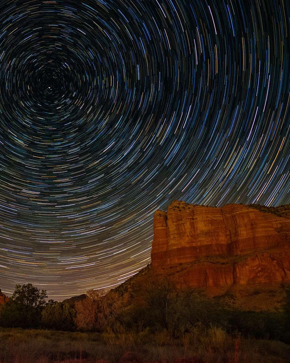
ROSS FOUNTAIN: SUPER RESOLUTION PROCESSING

The subject of this photograph is the Ross Fountain in West Princes Street Gardens, Edinburgh, with Castle Rock and Edinburgh Castle in the background. The fountain was originally created by the Antoine Durenne iron foundry in Somerville, France, and was put on show at the Great Exhibition of 1862 in London’s Hyde Park. After the exhibition closed, Edinburgh gunmaker, Daniel Ross, purchased the fountain and donated it to the city of Edinburgh.

I took this photo in the late spring just as the sun was setting. This is a perfect time of year to visit Scotland. Not that you can ever rely on the weather, but places such as Edinburgh are relatively quiet compared to the peak summer period, and especially around the time of the Edinburgh Festival Fringe. Where is the water you ask?
Well, the fountain wasn’t working at the time of my visit.
It was just as well I didn’t wait around as it was not till around seven years later that the restored and repainted fountain was finally switched back on again. Today, the fountain has mostly been painted a turquoise color, which contrasts nicely with the castle backdrop.
My original photograph is admittedly more like a picture postcard view of the fountain and castle. It doesn’t stand
MARTIN EVENING DEVELOPING
ALL IMAGES BY MARTIN EVENING 30
out as being particularly unique from the many other photos taken from around this spot.
Reappraising this shot today, I decided to crop the image more tightly. The downside of doing this was that I more or less halved the pixel count, restricting my ability to enlarge this photograph by too much. But thanks to the Enhance Super Resolution feature in Lightroom Classic, it was now possible to scale up the cropped version to generate a 36-megapixel-size file. This isn’t a true 36-megapixel image, of course, but in this instance, the Super Resolution enlargement was
impressive enough to create the impression this was a high-resolution capture.
(KelbyOne members can click here to download a smaller DNG version of this image for practice purposes only.)
THE STEPS
STEP ONE: Begin by selecting the Crop Overlay tool (R) and dragging with the tool across the image preview to apply a tight crop around the fountain and the Edinburgh castle in the background. Click Enter to commit the crop.


Before
STEP TWO: This photograph was taken using the Canon EOS-1Ds Mark III camera. Therefore, a camera lens profile wasn’t applied auto matically, as happens when editing photographs shot with my more recent Sony and Fujifilm cameras. So, expand the Lens Corrections panel and check the Remove Chro matic Aberration and Enable Profile Corrections options. In this instance, the make of camera and lens was automatically recognized and an Adobe matching profile selected. These adjustments corrected for chromatic aberrations, geometric lens distortion, and lens vignetting.


Step Two
DEVELOPING THE SHOT KELBYONE.COM 31
STEP THREE: This photo was taken in the early evening. Now, the camera auto white balance analyzed the colors in this scene and applied what I considered to be a cooler-than-normal white balance setting. To apply a white balance that reflects the actual colors in the scene, adjust the White Balance Temp and Tint sliders to apply a warmer white balance.
STEP FOUR: Having warmed up the white balance, it’s time to adjust the remaining Basic panel sliders. To manage the contrasty light in this scene, apply a negative Highlights adjustment combined with a positive Shadows adjustment. Then, finetune the Whites and Blacks sliders to optimize the overall contrast. In the Presence section below, add Clarity to restore more midtone contrast, add more Vibrance to slightly boost the saturation of the less vibrant colors, and decrease the overall Saturation a small amount.


HOW TO PHOTOSHOP USER > OCTOBER 2022 32
STEP FIVE: Next, click on the Masking icon between the Histogram and Basic panels (or press Shift-W), and select the Brush tool (K). Set the Exposure slider to –2.40 and paint around the tree trunks to the left of the fountain to darken the area just below the trees, as well as the base of the water fountain on the right.


STEP SIX: Having darkened the areas in Step Five, click the Create New Mask button in the Masks panel, select the Brush tool again, and paint just below the trees on the right. Here, I set the Exposure to –1.00, the Highlights to –100, and the Saturation to –40. Painting with this combination of settings desaturated the flowers as well as darkening them.


DEVELOPING THE SHOT KELBYONE.COM 33
STEP SEVEN: For the final localized adjustment, once more click on the Create New Mask button, but this time choose the Select Sky option from the pop-up menu, which automatically selects the sky. After the sky selection has completed, set the Exposure slider to –0.80 to darken the sky area.


STEP EIGHT: Lastly, I wanted to make use of the Enhance feature in Lightroom and Camera Raw to add more detail to the final cropped image. To do this, choose Photo>Enhance (Control-Option-I [PC: Ctrl-Alt-I). This will pop up the Enhance Preview dialog, where you can check on the Super Resolution option. After a few seconds, the preview will update to show a close-up preview of the Enhanced image. I then clicked the Enhance button to create a new, enhanced DNG version of the master photo.

HOW TO PHOTOSHOP USER > OCTOBER 2022 34
SUPER RESOLUTION PROCESSING

Over the last few years, Adobe has made much use of machine learning and artificial intelligence. We’ve seen this in the way that the Camera Raw and Lightroom Auto tone processing have been improved, as well as in exotic features, such as the Neural Filters, that have been added to Photoshop.
The original Enhance Details feature in Camera Raw and Lightroom promised so much, yet it failed to impress in all except a few select images where improvements could be seen. The new Super Resolution feature is something else, though! To use it, go to the Photo menu and choose Enhance (Control-Option-I [PC: Ctrl-Alt-I), or Rightclick on the image preview to open the contextual menu and choose Enhance.
The Enhance Preview window includes a Super Resolution option, where click ing-and-holding on the enlarged detail preview lets you see the image Without Enhance turned on. To select a specific area of the image to preview, click on the Minus Zoom icon at the bottom right of the preview. This zooms out to show the whole image. You can then click on the specific section you wish to zoom in on to inspect. When you click to apply an enhancement, this generates a new DNG image.

This isn’t always a quick process, which is why it’s best to apply selectively to just those images you feel might benefit from being scaled up in size. The photograph shown here is another good example of an image that clearly benefited from the use of the Super Resolution enhance ment. In particular, the way the enhanced processing improved the fine edge detail in the old burnt-out pier. It’s that type of image detail that will benefit most from this kind of image treatment.
With this example, the enhance process generated a 100-megapixel image from the 26-megapixel original. It’s unlikely I’d ever need to reproduce this image at the full 100-megapixel size, but when making large prints such as at A2 size or bigger, the difference should be noticeable.

n 35 DEVELOPING THE SHOT KELBYONE.COM


CAPTURING A FINE-ART BLACK-ANDWHITE PHOTO IN BAD WEATHER

I had the opportunity to stay at the Shangri-La hotel in Paris, which is a luxurious hotel that’s known for its amazing views of the Eiffel Tower. Unfortunately, I wasn’t having any luck with the lighting situation while I was there, as the weather was bad, and at night there was too much contrast between the Eiffel Tower and the inside of the room, the shot for which I was going. I wanted to show the beauty of the hotel and the Eiffel Tower together.

SERGE RAMELLI LIGHTROOM LABORATORY
ALL IMAGES BY SERGE RAMELLI 38
The next day was the same; the daylight photos were boring and didn’t display the hotel very well. Disappointed with my pho tography adventure, we started to pack so we could check out, but miraculously, I saw the moment: the light and shadow of the window on the floor was perfect with the Eiffel Tower perfectly framed through the window. It was the shot I’d been waiting to capture for days. So now, I’ll show you how I made it into black-and-white fine art. This is the original photo.


Before
STEP ONE: We’ll start with some simple retouching in the Basic panel by choosing Black & White for the Treatment. Then we’ll set the Shadows at +77, Highlights at –51, Whites at +53, and Blacks at –29. We now have a great base retouch with good contrast.


STEP TWO: Before using the Crop Overlay tool (R) to make it the perfect size and create a better composition, let’s first go to the Transform panel and click on Auto to straighten the image. Now we can crop it. To share on social media, I’ll usually set the Aspect drop-down menu to a 4x5 format. After resizing the 4x5 crop boundary in this image, though, it cut off the top of the Eiffel Tower, so I needed to make it a little bigger, as I didn’t want to lose any of the
Eiffel Tower or any of the light or shadow from the window on the floor. So I clicked on the lock icon next to the Aspect drop-down menu to unlock it, and then dragged the top-middle point of the crop boundary upward to include all of the Eiffel Tower. Click Enter to commit the crop.
LIGHTROOM LABORATORY KELBYONE.COM 39
STEP THREE: Now, we’ll head back to the Basic panel and add some overall Exposure by set ting it to +0.45. We’ll use masks for a dodge-andburn technique to add drama by highlighting parts of the photo. This will complexify the light and make the subject much more interesting. Here’s where we click on the Masking icon (gray circle with dotted outline) and select Radial Gradient. We set the exposure to 0.67, and drew a medi um-sized circle on the light and shadow of the window on the floor. In the Masks panel, we clicked the Add button and chose Radial Gra dient again. We drew another Radial Gradient on a different location in the image. Note that it will be part of the same mask with the same settings. Add as many Radial Gradients as you need to highlight areas in your photo.


HOW TO PHOTOSHOP USER > OCTOBER 2022 40
STEP FOUR: You can contin ue to tweak your image, as needed; but at this point in this image, I feel the edits have created an amazing image with great emotional impact and a strong message. Here’s the final result.
I hope you enjoyed these tips for overcoming any photo graphic situation, whether it’s bad lighting, angles, or the weather. You can always think outside the box and come up with great results. For the time of day this image was taken, the light was boring, but with the great composition, converting it to black-and-white, and a few minor edits, it’s a photo that can be sold in galleries. So don’t lose hope while taking photos. Keep searching for the capture! n Before


After LIGHTROOM LABORATORY KELBYONE.COM 41
UNDER THE LOUPE
USING PUBLISH SERVICES IN LIGHTROOM CLASSIC


Last month I wrote about various ways of sharing photos from Lightroom Classic, but one option I saved for special attention was Publish Services, the panel for which is located in the Library module, below Collections. It has been around for many years, but is often overlooked.
WHAT IS A PUBLISH SERVICE?
You can think of Publish Services as a form of export. It’s a managed form of export that allows you to group photos together (think collections) and publish (export) them to either your hard drive or some online service (Adobe Stock and Flickr by default, but you can add others). Once you’ve gathered together the photos, you click the Publish button and copies are exported based on the settings you configured when you created the Publish Service in question.

ROB SYLVAN
ALL IMAGES BY ROB SYLVAN 42
The cool(er) thing when comparing Publish Services with export is that, if you make a change later to one of the photos that you originally published, you can easily re-publish that photo with the changes. If you like tracking exports for a given purpose, this could also be useful.
LOCAL HARD DRIVE SERVICE
The more I thought about this long-forgotten (to me) part of Lightroom Classic, the more I thought about one way that it could be useful without a big investment. I could
create a local hard drive Publish Service to a folder in my Dropbox account, and then share that folder with friends and family as a way to make photos available directly to them. Here’s how I set that up:
STEP ONE: Click the + sign in the Publish Services panel, and choose Go to Publishing Manager, which opens the aptly named Lightroom Publishing Manager.

STEP TWO: If you haven’t set one up before, you can select the existing Hard Drive service at the top of the list on the left. Since I already had a couple Hard Drive Publish Services set up, I clicked the Add button at the bottom left to create a new one from scratch so you can see the steps on how to set it up.
STEP THREE: I suggest giving it a meaningful name, especially as you may decide to create more than one of these. Just type in the name in the Description field in the Publish Services section at the top. The rest of the Lightroom Publishing Manager dialog should remind you of the Export dialog, as it basically has all the same options (although you’ll see different options for publishing to Adobe Stock, Flickr, or some other service).

UNDER THE LOUPE KELBYONE.COM 43
STEP FOUR: Configure the options based on how you want to create these published (exported) copies. In my case, I directed them to a folder within my Dropbox account. You can also see all of my other settings to the right of each section in the image shown here.
to add photos from other collections or folders (just select a photo and press B to add it to the Target Collection).
STEP FIVE: Once configured, click Save to seal the deal. Now you have a special type of collection to which you can add photos, and when you’re ready, publish to the configured destination.
Tip: You can Right-click that published folder (as it’s called) and Set it as the Target Collection to make it easy


STEP SIX: Once you’ve added the photos, click Publish at the top right to let it do the rest.

PUBLISHING TO ONLINE SERVICES
Besides your local hard drive, there are a few online resources that are integrated into Publish Services. By default, you’ll see options for Adobe Stock, Facebook (no longer supported by Facebook), and Flickr. Clicking the Find More Services Online button at the bottom of the panel will take you to the Adobe Exchange where you can search for other Publish Service plugins created by third-party developers. I’ve found the

Step Six HOW TO PHOTOSHOP USER > OCTOBER 2022 44
exchange to be overwhelmed with preset packages, so your mileage may vary on finding anything useful there. I do know of a few online services that provide Publish Service plug-ins for their respective platforms, such as SmugMug and Zenfolio . Check with any online photo service you use to see if they provide a similar plug-in.
The options within online Publish Services vary with each service but, since the Adobe Stock service is included and supported by Adobe, let’s look at how that works. Check for documentation with the developer of any other online service plug-in you decide to use.

STEP ONE: Anyone can contribute to Adobe Stock with an Adobe ID. If you want to use the Lightroom Classic Publish Service, you’ll need to create an Adobe Stock contributor account using the same Adobe ID as the one tied to your Creative Cloud subscription (it’s easy to have multiple Adobe IDs, so make sure you use the right one). Adobe has a portal dedicated to helping
you become a successful contributor; just head to contributor.stock.adobe.com to link your desired Adobe ID and start learning more about Adobe Stock in general. Once you’ve created your Adobe Stock account, come back to Lightroom Classic to connect the Publish Service to your account.

UNDER THE LOUPE KELBYONE.COM 45
STEP TWO: Click Set Up next to Adobe Stock in the Publish Services panel to open the Lightroom Publishing Manager. Here you can enter a name or description that will appear in the Publish Services panel. Then follow the steps within the Adobe Stock Account section and click Save to begin.


STEP THREE: Expand the newly saved Adobe Stock Publish Service to see the Submit to Adobe Stock collection within (you can rename that collection by double-clicking it and giving it a new name if you wish). You can also Right-click that collection and set it as the Target Collection to make it easier to add photos to it over time. Alternatively, you can simply drag-and-drop photos from Grid view onto that collection to add photos for submission to Adobe Stock.

STEP FOUR: As you add photos to the collection, they’ll appear under New Photos to Publish, which means you can send them on to Adobe Stock at any time by clicking the Publish button in the lower left (next to Import) or upper right above the thumbnails (see image next page).
STEP FIVE: When photos are published to Adobe Stock, they’re converted to sRGB JPEGs, so feel free to add RAW,


TIFF, and PSD files to the collection. If a photo fails to meet the minimum technical requirements for file size, you’ll get a failure prompt with instructions to remove the problem photo (see second image next page).
If all the photos upload successfully, you’ll just be prompted to head to the contributor portal in your web browser to complete the submission (verifying/adding keywords, title, and description, as well as any needed
HOW TO PHOTOSHOP USER > OCTOBER 2022 46
Step
releases). Be sure to read through the provided resources in the Contributor Portal to learn more about managing your uploaded files.
can do this after the fact in the Contributor Portal. I like to apply them first, then edit in the portal after; this way I can leverage the metadata in Lightroom Classic.
3. Use the most important keywords in the title and description for each photo to help customers find them.
4. Along with the previous linked content standards, when selecting photos for stock purposes, put yourself in the shoes of a customer looking for content for use in specific projects. Don’t choose photos just because they’re pretty; usefulness is one thing that makes a stock photo successful.
Step
ADOBE STOCK TIPS
Here are a few tips about submitting photos to Adobe Stock before you hit Publish:


1. Check Adobe Stock’s photo and illustration requirements to ensure that your photos meet the technical guidelines (between 4MP and 100MP), content standards, and legal requirements.
2. You can apply metadata for title, description, and keywords in Lightroom Classic first, and these will be uploaded along with the photos, or you
5. Don’t overprocess your photos for stock. Make them look good, but remember that stock photos are raw materials for someone else’s project.
6. Open space, referred to as copy space, within your photos can be very useful to designers/ customers looking for photos.
Look at this as a learning experience. Submitted photos are reviewed to ensure they meet all standards before appearing to customers, and some photos will be rejected. Don’t take it personally, but learn from each rejection so you can improve. n
Four
Five UNDER THE LOUPE KELBYONE.COM 47
WORKFLOW
RADIANT PHOTO

Radiant Photo is an AI-based photo-processing application. It only processes photos, either individually or in batches. It doesn’t do any management, HDR, or stitching; it just processes the photo. On load, it examines your photo and applies a Smart Preset to give just the right amount of editing for the photo. It’s so good that much of the time, you’re done at that point. Of course, it also has a comprehensive set of tools for editing.
Radiant Photo is based on the Perfectly Clear engine. You’ve seen Perfectly Clear here on Maximum Workflow before and it’s a great program, though the UI felt a little cramped. Seeing how Radiant Photo expands and modernizes the UI over this great engine is a joy. The project is headed by master landscape photographer Elia Locardi, with Product Manager duties taken on by Rich Harrington. While Elia might be a landscape photographer, all of the portrait tools that made Perfectly Clear desirable for wedding and portrait photographers are still there. This is a product for photographers, made by photographers.
Note: This article was written using a press beta, but checked against the latest available release.
RADIANT PHOTO VS. LIGHTROOM AND PHOTOSHOP


We have this same conversation about all the plug-ins we look at here in the magazine and, as with most, it boils down to time. Yes, you can probably achieve the same results with either Lightroom or Photoshop, but with a little more time. And with each photo, that time builds.
 ALL
ALL
IMAGES BY SEAN MCCORMACK
SEAN M C C ORMACK MAXIMUM
48
Potentially, you can build presets or actions that speed up the process, but these are one-size-hopefully-fits-all, instead of the AI-based edits that Radiant Photo applies. This is definitely a program where you’ll want to make use of the trial version.
GETTING STARTED
After installation, you can run Radiant Photo as a standalone application or a plug-in. For standalone, batch processing can be triggered by dragging multiple photos onto the

app. With Lightroom, you can send batches of photos for processing and return back to Lightroom. One nice aspect of the Lightroom plug-in is that new photos get added to the open batch in Radiant Photo, rather than a new instance of the plug-in. To get from Lightroom to Radiant Photo, you select the photos you want processed, go to the Edit In menu, and choose Radiant Photo.

All images selected will go to Radiant Photo and, as they load, you’ll see a “Making your photos RADIANT” message.
“
Seeing how Radiant Photo
expands and modernizes the UI over this great engine is a joy.”
INTERFACE
By default, the photo opens in Quick Edit. On the right is the Smart Editing panel, with only a few of the available sliders visible. The left side panels are closed; more on this shortly. [I n the shipping version, the left-side panels are now open by default in Quick Edit mode.—Ed.]
There are a few ways to see the impact that Radiant Photo has had on your image. At the top left of the toolbar are three preview icons: Loupe View, which is just the edited photo; Before/After view, which gives a side-by-side
MAXIMUM WORKFLOW KELBYONE.COM 49
view; and Split View, which has a draggable handle that you can move across the photo with the before to the left and the after to the right. This handle is at the bottom left of the Loupe View, as well, and can be dragged out to see the Split View—a neat touch.
Also on the toolbar are the zoom in and out buttons, undo and redo, Close (cancel), and Save. Save returns edits to Lightroom.
QUICK EDIT
Let’s meet the most basic way of using Radiant Photo. In Quick Edit, you’re presented with the

minimum of sliders. The box at the bottom of the Smart Editing panel indicates that the AI has detected this as a landscape photo, and has applied the Landscape Smart Preset. The Strength and Color sliders are at 80, but they’d be different for other photos. The AI edit is really good. It’s taken an underexposed photo and given it quite a lot of life between color and contrast changes. Potentially, if this were just a shot for social media, you might already be finished.
By way of contrast, here’s what Lightroom’s Auto button does for the photo.


 Top: Radiant Photo Quick Edit; Bottom: Lightroom Classic Auto
HOW TO PHOTOSHOP USER > OCTOBER 2022 50
The Radiant Photo version really stands out in comparison. The Smart Preset has only one ticked slider, and that’s Exposure. This isn’t the same as camera expo sure, where you can lose highlight information if you push the set tings; it’s intentionally protecting the highlights. The three buttons below the slider give quick access to incrementally stronger Exposure settings along the slider.
The image is slightly cool in tone, and the blacks are quite rich. One tool that can soften these blacks, while warming the image, is Light Diffusion. As a lens filter, Diffusion offers a way to subtly add glow, and Light Diffusion does this with software. Think of it as a midtone contrast control. Here’s what 40 looks like for this photo.
The other two sliders are Depth and Vibrancy. Depth increases the 3D appearance of your 2D photos. It can use Contrast or Definition (which adds sharpening with the contrast). Vibrancy increases the color tone of the photo. Here we tried a Depth of 41 in Definition mode, with a Vibrancy of 5. Even such a low amount makes a difference.
To get the edit back into Light room, click Save.


Before After MAXIMUM WORKFLOW KELBYONE.COM 51
DETAILED EDIT
The tools from Quick Edit also exist in the Detailed Edit; but, with a lot more to it. This isn’t going to be a slider-by-slider approach, but rather a solution-based approach. Let’s start with a new photo, which has only had light spot removal done in Lightroom, as Radiant Photo doesn’t do this.
After opening the image in Radiant Photo, click Detailed Edit next to Quick Edit at the top of the screen. Above right we’re showing the panels closed down, so you can see the available tools without the clutter of sliders.


As expected, Radiant Photo has made a huge difference: The shadows are opened up, the color is much better, and there’s a whole lift to the photo in a natural way. Another change from Quick Edit is the opening of the leftside panels. [As mentioned earlier, the left-side panels are now visible in Quick Edit in the shipping version—Ed.] This is where you see the Navigator, for zoom ing and moving around the image. Smart Presets are open, and Auto Radiant is highlighted in this example; another Smart Preset may be selected based on the photo you have opened. You
can also see all the available Smart Presets, whereas in the Smart Editing panel you can only see the one being used at the bottom of the panel. And finally, there’s a regular Presets panel at the bottom.
Back to the right panels, both Strength and Color are set to 100, which is perfect for this photo. The next three panels, Tone, Color, and Details are the main editing tools for Radiant Photo. The Graduated Filter and Finishing Tools panels are optional. There are also two separate sections: Portrait and Color Grading. If you look below the Smart Editing panel you’ll see a row of
 Original image with spot removal performed in Lightroom
HOW TO PHOTOSHOP USER > OCTOBER 2022 52
three large icons. The first is for the main settings, the second for Portraiture, and the third is Color Grading. All three sections work in conjunction with each other.
Tone

The settings in Tone work on the luminosity of the photo. You’ve seen some of these in Quick Edit. Super Contrast deserves a mention, as it’s essentially a smart contrast slider. It’s also aware of the Depth setting, so the two should be used together for best effect. Another slider that affects Depth is Skin & Depth Bias, which has three AI modes: Normal, Bright, and Auto.
We’ll first smooth out the midtone contrast in this image by setting Light Diffusion to 66. Using Depth at 54 in Definition mode, we then set the Skin and Depth Bias to 150 in Auto mode, and Super Contrast gets a little bump to 20. This all increases contrast, but the Light Diffusion helps keep the transitions smooth, retaining shadow details and avoiding banding.
The final two settings in Tone are the Black and White Point sliders, in case you need to alter the darkest and lightest points of the photo.
If you need to see a histogram, click on the little curve icon between the Smart Editing and Tone panels to reveal it. [In the shipping version, this icon now looks like a histogram.—Ed.]

The checkboxes at the top left and right of the histogram will show you color overlays in areas in your image that are clipped. The Crop tool is next to the his togram icon but, if you’re coming from Lightroom, you’d be better off cropping there nondestructively.

Color
With the luminosity set, it’s time to work on the color. You can increase the color using Vibrancy, which you’ve seen in Quick Edit. It’s better to be subtle here, as you can really overdo it, so 15 is fine for this image. If you feel the hues are off, you can use Fidelity to correct it, which can be set to Standard or Vivid. As
this is a landscape, Vivid is the better option, as Standard is quite muted in comparison.

Color Contrast works on color separation, knowing where it should be warm or cool and adding contrast to match. With this photo, it’s a little strong.

MAXIMUM WORKFLOW KELBYONE.COM 53
If you had a color cast, Radiant Photo would detect it, and you could remove it using Tint Correction. It hasn’t detected one here, so it’s best to leave it alone.


After this are three toning options: Sky Toning, Foliage Toning, and Cor rective Filter. For each option, you can select a color from the dropdown menu, and control the effect using the Strength slider. Subtle works best here, too. There’s enough color in the sky already, and the foliage toning doesn’t really change the leaf hue here. The Corrective Filter does work here, and Orange at 100 gives a real Mediterranean feel to the image.
Details
As with Lightroom, the Details panel (top right) controls the sharpening and the noise reduction. Radiant Photos’ sharpening is similar to Photoshop’s Unsharp Mask with sliders for Sharp ening (Amount), Radius (how many pixels will be affected), and Threshold (where to start sharpening).
Noise can be detected, and there’s a series of profiles to combat it. As it has been detected in this photo, we used the Default profile with a Strength of 17 and Detail of 2 to correct for noise in the shad ows, while still allowing the image to remain sharp.

Gradient Filter
This panel combines two filters, the radial and the linear gradient filters. Choose the one you want by clicking on its thumbnail preview below Shape, and you’ll be presented with a set of tools for that particular filter. The radial filter has separate controls for the Inside and Outside, while the linear version has separate controls for Top and Bottom.

Radial gradient
Linear gradient
HOW TO PHOTOSHOP USER > OCTOBER 2022 54
In our photo, the sky is a little dark. The original photo was shot with a resin neutral density filter that was proba bly a little heavy for the scene. We’ll start by selecting the linear gradient and turning off all the settings in the Bottom section. In the Top section, we set the Exposure to 15 and Contrast of –45 to smooth this out. We then went back to the Bottom section and opened the Shadows to 52 and added a Color Vibrance of 18 to bring back some color. This image has some band ing in the sky, and there’s an easy fix in Photoshop. Save the image back to Lightroom, and then open it in Photoshop. Press Command-J (PC: Ctrl-J) to copy the Background layer. Apply a Filter>Blur>Guassian Blur with a Radius of 45 and click OK. Next, add a layer mask, and use a straight white-to-black gradient over the mask to keep the blur in the sky but hide it in the foreground. This would also be a good time to do any cleanup work.


Before After MAXIMUM WORKFLOW KELBYONE.COM 55
FINISHING TOOLS
Finishing Tools are pretty much the sliders of the Basic panel from Light room. They’re there if you feel you need them but, with Radiant Photo, the idea is that you should be able to do everything without requiring them.

“…with Radiant Photo, the idea is that you should be able to do everything without requir ing them [Finishing Tools].”
PORTRAIT TOOLS
When you open a portrait, Radiant Photo’s AI applies a portrait-based Smart Preset to the photo.
Assuming you like the preset, you can start working with the Portrait tools. These are found by clicking the middle icon at the top of the sliders, under the Smart Editing panel. There are four sections here: Eyes, Face, Skin, and Makeup.


You can adjust the face selection by clicking the Show & Adjust Control Points box and dragging the yellow circles to set the correct eye position. You can also click Manually Add Face and click on the eyes of the face you want selected.

HOW TO PHOTOSHOP USER > OCTOBER 2022 56
Eyes
These tools cover most of the things you’d need to do with eyes. The beauty of it is that you’re not making any selec tions; these are done for you. Here’s a close-up showing the face with no eye settings applied (usually Auto Red-Eye and Eye Enhance are on at this point from the Smart Preset). For this portrait, we don’t need any red-eye reduction.


With Eye Enhance, the iris is made richer, the whites are whiter, the outside of the iris is darkened, and the whole eye area is sharpened. At 100, it’s over-dramatic, but it gives an idea of how useful this one slider is. Backed off to 48, it really suits this face.


The wide-eyed look can be quite flattering for female por traiture, and using Eye Enlarge gives this effect. You could go for the anime look at 100, but it’s not recommended. This is absolutely a taste setting. Here’s the look at 25.
Dark Circles lightens the area under the eyes. It’s subtle and works perfectly for this task at 40.


As this is a studio photo, there are quite defined catch lights already, but if your portrait is lacking those, you can choose to augment with a variety of catchlights, including Beauty Dish or Outdoors.

MAXIMUM WORKFLOW KELBYONE.COM 57
Face
Here you can slim the face via Face Contouring. The AI slimming is based around the jawline shape, and remains aware of the facial features. As with eyes, subtle is better here, so a setting of 16 suffices for our subject. There’s no visible teeth here but the next slider, Teeth Whitening would correct for this. Lip Sharpening enhances the lip detail and draws attention to the lip; Medium at 50 works here.

Skin
The Skin section is where you smooth uneven skin and remove blemishes. Current trends in retouching are leaning toward more natural finishes. To this end, of the three available options, Subtle, Default, and Super Smooth, Subtle is best for Smoothing Type. Even using Smooth at 20, the difference is noticeable. You can also choose to smooth either just the face, or the whole body.

Blemish Removal reduces the appearance of blemishes. Here a setting of 30 diminishes their presence; but it’s always a balancing act between looking real and getting too smooth.


HOW TO PHOTOSHOP USER > OCTOBER 2022 58
The Infrared and Shine Removal sliders respectively remove skin redness and spec ular reflections produced by an excess of oil. Some redness in the cheeks is natural, and the complete removal of shine looks really unnatural, so settings of 40 on both looks good here.
Makeup
The final section is Makeup. There are two sections here: Skin Toning and Blush. Skin Toning is essential, like digital foundation, which gives an even tone to the skin. Blush gives a color to the checks.


Both have a set of swatches from which to choose to give a particular look, acting like a makeup palette. These are a good starting point for anyone who’s not a makeup artist to apply digital makeup. Both also have HSB sliders to allow you to select any color you like.
The default colors chosen here were perfect: Skin toning of 50, Face Only with the Pale Foundation color, combined with a very subtle 16 on Blush worked perfectly here.

Before After MAXIMUM WORKFLOW KELBYONE.COM 59
COLOR GRADING

Color Grading, the process of adding a color tone to the overall image, is really simple in Radiant Photo. It’s the third icon below Smart Editing, next to the Portrait tools. Simply go through the banks of preset Looks, then use the Strength, Saturation, and Contrast sliders to refine that look to your taste. Here we’ve used the 1960s Look from the Vintage cate gory, with a Strength of 119, Saturation of –12, and Con trast of –31.
PERFECTLY RADIANT

Radiant Photo is an impres sive application. It’s also a step-up and modern ization of the Perfectly Clear engine, one of the first to use AI for image editing. I found it a joy to use and, in playing with it, found that 90% of the time, the default Smart Preset looked great and required very little other work for my landscapes.
Purchasing Radiant Photo is taking an approach for the long term, in that it’s a perpetual license. Future updates will still be this pro gram, not a new program, so any presets you create or buy will continue to work. It’s by photographers, for pho tographers. As a standalone or as a plug-in, it’s there to supplement your current image manager/developer, not replace it. n
HOW TO PHOTOSHOP USER > OCTOBER 2022 60

RAINING IN PARIS: THE PROCESS OF REDISCOVERY

It’s raining in Paris. It begins as a soft drizzle as I go down Avenue du Président Kennedy, along the Seine River. The light is soft and diffused from the overcast sky, lacking the strong contrast between light and dark. I nevertheless welcome it. I’m in Paris, after all.
My wet polo shirt clings to me like an adhesive. I periodi cally wipe away the accumulation of water on my shaved scalp. Droplets of water collect on my glasses, but I give up trying to remove them; I only succeed in smudging them, making it harder to see things sharply. I need that clarity as I select and compose scenes with my Fujifilm X-Pro3. I may not be waterproof, but my camera and lenses are. There are no worries there.
People move around and past me, some with umbrellas, others with clear rain slickers. Many do without either. For


them, the rain is not an adversary to be avoided; it’s part of the ambiance of the city during the fall. I embrace it, enjoying the tactile feeling of the rain’s coolness against my skin. It helps me to be present and in the moment. I remain focused on the art of seeing.
It’s the first time in months that I’ve been able to lose myself to the streets. I want to remain present, soaking in both the visual and the tactile. These experiences have eluded me this year with life’s multiple and unexpected occurrences of grief and loss.
ALL IMAGES BY IBARIONEX PERELLO VISUAL STORYTELLING IBARIONEX PERELLO
62
Back home, I found relief and solace from life and work routines. Yet, I haven’t afforded myself the time to get lost on the streets, making photographs. It seemed a selfish choice while people close to me were in mourning.
Yet, as I walk down the Parisian streets, I realize how much I’ve needed this. A solitary walk provides small discoveries of light, shapes, colors, and moments that rejuvenate me. I experience childlike play, unburdened by the expectations of good or bad. It’s a headspace I return to quickly when I have the camera and the grace of time.
BREAKING THROUGH BARRIERS
I walk down from the Trocadéro toward the Eiffel Tower. Ready access to the iconic structure is reduced with transparent barriers and security checkpoints. The restric tion challenges me to create a less-than-obvious image.

I notice the water droplets on the transparent barrier and realize that I can use them. They can serve as a
story-telling element, and reveal the weather conditions. The reflection of the dark tree provides an unusual visual flourish; I hadn’t anticipated it, but I embrace the visual serendipity.
I purposefully tilt the frame. It not only includes most of the tower but provides a sense of energy and power. The tower feels like it’s a rocket moments before launch.
Pointing the camera upward to the sky introduces a challenge. The expanse of gray creates a strong contrast against the Eiffel Tower. A lousy exposure could result in either a blown-out sky or a severely underexposed subject. I bracket my exposures with the hope that one of the images will deliver the ideal frame to work with in Photoshop’s RAW converter, Adobe Camera Raw.

[KelbyOne members can click here to download a smaller DNG version of this image to follow along for practice purposes only and, even though we’re using Adobe Camera Raw in the following steps, you can just as easily follow along using Lightroom Classic (LrC).—Ed.]
STEP ONE: After importing the file into Adobe Camera Raw, click on the Browse Profiles icon (the one with the squares) to the right of the Profile pull-down menu. Instead of using Adobe Color or the camera’s default Picture Style, expand the Artistic set and select Artistic 04. Set the Amount slider to 130, which allows the editing to begin with a cool tone that reflects the weather conditions under which the photograph was made. It also reduces the contrast, revealing the details of the tower’s iron works.
 Original Image
VISUAL STORYTELLING KELBYONE.COM 63
STEP TWO: Next, click the Mask ing icon (gray circle with dotted outline) and create a new mask by clicking on Select Sky. The software automatically selects most of the sky, except what’s reflected in the transparent barrier. A red overlay appears over the affected area.


STEP THREE: To add the sky reflected in the barrier, click the Add button in the Masks panel and select the Color Range option. The icon turns into the eyedropper tool when the cursor is moved over the image. Click on an area of unselected sky, and the mask expands to include the sky in the reflection.

STEP FOUR: To reduce the inclusion of the tower in the mask, go to the Refine slider in the Color Range panel, and reduce the amount to 30.

PHOTOSHOP USER > OCTOBER 2022 HOW TO 64


 STEP
STEP
FIVE: Reveal more detail in the sky by going to the Light
panel
and reducing the Highlights to –12, Whites to –3, and Blacks to +2.
STEP
SIX: To strengthen the blue color cast, go to the Color panel and set the Temperature slider to –5.
Step Five Step Six
VISUAL STORYTELLING KELBYONE.COM 65
STEP SEVEN: Hover your cursor over Mask 1 in the Masks panel to reveal the More Options icon to the right of it (the icon appears as three horizontal dots). Click on it and, from the pull-down menu, select Duplicate and Invert Mask. The red overlay now appears over the Eiffel Tower and the trees in the foreground.


STEP EIGHT: To increase the detail in the shadows, go to the Light panel and set Exposure to +0.05, Contrast to –5, and Highlights to –11.

STEP NINE: The right edge of the frame is lighter than the rest of the frame. To remedy this, click the Create New Mask button and select Linear Gradient. Click-anddrag the mouse from left to right across the transition area between the sky and the edge of the barrier. A red overlay appears on the left quarter of the frame.

PHOTOSHOP USER > OCTOBER 2022 HOW TO 66


STEP 10: Balance the appearance of the sky in this area of the frame by going to the Light panel and setting the Exposure to –0.20, Highlights to –9, and Whites to –6. STEP 11: The image is progressing but can be improved by increasing the midtone contrast. Exit Masking by clicking the Edit icon at the top of the toolbar on the right (LrC: Click the Masking icon), go to the Basic panel, and set Clarity to +25 and Texture to +15. Step 10 Step 11 VISUAL STORYTELLING KELBYONE.COM 67
STEP 12: The Eiffel Tower should exhibit a hint of its metallic color and tone. To create this, go to the Color Grading panel. In the Shadows control, click-and-drag the control point at the center of the colored globe in the direction of the oranges and reds until the Hue is set to 36 and Saturation to 27. (To access the Hue and Saturation controls directly, click on the word “Shadows” above the color wheel to view all the shadow controls by themselves.) Set the Balance control to –5.

The effect skews to the dark tones resulting in an unusual interpretation of the iconic landmark; however, the image succeeds because it reflects what I experienced, as well as life’s recent challenges. The image is less a document of what I saw, but a representation of who I was at this moment in time. In a way, it’s a surprising self-portrait.

I wasn’t aware of that per spective when making the photograph. It’s a revelation that I discovered when I began postprocessing the image. It demonstrates how I can redis cover a photograph well after the initial exposure. n
Before

After
PHOTOSHOP USER > OCTOBER 2022 HOW TO 68
Never get “stuck” in Lightroom again!

The Quickest Ways to Do the Things You Want to Do, Right Now!
The fully updated third edition of Scott Kelby’s best-seller is available for pre-sale! Lightroom has become the photographer’s tool because it just has so much power and so much depth, but because it has so much power and depth, sometimes the things you need are…well…kinda hidden or not really obvious. This book was designed to get you straight to whatever you need to do in Lightroom right now, get your answer fast, and get you back to editing your images. Just one “thing” per page. Easy peasy. Scott tells you exactly how to do it all, using the same format and casual style that made his The Digital Photography Book, part 1, the best-selling digital photography book, ever.

| kelbyone.com | rockynook.com | #kelbyonebooks
Q. How do I switch from Lightroom to Lightroom Classic?
A. That’s a big question, but not uncommon. Sometimes photographers who are just starting out begin with Lightroom. Usually, it’s because they didn’t know there was more than one version, so they get the first one they see on adobe.com, which is usually Lightroom (Lr).
Switching to Lightroom Classic (LrC) is actually not hard. Because your images are already in the cloud in their full resolution, Lightroom Classic can sync all of your images to a folder on your hard drive. Your albums will come down as collections.
Start by installing Lightroom Classic, and then turn on Start Syncing in the upper-right corner in the cloud menu. That’s it! Your images will start to sync into Lightroom Classic. One thing you should consider before enabling sync is to choose a folder where all of these images will download; perhaps a folder on an external drive that has more space on it.
Go to Lightroom Classic (PC: Edit)>Preferences and click on the Lightroom Sync tab. Enable the checkbox that says Specify a Location for Light room’s Synced Images, and then click the Choose button. Navigate to the folder you wish to use, and click Choose. Once the images are downloaded
and in LrC, you can use LrC to move them at any time to different folders in the Folders panel or on different drives. Note: Be sure to only move images inside LrC; if you move them outside LrC, it will lose track of the images and tell you that they’re missing.

Q. I love using collections, but I’m frustrated by not having the ability to add an exported JPEG to a collection at the time of export. Am I missing something? Many thanks!

A. Hi! I love collections too, but maybe I don’t under stand the question. Are you saying that you want the JPEG you export to somehow be reimported into the catalog and added to a collection? Or are you saying that, when you export an image from, say a folder, you wish it to be added to a collection too? Neither of those are ideal workflows.
It’s best to put images into the collections where you want them. Do your edits, and then do your exports. The images will then be in the collections you want them in at all times throughout the entire process.
Q. My phone seems to be running out of space. When I checked, it looks like Lightroom is using more space than it should be. Is there a way to fix this?
A. I’ve run into this problem myself. All of a sudden, the space on my iPhone drops by 20–30 GB. Lightroom caches recent images to your device as well as images you’ve been editing. Normally, the cache clears over time; however, sometimes it can get stuck and not clear properly. This doesn’t happen often anymore, but if it has happened to you, you can manually clear it at any time to reclaim the space it uses. Here’s how:
Launch Lightroom on your mobile device and tap on the settings icon (gear). Then tap on Local Storage. Once you’re there, it will take a moment to
TERRY WHI T E LIGHTROOM Q&A
PHOTOSHOP USER > OCTOBER 2022 70
calculate your local storage usage. Once it does, you can tap the Clear Cache button. This will remove the cached files from your device. Don’t worry; your images are still in the cloud along with the edits you’ve done (Lightroom will even tell you this with a pop-up message where you can click Clear or Cancel).

in Photoshop. This happens automatically if you choose to edit a RAW file.

If you’re editing a JPEG or other format, then you’re going to get a pop-up dialog that asks you if you want to Edit a Copy with Lightroom Adjustments. Always choose this option because when you do, it will send a copy of your image over to Photoshop. Anything you do to this image will be done to the copy, not the original. This also happens automatically when you use Lightroom.
Another Lightroom Classic option is to send the image over to Photoshop as a smart object by Right-clicking on the image and choosing Edit In>Open as Smart Object in Photoshop. This will still send a copy, but even the copy will be protected as a smart object once it’s in Photoshop. This way, any filters you run on it will be nondestructive.
Q. Editing in Lightroom is great, because it’s nondestructive. I’m afraid to edit in Photoshop because I could make a mistake that screws up my image. Is there a way to keep the photo nondestructive even if I take it into Photoshop?
A. Photoshop, by its nature, can permanently alter pixels in your image, but this isn’t a bad thing, and there are several techniques you can use to protect your original from being altered. When you choose to edit an image from Lightroom Classic in Photoshop, you can protect your original by editing a “copy”
Q. I noticed when I’m in the Develop module that there are triangles in the upper-left and -right corners of the Histogram panel. Some times they’re different colors. What do these triangles mean, and why are they sometimes different colors?
A. These triangles are warnings and are even useful for fixing the issues that they warn you about. The
ALL
IMAGES BY TERRY WHITE
LIGHTROOM Q&A KELBYONE.COM 71
triangle in the upper-left corner of the Histogram is your shadow-clipping warning. The triangle in the upper-right corner is the highlight-clipping warning.
Ideally, you want both triangles to be grayed out. The different colors represent the severity of the warning. If either triangle is solid white, then that means the clipping is severe. A white shadowclipping warning means that there are large areas of your photo that are completely black with no detail. If the highlights triangle is solid white, then that means there are large portions of your image that are completely blown out.
The other colors mean that there’s less clipping. If you hover your mouse cursor over either triangle, you’ll see the areas that are being clipped in your image highlighted in blue for clipped shadows and red for clipped highlights. You can remove or reduce the clipping by dragging directly on the far left or far right side of the histogram below the triangles to adjust the Blacks and Whites, respectively, of your image, and hopefully get the triangles to gray. n
If you have a Lightroom question that you’d like Terry White to answer in the pages of Photoshop User magazine, send it to letters@photoshopuser.com.

HOW TO PHOTOSHOP USER > OCTOBER 2022 72


MOBILE MAGIC


Adobe’s applications are known for many things: cross-segment, cross-platform (more often than not), and integrated creative solutions that are often the best-in-class. They’re also known for “magic,” inexplicable features and solutions to difficult problems. In this piece, I’d like to explore just some of the magic that’s available in the palms of our hands.
ADOBE CAPTURE

I find everything about Adobe Capture to be magical. Wheth er leveraging the live feed of the camera or any existing file (local, from Creative Cloud, or even Lightroom), I can har monize colors, create infinitely scalable vector shapes, build one-of-a-kind patterns, extract and transcribe high-quality audio, and even create 3D materials. There’s another use case for Capture that’s so cool, it still kind of blows my mind, and that’s font recognition. Yes, iOS can detect type, and that’s undeniably cool. Cap ture’s magic upon that magic is to identify the most similar font from the vast library of thousands in Adobe Fonts. Here I took inspiration from a greeting card, with letter ing that looked hand-drawn. Despite this, Adobe Capture’s Type feature surfaced several very similar choices. In each case, capturing these elements places them in a Library, avail able to you in other mobile and desktop applications. Pretty magical, right?
Capture is available for Android, iPhone, iPad and even runs natively within Photoshop and InDesign!

GOING MOBILE BRYAN O’NEIL HUGHES
74
“I’m talking about ‘How-did-they-do-that?’ grade of magic.”
LIGHTROOM FOR MOBILE

Lightroom’s ability to store, sur face, edit, and re-edit (everything in Lightroom is natively nonde structive and forever undoable) across phones, tablets, desktop, and web is in itself quite magical, but I’m talking about “How-didthey-do-that?” grade of magic. My favorite functions in Lightroom are almost unbelievable.
With Select Sky, for example, simply choose an image with a visible sky (I chose one with many overlapping trees and taken through a windshield!). In the Edit screen, tap Masking (it’s the first option at the bottom left), and then tap the blue button with the plus symbol, and choose Select Sky. After Lightroom creates the mask, apply the effects of your choice. I went with Clarity, Dehaze, Exposure, and some Temp and Saturation adjustments. The mask would’ve taken forever to build manually, and a graduated effect would’ve given the wrong look and darkened the trees and cabin. But, instead, Magic!

Select Subject is equally amazing and instantiated in the same exact way as Select Sky. In the result shown here, I used it to identify and create an advanced mask around my son, who had been backlit by the bright sun. Once the mask was generated (almost immediately by Lightroom), I could tune the contents of the foreground with more precision than the finest hand-crafted mask built in Photo shop. Amazing!
Lightroom is available just about everywhere: Android, iPhone, iPad, Mac, Windows, and even the web!

ALL IMAGES BY
BRYAN O’NEIL
HUGHES GOING MOBILE 75 KELBYONE.COM
FRESCO
Okay, one more app before we leave the phone. Let’s look at a magical workflow available on both phone and tablet, and that’s fluid painting in Adobe Fresco . On the desktop, you can use any Photoshop .abr brush to do amazing things, and in Illustrator you can paint with infinitely scalable vector brushes; Fresco can do both of those, in a touch environment that’s both more intuitive and more focused. (As Lightroom is for photographers, Fresco is for those wanting to draw or paint.)
Where it gets magical is the ability to paint in bleeding colors, something I can’t do in any other app (mobile or desktop). Fresco facilitates this with a class of brushes

called Live Brushes: watercolors that bleed into one another and oil paints that interact just as you’d expect. Further, unlike their analog counterparts, you can edit, re-wet, and control every aspect of their behavior.
Not having a background in painting, my favorite magical (and admittedly somewhat hidden) workflow is the ability to use the above tools on an existing photograph!
Let me show you how:
1. Launch Fresco on iPhone, iPad, or even Windows.
2. Create a new canvas.

HOW TO 76 PHOTOSHOP USER > OCTOBER 2022
3. Use the image picker, and choose a photo from the camera, camera roll, files, CC Libraries, or Creative Cloud (which also allows you to get to your Light room photos).

4. Tap the image layer and the three-dot icon for more controls, and choose to Convert to Pixel Layer.


5. Now select your watercolor Live Brush and, at the base of your toolbar, remove all color from your brush (so you’re painting in water).
6. And now you can use watercolor to overpaint your image.
This same practice works with Oil Paint. Adjust brush parameters to suit your use and enjoy.
GROWING MAGIC
We’ve stayed on the phone and touched only three different applications, and look at all of the magic we’ve discovered. In the case of Adobe Capture and Adobe Fresco, those things can be done only on your mobile device!
Every year we see new mobile devices released, showing massive strides in chip, memory, display, machine learning, stylus, and more. The above magic is what happens when you wire that power to unique software solutions. As always, I look forward to seeing what you can create, leveraging these tools and others. Feel free to follow me, to see how I use them at Instagram @bryanoneilhughes .
Before I go, it’s almost time for Adobe MAX , my favorite creative circus! This year MAX will be hybrid, meaning that I might see some of you in Los Angeles. If I don’t, keep in mind that you can enjoy MAX from wherever this finds you, just as you have for the past two years. Enjoy the show and the magic! n
Step Five Step Six GOING MOBILE 77 KELBYONE.COM
SCOTT KELBY


PHOTOSHOP FOR LIGHTROOM USERS
PHOTOSHOP FOR PHOTOSHOP USERS
We’re winding down this column with kind of a wrap-up, catch-all for those things that we haven’t cov ered yet, but that we need to, before we bring this plane in for a landing. At the end of this last installment, you’ll be able to consider yourself a Photoshop user and not just a Lightroom user, and that’s why this article is called “Photoshop for Photoshop Users.” So let’s jump right in.
CHANGE THE SIZE OF YOUR IMAGE
If you want to change the physical size (dimensions) of your image, go under the Image menu and choose Image Size. When the Image Size dialog appears, you’ll see two fields where you can type in what you want your image’s new size to be, and you also get to choose the unit of measurement you want to use (pixels, inches, etc.) from the pop-up menus to the right of those fields (see image next page). You’ll also see a link icon to the left of those
fields. When that icon is turned on, this lets you know that these two fields are linked together, which means that if you type in a number in the Width field, the Height field changes proportionally, so your image doesn’t look stretched or squeezed. For example, if you started with a width of 5,472 pixels and a height of 3,648 pixels, but then you typed in 4,000 pixels in the Width field (scaling the image down in size), it would automatically reduce
ALL IMAGES BY SCOTT KELBY 78
the Height field from 3,648 pixels to 2,667 pixels, so the image is smaller in size, but looks normal proportionally. Leave the Resample checkbox turned on (if it’s off, turn it on), and leave the Resample pop-up menu set to Automatic, so it picks what it thinks is the best math to use during the resize.

ADD SPACE AROUND YOUR IMAGE

Say you want to add space around your image (I often do this when printing an image; I’ll add white space on all sides to give the image some “air” and a more professional look when printed), go under the Image menu and choose Canvas Size. When the Canvas Size dialog appears (seen here), you’ll see two fields similar to the ones in the Image Size dialog (where you can change the unit of measurement from the pop-up menus to the right of the fields), but these fields are not linked together by default, as they are in the Image Size dialog. You can type in two totally separate amounts if you’d like. Also, you can use the Anchor grid to choose exactly where this extra space will be added. For example, if you wanted to add 4" of white space below your image (you can also choose the color from the Canvas Extension Color pop-up menu), you’d click on the top-center square of the grid, putting your image at the top and the white space would then be added below it. If you leave the Anchor dot in its default location (in the center), and you add, say, 2" of white canvas space in the Width field, it would then add 1" of white space to the left of your image and 1" to the right. In our example here, I’m going to add 2" of white space to both the height and width and, because the Anchor dot is in the center, it adds 1” to all sides (left, right, top, and bottom), as seen here. But, of course, you won’t see any of this until you actually hit the OK button.

PHOTOSHOP FOR LIGHTROOM USERS KELBYONE.COM 79
ADD A STROKE TO YOUR IMAGE (AND A BONUS TECHNIQUE: BACK SCREENING)

STEP ONE: With an image open in Photoshop, get the Rectangular Marquee tool (M) from the Toolbox on the left (shown) and click-and-drag out a selection where you’d like your stroke to appear. (As seen here, I want my stroke to appear along that rectangular selection).
STEP TWO: Go under the Edit menu and choose Stroke. When the Stroke dialog appears, enter the width (in pixels) you’d like your stroke to be. A 1-pixel stroke is very thin, so I added a 6-pixel stroke here. By choosing Center for my Location, it splits the number of pixels, so half wind up on the outside of the selection and half on the inside. You can also click on the Color swatch to change the color of your stroke, but I left it set to black here.

STEP THREE: When you click OK, it applies the stroke to your image. Your selection will still be in place so, to see the final result as shown on the next page, Deselect your rectangular selection by pressing Command-D (PC: Ctrl-D). But, once you do that, press Command-Z (PC: Ctrl-Z) to Undo your deselection because we have a bonus technique, and you’ll need that rectangular selection in place to do it.
STEP FOUR: When you make a selection as we did with this rectangular one, everything inside that rectangle is selected, so if you made any edits to your image, it would only affect those areas inside the rectangle. But, in this case, we want to affect only the areas outside
Step Two Step One HOW TO PHOTOSHOP USER > OCTOBER 2022 80
Step Three Step Four
Step Five
the rectangle. To do that, go under the Select menu and choose Inverse (as shown here), which invers es the selection so now you have everything select ed except what’s inside that rectangle. Now, when we apply our back-screen effect, it doesn’t affect the bride; just the area outside our stroked rectangle.


STEP FIVE: Next, press Command-M (PC: CtrlM) to bring up the Curves dialog. This is another fea ture that lets you adjust the highlight, midtone, and shadow areas of your image. It’s a bit old-fash ioned at this point (after all, it was in Photoshop 1.0, so it’s 30+-year-old technology), and while we don’t use it as often for just adjusting tone these days (you’d more likely use Camera Raw), there are still things you can do with it, like this back-screen effect. Click on the bottom-left point of that diagonal line and drag it straight upward along the left side (as shown here), and as you drag, it back-screens the image.
STEP SIX: Click OK, and now you can Deselect (by pressing Command-D [PC: Ctrl-D] again), to see the final effect, with your back-screened area along the outside and the black stroke where your rectan gular selection used to be.

PHOTOSHOP FOR LIGHTROOM USERS KELBYONE.COM 81
REPLACE A DULLLOOKING SKY
STEP ONE: People have been doing this since long before Photoshop and, while Photoshop certainly made it easier, its built-in Sky Replacement feature makes it ridiculously easy because it uses AI to detect and mask the sky. So, all you have to do is choose the sky you want, and it does the rest, including bleeding matching colors into your foreground so it looks more like that sky was really there. Here’s our original image with a totally “meh” sky.

STEP TWO: Go under the
Edit menu and choose Sky Replacement to bring up its dialog. It comes with a small collection of Ado be-provided sample skies, but you’re best off using your own. (You can easily import them by clicking on the down-facing arrow to the right of the Sky thumb nail, and then clicking on the little gear icon at the top right, choosing Get More Skies, and then Import Images.) All you have to do is click on the sky you want to use (as shown here), and Photoshop does the rest. Of course, there are all sorts of options here: everything from changing the white balance of your sky, to flipping it so the light source is on the proper side to match your image, to controlling the scale and position of the sky. Click OK when you’re done.

PHOTOSHOP USER > OCTOBER 2022 HOW TO 82
STEP THREE: Here’s the image with a better sky in place, and all it took was clicking on one of those thumbnails. Yes, it’s that easy.
Thanks for coming along on this Photoshop journey with me. I hope you found it helpful. Although we’ve just scratched the surface of what Photoshop can do, at least
you’re up and running now, and starting to let that genie out of the bottle, so you can make some real Photoshop magic and expand upon what you’re already able to do in Lightroom alone. I’ll be kicking off a new column soon, but in the meantime, happy Photoshopping. �� n

PHOTOSHOP FOR LIGHTROOM USERS KELBYONE.COM 83

Yes, you read that correctly. We’ve been producing the 100 Hot Tips issue every year now for the past 23 years.
For the first 21 years, all 100 tips were dedicated to Photoshop, but since we started covering Lightroom in the magazine back in 2020, we now split the difference with 50 Photoshop tips and 50 Lightroom tips, so there’s something for everyone. These tips are from some of the highest-caliber instructors, designers, and photographers in the business. So climb aboard for a relaxing ride through the skies as you take your Photoshop and Lightroom skills to new heights.

Welcome to our 23rd Annual 100 Hot Tips issue!
DESIGN ELEMENTS ©ADOBE STOCK AND UNSPLASH; TIP IMAGES CREDITED ON AUTHOR PAGES
0 1 THE RIGHTCLICK STUFF
You probably know that you can Right-click on certain things in Photoshop for a contextual menu of features that are one click away, but there are probably some areas that you didn’t know on which you could Right-click. For instance, if you Right-click the title of your document you can see the path to the file on your system. If you move over a little and Right-click the blank area of the title bar, you’ll see some image options. Right-click the blank area outside the canvas and you can change the background color. And all of that is just in the main window. The point is: Explore the interface as you go by Right-clicking on stuff and you could find shortcuts you never knew were there. Note that some of these can vary whether you’re on Windows or Mac.
custom alpha channels by borrowing information from the other channels.
03 BATCH-PROCESSING IMAGES TO A DIFFERENT FILE FORMAT

There’s an automated feature that’s been in Photoshop for quite some time for converting images to a different format and resizing them. Under the File menu, go to Scripts and choose Image Processor, and just follow the numbered steps in the dialog. Let’s say you have a folder of PSD files you want to quickly convert to JPEGs. Click the Select Folder button to point it to your folder of images, specify a location to save the new images, choose Save as JPEG, and specify Quality and new dimensions (if needed). Then simply click Run, and away it goes. It’s pretty fast, depending on the original file size. If you work with numerous files, this can save a lot of time.
04 ADOBE STOCK TIP


If you have an Adobe account, you can log into the Adobe Stock site and download preview images to your Libraries panel (Window>Libraries) so you can try them out in your projects. When you find an image you like, you can then purchase the full-res image; however, you can also check out the Free section of Adobe Stock. Just click the Free tab at the top of the webpage. The website is always cycling through a variety of free, full-res images and, as long as you have an Adobe account, you can download them at any time. I’ll sometimes just flip through the Free section and download whatever images catch my attention, whether it’s for a future project or tutorial. Why not? It’s free!
05 FAST COLOR GRADE USING LUTs
02 DON’T BE AFRAID OF CALCULATIONS
Perhaps some of you have seen Calculations in the Image menu but just never used it because you have no idea what it does. It wasn’t until my friend Bert Monroy did a demo years ago when it clicked for me. I think it would be better named a “Channel Blender,” because that’s what it pretty much does. You can mix the channel information from the same image or two different images, but you can get even more specific and select a certain layer and which color channel to blend. You then specify the blending mix with a blend mode and the final result can be returned as a new channel, new document, or an active selection. Like Bert, I’ve used this often to enhance the contrast of
Color grading has turned into its own discipline for photo and video, and one quick way to add some pizzazz to your images quickly in Photoshop is to use an LUT (lookup table). These can be specific to certain filmstock looks, or abstract to create a variety of color effects. In Photoshop, you apply these by way of an adjustment layer. Just go to Layer>New Adjustment Layer and choose Color Lookup. The first option lets you choose preloaded LUTs or load your own. Just click on a few and see what they look like. As an artist you can
©Adobe Stock/makam1969 PHOTOSHOP USER > OCTOBER 2022 86
have some fun mixing several looks for something unique; after all, it’s an adjustment layer. You can find custom LUTs for free and for purchase online. This can save you time when you need some fast color grading.


0 6 ORGANIZATIONAL TIP: COLOR CODE LAYERS

This is another one of those features that’s hidden under a Right-click, as mentioned earlier. If you use a lot of layers, it can get pretty chaotic in the Layers panel, making it dif ficult to locate specific layers. Simply Right-click on the Eye icon on a layer in the Layers panel, and you’ll see a menu of colors from which to choose. Once you choose a color, the tab on the left side of the layer switches to that color. I’m terrible at naming layers so I use this a lot to visually pinpoint the layers I need. To apply a color to multiple layers, just select the desired layers and Right-click on one of them to select a color and they’ll all update.
the blur go in just the direction of the arrow; in a sense anchoring the blur to the object. Also, if you click the end points on either end on the path, you can modify the End Point Speeds separately. If you really want to get creative, click-and-drag away from the path to start a new one. Then you can have multiple blur directions at once all interacting with each other. (In the example shown here, I duplicated the image layer, added a Path Blur to the duplicate layer, and then masked out areas of the duplicate layer to reveal parts of the in-focus layer below.)
0 7 PATH BLUR FX

The Filter collection known as the Blur Gallery showed up in Photoshop a few versions ago and the blurs all do some interesting things. My favorite is the Path Blur, which are blurs that are controlled by a path. To apply, go to Filter>Blur Gallery>Path Blur. When the interface changes, you’ll see a path appear in the canvas with an arrowhead indicating the blur direction. So far it looks no different than a regular directional blur, but if you click the middle handle on the path and drag, you can bend the path, which bends the blur. You can also drag the endpoints to change the length and direction of the path, and you can even click along the path to add additional points.
In the Blur Tools panel, you can control the Speed and Taper. My favorite part is that, by default, the blur is bidi rectional but, if you uncheck Centered Blur, this will make

 ©Adobe Stock/deagreez
KELBYONE.COM 87
08 DESIGN BY FLAME
Speaking of paths, this is a fea ture I mentioned in the Hot Tips issue when it was new back in 2015, but it’s worth explor ing again! Using the Pen (P) tool, start by adding a path to an empty layer. Just a simple curved path is all you need. Go under the Filter menu to Render and choose Flame. Now, I see this feature as more of a cool, colored, streak generator than a flame generator, so if you look at it that way, you can get some great elements with a little experimentation.

In the Basic tab, I usually set the Flame Type to 1. One Flame Along Path, and then turn on the Use Custom Color for Flames option near the bottom. I can then click on the color swatch to change the default flame color. If you jump over to the Advanced tab, you can refine the shape even more. It can produce some impressive abstract streak elements that you can use in the background or in your compositing. Ironically, I use this filter a lot but have never used it for an actual flame
09 MAKE THE TOOLBAR YOUR OWN
Don’t like clicking-and-holding on a tool in the Toolbar to open a flyout menu to choose another tool? If you click-and-hold on the three-dot icon near the bottom of

the Toolbar, you’ll see the option to Edit Toolbar. When you choose this option, it opens the Customize Toolbar dialog, which is laid out like the main Toolbar with each tool set in the list on the left. You can rearrange the tools within each group or move tools into other tool groups. You can also drag tools out of groups so they have their own icon in the Toolbar. So technically, you could sepa rate all the tools from their respective sets to completely eliminate flyout menus.
For any tools that you don’t use, you can move them over into the Extra Tools section on the right. This will place them in an Extras icon at the bottom of the Toolbar, where that three-dot icon was, so you can still access them, if needed. You can also create and load Toolbar presets for specific types of projects.

1 0 A SECOND VIEW
This is another handy feature that’s been in Photoshop for quite a while. When you need to work zoomed in close on an image but don’t want to keep zooming in and out to check your work as you go, go under the Window menu, to Arrange and, toward the bottom, choose New Window for [filename]. This will open a second window of your image. At first, it seems like it just created a duplicate image; however, if you begin to paint or apply any effects to the original image, you’ll see the same effect applied to the new view. So now you can zoom in on one window and then place the other off to the side or on a second monitor, and you can see the full-size image update while you work on the close-up version.
PHOTOSHOP USER > OCTOBER 2022 88
1 1 OUTPUT JUST THE COLORS FROM THE COLORIZE NEURAL FILTER
If you’ve been keeping track of the work Adobe has done over the past four years regarding Photoshop and other digital imaging tools, you’re likely aware of the amazing artificial intelligence technology they’ve integrated into their products. The Neural Filters are trained models based on machine-learning technology. In seconds, you can convert a black-and-white image to a colored image, and it does a really amazing job. Just go to Filter>Neural Filters, and switch on the Colorize filter.
My tip, though, is that there’s a checkbox at the bottom of the Colorize panel that lets you export the colorization to its own layer so you can adjust it separately from the image layer. The preview will look terrible when you turn it on because the blend mode of the new layer it gener ates needs to be set to Color, which it automatically does when you click OK. But now you can mask, shift color, and more with the colors on their own layer.
1 2 USE COLORIZE TO COLOR-CORRECT IMAGES
The Colorize Neural Filter (Filter>Neural Filters) has a few secret capabilities that didn’t make the Adobe mar keting channels. Even though it does an amaz ing job of colorizing a black-and-white image, it’s also very good at color-correcting an image from a particularly colorful and troubling environment. Take this photo of a DJ booth at a nightclub where the stage lights caused this red color cast across the image. Fixing this with
traditional methods such as Levels would be extremely diffi cult but, in one click, you can get great results from Colorize.

Additionally, if you click into the image preview within the filter window, it’ll prompt you to select a new color for that Focus Point Color by opening a Color Picker. In this case, red was the sample choice, picked from the mixer board on the lower left of the image, and then I selected a color that better represented that area of the image in the Color Picker. This extra data point means the system can more accurately evaluate the colorization.

1 3 COLORIZING VIDEO FOOTAGE
Yes, it’s another use for the Colorize Neural Filter (Filter>Neural Filters). But this is very cool! Take a video clip and import it into Photoshop. It’ll make a video layer that you can convert to a smart object (Layer>Smart Objects>Convert to Smart Object). Now, you can apply the Colorize Neural Filter as a smart filter to the video (choose Smart Filter in the Output drop-down menu at the bottom of the Colorize panel).
After clicking OK, open the Timeline panel (Window> Timeline), and play the video. It’ll play really slowly at first, but let it play through a few times and it’ll “cache” up. Seriously though, now go to File> Export>Render Video, choose your settings and output your newly colorized footage!
1 4 USE THE DEPTH BLUR NEURAL FILTER FOR BETTER DEPTH-OF-FIELD EFFECTS

For more than two decades image editors have attempted to simulate the depth-of-field quality that we see from pho tography. The better the lens with that wide-open aperture, the stronger the depth of blur in an image.
 Photo by Flavio Anibal
KELBYONE.COM 89
As an image editor, there are times where this would be preferred; but the image simply wasn’t shot that way. Or, you may have images from multiple photographers. Gauss ian Blur, Lens Blur, and other filters have never really done a great job at simulating the real quality of a lens. They are often just “good enough.”
The Depth Blur Neural Filter (Fil ter>Neural Filters) has been trained on millions of images demonstrating true real-world results, and this provides the best depth-of-field results we’ve seen in Photoshop yet.
1 5 USE IMAGE PROCESSOR FOR BATCHING ACTIONS

Most editors simply want an action to run and then spit out a particular file type. For some reason, using File> Automate>Batch, or trying to record this in an action as a final step has always been more complex than nec essary. Instead, go to File>Scripts>Image Processor and
notice at the bottom of the dialog that you can choose any actions you’ve recorded. Just check on Run Action, select the action group in the first drop-down menu, and then the action you want to run on all the images in the second drop-down menu. This means you can set an output such as JPEG or TIFF, or even a PSD [see Corey Barker’s tip #3 on using the Image Processor, p . 8 6 —Ed.] and, when you click Run, your action will be applied to all the images between the open and save steps, and all the files will be converted to the new file format you selected.
1 6 SHOW ALL FILTERS IN THE FILTER MENU
It may bother some people (it did me) that some time ago Adobe switched from the default of showing all the filter groups and filters in the Filter menu, but rather you load them via an interface window called the Filter Gallery. This eliminated the ability to go straight to the filter you wanted in the Filter menu. You had to go to Filter>Filter Gallery and use the sets (folders) to find the filter for which you were looking. But if you go into Photoshop (PC: Edit)>Prefer ences>PlugIns, the top option allows you to turn on Show All Filter Gallery Groups and Names. Now when you go to the Filter menu in Photoshop you’ll see the full list.
1 7 ADOBE BRIDGE CUSTOM WORKFLOWS


Recently, Adobe added a new workspace named Workflow to Adobe Bridge. Similar to other workspaces such as Filmstrip and Libraries in Bridge, this workspace is set up specifically to help speed up anything with repetitive production tasks. Event and wedding photographers regularly have repetitive batch tasks, such as renaming, saving out as a different format, applying metadata for the event and their copyright info, resizing for print ing to vendors, etc. In this new workspace, you can create a workflow and it shows up in the Workflow tab on the left side. Once your workflow is set up, you simply grab all of your images from a directory in Bridge and drag it onto the name of the desired workflow in the Workflow panel on the left. This will apply all the batch edits that you set in the workflow and render them faster than a traditional action batch process would. You can learn more from Adobe about this feature by clicking here .
1 8 HIDDEN CUSTOM PATTERN FEATURE
Making patterns in Photoshop is one of those techniques that people either love or hate. For years, the process was extreme ly complicated for making a
PHOTOSHOP USER > OCTOBER 2022 90
pattern tile and understanding how to offset the image used in the tile; it wasn’t fun. Plus, each tile was used as a brick stack or offset repeat method. Adobe has contin ued to improve this, but surprisingly most people never play with this lesser-known Pattern feature. Go to Edit>Fill and, in the Contents pull down menu, choose Pattern. This would give your usual tile offset pattern.
Now activate the Script checkbox in this dialog, which will let you access different types of pattern fills such as Spiral, Place Along Path, or Symmetry Fill. Select Symmetry Fill, click OK, and it will activate a dialog that has dozens more pattern-fill options in the Symmetry Type drop-down menu that you’ve likely never seen before. Whether you’re building digital backdrops or want a more unique custom watermarking method, it’s a blast experimenting with the Symmetry Fill feature.

1 9 USE ACTIONS WITH ADOBE SENSEI


If you weren’t at this year’s Photoshop World , you missed some great sessions. For example, in one of my classes, I discussed how we’ve never been able to automate some edits because of the varying differences between images. For example, if you wanted to cut a person out and apply
a custom filter to the background, there was no way in the past to write an action for that because every image is different and actions couldn’t detect those differenc es. Today, if you record Select>Select Subject as a step in your action, Adobe Sensei does an excellent job at identifying people and other specific objects, such as cars, dogs, etc. Then you can record your steps in the action of how you want to affect the subject, or you could go to Select>Inverse so the selection flips to everything else except the subject and you can make changes to the background.

2 0 MASK ALL OBJECTS
Built on the Adobe Sensei Select>Subject engine, the Lay er>Mask All Objects feature will try to identify more than one subject in your image and then create a mask for each object. The original image is left intact but multiple layer groups are created, each with its own layer mask. This means if you drag the image layer into any of those groups, that subject will be masked out on its own. Or, you can simply hold down the Command (PC: Ctrl) key and click on the layer mask thumbnail in the Layers panel and that will create a marching-ants type of selection for you.
 Photo by Anoir Chafik on Unsplash
KELBYONE.COM 91
2 1 DOUBLE MASKING
If you already have a refined mask nicely cutting out an object (such as when masking out a sky or background), but you also want to add additional mask painting (non destructively), give this double-masking technique a try! First, create a new group folder with your masked layer placed inside. The simplest way to do this is to click on the layer in the Layers panel, and press Command-G (PC: Ctrl-G) to create a group (the selected layer will automat ically be placed in the group). From there, simply add a new mask to the entire group folder and paint away as much as you’d like with black! This double-masking pro cess allows you to take full nondestructive advantage of retaining the original mask refinement, because you can paint out more on the second mask with black and what ever brush style you choose.
ALL IMAGES BY BRET MALLEY
2 2 MORE REALISTIC CLOUD PAINTING

While Kyle’s Brushes and other cloud brushes are pretty incredible, take it to the next level with this technique. Starting with an actual image of clouds, create an inverse mask on this layer by Option-clicking (PC: Alt-clicking) the Add Layer Mask icon (circle in a square) at the bottom of the Layers panel. This will create a black-filled mask, concealing the cloud image entirely. From there, paint directly on the mask with white using one of Kyle’s cloud brushes. (You can find some of his cloud brushes in his Concept brushes pack. To download and install this set, go to the Brushes panel [Window>Brushes], click on the flyout menu at the top right, and select Get More Brushes. In the webpage that opens, scroll down to the Concept set, and click Download. Double-click the downloaded file to automatically install the set in the Brushes panel.)


After you’re happy with your mask, click back on the layer thumbnail in the Layers panel, go to Edit>Define Brush Preset, give your brush a name, and click OK. Your custom cloud brush is now ready to use. This level of cloud painting combines the best of both features: working with photo graphs, and leveraging some fantastic brushing capabilities!
23 BLENDING MODE CONTROL
Next time you have a layer that’s using a blending mode of some kind, try clipping an adjustment layer to it such as Curves. First, place the Curves adjustment layer (Layer>New Adjustment Layer>Curves) directly above the blending mode layer. From there, with the adjustment layer still selected, click on the small clipping icon (square with down-pointing arrow) at the bottom of the Properties panel (Window>Prop erties). Once enabled, your Curves adjustments will allow for next-level control of the effects of the blending mode, because it will only affect the layer to which it’s clipped. This is especially powerful when trying to make parts of layers disappear and appear with blending modes such as Screen and Darken.
2 4 EXPORT TO A NEW DIMENSION
Augmented reality (AR) is here to stay, and Adobe is making great headway with Adobe Aero . We also now have the ability to easily prep an image for AR right inside Photo shop. Currently, it’s a bit like beaming it to another planet; however, rather than saying, “Beam me up, Scotty,” we go to File>Export>Export for Aero. This will enable you to easily find and import (“beam”) an image once you’re in an Adobe Aero scene and have a surface mapped. Exporting for Aero is an efficient way of saving to your Creative Cloud account, specifically for Aero to find (no hunting it down!).

PHOTOSHOP USER > OCTOBER 2022 92
25 GROUP FOLDERS AND MASK SHARING
Have you ever needed two layers to share the exact same mask? Or perhaps you have several adjustment layers that work together for a certain effect and you’d like to mask all those layers at the same time. Try placing the potential mask-sharing layers into a group folder (Command-G [PC: Ctrl-G]). If you’ve already started creating a mask on one of the layers, then drag-and-drop that mask’s thumbnail in the Layers panel onto the group itself. And there you have it! One mask to control them all! Whatever you place inside that folder will also be masked out by the group’s mask. Similarly, try using blending modes for an entire group folder. Group folders aren’t to be underestimated. Plus, they help keep you organized.
2 6 DUPLICATE MASKS
Sometimes you may need to copy a mask to another layer, adjustment layer, smart object, or another kind of layer. In these cases, try holding down Option (PC: Alt) while drag ging the desired mask thumbnail you want to copy. Once your cursor is hovering over the layer to which you’d like to


copy this mask, release the mouse button. This is helpful especially if you’ve spent time creating a mask and need to use that same mask on another layer, but want to modify or use it in different ways on that layer (such as an inversion).
2 7 EDIT THE CONTRAST OF A MASK DIRECTLY
After you’ve created a mask on a layer, whether from a channel selection or from one of the automatic selection options available in a current Photoshop release (such as Select>Sky), it may be helpful to edit the contrast of the mask. You can do this with a Curves adjustment. First, Option-click (PC: Alt-Click) the mask thumbnail, which brings you into a workspace where you can directly edit the mask. The main image turns black and white and shows the mask in full detail in the canvas area. This means you can edit this mask with an adjustment, such as Curves. Pressing Command-M (PC: Ctrl-M) will bring up the Curves adjustment dialog. Editing the curve here will adjust the mask directly. Click OK when finished and click on the Layer’s main thumbnail in the Layers panel to escape the mask editing.
KELBYONE.COM 93
28 QUICKLY COMPARE ADJUSTMENT CHANGES

Immediately after adding and editing an adjustment layer, try pressing-and-hold ing the Backslash key (\) for a quick preview of the image state before adding the adjustment layer. If you come back to the adjustment layer later and make any changes, holding the Backslash key will show the state of the image before making those new edits. This is a great way to review a quick before-and-after of the changes you’ve made.
2 9
ACCESS A PLETHORA OF KILLER QUICK ACTIONS!
After opening an image, unlock the Background layer by clicking the lock icon to the right of it in the Layers panel. Then, with that same layer selected, scroll to the bottom of the Properties panel (Window>Proper ties) and you’ll find a Quick Actions section with an option to View More. When you click that option, a long list of great actions, which are simply one click away, shows up in the Discover dialog. From adding a vignette to smoothing skin, you’ll find a lot of great options to explore that make immediate adjustments. Be sure to come back and look for new options with each Photoshop update.

3 0 NEXT LEVEL BLEND IF CONTROL
Rather than making masks from RGB channels for various adjustment layers, try playing with the Blend If sliders on the different color channels within the Layer Style dialog. This will allow for an entirely new level of control, and is great for adding a number of targeted effects. To get to this fea ture, first select the adjustment layer0 to which you’d like to apply Blend If, then click on the small ƒx icon at the bottom of the Layers panel and choose Blending Options.
Within the Layer Style dialog that appears, go to the Blend If section at the bottom and, in the pull-down menu to the right of “Blend If,” select either Red, Green or Blue. Now play with the Blend If sliders to see which areas are affected. Also, don’t forget to Option-click (PC: Alt-click) the slider triangles to separate them in half, which allows you to apply the Blend If over a gradient rather than a single threshold value.

PHOTOSHOP USER > OCTOBER 2022 94
3 1 USE THE CLONE SOURCE PANEL TO BOOST EFFICIENCY
The Clone Stamp tool (S) is used by most people when doing photo restoration. It allows you to sample part of your image by Option-clicking (PC: Alt-clicking), and then you paint over another part of your image with those sampled pixels. Using the Clone Stamp Source panel (Window>Clone Source), you can work more efficiently with the Clone Stamp tool. At the top of the Clone Source panel, you can create up to five different Clone Sources. Just select one of the five icons, and then Option-click (PC: Alt-click) to set your sample area. Repeat for each of the five Clone Source icons. Each Clone Source will remember the sampled area so you don’t have to resample the same pixels repeatedly. You can switch between Clone Sources on the same image or even on other images.
3 2 CUSTOMIZE THE INFO PANEL

The Info panel (Window>Info) gives you specific feedback, such as your current cursor coordinates, the color below your cursor, document information, and much more. Did you know that you can customize the information that’s displayed in the Info panel? From the flyout menu at the top right of the Info panel, click on Panel Options. Now you can choose different modes for the color readouts, change the ruler units for the mouse coordinates, and add extra options that you wish displayed in the panel. Make sure that Show Tools Hints is checked so the Info panel will give you some brief instructions on how to use the currently selected tool.
tools we use most for restoration. To make the workflow as nondestructive as possible with these tools, use a new empty layer for each tool and different parts of the image. Using separate layers will help you recover from a mistake at any time (as long as the layers aren’t later merged). After creating a new empty layer, go up to the Options Bar and either choose Current & Below from the Sample drop-down menu or check on Sample All Layers, depending which tool is active, so that your healing and cloning will appear on the new layer.
34 TAKE ADVANTAGE OF BRUSH SMOOTHING
Mandala symmetry painting in Photoshop is very popular. Different brushes, shapes, and colors make every Mandala unique. With the Brush tool (B) active, look for the icon at the far right of the options that looks like a butterfly. Click that icon, and choose one of the symmetry options. Based on your choice, a path will appear in your document that you can transform. Press Enter to commit the path and start painting. The stroke will repeat on each side of every path.
Along with the importance of the style of the brush tip, the ability to precisely control the movement of each brushstroke is also very important in Mandala painting. In Photoshop, you can control each brushstroke simply by adjusting the Smoothing value of the brush in the Options Bar. The Smoothing value can be anywhere between 0–100. The larger the value the more control you’ll have over the brushstroke.
35 USE YOUR MOBILE DEVICE AS A SCANNER FOR PHOTOSHOP

Yep, Photoshop can communicate directly with your iOS device wirelessly via Bluetooth, and use its camera to bring an image right into Photoshop. Choose File>Import from iPhone or iPad>Take Photo. Photoshop will launch a camera on your mobile device. Take a picture and Photoshop will open it right away.
33 USE LAYERS FOR CLONING AND RESTORATION WORK
It’s always best to work nondestructively in Photoshop whenever possible, especially when doing photo-restoration work. The freedom to make mistakes and not have those mistakes be permanent is key. The Spot Healing Brush tool, the Healing Brush tool, and the Clone Stamp tool are the
36 CHANGE THE COLOR OF SOMETHING
There are several ways to change the color of something in Photoshop. This tip works great for objects that are any color, other than black or white. Here’s how: Select the object where you want to change the color, then choose Layer>New Adjustment Layer>Hue/Saturation. The adjustment layer will create a mask based on your selection. Now, in the

KELBYONE.COM 95
Properties panel (Window>Properties), check the Colorize checkbox. Using the Hue, Saturation, and Lightness sliders, you can change the color of the selected object.
37 CHANGE THE SEASON OF A LANDSCAPE
If you’re a photographer, you’ve probably been in a situ ation where you took a travel photo but then you wanted to go back to that same place to take another photo during a different season. Now you don’t have to wait or spend extra money to do it. Using the Landscape Mixer Neural Filter, you can change the season of the photo right in your office.

Go to Filter> Neural Filter, and switch on the Land scape Mixer (if this is the first time you’ve used it, you’ll need to download it first). Now you can click on one of the sample preset images, or choose Custom to use one of your own images, to change the look of your photo. You can also simply drag one of the seasonal sliders, or even change a day photo to night or vice versa.
38 RANDOMIZE YOUR CUSTOM PATTERNS
People take patterns in Photoshop for granted. Instead of cloning or copying the same object over and over again, you can make it into a pattern and use it to fill any size background or canvas. First, using the Rectangular Mar quee tool (M), select the area of the image that you want to define as a pattern. Now choose Edit>Define Pattern, give the new pattern a name, and click OK. With your new pattern defined, you can now use it to fill layers or replace backgrounds, but with this tip we’re going to randomize that pattern.
Choose Edit>Fill and, in the Con tents drop-down menu, choose Pat tern. From the drop-down menu next to Custom Pattern, choose the pat tern you just created (it should be at the very bottom of the list). Turn on Script and set it to Random Fill. Set the Blending Mode to Normal, the Opacity to 100%, and click OK.
Now you can use the sliders in the Random Fill dialog to adjust how the pattern will appear in your image. [See Mark Heaps’ tip above about using the Symmetry Fill pattern script.—Ed.]

39 GIVE ALL THE IMAGES IN YOUR PROJECT THE SAME MOOD
Working on a project where all of the images need to have the same “mood” or use the same color scheme can be challenging and take time. By using the Color Transfer

Neural Filter, the entire process can be much faster and more enjoyable. Choose Filter>Neural Filters, and switch on Color Transfer (if this is the first time you’ve used it, you’ll need to download it first). The Color Transfer filter has a library of preset images available, but you’re not limited to using only the default presets. Clicking on the Custom tab in Color Transfer, you can use any image you like. Either select an image in the drop-down menu that’s already open, or click the folder icon to select an image from your computer. Once you select a reference image, the Neural Filter will do the job.
40 PIN EDGES IN LIQUIFY
It’s a dead giveaway that you used Liquify if the edges of your image are pulled in. To prevent distorting the image edges while using the Liquify filter (Filter>Liquify), enable the Pin Edges checkbox near the top right of the Properties panel. Now you don’t have to worry about accidentally pull ing the image away from the edges of your canvas.
VICTORIA PAVLOV
PHOTOSHOP USER > OCTOBER 2022 96
41 PERSONALIZE SKY REPLACEMENT
The Sky Replacement feature has been a great addition to Adobe Photoshop, giving you full control over one of the elements that can make or break a landscape photo: the sky. The skies that come with Photoshop are awesome, but it’s easy to spot them out in the wild because we’re all familiar with them. We can add our own skies by navigating to Edit>Sky Replacement and then in the Sky Replacement dialog, click on the preview of the currently selected sky. In the window that opens where you can select a different sky, click the settings gear wheel at the top right. Select Get More Skies>Import Images to add your own skies to the list, giving you more creative freedom and individuality to your images with Sky Replacement. Alternatively, you can click the + icon at the bottom of that window to import new sky images. To manage your skies, click the folder icon at the bottom to create different groups, and drag your skies into the appropriate group.

42 USE KEYBOARD SHORTCUTS FOR PRODUCTIVITY
My biggest tip for productivity when using Adobe Photoshop is to learn and use keyboard shortcuts. I realize this isn’t a specific tip for a technique, but it’s incredibly valuable advice
if you want to speed up your workflow in Photoshop. Almost every key has a tool or task assigned to it and, by getting familiar with these shortcuts, you can become faster, staying in your creative flow and keeping your mind on the task at hand. To find the keyboard shortcut for any tool, hover over it in the Toolbar to see the details. If you want to see an entire list of Photoshop commands and tools to see which ones have keyboard shortcuts and what those shortcuts are, go to Edit>Keyboard Shortcuts, click the Summarize button in the Keyboard Shortcuts and Menus dialog, and then click Save. The list will open in a browser window.
4 3 USE ADOBE CAPTURE TO CREATE COLOR PALETTES


The Adobe Capture mobile app is some thing I use when I’m out exploring and I see colors or textures that I want to save for potential projects. You can use either your phone’s camera or import an image from your camera roll to have Adobe Capture identify and generate color palettes. If you’re using the camera, just tap the “shutter” button to create the palette. If you’re happy with the colors, tap Save. The saved color palettes can be found in the Adobe Capture app, published to color.adobe.com, and saved to any of your Creative Cloud libraries, which you can access in Adobe Photoshop.

KELBYONE.COM 97
4 4 HARMONIZATION IN NEURAL FILTERS
Neural Filters are a hot tool, taking AI and machine-learning powered by Adobe Sensei to the next level and making our lives easier when it comes to retouching photos. Compositing images has always been a little tricky with regard to matching color and tone, but the Harmonization Neural Filter has made this a whole lot simpler by automating the process.
Go to Filter>Neural Filters and look for Harmonization in the Beta list. If this is the first time you’ve used it, you’ll need to download it. Once it’s switched on, select a layer in the dropdown menu in the Reference Image section at the top. It will use the colors, saturation, and brightness from the selected layer to match across the rest of the image. You can then control the Strength or make any other changes for an aesthetically pleasing match.
4 5 MAKE A SURFACE SHINE WITH CLARITY
If you want to make a surface, such as a cobbled street or a mountain boulder, shine as if it’s wet, there’s a simple method to achieve this. Move into Adobe Camera Raw (Filter>Camera Raw Filter), activate the Brush tool (K),


paint over the object or surface to which you want to add a shine, and set the Clarity to 100. This is a really simple and effective technique to add some drama and atmosphere to any landscape photo. Here’s a trick: If a Clarity of 100 isn’t shiny enough, just Right-click on the mask, and choose Duplicate “[name of mask].” If that’s now too much shine, you can lower the Clarity on the second mask.
4 6 TRY AUTO
The Auto options in Adobe Camera Raw and Photoshop used to be wild, but with the machine-learning process that Adobe now employs, they’re becoming smart er and much better. I always choose Auto whenever I see it, and use that as a starting point to see how far an image can be pushed, as well as to see what the software determines is the best adjustments. I click Auto at the top of the Edit section in Adobe Camera Raw, and choose it in the White Balance drop-down menu in the Basic panel. In Photoshop, I often use Auto Tone, Auto Con trast, and Auto Color in the Image menu to see what effect they have on my image, before making
Before
ALL IMAGES BY DAVE WILLIAMS
adding Clarity After adding ClarityPHOTOSHOP USER > OCTOBER 2022 98
any adjustments. I find this is a great way to set the baseline and then push my creativity beyond it.
47 MAKE COLOR POP WITH A BLACK & WHITE ADJUSTMENT LAYER
A quick-and-easy way to make colors really pop in Adobe Photoshop is to add a Black & White adjustment layer (Layer>New Adjust ment Layer>Black & White) and change the blend mode to Soft Light. From here, you can change the Opacity of the adjustment layer to affect the contrast and the impact of the changes. You can then use the color sliders in the Properties panel (Window>Properties) to give more or less punch to each of the specific colors. This works really well to make a photo look vibrant in one simple move.
48 ENHANCE STARRY SKIES WITH A BLEND MODE
When you shoot photos with starry skies, you might find that your recollection of the


Before After
scene differs from the result you get from the camera. To enhance starry skies quickly and easily, all you need to do is select the sky (Select>Sky), press Command-J (PC: Ctrl-J) to copy it to a new Layer, and then change the blending mode to Lighten. You can now add a Levels adjustment layer (Layer>New Adjustment Layer>Levels) to enhance the stars. Use the layer mask on the adjustment layer to control which areas are affected by Levels.
49 AFTER MAKING ADJUSTMENTS, CONSIDER HALVING THEM
There’s a school of thought that you should find the right balance between what’s real and what’s manipulated when using Photoshop. After moving a few sliders around, you can

get lost in the postprocessing. While you can see the “before” version of your image, the viewer cannot, so you should carefully consider what the “after” will look like to that viewer. To save your images from looking over-processed, it’s worth considering less, and by that I mean splitting the difference on the slider movements you make in order to “keep it real.”
50 HIGH-PASS SHARPENING
Using the sharpening tools in Adobe Photoshop is all well and good, and each of them serves a different purpose; but you can take a differ ent approach to sharpening by using the High Pass filter. Here’s how: Duplicate the image layer by pressing Command-J (PC: Ctrl-J) and set the blending mode of the new layer to Overlay. Now add the High Pass Filter by going to Filter>Other>High Pass. In the dialog that appears, select a Radius value that complements the image, then click OK. You now have a sharpened image layer, and you can soften or remove parts of the sharpening by using a layer mask.
KELBYONE.COM 99
5 1 RENAME THE DEFAULT SMART COLLECTIONS

Lightroom Classic comes with a collection set of smart collections. Since all are centered around organizational workflow tasks, consider renaming this collection set to reflect that. I renamed mine to “ Workflow.” The underscore at the front ensures that it will sort close to the top of the list in the Collections panel, and not near the bottom. To rename a collection set, Right-click on it in the Collections panel and choose Rename in the flyout menu.
on images that aren’t keyworded, or that could benefit from additional keywords, seize the moment, and add those keywords while you’re in that folder! It will greatly benefit your future image searches.
53 TAKE ADVANTAGE OF THE WITHOUT KEYWORDS SMART COLLECTION
One of the smart collections in the default Smart Collections set that ships with Lightroom Classic (which I recommend ed that you rename in an earlier tip) gathers any images in your catalog that have no keywords applied. This is a very useful smart collection that allows you to quickly find the images that need keywording. I try to allocate some time each week to review this smart collection and then add relevant keywords to some of those photos.
52 THE “WHILE-I’M-HERE” KEYWORD STRATEGY
Keywording your files in Lightroom Classic may be a solid component of your normal workflow, or it may be more of a hit-or-miss; something you do now and then, but not with any consistency. Even if you’re good about trying to add keywords shortly after importing, there still may be many photos in your catalog that have no keywords, or only the most basic terms associated with where the image was made. I always advise my students and clients to take advantage of the “While-I’m-Here” strategy for keywording. Simply put, whenever you find yourself working in a folder


5 4 GO TO FOLDER IN LIBRARY
Sometimes when viewing a folder that contains many images with lots of subfolders, such as one for an entire year, or when viewing a lot of photos that are displayed as the result of a filter search, it would be nice to have a quick way to jump right to the folder that contains a specific image. Well, fear not, there is such a shortcut. Right-click on a thumbnail and choose Go to Folder in Library.


Before: Only location keywords added when the file was imported.

After: Specific keywords are added, describing the content and thematic concepts associated with the image.

ALL IMAGES BY SEÁN DUGGANPHOTOSHOP USER > OCTOBER 2022 100
5 5

CREATE A NEGATIVE EFFECT WITH AN INVERTED CURVE
In the Tone Curve panel in the Develop module, you can create a negative look by repositioning the white and black points. To do this, you need to be in Point Curve mode (the gray circle in the Adjust icons at the top of the panel). Drag on the corner curve points to reverse them so the white point is in the lower-right corner and the black point is in the upper-left corner.
5 6 SAVE A POINT CURVE
If you apply a point curve to an image and you like its look, it may make sense to save it so you can apply it to other images. This is not the same as a preset that you’d create via the Presets panel (though that’s another way you


could save Tone Curve settings); the saved curve setting will only be available in the Point Curve menu. Make your adjustment, open the drop-down menu to the right of Point Curve at the bottom of the panel, and choose Save. When the curve is saved to the default location, it will be avail able in both Lightroom Classic and Adobe Camera Raw.

57 BACK UP YOUR LIGHTROOM CLASSIC CATALOG
An essential part of regular Lightroom Classic “housekeeping” is backing up the catalog file. This can be very important if the database at the heart of the catalog ever becomes corrupted. If this ever happens, having a recent catalog backup means you can revert to a version of the catalog before the corruption occurred.
You can control how often Lightroom Classic asks if you want to back up the catalog in the Catalog Settings dialog (Lightroom Classic [PC: Edit]>Catalog Settings), and in the Back Up Catalog dialog that appears, depending on what you’ve chosen (this is also where you specify the location for the backup, which should be on a separate hard drive from the one where your main catalog lives). I have mine

KELBYONE.COM 101
set to “Every time Lightroom exits.” I don’t always back up the catalog each time I quit the app; if I haven’t done much new work I may skip a backup, but I always back up the catalog if I’ve added new images, or done other significant work, such as keywording, develop settings, re-organizing folders, or working with collections. Note that this is only a backup of the catalog database, and it doesn’t back up the actual image files. You must handle that with a more conventional backup routine.
58 OPEN IN REFERENCE VIEW
It’s not uncommon to want to apply Develop settings to an image so that it shares a similar look with another image. For images on which you’ve already worked, this can often be achieved by synchronizing the Develop settings from one image to another. But sometimes the image you want to use as a visual style guide may not have any Develop settings to sync. In this case, you can take advantage of the very useful Reference View feature.
With an active image that you want to adjust in the Develop module, choose View>Open in Reference View (you can also press Shift-R or find this command by Right-clicking on an image in Grid or Loupe view). A two-image view opens with the active photo (i.e., the one you want to adjust) on the right, and the Reference photo on the left. Drag an image from the Filmstrip into the Reference View pane for a side-by-side view. Any Develop adjustments you apply will only affect the active photo on the right.
5 9 REMOVE OLD CATALOG BACKUP FILES

Each time Lightroom Classic performs a backup of the catalog, it creates a folder with a compressed zip file and adds it to the folder that you’ve specified for that purpose. A catalog backup is a snapshot of what your catalog looked like on the date it was made. Once it becomes more than several weeks old, and you have newer backups, it’s no
longer an accurate snapshot of the catalog. It’s a good idea, then, to go to the backup folder every few weeks and delete the older catalog backups to free up some space on your hard drive.
I’ve run into situations where people have never done this, and their catalog backup folder contained literally hun dreds of backups that took up many gigabytes on their hard drive! I typically only keep the most recent 5–6 backups.
60

DRAG-AND-DROP IMPORTING
On a Mac, you can drag an image, or a folder of images, onto the Lightroom Classic icon in the Dock, or in both Mac and Windows, you can also just drag-and-drop onto the Lightroom Classic interface (i.e., drop it right on the Grid view of thumbnails). This will prompt the Import dialog to open and the location of the folder or images you’re dragging will be pre-selected as the import source. The Add option will also be selected, which will add the images to the catalog without moving them (you can choose another import method or destination location, if desired).
 Reference View in LrC
PHOTOSHOP USER > OCTOBER 2022 102
6 1 GETTING BETTER RESULTS WHEN REMOVING LARGE OBJECTS
If you use the Spot Removal (Healing Brush) tool (Q) to remove something big in your photo and it doesn’t remove it fully, try this: Go to the Brush options for the tool and lower the Feather amount to zero. Oftentimes, just that right there will do the trick.

6 4 AUTOMATICALLY APPLY AUTO CORRECTIONS TO YOUR PHOTOS ON IMPORT

If you want to apply auto corrections to your images when you import them, start by taking an image into the Develop module, but don’t make any edits to your image; leave everything at zero. In the Presets panel, click the + icon at the top right and choose Create Preset. When the New Develop Preset dialog appears, click the Check None button at the bottom to deselect all the different settings checkboxes. Now, in the Auto Settings section up in the top third of this dialog, turn on the checkbox for Auto Settings (as shown here). Name your preset “Auto Settings” and click Create.
Go to the Presets panel and Right-click directly on your Auto Settings preset, and from the pop-up menu that appears, choose Apply on Import. Now, when you import an image, it analyzes each image separately and applies the appropriate Auto correction for each image. Luckily, it’s “smart” and will correct each image individually.

62 SEEING A LIVE PREVIEW OF YOUR WHITE BALANCE ON THE FLY

If you’re using the White Balance Selector tool (that huge eyedropper in the Basic panel) to set your white balance (it’s my favorite method), and you have the Navigator panel open (top of the left-side panels), you can see a live preview of the white balance as you move the eyedropper cursor over your image.
6 3 KEEPING LAYERED PSDs LAYERED IN LIGHTROOM CLASSIC (ONLY)
If you take an image from Lightroom over to Photoshop for more editing and wind up adding layers, you can keep those layers intact when you return to Lightroom. All you have to do is save and close the document in Photoshop, as always. Of course, you can’t see these layers in Light room, but they’re still there in case you need to re-edit them in Photoshop. When you press Command-E (PC: Ctrl-E) to take the copy of the image back over to Photo shop, you need to choose Edit Original in the Edit Photo with Adobe Photoshop 2022 dialog, and the layers will reappear in Photoshop.
65 CREATING A BACK-SCREENED EFFECT
If you want an easy way to create a back-screened effect in a photo without making a trip over to Photoshop, go to the Tone Curve panel. Click the second icon to the right of Adjust to activate the Point Curve. Click the point at the bottom-left corner of the curve graph, and drag it straight up. The further up you drag, the more it back screens your photo.

KELBYONE.COM 103
66 HOW TO FLIP THE LINEAR GRADIENT MASK

If you’re doing some masking and use a Linear gradient, you can flip the direction of the gradient you just drew by pressing the Apostrophe key (’) on your keyboard.
67 HOW TO SEE A SIDE-BY-SIDE, BEFORE/AFTER
If you’re making edits in Lightroom Classic’s Develop module, you can see a side-by-side before and after of your edits by pressing the Y key on your keyboard. To return to your normal “after” view, press Y again.
68 HOW TO HAVE SPOT REMOVAL (HEALING BRUSH) PICK A DIFFERENT SAMPLE POINT
When you use the Spot Removal tool (Q), Lightroom automatically picks an area of your image to sample for the repair. If it picks a bad area (and it sometimes does), just press the Forward Slash key (/) on your keyboard, and it will try a different area. Press it again, and it tries a different spot.
69 BRIGHTENING YOUR SUBJECT’S SKIN
If you need to brighten your subject’s face, here’s a quick trick that works wonders: Go to the HSL/Color panel, click on the Luminance tab, and drag the Red and Orange sliders to the right. The farther you drag them, the more it brightens the person’s skin.

70 CHANGING COLOR WITH THE MASKING TOOLS
When using any of the Masking tools, if you scroll down to the bottom of the adjustment sliders, you’ll see the word “Color” with a swatch to the right of it. By default, the swatch has an X through it, meaning no color is being applied to the masked area. But if you click on that swatch, it will bring up a Color Picker where you can select a tint to add to your adjustments. Here’s the real tip: If you click inside the Color Picker and keep your mouse button held down, you can drag the eyedropper cursor out of the Color Picker and sample a color from right within your image for a perfect match for the other colors in your image.
SCOTT
KELBY PHOTOSHOP USER > OCTOBER 2022 104
Though a camera model can be sold to tens of thousands of photographers, you must make the camera your own. The same goes for the software you use to process your photographs. The camera and the software are merely tools that you not only have to master, but also customize to serve your vision and workflow. With that, here are my top 10 tips for Lightroom Classic.
7 1 CREATE SMART COLLECTIONS

A photographer can accumulate a multitude of images over time. Being prolific helps the skill, but it can make finding photos onerous. A simple solution is to create smart collections that automatically add images. To create a smart collection, click the + icon in the Collec tions panel header and choose Create Smart Collection. Then in the resulting dialog, name your smart collection,

add your rules, and click Create. Any images that meet these rules will automatically be added to that collection.
One idea for a smart collection is to add rules that look for a specific keyword, such as a genre of pho tography, and rating; for example, create a smart col lection that adds travel photographs that you’ve rated five stars. So when importing images into Lightroom Classic, after you create the smart collection, assign a keyword that represents the genre of photography. This can be portraits, softball, landscape, street photogra phy, etc. Then apply whatever rating you prefer to tag your best images. Over time, these smart collections provide quick-and-easy access to the best images for any category in your visual library.
7 2 LEVERAGING PRESETS
Lightroom Classic provides photographers with a diverse and fantastic selection of presets. They offer a great starting point to begin the postprocessing of images. Many of these can inspire you to interpret images as more than documentary photographs. The Amount slider above the Presets panel allows you to decrease or increase the amount of any effect. You can also create your own customized presets that you can use during import or when processing the files in the Develop module. After making all of your changes in the Develop module, click on the plus icon in the Presets panel header, select Create Preset, give it a custom name, check all the settings you want included, and click Create.

ALL IMAGES BY
IBARIONEX PERELLO
KELBYONE.COM 105
73 SNAPSHOTS: A HOME FOR VARIATIONS

Virtual copies are one way to create different interpretations of a RAW file; however, if you’re not careful, you can create clutter in your library that can lead to confusion. Snapshots are a convenient way to develop and collect different versions of your postprocessing. To create a snapshot, just click the + icon in the Snapshots panel header, name your snapshot, and click Create. Begin with a snapshot of the unedited RAW file, then you can create snapshots for a processed image in color as well as black-and-white. You can also create and make snapshots of the results of customized presets.
76 NAMING THE MASKS

The availability of masks in Lightroom Classic is one of the software’s best advances. It provides photographers with the ability to create selective edits of their images. Each mask becomes a distinct layer effect that can be refined or deleted at any time. When applying two or more masks, renaming each mask layer becomes a crucial organiza tional tool. In the Masks panel, you can either double-click the name of the mask to open the Rename dialog, or click on the three dots to the right of the specific mask and choose Rename.
74 DISCOVER THE PROFILE BROWSER
Many photographers are sat isfied with the default Adobe Color profile applied when their RAW images are import ed into Lightroom Classic; but click on the Profile Brows er icon (the four squares near the top of the Basic panel) and you’ll discover an expanded view of all available profiles. It includes Camera Matching profiles that emu late your camera’s Picture Style, which many photogra phers enjoy using. Click on the upper right-hand corner of any of the profile thumb nails to assign them to the Favorites set at the top of the Profile Browser.

75 PLAY WITH AUTO
Adobe has dramatically improved the Auto feature in the Develop module (you’ll find it in the Tone section of the Basic panel). The results can provide a quick-and-easy way to prepare an image before it’s included in an email or posted on social media. It also offers a great starting point to begin your pro cessing. After applying Auto, create a snapshot (see the snapshots tip above), and then after you’ve applied your edit ing flourishes, compare it to the Auto snapshot.

7 7 THE OVERLAY SHORTCUT

When applying a mask using the Brush, Radial Gradient, or Linear Gradient, it’s essential to see which parts of the image are affected. The application of a red overlay provides just that. Control the overlay’s appearance by clicking the Show Overlay checkbox in the Masks panel, or pressing the shortcut O on your keyboard.


PHOTOSHOP USER > OCTOBER 2022 106
78 COMPARE AND CONTRAST
A photographer often makes more than a single exposure of a subject or moment, so it can be hard to determine which is the best. The Survey mode is a powerful tool for comparing the subtle differences between photographs. In the Library module, select similar images and press the N key. The chosen images appear as a grid. Eliminate pictures by moving the cursor over them and clicking the X that appears at the lower right-hand corner until you’ve narrowed it down to your best.


7 9 THE POWER OF HSL
Don’t be intimidated by the wealth of slid ers in the HSL panel. They provide a way to selectively control the rendering of colors in your image, whether it’s hue, saturation, or luminance. With these sliders, you can enhance or diminish the effect of an indi vidual color to make it more prominent or less of a distraction.


8 0 VIGNETTING AFTER THE CROP
Applying a vignette draws attention to the center of the frame, focusing more on your main subject. The Vignetting Amount slider in the Manual tab of the Lens Corrections panel provides precise control for its creation; however, it works optimally when the image hasn’t been cropped. If you’ve cropped the photograph, go to the Effects panel instead and use the Post-Crop Vignetting feature. It customizes the effect regardless of how aggressively or modestly you’ve cropped the picture.
KELBYONE.COM 107
8 1 SET A CUSTOM MASK OVERLAY COLOR

With most of the attention being focused on the improved tools for masking, and rightly so, the tools for displaying the overlay of where the mask is located were also completely overhauled and upgraded. You may remem ber that previously you could press the O key to show/hide the overlay, and press Shift-O to cycle the overlay through the default red, green, white, and black colors, which is all still true. Now, however, we can click the overlay color swatch in the Masks panel to open the Mask Overlay dialog, which includes a color picker where you can select any color you desire.
82 CHANGE THE MASK OVERLAY MODE

Speaking of the Mask Overlay dialog, beyond chang ing the overlay color, you can also choose from several different overlay modes. After clicking the color swatch in the Masks panel to open the Mask Overlay dialog, click the Overlay Mode drop-down menu at the top and you can choose from: Color Overlay; Color Overlay on B&W (affected area with color overlay and unaffected area in B&W); Image on B&W (affected area appears in color and unaffected area appears in B&W); Image on Black (affected area appears in color and the unaf fected area appears all black); Image on White (affected area appears in color and the unaffected area appears all white); or White on Black (affected area appears in white and the unaffected area appears all black). You can also access these Overlay Modes from the Toolbar below the image or the three-dot menu at the bottom of the Masks panel.
83 MANAGE YOUR DEVELOP PRESETS

Develop presets can be incredibly helpful as a learning tool, a way to save some combination of settings for reuse, a productivity booster, and a means to maintain a consis tent look across your edits. The panel, however, can quickly become unwieldy and overwhelming because of the sheer volume of presets you can collect and create.
One quick tip for reducing the clutter in that panel is to invoke the Manage Presets dialog and hide all of the preset groups you don’t use. Click the + icon at the top of the Presets panel and choose Manage Presets to open the dialog. Then uncheck the box next to any preset
group you no longer want to see in the panel (you can always check the box later to bring any back).
84 MARK A DEVELOP PRESET AS FAVORITE

Another way to help gain some control over preset clutter is to mark your go-to presets as Favorites. Once you mark a single preset as a favorite, a special Favor ites group will appear at the top of the panel so you don’t have to scroll up and down looking for the preset group to which it belongs

ALL IMAGES BY ROB SYLVAN PHOTOSHOP USER > OCTOBER 2022 108
when you need it. To mark a preset as a favorite, simply Right-click the preset and choose Add to Favorites. This works for both custom presets you create or import as well as the presets provided by Adobe.

Bonus: If you mark a preset as a favorite, you can hide its parent preset group using the Manage Presets panel (mentioned previously), and the preset remains in the Favorites group.
85 FIND EXACTLY WHERE A PHOTO IS STORED

One of the most important things anyone using Lightroom Classic should know is exactly where a given photo is stored on his system. This is often the source of self-inflict ed injury or general confusion, because the Folders panel has a way of simplifying the folder structure displayed, so just looking at the folders shown may not be enough. In addition, we often work from within collections, and a collection can contain photos stored across any number of different folders. So, if at any point in your workflow you find yourself wondering where exactly is this photo stored on your system, just Right-click its thumbnail (either in the Library or Develop modules or the Filmstrip) and choose Show in Finder (PC: Show in Explorer) from the contextual menu, to open the file browser on your system with that photo selected.
8 6
FIND EXACTLY WHERE YOUR CATALOG IS STORED
Right after knowing where your photos are stored, you need to know where the Lightroom Classic catalog file is stored. By default, it’s in a folder named Lightroom, within the Pictures folder on your primary drive. The default pref erence setting is to load the most recent catalog, which means that, if you ever open a different catalog file (like an old backup copy or maybe a small catalog you exported) and then close out of LrC, the next time you launch LrC, it will open that other catalog without your even realizing it.
I’ve seen people work for months from an old backup catalog and not realize it until they delete all their old backup catalogs, and their work disappears. With LrC open, go to Lightroom Classic (PC: Edit)>Catalog Settings, click on the General tab, and you’ll find the location and filename of the open catalog.
87 APPLY COLOR LABELS TO FOLDERS AND COLLECTIONS

As well as meaningfully naming your folders and collections, you may also find it helpful to assign color labels to them as a way to help you visualize their contents more quickly. Just as with our photos, we can assign a red, yellow, green, blue, or purple color label to any folder, collection, smart collection, or collection set. To apply a color label, Rightclick the folder or collection and choose Add Color Label to Folder/Collection, then choose the desired color.
88 MARK A FOLDER AS A FAVORITE
Beyond color labels and names, you can also mark folders as favorites. For example, you might use color labels to estab lish a workflow (e.g., red = work in progress, green = ready to deliver, etc.); or maybe to indicate something about the contents (e.g., blue = HDR, purple = portraits, and so on.); but above those things you might also have certain folders containing important work, favorite locations, important family members, or if you have some special meaning you want to denote. To mark a folder as a favorite, just Rightclick the desired folder and choose Mark Favorite from the contextual menu. A little white star icon appears on any folder marked as a favorite.
89 MARK A COLLECTION AS A FAVORITE
Everything I said about folders containing photos with spe cial meaning can also apply to collections; however, there’s not a contextual menu for Mark Favorite in the Collections panel. Instead, select the collection you want to mark as a favorite, then click the collection’s name that appears above the thumbnails in the Filmstrip, and choose Add to Favorites. Collections marked as favorites don’t get a special star icon like folders do, but all folders and collections marked as favorites will appear in the special Favorite Sources group accessible from this menu in the Filmstrip.
90 FILTER THE FOLDERS AND COLLECTIONS PANELS
At the top of both the Folders and Collections panel is a small field, and if you type into that field, it will filter the contents of that panel to show only folders or collections that match what you’ve typed. For example, I start all my folder names with a date, so I can type in a year and see only all folders from that year. If you click the small magnifying glass icon in the field, you’ll find that you can also filter each respective panel by color label. Then, maybe you’ll label all collections for a given client in one color, so you can filter the panel by that color label, and only that client’s work is displayed.
The Folders panel also provides the option to filter by Favorite Folders (not pos sible in the Collections panel), and the Collections panel also provides the option to filter Synced Collections (mean ing collections synced with Lightroom cloud).
KELBYONE.COM 109
9 1 CHANGE THE CANVAS COLOR IN LIGHTROOM CLASSIC

Once you’re in the Lightroom Classic Develop module, you’ll notice that there’s a gray color around your image. This neutral color is designed to be less distracting to your eyes so that you can keep your focus on the image you’re editing. You can change it to a lighter or darker gray; as a matter of fact, you can also make it white or black. I per sonally prefer “Darker Gray.” To change the color, simply place your mouse cursor over the gray area, Right-click, and choose your preferred color from the contextual menu that pops up.
ALL IMAGES BY TERRY WHITE
92 SET A TARGET ALBUM IN LIGHTROOM
One of my favorite features in Lightroom Classic is setting a collection as the target collection. Here’s how: Right-click on the collection in the Collections panel and choose Set as Target Collection. This will let you add images quickly to this collection from any folder or other collection by simply selecting the photo(s) and pressing the letter B on the keyboard.
It seems that the Lightroom team has also snuck this functionality into Lightroom. In Lightroom, Right-click on any album in your list and choose Set “[album name]” as the Target Album. Now when you want to add photos to this Album, just select the photos, and hit the T key on your keyboard.
93 TOGGLE THE LOUPE VIEW OVERLAY
I really like the info displayed next to the photo when I’m in Loupe view in Lightroom Classic; however, there’s a way to change what it displays (or quickly turn it off). From your keyboard, just press the I key to toggle it from Date/ Time/Resolution to Shutter Speed/f-stop/ISO/Lens Used. Hitting the I key one more time will toggle it off.

94 SWITCH THE GRID VIEW STYLE TO EXPANDED CELLS
The default Grid view (G) shows your thumbnails using the Compact Cells mode; but one of the first things I do with a new installation of Lightroom Classic is switch the Grid view to Expanded Cells. In Compact Cells, all you’ll see is
the thumbnail with a number/count on the cell background, which isn’t very helpful. By going up to the View menu and choosing Grid View Style>Expanded Cells, you’ll see a lot more info about your images in Grid view. I like seeing the filename, file type, and file dimensions.
9 5 SUBMIT AN ENTIRE LIGHTROOM ALBUM TO SELL ON ADOBE STOCK

I love contributing photos to Adobe Stock to sell. It’s great that Lightroom Classic has a Publish Service making the process of uploading photos really easy, but the cloud ver sion of Lightroom doesn’t have a Publish Service for Adobe Stock. Here’s a great workaround, though.
Since your photos are uploaded to the cloud when you put them in Lightroom, you can actually send them over to your contributor account from the contributor portal at contributor.stock.adobe.com. You actually submit entire albums, so first put the photos you want to submit in an album in Lightroom and wait for that album to sync. Now head to contributor.stock.adobe.com in your browser and, once you’re logged in, click the Upload button at the top.
On the right side of the upload window you’ll now see a Select Albums button that allows you to choose the Light room album(s) that you want to submit. Put a check next to each album you want to upload, and click Upload Albums. After a few minutes you’ll get an email letting you know that your images have been uploaded. (Yes, it will convert the RAW/TIFF/PSD files to JPEGs for you!) Now these files are waiting for you in your Uploaded Files area so that you can keyword them and finish the submission process.
9 6 MAKE YOUR PORTFOLIO AVAILABLE AT ALL TIMES USING LIGHTROOM MOBILE
My portfolio is actually a series of collections/albums in Lightroom. This way they sync to my phone and my iPad so I can show people with whom I’m meeting (or just hanging out with). Because Lightroom only stores recent images on your mobile device to save space, though, you may have to wait for your portfolio/albums to download. To eliminate this problem, you can set specific albums to be Stored Locally, and then these images will always be on your device and ready to show or share, even if you don’t have an Internet con nection. Just tap the threedot menu to the right of the album name in the list and choose Store Locally when the menu pops up.
PHOTOSHOP USER > OCTOBER 2022 110
9 7
LET LIGHTROOM ON MOBILE HELP YOU CHOOSE YOUR BEST PHOTOS


Speaking of mobile, Light room mobile has a cool fea ture that hasn’t made its way to the desktop yet. You can have Lightroom show you which photos in your album are the ones that it thinks are “best,” based on a lot of built-in criteria. Most photographers know which photos they like best, but this is a great way to get a second opinion.
Just tap on the album you want analyzed. Once you’re in the album, tap the three-dot menu in the upper-right corner and tap Choose Best Photos. The photos in this album will be analyzed and then the results displayed. There’s even a quality threshold slider to narrow the results even more.
98 CHANGE THE COLOR OF THE BACKGROUND OF YOUR IMAGE

One of the best new features in Lightroom Classic/Lightroom is the new Masking capability. The Select Subject feature is great, and I use it all the time. You can also use this feature to change the background of your photo to a dif ferent color. Click on the Masking icon (gray circle with
dotted outline below the Histogram) and choose Select Subject. Then check on the Invert option at the top of the Effect panel to choose the background instead of the subject. Now, at the very bottom of the Effect panel, click on the swatch to the right of Color and choose the color you want. You can then use all the other settings in the Effect panel to fine-tune the look.
9 9 INVERT A GROUP OF MASKS
One of the recent subtle changes to Masking is that you can now invert a group of masks. The problem before was that if you selected a subject, for example, and a piece didn’t get selected, you could add it to the mask by brushing it in; but if you then wanted to invert the mask to choose the background, the part you brushed in wouldn’t get inverted. Now you can invert the whole mask group. Just click the three-dot menu for the whole group and choose Invert. The main mask and all the additional sub-masks will get inverted too.
100 MAKE YOUR OWN ADAPTIVE PRESETS
Both Select Subject and Select Sky allow you to edit in Lightroom/Lightroom Classic more easily than you ever could before. A recent update lets you use Select Subject and Select Sky in what’s now called “Adaptive Presets.” This makes doing batch and repetitive edits easier.
For example, say you have a portrait where you want to Select Subject, and then lower the saturation to make the subject black-and-white on a color background. When you save this as a preset, you just need to turn on the Masking option in the New Develop Preset dialog, where you’ll see a list of all the masks in your current document that you can turn on/off.
Now, you can apply the preset to different portraits of different people and it will work, because it will do a new Select Subject each time before reducing the saturation. The same goes for Select Sky. n
KELBYONE.COM 111
DOWN & DIRTY TRICKS
RAISING THE FRIGHT FACTOR OF HALLOWEEN IMAGES

Is it Halloween season already? Well break out your pumpkin-spice whatever and let’s get started! This time we’re doing some fun Halloween photo manipulation using one of my favorite features. We’re going to take a simple costume photo and turn it into a stylized horror poster by exaggerating features using Liquify, and a few other tricks, with which you can have some fun. You may get a few of your own Halloween ideas as you follow along. Enjoy!

COREY BARKER PHOTOSHOP
112
STEP ONE: Start by opening the subject you want to use. Here we have a cosplay Dracula that looks somewhat scary but let’s make it a little more menacing with some Photoshop “makeup” effects.


If you’d like to download the low-res watermarked version of this image to follow along, click this link , log in with your Adobe ID, and click the Save to Library button. Double-click the image in the Libraries panel (Window>Libraries) to open it in Photoshop.
To make it easier to work with the image, increase the resolution of the practice file. (We normally don’t recommend enlarging images, but this is only for practice pur poses.) Go to Image>Image Size, turn on the Resample checkbox, select Preserve Details 2.0 from the Resample drop-down menu, set the Width to 5,000 pixels, and click OK.

Next, go under the Select menu and choose Subject. Once selected, go to Select>Select and Mask. At the top of the Properties panel, set the view mode to On Black (A) and the Opacity to 100%. Use the Refine Edge Brush tool (R) to clean up the edges of the hair. You can also set the View menu to On White (T) to see if the selection missed any areas. If it did, use the Quick Selection tool (W) to add those areas. Back in the Properties panel, set the Edge Detection Radius to 1 px and then, down at the bottom, set the Output To drop-down menu to New Layer and click OK.
STEP TWO: Select the Polygonal Lasso tool (nested with the regular Lasso tool [L] in the Toolbar) and start a selection around the subject. We’re not including the hands and part of his suit; we mainly want the head and lower chest area from this image. (Did you notice my selection is in the shape of a coffin? That truly wasn’t planned.) Just click to add straight-line selections with the Polygonal Lasso tool, and then click on the starting point to close the selection.
©Adobe Stock/olly PHOTOSHOP DOWN & DIRTY TRICKS KELBYONE.COM 113
STEP THREE: Press Com mand-J (PC: Ctrl-J) to copy the selected area to a new layer. Create a new blank layer, press D to set the Foreground color to black, and then press OptionDelete (PC: Alt-Backspace) to fill the new layer with black. In the Layers panel, place the black-filled layer below the copied cutout subject layer that you just created at the beginning of this step. This will help us to see things better.


STEP FOUR: With the subject layer active in the Layers panel, press Com mand-T (PC: Ctrl-T) for Free Transform, Right-click inside the bounding box, and choose Perspective. Grab the top-right corner and drag it to the right to distort the image slightly. Don’t press Enter yet.

STEP FIVE: Now grab the bottom-right corner of the bounding box and drag it to the left, and you’ll get a more exaggerated distor tion. Don’t overdo it; only a small move is needed. Press Enter when done to commit the transformation. If you need to try again, just press Command-Z (PC: Ctrl-Z) to undo Free Transform and try Steps Four and Five again.

HOW TO PHOTOSHOP USER > OCTOBER 2022 114
STEP SIX: Now let’s exag gerate some detail on the face. Go under the Filter menu and choose Liquify. Make sure you have Show Backdrop turned off near the bottom of the Properties panel on the right. Then closer to the top of the Properties panel, open the section called Face-Aware Liquify. These settings are a lot of fun to play around with, as they isolate the distortions to certain facial features.
Starting with the Eyes, we’re showing the settings we’ve applied to get a slightly comedic/horror look. Varying the values on each eye gives you some interesting results. Here we want to exaggerate reality a little, so don’t be afraid to go a little crazy with the settings.


STEP SEVEN: Next, in the Nose section, we went pretty extreme to get that elongated, creepy slim nose. The Mouth section is a lot like the eyes in that you just need to play with the settings to see what they do and how extreme you can go before it starts to distort too much.

STEP EIGHT: For the Face Shape, you can see we went mostly in the negative to distort the overall face even more. Again, it’s really at your discretion on how much distortion you want.

PHOTOSHOP DOWN & DIRTY TRICKS KELBYONE.COM 115
STEP NINE: Even though the Face-Aware Liquify features have done pretty well, you may still want to manually distort some other features. Select the Forward Warp tool (W) and, in the Brush Tool Options at the top of the Properties panel, set the Size to 70 to start but you can change the Size as you go using the Bracket keys ([ ]) on your keyboard. Set the Density and Pressure to 40.

STEP 10: Starting with the eyebrows, you can see we pushed his right brow up a bit and his left one down. It’s best to make small adjustments and build up the effect. We also pushed in the sides of the nose a tad more. Make the brush a bit bigger and pull down the middle of his hairline. Once you get a handle on the Forward Warp tool, you start to get an idea of what you can do.
STEP 11: The last thing is the ears. To give him some slightly pointed ears, just use the Forward Warp tool and push the tip of each ear with just a few nudges to stretch them to more of a point. Again, don’t overdo it. Click OK when done.


HOW TO PHOTOSHOP USER > OCTOBER 2022 116
STEP 12: With the base distortion of the subject’s face done. Let’s do the scary hands. If you recall, the original hands weren’t menacing at all, which is why we excluded them. Here we have a pair of scary hands from Adobe Stock that will work great. You can find and download the low-res image from Adobe Stock by clicking here. Open the image from your Libraries panel and increase its resolution like we did in Step One with the vampire image, but set the Width to 3,000 pixels this time.


Just like before, go ahead and use Select>Subject to create the selection. If it misses any areas, or selects too much, grab the Quick Selection tool (nested below the Object Selection tool [W] in the Toolbar), and hold the Shift key to add to the selection, and the Option (PC: Alt) key to subtract from the selection while clicking-and-dragging.
Press Command-J (PC: Ctrl-J) to copy the selection to a new layer. (Note: We turned off the Background layer in the image shown here so you can see the transparency around the isolated hands.)

STEP 13: Both hands are on the same layer but we need them separated. Go to the Toolbar and choose the Rect angular Marquee tool (M) and draw a selection around either one of the hands. This time press Shift-Command-J (PC: Shift-Ctrl-J) to cut the selection to a new layer.

©Adobe Stock/junky_jess PHOTOSHOP DOWN & DIRTY TRICKS KELBYONE.COM 117
STEP 14: With the parts ready, let’s create a new canvas in which to build the final image. Press Command-N (PC: CtrlN) to create a new file. Set the Width and Height to 2000 pixels, the Res olution to 300 ppi, the Background Contents to Black, and click OK or Create.

STEP 15: Start by using the Move tool (V) to drag the subject layer into the new canvas. Hold the Shift key before releasing the mouse button so the subject lands in the center. Once there, use Free Transform to resize and position him at the top edge of the docu ment as you see here. Press Enter to commit the transformation.
STEP 16: Press Com mand-L (PC: Ctrl-L) to open the Levels dialog. Adjust the contrast a little to give the subject a darker tone using the settings shown here. Click OK.

STEP 17: Press Com mand-U (PC: Ctrl-U) to open Hue/Saturation, set the Saturation to –15, and click OK. This will remove a bit of the warmth and color from the subject: He is Drac ula, after all!


 Step 16
HOW TO PHOTOSHOP USER > OCTOBER 2022 118
STEP 18: Next, go to the creepy hand image, click on one of the hand layers in the Layers panel, and then Shift-click the other so they’re both selected. Use the Move tool to drag both layers over into the working document; be sure to hold Shift before releasing the mouse button. Here you can see they landed almost perfectly, but let’s change it still. Turn these hand layers off, for the moment, by clicking their Eye icons in the Layers panel.


STEP 19: Click on the subject layer in the Layers panel to make it active and activate Free Transform. First, drag the subject to the right, then move your cursor just outside the bounding box, and clickand-drag to rotate the image as you see here. Once you’re happy with the position, press Enter.

PHOTOSHOP DOWN & DIRTY TRICKS KELBYONE.COM 119
STEP 20: Click the Add Layer Mask icon (circle in a square) to add a mask to the subject layer, and then select the Gradient tool (G) in the Toolbar. In the Options Bar, choose the Radial Gradient icon, and then click on the gra dient preview to open the Gradient Editor. Select the Foreground to Transparent preset in the Basics set, and click OK to close the Gradi ent Editor. Press D then X to set the Foreground color to black, and then draw radial gradients at the bottom of the subject and around his cape to fade it all into the black background.

STEP 21: Activate the hand on the left, and make it visible again. Then use Free Transform once more to scale and position the hand in relation to the subject to create an exag gerated perspective view. Once done, press Enter.


STEP 22: Do the same with the other hand, but this time make it smaller to appear further back in space. Rotate it slightly to give it some variation. Press Enter when done. With both hands in place, the overall effect really takes shape.

HOW TO PHOTOSHOP USER > OCTOBER 2022 120
STEP 23: Let’s add a little more contrast to the subject, this time using an adjustment layer. Click on the subject layer to make him active, and then click the Create New Adjustment Layer icon (half-black/ half-white circle) at the bottom of the Layers panel and choose Levels. In the Properties panel (Window>Properties), push the midtone slider to the right quite a bit and the highlights slider slightly to the left to get more dramatic contrast.
STEP 24: Select the topmost layer in the Layers panel, hold down the Option (PC: Alt) key, click the Layers panel flyout menu at the top right, and choose Merge Visible. This will create a flattened version of the image as a new layer.


STEP 25: Now for a cool trick I use when I want to get an illustrated look. Here, we’re going to layer it with a color effect. First, go under the Filter menu and choose Filter Gallery. Go to the Texture group, and select Grain. Set the Grain Type to Speckle. The Intensity and Contrast depend on your image but here we’re using 25 for the Intensity and 50 for Contrast. Once done, click OK. The result makes the overall pieces appear more cohesive.

PHOTOSHOP DOWN & DIRTY TRICKS KELBYONE.COM 121
STEP 26: Click the Create New Adjustment Layer icon at the bottom of the Layers panel again and select Gradient Map. Click the gradient strip in the Properties panel to open the Gradient Editor. Go to the Reds folder and select the first preset. You might see the image turn into an inverted nightmare. Just click OK and, back to the Properties panel, check on Reverse. Now we have a cool color effect, but we don’t want it over the entire image, even though it does work this way.


STEP 27: Click on the layer mask thumbnail on the Gradient Map adjustment layer and use the Gradient tool with the same settings we used earlier to fade the red overlay to just the areas of the hands and eyes, as well as letting more of the red of the fingernails show through. You can press X to switch the Foreground color to white and draw smaller gradients on the eyes to ensure they’re covered in red. This adds a little more terror to the scene.


HOW TO PHOTOSHOP USER > OCTOBER 2022 122
STEP 28: As a finishing touch, let’s add a texture to grit it up a little. Here we have a texture from PhotoArt Textures that has a framing element to it. (You can use any texture you like, and there are plenty to choose from on Adobe Stock. Here’s a similar one that you can down load from Adobe Stock and open in Photoshop.)


First remove the color by pressing Shift-Com mand-U (PC: Shift-Ctrl-U). Then, use the Move tool to drag the texture into the main canvas.
STEP 29: Using Free Trans form once more, hold the Command (PC: Ctrl) key, and drag each corner of the bounding box to scale the texture to force it to fit the square format of the canvas. Press Enter, when done.
PhotoArt
Textures PHOTOSHOP DOWN & DIRTY TRICKS KELBYONE.COM 123
STEP 30: Double-click the layer thumbnail of the texture layer in the Layers panel to open the Blending Options in the Layer Style dialog. Go to the Blend If section at the bottom, hold down Option (PC: Alt), and click the sliders below the This Layer slider to split them. Drag each half of the sliders around to blend the texture with the subject. Click OK when done.

STEP 31: Use Free Trans form to rotate the texture. This adds to the menacing angle of the subject, creat ing even a stronger sense of unease.


HOW TO PHOTOSHOP USER > OCTOBER 2022 124
STEP 32: Lower the layer Opacity of the texture layer to 50%, and then add a layer mask. Once more, using the Gradient tool with the same settings we’ve been using, fade the texture around the subject’s hands and head.


STEP 33: We left an area at the bottom left where you can add some text or other information as needed. Here I just typed in “HAPPY HAL LOWEEN” in an Adobe Font called Shlop. You can find and activate Adobe Fonts by going under the Type menu and choosing More From Adobe Fonts. I then distorted the text using the same per spective and distort features we used earlier. I also added a Gradient Overlay layer style and Drop Shadow layer style set to red. n

Final PHOTOSHOP DOWN & DIRTY TRICKS KELBYONE.COM 125
DOWN & DIRTY TRICKS

CREATE YOUR OWN SURREAL MENTAL HALLWAY INSPIRED BY THE PATIENT
The new FX series, The Patient, attempts to dig deep into the mind of a compulsive killer and his kidnapped therapist. As the series progresses, layer upon layer of mental and emotional anguish is revealed. Despite the grim but compelling concept, we thought the promotional material featuring a visual representation of getting into someone’s head was a fun idea for a project!

KIRK NELSON PHOTOSHOP
126
Our project includes several steps that make good use of some clever masking tricks and Photoshop know-how to craft a mental landscape of enveloping doorways. The project does use some stock images from Adobe stock, but it’s possible to use the lower-resolution free versions to learn the techniques.
STEP ONE: In Photoshop, create a new document (File>New) and set both the Width and Height to 1500 pixels, and the Reso lution to 150 ppi. After creating the document, go to File>Place Embedded and select a stock image of an aging bearded man with spectacles.


If you’d like to download the low-res watermarked version of this image to follow along, click this link , log in with your Adobe ID, and click the Save to Library button. Drag the image from the Libraries panel (Window>Librar ies) into the new document.

Scale and position the image so the man’s face fills the frame at the center. Press Enter to commit the image.
STEP TWO: The stock image extends well beyond the canvas bounds and can cause unexpect ed results in the Camera Raw Filter that we’re about to use. To mitigate this, use Select>All and then Command-J (PC: Ctrl-J) to copy the selected pixels to a new layer. Double-click the name of the new layer in the Layers panel and rename it “Therapist.” Go to Filter>Convert for Smart Filters to convert this to a smart object.
©Adobe Stock/blvdone PHOTOSHOP DOWN & DIRTY TRICKS KELBYONE.COM 127
STEP THREE: Go to Filter>Camera Raw Filter and, in the Basic tab, set the Exposure to –1.85 and the Clarity to +60. In the Detail tab increase the Sharpening to 55. Then in the Effects tab, set the Vignetting to –50 to substantially darken the edges.


Click on the Masking icon (gray circle with dotted outline) on the right, select Radial Gradient, and draw a gradient that encompasses most of his face. Set the Exposure to +2.25, Contrast to –1, Highlights to +56, and Clarity to +37. Click OK.


HOW TO PHOTOSHOP USER > OCTOBER 2022 128
STEP FOUR: After applying the Camera Raw Filter go to Select> Subject to let Photoshop create a selection around the man’s head. Then go to Select>Inverse to select the background and not the subject. Add a Curves adjustment layer (Lay er>New Adjustment Layer>Curves) and Photoshop automatically uses the selection as a mask on the adjustment layer. Add a central point to the curve in the Properties panel (Window>Properties) and pull it up about one and a half grid spaces to brighten the background and give a near-silhouette effect to the subject.

STEP FIVE: Open the stock image of the door. You can find it on Adobe Stock by clicking here . Once it’s saved to your Libraries panel, double-click it to open it in Photoshop. Use Select>Subject to select the door and frame. Click the Add Layer Mask icon (circle in a square) at the bottom of the Layers panel to create a mask from the selection. Use the Crop tool (C) to crop the top and bottom of the image so the top and bottom of the door are at the edges of the document.

Then add a new layer beneath the door layer and grab the Gradient tool (G). In the Options Bar, select the Linear Gradient icon, click on the gradient preview thumbnail to open the Gradient Editor, choose the Foreground to Transparent preset in the Basics set, and click OK. Press D to set the Foreground color to its default of black and drag a slight gradient up from the bottom of the frame to give a faint indication of the bottom edge of the adjoining wall. Lower the Opacity of this layer to 60%. Then save this file as “DoorFrame .psd” and close the file.


 ©Adobe Stock/henvryfo
PHOTOSHOP DOWN & DIRTY TRICKS KELBYONE.COM 129
STEP SIX: In the main working file, go to File>Place Embedded, navigate to the DoorFrame.psd file, and click Place. Scale it down to fit just between the man’s eyes. Press Enter to commit the image This will serve as the basis to begin building the illusion of several enveloped doorways.


STEP SEVEN: Press Command-J (PC: Ctrl-J) to duplicate the doorframe layer. Then press Command-T (PC: Ctrl-T) to get the Free Transform handles and scale this copy up until it touches the inside edges of the man’s eyes (holding down the Option [PC: Alt] key will make the layer scale from the center point). Press Enter. Then use the Rectangular Marquee tool (M) to select the actual door within the doorframe (while drawing the selection, you can click-andhold the Spacebar to reposition it.) Hold down the Option (PC: Alt) key and click the Add Layer Mask icon to mask out the selected area.
STEP EIGHT: Make two dupli cates of the masked DoorFrame copy layer and scale each of them up to continue the door-within-a-door illusion. The spacing between each subsequent doorframe should also increase as the doorway size increases. Just be careful not to obscure the pupils of the therapist.

HOW TO PHOTOSHOP USER > OCTOBER 2022 130
STEP NINE: Currently, the gradient shading at the bottom of each doorway is visible outside the doorframe that should be in front of it. To correct this, use the Rectangular Marquee tool and select the inside area of the largest doorframe. Then, go to Select>Inverse to select the area around the doorframe. Click on the layer mask thumbnail for the next smallest door in the Layers panel, which should be the Door Frame copy 2 layer. Press D then X to set black as the Foreground color, hold Option (PC: Alt), and tap Delete (PC: Backspace) to fill the selection with black, there by hiding the gradient effect of the next smaller door that was sticking out beyond the largest door. Repeat this process for the next largest door.
After you make your selec tion of the third and smallest doorway (the DoorFrame copy layer), click on the DoorFrame layer to make it active, and then Option-click (PC: Alt-click) the Add Layer Mask icon to hide the gradient from the actual door that’s extending beyond that smallest doorway.


STEP 10: In the Layers panel, click on the mask thumbnail on the largest doorframe layer (Door Frame copy 3). Using the Gradient tool with the Linear Gradient and Foreground to Transparent preset and the Foreground color set to black, draw a gradient just a short distance up from the base of the doorframe to fade out the bottom of the frame. If the outside edges of the gradient shading is still visible, grab the Brush tool (B), set the Foreground color to black, and paint on the mask to hide those, too.


PHOTOSHOP DOWN & DIRTY TRICKS KELBYONE.COM 131
STEP 11: This virtual hall way should be vis ibly brighter than the surrounding area of the image. Make the Curves adjustment layer the active layer and go to Lay er>New Fill Layer>Solid Color. Set the color to a deep gray (#3c3c3c) in the Color Picker and click OK. Set the layer blending mode to Multiply and reduce the Opacity to 80%. This darkens the entire image, so click on the mask of the Color Fill layer to make it the active element. Use the Rect angular Marquee tool to create a selection around the largest doorframe and fill it with black. Press Command-D (PC: Ctrl-D) to cancel the selection, go to the Properties panel for the mask, and set Feather to 100 px.
STEP 12: Make a dupli cate of the Therapist layer, go to Filter>Blur>Gauss ian Blur, set the Radius to 25 pixels, and click OK. Create a rectangular selection inside the larg est doorway going from the top to about halfway down the actual door, and use that to create a layer mask. Now, use the Brush tool with a large soft round tip set to black and paint on the mask to fade out the hard visible line at the bottom, to reveal his eyes and eyebrows. This will serve as the basis of the wall texture for the doorways.


HOW TO PHOTOSHOP USER > OCTOBER 2022 132
STEP 13: Open the stock image of the decorative pattern (you can find it on Adobe Stock by clicking here). Since the Adobe Stock preview of this image down loads as an AI file, instead of clicking Save to Library, click Download Preview, and then drag the downloaded file onto the Photoshop icon to open it in Photoshop, instead of Illustrator. Click OK in the Rasterize EPS Format dialog.


Go to Edit>Define Pattern, name the pattern “Wallpaper,” and click OK. Back in the project file, go to Layer>New Fill Layer>Pattern. Name the layer “Wallpaper” and click OK. In the Pattern Fill dialog, select the new Wallpa per pattern, set the Scale to 34% (if you used the preview version of the decorative pat tern from Adobe Stock, try a Scale of 15% instead), and click OK. Then change the layer blending mode to Linear Burn and clip the layer to the blurry therapist layer with Layer>Create Clipping Mask.


STEP 14: Add a new layer over the Wallpaper layer and name it “Wall Shading.” Set the blending mode to Multi ply and clip the layer to the Wallpaper layer. Then grab the Brush tool again with a very large Soft Round brush tip set to 50% Opacity in the Options Bar. Hold down the Option (PC: Alt) key to get the eyedropper and click to sample a dark-gray color in the image. Then gently paint in some shading at the top of the wallpaper area.


©Adobe Stock/Oleksandra PHOTOSHOP DOWN & DIRTY TRICKS KELBYONE.COM 133
STEP 15: Use File>Place
Embedded to add an image of a man in a suit. You can find our image on Adobe Stock by clicking here . If you’re using the Adobe Stock image, drag it from your Libraries panel into your working file. Right-click on the layer in the Layers panel and choose Convert to Smart Object.


Drag the layer to the top of the layer stack, and use Free Transform to resize and position him so it looks like he’s standing in front of the door at the end of the hallway. Duplicate the layer and hide the original by clicking its Eye icon in the Layers panel.

On the copied version, use Select>Subject to create a selection of the man. Go to Select>Select and Mask to enter that workspace, set the View menu at the top of the Properties panel to On Layers (Y), and zoom into the man. Move the Shift Edge slider toward the left until it’s clear that the selection isn’t grabbing any of the white border pixels (about –8%, but you might have to go higher if you’re using the low-res Adobe Stock image). Set the Output To drop-down menu at the bottom of the Properties panel to Layer Mask, and click OK.
 ©Adobe Stock/Viorel Sima
HOW TO PHOTOSHOP USER > OCTOBER 2022 134
STEP 16: The blue of the man’s suit is a distrac tion from the otherwise warm color palette of the rest of the image. In the Layers panel, click on the layer thumbnail of the man in the suit so the layer is active and not the mask. Go to Image> Adjustments>Hue/Satu ration, and change the drop-down from Master to Blues. Set the Hue to +72 and reduce the Saturation to around –48. This changes his suit to a more purplish tone, which fits the project better. Click OK.


STEP 17: When shrinking the selection to prevent any white fringe, it’s pos sible some border areas were trimmed too much. To compensate, reveal the original layer of the main in a suit and set the mode to Multiply. Then add a layer mask and use the Brush tool set to black to paint out any distractingly dark edges.

PHOTOSHOP DOWN & DIRTY TRICKS KELBYONE.COM 135
STEP 18: To help ground the figure to the “floor,” he needs a shadow. Make another copy of the original man in suit layer and move it beneath the original. Delete the mask that came with it, then go to Edit>Transform>Flip Vertical and use the Move tool to drag the layer down so it’s a reflection of the man. Position it so his right foot is touching the right foot of his reflection, leaving a gap between his two left feet.
Go to Edit>Puppet Warp and click to place pins on the feet and knees of the shadow layer. Then move the pin of the offset foot up to meet the foot of the original layer. Press Enter to commit the warp. Go to Filter>Blur>Gaussian Blur and use a radius of 3 Pixels to soften the shadow, and click OK.

Finally, add a layer mask and grab the Gradient tool. Using the Linear Gradient and the Foreground to Transparent preset with the Foreground color set to black, draw a gradient on the mask from just below the knees of the reflection to just above the shoes of the man to fade the shadow out from top to bottom.


STEP 19: Go to the topmost layer, hold down the Option (PC: Alt) key, and select Lay er>Merge Visible. Then turn the merged layer into a smart object and run the Camera Raw Filter. In the Basic tab, increase the Clarity to +50 and the Vibrance to +30. In the Detail tab increase the Sharpening to +33. Click OK.


HOW TO PHOTOSHOP USER > OCTOBER 2022 136
STEP 20: To finish off the effect, let’s add a Color Lookup adjustment layer (Layer>New Adjustment Layer>Color Lookup). Set the 3DLUT File drop-down menu in the Properties panel to filmstock_50.3dl, and reduce the layer Opacity to around 65%.


While this project had more steps than most of this type,
it’s significant to understand why each particular feature was chosen for each pur pose. Features like masking, blending modes, and smart objects are all critical func tions to know when crafting a complex composition. Gain ing a deeper understanding of these Photoshop features will put you one step closer to being inside the head of a master compositor! n


Final PHOTOSHOP DOWN & DIRTY TRICKS KELBYONE.COM 137
COPYING MAKEUP FROM ONE PHOTO TO ANOTHER
The experimental Makeup Transfer Neural Filter lets you copy eye, eyebrow, and lip makeup from one image and apply it to those same areas in another image (sorry, blush isn’t included). Short of having your own personal makeup artist, this filter’s just the ticket for trying out different looks or for creating a good old-fashioned glamour shot. Read on!
STEP ONE: Choose File>Open and navigate to the two images you want to use, so they open into separate docu ments. Open the image to which you’ll apply the makeup, and the one from which you’ll copy the makeup (both of the images we’re using here are free from Adobe Stock).

If you’d like to download these images to follow along, click this link for the woman with the flower, log in with

your Adobe ID, and click the License for Free button. This will download the image to your computer as well as add it to your Libraries panel (Window>Libraries). Double-click the image in the Libraries panel to open it in Photoshop. Now click this link to find and download the woman with the Halloween makeup, and then open it in Photoshop as well.
LESA SNIDER BEGINNERS’ WORKSHOP 138
If you’re starting in Lightroom, select two thumbnails in the Library module and then choose Photo>Edit In>Adobe Photoshop 2022. For the Makeup Transfer filter to work well, both images need to have the model looking straight at the camera with their eyes open. Profile shots, tilted heads, or any image where both eyes aren’t open and fully visible— bangs, we’re looking at you!—may not produce good results. It’s also better if the image to which you’re applying the makeup doesn’t have much makeup to start with.


STEP TWO: In the docu ment containing the image to which you want to apply the makeup, choose Fil ter>Neural Filters. In the workspace that opens, choose All Filters (cir cled) and in the Featured section, locate Makeup Transfer and click the cloud icon to its right to download it. Once the download is complete, the cloud icon turns into a switch (circled), and it should automatically be turned on. If not, give it a click to turn it on, at which point the switch turns blue.


Step One
©Adobe
Stock/SHOTPRIME STUDIO
©Adobe Stock/olgaosa
BEGINNERS’ WORKSHOP KELBYONE.COM 139
STEP THREE: From the dropdown menu in the Reference Image section (circled), choose the other open image—the one from which you want to copy the makeup. (Alternatively, you can click the folder icon, navigate to an image on your hard drive that isn’t open, and then click Use this Image.) When you do, Photoshop analyzes the reference image and applies the makeup.


Tip: If you want to try out multiple makeup looks, open all the reference images in Photoshop first before launching the Neural Filters, and then use the Reference Image menu to switch back and forth between them. It takes Pho toshop a few seconds to switch reference images and do the makeup transfer, but this method is quicker than navigating to each reference photo individually.


STEP FOUR: From the Output drop-down menu near the bottom of the workspace, choose Smart Filter and click OK. This turns your layer into a smart object, which comes with a mask you can use to hide the filter’s effects.
STEP FIVE: Let’s use the afore mentioned mask to hide the dark eyeshadow that extends upward beyond her eyebrows. To do that, cruise over to the Layers panel and click to activate the mask (circled). Notice brackets appear on each corner of the mask to indicate it’s now active.

HOW TO PHOTOSHOP USER > OCTOBER 2022 140
STEP SIX: Press B on your keyboard to grab the Brush tool (circled). In the realm of masks, painting with black conceals and painting with white reveals. So press D to set the color chips at the bottom of the Toolbar (also circled) to the default colors of black and white, and then press X to flip-flop them so black is on top. In the Options Bar, click to open the Brush Preset Picker (cir cled) and choose the Soft Round brush in the General Brushes folder. Set the Size to around 150 pixels.

STEP SEVEN: Mouse over to the image and paint to hide the dark eyeshadow near each eyebrow so it looks even. Notice your brush strokes appear on the mask in the Layers panel.
Tip: If you mess up and hide too much, press X to flip-flop the color chips so white is on top, and then paint back across that area. You can also lighten parts of the makeup by lowering the brush Opacity setting in the Options Bar, and then painting across that area.


BEGINNERS’ WORKSHOP KELBYONE.COM 141
STEP EIGHT: That’s all there is to the makeup technique! Now let’s use a filter to add a glamour glow. Since the mask we already have will apply to all filters you run on this smart object layer, you must first consider whether or not you’ll want to hide some of the glamour glow specifically . To gain a separate mask for that one filter, you need to create another smart object from the existing smart object (a nested smart object, if you will). To do that, Right-click near the layer’s name (circled) and from the menu that opens, choose Convert to Smart Object. When you do, Photoshop tucks the original smart object inside another one. (If you don’t care about hiding any of the glamour glow from part of the image, such as the background, you can skip this step.)


STEP NINE: Choose Filter>Filter Gallery. In the Filter Gallery dialog, open the Distort category (circled) and pick Diffuse Glow. Click the minus icon at the bottom left of the dialog until the zoom is at 25%, and then click-and-drag in the preview until you can see your subject’s face. Set the Graininess slider to 0, Glow Amount to around 3, and Clear Amount to around 15. Click OK.

HOW TO PHOTOSHOP USER > OCTOBER 2022 142
Before
STEP 10: Back in the Layers panel, you’ll see the filter’s name (Filter Gallery, in this case) and a brandnew mask. If you wanted to hide some of the glamour glow, you could use a black brush inside this mask to get it done. Today, let’s simply change the filter’s blend mode and its opacity. To do that, double-click the icon to the right of the filter’s name (circled). In the Blending Options dialog that opens, set the Mode to Luminosity (to keep the photo’s colors from shifting), and then lower the Opacity to around 40%. Click OK.


Here’s a before and after version. Even though the Makeup Transfer Neural Filter is still in development, and despite the fact that a cheek blush isn’t included, you can use it to apply incredibly realistic makeup in mere minutes. The beauty of using smart filters for this tech nique is their versatility; not only does your original image remain unharmed, but you can edit both filters. To edit the Diffuse Glow settings, double-click the Filter Gallery filter in your Layers panel. To edit the Makeup Transfer filter, double-click the smart object layer thumbnail to open the original smart object in a temporary Photoshop document. There, double-click the Neural Filters filter in the Layers panel and change the reference image. When you’re finished, choose File>Save in the temporary Photo shop document, close it, and your changes are updated back in your original document.

Slick! Until next time, may the creative force be with you all. n

After
BEGINNERS’ WORKSHOP KELBYONE.COM 143
RESTORE THE MISSING PIECES IN A CROPPED PHOTO

There are times when a photo includes a person or object, but part of that person has been cut off, either due to poor composition or the image has been cropped. This is true of both old and modern photos. In this article, we’ll show you the steps to fix this issue by extending the edge of the photo and filling in all the missing pixels.
STEP ONE: This photo of two girls dressed in their Halloween customs was taken sometime in the late ’30s, but the girl on the left has been slightly cut out of the frame. You can find this image on flickr by clicking here. Start by pressing Command-J (PC: Ctrl-J) to duplicate the Background layer so you’re not working destructively. Double-click the name of the duplicate layer in the Layers panel and rename it “Background copy.”


STEP TWO: Select the Crop tool (C). Up in the Options Bar, select 1:1 (Square) in the Ratio drop-down menu, and uncheck Delete Cropped Pixels. Then drag the left-middle handle of the cropping boundary to the left until it “snaps” into place around the entire portion of the image on the right. Press Enter. The background is now extended so we can begin the restoration process.
STEP THREE: The piano behind the girls is cropped on the left side, so we need to “create” a left side. I Googled a 1937 black upright piano (to match the year the photo was taken) and found this photo. For practice purposes, here’s a link to a similar piano on Adobe Stock. You can download the low-res watermarked version of this image to follow along by logging in with your Adobe

PHOTO EFFECTS DEB PIETI 144 Before
ID, and clicking the Save to Library button. Double-click the image in the Libraries panel (Window>Libraries) to open it in Photoshop.

Using the Move tool (V) drag the piano image into the working file. Double-click its layer name in the Layers panel, and rename it “Piano.” It needs to be resized and aligned with the piano in the photo. To do this, press Command-T (PC: Ctrl-T) for Free Trans form. Temporarily lower the Opacity so you can see the original piano below and then drag the handles until it matches the original piano size. Press Enter to commit the transformation.


STEP FOUR: Notice the imported piano has a different perspective than the original piano. To fix this, go to Edit>Trans form>Perspective. Grab the upper-left hand handle and “pull” it to the right until the piano appears flush with the wall and its sides are perpendicular with the piano behind the girls. Press Enter.

PHOTO EFFECTS KELBYONE.COM 145
STEP FIVE: Select the Move tool, and reduce the Piano layer’s Opacity to 50%. Drag the Piano layer to align with the upper-right corner of the piano behind the girls.


STEP SIX: Using Free Transform again, drag the lower-middle handle downward until the piano appears to be sitting on the floor, and press Enter.

HOW TO PHOTOSHOP USER > OCTOBER 2022 146
STEP SEVEN: Click the Add Layer Mask icon (circle in a square) at the bottom of the Layers panel to add a mask to the Piano layer. Increase Opacity to 80%, as we need to see the piano so we can paint away the areas around it. On the Piano layer, select the Brush tool (B) and, in the Options Bar, set the size to 70 px, Hard ness to 75%, Mode to Normal, Opacity to 100%, and Flow to 100%. Press D then X to set the Foreground color to black. While on the layer mask, paint away all areas around the piano without touching the piano. Adjust the size of the brush accordingly as you do this, using the Bracket keys ([ ]) on your keyboard.

Tip: If you’re using the Adobe Stock image of the piano, before creating the mask, if you go to Select>Subject, Photoshop will select the piano. Now when you create the mask, it will use the selection. You can use the Brush tool as described above to fine-tune the mask.


STEP EIGHT: While still on the Piano layer, reduce the Opacity to 36%. Carefully paint away the piano that’s covering the girls. When finished, raise the Opacity of the Piano layer back to 100%.
Tip: As an alternative method, click on the Background copy layer of the girls, and go to Select>Subject. Click on the mask thumbnail on the Piano layer to make it active again, and press Option-Delete (PC: Alt-Backspace) to fill the selection with black, revealing the girls in front of the new piano. Use the Brush tool to clean up any missed areas on the mask.

PHOTO EFFECTS KELBYONE.COM 147
STEP NINE: Now we’ll crop the left side a bit so there’s the same amount of space between the sides of the piano and the edges of the photo. Select the Crop tool, and click the Clear button in the Options Bar. Grab the middle-left handle and drag until the space on either side of the piano is approximately equal. Press Enter to commit.
STEP 10: Next we need to fill in the wall to the left of the piano. While on the Background copy layer, grab the Rectangular Marquee tool (M). Select the wall above the piano from the left edge of the photo to about the middle of the Snow White costume girl’s forehead. Go to Edit>Copy. Click the Piano layer, then go to Edit>Paste. This will paste the wall above the Piano layer. Double-click the name of this layer and name it “Wall.”

STEP 11: On the Wall layer, select the Move tool and drag the wall piece to the left to fill the empty area. (If it doesn’t quite fill the space, use Free Transform to scale it as needed.) Select the Spot Healing Brush tool (J). In the Options Bar, set the size to 50 px, Hardness to 85%, Mode to Normal, and Type to Content-Aware, and check on Sample All Layers.


On the Wall layer, paint the picture and top of the girls’ heads to remove them. Notice the wall is whiter than in the Background copy and may look “sloppy” from removing the picture and girls’ heads. We’ll clean it up next with the Clone Stamp tool.


HOW TO PHOTOSHOP USER > OCTOBER 2022 148
STEP 12: Select the Clone Stamp tool (S). Set its Size to 60 px, Hardness to 53%, Mode to Normal, Opacity to 100%, and Flow to 100%. Check on Aligned and choose Current & Below in the Sample drop-down menu. Option-click (PC: Alt-click) on the Background copy wall portion to sample it. Paint over the wall on the Wall layer to even out the tones and match it to the rest of the wall. You’ll have to Optionclick (PC: Alt-click) several times to change the area you’re sampling as you go.
STEP 13: Duplicate the Wall layer, and then use the Move tool to drag the copied layer below the Wall layer in the image to extend the wall downward. Adjust the blend mode from Normal to Vivid Light in the Layers panel so that it blends evenly with the rest of the wall.
Repeat this three more times, moving each copy down with the Move Tool and changing the blend mode to Vivid Light.


STEP 14: Click on Wall copy 4 in the Layers panel and, while holding the Shift key, click on the Wall copy layer (not the original Wall layer) to select all the Wall copy layers. Press Command-G (PC: Ctrl-G) to group them together, and drag the folder below the Wall layer. Name the folder “Wall,” and change its blending mode from Pass Through to Hard Mix.

PHOTO EFFECTS KELBYONE.COM 149
STEP 15: Some of the new wall extended to the arm of the girl on the left, so we need to remove that. While on the Wall folder layer, add a layer mask. Select a medium size brush and, on the layer mask, paint in black to remove the wall over the girl’s arm.
STEP 16: Make a copy of the Background copy layer, and rename it “Arm and Hand.” This will be the layer that “creates” the arm and hand of the girl on the left, which are cropped in the original photo. Hide all the Wall and Piano layers for now by clicking their Eye icons in the Layers panel.


Go to Edit>Transform>Flip Horizontal. Reduce the Opacity of the Arm and Hand layer just to the point that you can see the Background copy layer underneath. Using the Move tool, align the girl on the right of the reversed layer with the original photo. Use a blend mode such as Subtract to help you line up the images.

HOW TO PHOTOSHOP USER > OCTOBER 2022 150
STEP 17: Set the blend mode back to Normal and the Opacity to 100%. Select the Rectangular Marquee tool and, while on the Arm & Hand layer, select all of her right arm down to the bottom of her dress. Press Command-J (PC: Ctrl-J) to make a copy of the selected area, and name the new layer “Arm.”


STEP 18: Turn off the Eye icon on the Arm & Hand layer to hide it. Lower the Opacity of the Arm layer so you can see the Background copy below, and use the Move tool to move the Arm layer so that the shoulder and collar of the dress aligns with the Background Copy layer. Then restore the Opacity to 100%.
Step
Step
STEP 19: On the Arm layer, add a layer mask. Grab the Brush tool and select a brush Size of 80 and a Hardness of 75%. Set the Fore ground color to black, and paint away areas around her shoulder, arm, and hand to blend it in with the original arm and hand. If you hide too much, press X to make the Foreground color white, and then paint that area back in. You can turn the Wall and Piano layers back on now.
PHOTO EFFECTS KELBYONE.COM 151
17
18
STEP 20: Now we need to fill in the empty area of the floor with the rug. On the Background copy layer, use the Rectangular Marquee tool to select the rug from the far-right bottom corner to the shoes and top of the Snow White girl’s skirt. Copy the selected area to its own layer and name the new layer “Rug.”


STEP 21: Use the Move tool to drag the Rug layer to the empty area of the floor on the left side of the document, and line it up with the border of the rug on the Background copy layer. Select the Clone Stamp tool and set the size to 45 px and Hardness to 53%. Make sure Sample is set to Current & Below. Option-click (PC: Alt-click) to sample a clean area of rug and go over the corner of the dress on the Rug layer to remove it.
STEP 22: Activate Free Transform, and click-and-drag outside the bounding box to rotate the Rug layer so it matches the perspective of the rest of the rug. After rotating it, you’ll need to hold the Shift key, and drag both the top and bottom middle points outward to fill in the space from top to bottom. We need to adjust the perspective of the Rug layer even more so that it looks like it’s lying flat on the floor. To do this, Right-click inside the bounding box and choose Perspective. Grab the upper-left handle and drag it downward until the rug lies “flat.” Press Enter to commit the transformation.

HOW TO PHOTOSHOP USER > OCTOBER 2022 152
STEP 23: Now, we’ll “blend” the edge of the Rug layer with the Background copy layer, so grab the Spot Healing Brush tool and set its Size to 50 px and Hardness to 7%. On the Rug layer, go over the right edge so that it no longer has a hard edge. Continue to use Free Transform and the Clone Stamp tool to fill in the rest of the floor with the new rug.

STEP 24: Let’s remove the rug from below the piano and replace it with wood flooring. I went to Pixabay .com (Creative Commons site) and searched “wood floor”. Download the image and open it in Photoshop. We need to convert it to black-and-white to match our photo, so press Shift-Command-U (PC: Shift-Ctrl-U)
to desaturate it. Use the Rectangular Marquee tool to make a long horizontal selection of the floor in the general shape of a wood plank without including any of the rocks. Copy-and-paste the selected area to the photo on which we’re working, and name the layer “Wood Floor.” Drag the layer below the Arm layer in the Layers panel.

Use the Move tool to position the wood plank so it looks like the front bottom edge of the piano is sitting on it. Click on the Background copy layer and go to Select>Subject. Click back on the Wood Floor layer and add a layer mask, and press Command-I (PC: Ctrl-I) to Invert the mask so the wood is hidden behind the girls. Use the Brush tool to clean up the mask as needed.
Step


23 Step 24 PHOTO EFFECTS KELBYONE.COM 153
Wood Floor: Image by Petra from Pixabay
STEP 25: If you want to create the illusion of multiple planks on the wood floor, make a duplicate of the Wood Floor layer. Click the link between the layer thumbnail and the mask thumbnail in the Layers panel, so you can transform the wood separately from the layer mask. Now use Free Transform to resize the wood into a much smaller plank. Right-click inside the bounding box and use Flip Horizontal and/or Flip Vertical to create variation in the patterns. Right-click again, choose Perspective, and drag one of the top corner points inward to make it look like the planks are lying flat on the floor. Drag into position and press Enter. Repeat as necessary, always using the main Wood Floor layer to make your duplicates.
STEP 26: Now just continue to touch up the photo as needed. For example, in our image the original piano is still slightly visible above the top of the new Piano layer. We used the Clone Stamp tool to remove it, but made sure to keep the shadows from the girl’s crown on the wall. We then cropped the photo even further to focus more on the girls, and added a shadow for the piano on the left wall.
At this point, you can either continue to retouch or colorize the image. n


Step 26

HOW TO PHOTOSHOP USER > OCTOBER 2022 154
AfterBefore
Travel’s Coming Back, and Here’s Your Perfect Companion!
Scott Kelby, award-winning travel photographer and author of the best-selling digital photography book in history, shares all his secrets and timetested techniques as he discusses everything from his go-to essential travel gear, to camera settings, to how to research before your trip, to the travel photography techniques that will help you capture truly captivating images on your adventures.
It’s all here—Scott doesn’t hold anything back in this groundbreaking book that will help you take the type of travel images you’ve always dreamed of. There’s never been a travel photography book like it! Now available for pre-order at RockyNook.com or your favorite bookseller.

KelbyOne Pro members: Click here and get a discount code you can use at rockynook.com to save 50% off your purchase | kelbyone.com | rockynook.com | #kelbyonebooks
Dreaming of making such incredible travel photos that when your friends and family see them they say, “Wait a minute, this is your photo!?”
PROVING GROUND

CLEANING SELECTION EDGES
Photoshop has made some amazing strides with automated selection tools. Select Subject has saved me countless hours by making tedious, manual processes a one-click affair! Well, usually. Sometimes the results do need a little help, even with fairly simple edges. This month we’ll look at a couple of ways to combine the new and the old for doing speedy cleanup work on basic edge selections.
Note: Before we begin, I want to set some expectations. These techniques are about working quickly to get solid results and should be added to your larger bag of tricks. They’re meant to help with getting the job done, not
perfection. Spend a few seconds to see if you get accept able results and if not, try something else. If you’d like to download the low-res watermarked version of this image to follow along, click this link ,

SCOTT VALENTINE PHOTOSHOP
©Adobe Stock/Woman: kharchenkoirina/Forest: andreiuc88 156
log in with your Adobe ID, and click the Save to Library button. Double-click the image in the Libraries panel (Window>Libraries) to open it in Photoshop.
To make it easier to work with the image, increase the resolution of the practice file. (We normally don’t recommend enlarging images, but this is only for practice purposes.) Go to Image>Image Size, turn on the Resample checkbox, select Preserve Details 2.0 from the Resample drop-down menu, set the Width to 5,000 pixels, and click OK. Then go to Select>Subject.
A DIFFERENT PATH
The first trick takes advantage of a slight imperfection in how Photoshop generates paths from selections. Take a look at the “marching ants” selection of this mysterious dancer in the woods.


Select Subject gives a pretty good result, but the edges of the dress are…not so good. Below left is the mask along the right side (with the selection active, click the Add layer mask icon [circle in a square] at the bottom of the Layers panel).
Tip: You can see the mask itself by holding Option (PC: Alt) and clicking on the layer mask thumbnail in the Layers panel. This also lets you work directly on the mask with nearly any of Photoshop’s layer tools (if you were watching a movie, this would be foreshadowing). You can either Option-click (PC: Alt-click) the layer mask thumbnail again, or click on the regular layer thumbnail to return to the image.
STEP ONE: Since the dress is fairly smooth already, let’s try using a path to clean up those edges. Hold Command (PC: Ctrl) and click on the layer mask thumbnail to load it again as a selection. Now open the Paths panel (Window>Paths) and click on the Make Work Path from Selection icon (it looks like a circle with four small dots around the perimeter).
What we get is a path that has smoothed out some of the rough selections. Photoshop will try to minimize the number of control points it adds to a path, which means it automatically reduces the jagged edges.
STEP TWO: We’ll need to work with the original image visible, so the first thing to do is turn off the layer mask. Go back to the Layers panel and click on the layer mask thumbnail, then open the Properties panel (Window>Properties). Click the Eye icon at the bottom right of the Properties panel to toggle visibility of the layer mask.

Close-up of right side of dress edge (mask) Step Two PHOTOSHOP PROVING GROUND KELBYONE.COM 157
STEP THREE: Now let’s grab the Direct Selection tool. (Make sure you have the Direct Selection and not the Path Selection tool! The Direct Selection tool is the white arrow nested below the Path Selection tool [A] in the Toolbar.) Start tweaking a few points by clicking on them to make them active (an active point is blue, while all the other points are white), and then drag them around. If you need to remove a few extra control points, grab the Delete Anchor Point tool (nested with the Pen tool [P] in the Toolbar) and get rid of any points that are in your way or making the path too complicated.
(
Note: If you need a primer on using the Pen tool and paths, see “Let’s Get Surgical” in the February 2019 issue of Photoshop User.)
Remember that you can drag active points directly, drag their handles to rotate the line at that point, or even use the Arrow keys on your keyboard to nudge them around. And if you find that some of the nodes create corners where you want a smooth curve, hold Option-Command (PC: Alt-Ctrl) and drag the node to convert it to a curve.
STEP FOUR: When you’re happy with the path on that side, click the layer mask thumbnail in the Layers panel to reactivate it. Now go to the bottom of the Paths panel and click Load Path As a Selection icon (dotted circle) to convert the path back to, you guessed it, a selection. The interior subject area is selected by default so you have the option of painting with white inside the selection; the selection will keep you from painting outside the lines. You can also go to Select>Inverse and paint with black. Often you’ll need a little of both to clean up the edges so that the mask is completely white over the subject and completely black outside the subject.
Without using the path method, you’re stuck trying to manually paint those edges, which can take a lot of time.


BLUR AND LEVELS
But what if you don’t really need to adjust the edge and only want to clean things up a bit, such as under the sleeve and arm, as shown here? There’s a quick way to accomplish this, too!

STEP ONE: In this case, create a selection around the area of interest: I used the Polygonal Lasso tool nested with the Lasso tool [L] in the Toolbar). Make the mask active, and then add a little Guassian Blur (Filter>Blur>Gaussian Blur). Again, make sure you’re adding the blur to the mask and not the layer itself. Use only enough blur to get rid of the speckled, jagged pixels.
 Adjusted path on the mask Edge partially painted along selection
Blurred region
Adjusted path on the mask Edge partially painted along selection
Blurred region
HOW TO PHOTOSHOP USER > OCTOBER 2022 158
STEP TWO: Remember the hint about foreshadowing?
Here comes the payoff: with the selection still active, press Command-L (PC: Ctrl-L) to bring up the Levels adjustment, and drag the black and white end points in toward the middle. Adjust a little at a time to increase the contrast of the blurry edge, making it tighter against the subject.
the edge is really powerful, but at some point you’ll start to lose smaller details. A good balance will leave you with enough definition and a clean edge, but not overly smooth.
Pro tip! You can shift the actual edge position of the mask by moving the sliders in the Levels dialog more in one direction or the other. Dragging everything to the right moves the edge inward toward the subject; dragging left moves things outward. For more on Levels, see “Levels Magic” in the February 2020 issue of Photoshop User.

SMUDGE IT
Here’s a little different situation where the Levels trick could work, but it’s a perfect opportunity to add another element. (You can find and download the low-res version of this image from Adobe Stock by clicking here and then open and enlarge it as we did with the previous image.)
STEP ONE: This time, I’ll go for the Curvature Pen tool (nested with the Pen tool [P] in the Toolbar) and create a path from the model’s hip down to about the bottom of the gown.


Usually, a Gaussian Blur setting of 3–5 pixels works great but since we’re using the Levels adjustment, you can err on the side of larger values. Being able to tame

Cleaned up arm Cleaned up mask edge Zoom of edge Zoom of edge with path
©Adobe Stock/kharchenkoirina
PHOTOSHOP PROVING GROUND KELBYONE.COM 159
STEP TWO: Grab the Smudge tool (under the Blur tool in the Toolbar). Up in the Options Bar set its Strength to 100%, and check the Finger Painting option. For best results, use a soft round brush that’s only a few pixels wide (I chose 9 px for this example). Make sure that you have the layer mask selected! In the Paths panel, click the Stroke Path with Brush icon (gray circle with white outline).


STEP THREE: You can follow this up by strok ing the path with the Blur tool as well, as the Smudge tool can some times leave other small artifacts. In fact, this version is sometimes an outstanding replacement for the Levels trick above when you’re not sure how much blur you’re going to need. Instead of erring on slightly larger blurs, start smaller and work your way up. So long as the path is enabled, you can repeat the stroke as many times as you like to get just the right blend. When you’re all done, place your beautifully and quickly cutout model into a new scene!
Before Smudge
After Smudge
HOW TO PHOTOSHOP USER > OCTOBER 2022 160
THE RIGHT TOOLS
The main message here is to use tools that make sense in the moment and exactly where you want them. In both images above, the hair results were acceptable so I wanted to leave those alone. It didn’t make sense to try and fiddle with the Select and Mask dialog to try and get everything at once, especially knowing I could target specific areas with a few different techniques.

Building on the results of Select Subject also kept me from having to manually create the mask or do detailed painting.
In many situations you’ll find that these little insider tricks save you frustration and time by letting you refine the power-house Artificial Intelligence tools. n
Room: ©Adobe Stock/Aarrttuurr
PHOTOSHOP PROVING GROUND KELBYONE.COM 161
IN
GET PLUGGED INTO PHOTOSHOP EXTENSIONS


One of the most precious things we have in any endeavor is time. Whether it’s learning, creating, or trying to meet deadlines, time is a large factor in every design or photography project, including how we bill clients for work. So, any tool that makes our process more streamlined is always going to be of great benefit, whether it’s a purchased product or, even better, free !
In this case, I’m talking about extensions and plugins (on top of the great techniques we learn in these very pages every issue). In this month’s article, I’m going to share some of my favorite free extensions found in the Creative Cloud Marketplace, which I use on a regular basis to help streamline my workflow by doing some of the heavy lifting that I used to do manually. It’s not cheating; they’re tools that make our lives easier. We commonly use physical tools in our everyday life, so why not use them creatively in our software?
WHAT ARE WE LOOKING FOR?
First things first, think about any pain points you have in your current workflow. Is there something you do in Photoshop on a regular basis that you wish you could do faster? If there’s something you can think of, then chances are someone else has the same problem, so there’s possibly a solution available in the form of an extension or plugin. And then there’s the joy of finding a plugin that solves a problem or adds something creative that you hadn’t even thought about.
D AVE C L AY TON DESIGNING
PHOTOSHOP 162 ©Adobe Stock/Piotr Krzeslak
HOW TO FIND THEM
So where are these wonderful tools? If you have a Creative Cloud membership, then the first place you need to go to is your Creative Cloud (CC) app. Once opened, you’ll see several options related to your account. The option on which we’re going to focus is Stock & Marketplace at the top of the window. Once you click on that, you now need to click on Plugins in the list below.

Next, click on All Plugins in the left-hand panel, then click on the filter option for Photoshop. At the top right, you can also filter by Most Popular, Most Recent, and Top Rated. Each plugin will show if it’s free or if there’s a fee; but there are so many great ones that are available for free.
On the left, just below the Manage Plugins option, you can search by keywords to find particular types of plugins, or by the actual name of the plugin, if you know it. When you click on a plugin’s card on the right, it will give you more details within the CC app where you can also click on the Website option to go to the developer’s webpage to learn even more. Some of the plugin cards will have a Learn More link instead that will take you directly to the webpage for that plugin. Installation is easy, but it’s slightly different for the ones with the Learn More link, so we’ll discuss the installation process as we work through each plugin.
Note: Not all plugins have been updated for M1 Macs, so if you’re using an M1 Mac, you may need to Rightclick the Photoshop app icon in the Applications folder, choose Get info, then check the Open in Rosetta option for these plugins to work.
So let’s take a look at some of these useful plugins and how they can be used in real-life scenarios.
1. ADOBE DESIGNTOPRINT
This extension is made by Adobe in association with the online store Zazzle; but you can also create the items using the templates supplied and save them on your computer. If you’ve been looking at using your designs on various products, this is a great way to create product mock-ups that can then be displayed and sold in your store on Zazzle.
STEP ONE: In the CC app, search for “DesignToPrint.” When the app card appears, click the Learn More link to go to the webpage. Make sure you’re logged in with your Adobe ID, and then click the Free button at the top right. Click the Accept and Continue button in the End-User License Agreement, and the Free button will change to “Acquired.”
DESIGNING IN PHOTOSHOP KELBYONE.COM 163
STEP TWO: Go back to the CC app, and the Learn More link is now an Install button. Click that button and, if you currently have Photoshop open, it asks you to close it. Do so, then come back to the CC app, and click Okay. Now click that Install button again, read the info in the pop-up window (if you want), and click OK. The CC app will let you know when the plugin has been installed.
STEP THREE: To open the plugin, launch Photoshop and go up to Window>Exten sions (Legacy)>Adobe Design To Print. Once the panel opens, you’ll need to agree to some info first, but it’s all good. (Photoshop might automatically collapse and dock the Adobe Design to Print panel. Just look for an icon that looks like a T-shirt, and then drag out that panel and expand it.) It will then ask if you’d like to receive pro tips via email; just choose the option you want.

STEP FOUR: You can now click on the big blue Create New Design To Print Project button, and you’ll be presented with a selection of goods from which to choose to add your design. We’ll start with a simple T-shirt, so click on Clothing & Shoes and select your T-shirt options. For this example, we’ll use the Women’s Basic Long Sleeve T-Shirt. You also have some additional options such as color, size, and T-shirt brand style. You can investigate these further by clicking on the More Product Information link, which will take you to a webpage based on the choices you made in the drop-down menus; but, for now, we’ll stick with the default settings. Click Create.
STEP FIVE: A template will be created in Photoshop with an artboard for the Front and one for the Back. Just place your image and/or text on the desired side of the garment, and the panel will refresh with a mock-up version of your design.


 ©Adobe
Stock/Znap
©Adobe
Stock/Znap
HOW TO PHOTOSHOP USER > OCTOBER 2022 164
STEP SIX: If you’re satisfied, go ahead and click on Publish at the bottom right of the Adobe Design to Print panel, and then click OK in the Publish As dialog. Also be sure to save your PSD doc for future use. This will automatically open Zazzle showing you what your product page will look like. You can then click Sign In to either access your account or to set up a new account. Just follow the instructions to make your garment live and available for sale. It’s that easy!
2. ALIGN & DISTRIBUTE
I can’t emphasize enough how important it is to get your artwork properly aligned without using guesswork. If you use Illustrator or InDesign, you’ll be familiar with all the alignment controls for the objects in your document. By way of comparison, here are the Align panels from Illustrator and InDesign, and then the align options in the Options Bar of Photoshop, found by clicking the three-dot icon.


I aligned the various elements with: distribute spacing; align to left of canvas; align to top of canvas; and align to the center of the canvas. Align to Canvas just saves a couple of extra clicks in Photoshop where you have to open the Align panel from the Options Bar and set the Align To drop-down menu to Canvas. I use this plugin as my default now.
3 QR CODE GENERATOR


Way back when, not many people liked QR codes, because you often needed a special app to read them, and nobody really knew the best ones, or the best way to scan them. Now most smartphones have cameras that automatically detect QR codes without the need for an additional app, and so the QR codes were reborn! This cool little Photoshop extension, while not as powerful as the built-in QR code maker in Adobe InDesign, can still create some useful QR codes.
After installing the plugin as we did with the previous two plugins, open the panel via Window>Extensions (Legacy)>Free QR Code Generator. Once open, just decide on the Size and Color you require (you can leave the Error Correction setting at its default), type in your URL or short link to which you want it to point, and click Generate.
The installation process for the Align & Distribute extension is the same as we did for Adobe Design to Print above. This plugin offers some additional alignment options for Photoshop. You can open it via Window>Extensions (Legacy)>Align & Distribute.
The panel is pretty self-explanatory, the cool addition being that you can align to an artboard as well as the regular alignment options. In this example,
InDesign
Align & Distribute Plugin
Illustrator Photoshop
DESIGNING IN PHOTOSHOP KELBYONE.COM 165
To make a new QR code, just click Start Over. Make sure you save each code for future use, and give it a name that indicates to which site it points!
4. EXPORT ALL TEXT

I love this extension. Quite often I have old PSD documents with lots of text that I need to export so I can rebuild the file in InDesign. Rather than going through and copy ing-and-pasting repeatedly from one app to the other, this extension will capture all the live text in a PSD and allow you to export to a simple .txt file.

Search for “Export All Text” in the CC app. This time you’ll find a Get button instead of a Learn More link. You can either click the card for the app for more information, or just click the Get button and click OK to automatically install it into Photoshop. This plugin uses the new plugin architecture in Photoshop, so you’ll actually find it in the Plugins menu instead of the Extensions (Legacy) menu.
We’re using a template from Freepik with dummy text for this example. With the Export All Text panel open, simply click the Export button (it’s the only option!), decide where you want to save the file, click Save, and Bob’s your uncle!
 Image by CosmoStudio on Freepik
HOW TO PHOTOSHOP USER > OCTOBER 2022 166
5. ICONS8
When you’re designing a document, you might find that you need specific icons for your design. Rather than going to stock sites to search for, download, and often separate out individual icons from a single file that contains a multitude of icons, you can use an extension such as Icons8, which has thousands of useful icons right at your fingertips. This particular extension has the Learn More link in the CC app, so follow the previous instruc tions for installing and opening the plugin from the Extensions (Legacy) menu.
With the Icons8 extension panel open, you can filter by type, or search by name, then once you’ve found the icon you need, just select your required size from the dropdown menu, and choose to insert either a PNG or vector SVG format. Just click once on the icon and it will place it into your document. (There’s one caveat with this extension: The free version limits the size of the icons that you can use, as well as restricting them to PNG only; but you can unlock the pro version for $13, which is well worth it.)

Icons8 places each icon as a smart object, so you can dou ble-click on its layer thumbnail in the Layers panel to open it in a PSB file, where you can edit it as needed. If you want to change the color, you can apply a Color Overlay layer style. When done, just save and close the PSB document. It won’t edit the original located in the panel, but it will update the instance in your document.
These icons are particularly useful if you’re mocking up an email newsletter, app, or website. It’s worth a look, given it’s free to try! And the price isn’t bad for unlocking its full potential.

Images: ©Adobe Stock DESIGNING IN PHOTOSHOP KELBYONE.COM 167
6. BLURB WALL ART CREATOR
I recently covered this plugin at Photoshop World. If you use Blurb to create wall art, then even better; but don’t worry if you don’t. This is a great way to create layouts for printing, especially if you’re creating items such as canvases and hanging wall art. This is one of a couple of cool plugins from Blurb, the other being a book layout for Adobe InDesign, which I use a lot, again, not always for Blurb products but a great way to quickly create layouts for books.

The Blurb Wall Art Creator plugin has the Get button in the CC app, so once you install it, just open it from the Plugins menu. Once the panel is open, click on Create New Project. If you’ve used this plugin before, you’ll see any previous projects you’ve created in the Your Recent Projects list.

Give your project a title (generally, I include the size in the name). There are some choices for the kind of material (I chose Canvas Print) and the size you need. After making your choices, click Create Template.
This creates a PSD with a locked group for all the useful info that you need to lay out your print. It explains all the areas that are printable, the kind of material on which it will be printed if you order it from Blurb, and the areas you need to include for something like a canvas where the image wraps around the sides.
HOW TO PHOTOSHOP USER > OCTOBER 2022 168
Now just place your image and resize it as needed. You can temporarily lower the Opacity of the image layer so you can see the bleed areas below. After I placed this image, I used it to create a mockup of what it would look like once printed.

These are just six of the many plugins and extensions I use. I highly recommend exploring all the plugins in the Creative Cloud app; you might find just the exact tools you need to improve your workflow or add some creative options! n

DESIGNING IN PHOTOSHOP KELBYONE.COM 169
REVIEWS
Luminar Noiseless
Noise Reduction Powered by AI | Dave Williams
Noiseless AI is the latest Extension to Luminar Neo by Skylum. It’s comparable to several other pieces of software that serve to reduce noise using machine learning (ML), artificial intelligence (AI) technology; but the power and the user interface are just so much more sleek and powerful with the Noiseless AI extension. [For more on Luminar Neo and how its Extensions work, check out “Maximum Workflow” in the September 2022 issue of Photoshop User.—Ed.]
The level of noise reduction is controlled primarily by three options: Low, Middle, and High. Luminar Noiseless AI will recommend the preset option that will work best with your image. Secondarily to this, there are sliders controlling Luminosity, Denoise, Details, and Sharpness. To control affected areas of the image, there are also Masking options, including a Brush, Linear Gradient, Radial Gradient, and an additional feature called Mask AI, which uses AI to determine where the mask should be applied.
I ran several images through Noiseless AI to test its capabilities and haven’t been disappointed, even with severely noisy images taken at night with a moonless night sky and the aurora over dark landscapes. There’s not much more to say,
Company: Skylum
Price: Luminar Neo + Extensions: $14.95/month; $109/annually; $448/ lifetime

2022 Extensions Pack: $299 (7 Extensions to be released by end of year)
Hot: Powerful noise reduction; effective UX and UI
Not:
GET THE SCOOP ON THE LATEST GEAR
PHOTOSHOP USER > OCTOBER 2022 170
Before After
“I ran several images through Noiseless AI to test its capabilities and haven’t been disappointed, even with severely noisy images taken at night with a moonless night sky and the aurora over dark landscapes.”


though, when a piece of software simply does exactly what it’s supposed to.
Noiseless AI sits within the Luminar Neo ecosystem and is also available as a plugin for Adobe Photoshop and Lightroom Classic. All of the methods of using Noiseless AI perform equally effectively.


Skylum takes care to invest carefully in their technology and education, and that’s reflected in Noiseless AI and Luminar Neo as a whole. When making a purchase, it’s worth considering that Luminar Neo, along with all its Extensions, is comparable to the competitors, such as ON1 and Topaz Lab.
Overall, I’m very impressed with Luminar Neo Noiseless AI and its simplicity in creating complex adjustments to noisy photos, therefore it’s a 5-star rating from me.
n REVIEWS KELBYONE.COM 171
©Jessica
Kobeissi Courtesy of
Luminar
RF
If you’re on a budget (and who isn’t nowadays), and you’re looking for a wide-angle zoom lens for your RF camera, the new Canon RF 15–30mm F4.5–6.3 IS STM may be a good solution for you, at just $549.99.

As you can guess from its name, the new model has a variable aperture of F4.5 at 15mm to F6.3 at 30mm (according to my tests: F5.0 at 16mm, F5.6 at 22mm, and F6.3 at 27mm and beyond). The lens is 3.7" (88mm) long and weighs just 0.86 lbs. (390 g). The filter size is 67mm. This lens has up to 5.5 stops of optical image stabilization and, according to Canon, it can go up to 7 stops if your RF camera has IBIS (in-body image stabilization).
Just like other non-L series RF lenses, the featured control ring also doubles as the manual focus ring, which means you’ll have to toggle between each function. Thanks to the STM motor, the autofocus is smooth, and silent enough to make this a good lens for video, and vloggers may enjoy the focal range, which also
IS STM
Company: Canon U.S.A. Inc.
Price: $549.99
Hot: Small size; lightweight; budget-friendly
Not: Optional lens hood; slow apertures for interior and night shots
New RF
Mount, Budget-Friendly, Wide-Angle Zoom Lens | Review by Fernando Santos
Canon
15–30mm F4.5–6.3
PHOTOSHOP USER > OCTOBER 2022 REVIEWS 172
“Thanks to the STM motor, the autofocus is smooth, and silent enough to make this a good lens for video, and vloggers may enjoy the focal range, which also works great if you’re on an ASP-C body.”
works great if you’re on an ASP-C body. For example, with the Canon R7 or R10, this lens will be equivalent to a 24–48mm zoom.
If you use Lightroom or Adobe Camera Raw, you’ll be happy to know that both already include the correspond ing lens profile. As usual, with Canon entry level lenses, there’s no lens pouch or lens hood included in the box.
Lens quality is on a par with what we have come to expect from Canon RF lenses. In my opinion, the Canon RF 15–30mm F4.5–6.3 IS STM is a good lens for those who don’t want to break the bank, but still want to have a wide-angle zoom lens in their camera bag. n

REVIEWS KELBYONE.COM 173
Leofoto MBC-20 Mini Ball Head
 Tiny, Panning Ball Head | Review by Fernando Santos
What if I tell you that a panning ball head can fit inside your closed fist? Surprised? So was I. Here’s what I found (in about 300 words):
Although the Leofoto MBC-20 mini ball head was probably designed to be used with small tabletop tripods or clamps to support some accessories, a mobile phone, etc., its small size also makes it interesting to use with the Platypod Ultra or even a small travel tripod. And it takes up no additional space in your camera bag. You will, however, need an inexpensive female 3/8" to male 1/4" adapter, so that you can attach the MBC-20 to a typical 3/8" tripod mount. I recommend the Manfrotto 015, but any similar one will do the job.
The ball head locks/unlocks with a lever release that works well, and the construction even allows it to be tilted up to 90°. The panning plate is on top of the 16mm ball head. There’s no spirit level; but your camera or your phone can help you to ensure that it’s level, so I did not find that a problem.
The arca clamp has a dual-function knob: the interior side opens/closes the clamp, and the exterior knob locks/unlocks the panning. Both are pleasing to the touch.
The ball head weighs just 3.7 oz/105g and is said to handle a load of up to 17.6 lbs./8Kg. In my tests, it didn’t go that far; but it could still handle my Canon R6 with the RF 24–240mm without any problem.
I wish the mount was 3/8" instead of 1/4", and a small hole for an Allen wrench to be inserted to tighten it to a tripod would be nice, too. Look carefully, and you may find similar models from other brands without these issues, at a less expensive price. n
Company: Leofoto
Price: $69
Hot: Very small size; lightweight; panning capabilities; well built
Not: 1/4" mount; difficult to lock to the tripod
REVIEWS 174 PHOTOSHOP USER > OCTOBER 2022
FeiyuTech SCORP Mini
Three-Axis, Lightweight, Handheld Gimbal | Review by Dave Williams

The SCORP Mini by FeiyuTech seeks to fill a gap and solve issues inherent to small gimbals: weight and ergonomics. The problem that they aimed to solve is one of ergonomics, and they’ve achieved the solution. The dual handles behind and beneath this gimbal are designed for comfort while operating your gear. Constant switching from one handle to the other to achieve the optimum camera angle is an issue that comes with gimbal operation but, as far as friendly, easy operation goes, this gimbal has it nailed.
Setup isn’t quite so friendly. Balancing a gimbal is generally a fairly tedious task, and unfortunately, it remains that way with the SCORP Mini. The balancing instructions are almost nonexistent and in broken English that effectively just says “balance the camera.” While this gimbal boasts support for four different camera types (mirrorless, compact, action, mobile), the attachments and plates to support each camera type require some instruction that isn’t present. I like a puzzle, but I’d rather have the solution available.
The unit itself is constructed of aircraft-grade aluminum and synthetic macromolec ular resin, making it strong and lightweight at 787g. It’s comfortable and easy to hold for long periods, and all the controls are at your fingertips, giving you full control with finger-and-thumb actions. The controls are extended into the Feiyu SCORP app and there’s another app, Feiyu ON, for creative shooting modes on your smartphone.
The SCORP Mini, pitched as the world’s first four-in-one gimbal, is a great piece of gear for amateur photographers. The batteries cannot be removed, however, so continuous shooting isn’t achievable with a battery change. It’s super-lightweight and feels tough and durable and, in terms of its price point, the $299 retail price (after the $199 KickStarter super early-bird price) is fair. Overall, this SCORP mini is a great gimbal for non-professional use.
Company: FeiyuTech
Price: $299
Hot: Supports multiple camera types; ergonomically designed
Not: Lack of instructions
n REVIEWS 175 KELBYONE.COM
Rollei Ball Head T5S Mark III

This new little ball head from German-based company, Rollei, deserves your attention. If you know the iconic and outstanding BH-55 by Really Right Stuff, you probably have seen many similar products from other companies. I tested a few and none compared to the BH-55; but this Rollei Ball Head T5S Mark III does look and feel like a BH-55, with a smaller size, less weight, and at a much lower price. Interestingly, it proved to be very solid, with great performance. Let me tell you about it.
The T5S Mark III is an arca-style panoramic ball head with three control knobs: a large one that controls the locking on the 40mm diameter ball head; a smaller one that controls the tension; and a third knob that controls the panoramic movement. The arca clamp is 50mm long and uses a screw knob. (Personally, I prefer the lever-release type.) It also includes a good-looking 50mm arca plate, but you probably already have enough arca plates, don’t you? I do. The ball head attaches to your tripod with the standard 3/8" mount.
While the BH-55 is incredibly good, many times when I’m traveling, I reach for a smaller ball head mainly because of weight and size restrictions. The T5S Mark III, weighing just 0.9 lbs/409g, seems to be a great compromise between size, weight, and performance, and it supports up to 48.5 lbs/22Kg. The ball head base diameter is 50mm (roughly 2"). Even when you use a Platypod Ultra, it doesn’t obstruct any of the threaded holes or the strap slots. Same applies to the larger Platypod Max and the new Platypod Extreme. Its size is also helpful if you need to mount the ball head on the popular Manfrotto 131 Arms.
Company: Rollei
Price: $89.99
Hot: Great performance; size; weight; very affordable price
Not: Screw knob clamp with no lever-release option
Surprisingly Great Ball
Head
From
Germany
|
Review by Fernando Santos
REVIEWS PHOTOSHOP USER > OCTOBER 2022 176
Apart from its good looks, small size, and light weight, how does the Rollei T5S Mark III perform with camera gear attached? Here’s how:
I grabbed my Canon EOS R6, the corresponding battery grip with two batteries inserted, the L-bracket sized for the grip configuration, my always-attached Peak Design Clutch, and then I added the Canon RF 2X Extender and one of my heaviest RF lenses, the RF 100–500mm f/4.5–7.1 L IS USM with a dedicated arca type lens foot. That totaled, in all, around 7.7 lbs/3.5Kg. If you exclude the RF high-end, super telephoto lens and gimbal heads, it’s difficult to load more on a ball head, considering the equipment most people use on a regular basis. Initially, I attached this whole setup to the lens foot, for proper weight distribution. The Rollei T5S Mark III handled the whole load without any problems, even with the lens extended to 500mm and the lens hood attached!
So, I decided to take it up a notch: I mounted the whole setup using the camera L-bracket, which changed the gravity center way outside the ball head. To my surprise, the T5S Mark III was still able to handle the load, and did
not move at all. Even though the specifications say it could handle up to 48.5 lbs./22Kg, I really wasn’t expecting that it could handle such a load.
So, I tried another heavy setup, where I replaced the RF 100–500mm with the RF 800mm F11, while keeping all the rest about the same, except for the lens foot, which, of course, was different. The new setup weighed about 7.3 lbs/3.3Kg and, again, it was no problem whatsoever for the Rollei T5S Mark III. Unfortunately, I don’t have any heavier lenses that I could try, but I suspect this ball head would still be able to handle them; at least if properly mounted on the lens foot.
The Rollei Ball Head T5S Mark III is a very impressive ball head. I will have no fear taking it with me on assign ment, because I know it will be able to handle my gear without any issues. The only problem for readers in the U.S. may be finding one locally, while readers in Europe will have no problem. The easiest way to get one in the U.S. seems to be via online ordering at Amazon Germany. Hopefully, that will change soon. n

REVIEWS KELBYONE.COM 177
reMarkable
The reMarkable 2 digital tablet is a very thin, low-latency tablet that re-creates the pen-on-paper experience with a rough glass surface. It’s a tablet that helps users focus, as it can only be used as an e-reader and note-taking annex drawing tablet. According to the latest research, with reMarkable 2, it’s better to assimilate and understand content than with traditional tablets, because it comes very close to a pen-paper experience.

For this review, reMarkable sent me the reMarkable 2 tablet as well as the following options: the Marker Plus pen with an incorporated eraser ($129); the standard Folio ($79) to carry the tablet and marker; and the Book Folio in brown leather ($169). They also included a free subscription to the Connect service that adds unlimited cloud storage, writing-to-text conversion, and more.
Made from stylish, dark aluminum, the reMarkable is only 4.7mm thick and has a writing surface of 15.5x20.5 cm. It has a 21-milliseconds refresh rate, which lets you write and draw very quickly with no discernible lag, and there isn’t a visible gap between ink and marker. The writing surface is quite dark (for more contrast, I’d rather it was a lighter shade of gray). The plastic marker pen has a structured surface and attaches to the tablet with a strong magnet. You can also purchase additional marker tips, starting at $14 for a pack of 9 tips.
number
templates allow
by Erik Vlietinck
Company: reMarkable
Price: $299
Hot: Beautiful design; lightweight; robust; paper surface feels like a smooth index card
Not: Connect doesn’t support privacy-minded cloud servers; text conversion is still in its infancy for cursive writing (or plain writing like mine)
A large
of
you to use reMarkable 2 for storyboarding,
2 Writing, Drawing, & Reading with the Tactile Experience of Paper | Review
REVIEWS PHOTOSHOP USER > OCTOBER 2022 178
perspective drawing, notes, and more. PDFs can be redacted on the page, which is the most efficient way to do it. Because you can turn layers on/off individually, reMarkable is very useful for sketching, situation roughs, drawing setups for studio lighting, etc.
Although the tablet will only render marker strokes in B&W, you can select your marker to export to blue and red for the pens, markers, pencil, and paintbrush; and gray, pink, yellow and green for the highlighter.
An app comes with the tablet that lets you quickly synchronize your content with reMarkable’s servers. After the 1-year free trial period, if you don’t subscribe to the optional Connect service ($2.99/month), you’ll need to open or edit documents that are older than 49 days, before they’re removed from the server.
The free reMarkable app enables you to upload PDFs and ePub files and a free web extension for Chrome browsers to read websites on the tablet. From within the app, you can offload the tablet to PDF, PNG, and SVG;
however, tags on the tablet won’t be exported. With the Connect service, you also gain the ability to offload OCR writings with Send by Email.
In addition to storing your notes on the tablet, Connect offers: unlimited cloud storage on reMarkable’s servers, Google Drive, Dropbox, and OneDrive integration; hand writing conversion (MyScript based); Screen Share to put your notes on a big screen via the reMarkable app; and Send by Email. Connect also comes with a 36-month extended warranty.

Text conversion isn’t bad; but it’s far from perfect. It recognized my handwriting correctly for about 95% of the time, and it can’t handle tables and lists.
The cloud services integration allows you to share notes directly from your reMarkable 2 tablet to, for example, a Dropbox folder with just a working Wi-Fi connection. It would be nice, though, if the integration would also support Sync or Box. n
REVIEWS KELBYONE.COM 179
The Eiffel Tower Effect
Dave Williams | Review by Peter Bauer
“How to find your unique photographic perspective and defeat the influencers” is how the author describes this book. He discusses at length how to take photos of familiar structures, landmarks, and scenes that differ from the huge number of near-identical photos of the subject flooding social media. He also devotes a large portion of the book to making your images (and yourself) more popular (and, therefore, more influential) on social media. One example: He notes that you can create engagement by including an “intentional mistake” in the text of a social media post. (Does that explain the several typos in the book? No, I refuse to engage on that subject!) He makes an excellent point for profes sional photographers, both wedding and commercial: The images you post to promote yourself should be readily reproducible rather than one-off, exceptional shots you happened to capture. Example photos illustrate his points effectively.


Pages: 170
$23.50 (paperback); $8.99 (Kindle)
Publisher: idavewilliams.com
Price:
REVIEWS PHOTOSHOP USER > OCTOBER 2022 180
David Yarrow: How I Make Photographs (Masters of Photography)
 David Yarrow | Review by Peter Bauer

The “Masters of Photography” series is a collection of books, each featuring one photographer who discusses his (or perhaps someday “her”) approach to his craft. David Yarrow may be the gold standard in wild animal photography. He’s very frank in his discussion of how he makes images. For example, he emphasizes doing as much research as possible before leaving for (or even planning) a specific shoot. Although he also explains that sometimes, despite your research, conditions don’t match your plans, and you’ll need to both improvise and compromise. In addition to animals, his photography includes the environments in which they live and, in some cases, the people with whom the animals interact. This is a small book (roughly 5.5x8") and some of the images are tiny (as small as 2.5x1.5"). It may inspire you to seek out his coffee-table books. But it will inspire you. n
Publisher: Laurence King Publishing
Pages: 128
Price: $19.99 (paperback)
REVIEWS KELBYONE.COM 181
Q. With the Spot Healing Brush tool selected, what are the differences between the Proximity Match and Content-Aware modes in the Options Bar?
A. Great question! The difference is that Proximity Match analyzes the pixels around the area you’re trying to repair and then samples those pixels and tries to blend them into the damaged area. The Content-Aware mode uses AI to fill the damaged area with the best possible match.
Q. How can I customize artboard preferences?
A. There are a couple of artboard preferences that you can customize in the way that works best for you. Go to Photoshop (PC: Edit)>Preferences>Interface. First, we’ll change the color of the canvas area around the artboards. In the Appearance section, click on the Artboard drop-down menu, and now you can choose any color from the available default presets. If you have a specific color in mind, choose Select Custom Color, select your color in the Color Picker, and click OK. That color will now be the backdrop for all your artboards. The next drop-down menu to the right lets you specify if you want to have a line around the border of the artboard, because by default, artboards have a line around them.
Q. I can’t figure out how to use the Magic Eraser tool. What does it do?

A. The Magic Eraser tool (nested below the Eraser tool [E] in the Toolbar) is similar to the Magic Wand tool; but, instead of selecting pixels in a single click, it erases them based on how similar the colors are. For example, if you have an image with a solid color background, you can remove this background with only one click using the Magic Eraser tool.
There are also some settings available for this tool in the Options Bar to help you control how much it erases. Tolerance is responsible for the range of similar pixels that will be erased and the value can be set between 0–255. The larger the Tolerance value, the more pixels it will consider similar, so it will erase a larger area.
The Anti-alias option will help smooth the areas around the deleted pixels. If the Contiguous option is selected, when you click with the Magic Eraser, it will only delete similar pixels that are next to each other, based on the Tolerance range you specified. If you turn off Contiguous, it will erase all similar pixels in the image (whether they’re touching or not).
If the Sample All Layers box is checked, the Magic Eraser tool will calculate the data using all visible layers.
And finally, the Opacity is responsible for the strength of the erasure.
Q. I see a lot of tutorials that use the Lasso tool for making selections. I started using Photoshop recently, and I’ve tried the tool many times, but it seems very difficult to use. Could you please explain why and how the Lasso tool can be used?
A. In Photoshop, we have many different selection tools, and the Lasso tool (L) is only one of them. Personally, I often use various selection methods depending on the image with which I’m working, and sometimes I’ll use a lot of the available selection tools when working on a complex selection.
The Lasso tool is a freeform selection tool which follows your hand/pen movement with precision as long as you hold down the mouse button, or apply pen pressure. Once you release the button, Photoshop will automatically draw a straight line from that point to the starting point of the selection to close it.
If you have a Photoshop question that you’d like Victoria Pavlov to answer in the pages of Photoshop User magazine, send it to letters@photoshopuser.com.
Once you make a selection using the Lasso tool, you can hold the Shift key and click-and-drag to add to the selection, or the Option (PC: Alt) key to subtract from the selection. When the Anti-alias option is selected in the Options Bar, the selection will have smooth edges. The Feather option creates

VICTORIA PAV LOV PHOTOSHOP Q&A PHOTOSHOP USER > OCTOBER 2022 182
smoother transitions between the selection and surrounding pixels.
While drawing a selection, if you want to switch from drawing freeform to drawing a straight selection segment, hold down the Option (PC: Alt) key and release the mouse button to temporarily switch to the Polygonal Lasso tool. Click-and-hold where you want the endpoint of the straight segment, release the Option (PC: Alt) key, and you’ll be back to the regular Lasso tool.
layer, and use this empty layer as a “painting” canvas.
Let’s look at the various settings in the Options Bar for the Art History Brush. Click on the brush preview in the Options Bar to open the Brush Preset Picker and, from the General Brushes folder, choose any brush. Click the folder icon next to the brush preview to open the Brush Settings panel, and make any desired adjustments to the brush.
Back in the Options Bar, you can change the Mode to Lighten, Darken, Hue, Saturation, Color, or Luminosity at any time. The Opacity value is responsible for the strength of the painting effect applied to the reference layer.
Tip: If you need to adjust the selection, in the Options Bar, click the Select and Mask button. Photo shop will redirect you to the Select and Mask workspace where you can adjust or improve the selection.
Q. A few years ago, I saw a digital painting done in Photoshop using the Art History Brush. Since then, I’ve been trying to paint using the Art History Brush tool with little success. Victoria, I know that you do digital painting in Photoshop, so could you please show me the best way of using this tool?

A. Thank you so much for this question. The Art History Brush tool (nested with the History Brush [Y] in the Toolbar) is easy and fun to use. This tool is especially helpful for Photoshop users without any painting experience. Using a photo layer as a base/reference layer, you can create a unique simulation of painting in many different styles. For a nondestructive workflow, create an empty layer above the reference/original
Photoshop offers many different brushstrokes styles from which you can choose in the Style drop-down menu. Keep in mind that you can switch between different styles as often as you wish. The Area specifies the diameter of the area which will be covered by each brushstroke, and it can be set anywhere between 0–500. Using the Tolerance option, you can limit the region where the brushstroke can be applied. Changing the brush Angle option will rotate the brush.
The best thing to do now is just start playing. Try different settings and brushes to see how they’re applied to the reference image.
Q. What is the fastest way of converting a photo to black-and-white using Photoshop on iPad?
A. The quickest way is to open the image on which you’d like to work in Photoshop on iPad, and then on the left side of the screen, tap on the Layer Properties icon and select Add Clipped Adjustments followed by Black and White. n
ALL IMAGES BY VICTORIA PAVLOV
PHOTOSHOP Q&A KELBYONE.COM 183
by Scott Kelby


Split Rembrandt Butterfly Loop See how different light patterns look on your subject Direct Light Diffused Light Fresnel Gobo Experiment with various light techniques and effects Learning Light Designed by Scott Kelby Learn lighting in the palm of your hand. Center column rotates to change lighting options Includes KelbyOne video training for students and educators Quickly switch between daylight and tungsten light • Made for educators and students • Designed to teach photography lighting • Offers a variety of lighting techniques • Lightweight handheld design • LED is cool to the touch • Optional mount for a tripod or stand • Standard AA batteries included EDU Price: $89.90 Designed
The Learning Light is the first educational lighting device that allows you to experiment with various lighting techniques without the need for complex or expensive equipment. Scott is a photographer, designer, and awardwinning author of more than 80 books, including The Flash Book, Light It, Shoot It, Retouch It, and The Digital Photography Book Series. He’s Editor of Photoshop User magazine, and CEO of the KelbyOne Online Educational Community. See it in action and order yours at f j westcott.com/learning-light-by-scott-kelby
