ThesisExhibitions April14–28,2017
BostonUniversity
GraphicDesign


PaintingSculpture


ThesisExhibitions April14–28,2017
BostonUniversity
GraphicDesign


PaintingSculpture

I find myself asking this question with increasing frequency lately, since the year began and our country launched itself in a very different direction politically and socially. For those of us who practice art and live it every day, it’s easy to assume the indispensability of art at such a moment. But in times of crisis, art becomes something of a battleground, either dismissed as frivolous or attacked for being dangerous. Funding for the National Endowment for the Arts is at its most precarious in a long history of besiegement, threatening the public visibility and support of the arts at the national level. Free expression is being questioned and challenged from the right, and, surprisingly, from the left as well, with a demand for ideological lockstep taking precedent over questioning and dialogue.
Social media ensures that every private expression is public and every feeling or impulse is perceived as a political position.

In the face of massive social upheaval, when seemingly every cultural value is on the table to be changed or erased, it is easy to question the use of art. At a moment where political expediency seems to be the only course forward, what do we do with the impulse toward the contemplative and the inward? When literally millions of people take to the streets to voice their dissent, what does it mean to stay in the studio? These are the questions that artists have to ask themselves now.
The last two years have been a time of immense change for the graduate programs as well as the outside world. The graduate Painting program welcomed the addition of a new chair and Professor, Josephine Halvorson. The Graphic Design program moved to a brand-new facility, increasing their workspace many times over, moving the program to the 808 building with the other graduate programs, and providing students with individual studio spaces for the first time in the history of the program. These pedagogical and physical transitions are reflected in this year’s thesis exhibitions, which have grown increasingly more ambitious, more intellectually rigorous, and more fearlessly experimental.
As a staff member in the School of Visual Arts and a graduate candidate in the History of Art and Architecture at Boston University, I have had the pleasure of closely watching this class of students develop and hone their artistic vision. Graduate school is a time of intense focus. In two short years these students, who have come from across the country and the world, have made Boston University their home. A sense of home seems to anchor much of the work, as the desire for place manifests throughout diverse projects in sculpture, painting, and graphic design. Through explorations of personal identity, of community and belonging, of collective responsibility, and of perception itself, these young artists and designers are asking what it means to be in this place at this time.
We are in a time of tremendous anxiety and uncertainty. And yet this class inspires in me a sense that change is possible, and that it begins with the ability to look differently, to ask questions, and to respond to the world critically and honestly. What we need now more than ever is nuance. Things are far more complex than they appear on the surface. Art complicates things. It allows us to hold multiple conflicting positions simultaneously. We can’t truly understand the contradictory times we live in, and what we must do with them, without art. We can’t properly understand each other without art. Beyond the technical or intellectual rigor developed through their time here, this ability to ask questions and connect to positions different from their own are the skills that these young artists and designers bring to the world, and they are the skills that will stay with them and remain the core foundation of their creative practices. I have full confidence in their ability to harness these hard-won tools to make sense of— and complicate—the world around them.
Evan Smith Graduate Candidate in the History of Art and Architecture at Boston University, and a staffmember of the Boston University School of Visual Arts, Evan’s writing has appeared in Art New England Magazine, Take Magazine, and ASPECT: The Chronicle of New Media Art. He is a Contributing Editor for Big Red & Shiny, a Boston-based online arts magazine; Photograph: Left Life Sized Poster, Wordless Content (Print, Installation) by Nicholas Samendinger.Shadan Almana
Jiayi An
Padmini Chandrasekaran
Yunfan Chen
Alexandra Creamer
Alicia Dewitt
Joshua Duttweiler
Jewelson Fernandes
Xiangrong Jiang
Bei Gan
Ya Gao
Yu Lin
Yimeng Liu
Rui Pan
Nicholas Samendinger
Urvi Shah
Qingbei Wang
Ying Zeng
Xinyue Zhao
Zixuan Zhu
When it comes to design, form making is what defines my work. By the manipulation and construction of forms, I can force audiences to think in a certain way while reflecting their own understanding. I believe that strong visual forms engage audiences and absorbs them. With design moving more towards digital, I always try to find a way to incorporate tangible elements. Many of my projects involves strong attention to detail, and are handcrafted in nature. I always try to find a way to apply a humanistic feel to my work whether it’s content, structure or form.
As an Arab, Arabic typography is part of my identity and is something that I am passionate about. The nature and beauty of Arabic typography is stimulating to the eyes. My MFA thesis project explores how Arabic typography can be used to create harmonious meangful forms. I believe that there is beauty in Arabic letters and this beauty can elicit and project positive feelings and emotions. As human beings, we tend to have negative feelings, emotions and negative traits such as feeling upset, unsatisfied, or the feeling of being a failure.
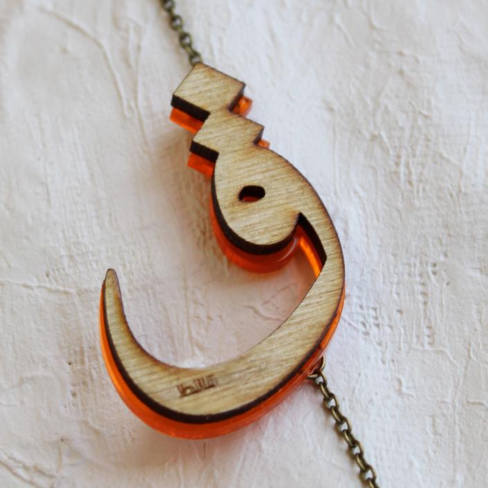
By employing wearable charms as a form, I have constructed 9 designs that symbolize different human traits and emotions. Each design is made from individual Arabic letters. They are constructed artfully from the first letter of the emotion’s word. Both positive and negative emotions are represented in the wearable charm and they both start with the same letter. For example, you can wear the Delighted charm whenever you seem Depressed. The positive emotion is bigger, designed more artfully (letter repetitions) and is seen in the front side. The negative emotion is on the back side of the charm and is represented by only one letter with no repetitions. The name of project (charm series) is Tahala which in Arabic means the beautification of oneself. My charms are not just worn as adornments, but are worn as a way to beautify the human soul.
As human beings we strive for positivity in life while experiencing negativity; This is represented by having the lively charm for the positive feeling in the front; and solo initial which stands for the negative feeling in the back. The negative feelings are acknowledged but placed in the back away from the sight. The charms are attached to metal chains. The Positive side is attached by 2 sides (two chains) and the negative side is attached by 1. This signifies that the positive side is controlling the negative one.
It is known in psychology that whenever for example you want to feel confident, you repeat and say: I am confident. Over time, you can acquire that characteristic and you feel confident. This is what I am trying to convey with my designs: You wear the positive emotion (becomes part of you) and over time you can acquire that positive feeling. With the repetition of letters, I am creating beautiful forms while emphasizing the positive emotion, and traits that a person would like to obtain. Jewelry in history and today is worn as a form of identity, and adornment. The Tahala charms are worn to signify both of these characteristics; an adornment to oneself and style, and to their soul, and becomes a statement that portrays positivity.
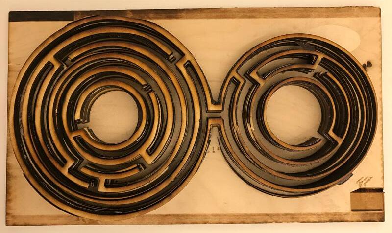
Photographs: Large Thesis project (Front Side), First letter of the word “qanoou” which means content in Arabic; Small Thesis project : (Back side) First letter of the word “qaanit” which means discontent in Arabic.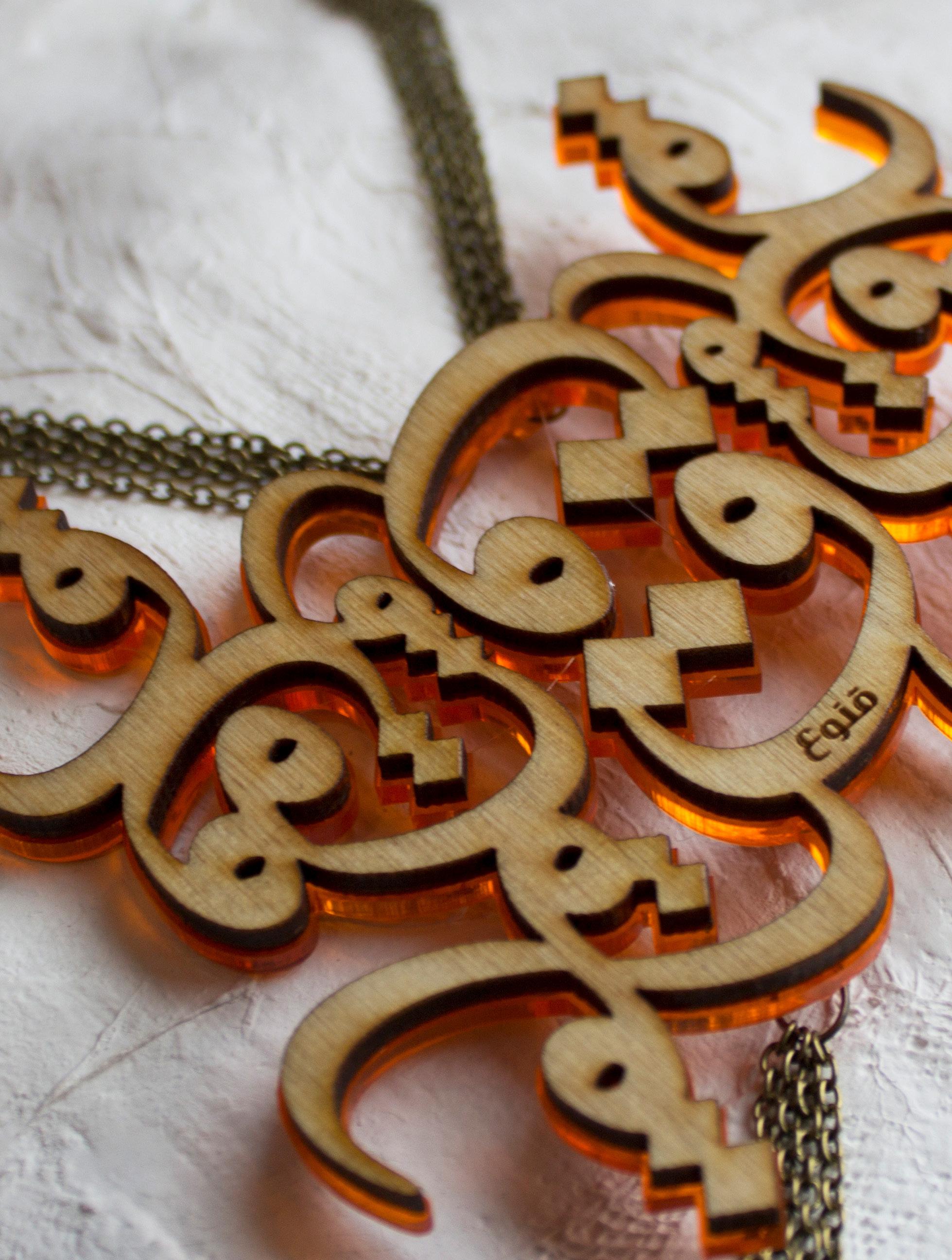
I believe audiences are drawn to beauty.
jiayi an
That is a natural thing since we are surrounded by beauty in the world. The secret to effective design is in understanding the audience’s attractions and incorporating them in their work.
My audience is my client. It is important to earn trust from my audience and pay that trust back. I need to know the audience well so I can create something that can resonate with them: it can be interesting, it can be cute, it can be sad, or it can be warm, but it must relate to the audience. The last thing I want to design is something that is very personal and narcissistic. It may look cool, but it will be about me and not the audience.
My thesis explores the topic of distraction through video. The project focuses on myself as the central character, struggling against distractions and ultimately, defeating laziness to complete the task at hand. Initially exploring the narrative through storyboarding, I considered how to express my point of view while identifying meaning in the work: is it positive or negative? This can be explored through different design elements and movement.
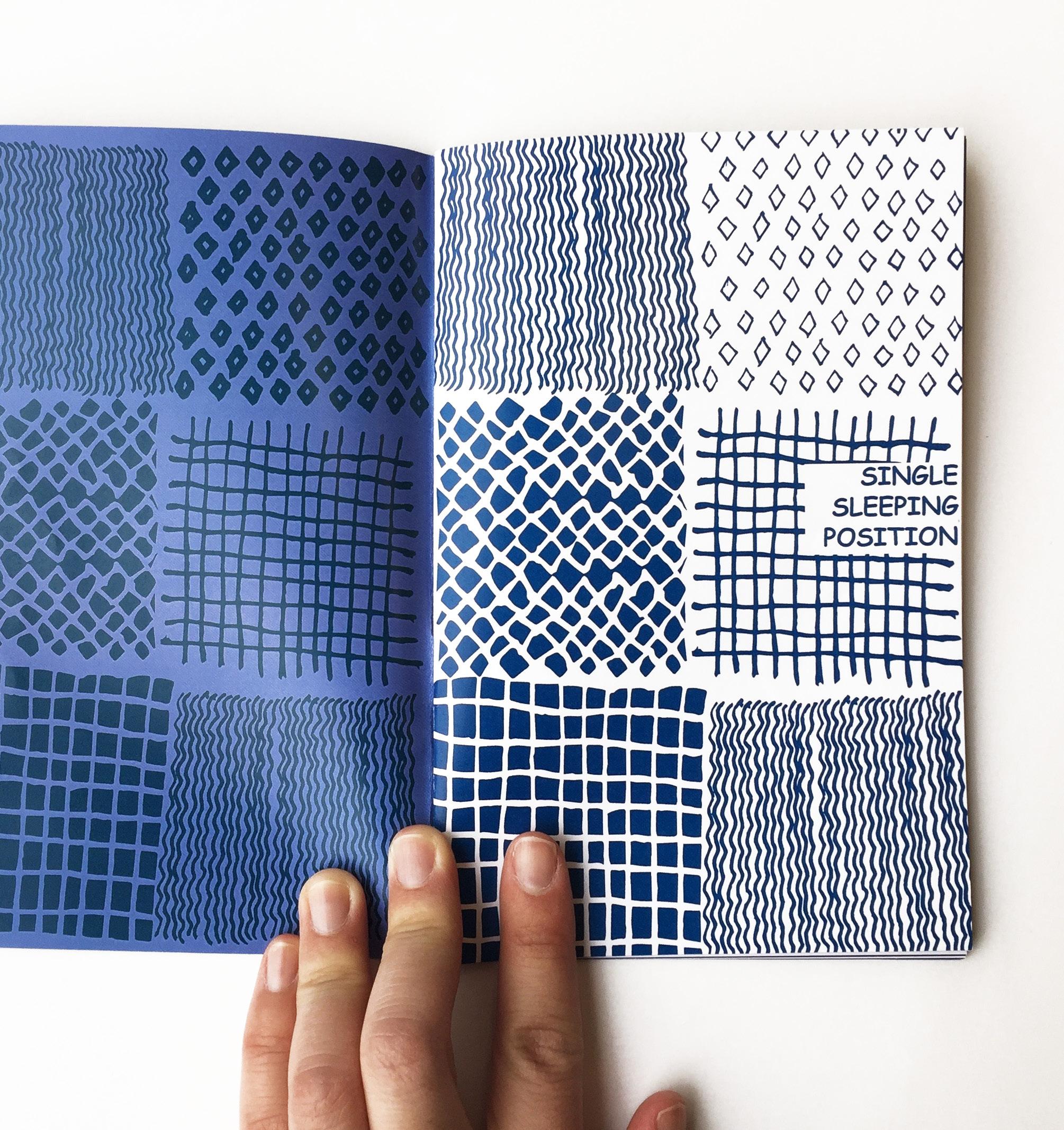
Photograph: Sleep Positions (Booklet).Much of my personality has been defined by the fact that I’m ‘from’ a lot of places. I was born in India, however lived most of my life in Bahrain attending a British-system school, before moving to NYC for six years, Kuwait for three, and now Boston for two. I’ve never been able to explain where I’m from without reciting some version of this narrative. Similarly, I’ve never been able to define my style or design practice without listing a range of conflicting interests and influences. Perhaps all graphic designers struggle with this because our goal is to meet clients’ needs, however my experience has helped me reach at least one conclusion, people today love things ‘clean’.
Clients shy away from more expressive work in favor of design that resembles Apple advertising, dominated by white space and minimal typography. As such, audiences have been conditioned to expect this type of conservative work and anything outside of this realm is seen as too busy or frightening. I feel frustrated by this lack of personality in design and want to change this by reintroducing surprise and character to the field’s visual landscape. Exposing audiences to more individualized work derived from personal stories will, in my opinion, allow brands to distinguish themselves with more versatility and personality, avoiding the norm of paring down to a generic minimum.
As big believer in authorship and storytelling, much of my MFA explorations have utilized self-generated narratives, culminating in a thesis project that showcases the problematic nature of a visual world without personality. The project lives in a hypothetical world living under the following decree:
We, from this day forward, decree a national order to prioritize jobs above all else. From this day forward, our focus should and will be Work and Productivity. For too long, we have allowed work
ethic to suffer at the hands of ‘passion’, and as a country, we have suffered greatly. Miscreants, Truants, Dreamers and Laziness will no longer be tolerated. Until our economy becomes strong, until work, productivity, and a sense of responsibility have been fostered – until idleness has been eliminated – this administration orders every organization of innovation, creativity and futurism to halt activities. Should environmental and/or social causes interfere with the creation of jobs, these endeavors will be pushed to the background indeterminately.
As a society, we can not move ahead until we have fixed the problems we face today. As such, in accordance with this decree, every citizen between the ages of 25 and 65 will be required to register for The Test. The Test guarantees placement in the workforce immediately. There will no longer be a struggle to find your place in this world. We will find it for you. The employment rate is expected to reach 100% within 6 months. Based on your determined career, each citizen will be required to spend between forty and eighty productive hours working each week. Soon you will have the opportunity to give back to this great country.

 Photographs: Top Thesis project, Productivity Report; Bottom Extreme Scale: effacer.

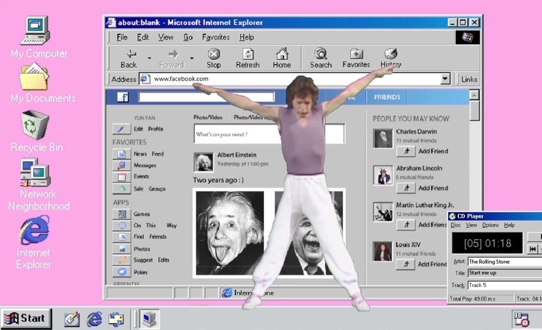
Design for me is not just a major. It's seeking better methods for making this normal life more interesting. I prefer using animation and programs to make design projects that have different ways of being presented to, and viewed by, the spectator. I like to test out different methods of visual expression to determine what’s best for me, and combine it with a subject that is familiar to the public in order to “redesign” it. It is a kind of way to play a trick or game with the viewers.
Recently I have had concerns about contemporary art; I experience some confusion in understanding it. So I decided to do some design work in the direction of art. After discussing with my thoughts and opinions on the topic, I was referred to three books that might help me better understand. I spent one month reading these books, and then decided to start my work based on the female nude. Nudes appear to be some of the earliest human art forms, and the body is the most familiar part of everyone. The theme of "female nudity" is interesting because: first, I am a woman, and second, I think the female nude is more controversial than the male nude in art history. I hope that through design and my knowledge on this topic, my work can contribute to my audience’s understanding of female nudity.
I combed through the history of female nudes in different periods of expression and divided them loosely, based on meaning and representation, into 4-5 parts. I created a “Nude Museum” in which to distinguish between the four different periods of nudity in art. Visitors who go to this museum will all be naked women. This “museum” will represent a “Paradise” state; women can enjoy showing their body and do not need to hide.
I will make a guide book for this museum showing visitors how to enjoy the museum, and there will be a small video showing what may happen in the museum. I do not want to express the idea of a particular individual view in this manual; I simply want to interpret the show in a funny way.
This book is not designed to educate the public on history because I think if someone wants to know about it, they just need to read a history book. I want to express to women that each of their bodies belongs to them, and they don't need to be afraid of the way others view them. I also hope that my audience, after reading the work, can enjoy it, and have a fresh perspective on female nudity.
I was born there in the 80’s, after much of the instability was over. Many aspects of our past still remain very much alive. But even with our history, we have somehow remained vibrant, happy, warm and welcoming people. It is almost as though the past has done little to damage us. Or perhaps we are just resilient and impenetrable to victimhood. Because of our history and the way it has shaped us, we as a collective people see the world differently and in some ways perhaps, from wider lenses. My work as a designer is most definitely shaped by my history, my background, and the way I see and experience things around me. I believe my point of view tends to be wider but, at the same time, detail-oriented. I like to pay specific attention to those things that are often times ignored by others; things that others perhaps deem as meaningless or uninteresting within this western society. I strive to make this subject the main focus of my projects and ideas. I want to believe that because of my country, my way of seeing design is more inclusive, diverse and tolerant. When creating work, I look for it to speak to the broader audience, or positively influence more than just a few. I want my work to emote sentiments that go across the board. At the same time, I search to incorporate my country’s cultural influence into my process and design ideas. I find inspiration in it’s beautiful people, our cultural vibrancy and our resilience. Because of my history, I believe that, as a designer, there is power in self-expression, in the lines we use to communicate, the shapes we create and the abstract forms we invent to communicate meaning. My work is meant to encourage and generate an emotional response within the viewer that at times may not be easily defined, but remains a source of enjoyment and questioning.
alexandra creamer
The Dominican Republic is a small country with an interesting but chaotic history.


alexandra creamer
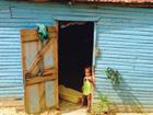
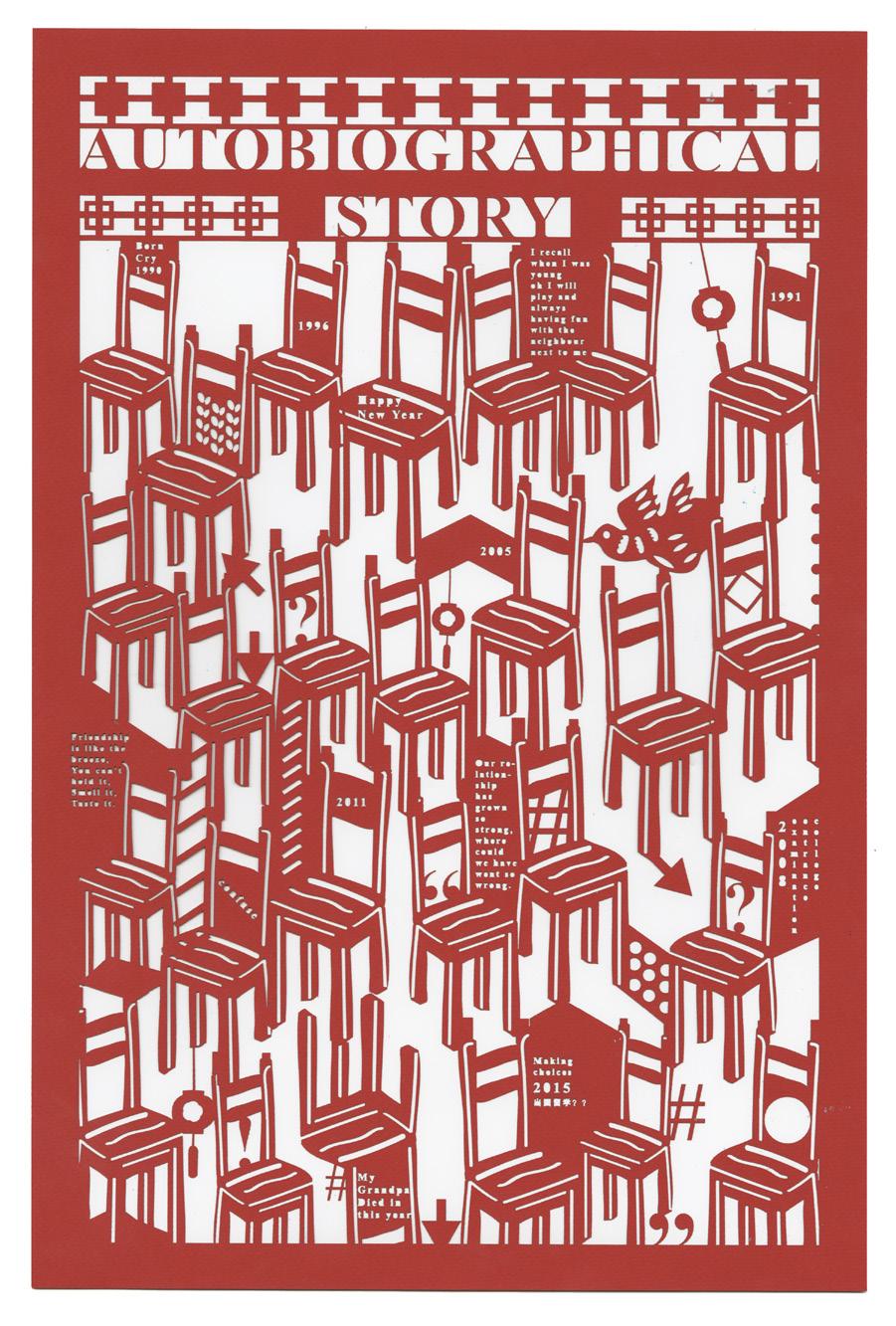
Surface: Autobiography Timeline (Life Size Poster)

Audiences look for objects that affirm their identity because they have grown wary of advertising and political messaging that contradict or challenge their perspective. I think that design has the ability to challenge the authority of these objects and thus infiltrate a viewer’s resistance to challenges. It does so by signaling the arbitrary and abstract nature of certain design conventions through a disruption of traditional form. I believe that this disruption is both beautiful and visceral. At its core, it can become a tool for empowerment and resistance.
I investigate these traditional forms by designing metabolically. That is, designing through a lens that exhibits the vitality of content that walks a line between order and chaos. By working with data, scientific documents, and historical objects that seek to reduce and organize content, I encourage the user to see and newly engage with their existence in a new light.
In my exhibition project, I’ll work with the Negro Motorist Green Book, a catalog that in its seemingly banal and objective invention exemplified the way design could become a tool to resist oppression. It challenged authority by working within the confines of traditional representation.
When Victor H. Green and George L. Smith compiled the first “Green Book” now 80 years ago, they were creating a new survival tool. African Americans had long understood by 1936 that there were places and people they should avoid, times of dusk and night that weren’t accessible to them. But, as blacks took to the roads, that protective oasis of knowledge could not go along. I look to the Green Books as a cunning and empowering document. Evidence that in the darkness and treachery of the American landscape, blacks refused to cower in place. Refused even the oppression of public transportation that reaffirmed a second class status. Blacks were starting new careers, visiting family, and vacationing.
The Negro Motorist Green Book was a key to that travel. Its pages offered a series of bright spots that could permeate the darkness of traversing an unwelcoming landscape, by revealing to its user the places that were accessible.
It shouldn’t be hard to accept this tool as a reference for the landscape today, but I admit, I found it difficult to equate the fear and hate of today, with the violence and racism of a past America. Indeed, I was unwilling to accept a need for these outdated survival tools. But since travel blossomed by becoming faster, easier, and safer, so too have the divisions, restrictions, and discriminatory practices.
But so too have blossomed the bright spots.
Photograph: Right Cover Art for Oasis, The New Green Book.

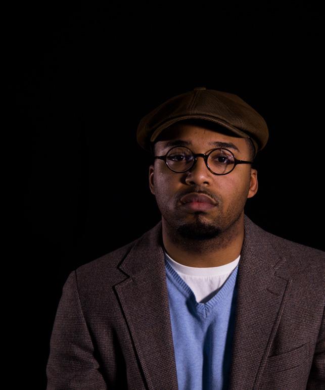
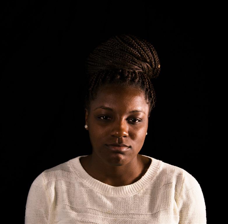
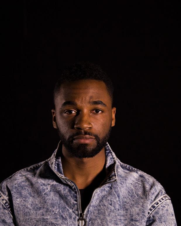
I seek to challenge the status quo through traditional and multimedia design that requires the viewers to also reflect on their own privilege.
Observing current events in the United States has provoked me to no longer be complacent in my own privilege. I seek to challenge the status quo through traditional and multimedia design that requires the viewers to also reflect on their own privilege. This introspection will expose feelings of indifference for those who surround us every day—those who may have an experience different from our own.
By carefully using the everyday visual language of our reality, I intend to confront the viewer with his or her own apathy towards problems that exist in our society. Through subversively presenting information, the audience is forced to acknowledge and respond to the content before them. I believe this confrontation, and the awareness that follows, can lead to empathy and creating an active difference in the lives of those facing injustice.
Photographs: Above Gentrification is Spreading, Mixed Media; Left Belonging, Multimedia.

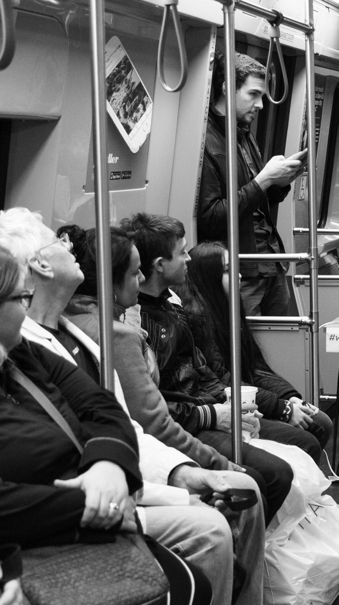
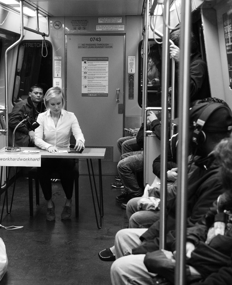
It is meant to be felt, looked at and experienced. The interesting thing about design is the power to communicate with the entire world at once. I believe in design. It is a language of its own and its understanding is not restricted to a particular group of people.
I choose to take up the challenge to create such kind of work which represents the emotions of a living being. Emotions are felt, expressed and understood by everyone and my focus lies on speaking to the world by using this technique. Rather than focusing on an explicit narrative, my design uses abstract linear forms to create a universal language that conveys the emotions we all experience in our lives. The linear forms are created using lines which represent a particular meaning based on the length, thickness, intensity and occurrences. For example, consider we have two images displayed on the wall. Image 1 has a set of 20 lines enclosed in a box which are stacked one below the other with a consistent distant between them. These lines have a regular thickness and are perfectly placed with the box. Now, picture Image 2 with the same number of lines enclosed inside a box. The lines in image two are crisscrossed having jagged edges and are inconsistently placed. When you look at the two images at once you get the immediate feeling of Image 2 having something wrong with it and hence can be considered to denote a bad emotion and vice versa for image 1 which represent a good emotion.
My projects include personal stories which have a certain emotion attached with it. My aim is to display emotions through the patterns so it can be felt and understood by everyone. The difficulty of working with personal projects is the limit to which another person can understand it. I truly believe that these patterns can help bring about a change in design with the mere ability to be perceived by all.
Photographs: Above Abdi and The Golden Ticket; Right Biography.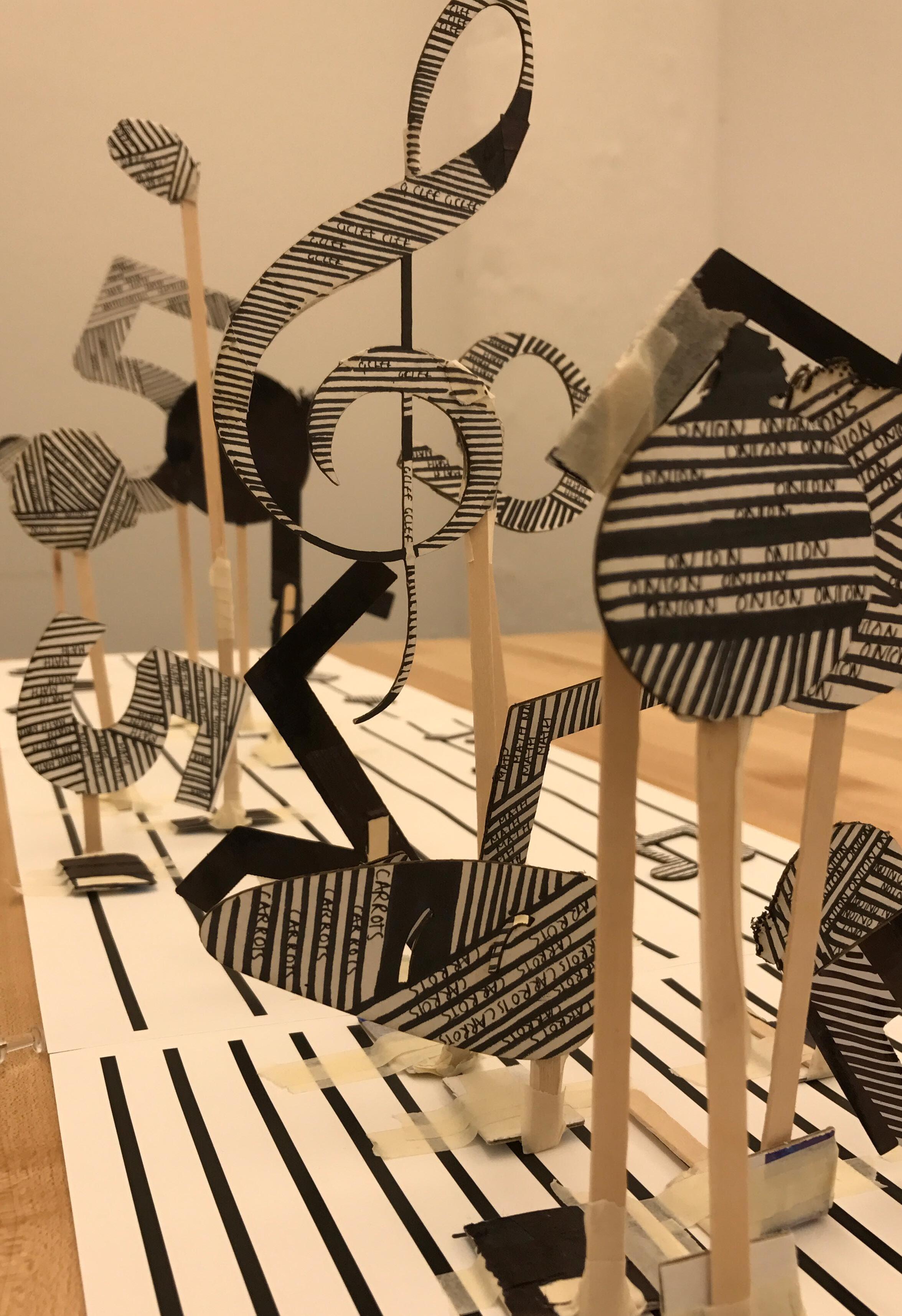
Once in a lifetime, everybody worries about finding themselves. We search for our real selves. It’s the process of growing up; from being a child to becoming an adult. Everybody goes through it. Now the question we usually don’t ask ourselves is: Is there a real you?
Everybody thinks there is a real you that exists. For the first time, I wonder if perhaps a real you doesn’t exist; that people are looking for something they will never find. This doesn’t have to be negative. We have to create our real selves. I think this is something we have to consider.
There is something about what it means to be you which defines you, and it’s kind of permanent and unchanging. A crude example is the horoscope. People are very wedded to these. People put them on their Facebook profile as though they are meaningful. There are also more scientific versions of this —ways of profiling personality type, such as, for example, the Myers-Briggs tests. A lot of companies use these for recruitment. You answer a lot of questions and this is supposed to reveal something about your core personality. And of course, the popular fascination with this is enormous.
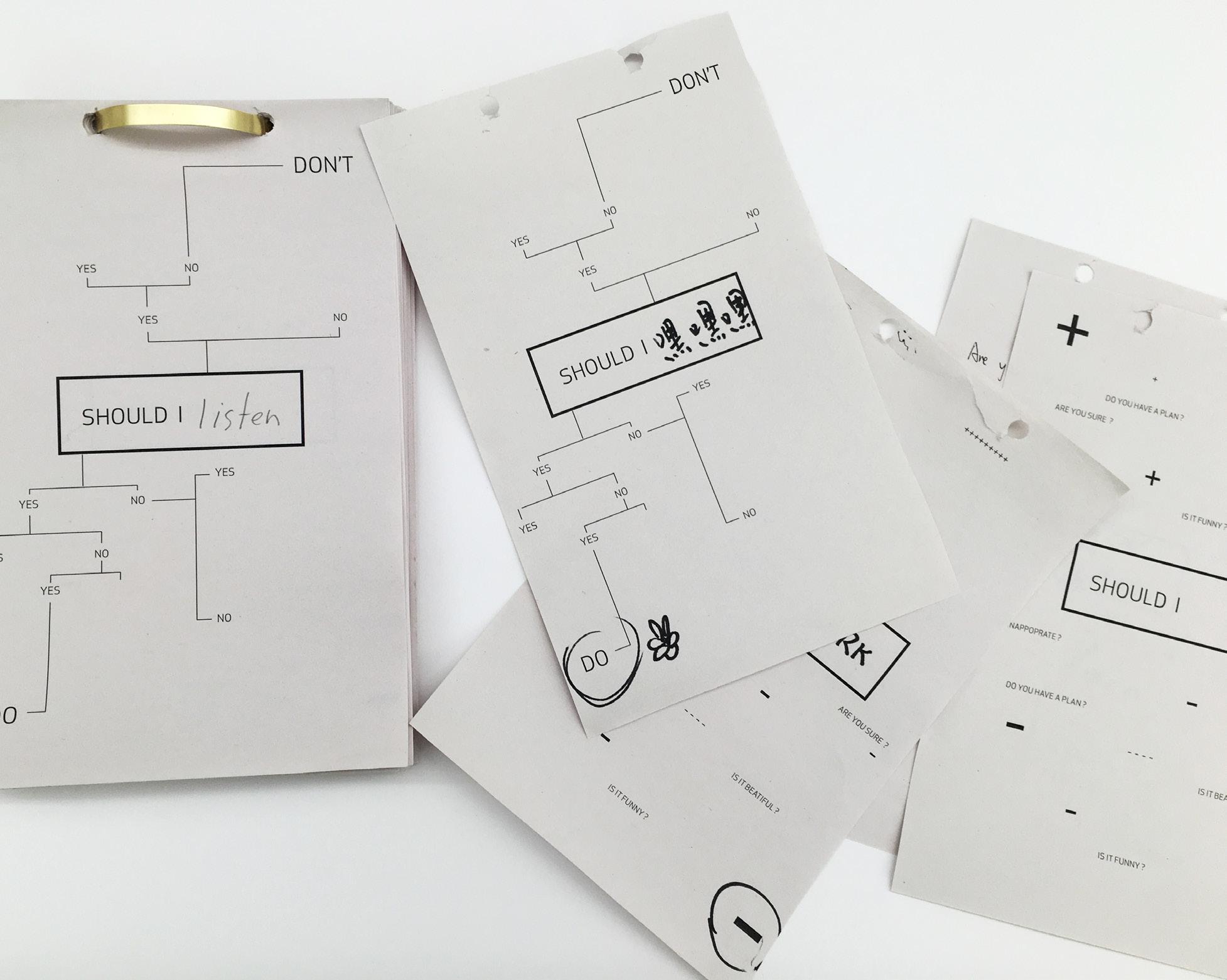 xiangrong jiang
In magazines, they’ll often advertise some kind of personality thing; doing the test to determine your learning style, your loving style, or your working style? Are you this kind of person or that?
We believe that this core or essence of ourselves is there to be discovered as a permanent truth about who we are and that it will remain throughout our lives. Here’s the common-sense idea: There is you. You are the individual you are, and you have this kind of core. In your life, of course, you accumulate different experiences. You have memories, and these memories help to create what you are. Who were you yesterday? Who are you now? Who are you going to be?
I have always believed that a good graphic designer should know how to attract the attention of people through their work. How do you grasp the curiosity of the audience? Before sending a message, we must give the audience a general feeling and evoke their emotions. The design should present messages professionally and in a way that’s easy to understand, and even communicate with people who read different languages. Finally, the design should establish a connection with the audience. Based on this theory, I will design a visual device to present my theme.
Who are you? is composed of many factors that affect each other. I use a circuit board for visual expression. On the circuit board, all the text information is made up of wires and resistors. The visual part is divided into three parts: Past, Present and Future. Those three parts are connected together by wire, LED lights and a small recording machine which influence each other. Interaction with the viewer causes them to wonder, Who Are You?
By interacting with the environment, the materials, the subject, and audiences, designers build the connection between their design and themselves. Leading by this kind of attachment, the work grows to be a mirror reflecting both the intended function and the creator.
As technology becomes more and more powerful and has been making significant impacts on daily life, some designers give up the pencil and work clean-hand. They create many “shortcuts” that works universally on all kinds of subjects and claim it is “professional,” such as sans-serif fonts, justified texts, simplified and flat graphic style, centered layouts. Hogtied by these kinds of “functions,” some people lose their own thinking in design and become a programmed machine, manufacturing meaningless design. Though this kind of design does look acceptable and effective, the fake perfection, always being misunderstood as “professional”, leads the audience and designers to nowhere. No thinking will be engaged.
I believe good design is an imaginative projection of the designer’s subjective state on the topic. When people look at it, they are attracted to the forms, affected by the designer’s personal touches and are then able to create a whole new experience on their own. Just like listening to a sad love song, people feel empathy, experience heartbreak and cry for it even though they have never experienced a romance like it. Good design contains storytelling, though not always literally, and with the personal pace of the designer, an audience receives the message and feels an association with it.
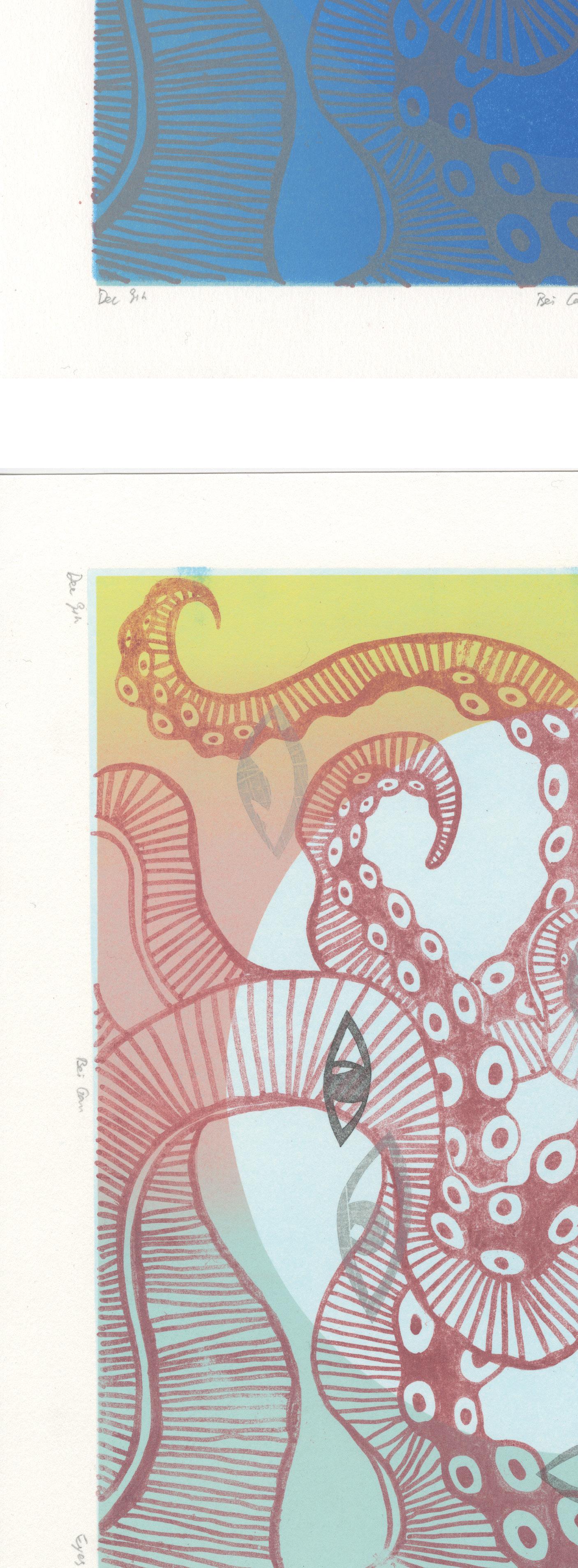
I, as a designer and an advertiser, celebrate humanity and the marks people make. I look for opportunities to bring craft quality into graphic design that meets mass production and reflects the designer’s personal feeling. Ink, brushes, rollers, papers and many other art materials have the nature of reflecting the mental status of the user since there is no auto-correction. I have been sewing for 10 years, and I notice that even I am sewing following the same paper-cut, the stitches, changing as my moods swing, make two pieces completely different. Therefore, crafting, for me, is the most intuitive way to interpret a subject. Combining crafting with graphic design is what I am examining. I am seeking the balance that the craft quality serves as not decorative graphic but also the function.
Photograph: Right Eyes, Multimedia Printmaking.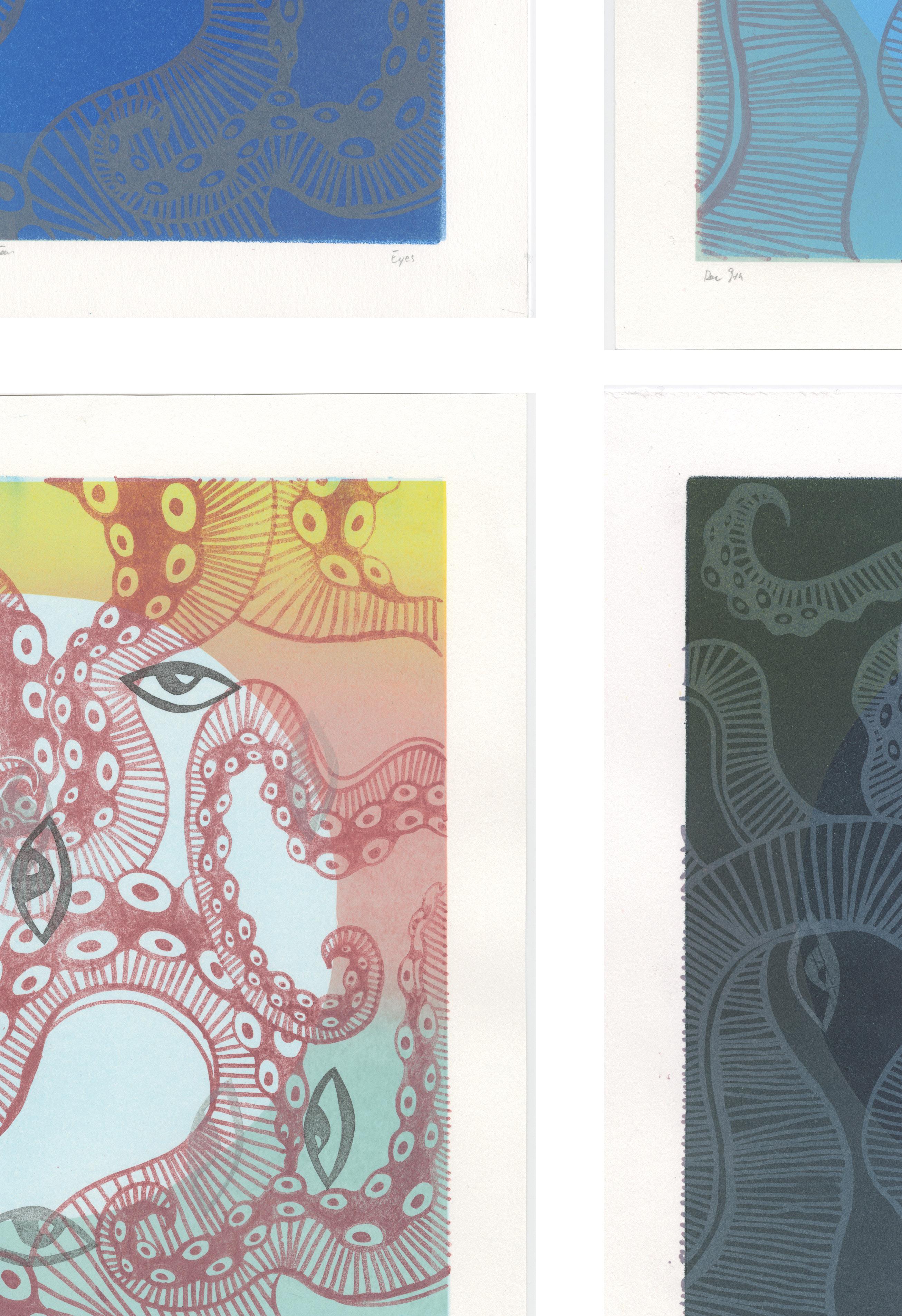


Do you realize how important your memory is?
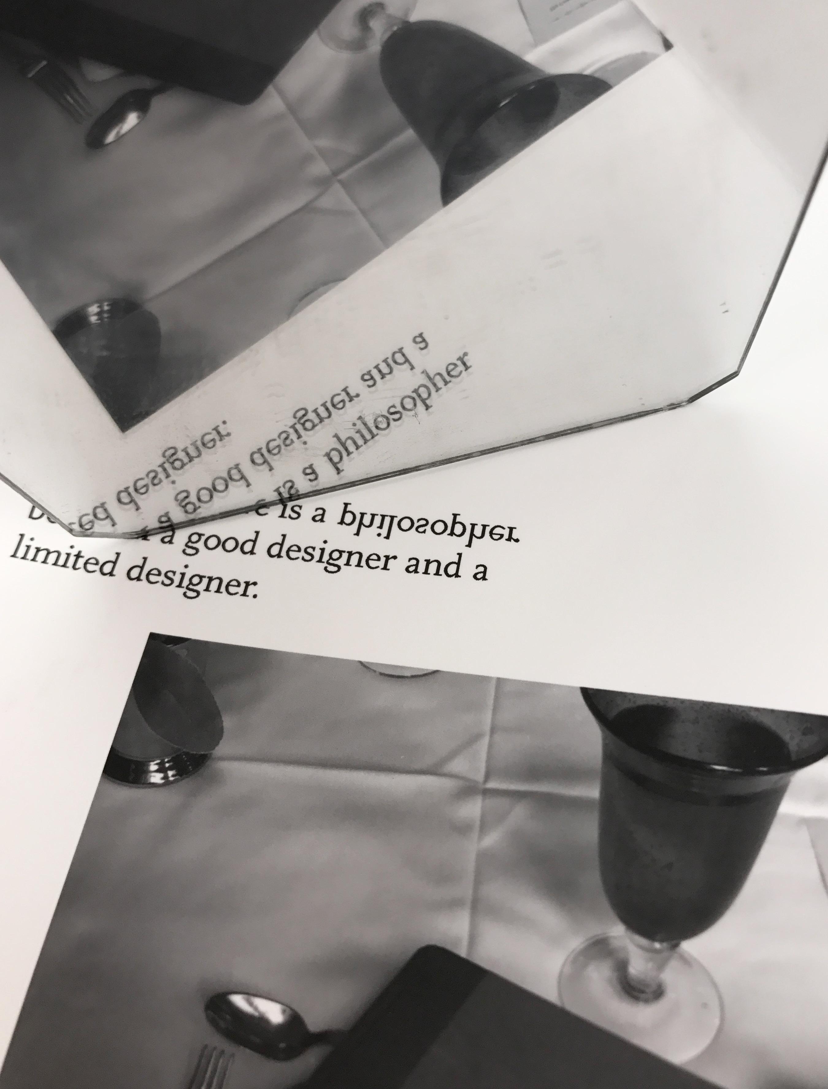
When it comes to graphic design, audiences are mostly fickle. Since there is too much information online and offline, people skip over information quickly. Because of this it can be difficult to draw an audience’s attention and even harder to engage them for a long period of time.
I believe the little things in our daily life have the potential to remind people of important things, forgotten, yet eternal feelings. We be can profoundly moved by these familiar yet forgotten memories.
Do you realize how important your memory is? Your memory is something develops with you over our lifetime, and it contains everything about you. What’s storage in your head is far more than a collection of facts and figures, but the experience you make up for your life. Autobiographic memory is different from learning ability. The ways you think of the past influence how you image the future. We piece together the fragment memories to create an idea of the future.
I think we all can draw some comfort effect that we will be remembered by others as well when we had been able pass those on to a family but also the effects we will survive in their memory too. Remember, the past is one of natures’s miracles. It’s incredibly unusual. Think about the time’s arrow going in one direction, we can reverse that; we can have time travel back to the past. Memories in every stage of life, we can close eyes and remember what happened yesterday.
Your memory is you. At the end of your life, your memory will be filled of your experience, your secrets and dreams.
I think the most important requirement of design is that it attracts the audience to stand in front it and get the meaning of what I am showing by interesting resonance. To achieve this, my design work must always do something new or different interesting layers. This could be presenting things from new perspective, in a new form, unforgettable colors, or using a special technology. This is not limited to the visual but also could involve smell or touch. It could also involve interactivity and play. All of this not only aids getting the audiences attention but also helping the audience remember my work. So I have tried to explore different ways to present my works, especially during these 2 years.
In terms of my final thesis show, originally, the idea I got is from Leonardo da Vinci’s theory of mirror, which makes me realize the important connection among the experience we have, something in our mind and the pretty of the nature. In my opinion, many people use mirror everyday, So I try to use mirror to show my concept ‘talk to the mirror’ and have some interaction with the audience.
Actually a small piece of mirror can contain all things in the world, so in this work, the viewer can experience and observe the mirrors and images showing of
everything near by during the whole process, which makes people communicate and talk with the mirror. Seeing themselves in the mirror and feeling it, which seems that we lead ourselves but not follow with the mirror. In our life, when we are faced with dilemmas or the failure of the cause to the problem, the mind may often appear two voices in the debate, as the pros and cons to discuss, this discussion sometimes makes us difficult to get rid of, and for a long time, the two voices can not convince each other, which will make our mood in the depressed situation.
So when you appear in such emotional state, try to “talk to the mirror”. What you need to do is to let yourself be in front of the mirror, with the first person (on behalf of your own voice) and the second person (on behalf of your good friend’s voice) dialogue performance. This technique allows the viewers to face the mirror, so that they are unreservedly in front of the mirror, so that they have nowhere to avoid. This kind of technique is the use of rituals, affecting the psychology of the parties. People’s external behavior will affect people’s inner feelings, rituals are external behavior, different rituals directly have a psychological impact to us.
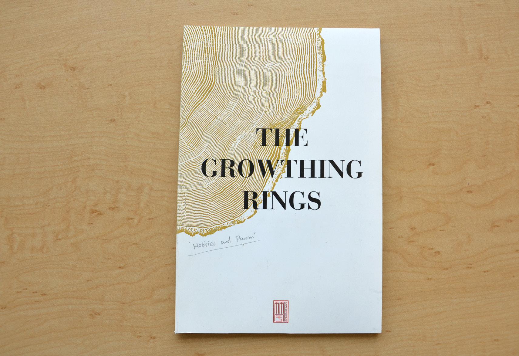
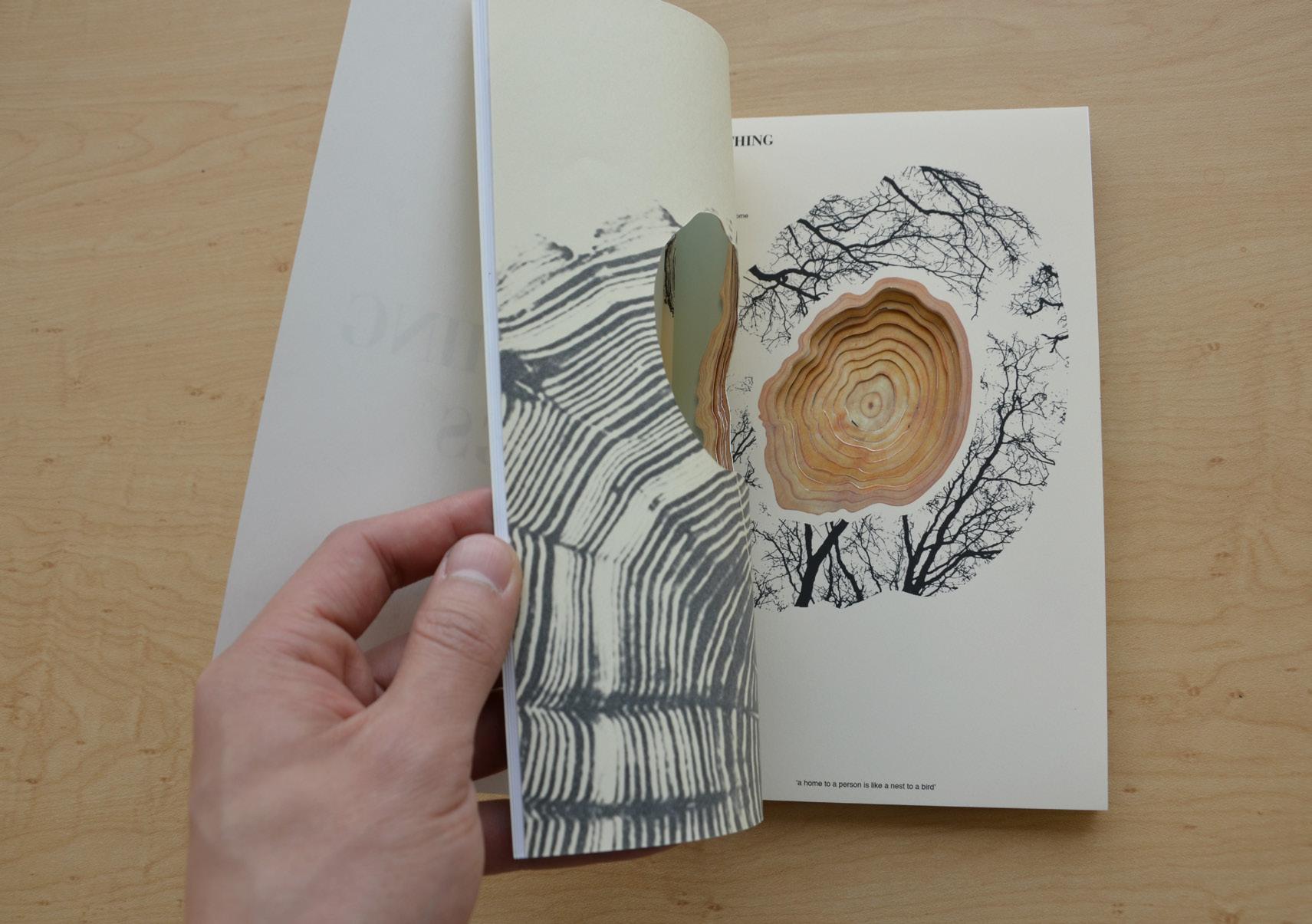
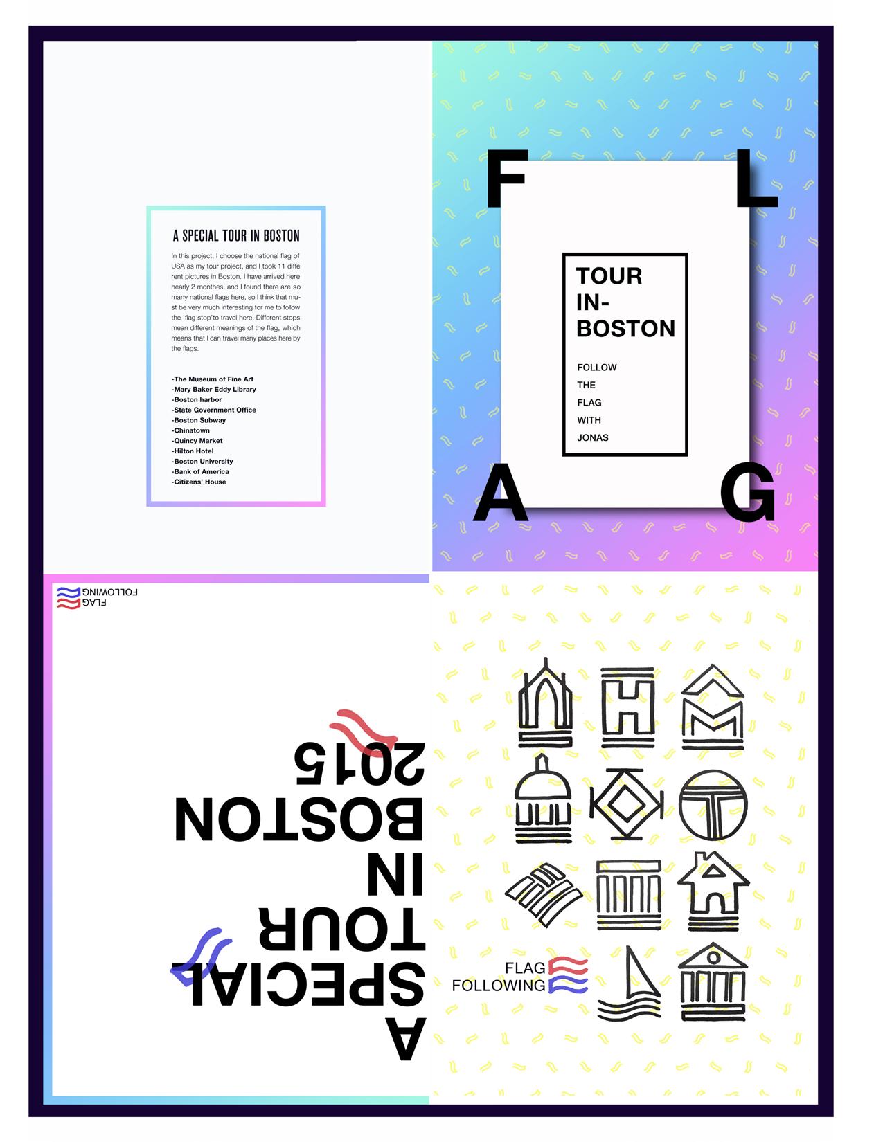
yimeng liu
In my opinion, design is a work that creates a sense of happiness and positive attitude that can be effective in touching people’s open hearts. At this point, I would like to use a series of free-style graphic design to enlighten people’s thought, feeling, and re-examination about themselves. I wish my design brings people's happiness and positive feeling, by multiple shapes and sizes combine with color and contrast. I prefer to use diversity of layers overlap method express my design style, which I think that it makes design full of more vitality and mysterious. Other than that, I would like to use bright color to express color contrast, since it has a positive communication with audiences. Above all, my goal is to make my design looks like a new world where lead people to imagine they are in and from there, they will be inspired, enlightened, filled with courage and happiness to face life.
For the form of my work. I would like to try to use silkscreen print way to create my design work. The technique of silkscreen printing became a very popular printing method in the 20th century. Silkscreen printing is a great introduction to the art of printmaking. Printmaking was originally a form of communication before becoming an art form with the advent of the printing press; art prints began producing limited edition prints. I prefer handcraft design that my silkscreen printmaking work can be unique. Every design work has life itself. When I was trying to used silkscreen first time, it matches my favorite layers overlap design method and bright color ink perfect to express design style. Therefore I choose silkscreen printmaking way to create my work.
My design inspiration is from my favorite artist, a French artist Henri Matisse. He was a draughtsman, printmaker and sculptor. In the late 1940s, Henri Matisse exclusively turned almost to cut paper as his primary medium, and scissors as his chief implement, introducing a radically new operation that came to be called a cut-out. Matisse used to cut painted sheets into forms of varying shapes and sizes—from the vegetal to the abstract—after which he then arranged into lively compositions, striking for their work with color and contrast, their exploitation of decorative strategies, and their economy of means. Initially, these compositions were of modest size but, over time, their scale grew along with Matisse’s ambitions for them, expanding into mural or room-size works. A brilliant final chapter in Matisse’s long career, the cut-outs reflect both a renewed commitment to form and color and an inventiveness directed to the status of the work of art, whether as a unique object, environment, ornament, or a hybrid of all of these.
In the future, regarding my design life, I decide that I will focus on my varying shape with colorful design style that could bring audiences more positive attitude and feel happiness to the life. One way of achieving that, I will try to create more handcrafts work to enrich my design life.
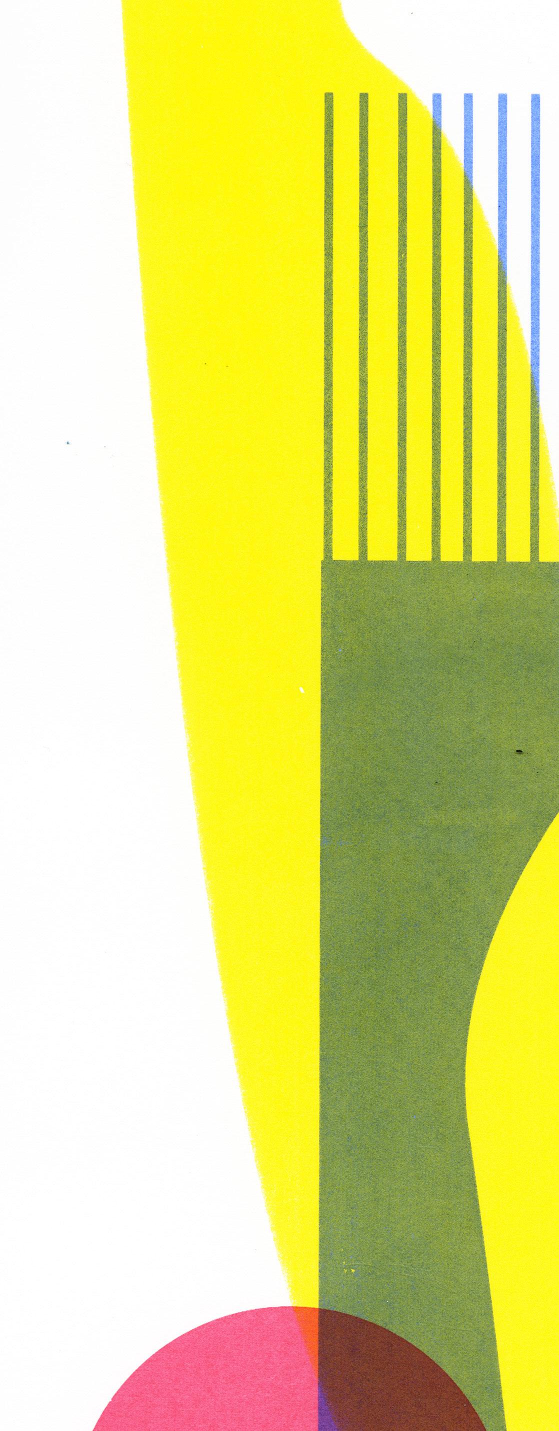
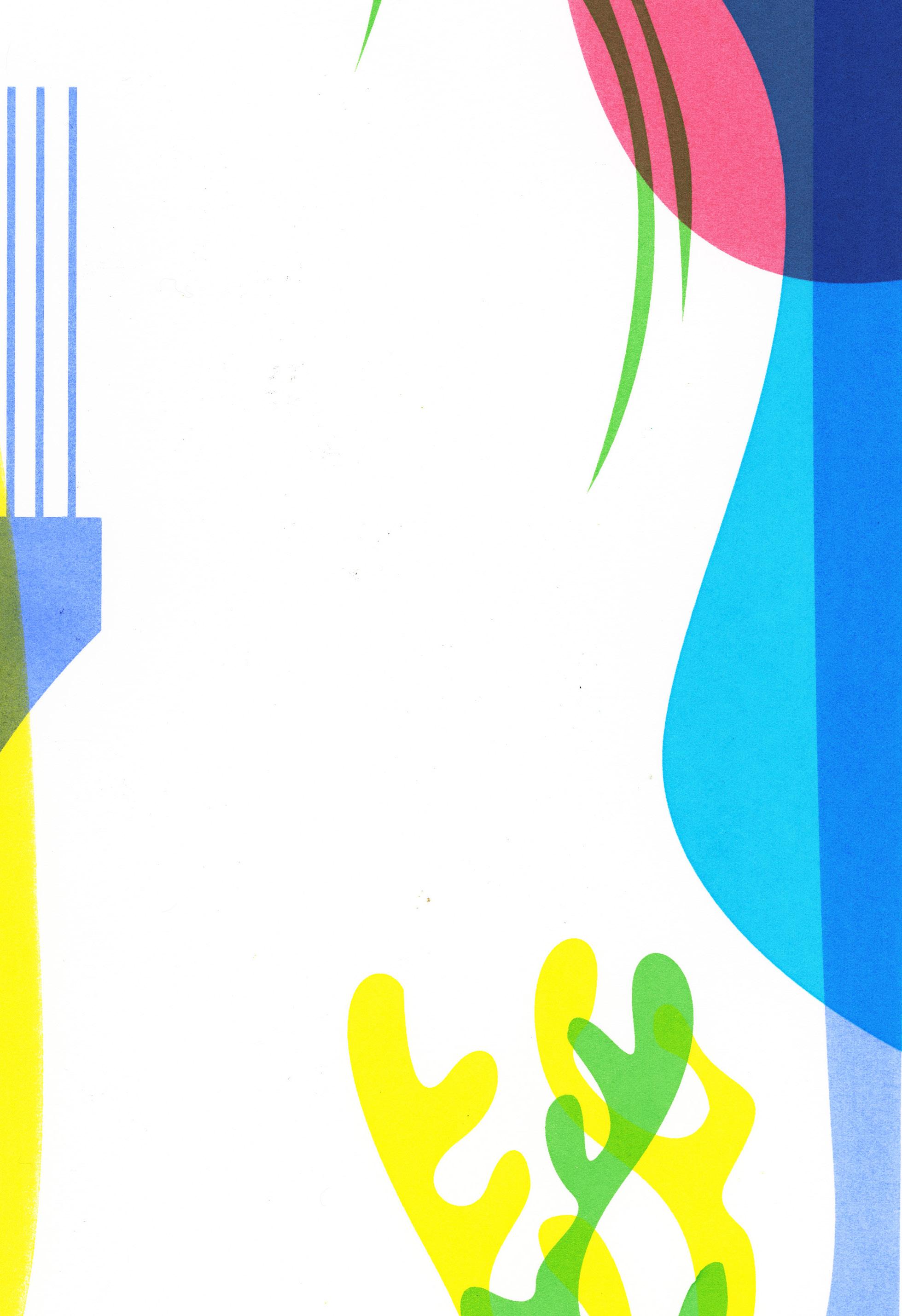 Photograph: Free-Style Graphic, Silkscreen Print.


Design is like lighting a bonfire in the spirit world. To me, art is something that doesn’t have a simple definition. I just focus on exploring how to make the art narrative work, getting the audience involved with emotional reactions and creating the imaginary space to strengthen my own expression. I believe that exploring art using narrative can be very powerful in design expression and the communication process. And as a designer, we also need to always question what, why, and how before the design process. Like, what are the stories behind the visuals? Why are you telling the stories in this way? How do I attract the audience?
My thesis work is based on the universal phenomenon that occurs when a lot of young people leave home to chase their dreams outside in big cities like Shanghai and Boston. Perhaps they hope to start a good career through the variety of development opportunities, or could have more chances to get a better education here. With the purpose of chasing something, they tolerate the tough days, adapting to any environment and are usually far away from homes. They have a job and a bed in the city, but do they belong to the city? They question themselves again and again.
We call this phenomenon "PIAO" in Chinese culture, which means the "floating," "moving," or "unstable" kind of lifestyle. This phenomenon also fits us — the big group of overseas students, as it relates to our daily life and reflects our emotions while living alone outside. Although we are confused, lost, and finding directions all the time, we still have dreams deeply in the heart.
I want to talk about it through my personal experiences. I studied and worked in Shanghai for almost six years, and then came here to study abroad. I love Shanghai, but it’s really hard to stay there because of high housing prices. The friends around me have almost the same situation but they’d rather stay outside in big cities for different reasons. So I choose to record the life of myself and two friends of mine as the contents of my work. The contents will divide into three parts: the life in Boston, Shanghai, and Hongkong. I also try to create a 3-D visual version mixed with video images to tell stories. It shouldn’t be absolutely negative or positive, I’m simply exploring how to get the audience to feel involved and touched though my personal work. I want my creations to leave a lasting impression in those audience’s mind and resonate.
Photograph: Autobiography, Life Size Poster.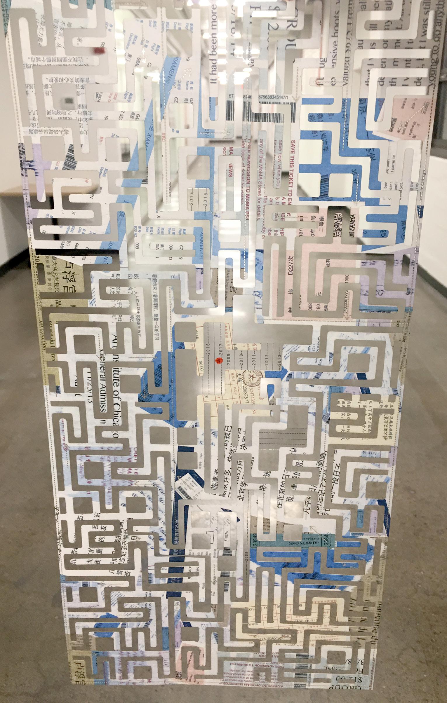

 Photographs: Above Arts for All Boston, Print|Social Activism; Right Top Autobiography, Print; Right Lower Used Balances, Web|Social Activism.
Nicholas’ entry point into the field of graphic design was by way of architecture. While completing his bachelors degree in Austin, Texas, he spent time at several architecture firms that exposed him to a design process through the development of a wide array of building styles. The desire to spend time in diverse environments was spurred by his long-time fascination in the power a built space has to shape the emotions, thoughts, and mood of its inhabitants. A thoroughly deconstructive and informed analysis in design thinking is often why architecture can be successful in this way. Nicholas believes this mode of thinking should exist in graphic design as well. In this light, the difference between practicing architecture and graphic design is that they are simply carried out with different mediums.
Nicholas sought a creative outlet where he could practice and further explore the design philosophy he adopted from architecture. This design experience, as an early foundation, influenced his early illustrations, his development with hand type, and other skills that invited work as a freelance graphic designer. Throughout his development, Nicholas continually searches for informative and thought provoking sources of inspiration outside the field of graphic design (such as architecture). He is constantly analyzing environments for elements that evoke a message, or change in mood, feeling, and thought. It is this successful communication by the environment, no matter the medium or message, that he seeks to embody in his work, especially when implementing unexpected and nontraditional combinations of content and form.

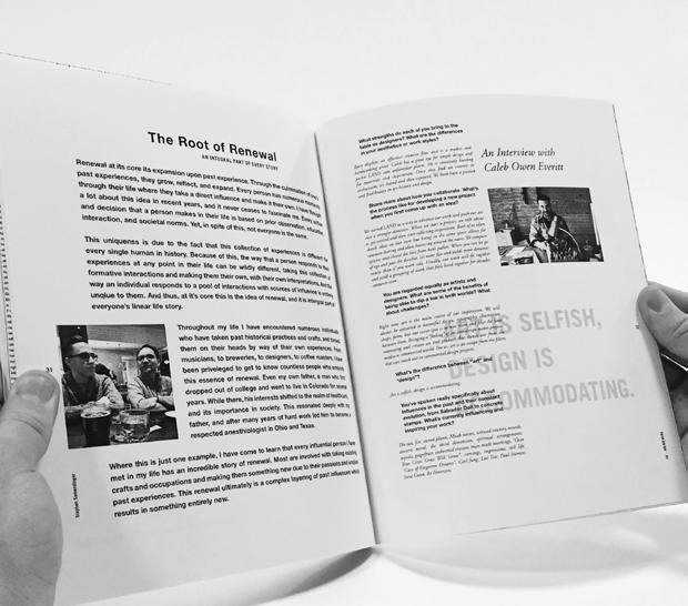
For his thesis, he selected one of the most prominent elements of architecture, transparency, and analyzed its significance in the field of design. Society’s responsiveness to the idea of transparency throughout history has shifted drastically. Many forms of design may reflect these changes in attitude, the most significant being architecture. However, rarely does design actually shape this change in how transparency has been received by society. Nicholas seeks to investigate the causation of this shift and examine how transparency, both literally and phenomenally, can be most effectively used. As architecture has been the main manifestation of this social shift, he examined these changes in a comprehensive analysis within his project. He then designed the thesis environment and presentation to enhance the delivery of the content, exploring the most effective choices in type, layout, colors and material.
I can rarely find words that can contextualize my thoughts, but there is something magical that a block of color, texture of a paper, or simply the arrangement of elements can express that my words never can.
My practice is my effort to have a voice in this world, without having the need to find words to define them. My work is about breaking down the everyday mundane thoughts I have and reconstructing them to become an entity that I can put in front of an audience and communicate a story. It is the close observation of the past and present while revealing stories of success, failure, pain, struggle, joy and looking at the subject without the clouded distraction of someone else’s judgment. It is an exercise of form making that is inspired by the constant inquiry of my life, experiences and surroundings while developing a point of view. My personal work attempts to be a break from commercial graphic design that can act as a testing ground for visual experiments.
As an amalgamated product, of my deep-seated roots in Indian culture and traditions, as well as my constant exposure of the West, my work is too influenced by these 2 broad spectrums. While so much work tends to be an imitation of the trends in the west, the cross-cultural influences helps me bring more life into my work. It acts as my platform to introduce historical cultural elements and bring them into the modern world of design.
Part of my work inclines towards being a biographical interpretation of events of my life, while the other strives to be a critical interpretation of social and cultural issues that surround me. The constant struggle of the contrast between the outer shell and what they might hide inside, is something that excites me and finds a way into most of my work. If a story means something to me there’s just a chance it meets something to other people too, and that’s what I find worth exploring. Sometimes design is about making something that looks appealing, but its also about saying something that is important to you.
I strive to create experiences that invite the audience to unfold contrasting narratives and create powerful moments that can provoke reactions and thoughts and maybe respectful debate. While some people use their clever 180 worded tweets to do so, I find my artwork helps me contribute my point of view to the world and create moments of reflection. I hope through my work to invite audiences, not only to explore my thought process but also reflect stories and people that have inspired me and motivate them too, to look for beauty in unusual and new places.
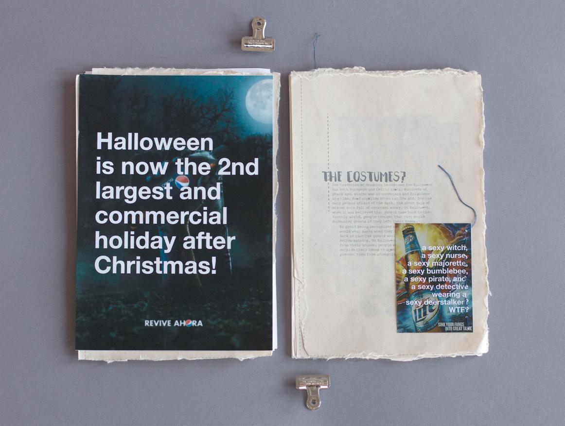
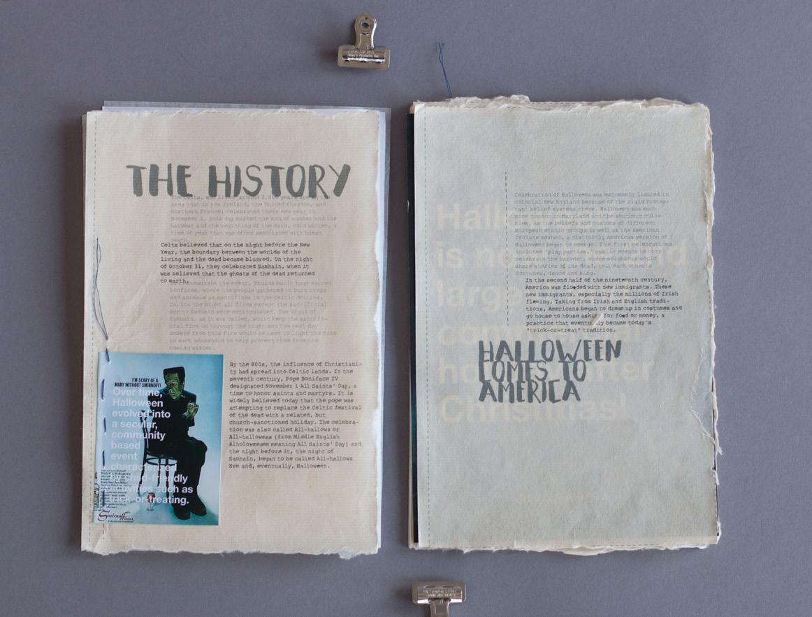
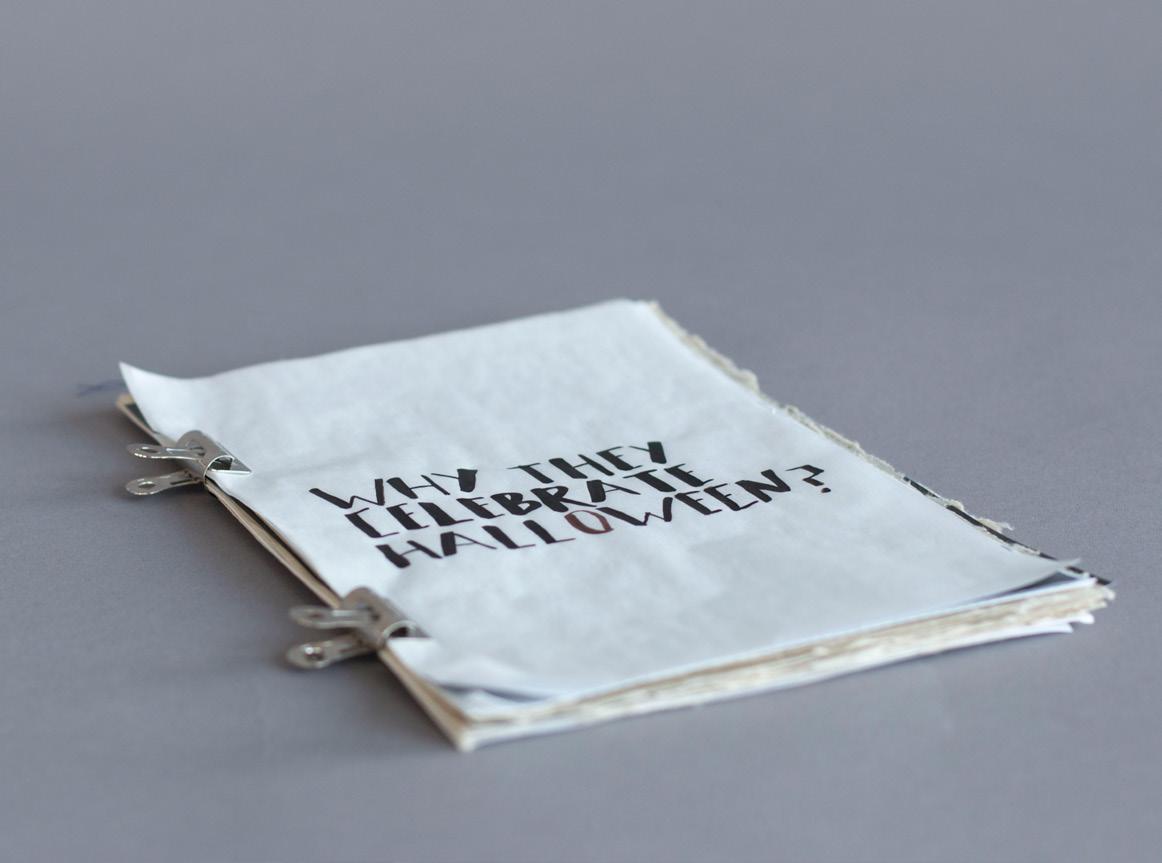

Curiosity, nonconformity and critical thinking make me interested in trivialities most take for granted. It always leaves me in doubt whenever I hear something like “it is supposed to be.” Who makes the rules and why these rules? Overturning traditions has routinely inspired my works and grown to be the new norm of my design. For any inspiration, a strong grasp of its origin and the context in which it lives is key to incorporating it into the design. Skillful adoption of familiar elements from everyday life through extraction, abstraction, and transformation, brings the design close to the intended audience. Visual hints not only resonate with the audience and help build an experience which feels natural and intuitive, but also ensure they are engaged in the challenging or provoking messages the design tries to convey.
Indeed, every work of mine has been motivated by curiosity, and, frankly, often by confusion. There is too much in this world that is unknown to me. When a question comes up, instead of rigorously studying a subject outside my specialty, I would rather use my artistic creativity as a tool to experiment with novel ideas. One day it occurred to me: if pets have a society like the human society, would there be a division of labour? Realising I could only think as a human and needed to get a pet involved for interesting magic to happen, I let a cat sit in front of my laptop and type on the keyboard. After a while, he had typed quite a lot. I documented the entire process and collected his inventions, which later became the project Human Pets Care instruction.
Most artworks are sentimental, expressive of the artist’s intention. Although every individual sees an artwork differently, the first impression is usually dominated by colour, pattern, etc. Everyone receives the same visual data created by the original artist and yields their own interpretation. In an attempt to un-visualise artworks, what if we deprive artworks of the canonical visual characteristics such as colour, pattern, and texture, but instead rely solely on natural language and mathematics to transcribe them? The audience then takes the transcription as input, makes the reverse conversion through their own imagination back to wildly different visual data, and finally sees a unique artwork. The role of the audience is shifted from a passive receiver to an active visualiser who is a conscious, distinguishable, integral, and pivotal component of the artwork. For example, the ambiguity of the word “yellow” prompts endless possibilities of visualisations of the colour, as everyone allows their own variation of yellow to form in their mind. I hope my work provides an innovative means for the audience to enjoy artworks—apart from seeing arts with their eyes—reading arts with their mind, and to achieve a personalised, unique experience.
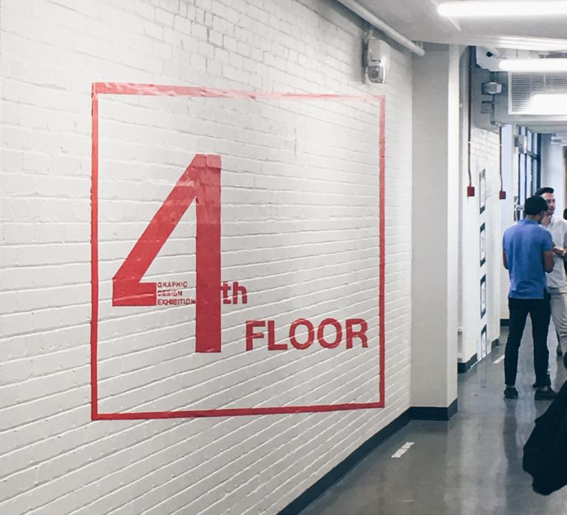
Photographs: Left Manifesto, Poster Series; Above 4th Floor, Exhibition Design.Time makes us forget or ignore them. They are everywhere in our daily existence and too common to be noticed. My approach is to reveal some of the unnoticed things, reflect our inner hidden personalities, and raise questions to audience and myself. For a long time I was struggling with what changes us and what makes us feel different from the past or childhood. The answer is “time.”
Time makes us grow; it makes us change and it makes us different. My favorite fairy tale is Peter Pan. Kids in wonderland never worry about growing up, and Peter is such a brave and free-spirited boy. But, we are not living in fairy tales and we have to grow up.
My story is fairy tale between yesterday and tomorrow, a story between “Yesterday City” and the little monsters of “Tomorrow”. Time is merciless; it take away your yesterday and force you into tomorrow. Time is like little thieves, they will steal your memory, make you forget something important to do. Once you notice time has already past, it is too late. Time is always around you and in your hand, but you can’t touch and see, and it will go away without any notice.
I have a wonderland in my bottom of heart. It is a “Yesterday City” built with my memory and favorite things. Time, just like little monsters, is biting and stealing something from the city. The more these little monsters steal, the bigger they will grow. Until a moment, they are not stoppable, time has out of your control, it is another new and blank day.
In design it is very important to find a way of drawing the audience to you. My approach is to have people experience something that relates to a daily life but they never usually think about it. Some things are too common to notice in our daily life, like voices, textures, or personalities at the bottom of one’s heart. Their daily existence is a reflection of our inner hidden personality.
There are many ways of revealing these unnoticed things, including motion, audios, story lines, etc.; for example, connecting irrelevant voices with images or animation. My approach is to use storytelling. I view the audience as listeners of my stories. Some may not want to listen, but getting an audience interested is a part of storytellers’ skill. I will make the audience feel they are a part of the story by using familiar experiences that resonant with them but presented in an unexpected way.
I believe that this kind of unexpected experience is important in design. I want the audience to keep them asking, what will happen, why is it happening, what is it about? I think this will raise deeper questions for them to think about. To make them get involved, I will like to make them feel they are a part of my story, they will have similar experience to help them resonant with the story I am saying.
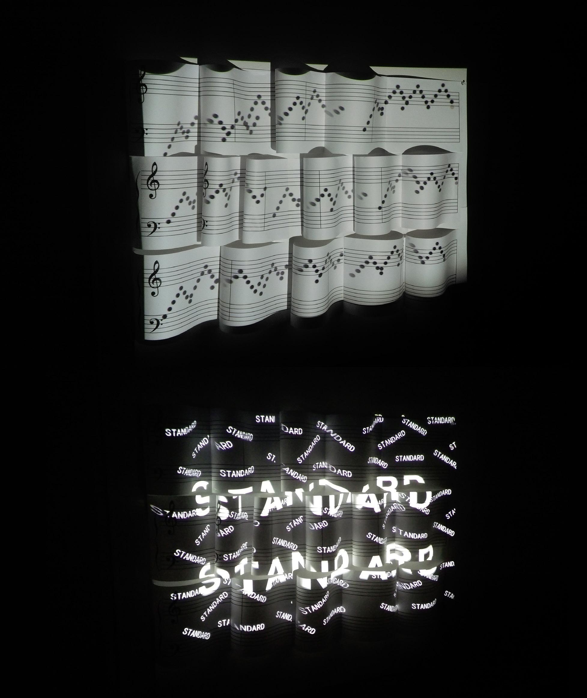

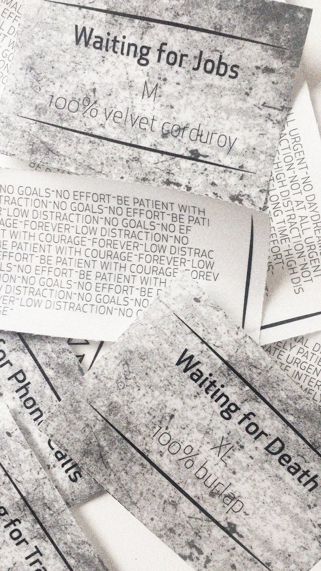
Seeing is touching and hearing is tasting. All senses are one sense and that, is feeling. By bringing this emotive quality into play, I’ll never cease to challenge the boundaries of our senses in the language of design. The title of my thesis project is Waiting Paradigm. Waiting is a part of life. We are all waiting for something to happen everyday. It could be as small as traffic lights, phone calls, and flights, or as long as love and death.
The project is composed of three parts: fabric posters, an interactive area, and a process book. By embroidering poetic texts on certain fabrics, I have designed and created giant fabric posters to represent five generic types of waiting we have all experienced, or will experience, someday. Similar to laundry symbols that define fabrics, and the clothing labels that instruct how to wash each fabric correctly, waiting care symbols are designed to define waiting, and the labels attached to the fabric provide instructions for caring for certain types of waiting. Viewers are encouraged to stamp on the instruction sheets for their own definitions of waiting. In addition, the archive of waiting records all sorts of waiting stories, and the connections between fabric and the abstract concept.
My work is defined by my use of daily objects as invitations, building varied experiences for most of my projects. I explore the balance between abstract concepts and the concrete but poetic forms of visual expression. Deconstructing the abstract concept into fragments—the pieces that are not only composed by optical elements, but also by sound, fabric, and odor, etc. —I intend to expand the meanings of fragments and show that fragments can also serve as the medium to present a whole.
Photograph: Right Waiting Paradigm, Print Labels.xinyue zhao


Waiting Paradigm (Print Labels)


Viewing a piece of graphic design should be like unwrapping a gift.
As a designer, I am always absorbing nutrients from daily life. Blue skies, white clouds, mysterious mists, breeze and water flows, every drop in life and every silk of gratefulness direct me to my real heart and mind.
I always dreamed about the ocean, which could be the vast boundless aggressive one with salty smelling waves, or the quiet mirror-like clear shallow sea filled with colorful corals; I like them all. For this reason, when the fairytale The Little Mermaid came to my life a long time ago, I was addicted to it and deeply immersed. Swimming around the ocean, jumping like a dolphin, chasing the waves; that’s how I dreamed that mermaids live. So in this thesis show, I am going to design a book about this story by using monotype prints. Integrating type with the prints, supported by a projector showing ocean movement from the top, I will make the audience get involved in an ocean experience.
Monotype is a type of printmaking made by drawing or painting on a smooth, non-absorbent surface. The image is then transferred onto a sheet of paper by pressing the two together, usually using a printing press. Monotype produces a unique print, most of the ink is removed during the initial pressing. Although subsequent reprints are sometimes possible, they differ greatly from the first print and are generally considered inferior. Due to this special technique, I am able to transform the ocean from my mind to the paper, because it’s so unique and distinct to me.
Nowadays, printed paper material is reducing, replaced by more and more technical, digital projects. But in my point of view, paper books are so special and still have a certain attraction to people. So I insist on paper prints, because I believe when people touch the paper and feel the texture of books, they can be more engaged with the content. In the meantime, my design will be using a range of formats and techniques as well. I want to try many different things, so my work will have a lot of variation. My design will show the value of thinking in different ways and using different methods to solve problems. So in this project, the multi-media optical technology will also be part of my design, making my project more diversified.
I believe that audiences are interested in design that is innovative, creative, and raises their curiosity, engaging the audience. One way to achieve this is to take a familiar design format and transform it with a fresh and surprising interactive approach. I want the feeling that viewing my design is like unwrapping a gift. The harder they work, the larger the gift they receive. I want my work to bring joy to the audience and produce a positive feeling. Unexpected content, interactive format, and positive attitude — these are the elements that will engage my audience.
A variety of design combinations, which is the design concept I have always been chasing, coming from pretty life, nature and the tiny little sparkling things. I am excited to bring my understanding of The Little Mermaid story to an audience who wants to experience the ocean, who has a passion for the sea, and who is willing to walk in my fantastic design world.
Galen Bradley
Erin Kerbert
Nicholas Anthony Mancini
Caitlyn Anne Norman
Nicolas Roche
Brantly Sheffield
Kayla Suverkrubbe
D Toporowski
Ruowen Wu
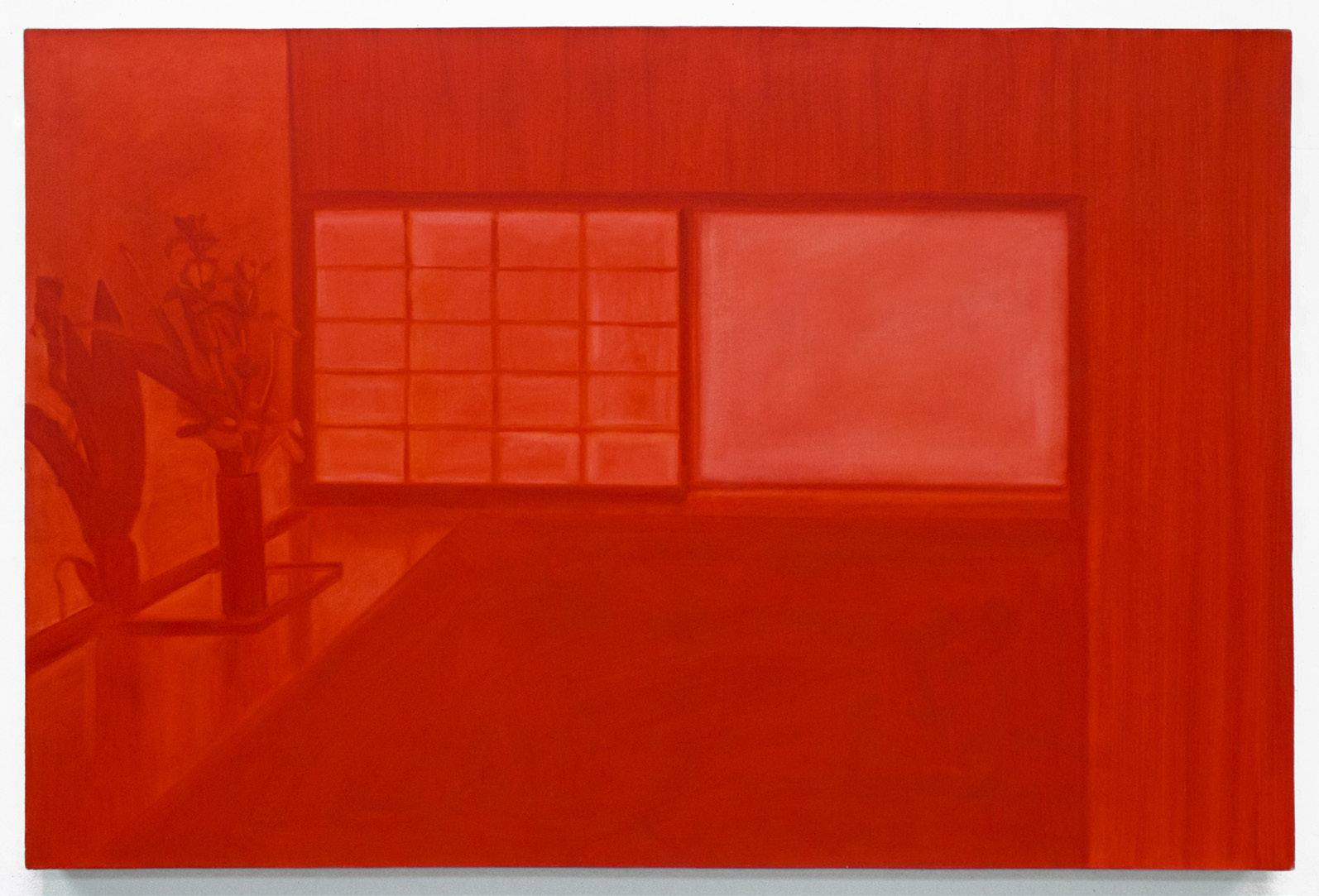
I am often struck by my inability to be present when a situation demands it of me. When I become too aware of my presence, reality unravels and the world becomes (or, perhaps, remains) inaccessible. It is outside and I am inside: separate. I sense the invisible barrier that exists between my mind and the physical world, like a curtain or an itch, and I want to obliterate it. Each moment slips by and I feel myself forgetting with every passing thought. Now all that remains of these moments exists in fragments, various artifacts and incomplete recollections, bound together by perpetual loss.
I am interested in a picture’s ability to shift time, to conflate past and present. If drawing is a form of learning, then perhaps by making pictures I can extract more knowledge out of it, experience more of the moments that have long since come and gone, or soon will be. It is a desire to extend the life of the ephemeral. The act of drawing and painting has become a grounding force, maintaining my contact with the physical, helping me achieve greater intimacy with both subject and surface. It serves as a reminder of my own ability to enact upon this world, each mark a record of my attempts. Paradoxically, painting is also a step removed, itself a barrier between me and a life lived. The resulting picture will never be an equivalent experience to what is pictured, but becomes something different altogether. In the end, I am primarily an observer, a voyeur in my own life. Rather than foolishly hope that painting will ever truly allow me to access the world, I seek to both capture and exist in that state of desire, to eternalize non-attainment, a place where want and lack coexist in an image—the pursuit of the unattainable.

Initially, making paintings had been a way for me to depict ideas, illusions of space, as well as experiences. While making strictly two-dimensional pieces, I became frustrated that I couldn’t access that beyond the flat surface. I began working inside the structure of a loom, a tool used to produce textile. While making what I call “woven paintings” I was able to reach not only the surface of the painting, but also behind it, and on top of it. This structure enabled me to add to, and remove from, as I produced the overall object as a whole. Working in this way not only allowed me to resolve frustrations involving surface access, but also allowed me to bridge a gap between my knowledge of painting as well as my knowledge of fashion design. I wanted to understand the overall makeup, the interior and exterior, of the thing I was creating. I was producing images or depictions of summarized memories and atmospheric qualities of experiences as a tool to further explore color, shape, and temporal movement.
After creating several “woven paintings” it became clear that these things needed to exist in real space. It was necessary for the work to share an environment with not only me as the maker, but also with viewers and objects that surrounded it. It seemed counteractive for these objects to sit passively on a wall. With this “shared existence” an interaction between the piece and viewer is able to take place. I like to think of this interaction as a reflection or projection of myself or viewer’s self, as well as a recollection of a temporal experience. As these newer pieces have begun to take hold, I have started to understand them, as objects that may mimic articles of clothing. The pieces are not to be worn, but rather to pose questions of what we wear, and why we wear them. My intent is for their existence to evoke a specific sense of place, individual, object, movement, memory, or a combination of. It is not important that each viewer has the same or similar reaction or interpretation to the colors, shapes, and pieces; in fact, it seems impossible for individuals to respond in exactly the same way. These newer pieces have allowed me to understand the specifics of what it is I am attempting to depict; I have begun to pave an avenue that enables me to reflect my own environment, experiences, and self on and beyond the superficial appearance or illusion of what it is that’s being created.
Photograph: Right All Natural, Mixed Media.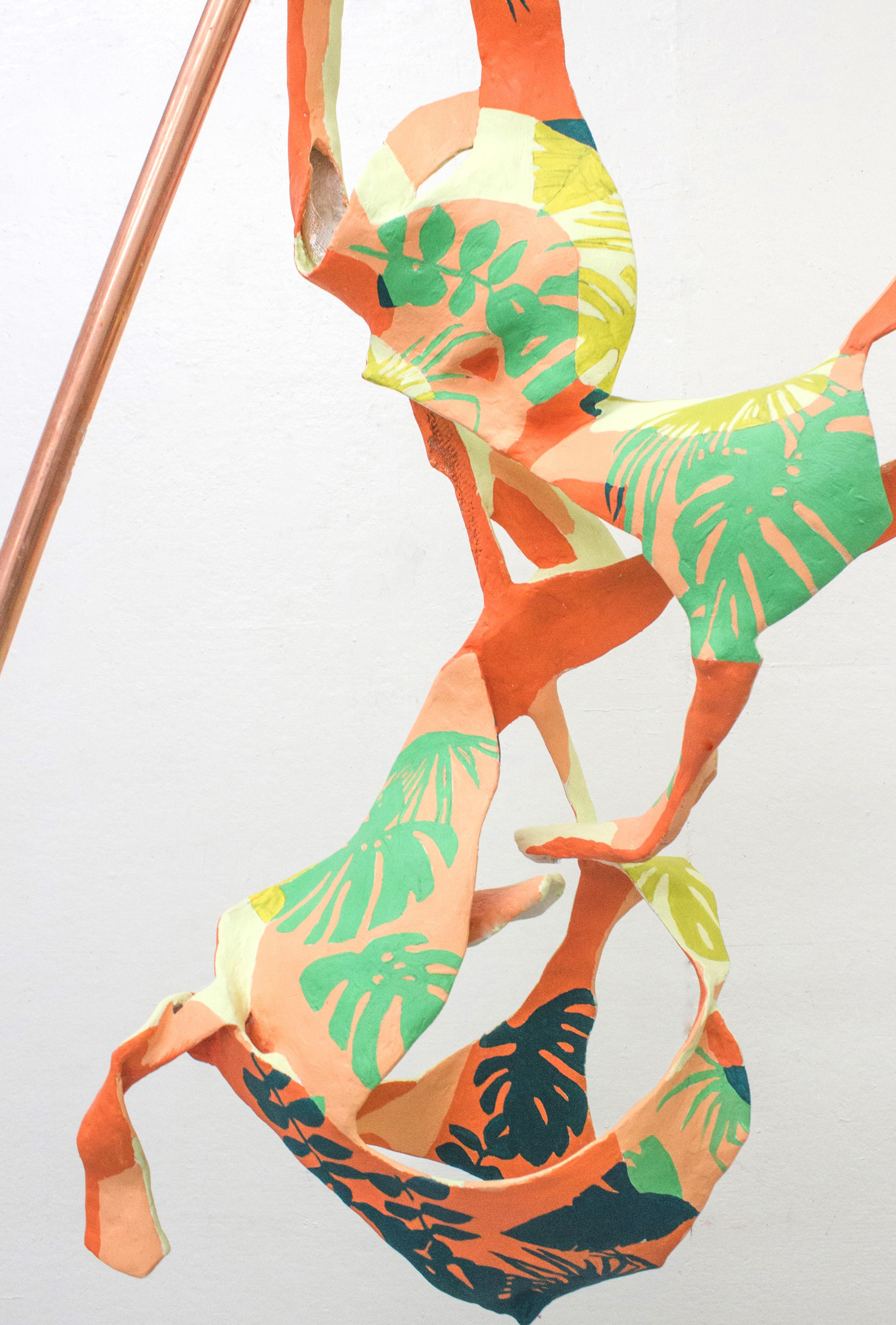
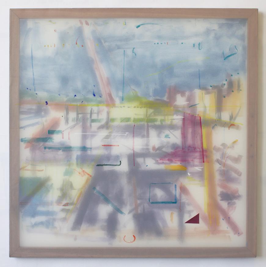
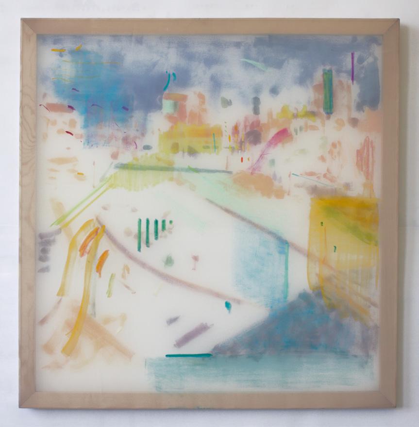
Memories superimpose spaces; a memory can enrich, distort, disguise, expose, blur and illuminate a place. The word impression points to both a physical pressure and a mental image. The unknowable distance between inside and outside can be assimilated to the unknowable relationship between parts and a whole. The only way I know how to locate these parts is to touch them, to press them. One can see a space in its entirety, but one cannot touch its expanse at once. Touch is not simply a gesture, it is a physical engagement, it takes time, it denotes time. We interpret touch, touch is important to how parts relate, to how people relate to each other. A single touch can be interpreted different ways. What is physically singular can become multiplied internally.
In the collages I depict places that confound the boundary between indoor and outdoor as a metaphor to explore the dialogue between our inner space and the physical spaces we inhabit. I am interested in how these spaces are physically constructed to alter a sense of place and how we, in turn, interpret and reconstruct them mentally. The collages are constructed using monotypes. The pressing of ink into paper, and the pressing of cut paper onto the surface relates back to impression. Layers of monotypes and pastel are bound across a single plane in an attempt to grasp a manifold experience.
The scrim paintings begin from direct observation, the scene traced directly onto the initial scrim. This observed beginning is then glazed by a secondary layer, entangling it in marks dervied from memory and invention. Two interpretations of one place remain physically separated, but optically interlaced.
Though my interests lie in the dialogue between physical and mental space, the true impetus to create is to attempt to form a bond, a bond that is based on sight and touch, that brings together experiences that would otherwise remain separate.
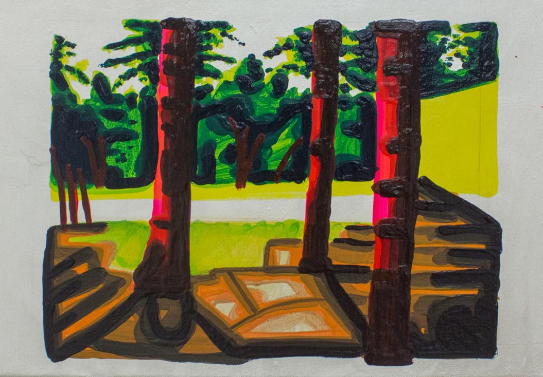
This exhibition includes two bodies of work, collages and scrim paintings, both of which examine the boundary between physical space and remembered scenes.Photographs: Left Top 808, Fifth Floor, Acrylic, Oil Pastel (on two layers of polyester); Left Lower Ramp, Theatre Construction, Acrylic, Oil Pastel, Paper (on two layers of polyester).
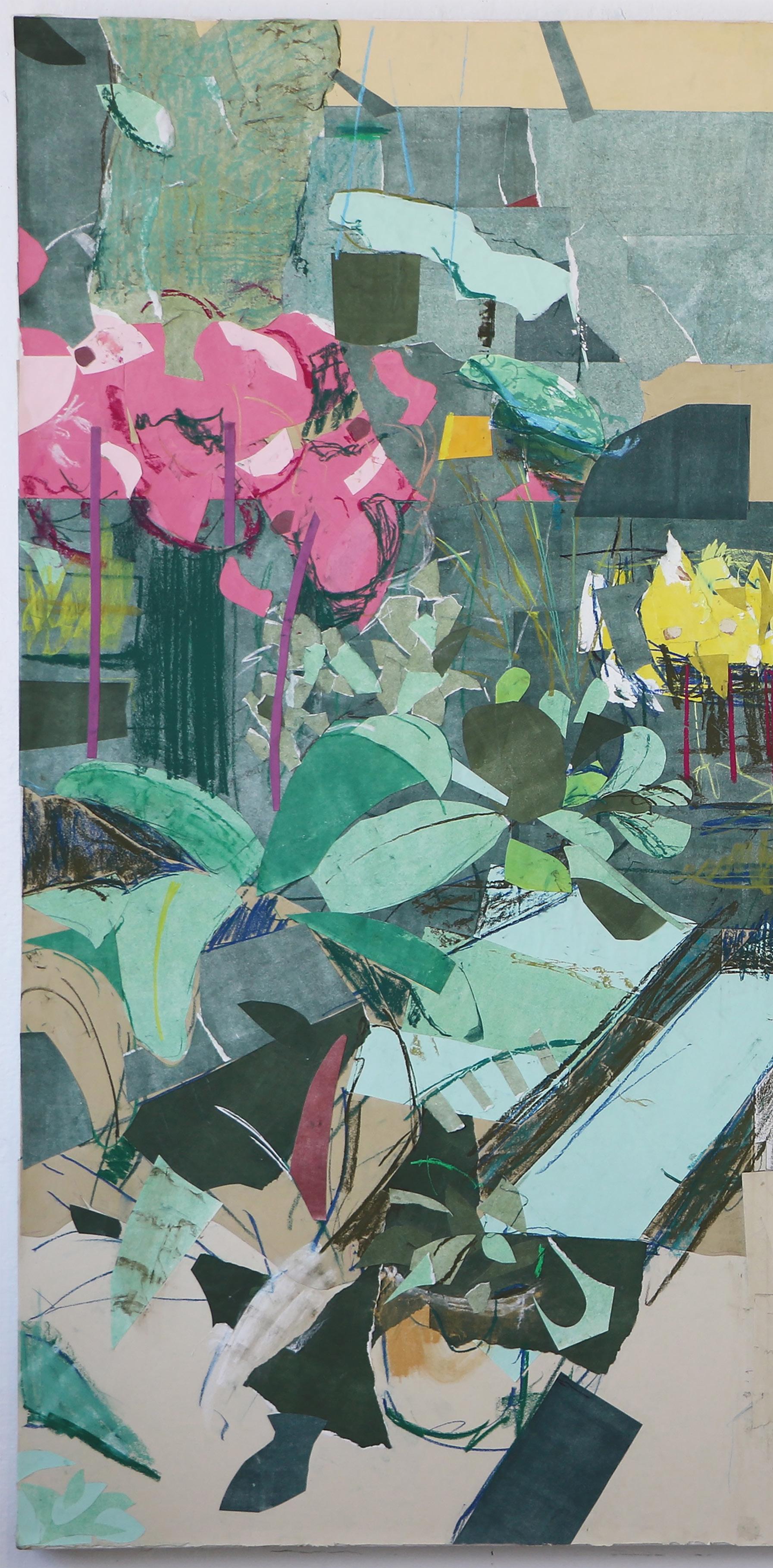
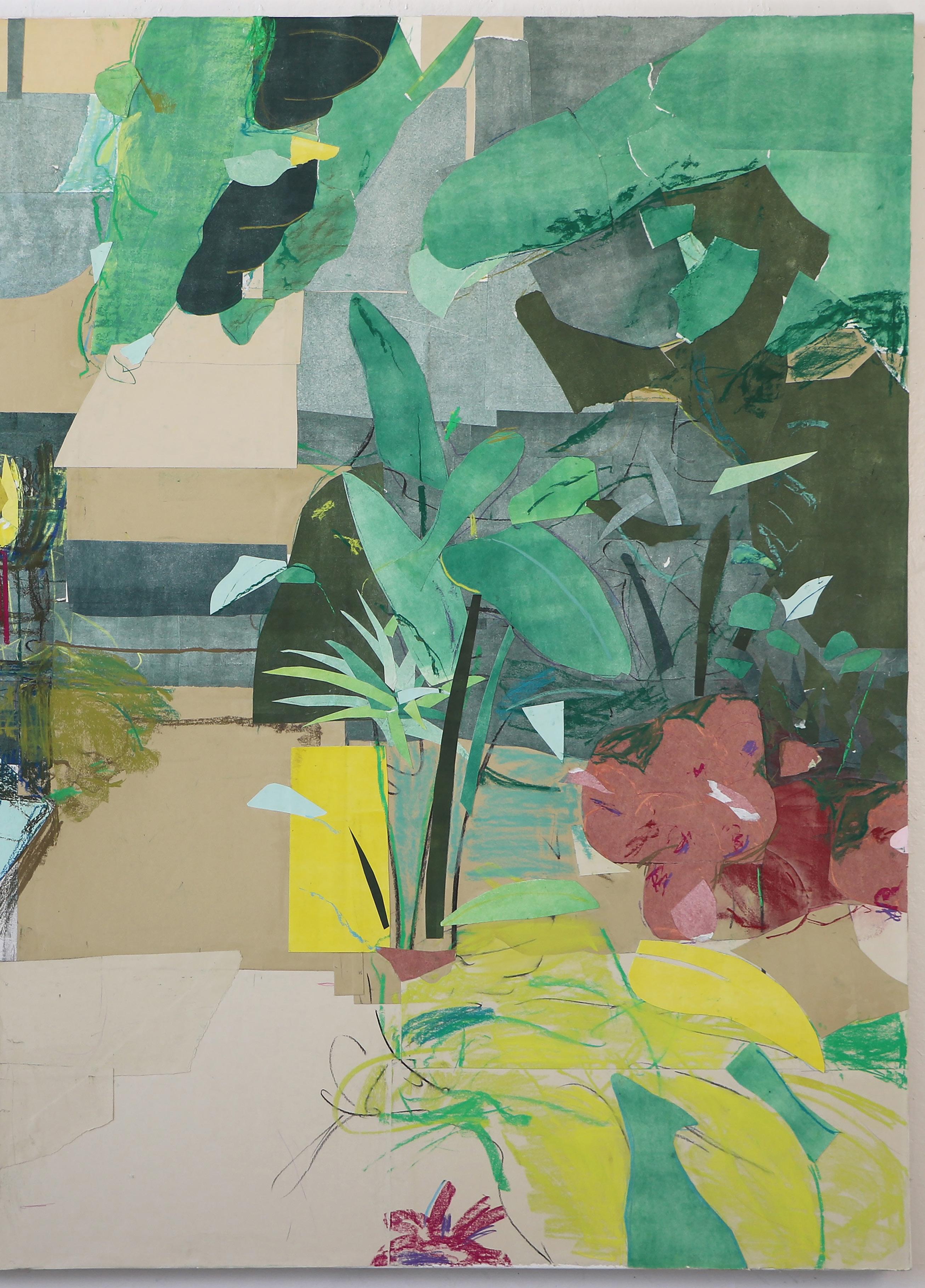
 caitlyn anne norman
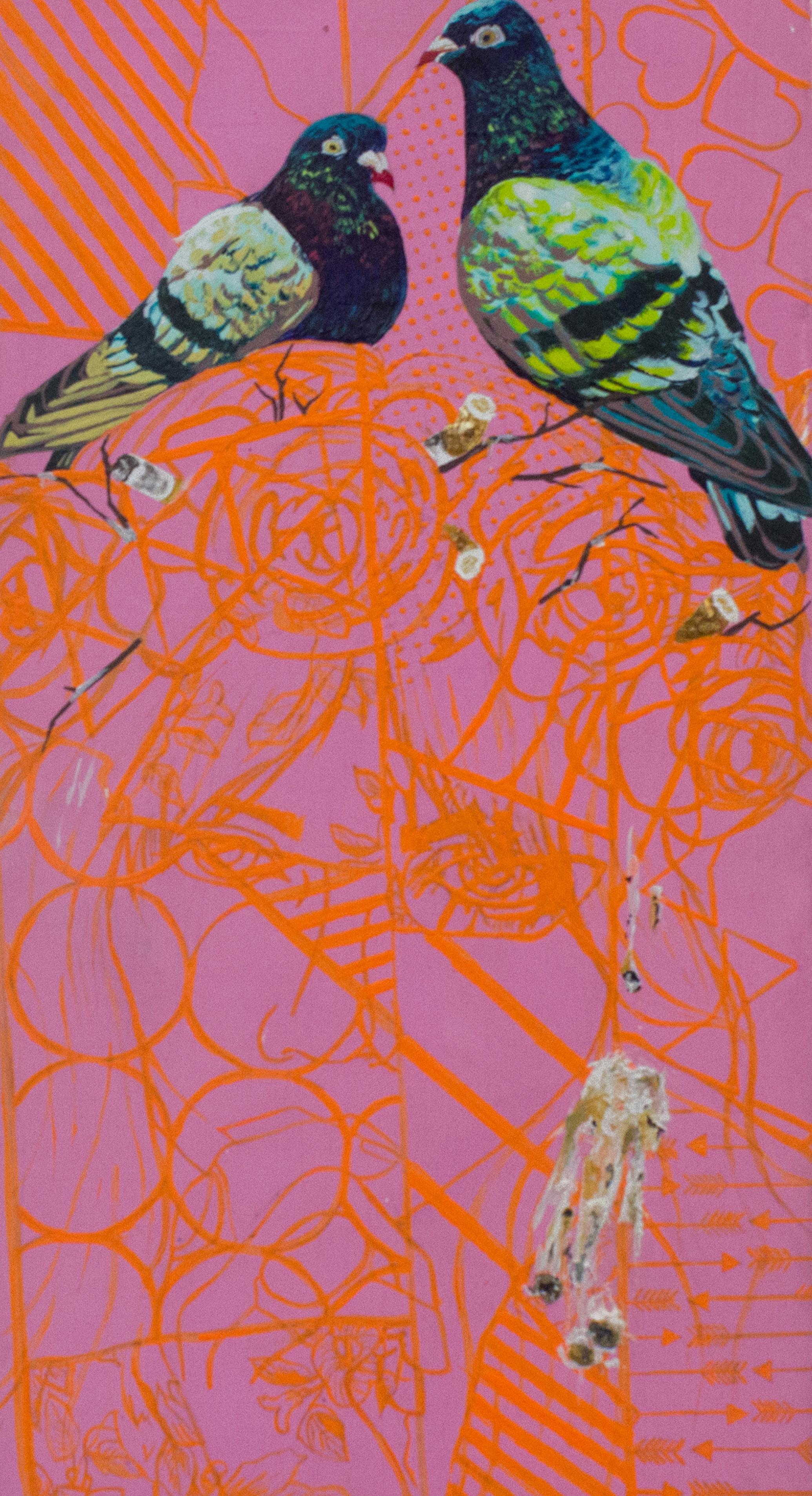
Menstrual cramps. Hangovers. Low self-esteem. Things nobody wants to talk about but need to be said. A person instinctively hides or reveals certain qualities about themselves. People lie or exaggerate the stories they tell to make themselves appear more interesting. They also deflect from their unflattering characteristics.
My use of pattern and animals in painting helps me to cope with the struggle of over-communicating and filtering information. By combining the figure, love of animals, and pattern, everyday life experiences become reimagined. Each element in a painting has multiple purposes. The use of pattern as a whole is symbolic of the need to ‘filter’ what “should” and “should not” be said in conversation. Furthermore, the pattern is created with symbols relating to the subject and acts as camouflage and code.
In each painting an animal serves as a metaphor for the object or person it is replacing, like crocodiles biting ovaries as a representation of the pain of menstrual cramps, or a fish louse as a stand-in for bad breath after a night of drinking. In contrast, the animal is used to glamorize the mundane. In any culture there is a need for social validation, and it is often attained by carefully selecting parts of ourselves we choose to reveal. By bringing light to regular but often shameful or embarrassing subjects, I hope my art can help reduce stigmas and facilitate an open dialogue.
 Photographs: Left Basic, Acrylic; Right Needle Core Biopsy, Acrylic and Glitter.
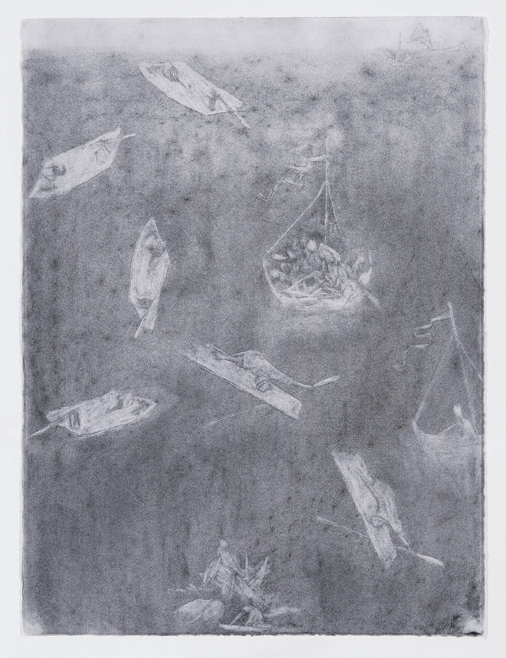
Imagine a boat in which the passengers are adrift, stranded in time, place, and thought—Who are they? Why are they here? Their whereabouts are unknown, their destiny unbound.
This body of work seeks to explore these timeless, existential questions, drawing upon historically sourced allegorical imagery. Amidst a dusty, greyed palette, minimal forms and stark horizons foreground the figures that often find themselves in precarious positions. Hesitant brushstrokes and an economy of mark-making and representation obfuscate the narrative. The reductive method of staining and erasing allows the image to oscillate between sensory impression and language, certainty and ambiguity, the known and the unknown. Repetition, a stand-in for ruminative thinking, calls into question how thought can inflect a feeling of stasis. Offering the experience of moving through space and time, the consistent horizon line and recurring scapes exemplify that feeling. This misuse of logic and anomaly within the narrative elicits a longer look; prolonged engagement is encouraged.


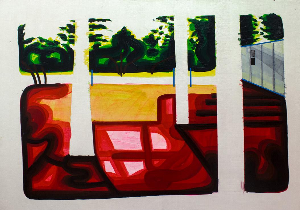
My time at Boston University’s MFA painting program has made me more confidant than ever that I am an artist who paints, and one who does so through the lens of landscape, in the context of both historical and contemporary discourses. Through my work, I create a personal visual language of images that strives to understand space, light, and the frame.
We view countless images everyday on screens or in person, and we react to them in countless ways. I want to question the sheer volume of what we encounter through a commitment to one image, painted to exhaustion until it stops becoming. I haven’t even come close to my goal of exhausting an image because of the endless possibilities that present themselves through the act of painting.
I first redact any information I deem unnecessary from the image, then reposition the image within the frame to create a shape. This structure for painting has enabled me to draw attention to the background by pulling it into the painted image and vice versa. I also explore paint as a material to create saturated, fluid, calligraphic marks that make up the painted image, evoking the feeling of looking at the screen of a computer, phone, or TV.
Some days I am on a screen more than I am in reality and I think it is my responsibility as an artist to understand this relationship. Because I am conscious of the time spent on a screen in the digital space, I want to question that space until I reach an understanding. The English language cannot express visual language in the way that paint can. I think paint is the perfect medium to take this on because it can create light that represents an illuminated screen, challenging assumptions about technology. Art historical traditions such as Hudson River School painting used the representation of light to create exoticized, imagined scenes. Similarly, my use of paint attempts to represent space and light in an artificial landscape that does not really exist.
An attempt to paint a thing that inherently does not exist, but can be viewed, questions the idea of what is real. Fake or real, this space exists and is expanding constantly, becoming something that I believe in. My paintings are consistently becoming a visual language to understand that belief.
Photographs: Right Top To Bottom 4, Acrylic on Canvas; 5, Acrylic on Canvas; 1, Acrylic on Canvas.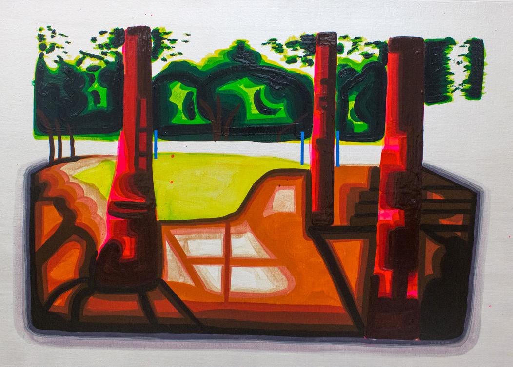
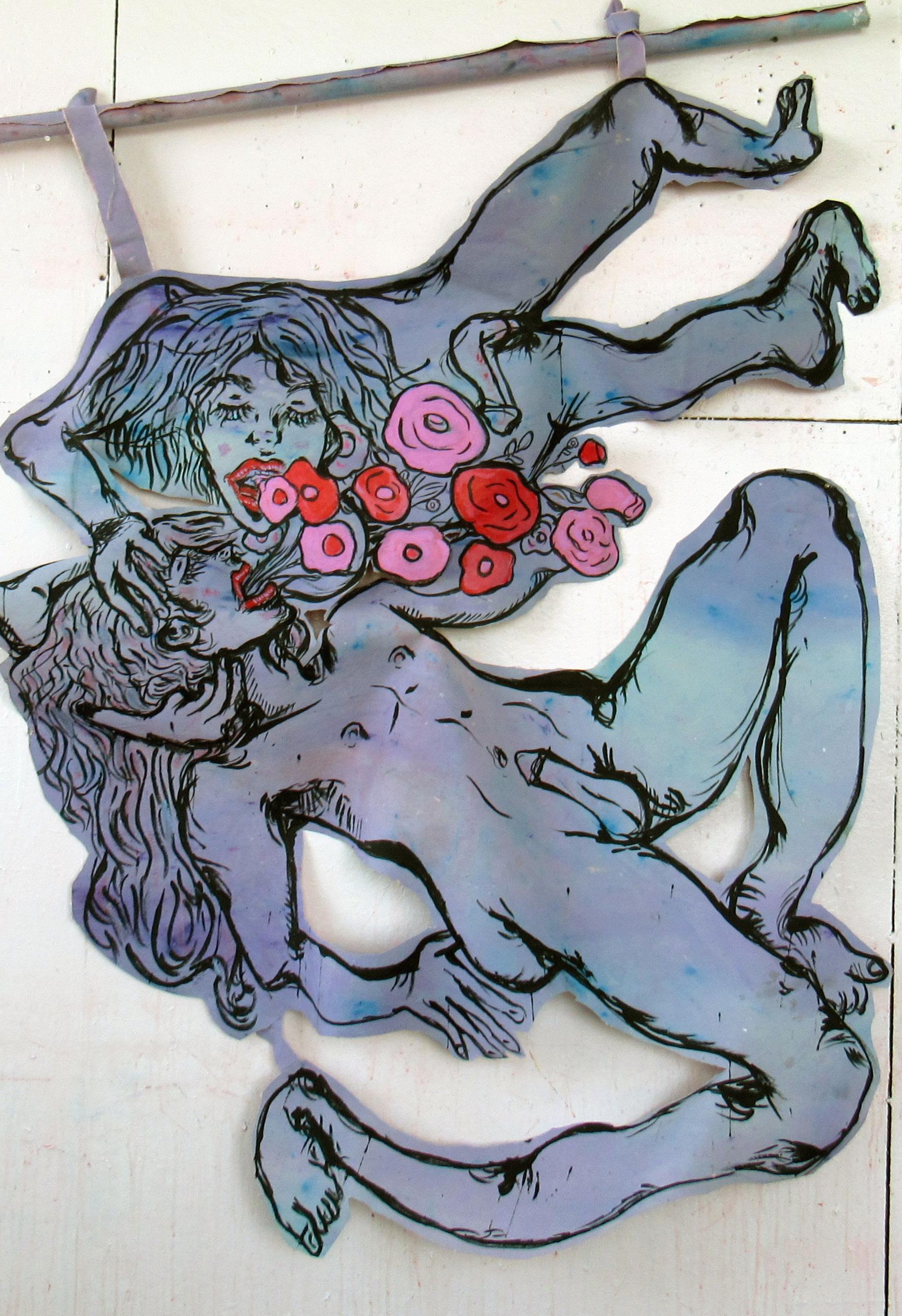
I burrow my face so the moment brushes my skull As the time erodes within our bones.
The hapless loss slams open a rusted door, To fracture us into a primordial soup.
We close our eyes with sanded lids From the built-up mountains we look from the top of.
I breathe in a warped way, the air which Fogs up glass returning my searching gaze.
I could steal the layers covering the cardboard land I see And hide behind them as curtains concealing a performance.
I suck the amoebas writhing in the layers of cloth To purge them into your ruptured guts.
I am a distracted process painter without rules. My work is a record of actions, reactions, and internal reasoning. I use size to give the painting presence next to me. I’m interested in the physicality of myself in relation to the painting. I want it to feel alive in my studio. With colour I blindly follow my intuition. I like its fighting ability to create and destroy.
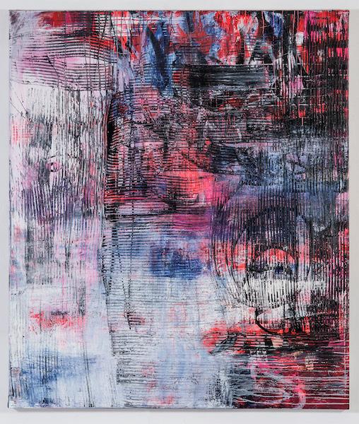
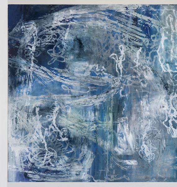

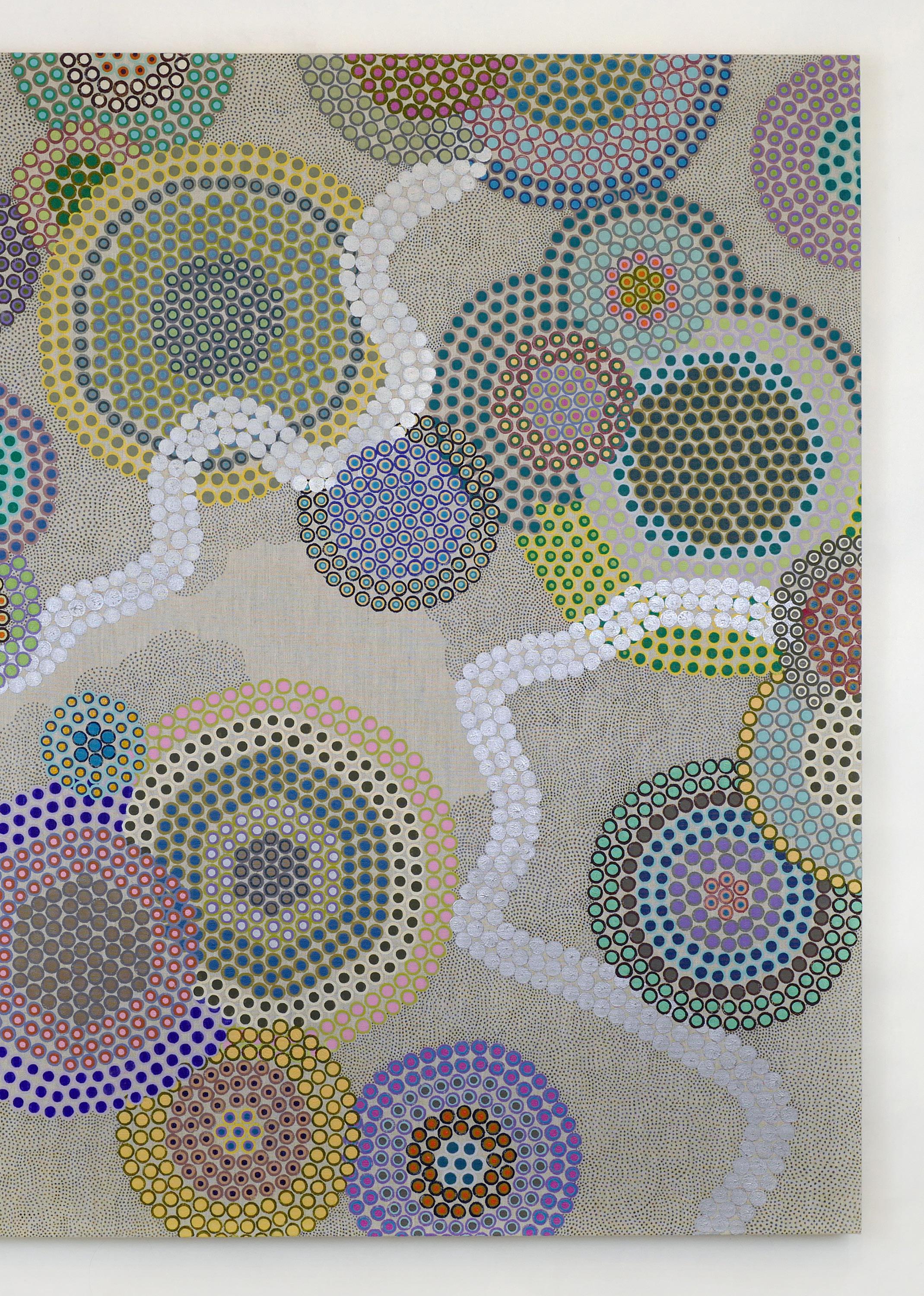
Two-thousand years ago, Lao-tzu once said in Tao Te Ching: “The Tao gives birth to One. One gives birth to Two. Two gives birth to Three. Three gives birth to all things.” Such is life everlasting, infinitely multiplying. Every time I think of I am inexplicably moved, in awe of the mystical conception of the natural world through “Tao”. In mathematics, numbers are an abstract concept. Numerals are symbols representing numbers. In painting, throughout the ages, do we not also use words such as “abstract” and “symbolism”? As we usually use different colors, is it not through mixing varying quantities of primary reds, yellows, and blues? My fascination with this series of thoughts gradually inspired me to use “dot” to represent a unit of symbol to create my work.
Multiplication leads to variation in living things, thus generating a colorful natural world. My appreciation of nature inadvertently percolates into my work. I like to directly paint on an unprimed canvas, forcing myself to be unable to revise. I respect every mark that appears from the tip of my brush, accepting the emergence of mistakes. To me, every dot that I render contains life and its own consciousness. Their existence deserves my recognition.
It is unknown when mankind started have “consciousness”; consciousness to the self, to time, and to the inevitability of death. Forty thousand years ago, a man placed pigments onto cave walls with his bare hands. Painting is born the moment he left his handprint. When people realized their mortality, they desire to depict their own bodies; When humans realized the mortality of the animals they admired, they desire to depict their form as well. This allows continuation.
In a sense, drawing can be understood as a process of replication. When I continue to replicate the same motion, uninterruptedly dotting and dotting more, there is a mysterious force that takes me back in time, back into that moment forty thousand years ago. I deeply believe this is the force of inherent human nature. Working on the surface of a canvas, I am trying to understand my own inherent qualities, which changes unpredictably, yet abides by a law.
Often I feel that I do not own control over the canvas. I am merely a worker summoned by it. At the moment I mark the first dot, its final form is determined. I have always thought that my work is full of life -- like a beehive, with hard work and labor there is no need pre-design the architecture of the hive. In my process, I do not intentionally choose colors. Before I start to paint, I select a group colors I like and randomly pick from that group as I work. I try to replace physical mixing with optical mixing. In other words, I put two colors side by side that do no overlap, producing the illusion of mixing when seen from a distance. As a viewer shifts to different angles and distances, the hundreds and thousands of dots ceaselessly continues to alter themselves.

 ruowen wu
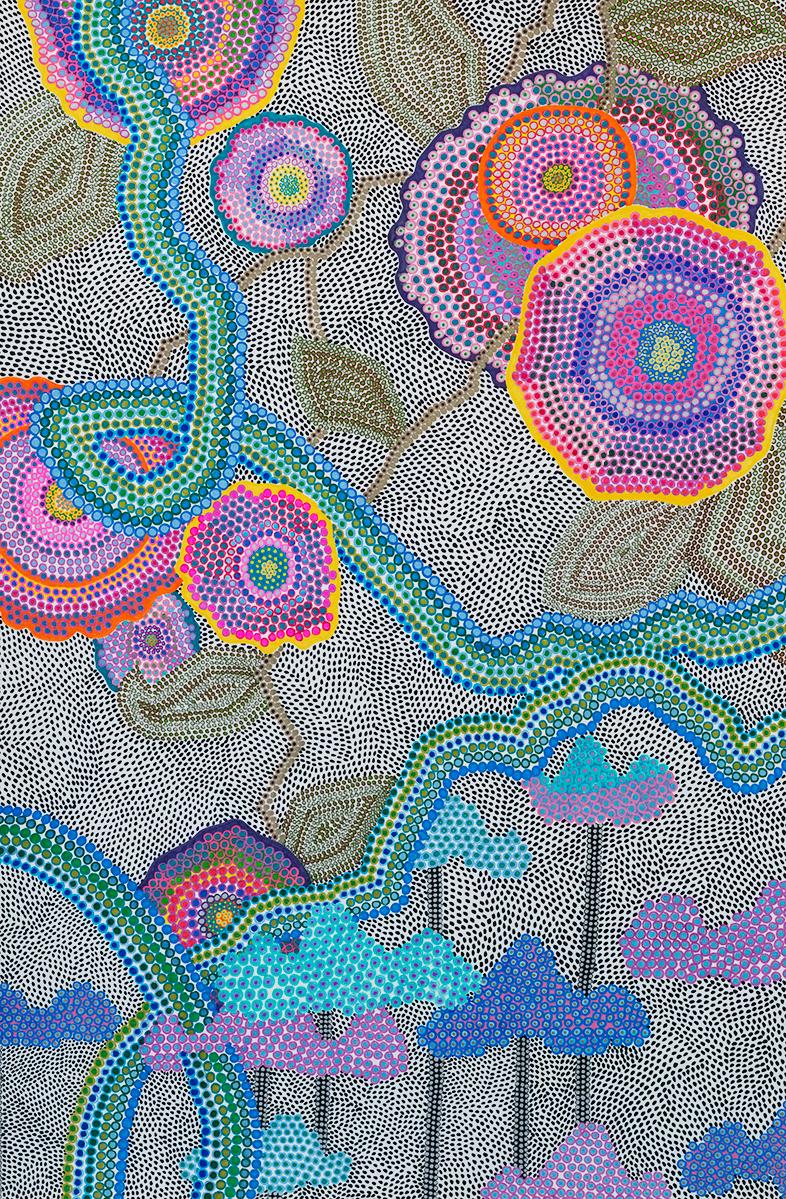
Untitled #4 (Paint Marker on Paper)
Catherine Della Lucia
Marisa Gilbert
Bastiyan K R R Rodrigo
Kali Vozeh
I explore the state of inbetweenness and negotiation of belonging between multiple sides, identities, cultures, and spaces.
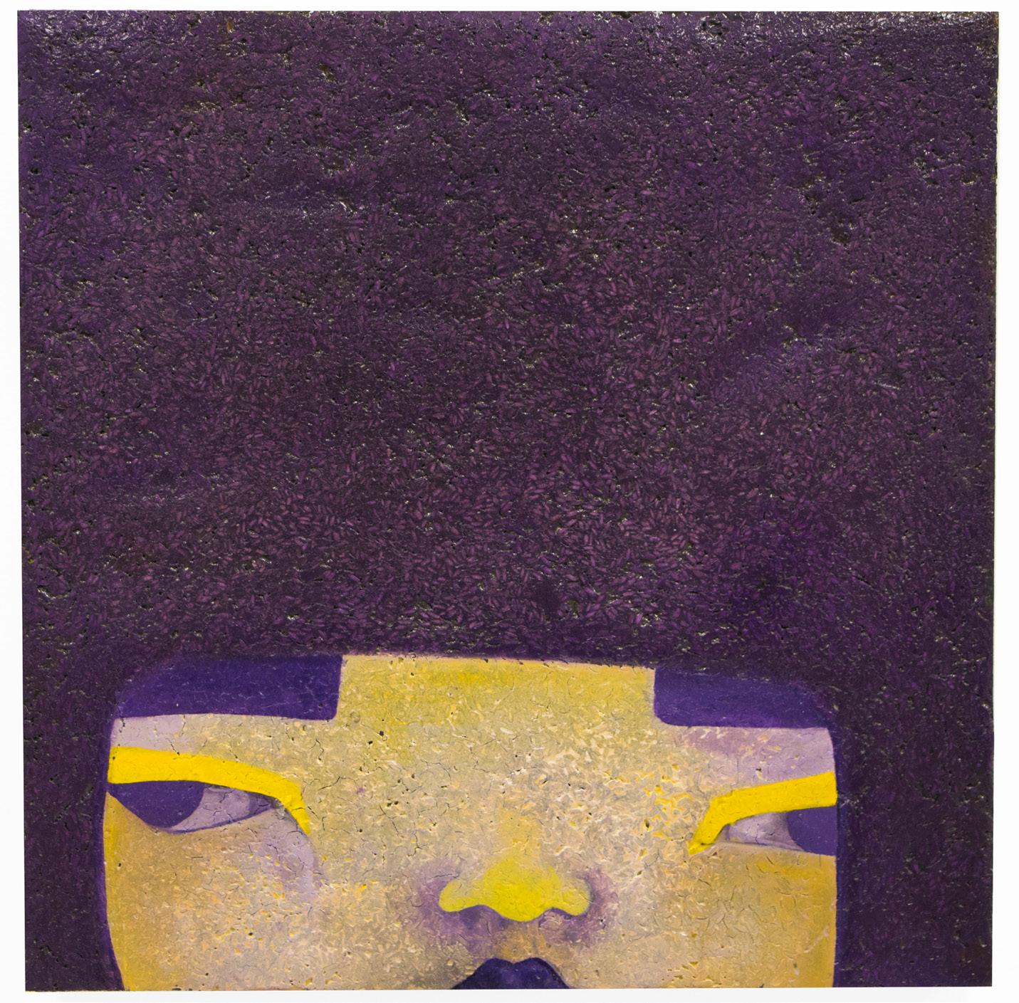
Through sculptural relief paintings I explore the state of “inbetweenness” and negotiation of belonging between multiple sides, identities, cultures, and spaces. This illusion of balance and buoyancy while floating between spaces relies on a system of equal and opposite invisible forces that at any moment are pushing, pulling, warping, expanding, and compressing. Awareness of one force requires the awareness of its opposite. The net force acting on a sphere half submerged in a liquid is a combination of gravity pushing downwards and the upthrust equal to the weight of the displaced liquid. With enough pressure, an object can be compressed, transforming in size, shape and density. I consider the compression of space, material, and images through the making of bas relief sculptures that in having dimension and heft feel very much of this world while limiting access through a frontal view point. They are the sum of multiple materials, textures, colors, and sculptural and painting languages that reference both Eastern and Western tradition. Similar to the formation of multicultural identity, the creation of these reliefs is an incomplete equation derived through additive, subtractive, and substitutive processes and with too many unknown variables. The equation is built from symbols and patterns that stand in for stories, questions, personal and cultural references that are impossible to visually embody and question authenticity and the right to heritage. It is through the making that more components to the equation become known, and I am able to submerge myself below and momentarily locate myself among what is only half foreign until alas, the upthrust pushes me back to the surface.
Photograph: Left Portrait of Rice, Rice, Latex Paint, Polyester Resin, Oil Paint, Wood.(Aquaresin,

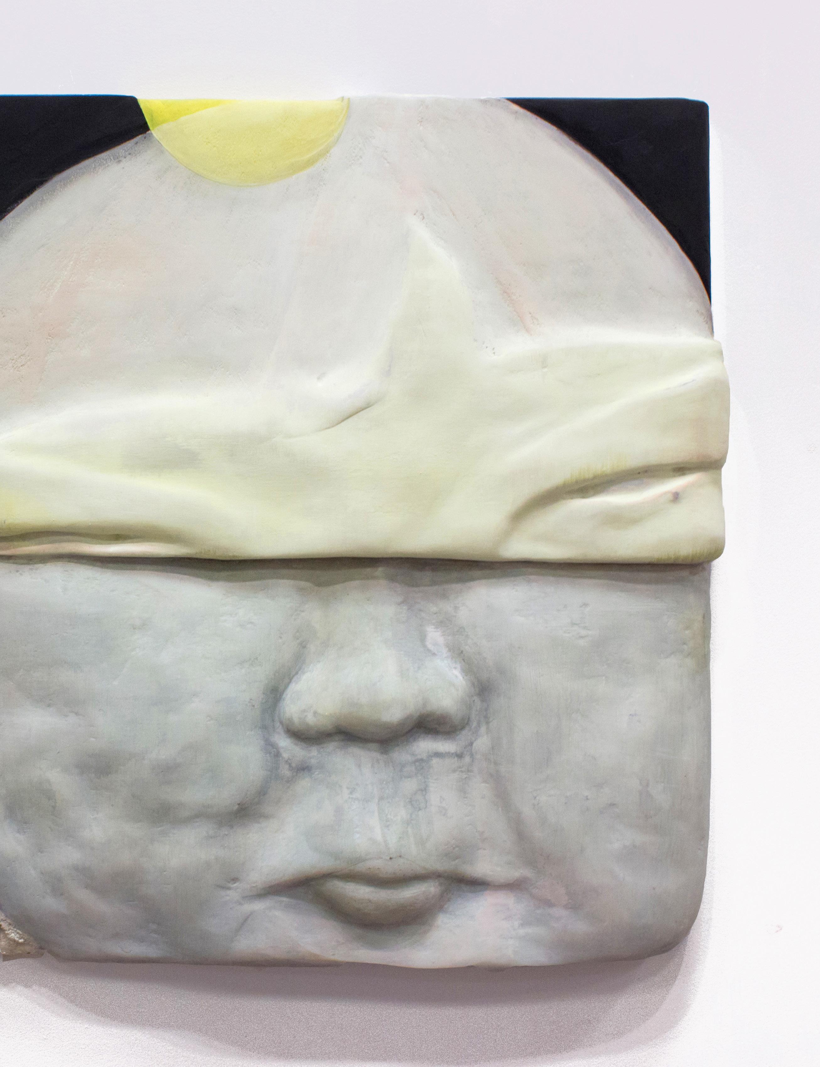
Using my own personal history and familial lineage, I find objects, habits, skills, and stories that explain the way I live and how I spend my time. I seek to highlight the absurdities in the objects that make up our day-to-day lives and the stories they tell. It might seem silly to emphasize the most average objects, but isn`t it also a little silly to dread shopping for food in a store, or to spend time sorting all of your laundry by color? I look at the ways I was taught how to live, and what these skills and the way I use them say about my priorities. My work continues to teach me about the privileges embedded in even the most mundane and domestic tasks.
Objects that are domestic and processes that are considered craft carry the weight of a rich and important history rooted in the feminine. Traditionally, many of these skills and objects are passed down maternally. Through the objects I reference, and the processes I use for making, I hope to emphasize the importance that lies in the female, generation to generation. We as people have lineages, as do the traditions and objects that make up our daily lives.
Through exaggeration and display, my work aims to deconstruct the objects that appear within our everyday and explore the spaces where art and life meet.
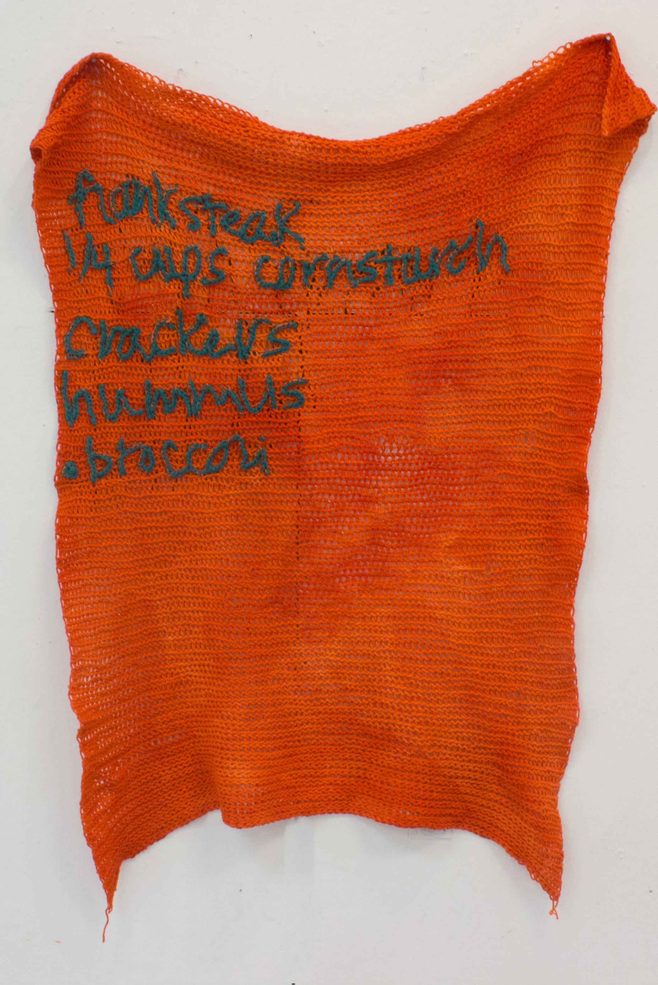
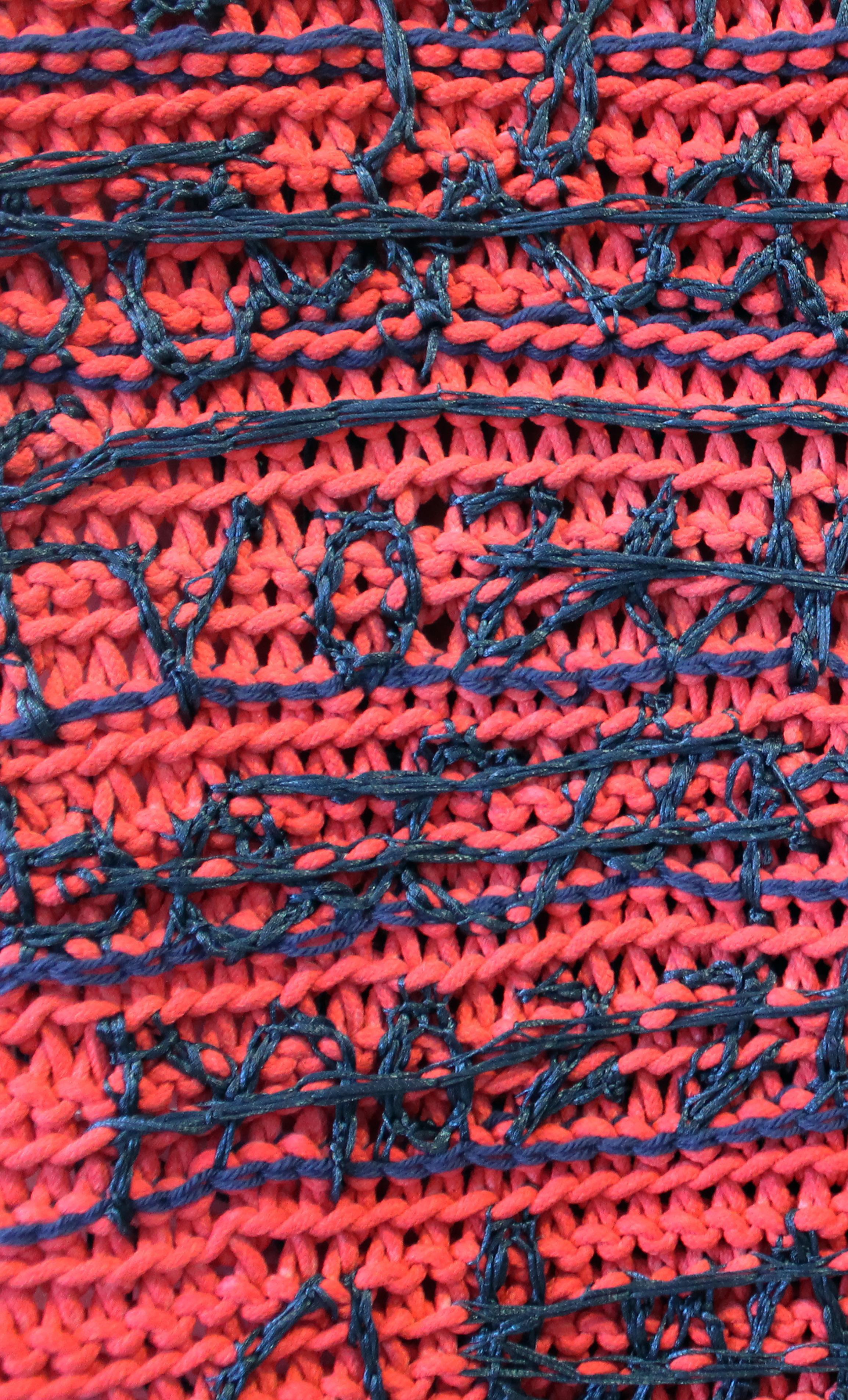
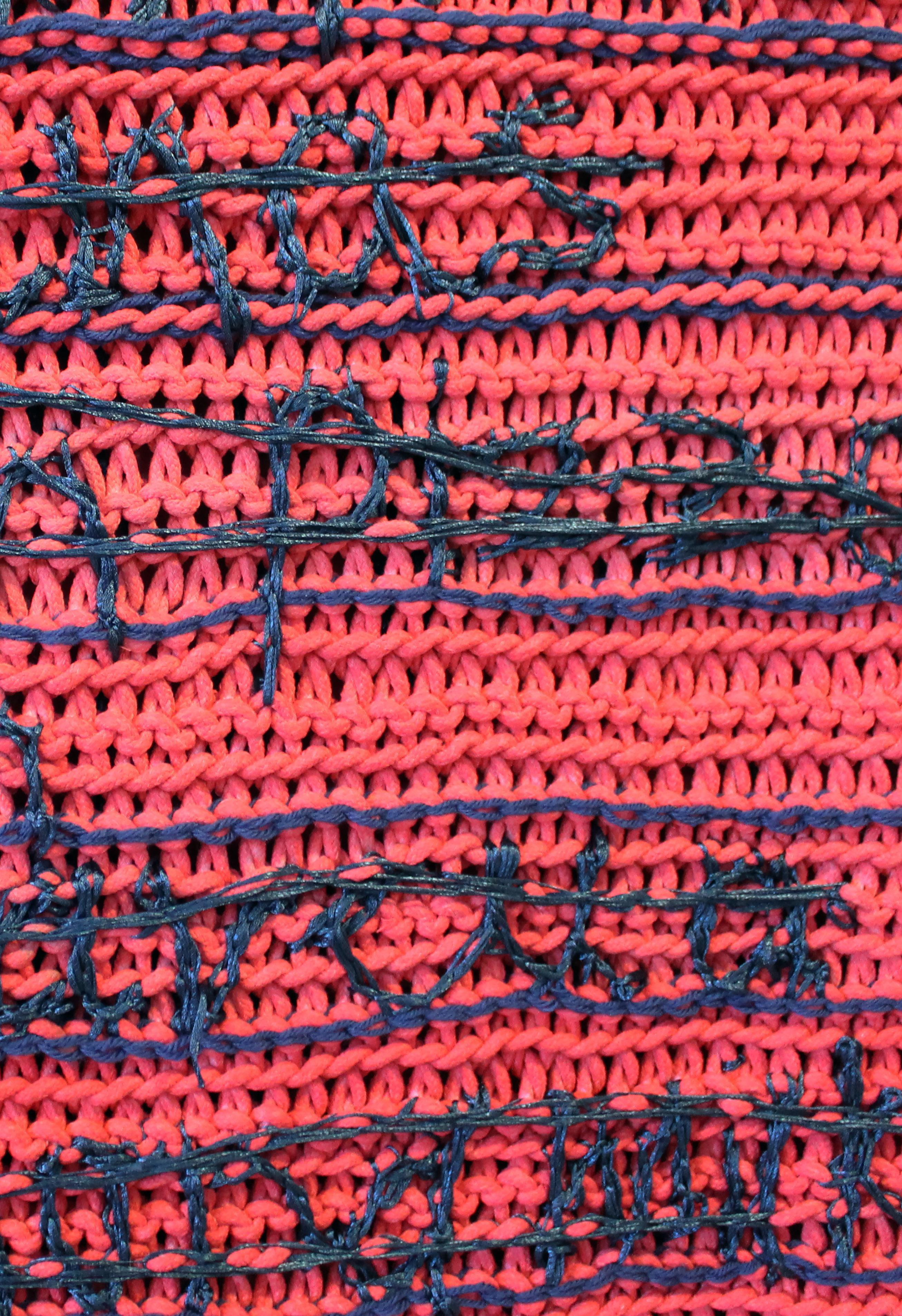
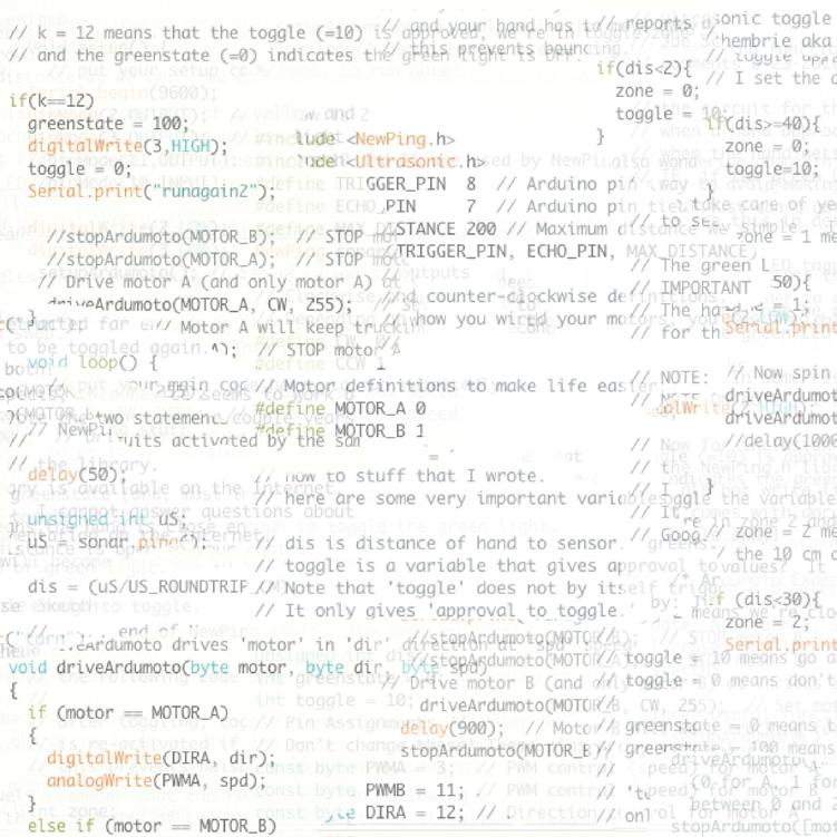
Bastiyan
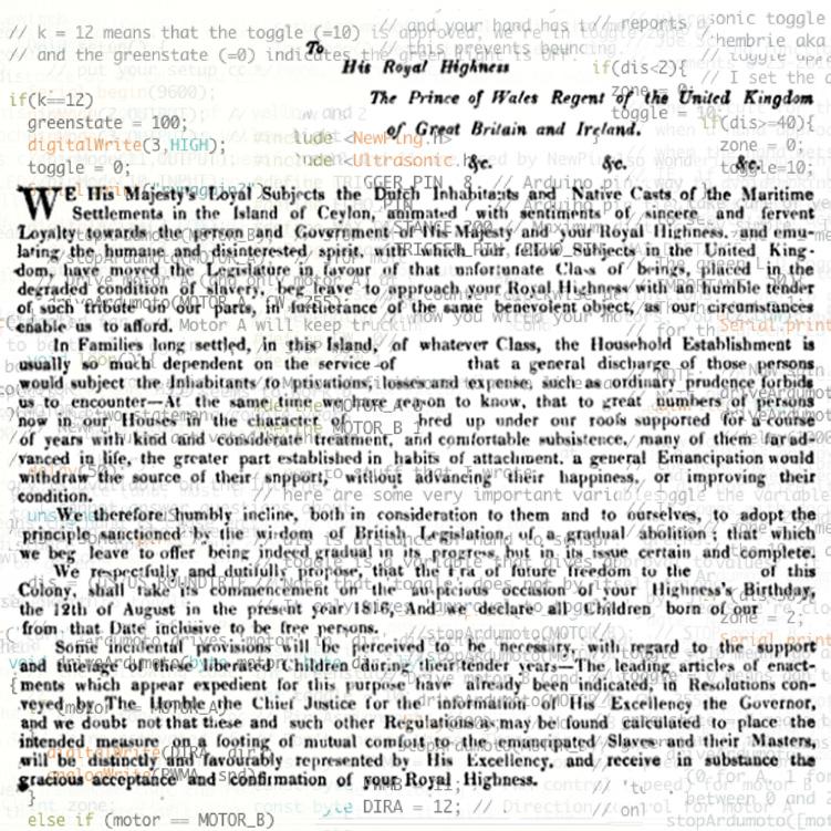
“Bastian”: German and French short name for “Sebastian”. From Portuguese colonization in 1597. First English document references ‘Bastian Rodrigo’ in “1818 letter to The Prince Of Wales Regent of UK and GB and Ireland”: King Gorge 3rd

Koralalage
“GE” or “gay” or : title name or house name or ownership: “Chief of Jayelle Cingalese”
Randima


82% “Asia South”, 11% “Asia East”, 6% “Melanesia”, 1% “Polynesia” : non Catholic name
Rukshan


“Lord of the trees” / : non Catholic name
Rodrigo
“Direct influence of the Colonial era ”
Born 1990
“Civil war” : 1983 to 2009
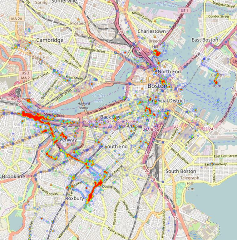
A transcultural / {“a person, or state of mind that is highly influenced by many cultures and ethnicities”: Sri Lankan, United States of America, Europe} artist whose work deals with acquisition / {“Nothing external is originally mine, but it can indeed be acquired originally, that is, without being derived from what is another’s. — A condition of community, of what is mine and yours can never be thought to be original but must be acquired (by an act that establishes an external right)…”: Immanuel Kant} of culture. A Sri Lankan native who calls New England {“Maine” 2010 - “Boston” 2017} my temporary home. My work reflects the time {“Past and the future acquisitions”: unable to retail or gain} spent in both cultures and the personal struggles {Socialist idealism of “WE”: “self sacrificing for tradition, family, and others”, capitalist “I”: “ ”} being disconnected from both cultures.
 Photographs: Left Top To Bottom Location Map, Boston; To His Royal Highness, Letter; C+Code.
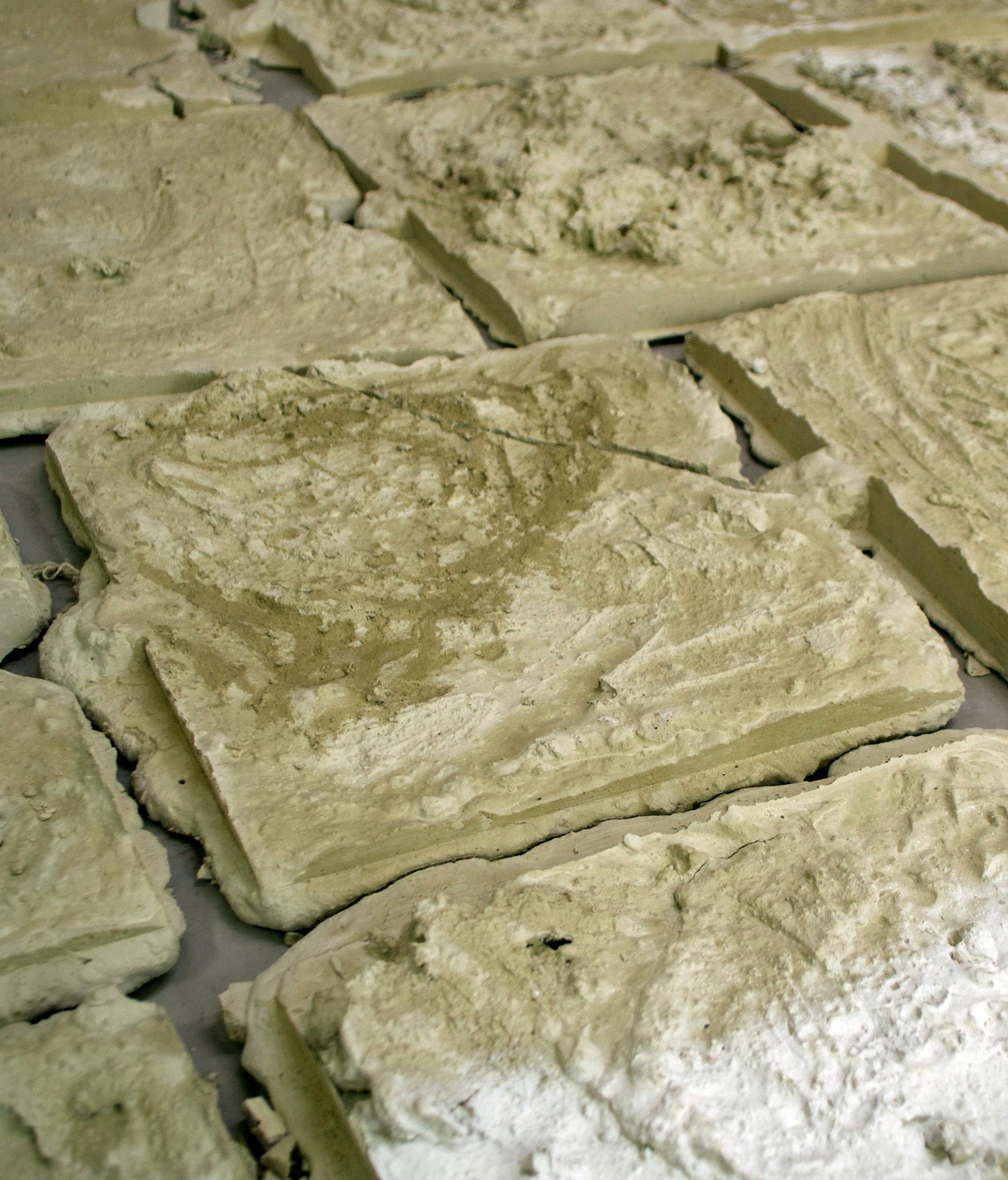
An athlete is a person that is proficient in sports, and different forms of physical exercise. An athlete is someone that competes against themselves and others, to improve as an individual and a community. An athlete puts their body through training in order to perform at the highest level they can. Their bodies are physically pushed and tested on the field. Every ounce of energy is put into playing the game for the team and self. An athlete is an identity, and that is how I identify. Holding this identity is how I approach making art objects — through the physical process of making, and the reciprocal relationship to material. In the studio I work with a process according to rules like in sports games or until the point of physical exhaustion. There has become a need to translate this language that athletes hold while in play, from the field to the studio. Mixing concrete by hand in a bucket, the body becomes a player at work. These fields I am working in are a recording of playing and the reciprocal material relationship. It is just what you see; heavy dirt and stone mixed together, poured, played in, and carried around. Plays that have been personally ran or witnessed are mapped and drawn out to try and understand the moment of action. Moving each object around in space and feeling their weight, or walking over a marked line on the field- it’s a muscle memory that also happens in game play. My work is a recording of this recognized physicality and the relationship we hold with our body, to share the identity of athlete through process and object hood.

6 Months Before We Even Think About a Field (50 Bags of Concrete, Rockite and Athletic Field Lining Paint)

graphic design
Shadan Almana
Jiayi An
Padmini Chandrasekaran
Yunfan Chen
Alexandra Creamer
Alicia Dewitt
Joshua Duttweiler
Jewelson Fernandes
Xiangrong Jiang
Bei Gan
Ya Gao
Yu Lin
Yimeng Liu
Rui Pan
Nicholas Samendinger
Urvi Shah
Qingbei Wang
Ying Zeng
Xinyue Zhao
Zixuan Zhu
painting
Galen Bradley
Erin Kerbert
Nicholas Anthony Mancini
Caitlyn Anne Norman
Nicolas Roche
Brantly Sheffield
Kayla Suverkrubbe
D Toporowski
Ruowen Wu
sculpture
Catherine Della Lucia
Marisa Gilbert
Bastiyan K R R Rodrigo
Kali Vozeh
sfalmana.com
be.net/jiayi-an
longnamedesign.com
yunfanchen.squarespace.com
alexandracreamer.squarespace.com
aliciadewitt.com
joshuaduttweiler.com
jewelson.myportfolio.com
ganbei1113.wordpress.com
lilyagao.com
mirabelleliu.com
hello-ruipan.com
anendof.com
urvishah.net
chingbei.com
candleroom.space
zixuanzhu.com
galenbradley.com
erinkerbert.com
namancini.com
nicolasjroche.com
brantlysheffield.com
kasuverkrubbe.com
dtoporowski.com
wuruowen.com
catherinedellalucia.com
marisagilbertart.com
bkrrr.studio
kalivozeh.wix.com/kalivozehart
This book was published on the occasion of the 2017
