Painting
Graphic Design
Printmaking
Sculpture
2023 BFA THESIS SHOW

Painting
Graphic Design
Printmaking
Sculpture
2023 BFA THESIS SHOW
It is my pleasure and honor to introduce the Boston University School of Visual Arts, 2023 Bachelor of Fine Arts thesis catalog. This publication features the work of 58 graduating students in the BFA Painting, Sculpture, Printmaking, and Graphic Design programs at the College of Fine Arts. In 2023, after the disruption of the pandemic and a period of transformative construction toward a unified arts and culture corridor on Commonwealth Avenue, both college galleries opened for thesis season. The 808 Gallery hosted the BFA Graphic Design exhibition, and BFA Painting, Sculpture, and Printmaking students exhibited in Stone Gallery. The reach of student exhibitions across our buildings echoed the sense of "opening-up" experienced in 2022-23 after serious pandemic restrictions.
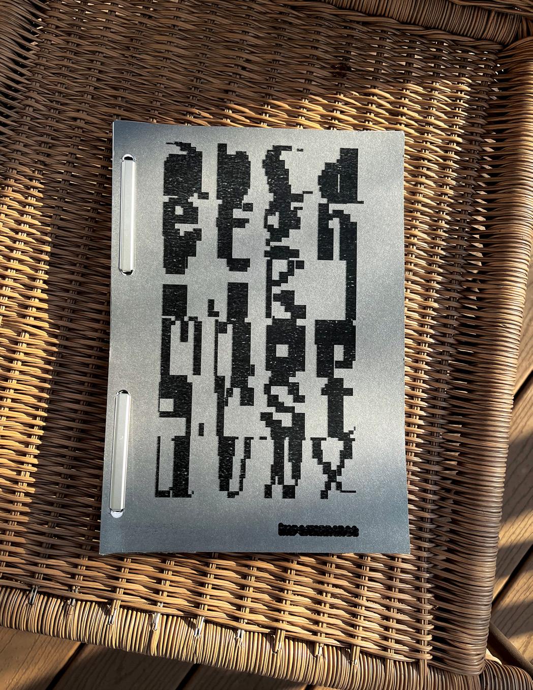
Edifice, the brand identity of the 2023 BFA thesis, also reflects the significant building projects at CFA and BU that have resulted in a more well-designed visually pleasing campus since the Class of 2023 arrived in 2019. Edifice refers to the College of Fine Arts’ buildings, classrooms, studios, and galleries as sites of meaningful action, personal engagement, and growth toward professional lives. The Graphic Design identity team Mina Chung, Hannah Hong, and Jacqueline Mang, who worked together to design this catalog, reflected on their choice of the Edifice theme, "As the buildings transformed, we also transformed culturally, communally, and intellectually. We are inspired to ask bigger questions and motivate one another to reach goals that once seemed impossible." They continue, "We want to present our works not only as individual artists, but as bodies of work that are built off of one another, forming a unique whole." Viewed as a whole, many of the artists in this catalog identify the studio process with liberation and activism. A painter’s protagonists ‘take on the worlds I have scrubbed away for them.’ A stand-in for the self provides another perspective for a Printmaking major who works with the same figurative form across a range of media. Sculptural processes connect artists with the freedom of childhood. The choice to seek beauty is seen as a ‘form of revolution,’ or a foil to political subject matter. Curator Leah Triplett Harrington, who co-taught the senior seminar for Painting and
Sculpture majors, writes, “This year's senior class pushed themselves to work ambitiously, both literally in terms of scale and more figuratively, with the tremendous scope of narratives and concepts they amplify. I am excited to show such determined, intrepid artists in this year's exhibition."
On behalf of SVA, I am deeply grateful to the BFA identity team for their generous work designing the digital and physical forms of the Edifice brand identity that brilliantly captures the experience and work of this class. Special thanks to Claire Bula for mentoring this team, along with Mary Yang who was also instrumental in teaching the senior Graphic Design thesis course. In addition, special thanks James Grady, Nick Rock, and Krystyn Wypasek for their work with the BFA Graphic Design seniors. Special thanks to the studio faculty who mentored BFA seniors in Printmaking, Painting, and Sculpture including Lynne Allen, Deborah Cornell, Cathy Della Lucia, Fox Hysen, Breehan James, Richard Ryan, David Snyder, and Jessica Tam. Sincere gratitude to BFA Program Chairs, Rebecca Bourgault, Deborah Cornell, Gregory Gómez, Richard Raiselis, and Christopher Sleboda, and Director of Graduate Studies Marc Schepens for their contributions to SVA in 2022-23. Thank you to Dean Harvey Young for his growth-minded leadership and Boston University Art Galleries Director Lissa Cramer for helping prepare our students professionally. I am grateful to the excellent SVA staff for ensuring the thesis process ran smoothly, particularly Nerissa Cooney, Julianna Fitz, Gus Wheeler, Josh Brennan, and Brandon Cohen working with Logen Zimmerman, Jessica Caccamo, and Beth Zerega. Together we sincerely congratulate the BFA Class of 2023 for their extraordinary work.
Dana
Clancy Director, School of Visual Arts
Associate Professor of Art, Painting
Bi, Evelyn
Diaz, Julia
Flaherty, Madison
Hu, Liran
Jiang, Yaming
Kuanysheva, Dilyara
LoPresti, Alessandro
Malcolm, Asjha
Meyer, Ligaia
Riedl, Jenna
Schmidt, Emma
Schneider, Rachel
Schuldenberg, Kathryn
Scully-Power, Sofia
Sullivan, Shamayam
Yu, Xianying
Everything is made of parts. The way parts come together to make something work matters to me; I find comfort in understanding.
The moment I saw Gepetto’s clocks in Pinocchio I was enchanted. I’ve always loved the charm, simplicity, and powerful truth contained in playthings—the little door that opens in a toy house holds the truth of a real door. I want my work to be heavy with truth, like an artifact uncovered from the womb of the desert, and give an intimate embrace with the specificity and preciousness of a Polly Pocket.
I work with wood, clay, and found materials to explore how sculpture serves as a tangible transcription of emotions, perspectives, and other invisible things. For me, the act of thinking and processing my emotions takes place when I build with real objects.
The relationship between the parts of that sculpture feel tender to me. There is tenderness in expressing my understanding of the thing and acknowledging each part as a whole in itself. My work practices care through honoring the work of creating understanding. @evelynbi.png
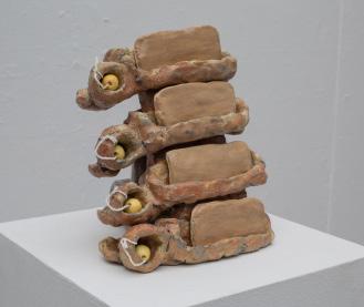
Feelings and ideas are encoded in affordances and physical gestures. To-Do List was made with the iPhone Notes app in mind, specifically the check-box function (or in this case a circle). There is a structure to the concept—the Task is on the Line, and that Line is attached to the Checkbox (the circle) that houses the Check (that becomes a ball when filled). These modular containers can be stacked. They hold the task like a little cave housing a ball, which rests in a nest behind the cave.
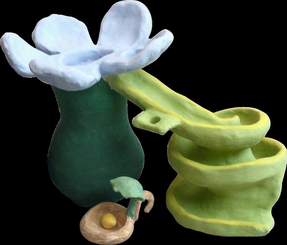
@artbyjulied
My goal is not to tell a story through paint, but to capture the quality of what it means to tell a story. Throughout my undergraduate studies, I’ve learned that making work for myself is one of the most productive ways to grow as an artist. I find comfort in the process of making—the subjecthood, palette, and surface of a painting—and I allow myself to make bad art. Figures don’t have to be perfect; stories don’t have to be understood. Painting is about moments and honoring those moments as best as we can in the ways we know how.
My artworks are explorations. Each one is practice for the next and a chance to be stronger than the last. The paintings I make are votives to the aesthetic tradition of storytelling; I want to capture those intimate details. I make use of warm underpaintings and fatty mediums to create thin, shining glazes. I often use pthalo blue to create backgrounds and landscapes, and burnt sienna and yellow ochre to capture the warmth of skin tones. I layer paint and wipe it away until my painting feels lived-in and real. I add glazes of crimson or venetian red to skin to bring figures to life and mix dark umber with other colors for deep, chromatic shadows.
The aesthetic of narrative painting stands out in art history, and we carry these stories from generation to generation. I want to make paintings that engage with this aesthetic. I want to make paintings that feel like drama. Maybe all I am searching for is to be understood; maybe it’s to be misunderstood purposefully.
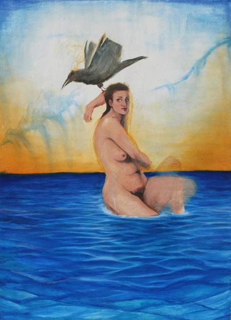


I have always loved art. My first memories of art and my interest began before I was six years old. I would sit in front of my television, put on some of my favorite movies, pause the screen and draw the characters. I recall drawing characters from Horton Hears a Who and my parents freaking out over it. I was quickly put into oil painting classes at a local art school right before my eighth birthday, and that was what started it all. This school became my second home and I now teach there.
My practice has always revolved around figures, but over the last four years it has altered from purely life paintings to partially conceptual or abstract work. My interest in using bright colors and distorting figures continues to develop. I am surrounded by the most talented artists who push my work to take on new heights.
Tattooing came later, and immediately stuck. The idea of permanent work on a living canvas walking around in public seems like my version of gallery shows and publicity. I quickly fell in love with creating flash work and paintings, and I continue to teach myself new skills in these materials and styles. I am drawn to the different stylistic elements of what is tattooable and what will not hold up over time. Simplifying designs without compromising their integrity is a challenge that inspires my work and encourages me to think and create simultaneously. It is increasingly important to plan these images before allowing yourself to place them on a living canvas. Their permanence begs a new level of significance, but also consequence if not done correctly.
Realizing that art was something I could pursue professionally was when everything came together for me. Art chose me when I was too young to know better, yet I chose art once I was old enough to make that decision.

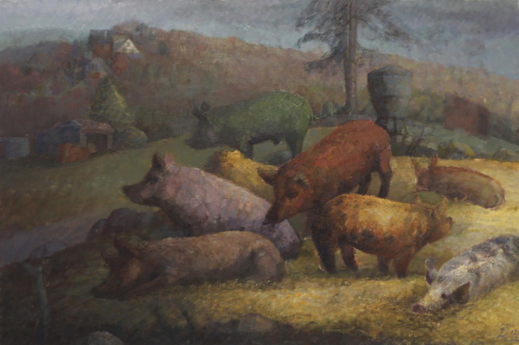
should "and" be "of"?
When Cezanne returned to Aix-en Provence, he declared the apples from the orchards and Mont Sainte Victoire visible by his doorstep as the rightful inheritors of Poussin’s arcadia. Though their respective influences triggered developments far beyond individual concerns, it is crucial for me to swim past the torrent of art-historical metanarratives to behold the provincial source of such anachronistic yet timeless aspirations.
The provincialism of Millet and Cezanne facilitated their retrospections to a rustic, archaic state of being, where the vein of classical art still pumps the freshest vitality, down to its basic properties of forms and spirits.
How can Classicism persist under a localist camouflage, far from cultural centers where the canonized repertoire is most available to study?
Holding no definite answer, I wish to reply to this problem in my work by noticing my own locational multiplicity.
Here, in Boston, New England’s townships gather to form a makeshift coastal urbanism, whose beacons, however, are dimmed by the enduring luminance of the metropolis not too far away. To the east, the vast Atlantic washes ashore sensational tidings for upright Yankee’s digest. Westward, open countries, though largely reforested now, still echoes memories of a once austere, agrarian landscape where stone walls of impeccable, puritanical conviction evangelized over the rolling hills. These historical antecedents mark the field for kindling that pastoral association which Millet and Cezanne took up. However, they now appear depleted of vital materials.
But the incantation of that invisible ritual laced together with every stone, timber, brick, boughs, and vines is still traceable, and thus worthy of new inscription of painterly fables, against Mt. Wachusett’s pyramidal facade.

@sbjksbjk
@ch3coododo
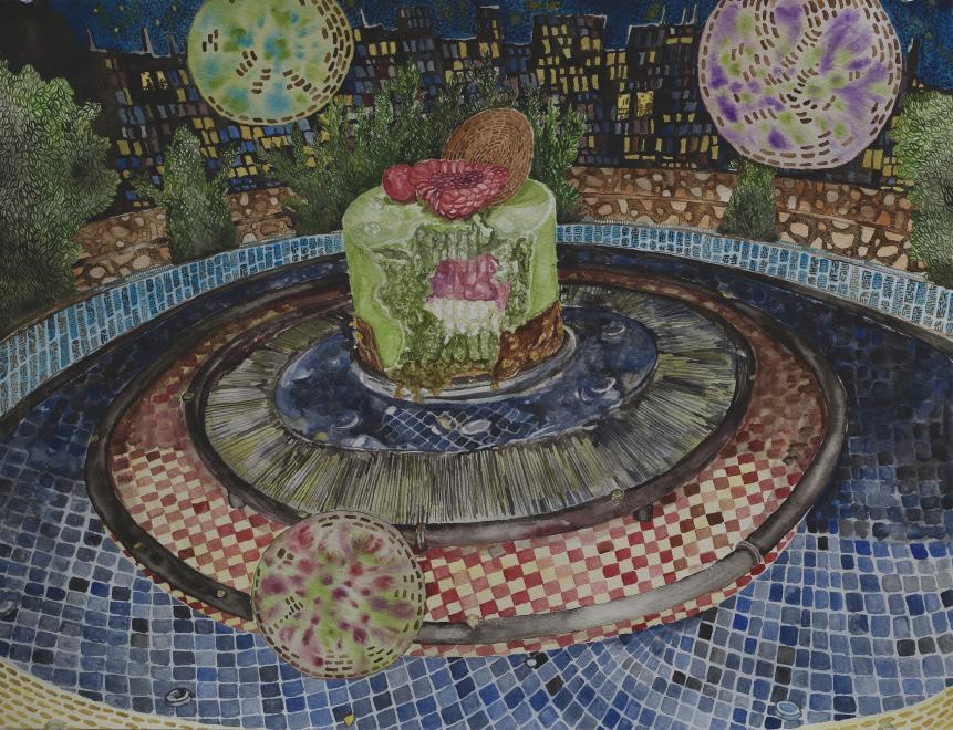
Whenever I have a sheet of watercolor paper, some paint, and a small brush, I turn into a magician.
Memories are the spells; they are the things I wish I would never lose. My photo album is the spell book.
Brushes are my wands; the smaller the brush is, the more precise my magic. Paint is the fairy dust. The second when paint and water meet the paper, it permeates, and that is when the magic happens. Floating above the paper, I can almost feel each water and paint particle bind with each grain of paper. I live through a magnifier.
Am I so numb?
I wish I could reincarnate as a tree or a bird. Alternatively, I see papers as land. Each shape on the paper I blocked out when working out the composition is a lake that reflects reality as a mirror does. I dive into them. When my brush touches the paper making marks, I am throwing rocks to the water strumming ripples in the tranquil void. They expand, mingle, and vibrate until they form a dazzling world of reality and reflection. That is when the land’s richest season comes, with flowers blooming in a riot of color.
Each painting has its own life; they know how they want to be, when they feel realized, and when they want me to let go. Quietly sitting close to them, I listen to them whispering their wills. Paintings need to be treated with great care, and I need to have fun with them. They could only grow when being watered with love.
Can you see the ecstasy in my eyes?
alessandrolopresti.cargo.site
@sandrolopresti
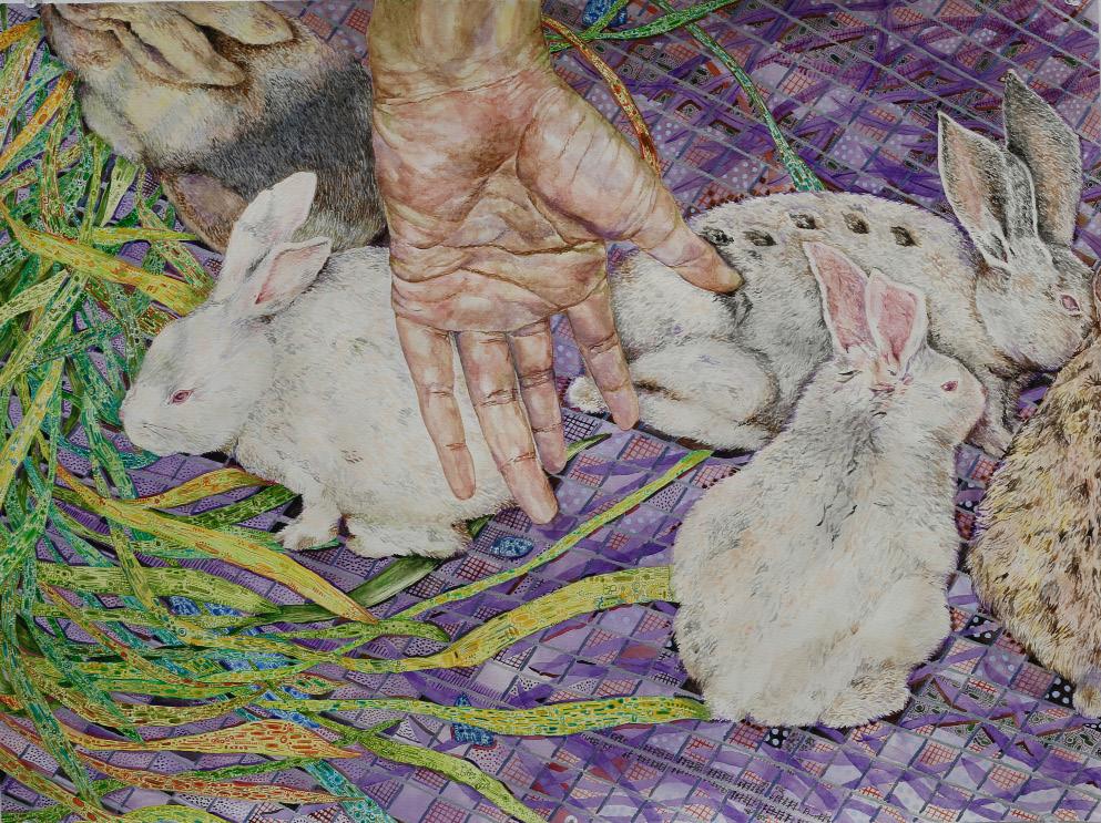
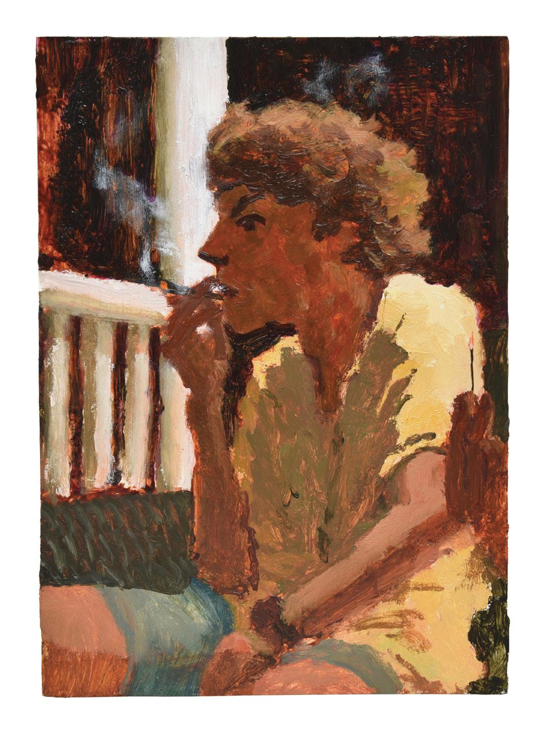
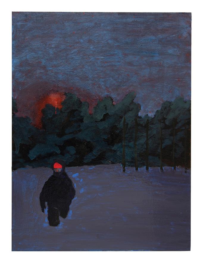
My paintings are romantic narratives, I paint what is personal, and I idealize these things: my family, friends, dogs, the trees around the fields by my grandparents’ houses, a home without an address. I am working with banal, inescapable everyday motifs to find some magnificent, or feeble enigma within. I wish to paint the puzzle of humor, loneliness, togetherness, loss, tenderness, cold, stuckness, and yearning.
The way my old dog told me it was time to go to sleep, or how her successor smiles when she runs. The shadows when we trudged through the snow near the train tracks at night and how those tracks lit the night sky at home. When we visited the snow in Maine for the first time in years to make the first footprints, what could have been the speed of the night sky and the light of the moon?
I begin with the image, just to see it. Just to see it once again. From there, I intuit, allowing the work to push and pull me as much as I control it. While I retain representational imagery, I grant the material an expressive presence equal to that of the image. I wish to pare down the image by dwelling and playing, painting each image multiple times, and allowing shifts to take place within and between each iteration.
I work in wake of time, and yearning for cyclical moments that I wish to extend. I am working to repeat, but not to complete the memory. In a mode more akin to poetry than prose, I paint the image as reliving an idealization of an experience of the thing.

asjhamalcolm.com
@jaaahjaaahhhhh

Fantasy in the hold, Fantasy within reach, So beautiful, yet lonely.
Art in the hold: If the hold is nothing, fantasy feeds it. If the hold is dark, fantasy thrives on its nothingness. The bright orange and pink, deep and lilac purples, teals and blues dominate the panel’s surface and give way to free, unrestrained figures. They take on the worlds I have scrubbed away for them. I balance between a world based on our own, yet in a sense, utopic; layered, lathered, reworked, renegotiated, applied smoothly then thinly, wiped once more with quick sketch-like marks alongside thick paint. A candied labor of love for you, imagination, to inhabit.
Making fervently: Openness to material keeps me engaged. Memory is sweetly fleeting, so materials indulgently ground them. Small knick-knacks sometimes make their way into my work or heavily influence my choice of materials. I want the physical attributes of the piece to facilitate the narrative and encourage the viewer to read slowly; a nod to another realm of relatability and an embodiment of the viewers’ physical relationship to the work itself.
Art as a function of love: My work is intimate imagery of black people on display, not only in public, but within the context of an art world that has historically ignored and undervalued us. Channeling my personal and wider social histories, I relentlessly spit out cheeky poetics of the mundane, referencing these histories to understand my presence. Lived, walked, thought, among other tasks, my work is but a modem to interact with the past so I may realize what can now materialize. Subjects can be made up of no more than a simple brush tick or be as solid as the building depicted next to it; all to tenderly mold a well-rounded and dynamic idea of my experience and black livelihoods.
Listen in the hold, See in the hold, Stay in the hold.
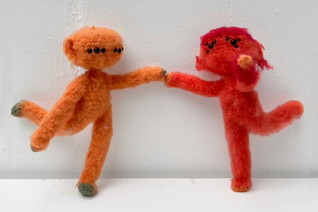
ligaiameyer.cargo.site
@ligaia.meyer
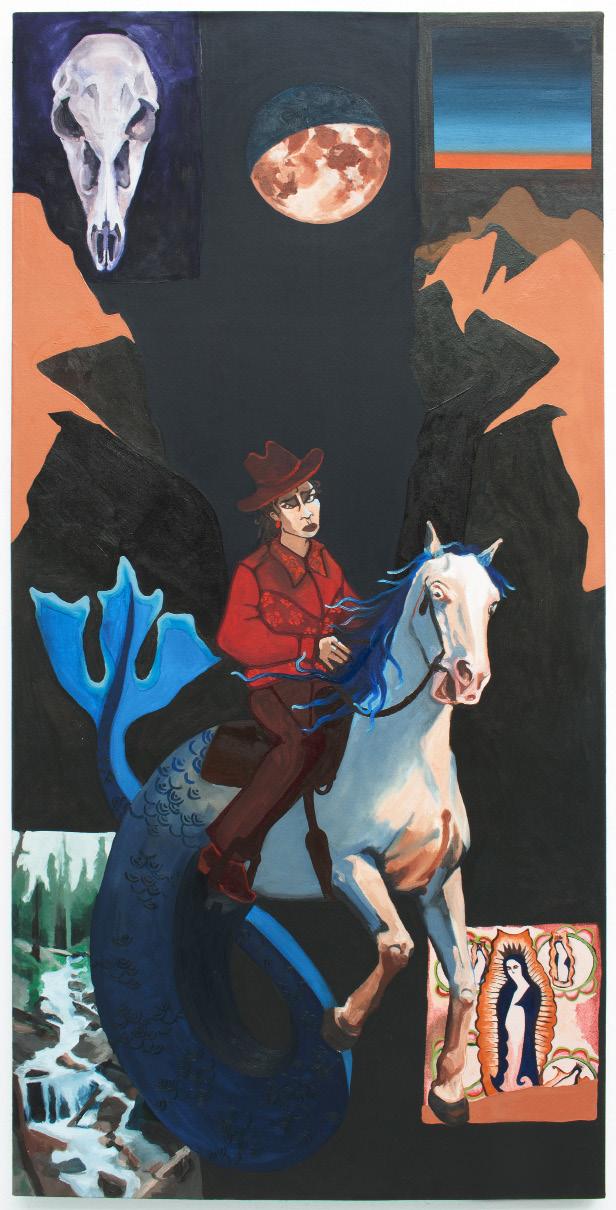
The Wanderer had an obsession with the sky: the clean blue open Stargazer was their birth name their secret name.
They had only shared this name with one other: a little while ago, but not long enough to forget.
The Wanderer sat astride a queer creature: half fish and half horse
The creature sat astride the border between the desert and the sea.
On the morning that the Wanderer had spoken their true name they had lost it
The other, wild with hinder, had swept it up and away in the dawn light.
I wanna walk alone at night. I wanna be the conquering man. Cowboys are a symbol of American imperialism, they embody the spreading of horror, violence, and destruction but I long for the freedom they symbolize. The world was made for cowboys, so I wanna be a cowboy baby. Manilla, where my mother was born, was once a prominent port city that connected the Philippines to the rest of the Spanish empire. I’m fascinated by the crosscultural trade fostered by European imperialism. The metamorphosis of Christian symbols as they were imposed on various cultures and became conflated with local icons. I’m trying to chase the Virgin Mary down. My mother didn’t raise me Catholic, but I wonder what heaven looks like.
I miss the color of the desert sky. The emptiness. Mountain lakes after the rain. A view across the southern New Mexico, where I was raised, during the early summer drought. I worry about finding somewhere to go back to. I worry about not being able to find myself outside this landscape. My paintings are an attempt to traverse these distances.
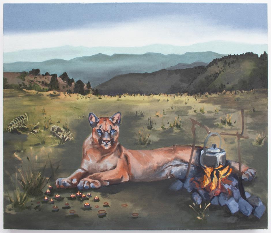
@dotproducts.paintings
@re.jenna.rate
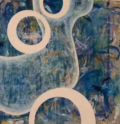
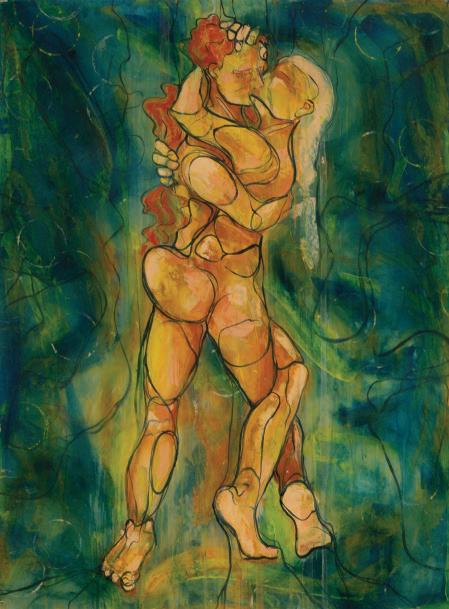
1. Art is not less meaningful when it is not archival. Nothing will last forever. (Painting on cardboard does not mean I hate my work.)
2. Critique, at its finest, is the ultimate form of love. Critique, at its worst, is the ultimate form of degradation.
3. Anyone is allowed to criticize art. (And if their vision of my success doesn’t agree with my own, I will not listen to them.)
4. Beauty without justification is a form of revolution in a productivitycentered society. Make origami frogs. Paint the fucking sunset.
5. It is no more heroic and pure to “make art just for oneself,” than it is commercial and crass to make art for public consumption.
6. If art requires 30 minutes of explanation and an art history degree to understand, the average passerby is not going to give a shit how groundbreaking it is.
7. That said, it’s no less art if only the artist sees the value.
8. The highest purpose of art is not to make people happy. It is to make people feel more alive. Painfully, beautifully, angrily, euphorically alive.
9. It is more important to be understood than respected.
10. It’s not good art if it requires shitty behavior. All things are not forgivable in the pursuit of the exquisite.
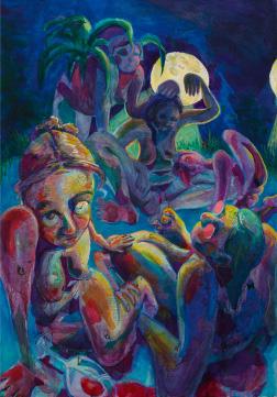
At the center of my work is my body. I’m interested in the physicality and capabilities of it; how the body acts as a vessel to convey and hide the complex love and desires that burst from within. The complexities that interest me most are driven by contradictions.
I like the contradictions of movement, and the relationships that are born from them. Extensions and contractions, fluidity against sharpness, my body both fighting against and leaning into the pull of gravity and the embrace of the floor. At the heart of this interest is a desire for weightlessness—the antithesis of the fatigue that is so familiar to my body. My work is a scrabble for this transcendence—an ease of movement I fantasize but cannot emulate—and a documentation of this quest. I will not achieve this goal, and it’s this knowledge above all that weighs heavy against my stumbling attempts for lightness.
Along with transcendence, I explore themes of female spaces, physical expression, intimacy, the nature of emotional attachments, and the act of merging and separating. When I think about the emotional attachments that interest me, I try to visualize them as creatures—alternate personas—that want to tear out of my body. Some are gnarled, dripping, and nasty while others are smooth, beautiful, and unbearably gentle. All are inhuman. They’re driven by motivations fully known only by themselves. And as my attention turns to the envisionment of these creatures, I wonder: How do they move? How do they feed? What do they crave? What are they gnashing their teeth for? Where are they trying to go? What do they want to touch?
As these creatures begin to explore one another and their inhabited space, they frequently merge to form extreme entanglements of writhing limbs. Emotional attachments manifest physically as my creatures burrow into one another, testing the boundaries of what it means to be close to another living being, and in doing so, transcending the limitations of the human body.
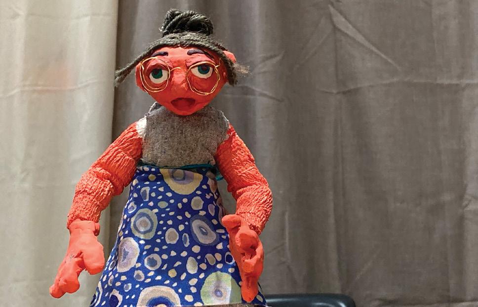
rachelschneider.info
@rachelschneider.art

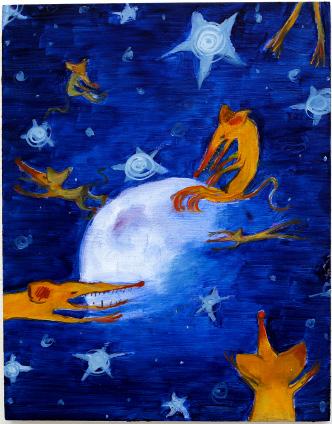
As a child, I loved reading and I favored books with illustrations. This adoration of children’s illustrations fueled my interest in narrative painting and informed the humor and play at the heart of my work. The Barefoot Book of Princesses by Caitlin Matthews greatly influenced my visual library and aesthetic preferences for deep blues and purples and celestial motifs. I am drawn to similar palettes in my own work, and I frequently include the night sky filled with stars and the moon in my own paintings. The hazy luminous moon flanked by floating yellow rats and the bright stars of Rats in Space draws on both these colors and subject matter.
These stories also encouraged my interest in narrative painting. Instead of starting with a cohesive story, I began with creating a cast of characters to insert into narratives of my choosing. In recent years, rats have become the protagonists of my work. The rats are stylized alien creatures with exaggerated monstrous features including slit-like eyes and long sharp snouts filled with spikey teeth. The universe of the rodents also includes a monstrous camel, a prophet in the form of a ceramic duck in Christmas regalia, and my friends and I. When a new character finds a place in my visual universe, I explore their characterization and create a personality.
The story I am developing is never finished. I want to leave an opening in every painting for the viewer to question the narrative. Rather than make a complete chronicle of the characters, every painting contains a sense of mystery that obstructs a definitive or clear story. The viewer is left guessing, which encourages further inspection of the work. It is this mystery that inspires me to make another painting and continue to explore the world my characters inhabit.
kathrynschuldenberg.cargo.site
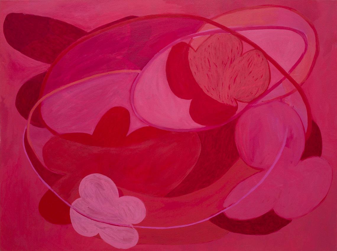
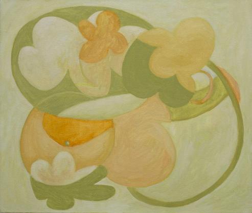
Rounded, organic motifs bound through each painting, resembling the silhouette of a simplified flower. Their variety in shape and attitude lend to different speeds, personalities, and weight. Bubblegum pink, peach, and magenta dominate the paintings, with frequent use of golden yellow, seafoam green, jade green, and periwinkle. The paintings fluctuate between a gestural looseness and a careful organization of space. A brightness and warmth come from the color and imagery. Childlike qualities are imbued through optimistic luminosity and indulgent color that elicits smells of candy, grass, and nail polish.
The oil paintings on canvas are a little larger than the size of a classroom desktop, with a few larger works closer to the size of a teacher’s desktop. The acrylic-on-paper works act more like pattern, clean-cut illusions of space and repetition. On a smaller scale, roughly that of an open magazine, these works are mechanical in nature. Layered gestures are slowly built up and refined to create a dynamic arrangement of space and color. The juxtaposition of thin and thick, scrubbed and smooth, translucent and opaque creates a collage effect. Some arrangements are contained within the rectangular surface, while others break the edge and imply extension beyond the frame.
Reminiscent of a child’s nursery or maybe of a seven-year-old’s bedroom, the paintings evoke feelings of being carefree, hopeful, and curious through their gestural looseness and explorative freedom. An embrace and celebration of girlhood and youthfulness is the spirit through which these paintings are informed.

@sofiascullypower
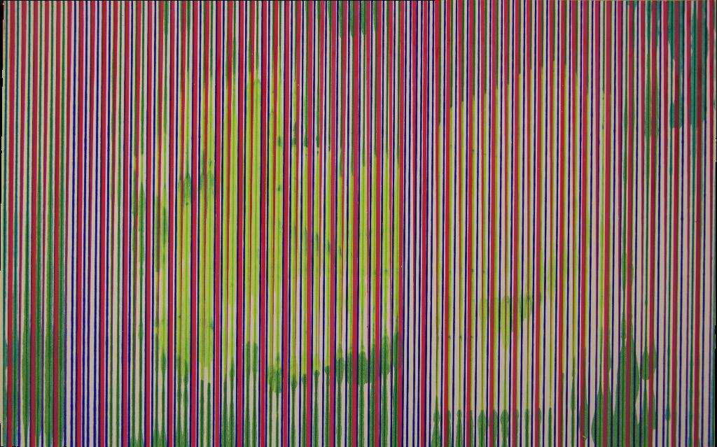
My work centers sensation and perception. I am fascinated with the feeling and quality of objects and spaces. Specifically, light, color, texture, and vibration; conditions that influence sense data. These appears in my work through investigations of pattern, color contrast, size, style, and material.
I use painting to either create an atmosphere or record it.
I’ve experimented with “color field painting” recently. These paintings are an attempt to produce an engaging object for the viewer to experience. I draw inspiration from scientific models and the lineage of color study to compose color harmonies. The patterns are derived from cymatics: the visualization of sound vibrations.
My representational paintings depict spaces I inhabit as residue of an event, the trace, a footprint, the after effect, or its aftertaste. For example, a circle of chairs in a critique room. I think of these chairs as evidence of an event. The chairs serve a purpose beyond their primary function. Taken together, they are a conduit for group experience. This is reflected in their arrangement.
The internet shapes our experience and memory just as one-point perspective changed how people saw the world. New technologies cause massive shifts. Now I paint early internet memes—symbols that hold collective knowledge, memory, and language.
I explore how elements of painting such as color, texture, and material can be used to negotiate my relationship with my interests and impulses. I use various mediums, from oil paint to water-based paint, printmaking, and UV-reactive pigment.
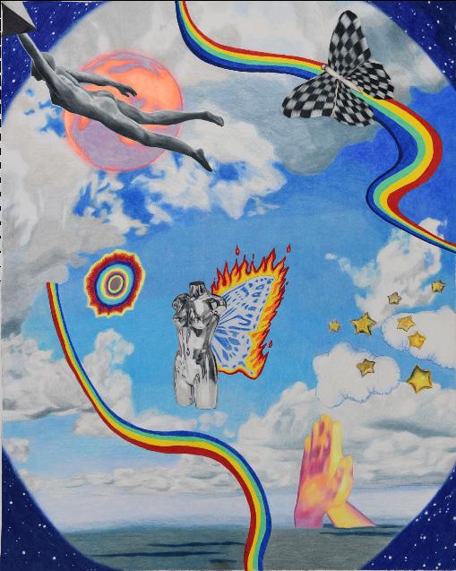
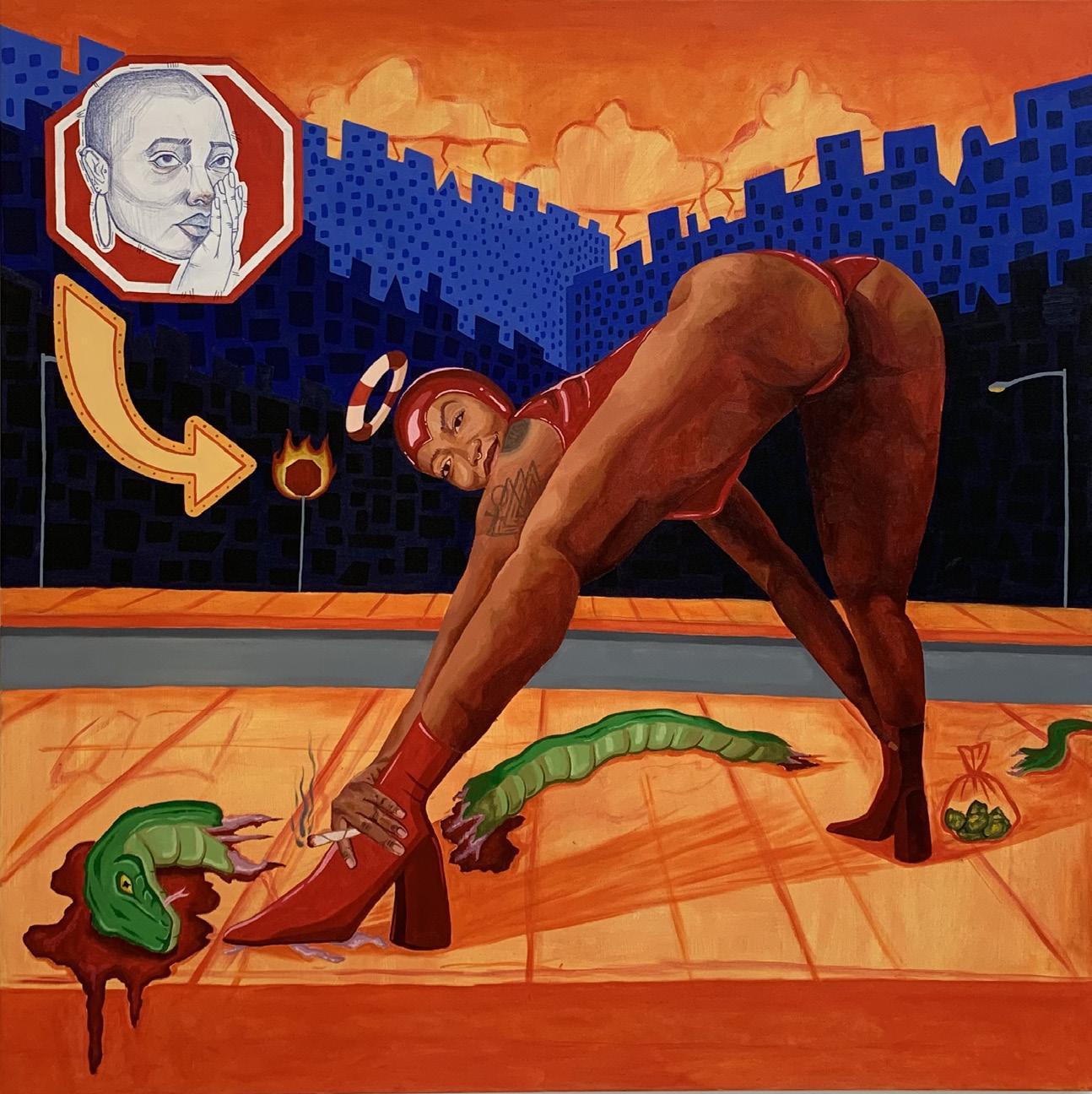
My work is a series of ongoing scientific studies where physical form meets imagination. The canvas gives me immunity to humanize my experiences. I view art as a humbling continual search and discovery; a way to engage and understand my place in the world.
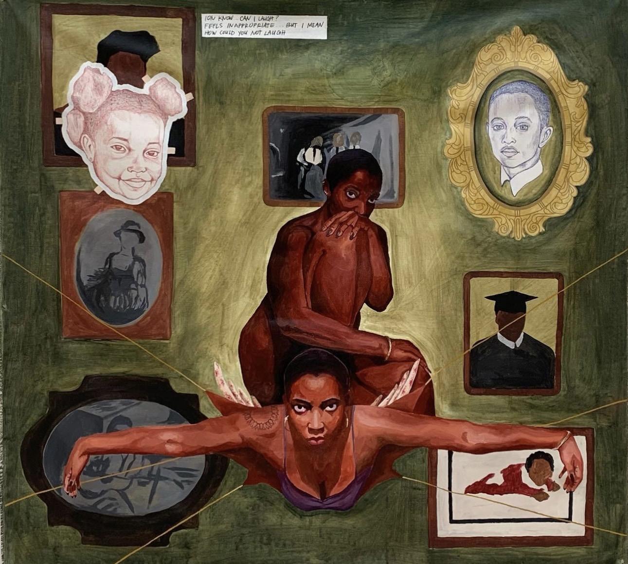
Introspection and self-awareness have consistently played vital roles in my life. I grew up nomadic, moving from school to school, city to city. My childhood was always in motion. Catering my outside appearance and emotions to the new environments I inhabited became part of my identity. I grew conditioned to constantly be aware of my person, my impact, and the space I took up. Navigating areas where I had to prioritize my gender above my race, I learned to shapeshift. Like a chameleon with bright colors, my facade was visible but digestible. The face I put on developed into a persona I perform for the public and an identity I kept sealed away for myself. The composure and meticulous self-evaluation transformed into an entity all on its own. She has become my solace, my constant. She is who I paint.
From 8-foot drop cloths to 5-foot canvas, my pieces take up all the oxygen in the room. I crave intimacy and humanity in large work. To paint a large picture of myself is to place myself outside of my experiences. I become larger than life, easier to understand and absorb. Each painting stands with a central figure staring back at you. She demands participation from her audience. Her gaze follows you as you absorb the saturated colors and dissect the iconography. She is unabashedly coarse and seductive, tempting a reaction out of you. She demands everything from you that I cannot give—the space and attention to express herself transparently. Your role is to act as a receipt, a transaction of authenticity.
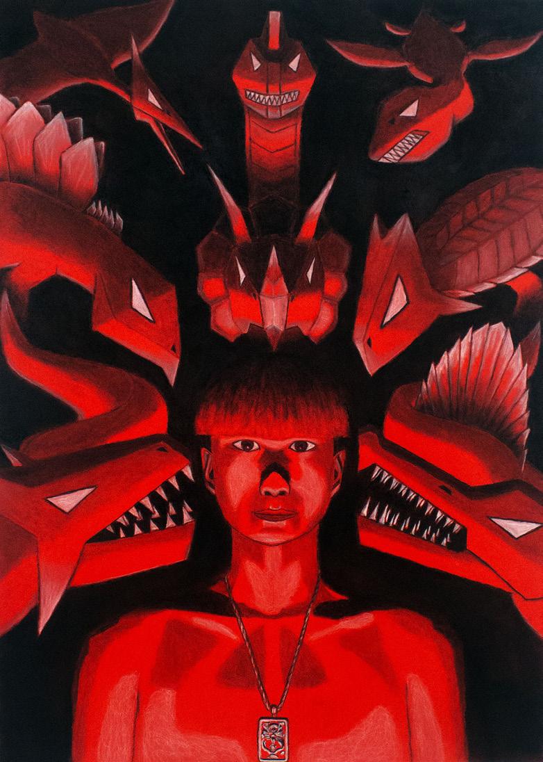
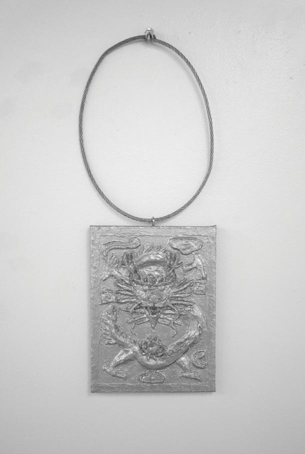

I feel like a kid. I want to keep playing and having fun. I feel that I have not fulfilled my childhood, and I want to remain in it. There is an innocence to childhood. Growing up means the loss of that innocence. Being a child is the best thing in the world for there is no limit to the imagination of children. From that innocence comes the purest art.
Art, to me, is instinctual. The joy, the fulfillment, and the process of making hold meaning. It’s childish, fun, playful, cool, and beautiful.
Inspiration is everywhere. My inspiration mostly comes from my life experiences. I am inspired by my artworks, and my artworks inspire me. I often portray animals and dinosaurs. I see them as majestic yet menacing creatures of the natural world. I find a certain beauty in them. Beauty is unexplainable.
Whatever the medium may be, from drawing and painting to sculpture, I aim to relive my childhood, recreate the innocence of childhood art, and find beauty in the world.
lilywynne.com
@lily.fineart
I am a maker. I create objects to connect with. I relish when a person can interact with my art physically and emotionally. I create pieces that are tangible even if they cannot be touched. Part of that is using materials, such as fabric and clay, that stand as objects on their own, and bear a familiarity to the viewer. My artistic practice questions the separation between art and craft and brings techniques traditionally used in crafting to the forefront.
Collection informs my process. I garden to collect flowers, just as my mother did when I was a child. I collect knick-knacks everywhere I go. I use collection as a means to document where I have been and access memories. I foster a sense of nostalgia that leads to a deep connection with the pieces I create. Through art, I use the past to help inform my present.
I draw from the women who surround me: my mother, my mémère, and my friends. They show me what it means to be strong, beautiful, and independent—traits I strive to find in myself. My art is an exploration of my capabilities both artistically and personally. Prevalent themes that emerge include love, nature, intimacy, humor, and the search for happiness. I use an ambiguous figure representationally in my work. They represent myself, my thoughts, and my emotions, as well as the people I interact with. The figure represents not only the person I am, but also the person I am not. They can be the person I want to be. It is through this figure that I explore my own experiences in a way that allows me to see my life from a different perspective.

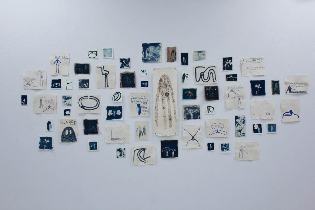
chelseahan.weebly.com
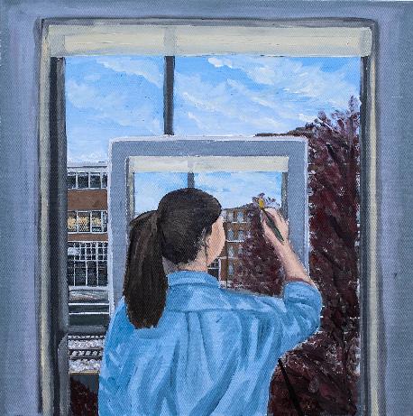
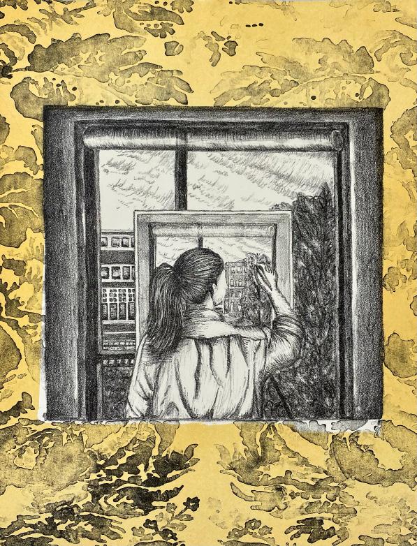
Utilizing the language of drawing, printmaking, and painting, I create autobiographical representations in my work. Other artists who have done the same, such as Van Eyck and M.C. Escher, depict themselves either directly or metaphorically in their work. This has inspired me to narrow down the content and focus on one subject: myself.
I have explored many printmaking techniques, which offer unique aesthetics to create a specific atmosphere through texture, value, color, and layering. My print subjects are all varations on the same theme. Starting with my self-portrait Back to Me, I portray the same image in multiple different print mediums. By modifying reality, my art becomes both playful and surreal. To achieve this, I used the Droste effect, a technique for creating a recursive scene by placing the same image repeatedly in a composition. In this instance, I use the same image of myself as a reference. Repetition of the figure expands the work’s exploration of my identity and creates illusions of what is real and what is not. Inspired by M.C. Escher’s Drawing Hands, the illusion of multi-dimensionality led me to break my own perception of reality. By looking at the work, the viewer becomes a part of the multiple dimensions. When our senses are tricked, can we distinguish what is real?
A brief break from reality in an illusional space gives rise to more questions than it answers. Making the first piece led me to create a complete series on this one theme. In the future, I will approach other subjects similarly, emphasizing the real and unreal, by representing others rather than myself.
bonnie-yu.com
@mola_bonnieyu

rephrase?
Growing up in China, I was part of the society that craved Western culture. For years I have turned away from my own culture and embraced others. It was not until I reclaimed my culture through Chinese traditional clothing (hanfu), which currently serves an essential role in the narratives of Chinese history and traditions depicted in my work.
In China, I witnessed and experienced mistreatment towards women. A few years ago, the Chinese National News declared that it is a woman's responsibility to give birth and raise children. A month earlier, the Chinese government officially gave children from mistresses the right of inheritance. Women have been historically mistreated in China, and now China is falling back into “a modern polygamy society,” which further perpetuates the backwards progression of how society values women.
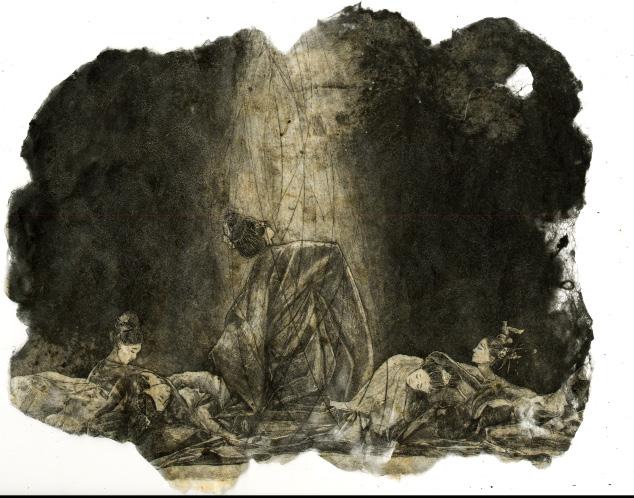
My work focuses on the injustices toward women in China and seeks to raise awareness to promote change. Under my “beautiful surfaces” lie brutal social constrictions and reality. My storytelling narrows from a collective women’s experience to me as an individual in the form of the self-portrait.
I employ etching and collagraph on silk as my main medium, along with painting. Historically, silk has been historically produced by women and holds cultural significance. While printmaking and painting together produce rhythms in my work, etching has the capacity for very fine marks and faithfully records texture. Painting on the other hand is about color and more general lines. The integration of the two Western techniques on an Eastern surface serves as a gateway to my stories on women in China.
Ajas, Kira
Benoit, Rebecca
Bernasconi, Isadora
Chang, Danielle
Chung, Mina
Collins, Claire
De La Blanca, Andreina
Garcia, Faith
Griffin, Emily
Had, Lauren
Hong, Hannah
Huang-Debow, Max
Huang, Felix
Kim, Christine
Kim, Minsuh
Li, Xiang Li, Yiqing
Lin, Yuqing
Liu, Yantong
Liu, Yushuo
Malcolm, Asjha
Mang, Jacqueline
Mann, Kelsea
Mitchell, Shelby
Nie, Michelle
Om, Seyun
Park, Eugene
Pyrdol, Mary
Rajgarhia, Avishi
Ramos, Hannah
Sealey, Crystal
Sheridan, Nell
Snavely, Emma
So, Julia
Sosi, Perry
Subedi, Sambridhi
Tran, Dennis
Wagner, Laura Wang, Tianliang
Wang, Zhipeng
Zhang, Kexin
kiraajas.com
@kiraajas
How can our work as artists produce social change?
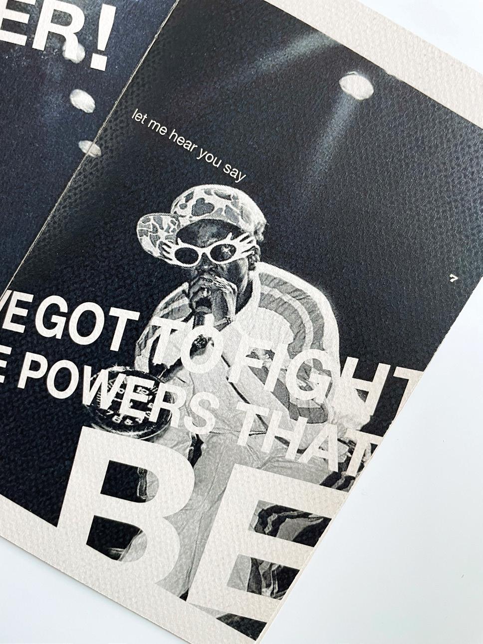
Part of my desire to create comes from my deep connection to music. From the boom bap1 that blasted from my dad’s speakers to the smooth tones of my violin, music has always surrounded my daily life, which in turn has influenced my creative outlook. Yet, that is not the only driving force that motivates me to create. Amid political turmoil and social injustices, I’m sparked with the creative impulse to make. These moments prompt me to express my point of view through design. Graphic design is a tool that allows me to stand up for my community and the world at large.
These are the reasons why I resonate with hip-hop music. Hip-hop is a creative expression born of activism. It’s an artistic language that allows musicians to express their condemnation of social injustices that their communities face. These artists aim to uplift their communities during times of uncertainty. Musicians provide strength to people through their songs.
The relationship between hip-hop and activism is essential. Hip-hop strengthens communities and generates change. I use graphic design to create protest kits that enable anyone to create protest art so that they can more easily express their beliefs and feel a sense of community. I want people to experience the importance of the art of protest.


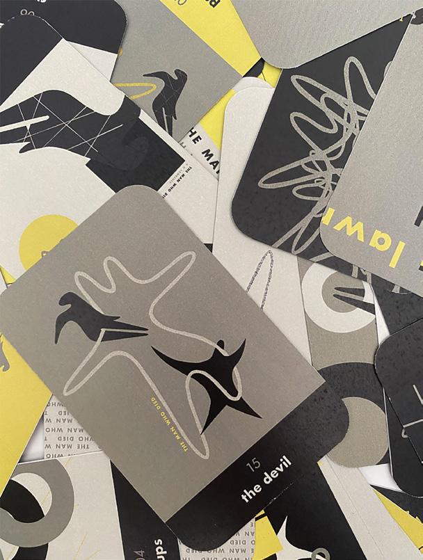
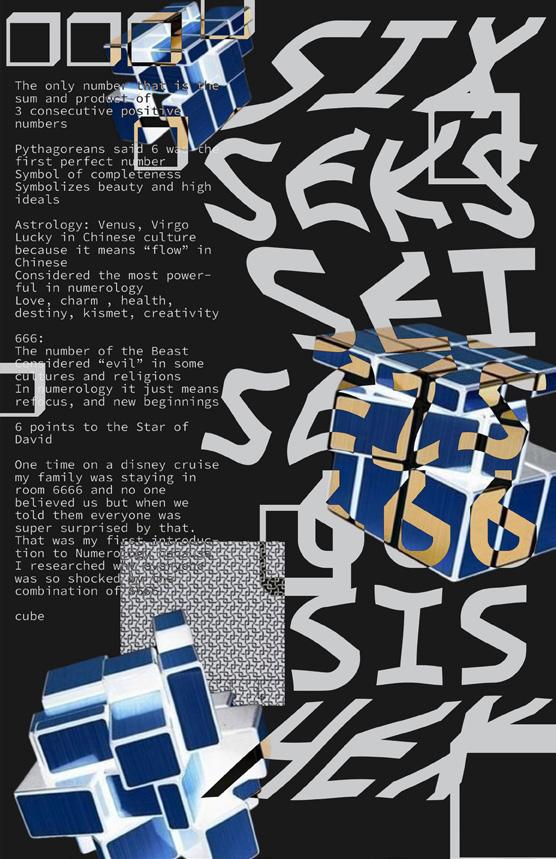
Numbers have always been an integral part of my life. As someone who was diagnosed with OCD at the ripe age of seven, this makes a lot of sense. There are good numbers, there are bad numbers, and sometimes you just have to do something a certain number of times or else something bad will happen (probably, maybe, definitely not). I’m fascinated by numbers but not in a math way, since I am notoriously terrible at math. The psychology of numbers also intrigues me. Why is thirteen unlucky, but seven is a blessing? Why do good things come in threes? Speaking of three, why is it an absolutely wretched number to me, and why does twenty five feel like the complete opposite? Why are there so many methods of counting and why do people place so much emphasis on numeric value?
My thesis pushes beyond numbers as a logical tool and into the abstract, exploring the experience of numbers and quantifying them. Through this thesis I explore the societal obsession with value and numerical identification paired with my own lived experience. I also delve into the human insight that the physical amount of something is not considered except in the absence or abnormality of that thing. For example, people notice when they don’t have enough eggs for a recipe and they also notice when they have five spatulas, which is a lot of spatulas for a household of four.
I explore these ideas with and through graphic design with an emphasis on documentation, iterations, patterns, and repetition. I hope to find a unique style at the intersection of the rigidity of structure and the fluidity of abstraction. Ultimately, my thesis challenges the viewer to consider the role numbers play in their everyday lives and to experience numbers in their most abstracted form.
isadorab01.wixsite.com/portfolio @isadora.artt


reck·less adjective (of a person or their actions) without thinking or caring about the consequences of an action.
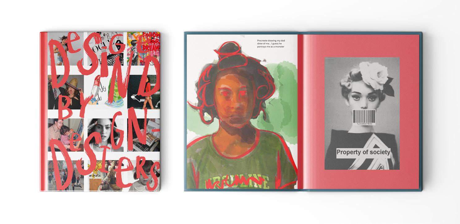
It was the Catholic school that I’m pretty sure did it. In the classroom, I’m a rule follower but outside the classroom—I am a reckless person. In Pretty Reckless, I explore this uninhibited behavior to express a sense of freedom. I hope to be more experimental in my approach and my designs, to be less focused on the final product, and make space for creativity and the flow of experimentation.
TBH, our generation has faced a series of major world events at key milestones in our development, from domestic terrorist attacks and over twenty years of war to economic meltdowns, the climate crisis, and more. I, like so many of my peers, have had many challenges over the last few years. I was not accepted to my first choice college and transferred to Boston University in the middle of the pandemic. This caused me to miss out on a lot of the in-person college experience. During my final semester, I want to be unencumbered and reckless with my work. Isn’t this what art school is for? Experimenting, having fun, doing what you want with the time you have?
For Pretty Reckless, I created a brand identity to empower other women to be reckless. I strive to change the narrative of the word “reckless” by showing people that it is not a bad thing, but rather an act of liberation. For this project, I designed a new brand and created a brand identity, poster series, and accessory designs to market and build a community of empowered women. I researched individuals who I believe are “reckless” in fashion, design, and pop culture. I believe these people are empowered; their creativity is uninhibited as they break artistic, cultural, and gender stereotypes.
@ninicha.on.the.grid
Looking up at the sky with my twin brother, I asked what shapes he saw in the clouds. Images of a broccoli, turtle, and spaceship were shuffling through my mind until I heard my brother mumble, “I just see a blob.” In this moment I felt a wide gap between my twin in our innate understanding of the world.
I identified myself as a creative thinker, one who draws meaningful connections through narrative and emotion, whereas I identified my twin as a logical thinker, one who draws meaningful connections by objective and analytics. However after pursuing graphic design, I realized that creative thinking and logical thinking are not necessarily mutually exclusive. My methodology of drawing mindmaps, labeling connections, and utilizing systematic techniques is what allows me to execute original thought. Recently, I have noticed these overlaps as I apply my design process to the study of hair.
I associate my hair strongly with my identity, as I constantly cut, color, and style it to fit the climate of my personal expression. Now I wonder what else my interaction with hair offers. I believe that design has the potential to dissolve the dichotomy I placed between people like me and my twin. I want to push hair as a language, medium, and viewpoint to contextualize the tension and harmony between creative and logical thinking. Through generating tools, forms, and narratives around hair, I invite and challenge you to deconstruct and reconstruct conventional methods of thinking.
chungmina.com @dominaaaaas
[PIGO JIDA]
피고 지다. To bloom, and to fall.
The concept of life becomes so clear and simple when we turn to nature. When something is born, it will eventually return to the soil. As ironic as it may sound, realizing how simple life can be defined helped me to accept my own grief.
Humanity monumentalizes inanimate objects, like tombstones, to help us remember those we love. We also give impermanent gifts, such as flowers, to celebrate new stages in life: for an exciting graduation, a romantic first date, or a heartwarming birthday party. How can something so beautiful, yet so prone to deterioration, represent the cycle of life?
“Pigo Jida” (피고 지다), which translates to “to bloom and to fall” in Korean, is a flower arrangement ritual inspired by the life cycle of flowers. My thesis delves into the symbolic and emotional significance of flowers in our lives to explore practices of collecting, gifting, and eventually letting go. By examining the art of the flower arrangement and its connection to ritual design, this thesis considers the role of flowers in bringing solace and joy to those who are both grieving and celebrating.
With the goal of engaging viewers in the meaningful act of gift-giving through custom flower arrangements, “Pigo Jida” offers an opportunity to take a moment to celebrate life.
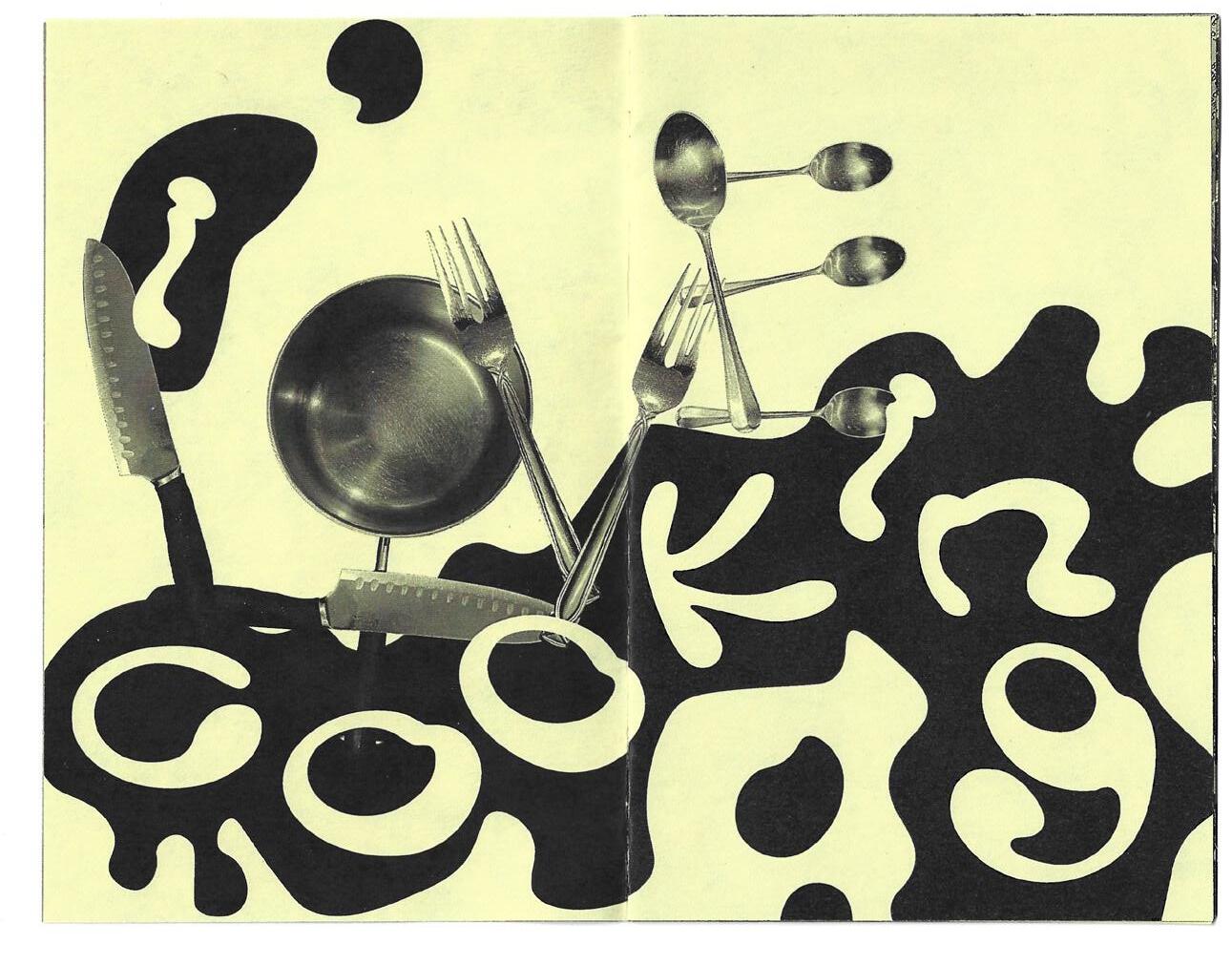

“What’s for dinner?” explores the experience of sharing a meal through design. In this work, I consider different perspectives on meals, seating arrangements, and the plate/table as a frame for conversation. I share my research and ideas in the form of books, videos, and experiences. clairecollins.myportfolio.com
“What’s for dinner?”
Eating together has been standard practice for my family ever since I was little. Every night when I came home from school, I would ask my parents “What’s for dinner?”. Every night, we would sit around the dinner table to eat and talk. This didn’t change when I moved away to college. I continue to prioritize meals with my friends and find myself eating around the table with my roommates, my boyfriend, and even driving all the way back home to Providence to enjoy a family meal.
Sharing a meal with others, whether that be family or friends, builds community and creates a sense of belonging. Many cultures are rooted in food and there’s a reason for that. Food influences the way we interact with the people around us. It’s an excuse to slow down, talk, and reflect on our day. Eating together alters our perspective. It’s a simple act that we don’t often think about but affects us in so many ways.
andreinadlb.com
@andreinaa.jpg
How do you navigate uncomfortable situations? How have others influenced you and your path? I focus on change in all aspects of my life and art. As someone who has moved several times, moving, adapting, and changing is central to my identity—for better or worse. On one hand, movement has impacted my personality as someone who now looks for change and novelty in life and design, and yet is also apprehensive of the unknown.
Creative coding1 allows for a different opportunity to experience the world through experiments. The tool allows for constant change, experimentation, and unknowns as the physical gets to live in the digital world through greater interactivity. Using creative coding to track movement allows for an input/ output scenario and provides a bettering understanding of movement as it pertains to navigating life’s unknowns.
With creative coding, I demonstrate how moving towards the unknown is good. I hope to cultivate positive outlook on change and uncertainty by creating space where people can move as they please, activating interactive visuals as they go. As participants venture further from their entrance point, they will have had multiple opportunities to encounter positive changes and experience wonder.


1. Creative coding is a form of coding in which the goal is to create something expressive, rather than something purely functional.
I don’t speak Spanish. My entire family does, menos yo (except me).
In my household, language barriers define our communication. The word “barrier” has a negative connotation, and yet barriers like this (como este) are intertwined and ingrained in my everyday life. From (de) Venezuela to (a) España, my global relationships with family are held together through the beauty of Spañglish. As a member of a bilingual family, embracing barriers or desconexciones (disconnections) helps me to form empowering (empoderador) bonds across language and identities. My thesis, Recon(n)ect(ar), brings attention to and explores disconnections in various forms: physical distance, experience, and, of course, language. Recon(n)ect(ar) is an ode to and a reframing of barriers.
Through tipografía y sonido (typography and sound), this collection serves as a platform for family narratives and experiencias bilingües (bilingual experiences). Highlighting these unacknowledged stories, Recon(n)ect(ar) serves as a catalyst to empower people, yo incluido (including me), to embrace barriers. Process and research are used as tools for reconnection (reconexión); conversation accompanied by the study of phonetics helps merge both idiomas de español e inglés (languages of Spanish and English). The work featured seeks to give individuos (individuals) the agency to embrace partially understood languages and bridge gaps in identity. Recon(n)ect(ar) recontextualizes, acknowledges, and reframes language barriers as well as illustrates "flawed" identities.


emilypgriffin.cargo.site
@epaigeart , @gnreenies
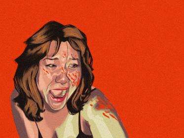
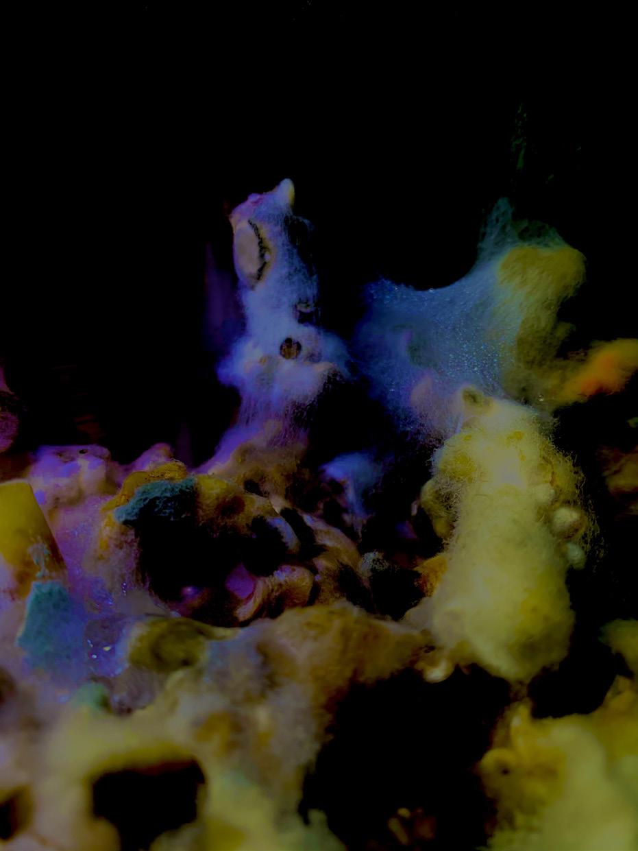
Ever since I was a child, I’ve been fascinated with the grotesque. It was, and still is, a polarizing experience—I often find beauty and comfort in things others do not. I love mounting taxidermied animals on my wall. I love my adorable pet rats. I love adorning my body with gorgeous piercings and tattoos that some people may find uncomfortable—and I desperately want people to embrace the grotesque outside of its pre-established contexts. If something is aesthetically pleasing, why should its context get in the way of our appreciation? How can I share the things I find beautiful without causing discomfort for my audience? I want to shift the narrative of the grotesque from disgust to fascination and appreciation.
I experiment with food and photography to explore my own interpretation of the grotesque. I aim to put something through the wringer of discomfort so that I may present it in a beautiful way and express beauty and discomfort in a compatible visual language. I draw inspiration from “ugly design,” using my photographs to explore the following question: Can the beautiful and the grotesque coexist, or do they inherently contradict each other?
What happens if you are presented something beautiful without knowing its grotesque context? Can it maintain its beauty, or will it provoke postdiscomfort despite initial perceptions?
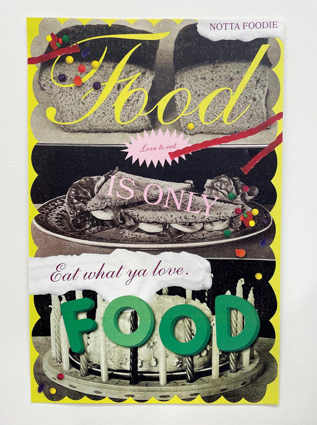
I love food, but I’m not a foodie.1 I love cooking, but I don’t care about what dish I’m making. I love eating, but this wasn’t always the case. To love food is to take delight in taking care of your mind and body. It is savoring, enjoying, and loving yourself. There’s no need to dwell on whether your meal has too many carbs or if you’ve oversalted the sauce. As long as you feel full, satisfied, happy, and healthy then there’s nothin’ more to say. Your eating should not be open for critique or commentary. Food is for you to eat. Plain and simple.
Inspired by my own personal relationship with food and research of dietculture and intuitive eating, I launched the food-positive campaign, Notta Foodie. This Instagram account, poster series, collection of conversational interviews, and other marketing materials promote a celebratory foodrelated event and provide an alternative narrative of what eating can look like. Foodie culture, diet trends, and “That Girl” aesthetics of home cooking have distorted the world of eating, but food should be accessible and inviting for everyone.² I want to celebrate all types of eating no matter how imperfect, calm fears that come with eating, and promote food as a form of self-care and self-love.
Eat what ya love ‘cause it’s just food, and there are so many things that matter so much more.
1. Foodie: a person having an avid interest in the latest food fads Synonyms: gourmet, epicurean, gastronome, epicure, connoisseur 2. "That Girl" is a girl (or any gender) that gets up at 5:00 am, meditates, drinks smoothies, showers every day, journals, only eats healthy food, goes to the gym every day, and is successful in many ways.

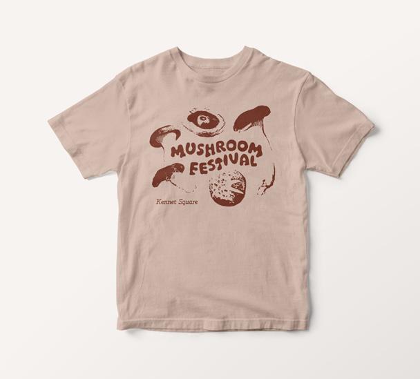
To jumpstart my brain, I require a refreshing iced drink and music that correlates with the weather; my tastebuds need a wakeup call, and my brain needs to feel sound vibrations. My desk should remain mostly clear, although I may have hidden last night’s coffee-stained mug behind my laptop.
How do you work? Are you someone who sets a timer? Or do you work with short bursts of energy? Or perhaps your psyche requires adequate natural lighting, or a slight breeze through the holes of your sweater.
The “third space,” coined by American sociologist Ray Oldenburg, refers to social environments and gatherings that foster community and personal interactions separate from our homes (“first place”) and the workplace (“second place”). Enter The Nea, a fictional concept for a new “third place”, which explores how our environment affects the way we work and reimagines traditional café experiences to support three broad working styles and personalities:
[1] Open & Collaborative
[2] Private & Focused
[3] Artistic & Inspired
To reach a deeper understanding of the relationship between environment and motivation, I use design as a tool to reconceptualize conventional interactions with menus, food, drink, and tools for productivity. The Nea seeks to demonstrate that the design of work environments plays a fundamental role in fostering the creativity and productivity of an individual, while simultaneously building a sense of community that is essential for human flourishing.
maxhdesigns.cargo.site
@max_hdesigns
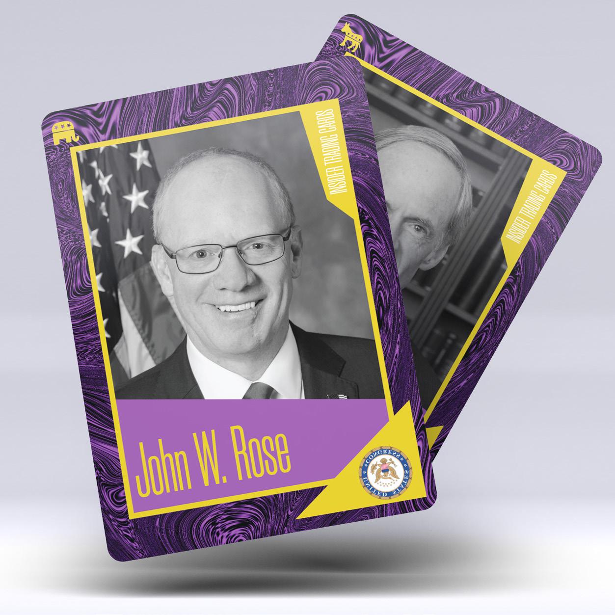
“Never meet your heroes” is often said in reference to meeting celebrities and other public figures in real life. The idea is that you don’t want to ruin the idolized image of them that you have constructed in your head. Most celebrities do not have much control over their public image. As a “brandable celebrity” they often benefit from endorsements and in turn reach a wider audience. Still, I think you should always meet your idols—challenge what they say and explore ways to critique them. Blindly following celebrities leads to groupthink that can be dangerous for society when hateful beliefs and misinformation are taken as gospel. Good or bad, publications and stories about public figures must be designed.
Design plays a big role in the idolization of celebrities and the perception of public figures. Language, imagery, and typography are all part of a visual language that documents celebrities. Different mediums portray people in a range of lights: posters place celebrities on a pedestal (especially when hung); athlete trading cards document their statistical achievements with clear and tight typography; magazines highlight nearly everything about celebrities, pairing gridded imagery and text to tell an intriguing story.
I create works that turn these mediums and methods of idolization on their heads, challenging people to think critically about the embedded narratives and visual languages of celebrity culture, as well as to criticize celebrities who have fallen from my personal grace.


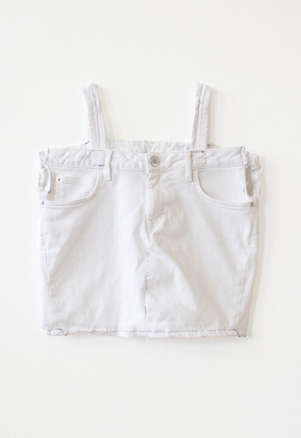
Why do we wear clothes? Historically, clothes are worn for warmth and protection. In today’s world, with advancements in clothing material and function, what’s the purpose of clothes? How has clothing evolved beyond its original purpose? Clothes have become a medium for personal expression, tailored to the wearer’s body and style sensibility. The fast pace of the fashion industry demands mass production and uniform sizing. A “one cut for all” method has replaced tailored clothing of the past.
I hope to redefine articles of clothing and ways of dressing by deconstructing and reconstructing fashion. What is more important: function or form? Appropriating functional features of clothing from its original context and incorporating these elements into stylistic designs lets clothing design evolve. While gender is often assigned to clothing, clothing itself does not have gender. Deconstructing gender in clothing allows for the blending of gender boundaries, gender neutral clothing, and fair expression.
Composing an outfit is one form of design—a sort of curation. Color, pattern, and composition. Why do we wear certain types, genres, or cuts of clothing? I think of clothing as a sculptural entity. Shape, form, and materiality. What do the clothes we wear communicate about our personality, style, etc.?
My work includes a collection of clothes along with a lookbook style catalog. I plan to develop a clothing brand and social media accounts to showcase my works.
I aim to encourage critical thinking of our daily fashion choices and the intention that goes into creating an outfit and to inspire others to redefine clothing.

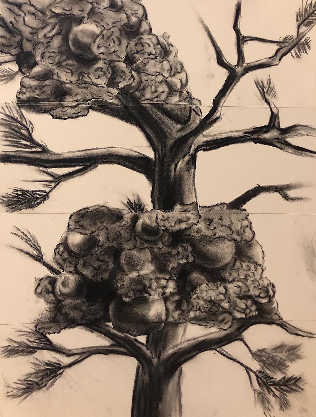
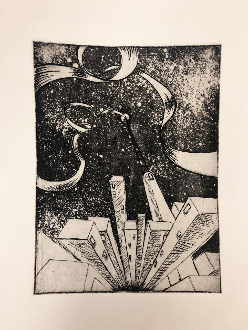
Many people rarely think about their happiness as they reach for success. People say they want to succeed so they can reach certain material goals. They believe these materials will help them achieve happiness. Happiness may follow success, but what if success is not something that one can obtain? Success is a variable that measures the degree of happiness, not a constant that determines it. Therefore, happiness can easily be achieved through gratitude. Gratitude may seem difficult to reach, but it can easily be found in the small things and situations in life.
My thesis focuses on sharing my own experience discovering true happiness: friends, family, religion, and art education. As a graphic designer, I have learned how to communicate visually. Graphic design expands the possibilities of creating interactive spaces through both analog and digital forms. I bring these ideas to my designs in an effort to pass on my journey of obtaining happiness through gratitude.
@michellekim._ ,@michelleinstar._

“When in Rome, do as the Romans do,” refers to the importance of adapting yourself to the customs or traditions of a people. Every community is tied together by an intricate tapestry of individual values, norms, and history. A community’s culture and its impact on their lives is a distinctive and complex entity which furnishes identity and purpose to its people. Traveling and getting hands-on experience of what it is to be part of another community is my favorite approach of learning something new. My thesis emphasizes on obtaining a true insight as well as interpretation into the cultures I’ve been exposed to. Every project featured in this thesis acts as a guidebook for my audience and myself, sharing different aspects of culture I’ve experienced and wish to explore further.
When unwrapping my personal understanding of exploring different cultures, culinary experience will always be the highlight as food is the greatest storyteller. It portrays people’s identities and where they come from and bridges nationalities, geographies, and generations. Food also narrates all the major elements such as traditions, language, aesthetics, religion, and social organization that form a culture. It conveys about a society’s history, including how people lived and how they managed to create a specific cuisine. By getting a hint of taste of another culture through food, it opens a door to learn about the unique history, geography, and communities that inhabit the land.
Being exposed to another culture is not limited to just a culinary experience, music and sports are also crucial features which will be included in my project. I plan to execute my ideas using the methodology of creating mini guidebooks in a series of Michelle-in ____. We tend to think that rigid constraints and rules limit the opportunities to learn and grow. My thesis will impose on the general concept of this “set of rules and instructions” such as recipes and with an intention to spark a desire to challenge yourself and open the door to something new.


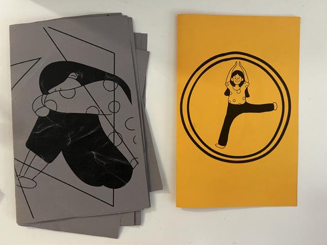
As a designer with a dual background, I make an effort to include what I have learned from psychology into my designs to help people with mental health issues. Like many designers, I aim to use graphic design as a tool to share information related to mental health. Graphic design visualizes the content to deliver information effectively and efficiently. However, simply delivering information should not be the only function of graphic design. My work explores how to use graphic design in new ways.
I am inspired by the work of Edward Adamson, known as “the father of Art Therapy” in Britain, specifically his article titled, “Art as Healing: Edward Adamson.” The process of artmaking, from graphic design to coloring books, can be both curative and therapeutic. Coloring books like the Secret Garden help to ease depressive and anxious emotions. While there are many activities beyond artmaking that can be used to support mental health, graphic design is a useful tool to share these practices in a visual format. In my thesis project, I aim to create a platform, or toolkit, of visualized practices that are beneficial for mental health issues.
wendyli.org
@wendyart23
To echo designer Mike Monteiro’s sentiments, the world is “ruined” by design. From toy colors to gift shops and “exotic” brands, design choices subtly drive purchasing decisions by exploiting assumptions based on gender, socioeconomic trends, and cultural stereotypes. In so doing, design reinforces social norms and upholds conformity over diversity, dividing us from those we perceive to be different. The challenge for designers then, is to bring forth creations that demolish socially constructed boundaries and lead us to embrace multiple, intersecting dimensions of our identities.
As a female Chinese international student living and studying in the US for over eight years, I often ponder the long-standing problem: bonding versus bridging. Generally, bonding occurs naturally within communities rooted in shared history, identity, or values. Bridging between individuals from disparate backgrounds and social groups, however, requires significant effort. Based on my personal experience, I’ve learned far more from engaging with people whose lived experiences and viewpoints diverge drastically from my own. Rather than driving us apart, these differences underscore the commonalities that bind us together.
I explore the ways in which design can serve as a tool to facilitate both bonding and bridging in communities through group forming theories and case studies. I use design to break down assumptions and encourage collaboration among individuals from all cultural backgrounds.

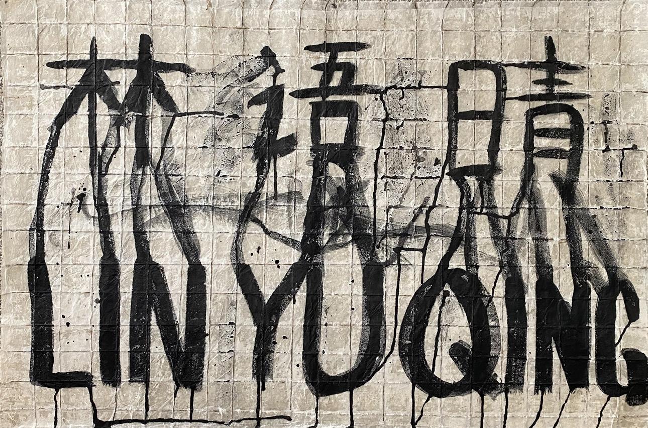
Chinese, like most languages, was created when patriarchy was most prominent; its grammatical structure and language system were made to fit men’s beliefs and biases. Chinese is inherently a sexist language.
The oldest known Chinese writing, 甲骨文 jiǎgǔwén (oracle bones), dates to the Shang Dynasty. These simple depictions and drawings reflect the patriarchal values of ancient China. Looking at the Chinese character 女 nǚ (female), the oracle bone version depicted a kneeling woman, and reinforced beliefs that women should be submissive, quiet, and obedient. Other Chinese characters with the 女 nǚ (female) have similar negative connotations. Although modern China isn’t as patriarchal as ancient China, this misogynistic history is present in modern Chinese language. Simplified Chinese no longer looks like actual depictions, and therefore this history is often glossed over when learning Chinese language.
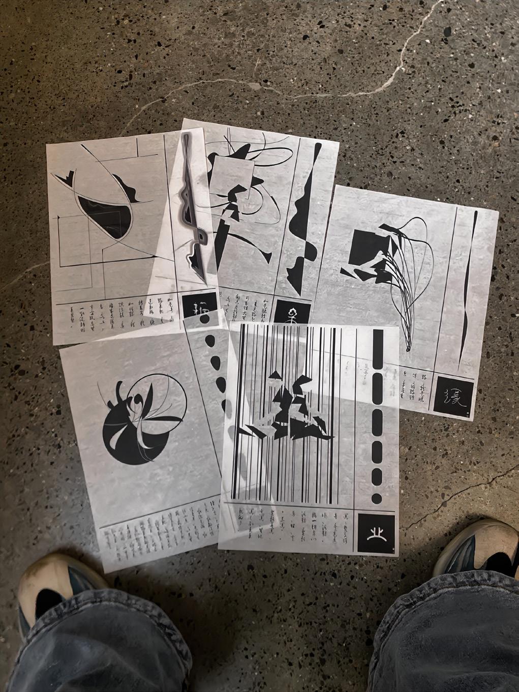
My thesis aims to raise awareness about the gender inequality rooted within the history of the Chinese written language. I analyze and critique the history of characters with the 女 nǚ (female) radical and its misogynistic undertones. Through a traditional Chinese book, I create new forms of oracle bones to reframe and redefine 女 nǚ (female) radical’s history to reflect the current discourse around gender and gender roles.

I grew up under the influence of my mother and became very interested in Chinese Buddhist culture. Although I am not a true Buddhist, I think some of the theories of Buddhism reveal many objective laws and explain many truths. I see reason in the “Cause and Effect” theory, one of the core tenants of Buddhism.
In the theory of “Cause and Effect,” the cause of one thing must be the result of the development of another thing; the result of the development of one thing must also be the cause of the creation of another thing. Cause and effect are a continuous cycle. The theory of “Cause and Effect” is the crystallization of Buddha's wisdom and captures Buddha's perspective on the nature of things. “人人知因果大治之道也, 人人不知因果大乱之道也” The doctrine of cause and effect is not only applicable to the good and evil of human beings, but also to the development and change of all things.
My thesis shares the theory of “Cause and Effect” with viewers and urges them to quit committing evil and respect life. My goal is to explain the concept of “Cause and Effect” by designing a series of interactive installations, which allow audiences to participate in the process of cause and effect with their own hands. I also attempt to visualize my knowledge of Buddhist culture through typography, traditional artifacts, branding, and other narratives.


Looking back at the history of education, art has not received the attention it deserves. In 1821, art was first introduced to public schools. Today, nearly all schools have art education in their curriculum. This curriculum frequently includes drawing, painting, graphic design, sculpture, and music. While there are still some parents who think art classes are wasting the time and energy of their kids, most parents are happy and supportive of their children learning the arts. There are more visual art and music schools today than ever before. But how have these art programs become so prolific in just a few decades? How helpful is it to the growth of children? Can we see what people really think in their hearts from the way they express their art?
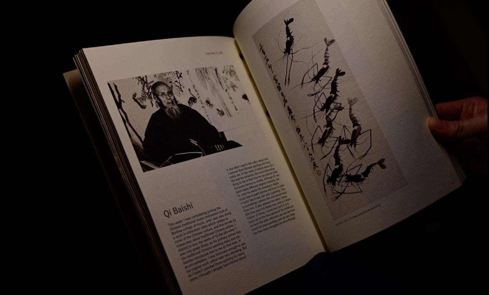
In my opinion, art, design, and education are inseparable; all the textbooks we use in school have been carefully designed to convey the correct information in a simple and clear way. In other words, education and design co-exist in harmony. Graphic design floods our day-to-day life. Since my sophomore year, I have worked part-time in different kindergarten and weekend schools. I have personally experienced the importance of art and design in education. This helped me feel confident that art supports education. Leonardo da Vinci said, “eyes are the windows of the soul,” but it seems to me that the way people express art is what really leads to the depths of their hearts.

asjhamalcolm.com
@jaaahjaaahhhhh
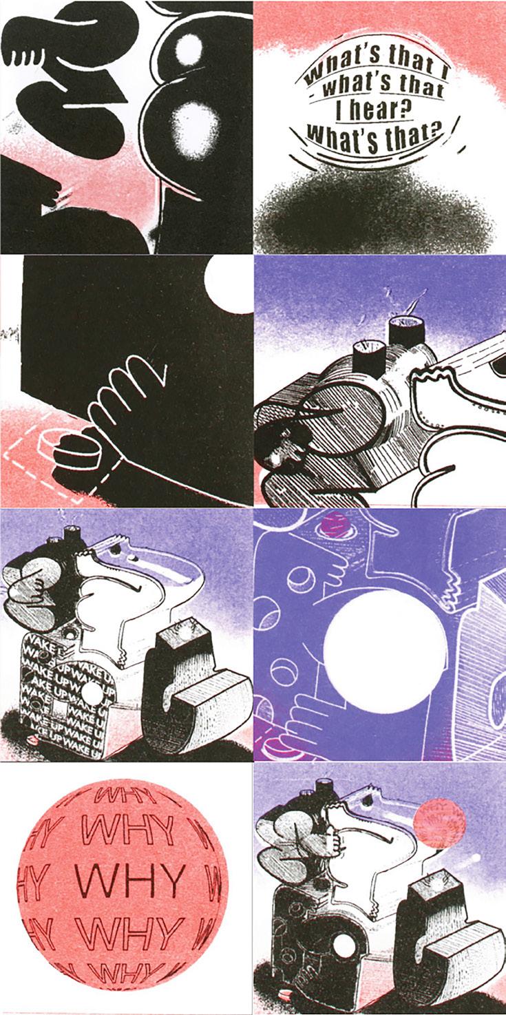
The way we live today is fast. Speed touches all aspects of life. Our food, our clothes, our internet, our calendars, our routes, our routines, our attention, our breath—speed is an imposing force on all. How does this influence the designer? Historically, we have designed for this very trajectory. Designers create bank notes, contracts, maps, manuals, and money to provide proof of property and visualize the pluto-capital cultures we inhabit.1 With its beginnings rooted in advertisement, design is streamlined to attract monetary gain and, with it, an expendable attitude toward the artworld working class. This puts designers in a forced contradiction where our own exploitation is status quo and considered a right of passage in the field. How do we make in such a state? Let’s take a moment. Can we slow down?
Wiggle your toes
Stretch, deep breath
Intake
Listen
Rely on your senses to set the pace
The senses are an impetus to slowness
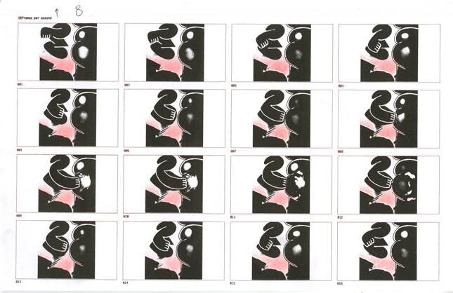
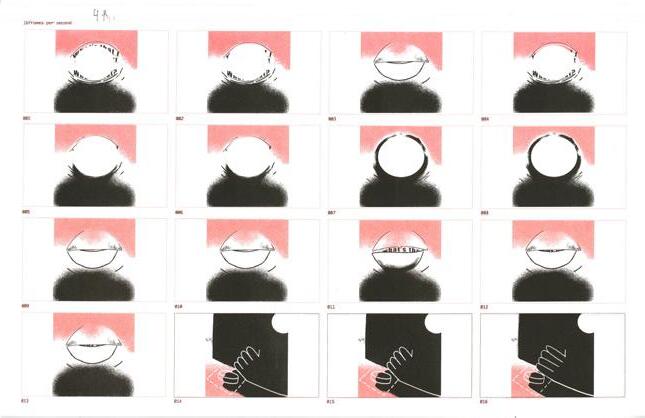
Artists have long theorized what a world undisturbed by capitalism could look like, all while subjected to its absurdities. Although counter to the inherent speed of capitalism, slowness can withhold this creative potential. In my thesis, I investigate slowness and what it means to my design process. Through making a set of wearable textile garments, I explore slowness as a self-guided practice for creating, experiencing, and intaking designed work. Each project isolates sensory processes as a way to generate designed objects and challenge the commodifying nature of capitalism. This thesis is the start of an ongoing negotiation of my role as the "precariat" navigating the consumer-driven design world.2
publisher info?
1. Ruben Pater, “Designer as Worker,” in CAPSLOCK, 241.
2. Combination of the words precarious and proletariat, used to describe people in the working class. See, PATER, “Designer as Worker,” 250.
jacquelinemang.com
@jacmango
The objective of mahjong ( ) is to end up with a winning set of tiles through the act of collecting, discarding, and shuffling. In the game, tiles are constantly changing and players are eventually forced to discard them. Mahjong acted as a momentary liaison between my family and I, and the act of exchanging tiles transcended cultural barriers. Through a fleeting moment of play (and a handful of losses), I strengthened connections, created memories, and shared joy.
Why don’t we want to discard the moments we collect?
Why do we choose to play or do things that only last for a moment?
How does capturing moments differ from experiencing moments? What can you gain from a temporary experience?
Being present and focused while playing mahjong is crucial for success in the game. In the same way, being present in our daily lives is important for forming and maintaining connections. When we are not consciously present, we miss out on opportunities to connect and create meaningful experiences. My work explores what it means to be in the moment and how we can appreciate impermanent experiences.
Through a set of digital and tangible experiences inspired by the framework and play of mahjong, I hope to craft meaningful interactions that encourage people to appreciate transience and reflect on how impermanence brings us to the present.
Dimensions?
I find it fascinating to observe the ways in which modern digital platforms transform the landscape of community, hope, and guidance in our lives. The user experience of interacting with religion and social media are vastly different. However, both social institutions offer a sense of community and idolization that people crave.
The use of algorithms on social media platforms isolate individuals and create echo chambers akin to religious sects or cults. While I grew up in the Protestant Church during the height of innovation for social media apps, I left my religious affiliation when I went to college. Nevertheless, I remain critical of what I devote my time to and I find myself easily influenced by the thoughts and ideas of people I’ve never met—from Apostle to influencer.
The task of designers is not limited to creating designs that are commercially successful, but also to create designs that foster connections and build community. This shift towards community may explain the resurgence of visual elements and analog processes that were historically used in the formation of the most enduring communities. The Holy Scroll presents the environment of a religious institution and the content of social media. It begs the user to reflect on what it means to belong to a social institution and how they communicate and derive meaning.
Dimensions?

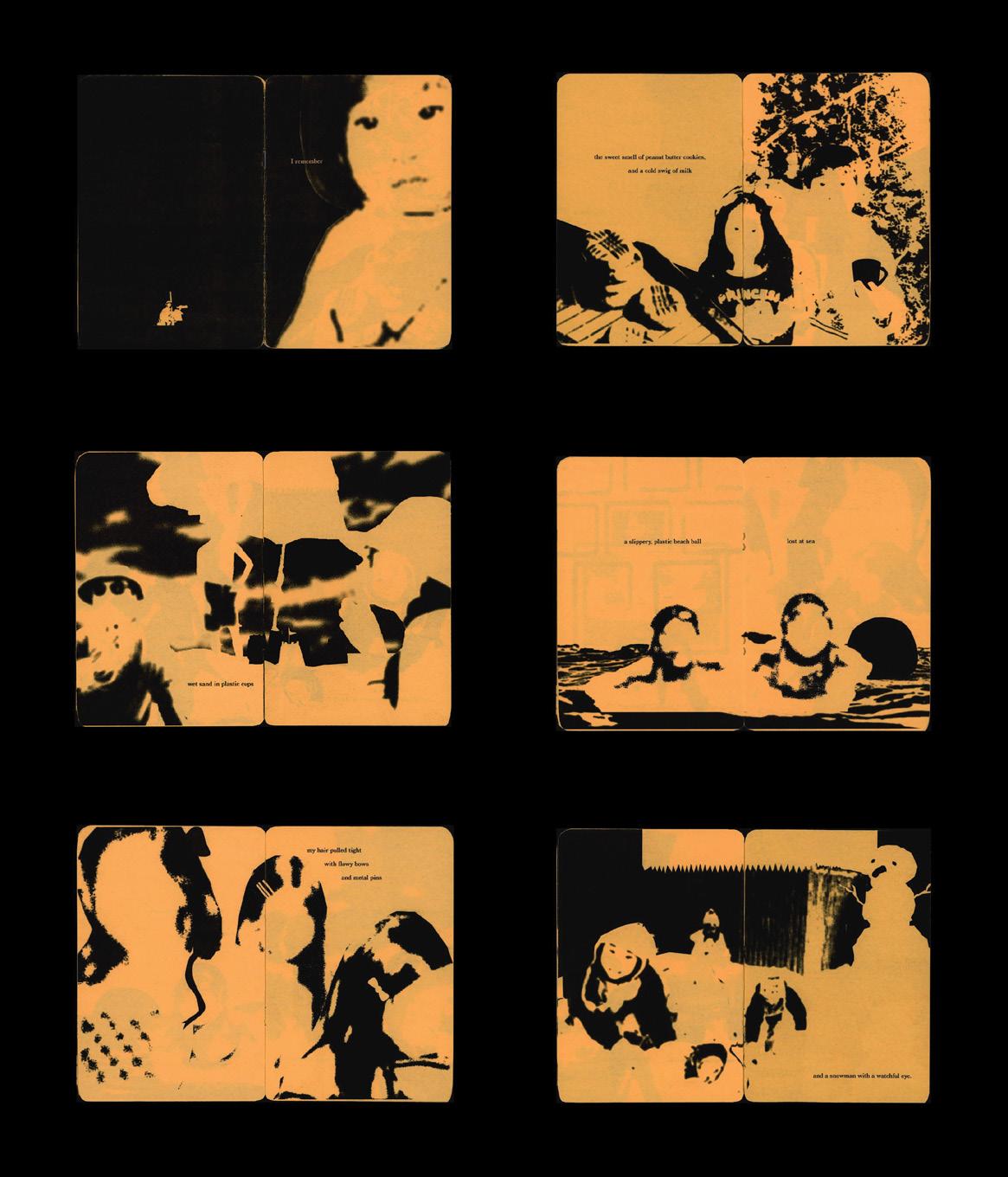
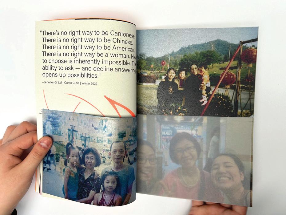
As it’s said, a picture is worth a thousand words. The camera has been around for centuries, long before the appearance of iPhones. With film cameras and then digital, photography was a cherished art form and the invention of the camera was revolutionary. It allowed for documentation, opened up a new form of communication, and still images of life could be captured and shared around the world. A physical object, that could capture and print on a 4x6 piece of paper, meant people could capture their baby's birth or their parents' 60th birthday, their wedding — all of life's simple but precious moments. The camera changed the way we tell stories, cherish friends or family, and share special moments in time.
Growing up my parents always had a camera with them to document every moment, especially on vacations. Memories that have now faded come to life and I’m able to find that distant feeling of a special moment. I’m able to fondly reminisce about old times with my family. Every year since I was born, they documented each trip in their own special photo album (dated and organized by my mom). I look back and realize the importance of documentation and I can continue to share and cherish those memories.
How can we cherish and keep loved ones close to our hearts? I choose a selection of old photos from myself and my close friends to recontextualize, to combine the old and the present. How can we reinterpret an old photo and make it seem present? Through graphic design, photography, and storytelling, and AI I hope to challenge the idea of a finished memory by redesigning and reinterpreting old photographs. This project aims to showcase the importance of photography and the gift it gave us to not only document, but also relive old memories.

In middle school, my Friday nights were spent sitting behind the front desk taking orders for customers. My break time was split between finishing my algebra homework or peeling peapods with the waiters. I can still feel the oil burning my fingers while packing takeout orders. For some Asian American kids, or “restaurant kids,” this is a familiar story of sacrifice and hard work.1 While working in service, I learned how to work with precision and navigate customer-worker relationships, I also developed a love for cooking. Today, I still reference these skills in my design practice.
Cooking is to chefs as crafts is to designers. Their processes and outcomes inspire me to work with analog mediums. This thesis explores what it means to be of service to people. Through a collection of zines, posters, and other interactive materials, I celebrate these mediums and rely on my own hands to create something for someone else.
I hope to create a space for people to reflect on the skills they have learned and share a vulnerable story of human interaction through service. In the same manner as graphic design, working in service requires an understanding of space, navigation, rhythm, and precision—a skilled dance without choreography that can only be learned through practice. To be bold enough to make mistakes, yet courageous enough to accept criticism, being a restaurant kid has taught me how to cook with my heart, craft with precision, and design with empathy.
seyunom.cargo.site
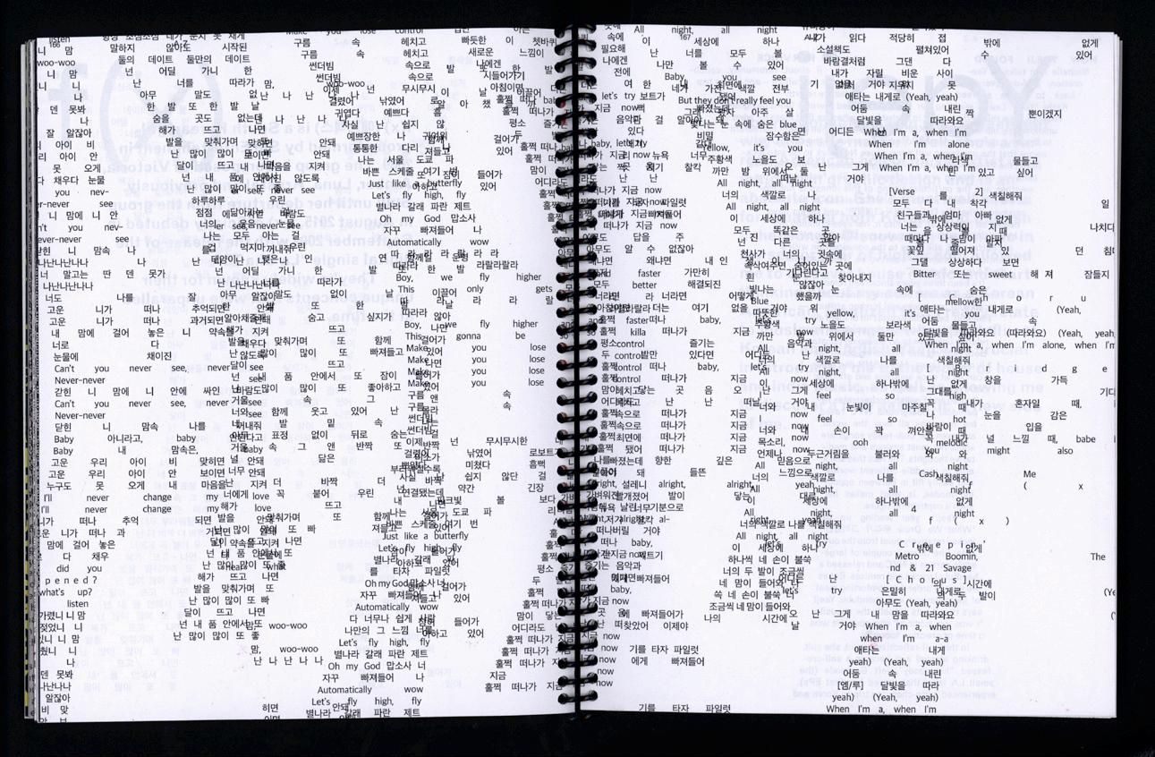
Typography is arguably one of the most important features of graphic design— type is crucial to creating a compelling image and message. Typography is language, communication, culture, and history. Letters and typefaces are a result of how we communicate, both past and present. Typography continues to influence our world and we are more connected than ever.
As a 1.5 gen Korean American immigrant I am interested in Korean typography. At this point, I’ve lived in the United States as long as I have in Korea. What does it mean to be a 1.5 generation immigrant who feels both Korean and Korean American? As someone who is fluent in both languages, I constantly grapple with this question and have become interested in the history and culture that shaped Korean typography. So far, my typography education in the United States has been quite Eurocentric, and I have not always known how to approach Korean typography, which has a distinct history and set of characteristics that differ from the west. I often struggle to find English resources related to Korean typography.
I created bilingual publications to experiment and play with the hierarchy of these languages. Concepts of legibility, hierarchy, representation, and dominance play and important role in my thesis “한글? 라틴? Hangeul + Latin!” and I incorporated these ideas into my bilingual publications and corresponding workshop to inform the public about Korean typography.

eugeneparkgd.cargo.site
@eugenepark_gd


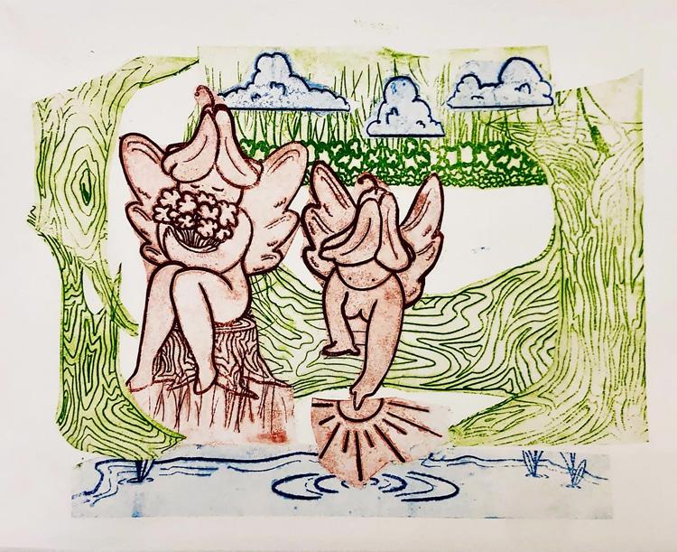
Why do people dream and fantasize about the distant future? Although there is no simple or singular answer, people can agree that the future will look drastically different from the present. Science fiction explores these dreams and fantasies through art, books, and on screen. Growing up, I immersed myself in this multimedia genre, fascinated by the different realities these stories explore.
Although these stories are fictions, they are often based on elements of our reality and therefore link our present and future. Through this link, science fiction enables us to reflect on the impacts of our interactions with each other, technology, and our environment.
At times science fiction serves as a warning, flagging the ways in which our collective actions can produce undesirable futures. For my thesis, I curated content from my favorite science fiction books, television series, and films to produce a publication, poster series, and lenticular imagery that explores how present practices can lead to unpleasant realities. The visual language of my thesis is informed by the aesthetics of science fiction. Through my thesis, I explore the endless array of possibilities that science fiction affords and offer a sense of agency to audiences.
marypyrdol.wixsite.com/marysartportfolio @_marys.canvas_
As global warming and other planetary catastrophes worsen, tensions form between the ecosystem and the future. When will Earth be healthy again? How do we get there faster? When the media force-feeds us the doom of the biosphere on a global scale, it can be difficult for individuals to appreciate the sustainable progress we have made. The Climate Clock, for example, is designed to instill fear; it tells us we are running out of time to turn things around. In my thesis, I explore how design influences our perception of the future. What role can design play to show our progress? How can design influence our perception of “doing enough”?
The Bottom of My Garden is the concept for an app designed to ease this tension by focusing on you. This experience uses a garden as a metaphor to display the progress of a given user. While Earth’s ecosystem is vast and difficult to quantify, a garden is small and localized. Users create their own personal ecosystem by integrating sustainable practices into their daily routine.
Through The Bottom of My Garden, I design an intimate user experience to make sustainability feel more attainable. Illustrations and animations instruct users to feed their garden and complete tasks such as carpooling or taking a shower in less than five minutes. Over time, the garden quantifies the user’s personal efforts without comparing their impact to a global degree of change. Users experience design that is meant to encourage. These visuals take overwhelming realities and turn them into smaller, more helpful and hopeful possibilities.

name here does not match title in the thesis statement?
avishirajgarhia.com
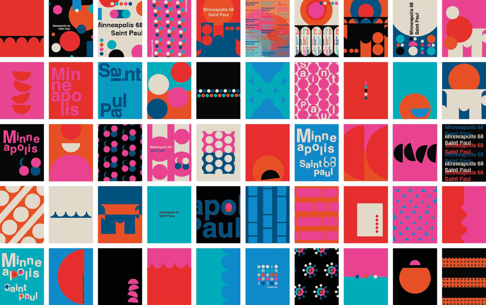

Although I feel fortunate enough to have had the opportunity to study what I love at a top-notch institution, I often feel disconnected from the environment I grew up in and what I call home. India and Indian culture is different from the United States. I find that my own art often finds influence and inspiration from the art and art forms in India that are not often featured in US museums or history books, but can be found in throughout Indian culture, in households, on the streets, and at festivals.
This art is often lost in translation and cannot fully be articulated with words. In my thesis, I work to identify and merge elements of my typography with art from the culture and environment I grew up in.
Hues of Home: Exploring the Nuances of Indian Culture through Graphic Design is an attempt to blend the intricate patterns, vibrant colors, and rich symbolism of day-to-day Indian art with typography and modern graphic design techniques to create visually stunning and culturally rich designs. I aim to showcase the beauty and complexity of the nuances of Indian art and culture through typographic forms. I aspire to pay homage to the culture and heritage I grew up in and explore the endless possibilities that arise when we blend traditional and contemporary design elements.
Growing up in the Midwest, I never thought much of anywhere or anything besides my community in Illinois. The best thing around was always the people. Away from home, and away from everyone I know, I still can’t help but think about the people around me. I want to get to know the person sitting next to me on the bus, the bus driver, my grocery store clerk, and the janitor that comes every night. To me, this is the best way to spend my time and the most impactful form of design. In all my curiosities, design becomes a tool to immerse myself in these questions and engage with strangers.
HAND-ME-DOWN is a project on community, collaboration, and collective.1 In April 2023, HAND-ME-DOWN hosted an interdisciplinary runway experience at the intersection of music, visual art, and fashion at a local church in Brookline, MA. I used design as a tool to translate and connect the many different stories, disciplines, and people I’ve spoken with into a momentary collective. HAND-ME-DOWN is an open-ended system experimenting with the complexity and unpredictability of people and public-space—letting the design fall into someone else’s hands. HAND-ME-DOWN is a project that relies on the willingness of a community of strangers to collaborate and share stories that have never been told, those of artists, musicians, a thrift store, a church, and other local businesses. These stories open ears and me.
@gems.by.a.gem

In Dr. Strange in the Multiverse of Madness, dreams are considered proof of alternate versions of ourselves in the universe, which is why I like to say that I live multiple lives. I dream every single night. My dreams are so vivid that I sometimes mistake them for memories. The plotlines cover various genres, from comedy and drama to thriller. Occasionally, I can lucid dream where I control what takes place.1 My imagination is just as wild when I am awake. Dreaming is a consistent part of my everyday life; I cannot accurately describe what it is like to be me without mentioning my dreams. Therefore, I became curious about the most individualized parts of our imagination and the possibility of sharing them.
Lost in Pretend is an immersive and interactive celebration of our imagination and subconscious creativity that reminds viewers that escapism is bliss in moderation.2 The Lost in Pretend podcast, serves as an outlet to share my dreams, invite others to do the same, and provide commentary on escapism in noteworthy media. By converting the imagination into an auditory experience, this podcast encourages multiple layers of interpretation as the listener creates their own visuals. It is also serves as the soundtrack for the the Interactive Kaleidoscope exhibition, which imitates a dream’s manipulation of reality through the presence of illusion in the real world. Lastly, my choose-your-own-adventure story, The Red Apocalypse, allows readers to navigate and control my imagination at their own pace.
Using multiple mediums, Lost in Pretend explores a variety of ways to exchange dreams, experiences, and, ultimately, identities.


Is it rude to closely examine people’s clothes in elevators? Even if it’s awkward, I can’t help but think about the genealogy of your platform combat boots or how the concealed zipper on your skirt recalls the ways in which women’s skirts were manufactured before 1935, when exposed zippers were not socially acceptable.
Maybe you don’t care about fashion and to quote The Devil Wears Prada, “you think this has nothing to do with you.” And yet, the trend cycle, innovation in production, design-thinking, and the cyclical nature of socioeconomic trends in inextricably intwined with fashion. In fact, what you’re wearing in the elevator has everything to do with this thesis project: Vintage Confidential.
Fashion in 2023 features derivative trends from social media’s Gorp-Core and the Coastal Grandmother look, to Recession-Core and the Scandi-Girl Aesthetic. When paired with recent fads in graphic design, fashion marketing trends like “blanding” and the gothic aesthetic blur the boundaries of these aesthetics. I am enthralled by rapid trend cycles and the art and science of dating vintage clothing. My idea of a perfect afternoon is spending hours sourcing pieces from tiny thrift stores, church basements, and estate sales. Before working in the vintage resale market professionally, I spent my childhood thrifting and altering everything I owned to look more like current trends.
To create Vintage Confidential, a field guide to dating and identifying vintage clothing, I researched how certain generational events (the pandemic, Y2K, recessions, and pop culture) influence fashion today. Which trends have captivated each generation and why? What styles have endured for the past 100 years? And what is the future of fast fashion and the trend cycle now that thrifting is popular?
Vintage Confidential combines the knowledge of forecasters in graphic design and fashion to unpack the inner workings of the industry.
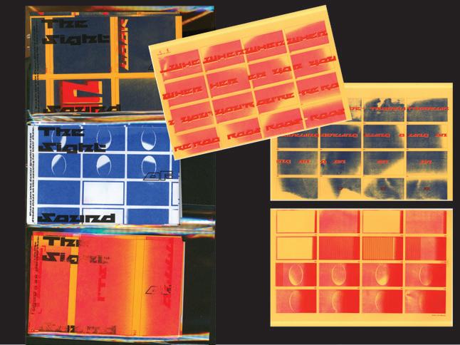
@gems.by.a.gem
Years after I gave up on the work that went into maintaining and painting my long natural nails, I discovered I could order fake plastic nails on Amazon, cut them to my desired length, and paint them prior to attaching to them to my nails, saving myself hours I would typically spend painstakingly trying not to smudge wet polish. The ability to paint the nails off of my own hand gave me the freedom to dive deeper into nail art. Over the past year and a half, nails have become a more prominent aspect of my identity, in the way other people see me, and the way I see myself.
In my thesis, I explore the space between nail art and design, a sweet spot in which neither overpowers the other. Fake nails are historically an ornament worn by women. In this project, I use nails as a vessel to inform people about the often-forgotten women in graphic design history. To share their stories, I’ve created a series of nail sets, packaging, and a website inspired by these women. When I set out to begin this project, I quickly realized how difficult it is to find information about women designers. For this thesis, I’ve made nails that not only look great when worn, but also allow these women to receive important recognition.
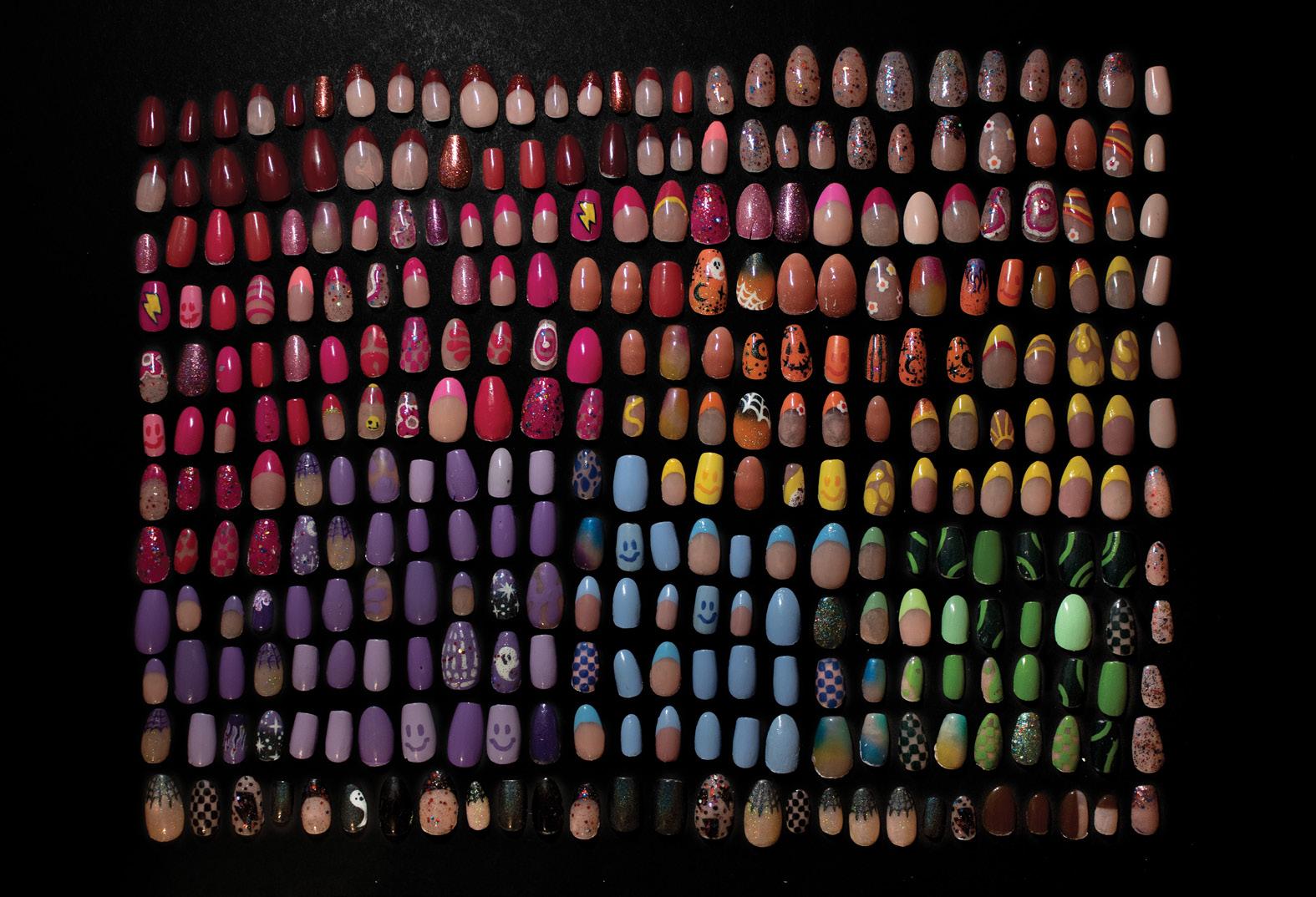
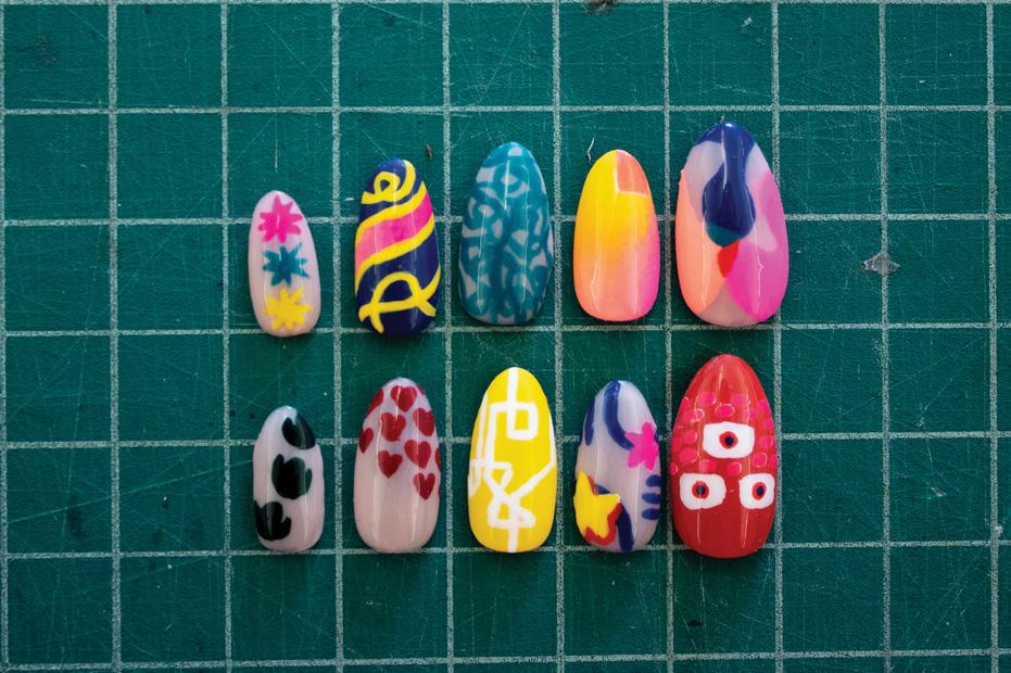
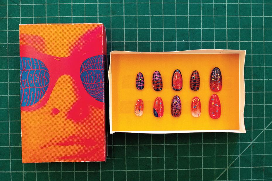
juliaso.design
@jso.design
Throughout my life, I’ve always had a problem with the question “where are you from?”. As a Chinese American who spent 15 years in Japan before moving to the United States, I often struggle to define my identity both culturally and geographically. Although most of my childhood was spent in Japan, I didn’t learn Japanese until middle school and always felt like a foreigner in my own home. Despite this, I developed a strong connection to Japanese culture, which continues to shape my sense of self.
Reflecting on my experiences, I became interested in the concept of “place identity,” which was first introduced by environmental psychologist Harold M. Proshansky in 1978. Proshansky defines place identity as the complex pattern of conscious and unconscious ideas, feelings, values, and goals that make up an individual’s personal identity in relation to the physical environment. Inspired by this idea, I decided to explore the relationship between space and identity through craft using urban architecture and maps to create a place identity installation and branding project.
Inspired by Tokyo, San Francisco, and other places I consider home, I created a series of visual maps highlighting my personal and cultural connections to specific geographic locations. By dissecting the unique urban traits of each place, I aim to recreate my image of home and explore how my sense of self is shaped by the spaces I inhabit. Through design, I aspire to celebrate the unique characteristics of different people and places and ultimately deepen my understanding of my own identity.

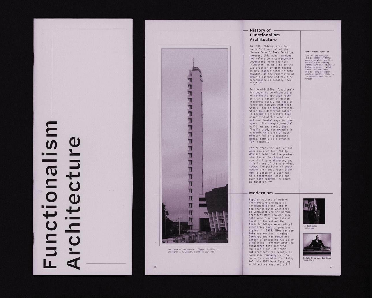
Who do you consider to be your people? We are often willing to inconvenience ourselves to benefit these individuals in some capacity, and yet, it can be more difficult to extend that same service beyond this small group. That said, I believe that I cannot remain indifferent to the concerns of those around me, and this conviction inspires me to utilize my position as a visual artist to design and facilitate positivity with people at the center. Thus, I have coined this concept of being “for people'' within the context of service as pferda (/fur • duh/). To be for the people requires that one sets aside ego, collaborates, serves, and listens in order to activate the awareness, change, creativity, and empowerment of others.
The paradigm of Pferda People in a design context is rooted in the disruption of the traditional top-down hierarchical relationship between designer and audience, shifting the designer’s role to that of a facilitator who, in turn, invites the audience to contribute to the final outcomes of creative labor. My thesis utilizes design as a tool to educate, catalyze conversation, collaborate, and express the experience of Boston University students. This is accomplished by surveying a large group of my peers about their concerns, followed by the creation of a catalog that documents those concerns, and merch that communicates them in a digestible manner. To host these projects, I curated a collaborative photo collection, gallery of stories, and website. Pferda People has the potential to expand outside of Boston to create a collective of individuals all over the world that believe in utilizing their abilities to serve, collaborate, and tell stories for the betterment of our communities.


sambidesign.cargo.site
@sambidesigns
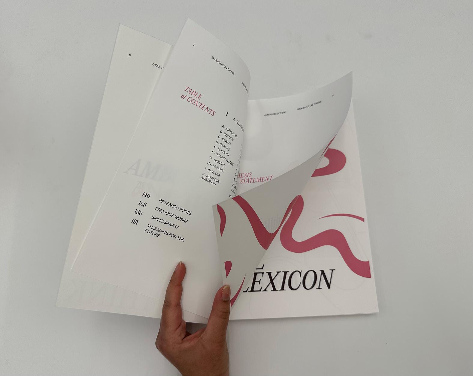
Before me, sits a shoe. It’s flipped over, resting atop its laces. To anyone else, it is not something that would elicit a strong feeling. To me, seeing the shoe in such a state triggers immense discomfort. I immediately go to turn it back over—the act alleviating the bothersome feeling that something bad will occur if I don’t.
We call them superstitions: these actions we take to ward away wicked energy or lure in good fortune.1 Derived from mythology, astrology, fables, and history, we follow these rituals consistently, as they embed themselves in our behaviors and identity. Superstitions are unique to us and the cultural environments we were raised in. Psychologically, the impressionable part of our brains, wired to mirror the behaviors and beliefs of others, influences the superstitions we believe in, sometimes without reason.
I have obtained several superstitions throughout my life that have significantly influenced my identity. Why do I follow these rituals? What are their origins? Rituals Written in the Stars explores the various facets associated with superstitions and categorizes them into two concepts: the psychological and the supernatural. This project uses design to showcase a visual system that breaks down the complexity of superstitions into their simplest forms. Through this system, I hope to tell an abridged story of my own identity.
By unveiling these superstitions, I aspire to encourage others to share their own rituals with me, so that we can embrace and explore this shared experience together. I want to use this chance to not only understand myself better, but to offer an opportunity to facilitate a conversation with those who also believe in the power of predisposed fate and the ascendancy of stars.

User interface (UI) design might not be the first thing that comes to mind when you think of video games, but it’s a crucial element of game design that can make or break a player’s immersion. Immersion refers to the state of being fully absorbed in an experience, and in the context of video games, it is a measure of how much the player feels like they are a part of the game world. Effective UI design enhances player immersion by reducing distractions and allows the player to focus on the game. These designs help to create a seamless connection between the player and the game world. UI should not only be functional and intuitive, but also aesthetically pleasing and engaging, thereby enhancing player immersion.
H:eaDSuP explores the intersection of UI design and game design, with a focus on the principles and techniques used to create immersive and enjoyable player experiences through effective UI design. Deliverables include, but are not limited to, design prototypes, an interactive prototype, and a set of design guidelines. Testing usability and exploring different design possibilities can help determine what works and what doesn’t. Soliciting feedback to better understand what aspects of the UI design are confusing or frustrating helps to make changes to improve the overall game experience. User interface is one of the most under-appreciated parts of game design and should not be undervalued; it has a tremendous impact on the way a game looks, works, and feels.
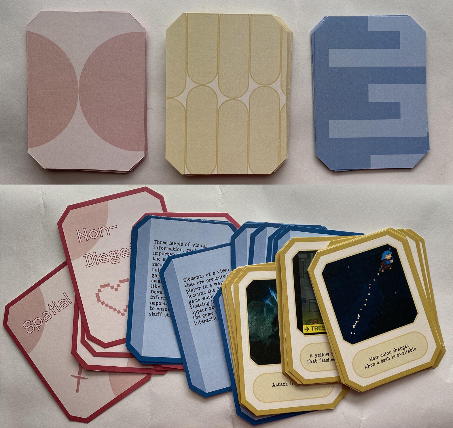
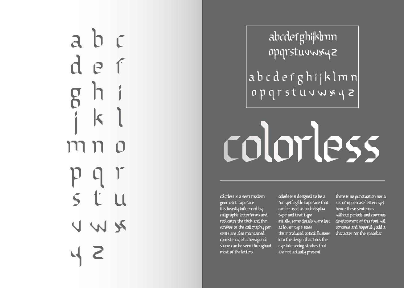
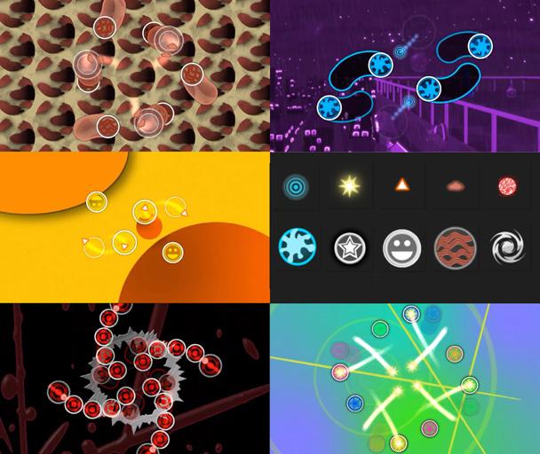
laurawagner.cargo.site
@wagnwheel.art
There are few areas of my life and design practice, which have not at some point or other, been ruled by a binary system1 with solid divides. Dichotomies1 like analog or digital, intention or spontaneity, textual content or visual approaches are quite similar to dichotomies such as artist or academic, visible or invisible, and male or female. However, I feel that the areas between and beyond these categorizations are worth pursuing: the multi-media, the non-binary, and the embracing of imperfections.
How to Break the Machine pursues methods that are fundamentally built off mistakes and misregistration, including glitch and scanner art as well as risograph production. I embrace these forms’ potential for disruption to explore what it means to live in spaces between the two given options. To live in these spaces is to recognize and to reject the binary. In this way, art and design practices that embrace mistakes and spontaneity allow for a fundamentally nonbinary identity and existence.
My work embraces a publication-based approach with a narrative structural bent. Patterns such as a three-act structure or Joseph Campbell’s Hero’s Journey can be utilized far beyond linear storytelling and serve as bases for my publications’ frameworks. Infographics, layout design, and elements of visual narrative influence the format, while design theory and criticism in conversation with existing gender theory influence the content. Finding a balance between narrative and informational approaches to content is key for engaging my skills in literary analysis, writing, and illustration through a design lens that is both creative and curatorial.
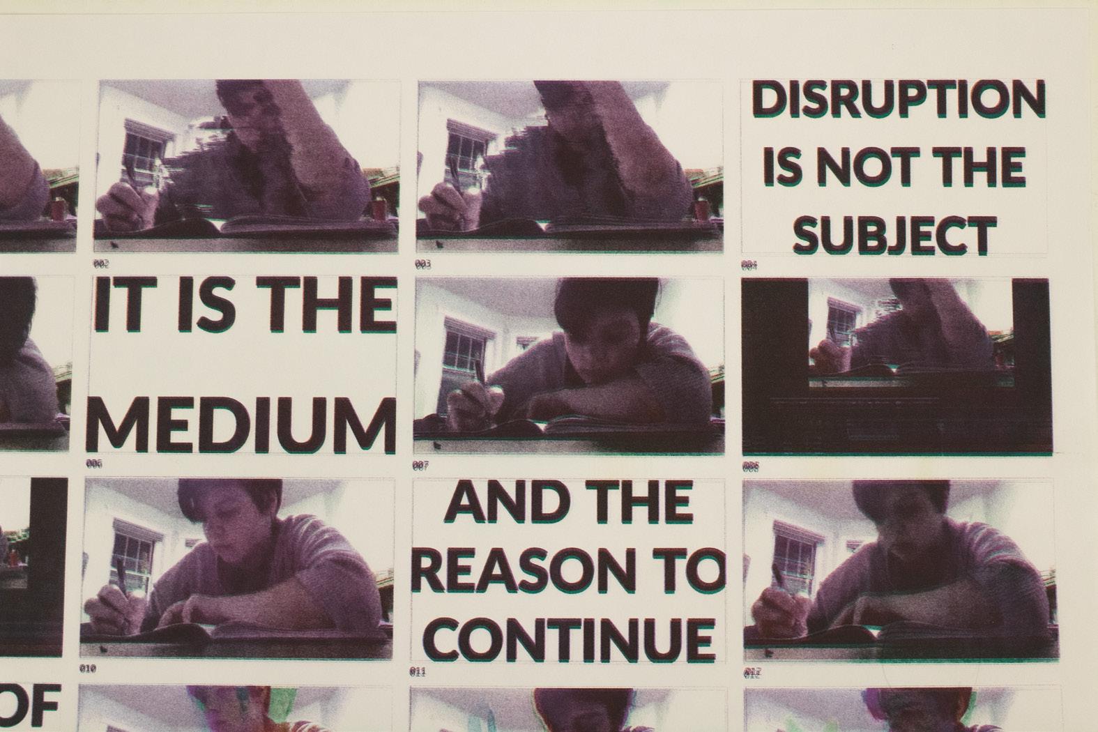
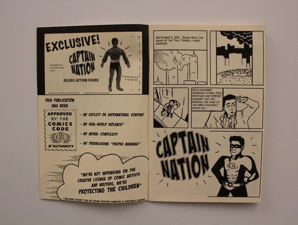
@tylerwang999
Looking back to the last century, I always wonder what we could adopt from history. The history of Northeast China is buried under dust. Shenyang, where I was born and raised, was left out on the frozen land of Northeast China. Like Detroit, Cleveland, Pittsburgh, or any similar cities you can name, their glories have been long forgotten by the people they have helped and the people they have raised.
Is the answer truly always the same, just like thirty, forty, or fifty years ago? Is the end always truly the same? Do we always find ourselves helplessly standing in front of the ruins of our hometown? With the emergence of the Rust Belt and the fall of the Northeast, how could we avoid these tragedies repeating themselves? What pushes younger generations to leave the land that ties their background and identities; for those who choose to stay behind, what are they thinking?
To answer these questions, I used speculative design to explore the many possibilities. The speculative design does not solve the problems, but rather connects the past, present, and future to encourage people to think. Design is not significantly related to commercial or practical purposes; however, it can be both theoretical and critical. People need to realize how cities like Shenyang fell and what these cities have sacrificed for the nation and its people. By investigating these people and their history, I aim to make the project more representative of me, my hometown, and anyone who can find empathy, and ask people genuinely reflect rather than seek simple answers.
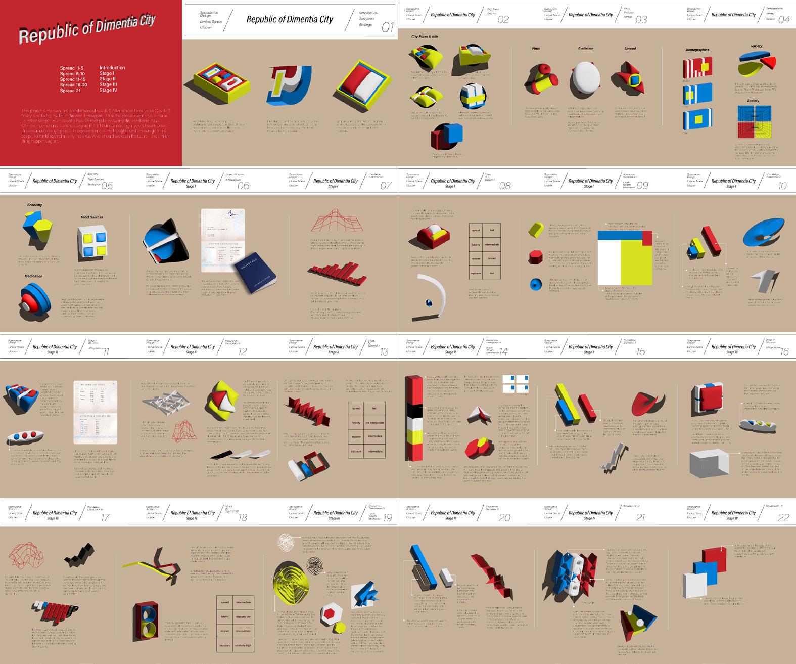
@cypherwang_designer

Genes are self-replicating units that exhibit a drive to propagate themselves and their traits, making them inherently selfish. This feature has long been a source of conflict between these genetic entities and the human race. For over 5,800 years, humanity has struggled with the impact of genes on their behavior and personality. It is through our genes that humans are endowed with a proclivity toward conflict.
The prevalence of conflict in human society is a pervasive and complex issue. At its root lies the question of whether conflict is inherent to human DNA. From the beginning of our existence, we have faced conflicts with nature and waged battles with other creatures to ensure our survival in the natural world. Nevertheless, it is the conflicts that arise between humans themselves that have proven most baffling. Why do tribes that have never encountered each other often engage in wars rather than collaborating? In spite of these conflicts, humanity continues to progress and evolve.
One major cause of conflict is the scarcity of resources required for our well-being. This lack of quality resources frequently leads to wars and disputes over land, water, and other necessities. My thesis aims to provide a deeper understanding of the various causes of conflict. I explore different examples of conflict, from wars and significant events to the very building blocks of life itself—genes. My aim to discern what kinds of conflicts are beneficial and which are harmful.
To achieve this aim, I employed 3D design to create a visual language that describes the different types of conflicts and presented these ideas in a book. This book delves into the inherent flaws of genes and how we as humans must confront our genetic imperfections and contend with our desires.
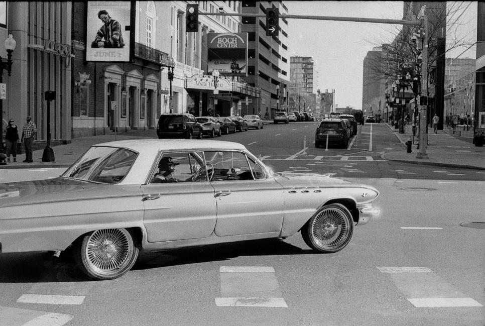
kexinzhang.cargo.site
@kxnzhng
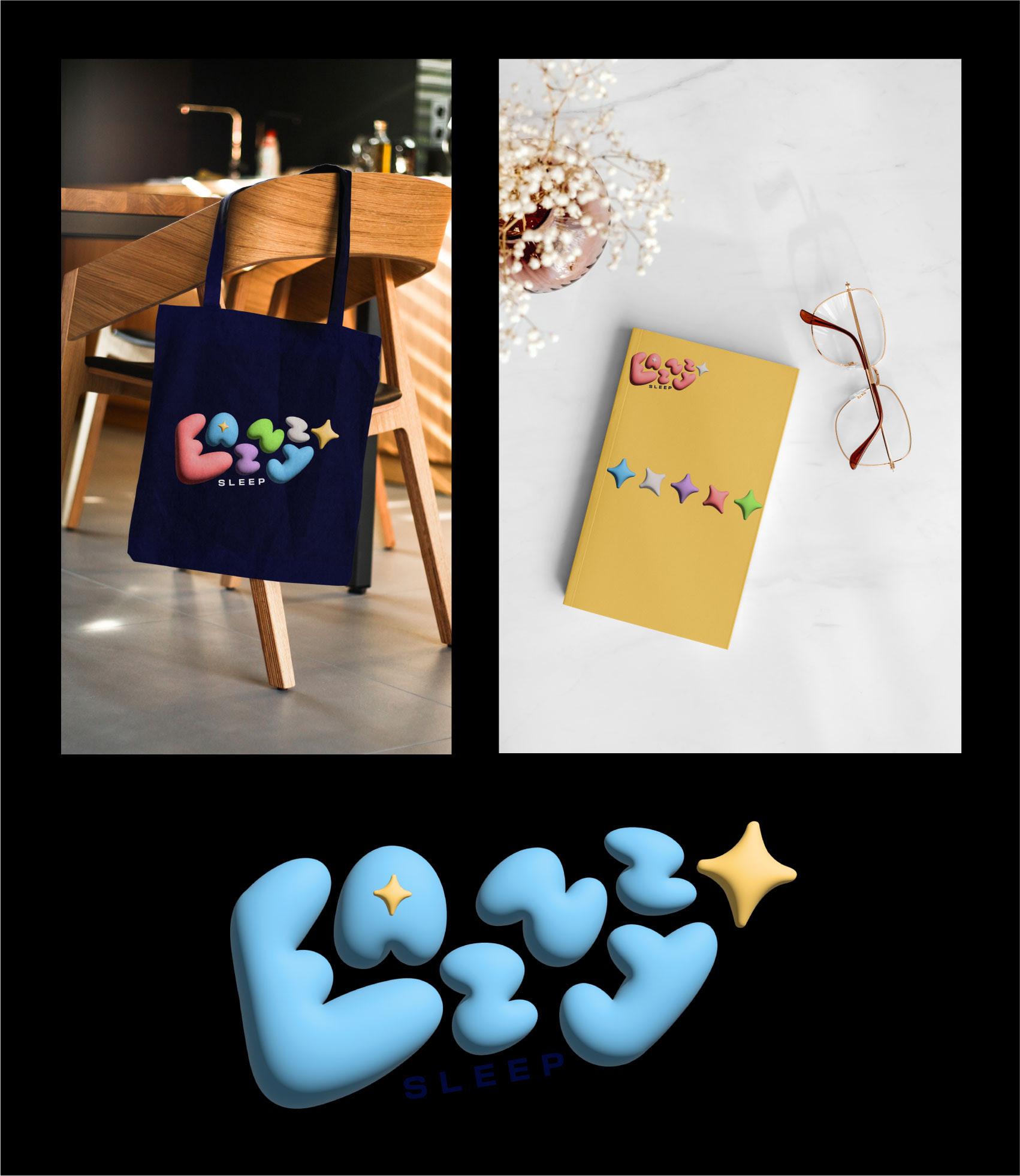
The onset of the COVID-19 pandemic in early 2020 was challenging on many fronts, especially in early education. Faced with these unprecedented circumstances, schools scrambled to figure out how to keep children safe while still ensuring that students were receiving quality education. Despite best efforts, schools still experienced multiple waves of outbreaks. With a more thorough understanding of public health, the importance of vaccines and how they work, may have helped to lessen the initial panic and buffer the spread of the virus. I plan to pursue a career in medicine and hope to utilize my designs to spread awareness and prevent disease transmission.
ImmunoBuddies is an educational kit for elementary school-aged children that provides kids with a basic understanding of the recommended vaccines for their age group. The information included in the kit takes on various forms, which help to reinforce knowledge and facilitate learning. The picture book and stickers present the information as text paired with visuals during the children’s first exposure to the material. The collector’s cards introduce the element of play into learning, and the posters strengthen long term memory. All parts of the kit follow a visual identity system that uses bright colors, intriguing forms, and fun characters to invite kids to learn. By explaining complex medical concepts in more digestible bits and pieces and relating these ideas to analogies that children will understand, ImmunoBuddies builds children’s knowledge of health topics and disease prevention. This thesis initiates a conversation between children, their body, and health at a young age, preparing them to make informed choices about their care in the future.
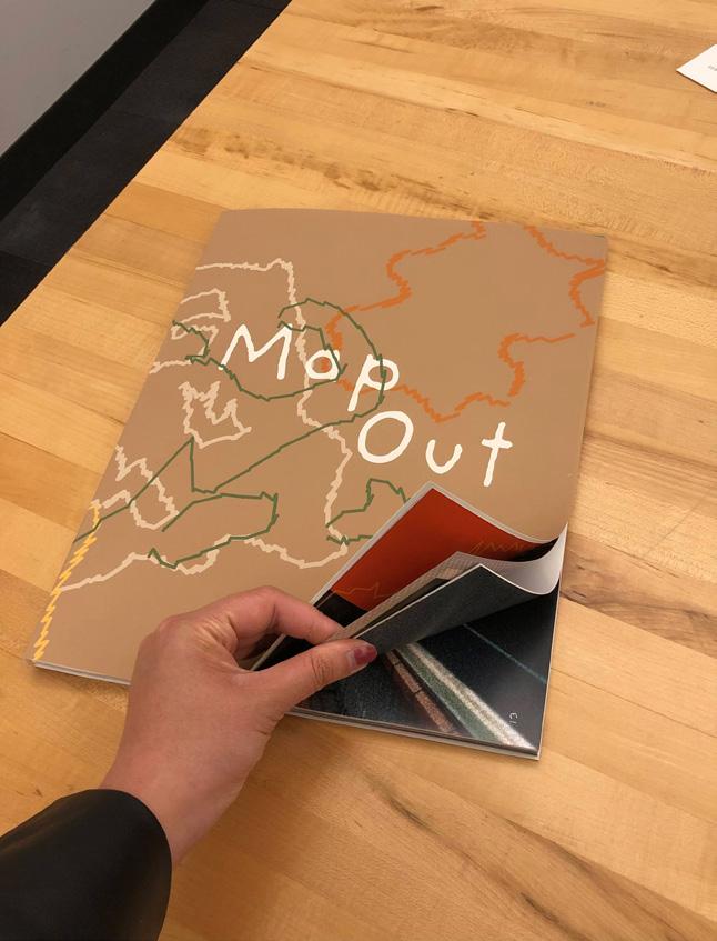
The School of Visual Arts at Boston University College of Fine Arts prepares students to think seriously, to see critically, to make intensely, and to act with creative agency in the contemporary world.
Established in 1954 to combine the intensive studio education of an art school with the opportunities of a large urban university, Boston University School of Visual Arts is committed to educating the eye, hand, and mind of the artist. We believe that students become visual artists when education, practice, and awareness of historical and contemporary context enable them to think critically and imaginatively, and to express those ideas with skill and conviction. The professional artists and educators that make up our faculty lead small classes of highly motivated students.
The Foundation program is the bedrock of our undergraduate program, and emphasizes a mastery of traditional skills and visual problem-solving. All BFA freshmen begin with drawing courses and continue foundation studies in painting and sculpture before they choose a studio major. MA programs in Art Education, Graphic Design, Painting, and Sculpture focus and elaborate professional studies. Studio electives expand and enrich all graduate and undergraduate Visual Arts major programs.
Courses in studio art, art history, and the liberal arts and sciences taught by the nationally and internationally recognized faculties of the University's 17 schools and colleges provide the intellectual framework for our curriculum. University-sponsored international study programs broaden the Boston campus experience and encourage global awareness.
Boston provides a rich cultural resource for our School. The city's renowned museums and musical organizations, art galleries, theaters, libraries, and other universities, colleges, and schools offer exhibitions, concerts, theatrical performances, and lectures of the highest quality.
Our CFA community has built a culture of supporting one another and seeking challenges, which has shaped our work as graphic designers, printmakers, painters, and sculptors.
All undergraduate visual arts students start off with a strong foundational curriculum that prepares us to create through our respective mediums with a deep understanding of the principals that make art, art. Edifice plays on the idea of the home and community that we have at the College of Fine Arts, and the foundation that has been laid for our education, careers, passions, and futures of each individual student.
Our appreciation for the foundational curriculum that brought the SVA students together led us to create a visual language that emphasizes the hands-on experience of creating art. Our visual language of the 2023 BFA Thesis Show involves paper house elements, bricks, and solid/dotted lines.
Through the abstract imagery of cut outs of a paper home, we recall an appreciation for craft and unique dimensionality of each student’s journey at CFA. As much as we have grown as artists, we have also witnessed our educational institutions physically grow with us, with the renovation of the College of Fine Arts, the transition from testing facility to gallery in 808, and establishment of the Center for Computing and Data Sciences building. As the buildings transformed, we also transformed culturally, communally, and intellectually.
We are inspired to ask bigger questions and motivate one another to reach goals that once seemed impossible. As our undergraduate education comes to an end, we go off into the world with the foundation that we have set, and remember BU CFA as a place to call home and fellow peers to call as family. We want to present our works not only as individual artists, but as bodies of work that are built off of one another, forming a unique whole. The brand identity of “EDIFICE” will emphasize the unique qualities of each artists’ thesis as a building block to creating one solid home.
EDIFICE
BFA Thesis Show
May 9 – 19, 2023
Boston University
The Faye G., Jo, and James Stone Gallery
808 Gallery
Painting
Graphic Design
Printmaking
Sculpture
TYPE
Greycliff CF by Connary Fagen
Anthony by Velvetyne Type Foundry
CirrusCumulus by Velvetyne Type Foundry
DESIGN
Mina Chung, Hannah Hong, Jacqueline Mang
FACULTY ADVISOR
Claire Bula
EDITOR
Danielle Weindling
PRINTING
Kirkwood Printing, Wilmington, MA
© 2023 BU CFA School of Visual Arts
855 Commonwealth Avenue
Boston, MA 02215
bu.edu/cfa/visual-arts (617) 353-3371