
Boston University
College of Fine Arts
School of Visual Arts


Painting
Printmaking
Scultpure
Graphic Design


Boston University
College of Fine Arts
School of Visual Arts


Painting
Printmaking
Scultpure
Graphic Design
I am pleased to introduce the Boston University School of Visual Arts Class of 2024 Bachelor of Fine Arts thesis catalog featuring work by 33 students graduating from BFA programs in Graphic Design, Painting, Sculpture, and Printmaking. The Class of 2024 have faced enormous cultural change during four years as undergraduate students. Due to the pandemic they have adapted to different ways of working together, but creating in the face of so much flux seems to have heightened these students’ attentiveness to manipulating images and materials in new ways. In these pages the students reflect on the importance of play and imagination in the studio, and a sense of experimentation is evident in their thesis work. The BFA Thesis branding team of fellow seniors reflects on the visual identity they designed as expressive of this group who ‘learned to go with the flow’ as they “entered school in a hybrid of digital and physical space,” such that “their ability to adjust mirrored the fluidity of water.”
Through their work this group of talented young artists and designers also invite us to become aware of how we engage with the flow of time. They dig into the past - working with archives, considering visual traditions from home countries, or making paintings of objects - including photographs - from their parents or grandparents’ lives. They also experiment with recent technology, exploring the impact of digital worlds on human experiences, utilizing AI, and speculating about the future through their experimental processes. The exhibitions in Stone and 808 Galleries at CFA create a sense of flow for the viewer between individual experience and larger social questions; we encounter a stream of sources from the world manipulated in unique ways by each student.
This is a very special group of students and faculty mentors who “transcended dimensions, flowed between learning spaces, and overcame obstacles in their new environment,” as the BFA Branding team writes. On behalf of SVA I give a truly heartfelt thank you to the talented thesis identity team: Eva Brown, Jessie Choi, Drew Demeterio, Vincent Liu, Sarah Nam, Campbell Morin, Tiffany Taw, Jimi Taiwo, and Wendy Tang. Thank you to Claire Bula for mentoring these students through her Branding course, along with important mentorship of BFA Graphic Design seniors by Assistant Professor Mary Yang and Assistant Professor James Grady in 2023–24. SVA is so grateful to the studio degree faculty who worked closely with seniors in BFA Painting, Sculpture, and Printmaking on their thesis processes, including Associate Professor Lucy Kim, Lecturer E.E. Ikeler, Associate Professor and BFA Sculpture Chair Greg Gomez, Associate Professor and BFA Printmaking Chair Deborah Cornell, and Assistant Professor E. Tubergen. Thank you to BU Art Galleries Director Lissa Cramer for helping prepare our students professionally, along with Programming and Media Manager Nerissa Cooney for her mentorship of SVA’s thesis processes with important thesis support by Administrative Coordinator Andy Wilson and Technical Associates Gus Wheeler, Josh Brennan, and Jesse Finkelstein working with Operations Manager Logen Zimmerman, as well as curator Beth Kantrowitz. Thank you to Beth Zerega and Jessica Caccamo for their work with these students over four years. In my last year as SVA Director, I am grateful to have led growth - in addition to steering through much change - through collaboration with the wonderful faculty and staff of SVA along with resources from CFA. I am grateful to the Class of 2024 for their dedication and ability to invent (and flow) in the face of disruption.
Dana Clancy
Director, School of Visual Arts
Associate Professor Art, Painting
Mason Burns
Ryan Dempsey
Kennedy Harwood
Sydney Huston
Dilyara Kuanysheva
Caroline Lander
Hannah Roderick
Shane Specht
Ruby Yoo
Angela Pistilli
@artistmasonburns
The still lives that I paint have been set up inside my studio with items taken from my object library gifted to me by my grandmother. My grandma was a photographer all her life and often crafts arrangements of things for me to paint. These compositions consist of natural, ephemeral objects that she finds walking around her small Rhode Island town. These quiet arrangements symbolize the beauty that she observes in the local environment. I oscillate my scale with these images from either small and delicate to large and unavoidable. This scale shift often pertains to the size of the object I’m painting. I choose to work on a nearly lifesize scale to place these objects in the room with the viewer. This conversion of organic material onto the canvas turns these objects shrine-like, a removed version of worship to my grandmother. Glimmering, perfect, and untouchable, I want these objects to sit in a world of their own that ignores the way time would normally decay them.
My work is an autobiographical and fleeting take on still life and portraiture. I mainly paint about myself and my grandmother in a diaristic form, and I reference many of my grandmother’s photographs and objects she has collected over her lifetime. I work with this subject matter to impose a comparison of days and nights, the carrying capacity of memory, and what it can feel like to be young, overwhelmed, and not wanting to let anything go.


ryandempseyart.com
@ryandempseyart
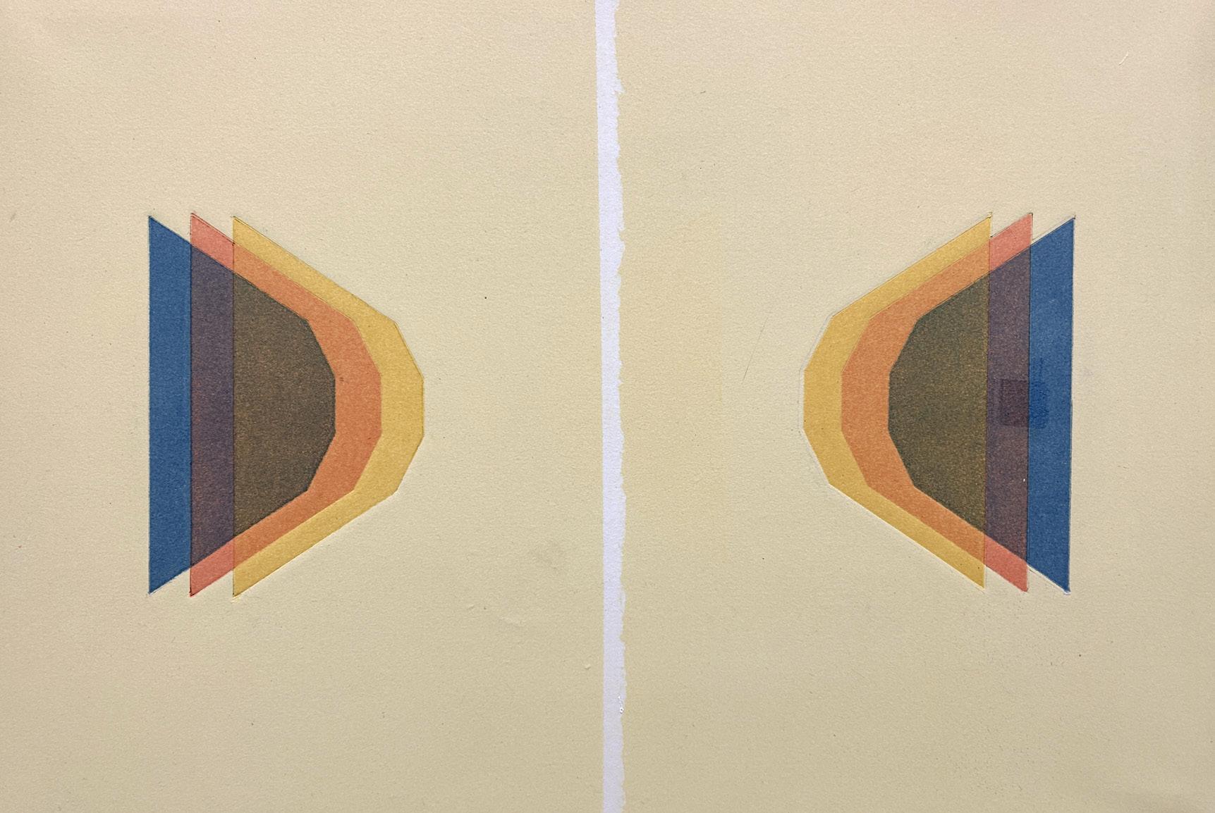
Born and raised in the suburbs of Phoenix, at the desert’s edge, I grew up with the backdrop of a warm, vibrant western light that inevitably shaped how I would see. Surrounded by painters of this phenomenon and heavily influenced from youth by various art movements out of Los Angeles that considered light specifically, color became a major concern in my painting early on. Today, my work explores the idea that digital addiction and exposure rate to blue light (avg 7 hours/day worldwide) is fundamentally altering human’s perception of real world color, and thus altering color itself. Using both paint and forms of printmaking (often joining the two), I explore color relationships between “real” or observable colors and colors that appear digitally through blue light. The bulk of my process consists of physically extracting color from both these realms through various techniques and replicating them with intense specificity. These colors are broken down to their truest chroma and juxtaposed in various ways to understand how their properties can be severely altered.
While the goal of this study is very abstract, the work carries a sense of urgency and necessity in an area that has virtually no existing research yet is increasingly prevalent. Joseph Albers said, “In an age in which increased human sensibility has become such an obvious need in all areas of human involvement, color sensitivity and awareness can constitute a major weapon against forces of insensitivity and brutalization.” Is this not more true today than ever before? In an increasingly digital world where artificiality seems to be the common avenue for advancement, could demonstrating something as simple and all-encompassing as humanity’s changing perception of color make a statement indicative of shifting reality?


kennedyharwood.com
@kennedyharwood.art
My paintings examine issues of labor and material value in “craft” objects and histories. I emulate specific surfaces like quilting fabric, wood finishes, and glitter, complicating their relative significance through concentric compositions with dynamic scale shifts. Differences in material associations are in fact distinctions of class and gender-based hierarchies, and the painted translation of these subjects equalizes them on a flat picture plane. There are limitations to what paint can convey, and while trompe l’oeil is present in both my technique and the content of the work, there is slippage between the real and the painted, between high and low, between invented and observed.
Traditions of craft are passed down in a way that preserves material knowledge and appreciation. I have inherited skills in textile making and woodworking, and I have a deep affinity for craft projects from early childhood. Bringing these approaches together in my paintings allows me to collapse multiple histories and methods into a single composition. I bring craft materials into my studio, reenact processes of play whilst making, and observe the resulting objects as still lives. Adornment and invention creep in through a series of framing devices that often point directly to the center. These compositions emphasize lineages of making where ornamentation beyond the functional is essential. The paintings assert that inherited craft traditions are extraordinary, and that the decorative and the abstract are deeply profound.


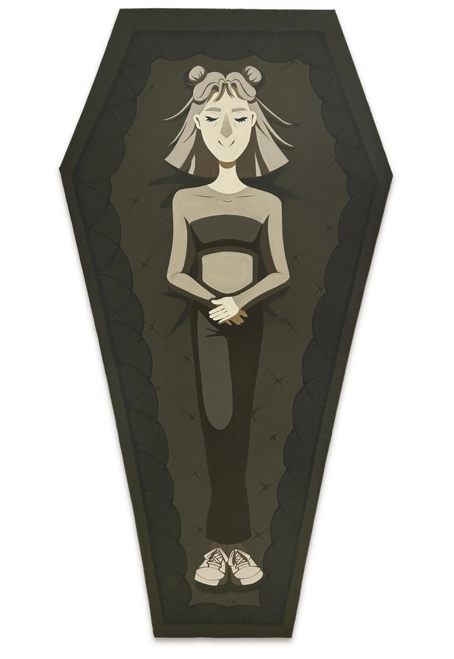
My paintings provide a way to materialize past, hypothetical, and present versions of myself. Exploring these versions of myself as characters in an illustrative style is a way to step back and see “her” for what she is, was, or could have been—no matter how cringy it may be.
An illustrative and cartoony approach to painting allows for a logical progression in character creation. As a result, I use self-imposed formal “rules” that determine how I depict these various versions of self. Noses are simplified into rhombuses, pupils into ovals, and ears into half-circles. Colors have a formulaic and dependent relationship, and cel-shading creates distinct edges between light and shadow. This simplistic imagery serves as an accessible way to relate to the painting while clearly defining each self.
These works represent a vast array of characters, and I aim to depict and appreciate each of their existences. For my past selves, I emphasize specific moments to find the humor in uncomfortable situations. The hypothetical selves allow me to indulge in “what if” scenarios by bringing them into reality as a painting and creating a tangible visualization of a previously incorporeal self. In the characters representing my present self, I am challenged to show similar levels of awareness and compassion. Through this dedicated practice, my paintings force me to reconsider repressed memories, imagined futures, and current experiences as a 23-year-old in 2024.


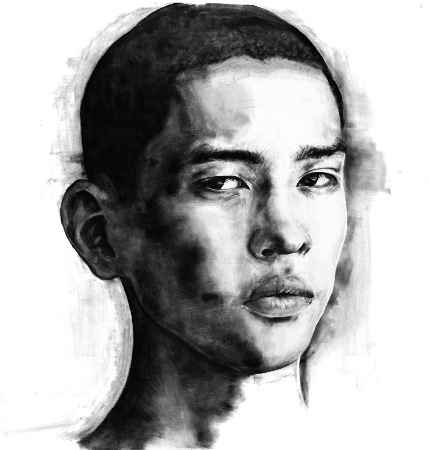
I was born and raised in Almaty, Kazakhstan, a post-Soviet Central Asian country with nomadic roots. When I was twelve, my family and I moved to the United States permanently. Since then, I have always had feelings of a cultural identity crisis, and I have tried to “mine” my way back home through my work. One way I thought about bringing myself closer to my culture is through portraiture and portraying family members and figures of the past—those whose stories have not been told but deserve it nonetheless.
Simultaneously, I share my culture with an American audience and create a piece of home around me here in the United States.
I take small photographs from old family albums, some small enough to be a passport picture, and make a large drawing of them using charcoal or pan pastel. The works are typically three by four feet in size. The drawings end up speaking to one another, creating a hall-of-fame effect when side by side. Some works possess smaller details that are indicative of the time the photographs were taken- such as my grandmother’s hairstyle or my great-grandfather’s army uniform.
Ancestral worship is an important part of Kazakh culture, so by creating these portraits, I commemorate their existence and history. It is important I share their stories of hardship of growing up in the USSR, and exhibit their lineage. These people are heroes to me.
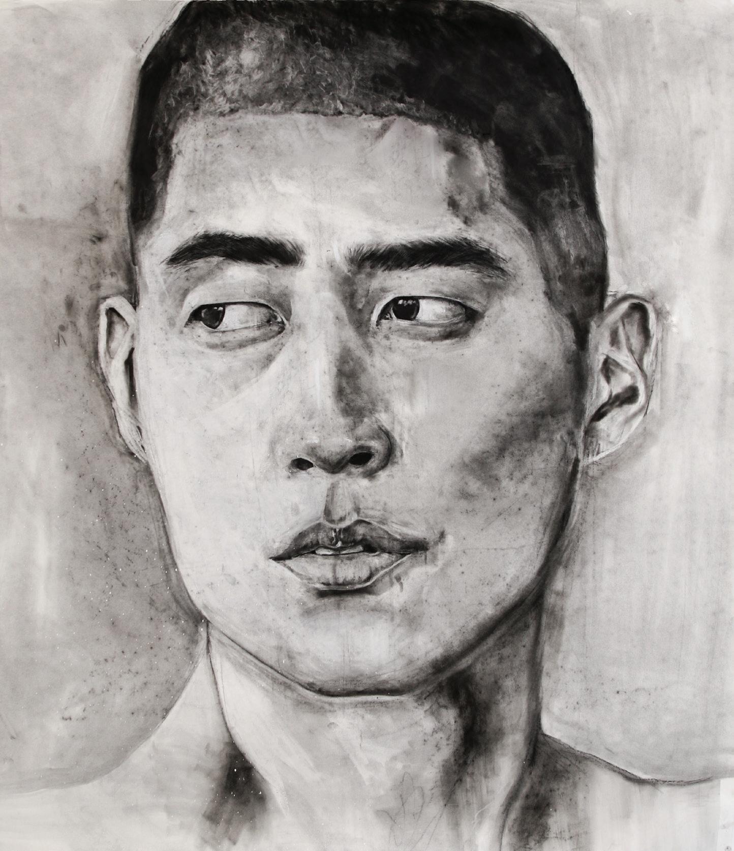
Uncle Serikzhan

“I used to live there” is often a sad phrase, used to describe a space once full of love. For me, I use painting as a way to document places I have lived or visited to reckon with the memories, objects, and people attached to space and place. This typically manifests itself into large colored pencil drawings on paper with a dark acrylic wash that show the space which I am currently inhabiting. Through tight, repeated marks I construct the space that is my room, the windows, the bed, my posters, flowers from my parents, or the squishmallows I cuddle every night. Everything in my room is important and has meaning and significance to me. I consider my paintings not only a declaration of love to the space I inhabit, but also a declaration to the act of painting itself. Built upon the notion that care and attention are deeply related, these paintings are about looking, labor, and love. My objects, the window I look out everyday, these paintings are a declaration of my existence, it is my portrait, I am the ghost who paints them.


@visionsofher
I work within my own physical and emotional experiences to create worlds that are not like our own, to highlight the sensitivity of time that comes with being human. Accompanied by an exploration of saturated and unnatural color, my pieces become an adventure into my conscious and subconscious mind. Spending so much time in my own head, I naturally take a diaristic approach to art making, one that is not always imbued with truth, but rather an uncanniness not always found in day-to-day life.
My work serves as a vessel to discover the ways in which I am thinking and moving about space, exploring in-between moments remembered and forgotten, invading the concepts of self hood and vulnerability. I use acrylic and colored pencil together as modes of invoking certain feelings from recollections, mine or someone else’s I am not sure, like a longing for what once was. I view all of my work as a self portrait, whether it be of me, of someone else, or of an inanimate object. Everything has been touched by me, these feelings felt by me, making a body of work that is the essence of myself.
Without these memories, my garden of work would be dry, bitter, unkept. They are an integral part of me, watering and nourishing what I create. I don’t plan ahead, I throw the seeds and let them grow in whatever way they want, as they twist and turn and spread and reach far beyond an ending I pictured, surprising even me with secret blooms of hidden parts of myself. I paint what I love, the optimal conditions for the sweetest yield.


imbeingwatchedimbeingwatched imbeingwatched, 2023.
@shanespechtar
I am often arrested by a particular scene that I see; a mountain, a car on a rainy street, or even just a person sitting at a bus stop can snap me out of the routine of my life. In moments like these I am suddenly overcome by a sting of mindfulness and joy for the natural world, but these moments are mostly forgotten as I forge on with my day.
Even if I remember that moment until I come home, I probably won’t remember it tomorrow, or next week, or next month. It is for this reason that these fleeting moments are so bittersweet. I might recall the emotions I experienced during the second or two that I stop and think, but they grow duller and duller with time, and somehow a photograph never really does them justice either. If you’ve ever tried to spontaneously photograph a blood moon with your iPhone, you’ll know how inadequate photos can be.
The goal, then, of my paintings, is to make these moments permanent. I want to seize them, examine them, and translate them into an image. So what begins as a small flash of contemplation for me becomes a small painting, anxiously rendered before the light changes, then a larger one, which can, in a way beyond a photograph or a written description, authentically translate and share some of those pinpoints of ephemeral joy.


I explore the relationship between isolation, escapism, and art in today’s digital age. What makes someone seek life in fiction, through the screen and in pixels? The pursuit of distraction and comfort via digital media drives many to self-isolate—some for a lifetime. And yet, these stories and creations that serve as unconditional companions can also be considered works of art. Like the often-solitary practice of artists, I find the social isolation of new media compelling. To exist in such a state is a contradiction itself: to be simultaneously connected to the world and not.
Growing up with the rise of digital media, it feels like some part of me has never grown out of living in these virtual worlds. These experiences have made me. The websites, games, and characters that defined my childhood have become some of my most lasting friends and mentors. What I create delves into those digitized experiences, forging work that realizes what was once imaginary. Life within a screen, spilling out. Friends, connected only through a fictional intermediary. A dissociating attachment to what feels safe.
Using oil paint and canvas, I mix digital languages with imagery from the art-historical canon. I force what was once an escape into reality, and sit with it. In paint, I build a home for the characters, stories, and feelings we consider secondary. Through my paintings, they become real. What has existed on the screen, in my mind, and in my own room, now exists in the here and now. I make art that I want to exist.

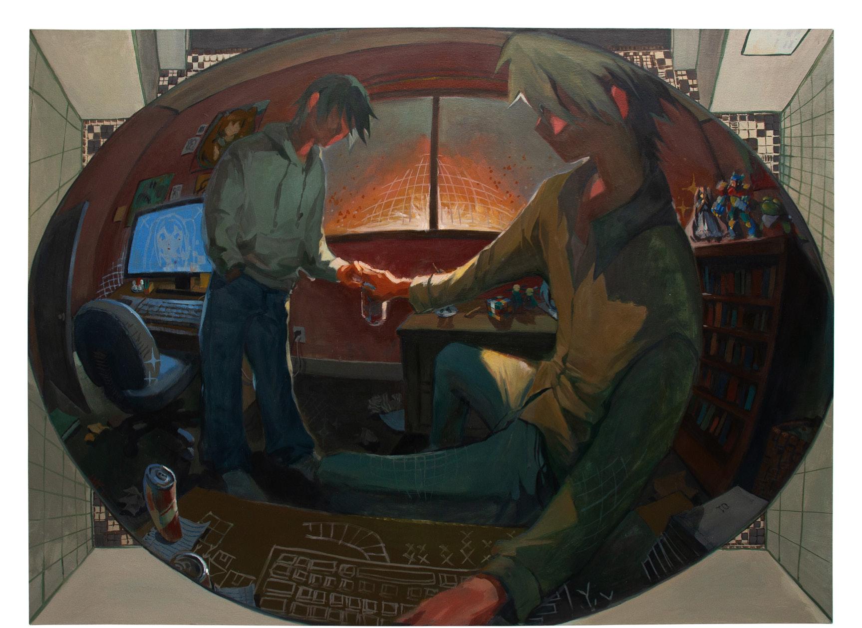

@artbyangp
In my portrayal of the female figure, I take an approach to the body that deviates from gender norms. My compositions are strategically crafted, mirroring the careful consideration of the figures’ bodies. It is important that the lineage of the female nude be challenged through deliberate posing and expression, along with distorted proportions. Chopping wood, hunting, or even lounging, the women in my work perform with unwavering confidence.
The forest is a space that feels like it continues on infinitely. The figures aren’t restricted and the suggestion of a ceiling disappears. The outdoors is also a way to contrast real life elements with physically impossible bodies. That way, it is feasible that these women might actually exist–foraging, working out, or having fun.
Within a history of the idealized female form, my distortion of the body appeals to a personal standard of underrepresented beauty. This perspective has been mostly shaped by my experiences as a female powerlifter and the typically “unfeminine” characteristics that come with weightlifting. However, large traps or biceps can only be obtained with hard work, discipline, and dedication. My work celebrates this truth, and is an appreciation for the beauty in strength.These works only skim the surface of what’s possible in a world where women always win.


@artbyangp
In my work, I am interested in portraying the female figure, taking an approach to the body that deviates from gender norms. My figures display inflated muscles and distorted proportions to evoke a sense of exuberant strength. Inspired by my own passion for weightlifting outside of the studio, I want to spotlight muscular body types that defy the standard beauty convention. By doing so, I revise the ongoing narrative of how the female nude is portrayed throughout history.
The compositions of my work are strategically crafted, mirroring the careful consideration of the figures’ bodies. It is important that the lineage of the female nude be challenged through deliberate posing and expression, along with distorted proportions. Chopping wood, hunting, or even lounging, the women in my work perform with unwavering confidence. Their actions, which are sometimes supplemented by a weapon, exaggerate their physical strength and power.
Through printmaking specifically, I am able to formulate complex narratives to make my message heard. The expansive medium of etching allows my prints to push and pull. In my practice of using many techniques on one matrix, a soft diffusion of light butts up against hard edges, smooth plate tone is cut by texture, and hard lines oscillate between soft marks. Given the complexity of my imagery and narrative, the prints demand an intricate blend of techniques to successfully convey them. In this carefully constructed world, women always win.


My art tells my story, channeling my emotions, vision, and experiences through various media. Visual art has always been the language through which I feel most comfortable and confident expressing my narratives. To me, “art” is a free-form, boundless, and organic term—the marks I make and the imaginative characters I create give form to intangible and complex thoughts and feelings. Through my work, I aim to share my perspective, seeking a connection with those who share similar thoughts and understandings. I hope my artworks can provide consolation and healing to the hearts and minds of those who experience them. My practice begins with honesty and a desire to overcome my tendencies toward overprotection, doubt, and perfectionism. I set aside these inclinations in art, adopting an open mindset, embracing vulnerability, and accepting every process and mistake as part of my creative journey. Art is a medium to record and heal, with each step meticulously crafted by hand. My art is fueled by the challenge of facing inner turmoil, which often results from sleepless nights and internal criticism. I draw inspiration from my lowest points in life, transforming pain and shadow into messages of hope. Through my art, I confront my sadness, sometimes masking or hinting at it through fictional characters. These complex, unexplainable images and emotions find their form on paper. Technique, medium, style, and color are some of the variables I explore in my work. These elements may shift multiple times throughout the creation process, each alteration driven by how best to support and convey my message. While each art project is unique, I create connections through recurring natural elements, animals, or characters. I am drawn to printmaking for its diversity of techniques, from etching, monotype, and silkscreen, to digital, lithography, and relief. As an artist who thrives on hands-on creation and the meticulous crafting of delicate images, printmaking is an ideal medium.


@theartofbader
My method of making adheres to a subconscious flow of thought and feeling deeply rooted in a musical soundscape. As it cycles through my mind, it takes on diverse forms inspired by a variety of musical artists’ lyrical world-buildings and sound palettes, dressed in a plethora of symbolic references emerging from mythological, theological, and biological sources.
My work is an imprint of my soul, a macroscopic display of sensuality always in flux, and an exploration into my convoluted experience with gender through a visually rich lens. My media is sculptures translated into recorded movement in space over time, referred as “sculptural film”. I envision short form musical videos inspired and organized according to a chronology of transcendental instances in my life, acting both as self-sufficient sculptures within a grandeur filmographic narrative, engaging audiences beyond the film’s macrocosm of psychophysiological symbolism and settings. In this middle space between object and interactive universe, the sculptures implore various modes of communication inside and outside of the context of film. By merging the sculptures, physical setting, actors, and pre-recorded and digitally projected footage, the sets contain their own set of associative rules and regulations separate from that of “the outside world”: a self-enclosed aesthetic system.
My greatest desire is to capture the primarily intangible and temporally capricious complexities of gendered and traumatized human bodylines. I feel as though merely materializing this deeply spiritual subject renders its emotional flexibilities dull and too concrete. By renouncing previously explored formalities which rely on essential habits of intuition, I hope to build greater flexibility, allowing themes to fluctuate along a spectrum of subjectivity. Always deferring from any definitive conclusion.
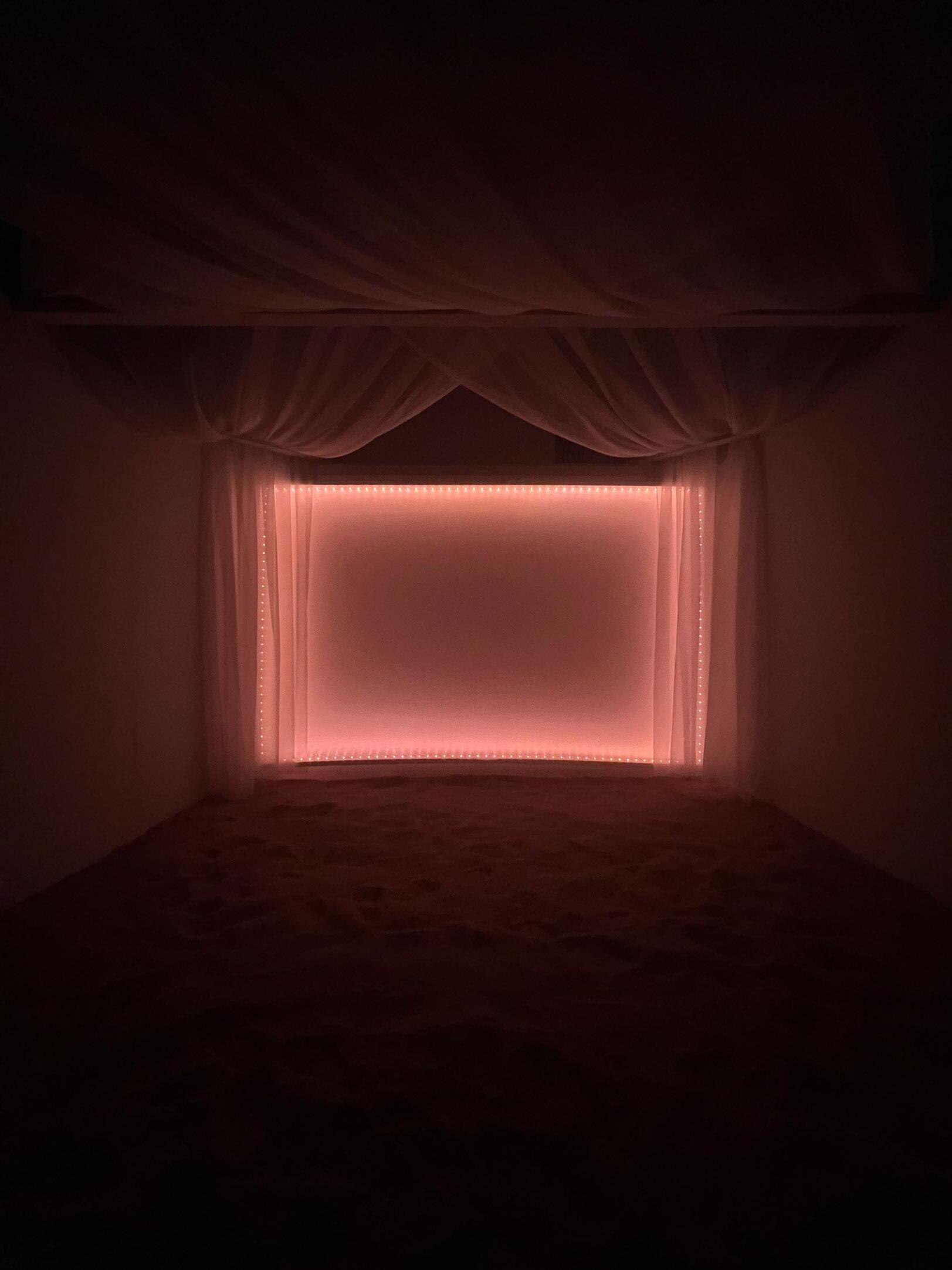
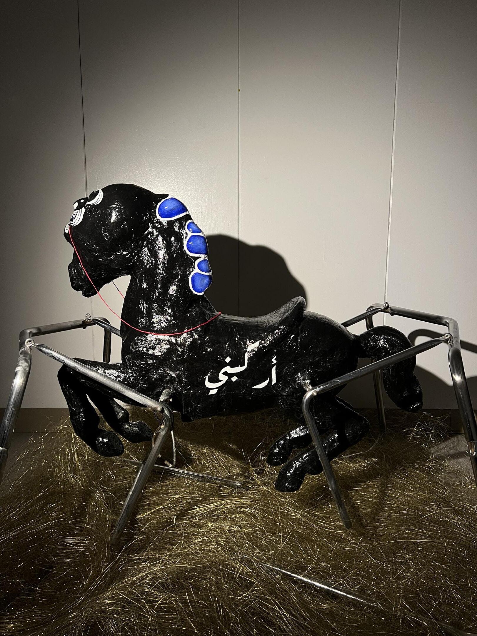

Angie Ao
Eva Brown
Jessie Choi
Drew Demeterio
Dan Galvin
Leena Jang
Joanna Jung
Sophie Jurion
Stella Lee
Anna Lee
Wanjing Li
Vincent Liu
Campbell Morin
Sarah Nam
Yunseo Aimee Noh
Kate Poe
Grace Snow
Tiffany Taw
Jimi Taiwo
Ruoxu Tang
Nolan Thompson
angieao.me
@droppopangie
“Comfort media” is a Gen Z term that can be defined as “media that one can use to turn their brain off for a bit.” In an era of web accessibility and media exposure, it can be an overwhelming task to find peace or unwind. A favorite lullaby, book, or movie can bring about a state of relaxation. I am interested in exploring “comfort media” because of its therapeutic effects. I aim to unpack why we become attached to certain media as processing mechanisms.
In some cultures, comfort media has affected spaces such as fandoms, idol fans, and cinephiles to the point of obsession. I want to analyze how fans develop a taste for comfort media and explain why they gravitate towards a certain type of media. I document the origins of “comfort media” in Gen Z and trace how web accessibility has affected our generation’s perception of experiences and memories through the “comfort items” I love: baseball caps, manga/comic books, and keychains.
There are events where people can celebrate comfort media at local expos such as Anime Boston, PAX East, and FAN EXPO. To those without strong attachments to comfort media, it may seem odd to develop a lifestyle or even career around it. Perhaps it is living vicariously through this media that people like me find contentment.
I want to evaluate the cycle of comfort media through sustained engagement. Utilizing investigative journalism, fanart, and narrative illustration I seek to produce similarly comforting methods of making (because that is just how my brain works).

Thoughts On Thesis Selected Spreads 2023. Adobe InDesign, 7.75 × 10 in.


evamb.cargo.site
@evamariion
I did not play the early 2000s game Club Penguin a lot, but what I do remember is the chatroom. I remember it in every online space I inhabited. The internet creates connections.
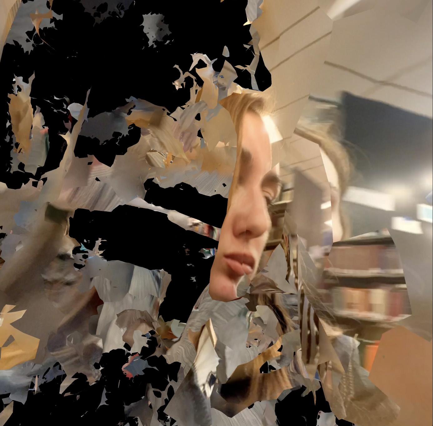
As a zillenial, I am unique. I experienced my formative years online, and yet I was introduced to the web much later than children today. Like any good daughter of the internet, I have a penchant for information and documentation. My design research revolves around turning collected information into storytelling and digital world building. Through design, I have worked towards reducing erasure, and capturing this moment in internet history.
With Internet Tenderness, I conducted design research along themes of translation, collecting, archiving, internet, nostalgia, and teeth. My thesis culminated in archival work, 3D-explorations, writing, video, and a book. I operated as both designer and design technologist. The questions that drove my research included:
What does scanning mean?
What do physical, digital, and liminal spaces look like?
Where do they intersect?
What can we learn from documenting digital media? How much translation can art withstand?
What will an archive of the present-day internet look like?


jesseugenia.cargo.site
@jesseugeniaarts
Growing up, I never considered trash as waste. I would look at waste and imagine another life for it. What was once a cardboard box would be crafted into a doll house. With just a pair of scissors and some glue, I transformed a box into a miniature castle, complete with makeshift furniture using bottle caps and fabric scraps. A simple cardboard is not just packaging ready to be thrown out; it is the foundation of endless possibilities of creation.
Repurposing trash is far more sustainable than recycling. What if artists and designers consider recycled trash as a medium? With my desire to prolong the life of single-use trash such as packaging, I propose a modular system of instructional design that guides the audience through economical ways to up-cycle, offering an alternative to trashing or recycling.
In particular, I experiment with cardboard to create an easy and accessible way to create items such as a pencil case, box, cable organizer, and stamps using a single stencil template. The designed template provides the base for multiple ways to fold and cut the desired surface material alongside an instructional manual with a thoughtful key symbol system, so that others can recreate these artifacts with limited supplies.
All in all, my work models the concept of “circular economies,” bringing new life to discarded materials. Through creating an instructional system I hope to incentivize engagement in sustainable practices by showcasing the creative potential of upcycling–one that shapes not only my childhood but also my perspective on the world around me.


@drewdrewdem
“How do you say heritage in Bisaya? Kabilin?” “Yes, but we don’t even really talk like that anymore.”
I’m proud of who I am and where I come from. I’m proud of my culture. I’m proud to be a Filipino person living in America today. But I realize, as someone who grew up in between cultures, I feel a disconnection from my heritage. Even in our language, the past seems lost in time. As I got older, I started to search for ways to connect to my history and heritage: joining a cultural organization, researching Filipino history, looking into traditional tattooing, and reading about decolonization. Ultimately, I realized I wanted to apply my interest in Filipino culture and art to my graphic design thesis.
My thesis branches from the idea that in western design, many eastern practices, and more specifically– Filipino practices, are lost and overlooked. This sparked in me when I received a tattoo that was influenced by traditional patterns, but modernized to fit the artists’ style and my own ideals. But what did I know about these influences? Where do they come from? Even in the Philippines, an alphabet and traditional glyphs are getting lost through time, as a result of colonization. Where is the Filipino arts community?
In my thesis, Kabilin, I create a Filipino arts collective that aims to gather many different aspects of Filipino arts and culture. This will be through information shares on lost Filipino practices, Filipino artist spotlights, and building a sense of community and identity in a cohesive brand. My mission is to create a space for Filipino arts to thrive and for Filipino artists to find a sense of connection and community to their heritage and culture.


www.danportfolio1.com
@danportfolio1
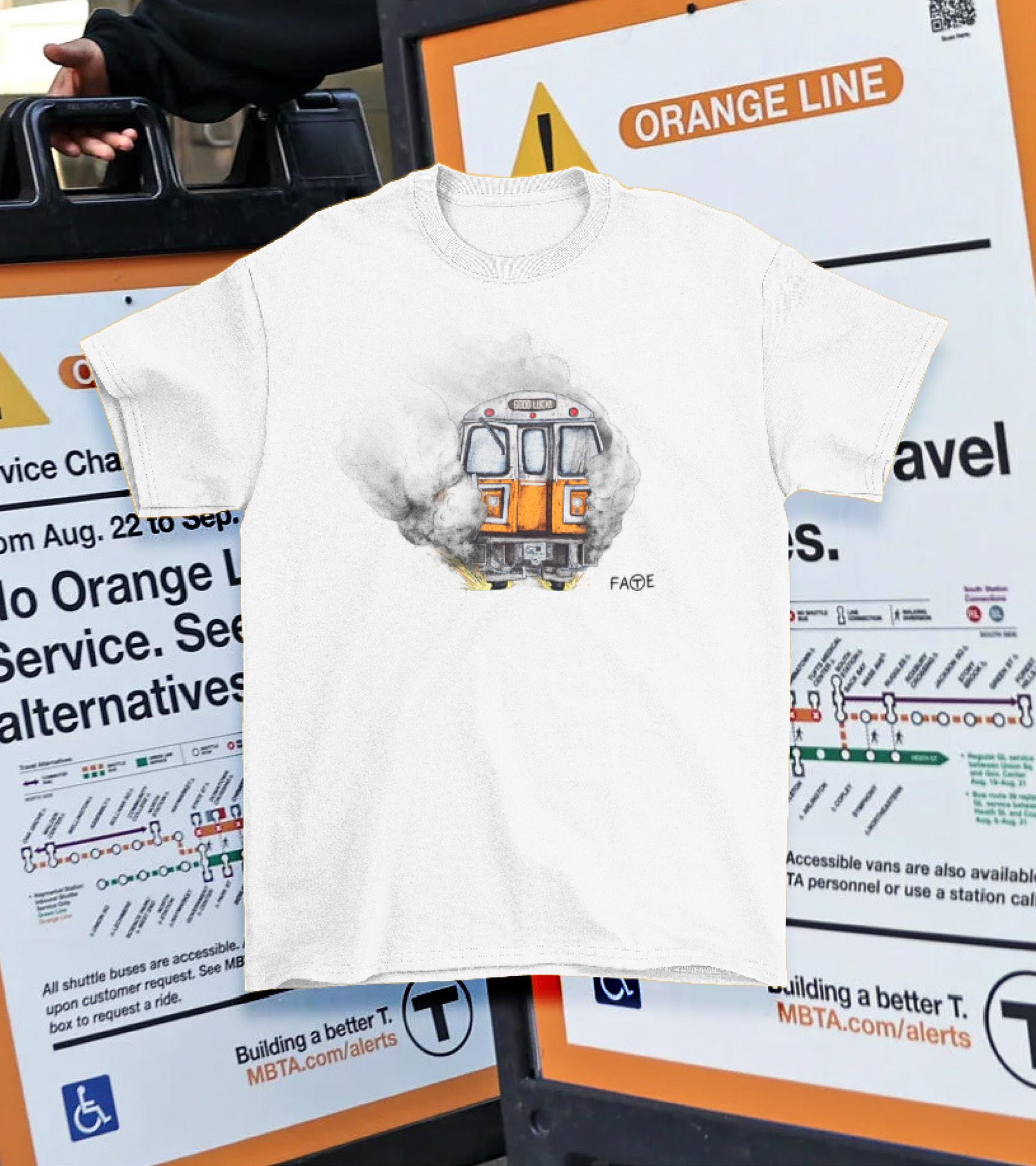
Sardonicism: A Multimedia Collection of Social Commentary via Satire.
The tempo of the modern world is driven by ephemeral fads and an unrelenting volume of fast news. As a result, the human attention span is the shortest it has ever been. We forget about ongoing calamities as soon as a new one arises. All the while social trends cycle in and out of an endless torrent of news updates. The world of visual arts has become oversaturated with superficial analyses and copycat creators, resulting in a dearth of social commentary within the field today.
Leaning into my affinity for comedy and illustration, I have designed a series of animations, merchandise, and installations titled Sardonicism. These projects are aimed at recontextualizing their respective mediums while satirizing both local and global events. Sardonicism acts as a collection of social commentaries which provide viewers with both physical and digital forms to relate to, contemplate, and enjoy. I critically reimagine these forms in response to the rapid pace of media culture, which has drained the art from satire. This installation reanimates the relationship between art and humor through a satirical look at elements of the frantic human experience of the 21st century.
It is ironic that an abundance of accessible media outlets and digital interconnectivity has made humankind more physically disconnected than ever. My thesis strives to unite people by showcasing a series of projects across multiple mediums. Each project critiques an issue that affects the public, and consequently connects us as people. This body of work is rooted in satire, generating dialogue that inspires relatability, reimagination, and unity.
1. Disdainfully or skeptically humorous: derisively mocking (Merriam-Webster).
2. Media culture refers to the culture created under the influence of mass media. The concept of media culture infers its impact on society’s information consumption and intellectual guidance. Media culture tend to be a major factor in the formation of mainstream culture since it affects society’s opinions, values, tastes, attitudes, and informational availability (Bharathidasan University).


@leenajdesign
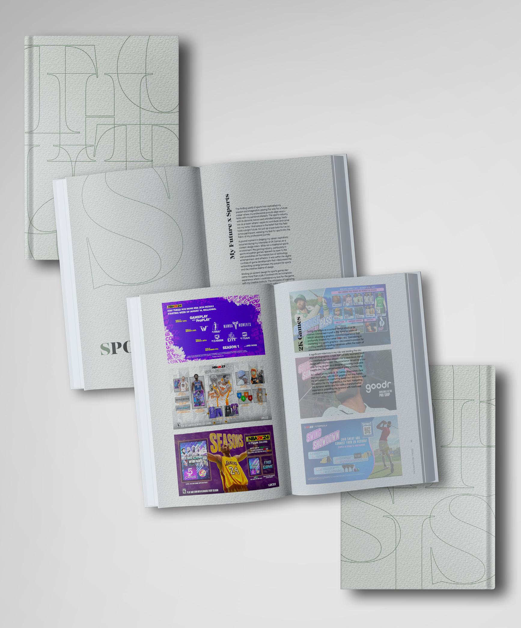
Sports is more than just about competition; it’s a vibrant world where excitement meets unity, and visuals play a crucial role in bringing this to life. My thesis explores sports graphics in basketball and the role that they play in the sports experience. I investigate how design enhances fan experiences in sports marketing, through the use of innovative typefaces, color choices, cultural nuances, and storytelling. Additionally, I explore the forefront of emerging technologies, such as augmented reality (AR), and their transformative impact on sports marketing.
Going beyond the surface, I explore the broader significance of sports, emphasizing the value of unity and individual narratives. This concept of “designing victory” encompasses more than just triumphs on the court; it encompasses the diverse individual journeys within the sports realm.
How does design shape our connection to the sports world, bringing fans closer to the action? Designing Victory serves as a platform for designers, sports professionals, and fans, to deepen their appreciation for how design visually constructs the game and celebrates the diverse stories and their definition of victory. It highlights how sports bring people together regardless of their backgrounds or affiliations, emphasizing the inclusive power of the sports world. Through Designing Victory, I hope to shine a light on the inclusive and unifying power of sports, encouraging a deeper appreciation of how graphic design is used as a tool for community-building, bringing individuals together, and even shaping our world.


joannajung.com
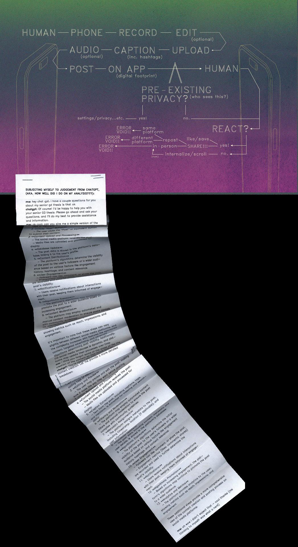
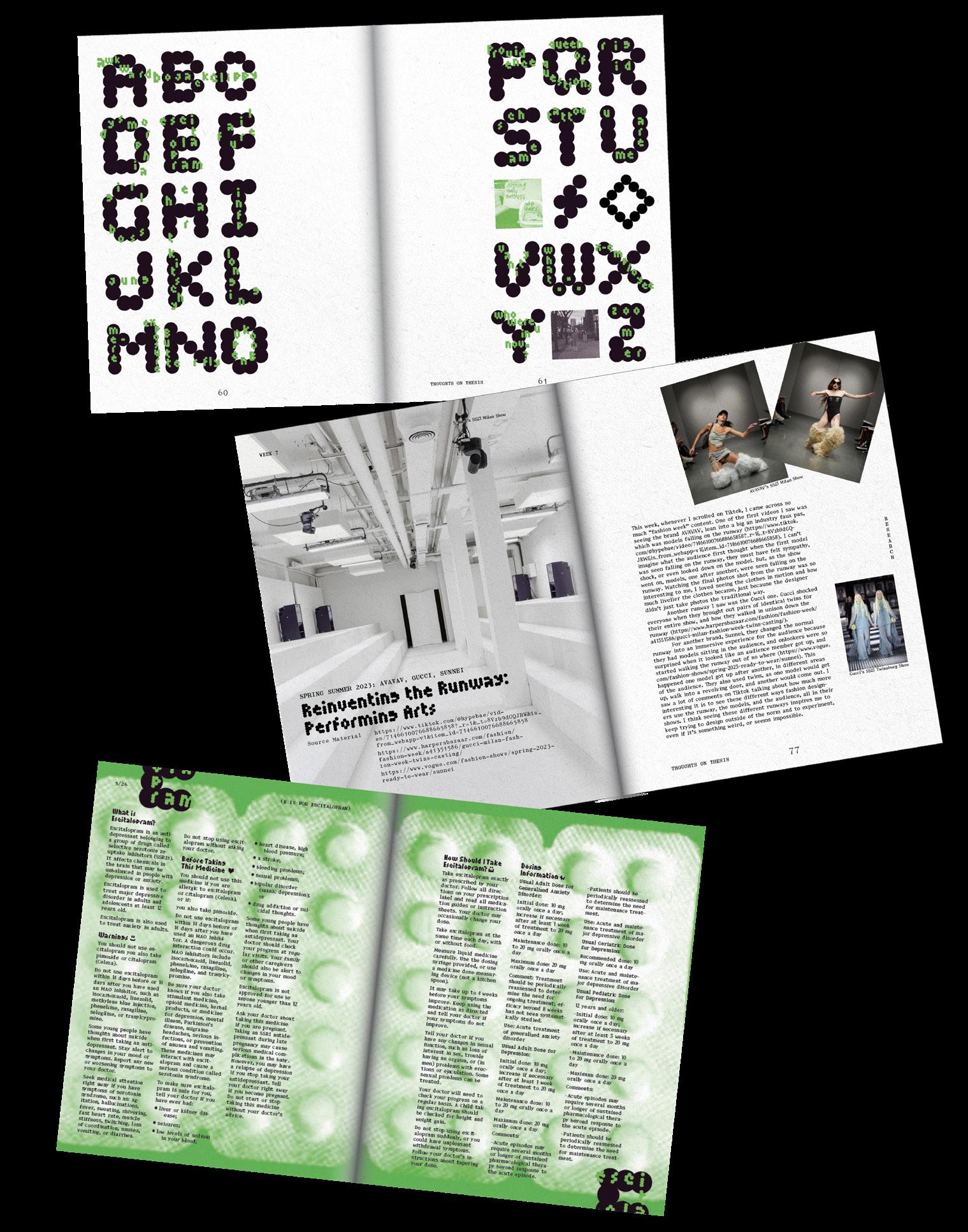
In the age of seamless text communication, social media has exacerbated isolation by allowing users to adopt aliases, creating a disconnect from their real-life personas. Despite initial intentions, content often surpasses its intended audience, blurring the lines between personal expression and public scrutiny. A TikTok video posted by an Asian American son, detailing his mother’s struggles with various mental health conditions, becomes a virtual space for him to “Scream Into the Void.” Despite facing criticism, he continues posting, finding solace in the relatability of his content to others.
This story is just one among millions shared by individuals who view social media as an outlet for release. However, the loss of control over self-presentation, evident in more confined social circles, becomes apparent as content reaches a vast audience. The intersection of human connection and social media raises concerns about the extent to which technology shapes discourse and whether we are too comfortable allowing it to do so.
The impact of social media extends beyond platforms, with content posted on an incomprehensible scale. Reflecting on the current trajectory of technology prompts questions about relinquishing control to algorithms in shaping conversations. Initiating critical discussions becomes crucial for balancing genuine human connection with technological influence.
Navigating these challenges has led me to experiment across analog, digital, and human realms, particularly through a website serving as a space to “Scream Into the Void.” Creating a “safe digital space” fosters trust, allowing viewers to fully immerse themselves in a personalized experience through conversational prompts, custom avatar personalization, and a void to scream and explore. This exploration is essential for visualizing the abstract nature of intimacy scales in human relationships amid technology’s influence. As society grapples with the consequences of technology-driven interactions, finding a balance is vital to preserving authentic connections while critically assessing the role of algorithms in shaping human discourse.

sophiejurionportfolio.cargo.site @sophiejdesign
Globally, at least 2.2 billion people have a near or distance vision impairment (”WHO Vision Impairment and Blindness,” 2018).
What does it mean to be visually impaired? Mild visual impairment is a visual acuity of 20/70, severe impairment (legally blind) is 20/200 and total blindness is 20/400. As someone who is nearsighted and works primarily with typography and form, what does it mean to design for visual accessibility?
My thesis, Envisioning Design: Educating and Making for Visual Accessibility explores an interactive and inclusive design experience for adults to reconnect with their senses through art experiments and play, rediscover their door to creativity, and learn about visual impairment and color blindness.
“While practicing inclusive design should make a design more accessible, it’s not a progress for meeting all accessibility standards” (Holmes, 2018). In Kat Holmes book “Mismatch,” she says that diversity is our biggest asset, but inclusion is our biggest challenge. Her methodology is to first learn what other people’s needs are, then ask who are excluded? What can we add so that they are not excluded?
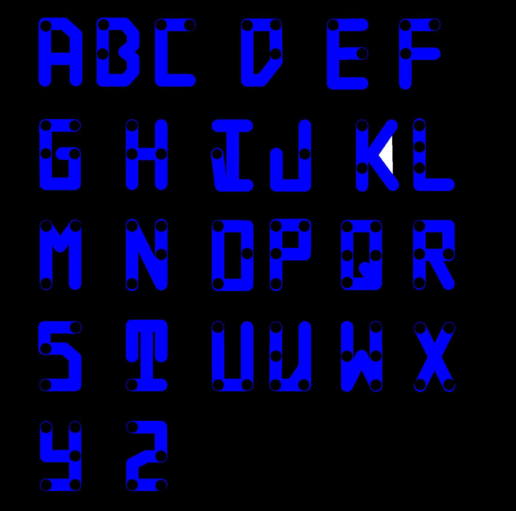
Accessibility is an attribute that makes a product, service, or environment work for someone with a disability. Whereas, inclusive design is a methodology not an attribute (Holmes, 2018). Building on these examples of accessibility, I explore designing with braille, alternative text, screen readers, and laser-printed acrylic objects and clothing tags that make my design adaptable for those with visual impairment disabilities. Designing experiences that are accessible to everyone is an ethical goal, and it should be a goal for artists, for writers, for institutions, for museums or for schools, individually and collectively, to create inclusive experiences.

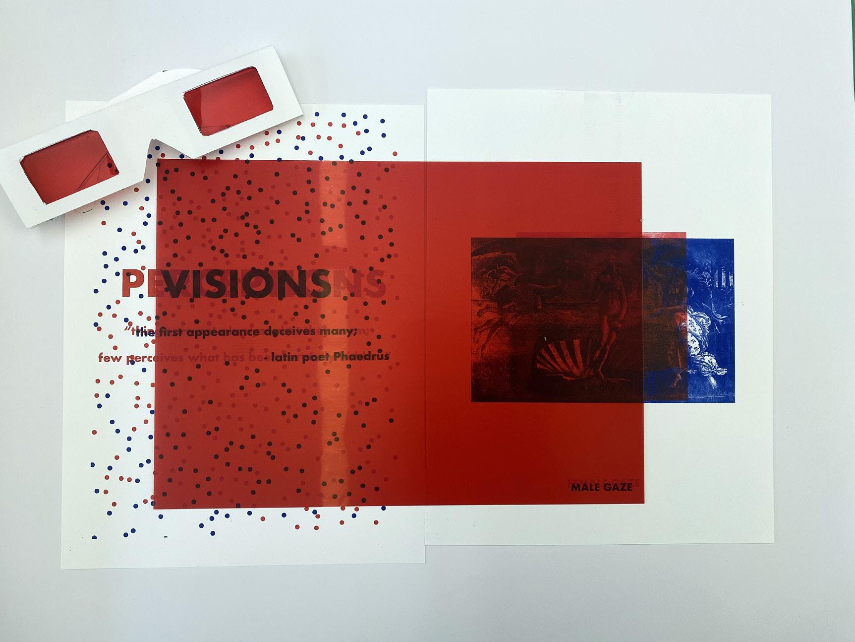
New York City is my favorite city worldwide, for it consistently teaches me invaluable lessons. This summer, I gained shocking insights into the city’s offerings, particularly in its nightlife accessible through the elusive “face card.” I discovered how women secured access to premier nightclubs, events, and expensive dinners seemingly for free, although the true cost was more profound. In a world deeply influenced by perceptions of beauty, my thesis endeavors to unravel the intricate dynamics surrounding “Pretty Privilege.” This phenomenon, characterized by the preferential treatment and advantages bestowed upon the “conventionally attractive,” permeates various aspects of life, molding interactions, opportunities, and societal expectations.
My thesis uses historical analysis as an entry point to dive into the evolution of pretty privilege through different decades and cultural perspectives – examining how societal standards of beauty have shaped perceptions and opportunities. From the workplace to nightlife and social to online settings, the influence of pretty privilege casts a significant shadow, affecting hiring decisions, social interactions, and even educational experiences.
The exploration of Pretty Privilege encompasses narratives, interviews, and personal anecdotes conveyed through user experience (UX), zines, posters, and installations. I aim to spark deep conversations on an uneasy topic, recognizing its widespread prevalence in diverse spheres of life, shifting the focus towards the creation of conversation spaces. By comprehensive analysis of both digital and physical aspects of these safe spaces, I ultimately hope to foster a deeper understanding of the multifaceted emotional impact of pretty privilege, touching on its empowering and dehumanizing dimensions.


@leeartanna
The designer’s journey unfolds as they navigate the intricate relationship between form and function. This thesis serves as my roadmap, tracing the exploration of form and function through the lens of beauty and utility. Driven by real-life observations and experimentation, I embark on The Pursuit of Discovery to delve into patterns in objects that intertwine these two concepts. Through iterative processes, I search for the harmonious balance often regarded as the golden standard of design, inviting the audience to explore and discover their own ideal within the work.
This thesis explores the interplay between beauty and utility through the examination of everyday objects applied to an iterative process. The Pursuit of Discovery draws inspiration and builds upon existing objects that successfully serve their roles and purpose while embodying beautiful forms. Through the iteration process, I demonstrate the extent to which function—embodied in reproducibility, efficiency, and problem-solving—and art—manifested in craftsmanship, tactile qualities, and uniqueness—can be elevated and compromised. This exploration unveils the apparent contradiction between these concepts, revealing a spectrum of designs prompted by variables of resources, price, and time in relation to beauty and utility. Beyond personal discovery, this journey invites the audience to discern their own insights within the relationship of form and function and visualizes the range of data collected through a digital archive.


liwanjing.com
@wanjing_lili
In Search of Feminism and Identity in Asia explores the nuances and evolution of modern feminism within Asian cultures, particularly focusing on the perspectives of Asian Gen-Z females. In the past ten years, the concept of feminism has gained visibility within Asian public discourse, coinciding with the period in which Gen-Z Asian women are developing their identities and transitioning into adulthood. This timing has enabled them to contribute significantly to the dialogue on feminism. Through interviewing twelve Gen-Z females from Asia, I gained insights into their views on feminism within their social contexts. These discussions helped me understand how they comprehend, perceive, and react to feminism and gender inequality. A notable observation was the association of “feminism” with radicalism and a misconception of it as advocating for female supremacy in Asian cultures, contributing to its negative and taboo perception. As the concept of feminism and awareness of gender inequality spreads, a noticeable gap emerges in the understanding of these issues not only between Asian Gen-Z and their Gen-X parents but between genders as well.
Based on the context and insights, In Search of Feminism and Identity in Asia delves into Gen-Z Asian women’s fundamental understanding of feminism and how social media shapes its image. By presenting insights from interviews with Asian women, the study highlights underexplored aspects of Asian feminism. I blend research findings, personal reflections, and creative processes across multiple formats, including publication, web experience, conversation curation, and video art. I experiment with integrating a visual language using a diverse mix of Asian aesthetics spanning from the 1950s to the 2000s. Through graphic design, In Search of Feminism and Identity in Asia acknowledges the distinct challenges and progress of feminism within Asian cultures amidst increasing global cultural exchange. It encourages more discussions on this topic within Asian social settings and cross-cultural dialogues, fostering an inclusive understanding of feminism across different cultures.


liushenjia.cargo.site
@vincent_lsj
Moving away from China and growing up in the suburbs of New Jersey, I had cast aside my cultural identity in an attempt to better assimilate into my environment. My household was still distinctly Chinese, but I wasn’t proud of it or my country. This remained to be the case until I had met Asian American friends and joined clubs centered around Chinese students in college. These interactions touched a part of me that had remained dormant ever since moving away from Shanghai. They triggered a fever-like obsession surrounding Chinese culture, seeping seamlessly into my graphic design work.
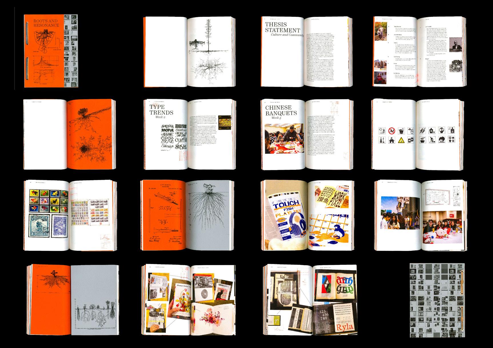
My thesis inquiry, 根 gēn (Roots), re-examines my motivations for caring about my culture—Chinese culture—after a long period of neglect. It draws on past personal, familial, and communal experiences, using graphic language to enrich Chinese cultural awareness. This body of work focuses on injecting existing Chinese aesthetics, symbolisms, and vernacular into my Western design tendencies. My projects utilize a methodology of intuitive form making and the traditional Chinese mindset of building something new rooted in the past. They take inspiration from my family customs and childhood nostalgia growing up in China, the underlying part of my identity which yearned to reconnect with culture.
Roots explores the visual beauty and complexities of the Chinese language through a variety of typography driven projects in print mediums. It aims to provide a uniquely Chinese American perspective on the celebration of culture described in the Heritage Cycle.1 In essence, Roots acts as a source from which more avenues surrounding graphic design and Chinese culture can be explored by Asian American students and designers alike.
1. Proposed by English historian Simon Thurley, the Heritage Cycle is a heuristic model that includes four phases. By understanding the cultural heritage people value it; by valuing it they will want to care for it; by caring for it they will help people enjoy it; from enjoying comes a thirst to understand it.



campbellmorindesign.cargo.site @campbellmorin
“Your self expression allows the audience to have their own self expression,” Rick Rubin wrote in The Creative Act: A Way of Being. Every piece of artwork acts as an unreliable narrator because we, as conscious beings, live within our own bias and completely unique perspective of the world.
Acknowledging the realization that the creators have as much unconscious bias as the viewers do, my background in journalism as well as graphic design, implores me to believe no piece of created work can be completely free of bias. I explore personal bias within my writing as well as my design decisions through distortion in imagery, typography, and purposeful curation and organization aimed at making my audience question and critically think about their choices as well as what I am revealing.
My thesis explores this beautiful, while also jarring, fact about human nature and bias through a series of books and magazines aimed at making moral philosophical thought necessary.
This series of books and magazines explores ethical dilemmas through philosophical thought and stories from an array of cultures within current society and how this manifests into artistic work. Using the golden ratio and fibonacci sequence as the backbone for my design decisions, the content of the “now” is reflected through the lens of the past. I intend to explore my own moral code while leading my viewer to explore their moral code, and maybe question their sanity, as well.
How can moral philosophy inform and justify my design decisions while simultaneously making learning about individual moral codes necessary through design?
But who am I to talk? Can you trust me? Maybe.


snam9170.myportfolio.com
@sarienahm
When I first started off as a graphic designer, I thought design could only be successful when it was original, and something never done before. I made a conscious effort to try to explore outside of my comfort zone, to find new things and materials to give me inspiration. It was only after fruitlessly searching that I circled around to see that I found a lot of my influences are dependent on my surroundings, namely the people around me.
This made me realize that the significance of personal connection in shaping our design processes is essential. Our work is not just the result of technical skill or aesthetic preferences, but is heavily influenced by our experiences, emotions, and connections to our surroundings. In design, I believe a personal connection to form, content, and materials is important for achieving meaningful outcomes, as passion and familiarity creates even more effective design.
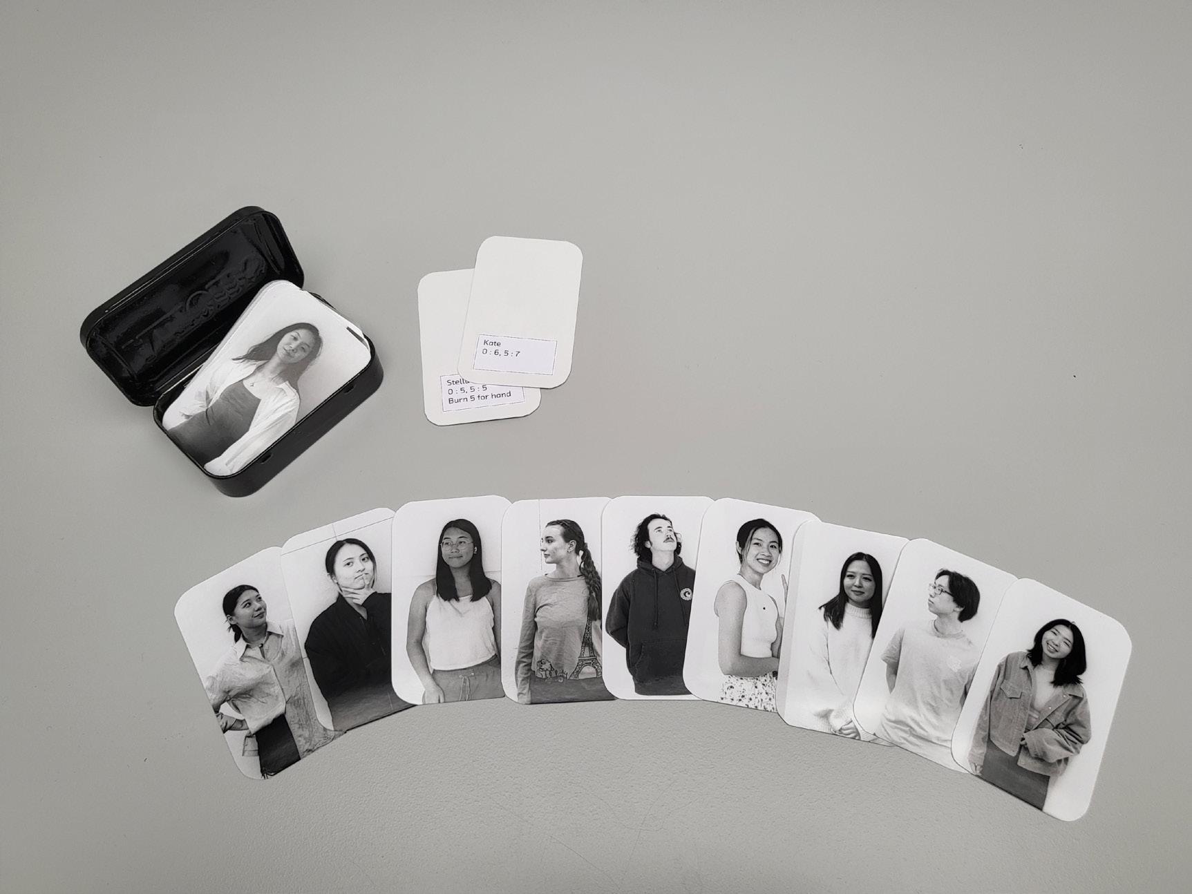
My thesis, Visualizing Identity: Exploring the Essence of Human Traits Through Graphic Design, showcases a physical archive of the people around me, exploring what makes up a person through data visualization and informational design. Through the analysis of collected data points, personal narratives, and interviews, it delves into the intersection of personal connection to translate human identity through both objective and subjective lenses. Utilizing abstraction, this archive visually and conceptually explores what makes up a person and their identity within the realm of graphic design to make connections between human nature and habits.


website.com
You can turn an egg into an omelet but you can’t turn an omelet into an egg.
In moments when I slip into creative reverie, my mind often wanders into the realm of the improbable. As I space out and let my thoughts drift, I think of how life is full of unpredictable twists and turns. My thesis seeks to reflect on this complexity. It is within these moments of introspection that I notice that the improbable often holds the most compelling stories. Possible but Improbable serves as a guide to experiment beyond conventional design norms, breaking free from the expected, and finding beauty in unexplored corners.
Central to my thesis is a visual system that goes beyond the boundaries of what is considered normal or expected. Through my thesis, I venture into unexplored realms by challenging preconceptions. By employing such visual elements, I aim to defy the perceptions and delve into liminal spaces. It is the unpredictable twist, the unconventional approach, that transforms the improbable into the extraordinary.
Possible but Improbable is not just a visual showcase but also offers a new perspective on the limitless possibilities that emerge when we step into reveries of the improbable. A narrative that goes beyond the visual, it invites to perceive the world through a lens of limitless potential, capturing and resonating with the unpredictable nature of my journeys.


www.katepoe.com
@katepoe.pdf
A third space is defined as a playful, social space outside of the home or workplace that is free from expectations of productivity, promotes conversation, and connects people through interchanging knowledge. Through the back-and-forth movement of ideas, these spaces help us build individual and collective identities and promote psychological well being. As an individual, I’ve found connection and joy through inhabiting these spaces. But with the rise of digital isolation and the commodification of authenticity, third spaces are disappearing. When these spaces don’t exist, or exist with the ulterior motive to sell something, we lose the value of sharing our experience and others lose the value of hearing it. As a designer, I worry about how my work could perpetuate this trend. This thesis is a way for me to challenge that by using my work as a third space.
Take Part, Make Whole: Designing Spaces for Interchange builds spaces for people to share their experiences and explores the role of the designer as a facilitator. I prioritize using design to create spaces and work that connects people over capitalism. What role does the graphic designer play in helping others connect to themselves and each other? How does community participation bring value to our work and ourselves? How can I use design to create human connections over selling a product? I investigate shared experience and community through:
1) Participation in my work from classmates, friends, and the community
2) Interchanging information, ideas, and experiences
3) Synthesizing these elements
The project manifests as a collection of design experiments using community responses. My priority is to create a connection between myself and participants, then ultimately between us and the world. At its heart, Take Part, Make Whole aims to serve as a safe space for connection, conversation, and healing for everyone involved.


gracesnow.cargo.site
@gracesnow.png
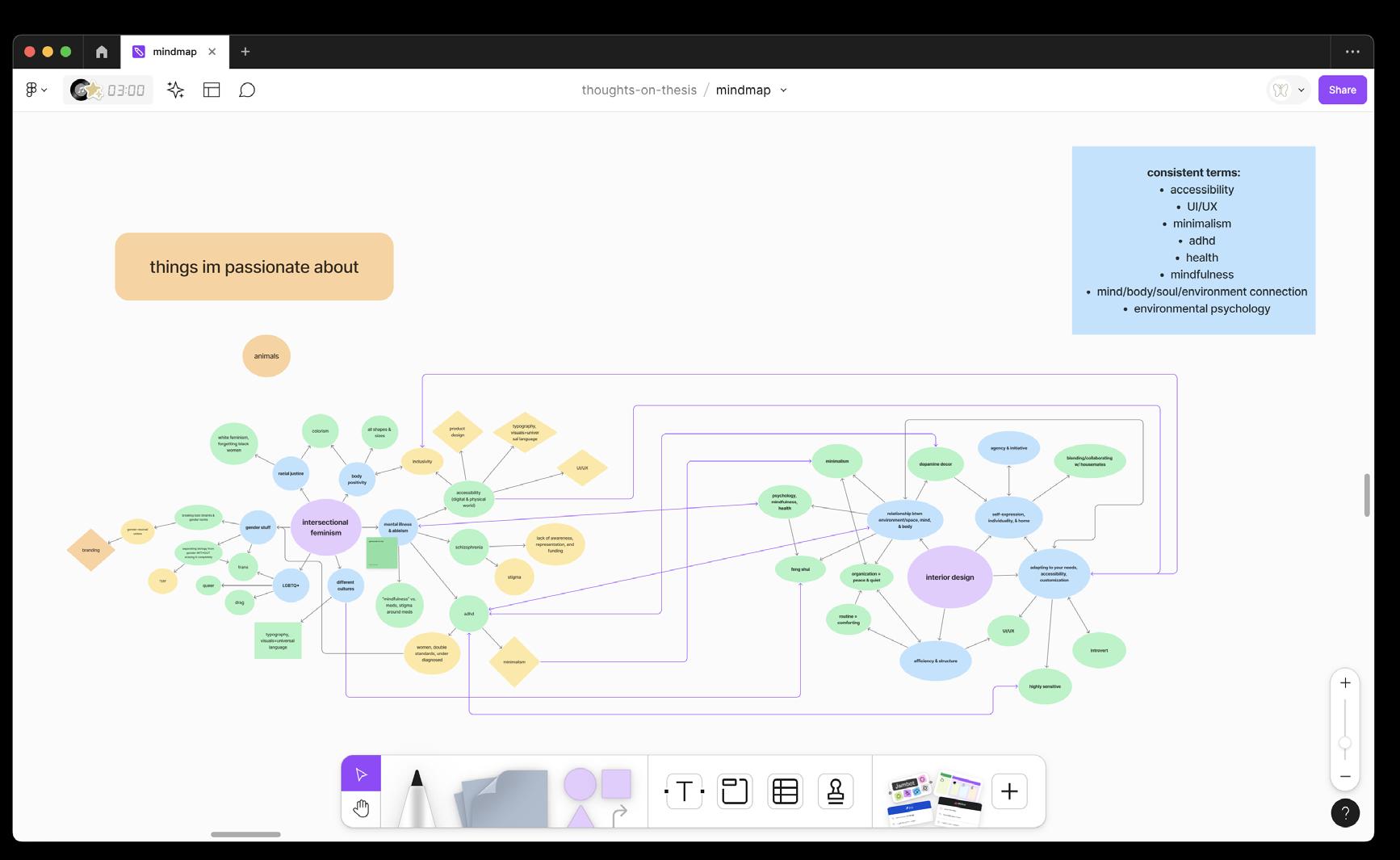
The eight aspects of wellness are emotional, physical, occupational, social, spiritual, intellectual, environmental, and financial. In this demanding society, it can be hard to juggle all of these, especially with health issues; however, personal living spaces have the power to nurture multiple aspects at once and can be modified to address specific needs, such as cognitive functioning, mood & energy, sensory sensitivities, stress, sleep, pain & discomfort, mobility, and vision & hearing. But how?
As a graphic designer with ADHD, anxiety, and chronic disease, maintaining wellness and balance has been an ongoing, highstakes challenge. There are so many resources that help us succeed occupationally and academically, but what about the remaining aspects of our health that we neglect both as a symptom and as a result of overworking ourselves to meet society’s demands? For me, two things have taught me how to maintain wellness and balance: graphic design and yoga. Through graphic design, I’ve learned the power of organization, physical & digital accessibility, aesthetics, and (user) experience. Through (power) yoga, I’ve learned the power of mindfulness, modifications, movement, and discipline. Through both, I’ve learned the power of making intentional choices and modifications to suit individual needs.
My thesis emphasizes the connection between living space and wellness through the lens of health issues. Through UI/UX design, I provide a tool specifically designed for people with (or without) health issues to optimize their living spaces and wellness, which incorporates both ancient Eastern principles of feng shui, mindfulness, and yoga and modern Western principles of universal & accessible design and wellnessfocused interior design. I strive to use my platform as a graphic designer to serve and empower overlooked audiences by not only filling the gap in accessible tools but also ensuring that what I provide offers a convenient, customizable, and inclusive experience.


tiffanytaw.cargo.site
@artby.tiff
A liminal space refers to a space between spaces. It’s a space full of emotions and ambiguity as one leaves the past and awaits for the unknown future. An airport is the epitome of a liminal space as it physically and emotionally transits a person from one place to another. Just as one packs and leaves behind items when they travel, one also has memories they carry and leave behind when transitioning from one emotional state to the next. A life transition for me was my first time flying: a 22-hour-long journey from Yangon to San Francisco.I was forced to be a translator for my parents as a 13-year-old as we were taken to the immigration office.
IN- [TRAN(SIT] U) explores the airport experience as a metaphor for life transitions. The meticulous process of going through an airport reflects the complex emotional process one goes through during a life transition. Each checkpoint of the airport—check-in, security, dutyfree, immigration, and baggage claim—can be treated as a metaphor for our emotional journey. We shed aspects of our former selves, much like discarding prohibited items at security. Simultaneously, we had to preserve our original selves, just like we have to prove that we match the identities on our passports.
Ultimately, I hope people can embrace the process of transitions while staying true to themselves throughout the changes. I create a moment for people to check in and record how they are feeling. Objects can tell stories so I invented a system of looking at transitions through the lens of objects. Just like how I reflect on my transitions through this project, I hope people can do the same and be proud of how far they have come.


What are you grateful for? 2021. Interactive installation.


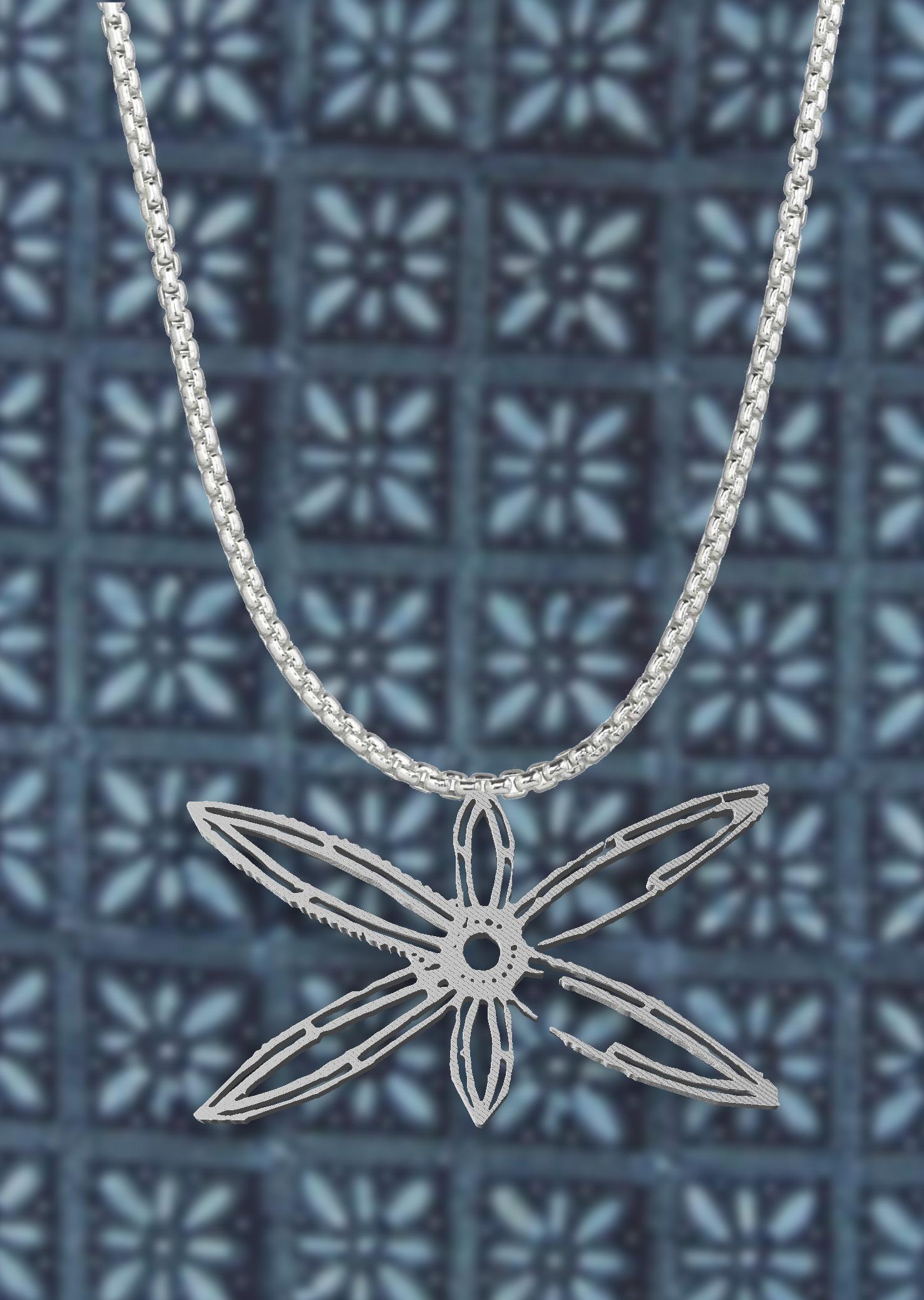
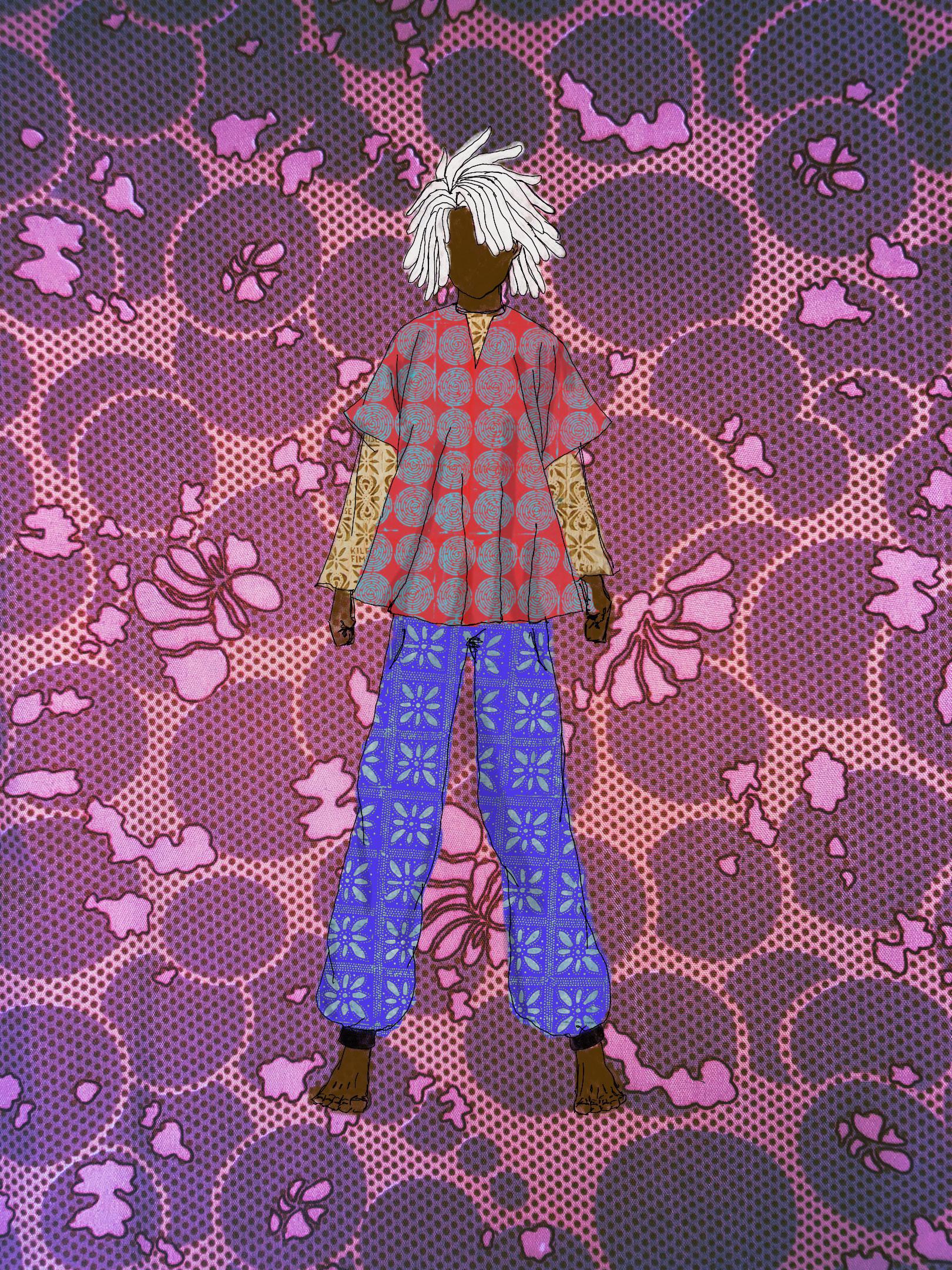
In my thesis I bring together the traditions of Yoruba culture with modernity through the lens of graphic design and artistic experimentation. As a first-generation Nigerian born in the United States, my education is deeply rooted in western practices. I am on a quest to decolonize my worldview through an exploration of my heritage and traditions.
My project focuses on integrating the history and cultural significance of textiles and attire in Yoruba societies through the lens of graphic design. This involves a multidisciplinary approach, embracing jewelry, stencils, zines, and other materials and methods to infuse Yoruba traditions into contemporary design. By examining the historical origins and cultural contexts of traditional garment-making practices in Yorubaland and the broader West African region, I am discovering how globalization and modernization have shaped these traditions and the innovative adaptations that have emerged.
The core of my thesis investigates how multidisciplinary approaches can uncover new and fascinating ways to create form, while also emphasizing the spiritual power and significance of cloth and traditions in the modern era. This project is a endeavor to combat the disconnection from my culture, ancestry, and heritage, emphasizing the importance of preserving and evolving the vast, complex, and beautiful Yoruba culture.

tangr.cargo.site
@loookwendy
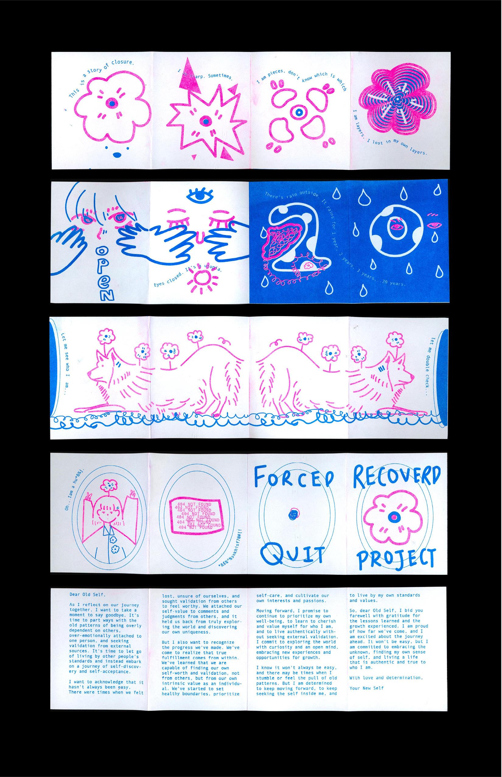
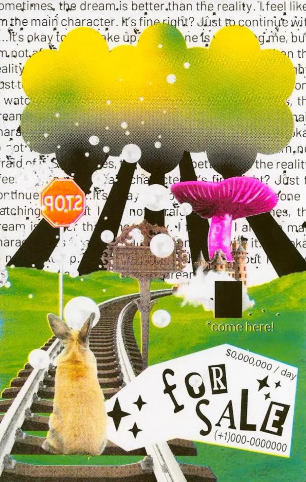
Growing up, I played various video games such as Animal Crossing, Travel Frogs, and Otome games. I would go on adventures with them. We share not only happiness but also sadness. Overtime, I formed a parasocial relationship with the NPCs (non-player characters) in the game, which is a one-sided relationship someone builds with a non-existing character. I have to admit that that has become a significant part of my life. They have empowered not only the “me” in the game but also me, as a player, in reality. By societal standards, these relationships are considered ‘unreal’ and ‘intangible,’ however I believe that they are true and validated. I aim to explore the process of how these relationships form and how parasocial relationships in video games can validate relationships and connections. Through research, critique, and play, I examine the interplay between the ‘real’ and the ‘virtual.’ My thesis explores the motivation behind why and how parasocial relationships form in video games in the search for human connection and self. It addresses the tendency to seek emotional fulfillment beyond the physical world and how relationships in video games can replace that longing for human connection.
I aim to create an experience of knowing, understanding, and forming a parasocial relationship in video games through illustration, digital posters, and installation—capturing the essence of the journey in a way that is both engaging and heartfelt. The project advocates for challenging societal perceptions, encouraging individuals to explore and understand parasocial relationships in digital games. As we navigate uncharted territories in an evolving landscape, this study fosters an understanding of the unique role each digital influence plays in the human experience, transcending the boundaries between the ‘real’ and the ‘virtual.’

nolanblakethompson.com
Ever-evolving and emerging technologies influence every facet of the human experience, and design is no exception. As designers, we stand at a determining intersection that demands we critically, curiously, and empathetically engage with the technology that is unequivocally linked to our practice.
Data-driven tools open a door to unprecedented ways to think, make, and engage with design. With no predetermined or imperative outputs, designers can embrace play and break boundaries. The act of play allows for a deeper understanding of the connection between technology and design that goes beyond technical comprehension, but actually creates space for critically engaging with the possibilities that exist in this space.
I believe all designers and people alike should have some form of code literacy, and creative-code is simply one avenue that can help integrate design with the technology that supports it. As a playful conductor of these technologies, I expand my creative freedom and return agency to the user through design processes that emphasizes conscious interactivity, increases code literacy, and utilizes transparent toolbuilding. I will generate type, images and patterns through technology built by creatively coding.
Through both building and recontextualizing digital tools utilizing creative code, I engage with technology and demystify the hidden structures of the digital landscape to promote more empathetic, transparent, and human-honoring uses of design and technology.


designing_with_sin() 2024. P5.js.
STAFF
The School of Visual Arts at Boston University College of Fine Arts prepares students to think seriously, to see critically, to make intensely, and to act with creative agency in the contemporary world.
Established in 1954 to combine the intensive studio education of an art school with the opportunities of a large urban university, Boston University School of Visual Arts is committed to educating the eye, hand, and mind of the artist. We believe that students become visual artists when education, practice, and awareness of historical and contemporary context enable them to think critically and imaginatively, and to express those ideas with skill and conviction. The professional artists and educators that make up our faculty lead small classes of highly motivated students.
The Foundation program is the bedrock of our undergraduate program, and emphasizes a mastery of traditional skills and visual problem-solving. All BFA freshmen begin with drawing courses and continue foundation studies in painting and sculpture before they choose a studio major. MA programs in Art Education, Graphic Design, Painting, and Sculpture focus and elaborate professional studies. Studio electives expand and enrich all graduate and undergraduate Visual Arts major programs.
Courses in studio art, art history, and the liberal arts and sciences taught by the nationally and internationally recognized faculties of the University's 17 schools and colleges provide the intellectual framework for our curriculum. University-sponsored international study programs broaden the Boston campus experience and encourage global awareness.
Boston provides a rich cultural resource for our School. The city's renowned museums and musical organizations, art galleries, theaters, libraries, and other universities, colleges, and schools offer exhibitions, concerts, theatrical performances, and lectures of the highest quality.
The BFA 2024 Thesis Exhibition is a collage of the diverse narratives and collective experiences of the graduating class. Attending college through globally unprecedented times has made these students masters of flexibility and fluidity. They entered school in a hybrid of digital and physical spaces. They transcended dimensions, flowed between learning spaces, and overcame obstacles in their new environment. Their ability to adjust mirrored the fluidity of water. The Class of 2024 learned to “go with the flow”, as they have demonstrated resilience by creating exciting work both digitally and physically.
2024 BFA THESIS SHOW
May 2–11, 2024
Boston University
The Faye G., Jo, and James Stone Gallery
808 Gallery
Painting
Printmaking
Sculpture
Graphic Design
©2024 BU CFA School of Visual Arts
855 Commonwealth Avenue
Boston, MA 02215
bu.edu/cfa/visual-arts
(617) 353-3371

TYPE
Cakra by Lucia Kollert and Vojtech Kollert
Barlow by Jeremy Tribby
DESIGN
Vincent Liu
Tiffany Taw
Sarah Nam
Wendy Tang
Eva Brown
Jessie Choi
Drew Demeterio
Campbell Morin
Jimi Taiwo
FACULTY ADVISOR
Claire Bula
EDITOR
Danielle Weindling
PRINTING
Kirkwood Printing, Wilmington, MA
