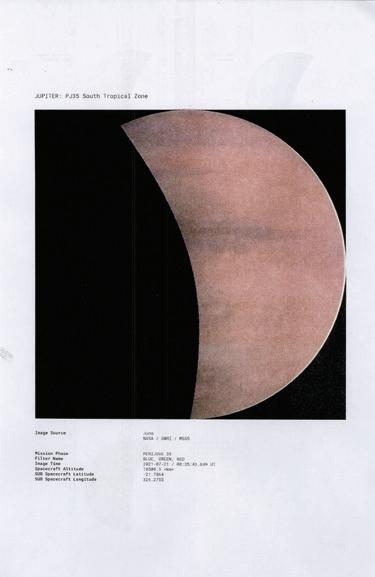
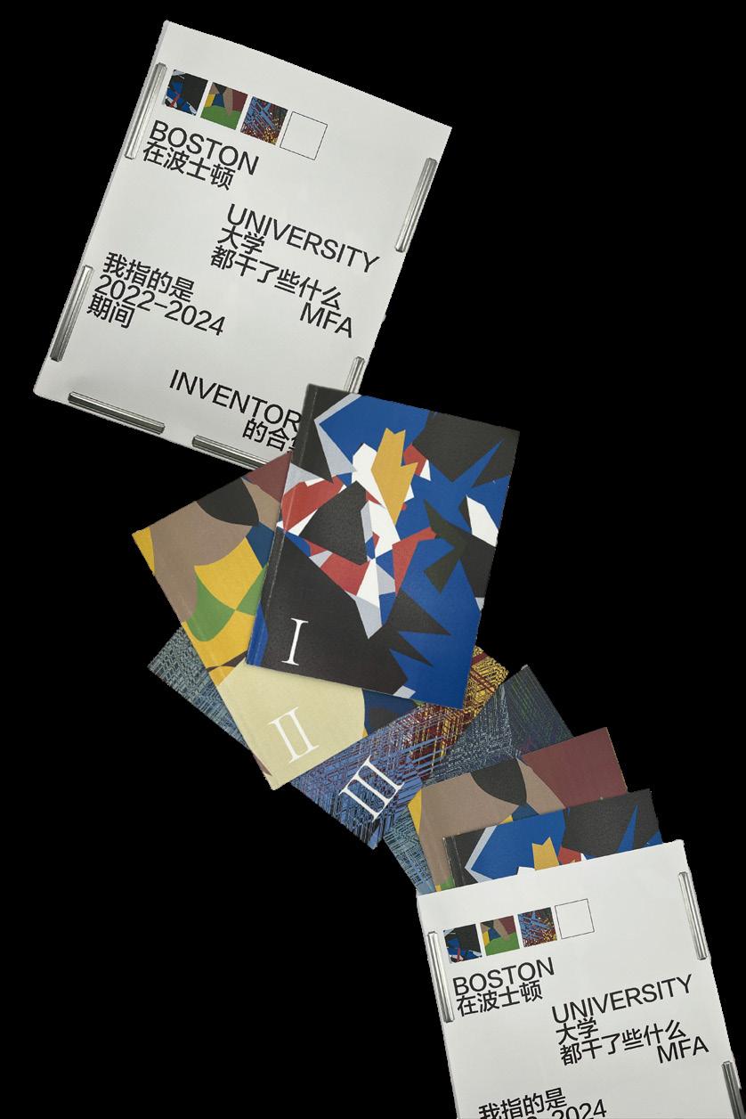
I am pleased to introduce the Boston University School of Visual Arts Class of 2024 Master of Fine Arts thesis catalog featuring work by graduating students in Master of Fine Arts programs in Graphic Design, Painting, Sculpture, Print Media & Photography, and Visual Narrative. This is the first thesis exhibition for the latter two MFA programs, launched in 2022. With sixty students, this class represents the largest cohort of graduating MFA students in the history of the school, a highly diverse group of artists and designers from across the globe.
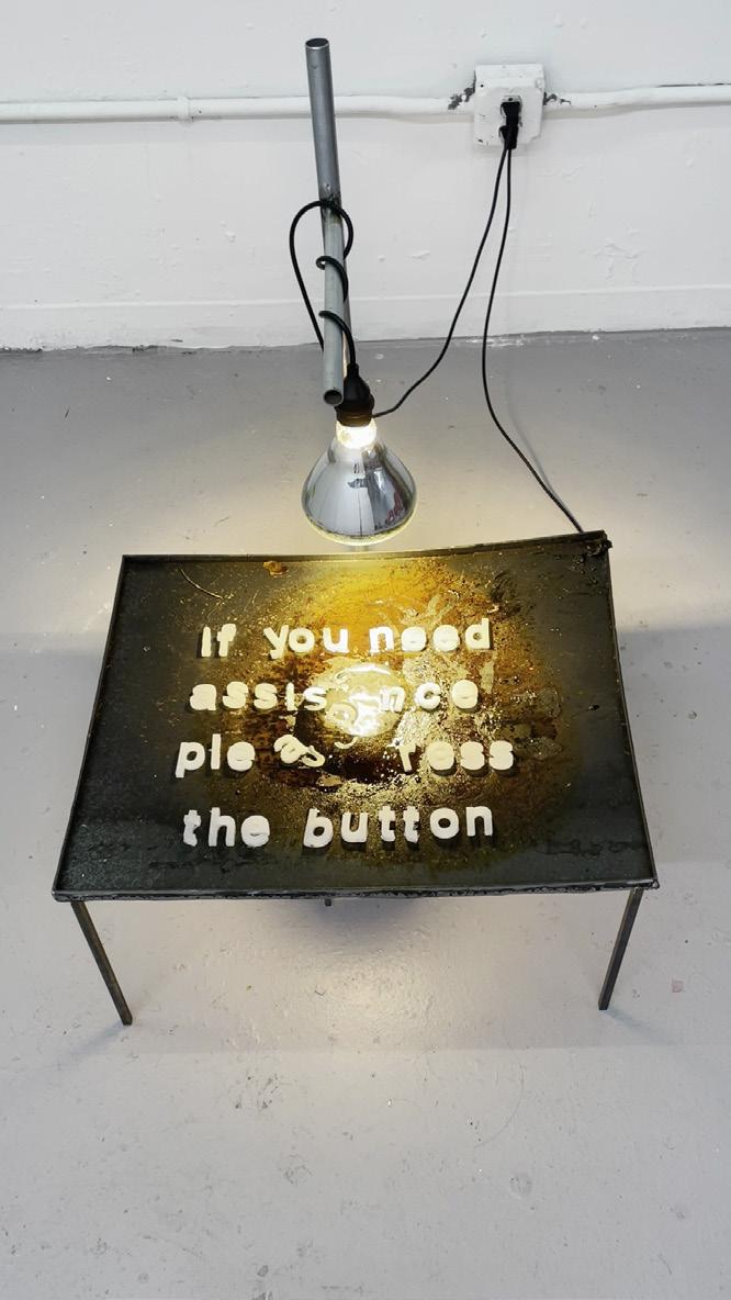
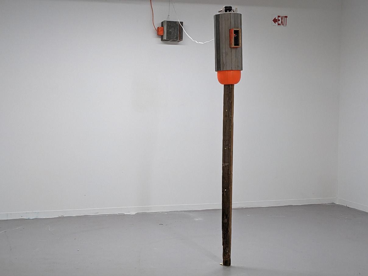
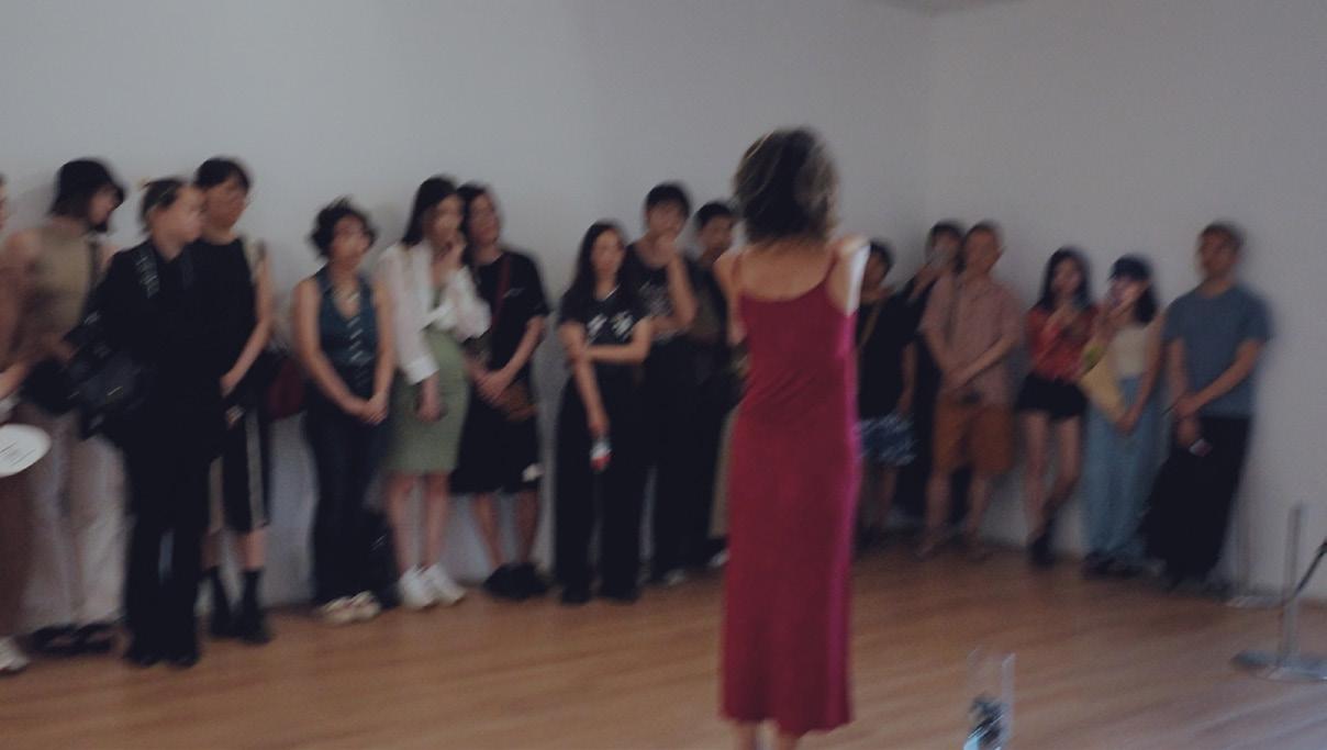
Also new for this year, our thesis exhibitions expand beyond BU and the traditional gallery space: in addition to the MFA exhibitions in College of Fine Arts’ galleries at 808 and 855 Commonwealth Avenues, graduating MFA Sculpture students install their exhibition in Allston at 1270 Commonwealth Avenue, working in dialogue with the site of a former big chain drugstore. MFA Graphic Design and Print Media & Photography exhibitions are on view in 808 Gallery, MFA Painting is exhibited in the Stone Gallery, with Visual Narrative nearby in the Commonwealth Gallery, pairing their exhibition with a series of book launches.
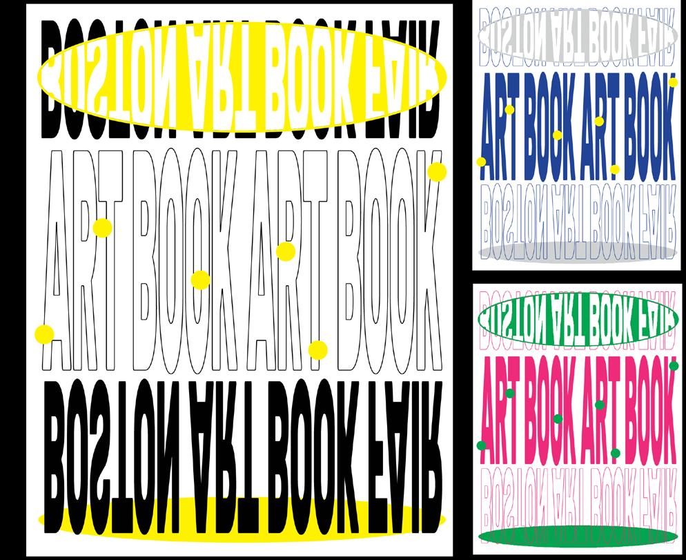
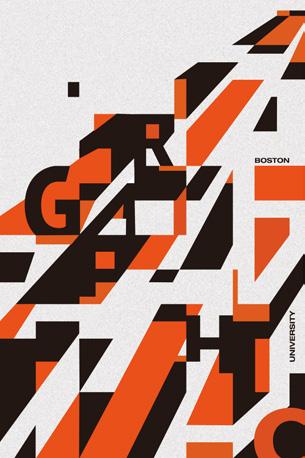
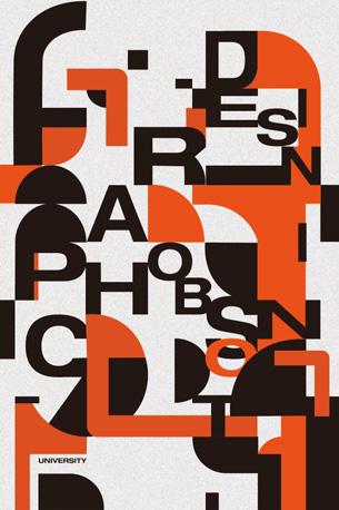
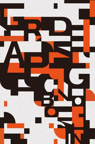
Within these galleries and the pages of this catalog, these graduate students reveal highly individualized practices informed by culture, locale, historical research, texts, the property of materials, and the body’s relationship to the physical world. The studio is a site of transformation where the expansion of learning and the compression of making meet. 1 The Class of 2024 are artists and designers who have also weathered much recent cultural change and flux, and a strong current of experimentation runs through each cohort, formed at SVA in intense dialogue—and shared social time—across a wide range of backgrounds and languages. The MFA Graphic Design exhibition of twenty-five graduates led by Associate Professors Christopher Sleboda and Kristen Coogan is titled Side B, a notion centered on the flip side of a record, an exhibition “encouraging an inclusive approach to design and suggesting that visual communication is a multifaceted discipline made stronger by
1.
James Gold, MFA Painting writes that the “cycle of expansion (through learning) and compression (through making) allows me to cast a wide net as I explore the question: What does our historical imagination look like?”
multiple perspectives.” As described in the exhibition text, “The concept symbolizes a willingness to defy expectations, explore uncommon tools, and present a multifaceted expression of craft.”
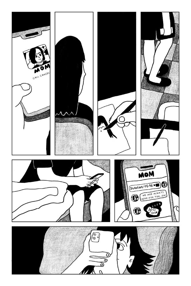
These students write about seeking the unknown, yet also generously invite us, the viewer, to go along, offering the opportunity to learn together. Chair of Visual Narrative Joel Christian Gill writes of the first graduating class, “These ten authors have crafted narratives that are humorous, poignant, and thought-provoking, designed to evoke the same range of emotions in readers.” MFA Sculpture Chair David Snyder also points to the results of a deep mutual engagement in his second-year class: “what they have built together and share in common is both singular and ineffable: a conversation, a culture, a language, a heart girded by support, care, and love for the creative process and for each other.”
During their time at SVA, we also focused on community building and supporting graduate professional needs. Before thesis, these students took part in many exhibition opportunities on and off campus, traveled to New York to see work or to Belgium to make work, as Print Media & Photography students did with Professor Lynne Allen and Assistant Professor Toni Pepe. Students tabled at book fairs and the Massachusetts Independent Comics Expo (MICE) at BU, took part in symposia at Multiple Formats Art Book Fair, assembled together in the refreshed Visual Arts Research and Resource Library or after the important MFA Tuesday Night Lecture Series.
This catalog is itself an impactful group effort: Thank you to the MFA exhibition design team Dhwani Garg, Veridiana Victorelli, Amanda Mundy, and Niharika Yellamraju, for your wonderful work. On behalf of SVA, I want to especially thank Professor Sleboda for his mentorship in overseeing this catalog and thesis identity for MFA Graphic Design along with MFA program chairs who have worked so tirelessly on behalf of their graduate students—professors Lynne Allen, Kristen Coogan, Joel Gill, Josephine Halvorson, and David Snyder are to be commended for their leadership. We are grateful to Director of Graduate Studies Nick Rock and all graduate faculty for their mentorship. Thank you to Boston University Art Galleries’ Managing Director Lissa Cramer for helping prepare our students professionally, along with Programming and Media Manager
Nerissa Cooney who has improved SVA’s thesis processes. I am grateful to SVA staff who support thesis, particularly Administrative Coordinator Andy Wilson and Technical Associates Gus Wheeler, Josh Brennan, and Jessie Finkelstein working with Operations Manager Logen Zimmerman. On behalf of all SVA faculty and staff, I sincerely congratulate the stellar MFA Class of 2024. In my last year as director, I am grateful to have led six years of growth and change in SVA only possible through collaboration with faculty, staff, and the College of Fine Arts Office of the Dean.
Dana Clancy Director, School of Visual Arts
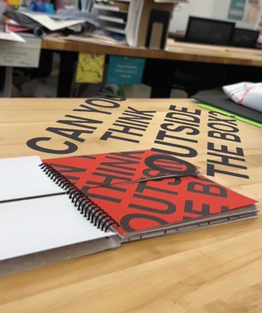
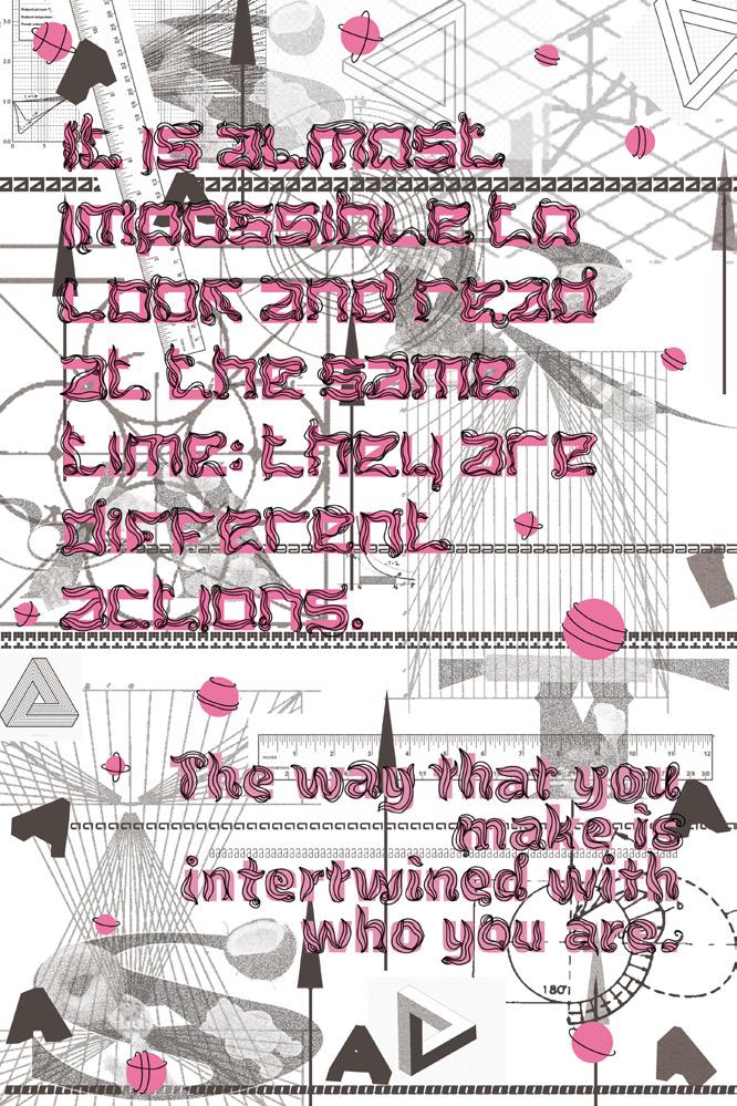
Turn, flip, or rotate. The 2024 Boston University Graphic Design MFA exhibition embraces the metaphor of “Side B” to examine the process of making without traditional constraints. The B-side of an album has historically represented an opportunity for musicians to experiment, offering a place for less predictable tracks and unique compositions. In the hands of the graphic designers featured in this exhibition, “Side B” becomes a driving methodology for creating experimental work, deep cuts, new ways of thinking, and different ways of making. The concept symbolizes a willingness to defy expectations, explore uncommon tools, and present a multifaceted expression of craft.
The twenty-five Graphic Design MFA candidates whose work appears in Side B come from across the United States and China, as well as from Brazil, India, Indonesia, Korea, Russia, Taiwan, and Venezuela. The thesis exhibition is collaboratively conceived and mounted by this graduating cohort and is a significant public-facing outcome of their studies at Boston University. Each graduate thesis explores different themes and conceptual frameworks, showcasing methodologies and ways of making that emerge from each individual’s practice and respond to the contemporary graphic design landscape. Through their individual thesis research, this talented group uses graphic design to produce and interrogate visual and material culture: engaging with technology, tools, and new platforms, seeking opportunities for collaboration and community engagement, and theorizing about graphic design’s future.
Side B pulls this work together, encouraging an inclusive approach to design and suggesting that visual communication is a multifaceted discipline made stronger by multiple perspectives. By embracing a porous and flexible understanding of graphic design, emphasizing its complexity and the many factors present in current practice, the 2024 GD MFA designers celebrate the promise of the B-side and the possibilities that unfold when working on the flip side.
Kristen Coogan Associate Professor of Art, Graphic Design
Christopher Sleboda Associate Professor of Art, Graphic Design
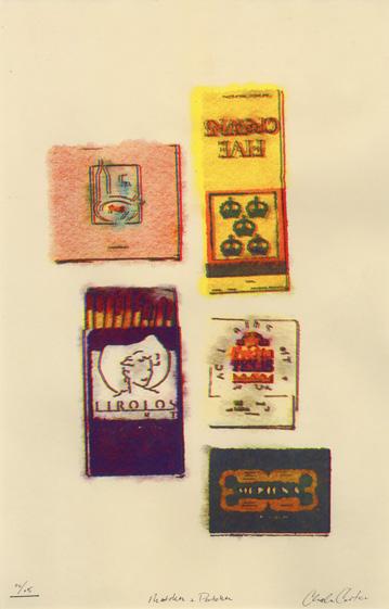
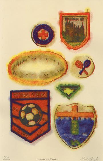
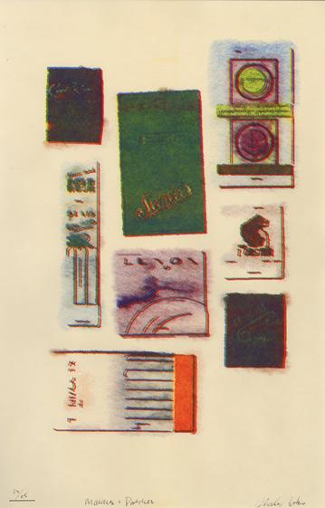
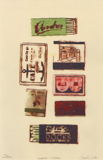
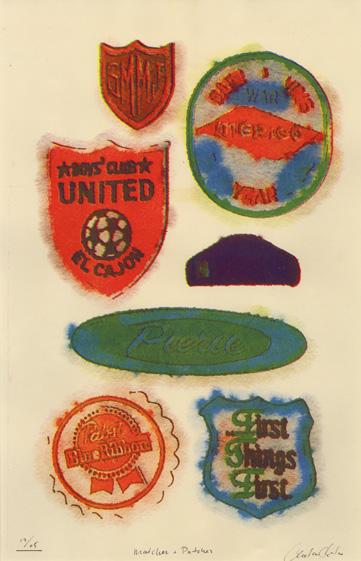
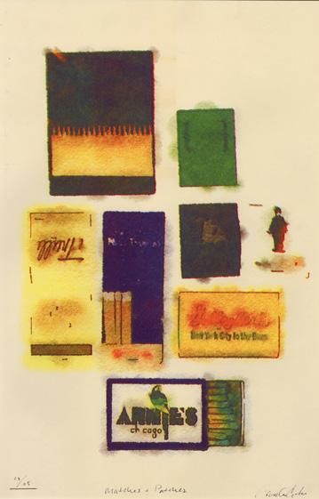
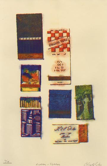
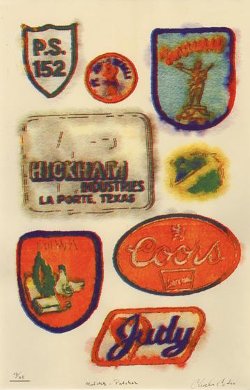
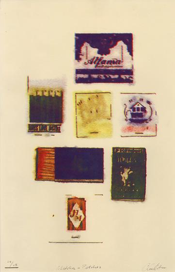
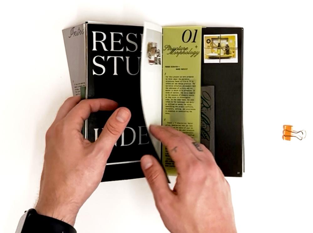
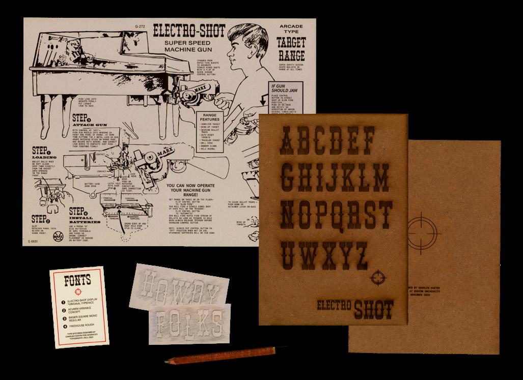
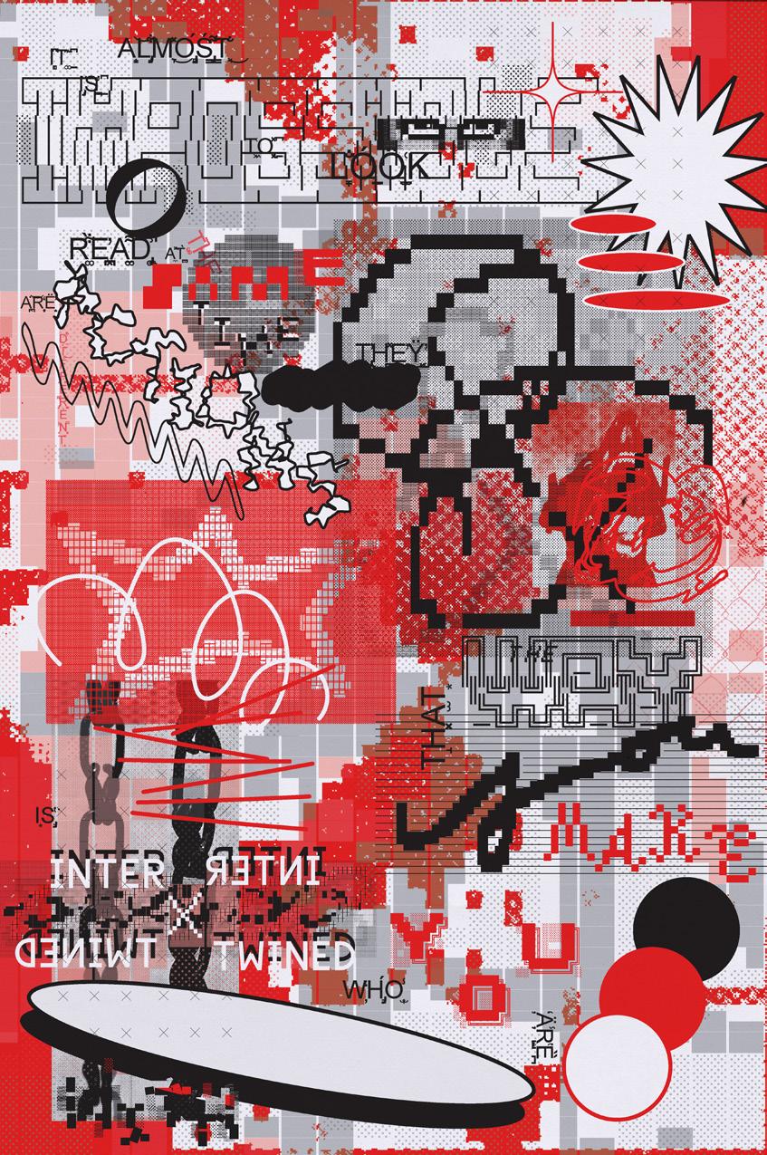
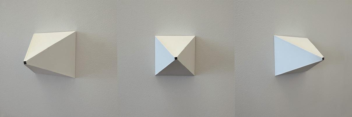
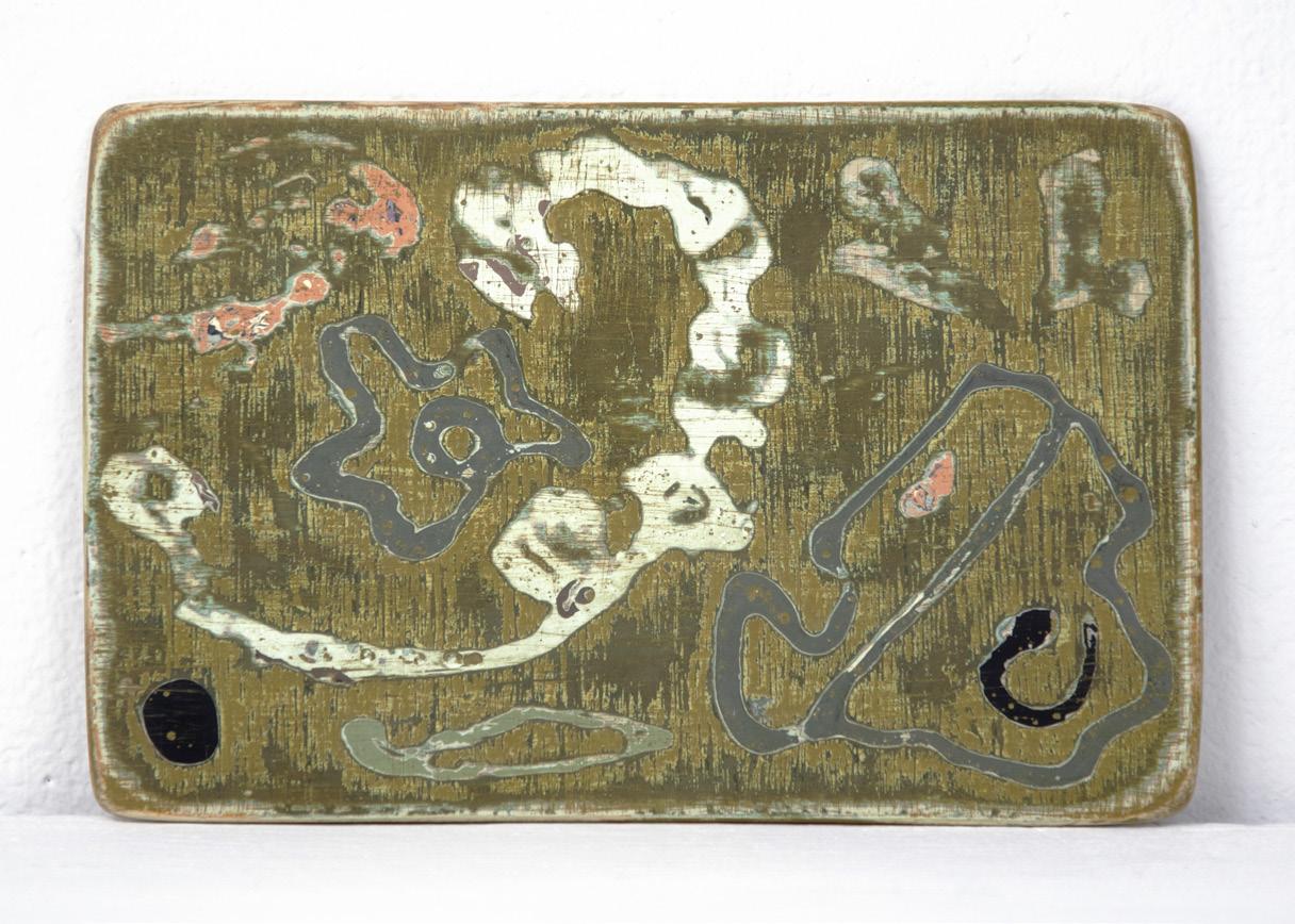
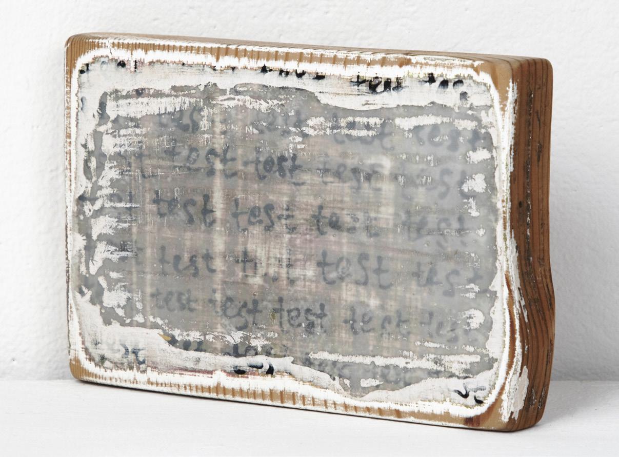
Charles Castro
THE TANGIBLE
As a designer and visual artist, my main goal is to highlight the diverse nature of graphic design by blending my unique design approach and principles. I want to break free from traditional boundaries and offer a more comprehensive perspective on visual communication by combining formal techniques, emotional depth, and analog mediums often associated with fine arts. I aim to go beyond the usual by using precise formal techniques that not only enhance visual appeal but also emphasize the importance of methodological rigor in graphic design. Adding emotional meaning to my designs is crucial, creating a connection that goes beyond aesthetics and resonates with viewers on a deeper level. Stepping away from a purely digital form of making, I’ve embraced analog mediums in my design work, opting for a hands-on, traditional approach that pays homage to timeless artistic methods. By incorporating analog tools and techniques, I hope to dissolve boundaries between disciplines, encouraging a broader understanding of graphic design. In essence, my aim is to set a new standard for graphic design—one that goes beyond aesthetics to embrace a holistic and interdisciplinary approach. Through the intentional integration of design methodology, formal techniques, emotional resonance, and analog mediums, I hope to redefine the possibilities within the field and contribute to a more enriched and nuanced design landscape.
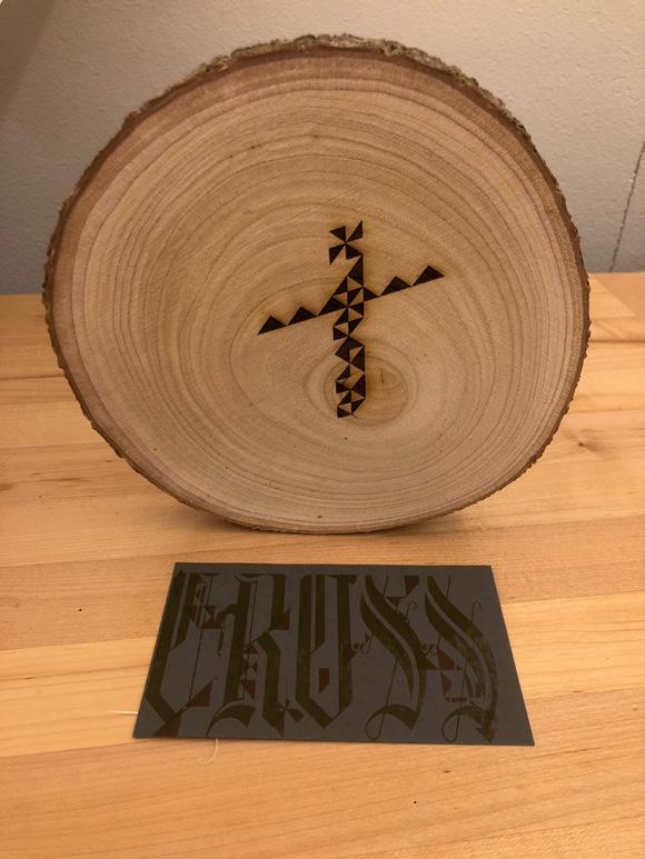
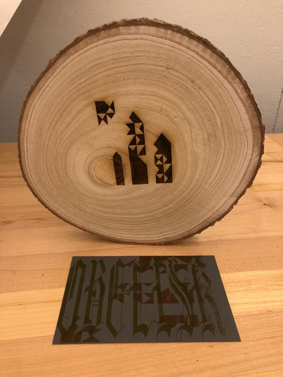
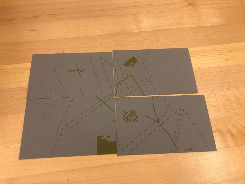
Matches + Patches, 2023. Risograph prints, set of 9, each 11 × 17 in.
Process Book, 2023. Inkjet print on paper and vellum, 4⅛ × 7½ in.
Electroshot Typeface Specimen/Stencil, 2023. Newsprint and fiberboard, dimensions variable.
Interrupt, 2022. Printed poster, 40 × 60 in.
Qianyue (Rachel) Chen
MICRO NARRATIVES
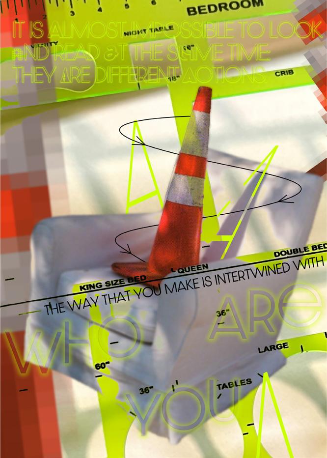
In the bustling landscapes of urban environments, traffic cones are not merely functional objects but repositories of micro-narratives that weave the intricate tapestry of city life. Far from being mundane markers, these cones are silent witnesses to the daily rhythms of urban dynamics, serving as focal points for a complex interplay of individual stories that illuminate the urban experience.
Traffic cones are seen as both the fabric and the scaffolding of the city, marking sites of future transformation, and serving as canvases for public expression and interaction. In their striking orange hue, they punctuate the cityscape, guiding the flow of urban life while also inviting moments of creativity and personal connection. These objects, positioned at the intersection of change and continuity, embody the dynamic stories of development, adaptation, and community engagement that characterize the urban condition.
It’s essential to remember that the grand narrative of urban living is composed of countless small objects like cones. Each one, though seemingly insignificant on its own, plays a crucial role in shaping the collective experience of the city. Through their presence, traffic cones contribute to the larger dialogue about space, identity, and belonging in urban environments. By paying attention to the micro-narratives these objects encapsulate, we gain a deeper appreciation for the intricate layers and diverse textures that make up our shared urban landscapes.
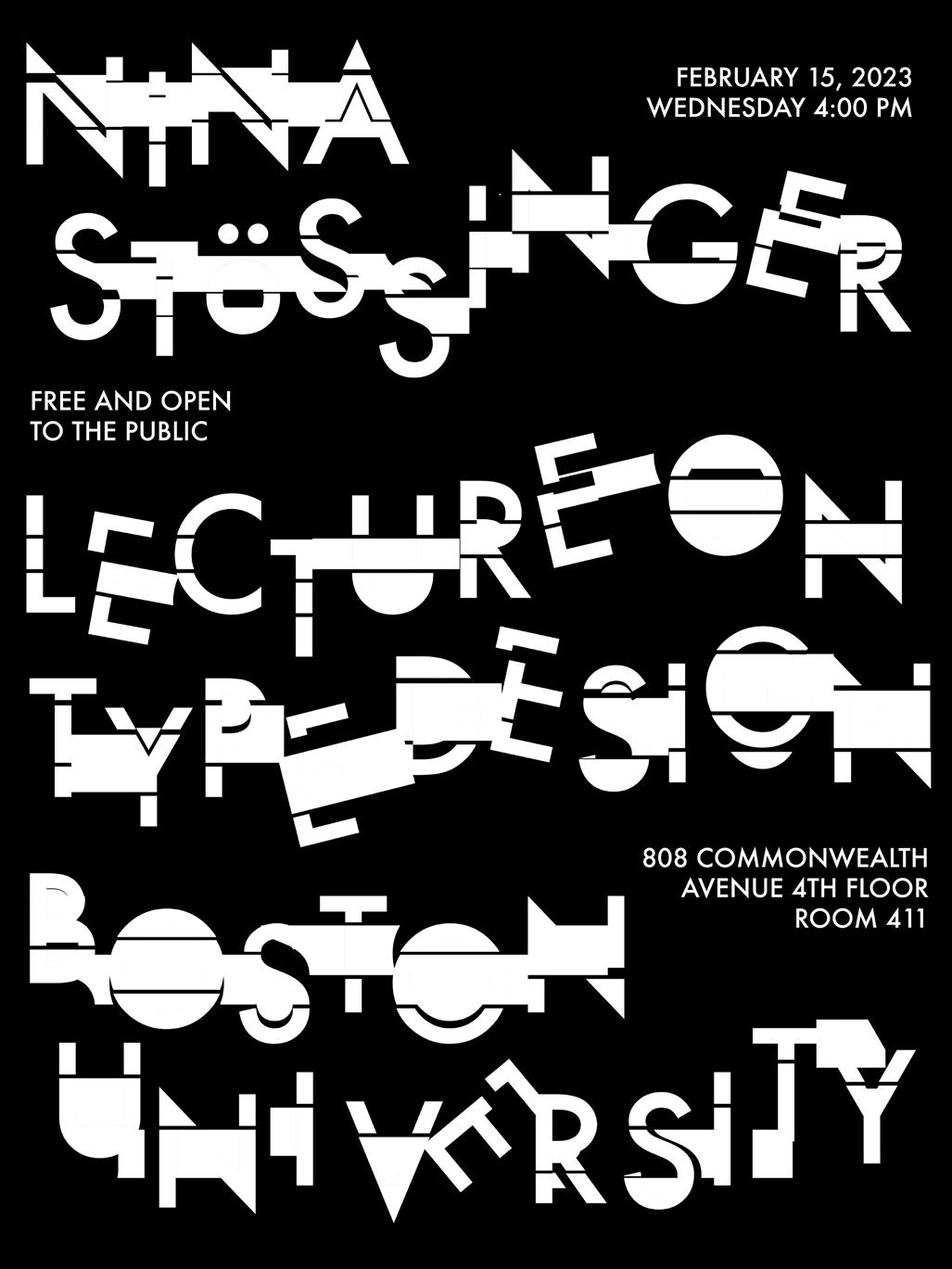
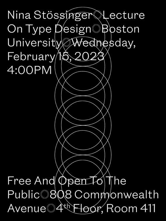
Nina Stössinger Lecture Poster, 2023. Poster, 18 × 24 in.
Yidie (Tico) Chen
In this rapidly evolving digital era, humans have become visual creatures surrounded by a variety of aesthetics. However, within my surroundings, there is a group of individuals seemingly abandoned by design trends. Throughout my career in design, I have come to realize that the elderly are swiftly being replaced by fresh blood, struggling to keep up with the waves of design.
My grandfather is one such individual. His daily encounters with design are limited to newspapers and advertising pamphlets. Many times, he has asked me what graphic design entails, and I have found it challenging to give him a clear verbal response. This motivated me to start this thesis, aiming to blend the art created by his hands with my understanding of design and aesthetics. I aspire to showcase the transformative power of graphic design by integrating his daily thoughts and memories into captivating posters and digital art, thereby redefining perceptions of aging.
Drawing inspiration from my grandfather’s experiences, this thesis delves into the personal narratives of the elderly, exploring how graphic design can become a vibrant link in preserving and sharing the rich tapestry of individual stories. By fusing the unnoticed artistry of the elderly with my design perspective, this thesis seeks to bridge the gap between generations, emphasizing the potential of graphic design to transcend age barriers and contribute to a more inclusive and interconnected society.
Flashback, 2024. Poster series, each 24 × 34 in.
Flashback 2, 2024. Poster, 22 × 34 in.
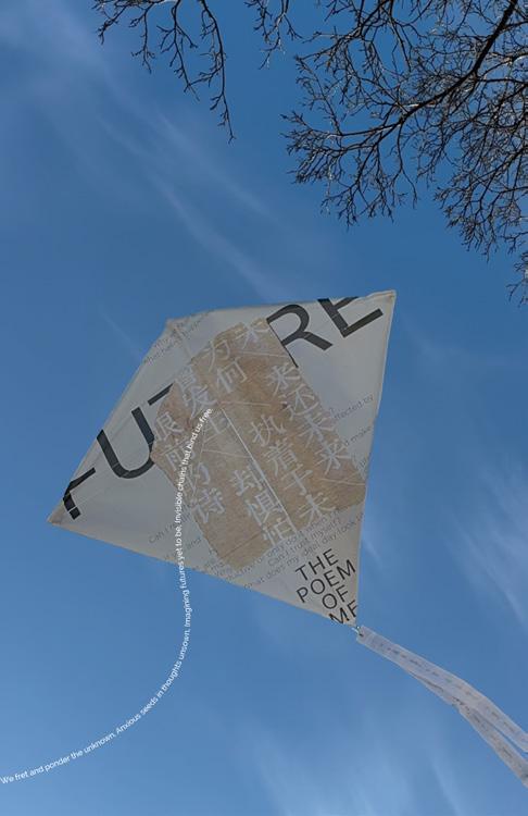
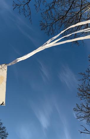
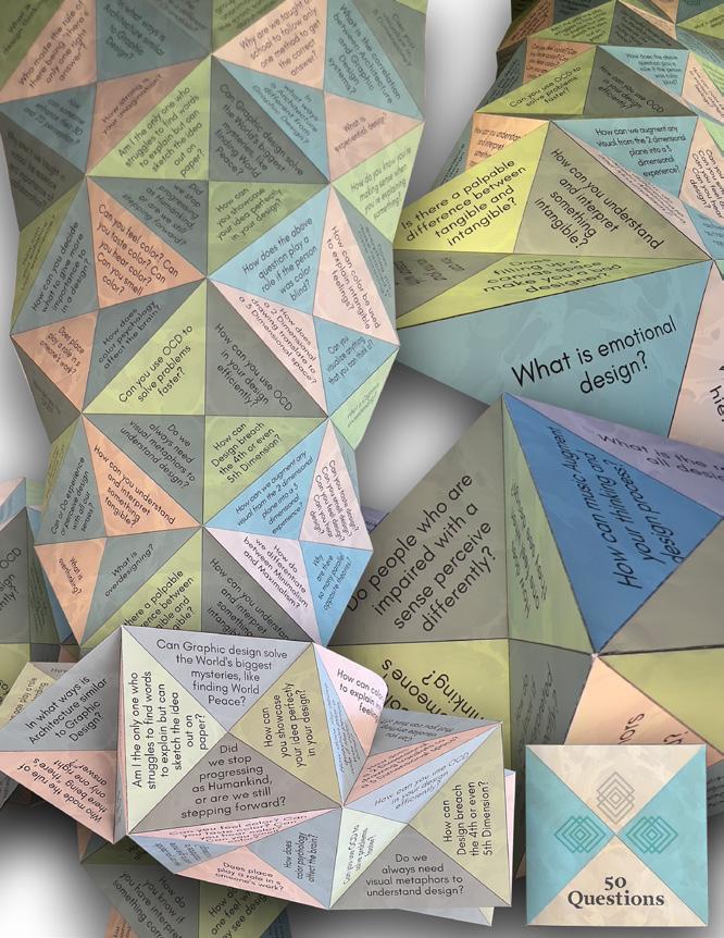
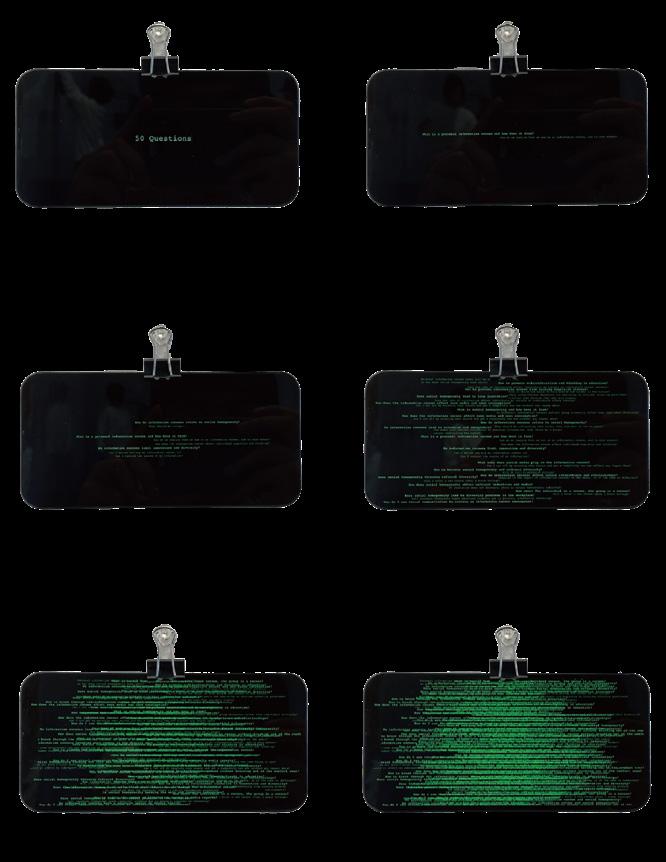
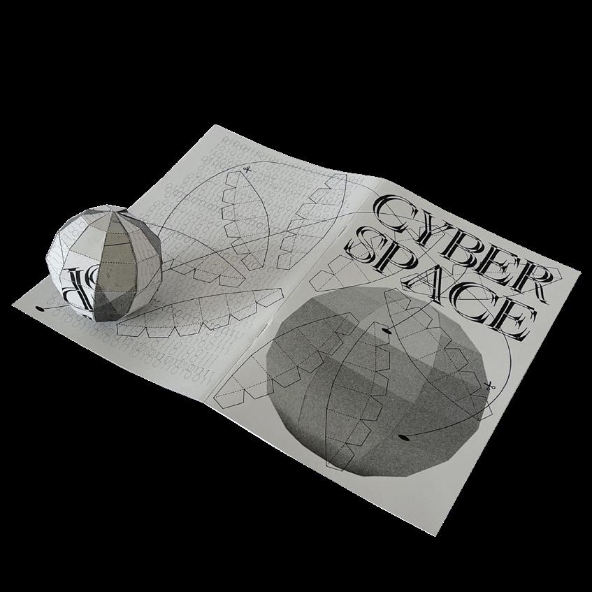
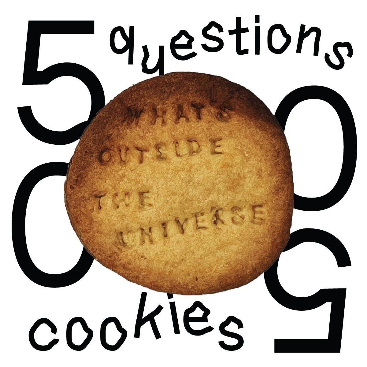
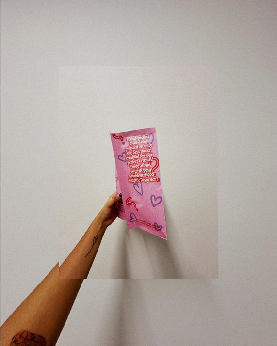
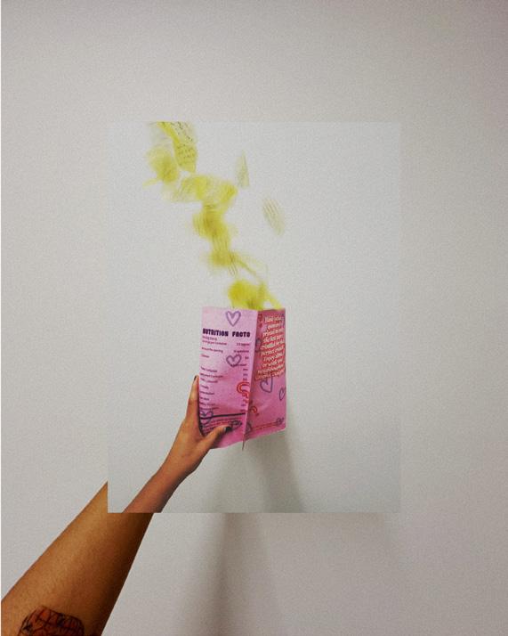
50 Questions, 2023. Print on kite, 12 × 12 in.
Nuclear, 2023. Typeface Design Blender model.
Awake, 2022. Poster and animation, 40 × 60 in.
Kristen Davis
STRUCTURE
The handmade and the digital can be combined under the umbrella of graphic design. They can be combined to explore the natural structures of the world, including the patterns of nature and the structure of human anatomy. My work is a combination of handcrafted, digital, and the in-between thanks to my Cricut machine. The goal is to make new discoveries about the beauty of the natural world by combining these three making processes. I explore what it means to design and be designed. I explore new ways to combine the handmade with the digital. My thesis also aims to uncover how the natural patterns and structure of the world can be represented in these mediums. Does the way these patterns are presented affect the way the viewer perceives them? Does the approach to making result in a more abstract and artistic result, or is it more designed and graphic? I hope to be able to answer these questions by creating a body of work that will represent different forms of designing. Natural patterns and anatomy have been explored through many different creative lenses. There are many designers who combine the analog with the digital. The art of papercutting is a less explored topic in the design world, though it does exist. Combining craft and design is a complicated task due to the complicated production process and difficulties related to mass production and distribution.
I am more comfortable exploring creativity through the lens of an artist than a designer. I approach my thesis from a graphic design standpoint, finding ways to marry in the handcrafted through different experiments. My thesis is a combination of experiments with the goal being to discover something new about the making process and how different mediums affect the viewer’s perception of the subject.
50 Questions, 2023. Cut paper, 22 × 50 in.
Paper Lantern, 2023. Cut paper, 16 × 16 × 16 in.
Side Effects, 2023. Posters, digital illustration, each 11 × 17 in.
Mega Poster, 2022. Digital, 40 × 60 in.
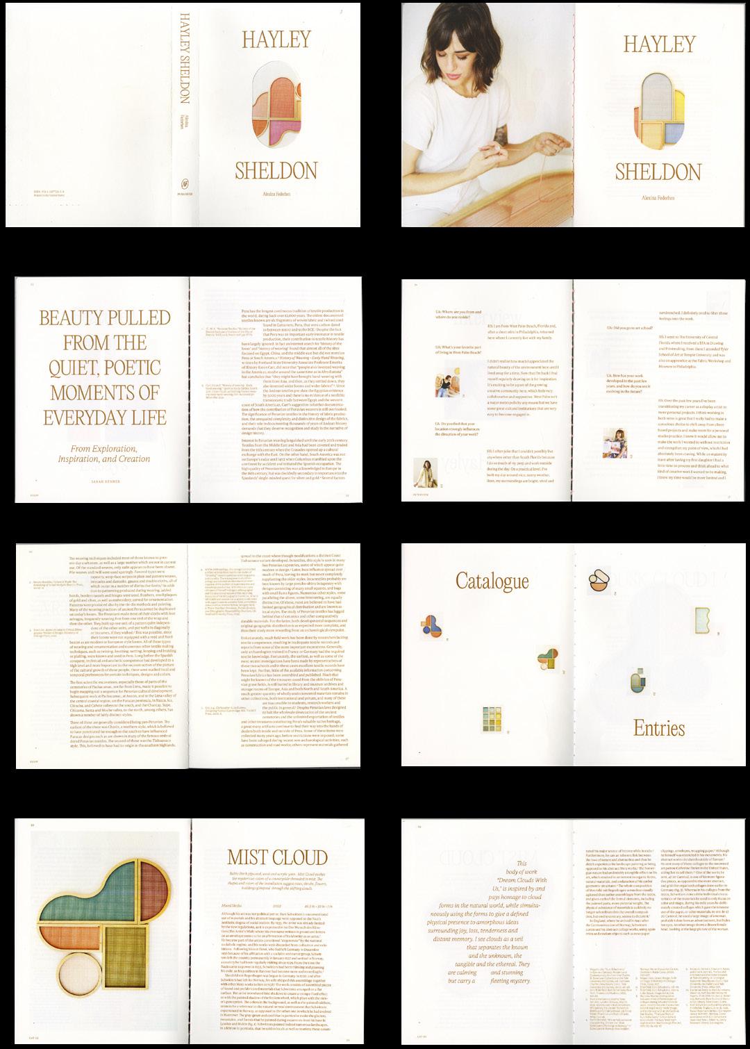
Alexina Federhen
BUILDING A BETTER BRAND
Branding is everywhere and has the power to change us as people and as a society. It is what we interact with every day, and it affects our mood, our decisions, and our habits. Designers have an ethical responsibility to create with intention and purpose to make the world a better place. Humans have an innate desire to surround themselves with items that define them. Identity and place are so closely connected that they inform each other. We create our environment based on our identity as individuals and our personal values. Environmental psychology studies how we shape our environment and, in turn, how our environment shapes us.
Brands are more than just the products we use; they’ve become our built environment. As a result of the pandemic and our reliance on a digital world, we have disconnected from communities and lead more isolated lives. Brands have the power to connect us, not to the actual products, but to groups who share certain values communicated by those products. Brands have become ecosystems with the power to create communities. My thesis explores the three dimensions of brand design. Brand designers need to adopt a new way of thinking about design identity that is more rooted in architectural design—a solid foundation, a reliable structure, and a user-friendly interface. Brand design should not just be a market strategy to sell a product. I approach it as an architect would—a physical grounding in the structure of design to create a foundation for the client that the business will build off. It must be tied to the identity of the client and the target audience. Every project, every problem, every solution is an opportunity to create a three-dimensional solution—concept/vision, target client, storytelling as wayfinding—and change the world for the better.
Hayley Sheldon Monograph, 2023. Book, 10 × 7½ in.
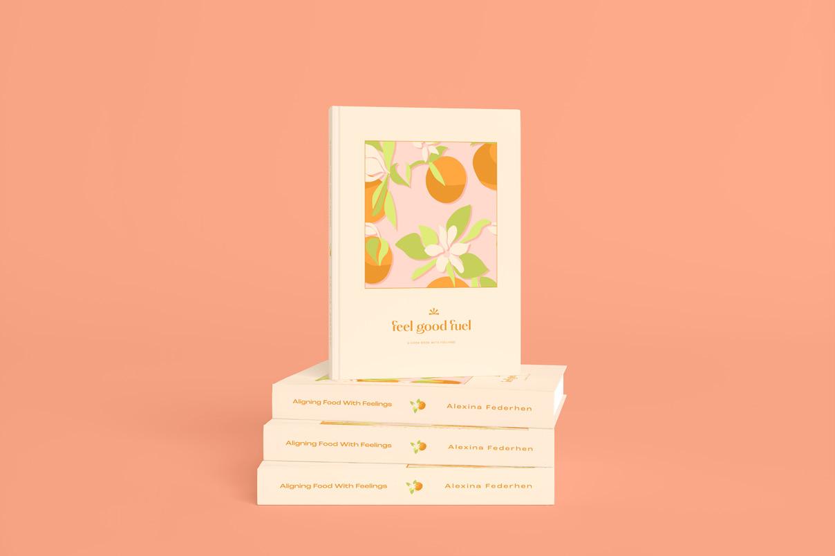
Feel Good Fuel, 2022. Cookbook, 7½ × 5½ in.
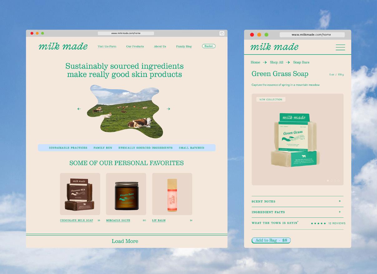
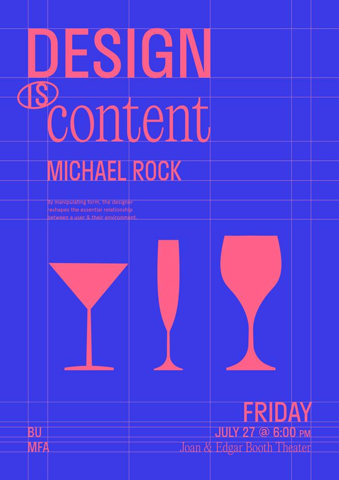
Milk Made, 2024. Website. Design is Content, 2023. Poster, 36 × 24 in.
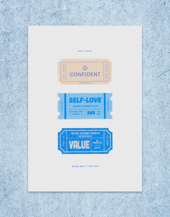
Ticket, 2023. Silkscreen print, 17 × 11 in.
Dhwani Garg
My work examines my role in graphic design and potential contribution to the vast terrain of typefaces and explores how type scale can intertwine through form and system within various frameworks. I explore various typefaces that can serve as a catalyst for my designs.
Growing up in India, where design elements take form in various shapes or sizes—be it in costumes, home decor, or even household items, design is an integral part of my experience. This has made me naturally drawn to the idea of proportionality. This innate inclination has fueled my passion for exploring the intricate connection between design elements and proportions.
Through my practice, I experiment with type scales as a tool to explore new narratives within my designs. I am of the opinion that even the smallest point sizes wield significant impact and contribute to the formation of larger forms and compelling narratives.
My methodology examines the fusion between readability and captivating visual allure. It signifies a departure where typefaces are not just carriers of words but also the handlers of design, marking their transition from conveyors of words to convoy of expression, prompting a profound reconsideration of their significance to my work.
Being a creator, a maker, and a designer is the lens through which I experience life, but it is also through this lens that I see my contribution to this world. Designing has always been about the journey for me. One in which I am constantly learning to see new details of design, living in an invariably wonderous wandering path that often offers serendipitous surprises, that teach me yet, one more lesson about something I hadn’t noticed before!
Interested in expanding my own vision of design, I joined the MFA program as a platform for exploration and discovery. Previously trained as an architect, I brought with me the practice of the structural and functional while being no stranger to the poetic essence of the built environment inhabited by human emotions. The relationships between structure and emotion, constraints and freedom, and pieces that create a whole, have always been part of my practice as a designer.
Through graphic design, I have developed an interest in design concepts that are applicable across a variety of disciplines within design itself, aiming to explore forms and materials widely, keeping the idea of range in mind. Designing to communicate has become designing to connect, inviting the audience to come closer, to experience, engage or play, and at times, to create further.
The symbioses between the tridimensional and bidimensional, between the audience and myself, and among the range of applications within a singular design concept, have become central to this adventure called the MFA in Graphic Design.
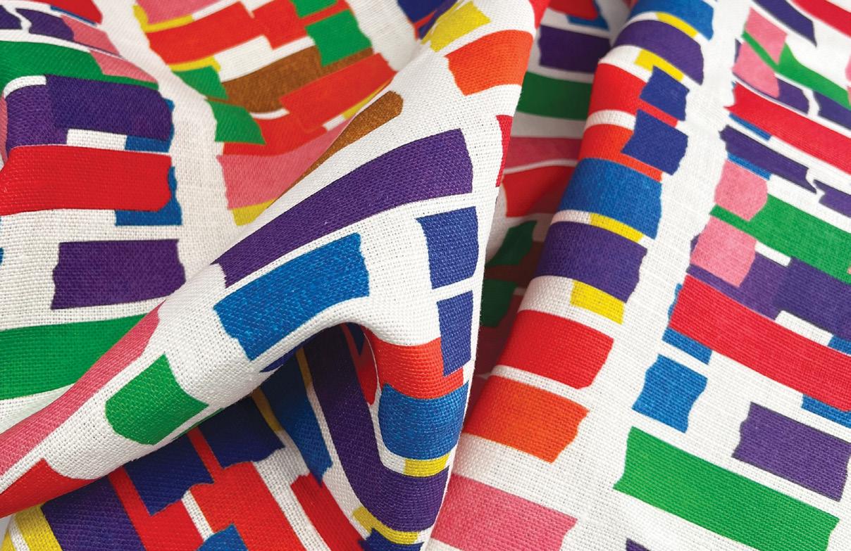
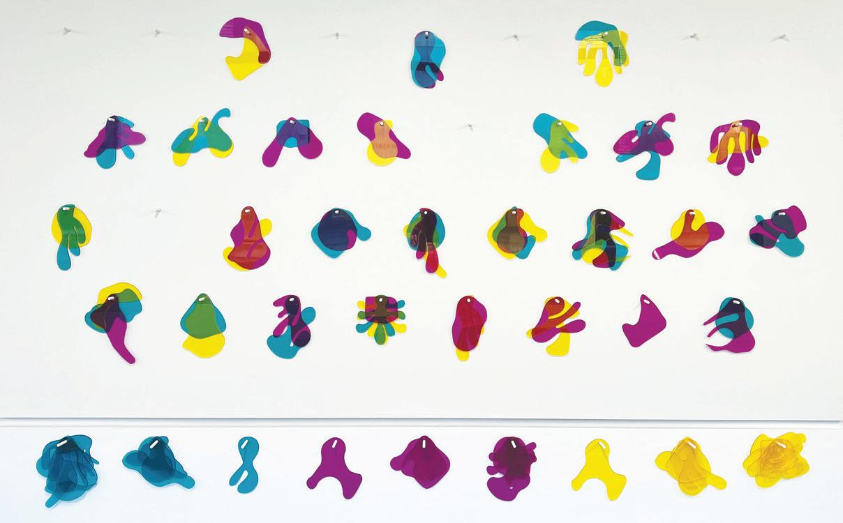
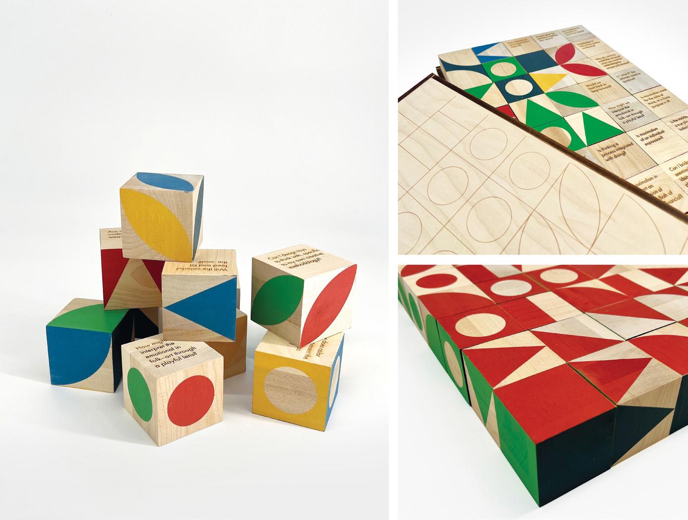
Masking Tape Proportionality, 2023. Belgian linen fabric, 54 × 72 in.
CMY no K(ey), 2024. Wood and acrylic installation, 8 × 5 ft.
50 Questions 10 Patterns, 2023. Wooden blocks and box, 10 × 20 × 2½ in.
Arjun Lakshmanan
DIMENSION OF SENSES
We, as humans, are an advanced civilization with the capability to think and perceive things in the world. With the help of our five senses (sight, smell, touch, taste, and hearing), we collect information about our environment and our brain interprets this input. The brain’s interpretation can be considered a sixth sense of the body, linked to intuition and instinct.
My research aims to narrow the divide between understanding the connection of our senses to perception and how perception functions in the realm of design. My thesis work challenges conventional notions regarding the quantity, quality, and dimensions of perception.
Within the realm of graphic design, questions arise regarding the ability to envision three-dimensional constructs. This uncertainty extends to the differentiation and understanding between tangible and intangible forms in the world. My explorations aim to unravel how individuals perceive and create multidimensional forms. This study utilizes discourse analysis within the specific context of design, diverging from conventional linguistic approaches and narrative analysis to unravel the intricate interplay between perception and execution in design. Design perception consists of many key factors, such as spatial orientation, stylistic preferences, aesthetics, cultural influences, and mediums of representation.
The aim is to dissect these elements, offering a more nuanced understanding of their impact on human senses and design perception. I further delve into the cognitive mechanisms that shape individual thought when designed communication occurs. Finally, this study aspires to serve as a catalyst for developing a design language that transcends the limitations of current perception.
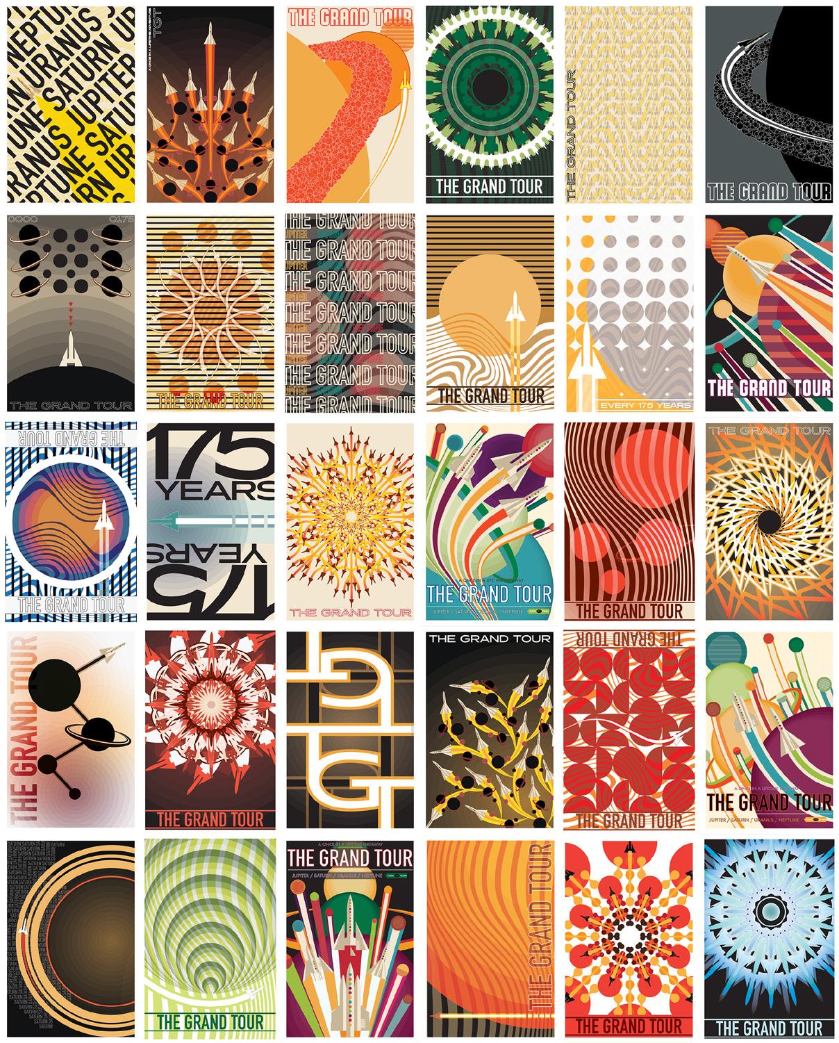
50 Iterations Post-Cards—The Grand Tour, 2022. Postcards, each 8½ × 5½ in.
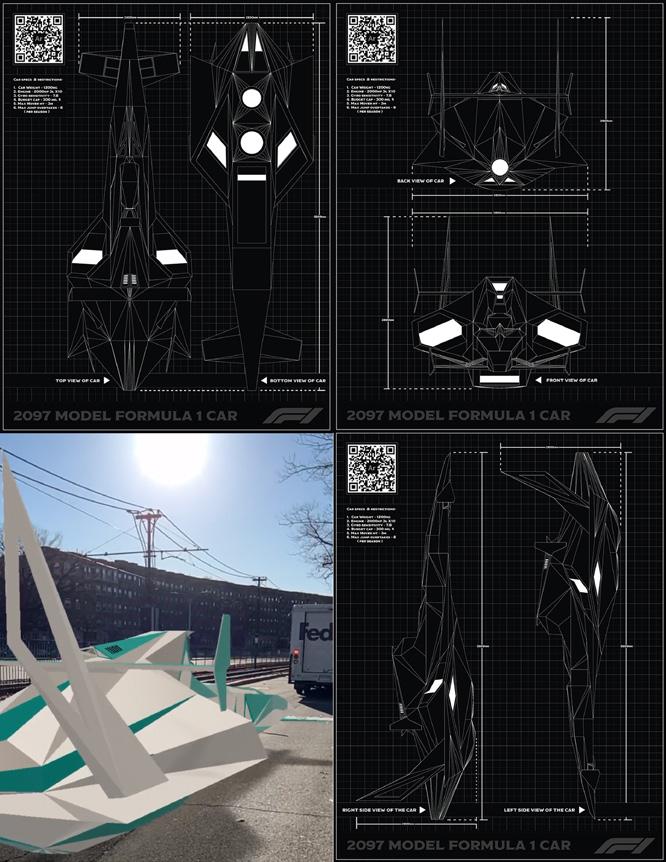
Futuristic F1 car—AR Model, 2022. Poster, 8½ × 11 in.
Origami Poster—50 Questions, 2022. Poster, 8½ × 11 in.
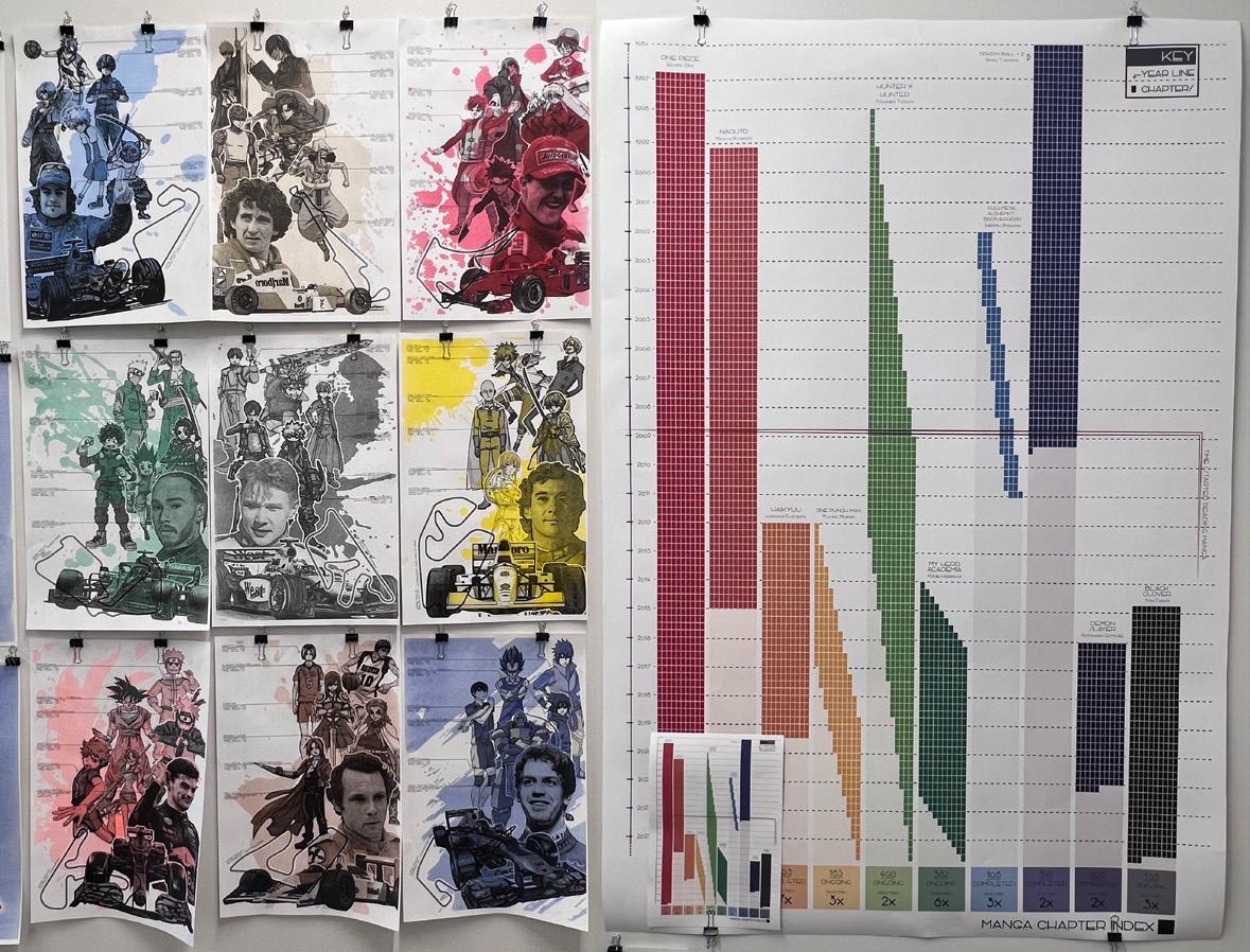
Observe & Quantify Poster—Manga + F1, Total Manga Chapters Read, 2023. Posters, 11 × 17 in.; 33 × 47 in.
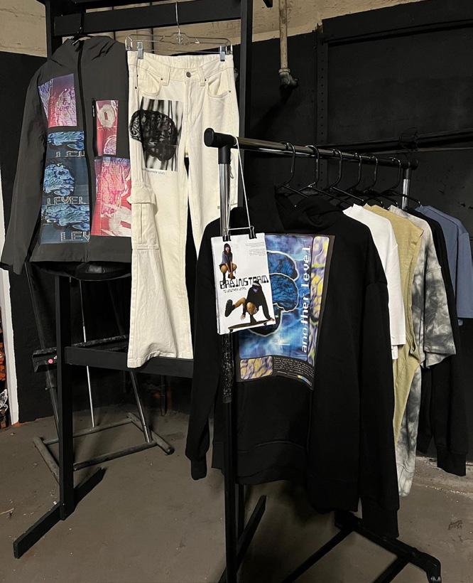
Ren Lanzi
In the realm of graphic design, a new concept emerges: ________CORE. Acidic, belonging, chaos, culture, decentralization, emotion, filling space, interaction, queer. Whatever nouns, verbs, or adjectives imaginable are a possibility and a perfect fit to accompany this multidisciplinary ethos. Each word serves as a brushstroke on the canvas of my graphic design thesis, challenging societal and design norms and beckoning those who seek refuge from the confines of tradition, conformity, and the ordinary.
Born out of the lived experiences of a nonbinary POC navigating a predominantly white and cishet society, ________CORE arises as a safe haven—an endless web of communities where one can enter and bring to light their true self. It can act as the ambiguous middle stage of a rite of passage, offering a sanctuary for ideas, thoughts, WIPs, and trial and error.
________CORE is a design manifesto of decentralization and experimentation: creating spaces for new experiences, emphasizing the importance of S.T.E.A.M. (Science, Technology, Engineering, Art, Math), and encouraging interactivity between the artists, the art, and the audience. My thesis endeavors to decentralize graphic design norms, challenging Western and Eurocentric customs with an unconventional and experimental approach to make design more inconvenient as a form of play, testing the five senses, making a controlled variable uncontrolled, and removing control entirely from the artist is just the beginning.
The results aspire to inspire those to challenge the routine and embrace intuition, utilizing ________CORE as a visual narrative, a science experiment, and an inquiry to disrupt and reconstruct. The objective is not just pedagogical—it reaches into the realm of self-discovery and identity, extending beyond the artist to the audience. So now I ask, how should we begin to dismantle the enigma behind what makes and who is “an artist”?
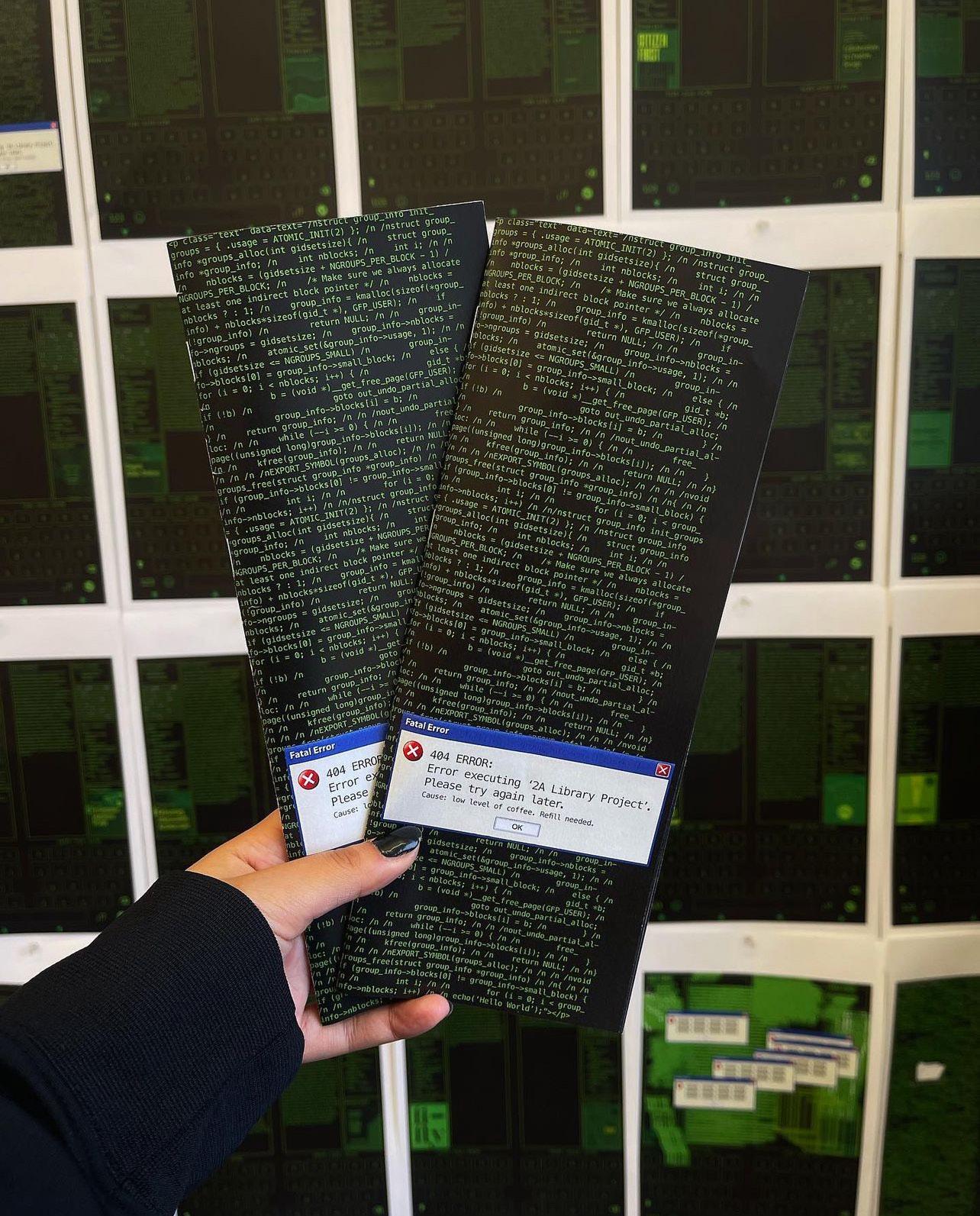
404 Error, 2022. Graphic design book catalog, 4¼ × 11 in.
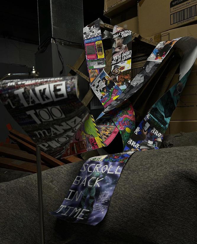
Scroll Back In Time, 2023. Diary poster and toilet paper stand, 5 × 20 in.
Brainstorm, 2022. Clothing brand, various fabrics and transfer paper, 6 × 9 in.
Interrupt, 2022. Poster design, 24 × 32 in.
Conversations with the Cosmos, 2023. Poster design, cardboard box, and transparent film, 24 × 32 in.
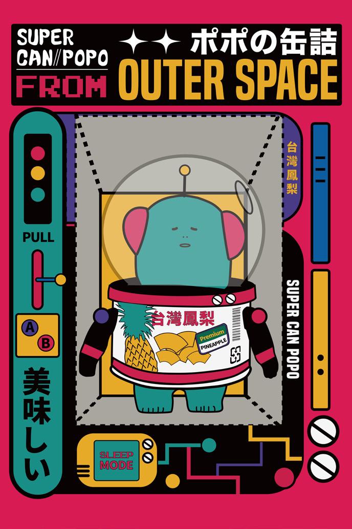
Liang Yi Lee
HARMONY THROUGH DIVERSITY: A SUSTAINABLE FUSION
In Boston’s dynamic academic environment, this thesis explores the integration of Taiwanese students into the cultural fabric of Chinatown, challenging biases through graphic design. Addressing stereotypes about Chinatown’s cuisine, the study uses design to showcase the authenticity of local foods, reflecting the evolving perceptions in multicultural neighborhoods.
Examining the concept of a “recycle” culture in Boston’s urban setting, the thesis highlights multilingual landscapes, cultural festivals, culinary experiences, and collaborative art projects as symbols of the city’s rich cultural exchange.
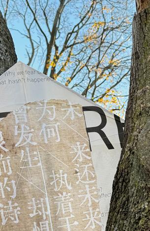
By focusing on typeface and illustration design, this project contrasts Chinese and English fonts to symbolize the coexistence of Eastern and Western cultures. This interplay emphasizes that cultural diversity extends to language and communication, with graphic design serving as a powerful medium for conveying unity, diversity, and transformation.
Harmony Through Diversity promotes a message of unity, breaking down language barriers and creating a visual and conceptual bridge between diverse communities. The design concept celebrates the beauty that emerges from embracing cultural diversity, challenging biases, and promoting sustainability.
In the heart of Boston, the thesis concludes that the fusion of cultures is a living reality, where typeface and illustrative design become a universal language reinforcing the idea that cultural identities can coexist and influence one another, creating a tapestry of ideas and traditions greater than the sum of its parts.
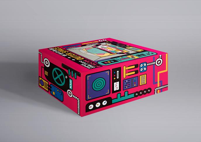
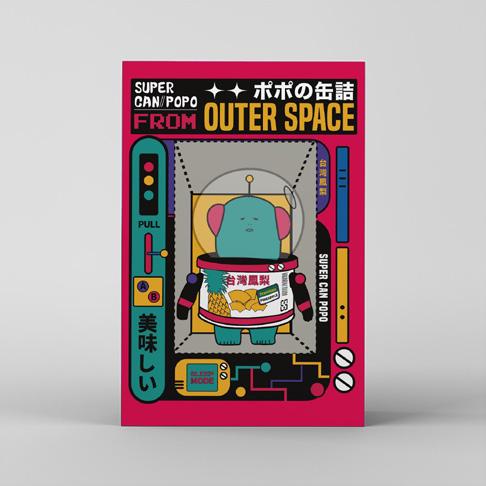
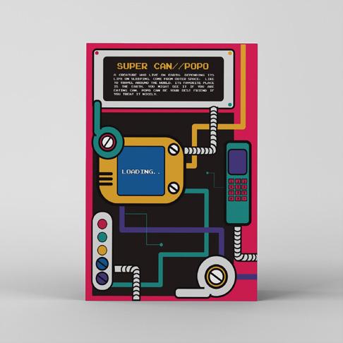
Supercan POPO, 2023. Mixed media, 36 × 48 in.
Chaos in Harmony, 2022. Digital, 18 × 24 in.
Masonry, 2022. Digital, set of posters, each 24 × 36 in.
Japanophilia, 2023. Digital, 33 × 51 in.
Chi Wei Lin
WHEN WESTERN MEETS EASTERN
The typography landscape in Taiwan has witnessed a growing trend towards standardization, with a predominant focus on Western minimalism and Japanese aesthetics. This contrasts starkly with the typography scene in Taiwan during the 1950s. This phenomenon has occurred in most Eastern countries due to globalization and the pervasiveness of Westernized design education.
To address this shift, I aim to encourage young designers to delve into the history of traditional Chinese design and explore Chinese type design archives from the past rather than solely relying on Western resources. In today’s Chinatown, the typography landscape is extremely different from what it is now in Taiwan. Taiwan has a far more Westernized typography landscape compared to that in Chinatown in America. It is crucial for people to be mindful of the dominance of Western influences in design education that has shaped the typography landscape today. Typography reflects cultural aesthetics and history. It loses diversity when one typography system begins to dominate. Eastern cultures are increasingly leaning toward Western aesthetics in education and typography. In doing so, we risk losing our original identity and uniqueness. I believe there are other ways of embracing the difference between Eastern and Western styles while preserving our own.
Expressive Typography, 2024. Magazine spread, 10 × 17 in.
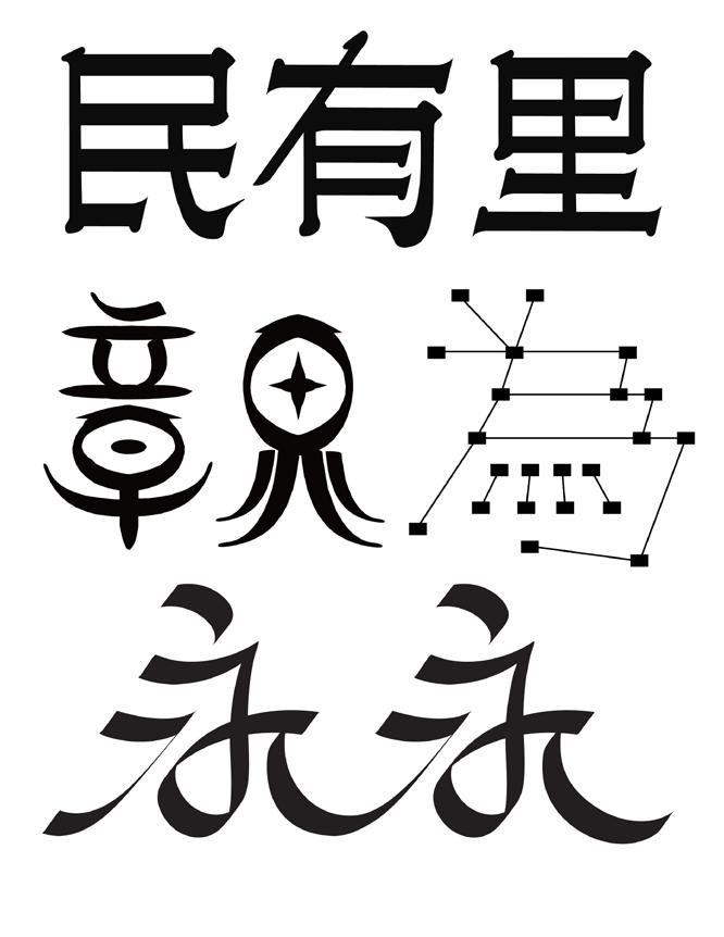
Chi typeface specimen, 2023. 10 × 8¾ in.
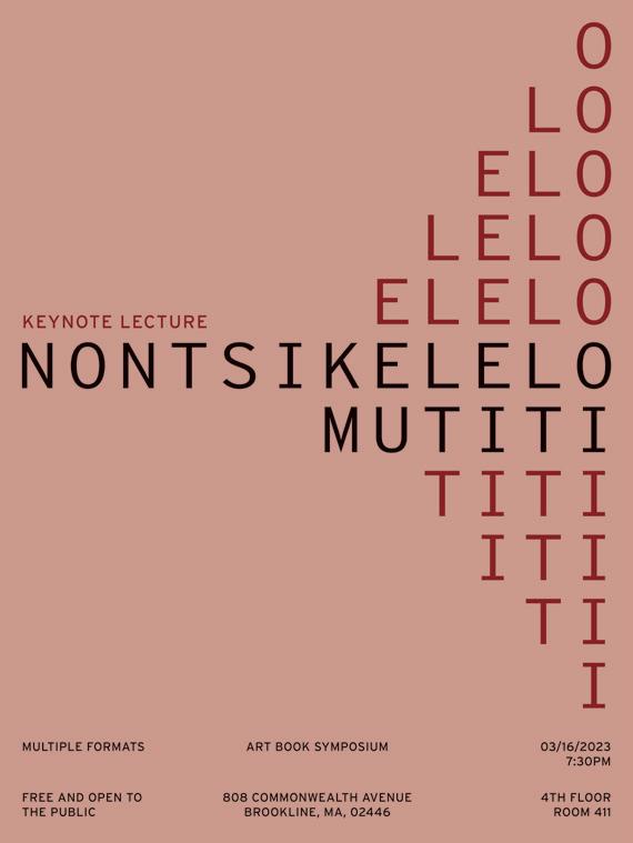
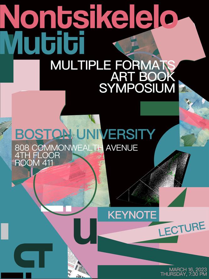
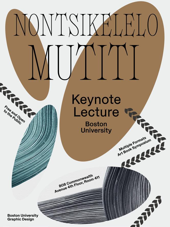
Nontsikelelo Mutiti Keynote Lecture, 2023. Poster, 18 × 24 in.
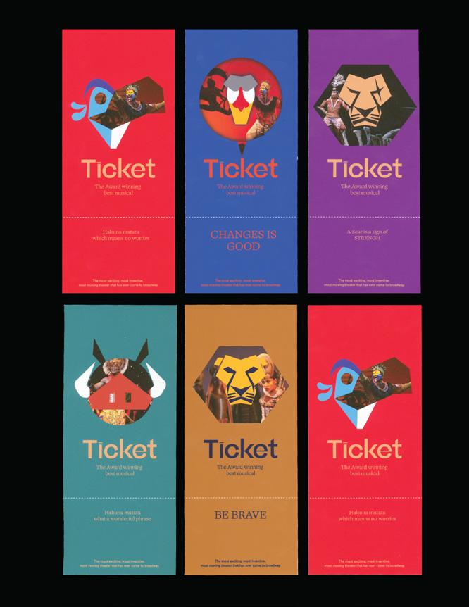
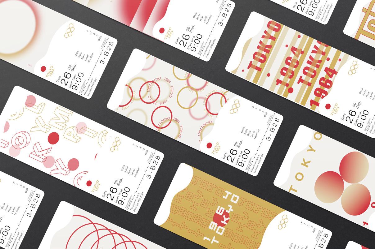
Branding for Lion King Musical, 2023. Ticket, 2½ × 6 in.
Chinese Type Design, 2023. Typeface inspired by Brush/Translation/ Expansion model.
Raquel Rabines
I often find myself overwhelmed by the seemingly uncontrollable and unexplainable components of our world. I can’t help but feel small, existing in space with endless questions, countless theories, and very few answers. I ease this discomfort by observing, questioning, and exploring what it means to be human and how we relate and respond to the natural and biological phenomena of our world. Common themes I explore within my work include interconnection, time, observation of nature and natural processes, perspective, and emotion. The more I seem to learn and observe about our world, the less I feel like I really know. My own discomfort from this realization is what drives the emotion behind my own work. Additionally, my design aesthetic and illustration style have been influenced by my family and life growing up in Southern California. As the youngest daughter in a family of five, I was exposed to San Diego’s skate and surf culture by my older brothers at a young age. My illustration and design aesthetic often showcases my younger years reading Thrasher magazine and surf publications. Similar to a good horror movie—one of the things I love—I was always drawn to the unsettled grittiness and grunge aesthetic of skate culture influenced by the punk rock scene of the 1970s and the graffiti street art movement. Above all, my design methodology and creating process are the most important part of my identity as an artist and designer. I love to incorporate traditional art forms such as painting, printmaking, collage, book arts, and photography into my design compositions and graphic works. It is important to me that I work with physical materials and create tangible work that I am able to hold, interact with, and share.
MAD WORLD
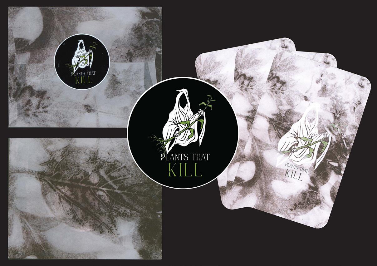
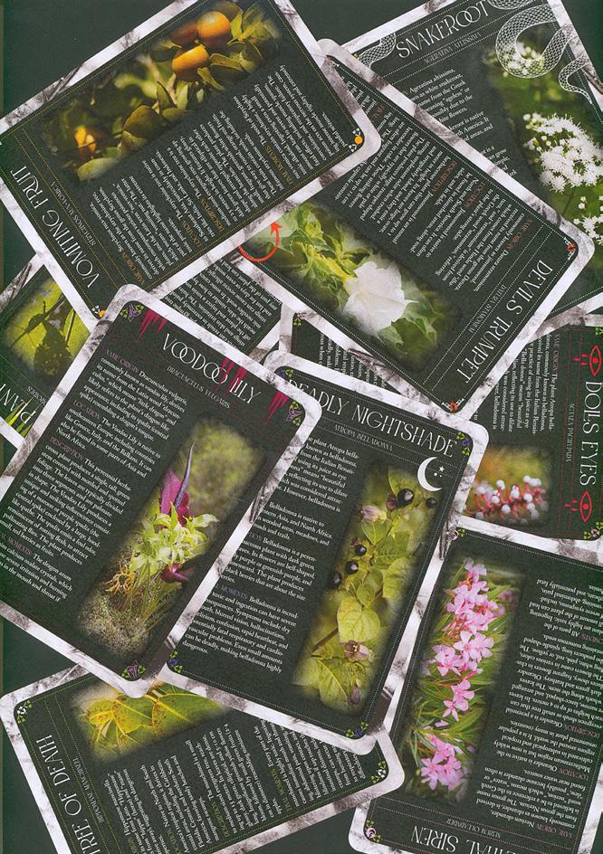
Plants That Kill, 2023. Packaging and card design (back), print, 5 × 7 in.
Plants That Kill, 2023. Card design (front), 5 × 7 in.
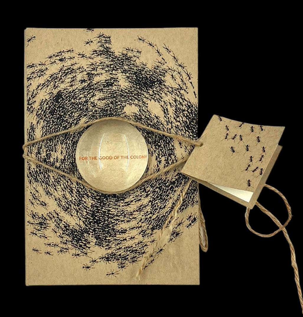
For The Good of The Colony, 2023.
Publication package design, print 5½ × 8½ in.
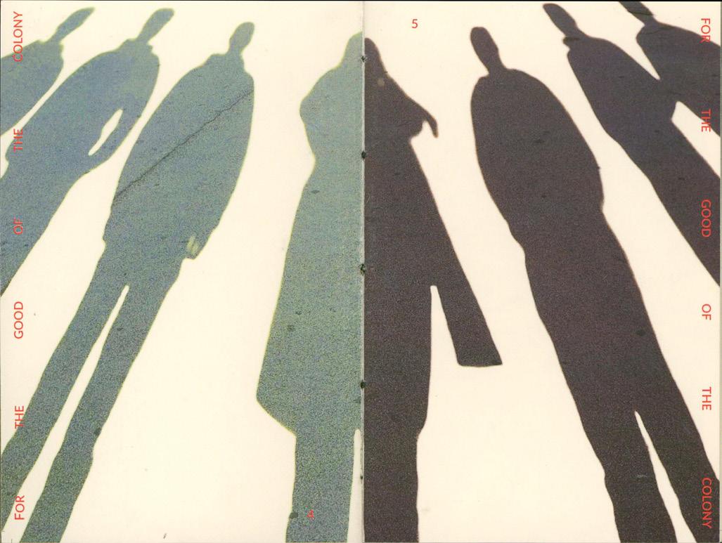
For The Good of The Colony, 2023.
Publication design, print 4 × 6 in.
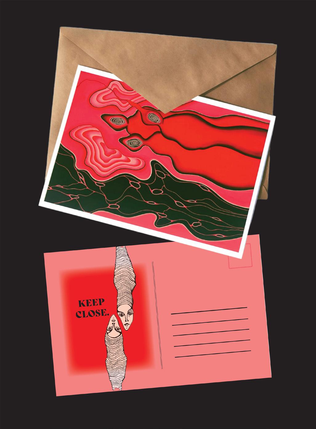
“Keep Close” Postcard Collection, 2022.
Digital print, 4 × 6 in.
Christine Seungmin Roh
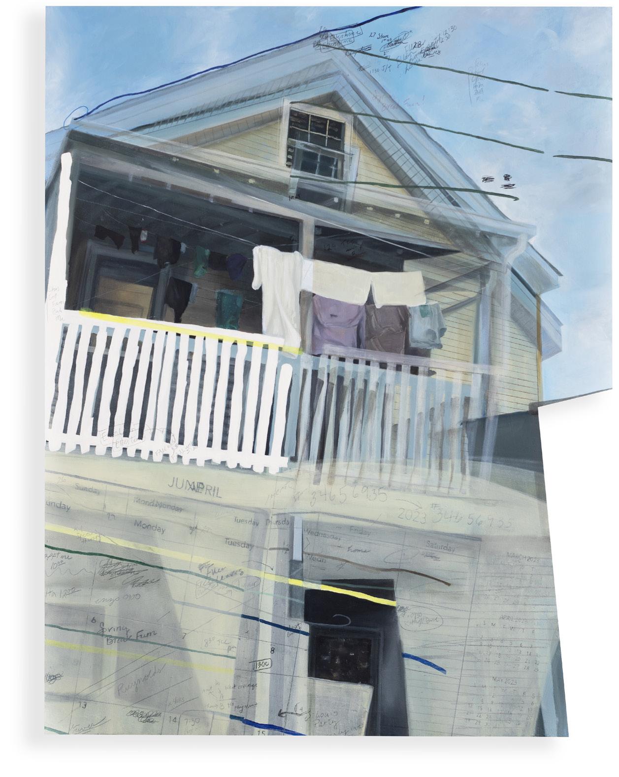
The world is changing at a rapid pace, driven by science and technology. While it liberates people to do things easier and faster than ever before, it may cause them to become detached and disoriented from reality. Design can reconnect people in this challenging society where it’s easy to fall behind in this race, just as it’s easy to get necessary information at the speed of a blink of an eye. Access to this information is a necessity for survival in our society now, and everyone should be able to get what they need. I explore strategies for people to envision their passion and love and make them come true with my design language. I approach projects through various mediums based on what you think and love. Your experience, your story, and your journey matter the most to me, and that’s what inspires me to design. I would like to get to know you by listening and asking the right questions at the right time. Designers should communicate to ensure everyone is on the same page. Through connection and the realization of ideas, design helps reunite people.
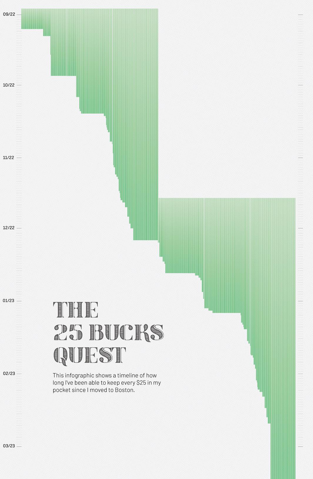
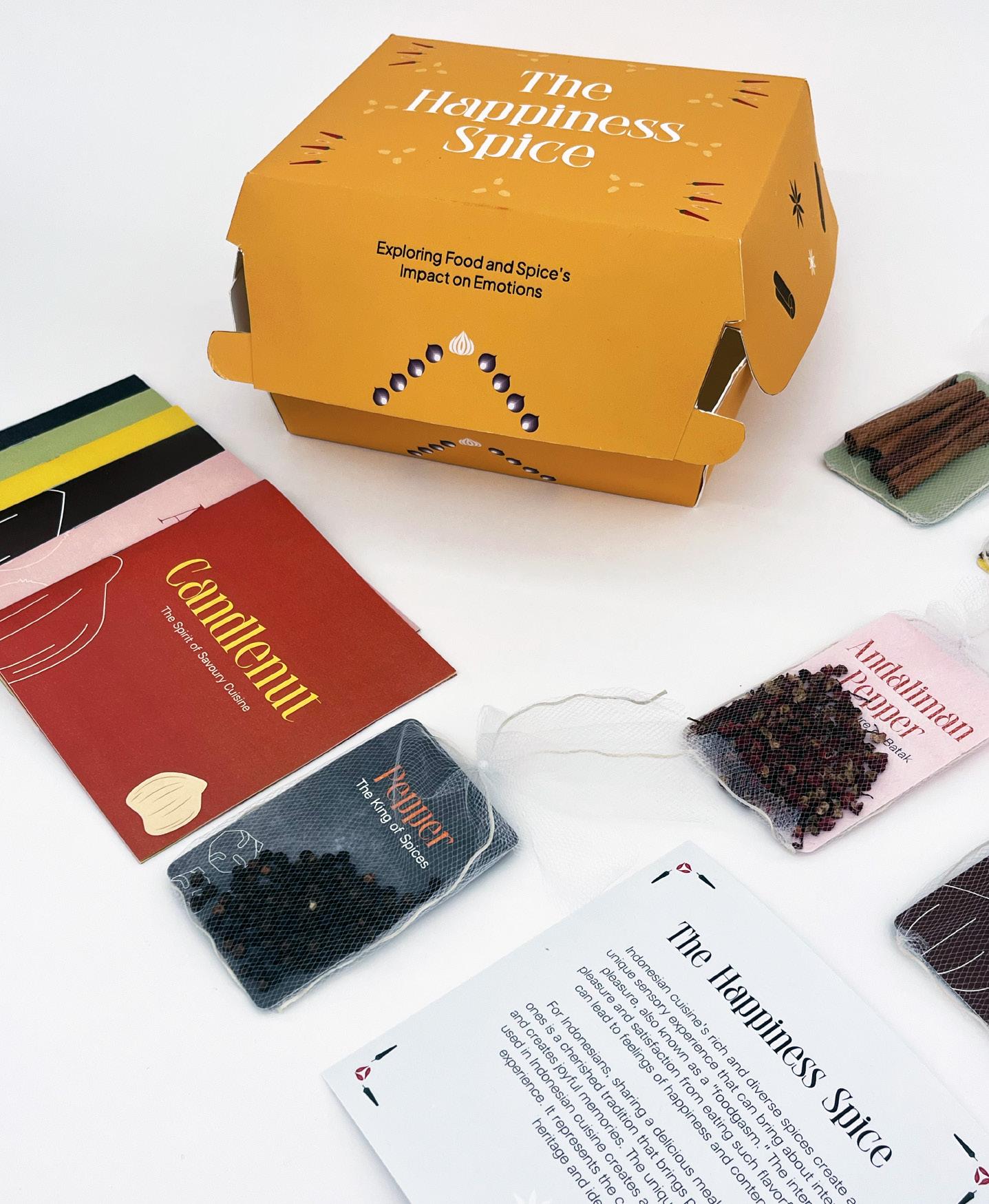
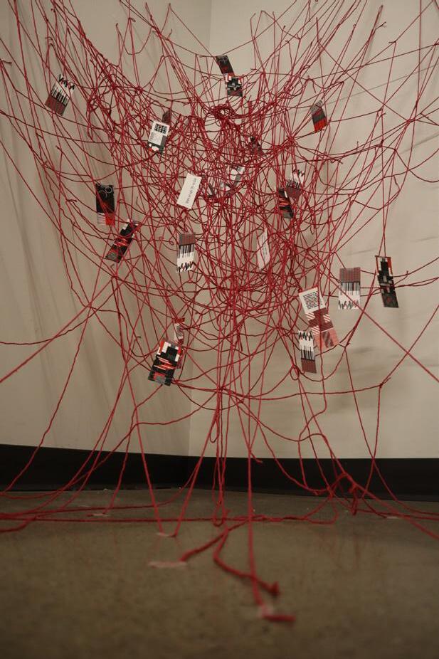
Drawing Numbers emerges from my daily engagement with charts and numerical data at the Ministry of Finance of Indonesia, where I have been working for 10 years. With a background in accounting, the legibility, precision, and accuracy of these numbers hold paramount importance to me. However, the challenge lies in capturing the interest of a broader audience who may not inherently find these numerical intricacies engaging. By comprehending the audience’s desires and expanding the repertoire of alternative forms of publication infused with emotions and sentiments, this project enriches the domain of information design, challenging perceptions of monotony and tedium that have persistently lingered. This work embarks on a quest to discover variative forms of visualizing scattered data that permeates our surroundings. It seeks to puzzle out how illustration and/or data visualization can enhance the conveyance of messages related to data more effectively. Drawing Numbers thus stands as a comprehensive exploration, offering not only insights into the intricacies of information design but also practical methodologies and alternative perspectives. It is a call to enrich the field, making information more accessible, engaging, and meaningful.
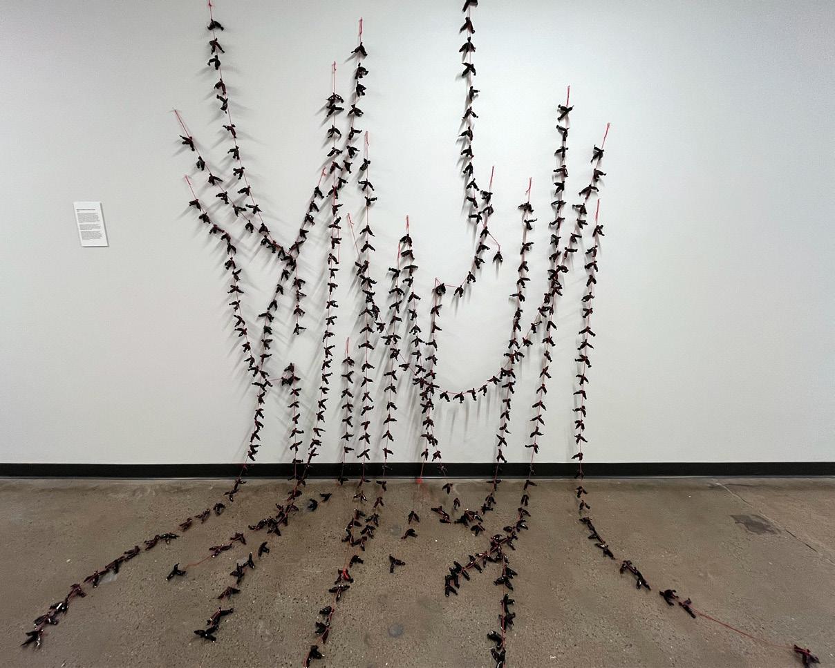
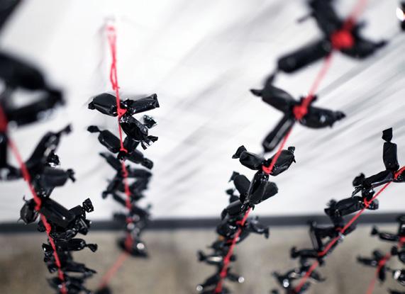
The 25 Bucks Quest, 2023. Poster, 70 × 35 in.
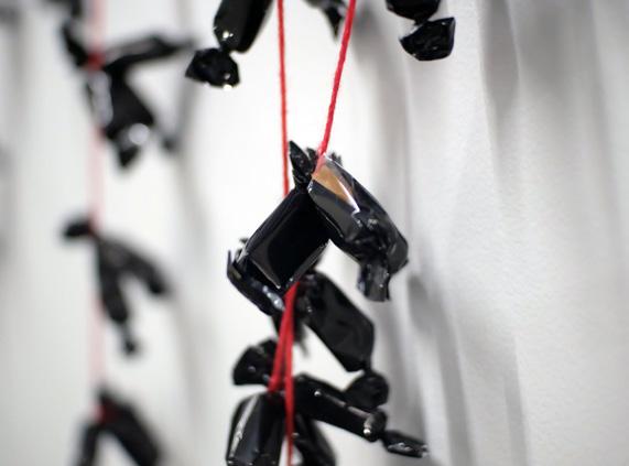
What Lies Within The Black Candies, 2023. Installation, caramel candies, black plastic wrapper, and red thread, 7 × 7 ft.
The Happiness Spice, 2023. Zine and packaging box, 10 × 10 × 5 in.
Kristina Shumilina
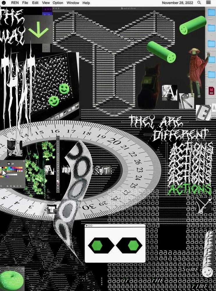
CREATE NEW LAYER
In this era of information noise and overload, the challenge of drawing attention and shaping perceptions has never been more daunting. To navigate this landscape, I explore multilayering as a design approach. I believe that it is a promising route forward—toward impactful design strategies, profound connections, and lasting impressions.
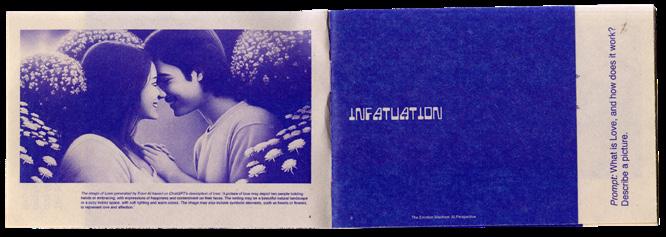
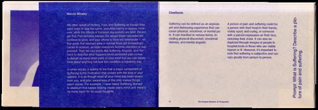
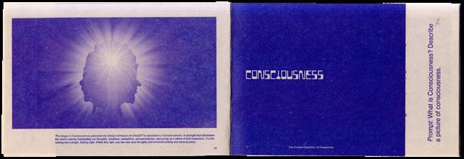
With regard to my design methodology, I create complex structures and interconnections of multiple layers, meanings, perspectives, and narratives. Each design element, including aesthetic elements and abstractions, carries intended and assigned meaning. I delve into verbal components, such as connotations, semiotics, and linguistic nuances, as much as into visual ones, such as color theory, typography, and hierarchy. Using multiple mediums, “breaking” standard mediums, combining craft and digital approaches, and curating the multisensory experience, I enhance the immersion of the recipient in the design piece. The important part of my approach is collaborating with AI: while debates continue that artificial intelligence will replace the jobs of artists, designers, and other professionals, I’m exploring ways to collaborate with AI, convinced that such a partnership has the potential to push our creativity to new levels.
My research is interdisciplinary and lies at the intersection of design, storytelling, and commercial space. The foundation is understanding human perception, particularly in response to visual and verbal stimuli, and navigating the recipient’s attention through different layers of design depth. As a result, I convey the conceptual research and create the body of design work based on research insights and methodology principles, introducing both research and the body of work within the thesis book. The research contributes to such areas as graphic design, branding, advertising, marketing, and communications.
What is Real? // Color in Space, 2023. Double-sided risograph prints, 11 × 17 in.
Infinite Alive, 2023. Split book and augmented reality, 7 × 7 in.
The Emotion Machine: AI Perspective, 2023. Newsprint paper, 5¼ × 3½ in.
Weimiao (Davis) Sun
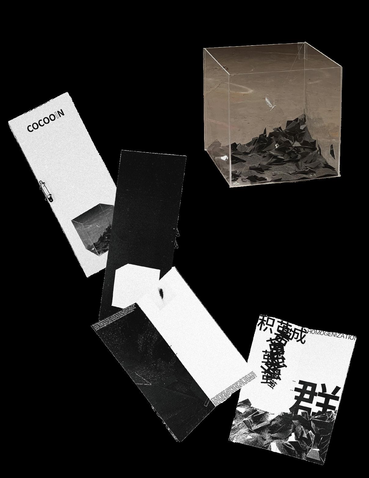
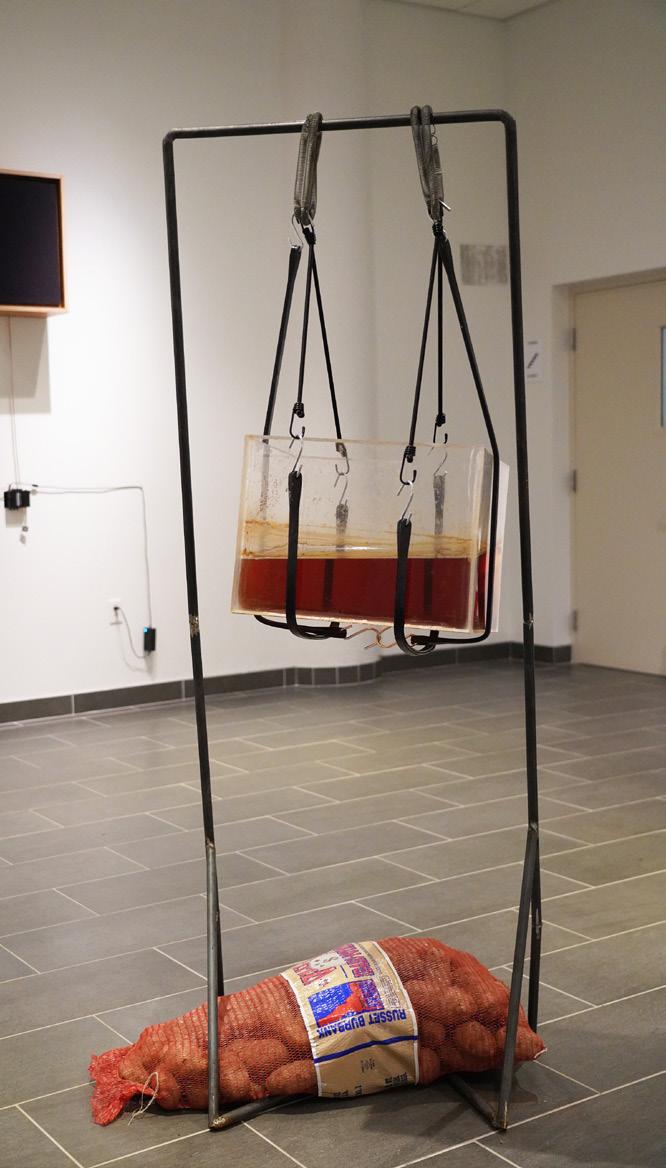
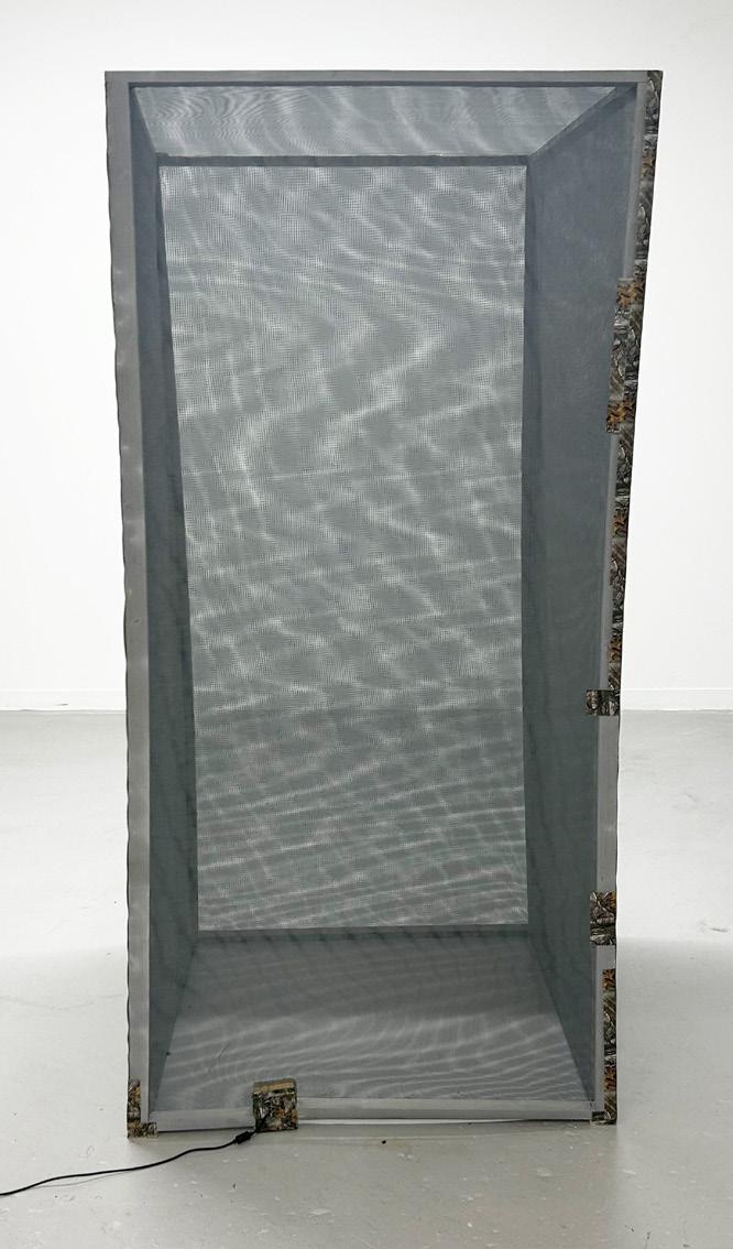
RUSTY IN COCOON
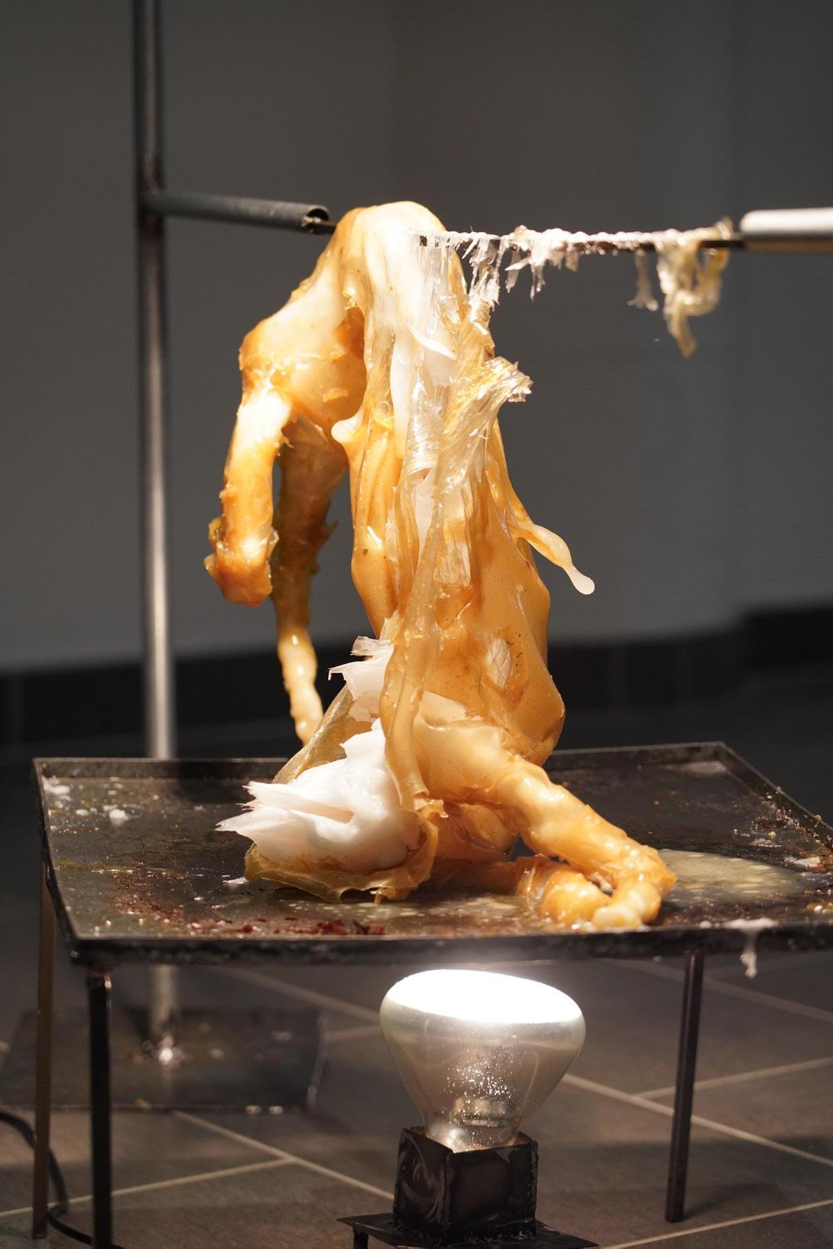
In contemporary society, the relationship between individuals and groups is profoundly affected by information technology. When I communicate with others, I notice imbalances in the storage and sources of information. In this context, I was inspired to express the subtle and complex relationship between individuals and groups, paying special attention to social homogeneity and the plight of information cocoons. The motivation for this project is to deeply analyze the phenomenon of homogeneous individual rust and how to reveal the deep connotation of this problem through artistic expression. How individuals become rusty, lose their innovativeness, and stagnate under the pressure of social homogeneity. This phenomenon is not only manifested in the homogenization of individual thinking, but also in the fragmentation of media information and the neglect of diversity. Through artistic expression, I hope to show the potential impact of this rusty state on individuals themselves and society as a whole. Through this installation art project, the relationship between the individual and social homogeneity is conveyed. The audience can feel the mutual influence of personal information cocooning and homogenization through the works. The individual is stagnant in the cocoon, partially detached from the original information, and reaches another cocoon chamber. In addition, I use creative means to present the complexity of information cocoons and remind people to think critically about information selection. The art project Rusty in Cocoon not only reflects the struggle of individuals in homogeneity, but also reveals the profound impact of social structure and information selection on individual creativity. This insight transcends the realm of art and reminds us to remain innovative and independent thinkers in all walks of life. The successful experience of this project provides general principles for other fields, encourages people to seek uniqueness in the trend of homogeneity, and promotes society to develop in a more innovative and diverse direction.
Cocooin, 2023. Booklet and installation, 4¼ × 11 in.
50 Questions Poster, 2023. Digital motion, 5⅞ × 2⅞ in.
Remix, 2023. Photo album and booklet, 8½ × 11 in.; 4¼ × 11 in.
Inventory, 2024. Multiple book collection, each 8½ × 11 in.
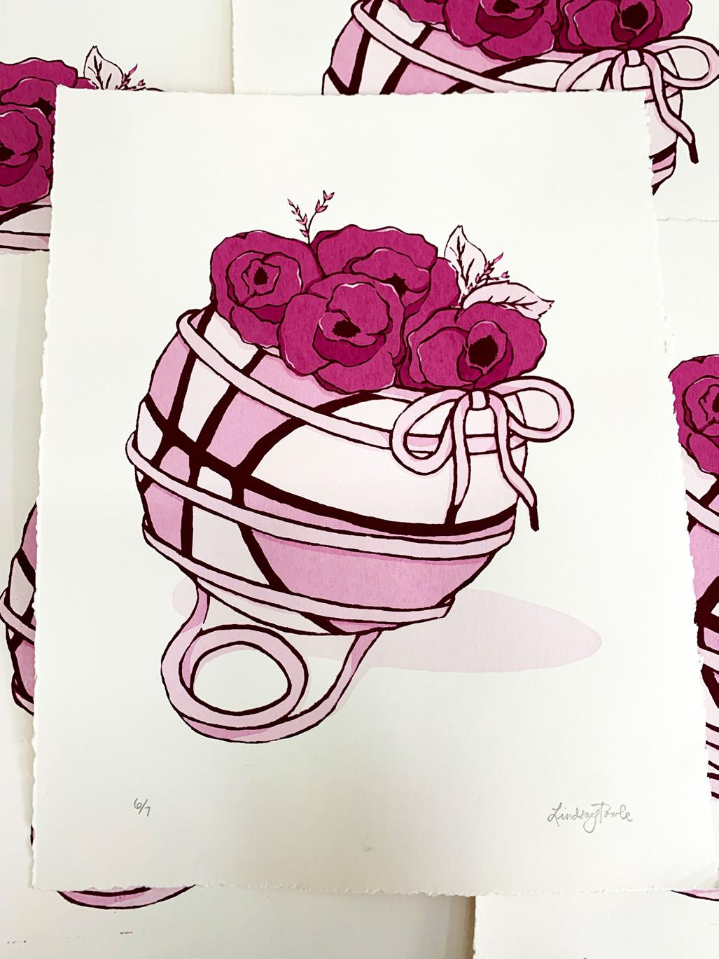
Lindsay Towle
THE BACKCOURT
In today’s society, where various subcultures thrive alongside mainstream sports like basketball, this thesis examines how people find their place in urban street culture and athletics, focusing on how graphic design helps shape individual identities within these groups. As an athlete and creative immersed in these subcultures since childhood, my passion for this topic stems from a desire to comprehend how my own style has evolved under the influences of the groups I’ve associated with and the environments I’ve navigated. By drawing on social identity theory and Maslow’s hierarchy of needs, my research explores how people form their identities through group connections and looks at how personal expression fits into group belonging. It challenges the idea of a single, dominant popular culture and suggests a need for understanding different audience groups and the influence of design on specific subcultures.
My approach encourages a do-it-yourself attitude, using methods like collage and layering to blend different identities and interests into cohesive visual stories that resonate with niche subcultures. Through this hands-on method, I aim to capture the essence of personal expression while embracing the authenticity that comes from imperfection and experimentation.
This body of work underlines the close link between graphic design and subcultures, stressing the importance of recognizing and engaging with diverse cultural expressions throughout the design process. Ultimately, this thesis argues for a shift away from designing for mass appeal, urging designers to focus on fostering belonging and self-fulfillment within smaller communities, thus promoting a more inclusive and genuine design practice.
Legacy of Champions, 2023. Print, 11 × 17 in.
Legacy Reimagined, 2023. Print, 3 × 5 in.
Legacy Reimagined, 2023. Print, 3 × 5 in.
SOLESTAMPS, 2023. Print, 17 × 2 in.
The Competitive Nature, 2024. Silkscreen on paper, 11 × 17 in.
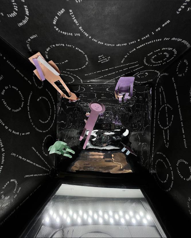
Bella Tuo
BETWEEN WAVES
Between Waves is a comprehensive exploration and guide for reimagining design spaces to foster inclusivity and community engagement. This thesis delves into collaboration, with a focus on individuals or groups blending diverse talents—artists, children, families, community members, and even strangers—to create impactful visual content and projects transcending conventional boundaries. Integrating the concept of heterotopia into graphic design, my work aims to cultivate dynamic and inclusive environments that celebrate diversity, challenge norms, and inspire transformative change.
This exploration emerged from recognizing a significant divide between everyday individuals and professional designers. This realization fueled a desire to create universally accessible spaces nurturing untapped creativity and encouraging experimentation. Inclusivity, as I discovered, relies on breaking communication barriers and embracing diverse voices, sparking curiosity to explore these dynamics within design contexts. Additionally, my work examines heterochrony within graphic design, manipulating the notion of time and temporality to challenge dominant narratives and explore alternative viewpoints.
Ultimately, Between Waves engages with the evolving conversations and interactions within design environments, forging a new narrative and anchoring collaborative spaces in inclusivity and boundless creative potential.
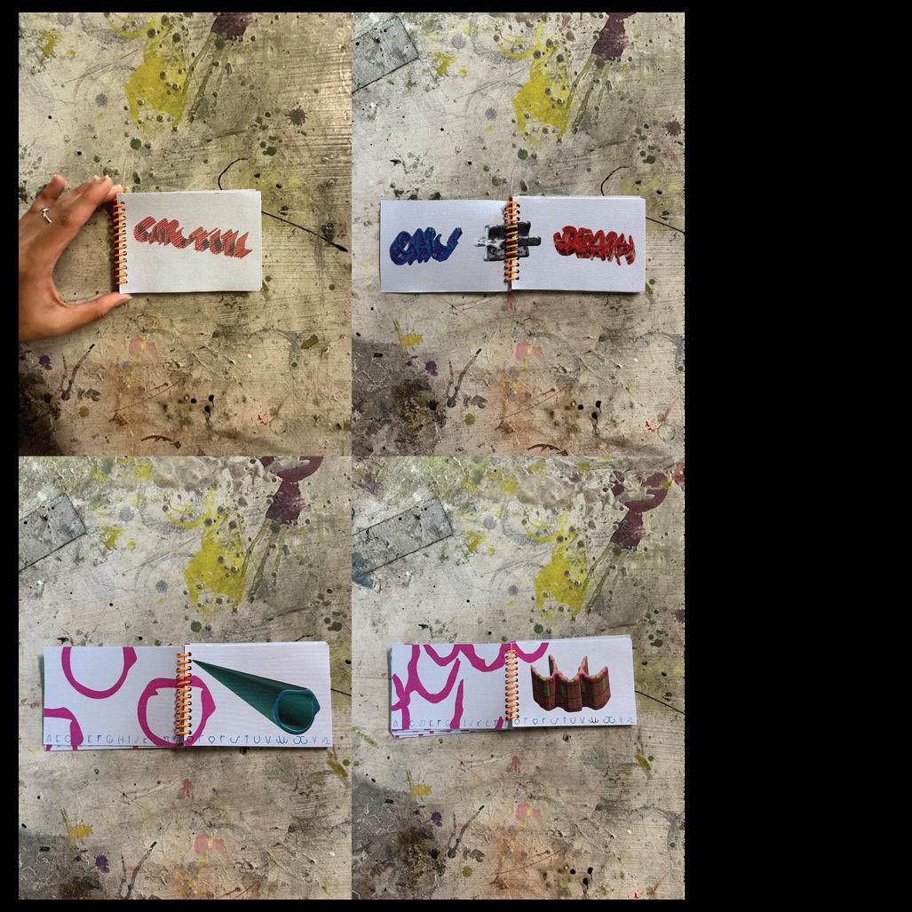
A TO Z, 2023. Publication, 6 × 12 in.
Alphabetic Connection, 2023. Mixed media, 5½ × 8½ in.
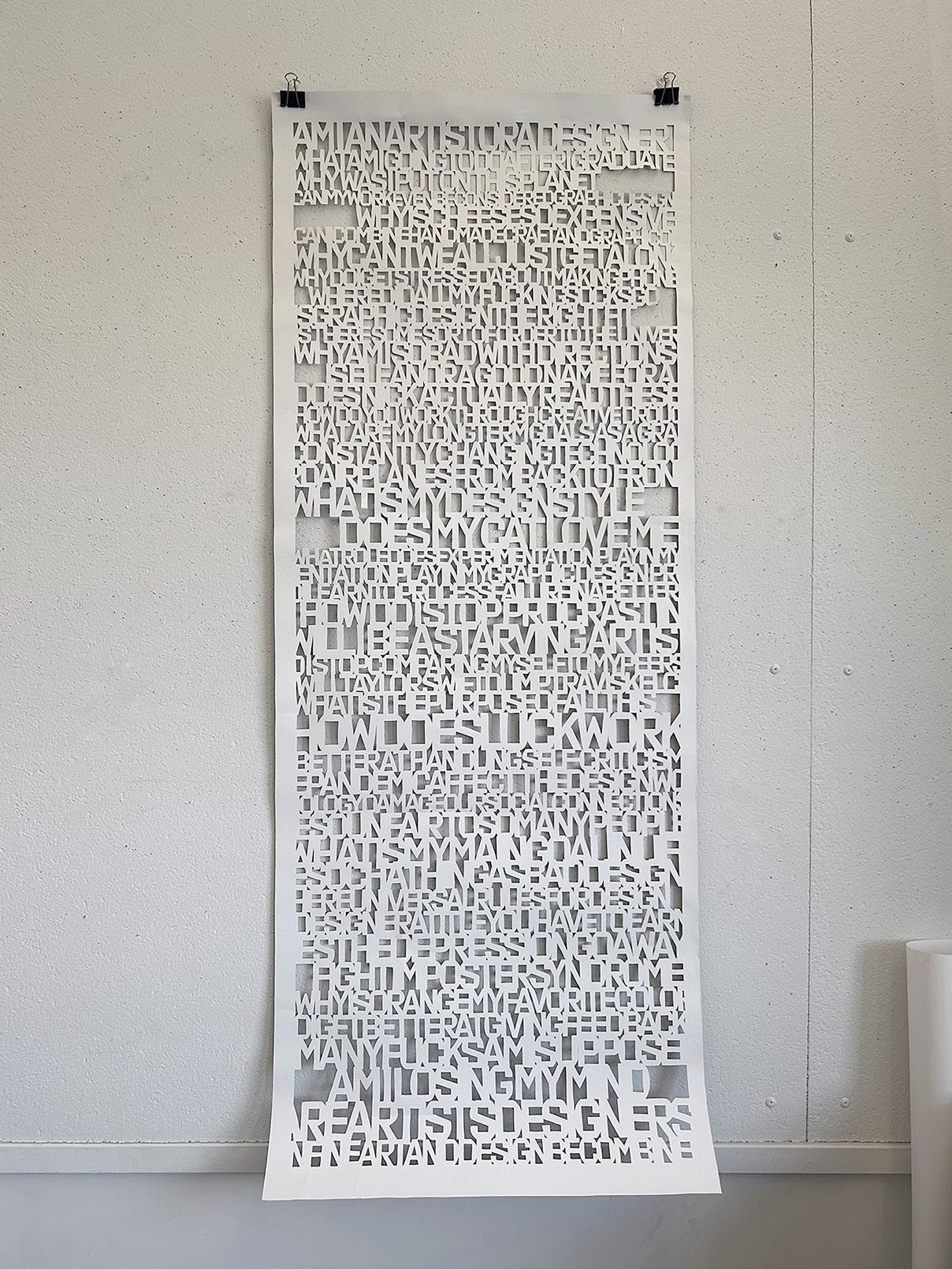
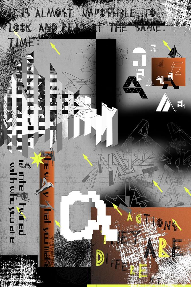
Tool use is a defining moment in human evolution. It marked a shift in our biology and thus our abilities—a shift that would fundamentally differentiate us in more and more complex ways from other cognitive beings. To this day, new tools and technologies mark cultural shifts, usher in new eras, and mark the different stages of our history.
Tinkering has always been a huge part of my creative process. My earliest memories are of crafting and tinkering with all sorts of materials and tools. I was, and am, a maker at heart. South Asian cultures have a common understanding of जुगाड़ (Jugaad), the ethos of making do. Jugaad, in my practice, is the essence of questioning the way things are done and trying to devise new ways of doing.
Women in my family have been cooking for decades. They don’t have recipes written down because they don’t even use standard measurements most of the time.
(Kanthittam), or eyeballing, is seen as the mark of a true craftsperson. Proficiency with craft and consciousness of one’s tools are both necessary and essential for good, inventive design.
My thesis is a codification of my design methodology and ethos. It is a natural progression of the years of making that have shaped my practice. After trying to learn graphic design, I fell in love with it as a craft. When given a pen, why are we only taught to write with it? What else can it be, other than a mark-making tool? Through the work that has been planned for this thesis, several questions will be attempted to be answered: If anything can be anything, do tools have inherent value? How can subversion become a driving principle of design? How much is there to be explored in the craft that is graphic design?
**3
**2
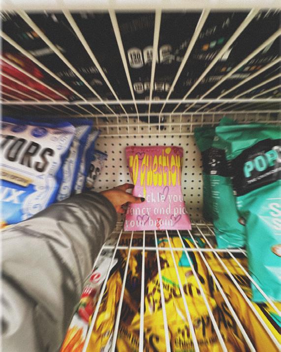
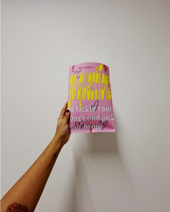
A bag of chips and 50 questions, 2023. Glossy and uncoated papers, mirror vinyl, 7½ × 10½ in.
Catskull, 2023. Typeface and type specimen, printed on uncoated paper, spiral bound, 5 × 3½ in.
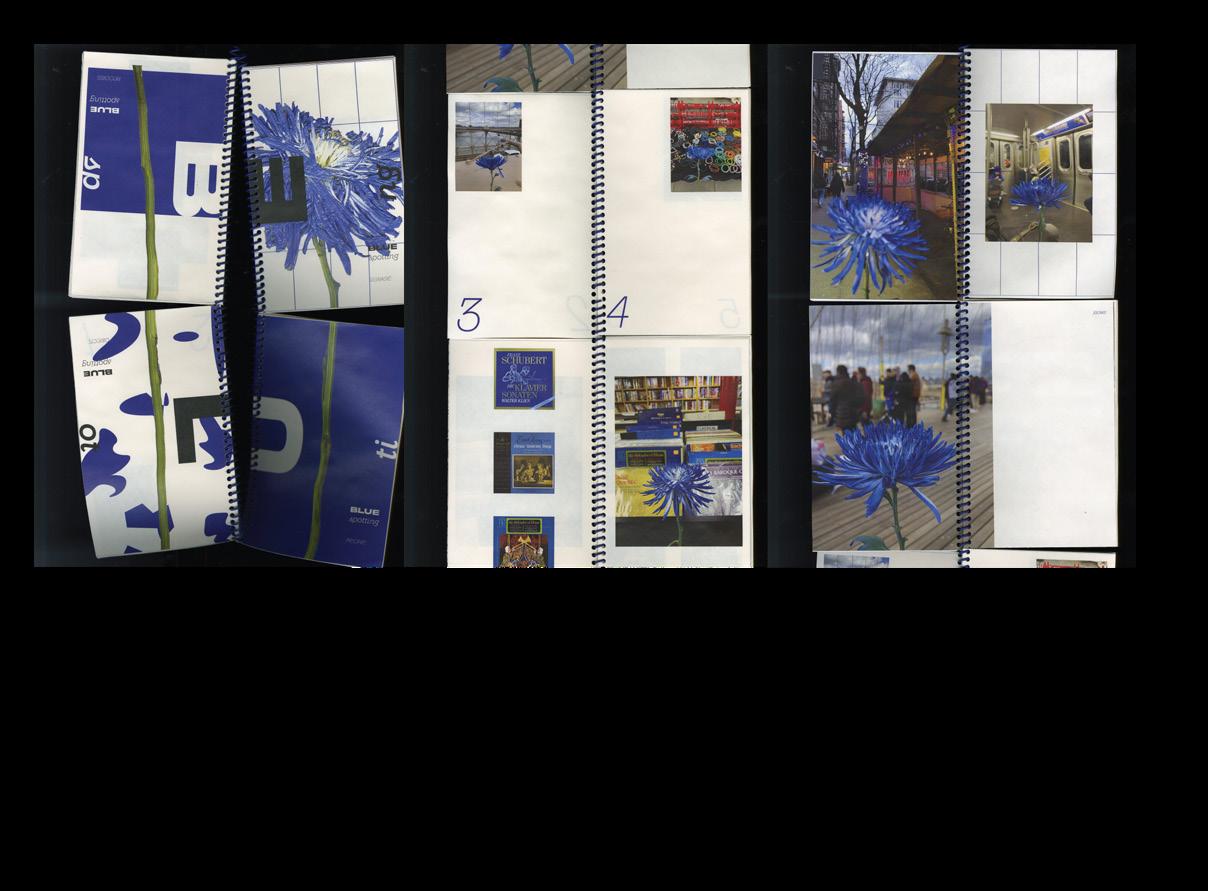
BLUESPOTTING, 2023. Uncoated paper, spiral bound, 5 × 32 in.
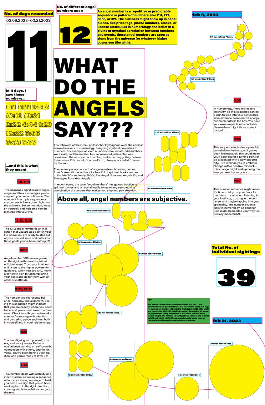
What Do The Angels Say, 2023. Poster printed on plotter paper, 33 × 52 in.
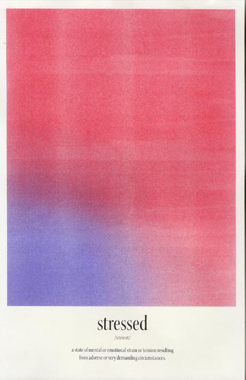
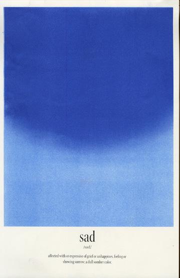
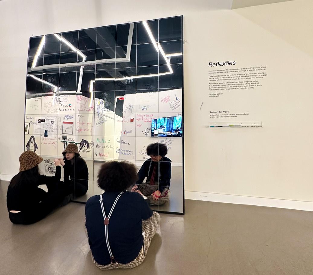
Veridiana Victorelli
Having a background in communication and art, I’ve observed a significant conflict between structure and emotional depth in design. I’ve chosen to pursue designing innovative and emotionally engaging pieces aiming to create impactful and informative experiences while remaining contemporary.
In the search for emotionally engaging design, this thesis explores the richness of nuances and investigates how to bridge the gap between structure and emotion. By delving into personal experiences and creating design projects that fuse memories, expressions, and nostalgia, it seeks to resonate with its audience’s emotions and create a lasting impact while still translating the intended message.
It is integral to this thesis that the design leverages nostalgic undertones, positive emotions, and the power of memories. This approach results in pieces that fuse familiarity and comfort, drawing upon untranslatable feelings like saudade or cafuné. My research expands into multi-sensory experiences, joining physical and emotional stimuli that invite audiences into immersive experiences.
To create work that evolves beyond convention, an extensive exploration of existing theories and scholarly work is in play, delving into the essence of multi-sensory engagement. Drawing from foundational concepts of emotional design and the advocacy for innovation and cross-disciplinary design, my work investigates design experiences that transcend visual communications alone.
The breakdown of a great chaos [Feeling Experiment], 2023. Risograph prints, each 11 × 17 in.
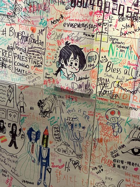
Reflexões, 2023. Mirror installation, 8 × 8 ft.
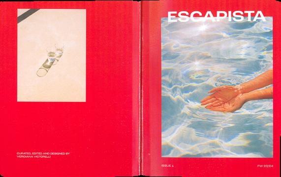
Escapista Magazine, 2023. Publication, 9½ × 7½ in.
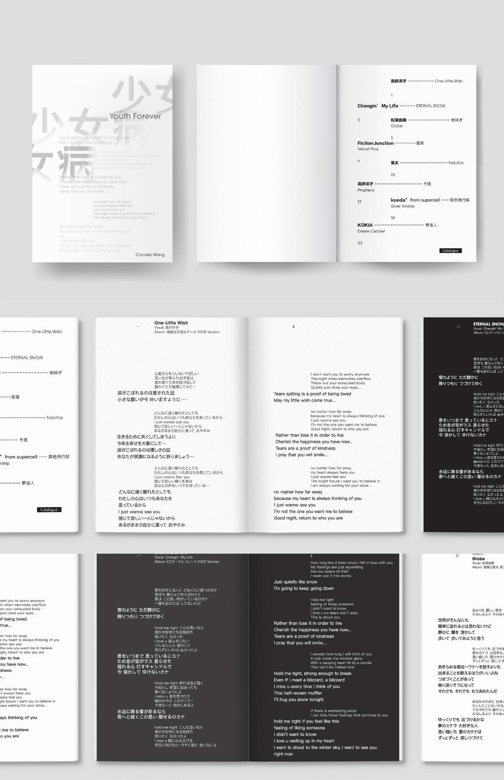
Cornelia Mengdi Wang
ALCHEMY
In the realm of visual communication, the act of creation is not merely a process but an alchemical transformation where ideas, technologies, and mediums converge to birth new realities. My thesis, an exploration at the crossroads of graphic design and digital alchemy, delves into the experimental and interdisciplinary nature of contemporary visual arts. By weaving together the threads of 3D modeling, augmented and virtual reality (AR/VR), traditional graphic design, motion graphics, comics, and illustration, my work seeks to transcend conventional boundaries and venture into uncharted territories of expression and perception.
This journey is guided by the principles of alchemy—not in the ancient pursuit of turning base metals into gold, but in the modern quest to blend diverse elements of design and technology to create works that are greater than the sum of their parts. Each project is an experiment, a playful yet serious attempt to discover novel combinations and interactions that resonate with both the creator and the audience. Through this process, I aim to not only expand the limits of what is visually and experientially possible but also to redefine the role of the designer as a digital alchemist who harnesses the transformative power of art and technology.
In this ever-evolving digital landscape, my work stands as a testament to the potential of interdisciplinary experimentation. It is a call to embrace the unknown, to revel in the process of creative exploration, and to recognize the magic that lies at the intersection of different artistic disciplines. By charting this unexplored territory, my thesis contributes to the broader dialogue on the future of graphic design and opens up new possibilities for what it means to create in the digital age.
MENGDI WANG
**2
**3
**4
Youth Forever, 2022. Print, 6 × 9 in.
Structure + morphology, 2023. Print and 3D print, dimensions variable. Liminality + Transition, 2023. Print, 11 × 17 in.
Remix, 2024. Print, 12 × 12 in.
Remix, 2024. Print, 12 × 12 in.
Ash Wei
PRINTED ON DEMAND
A book is a time-bound experience with both linear and non-linear narratives. Reading intertwines with the environment and current mood. Revisiting an old book brings memories flooding back, blending with new surroundings and mood. A book holds its own story as well as readers’ paralleled narratives.
[Self-publication] refers to the act of a creator independently publishing their work without the involvement of a traditional publishing house. [It] is a playground. [It] pushes boundaries, experimenting with content, layouts, typography, and colors. [It] is a method of breaking free from the grip of consumerism and capitalism, allowing creators to dive into topics they’re truly passionate about and reclaim ownership of their work.
[It] reaffirms designers’ interests. [It] reassures designers that their creativity has a home beyond client briefs and corporate constraints. [It] celebrates voices that go unheard in mainstream discourse.
[It] is a manifesto, a bold rebellion, where creators announce their assertions in the form of a book. [It] is a handshake, connecting individuals who share common aspirations. [It] is a confession.
[It] is free. [It] is confident. [It] is urgent. [It] is fun.
Through dialogues with self-publishers, book artists, co-founders of bookshops and art spaces, and organizers of art book fairs; through participation in workshops with designers and the general public alongside personal journeys exploring the artistic potential of books as a medium of expression, Printed on Demand endeavors to carve out a distinct perspective within the vast landscape of self-publishing. It aims to offer glimpses into its expansive realms encompassing art, design, economics, politics, and humanities. Printed on Demand is developed in two directions: self-publishing for me and self-publishing for us. Self-publishing, akin to printing on demand, serves as a conduit for fulfilling the demands of both creators and readers, facilitating a symbiotic relationship between personal expression and societal engagement.
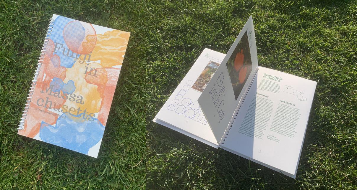
Fungi in New Jersey, 2024. Printed booklet, 8½ × 5½ × ⅝ in.
Fungi in Massachusetts, 2023. Printed booklet, 8½ × 5½ × ⅝ in.
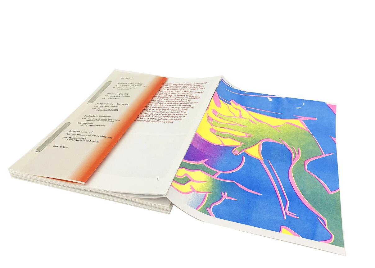
Process Book, 2023. Printed booklet, 11 × 8½ × ¾ in.
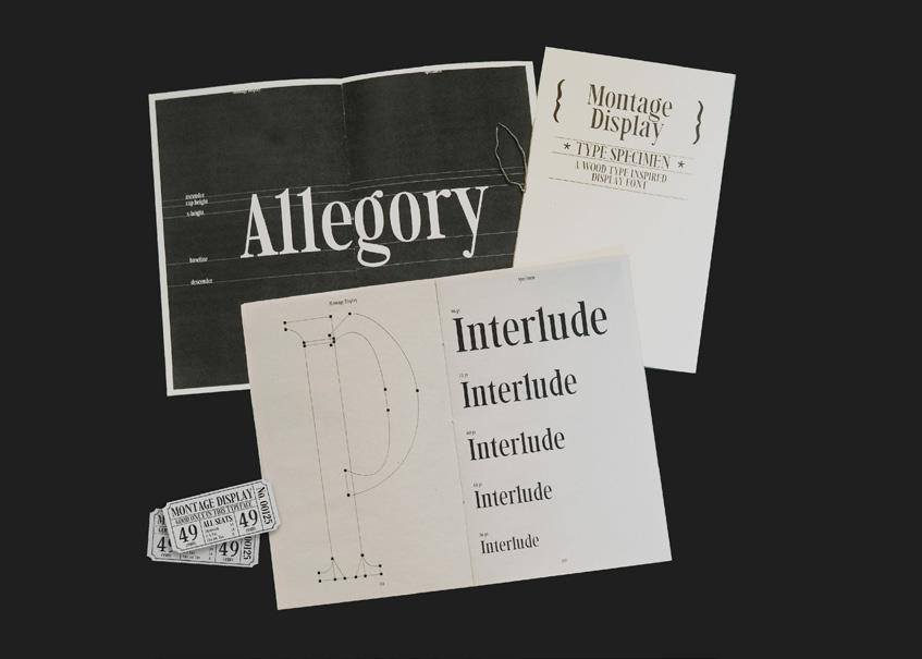
Montage Display, 2023. Type specimen, 8¼ × 5¼ × ¼ in.
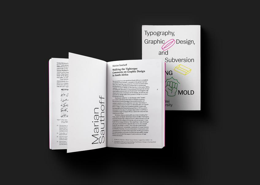
Breaking the Mold: Typography, Design, and Subversion, 2023. Printed book, 8½ × 5½ × ⅝ in.
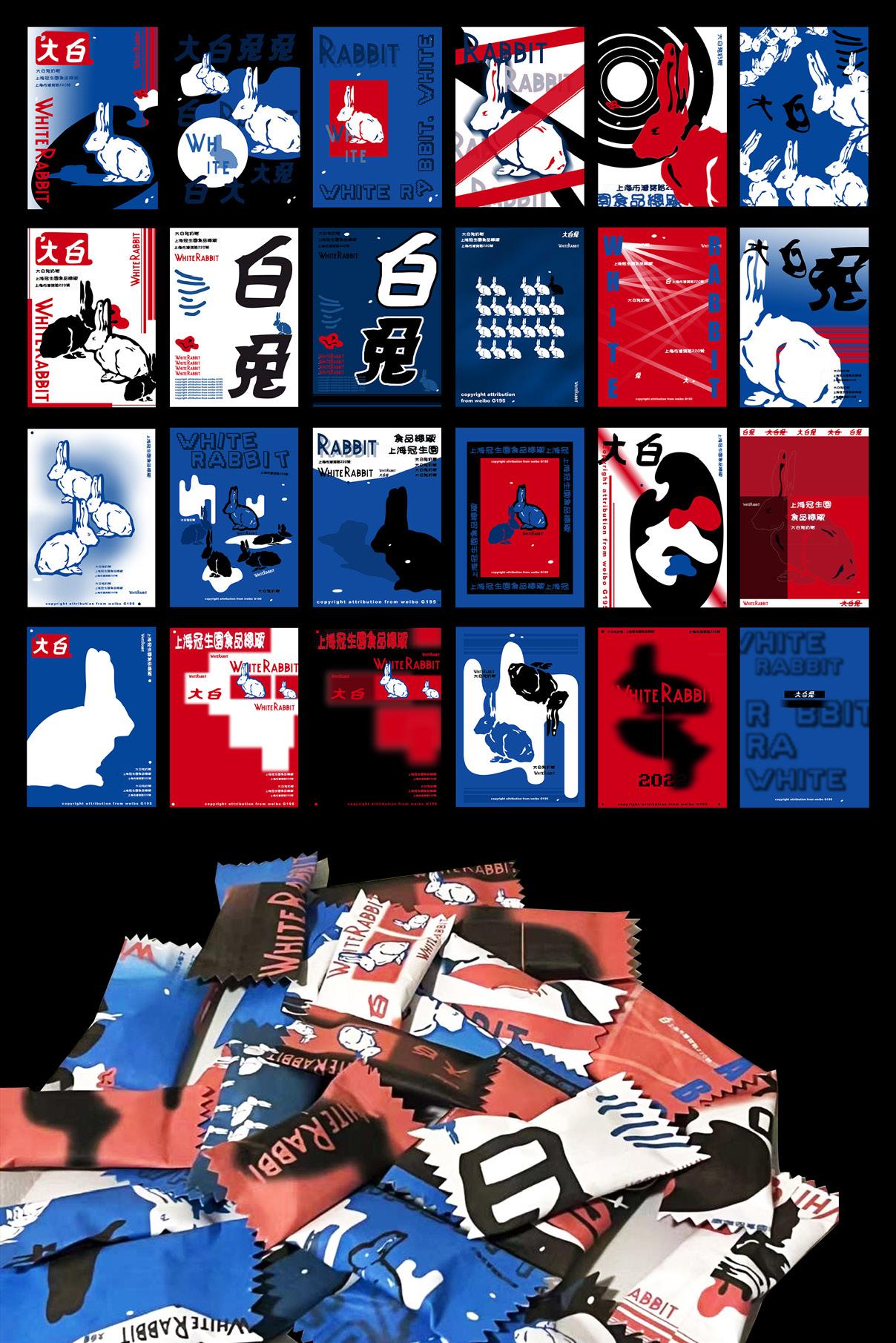
Xin (Cecilia) Yue
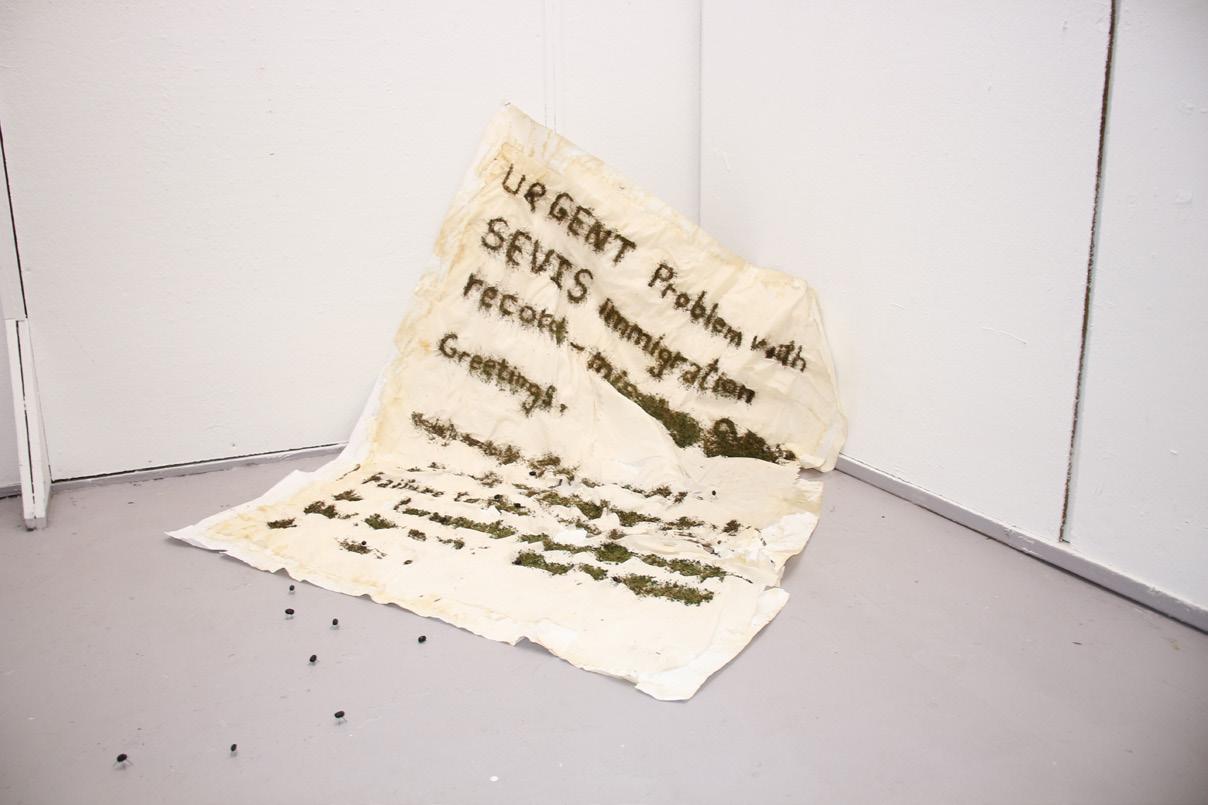
With the rapid advancement of technology today, the virtual world is gradually merging with the real world. This integration not only changes the way we interact with the world but also provides a new creative platform and opportunities for graphic designers. This thesis aims to explore the impact and insights of this relationship on the field of graphic design by delving into the combination of conceptual and realistic design. I use graphic design techniques to explore the boundaries between the virtual and the real, including comparing interactions between virtual and real characters, analyzing the differences between AI-generated graphics, and manually created ones.
Combining the conceptual with the realistic is a challenging and creative approach. The challenge of conceptual design is to translate abstract ideas into forms that viewers can understand and resonate with. Meanwhile, the challenge of realistic design is how to meet practical needs while maintaining creative and aesthetic integrity. By combining elements of the conceptual and the real, designers can create work that has depth and utility, thus achieving the dual goals of fascination and practical application. Through the research in this thesis, I reveal the deep connection between concepts and the real world, explore their manifestations and creative expressions in graphic design, and their impact on human perception and cultural ideas. I combine conceptual elements with realistic physical representations to improve the ability to transform virtual concepts into real forms, create works that are both creative and practical, and explore their potential and possibilities for future development.
Cute bunny, 2022. Candy wrapper redesign, 1½ × 3½ in.
Chaotic order, 2023. Poster design, 40 × 60 in.
50 questions, 2023. Advertisement, 11 × 17 in.
Rejecting Physical Stigma, 2023. Digital and printed poster, 11 × 17 in.
Yingchen (Molly) Zhou
DRAWING LINES IN SAND
When I feel bored without a cellphone, I focus on details in life. I find lines in an object that I can spend my attention on. I start to think about the function and influences that line has in graphic design. Lines can pass on information in graphic design, and they can also have positive and impressive effects on visual systems.
The line is also the most ancient element artists have used to describe objects and record events. Ancient people drew the outlines; then, lines became shapes. With the development of human history, people discovered the use of shadow and perspective. The discovery of perspective is remarkable, but it has more connection with the development of lines. It can be considered as a systematic innovation of lines. Analyzing line artworks may prompt consideration of visual information delivered by lines. The essential thing for this process is to focus on the effects of invisible lines, such as perspective.
Analyzing the use of lines in artworks is helpful for understanding how lines can be useful in graphic design. Discovering how lines underlie visual systems and pass information to an audience is an initial stage. Like the lines used in artworks, the shapes and spaces from line systems can become part of the design. Instead of only focusing on unnoticeable line systems, the actual line-created designs that are directly presented to the audience also deserve attention.
Visual analyze, 2022. Printing on paper, 11 × 17 in.
Morphology, 2023. Printing on paper, 5 × 4 in.
Monograph, 2023. Printing on paper, 8 × 10 in.
Yinxue Lucy Zou
METAMORPHOSIS
My thesis explores the transformative journey of graphic design as it evolves from its traditional roots in print media to the dynamic realm of digital and multimedia formats, drawing a parallel to the metamorphosis of butterflies. This metaphor serves not only to illuminate the technological advancements in the field but also to provoke a deeper inquiry into the interplay between art and technology. The core of my investigation centers on how the advent of digitalization reshapes the role of designers, altering the dynamics of audience interaction and challenging traditional perceptions of visual consumption.
By contrasting the constraints of print media with the expansive potential of digital platforms, including the advent of augmented and virtual reality technologies, I aim to uncover how these innovations extend the creative capabilities of designers and redefine the user experience. Metamorphosis critically examines the ethical considerations that accompany this digital shift, with a particular focus on issues of accessibility, environmental sustainability, and the digital divide. Through a dialectical approach, my research seeks to not only chronicle the evolution of graphic design in response to technological progress but also to forecast the future trajectory of the field, anticipating the integration of cutting-edge technologies. This thesis strives to provide a comprehensive analysis of the complex relationship between graphic design and technology, highlighting the significant impact of digital transformation on the discipline and its broader implications for societal and cultural evolution.
Synergraph, 2022. Print, 48 × 60 in.
Distress signal, 2023. Installation, paper and yarn, dimensions variable. Merge, 2022. Print, 48 × 60 in.
Timeless Admissions, 2022. Print, 2½ × 7 in.
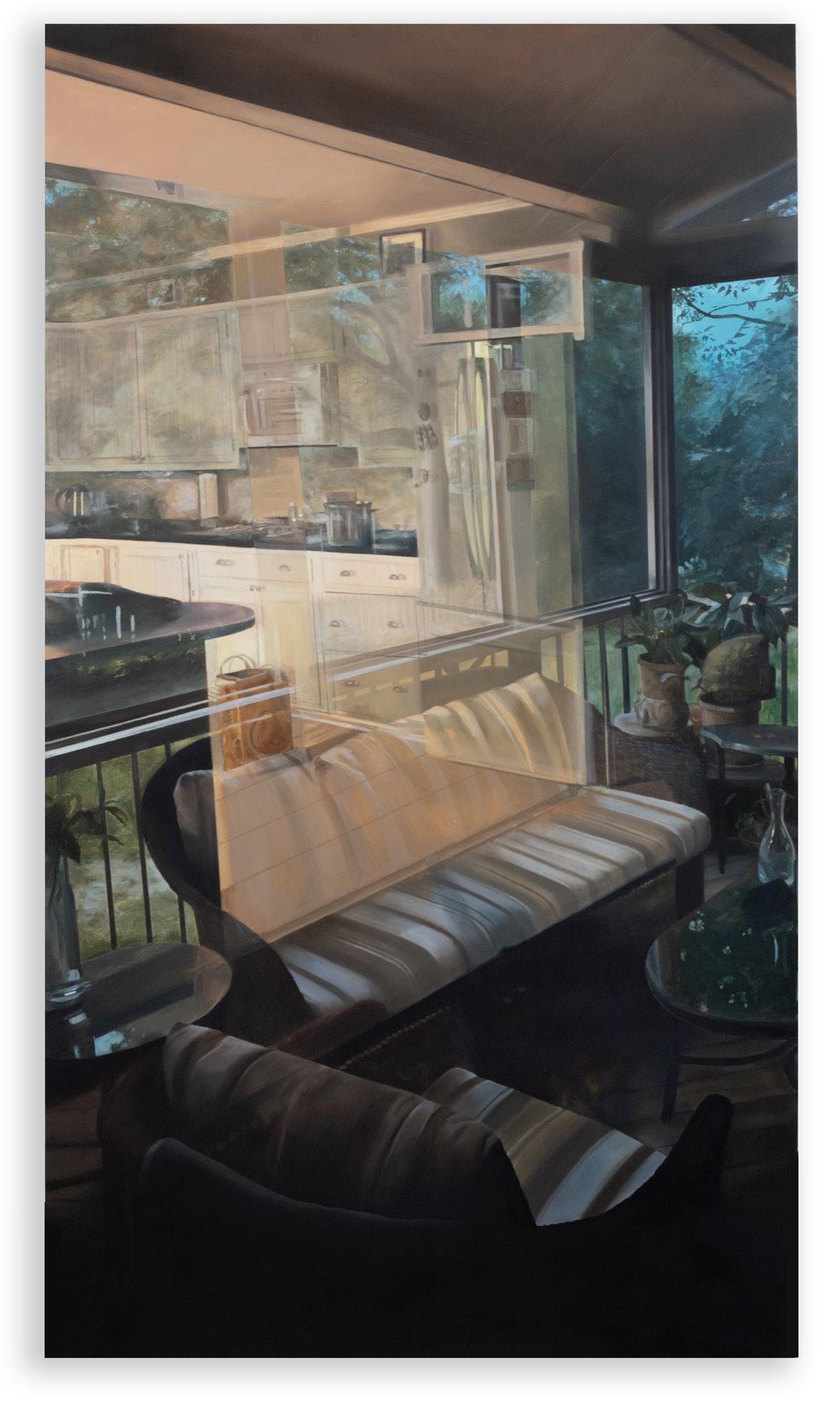
Language is a useful metaphor to describe the experience of painting. Reading, literacy, and lexicons are terms we frequently cite in critique. In one form or another, students from the MFA Painting class of 2024 turn to language, either materially or analogically, to help them navigate meaning in their work.
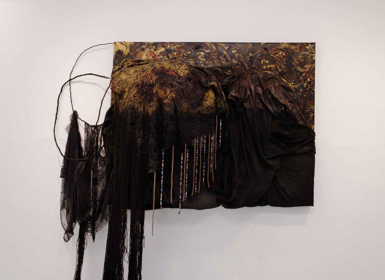
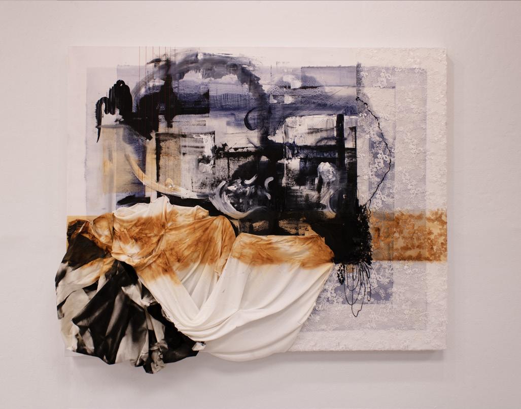
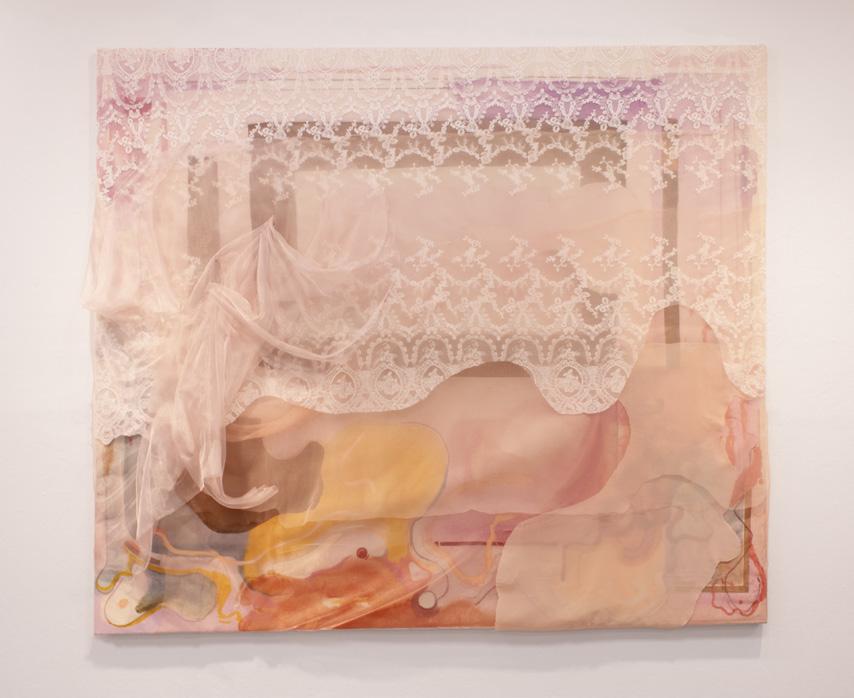
Several artists in this cohort consider the question of legibility. Sophie Thervil and Téa Chai Beer carefully adjust the dials of cultural coding implicit in figurative representation. Through their acutely observed paintings, they disclose the mechanisms of perception and self-presentation. Huakai Chen and Natalie Conway layer handwritten text until it becomes unreadable. Political and personal messages dissolve and surface in the accrual and excavation of material. Yingxue’s Daisy Li and Linda Obobaifo’s practices lie somewhere in between. Yingxue’s still lifes and landscapes drift into the realm of nameable subjects, only to dissipate into marks and colors. Linda veils personal photographs and painted gestures in lace to reveal and obscure memory and identity. For a medium like painting, where everything exists on the surface, all of these artists are balance what is visible and what is unseen.
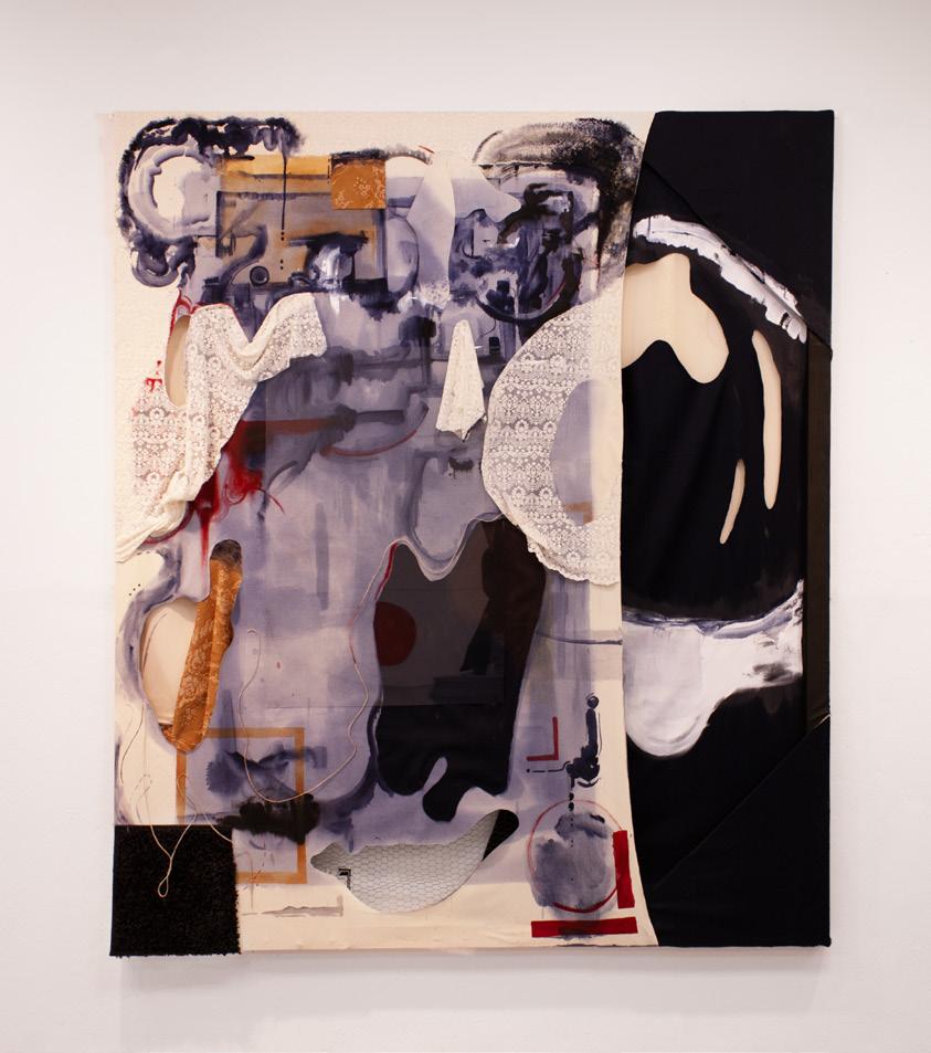
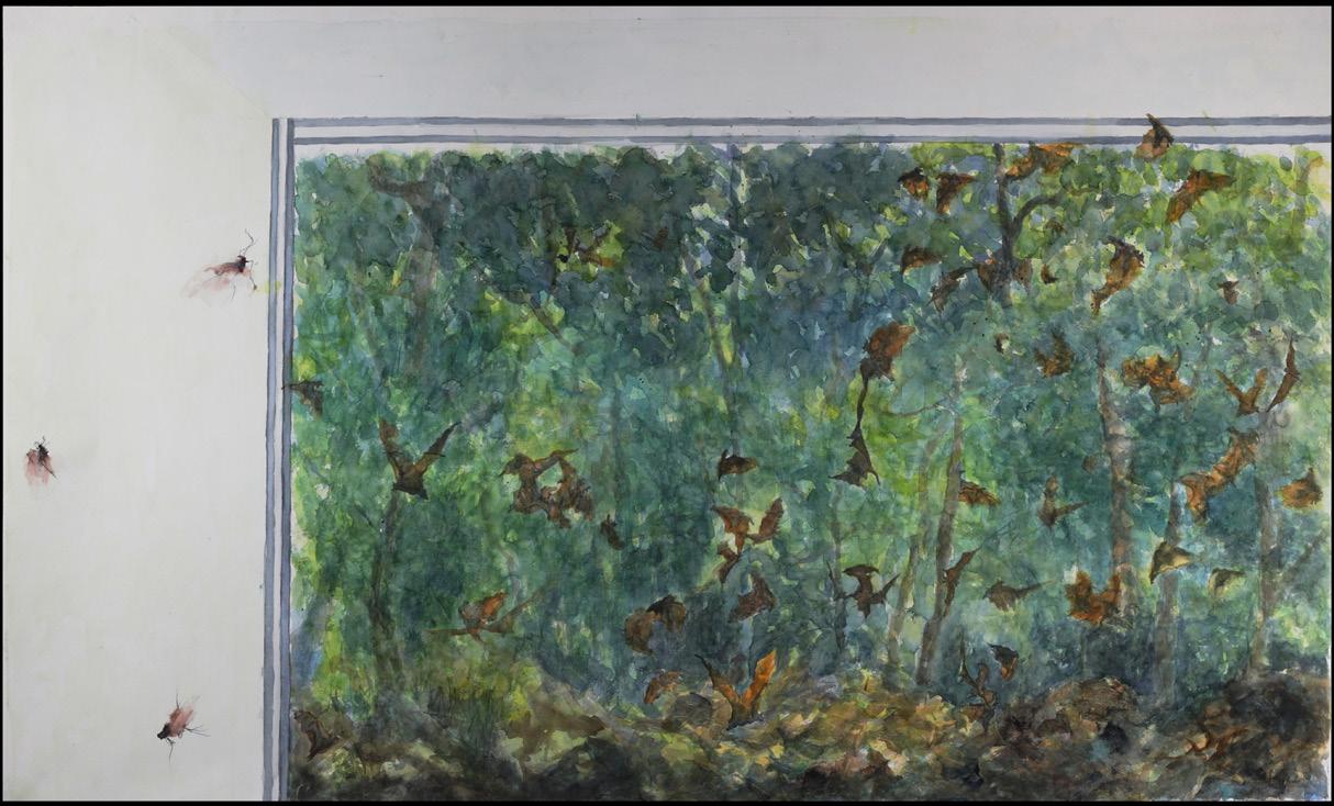
Language appears in many forms. For some of these artists, it exists in and as found material. Julia McGehean plays with a collection of objects that take on the behavior of words, reshuffling meaning through acts of translation. Sayak Mitra and Jacob Salzer scavenge ready-made text, such as a restaurant receipt or cardboard packaging. When collaged into their work, this ephemera embeds the personal relationships and societal systems that shape life as we know it. Cody Robert Hook Bluett, too, notices the hierarchies in visual culture. He uses craft techniques to frame paintings that evoke the psychology of the working class America. Several artists work descriptively, one might even say novelistically, to render factual and fictional realities. Abbi Kenny and Ellen Weitkamp recount their daily environments through high-resolution renditions of domestic interiors. When painted, textures, reflections, and notes elicit witty commentary on habits and local vernacular. Sidharth Shah and James Gold anticipate future scenarios of loss and discovery. Sidharth paints animals on the brink of extinction, eliciting our empathy through his tender and fugitive watercolors. James conjures artifacts that have yet to see the light of day, inviting our imagination to a future yet to unfold.
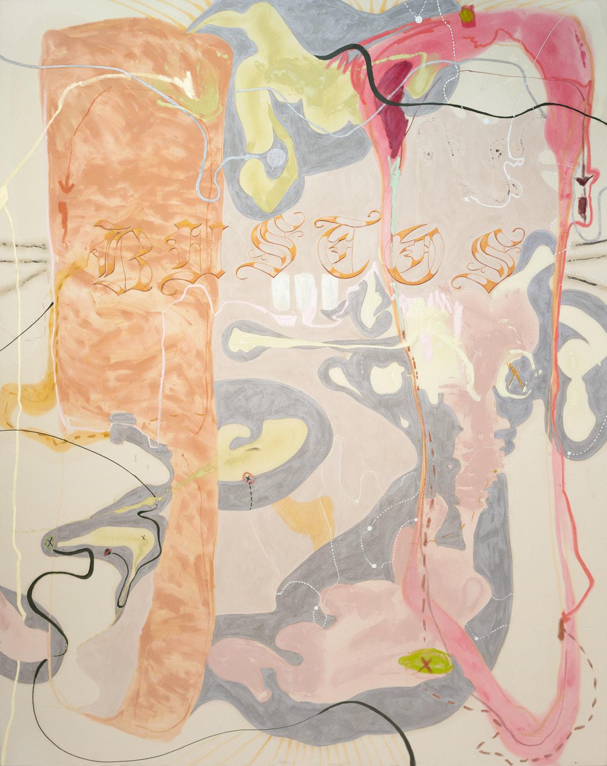
Stephanie Petet and Sarai Bustos use the language of abstraction to channel and express sensation. Stephanie’s musical roots inspire her improvisational formal moves and interests in frequency, sound, and space. Sarai’s embodied paintings act as spiritual maps to guide her through inner and outer worlds, exploring her heritage and charting next steps.
Josephine Halvorson Professor of Art and Chair of Graduate Studies in Painting
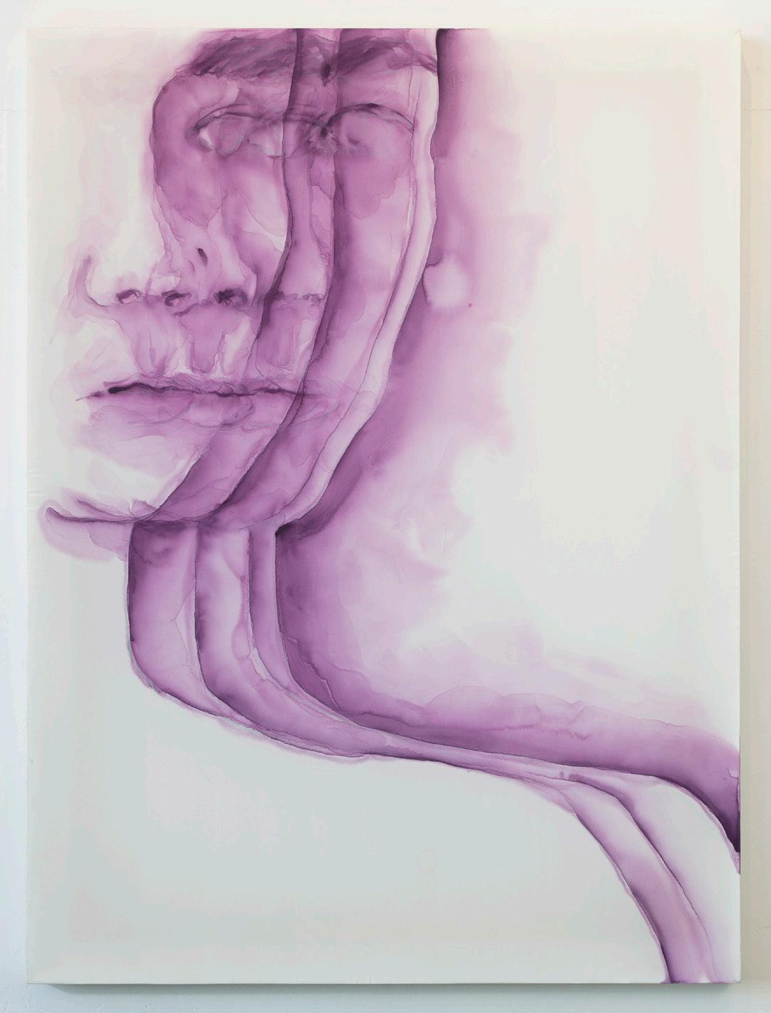
Téa Chai Beer
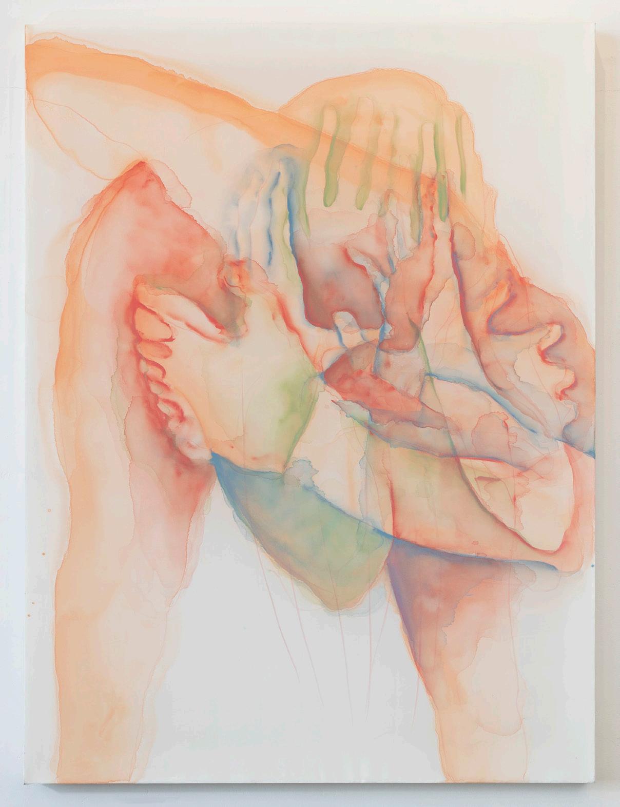
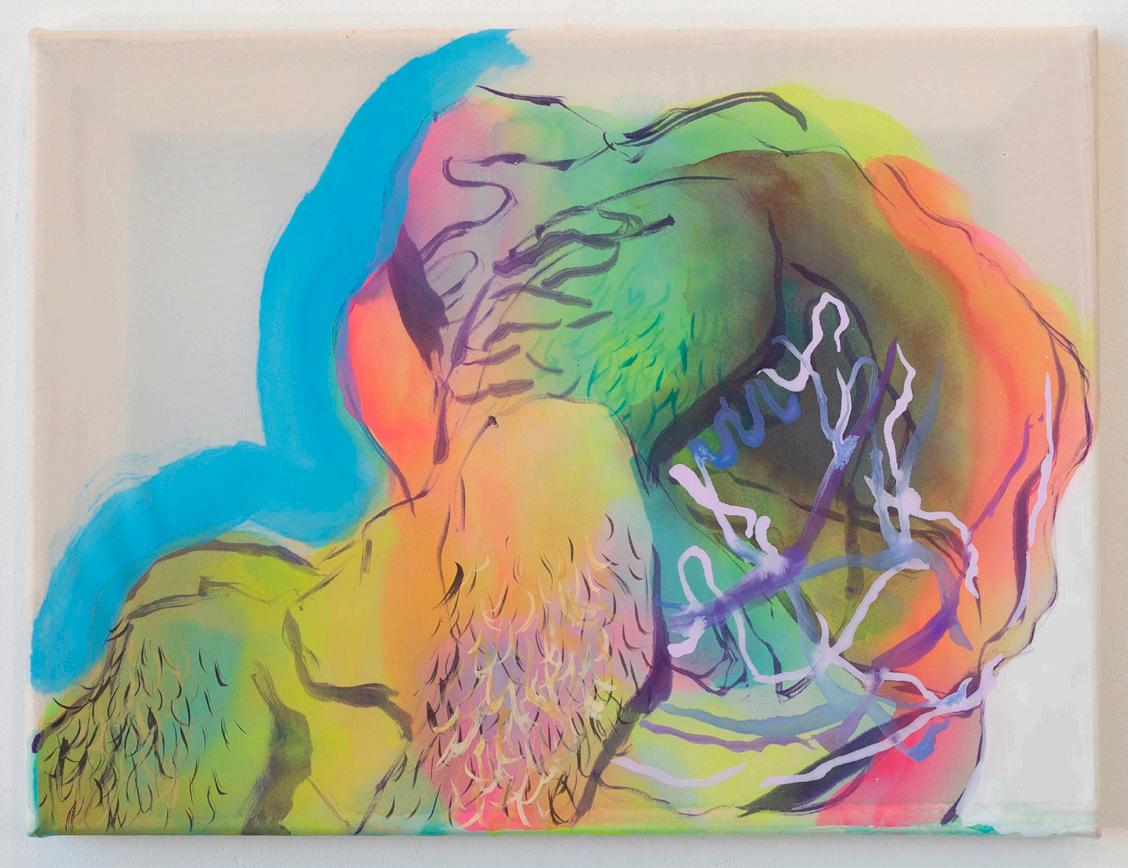
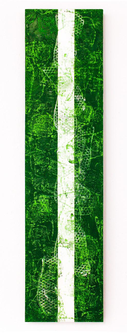
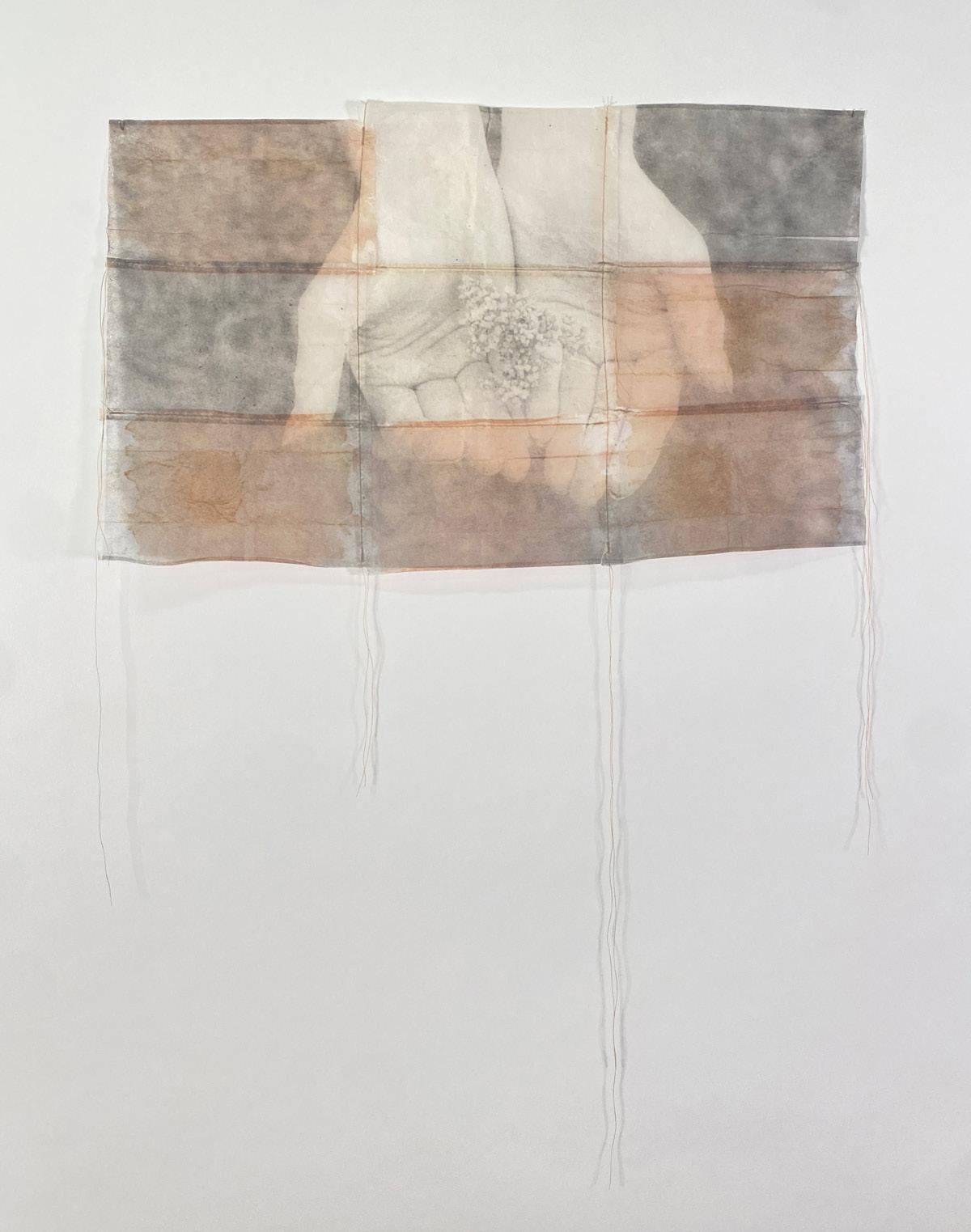
My practice explores the multiplicity of the self through layered drawings and paintings on translucent substrates, including raw silk, poly silk, and rice paper. As a (cisgender) queer and mixed-race Korean and White American, I move through the world fluidly, shifting and adjusting according to context or perception by others. Through self-portraiture, my work aims to embody this slipperiness by exploring the complexities of my experiences across various situations and affects.
My paintings begin with stacked drawings—suggesting movement, different moments in time, or multiple feelings held simultaneously—to provide a compositional foundation. I then work wet-into-wet with water-based media, such as acrylic paints or inks, resulting in stains that complicate the initial framework, echo the translucency of the substrate, and evoke notions of indelibility, fluidity, and plasticity. As the layers of stained pigment continue to build upon themselves, obfuscating earlier passages, I draw out select moments of clarity with denser opacities. Due to my use of unprimed poly silk and silk, the pigment ultimately seeps into the surface’s fibers, resulting in two-sided paintings and drawings that, when suspended in the middle of the room, simultaneously beg a more embodied encounter with their viewers. Installed this way, their ephemeral materiality can elicit ideas of dislocation, dissociation, and disassociation. Through the porosity of my substrate, every gesture—intentional and accidental—becomes permanently embedded in the painting’s body; I think about how this parallels the ways our actions and lived experiences become a part of who we are and how we relate to others. Through the metaphors I draw between how I make my work and how I feel in my own skin, I hope to exploit, cannibalize, and resist ideas of affect, identity, and morality at stake in my materials, process, and practice.
How Do I Keep? 2023. Acrylic and colored pencil on poly silk, 40 × 30 in.
Feral Ruminations/Masturbations on Intrapersonal Arguments with Constructed Others and Selves, 2023. Acrylic on poly silk, 9 × 12 in.
The Kiss, 2023. Gouache on silk, 9 × 12 in.
Dissociation, 2023. Acrylic and colored pencil on poly silk, 40 × 30 in.
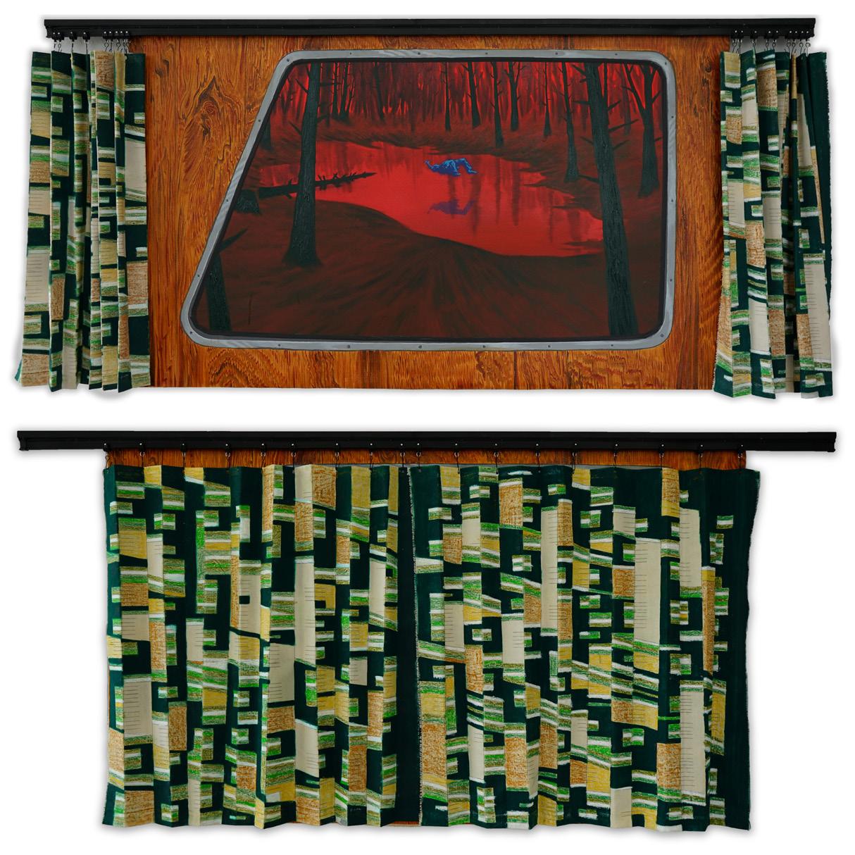
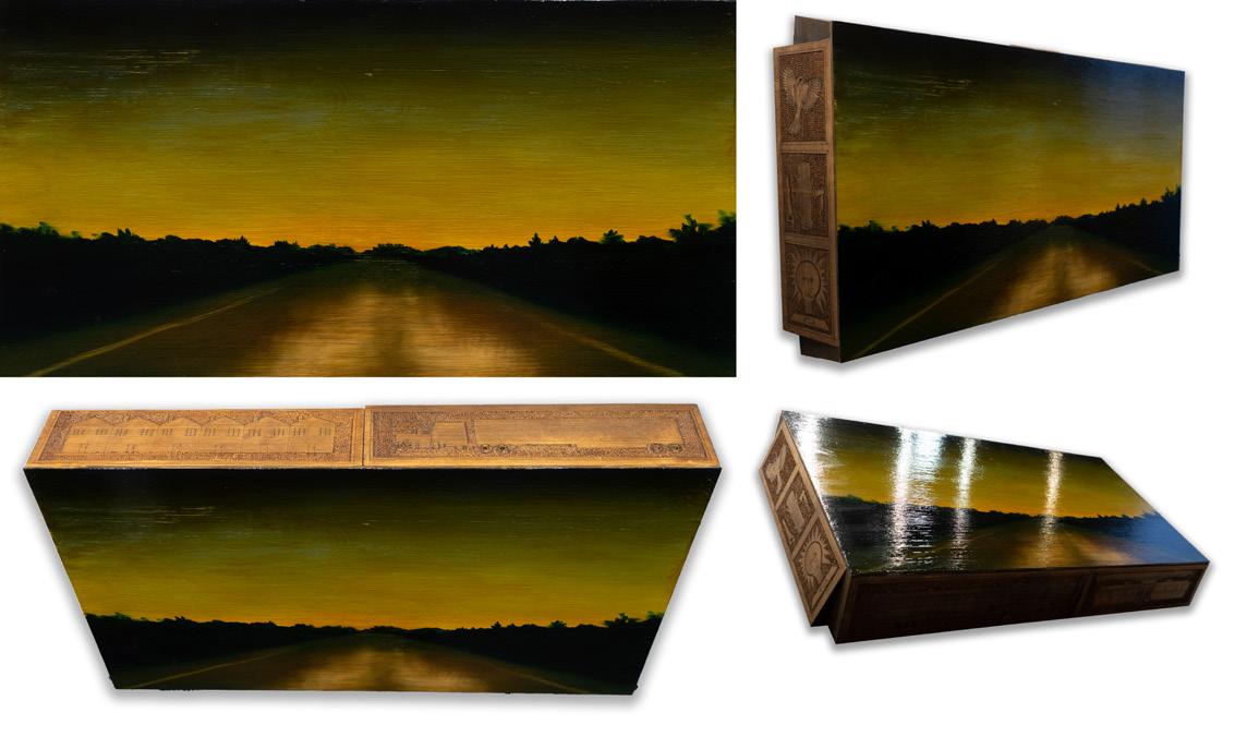
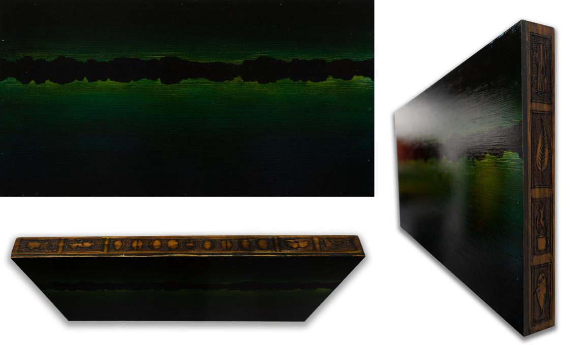
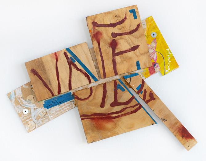
Cody Robert Hook Bluett
My artwork focuses on the relationship between landscape, narrative, and memory. I make paintings using traditional oil landscape techniques layered with contemporary material explorations. These images are composed using various types of frames and vignettes, investigating the lens of the viewer’s experience and exploring formal relationships of edge, texture, and atmosphere. With a high cultural value towards craft and the handmade, three-dimensional elements continue to complicate and abstract the dreamlike narrative qualities of my work. These works imbue slowness and emptiness in order to express the beautiful, absurd, and ominous boundaries between fiction and reality, creating a unique American folk horror aesthetic and atmosphere.
My practice also includes sculpture installations that encourage slow interaction and close attention to detail. Many of these works use various visual and audio technologies that focus on the mechanical aspects of their operation to enhance the viewer’s experience. These objects present visual engagement and tactility without clear function or instruction for the viewer, further expanding the dreamlike and supernatural elements of the work. My sound work focuses on electronic musical experimentation to create slow and meditative compositions informed by my paintings and amplified in tandem with sculptural objects.
My practice invests heavily in themes of working-class life experiences and relies on the aesthetic qualities of my coming of age in Pennsylvania. These themes portray the idea of American blue-collar beliefs and disbeliefs that are the undertones of social and political contemporaneity. My landscapes are still and liminal, experienced by the proletariat during moments of respite, repetition, and reminiscence. These places allow for imagination and creativity to flourish, for they are the dreamscapes and nightmares of an economic class whose culture is being systematically eliminated. I represent these ideas in honest and transparent ways while continuing to honor their ambiguity.
Bill’s Big Transcendence, 2023. Oil, shellac, pastel, graphite, tape, and various hardware on canvas, 36 × 80 in.
Catching in the Kingdom of Frogs, 2023. Oil and spray paint on canvas, carved wooden frame, 33½ × 41½ in.
Where are the Sleeping Fish?, 2023.
Oil and spray paint on canvas, carved wooden frame, 33½ × 41½ in.
Highway Hieroglyphs, 2023. Oil and shellac on panel, carved spruce, 20 × 37 × 6 in.
Clues at Kezar Lake, 2023. Oil and shellac on carved wooden panel, 15 × 24 in.
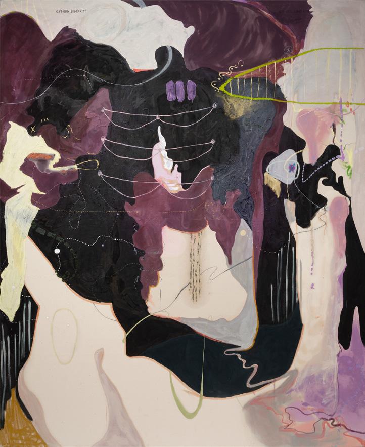
Sarai Bustos
In my large-scale oil paintings, I negotiate what it means to use mapmaking as a guide to create imaginary places and abstract spaces that explore my family, identity, and spirituality as a first-generation Mexican American. By painting on raw canvas, I engage in the soak-staining and resistance of ink, oils, and oil paint to create biomorphic shapes through various viscosities and intimate marks.
By working on large canvases and through my bodily relationship to scale, drawing, and movement, I discover unlocatable landforms through an improvisational process of mapping imaginary places. My forms and dotted lines reflect my longing to locate myself as a whole. I wander through external routes, leaving and entering boundaryless forms and color fields. These metaphorical journeys suggest past explorations and passages that have guided me across internal boundaries. I use culture-specific imagery to signal my community and reclaim the struggles of not being recognized. By engaging with these forms, I place myself as a small protagonist in a large world, signaling my intuition to guide me. Navigating these organic forms leads me across open or closed barriers of pink-earth color fields. There, I trace my different drawing methods to create maps that ground me when I wander between cultures. The scale and materiality of the paintings call on the viewer to feel and trace the known and unknown dotted lines and locations.
Moments of raw canvas are left untouched, signaling that all areas of the map have not been discovered yet, questioning my intuition that has guided me to discover the painted areas. I wonder about decolonizing the idea of maps to create guides for myself and future generations into places of belonging. Bringing forward my first-generation experience of not knowing where I am, while using my curiosity to find where I want to be, these paintings function as my spiritual guides.
La unión de distinto mundos, 2023. Oil, acrylic, pearl pigments, and ink on canvas, 96 × 76 in.
Hermana One, 2023. Oil, acrylic, pearl pigments, and ink on canvas, 96 × 79½ in.
Hermana Two, 2023. Oil, acrylic, pearl pigments, and ink on canvas, 96 × 78 in.
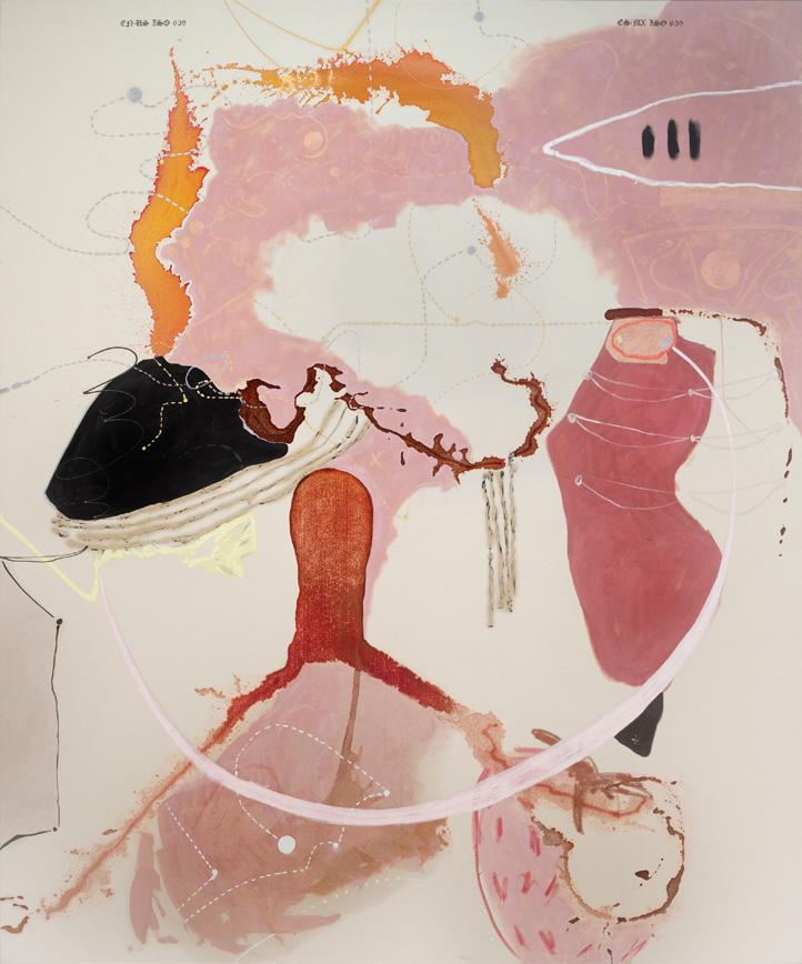
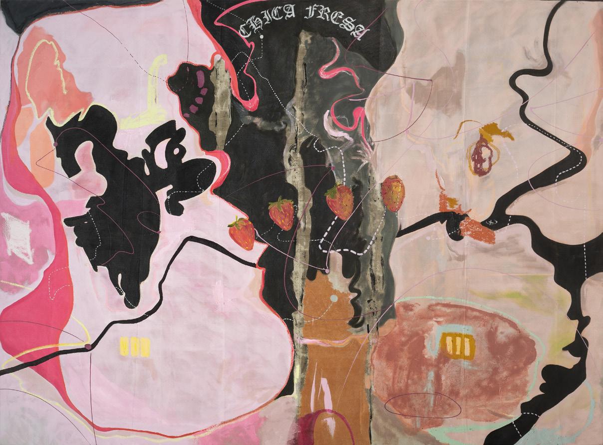
Chica Fresa, 2023. Oil, acrylic, pearl pigments, and ink on drop cloth, 72 × 96 in.
Huakai Chen
As an artist, I explore the overwhelmingness of confronting socio-political issues in China from an individual perspective, through the combination of oil painting, calligraphy, photo transfers, and found materials. These feelings derive from my own family history with governmental control, the tragic domestic news I read online every day, and the difficulty in expressing these issues under censorship. The multiplicity of visual languages in my work speaks to the impossibility and stress of communicating my intentions and becomes evidence of the endurance of the artist.
The End Of The Road is my most recent painting. In this wall-sized piece, I integrate the direct marks of painting and calligraphy with the indirect marks of woodcut print transferred onto the canvas’s surface. With the density of visual information rendered in muted palettes, the illegible text turns into deep and low murmurs of distress. My use of repetition recreates these feelings visually, from the application of material to the formats of individual pieces. I regard each repeated action as an attempt to realize the intangible and prolong the ephemeral. In addition, I build up multiple semi-transparent layers of color to interrupt legibility. As a result, the space in my paintings invites viewers to enter, yet rejects them by challenging legibility at the same time.
The scale of my artwork exists in two extremes—either as big as architecture or as small as a sheet of paper. I want to remind the audience of scale relationships: between their own bodies, the scale of art, and the problems within society today. I hope my viewer, like me, is in search of a form, reaches out to it, recognizes more than what they initially see, and eventually gets lost in the experience of perception.
The End Of The Road, 2023. Oil and laser-print transfer on canvas, 10 × 12 × 2½ ft.
Window I, 2023. Oil on panel, 12 × 9 in.
Window II, 2023. Oil and papier-mâché on panel, 12 × 9 in.
Window IV, 2023. Oil and laser-print transfer on panel, 12 × 9 in.
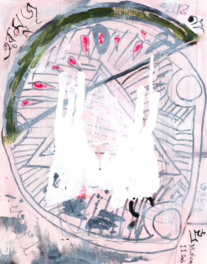
Natalie Conway
I want to give shape to my inner thought world—the stuff I can’t capture in words. Using color and gesture intuitively, I create dense, layered paintings through a multitude of experimental processes. Bits of recognizable imagery and text point to my preoccupations with childhood, femininity, spirituality, science, and education, while more abstract forms invite free association. Made on sturdy wooden supports, the surfaces and edges of these paintings reveal a history of deposition and erasure, rendering them objects as much as images.
My practice begins with remnants and fragments I collect with no end in mind: scraps of wood, dried-up chunks of gesso, trinkets, and trash, along with doodles, word lists, and photos of the ground taken during walks. Scavenging and salvaging are vital to my lifestyle, and these activities provide the raw material for my creative practice. In the additive stage of putting paint to a surface, I see myself collaborating with chance and entropy, welcoming in whatever captures my attention.
Such openness entails overwhelming accumulation. I have to find ways to recover the most important forms that have been buried, which I do through physical excavation like scraping, sanding, and polishing. All done by hand, this careful but extensive labor becomes another opportunity for discovery, yielding cross sections reminiscent of geological, biological, and archaeological samples. Such specimens do serve as sources of inspiration, but also point to the ways in which my process affects my body: the compression and abrasion of materials wear on my skin, ligaments, and bones.
Though the wounds and aches force me to attend to my age and present condition, my practice helps me rekindle a youthful sense of creativity. The accrual and removal of layers mirrors the nonlinear process of personal growth, in which unlearning is just as important as learning, and healing means bearing scars.
Some Weather, 2024. Gesso and acrylic paint on wooden board, 17 × 11 in.
Automatic, 2024. Gesso and acrylic paint on plywood panel, 4¾ × 7¼ in. Or Trial, 2023. Gesso and acrylic paint on wooden board, 4½ × 6½ in.
For Them, 2023. 10 parts: gesso, acrylic, eggshells and mica on wood boards, plywood panels, and cradled plywood panel, 15 × 29 in.
Rawr!, 2023. Gesso, acrylic, and oil on cradled plywood panel, 14 × 19 in.
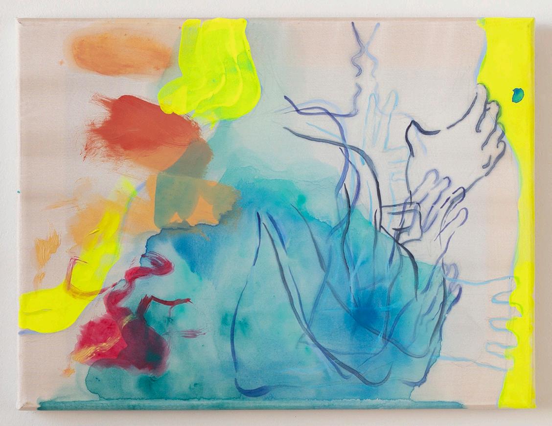
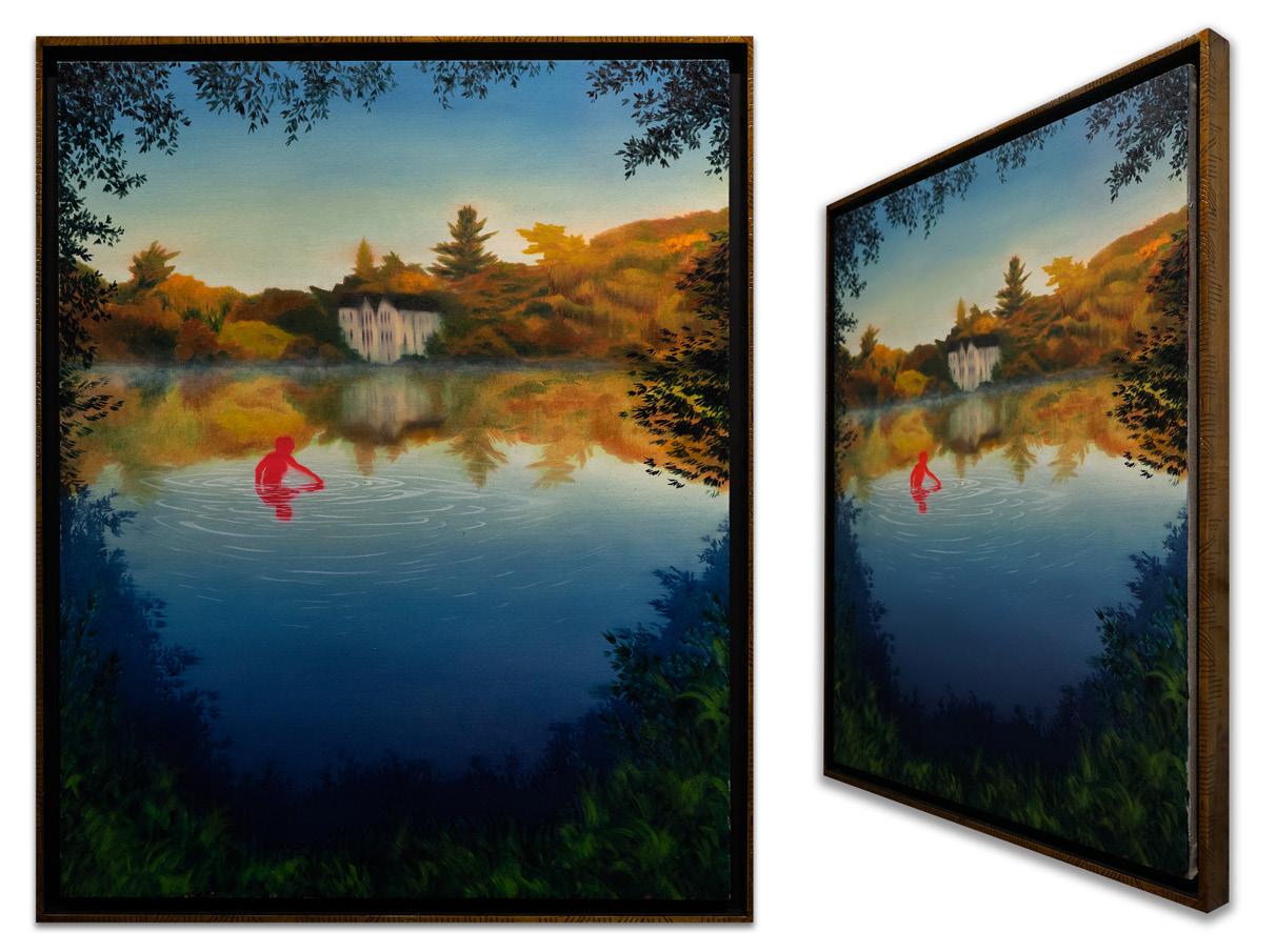
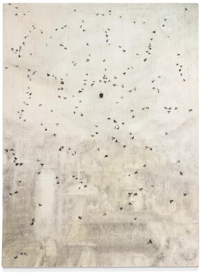
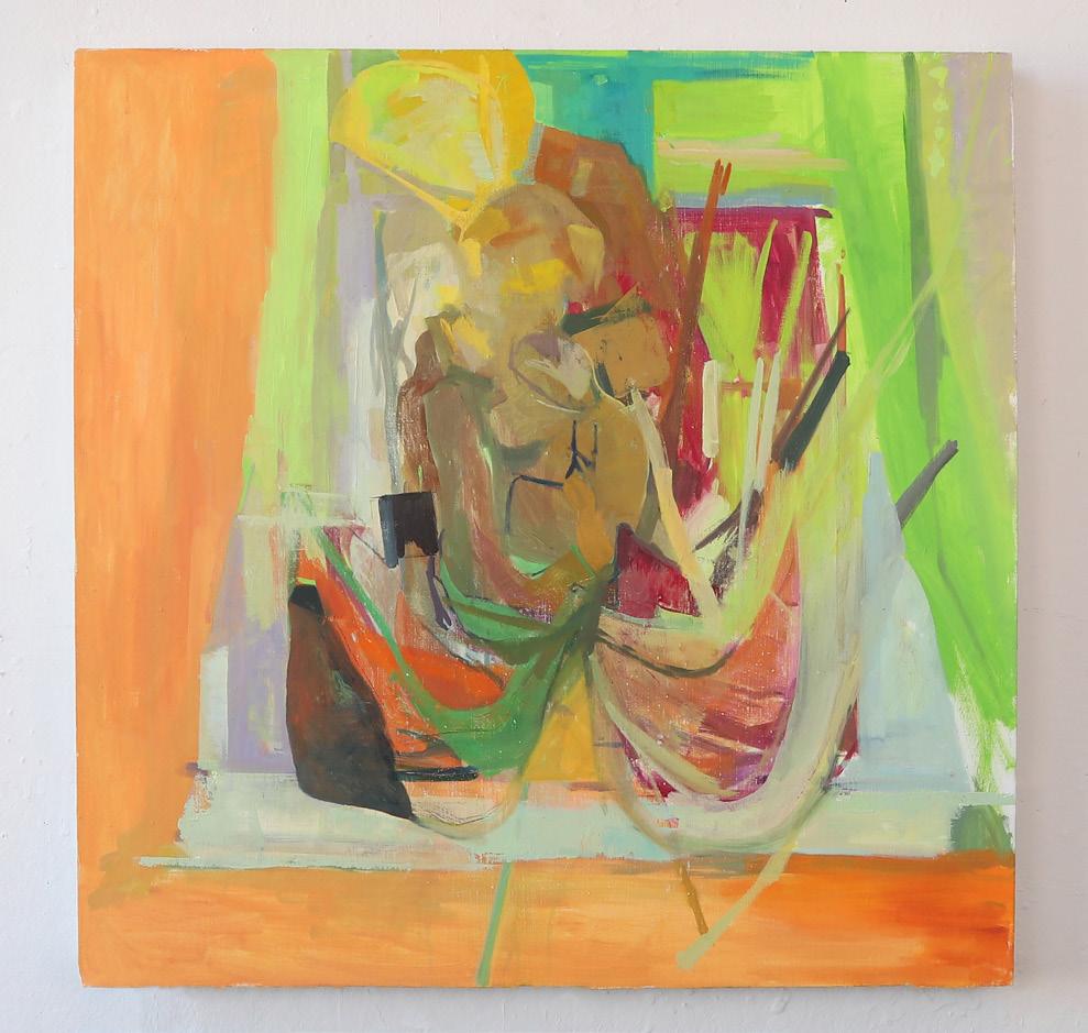
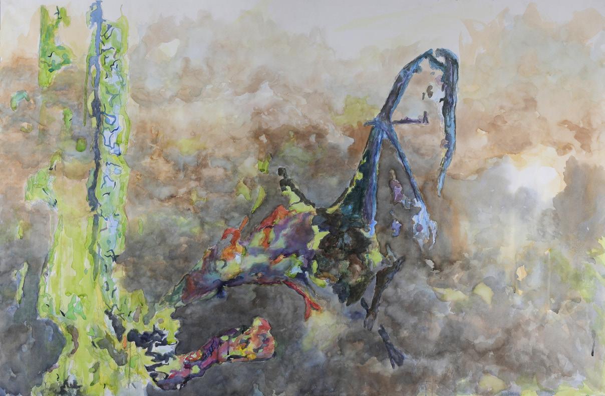
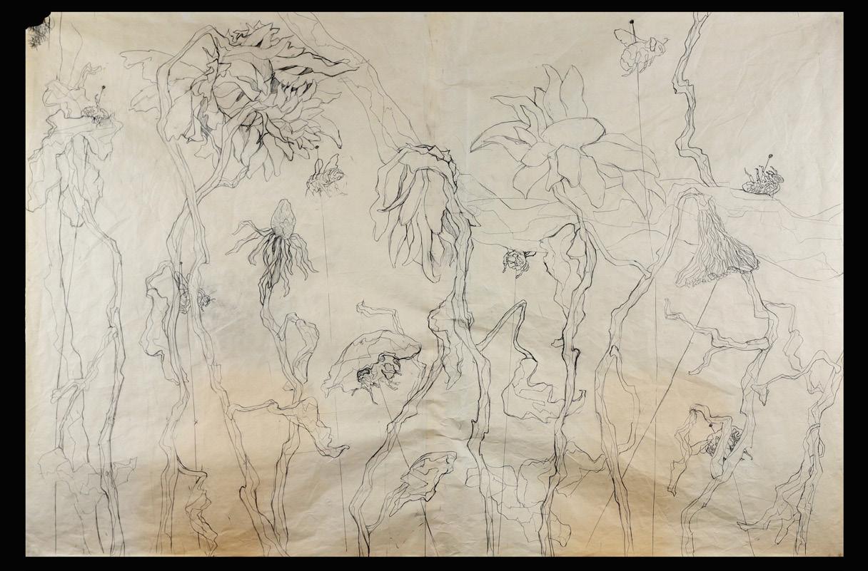
James Gold
At once ancient and futuristic, my paintings depict fragments of hypothetical archaeology. Their lustrous surfaces are created with traditional painting techniques, yet are influenced by the hyperreality of digital imagery, occupying a space between fact and fable.
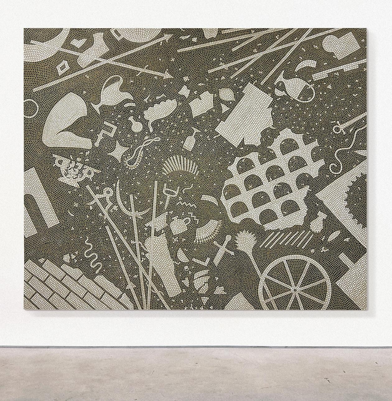
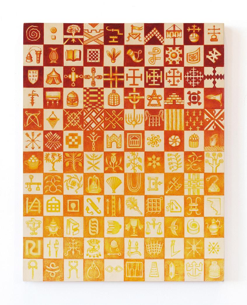
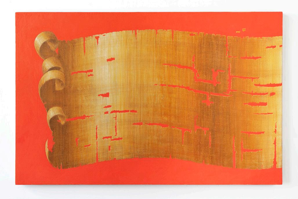
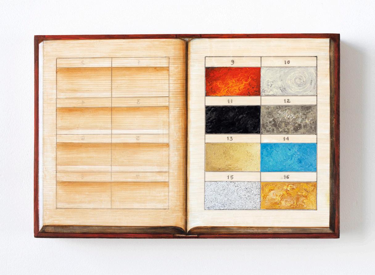
In my recent work, a papyrus scroll unfurls like a flag against a glowing coral background, an illusionistic black-and-white mosaic reveals swirling silhouetted artifacts, and an array of floating golden fragments on an electric-blue background suggests cartographic contours of islands and oceans. The cropped compositions imply that each painted object might extend infinitely beyond the edges.
My studio is an alchemical laboratory where I explore the sensuality of diverse materials. Starting with a sandy-textured pigmented gesso, I layer India ink, egg tempera, and sign-painting enamel in a range of shimmering colors—using stamps, brushes, abrasives, and calligraphy pens to realize objects that appear found, even to me. Viewers are invited into a world of “willing suspension of disbelief” as color and form become trompe l’oeil fragments of marble, tapestry, and papyrus. I create my paintings with love and care, and as I foreground an imagined future, I invite viewers to rethink the physicality of our contemporary world.
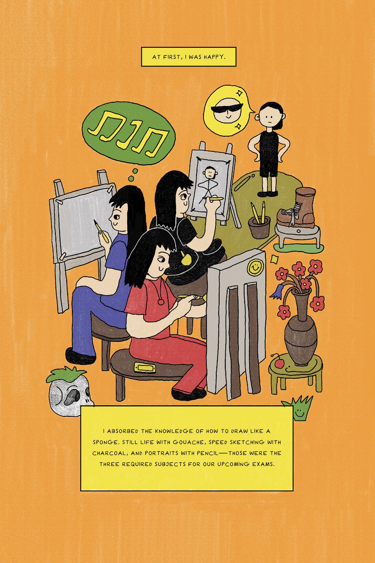
Each painting grows out of in-depth research and prompts investigations into an ever-expanding web of topics. As I read about archaeology, the history of design, neuroscience, geology, and the language of symbols, I gather and condense information into the surfaces of my paintings, driven by a desire to freely share the excitement of my discovery with viewers. This cycle of expansion (through learning) and compression (through making) allows me to cast a wide net, as I explore the question: What does our historical imagination look like?
Big Mosaic, 2023. Oil enamel and pigmented gesso on panel, 60 × 72 in. Heraldry Inventory, 2023. India ink and pigmented gesso on panel, 20 × 16 in. Papyrus Scroll on Coral, 2023. Oil paint, India ink, acrylic gouache, and pigmented gesso on panel, 30 × 47 in. Book Palette, 2023. Oil enamel and India ink on panel, 8 × 12 in.
Abbi Kenny
Born in Boston into generations of New Englanders, I make materially dense paintings depicting regionally and personally specific objects. By recreating inherited family recipes, interior dining scenes, and kitchenscapes, I seek to understand and locate myself. I look to discover my identity within the truths and fictions of culture-making. I utilize cuisine and the tradition of still-life painting to digest the legacies of class, place, and history.
My practice is an alchemical exploration of acrylic paint: I pour, stencil, airbrush, sand, and render material into unexpectedly representational paintings. While my work may seem initially photorealistic, the topographical surfaces of each canvas dissolve into color, shape, and texture. By clashing together distinct paint languages, I disrupt the viewer’s expectations of visual coherence calling attention to the mundane—asking more of everyday objects and cultural behaviors. As an artist, I ask, what is remembered and what is lost? The unease of the compositions positions the viewer in my place as the sole inheritor of my parents’ family histories, each entangled with New England.
Through my engagement with history, while painting everyday objects, I push up against the legacy of pop art. Matrilineage and depictions of caretaking co-opt pop art’s visual lexicon with a feminist lens, probing ideas of pop culture applied to women’s spaces and belongings. I transcribe my grandmother’s handwritten recipes alongside 1970s Betty Crocker recipe cards, trompe l’oeil yet larger than life and loaded with materiality. I am the historian’s unexpected assistant, an heir, and a translator. I make art that collapses generational visual culture, bringing regionally specific objects into circulation in a contemporary world. Unlike a historian though, my work does not take its final form as a thesis, but rather as a series of additional questions and observations bound up and investigated through the transformative qualities of paint.
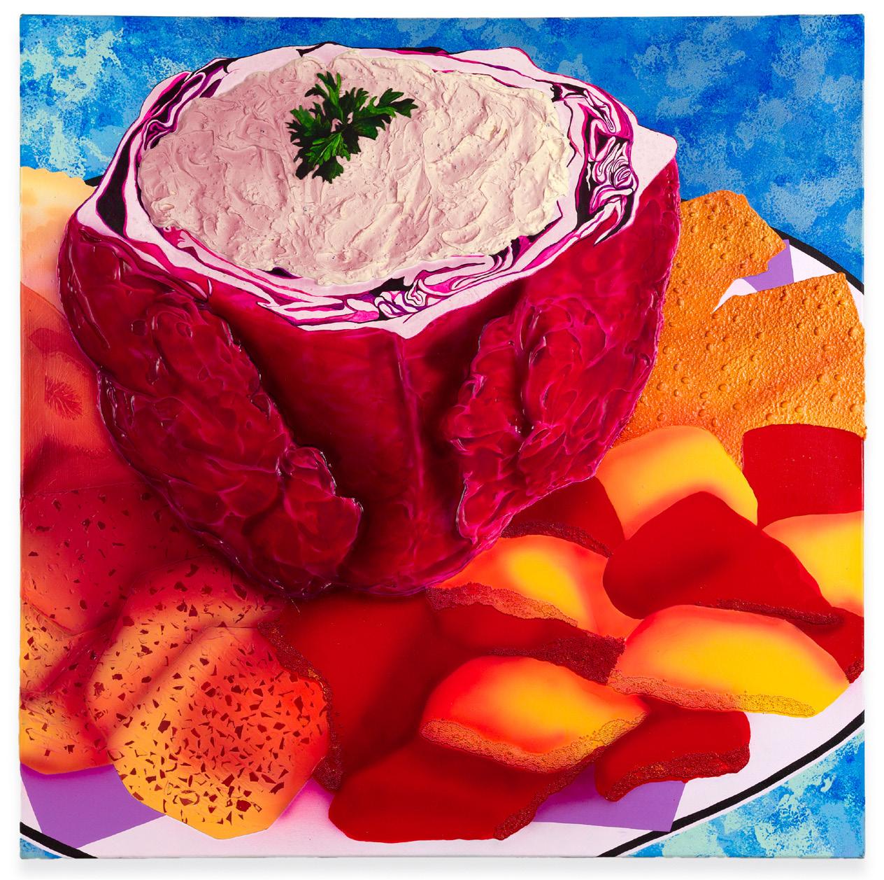
Liptauer Cheese (in Cabbage)
A Cooking Class Appetizer, 2023. Acrylic, molding paste, pumice gel, glass beads, beads, rice, glass flakes, muscovite mica, and paper collage on canvas, 30 × 30 in.
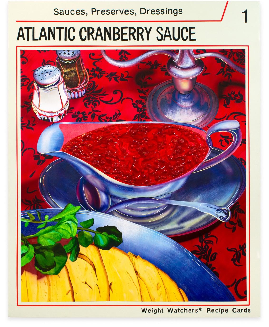
Atlantic Cranberry Sauce (courtesy of Weight Watchers), 2023. Acrylic, molding paste, acrylic gouache, black pepper, glitter, glass beads, muscovite mica, glass flakes, and Yupo collage on canvas, 60 × 48 in.
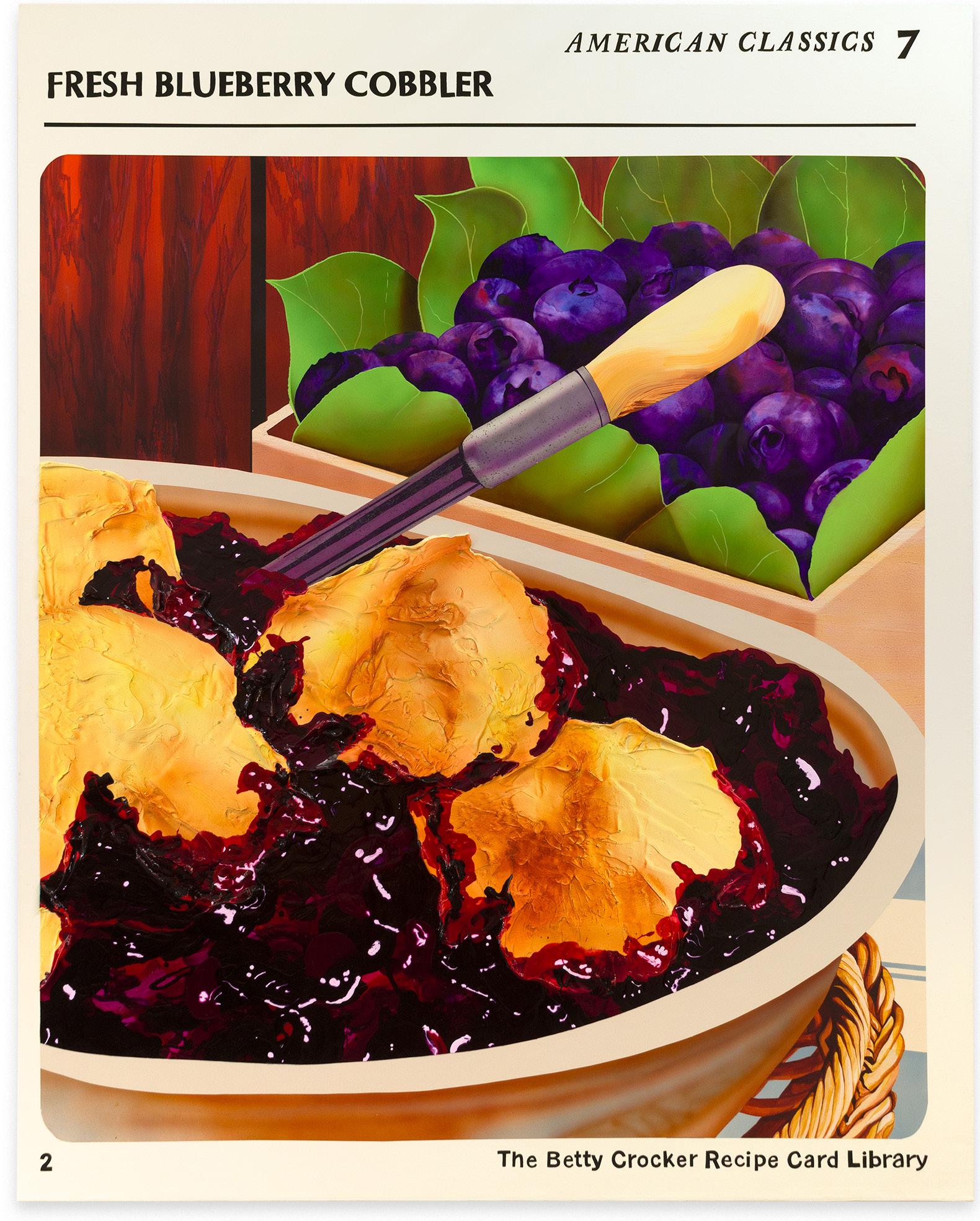
Fresh Blueberry Cobbler–An American Classic, 2023. Acrylic, acrylic gouache, molding paste, colored pencil, cellulose, graphite, oil, and iron glimmer on canvas, 60 × 48 in.
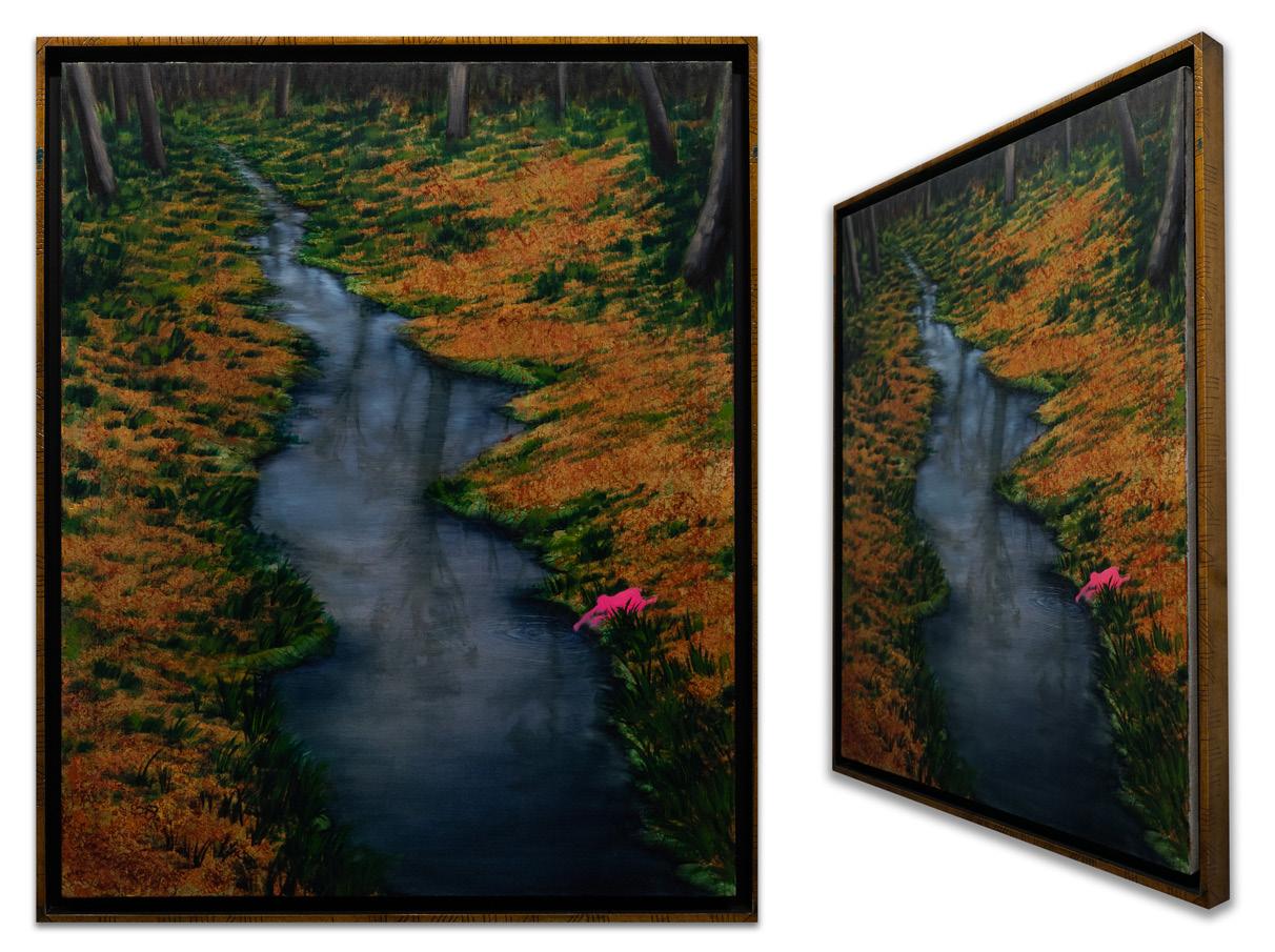
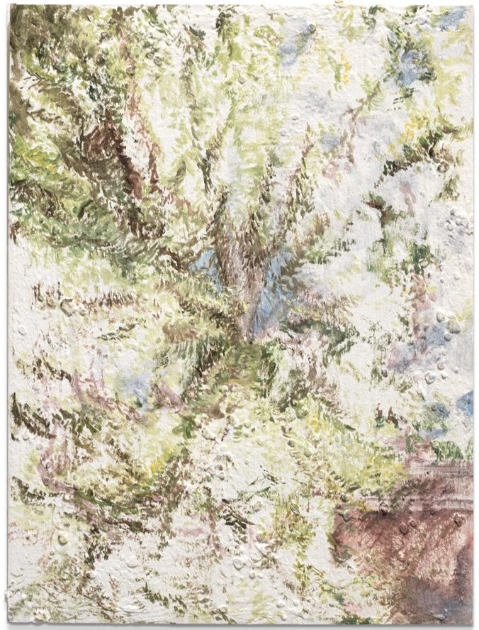
Yingxue Daisy Li
My days often start with setting up a still life with a view outside the window or biking around Boston to find a landscape motif, such as ponds, woods, bridges, or tunnels. While intensively observing my chosen subject, I transcribe my spirit and thoughts through the back-and-forth acts of looking and creating. I constantly make marks, then erase and rearrange them, revealing my honest search, not a mere picture of a preconceived idea of how a subject appears.
My works bear traces of covered and erased lines and repainted shapes and colors. Using multiple mediums, such as charcoal, pastel, ink, acrylic, oil, and collage on paper or canvas, I play with how laying in colors in different textures and brush strokes can connect with my observational experiences and internal thought processes.
The continuous struggle between the two procedural modes in my practice—immersive looking and making use of what I perceive—emerges from my own personal history of existing between China and Western countries and the diverse philosophies in each culture. I believe the self is an illusion, Daoism’s concept of selflessness and the idea that existence is defined by our continuous search, doubting and actions of making decisions. I digest various cultural tensions, and they are expressed through emotional states, such as meditative and ecstatic, which I then re-locate in my works.
Born in Anhui, China, where many traditional landscape painters are from, I carry with me the same longing for a quiet inner space and a pastoral lifestyle, even after many years of studying abroad. However, my family and my multicultural educational background have also taught me to continually look at things from different perspectives and question my initial point of view. My creative process, through painting and drawing, is my journey of navigating through such complex cultural influences. Between marking and looking is the experience of knowing and not knowing. Through painting and doubting, I process my existence and the world around me.
Hewnoaks I, 2023. Charcoal and acrylic on linen, 27 × 31 in.
Kiss II, 2023. Oil on linen, 27¾ × 27½ in.
Spring, 2023. Acrylic on linen, 31 × 27½ in.
Tunnel, 2023. Oil and charcoal on canvas, 30¼ × 29 in.
Wave, 2023. Pencil and acrylic on Yupo paper, 9 × 12 in.
Julia McGehean
Rendered to scale with crisp lines defining the edges of regulated color, my paintings depict tennis courts and book pages with intersecting qualities of geometric abstraction, action painting, and trompe l’oeil. Through an overlapping presence of sequential tracking in sports and literacy, my process is informed by a parts-to-whole paradox of labored learning. Each painting is a visual record of the cumulative efforts that are inherently erased at the threshold of success. I interrupt these compartmentalized shapes in relation to movement and (mis)translation by imprinting sneaker soles and game-related gear into wet grounds. This responsive approach intuitively records the pressures of manufactured mark-making to lift and deposit oil paint across the impacted surface. Despite their inert properties, these paintings are active opponents in the studio; relating the endurance of failure and grief to running with a stone in your shoe.
Through an amalgamation of published imagery and everyday office supplies, I engage with found objects as a tangible study of the writing process. My collection serves as a modular dictionary in which distinct definitions are exchanged for familiar forms. As an artist, I am also an editor. I add, subtract, and rearrange visual components until they formally and pragmatically converge as one. Whether assembled laterally on shelves or vertically in pegboard, these working documents consider the neurological interplay between objects and words and objects as words. This offbeat internal dialogue is articulated with a physical vocabulary of punctuation; disrupting the surface-tension with an undercurrent of comedic timing. These mechanical moves articulately suspend a string of non sequiturs, while encoding personal anecdotes that are simultaneously disconcerting and amusing, revealing and perplexing. Reflecting on constraints placed on the neurodivergent population to exist legibly, I grapple with my own didactic tendencies and question what it means to hold the privilege to consciously choose illegibility.
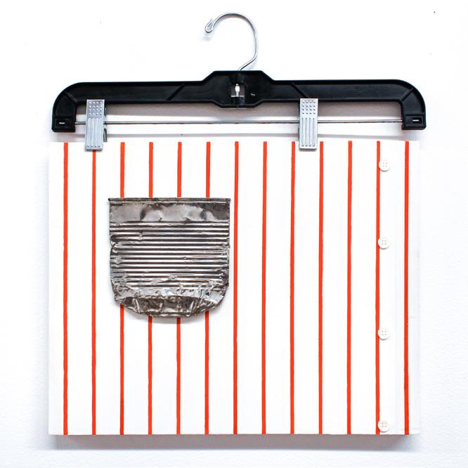
Page 458 (Color Atlas of Anatomy), 2023. Solvent transfer, colored pencil, paper, wood, 14 × 18 in. did you mean: can’t, 2023. Oil on panel, can, hanger, buttons, 14 × 18 in.
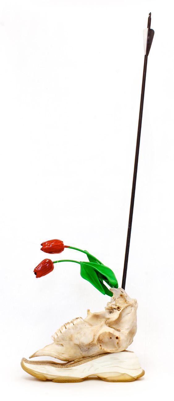
Painting with Two Balls, 2023. Oil on panel, post-it notes, sand, 48 × 32 in. Erected Sentence Series No. 3, Leather Upper, 2023. Sneaker sole, sand, bovine skull, enamel painted imitation tulips, arrow, thread, 11 × 5 × 35 in.
Walk the Line, 2023. Oil on panel, 12 × 47 in.
Sayak Mitra
JIJÑĀSĀ
The crisscrossing threads of my identity as both a Bengali Indian and a conditional resident of the United States of America unfurl and entangle conventional forms of artistic knowledge. Through my paintings and installations, I assemble fragments of my life, past and present, to describe the breadth of my multicultural experience and the world I live in.
In my triptych, The Ganges, comprised of three 4 × 8 foot plywood panels, I integrate visual vernacular with autobiographical annotations and painted remarks. In my artistic practice, I mine symbols from packaging materials and the stamped markings on substrates, which I leave intact, collage onto the surface, or replicate through digital transfers. Signs are important to me because they manifest both images and information. I have made paintings that illusionistically reproduce signage and the graffiti that covers them. In my composite assemblages, I use sign painting techniques, such as stencils, grids, and projections, as part of my visual vocabulary. Social spaces activate my work, similar to how signs function in public.
My piece Sakshi Chhilo Siddharth incorporates an industrial tarp, rice bags, and burlap, and I examine how these materials take on an alternative socio-economic meaning in America, where burlap is primarily used for landscaping and cheap packaging. In West Bengal, burlap is repurposed all over the home, and it is common to sew burlap potato sacks into doormats, cushions, and curtains, giving the material a new life. This practice of deliberate repurposing of materials reinforces the identity of culture.
My earliest memory of art is participating in building pandals in Konnagar, which is a suburban town in West Bengal, a state in India. These impressive, yet temporary, architectural structures exist outside and are constructed collectively by members of a local community, showcasing indigenous craft and housing a religious altar. Throughout my twenties and thirties, I was a graffiti artist, sign painter, web designer, and muralist. These experiences inform my practice today, politically and formally.
Sakshi Chhilo Siddharth (installation view), 2024. Egg tempera, cardboard, aluminum signs, recyclable food packages, found woods, used gloves, burlap roll, stretched canvas, and reclaimed materials, 65 × 96 in.
Mindful objective investigation of rationalist narrative in the Gig economy (installation view), 2024.
Inkjet-printed printer paper collage, synthetic paper, ink, pastel, acrylic, canvas, wood, concrete block, and clear shower curtain liner, 139 × 131 × 15 in.
Ganga, Neel Kuthi and A Piece of Art, 2023. Oil, graphite, acrylic, and image transfer on gessoed canvas, 43 × 23¼ in.
Ganashatru, 2023. Oil, acrylic, graphite, pastel, ink, and painter’s tape on found wood, 30 × 24 × 1½ in.
Mindful objective investigation of rationalist narrative in the Gig economy (detail), 2024.
Linda Obobaifo
My sculptural and collaged paintings explore the roles of women and domesticity through identity and collective histories. Through the layering of material and images, I conceal and reveal information to address the effects of perception and memory, particularly when they become distorted over time. I am interested in how public and private spaces inform the way we portray ourselves and our identities.
Lace is a material and symbol for femininity, which I incorporate into my work. I question its historical significance and how its meaning has changed over time. Lace evokes nostalgic memories of life-changing occasions, from celebrating a Christening or joyous wedding to mourning a loved one. I am also interested in the formal properties of lace, particularly how it can simultaneously reveal and conceal the body. I use this as a metaphor for hiding, masking, and choosing to unveil some truths to the public eye while keeping the viewer out of reach.
I create distance between the viewer and the artist through the materiality of the oil and acrylic paintings, using lace, chiffon, tulle, crystal organza, and plexiglass to show how memories can be distant and come in and out of view. Additionally, I question how the lines of girlhood and womanhood blur, become intertwined, and even forced. Each painting can be read as a form of poetry, which is coupled with my writing. I pair my paintings alongside my poetry to create a dialogue of secrets being revealed between each piece. My poems and paintings have become a coded language, serving as both a boundary and blanket of protection. My use of photography helps me consider the preservation of memory, the duration and passing of time, and the overlap of past and present. I think about time, labor, and windows as being mirrors reflecting into our private lives.
Browned Histories of Women Tied into Breeding America’s Lost Child—
Dressed in Beads and Jute Twine, 2023. Acrylic, oil, lace, chiffon, microsuede, jute twine, beads, and chicken wire on canvas, 48 × 60 in.
Swimming in a Pool Full of Honey’s Lies (An American Film), 2023.
Acrylic, oil, lace, carpet, chiffon, plexiglass, jeans, jute twine, and chicken wire on linen, 84 × 96 in.
Fatigued Facade, 2023. Oil, acrylic, cotton, linen, string, and lace on canvas, 48 × 60 in.
If You Were Gazing Through My Memories (In Lilac and Pink), 2023. Acrylic, oil, jute twine, lace, silk, tulle, crystal organza, and pins on canvas, 84 × 96 in.
Everything Comes Full Circle, 2023. Oil, acrylic, jogger pants, linen, lace, string, and jeans on canvas, 48 × 60 in.
Stephanie Petet
My work and process are a constant unfolding of variables, vibrations, and planes of sensation. Through abstraction, my paintings strike a balance between material reality and felt frequency by employing a range of paint applications and color combinations. As material objects, my paintings can sometimes fit in a purse or be wider than my own wingspan, evoking a sense of entity or experience.
Each composition begins with chance and collaboration. I ask a friend to pick a color and lay down painted marks in whatever way they see fit. Other times I draw a grid or a connect-the-dots pattern in the shape of a form only known to me and then have someone respond to that configuration. This allows me to react and create a spontaneous dialogue in a way I cannot predict, and acts as a reminder and metaphor for performance for an audience.
Formal construction, using a variation of paint application modalities, informs my vocabulary of intuition. Subtractive methods such as wiping, scraping, and sanding allow me to orchestrate internal light and resist impulse. Carefully dialed-in color relationships are tuned to my conceptual and scientific interests in frequency, sound, and space. Foundational elements of music are a primary component of my spatial building language. Tempo and rhythm operate in relation to the kinetic speed of paint gesture; dynamics and pitch operate in relation to scale and proximity in tandem with color, value, saturation, temperature, and opacity.
Every piece arrives at its finality at different speeds or boiling points. I invite the viewer to dive in, complete the sequence, peer around a mark, or imagine peeling back the glaze of paint to get a glimpse of how it all started. Through this practice, I uncover hidden liminal spaces within my mind that are echoed in the oscillating lived possibilities of memory and emotion.
Globe Drain, 2023. Oil on canvas, 80 × 72 in.
Tomb Zone, 2023. Oil on panel, 42 × 48 in.
Ghost, 2023. Oil on panel, 30 × 42 in.
Fiber Wave, 2023. Oil on panel, 30 × 42 in.
Tuning Fork, 2023. Oil on canvas, 70 × 72 in.
Jacob Salzer
My work is an exploration of the practice of noticing. As an artist I give attention to subjects of my everyday life, such as a conversation between two people, a surface that I’ve walked over hundreds of times, or an exploration of relationships that give me a sense of self. Recently, autobiography has become more important in my work. I engage with and make work about my lived experiences through painting, found sculpture, printmaking, and collage. My piece Box for Prints is a sculptural painting of a hole in the wall at a public transport spot in Boston. The work has a booklet attached to the front to display monoprints, and a space in the center to give the viewer a section to peer into with different writings and scraps of art inside. Using different forms, materials, and sources I create narratives that are built through the process of making, while staying true to my own observations and feelings.
I’m interested in how an image or object can hold meaning yet change based on its context. A crushed beer can inherently hold no value, but it does in art. I have chosen to paint something that I’ve owned for the majority of my life, a special gift from someone, or something as ephemeral as a receipt from a fun night out. Sometimes I incorporate things that hold no meaning at all. I like combining visual elements that have personal significance alongside those which might appear intimate but actually give the viewer an opportunity to enter the work through their own associations.
I use the same approach with symbols, both painted and constructed. Some symbols I return to include the Rummikub smiley face, and the wooden apple box that once belonged to my father. Their repetition implies importance within the work, while offering no resolution.
Hunting Bibs, 2023. Acrylic monoprint and mixed media on panel, 41½ × 25 in.
Green Line Hole in the Wall, 2023. Oil acrylic monoprint on panel, 34 × 31 × 7 in.
Spooky Joe at Home, 2024. Pencil on paper, 23 × 19 in.
KEH off Boylston, 2024. Acrylic and oil on panel, 48 × 43 in.
Found Cans, Stolen Drawing, Stolen Hat, First Date, 2023. Oil and acrylic with found material on panel, 24 × 48 in.
**4
Sidharth Shah
My graphite drawings and watercolor paintings explore the impact of humans on the flora and fauna of the world today. Human greed and apathy threaten a million known plant and animal species with extinction and are causing widespread ecosystem imbalances. In my art, I capture endangered creatures representationally using exaggeration, disintegration, and distortion of line and form, to emphasize the adverse impact of their possible eradication.
My drawings are made on reclaimed packing paper that I used for a move in 2011. Uncrumpled and delicate, the ephemeral quality of this substrate reflects the frail and fragile condition of my subjects. In contrast, my paintings are made on acid free paper, and I use watercolor to consider the nature of impermanence. Watercolor is demanding, as every brush stroke is indelible, yet its fugitive pigments and organic fibers require care to be preserved. The act of drawing or painting then becomes a metaphor for ecological holism: line, form, and color, behave like organisms that I orchestrate into a harmonious visual ecosystem on the surface of my work, thereby implicating me through my own hand.
Recently, I have been drawn to depicting the psychosis that wild animals experience under captivity. Zoochosis goes against millions of years of evolution and my art captures the psychological elements of space, barriers, and behaviors that captivity imposes. This is an emotionally distressing subject that requires commitment and insistence to create sensitive paintings that blur the boundary between art and activism.
I use varying degrees of layering, transparency, amalgamation, scale, and abstraction to draw out metaphors based on ecological food web dependencies and inter-species relationships. My ambition is that the viewing experience of my art transcends the visual and moves into the visceral and emotional realms, where humans might be inspired to nurture compassion, resist apathy, and re-consider humanity’s onus towards the planet and its 8.7 million species.
Untitled, 2023. Watercolor on paper, 42 × 64 in.
Untitled, 2023. Watercolor on paper, 42 × 70 in.
Untitled, 2023. Graphite on paper, 35 × 45 in.
Untitled, 2023. Watercolor on paper, 42 × 66 in.
Untitled, 2023. Graphite on paper, 35 × 45 in.
Sophie Thervil
My paintings capture fleeting and overlooked moments that I suspend through highly realistic oil paintings. Relying on my own visual perception and moral judgments, each painting becomes a projection of someone else. My portraits of strangers and friends become a reflection of myself, society’s expectations, and the cultural codes of the city in which I live, Boston. My practice starts with photographing people I encounter around the city. I notice when I am quick to make judgments about someone’s appearance. Keys falling out of jeans, a jacket buttoned to the collar, or stains from morning coffee on a dress shirt leap out at me. With more recent work, I play with the idea of dress-up. Every day, each person chooses clothing and accessories from their own closet to create an impression. I do the same as an artist, questioning how earnest I should be. Through exaggerated scale, the viewer is allowed to fully enter each painting, taking note of small yet important details. With thin layers of carefully and sensitively applied oil paint, I think about painting objects as they feel to the touch: the coldness of a metal belt, the slippery quality of satin, the specific sheen of a puffer jacket.
Throughout my work, I explore how my perception of clothing, objects, and personal style reveals my own biases of who strangers and friends are. These paintings become vulnerable in my honest judgments of class, race, and assumptions. As a mixed race, yet white passing, woman, I find myself questioning how brief moments can sway someone’s perception of another’s identity. The changes in our day-to-day appearance tell a larger narrative of who we are or who we could be. As you look down at your fingernails that hold last night’s paint, socks that don’t match, the necklaces that slowly become tarnished, what story are you telling about who you are?
Let me get a… *Boston Accent, 2023. Oil and acrylic on canvas, 78 × 38 in.
Custom Silicone Wristband 80% off, 2023. Oil and acrylic on canvas, 78 × 38 in.
Someone, Somewhere between the Rose and it’s Thorn, 2023. Oil and acrylic on canvas, 78 × 38 in.
Ellen Weitkamp
I consider my studio practice to be a paced and daily conversation with place, reflecting on how I negotiate where the past, present, and future sit. Pulling from images from my everyday, my oil paintings and prints evolve as a process of rediscovering the environment I inhabit and discerning my place within it.
My paintings emerge from a slow and meticulous process of collaging translucent and opaque layers, text, and varying perspectives onto shaped and rectangular supports. This process encapsulates the expansiveness of time, using ordinary subjects like an unmade bed, an empty driveway, or the interplay of light on a kitchen counter. Through my use of overlapping visual and written elements, spaces and meanings can be enveloped and revealed. For instance, in September 2022–December 2023, the text from a postcard floats on top of a blanket, all of which is hidden by a sheer curtain.
My prints, on the other hand, depict an immediacy of place and presence through a direct lithographic drawing practice that shows more than what can be noticed in a passing moment. Recent prints depict a subtle light shift on the side of a building, a funny pairing of similarly shaped objects, or a glass that is precariously close to the edge.
The exchange between slow, meticulous painting and the immediacy of drawing allows my work to navigate the intricate dance between permanence and transience. With each composition, I infuse a heightened presence, a subtle nuance of the mundane, and a conscious effort to capture something unrepresentable: the ephemeral nature of time.
April–June, 2023. Oil paint and colored pencil on panel, 30 × 23½ in. June 2019–Present, 2023. Oil on panel, 34 × 60 in.
August 18th, 2022; all afternoon, 2023. Oil on panel, 43½ × 42 in.
The Print Media & Photography MFA program at Boston University emphasizes an interdisciplinary, process-driven approach to studio practice, centering on the intersection of photography and printmaking. This approach engages with both the material and critical dimensions of these disciplines. We take pride in presenting the inaugural class of 2024, whose work expands the boundaries of these closely related disciplines and exemplifies a steadfast commitment to experimentation and discovery. As printmaking and photography converge, fundamental concepts such as the artist’s hand, memory, perception, illusion, time, and repetition come to the forefront. Mark-making, texture, light, and chemical reactions serve as a nuanced language that communicates the artist’s intentions, providing viewers with multiple ways of seeing. Sofia Barroso, Delaney C. Burns, Julianne Dao, and Emily Taylor Rice reveal thoughtful and iterative explorations encompassing psychological, environmental, and intimate perspectives. Their work offers a lens that oscillates between macro and micro viewpoints, disrupting the viewer’s sense of the familiar and, in turn, prompting more questions than answers. This exhibition represents artistic prowess and stimulates a profound intellectual engagement with the intricate interplay among the processes, materials, and concepts found within printmaking and photography.
Lynne Allen Professor of Art, Printmaking
Toni Pepe Assistant Professor of Art; Department of Photography
Deborah Cornell Professor of Art, Printmaking
Sofia Barroso
A WAY INWARD
Photography embraced as a daily practice has become a medium through which I indulge in the present. I capture fleeting moments—those often overlooked or rarely noticed. I cherish these seemingly ordinary instances as they form an integral part of the narrative I feel compelled to share.
The exercise of photographing serves as a practice through which I uncover the allure of the mundane. It compels me to slow down, observe keenly, and decipher the nuanced visual language of time. Akin to the transient nature of moments, light itself is ephemeral, adding depth and temporality to my exploration.
I transform my images into tangible forms through alternative photographic processes and printmaking, integrating bodily engagement, materiality, and physical presence into my work. By incorporating fabric, paper, thread, paint, and other elements, I embrace the notion of possibilities. Through experimentation, I challenge the conventional understanding of processes such as cyanotype and silkscreen printing, leading to continual discoveries.
My artistic journey is a profound and ongoing relationship with my inner self from inception to completion. I am constantly questioning, challenging, encouraging, and validating, which forms the intricate dance between introspection and creation. My work represents my most valuable form of self-discovery—a visual and tangible expression of the dialogue within.
Exploration of Possibilities, 2023. Cyanotype on fabric, 25 × 25 in.
Gossamer Light, 2023. Cyanotype on fabric, 30 × 22 in.
Lingering Light, 2023. Silkscreen on paper, 30 × 22 × 2 in.
Instances, 2023. Image transfer on panels, each 8 × 8 × 1 in.
Delaney C. Burns
I am the culmination of all the women who have come before me, a product of their love and labor, a labor that I have seen go unnoticed and unappreciated. This body of work is a celebration of their effort as well as a critique of the gendered roles they have been forced into. I draw upon these intimate, personal moments to understand historical and contemporary issues.
These reflections come from a deep empathy and desire to understand hidden histories that are intertwined with current events today, such as the ongoing struggle for reproductive autonomy. Though often seen as a contemporary conversation, various plants and herbs have been used worldwide for centuries for abortion and birth control. These plants are more than just symbols of reproductive justice and the freedom to choose, they represent strength, hope, and resilience. I juxtapose the plants with text from letters, notes, cards, and diary entries the women in my family have written to capture their individuality and create intimacy with the subject. While many of these experiences are specific to the women in my family, they reflect a larger collective history of gender roles, gendered violence, and generational knowledge.
The physicality of printmaking becomes emblematic of the unseen labor of generations of women. Graining stones, carving wood, and pulling prints become a meditation, while my bookmaking practice parallels the act of mending and sewing. Tea bags and tea stains become a recurring element in my work, as these medicinal plants were typically consumed as tea. I visually and metaphorically layer other women’s stories and experiences with my own to capture the adoration, rage, and grief I feel when analyzing the roles we have taken on. Through the critique of societal norms and shortcomings, I seek to understand my place in the world and unearth a larger history that connects us.
January 1967, 2023. Risograph with monotype, 11 × 17 in.
An Offering, 2023. Acetone transfer on tea bags, 9½ × 16½ in. Remembrance, 2023. Lithograph, 16¼ × 20 in.
Julianne Dao
I am interested in how the lack of visibility of an image may reinforce the act of looking, through recognizability and interaction with space, light, and shadow, to create an experience that goes beyond seeing an image. To engage these concepts, I explore the theme of ephemerality through nature. Each of my works captures the essence of an experience by exploring images of nature that are processed to border on the edge of visibility. Ephemerality is conveyed through imagery, material, and juxtapositions between obfuscation and visibility.
Nature is an inherently ephemeral subject. It is constantly transforming and never stagnant. Images of water, plants, lights, and shadows highlight nature’s ephemeral qualities, alluding to general feelings of nostalgia, familiarity, and yearning. To enhance and embody these feelings, material and medium are essential. Materials have the ability to create the impression of various sensations, tangible and intangible. Using translucent fabrics and paper, my work interacts with light and air to describe the delicate, hazy, and fleeting qualities of ephemerality. These materials are able to capture light and cast shadows to encompass the image not only on its surface but also in the space it occupies.
Toward the concept of ephemerality, where clarity is always fluctuating in a moment that is difficult to preserve, I use a variety of techniques creating juxtapositions between the recognizable and the nearly undetectable image. Printmaking techniques of blind embossment and chine collé allow for layering of various imagery and materials, with each layer concealing or highlighting the imagery. The source of the imagery comes from photographs, mainly polaroids, that for me, suggest nostalgia. Utilizing the medium’s unpredictability results in intentionally degraded images that speak to the passage of time, obscured moments, and ephemerality.
Walking Shadows, 2023. Collagraph blind embossment with inkjet print chine collé, 24 × 18 in. Haze (Land and Water), 2024. Collagraph and inkjet print, 21 × 17 in.
Seafoam, 2023. Woodcut with collagraph blind embossment, 18 × 13 in.
Emily Taylor Rice
The complicated narratives and often serious realities surrounding mental health and substance use disorders are what lie at the heart of my work. I navigate and reflect on the emotional geography that surrounds these experiences through the personal lens of alcoholism. Through photographs, monotype prints, collage, and silkscreen prints on found textiles, I aim to emphasize the force and oppression of addiction while acknowledging the release that can be found through acceptance and the choice of recovery.
Through abstraction and symbolism, I create visual metaphors that illustrate emotional complexity, struggle, growth, and strength. The concepts of time and memory are incorporated into my work through repetition and pattern. Processes of embossing and printing leave their traces, similar to how emotional upheavals leave scars that cannot be erased. Pigments collide with but also delicately caress surfaces, emulating feelings of both desperation and relief. I use printmaking as an artistic means of communication and as a form of activism. Addiction does not discriminate, and I aim to provoke thoughtful responses, fostering empathy and understanding.
There is beauty in damage. Breakage and disruption in my pieces invite an examination of the painful aspects of addiction while rebuilding the works through collage allows for a new narrative to emerge. This interplay between deconstruction and reconstruction speaks to the space between dying and living. I highlight the physical, mental, emotional, and spiritual transformations that can take place from addiction to recovery. Often an uncomfortable subject, I strive to dismantle assumptions and break down barriers to initiate truthful and constructive dialogue.
Standing smack in the middle of the truth about myself, 2023. Silkscreen on found fabric, 31 × 23 in.
Navigating healthier terrain, 2023. Silkscreen on found fabric, 33 × 24 in.
Days and Downs, 2023. Woodcut and embossment, 29½ × 43 in.
What does contemporary sculpture look like? Ask each of this year’s MFA Sculpture cohort, and you will receive a different answer:
For Helena Abdelnasser, sculpture is a medium of transitory states— of phase changes where familiar solids like wax, strawberry Jello, bread, sugar, ice, and asphalt briefly coalesce before collapsing, melting, or sublimating into room-filling vapor. These unstable and fugitive properties extend beyond their material composition—this is a world where text can become object, object can become image, and all three states can wend their way between the organic and inorganic, the personal and impersonal, the living and the dead.
Liam Coughlin inscribes formal underpinnings of sculpture—scale and weight, space and situation, surface and armature—in exquisitely configured objects wrought from familiar construction materials and punctuated with the flotsam of suburban American malaise. As subtle as they are massive and conspicuous, these cryptic, brooding forms withhold as much as they show. They are prone to disquieting incoherent blurts of stifled alarm that—if you listen closely—reveal a sly and biting sense of humor.
Alyssa Grey expands sculpture into networked relationships of interrelated, co-dependent parts that yield results both ingenious and absurd. As with a slightly twitching can of diet Coke motivated from an egregiously cantilevered beam, or a handmade “aquarium” full of rusty water sprung from jiggly springs and counterweighted by a sack of potatoes, these quirky and intensely crafted one-liners hum with a tenor of pathos and perseverance.
Yolanda He Yang’s interdisciplinary practice offers pensive and lyrical responses to the immediate minor magic extant within the sorts of ephemera most of us don’t see: a shadow, a shaft of light, a gust of air. By gently holding space for all manner of transcendent incidence and interaction of humble—often fragmentary—materials, this work provides a moving interplay between the attentive resolution of minor phenomena and the inevitable poignancy of letting go.
And for Mae-Chu Lin O’Connell, sculpture can slip from noun to verb—it can be performed, enacted, and embodied—always with painstaking precision, dry wit, and a balance between the empathetic and the visceral. We bear witness and are implicated in this emergent present
tense of the genre: we watch—aghast, queasy, giggling self-consciously— as yards of noodles are swallowed, regurgitated, and meticulously measured; as institutional territory is marked by the most animalistic means; as eyeliner is applied by X-Acto blade.
The variation in form within the work of these exceptional artists pays tribute to the enormous and diverse potential of sculpture. But what they have built together and share in common is both singular and ineffable: a conversation, a culture, a language, a heart—it is sincere and challenging, full of humility and humor, fueled by mutual respect, and girded by support, care, and love for the creative process and for each other. And though the heart remains unseen, their extraordinary work is testament to its strength.
David Snyder Assistant Professor of Art, Sculpture
Helena Abdelnasser
I am a visual artist who grew up in a culture in which science, myths, and ritualistic spirituality are coexisting and at times overlapping. My installation work is often composed of biodegradable ingredients used for their cultural and political symbolism to retell stories about humans’ desire to control the uncontrollable; generally, that which is natural. By playing with both logic and materials, my work creates absurd settings in which architecture, infrastructure, animals, and bureaucracies become active characters. These characters construct narratives centered around themes of consumer culture, institutional structures, and the industrialization of nature.
The impermanence of my work results in performative installations that are constantly enduring change through decomposing, melting, or sprouting—all in the interest of allowing unexpected narratives to develop over time. According to the logic of this world, the words of an email are blooming and wilting, the fish are melting, and three dead pigeons are sprouting near a garden fence.
Why is there a tendency to preserve? And how much assertion of control goes into attempts to preserve? These parable-like settings offer an alternative logic that questions what it is like to not be able to control a situation.
Poor Thing Fell from the Tree, 2023. Paraffin wax, animal gelatin, heating lamps, welded steel, and toxic fumes, 62 × 27 in.
Save for Later, 2022. Chia seeds on paper, 60 × 40 in.
Untitled, 2024. Grass, mud, painted pine wood, 47 × 20 in.
Vegan Leather, 2023. Baked dough, 40 × 23 in.
If you need assistance please press the button, 2023. Video (30 min.), wax letters, steel, and heating lamp, 20 × 24 in.
Liam Coughlin
In my sculptural practice, I conjoin, embed, and conceal cheap plastic ephemera with and within common building materials as a means to craft a surreal allusion to the suburban rural New England landscape. The repeated use of chintz—Halloween pumpkin pails, plastic Walmart shopping bags, and Burger King cups—often makes reference to the depressing cultural psychosis of the ceaseless chain-store holiday display. My interest in frontality is both a physical reference to the kinds of façade-oriented, strip-mall architecture that often define these down-trodden spaces as well as a call-back to the repressed mentality of growing up in a homogenized, hermetically sealed, village-like culture of a small New England town. This frontality is just as much a formal concern as a metaphorical interest. The seemingly dichotomous relationships developed between the consumer byproducts and construction materials serve to develop a type of alphabet within the material focus of my studio practice. These constructed, pseudo-minimalist forms serve as containers for meaning as they oscillate between withholding and offering information through partially or completely obscured objects, sounds, and videos.
Untitled, 2023. Antique trim, oriented strand board, sawdust, wood glue, Pizza Hut bag, light, electrical components, flagpole holder, branch, speaker, and sound, 72 × 20 in.
Untitled, 2023. Dimensional lumber, blow-mold pumpkin pail, speaker, sound, digital amplifier, extension cords, cedar, and oriented strand board, dimensions variable. Woods of Townsend, MA.
Untitled, 2023. Still from single-channel video, 1:19 min.
Alyssa Grey
As a sculptor interested in the formal language of materials and their interactions within space, my creative focus toggles between art objects and their modes of display. Drawing inspiration from traditional uses of pedestals, I create interdependent networks whereby units rely upon each other in order to function as a means of support for isolated moments in the work. Fueled by the never-ending question: what if? I experiment with industrial and organic materials to find new and unlikely combinations of both. These personally inflected and playful objects draw from the do-it-yourself expediency of lower-middle-class home projects which often entails crafting my own tools and equipment to jerry-rig problems. These soiled structures form quick-fix foundations while stubbornly (if tenuously) clinging to kindred objects that can only be described as coping mechanisms. Using soda cans, duct tape, rust, and sacks of potatoes, I create double meanings and puns with my material choices in order to imbed poorly made jokes within the larger sculptural systems. These jokes always fall just short of a punchline—leaving them confused and alone; feelings that echo throughout the work, with each elaborate piece dismissed and left in silence.
Dangle it in Front of Me, 2023. Wooden beam, ratchet straps, motor, hand-dyed rope, Diet Coke can, and extension cord, 120 × 144 × 96 in.
Contained, 2023. Handmade paper and steel, 54 × 36 × 36 in.
The One Without the Nugget, 2023. Steel, plexiglass, bungee cords, springs, 50-pound bag of potatoes, and rusted water, 72 × 30 × 24 in.
Untitled, 2024. Wood, gray paint, motor, and camouflage duct tape, 75⅝ × 42 × 42 in.
Death to the Nugget, 2023. Fish tank, wooden pallets, soap, and rusted water, 48 × 54 × 36 in.
Mae-Chu Lin O’Connell
My practice is a navigation of the discomforts, misalignments, and frustrations that I experience in life. Through crafting various personas and implementing pseudo-therapeutic measures, I attempt to address physical and mental disturbances in ways that can seem exacerbatory.
Literal is my conceptual native language, the mother tongue of the instructions I create and follow. I self-stimulate to the point of exhaustion to achieve the feeling of productivity; enervating myself in the highs of container-construction elicits satisfaction even if temporary. Cherishing said containers, I derive comfort from finding homes for objects/collections/feelings/moods. As such, these receptacles are built in some cases physically and others within the confines of my mental palace.
These organizational tendencies infiltrate my productive processes, including the corporeal: hair and other bodily products make appearances in many of my performances and apparatuses, whether merely collected and en-vesseled or transformed for a purposeful device.
In an effort to ensure proper communication of instruction, theatrics become a method of information distribution and preservation. Though she is a persona to whom I can divert culpability, the actor I become is nonetheless plagued by insecurity, perpetually in pursuit of an existence without disappointment, without fear, without grief, without FOMO, without cringe, without burnout. Introspection is key, yet I do not wish to over-think/act/react/eat/promise/do-it, nor navel gaze.
The alter ego aids in my pursuit of happiness and discovers that joy is not merely the avoidance of the anti-joy; it is the overarching goal of life and therefore the mission of the artistic practice; for artmaking must supplement the mental diet.
Makeup Tool Tutorial, 2023. Video performance with cosmetic products and construction tools, dimensions variable.
Longevity Noodle, 2024. Video performance with traditional handpulled noodles, dimensions variable. **1
Self Slapping Motivational Gauntlet (“I don’t want to take Adderall today”), 2023. Video recording and mixed media device, dimensions variable.
Installation view of Handbook Piece Version 1, 2023. Artificially-enhanced text in ink on copy paper, dimensions variable.
Installation view of Cleaning Series—Oasis, 2023. One-hour live performance with salvaged Boston University shower unit, video projection, water, soaps, lotions, bath bombs, spa masks, beverages, flowers, candles, towels, assorted self-care items, and cleaning supplies, dimensions variable.
Yolanda He Yang
By fusing photography, body movement, performance, video, and sculpture, my installations delve into the hidden layers of emotion embedded within aspects of the optical experience. I seek to offer poetic presentations that invite the viewer to experience space as it exists beyond its surface appearance and to suggest the total rupture of boundaries imposed between inside and outside, space and time. Through subtle adjustments and slight re-orientations of objects, my installations challenge conventional notions of meaning while advocating for the power, resilience, and possibility inherent within fugitivity and delicacy. My work invites viewers to explore the intimate immensity of these concepts while engaging with the politics of space and body, prompting reflections on these themes’ societal and personal implications.
Yolanda He Yang is a Boston-based artist whose practice encompasses both personal studio work and public art. Born in a Catholic family in North China, Yolanda relocated to various places she remembered as homes, schools, and playgrounds when she was a child.
the first phrase of touching (detail), 2024. Installation, shards, and LED spotlights, dimensions variable. of woman herself (still), 2023. Performance. the first phrase of touching (detail), 2024. Installation, shards, and LED spotlights, dimensions variable. Untitled, 2023. Shards inserted in wall, dimensions variable.
Visual Narrative (Comics) is a complex art form that demands proficiency in multiple roles throughout the creation process. Creators must act as true authors, deciding everything from a character’s appearance and dialogue to their environment and motivations, including details as minor as their shoes and shoelaces. For cartoonists, this means they must take on the roles of researcher, writer, director, camera operator, acting coach, and more for their stories. The inaugural class of the MFA in Visual Narrative serves as a case study in how to successfully blend words and pictures into compelling, impactful stories. The stories presented here represent just a glimpse of the larger body of work, filled with passion, storytelling, and creativity. These ten authors have crafted narratives that are humorous, poignant, and thought-provoking, designed to evoke the same range of emotions in readers. I am honored to have had the opportunity to mentor and guide these ten exceptional cartoonists.
Joel Christian Gill Associate Professor of Art
Sandeep Badal
PHANTOM IN A JAR
Sandeep Badal is a visual storyteller from Kathmandu, Nepal, working in comic books, illustration, and filmmaking.
Phantom in a Jar is a story of a queer immigrant writer-illustrator based in New York, working on his debut graphic novel, who finds himself haunted by the entity of his recently deceased father. As he struggles to come to terms with his grief, the conversations he never had with his father when he was alive start manifesting into guilt, affecting his work and his relationships.
Interspersed with Vinay’s story is the comic book that he is working on, featuring a trans-femme superhero who starts questioning her role as a hero in a society that has suddenly started treating her like a villain.
Phantom in a Jar explores the themes of identity and belonging, grief, guilt, and healing through visuals that explore the mundane and melancholic to the absurd and surreal. These themes intersect to create a narrative that delves into the complexities of human emotions and relationships.
Phantom in a Jar (prologue, page 1), digital drawing, 2024. 6 × 9 in.
Phantom in a Jar (prologue, page 2), digital drawing, 2024. 6 × 9 in.
Phantom in a Jar (chapter 1, page 6), digital drawing, 2024. 6 × 9 in.
Phantom in a Jar (chapter 1, page 13), digital drawing, 2024. 6 × 9 in.
Phantom in a Jar (chapter 1, page 17), digital drawing, 2024. 6 × 9 in.
Lafleche Giasson
HEARTWASHED
Lafleche Giasson is an artist and graphic novelist living in Boston. At age 17, she escaped a cult and is now doing the real work of healing from it. Her narrative work explores intergenerational trauma and complex post-traumatic stress disorder through compassionate visual storytelling. Lafleche’s oil paintings in portraiture and landscape have been on display in art galleries and sold to private clients by commission.
Heartwashed is a graphic memoir about a girl born in the fourth generation of a cult, a close-knit community of families bound together by the tenets of faith, loyalty, and obedience. To believe is to obey. To obey is to belong. To belong is to be loved.
When Lafleche’s father is suddenly and mysteriously excommunicated, Lafleche, her siblings, and her mother are moved across the continent to restart life without him in the name of God. To survive in the cult, young Lafleche must detach herself from her love for her father. In a generations-old culture of psychological and emotional abuse, Lafleche is challenged to find a safe source of love and struggles to develop her individual identity without betraying her family. When her father returns seven years later to uncover the truth of his disappearance, Lafleche must choose between belonging and freedom.
A tender coming-of-age story, Heartwashed illuminates the heartache of loving and forgiving those who hurt us. This book does not take revenge; it offers compassion, and propounds that real love begins in honesty.
Heartwashed, Chapter 3a, digital drawing, 8½ × 11 in.
Heartwashed, Chapter 3b, digital drawing, 8½ × 11 in.
Heartwashed, Chapter 3c, digital drawing, 8½ × 11 in.
Camila Kerwin
THE LEADING CAUSE
Camila Kerwin is a journalist who makes comics and radio. She is a regular comics contributor to the Boston Globe. Her work has appeared in the Miami Herald, Marketplace, NPR’s Morning Edition, and elsewhere. She illustrated WLRN’s Edward R. Murrow Award-winner, Class of Covid. In 2020, for the first time in history, firearms became the leading cause of death for Americans under 18. The Leading Cause is a nonfiction collection of profiles of five kids who have died of gun violence or gun negligence. The book does not belabor the circumstances of the kids’ deaths. Instead, it focuses on key moments that paint a picture of who they were as people. It also interweaves a historical narrative about how gun culture and legislation has evolved throughout US history, often in the background of the kids’ lives. It highlights key turning points and characters who have played a role in the proliferation of guns in the US, including the 19th-century formation of the National Rifle Association; the NRA’s dramatic transformation from a sportsmen’s organization to a gun-lobbying juggernaut; the backstory of former NRA president Marion Hammer; the 2008 Supreme Court case D.C. v. Heller, which concluded that the 2nd Amendment protected an individual’s right to bear arms, not just a state’s right to form a militia; and the systematic blocking of federal child access prevention laws and other gun safety policy.
The Leading Cause adheres to a high journalistic standard of accuracy, verification, and an honest handling of evidence cited by both gun control supporters and gun proponents. Above all, it is a tribute to the lives of these five kids, and the loved ones they’ve left behind.
Ethan, 2024. Digital drawing, 6 × 9 in.
2024. Digital drawing, 6 × 9 in.
Joaquin, 2024. Digital drawing, 6 × 9 in.
Joaquin,
Ariel Cheng Kohane
ḤAI NOON
Hi! I’m Ariel Cheng Kohane. I’m a cartoonist, filmmaker, and rubber duck enthusiast from Boston. Most of my stories reflect my experiences as a half-Chinese Jew and revolve around biracial/multiethnic characters. When I’m not stressing over deadlines, I’m usually playing videogames, watching cartoons, or stressing over something else.
Ḥai Noon is a fictional story about Chinese and Jewish cowboys in 1880s America. The word Ḥai means life in Hebrew, and I used it to make a pun out of the Western high noon trope. Both Chinese and Jewish people greatly impacted American history during the Wild West era, but these stories are rarely taught in history classes, if mentioned at all. I wanted to highlight their incredible contributions to the nation we live in today. The cast of characters I built are more than just cowboys on an adventure; they’re individuals with hopes, flaws, and secrets. They can also be more than a little bit silly at times because I wanted the story to be fun as well as serious(ish).
I’ve selected character art and final colored pages for this catalogue. I hope you enjoy my work! L’chaim and ganbei!
**3
**4
Hai Noon character art, 2023. Digital drawing, 7 × 8½ in.
The Many Faces of Faye, 2024. Digital drawing, 8½ × 11 in.
Hai Noon, Valley (prologue), 2023. Digital drawing, 7 × 10 in.
Hai Noon, Burning (prologue), 2023. Digital drawing, 7 × 10 in.
Hai Noon, Rage (prologue), 2023. Digital drawing, 7 × 10 in.
Izzy Rousseau
SUPERFREAK
Izzy Rousseau is a comic artist whose work is magical, macabre, zany, humorous, and occasionally uncomfortably sexy. Her comics feature neurodivergent women as main characters. It is her goal to create comics that break stigmas surrounding the stereotypes of how society perceives people like her. Izzy has been published in the award-winning all-girl comic anthology series, Dirty Diamonds and ran a successful Kickstarter campaign for her comic book, Metanoia. She hopes her newest comic Superfreak is also a hit!
Superfreak follows the plight of two teenage girls growing up in a not-so-distant future where superpowers are illegal (unless you have the money to be a villain). They discover that their crass, cruel, functioning alcoholic history teacher Mr. L is an unwanted vigilante whose mastery of his superpowers is piss-poor at best. They use the knowledge of his secret identity to blackmail him into taking them with him on all his misadventures. Along the way, the trust between the unexpected trio grows. Harper and Gia discover who they want to be in a world where injustice exists around every corner, while Mr. L learns how to be a better teacher and what it really means to be a superhero. Superfreak satirizes superhero tropes while addressing modern day issues including government and police corruption, classism, wealth hoarding, patriarchy, religious extremism, and discrimination.
Superfreak (chapter 3, page 1), 2024.
Digital drawing, 8½ × 12 in.
Superfreak (chapter 3, page 2), 2024.
Digital drawing, 8½ × 12 in.
Superfreak (chapter 3, page 3), 2024.
Digital drawing, 8½ × 12 in.
Mr. Lohmbardi Character Concept
Part One, 2024. Digital drawing, 7¾ × 11 in.
Mr. Lohmbardi Character Concept
Part Two, 2024. Digital drawing, 8¼ × 11¾ in.
Sadie Saunders
SPILLED MILK, AND OTHER REASONS TO CRY AT WORK
Sadie Saunders is a comic artist, barista, and designer who likes telling narratives that are driven by humor and create a sense of joy and unease. Using bright colors, wiggly lines, and an abundance of jokes, Sadie creates narratives that are hilarious and strikingly relatable.
Spilled Milk, and Other Reasons to Cry at Work is a graphic memoir about finding yourself through work and the people we surround ourselves with. Sadie is 20-something-year-old who, after a long struggle with her health, finds a barista job through an old friend she has a rocky history with. Confident she won’t stay long at this job, Sadie is surprised when Village Coffeehouse turns out to be a place with a complex cast of characters, including fellow artists, difficult customers, and an arrogant boss. Sadie must navigate a mixture of mundane and absurd situations with her newfound friends who challenge her to grow into a more confident and thoughtful person. By the end of her six years at the shop, she realizes that her little community functions as a transient space between people and where they’re meant to be.
Tying together themes of community, identity, and coming of age in your twenties, Spilled Milk contains twenty-four pages of finished artwork, additional pages of thumbnails and sketches, full chapter outlines, and a completed book pitch.
Spilled Milk, This Will Never Last, 2024. Digital drawing, 9 × 6 in.
Spilled Milk, Plop!, 2024. Digital drawing, 9 × 6 in.
Spilled Milk, I’m Free Most Days, 2024. Digital drawing, 9 × 6 in.
Spilled Milk, I Guess So, 2024. Digital drawing, 9 × 6 in.
Spilled Milk, Yup That’s a Shark, 2024. Digital drawing, 9 × 6 in.
Ella Scheuerell
WHO CREATED THESE BEINGS WITH EYES THAT LOOK AT EACH OTHER?
Ella Scheuerell is a storyteller and cartoonist who creates with the mission of destigmatizing the conversation around mental health. Through emotive dialogue and poetic narratives, her stories tenderly explore the sometimes-uncomfortable truths beneath the surface of the lives of people diagnosed with mental health disorders, including her own experience with anxiety and depression.
Despite the sometimes difficult or painful topics of exploration, Ella finds a way to maintain a vibrant levity and stability throughout her stories. Her artistic process visually symbolizes this balance: the use of raw colored pencil marks indicate that every mark on the page is an important contribution in the journey of one’s own becoming, bright watercolors provide comfort and light, and black ink lines ground each page in contrast. Moments of collage and mixed media encourage viewers to celebrate individuality and imperfection.
For her thesis, a graphic memoir in progress titled Who Created These Beings, Ella focuses on themes of family mental health, trauma, and resilience. In this true story, readers follow Ella through the pandemic and the pain of tragically losing her mentally ill uncle Chris to suicide. As she grieves in the midst of isolation, Ella finds herself facing her own existential questions about life and purpose, all the while drawing and writing as a mechanism of survival. The heaviness begins to lighten when Ella finds an enormous pile of hand-drawn, unpublished, shaky-lined cartoons that Chris left behind under his bed in a plastic bag, serving as a window to his sensitive and quirky soul. The pebbles and rocks that previously tripped Ella up in her mid-twenties begin to form a distinct and safe path as she traverses toward the new chapter of her thirties, guided by the invisible hand of Chris in every drawing and challenge she faces in finding love for herself.
Another Reality, 2023. Colored pencil, watercolor, and sharpie on paper, 10 × 7 in.
Heavy Shoes, 2023. Colored pencil, watercolor, and sharpie on paper, 10 × 7 in.
A Delusional Truth, 2023. Mixed-media collage, 12 × 9 in.
He Couldn’t Understand Why He Was So Misunderstood, 2023. Mixed-media collage, 12 × 9 in.
Well You’re Not Very Nice 2023. Mixedmedia collage, 12 × 9 in.
Avanji Vaze
VRINDAVAN HOUSE
Avanji Vaze is a storyteller, artist, and researcher. Her Indian influences give her stories a tone of folklore. Her work weaves complex themes such as empathy, identity, activism, and relationships with humor, lightness, and ease.
Vrindavan House is set in a utopian world taken over by sophisticated mushrooms that have solved humanity’s most pressing problems. The rich didn’t like this, so they left and the woke artists stayed behind. Seven artists cohabit together in this new world. Inevitably, they form a loving bond with one another. As their relationships grow, so do their complexities. This results in a labyrinth of emotions such as jealousy, affection, anger, and joy. They try to resolve this conflict by having a cooking competition to determine a winner to be the center of their polycule. Inspired by her brief stint of living in a house full of lovable misfits in the midst of a global pandemic, this story celebrates the messiness of human relationships, adaptability, and community and poses the question: what do we create when there’s no audience to create for?
Lunch table (prologue, page 1), 2023. Digital Drawing, 6 × 9 in.
Vrindavan House (chapter 1, page 3), 2023. Digital Drawing, 6 × 9 in.
Vrindavan House (chapter 1, page 2), 2023. Digital Drawing, 6 × 9 in.
Vrindavan House (chapter 1, page 1), 2023. Digital Drawing, 6 × 9 in.
Xinhui Wang
SUNFLOWERS NEVER FADE AT NIGHT
Xinhui Wang is an illustrator and storyteller. She likes illustrating with color and texture and exploring different techniques and mediums.
Xinhui’s works mainly depict warm stories, and she hopes to bring more warm feelings through her art. Did you ever have any special dreams when you were a child?
Sunflowers Never Fade at Night is about a girl’s illusory and beautiful dream and is also a story about healing loneliness. The protagonist is a girl who feels lonely. One night she has a dream. In that dream, she meets a friend, who is a star. They spend a wonderful time together and don’t go home until the sun rises. Childhood feelings are beautiful and fragile, and with the help of the star, the girl regained hope. The star protects the girl’s lovely dreams. During the journey, there are not only stars, but shy little animals, blooming sunflowers, and swaying grasses on the roadside as well. They bring her a warm and touching world in the dark, where they create many unforgettable memories together, and therefore they live in each other’s hearts forever. Everyone has their own dreams in their hearts; some are happy, and some are sad. Xinhui hopes this story can bring sweet dreams and hope to everyone.
**4
Sunflowers Never Fade at Night (page 4), 2023. Digital drawing, 8 × 16 in.
Sunflowers Never Fade at Night (page 1), 2023. Digital drawing, 8 × 16 in.
Sunflowers Never Fade at Night (page 7), 2023. Digital drawing, 8 × 16 in.
Sunflowers Never Fade at Night (page 14), 2023. Digital drawing, 8 × 16 in.
Sunflowers Never Fade at Night (page 15), 2023. Digital drawing, 8 × 16 in.
Dajia Zhou
WHAT ARE YOU THINKING?
Dajia is an illustrator and storyteller who loves futuristic, conceptual, and playful illustrations and graphic narratives related to empathy. Her works are inspired by a variety of topics including daily life, current events, gossip, and mass media. She loves to use her imagination and cartoon her ideas in silly and humorous ways.
This graphic memoir What Are You Thinking explores the connection between Dajia’s personal growth and her passion for art, chronicling her artistic journey from childhood to adulthood.
Dajia’s childhood was filled with a passion for doodling, which set the stage for her seemingly destined artistic journey. She took weekend art classes in elementary school, endured intense art training in high school, and finished an undergraduate art degree. After a one-year gap during the pandemic, she flew 20 hours away from home to the United States to pursue graduate degrees in illustration and comics.
Amidst the academics of her graduate studies, she grapples with the intricacies of daily life in a foreign land. The challenges posed by language and cultural barriers serve as internal conflicts, compounded by the swelling waves of homesickness. Simultaneously, the looming unpredictability of a freelance career makes her begin to question whether her decision to pursue the path of art was the right one.
I Became A Drawing Machine (chapter 2, page 9), 2024. Digital drawing, 6 × 9 in.
I Became A Drawing Machine (chapter 2, page 6), 2024. Digital drawing, 6 × 9 in.
I Became A Drawing Machine (chapter 2, page 27), 2024. Digital drawing, 6 × 9 in.
Independence Day (chapter 6, page 10), 2024. Digital drawing, 6 × 9 in.
Independence Day (chapter 6, page 11), 2024. Digital drawing, 6 × 9 in.
BU SVA MFA
Founded in 1839, Boston University is an internationally recognized institution of higher education and research. In 2012, BU joined the Association of American Universities (AAU), a consortium of leading research universities in the United States and Canada. Established in 1954 as part of the larger University, the College of Fine Arts (CFA) is a top-tier fine arts institution. Comprising the School of Music, School of Theatre, and School of Visual Arts, CFA offers professional training in the arts in conservatory-style environments for undergraduate and graduate students.
The Master of Fine Arts (MFA) program in Painting at Boston University promotes the discipline in its varied manifestations as a fundamental form of artistic expression. At its core, the program is studio-driven, with rigorous expectations about each student’s focused commitment to their individual artistic practice.
The MFA program in Graphic Design provides a sequenced studio approach to advanced design thinking and problem-solving for visual communication, preparing students to thrive in a dynamic professional environment. A solution-based practice framed by key principles defines the core graphic design studios. Students are challenged to articulate a design perspective and method through studio projects emphasizing form, communication, authorship, audience, and medium.
The Print Media & Photography MFA emphasizes photographic and printmaking practices within a contemporary art context. Interdisciplinary by its nature, the program reimagines conventional methods and allows students to refine and expand their practice, encouraging inquiry, experimentation, and an inventive approach.
In the MFA program in Sculpture, students are encouraged to explore personal expression through a variety of media and diverse
stylistic forms. Work ranges from intense observation to imagination and invention and reflects various philosophical and artistic points of view.
The MFA in Visual Narrative program intertwines research in the humanities and sciences with the artistic disciplines of comics, picture books, and transmedia, forging multifaceted storytelling experiences. Students explore the medium’s capacity to convey narratives with empathy and to communicate effectively with a wide-ranging audience.
In all programs, a rigorous studio practice is supplemented with critical dialogue in the form of weekly seminars, lectures, discussions, critiques, and visiting artist programs.
Students form a close working relationship with faculty and peers, forging networks that will serve them professionally and socially for a lifetime. Students benefit from expansive facilities, including welding and wood shops, state-of-the-art printmaking studios, a 10,000-square-foot graduate graphic design studio, and individual studios for painters and sculptors. Students also have access to the Engineering Product Innovation Center, which features the newest and most exciting technologies available to makers.
Our award-winning faculty have work in the collections of major art museums across the globe, including the Museum of Modern Art, the Whitney Museum of American Art, the Solomon R. Guggenheim Museum, the National Gallery of Art, and the Victoria and Albert Museum. Our alumni have careers in exciting creative fields, develop innovative businesses, and exhibit their work widely in galleries and museums across the US and beyond.
We invite you to discover more about Boston University School of Visual Arts and the many accomplishments of our faculty, students, and alumni by visiting www.bu.edu/ cfa/visual-arts.