

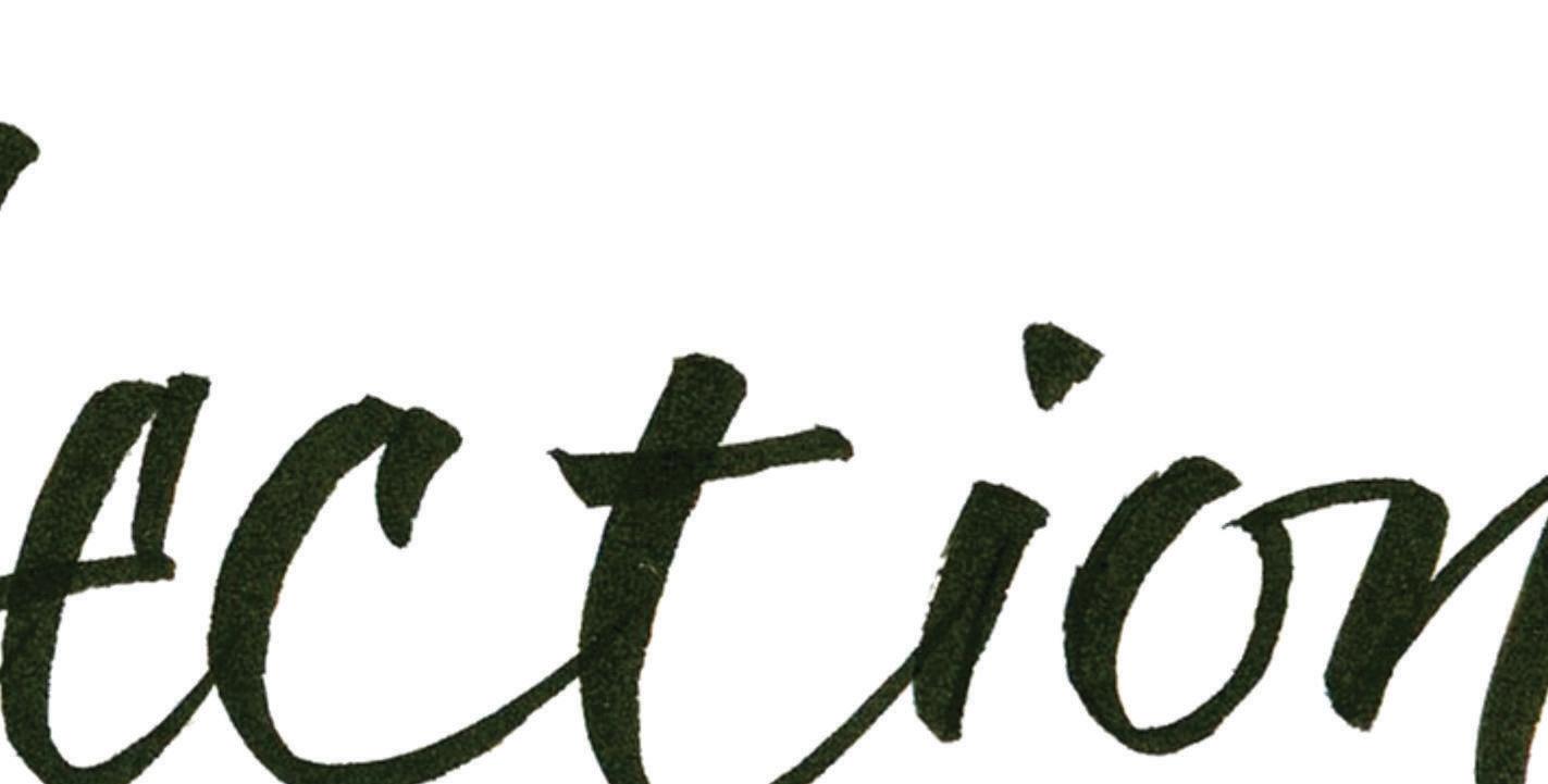


 by Judith Lovell
Journal Issue #7
June 2023
Regular monthly meetings
are held on the Second Wednesday of each month from 8:30am to 12:00pm (no meeting in July and August)
Pearmine Room, Exhibition Grounds
(Exceptions are Pot Lucks in December and June)
Executive Meetings
are held on the First Tuesday of each month at a member’s home from 9am to noon
All members are welcome!
Playtime
is held on the Fourth Wednesday of each month from 9am to 12pm
Pearmine Room, Exhibition Grounds
Annual Membership in Warmland Calligraphers includes digital copy of Journal.
Dues are C$45 for Canadian residents and US$45 for US/Int’l.
Warmland Calligraphers of the Cowichan Valley (the Guild) is a non-registered non-profit group formed to facilitate the exchange of information between calligraphers and to promote interest in and appreciation of calligraphy as an art form within the community. Membership is open to calligraphers at all levels of expertise as well as those with a love of beautiful writing.

Contents of this journal are copyrighted by the authors/artists. Requests for permission to reprint any part must be made through the Editor. The views of contributors are not necessarily those of the Executive or members of the Guild. Members are invited to submit concise pieces for publication as well as to alert the Editorial Committee to conferences, papers, speeches and other matters of interest to our readers.
The Editorial Committee reserves the right to make editorial changes in material accepted for publication. These include such revisions or additions deemed necessary to ensure correctness of grammar and spelling, clarification of obscurities, brevity and conformity to the Reflections journal.
EditorBarbara Qualley ProofreaderEleanor HarrisMeeting ProgramsMargaret Kells
Linda YaychukWorkshopsKathy
Bedard3 President’s Message / 2023-2024 Officers and Chairs
4 Yukimi Annand Workshop -Text and Texture
6 September Meeting Program / October Meeting Program
7 September 2022 Galleria -Sign of the Zodiac
10 October 2022 Galleria -Maud Lewis
12 Warmland Library
13 Cowichan Exhibition 2023
14 November 2022 Galleria -Two Contrasting Words

17 2022 Christmas Cards
21 November Meeting Program / December Meeting Program
22 Susan Greenseth -Playful Alphabets
24 January 2023 Galleria -Humorous Quote
26 January Meeting Program / February Meeting Program
27 February 2023 Galleria -Two-inch Alphabet

31 March Meeting Program / Library Exhibition
32 March 2023 Galleria -Graphite
FRONT COVER -Carroll McLaurin
the
This quote was written out numerous times over a 12" square watercolor paper and then mounted on a Masonite board.
A rice paper sheet had the same quote but written with random letters in kind of a circular form. I then tore it up in the shape of a puddle. When I was gluing them together, the ink started to smudge so I went with the splashing effect.
Since the project was something very new to me with no expectations of a final look, I really had fun. There's a lot to be said about just going with it and letting loose. I am trying to apply this theory to all my creations now. Enjoying the moments!
From the Yukimi Annand workshop
“When life throws you rainy days play in
puddles.”
As I sit here in the WestJet lounge waiting for my flight home and having just been served a nice cold beer, some Kettle Chips and tempura, I am very aware of my privilege. I am grateful for my opportunities and advantages. Certainly, over the last year, I am grateful for the wonderful group of calligraphers that I have come to know. (Thank you, Pat Wheatley, for encouraging me to join).
Walking into the President’s role was daunting at first. I felt like my past President would indeed be a wonderful support which eased my mind. As it turns out, there are many talented supportive people in our Guild and on the executive that have made my first year as President something that has encouraged growth in more ways than I could have imagined. I do love lifelong learning.
Whether we are beginners or seasoned professionals, we all have something to learn and something to teach. By sharing our knowledge and skills, we can help each other
grow and improve. I encourage you to share your new discoveries with us whether it be with a formal class or a casual gathering at one of our Playtime sessions. There is always something new to discover whether it’s a new technique, tool, or style.
We have sailed into the “tech world” even more than we were before. I’ve had the advantage of taking several courses through the Zoom platform that would have been inaccessible to me before Covid-19.


With the help of a talented executive, we are fine-tuning our access to courses, information storage and retrieval. Our workshop coordinators continue to expand our horizons to open a world of learning for us, some in-person classes and other classes on Zoom. They are reaching out through surveys and fillable forms to include our members near and far.
I am honoured to serve as your President for my second year. I am so thankful for the people in our Guild, the learning it provides for me, and the
Elected Executive Officers
PresidentDiana Carwithen
Past President/HistorianRuth Rutledge
Vice President/ExhibitionsLucy Hylkema
TreasurerCarolynn Dallaire

SecretaryLinda Lax/Linda Yaychuk
Meeting ProgrammesCaroline Morrison
WorkshopsJudi Hopewell/Debbie Craig
MembershipChris Vanier

TechnologyCaroline Morrison
Non-Elected Committee Chairs
Journal Editor Barbara Qualley
Librarian Tricia Field/Cathie Harrower
Webmaster Diana Carwithen
Sunshine Carolynn Dallaire
Communications Barbara Qualley

opportunity to dive into a world of creation guided by my talented colleagues.
(only partly composed with the use of AI) LOL
“Don’t go through life, grow through life” Eric Butterworth
wccvlibrary@gmail.com wccvgalleria@gmail.com

wccvworkshops@gmail.com

Warmland Calligraphers stepped out of the usual workshop schedule and held a summer Zoom gathering with Yukimi Annand. Yukimi is a master at using a folded pen to create texture using text and, as her students, we were enthusiastically looking forward to learning her techniques.
Folded pens are a fairly new tool for calligraphers. In 1995 Matthew Coffin introduced them at the Letterforum conference in Washington DC. The nibs are made of metal that has been folded in half to create an ink reservoir on one side and a curved edge on the other. Yukimi is particularly fond of the radius cut folded pen manufactured by Tim’s but also recommends New Horizon folded nibs and Luthis pens.
We began with exercises to teach us the variety of lines that can be achieved with a folded pen. Yukimi demonstrated how she holds her pen to get different thicknesses of lines. The thinnest lines are achieved by using the tip and thicker ones come from using various parts of the curve. It was fascinating to watch Yukimi create a line of text, rotating her pen with each mark to get the effect she desired.
After we practiced creating dots, lines and curves of various thicknesses, we turned to capital letters. Our extensive handouts gave several styles of capitals and Yukimi showed how to vary them by putting thick and thin lines in different places. She cautioned us to be mindful of how the letters we create appear. Too many thick lines in one letter looks heavy so it’s best for each letter to have a combination of thicks and thins. In this way, one letter can have several different looks depending on where the thicks and thins are placed.
Yukimi’s advice on creating good looking letters also applies to creating words and longer text. Within a word, consideration should be given to how the previous letter looks, if it’s heavy, place a lighter one next to it. The same holds for placing words together, it’s best to vary thicknesses to create balance.

Yukimi’s form of calligraphy moves beyond merely writing words and into the creation of texture. Legibility loses its importance and artistic considerations become prime. The overall appearance of the page of text becomes the significant factor. Is there an area of main interest, a focal point? Is it an interesting composition? Does the page look balanced? Is one part in harmony with the other parts?
We were given numerous tips to help us create an interesting page of text. For example, since legibility isn’t of importance, there doesn’t need to be spaces between letters or lines and words can bump together. To add movement, letters can bounce or swing (slant). When slanting letters, consider the spaces created and work to keep the spaces balanced across the page. Adjustments can be made when working down the page to create overall visual interest.
All these factors became clear as Yukimi demonstrated her techniques. She showed multiple examples of different ways to create text. She did a heavy overall look and then a light one. She started with small letters, moved on to large and then did the reverse. She created a heavy look in part of a quote and a light one in another part. She used narrow letters and wide ones to create other unique looks. It was a very instructive demonstration.
At this point, Yukimi introduced her Italic based lower case letters. She demonstrated various forms of these letters; with an uptick they are even more like Italic, they can be stretched vertically or horizontally, and they can have a light look or a heavy look.


Next, we were given a glimpse of where we could take what we’d learned. Yukimi gave a slide show of her work and that of other calligraphers. There was a large variety of looks and styles, some abstract or geometric, some with letterforms inspired by nature, some open and some very formal. She even suggested that if we work when we’re tired, we might get
an interesting “crazy” look. All the direction we could take our projects was very inspiring.
The techniques Yukimi taught us came together when she demonstrated how she produces a final piece. She took a sheet of texture and, considering design and composition, cropped a section. Using matte medium she glued it to a wooden panel, folding the edges over the sides. Next, she took a second piece of cropped texture, this time done on Japanese paper, and painted the back of it with more matte medium. The medium made the Japanese paper translucent so that when it was applied to the panel, the underlying letters showed through, thereby increasing the look of texture. To add more interest, Yukimi added touches of colour here and there. The end result was a beautiful piece of art with fascinating intricacies of line, texture and colour.
A very constructive aspect of Yukimi’s workshop was the critiques with which she started our second and third lessons. Our homework had been to play with thick and thin letters. She printed each piece and made written comments on them as well as made improved versions of the pieces. She also showed that with Photoshop one can crop, change black and white to the reverse and play with colours. She then e-mailed the homework back to the creators. They were very comprehensive and helpful critiques.
Yukimi’s workshop was filled with instruction, demonstrations, tips, techniques and guidance. From her introduction of various letterforms to demonstrations of how to use them to create interesting and artistic textures, it was non-stop learning.
There will, no doubt, be some excellent work done following this workshop.
-Kathy BedardThe text is “Light slips out of any darkness” from the poem God's Bones by Lorna Crozier

The dark from Lorn
The phot pape Arch glue dle. per adde


The folded pen writing was photocopied onto Japanese paper and glued on top of Arches Text Wove which had the Sumi brush strokes. Then glued to an 8” square cradle. A piece of Japanese paper gilded with 24ct gold was added. Used an EZA pen.


I really enjoyed playing with the letters, changing weights and heights.This has each letter touching and then another with lots of space. I regret that I haven’t used it enough.


Cathie
I used a folded pen on Arches Text Wove. “All we are saying is give peace a chance”. John Lennon quote
I used Sumi ink and a folded pen to try and create texture. Using the pen on its broad edge to create thick lines and on the tip for thin lines. You had to extend or spread out some letters, not all, and incorporate thick lines and thin lines so that there was variety to create texture. Readability was not an issue in this, just texture.


We had to create texture by writing our chosen quote in a variety of ways, paying attention to thicks, thins and spacing.
Yukimi had given us many ideas on how to go about this and this is my attempt to do a circular piece.

The activity at the September meeting was a presentation by Betty Locke titled “Less is More”, demonstrating inspirational ideas on how to use a pencil or pen to create personalized greeting cards and envelopes.
Betty used Roman Capitals, which she declared can be a challenge for everyone, even those with experience. During the activity she advised everyone to be free in the execution of the letter forms; no use of lined paper, for example.


The first letter to be examined was the letter A, stretched from top and bottom with the heaviest pencil weight at the top and bottom of the letter with a waistline in the centre. Betty used the word ‘ resultant visual effect. This procedure produced a lightness to the letter, and the slight curve in the A to become


more artistic. The same drawing method with the letter H resulted in a gentleness and flare to that letter. Betty encouraged us to form the letters with positivity and determination, and to avoid “hairiness” in the drawing of them.
It appears that all letters having down

During our October program Judi Hopewell explained some of the aspects of the Parallel Pen. She had a number of them on display and for purchase. The pens come in five different sizes ranging from 1.5mm to 6mm and each size has a different coloured cap for easy recognition.
Judi started by unpacking the box of a pens and discussing the different parts that come with it. There are two ink cartridges (red and blue), a nib cleaner to clean out bits of fiber that may collect between the two nib plates and a pipette which is used to force water through the nib to clean it when changing cartridges. It also comes with a very informative brochure which should be kept on hand for future references.
Judi explained that you could create a double pointed Parallel Pen by using a small rasp to grind a groove in the middle of the nib.
The one drawback of this pen is that the ink is not waterproof. However, you can spray your final piece with a fixative to protect it from the elements.
Judi's presentation was delightful and had bits of information that were new even to we “Old Girls”. Thank you Judi.
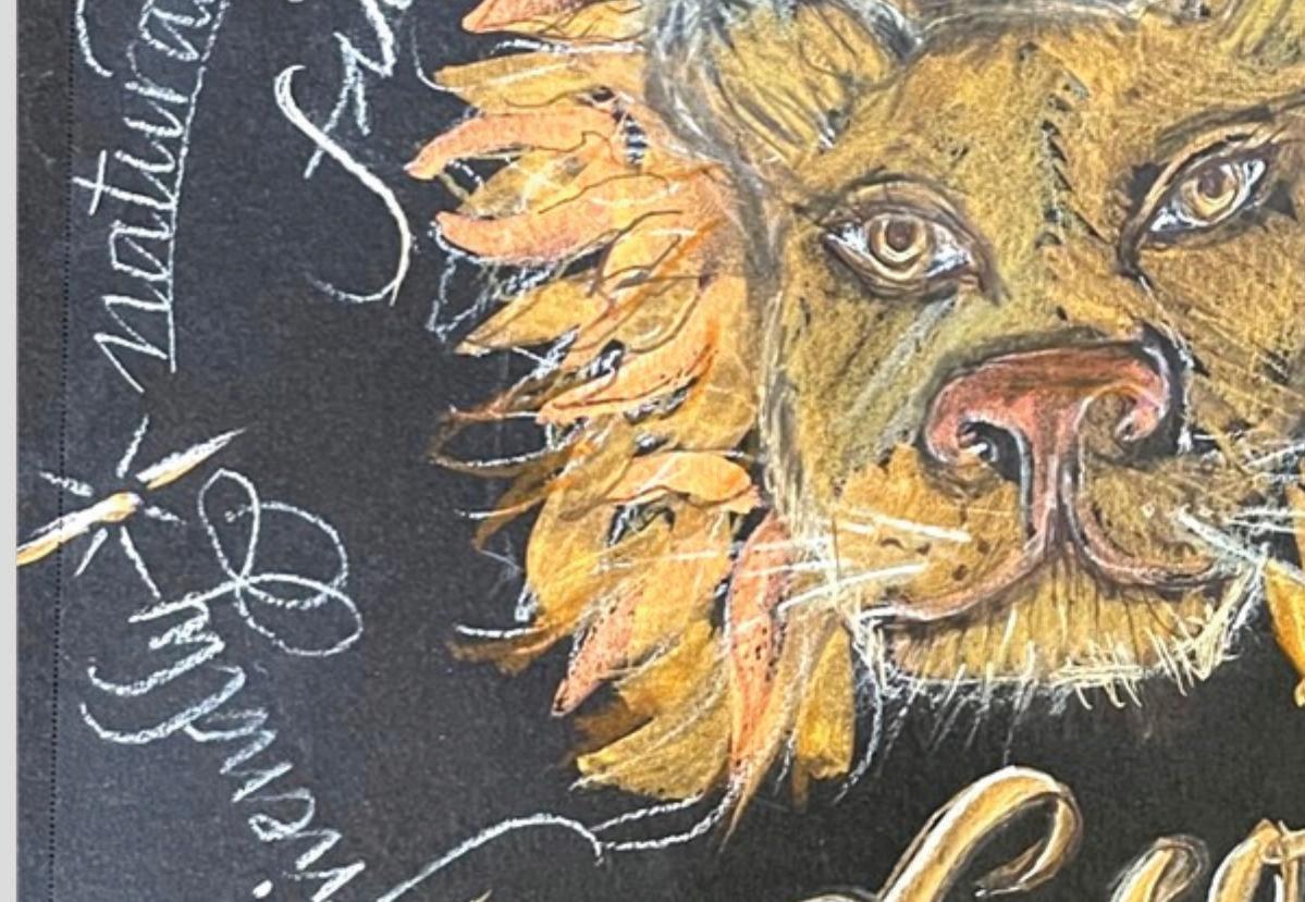
-Linda YaychukDo a piece of calligraphy in which your personal Zodiac sign is the focus.




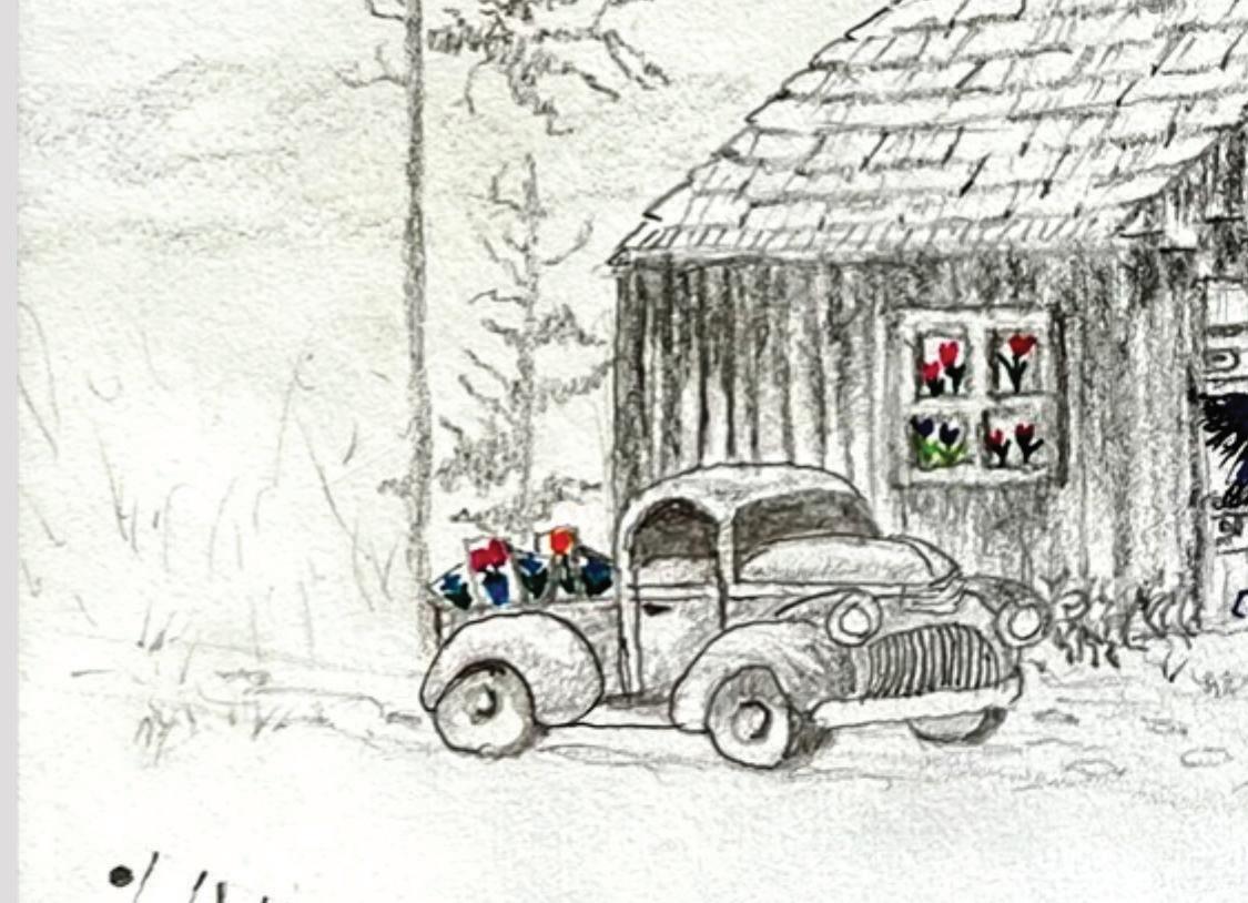
Using the art and life story of Canadian artist Maud Lewis as your inspiration, create a piece.




The Warmland Calligraphers library started off as a handful of books toted to meetings in a bag or two. Soon the collection needed a real home and then-member Olive Cretney’s husband, Val, came to the rescue.


Val built a sturdy, lockable box on wheels. Over the years, it has withstood the rigors of being moved to our various meeting locations.

It used to look VERY empty, but the shelves are now filled with some irreplaceable volumes and lots of current magazines. Pick a topic, pick a hand to study, pick an instructor you admire, and we are sure to have the book for you!
It seems that it is now time to cull a few treasures and over the next year, members will have an opportunity to purchase a book or two to add to their personal collection.


Librarian Cathie Harrower shows off the cart.

The theme of the 2022 Cowichan Exhibition was “Jack and the Beanstalk”.


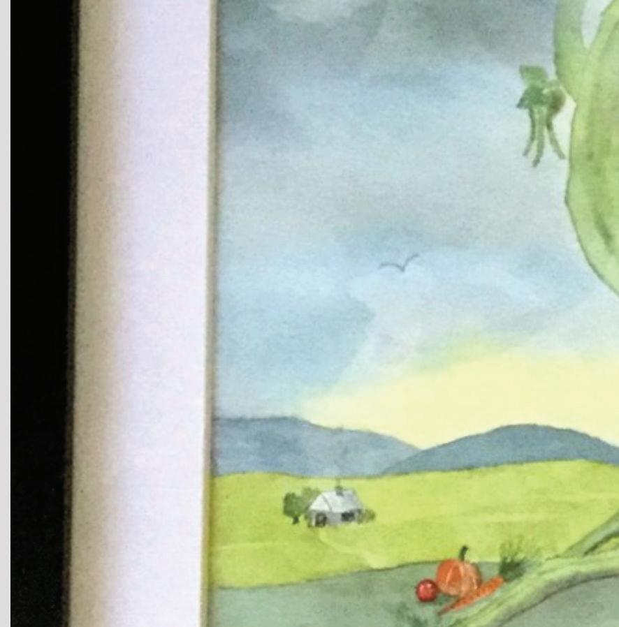


Our members, Judy Lowood and Ruth Rutledge took on the challenge, resulting in Ruth winning the Theme Challenge.

24"x18" Bister ink andwatercolours.
I decided to tell the whole story and it seemedtowork as texture. I'd redo the ‘fee fi fo fum’ again using Yukimi Annand’s thick-thins lettering style.


To tell the truth the whole thing just evolved in spite of me!
11”X 14”


Watercolour and a C2 nib for Uncial lettering.

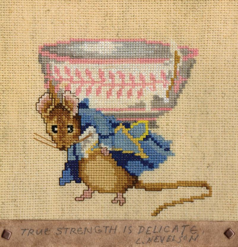
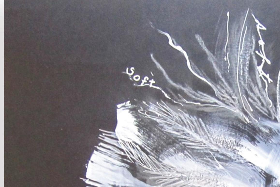
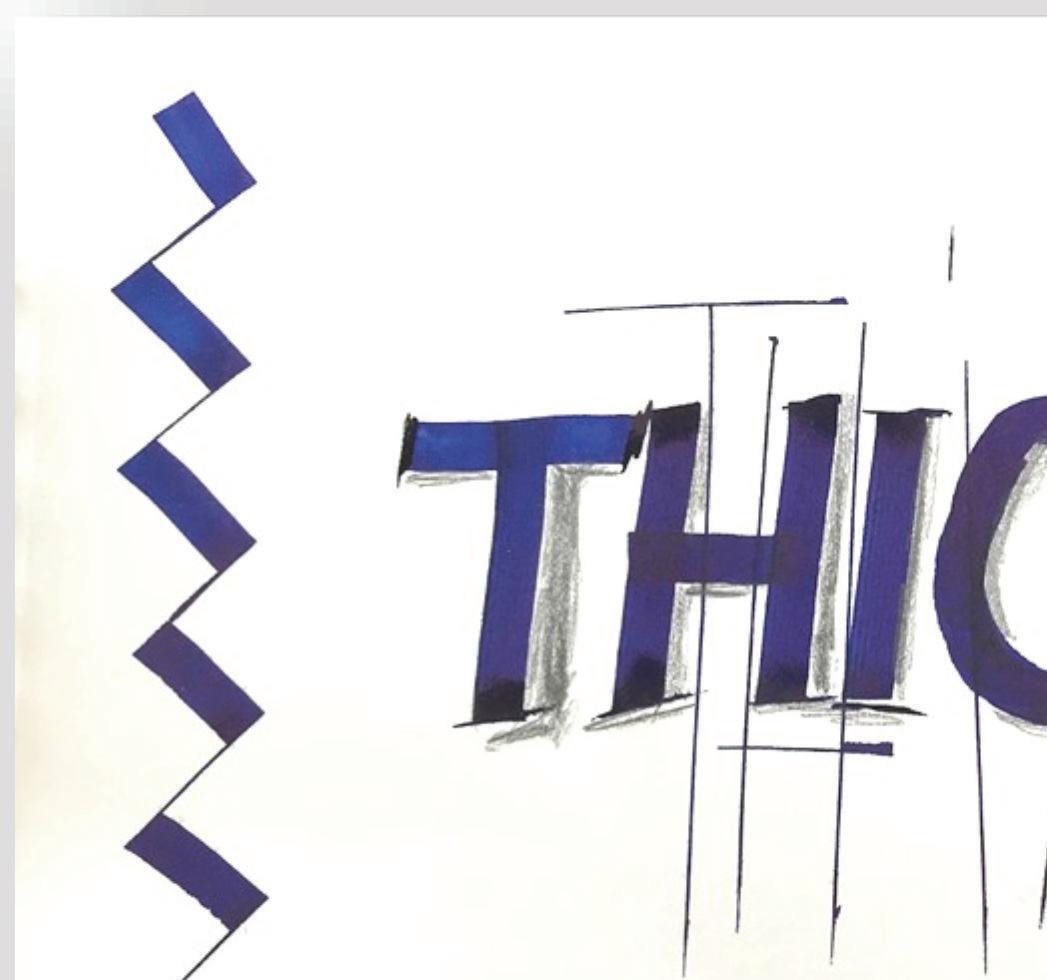
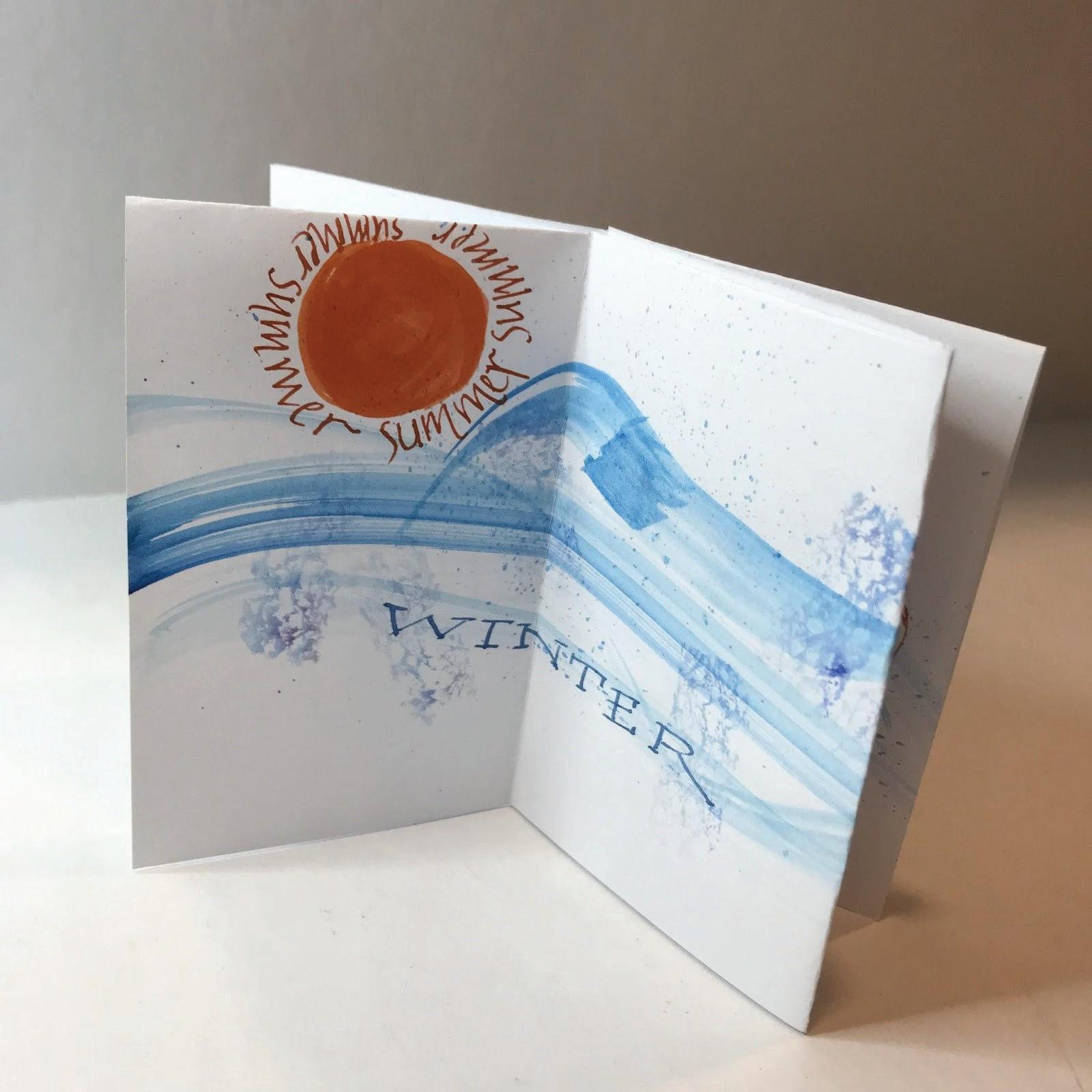
Choose two words that have contrast in meaning to be the source of a two-word composition. Use hands, tools and colours that seem appropriate.











 Marilyn Boechler
Renate Worthington
Marion Craiag
Ruth Rutledge
Linda Yaychuk


