


 by Judith Lovell
EditorBarbara Qualley
ProofreaderEleanor Harris
by Judith Lovell
EditorBarbara Qualley
ProofreaderEleanor Harris
MeetingProgramsMargaret Kells
Linda YaychukWorkshopsKathyBedard
Journal Issue #7
June 2023
Regular monthly meetings
are held on the Second Wednesday of each month from 8:30am to 12:00pm (no meeting in July and August)
Pearmine Room, Exhibition Grounds
(Exceptions are Pot Lucks in December and June)
Executive Meetings
are held on the First Tuesday of each month at a member’s home from 9am to noon
All members are welcome!
Playtime
is held on the Fourth Wednesday of each month from 9am to 12pm
Pearmine Room, Exhibition Grounds
Annual Membership in Warmland Calligraphers includes digital copy of Journal.
Dues are C$45 for Canadian residents and US$45 for US/Int’l.
Warmland Calligraphers of the Cowichan Valley (the Guild) is a non-registered non-profit group formed to facilitate the exchange of information between calligraphers and to promote interest in and appreciation of calligraphy as an art form within the community. Membership is open to calligraphers at all levels of expertise as well as those with a love of beautiful writing.

Contents of this journal are copyrighted by the authors/artists. Requests for permission to reprint any part must be made through the Editor. The views of contributors are not necessarily those of the Executive or members of the Guild. Members are invited to submit concise pieces for publication as well as to alert the Editorial Committee to conferences, papers, speeches and other matters of interest to our readers.
The Editorial Committee reserves the right to make editorial changes in material accepted for publication. These include such revisions or additions deemed necessary to ensure correctness of grammar and spelling, clarification of obscurities, brevity and conformity to the Reflections journal.
3 President’s Message / 2023-2024 Officers and Chairs
4 Yukimi Annand Workshop -Text and Texture
6 September Meeting Program / October Meeting Program
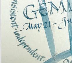
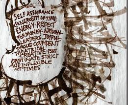
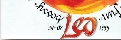
7 September 2022 Galleria -Sign of the Zodiac
10 October 2022 Galleria -Maud Lewis
12 Warmland Library
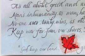
13 Cowichan Exhibition 2023
14 November 2022 Galleria -Two Contrasting Words

17 2022 Christmas Cards
21 November Meeting Program / December Meeting Program
22 Susan Greenseth -Playful Alphabets
24 January 2023 Galleria -Humorous Quote
26 January Meeting Program / February Meeting Program
27 February 2023 Galleria -Two-inch Alphabet

31 March Meeting Program / Library Exhibition
32 March 2023 Galleria -Graphite
34 Alexander School Childrens’ Poems
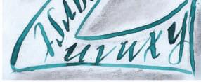
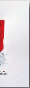
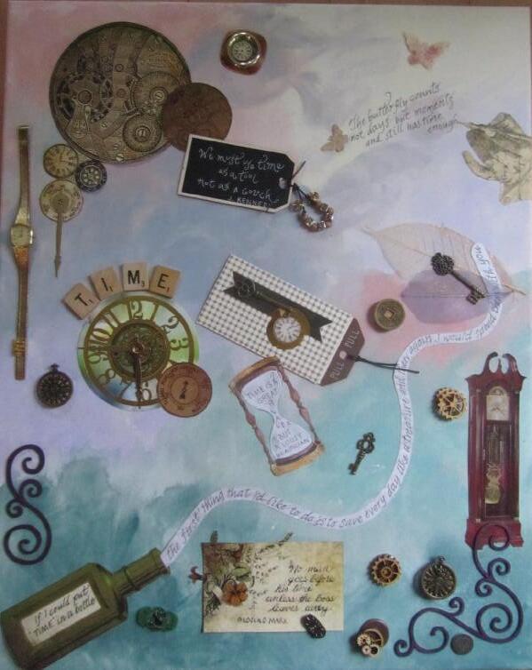
FRONT COVER -Carroll McLaurin
This quote was written out numerous times over a 12" square watercolor paper and then mounted on a Masonite board.
A rice paper sheet had the same quote but written with random letters in kind of a circular form. I then tore it up in the shape of a puddle. When I was gluing them together, the ink started to smudge so I went with the splashing effect.
Since the project was something very new to me with no expectations of a final look, I really had fun. There's a lot to be said about just going with it and letting loose. I am trying to apply this theory to all my creations now. Enjoying the moments!
From the Yukimi Annand workshop
“When life throws you rainy days play in the puddles.”
As I sit here in the WestJet lounge waiting for my flight home and having just been served a nice cold beer, some Kettle Chips and tempura, I am very aware of my privilege. I am grateful for my opportunities and advantages. Certainly, over the last year, I am grateful for the wonderful group of calligraphers that I have come to know. (Thank you, Pat Wheatley, for encouraging me to join).
Walking into the President’s role was daunting at first. I felt like my past President would indeed be a wonderful support which eased my mind. As it turns out, there are many talented supportive people in our Guild and on the executive that have made my first year as President something that has encouraged growth in more ways than I could have imagined. I do love lifelong learning.
Whether we are beginners or seasoned professionals, we all have something to learn and something to teach. By sharing our knowledge and skills, we can help each other
grow and improve. I encourage you to share your new discoveries with us whether it be with a formal class or a casual gathering at one of our Playtime sessions. There is always something new to discover whether it’s a new technique, tool, or style.
We have sailed into the “tech world” even more than we were before. I’ve had the advantage of taking several courses through the Zoom platform that would have been inaccessible to me before Covid-19.


With the help of a talented executive, we are fine-tuning our access to courses, information storage and retrieval. Our workshop coordinators continue to expand our horizons to open a world of learning for us, some in-person classes and other classes on Zoom. They are reaching out through surveys and fillable forms to include our members near and far.
I am honoured to serve as your President for my second year. I am so thankful for the people in our Guild, the learning it provides for me, and the
Elected Executive Officers
PresidentDiana Carwithen
Past President/HistorianRuth Rutledge
Vice President/ExhibitionsLucy Hylkema
TreasurerCarolynn Dallaire

SecretaryLinda Lax/Linda Yaychuk
Meeting ProgrammesCaroline Morrison
WorkshopsJudi Hopewell/Debbie Craig
MembershipChris Vanier

TechnologyCaroline Morrison
Non-Elected Committee Chairs
Journal Editor Barbara Qualley
Librarian Tricia Field/Cathie Harrower
Webmaster Diana Carwithen
Sunshine Carolynn Dallaire
Communications Barbara Qualley
opportunity to dive into a world of creation guided by my talented colleagues.
(only partly composed with the use of AI) LOL
“Don’t go through life, grow through life” Eric Butterworth

wccvlibrary@gmail.com wccvgalleria@gmail.com

wccvworkshops@gmail.com

Warmland Calligraphers stepped out of the usual workshop schedule and held a summer Zoom gathering with Yukimi Annand. Yukimi is a master at using a folded pen to create texture using text and, as her students, we were enthusiastically looking forward to learning her techniques.
Folded pens are a fairly new tool for calligraphers. In 1995 Matthew Coffin introduced them at the Letterforum conference in Washington DC. The nibs are made of metal that has been folded in half to create an ink reservoir on one side and a curved edge on the other. Yukimi is particularly fond of the radius cut folded pen manufactured by Tim’s but also recommends New Horizon folded nibs and Luthis pens.
We began with exercises to teach us the variety of lines that can be achieved with a folded pen. Yukimi demonstrated how she holds her pen to get different thicknesses of lines. The thinnest lines are achieved by using the tip and thicker ones come from using various parts of the curve. It was fascinating to watch Yukimi create a line of text, rotating her pen with each mark to get the effect she desired.
After we practiced creating dots, lines and curves of various thicknesses, we turned to capital letters. Our extensive handouts gave several styles of capitals and Yukimi showed how to vary them by putting thick and thin lines in different places. She cautioned us to be mindful of how the letters we create appear. Too many thick lines in one letter looks heavy so it’s best for each letter to have a combination of thicks and thins. In this way, one letter can have several different looks depending on where the thicks and thins are placed.
Yukimi’s advice on creating good looking letters also applies to creating words and longer text. Within a word, consideration should be given to how the previous letter looks, if it’s heavy, place a lighter one next to it. The same holds for placing words together, it’s best to vary thicknesses to create balance.

Yukimi’s form of calligraphy moves beyond merely writing words and into the creation of texture. Legibility loses its importance and artistic considerations become prime. The overall appearance of the page of text becomes the significant factor. Is there an area of main interest, a focal point? Is it an interesting composition? Does the page look balanced? Is one part in harmony with the other parts?
We were given numerous tips to help us create an interesting page of text. For example, since legibility isn’t of importance, there doesn’t need to be spaces between letters or lines and words can bump together. To add movement, letters can bounce or swing (slant). When slanting letters, consider the spaces created and work to keep the spaces balanced across the page. Adjustments can be made when working down the page to create overall visual interest.
All these factors became clear as Yukimi demonstrated her techniques. She showed multiple examples of different ways to create text. She did a heavy overall look and then a light one. She started with small letters, moved on to large and then did the reverse. She created a heavy look in part of a quote and a light one in another part. She used narrow letters and wide ones to create other unique looks. It was a very instructive demonstration.
At this point, Yukimi introduced her Italic based lower case letters. She demonstrated various forms of these letters; with an uptick they are even more like Italic, they can be stretched vertically or horizontally, and they can have a light look or a heavy look.


Next, we were given a glimpse of where we could take what we’d learned. Yukimi gave a slide show of her work and that of other calligraphers. There was a large variety of looks and styles, some abstract or geometric, some with letterforms inspired by nature, some open and some very formal. She even suggested that if we work when we’re tired, we might get
an interesting “crazy” look. All the direction we could take our projects was very inspiring.
The techniques Yukimi taught us came together when she demonstrated how she produces a final piece. She took a sheet of texture and, considering design and composition, cropped a section. Using matte medium she glued it to a wooden panel, folding the edges over the sides. Next, she took a second piece of cropped texture, this time done on Japanese paper, and painted the back of it with more matte medium. The medium made the Japanese paper translucent so that when it was applied to the panel, the underlying letters showed through, thereby increasing the look of texture. To add more interest, Yukimi added touches of colour here and there. The end result was a beautiful piece of art with fascinating intricacies of line, texture and colour.
A very constructive aspect of Yukimi’s workshop was the critiques with which she started our second and third lessons. Our homework had been to play with thick and thin letters. She printed each piece and made written comments on them as well as made improved versions of the pieces. She also showed that with Photoshop one can crop, change black and white to the reverse and play with colours. She then e-mailed the homework back to the creators. They were very comprehensive and helpful critiques.
Yukimi’s workshop was filled with instruction, demonstrations, tips, techniques and guidance. From her introduction of various letterforms to demonstrations of how to use them to create interesting and artistic textures, it was non-stop learning.
There will, no doubt, be some excellent work done following this workshop.
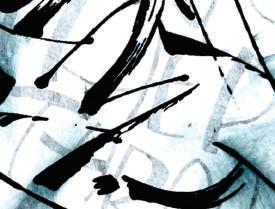
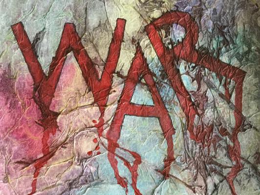
-Kathy BedardThe text is “Light slips out of any darkness” from the poem God's Bones by Lorna Crozier

The dark from Lorn
The phot pape Arch glue dle. per adde


The folded pen writing was photocopied onto Japanese paper and glued on top of Arches Text Wove which had the Sumi brush strokes. Then glued to an 8” square cradle. A piece of Japanese paper gilded with 24ct gold was added. Used an EZA pen.


I really enjoyed playing with the letters, changing weights and heights.This has each letter touching and then another with lots of space. I regret that I haven’t used it enough.


Cathie
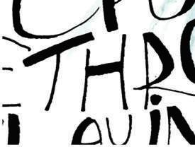
I used a folded pen on Arches Text Wove. “All we are saying is give peace a chance”. John Lennon quote
I used Sumi ink and a folded pen to try and create texture. Using the pen on its broad edge to create thick lines and on the tip for thin lines. You had to extend or spread out some letters, not all, and incorporate thick lines and thin lines so that there was variety to create texture. Readability was not an issue in this, just texture.


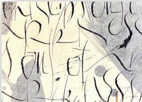
We had to create texture by writing our chosen quote in a variety of ways, paying attention to thicks, thins and spacing.
Yukimi had given us many ideas on how to go about this and this is my attempt to do a circular piece.

The activity at the September meeting was a presentation by Betty Locke titled “Less is More”, demonstrating inspirational ideas on how to use a pencil or pen to create personalized greeting cards and envelopes.
Betty used Roman Capitals, which she declared can be a challenge for everyone, even those with experience. During the activity she advised everyone to be free in the execution of the letter forms; no use of lined paper, for example.

The first letter to be examined was the letter A, stretched from top and bottom with the heaviest pencil weight at the top and bottom of the letter with a waistline in the centre. Betty used the word ‘entasis’ to describe the resultant visual effect. This procedure produced a lightness to the letter, and the slight curve in the A to become


more artistic. The same drawing method with the letter H resulted in a gentleness and flare to that letter. Betty encouraged us to form the letters with positivity and determination, and to avoid “hairiness” in the drawing of them.

It appears that all letters having down strokes or straight strokes can be formed using this technique. Betty also demonstrated how the round letters OCDGQ can be formed using the same technique. There was a discussion of how versals, as drawn letters, can also be illustrated using this technique.
The activity concluded with a slide show of examples, and discussions of each slide, some of which were drawn using a Papermate pen, with a hint of water colour paint.
-Margaret Kells
During our October program Judi Hopewell explained some of the aspects of the Parallel Pen. She had a number of them on display and for purchase. The pens come in five different sizes ranging from 1.5mm to 6mm and each size has a different coloured cap for easy recognition.
Judi started by unpacking the box of a pens and discussing the different parts that come with it. There are two ink cartridges (red and blue), a nib cleaner to clean out bits of fiber that may collect between the two nib plates and a pipette which is used to force water through the nib to clean it when changing cartridges. It also comes with a very informative brochure which should be kept on hand for future references.
The end of the pen is made up of two parallel nibs. By manipulating the nib you can create thick and thin lines to produce any calligraphy hand except copperplate. One can also use the corner of the nib for line drawings.

Once a cartridge is empty you can clean it and refill it using a small pipette or syringe. Judi recommends using Doc Martin's Fine Art Watercolours. While writing you can get a very effective look by dipping your nib into a different colour ink. The colours will change from one to the other and back again.
Sometimes the edges of the nib become dull. You can sharpen them by dragging both sides and the corners of the nib across Crocus Cloth or very fine sandpaper.


Judi explained that you could create a double pointed Parallel Pen by using a small rasp to grind a groove in the middle of the nib.
The one drawback of this pen is that the ink is not waterproof. However, you can spray your final piece with a fixative to protect it from the elements.
Judi's presentation was delightful and had bits of information that were new even to we “Old Girls”. Thank you Judi.
-Linda YaychukDo a piece of calligraphy in which your personal Zodiac sign is the focus.


Using the art and life story of Canadian artist Maud Lewis as your inspiration, create a piece.


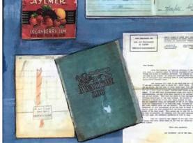
The Warmland Calligraphers library started off as a handful of books toted to meetings in a bag or two. Soon the collection needed a real home and then-member Olive Cretney’s husband, Val, came to the rescue.


Val built a sturdy, lockable box on wheels. Over the years, it has withstood the rigors of being moved to our various meeting locations.
It used to look VERY empty, but the shelves are now filled with some irreplaceable volumes and lots of current magazines. Pick a topic, pick a hand to study, pick an instructor you admire, and we are sure to have the book for you!
It seems that it is now time to cull a few treasures and over the next year, members will have an opportunity to purchase a book or two to add to their personal collection.


Librarian Cathie Harrower shows off the cart.

The theme of the 2022 Cowichan Exhibition was “Jack and the Beanstalk”.


Our members, Judy Lowood and Ruth Rutledge took on the challenge, resulting in Ruth winning the Theme Challenge.

24"x18" Bister ink andwatercolours.

I decided to tell the whole story and it seemedtowork as texture. I'd redo the ‘fee fi fo fum’ again using Yukimi Annand’s thick-thins lettering style.


To tell the truth the whole thing just evolved in spite of me!
11”X 14”


Watercolour and a C2 nib for Uncial lettering.


Choose two words that have contrast in meaning to be the source of a two-word composition. Use hands, tools and colours that seem appropriate.


 Marilyn Boechler
Renate Worthington
Marion Craiag
Ruth Rutledge
Linda Yaychuk
Marilyn Boechler
Renate Worthington
Marion Craiag
Ruth Rutledge
Linda Yaychuk


This month’s activity demonstrated “Funky Letters with a Parallel Pen”, and was presented by Guild member Violet Smythe. The meeting was attended in person by some members, and via Zoom by others. Prior to the meeting, members were provided with two exemplars, a guide sheet, and a Parallel Pen information sheet. Violet stated that the Parallel Pen can be used as a dipping pen, as well as a cartridge pen containing the desired ink.
She recommended Econoline 718 (light grey) placed in the cartridge of the pen, which when dipped into other colours produces a softer colour. Violet also advised members to make sure the ink flows smoothly from the pen. The funky letters incorporate thick and thin strokes, with the vertical strokes drawn at a 45° angle: then onto the corner of the nib to make a tiny hook at the top or bottom of the letter. A diamond shape can be drawn on each letter which provides an interesting effect. Violet drew all the letters of the alphabet to demonstrate this technique.
The letters are very attractive and elegant, with the diamond strategically placed to enhance each letter.


The diamond can be of different colours to enhance and add variety to the text. We were cautioned to make sure the ink of the letter is dry before add-
ing the diamond shape. We were also informed that letters could be filled in with contrasting colours, or shadows added with pencil, pigma pen or watercolour pencils. The session ended with Violet demonstrating how to form the leaf shapes using one of the two exemplars. She also responded to questions from Guild members.
-Margaret KellsTwenty-six members attended the Zoom Christmas party meeting which was divided into four sections.

The first section of the meeting consisted of a travel trivia slideshow. There were 15 travel photographs submitted by members, and the membership at large were tasked with identifying where the photographs were taken. The photographs ranged from Iceland to the Antarctic, and many places in between. Some of the places shown were a challenge to identify, but afterwards the owners of each photo enlightened us as to the locale of the photos, followed by a short discussion on the circumstances of their trip.
The second part of the meeting was an on-line “Spin the Wheel” contest


where each member whose name showed up when the wheel stopped, won one of 10 art material prizes, or one of three books.
The third section of the meeting consisted of a presentation by Caroline Morrison of ‘Gold Christmas Trees’, demonstrating the use of black paper, oblique copperplate pen and gold paint. A list of requirements and instructions were sent out prior to the meeting. Caroline also showed a video of the technique that she was demonstrating, with members following along. It was agreed that the gold trees drawn on black paper were visually quite outstanding.

The last part of the meeting was a slideshow of 27 Christmas cards submitted by members, with each
member commenting on their personal submission. The slideshow illustrated an amazing variety of card designs, and showcased the many talents of the individual Guild members.
-Margaret Kells Violet Smythe exemplarTwo playful alphabets were brought to Warmland Calligraphers in the Fall. They arrived via an entertaining Zoom workshop with Susan Greenseth. In the class Susan led us through the history of the hands, gave instruction on how to create the letters and provided a slide show filled with expressive examples of the letter forms.
Susan was intrigued by calligraphy as a child after seeing a newspaper masthead done in Blackletter. She wondered how the interesting shapes were created. The answer to this came many years later when she signed up for a class with Alan Q. Wong. He taught her how to hold a pen and maintain the angle to produce thick and thin lines. From there she went on to learn many formal calligraphic hands.
A turn came in Susan’s calligraphy practice when she stumbled on the book Calligraphic Alphabets by Arthur Baker. The book showed her there is a lot “out there” besides the traditional hands she had been using. It was an introduction to the way pen manipulation can create new shapes in letters. This is what Susan planned to share with us in the workshop.
Equipment for the class was fairly simple. For a pen we used a 6.0 mm Pilot Parallel Pen. Because the ink that comes with the pen is not lightfast, Susan suggested using a higher quality ink such as Walnut ink or Bister Ink. For paper she suggested Dot Matrix printer paper which takes ink well and provides built in guidelines. Another suggestion was to print guidelines directly onto Gilbert Bond paper.
We began our instruction with the letters in the first of two alphabets from Susan’s exemplar sheets. We worked at a height of 2 pen widths and held the pen fairly upright. Susan demonstrated how to rotate the pen steeply to create width variations, sometimes using the corner of the nib for fine lines. She explained that the angle of the pen to the paper at the start of a stroke will affect the shape of the stroke at its end. With each letter she illustrated how to turn the pen to create the letter shape. Some letters
could be made in one stroke and others two. The “g” and “y” called for a particular push stroke at the end of the descender and the dot on the “i” was created by spinning the pen slightly. Her tip for fashioning a well-formed letter was to watch the counter space being produced.

Susan indicated various additional things to keep in mind. She discussed spacing between letters and mentioned that we can vary the x height and the length of ascenders and descenders. Also, a serif can be added. The alphabet she gave us was intended as a starting point from which we could make personal variations.
riations.
combined thick lettered words with words done in thin lines. She was pleased to see that some of us had played with the letters by altering them. There was a lot to learn from the variations the others had produced.
After a short review of the first alphabet, we moved on to a second one. This was a fun hand suitable for writing the name of a candy or a baby shower invitation. Susan demonstrated each letter. Some strokes started with a pen angle of 70 degrees, some started flat and others were tapered. She also gave us some alternative letter forms. Like the first hand, this one was meant to be played with and modified to produce variations.
We ended our first class with a slide show showing the ways Susan has used calligraphy over her career. One example was done with little space between letters and between lines, the purpose being to create texture. Another showed a pattern produced by using tall ascenders all pointing toward the middle of the page. She used the pen to create non-letter shapes and quite often included dots, whether accidental or purposeful. To produce changes in colour as she moved along a word, she used light green ink in her pen and then dipped it in Bister inks of other colours. We received a lot of good ideas to include in our homework assignment.
Our second class promised to be as interesting as was our first. We began with a slide show of our homework. Paying attention to each individual piece, Susan gave positive, helpful comments. For example, she suggested a “t” could be dropped below the baseline to tuck it under the next letter. She complimented those who
A slide show of Arthur Baker’s work showed us the innovative ways he used calligraphy. Susan used this as a springboard for discussion on how to adapt letters to our needs. She showed us variations on “d” and “f” and how to form flourishes. Because Baker didn’t create any numerals, Susan showed us the ones she had devised. For these her tip was to wiggle the pen when making hairlines to add more character.
Susan was generous with ideas on how to add pizazz to our work. For example, since the letters have many broad strokes, a decorative effect can be achieved by drawing a white line through the stroke with a white Uniball Signo pen which is very opaque. Another option is a Pilot Juice Up 04 gel pen which will give a fine line for creating decorative strokes. Also, an outline or a shadow can be added to letters and 3D Nuvo Crystal Drops can be applied as well as glitter from a Wink of Stella Glitter Pen.

By the close of our second day, we were well versed in the unique hands Susan had taught us. With her good humour and skilled teaching style, she moved us to see the fun that can be had with these two alphabets, how they can be modified to create variations to suit our needs. It was a very enjoyable workshop.
-Kathy BedardCarolynn Dallaire : One of the December prompts for Scribbled Lives was to create wrapping paper.I procrastinated for awhile...... then using one of our practice paper sheets, lettered, many times, what I'd done for homework for Sue.The second photo shows two examples of how I used the paper.When something is scanned, its easy to make a document and reproduce.Actually looks better smaller.


Pen a silly or humorous quote.


Our January program on the Akim Cursive hand was presented by Carolynn Dallaire.


The hand was created by a German named Hans Joachim Burgert who felt that forming these letters mimicked the beating of the heart.
Carolynn discussed the overall impression of the lettering. It is a monoline with no thicks or thins.

Contrasts are created with tiny bowls on some letters and swing strokes on others. The bowls are only about three millimeters in x-height. The extenders are about four times the x-height. They have to be long in order to create contrast. Capitals are large and make a statement. Extend-
ing the ascenders and descenders can create difficulties when doing a layout.
Because the lower case letters are so small they pop when the descenders and ascenders are added. Ascenders can start at the bottom line and curve up. A dot is placed beside the head of the q and g. The size of the swing strokes depend on the amount of room between the letters or words. Swing strokes need to be long in order to make a statement. The diagonals on such letters as the a or s should be about three times the x-height.
Carolynn guided us through the creation of each letter followed by using them in words and phrases.
The finished pieces looked like work
done in shorthand. This is not the easiest hand to read. Carolynn suggested that we play with the letters and try to make the words swing. Carolynn held our attention through the program because she made it so interesting.
Thank you Carolynn for a very enjoyable experience.
-Linda YaychukThe February program called Zenspirations was presented through a video featuring Joanne Fink.
Joanne decorates Roman capitals using zentangle patterns. Members were provided with copies of her letters and patterns to use while creatingtheir own letters.
Joanne started by drawing the outline of an A stressing that the parts of the letter should not be joined. More lines were added around the letter and crossed each other at intervals. Patterns were then added between the lines. She also added rounded elements as well as tiny circles. For the bottom of the letter, Joanne likes to add weight by darkening the lines and using larger designs. The different designs should be balanced within the letter and the same two designs should not lie next to eachother.

Joanne then started addingcolours. She uses Sakura's Jelly Roll, Mikron, Stardust, Metallic and Pigma pens. When adding colour don't put the same colours next to each other. Balance them by placing them on opposite sides of the letter. You also want just touches of colour. You don't have to fill the whole letter with colour or designs. You can gradually change from one colour to another within a pattern. Designs such as hearts can be dangled from lines dropping from the top of the letter or from flourishes. Once the letter is coloured, go over the lines again with your Pigma pen.
These decorated letters can be used to create unique cards or for adding a new element to the front of anenvelope.
Thank you to Caroline Morrison for organizing a very enjoyable program.
-Linda YaychukTiny Alphabets: Work in a tiny 2-inch square and create an alphabet with one letter of the alphabet featured as a focal point. Letters MUST be in alphabetical order. Your final piece may be just one tiny square, or it might include several 2” squares.


Our Guild founder, Betty Locke, shared her Travel Journals with us.


In 2004 Betty attended a workshop on constructing journals, but was not immediately interested in journaling until she was given a blank journal by a friend, and encouraged to fill it in. This whet her appetite for journaling.
The presentation commenced with a slideshow of some of Betty’s work, and included exhibits from nine of her many journals. Betty and her husband have travelled extensively throughout the world, during their lives together, and the journals are a testament to the incredible adventures which they experienced.
Betty showed and explained the structure of the journals, which were made by her friend annually, each


journal being 6x6 inches in size using Arches Text Wove paper, and sporting an interesting cover. Betty carried a simple amount of equipment for journaling while travelling – pigma pens, pencils, paints, glue stick and scissors.
The illustrations and text on each page of her journals were completed daily in approximately two hours, the ideas taken from experiences of that day while the ideas were fresh in her mind.


She occasionally used versals in the text which further enhanced the artwork. The illustrations are quite beautiful, and extremely interesting. That Betty could achieve what she did in two hours at the end of each day is a tribute to her artistic skill and imagination.


It was a most enjoyable presentation, and one which should stimulate the interest of other Guild members to undertake journaling themselves.
rtake


 - K
- K


 Margaret Kells

Working ONLY in graphite, create a piece that celebrates National Pencil Day.


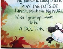
For over 15 years our Guild has been creating calligraphic art using words from Alexander School students. It has happened in various ways, but for the last five years a classroom of Grade One and Two students (6- and 7-year olds) have been interviewed by their teacher about their feelings and what they imagine they will be when they grow up.
The interviews are then given out to our volunteer calligraphers at the January meeting and they have until the February meeting to create a piece


of bright calligraphy, featuring the child’s name prominently, and using the children’s words. These pieces are framed and hung in Sunridge Place until May. They are always a popular display, and enjoyed by the staff and the residents. Our thanks goes to a generous calligrapher who donates the money to purchase the 8” x 10”frames.
We deliver the framed pieces to the classroom before Mother’s Day so that they can become gifts for the students to give to their mothers. Before Covid, we would also arrange for the calligra-

phers to come and meet ‘their’ student over juice and fruit when we delivered the pieces. We are hoping to start that tradition again because it is so much fun to meet these children.
This is such a positive experience for so many people, of so many ages, and I am so proud of Warmland Calligraphers for doing this year after year. Thank you!
- Lucy Hylkema


 Margaret Kells
Joyce Gammie
Margaret Kells
Joyce Gammie


The April programme “Collage on Canvas” was presented by Charlotte Whiteley. As with previous meetings the presentation was attended in person, or viewed via Zoom.
Charlotte stated that historically collage dated back to the invention of paper, and Pablo Picasso was a wellknown modern collage artist. She spoke about the composition of collage, by selecting geometric shapes along with colours of choice, or using whimsical or representative ideas, or Monet-like collages using scraps of images pasted on to create a scene, or abstract ideas with no deep meaning. Charlotte underlined the importance of supporting the canvas from underneath and priming the canvas before applying paint or glue to it. She gave examples of a variety of items which could be used to build a collage: cloth, beads, papers of interest, items from nature, cheesecloth, string etc. She added that the collage could be further enhanced with coloured pencils, stencils, gold medium, texture mats and calligraphy to name a few. She
emphasized sealing each layer with a matte medium, allowing each layer to dry completely before adding the next layer, and sealing the finished piece. We also learned which glues work best, and were given a recipe for homemade Gesso.
Charlotte showed examples of collages she had done in the past, and added that the opportunities for creativity are endless.


Following Charlotte’s presentation, Caroline Morrison gave a brief informative talk on mounting artwork on a cradle board, or wooden painting board, for exhibition purposes. She gave information on where to purchase cradle boards, how much fixative and varnish to use and when to apply each; also how to seal the artwork by finishing it with varnish or Gamblin wax, which can then be polished. Caroline also gave information on the type of hangers to be used, where to purchase them, and
While in Britain, Lucy and her husband, Leo, traced the route taken by St. Cuthbert in 664 from Melrose, Northumbria in Britain to Lindisfarne in Ireland. This route today takes you through towns and alleys which were once part of the Roman roads. It also passes many cathedrals that have been dedicated to St. Cuthbert. Once in The Borderlands, Lucy noticed that many of the shops and road signs still use the Uncial hand.
St. Cuthbert led a life of caring for people and animals and was thought to have created miracles. In later life, he was appointed the Bishop of Lindisfarne. When his body was transferred from Lindisfarne to Durham Cathedral, they found a small gospel book the size of his hand which was written in Uncial. It is one of only a few books to have survived from this time. The letters are only 2.5mm high which
where to place them on the cradle board to satisfy exhibition requirements. Margaret Kells next ece. work for of and for tion, brief work nting She to much


is very unusual as most books were written with letters 5mm high and recorded in large weighty tomes. As the books got bigger, they started to record the words in columns which allowed light within the writing since churches were quite dark and it was hard to see the scripts.


Lucy discussed and demonstrated the Uncial hand noting that there are many forms of Uncial depending on the region where it was used. In Ireland they use the half-Uncial. The letters have short ascenders and descenders and are made up of circles and lines. It is an alphabet without upper- and lower-case letters. Lucy demonstrated each letter as we recorded them onto lined sheets that Lucy had provided.

-

Lucy's presentation was both informative and enjoyable. Her enthusiasm when describing her experiences in Britain made us wish we were there too.
- Linda YaychukAn element of collage must be included in your calligraphic piece. This may be as simple as a “paste on” or may be many layered and intricate.


Betty Locke and Carolynn Dallaire belong to a private Facebook group similar to our Scriptors. Once a week, a prompt is unveiled and members create their piece and upload it to the group page where other members can offer insightful praise to the accomplishment.

The layouts are achievable for all levels of calligrapher, yet there is strategy in letter design and placement.


1 - Flower petals form the letter “O” and the horizontal line stretching in the attribution make a splendid grounding.


2 - December is floating down the page and you instantly see snow with the addition of dots.

3 - Falling leaves, perfectly positioned, complete the visual.
4 - The bold strokes are known as fractured letters as only parts of the letters are shown. Consider them clues that draw you in to read the text.


5 - The collage strip draws your eye to an otherwise calm page. Weighted and shaded lettering keeps you engaged.

in and inte fill y

6 - The harmonious background and collage draw you in, only to find lettering you cannot read! Do we need to? The asemic letteringis left for the each reader to fill in and interpret.


ret.
 3/Betty Locke