Work that I couldn’t of done without my friends I came here with.
PILOT FLYING J BRAND STUDY
33 THOMAS
MODULAR LIVING
MONUMENTS TO NATURE
INTERCONNECTIVITY
ASTOR PLACE AMBIANCE
POSITIVE NEGATIVE
VARIOUS VISUALS
PILOT FLYING J BRANDING STUDY
Battle Mountain, Nevada.
Pilot Flying J is one of the marquee travel center companies in the US. Their client base is not only industrial logistics partners, but also typical civilian travel creating an beautiful opportunity to design around these different flows. Pairing this with the environmental regulations of today and the immediate future, adding electric vehicles into the mix only creates a richer opportunity to design for the immediate change in the vehicle landscape. This leads us to believe the temporal nature of travel centers and fueling stations have a longer use period per stop, meaning opportunities to beyond just refueling exist and we began to study those and learn what works best and why should Pilot Flying J have it.
Pilot Flying J has 786 stops around the country with different identities because it’s never been truly updated and upgraded following different mergers. The question we asked ourselves was, how can we create an updated unified brand that takes into account the technological and sustainable changes that meet the needs of the Pilot Flying j users and employees through a mass and easily deployable product?
5 Rendering : View
J from W
Street.
Studio Critic: Michael Bell Partner: Joachym Joab Spring 2023 - ADV 6
of the new Pilot Flying
Front
6
Pilot Flying J Brand Study
Diagrams : Six Pilot Flying J’s across Nevada being analyzed.
5625 W Winnemucca Blvd, Winnemucca, NV
3812 E Craig Rd, North Las Vegas, NV
650 W Front St, Battle Mountain, NV
1880 W Winnemucca Blvd, Winnemucca, NV
465 Pilot Rd, Fernley, NV
480 Truck Inn Way, Fernley, NV
7 Advanced Studio VI
Map : The 9 total Pilot Flying J’s in Nevada. Site in red.
8
Diagram : Different program masses and types.
Pilot Flying J Brand Study
Floor plans : Different modules and the respective floor plans to match.
9
Advanced Studio VI
10 Floorplan : Grocery Store module Pilot Flying J Brand Study
11
VI
Rendering: Entry into the Pilot Flying J between the grocery module and welcome center.
Advanced Studio
12 Floorplan : Welcome Center Module Pilot Flying J Brand Study
Advanced Studio VI 6 - STANDARD WALL COMPONENTS 6 - CORK SIDE WALL COMPONENTS 6 - HALF GLAZING WALL COMPONENTS 1 - STAIR COMPONENT 13 - INTERIOR WALL COMPONENTS 3 - GLULAM BEAM COMPONENTS GLULAM BEAM COMPONENTS SIGNAGE TOWER 10 - ROOF COMPONENTS
14 Pilot Flying J Brand Study
15
Advanced Studio VI
Section
:
Cut through the Welcome Center module.
16 Floorplan : Park Module Pilot Flying J Brand Study
Advanced Studio VI 20 - ROOF COMPONENTS (12 TYP.) 5 - GLULAM BEAM COMPONENTS 16 - HALF GLAZING WALL COMPONENTS
18
Rendering : The interior courtyard shared between the building massing.
Pilot Flying J Brand Study
19
Advanced Studio VI
Rendering : The manicured green space for the Park Module adjacent to the Playground Module.
20 Floorplan : Restaurant Module’s lower level floor plan. Pilot Flying J Brand Study
Advanced Studio VI 8 - STANDARD WALL COMPONENTS 16 - CORK SIDE WALL COMPONENTS 2ND FLOOR DINING SELF CHECKOUT KIOSK 8 - HALF GLAZING WALL COMPONENTS 13 - FULL GLAZING WALL COMPONENTS 35 - INTERIOR WALL COMPONENTS 5 - KIOSK COMPONENTS 5- GLULAM BEAM COMPONENTS 1 - STAIR COMPONENT 20 - ROOF COMPONENTS (15 TYP.)
22 Pilot Flying J Brand Study
23
: Grocery
Advanced Studio VI
Rendering
Module Interior.
24 Floorplan : Pilot Flying J 693’s Building Plan at Battle Mountain. Pilot Flying J Brand Study
25 Rendering :
Advanced Studio VI
The vehicular approach to the new Pilot Flying J.
26 Pilot Flying J Brand Study
27 Building
: Cutting
the Welcome
and
Advanced Studio VI
Section
through
Center
Grocery Modules.
29
(Left) Rendering : Man jogging into the Pilot Flying J from park connection.
Advanced Studio VI
Site Plan : The Synthesis of Building Form and Sitedesigned for efficiency.
30 Pilot Flying J Brand Study
31 Building
:
and
Advanced Studio VI
Section
Cutting through Restaurant, Park,
Playground Modules.
32
Photography : Model from above.
Pilot Flying J Brand Study
33
Advanced Studio VI
Photography : Module from South end of the site.
34 Pilot Flying J Brand Study
35 Rendering : Pilot
J
-
Advanced Studio VI
Flying
#693
Battle Mountain, Nevada.
33 THOMAS
Tribeca, New York City, New York.
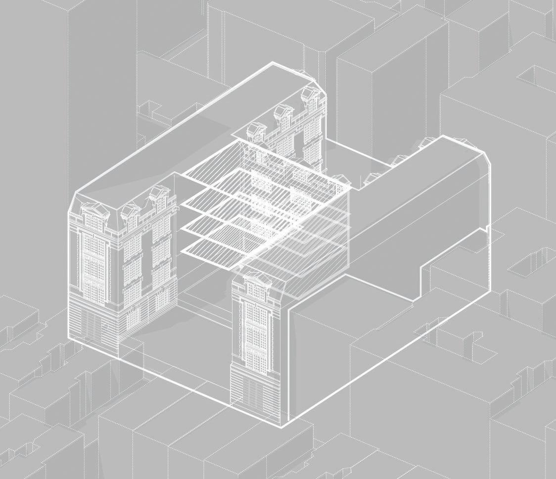
33 Thomas, formerly known as the AT&T Long Lines Building has a very prominent place in the history of high-rises in New York City. Along with it’s architectural successes of being a monolithic, iconic, and extremely functional architecture, it’s equally scrutinized; The rumors that spiral around this architecture are just as impressive.
Through research about John Carl Warnecke and his drawings, we’ve come to learn about who funded the project, and what it’s intentions were. An atomic bomb proof, windowless high-rise, that’s has incredibly low occupancy, and use in the twenty-first century. What can we do with it?
Our interventions looks for solutions to keeping the iconic elements of 33 Thomas there, and integrating housing and other mixed use programs into the podium and the tower.
37
:
Studio Critic: Wonne Ickx Partner: Min-Soo Jean Fall 2022 - ADV 5
Rendering
View of the intervention from Thomas Street across Church Street.
38 Thomas Street
Telephone
Terracotta
CMU
Worth Street Broadway Church Street 33 Thomas Diagram : Material indexing Diagram: Mapping
Rendering : The
Granite Slab Height Diagram
Cable Diagram Steel Volume Diagram
Mass Diagram Precast Concrete Panel Diagram
Volume Diagram
of Tribeca
Atrium condition created via the cut.
40 33 Thomas Rendering : Looking across Atrium into the racquetball court.
41 Existing Cut Connect Advanced Studio V
Diagram: Simple form explanation
42 33 Thomas Floor Plan : Vent level of the Podium. Floor Plan : Top level of the podium before it transitions to residential.
43 Advanced Studio V
Rendering :
Showing the connectivity between “neighborhoods”
44 33 Thomas
Rendering : Canadian users front yard.
45 Advanced Studio V
Diagram : The program distribution on the residential level.
Floor plan : Residential level
46 33 Thomas
:
Rendering
The shared neighborhood park.
47 Advanced Studio V
Rendering : Theatre condition in the basement of the podium.
48 33 Thomas
Photography: Model on the Broadway side
49 Advanced Studio V
Photography: Model from the Church x Worth side.
50 33 Thomas
Chunk Axon : Showing the transition from the lower podium to the upper Residential levels.
Rendering : Kids playing by the pool on the vent level of the podium.
52 33 Thomas
Exploded Axon : Existing wall assembly
53 Advanced Studio V Exploded Axon : New Residential
facade assembly.
54 33 Thomas Rendering : Inside a residence at 33 Thomas.
MODULAR LIVING
Bronx, New York City, New York.
Mod:Liv is a project that looked to redefine how project delivery methods and partnerships in the process could enable modular homes to have more meaning and deliver better housing at a lower cost.
Utilizing a joint venture with Project Manager, and Manufacturing we were able to lower project vacancy and hard costs of assembly. Designing a modular project meant that we could do a lot of the construction offside. The modules were designed so they would fit nicely on a twin twenty-seven foot trailer, bringing two modules to the site at a time. With the Project Manager and our design features, we aimed to enable flexibility in the modules and how they could be staged. This meant that the modules were able to flex into more or less bedrooms per need of the user, therefore they would never leave the development because of availability. They would only move down the hall or next door.
Balancing modularity and repetitiveness with operation pieces and site specific architecture really begins to give Modular Housing a new meaning and added afford-ability. This is Mod Liv.
57
Studio Critic: Michael Caton Partner: Samuel Bager Fall 2021 - Core 3
Rendering : Stacking the prefabricated modules into position.
58
Mod(ular):Liv(ing) Floor Plan : Singular Module of a typical studio apartment.
59 Core Architecture Studio III
Axon : Studio Apartment being flexed into a two bedroom configuration.
60 Phase 1 - 2BR Studio (1 Module) Partners Transition 1 Bedroom (2 Modules) Users Unit Types Unit Configurations Family Property Manager Phase 2 - 1 BR extended living 2 Bedroom (3 Modules) Bachelor Mod(ular):Liv(ing)
Diagram : The flow in which a user would interact with a project manager to find the best solution to their dynamic family needs.
61 Core Architecture Studio III
Exploded
Axon : The different components needed to assemble a singular unit.
Mod(ular):Liv(ing)
62
Model Photography
: View from inside of the living space of the module.
63 Core Architecture Studio III
Model Photography : How two prefabricated modules of a one bedroom configuration begins to aggregate.
65
different
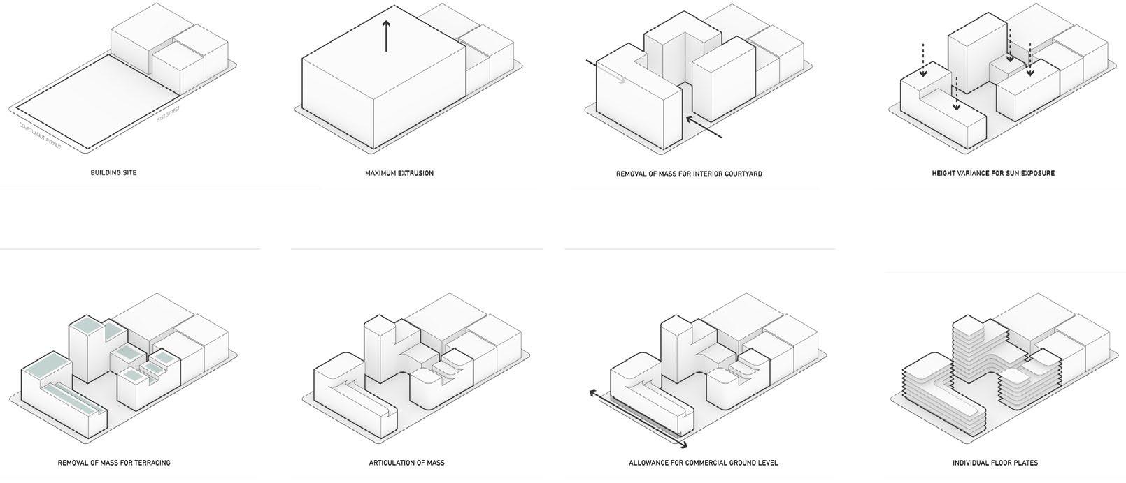
Building Site Removal of Mass for Terracing Maximum Extrusion Articulation of Mass Removal of Mass Commercial Allowance Height Variance for Sun light Floor Plates
Floor Plan: Typical upper level floor plan showing the
units.
(Left) Rendering : View from top level terrace into the public park.
versus maximum
Core
III
Diagram : Addressing site needs
capacity of the site for our modules.
Architecture Studio
Floor Plans : How the unit aggregates to create different unit types.
1 Bedroom
2 Bedrooms
3 Bedrooms
Diagram : Different unit types within the same overall module dimensions.
Studio Studio
3 Bedrooms*
2 Bedrooms*
3 Bedrooms
4
3 Bedrooms
2 Bedrooms
1 Bedroom
4
3 Bedrooms
3 Bedrooms*
2 Bedrooms*
* Signifies that these are bookend units that cap off the end of the building or the double loaded corridor
Mod(ular):Liv(ing)
66
Bedroom Fillet*
Bedroom Fillet*
Fillet*
Fillet*
67
III
Rendering : The shared outdoor spaced created when removing a singular module.
Core Architecture Studio
68 Mod(ular):Liv(ing) Axon Diagrams : Form articulation diagrams. Building Through Points Green space Primary Street Axis Green Cores Pedestrian Circulation Vertical Circulation
69 Core Architecture Studio III
Model Photography : Masses on site.
Mod(ular):Liv(ing)
70
71
Rendering :
A
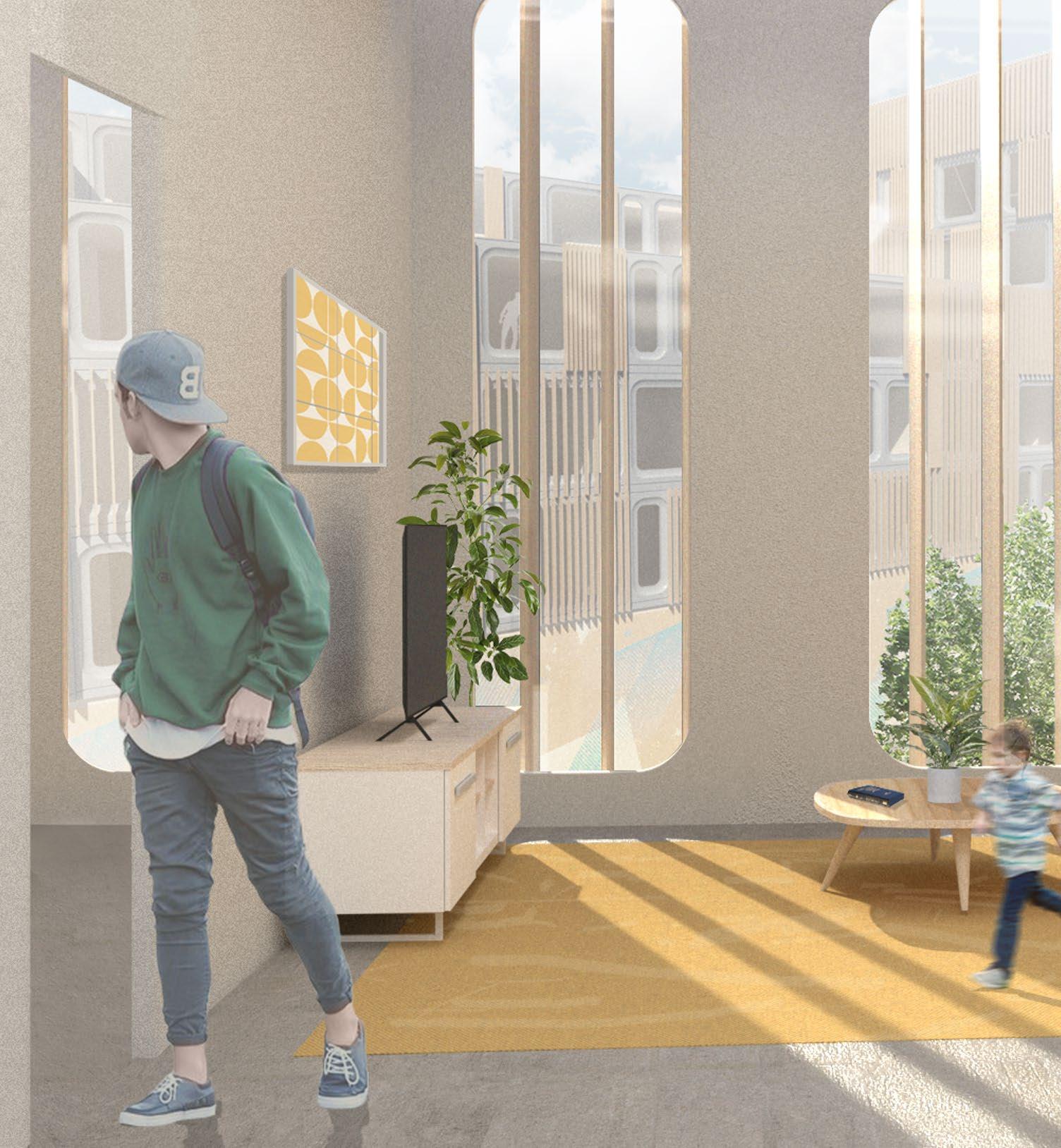
living space of a one bedroom module facing inward to the courtyard.
Core Architecture Studio III
72
Mod(ular):Liv(ing)
73
Chunk
Axon : Two part drawing showing the repetitive structure featured in the prefabricated modules versus the site specific architecture below. Core Architecture Studio III
Building Scale Exploded Axon : Showing the major components of the three separate masses and how they relate to each other on the site.
Mod(ular):Liv(ing)
74
75 Core Architecture Studio III
76
Facade Road-map : Plan Facade Road-map : Elevation
Mod(ular):Liv(ing)
77 Core Architecture Studio III
Exploded Axon : Facade Components
78 Mod(ular):Liv(ing)
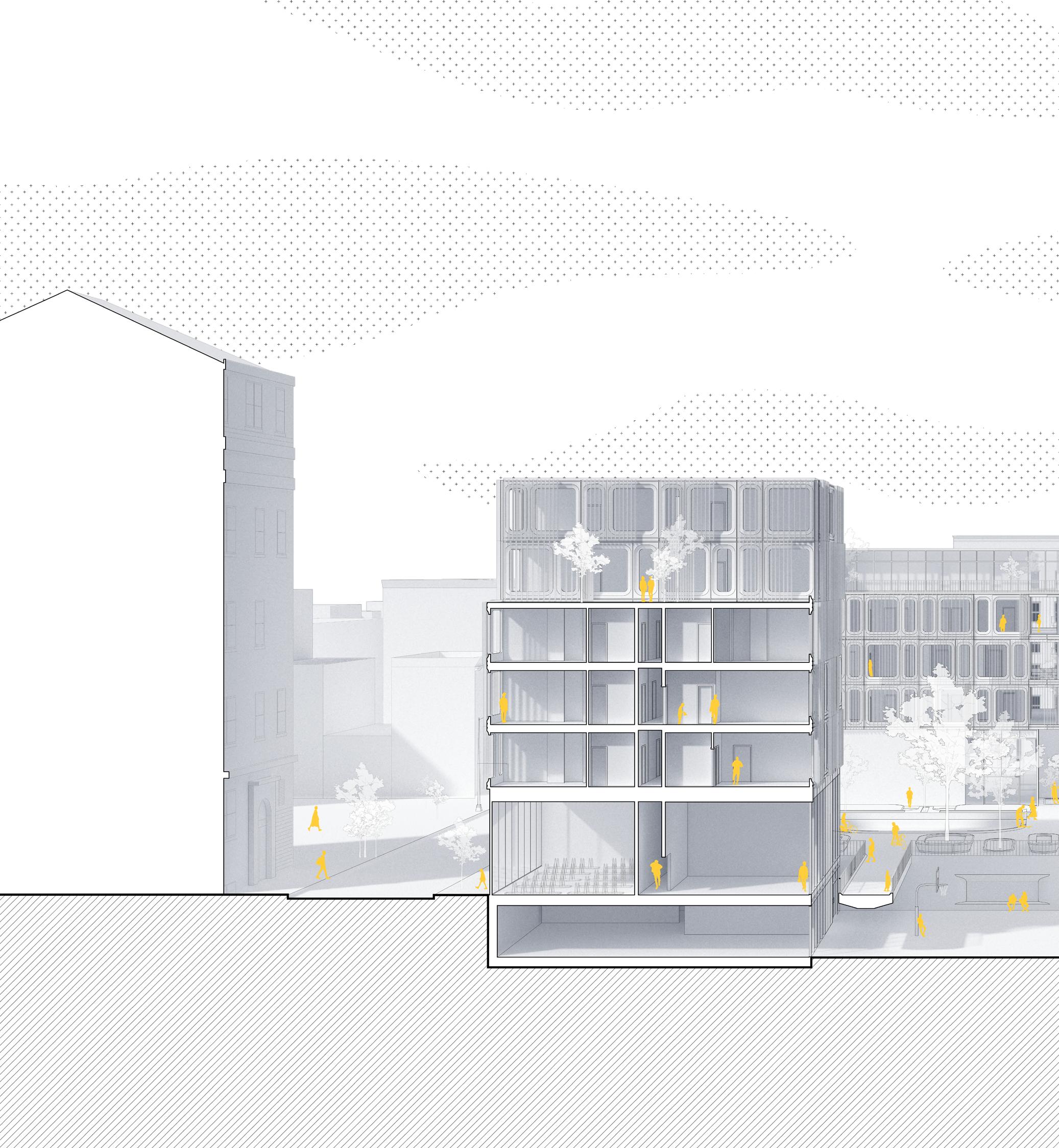
79 Core Architecture Studio III Longitudinal Section
Mod(ular):Liv(ing)
80
81 Core Architecture Studio III Latitudinal Section
82
Rendering : Path through the tie at night.
MONUMENTS TO NATURE
Being placed in a site removed for the urban condition left us in a position to generate a philosophy about nature and context, and what it means to design a center focused about it. Monuments To Nature aims to distill the elements, and their sensory experiences.
There are three monuments, the tower which focuses on air, utilizing vision. Here you can bird watch in the environment of the bird, at the tree canopy level. The second monument is the land element. Here you have your surroundings blocked off so you’re focused only on what is inside, and what you’re allowed to see outside. It’s designed around an ancient rock, which you can only see, not touch from above. There are opportunities to look out, but you can only see the ground in front of your feet, forcing you to experience the dynamism of the simple things in front of you. The third and final monument is the water monument. Here the water flows onto it and you can interact with the water of the Hudson River upstream. There is also a water wall in which it flows over and cascades down into the lower level.
The monuments are permanent and meant to last forever and eventually be overgrown by nature, whilst the only “architecture” on the site is made from Timber and Polycarbonate. These materials are more temporary and will eventually wear away leaving a slab. The symbolic geometries of the concrete left over will encapsulate the signification of the monuments and their relationships to one another.
Annandale-on-Hudson, New York.
85
Studio Critic: Robert Marino Partner: Samuel Bager Spring 2022 - ADV 4
Rendering : The approach to the Tower monument.
86 Monuments to Nature Mapping : Northeast regional map highlighting the site.
87 Advanced Studio IV
Mapping: Annandale-on Hudson in focus of our site.
88 Monuments to Nature
Mapping : Where the four structures fall on the site. Section : Air Monument
Advanced Studio IV
90 Monuments to Nature Plan : Air Monument Plan
91 Advanced Studio IV
Rendering : Bird watching from the Air Monument.
92 Monuments to Nature Plan : Land Monument Plan.
Rendering : Viewing the Land Monument from the outside.
94 Monuments to Nature
Rendering : Viewing the ancient stone the monument was built around from above. Section : Land Monument Section.
95 Advanced Studio IV
96 Monuments to Nature
Plan : The Water Monument.
97 Advanced Studio IV
Rendering : A man approaching the Water Monument.
98 Monuments to Nature
Rendering : Water washing up onto the Water Monument. Section : How people can occupy and interact with the Water Monument.
99 Advanced Studio IV
100 Monuments to Nature
Photography : Air Monument
Model
101
Advanced Studio IV
Model Photography : Land Monument.
102 Monuments to Nature Rendering : Lobby Space.
103 Advanced Studio IV
Rendering : Entry into the Mass Timber and Polycarbonate Architecture.
104 Monuments to Nature
Diagram : All the monuments together in tandem.
105 Advanced Studio IV
INTERCONNECTIVITY
East Village, New York City, New York.
The project fosters an environment of sharing and connectivity through play and education. Children come from different backgrounds and the ability to share is very important to their growth and development. Play is free, genuine, and important keeping them alert.
Creating space in which they aren’t inhibited by the lack of open space in the city and creating opportunities within the program is key. The geometries of space balance the adjacency and circulatory experience of the occupants leading them to destinations where they are able to break the boundaries of what is a classroom and interact freely and share with one another.
In the Neighborhood of the East Village, PS 64 has a prominent history and through Interconnectivity, it returns to it’s original glory with additional services that are needed in the future classroom.
107
Studio Critic: Karla Rothstein Spring 2021 - Core 2
Rendering : Looking up at the intervention from the ground.
108 Interconnectivity Diagram : The interventions with the existing form. Atrium + Play-zone Creation Entry Experience Mid-Section Floor Plate Removal North & South Facade Addition South Facade Removal Circulatory Experience
109 Core Architecture Studio II
Axon : The proposed architecture,
110 Interconnectivity
111 Core Architecture Studio II
Diagram : Connectivity and integration via touch.
Material Experiments : Concrete Castings (porosity).
Rendering : Hallway outside of the concrete mass.
Plan : Typical Educational level.
112 Interconnectivity
Floor
113 Core Architecture Studio II
114 Interconnectivity
115 Core Architecture Studio II Floor Plan : How you’d circulation through the area of play. Rendering : How the concrete mass creates space for play.
Rendering : Areas of calmness in tension between circulation.
116 Interconnectivity
117 Core Architecture Studio II
Rendering : Different forms of play shown inside the sphere.
118 Latitudinal Section Interconnectivity
119 Core Architecture Studio II
120 Interconnectivity
121 Core Architecture Studio II Longitudinal
Section.
Interconnectivity
Core Architecture Studio II
Interconnectivity
Core
II
Architecture Studio
126 Rendering : The new PS 64. Interconnectivity
127 Core Architecture Studio II
ASTOR PLACE AMBIANCE
Astor Place, New York City, New York.
Astor Place Ambiance proposes an elevated architecture that acts as a viewing platform for the community. Tying into The Public Theater’s repertoire of venues, this is a completely outdoor venue that would operate in the evenings with specific musicians or performers scheduled. On other days the structure allows for spaces above and below for moments of community and gathering. The platform provides a variety of seating focused around Astor Place as a centripetal stage, along with a multiplicity of spaces for different people to congregate. Utilizing vendors and the local restaurants, the platform also allows events to take place on the top, including art installations, or food events.
The form aims to have very little impact and contact on the surface level and the existing context. Astor Place Ambiance hopes to avoid obstructing existing pedestrian flows, vehicular traffic flows, and experience within the square,but amplify the possibilities and experiences of the previous condition. On a similar note, the platform aims to utilize the windows of the existing context as a means of viewing, expanding the ideas of spectator-ship to include viewers from work or home for example.
Studio Critic: Amina Blacksher Fall 2020 - Core 1 129 Rendering :
Approach and entry into Astor Place Ambiance from Cooper Square.
130 Astor Place Ambiance Plan Oblique : The elevated structure above Alamo Plaza. Floor Plan : Viewing Platform enclosure
131 Core Architecture Studio I
Section : Slicing through the elevated viewing platform.
POSITIVE NEGATIVE
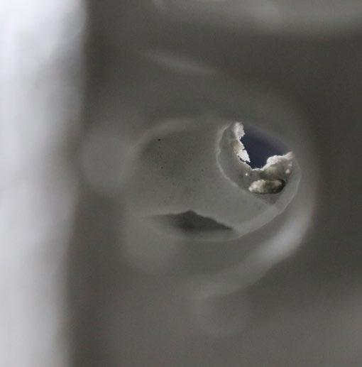
Positive Negative is a project focused on the making of a repetitive geometry in the class of Translational Geometries. In this class we took a 2D idea and turned it into a repetitive tile that can fit together or relate in multiple ways via one form. Here I designed a detailed form with many different surface details to create formal relationships but also textural ones that can be appreciated from close and far visually but tacitly.
Studio Critic: Joshua Jordan
Fall 2022 - Transitional Geometries
133
Photography : Positive Negative tile.
134 Positive Negative
Photo Collage : Giving it scale.
135 Transitional Geometries
Photograph : Closeup of the inverting surface patterns.
136 Positive Negative
137 Transitional Geometries
Photograph : Linear organization
VARIOUS VISUALS
Miscellaneous visualizations that have been produced from year one to year three at Columbia GSAPP. Visual story-telling persay.
139 Rendering: ADR 1Fall 2020 Professor Joshua Uhl
Rendering : The power of the light
140 Inquisition Into The Light
141
ADR I - Joshua Uhl (F-20)
Animation : Movement of knowledge.
Rendering :
142 The Journey
The approach to the tower.
Team: Samuel Bager & Joachym Joab.
143
Techniques of the Ultrareal - Phillip Crupi (S-22)
Rendering : Inside the tower.
144 GSAPP Worm
Team: S. Bager, N. Richards, V. Benjamin, K. He, D. Li, M. Guimaraes
145
The Outside Project - Laurie Hawkinson & Galia Solomonoff (S-23)
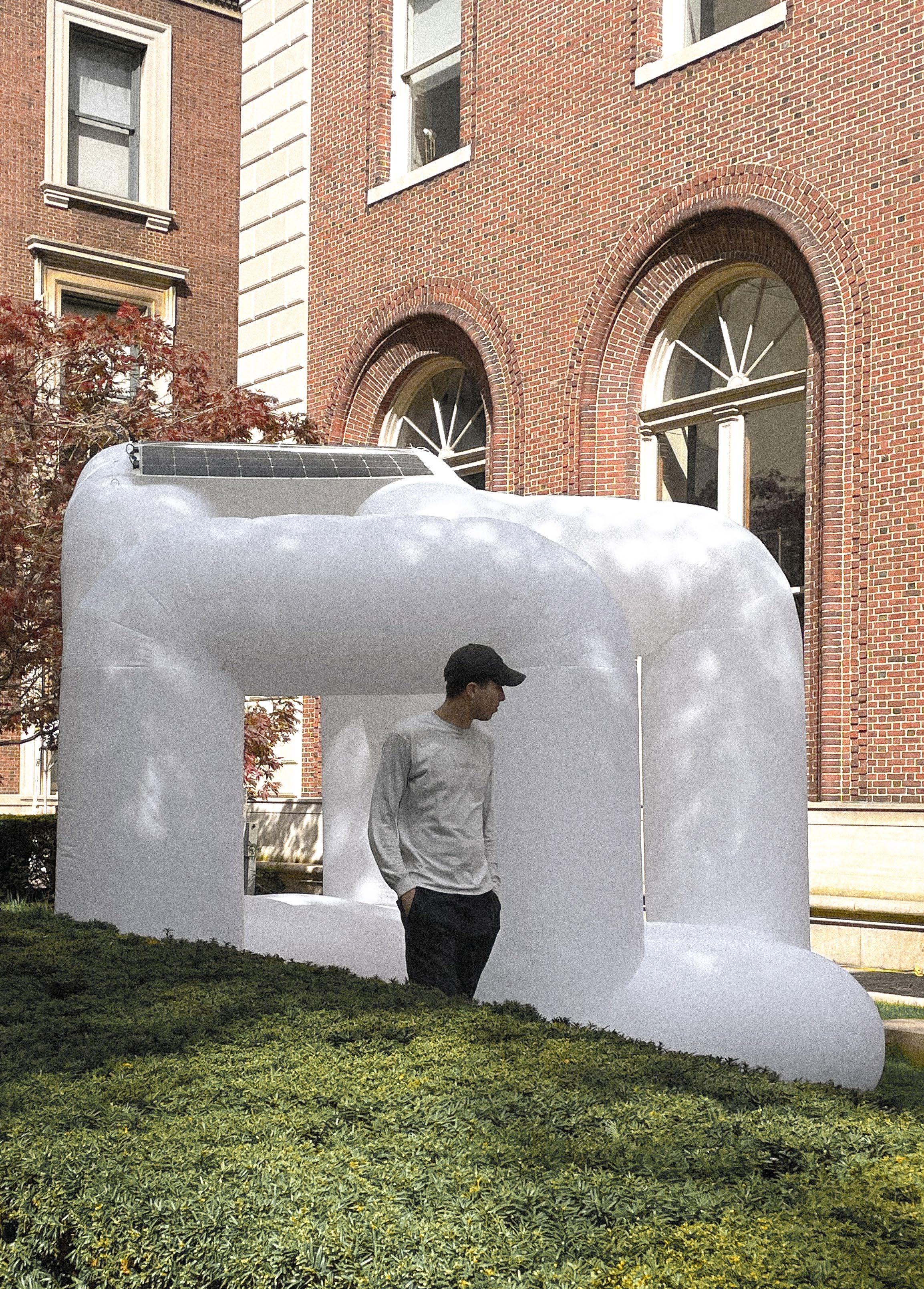
Photograph : Student exploring Worm.
146
GSAPP Worm
Rendering : GSAPP Worm at Night.