cal poly, san luis obispo 2023
California Polytechnic State University Technical Association of the Graphic Arts Volume 40
© Copyright 2023 California Polytechnic State University, San Luis Obispo Technical Association of the Graphic Arts Student Chapter Published in the United States of America By Cal Poly, San Luis Obispo TAGA Student Chapter 1 Grand Ave San Luis Obispo, CA 93407-0381 Printed in the Graphic Communication Department at California Polytechnic State University, San Luis Obispo
Technical Association of the Graphic Arts 2023 vii
Augmented Reality
This journal features augmented reality experiences enabled through RealityBLU®. On each full page illustration, scan the QR code in the bottom left corner to open up the RealityBLU® browser on your device.
Allow RealityBLU® access to your camera. Hold device one foot away and point camera towards the artwork. Keep camera pointed at journal throughout the entire augmented experience.
Designs may take 10-15 seconds to load. If you are experiencing difficulties, refresh the page. If the browser is still not responding, exit out, and scan the QR code again.
Audio Transcripts
To be accessible for users with vision impairments, we have created an audio transcript for all five articles through Descript®. Scan the QR code to the right to access all audio transcripts.
The audio file may take up to 20 seconds to load due to its size.

Practice by scanning this QR Code and watch this page come to life.
Scan QR Code Scan Artwork Use progress bar to navigate to different sections of journal. To follow along with the transcript, click on the quotation marks in the top right corner.
1. 2.
All Audio Transcripts

See More of Cal Poly TAGA
RealityBLU Links
President’s Letter 2 Accessibility & Inclusivity in 7 Packaging Design Solutions to Accessibility in Art & Design: 33 A Multisensory Art Installation SeaBreeze Cupcakes 47 An Introductory UX/UI Guide 81 PhotograVR: Interactive Photography 103 Education in Virtual Reality Meet the Team 121 Acknowledgments 131 Colophon 133 Table of Contents
President’s Letter
Dear Reader,
It is my honor to present to you the 2023 Helmut Kipphan Cup Journal Competition entry of California Polytechnic State University, San Luis Obispo’s TAGA student chapter. This journal is the result of months of collaboration by our dedicated executive board and the help of our department faculty and club members.
The overarching principle we wanted to demonstrate in this year’s journal is “Form Follows Function.” We applied this idea by reminding ourselves, through the process of collecting research, designing layouts, and prototyping packaging, that functionality facilitates effective design. The notion of form follows function also lends itself to accessibility, which is why we’ve chosen to feature the work of authors striving to create a more inclusive world through print and digital media. Our goal was to produce a journal that highlights accessibility in the graphic communication industry by incorporating print and digital design to create a multi-sensory experience.
The look of this year’s journal takes inspiration from the Swiss design tradition. Swiss graphic design takes inspiration from modernism trends of other countries, such as the geometric shapes of Russian Constructivism, the notion of form following function in Germany’s Bauhaus, and the simplicity of De Stijl in the Netherlands. Some of the key characteristics of this design style are the use of a grid system, asymmetric layouts, and sans-serif typefaces. To fit with our overarching theme of accessibility, we applied these principles along with a bold, contrasting color palette to create a journal that is both fun to look at and easily readable.
Our chapter is proud to present this journal which has been produced by students within the Cal Poly Graphic Communication department. We uphold the Cal Poly “Learn by Doing” philosophy by utilizing our own facilities along with resources provided by our sponsors. Our executive board was present throughout every step of the production process.
California Polytechnic State University 2
2
We outsourced our UV spot varnished covers and custom packaging from a local business on the central coast, Poor Richard’s Press. Todd Ventura, president of the company, invited the team to utilize his facilities and allowed us to be hands-on throughout the production process.
I would like to give special thanks to our dedicated chapter advisor, Dr. Rachel Ma, for her dedication to the team, persistent generosity, and willingness to help bring our ideas to fruition. I would also like to thank the Cal Poly Graphic Communication Department faculty and staff, as well as our generous sponsors. Finally, I would also like to thank the 2023 TAGA judge panel for giving us the opportunity to be a part of an association that encourages a future of innovative thinkers.
Sincerely,
Amber Gourley
Technical Association of the Graphic Arts 2023 3
Emphasis
Bionic reading is designed to allow the eye to track letters with ease by emphasizing the first few letters with bold text.
 Artwork by Callie Russo & Hailey Honegger
Accessibility and Inclusivity in Packaging Design
Daniel P. Burns
Abstract
The packaging industry in both graphic and structural design has underserved the vision impaired community. Globally there are 1.3 billion consumers who are vision impaired, while 36 million of them are blind. These customers’ needs are not being addressed by the majority of packaged products and manufacturers (Gardner, 2017). The following paper will examine how best the packaging industry can address accessibility issues for the visually impaired.
7
Introduction
This project is close to home for me. Both my grandmother and father went blind in their later years. I have been diagnosed with early onset macular degeneration. As a packaging professional with this disability in my not-too-distant future I feel the need to address it. My research shows that over decades, small steps have been taken to design packaging for those with visual impairments. In most cases designers typically default to including Braille in their designs. In others, accessible packaging is deemed too costly and any advancements are discontinued.
By researching how we currently address this market and the scope of it, I will identify opportunities to advance the implementation of current trends and where even those fall short. Furthermore, this work will strive to develop a framework for packaging design that will cater to that demographic and provide guidance to packaging designers that will enable them to include these consumers’ needs in their designs. I will seek to answer: Why are there no packaging standards that address the needs of the visually impaired? What has been done? What hasn’t worked? What can be done to create independence in these consumers?
Terminology
Vision impairment is defined as a person’s eyesight that cannot be corrected to a “normal” level. It is caused by a loss of vision acuity, when their eyes do not see objects clearly. It can also be caused by a loss of visual field, in which their eyes cannot see as wide an area without turning their heads or moving their eyes (University Of Pittsburgh, n.d.). Vision acuity is a measure of the ability of the eye to distinguish shapes and the details of objects at a given distance. Blindness and vision impairment are broken down further into two groups with subcategories. The first group is Distance Vision Impairment. Distant Vision Impairment is further broken down into four levels from Mild to Moderate to Severe to Blindness. The second group does not have subcategories, it is Near Vision Impairment (World Health Organization, 2021). Color blindness, or color vision deficiency, is not considered a vision impairment because it doesn’t lead to additional vision loss (Cleveland Clinic, 2020). However, it should be included in this discussion because part of the communication function of packaging is conveyed via color.
California Polytechnic State University 8
Vision impaired consumers are a substantial section of the population and they are not being supported by current industry packaging standards and trends. The average household spends $6,602 on groceries yearly (Price, 2021). With most households having at least one vision impaired person (National Library of Medicine, n.d.), one can reasonably assume the reported blind population of 36 million people would be 36 million households. By extrapolating this data, the packaged products needed for this demographic is roughly $237,672,000.
Currently, visually impaired consumers rely on a blend of support from the grocery store staff, personal companions, and certain technologies to shop for groceries. This is a framework that, if expanded upon and supplemented with packaging solutions, would increase the independence of this target audience.
Literature Review
There are currently many existing guidelines for use in design for the vision impaired. The Americans with Disabilities Act “prohibits discrimination against people with disabilities in everyday activities, such as buying an item at the store, going to the movies, enjoying a meal at a local restaurant, exercising at the health club, or having the car serviced at a local garage.
To meet the goals of the ADA, the law established requirements for businesses of all sizes. These requirements went into effect on January 26th, 1992. Businesses that serve the public must modify policies and practices that discriminate against people with disabilities; comply with accessible design standards when constructing or altering facilities; remove barriers in existing facilities where readily achievable; and provide auxiliary aids and services when needed to ensure effective communication with people who have hearing, vision, or speech impairments. All businesses, even those that do not serve the public, must comply with accessible design standards when constructing or altering facilities.” (United States Department of Justice Civil Rights Division, n.d.). Other sections of the Americans with Disabilities Act are already used in all grocery stores; All grocery stores have to be wheelchair accessible. The barrier to entry for consumers using wheelchairs has been removed. Product packaging is a similar barrier for the vision impaired and must be addressed as well.
Technical Association of the Graphic Arts 2023 9
There has recently been an influx of research on this topic. Among the many resources on this topic is a thesis published by Ian Baitz for Ryerson University that addresses the issue. The thesis was on Accessible Packaging Design in the Beauty Industry (Baitz, 2020). The author recognizes the difficulty that many packaged products present to consumers. Amongst the paper’s resources is an overview of inroads made by the International Organization for Standardization. The ISO’s purpose is to ensure that any products and services result in being “safe, reliable, and of good quality” for end-users. ISO went further and developed standards in relation to accessible consumer packaging titles ISO 19809. Further ISO 19809 and ISO 17351 recognizes tactile markings as a type of indicator for accessible packaging to convey information to consumers with visual disabilities. It states that tactile markings should be used to identify products that are similar in shape but with different content. These tactile markings should be simplified indicators made at a considerable size in relation to the package and in an area of the package that consumers frequently interact with. The ISO 19809 also illustrates the use requirements of braille signage in design.
The Medical Model of Disability claims that impairments are to be “fixed” with medical treatments even if they are not considered lifesaving. The Social Model of Disability states that disability is caused by the way that society is structured. The level to which disabilities are perceived is based on how visually-abled people determine them (Baitz, 2020). To combat limitations for people with visual impairments, designers must conceive suitable methods and accommodations.
Looking for more specific data on printed materials led to the Royal National Institute for the Blind (Royal National Institute for the Blind, n.d.). The RNIB is a United Kingdom charity offering support and advice to almost 2 million people in the UK with sight loss. The RNIB has put together comprehensive requirements for printed matter that exceeds what was defined by the Commonwealth of Massachusetts (Royal National Institute for the Blind, n.d.). Among the many requirements are:
California Polytechnic State University 10
1. Contrast: Use high contrast colors for text and backgrounds
2. Type Color: Type is most easily readable in black and white. If type needs to be a color it should be limited to titles, headlines or highlighted materials.
3. Point Size: Should be between 12 and 18 points.
4. Leading: Should be around 25 to 30 percent of point size (1.25, 1.3)
5. Font Style: Avoid decorative or script fonts.
6. Font Heaviness: A medium heaviness font is best. Avoid light types or thin strokes. When emphasizing, avoid italics or all caps.
7. Letter Spacing: Choose a monospaced type instead of one that is proportionally spaced.
8. Columns: Separate large quantities of text into columns.
9. Material Finish: Matte varnish finish is preferred. Glossy varnishes make the package difficult to read.
10. Clean and Simple Design: Use distinctive colors, styles and shapes on the packaging to make them easier to tell apart.
11. Avoid Hyphens
12. Justification: The main text is left aligned. Right margins are ragged, not justified, because centered and right aligned text is difficult for some people to track.
13. Lines of Text: Each line of text is no longer than six inches (50-60 characters per line).
14. No Wrap Around Text: Text should not wrap around corners to other panels.
This topic is prominent in multiple trade articles. The various articles all brought up the same points as the Royal National Institute for the Blind, but were not as concise or clear. The takeaway is that there is a growing recognition that many consumers cannot accurately use current packaging and that it needs to be addressed.
Methodology
The use of technology is currently how the vision impaired consumer is able to engage with packaging. The earliest technology that is still in use for packaging, called haptic technology, is the process of conveying information through touch (McLaughlin, n.d.). A common example of this is the Braille alphabet, Figure 1 (Perkins School for the Blind, n.d.).
Technical Association of the Graphic Arts 2023 11
Alphabet
The Elia Alphabet
A B C D E F G H I J K L M N O P Q R S T U V W X Y Z
Arthritis or
Back or spine
Heart trouble/hardening
Lung or respiratory
Deafness or serious hearing
Limb/extremity
Mental or emotional
Blindness or vision
California Polytechnic State University
12
Figure 2 ELIA Alphabet (ELIA Alphabet, n.d.)
Figure 1 Braille Alphabet
j k
o p q r s
The Braille
a b c d e f g h i
l m n
t u v x y z w
The Braille alphabet is an embossing pattern of raised dots arranged in a cell of up to six dots in a three by two configuration (Braille Works, n.d.). It was first created in 1824 by Louis Braille. The user “reads” the letters by moving their hand from left to right along each line of type. The specifications for the most recognized haptic, Braille, is well established (Brailleauthority.org, n.d.).
While Braille is clear to read, the large uniform size of the cell would make most packaging unable to convey its information in this manner. The distance from center of dot to center of adjacent dot is 0.092 inches which is very similar to the FDA’s minimum ingredient label size of 7 point type, 0.097 (U.S. Food and Drug Administration, 2018). However, Braille is a fixed width type which does not allow for kerning and spacing variations that occur in modern design. It simply takes up too much space to clearly communicate the information from the package in its current form.
While Braille is the most commonly recognized haptic, there are other choices such as the ELIA Alphabet (The Elia Idea, n.d.), the Moon Alphabet (Royal National Institute for the Blind, n.d.), and Cyrus (Raised Universal Symbols). The ELIA Alphabet stands for Education, Literacy and Independence for All. This is a digital font and printer with the ability to produce raised-ink letterforms. The ELIA Alphabet consists of raised letter frames that the reader runs their finger around clockwise and then inside the frames, Figure 2 (ELIA Alphabet, n.d.). The Moon Alphabet was created in 1845 by William Moon. The Moon Alphabet is a series of raised shapes. The characters are large and are similar to their printed equivalent, Figure 3 (AZ Deaf and Blindness, n.d.). Due to the nature of its design, it works well for people with less sense of touch or for those who lose vision later in life.
As seen in Figure 4, CyRUS Raised Universal Symbol is an augmentative and alternative communication that uses objects or pictures that share a perceptual relationship with the items they represent as symbols (Victorialand Beauty, n.d.). All of these alternatives to braille have unique strengths and weaknesses. With tactile pictograms easier to learn than Braille (Hagood, 2016), it can be argued the simple pictogram nature of CyRUS haptics has the most promise.
Technical Association of the Graphic Arts 2023 13
The Moon Alphabet
The complexities of a complete alphabet or comprehensive symbol language seem to work against purpose. The typical decline in many cognitive domains in the aging process create an unintended problem. Declines in tactics perception, cognitive processing, and reduced working memory can leave the vulnerable vision impaired without this means of communication (Prescott et al., 2015).

Haptics are applied to packaging in several ways. On folding cartons, applying them can be as simple as a male and female embossing die applied during the die cutting process. On flexible packaging, designers can aid raised symbols through inkjet technology and varnishes. It would need added dry time and would need to run at a slower speed to maintain their integrity. Proctor and Gamble has found success by using a laser to etch haptic designs into its Herbal Essence packaging.
Proctor and Gamble identified that many of their consumers’ vision impairments were exacerbated by the fact that they couldn’t wear their glasses
California Polytechnic State University 14
Figure 3 Moon Alphabet (AZ Deaf and Blindness, n.d.)
or contacts in the shower where their product is used. Proctor and Gamble utilized a laser in the packaging line to etch markers onto the packaging. They differentiated products by etching a row of raised lines on the back of their shampoo bottles and two rows of raised dots in the same location on their conditioner bottles. They did this without weakening the product or negatively impacting their production lines (Reynolds, n.d.).
Moving past physical contact there are other technologies that are in use elsewhere that can be redirected for the purpose of easing eye strain or increasing inclusivity. They can be as simple as software or as complex as a separate piece of electronic equipment. Bionic Reading is software that adds emphasis, or bold lettering in the most concise parts of words (Bionic Reading, n.d.). This bold type guides the eye over the text and your brain completes the word.
One of the most commonly consumed items in the United States is reportedly Oreo Cookies (Amatulli, 2015). Here is how their ingredients list reads (University of South Dakota, 2018):
Unbleached Enriched Flour (Wheat Flour, Niacin, Reduced Iron, Thiamine Mononitrate {Vitamin B1}, Riboflavin {Vitamin B2}, Folic Acid), Sugar, Palm and/or Canola Oil, Cocoa

Technical Association of the Graphic Arts 2023 15
Figure 4 CyRUS Raised Universal Symbols (CyR.US System, n.d.)
night cream face oil eye cream face moisturizer exfoliator face wash serum
(Processed with Alkali), High Fructose Corn Syrup, Leavening (Baking Soda and/or Calcium Phosphate), Salt, Soy Lecithin, Chocolate, Artificial Flavor.
When applying Bionic Reading they now read as:
Unbleached Enriched Flour (Wheat Flour, Niacin, Reduced Iron, Thiamine Mononitrate {Vitamin B1}, Riboflavin {Vitamin B2}, Folic Acid), Sugar, Palm and/or Canola Oil, Cocoa (Processed with Alkali), High Fructose Corn Syrup, Leavening (Baking Soda and/or Calcium Phosphate), Salt, Soy Lecithin, Chocolate, Artificial Flavor.
As a stand alone technology this would not be enough for a robust solution. This augmented typography, when incorporated into design, would greatly assist the myriad types of vision impaired consumers in reading the packaging requirements.
Electronic Technology has become incredibly interactive to assist the vision impaired with packaging. The technology has changed dramatically over the years and it is now making leaps in terms of independence. These leaps help the vision impaired consumer navigate a grocery store as well as use the products at home. It is available digitally only at this time. There isn’t a packaged product that utilizes this font; from a production standpoint, when using a proportion wheel on the two sampled body copies it would take up roughly 1.7 percent more surface area for the same content.
While Bionic Reading is a recent innovation, it is already receiving praise for how it is also supporting the neurodiverse community. Early reporting of the format of Bionic Reading has allowed people with dyslexia to immediately understand the content of various texts on their first readings (Gibbs et al., 2022). Bionic Reading is also showing success with people who have ADHD (Lavelle, 2022). The ability to process more text much faster is inline with ADHD’s tendency to shift perception priorities.
California Polytechnic State University 16
NaviLens is an expanded gamut QR code that can access a great deal of information when scanned by your smartphone (NaviLens, n.d.). QR codes are limited because you can only scan them when they are centered in your smartphone’s camera. Visually impaired users can use NaviLens codes, as they do not need to know precisely where they are placed (Navilens, n.d.). The phone just needs to be pointed in the Navilens code’s direction. Because the NaviLens digital codes trigger audio notes, the amount of information that can be conveyed is potentially limitless, Figure 5 (NaviLens, n.d.). NaviLens is used in several European cities for their public transportation. Scanning the code with the NaviLens app has allowed thousands of visually impaired people to navigate their public transport systems.
NaviLens QR codes were put into use on World Sight Day in the United Kingdom on October 8, 2020 (Kelloggs, n.d.). The Royal National Institute for the Blind partnered with Kellogs and NaviLens to create a limited run of packaging. In sixty stores across the United Kingdom there were boxes of Coco Pops whose packaging was designed for the blind or vision impaired. The packaging utilizes all the printed materials guides that the RNIB has suggested such as larger print, simplified artwork, and Braille as well as adding a NaviLens QR code, Figure 6 (Qureshi &
Technical Association of the Graphic Arts 2023 17
Figure 5 NaviLens QR code (NaviLens, n.d.)
Bradbury, 2020). The promotion was a success. Over 90% of the participants wanted more accessibility features (Royal National Institute for the Blind, 2021). On the heels of this success Kellogs has announced that it will be adding NaviLens codes to their entire cereal line across all of Europe (Royal National Institute for the Blind, 2021).

Discussion
There are few regulations in regards to packaging design. There are no mandated inclusive graphic design requirements currently (Food and Drug Administration, n.d.). According to the 2018 National Health Survey Interview, 32.2 million American adults over age 18 have some form of vision loss, as seen in Figure 7. Vision loss refers to individuals who reported that they have trouble seeing, even when wearing glasses or contact lenses, as well as to individuals who reported that they are blind or unable to see at all (Center for Disease Control, n.d.).
A detailed look at statistics compiled by the Center for Disease Control is insightful. The CDC has extensive data collected in regards to vision loss. The CDC has over 700,000 surveys that cover vision impairment. It can be broken down in a myriad of ways. The most telling example shows that vision impairment is increasing rapidly. The data indicates
California Polytechnic State University 18
Figure 6 Kellogg’s Coco Pops box using NaviLens (Qureshi & Bradbury, 2020)
that by the year 2050 the number of United States citizens living with vision impairment will have doubled (Centers for Disease Control and Prevention, n.d.), see Figure 8. The CDC also identified in an earlier survey that vision impairment is among the top ten disabilities among adults eighteen and older. With that type of an increase it should add even more urgency to developing ways for vision impaired people to use packaging.
To confirm the CDC’s data, I downloaded its 700,000 line CSV file. A sample of 1000 lines were taken at random and the data plotted in Matlab to recreate the CDC’s graphs. The results are very close to what the CDC has predicted. Vision impairment in the United States is on an upward trajectory, see Figure 9.
The alarming increase in the vision impaired population makes it clear that inclusivity in packaging needs to happen now. In 2015, a total of 1.02 million people were blind, and approximately 3.22 million people
Technical Association of the Graphic Arts 2023
19 Year No. of Persons With Visual Impairment in the United States (in Millions) 4 3 2 1 0 2020 2015 2025 2030 2035 2040 2045 2050 NHW AA Asian Hispanic Other
Figure 7 United States citizens living with vision loss growth (Centers for Disease Control and Prevention, n.d.)
Arthritis or rheumatism
Back or spine problem
Heart trouble/hardening of the arteries
Lung or respiratory problem
Deafness or serious hearing problem
Limb/extremity sti ness
Mental or emotional problem
in the United States had vision impairment, as defined by the best-corrected visual acuity in the better-seeing eye. By 2050, the numbers of these conditions are projected to double to approximately 2.01 million people who are blind, or have vision impairment of 20/200 or worse, 6.95 million people with vision impairment (Centers for Disease
California Polytechnic State University 20
0 20 40 60 80 100 30 25 20 15 10 5 0 Visual Acuity Age Bracket Measured Visual Acuity (Visual Acuity vs Age)
Figure 9 Sampling of CDC’s data to verify accuracy of graphs
Figure 8 Top 10 disabilities in the United States (Centers for Disease Control and Prevention, n.d.)
M N
Diabetes Blindness or vision impairment Stroke 0 5 10 15 20 Percentage
Control and Prevention, n.d.). To put this in perspective, there are 36 million vision impaired people in the world. If the Centers for Disease Control and Preventions model is applicable to the entire world, then by 2050 that number will be 72 million. That number is greater than the current population of the United Kingdom. The Center for Disease Control and Preventions hasn’t updated their color vision deficiency reports since 1972 (Center for Disease Control and Prevention, n.d.). Current data shows that 3.7% of the United States population has some degree of color blindness. That is 12 million people in the United States alone (Lee, 2020). It is impossible to predict growth as color vision deficiency is genetic, usually inherited from their mother, and affects predominantly males (Color Blind Awareness, n.d.).
Conclusion
There isn’t a one way approach to resolving this issue. It’s going to take a combination of raising awareness, use of technology and an evolution in existing processes. Earlier we touched on Haptics and how they are currently used. They need to be part of the solution to this issue. Currently haptics, with the exception of Braille, are very specialized. What if we break that out into a larger idea? Millions of people around the world can readily recognize the old NFPA Diamond. It is a diamond broken into 4 quadrants. Each quadrant represents 1 thing. For instance the top quadrant is red for flammability. The higher the number in that quadrant the higher the risk. This basic setup has lasted decades and is the framework for what I believe would be an enormous help to the vision impaired.
I propose breaking down the four quadrants into grocery concerns that are most in need of identification. Those are 1) Refrigerate, 2) Shelf Stable, 3) Freeze and 4) Allergens, Figure 10. These would be debossed into the packaging to avoid them being damaged when stacked. There would be a straight line debossed at the base of the diamond to indicate where the bottom so the consumer can orient themselves to the diamond and understand what it is saying by touching it. Being able to identify by touch whether something needs to go into the freezer or fridge while in the store or at home is an enormous improvement. I would go a step further and inside the debossed diamond add an emboss pictogram for a hazard, such as crush hazard, do not stack, bacteria issue if not refrigerated,
Technical Association of the Graphic Arts 2023 21
and of course put a pictogram for exactly what allergen could be at risk such as a pictogram for “manufactured at a facility that also processes tree nuts.”
These embellishments are easily incorporated into folding carton packaging in the die cutting operation. The debossing and embossing would become part of the cutting die and every die cavity would have them. It would be more difficult in the flexible packaging realm. If a flexible film packaging contains something rigid (foil, paperboard, or a thicker caliber material), a male and female heated die plate can be made to add this identifying diamond. This would be an added function in its converting steps.
REFRIGERATE
Embossed
Pictograms
For Issues
I.E. Crush Hazard
SHELF STABLE
Embossed
Pictograms
For Issues
I.E. Do Not Stack
ALLERGENS
Embossed
Pictogram
For Allergen
FREEZE
Embossed
Pictogram
For Issues
I.E. Do Not Stack
There are processes being developed for flexible film that would allow the identifier diamond to be on the thin packaging. There have been advancements in inkjet technology and varnishes that can apply similar haptics
California Polytechnic State University 22
Figure 10 Packaged Product Care Identifier by Daniel Burns
inline. A combination of raising public awareness, enforcing rights in the American with Disability act, technology and haptics will break the current communication barrier. By utilizing combinations of these new design attributes a far greater amount of vision impaired consumers will be able to engage with their packaged products. The act of clear understanding of the packaged product by the vision impaired will create better communication with the manufacturer. Ultimately this new understanding will bring equity to the two groups.
Technical Association of the Graphic Arts 2023 23
California Polytechnic State University
References
Amatulli, J. (2015, December 4). The Definitive List Of America’s Favorite Cookies. HuffPost. Retrieved May 27, 2022, from https://www.huffpost.com/ entry/cookies-om-nom-nom_n_5661a953e4b079b2818e3e68
AZ Deaf and Blindness. (n.d.). Dr Moon Page. AZ to Deafblindness. Retrieved June 5, 2022, from http://www.deafblind.com/moon.html
Baitz, I. (2020, 11 30). Accessible Packaging Design in the Beauty Industry. Cambridge Dictionary | English Dictionary, Translations & Thesaurus. Retrieved May 24, 2022, from https://www.google.com/url?sa=t&rct=j&q=&esrc=s&source=web&cd=&cad=rja&uact=8&ved=2ahUKEwiOh6i-v_H0AhVLVs0KHb5ICFQQFnoECAMQAQ&url=https%3A%2F%2Fwww. ryerson.ca%2Fcontent%2Fdam%2Fgcm%2Fimages%2FCommunity%2FThesis%2F2020%2FMilarBentia-Beauty.pdf&usg=AOvVaw3K1
Bionic Reading. (n.d.). Bionic Reading. Faster. Better. More focused. Reading. Retrieved May 24, 2022, from https://bionic-reading.com/
Brailleauthority.org. (n.d.). Size and Spacing of Braille Characters. Size and Spacing of Braille Characters. Retrieved May 27, 2022, from http://www.brailleauthority.org/sizespacingofbraille/sizespacingofbraille.pdf
Braille Works. (n.d.). Braille Alphabet. Braille Works. Retrieved May 24, 2022, from https://brailleworks.com/braille-resources/braille-alphabet/
Center for Disease Control and Prevention. (n.d.). Vital and Health Statistics; Series 11, No. 118 (8/72). CDC. Retrieved May 27, 2022, from https://www.cdc.gov/nchs/data/series/sr_11/sr11_118.pdf
Centers for Disease Control and Prevention. (n.d.). Burden of Vision Loss. CDC. Retrieved May 24, 2022, from https://www.cdc.gov/visionhealth/risk/burden.htm
Cleveland Clinic. (2020, December 30). Color Blindness: Types, Causes & Treatments. Cleveland Clinic. Retrieved May 27, 2022, from https://my.clevelandclinic.org/health/diseases/11604-color-blindness
Color Blind Awareness. (n.d.). About Colour Blindness. Colour Blind Awareness. Retrieved May 27, 2022, from https://www.colourblindawareness.org/colour-blindness/
Commonwealth of Massachusetts. (2007). Accessible Print Materials : Formatting Guidelines to CyR.US System. (n.d.). The CyR.US™ System –VictorialandBeauty. Victorialand Beauty. Retrieved June 5, 2022, from https://victorialandbeauty.com/pages/cyr-u-s-system
ELIA Alphabet. (n.d.). ELIA Alphabet. ELIA. Retrieved June 5, 2022, from http://www.theeliaidea.com/elia-frames2
24
Technical Association of the Graphic Arts 2023
Food and Drug Administration. (n.d.). Food Labeling Guide. US Food and Drug Administration. Retrieved May 24, 2022, from https://www.fda.gov/files/food/ published/Food-Labeling-Guide-%28PDF%29.pdf
Gardner, E. (2017, July 12). Are packaging manufacturers doing enough for visually impaired consumers? -. Packaging Gateway. Retrieved June 3, 2022, from https://www.packaging-gateway.com/analysis/featureare-packaging-manufacturers-doing-enough-for-visually-impaired-consumers-5867734/
Gibbs, A., Habeeb, L., & Weingarten, B. (2022, May 20). What Is Bionic Reading and Why It Feels Like ‘Unlocking 100% of Your Brain’. Newsweek. Retrieved May 27, 2022, from https://www.newsweek.com/ what-bionic-reading-why-feels-like-unlocking-your-brain-1708614
Hagood, L. (2016, November 28). A Standard Tactile Symbol System: Graphic Language for Individuals who are Blind and Unable to Learn Braille. Texas School for the Blind and Visually Impaired. Retrieved June 5, 2022, from https://www.tsbvi.edu/203-%20resources/1315-standard-tactile-symbol-%20 system
Kelloggs. (n.d.). World Sight Day. Kellogg’s. Retrieved May 24, 2022, from https://www.kelloggs.co.uk/en_GB/world-sight-day.html
Lavelle, D. (2022, May 27). Bionic reading: could an ADHD-friendly hack turn me into a speed-reader? | Daniel Lavelle. The Guardian. Retrieved May 27, 2022, from https://www.theguardian.com/commentisfree/2022/may/27/ bionic-reading-adhd-speed-reader
Lee, H. (2020, April 6). Wayfinding Signage for People with Color Blindness - Lee - 2020 - Journal of Interior Design. Wiley Online Library. Retrieved May 27, 2022, from https://onlinelibrary.wiley.com/doi/abs/10.1111/joid.12169
McLaughlin, M. L. (n.d.). Introduction to Haptics. Higher Education | Pearson. Retrieved May 27, 2022, from https://www.pearsonhighered.com/assets/ samplechapter/0/1/3/0/0130650978.pdf
National Library of Medicine. (n.d.). THE DEMOGRAPHY OF BLIND AND VISUALLY IMPAIRED PEDESTRIANS. NCBI. Retrieved June 3, 2022, from https://www.ncbi.nlm.nih.gov/books/NBK218022/
NaviLens. (n.d.). NaviLens EMPOWERING the visually impaired. Retrieved May 24, 2022, from https://www.navilens.com/en/
Prescott, T. J., Heller, M., & Ballesteros, S. (2015, May 28). Visually-impaired touch. Scholarpedia. Retrieved May 27, 2022, from http://www.scholarpedia.org/article/Visually-impaired_touch
Price, S. (2021, December 29). Average Household Cost of Food. ValuePenguin. Retrieved June 3, 2022, from https://www.valuepenguin.com/
25
California Polytechnic State University
how-much-we-spend-food
Qureshi, W., & Bradbury, P. (2020, October 9). Coco Pops boxes trialed for the blind and partially sighted. Packaging News. Retrieved June 5, 2022, from https://www.packagingnews.co.uk/design/new-packs/ kelloggs-co-op-trial-coco-pops-boxes-designed-blind-09-10-2020 Reynolds, P. (n.d.). P&G’s Tactile Notching on Bottles Helps the Visually Impaired. Packaging World. Retrieved May 27, 2022, from https:// www.packworld.com/design/package-design/article/21509433/ pgs-tactile-notching-on-bottles-helps-the-visually-impaired#next-slide
Royal National Institute for the Blind. (n.d.). http://scdg.org.uk/wp-content/ uploads/2019/02/Colour-information-with-header-sheet-2.pdf.
Royal National Institute for the Blind. (n.d.). Moon Alphabet. RNIB. Retrieved May 24, 2022, from https://www.rnib.org.uk/practical-help/reading/ braille-and-moon-tactile-codes/moon
Royal National Institute for the Blind. (n.d.). RNIB. RNIB - See differently -. Retrieved May 24, 2022, from https://www.rnib.org.uk/
Royal National Institute for the Blind. (2021, July 1). Kellogg’s: a game changer in accessible packaging. RNIB. Retrieved May 24, 2022, from https://www.rnib.org.uk/connect-community/connect-news-and-stories/ kelloggs-launch-accessible-packaging
Royal National Institute for the Blind. (2021, July 1). Kellogg’s: a game changer in accessible packaging. RNIB. Retrieved May 27, 2022, from https://www.rnib.org.uk/connect-community/connect-news-and-stories/ kelloggs-launch-accessible-packaging
The Elia Idea. (n.d.). Elia Alphabet. ELIA - ELIA. Retrieved May 24, 2022, from http://www.theeliaidea.com/
University of Pittsburgh. (n.d.). What is Vision Impairment? | Department of Ophthalmology | University of Pittsburgh. Ophthalmology. Retrieved May 27, 2022, from http://ophthalmology.pitt.edu/vision-impairment/ what-vision-impairment
University of South Dakota. (2018, January 11). Nutrition Label. Nutrition Label. Retrieved May 27, 2022, from http://nutrition.und.edu/foodpro/label.asp?locationNum=05&locationName=&dtdate=1/11/2018&RecNumAndPort=180001
United States Department of Justice Civil Rights Division. (n.d.) The Americans with Disabilities Act. Retrieved Nov 18, 2022 from https://www. ada.gov/
26
U.S. Food and Drug Administration. (2018, September 16). Guidance for Industry: Food Labeling Guide | FDA. US Food and Drug Administration. Retrieved May 27, 2022, from https://www.fda.gov/regulatory-information/ search-fda-guidance-documents/guidance-industry-food-labeling-guide
Victorialand Beauty. (n.d.). The CyR.US™ System – VictorialandBeauty. Victorialand Beauty. Retrieved May 24, 2022, from https://victorialandbeauty. com/pages/cyr-u-s-system
World Health Organization. (2021, October 14). Blindness and vision impairment. WHO | World Health Organization. Retrieved May 27, 2022, from https://www.who.int/news-room/fact-sheets/detail/ blindness-and-visual-impairment
W3C. (2021, December 7). W3C Accessibility Guidelines (WCAG) 3.0. W3C. Retrieved May 27, 2022, from https://www.w3.org/TR/wcag-3.0/
Technical Association of the Graphic Arts 2023 27
Daniel Burns

22
About the Author
Daniel Burns is a Graphic Communication professor who teaches beginning and advanced print production courses for 9th through 12th grade students at Madison Park Technical Vocational High School. Daniel believes that vocational education is a fundamental part of academic excellence and the building blocks of critical thinking in high school and beyond. In addition to managing the Graphic Communications curriculum for the school, he tutors in an after school program where he works one-on-one with students. Prior to teaching he worked 25 years in the packaging industry. Starting as a feeder on a Heidelberg Speedmaster and ending as the Print Production Manager of a firm, Daniel holds an AS in Printing Technology, a BS in Occupational Education and an MS in Packaging Value Chain.
Technical Association of the Graphic Arts 2023 29
Wired

This illustration nods at the idea of the multisensory experience, incorporating sound, touch, and sight in unique ways to make a piece of art as accessible as possible. Geometric shapes and use of a grid keep the composition grounded to Swiss design principles.
Artwork by Hailey Honegger
Solutions to Accessibility in Art and Design: A Multisensory Art Installation
Olive Robertson
Abstract
Fine arts are something we consider a visual experience most of the time, but of course this is not the case for people with compromised vision. When we fail to consider accessibility in art and design, the experience becomes exclusionary to an entire group of individuals with visual impairments and forms of blindness. To explore possible solutions to accessibility in art and design with a narrow focus on visual impairments, I applied techniques commonly used in printed electronics methodology. I wanted to further showcase the impact of how designers enhance the overall user experience when they choose to center their focus on designing for accessibility.
33
Introduction
To fully tackle these accessibility challenges, I had to think beyond sight and focus on other senses like tactile and auditory. For the final product I imagined an interactive art piece with visual appeal, auditory capabilities, and tactile functionality. In other words, the canvas would become both a sensory board and musical instrument. In doing so, I would be expanding preconceptions of typical art pieces while utilizing printed electronics.
Literature Review
Turning to the blind experience can help us understand the importance of accessible design, and how it addresses a variety of social issues. Globally there are nearly 1.3 billion people living with a visual impairment or form of blindness (Coates, 2019). The concept of visiting a museum has many factors that could make someone with a visual impairment feel excluded and with 8% of the population meeting this criteria it’s important they don’t get overlooked. Multisensory exhibits need to be considered for this group of people and will enhance the experience for everyone else. Audio guides, audio descriptive displays, 3D printing, and tactile exhibits have potential to make the museum experience more accessible for these groups.
Existing Technologies
In his TED Talk, Neil Harbisson spoke about his rare visual impairment called “achromatopsia” or total color blindness (Harbisson, 2012). Because his condition prevents him from ever seeing color, he invented a way to hear color. His color sensor detects color frequency and after memorizing color names to their frequencies, Harbisson has his own, unique perception and experience with color. Although Harbisson’s idea is much different from my own, they have many similarities. The most important parts of Neil’s talk was his descriptions of how he also can experience color, without being able to see it as the majority of the population perceives it. This opens up an opportunity to change our perspective on our own relationship with color and how it is possible to expand our senses in different ways. There is a huge opportunity to use similar methods and technology to make a colorful experience accessible to 100% of the population. Neil’s color sensor can be reworked into an art piece such as the one I am planning on creating. The sensor would be a touch sensor and
California Polytechnic State University 34
the color being touched would play back its parallel frequency. With that said, color should not be relied on by its lonesome; adding textures and other sensory elements can help those with visual impairments experience art. In addition, they provide different examples of color wheels and how to create accessible color combinations for design (Graham, 2017).
Electrical Paint & Bare Conductive
Conductive ink and paint are not new to the market and were originally developed for printed electronics we associate with smartphones and computer chips. A company called Bare Conductive sells conductive paint which can be used to make craft material, bend sensors, light, capacitive sensors, interactive art, pacemakers, etc (TEDx Talks, 2013). The methods and applications of Bare Conductive’s paint stretch widely; it can be applied by screen printing, flexography, spraying, etc. and has many possible functions from DIY craft projects to RFID tags and Diabetes test strips. There are multiple ways to create a similar electrical ink, however, metals like silver, copper, and nickel don’t excel in electrical resistivity and have the same low cost that graphite does (Bare Conductive, 2021). Many of the issues with this product fall in the scope of budget and its reliability. The paint itself is $23.00 per 50ml, along with the cost of acquiring a sound board, wiring, speakers, and paint materials.
Methodology
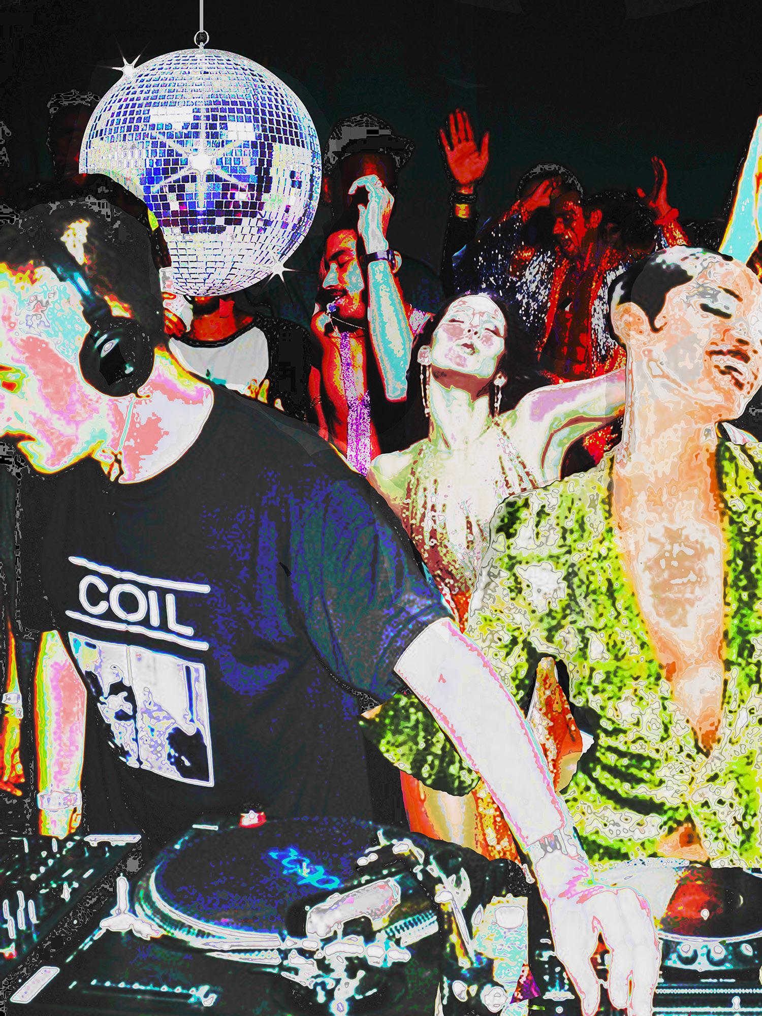
Once I researched the different types of visual impairments, accessibility techniques, and statistics on the affected population, I looked for intersections between accessibility as it relates to previous printed electronics applications. I began the process by developing a mood board that would shape the creative direction of the visual piece. The moodboard takes inspiration from the intersection of the modern day house music scene and the 1970’s club scene. I aspired to celebrate themes, cultures, and figures from music while including elements that would work to include various textures. Using Photoshop, I collaged various pictures from my mood board in addition to playing with various color themes which I could use as a reference for my final painting. I then sketched the outlines of these figures before painting in the details.
Technical Association of the Graphic Arts 2023 35
California Polytechnic State University 36
Figure 1 Reference image based on moodboard
Textures
After developing the outline of the painting, I decided to add textures to bring in the tactile experience. Adding textures with alternate material allows the canvas to function as a sensory board, encouraging users to touch all parts of the painting with an emphasis on certain areas. For example, the disco ball, sequin shirt, and tie all have a unique feel, both visually and texturally. The added textures make the painting look more realistic, give it a 3D quality, and enhance the overall sensory experience.
Conductive Paint
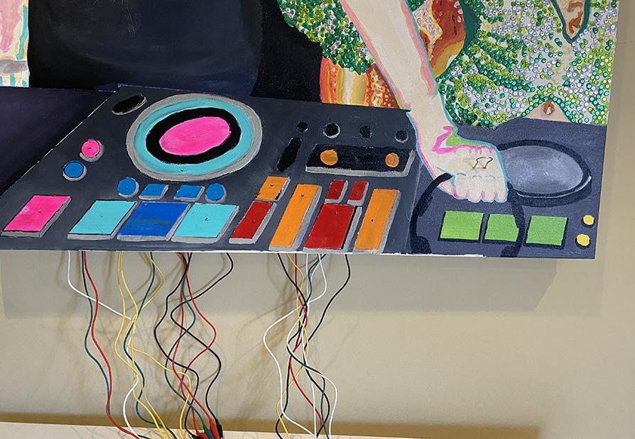
The conductive paint from Bare Conductive is water-based, non-toxic, and can conduct electricity when dried. I painted 20 sensors in total to make 20 different sounds that would later be triggered by touch. When touched, different areas prompt a signal to the soundboard, which plays a specific audio for each sensor. Later, I recolored the sensors to feel cohesive with the painting.
Wiring and Set Up
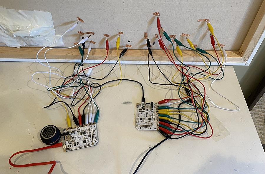
My next steps were to wire the painting so the conductive paint would be connected to a source of electricity. I achieved this by piercing nails through the back of the painting that would be hooked up to alligator clips and wires. I also utilized copper tape to ensure the circuit between the nails and alligator clips would remain intact. After doing so, the wires were connected to two different Arduino One boards to facilitate commands.
Code
Once everything was properly connected, the next step was to work on the code that would control the board. The blue and pink sensors on the painting were connected to a soundboard programmed with a HID keyboard Arduino code and Soundplant 50 application. This allows live loops to be played Polyphonic, meaning that multiple buttons can be pressed and played at the same time. This would be an essential element of accessibility, allowing hands to scan the painting in the same way eyes would, uninterrupted by any lag time. I uploaded 12 tracks to parallel different keys on my keyboard. The 8 red and orange sensors on the painting are connected to a soundboard programmed with a MIDI Piano Arduino code, which I then changed to play a drum kit instead of piano
Technical Association of the Graphic Arts 2023 37
California Polytechnic State University 38
Figure 2.1 Front of painting; Conductive paint recolored with nails through the center
Figure 2.2 Back of painting; Alligator clips attached to nails and copper tape
sounds. To hear the audio, the blue and pink sensors require a computer connection. The red and orange sensors can work connected only to a power source as long as a speaker or headphones are attached.
Audio
Because the blue and pink sensor’s audio functions without a Midi code, I made a full beat using Logic for reference of what music can be played using the painting. I then changed the tracks to be individual stems, making sure to trim the time-frames to work in sync with all stems. The tracks were the exported individually as 12 separate stems and renamed TRACK000 – 011 to be read by the soundboard. Using Soundplant 50, each stem was programmed to be triggered by W, E, T, Y, U, A, S, D, F, G, and H on my keyboard.
Discussion
Unfortunately, I had to take GrC’s course on printed electronics virtually due to COVID, however, this project gave me another opportunity to learn about the technology and techniques used to make interactive art. Despite my lack of experience, I was very pleased with how the project turned out and am ultimately thankful I decided to focus on a printed electronics focused project. Because I had not worked with conductive paint or printed electronics in this way, I was unsure if the sensors were going to pick up touch in order to trigger the audio. Although I did not have much experience, the conductive paint worked well and the sensitivity was suitable to pick up touch. At the end of the project, I ran into issues I had not previously predicted. Specifically, in order to program my board I needed a USB micro cable that read data transmitting and not just charging. At the last minute I found myself having to test multiple different cables from friends in order to find one that worked for data transmitting. Next time I would use longer cables and hopefully mask them better so they aren’t as visible as well. In the future, instead of using alligator clips, I would like to solder the wires onto the board and painting for permanency purposes. The alligator clips attached to the nails worked well for showcase but it makes the painting difficult to move around and the clips stay connected to both parts.
Technical Association of the Graphic Arts 2023 39
California Polytechnic State University
40
Scan to watch the project process
Scan to hear the song on Soundcloud
References
Bare Conductive. (2021). Create an interactive poster and tell a story with your own sounds. Bare Conductive. Retrieved April 5, 2022, from https://www.bareconductive.com/blogs/resources/create-an-inte ractive-poster
Coates, C. (2019, December 8). Best practice in making museums more accessible to visually impaired visitors. MuseumNext. Retrieved April 5, 2022, from https://www.museumnext.com/article/making-museums-access ible-to-visually-impaired-visitors/
Graham, T., & Gonçalves, A. (2017). Stop designing for only 85% of users: Nailing accessibility in Design. Smashing Magazine. Retrieved April 5, 2022, from https://www.smashingmagazine.com/2017/10/ nailing-accessibility-design/
Harbisson, N. (2012, June). I Listen to Color [Video]. TEDGlobal. 2012. https://www.ted.com/talks/neil_harbisson_i_listen_to_color/ transcript?language=en
TEDx Talks. (2013). Paint Your Circuits With Ink: A New Revolution In Electronics | Matt Johnson at TEDxGateway [Video]. Youtube.
https://www.youtube.com/watch?v=R0xH0_qaqVw
Technical Association of the Graphic Arts 2023
41
Olive Robertson

42
About the Author
Olive Robertson (she/her) is a multidisciplinary graphic designer and artist based in California. Olive has a Bachelor of Science in Graphic Communication with a specialty focus in Design and Reproduction Technology from California Polytechnic State University, San Luis Obispo. She has worked with Netflix and Tik Tok’s popular show The Hype House, Shabang Live Music and Arts festival, independent music magazine .wav, and several touring musicians.
43
Cupcakes
This illustration draws on the Von Restorff design principle to tie in with the Phoenix Challenge’s main objective: providing access to smart packaging and branding solutions for SeaBreeze Cupcakes.
Artwork by Jessica Yu and Trista Wang

SeaBreeze Cupcakes
Phoenix Challenge
Abstract
The Phoenix Challenge is a year-long International college-level competition that places a focus on flexographic printing and package design. Each year, our team works with a business to redesign their packaging from start to finish. This year, Phoenix Challenge chose to work with SeaBreeze cupcakes, a company local to Cal Poly in the heart of San Luis Obispo’s downtown. We chose this company because many small businesses have suffered as a result of the Covid-19 pandemic, and it felt important to provide access to high quality branding and packaging for a local brand that was experiencing this.
47
Introduction
After researching SeaBreeze’s brand values and current customer base, it seemed there was a great opportunity for a packaging redesign that could increase visibility as well as expand access to the current target market. Because the bakery mainly deals with jobs for special occasions like weddings and birthdays, the owner and team identified opportunities to develop packaging that could make customer celebrations even more memorable. The bakery also recently underwent a rebrand, but this was not reflected throughout all of their products. New packaging for the bakery’s products would better reflect the bakery’s updated branding, which in turn could help them develop a stronger brand image. By designing unique and consistent branding throughout their products, we hope to increase brand awareness and sales for the bakery.
Methodology Industry Data
As of 2020, the global bakery products market reached a value of $331.37 billion, and is expected to grow at a Compound Annual Growth Rate (CAGR) of 4.6% between 2021 and 2026 to reach a market value of $436.91 billion (Expert Market Research, n.d.). The retail sales of fresh bakery products in the U.S. has also grown from 22.5% in 2013 to 24.2% in 2018 (Flower Foods, 2019). In the 2020 Consumer Expenditure Survey conducted by the Bureau of Labor Statistics, the average U.S. household spends around $428 dollars on bakery products in a year, a $36 increase from 2018 (Bureau of Labor Statistics, 2021). The top three factors influencing bakery purchases are price, quality, and freshness. According to Linkage Research and Consulting, when purchasing items from a fresh bakery, 67% of consumers chose quality as the most important factor, followed by freshness at 66%, and price at 59%. Our research demonstrates that the bakery industry is still growing and will continue to be a viable market for premium products and packaging.
Demographic
According to Linkage Research and Consulting, “100% of U.S. consumers report their household purchased a baked good in the last year.” Although there is not a definitive demographic for the consumers
California Polytechnic State University 48
of baked goods, the American Bakers Association (ABA) states that Millennials and Gen Z are the biggest consumers of bakery items. In a study conducted by the ABA in 2019, 62% of Millennials and Gen Z reported purchasing a sweet baked good in the past week (Juhl, 2019). Furthermore, as older adults begin to limit their sugar and carbohydrate intake due to health concerns, 78% of younger consumers report eating carbohydrates in their regular diet and are not dissuaded from purchasing baked goods because of health concerns (Juhl, 2019).
Based on this information, Millennials and Gen Z seem to be the major consumers of bakery goods on a national level. While our research does not show a definitive count for the number of bakery consumers in San Luis Obispo, we can approximate the number of consumers using the information provided by the ABA. Because we know that the majority of consumers are Millennials and Gen Z, we can estimate the number of potential consumers in the San Luis Obispo area. According to the San Luis Obispo Chamber of Commerce, the current population is around 45,541 people, roughly 52% Millennial and Gen Z. In addition, San Luis Obispo is a well known college town with around 32,471 college students from Cal Poly and Cuesta College that belong to the Millennial and Gen Z generations (California Polytechnic State University, 2021; Cuesta College, 2019). The local demographic in San Luis Obispo aligns with the national demographic, illustrating that Millennials and Gen Z are a viable and desirable target market.
Target Market
Breanne Bielawa, the owner of SeaBreeze Bakery & Sweet Treats, stated that the bakery’s target market is primarily women aged 25 to 40. However, according to the American Bakers Association, Millennials and Gen Z are becoming the biggest consumers of baked goods. Because of the growing Millennial and Gen Z consumer base of bakery goods, we wanted to expand the bakery’s target market to include younger consumers that are more representative of the demographic of San Luis Obispo, while still retaining their current customer base. By expanding our target market to include Gen Z and Millennials, there is higher opportunity for the bakery to increase their sales and visibility.
Technical Association of the Graphic Arts 2023 49
To better target our products toward Millennials and Gen Z, it was important to gain consumer insight and analyze the consumer behavior of our desired target market. In analyzing Millennials and Gen Z’s purchasing behavior, it is evident that sustainability and nutrition are major factors influencing purchasing decisions. Consumers are beginning to place a greater emphasis on sustainability when making purchases. In a 2021 survey conducted by First Insight and Baker Retailing Center at the Wharton School of the University of Pennsylvania, it was found that 75% of Gen Z and 61% of Millennials surveyed “prefer sustainability over the brand name of products” (Women’s Wear Daily, 2021). Although younger consumers prioritize sustainability more than other generations, the survey showed that shoppers across all generations are beginning to consider sustainability when making purchases. Furthermore, 73% of all survey respondents felt that sustainable packaging is very or somewhat important today compared to 58% in 2019, which shows consumers’ growing interest towards the environment (Business Wire, 2021). Because most consumers value sustainability especially our target market —it was important for our team to consider the sustainability of our products. Millennials and Gen Z are also very concerned about the nutrition and quality of the bakery items they are purchasing. The Free From Forum’s Market Monitor’s survey found that 50% of consumers want bakery goods with better-for-you attributes such as all- natural, low sugar/sugar free, organic, etc. According to the ABA’s 2019 survey, the most important nutritional descriptors for Gen Z and Millennials are “whole grains,” “freshness,” and “natural ingredients,” and 48% of respondents stated that they would be more likely to purchase a company’s product if the ingredients were responsibly sourced (Juhl, 2019). Since consumers place a great emphasis on the nutrition and quality of the products they purchase, it was important for us to communicate in our designs the fresh, high-quality baked goods SeaBreeze produces.
Industry Resources and Consults
Irene
Carbonell | Packaging Structure
Lecturer & Researcher, Industrial Technology & Packaging, Cal Poly
Irene Carbonell is a lecturer and researcher of Industrial Technology and Packaging in Orfalea College of Business. She teaches and
California Polytechnic State University 50
mentors student projects in various courses of the packaging program regarding packaging design, performance, and materials testing. Professor Carbonell helped the team refine the dieline for our paperboard carton and addressed structural concerns. A few pain points that she mentioned were the lack of dust flaps and friction on our initial die lines. To better protect the glass extract bottles, she suggested that we redesign our die line to optimize the friction and increase protection for the products. Professor Carbonell’s knowledge of paperboard and its structural integrity allowed us to better refine our design and consider structural elements for future packaging solutions.
Nick Cooper | Prepress
Lecturer, Graphic Communication Cal Poly
Nick Cooper graduated from California Polytechnic State University, San Luis Obispo with a Bachelor of Science in Graphic Communication concentrating in Graphics for Packaging. After graduation, he worked as the Prepress Manager for Custom Label & Decal, LLC, where he created proofs for customers, set up press-ready files for both flexo and digitally printed narrow web labels, and was heavily involved in flexographic platemaking. He has returned to Cal Poly as a Graphic Communication lecturer and Equipment Technician for the department. Nick was an integral part of the prepress and printing process, assisting our team in preparing files for plate making using the Esko software.
Mike DeMilo | Sustainability
Owner of Science Discovery, San Luis Obispo, CA
Mike De Milo is a California Polytechnic State University alum and the owner of Science Discovery, a water conservation and recycling education center located in San Luis Obispo. De Milo founded his company in 1994 with the hopes of educating students about recycling and composting to local schools. The company is now providing over 1,500 education programs each year. We have been fortunate enough to have De Milo speak in several of our courses about these important topics and thought he would be the perfect individual to help us gain better understanding of how to make our pieces recyclable. He guided our substrate and material decisions to determine their level of sustainability. When we completed our production, he examined whether
Technical Association of the Graphic Arts 2023 51
our pieces are 100% recyclable in San Luis Obispo country’s recycling facilities, and concluded that they are.
Lorraine Donnegan | Design Professor, Graphic Communication Cal Poly
Lorraine Donegan is a professor at the California Polytechnic State University with more than 20 years of experience in the graphic design and production industries. In her teaching, she links design with technology in an effort to prepare students to understand the language and role of the graphic designer, the print provider, and the final product. The design team was fortunate to speak with Lorraine about design considerations for packaging and labels. She provided advice on how to streamline the prototyping process by working backwards from existing samples. Additionally, she gave valuable insight on how to properly communicate our client’s existing brand while developing new packaging solutions.
Malcolm Keif | Press Professor, Graphic Communication Cal Poly
Dr. Malcolm Keif, a Graphic Communication California Polytechnic State alumnus, has taught at the university level since 1990. He primarily taught a flexographic printing course where he went over FIRST specifications and certain characteristics of flexo printing. He previously served as the Phoenix Challenge advisor for multiple years. His experience was valuable during our press run as he guided us throughout the printing process. He explained why we came across certain issues and how to navigate them.
Competition and Positioning
With the U.S. baking industry consisting of around 6,000 retail and 3,000 commercial bakeries, small local businesses face a lot of competition because of the multiple distribution channels for baked goods (Woodruff, 2019). In the survey analysis by the Free From Forum’s Market Monitor, the preferred retail channel for consumers seeking to purchase fresh bakery goods were traditional grocery stores (i.e. Albertsons, Kroger, etc.) at 55%. Mass merchandise stores such as Walmart and Target closely followed at 43%. Local bakeries were the third most preferred platform
California Polytechnic State University 52
at 25%. The multiple distribution channels for baked goods makes the bakery industry very competitive, especially for local bakeries, which is why it is important to distinguish SeaBreeze from their competitors.
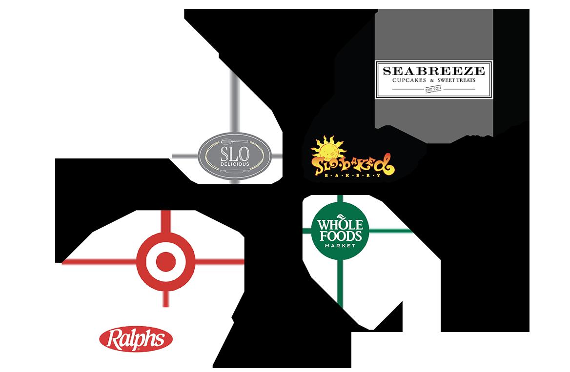
Our team performed a SWOT analysis weighing the strengths, weaknesses, opportunities, and threats of the company before analyzing its competitors, as shown in Figure 1. With the U.S. baking industry consisting of roughly 6,000 retail and 3,000 commercial bakeries, small local businesses face a lot of competition (Woodruff, 2019). In the survey analysis by the Free From Forum’s Market Monitor, the preferred retail channel for consumers seeking to purchase fresh bakery goods were traditional grocery stores (i.e. Albertsons, Kroger, etc.) at 55%. Mass merchandise stores such as Walmart and Target closely followed at 43%. Local bakeries were the third most preferred platform at 25%. Competitors are displayed below in a perceptual map in Figure 2. The multiple distribution channels for baked goods makes the bakery industry very competitive, especially for local bakeries.
Strengths
High quality ingredients and products
Beautiful hand-decorated custom cakes
Gluten free, vegan options
Made to order — everything is fresh
Inviting ambience and great location
Opportunities
Expand target market
Establish a consistent brand identity
Increase visibility and presence in SLO
Customize packaging for specific occasions
Weaknesses
Lack of branding
Limited to baking for special occasions
High price point
Small target market
No online ordering system
Threats
Traditional grocery stores
Other bakeries in SLO
Trend towards home baking
Limited celebrations due to pandemic
Figure 1 SWOT Analysis
Technical Association of the Graphic Arts 2023 53
Concept
When analyzing the current state of the bakery, we identified two main problems with the branding and packaging they were using. The first problem is their lack of unique and attention-grabbing packaging. In San Luis Obispo, there are numerous local bakeries in addition to grocery stores that sell baked goods, which highlights the importance of creating unique packaging that differentiates itself from other competitors. SeaBreeze’s initial packaging for their cupcakes was a standard solid bleached sulfate paperboard stamped with the logo on the bottom right corner of the lid. This is very similar to their competitors, which makes it hard for SeaBreeze to distinguish themselves. Because they position themselves as a high-quality bakery, it was important to develop packaging that incorporated design elements that better showcased their brand to consumers. The second problem our team identified was that their current branding was not consistent. The bakery recently underwent a rebrand in which they developed a new logo that better reflected a modern yet rustic farmhouse style. Though the bakery had received a new brand logo and style, it was not being used consistently among their products, ultimately weakening their brand image and professionalism. To address these problems,
California Polytechnic State University 54
Figure 2 Perceptual Map
our team planned to improve and strengthen their brand identity by developing a branding guide with a standard color palette, typeface, and the bakery’s new logo
Market and Product Trends
With people being able to gather in safe conditions again, many are looking for baked goods for their celebrations and social occasions. In a survey conducted by Euromonitor International’s Global Life Consumer Lifestyles survey, 60% of consumers under the age of 44 felt that it is important to spend money on experiences, illustrating that baked goods need to provide more than just good flavor. According to Barry Callebeaut, a leading manufacturer of chocolate and cocoa products, states, “baked goods that wow consumers by delivering on a unique experience, especially a unique visual, can drive consumers to want to share their amazing experiences with others...” (Barry Callebaut, 2018). With consumers willing to spend more on unique experiences, bakeries need to strive to develop specialty products that excite consumers. The bakery industry has also seen a shift towards health and nutrition. Consumers are now seeking healthier and nutritious options when purchasing baked goods. When shown a list of better-for-you attributes, 57% of respondents stated that one or more of the better-for-you attributes was important in their decision to purchase a bakery product. The most important attribute for consumers purchasing from a fresh bakery was the all-natural quality (27%). Clean label/limited ingredients and nothing artificial followed at 25%. From these industry trends, it is evident that consumers are willing to spend more on goods that are unique, high-quality, and nutritious. The bakery trends show that there is a high demand and rising market for specialty and premium bakery products, and it is a viable market for our team to develop packaging solutions for. In addition, these trends helped to inform our design decisions and ensure that we develop a design that will appeal and align with consumer interests.
Survey
Our team sent out a survey to Cal Poly students to gain insight into the color palettes and designs that would appeal to our target market. From the survey, we asked respondents to choose a color palette from three options that best reflected the bakery’s clean, organic, and
Technical Association of the Graphic Arts 2023 55
modern farmhouse style. The most popular color palette from these responses was used throughout our designs and branding. The survey also helped to inform the material, structure, and design of the cupcake box we were developing. For the cupcake box, our team was debating between a matte black, glossy black, and kraft material. Respondents felt that the kraft material better aligned with their expectations of the bakery. Our target market also preferred having a clear panel to view the cupcakes versus an opaque box. However, due to sustainability concerns, which was a big priority in our designs, the team decided to go with an opaque box. Additionally, the survey found that 84.6% of respondents preferred the handle compared to a traditional box. Overall, these insights helped to inform our design decisions when creating our products by gaining an understanding of what our target market likes and dislikes.
Cost Considerations
Because SeaBreeze is a small business, it was important to consider the cost effectiveness of our packaging solutions so the bakery could spend their money as efficiently as possible. Solutions that do not require the bakery to print on the actual boxes are more cost effective because boxes can be purchased at a lower, bulk price. We also found it was more effective to print on the band for the extract box because this allows the bakery to easily alter the information based on unique extract flavors or change the color of the band to match a specific theme compared to ordering custom printed boxes. As for the cupcake box stickers, we found it more efficient to customize a box by applying a sticker rather than purchasing limited quantities of custom printed boxes for each special occasion.
Design
The updated SeaBreeze logo is black and white and features a classic serif typeface with rustic elements. The SeaBreeze storefront is located in the downtown SLO Creamery Marketplace, which is an open-air market that contains a variety of hip small businesses. The owner of SeaBreeze, Breanne, admires the modern rustic and farmhouse style of the Creamery, which is why her new logo is simple and focuses mainly on typographic elements and clean lines.
California Polytechnic State University 56
While the updated logo is a step up from SeaBreeze’s prior branding, the business lacks a clear brand identity. The website dates itself by featuring their original logo, packaging lacks design consistency, and there is no obvious color scheme. To assist in Breanne’s shelf appeal and brand recognition, we decided that the rebrand must take into consideration cohesiveness with the updated logo, a recognizable color palette, and organic or rustic elements throughout each packaging item. Figure 3 displays the final color palette and font decisions.
Technical Association of the Graphic Arts 2023 57
Figure 3 Branding guide
FIRST Specifications
When designing the labels, we took into consideration FIRST specifications to ensure high-quality products with minimal printing errors. The typefaces that we chose have thin lines and serifs, so we decided on a 9 pt minimum and increased the type weight to improve legibility. In addition, we trapped all text and graphic elements to prevent misregistration in the press run. Once we had our final designs, we spoke with lecturer Nick Cooper and he assisted us in conducting proper file preparation. Nick suggested that we add an additional 0.5 stroke to the vector graphics to prevent misregistration caused by line variation in the illustration. It was also brought to our attention that we needed to overprint the dielines, which would have caused a white knockout on labels. By following design considerations and proper file preparation, we were able to improve efficiency during the press run and prevent unnecessary errors.
FDA Nutrition Labeling
In our extract label design, we referred to the U.S. Food and Drug Administration (USFDA) to ensure our designs met the FDA nutrition labeling laws. In accordance with the Federal Food, Drug, and Cosmetic Act, all packaged foods and dietary supplements must have nutrition labeling unless they qualify for a small business nutrition labeling exemption. The exemption applies to low volume products whose business “employs fewer than an average of 100 full-time equivalent employees and fewer than 100,000 units of that product are sold in the United States in a 12-month period” (U.S. Food and Drug Administration [USFDA], 2017). Because the bakery sells low volumes of the extracts and employs fewer than 100 full-time employees, they do not require nutrition labeling.
Sustainability
A major focus point for this project was sustainability. With a combination of research and interviews with professionals in the industry, we were able to develop pieces that are 100% recyclable in San Luis Obispo County’s recycling facilities. One of our concerns was whether the potential oil stains from frosting or extracts would impact the packaging’s recyclability. Consultant De Milo confirmed that the inserts we created would protect the carrying box from being contaminated. He also
California Polytechnic State University 58
mentioned that even if food products did touch the package, the ratio of food to packaging material is such a small percentage that it would not pose a threat to recyclability. Additionally, to keep things eco-friendly and food safe, we incorporated a water-based varnish on the extract box band to highlight the three-bottle products inside. Considering sustainability as the main focus of this project, we were debating whether using glue in packaging structure is less sustainable compared with packaging with no glue at all. Our initial packaging prototype was focused on using no glue and structuring the packaging only by folding and tucking the flaps. The goal with this approach was to eliminate the glue entering the recycling stream and use fewer chemicals. After experimenting with glueless dielines, we realized the structure of the box makes it difficult to step and repeat on a large sheet of paperboard, which potentially creates more waste in production. To reduce waste and improve production efficiency, we developed dielines that would use glue on only one flap. De Milo advised, “even with a small amount of glue, it is a fraction of a percentage and would not impact the recycling.” The packaging dielines with minimal glue allowed us to reduce paperboard waste and produce more boxes from one sheet compared to dielines without glue. The extract boxes were designed to fit three glass bottles. To ensure security during transportation, it was decided that some type of cushion or divider should be included. Our initial concept was to develop a separate insert that has a dimension of 18.5” x 1.5”. This long strip was designed to be folded into six sections that created two upside-down “Ts” to divide the glass bottles. While it protected the bottles, it also used additional materials, which was not ideal. Hence, we explored the concept of repurposing window cutouts. The materials cut off are often removed as waste. However, if these materials could be used to protect the glass bottles, that would be an even more sustainable solution. We made the opening windows with creases and cuts that create 0.25” folded pieces, which not only form the window to show the product, but also cushion the bottles.
Prepress
According to FIRST, digital files for printing on the flexo press have to be prepared specifically to compensate for registration tolerance and dimensionality of the features. Typical preparation of the digital files includes checking trapping and overprints. Consultant Nick Cooper
Technical Association of the Graphic Arts 2023 59
suggested increasing the width of reversed lines to align with the FIRST specifications. After the digital files were finalized, they were sent to Multi-Color Corporation at San Luis Obispo for plate production because the Esko CDI in our lab was removed and was not replaced during the time of this project. We also took production efficiency into consideration when step- and-repeating products. To maximize efficiency, we decided to use three sets of plates to print our three products. This strategy minimized plate and ink changes on the eightcolor flexo press. With three sets of plates, we were able to print two colors out of the four print stations for every set of plates. In between each press run, we simply changed two plates and substrates without changing the inks on the press. One set of the plates is for the cupcake box stickers with Pantone 7527 and process black. The second set of the plates is for cupcake box stickers and extract labels with Pantone 7476 and process black. The third set of plates is for the extract box band with Pantone 7476 and the water-based varnish. Dielines were sent to MAXCESS to make magnetic flexible dies. We produced one set of dies for the stickers and labels for pressure sensitive materials and the other for the extract box band on paperboard.
Execution
Because we knew the bakery caters towards many special occasions such as birthdays, graduations, and weddings, we thought it would be nice to have custom stickers for each occasion that can be applied to their cupcake boxes. The personalization aspect helps to build a stronger relationship with consumers. In addition, the stickers incorporate the updated branding, and when applied to their cupcake boxes help differentiate SeaBreeze from their competitors. Figure 4 outlines specifications for the cupcake box stickers.
California Polytechnic State University 60
Cupcake Box Stickers
Technical Association of the Graphic Arts 2023 61
Congrats to the happy couple! Congrats, Grad! Hey, Mustang! Happy Birthday!
Figure 4.1 Cupcake box sticker design
California Polytechnic State University 62
Figure 4.3 Product specifications
Figure 4.2 Color management report
Environmental Conditions
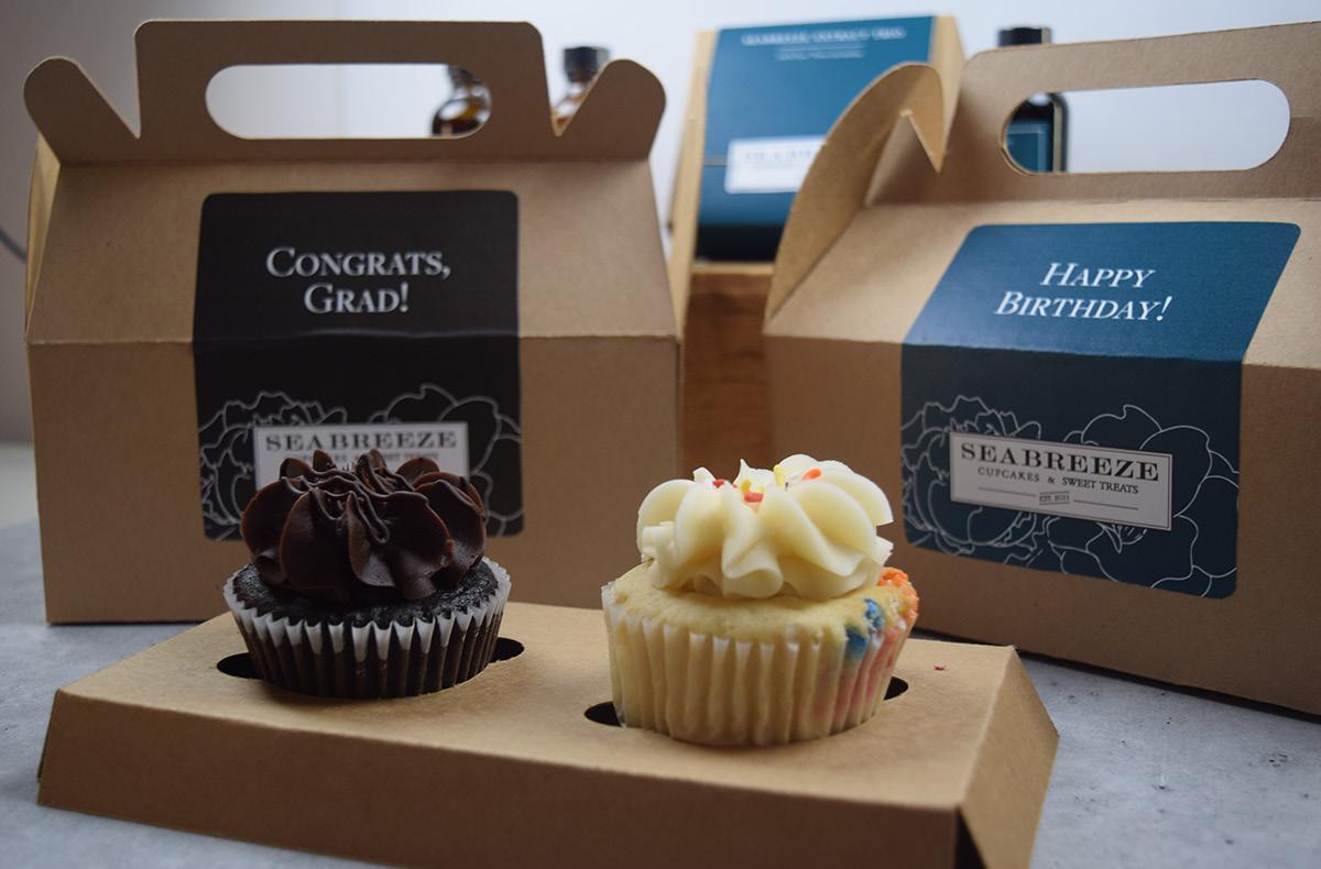
Temperature: 69ºF
Humidity: 51.3 Rh
Technical Association of the Graphic Arts 2023 63
Figure 4.4 Press specifications
Figure 4.5 Final product outcome
Unit 1: Pantone 7527 C Gray
Unit 3: Paper Process Black
Extract Labels
When discussing with the owner of SeaBreeze, she mentioned that aside from baked goods the second product they sold the most were their extracts. Currently, the bakery sells extracts as single bottles with a basic white label that has text on it for product identification. In analyzing the design of the label, we found that the current label does not utilize a color or typeface that aligns with the bakery’s new branding. The current design is simple and does not incorporate any branding elements that distinguish their product from other local bakeries or grocery stores, demonstrated in Figure 5.1. Because the product is considered one of their most popular, our team thought there was a great opportunity to redesign the extract labels to align with the branding. Again, this would reinforce and strengthen their brand identity to consumers, while also differentiating themselves from competitors.

California Polytechnic State University 64
Figure 5.1 Extract label design
Technical Association of the Graphic Arts 2023 65
Figure 5.2 Color management report
Figure 5.3 Product specifications
Environmental Conditions
Temperature: 70ºF
Humidity: 51.7 Rh
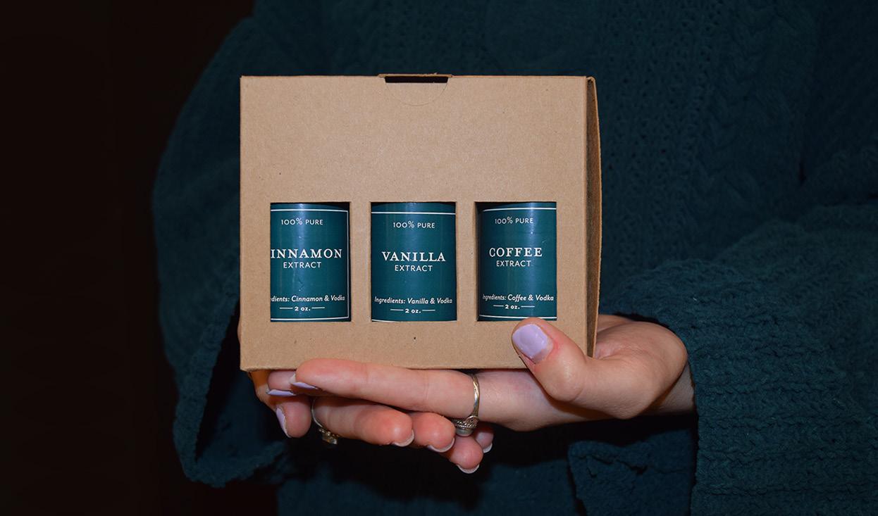
California Polytechnic State University 66
Figure 5.5 Final product outcome
Figure 5.4 Press specifications
Unit 2: Pantone 7476 C Green
Unit 3: Paper Process Black
Extract Band
The owner stated that the extracts were a popular product at the bakery and showed interest in selling extracts in a three bottle gift set in addition to selling them individually. We wanted to prioritize sustainability and limit printing on the actual package as much as possible in order to maintain the recyclability of the packaging. As an alternative, we developed a 4” wide band that stretches close to the width of the box so that we could incorporate the branding elements and designs we developed. Although the owner wanted to maintain the exposed windows to showcase the extract bottles, the band would unfortunately cover these areas. As a solution, we created a design of three extract bottles on the front of the band that were printed with a water-based varnish in order for consumers to identify the products on the shelf. See Figure 6. In addition to the three extract bottles on the front of the band, the design follows the colors and typefaces of the updated brand guide in order to improve brand recognition and shelf appeal.
Technical Association of the Graphic Arts 2023 67
Figure 6.1 Extract band design
California Polytechnic State University 68
Figure 6.2 Color management report
Figure 6.3 Product specifications
Environmental Conditions
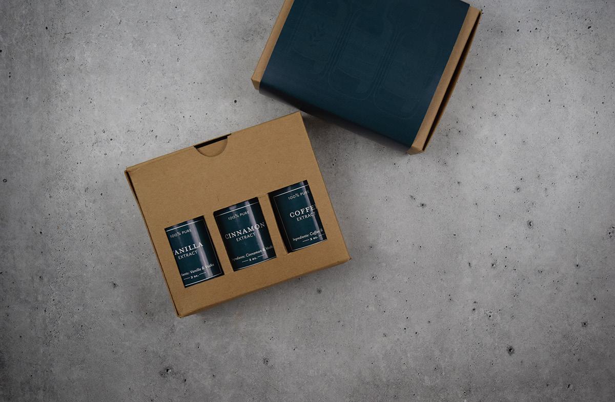
Temperature: 69ºF
Humidity: 50.9 Rh
Figure
Technical Association of the Graphic Arts 2023 69
6.4 Press specifications
Unit 2: Pantone 7476 C Green
Figure 6.5 Final product outcome
Discussion
During the three press runs, we encountered a few challenges including registration accuracy and printing quality. We followed the FIRST specification to achieve the best color registration accuracy as possible on our press, and the dies were registered to the printed products. When printing with the soft touch varnish, we experienced low coverage over the Pantone 7476 ink. The varnish was not printed solid enough to create the visual impact we expected. We decided to switch to a higher volume anilox roll to increase the amount of varnish laid down on the substrate. The appearance was improved after this correction. For pressure sensitive labels, the dies worked very well. When printing the extract band, the removed paperboard could not be gathered effectively on the collecting roll. Our press was not designed to die-cut the unsupported materials and it stopped the press constantly. We ultimately decided to disengage the dies from this press run and cut the final product on a Polar cutter after printing. In the proper production environment, the paperboard band would be die-cut after printing to streamline the workflow rather than die-cutting on a web press.
Another challenge we experienced were the streaks and banding shown on the large solid area printed on both the matte-coated paperboard and pressure sensitive label stock. Since the press we used was a 30-year-old geared press, the gear streaks were hard to avoid especially when printing with large solid areas. The streaks are even more noticeable when printing large areas of green or blue colors. Because our design consists of substantial solid areas and fine type all on one plate, our limited press faced challenges. The streaks would be less noticeable when printing with a servo press.
Conclusion
This project was an entire start to finish rebrand and repackage for SeaBreeze. By the end, we had successfully developed a branding solution based on market research, competitive landscape, and the client’s personal wishes. We also utilized a survey to collect information about a more concentrated, local demographic that might expand the bakery’s audience: Gen Z. Industry resources offered professional insight on sustainability, substrates/glues, design principles,
California Polytechnic State University 70
and flexographic printing. We developed a design that considers the market’s needs and desires, is competitive with other bakeries, and is also 100% recyclable. In the process, this taught us that glue can be more sustainable than some dielines without it, depending on quantity. Finally, we used a water-based varnish to develop a sense of specialty, and created cushion separations for the extract bottles to prevent damage in the process of transportation. We followed FDA requirements and FIRST specifications, as well as measured the ΔE2000 for each substrate to maintain low color variation. Additionally, we tested package integrity and used a semi-gloss substrate to prevent rubbing off of the labels.
Technical Association of the Graphic Arts 2023 71
California Polytechnic State University
References
Barry Callebaut. (2018). Bakery trends: Make my day special. https:// www.barry-callebaut.com/en-US/manufacturers/trends-insights/ bakery-trends-make-my-day-special.
Bureau of Labor Statistics. (2021, August 2). Cereal and bakery products expenditure of United States households from 2018 to 2020, by type (in U.S. dollars) [Graph]. Statista. https:// www-statista.com.ezproxy.lib.calpoly.edu/statistics/237252/ cereal-and-bakery-products-expenditures-of-united-states-households/.
Business Wire. (2021, November 23). The state of consumer spending: Gen Z influencing all generations to make sustainability-first purchase decisions
https://www.businesswire.com/news/home/20211123005565/ en/The-State-of-Consumer-Spending-Gen-Z-Influencing-All-Generationsto-Make-Sustainability-First-Purchase-Decisions#:~:text=The survey%2C conducted by First,spend more for sustainable products.
California Polytechnic State University. (2021). Facts and Figures. https:// www.calpoly.edu/about/facts-and-figures
Cuesta College. (2020). Fast Facts. https://www.cuesta.edu/about/info/collegefacts.html
Flowers Foods. (2019, November 30). Retail sales of fresh bakery products in the United States from 2013 to 2018 (in billion U.S. dollars).[Graph]. Statista. https://www-statista-com.ezproxy.lib.calpoly.edu/statistics/864121/ fresh-bakery-retail-sales-us/
Juhl, K. (2019, April 18). ABA unveils most in-depth study on gen z consumers habits; reveals millenial perceptions of baked goods. American Bakers Association. https://americanbakers.org/news/aba-unveils-most-depth-studygen-z-consumers-habits-reveals-millennial-perceptions-baked-goods
Linkage Research and Consulting. (2019). 50% of consumers want bakery goods with better-for-you attributes. https://linkageresearch.com/bfy-bakery/ San Luis Obispo Chamber of Commerce. (2021). Demographics. https://slochamber.org/supporting-business/data-center/demographics/
Women’s Wear Daily. (2021, December 6). Report shows influence of Gen Z on other demographic groups. https://wwd.com/sustainability/business/ first-insight-report-1235010394/
Woodruff, J. (2019, July). Bakery industry analysis. Houston Chronicle. https:// smallbusiness.chron.com/bakery-industry-analysis-64831.html
72
Naomi Furuya Team Lead
74
About the Authors
Naomi Furuya is a 4th year Graphic Communication Major and Packaging Minor at Cal Poly, San Luis Obispo. When she was the team leader for the 2021-2022 Phoenix Challenge Team, they earned 1st place at the annual Phoenix Challenge College Competition. As a team leader, she worked directly with the client to communicate updates along the way. She organized meetings and created timelines and felt it was such an incredible experience to be a part of. She is beyond grateful to have had the opportunity and take the experience into her post-grad life.
75
Xiaoying Rong Advisor

76
About the Authors
Dr. Xiaoying Rong earned her Bachelor of Engineering from Beijing Institute of Graphic Communication, a Master of Business Administration from Beijing Institute of Technology, and a Ph.D. in Paper Engineering, Chemical Engineering, and Printing from Western Michigan University. She is currently teaching printed electronics and product development, specialty printing technologies, and color management at Cal Poly, San Luis Obispo. Her teaching and research interests are interactive tangible product development, design for smart/interactive packaging, and marketing applications. She loves to explore technologies for manufacturing printed, flexible, hybrid electronics, specialty imaging technologies, materials for packaging and graphic communication products, conventional and digital printing technology, and color science.
77
Banana

The banana is known as a UX/UI masterpiece. Its deep yellow color indicates when it is ready to be eaten. It is mobile, mess-free, and the peel makes it easy to eat, while its shape fits perfectly in your hand.
Artwork by Hailey Honegger
An Introductory UX/UI Guide
Cindy Do Abstract
Within the Cal Poly Graphic Communication (GrC) department, we have a concentration for User Experience/User Interface (UX/UI). However, the UX classes that students in this concentration are required to take are mainly upper-division classes, so students may have a difficult time exploring user experience earlier in their college career. The goal of this introductory UX/UI guide is to provide students who are interested in the UX/UI area a place to start. I also hope to share the information and resources that I found helpful to me when I first started learning about UX/UI. With UX/UI also being a relatively newer concentration in the GrC department, there is an opportunity to create a learning resource for students interested in the topic, but do not know where to start. Having this introductory UX/UI educational resource can benefit students within the GrC major interested in learning more about this area or are looking to get started.
81
Introduction
UX/UI has been a popular field of study in the Cal Poly Graphic Communication department since its fruition. Most students in the department are under the conception that jobs offered in the field tend to be higher paying than print, packaging, and management applications. Cal Poly offers online resources for students to get more involved in clubs, programs, and activities related to UX/UI. According to Hired.com, the year 2020 showed a 289% increase in interest in UX roles (Teixera). A lot of interest in UX/UI was sparked from the Covid-19 pandemic, as remote work has paved the way for unique opportunities to rethink branding and product/user communication (Teixera).
An article by Ira Kaushik talks about the resources that would have been helpful at the start of her UX design career, because she admits feeling lost and not knowing where to start at the beginning of her journey. In a list of over 100 topics, she names resources for UX design and research, the UX design process, what to do before starting a project, design principles, and general career advice (Kaushik, 2020). There are some resources online for people seeking to learn more about UX/UI and or gain a certification of training, but because the field is so broad, the courses tend to have a more narrow scope and focus on a specialized topic. Courses can be found through Youtube, via email, and even some universities like UC San Diego, University of Michigan, and Georgia Tech (Wakefield, 2017).
The intent of this project is to provide an inclusive, easily accessible online resource for early GrC students. To do this, it is important that I follow a strict process of drafting, designing, and developing. After meeting with my mentor, we decided I would deliver the following:
1. Information architecture: An information architecture provides a map for my website, organizing and structuring the content that will be displayed.
2. Use cases and interaction framework: Use cases are actions that users may want to do within the website and how they will do it. Interaction frameworks are rough sketches that show the use cases in action. The interaction framework will transition into wireframes later on.
California Polytechnic State University 82
3. Wireframes: I used low and mid fidelity wireframes for this project. My low fidelity wireframes are sketches to get a feel of how to lay out the content. These low fidelity wireframes will be cleaned up into mid fidelity wireframes done on Figma.
4. Design guide: The design guide shows the typography, colors, and logos that will be used on the website.
5. Final website: The final website made in Webflow is fully functional.
The following paper will walk through the process of developing these deliverables, and ultimately, how they could be advanced or furthered in the future.
Methodology User Survey
Before starting on my deliverables, I sent out an initial user survey to the Cal Poly GrC department to get a better understanding of who I was designing for and what my audience was interested in. I asked questions regarding the survey-taker’s grade level, the concentration they are interested in, self-efficacy questions to gauge how comfortable people are with self-learning, and the type of UX/UI topics the survey-taker is interested in learning more about.
From my survey, I was able to gather 28 responses, all of them being from Graphic Communication students from varying years and concentrations. The results from this survey, seen in Figure 1, allowed me to prioritize certain content for my website based on how interested the respondents were in the presented topics.
Technical Association of the Graphic Arts 2023 83
User Survey Results
What year are you?
First year
Second year
Third year
Fourth year
What concentration are you in/most interested in?
Design Reproduction Technology
User Experience/User Interface
Graphics for Packaging
Graphic Communication Management
California Polytechnic State University 84
How confident are you in self-learning?
How would you rate your current UX/UI knowledge?
Technical Association of the Graphic Arts 2023 85
1 2 3 4 5 15 10 5 0 Very confident Not confident at all
1 2 3 4 5 15 10 5 0 Expert level knowledge Almost no knowledge
Are you interested in learning about UX/UI tools?
Very
Are you interested in learning about career opportunities in UX/UI?
Very interested Not
California Polytechnic State University 86
1 2 3 4 5 20 15 10 5 0
interested at all
interested Not
1 2 3 4 5 20 15 10 5 0
interested at all
Figure 1 Survey results
Information Architecture
This information architecture, shown in Figure 2, helps to organize the content on my website and creates a blueprint for the navigation system.
UX/UI Guide Homepage
About the project Topics Resources
Project description
People to connect with
About the creator
What is UX/UI?
Di erence between UX and UI
UX/UI careers
Di erent paths in UX/UI
Where to find jobs
Design process
How to start a UX project
UX tools
Figma
Designing for accessibility
Learn more on campus
Classes, clubs, events
2 Information architecture
Include links and descriptions of resources on website
Technical Association of the Graphic Arts 2023
87
Figure
Use Cases
Use cases are descriptions of what task the user should be able to perform and how they carry out that task on the website. My use cases are as follows:
1. User should be able to view a list of topics on the homepage and on the dropdown menu.
2. User should be able to select a lesson from the homepage and dropdown menu.
3. User should be able to view a list of resources on the resource bank page.
4. User should be able to learn more about the project under the about page.
Interaction Framework
This interaction framework, shown in Figure 3, is a rough sketch of the use cases listed above to visualize what the navigation will look like.
1. User should be able to view a list of topics
logo browse resources about an introductory UX/UI guide by a GrC student for GrC students Homepage
logo browse resources about an introductory UX/UI guide by a GrC student for GrC students
logo browse resources about Homepage or
logo browse resources about
California Polytechnic State University
Homepage what is ux/ui careers in ux/ui
88
Homepage
let’s get started
2. User should be able to select a lesson
logo browse
An introductory UX/UI guide by a GrC student for GrC students
Homepage
logo browse What is UX/UI?
logo browse
Homepage or
3. User should be able to view a list of resources
logo browse
resources
Resource Bank
What is UX/UI?
UX/UI design principles
*will have resouce links sorted into their own respective categories
*have a submenu that links to di erent parts of the page
Technical Association of the Graphic Arts 2023
Lesson 89
4. User should be able to learn more about the project
*the about page should also contain people that the user can contact to learn more about UX/UI and the concentration
Figure 3 Interaction framework
California Polytechnic State University 90
logo browse Homepage nav About page nav resources about About ths project
Wireframes
I created low fidelity rough sketches of website screens helped me plan out how to layout each page and what content to include, which then turned into mid fidelity wireframes. These wireframes, shown in Figure 4, provide a better sense of how the layout and spacing would look in a web browser, and were helpful to kickstart the design process.
hello there, welcome to this introductory UX/UI guide.
What is this guide?
Lorem ipsum dolor sit amet, consectetuer adipiscing elit, sed diam nonummy nibh euismod tincidunt ut laoreet dolore magna aliquam erat volutpat. Ut wisi enim ad minim veniam, quis nostrud exerci tation ullamcorper
what would you like to learn today?
What is UX/UI?
Lorem ipsum dolor sit amet, consectetuer adipiscing elit, sed diam nonummy nibh euismod tincidunt ut laoreet dolore magna aliquam erat volutpat. Ut wisi enim ad minim veniam, quis nostrud exerci tation ullamcorper
UX/UI Career Opportunities
Lorem ipsum dolor sit amet, consectetuer adipiscing elit, sed diam nonummy nibh euismod tincidunt ut laoreet dolore magna aliquam erat volutpat. Ut wisi enim ad minim veniam, quis nostrud exerci tation ullamcorper
Design Process
Lorem ipsum dolor sit amet, consectetuer adipiscing elit, sed diam nonummy nibh euismod tincidunt ut laoreet dolore magna aliquam erat volutpat. Ut wisi enim ad minim veniam, quis nostrud exerci tation ullamcorper
Technical Association of the Graphic Arts 2023 91
LOGO Browse Resources About
logo Learn What is UX/UI? UX/UI Career Opportunities Design Processes UX Tools Designing for Accessibility UX/UI at Cal Poly made by GrC students, for GrC students More About the project Resource bank
Lorem ipsum dolor sit amet, consectetuer adipiscing elit, sed diam nonummy nibh euismod tincidunt ut laoreet dolore magna aliquam erat volutpat. Ut wisi enim ad minim veniam, quis
The creator of this website
Lorem ipsum dolor sit amet, consectetuer adipiscing elit, sed diam nonummy nibh euismod tincidunt ut laoreet dolore magna aliquam erat volutpat. Ut wisi enim ad minim veniam, quis nostrud exerci tation ullamcorper suscipit lobortis nisl ut aliquip ex ea commodo consequat. Duis autem vel eum iriure dolor in hendrerit in vulputate velit esse molestie
California Polytechnic State University about this project Learn more about UX/UI from these people! LOGO Browse Resources About logo Learn What is UX/UI? UX/UI Career Opportunities Design Processes UX Tools Designing for Accessibility UX/UI at Cal Poly Name Department Contact Info
More About the project Resource bank Name Department Contact Info Name Department Contact Info
92
Figure 4 Mid fidelity wireframes
Design Guide
Before starting on the website itself, I created a design guide, including the typography, colors, and logo. Originally, I wanted to incorporate the branding guidelines from the GrC Department to keep it consistent with all the other GrC content that is available for students. However, after speaking with my mentor and showing him my original design guide, he suggested that I do try to experiment outside the box with the design and that I don’t have to stick with the GrC branding. That way, I can create a design that is more personable, while also incorporating UX design trends.
Heading 1
Bold, 38 px
Heading 2
Bold, 32 px
0123456789
COLORS
Heading 3
Bold, 24 px
Paragraph Regular, 16 px
Technical Association of the Graphic Arts 2023 93
abcdefghijklm nopqrstuvwxyz
TYPOGRAPHY Montserrat
#6A82FB #FC5C7D #222222 #F4F5FC
Secondary
Primary
Figure 5 Design guide
Execution
Finally, I combined my design guide with my website layouts on Webflow. At this point, my website is fully functional, and I look forward to expanding it in the future. See Figure 6 or scan the QR code below to see the finished site.


California Polytechnic State University
Figure 6 Final website, scan the QR code to visit the finished site
94
Discussion
I still have a couple of items I would like to address for this project in the future. Firstly, I will continue building out the remaining website pages. There are still a couple of pages that I would like to add to the website, including the resource bank and a page for CalPoly resources. Next, I want to perform usability testing, which I have not yet gotten to because of time constraints. This will help me see if the website is easy to navigate and parts of the website I will need to improve on. Finally, I want to implement this website within the Cal Poly Graphic Communication department. One of the main questions students asked me was whether or not the website will be viewable or incorporated within the GrC website. Because of this interest, I would like to look into how we can provide this resource for future students.
Working on this project allowed me to further learn about UX/UI through reading articles and actually applying UX/UI concepts. I also love being able to teach others and share information, which I was able to do through creating this guide. In addition to that, I was able to further learn about how to effectively manage projects.
Technical Association of the Graphic Arts 2023 95
California Polytechnic State University
References
Kaushik, I. (2020, January 15). Resources I wish I had when I started learning UX Design. UX Planet. Retrieved April 4, 2022, from https://uxplanet.org/150-design-resources-3bd788265e1f
Teixeira, F., & Braga, C. (n.d.). The state of UX in 2022. UX Trends. Retrieved April 4, 2022, from https://www.trends.uxdesign.cc/
Wakefield, M. (2017, March 13). Inclusive UX Education: Designing a free online learning curriculum. UX Planet. Retrieved April 4, 2022, from https://uxplanet.org/inclusive-ux-education-designing-a-free-online-learning-curriculum-52154a188af3
96
Cindy Do
98
About the Author
Cindy Do (she/her) graduated in June 2022 from California Polytechnic State University, San Luis Obispo with a BS in Graphic Communication, concentrating in Web and Digital Media. When exploring all the different paths in GrC, she came across the world of technology and how much of an impact they can make on an individual. At this moment, Cindy found her passion: designing digital experiences to help improve our daily lives. This passion led her through many challenges, such as late 5am nights competing in events like UX Fest and SLO Hacks to create apps that improve student life on campus. For her senior project, Cindy designed an “Introductory UX/UI Guide” website resource for GrC students interested in learning more about the UX field. While the website is still under development, she hopes that students are still able to use this resource as a first step into this massive growing industry.
99
VR Studio

This illustration embodies the experience of entering a virtually rendered space, based on the PhotograVR studio and virtual instructor.
Artwork by Hailey Honegger
PhotograVR: Interactive Photography Education in Virtual Reality
Barrett P. Lo
Abstract
The augmented, virtual, and mixed reality industry has grown significantly in recent years as technological advancements improve user experiences. In an increasingly remote-work-enabled world, virtual reality (VR) presents an opportunity to provide immersive and interactive experiences no matter the time nor place. With this project, we seek to evaluate the ability of VR technology to match educational outcomes of traditional in-person learning. Additionally, we seek to compare the effect of social presence on learning outcomes in educational VR simulations with a human-like instructor versus an abstract non-human instructor. To meet these research goals, we developed a VR application that emulates a photography studio teaching lighting fundamentals. This paper covers the results of the first pilot test session and future considerations for refinement of the application.
103
Introduction
At the start of the COVID-19 pandemic lockdown in 2020, myself and many other Cal Poly Graphic Communication (GrC) students enrolled in the core course Digital Photography and Color Management, which historically provides GrC students hands-on experience with professional studio lighting equipment and practices. Without the ability to meet in person and partake in this learn-by-doing lab, some students are graduating less prepared than previous cohorts, in terms of industry-standard photo and video shoots.
The absence of hands-on learning during the pandemic is not unique to the Graphic Communication department; students of all disciplines at Cal Poly and other schools across the country during the 2019-2020, 2020-2021, and 2021-2022 school years missed out on critical learning experiences. Even without a pandemic, courses dependent on specialized space, physical equipment, and individual instruction often become impacted at the cost of both the institution and the student (Brown & Cruickshank, 2003). A virtual reality program that prepares for industry work, as well as an in-person lab, would allow more students to enroll in a course regardless of facility availability, equipment acquisition, instructors hired, or highly contagious diseases. It is important to create effective teaching materials for students to gain hands-on experiences, yet there is limited financial support for making effective educational VR experiences compared to those for entertainment, medical training, remote work, and military training.
The main purpose of this project is to create a proof-of-concept VR program that teaches creative arts skills which typically require expensive or extensive equipment. Recent studies have found educational VR experiences to increase interest, self-efficacy, and aspirations in a given field (Makransky et al., 2020) and be no less effective when completed away from the classroom (Makransky et al., 2019). The effective VR implementation of a photography lighting curriculum that typically requires hands-on experience can serve as proof for future Cal Poly courses being translated to VR.
California Polytechnic State University 104
In addition to testing the efficacy of VR education for hands-on activities, another goal of this project is to compare learning outcomes between a scenario featuring a human-like instructor and one featuring an abstract non-human instructor. This second goal investigates the idea of social presence first introduced by Short, Williams, and Christie (1976) but applied to a context where the subject is immersed in a virtual space as in VR. Social presence can be defined as the subjective sense that another human is physically and mentally present in the same space. Research on the topic of social presence in immersive virtual reality points to participants being affected by the social presence of others, even if those others are actually computers rather than actual humans (Kyrlitsias, 2020). Through this project, we seek to determine the effects that social presence has on educational outcomes in VR.
Literature Review
Studies have shown that VR and augmented reality (AR) can enhance essential educational outcomes, particularly in motivation to learn (Hew & Cheung, 2010; Jensen & Konradsen, 2018; Merchant et al., 2014) because of the para-reality experiences afforded in immersive media content (Bracken & Lombard, 2004; Lombard et al., 2015; Lombard et al., 2017). With more online instruction taking place, there is a need to maintain (or exceed) the quality of learning between in-person and virtual formats. Hands-on activities may be performed and recorded by instructors for students to watch online but will likely be engaged at a passive level or active level at best according to Chi and Wylie’s (2014) ICAP framework (Chi, 2014). Activities hosted in VR programs can simulate interaction and immersion from the student, elevating engagement levels.
Technology companies are currently building and investing in an expanding metaverse, a digital environment that makes use of both virtual reality (VR) technologies. With roughly $30 billion in market size in 2021, the combined VR and AR market is predicted to grow to more than $250 billion by 2028 (The Insight Partners, 2022). As such, with the rising need for online educational experiences and evolving VR/AR technologies becoming more mainstream, it is likely that more classroom activities will be taking place in a variety of virtual environment spaces. Although much research has 105
Technical Association of the Graphic Arts 2023
examined the topic of learning in digital environments such as video games and work-related training, most of these research projects have been conducted on environments that appear on flat-screen devices and seek to teach lower-level cognitive abilities. In other words, there is a deficit of knowledge on the topic of learning in virtual reality environments and how these environments may facilitate higher-level cognitive skills.
Virtual reality technology has been of interest across industries such as manufacturing, entertainment, military, and medical. Virtual reality for education has been researched to a lesser degree but has the potential to increase both access to and quality of education. Access is increased by only requiring a student to have a VR headset, which can store a plethora of learning topics and provide experiences that would otherwise be difficult to experience. Quality of education is increased by transforming online educational content into immersive and interactive truer-to-life lessons. DiVR 360, a marine sciences education VR program led by Cal Poly associate professor Crow White, allows participants to partake in the experience of conducting experiments deep underwater (Downey, 2022). The DiVR 360 program improves access to such underwater experiments, which would normally require special scuba licensure, and provides an engaging lesson thanks to its immersive 360 video.
A virtual educational photo studio has been created before. In response to a large number of students that were required to take an introductory photography course, and the lack of studio space and instructors to maintain the traditional education structure, faculty at De Montfort University in Leicester, England developed a 2D virtual photography studio simulation (Brown & Cruickshank, 2003). Made in the early 2000s with limited computing power and public computer literacy, the program had a fixed number of results based on the parameters that the user set. Results were shown in the form of images that the developers had taken in the real photo studio and set in the program. The students who participated in this virtual studio instead of the real studio showed no significant difference in performance when compared to prior classes. Brown & Cruickshank’s (2003) results were an early proof of virtual instruction’s educational efficacy. However, their program was displayed on a 2D computer monitor
California
State University
Polytechnic
106
and was therefore not immersive, whereas the VR program made for this project is immersive in 3D.
Elixxier is a German software company specializing in software for photographers. Their flagship program, set.a.light 3D, is a lighting simulator available on Windows and MacOS platforms. set.a.light 3D allows users to customize a studio photography environment from the lighting equipment, configuration, and placement, to the photorealistic model appearance and pose (Elixxier, n.d.). Additionally, users can set up cameras within the scene with alternate lenses and focal lengths in order to preview a shot taken. The set.a.light 3D program is very robust and allows for fine tuning of lighting, camera, model, and environment configurations with accurate shadow reproduction, making it a useful tool for studio photographers who want to preview a setup (Ovchar, 2021). For students learning studio lighting concepts for the first time, the program does not offer in-application guided instruction. Further, the program displays a 3D scene on a 2D computer monitor, not fully immersing the user in the environment.
The existing programs mentioned above have informed the current project’s scope and direction. This project seeks to exceed the capabilities of Brown & Cruickshank’s (2003) program, yet no attempt is made to be a full-fledged studio simulator as detailed as Elixxier’s set.a.light 3D. DiVR 360 serves as an example of the target level of complexity and interactivity sought for this project.
Methodology
The PhotograVR application is an immersive and interactive educational VR application that teaches participants about basic photography lighting principles. The application is created in Unity for the Oculus Quest 2 and requires only the Quest 2 headset and a 16’x16’ space free from obstacles. To test the effects of social presence on the learning outcomes, two versions of the application exist: one with a human instructor and one with an abstract ethereal instructor. Both versions are identical in every way except that the socially present version features a human avatar while the other version features a floating glowing orb as the instructor.
Technical Association of the Graphic Arts 2023
107
Lesson Plan/Script
Katie Hollister is responsible for the instruction outline and script for this program. For this proof-of-concept, the scope of instruction is limited to a single lesson on three-point lighting—a fundamental lighting principle widely employed in professional photography and videography. Threepoint lighting is a key learning objective from the reference course of this project, Digital Photography and Color Management. The scenario is written to require interaction throughout the lesson and take 5-10 minutes for a university-level student to complete. The 360° immersion of VR adds complexity to the script writing process, ultimately requiring step-by-step stage instructions mixed with lines of narration to guide the flow of the experience.
Design
As a student pursuing the discipline of user experience (UX) design and concentrating in Experience Design for Extended Realities (XDXR), I place emphasis on the design phase to consider the program’s usability. As an emerging technology, VR has yet to be widely experienced by the general population; students who are learning through VR are unlikely to be familiar with the platform. To create an experience friendly to new VR users, iterations of the VR scene and interfaces are sketched with pencil and paper with use of Andrew Leitch’s VR storyboard template (Leitch, 2017). Oculus’ recent release of hand tracking eliminates the need to hold VR controllers and allows for more natural interactions in the program.
Technology
The primary deliverable for this project is a VR program for the Oculus Quest 2. The Oculus Quest 2 is the target development device because of its widespread commercial availability, top-of-the-line processing power, and ability to run applications without being wired to a computer (Meta, n.d.). All development of the VR application is done in Unity version 2021.3.2f1 with Oculus Quest 2 interfacing enabled with the Oculus Integration SDK plugin. The completed application was exported as an .apk file and sideloaded with the free SideQuest software (SideQuest, n.d.) onto a Quest 2 device. The lighting equipment and human model assets are purchased from AT Studio and Humanoid Animations respectively from Turbosquid.com. Development of the
California Polytechnic State University 108
application in its current state took place over four weeks of the 20212022 academic year.
Virtual Reality Application
The VR application created for this project was developed to test various human-computer interaction hypotheses such as the effects of social presence on learning in VR. However, the development of the application was itself a practicum for the process of planning, designing, and developing a virtual reality application. The planning phase had outlined several requirements for the application, primarily participant movement throughout the scene, interactive lights (on/off, intensity up/down), guided instruction, and a virtual camera that outputted images for review. Of those primary requirements, all were implemented except for the virtual camera, which would allow both the participant and course instructor to check the student’s understanding or completion of the lesson. Figure 1 displays the renderings.

Technical Association of the Graphic Arts 2023
109
Figure 1.1 The human instructor in the PhotograVR application
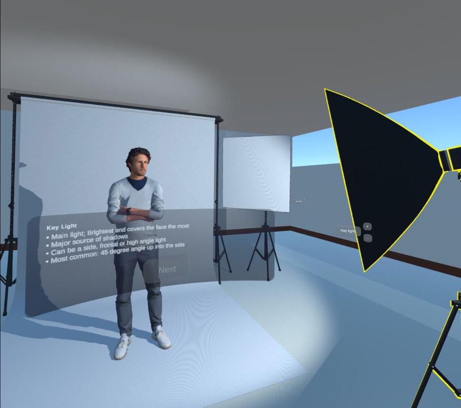
California Polytechnic State University
Figure 1.2 The abstract instructor in the PhotograVR application
110
Figure 1.3 The studio scene in the PhotograVR application.
The application’s core, StoryManager, orchestrates the sequence of the script, holding the narration clips and the requirements to advance within the lesson. Based on a progressing script, StoryManager sequences its children StoryClip objects which are comprised of smaller StorySnippet objects. StorySnippet objects are the baseline building block of the StoryManager and can contain an audio file (typically a narration voiceover), a text header, a text block body (typically the voiceover closed captioning), and any number of events to trigger (e.g., turning on or off lights automatically). See Figure 2 for a diagram of the StoryManager organization.
Technical Association of the Graphic Arts 2023
111
Figure 2 Structure of the StoryManager component in the PhotograVR application
Intro : Clip Hands-on : Clip High-key : Snippet
Story Manager
Lecture : Clip
Outro : Clip Review : Snippet Goodbye : Snippet Hello : Snippet Intro : Snippet [private] AudioSource Story Snippets extends Story Story Clips: MonoBehavior [private] Studio Lights [private] Studio Lights public PlaySnippet() [private] LightRequireme [private] PostActions[] Story Manager Story Manager
Key Light : Snippet Fill Light : Snippet Black Light : Snippet Rim Light : Snippet
Low-key
: Snippet With Black Light Snippet
Pilot Test
Pilot testing is conducted with members of the project team to validate the application’s efficacy. A pilot test session begins with starting the application and orienting the Quest 2 headset in a particular direction to fit the boundaries of the physical space. A human/non-human instructor version is randomly selected. Then, a participant secures the headset to their head and can immediately begin interacting with the environment within the application. The lesson does not begin until the participant presses an indicated virtual button in the application. After the lesson is complete, the participant removes the headset and completes a Google Forms postsurvey comprising five demographic and nineteen experiential questions. Data from this post-survey includes both qualitative (short answer) and quantitative (1-5 Likert scale) data.
Two pilot tests were conducted outside of my own tests; my own testing feedback is ignored due to bias from developing the application. For both pilot tests, the post-survey was not completed. Instead, verbal feedback from the participants while progressing through the experiment was noted down and synthesized into Table 1 with frequency counters. The most apparent feedback is the frustration of not being able to advance through the lesson due to unresponsive inputs or a lack of clarity in the virtual environment controls. Secondly, the human instructor was interpreted as being a fellow student rather than the instructor, potentially due to their position out of the student’s typical line of sight. Further, the abstract non-human instructor was not clearly identifiable as an instructor or anything significant. One pilot tester reported it as a glitch in the application due to its flat appearance instead of a glowing sentient “other.” Still, the room-scale virtual environment is reported as appearing true-to-life which supports the participant’s immersion. The script and verbal narration reads/speaks clearly and teaches the essentials of the intended concepts. Participants desired more interactive portions of the lesson since it is intended to be a repeatable lab rather than a lecture in 3D.
California
State University
Polytechnic
112
Table 1: Pilot Testing Feedback
Note: Pilot testing was conducted with two individuals on the project team. Frequency of mention is limited to 1 count per participant.
Discussion
Feedback from the pilot testing shows that there is room for improvement, as expected from a proof-of-concept. There are clear areas for the application to improve before moving on from the pilot testing stage and conducting official experiment tests. First, the interactions required to advance through the lesson are not clear or responsive; a participant who is inhibited from completing the lesson is unlikely to learn effectively. Second, the instructors need to be more clearly defined and command a presence. Future design analysis and informal tests should compare controller-based inputs versus hand gesture inputs with regards to inexperienced VR users and placement or animation of the instructor avatars to strengthen their presence and authority. A significant and unexpected disruption in the development schedule which prevented the virtual camera to be incomplete was the quality of Oculus’ SDK components. The kit, which is supplied directly by the Oculus Quest 2 developers contained key components which were not updated for the latest versions of Unity or supplied with adequate documentation. The StoryManager designed for this
Technical Association of the Graphic Arts 2023
Feedback Sentiment Frequency of Mention Interactive controls unclear Negative 2 Unclear next steps after task complete Negative 2 Irrelevant controls distract from objective Negative 2 Environment is true-to-life Positive 2 Portion of lesson not engaging Negative 1 Test setup is clunky Negative 1 Narration is smooth Positive 1 113
California Polytechnic State University
scenario is adequate for a linear script but would likely need to be modified for a non-linear or dynamic lesson script. Accessibility can be improved as the current version requires a large, open physical space to match the in-application space.
Conclusion
As a proof-of-concept for interactive visual arts education in virtual reality, the PhotograVR application in its current state shows potential for adequate educational efficacy and flexibility of use. A stable and effective baseline application requires a significant amount of time from a particular programming skillset to develop. But once complete, it can host numerous immersive and interactive VR lessons that use the same virtual environment. Three-point lighting is just one of countless photography and videography principles that visual artists across the globe learn. The benefit of VR education is not just the immersion or interactivity, but also the accessibility and flexibility to learn the content at any time or place as if the learner were actively participating in a classroom. PhotograVR will continue to be refined as an educational medium and research tool into the 2022–2023 academic year with funding from the Cal Poly Center for Expressive Technologies Seed Grant.
Author Note
The proposal that this project resulted from was awarded funding from the Cal Poly Center for Expressive Technologies 2022-2023 Seed Grant. The funded proposal and this project are advised by Dr. Hocheol Yang and jointly investigated by Katie Hollister. Please direct any questions or comments regarding this project to Barrett Lo (barrett@L-O.io) or the Cal Poly Graphic Communication department.
114
References
Bracken, C. C., & Lombard, M. (2004). Social presence and children: Praise, intrinsic motivation, and learning with computers. Journal of Communication, 54(1), 22-37. https://doi.org/10.1111/j.1460-2466.2004.tb02611.x
Brown, S. & Cruickshank, I. (2003). The virtual studio. International Journal of Art & Design Education, Vol. 22(3), 281-288.
https://doi.org/10.1111/1468-5949.00365
Chi, M. & Wylie, R. (2014). The ICAP framework: Linking cognitive engagement to active learning outcomes. Educational Psychologist, Vol. 49(4), 219-243.
https://doi.org/10.1080/00461520.2014.965823
Downey, G. (2022, April 5). DiVR 360: Bringing scientific scuba diving into the classroom. Mustang News. https://mustangnews.net/ divr-360-bringing-scientific-scuba-diving-into-the-classroom/
Elixxier. (n.d.). set.a.light 3D V2.5. https://www.elixxier.com/en/products/ setalight3d.php
Hew, K. F., & Cheung, W. S. (2010). Use of three-dimensional (3-d) immersive virtual worlds in k-12 and higher education settings: A review of the research. Crossing boundaries: Learning and teaching in virtual worlds, 41(1), 33-55. https://doi.org/10.1111/j.1467-8535.2008.00900.x
Jensen, L., & Konradsen, F. (2018). A review of the use of virtual reality head-mounted displays in education and training. Education and Information Technologies, 23(4), 1515-1529. https://doi.org/10.1007/s10639-017-9676-0
Kyrlitsias, C., Michael-Grigoriou, D., Banakou, D., & Christofi, M. (2020). Social conformity in immersive virtual environments: The impact of agents’ gaze behavior. Frontiers in Psychology, Vol. 11, 2254. https://doi.org/10.3389/ fpsyg.2020.02254
Leitch, A. (2017, January 5). A storyboard for virtual reality. CinematicVR. https://medium.com/ cinematicvr/a-storyboard-for-virtual-reality-fa000a9b4497
Lombard, M., Biocca, F., Freeman, J., Ijsselsteijn, W., & Schaevitz, R. J. (2015). Immersed in media: Telepresence theory, measurement & technology. Switzerland: Springer.
Lombard, M., Lee, S., Sun, W., Xu, K., & Yang, H. (2017). Presence theory. In C. Hoffner (Ed.), International Encyclopedia of Media Effects (pp. 15831595). NJ: John Wiley & Sons (published in conjunction with the International Communication Association).
Makransky, G., Mayer, R.E., Veitch, N., Hood, M., Christensen, K.B., & Gadegaard, H. (2019). Equivalence of using a desktop virtual reality science
Technical Association of the Graphic Arts 2023
115
California Polytechnic State University
simulation at home and in class. PLoS ONE 14(4): e0214944. https://doi. org/10.1371/journal.pone.0214944
Makransky, G., Petersen, G.B., & Klingenberg, S. (2020). Can an immersive virtual reality simulation increase students’ interest and career aspirations in science? British Journal of Educational Technology, Vol. 51(6), 2079-2097. https://doi.org/bjet.12954
Merchant, Z., Goetz, E. T., Cifuentes, L., Keeney-Kennicutt, W., & Davis, T. J. (2014). Effectiveness of virtual reality-based instruction on students’ learning outcomes in k-12 and higher education: A meta-analysis. Computers & Education, 70, 29-40. https://doi.org/10.1016/j.compedu.2013.07.033
Meta. (n.d.). Oculus Quest 2: Our most advanced new all-in-one VR headset. Retrieved June 6, 2022, from https://store.facebook.com/quest/products/ quest-2/
Ovchar, I. (2021, June 19). Review: set.a.light 3D makes learning and seeing light a piece of cake. PetaPixel. https://petapixel.com/2021/06/19/ review-set-a-light-3d-makes-learning-and-seeing-light-a-piece-of- cake/
Short, J., Williams, E., & Christie, B. (1976). The social psychology of telecommunications. Toronto; London; New York: Wiley.
SideQuest. (n.d.). SideQuest. https://sidequestvr.com/
The Insight Partners. (2022). Augmented Reality and Virtual Reality Market Forecast to 2028 (Report No. TIPTE100000114). The Insight Group. https://www.theinsightpartners.com/reports/ augmented-reality-and-virtual-reality-market
Turbosquid. (n.d.). 3D rigged people sixpack 002 model. https://www.turbosquid.com/3d-models/3d-rigged-animate-crowd-model-1431937
Turbosquid. (n.d.). Photography studio equipment 3D model. https://www. turbosquid.com/3d-models/photo-real-studio-equipment-3d-model-1707994\
116
Barrett Lo
118
About the Author
Barrett Lo is a Chinese-American, California Air National Guard veteran, and 2022 graduate of the Cal Poly Graphic Communication department. Approaching the field of graphic communication through an emerging technology lens, Barrett created his own concentration of Experience Design for Extended Realities and explored virtual and augmented realities as medium of interpersonal communication. His undergraduate career culminated in the design and development of an interactive studio photography lab in virtual reality. Currently, Barrett works at Microsoft as a software engineer on their cloud service Azure.
119
Meet The Team
Amber Gourley President
Amber Gourley is a fourth-year transfer student studying Graphic Communication with a concentration in Management. She is from Laguna Beach, CA, and received her associate’s degree in Communication Studies from Saddleback College before transferring to Cal Poly. In her free time, Amber enjoys thrifting, attending live music events, and playing video games. She applied for TAGA because she loves Cal Poly’s “Learn by Doing” philosophy and wanted to be involved in a project that is an integral part of the department’s community. She admires how the Graphic Communication department demonstrates the intersection between creative and technical disciplines. She loves the bond that the executive board has developed together and is so proud of the hard work put into the journal.
122
Mary Wood Vice President
Mary Wood is a third-year student studying Graphic Communication with a concentration in Management and a minor in Media Arts, Society, and Technology. She is from Los Angeles, CA and enjoys spending time with her family and friends. As Vice President, Mary leads general member meetings, controls the budget and funding, sets and keeps track of deadlines, and assists the President in executive tasks. She was drawn to TAGA because of the opportunity for creative growth within a small female-led group. Through TAGA, she has learned how to apply classroom leadership and management skills into the Graphic Communication field and looks forward to pursuing something similar after college. Mary is grateful to be a part of such a supportive and driven team.
123
Kailey Latin Communication Coordinator
Kailey Latin is a fourth-year transfer and Graphic Communication student with an Associate’s Degree in Communications from the College of San Mateo. Outside of academics, extracurriculars, and work life, Kailey loves to exercise, go to the beach, and go out for ice cream. As Communication Coordinator, she is honored to have sourced the articles that molded a journal about accessibility and intelligent design. Kailey is so grateful for all she’s learned about managing social media, compiling and editing high level academic writing, and collaborating with a small group to produce a competitive printed product. She is proud to have worked with people who are so dedicated and intelligent, and wishes the best for those graduating.
124
Hailey Honegger Design Coordinator
Hailey Honegger is a fifth-year Graphic Communication student from San Diego, CA. As Design Coordinator for TAGA, Hailey was determined to create a visual brand for TAGA that is both accessible and fun, and the result is a journal that embodies “form follows function.” Inspired by Swiss graphic design principles, Hailey used a grid structure and a bold, primary color palette to create the visual feel of this year’s journal. Hailey has a background in fine art as well as graphic design, and it has been amazing to see her visions come to life as Design Coordinator. As of March 2023, Hailey will have graduated from Cal Poly with a Bachelor of Science in Graphic Communication and a concentration in Design Reproduction Technology. She is beyond grateful to have worked with such a dedicated team in the final stretch of her time at Cal Poly.

125
Kendra Roberson Augmented Reality Coordinator
Kendra Roberson is a second-year Graphic Communication student from Rocklin, CA who enjoys spending time outdoors, thrifting, playing the guitar, cooking, and drawing. As a general member of TAGA 2022, she was introduced to augmented reality and learned how to animate Adobe Illustrator files. She applied to be a part of TAGA for the 20222023 school year because she enjoys the experience of creating a product from start to finish. She has learned to use AfterEffects and Illustrator to intertwine digital experiences and physical products. As the youngest board member of TAGA, she is thankful to work with a group of dedicated and talented role-models whom she looks up to.
126
Annali Jacobs Web Coordinator
Annali Jacobs is a fourth-year student studying Graphic Communication with a concentration in User Experience/User Interface. She is from San Rafael, CA. Annali is an avid traveler, a dancer and music lover. As Web Coordinator, Annali designs and publishes the TAGA website using SquareSpace and manages the chapter’s ISSUU journal archive. Her involvement with TAGA allows her the opportunity to collaborate with creative individuals and gain print production exposure outside of the classroom. As a digital media enthusiast, Annali’s role as Web Coordinator is a perfect fit, as it provides journal design insight throughout the production process. Being a member of the executive board has been a great honor for Annali as it has provided her the opportunity to work with a team of dedicated, hard-working individuals.
127
Emily Kovarik Production Coordinator
Emily Kovarik is a fourth-year student studying Industrial Technology and Packaging with a concentration in Packaging and a minor in Graphic Communication. She is from Mercer Island, WA and enjoys hiking, spending time outdoors, and traveling. In her role as Production Coordinator, she is responsible for designing and prototyping the journal and its packaging system to complement the selected design style. She also manages production and project deadlines, works closely with material suppliers, and schedules outsourcing as needed. She was encouraged to join TAGA after working on a similar project during her study abroad experience in Germany. She enjoyed the process of working with designers and artists to select material and production processes that support the journal’s design style and print volume, and found that she was able to utilize a niche combination of her packaging and graphic communication knowledge.
128
Dr. Rachel Ruoxi Ma Advisor
Rachel joined Cal Poly in 2018 and has been teaching classes with a focus on paper and printing science ever since. She enjoys the technology side of Graphic Communication, and loves working on printing presses to produce tangible products that offer lasting impressions. In her free time, Rachel enjoys swimming and exploring the Central Coast hiking trails. Her favorite trail so far is Point Buchon in Montaña De Oro. Being the TAGA chapter advisor has been pure bliss for Rachel. Her responsibility is to listen to the team members, facilitate open communications with other departments, provide resources and support to the areas of need, and cheer for her team. It’s been a gratifying experience for her to help her team grow, and she can’t wait to showcase their journal with students, faculty, and professionals from the industry.

129
TAGA 2022–2023 General Members
Pictured are some of the general members of the 2022–2023 Cal Poly TAGA chapter. This group consists of both underclassmen and upperclassmen who assist the executive board with design and production of the journal. Several illustrations featured in this journal were done by Cal Poly TAGA general members. Many of these involved members will go on to become part of the chapter’s executive board in coming years.
 Pictured, from left to right: Jessica Yu, Emily Vitanatchi, Zoe Grbich, Isabelle Chan, Trista Wang, Jaden Bhang
130
Not pictured: Callie Russo, Christine Ha, Jessica Mason, Mayson Rutsky
Acknowledgments
Thank You
The 2022-2023 Cal Poly TAGA Student Chapter would like to thank the following people and organizations for their support and generous contributions:
Sponsors and Supporters
Ian Flynn, Visual Media Alliance
Todd and Ethan Ventura, Poor Richard’s Press at San Luis Obispo
Jim Workman, PRINTING United Alliance
M.J. Anderson, RealityBLU®
Lou Caron, Printing Industries Association, Inc. of Southern California
The Cal Poly, San Luis Obispo Graphic Communication Department
Dr. Rachel Ruoxi Ma, Chapter Advisor
Professor Donna Templeton
Dr. Hocheol Yang
Dr. Xiaoying Rong
Colleen Twomey, Department Chair
University Graphic Systems
131
Colophon Design
This book was designed using Adobe InDesign and Adobe Illustrator. All illustrations inside the book were created by Hailey Honegger, Callie Russo, Trista Wang, and Jessica Yu.
This book was set in Neue Haas Grotesk, a typeface originally designed for handset linotype by Max Miedinger in the 1950s. This typeface would undergo redesign to later become Helvetica, the world’s most famous and widely used sans-serif font. Neue Haas Grotesk would lose much of its original personality traits when it was transformed for digital typesetting. In 2004, designer Christian Schwartz sought to restore the original form of Neue Haas Grotesk with as much fidelity to the original shapes and spacing as possible. The typeface has since become synonymous with the Swiss design movement for its simplicity, cleanliness, and legibility, making it the ideal choice for this year’s journal.
Production
All work was done under the guidance of Graphic Communication professor Dr. Rachel Ruoxi Ma. The journal articles were edited for this publication. The cover stock used is Neenah Classic Linen Digital Cover 100 lb. in Classic Neutral White. The inside of the book was printed on Mohawk Smooth Warm White 80 lb. stock. Files were printed in-house using EFI’s Fiery Command Workstation and the Konica Minolta C1100 digital press.
Finishing
The journal was bound using the Duplo Binder 280 and sheets were cut down to size using the Polar 92X Cutter.
Electronic Publishing
This journal was published using Issuu and embedded on the Cal Poly TAGA 2022 website. The Cal Poly TAGA website (calpolytaga.com) was published using Squarespace.
Augmented reality elements are powered by RealityBLU® technology and were animated using Adobe After Effects.
133


 Artwork by Callie Russo & Hailey Honegger


 Pictured, from left to right: Jessica Yu, Emily Vitanatchi, Zoe Grbich, Isabelle Chan, Trista Wang, Jaden Bhang
