

BRANDING DEVELOPMENT FOR A NEW AÇAÍ BRAND
About Us
This
Australian brand was founded by Brazilians who are passionate about sharing the powerful benefits of the açaí berry with the world.
Brand Persona
Welcoming:Creating a warm and inclusive experience that resonates with people from all walks of life.
Energetic:Inspired by the vitality of açaí and the active Australian lifestyle.
Eco-Conscious:Committed to sustainability and environmental preservation.
Authentic:Proudly rooted in Brazilian culture, bringing the heart of the Amazon to Australia. Celebrating discovery and connection, uniting two cultures.

TONE OF VOICE
Passionate: Sharing the story and benefits of açaí with enthusiasm and authenticity.
Friendly: Approachable and inclusive, inviting everyone to enjoy our products.
Informative: Highlighting the health benefits and sustainability of açaí.
OUR ATTRIBUTES
Differentiators
Authenticity:
100% organic açaí sourced from the Amazon rainforest.

Sustainability: Commitment to eco-friendly practices, from sourcing to packaging.
Product Benefits
Rich in antioxidants, healthy fats, and essential nutrients.
Versatile and energizing, perfect for any time of day. Customizable, catering to diverse tastes and dietary needs.

OUR ATTRIBUTES
Differentiators
Customizability: Unlimited toppings and options for every dietary preference.
Authenticity: 100% organic açaí sourced from the Amazon rainforest.
Sustainability: Commitment to eco-friendly practices, from sourcing to packaging.
Experience-Driven: A
focus on
creating memorable, sensory-rich customer experiences.


M O O D B O A R D


OPTION #1
Introducing the first creative concept, designed with a more commercial language, aligned with market standards.
DEFENDING THE LOGO CONCEPT
This logo captures the essence of fun, lightness, and youthfulness, representing a dynamic mix of elements:
• Products: Endless flavor combinations.
• Cultures: The vibrant energy of Brazil meets Australia’s laid-back spirit.
• Audiences: From children to seniors.
• Experiences: Personalized, creative, and unique moments.


With its playful design, the logo tells a visual story of health, diversity, and positive experiences, making the brand approachable and adaptable. It connects emotionally, inviting everyone to celebrate their individuality through customizable options.
It’s more than a logo
I’s the symbol of mixing flavors, cultures, and people into one exciting brand identity.
We invite you to a different experience
A delicious combination of flavors designed to give you strength, energy, and vitality.

The best part is the endless flavor possibilities: with fruits, nuts, granola, chocolates, and more, you can get creative and discover your perfect taste.


Alternative without the symbol

OPTION #2
Introducing the second creative concept, designed with a Amazon connection Brazil and Australia.
DEFENDING THE LOGO CONCEPT
This brand embraces a multicultural identity, celebrating diversity through its graphic element: a stamp that adapts seamlessly across different backgrounds, settings, and images


TASTE THE ENERGY, CREATETHE MOMENT.


THE STAMP SYMBOLIZES:

• Cultural fusion: Blending the rich heritage of Brazil with Australia’s inclusive and diverse spirit.
• Versatility: The dynamic design can transform to fit various contexts, making it adaptable for any medium or scenario.
• Unity through diversity: Reflecting a brand that connects people of all ages, cultures, and experiences through shared joy and discover.


STRENGTH AND FLAVOR, NATURALLY


OPTION #3
This variation retains the same community-driven, social, and interactive spirit while incorporating the original name Açaí Brazil.


This texture is inspired by the rich patterns
and symbols of
Amazonian Indigenous culture, bringing authenticity and a deeper connection to the roots of the açaí berry

OPTION #4
This brand concept highlights the fusion of Brazilian and Australian cultures through its colors and typography:
DEFENDING THE LOGO CONCEPT
• Colors: Carefully chosen to reflect the meaning behind key brand messages and create a vibrant, symbolic connection.
• Typography:
•Australia:Straight, clean, and simple fonts, representing an easygoing, laid-back culture.
•Brazil:Curved, playful typography, capturing the rhythm, movement, and creativity of Brazilian life.


W H E R E B R A Z I L I A N F L A V O R M E E T S A U S S I E V I B E S

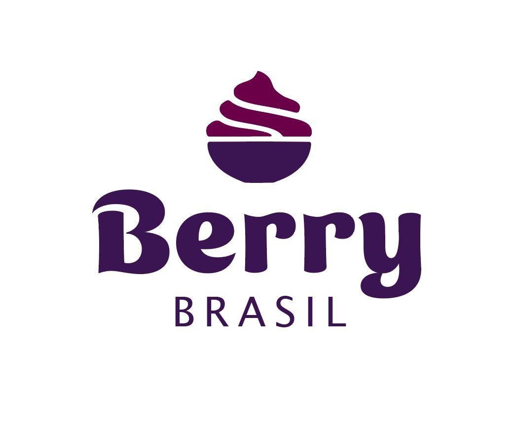
This logo concept is rooted in the idea of community, social interaction, and shared experiences, inspired by the joy of simple outings, like going for ice cream—but with a twist:
DEFENDING THE LOGO CONCEPT
• A healthier, organic, and natural option that everyone can enjoy.
• Symbolism: The brand’s symbol visually represents the iconic açaí bowl, evoking its rich, delicious appeal.
• Typography: The chosen font conveys a sense of flavor, fun, and indulgence, enhancing the idea of a tasty and satisfying experience.
• Community-driven: The design celebrates the act of gathering, sharing, and creating meaningful connections through food.


OPTION #6
This variation presents a modern, minimalist take while preserving the essence of community, flavor, and authenticity.


ORIGINALBRAZILIAN FLAVOR TO MODERN LIFESTYLE

This variation introduces delicate wireframe elements that convey a sense of modernity, minimalism, and elegance, while subtly integrating surf culture and its relaxed, adventurous spirit.


Thank you for your attention
As the next steps, I’ll be waiting for your feedback on which creative concept make sense for the business.
For the next step, I will further develop the visual communication and with the creation and implementation for all materials.