Celebrating the Most Inspiring and Innovative Design Visionaries in Western Canada


Celebrating the Most Inspiring and Innovative Design Visionaries in Western Canada


Training tomorrow’s Designers of the Year for a quarter century in British Columbia. New state-of-the-art creative campus opening soon.


For art, media, and design professionals, the goal is always to do what you love. The good news? There has never been a better time to build a career as a creative.
The creative arts sector is booming. More than ever, organizations need creative problem solvers, innovative thinkers and creators of every variety. After fuelling the growth of British Columbia's booming creative sector for over 25 years through education and labour force development, LaSalle College Vancouver, an institution dedicated to higher education across the creative landscape, is the industry’s beating heart.
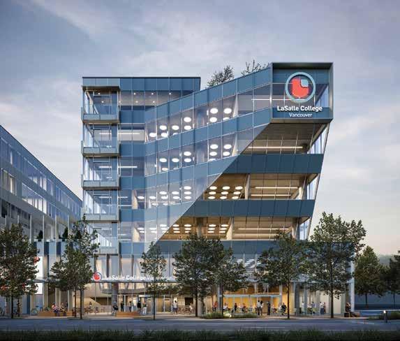
LaSalle College Vancouver is on a mission to meet the rising demand for quality education that can fill roles essential to economic growth in BC. It has launched a new, purpose-built, 108,000-squarefoot creative campus—a playground where aspiring designers, musicians, chefs, artists and film makers can explore new and incredible ways to bring their ideas to life. LaSalle has also re-aligned its degree and diploma programs to place active learning and technology at the forefront, embracing industry need and ensuring learners can unleash their passions and unlock their dream careers like never before.
“Now, more than ever, art and design play a pivotal role in shaping our world," explains Dr. Jamie Kemp, chief academic officer at LaSalle College Vancouver. "Creative problem solving is at the core of what it means to be an artist or designer today. It's about making the world a better, more beautiful place while addressing some of the most pressing social and environmental issues of our time.”


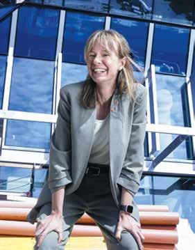

Why is it important for people to do what they love for work? Dr. Kemp says the answer underlines a fundamental truth: when passion drives your career, work becomes more than a job—it becomes a calling. "Work plays a huge role in our lives, shaping how we spend our time and influence the world," she says. "By doing what you love, you're more likely to be motivated, make a difference and find satisfaction in your contributions.”
Securing a career doing work you love is also the ultimate investment in work-life balance. LaSalle College Vancouver is committed to creative diversity and health, which empowers students to fully pursue their passions. The new campus is Certified Gold by the Rick Hansen Foundation for accessibility and holds Fitwel accreditation for health and wellness. That means it is a space where students can build their portfolios while they build a happy and balanced life.

“Now, more than ever, art and design play a pivotal role in shaping our world. Creative problem solving is at the core of what it means to be an artist or designer today. It’s about making the world a better, more beautiful place while addressing some of the most pressing social and environmental issues of our time.”
Dr. Jamie Kemp, chief academic officer at LaSalle College Vancouver


To foster creative ingenuity, learning spaces must embody innovation. At LaSalle College Vancouver, a suspended classroom floating above a sprawling atrium to a formidable digital lounge destined to be the envy of gamers nationwide is an architectural marvel. A rooftop meditation garden crowns the building, featuring Indigenous art, makerspaces, and a fine-dining restaurant run by the Culinary Arts department.
“We've also developed newly revised programs to bring us into the new building," Kemp says, highlighting the seamless integration of cutting-edge facilities and curriculum designed to inspire, challenge and nurture students as they launch into successful careers they love.
Ready to follow your dreams? Visit lasallecollegevancouver.com or scan the QR code to learn more.
Connect: @LaSalleCollegeVancouver | @lasallevancouver
For aspiring creatives, the path to a fulfilling career starts with a decision: pursue your passion fearlessly. "Decide that you're going to do it," advises Kemp, encouraging students to embrace their dreams as viable, rewarding career paths. “Choose your passion. You don't have to pick between being successful and doing something you love—you can have both.”
LaSalle College Vancouver, part of the global LCI Education network, is more than a place of learning—it's a community where future leaders, innovators and artists come together to shape the future of the creative sector.
Whether you're drawn to the dynamic world of game design, the elegance of fashion, the transformative power of interior design or the narrative magic of film, LaSalle College Vancouver offers the programs, environment and connections to turn your creative aspirations into reality.
If you're ready to embark on a journey that blends your passion with practical skills, leading to a career you'll truly enjoy, LaSalle College Vancouver is ready to welcome you. With the first cohort soon to enter the new campus, an admissions expert is available to guide you through your next steps toward becoming a creative leader.
Don’t wait to seize your spark. Discover how a degree from LaSalle College Vancouver can unlock your potential and set you on a path to a career filled with passion, innovation and impact. Your creative future begins here.




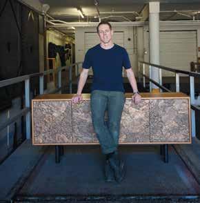
Designer
And the winners of this year’s top design honours are...
Designers Alda Pereira and Douglas Cridland join the ranks of our Western Canadian icons. 80
As voted by you: find out which finalists’ projects were your favourites in this inaugural awards category.
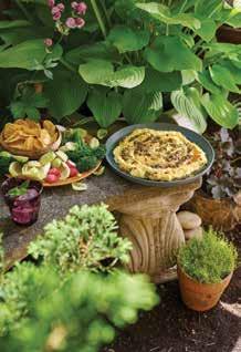
From architecture to landscape, these are the top designers who vied for the title of Western Living Designer of the Year.
Vancouver’s tiny yet mighty Dear Gus serves up snack-sized bites and plenty of European charm.
Embrace the
Our
Making the call: meet the distinguished design panel behind this year’s WL Designers of the Year.

A crop of farmers’ market-totable recipes inspired by harvest season.
Meditation, Japan, tennis: Louis Duncan-He on what sparks his creativity.

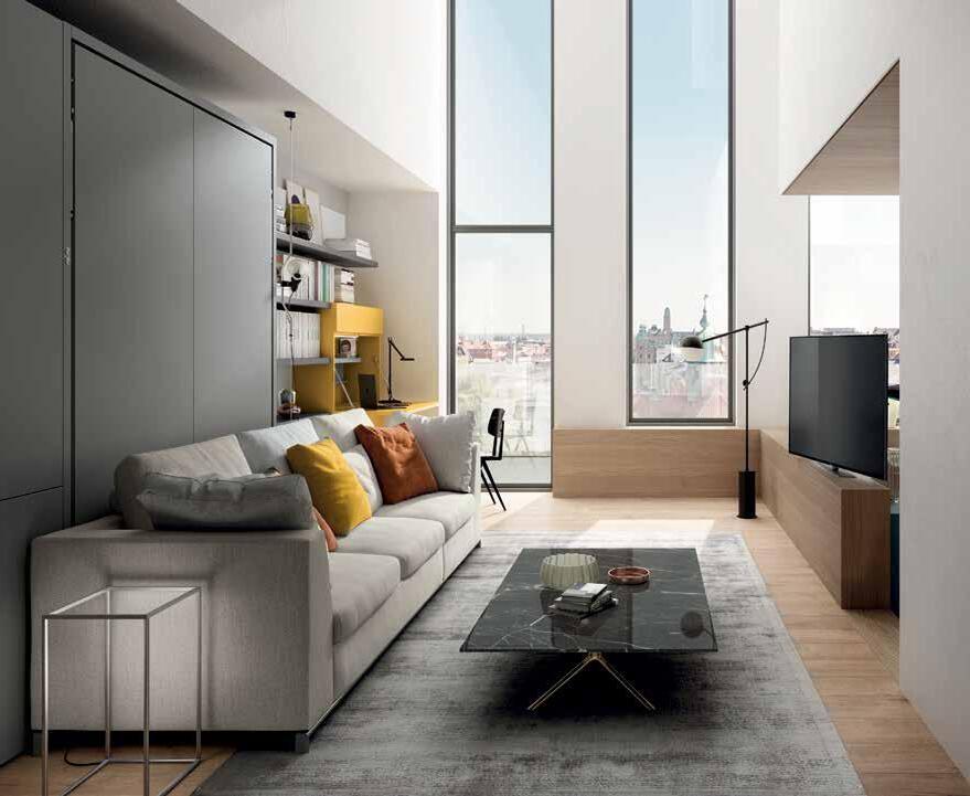
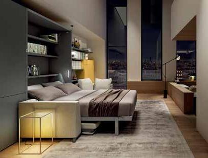
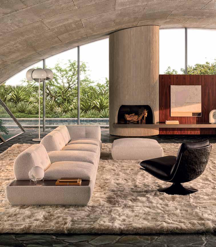
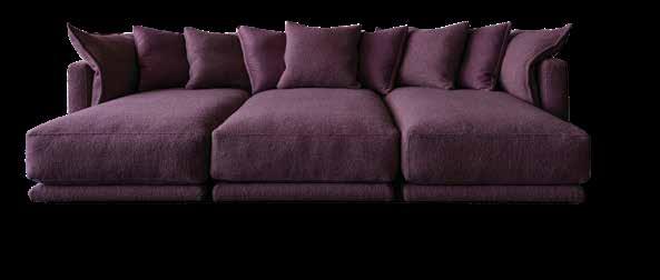
by Arketipo Firenze
Sec�onal Sofa
When people ask about statement pieces, subtlety is rarely ever discussed, and yet Atlas is perhaps one of the grand expressions of form and style.


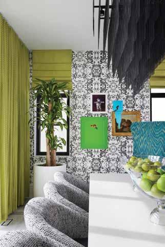
westernliving.ca
ceo & group publisher Ryan Benn
group vice president, publishing & operations Nina Wagner
editorial
editorial director Anicka Quin
editors-in-chief Nathan Caddell ( BCBusiness ), Stacey McLachlan ( Vancouver magazine)
managing editor Dani Wright
assistant editors Kerri Donaldson, Rushmila Rahman wine and spirits editor Neal McLennan
contributing editors Melissa Edwards, Alyssa Hirose, Amanda Ross, Barb Sligl, Julie Van Rosendaal
editorial interns Arijit Joshi, Lea Krusemeyer, Tia Sacks email mail@westernliving.ca
design
creative director Jenny Reed
art directors Stesha Ho ( Vancouver magazine), Edwin Pabellon ( BCBusiness )
sales representation
vice president of sales Anna Lee
vice president, custom publishing & agency services Chad Brealey
senior media specialists Brianne Harper, Mira Hershcovitch, Sheri Stubel sales coordinator Rebecca Scutt email sales@canadawide.com
european sales specialist S&R media, Sylvie Durlach
tel +33 1 44 18 06 65 email srmedia@club-internet.fr
production/administration
group vice president, education and administration Jane Griffiths group director of operations Devin Steinberg director of circulation Tracy McRitchie manager, hr and administration Ava Pashmchi
digital marketing manager Rebekah Ho executive assistant to the ceo Hannah Dewar
production manager/digital ad coordinator Kim McLane
production associate Natasha Jayawardena
production support technician Ina Bowerbank office administrator Celine Simpson
finance
group vice president, finance Conroy Ing, CPA, CMA vice president of finance Sonia Roxburgh, CPA, CGA accounting Terri Mason, Eileen Gajowski
address

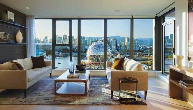
I’ve just spent the past weekend with my 15-year-old nephew (a long-planned birthday present involving his first solo trip to Vancouver from Calgary), and part of our jam-packed itinerary included a night at Nat Bailey, our local minor-league baseball stadium, where we caught a Vancouver Canadians game. It was my first time in years, and it brought the happy contentment that comes when moments of familiarity—the sushi races, the seventhinning stretch, the T-shirt gun—meet moments of joyful surprise, like the rare grand slam we witnessed that night. My nephew declared the whole thing to be “sick,” one of many terms he dropped over the weekend that were his equivalent of “fantastic.”
I like to think that our annual Western Living Designers of the Year issue—now in its 17th year—finds that happy spot, too. You’ll discover some familiar faces (our Architects of the Year have won a DOTY title five times now; their first was in 2008, the same year these awards launched), and you might find a few surprises as well. In addition to our nine judged categories (check out our all-star panel of judges on page 86), we’re also launching our brand-new WL People’s Choice Awards—voted on by you, the reader, with the winners announced live on stage at our celebration in Vancouver on September 12.
And we’re also inducting two designers into another new award category: our Western Living Design Icons. Alda Pereira and Douglas Cridland have both held the title of Western Living Interior Designer of the Year (in 2010 and 2016, respectively), and their contributions to (and influence over) the local design scene are truly immeasurable.
It doesn’t feel appropriate to apply a 15-year-old’s slang to describe how impressed we are with the work of each of the designers in these pages, so I’ll stick with my own Gen-X version: the talent you’ll discover in this issue is, simply put, awesome. Please join me in congratulating all of our winners. Whether they’re familiar names or new discoveries, I hope you’ll find your own inspiration in what they have created.

Anicka Quin , Editorial Director anicka.quin@westernliving.ca
Follow Anicka on Instagram @aniqua
Follow Western Living on

As we were finishing this issue, we were devastated to learn that our regular columnist Joy Pecknold tragically lost her life in an accident. I’ve known Joy for nearly 20 years, and she earned her name in all the ways that mattered: in how she lived her life, and in what she brought to those who knew and loved her. She wasn’t just a wonderful writer who contributed so much to many Canadian publications, she was also a true champion of our local design scene. Her last column runs in this issue (page 18). To say she will be missed is an understatement, and all of our thoughts are with her friends and family.

Spotlighting the best of architecture and design in Western Canada.
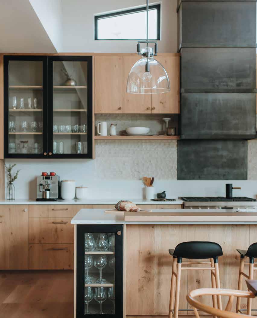

Designed by LAUREN RITZ, LRD Studio, Squamish, B.C.
The Look: Material Magic
Though this kitchen is in a Whistler home, it takes its inspiration from another mountain town: Tahoe. “It became a high inspiration for this project,” says interior designer Lauren Ritz. “Homes there have this rustic drama, and we just had a great time playing with it.” So while many other Whistler homes feature wood and stone, this one swerves with raw steel detailing and chiselled limestone countertops; cabinets, meanwhile, are made from rustic, pressed-wood veneers finished with a water-based lacquer (shoutout to McGrath Millworks). Cold-rolled steel wraps the hood vent and cascades right down to the stovetop, because, as mountainrugged as this “cabin” kitchen is, it’s still made for modern life. “It’s an easyto-wipe surface that’s going to age well over time,” says Ritz.
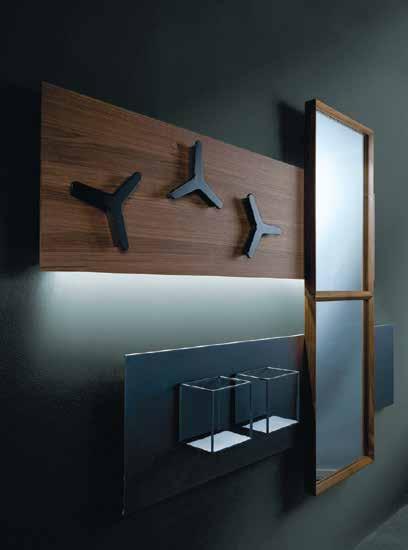
Sometimes, to find a chic, personalized storage solution for a uniquely sized space, you must improvise. Case in point: the Jazz wall panels (single metal varnished panel, $1,390) by Ronda Design. You choose the medley: from painted metal and veneered wood panels to magnetic shelves, mirrors, coat hooks, trays and optional back-lighting. Compose your own feature wall masterpiece to hit all the right notes. arkinteriors.ca
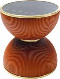
A hot new bombshell has entered the living room: the Endless Vegas side table ($559) from Kare. With its striking hourglass figure wrapped in burnt orange quilted leather, this curvy couch companion adds a splash of retro elegance and va-va-voom to any room. kare-design.com

High Back Chair from King Living From $895. kingliving.ca
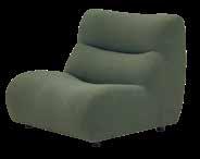
True, this 1977 chair style makes for a perfectly slouchy standalone piece: relaxed, curvy, humble, comfortable. But, more importantly, it’s modular. I like the idea that it could one day be part of a bigger crew of seats. Just keep adding more arm(less) chairs and you’ll eventually have a full-on sofa, thanks to the flexible design. For now, it’s a place to lounge, and also to dream about the day I’ll have enough space for 12 linear feet of this cushy, mossy green seating. Stacey McLachlan , senior editor
For more editors’ picks visit westernliving.ca
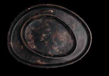
Marble Slab


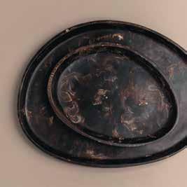
Beautify your shelf life with the Pebble resin tray (small $88, large $128) from Oak and Fort’s newly launched homeware collection. Featuring marble-patterned resin that swirls like cream in coffee, it’s a stunning way to decorate, display or declutter your space. You won’t want to skip this pebble. oakandfort.com
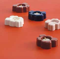
Tealight Delight
What better way to celebrate the 60th anniversary of Marimekko’s iconic Unikko pattern than lighting a candle—specifically, a tealight in one of these whimsical matte-finished glass Unikko flower shaped candle holders ($51). With charming colours like deep blue and blush pink, you’ll want the whole bouquet. kitinteriorobjects.com
At this year’s Alcova design show in Milan, the Vancouver design firm Marrimor—known for the iconic Toof table— unveiled Draft, their new line of artsy rugs (8' x 10', $19,000). Overflowing with creativity, these rugs are literal walks of art. marrimor.com
Retro Rainbow Redux
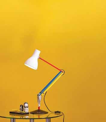
Seldom are remakes better than the original, but the Paul Smith Edition Type 75 desk lamp ($602) proves a vibrant exception to the rule. The classic British Anglepoise task lamp dazzles anew with Paul Smith’s colourful redesign. Truly, here is a light that’ll never go out. informinteriors.com


If you love Halloween or just the charm of a gourd, this pumpkin bowl with lid ($25) from Ikea’s Höstagille collection is the perfect treat for your home and the trick for storing your postHalloween candies. ikea.ca
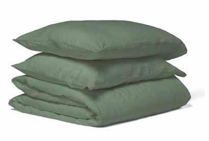
Sweet Greens Dream in monochrome with Wilet’s linen cotton duvet set (queen, $230) in their newest hue—pistachio. Designed in Vancouver, it’s a 55/45 linen to cotton blend, meaning you get a smooth, lived-in look and feel without having to shell out quite so much green. shopwilet.com
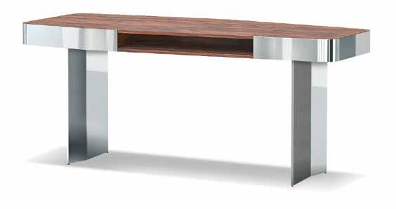
Typically, desks don’t ignite creativity, but the Diagramma writing desk ($33,650) designed by Giampiero Tagliaferri for Minotti might just be the exception. Its sculptural design combines sleek stainless steel with rich santos palisander wood and integrates subtle storage—making it functional art you can write on. livingspace.com
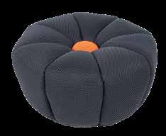
Lazy Daisy
Plant your feet couchside on the cozy Daisy ottoman ($1,995) from Calia Italia. The blossom buddy comes in either red or grey (with contrasting red or grey core)—but you can always pick your own daisy with a custom colour order directly from the Calia fabric collections. inspirationfurniture.ca
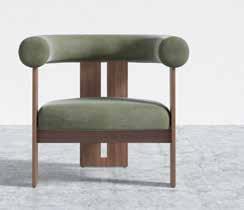
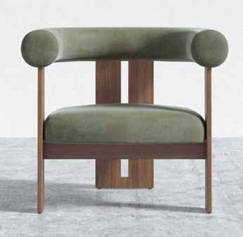
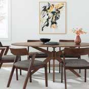
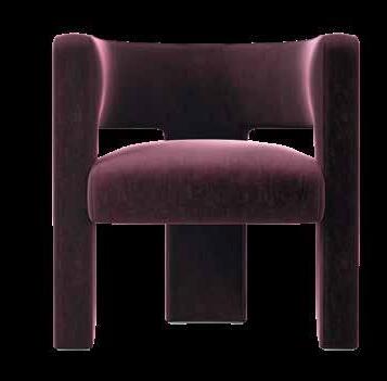
Sitting Pretty Don’t stand for boring—take a seat in effortless cool instead. The Tola lounge chair ($799) combines cushy curves upholstered in light grey, black and sage in chic contrast to a sleek walnut frame. Seat dreams are made of this. roveconcepts.com
By Kerri Donaldson
Popular online furniture retailer Article opened its first-ever brick-and-mortar store in late summer on East Hastings. The 4,175-square-foot location features a curated selection of living essentials including couches, bed frames, accent pieces and colour swatches. Known for its modern styles and affordable delivery, the Vancouverbased brand has been shipping furniture across the U.S. and Canada for the past decade—and the new store is an exciting milestone for the company. 848 East Hastings St.
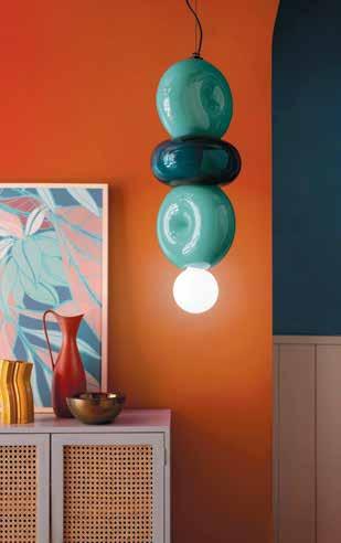
Play Glow
Lighten up any room with the playfully designed Bumbum pendant suspension lights ($1,477) from Ferroluce. They’re round, colourful and elegantly whimsical—like if modern pop art met that chunky necklace your high school art teacher always wore. lightformshop.com
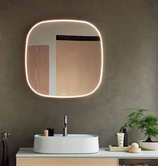
Light Bright
Mirror, mirror on the wall, who’s the most luminescent of them all? Trick question—it’s the mirror itself! The Sebastian Herkner-designed Zencha smart mirror (from $3,500) from Duravit is more than just a pretty face. With lighting that adjusts from warm to cool in order to sync with your mood or circadian rhythm—plus a handy defog option—it’s brains and beauty. kitchenandbathclassics.com
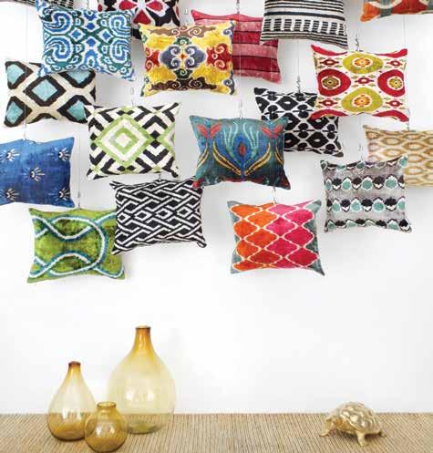
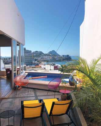

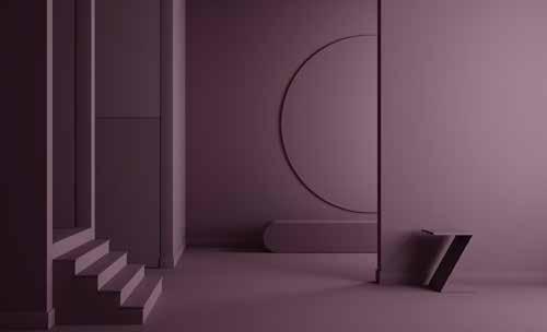

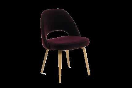
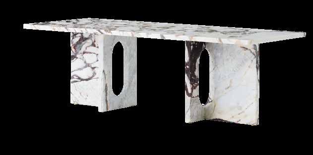
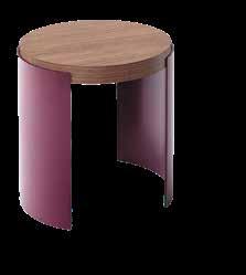
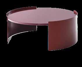
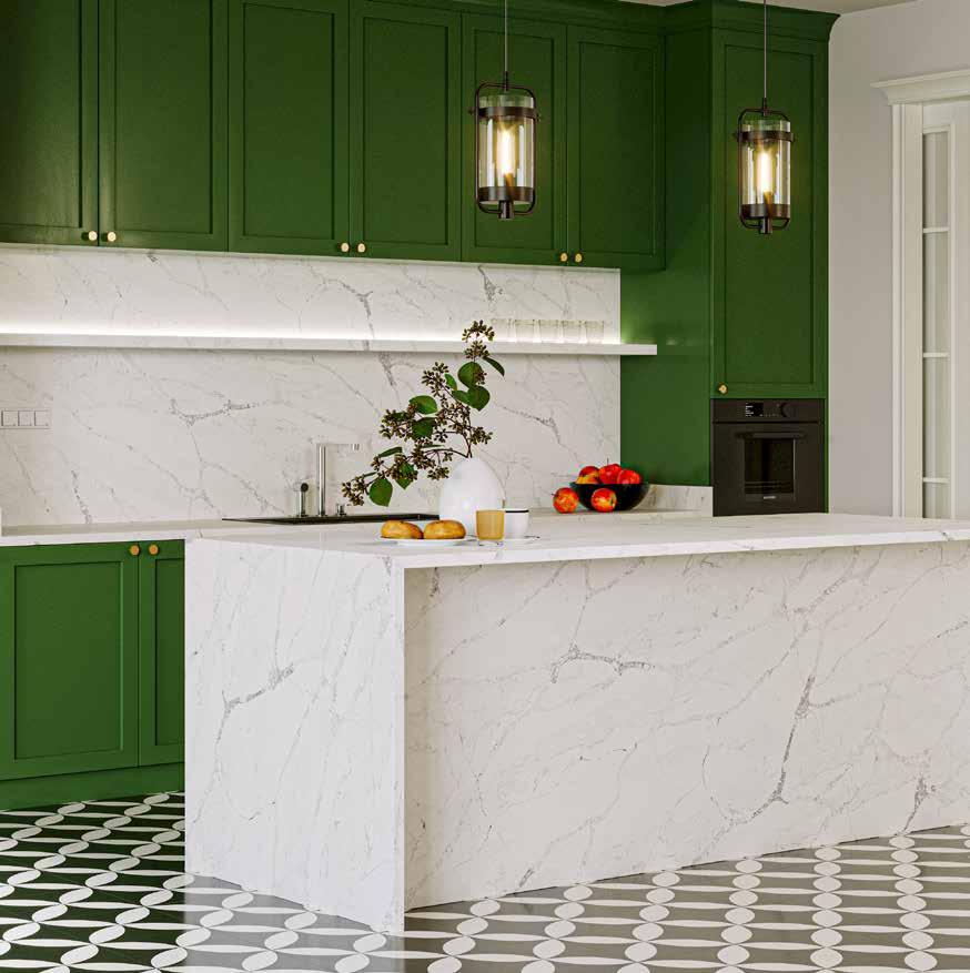
Arguably, harvest season’s most luscious hues are the deep purple spectrum one finds across ripened black plums and grapes pressed to become red wine. This rich range of shades is somehow warm and moody at once, and handles a little spilled Bordeaux oh so graciously.
By Joy Pecknold
Unit 106, 1551 Broadway St., Port Coquitlam, BC V3C 6N9 Office: 604 949 3046
Unit 3, 1010 Yates Street,Victoria BC, V8V 3M6 Office: 250 419 7272 (Enter from Johnson St.)

Our picks from the biggest design festival in Western Canada, IDS Vancouver.
very September, IDS Vancouver arrives as a gravitational centre for design lovers: it’s four days of immersive programming and exhibitors, all kicking off with an opening night party that’s consistently stellar. Here are our top picks for what to catch at this year’s event, which runs September 26 to 29 at the Vancouver Convention Centre.
By Susan Bryant

Since opening night party guests inevitably gravitate to the bar, each year IDS works with a designer to make it a showstopper.
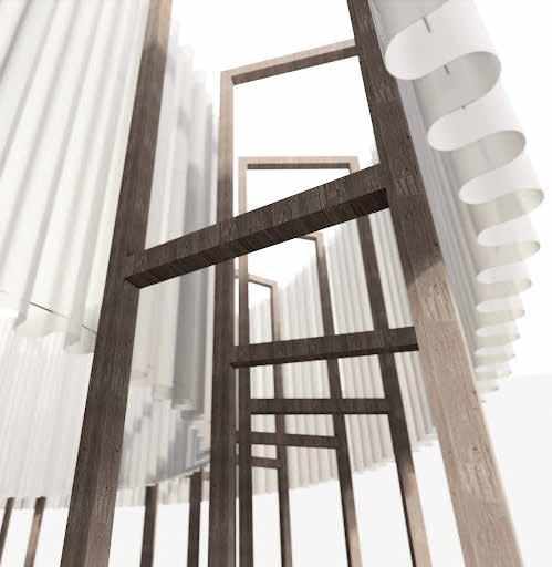
This year, Squamish’s Stark Architecture will be creating a soaring space from recycled materials that reaches over 27 feet into the air, making the Perpetua Bar visible from just about anywhere on the show floor.
We’re fortunate to have Omar Gandhi on our WL Designers of the Year judging panel this year—and we’re looking forward to the award-winning architect’s IDS Vancouver keynote (“Extreme Solutions,” Friday at 10 a.m.). His firm is known for creating striking residential projects in tough locations—join him as he charts his team’s ability to find the creative solution while keeping mental health and attention to teamwork at the centre of their work.


Editorial director Anicka Quin and senior editor Stacey McLachlan take the stage on Sunday, chatting with some of the West’s best designers. Look for our 2024 WL Furniture Designer of the Year, Celina Dalrymple of Ffabb (on “Creating Comfort”), and our WL Architect of the Year, Clinton Cuddington (“The Evolution of West Coast Modern”), along with Vancouver’s most indemand restaurant designer, Craig Stanghetta (“Crafting Spaces That Resonate”).



Leading into IDS this year is the return of Design Vancouver Festival , an immersive 11 days for design lovers curated by past Western Living Fashion Designer of the Year Becki Chan. From September 19 to 29, look for pop-ups all over the city: from a lemonade-stand party (featuring the winning design of the Architecture Foundation of BC’s first competition of the same name) to open studios (ever wanted to see the inner workings of an interior designer’s office?) to architectural walking tours to art auctions—all the way to a bound-to-be delicious session exploring the architecture of dessert. Find your favourites at designvancouver.org
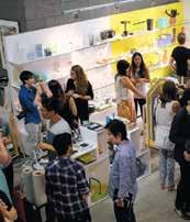
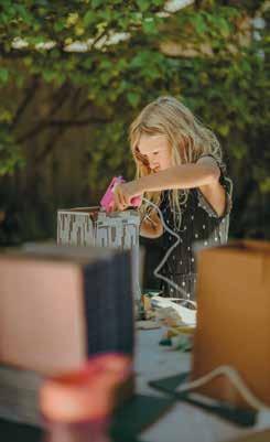
The immersive Future Neighbourhood exhibit is designed to get the conversation going on good design—even for kids. The hands-on Petit Architects workshop gets littles constructing and designing their own mini-buildings with recycled materials, contributing to a communal model of what they’d like to see in a green city of the future.
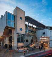
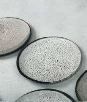
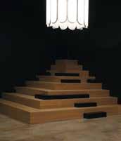
For the upcoming Design Vancouver Festival, events include (from top): tours of the Arts Umbrella building on Granville Island; an open studio of local maker Origins; parties, parties, parties, including one at Vancouver Special; ceramicist Janaki Larsen’s open studio; and more events in elegantly designed spaces, like a coffee tasting at La Marzocco.
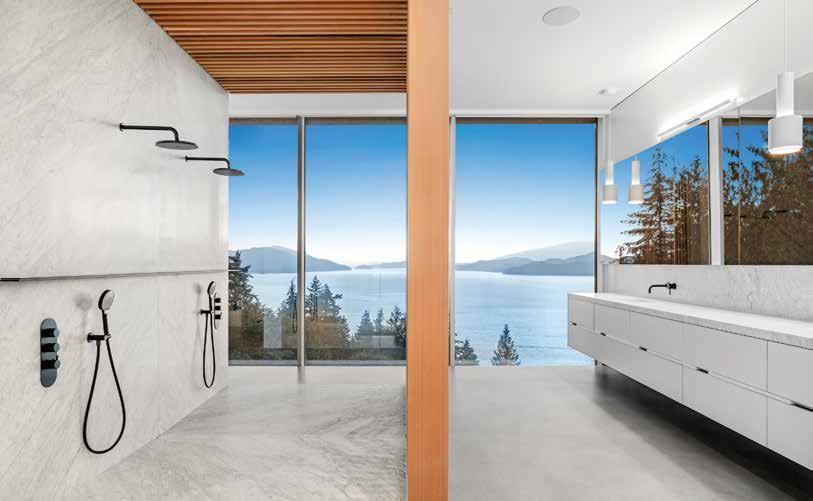
Architects seeking to enhance performance and aesthetic integration of windows and doors in their projects rely on Varsa for innovative, design-savvy and functional solutions
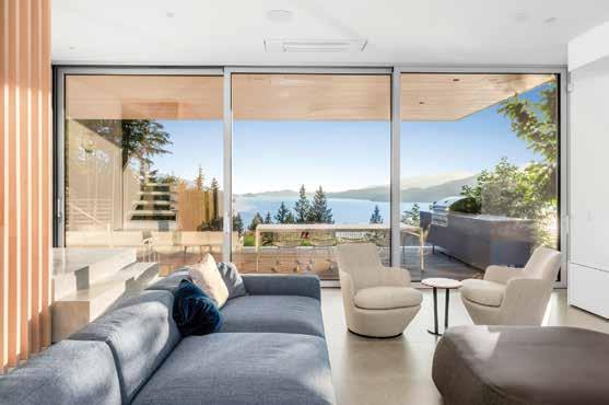
The impact of a window or door on a space is profound. It dictates how users experience light, views and overall ambiance. Bringing more than 20 years’ experience to every project, Varsa specializes in oversized solutions that transform these elements into stunning focal points. For instance, Varsa’s sliding doors can soar up to 16 feet high, providing uninterrupted views that redefine indoor-outdoor living—a transformative feature for any dream home.
As building codes and energy regulations evolve, the demand for premium, certified products is rising. Varsa is at the forefront of this trend, consistently exceeding certifications, including those for LEED and Passive House, as well as NAFS testing standards from net-zero energy compliance to Step Code 5 compliance. This proactive approach ensures that architects can incorporate sustainable solutions without compromising design or quality.
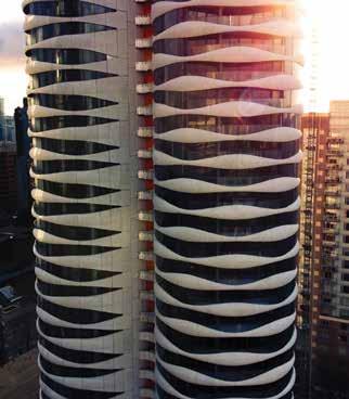
Versatility is another hallmark of Varsa’s offerings, with products customizable to complement a range of architectural styles— from contemporary and farmhouse to French provincial, mid-century modern and ultramodern designs. Their products can be seen in

various high-profile projects, including luxury custom homes and significant commercial and residential developments, such as the unique Butterfly Building in Vancouver, which features the Lift and Slide doors.
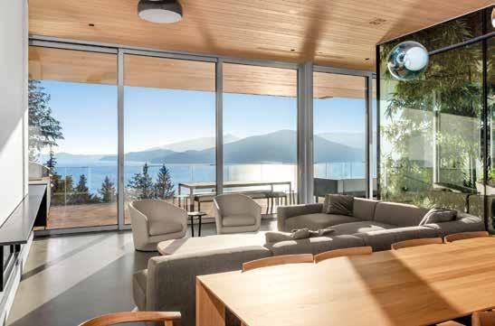
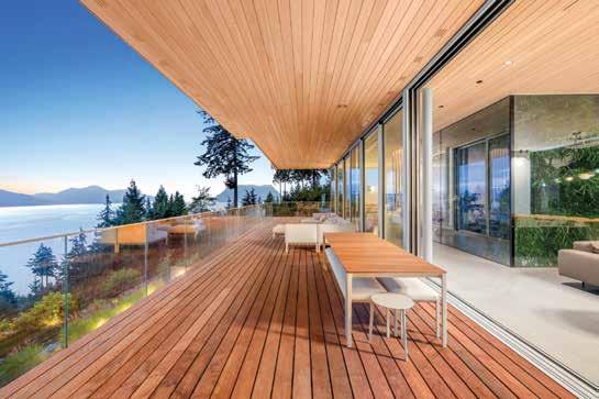
Architects are particularly drawn to Varsa’s aluminum frames for their ability to support larger windows and doors without compromising structural durability. A prime example is found in a stunning custom home in Lions Bay, designed by Chris Hunter of Hunter Office Architecture. Hunter highlights the home’s intricate design, which features structural steel and exposed concrete, coupled with extensive curtainwall glazing and overheight, Lift and Slide stacking doors that
facilitate a seamless connection to expansive covered outdoor areas.
Varsa curated a custom order that aligned with the project’s budgetary and operational specifications. This order included Fixed and Tilt-and-Turn windows, Lift and Slide doors, and extensive curtainwall systems, all finished in a raw, natural aluminum anodized surface.
“This choice was ideal given the expansive openings,” says George Varnas, CEO of Varsa Windows and Doors. “Our designs maximize floor-to-ceiling views while minimizing obstructions, allowing the breathtaking landscape to remain the focal point.”
The design included a four-sided atrium that was challenging to conceptualize, detail
and install. “Varsa had no issues tackling it with us,” Hunter says. “The triple set of sliding doors define the mid-floor living, allowing it to open up fully to the full width of the deck with views to Howe Sound.”
The collaborative dynamic between Varsa and creative architects like Hunter rests on clear communication and a shared commitment to problem-solving. “Varsa embraces the challenge and offers comprehensive solutions,” Hunter says, reflecting on the way his company and Varsa work together to navigate project complexities. Varnas echoes this sentiment, recognizing the mutual respect for each company’s expertise, which enhances their collaborative efforts and ensures the successful realization of innovative architectural designs.
Through such partnerships, Varsa continues to lead the industry in high-performance, aesthetically striking windows and doors, forging paths toward both robust functionality and exquisite design in modern architecture.
Learn more about Varsa Windows and Doors at varsa.ca
Connect @varsa.ca

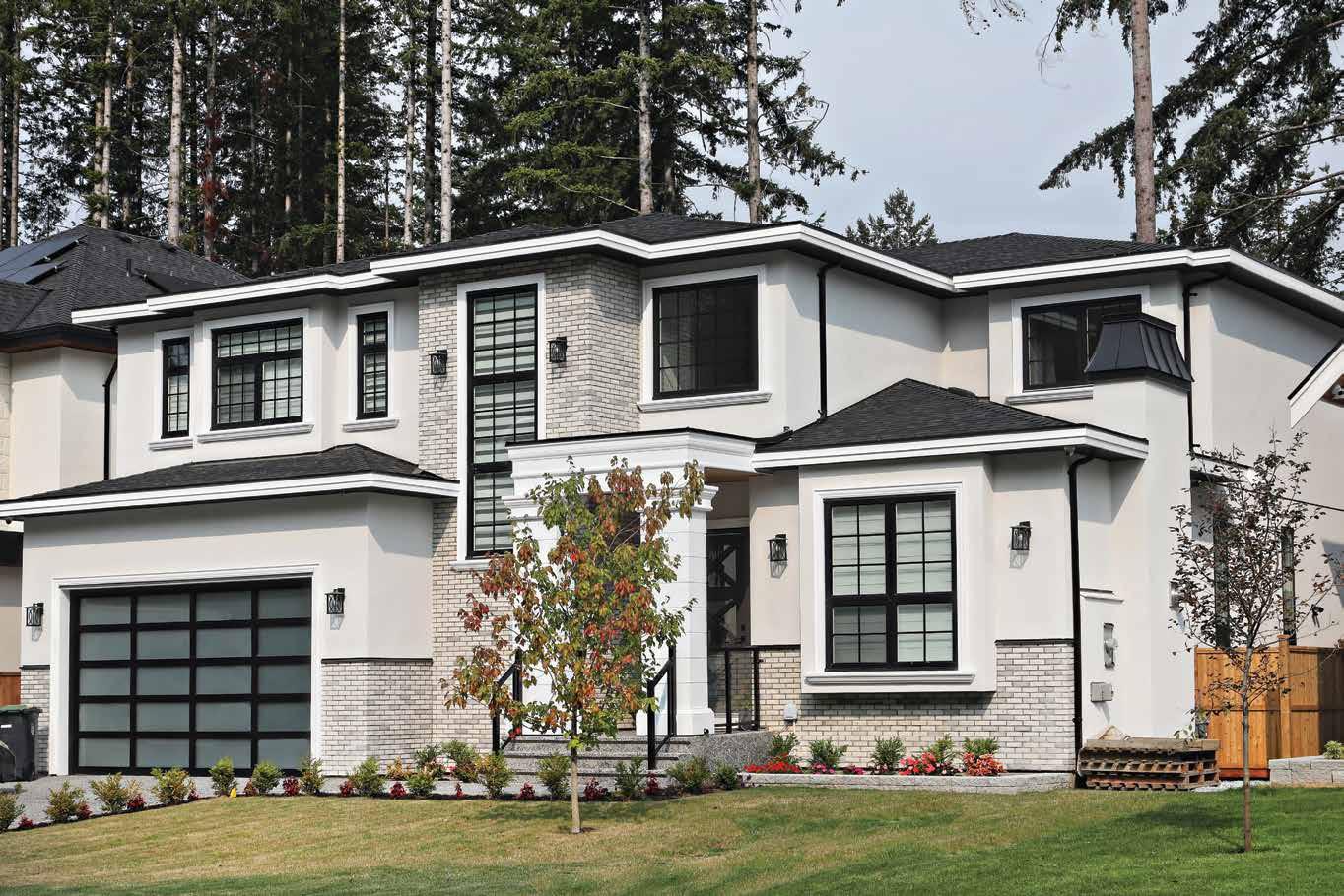





Our 17 th annual celebration of the best design in Western Canada is bigger and better than ever: discover the brightest minds in architecture, interiors, furniture design and more.


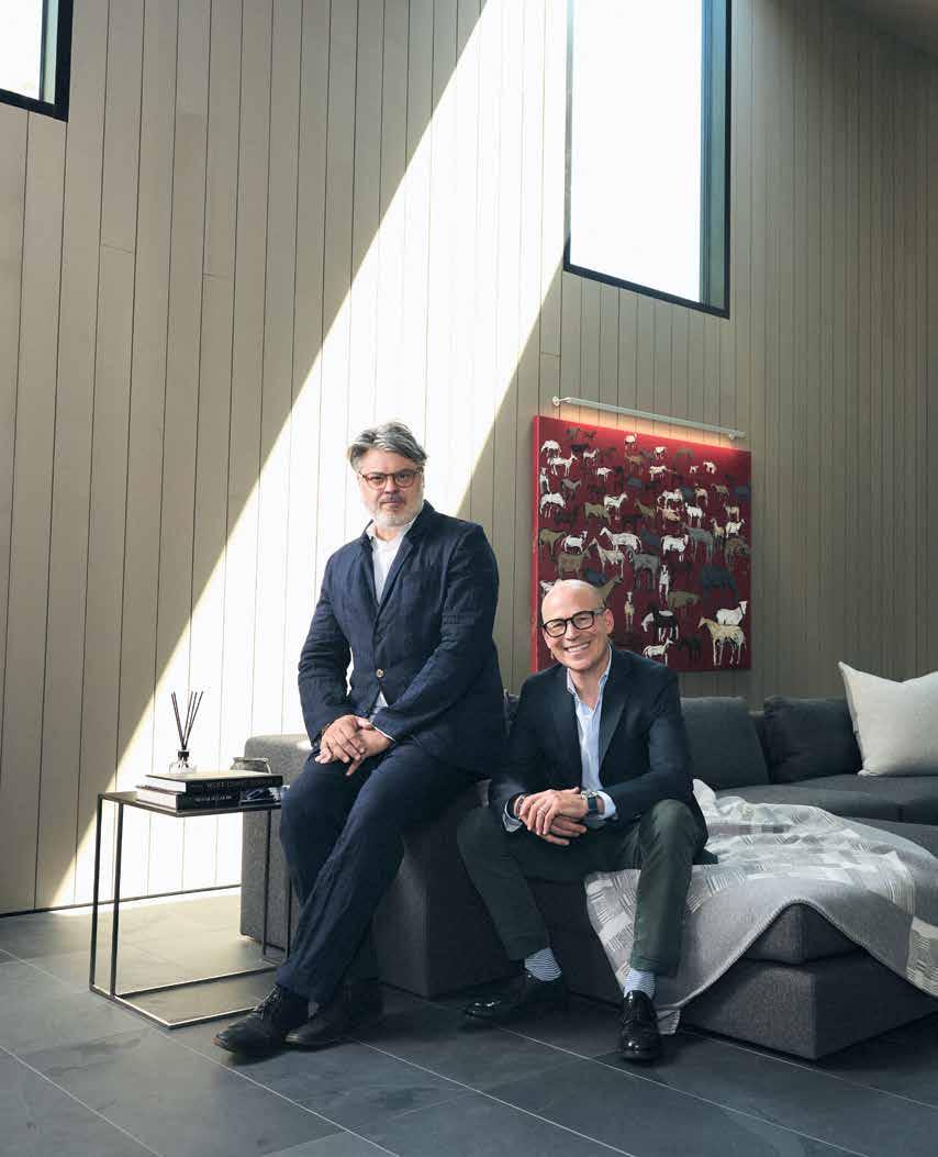
Another year, another win from the perpetually humble, consistently impressive Measured Architecture.
By Michael Harris / Portraits by Pooya Nabei
“We don’t believe in the cult of individual genius,” says Clinton Cuddington. “The whole ‘great architect’ thing.”
Humble words coming from the co-principal of a studio that’s won more Designers of the Year awards than any other (with this year’s win, five times and counting). But Cuddington and fellow principal Piers Cunnington (yes, their names are just a consonant apart) really do believe humility is a virtue. In fact, to avoid the trap of artistic ego, they don’t use their names to brand their practice. Instead, the winners of this year’s Western Living Architects of the Year award labour under a modest banner—Measured.
The lack of braggadocio is, in fact, a design philosophy. “The joy of coming to work,” says Cunnington, “is working with others to conjure ideas and work with them to create a fully formed design. A piece of architecture is a synthesis of conflicting elements.” It’s in collaboration and responsiveness that Measured Architecture finds its gold.
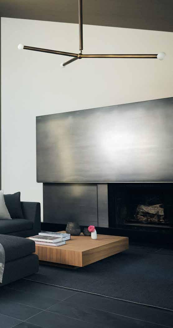
Yes, their body of work could be described as belonging (broadly) to a Cascadian contemporary regionalism. And yes, you’ll discover plenty of modernist, minimalist elements in their swaths of concrete, glass and cedar. But what excited our judges, what makes their work so consistently exceptional, is their devotion to the unique conversation that each project produces—a conversation with the client, with the landscape, with the changing times.

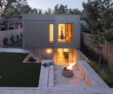
Some architects pose as unyielding visionaries who have one unchangeable stylistic signature. But Cuddington and Cunnington would find that far too dull. As judge Kathy Hancox of HK Associates put it, the work is “innovative and curious... Each project brings fresh eyes to the design opportunity, reflecting the uniqueness of the client and context.” In their Shor House, on B.C.’s Mayne Island, that responsiveness comes shining through. They built a new retreat on the foundations of a previous building to produce what Cuddington calls “a glorified barn.” The house would be a part-time home for Cuddington himself, and he knew he wanted history in its bones (a trip to Donald Judd’s Marfa compound inspired him to push the limits of repurposed material). So Measured teamed up with salvage company Unbuilders to preserve and reuse lumber from the house, barn and fishing shack that previously sat on the site (nothing went to the landfill). Century-old railroad ties of yellow cedar—some made with thousandyear-old wood—were also milled and incorporated throughout the interior. A retaining wall of stacked stones, kept from the previous house, was given new life by master stone mason Tamotsu Tongu, and original floorboards were reinstalled with their aged patina intact.
The Shor House design, in other words, never presented itself fully formed in either architect’s head. Rather, a process of scavenging and sitting with the site suggested the design over time. They built in response to what they found.
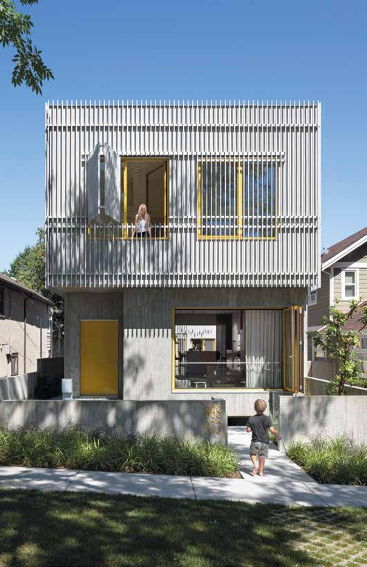
Then there’s Frame House, a wildly different affair. The clients wanted their young children to have a hand in the design process—and Measured, true to form, welcomed those young inspirations. A suspension of trapeze netting upstairs is one fantastic result, offering moments of random lounging or wobbly transits from room to room. (The house itself is less wobbly, a chic concrete box with wall-wide windows that open onto the park across the street.)
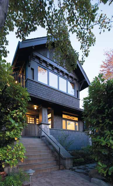
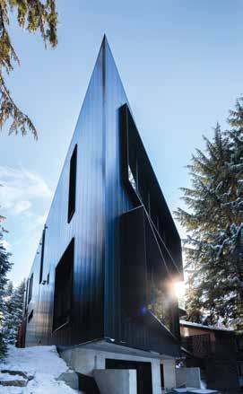
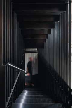
For Alma House (left), the team modernized a 1912 house without trying to be beholden to the time period—allowing historic elements to shine, and contemporary elements to stand out as well. In the Lagoon House (below), a folded-plate steel staircase connects the three stories of the house.

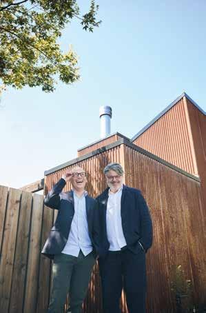
WITH PIERS CUNNINGTON AND CLINTON CUDDINGTON
Who do you admire most as a designer?
Piers: Alvar Aalto.
Clinton: Donald Judd, for his ability to distill.
Who’s a Canadian designer whose work you admire?
PC: Brigitte Shim and Howard Sutcliffe of Shim Sutcliffe Architects.
CC: Arthur Erickson, for his ability to infuse his work with the lessons of his travels.
What’s your go-to material of choice?
CC: Reclaimed, as it’s a constant reminder that we need to assess lifespan of the material prior to the elimination of it.
What books are on your nightstand right now?
PC: Visitation by Jenny Erpenbeck and On Consolation by Michael Ignatieff.
CC: The Architecture of Arthur Erickson , Building Seagram by Phyllis Lambert (honoured to be working alongside Phyllis on the Arthur Erickson Foundation) and Declaration of Interdependence by David Suzuki (excited to be working with Severn CullisSuzuki on their foundation headquarters).
What do you think is the most perfectly designed object?
PC: The bicycle.
CC: The buttonhole.
Is there a famous project or object you wish you’d designed?
PC: The clock.
What are your pet peeves?
PC: Accidental inconsistency.
Favourite room from a movie?
PC: The submarine from The Life Aquatic with Steve Zissou
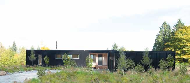
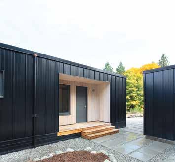
The team’s Lagoon House, located in Whistler, features black powder-coated steel cladding (left), designed to integrate with the surrounding trees and rocky landscape.
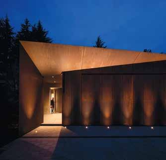
The Corten steel walls and cedar ceiling of the front entry (this photo) continue inside the home.

“A piece of architecture is a synthesis of conflicting elements.”

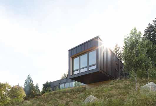
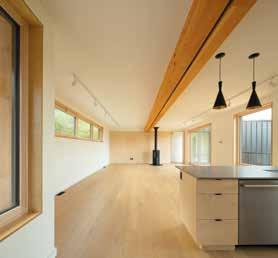
Net Zero House on Salt Spring Island is the team’s first foray into net zero design. The project was built in a prefab facility in Revelstoke, so it was designed to be structurally durable enough to handle craning into place. The sturdy construction meant they could cantilever the main bedroom (bottom) without added expense.
Alma House, meanwhile, is a modernist renovation of a historic property. So, it responds not just to the client’s wishes but also to the style of the “host” house, too. Wainscoting and stained-glass windows were saved. But the kitchen was adapted for today’s use, and contemporary ideas are threaded throughout. “Rather than mimicking the old, diluting it,” says Cunnington, “we let the older elements shine through juxtaposition with the modern.”
The solutions that Measured deploys are infinitely varied—from accommodating renovations to grand statement houses—because Cuddington and Cunnington begin, every time, without preconceptions. More than a month is spent simply listening to new clients ask questions, getting a feel for their needs, before they begin a single drawing. This process, the effort to react authentically to the facts on the ground, is their guiding light. The benefits of that engagement are perhaps most obvious in a project like the Net Zero House. Because the building was prefabricated offsite, it needed extra support on its underside to keep from warping during transit. This supposed hassle was flipped around by Measured and became a design opportunity: the structure’s extra rigidity meant it could be cantilevered off a bluff—a magical effect with no extra cost.
For Measured, the inevitable (and unique) moments of friction are in fact the gateway to discovery: a chance to produce something new and unrepeatable. It’s heartening to discover that—despite their disdain for the mono-style of some “great architect”— Measured’s amenable approach has led them to greatness all the same.
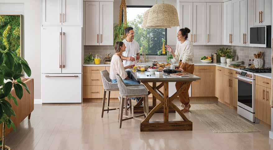
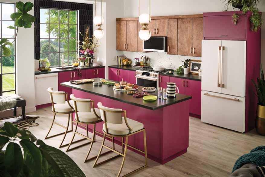
Explore the New LG STUDIO Essence White Collection at a Midland Appliance Showroom Near You
Midland Appliance has been serving the Greater Vancouver area for over 40 years, featuring quality brands such as LG STUDIO in our four designer showrooms.
Our sales professionals will walk you through a personalized shopping journey, exploring a variety of brands and products to suit your home appliance needs. More than just high-end ranges, professional refrigeration, and laundry appliances—you can count on us to help you build a dream home worth living in. That’s why they say, there’s no place like a Midland Home.

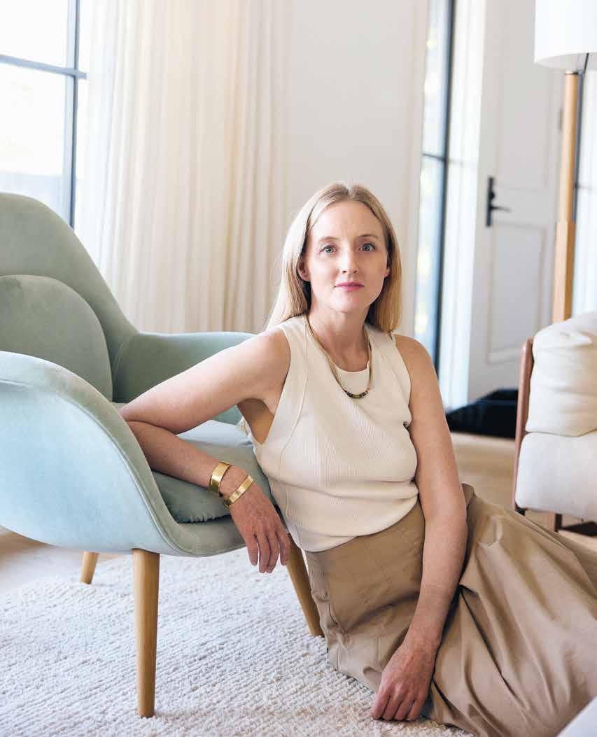
Sophie Burke offers a masterclass in thoughtful, Pacific Northwest-influenced design.
By Amanda Ross / Portraits by Pooya Nabei
Itwas likely inevitable
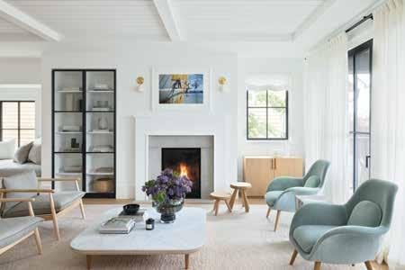
that Vancouverite Sophie Burke would one day become an interior designer. Her parents were not only avid gardeners who regularly pressed their children into green-thumb service in the family’s English garden, they were also passionate antique hunters with a penchant for wrangling Sophie and her five siblings into every antique store they came upon. “My parents were really creative and really interested in design,” explains our 2024 Western Living Interior Designer of the Year. “Together, they were creating an aesthetic.” And young Sophie was happily along for the ride.

Ema Peter
So it wasn’t a surprise that, when Burke was choosing her post-secondary schooling, Britain’s KLC School of Design was top of the list. “My parents’ aesthetic was more traditional, but it gave me an appreciation for first putting an aesthetic together,” she says. Across the pond, she then fell in love with the Brits’ effortless ability to mix modern and traditional fare. “While living in Islington, I was introduced to Scandinavian design at a great store up the road that featured lots of classic Danish pieces interspersed with antiques—I’d always pop in and wander around,” she says.
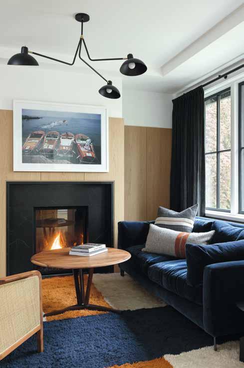

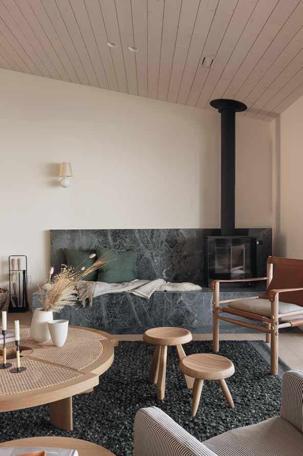
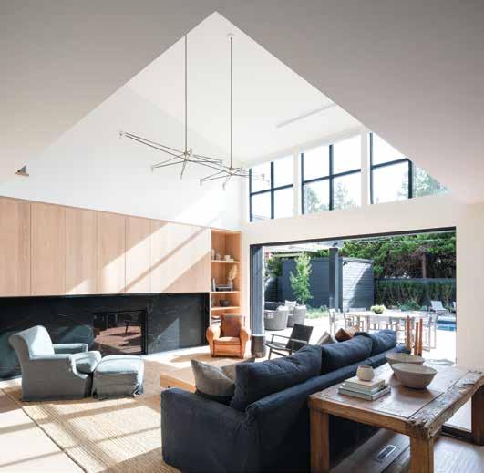
The interiors of Burke’s Halfmoon Bay project are inspired by a contemporary, coastal Australian aesthetic. A green marble fireplace (this photo) anchors the main living space and channels the forest hues outside the windows.


What was your first design project? I worked on a restaurant called Itsu in London right after I graduated from design school there.
Who’s a Western Canadian designer whose work you admire?
I really admire Janaki Larsen’s work as a potter. I love how what she makes seems so rooted in the natural world. I drive by her studio on my way to work each day and I love looking in the window to see the beautifully curated displays of her work mixed with sculptural elements like branches or tumbleweed. It’s a creative inspiration .
What’s your go-to material of choice?
Anything natural—ash, oak, stone, plaster, linen, wool. I like things that aren’t always perfect and that can change over time. I like seeing knots in wood, slubs in linen, fossils in stone. These are the things that make them interesting to me.
What books are on your nightstand right now?
The Postcard by Anne Berest, Sorrow and Bliss by Meg Mason and Being Peace by Thich Nhat Hanh—that one lives on there.
What’s on your playlist these days?
I’ve been listening to Sturgill Simpson’s new Johnny Blue Skies album, Passage du Desir, on repeat. Ema Peter
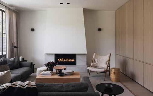
Beyond school, London also offered ready access to design meccas like Habitat—the shop founded by British design icon Terence Conran—or modern furniture retailer Twenty twentyone. “My eye started opening up to what else was out there apart from what I grew up with,” she says. Upon graduation, she landed a coveted job with Conran himself, where she continued to hone her aesthetic around Conran and Partners’ contemporary ethos—one Burke calls “timeless and never trendy.” Her designs for the firm leaned into classic modern furniture pieces that would resonate down the road rather than date themselves.
And while today the repertoire of Sophie Burke Design skews contemporary, there’s always a classic throughline that grounds each space, ensuring they never feel overtly on-trend, formulaic or cold. Whether it’s a coastal cabin, a mountain retreat or a city home, her spaces are rooted in their specific place, with layers of rugged texture, natural materials and deep colour that work in concert with calm, clean backdrops to create a unique Pacific Northwest vernacular that’s singularly hers.
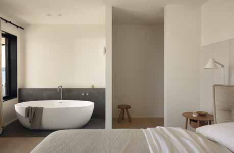
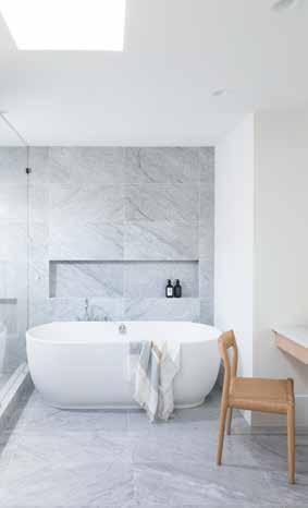
Take her Halfmoon Bay project—a renovation of a 1980s house—where intentional moments abound. A raised marble hearth, a nubby living room rug and the primary bath marble surround, all in forest green hues, aim to channel the outdoors. When set against a shell of clean white oak floors, cream handmade Heath tiles and crisp white walls, the coastal leitmotif anchors the intimate abode with dramatic moodiness.
“New builds can be challenging because you never want them to look devoid of interest or without the layers that an old house can bring.”
The Highland Hills project (above and right) was inspired by the characteristics of an old Belgium farmhouse. It was also a winner in our inaugural WL Design 25 awards.
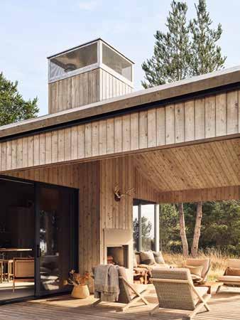
Burke’s Island Ranch project, which appeared in our March/ April issue, opens up directly to the outdoors from every space. The client’s desire for a pared-back, nomadic escape from the city further broke down the barriers between inside and out, particularly with an outdoor shower and bath.

For her Modern Farmhouse project, Burke aimed to balance a traditional aesthetic with a modern one. Antiques are blended with contemporary furniture to emphasize a sense of timelessness.
“Sophie’s interiors are always consistently thoughtful, beautiful and have a strong sensibility,” says judge and interior designer Michelle Biggar of Vancouver’s McFarlane Biggar. “Her work is never overdesigned yet every element and detail is fully considered, well detailed and harmonious with the overall design.”
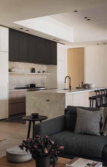
In her Highland Hill project, a blank slate was inspired by the idea of a Belgian farmhouse. “New builds can be challenging because you never want them to look devoid of interest or without the layers that an old house can bring,” explains Burke. Inside, geometry and contrast reign supreme: diminutive black sconces flank a large white sculptural chimney hood while a dark stained oak kitchen backsplash contrasts with white cabinetry; a weighty custom coffee table by Vancouver’s Barter Design holds its own spatially against the scale of the home’s
architecture. “The table is a natural material so it has character and will eventually patina—cracks might form over time, too, but we embrace all that,” explains Burke.
On a bluff facing the Salish Sea, her Island Ranch project is another masterclass in creating time-worn interiors. While the low-slung ode to indoor/outdoor living was built from scratch, its envelope is clad in rough-sawn cedar artfully stained in weathered grey to recall a pioneering homestead. Clothes hang on wall pegs in lieu of closets; an outdoor galvanized metal bathtub extends the rugged living space; cozy sheepskin throws and textured linen pillows hark to a simpler time. Modern organic elements serve as equally masterful design strokes in this nomadic escape, like a hanging ceiling speaker clad in fir and a wood coffee table by Barter that’s actually a subwoofer.
To the designer herself, part of the allure of each space is that her clients all bring a little something different to the table. “They come with their own set of ideas that drive the project,” says Burke. “We don’t want every space to look the same, so when an owner wants something a little more California, for example, or an Australian beach vibe, that’s what makes it interesting and fun for us.”
For the Modern Farmhouse project in North Vancouver’s Edgemont Village, three different chairs in the living room highlight Burke’s eclectic prowess. “It’s more interesting when you can find pieces that don’t match but can still work together to start to create a bit of a story,” says Burke. A vintage club chair from 1st Dibs and an iconic CH25 chair from Carl Hansen face a classic custom upholstered wingback chair. “There’s this tension between antiques and new pieces where you can’t pin the look to one period of time,” she explains.
Whether it’s a vast new build or a compact heritage house, a Sophie Burke space feels sophisticated, clean and always intimate and welcoming. Judge and interior designer Juli Hodgson summed it up succinctly: “Sophie Burke makes houses that people want to live in.” We couldn’t agree more.
KITCHEN ARCHITECTURE
SINCE 1892


BLA Design Group is building something beautiful on a foundation of high-tech visuals—and a solid, easy friendship.
By Stacey McLachlan / Portraits by Pooya Nabei
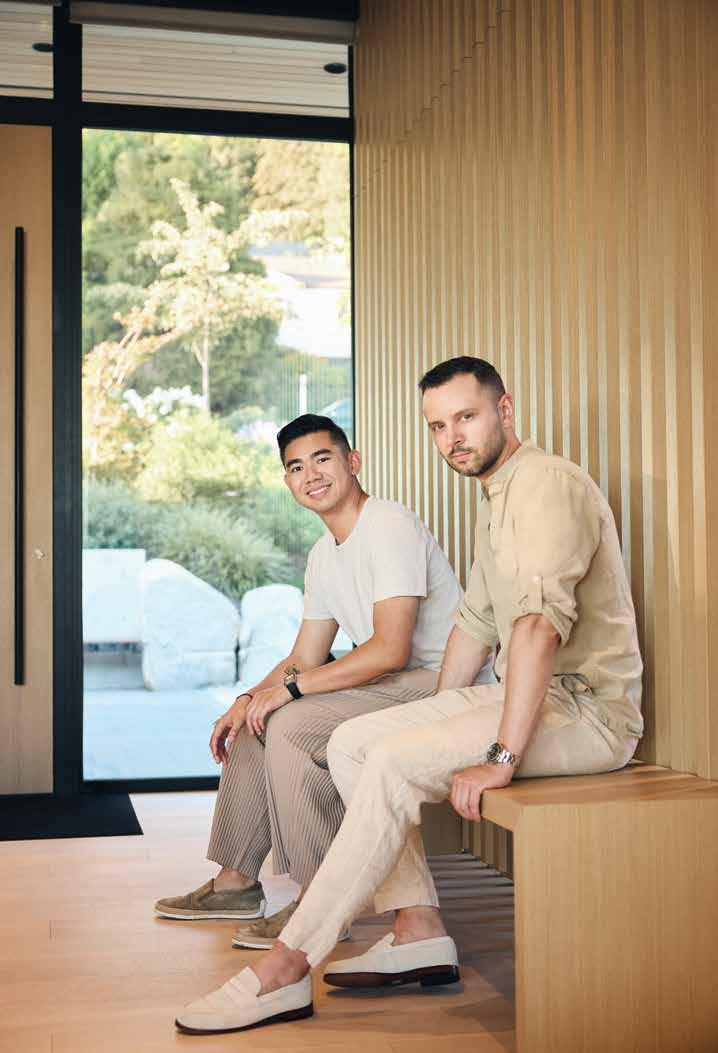
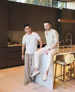
The story of Jesse Basran and Jerry Liu’s first meeting isn’t one of those “lightning struck” sort of moments. They crossed paths at a Vancouver house party (Basran a recent grad from BCIT’s architectural program; Liu back home on summer break from his architecture studies at Cornell). They became acquaintances, then friends, in the way most relationships slowly level up in an infuriatingly uncinematic way: running in the same social circles, getting together once in a while to talk about careers and life. Just two easy-going guys with big architectural ambitions, admiring each other’s work and eventually deciding to team up. It’s a surprisingly undramatic backstory, given how thrilling their work together is as BLA Design Group.
But no meet-cute tale is required to win the Arthur Erickson Memorial Award for an Emerging Residential Designer—just exciting, promising work, and that’s what the two Vancouver designers deliver. “There’s an innovative use of materials and form, attention to details inside and out, and a fresh approach to solving residential designs as an emerging talent,” said judge James Cheng, principal of the acclaimed James K.M. Cheng Architects in Vancouver.
Basran and Liu launched BLA in 2018, after working with Javier Campos (a former WL Architectural Designer of the Year). Liu had long admired Basran’s architectural rendering work—Basran is a few years older, and had already started a rendering business while Liu was finishing up school—and the two found they were easy collaborators. As Liu puts it, Basran brings “a strong sense of visual excellence,” while Liu is the more practical of the pair (also creative, but the handler of
a
and

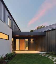
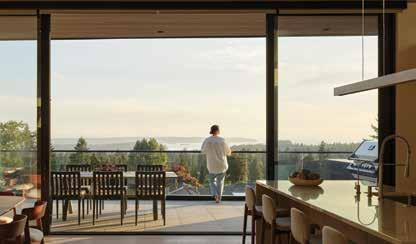
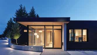
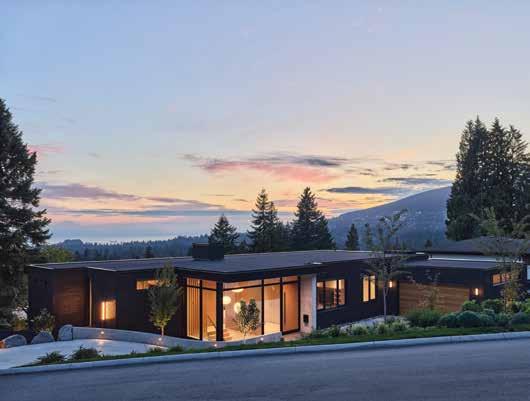
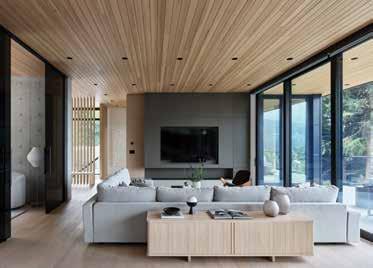
The Yeats House took a client’s vision board of a modern farm house for a growing family and made it a reality. At the heart is a central gathering space that encourages time spent together, connecting two main building forms via a
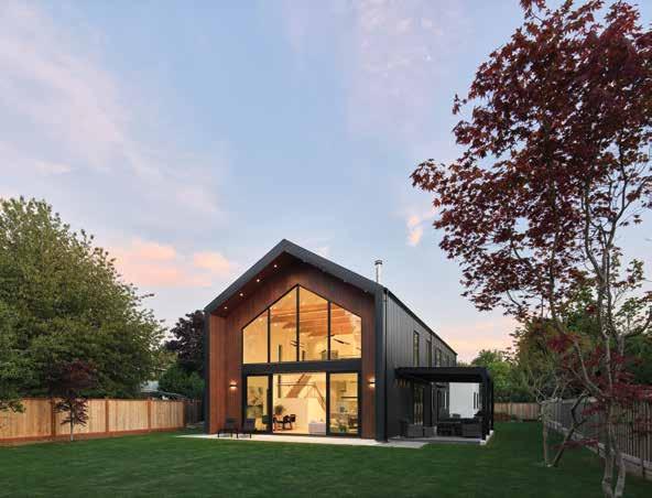
budgets, timelines and all that unglamorous stuff). Though it’s not just their workflow or excellent pedigrees that make this a winning partnership. “We’re friends first,” says Liu.
This award comes six years into their joint venture. They’re fans of several West Coast designers, from greats like Arthur Erickson to contemporaries like McLeod Bovell, but have come to put their own spin on modernism, leaning hard into a unique process. “We’re strongly visually oriented,” explains Liu. “We probably do more renderings than any other firm because we’ve gotten so proficient at it.” The duo sees renderings as a generally underutilized tool in the private residential sector, but BLA clients can expect 3D images, high-fidelity videos or even VR models to help communicate exactly what’s in Basran and Liu’s heads.
They also conduct detailed site analyses and produce visual diagrams to help simplify complex ideas and educate clients. “When we approach people with a strong visual representation—clients, contractors, builders, vendors, suppliers—everyone can quickly understand how it’s supposed to look,” says Liu. Demonstrating how a window placement will impact the light, or experimenting with shifting the placement of a staircase: it’s a process rooted in “show, don’t tell.”
Of course, beyond the technical precision here is an empathy for the homeowners they work with. For BLA, each project is a chance to “enhance the human experience,” Liu says, and “respect each client’s unique narrative.” The Feng House, for instance, located near Pacific Spirit Park in Vancouver, brought the history of the Chinese

WITH JERRY LIU AND JESSE BASRAN
What was your first design project?
Jesse: The first one that comes to mind is an early school project where I was tasked with designing a new house overlooking Howe Sound. Naturally, I broke most of the rules, but I ended up with something pretty cool.
Jerry: A wearable device inspired by the mechanisms of a pufferfish. It created abstracted charcoal drawings that were a visual representation of the unique pufferfish physiology.
Who do you admire most as a designer?
JL: Virgil Abloh. His 2017 lecture at the Harvard Graduate School of Design inspired me to pursue design with honesty and authenticity.
What do you think is the most perfectly designed object?
JL: Everything by Dieter Rams. His works epitomize minimalist design with a focus on functionality and timeless aesthetics, and they profoundly influence modern product design.
What do people often get wrong about design?
JB: Sometimes there is a tendency to overdo things. Start with the essentials. Only add what has purpose.
JL: That design has a beginning and an end. Design is an endlessly progressive and transformative endeavour. Especially for a home, spaces evolve continually as time and their inhabitants change.
Was there a childhood moment that hinted design was in your future?
JB: Ask my parents how many versions of a fort I could make with our living room couch.
JL: I used to play with these Japanese toys called Zoids, which in my opinion are far more badass than Lego bricks.


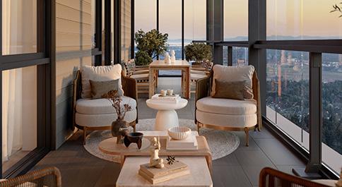
A Downtown Surrey community that invites culture and connection through its energized ground plane. Location: Downtown Surrey
Crafted for outside-in living, every residence features balconies with retractable glass panels that extend your living space year-round.
Location: Metrotown, Burnaby

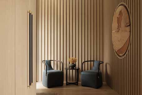
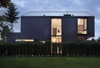

immigrant homeowners into conversation with its West Coast context. The house is clad in stained cedar, a nod to the nearby forest, and the large sliding doors at the rear open up to bring the living spaces and patio together—a classic West Coast move. But it also features slatted wood panel walls, a reference to traditional Chinese ping feng room dividers; within these panels lies a custom topographic sculpture of Hangzhou, the owner’s hometown.
It’s just one example of the specialization the firm has started to build: creating homes for Chinese immigrant families. “There’s a big client base here looking for a modern living style, but there’s a lack of professionals at the highest level of design who are familiar with the culture, the language and the sentiments. As a studio, we’re starting to fill that market void a bit,” says Liu.
The Vista House is similarly rooted in context. “It’s about prioritizing the views while harmonizing the house with the environmental context,” says Liu. The irregular site created some challenges, but BLA played with compression and expansion to allow for a full embrace of the sightlines on the steeply sloped, wedge-shaped plot. A floating balcony welcomes an indoor-outdoor living experience that capitalizes on the stunning viewpoint. And over in Richmond you’ll find the Yeats House, a double-storey modern barn design, built with a limited budget but still achieving grand results thanks to economical interior finishes.
Materials throughout all their projects, in fact, are selected with practicality in mind. Stucco, metal, concrete and wood are all constants in BLA’s work. Yes, they’re not necessarily dramatic or glamorous in their raw form, but with the right application, they become something warm, welcoming and wonderful—much like Basran and Liu’s slowburn friendship. As Basran puts it: “It’s not about the materials; it’s about how you use them.”

Discover beautiful homes with rare, 10’ ceilings and enclosable balconies, where city life, love of nature and community come together
West Coquitlam is a treasure that lies on the border between Burnaby, Port Moody and Coquitlam. This warm, inviting pocket neighbourhood beckons with bikefriendly streets, nature-filled parks and a surge of residential homes—among them, Portico by Wanson Group. This six-story development offers one- to three-bedroom homes at the pinnacle of urban living, nestled among vibrant amenities, nature’s playground and, above all, a community of great people.
Your home is your haven, a place to unwind and express yourself. Portico homes boast 10' ceilings throughout its flexible and functional living spaces, creating an airy sense of grandeur, making room for larger windows with abundant natural light and leaving a world of possibility when it comes to choosing décor. Higher ceilings also mean larger, more abundant cabinetry and additional vertical closet space. In the kitchen, this is crucial to maintaining a well-organized and clutterfree space so the gas range cooktop and hand-selected finishes can shine. An optional expandable kitchen island dining table is perfect for gatherings with loved ones.

Centre is just minutes away. Looking to immerse in nature? Enjoy nature, tall trees and stunning views of the city and inlet just a fourminute bike ride away at Burnaby Mountain where 34 multi-use trails spanning 28 km and 578 hectares are waiting to be explored.
Unique in Coquitlam, Portico homes blend indoor and outdoor living with enclosable glass balconies in the two- and three-bedroom units located on floors two and up. Simply slide panels open during warm, summer months or close them up to create a cozy, well lit space in the cooler months. This is the ultimate flexible living space that could be a safe play area for children, a place for pets to rest or your very own corner of tranquility.
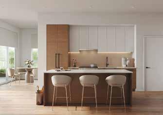
Surround yourself in your spa-like en site oasis to unwind where chic matte black fixtures, a frameless shower and an oversized mirror with a medicine cabinet make all your beauty dreams come true.
Portico is nestled on a quiet, family-oriented street, across from a future park and only a 10-minute walk from Burquitlam Skytrain Station. Craving retail therapy? Lougheed
Good things are on the horizon. Discover Portico and contact the dedicated Sales Team at: info@lifeatportico.ca or 604-721-9652 to book an appointment at the Presentation Centre located at: 104 - 552 Clarke Road, Coquitlam BC V3J 3X5. Visit lifeatportico.ca to learn more.
Meet your friends, family and neighbours in a southfacing courtyard that’s perfect for socializing, BBQs, tea-parties, and making memories. Or take the festivities indoors to a versatile social lounge where a spacious kitchenette with a large island, convenient bar fridge, plush seating area, TV, fireplace and pool table provide everything you need to gather in comfort. If it’s serenity you seek, enjoy Portico’s quiet zone where work pods, co-working area, and separate play area for children provide focused productivity or relaxed leisure. Don’t forget to tackle your wellness goals with a fully-equipped fitness room, just steps from home.


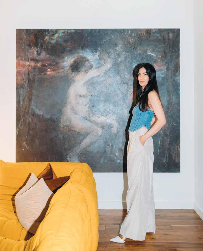
Edmonton’s Brianna Hughes brings a photographer’s eye and an artist’s touch to the striking, sumptuous spaces she designs.
By Stacey McLachlan / Photos by Sharon Litchfield
have nothing against minimalism or Scandinavian modernism over here at Western Living HQ, as any given issue of the magazine will prove. But the work of Edmonton-based interior designer Brianna Hughes, who plays in a palette of moody colours, rich textures and old-world references, makes us question our allegiance to a crisp white room. Each of her projects is layered and sensual—sofas upholstered in mink velvet, walls finished in moss-coloured plaster, reeded cabinets in the kitchen, maroon mouldings in the entryway. It’s maximalism done with an elevated, elegant restraint, and a design sensibility that wowed our judges and earned Hughes the Robert Ledingham Memorial Award for an Emerging Designer this year. Looks like more is more is more.
Though Hughes has only been operating her design practice, Brianna Hughes Interiors, since 2021 (her previous role was with Ministry of Interiors, which she co-founded), she’s been an artist her whole life. The daughter of art collectors, she studied art history and photography in New York and Paris. “The cities were my classrooms,” says Hughes, who soaked up inspiration from both the history and the contemporary art scenes in both places. The homes she designs today always have elements that wouldn’t feel out of place in a Parisian penthouse or a turn-of-thecentury Brooklyn brownstone—wainscoting, marble, dark herringbone floors—but there are plenty of contemporary details (an oversized drum light from Luminaire Authentik here, a quirky pop-art rug from Indigenous artist Rashelle Campbell there) that bring balance, too.

Warm Welcome
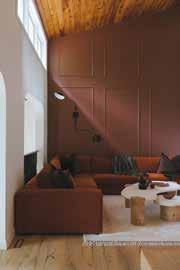
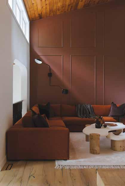
The Highland House is a renovation of a 1979 home for a family of five in Edmonton’s Highlands neighbourhood. Terracotta flooring and accents give the home a warm, historic feel beneath its sloped wood ceiling. Here you’ll find vintage-inspired unglazed Zellige tiles around the woodburning fireplace, and plush corduroy sofas that lean into the ’70s vibe.


What was your first design project?
A psychology practice in a 100-yearold home in Edmonton.
What do you think is the most perfectly designed object?
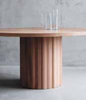
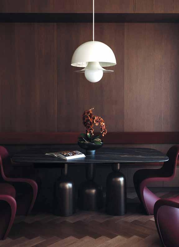
The Tulip table by Eero Saarinen—the clean pedestal base is so aesthetically pleasing and you can cleanly tuck chairs under it. It’s perfect for smaller places: the single pedestal keeps the lines clean.
Textured Touches
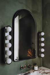
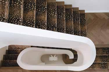
Ramsay House was started when Hughes was still with Ministry of Interiors, and then completed under her own firm. The narrow, high-ceilinged house is centred on a dramatic curved staircase (finished with a custom antelope stair runner, of course). The powder room walls were finished in plaster to bring the texture. Macchia Vecchia porcelain slabs are the defining material in the gorgeous kitchen.
Do you have a favourite room from a movie?
The film Ex Machina is a story about humanity’s relationship to nature and technology and the interiors they chose were incredible. A movie about a robot might conjure images of sterile metal and glass but we see built-in texture and warmth. It makes me think about how we live in a world of advancing technology— it’s my mission to continue reflecting the natural colours, textures and patterns of our environment.

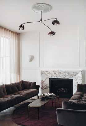
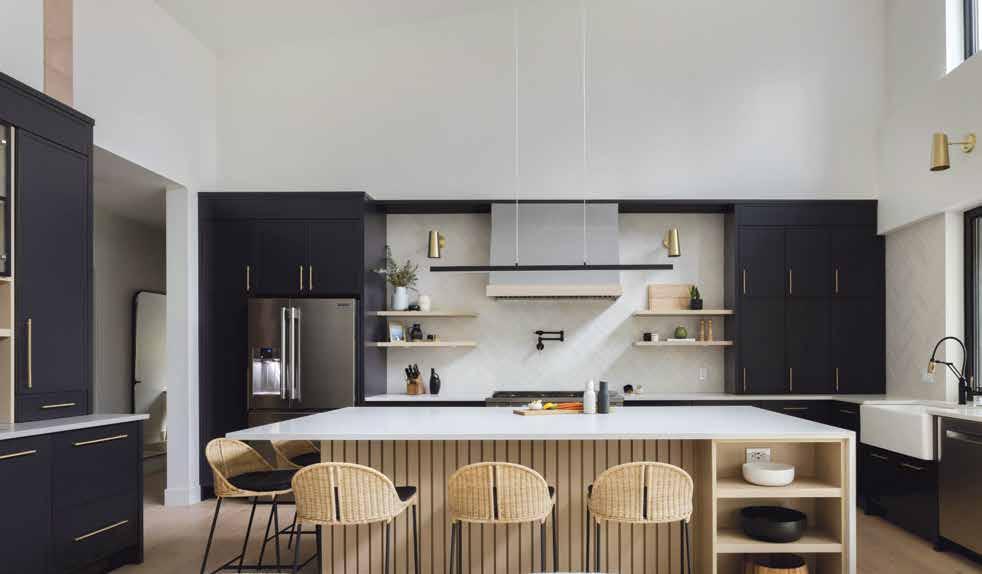
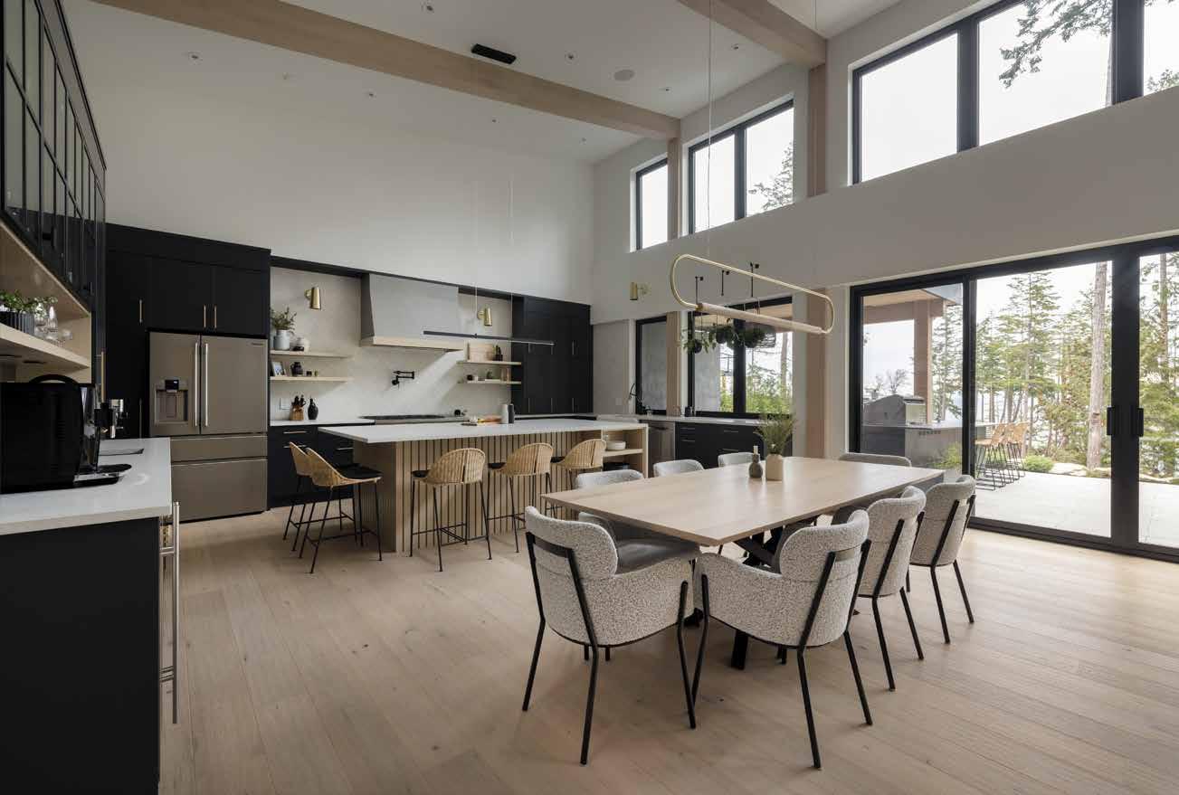


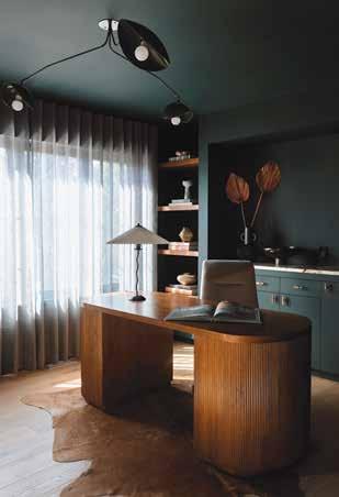
Her talent for composition perhaps comes from a 15-year career as a photographer: she was known for emotive family portraits that captured the beauty of a space within the frame. “I would take a family and situate them in their living room or bedroom and create an architectural portrait,” she says. “I loved playing with the furniture, and having them live in their space. It wasn’t just a focus on Mom and Dad and the kids smiling, it was more how they were in their environment.” She met her former business partner through her portrait work, and they teamed up for five years as Ministry of Interiors before Hughes launched her solo practice to further home in on her unique aesthetic. “Even when you go to school for something, you need to learn by doing, and it’s terrifying,” laughs Hughes. Though she’s not formally trained in interior design, her studies in lighting, space and colour translate into an aptitude for creating beauty. “I have an ability to make things that are unexpected come together. Maybe because I didn’t have that formal training, I was able to find my own direction,” she says. She doesn’t consider her work to be particularly colourful, but the forest green office of the Rio Terrace project or the terracotta walls in the Ramsay House bedroom are undeniably dramatic standouts from the current Western Canadian design scene. “I’ve collected quite a bit of art over the years, so maybe just seeing a painting with baby blue and gold and pink next to a fluted green cabinet helps me see what works,” she hypothesizes. “Or maybe putting colour together just comes naturally to me.”
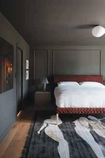
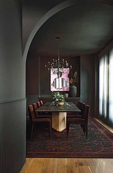
Whatever the reason for the skill, judge Juli Hodgson, principal of Hodgson Design Associates, took note during the judging process. “No one else is really doing what [Hughes] does this well,” she wrote. “She brings a beautiful colour palette and beautiful objects to warm moody spaces. Bravo.”
Hughes’s work is about more than finding the right blush-pink bathtub for an ensuite, though. “I’ve been doing a lot of self-reflection about how I want to live a life with purpose and meaning, and I want to feel like I’m helping other people, and I had this a-ha moment,” says Hughes. “I’m helping people find what inspires them and makes them feel comfortable. I’m helping them create something totally unexpected.”
Colour Your World
An infill home in Edmonton’s Rio Terrace neighbourhood got the Hughes treatment in 2022. The charcoal dining room features fluted wainscoting, a dramatic chandelier and a custom table made by pairing an old-world ceramic tabletop with a modern, angled wood base. A portrait from Edmonton artist Carolyn Campbell anchors the space. The primary bedroom is painted moody grey (the ceiling, too!) while the home office is drenched in forest green.

Wine partner
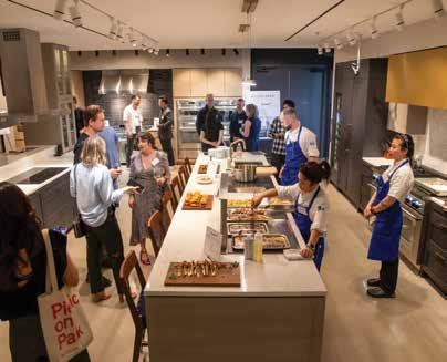
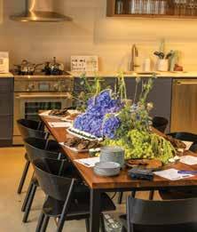
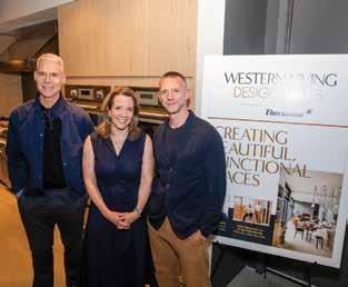
It was a full house at Luxe Appliance Studio on Thursday, June 13, as designers gathered for our latest WL Design Talk. Over wine and appetizers prepped by Thermador’s pro chefs, designer Chad Falkenberg of Falken Reynolds Interiors shared his firm’s philosophy on what makes for enduring design. Thanks to Luxe and Thermador for their support of this event! Learn more about our next WL Design talk at westernliving.ca





Thermador has one of the most advanced refrigeration collections on the luxury market, with a never-before seen suite of innovative features. It’s the refrigerator other refrigerators want to be.
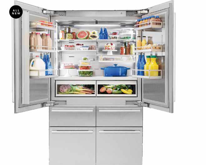
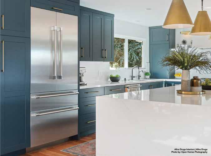
ourmet home chefs with a passion for preparing food from scratch know how important it is to use the most high-end, highperforming and feature-packed appliances— it’s all part of the vision for a perfect kitchen where aesthetics and functionality combine in complete harmony. Sleek, luxury design, innovative technology and ultimate flexibility are at the top of every culinary aficionado’s wish list, and the new Thermador Built-in Bottom Freezer Refrigeration delivers.
Flexibility At Your Fingertips
When space, flexibility and personalization are top of mind, Thermador bottom freezer refrigeration makes the process of creating your dream kitchen easy, with plenty of options. Available in four sizes from 30-inch to 48-inch built-in designs, this refrigerator is a gamechanger because it offers the flexibility to use the space the way your lifestyle demands.
Craving ice cream one day and fresh produce the next? The ThermaFlex™ Drawer offers pre-set temperature modes, including freezer, beverage, meat/fish and more, so you can flex from chill to frozen in the same drawer with the touch of a button. ThermaFresh® Pro Drawers keep your veggies crisp and fresh for longer, creating the perfect humidity and temperature conditions for each drawer.

When it comes to flexible storage, Thermador goes the extra mile with additional, personalized features thoughtfully designed to make your culinary experience more seamless, more intuitive and more intelligent. Everything fits within gallon-sized bins that are crafted for strength and easy to adjust to suit whatever storage needs your culinary adventures require. Maximize a full range of storage options with an open-face deli drawer or easy to adjust splitlevel shelves.
You’ll know exactly what you have (and need) thanks to perfectly placed interior cameras that display the contents of your refrigerator any time, from anywhere, all through the Home Connect® app. Running low on milk? Have everything for that incredible recipe you’ve been dying to try? Never miss a beat with


Learn more at thermador.ca or Visit, the BSH Luxe Appliance Studio, 30 E 6th Ave Unit 101, Vancouver, BC V5T 1J3, Canada, for a closer look at the new refrigeration collection. Connect: @ThermadorCanada | @thermadorhomecanada
the ultimate in visibility, made even better with elegant and vivid theatre-style LED lighting that maximizes visibility while minimizing hot spots.
When you just want a refreshing, icy beverage, peek inside for a discreet internal water dispenser that uses an UltraClarityPro™ water filter to remove 99% of impurities and keeps cool, refreshing water accessible while preserving the sleek exterior lines of your refrigerator. Plus, with Amazon Smart Reorder for water filters, you'll always have a fresh supply on hand.
Reach for the Elevated Dual ice maker, available in 42-inch and 48-inch models, for countertop height, flush to counter icemakers that streamline your refreshments—and your kitchen aesthetic. For a little something extra, discover a splash of sophistication in everyday drinks with two styles of artfully designed ice. Signature Diamond Ice, available in all models, is artfully designed to maximize the chill with a shape that concentrates the cold—and looks beautiful doing it. Entertaining Ice, available only on the 42- and 48-inch models, is perfect for elevating your favourite cocktails with a bolder, slower melt thanks to a larger, sculpted gem shape that chills cocktails for longer.
Of course, all this functionality is right at your fingertips with a vibrant, personalized, fullcolour touchscreen with WiFi connectivity and functionality through the Home Connect® app, which also provides important notifications of filter status, open door, and more.
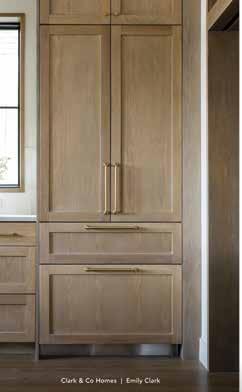
Don’t forget—Thermador refrigerators are simply beautiful. Intuitive, counter height beltline and midline Masterpiece Collection® handles match with under counter products to enhance visual continuity. Stainless steel exteriors and full stainless steel inner liners create flawless lines in any kitchen space. And, if you want to fully customize your kitchen, this refrigerator lineup is Panel Ready to give you the freedom to match your refrigerator with your cabinets for an integrated, seamless look.


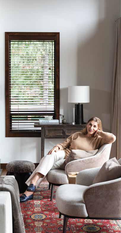
Two designers join the WL Design Icons list for 2024—and Pereira’s standard-setting design is the very definition of this award.
ABy Anicka Quin / Portrait by Ema Peter
lda Pereira was a rule-breaker from the start. She was fresh out of KPU’s interior design school back in 1987, and she opened her own business just as the country was heading into a recession. “The first rule they teach you is to never start a business straight out of design school,” she told us in 2010 when she won that year’s Western Living Interior Designer of the Year title, “and I broke that rule right away.”
But Pereira immediately made an impact: her very first project, a small salon, won her gold from the Interior Designers Institute of British Columbia. And since then she’s covered everything from private homes to corporate head offices to becoming the go-to for multi-dwelling residences all over Vancouver (her name became so synonymous with excellent design that one developer named a building after her: the Alda).
She is, of course, still an in-demand designer in the city, and it’s easy to understand why. If you revisit the 2010 portfolio that secured her win, you’ll see work that could have easily been featured in a recent issue of this magazine. And, in fact, when we celebrated our 50th anniversary a few years ago, it was Pereira’s own home (which we ran in 2014) that was highlighted in the issue as one of our favourites of all time—itself an exercise in approachable modernism that you could imagine spending plenty of quality time in. “There’s a certain minimalistic sensuousness to what she creates,” says interior designer Kelly Deck. “She always strikes this balance of extreme restraint without sacrificing atmosphere.”
Pereira has long had the gift of making each project very personal, too. “There’s an ease about Alda’s work—it doesn’t feel derivative,” notes interior designer Robert Bailey. “It just seems to flow very naturally—it really feels like it’s driven by the client, and the context in which she’s working.”
She may break the rules, but in doing so she has become a standard-setter for beautiful design in Western Canada. It’s an aesthetic that many local young designers are aspiring to match—and an indelible imprint that will be helping to guide and inspire our interior design scene for generations to come.
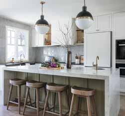

Interiors that tell the story of your lifetime.
Stephanie and her team get deeply involved, learning as much about the client’s functional needs as their life experiences. It is this truly personal approach that differentiates the client experience Stephanie Martin Interior Design provides. The end results are homes full of carefully considered design details, individualized concepts, and eclectic styles that transcend trends and stand the test of time.
stephaniemartindesign.com

PURE Design Inc. offers elevated, bespoke Interior Design and Construction Management from our studio nestled in the Shipyards District of North Vancouver. Our retail shoppe stocks artisan treasures from around the globe. Throughout our simplified yet concise design process we create beautifully layered, one of a kind living spaces. Our Construction Management service takes care of every detail to ensure your home is completed with a high level of quality and detail. Allow us to transform your space into a cozy sanctuary that reflects who you are. purebyamimckay.com

A highly qualified, Calgary based Interior Design Studio that specializes in high-end residential projects.
At RCID, our goal is to make the process of creating customized, elegant spaces from our client’s perspective. We employ systems and strategies to ensure our clients feel at ease through all phases of design.
Whether it is a new build or renovation, the RCID team is eager to help you achieve your vision.
rochellecotedesign.com
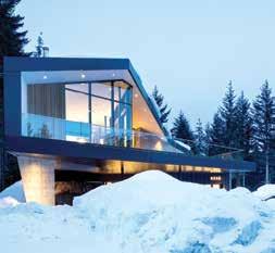

Frits de Vries Architects + Associates Ltd.
Frits de Vries Architects + Associates Ltd. is an award winning architectural studio with a diverse portfolio of projects and a special expertise in residential design.
Our client-focused team delivers innovative & thoughtful architectural solutions to projects of every size. We view design as a collaborative process between client, builder and architect, resulting in a truly unique architectural product. frits.ca
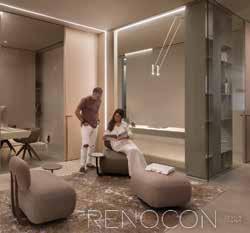
Our design center is located in the heart of Vancouver's Design District. We embrace an intentional approach to crafting spaces that resonate with the way our clients live, laugh and love.
Creating in every shape and form is our favourite pursuit—whether it’s crafting inspiring spaces, building strong relationships, or refining our designs. We create with you, for you, and our expert team of project managers and trades works seamlessly alongside us to bring our shared vision to life. renocondesign.com


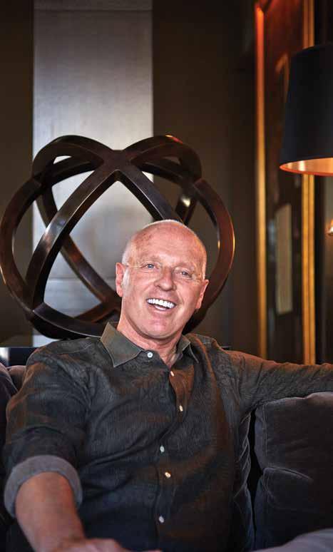
The second of our two inaugural WL Design Icons for 2024, Cridland understood just how his clients would want their future selves to live.
By Neal McLennan / Portrait by Martin Tessler
We try to use the word icon sparingly in this magazine, because it’s a term that only becomes true after long exposure to the rigours of time. One season’s “iconic” chandelier can be fodder for a “what were we thinking” column after only a few years of changing tastes. But we’ve been lucky here at Western Living to have had a front-row seat to 50-plus years of Douglas Cridland doing masterful interiors, so we feel uniquely qualified to humbly bestow the title upon him. We first featured one of his houses in March 1981, where, going for clean and functional, he installed restaurant shelving a solid 20 years before its widespread use in home kitchens. And so began a journey of him designing wildly imaginative spaces and us being privileged to publish them in these pages. And throughout all this time, the one constant has been that his genius for design is unwavering.
But for Cridland, the spaces themselves are only one part of his career: they’re bolstered by the people he and his work have touched over the decades. When this award was announced, letters singing his praises poured into our office. They came from clients (“He has a particular talent for creating interiors that transport a client to their future selves; meaning he sees who you are before you do and takes you there one fabric at a time!”), fellow designers and even contractors, who marvelled at his professionalism. We were particularly struck by the words from Cridland’s former colleagues, Samantha Smiddy and Lisa Stegman: “His influence on our personal and professional style is still felt in our everyday design decisions. Whether it be an interior architectural detail with a drapery pocket or the stitching on a custom ottoman, his teachings are now a part of us, the next generation of designers.” It all amounts to a body of work on which we can proudly put the moniker of icon.


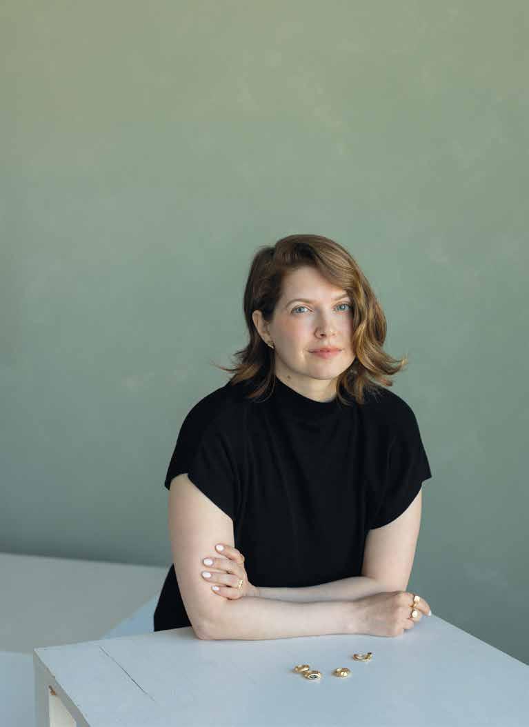
Jeanie Andronyk merges the physical and digital by linking her jewellery to NFTs.
By Dani Wright / Portrait by Emily Oud


Simultaneously, Andronyk worked at JewellerBau, a gallery in Vancouver owned by Dina Gonzalez Mascaro, who, along with her partner, took the designer under her wing and provided a space for her to showcase the very jewellery that informs the type of work she creates today.
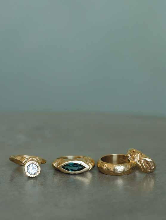
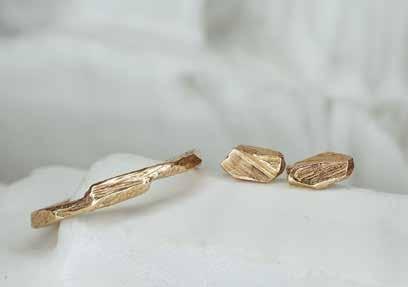
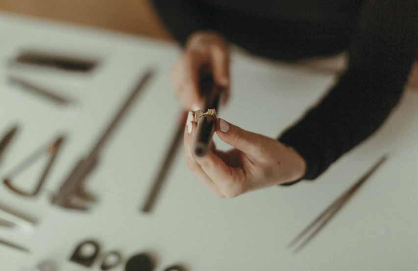
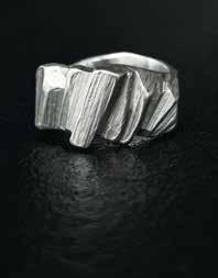
Take the Drift ring, a non-traditional solitaire-style ring that celebrates the use of handheld tools to create something not only captivating in design but also ergonomic and balanced in its wearability. “Even if it’s a finer piece, I don’t want it to look too delicate... I want it to be substantial,” Andronyk notes. Her pieces aren’t fussy, and can withstand heavy wear despite the raw elegance that judge Karyna Schultz of Neighbour described as having a “brutalist quality that appeals.”
From the beginning, jewellery designer Jeanie Andronyk has loved creating items with her bare hands. Growing up on a farm in northern Alberta meant ample opportunities for hands-on creativity: from using leftover wax from the wood stove to form candles to weaving old ribbon markers she collected from gas pipelines, she spent her childhood making. But it wasn’t until she moved away that her innate creativity became a realistic career path, too.
“In a small town, jewellery designer was never an option; it was something I had to
feel my way into,” the designer explains. She was drawn to rocks and minerals, so she picked up work at a semi-precious gem wholesaler in Edmonton, where she eventually met jewellery designer Leanne Gallagher of Salt Spring Island’s Queen Bee Design. Soon enough, Andronyk was learning basic silversmithing, soldering and production. From there the designer completed a two-year diploma with master goldsmith Gerold Mueller at the Vancouver Metal Art School, where she experimented with “out-of-the-box, sculptural pieces.”
When a sudden renoviction from the designer’s Vancouver apartment coincided with the end of school, she took the opportunity to move to a tiny town in Southwest Saskatchewan. “I missed the space to breathe and the magic of the country, where rural simplicity can breed creativity in unexpected ways,” she says. And it did: upon relocating, our 2024 Western Living Fashion and Jewellery Designer of the Year officially founded the eponymous Andronyk Studio.
Andronyk’s gender-neutral, sculptural pieces are also constructed with responsibility in mind. The designer is a member of Ethical Metalsmiths and Andronyk Studio is a Fairmined Gold licensed brand, which means pieces like the Prism ring are not only avant-garde and substantial in their design, they’re ethical and sustainable in their impact, too. Judge Gabrielle Bayona of Truvelle praised Andronyk for the move.

WITH JEANIE ANDRONYK
Who’s a Western Canadian designer whose work you admire?
Edmonton’s Vikki Wiercinski. She can combine elements and shape and colour in her patterns in a way that I am always struck by. It’s easy to become happily lost in her work.
What’s your go-to material?
Gold. Always gold. As a material, it’s so full of history and I feel like it comes alive when you work with it. It’s durable and buttery and delicious and powerful and oh-so-gorgeous.
What books are on your nightstand right now?
Right now I’m re-reading The Incal, a graphic novel by Alejandro Jodorowsky. It’s everything you want in a metaphysical sci-fi comedy/drama, and it inspired the film The Fifth Element !
What do you think is the most perfectly designed object?
I have a Barunson Techno 1000 mechanical pencil from my childhood that I can’t live without and is still perfectly new. The weight, pocket clip and click are all so satisfying, and the chrome details are super sharp.
“With solid gold jewellery becoming more popular,” she noted, “the use of not only recycled gold but also ARM-certified gold (Alliance of Responsible Mining) makes this collection a cut above—prioritizing ethical sourcing without sacrificing on style.”
The designer embraces the concept of “phygital” items—ones that exist both physically and digitally. In the case of the Aeon collection, inspired by AI, each sculptural ring has a unique NFT (what Andronyk calls “digital assets”). “Each of the [digital] artworks I’ve created is a section of the physical ring, and then I’ve created a world around it in the digital space.” Details about the piece are also embedded in the metadata of the digital asset, linking the two together on the blockchain where, according to the designer, it can live forever.
“The concept of permanence is so important to me, because my work is always evolving,” she says. “It’s not a prim and pretty thing— it’s something that will evolve with you. As you wear a piece it will slowly polish up... or it will gain scratches, but it’s meant to collect those little memories. It’s truly yours that way.”

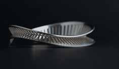
For designer Stephanie Geracitano, the creation process is rooted in her background in both sculpture and industrial design—that pairing of the organic with the architectural that gives jewellery by Orii Design its unique quality. Traditional metalsmithing coupled with 3D printing technology allows the designer to innovate forms that would otherwise be difficult to achieve by hand. Take her own favourite piece, the Helix cuff: a sterling silver bracelet, inspired by the helix shape of DNA, that angles fine lines against each other and naturally curves up and down, making you instinctively want to turn it. “It’s interesting from all angles,” says Geracitano. Judge Gabrielle Bayona of Truvelle commended Geracitano’s approach. “Using both modern and classic techniques gives the final result a clean finish and symmetry that isn’t always possible without the use of software and 3D printing,” she commented. “Yet, there’s something in the curvature of each piece that feels natural and elemental in origin.” Tia Sacks






Change of Pace
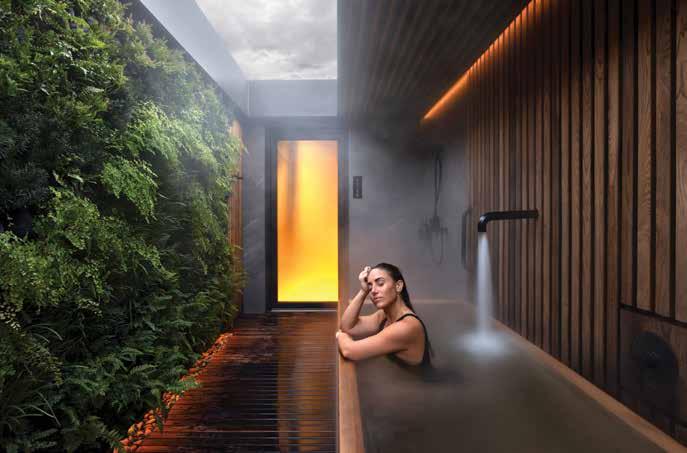
Landscape designer Alexander Suvajac mainly works on residential properties, but Circle Wellness Spa was an opportunity he couldn’t pass up. “The urban context created a freedom of planting and expression,” he recalls. “It’s a really unique project that I am thrilled to be a part of.”
Sharing Is Caring
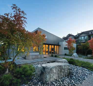
The homeowners of the Curio project (above and left, a collaboration between Suvajac and Haeccity Studio Architecture) also own the property behind it, and the landscaper took advantage of that by setting up a “borrowed view”—planting grand trees on the adjacent property to up the Curio yard’s wow-factor.

Alexander Suvajac finds ultimate harmony between urban dwellings and the natural environment.
By Alyssa Hirose / Portrait by Pooya Nabei
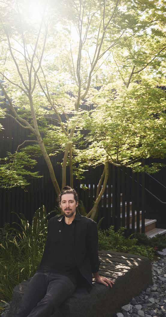
Alexander Suvajac
may have grown up planting flowers for neighbours, helping with landscaping projects on his dad’s construction sites and taking on summer gardening gigs to pay for travel expenses, but working in the field wasn’t on his when-I-grow-up radar. “I was never thinking about a career in garden design—I didn’t even know what landscape architecture was,” he recalls.
Besides: how could something that came so naturally to him possibly be a job?
“I always thought work had to be hard; that it’s a grind,” he says, “but this was already a throughline in my life story.” After studying industrial design at Vancouver’s Emily Carr University, Suvajac applied for a master’s degree in architecture... and landscape architecture, just in case. “I ended up getting a scholarship for landscape and waitlisted for architecture, so the decision was made,” he says with a laugh.

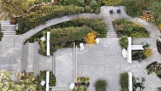
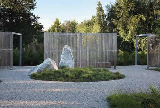
Suvajac and his team worked hard to make the Myra Canyon home fit as naturally as possible into the Okanagan wilderness (above). “I like the idea of a property being able to stitch itself back into the larger landscape... there aren’t these boundaries, like, ‘Here’s our yard, and here is the nature we’ve kept at bay,’” he says.
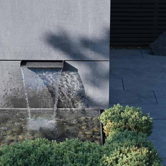
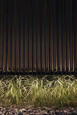
So Suvajac’s clients have fate, in part, to thank for their beautiful, balanced outdoor spaces (in backyards and beyond). Some of his projects work to merge with the natural environment as much as possible—take his Myra Canyon home, for example, a project that embraces the surrounding arid meadows and ponderosa forests of the Okanagan. “We brought in what was already growing in the area but also started to elevate the landscape, so it becomes more tailored the closer you get to the house,” he explains. Suvajac’s PF Vancouver home in the Kitsilano neighbourhood similarly incorporates the mountain views of the Pacific Northwest together with nods to traditional Japanese garden design (think: Japanese maples, bonsai-like strawberry trees and creeping honeysuckle).
Was there a childhood moment that hinted design was in your future?
I recall some of my earliest memories being fascinated by materials and by texture, forms in the built and natural world. That fascination has never ended.
What’s your dream project?
I have a few regenerative placemaking projects in mind that take drastically disturbed land “restoration sites” and transform them into destinations that are both ecologically and aesthetically alluring. Or, in general, anything that promotes deep nature immersion and design that taps into the energetic and circadian rhythms of a space, like a landscape hotel.
Other works aim to create a retreat within an urban environment, like his Curio project, a suburban home in Richmond. “There were privacy issues; it’s a unique parcel surrounded by townhouses in almost all directions,” the designer explains. Veils of bamboo, a timber pergola and arbour and strategic hedging help the space feel secluded, but still airy and serene.
Then, there’s the odd project that totally transports you: the best example in Suvajac’s portfolio is Circle Wellness Spa, a self-guided thermal spa on Vancouver’s Granville Island. Unlike the other candycoloured buildings on the tourist-heavy peninsula, the spa is dressed strikingly all in black. A short portal-like entryway guides guests into a small courtyard of granite aggregate and gravel, with yellow cedar decking and thoughtfully placed green-leaf Japanese maples and sword ferns. “It’s an otherworldly experience; you can shed whatever tensions you might have coming in and just connect,” says the designer. This project is also a good example of Suvajac’s passion for his work, despite being in the industry since he was barely a teenager.
planters from Vancouver’s GreenTheory and a blackened stainless steel water feature by Riddleworks to elevate the once-flat deck into a beautiful staycation space.”
“Am I getting into too much detail?” he asks, deep into talking about flood lines and the pragmatic challenges of building an oasis on a parking lot. “It’s easy for me to nerd out talking about landscape.”
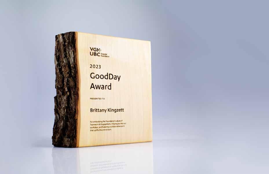

A uniquely West Coast gift designed as you wish!
Are you searching for a sustainable gift with West Coast flair? Consider our live-edge “Vancouver Awards” which can be customized with your personalized message.
• locally handcrafted from windfallen maple trees, salvaged in the Fraser Valley
• includes professional graphic design, based on your the details you provide
• engraved with our solar-powered laser
• delivered in 3 weeks, or as little as 2 days with rush service
Bring a glowing smile to their face with a beautifully crafted gift that will last a lifetime!
Over 150 five star reviews and counting! Order at eclipseawards.ca


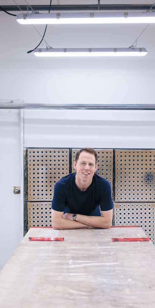
At New Format Studio, Henry Norris experiments with science and craft to transform ordinary materials into extraordinary designs.
By Kerri Donaldson / Portrait by Pooya Nabei
Henry Norris’s journey began with simple curiosity: “I was always interested in how things worked and how I could make them better,” says our 2024 Western Living Industrial Designer of the Year. It’s this drive that fuels New Format Studio, the Vancouver-based design firm he founded in 2016.
The studio’s story is one of constant evolution and exploration. “I am continually deepening my knowledge of the materials we work with through experimentation,” Norris says. With a foundation in industrial craft and a background in metalwork, Norris is otherwise a self-taught designer. He created New Format’s offshoot, Henry Norris Workshop, in 2020 out of his “desire to explore more conceptual work in which process can dictate form.”
New Format Studio lives up to its name through relentless experimentation and discovery. Case in point: the Borrowed Forms credenza, one of our inaugural WL Design 25 award winners. Inspired by stones collected over dozens of foraging trips across the Pacific Northwest, the design process involved hot jeweller’s wax poured over those stones to create a tapestry of textures cast in solid bronze. “I wanted to show the memory of the stones, expressed in a cabinet that distills what the landscape is like here,” says Norris. Judge Marjan van Aubel, founder of the solar design practice Marjan van Aubel Studio, praised the work as “a beautiful mix of design and craftsmanship that poetically brings natural stone formations into one’s home.”
The Froe table was also developed after a series of experiments. “This one took a couple of years because I discovered the process of glass enamelling and then worked on it to find the limitations,” says Norris. The
first piece in a series that integrates glass enamel on solid copper, the table features hues from soft pinks to deep purples. “The glass is painted onto the surface and fused to the metal by firing the copper red hot. As the enamel melts, one intuitively directs the torch to change the final coloration,” explains Norris. This transforms copper into a warm, tactile surface.
The Mini Plano credenza pair originated from the discovery that flat glass could be curved, leading to furniture that softens this hard material. By heating glass to bend under its own weight, the studio creates beautifully refractive panels. The piece features hand-cast reeded glass, textured bronze and blue Tlupana marble from Vancouver Island. Despite the range of materials, it feels cohesive thanks to innovations like aged, stippled bronze on the frame, designed to complement the handmade curved glass and rough marble top. The nine-sided tapered bronze handles are hand-carved sculptures, necessary, says Norris, “because the design made it near impossible to machine them.” He developed a special technique using an angle grinder to achieve machine-perfect precision with human hands. Over time, the patina finish will literally and symbolically blend the maker’s touch with the user’s, creating a harmonious design. Judge Toby Barratt of Propellor commended the work: “New Format’s sensitivity to both the technical and poetic potentials of materials creates pieces with a unified and timeless quality.”
And the Cirrus console, created in 2023 from Norris’s explorations in bronze casting done out of the more experimental Henry Norris Workshop, reimagines his 2021 Cirrus coffee table but with a focus on scale and a more delicate form: one that’s handsculpted. The bronze legs create a seamless base for the black Carmanah marble top, with visible vestiges of the sand-casting process.
New Format Studio exemplifies what can be achieved when passion, creativity and meticulous craftsmanship come together. “I have a deep personal interest in going all the way,” says Norris, “to fully understand a material that takes many lifetimes to know.”
The Froe table captivates with its unique texture and mesmerizing pink and purple hues, a result of innovative glass enameling applied to solid copper. The design embodies Henry Norris’s artistic vision of transmuting materials into visually arresting, functional art.
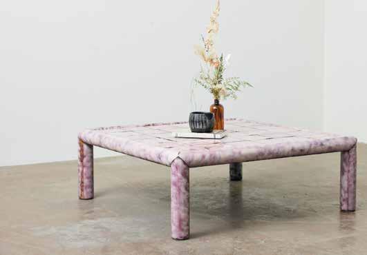
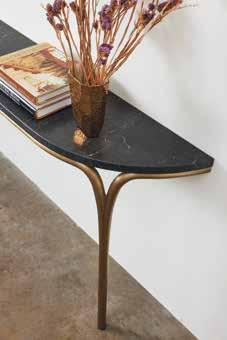
Crafted from cast bronze, steel and cherry wood, the Borrowed Forms credenza is the result of dozens of trips to forage for suitable stone formations in the Pacific Northwest. Norris used jeweller’s wax to cast the stones in bronze.

WITH HENRY NORRIS
What was your first design project?
Built-in wooden shelving for a friend’s retail store. I winged it in two evenings with a Skil saw, maybe a hand drawing and a rudimentary understanding of how a level functions.
Who do you admire most as a designer? Piet Hein Eek is on another level for his work and his big vision.
What books are on your nightstand? The Creative Act by Rick Rubin.
What music are you listening to right now?
Country music from the ’70s and ’80s: Lucinda Williams, Townes Van Zandt, Blaze Foley, Emmylou Harris.
Any podcasts you follow?
Right now I’m listening to Acquired , and I’ve listened to many, many episodes of How I Built This
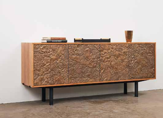

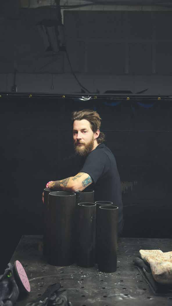
This
Furniture designer
Ben Barber’s eclectic portfolio covers the minimal, the bold, the natural and the colourful, all while celebrating each material in its most beautiful form.
By Alyssa Hirose / Portraits by Pooya Nabei
the
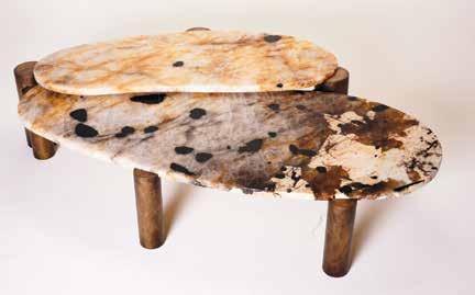
You could call Ben Barber materialistic, and that would be a compliment. The Vancouver-based furniture designer has been perfecting his study of steel, brass, bronze, glass, wood, stone and other fundamentals of the trade for over a decade. One of our two 2024 Furniture Designers of the Year selects the materials for his bespoke works with the same industriousness and passion of a painter choosing a colour palette (so it’s not surprising that he studied fine arts at the Pratt Institute). “There’s no real set career for artists, but the furniture and interior design realm made sense to me,” Barber remembers. “It was something to grab on to.”

Barber didn’t set out to make the Rampart console (below and above) medieval-inspired, but he noticed during the design process that the piece was reminiscent of battlement architecture. So, he read up. “Thankfully, we’re in a world where we are inundated with endless amounts of information,” he says.
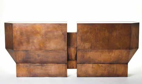
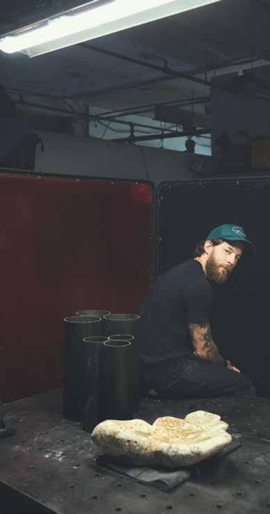
WITH BEN BARBER
Who do you admire most as a designer?
It’s a tie between Ettore Sottsass and Isamu Noguchi. Both had such long and prolific careers that were never pigeonholed into one medium or discipline. The tone and mood of the two feel very different but I think both took a similar approach to life as a creative.
What’s your go-to material of choice?
Steel, due to its abundance, ease of workability and strength.
What books are on your nightstand right now?
The Haar by David Sodergren and The Negative by Ansel Adams.
Do you have a favourite room from a movie?
The bedroom in 2001: A Space Odyssey
What’s your dream project? I would love the opportunity to produce an entire home from the ground up. To have my hands in everything from the architecture, landscaping and interior design to the custom built-in furnishings.
What are your design pet peeves?
Designers who release whole collections that are only renderings. I need to see the physical, tangible and monetary work that went into making the pieces. If it’s a rendering, it’s only an idea.
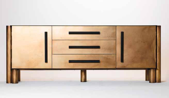
Signed, Steeled, Delivered
Barber loves working with steel (see: the Niju credenza, left). “It’s a wonderful material to work with—it’s easy to understand and fabricating it is pretty painless,” he explains. The instant moodiness it brings to a space doesn’t hurt, either.

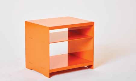
The designer spent some time working at Vancouver’s Union Wood Co. and with art production teams on film sets before founding his eponymous studio in 2014. Each item in his collection is crafted in whatever material is best suited for its unique form and function.
Take the Xenolith long table and the Sanora bedside table: Xenolith is a curvilinear natural beauty in splotchy Patagonia granite and burnished brass, while Sanora is clean-lined, minimal aluminum custom powder-coated in crayon hues like orange, purple and yellow. Xenolith’s earthy stone matches the table’s organic figure; Sanora’s water jet-cut aluminum is well-suited to its rectangular silhouette. But both exhibit the designer’s unique structural mind—Xenolith is essentially two tables bolted together, holding each other up, and Sanora showcases its own manufacturing process. (“Instead of trying to hide how it’s produced, I wanted to highlight it—like assembling Lego of sorts,” Barber explains.)
Judge Ross Bonetti, owner of Livingspace, says Barber’s use of metal and stone is “interesting, as it doesn’t rely on the warmth and familiarity of wood.” In Barber’s Niju credenza, for example, burnished brass and leatherwrapped handles balance out the sleek blackened steel. The designer takes cues from architecture, too—the hardworking Erebus table was influenced in part by Japanese engawas (covered exterior walkways that surround a building) and the imposing Rampart console is a nod to medieval battlement structures.
As impressive as these examples are, they’re not prescriptive—Barber’s furniture is made to order. “Just about every piece can be customized and everything is bespoke,” says the designer, “so we can always tweak it if needed.” There are endless variations in size, composition and (of course) material, but with his award-winning artistic eye and insider knowledge, he makes sure every client finds their perfect match.
Building Blocks
The Sanora bedside table keeps no secrets, with water jet-cut aluminum pieces that fit together conspicuously. “I really wanted to celebrate the construction,” says the designer.
Own It
Barber has the first iteration of the Erebus coffee table in his own home. “It’s a tank,” he says with a laugh, “and you have all this extra storage underneath... I really enjoy pieces that can be effectively used as a gathering place.”
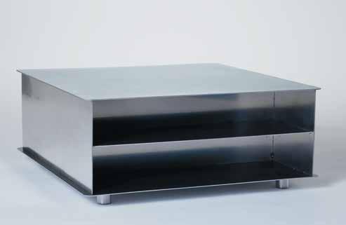

Heidi Rey’s love for tactile creativity started early—in fact, it reaches right back to an unusual childhood pastime of carving shapes from soap or turning carrots into dining utensils while she sat in front of the TV. “I would get some tools and carve them because they were what we had around,” says the Studio Heidle founder. “To this day, my curiosity loves setting the parameters of projects by defining a few materials and figuring out what I can come up with.”
Take Bouba, her table and modular chair set. The curved seating and forced proximity of sharing a bench encourage social connection and togetherness. Dining as a family was a foundation in Rey’s life growing up, so the circular set was deeply meaningful in helping her process her sister’s passing. “We don’t regret the moments we were present for,” Rey says.
Her projects are collaborative with the clients (“the project is the leading factor, not the deadline,” she explains). They are also iterative, changing to suit each client’s needs—a process she dubs “the Heidle Method.” Take the Amoeba coffee table, where every new version is adapted to the client’s space—like an art installation. “What’s the point of doing things custom if it’s not actually for you?” Rey says.
Sandrine Jacquot
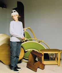

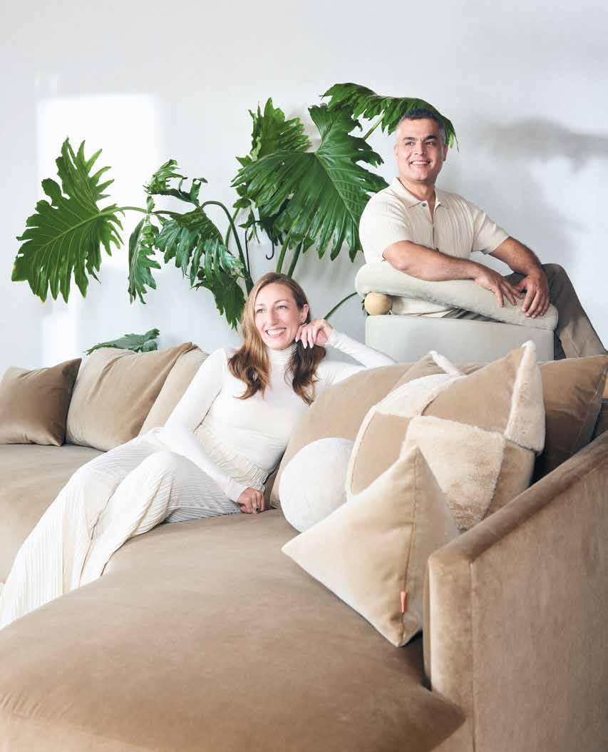
Celina Dalrymple and Najeeb Dawary of Ffabb Home bring the art of great design to sustainably made furniture.
By Anicka Quin / Portraits by Pooya Nabei
The evolution of Ffabb’s Jumbalow sofa into Jumbalow Juicy was thanks to a project the team was doing with Ben Leavitt of PlaidFox Studio, who was looking for a rounder sofa. “We padded it up, and we both loved it—I added a little more juice to it,” says Dalrymple.
When Celina
Dalrymple was a kid stripping furniture for her mom’s upholstery shop in Port Alberni, B.C., she wasn’t just negotiating for a little more TV time (though that was certainly part of the bargain): she was figuring out how to do things better. “I’ve always loved the guts of furniture—seeing how it was made, how the frame was put together,” she says. “I always felt like I was a bit of a detective. Why did that break? Why did the foam wear down? Why is this creaking?”
That curiosity would ultimately lead this 2024 WL Furniture Designer of the Year (her firm is one of two winners this year) to launch her own furniture design business, though it wasn’t immediately obvious that this was what she was meant to do. She moved to Vancouver after high school for film school, and found herself taking a job at Luxcious Upholstery on Main Street to help pay the bills.
But she quickly realized how much she genuinely loved the work, and soon opened her own little shop. “I literally had next to nothing—I had a staple gun and a sewing machine, I made a two-by-four frame table, and I somehow convinced this company that I could reupholster all of their chairs,” she says.
Every time she got another gig, she would buy more tools, and, eventually, bring on more staff. “The best thing I ever did was hire people more skilled and experienced than myself,” she says. “They taught me so much.”
One of those upholsterers is now her business partner. Najeeb Dawary sharpened his skills in Afghanistan, and started working with Dalrymple 18 years ago. “He worked like it was his business, too,” says Dalrymple. When, in 2018, she decided to pivot from their custom upholstery business to launch Ffabb Home, a line of made-to-order upholstered furniture that evolved out of
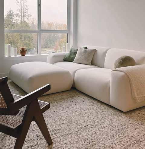
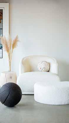
The Mallo collection started with a swivel chair, but quickly evolved into a series of pieces.
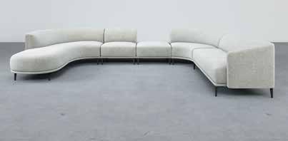
“Everybody just loved the chair, the way the seat felt and the back support,” Dalrymple says.
“So it was just another one of those moments where someone wanted a couch based on the design, and it started to morph from there.”
her custom work, she asked him to join her. Dawary manages the back of shop and production, while she sketches out new design concepts and manages the business itself.
It’s all produced out of their North Vancouver shop, with pieces precisely crafted with a 13-layer Baltic birch interlocking frame, and designed to the millimetre for both comfort and visual appeal. Prototypes that other manufacturers might move forward with are continually modified and played with until Dalrymple is satisfied. “I’m a bit of a tweaker,” she says with a laugh.
“Things like the arm could use an extra inch, or I feel like we nailed the seat proportions, but this could look way cooler if the seam was here. That’s the fun part of developing a new collection.”

The Ffabb collection runs the gamut from classic and modern (like the square-armed, low-profile Coasty) to playful and curvaceous (like the excellently named Jumbalow Juicy). Judge Steen Skaaning of Inspiration Furniture commended Ffabb’s creativity in that collection in particular: “The curves should be predictable, but it somehow surprises. Very nicely done.” And each line has a seemingly infinite sub-series of styles and modular designs, allowing it to work in everything from a small apartment to a sprawling rancher.
Designer Ben Leavitt of PlaidFox Studio is a regular collaborator with Ffabb. “I’ve used the Jumbalow Juicy in so many projects,” he says. “Well-designed furniture should be sculpturally interesting, but it also needs to marry with function. They create curvaceous, comfortable furniture that you want to look at, but nestle into too. They’ve really mastered the art of lounging.”
Ffabb expanded into the U.S. market in 2019, and the duo has since grown to a team of 10. They currently produce approximately six or seven pieces a week, depending on whether or not one of the pieces on order is a bed (“a bed actually takes a ton of time— there are so many little details”), but Dalrymple is intentional about keeping their company as sustainable as the furniture they design. “I’m not looking to have a giant factory where we’re just pumping things out,” she says. “It’s really important to us to have that attention to detail and pride in every job.”
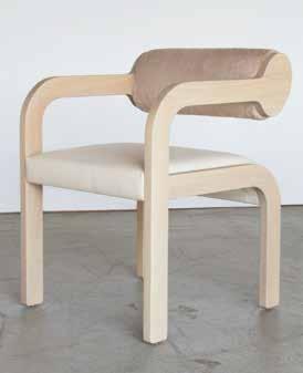
She’s Got the Look
“Designers kept telling me, ‘I can’t find a super comfortable, well-priced local dining chair that’s stylish,’” says Dalrymple. She spent her evenings sketching this design until she found a piece that looked great from the back but was supportive, too: the Navana.
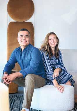
WITH CELINA DALRYMPLE AND NAJEEB DAWARY
Was there a childhood moment that hinted design was in your future?
Celina: I was fascinated by the inner workings of the furniture my mother was reupholstering and was always brainstorming ways to create my own pieces. A memory that comes to mind is me sneaking into the workshop around the age of 12 and using her power tools to make a fancy chaise for my bedroom.
Najeeb: I recognize early signs of my future in design, despite a focus on surviving in a war-affected region. I was fascinated with cars, which led me to create miniature Matchbox models, igniting a passion for creativity. Years later, as I began upholstering cars, I saw how those childhood experiences shaped my career, merging past passions with my current reality.
What’s changed for you, personally or business-wise, after the last few years?
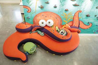
Designed

CD: My partner Jason and I have taken on a new caretaker role with two magical little gals in the last two years. It has completely realigned my work focus and I have become more routine and productive during the time I am in the studio.
ND: On a personal level, this period has taught me resilience and adaptability. From a business perspective, Ffabb has grown tremendously, not just in terms of our product line but also in understanding what Ffabb stands for in the world of furniture. We’ve refined our processes, enhanced our designs and solidified our commitment to quality.








Edmonton-based BJB Woodshop makes the case for spectacular stairways. By
Alyssa Hirose / Portrait by Jason Franson
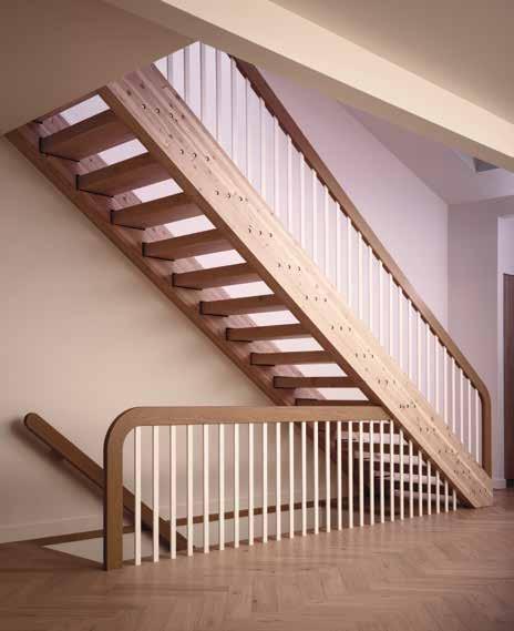
Great design tells a story, but Bryan Boutin’s woodworking takes it up a notch: he creates moments of striking interest, quiet contemplation and beautiful craftsmanship between storeys. The stair and railing designer has been working in the business for almost two decades, and he never underestimates the statement-making power of a staircase. “When you walk into the front of a home, that’s usually where the stairs are situated,” he says. “They set the whole tone.”
Bryan is one half of the BJB Woodshop team, our 2024 Western Living Maker of the Year. He and Erin Boutin (who met just in time on a dating site in 2011—“I had just about given up on dating sites and it was her first time using one,” he remembers with a laugh) started the company out of a one-car garage in Edmonton. Thanks to brand manager Erin’s savvy marketing, BJB soon had stair-crazed social media followers swooning.
Dawn of the Tread Underneath some outdated carpet, BJB found incredible timber treads in the Blue Quill No.2 staircase (left): they just needed a little smoothing. The sanding and squaring up left the treads a bit smaller than before, so the woodshop team inserted black plates into the stringer pockets, creating the illusion that the steps are suspended in space.
The Nihilo project (below), done in collaboration with Justin Wisser, was judge Jody Phillips’s favourite. “It’s such a standout with its two-tone contrast and crisp lines,” she said.

WITH BRYAN BOUTIN
Was there a childhood moment that hinted design was in your future?
As a kid growing up in rural Alberta, I really enjoyed designing and building elaborate tree forts with my brother and cousins.
What are your design pet peeves?
Working against the inherent style of a home and shoehorning in design trends that don’t suit the architecture.
What’s changed for you, personally or business-wise, after the last few years?
Moving BJB Woodshop out of the one-car garage that we started in and into a proper commercial shop space this year has been a major highlight.
Who’s a Western Canadian designer whose work you admire?
I’ve had the opportunity of working on a stunning home for BattersbyHowat Architects over the last couple of years and I really admire their incredible attention to detail.
What music are you listening to? I listen to a wide variety of artists but Caamp has been my go-to lately.
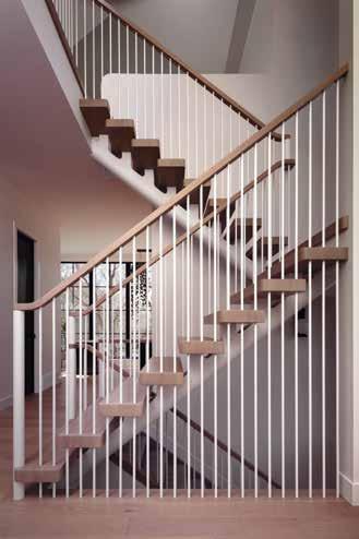

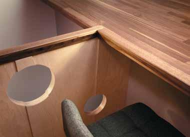
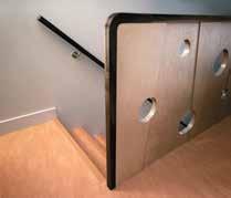
That said, the makers never put style above substance. Bryan’s interest in stairs and railings was born out of a distaste for processed materials, the usual suspects in cabinetmaking (his field of study at the Northern Alberta Institute of Technology). He made the switch and traded MDF and plastic laminate for solid wood. BJB’s High Street project in collaboration with Nako Design, for example, has a jawdropping continuous red oak handrail that seems to curve effortlessly back on itself. The textured black metal spindles are flush with the flooring—it’s “shoe”-less, meaning there’s no base. “The spindles die right into the flooring,” Bryan explains.
DOTY judge Sumer Singh of Mercedes and Singh (our 2021 winner of this award) calls BJB’s work “a fresh take on what it means to create a cohesive design”—the woodshop continues to innovate on a basic functional structure invented some 4,000 years ago. Their Nihilo project’s rounded solid-wood mono-stringer (that’s the support board for the treads, akin to a spine) gives the staircase an airy, whimsical vibe, while the Blue Quill No.2 staircase revives a ’70sera Douglas fir glulam-beam beauty with a new white oak rail and refreshed rough-sawn timber steps. “To get timber of that size—one piece of wood, with no laminations in it—is very expensive and rare,” says Bryan. “We just needed to revive it.”
That focus on sustainability shines in BJB’s Birch House garden suite project, as well: the offset “shards” of Baltic birch that make up the panelling were offcuts left over from the property’s main home. Some walnut flooring went unused, too, so Bryan and Erin reimagined it to create the kitchen peninsula and integrated railing. Artfully placed holes in the birch bring a touch of fun—inspiring judge Jody Phillips, executive director at Deer Lake Gallery, to call the studio’s passion for stairs and railings “cool and contagious.”
“I’m trying to push our industry forward—it’s been a bit stuck,” says Bryan. “To incorporate new techniques, to visually lighten as much as possible, but do it in a way that is still functional and strong and safe.” In other words: BJB is stepping up.
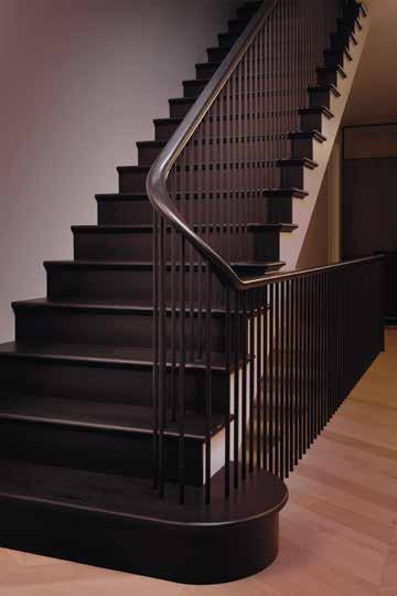
It’s the Climb BJB’s High Street project was the first time Bryan Boutin was able to really present his own design to a client, he says. The Brooklyn brownstoneinspired staircase was created in collaboration with Nako Design, Bloc 53 Developments, Beyond Wood Ltd. and Guenther Studio.

Pablo Mariano’s designs radiate simplicity and express a deep understanding of what it means to be resourceful. “After closing my shop in Buenos Aires, moving abroad, and no longer having any power tools, I had to get particularly resourceful and start making things with less to keep my practice alive,” says the now-Vancouver-based furniture designer. He adapted out of necessity and became proficient in the art of traditional woodworking; that less-is-more ideal is reflected in pieces like his Tronco stool, the first wooden piece he created by hand: for this project, he used chisels, handsaws, scrapers and other manual instruments to shape the solid movingui and African mahogany.
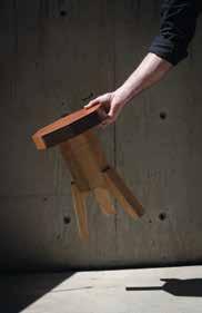
Judge Sumer Singh of Mercedes and Singh praised Mariano for demonstrating a “deep connection with materials, their effects, and how to harness their properties in designed elements and spaces.” Even without drills and buzzsaws, that connection is a powerful one. “It is almost like a meditative practice, working with my hands as tools,” says Mariano. Lea Krusemeyer
LET US KNOW WHAT MATTERS MOST TO YOU.
SCAN HERE

YOU’LL BE PART OF A COMMUNITY OF INFLUENTIAL VANCOUVER VOICES, AND THE FIRST TO KNOW ABOUT WHAT’S HAPPENING IN THE CITY.

JUST FOR JOINING, YOU'LL BE ENTERED TO WIN A PAIR OF APPLE AIRPODS MAX


Our brand new WL People’s Choice Awards were voted on by you, the reader—celebrating one dynamic project from each of our finalists in this year’s Western Living Designers of the Year awards.
FINALISTS: ARCHITECTURE
Alma House, Measured Architecture
Ancient Cedars, Openspace Architecture
Feng House, BLA Design Group
Halfmoon Bay, Frits de Vries Architects and Associates Ltd.
In/Out Residence, RUFproject
Mid-Century Revamp, Lamoureux Architect Inc.
Modern Californian, Alloy Homes
Project One, Dda Architecture Ltd.
WINNER: ARCHITECTURE
Bird’s Wing Passivhaus and Duplex
One Seed Architecture and Interiors
This innovative custom duplex includes two primary units, each with a flex suite— addressing the ongoing “missing middle” issue in the housing crisis.
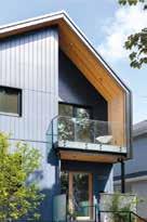
FINALISTS: EMERGING ARCHITECT OR RESIDENTIAL DESIGNER
Beam House, Tano Studio
Bird’s Wing Passivhaus and Duplex, One Seed Architecture and Interiors
East Van Duplex, Noble Architecture and Interiors
Feng House, BLA Design Group
Panorama, Shelter Residential Design

WINNER: EMERGING ARCHITECT
Rock Bluff House
Laura Killam Architecture
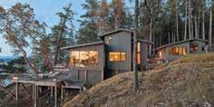
This off-the-grid island home is a gorgeous meditation on coastal living, and an ode to the landscape surrounding it.
FINALISTS: EMERGING INTERIOR DESIGNER
Colwood House, Erica Colpitts Interior Design
Grizzly Hill, Form Collective
Lottery Home 2023, Rochelle Cote Interior Design
Pacific Promenade, Schédio Spaces
Ramsay House, Brianna Hughes Interiors
Soft Retreat, Smiddy Stegman
Vibrant Global Penthouse, Louis Duncan-He Designs
Wolfhagen House, Nako Design

WINNER: EMERGING INTERIOR DESIGNER
The Crescent Jocelyn Ross Studioworks

FINALISTS: FASHION AND JEWELLERY
Aeon 03D Ring, Andronyk Studio
Athena Goddess Earrings, Scandinavia Wolf Designs
Flourish Earrings, LanaBetty
Helix Cuff, Orii Design
Salish Sea Ring, E.V. Stenroos
WINNER: FASHION AND JEWELLERY
Sun Manifest
Affirmation Love Note
Sonja Picard Fine Jewels
A piece designed to empower the individual who wears it, and remind them that the light they seek is always within them.

FINALISTS: FURNITURE
Access Privacy Pod, Onetwosix Design
Aria Coffee Table, The Stables Woodshop by Jeff Mann KDOM Table, Shipway Living Design Mini Plano Credenza Pair, New Format Studio Navana Chair, Ffabb Home Nieves Table, Autonomous Furniture Rampart Console, Ben Barber Studio Stance Side Table, Buckshee Workshop Weave Console, Caliper Studio

WINNER: FURNITURE
Bouba Studio Heidle
The intentionally close design of this table and chairs set challenges our ideas of how form can impact presence, togetherness and shared experience.

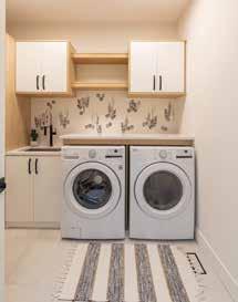
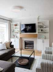


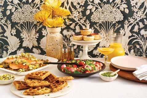

FINALISTS: INDUSTRIAL DESIGN
Access Privacy Pod, Onetwosix Design
Mini Plano Credenza Pair, New Format Studio
Rampart Console, Ben Barber Studio
Standing Mirror, Ryan Boechler
WINNER: INDUSTRIAL DESIGN Flow

FINALISTS: INTERIOR DESIGN
Alma House, Measured Architecture
AVD Rosedale, Alykhan Velji Designs
Nikki Alagha Design
A playful exploration of handmade forms, the shade of this light is made with liquid glass draped over a handmade mould.
Britannia Residence, Stephanie Martin Interior Design
Jericho House, Sophie Burke Design
Mid-Century Modern, HB Design Oceanview, Pure Design Inc.
Shawnigan Lake, Andrea Rodman Interiors
Southlands, Project 22 Design
The Tree House, Ola Hiraeth White Palms, Stephanie Brown Inc.
WINNER: INTERIOR DESIGN
Woven Cardero Renocon Design Center
A home designed to create a narrative of light, texture and space, with the views inside just as dynamic as those outside its windows.
FINALIST: LANDSCAPE DESIGN
Myra Canyon, Alexander Suvajac Landscape

WINNER: LANDSCAPE DESIGN
Stirling Arm Biophilia Design Collective
A lakeside property that balances wilderness with drought-tolerant plantings and perennials that invite key pollinator species.
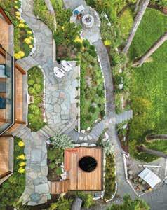
FINALISTS: MAKER
Bear Cache, Regan Appleton Design
Nihilo Stairs, BJB Woodshop
Omphalotus Grove Table, Scandinavia Wolf Designs
Rational Desk, Pablo Mariano Craft Studio

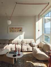
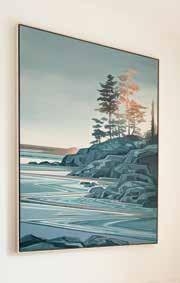
WINNER: MAKER
Vancouver Home
Fiona Dalrymple Fine Art
This custom piece captures a shoreline scene with silhouetted trees in colours and tones complementary to other design elements in the home.
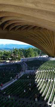
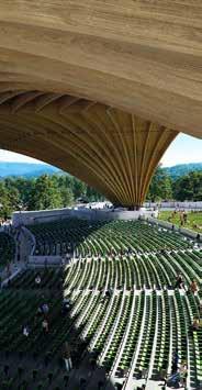
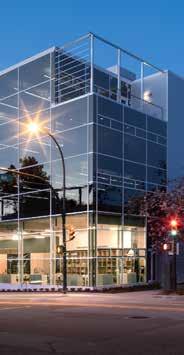

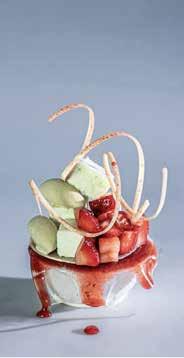


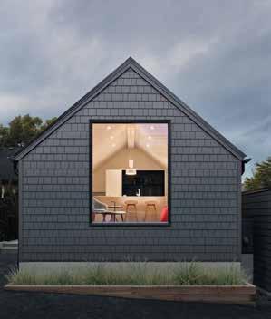
Alloy Homes
BLA Design Group
Dda Architecture Ltd.
Frits de Vries Architects and Associates Ltd.
Lamoureux Architect Inc.
Measured Architecture
One Seed Architecture and Interiors
Openspace Architecture
RUFproject
ARTHUR ERICKSON MEMORIAL AWARD FOR AN EMERGING RESIDENTIAL DESIGNER
BLA Design Group
Laura Killam Architecture
Noble Architecture and Interiors
One Seed Architecture and Interiors
Shelter Residential Design
Tano Studio
Andronyk Studio
E.V. Stenroos
LanaBetty
Orii Design
Scandinavia Wolf Designs
The Sonja Picard Collection
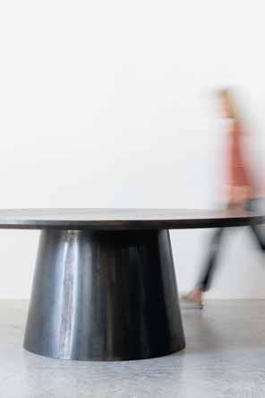
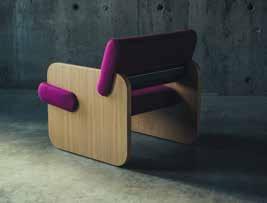
Autonomous Furniture
Ben Barber Studio
Buckshee Woodshop
Caliper Studio
Ffabb Home
New Format Studio
Onetwosix Design
Shipway Living Design
Studio Heidle
The Stables Woodshop
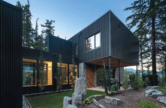
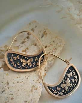
INDUSTRIAL DESIGN
Ben Barber Studio
New Format Studio
Nikki Alagha Design
Onetwosix Design
Ryan Boechler
INTERIOR DESIGN
Alykhan Velji Designs
Andrea Rodman Interiors
HB Design
Measured Architecture
Ola Hiraeth Interior Design
Project 22 Design
Pure Design Inc.
Renocon Design Center
Sophie Burke Design
Stephanie Brown Inc.
Stephanie Martin Interior Design
LANDSCAPE DESIGN
Alexander Suvajac Landscape
Biophilia Design Collective
MAKER
BJB Woodshop
Fiona Dalrymple Fine Art
Pablo Mariano
Regan Appleton Design
Scandinavia Wolf Designs
ROBERT LEDINGHAM
MEMORIAL AWARD FOR AN EMERGING
INTERIOR DESIGNER
Brianna Hughes Interiors
Erica Colpitts Interior Design Form Collective
Jocelyn Ross Studioworks
Louis Duncan-He Designs
Nako Design
Rochelle Cote Interior Design
Schédio Spaces
Smiddy Stegman
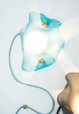
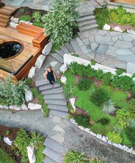
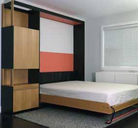
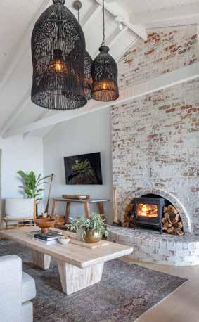
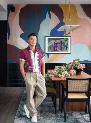
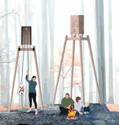

Claudia Afshar is principal and founder of Claudia Afshar Design, and a globally recognized high-end interior designer specializing in unique and refined environments across residential, commercial, hospitality and product design.
Jonathan Adler is a potter, designer and author who launched his namesake ceramics brand in 1993. Today, his offerings span furniture, lighting, home decor and more, plus countless iconic interior projects and retail locations worldwide.
Toby Barratt is a partner and co-creative director at Propellor Studio, a multidisciplinary art and design studio based on Granville Island in Vancouver. Propellor’s work spans a range of disciplines from lighting and furniture design to exhibition design and sculpture.
Gaby Bayona is a Vancouverbased business owner. Since 2013, she’s launched bridal brands Truvelle, Laudae, Aesling and Halseene and has opened Lovenote Bride with locations in Vancouver and Calgary. She’s been twice named the Western Living Fashion Designer of the Year.


Michelle Biggar, principal of the Office of McFarlane Biggar Architects and Designers, has been practicing interior design for over 25 years. With projects across Canada, Australia and the U.K., her work embraces an extensive range of service offerings from hands-on small projects to design leadership of large-scale, complex, multi-user facilities.

Ross Bonetti is the founder and CEO of Livingspace, Vancouver’s first modern European design store. He is also president of Livingspace Homes, a residential construction and renovation company that delivers exceptional quality homes to complement the modern lifestyle.

Becki Chan is a designer living and working in Vancouver. Chan operates a namesake jewellery line, curates and produces the long-running PechaKucha culture event series, and launched the inaugural Design Vancouver Festival this year.
James K.M. Cheng , principal of James K.M. Cheng Architects, is a Canadian architect recognized for his pioneering contributions to West Coast architecture and city building. Cheng has received over 45 design awards, including the Order of Canada.
Brent Comber is an artist who inhabits the space between expression and function to create storied works reflective of the Pacific Northwest’s ephemeral landscape.


Omar Gandhi is the principal of Omar Gandhi Architects, an architectural practice founded in 2010 with small teams in both Halifax and Toronto. Recently, OGA was the recipient of a 2018 Governor General’s Medal in Architecture for its work on Rabbit Snare Gorge and was honoured as the only Canadian practice in Architectural Record Magazine’s 2018 Design Vanguard.

Russell Greenberg is the founder of interdisciplinary design firm RUX Studios, and the creator of Stickbulb and Gradual. His work ranges from award-winning mosque master plans to water purification systems, porcelain statues, mobile devices, jewellery, vending machines and sustainable LED lighting.

Kathy Hancox is a CanadianAmerican architect and one half of the husband-and-wife team behind HK Associates, an award-winning architecture firm based in Tucson, Arizona. With her partner Michael Kothke, Hancox has established a practice known for its holistic approach to architecture, interiors and landscapes.
Juli Hodgson , principal of Hodgson Design Associates (HDA), is a three-time winner of a Western Living Designer of the Year award and a four-time Best of Houzz winner in two categories: design and service.


Maurizio Meossi is an architect and associate director for Zaha Hadid Architects. Since 2020, he has worked on some of ZHA’s largest mixeduse projects and masterplans across the world, including Italy, Australia, Mexico, Türkiye and Hungary.
Jody Phillips has a rich career as an advocate for Western Canadian design; recent roles include executive director of the Burnaby Arts Council, director of IDS Vancouver and the national IDS brand director.


Sumer Singh is the founder of Mtharu, a multidisciplinary and applied materials research lab with in-house manufacturing for objects, furniture and lighting. He also is co-founder of Mercedes and Singh (MASIV), created to fulfill a need for complex and multi-material architectural fabrication in Calgary.
Steen Skaaning was born and raised in Denmark by a family of furnituremakers, and now is CEO of Inspiration Furniture in Vancouver, which has grown to include a large distribution centre and second showroom in Coquitlam.


Karyna Schultz is the co-owner of several Vancouver boutiques alongside Saager Dilawri, her partner in life and business. Together they run Neighbour, Neighbour Women and Neighbour Object, and are deeply involved in all the stores— working the floor as well as doing all the buying, styling and direction.
Marjan van Aubel is the founder of Marjan van Aubel Studio, an award-winning innovative solar design practice that brings solar energy into daily life. She has collaborated with global brands such as COS, Timberland and Swarovski with the aim of accelerating the global energy transition to solar.


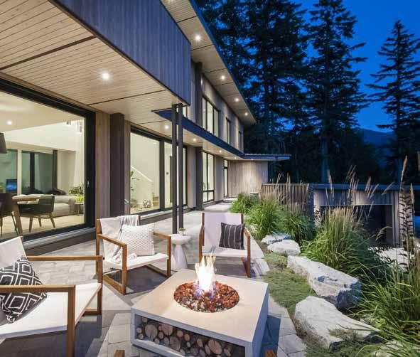
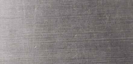


all


equal. and which can cause bloating and painful (and let’s face it, embarrassing) gas.


FODMAP, 100% plant-based fibre
IBS symptoms so you can get back is the only unique, low-FODMAP fibre certified by Monash University to be effective in the treatment of an irritable colon (IBS) and proven to relieve symptoms such as constipation, diarrhea, gas, bloating,
that provides gentle relief from to your regular schedule! and overall intestinal discomfort. inulin are high in FODMAPs, (and let’s face it, embarrassing) gas. completely in water: no grit, colour, or taste. associated with IBS

Dissolves quickly and mixes


Reduces abdominal discomfort


Gentle relief for constipation, diarrhea, gas, and bloating


Lead research University certified Fibre4 for IBS (irritable bowel syndrome)
There’s much more! Read the whole fibre4 story at webbernaturals.com


Despite its modest square footage, Dear Gus Snack Bar goes bold with its menu and old school with its design.
By A lyssa Hirose / Photos by Studio Santiago
Vancouver’s Dear Gus is small—the entire restaurant is only 513 square feet. Gus himself, who inspired the name of the Mount Pleasant snack bar, is also small: he’s owner Rachel Lee’s bunny. But you can’t call the fare served at this European-inspired space rabbit food. “It’s a snack bar, but I didn’t want anyone to leave hungry,” Lee says. It’s a simple ask, and one that perfectly suited chef Jorge Tuane’s culinary sensibilities.
“The menu itself is tailored in a way that it can be executed by one chef, because it’s a really, really tiny restaurant,” says Tuane. That means the dishes require plenty of pre-opening prep, but only a few steps to plate (you won’t find a pair of garnish tweezers here). The food isn’t precious, and that matches the casual vibe. “I like dishes with interaction—dip bread, scoop mussels with broth, use your hands, get yourself dirty,” says the chef. Options like marinated prawns, oysters with pomegranate chili vinaigrette and tagliatelle with morel mushrooms are straightforward but soulful.
Interior designer Gillian Segal looked to European wine bars and her own travels for design inspo, and aimed to give the space the patina and storied feeling of a heritage hidden gem. Thrifted dishware (“Stuff you would find in your grandma’s house,” says Lee), oak wainscoting, a checkered tile bar and stone tables bring texture, and funky lighting makes the cozy spot feel lived-in. For finishing touches, Segal and her team headed to the grocery store to source olive oils and condiments to display... or not. “We must have done a good job,” the designer says with a laugh, “because when we brought it all in, the chef was like, ‘Can I use this?’” No space—or ingredient—is wasted here.
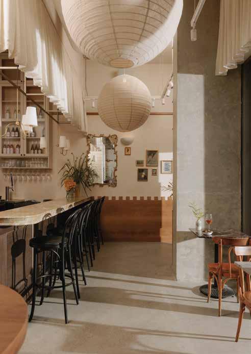
All of the café tables were custom made from stone remnants sourced from a local slab yard. “We wanted it to feel collected, and also waste less materials,” says designer Gillian Segal. The chairs were also salvaged from a vintage dealer.
The rabbit imagery is understated yet adorable—Gus is pictured in some of the restaurant’s wall art, and bunnies are printed on the wine glasses.
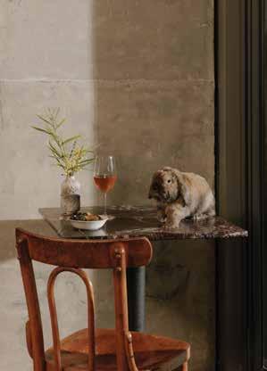
You’ve likely seen her residential work in this magazine before, but Dear Gus is actually the first restaurant that Gillian Segal and her team have ever taken on.
“It was the perfect foray into restaurant design... a bite-sized restaurant,” she says.
Instead of traditional wainscoting, Segal went for a unique checkerboard look inspired by historic European buildings.
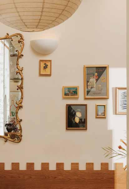
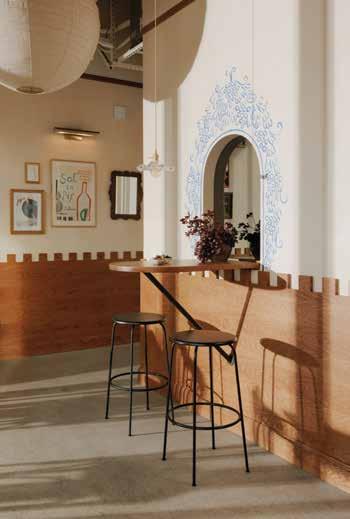
Influenced by painters like Matisse and old picture books like Madeline , Vancouver artist Chelsea O’Byrne hand-painted the grape detailing around this arched mirror.
Vintage art sourced secondhand is displayed among postcards from owner Lee’s travels to Europe. “It’s an eclectic little mix, and feels like it’s been there forever,” the designer says.
Photos by Alan Chan
MUSSELS As the menu came together, one of owner Lee’s requests for chef Tuane was the incorporation of nduja. Dear Gus’s mussel dish is served in a spicy nduja tomato saffron broth, and it’s unsurprisingly Lee’s favourite thing to order in the sun-drenched, open-air space. “The broth is a little heavier, and you can pour it right onto the bread—it’s absolutely delicious,” she says.
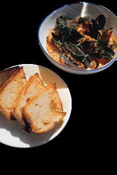
HOUSEMADE BREAD Tuane worked at Vancouver’s AnnaLena for five years—“so that was his bread standard,” says Lee with a laugh (Michelin-starred AnnaLena is known for its insanely good torn bread). Tuane’s bread, made fresh daily, is establishing its own stellar reputation. “Even though it’s just bread and butter, it’s probably our top-selling dish— some people come and just get the bread, it’s that good,” Lee says. “I think having a good bread and butter really sets a standard... I like that it’s our star.”
PEAS The restaurant introduced its pea dish this spring, and it’s a quiet winner for Tuane. “It’s an easy dish to skip,” he admits, “but people who order it really enjoy it.” Brilliant green peas, fava beans and fermented rhubarb float atop a creamy cashew gazpacho. Don’t sleep on this refreshing, hearty chef fave.


Come farmers’ market season, dinner inspiration lurks in every stall. There’s no need to overthink it, after all, when the tables are laden with juicy pears, vibrant orange carrots and corn pulled right from the fields. Fill your basket, invite over your favourite people, and watch as summer’s most memorable meals come together in a snap.



Honey Bourbon Pork
see page 95 for recipe.
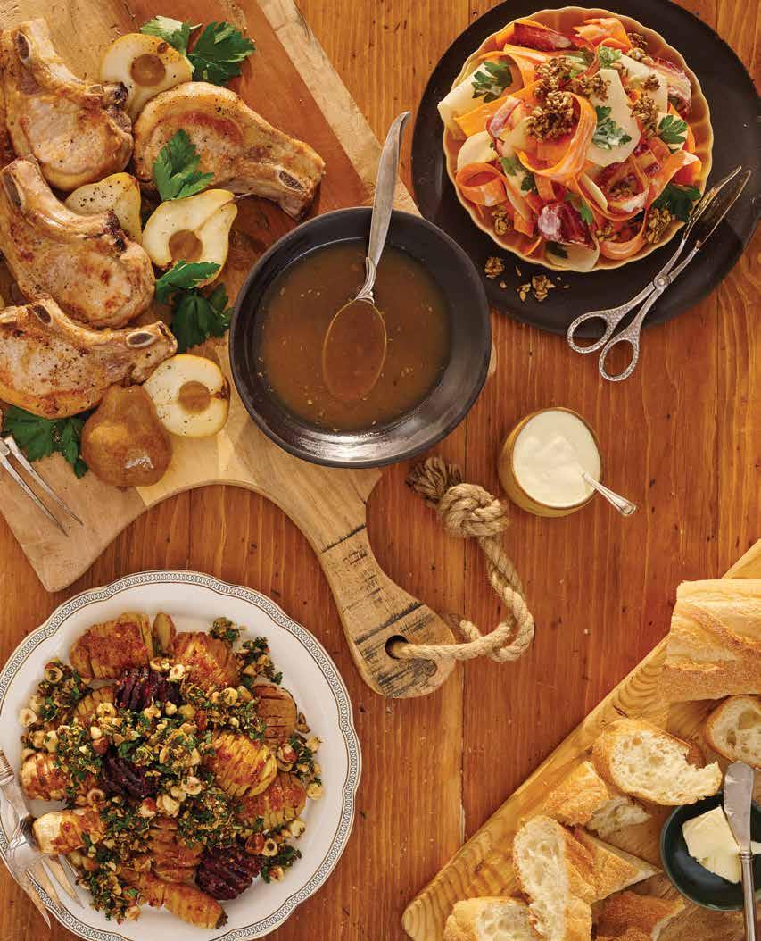
see page 96 for recipe.

Yield: 6 servings
Prep time: 25 minutes
Cook time: 15 minutes
This flavourful dip is perfect for an impromptu dinner party. The sizzling chili oil to finish is optional but it truly brings a depth and brightness to contrast the earthy sweetness of the corn. Serve alongside bread or a variety of seasonal market vegetables for dipping, swirling and dunking


Yield: 4 servings
Prep time: 10 minutes
Cook time: 20 minutes
2 green onions, trimmed and thinly sliced into rounds
3 garlic cloves, minced, divided
2 tbsp roughly chopped cilantro leaves and tender stems
2 tsp chili flakes
¼ tsp kosher salt, plus extra for seasoning
¼ cup oil (sunflower, avocado, grapeseed or canola will all work well here)
2 tbsp unsalted butter
2 cups fresh corn kernels, from about 3 ears of corn
1 large shallot, minced
½ cup whole-milk ricotta cheese
1 tbsp fresh lemon juice
Crudités, sliced baguette, flatbread or corn chips, for serving
Start by making chili oil. In a medium-sized heatproof bowl, stir together green onions, one minced garlic clove, cilantro, chili flakes and salt. Set aside.
In a small pot, heat oil over medium-high until shimmering (about 2 minutes). To test if oil is ready, place handle of a wooden spoon or wooden chopstick upright in oil. If it bubbles vigorously, then it’s ready. Carefully and slowly pour hot oil over green onion mixture, taking care as oil will sputter and pop. Set bowl aside for oil to cool and infuse while you make the dip.
Melt butter over medium heat in a large skillet or frying pan. Add corn kernels, minced shallot and remaining minced garlic. Cook, stirring often, until shallots have softened and corn is tender (about 7 to 10 minutes). Transfer warm corn mixture to bowl of a food processor and blend until almost smooth, scraping down the sides of the bowl as needed. Add ricotta and lemon juice and puree until very smooth. Season to taste with salt.
Transfer dip to a bowl and, with the back of a spoon, create a swirl pattern on top. Drizzle chili oil over dip and serve alongside crudités, sliced or cubed bread or corn chips.
Impromptu inspiration isn’t only to be found at the farmers’ market—it can happen at the wine store as well. The key is to embrace that improvisational ethos and venture past the usual cabernet/chardonnay safety zone. Also, in the spirit of the exercise, we’re staying local and zeroing in on producers who—like vegetable farmers—roll up their sleeves and oversee all aspects of the end bottle.
By Neal McLennan
Red Barn Transfiction Rosé $30
Respect for the land isn’t the sole purview of the little guy— Red Barn is the quirky entry in Anthony von Mandl’s empire (who, by turning all his properties organic, has moved the sustainable needle further than anyone in the Okanagan). And this rosé is capital J juicy: grapefruit, fresh blossoms and ready to dance with corn, chili and cilantro in short order.
Pamplemousse Jus
Leon Millot Pet Nat $32
The natty crew embrace the farmer’s ethos, but many don’t actually own their own land. The exception is this passionate trio who have 10 acres in Summerland where they grow the rarely seen hybrid grape Leon Millot and then turn it into this light red sparkler—very focused with clear acidity just dying to cut through a rich honey bourbon sauce.
Covert Farms Sauvignon Blanc/Semillon $23.43
The Covert family have been farming this land since 1959, and while wine came a bit later, they’re bringing the same honest approach. This winner of a bottle has more depth than pure SB—all the better to embrace the umami-rich miso or tangy kohlrabi.
This one-pan dish is full of earthy fall flavours. It’s the perfect comfort food to cozy up to when the evenings start to get cooler. When buying pork chops, look for ones on the smaller side so that four can fit together in the skillet, or else buy three bigger ones and plan on slicing them up before serving.
2 tbsp grapeseed or avocado oil
4 bone-in, centre-cut pork loin chops
Kosher salt and freshly ground black pepper, to taste
1 large shallot, finely chopped
3 tbsp unsalted butter
2 tbsp white wine vinegar
3 to 4 firm pears, halved, pitted and stems left on ¼ cup clover honey
⅓ cup bourbon
Preheat oven to 400°F. Heat oil in a large cast iron skillet or oven-safe frying pan over medium-high until very hot. Pat pork chops dry and season generously all over with salt and pepper. Add pork to skillet and sear, undisturbed, until golden brown on bottom (about 4 to 6 minutes). Transfer pork to a plate.
Reduce heat under skillet to medium and add shallot and a pinch of salt. Cook, stirring often, until tender (about 1 minute). Remove skillet from heat and immediately add in butter, vinegar and pears, cut side down. Place pork chops browned side up over pears and add any juices that accumulated on the plate. Transfer skillet to oven and roast until pork registers 145°F on an instant-read thermometer inserted into the thickest part of the meat (about 6 to 10 minutes). Transfer pork and pears to a serving platter.
Return skillet to stovetop and stir honey and bourbon into any pan juices. Turn heat to medium and bring mixture to a simmer, whisking constantly, until reduced slightly and syrupy (about 2 minutes). Remove skillet from heat, taste sauce and adjust seasoning as desired with additional salt, honey or vinegar. Spoon sauce over pork and pears and serve.
Yield: 4 to 6 servings
Prep time: 10 minutes
Cook time: 15 minutes
This is an easy and impressive salad that makes a welcome side to many dishes. Kohlrabi tastes like a mix between cucumber and broccoli and can be found in either a light green or purple-skinned variety. Either may be used in this recipe. Make sure to pick a bulb that’s heavy for its size, and make sure to save the leaves (they are great sauteed)

¼ cup raw, hulled sunflower seeds
1 tbsp flax seeds
1½ tbsp maple syrup
Flaky sea salt, to taste
3 small or 2 large kohlrabi, peeled and halved or quartered
2 or 3 large carrots, well scrubbed
⅓ cup packed flat-leaf parsley leaves, coarsely chopped
2 tbsp olive oil
⅓ cup plain yogurt
2 to 3 tbsp prepared horseradish
1 tbsp lemon juice
Pinch of sugar
Finely ground black pepper, to taste
Start by making a crunchy seed topping. Line a baking tray with parchment paper and set aside. Place sunflower seeds in a large frying pan and place over medium-high heat.
Cook, stirring constantly to prevent burning, until seeds are a light golden brown (about 2 to 3 minutes).
Stir flax seeds and maple syrup into pan with sunflower seeds. Continue to cook, stirring constantly, until maple syrup has coated seeds and no, or very little, syrup is left in pan (about another 2 minutes). Transfer seed mixture to your parchment-lined baking tray and spread out as best you can in a single layer. Sprinkle with flaky sea salt to taste and set aside to cool for 5 minutes. Break seed clusters into small pieces.
Using a mandolin or sharp knife, very thinly slice kohlrabi and carrots (however you like) before adding them both to a large bowl. Add parsley and toss gently to combine. In a medium bowl, whisk together oil, yogurt, horseradish and lemon juice until well combined. Taste and adjust seasoning with sugar and pepper as needed.
Just before serving, pour dressing over kohlrabi mixture and toss to coat. Transfer half the salad to a serving bowl and sprinkle over with half the crunchy seed topping before repeating with remaining salad and seed topping.
Yield: 4 to 6 servings
Prep time: 30 minutes
Cook time: 1 hour
Potatoes, beets and turnips, oh my! This recipe is great for using up a variety of seasonal vegetables found at the farmers’ market. The crowning glory of this recipe might just be the nut, seed and date crumble that gets sprinkled over the vegetables. It provides great textural balance and freshness to the roasted vegetables. Take care to choose vegetables that are all roughly the same size for this dish. This helps ensure that everything roasts to perfection at the same time
½ cup raw hazelnuts or pecans
¼ cup raw pumpkin seeds
2 lb mixed root vegetables, such as potatoes, beets and turnips, trimmed and scrubbed
2 tbsp grapeseed or avocado oil
Kosher salt and freshly ground black pepper, to taste
3 tbsp white miso paste
¼ cup maple syrup
1 tsp red chili flakes (optional)
4 medjool dates, pitted
½ cup packed kale leaves
Zest and juice of 1 lemon
Preheat oven to 400°F. Place nuts and pumpkin seeds on a rimmed baking tray and toast in oven, stirring once or twice, until nuts are fragrant and pumpkin seeds are toasted (about 6 to 8 minutes). Set tray aside and let nuts and seeds cool for 5 minutes.
Meanwhile, increase oven temperature to 425°F.
Trim a bit off each root vegetable to create a flat surface so they will not roll around while roasting. Slice each vegetable crosswise at ⅛-inch intervals, cutting roughly two thirds of the way through each vegetable. Take care not to cut all the way through or you will not get the accordion effect. Place flat side down in a baking dish or roasting tray large enough to comfortably accommodate the vegetables in a single layer. Drizzle with oil and season with salt and pepper. Roast vegetables until just fork tender (about 30 to 45 minutes).
While vegetables are roasting, whisk together miso paste, maple syrup and chili flakes, if using, in a small bowl until well combined. Once vegetables are fork tender, pour miso mixture over cooked vegetables. Return to oven until sauce has created a sticky coating on vegetables (about another 10 to 15 minutes).
While vegetables finish roasting, make crumble. Place toasted nuts and pumpkin seeds on a cutting board along with medjool dates and roughly chop all together. Add kale, lemon juice and lemon zest and continue to chop until kale is in bite-sized pieces and mixture is well combined yet still has lots of texture.
To serve, transfer roasted vegetables to a serving platter. Sprinkle crumble overtop, season with some additional salt, if desired, and serve.
Yield: 6 servings
Prep time: 15 minutes + refrigeration time
Cook time: 15 minutes
This dreamy pudding is an unexpected ending to an impromptu dinner. With flavour notes of caramel, cinnamon and ginger, this pudding is reminiscent of pumpkin pie, but comes together in a fraction of the time. If you have a moment to guild the lily, a dollop of freshly whipped cream would not be amiss here. You could also enjoy this pudding using a graham cracker or ginger snap as an edible utensil
1 large butternut squash, peeled, seeded and cut into 1-inch cubes (about 6 cups total)
2 tbsp unsalted butter, divided
½ cup water
Pinch fine sea salt
¼ cup lightly packed light brown sugar
½ cup coconut cream, thickened part only, at room temperature
1 tsp vanilla extract
1 tsp ground cinnamon
¼ tsp ground ginger
In a large sauté pan or skillet, bring butternut squash pieces, 1 tbsp butter, water and salt to a boil over medium-high heat, stirring occasionally. Reduce heat to a simmer, cover and let cook, stirring occasionally, until butternut squash is fork tender (about 8 to 10 minutes). Remove lid, stir in brown sugar, increase heat to medium high and continue to cook, stirring often, until there is almost no more liquid in the pan (about another 5 minutes).
Transfer butternut squash to a food processor and blend until smooth. Add remaining 1 tbsp butter, plus the coconut cream, vanilla extract, ground cinnamon and ground ginger. Blend until smooth.
Transfer pudding to ramekins or small serving bowls. Pudding may be served right away while warm or refrigerated at least 2 hours and up to overnight, allowing pudding to firm up. Garnish as desired and serve.
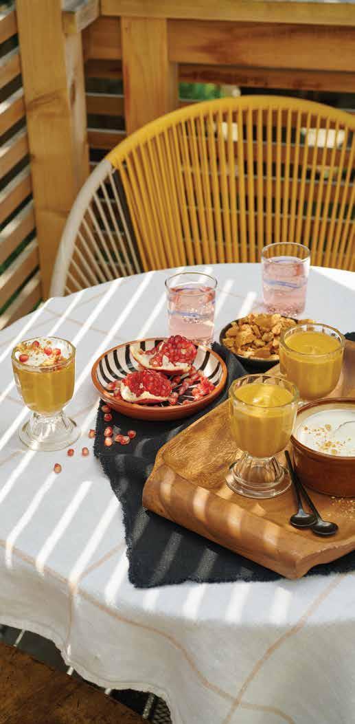
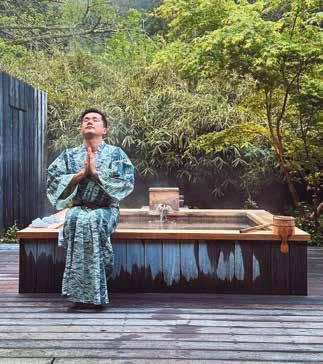
Lighting has always inspired me because, in addition to function, it can add so much tension and drama to a room—case in point, the “lasso” chan delier in our Bragg Creek project, made from a flexible silicone LED tube. With my background in creative advertis ing and lifelong passion for artistry, I see lighting as one of the most crucial elements in interior design—the jewel lery to a space. This fall, I’m launching a lighting line that is inspired by nature and crafted with a fluid and earthy design sensibility. Stay tuned to our website for the official launch!
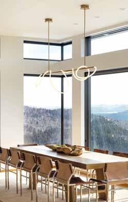
Running a small business is a lot of things: incredibly rewarding, but at times overwhelming and filled with pressure and responsibility. I’ve introduced meditation into my life by sitting in silence for 15 minutes every morning and focusing on my breath and daily affirmations. It’s a simple practice that brings immense clarity, peace and stillness. My husband has noticed a big difference!
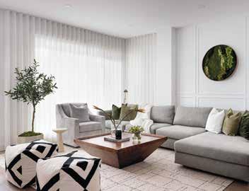

When I get stuck during a client briefing, I’ll ask to take a walk through their closet—it can say so much about who someone authentically is (or aspires to be). Fashion has always been such an important part of my personal expression because creativity and design are ultimately fluid. Interiors influence art, which borrows from fashion, which takes inspiration from products—it’s a cycle. I once developed an entire design scheme for a client’s home based on an amazing ombré pleated skirt I saw in her closet.


Everyone I know has talked about their visits to Japan as being an extraordinary experience. Well, this wondrous country exceeded my already-high expectations. I’m currently building a house, and our entire ensuite bathroom has taken inspiration from an onsen (traditional Japanese bath). And the shopping is also incredible: I ended up having to buy a new suitcase to bring home some of my treasures (including a vintage ’70s army jumpsuit—yes!).
If the kitchen is the heart of the home, then the living room is its soul. When I designed my living room, my partner and I had one requirement: it needed to be a space where it was physically difficult to feel stress. I brought in a spa-like palette with a mix of Parisian and global inspiration and I can say with certainty that my living room is one of my most used rooms in the house: it has hosted everything from karaoke disco parties and Netflix binge fests to sentimental conversations with a glass (or bottle) of wine.
I love playing tennis, following it and watching it (fun fact: I was once a nationally ranked tennis player). As a child who was never really interested in sports, I once saw two juniors hitting down the line during a practice session with such grace—I didn’t know a sport could be so visually beautiful. And so, at the ripe age of seven, I picked up a racquet and never looked back. At the end of a hard day, nothing beats passing someone at the net with an inside-out forehand drive volley.

