SunFlower Housing
Location: Philadelphia, Pennsylvania
Project: Residential and Mix-use building design
Professor: Ute Poerschke
Individual Work
Fall 2022
From a urban point of view, the Railpark show the movement gesture and seems like a flowing river in the busy and high city in Philadelphia. Softly connect the neighborhood, like a necklace insert into the city. When come to our site area, the house is flowing out of the railpark, like the pearls coming out from the necklace of railpark, continuing the language of free curve to design the house. Showing the movement and fluent of the house. When people walk into the site, they can first feel light, sound, air of the size of the house, but then smoothly see the whole sight of the building gradually. So house design is like invert to the city background. In the city context, the building and streets are straight, and the railparks is the curve. In my deisgn, the outline of the house is curve shape, and the inside walls are straight.
The north building is a café and tea room, using a lobby space connected to the Rail Park. And the first floor of the mixed residential building is for commercial use, while the second floor is intended to continue the landscape of the Rail Park to form a garden, with part of the building serving as a community library. The residential units are located from the third to the eighth floor. The materials used are CLT wood, White Concrete and curved glass.
15 14


• Site Plan 1/32''=1'


17 16 • Concept Sketch
• Ground Floor Plan 1/16''=1'
• RailPark Floor Plan 1/16''=1'


• Section A-A
• Structure Model


Structure: CLT Beam & Column, White Concrete Wall.
Material: Wood Wall in Residential Unit Floor, Curved Transparent Glass.


• Elevation
19 18
• Residential Unit Floor Plan 1/16''=1'


Library Perspective

Entrance Perspective
21 20 Wall Section

Leaf City
Affordable Housing and Sustainable Community
Location: Oil City, Pennsylvania
Project: Urban Design & Housing Design, 3D Printing
Professor: José Duarte
Group Work, Teammate: Tariq Kenanah, Michelle Wong Fall 2023
The inspiration of the urban concept is from the leaf veins and the inherent beauty of the natural environment that graces our chosen site. Our vision is to seamlessly integrate with the existing landscape using a soft and organic approach, promoting a sustainable and health-conscious lifestyle that encourages residents to leisurely stroll in proximity to their homes. We designed a green ring enveloping the entire site, which designed many natural trails, can be assigned for hiking and biking and walking. Using the organic curve lines for the road circulation inside our area and connecting the existing streets at west and east directions.
In essence, based on the goals for more communication and social opportunities for people in the community, we want to generate more open spaces or plaza spaces that will be defined as a new urban living room inviting whole community to come and input vitality to the space.
23 22
Community vision and strategy
1. Networking – Cultivating an interdependent world through the creation of a tight-knit community.
2. Sustainable Lifestyle – Promoting walking and bicycling as viable choices, encouraging residents to adopt a sustainable lifestyle, with a focus on the implementation of a green ring.
3. Nature – Nurturing a green city ethos, fostering organic growth, establishing soft connections that activate the community and invite collective energy input.

Intial concept diagram - Green ring around the site and division of

Leaf Veins - Inspiration from the natural setting of the site

Urban Grammar
Shape grammar rules and application
The urban grammar begins with formulating the central park at the core, followed by structuring road systems, blocks, and housing plot locations. These serve as general rules, with our design introducing specific grammars, transitioning from straight lines to dynamic curvilinear forms.


Shape grammar rules

application
25 24 Urban plan
Urban Design
Rule
Road direction & Programs


Urban blocks
Design variations
Integrating - various dwelling types in one city block: Single unit house & duplex & apartment & public building
Incorporating - numerous plazas and green spaces, our design aims to offer neighbors an urban living room, fostering a new and sociable lifestyle.
The overall functional zoning concept consists of a horizontal central green park in the middle, with public buildings and apartments on either side along the park, where the apartments are indicated by the color red.
The configured roads predominantly adopt a one-way layout across the site.

Perspectives
Community and Aerial view


27 26 Program diagram
Urban
Road direction
Diagram
Through east entrance
To explore the geometric freedom of 3D concrete printing, a pentagonal column was rotated to add dynamism to the design. This pillar is a metaphorical representation of the art and engineering that could coexist with the Pennsylvania environment.

Generated Toolpath and the Printed Structure

A wall element was extracted from the house design to showcase the printabiltiy of the curved wall. Printed at 1:2 scale, each wall is similar in design with regards to the overhang angle, but vary in thickness and curvature throughout the housing design.

Toolpath Generation Steps


Progression of Toolpath Generation
A clean and streamlined aesthetic was achieved by employing a simple, yet elegant toolpath to harmonize with the vertical strip windows. The toolpath considerations were integral in crafting a reflective space to foster a peaceful atmosphere within the structure.
29 28
1 Pillar
Print
Print 2 Beam

InterLock
Location: Watkins Glen, NewYork
Project: Automotive Research Center & Museum
Professor: Shadi Nazarian
Individual Work
Spring 2022
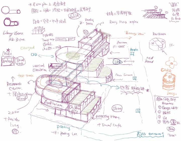
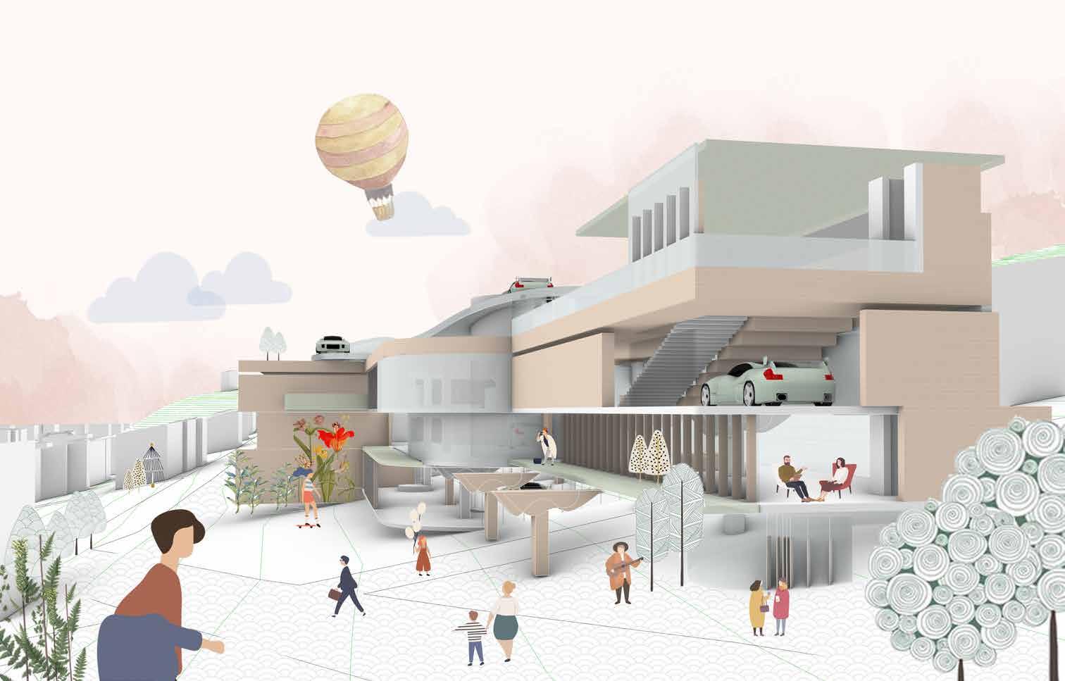
The design consists of two rectangular boxes interlocked in plan and section. The overlapping part in the middle is used as the atrium. The two boxes are contrasted in material. The museum uses glass and the other box uses stone.
Original Growth: The design of the museum is stepped according to the terrain of the site, and rises layer by layer according to the height of the site to better integrate the specific terrain.
Terrace: The winter survey found that the site itself has fewer trees, so if you want to add more green plants, the second floor is set back, and the exit platform can be used as roof green plants.
Exhibition Theme: According to the research on racing car parts, the overall architectural design style wants to reflect the mechanical sense of the racing car structure. At the same time, the theme of the design exhibition is defined as the display of retro racing cars according to the chronological order of invention. Therefore, this building wants to reflect historical retro and a sense of future technology.
Atrium: The connecting part of the two buildings serves as the atrium, the atrium serves as the garden landscape, connects the floors, and people can communicate between the different floors.
Tracks: Roof Tracks investigate material possibilities for the retro racing car.
31


33 32 • CONCEPT DESIGN • SITE PLAN Block & Elevation Analysis • PLAN
Ground
Floor Plan 2 Floor Plan


35 34
• SECTION
Cross Section Long Section
Lobby Space Cafe’ Area


Main Entrance Perspectives

Exterior Perspectives
37 36 • CIRCULATION & FUCTION ANALYSIS • PERSPECTIVES

Trigger
Location: Beijing, China
Project: Art activity center that activates historical district
Professor: Bing Wang, Ying Qi
Individual Work
Spring 2017
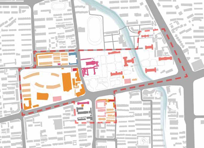
Chongwai No. 6 is located in the second ring of southeast Beijing, at the northeast corner of the Temple of Heaven, belonging to the cultural preservation construction control zone. It is adjacent to Guangqumen Inner Street in the north, Chongwenmenwai Street in the west, Fahuasi Street in the south, and Xingfu Street in the east, covering an area of about 0.8 square kilometers. The main house here was built in the 1940s to the 1970s. It is now a demolition detention area. There are nine illegal buildings of about 1,600 square meters in the area. The current situation of land use is crowded, poor construction quality, backward municipal conditions, poor environmental sanitation, high voices from the people, and strong desire for renovation.
This project is located in an old historical district in Beijing. It is concerned with questions: whether art can activate urban space, the relationship between art and people and the old district. To be an artistic activity center for tourists and residents. The design strategy takes the crowd as the starting point, designs different space functions for people of different ages and different needs, and uses artistic techniques to attract people to come to achieve the purpose of activating urban space and community vitality. It is hoped that important buildings in the historical district can be valued and protected, and culture can be spread.
39 38
Art History & City Development
This design project uses the method of art to intervene in the urban space to act as a trigger for Beijing's historical districts to activate the old city. The development of art is long, and various art forms have played a role in architecture and urban space. From the 13th century Renaissance to Baroque Rococo, Neoclassicism and Romanticism, to modern art and contemporary art, the study of art history is inseparable from the development of the city.

Art and People & Community
After analyzing the population of this historical district, it is divided into four groups according to age criteria. Children and the elderly are the main residents of the community. The 20-year-old young people and 30-year-old family members who come to visit are targeted at the crowd.
Site Mapping
The Temple of Heaven Antique City located at No. 91 Fahuasi Street is not only full of antique folk customs, but also modern fashion. The antique jewelry placed along the antique street forms a unique tourist landscape. Although the antique street is not long, it is full of vitality.


Nangangzi Catholic Church is a district-level cultural relic protection unit. Located at Tiyuguan Road, Chongwen District, Beijing. It was built in the second year of Xuantong in the Qing Dynasty (1910). At that time, the Beijing Catholic Main Church planned to build a church and a congregation of nuns.

41 40
Renaissance Baroque & Rococo Neoclassicism Romanticism Impressionism Post-impressionism Arts and Crafts Movement Contemporary Art Pop Art Abstract expressionism New York
art district Beijing 798 Art Park Crystal Palace Monet Academy
athens Michelangelo Gallery Children Gift Shop Movie screening room Young People Family Old man Book Store Painting classroom People Music live house Art market Art workshop Tea room Coffee shop Art Community Modern Art Fauvism Cubism
Soho
of
19th to 20th century 20th to 21th century 13th to 18th century
Protected courtyard
Protected courtyard
Protected
courtyard
Fahua Temple Middle School
Modern
Design
Nangangzi Church
Corporation Protected courtyard Protected courtyard
Site
Art Museum
Antique City
User Category


Group: Children
Age:
6-12
Children are characterized by liveliness, like running, and require safety. They can be designed in a diversified space with platforms and height differences, and they can run on the roof.

Group:
Age:


Group:
Age:
Young people around the age of 20 like to watch art exhibitions and like novel things. They can be combined with spaces such as art cafes to absorb culture and knowledge in a relaxed atmosphere.
The elderly are characterized by poor physical strength, inconvenient legs and feet, inconvenient to go up and down, and they like a quiet atmosphere. Need to design barrier-free ramps to ensure safety. The design space is a low-rise space combined with the courtyard.


Group: Age:
Family members around 30 years old are mostly parentchild activities, and the design can focus on parentchild interaction space.


43 42
The
Family
Crowd classification Space type Space image
50+
elderly Young people 20-30
30-40

Children
Age: 6-12


The space designed for children's activities is mainly children's art workshops and painting classrooms, through the ladder-shaped space to make children more happy activities. The flow of children can also go from their own children's hall to the special children's reading room on the second floor of the bookstore to study and read through the corridor.

Group:
Age:
The elderly
50+


The entrance and exit of the space for the elderly in the community should be on the north side of the site, close to the residential area. It is a community library with various categories such as art, movies and music. People can talk, read and spend leisure time here. Age: Age:
Young people


The space for tourists and young people is mainly at the main entrance on the south side. It is an art exhibition hall, a coffee shop and a souvenir shop. The design site is close to the historical building Fahua Temple in the Chongwai No. 6 area. A fixed exhibition will be held to spread history and culture Knowledge, attracts the flow of people.

Group: Group: 30-40 20-30
Family


The first floor of the multi-person family activity space is an art bazaar, where activities are held regularly, and commercial activities are added based on the historical background of this place to drive consumption and activate the city. Art is a good way to bring people closer to the city.
45 44
Space Usage
Group:

The exploded axonometric drawing mainly embodies the spatial forms used by four different groups of people. Through these spaces, different circulation lines are formed, so that people can enjoy activities inside, achieve the integration of indoor and outdoor spaces, and activate the entire community.
47 46 Exploded Axonometric Drawing

Integrate New with the Old
Location: Jinan, China
Project: Hongjialou Cathedral area renovation design
Professor: Ying Qi, Qipeng Mu
Individual Work
Spring 2018
Built in 1905, the Hongjialou Cathedral is a twin-tower Gothic building, and the largest Catholic church in Jinan and North China, also known as one of the three famous Catholic churches in China. It occupies an important position in modern Chinese religious architecture. The whole building is majestic, with grand beauty and solemnity. The space inside the church is large and shocking, with windows on all sides and good internal light. In the afternoon, the sunlight passes through, creating a warm environment that matches the sense of rituals of religious places, giving people a sense of spiritual purification. The architecture of the Chinese and Western walls has unique characteristics. The Hongjialou Cathedral is indeed the most beautiful building of western style in Jinan.
The Church Landscape Park is located on the north and east sides surrounding the Cathedral. The overall design concept is to take advantage of the original site landscape on the north side of the church to create an open park and cultural buildings enclosing the church. The different entrances and exits of the park welcome people from different directions. The wooden platform creates a sense of envelopment and warmth in the church, increases opportunities for people to communicate with each other, draws closer the relationship between people and the church, and enhances the spiritual image of the church in the city.
49 48


51 50 Site analysis Mapping Usage of Hongjialou Cathedral Land use analysis Residential Late Qing Dynasty Built in 1980-2000 Open space Greening Primary and secondary school >3.5 Vehicles/min Flat roof Business Republic of China Built after 2000 Education and Research 2.5-3.5 Vehicles/min Pitched roof Hostel Built in 1949-1980 Religion Administration Under construction 1-2.5 Vehicles/min Open space distribution map Building age distribution map Traffic flow analysis Roof style distribution map Greening and tree distribution map 1905 Hongjialou Cathedral Catholic Catholics worship. Tourists take wedding photos in front of west facade. Walking activities in Hongjialou Square. Tourist Resident 1909 Daming Lake Xia garden 1930 Shandong Minsheng Bank Site 1931 Baotu Spring Park National key cultural relics protection unit Provincial key cultural relics protection unit Municipal key cultural relics protection unit Tourist Resident 7 11 15 19 23 Mon Tues Wed Thurs Fri Sat Sun
Renovation based on View Accessibility
Sight analysis analyzes the view of the church from four directions, east, west, south, and north, and proposes a transformation strategy for each direction.
West facade need broaden. Remain the landscape.


Remain


Shape generation diagram
of some annexes Surrounding sense of enclosure Echoing different interfaces


53 52
Demolition
Church Landscape Park Master Plan
Main entrance Tree platform entrance West entrance 1 2 3 4 5 03. Tea room 02. Church Research Museum 04. Media center : Including art exhibition and community library 05. Church office
the architecture. Need more platform. 01.
Tourist Service Center


55 54 1F Plan 2F Plan 01. Office 01. Scenic introduction 01 02 03 04 05 06 07 08 09 10 11 12 1 2 3 4 5 6 7 8 9 10 11 12 13 14 15 16 17 18 03. Reading corner 03. Coffee shop 02. Souvenir shop 02. Lecture hall 04. Reception 04. Church model display area 05. Office 05. Viewing area 06. Souvenir shop 06. Research results display 07. Coffee shop 07. Church VR display 08. Art exhibition hall 08. Office 09. Reading rest area 09. Terrace 10. Handcraft workshop 10. Tea room 11. Painting restoration room 11. Book sorting room 12. Exhibition preparation room 12. Office 13. Self-study area 14. Art library area 15. Humanities book area 16. Language library area 17. Rest area 18. Outdoor reading platform 4 8 20m 0
Tree platform
Church Research Museum
Other Works
Pencil Sketch: Exploded Detail Drawing, Spring 2022
Professor: Darla Lindberg
In architecture, there is no such thing as good idea. There is only expression. Carlo Scarpa Cite in Marco Frascari's "The Tell-the-Tale Detail"

This is a column in Stuckeman building in Penn State campus. The axon shows the connection details and how the nails work. The bottom part can be draw out from the vertical column.
Material model making Rammed Earth model, Spring 2022


Rammed Earth Wall Section Axon and Final photo of the model. Just like cooking, follow different recipes, like the various degree of mixing dirt, sand and cement, to get different colors of soil, the layering effect is beautiful.
57 56
Other Works


59 58
Manual model: Suzhou Humble Administrator's Garden, 2015
Ancient building model making Chongang five-step flat body fighting arch, 2016

61 60 Hostoric building's construction drawings

63 62 Professional Work - Construction drawings


65 64

Mengyao Zhang +1 814-826-8628 carol0229@outlook.com


