
4 minute read
SPANISH FINENESS
SPANISH
Elegance, sobriety and brightness - the elements that form the design of a Barcelona house renovated by The Room Studio where one of the main objectives was to preserve the original structure.
Advertisement
Photography by Mauricio Fuertes
FINENESS
In terms of materials, The Room Studio opted for the main use of natural woods, different types of marble, brass and stone, as well as comfortable textiles. The designers sought to give the house the nobility and sobriety for which it is characterized, combining it with timelessness in different environments and creating lighting scenes in each corner.
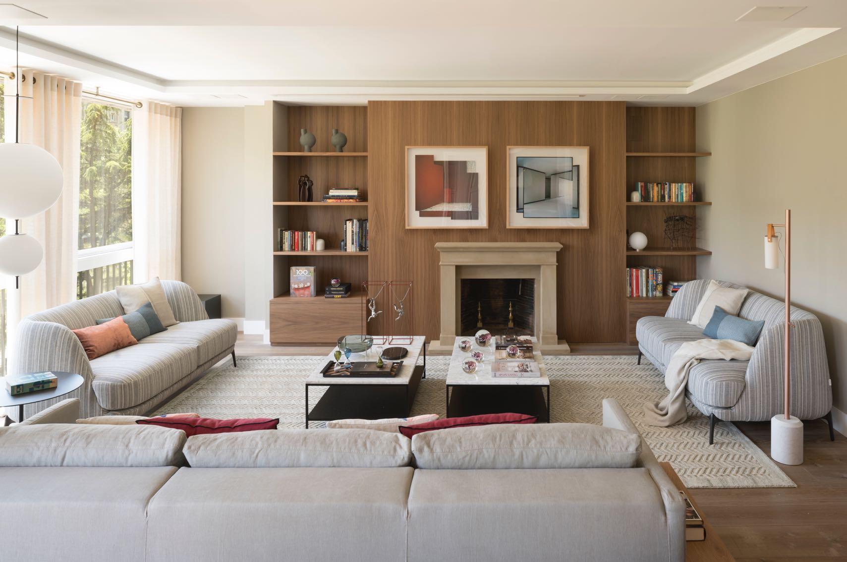


In this house of 300 m2 located in the most central area of the Diagonal of Barcelona, a comprehensive reform of Interior Design, Decoration and Styling was executed. The main premise of its owners was to maintain the structure of the house, adapting it to current needs. That is why all the spaces were redistributed, restoring all the areas. So open, functional and updated areas were obtained in this house that lacked personality and character, where natural light is the protagonist. It was completed with a global domotic project and an audiovisual system, in addition to providing each space with an independent music control. In the main zone, three connected and differentiated areas were created. On the one hand, we find the area of the room where the original fireplace was kept, giving it an updated image. The sofas were arranged so that they were useful both to see the projector and to be with friends. Next to this room there the reading and music area, since the owners love to read and play the piano. A corner was created with two comfortable armchairs and an auxiliary table obtaining an enveloping and comfortable environment. While the dining area was created including a visual communication with the kitchen. In turn, a partition was made with sliding doors in transparent glass to make the most of natural light and achieve amplitude.
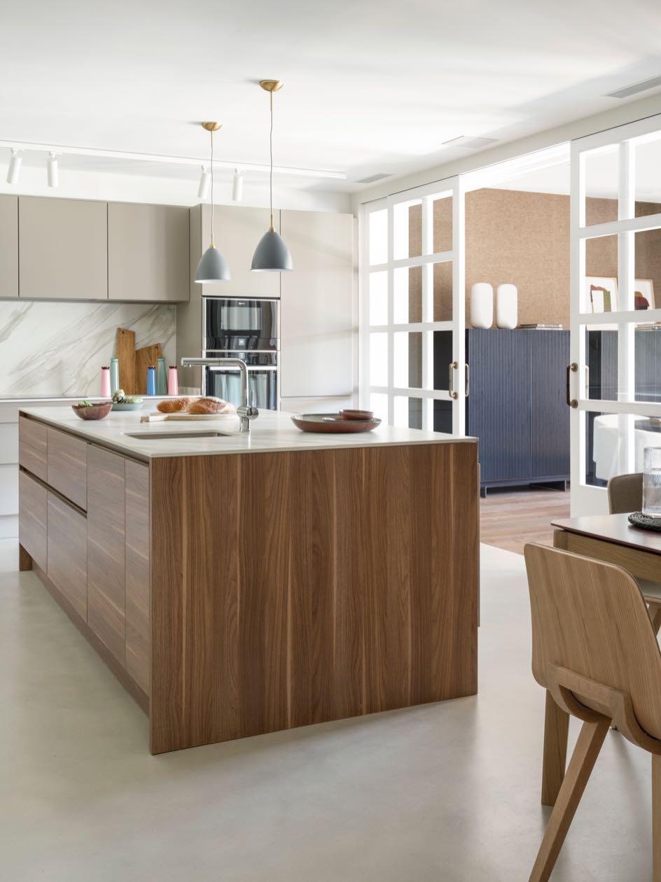
A range of neutral and simple tones is used throughout the entire house. These colors are prolonged in the materials used, choosing microcement for the design of the kitchen. The timelessness and the continuity over time of the introduced elements are sought. The general lines used are clean and continuous, avoiding irregularities and seeking purity.
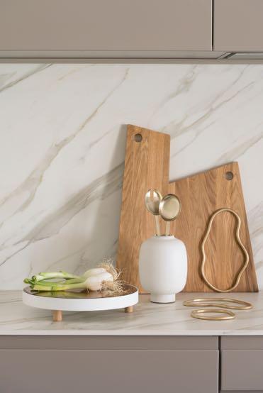

A large custom-made kitchen was obtained where the whole family could be together. An area designed for breakfast was designed on the large island accompanied by stools of Kuskoa and Gubi's suspended lamps. While, at the corner, another place more collected in the form of a

bench with Treku's table where you can sit down to eat. This point of the room is characterised by elegant accessories like suspended lamps of Normann Copenhagen, paintings in Victor Lope's Gallery, jars of En Línea Barcelona and complements designed by The Room Studio.


The nucleus of division of night and day zone is the hall, where it is bet by a very dark color with strong contrasts obtained by combining furniture and accessories such as Gubi’s central table withthe white vases. In this space, the only one to stand out is the rug of BSB Alfombras thanks to its colours. This room can be defined as the most differentiating axis of the house.
In the night area, the suite room was designed with a contemporary and sober style. Works of art were included and straight lines and structures with more solid appearance were used. It sought to give an elegant air that breaks with more informal fabrics and colors. The small terrace connects with the suite harmoniously.
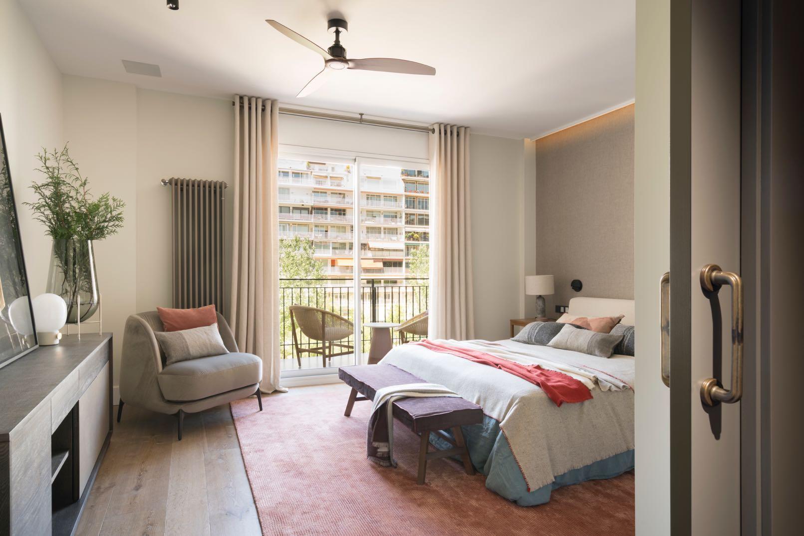
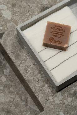


Decorative papers with a very soft air are used in the rooms. These are combined with very balanced colors and always being part of the same tone palette. The Room Studio chosen the custom-made furniture and designed the completions specifically for the two rooms. The designers included the rugs with a geometric pattern of BSB Alfombra that perfectly match with the rest of the furniture and giving a touch of extra comfort.


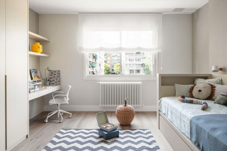


For the rooms of the children it was decided to separate them by genres, each one with its independent bathroom. The rooms have a study area, another dressing room and a large area to play. The children's favorite colors were used, distinguishing their personalities and expressing their characters.
of SENSE PLAYFULNESS

The architecture and design practice based in Brooklyn, Frederick Tang Architecture, recently completed the design for a New York apartment combining sophistication with bold color accents.
Photography by Gieves Anderson


