5 minute read
THE NEW LIFE OF A HOLIDAY APARTMENT
A HOLIDAY APARTMENT The new life of
CaSA, an office of architecture by two Italian architects, Matteo Colombo and Andrea Serboli, completed the restoration of an apartment in Barcelona for a young family residents abroad.
Advertisement
Photography by Roberto Ruiz
The apartment is located in a nicely featured art nouveau building in hip Born neighborhood, on the top floor. Clients came to CaSA after a terrible experience: after purchasing and restoration the property, disgracefully only one day before inauguration a big explosion burned the flat down, along with a great part of the works completed, leaving the clients’ budget to a low and damaging severely some of the property’s ancient features. So, the initial brief was to provide a budget-friendly project, due to the loss of the investment in the first burned-down rehabilitation. A clever use of materials was mandatory, as well as making the most of the existing distribution and installations. In spite of that, the apartment had to look dramatically different by the end of the works. Once setup the project’s essentials, other special elements could be evaluated separately


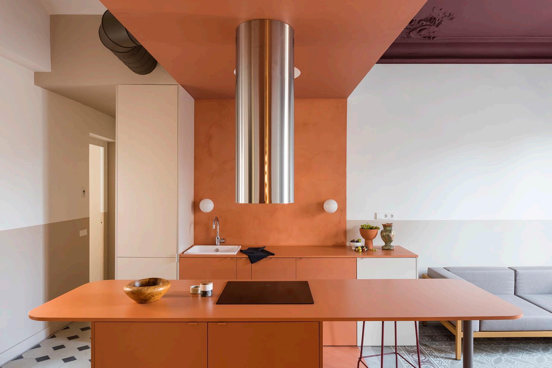
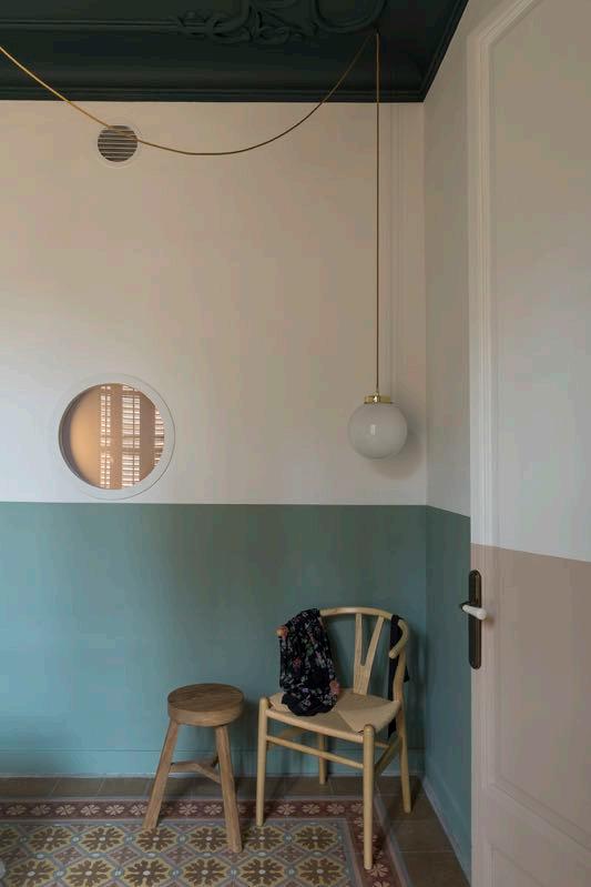
and added to it. The challenge was to take the given spaces and make new sense of them, change the meaning and uses without moving walls, a new interpretation of spaces. The original layout already included an open kitchen, living, two bedrooms (for parents and kids) and a small bathroom. Architects decided to treat the central area as a colour-block. This brick-like core orders the space around itself, embodying several functions (kitchen, dining, studio). To create this distinct area, the architects decided to dip the whole space in a rich terracotta colour, including the recessed area that will be use as a quiet studio corner. The studio area is nested in a recessed space opposite to the kitchen, with bespoke desk and shelves cut with a circular shape to allow a small globe pendant lamp to hang on them, all in the same colour. A porthole window punctures a wall, bringing a dash of natural light into the space.


Micro-cement floor of the same hue unifies the central area and, the same earthy tone is used for the micro cement backsplash wall, the ceiling, the kitchen cabinets including the long, round edged central island, as well as for the studio area, desk and shelves. The result is a colour-block area that makes a distinctive statement at the core of the apartment.
The living room has a Kettal Landscape sofa with mustard coloured frame and mink cushions, a planter by FermLiving and a Handvärk lamp by Studio Floor. While lights throughout the apartment are done with hanging and sconces globes.


A holiday apartment allows for more daring colour choices. Architects picked a soft palette for the property. Outside of the brick-coloured core, walls are white to maximize light. Even so, a valance runs around walls, doors and windows, giving an artificial horizon, visually widening spaces, in an otherwise vertically proportioned property. This fringe has been chosen based on the spaces and in relation to the colourful, original hidráulico floors: a more neutral sand brings warmth through entrance and living (unifying the spaces on both sides around the the kitchen block), making the burgundy and greys shades of the living floor stand out; a cooler light green colour was chosen for the bedrooms.


Both clients and architects wanted the historical features to be preserved or rescued and highlighted, making the most of high ceilings, decorative features, floors, windows, doors. Most walls had to be scrapped to bricks and newly finished and some of the original art nouveau ceiling features restored or even reproduced and replaced. Ceilings have also been painted in colours: an off burgundy for the living, a dark teal for the bedrooms.
The bedroom also features the porthole window that brings light into the studio. Furthermore, there is access to a small walk-in wardrobe that is part of the brick coloured block.


Bedrooms are simple and clean. In the master bedroom the colour fringe becomes a volume, forming the bedhead that embodies globe lights, light switches and sockets and a niche on the side where a bedside table cannot be placed.


The children’s room has a built-in wardrobe that follows the wall colours. Like cabinets in kitchen, bathroom and corridor, also here the architects inserted custom-made door handles, lacquered in colours that match their surfaces.


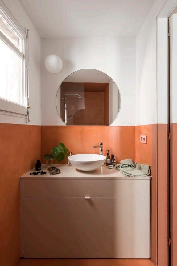
The bathroom is also treated with the brick-red micro-cement, again the valance and invading the shower space.


S U B S


C
R
I


B
E
Subscribe or extend your subscription to G&G _ Magazine for 3 editions and receive a picture of the Canvas collection*
Africa
jewellersnetwork.co.za maisonnoir.co.za okha.com
America
bigboystoysvegas.com claytonandlittle.com daniellevyporcelain.com fredericktang.com luxe4home.com.br mulapreta.com mutuus-studio.com sarahvondreele.com theladg.com walkerwarner.com
Asia
aionwater.in ammarbasheir.com artoletta.com asafweinbroom.com designshanghai.com designtokyo.jp expo2020dubai.com furniture360.ae h2rdesign.com indexexhibition.com lw.co supercarcapsule.com thehotelshow.com tushantbansal.com workspace-index.com
Europe
abigailahern.com acquadilimone.it alessi.com antoniolupi.it arcticbath.se artisan.ba aruntamchocolate.com avoralife.com baytm.dk azarbizar.be bbebitalia.com bessadesign.com bloomingville.com bomma.bz rabbu.com casalgrandepadana.it castrolighting.com chinadesigncentre.com cipolladiacquaviva.it dcwe.fr delightfull.eu domkapa.pt eden-outcast.com epoca.pt formitalia.it gandgmagazine.eu henge07.com homessociety.com hommes.studio ifgroup.org jetclass.pt kettal.es lalabonbon.it lemondesauvage.com macullo.com malicorne.com mezzocollection.com mineheart.com nirmeiri.com noa.network ohlab.net piattoeforchetta.it pieter-adam.com risobuono.it rugsociety.eu studiomodijefsky.nl theroom-studio.com the-privatelabel.com zaditaly.com
Oceania
pampa.com.au


