


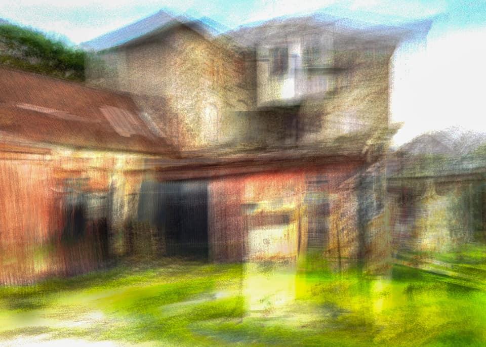
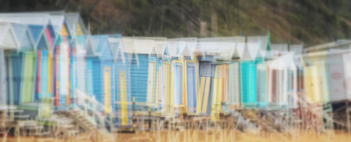
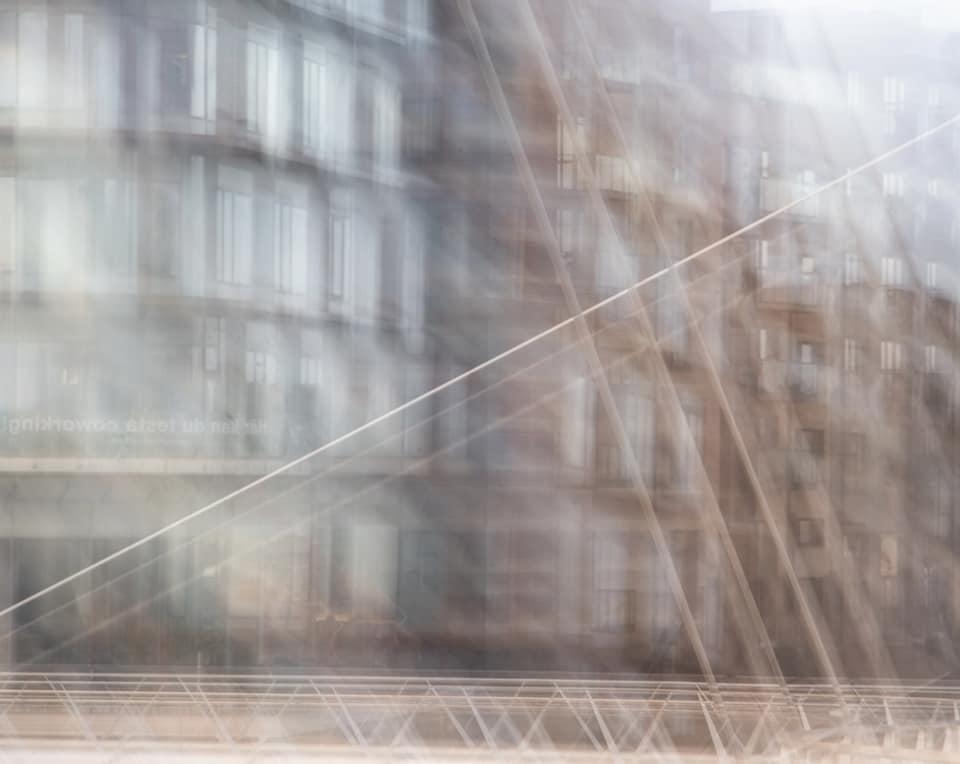
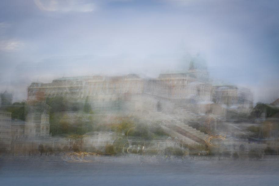
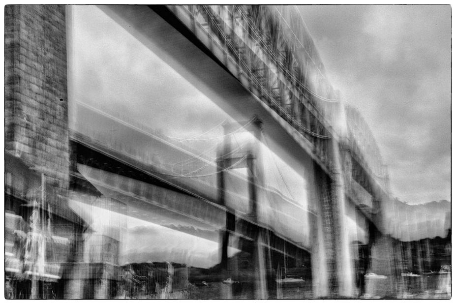
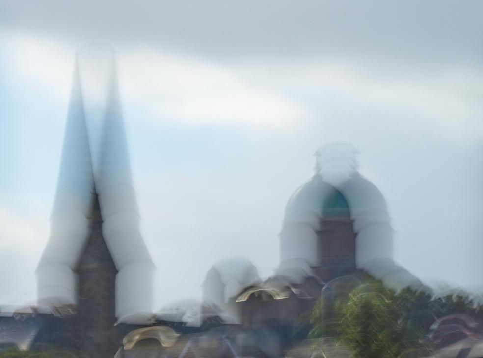
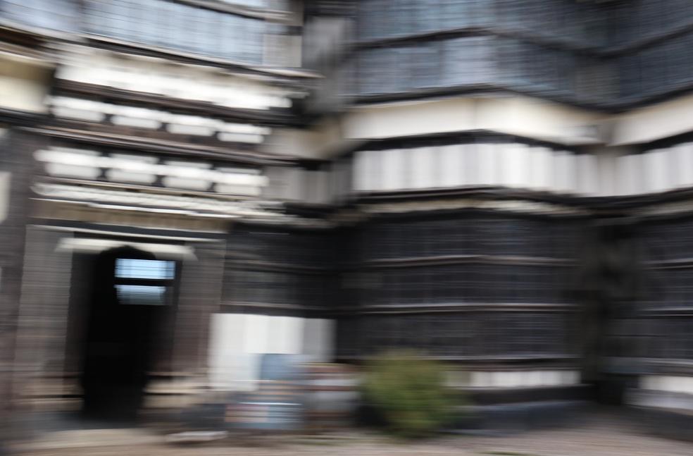
The ‘architecture’ challenge is complete. I knew there would be some beautiful and unique work submitted by everyone, but I was delighted with the creativity and such a wide range of styles submitted. It was also lovely to see the interpretations of architecture from around the world. We had Singapore, Edinburg, Glasgow, Portsmouth, London, Chester, Greenwich, Windsor, Sweden, Cape Town, Lake Garda in Italy, Miami, Calgary, Budapest, Brussels, Oslo…and I’m sure I have missed a few out what an amazing offering for our judge and not an easy task.
The judge for this challenge was Bill Ward. Bill creates the most beautiful ICM work, but not only this, he shares his knowledge willingly with o thers to help them learn. He is now a regular contributor to the ICM Photo magazine with super articles that help build understanding and in turns skills in the world of ICM. Bill is also a fellow Light and Land leader. He is also a rather famous actor (but ashamed to say I had never heard of him in this capacity as I have never watched one episode of Coronation Street!),
Bill has a beautiful website https://billwardphotography.co.uk/ He does offer 1:1 workshops around Bristol but if you are interested in group workshops and tours his tutor page on Light and Land is here https://www.lightandland.co.uk/photography tour tutors/view/bill ward
Bill is also on Instagram https://www.instagram.com/billwardphotography/ Do go and show him support on these various platforms as a thankyou for his judging time.
All the judges have offered their time at no cost to this challenge and for that I am deeply grateful.
I created this ICM challenge, to offer a friendly competition within the creative group I run for all previous course attendees and mentee students. It is to encourage interaction in the group and to offer a reason to share or make photos in reaction to a prompt. From mid July to early December, a new challenge subject will be set in the group. It may be interpreted however an individual wishes, but the ICM technique must be the overriding element in the image. I have chosen an outside judge for each challenge to offer a wide variety of feedback and varying outlooks on ICM photography.
This is a cumulative competition:
• Points 1 10 are awarded for the top 10 placings each challenge. (1st place gaining 10 and 10th place 1)
• A point is awarded to every entrant to say thank you for submitting.
• A bonus 5 points are awarded to each of Charlie’s top 5 each challenge. In December there will be an online awards evening, with some small prizes, and to celebrate everyone’s achievements.
If you are interested in online or in person courses, please check out my website for more info www.charlottebellamy.com I also have a You tube channel https://www.youtube.com/c/CharlotteBellamycreativephotography/videos
Please email with any questions or comments Charlotte@charlottebellamy.com
Copyright remains with each of the photographers, please do not save in anyway the images from this document.
Without further ado I would like to introduce you to your winners. Congratulations to the top 10.
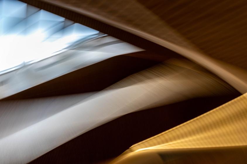
Winner Colin Smith

Spiral Staircase Bill said This was the stand out image of the set for me: dynamic, eye catching composition, a very clear photographic idea, beautifully executed. The integrity of the original subject has been maintained (not that that is important at all but in this particular case I thought it really worked), but blurred round the edges. Couldn’t quite tell if this was pure ICM or more Multiple Exposures, or possibly a bit of both, but that’s by the by whatever you’ve done really works! The only technical point I’d raise is whether the highlights of the central light source are slightly blown, but again, the image works so well that that really is secondary to the idea (and you could argue anyway that it serves it really well in any case). Great work!

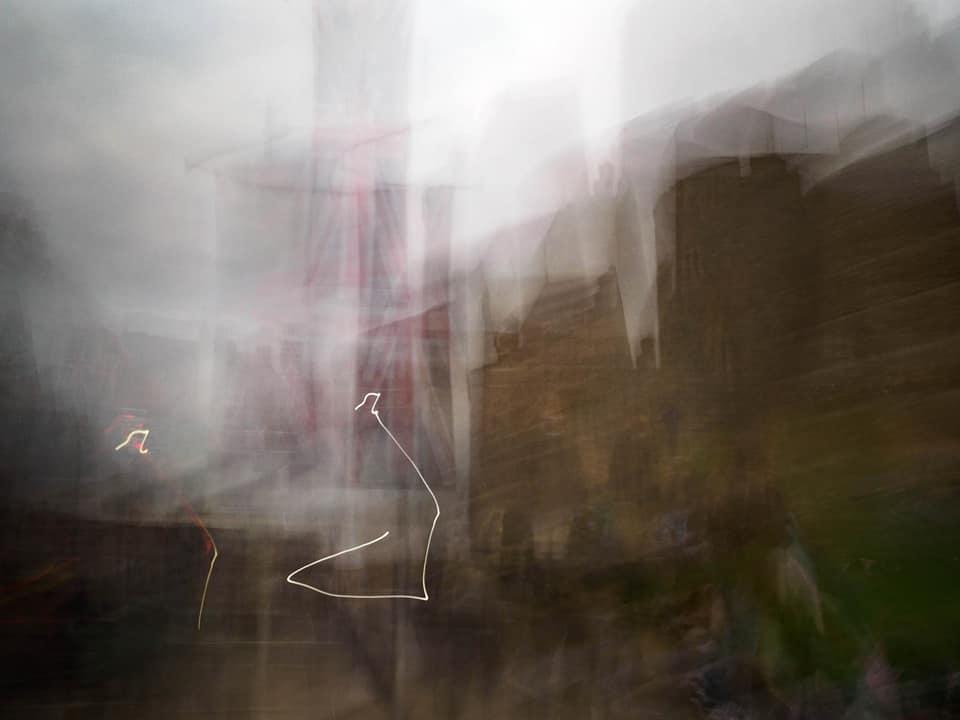
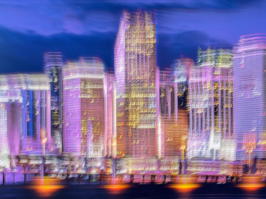
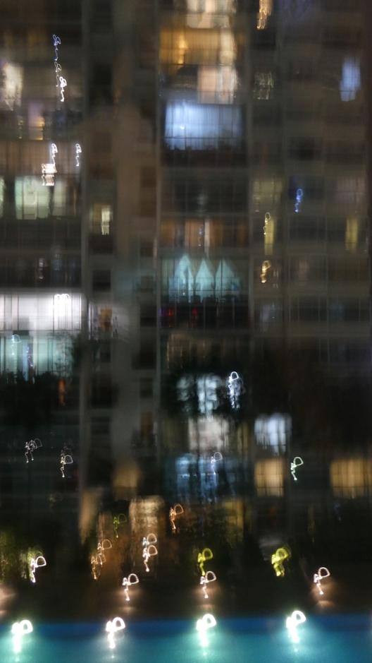
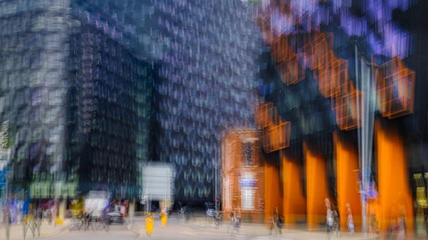
Runner up Camilla Rutayisire Gore
Human in the City Bill said There’s a lot to like about this image. In particular, great composition, and separation between the elements. I like the idea: lone human in the city, which speaks to all of us I suspect. And you made sure that the edges of the human are discreet from the building that surrounds it. Lovely colours too, and a sense of the darkness of the city below vs the golden light above. I particularly like the way the body is framed within the central golden section of the building also the recurring green streaks throughout the photograph of the walkway bollards are a nice touch. Very nice work!
3rd place
Carol Hudson

Stained Glass Window Bill said Strong, simple idea, really well executed. Unusual, eyecatching subject matter. For me, there’s an idea here of the saints in the window almost flying out of it into the church, the glory of God, as it were, spreading out to the congregation, which I really really liked. Lovely movement, and suggestion. Super work!


 Gunilla Steen
Joy Tracey
Michelle Jackson
Gunilla Steen
Joy Tracey
Michelle Jackson
 Mirriam Manners
Angie Robertson
Federica Morgan
Mirriam Manners
Angie Robertson
Federica Morgan
 Caren Kaufman Mlot
Jaana Kotoneva
Christine Griffiths
Caren Kaufman Mlot
Jaana Kotoneva
Christine Griffiths
 Lyn Rostron
Christina Webb
Debbie Christie
Valerie Huggins
Lyn Rostron
Christina Webb
Debbie Christie
Valerie Huggins
 Marion Woodman
Kim Stevens
Marion Woodman
Kim Stevens
 Sue Woodbridge
Birgitta Larsson
Sue Woodbridge
Birgitta Larsson
