P O R T F O L I O
WORKS BY: CHRISTABEL CHENSITE ANALYSIS


1.1 site analysis
1.2 conceptual sketches
1.3 museum overview perspectives
1.4 floor plans section

Project Type: Parasitic Architecture

Attaching itself to the “host”, the parasite aims to enhance the surrounding environment without overwhelming the host.
Site:
Shophouse units 2-16 along Koon Seng Road
Located in Joo Chiat, Singapore’s first heritage town, a residential conservation area known for its heritage architecture and a popular tourist destination.

Design Strategy:
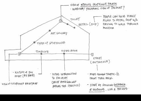
To design a heritage museum that will bring visitors on a journey through the heritage of Joo Chiat while experiencing the shophouse in a new way.
The heritage of Joo Chiat is only conserved through the shophouses’ architecture. Locals and tourists are not educated about the shophouse or heritage as they only view the facade from ground level, as shown above.
Scaffolding structurees are seen when conservation works are carried out on shophouses’ architecture. I used this as the idea generator to “conserve” the heritage of shophouses and Joo Chiat.


Latching onto the host this way would restrict the amount of sunlight and ventilation on the ground floor.


Solution: parasitic modules attaching at different levels with voids adjacent to circulation pathways.


KEY PLAN

EXTERIOR ELEVATION


GROUND FLOOR PLAN


SCALE 1:200
FIRST STOREY & SECOND STOREY PLAN SCALE 1:200

THIRD STOREY PLAN SCALE 1:200


RETAIL STORE PLAN SCALE 1:200
1 2
Communal seating areas on the ground floor relate to the parasite in terms of the materials used while providing a space for residents and visitors to rest and hang out.
1. Reception
2. Historical timeline of Joo Chiat
3. Tile display
4. Types of shophouses
5. Viewing deck
6. Retail store
1.1

site context concept
1.2 elevations perspectives
1.3 floor plan
Project Type: Hospitality
To create a new brand for a chain of hotels that provides affordable accomadation and ensuring guests enjoy a great local atmosphere.
Site: New Delhi, India

Be Hotel is a 2.5 star hotel located in the city center.
Design Strategy:
To design versatile spaces within the hotel that cater to backpackers, families and business travellers while capturing the cultural essence of the country, taking in mind the timeless and homely image of the hotel’s branding.
COURTYARD: TRANSLATING CLASSICAL INDIAN ARCHITECTURE INTO A MODERN SPACE
Main spaces (bar, lounge, dining) are designed as a courtyard as it is where most communal activities happen. The double volume and columns are deliberately emphasized by designing the space such that guests are able to experience the spatial qualities once they enter the hotel.
Circulation path
Courtyard

The lattice creates different shadow patterns in the space depending on the time of day.
A variety of seating provides flexibility for guests and caters to the

The counter is designed such that it connects the indoor & outdoor dining areas.


1.2 floor plans

1.3 perspectives sections


Project Type: Problem Based Learning
To provoke inquiry into the cultural, societal, architectural and environmental issues surrounding design and propose a new use for the building.
Site: Thomson Community Club
Various communities in Thomson are segregated as the culture of congregating for entertainment is fading. Also, there are many music schools and studios in the vicinity but no specific venue for these music enthusiasts to showcase their talent.
Design Strategy:
To create a space where people, food and music come together in the form of a music cafe selling traditional desserts since the food culture in Singapore is prominent and it connects different communities. The cafe also serves as a platform for music enthusiasts to come together and perform while residents in Thomson can gather to watch and participate during open mic sessions.
FIRST STOREY PLAN
SCALE 1:100


SECOND STOREY PLAN
SCALE 1:100


Horizontal
visual continuity while vertical
The stage is a key space and is emphasized by a double volume which allows sound to travel to the second storey. The double volume also allows visual continuity, so people get to watch and hear the performance.


1.1 site context concept facade + section
1.2 perspectives
1.3 working drawings
Project Type:

Mixed-use (Soho), client-based
Site: Geylang Bahru Industrial Estate

Design Strategy: To convert the existing site into a Soho unit for the client to eat, work, play, meet and sleep.


Client profile: Cafe owner and freelance photographer
Site location Sun path SPACE TRANSLATION
PHOTOGRAPHY: USING LIGHT TO DEFINE SPACES
An axis derived from the sun path divides the space while different types of lighting defines the type of spaces (public/private).
Axis Adjacent spaces


 1. Cafe/Gallery
The cafe acts as a gallery through a montage of the client’s works displayed along the walls of the first storey. A strip of light on the floor guides customers to the counter.
2. Study/Reading area
A skylight directly above illuminates the study area.
3. Model Experimentation of light.
4. Model An example of light cast by the sun through the skylight in the cafe.


1.1 other projects
1.2 live projects
1.3 photography
Subject module: World Issues (Cross-Disciplinary Subject)

A photographic campaign part of a group project aiming to raise awareness of racism. The project revolved around the theme of a world without colour, as skin colour will not matter in a colourless world. A book, posters and various merchandise were designed, all in an achromatic colour scheme, following the theme.


1. Merchandise designs

2. Poster design 1
3. Poster design 2
A WORLD WITHOUT COLOUR 1 2 3 4 5
4. Cover page of book
5. Sticker designs


Location: Sentosa Boardwalk
Part of The Christmas Tree Project and inspired by Alice In Wonderland, the idea was to create an unconventional christmas tree representing a christmas dinner. Various kitchen and dining utensils hang haphazardly to emphasize the casual, messy and fun atmosphere as people catch up over a good meal.


Location: Glocal Village, Temasek Polytechnic
Part of an initiative for Global Community Day and Diversity Inclusion You, an event organised by Temasek Polytechnic, a graffiti wall was created, encompassing the theme of diversity and vibrance.


